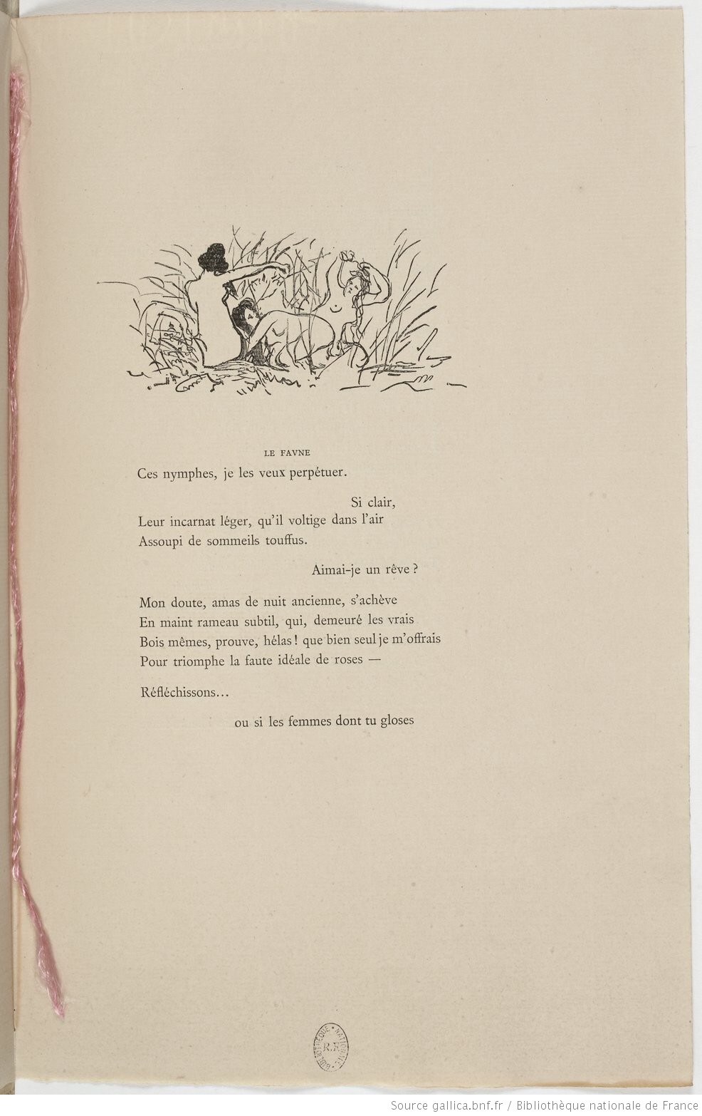
Above: “The Alfred Jewel”, enamel and gold; late 800s; found at Petherton, Somerset, in 1693. The Ashmolean Museum, Oxford, presented by the Estate of Colonel Nathaniel Palmer. Below: MS. Hatton 20, fols 2v-3r. St Gregory the Great, Cura pastoralis, translated by King Alfred and copied 890-897. This copy of St Gregory’s manual for clergymen “speaks” (bottom left) of how Alfred “sent me to his scribes north and south”.
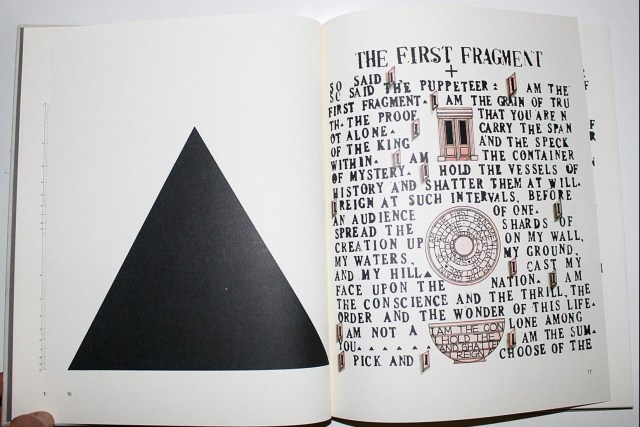
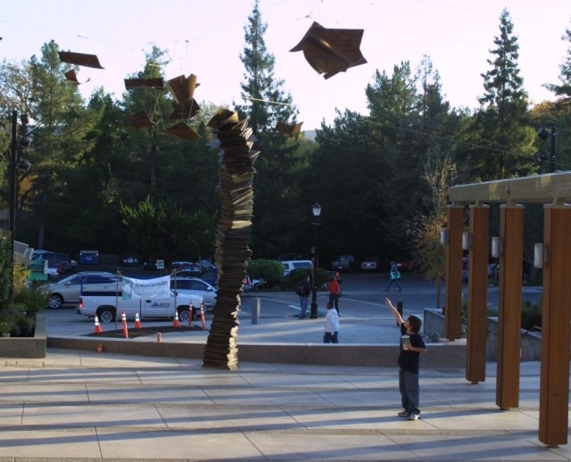
The exhibition “Designing English” at the Bodleian’s Weston Library (1 December 2017 — 22 April 2018) showcases almost 100 of Oxford’s medieval manuscripts, objects and books illustrating graphic design and the book arts.
Alongside that exhibition are the results of a workshop and competition among book artists: “Redesigning the medieval book“. A surprise and pleasure to find the medievally inspired work of Turn the Page‘s own Jules Allen:
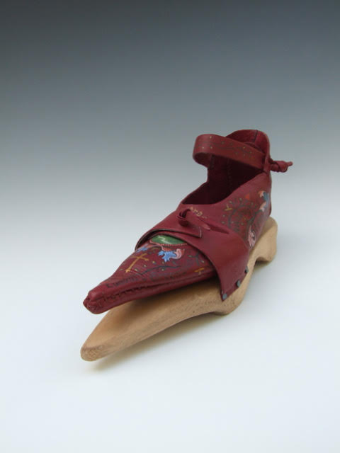
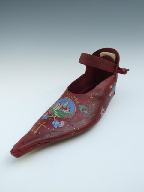
Pilgrim Shoe (2017) Jules Allen, with Ernst Allen and Eileen Gomme
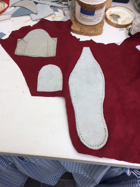
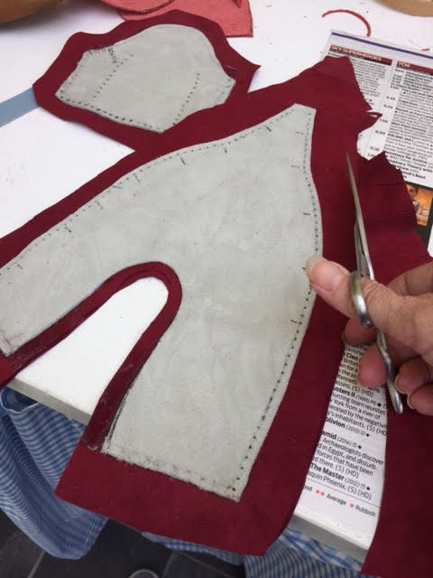
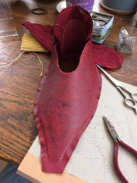
Jules Allen was kind enough to provide additional photographs and some background on the making of Pilgrim Shoe.
Pilgrim Shoe (2017) Jules AllenPilgrim Shoe (2017) Jules Allen
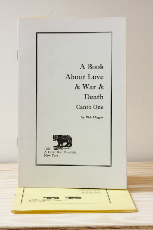
Guided by the anthology of possible texts, I made Pilgrim Shoe in response to Geoffrey Chaucer’s The Canterbury Tales. The following points in the brief inspired me:
Where and on what should you write if you seek ‘to do things with words’?
Does form always fit function? Does a function only have one form?
Is looking more sensuous than reading?
I approached the project from the perspective of a Medieval Cordwainer seeking to attract wealthy customers and found that although it was common practice to decorate shoes by engraving or cutting patterns into the leather, other forms of decoration were rare during Medieval times. An inventive Cordwainer might have thought of personalising shoes for specific purposes or events using text, images, or even a charm for luck.
With this in mind I made a Poulaine style shoe with wooden patten specifically for Chaucers’ ‘The Lady of Bath’, who may have been attracted by the decorated shoe both as a unique, sensuous status symbol and a map with which to find her way from London to Canterbury. Such a shoe might have been admired or found useful by fellow pilgrims en-route, and with a recipe for love (from the Anthology of texts) concealed within the rein-forced heal, perhaps she might attract a new husband during her pilgrimage.
I hand painted images and added calligraphic text on the shoe. The place references from London to Canterbury were researched using various historical sources including the Gough Map http://www.goughmap.org/about/
Pilgrim Shoe (2017) Jules AllenPilgrim Shoe (2017) Jules Allen
Materials: Leather, artificial sinew, watercolour and acrylic paint, calligraphers ink, wood. paper, metal studs, starch paste and wax
Dimensions: L30cm W10cm H16cm
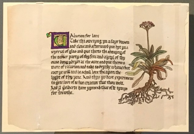
Paper charm: Selected from a section on Medical Remedies and Charms from the 1400’s for the concealed charm written by hand on paper, housed in the heal of the shoe.
Middle English Version: Charm for love Take thi swetyng yn a fayr bason and clene and afterwarde put hyt yn a wytrial of glas, and put therto the shavyng of the nedder party of thy fete and a lytyl of thy oune dong ydryet at the sune, and put therto a more of valurion. And take to drynke, whane that ever ye will, and he schall love the apon the lyght of thyn yene. And thys ys best experiment to gete love of what creature that thou wolt. And Y, Gelberte, have yproved that ofte tymys, for trewthe. Modern Translation: Charm for love (translation) Catch your sweat in a nice clean basin and afterwards mix it with sulphuric salt, and add to it some shavings from the back of your feet and little of your own dung dried in the sun, and add a root of the herb valerian. And take a swig whenever you want, and he’ll love you as soon as he catches your eye. And this is the best proven method to win love from whoever you want. And I, Gilbert, have proved this many times, truly.
Credits also to Ernst Allen for the wooden patten and Eileen Gomme for the passage of calligraphy on the paper charm.
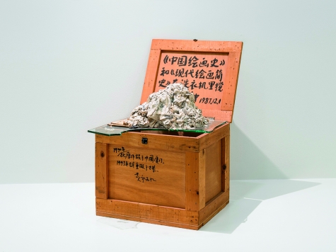
Huang Yong Ping: The History of Chinese Painting and a Concise History of Modern Painting Washed in a Washing Machine for Two Minutes, 1987/1993, ink on wooden crate, paper pulp, and glass, 30 by 19 by 27½ inches. Walker Art Center, Minneapolis.
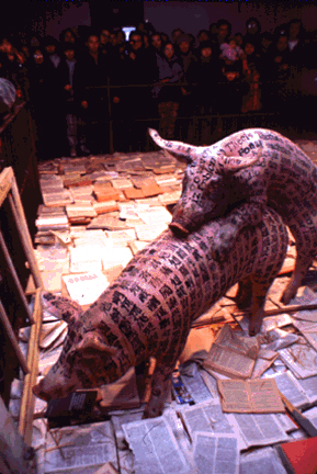
“Art and China after 1989: Theater of the World,” now appearing at the Guggenheim Museum in New York through January 7, 2018, includes work from Xu Bing and Huang Yong Ping. The exhibition attracted animal rights protestors and removal of works, one of which was Xu Bing’s video of his 1994 installation A Case Study of Transference. In a pen littered with books, Xu Bing presented two pigs, one tattooed with words in his now famous nonsense Chinese calligraphy and one with nonsense English words. The piece became infamous when the pigs, bored with the intercourse offered by the books, engaged in more mutually interesting discourse.
A Case Study of Transference (1994) ⓒ Xu Bing
The exhibition also occasioned this article in “Art in America” by managing editor Richard Vine. He has held up art’s hard mirror to us all in this essay.
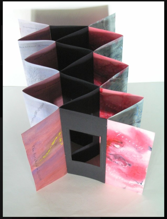
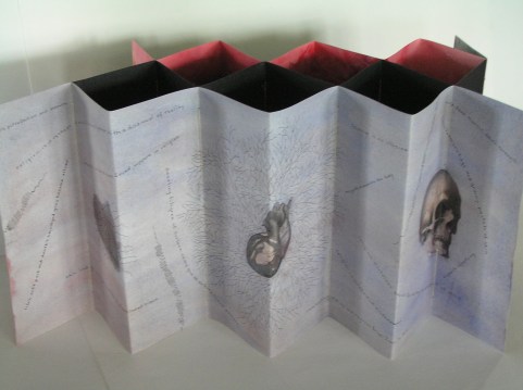
Selected for the 2017 Manly Library Artists’ Book Award exhibition in New South Wales, Australia, The Future of an Illusion by Helen Malone and Jack Oudyn demonstrates an effective collaboration in a field of art densely populated with — almost defined by — collaborative efforts:
The Future of an Illusion (2017) Helen Malone and Jack Oudyn Sculptural tunnel book structure (three joined four-fold leporellos) enclosed in a folder and protective boxin a box,. Box made with Lamali handmade paper, suede paper (lining) and Somerset Black 280 gsm; Folder: Canson black 200gsm, skull button and waxed thread; Leporellos: center leporello made of Canson black 200 gsm, linen thread adjoining two leporellos made of Arches watercolour paper 185 gsm with acrylic, soluble carbon, gouache and transfer ink jet images. Box: H275 x W313 x D34 mm; Folder: H258 x W295 x D21 mm; Book: H250 x W290 x D16 mm closed, D410 mm open. One of an unnumbered, signed edition of 4. Acquired from Helen Malone, 12 September 2017.
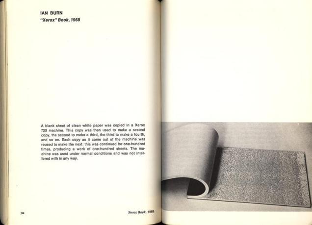
Edouard Manet and Stéphane Mallarmé; Bertrand Dorny and Michel Butor; Dorny and Michel Deguy; Barbara Fahrner and Kurt Schwitters; Ron King and Roy Fisher; Telfer Stokes and Helen Douglas; the Art + Language Group (Terry Atkinson, David Bainbridge, Michael Baldwin, Ian Burn, Harold Hurrell, Joseph Kosuth, Christine Kozlov and Mel Ramsden); Tom Rollins + K.O.S.; Julie Chen and Clifton Meador; and Chen and Barbara Tetenbaum.
That list is by no means comprehensive nor representative – chronologically or categorically — but it flags the strength of the tradition. One pair that is particularly apropos for Malone and Oudyn is Sonia Delaunay and Blaise Cendrars. Over a century ago and half a world away, they collaborated on La Prose du Transsibérien et de la Petite Jehanne de France, also in the leporello, accordion or concertina format. Malone writes that it “has always been very influential generally on my work.”
Cendrars as poet and publisher and Delaunay as painter were interested in achieving what they called simultaneisme, or a “simultaneous book.” They wanted to create a form of art in which painting and text could be united in expression. Delaunay painted the left column of color and abstract shapes guides us through the text, which is set in various typefaces, allowing for movement as the reader mimics the journey across the page as described in the train ride in the poem. Claire Kelly, Melville Books
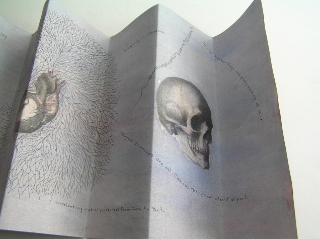
The Future of an Illusion springs from two imaginations struck by two literary works: Sigmund Freud’s eponymous book on belief in an afterlife and Jim Crace’s novel Being Dead.
It delivers an emotional simultaneity that echoes the different kind of simultaneity Sonia Delaunay and Blaise Cendrars achieved. Malone and Oudyn have the advantage of their subject — death, decay and the afterlife — that provokes simultaneously conflicting emotions and states of mind. Fear, humor, sorrow, hope, despair, etc.
The choices of two texts, the double leporello and techniques — and the way they are applied — play with that emotional simultaneity beautifully. The use of Crace’s text (and the “inverse ekphrastic” influence of the whole novel, which documents the decomposition of a dead body left in nature) adds to the work’s physicality. The choice of title from Freud’s book centers the artwork’s perspective on death — the void toward which the central tunnel leads.
The Future of an Illusion appeared in exhibition at Grahame Galleries in Paddington, Brisbane, and a copy resides in the collection at the State Library of Queensland.
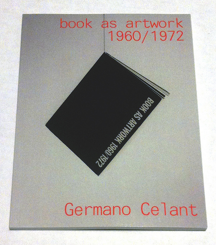
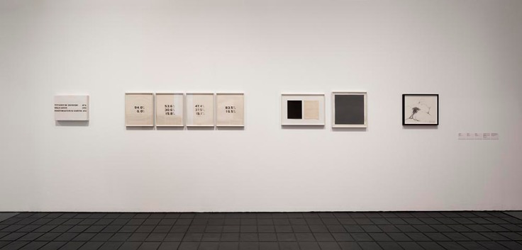
Where to go to compare and contrast the book art in Germano Celant’s pioneering “catalogue” of the Nigel Greenwood Gallery exhibition in London (1972) with that of the last half century?
Being a sort of small and portable catalogue and curator’s explanation for the gallery’s exhibition of ca. 300 works, Celant’s Book as Artwork is arranged chronologically and then alphabetically by artist. Presumably it was organized to match the exhibition’s organization (note the year 1967 in upper left of the photograph below and the distinctive Hidalgo cover, fifth from the left). With no photographs of the works, Book as Artwork gives no easily accessible visual sense of the 300 works in that exhibition. If we had that starting visual touchpoint, it would be easier to “place” the period or individual works in relation to book art from the 80’s onward.
Book as Artwork 1960 – 1972 – Exhibition Nigel Greenwood Gallery B, 1972.
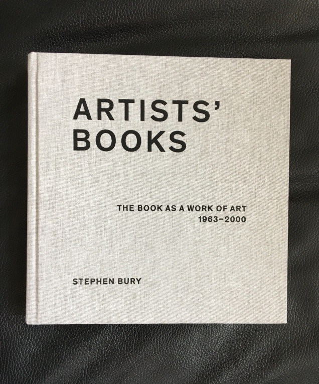
Stephen Bury’s Artists’ Books: The Book as a Work of Art, 1963 – 2000 (2015) includes, by design, only a handful of the artists and works selected for the Celano/Greenwood exhibition.
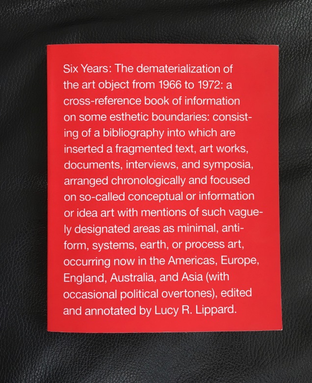
Lucy Lippard’s Six Years: The dematerialization of the art object from 1966 to 1972 (1973, 1997) — a “bibliography into which are inserted a fragmented text, art works, documents, interviews, and symposia, arranged chronologically” — comes as close as one might hope in black-and-white print for a starting visual touchpoint. Lippard’s scope, however, ranges beyond book art, so the number illustrated limits systematic visual comparison and contrast with the book art of the ensuing decades.
Phaidon’s Artists Who Make Books(2017) provides good coverage and bridges the 1960s to the 21st century. The essays and descriptions bring the book art off the page and into the mind’s hands.
Best of all is Lynda Morris’s mini-memoir of her role in organizing the Celant/Greenwood exhibition.
Germano had sent Nigel [Greenwood] a wonderful, arty handwritten letter in pink capitals … on December 22, 1970:
DEAR PUBLISHER I AM PREPARING FOR A NEW INTERNATIONAL MAGAZINE A COMPLETE ANTHOLOGY OF BOOKS MADE DIRECTLY BY ARTISTS.
…Nigel had met Germano and had his telephone number in Genoa. I was sitting beside him when he phoned and proposed Book as Artwork exhibition for September 1972. Germano immediately agreed.
For sources of book art since the close of the Celant/Greenwood exhibition, we are spoilt for choice. Print and digital, image-rich aggregations of book art abound. We can return to the Phaidon and Bury books. We can turn to the well-illustrated print and online publications from the Centre for Fine Print Research at the University of Western England, online library collections such as the MassArt Library or Chicago’s School of the Art Institute, the websites of dealers such as Zucker Art Books displaying their wares, the dozens of websites for recurring book art fairs such as International Artist’s Books Triennial Vilnius (1997 – present) and CODEX International Book Fair (2007 – present) and community sites suchas Artist Books 3.0. In the future, the Getty Research Institute‘s processing of the Steven Leiber Basement archive should also yield a rich source of images of works by the artists selected for the Celant/Greenwood exhibition.
Present-day online access challenges Mallarmé’s dictum: ”Everything in the world exists to end up in a book.” Now it seems:
Everything in the world exists to end up on the web.
As far as that premise holds, this annotation and rearrangement of Celant’s bibliography — a “webliography” — offers an online starting point for connecting the book as artwork 1960/1972 with the book as artwork since. In providing some images of the works and links to images, the webliography offers anyone interested in book art the means to gain a more colored impression of the period’s book art. That the primary impression is still black and white underscores the impact of xerographic technology on artists then as well as that of conceptualism driven by text or photograph. A webliographic approach also offers the opportunity to link the book art of the Celant exhibition with book-oriented Web-art or Net-art such as that of Amaranth Borsuk, Taeyoon Choi, Gunnar Green, Johannes Heldén, Bernhard Hopfengärtner and many others referenced below.
The reorganization here of Celant’s and Morris’s list — by artist alphabetically then chronologically — makes it easier to see the curators’ tendencies in selection as well as the influence of practical factors. The curators’ selection is obviously more Western, less Eastern European and even less Middle Eastern and Asian. Individuals’ prodigality surely played a role in whom and what was included. As Morris’s essay in the Phaidon book reveals, the geographical proximity of works available to be chosen played a role; so, too, the influence of the then-contemporary art network played a role (Atkinson, Beuys, Celant, Dwan,Greenwood, Hansjorg Mayer, Walther König, Maenz, Siegelaub, Sperone and the many other personalities of the Art-Language, Arte Povera, Conceptualist and Fluxus movements); and even the size of suitcases and availability of transport for bringing the artwork into the UK played a role.
Generally the online links for the artists’/authors’ names lead to biographies, either in their official websites, Wikipedia or other news sources. Where an artist/author is listed multiple times, the links vary from instance to instance to provide a wider range of information about the individual and, in some cases (such as Dieter Rot’s), more images. The links behind the publishers’ names go to publishers’ websites or Wikipedia entries about them. The links that follow each entry resolve to images of the work, videos, audio, interviews or essays relevant to the work. For selected entries in Celant’s list, a compare/contrast takes the user to websites or works whose juxtaposition might shed light on the similarities or differences between the item in Celant’s list and book art of the subsequent decades.
The webliography also supports the haptically as well as digitally inclined. The links behind the titles of the works provide information on the nearest library location of the work (although not all titles could be located). Be sure to enter your own location and refresh the results.
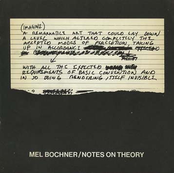
Bochner, Mel. The Singer Notes. New York: Self-published, 1968. [Images] [Compare/contrast Bochner’s notes and drawings resulting from conversations with scientists and engineers at Singer Labs in New Jersey with the Smithsonian Libraries’ online exhibition Science and the Artist’s Book, 1995]
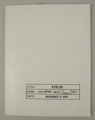
Gregory, Kathe; Landis, Marilyn; Lewis, Russell; Crane, David; Kahn, Scott. Stolen. New York: Colorcraft Lithographers/Dwan Gallery, 1970. [Images] [Compare/contrast with Andrew Savage’s Stolen White Goods, 2006, and then Cristina Garrido’s intervention White Goods, 2011]
Lole, Kevin; Smith, Paul. Handbook on Models. Coventry: Self-published, 1972. [Unable to locate a work of this title in WorldCat, but one with the title The Relativism of Emotion Handbook to the Model and same date of publication is described in Paul Robertson‘s “A Collection of Rare Art+ Language Books and Internal Documents – Many Unknown in Literature”, Gorebridge, Midlothian: Unoriginal Sins/Heart Fine Art, n.d.]
30 x 21cm, 50pp (printed recto only) plus printed card covers. Xerox inner pages as issued. The first and only edition of this theoretical work based on a physical model (electro-shock, photo beams and electronic buzzers) acting as metaphor for analogue, theoretical and representative models. Cover is very minority marked on the front and back cover has a faint diagonal crease else VG++. From the archive of David Rushton who believes only 10 or fewer of this book was published.
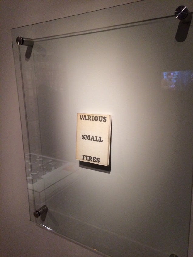
Display of Ed Ruscha’s Various Small Fires and Milk, 1964, at Pliure: La Part du Feu, 2 February – 12 April 2015, Paris. Photo by Robert Bolick. Reflected in the lower left hand corner is the display of Bruce Nauman’s Burning Small Fires; in the upper right corner, the film clip of Truffaut’s 1966 Fahrenheit 451; and in the upper left, Maria Helena Vieira da Silva’s La bibliotheque en feu, 1974.
Pilkington, Philip; Rushton, David; Lole, Kevin; Smith, Paul. Concerning the Paradigm of Art. Zurich: Editions Bischofberger, 1971. [Last author’s name corrected from “Paul” to “Peter”] [From Paul Robertson, “A Collection of Rare Art+ Language Books and Internal Documents – Many Unknown in Literature”, Gorebridge, Midlothian: Unoriginal Sins/Heart Fine Art, n.d.
“30 x 21cm, 16pp (recto only). White card covers – with offset title. A text published by Bischofberger from a theoretical document written by Kevin Lole, Philip Pilkington, David Rushton and Peter Smith (formerly Analytical Art and by this time fully regarded as members of Art & Language) which applied Thomas Kuhn’s theory of paradigm shift to art (the original theory by Kuhn being a view that revolutions in scientific thought only occurred when sufficient contrary evidence to the prevailing orthodoxy had mounted up and the original hypothesis could no longer explain the physical evidence emerging from empirical studies). It is worth noting that at this time Bischofberger bought a great deal of Art + Language material from the group and published other documents by them including some of the group’s rarest publications – storing many of the more three-dimensional works for later resale. Bischofberger did not print the books himself – rather Art and Language arranged design and publication in Coventry (for free using the University’s resources) and David Rushton drove the books over in a camper van to Switzerland (breaking down just on the edge of the city due to running out of petrol and having little money left, Rushton coasted the last mile down hill on an empty tank).
The limitations of these series of books are usually placed at c. 200 but Rushton remembers taking far fewer than that with him and this Analytical Art book was in fact only produced in 50 copies taken to Zurich plus a few retained by the artists in the UK.
That said this is one of ONLY 5 copies which were numbered in roman numerals (this one being III/V) and signed by ALL of the four writers in pencil on the first title page.”]
Pilkington, Philip; Rushton, David. Sample from a Topological Notebook. Coventry: Self-published, 1972. [Video] [From Paul Robertson, “A Collection of Rare Art+ Language Books and Internal Documents – Many Unknown in Literature”, Gorebridge, Midlothian: Unoriginal Sins/Heart Fine Art, n.d.
“30 x 21cm, 28pp carbon copy pages and printed cover. This was one of ONLY four copies made and published by the group – two copies being signed by David Rushton and Peter [sic] Pilkington and created from original typed sheets and two copies remaining unsigned and created (as here) using the carbon copies from the originals. These latter two examples were regarded by the group as artist’s proofs of the book. This is the only copy of this book available for sale anywhere as from the original four prices: one is in Paul Maenz’s archive and another two copies are in the hands of private collectors (who purchased them from ourselves). This copy is signed by David Rushton and Philip Pilkington and has been stamped on the inside front cover with the official Art & Language Stamp and also designated in blue ink “Second Copy”. Fine estate and clearly rare.”]
Magnet / Photo Series / Group 2000 / September 1968 / (4 Phase) / Continuous Photographic Photographs Continuously Photographs Up to 20,000 Shots / Run Time work / 10 years / annual series of 20,000 elements / technique / black and white photography / leafs / 3 M / K 203 3 / each 30 x 40 / constant time setting diaphragm / fixed tilt stand / 1969 / camera used maintains the original value and adds to the artistic market.
Ramsden, Mel. The Black Book. [Unable to find a work under this title in WorldCat]
Ramsden, Mel. Abstract Relations. New York: Art-Language, 1968. Edition of 5. [Unable to find a work under this title in WorldCat; the 5 images on the left in this photograph from the Philippe Méaille private collection at MACBA come closest.]
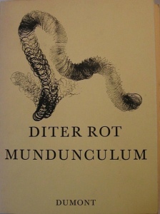
Rot, Dieter. Icelandic Leather. Reykjavik: Self-published, 1970. [Unable to locate by this title; may be referring to Volume 5, Bok 3 of the Collected Works]
Display of Ed Ruscha’s Various Small Fires and Milk, 1964, at Pliure: La Part du Feu, 2 February – 12 April 2015, Paris. Photo by Robert Bolick. Reflected in the lower left hand corner is the display of Bruce Nauman’s Burning Small Fires; in the upper right corner, the film clip of Truffaut’s 1966 Fahrenheit 451; and in the upper left, Maria Helena Vieira da Silva’s La bibliotheque en feu, 1974.
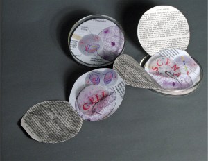
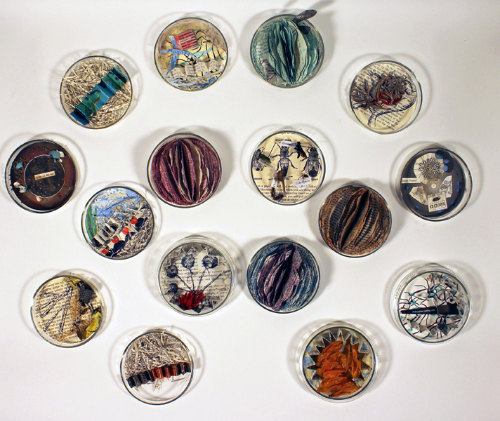
Cell Compendium (2008-2016) Diane Stemper The work began with a gallery installation of Cell: Descent and 25 petri dishes filled by gallery visitors with science facts, liquid and solid matter. The installation in 2016 included 75 dishes filled with small altered found text books, drawings, and specimen objects housed in petri dishes.
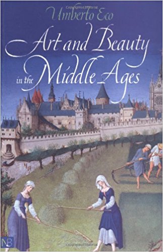
In the middle of a shelf in Diane Stemper’s Ohio home, Umberto Eco’s Art and Beauty in the Middle Ages sits bookended, on the left, by two books about Francis Bacon and, on the right, by a small monograph on Pierre Bonnard and another book Art and Culture of Japan. The books are not organized alphabetically or chronologically. When she pulls the book out, it feels perfect, not too thin or thick, its dimensions and weight ideal for carrying in a shoulder bag. It has a feeling of secrets and importance.
Since discovering Stemper’s work at the Center for Book Arts (New York, 2014), I have wanted to talk to her about the themes and material that drive that work. Art and science, paper and glass, the universal and the particular, ink and watercolor, the physical and the spiritual. We finally arranged it in medias res, and she agreed to this oblique approach to her mind and art.
BoB: As you open Art and Beauty to its mid-point, what do you hear, smell or see about it or around it?
DS: Well, not sure if you mean inside of the room I am in or the memory it conjures, so I will go with memory. The words “cathedral”, “Chartres”, “vestibule”, “allegory” take me from the immediate space of my front room to the interior of a European cathedral or even perhaps as a child to the pews of St. Paul Cathedral in Minnesota during midnight mass. There is the fragrance of incense, the dark light of an imposing building, chanting and mystery. There are also the many hands of craftsmen chipping away at stone, painting glass and the laborers who put it all together and probably were not treated all that well.
Then there is that word “parabolic” and Eco’s explanation of Aquinas’ description of the arts as being literal, that the poetic image and its meaning were in the mind of the “reader” and that this association was a “matter of habit” – this reminds me that I and my viewers have different habits of mind, from the museum visitors I once toured who loved Impressionism and were hostile to Rothko, to the viewers responding to my specimen series – “why are they dead, did you kill them, that’s icky”. Surface literalism can be a matter of what one is familiar with and fearful of what one does not understand, but it can also be a “way into a piece” if the viewer is willing.
BoB: At the end of his book, Eco sums up his explanation of how the medievals looked at art with this startling statement, “They saw the world with the eyes of God”. What of today’s viewers of art and, in particular, those who look at your art?
DS: When originally picking the book from the middle of the middle shelf and then opening it to the middle, that sentence you mentioned — “The association of an image with a certain meaning is a matter of habit” — leapt out. Eco was referring to the ability of people of the Medieval period to read an image as if it were a literary text, for example, knowing instantly which animals or colors represent which biblical figure or story. However, I am reading Eco’s words from my 21st century vantage point, where there isn’t necessarily a concrete set of universal meanings assigned to objects or colors that every person understands and knows.
He also writes that the medieval mind loved a puzzle, that it was part of public discourse to figure out symbols and the inherent meaning within images. That there was adventure in the act of discovery. And another phrase that struck me: “Grasping reality through sense knowledge.”
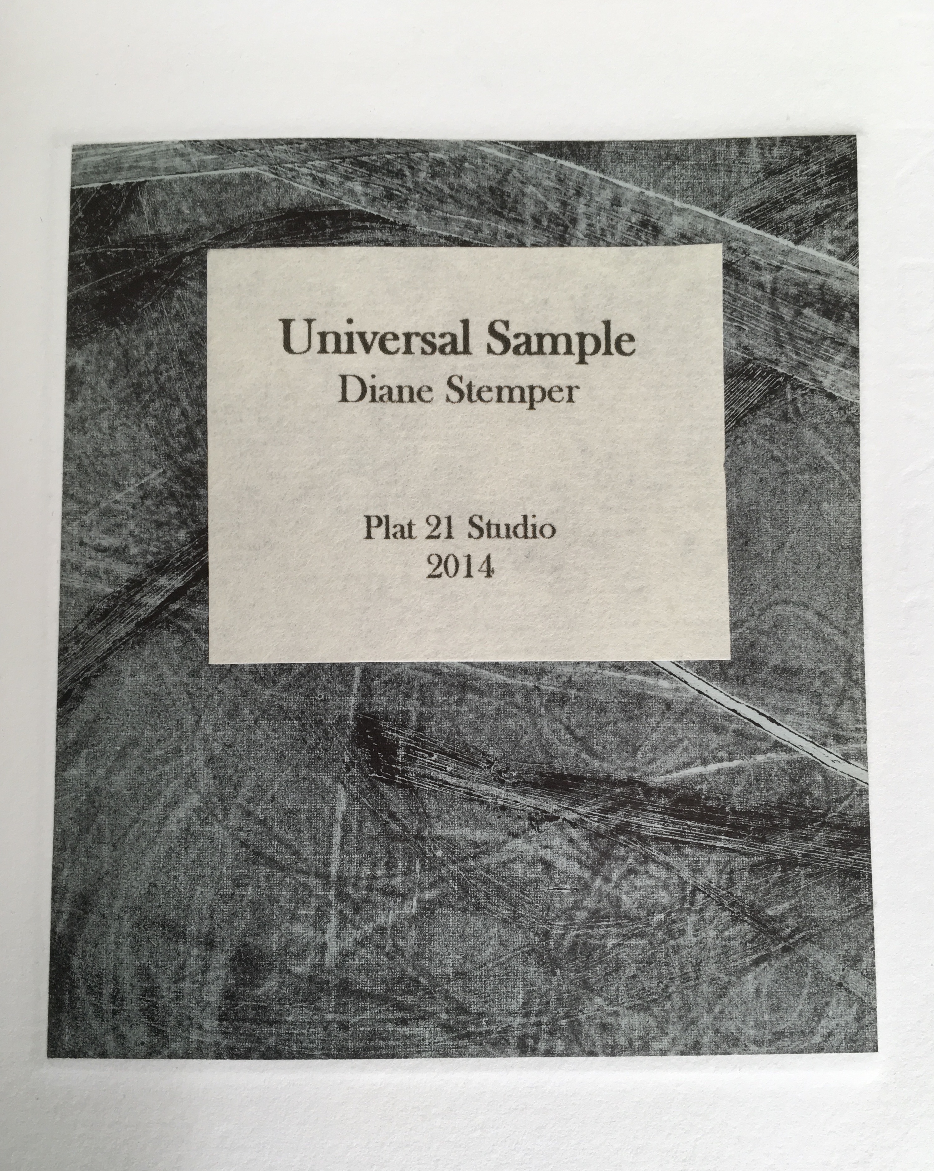
Universal Sample (2014) Diane Stemper Edition of 4, Intaglio and letterpress on Arches
Today’s “matter of habit” is problematic when viewing art. For some of my pieces, in particular Universal Sample and my drawings and prints of specimens, the viewing can be rather cursory, a knowing, habitual glance that says, “oh I see what that is”. The glance sums up the object in very simplistic terms. In this case, for the viewer, the specimen represents death or some distasteful high school experience of dissecting a small creature, and nothing more. It is possible to look at visual art not just with visual sense but in partnership with other physical sensations conjured by the image. Looking at the work as if there is more than meets the eye, that there is an underlaying sensibility to the image that references another experience or feeling or bit of knowledge, a smell, a sound…or that of the animal or that of the instance in which the animal finds itself, or the moment that a curious person finds such an animal. Imagining that moment — “What was it like?”
So, I hope that people will approach my artwork with imagination and not as a matter of habit — to look at my work as if it is a bit of a puzzle, not a straightforward statement or concept but more of a string of thoughts, feelings and visual and sensate information to be arranged and rearranged to come to some sort of conclusion or idea about the meaning, however uncertain that may be.
BoB: Do you recall the circumstances of the book’s purchase? What were you doing when you decided to buy it?
DS: I absolutely remember. I was living in London with my spouse and family as part of a study abroad program my spouse was leading. Each day, after all were at school or otherwise occupied, I would head out in pursuit of art, medical museums, natural history oddities or any number of things and on one day I went to the British Library to see an exhibition, Royal Manuscripts: The Genius of Illumination. This was an exhibition of the several collections representing centuries of books commissioned by kings and queens and to my delight there were books on medicine, science and nature. After spending a very long time in the exhibition, I went to the gift shop where I found the Eco book. The extraordinary detail of the manuscripts I had just seen and the enormity of the exhibition itself put me in the mood to purchase the book.
BoB: As an artist whose work has an intimate relationship to “the book,” could you describe the effect this has on you when you are reading books in general or when revisiting the Eco book in particular?
DS: In general, when I am reading a book versus the screen of a device, I enjoy the structure of the book and understanding the manner in which it is assembled. The type of binding, the quality of paper, the action of the pages, do they lay flat or do they fight. I find the term “perfect binding” ironic as I am reading a book where the pages are falling out. I typically notice the condition of a book, faded covers, mildew or wear on the edges. Books with these qualities I feel a bit sorry for as I wonder where their next home will be, probably not my local library or the used book store, since here in Ohio, we haven’t many of those. Maybe they will live a short while at the Goodwill Thrift Store and from there, the recycle bin. Books are a bit like an endangered species and I am at times concerned that the youth (I have one at home) are only relating to books as they are required to do so at school and not as a place of refuge, ideas and travel. It is hard for books to compete with the ever-present screen and digital speed of information and interaction.
The Eco book in particular is a pathway back to London, to other centuries, to a time when art was the screen of the day and to the Royal manuscript exhibition. The books in the exhibition survived over centuries; the hours and hours of skill, artistry and dedication it took to not only create the books but to also preserve them gives me pause. The Eco book itself is not a great work of craftsmanship as an object, it is, after all, bound as a “perfect binding”. Still, it has not fallen apart yet, so the binders must have used a better-quality glue. Instead, the Eco book is a vessel of ideas and murmurs of what it meant to have art and beauty in one’s life hundreds of years ago. What are my intentions when opening a book? To be lifted away from the present, to enter another time period or another person’s circumstance or to be visually transported.
BoB: Turning the question on its head, when the act of creating a work rather than the act of reading is in flight, how do books feed your working process?
DS: For my series on Darwin, all seemed to fall into a flawless moment. I happened upon dozens of petri dishes and had already been thinking about Darwin’s 200th birthday. It is an instance of form and content playing together without much conflict or negotiation. From that came many books that really seemed to define themselves both in structure and content.
Cell Book #37 (2014) Diane Stemper
My books built into petri dishes are a different viewing experience for people because the dish itself is so familiar and suddenly the viewer finds the dish in an unusual circumstance, that of being a book. People pause, take notice and naturally ask questions, they seem unleashed from any customary reaction or habit and are open to an idea. The dish is an entry to figuring out a puzzle and not a barrier, such as an image of a dead bird or a dissected lizard might be.
The first books (Cell: Compendium) were in direct response to various nearby communities that were pushing for “creationism” to be taught in the public schools. The petri dish is a universal item repositioned and viewers find it humorous, unique or “creative” and while some stop there, most people are prompted to go further. The recognition of the petri dish spurs and opens the door to more meaningful connections and interpretations.
Compendium of Fact #1 (2009) Diane Stemper
Mostly however, when making my art work, initially the book structure is secondary, a simple vehicle for the content. Imagery, content, text and the oblique narrative story are primary and the development of the images and content are the key portions of my studio work. I use other books in my work, discarded textbooks and spines, for instance, that I take apart and rework. I also use books as reference, looking for a word or phrase, a bit of information to jumpstart a narrative about a topic I am interested in. I borrow science imagery to create and integrate with my own images. I am an observational artist and that includes observing via books as well as nature.
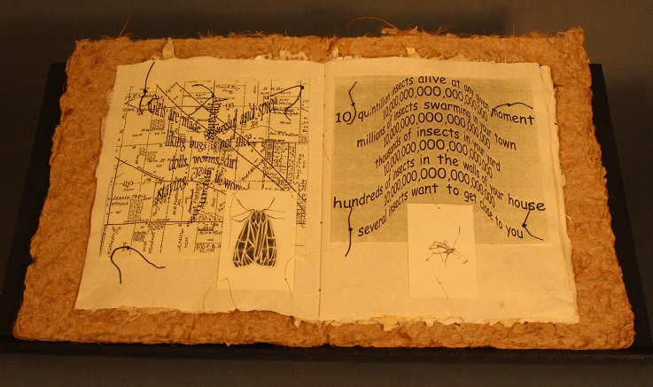
Discovery Plat 21 – Numbers (2001) Diane Stemper A unique artist book. One of four unique books exploring the life of insects as observed on, in, around an Ohio porch. Book 2 (Migration), Book 3 (Pause) & Book 4 (Flight) in the special collections of the Cincinnati Public Library, Hamilton County, Ohio.
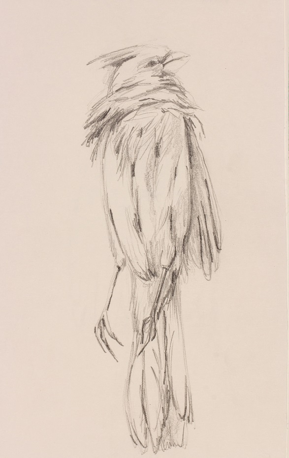
Ohio Specimen Cardinal (2016) Diane Stemper
Once the content and images are in motion, the book structure comes into play and that is when the many possibilities of the structure interact with the content and it is really the most significant challenge of creating an artist book. I do not like to use book forms for the simple novelty of the structure or for the entertainment factor (for instance a pop-up or tunnel book) unless of course it really fits the topic. I want viewers to focus on the images and feeling or message of the work, so the book structure becomes, is, or should be a thoughtful object that houses an idea or an experience, it is in service to the artist, to the viewer, it invites the viewer in and then steps aside.
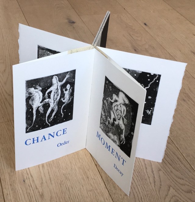
BoB: Let’s turn to Universal Sample in some more detail. I’d like to ask you to comment on the intersection between the words in Universal Sample (“universal” and “sample”, “chance” and “order”, “moment” and “decay”) as well as the intersection of the words with the prints, their color, the paper you used, and the star structure.
Universal Sample (2014) Diane Stemper Edition of 4, Intaglio and letterpress on Arches
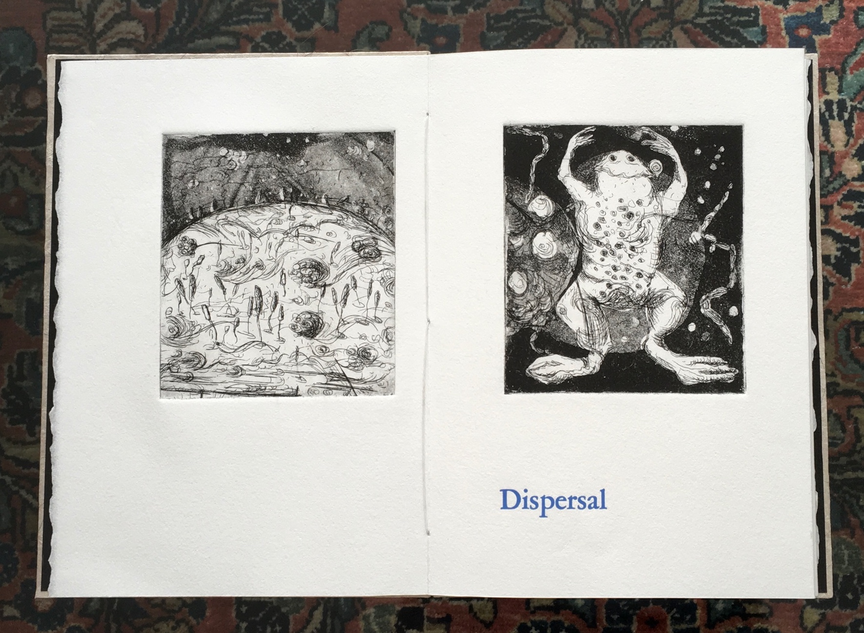
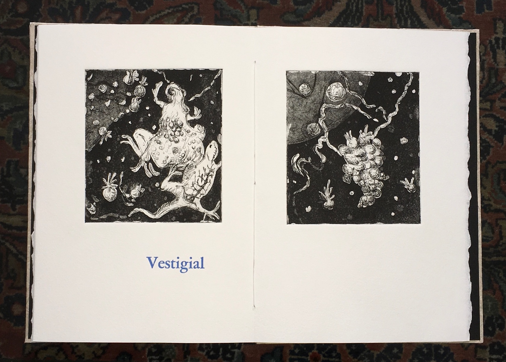
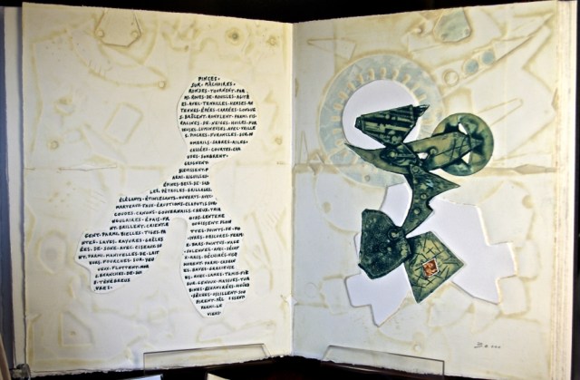
DS: First, let me say the entire book, the six images and the text, is meant to present obliquely a life cycle of early life forms. The images are inspired by my own source material comprised of many drawings of specimens that I did at the Hunterian Museum at the Royal College of Surgeons in London.
The title, Universal Sample, is singular and expansive. A sample is one bit of something larger that is collected and taken from a whole and isolated, universal represents a larger inclusive whole. In this case “Sample” is not numbered or identified. It is in relationship to all else, is composed of and is evidence for all else.
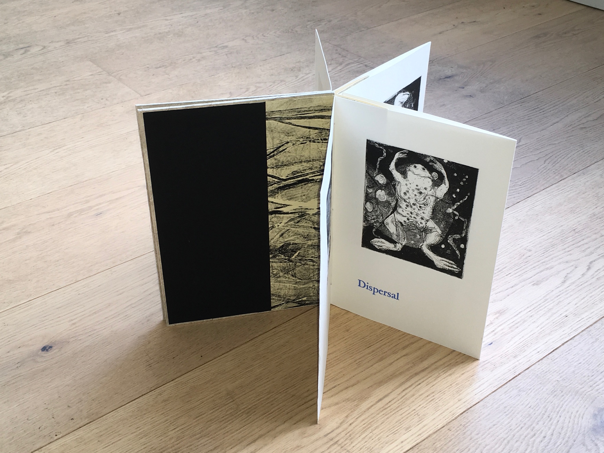
Dispersal – Begins the book and alludes to creation.
Universal Sample (2014) Diane Stemper Edition of 4, Intaglio and letterpress on Arches
Vestigial – Ends it and alludes to remains.
Universal Sample (2014) Diane Stemper Edition of 4, Intaglio and letterpress on Arches
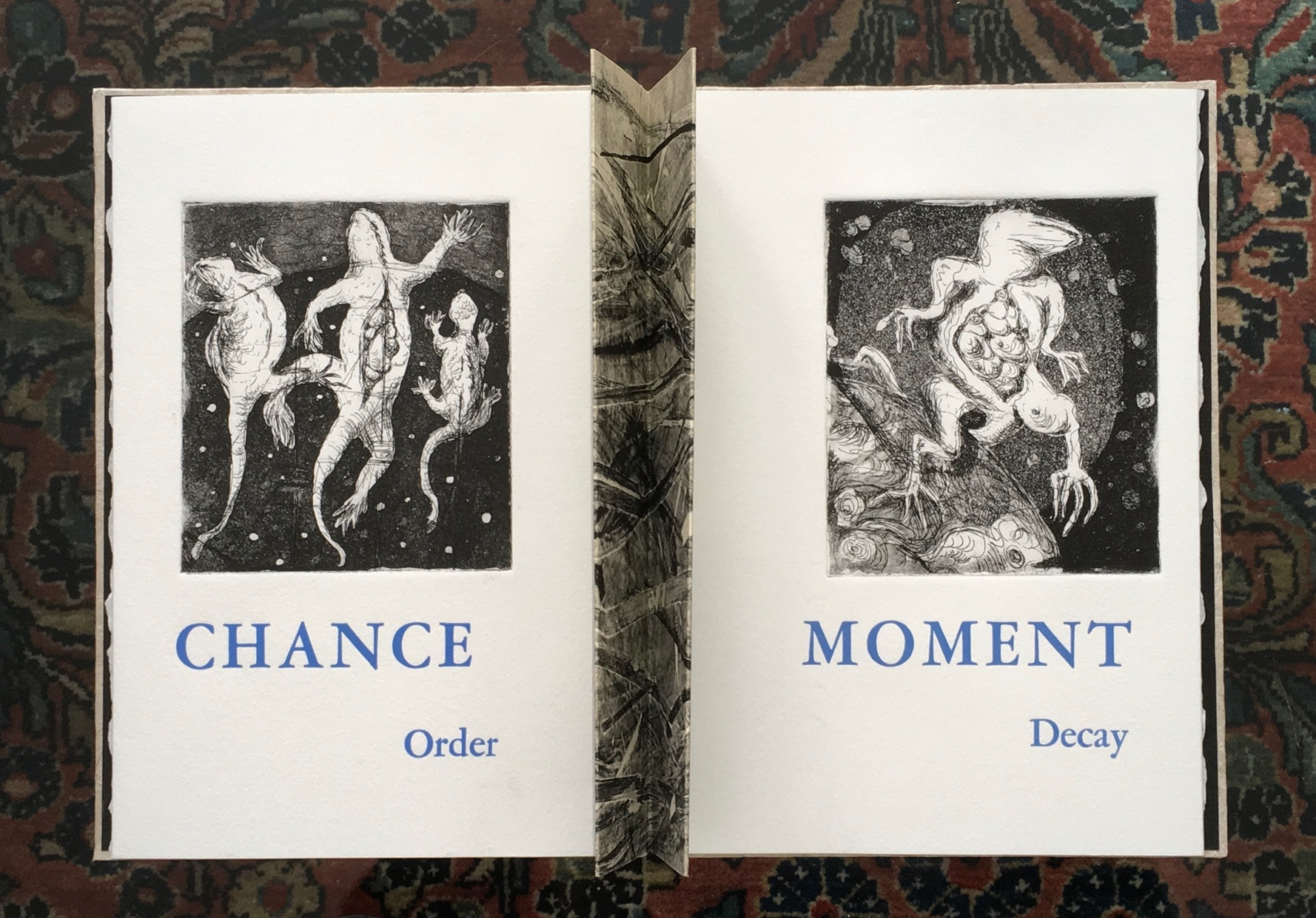
Chance – In part I feel the world is a chaotic place where the intentional can be overcome by chance and luck, circumstance and happenstance.
Order – This is about human systems (religious, scientific) within a chaotic world and about the molecular combining and recombining relative to evolution over millions of years which bring about reasonable order within an ever-changing environment.
Universal Sample (2014) Diane Stemper Edition of 4, Intaglio and letterpress on Arches
When I place the words “chance” and “order” together, I am referencing religion as a human system attempting to bring order to chaos, to explain the inexplicable. The images progress from an unidentified plasma or bubbly life form to a life form that appears to be lizard like, one of the early animal forms on earth. One print shows three lizards, a trinity of sorts, impaled perhaps, especially as specimens might be. Floating, they represent the substance, atom, molecules, electrons, neutrons that I know exist versus the Trinity as espoused by Christianity that I am not so certain about. In this way, I am harking back to the root of an entire body of work that I have made that draws upon Darwin’s On the Origin of Species.
Moment and Decay are read together with the image of a frog, a frog that is decomposing, reordering and redistributing its cells. I want the text to key viewers into the idea of a space, gap, a line or moment when decay begins. The last print is of an imaginary cellular structure of a life form as it is releasing and redistributing entirely into another space whether that is air, dirt or water or the space beyond our stratosphere.
The book structure, font and print size and paper choices are all subject to various constraints, such as paper and press bed size, size of copper, or availability of type face at the printmakers cooperative where I do my printing. For this book, I worked the structure of the book, image and text placement and layout simultaneously with content development and made at least a few small mock-ups to help me see the possibilities, resolve problems and keep me on track. I like book structures that are straightforward and that are an entry to the images and content. Sometimes, as with the Cell books, the structure is integral to the content of the work. For Universal Sample, what was going to be a simple accordion changed as I saw that the images and text could offer different ways in which to view and read the book. The star structure which consists of a series of three-page short accordions sewn into a concertina spine is elegant, seems like a standard book, a good frame for the images and when opened it can go beyond being a standard book and be manipulated and reconsidered.
Universal Sample (2014) Diane Stemper Edition of 4, Intaglio and letterpress on Arches
BoB: Where next with your art?
DS: I like anything that can be described as a collection, the more personal and odd, the better, and I find opportunities to visit natural history or medical museums when I can. Currently, I am finishing a book object that incorporates several of my drawings of backyard specimen finds. This work includes test tubes and refers to the challenge of birds to avoid hazards and remain undetected. I am also thinking about a series of artist books that somehow reveal the dozens, hundreds, thousands of birds that are housed in the drawers of collecting institutions.
BoB: With thanks to Diane Stemper for her time and reflection. To enjoy more of her work, see her site and also:
Diane Stemper received her B.F.A. in printmaking from the San Francisco Art Institute and a M.A. in Interdisciplinary Arts from San Francisco State University. Her work is included in the Artists’ Book Collections of: DAAP Library, University of Cincinnati, Ohio; Main Public Library of Cincinnati and Hamilton County, Cincinnati, Ohio; Special Collections, Miami University, Oxford, Ohio; and the Lucille Little Fine Arts Library, University of Kentucky.
Renée Riese Hubert and Judd D. Hubert’s The Cutting Edge of Reading: Artists’ Books (Granary Books, 1999) is a signal work of appreciation and analysis of book art. Nearly twenty years on, it can be read and appreciated itself more vibrantly with a web browser open alongside it.
To facilitate that for others, here follows a linked version of the bibliography in The Cutting Edge of Reading — a “webliography”. Because web links do break, multiple, alternative links per entry and permanent links from libraries, repositories and collections have been used wherever possible. These appear in the captions as well as the text entries. Also included are links to videos relating to the works or the artists. At the end of the webliography, links for finding copies of The Cutting Edge (now out of print) are provided.
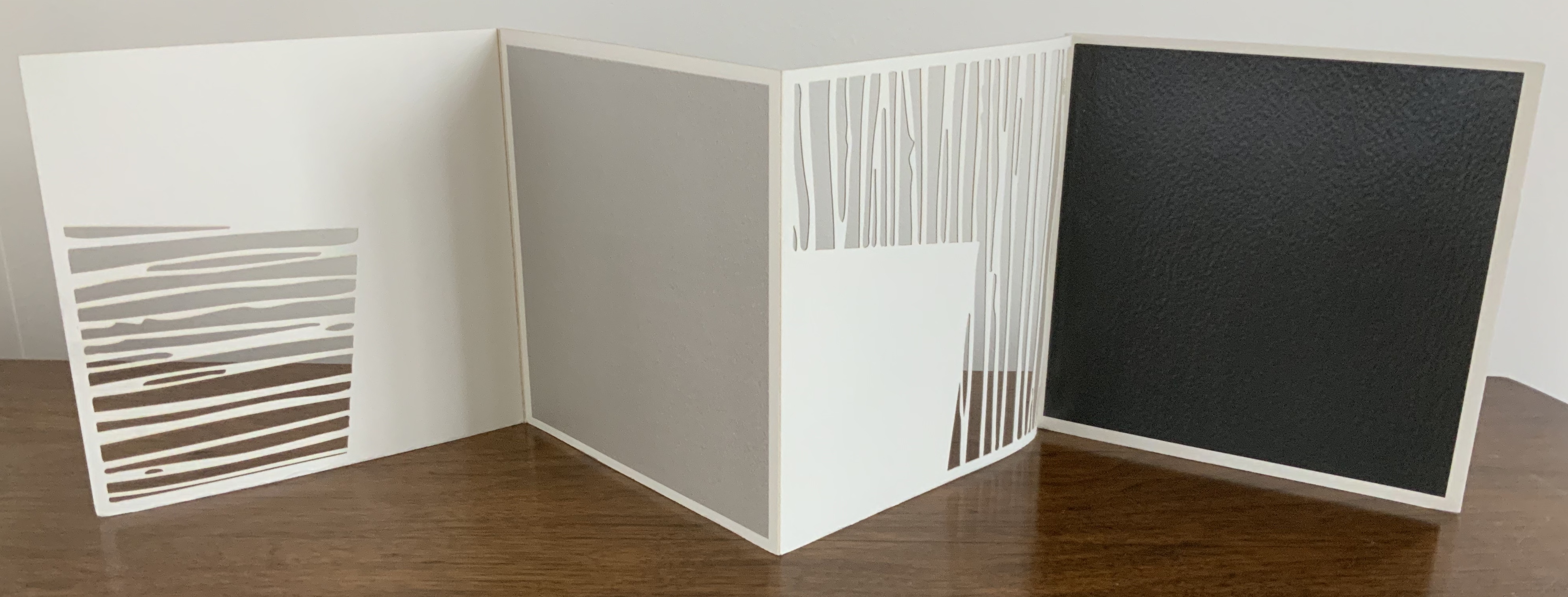
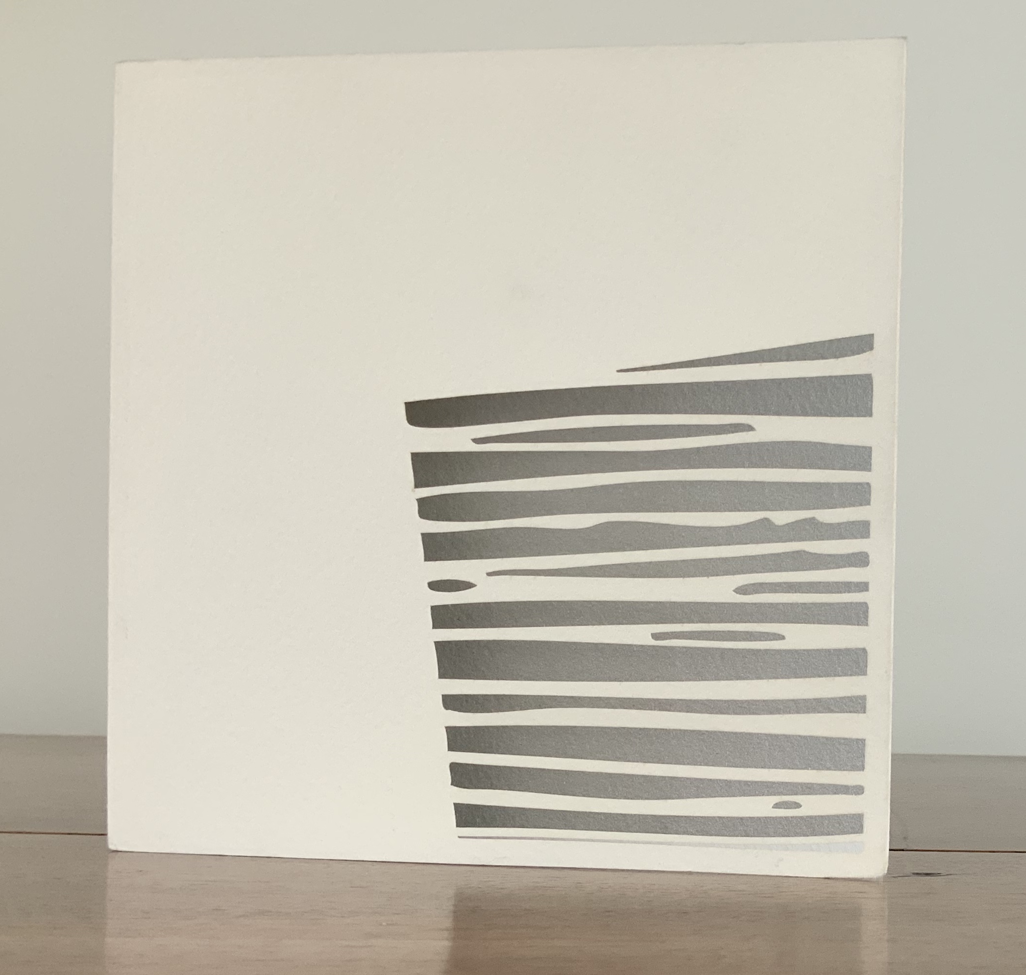
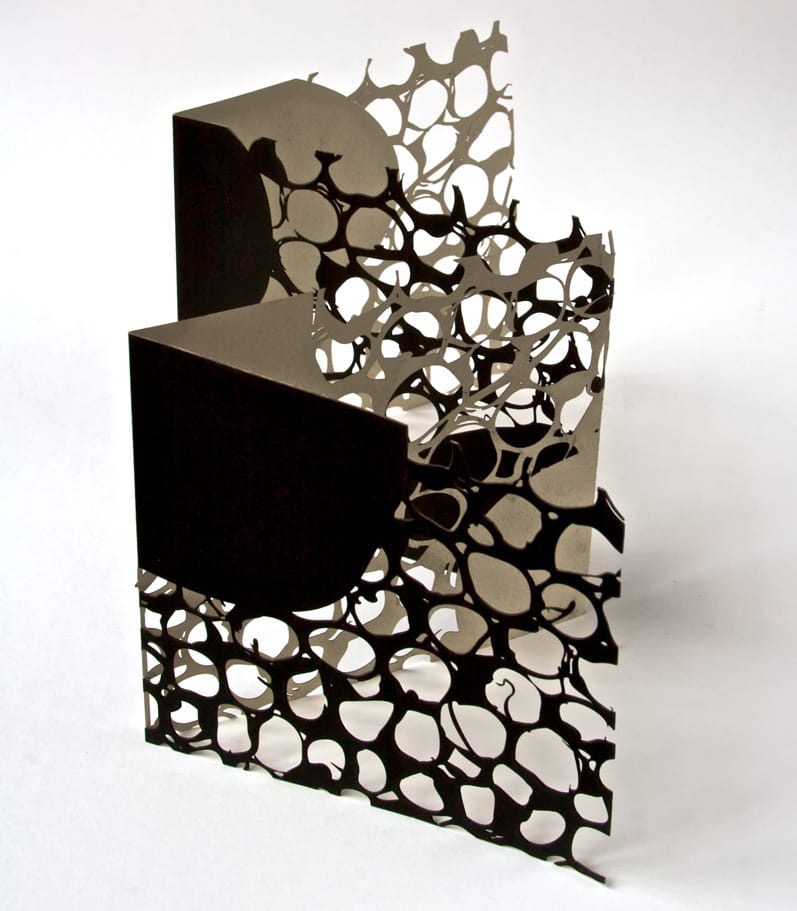
Untitled (2006) Jenny Smith Matte-beige slot-and-tab case containing eight-panel leporello, four panels lasercut and three screenprint. Case: 167 x 167 mm; Book: 165 x 165 mm. Edition of 25 of which this is #21. Acquired from the artist, 31 July 2017. Photo: Courtesy of the artist.
Photos: Books On Books Collection.
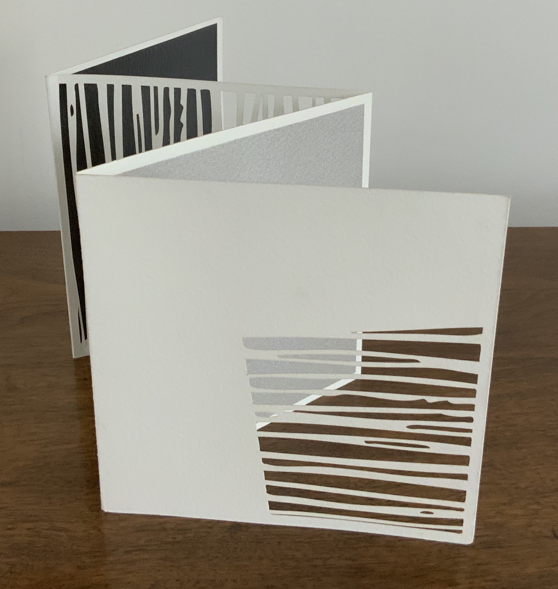
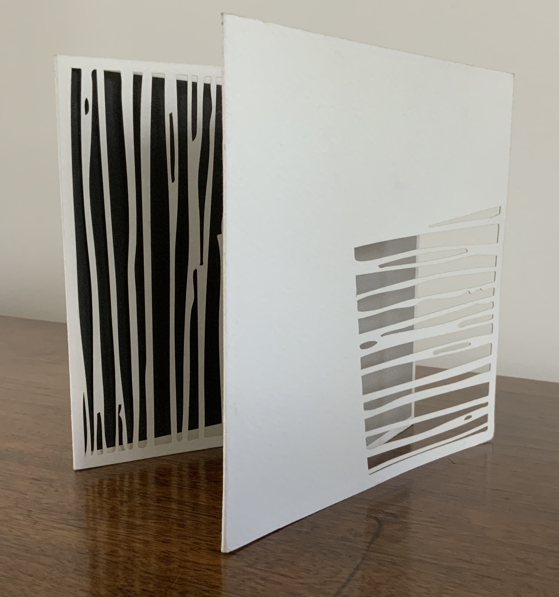
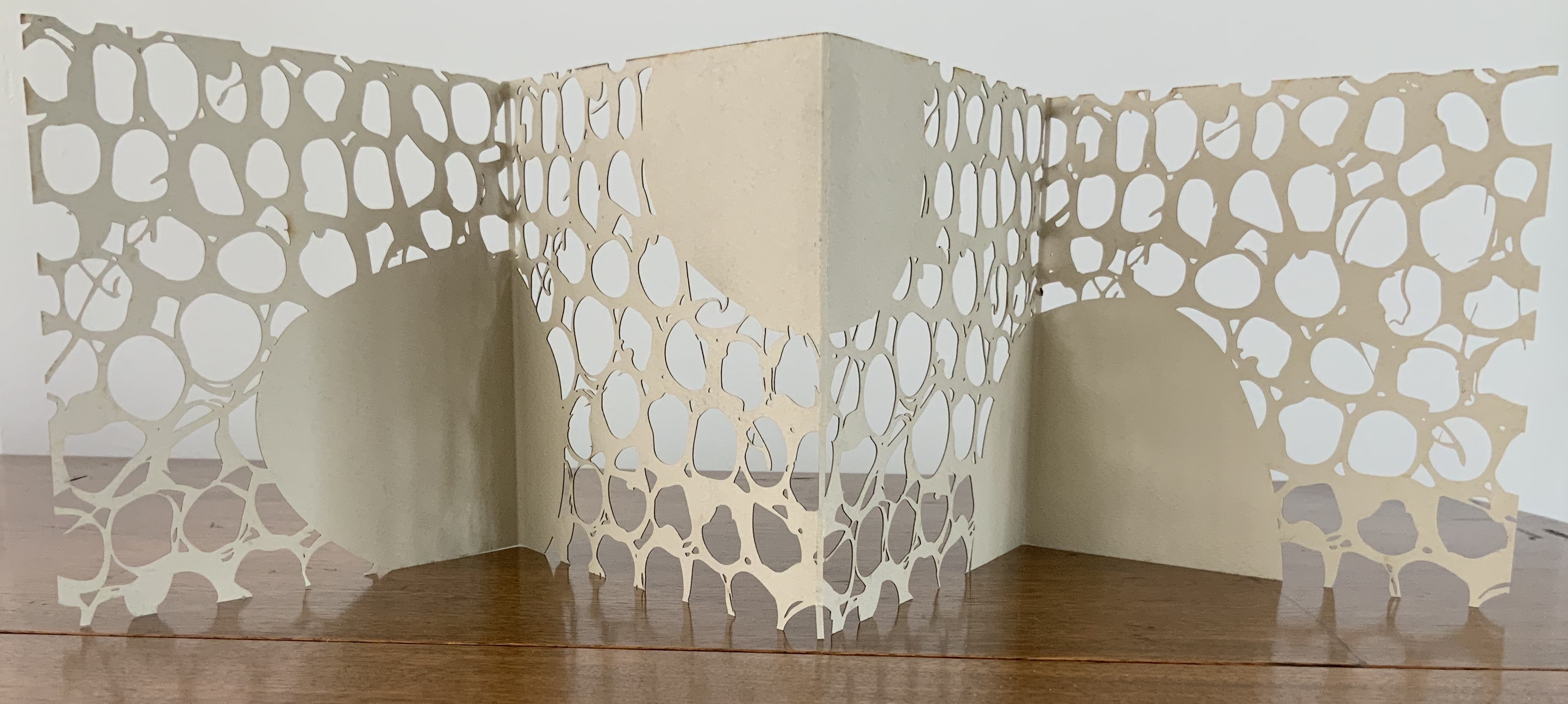
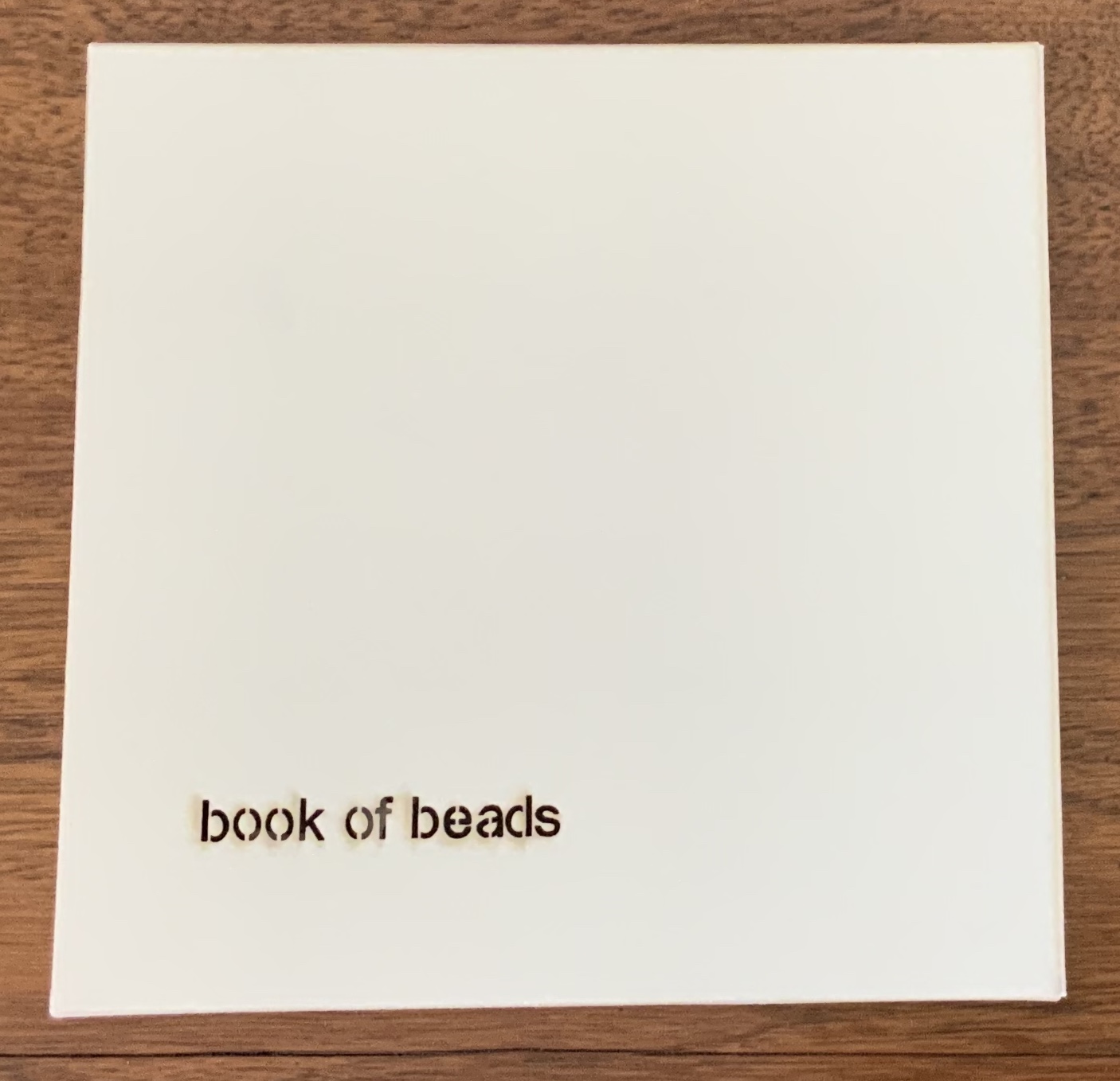
Book of Beads (2008)
Book of Beads (2008) Jenny Smith Case of beige matte-finish, screenprint black interior, title lasercut: 165 x 165 mm; Book in accordion-fold, eight panels lasercut, taupe on one side, screenprint black on other, 160 x 160 mm Edition of 20 of which this is #13. Acquired from the artist, 31 July 2017. Photo: Courtesy of the artist.
Photos: Books On Books Collection.
The interlocking views of panels through panels foreshadow a work by Katumi Komagata:「Ichigu」(2015). The fine tendrils in the cutting may remind some of works by Béatrice Coron or Merrill Shatzman.
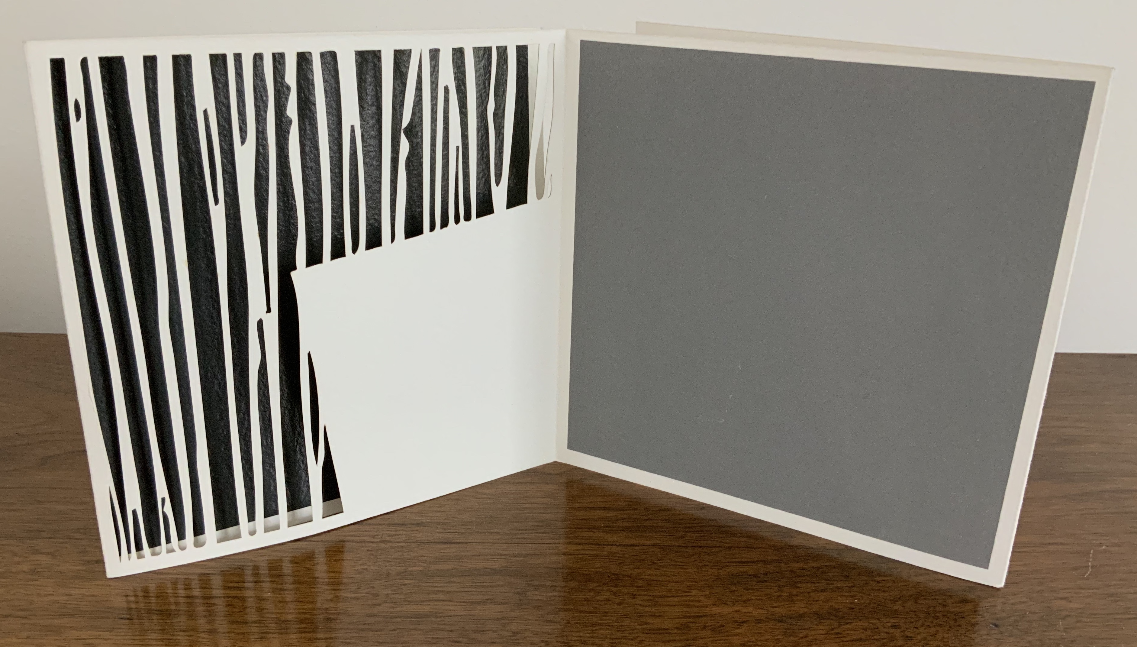
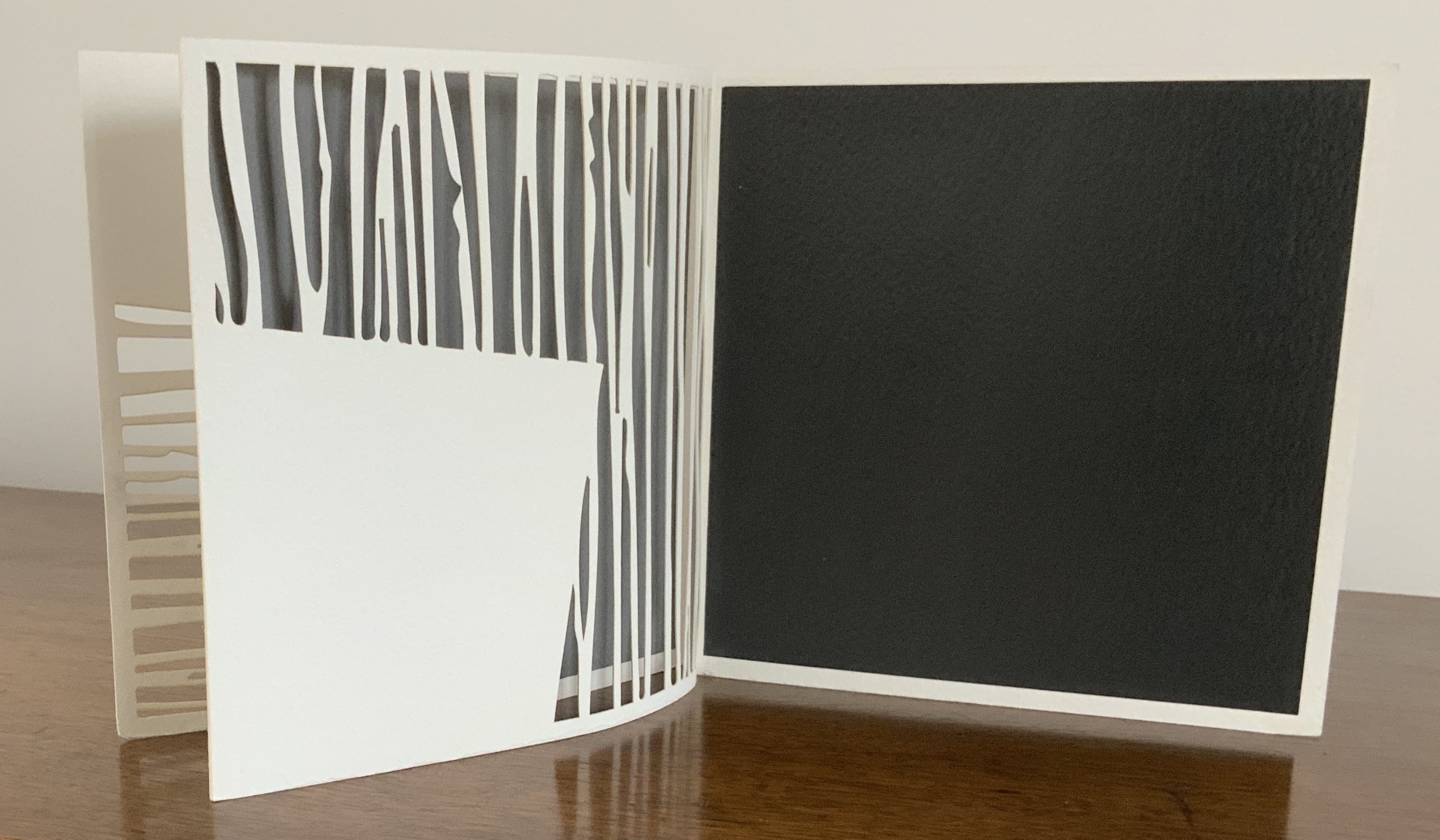
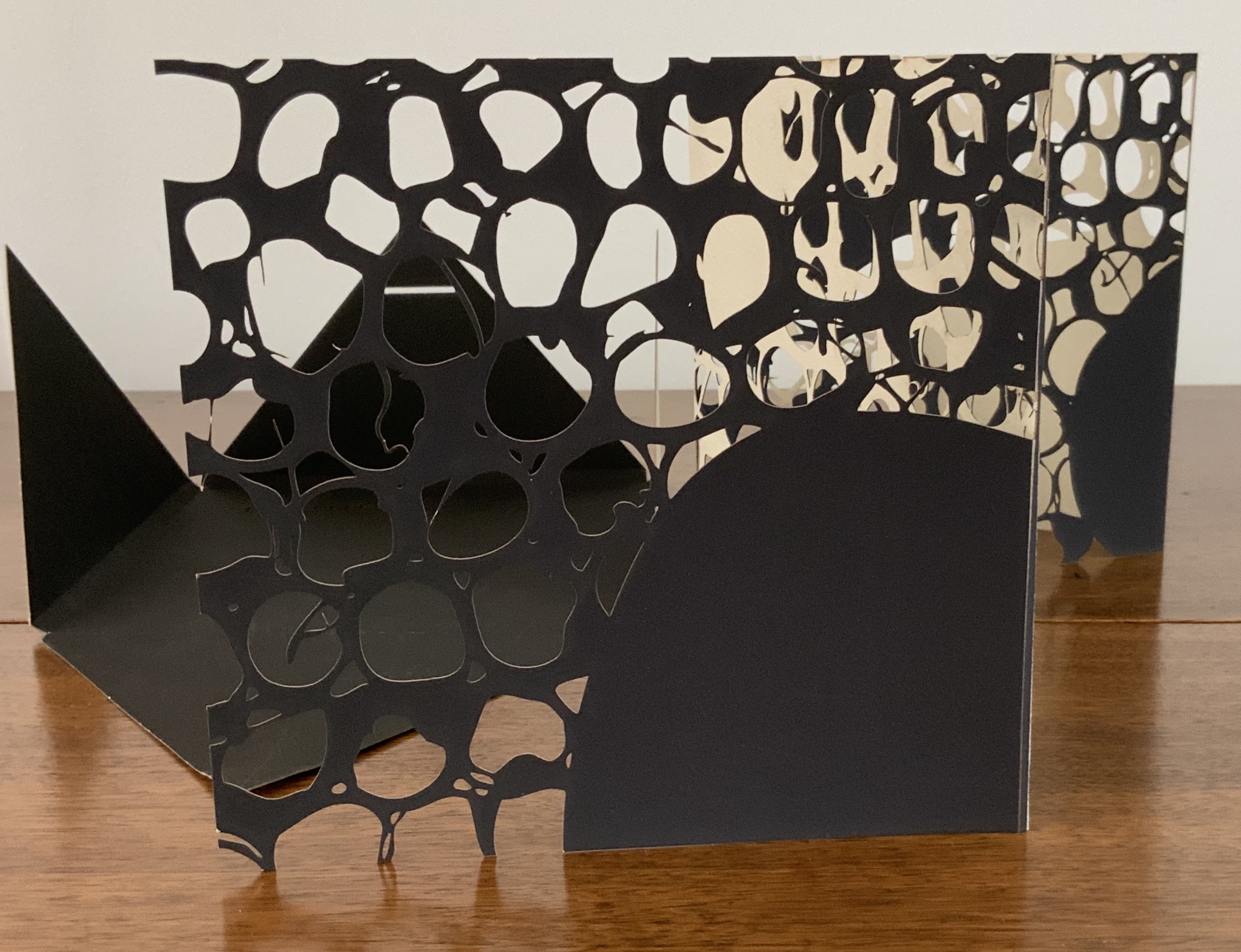
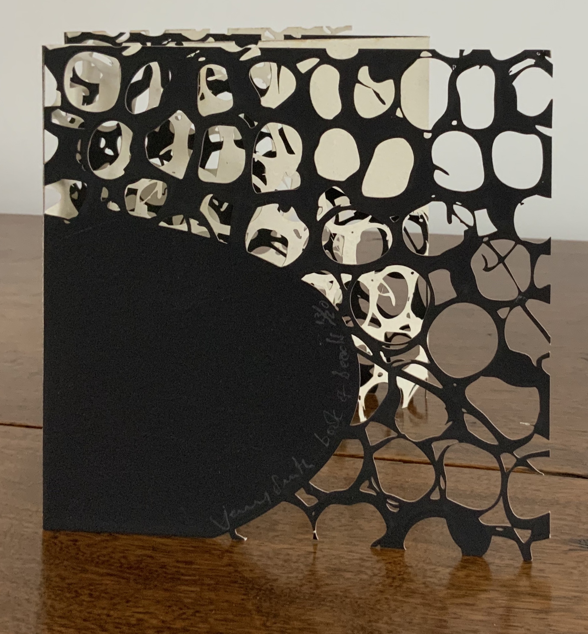
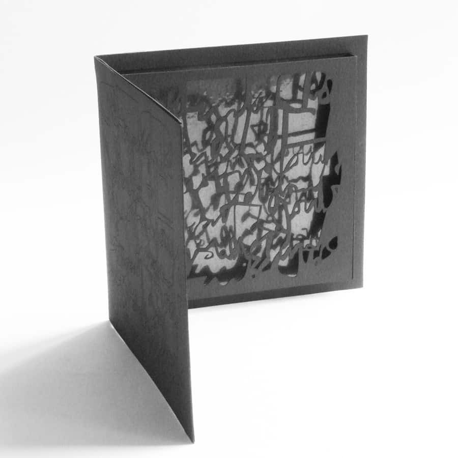
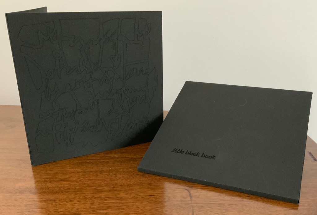
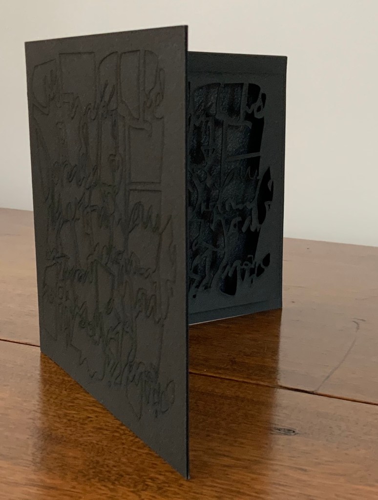
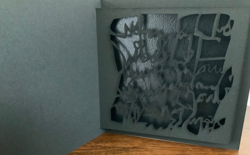
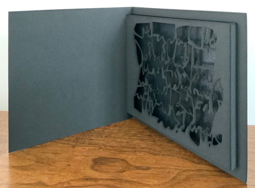
Little Black Book (2009)
Little Black Book (2009) Jenny Smith Matte-black slot-and-tab case containing matte-black single fold booklet; cover engraved with an abstract, calligraphic design that is cut out inside on the pop-up page and reappears in shadow against a gloss black screenprint insert behind the pop-up page. Case: 167 x 167 mm; Book: 160 x 160 mm; Pop-up page: H140 x W150 mm. Edition of 20, of which this is #14. Acquired from the artist, 31 July 2017. Photo: Courtesy of the artist.
The grassy nature of the 2013 installation and its engagement with children may remind the reader/viewer of Water on the Border (1994) by Helen Douglas and Telfer Stokes. For some, the interaction of cage and words in the 2016 installation may recall Bird Language (2003) by Xu Bing.
Further Reading
“Medicinal Art”, Studio Pavilion, 19 September 2019. Accessed 2 May 2020.
Enclosed Content Chatting Away In The Colour Invisibility, Anouk Kruithof, 2009
Anouk Kruithof’s massive wall of colored books echoes two leitmotivs in book art — the installation and the presumed disappearance of the book in the onslaught of digital media. Reminiscent of pixels on the computer screen, the work is entitled Enclosed Content Chatting Away In The Colour Invisibility and consists of over 3,500 books rescued from the recycling dump and whose arrangement varies with each installation. Kruithof has stated that she seeks to “invent new things out of fragments of the past.’
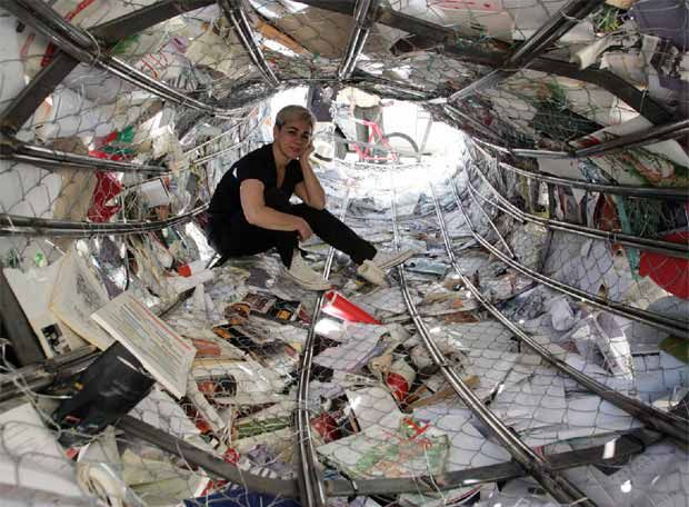
Biografias, Alicia Martín, 2005, site specific installation, Casa de America, Madrid
Alicia Martín’s installation, called Biografias, has appeared in Madrid, The Hague, Cordoba, Linz and Valencia. The torrent of defenestrated books is made of over 5,000 titles fixed to a wire frame.
Alicia Martin “absorbed” by her work
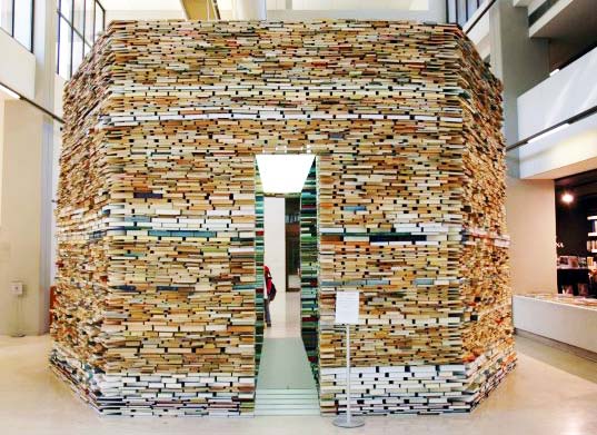
Matej Kren is another book installation artist, whose thoughtful, towering installations have been featured in Prague and numerous other cities in this hemisphere.
Book Cell, Matej Kren, 2006, Centro de Arte Moderna – Foundation Calouste Gulbenkian, Lisbon, Portugal
Although Brian Goggin does not use actual books as his material, his works in bronze, polycarbonate, steel and LED prompt reflections on books, language, the transmission of ideas, permanence and impermanence.
Speechless, Brian Goggin, 2008-2009 Bronze, site-specific installation Lafayette Library, Lafayette, California
Looking back to the late 19th century, you will find that Myanmar can lay claim to the world’s largest book.
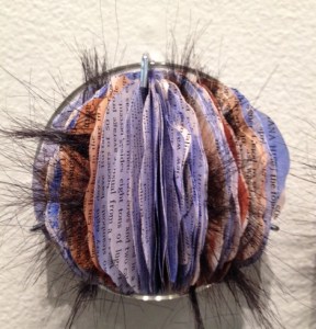
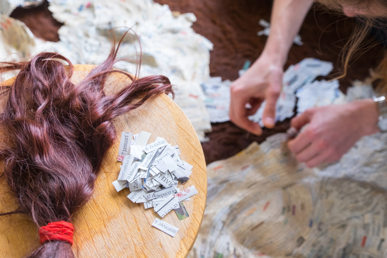
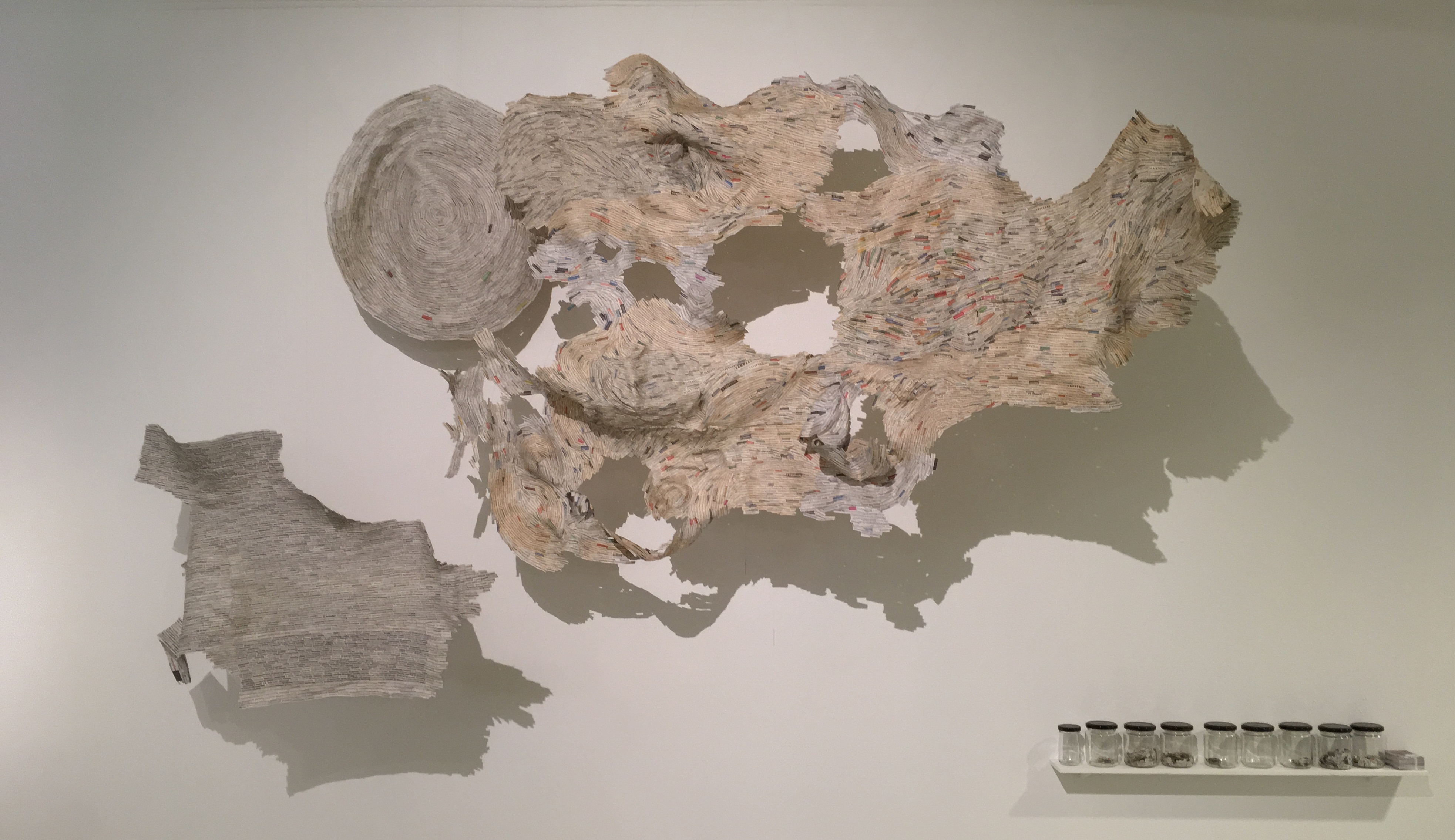
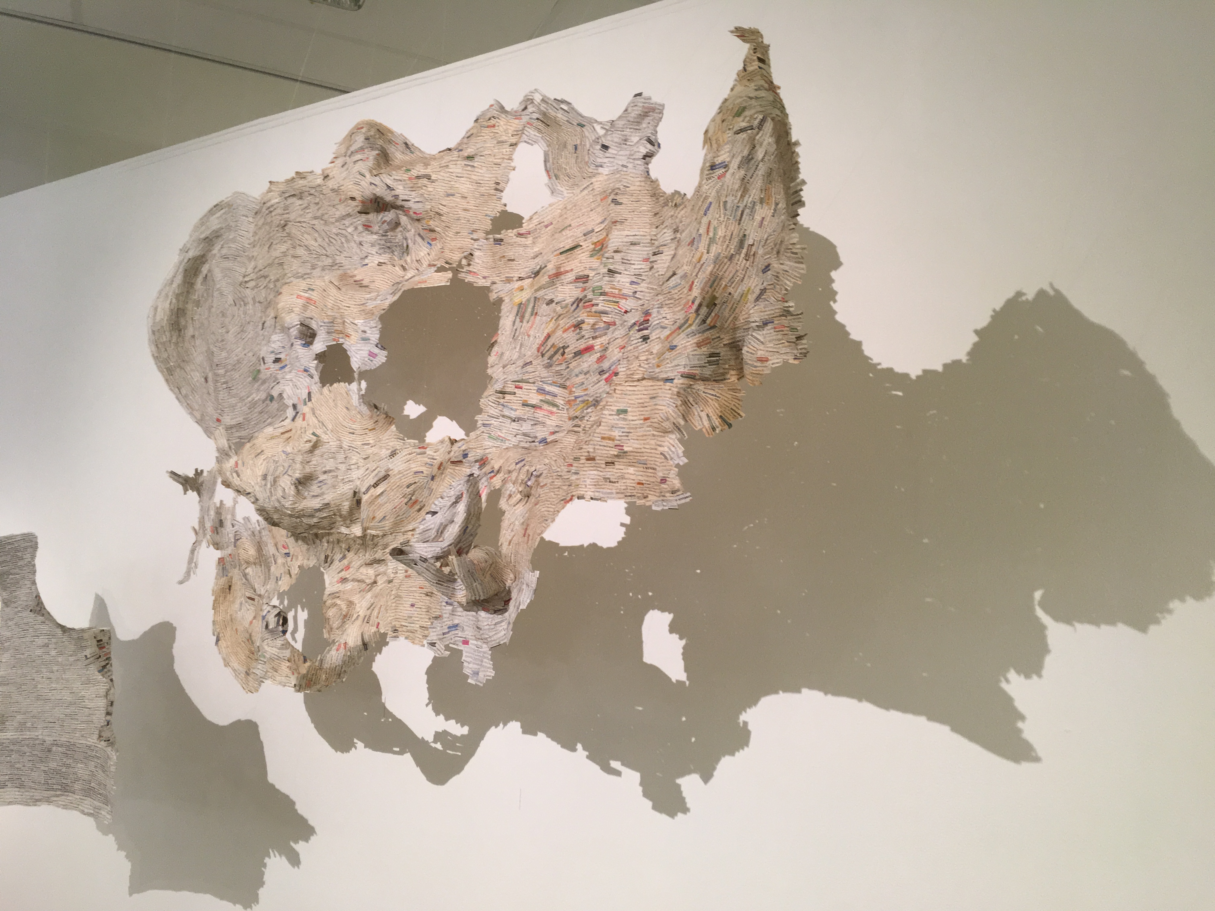
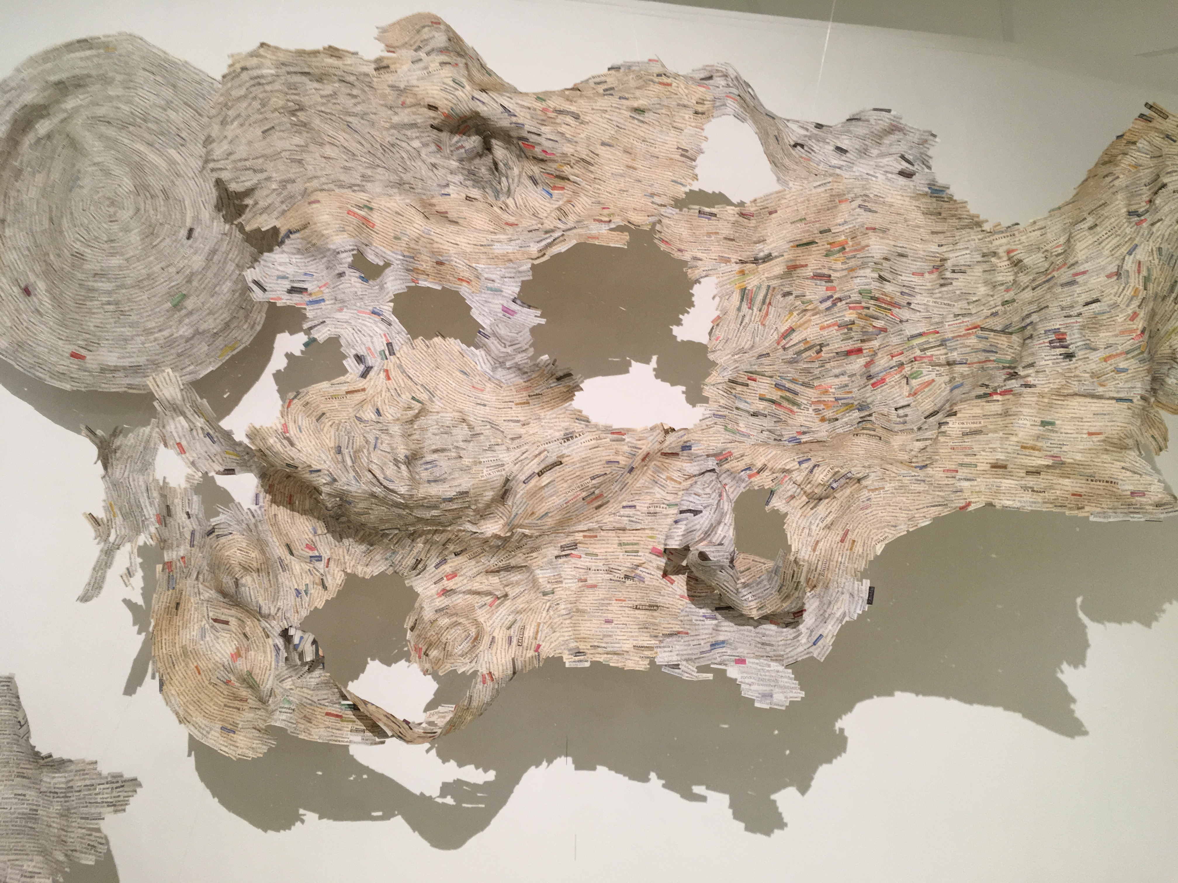
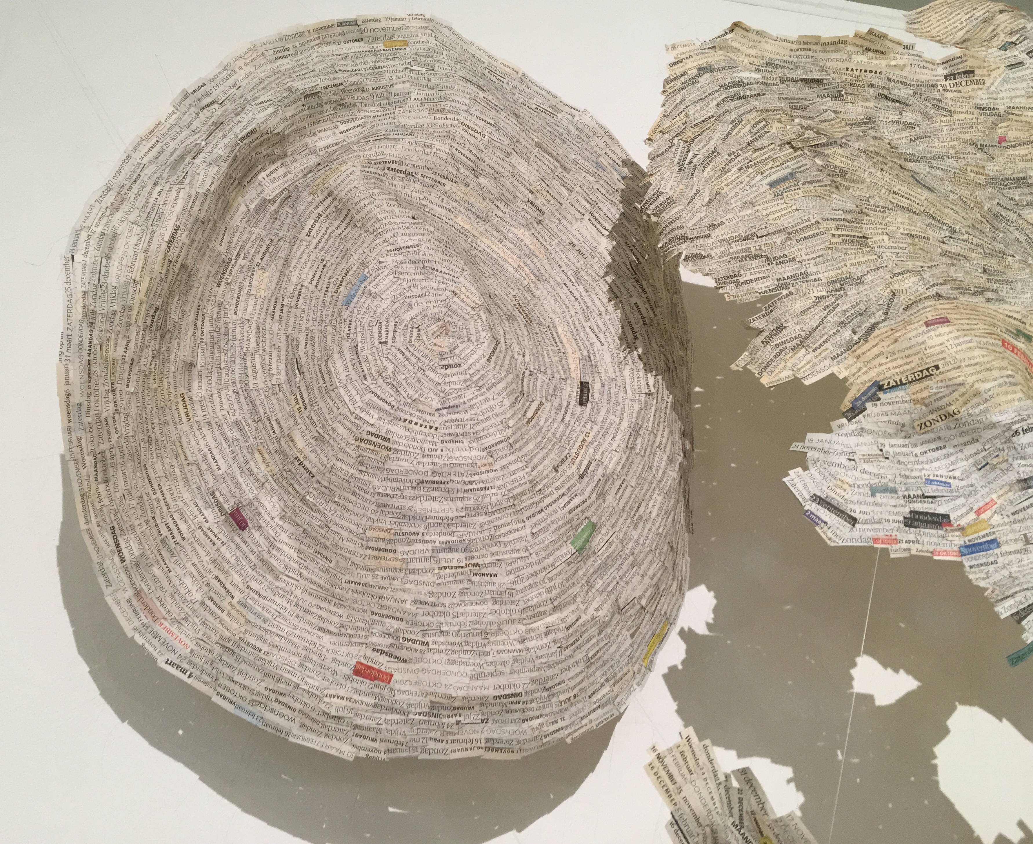
From 4 June to 29 October, Vienna Romanée’s “Data Sewing Project” will be on display (and growing) in the Coda Paper Art 2017 exhibition at the Coda Museum in Apeldoorn. These snippets of data from newspapers are sewn together with human hair.
Datanaaiproject/Data Sewing (2011 – present) Krantenpaper, menselijk haar/ newspaper, human hair Vienna Romanée Photo: Robert Bolick
Datanaaiproject/Data Sewing (2011 – present) Krantenpaper, menselijk haar/ newspaper, human hair Vienna Romanée Photo: Robert Bolick
Datanaaiproject/Data Sewing (2011 – present) Krantenpaper, menselijk haar/ newspaper, human hair Vienna Romanée Photo: Robert Bolick
Datanaaiproject/Data Sewing (2011 – present) Krantenpaper, menselijk haar/ newspaper, human hair Vienna Romanée Photo: Robert Bolick
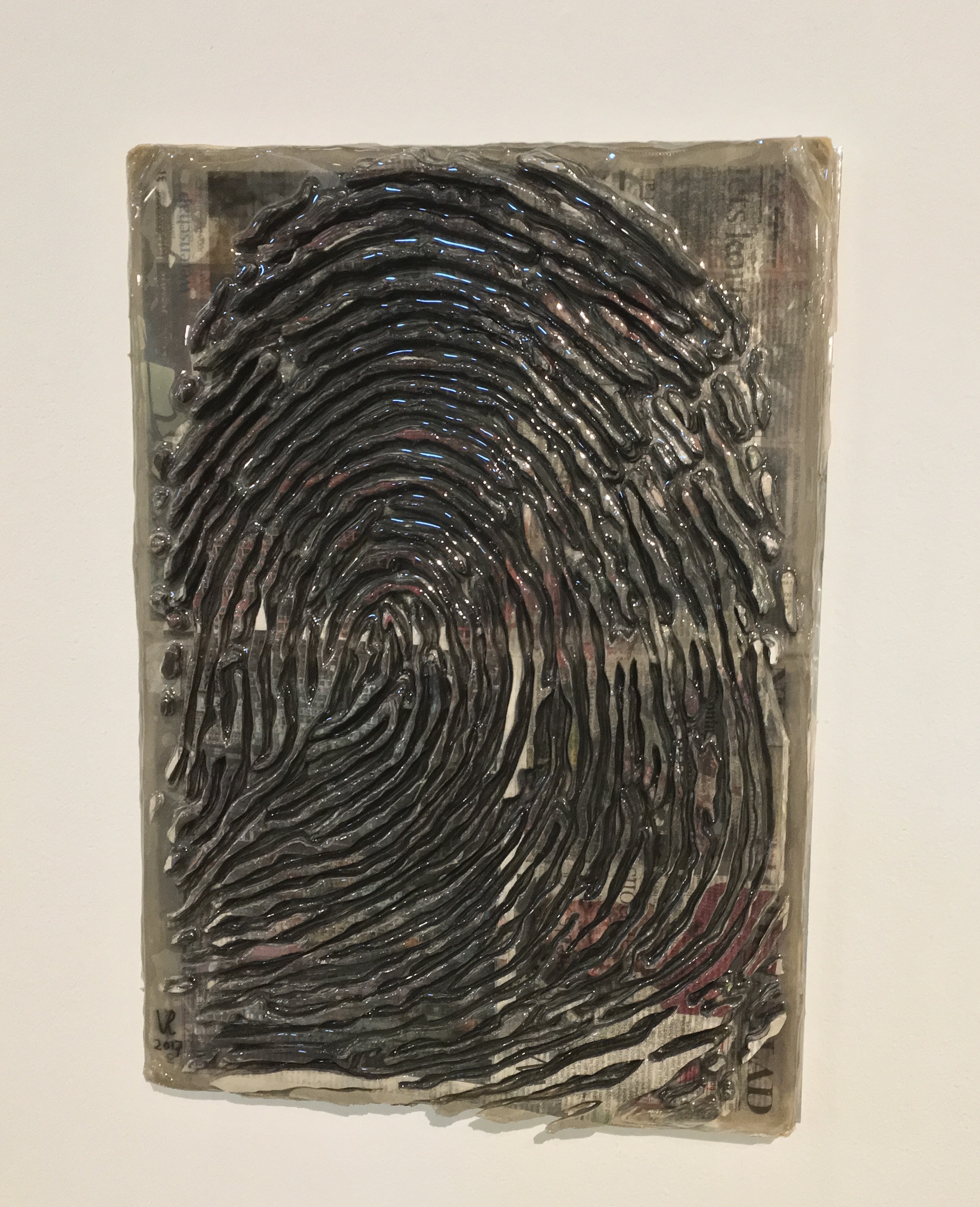
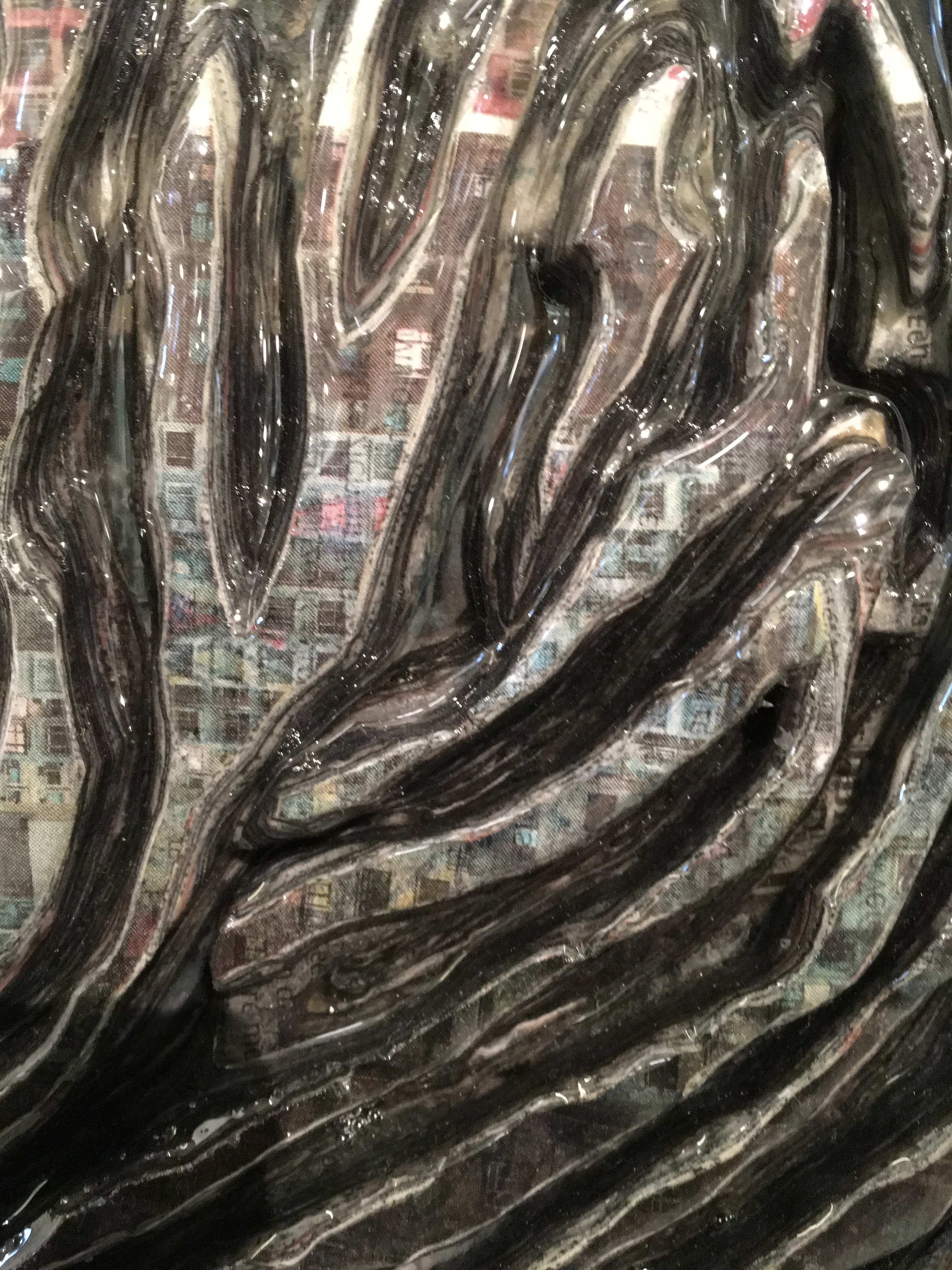
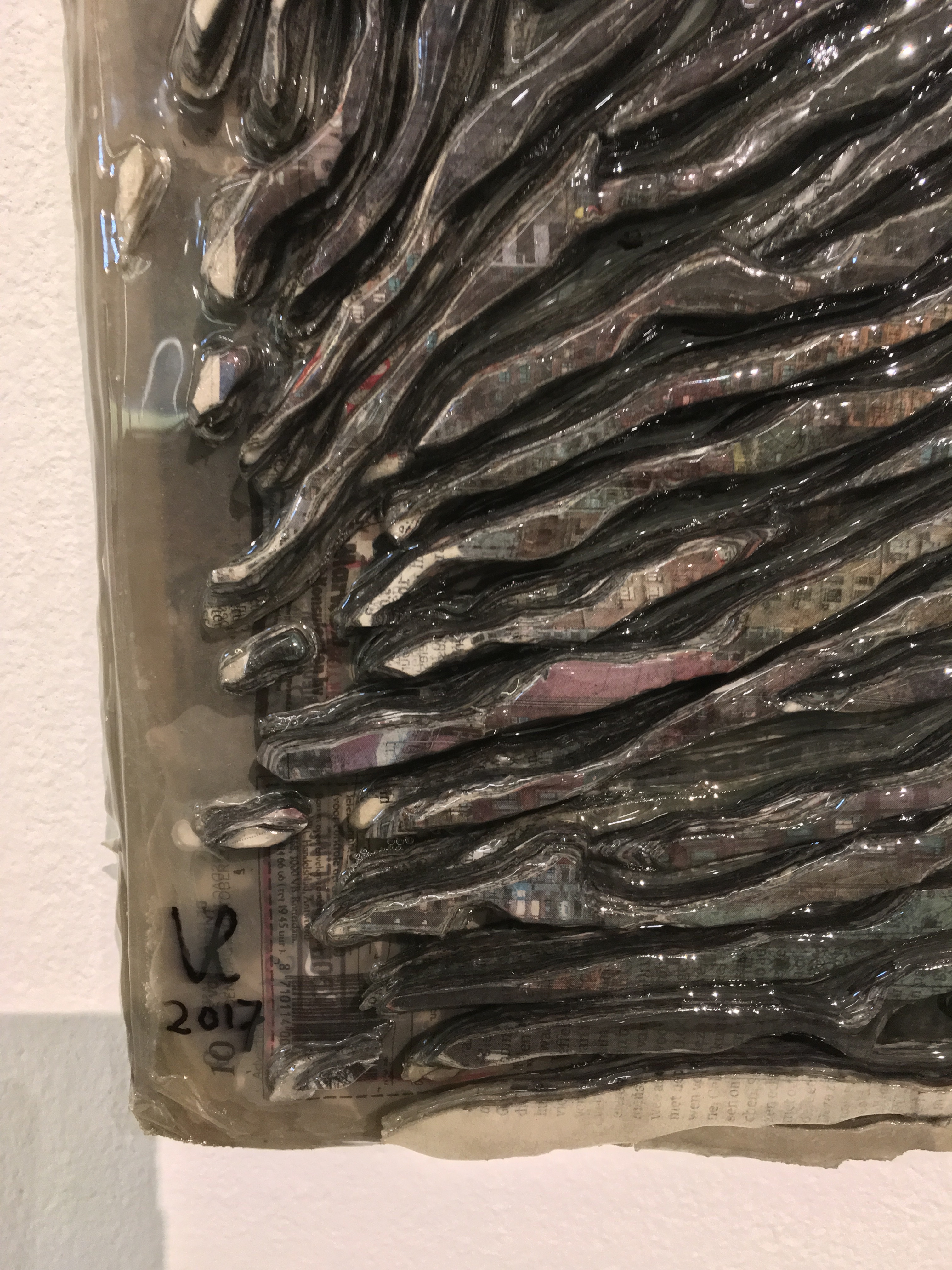
Also on display will be Fingerprint 1.1, a painstakingly created sculpture of a fingerprint built up in layers of shreds of newspaper that speaks of the data embedded in our fingerprints, the permanent and the ephemeral, the material and the human spirit.


![Image result for art & language: texte zum phänomen kunst und sprache [book]](http://igem.adlibsoft.com/wwwopacx/wwwopac.ashx?command=getcontent&server=images&value=coda%5CAB00318.jpg)


 DS: I absolutely remember. I was living in London with my spouse and family as part of a study abroad program my spouse was leading. Each day, after all were at school or otherwise occupied, I would head out in pursuit of art, medical museums, natural history oddities or any number of things and on one day I went to the British Library to see an exhibition,