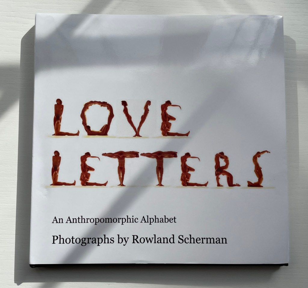
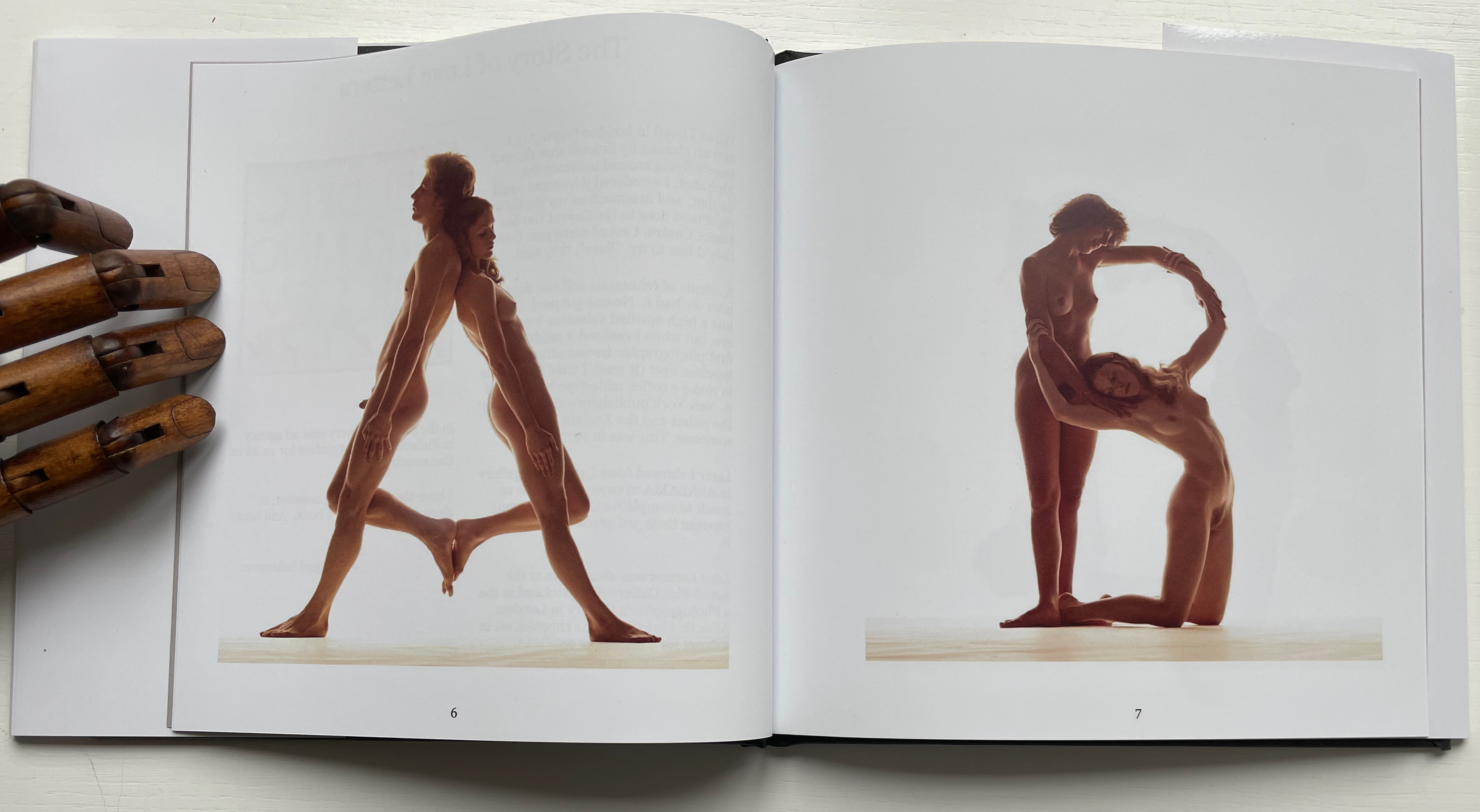
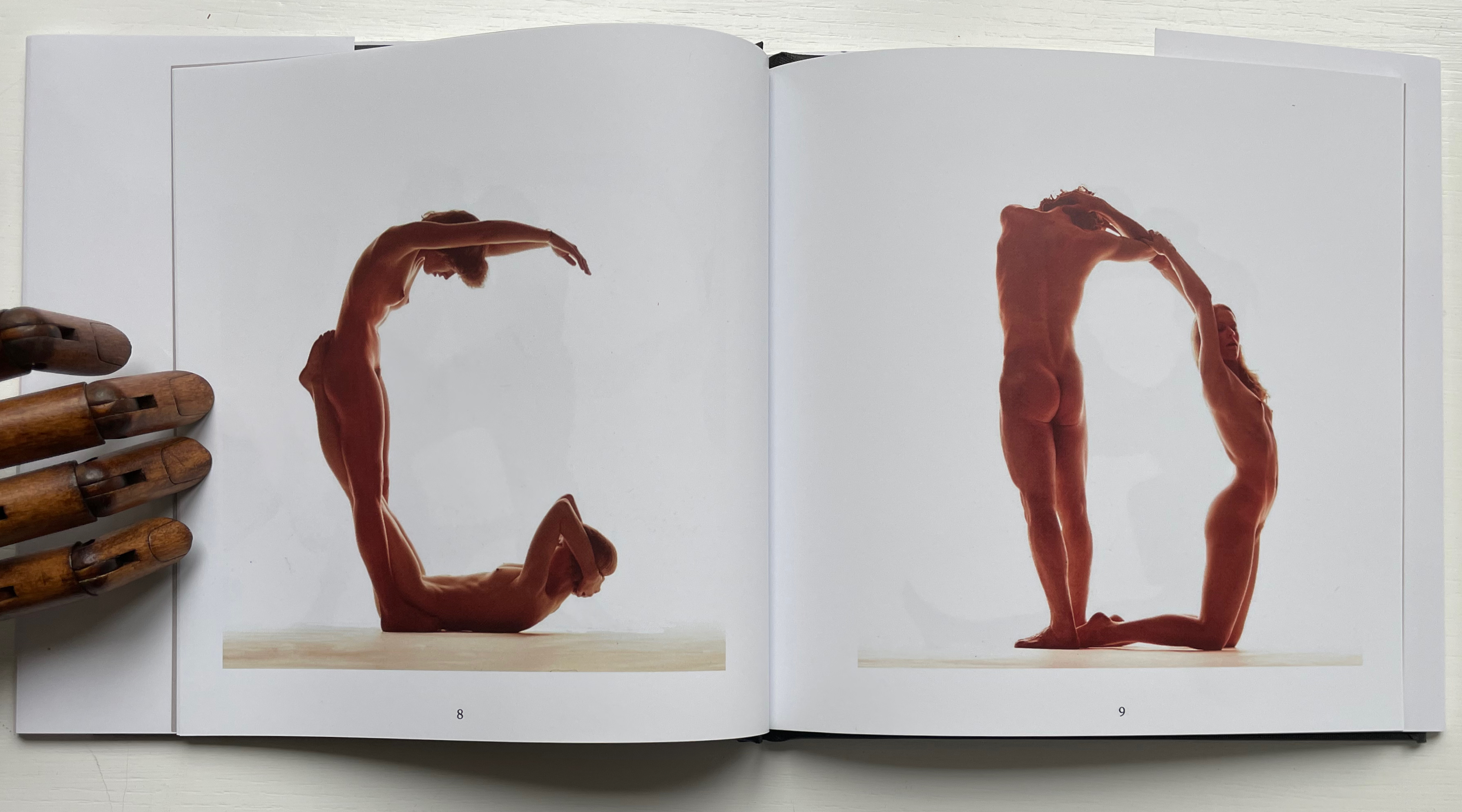
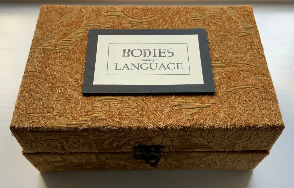
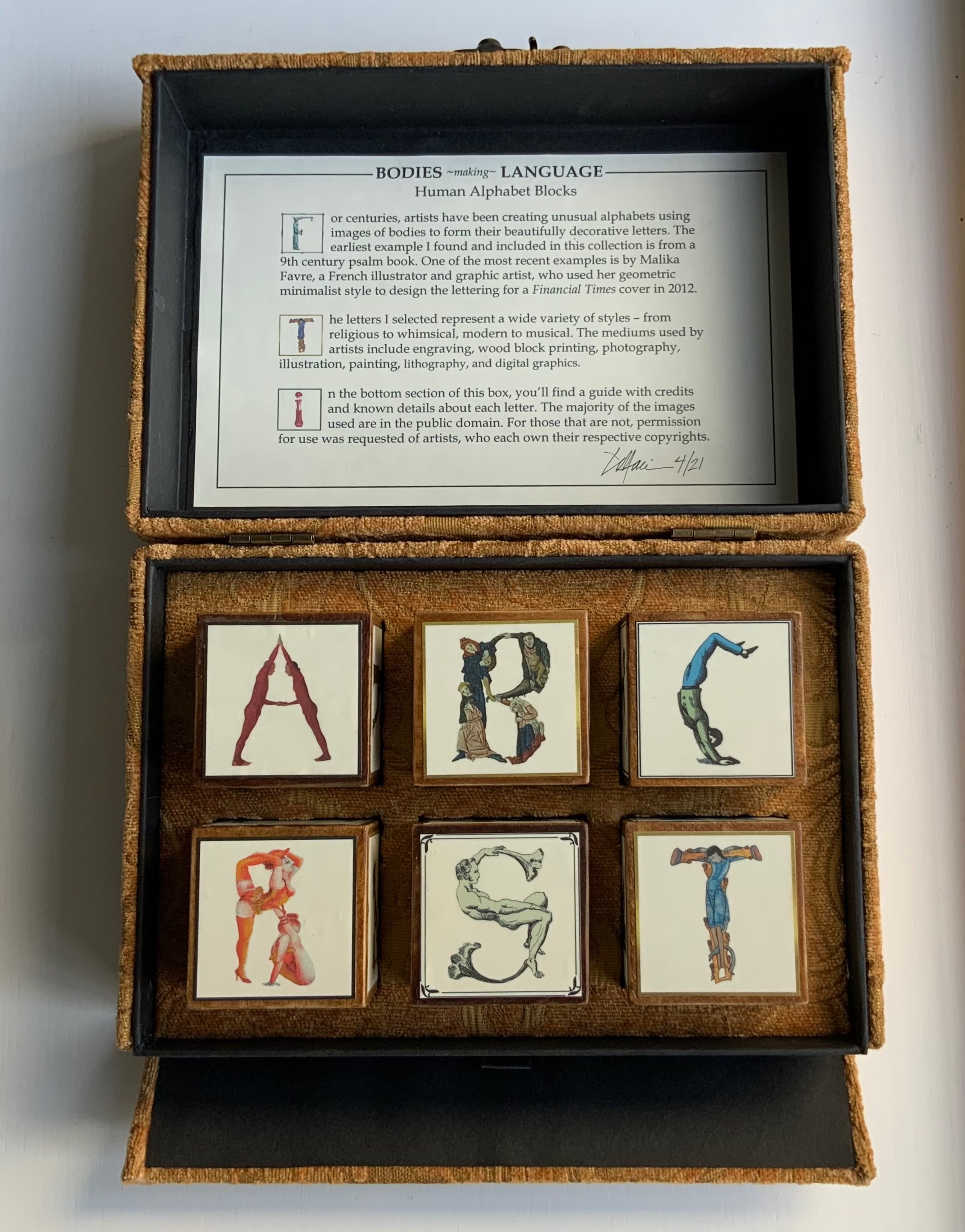
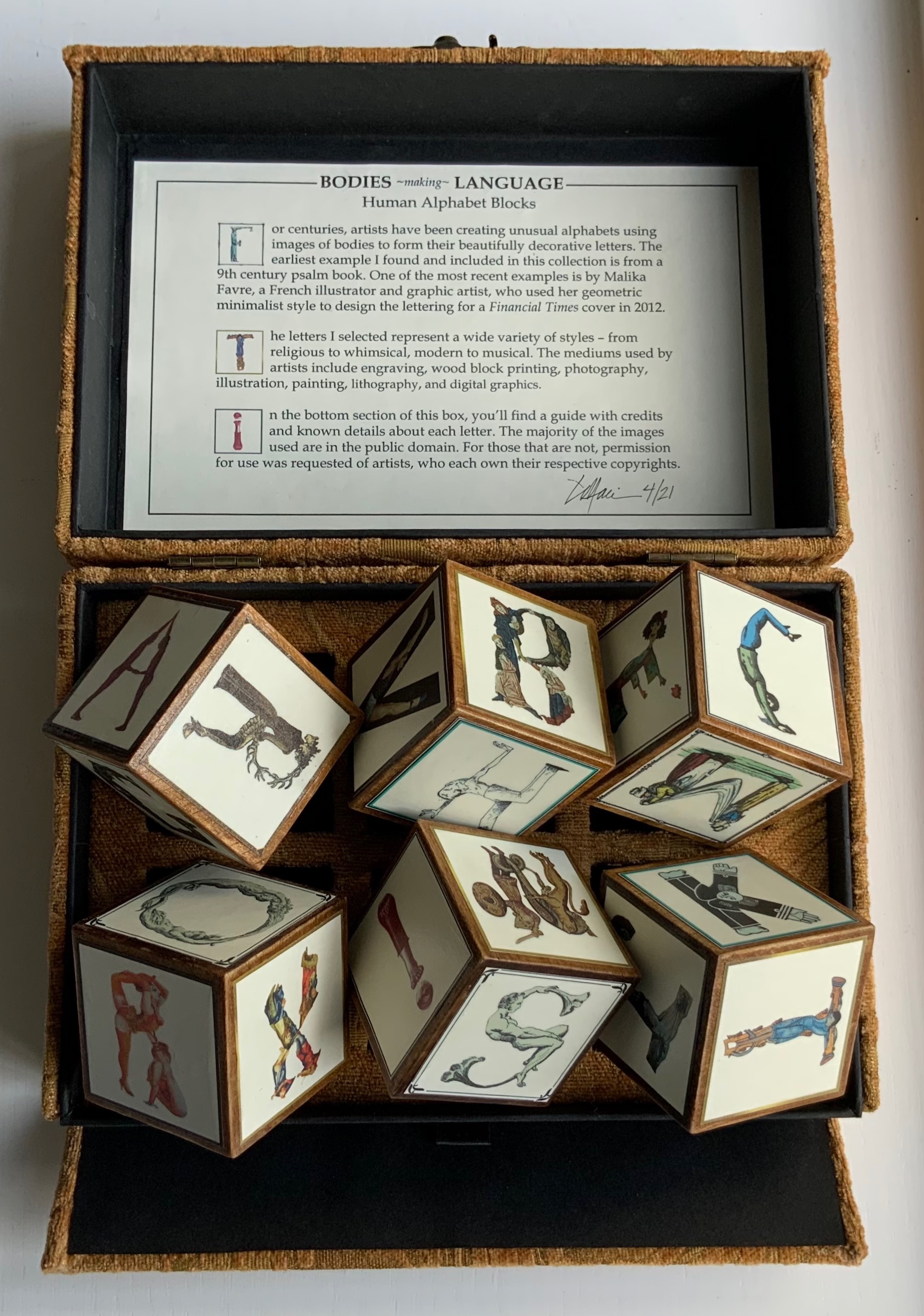
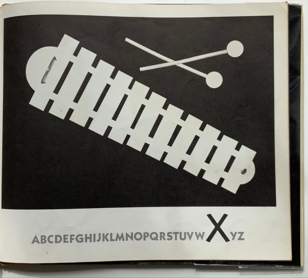
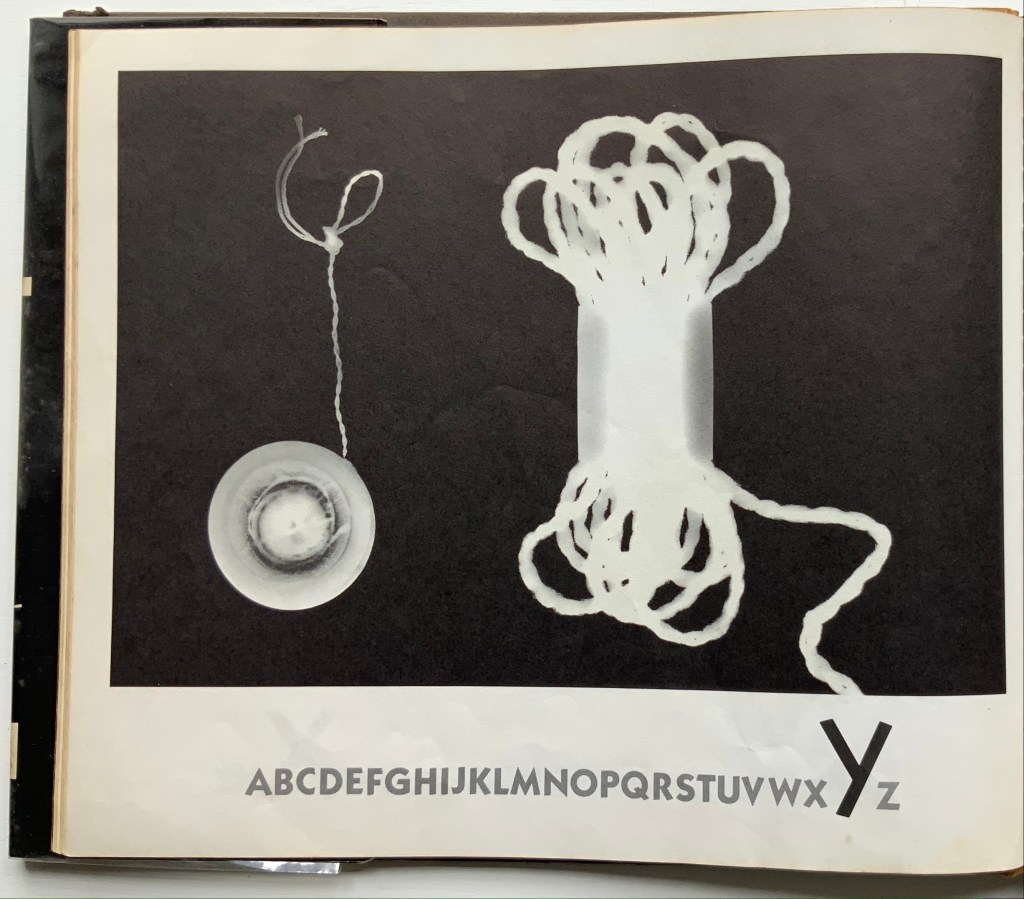
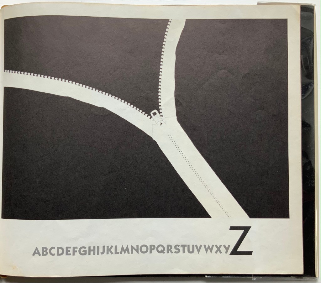
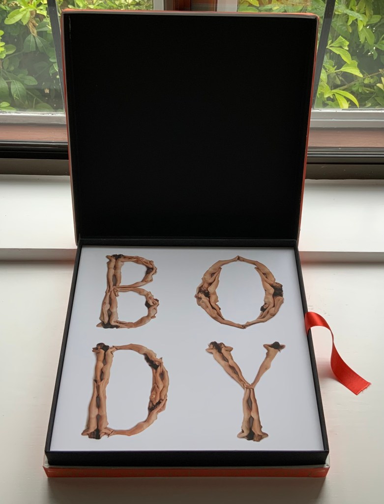
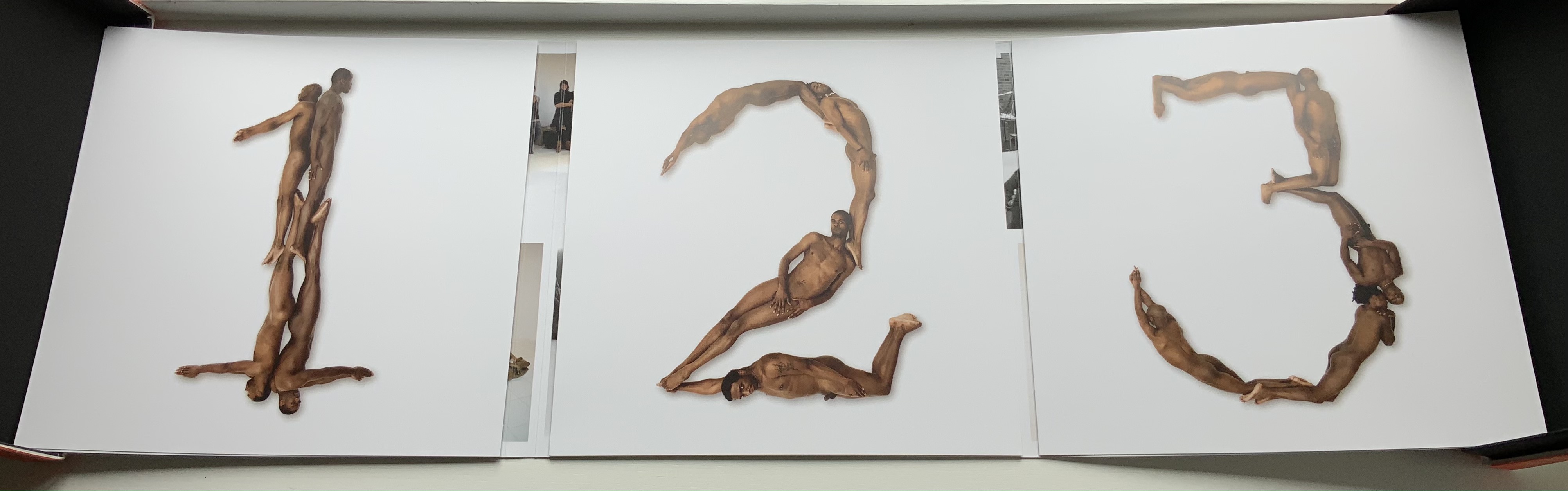
Bodies Making Language (2021)
Bodies Making Language (2021)
Lisa Merkin
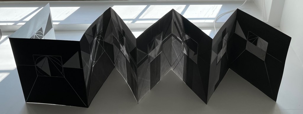
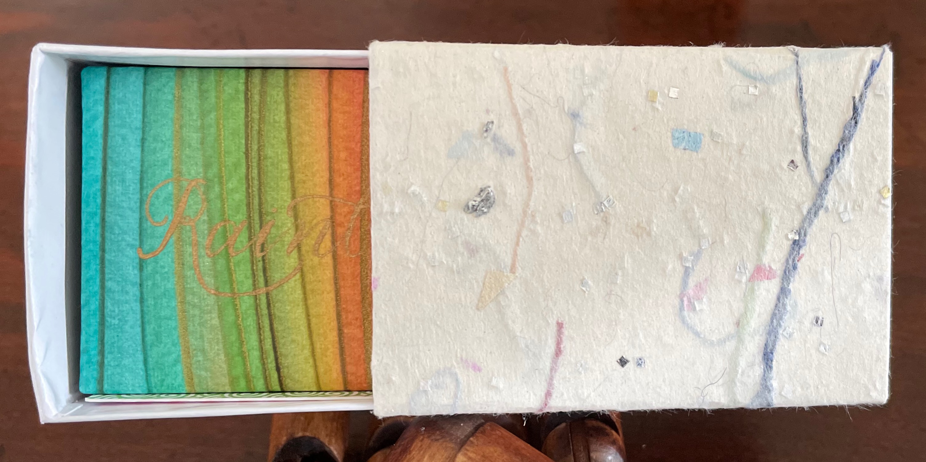
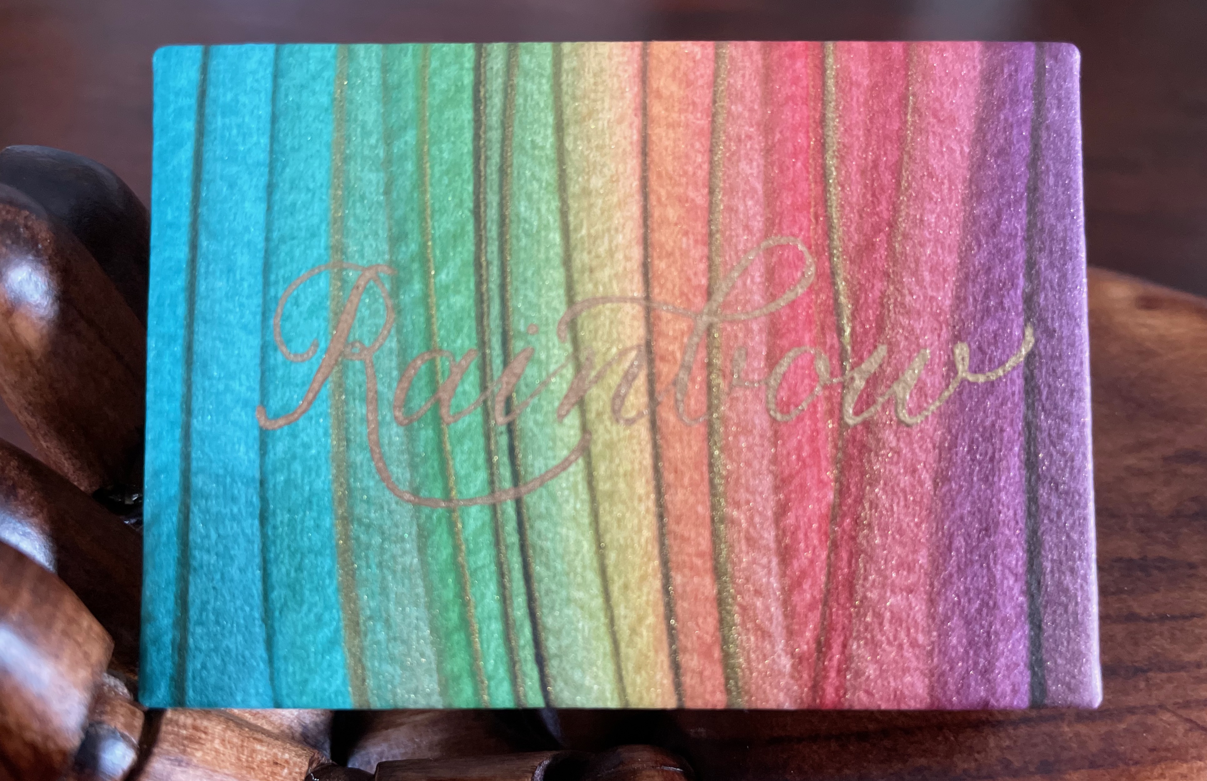
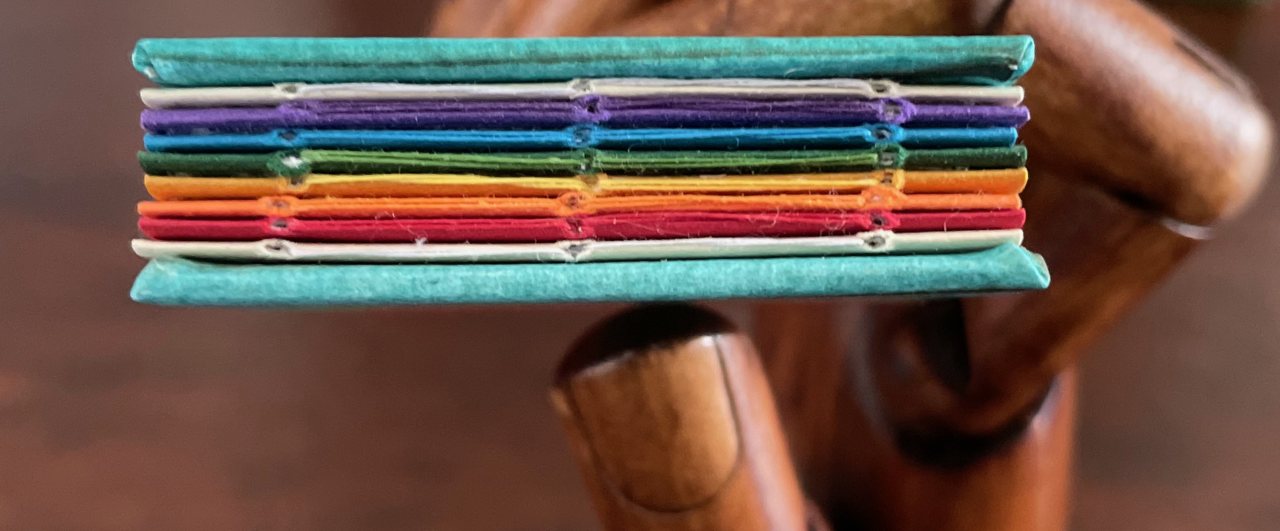
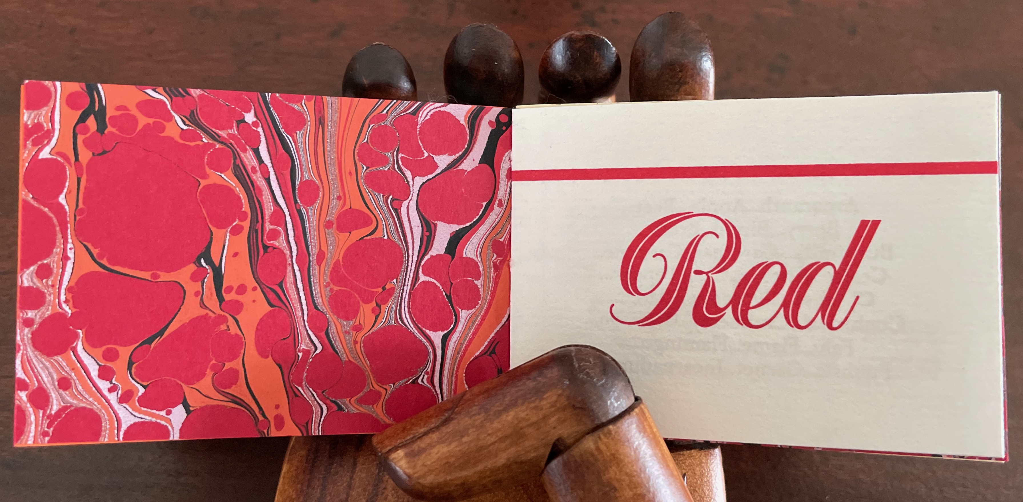
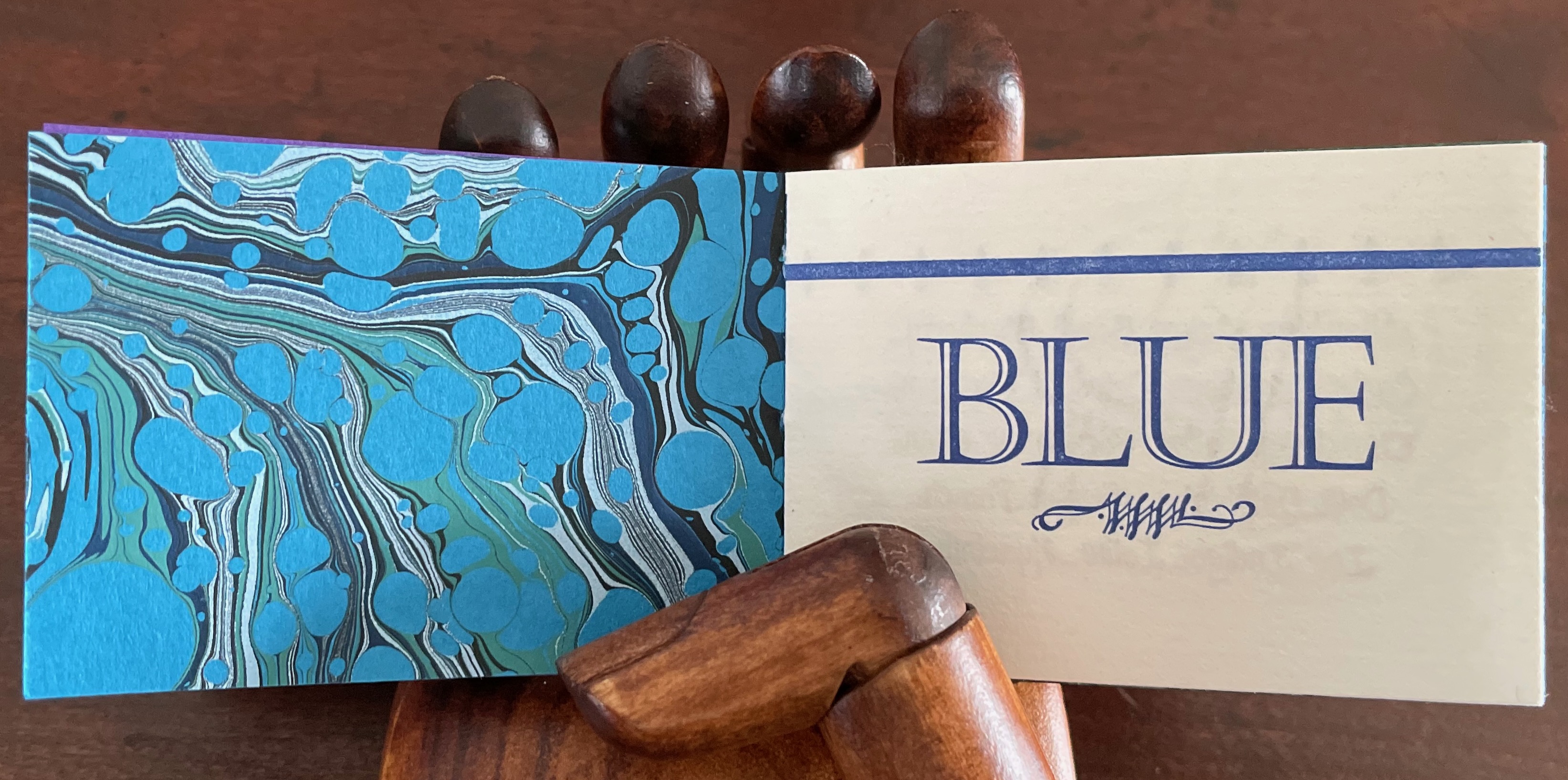
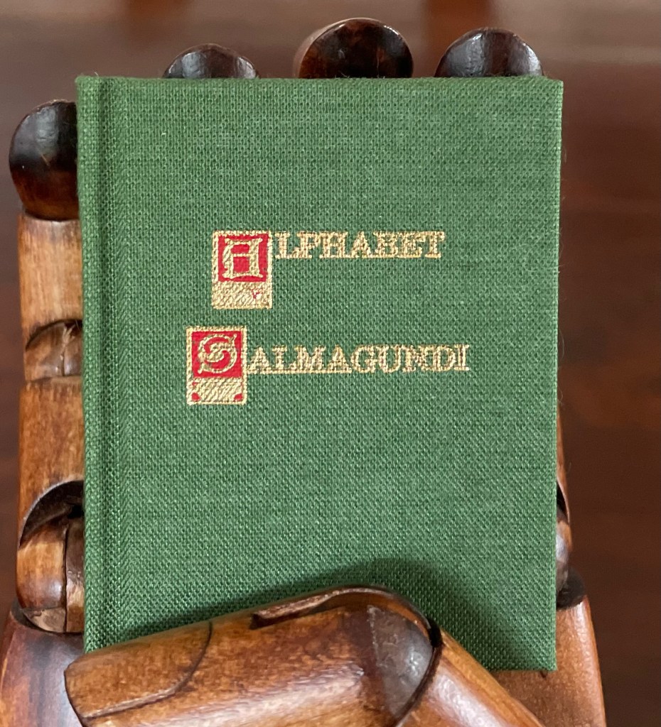
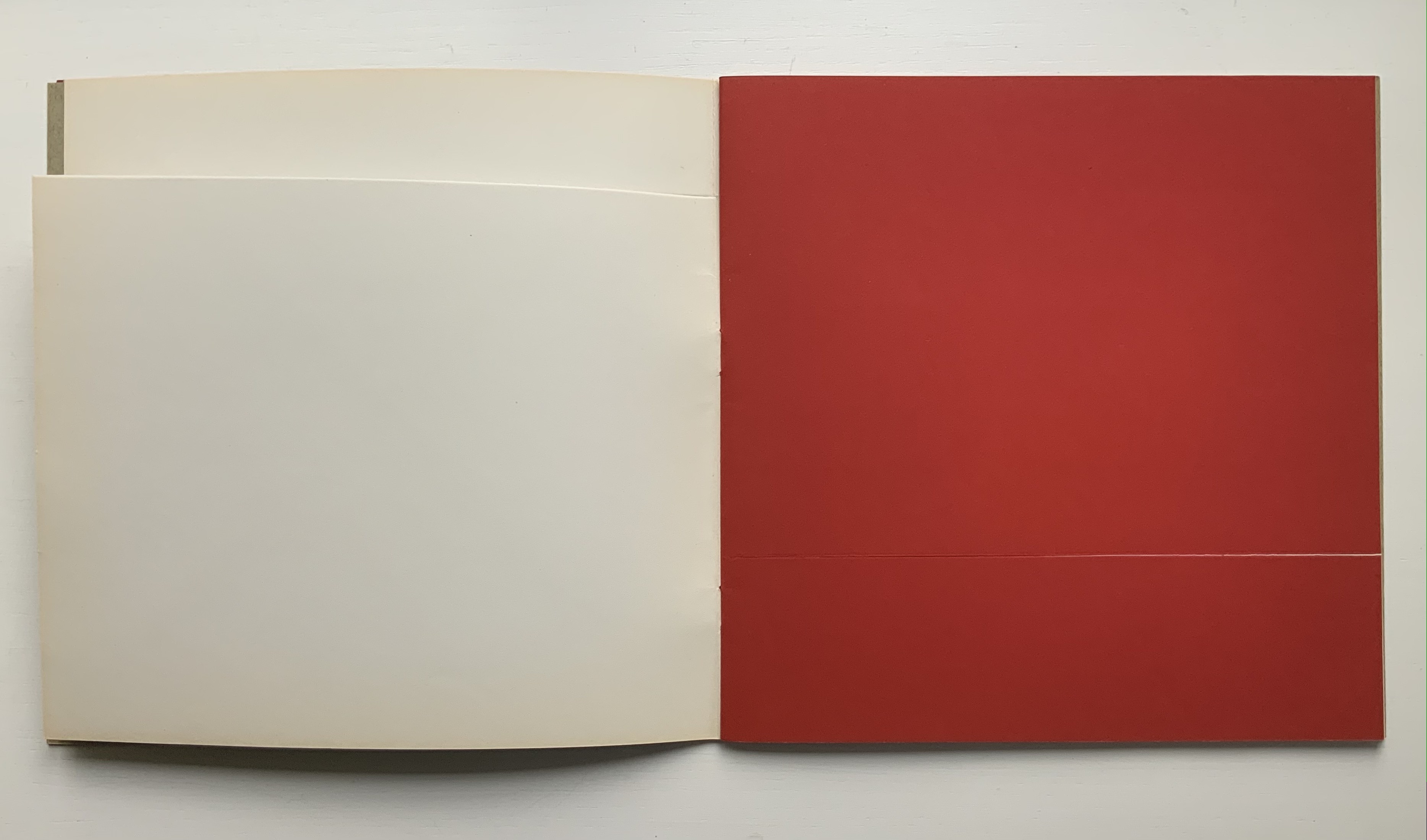
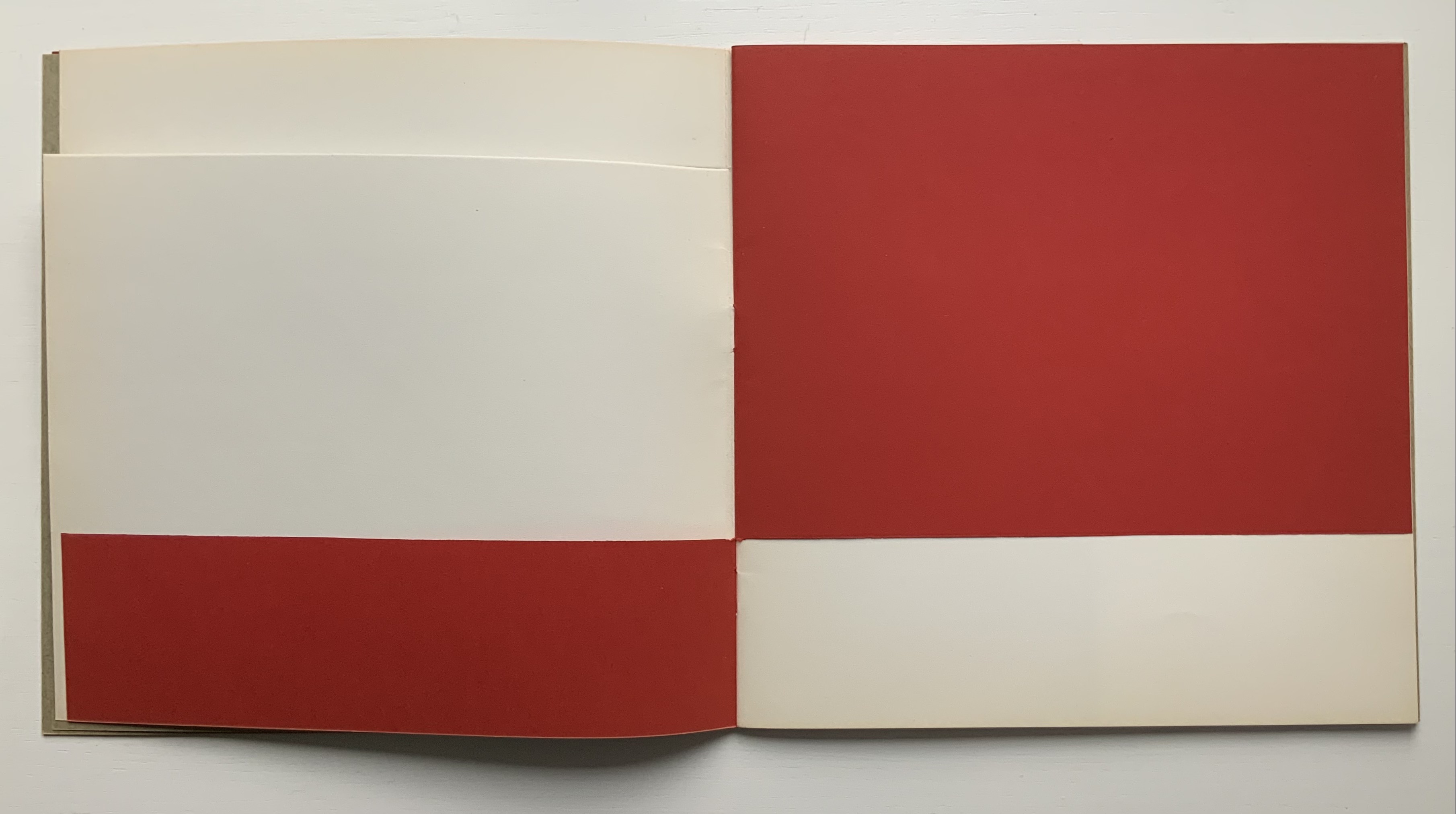
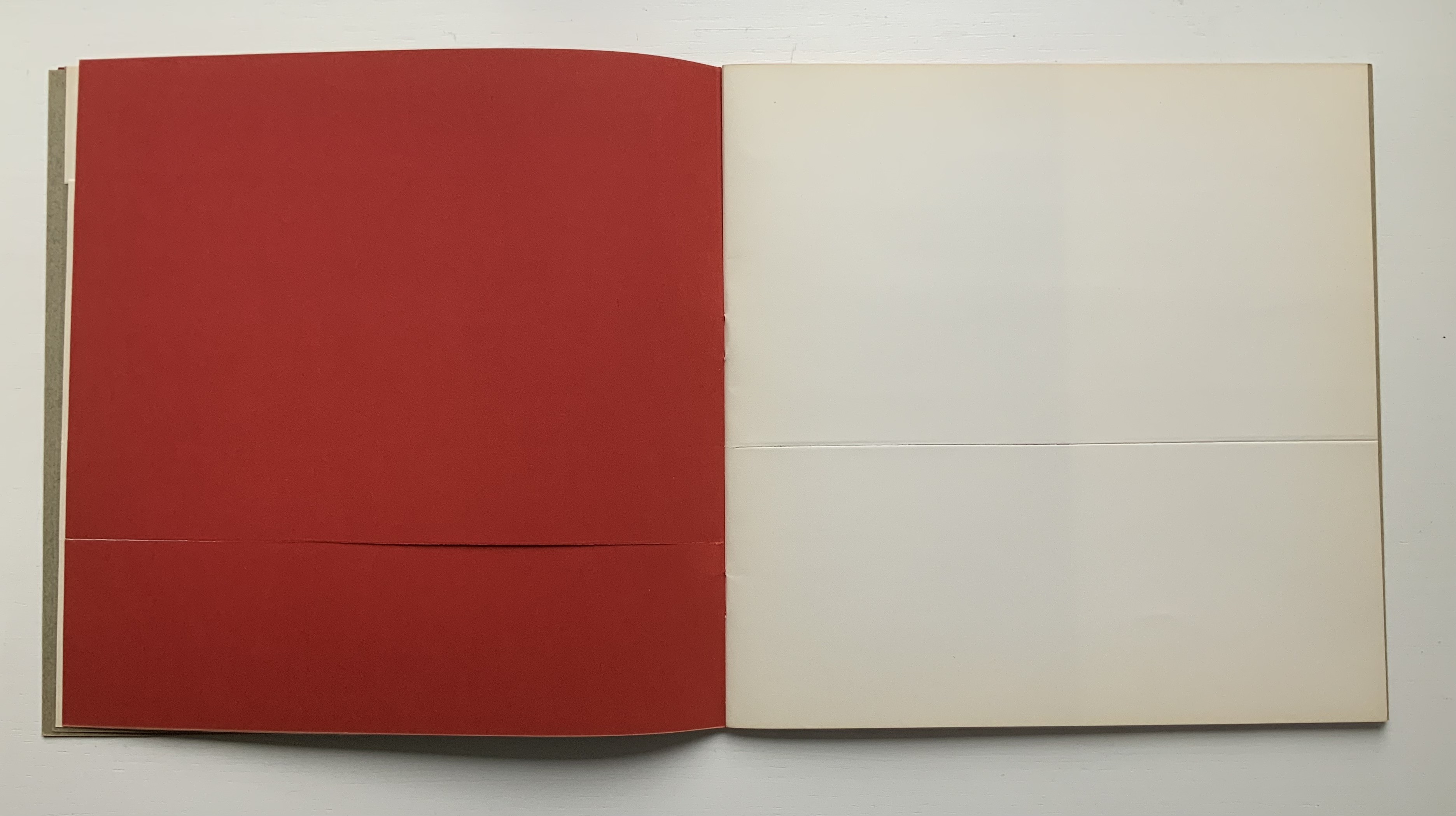
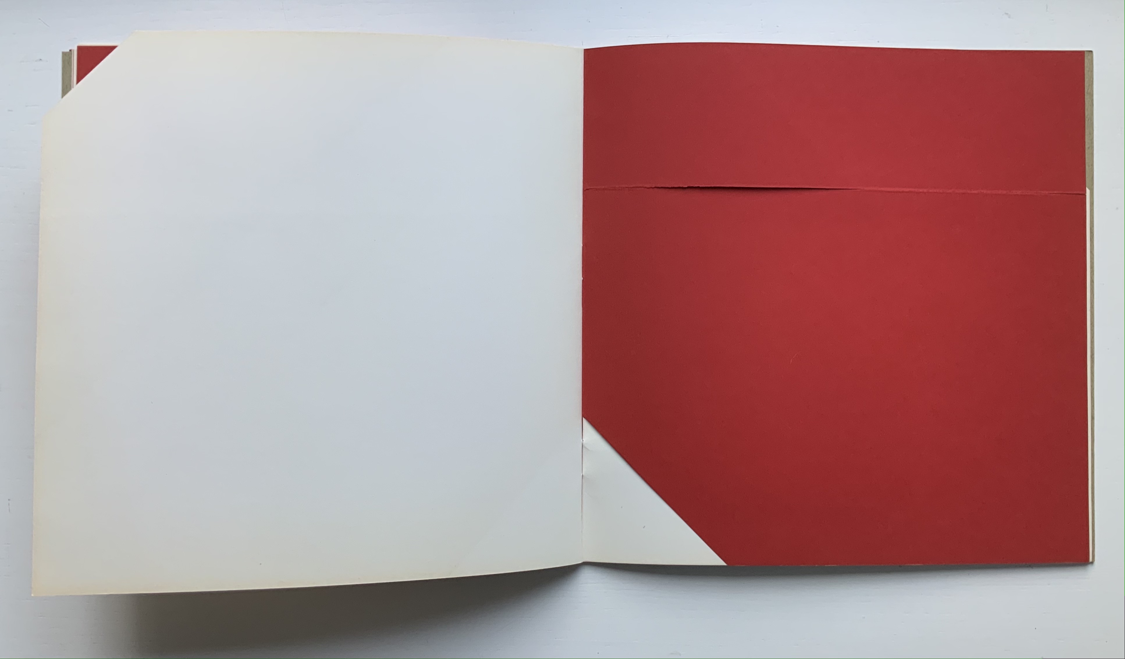
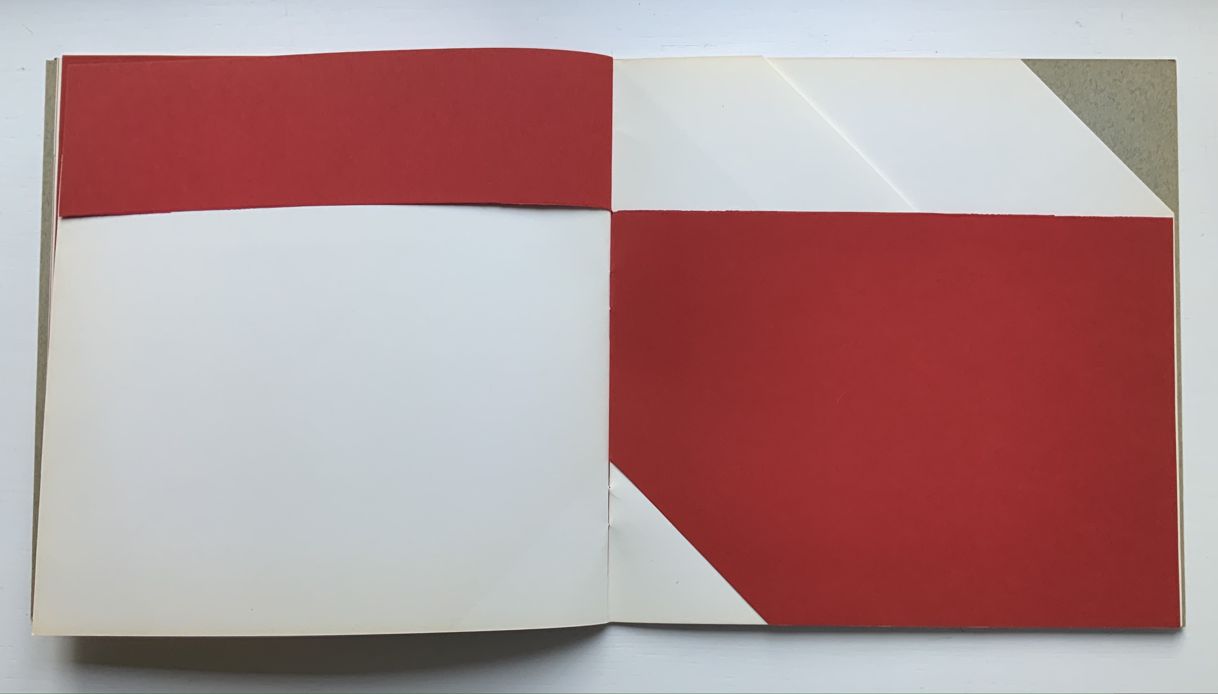
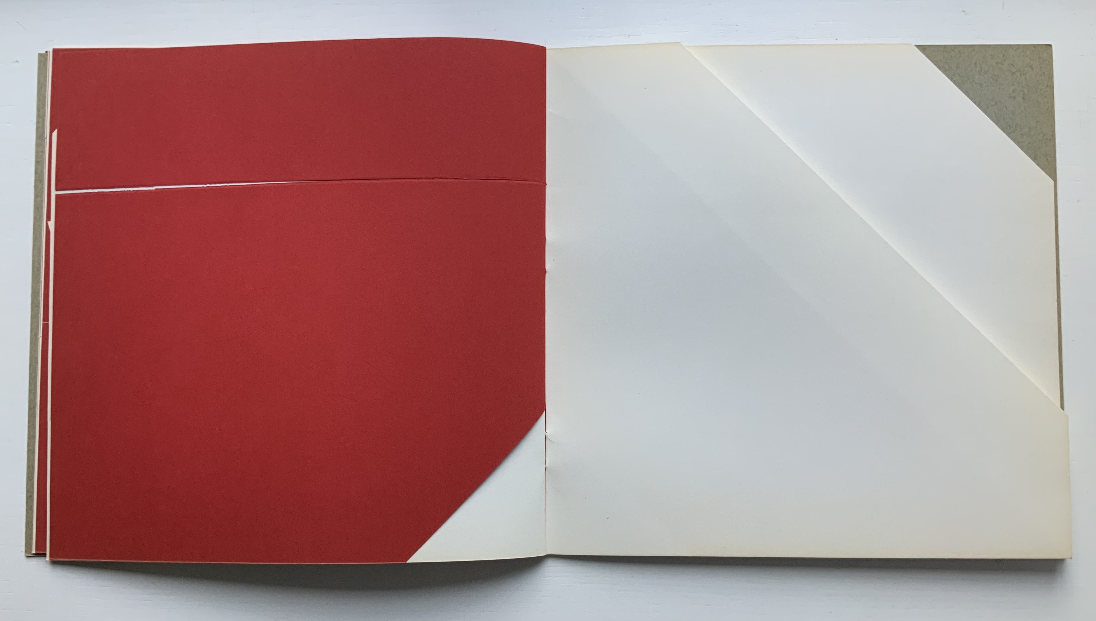
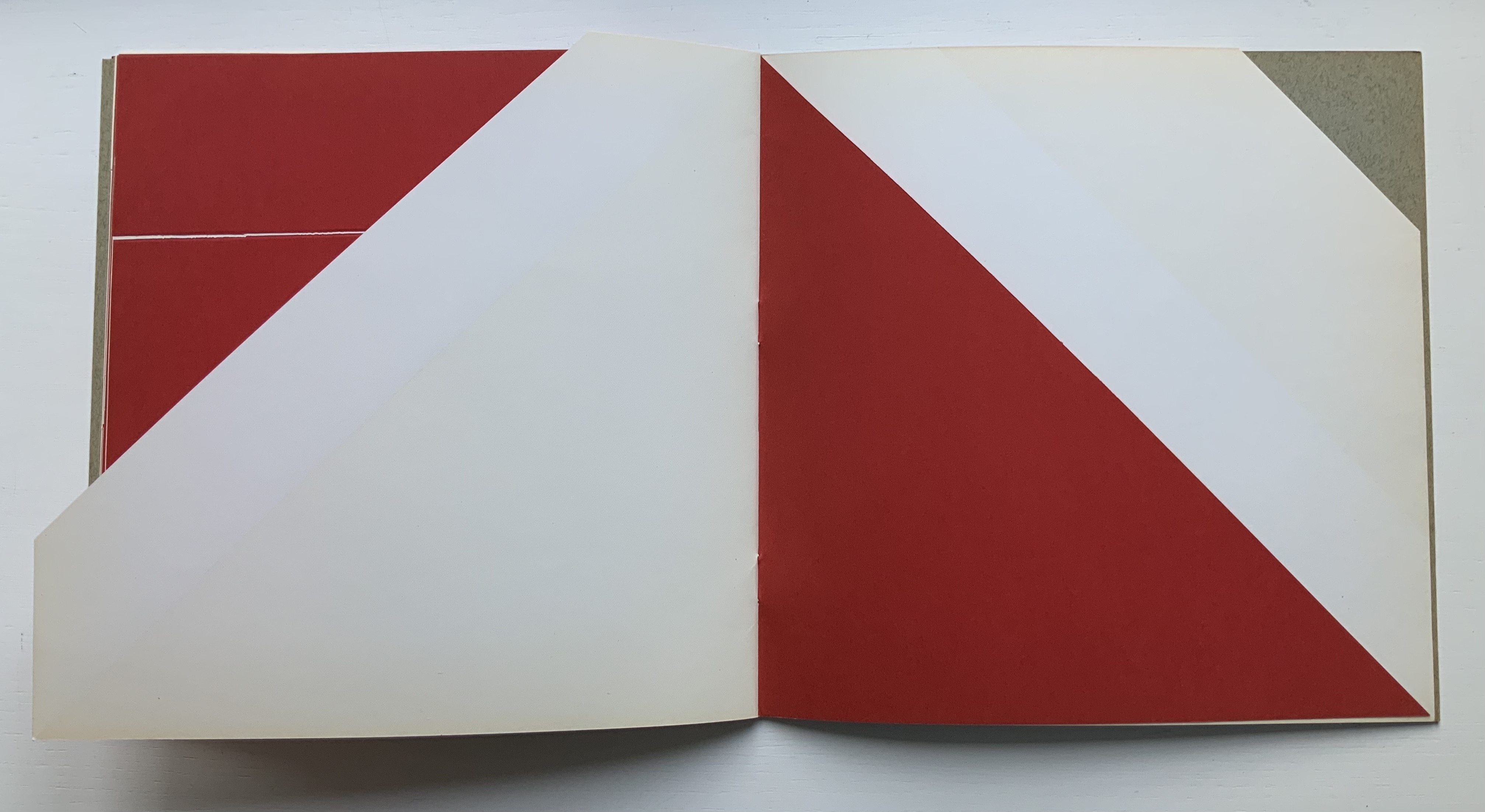
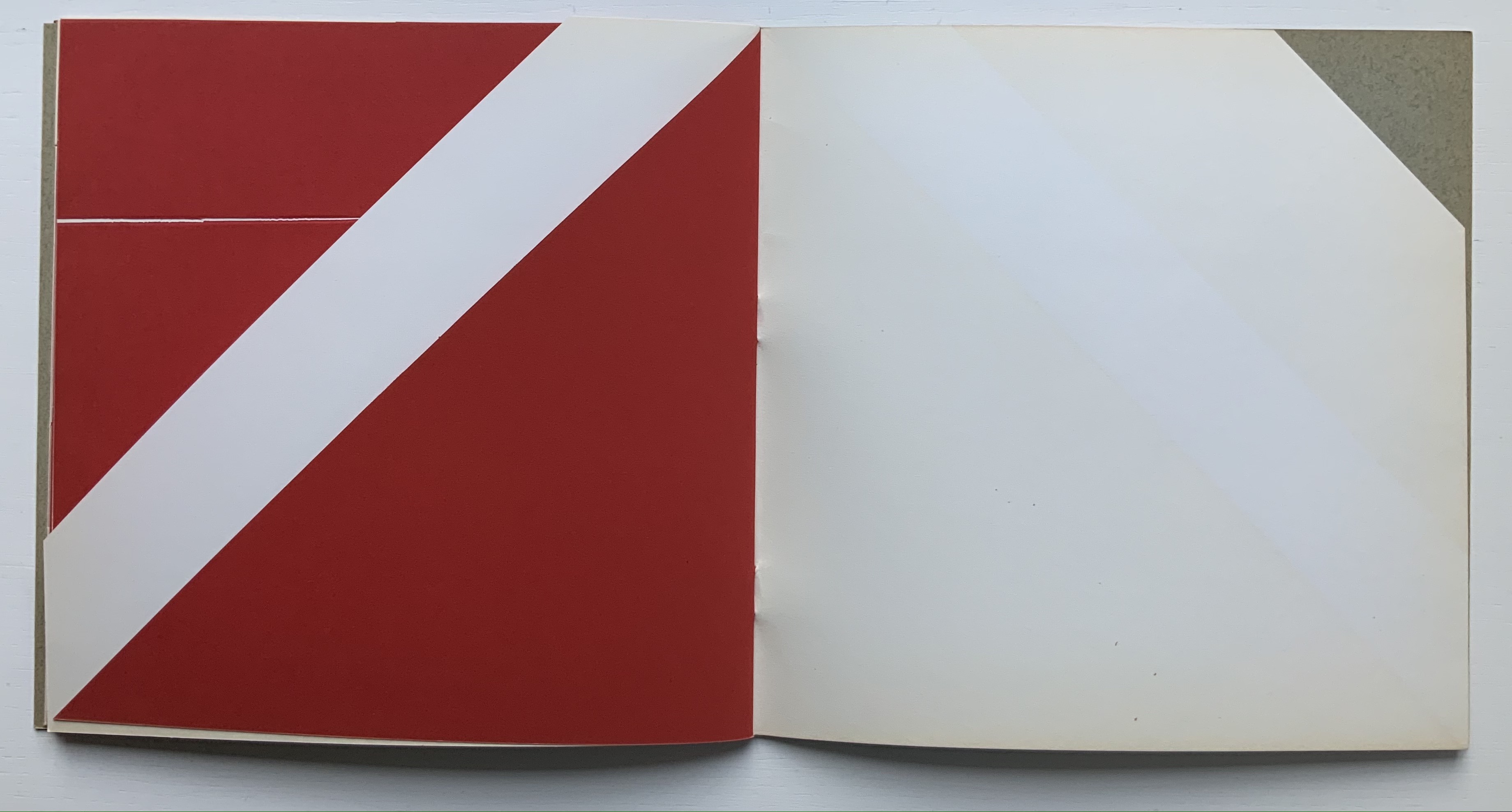
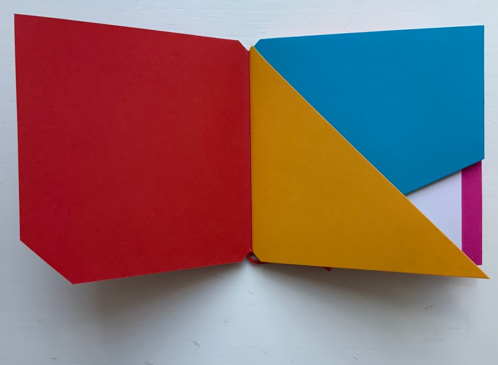
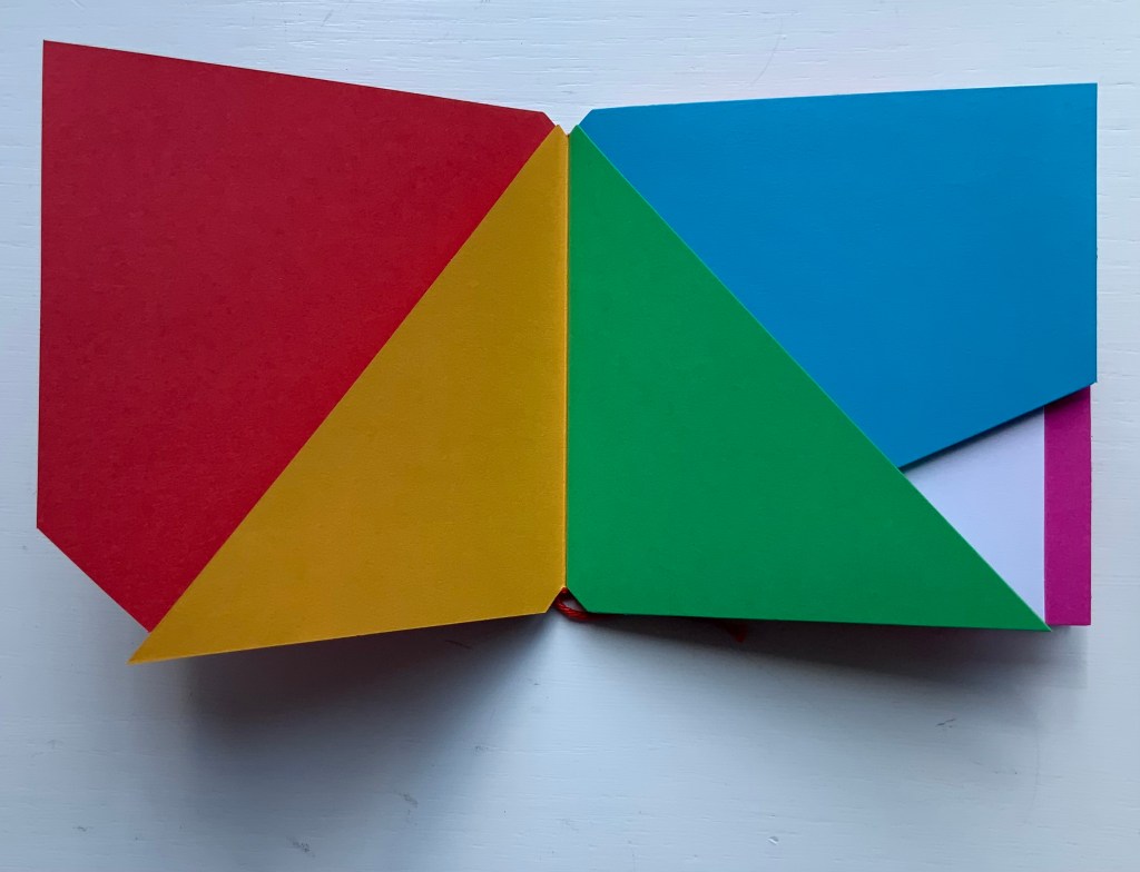
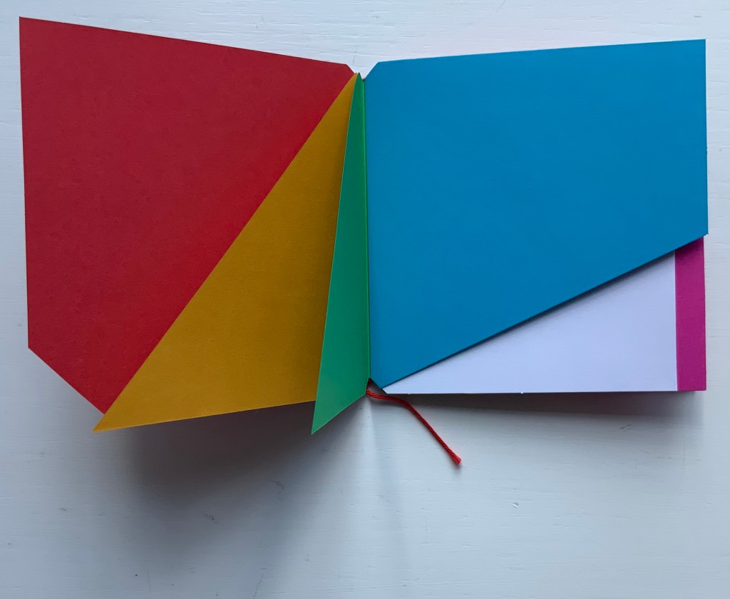
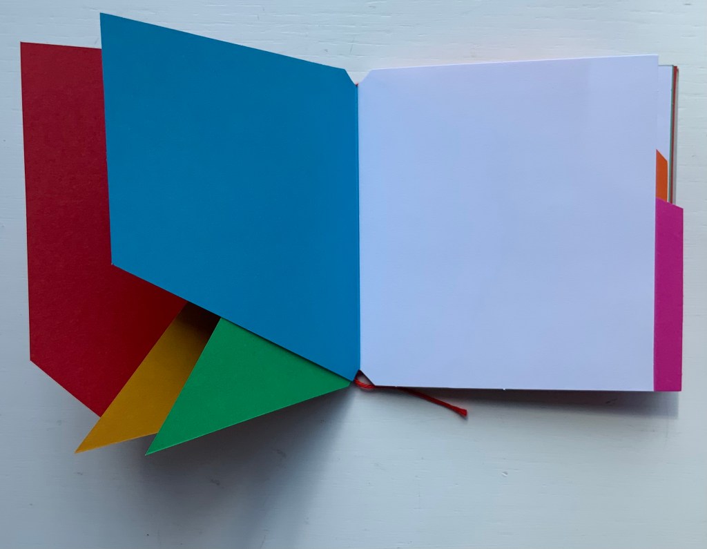
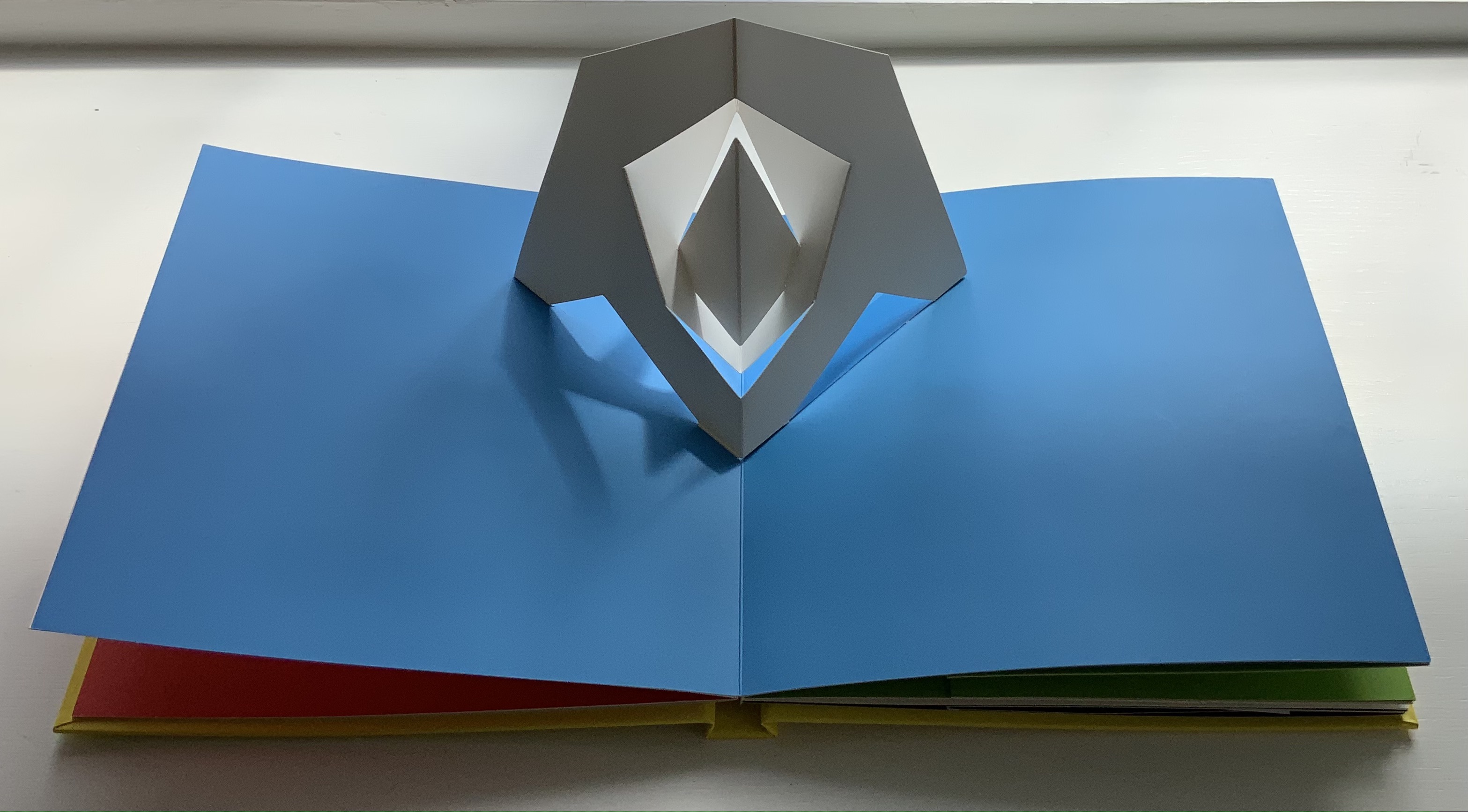
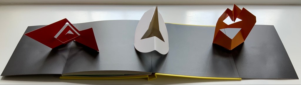
Brocade-covered box containing six blocks and compartment with three cards. Box: H95 x W225 x D155 mm. Blocks: cube 50 mm. Cards: H105 x W205 mm. Unique work. Acquired from the artist, 20 September 2021.
Photos: Books On Books Collection. Displayed with permission of artist.
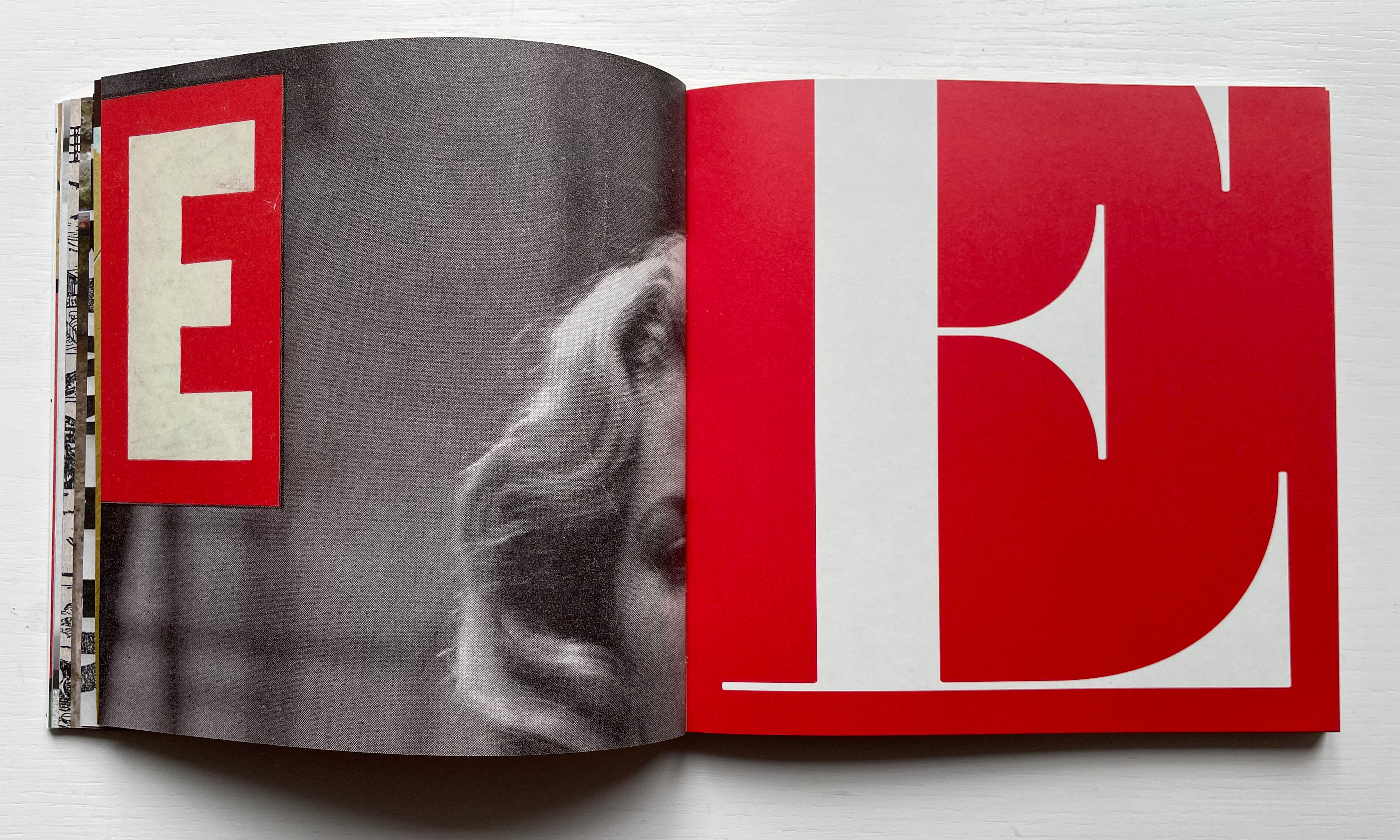
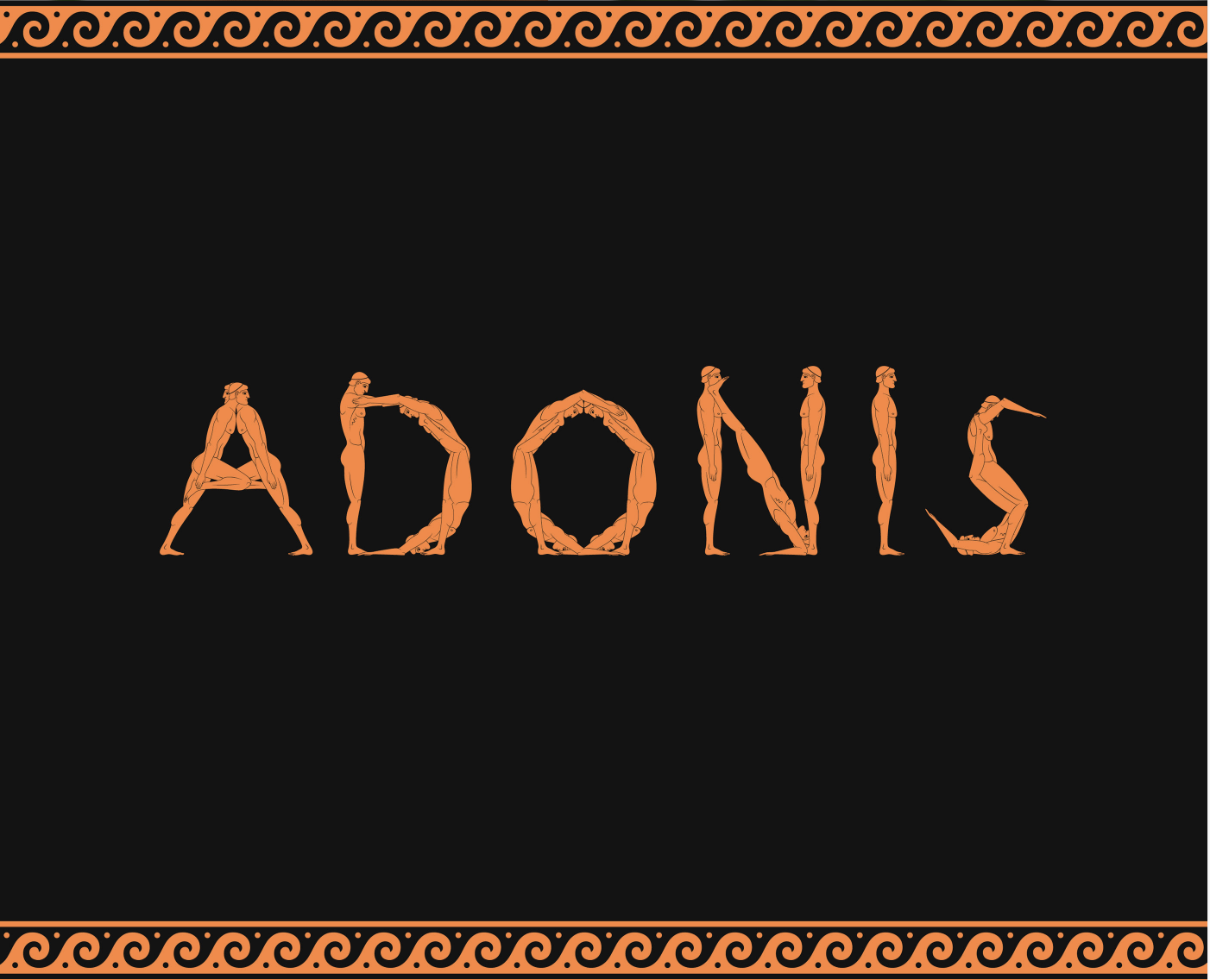
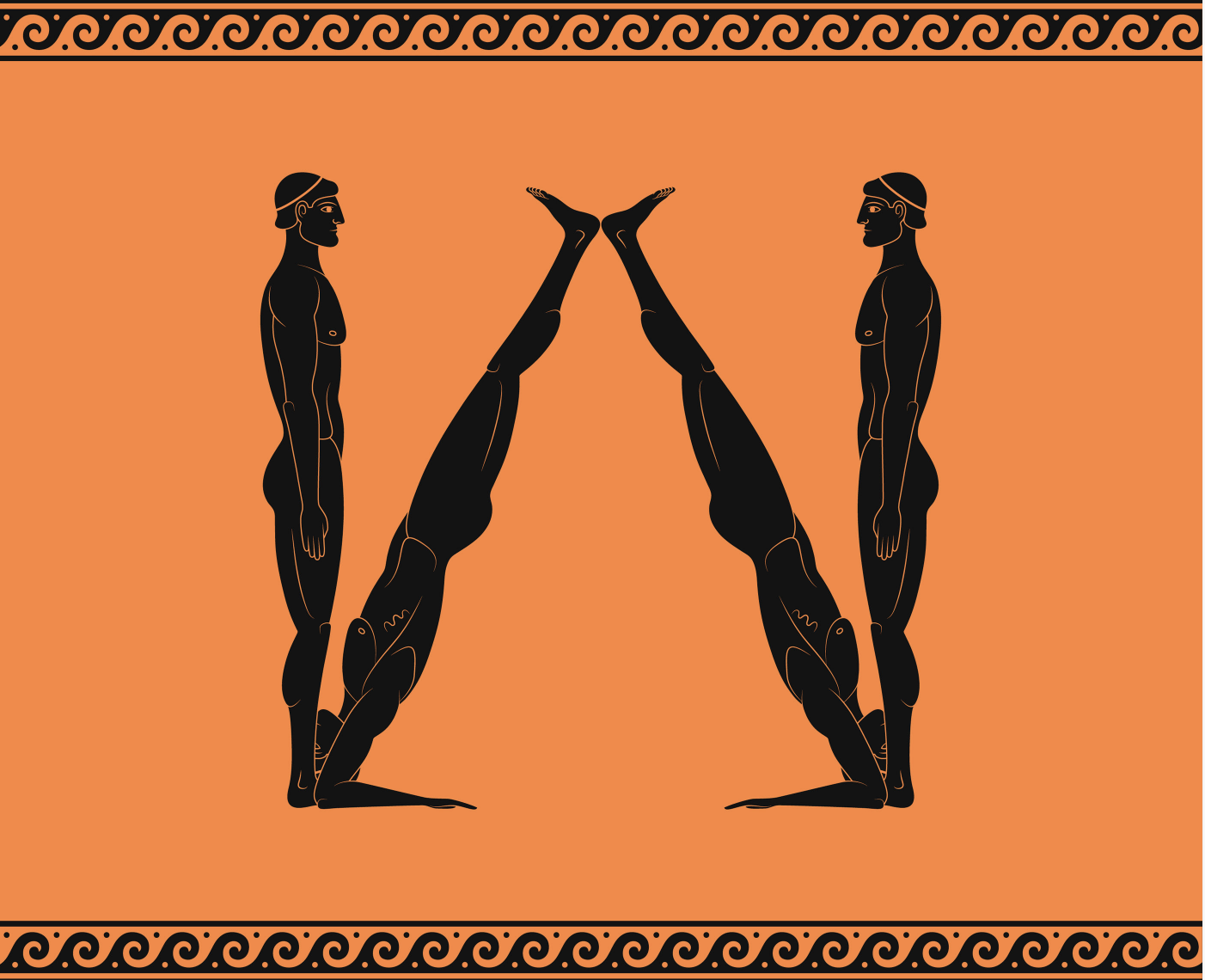
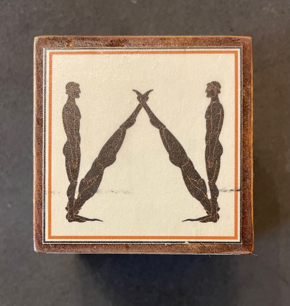
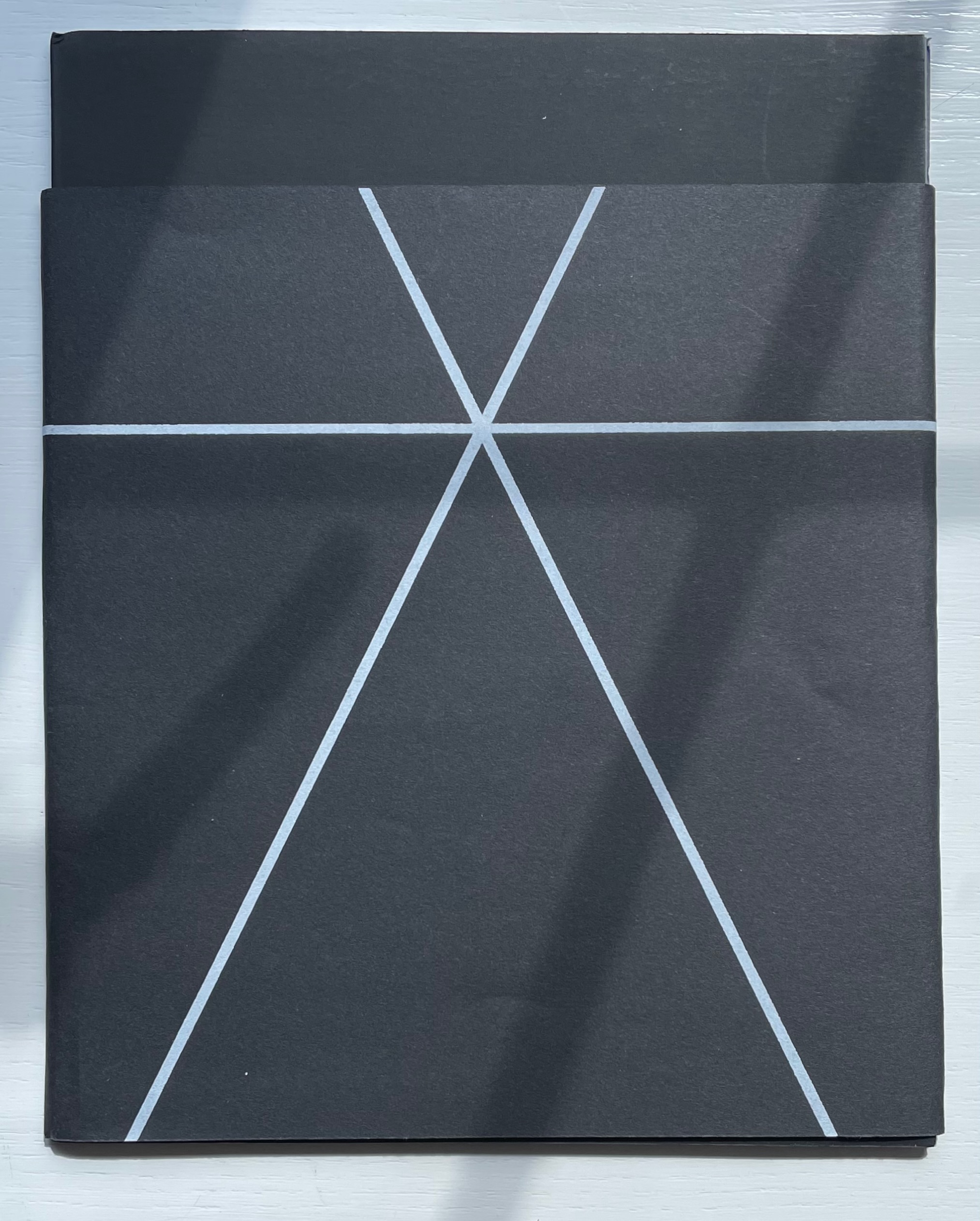
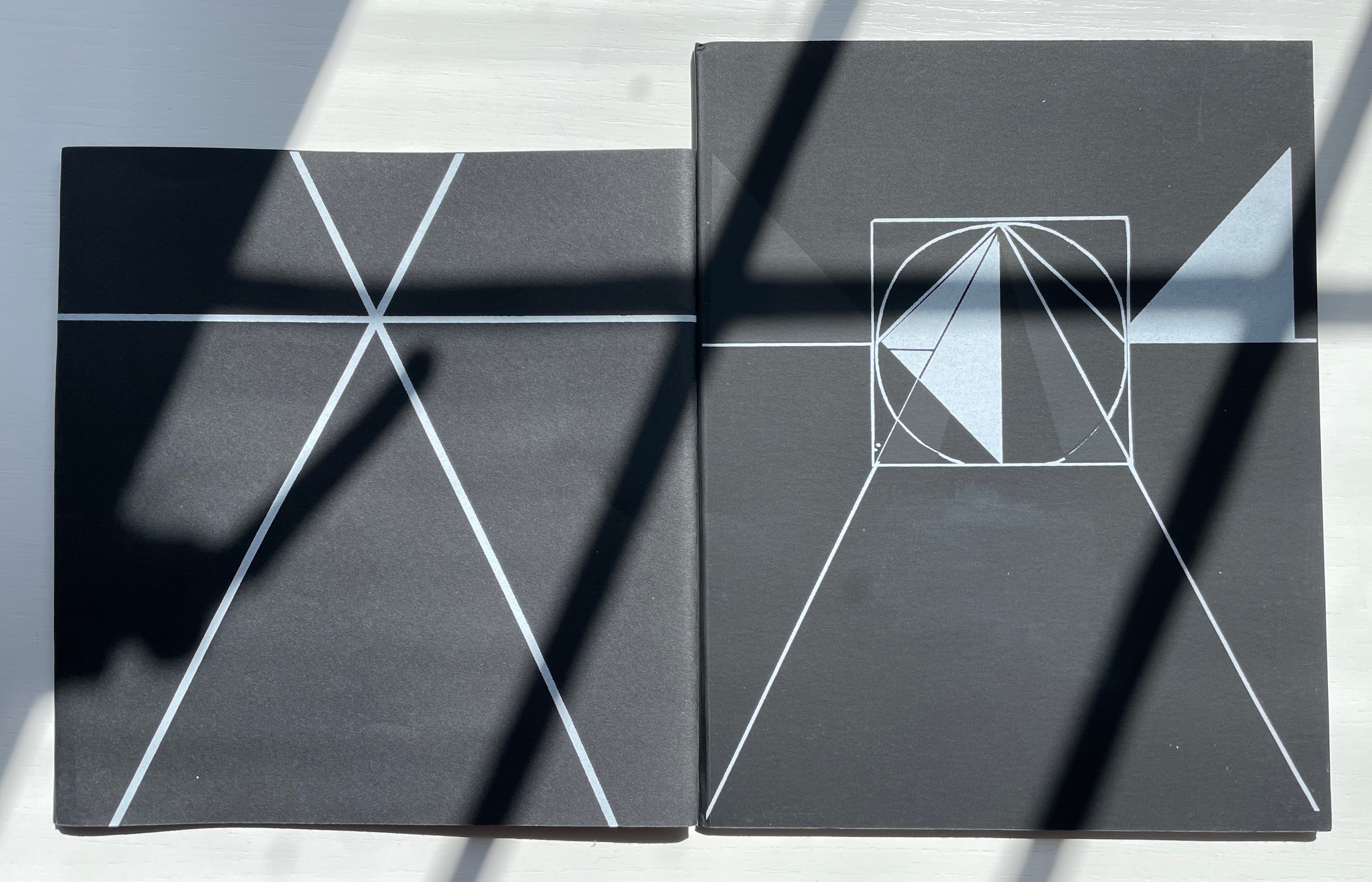
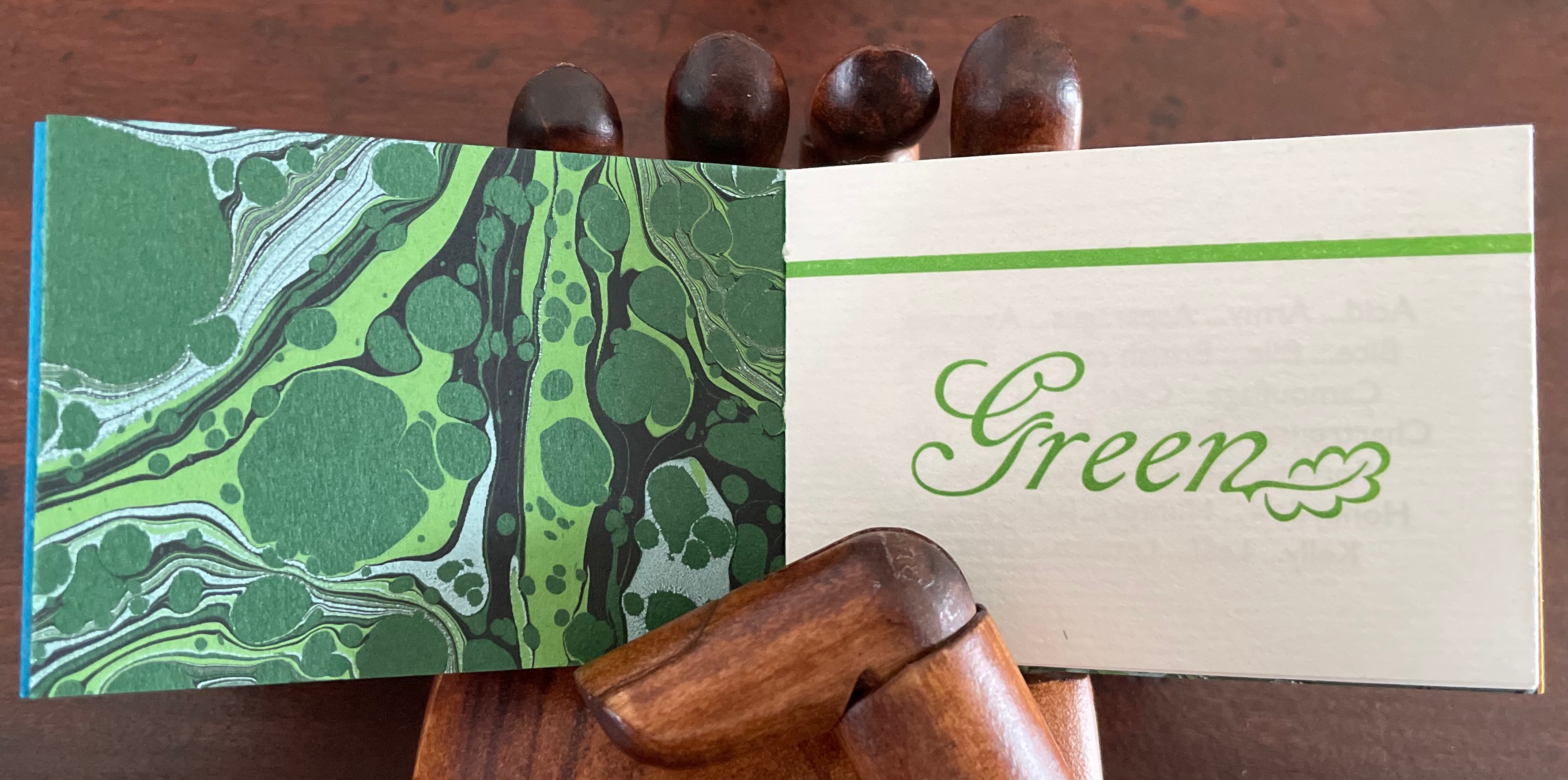
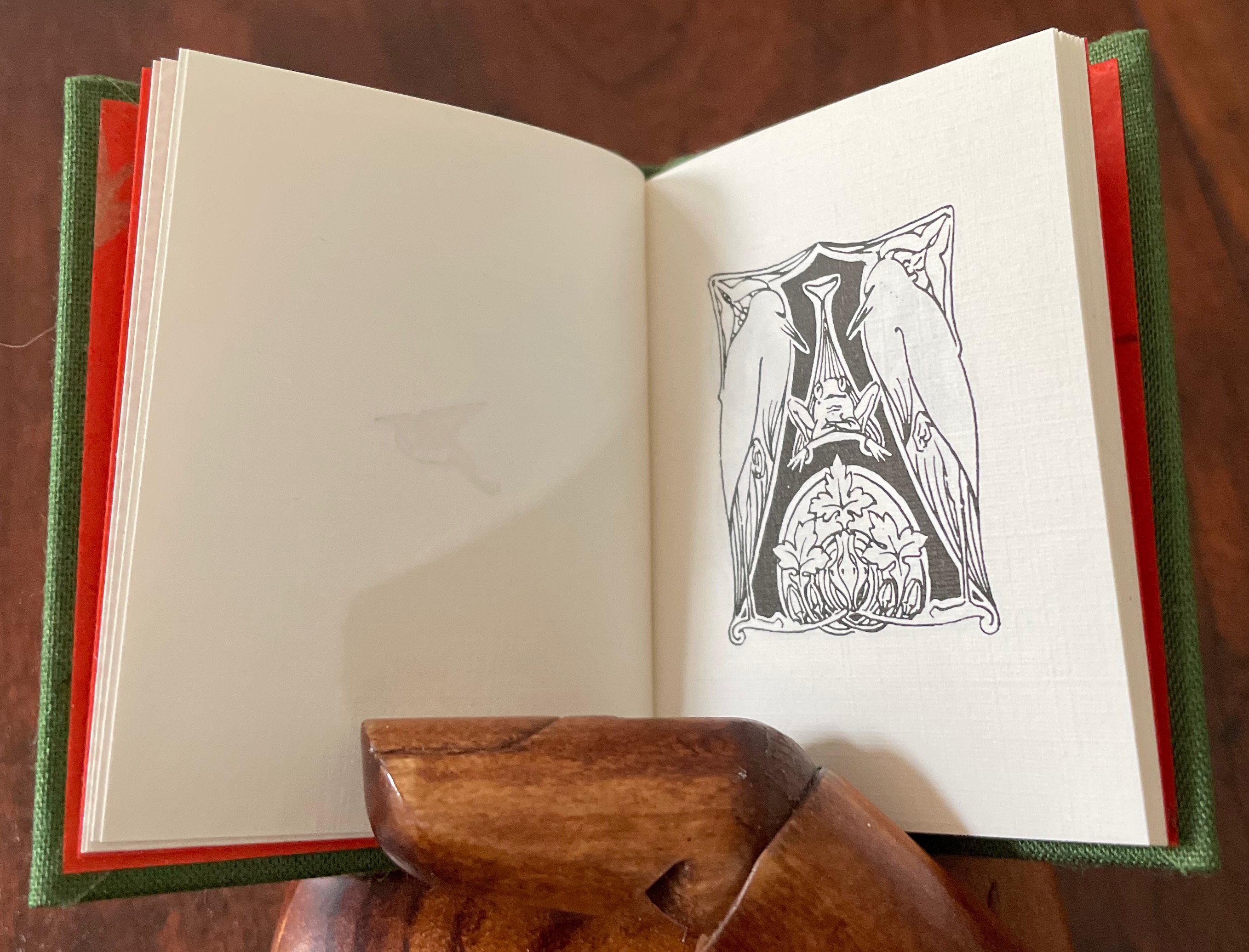
In a play known from fragments as the Alphabet Tragedy (although it sounds more of a comedy), the ancient Greek playwright Kallias had his chorus and actors mime and dance the letters of alphabet. Lisa Merkin’s book of blocks in a box shows that bending bodies to make letters has never grown old. Appropriately, her most recent image comes from Diego Rodas Feroni’s typeface Adonis (2018), which seems to recall the Greek playwright’s actors. Also in the Books On Books Collection, Vítězslav Nezval & Karl Teige’s Abeceda (1926), Pilobolus Dance Company’s Human Alphabet (2010) and Marie Lancelin, Gestes Alphabétiques (2014) have carried on the tradition of the alphabet dance.
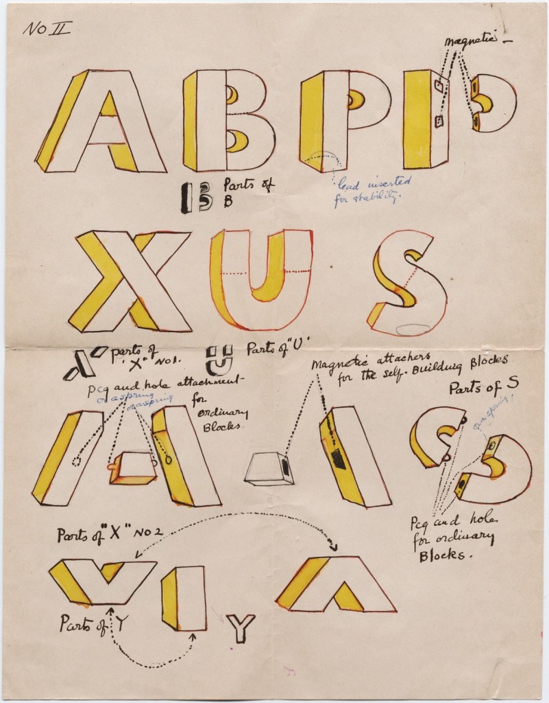
© Diego Feroni 2018. Displayed with permission of Diego Rodas Feroni.
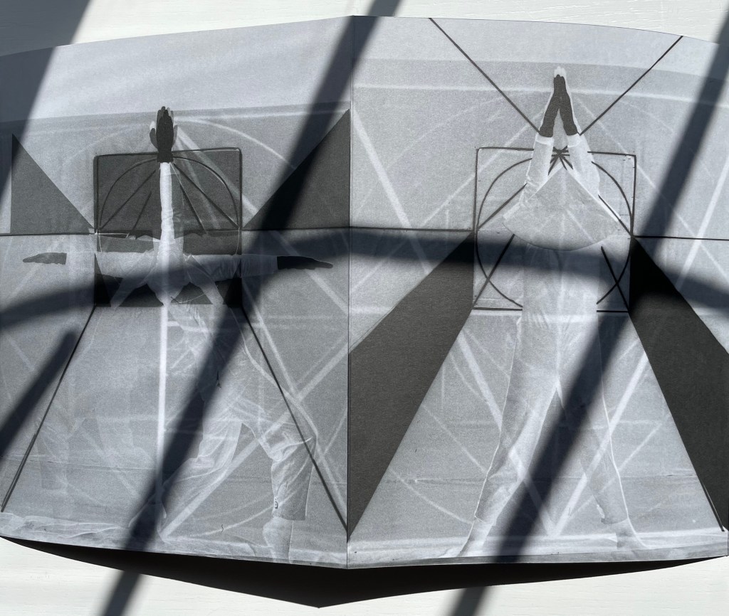
Block 6: During his studies at UFRJ Universidade Federal do Rio de Janeiro, Diego Rodas Feroni designed the Greek God figurine typeface Adonis (2017).
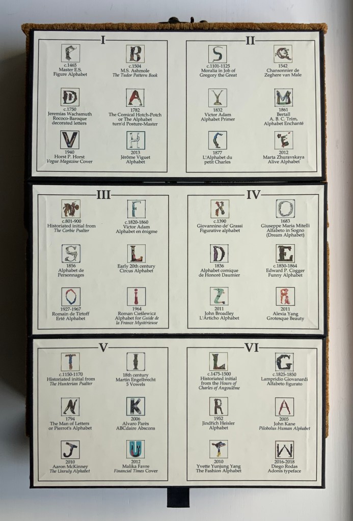
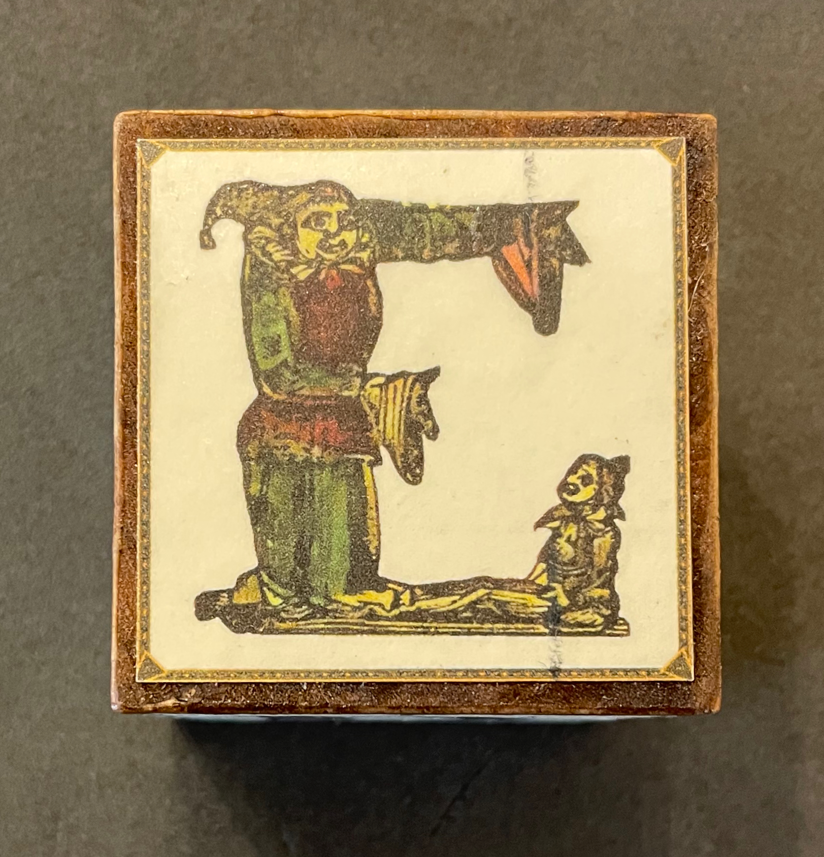
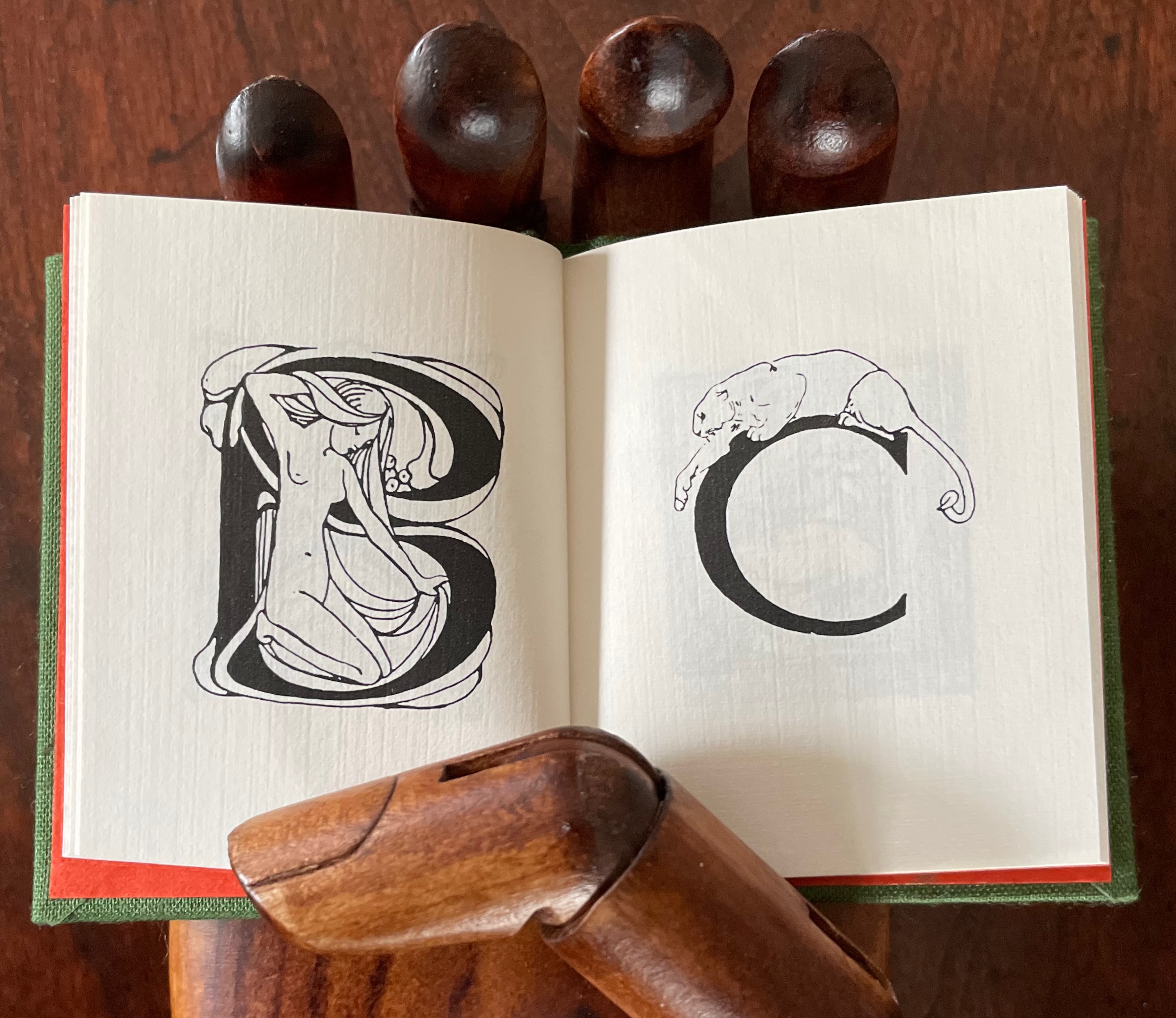
Many of Merkin’s choices celebrate the more comic aspects of anthropomorphic letters: Carington Bowles’ The Comical Hotch-Potch (1782), Bowles & Carver’s The Man of Letters, or Pierrot’s Alphabet (1794), Honoré Daumier’s Alphabet comique (1836), Edward P. Cogger’s Funny Alphabet (c. 1850-64), Aaron McKinney’s The Unruly Alphabet (2010) and Jérôme Viguet’s caricatures Alphabet (2013).
Block 4: Funny Alphabet (c.1850 – 1864) by illustrator and engraver Edward P. Cogger. McLoughlin Brothers Publishing, NY.
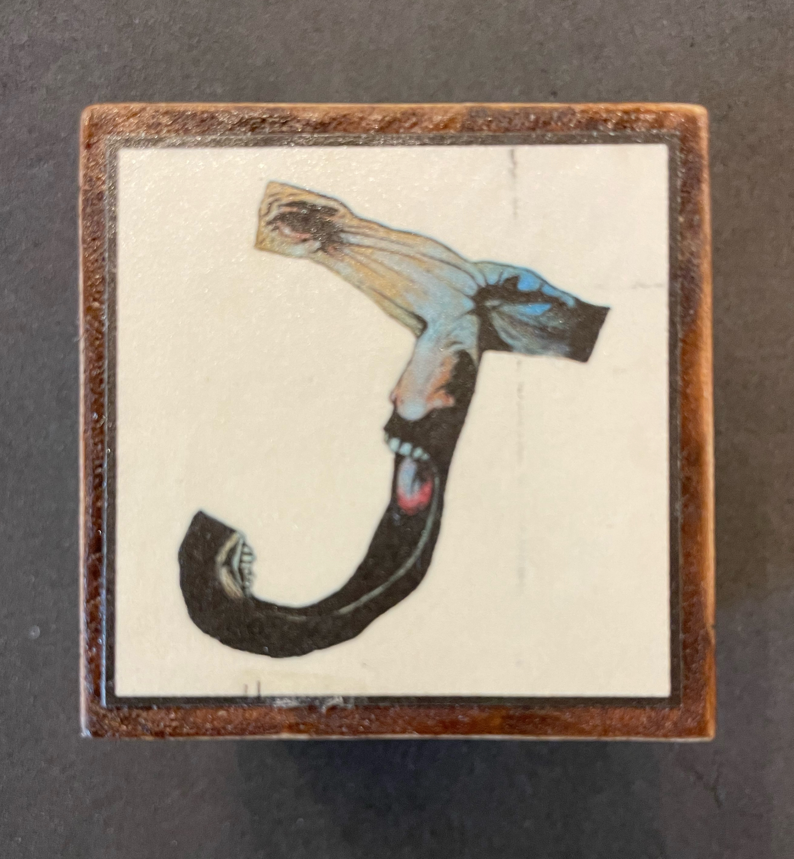
Block 5: The Unruly Alphabet is a “lively and haunting abecedary“ book created in 2010 by the English illustrator Aaron McKinney, who sets the alphabet against a backdrop of rebellious behavior showcasing human nature.
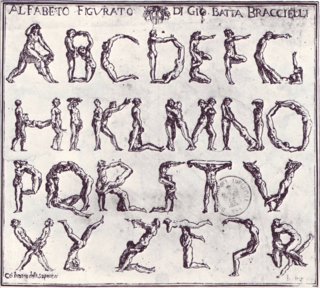
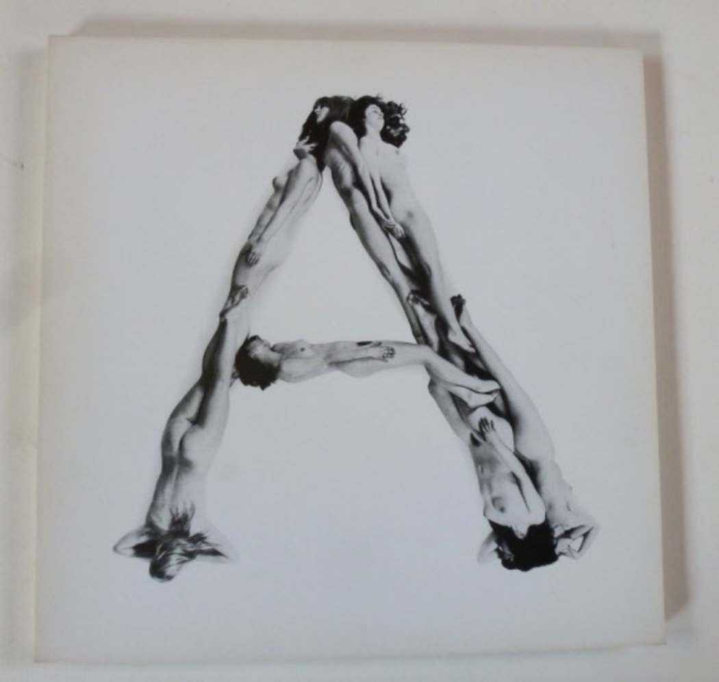
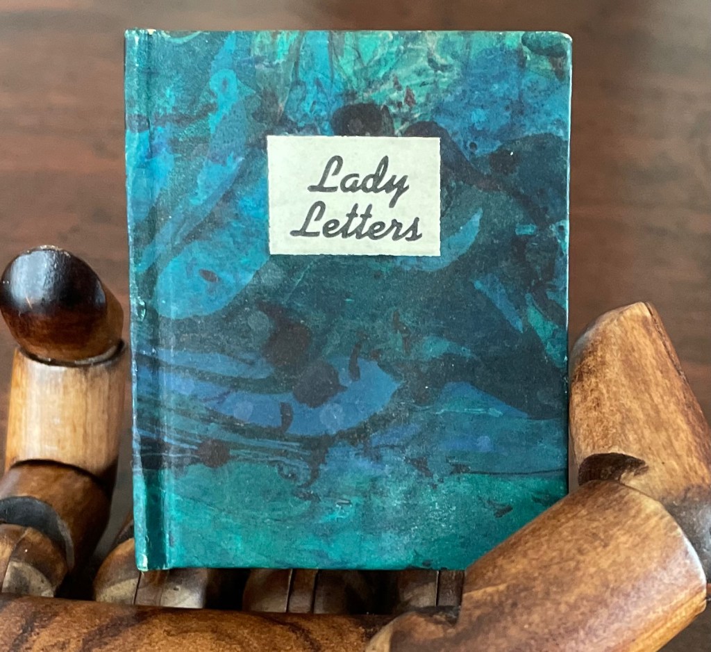
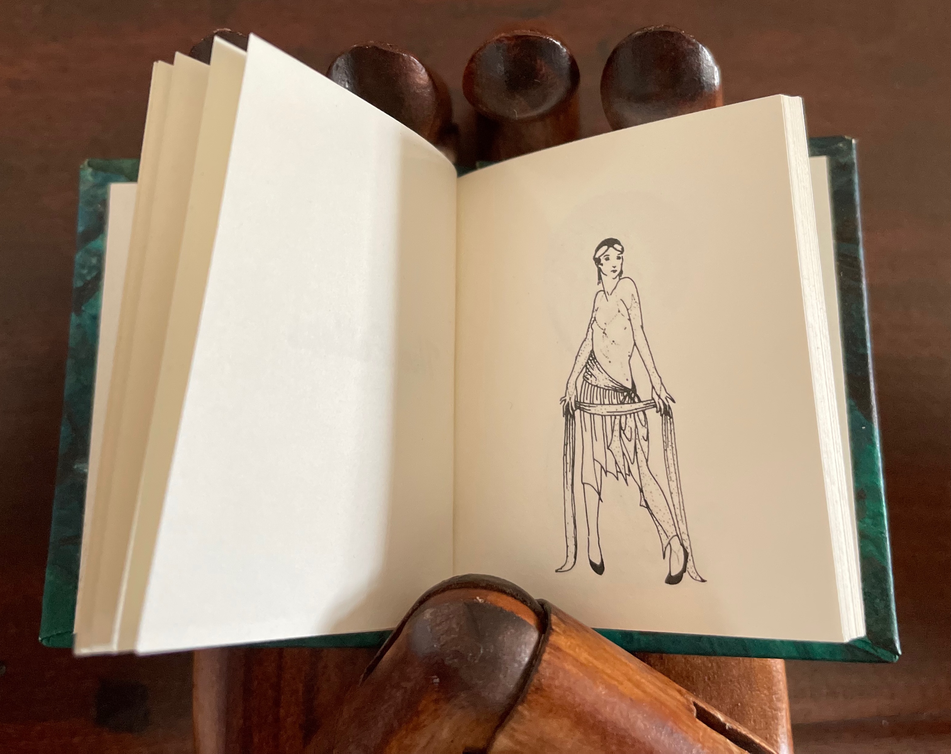
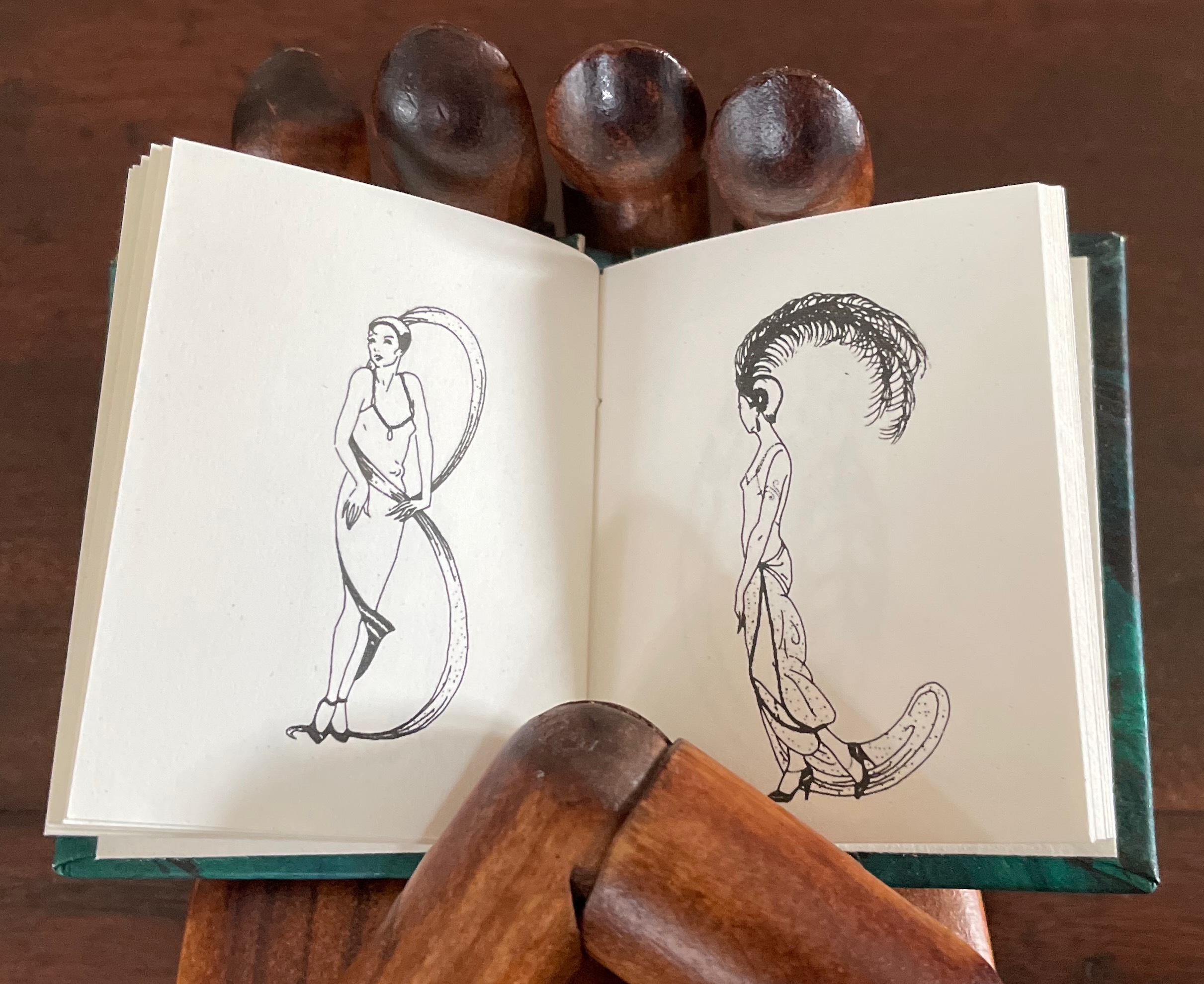
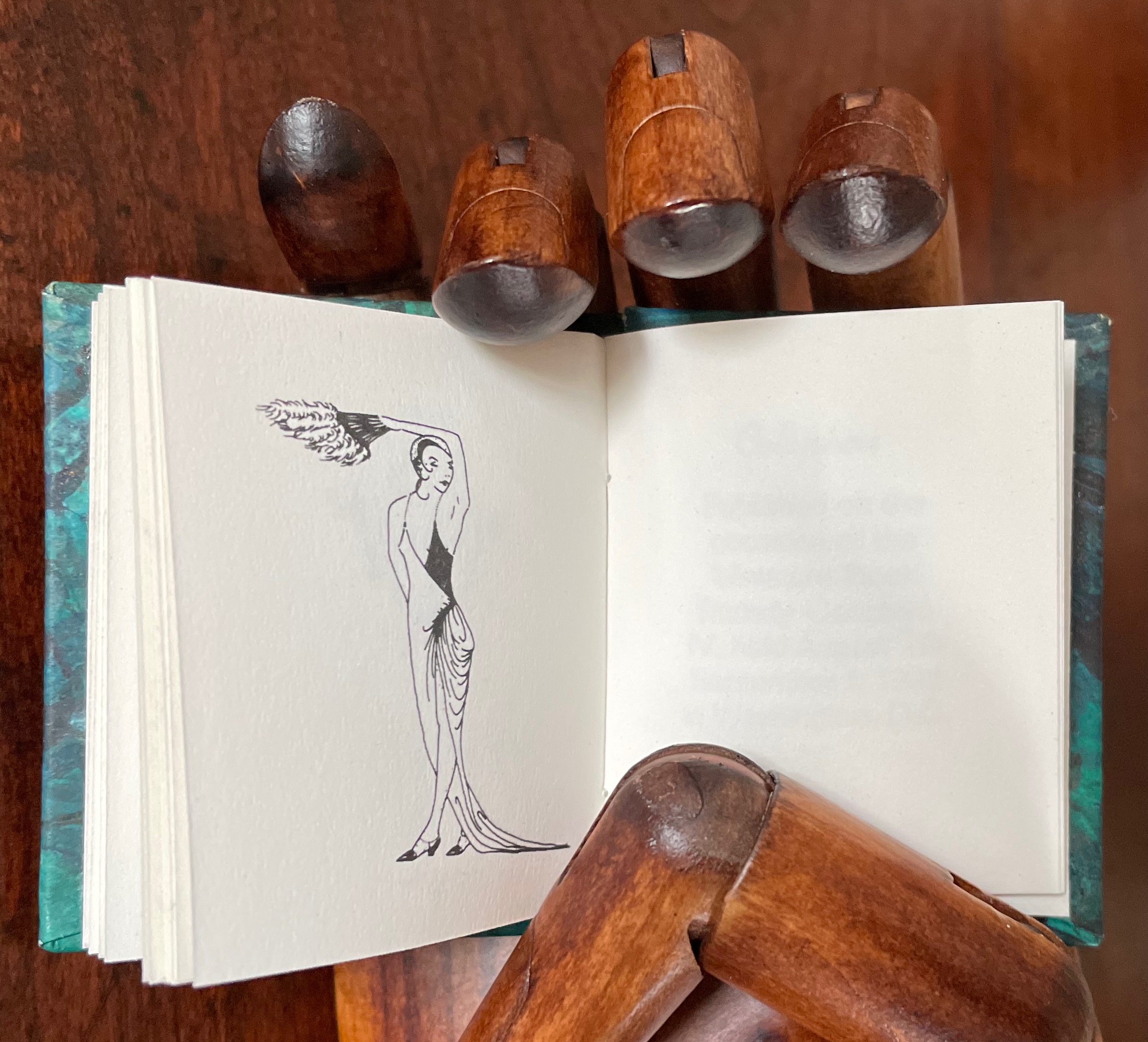
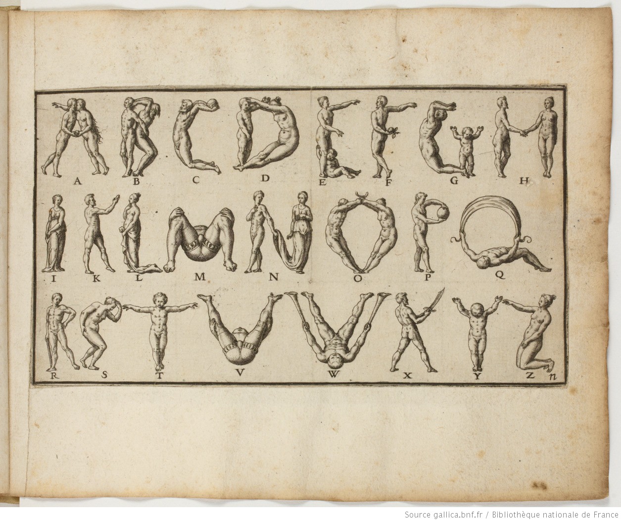
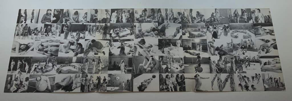
Maybe the human body and the perfect letter have something in common. Geofroy Tory (1529) and Anthon Beeke (1970) certainly thought so — the former in a neo-Platonic, religious way and the latter in a more secular way. Although Beeke is not represented among Merkin’s blocks, she does not neglect celebrations of the female form. Most of them come from the realm of fashion: Erté’s Alphabet (1927-67), Horst P. Horst’s Vogue cover (1940), Yvette Yang’s The Fashion Alphabet (2010) and Alexia Yang’s Grotesque Beauty (2011). From the collection, Rebecca Bingham’s miniature Lady Letters (1986) could qualify for the catwalk.
Champ Fleury by Geofroy Tory Translated into English and Annotated by George B. Ives, Designed and printed by Bruce Rogers (1529)[1927]
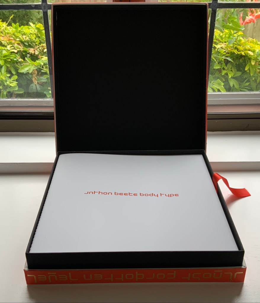
Alphabet by Anthon Beeke, Geert Kooiman and Ed van der Elsken (1970).
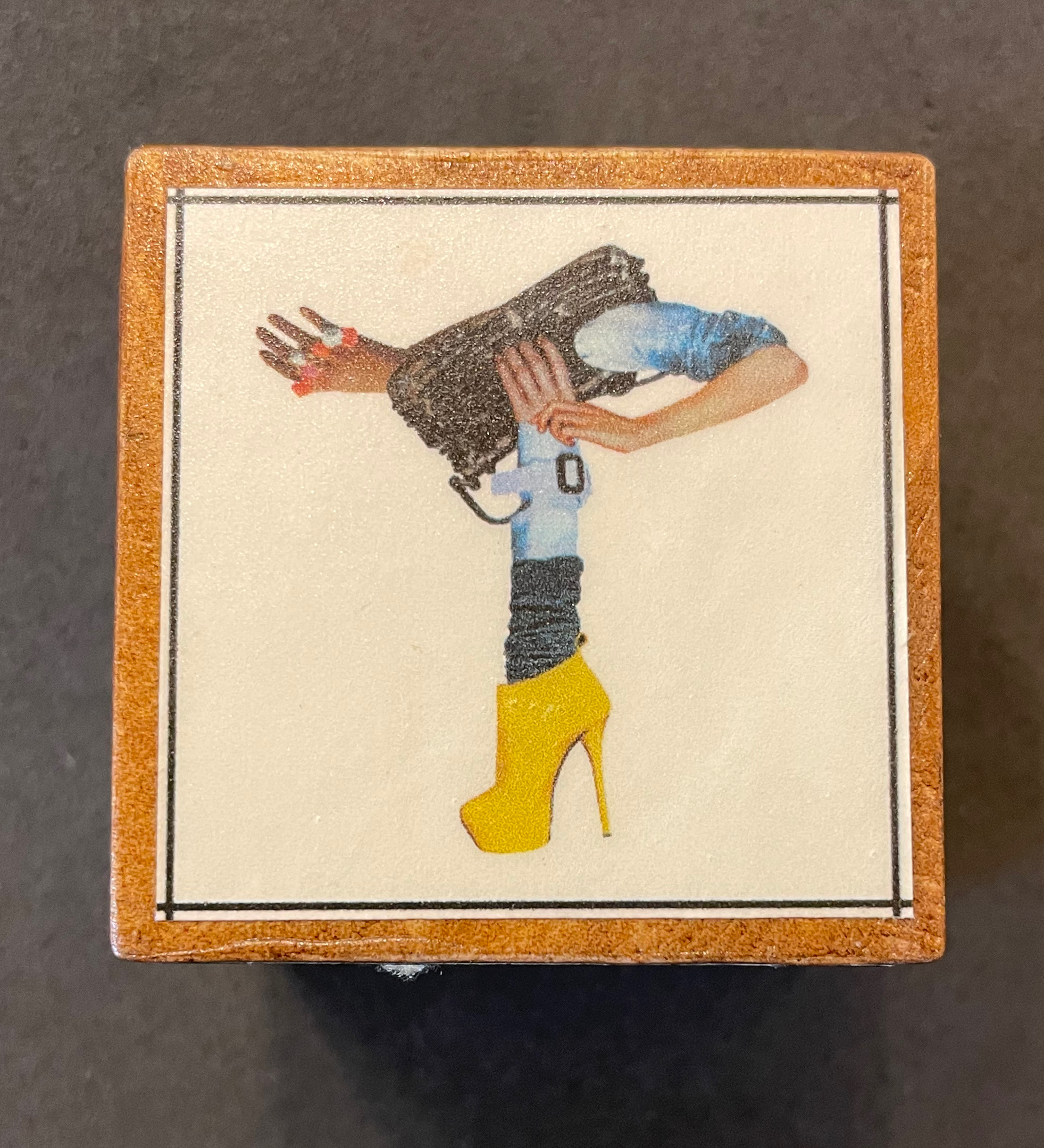
Block 6: The Fashion Alphabet by Korean-born, Dutch-educated, and Paris-based artist, Yvette Yang. In 2007, Yang began creating her font fashion series with bits and pieces from the runways and magazines. This T is from her interpretation of Spring/Summer 2010.
Lady Letters (1986) by June Sidwell and Rebecca Bingham. The miniature book captures Sidwell’s designs and poses.
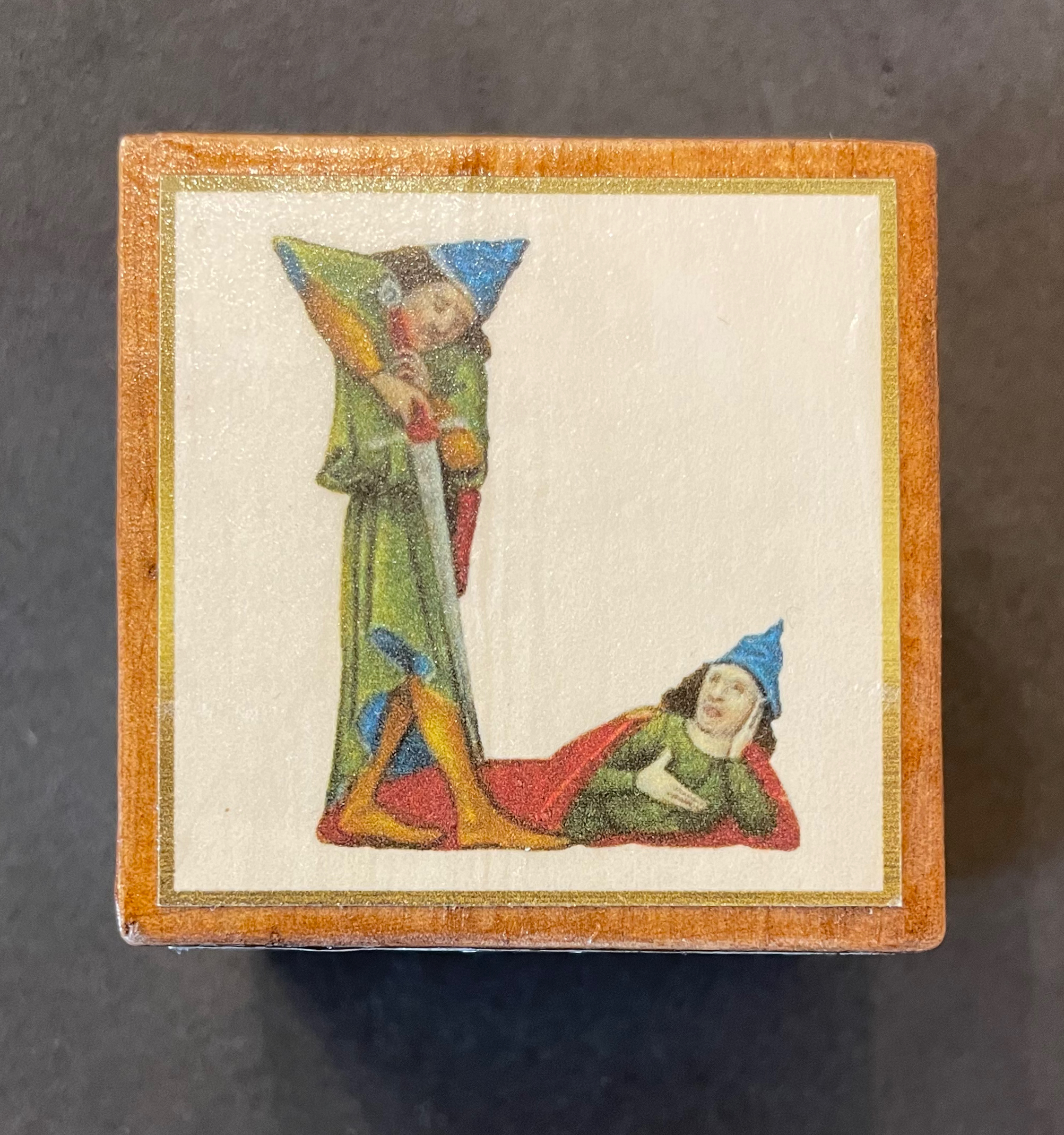
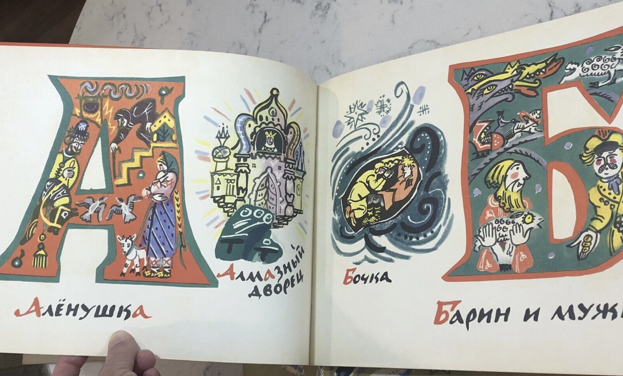
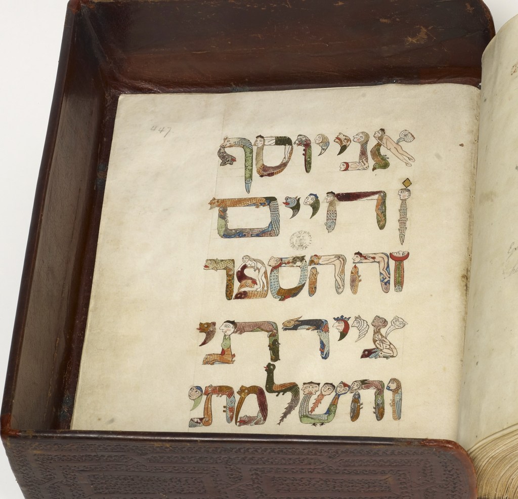
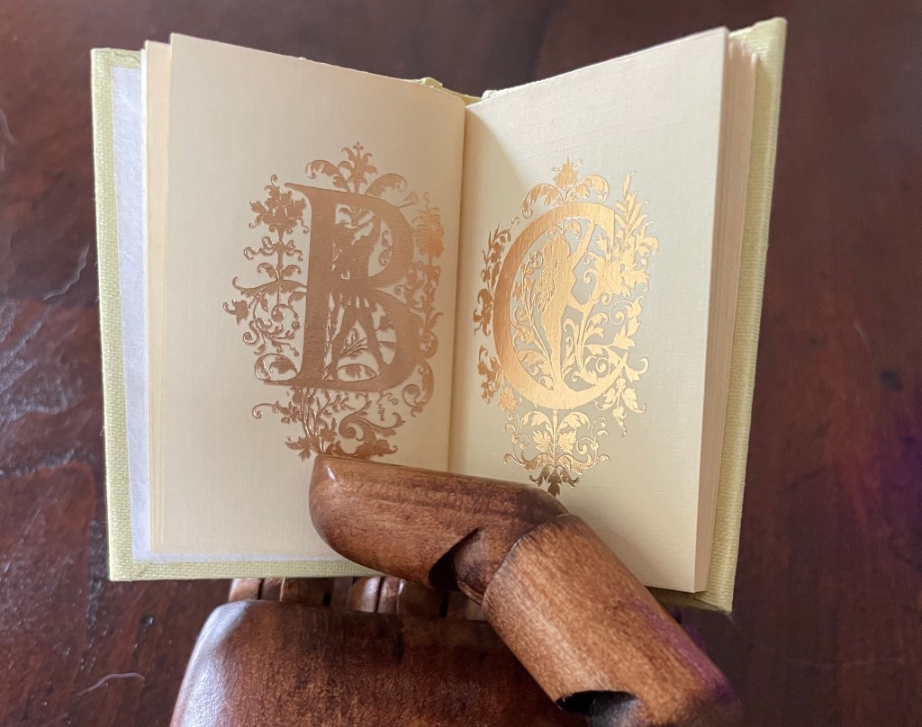
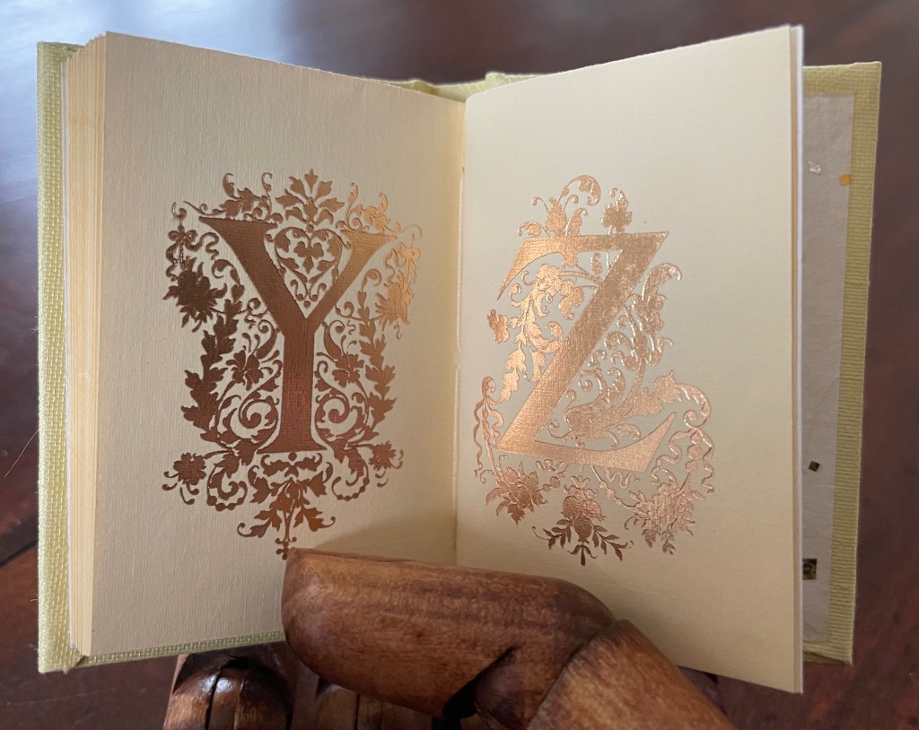
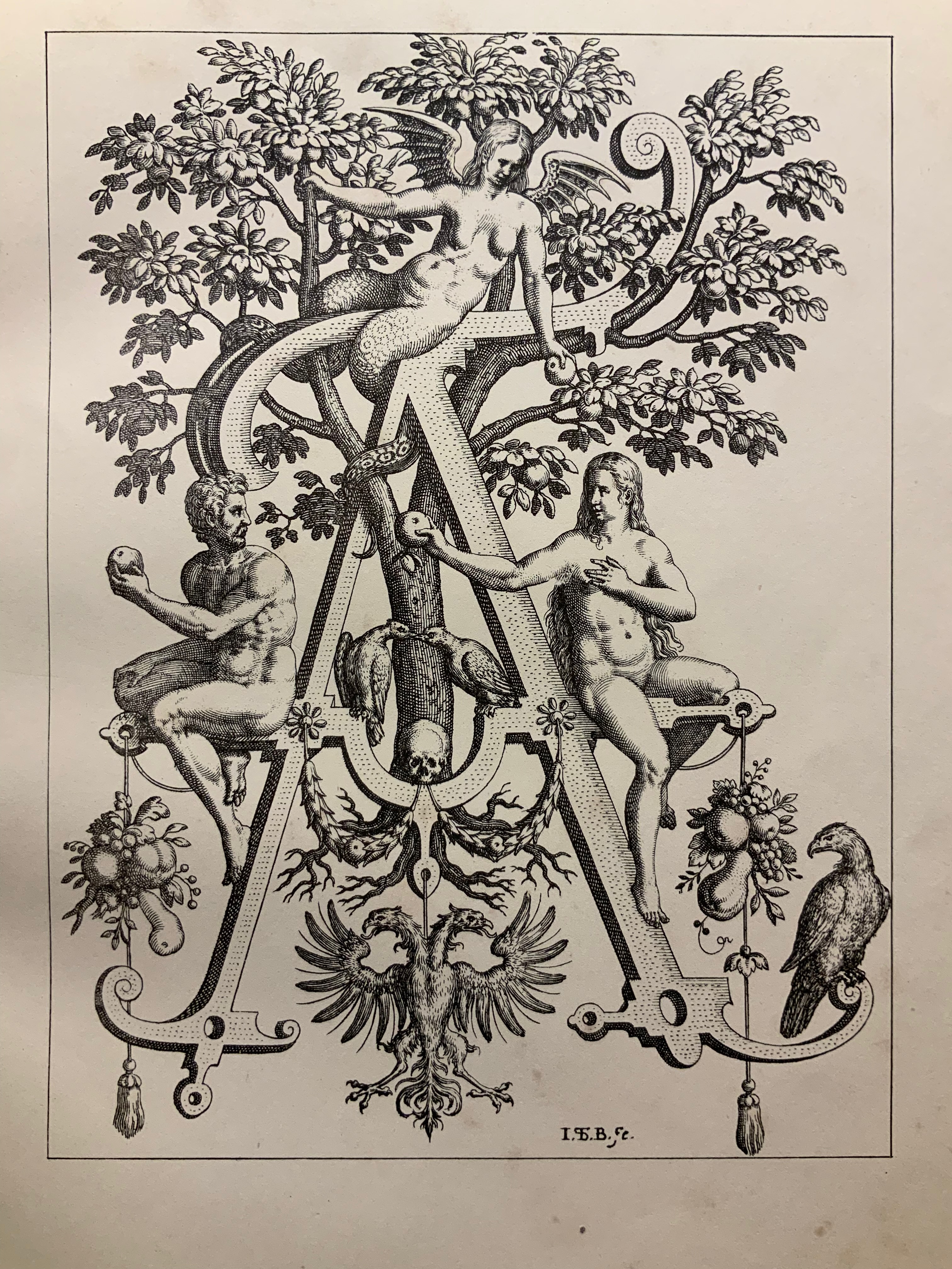
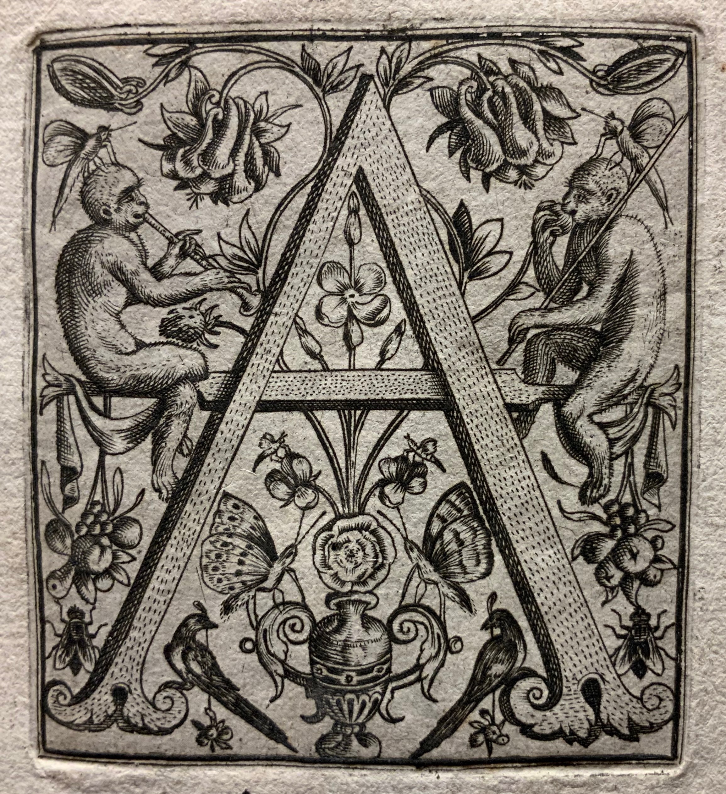
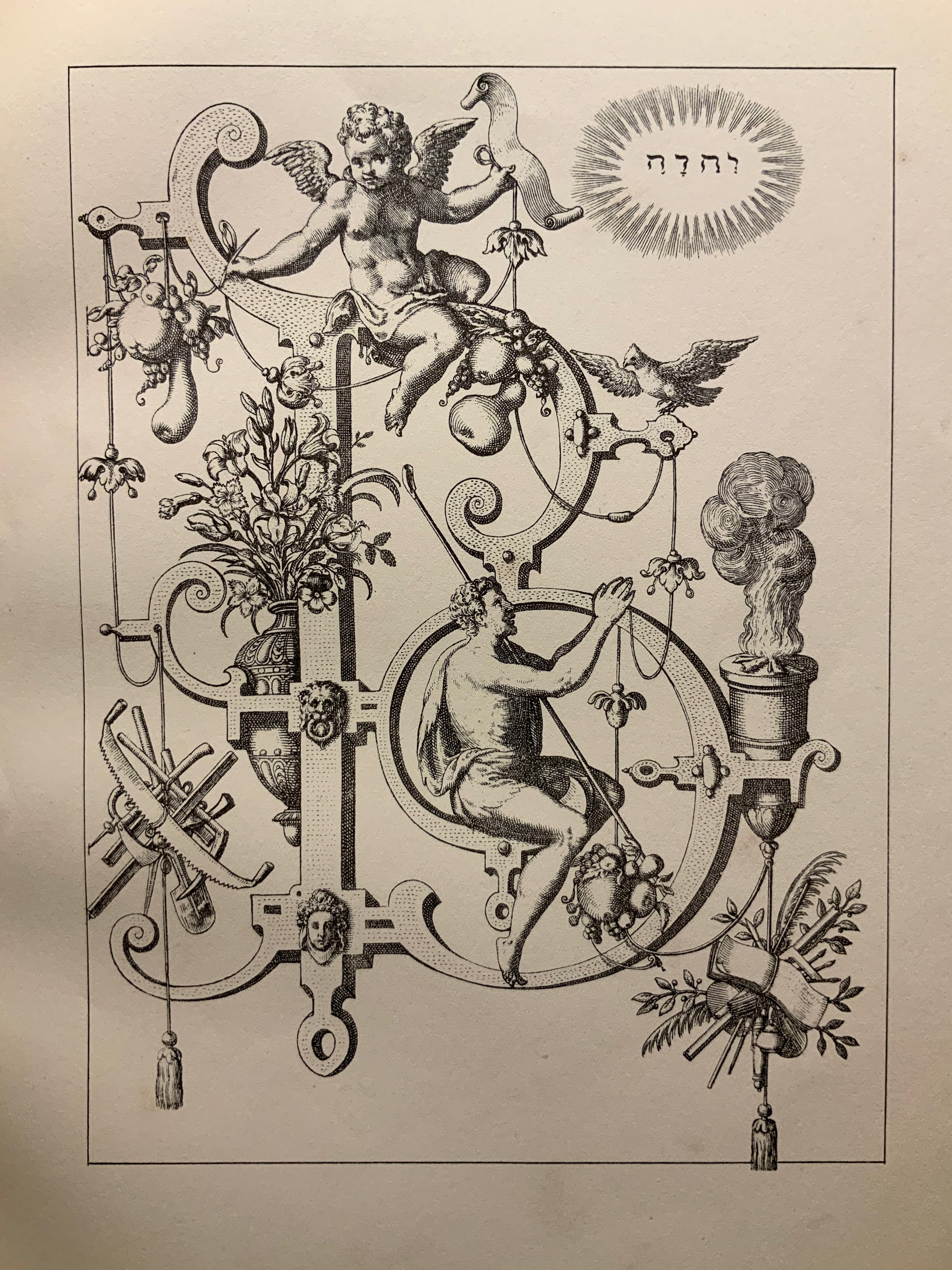
Historiated and figurative letters from the 6th to 15th centuries so well represent the Latin alphabet in Merkin’s box of blocks it would be greedy and thematically problematic to wish for one of the Hebrew letters from the Kennicott Bible. If there is ever a second Merkin volume to celebrate anthropomorphic letters, though, another range of languages beckons. For Ukrainian, there are the letters of Tatyana Mavrina. For Arabic, there are Mahmoud Tammam’s inventions, but then the volume would have to admit the zoomorphic, which suggests perhaps a third Merkin volume of animal alphabets.
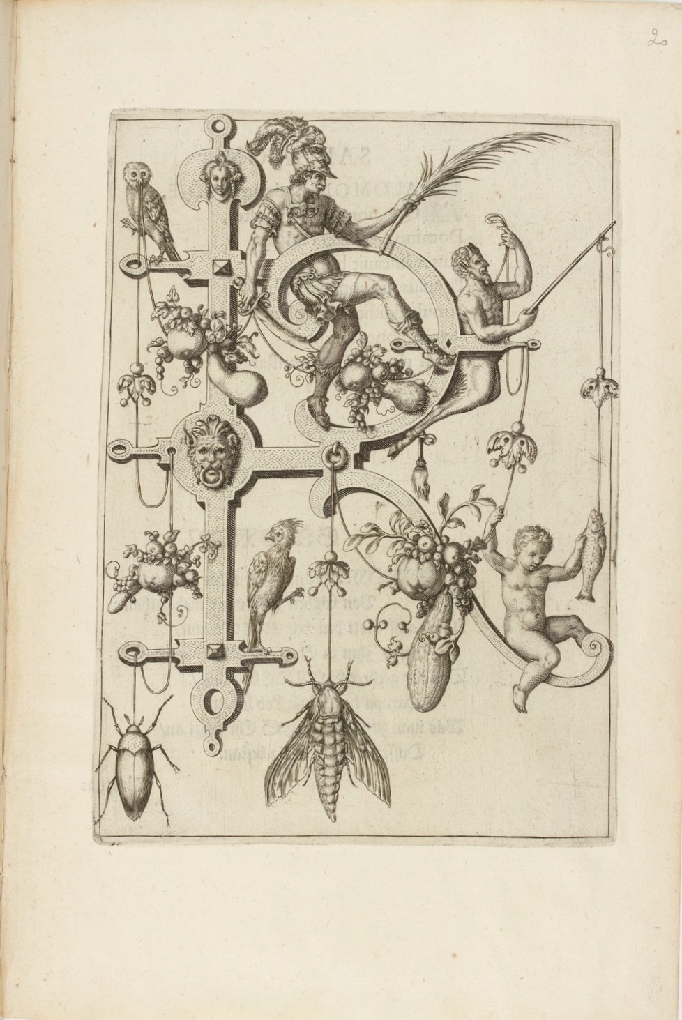
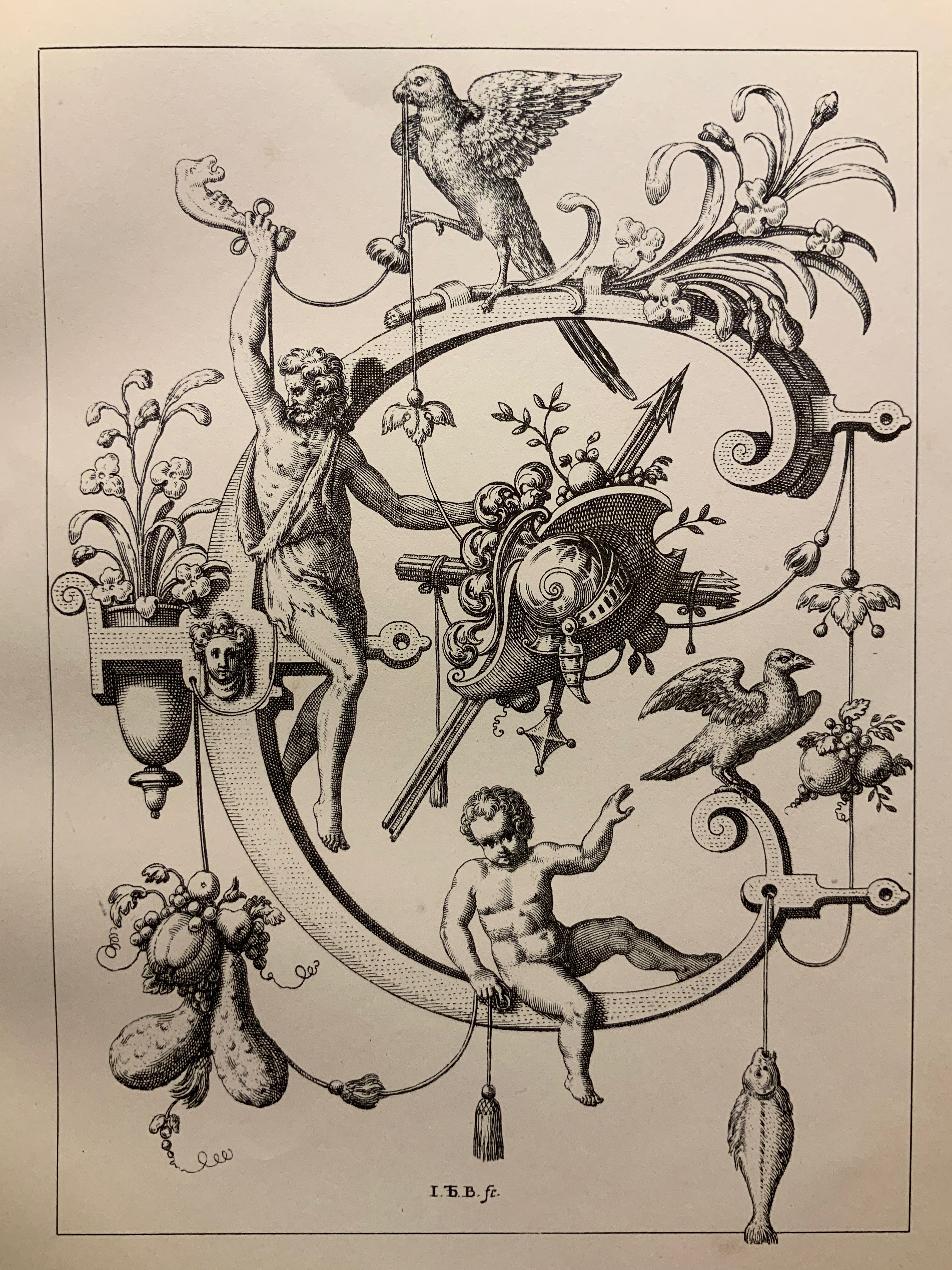
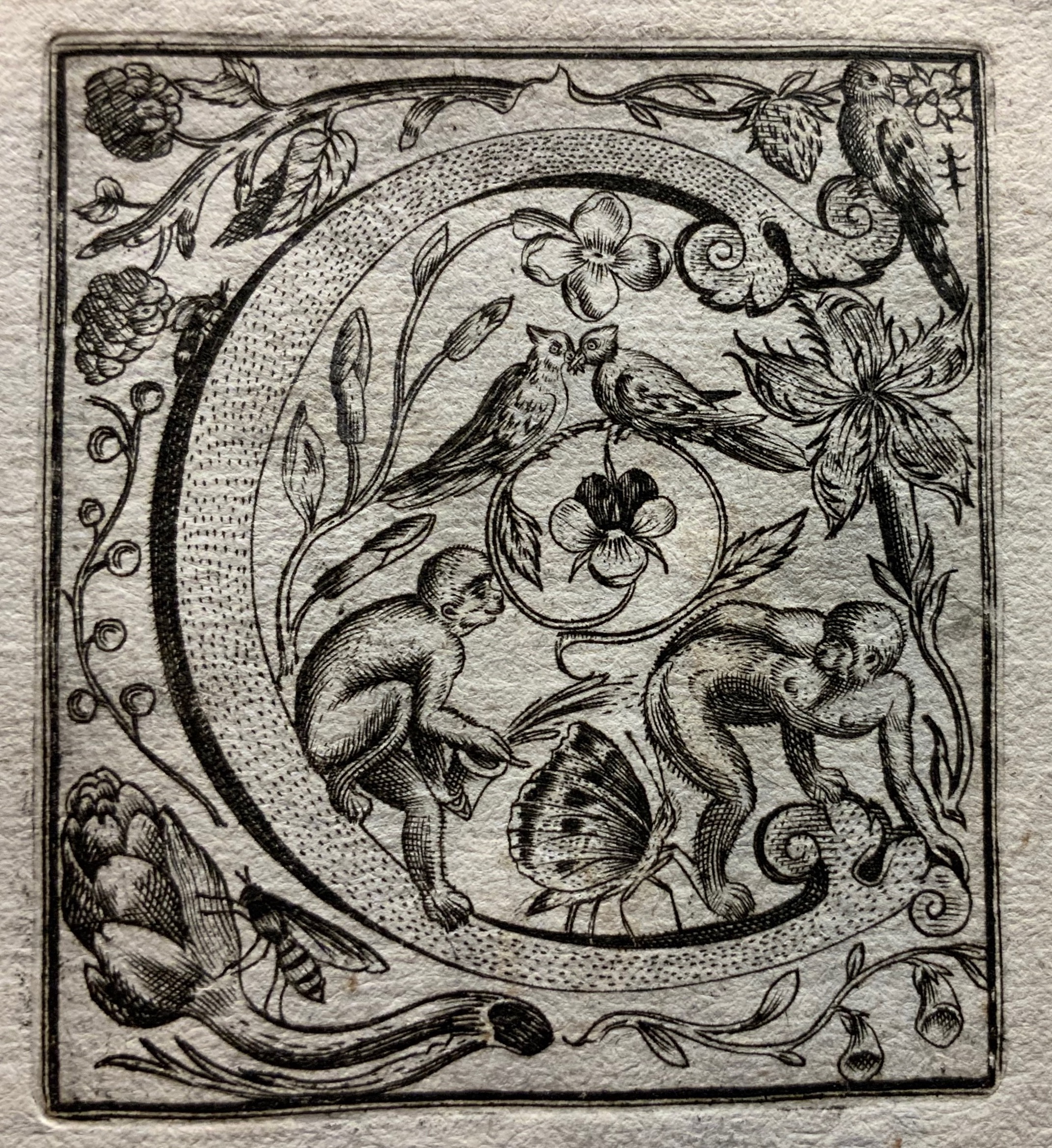
Block 6: Horae ad usum Parisiensem (Hours of Charles of Angoulême) (ca. 1475-1500) by the French illuminator and painter Robinet Testard (fl. 1470–1531). Bibliothèque nationale de France, Paris.
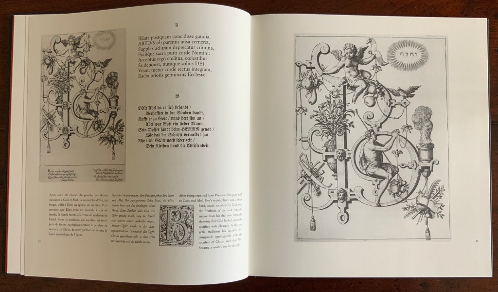
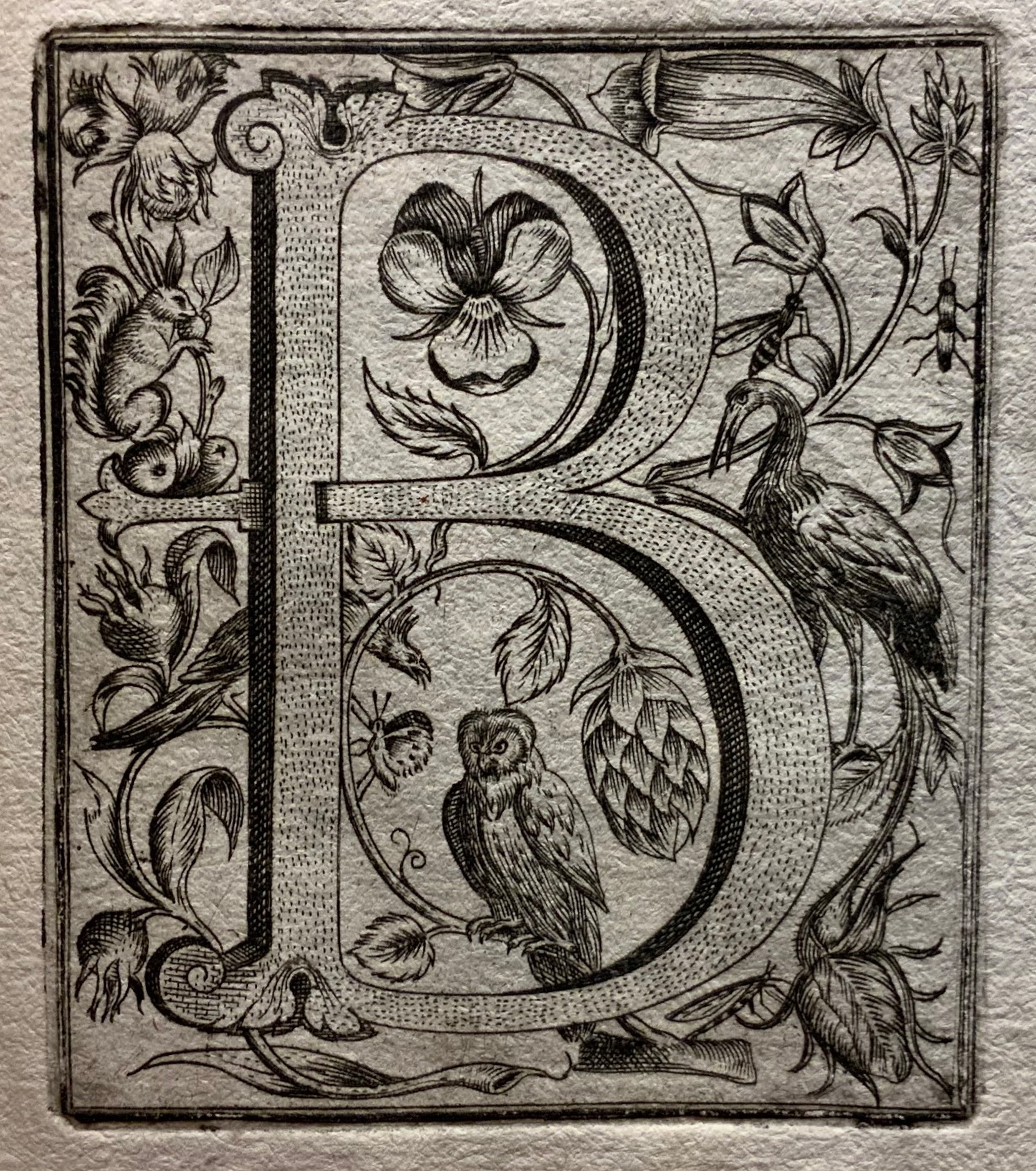
Block 2: Moralia in Job by Pope Gregory the Great (590-604). The Abbaye Notre-Dame, Cîteaux, France.
Hebrew Bible with David Kimhi’s Sefer Mikhlol (“Kennicott Bible“) (1476). Neubauer 2322. Bodleian Libraries, Oxford.
Сказочная Азбука / Skazochnaia Azbuka / A Fairy Tale Alphabet (1969) by Tatyana Mavrina.
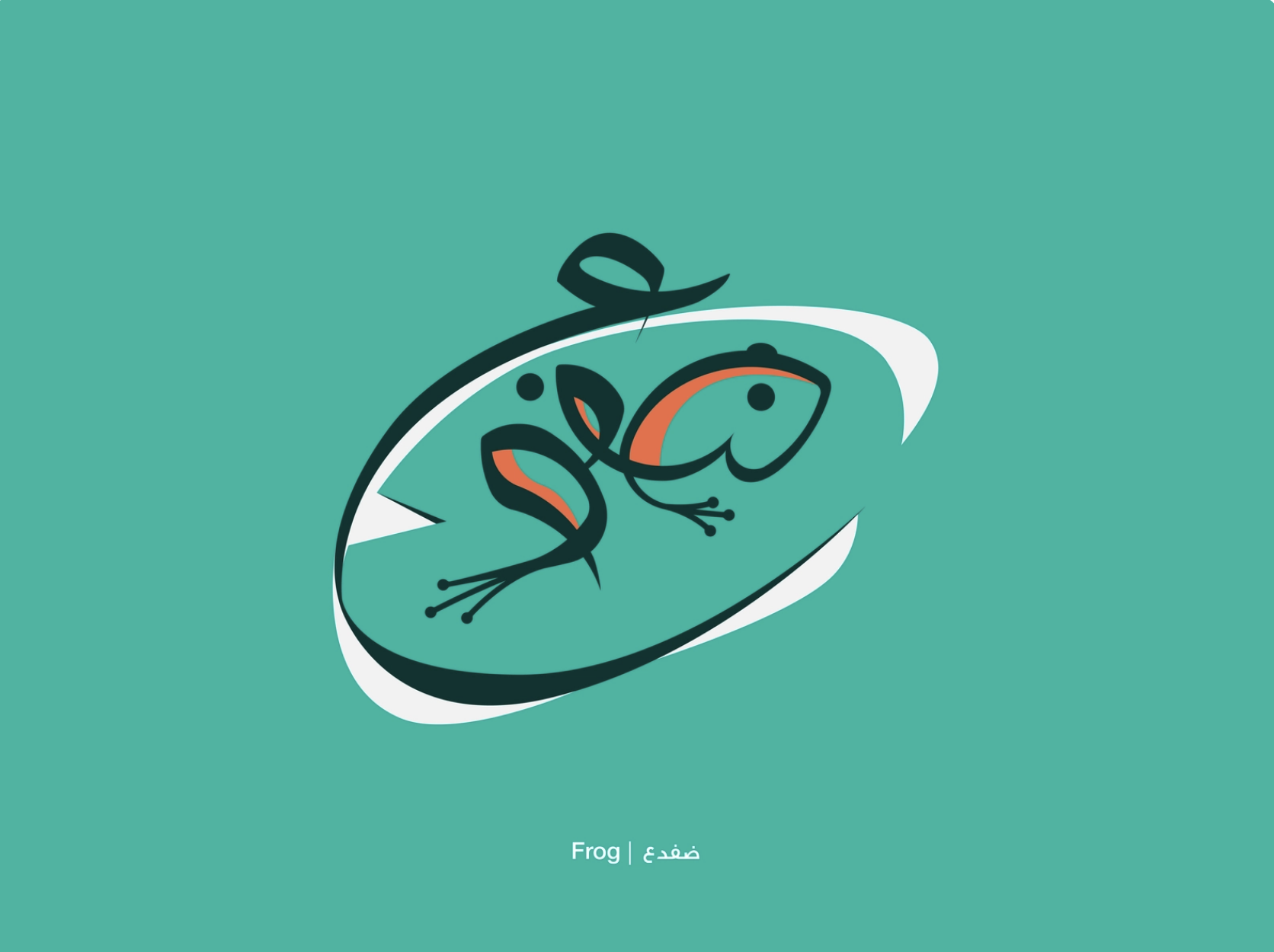
In his Arabic letters project, Mahmoud Tammam manipulates the Arabic script ضفدع meaning “frog” to illustrate its meaning.
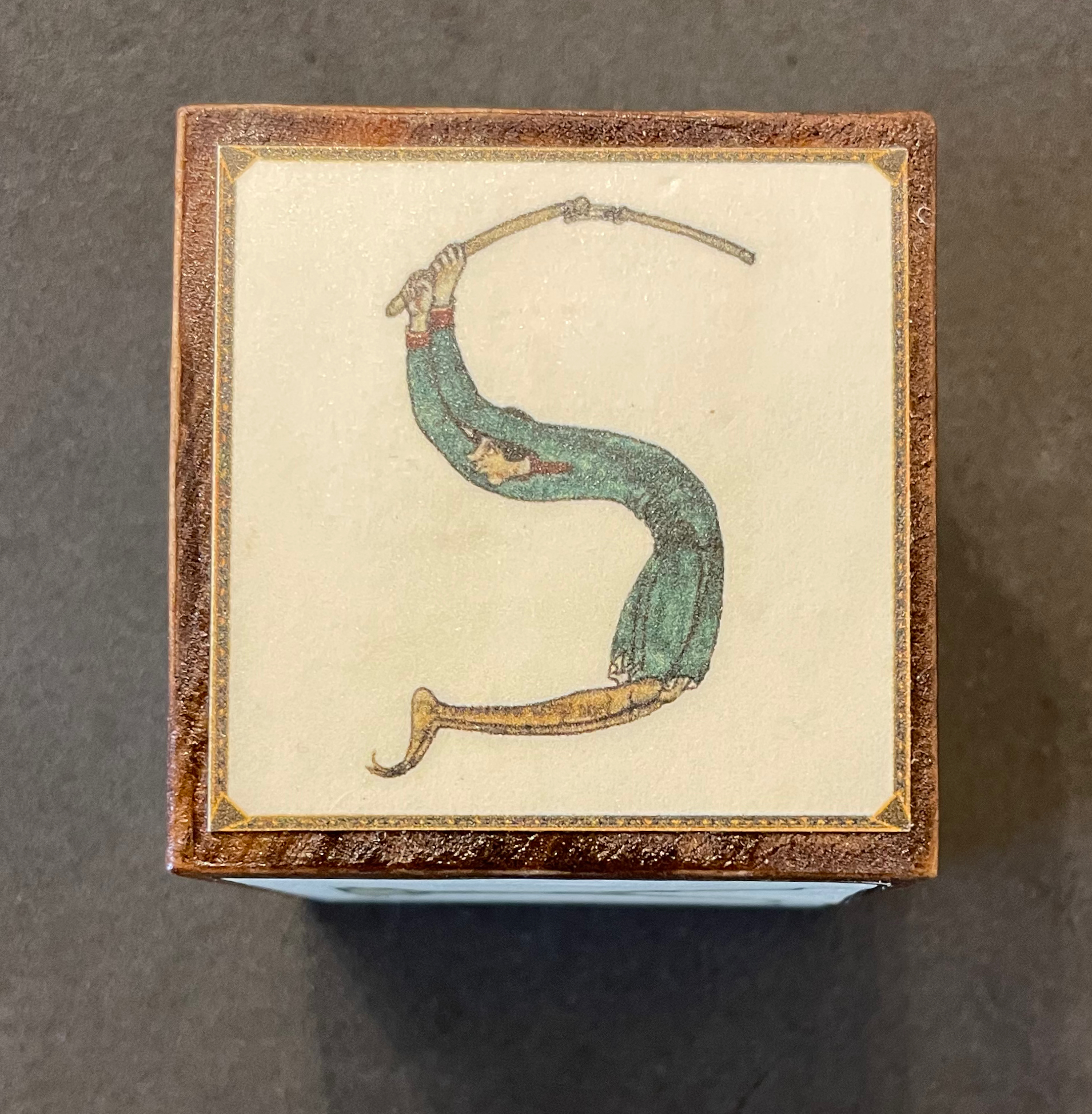
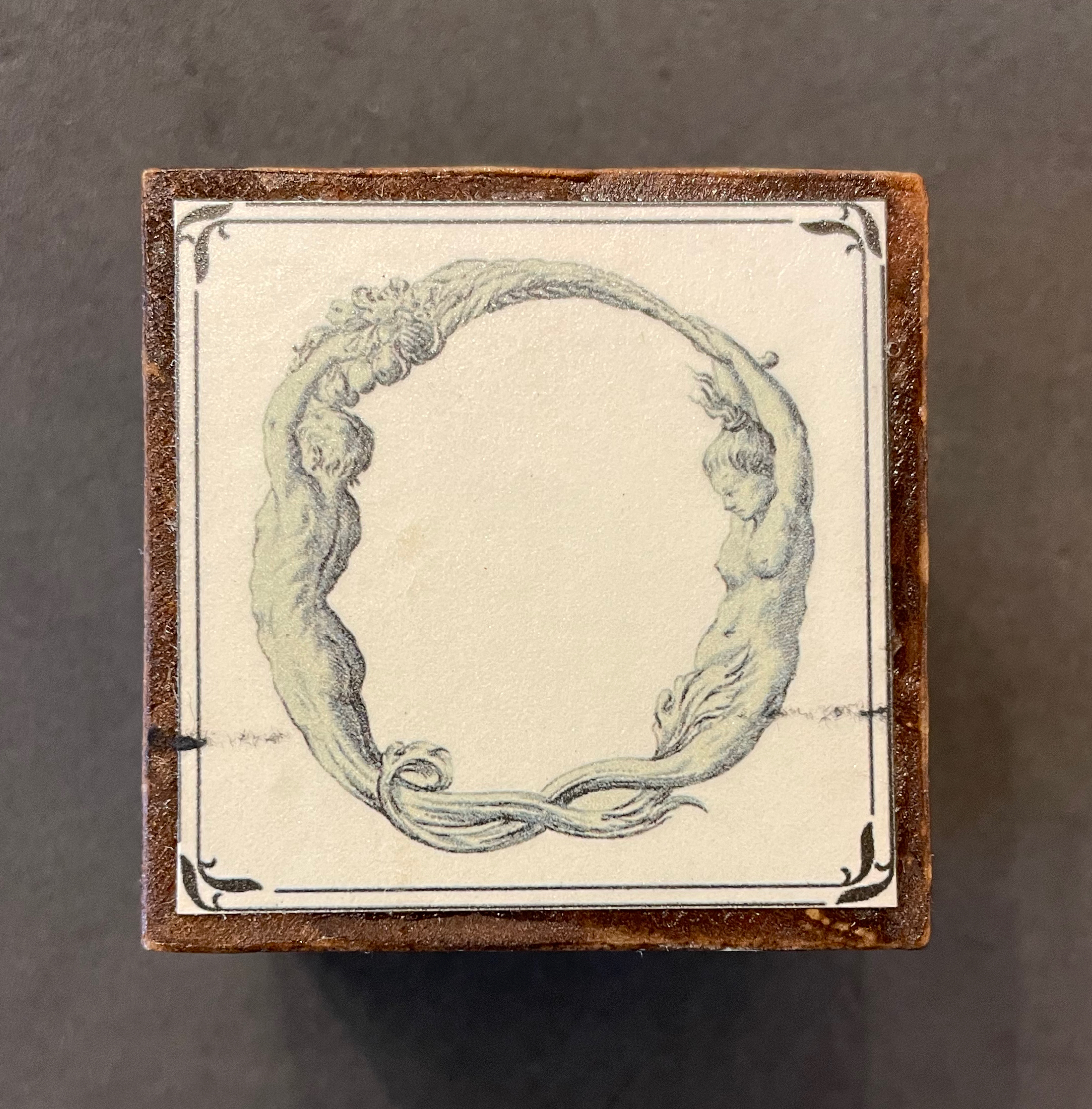
As shown with the Adonis letter W, Merkin’s blocks remind us of the influence of past art on the alphabets of 20th- and 21st-century designers and artists. Among the modern alphabetic variants, Dada and Surrealism make a strong showing of influence on Yvette Yang’s letter T (above) and Roman Cieślewicz’s letter i (below), and who knows, perhaps Giuseppe Maria Mitelli’s letter O influenced the Dadaists and Surrealists themselves. More than a strong showing, these styles highlight something fundamental about the alphabet and art. Both the alphabet and art ask, Are we discovering meaning or making meaning?
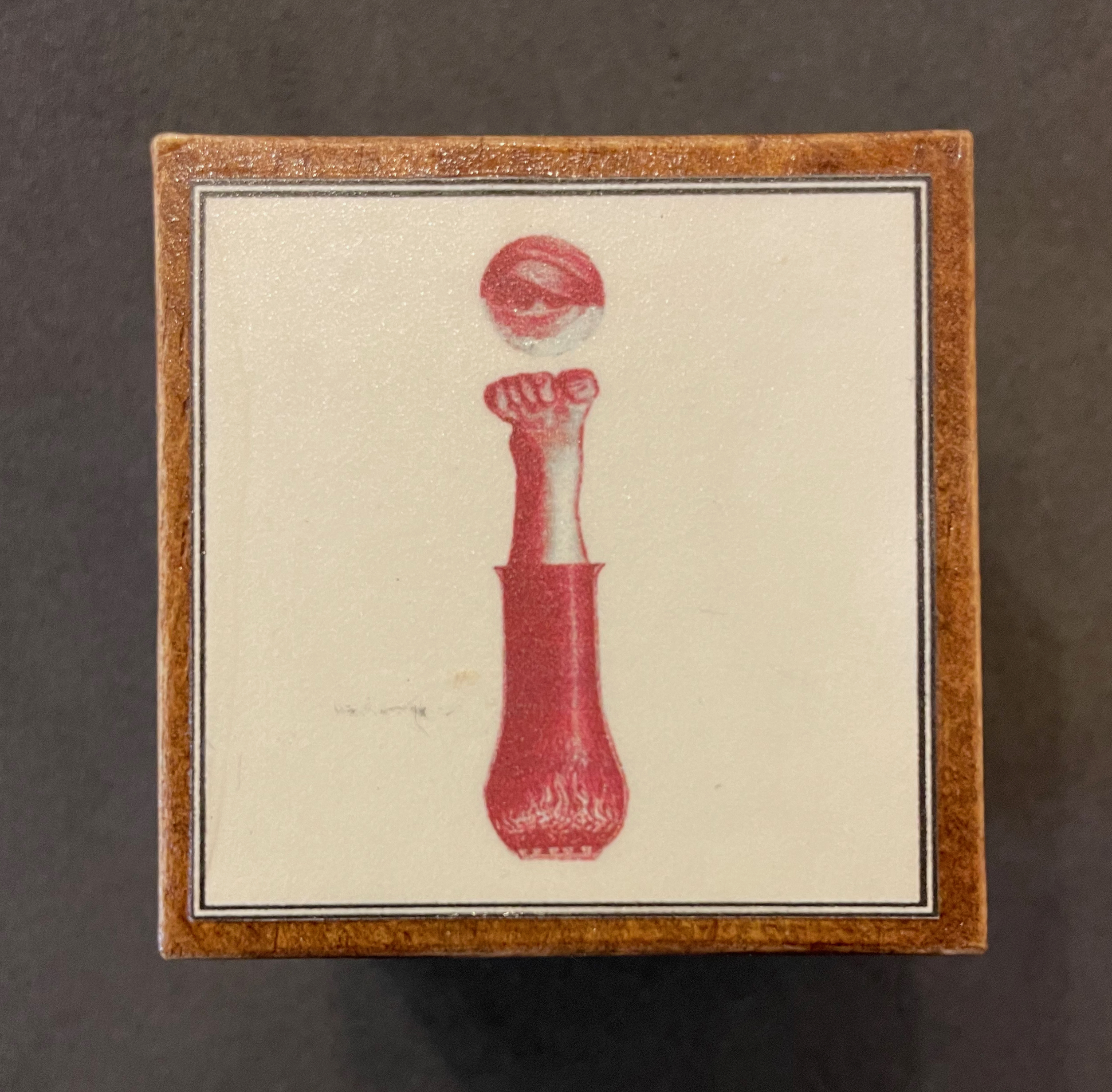
Block 4: Alfabeto in Sogno (1683), etchings by Giuseppe Maria Mitelli (1634-1718).
Block 3: From the fantastical alphabet created by Roman Cieślewicz (1930 -1996) for Guide de la France Mystérieuse” (1964).
Every history of letters or script begins with the figuratively pictographic. Someone somewhere at some time scrawled a shape tied to a sound tied to an object — A is for Ox — and some other(s) in the same place and time recognized and accepted the discovery that this handmade shape could conjure up that object in the mind. It would have seemed magical, and they imagined that somehow meaning and reality inhered in that shape or sound waiting to be discovered.
Yet, the shapes of characters — whether Latin or Chinese or Arabic or any language — and their relationship to the sound or meaning they represent is arbitrary, a prehistorical and historical function of social convention, a collective making by individuals. That arbitrariness provides the opening for artists to use the alphabet to question our meaning-seeking behavior and our assumptions about reality, and modern artists’ anthropomorphizing the alphabet pokes fun at that behavior and those assumptions. Perhaps a fourth Merkin box — one for bodies making “asemic alphabets”?
Further Reading
“Abecedaries I (in progress)“. Books On Books Collection.
“Anthon Beeke“. 21 June 2021. Books On Books Collection.
“Rebecca Bingham“. 30 December 2022. Books On Books Collection.
“Lyn Davies“. 7 August 2022. Books On Books Collection. Reference and fine print.
“Marie Lancelin“. 4 January 2023. Books On Books Collection.
“Tatyana Mavrina“. 24 February 2023. Books On Books Collection.
“Vítězslav Nezval“. 16 July 2021. Books On Books Collection.
“Geofroy Tory“. 21 June 2021. Books On Books Collection.
“Rudyard Kipling and Chloë Cheese“. 15 February 2023. Books On Books Collection. Illustrated children’s book. [In progress]
“Abe Kuipers“. 15 February 2023. Books On Books Collection. Artist’s book. [In progress]
“Don Robb and Anne Smith“. 26 March 20223. Books On Books Collection. Illustrated children’s book.
“James Rumford. 21 November 2022. Books On Books Collection. Illustrated children’s book.
“Tiphaine Samoyault“. 10 July 2023. Books On Books Collection. Illustrated children’s book.
“Tommy Thompson“. 21 August 2022. Books On Books Collection. Reference.
Boeckeler, Erika Mary. 2017. Playful Letters : A Study in Early Modern Alphabetics. Iowa City: University of Iowa Press.
Clodd, Edward. 1913. The Story of the Alphabet. London: Hodder and Stoughton. 1913. Superseded by several later works, but is freely available online with line illustrations and some black and white photos.
Davies, Lyn. 2006. A Is for Ox : A Short History of the Alphabet. London: Folio Society.
Demeude, Hugues. 1996. The animated alphabet. London: Thames and Hudson.
Diringer, David, and Reinhold Regensburger. 1968. The alphabet: a key to the history of mankind. London: Hutchinson. A standard, beginning to be challenged by late 20th and early 21st century archaeological findings and palaeographical studies.
Drucker, Johanna. 1999. The alphabetic labyrinth: the letters in history and imagination. New York, N.Y.: Thames and Hudson.
Dukes, Hunter. 27 April 2023. “Punctuation Personified (1824)“. The Public Domain Review. Not only could letters be formed with the human body, so could quotation marks and square brackets.
Ege, Otto. 1921/1998. The Story of the Alphabet, Its Evolution and Development… Embellished Typographically with Printer’s Flowers Arranged by Richard J. Hoffman. Van Nuys, CA: Richard J. Hoffman. A miniature. The type ornaments chosen by Hoffman are arranged chronologically by designer (Garamond, Granjon, Rogers) and printed in color.
Firmage, Richard A. 2001. The alphabet. London: Bloomsbury.
Fischer, Steven Roger. 2008. A history of writing. London: Reaktion Books.
Gagné, Renaud. 2013. “Dancing Letters: The Alphabetic Tragedy of Kallias”. In Choral Mediations in Greek Tragedy, ed. R. Gagné and M. Hopman, Cambridge University Press 282-307.
Goetz, Sair. 11 June 2020. “Letterforms / Humanforms“. Letterform Archive News. Accessed 30 January 2022.
Goldman, David. 1994. A is for ox: the story of the alphabet. New York: Silver Moon Press.
Heller Steven and Gail Anderson. 2014. The Typographic Universe : Letterforms Found in Nature the Built World and Human Imagination. New York New York: Thames & Hudson.
Jackson, Donald. 1997. The story of writing. Monmouth, England: Calligraphy Centre.
Jacquillat, Agathe, and Tomi Vollauschek. 2011. The 3d Type Book. London: Laurence King.
Pflughaupt, Laurent. 2008. Letter by letter: an alphabetical miscellany. New York: Princeton Architectural Press.
Public Domain Review. “The Human Alphabet“. 3 November 2016. The Public Domain Review. Accessed 10 February 2023.
Robinson, Andrew. 1995. The story of writing. London: Thames and Hudson.
Rosen, Michael. 2014. Alphabetical: how every letter tells a story. London: John Murray.
Raptis, Sotirios. 18 February 2011. “Human Alphabets 2“. Slideshare.net. Accessed 10 February 2023.
Raptis, Sotirios. 18 February 2011. “Human Alphabets 1“. Slideshare.net. Accessed 10 February 2023.
Raptis, Sotirios. 13 August 2016. “Human Alphabets 3“. Slideshare.net. Accessed 10 February 2023.
Raptis, Sotirios. 13 August 2016. “Human Alphabets 4“. Slideshare.net. Accessed 10 February 2023.
Sacks, David. 2003. Language visible unraveling the mystery of the alphabet from A to Z. New York: Broadway Books.
Wise, Jennifer. 1998. Dionysus Writes : The Invention of Theatre in Ancient Greece. Ithaca ; London: Cornell UP.
Zimmermann, Ingo. Menschenalphabet / Human Alphabet. Ingofonts. Accessed 10 February 2023.