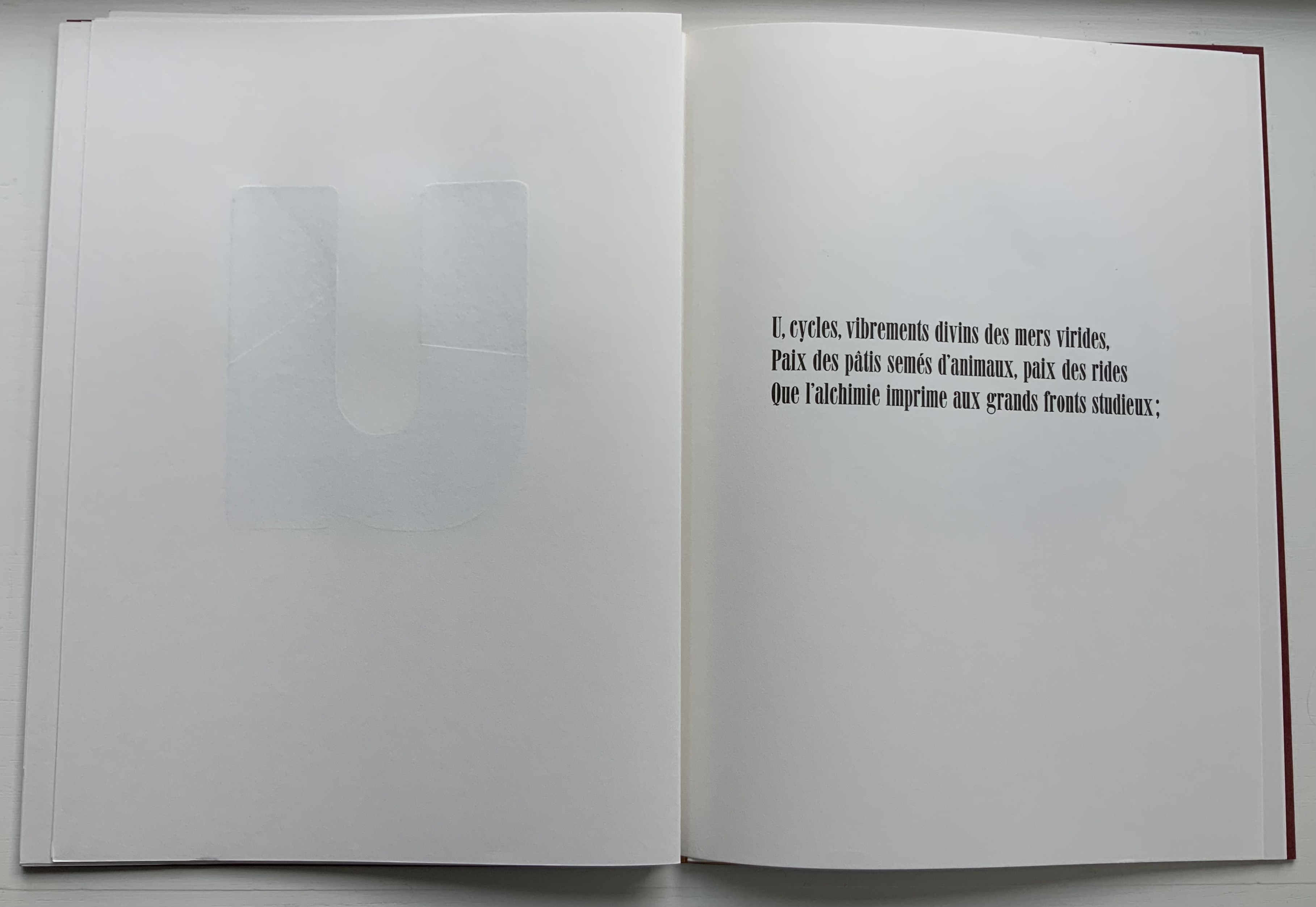
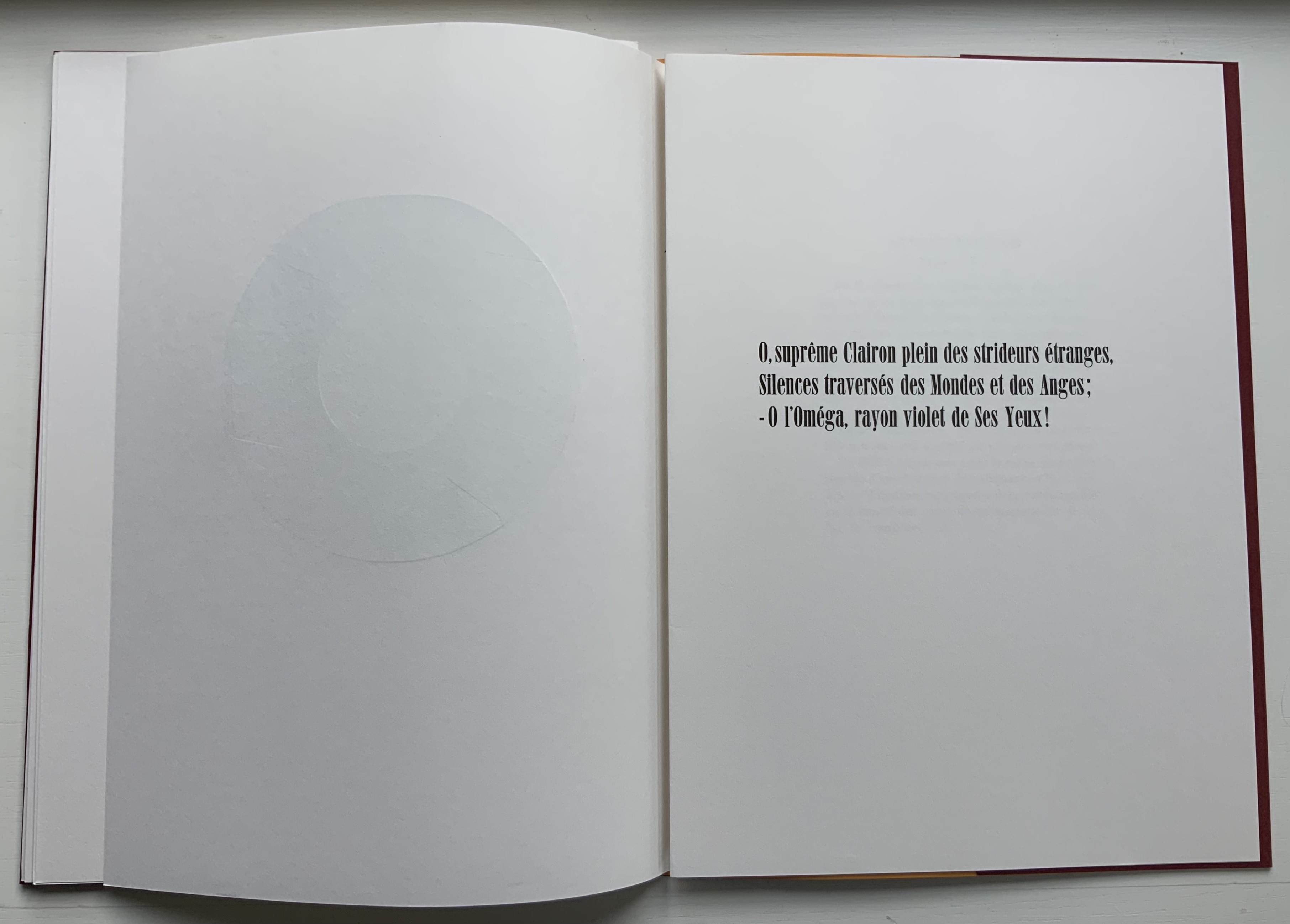
In the Books On Books Collection, there are livres d’artiste of Un Coup de Dés in French, English and German — even Arabic. Edizioni Ampersand brings an Italian edition into the fold. Alessandro Zanella founded Edizioni Ampersand in the early 1980s in Verona, and its second publication was UN COLPO DI DADI. Zanella had beenintrigued by the revolutionary typographic layout of the poem and borrowed a first edition copy from Leo Lionni, the children’s book author and illustrator. Presumably for the future flexibility of his printing house, Zanella purchased a set of Caslon type rather than Bodoni in which to set the poem.
The 1914 edition of the poem has no title page laid out as a double-page spread. Why the title is split into four lines for the French and five for the Italian is not clear. The French layout gives a more expected left to right reading across the spread, whereas the Italian jumps back and forth (perhaps more in keeping with Mallarmé’s syntax later in the poem). Otherwise, as seen in the pairing of the “Comme si … comme si/ come se … come se” spreads, Zanella follows the 1914 edition’s layout.
The French printer/artist Jacques Vernière may have destined himself to contribute the artwork to UN COLPO DI DADI. He had introduced Zanella to American expatriate printer Richard-Gabriel Rummonds, proprietor of The Plain Wrapper Press, then also in Verona. Some years after working with Rummonds, Zanella struck out on his own and established Edizioni Ampersand. Whether by research or intuition, Zanella
Although not following Mallarmé’s choice of typeface, Zanella did follow Ambroise Vollard’s instinct that a livre d’artiste edition would sell better than a text-only edition. He also followed Mallarmé’s concern that Vollard should not let the prints and paper used for them detract from the visual impact of the text. Zanella separates Vernière’s wood engravings from the text, placing two after the French version and two after the Italian version of Mallarmé’s preface. Their evocation of the storm, shipwreck, waves and the abyss is unmistakable, as is the folio cover’s image of foam on the surface of waves.
Spread of French preface and image; spread of Italian preface and image.
Close-up of images after the prefaces.
Spread with second image in the French section; spread with second image in the Italian section.
Close-up of second images in the French and Italian sections, respectively.
The watermark in the handmade paper seems extraneous: Veronica’s Veil, the relic capturing Christ’s image, might have interested the otherwise non-religious author of Herodiade, but its bearing on this poem is unclear. A mermaid or siren would have been more suitable. But such a subtle discrepancy or missed opportunity does not sway the balance of text, image, ink and paper that Zanella has achieved here.
Logo of Edizioni Ampersand
Further Reading
Nicolini, Chiara. Summer 2012. “Lines in the Ampersand“, Illustration. Accessed 5 February 2022.
Shaw, Paul. “Alessandro Zanella: In Memoriam“, Special Collections, Marriott Library, University of Utah. Accessed 5 February 2022.
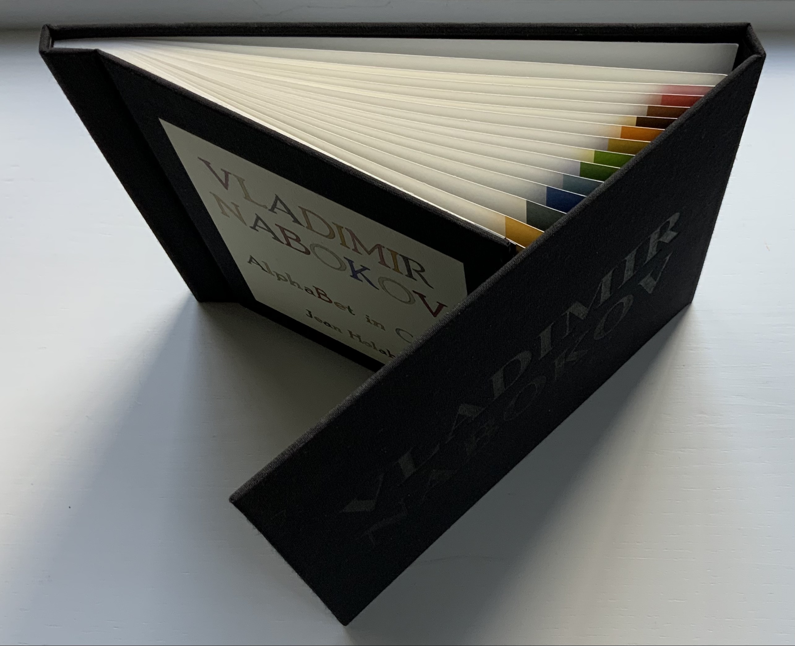
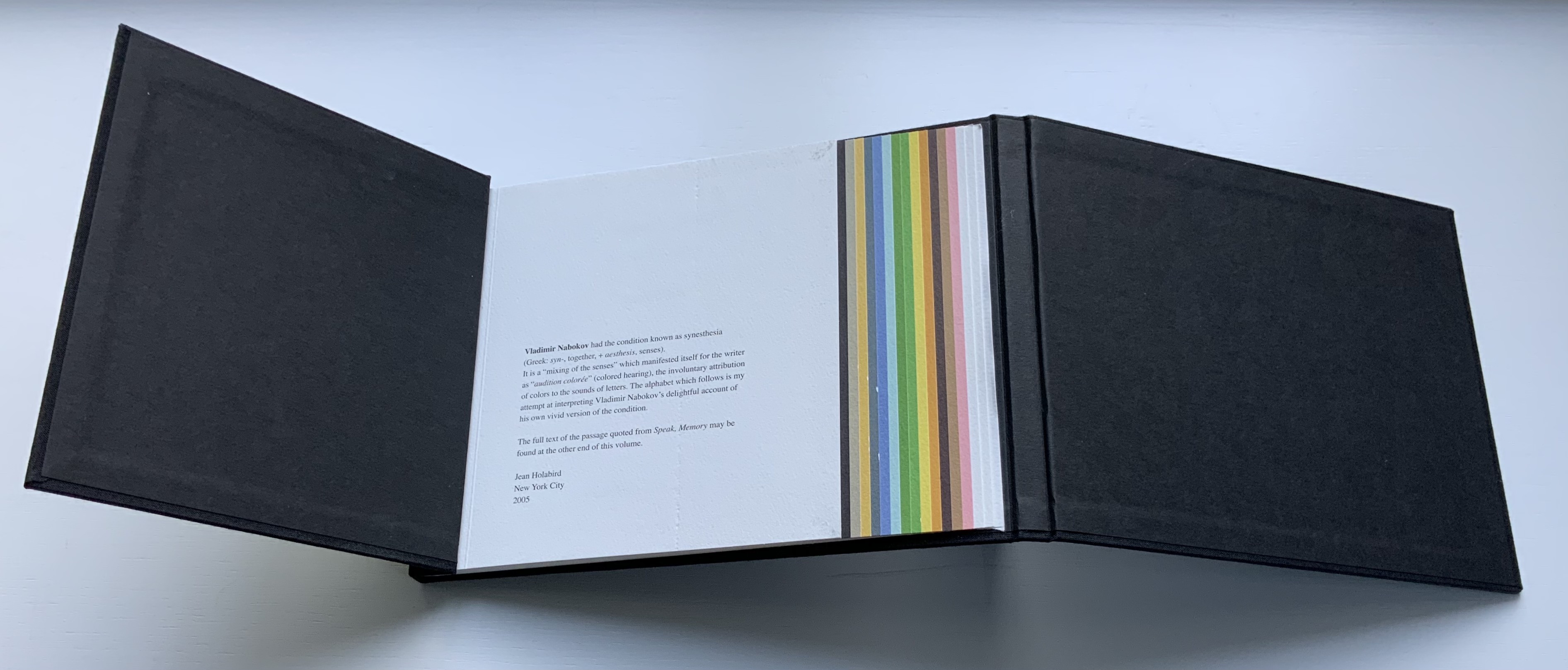
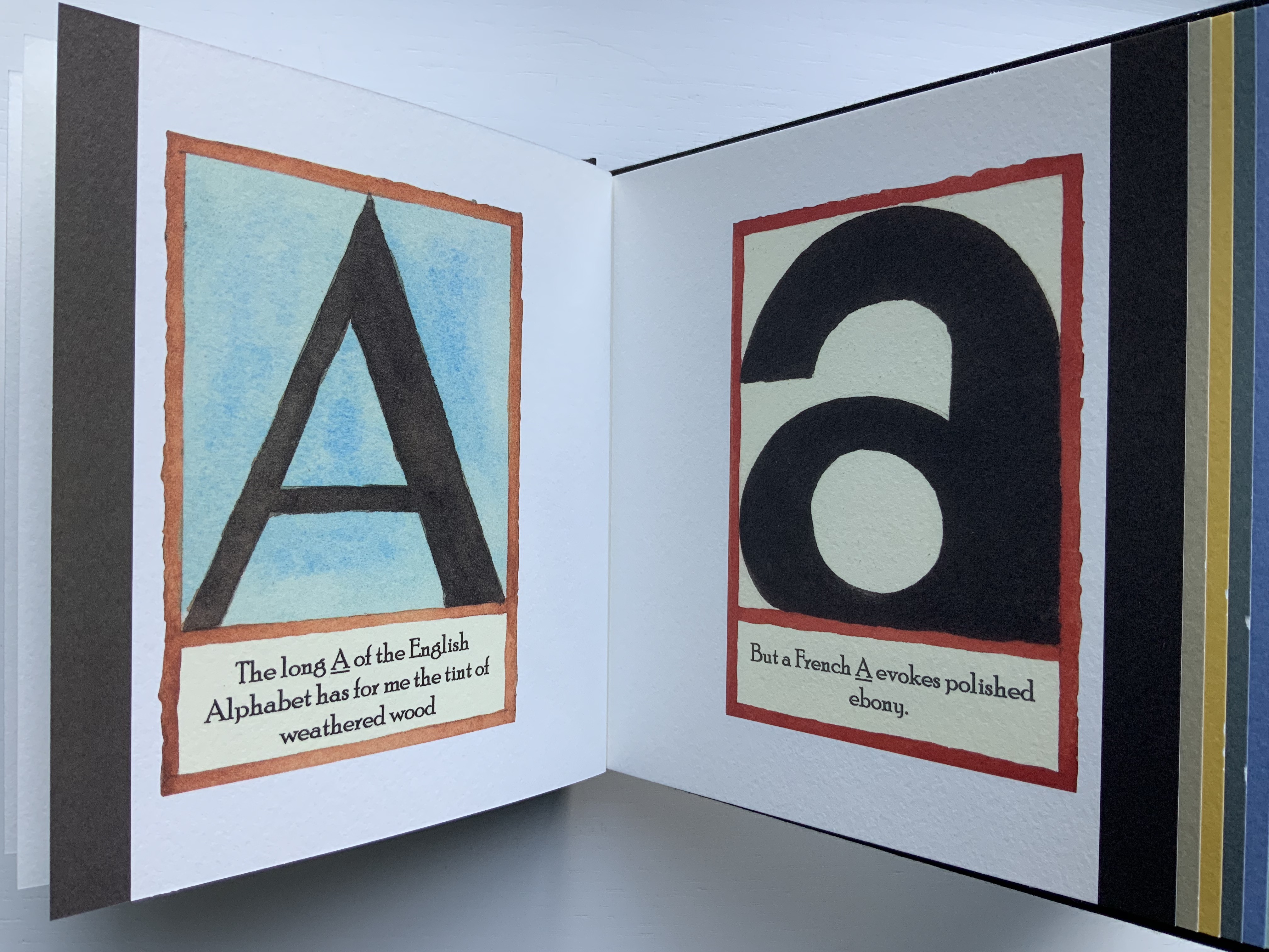
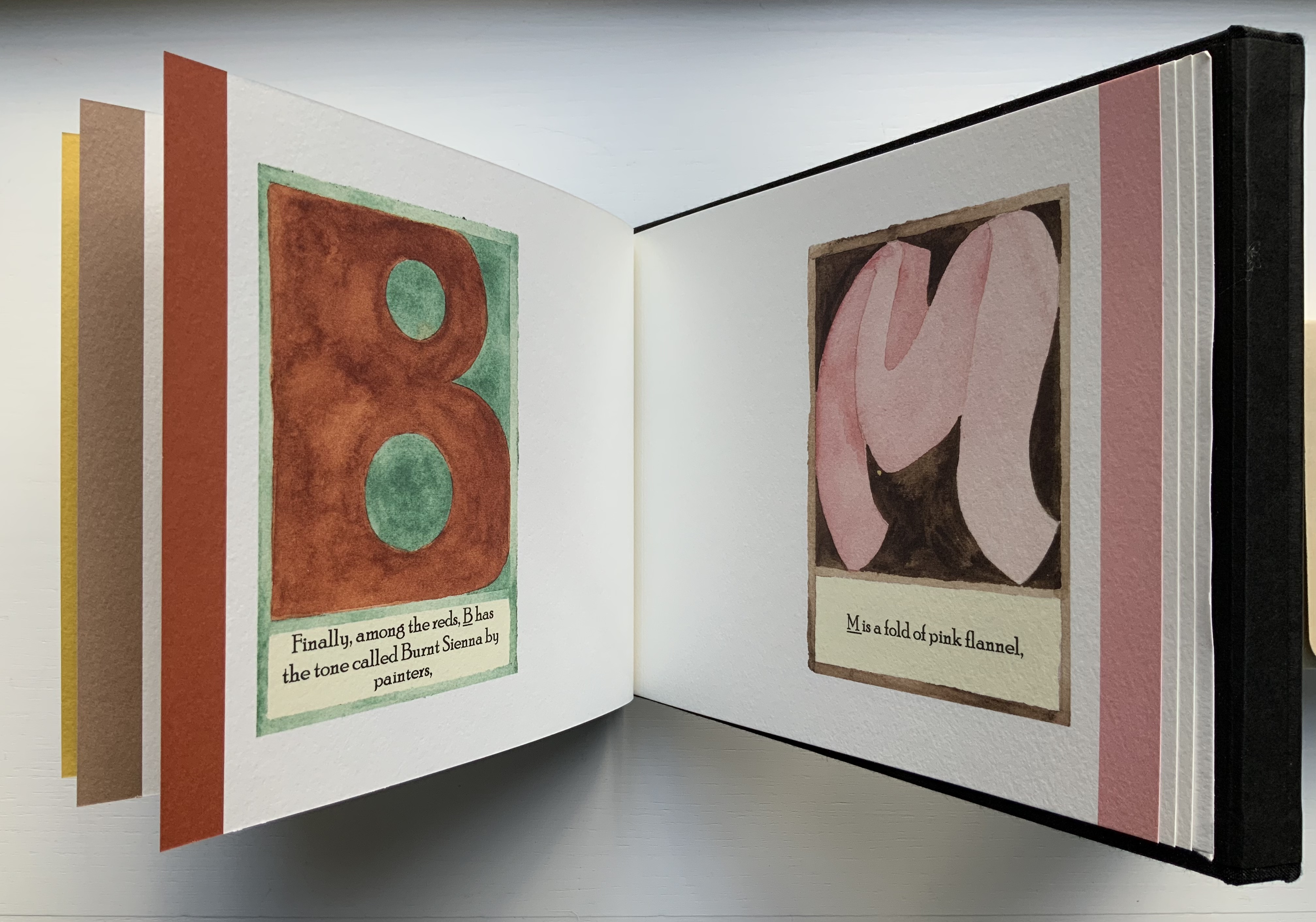
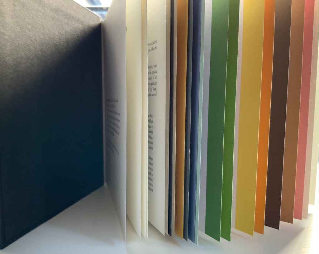
Vladimir Nabokov: AlphaBet in Color(2005) Jean Holabird Black cloth boards, silver lettering to spine, blind stamped lettering to front board, illustrated title label to inner board; internally bound in the Japanese style with opening overlapping boards and staggered colored pages. H175 W235 mm, 40 pages. Acquired from Klondyke (Almere NL), 11 November 2021. Photos of the book: Books On Books.
Publisher’s statement:
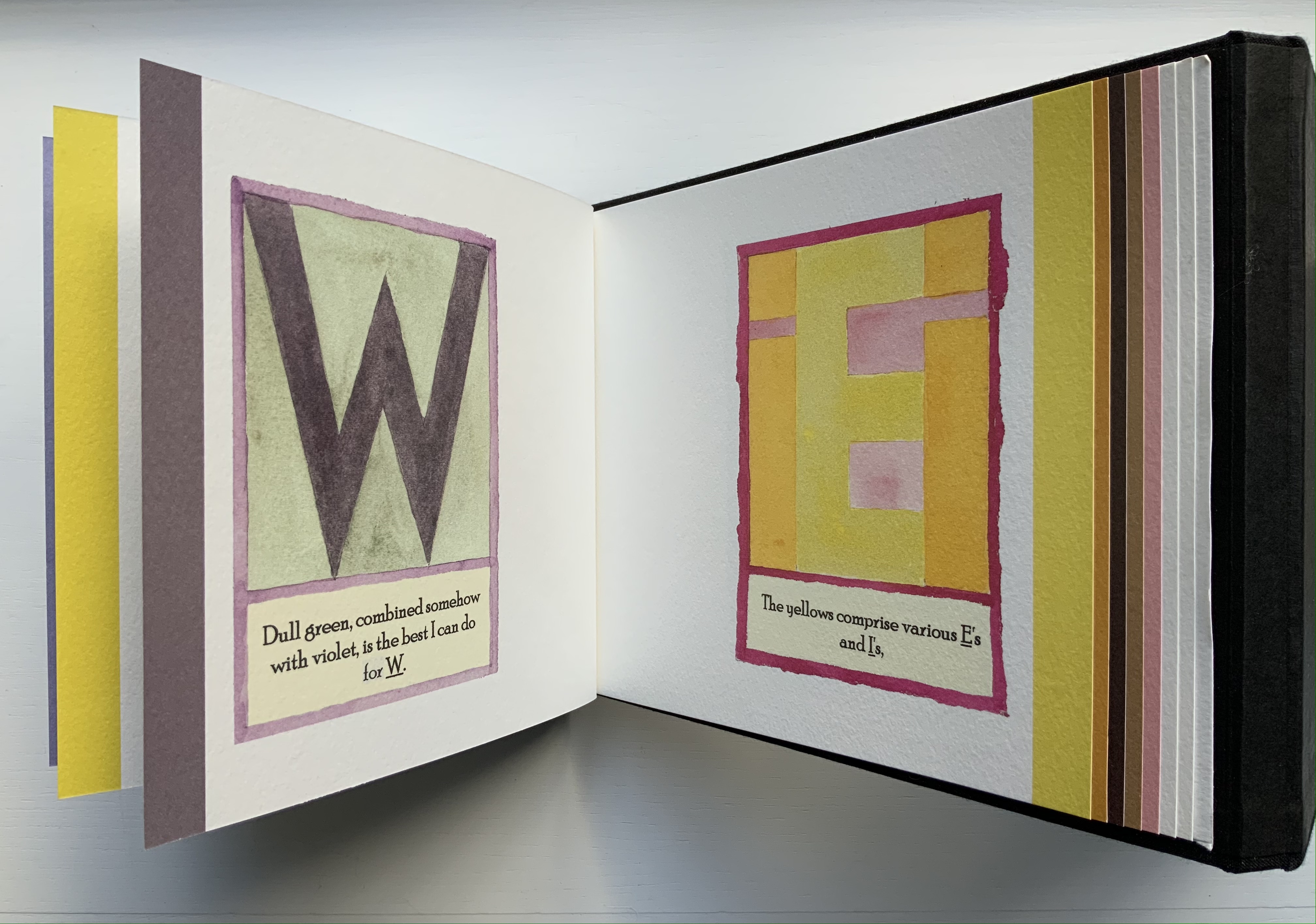
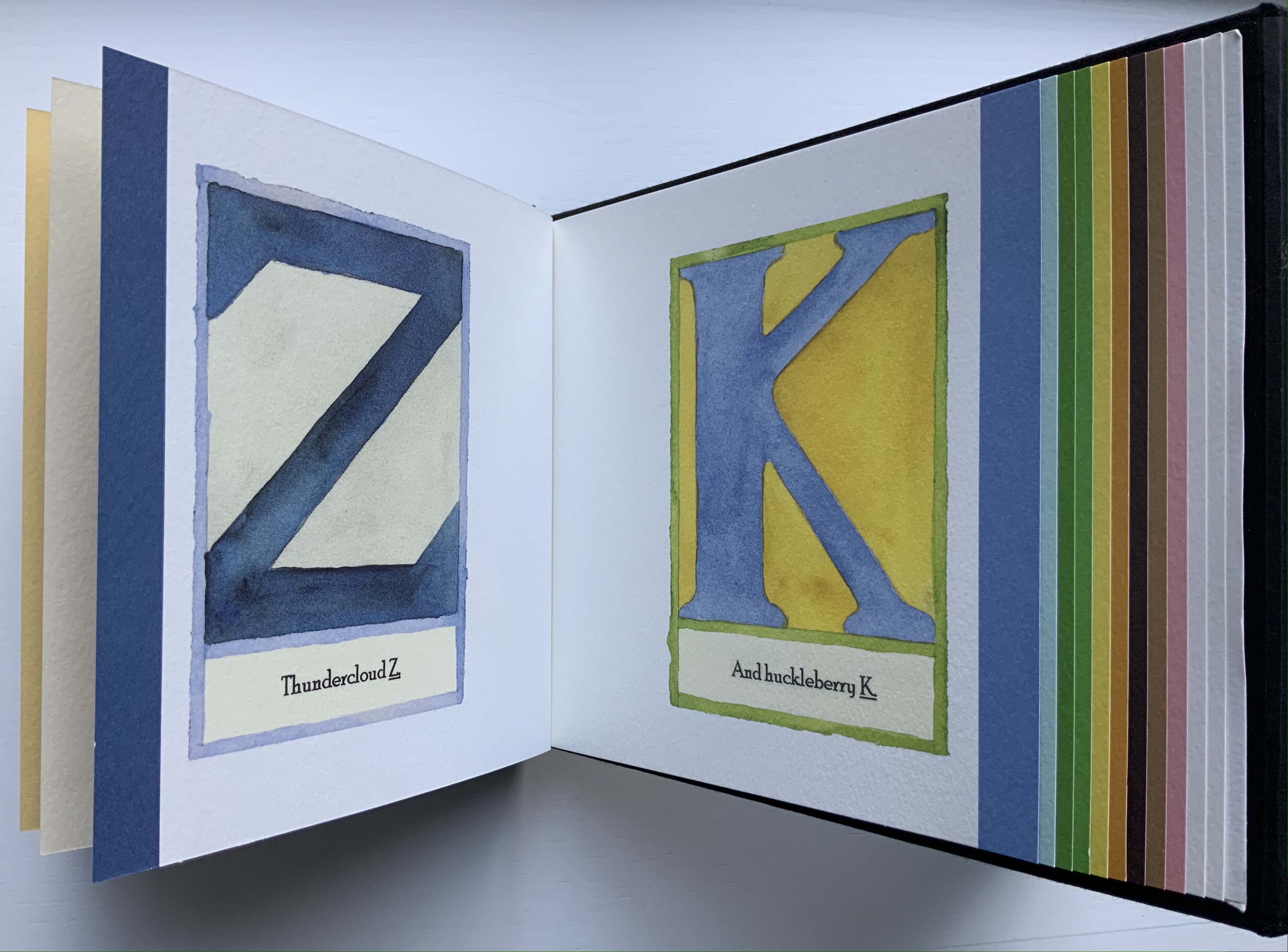
Vladimir Nabokov saw rich colors in letters and sounds and noted the deficiency of color in literature, praising Gogol as the first Russian writer to truly appreciate yellow and violet. He saw q as browner than k, and s as not the light blue of c, but a curious mixture of azure and mother-of-pearl. For anyone who has ever wondered how the colors Nabokov heard might manifest themselves visually, Alphabet in Color is a remarkable journey of discovery. Jean Holabird’s interpretation of the colored alphabets of one of the twentieth century’s literary greats is a revelation. The book masterfully brings to life the charming and vibrant synesthetic colored letters that until now existed only in Nabokov’s mind. In Alphabet in Color Jean Holabird’s grasp of form and space blends perfectly with Nabokov’s idea that a subtle interaction exists between sound and shape.
As puzzling as the phenomenon of synesthesia is, Holabird’s depictions and the book’s architecture are more engaging in their own right. The lapping pages and binding make this work awkward to handle, which might be thought of as a complement to the book’s non-alphabetical and non-spectral order of letters and colors. It is a warm complement to Le Cadratin’s cool rendition of Rimbaud’s sonnet “Les Voyelles“.
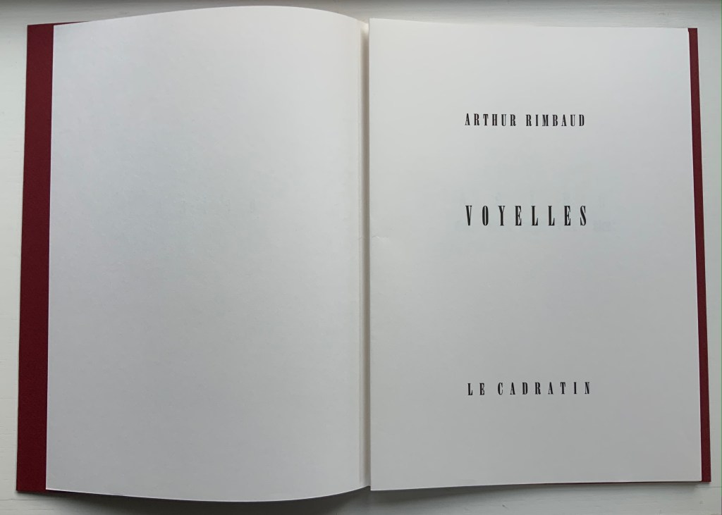
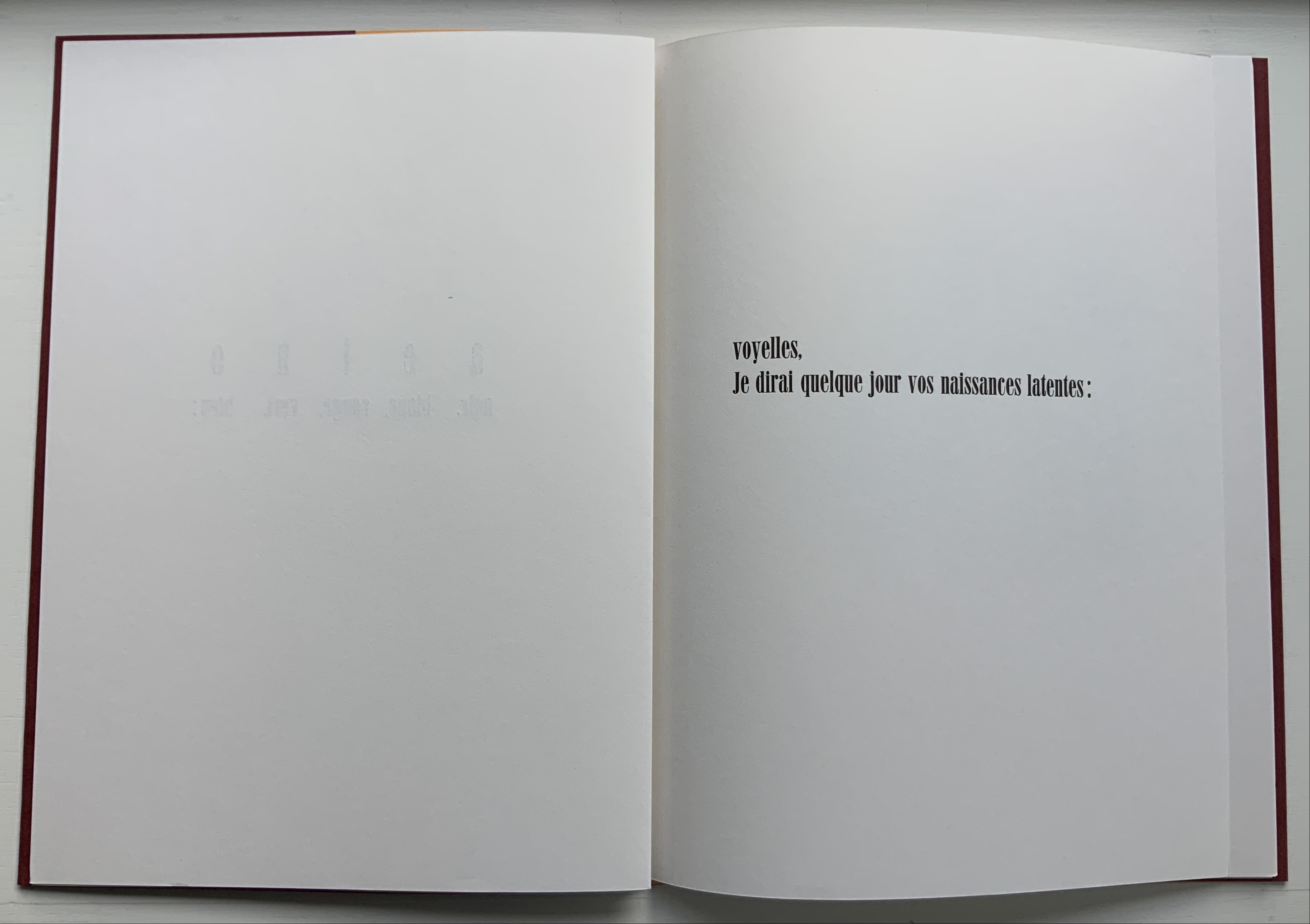
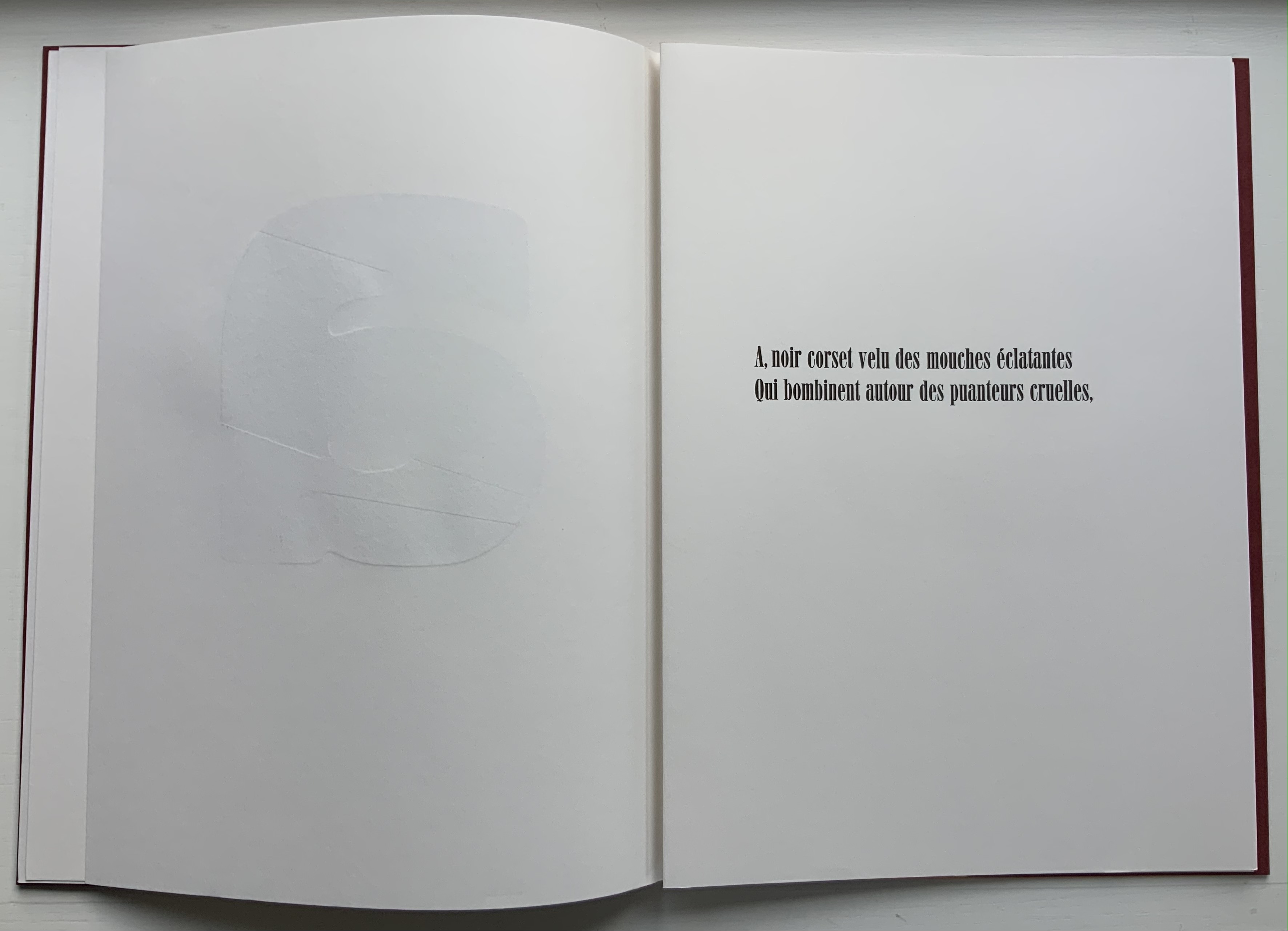
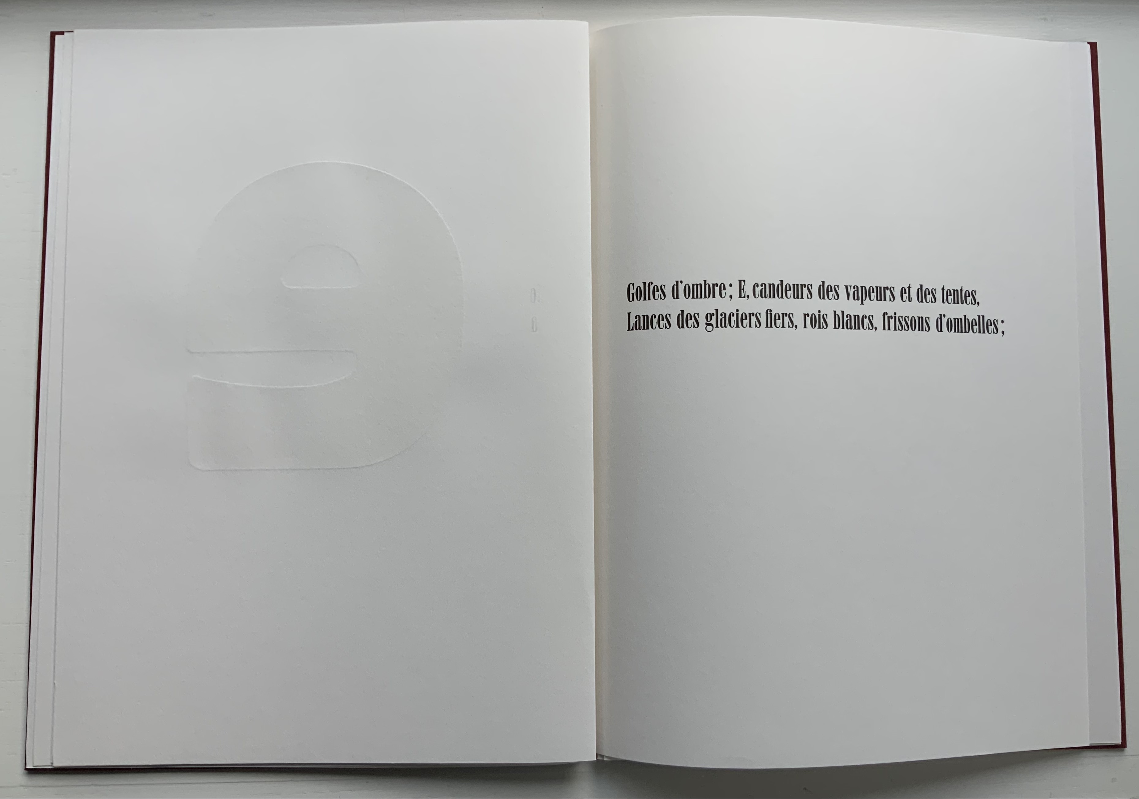
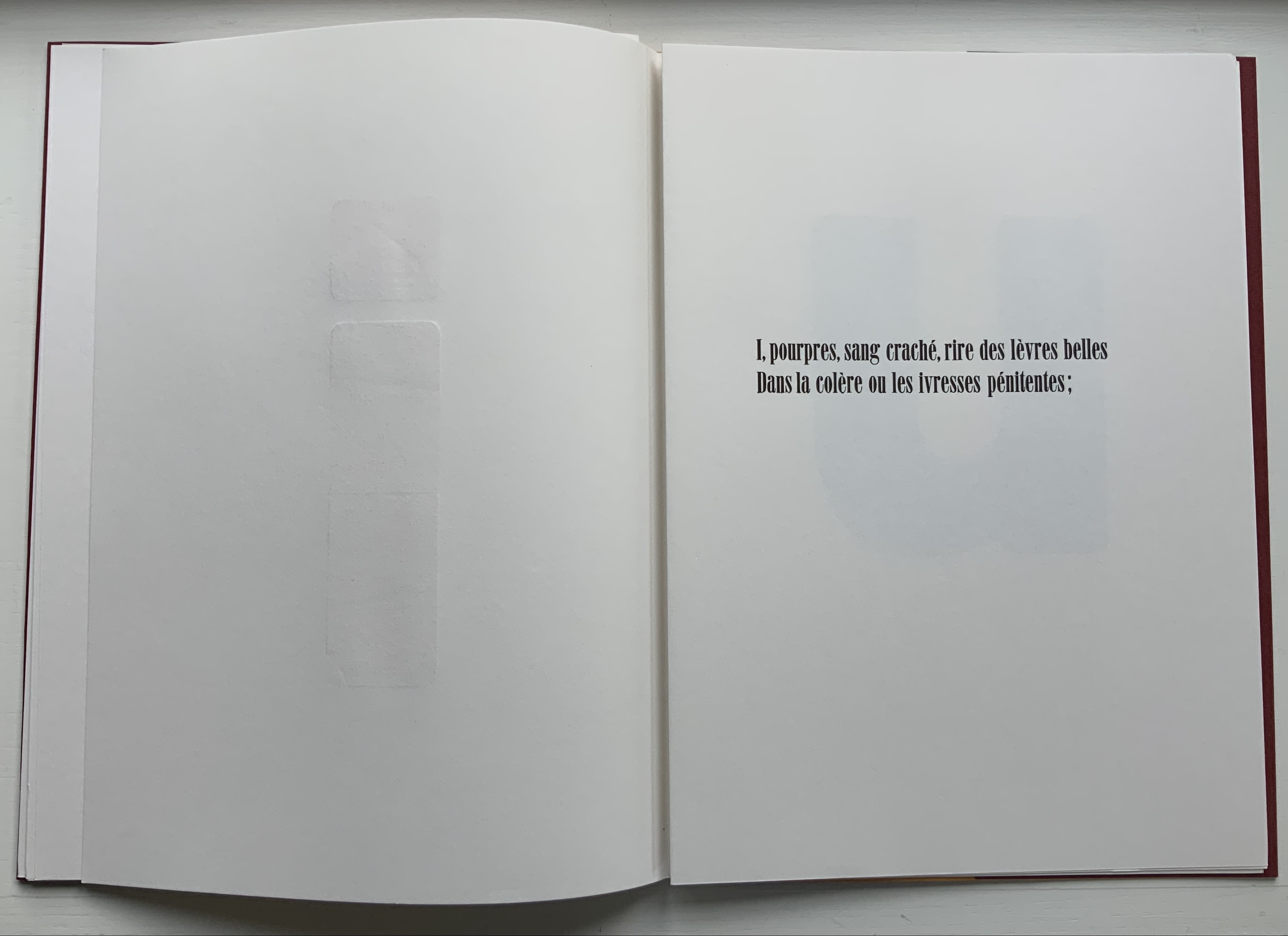
Voyelles (1871/1883/2012) Arthur Rimbaud Design and direction: Jean-Renaud Dagon H325 x W235 mm, 32 unnumbered pages. Edition of 200, of which this is #67. Acquired from Le Cadratin, 6 November 2021. Photos: Books On Books Collection.
Le Cadratin is more than a typesetting and printing house or fine press. An atelier-typographique, founded by Jean-Renaud Dagon, its artists perform tightrope acts in typography, ink, paper and form. Under Dagon’s direction, Joanne Bantick, Hugues Eynard, Nicolas Regamey and Roger Jaunin have composed and printed a rendition of Arthur Rimbaud’s sonnet “Les Voyelles” that deserves applause.
Written in 1871 by Rimbaud and first published in 1883 by Paul Verlaine, the sonnet is one of the better known historic literary examples of graphemic-color synesthesia — strongly associating a color with a letter — and in Rimbaud’s case with strong tones of eroticism. Le Cadratin’s artists leave Rimbaud’s eroticism bound to his text, handset in 28pt Roman Idéal, but deliver their own exuberance with subtle tactility and visual texture in large format wooden type using Heidelberg and Vandercook presses.
Voyelles contributes to other themes in the Books On Books Collection besides the alphabet motif. The handling of wooden type echoes David Clifford’s Letterpress Printing ABC and Andrew Morrison’s Ampersand& (2005) and Two Wood Press A-Z (2013). The synesthesia of letters is shared with Jean Holabird’s Vladimir Nabokov: AlphaBet in Color (2005)
Further Reading
“David Clifford“. 15 September 2021. Books On Books Collection.
“Jean Holabird“. 8 February 2022. Books On Books Collection. For a look at Vladimir Nabokov’s synesthetic alphabet.
“William Joyce“. 18 June 2021. Books On Books Collection. For the more innocent end of literary synesthesia where the cold gray-black of numbers gives way to an alphabet of jelly bean colors.”William Joyce”. 202 Books On Books Collection.
“Andrew Morrison“.15 September 2021. Books On Books Collection.
As Mitsou Ronat and Tibor Papp were preparing their mise-en-page edition of Mallarmé’s Un Coup de Dés Jamais N’Abolira le Hasard(1897/1980) following Mallarmé’s corrected proofs, Neil Crawford came across a copy of Robert Cohn’s Mallarmé’s Masterwork and was struck by its reproduction of the set of proofs sold by Pierre Berès to an American collector – the so-called Lahure proofs. Crawford, too, was determined to prepare a “typographic translation” of the proofs — but in English. In an essay providing a rich background to the poem, his meeting with Tyson and the publishing of their homage, Crawford explains how he went about his typographic translation.
First, using Cohn’s reference to the original’s size, he enlarged the reproductions photographically and then began puzzling over how to squeeze an English version taking up 10% more space than the French into Mallarmé’s careful layout. Compromising on the use of Bodoni in place of Didot as the typeface (the latter was not available to English typesetters when the poem was first pubIished anyway), it would take Crawford seven years of evenings in tracing letters, translation, transcription, adjustment, retranslation and retranscription to generate hand-crafted layouts that could be stored away until the day that photocomposition would be sufficiently advanced to accommodate the word and character spacing necessary to follow them. The original of Crawford’s typographic layout resides at the University of San Diego. Below are iterations toward the double-page spread that completes the appearance of the poem’s title within the poem.
Courtesy of Neil Crawford.
When Crawford and Tyson met in the early Eighties, Tyson had already established Tetrad Press and was planning his own livre d’artiste version of the poem. His aquatints in a separate folio cover would occupy the position Mallarmé expected for Odilon Redon’s prints in the abortive limited edition in train at the time of his death in 1898. In an ironic reversal of Mallarmé’s concern that the Redon prints might undermine the typography, Tyson and Crawford were concerned that anything less than letterpress printing would not ensure the density of black on the page that would complement Tyson’s aquatints. This led to phototypesetting output as patch setting, then hand pasting according to Crawford’s layouts, and then creation of process line blocks for the relief printing in letterpress.
At a glance, Tyson’s aquatints present a puzzling juxtaposition with the poem, but we can thank Crawford’s essay for a clue to the puzzle.
The poem’s reference to LE NOMBRE (“THE NUMBER”) has sent plenty of scholars on the hunt for its identity. Mitsou Ronat had argued that the magical number has to be 12. After all the classic Alexandrine line of French poetry numbers 12 syllables, and the larger type sizes that Mallarmé chose for the poem are 36, 48 and 60. Unconvinced “typographically”, Crawford points out that “at the time of composition – faces above 24 point were cut in multiples of twelve as standard”. Nevertheless, he also writes, “It would appear that the number 12 (the number of feet in the classic Alexandrine verse form) had great symbolism for Mallarmé” and notes that Tyson’s images
reflect the undertones of the Poème’s symbolism with a composition based on a duodecic permutation corresponding to the measures within the Alexandrine metre, referring in an oblique way to Mallarmé’s recurring imagery ….
Duodecic refers to the Base 12 system, which has the arithmetic advantage over Base 10 of making fractions easier as can be seen from the following image. To apply that image’s Base 12 grid to Tyson’s permutations, however, requires modifying it from 3×4 to 4×6. In other words, there are 24 small squares underlying Tyson’s images, not 12. Mallarmé intended the double-page spread, not the single page, to be the unit for page layout. So perhaps Tyson’s oblique reference to the Alexandrine is also “doubly oblique” (2×12), referring to Mallarmé’s preferred canvas.
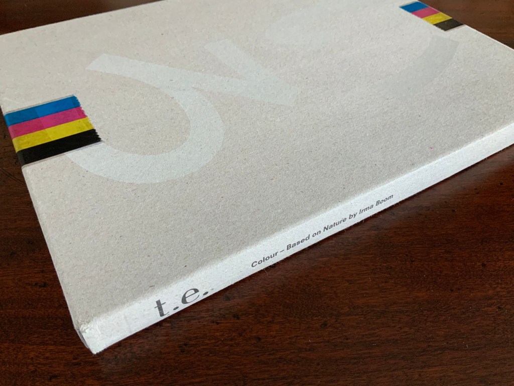
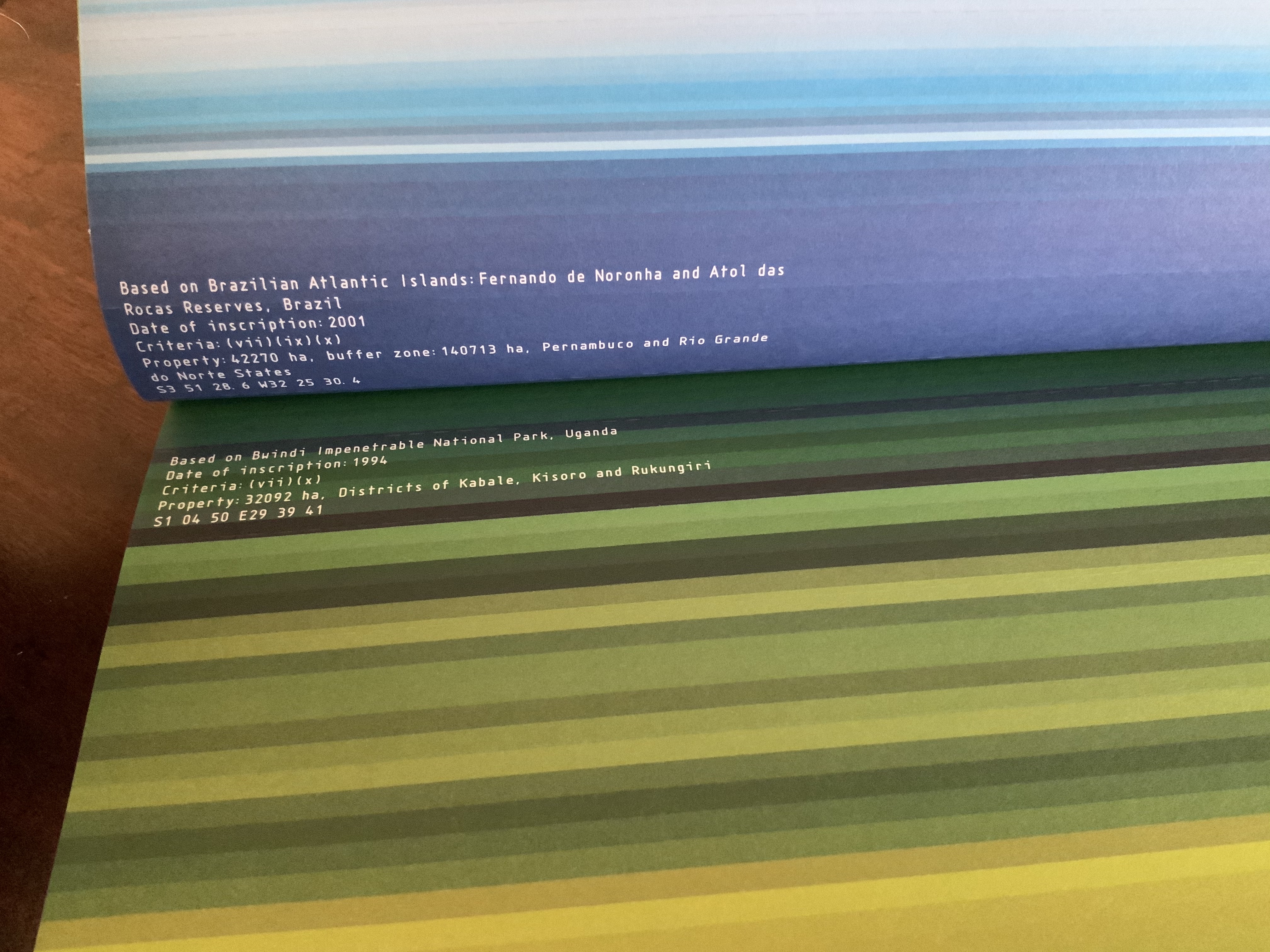
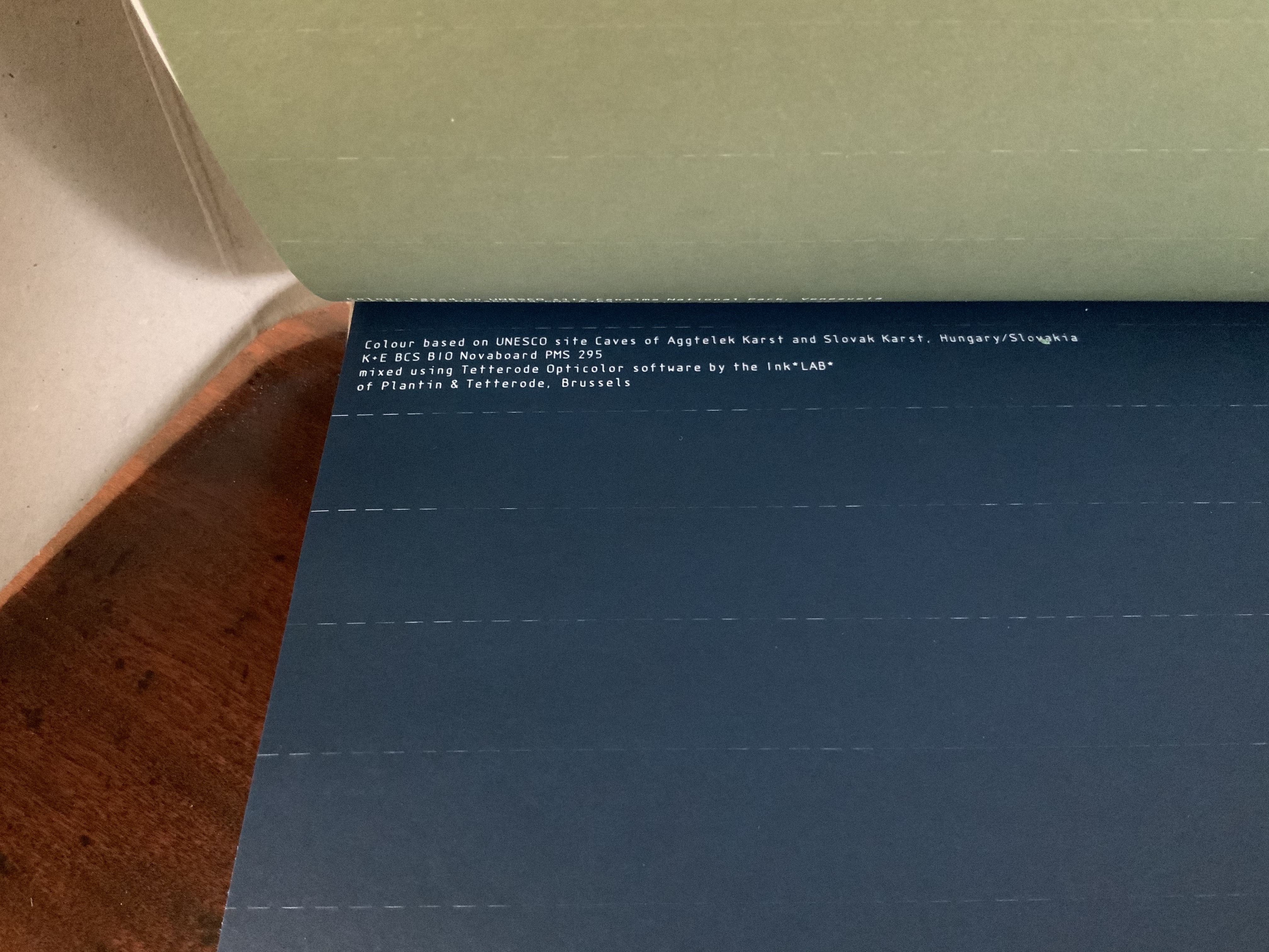
Colour — Based on Nature (2012) Irma Boom Box holding softcover. H320 x W240 mm, 170 pages. Acquired from Ursus Books & Gallery, 16 November 2020. Photos: Books On Books Collection.
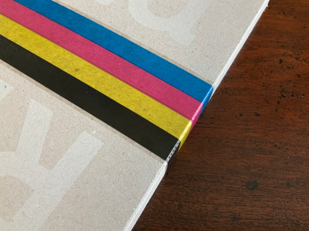
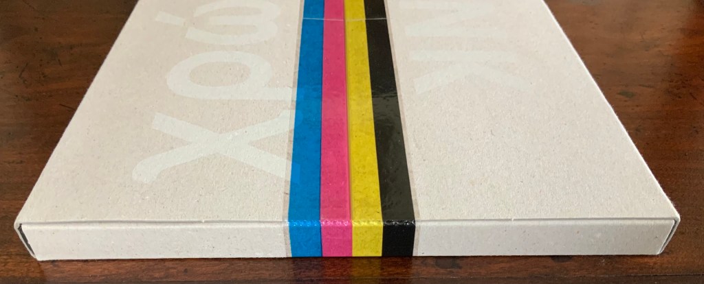
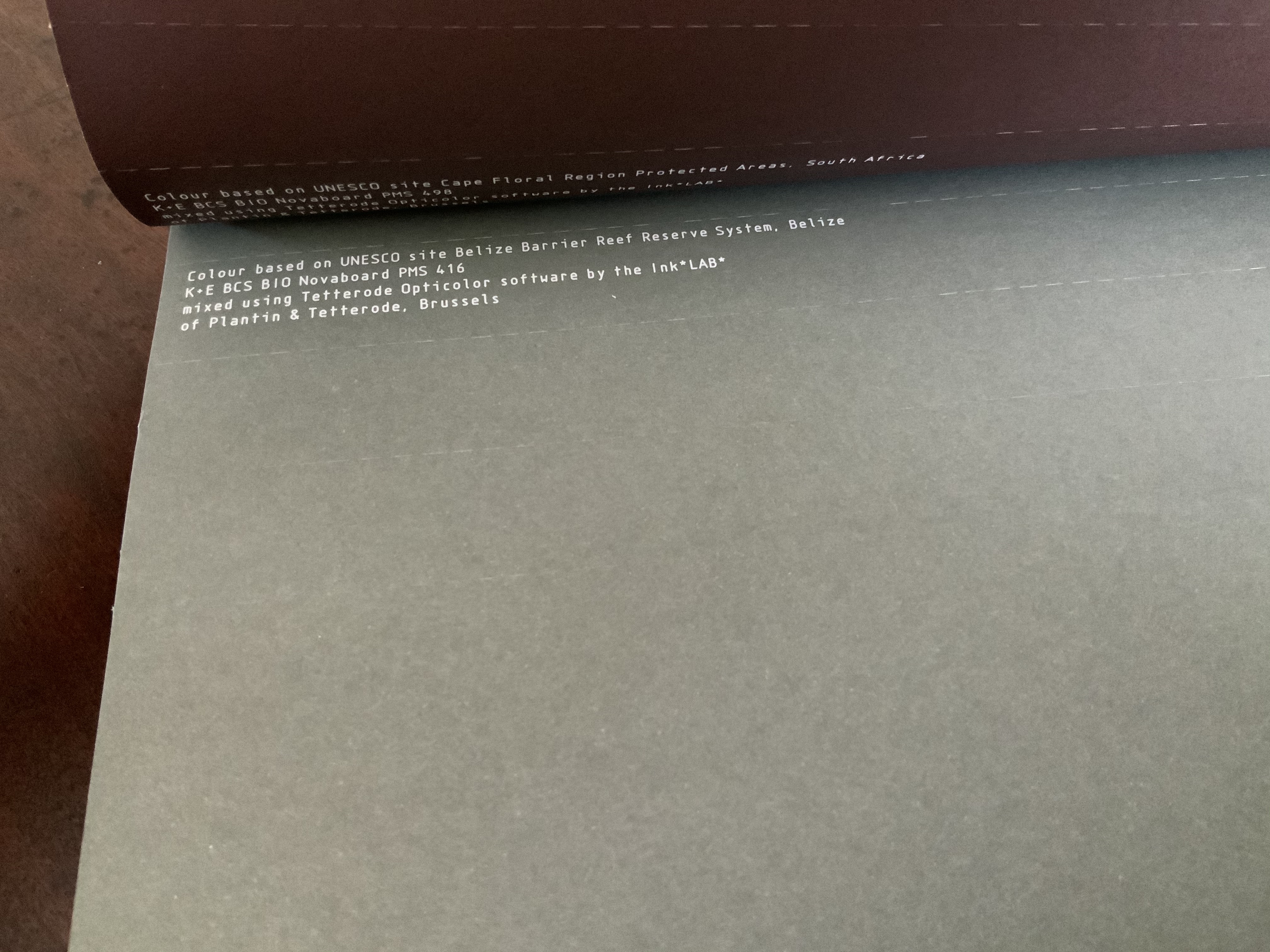
This work of art in the form of a book explores and associates colors with 80 UNESCO World Heritage sites across the globe. On the exterior of each folio, all of them uncut, a single, solid color appears. As the folio is cut, the interior reveals striated variations on the exterior color.
The striations act like lines of rhymed and unrhymed verse. The whole volume could serve as a textbook on theory of colors, the destructive act needed to access the color reminding student and teacher of the fragility of the heritage sites being celebrated.
Irma Boom: The Architecture of the Book (2013)
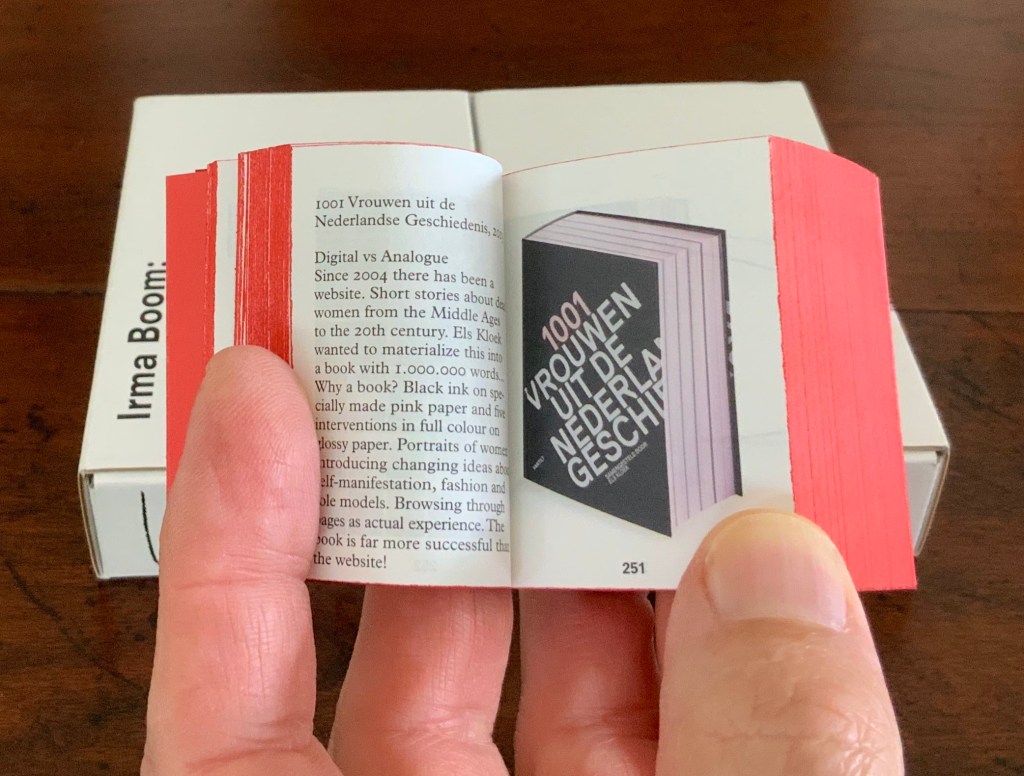
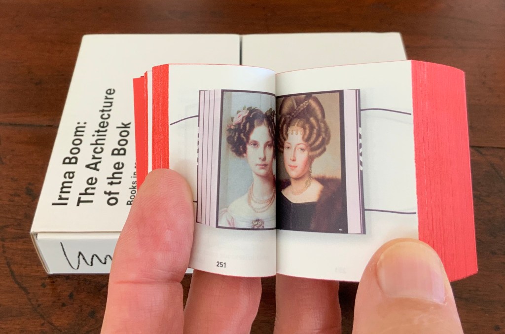
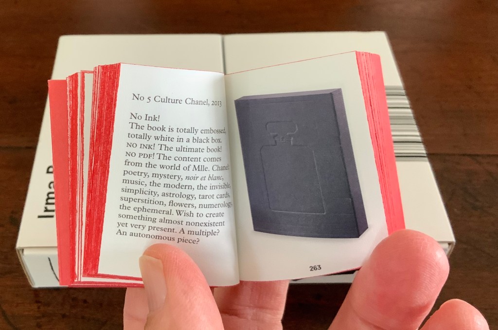
Irma Boom: The Architecture of the Book (2013) Irma Boom Box holding miniature softcover. Box: H153 x W118 x D31 mm; Book: H55 x W44 x D30 mm; 800 pages. Acquired from Amazon, 3 June 2015. Photos: Books On Books Collection.
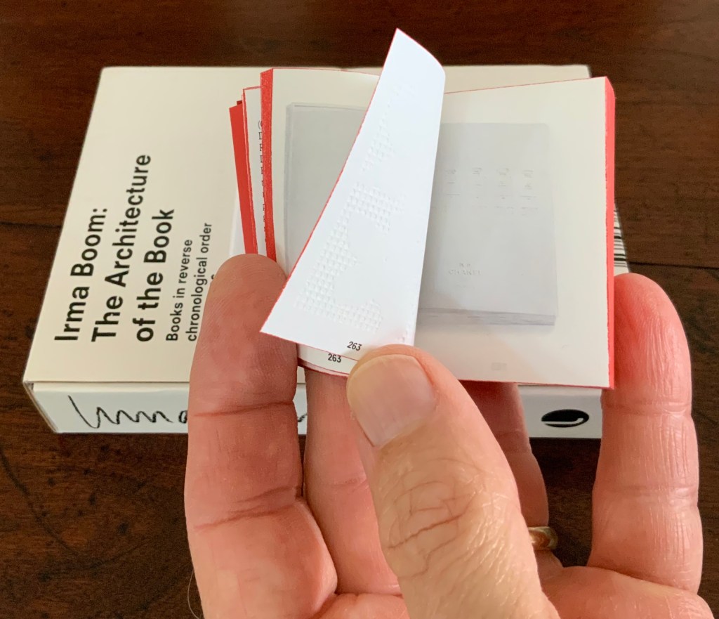
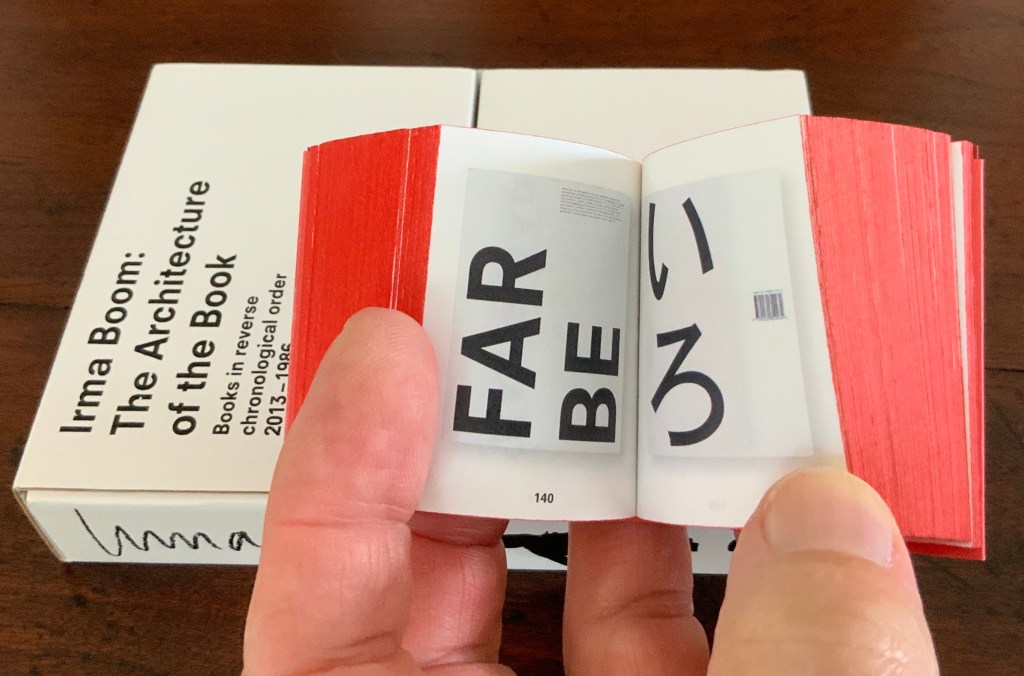
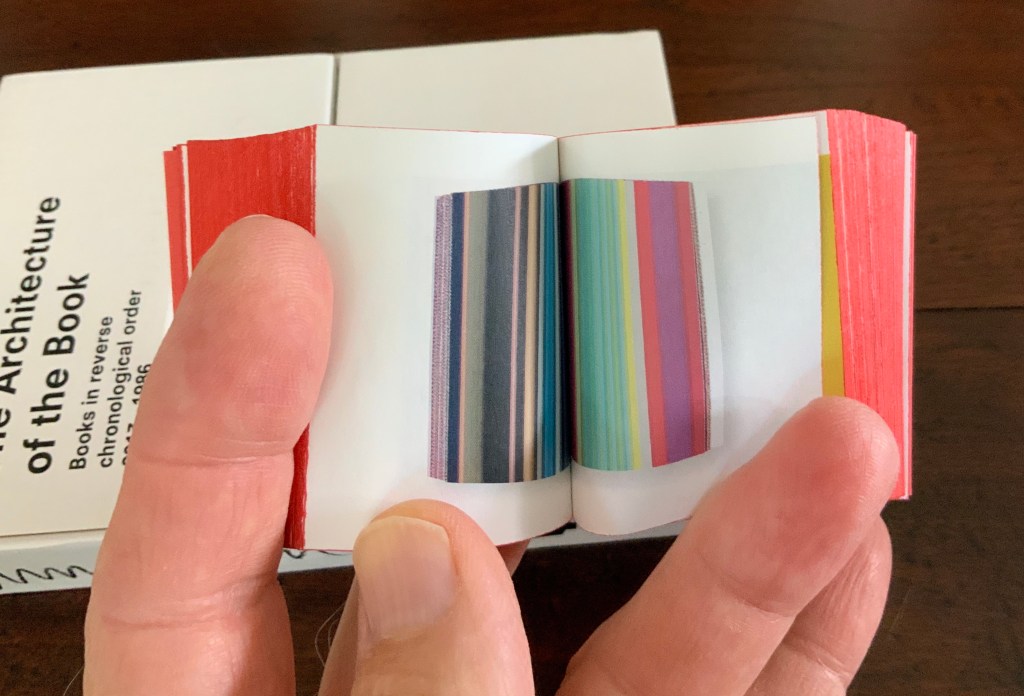
In and of itself, a legible miniature book astounds. Add to it the design genius of Irma Boom and the astounding becomes book art. Recording her books in reverse chronological order 2013-1986 (with reverse pagination as well), Irma Boom: The Architecture of the Book uses its structure and contents to make us think again and again about the reach of the book’s technology.
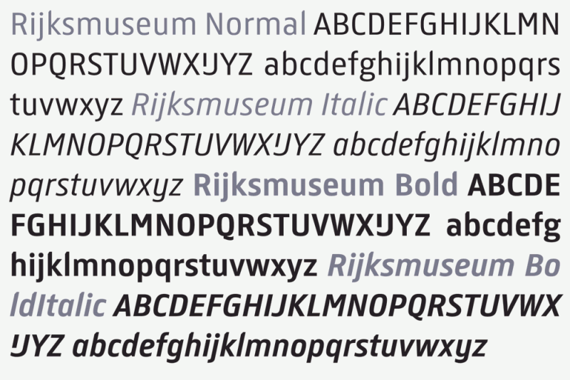
In 2013 the newly renovated Rijksmuseum opened with a new logo, new typeface design and publications design — all by Irma Boom and her studio. The new typeface — de Rijksmuseum — was developed by Paul van de Laan of Blue Monday under Boom’s artistic direction and appeared in museum signage and publications. The new typeface marks an interesting shift from DTL Documenta, the previous corporate font, designed by Frank E. Blokland. Blokland had studied with Gerrit Noordzij and later succeeded him at the Dutch Royal Academy of the Arts (The Hague). He founded the Dutch Type Library in the 1990s.
The previous style sheet leads with the serif version of DTL Documenta, while the de Rijksmuseum style sheet leads with the sans serif. Having applied to intern at Total Design in Amsterdam and been rejected by Wim Crouwel’s colleagues for her experimentalism, Boom must have especially enjoyed winning this commission. Just as much as the typographic differences, though, it is Boom’s roots in book design that differentiates the new from the old.
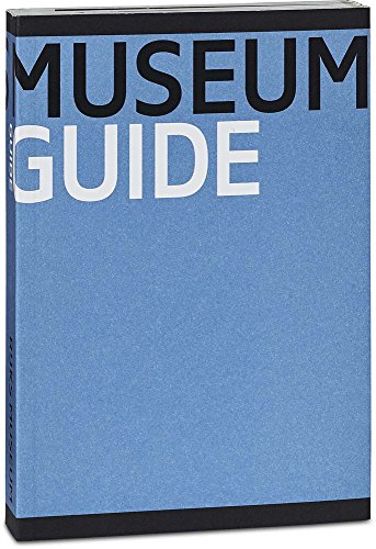
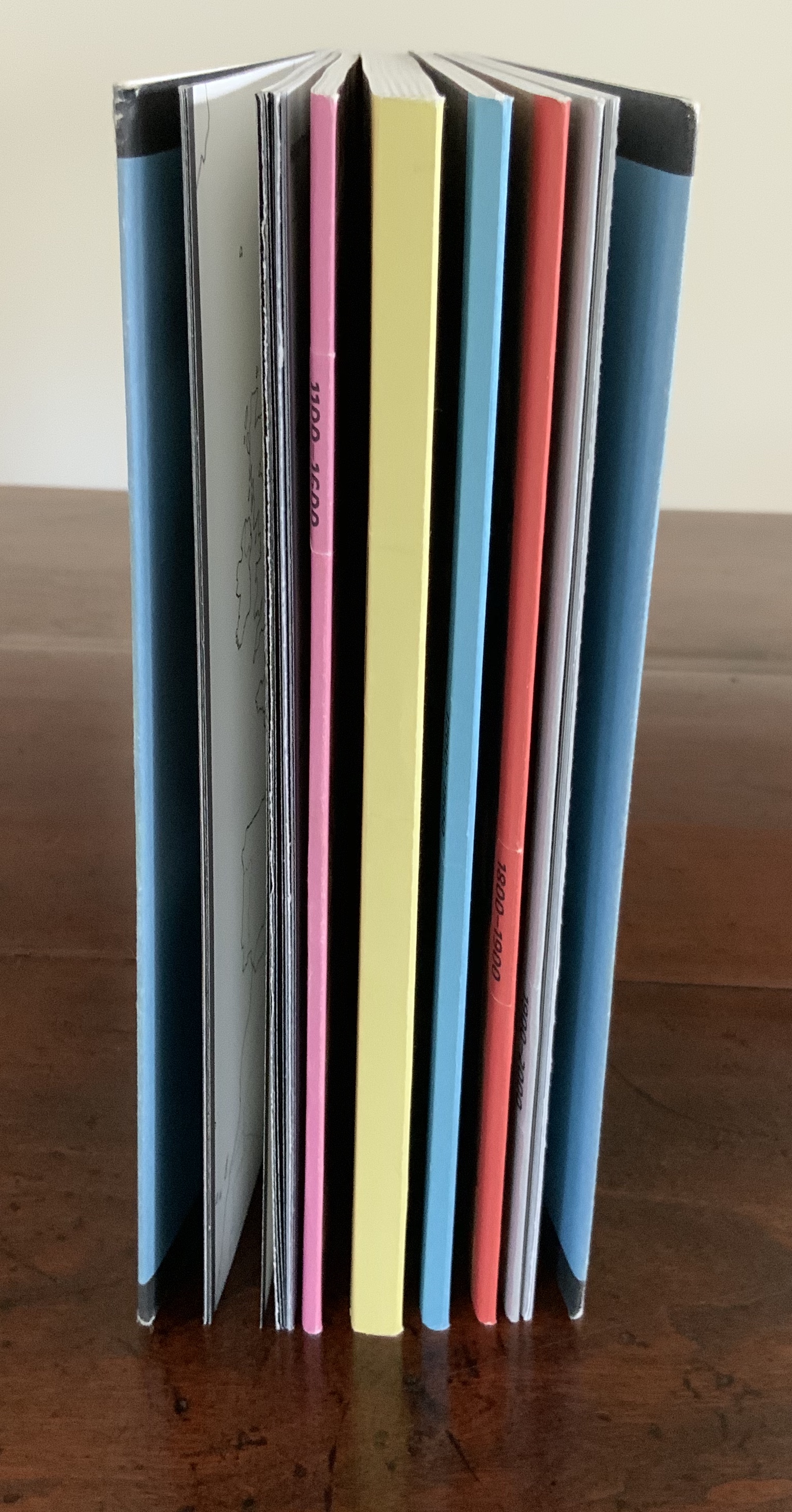
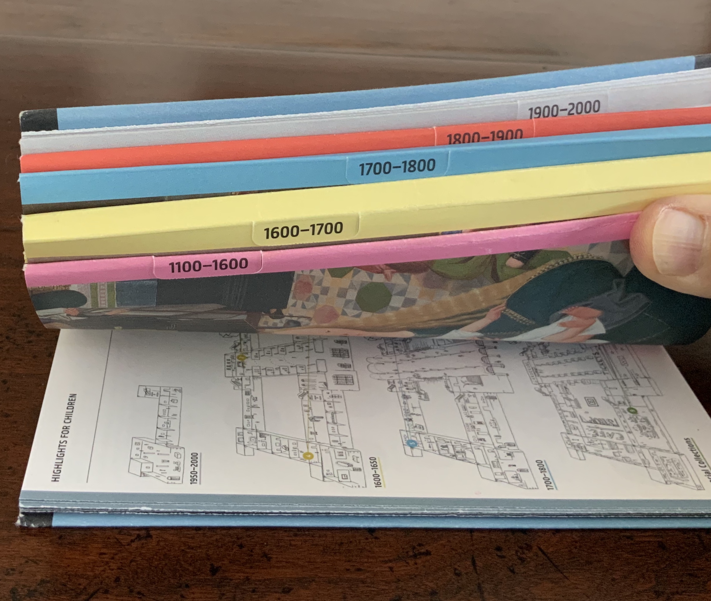
Guide Rijksmuseum (2013) Eric Spaans (text),Irma Boom (design) Softcover with multiple foldout maps. Acquired at the Rijksmuseum. Photos of the work: Books On Books Collection.
James Jennifer Georgina (2010)
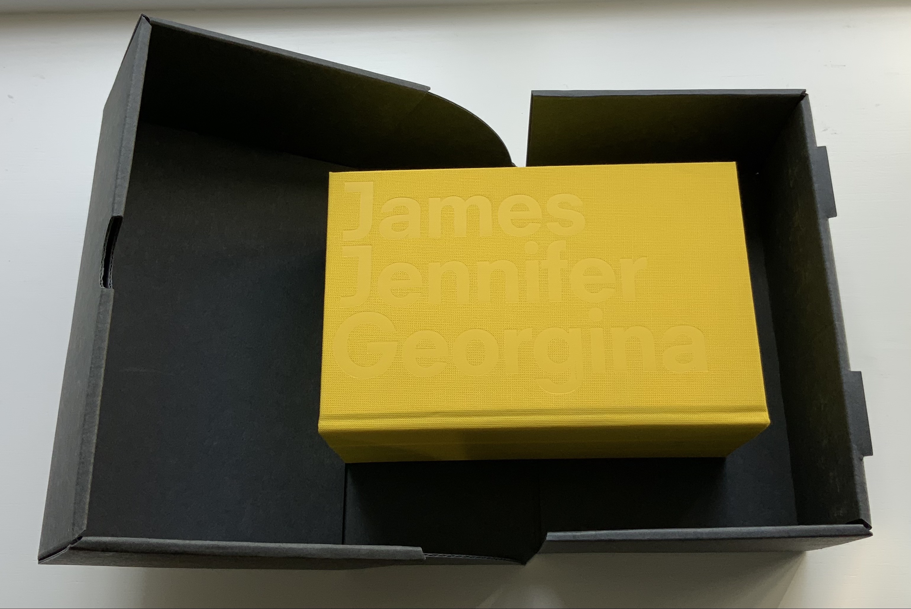
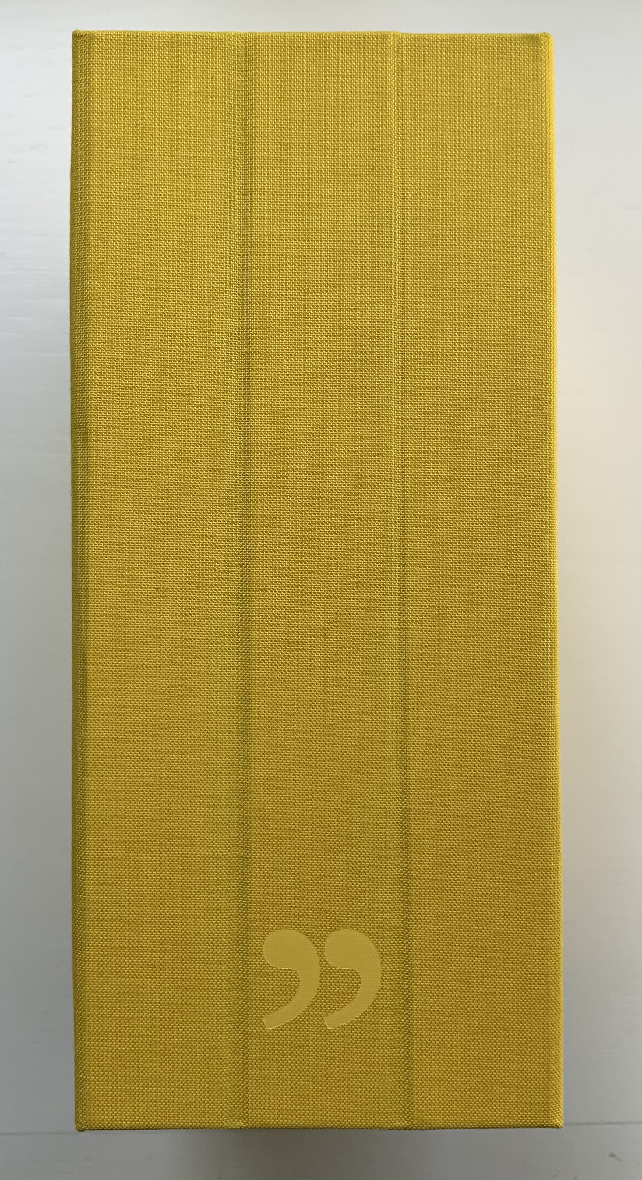
James Jennifer Georgina(2010) Irma Boom Box holding casebound book. Box: H220 x W140 x D100 mm. Book: H194 X W126 X D90 mm; 1198 pages. Edition of 999, of which this is #699. Acquired from Bubb Kuyper, 28 May 2021. Photos: Books On Books Collection.
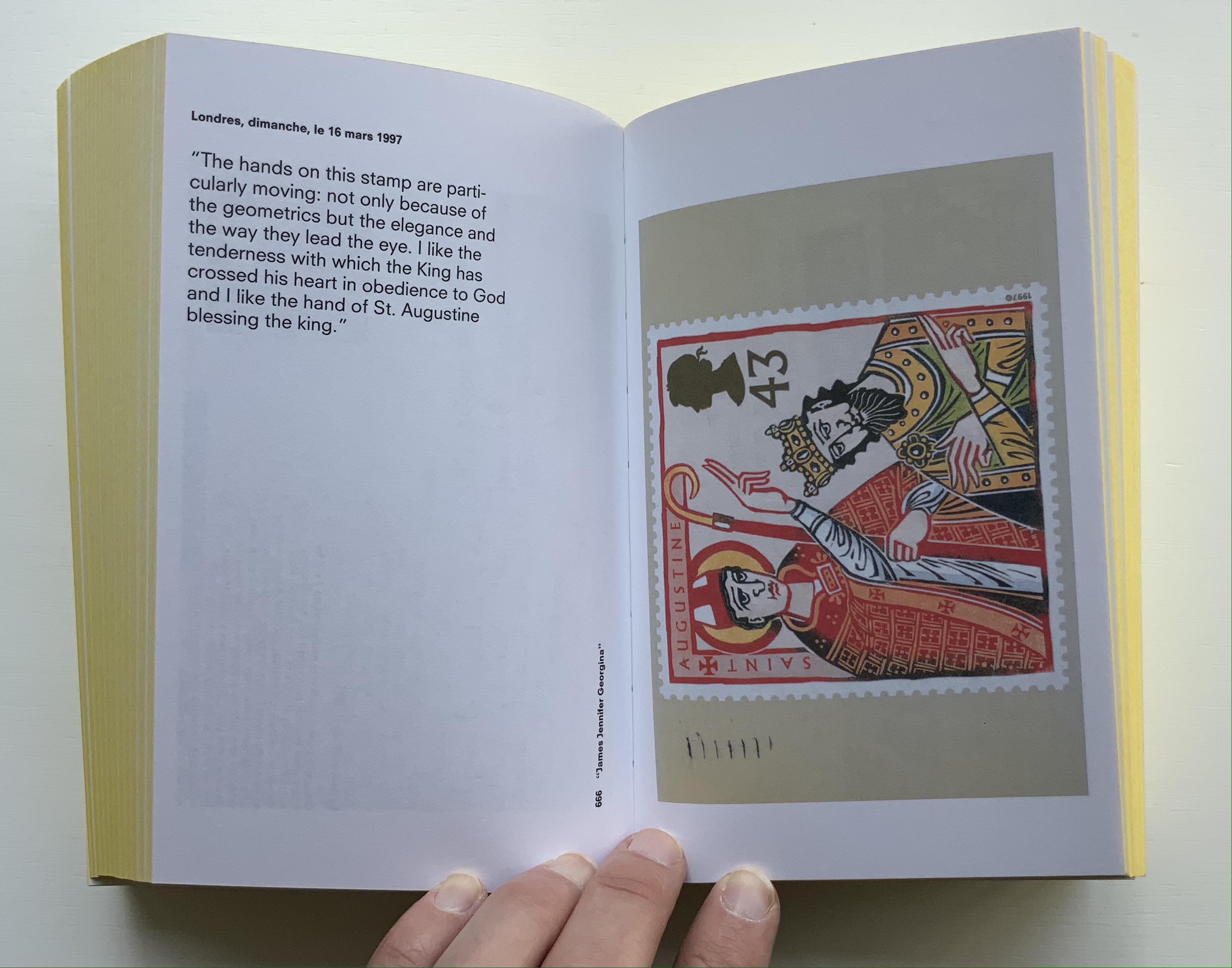
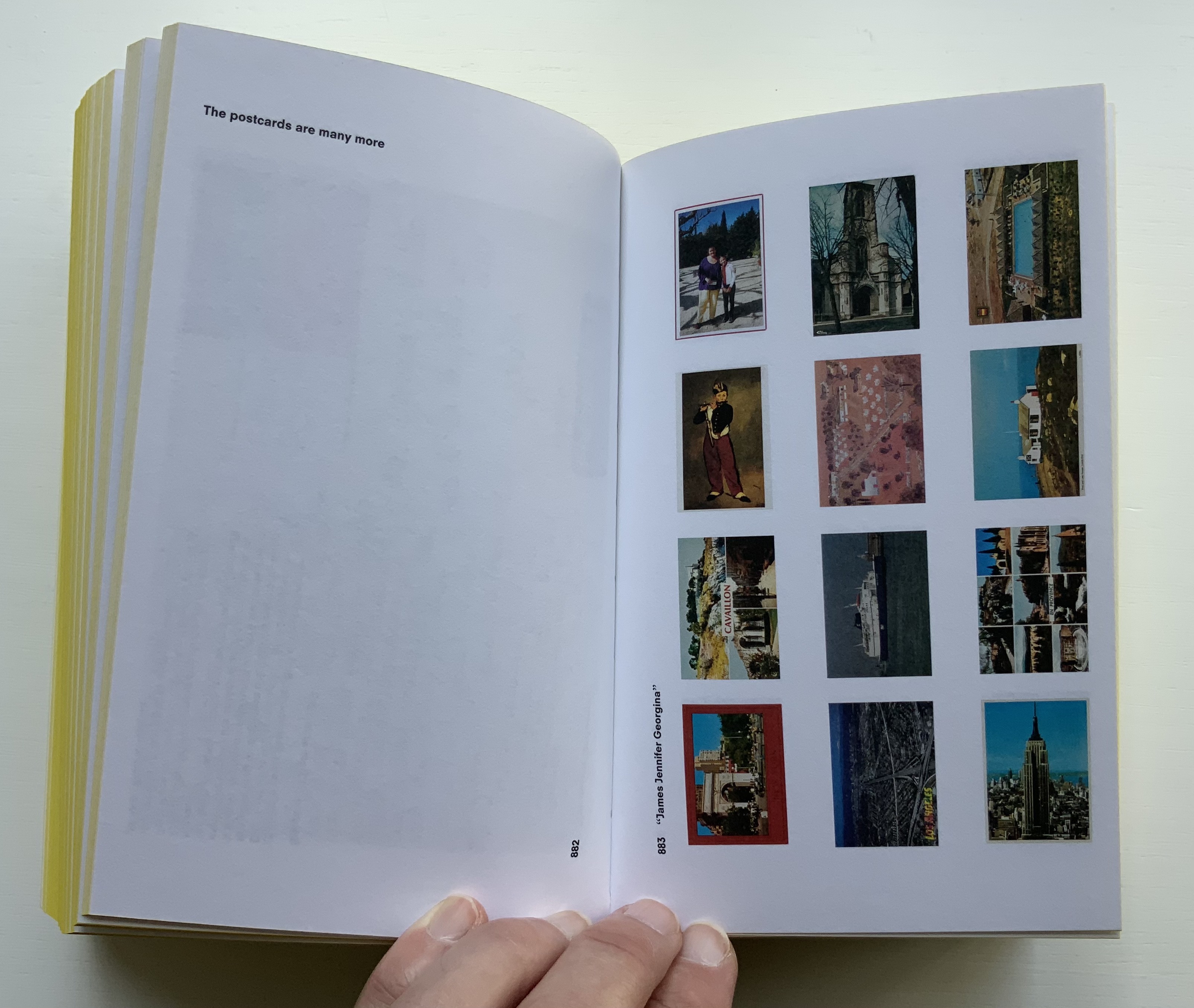
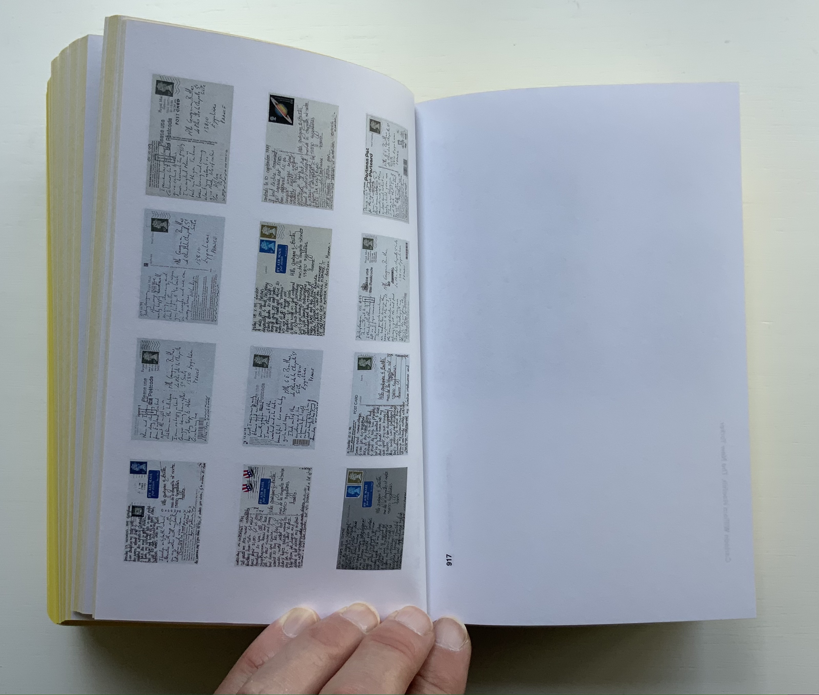
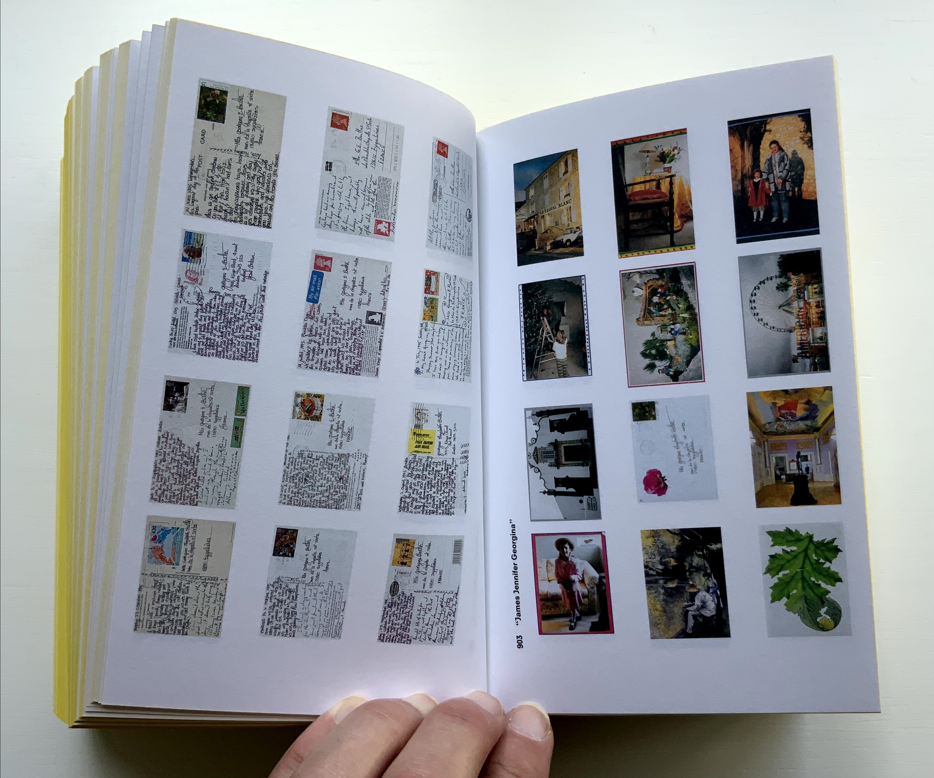
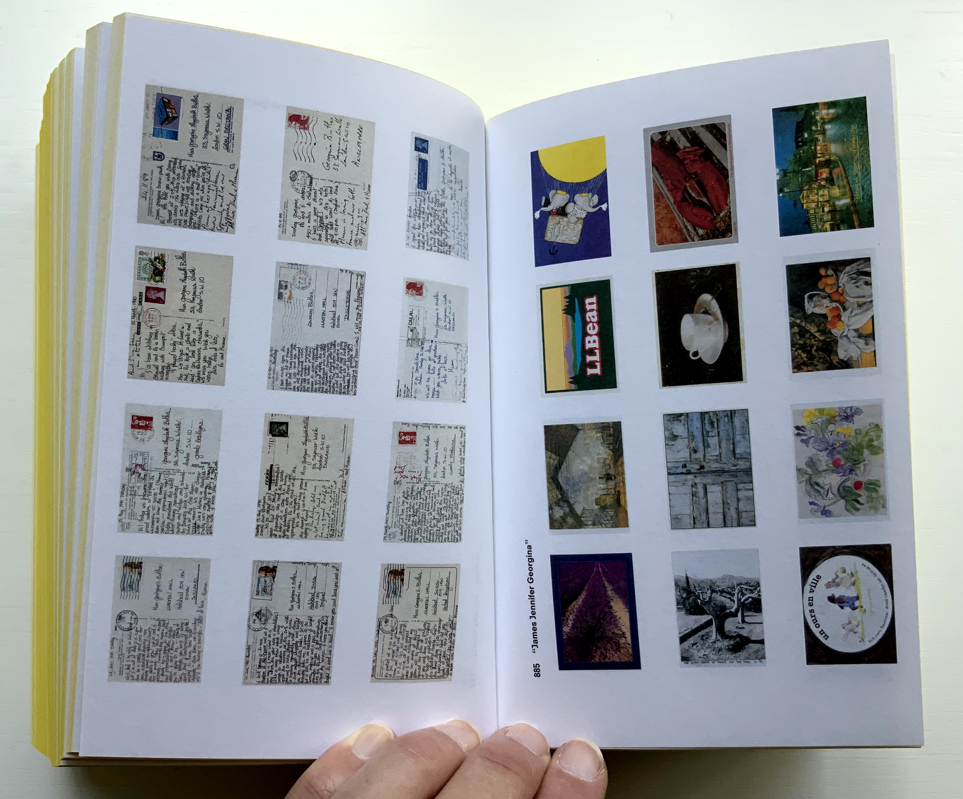
James Jennifer Georgina is book art as epic family portrait, created with the fronts and backs of 1136 postcards, spanning ten years of travel by the Butler family. At 1198 pages, it comes close to War and Peace, and in one theme, it comes close to Anna Karenina. Tolstoy writes at the beginning of the latter, “All happy families are alike; each unhappy family is unhappy in its own way.” After poring over JJG, I wonder if that should have been “each unhappy family thinks it is unhappy in its own way”. In the end, the family portrait is one of considerable privilege, culture, shame, pain and love. What distinguishes the Butler family’s unhappiness besides that context of privilege is its form of documentation and, above all, Boom’s transformation of it into this monument of book design. Its three-part spine especially developed to allow this nine centimeters-thick book to open effortlessly to any page .
Boom’s other outstandingly designed hefty works include SHV (1996) commissioned by Steenkolen Handelsvereeniging (SHV), Sheila Hicks: Weaving as Metaphor (2006) and Artist, Work, Lisson (2017) commissioned by the Lisson Gallery. They can be viewed here, here and here, respectively.
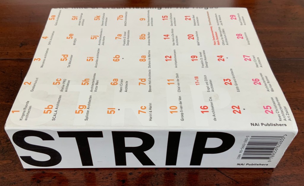
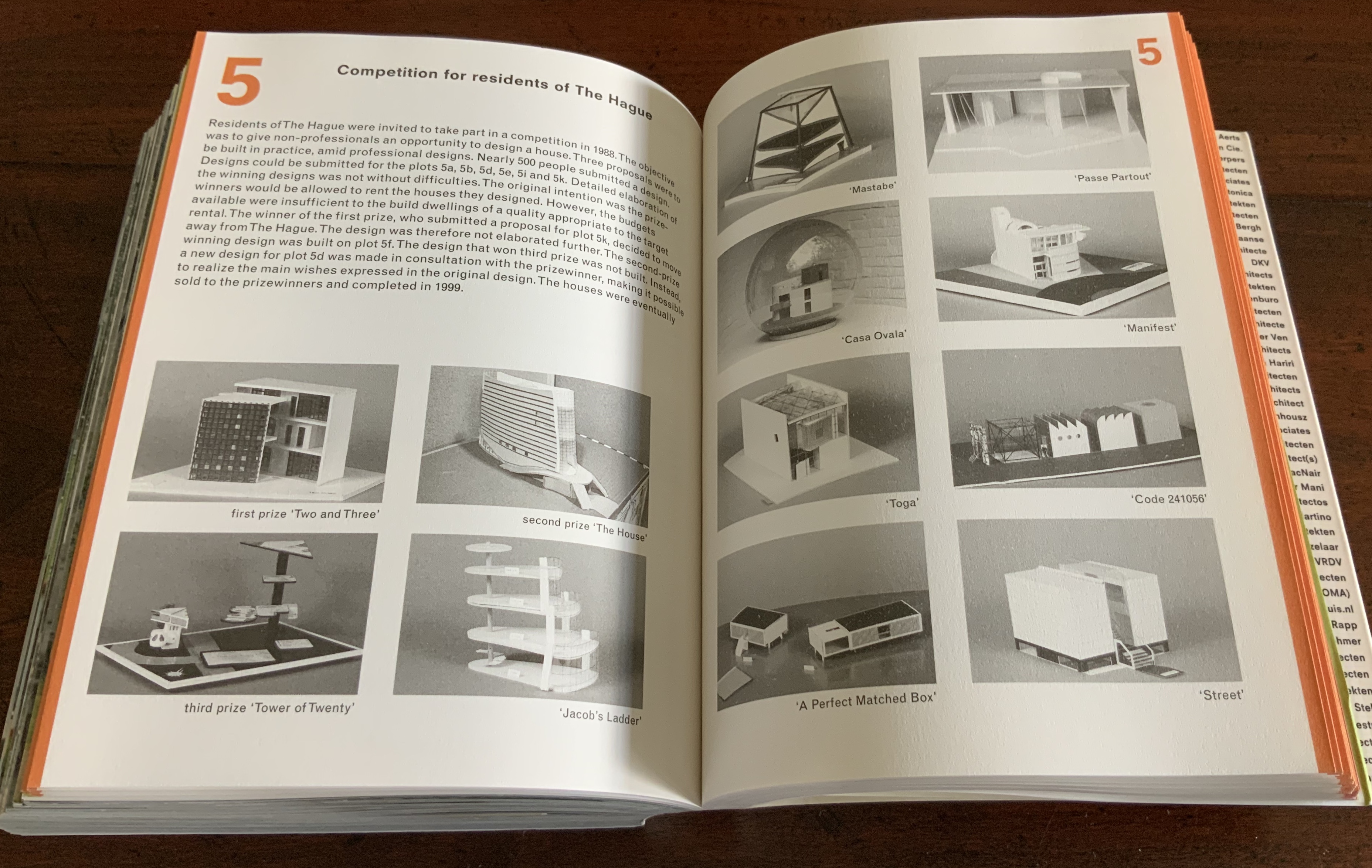
Strip: One Mile of Urban Housing in The Hague (2003)
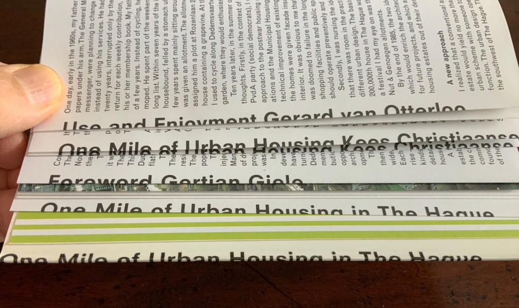
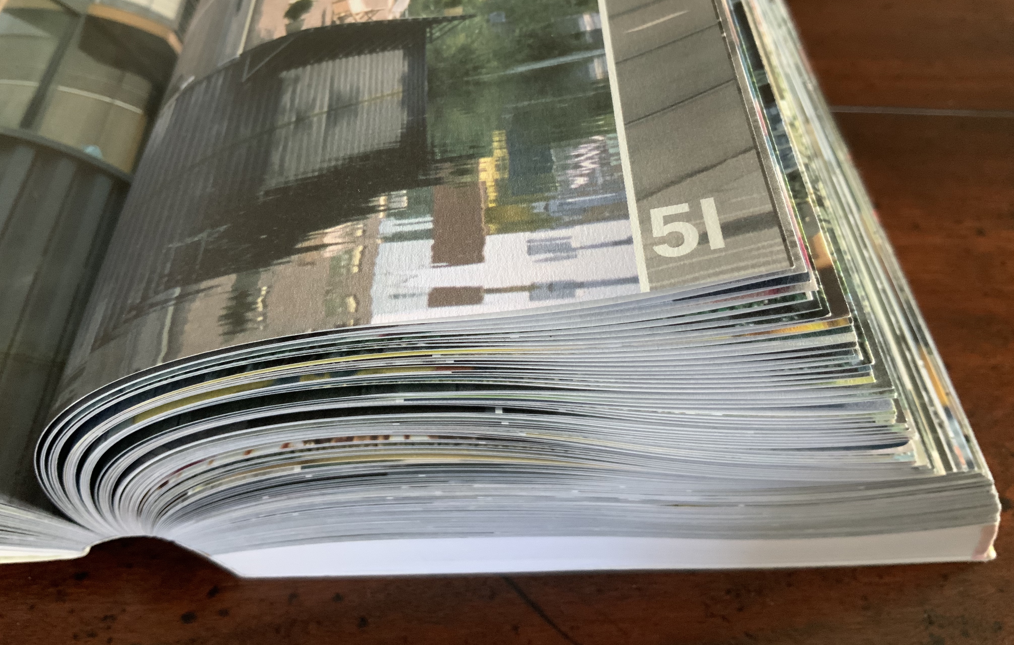
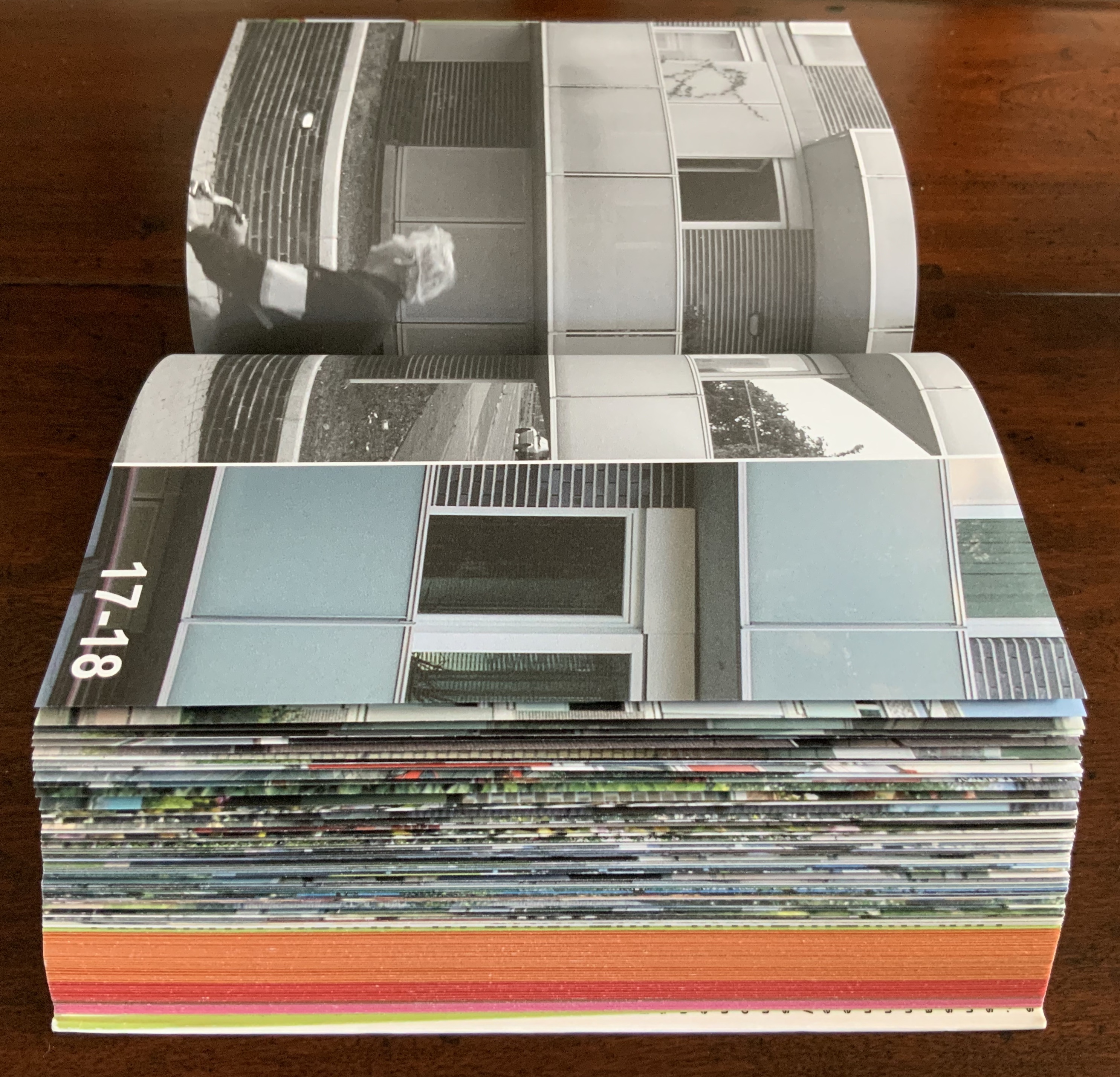
Strip: One Mile of Urban Housing in The Hague (2003) Marja van der Burgh, Kees Christiaanse, Gertjan Giele and Gerard van Otterloo (eds.); Design by Irma Boom and Sanne Beeren; Photography by Hans Werleman. Paperback, perfect bound, H175 x W142 x D40 (spine) and D48 (fore edge)mm. 256 uncut folios. Acquired from Galileo Alby, 28 September 2020. Photos: Books On Books Collection.
The primary purpose of Strip could not be further from that of Ed Ruscha’s Every Building on the Sunset Strip; nevertheless, its title and design pay a sort of homage to that accordion book with one side of the Sunset Strip at the top and other at the bottom. With its Chinese-fold pages, Strip has the same problem with thickness that any single-sided accordion has. Of course the Chinese fold offers the same advantage offered by the accordion fold: note how the section titles and photos wrap over the uncut folios, foreshadowing the treatment of the Rijksmuseum Guide above. Also like the Guide but unlike Every Building, Boom’s book is a form of information sculpture.
In some ways, Strip has more in common with the first edition of Robert Venturi’s Learning from Las Vegas, designed by Muriel Cooper at MIT Press, than with Ruscha’s Every Building on the Sunset Strip. Just as Learning from Las Vegas is intent on architectural and urban design theory, so too is Strip. Just as Cooper’s monumental design swamped the textual content (so much so that the authors successfully pressed for a reduced-size paperback), Boom’s design almost does the same to Strip‘s content. Almost, but not quite. Strip‘s blockiness, its rubbernecking around the corner of pages and its jumps in perspective match up with the authors’ intent — to document an environment and its residents.
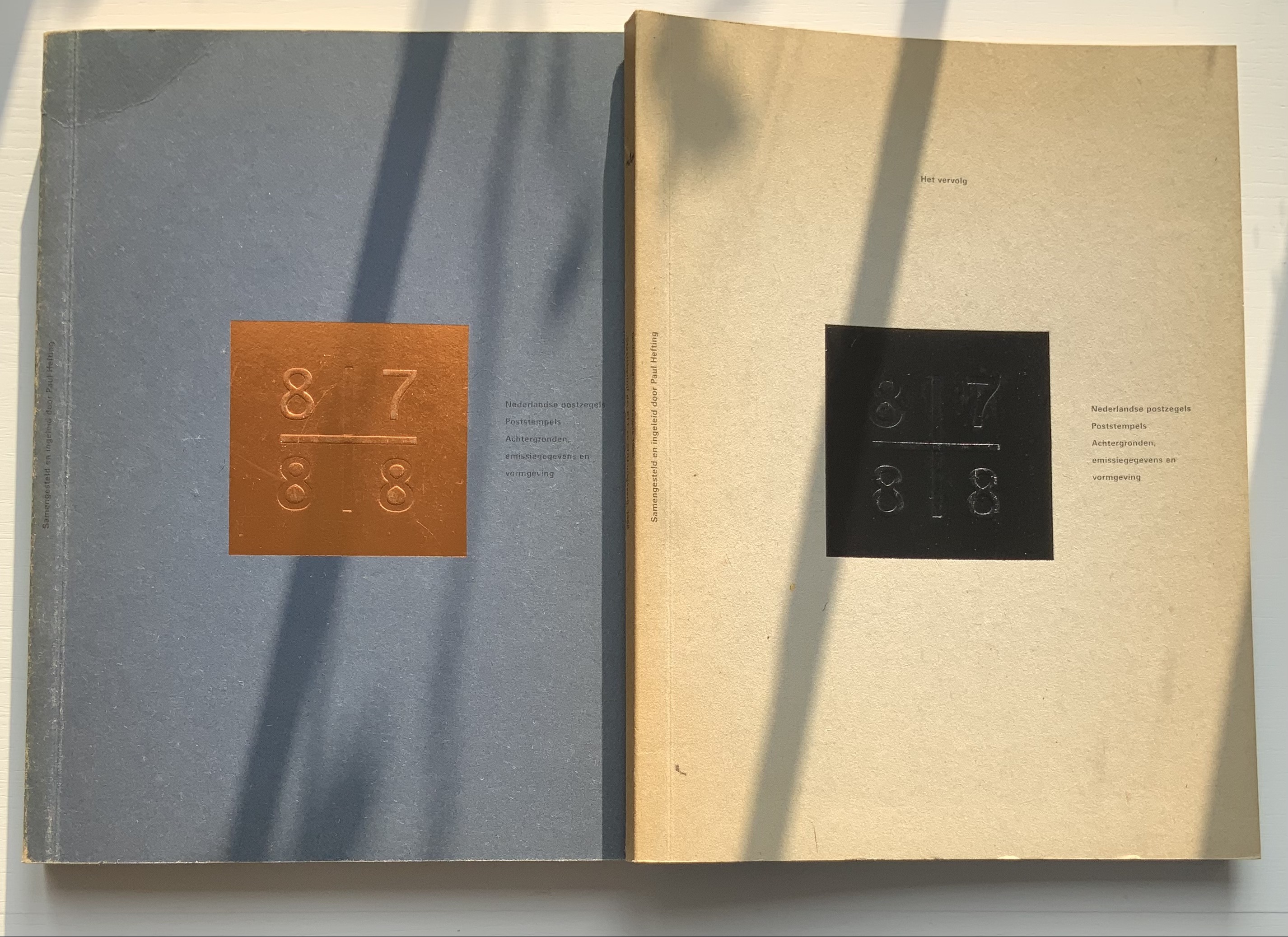
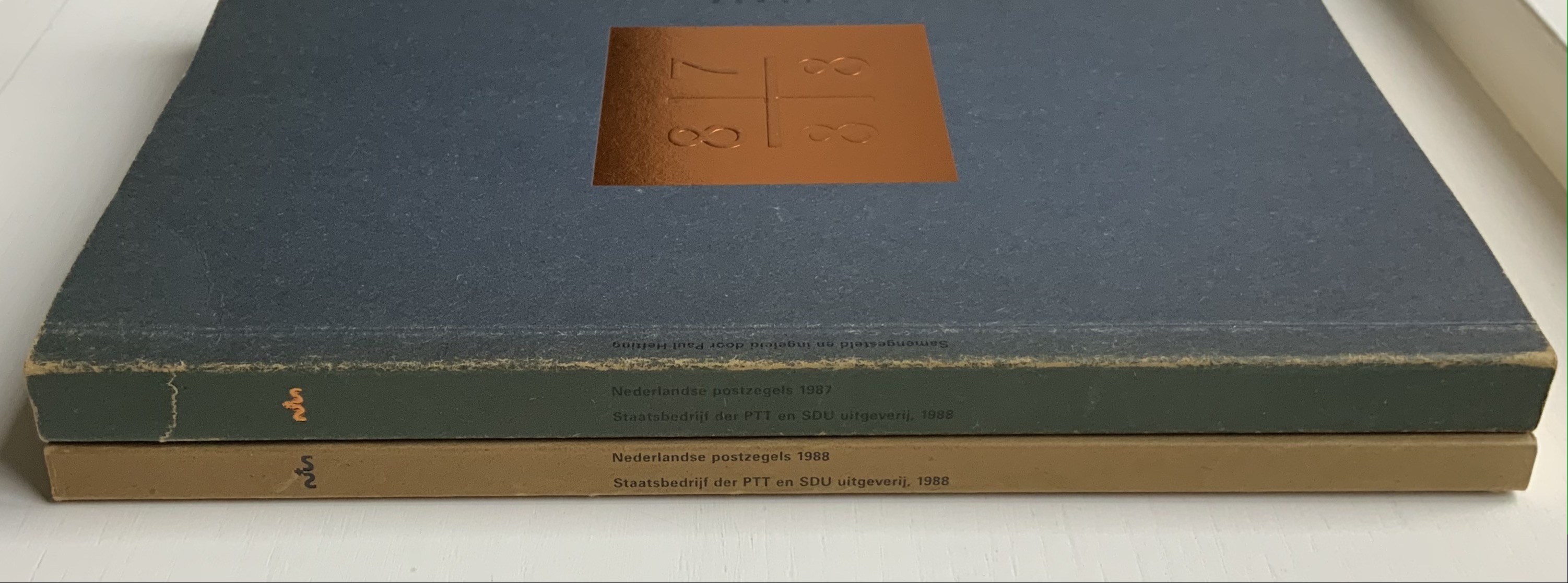
Nederlandse Postzegels, Poststempels 87/88 (1988)
Nederlandse Postzegels, Poststempels87/88: Achtergronden, Emissiegegevens en Vormgeving (1988) [“Dutch stamps, postmarks 87/88: background, issuance data and design”] Irma Boom (design), Paul Hefting (text) and Piet Janmaat (photography) Two softcover volumes. H250 x W188 mm, 228 pages combined. Acquired from Cornelis Verheij, 9 January 2022. Photos of the work: Books On Books Collection.
This two-volume set accounts for Boom’s first published book design and her first book design award. It celebrates the special edition stamp designs commissioned by the Dutch PTT during 1987 and 1988 and features an index of the different postal cancellations used during those years.
Foreshadowing Strip, the interior pages are created in the Oriental style of single-fold folios bound with the fold at the fore edge. In Nederlandse Postzegels, however, printing occurs on both sides of the folios. The outer sides are printed with 4-color offset lithography, presenting images and text sometimes in portfolio and sometimes in landscape layout. Whether in portfolio or landscape, images will often run from the recto to verso page, wrapping around the fold. In the section on the designers and their designs, the main text shows in landscape and, like the images, runs over the fold at the fore edge.
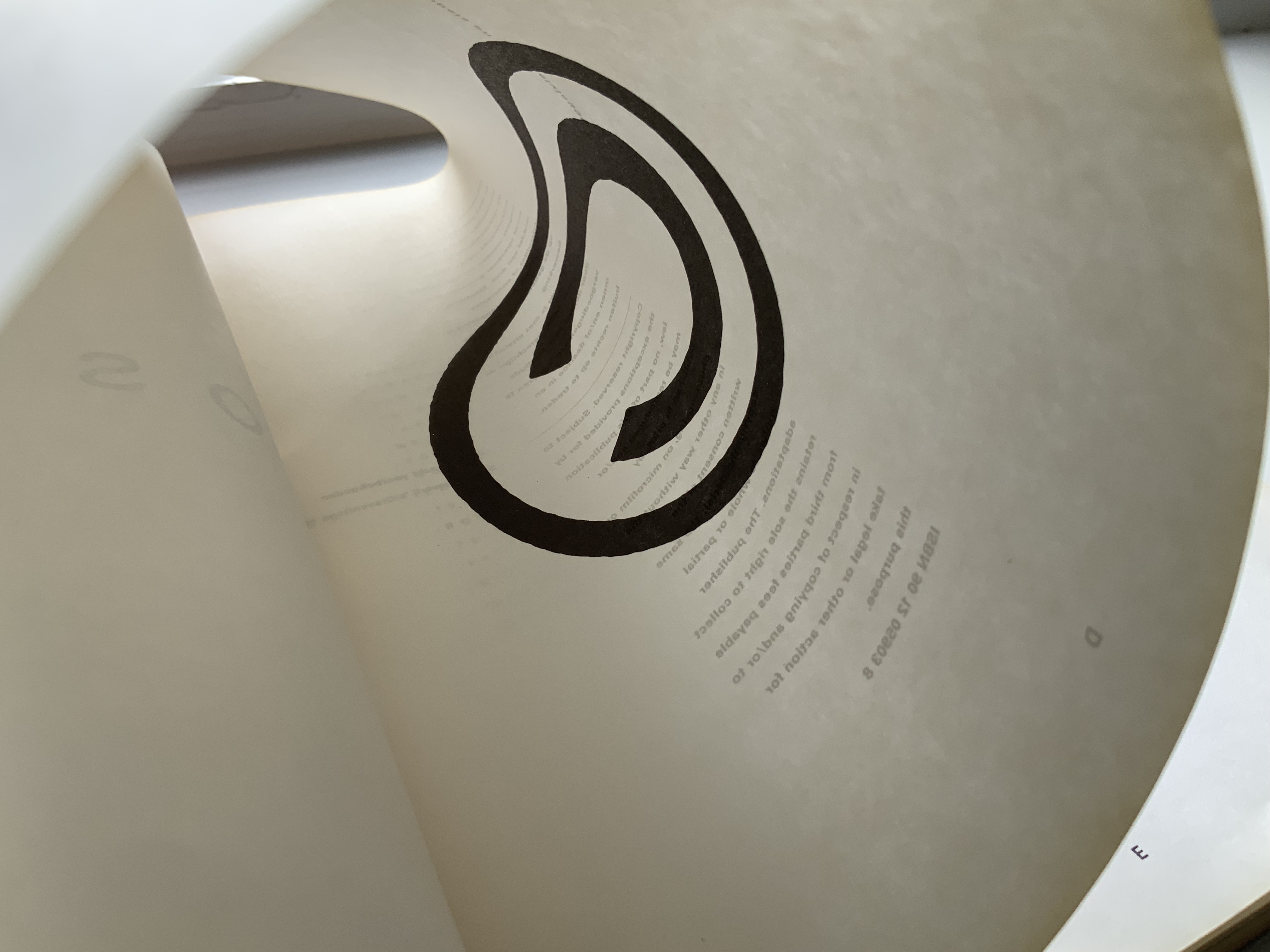
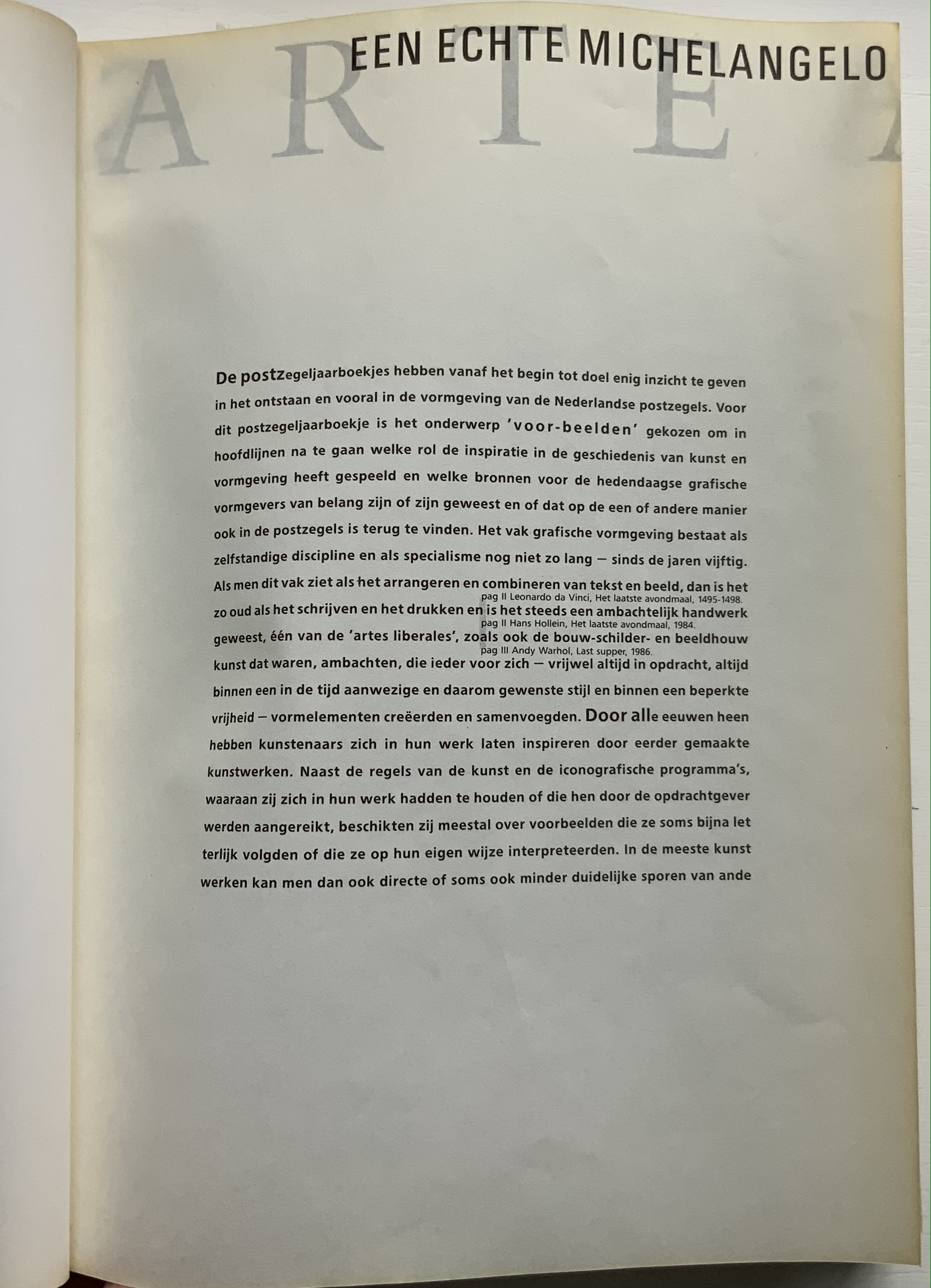
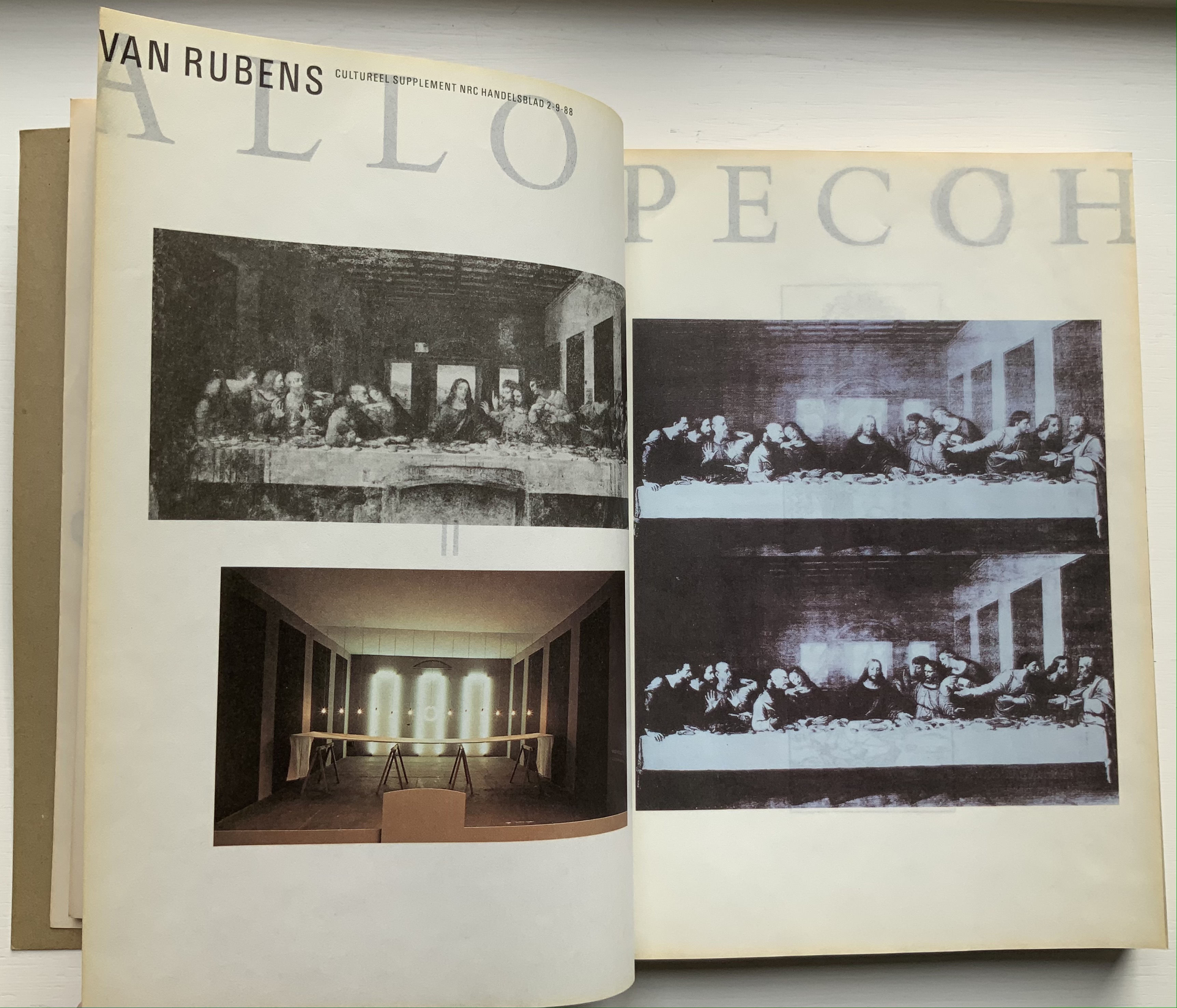
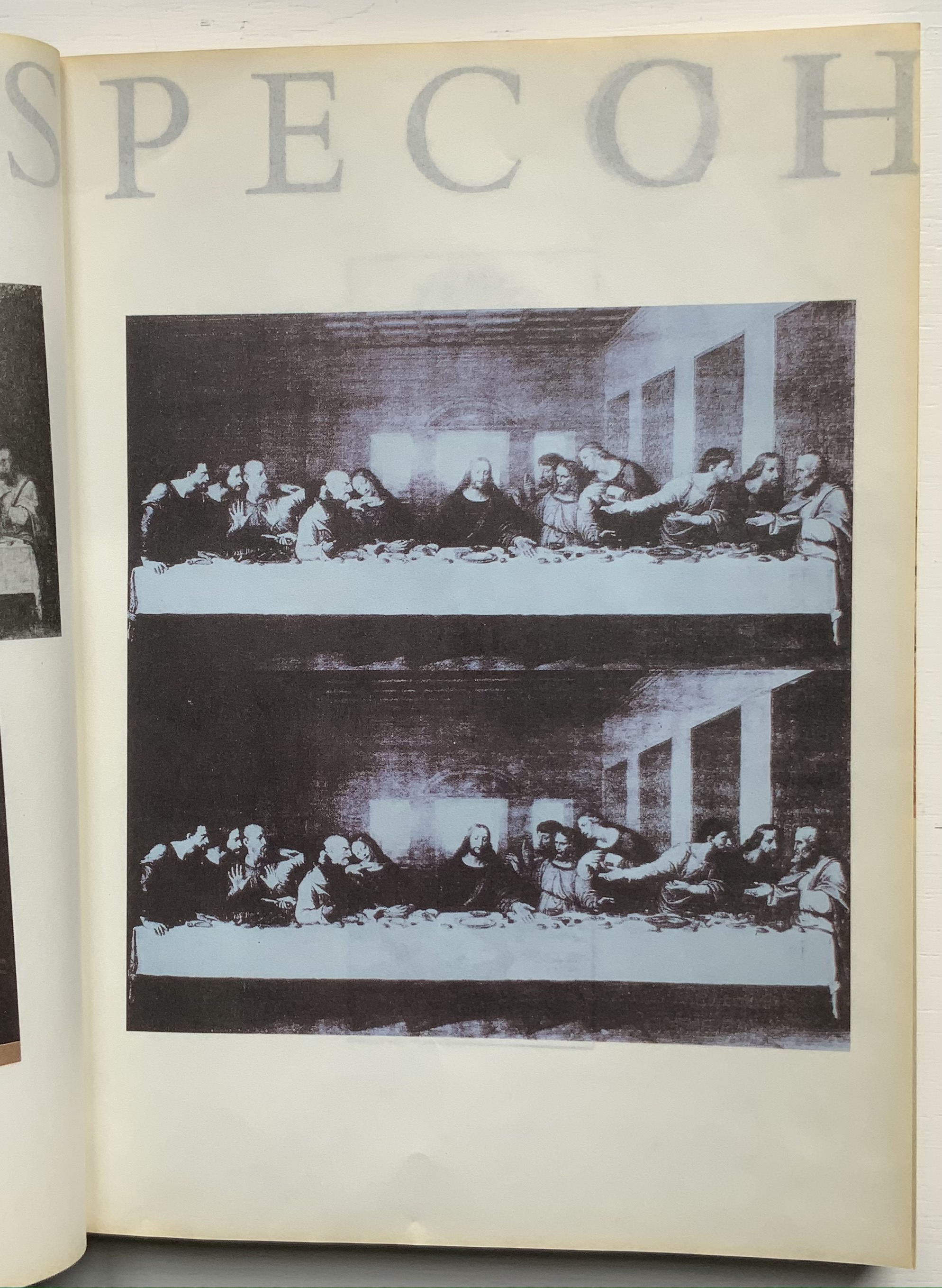
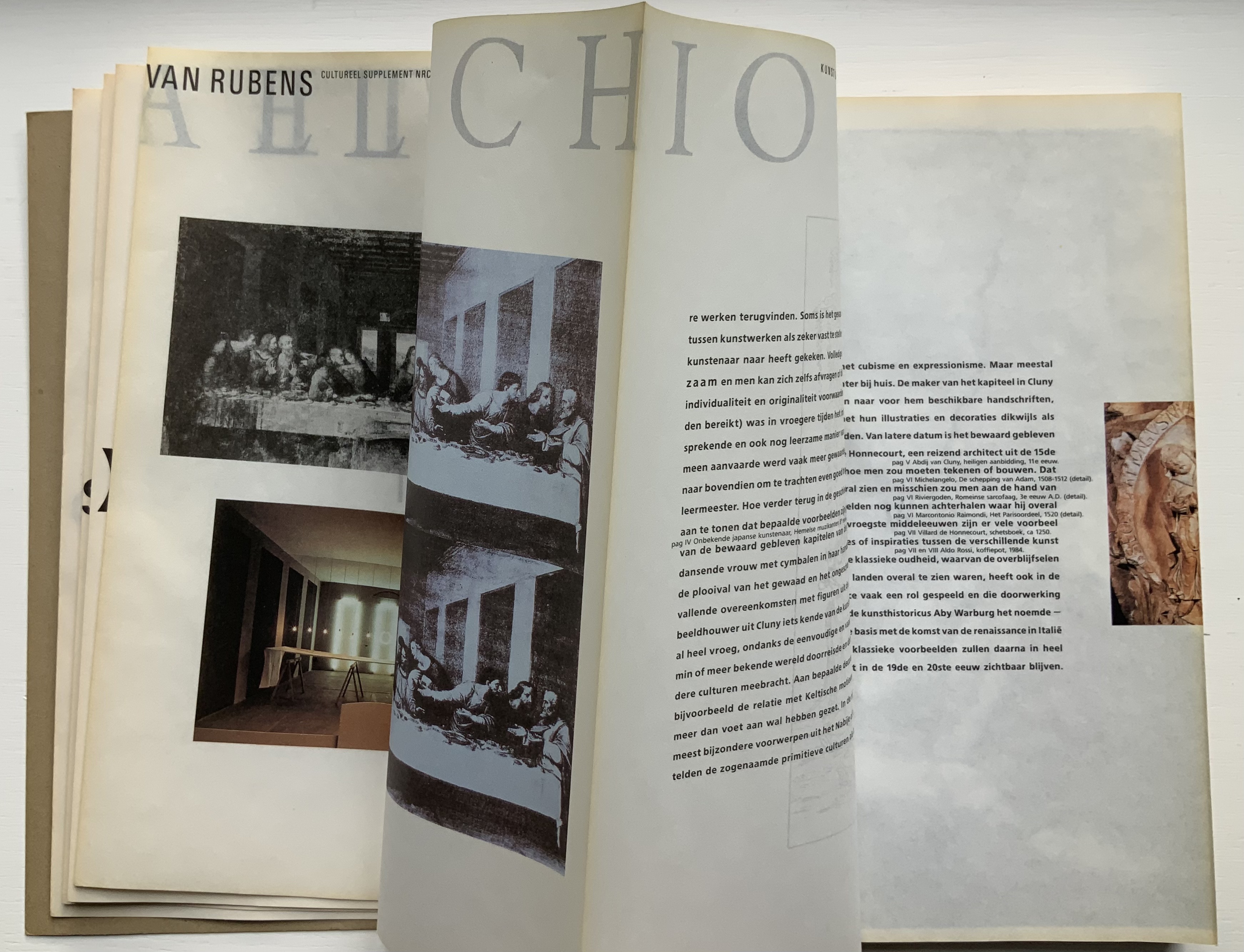
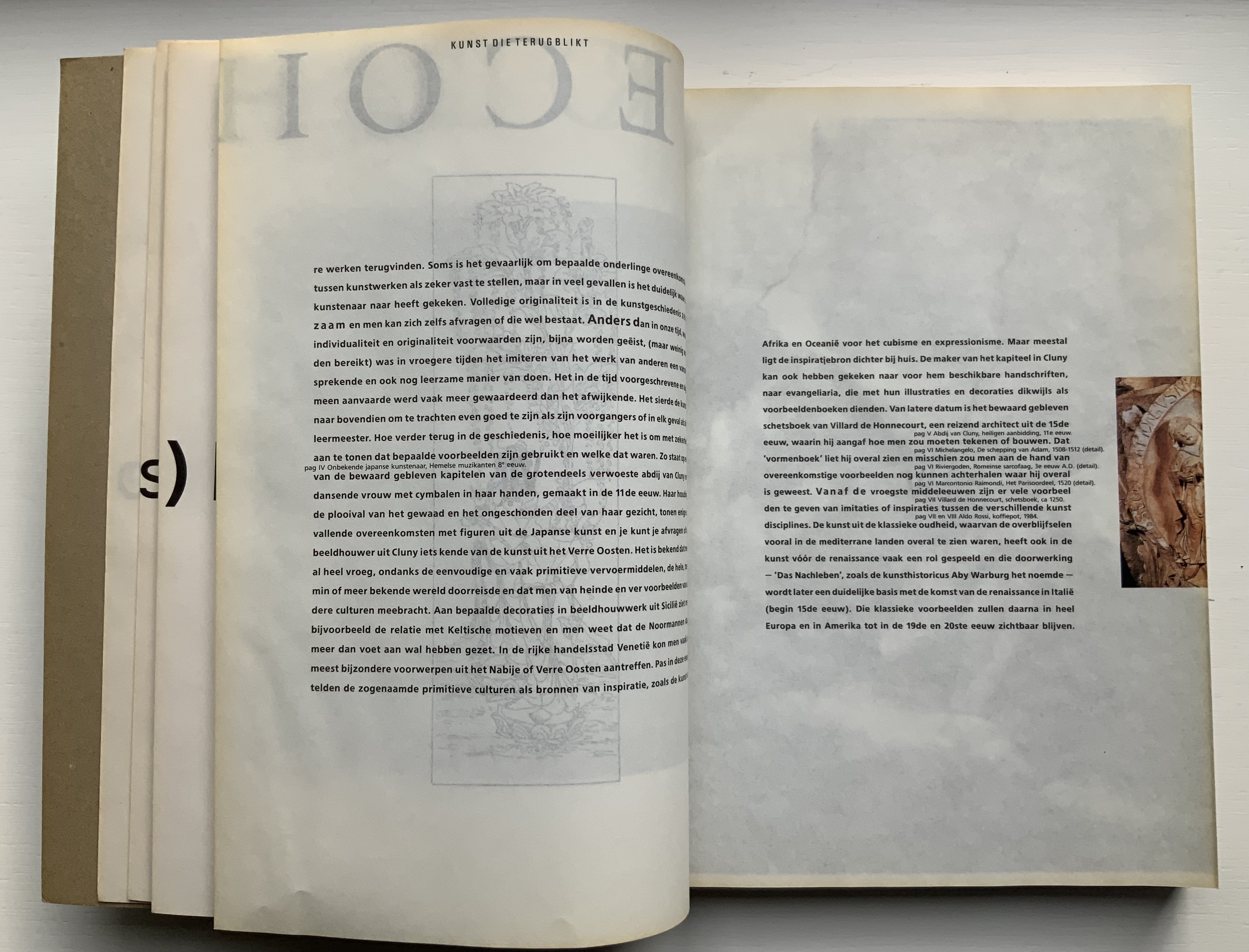
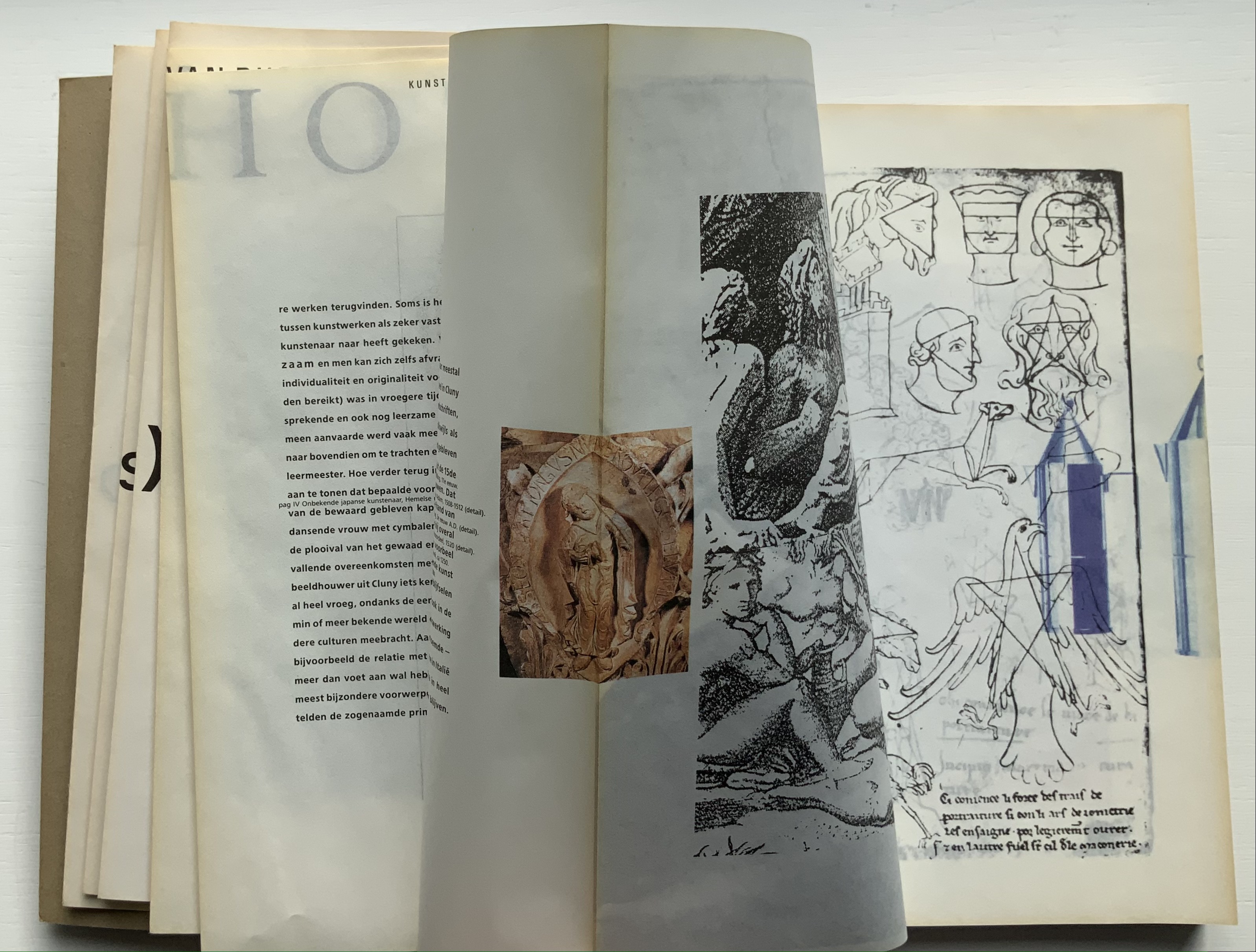
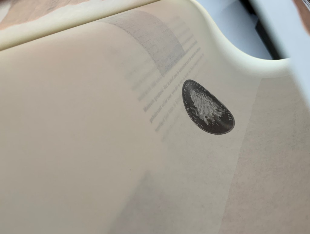
The inner sides are printed single color — black — creating shadow images on the outer side. Only by cutting through each fold (as encouraged by the perforations in Colour Based on Nature) can the inner-side images be examined closely, but this would destroy the work and the intent. With the shadows from the inner side, the outer side takes on a collage-like appearance. The print on the inner side also often serves for communication. For example, in the illustrated historical survey of design with which the first volume opens, the roman numerals for numbering plates appear on the reverse side of the plates to which they are assigned. Of course, the roman numeral has to be printed in reverse on the inner side so that it reads aright on the outer side, which is especially appropriate for this section labelled — from behind, of course — ARTE ALLO SPECCHIO (“art in the mirror”).
Copyright page and Table of Contents (pages D and E); inner side of page D.
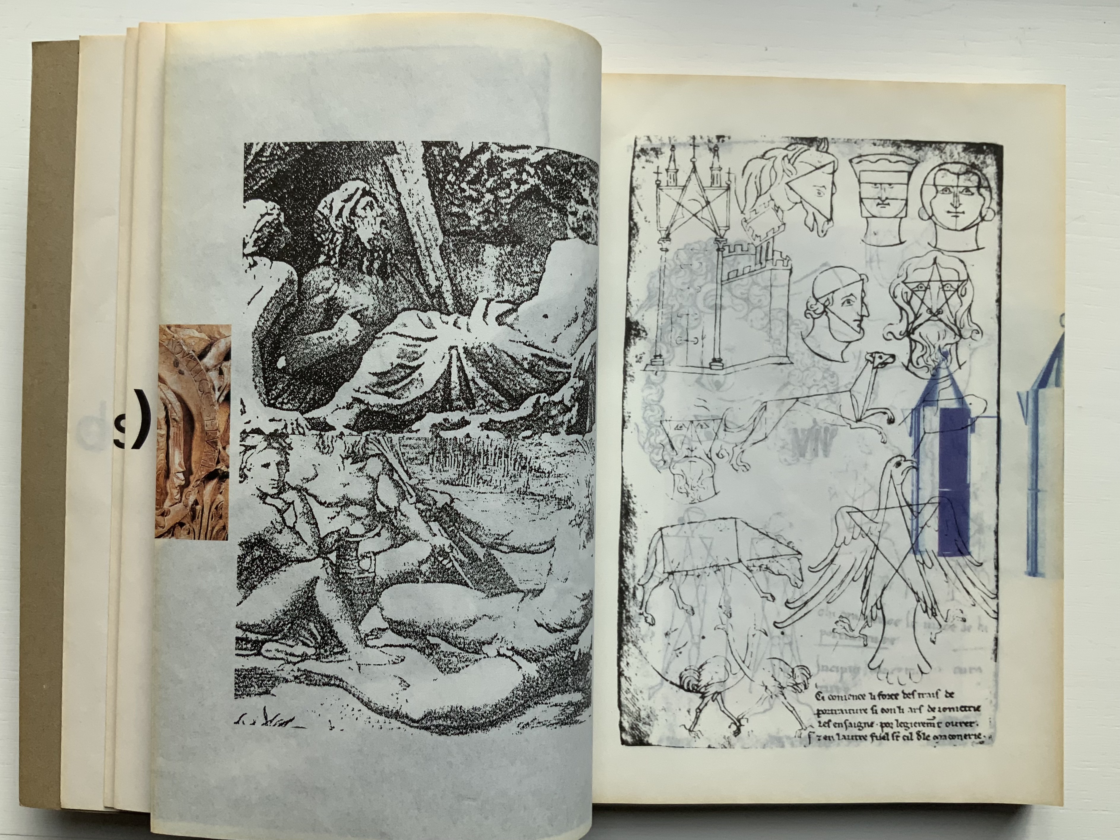
ARTE ALLO SPECCHIO (“Art in the Mirror”) printed on the inner sides of unpaginated pages I, J, K and L, with specchio running over the fold between K and L.
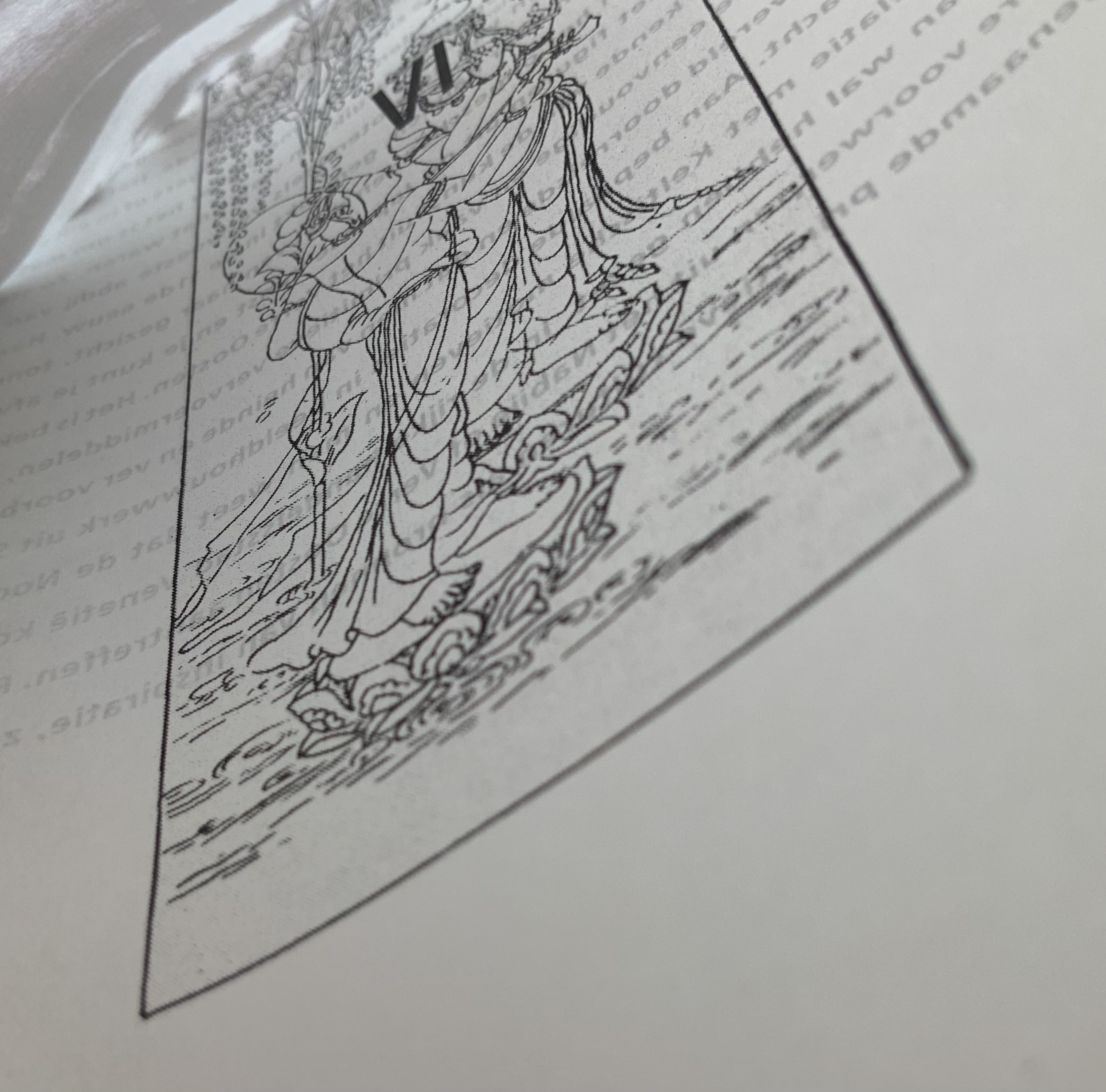
Clockwise: Unpaginated pages L and M; plate IV printed in reverse on inner side of page L (note on page L the interlinear caption for plate IV — pag IV Onbekende japanse kunstenaar, Hemelse muzikanten 8 eeuw [“plate IV, Unknown Japanese artist, Heavenly musicians 8th century”]); note image running over the fold between pages M and N; pages N and O.
Like all of Boom’s other works in this collection, Nederlandse Postzegels is not a quick read or easily navigated reference work. Its design demands from the reader an awareness that should translate into thoughtfulness about the accomplished designers and their designs, among whom are Anton Beeke, Henk Cornelissen, Wim Crouwel, Reynoud Homan, Cees de Jong, Frans van Lieshout, Karel Martens, Rick Vermeulen, Tessa van der Waals, Piet Zwart and many others.
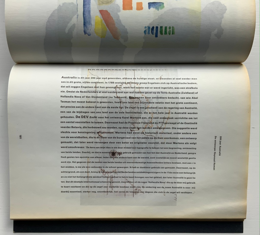
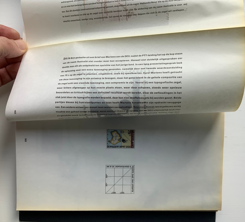
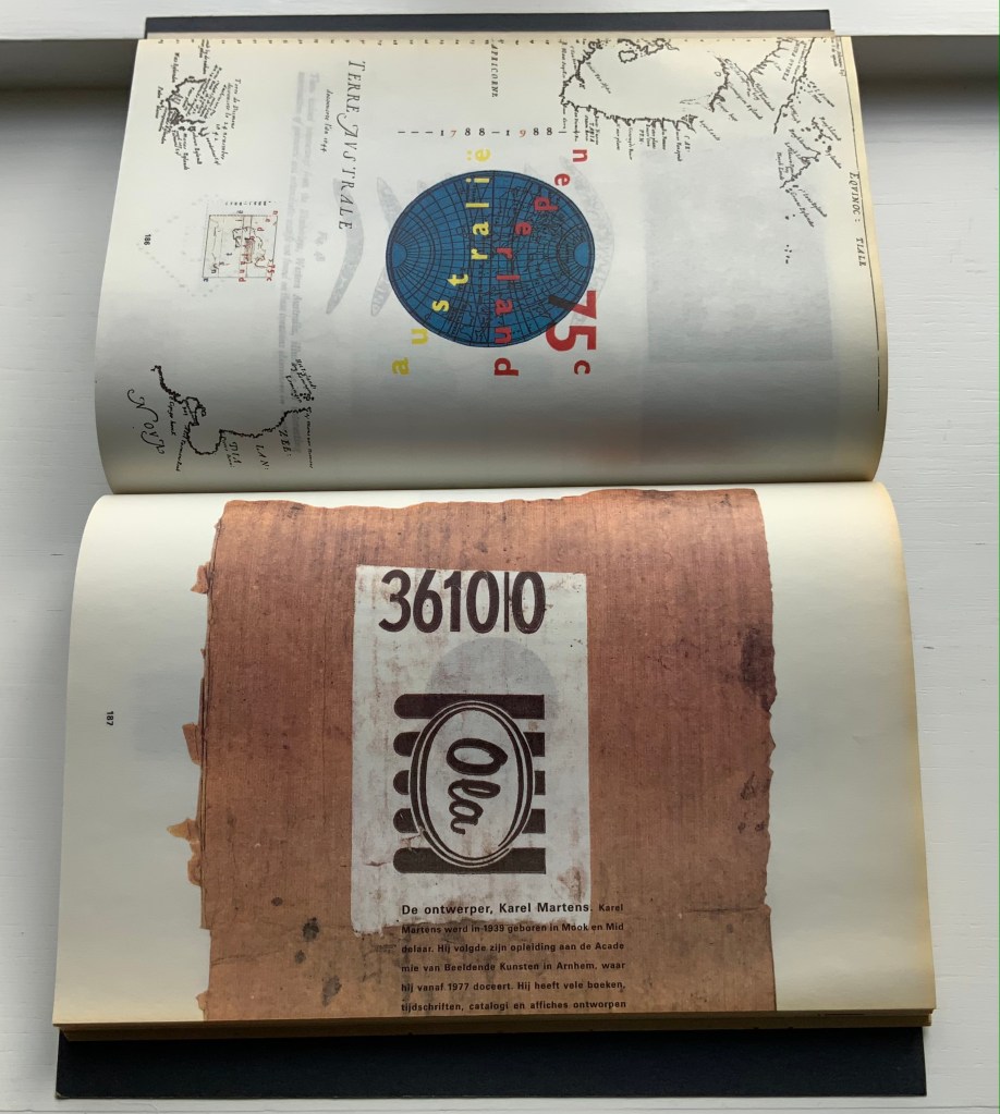
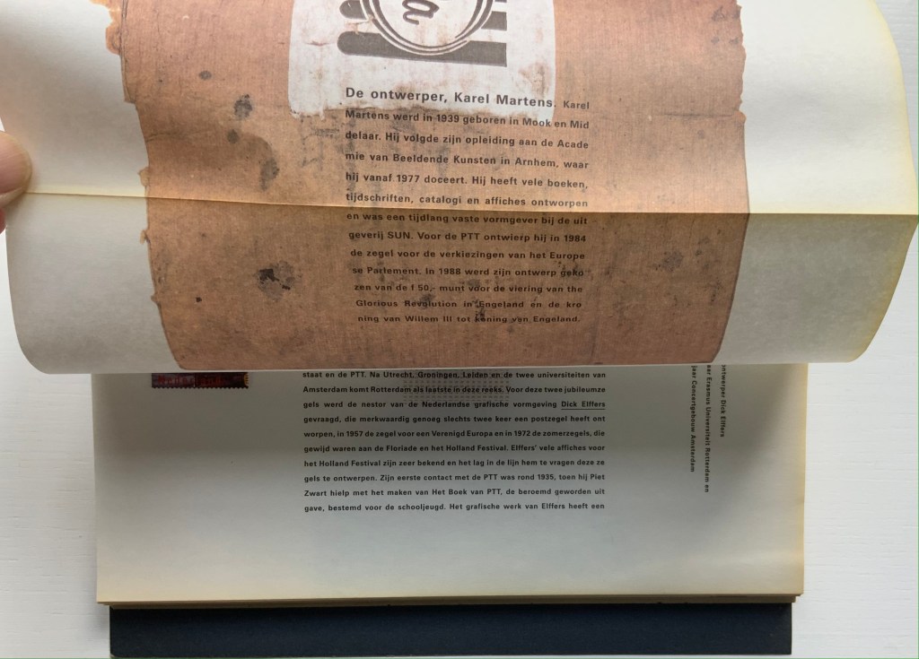
The selected pages and their “inside surfaces” recount the separate efforts of Karel Martens and Reynoud Homan to design the Dutch stamp commemorating Australia’s bicentennial in 1988. Martens’ design conflicted with PTT requirements, so Homan stepped in. The descriptive text follows a landscape layout and reads over the fore edge fold, but page numbers and some of the illustrations follow a portfolio layout.
Pages 181-83.
Pages 186-87.
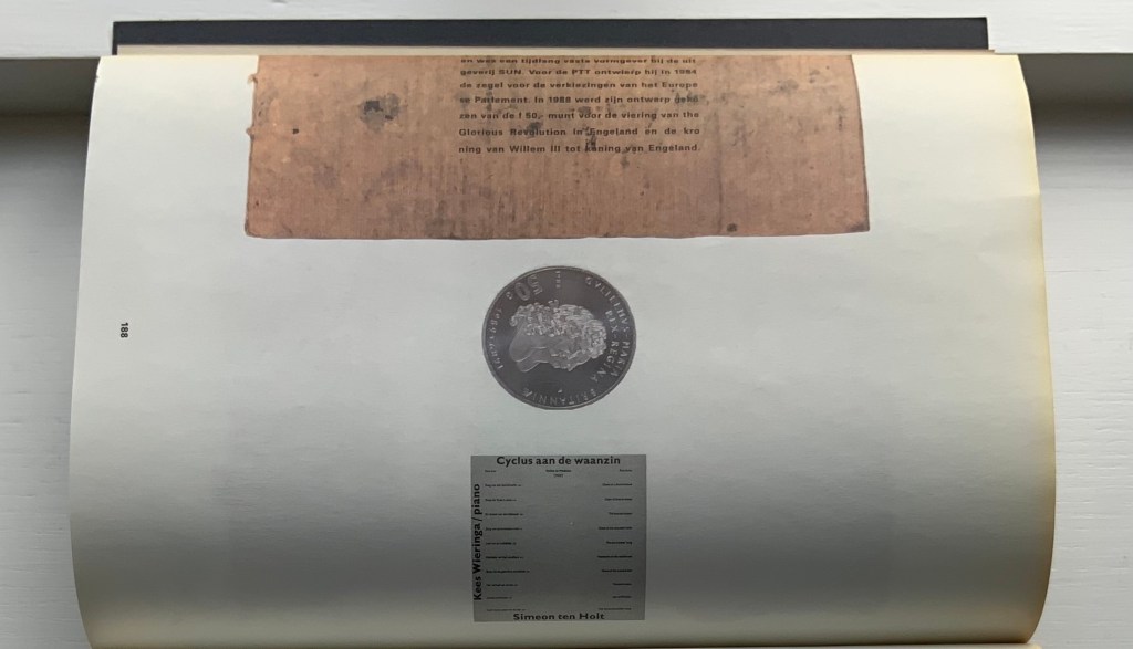
Top to bottom: Page 187’s text running over the fold to page 188; page 188 showing Karel Martens’ design of the coin commemorating William & Mary’s 300th anniversary of accession; inner side of page 188 cheekily showing the reverse side of the Martens coin.
Comparing herself to the kind of architect who produces social housing, Boom asserts, “books are industrially made and they need to be made very well. I am all for industrial production. I hate one-offs. On one book you can do anything, but if you do a print run, that is a challenge. It’s never art. Never, never, never.” But no less an institution than the Museum of Modern Art holds a copy of Nederlandse Postzegels. Display the book alongside the other five works above and the temptation to take Boom’s stance to be just as arch as that of Marcel Duchamp (“It’s art if I say so.”) is hard to resist. Nevertheless, ending with Nederlandse Postzegels, this entry defers to Boom and gives her the last word — at least on how the work came to be:
Since 1920, the PTT Art & Design Department had commissioned artists, architects and designers to design its services and products. To me, the whole idea of Dutch design comes from the design policy of PTT, especially in the 1970s and 80s when Ootje Oxenaar was head of the department.
Working at the Staatsdrukkerij meant enormous creative freedom. Those were the heydays of art-book publishing. If you made a book cover, they would encourage you to use foil or special printing techniques. The department was a springboard for young designers who would work there for one or two years and go on to something more exciting. After my internship, I went to Dumbar and the Dutch television (NOS) design department. After I graduated I went back to the Staatsdrukkerij, and ended up staying for five-and-a-half years. I learned a lot. In retrospect, it was a very productive and super-creative time.
I did jobs nobody else wanted, like the advertisements for the publishing department, which was – thinking of it now – a smart thing to do because I could experiment. Those assignments were completely under the radar but they were seen by Oxenaar. He invited the designer of the ‘crazy ads’ to do one of the most prestigious book jobs: the annual Dutch postage-stamp books.
Places like the Staatsdrukkerij don’t exist any more. When I started working there after graduation, I was immediately a designer (not a junior), and I quickly became a team leader. At that time I was very naive and fearless. I was not aware of an audience, and certainly not a critical audience! This vacuum is no longer possible for designers starting out today. I only became aware of the outside world after the prestigious postage-stamp yearbooks were published: hate mail from stamp collectors and design colleagues started to come in. But there was also fan mail.
The books polarised the design community. They won all the awards and a Best Book Award, my first one. In the jury report they mentioned ‘a brilliant failure’. Suddenly people knew who I was. I realised negative publicity has an enormous impact, more than positive publicity.” — Miltenburg, “Reputations: Irma Boom“.
Further Reading & Viewing
“Olafur Eliasson“. 17 May 2021. Books On Books Collection. Irma Boom designed the Eliasson catalogue called Contact, which is shown in that entry.
Boom, Irma, Julia Blume, and Günter Karl Bose. 2002. Irma Boom. Leipzig : Institut für Buchkunst.
Lehkoživová, Irena. 23 November 2016 –14 January 2017. “Irma Boom“. Vi Per Gallery, Prague, Czech Republic. Well-illustrated with photos by Peter Fabo.
Valise for Mallarmé(1997) Kathy Bruce Valise, altered book, X-ray film, wood, glass, die, collage. H8.5″ x W10.5″ x D5″. Unique. Acquired from the artist, 3 November 2021. Photos of the work: Books On Books Collection.
Any artist who flirts with surreality is likely to begin or end up carryingMarcel Duchamp‘s bags or bearing Joseph Cornell‘s boxes. Cornell himself was influenced by Duchamp. He assisted Duchamp with the latter’s Boîte-en-Valise series, 1935-41, and assembled a few of his own suitcase- or valise-based works, such asUntitled (The Life of Ludwig II of Bavaria), 1941-52, and Untitled (The Crystal Cage: Portrait of Berenice), 1934-67. Boxes though became his forté. Although Cornell sourced a substantial amount of collage material from books, he did not frequently use altered books (especially excavated ones) as an object within an object, a container of objects or object in itself. One excavation example is his Object (glass, dust and plastic spoon), 1939. Another, which however embodies all the permutations, is Untitled (To Marguerite Blachas), c.1939, a thorough-going alteration of the Journal d’Agriculture Practique (Volume 22, 1911). A variation with Volume 21 was discovered after his death in 1972.
So, since 1972, how to make anything not merely derivative? Hefting the influences lightly, Kathy Bruce takes Duchamp and Cornell in an original direction and replaces their mysterious surreality with the mysteries of Stéphane Mallarmé’s poem Un Coup de Dés Jamais N’Abolira le Hasard (1897) and with her own surreality arising from chance-found objects and chosen juxtaposition. Cornell remarked that his boxes “are life’s experiences aesthetically expressed”. Valise for Mallarmé and the four other of Bruce’s works described below are aesthetic expressions of her experiences of the poem that “made us modern”.
This Duchampian valise opens to show that it has been pressed into a Mallarméan voyage. In the deeper compartment sits a Cornellesque glass-covered wooden box. It contains a red die; collage of an engraving of penguins, a spouting whale, a ship under sail against towering glaciers and a flight of birds; scraps of paper marked with Chinese ideograms and handwritten numbers and symbols; and mechanical diagrams. A reflective, smoky blue sheet surrounds the glass-covered “raft”. It is a piece of X-ray film discarded from Gramercy Hospital in New York City. The film is face down and affixed to a sheet of paper that later developed ripples. The artist “liked the way it looked– like waves in the water, so it stayed” (correspondence with the artist, 11 December 2021).
On the shallow side of Valise for Mallarmé is an altered book, excavated to fit around the “raft” and show a passage from Un Coup de Dés pasted at the bottom of the excavation and covered with translucent paper. The book is John L. Stoddard’s Lectures (Ireland, Denmark, Sweden, Supplementary Vol 1). Stoddard was a prolific writer (16 volumes in his lecture and photograph series) and prodigious traveller (26 countries and multiple states in the US visited). The lecture series appeared 1897 to 1898, haply coinciding with Mallarmé’s poem and death. Strangely enough, where Mallarmé ended his spiritual voyage from Catholicism to atheism, Stoddard ended his from atheism to Catholicism. The combination of coincidence and divergence from this found readymade no doubt confirmed it to Bruce as the right choice of color, shape and material to echo the poem’s last line — Toute pensée émet un Coup de Dés (All thought emits a roll of the dice).
Conmoción, Contución y Compresión Cerebrales (1998)
Conmoción, Contución y Compresión Cerebrales (1998) Kathy Bruce Framed, altered book, surrounded by white cloth and containing an embedded box containing another box with dice and collage. H15″ x W12″ x D3″. Unique. Acquired from the artist, 3 November 2021. Photos of the work: Books On Books Collection.
Were it not for the preceding work, the presence of dice and and the image of a ship pasted to the back of the glass-covered box embedded in the altered book framed here, we might miss that Mallarmé’s poem inspired Conmoción, Contución y Compresión Cerebrales. The altered book’s title, difficult to make out on the spine, is Patología y clínica quirúrgicas (1873), a medical manual by Joseph-Auguste Fort, a French contemporary of Mallarmé. Fort had travelled in Spain, voyaged to South America and studied medical education and practice in several countries there, hence the Spanish of his book.
The shredded book pages packed around the box within the box embedded in the medical manual could be compared to The Wasteland‘s “fragments I have shored against my ruins”, but T.S. Eliot’s fragments are snippets of civilisation (lines from a nursery rhyme, Dante’s Purgatorio, a Latin poem, etc.) that his speaker uses to shore against his contemporary wasteland. Bruce’s snippets come from that medical manual and serve a dual purpose. First, to provide the title of her work. Second, to insulate and secure the box containing the dice and print of the ships under sail. The title appears in the bottom space between the boxes and comes from a section heading in the book, a phrase that “speaks to the chaos and confusion of the wrecked ship at sea” (correspondence with the artist, 12 December 2021).
So, from what is the packing insulating that inner box? Loose in the tilted embedded box, the dice can still roll; tilted in the box, the ships are continually bound to founder. How can conmoción, contución y compresión cerebrales (cerebral concussion, contusion and compression) be avoided? What can protect against Chance that any roll of the dice can never abolish or against the “bookwreck” in which they are embedded? What surrounds the altered book implies that they cannot. The crumpled white cloth (from the poem’s velours chiffonné) evokes not only a fallen sail but also a coffin’s lining in which the book lies. How appropriate then that Mallarmé’s poem confronting le néant (nothingness) and inspiring this work of book art is here but not here.
Solitary Plume Lost(1998 or 2000)
Solitary Plume Lost(1998 or 2000) Kathy Bruce Small cigar box, feather, pine wood, collage, cloth. Closed H1.5″ x W6.5″ x D3.5″. Unique. Acquired from the artist, 3 November 2021. Photos of the work: Books On Books Collection.
Inside the box:
Lining the cigar box, a piece of white crumpled velvet, which refers to the poem’s velours chiffonné.
A scrap of stiff, dark blue, glittering felt, a kind from which a toque de minuit (a hat or cap the color of midnight) might be made.
A triangular block of pine wood on which three translated lines of the poem are pasted along the hypotenuse surface, a 1998 commemorative stamp with Mallarmé’s likeness is pasted on the top surface, an image of the Aquila constellation with its main stars Altair, Tarazed and Alshain is pasted on the bottom surface, and constellation markings for the hypergiant stars of Draco are pasted along the two remaining sides.
A white feather, which refers to (plume solitaire éperdue/solitary lost plume), attached to the inside surface of the box’s top.
Among the best known images of Mallarmé is the portrait by Edouard Manet in 1876. Cross-legged in an armchair, the poet leans toward his right hand resting on a side table and holding a cigar from which smoke curls. It is so well known that, after puzzling over the constellations and text on the other sides of the block, it is a surprise that the image on the stamp has not somehow changed into it.
Navigating the Abyss I (1998)
Navigating the Abyss I (1998) Kathy Bruce Altered book, wood, lenses, collage, thread. H7.5″ x W5″ x D3″. Unique. Acquired from the artist, 3 November 2021. Photos of the work: Books On Books Collection.
Bruce brings her sculpture outside any enclosure with Navigating the Abyss I. Rigging-like thread wraps around a copy of Intermediate Reader, a relic from a series of readers compiled between 1867 and 1927 for the Brothers of the Christian Schools, headquartered in Montreal, which recalls Mallarmé’s school-teaching days. Three triangles of wood panelling are attached to the book’s back cover, a deft choice of material for the sail-like seams and shape. A glossy piece of postcard or a cut from the cover of an art book depicting a gilded hand, open as if having just rolled the dice, occupies one corner of the cover. It’s impossible to say whether it is the lower or upper, left or right, as the book has been turned upside down and back to front in its altering (note the photos above). The three loose lenses add to this effect of shipwreck detritus, as does the convex lens embedded like a porthole in the book and revealing a torn page and part of a handwritten letter presumably left in the book. Across from the convex lens, the pasted-down diagram is a scaled drawing of a template for what appears to be a rigging pulley with a diameter of 9 and 3/4 inches. The collaged precision diagram alludes not only to the ship but also to the poem’s reference to anciens calculs. It adds to the artifice and abstraction of poem, book, ship and flotsam that Bruce has created.
The paragraph pasted on the book’s front cover (the artwork’s “back cover”) comes from the Intermediate Reader. The content is uncannily apt:
Far in the horizon, they thought they saw a beautiful lake, with branching palm-trees. They longed for the water and the cool shade; but their ____ guide told them there was no lake in the place where it seemed to be; that it was only the mirage — a seductive illusion floating in the air.
The small rectangle excised from this passage is pasted face down among the other detritus on the opposite side. It is another bit of controlled artifice that not only alludes to the use of empty space (les blancs) in Un Coup de Dés but contributes to the work’s surreality.
Navigating the Abyss II (1999)
Navigating the Abyss II (1999) Kathy Bruce Altered book, camera lens, collage, thread. H9″ x W7″ x D5″. Unique. Acquired from the artist, 3 November 2021. Photos of the work: Books On Books Collection.
A withdrawn library copy of Jean-Jacques Rousseau’s 18th century bestseller Julie, ou la nouvelle Heloïse, with one-sixth leather binding over marbled boards, provides Bruce with the raw “stone” for her second sculpted version of Navigating the Abyss. Headed for the graveyard of pulping or burying in landfills, this culled copy, stamped WITHDRAWN in black on all of its faded marbled edges, is destined never to be opened again, a point underscored by the tangle of black thread holding it closed. The inaccessible content is the epistolary tale of Julie d’Étange, an aristocrat who falls in love with her tutor Saint-Preux, is married off to the tolerant atheist Lord von Wolmar, becomes devout to overcome her attraction to Saint-Preux, and dies of hypothermia after plunging into water to save her child. The inauthenticity into which Rousseau throws religious belief makes Bruce’s choice of this marbled stone appropriate for paying homage to Mallarmé who chose to navigate the abyss without God.
Although both versions of Navigating the Abyss have a similarity, somehow this second version is bleaker than the first. Looked at on edge, the black lens and marbled book appear to be a funerary sculpture on a plinth. Unlike the embedded lens in the first version, a single Cyclopean camera lens sits atop the book into which a hole has been bored. The darkness at the lens’ center evokes the idea of an abyss or whirlpool, especially as the words and letters from the torn pages circle around the edges like detritus being pulled down. A black-and-white version of Goya’s Saturn Devouring his Son provides the ghostly image floating in the lens. While it isn’t necessary to know the source of the image or that the series from which Goya’s mural painting comes is called The Black Paintings, the details add to the funereality evoked by the black thread, the black stamp and decayed state of the book.
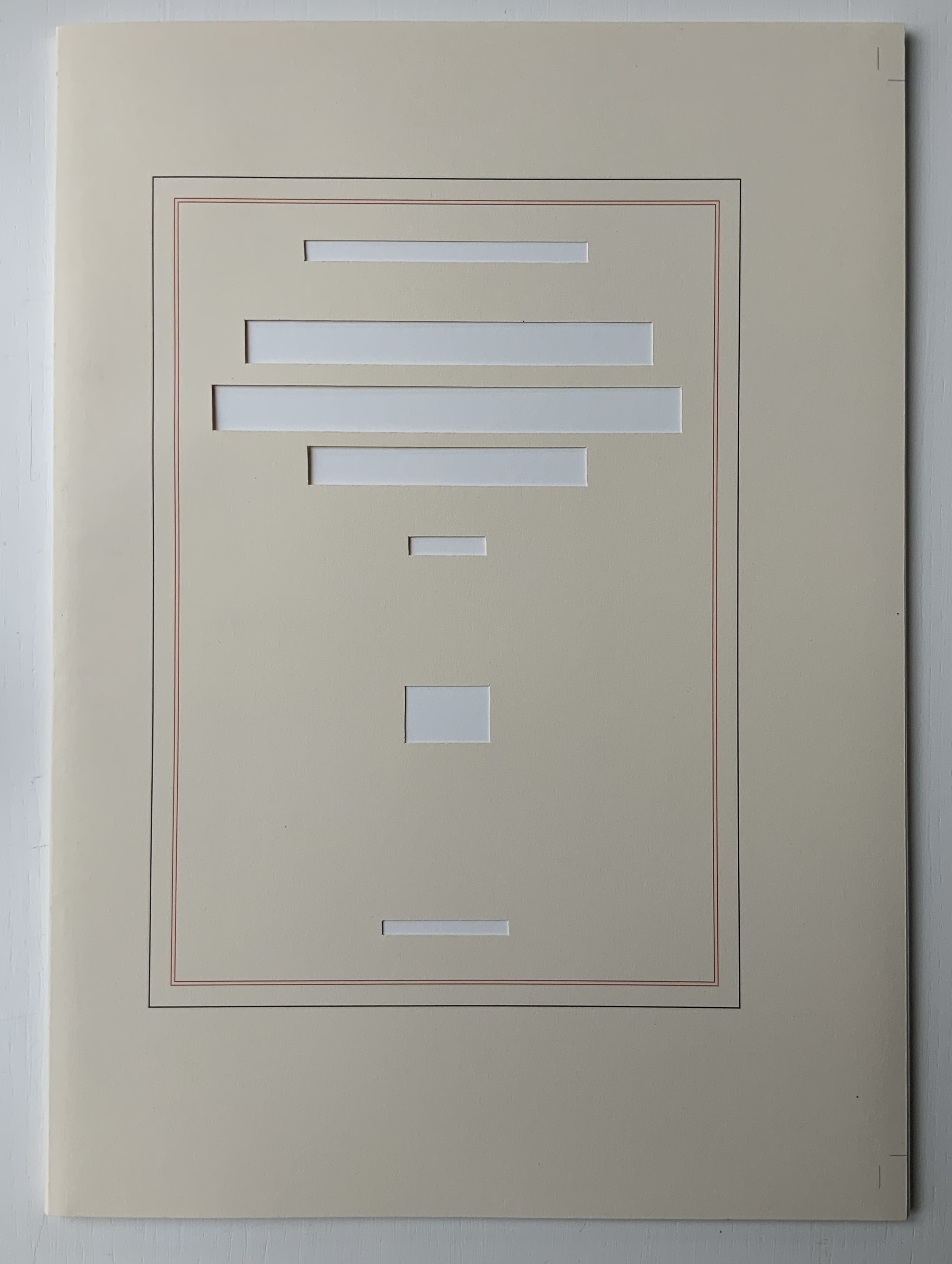
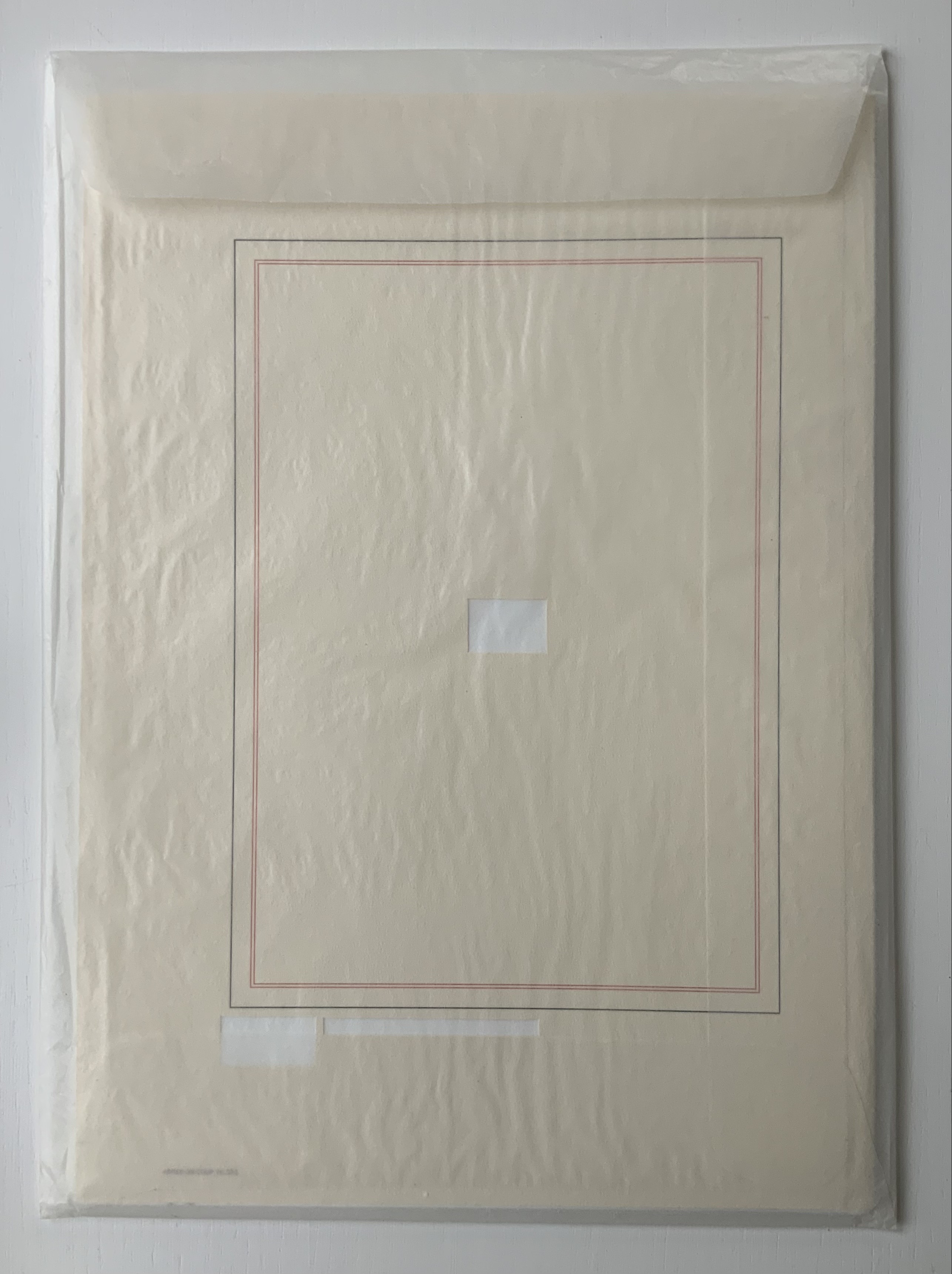
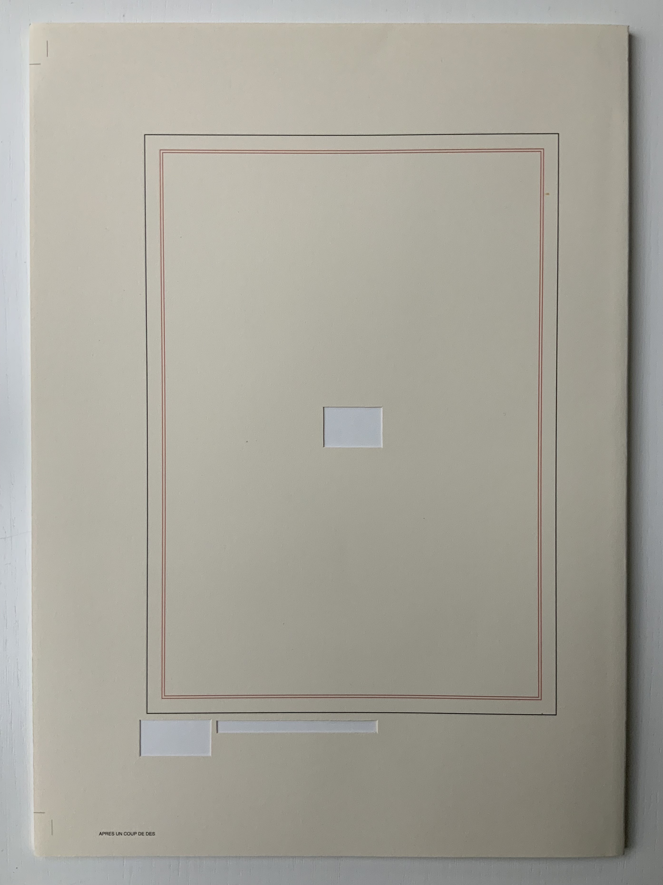
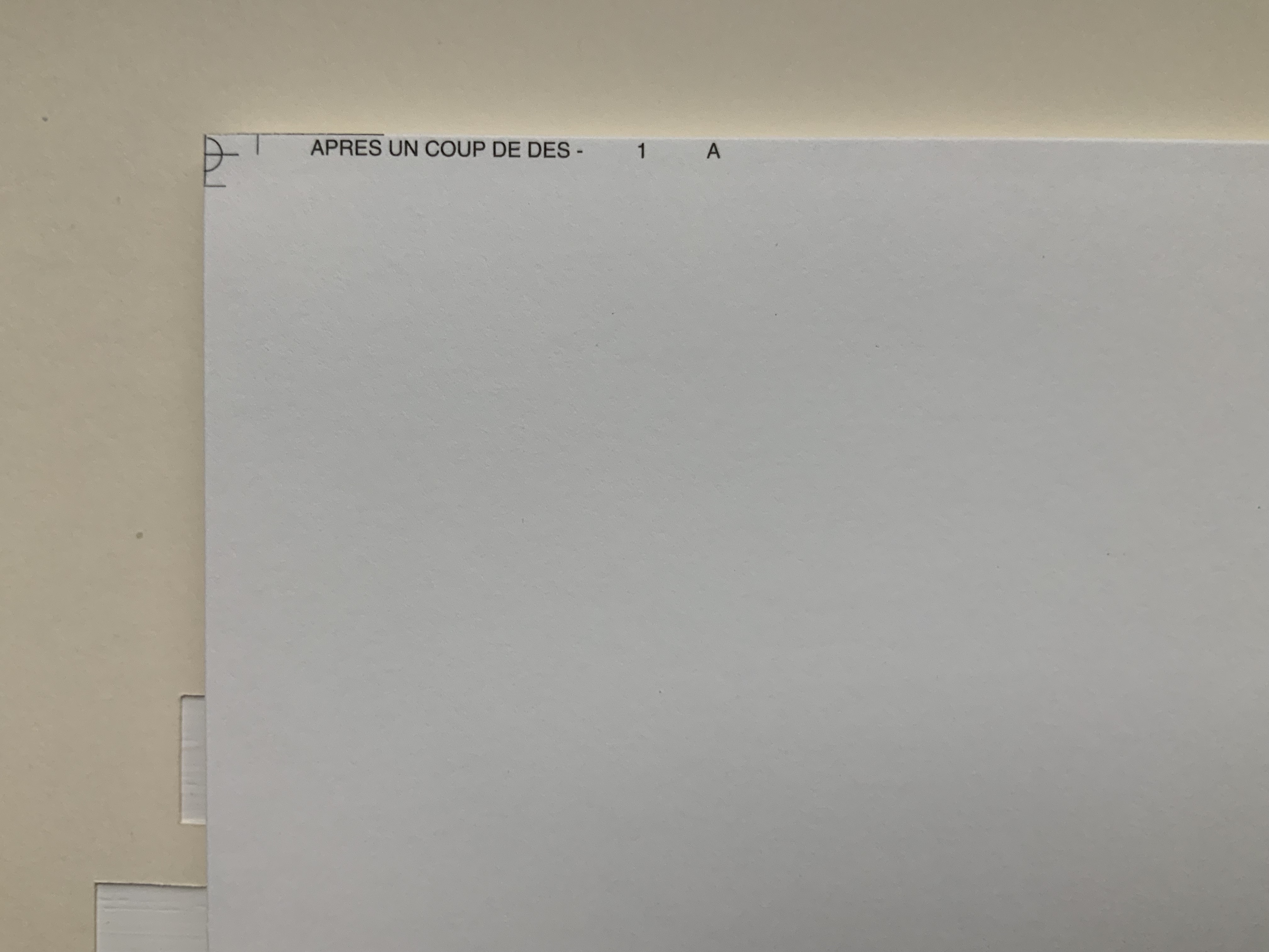
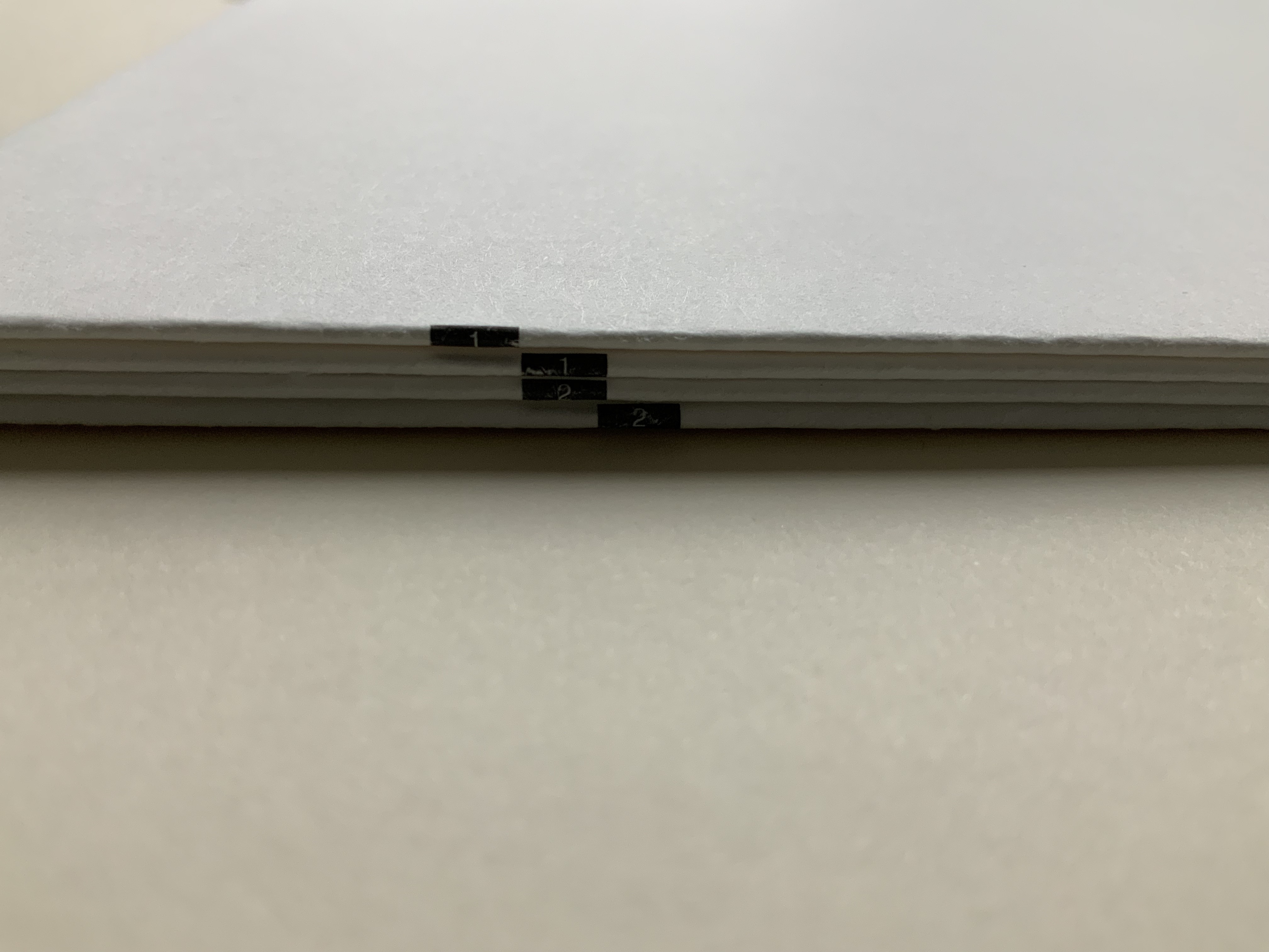
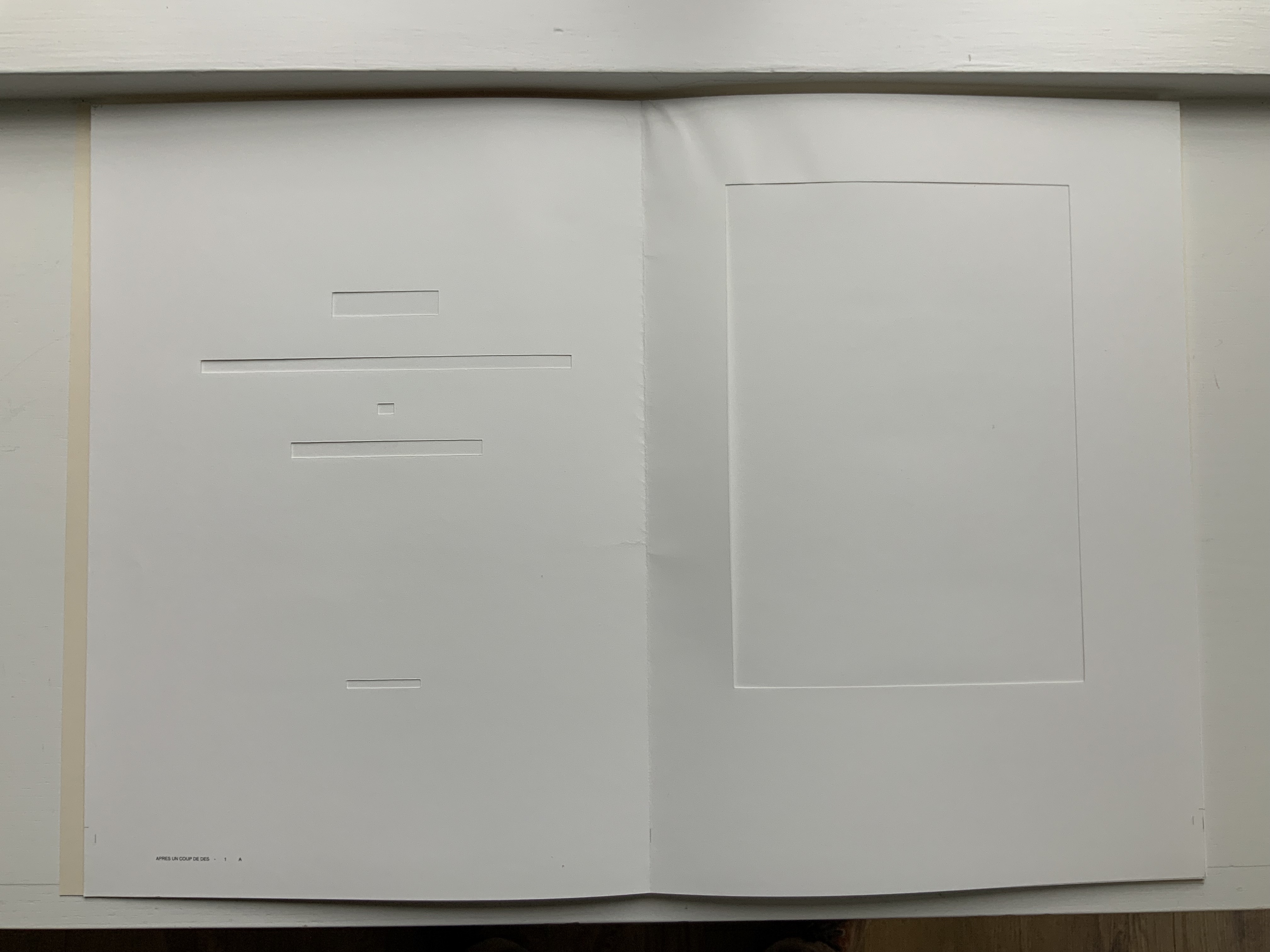
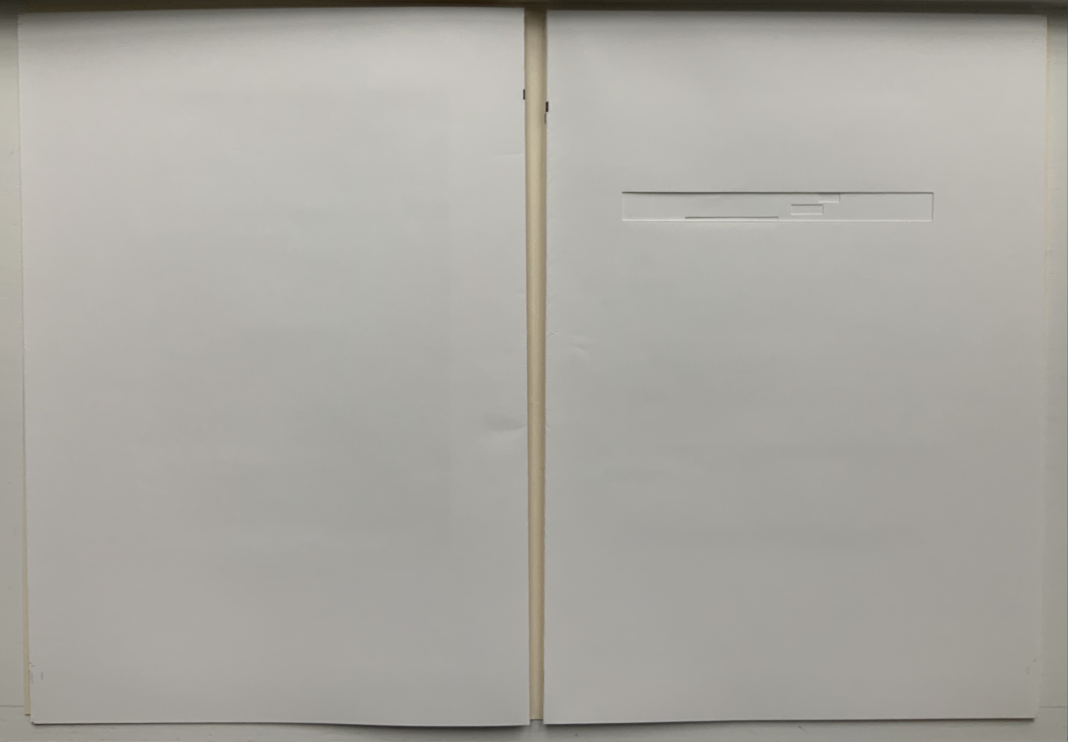
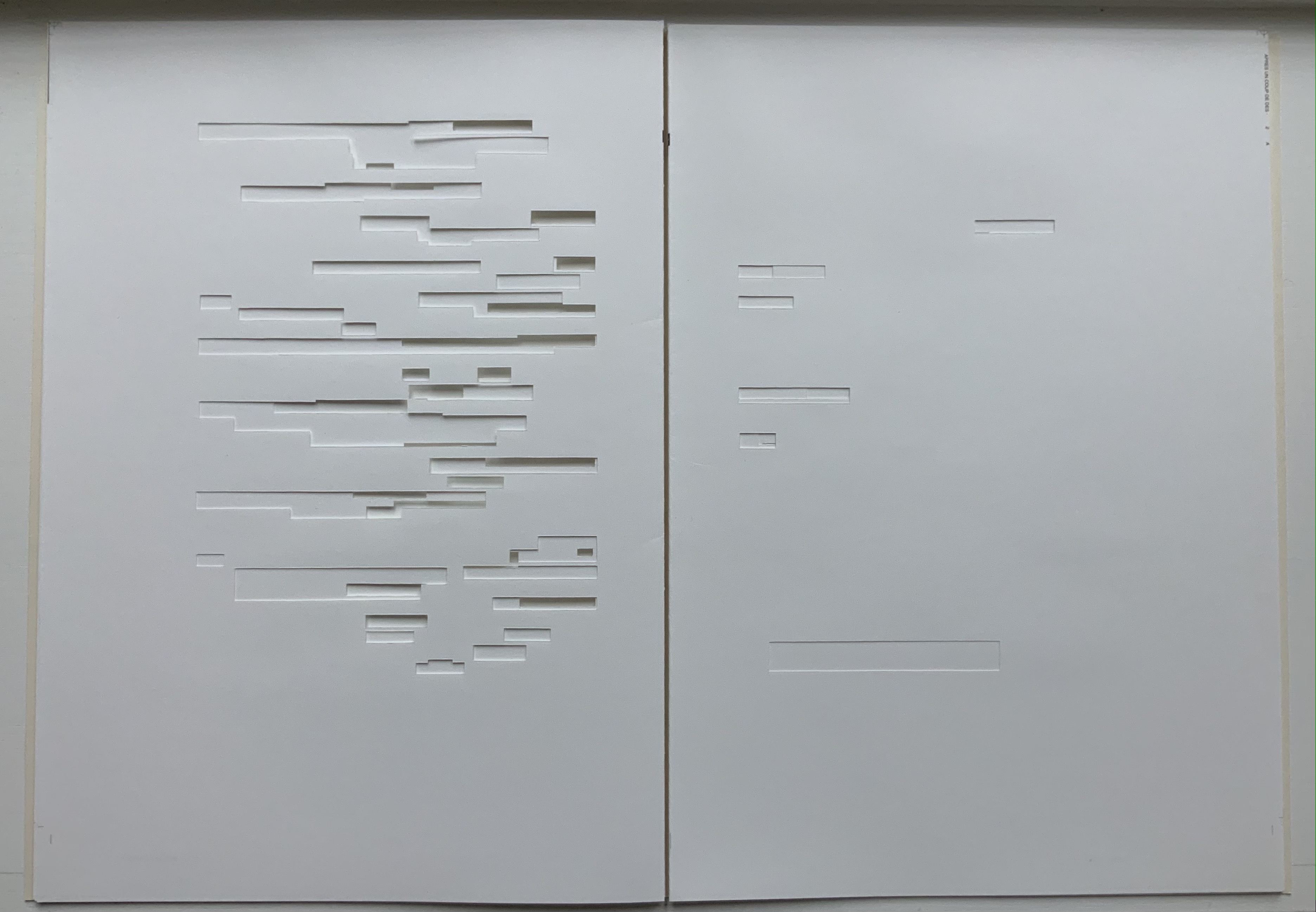
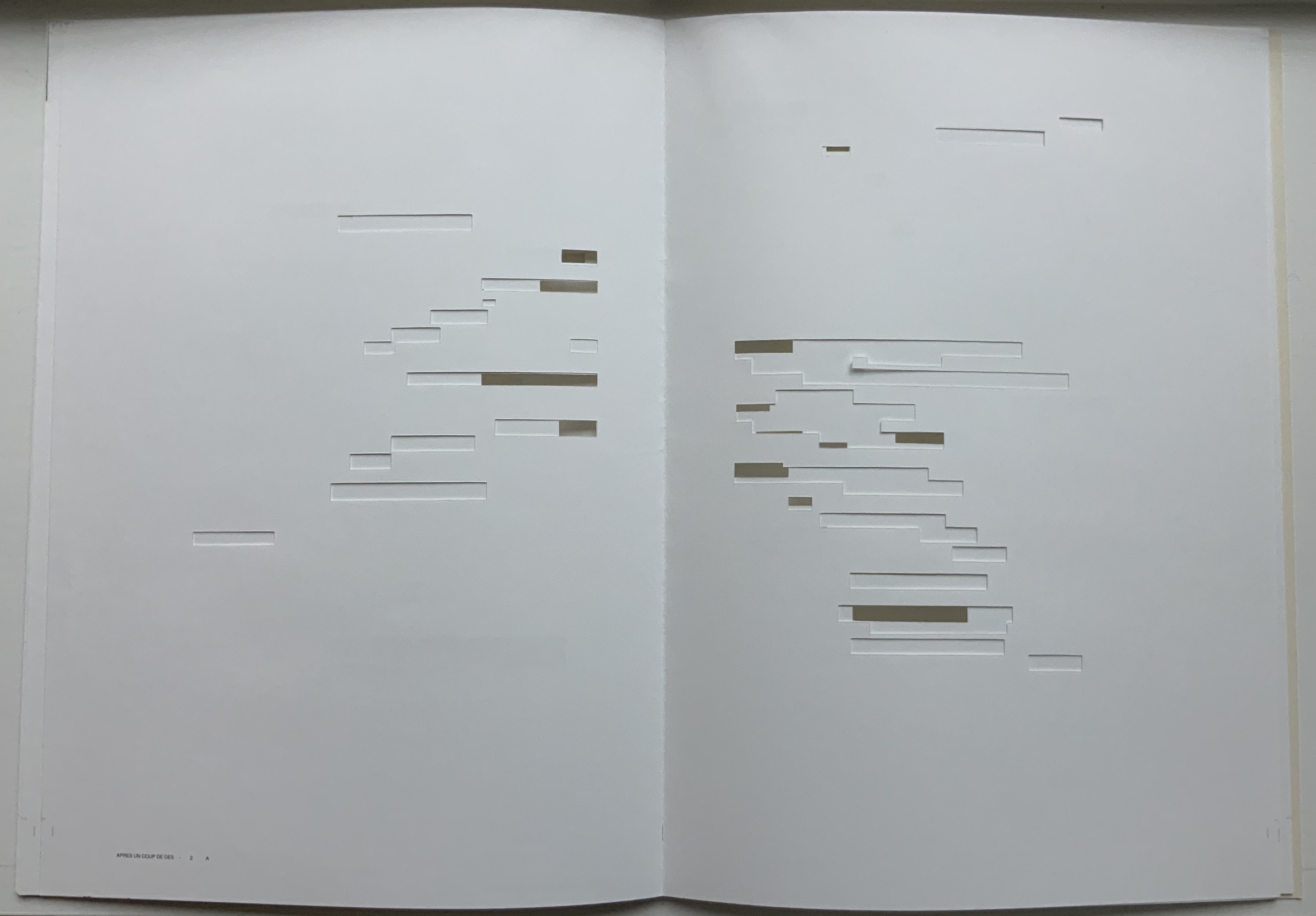
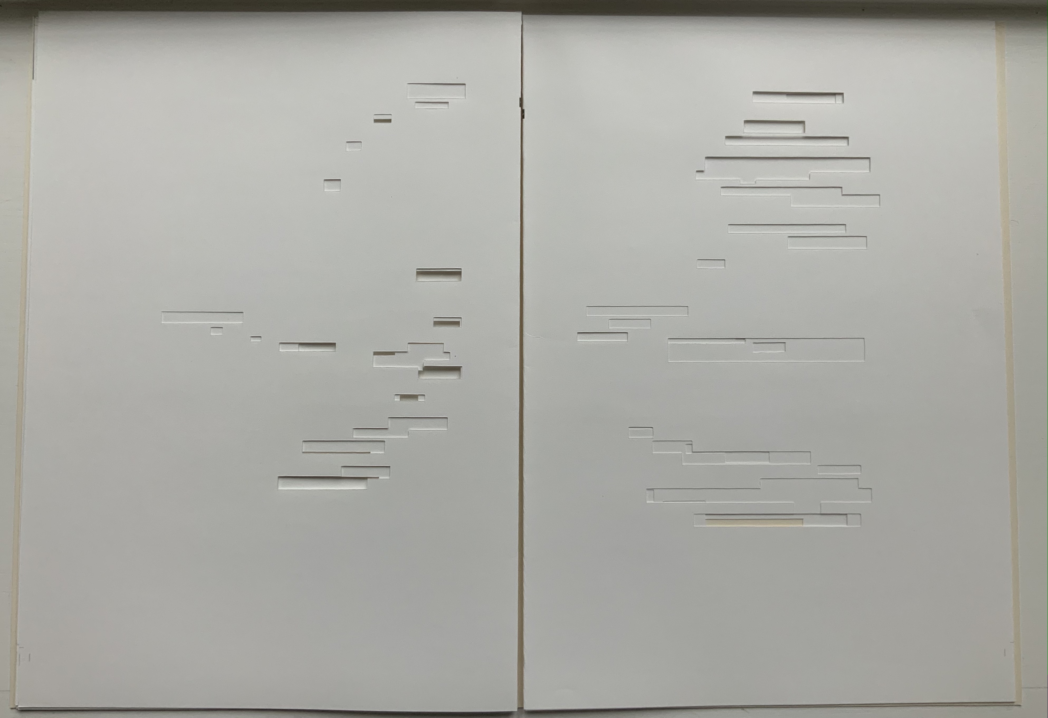
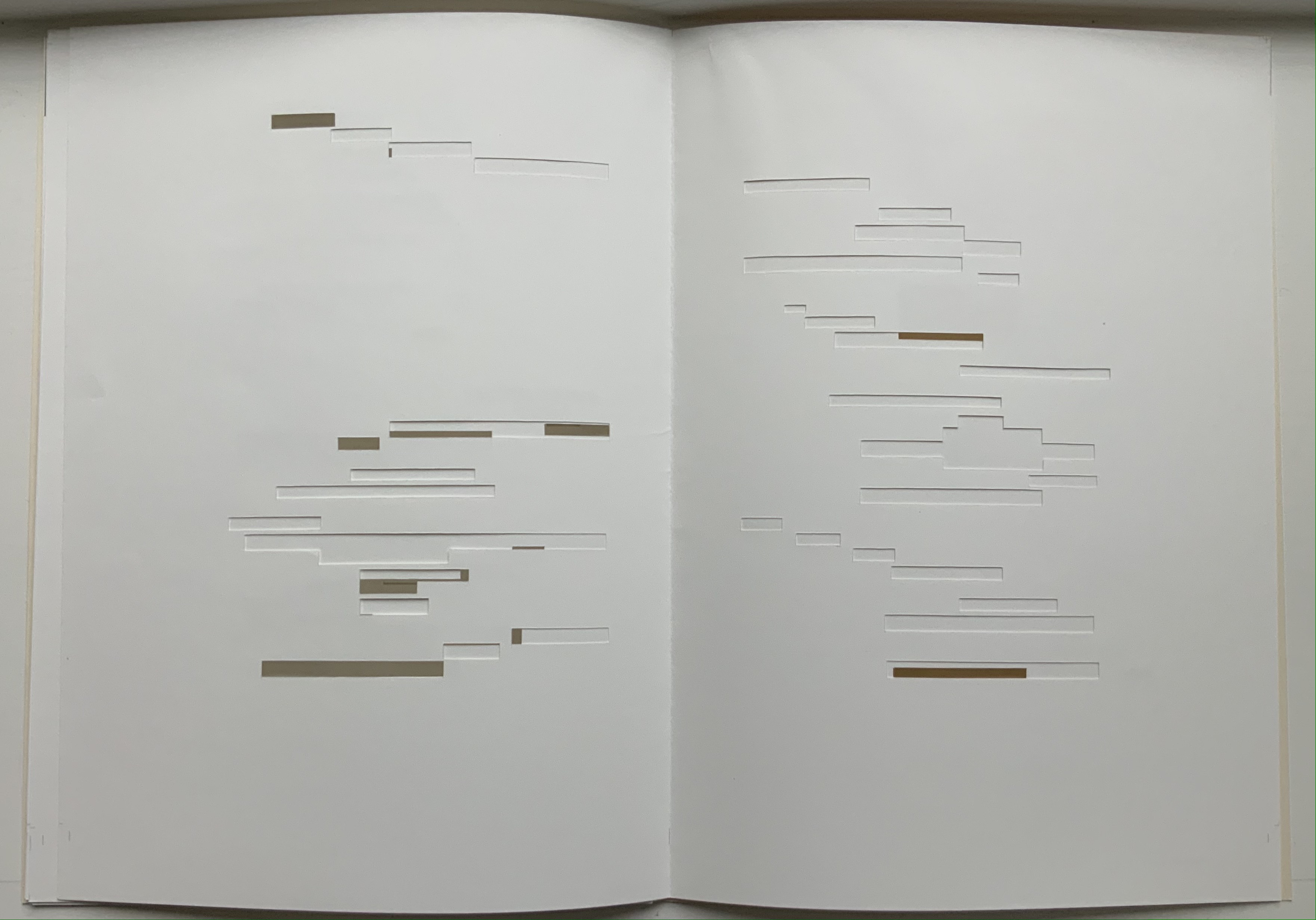
Après Un Coup de Dés (2015) Michel Lorand Cover and gatherings, untrimmed and unbound, in glassine envelope. Cover: H362 x W260; gatherings: H362 x W256 mm; 32 unnumbered pages. Edition of 50, of which this is #19. Acquired from the artist, 22 October 2021. Photos: Books On Books Collection. Displayed with the artist’s permission.
Since the 1960s when Ernest Fraenkel, Mario Diacono and Marcel Broodthaers blotted out the text of Mallarmé’s poem Un Coup de Dés Jamais N’Abolira le Hasard (1897) to create their works of homage, numerous others have expanded on the technique: substituting images of sonograms (Sammy Engramer, 2009) or algorithmically generated abstractions (Eric Zboya, 2018, and Benjamin Lord, 2019), or excising the text (Michalis Pichler, 2008, and Cerith Wyn Evans, 2008) or algorithmically erasing it (Jérémie Bennequin, 2009) — just to name a few.
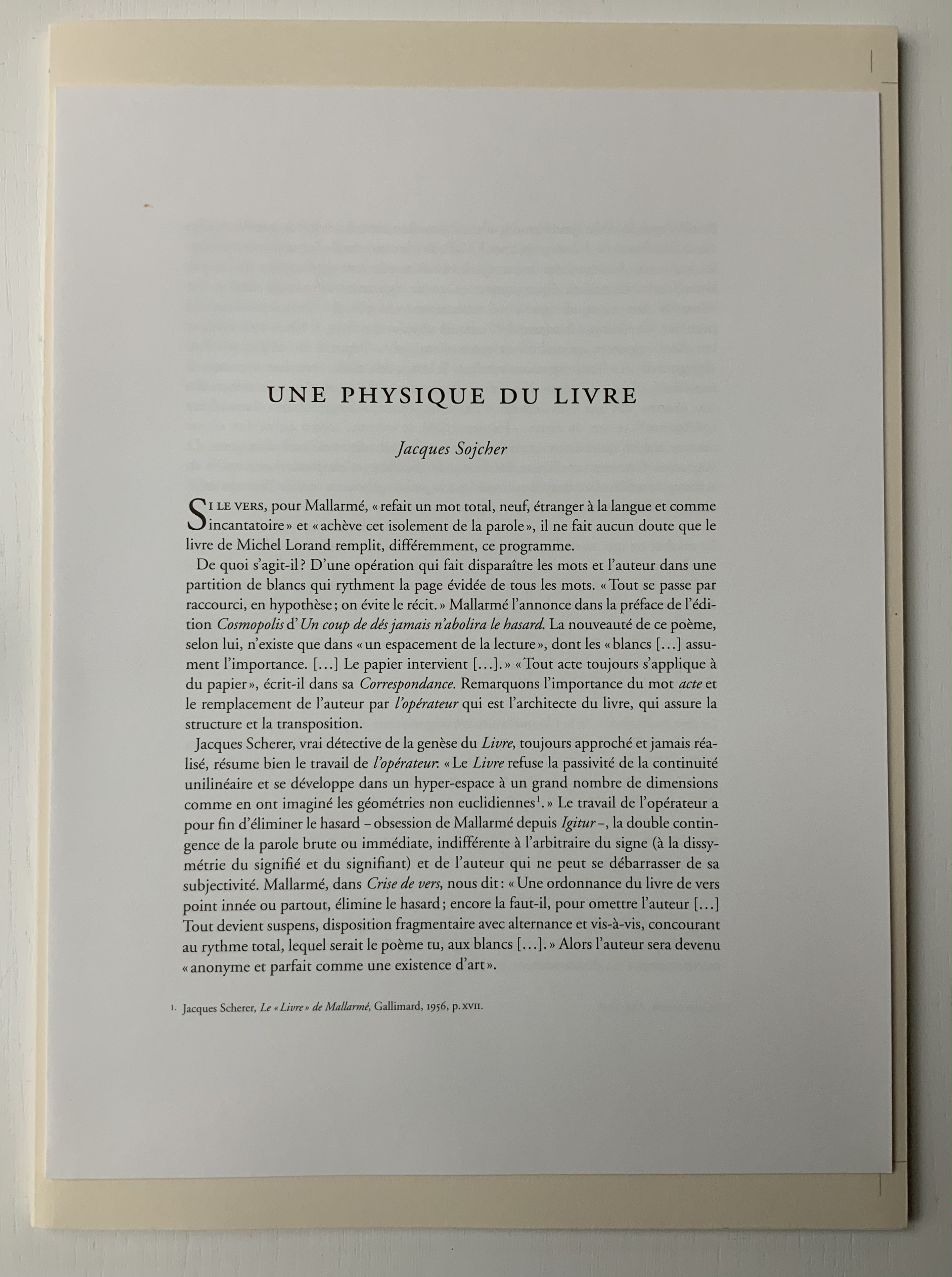
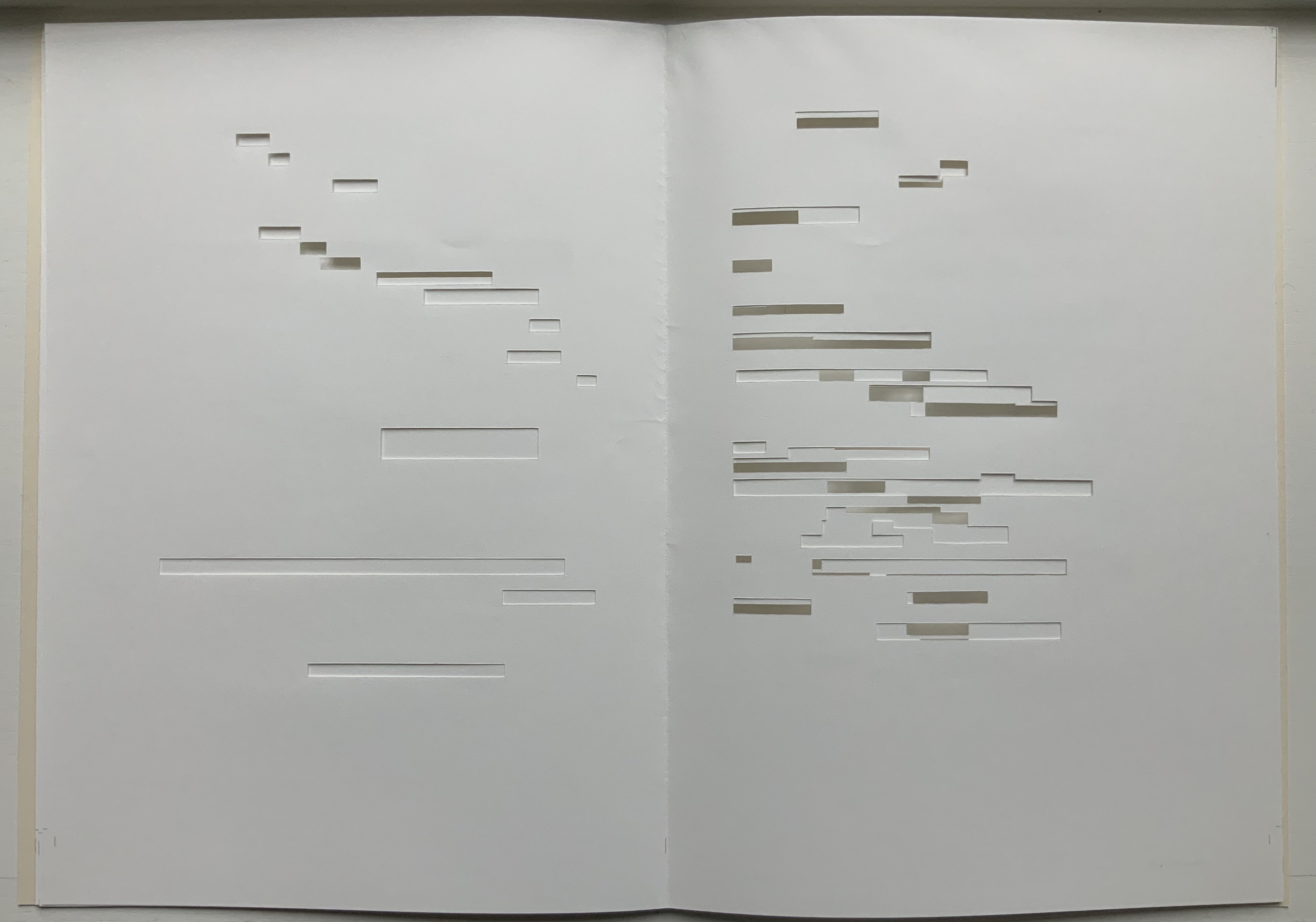
In Après Un Coup de Dés (2015), the only printed marks are the cover’s traditional black and red borders and the printer’s registration and gathering marks on the sheets. Wherever else Mallarmé’s text would have been printed has been excised. In reply to a question about the process involved, Lorand explains that he had asked the designer Filiep Tacq to create a layout that would cover in black exactly the blocks of text as it appears in the current Gallimard book edition of Mallarmé’s poem, including the front and back covers (correspondence with the artist, 1 November 2021). Lorand took a scalpel to the offset printed sheets, removed the blackened blocks, folded the sheets by hand into the four gatherings, assembled them in the correct order and laid them untrimmed and loose inside the cover. Each of fifty copies was placed inside its own handmade glassine envelope along with a flyer including introductory text by Jacques Sojcher (emeritus professor, University of Brussels) and the colophon for the work. It is a book that is not-yet a book.
Lorand’s and all of these other works of homage give us inverse ekphrasis. They are the visual, tactile and conceptual works of art that come after Mallarmé’s text. We are more used to ekphrasis where the object, painting or sculpture comes before the text — like Achilles’ shield before Homer’s description, or the Grecian urn before Keats’ ode, or Brueghel’s Fall of Icarus before Auden’s Musée des Beaux Arts. Homer, Keats and Auden vie with the art of the crafted object to put that object (and more) in front of us with words. With the inverse, the crafted objects vie without the words to put Mallarmé’s poem (and more — and sometimes less!) in front of us.
Many of the hommageurs hint at the “and more” with a subtitle to Un Coup de Dés Jamais N’Abolira le Hasard. With Broodthaers, it is Image; with Pichler, Sculpture; with Engramer, Onde (Wave as in soundwave); and with Bennequin, Omage (as in hommage with the “h” and “m” missing). With Lorand, there is no subtitle. Instead, we have the word après prefacing the truncated title of the poem. But, “after” Mallarmé’s poem, what is Lorand proposing? An homage in the form of something that restates, reproduces the poem but without the words? An homage in the form of something else presented in the manner of Un Coup de Dés but without the words? Or something else that simply occurs after the poem’s roll of the dice? As it turns out, all that and more.
Paul Valèry was probably the first of Mallarmé’s circle to see and hear Un Coup de Dés. His reaction picks out one of the themes that make up Lorand’s “and more”:
It seemed to me that I was looking at the form and pattern of a thought, placed for the first time in a finite space. Here space itself truly spoke, dreamed, and gave birth to temporal forms. Expectancy, doubt, concentration, all were visible things. With my own eye I could see silences that had assumed bodily shapes. Inappreciable instants became clearly visible: the fraction of a second during which an idea flashes into being and dies away; atoms of time that serve as the germs of infinite consequences lasting through psychological centuries — at last these appeared as beings, each surrounded with a palpable emptiness…. there in the same void with them, like some new form of matter arranged in systems or masses or trailing lines, coexisted the Word! — Paul Valéry, Collected Works of Paul Valery, Volume 8: Leonardo, Poe, Mallarmé (1972).
Lorand writes:
My <<Après un Coup de Dés>> introduces a corpus of approaches to what might be “the movement” that constitutes speech: “A language that speaks” as Martin Heidegger calls it (Unterwegs zur Sprache, Verlag Günther Jeske, Pfullingen, FRG, 1959).
How can we think, how can we imagine this movement within language itself? What path to take to allow us to experience this movement, the one that constitutes the word itself. This word is sound. The object of all my work is the identification of what could be the image of this movement, of this word. This exploration attempts to approach the nature of this movement: a word beyond language when the latter is silent. (Correspondence with the artist, 1 November 2021.)
Like his others, Heidegger’s On the Way to Language is a dense book; more than the others, it is poetical, an invitation to experience language. In it is a series of lectures entitled “The Nature of Language” in which Heidegger uses two poems, one by Stefan George and one by Gottfried Benn, to question language about its nature. Although George’s poem is the one that Heidegger deeply explicates, Benn’s is the one that, echoing Valèry, sheds the most light on Lorand’s Après Un Coup de Dés — especially with its last two lines.
A Word
A word, a phrase –: from cyphers rise Life recognized, a sudden sense, The sun stands still, mute are the skies, And compacts it, stark and dense.
A word — a gleam, a light, a spark, A thrust of flames, a stellar trace — And then again — immense — the dark Round world and I in empty space.
Après Un Coup de Dés seems to be a wordless invitation to experience language. But in a sense, Mallarmé’s words have not disappeared, not entirely. Their shapes — embodied in the voids — move silently and rhythmically across the unfolded sheets; in the gatherings, they cascade over one another much as they do syntactically and typographically in print. And even though the text is not before (in front of) us, Lorand’s artwork delivers a wordless experience of a key paradox of language with which Mallarmé sought to imbue his poem: the language of the void or abyss — the void or abyss of language. One of the ways in which the poem presents this self-enveloping paradox is that it begins and ends with the words un coup de dés, the act that can never abolish chance and the act that all thought emits. Similarly, Après un Coup de Dés displays the presence of language by displaying the absence of language, or les blancs defined by and defining empty space.
Mallarmé’s invitation in Un Coup de Dés, however, beckons us to a slightly different concept of language than that articulated by Heidegger. For Mallarmé, chance plays a prominent role in what Heidegger would call the “neighborhood of poetry and thought”. But chance, hazard or a roll of the dice plays a much less prominent role for Heidegger, and in Lorand’s work of art, with its registration and gathering marks and glassine enclosure, there seems little allusion to it — perhaps naturally so since Lorand’s work comes after the dice have been rolled.
Even though it comes after Mallarmé’s completed poem and after the Gallimard book edition, Après presents as an unfinished work, a book not yet trimmed and bound, which reflects not only Mallarmé’s unfinished realization of the poem as a book but also his unfinished life’s pursuit: le Livre, the thing in which everything in the world would end up — the thing that, by virtue of a spacious mobility of typographic layout and the interplay of its elements, would be “the total expansion of the letter”. Lorand’s attention and manual precision in excising the blackened blocks where the text would otherwise appear evoke Mallarmé’s attention to the minute details of typeface, size and font shown in his handwritten mark-up of the proofs for the book edition he was planning before he died.
Après also comes after the efforts of Broodthaers and Pichler, both of whom organized exhibitions for their works of homage. In fact, Pichler paid homage to Broodthaers by naming his exhibition “Pichler: Exposition Littéraire autour de Mallarmé” (Milan, December 2016) after “Broodthaers: Exposition littéraire autour de Mallarmé” (Antwerp, December 1969). Pichler’s exhibition was also daring in its exposure of the works to the visitors.
In the 2018 display of Après Un Coup de Dés, the previously gathered but now unfolded sheets and cover lie side by side under glass. Often this is cause for complaint about the distanced display of artist books. In the case of Après Un Coup de Dés, the distance effectively draws point-blank attention to what the privileged reader gradually discovers in handling the work. The unprivileged reader may have to imagine the making, unmaking and remaking of the book but, confronted with the gestalt of the undone gatherings and their registration marks, that reader immediately sees/witnesses the void defined by a void.
Après Un Coup de Dés in the group exhibition Reading Hand Writing Bodies at Les Abattoirs de Bomel, Centre d’art de Namur, Belgium, 8 February – 11 March 2018. Photo: Courtesy of the artist.
In relation to Broodthaer’s Image and Pichler’s Sculpture, Après comes both before and after. The positioning of the words après, image and sculpture vis à vis the poem’s title has been noted already. Of all three visual, tactile and conceptual works, Lorand’s stands as the chronologically “after” yet unfinished “before” to Broodthaers’ and Pichler’s finished works. In yet another “afterness” to Mallarmé’s poem, Lorand likens Après to a silent score of music or a piano roll (correspondence with the artist, 1 November 2021). This echoes — if that is not too perverse a verb — Mallarmé’s reference to “score” in his preface to Un Coup de Dés. In premonitory, if not coincidental, irony, Lorand’s piano-roll-like 2015 work precedes a work that Michalis Pichler created for his 2016 Milan exhibition: a piano roll playable on a foot-pumped pianola and entitled Un Coup de Dés Jamais N’Abolira le Hasard: Musique (see video above).
The interplay of its philosophical roots with its mechanically produced print and its manual cuts makes Lorand’s AprèsUn Coup de Dés one of the more challenging works of homage to Mallarmé’s poem. To “hear” it side by side with the others in the Books On Books Collection (see below) is rewarding.
Further Reading
“Derek Beaulieu“. Books On Books Collection. 19 June 2020.
“Eric Zboya“. Books On Books Collection. 01 June 2020.
Heidegger, Martin, and Peter D. Hertz, trans. 1959/2009. On the Way to Language. San Francisco: HarperOne. Reprint. “No matter how we put our questions to language about its nature, first of all it is needful that language vouchsafe itself to us. If it does, the nature of language becomes the grant of its essential being, that is, the being of language becomes the language of being” (p. 72).
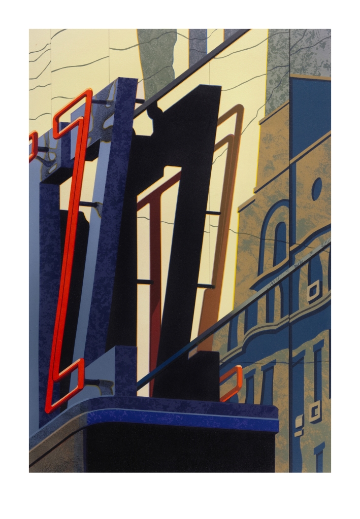
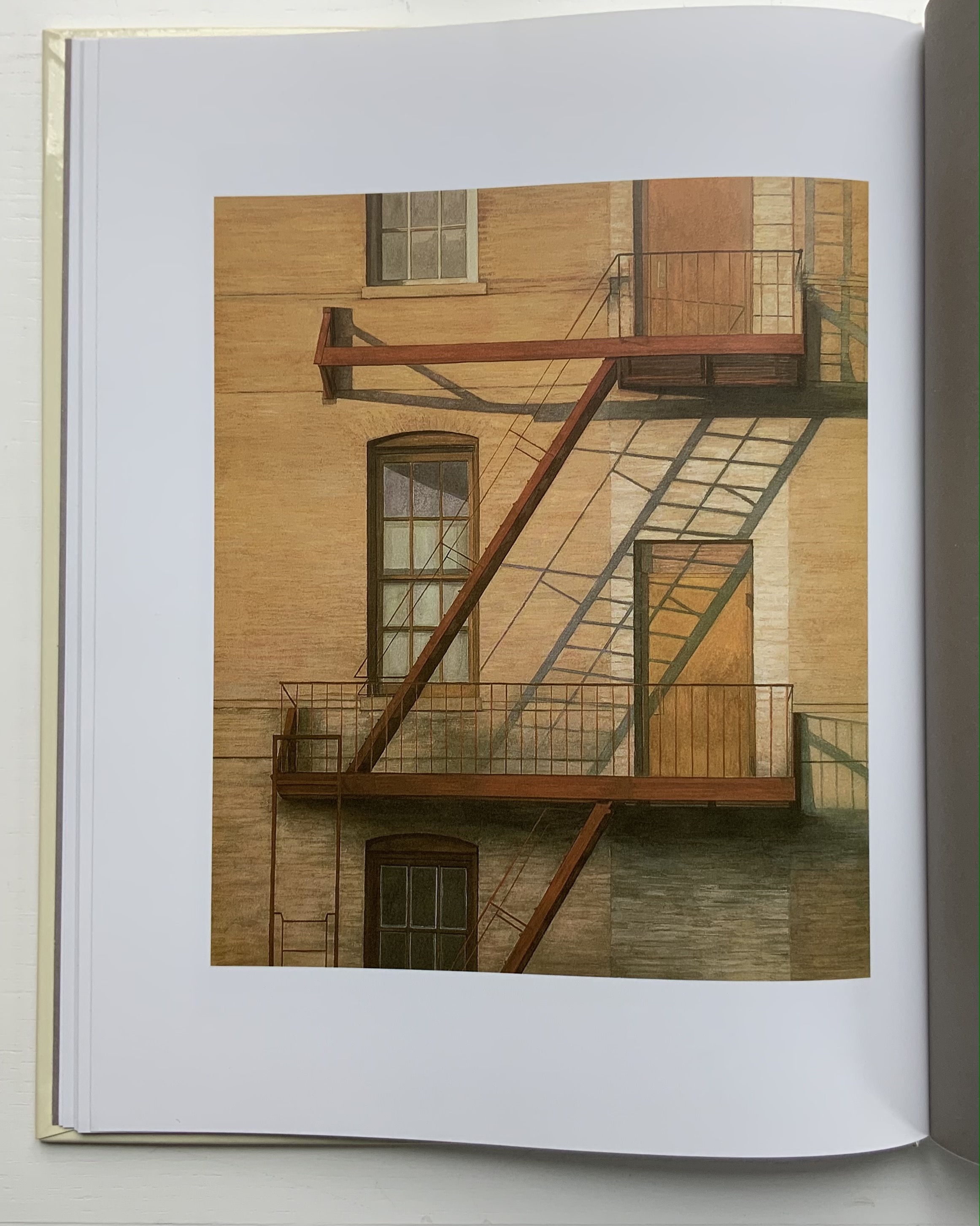
A-Z: Robert Cottingham: An American Alphabet (1997-2012)
A-Z: Robert Cottingham: An American Alphabet (1997-2012) Robert Cottingham Hardcover. H x W mm, pages. Edition of 100. Acquired from Tandem Press, 10 September 2021. Photos of the book: Books On Books Collection. Displayed with permission of the artist and Tandem Press.
I had completed a number of canvases for AN AMERICAN ALPHABET and began to experience storage problems. The paintings were leaning against all available walls and were in danger of being damaged. For protection, I hung them as a group on one wall, stacking them four high by four across, … sixteen canvases that reached to the ceiling and formed a monumental mosaic of letterforms. This arrangement of tightly packed images created an energy I hadn’t anticipated. As I looked up at it for the first time from my studio floor, I was immediately transported back to those moments when my father and I ascended from the 42nd Street subway station. The sight lines in my studio matched the ones I’d experienced as a child looking up at the signs and lights of Times Square. (Cottingham, A-Z)
Cottingham’s time travel creates a longing in the viewer for travel in time and space. What that wall must have looked like. Those who might have enjoyed the 1996 show at the Forum Gallery in New York or the installation at the New York Print Fair in November 2011 or the Tandem Press exhibition at Madison, WI, in 2018 would have a limited idea (the images were not stacked four high). A-Z: An American Alphabet is as close as the rest of us will come to visualizing it. The artist book does have the advantage of letter by letter commentary from Cottingham.
Another plus in the book is Cottingham’s exploration of his process, tools and material:
The photograph is the starting point. Once I’ve chosen a specific image, I’ll do at least one preliminary sketch in black and white. This drawing familiarizes me with the image and allows me to make the first formal adjustments. The drawing acts as a value study — a sketch that helps determine the tonal range of the image, how dark or light the various elements should be. …/ Next comes the preliminary color study. This may be a watercolor or a gouache, sometimes handled loosely, sometimes treated as a more finished work. …/ I can now move on to the canvas. My preferred medium is oil. … The painting quickly takes on a life of its own, demanding further adjustments to color, tonal value, and form. But the preliminary work, like a map, guides me towards the new and always unexpected version of my original concept./ … / I consider printmaking an important adjunct to my painting. Many times, when I’ve completed a painting, I feel the need to do more work with the image — to dig deeper, exploring other aspects of its structure. Printmaking offers this opportunity. … / … An old world sensibility and craftsmanship is brought to the selection of paper (often hand-made), the mixing of inks, the preparation of plates or lithographic stones, and other steps in the process.
Cottingham also draws out the collaborative nature of printmaking, which in this case involved four Master Printers (Andy Rubin, Bruce Crownover, Joe Freye and, for the digital, Jason Ruhl) and, for the book design and layout, Linda Endlich. Another form of collaboration is influence, and Cottingham is generously open about his debts: Charles Demuth, Edward Hopper, René Magritte, Piet Mondrian and, of course, the design of the signs from which the letters come. Along with his contemporaries such as Chuck Close, Don Eddy, Richard Estes, Audrey Flack and John Salt, Cottingham represents the movement of Photo-Realism.
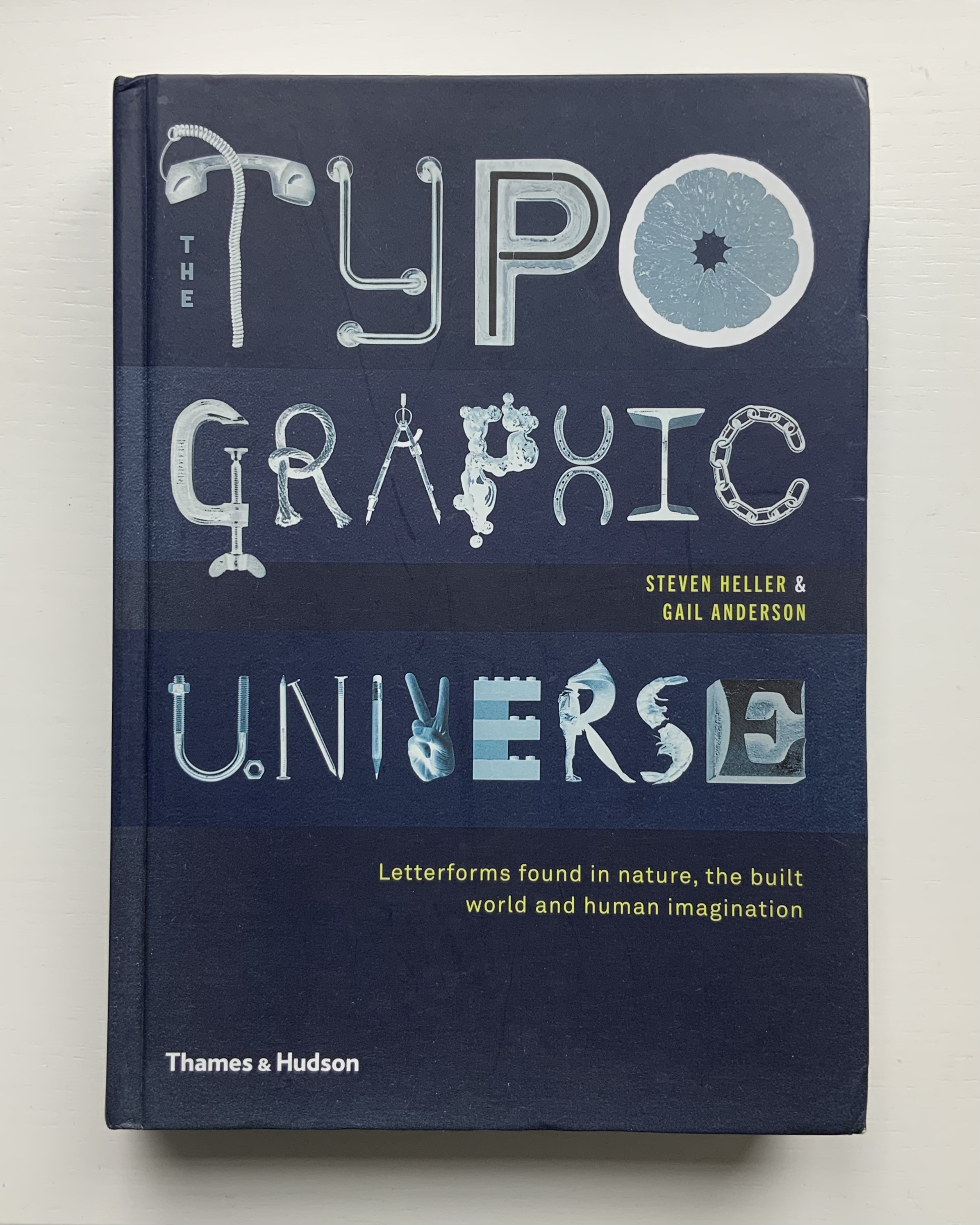
An American Alphabet also finds cousins in the Books On Books Collection. For found letters as objects, there is The Typographic Universe (2014), compiled by Steven Heller and Gail Anderson. For found letters recreated with pastels and watercolor, there is Stephen T. Johnson’s Alphabet City(1995). For color and form (albeit in totally different media), there are Karen Hanmer’s The Spectrum A-Z (2003) and Tara McLeod’s ABC (2015).
Left: The Spectrum A-Z (2003) by Karen Hanmer. Right: ABC (2015) by Tara McLeod. Photos of the works: Books On Books Collection.
The artist and Tandem Press have been kind enough to provide images of the letters A and Z to compare with those in the book, a comparison that underscores the quality of the book and Cottingham’s art.
An American Alphabet: A (2001) Robert Cottingham Lithography, Edition of 40, 32 x 23 inches Image courtesy of Robert Cottingham and Tandem Press
An American Alphabet: Z (2008) Robert Cottingham Lithography, Edition of 40, 30 1/2 x 23 inches Image courtesy of Robert Cottingham and Tandem Press
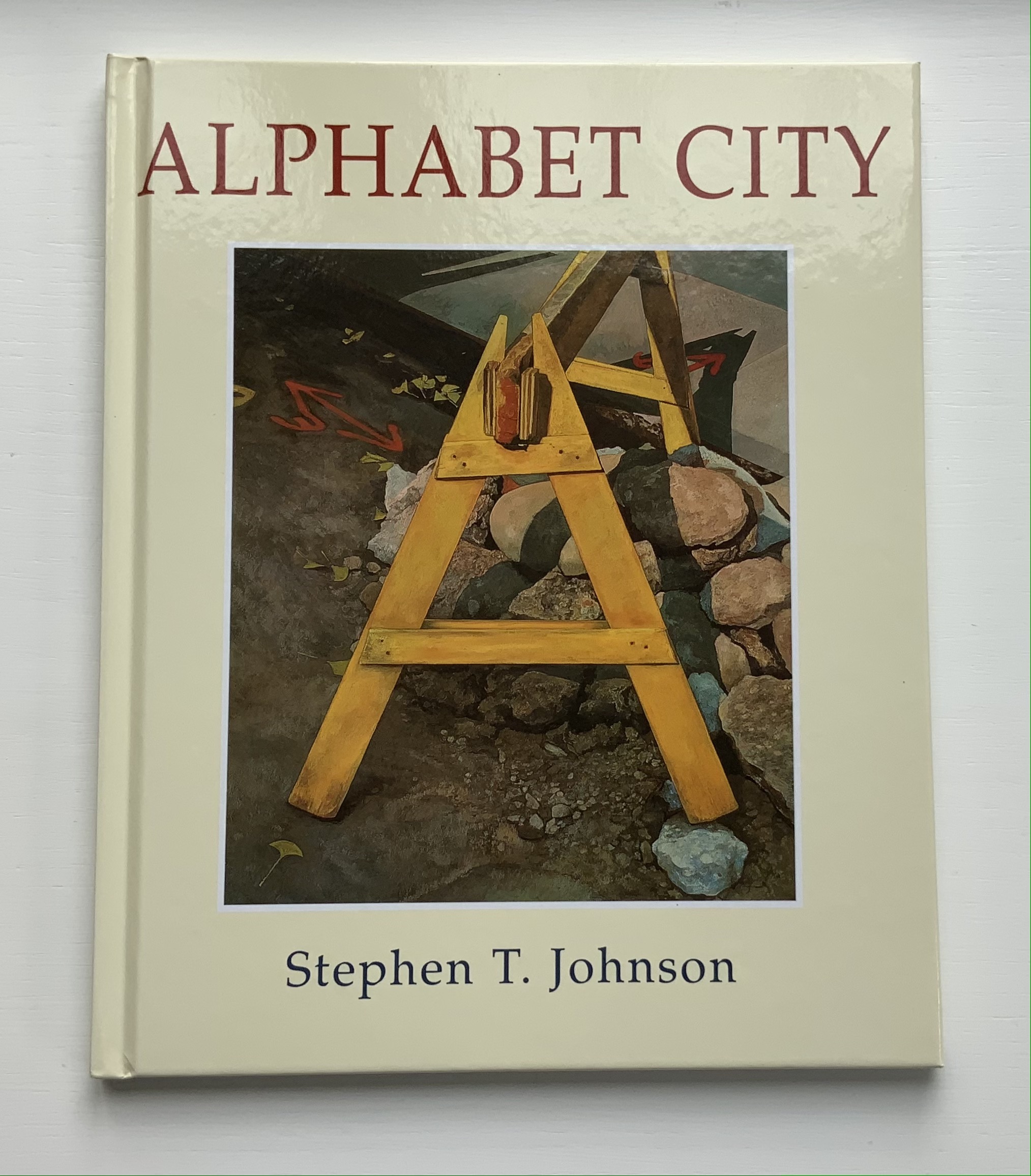
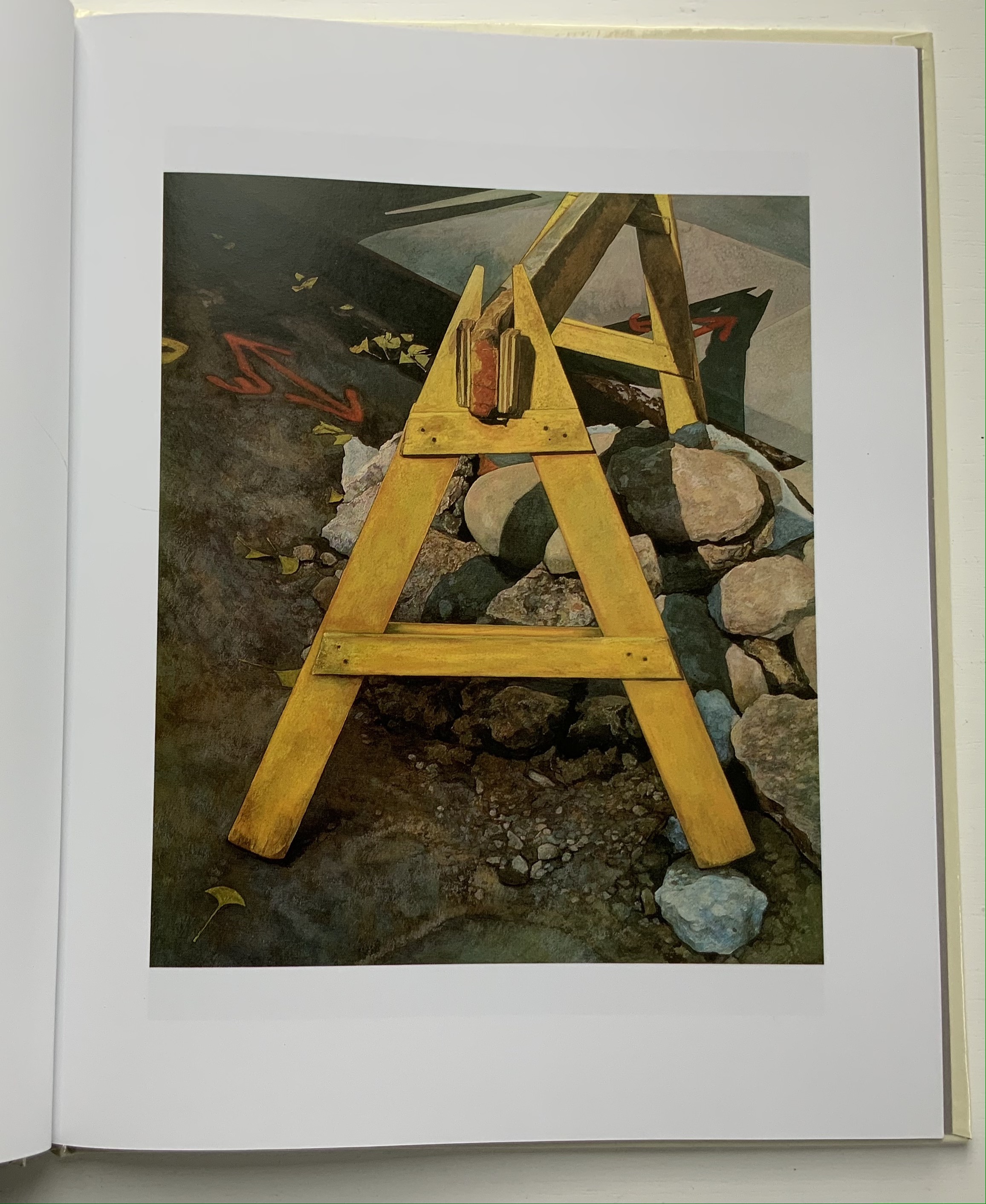
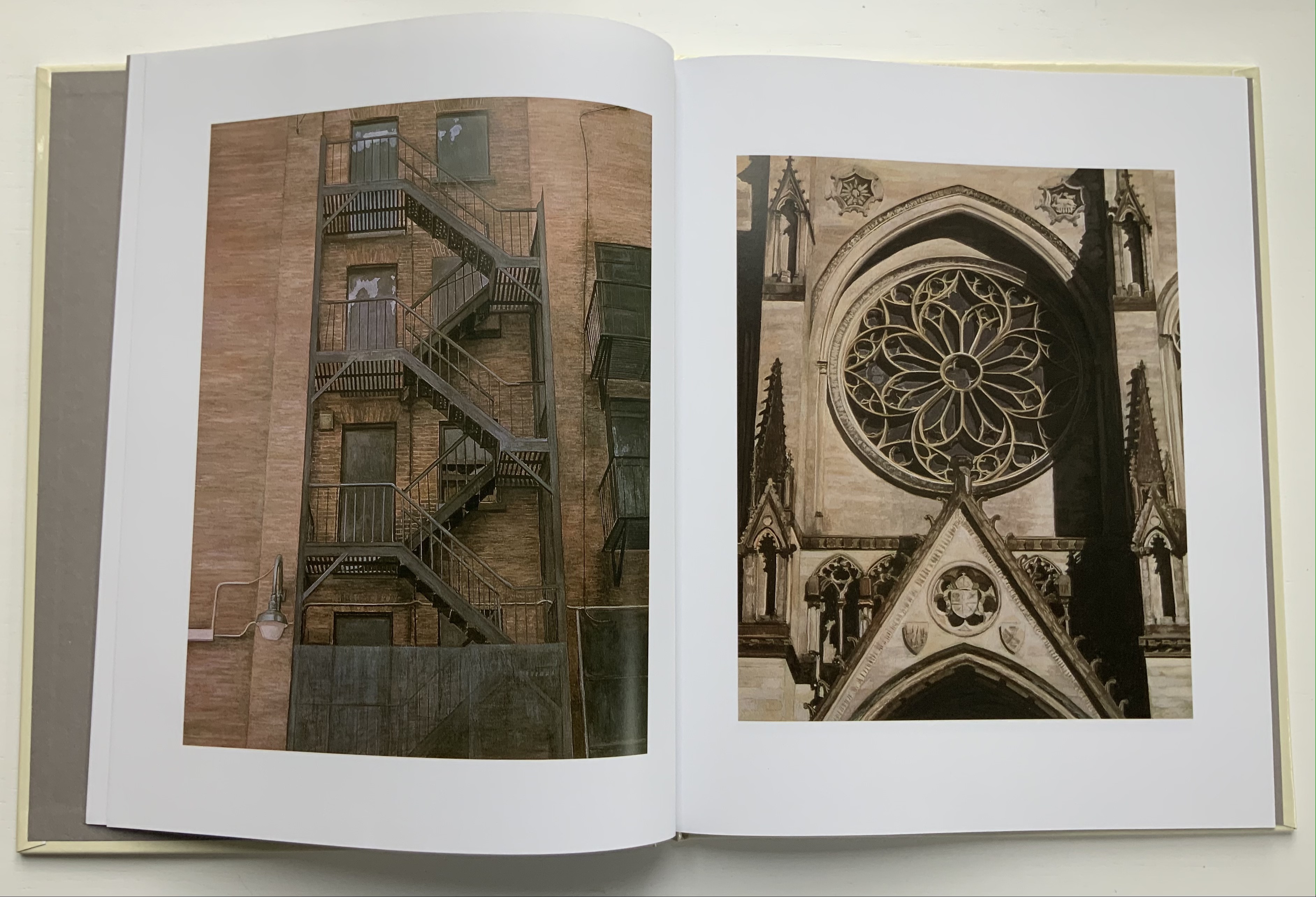
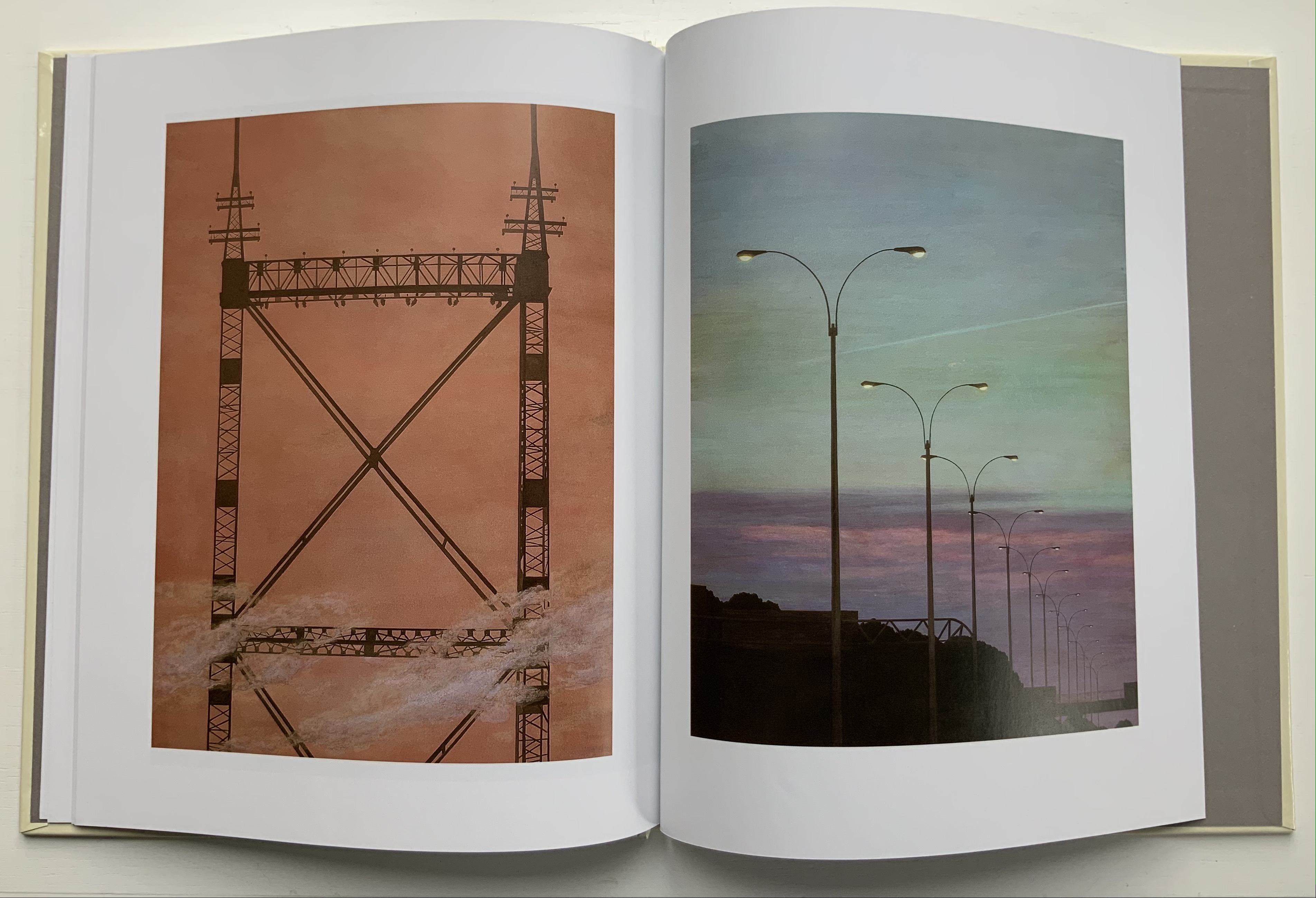
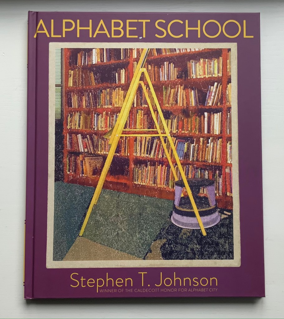
Alphabet City(1995) Stephen T. Johnson Casebound, sewn and glued. H276 x W226 mm, 32 pages. Acquired from Blackwell’s, 17 August 2021. Photos of the book: Books On Books Collection.
A Caldecott Honor Book and New York Times Best Illustrated Book in 1995, Alphabet City goes beyond the alphabet letters as found objects, a sub-genre documented by Steven Heller and Gail Anderson inThe Typographic Universe (2014). Johnson transforms his found capital letters with pastels, watercolor, gouache and charcoal into photo-realistic pictures in varying but similar sizes; for example, 26.5 x 22.5 inches for the A and 25.25 x 21.5 inches for the Z. These appeared in an inaugural exhibition in 1997 at the Katonah Museum of Art in New York. Johnson’s works are held in numerous permanent collections (mostly in the US) and private ones (mainly US-based but increasingly Europe as well), but they are closely tied to his children’s books: Alphabet School (2015) and A is for Art (see below). Most impressive is how he lifts the alphabet book from ordinary trade status to artist book.
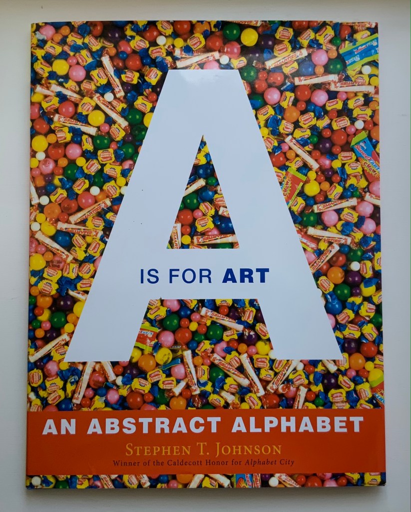
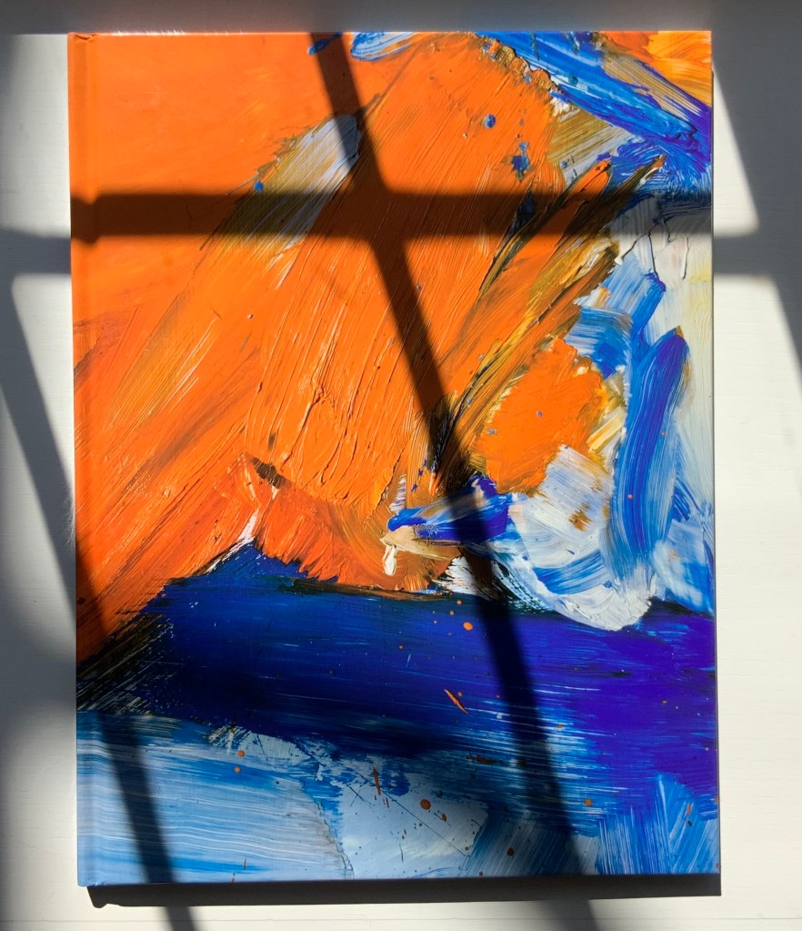
A is for Art: An Abstract Alphabet(2008) Stephen T. Johnson Perfect bound in case with doublures. H310 x 235 mm, 40 pages. Acquired from Amazon E.U., 4 September 2021. Photos of the book: Books On Books Collection.
In his review in American Art, Philip Nel coins an apt name for Johnson’s art — “alphabet expressionism” — which, on closer examination of texture and technique, applies also to Alphabet City. Go back and look at the foreground of the letter A in Alphabet City.
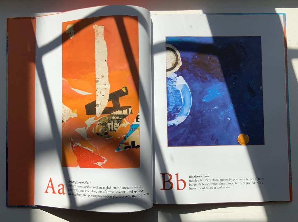
Also a New York Times Best Illustrated Book of the Year, A is for Art demonstrates two subgenres of alphabet books: the hidden and alliterative alphabet. An interesting, perhaps intentional, effect — even more so when the letters are difficult to find — is to make the viewer linger over the image longer than the museum goer’s average of less than 30 seconds per object. The ingenuity of Johnson’s alliterative sentences is almost as engaging as the images; even so, its main effect directs the eye back to the images. Here is the text for the letter A:
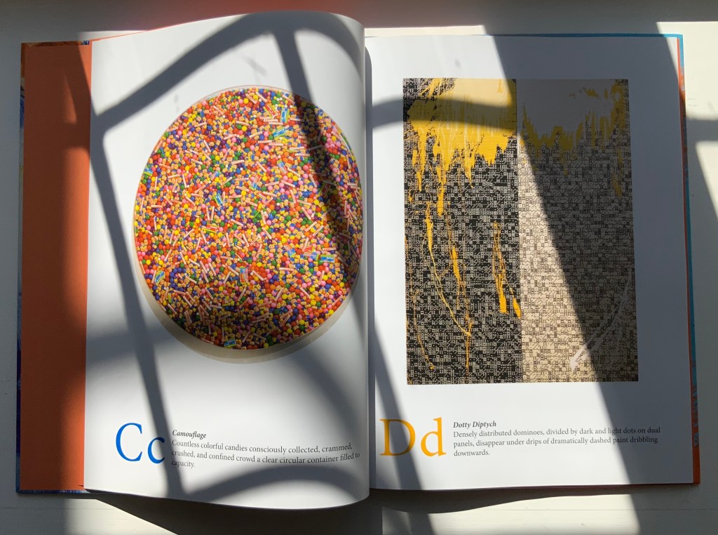
A a Arrangement No. 1 Affixed across and around an angled letter A are an array of abstracted and assembled bits of advertisements, and apparent among them are apostrophes, ampersands, accents, and an asterisk.
If you spend only 13 minutes in this book (30 seconds per letter), you are missing out.
Music and numbers have also piqued Johnson’s creative curiosity, but another of his series works leads in a more intriguing, roundabout way back to A is for Art: the Kana Card series. On a trip through Japan, the artist acquired a set of Japanese flashcards for learning Katagana and Hiragana. Each 2 x 3 inch card becomes a canvas for paint and collage.
Alphabet School (2015)
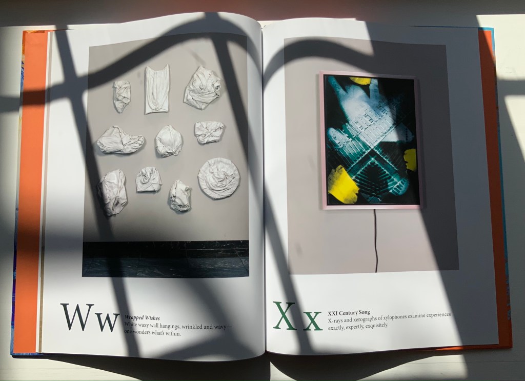
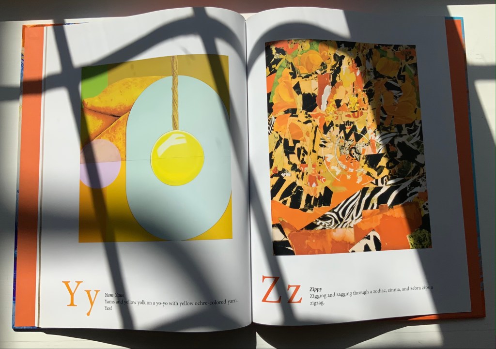
Alphabet School (2015) Stephen T. Johnson Hardback. H286 x W236 mm, 32 pages. Acquired from Book Depository, 5 November 2021. Photos of the book: Books On Books Collection.
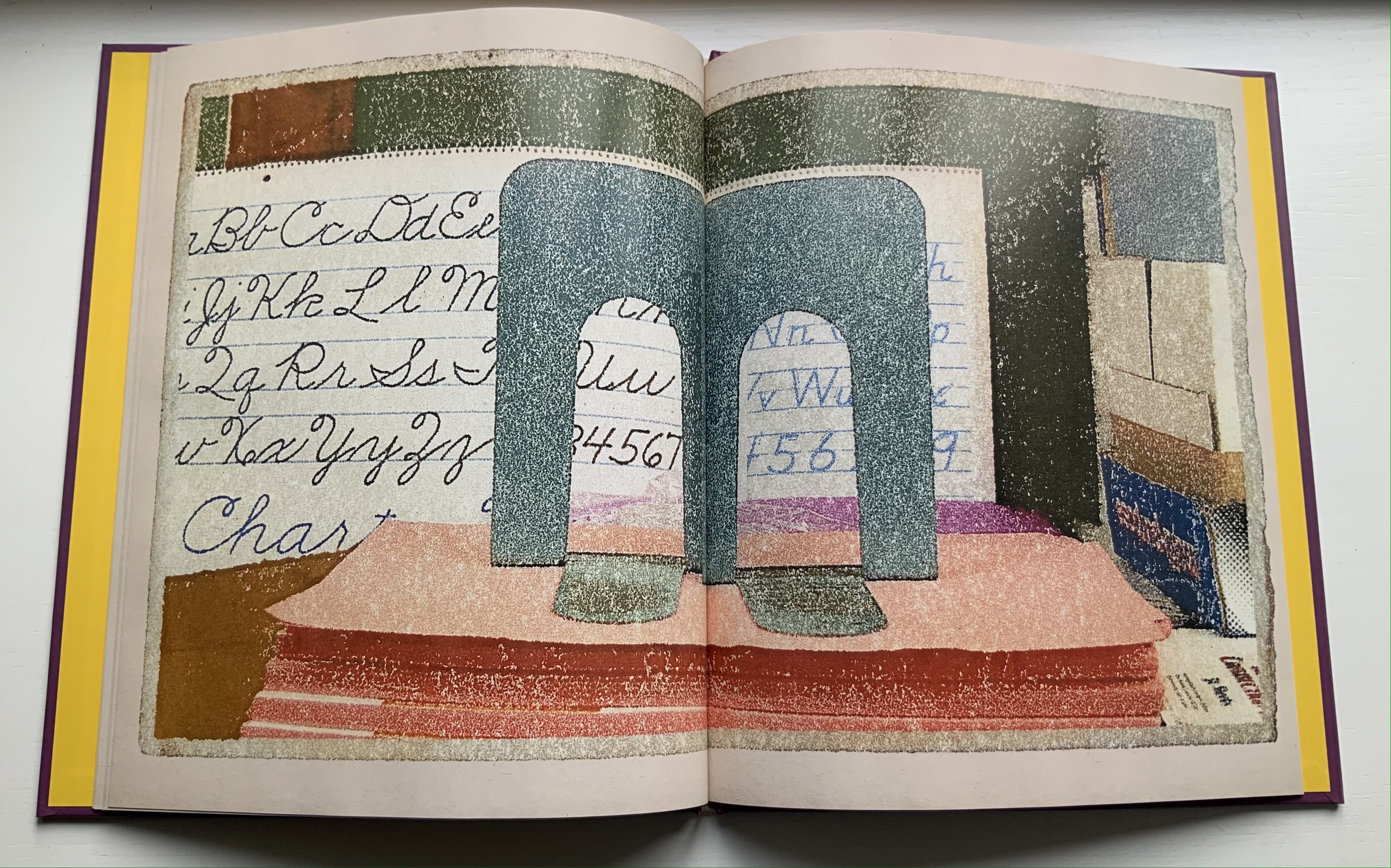
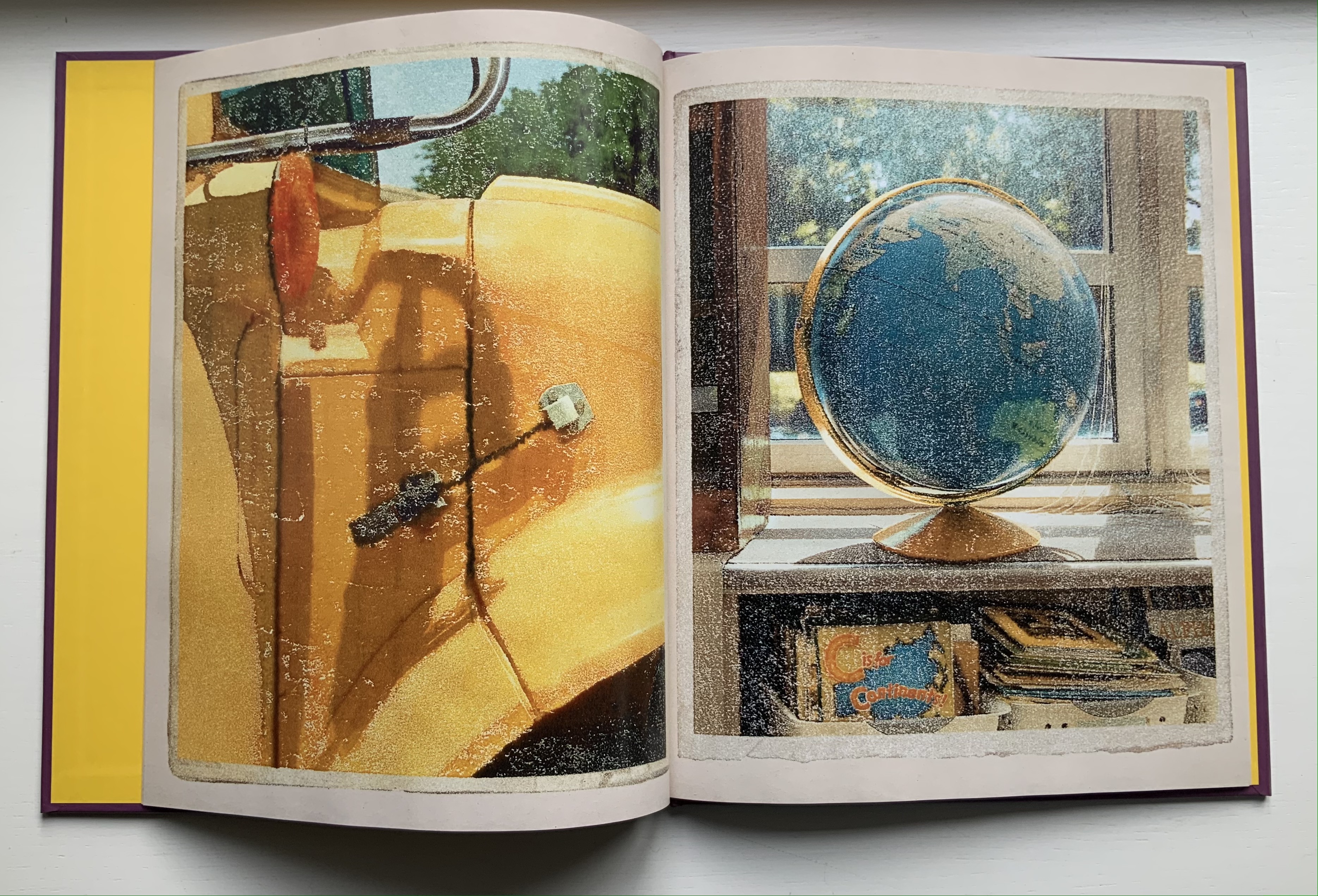
Using monoprints on paper with digital enhancements, Johnson shifts technique yet again here. The photorealism yields to a graininess, but as with Alphabet City, the effect of making the reader look not just at the images but also at his or her environment remains.
Some letters are contrived (two bookends posed for the letter M). Most of the scenes, however, deliver an authentic sense of found letters (the C in the support of the globe atlas). Johnson has raised the bar on the hidden-letter theme, common in the genre of alphabet books, by several notches.
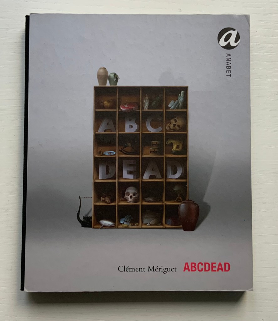
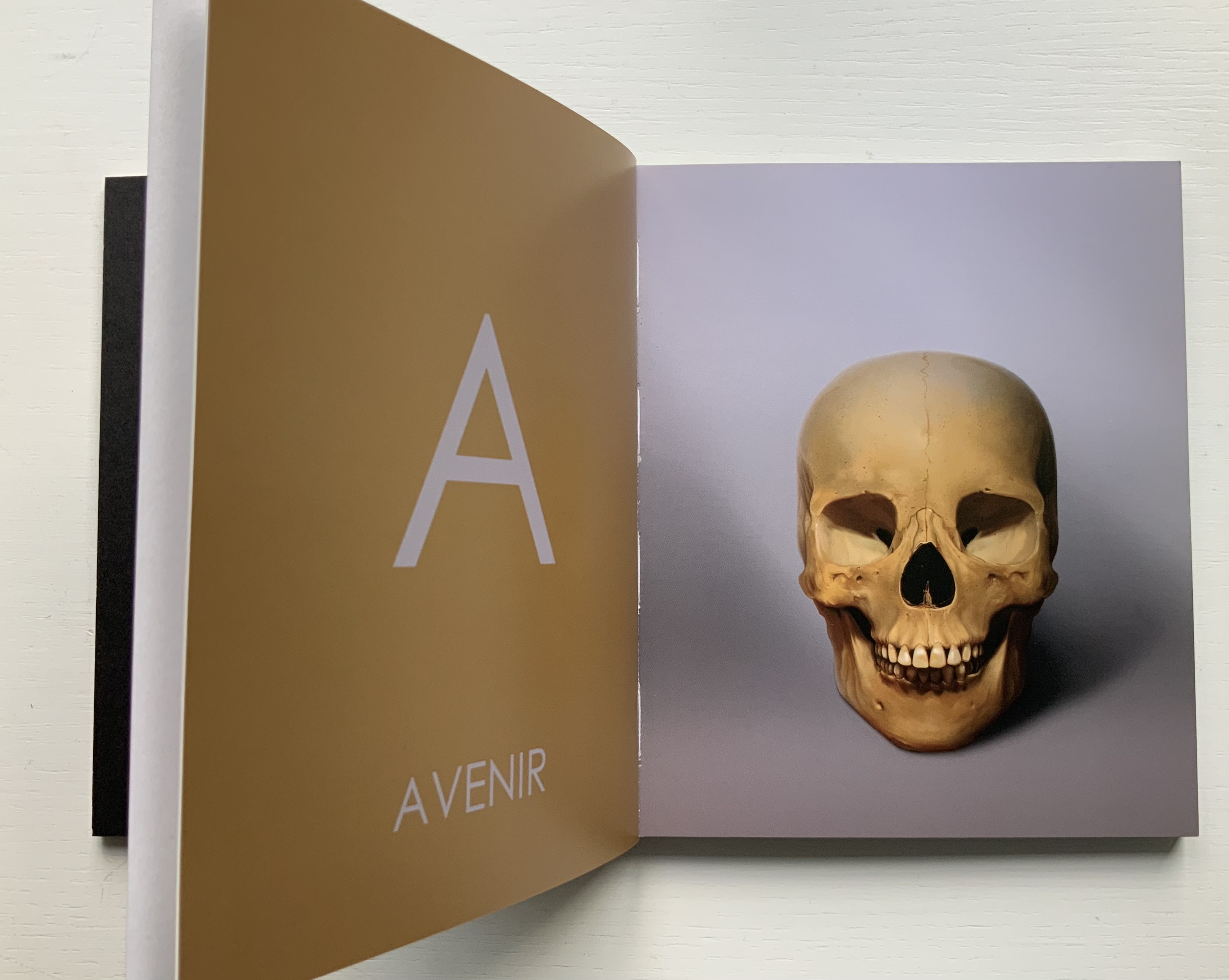
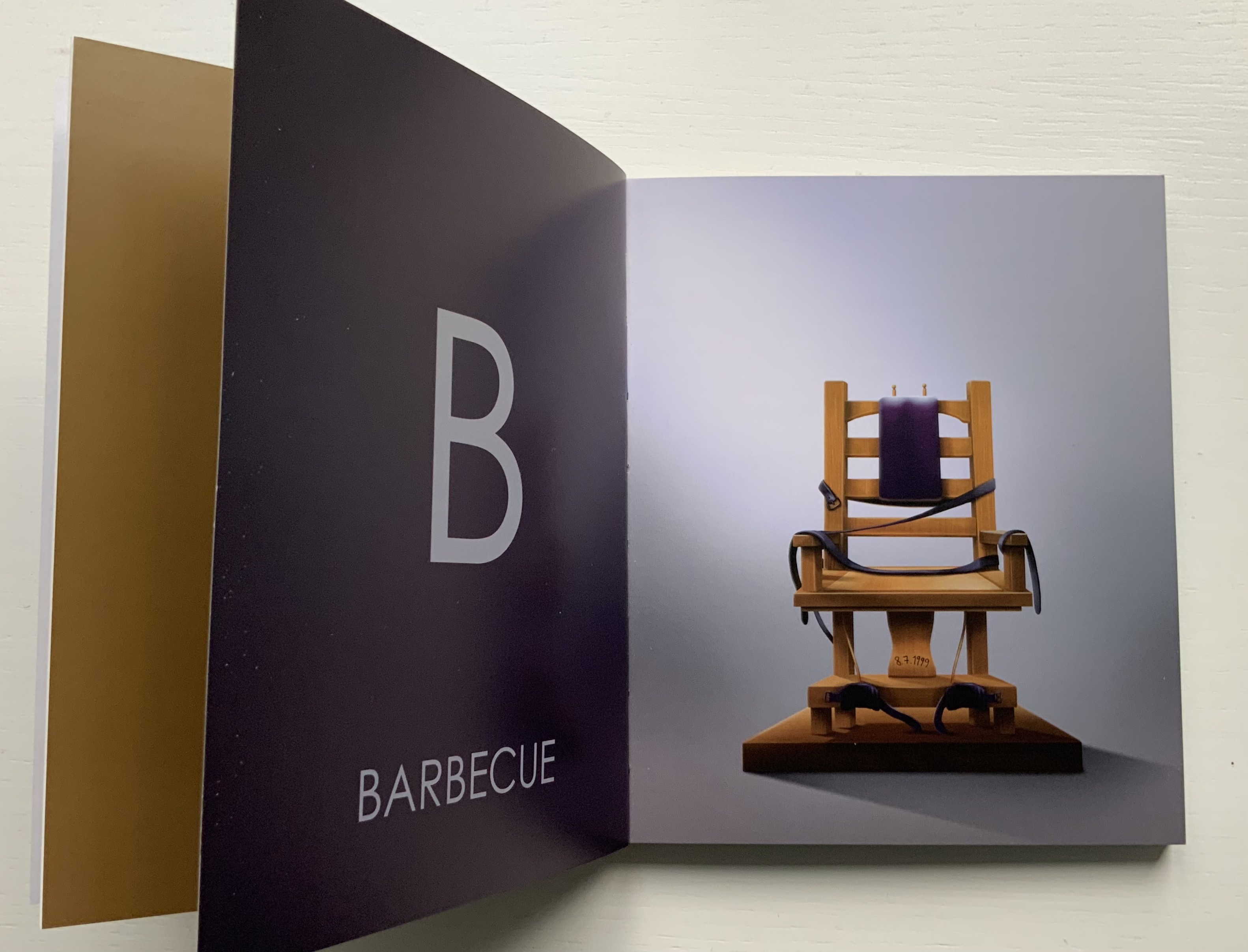
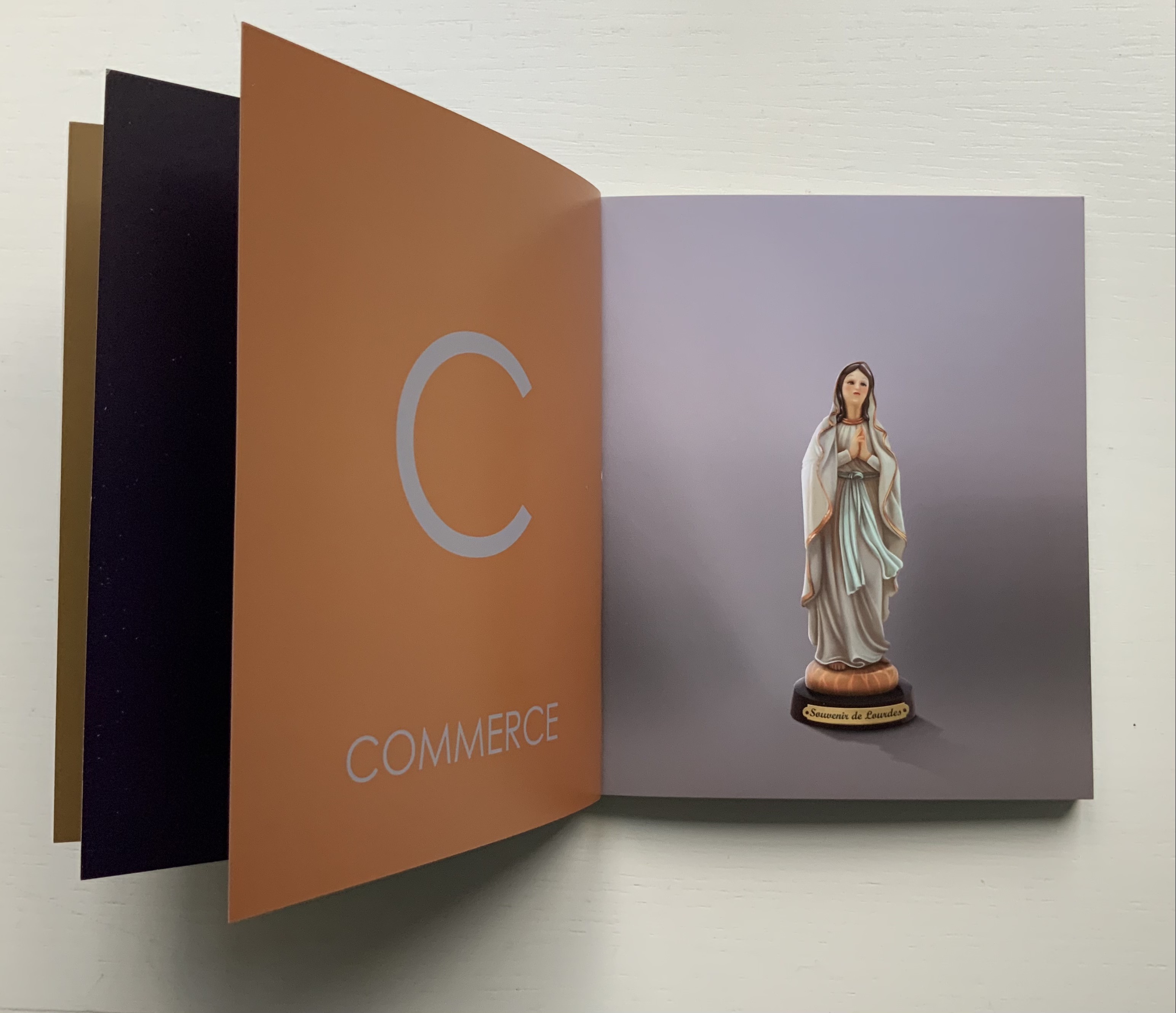
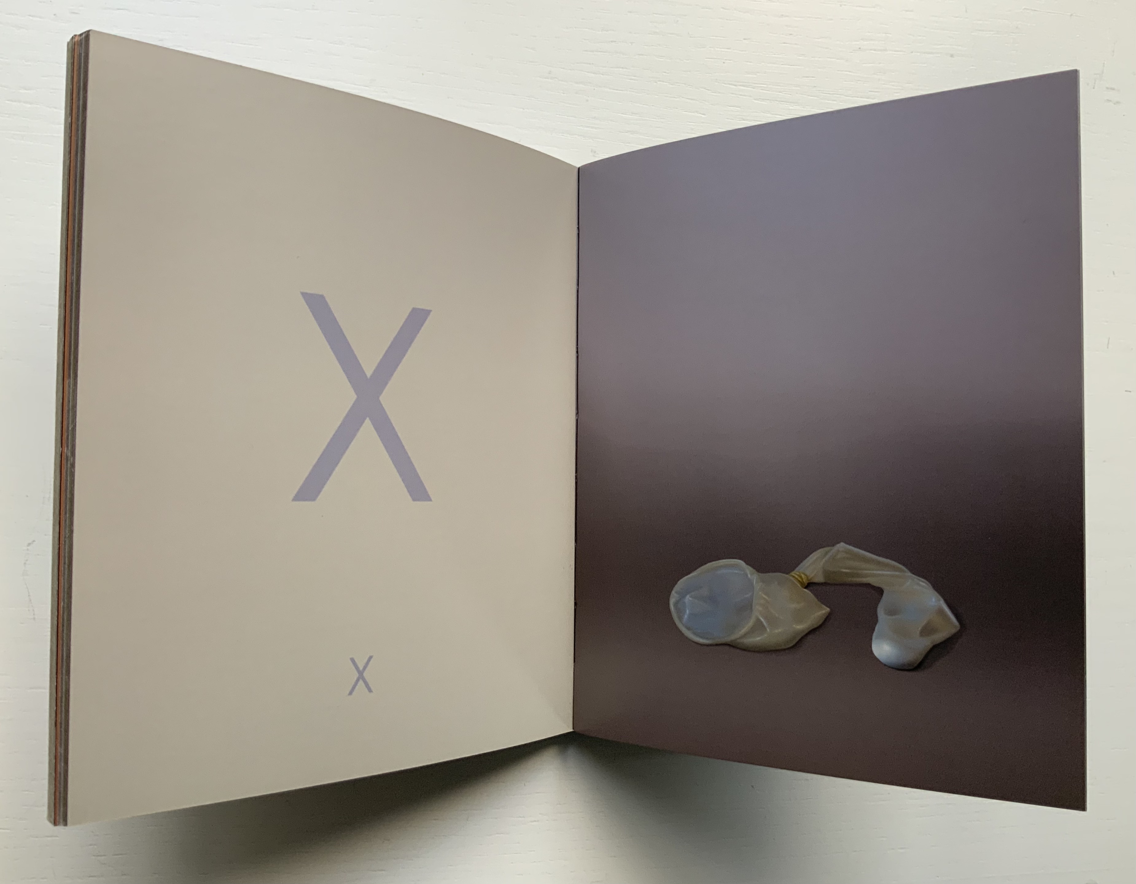
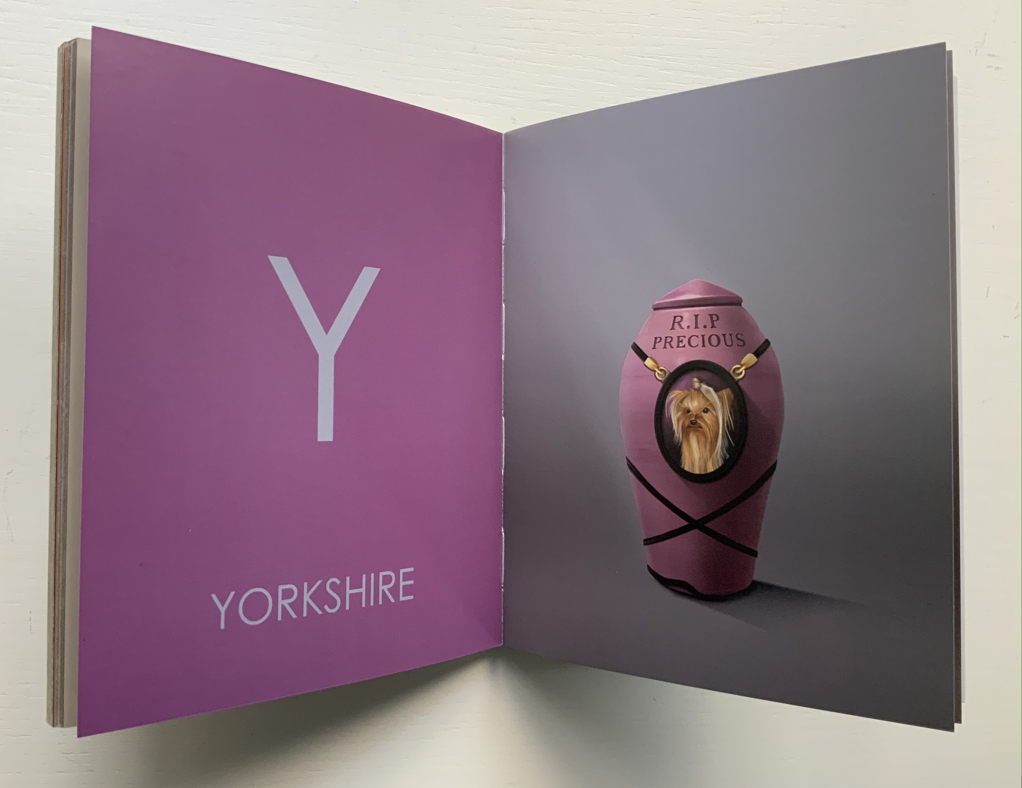
ABCDead (2010) Clément Mériguet H170 x W140 mm, 56 unnumbered pages. Acquired from Chapitre Libraire, 10 September 2021. Photos of the work: Books On Books Collection.
An alphabet of sardonic commentary in words and images on death, human behavior, stupidity and fetishism. Starting with the skull for Avenir (“future”), Mériguet places his alphabet artist book squarely within the genres of the vanitas and still life. which in French is — appropriately — nature morte (“nature dead”). (In addition to the images below, the artist offers the images of an ivory carving to illustrate Éléphant, a tree stump for Oxygène and a dead bee for Pollen. With his medium being the computer, he clearly cannot resist compounding the punnery by describing his images as nature morte virtuelle.