Perhaps there is some peculiar feature of “the book as intellectual instrument” that explains the phenomenon of book-artist-cum-impresari. In the last century, we had Ulises Carrión and Dick Higgins among others. In this century, we have Alicia Bailey, Sarah Bodman, Hubert Kretschmer, Antoine Lefebvre, Laura Russell to mention only a few. They flourish and with such variety. Some manifest as curators, others as gallerists, and others as publishers. Some transform that manifestation into a form of art itself. Aurélie Noury verges on doing this with the works under her imprint Éditions Lorem Ipsum.
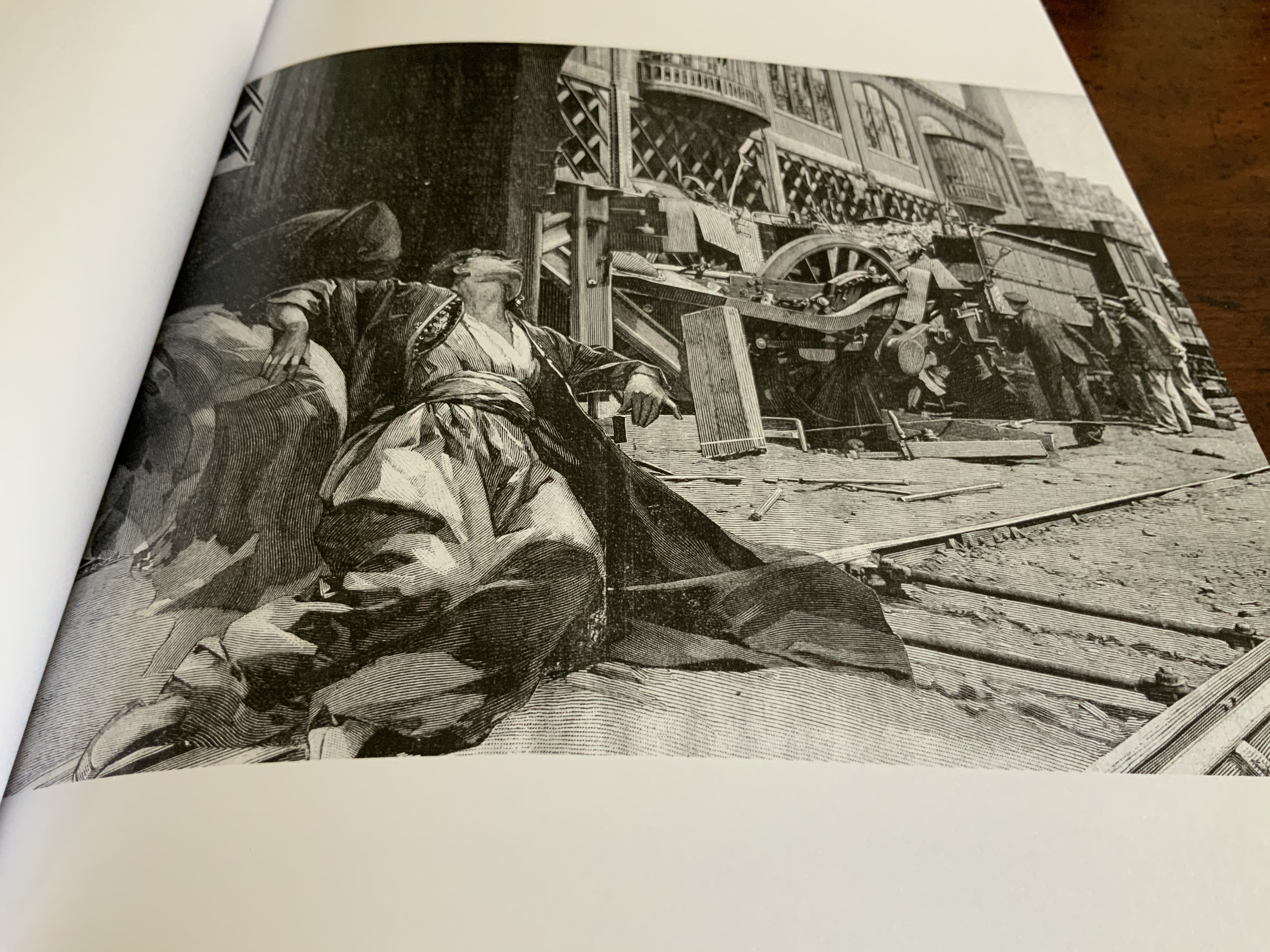
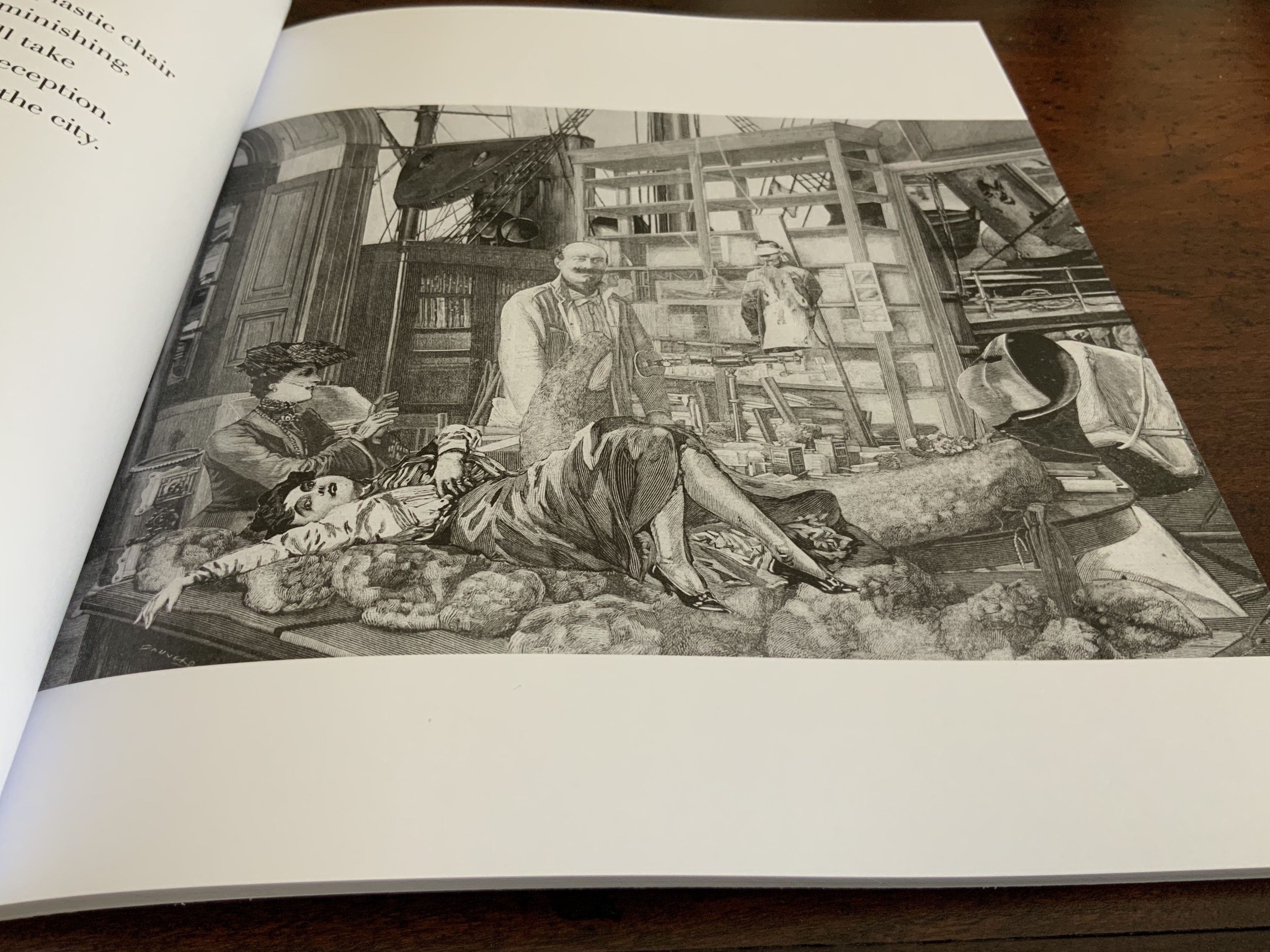
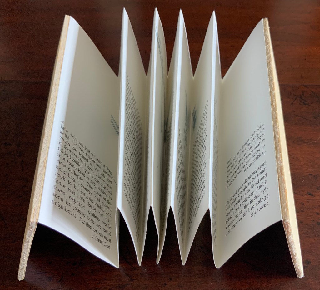
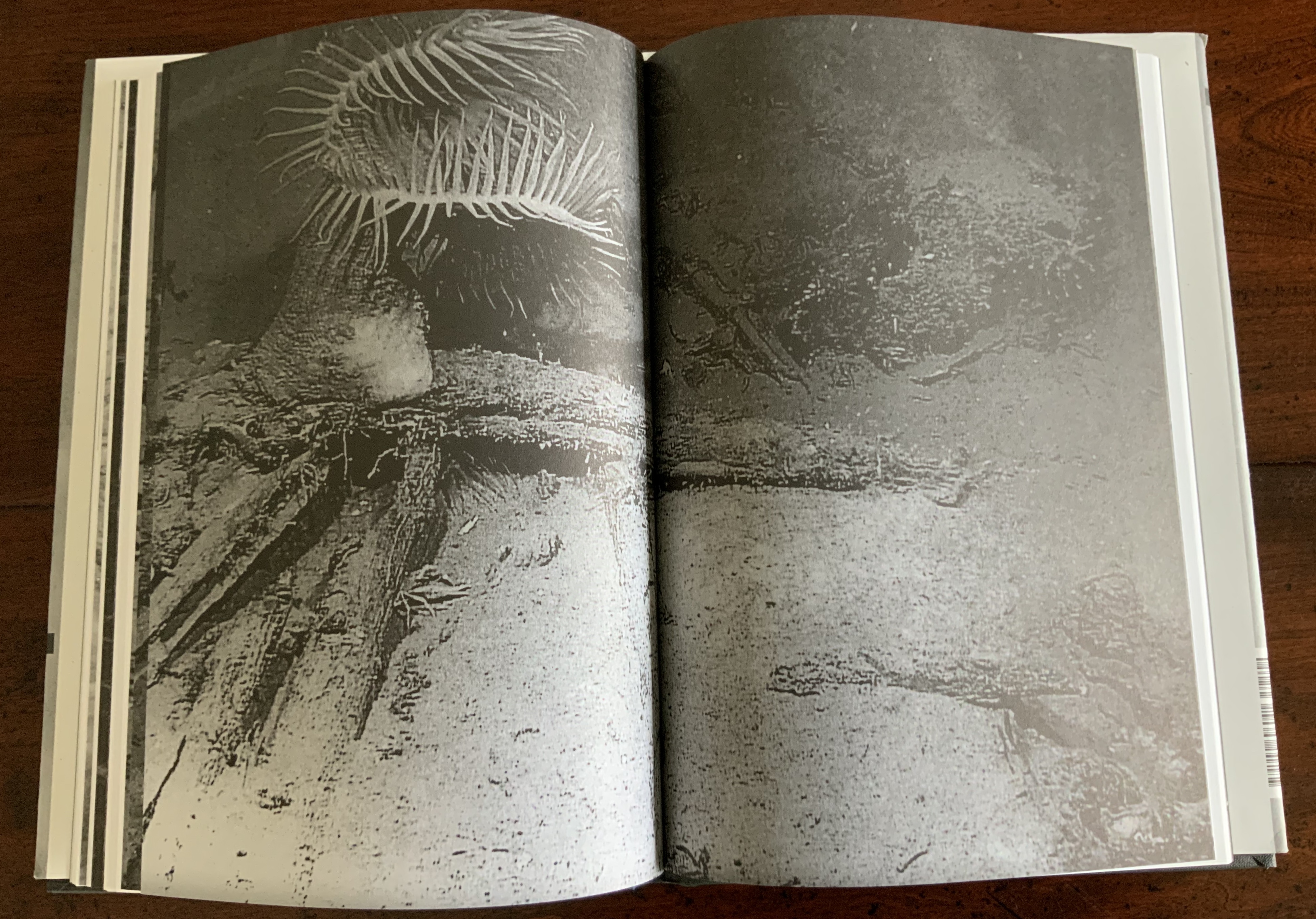
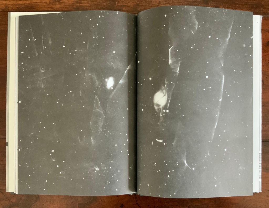
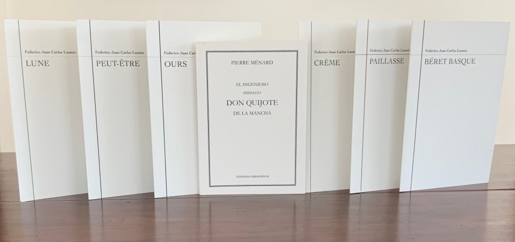
El Ingenioso Hidalgo Don Quijote de la Mancha by Pierre Ménard (after Jorge Luis Borges, “Pierre Ménard, auteur du Quichotte” in Fictions) (2009)
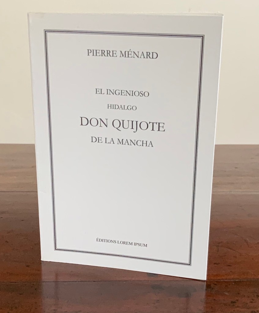
El Ingenioso Hidalgo Don Quijote de la Mancha by Pierre Ménard (after Jorge Luis Borges, “Pierre Ménard, auteur du Quichotte” in Fictions) (2009)
Aurélie Noury
Perfect bound with folded cover, H170 × W120 mm, 38 pages.
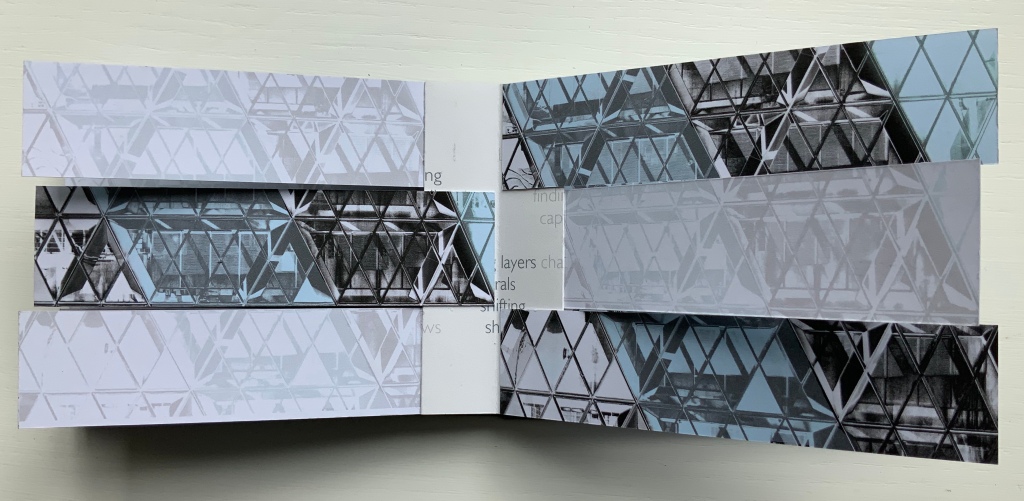
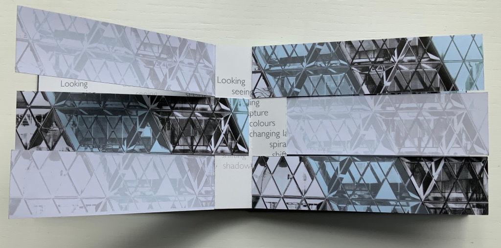
Photos: Books On Books Collection.
Borges would be the first to congratulate Noury on her persistence, diligence and taste. Of course, he would be biased, but what else to call her recovery of these pages so briefly mentioned in his short story “Pierre Ménard, author of Quixote”, how else to describe their careful resetting in the precise order mentioned, and what other choice of fonts could be suggested than Garamond for the cover and Times New Roman for the text?
For any reader finishing the discourse on what the narrator calls Ménard’s unfinished oeuvre, it is a solace to turn to Noury’s reproduction and see exactly where Ménard left things hanging in the fragment of Chapter XXII that the narrator mentions so tantalizingly. It is a vicarious thrill to share with the narrator the strangeness of that fragment appearing after the ninth and thirty-eighth chapters!
Given the intrepidness of our artiste éditrice, it may seem churlish to mention the acute accent that appears in the last name of the latter-day author of Don Quixote. No such accent appears in the original Spanish of Borges’ story. Perhaps the Argentinian or his secretary had a momentary lapse. Then again, to give Noury the benefit of doubt and Borges the gift of future vision, the narrator’s Pierre Ménard (or Menard) could very well have been the ancestor of the eponymous founder of a micro vineyard in the Loire Valley who cannot seem to settle on one spelling or the other. It cannot be an accident that this vineyard recently produced a vintage named “Chaos” (2017), a wine that, one critic writes, “should not exist”.
Borges invented other authors besides Ménard and his bio-bibliographical narrator. Borges and his life-long friend Adolfo Bioy Casares came up with Honorio Bustos Domecq, a fictitious detective under whose name they wrote numerous short stories and through whom they introduced other fictitious authors — one such was Federico Juan Carlos Loomis. In “A List and Analysis of the Sundry Books of F. J. C. Loomis”, “Bugsy” Domecq chronicles the work of the legendary writer and critic. Loomis’s chief claim to fame is his collection of six books, whose contents consist solely of their titles.
Were it not for Aurélie Noury’s translating and publishing skills, the Francophone population would have to remain content with Domecq’s Spanish listing and analysis. (Saving, of course, the one title that Loomis wrote in French: Béret Basque.) Regardless of fluency in French or Spanish, the attentive reader will appreciate how the publisher’s sensitive translations capture the denotative, connotative, spiritual and cultural intent of Federico Juan Carlos Loomis’s singular texts.
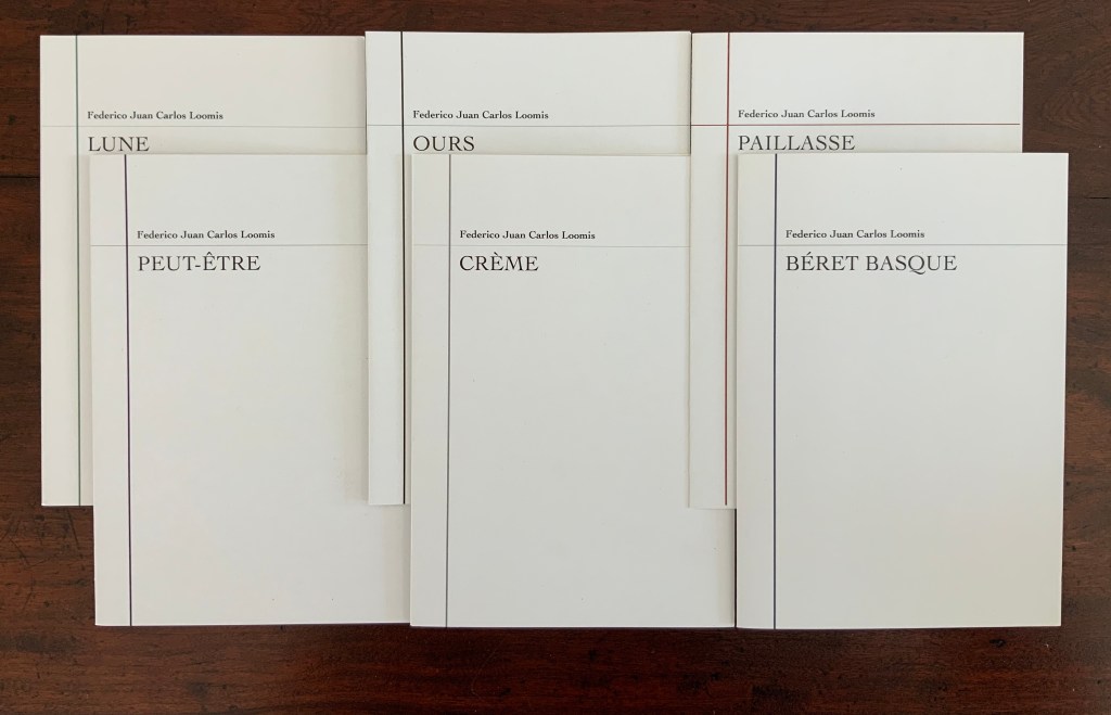
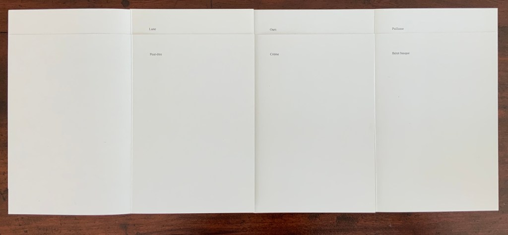
Each of the French versions is tastefully set in Cochin on the cover and Times Roman in the text. The works’ restrained design (H190 x W130 mm, four pages, three covers in black & white, three with the addition of colored rule) complements their minimal contents.
Many book artists have paid homage to Borges (see Further Reading below). These seven works surely secure a place of honor and humor among them for Aurélie Noury.
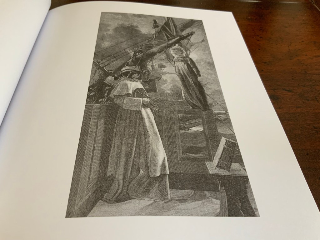
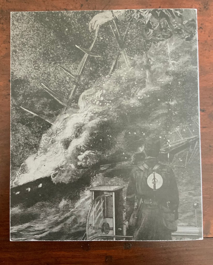
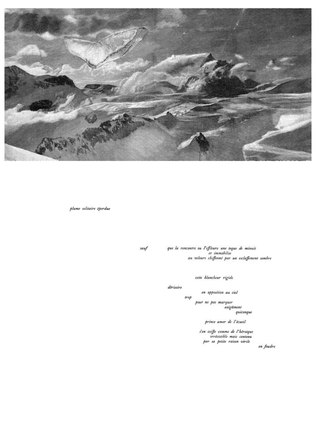
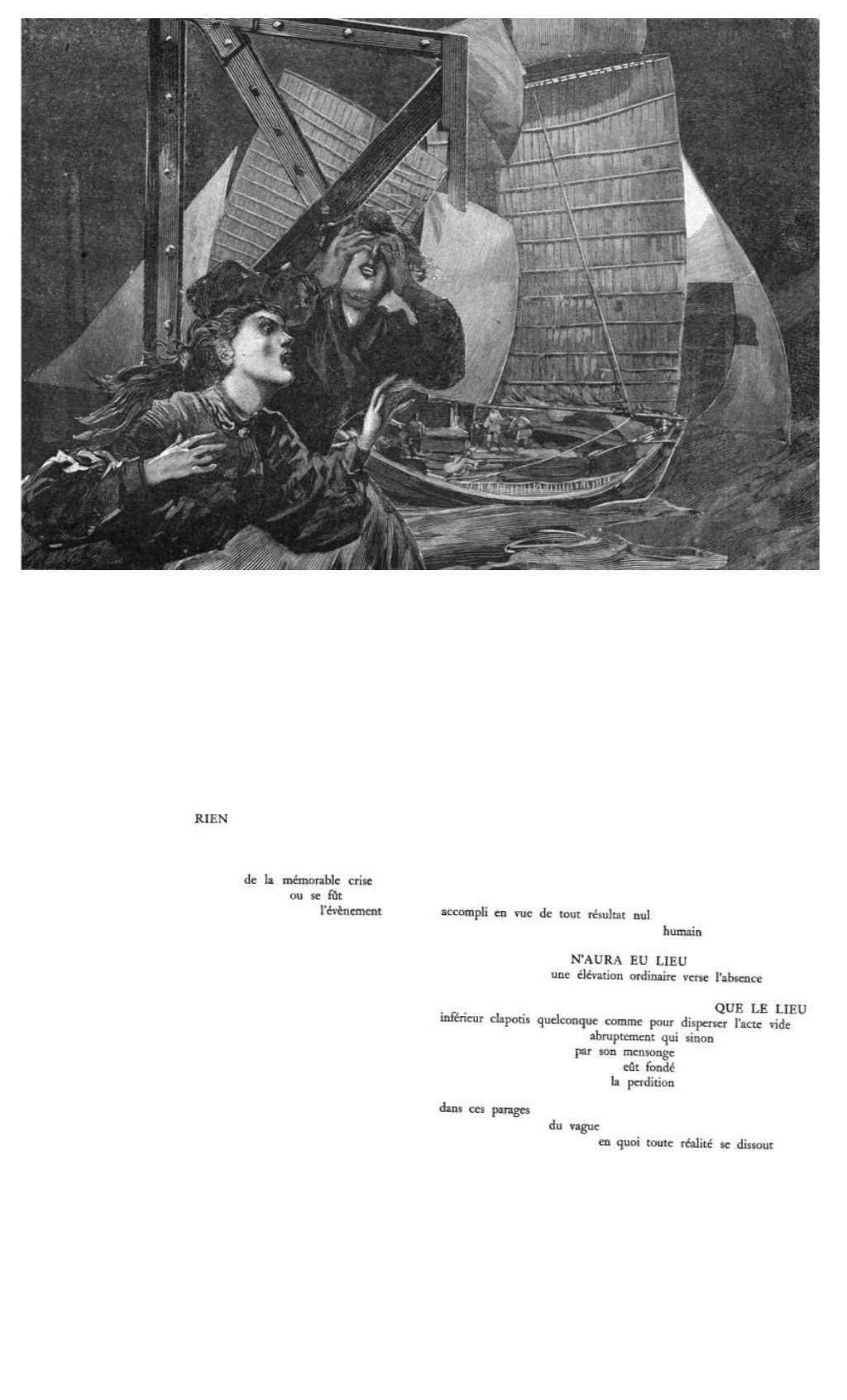
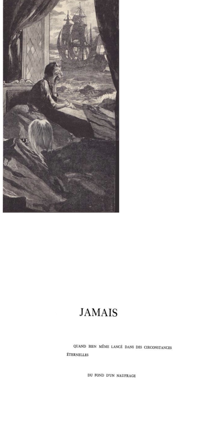
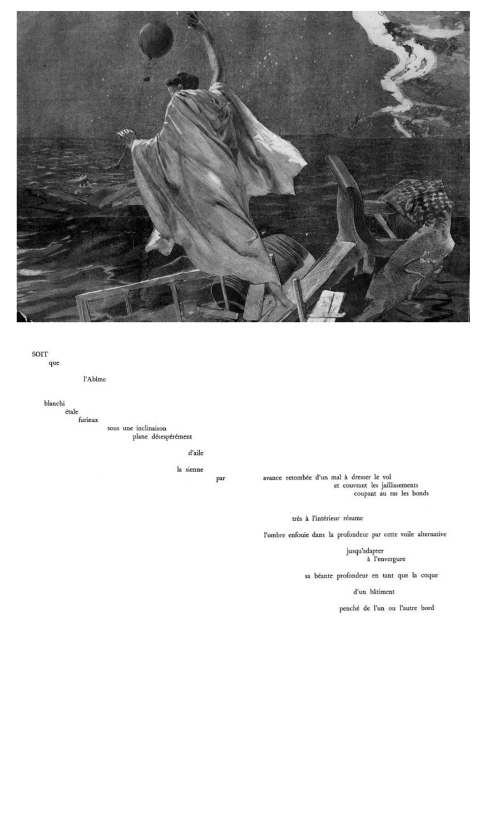
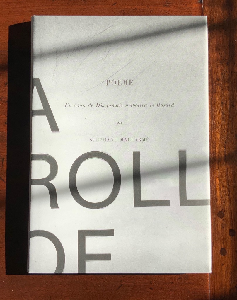
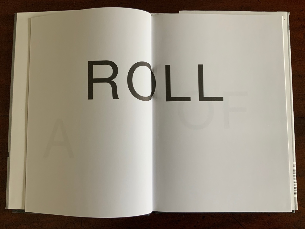
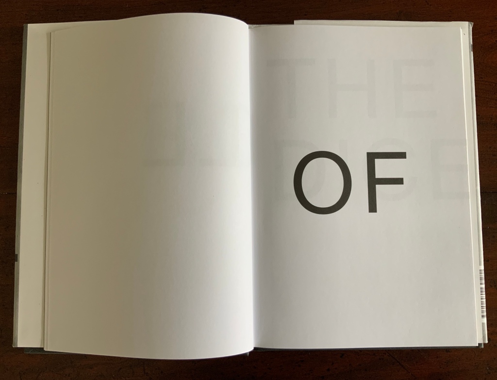
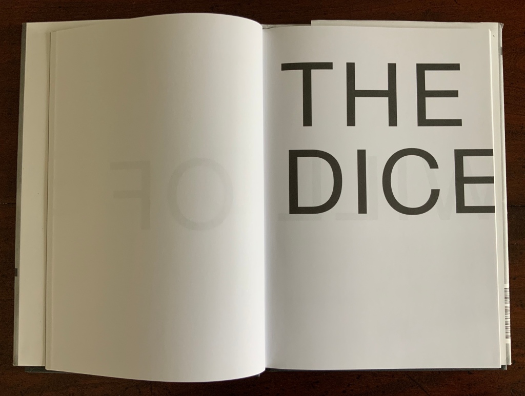
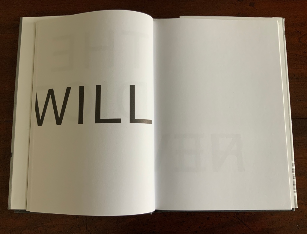
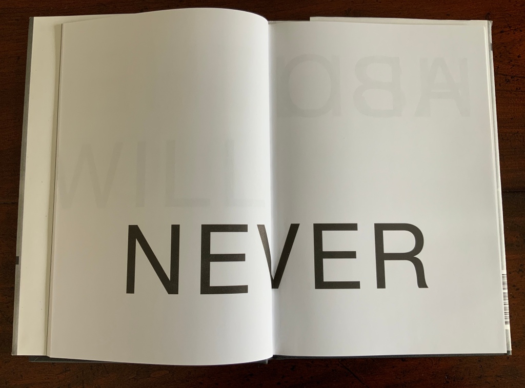
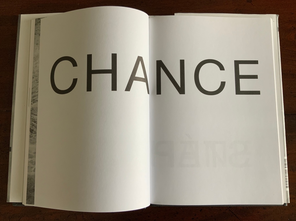
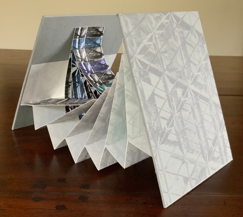
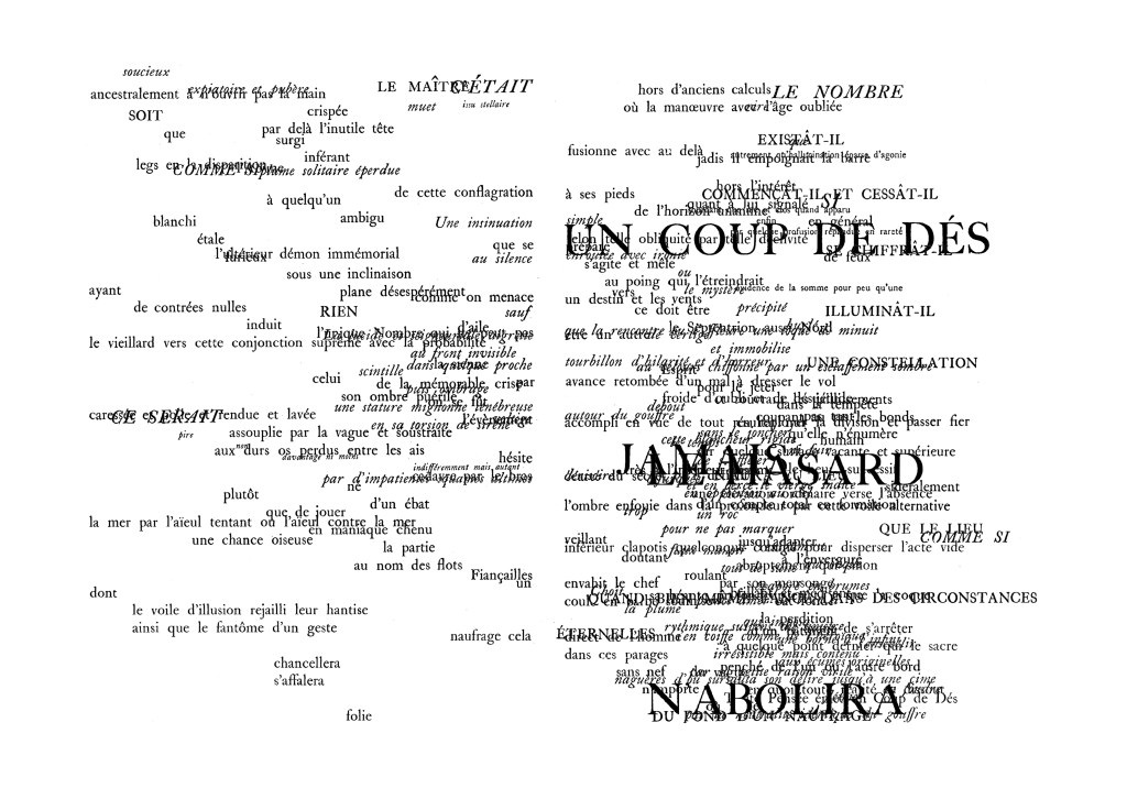
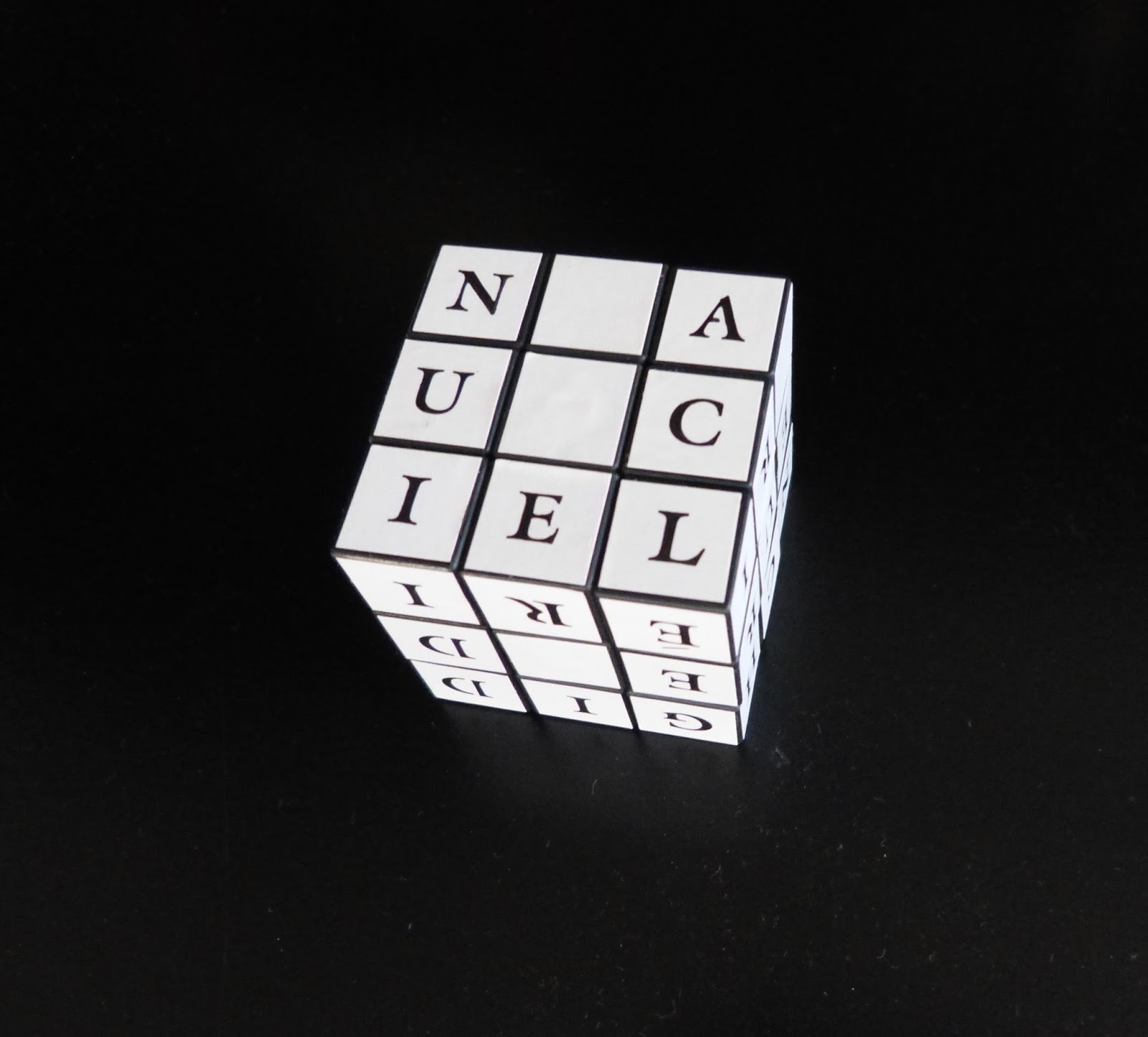
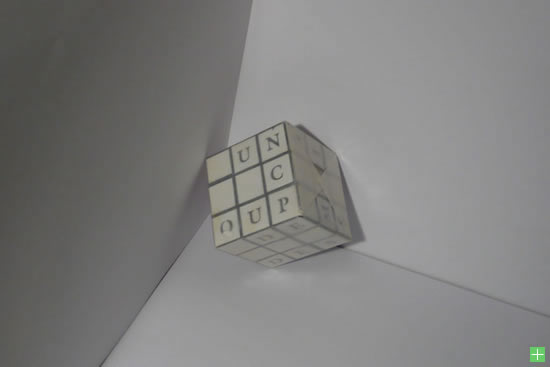
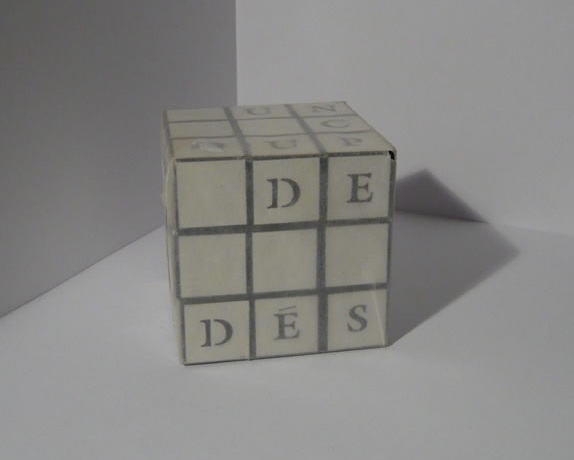
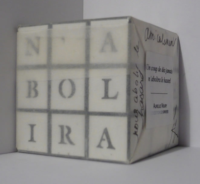
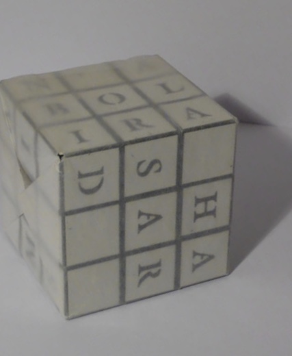
Un coup de dés jamais n’abolira le hasard (poster) (2008)
Un coup de dés jamais n’abolira le hasard (poster) (2008)
Aurélie Noury
H100 x W700 mm. Photo: Courtesy of the artist.
Except for her Rubik’s Coup de Dés, Noury’s poster version of Mallarmé’s poem would be the thing for summarizing, critiquing, parodying and paying homage to le Maître‘s work. Why not collapse all of the spacing and text in its varied type sizes and styles into one double-page spread? But then, if the game is “the total expansion of the letter”, the dispersal of letters from keywords in the poem across the 54 spaces on a Rubik’s cube would be the thing. Unfortunately, at the moment, this particular thing does not reside in the Books On Books Collection, so the following photos (courtesy of the artist) stand as a collector’s reminder.
Noury’s inventive literary/artistic appropriation does not end with Borges and Mallarmé. Marcel Duchamp, Honoré de Balzac, John Irving and Louis Aragon also come in for varying treatments at her hands. Her choices for these reversals of ekphrasis — proceeding from an existing text to a newly created work of art, rather vice versa — are clever. But it is her combination of the techniques of appropriation, homage and parody and intermedial play with the various techniques of print and digital publications in a distinctive way for each target text that is ingenious.
No doubt there could be many more such works to come, but even the most ingenious of appropriators finds her time appropriated by other ventures. As directrice of the imprint Éditions Incertain Sens, she engages with the works acquired for Le Cabinet du livre d’artiste (CLA) at the University of Rennes 2 as well as with their documentation in the CLA’s newspaper Sans niveau ni mètre. These ventures have been apropos and obviously influential for Noury. Éditions Incertain Sens and the CLA were founded by Leszek Brogowski, who has written extensively on book artists such as Bernard Villers. The furniture of CLA was made by artist and writer Bruno di Rosa, who has appropriated and extended the works of Gustave Flaubert and Joachim du Bellay. The situation could be only more apropos if Éditions Incertain Sens had been founded by Mallarmé and Borges at some point in the future!
Further Reading
“A Maze of Books for the Cultural Olympiad“, Bookmarking Book Art, 15 August 2012. For a sculptural homage to Borges.
“Sean Kernan“, Books On Books Collection, 23 February 2013. For a photographic homage to Borges.
“acqueline Rush Lee”, Books On Books Collection, 8 October 2019. For more on reverse-ekphrasis.
“Antoine Lefebvre”, Books On Books Collection, 28 September 2020. For another artiste éditeur.
“Peter Malutzki“, Books On Books Collection, 11 November 2019. For an homage to Borges’ Encyclopedia of Tlön from the short story “Tlön, Uqbar, Orbis Tertius”.
“Michalis Pichler”, Books On Books Collection, 19 August 2020. For a prolific hommageur of Mallarmé.
“Hanna Piotrowska (Dyrcz)“, Books On Books Collection, 13 December 2019. For an “earthy” homage to Borges.
“Benjamin Shaykin“. 3 December 2022. Books On Books Collection. For another homage to Borges.
“Rachel Smith“. In progress. Books On Books Collection. For another homage to Borges.
“Barbara Tetenbaum”, Bookmarking Book Art, 26 June 2013. For more on reverse-ekphrasis.
Basile, Jonathan. 2015~. The Library of Babel. Website. Accessed 3 July 2023.
Gilbert, Annette (ed.). Publishing as Artistic Practice (Berlin: Sternberg Press, 2016).