Michael Donaghy (1954-2004) was something of a throwback to the Metaphysical Poets of the seventeenth century. Their love poetry excelled at extended metaphors designed to touch the heart and mind. “Machines” illustrates this best among his poems. It is worth a listen.
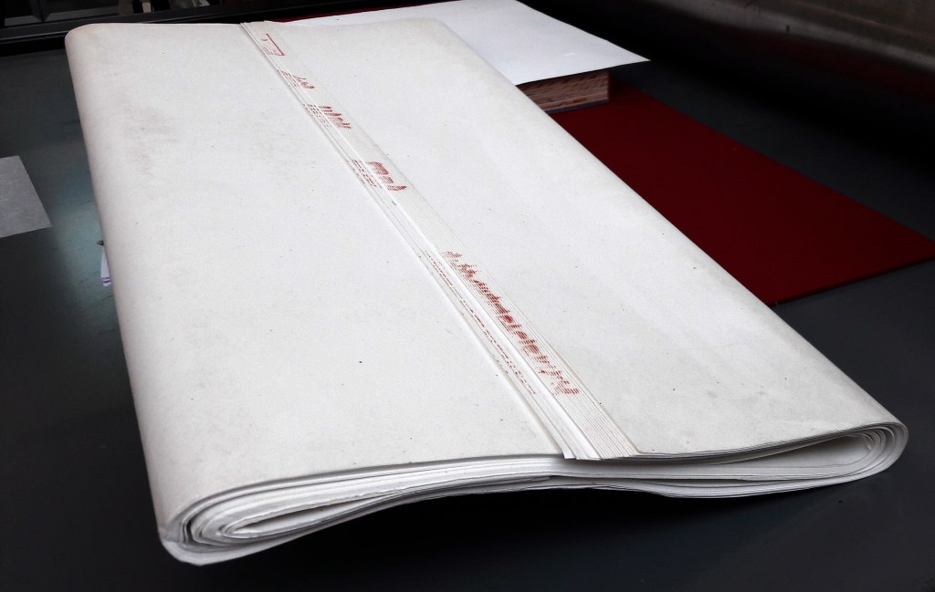
For Barbara Tetenbaum, intense listening to works of literature has provided a rich source of artwork. Her Mining My Ántonia (2012) is based on hours in a gallery at Reed College listening to a recorded reading of Willa Cather’s novel. Here is how she describes the artist’s book:
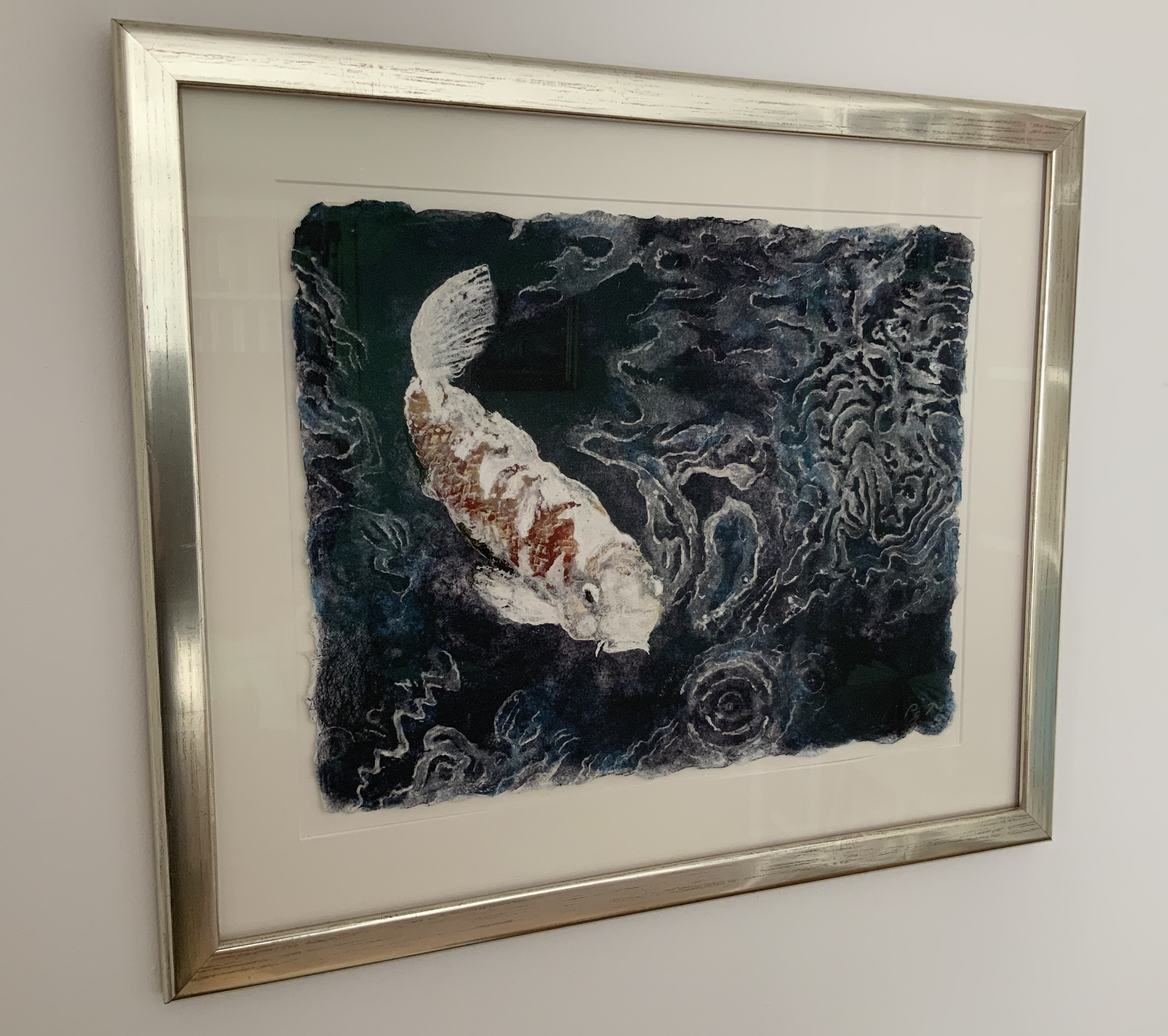
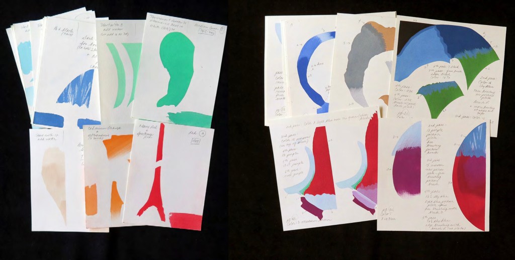
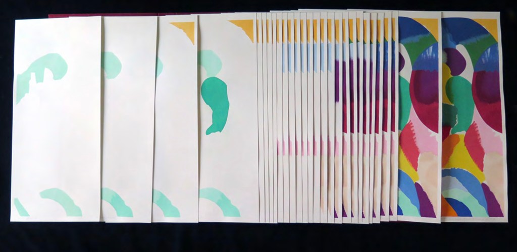
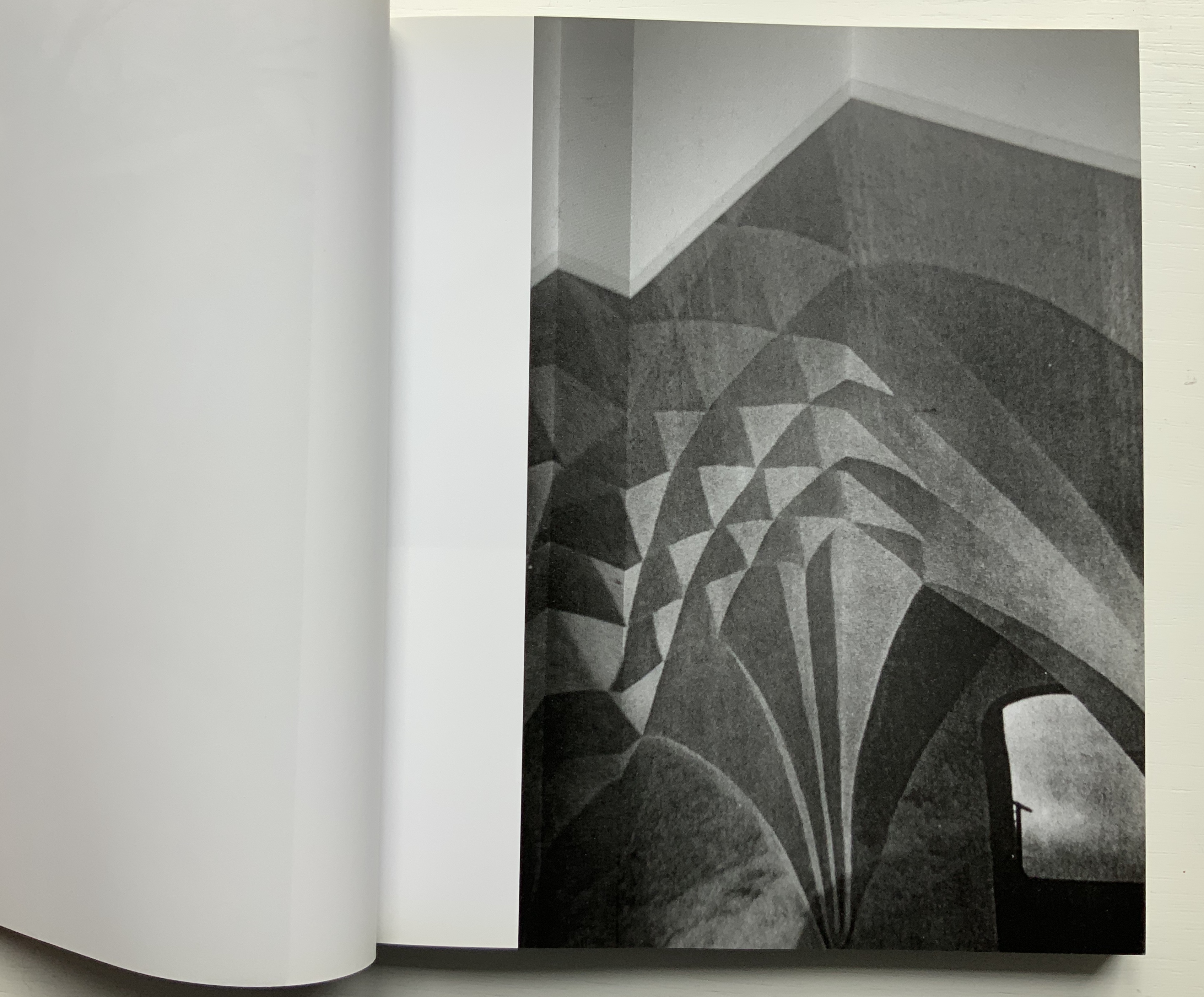
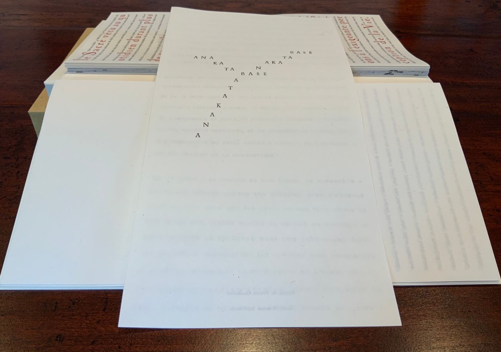
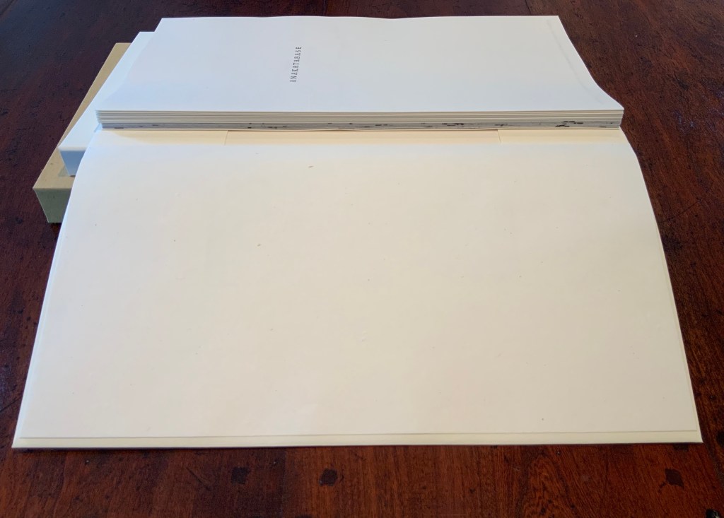
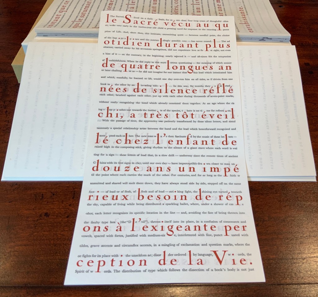
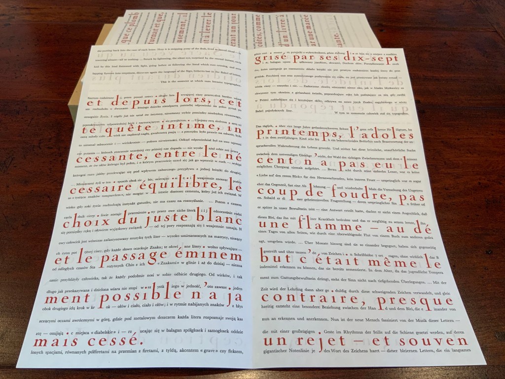
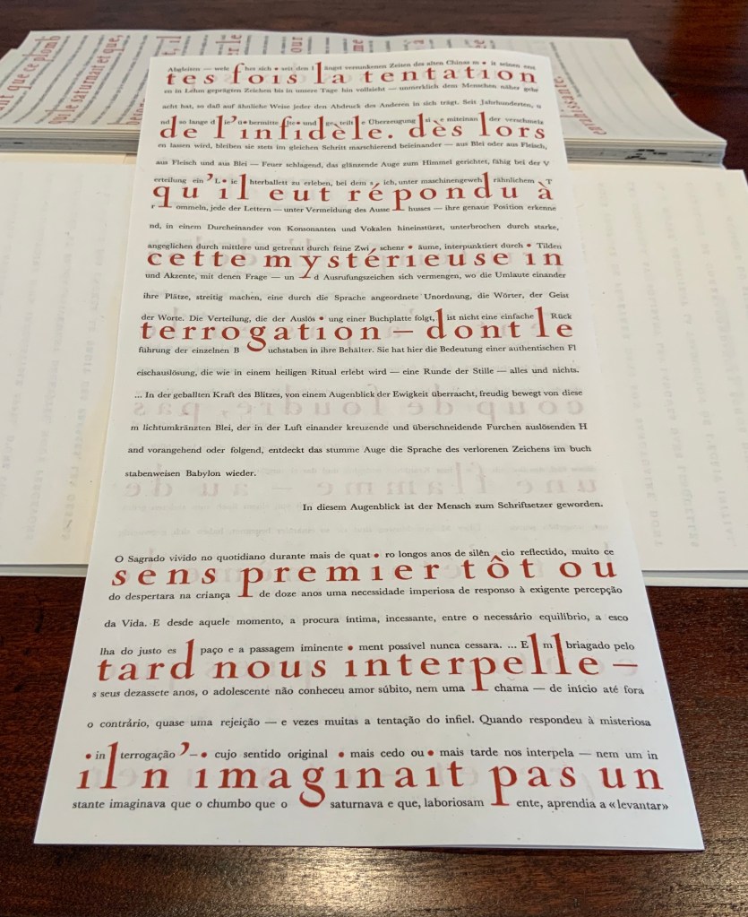
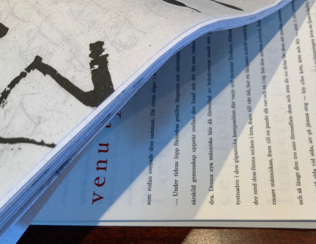
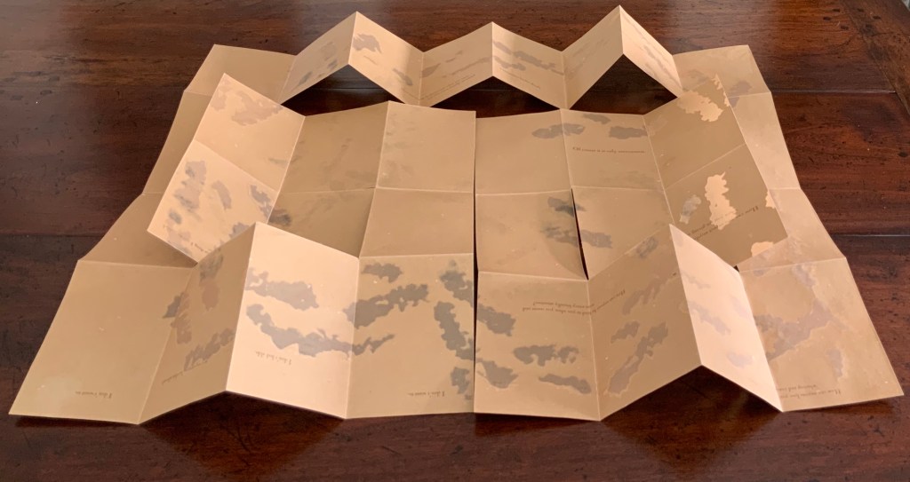
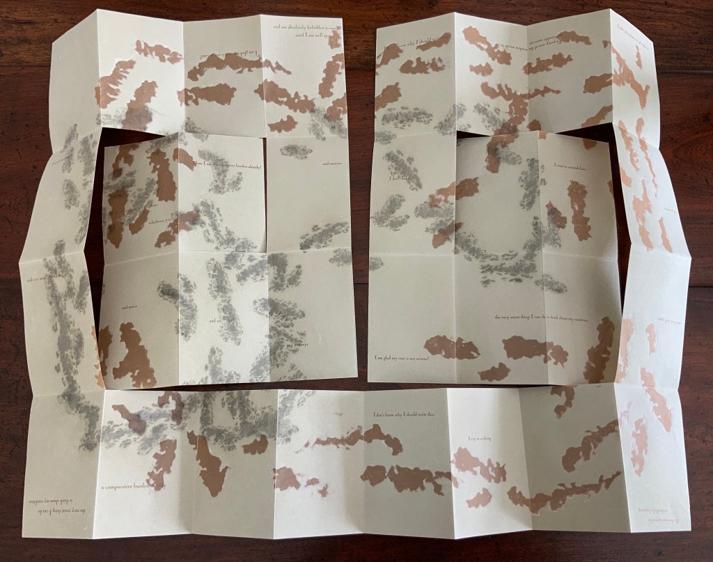
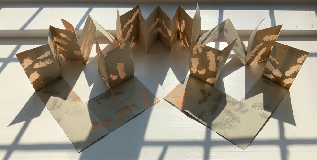
It features five automatic drawings made while listening to the novel, printed as etchings. A cloth-bound book of handset letterpress-printed excerpts accompanies this. A large fold-out map of how I see the novel, printed as a large etching with letterpress text, is housed inside the book along with one piece of text from the original Reed College installation.
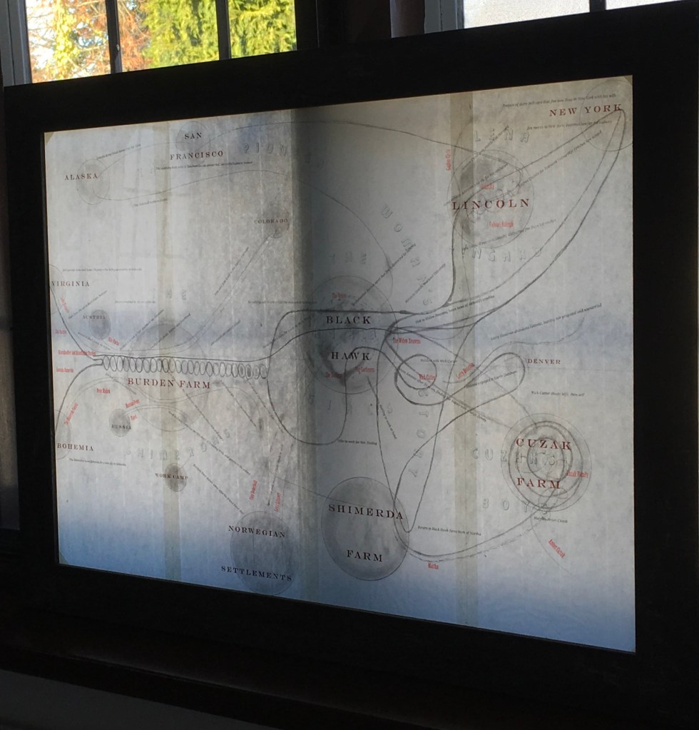
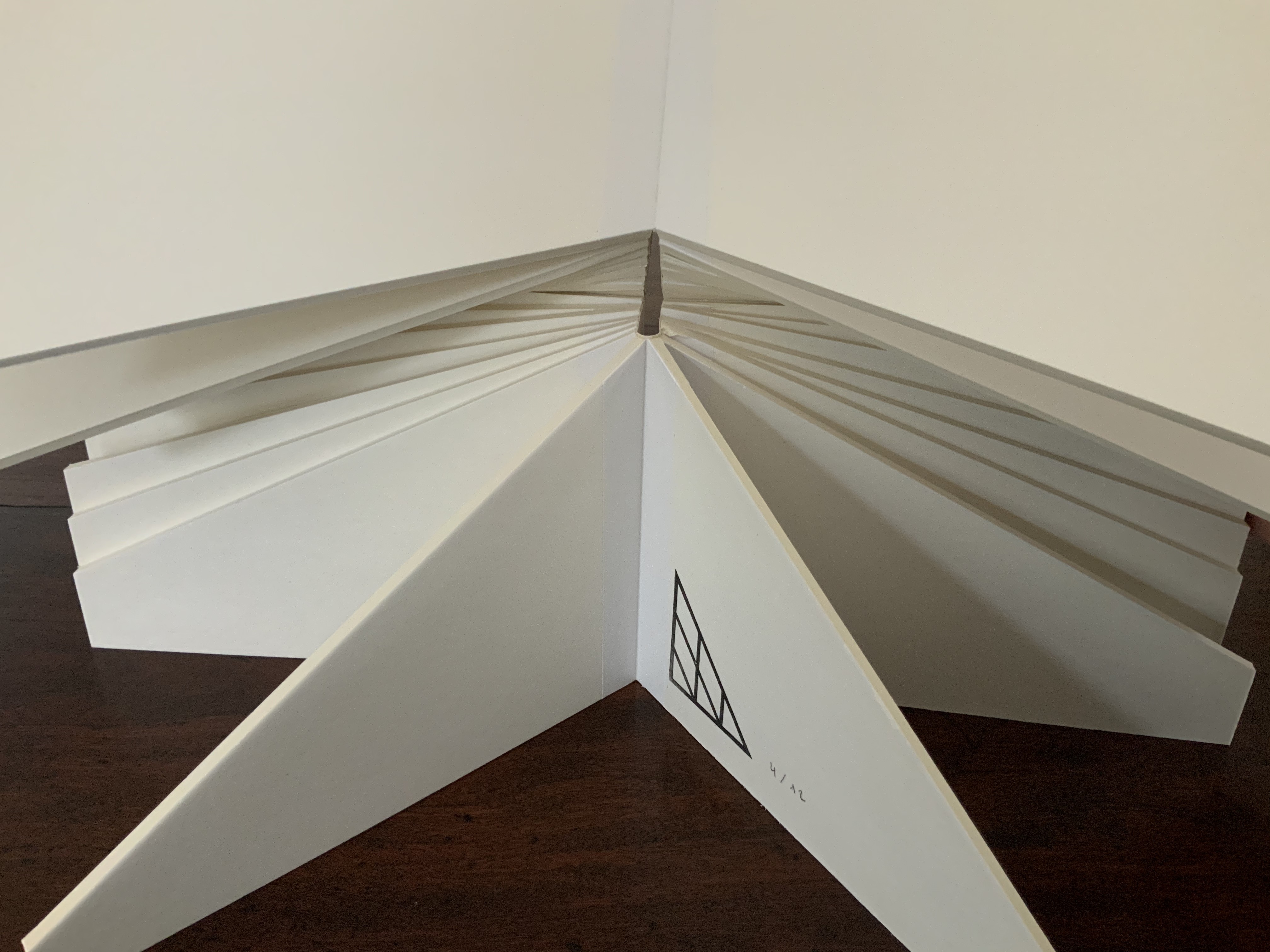
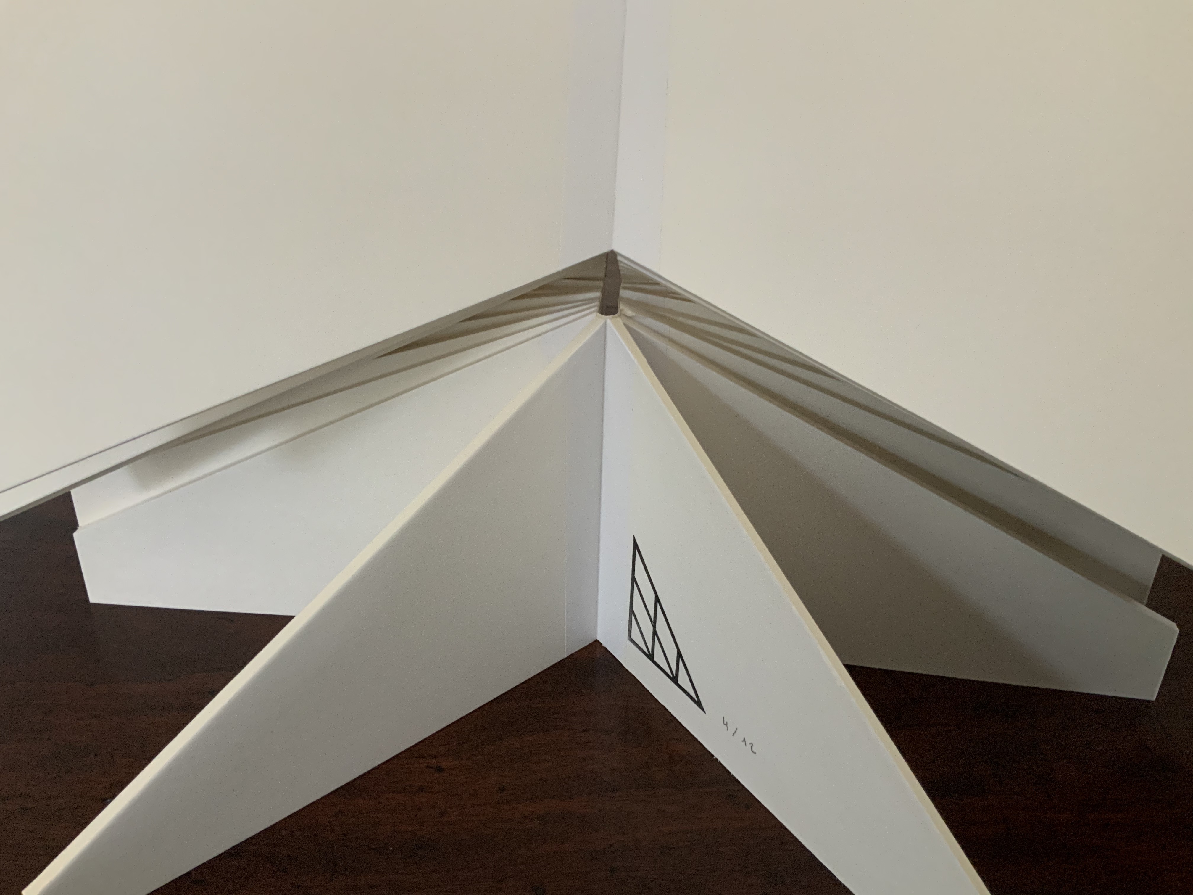
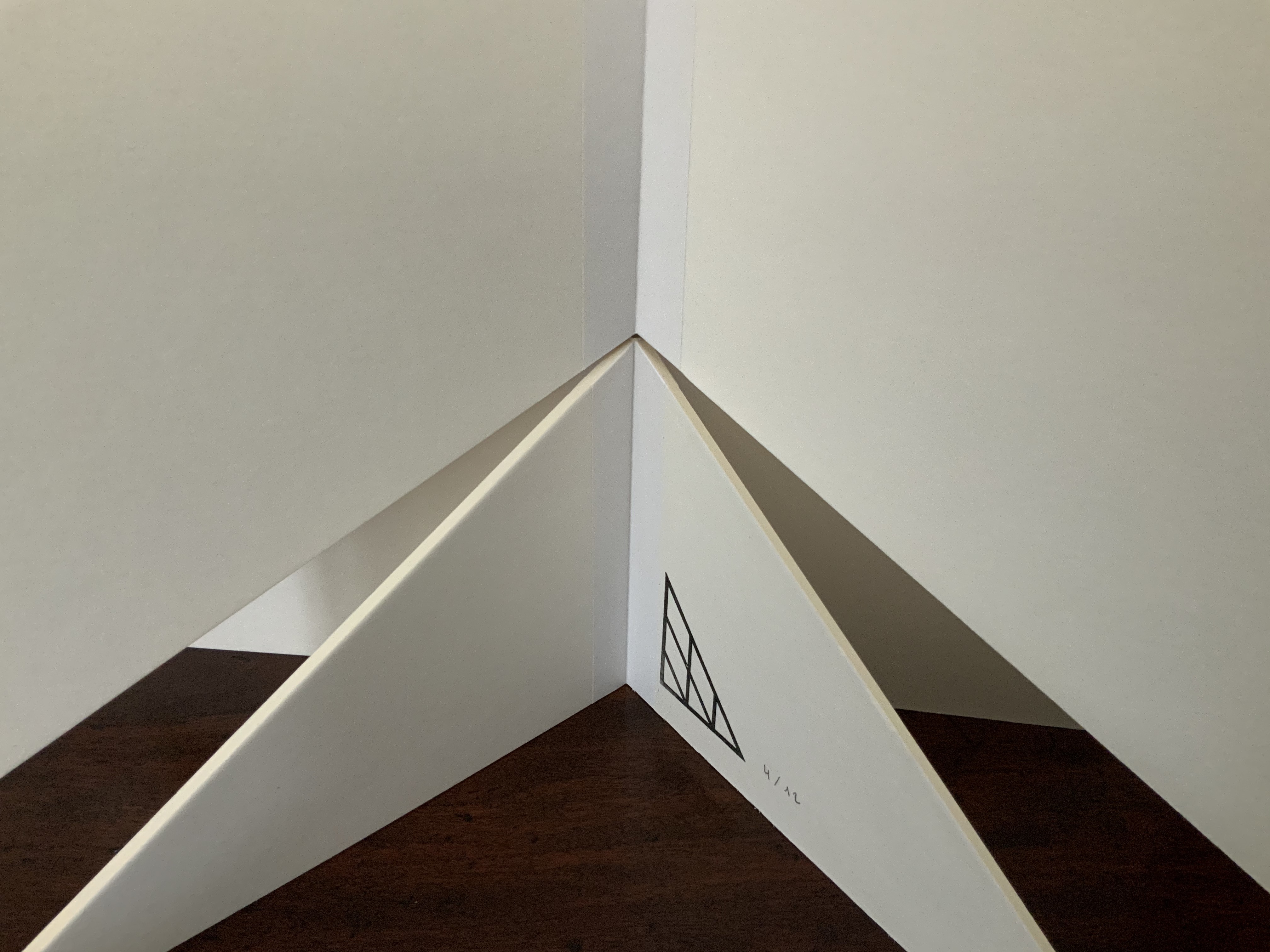
Framed copy of the large fold-out map included in Mining My Ántonia (2012). Photos: Books On Books Collection. With permission of the artist.
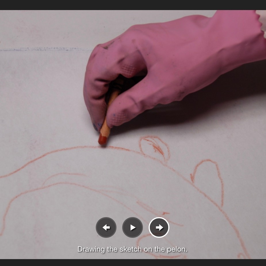
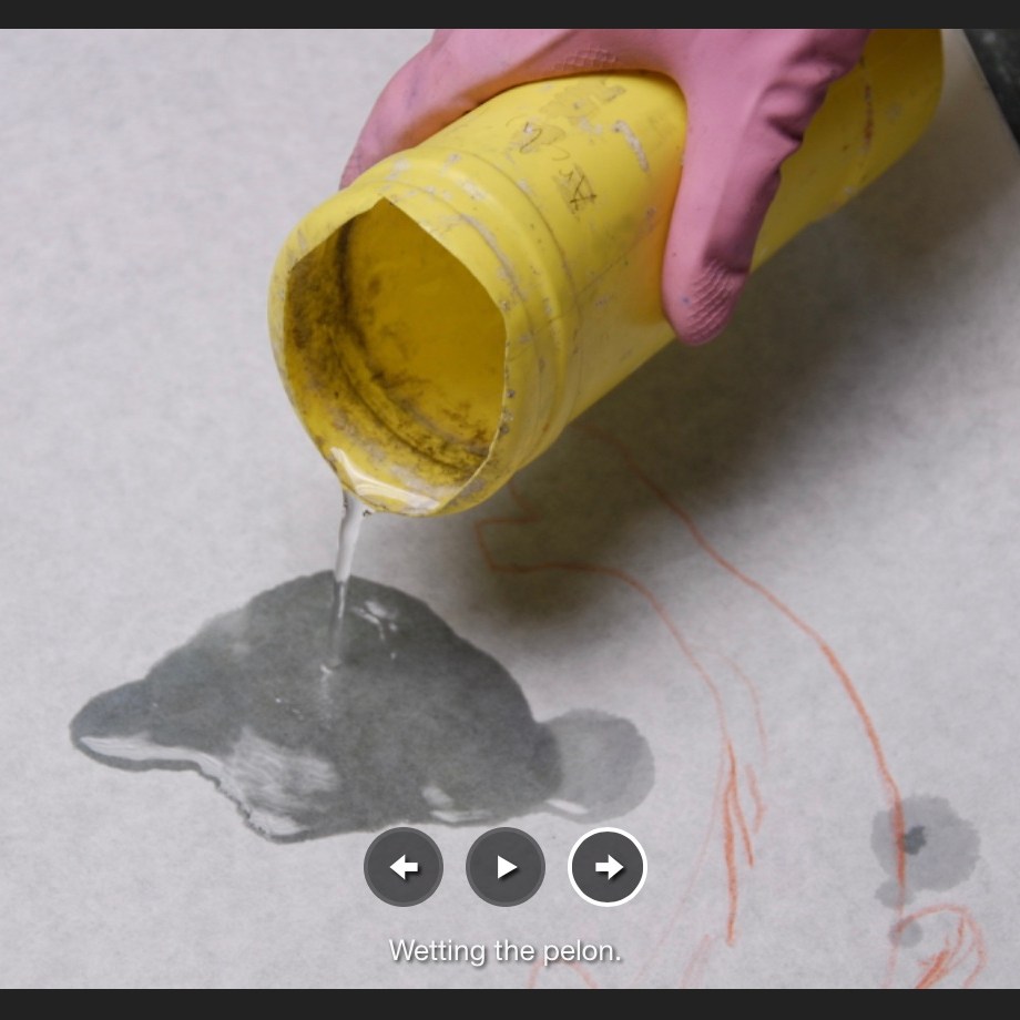
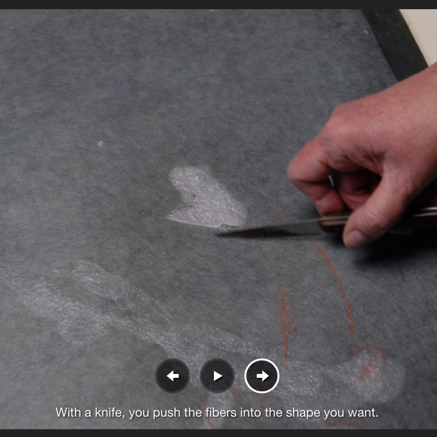
Decades earlier while working with Ron King, founder of Circle Press, Tetenbaum was engaged in a 10-year body of work of “marks on pages, marks as diary entries, marks as keeping time, marks as recording lived experience”. That work foreshadowed Mining My Ántonia — as did the result of meeting Michael Donaghy and his wife Maddy Paxman in 1986. That same year, when King and his wife left for an extended vacation in Eygpt, he gave Tetenbaum free rein to make any chapbook she wanted while he was away. She naturally turned to Donaghy’s melodic poetry to find the right one to react to with typesetting, paper choice, printing, binding and her own artwork — not to illustrate the poem but rather to create a companion experience for the reader.
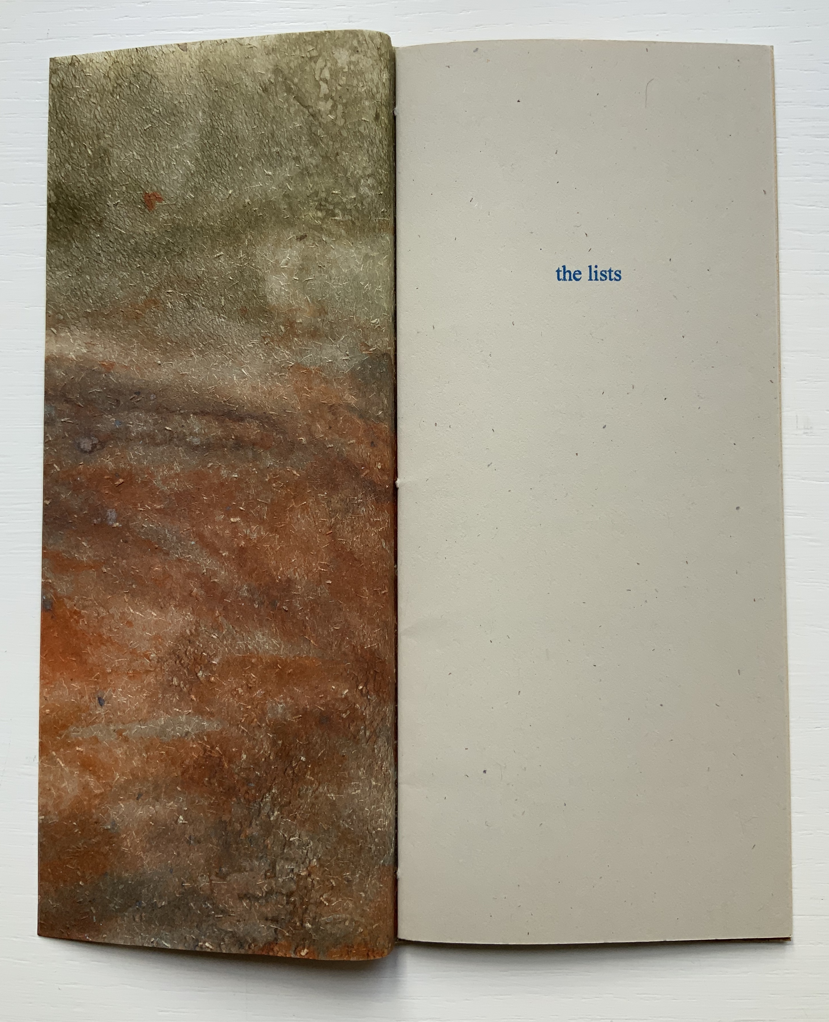
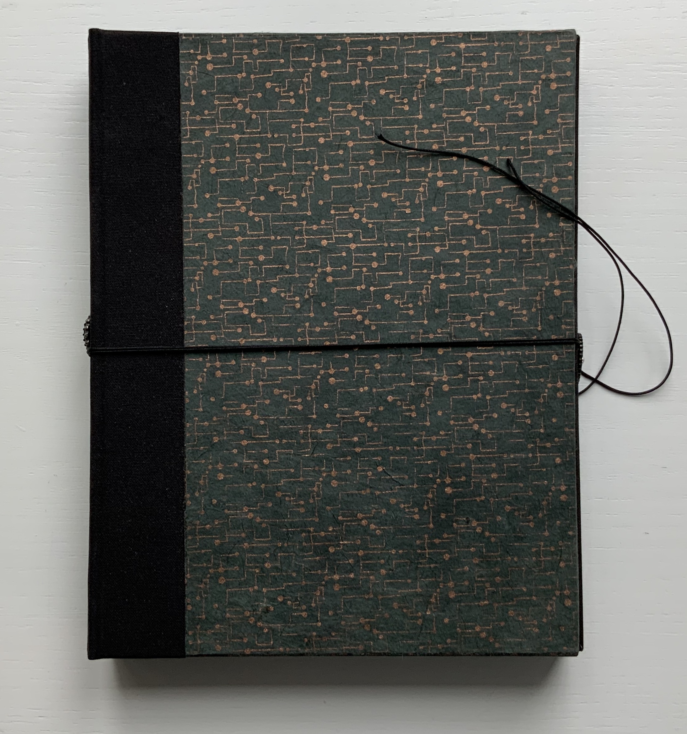
The first of that companion experience comes from the warmth of the cover’s color, texture and weight.
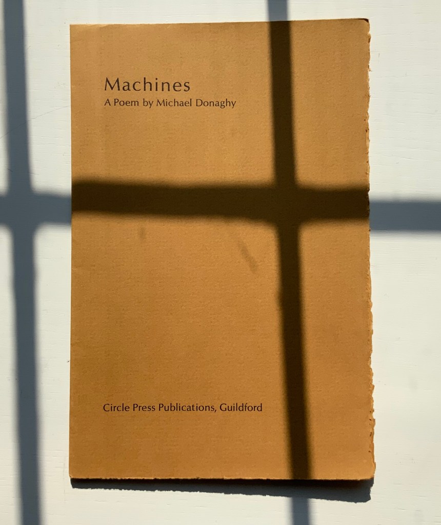
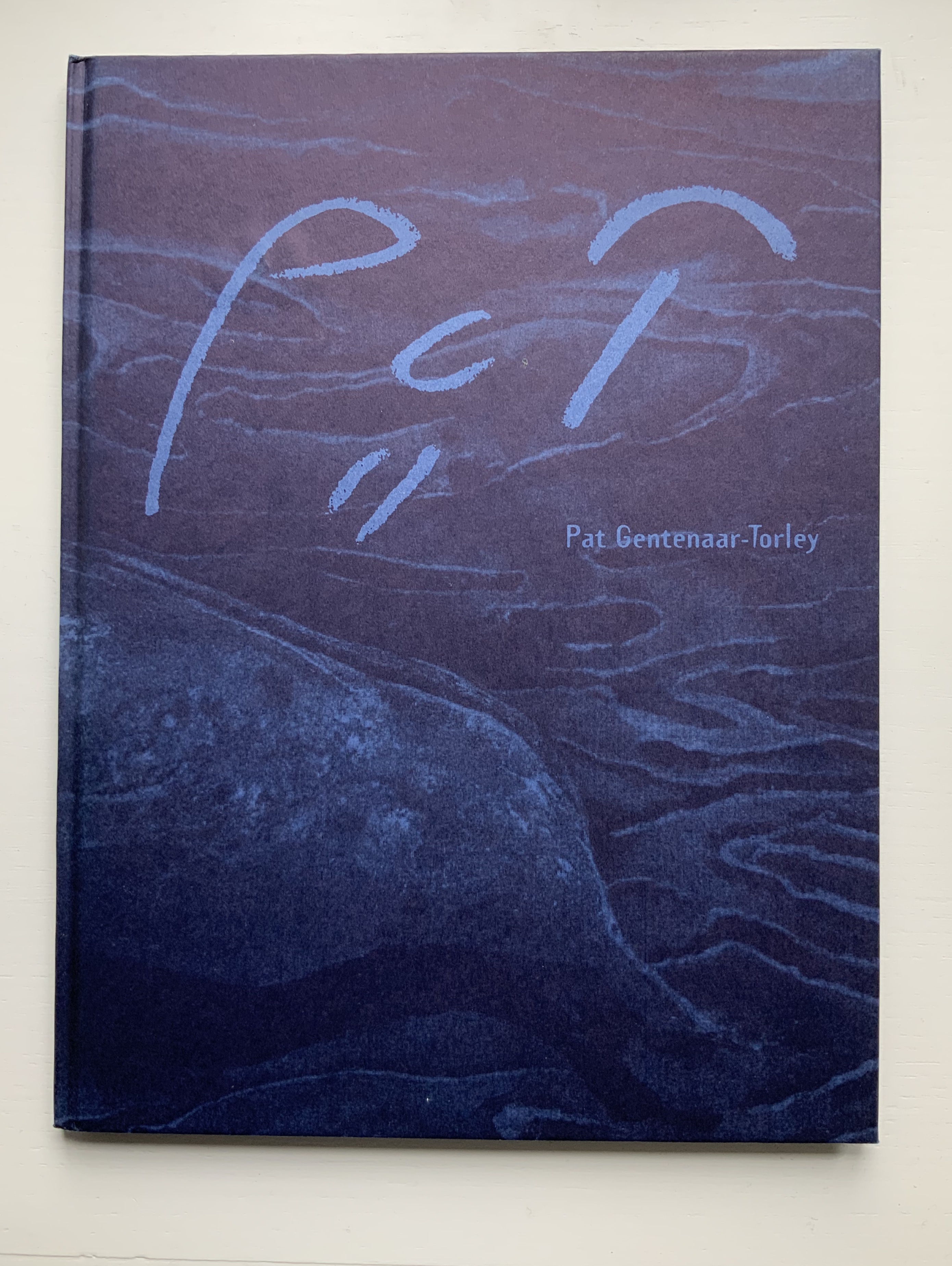
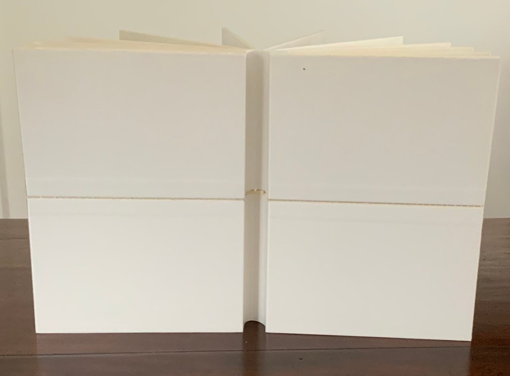
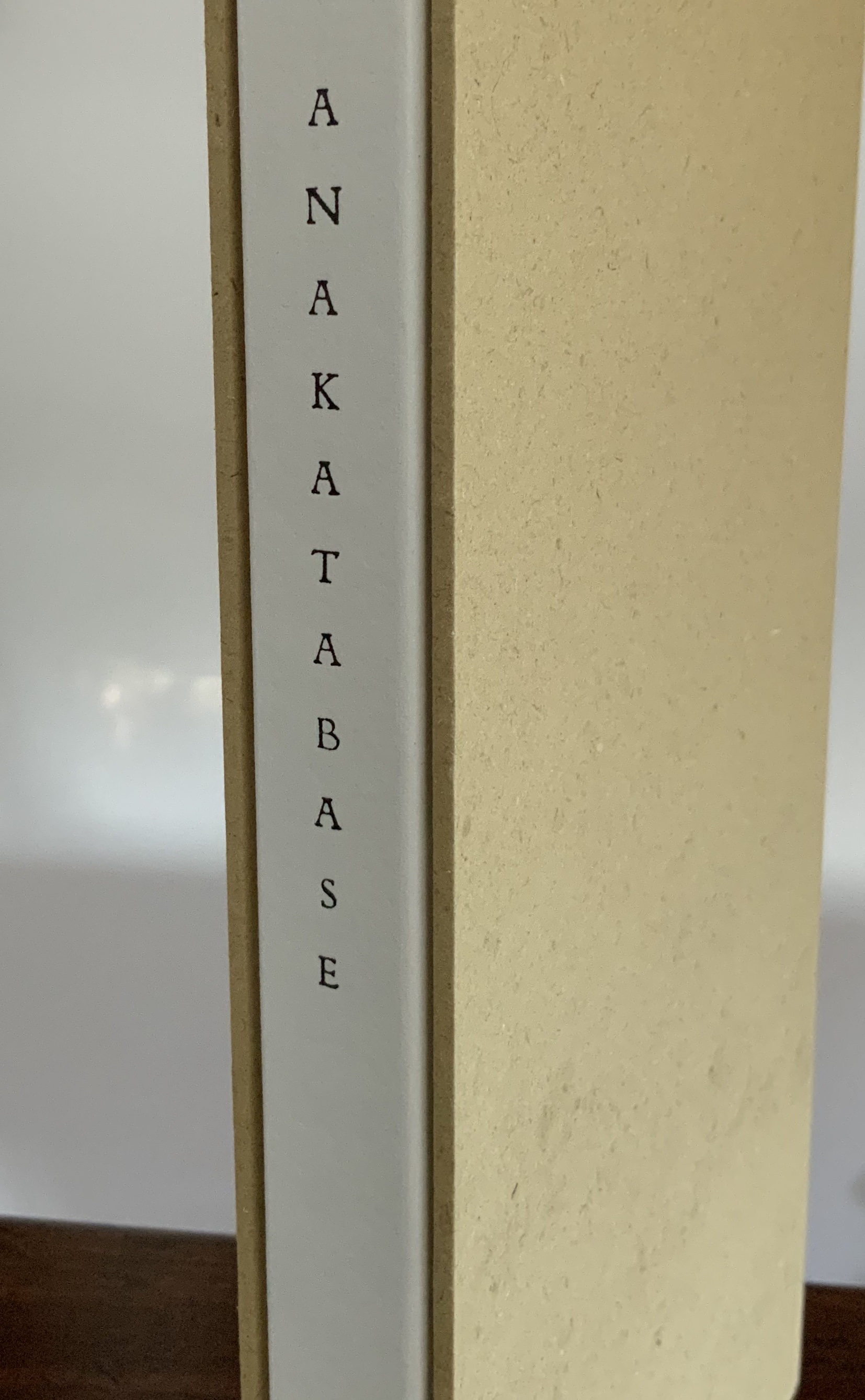
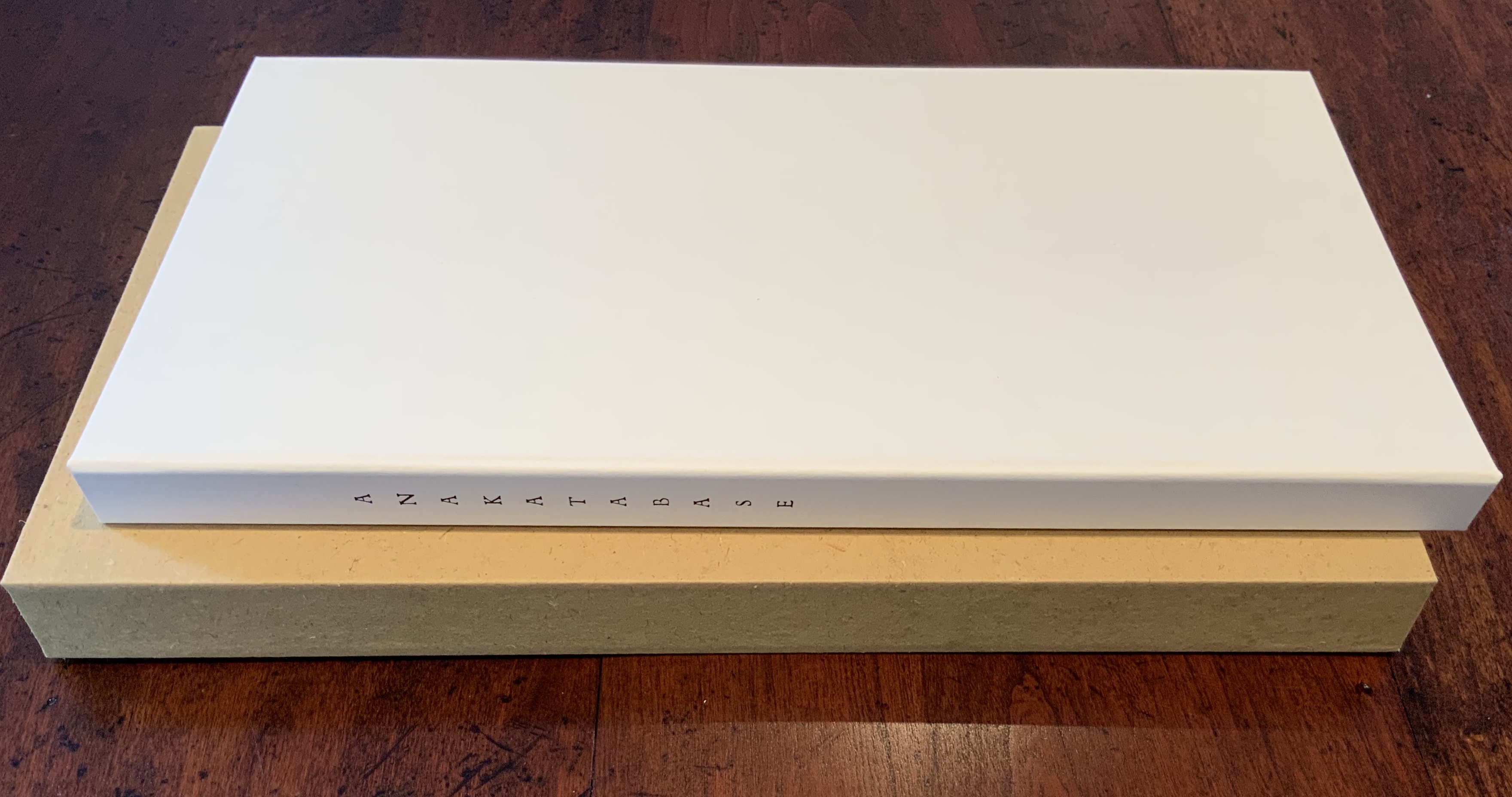
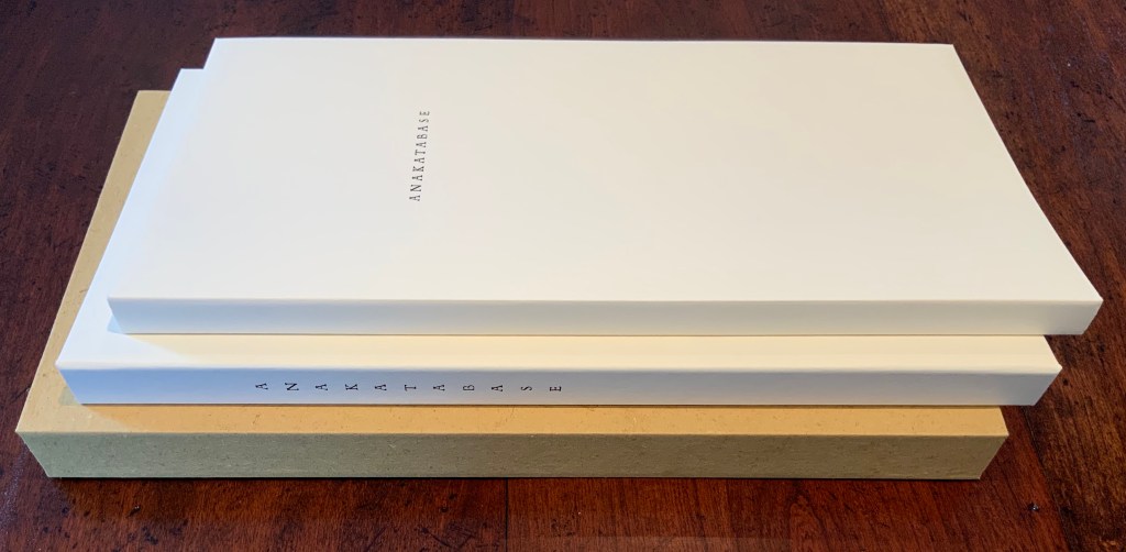
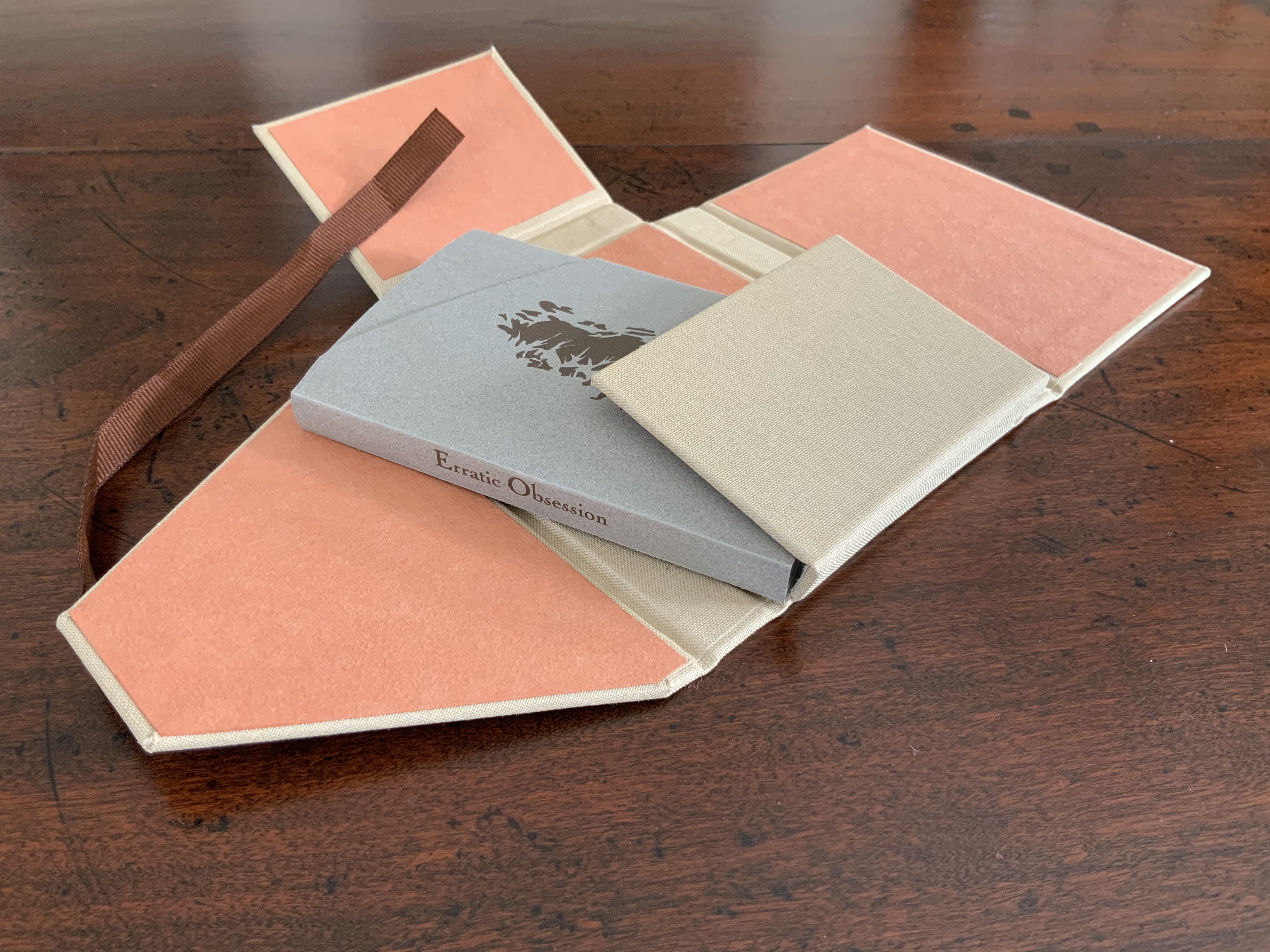
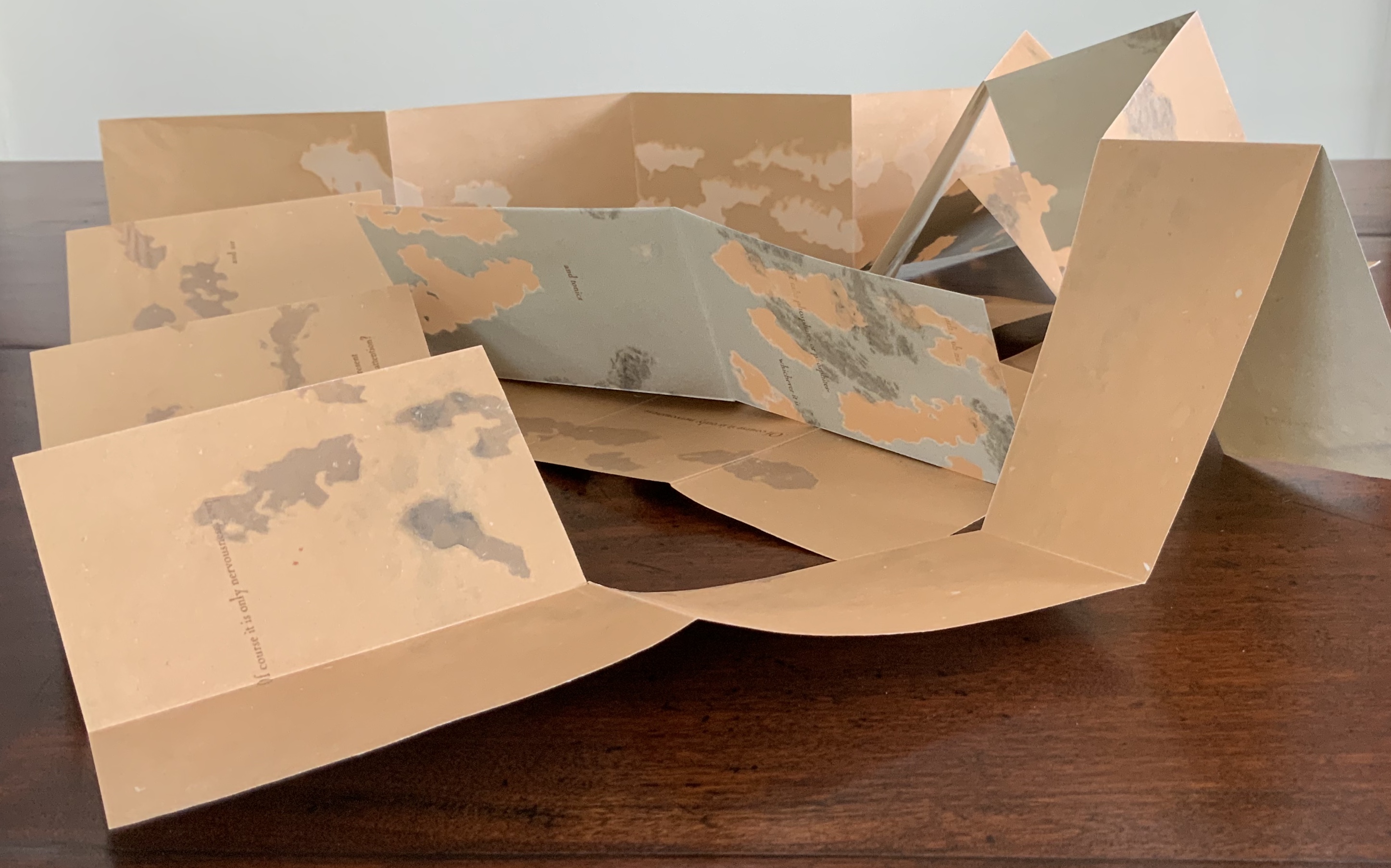
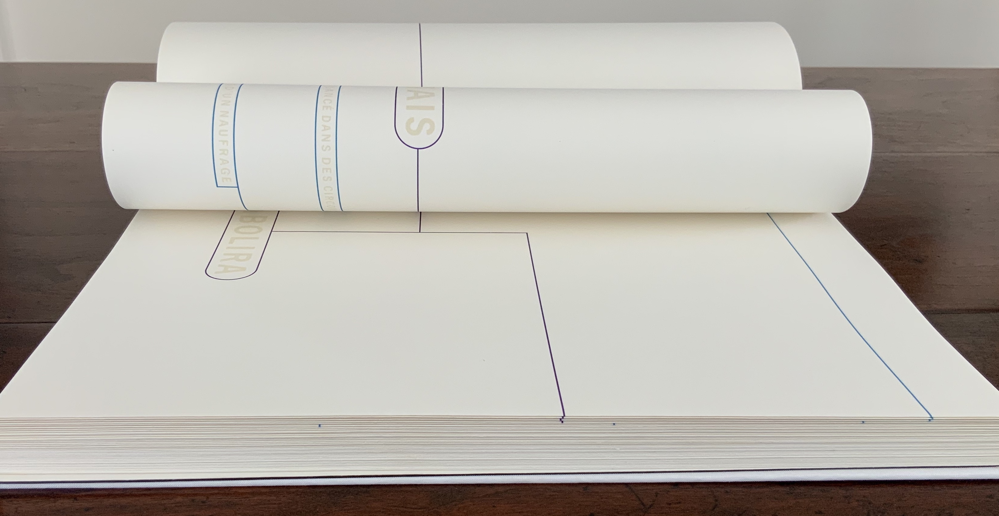
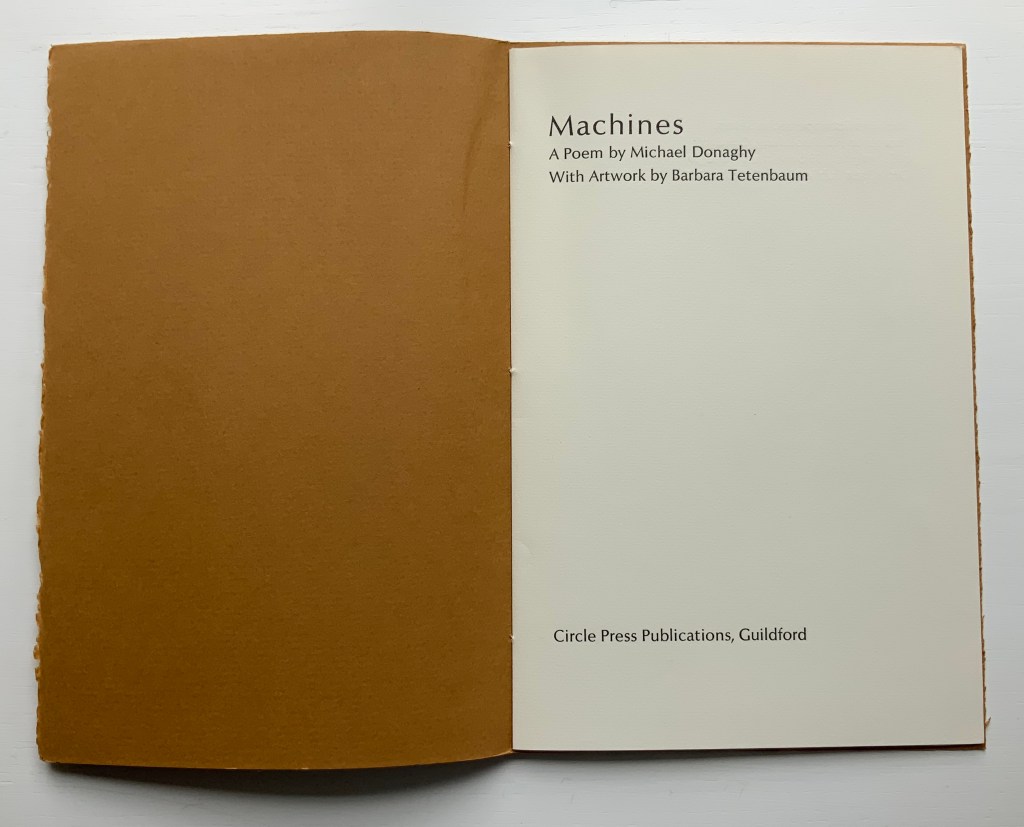
Machines: A Poem by Michael Donaghy (1986)
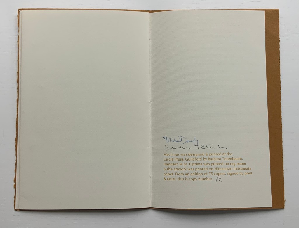
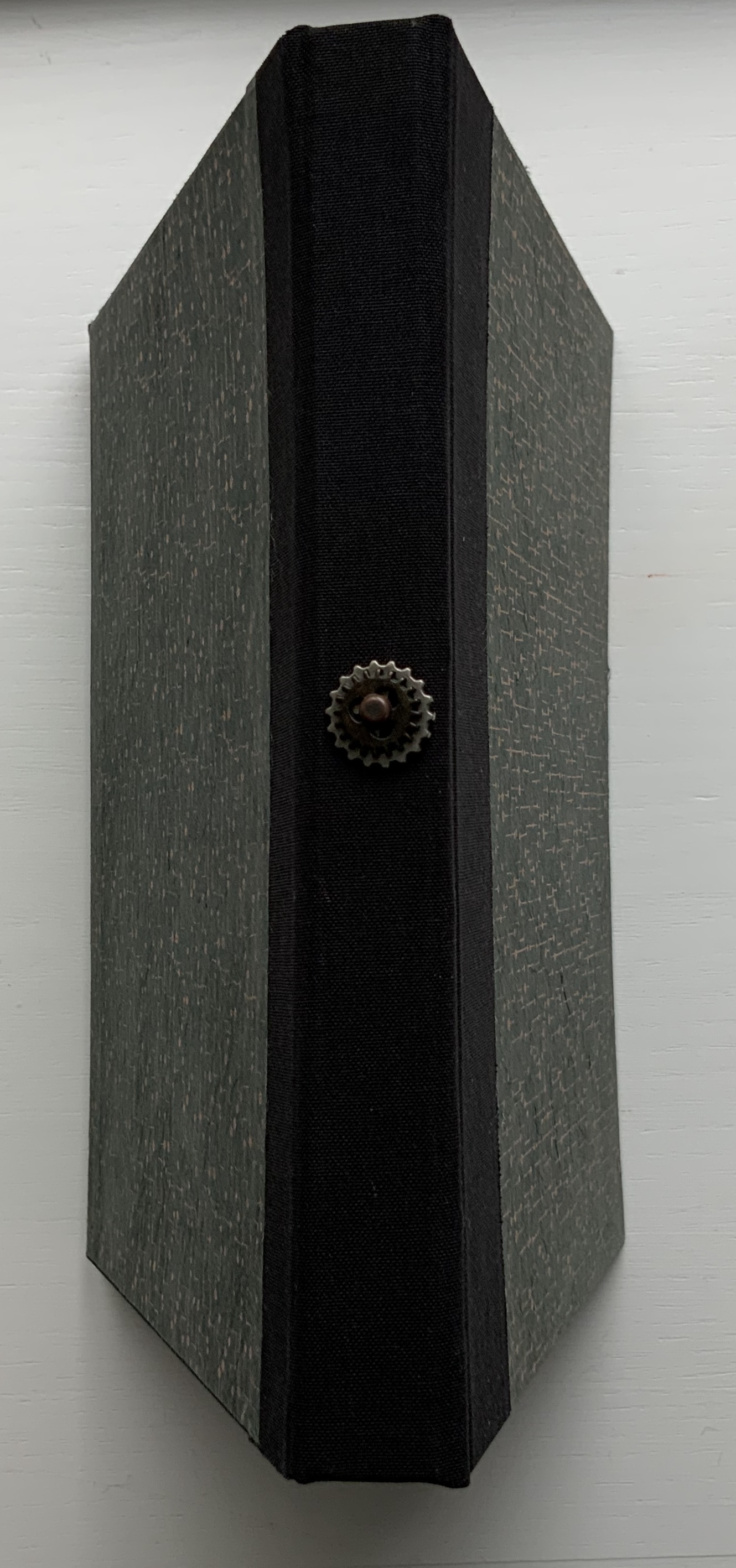
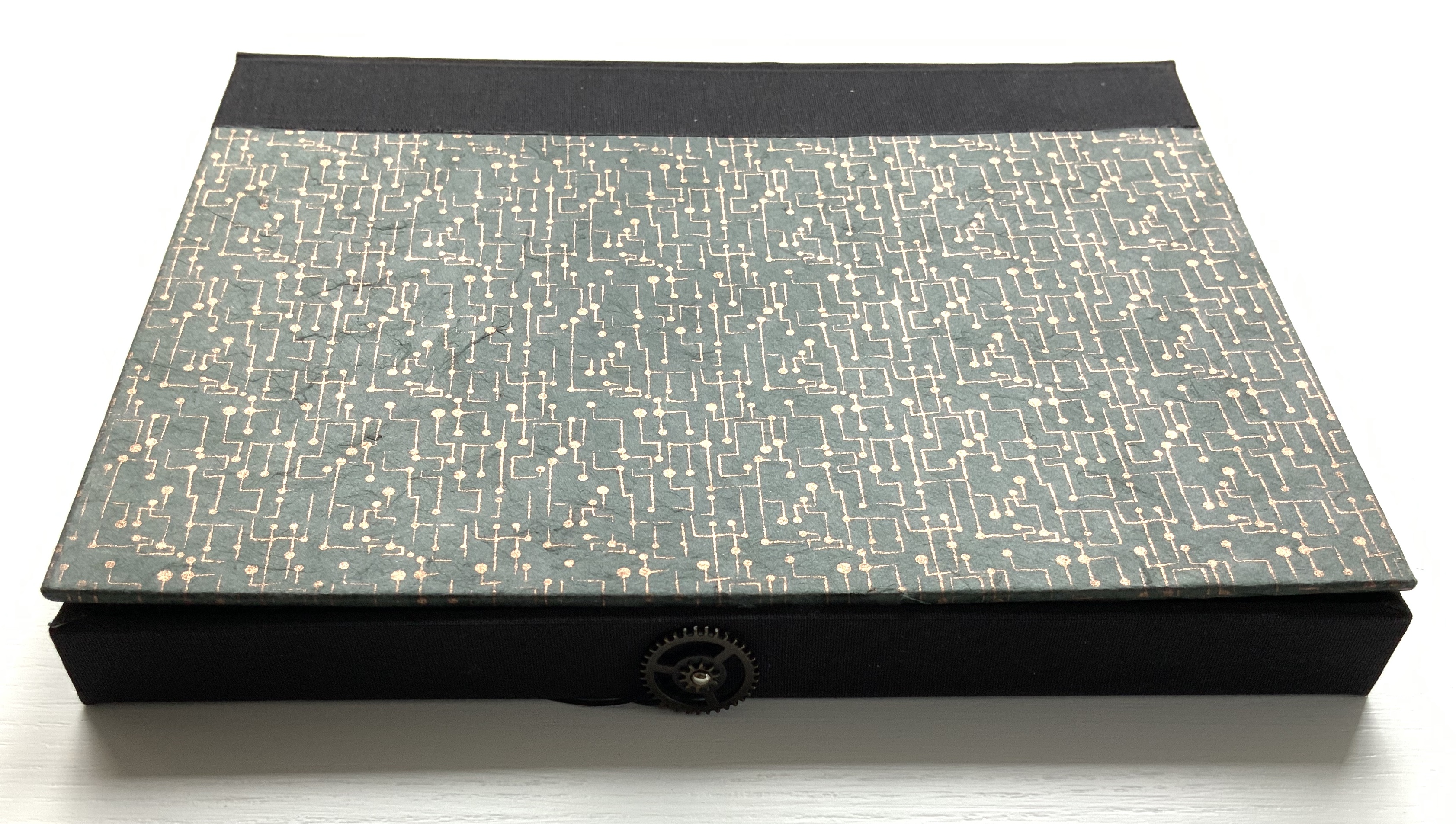
Designed and printed by Barbara Tetenbaum at Circle Press, Guildford. Handset 14 pt Optima printed on rag paper, artwork printed on Himalayan mitsumata paper. Edition of 75, of which this is #72. Acquired from Circle Press, 22 June 2015. Photos: Books On Books Collection. With permission of Maddy Paxman and the artist. “Machines” © Michael Donaghy Estate.
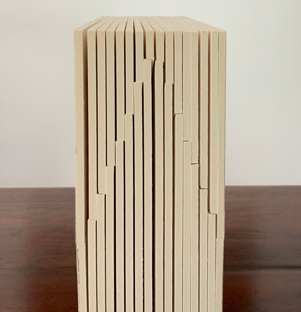
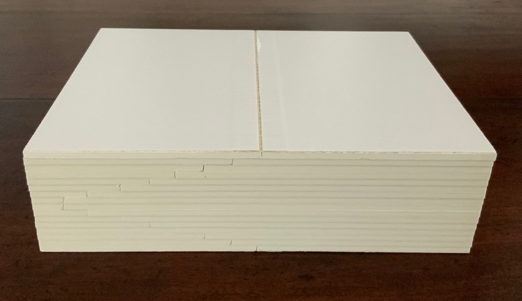
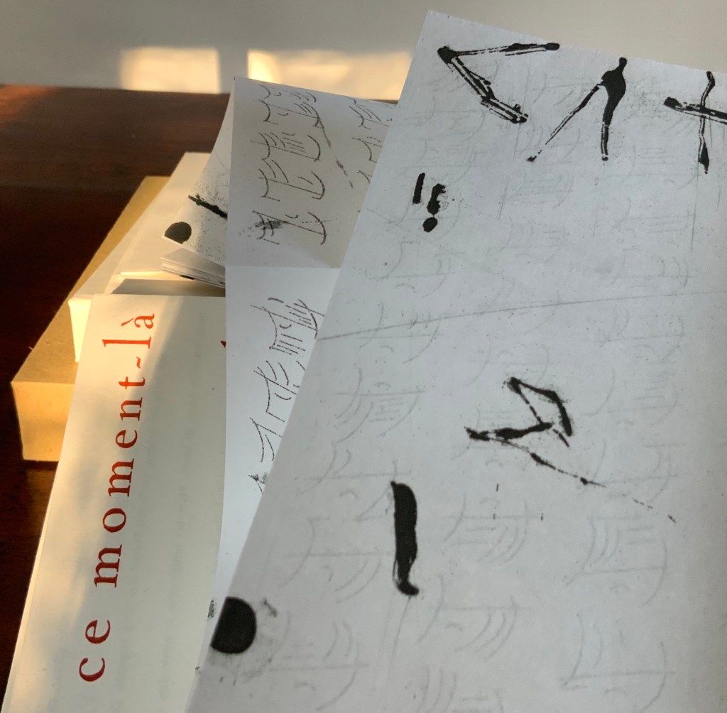
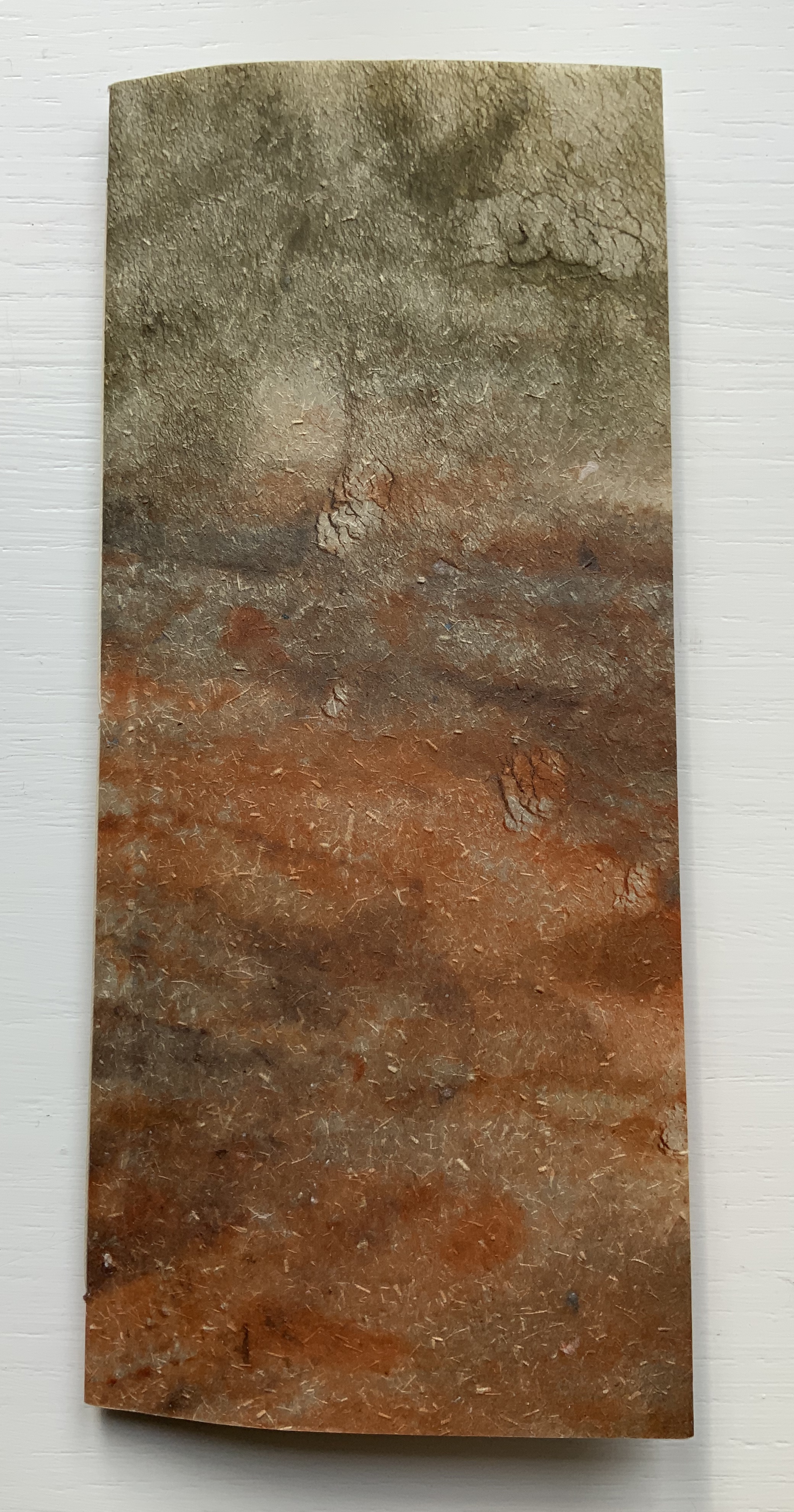
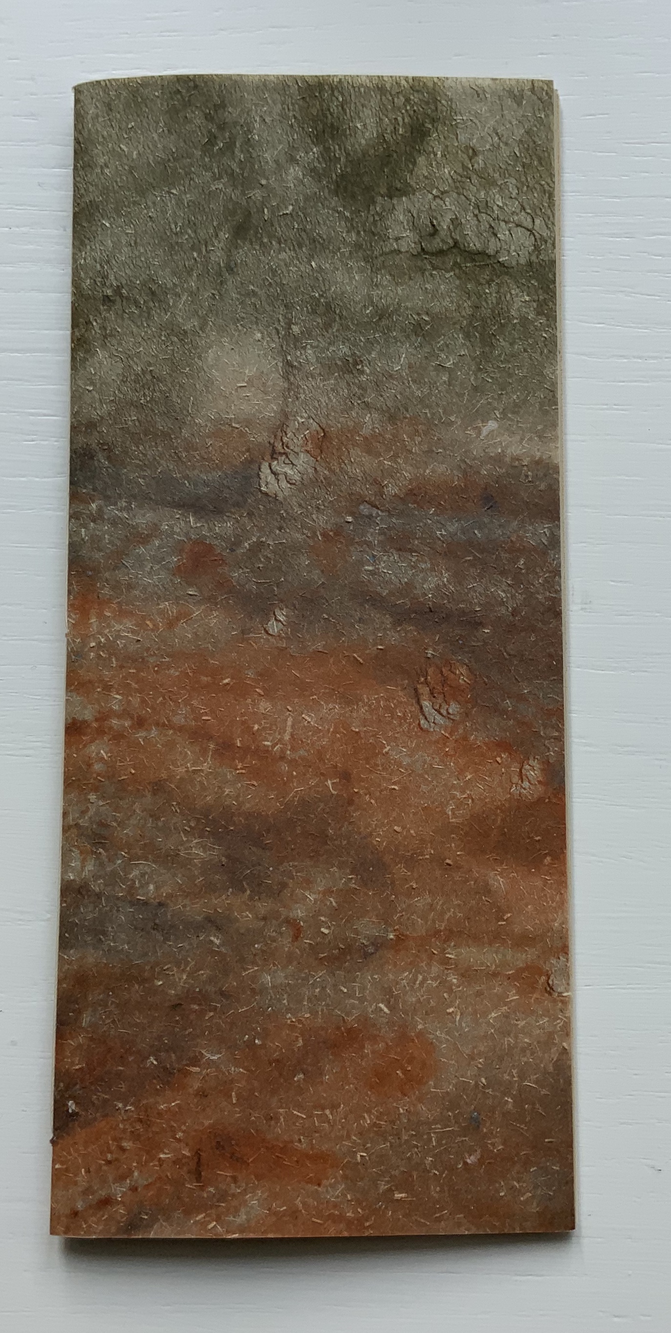
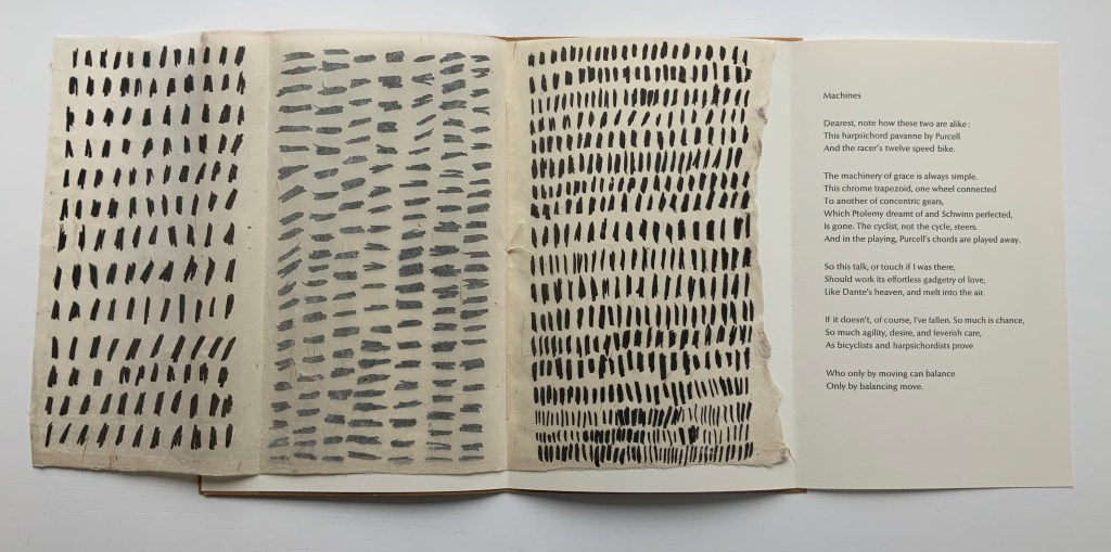
The cover is actually a large single deckle-edged sheet, trimmed at top and bottom then folded to quarters.
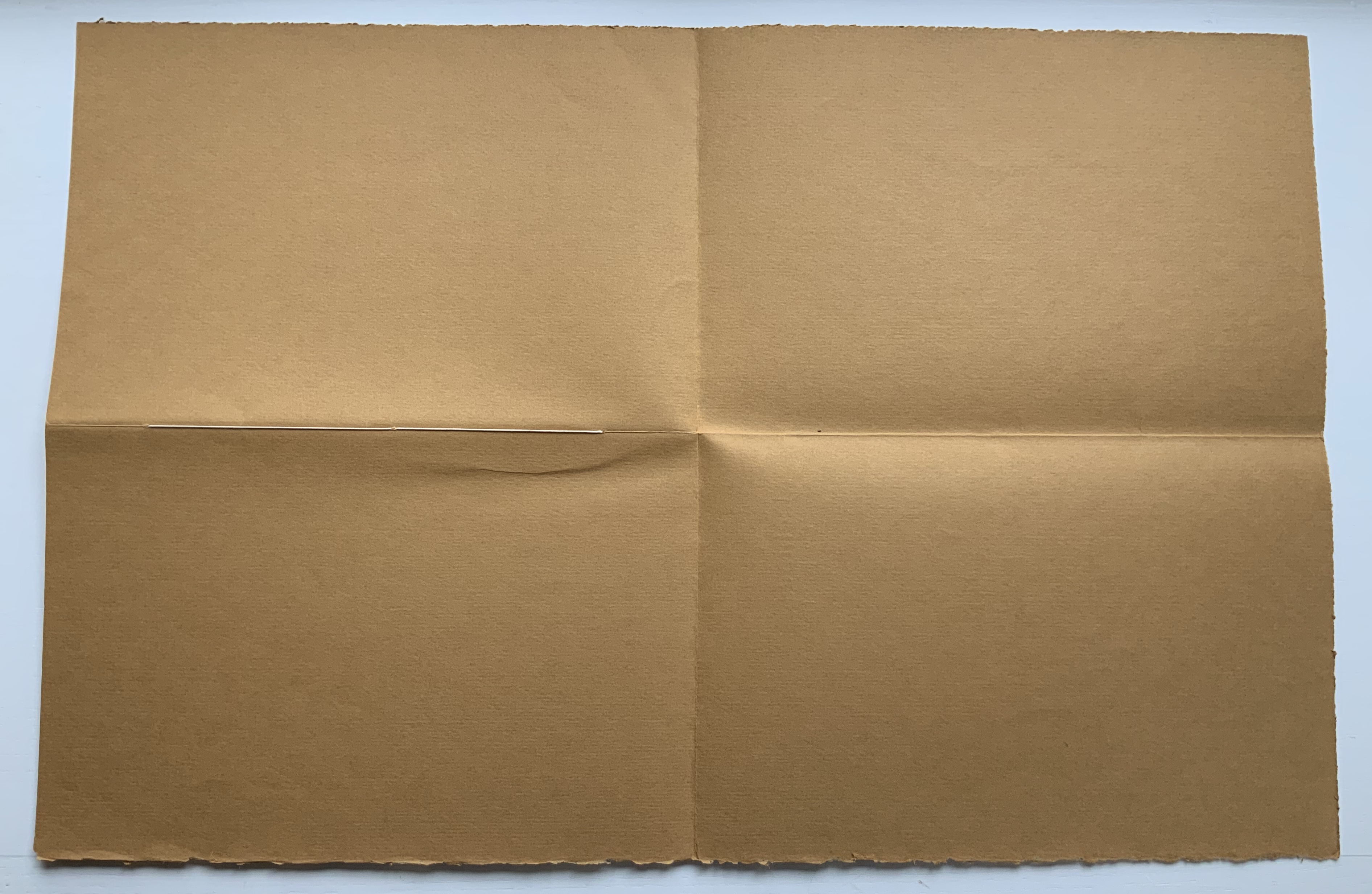

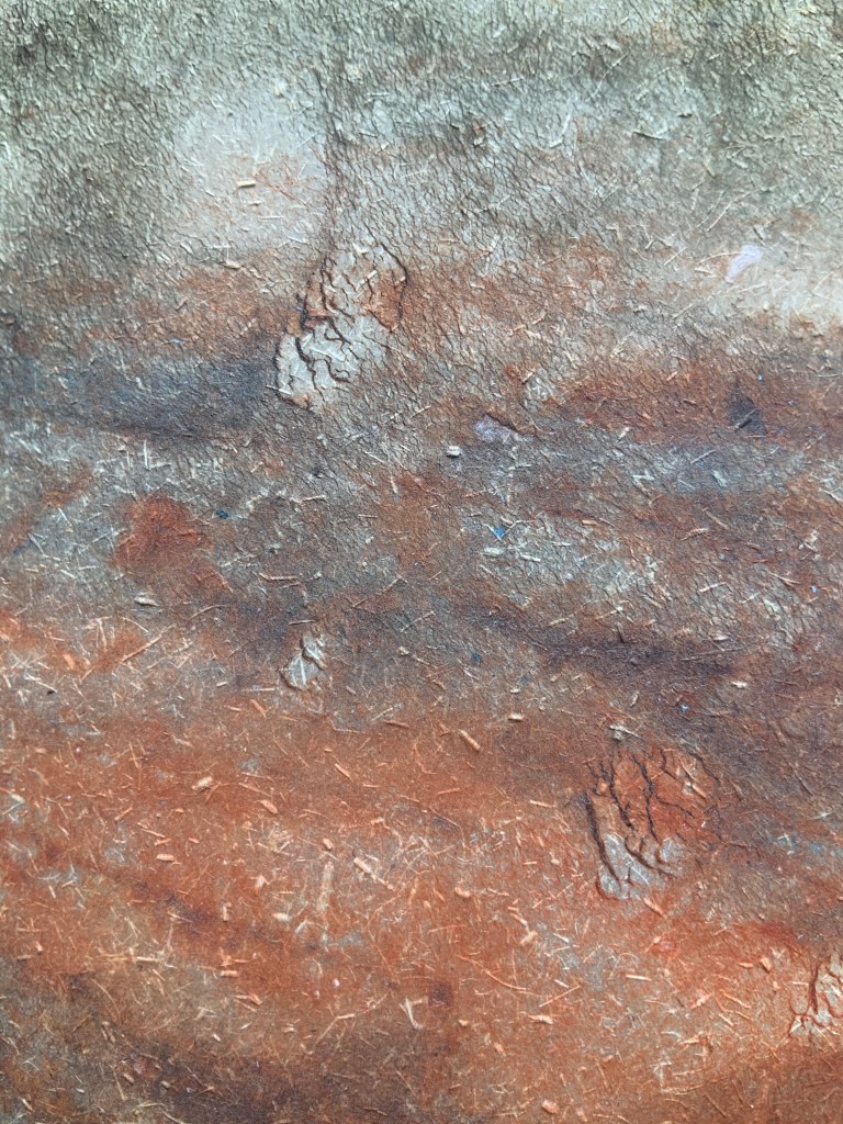
In addition to strengthening the cover, the folding protects the three-point single-thread binding that attaches two sheets of rag paper and one sheet of mitsumata paper to the cover.
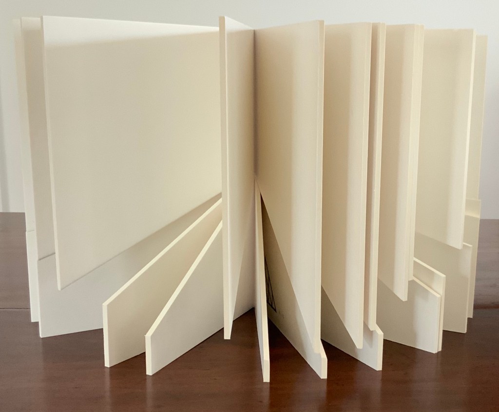
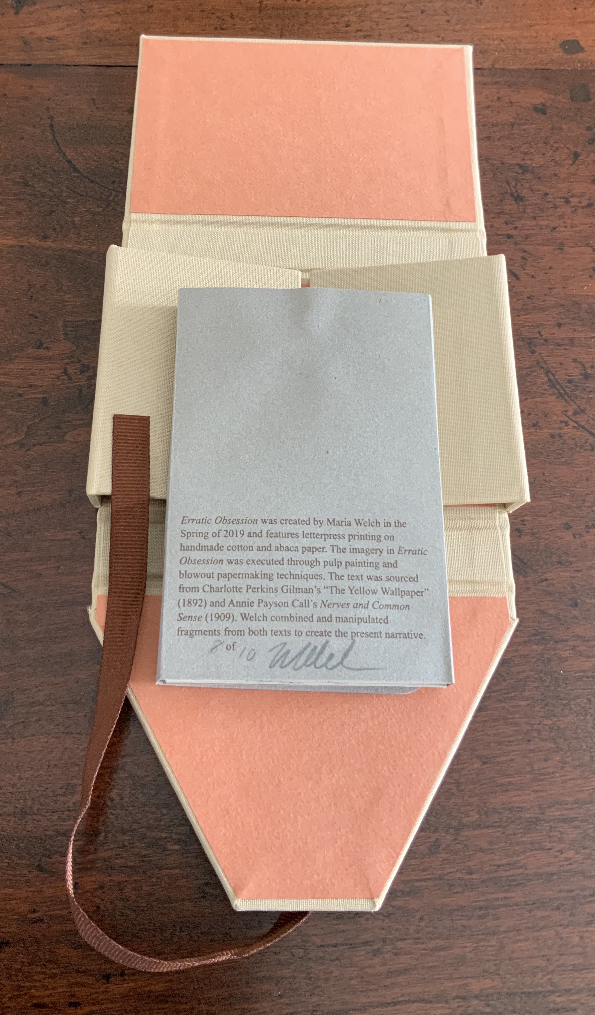
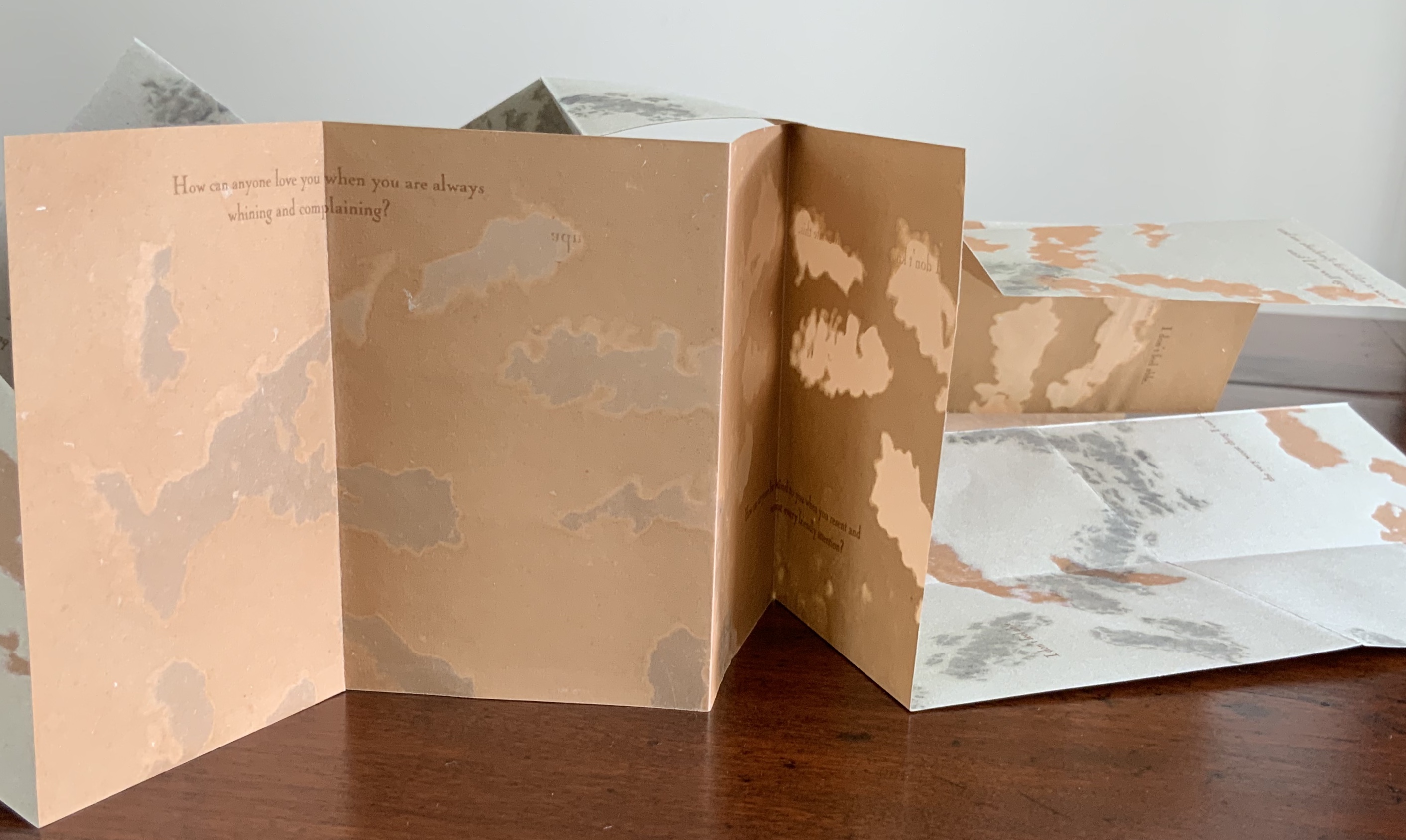
Structurally the pages have a subtle imbalance. The first sheet of rag, bearing the title and colophon, folds to two slightly unequal panels. The title page is wider than the colophon page.
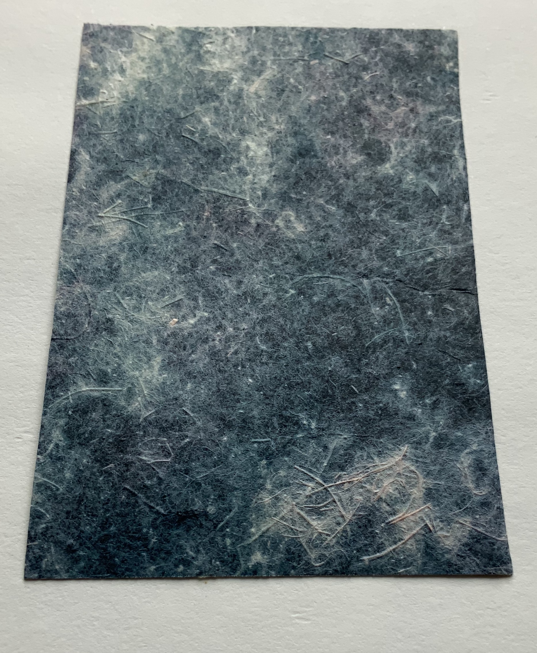
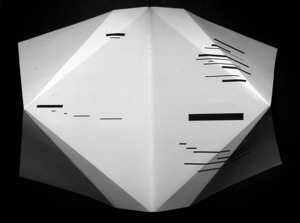
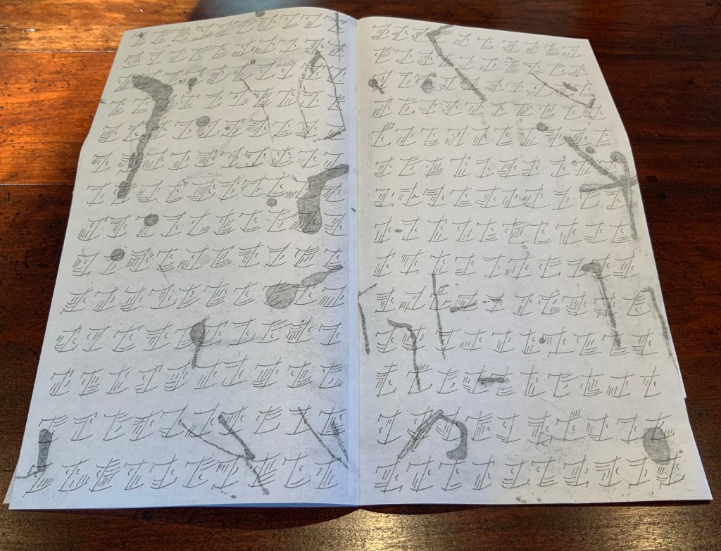
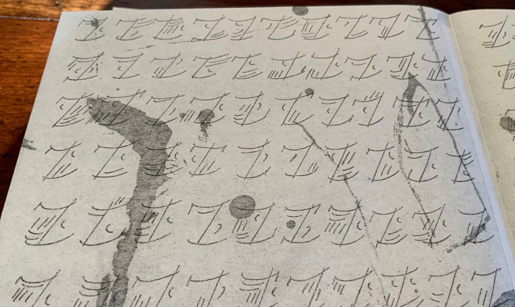
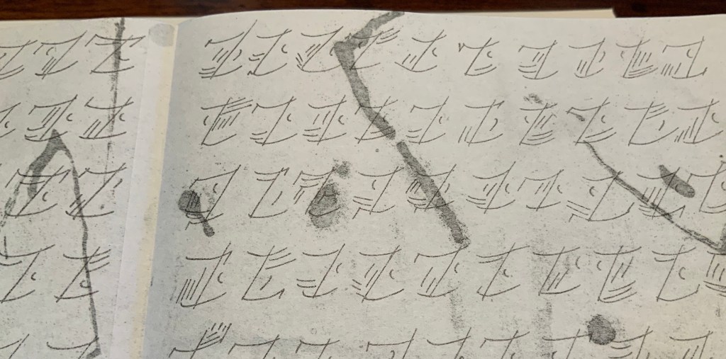
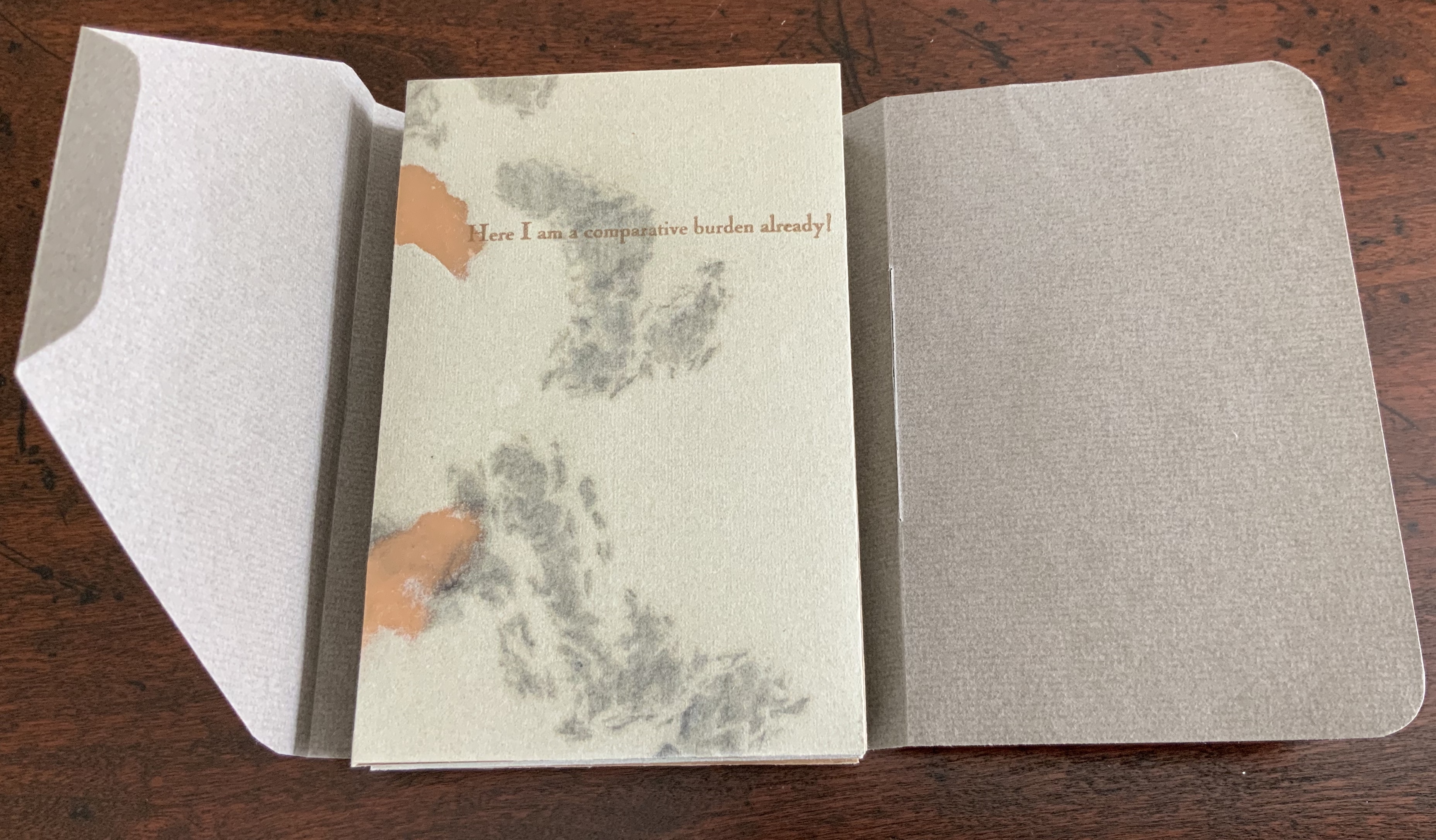
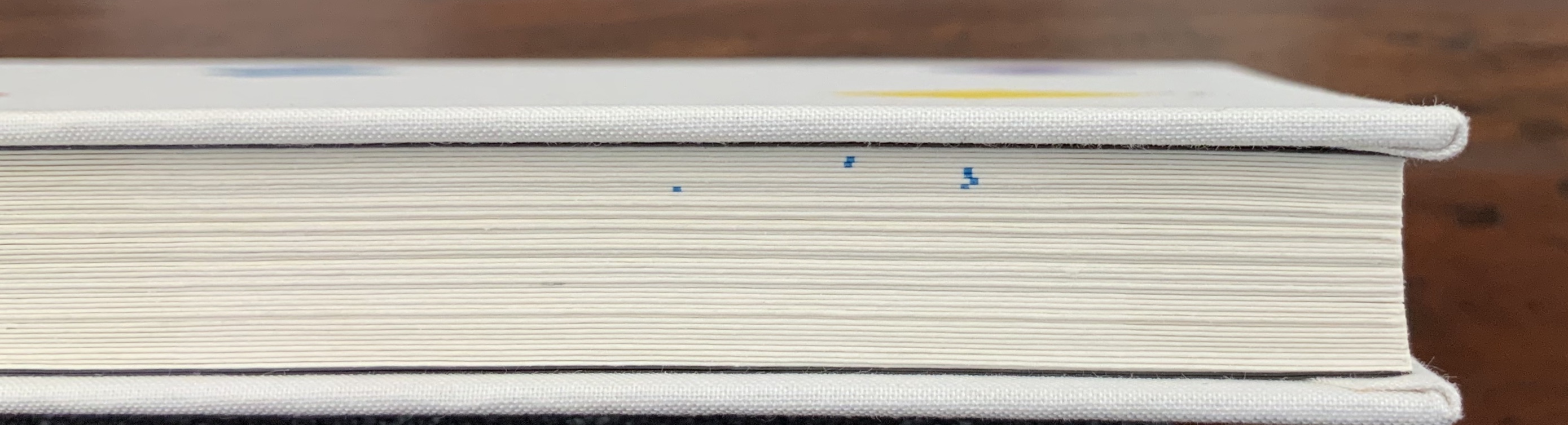
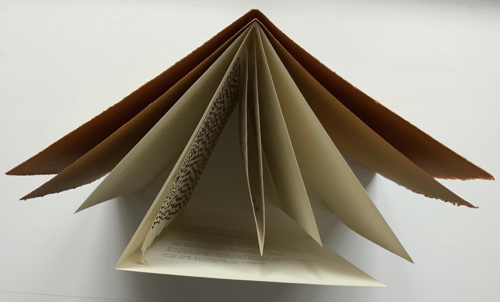
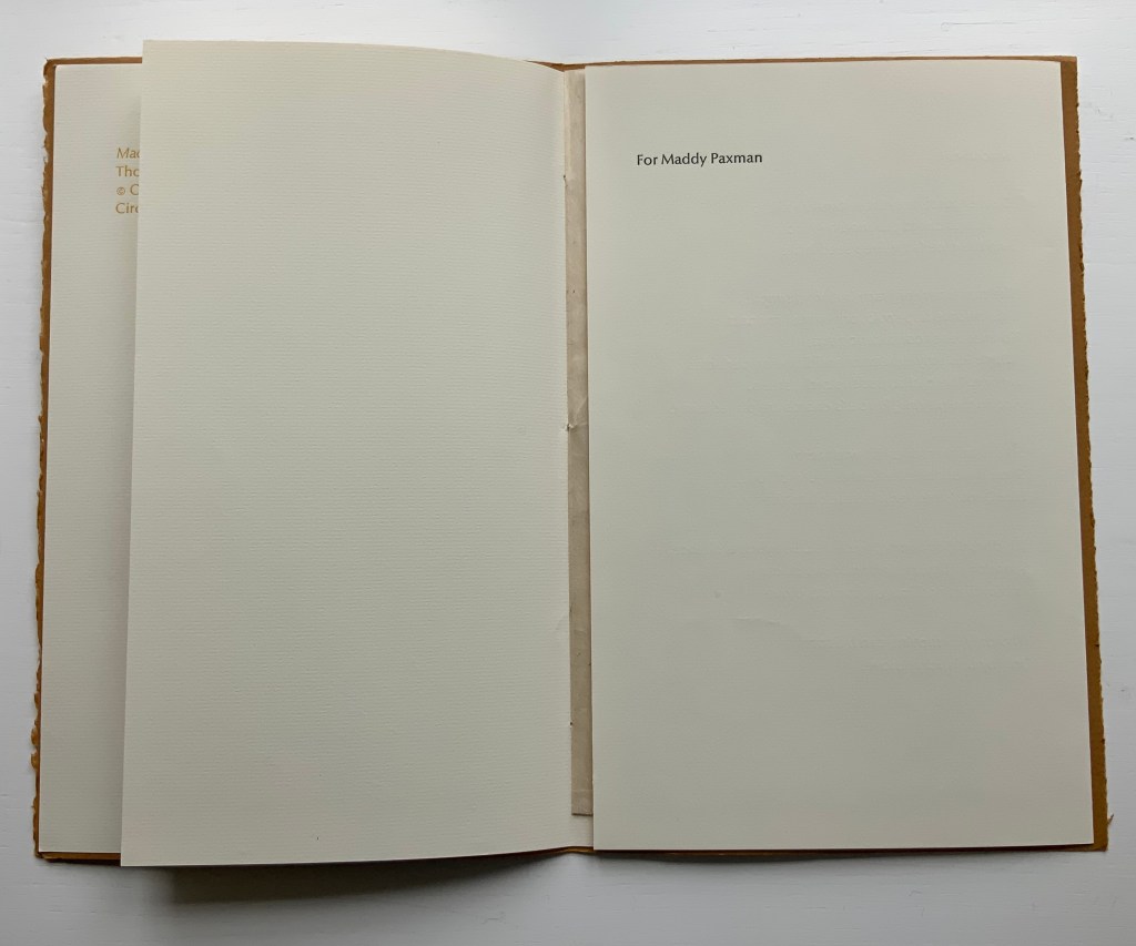
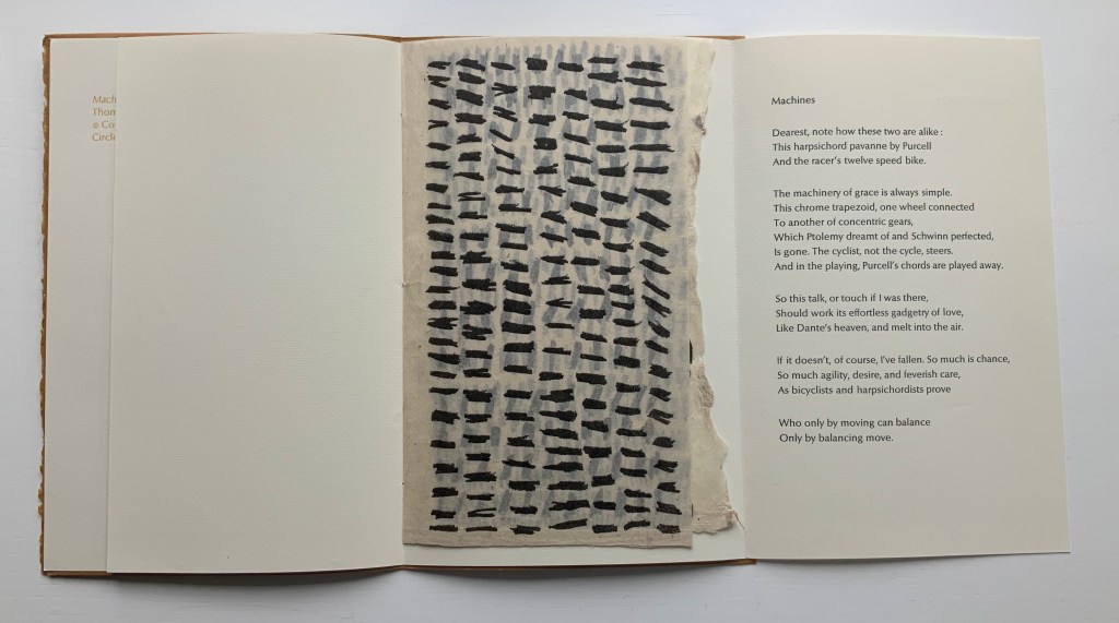
The second sheet folds to three unequal panels, the last bearing the dedication to Maddy Paxman on one side and the poem itself on the reverse. In a gestural embrace, the panels fold to envelop the sheet of mitsumata paper on which Tetenbaum’s marks appear.
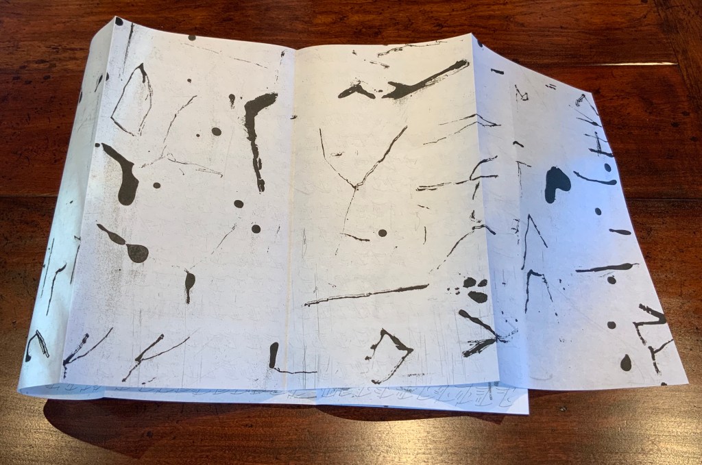
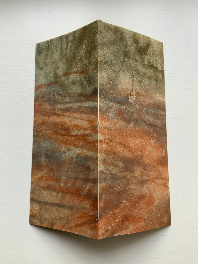
Also folded in “slightly off” thirds, the soft translucent mitsumata has an additional subtle imbalance. Unfolded for “reading”, the panels show a steady increase in the number of marks from left to right. Oddly though, the first and third panels show vertical marks, while the second’s are horizontal and printed on the other side of the sheet.
With permission of Maddy Paxman and the artist. “Machines” © Michael Donaghy Estate.
With permission of Maddy Paxman and the artist. “Machines” © Michael Donaghy Estate.
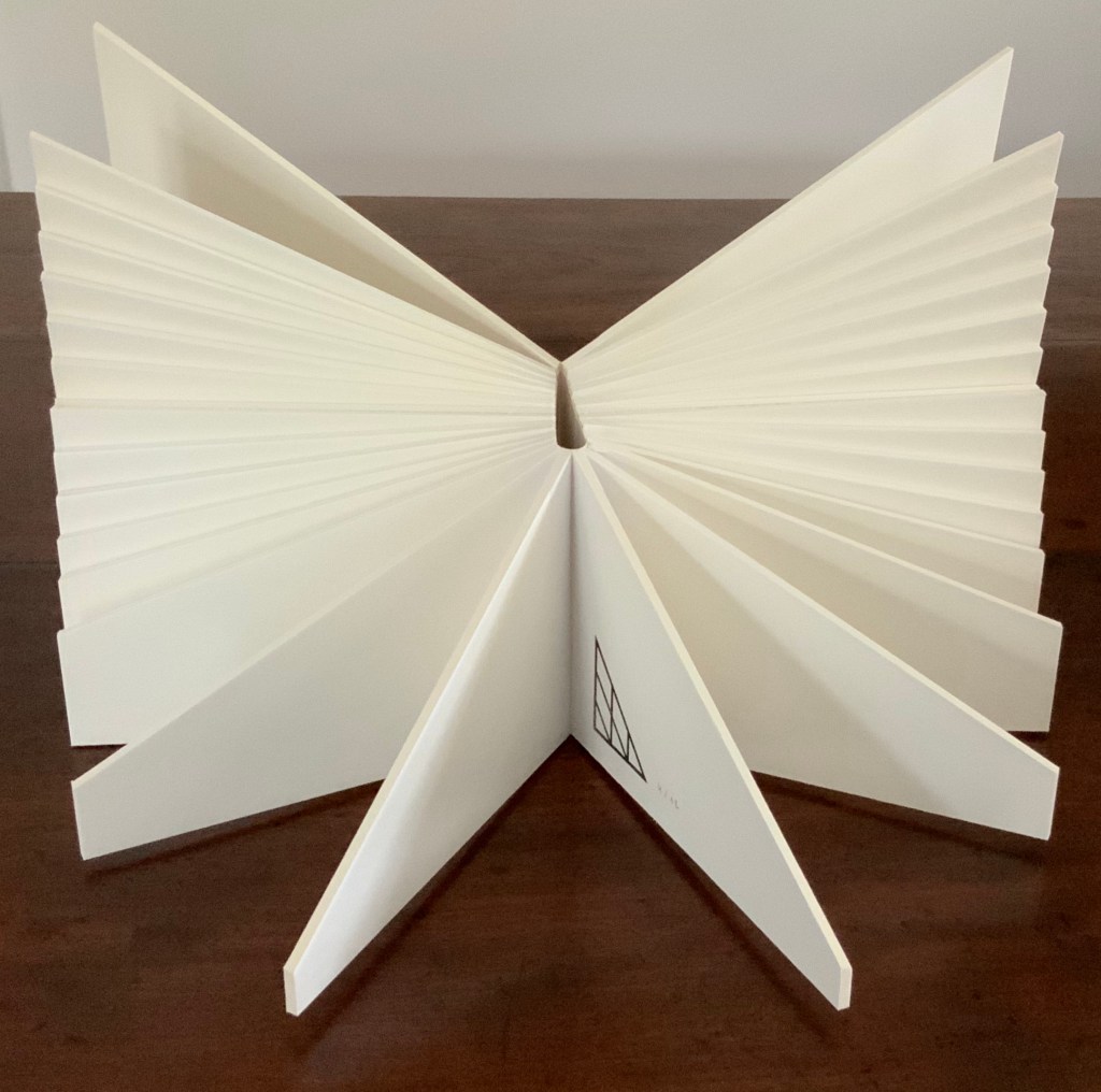
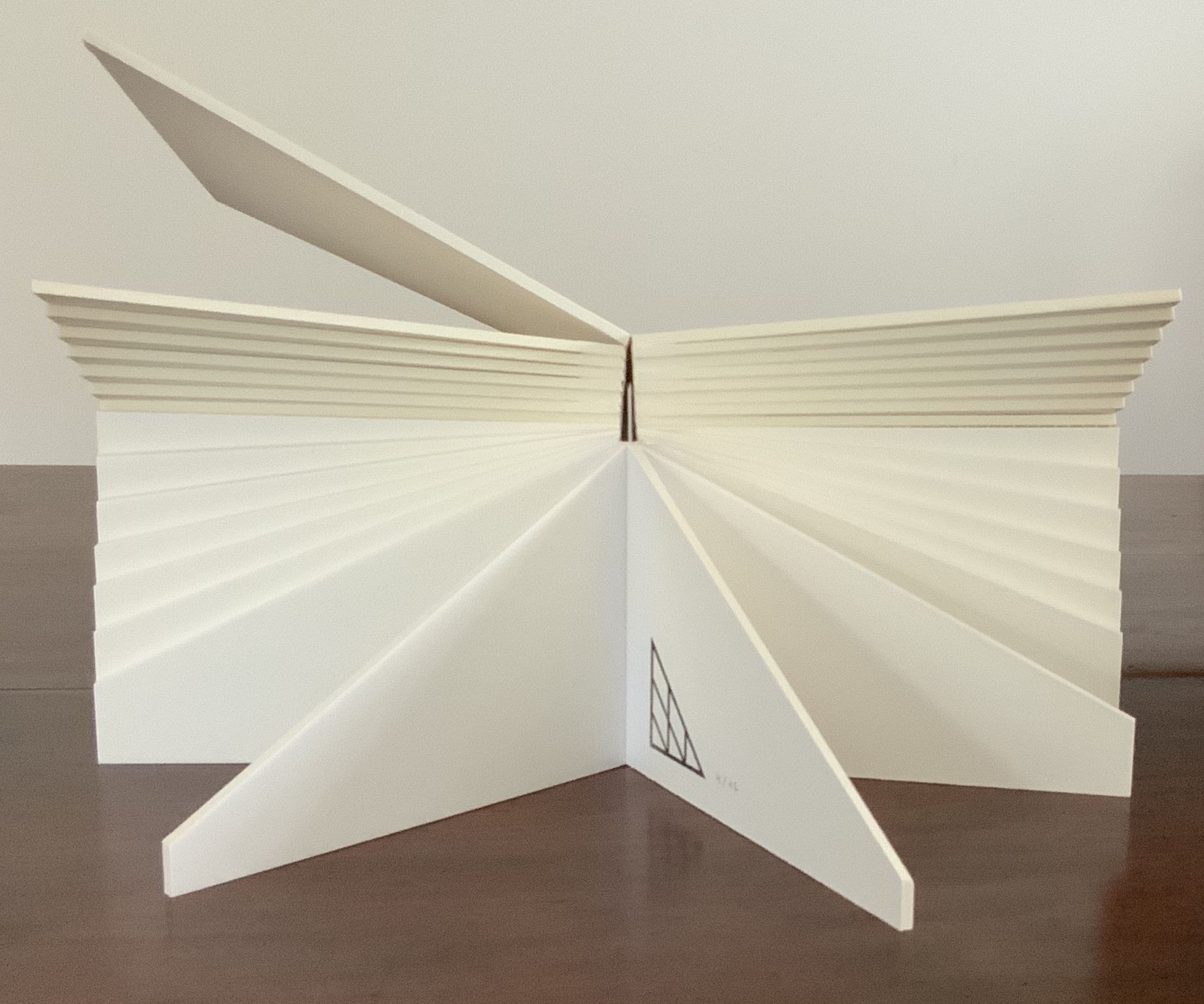
What is going on? The answer begins to appear from the view of the triptych of marks alongside the poem and its music. The columns of marks move left to right and down like the lines of verse. Taken together, the four panels achieve a forward-moving balance: vertical-horizontal-vertical- horizontal. Like a bicycle ride, the poem and marks start slowly, then move forward picking up speed — a natural outcome of a performative response to Donaghy’s poem.
But then, this is a view the artist did not fully intend. She writes, “The folding in the book was in part to allow the reader to have access to the poem without the intrusion of the visuals“. Listen though to Donaghy as he speaks the poem, which at the end appositely replies to the artist’s intention: “So much is chance, So much agility, desire and feverish care, As bicyclists and harpsichordists prove Who only by moving can balance Only by balancing move”. The same for the book artist. The varying folds and contrasting papers envelop, separate and blend art and text. Just as the asemic pulsing marks contrast with and mirror the rhythmic, rhyming text.
Before going on to the next artist, it is worth a short online detour for background on the mitsumata paper that Tetenbaum chose. The paper is handmade from the inner bark (or bast fibre) of a plant called mitsumata (argeli in Sikkim, India). A sustainable and renewable resource, the plants are cropped above ground level and reharvested after 3-4 years. Argeli’s scientific name is Edgeworthia gardneri, in honour of Michael Pakenham Edgeworth, botanist and civil servant in India, and for his half-sister, writer Maria Edgeworth. So much is colonial science, so much is literary chance.

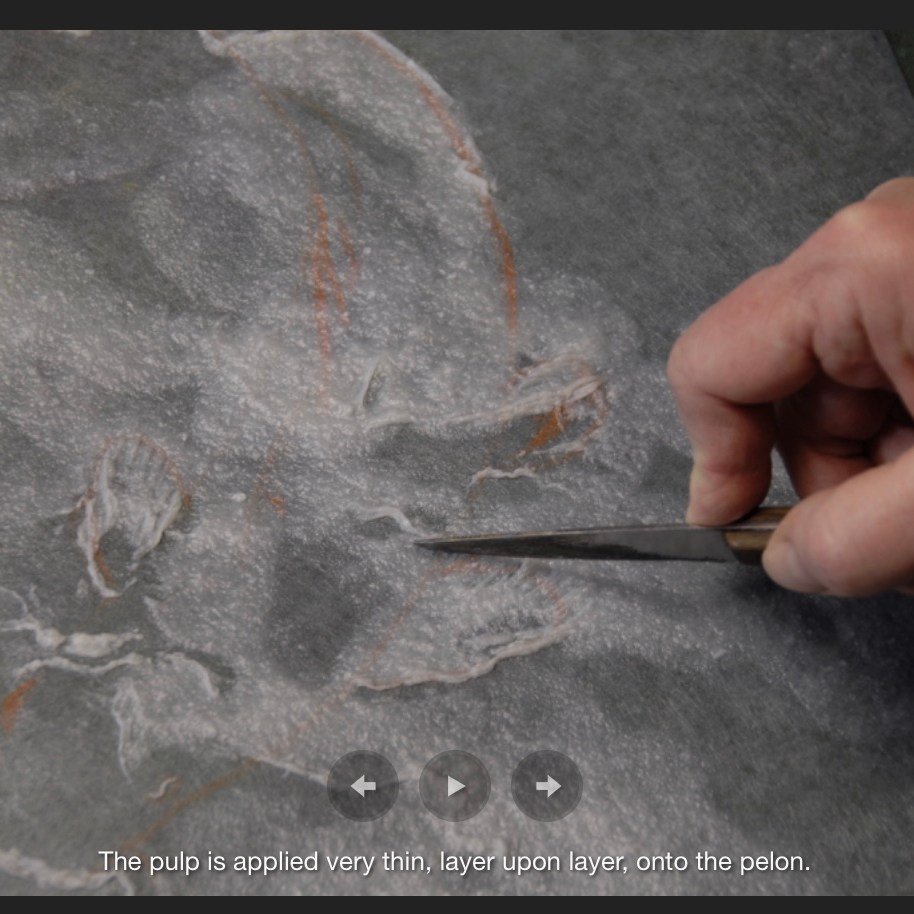
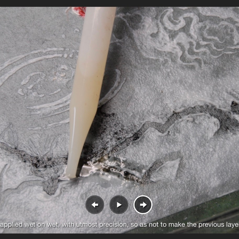
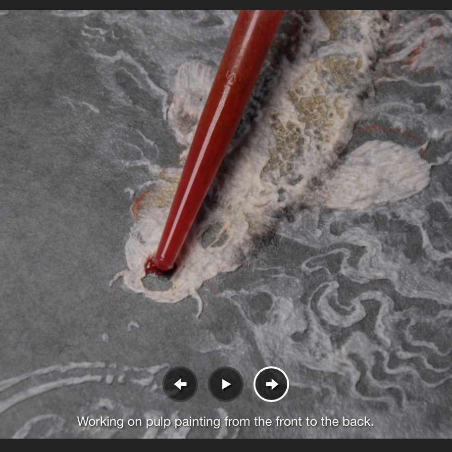
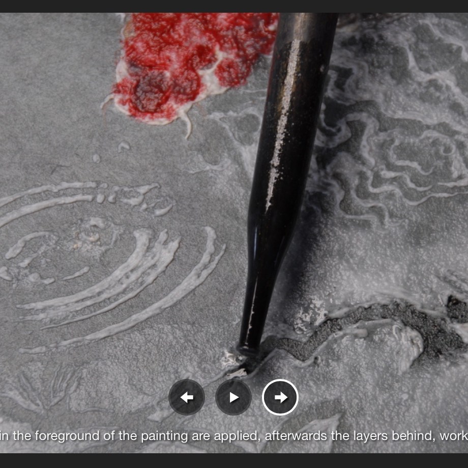
Mitsumata paper is made with the Japanese nagashizuki dipping and layering method of papermaking. From “Mountain Plants to Paper: A Sikkim Story“, documentary by Jaya Jaitly, Dastkari Haat Samiti, n.d. Accessed 25 September 2020.
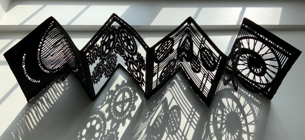
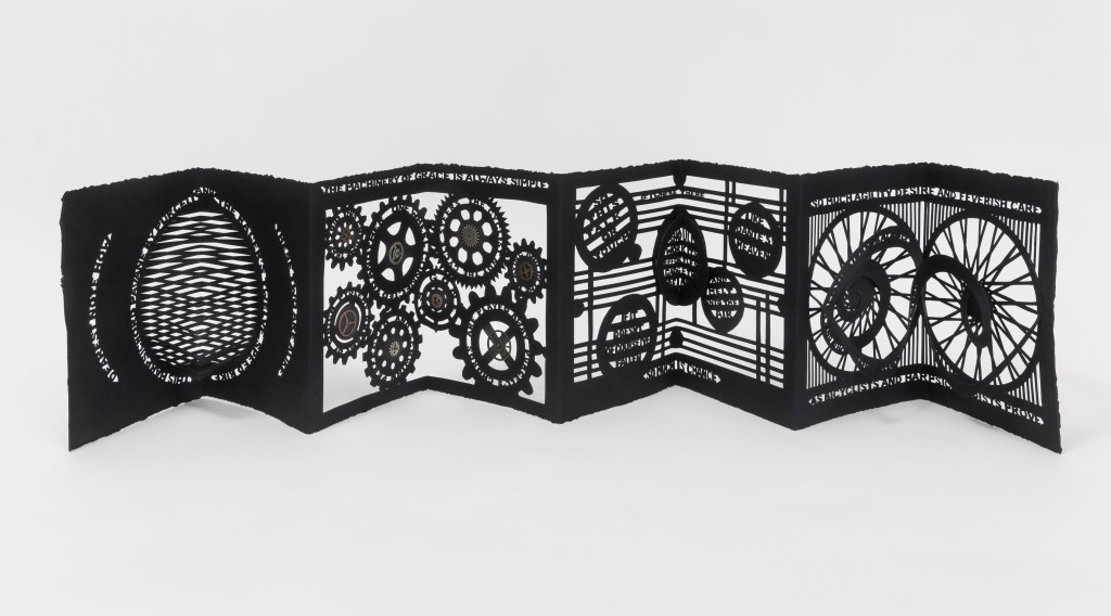
Béatrice Coron has dived into the mechanical and musical metaphors of the poem and emerged with a knife-cut leporello pop-up incorporating text, images and metal gears.
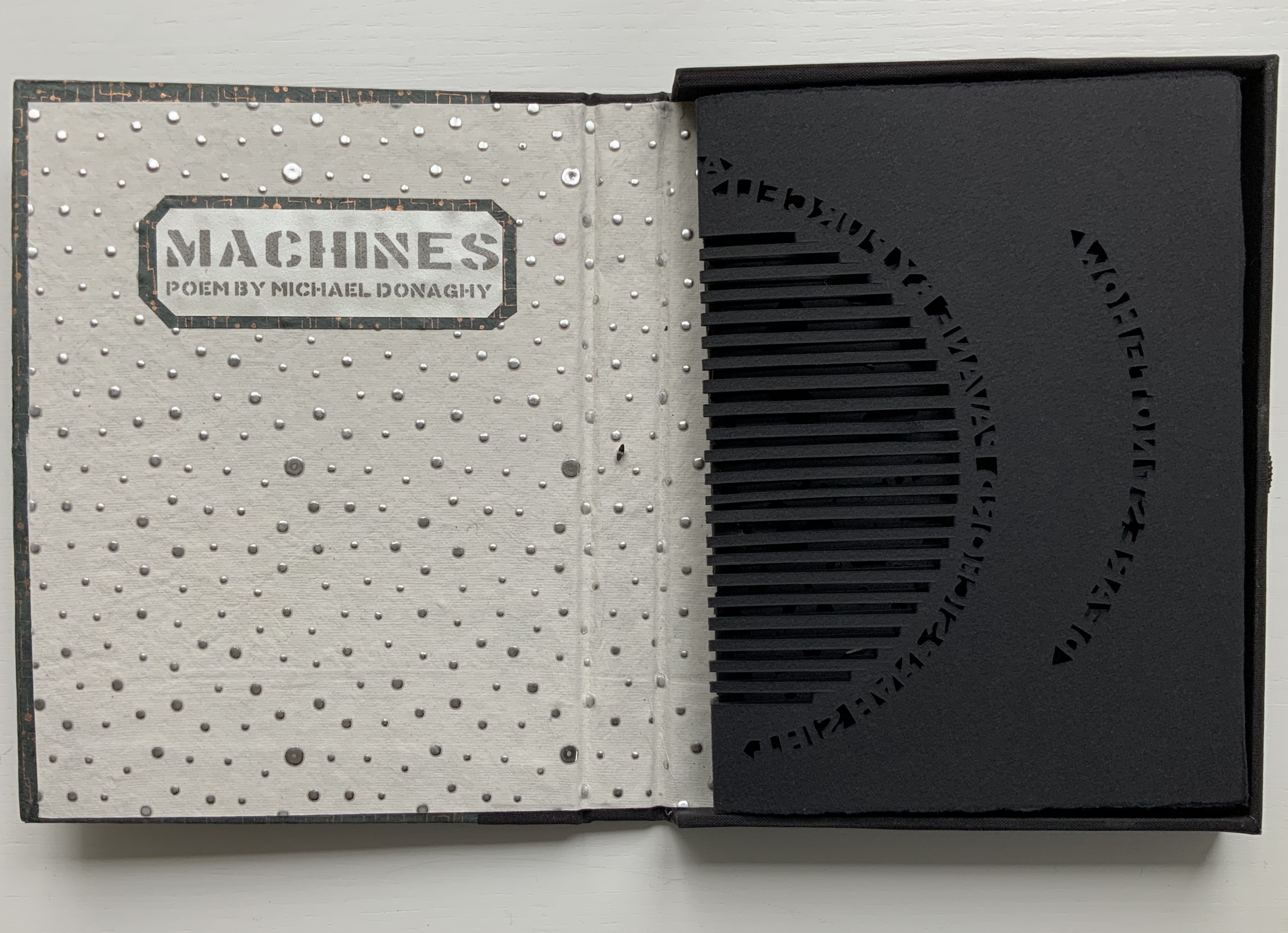
Machines: Poem by Michael Donaghy (2017)
Béatrice Coron
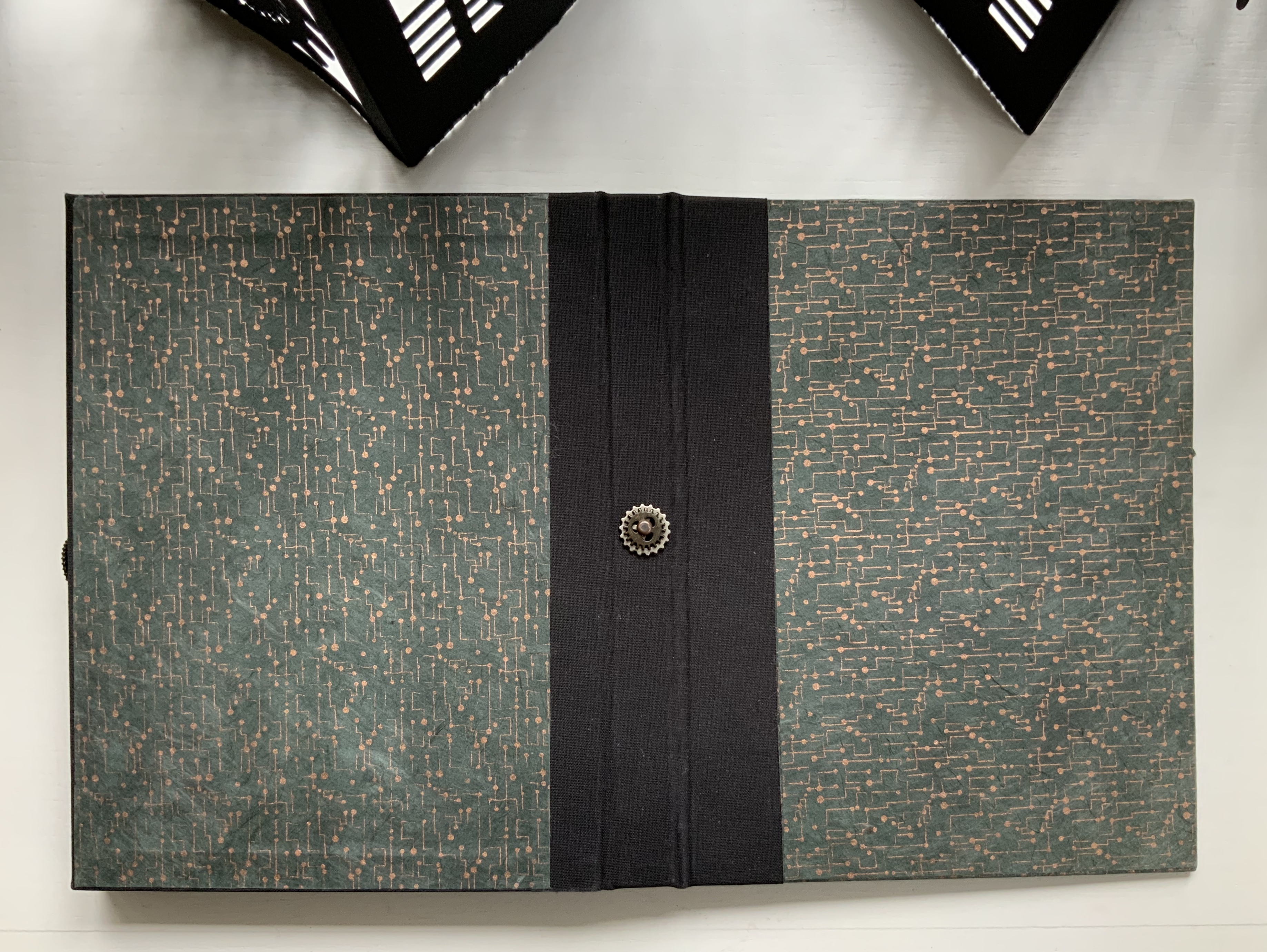
Leporello pop-up, enclosed in box with closure of small gear and black thread. Box: H205 x W162 x D27 mm. Leporello: H195 x W143 mm (closed), W1125 (open). Acquired from the artist, 31 July 2017. Photos: Books On Books Collection. With permission of the artist. “Machines” © Michael Donaghy Estate.
The black thread unwinds from the sprocket on the fore edge of the box, and the box opens to a pastedown title page sprinkled with drops of solder. The enclosed leporello unfolds to a tour de force of paper engineering.
First photo: Books On Books. Second photo: Etienne Frossard. With permission of Maddy Paxman and the artist. “Machines” © Michael Donaghy Estate.
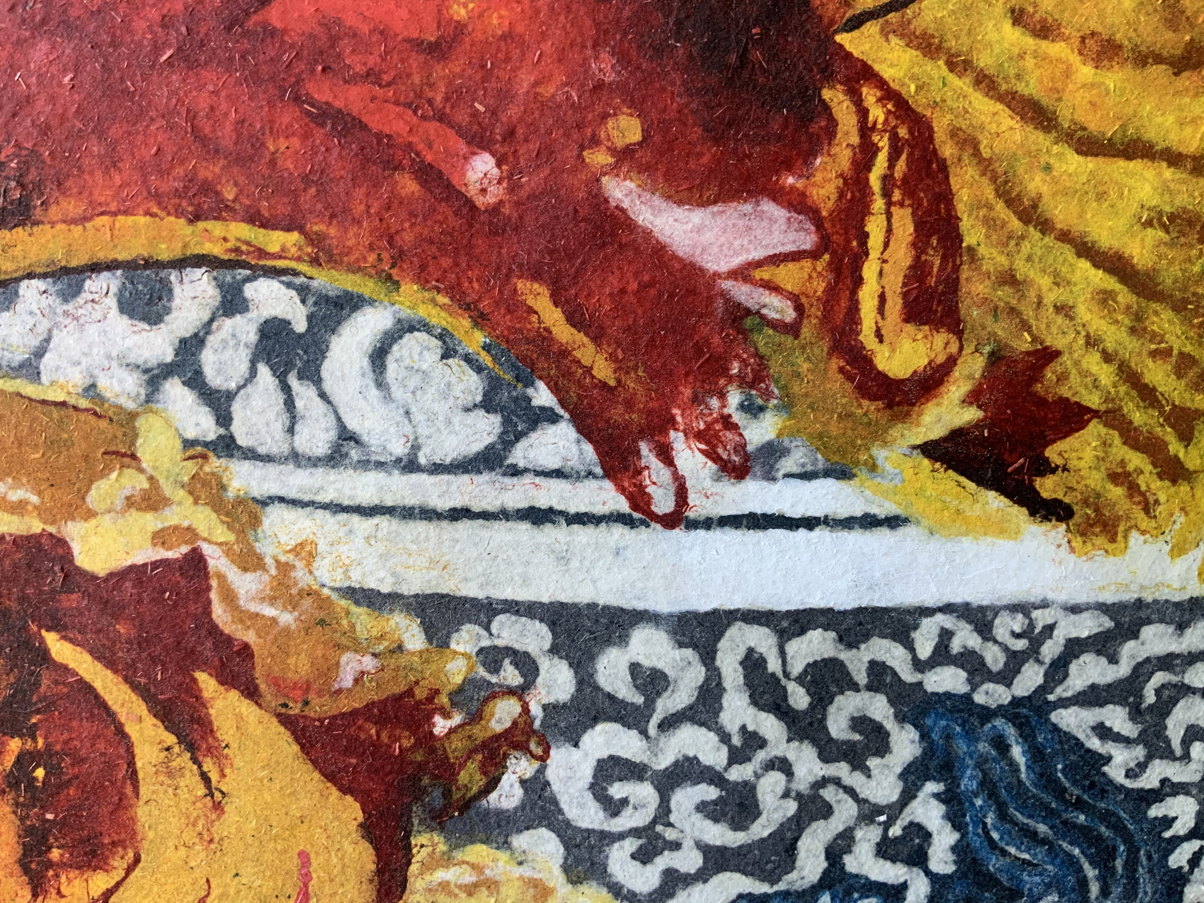
The first double-panel spread presents a centered fanfolded pop-up, whose slits and folds across the crease deliver a stroboscopic effect. Or that of a speaker vibrating with music. The words of the first stanza bracket the pop-up like parentheses representing motion or sound.
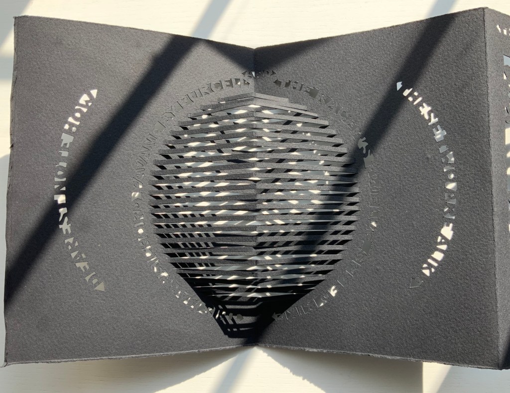
Photos: Books On Books. With permission of Maddy Paxman and the artist. “Machines” © Michael Donaghy Estate.
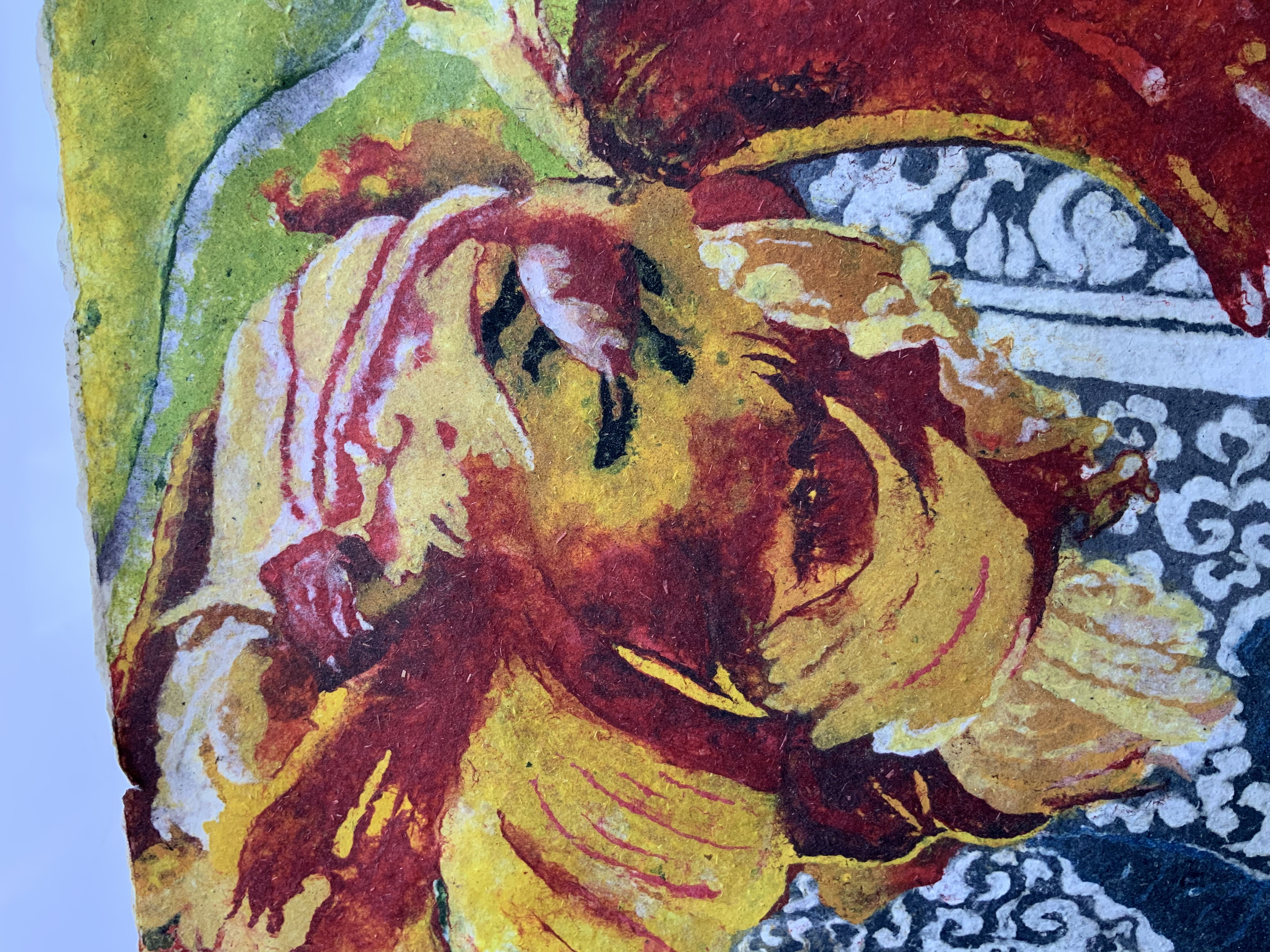
For the next double-panel spread, Coron takes the first line of the poem’s second stanza — “The machinery of grace is always simple” — and centers it appropriately at the top. The lines expanding on that statement are cut just below the teeth and into the circumference of interlocking gears. Along with their struts, rims and teeth, these gears are the only remains of this section of paper. Despite all that air and the weight of the small metallic flywheels and gears centered in the cutouts, the double-panel spread balances gracefully.
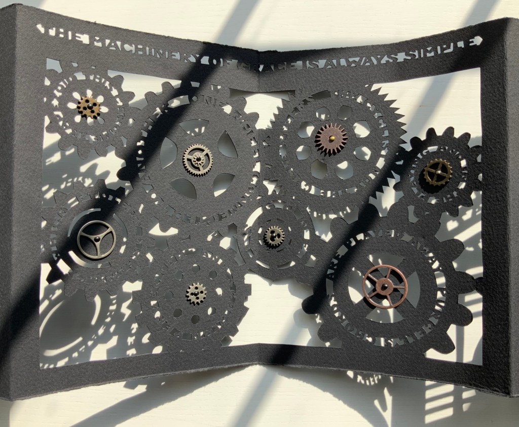
With permission of Maddy Paxman and the artist. “Machines” © Michael Donaghy Estate.
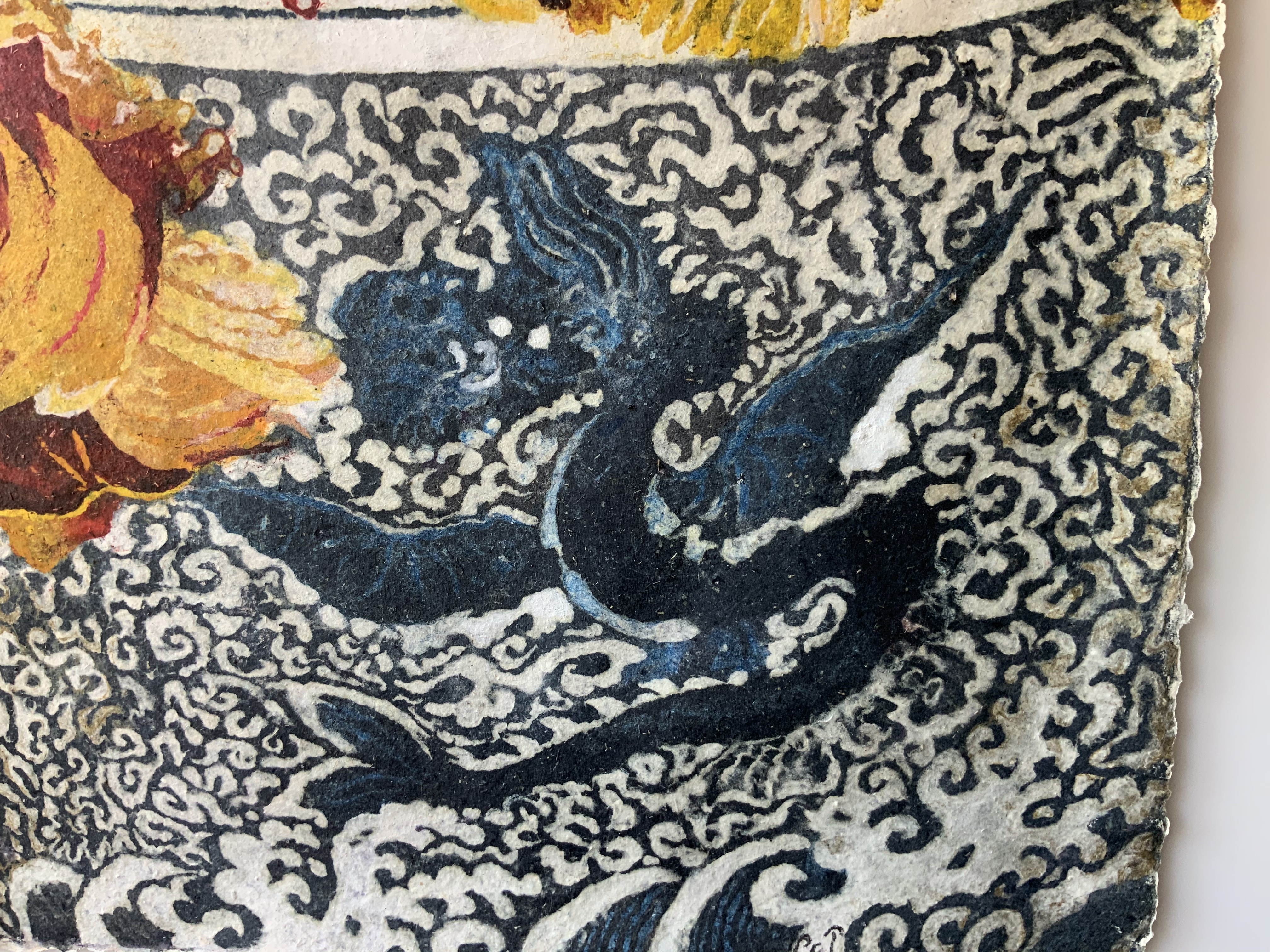
The floating layer technique is used for the third double-panel spread. The whole note (or circle) in the center hovers over the musical staves by virtue of hinged multi-tier paper supports. The words appearing between the staves and inside the whole notes (or rests?) take in all of the third stanza and first line of the fourth.
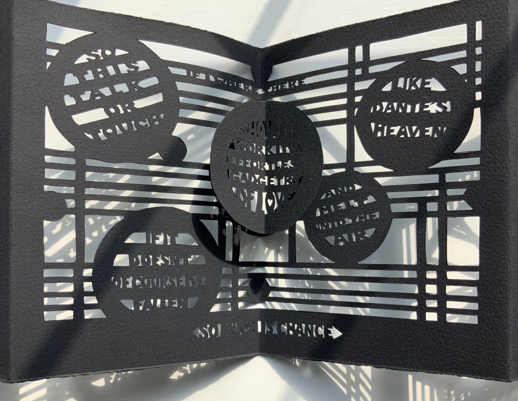
With permission of Maddy Paxman and the artist. “Machines” © Michael Donaghy Estate.
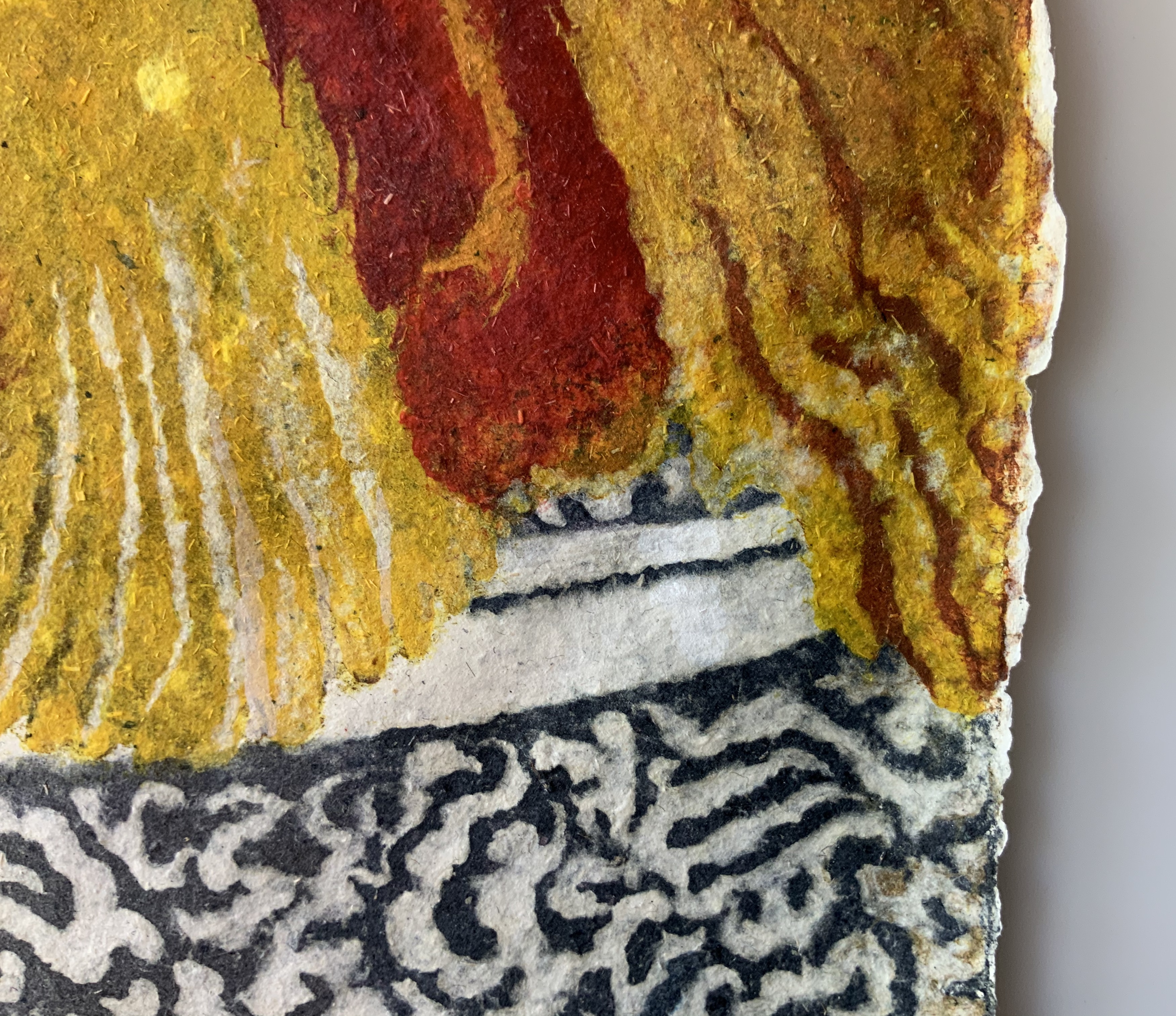
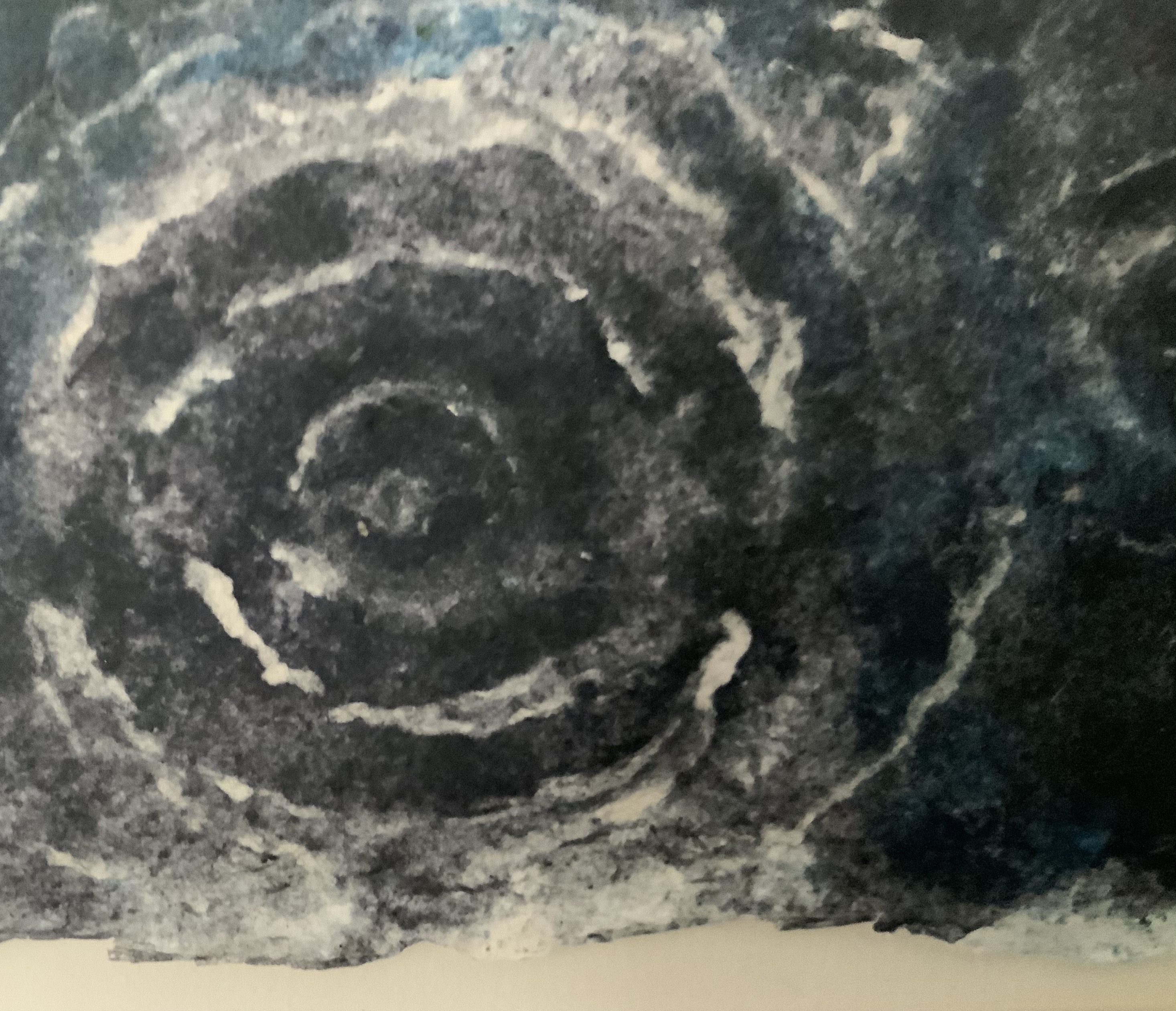
The remaining lines of the poems are cut above, below and into two interlinked spiral pop-ups. Normally a spiral is cut from a circle on one page, and one end of it is attached to the facing page. Here, with this variant on the technique, Coron give us the two bicycle wheels linked by a chain, or perhaps two treble clefs fallen over.
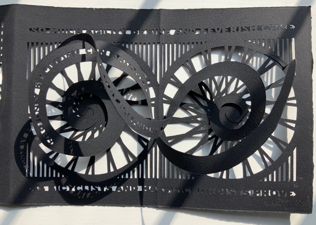
With permission of Maddy Paxman and the artist. “Machines” © Michael Donaghy Estate.
Coron’s and Tetenbaum’s palettes reflect the rich diversity of book art. With a few elements in common from the book arts, these two very different works, engaging the same poem, speak to the eclecticism of the Books On Books Collection and some of its underlying themes. One is the meaningful materiality of book art as well as its haptic pleasure — be it in the structure, paper, the type or lettering or marking, the colors, the balance of image and text, or that of shape and space.
The second is a particular kind of engagement with literature. Not all of the book art in the collection engages with literature, but that which does performs a sort of inverse ekphrasis, where the poem engenders the work of art. So distinctively different in their responses, the two works show that, even within that underlying theme, eclecticism seems inevitable.
And finally, the last of the three is chance. As noted, the poem itself addresses the role of chance in the “gadgetry of love” and creativity. But what of this then? When Donaghy reviewed the proofs of Tetenbaum’s typesetting, he called out the presence of one extra word that threw off the meter. The type had to be reset. When Coron’s rendering was opened and inspected, the collector called out the absence of one word. The leporello had to return for recutting. Mirrored typos thirty-one years apart — now there’s chance.
Further Reading and Listening
Carter, David A. and Diaz, James, The Elements of Pop-Up, A Pop-Up Book for Aspiring Paper Engineers (New York: Little Simon, 1999).
Coron, Béatrice. Interview with Steve Miller, Book Arts Podcasts, School of Library Information and Sciences, University of Alabama, September 2011.
Coron, Béatrice. Interview with Helen Hiebert, Paper Talk Podcast, 22 August 2020.
Donaghy, Michael. Collected Poems (London: Macmillan, 2014).
Ferguson, Margaret W.; Mary Jo Salter; Jon Stallworthy (eds.). The Norton Anthology of Poetry (New York: W.W. Norton, 2005).
Paterson, Don. Smith : a reader’s guide to the poetry of Michael Donaghy (London: Picador, 2014).
Tetenbaum, Barbara. Interview with Claudia Hamilton, Book Arts Podcasts, School of Library Information and Sciences, University of Alabama, 13 January 2006.
Tetenbaum, Barbara. Interview with Sarah Lange, University of Wisconsin-Madison Book Arts: Oral History, 18 June 2018.
Tetenbaum, Barbara. Correspondence with Books On Books. 22 September 2020.