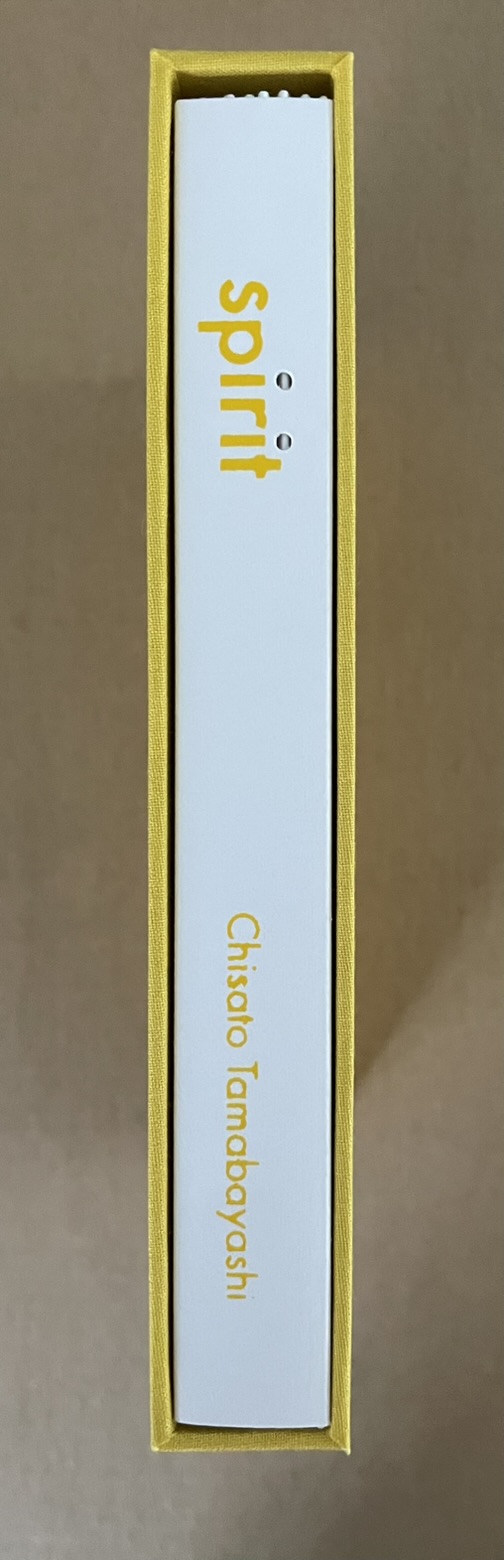
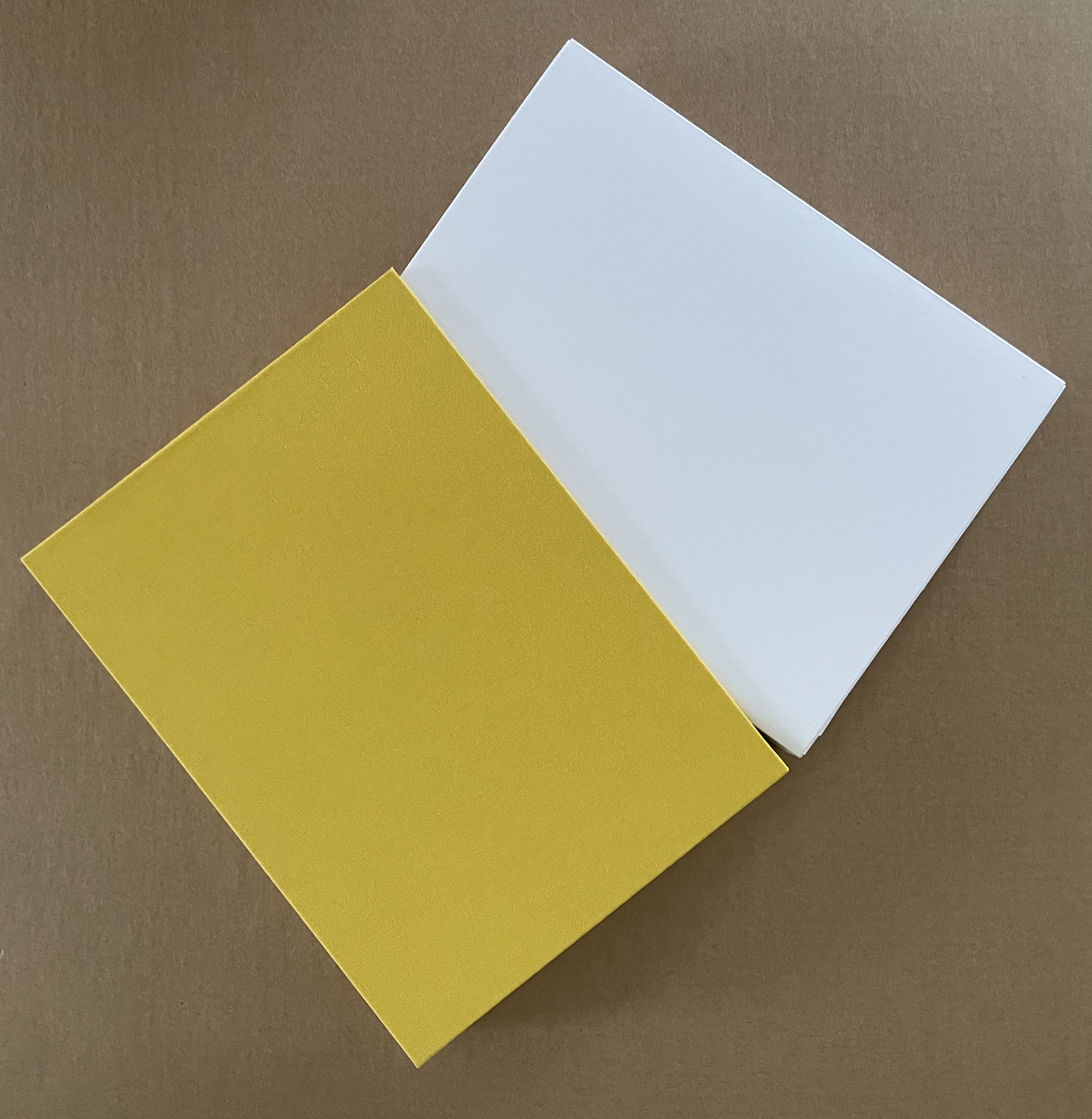
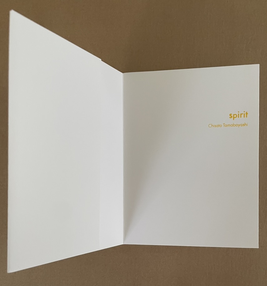
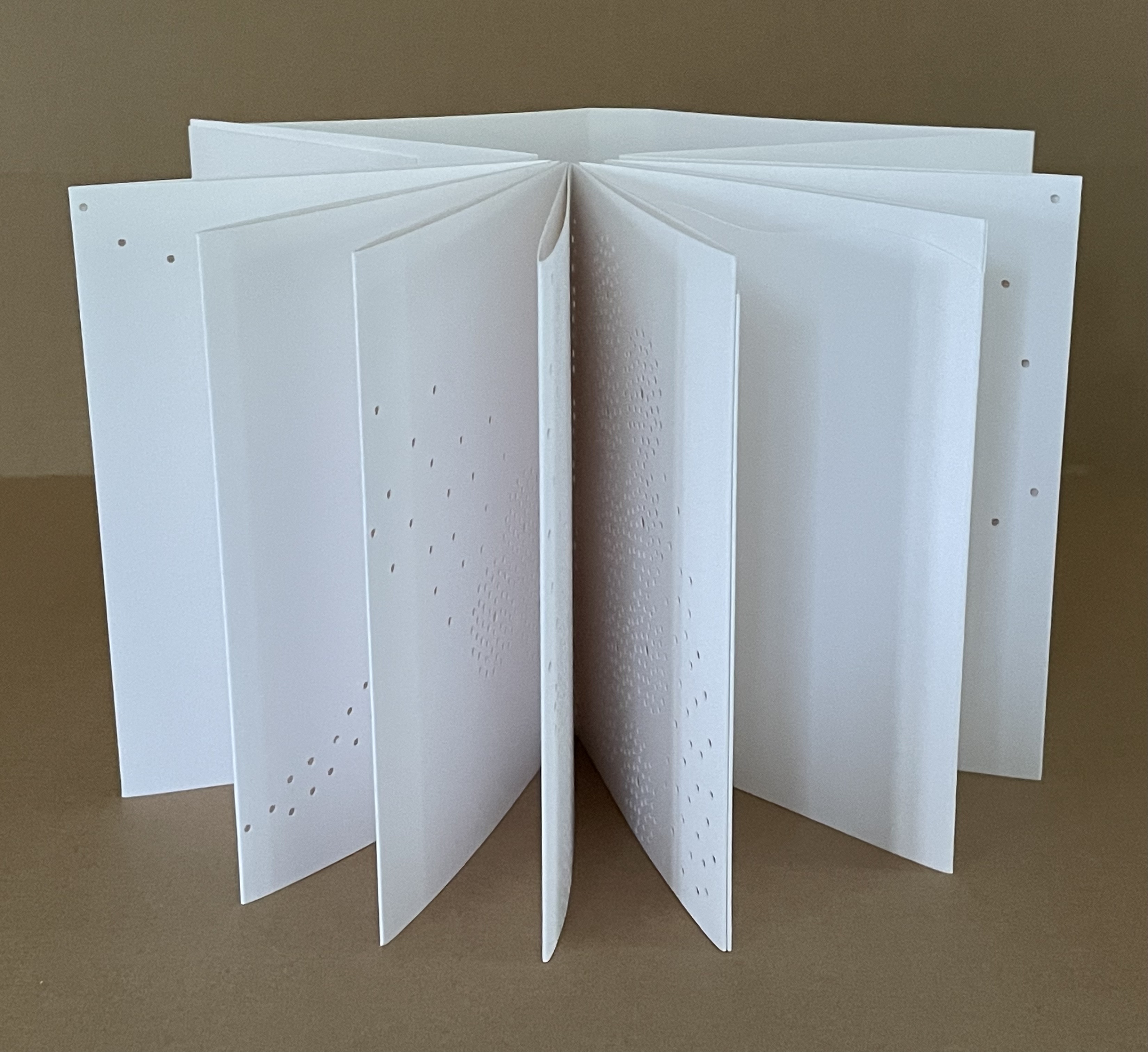
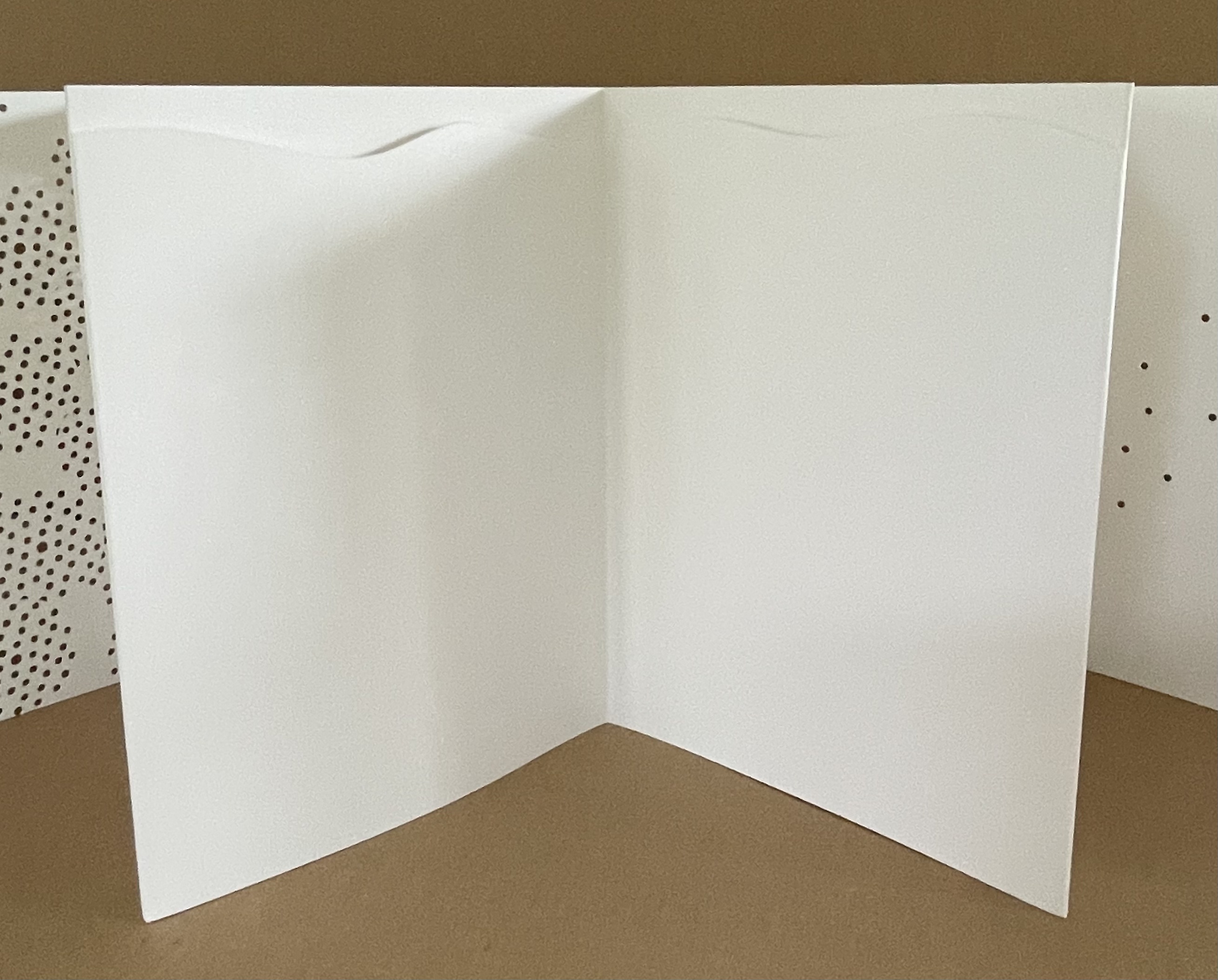
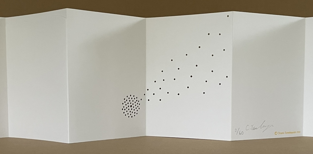
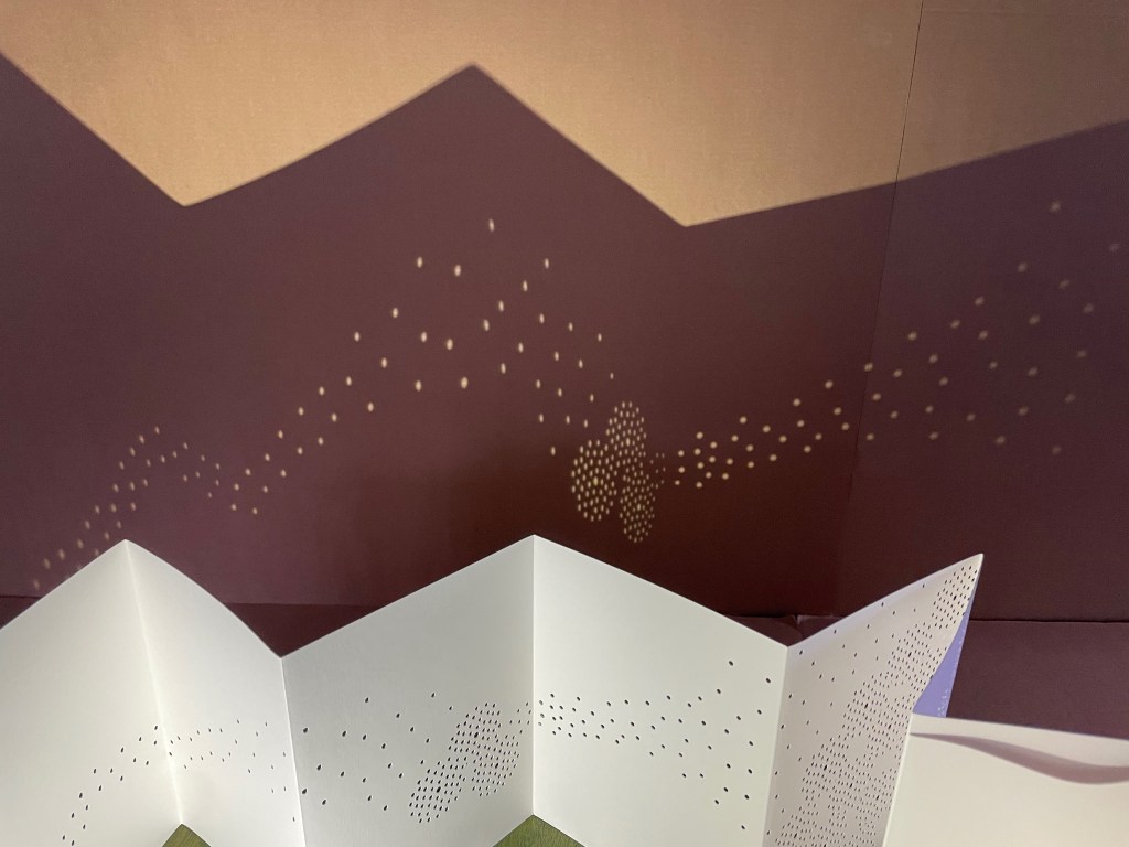
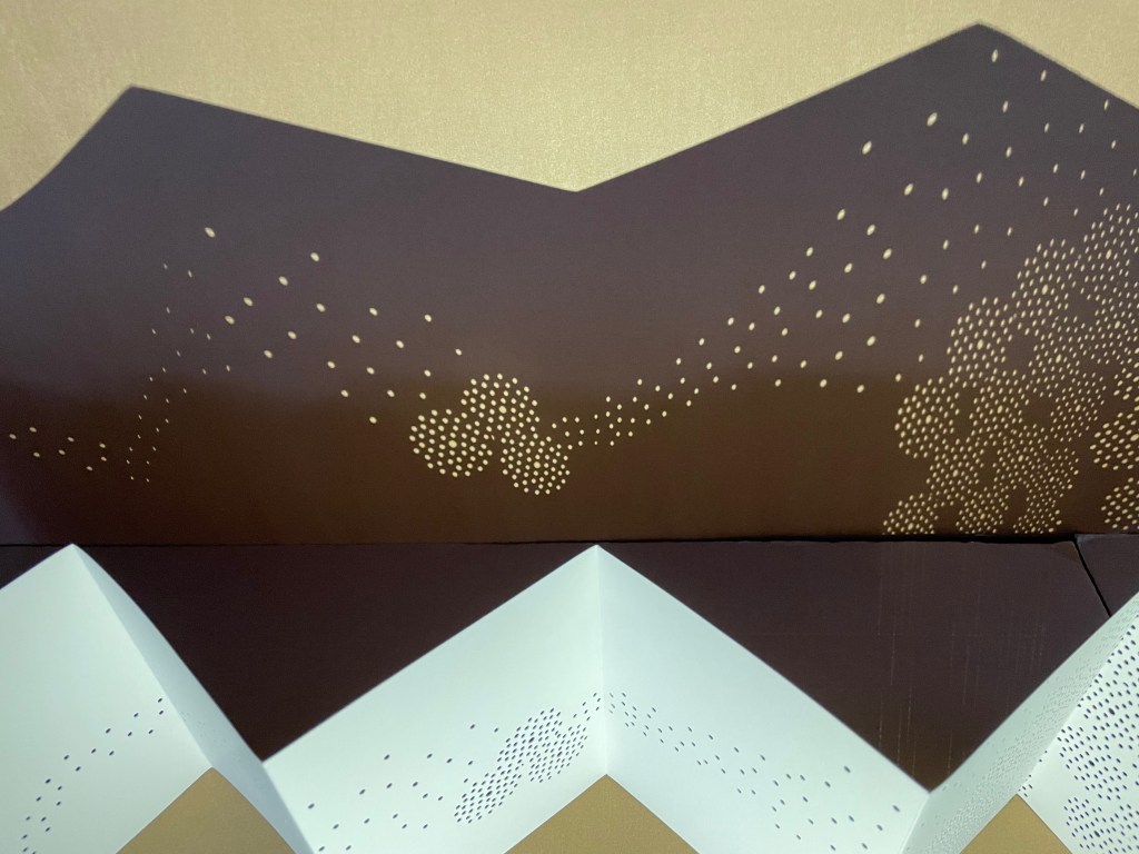
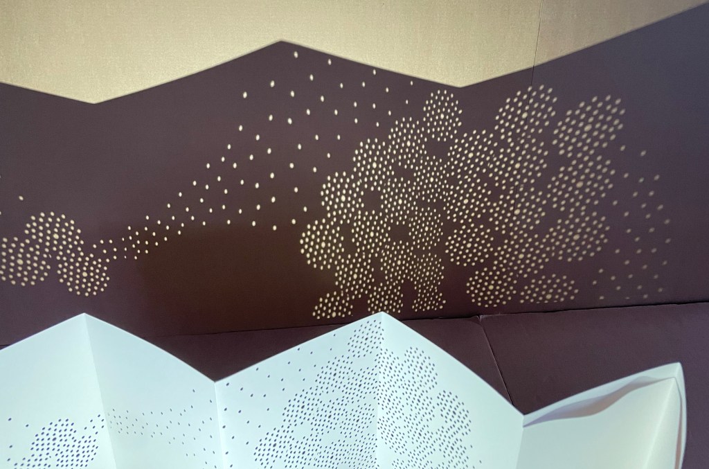
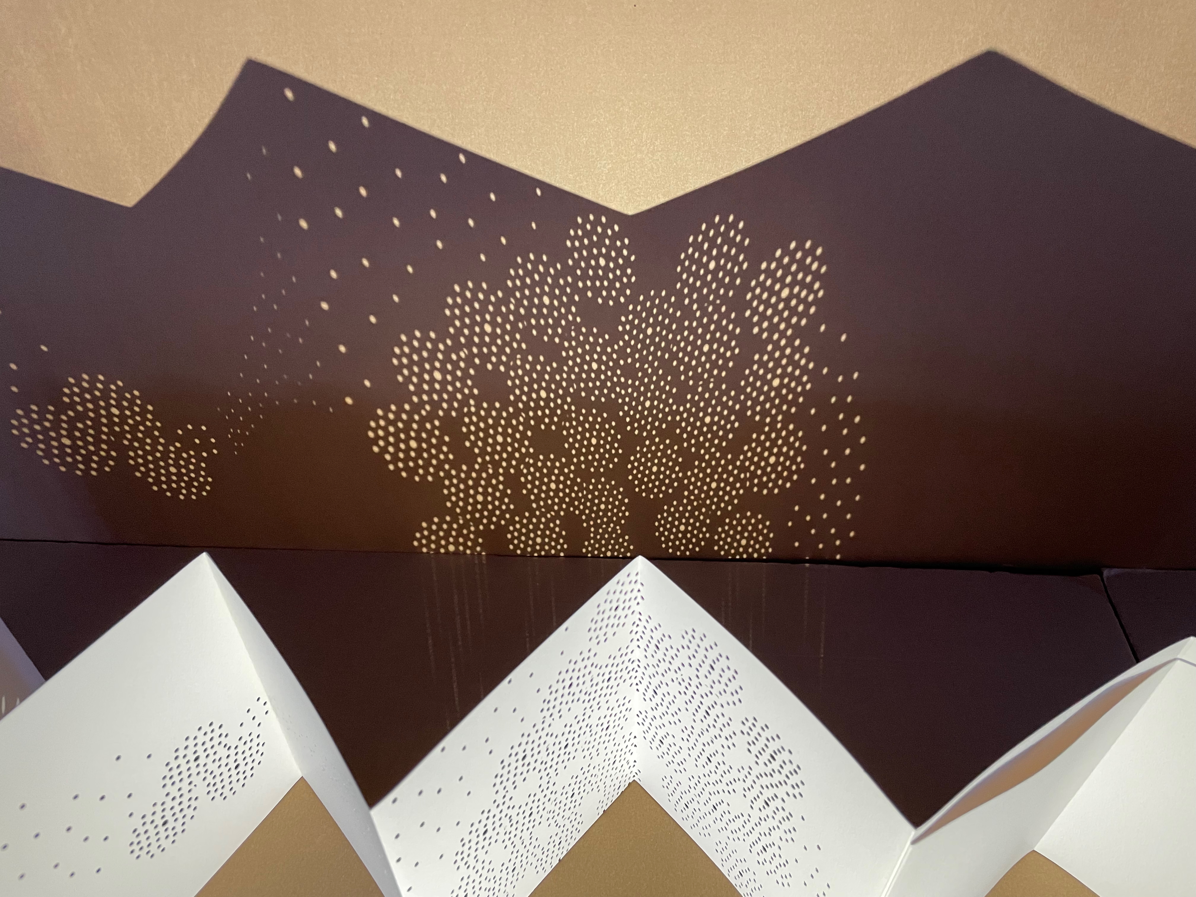
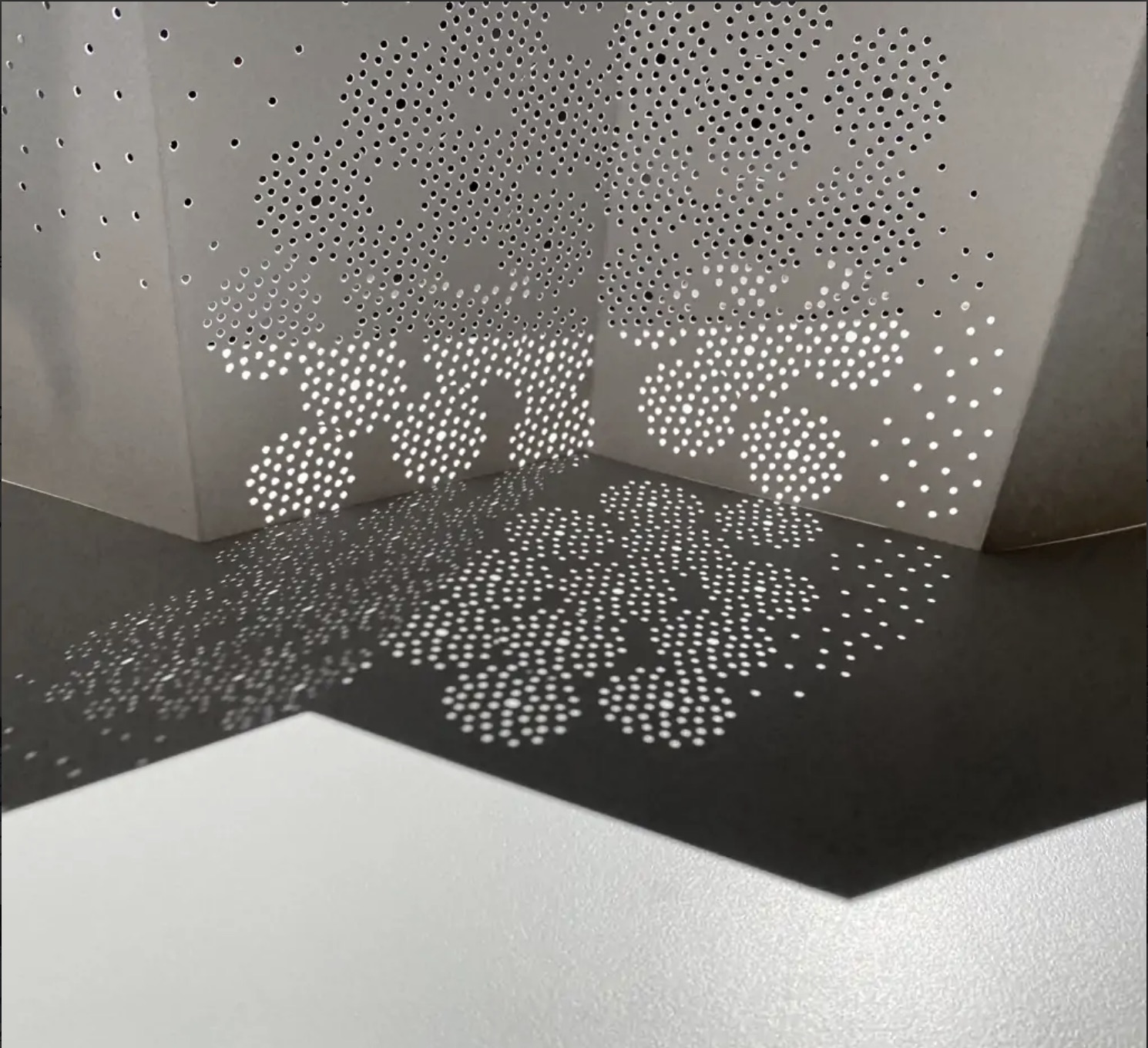
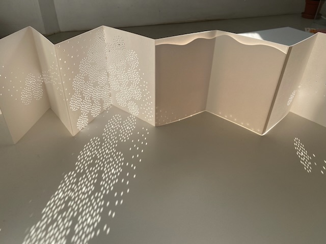
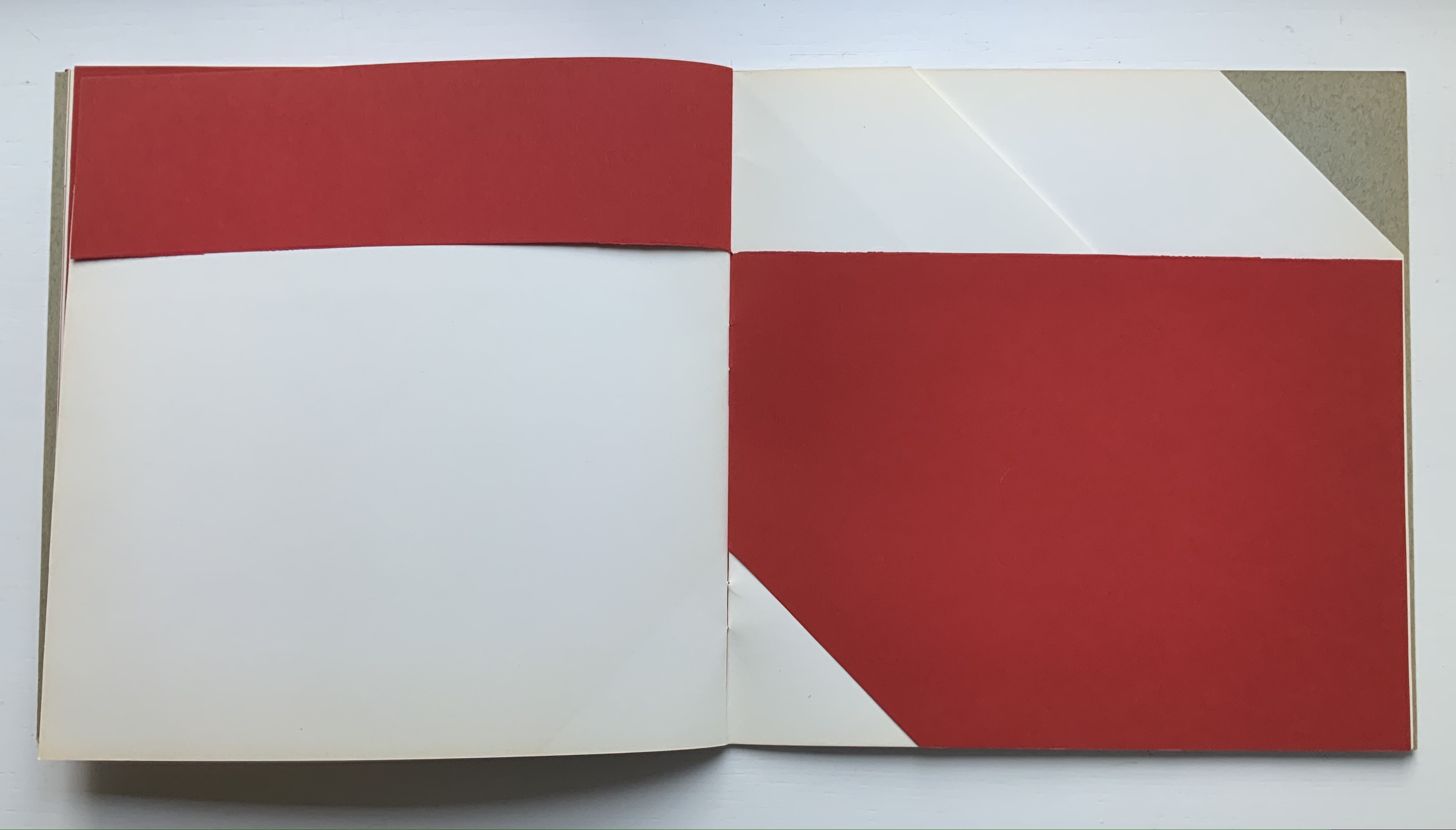
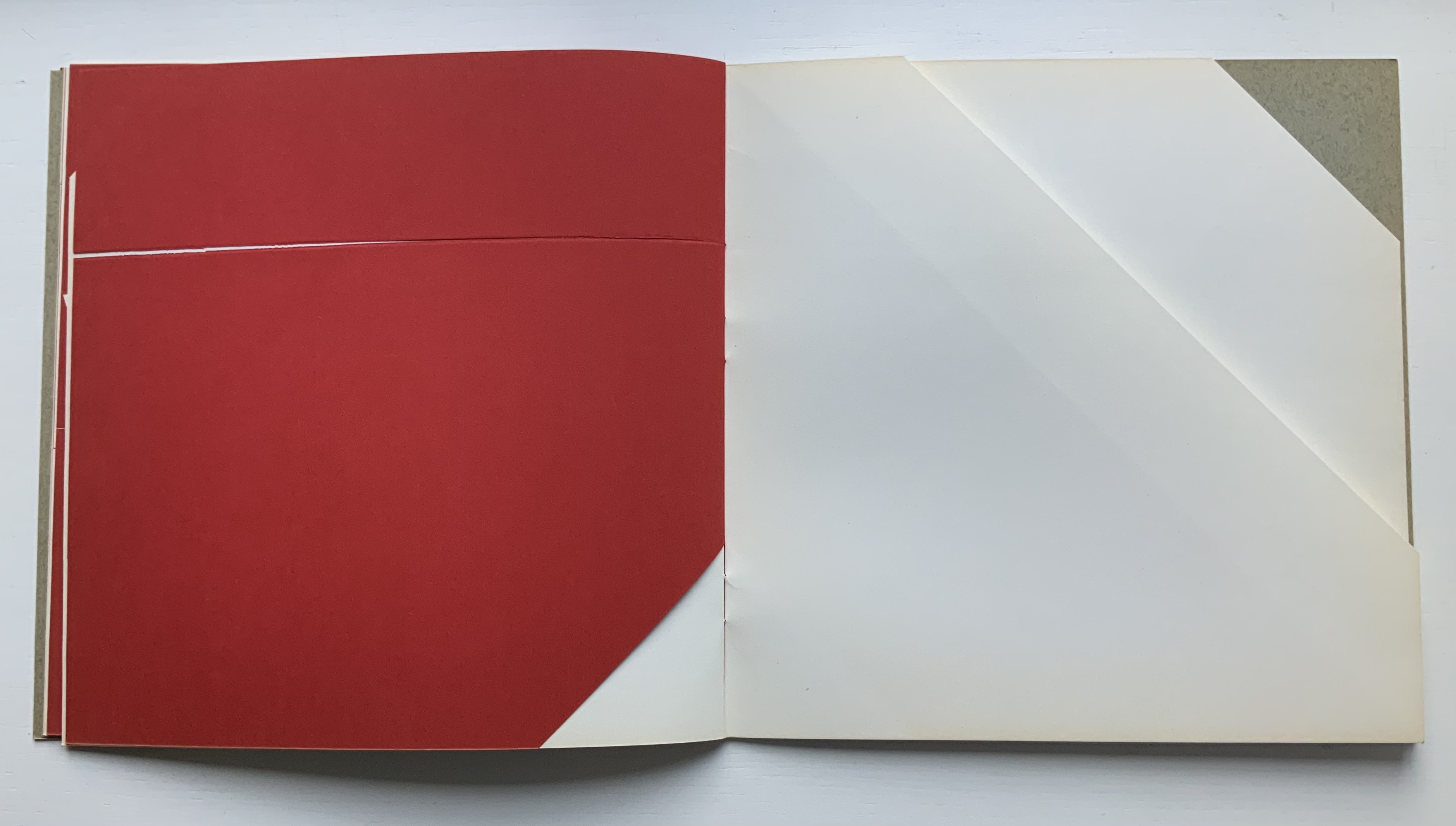
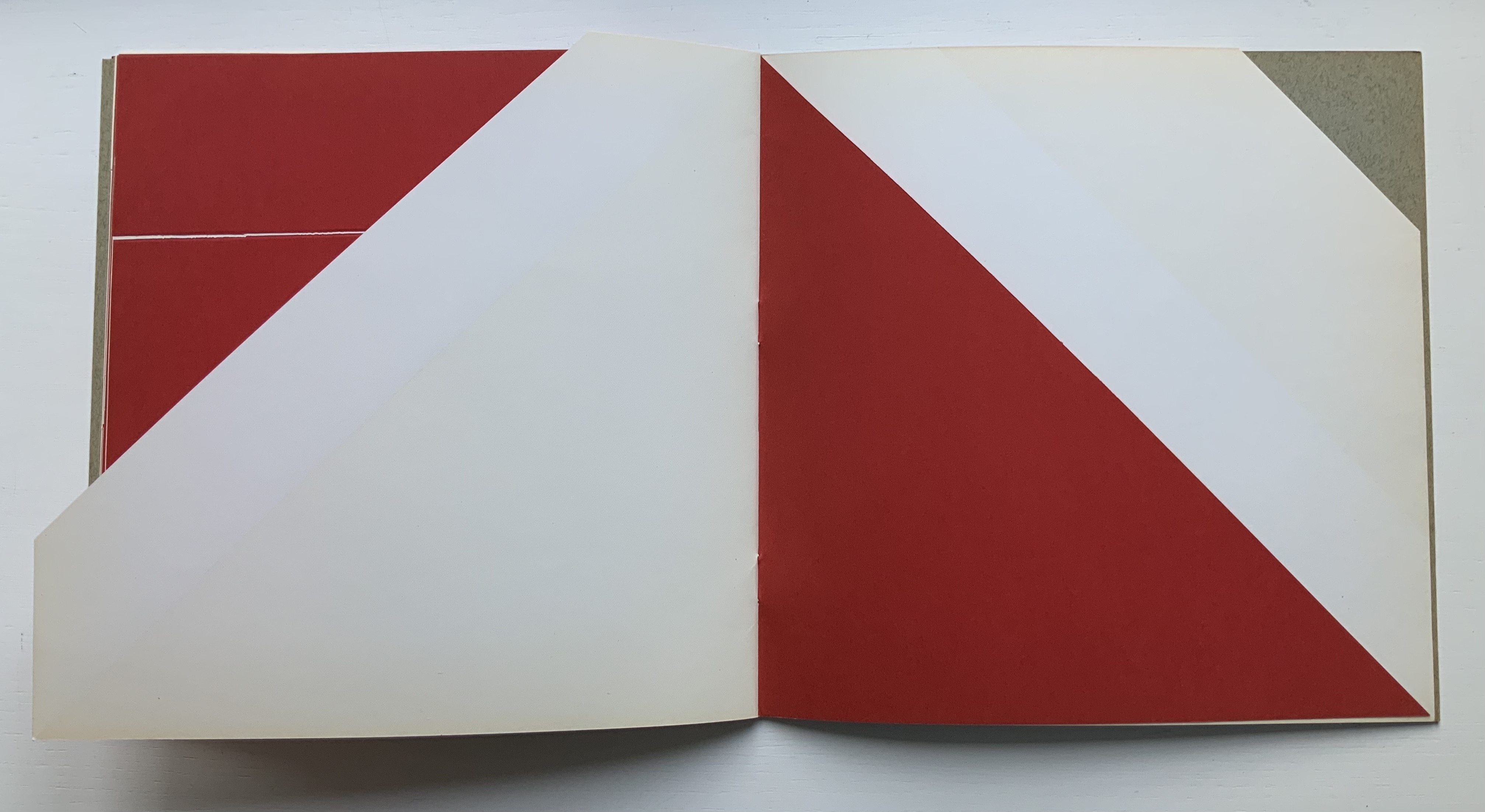
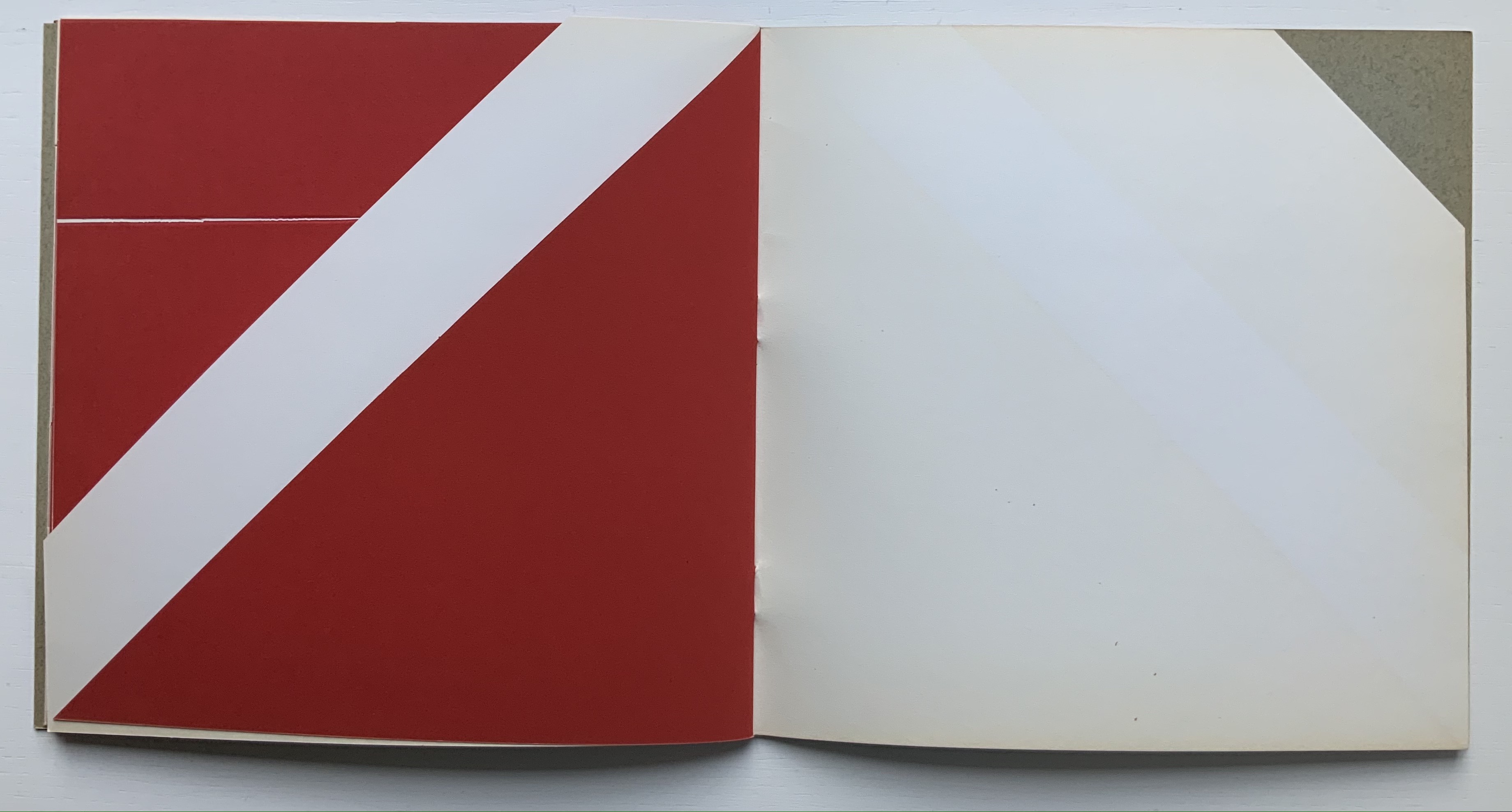
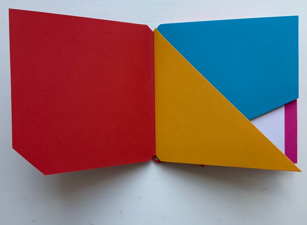
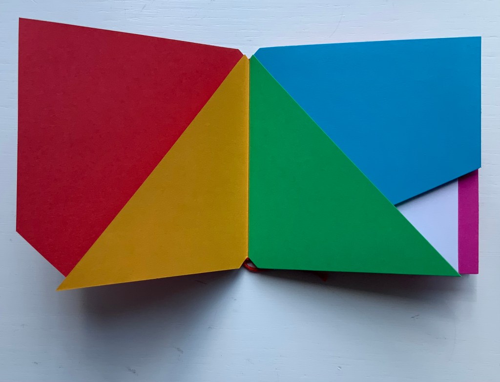
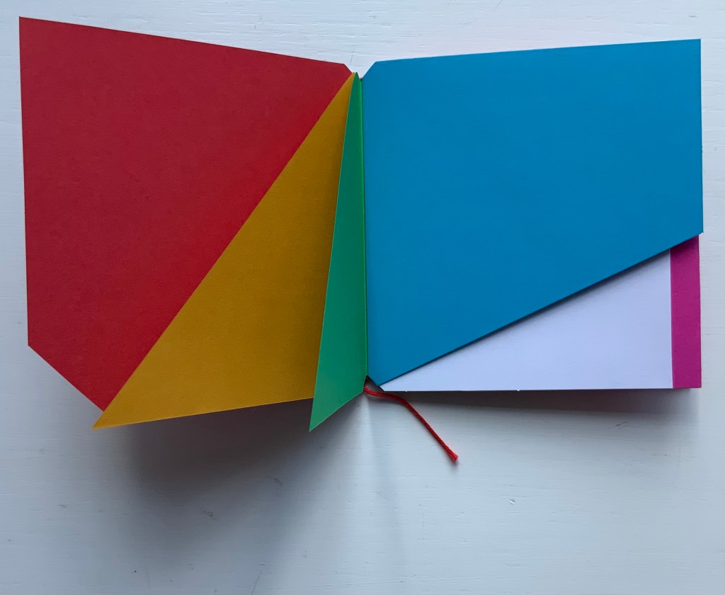
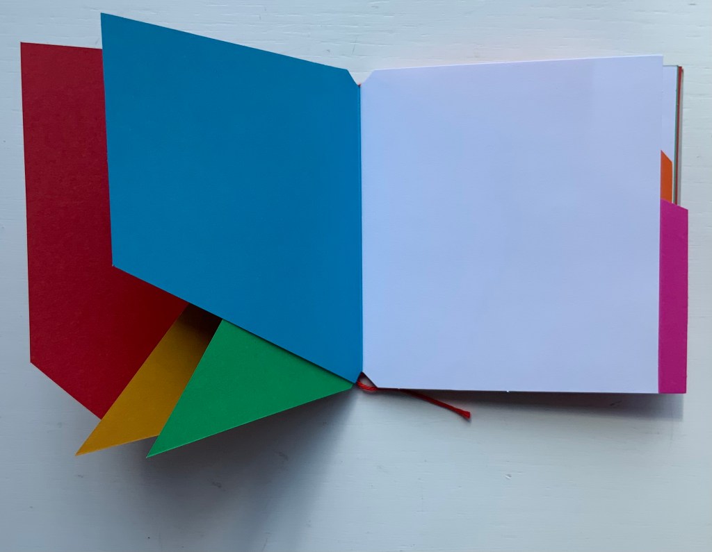
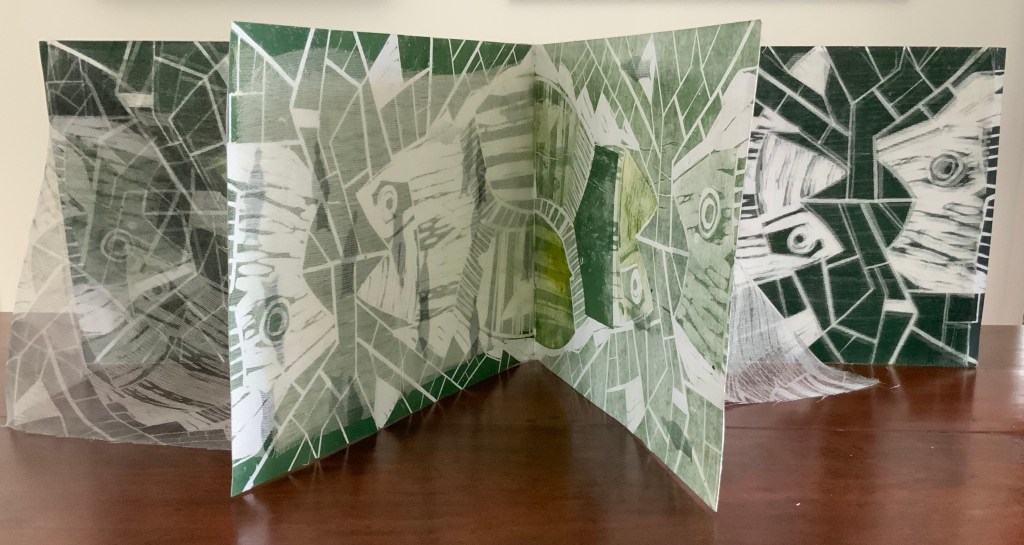
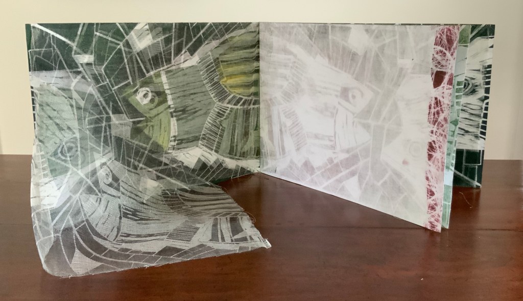
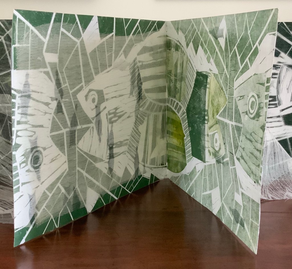
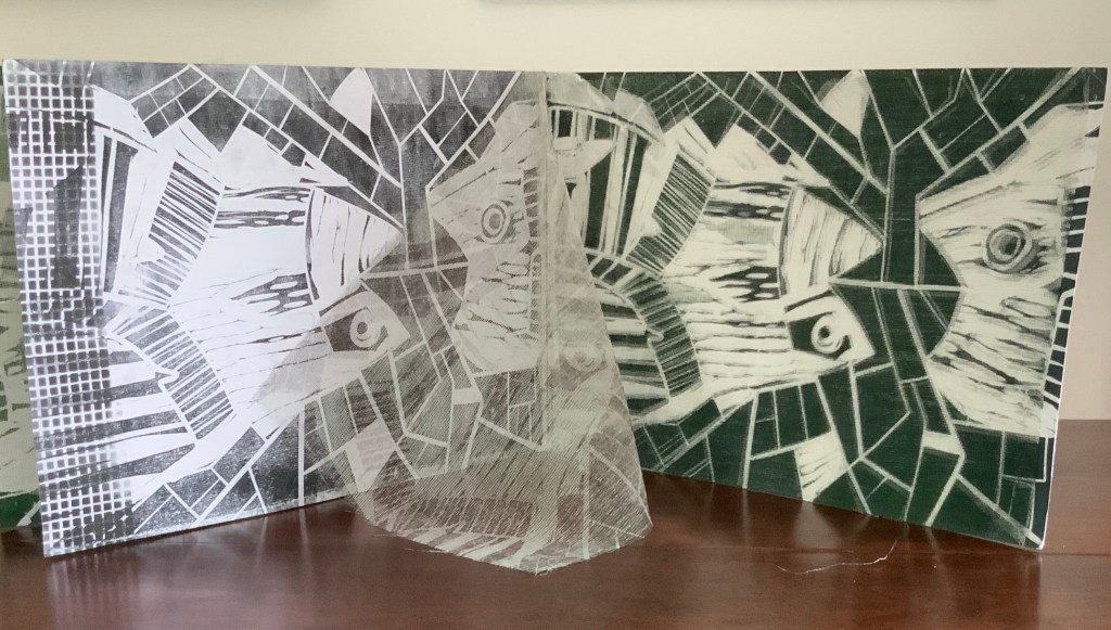
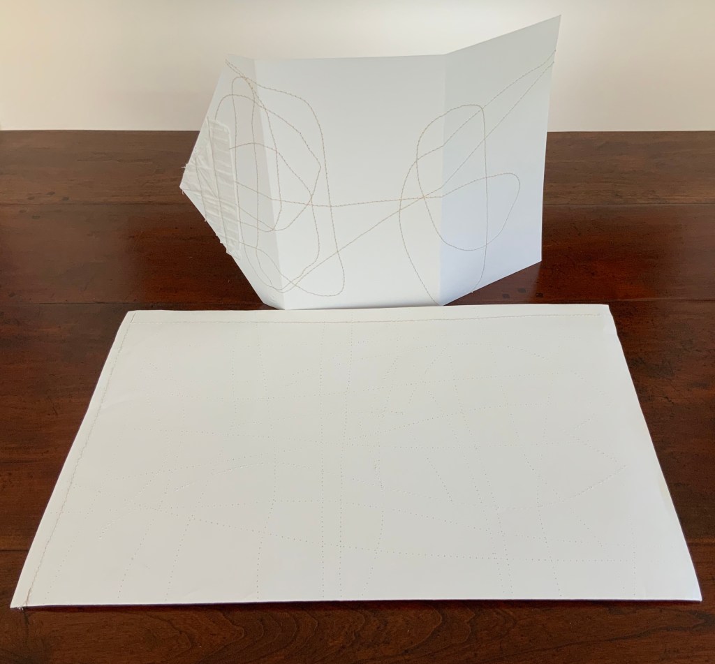
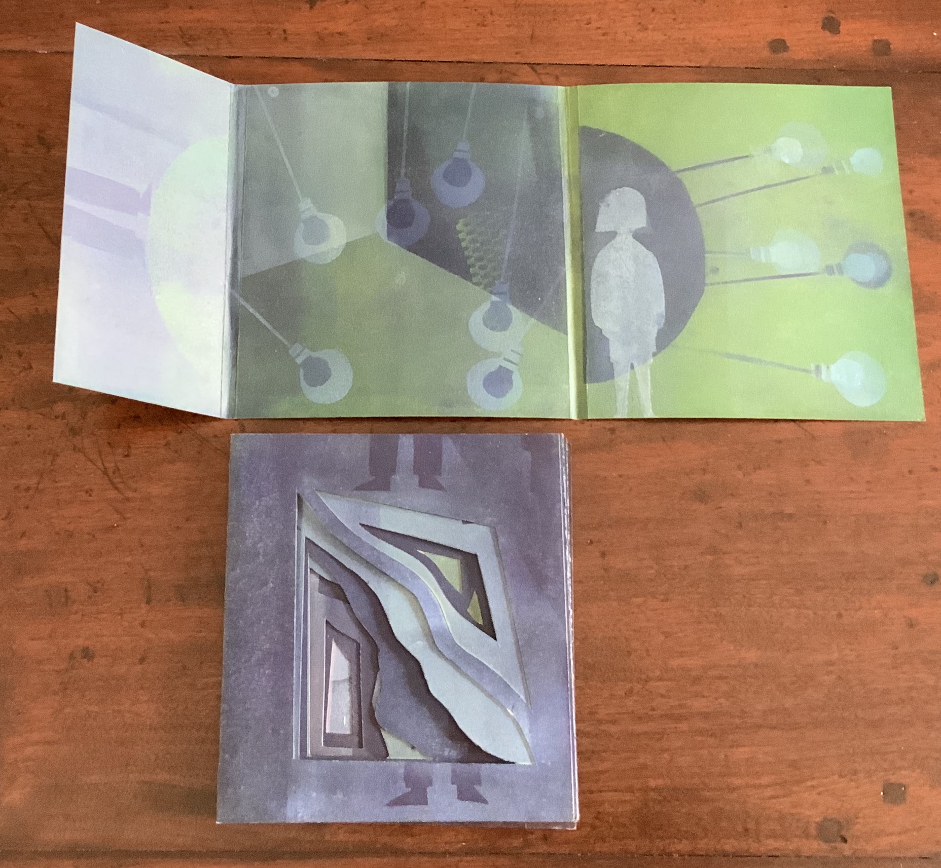
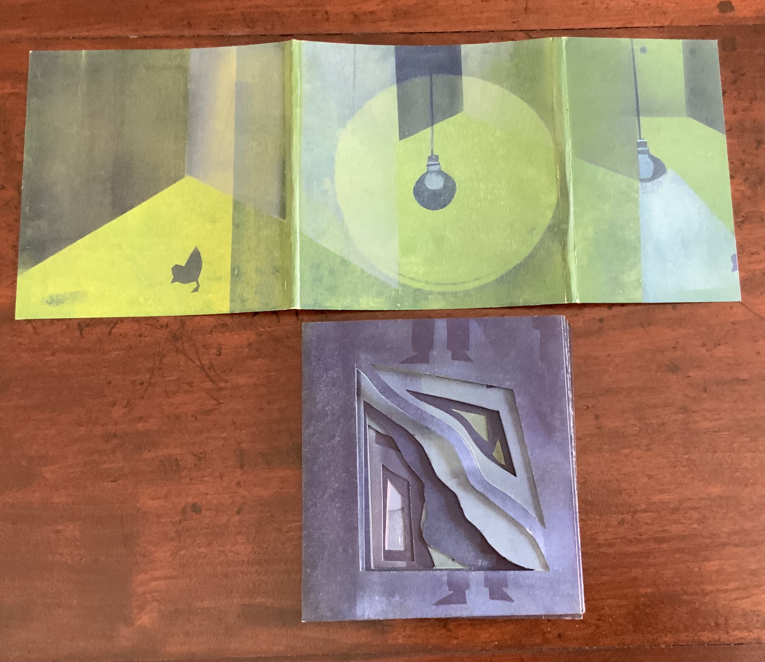
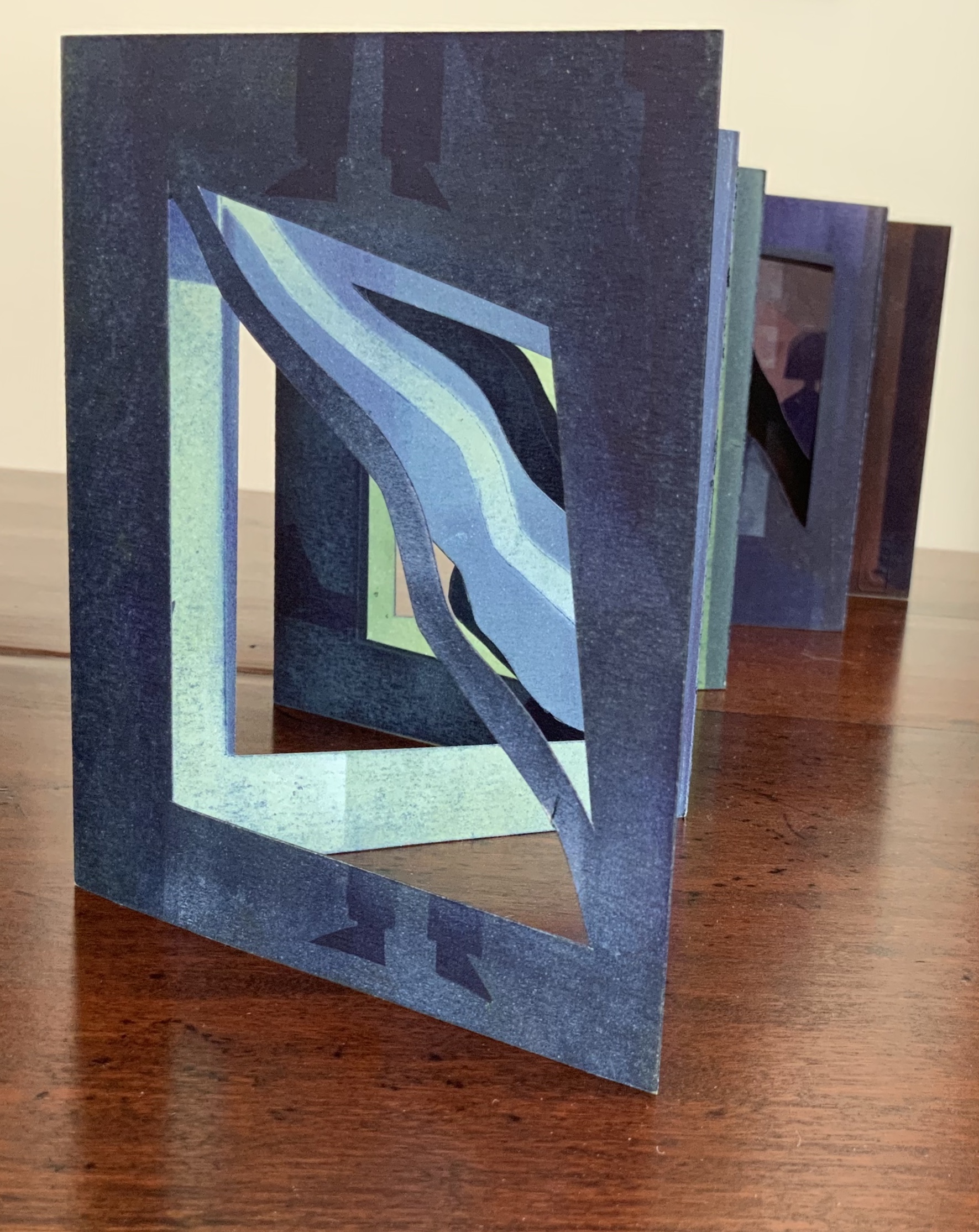
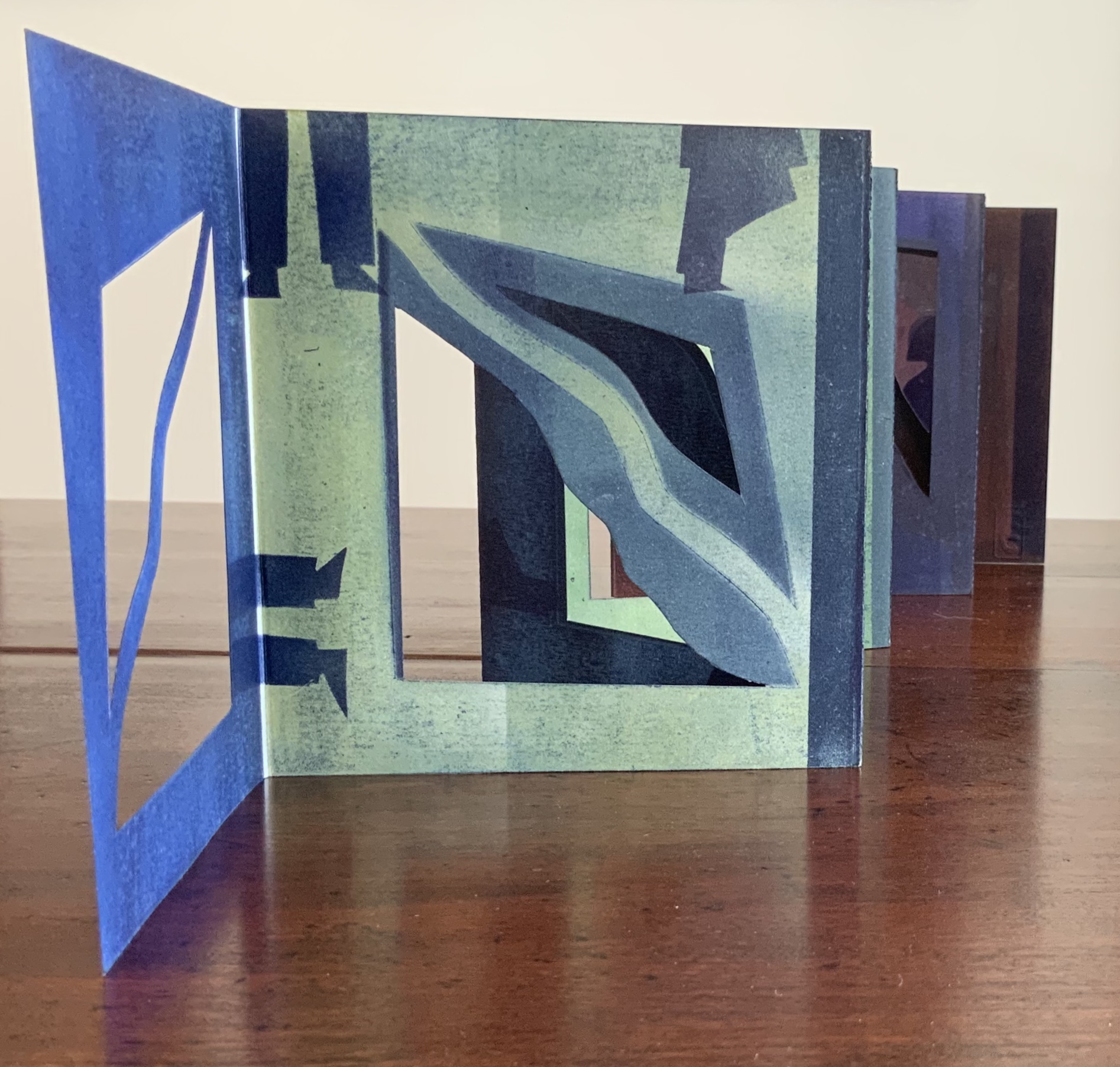
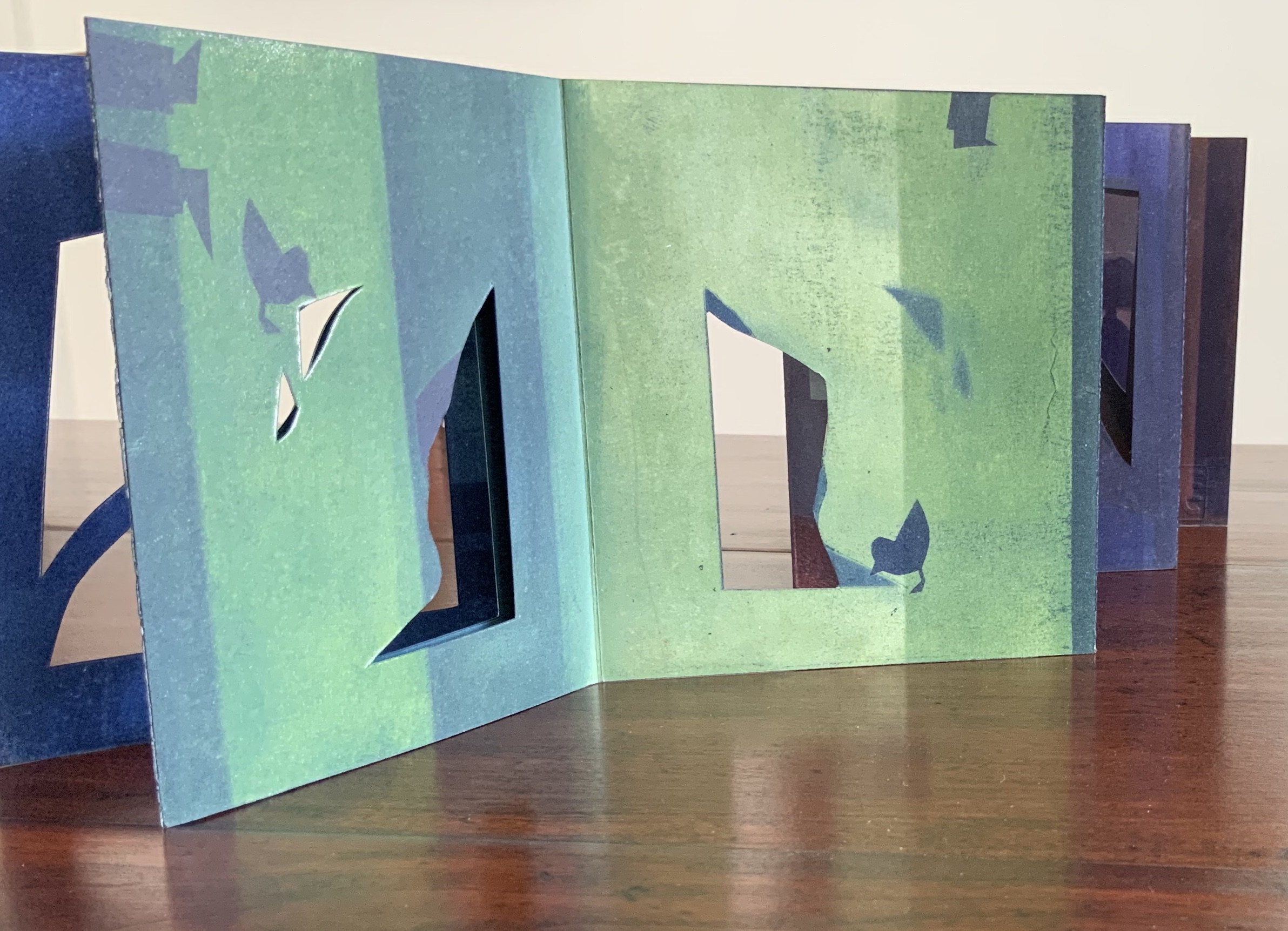
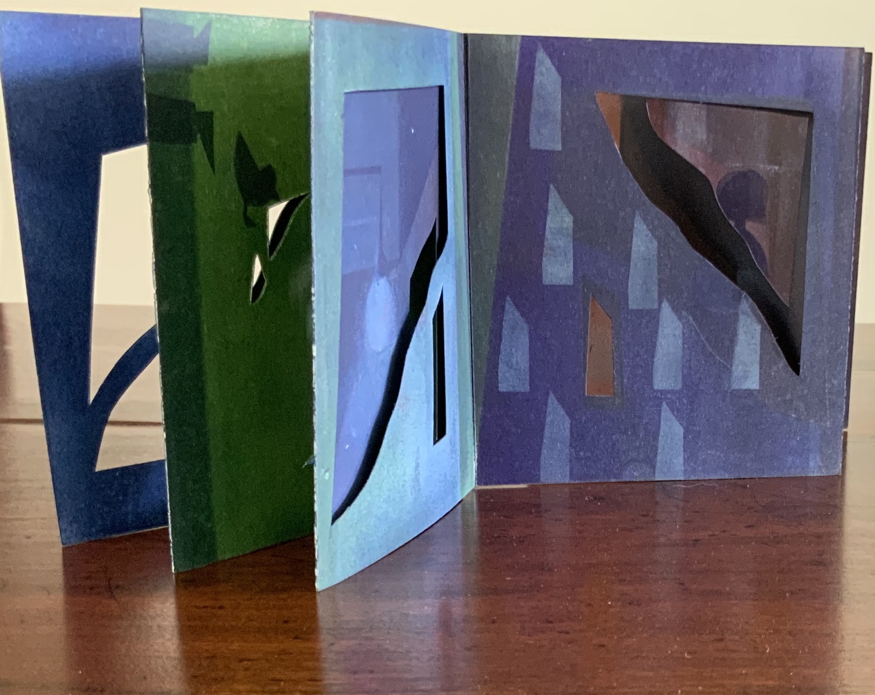
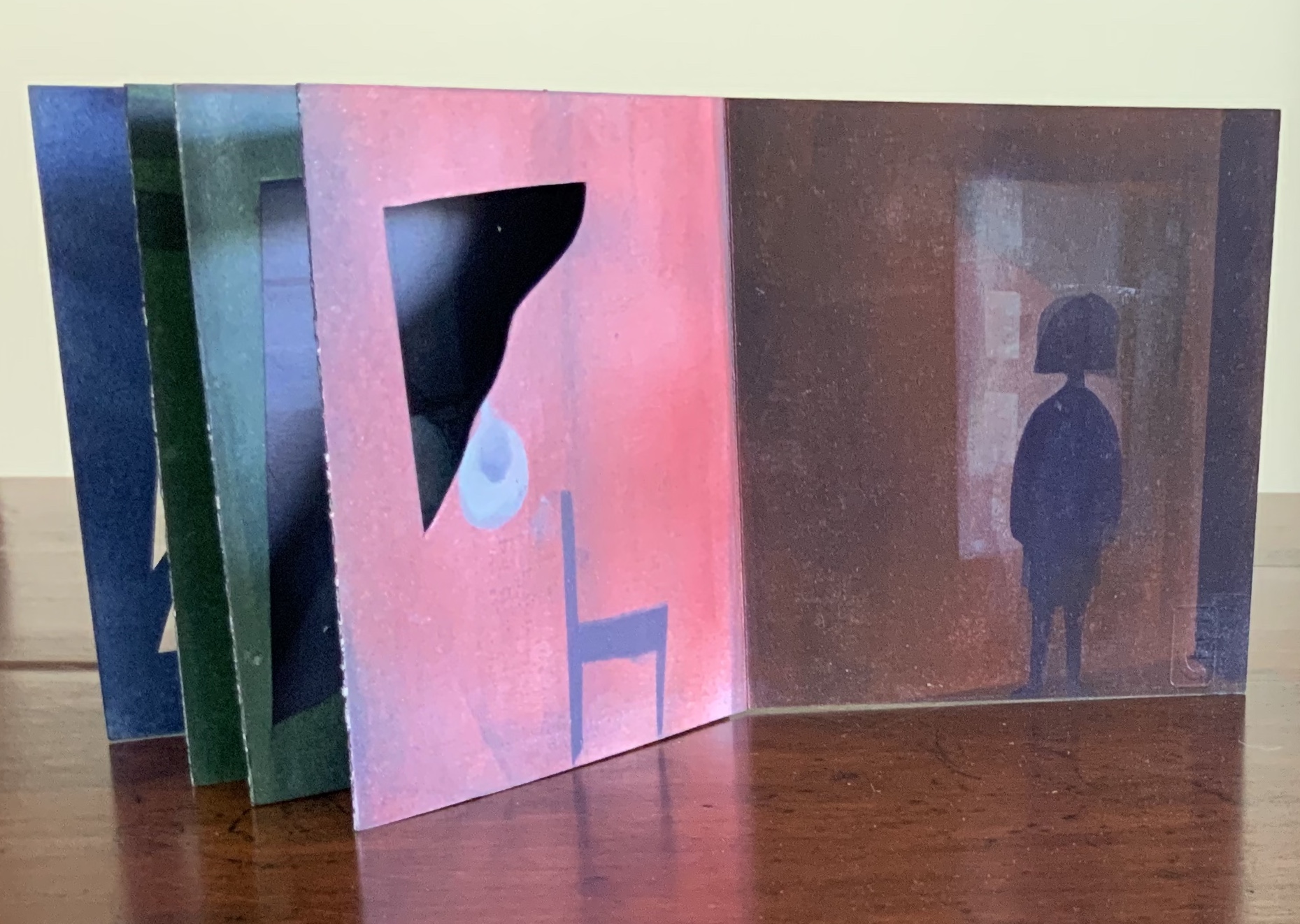
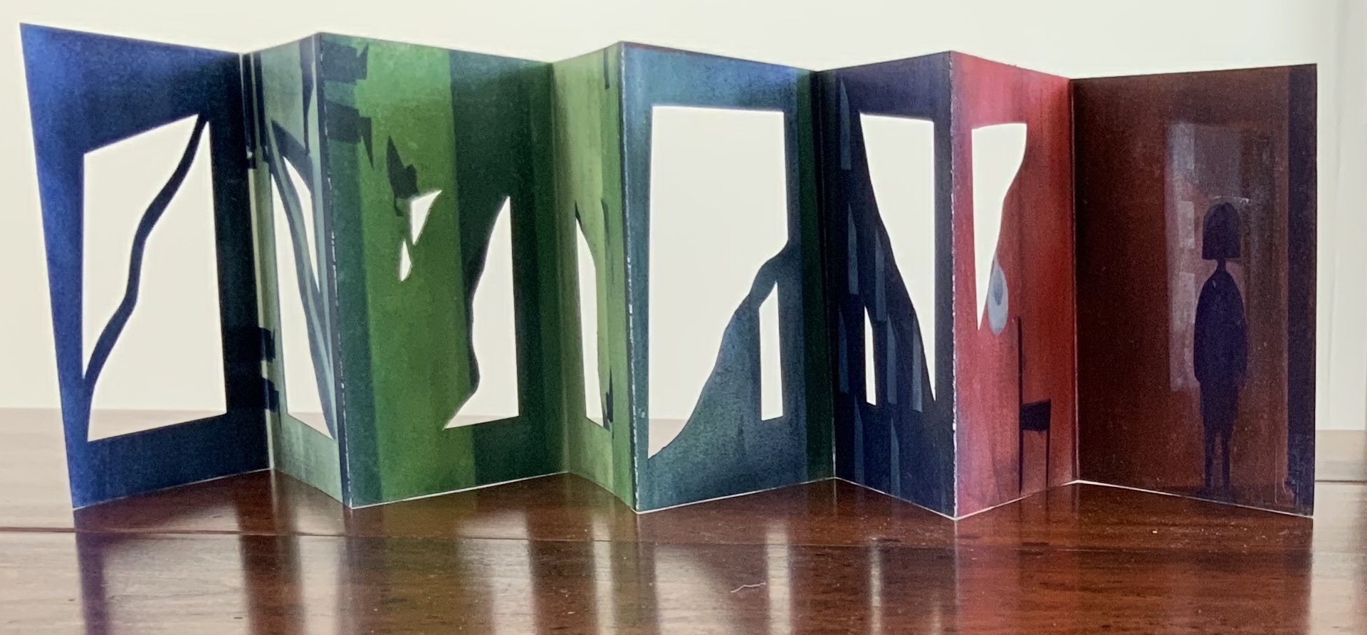
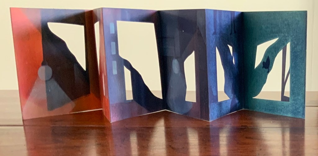
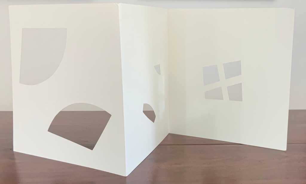
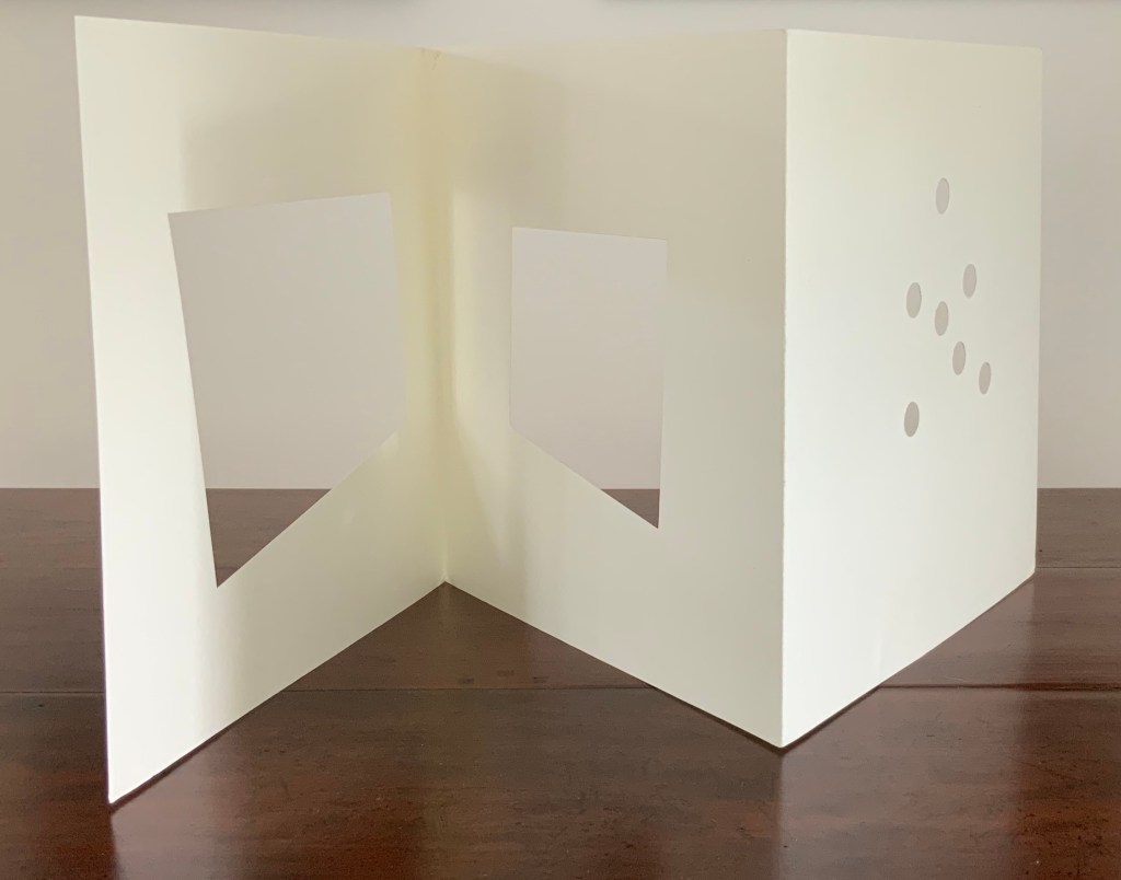
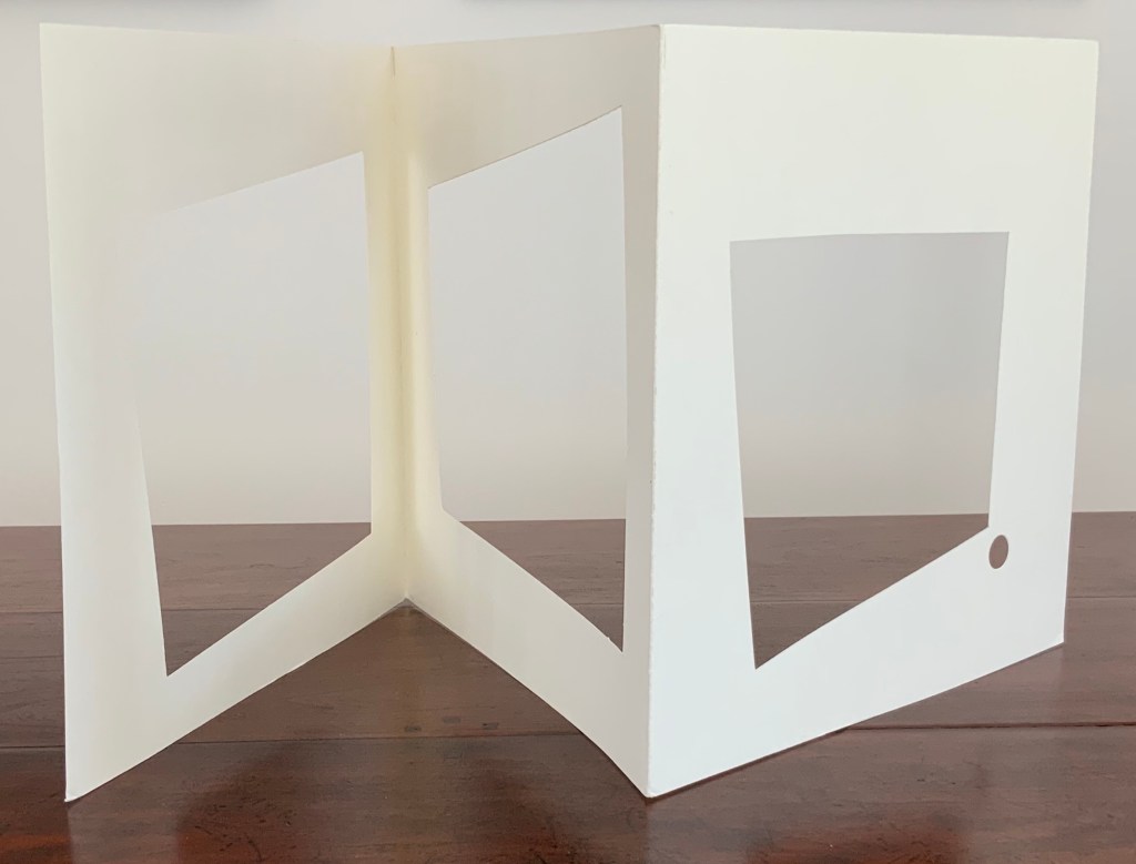
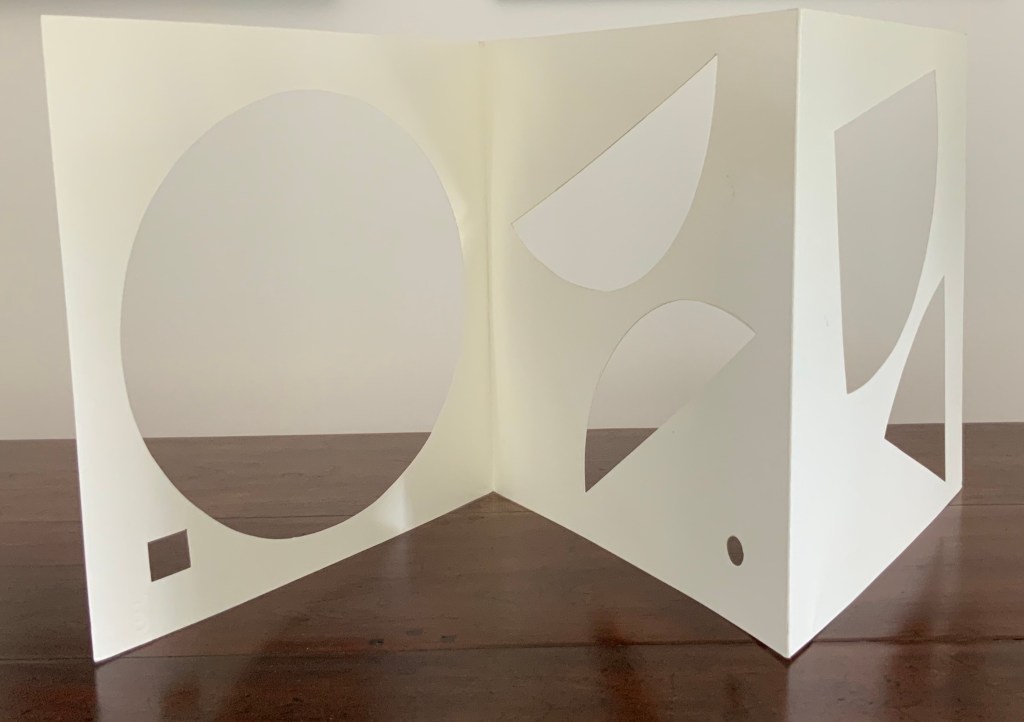
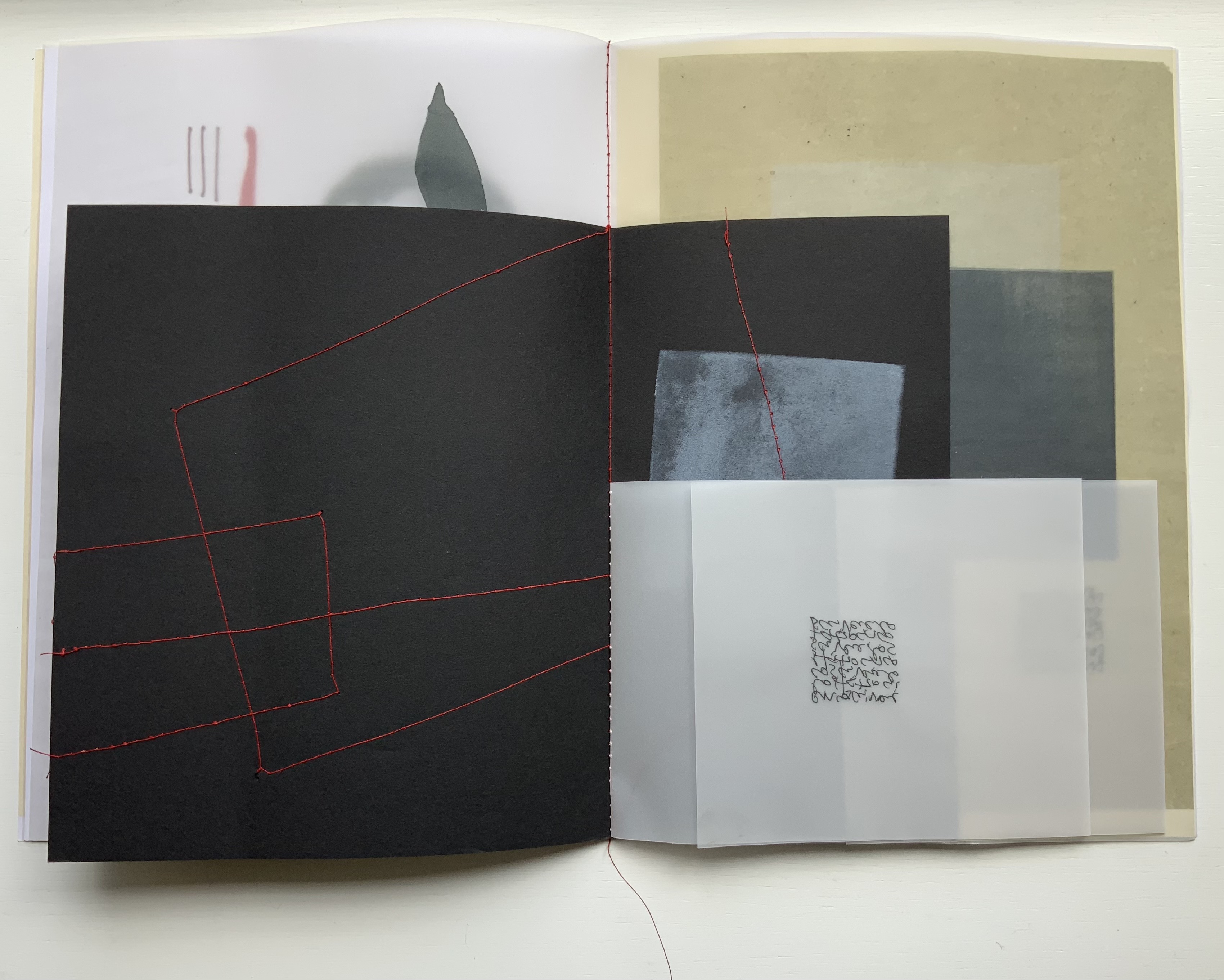
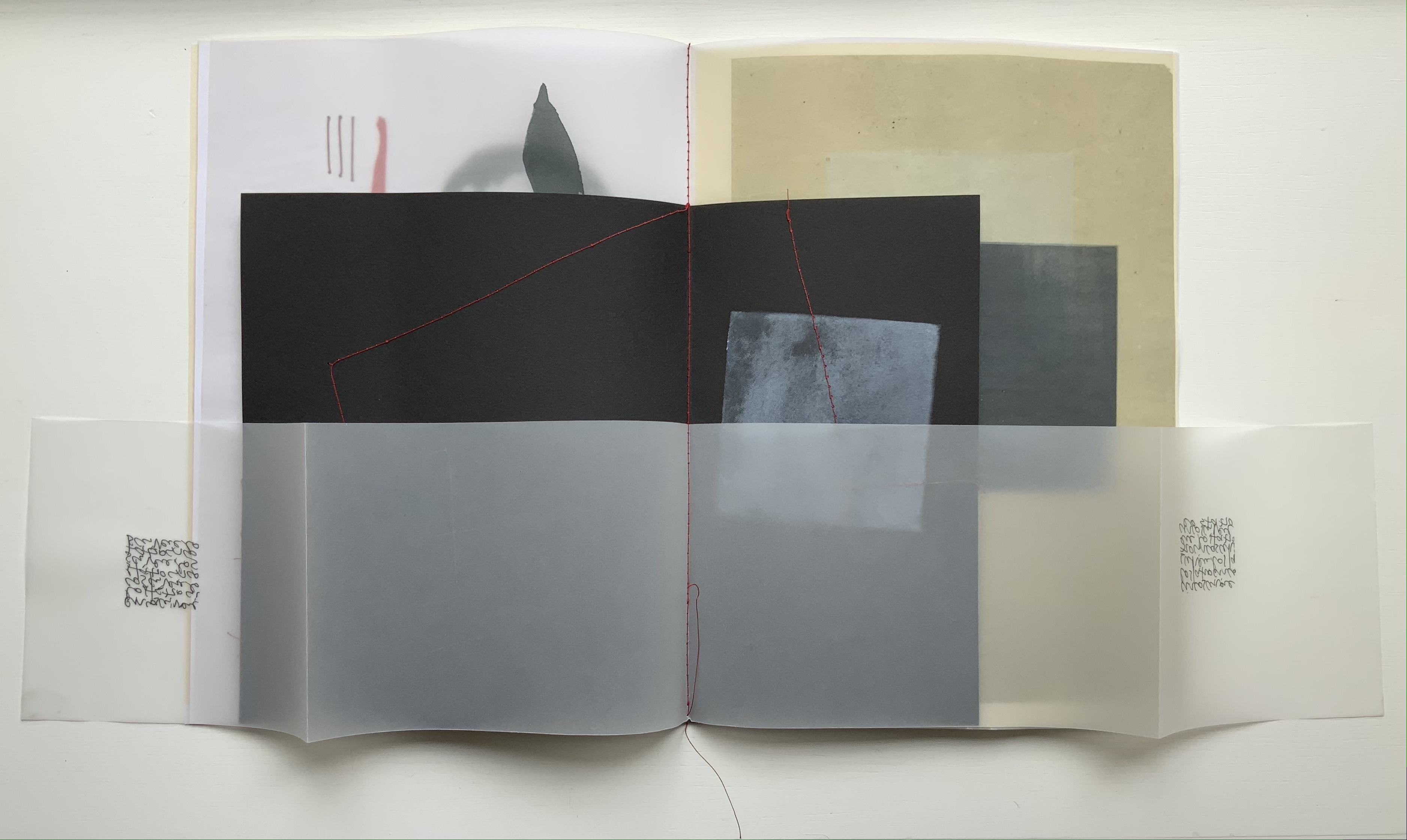
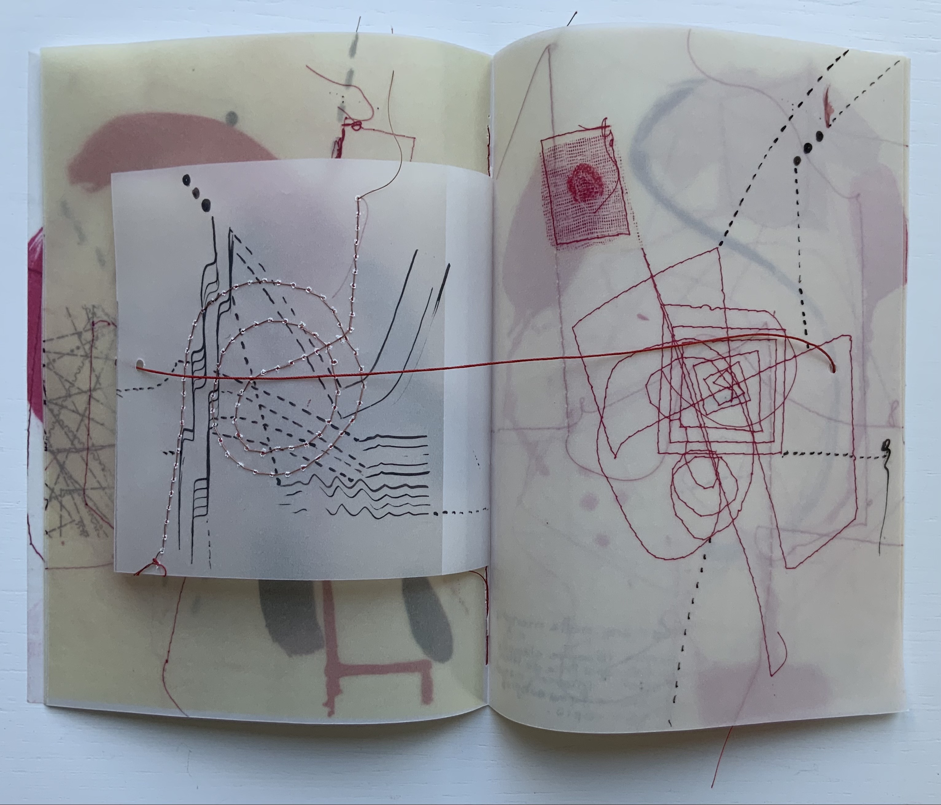
Spirit (2024) Chisato Tamabayashi Yellow cloth-covered slipcase. Leporello of 8 panels and enclosing cover. Slipcase: H168 x W129 x D24 mm. Book: H160 x W120 mm (closed); W2100 mm. 16 panels (excluding enclosing cover). Edition of 60, of which this is #2. Acquired from Chisato Tamabayashi, 5 November 2024. Photos: Books On Books Collection.
Chisato Tamabayashi’s leporello Spirit departs from her usual paper-engineering techniques. It relies on hole punching, paper sculpture, and display with light. Her crossover in techniques will remind close observers of Katsumi Komagata’s movement from Little Tree/Petit arbre (2008) to「Ichigu」(2015).
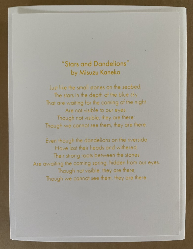
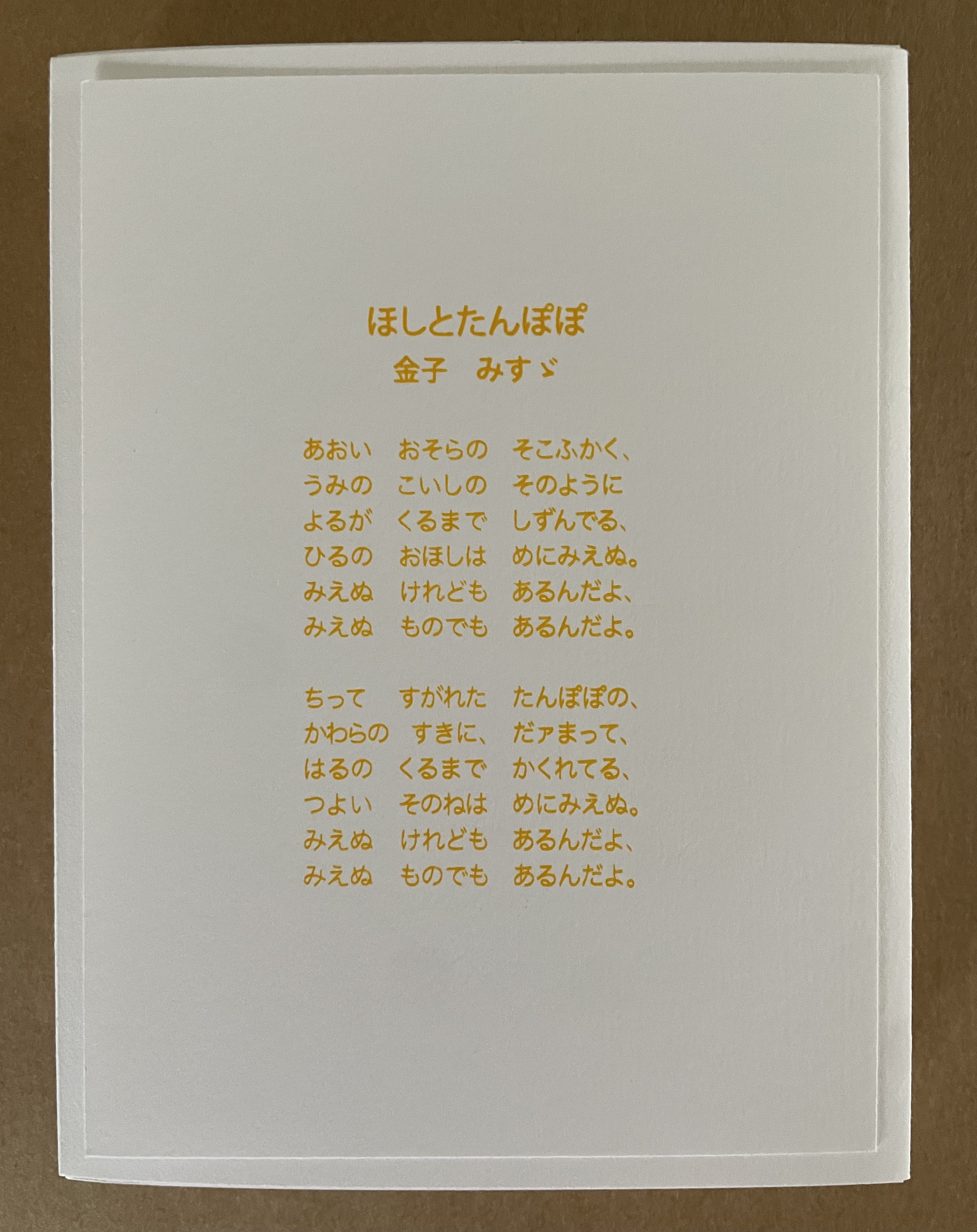
Spirit is accompanied by the 20th century poet Misuzu Kaneko‘s poem “Stars and Dandelions” (in English and Japanese) from which Tamabayashi has taken her inspiration.
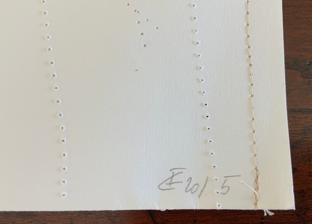
Viewed standing or lying flat, the leporello’s arranged holes echo the seeds leaving the dandelion heads bare in the second stanza of the poem.
Just before the last spread of imagery, the upper edge takes on the shape of the ocean surface beneath which the stones mentioned in the first stanza lie.
A projection to the background echoes the stars from the first stanza of the poem.
A projection to the foreground echoes the stones on the seabed from first stanza of the poem. Photos: Courtesy of the artist.
Like Misuzu Kaneko’s poetry, Chisato Tamabayashi’s artwork appeals to children and adults, underscoring the link between children’s books and artists’ books explored so well by the Huberts in The Cutting Edge of Reading, Johanna Drucker in “Artists’ Books and Picture Books”, and Sandra Beckett in Crossover Picturebooks.
Tamabayashi’s and Komagata’s handling of holes, paper engineering, and display with light should be considered alongside the efforts of the book and paper artists’ explored in the second issue of Inscription as well as those of Eleonora Cumer and Jenny Smith.
Drucker, Johanna. 2017. “Artists’ Books and Picture Books: Generative Dialogues” in The Routledge Companion to Picturebooks, edited by Bettina Kümmerling-Meibauer. London: Taylor & Francis Group.
These are Bruno Munari’s words that I share. I play and I have fun with my papers and my colours, but it is a job and a job, even if enjoyable, is a serious thing. My notes on image diaries are serious. A collection of thoughts translated into images, that are daily, just like a diary, “annotated” on nearly three hundred pages. I use the stencil technique with a monochromatic press, an imaginary thread connects them and creates a long history that develops, touching on events that have hit me in a particular way. It is my imaginary world, but at the same time, very real.Paper, card, fabric, needle, thread, colours and gouges are the materials that allow me to work and to leave my fantasy and creativity free. I have one very small study, but it is sufficient. It is welcoming, full of books, with a great ceiling window, three tables, two chalcographic presses and one press. When I am sitting in my workplace, I manage to isolate myself in my world. I can stay seated for hours without the passing time weighing on me, making me happy with this choice of life. — Eleonora Cumer
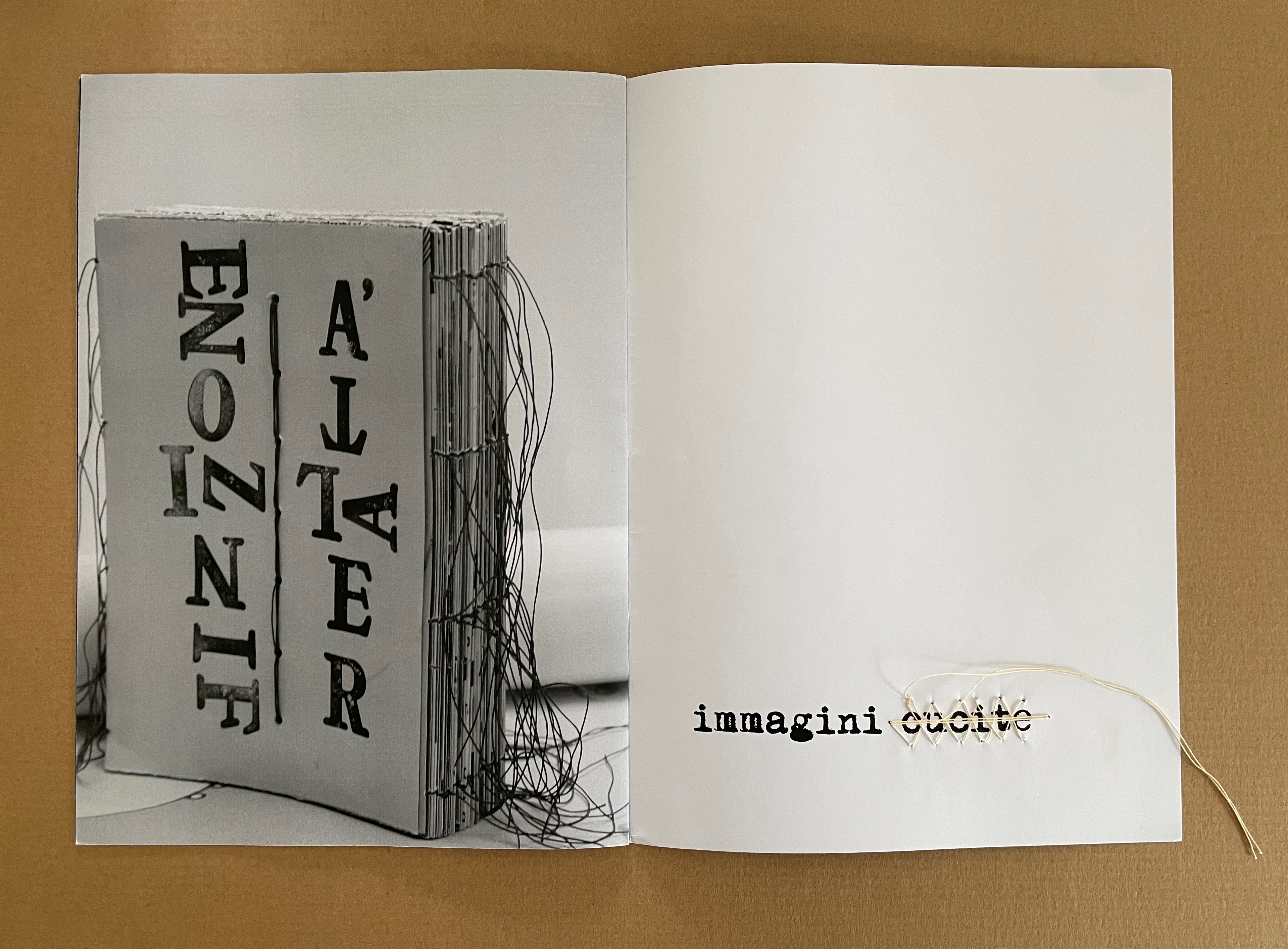
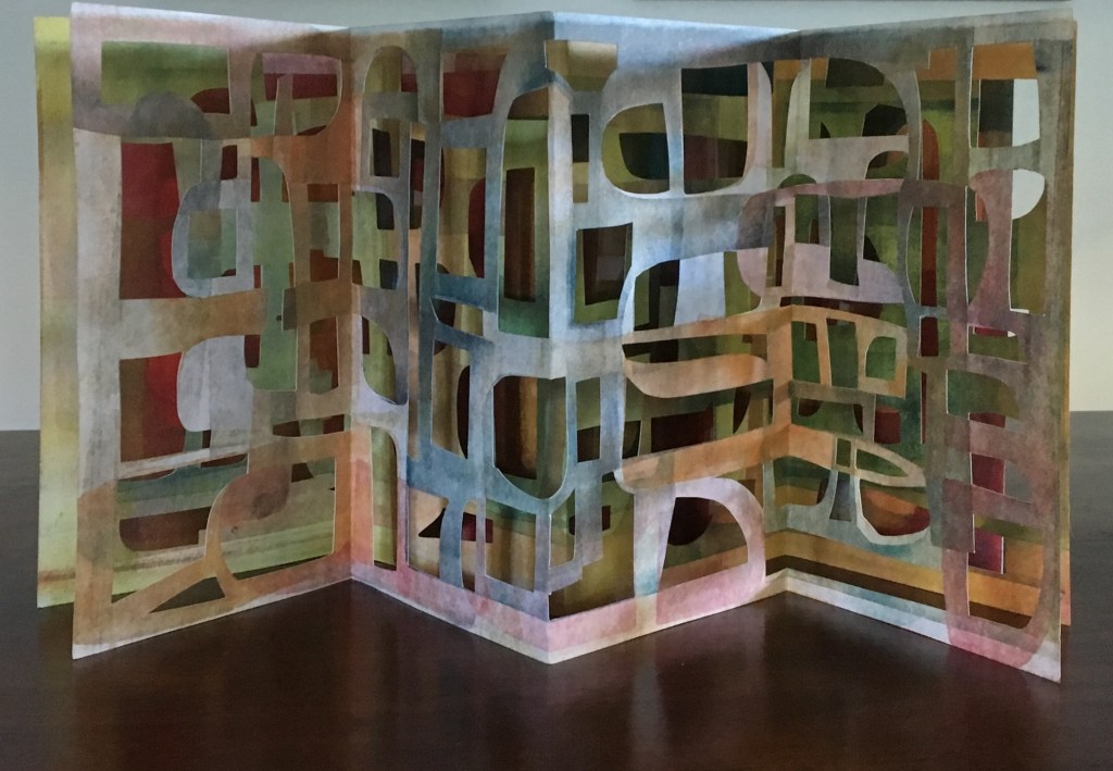
libro catalogo con interventi manuale (2019)
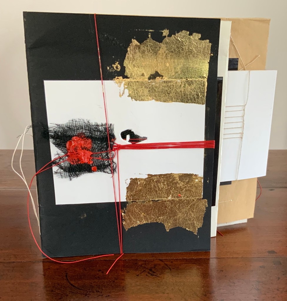
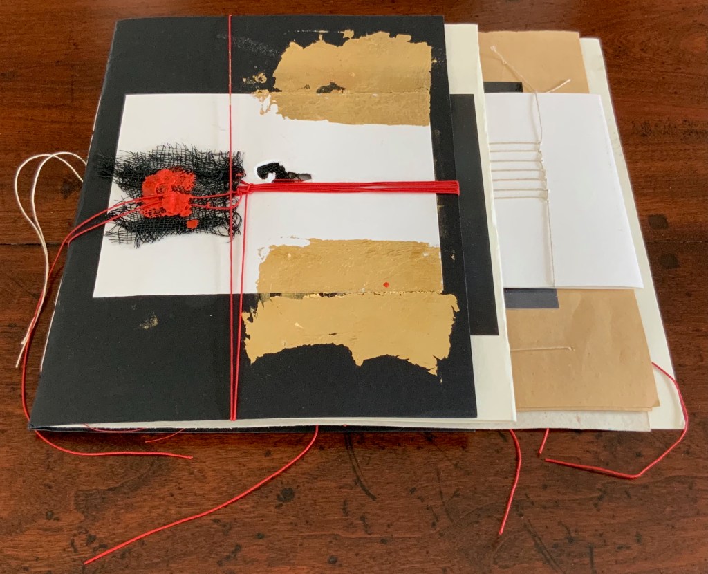
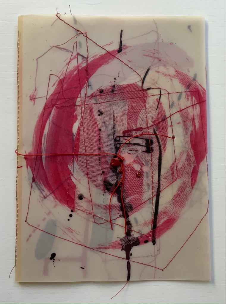
libro catalogo con interventi manuale / “book catalogue with manual interventions” (2019) Eleonora Cumer Sewn booklet, various papers including photographic, gold leaf, thread, mesh, string, wax. H200 x W220 (variable) mm. [16] pages. Unique. Acquired from the artist,. Photos: Books On Books Collection.
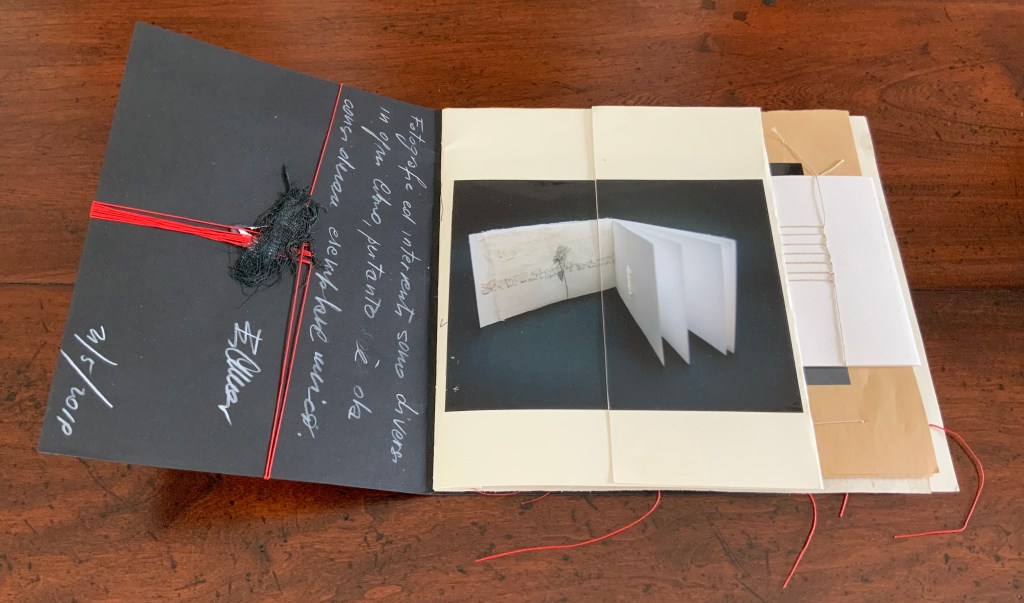
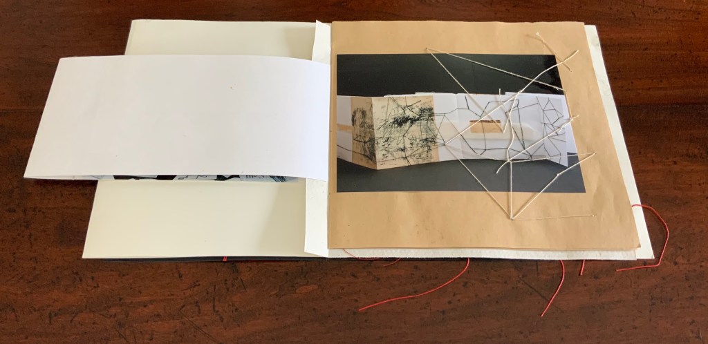
Many catalogues of individual artist’s books aim to be works of art themselves. Some attempt this with fine press production and limiting the edition, which sometimes succeeds. Some embody the very material and techniques that the artist used to create the items represented in their pages. Eleonora Cumer’s libro catalogo con interventi manuale / “book catalogue with manual interventions” (2019) is an extreme and stunning example of the latter. It is extreme because it is unique, not a limited edition. It lacks any identifying captions or list of works (the captions below appear only as a convenience for this entry in the Books On Books Collection). Libro catalogo con interventi manuale stands on its own as a stunning work of book art.
As the richly textured and gold-leafed cover turns, notice how Cumer presents the image of the catalogue’s first work: Parole non dette, frasi in sospeso / “Unspoken words, unfinished sentences” (2018). Split and pasted on two sides of the first folio, the glossy photograph of Parole non dette reunites with precise registration in the center of the folded folio.
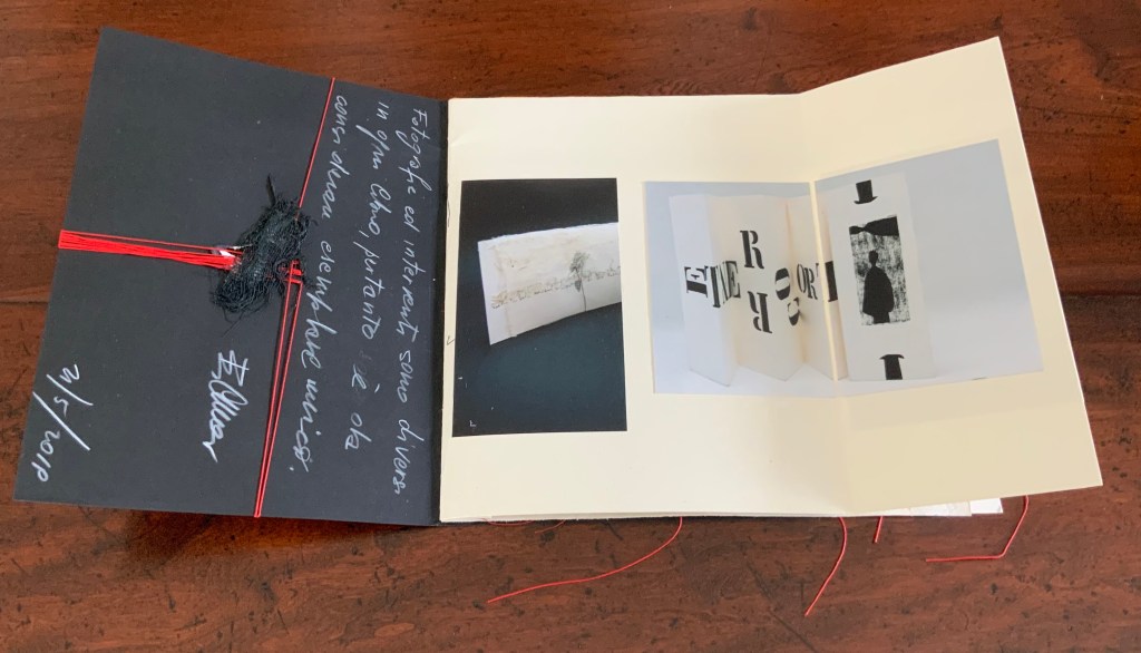
When the right half of Parole non dette turns, the second work — controcorrente /”against the current” (2010) — comes into view.
Although pasted on one side of the folio, the photograph of controcorrente splits in two at the fold, the left side and right side precisely registered with one another on either side of the fold. This is subtle. First an image reunited and aligned by virtue of cut and fold, then second an image separated but aligned by virtue of cut and fold. We may be long used to how juxtaposition works artistically on the flat surface of collage or the multiple surfaces of assemblage. Cumer teaches this afresh with the flat and multiple surfaces of book structure as well as with the materials and techniques of bookmaking.
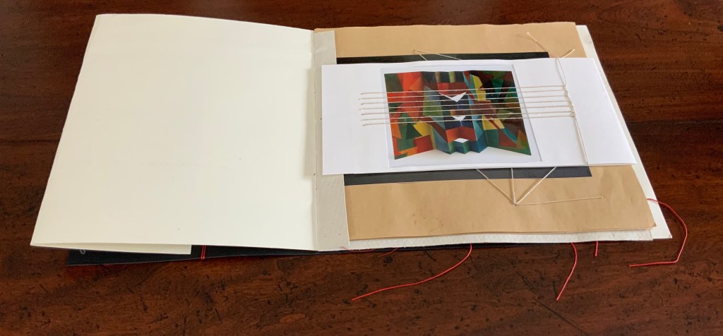
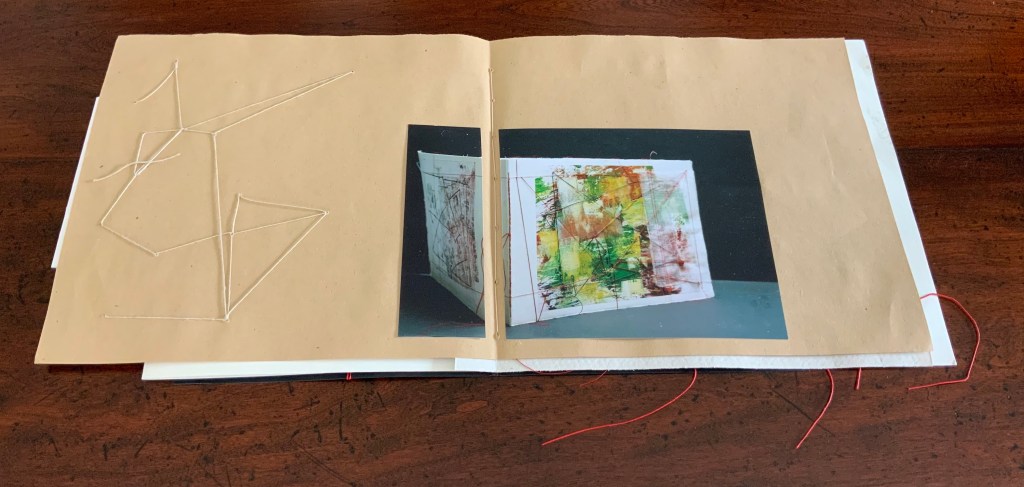
The next three works appear in a fold-out insert attached to the stub of a textured folio that also supports a brown paper folio following the insert. The colorful città / “city” (2018) reflects how Cumer’s palette and sculptural repertoire extends beyond the black and white leporello of controcorrente. The threads sewn in parallel over the photograph of città not only reflect another part of Cumer’s material repertoire, they also enact another part of her sculptural repertoire in the way they work with, in, and across the photographs and folios.
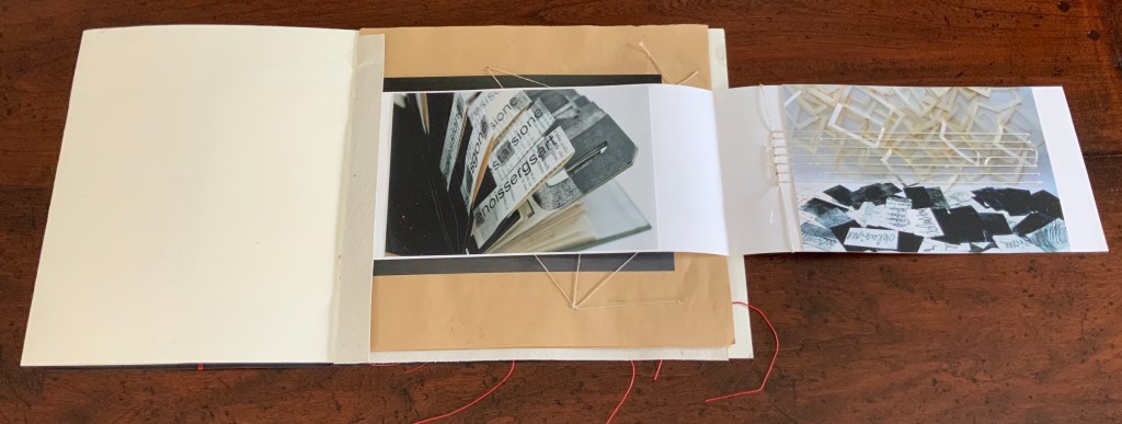
When the image of città / “city” folds out to the right, photographs of two more works appear: desiderio di … arte / “desire for … art” (2012) and illusione – delusione / “illusion – delusion” (2012). The image of desiderio highlights Cumer’s use of the flag book structure, although there is structurally much more to that work’s composition. The parallel threads that extended over the photo of cittá on the other side of the fold-out now pierce the photograph of illusione – delusione.
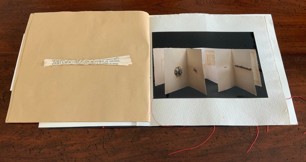
The next work to appear — il libro segreto /”the secret book” (2018) — carries on with the intervention and penetration by thread. The patterns formed by the thread reflect and extend those which can be seen in the photograph of il libro segreto. Leaping out of the photograph and penetrating the supporting brown paper folio, the thread introduces a new motif that will recur in just a few more pages.
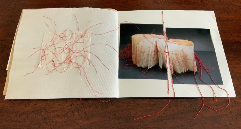
The spread presenting the next work — fili intrecciati / “twisted threads” (2018) — reverts to the split aligned photo as used with controcorrente, but here the division comes at the center of the double-page spread. Off to the left side, the abstract figure in stitched thread echoes the technique used in fili intrecciati itself and starts another recurring motif in the catalogue.
No intervention occurs in the photograph of cancellazioni e riscruttare / “cancellations and rewritings” (2018). No cuts, no folds, no threads, but on the facing verso page, Cumer brings to life one of the cancelled/rewritten objects that can be seen in the photograph. Just as in fili intrecciati, the thread-bound bundle of strips of cut text has leapt from two dimensions to three dimensions, highlighting again how Cumer uses the flat and multiple surfaces of book structure as well as the materials and techniques of bookmaking to re-teach us how juxtaposition works artistically on the flat surface of collage and the multiple surfaces of assemblage.
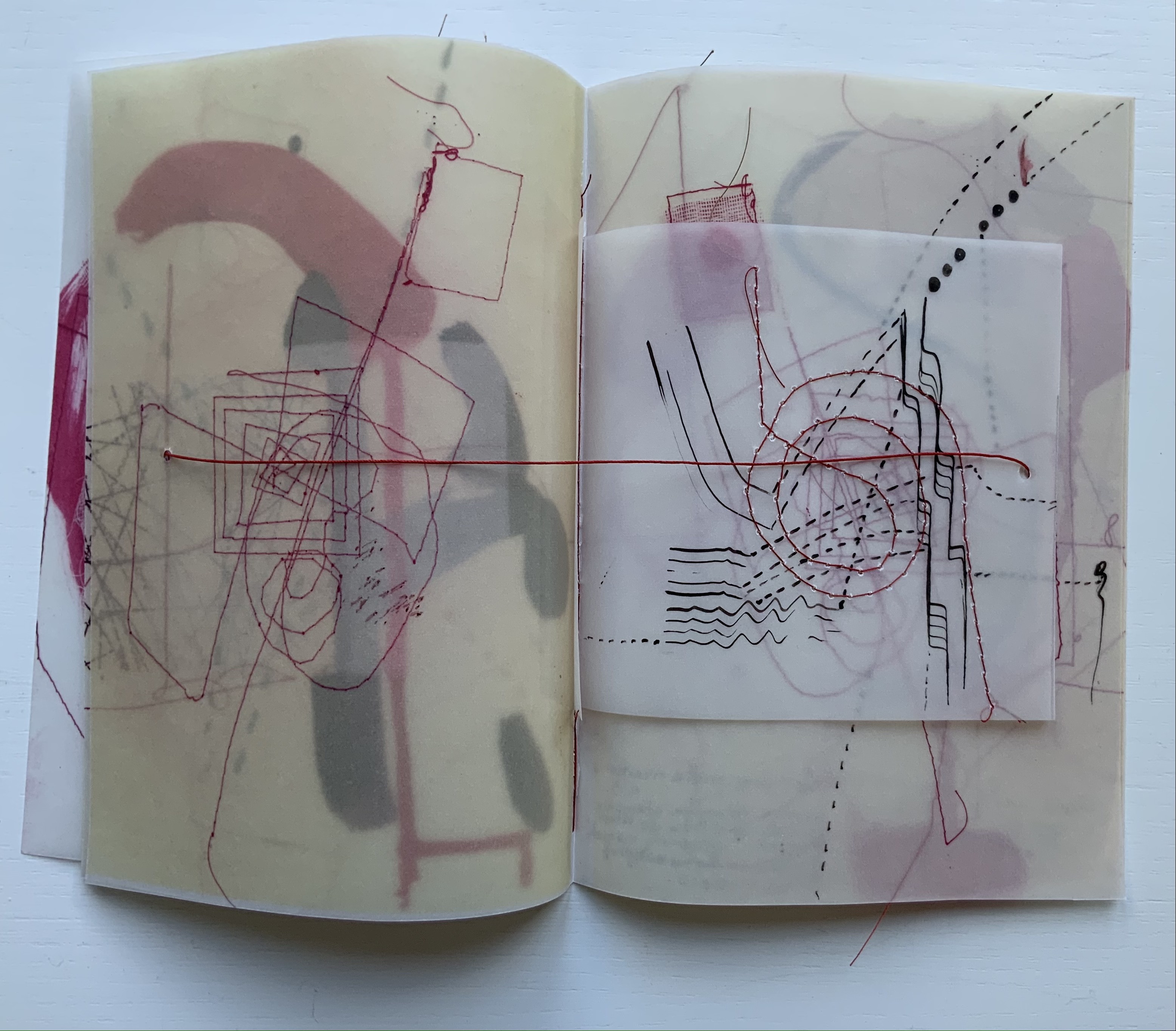
Following but elaborating on the previous spreads’ motif of juxtaposing an extract of the work with a photograph of the work, Cumer places a red-threaded square of tartalan across from the cut and misaligned photograph of la poesia dell’universo / “the poetry of the universe” (2018). The cut photograph is split by a red stitch that divides in two itself.
Here is where the variation on the two dimensional becoming three dimensional introduced by il segreto libro recurs. Defying the gutter’s separation of the tartalan sample from the whole work and the severing of the photo on the recto page, threads from the sample cross the gutter, fall across one half of the photograph, and link up with the severing stitch. The thicker thread of the severing stitch passes under the other half of the photograph to exit from it on the right and fall across the image of red threads similarly exiting the work itself. The ways in which this double-page spread speaks to the self-reflexive nature of book art and the paradoxical relationship of art to what it re-presents are remarkable.
The final work in the catalogue — visioni urbani / “urban visions”(2015) — resides in the Books On Books Collection. More about it can be found here. Threads do not make an appearance in visioni urbani, but their triangular appearance here does reflect on urbanivisioni. If the space to the left of the red stitching can be counted as a page, this is a “three-page” spread echoing the three-way split of the photo of the work, which echoes the tripartite physical structure of the work itself.
In the colophons of several earlier works, Cumer has drawn attention to this practice in libro catalogo of recycling her works. She labels them as part of projects “born of work with old books”, “born from her artist’s books”, and “born of her work with old theater posters”. Three of them are explored below, and three others can be found in a previous entry on her work.
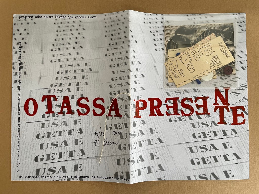
PRESENTE/OTASSA (2015)
PRESENTE/OTASSA / “Present / Tax” (2015) Eleonora Cumer Sewn booklet. H287 x W204 mm. [8] including cover. Edition of 50, of which this is #19. Acquired from the artist, . Photos: Books On Books Collection.
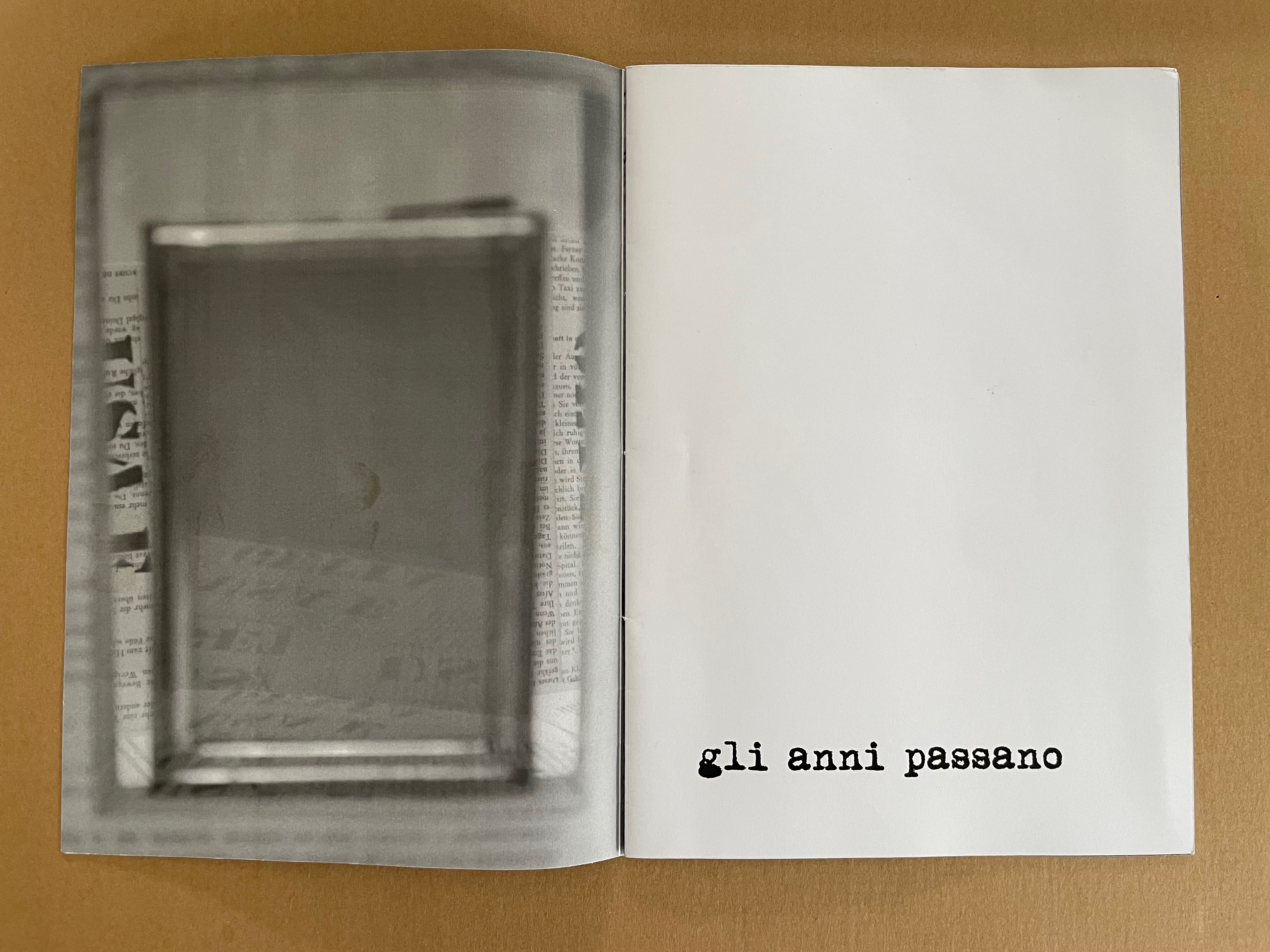
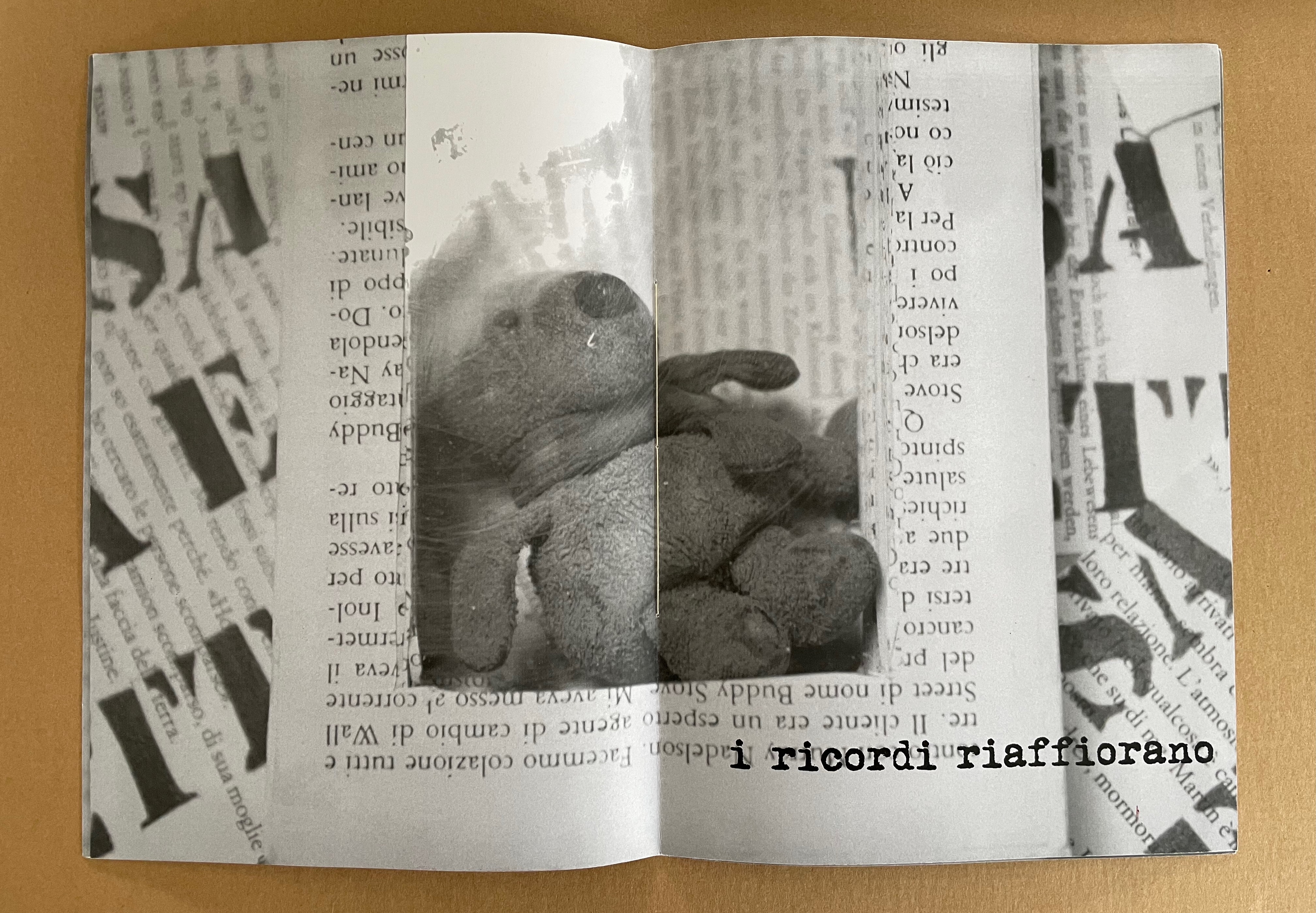
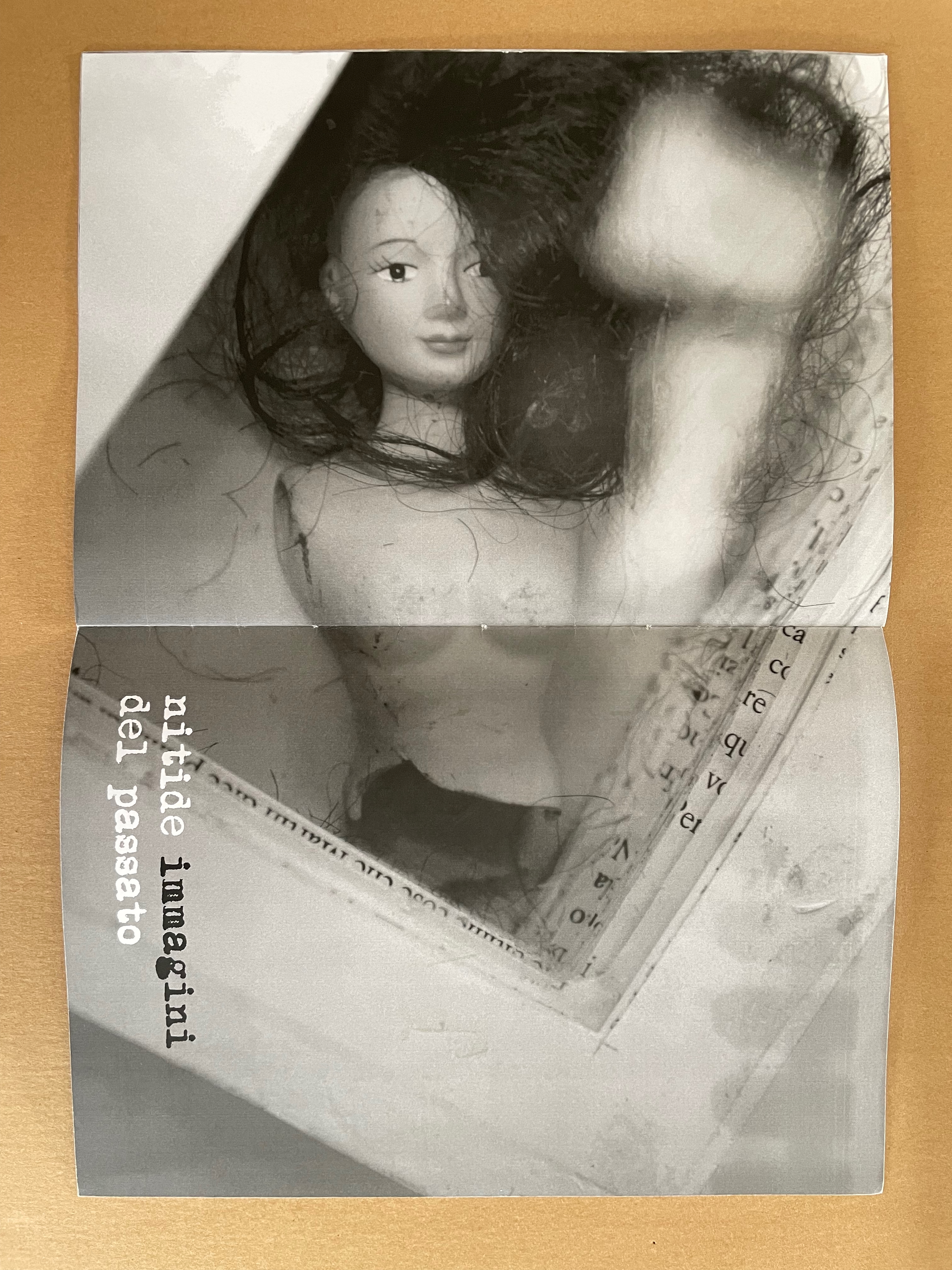
Whether read as otassa presente or presente otassa, the translation of this sewn booklet’s title comes out the same: a present tax. The phrase in the background — usa e getta — stamped over ghosted images of cutout book pages means “disposable” and is used as the title of a 2014 work. The ghosted book pages come from the Italian edition of Mario Puzo’s last novel Fools Die, a Hollywood/Wall Street potboiler. The front cover’s sealed plastic envelope containing cut-up sewing patterns, buttons, thread and an old photograph of a little girl wearing a knit shawl and sitting in a white wicker chair makes the intriguing juxtapositions only more so. What do these collaged and assembled elements have to do with one another?
Some clarity dawns with phrases on the interior pages: gli anni passano (“years go by”), i ricordi riaffiorano (“memories come back”), and nitide immagini del passato (“clear images of the past). “Disposable” alludes not only to the novel whose pages wallpaper the cover and interior pages but also to Cumer’s work of the preceding year — USA E GETTA (2014), a series of unique altered books. The series is the source of the images inside PRESENTE/OTASSA. Each shows a hollowed-out book with an object held in place between clear plates — a picture frame (empty except for the reflection of the foreground — the rest of the work it comes from), a stuffed toy, and a broken dress-up doll. Things of the past that in general are disposable (like sewing patterns no longer needed or broken dolls) nevertheless come back as clear images: a tax on the present.
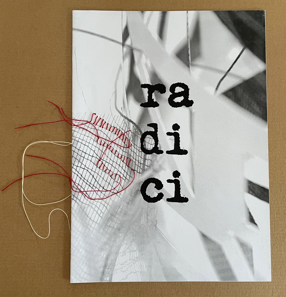
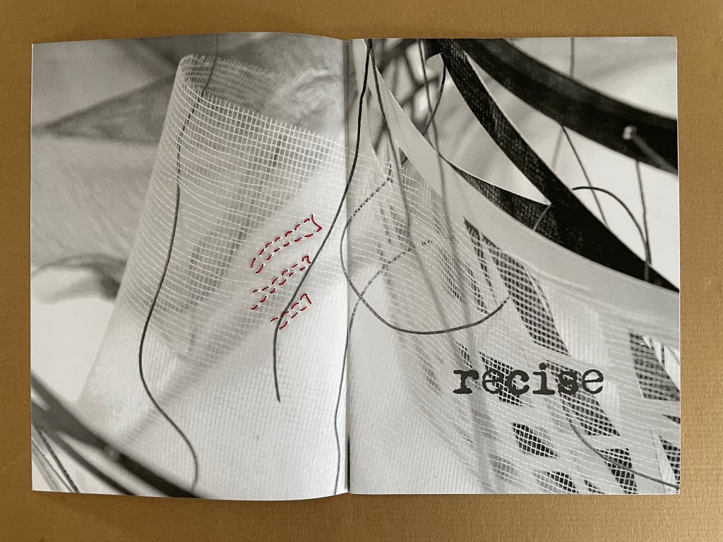
radici/ in memoria dei miei genitori (2015)
radici/ in memoria dei miei genitori / “roots/ in memory of my parents” (2015) Eleonora Cumer Sewn booklet with stitching. H287 x W206 mm. [8] pages. Edition of 50, of which this is #11. Acquired from the artist, . Photos: Books On Books Collection.
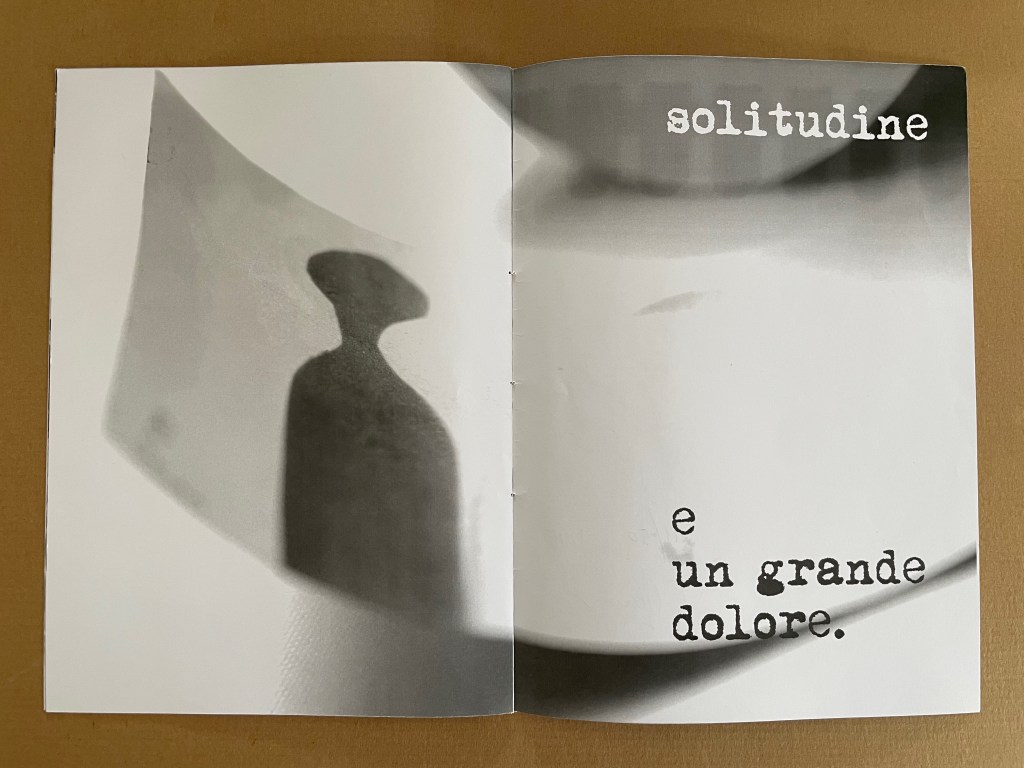
The theme of memory continues in radici/ in memoria dei miei genitori / “roots/ in memory of my parents” (2015) but perhaps more poignantly than in presente/otassa. Drawing on the previous works moltitudine e solitudine/ “multitude and solitude” (2013) and no time no space (2015), the booklet also evokes Cumer’s passion for textile and fabric art. The small image of a sewing box in the lower left hand corner of the central spread may speak to a parental source of that passion, but the words on the other spreads — recise and solitudine e un grande dolore (“severed or sever or cut” and “loneliness and a great sorrow”) — turn that central spread into a collage of loss almost more so than a collection of memories. It is one of the more somber works by Cumer in the Books On Books Collection.
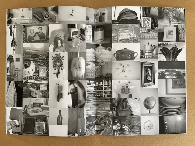
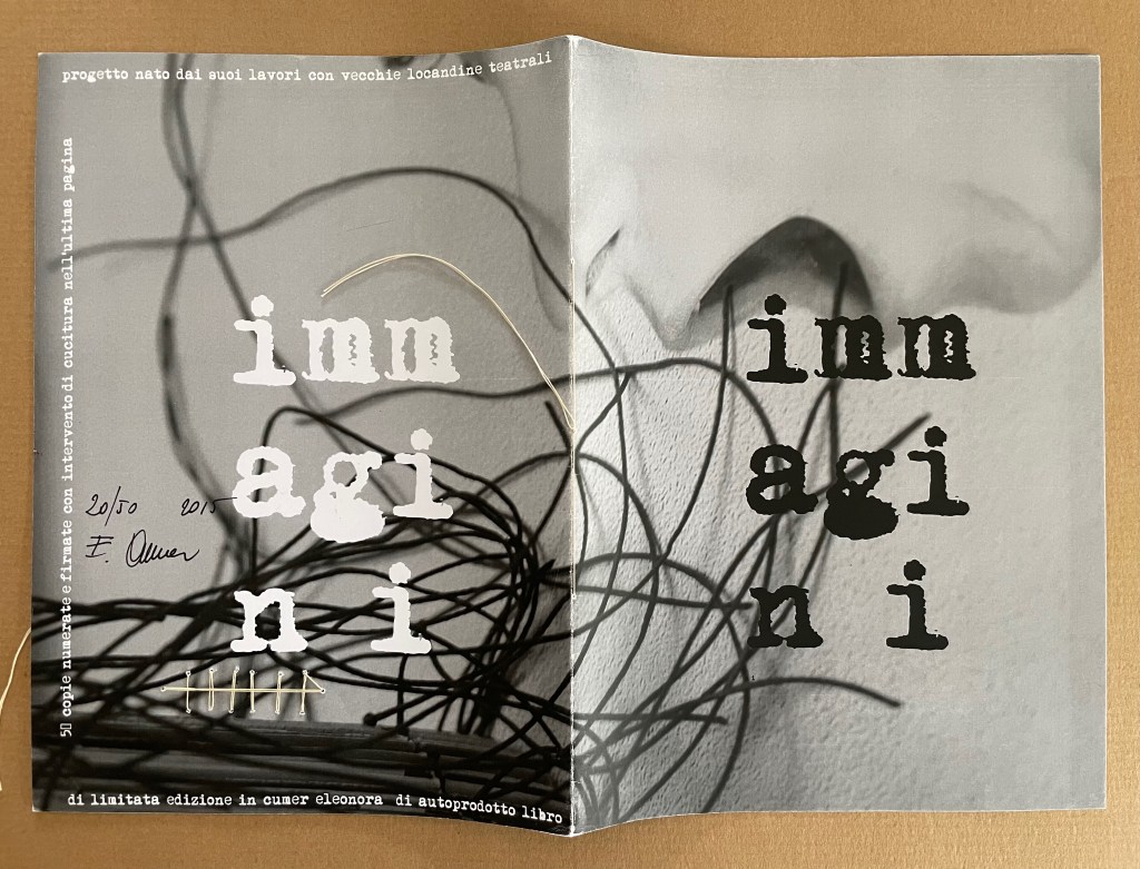
immagini (2015)
immagini / ‘“images” (2015) Eleonora Cumer Sewn booklet with stitching on the last page. H287 x W206 mm. [8] pages. Edition of 50, of which this is #20. Photos: Books On Books Collection.
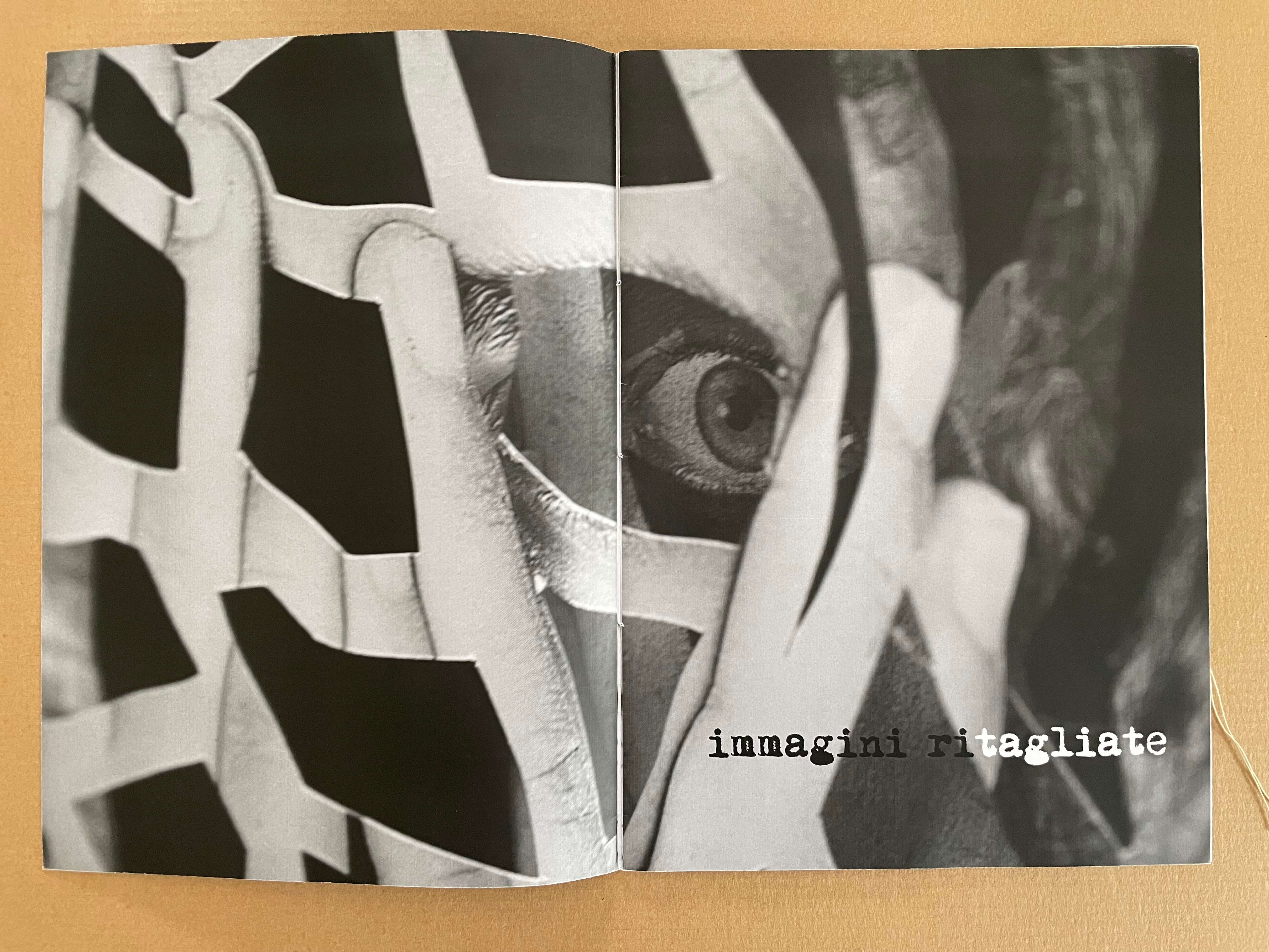
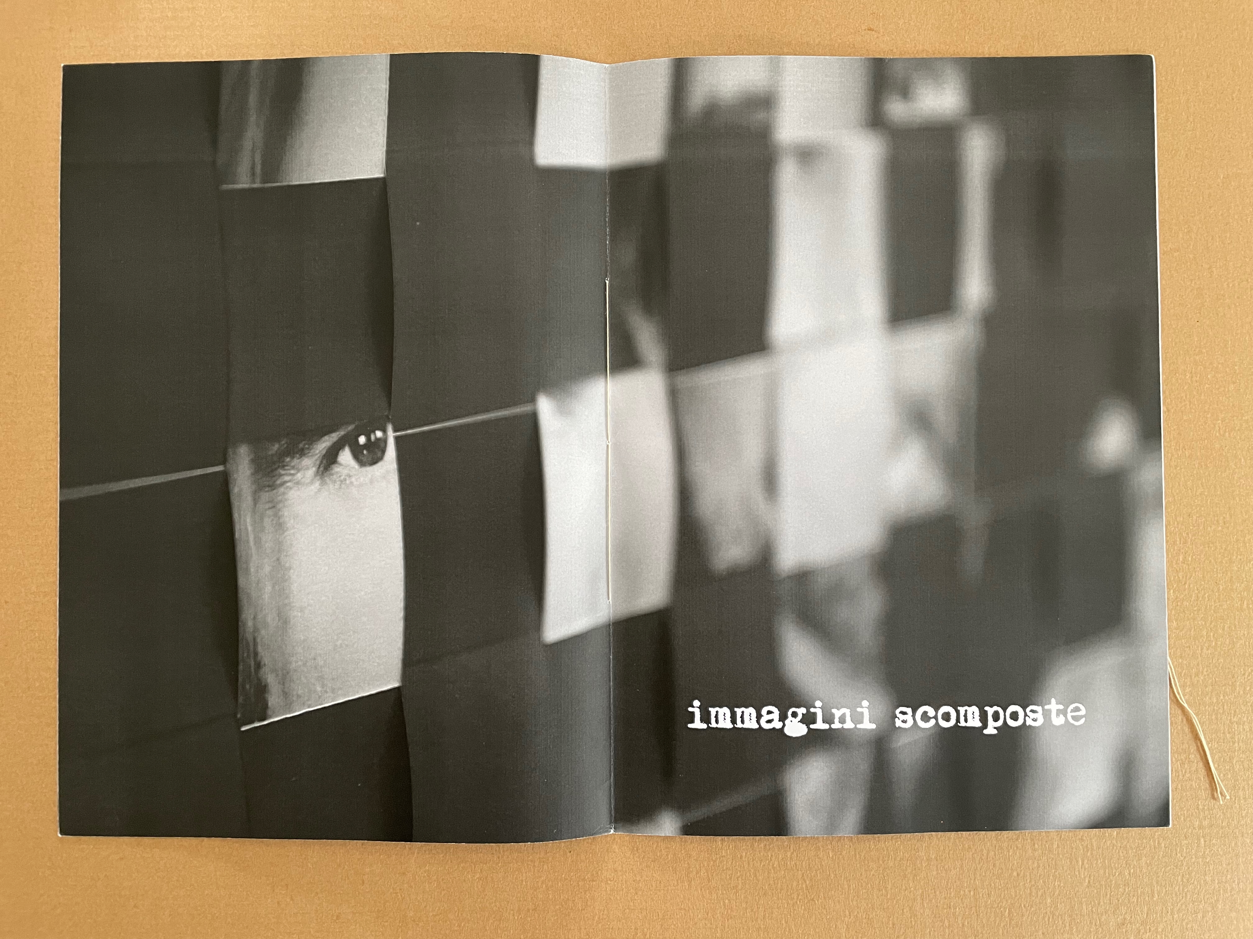
The overlaid phrases immagini ritagliate, immagini scomposte, and immagini cucite can be translated as “cut out images”, “distorted images”, and “stitched images”, respectively. On the cover of the unreadable book displayed, the words FINZIONE / “fiction” and REALTÁ / “reality” are spelled in reverse. As in libro catalogo, there is self-reflexivity at play here. Cumer plays with the word ritagliate by printing ri in black and tagliate in white, creating two verbs — ritagliate (“cut out”) and tagliate (“cut”), which apply to the word itself, the technique in the poster displayed, and the fragment of it blown up on the double-page spread. By blurring the image on the recto page of the second double-page spread, she makes the spread play out the meaning of scomposte — “distorted”. And in the third spread, she playfully stitches over the word cucite — “stitched” — which comments not only on the word but also on the stitched unreadable book on the verso page.
*Giocare è una cosa seria! I bambini di oggi sono gli adulti di domani aiutiamoli a crescere liberi da stereotipi aiutiamoli a sviluppare tutti i sensi aiutiamoli a diventare più sensibili. Un bambino creativo è un bambino felice!
“Playing is a thing! Today’s children are tomorrow’s adults. Let’s help them grow up free from stereotypes. Let’s help them develop all their senses. Let’s help them become more sensitive. A creative child is a happy child!” Bruno Munari, on occasion of 1986
Bruno Munari, 1986, on occasion of a Children’s Workshop Laboratory, prompted by a series of seminars promoted in 1977 by Franco Russoli, Superintendent of the Pinacoteca di Brera.
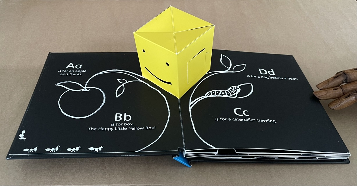
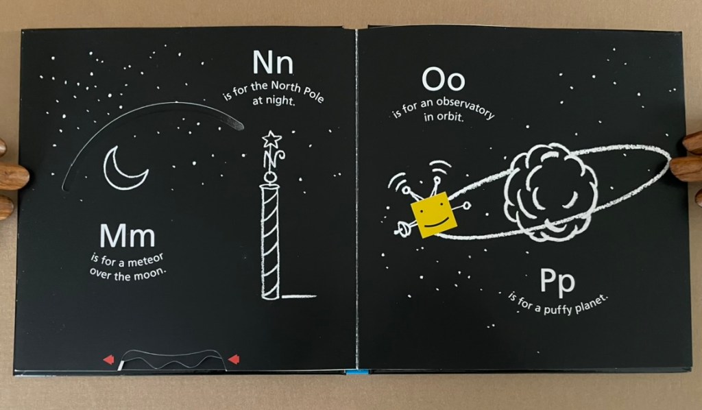
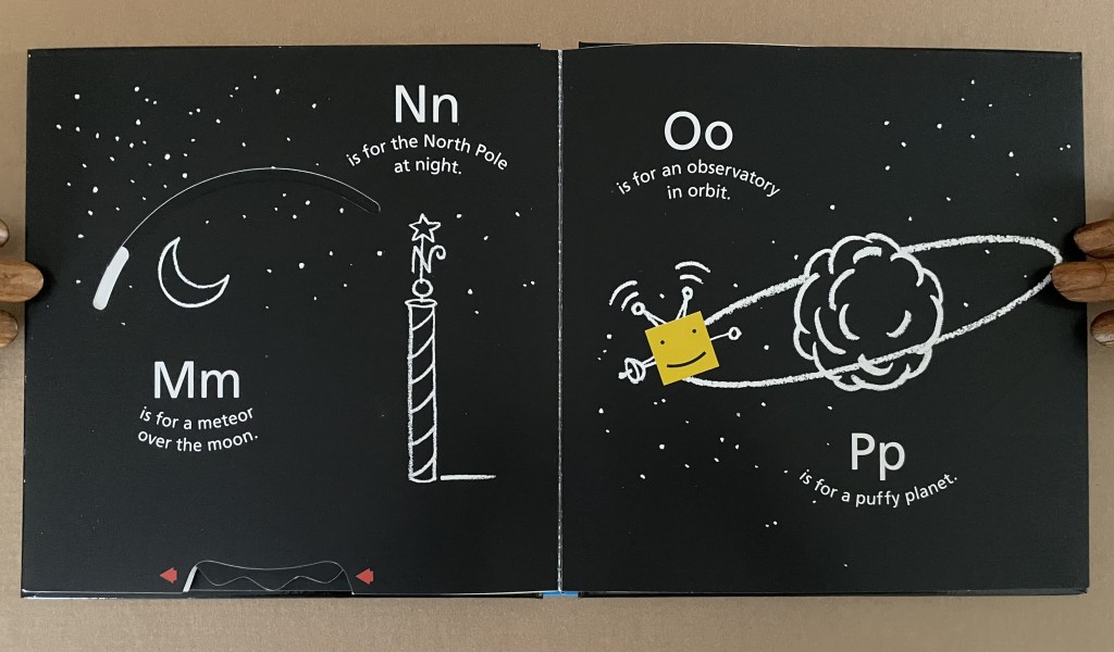
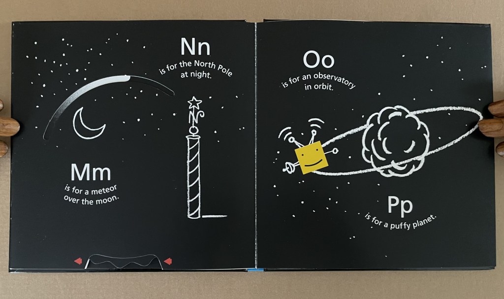
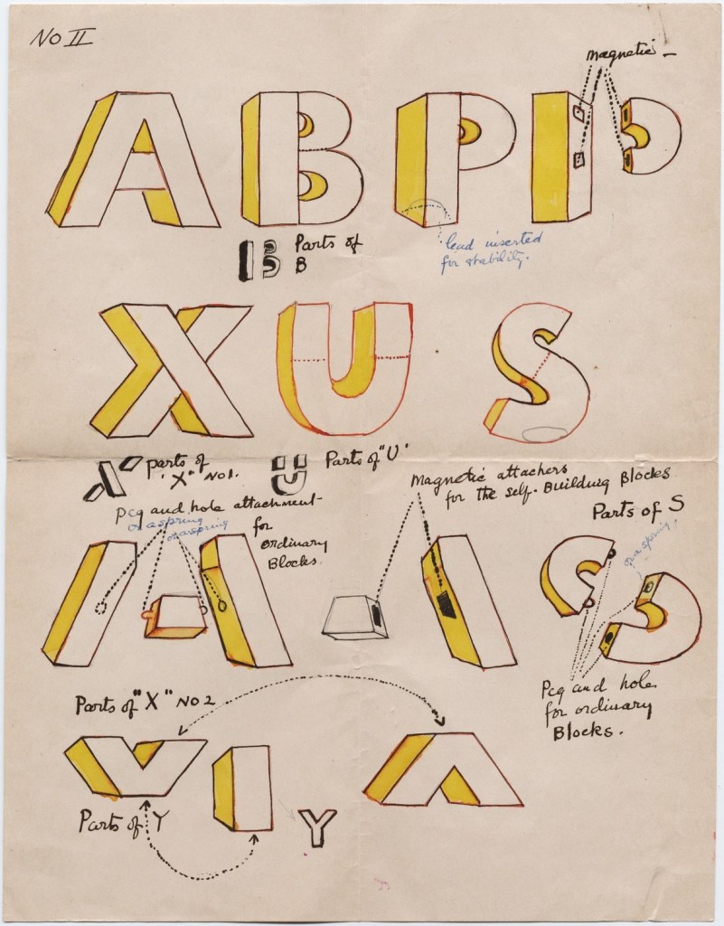
B is for Box (2014) David A. Carter Pop-up book, printed paper over boards. H187 x W184 x D28 mm. [14] pages. Acquired from Type Punch Matrix, 17 September 2024. Photos: Books On Books Collection.
“The Happy Little Yellow Box” was first introduced in a pop-up book of opposites by that name in 2012. For the Books On Books Collection, the box’s return in this pop-up alphabet makes it the one to add to all the other abecedaries here. The box is also a happy reminder of the items under Further Reading (below).
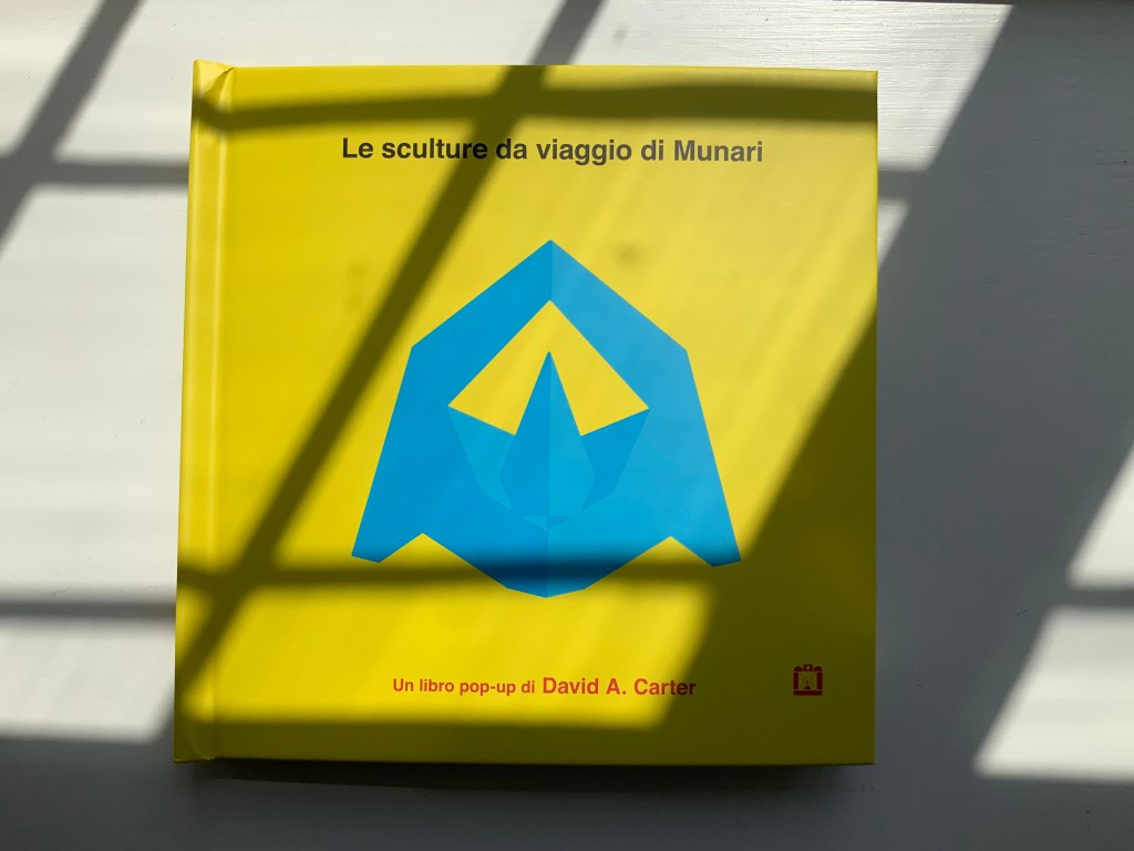
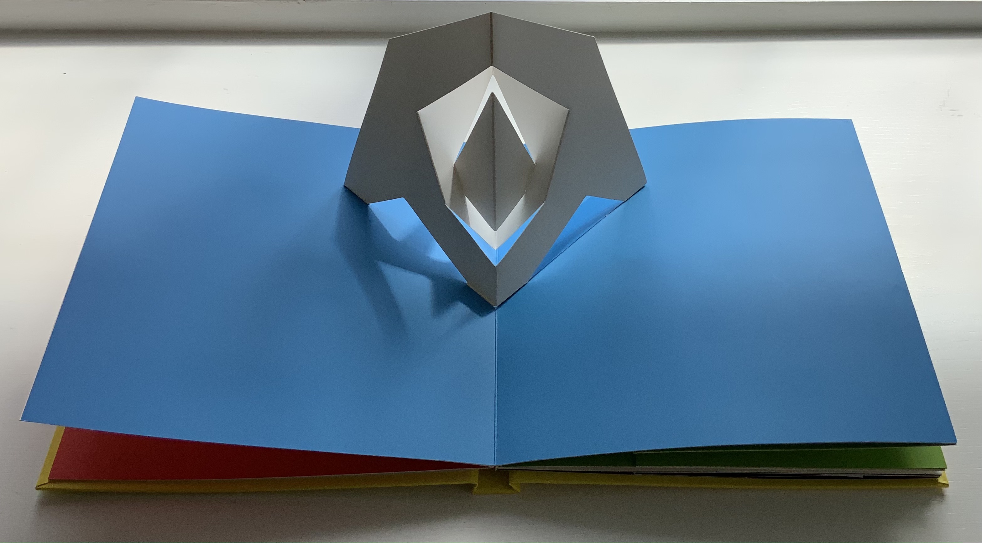
Le sculture da viaggio di Munari (2019)
Carter’s Le sculture da viaggio di Munari brings the spirit of Munari’s “travel sculptures” into the collection. His homage carries the blessing of Corraini Edizioni, further justifying its inclusion.
Travel sculptures started off as small sculptures (some even pocket-sized) to carry with you, so you could take part of your own culture to an anonymous hotel room. Later they were turned into ‘travel sculptures’, five or six metres tall and made of steel. One of these was seen for a few months in Cesenatico, another one in Naples. Others are sleeping among huge trees in the Alto Adige region.’ This is how Italian designer Bruno Munari (1907-1998) described his ‘travel sculptures’, which in turn inspired American illustrator and designer David A. Carter for this pop-up book. –Corraini Edizioni website. Accessed 3 August 2021.
Munari’s travel sculptures also recall works in the collection like Cumer’s scultura da viaggio dipinta n.2(2017), Komagata’s「Ichigu」(2015) and, albeit less portable, Ioana Stoian’s Nous Sommes (2015).
Rubin, Ellen. 2019. Ellen Rubin – The Popuplady. For her definition of the “spider web” form of pop up (Within a circle, a spiral is cut either by hand or laser. A ribbon or pull is attached to the center area. When pulled up, a ‘spider web’ pop-up is created.), Rubin illustrates it with an example from Carter.
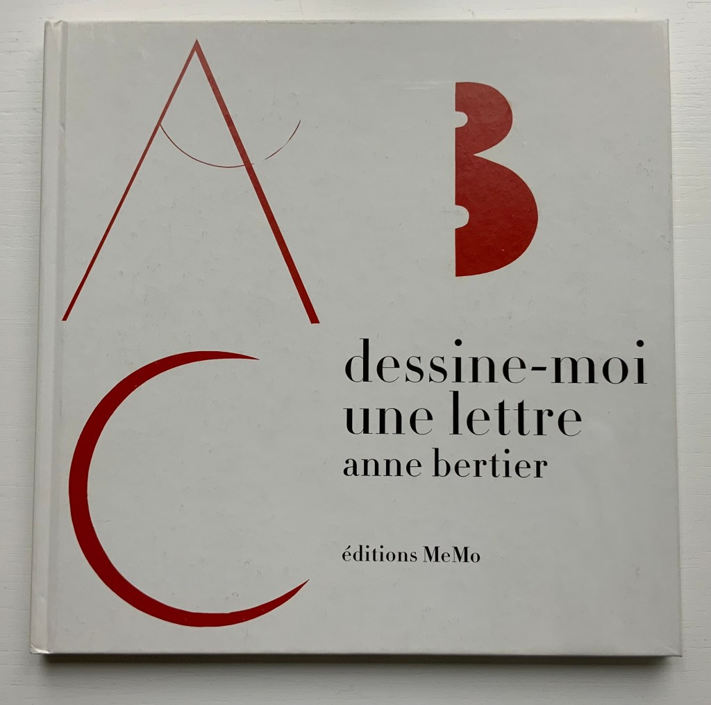
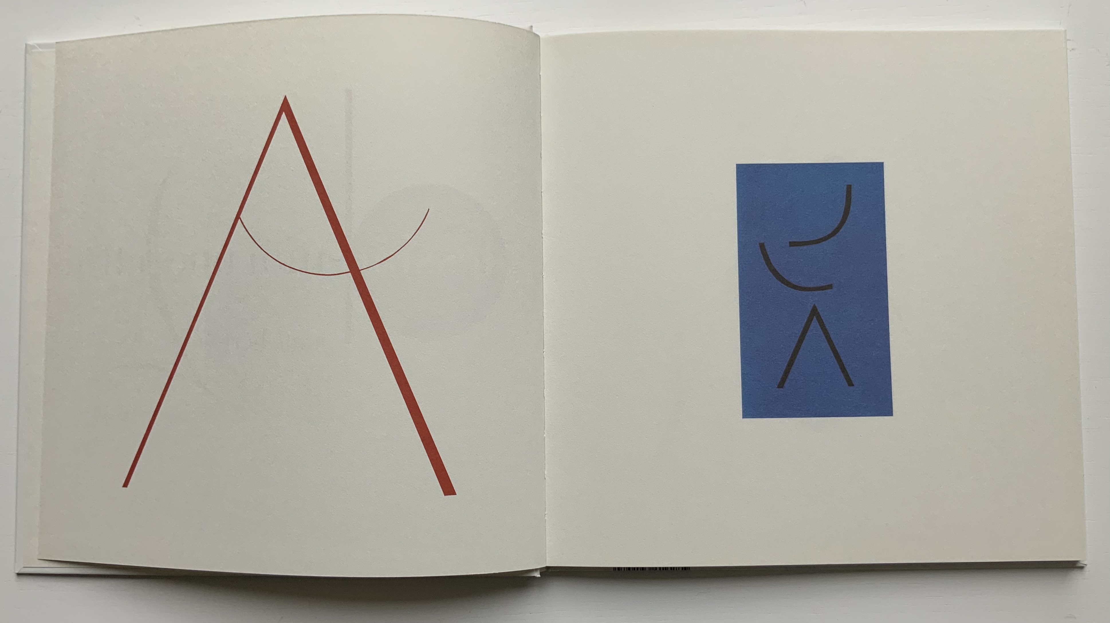
Dessine-moi une lettre (2004) Anne Bertier Casebound, sewn. H258 x W258 mm, 56 pages. Acquired from Amazon, 17 August 2021. Photos of the work: Books On Books Collection.
Anne Bertier’s three alphabet books cross sub-genres of the ABCs with distinctive style and educational challenge. While the answers to the visual puzzles are offered at the end of the first and last books, considerable pleasure is missed by giving up too quickly. For the English speaker learning French, there’s the added pleasure of cementing a familiar word with Bertier’s images and discovering a new word that will also stick because of them.
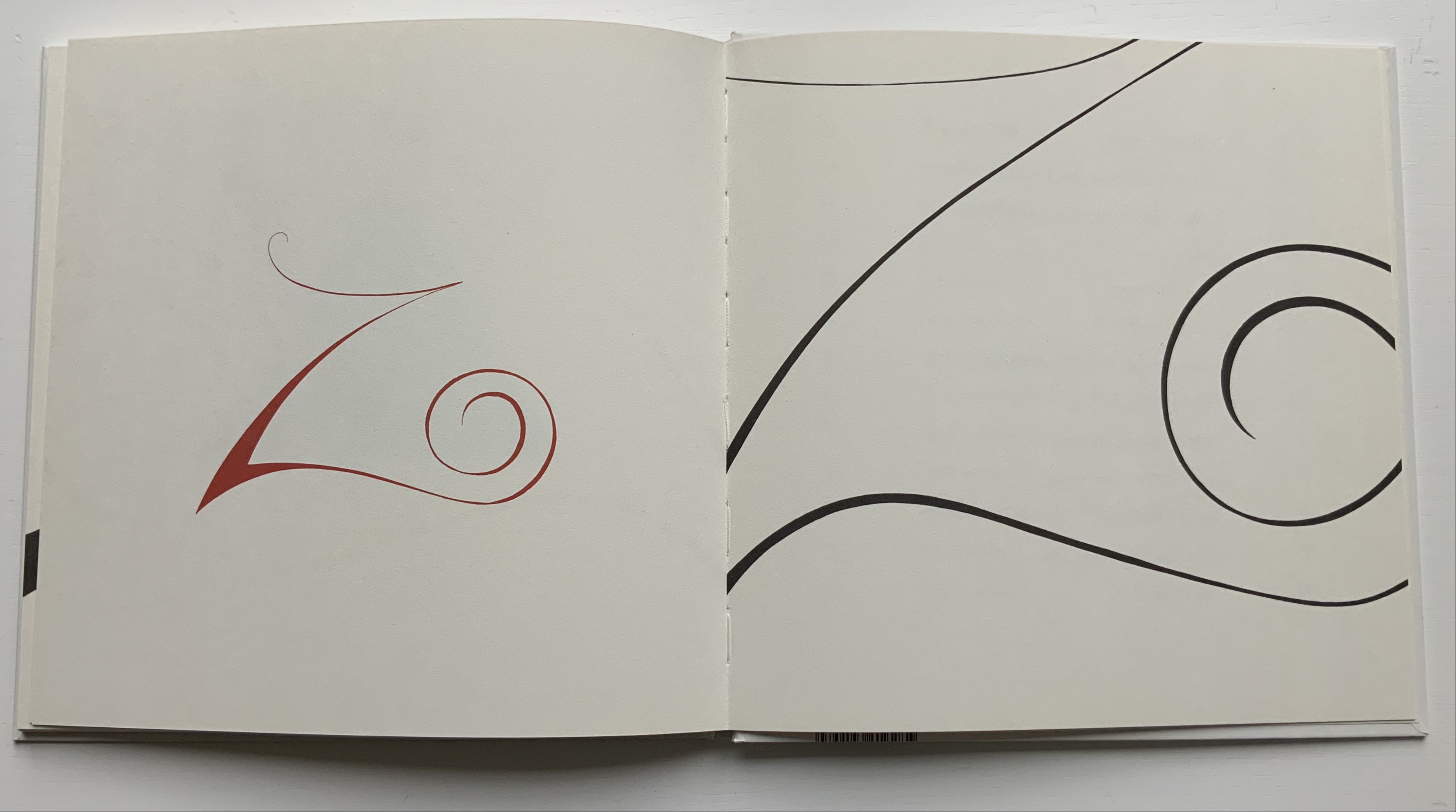
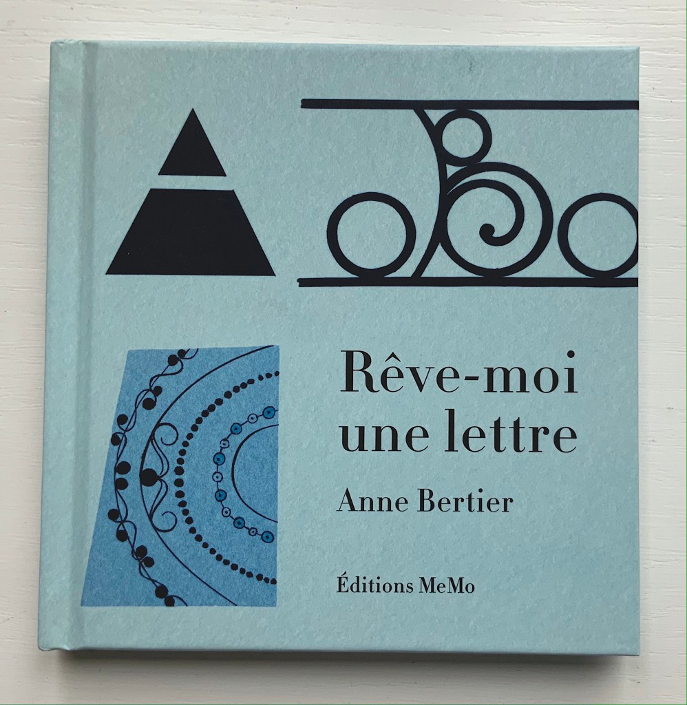
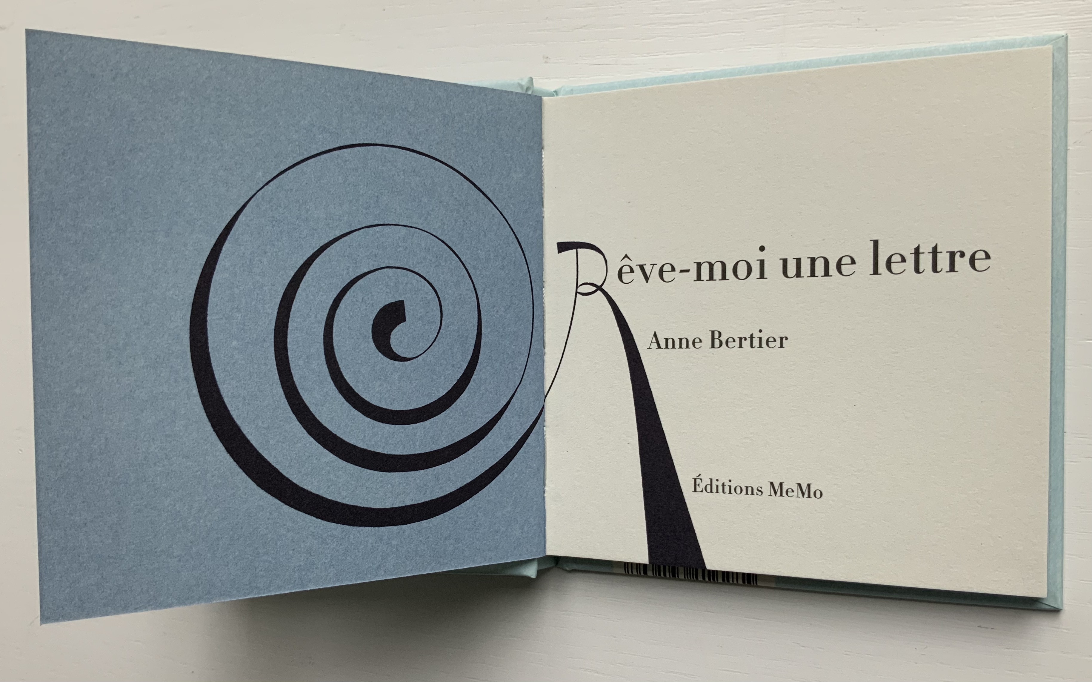
Rêve-moi une lettre (2005)
Rêve-moi une lettre (2005) Anne Bertier Casebound, sewn. H135 x W132 mm, 52 pages. Acquired from Amazon, 30 August 2021. Photos of the work: Books On Books Collection.
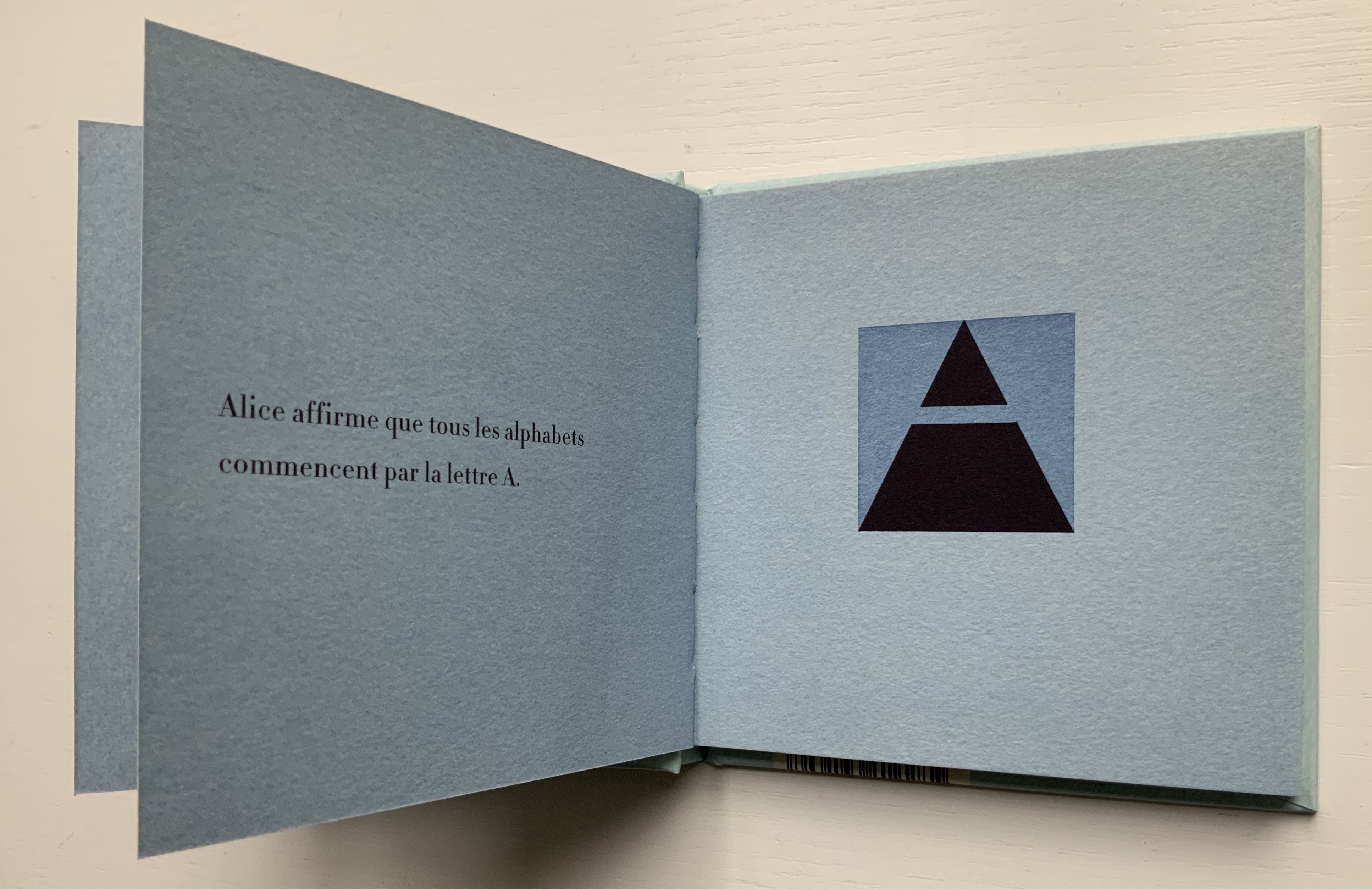
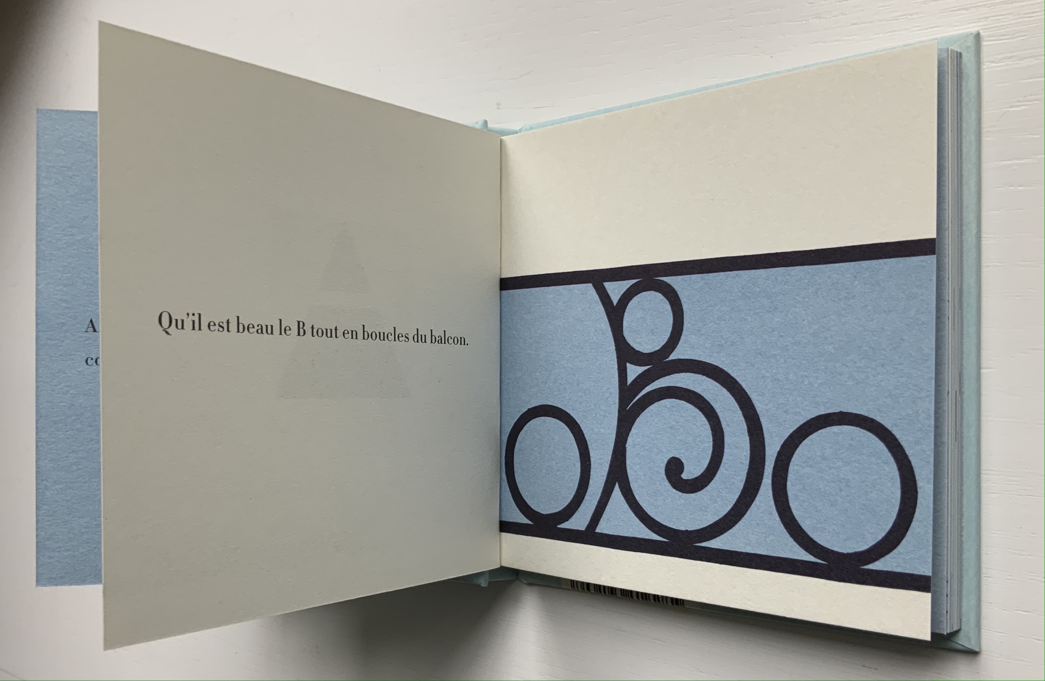
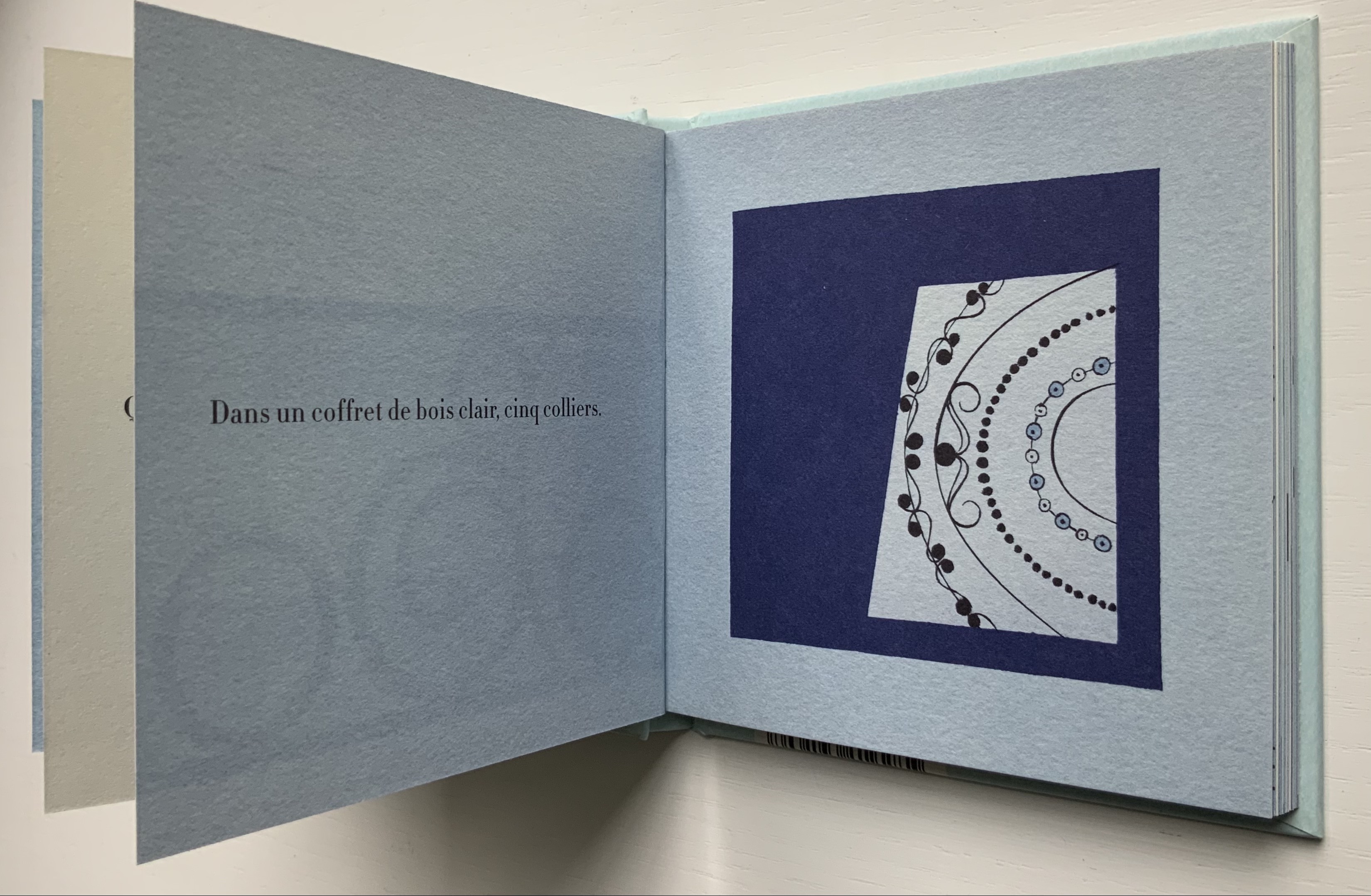
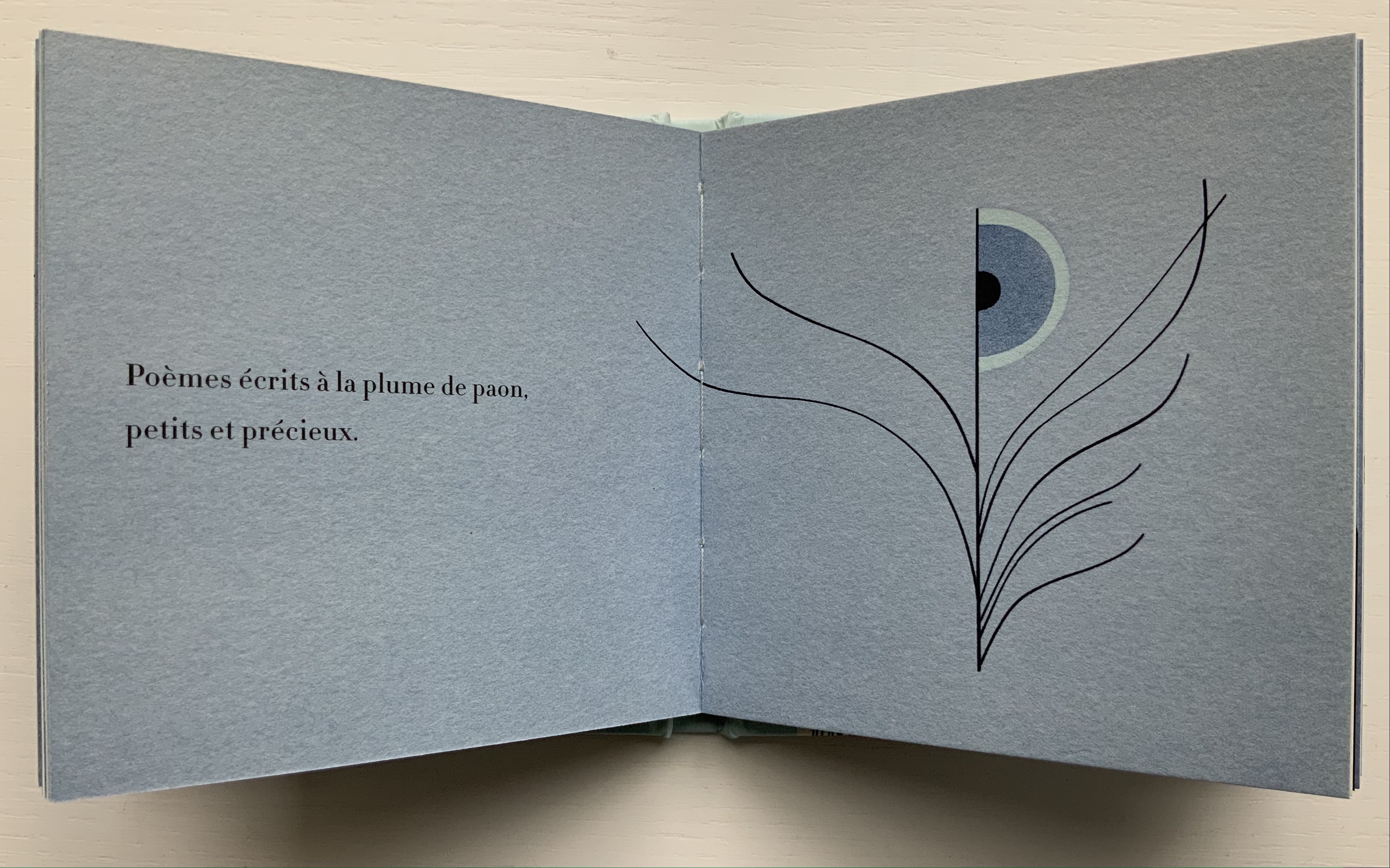
Here is the French version of the alliterative alphabet. Its opening with Alice suggests an underlying literary motif, but more likely at play is the association of the book’s title (“dream me a letter”) with Alice’s dreaming of Wonderland.
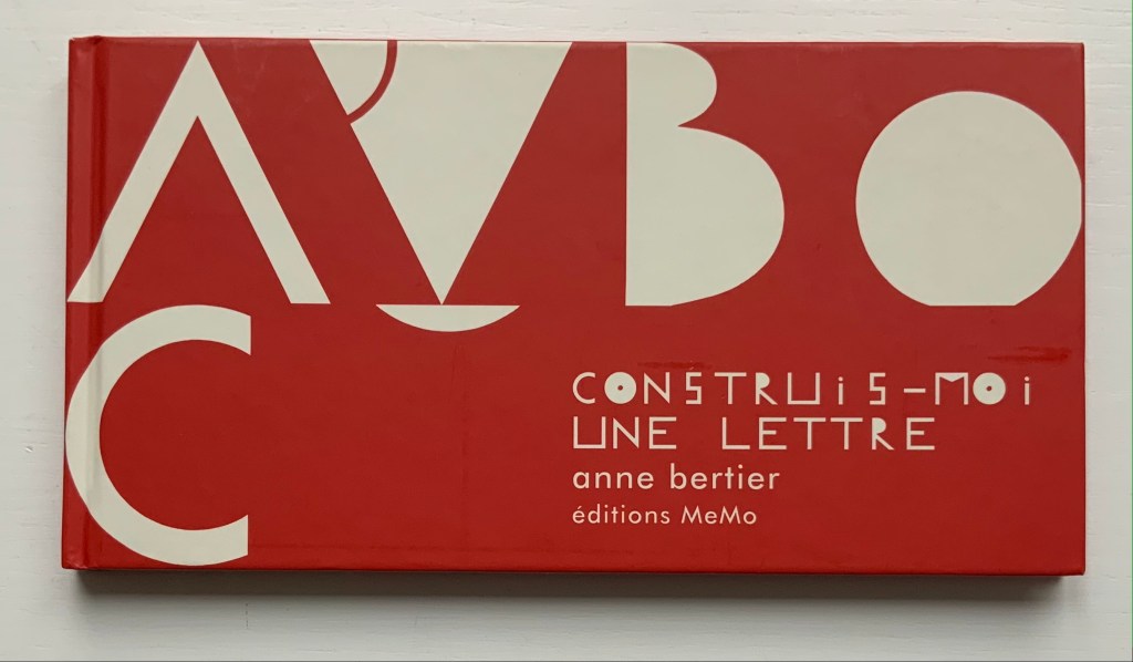
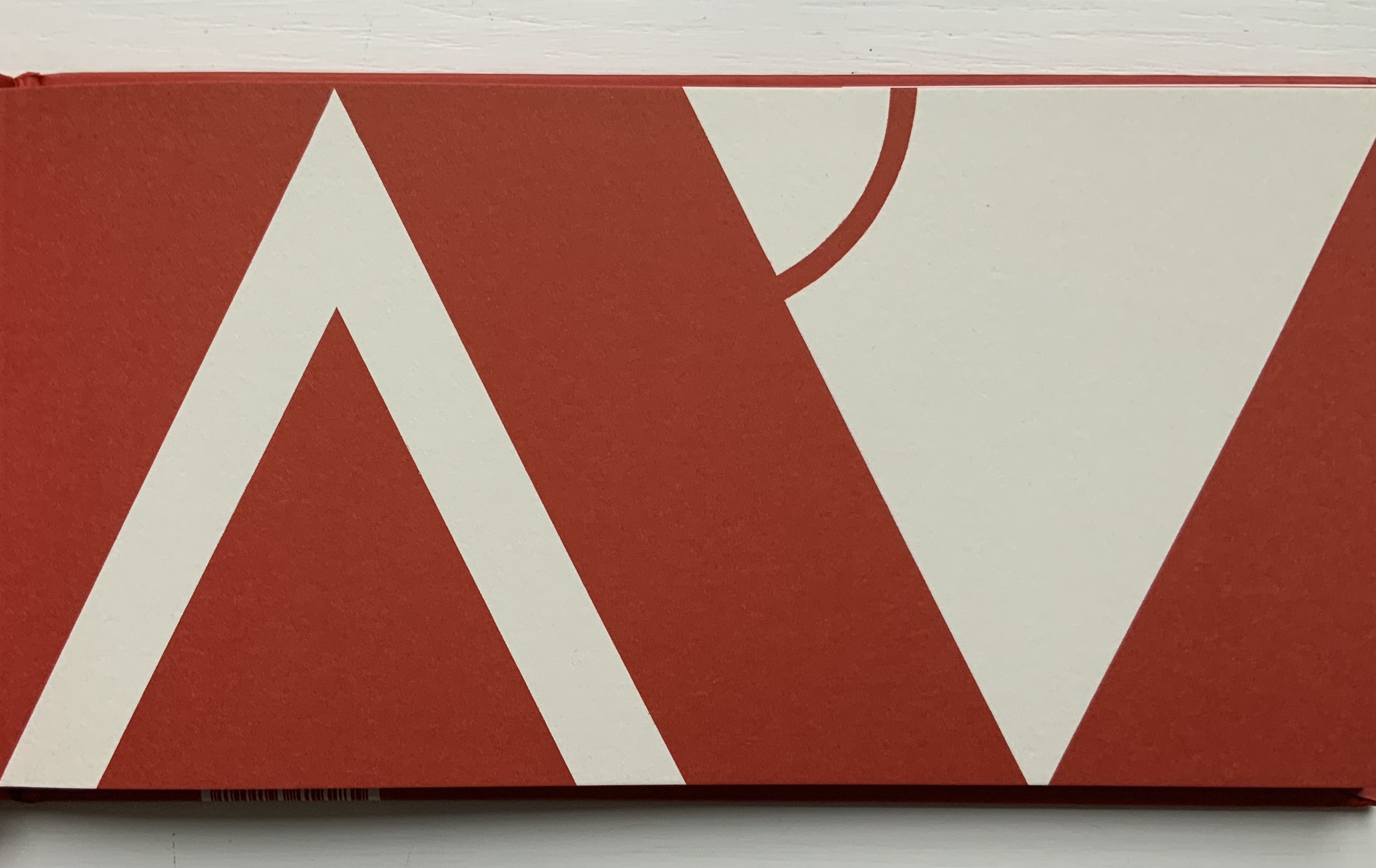
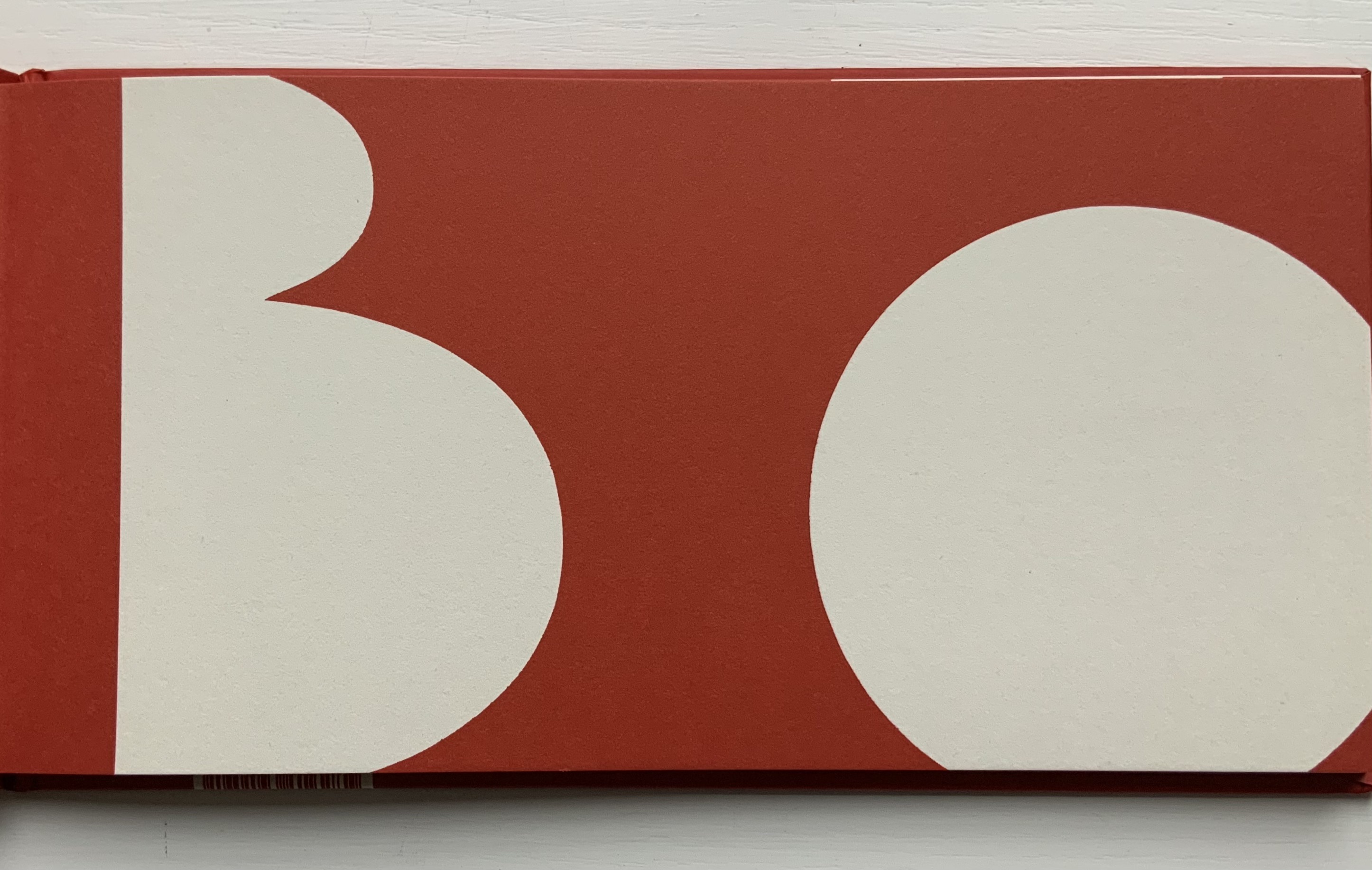
Construis-moi une lettre (2008)
Construis-moi une lettre (2008) Anne Bertier Casebound, sewn. H135 x W256 mm, 56 pages. Acquired from Amazon, 17 August 2021. Photos of the work: Books On Books Collection.
The English alphabet’s “go to” for the letter A does not work for the French pomme, but from the similarity between the image here and that in Dessine-moi un lettre, there seems to be one, too, for the French alphabet. With the cognate word in French and English, the letter B is too easy. But C is for ?
With the overlap between design, art and children’s education, Bertier’s numerous large-scale exhibitions in China, Italy, Japan, Korea as well as France come as no surprise. Think of Dik Bruna, Eleonora Cumer, Katsumi Komagata or Bruno Munari.
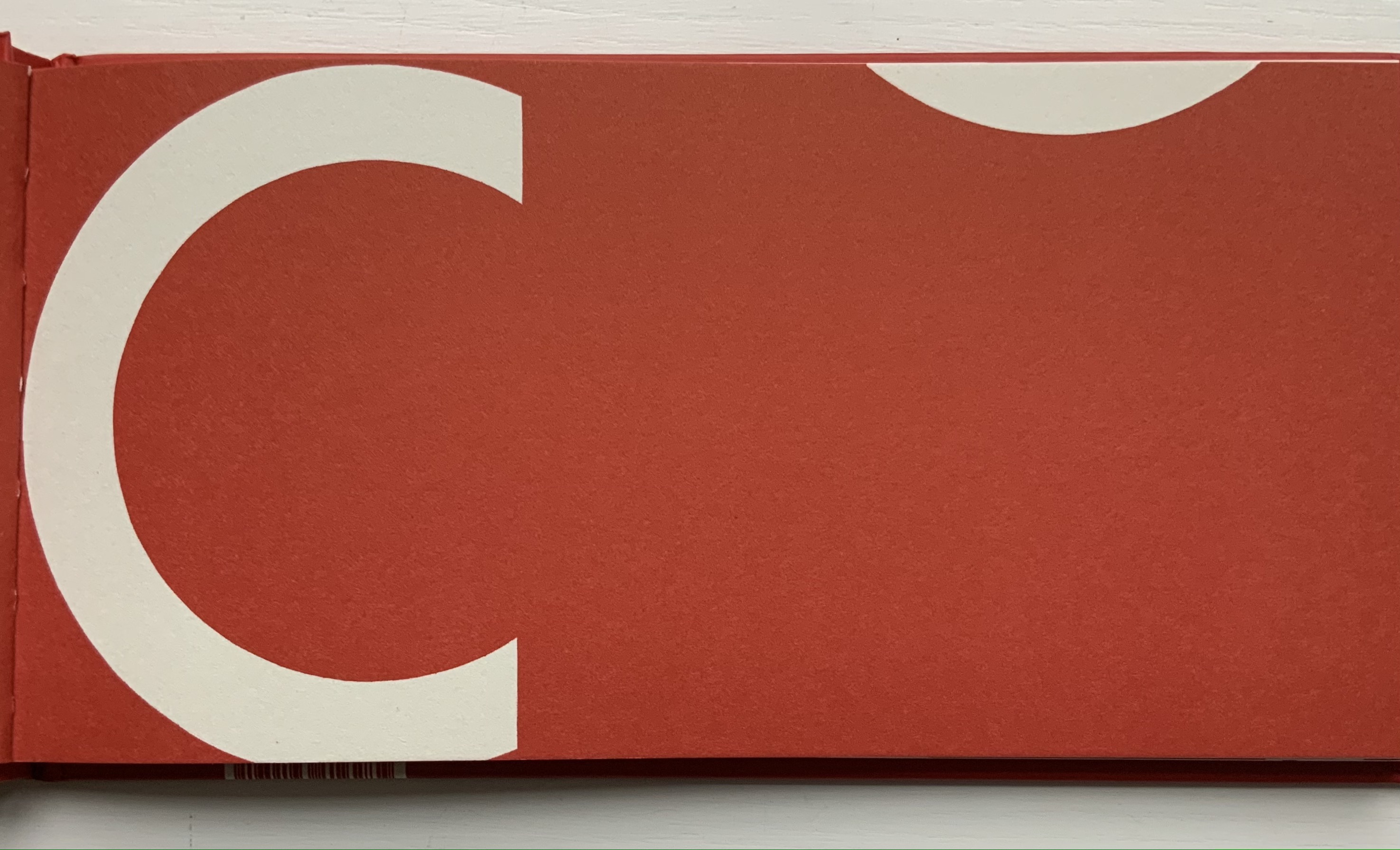
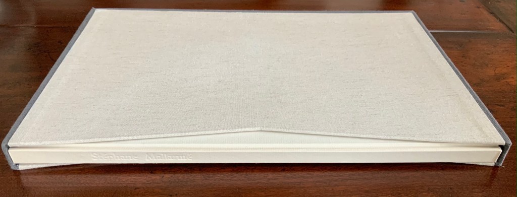
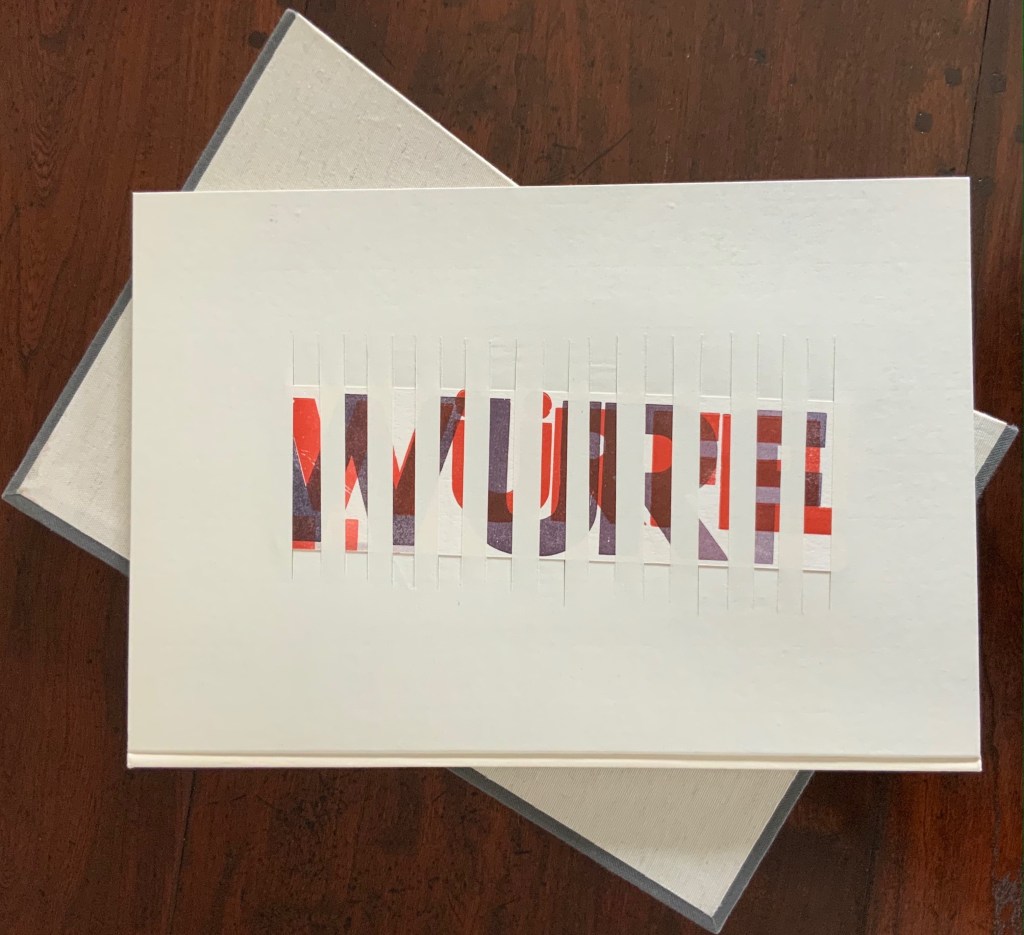
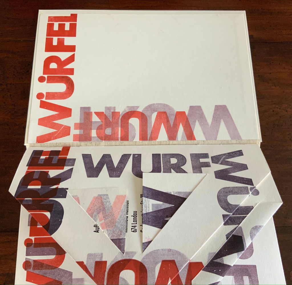
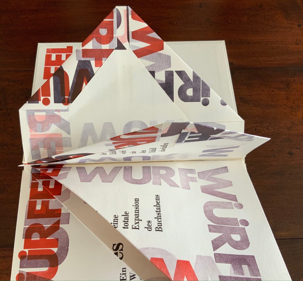
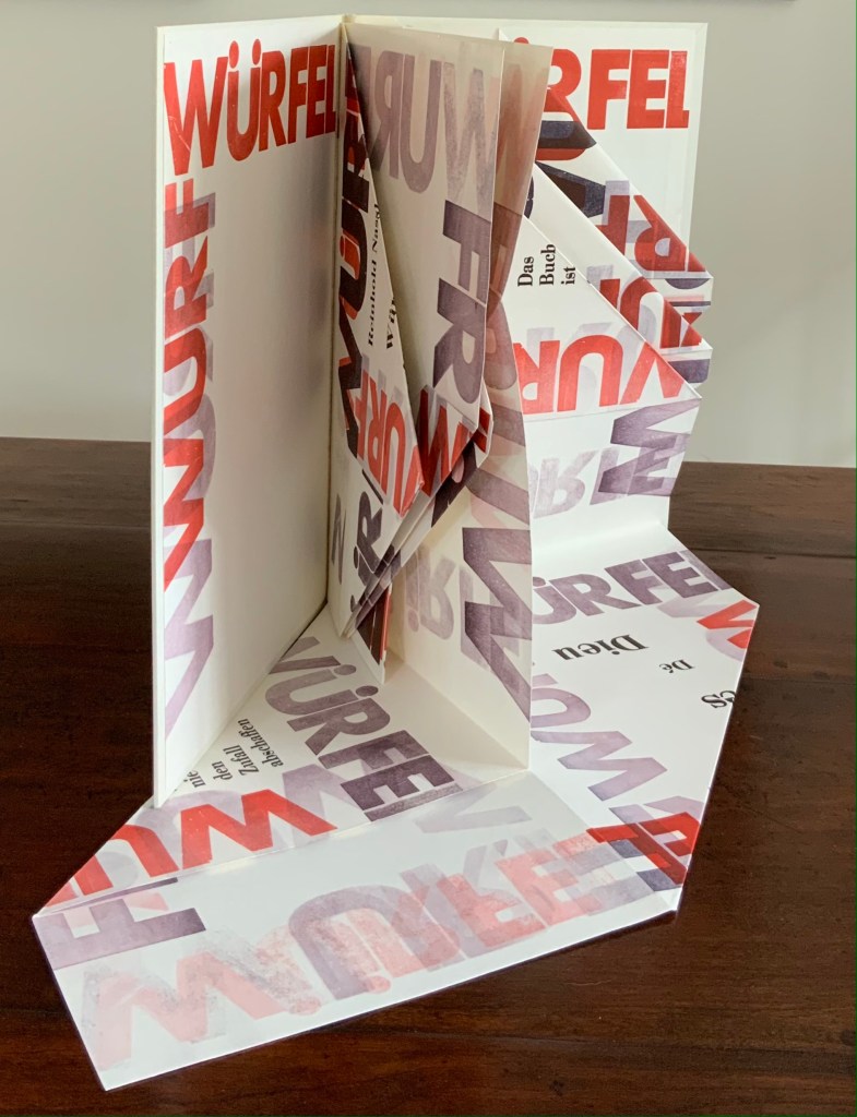
Würfelwurf: fragmentarische Annäherung an Stéphan Mallarmé (1992) Reinhold Nasshan Slipcase, embossed spine, casebound in paper-covered boards, front cover decorated with title set on slip of paper woven into the cover, block sewn and glued, with relief prints as pastedowns. Slipcase: H360 x W248 mm; Book: 351 x 243 mm, 4 gatherings of folios of varying size cut, tucked or folded to fit within the binding’s dimensions. Unique. Acquired from the artist, 24 February 2021. Photos of the work: Books On Books Collection. Displayed with artist’s permission.
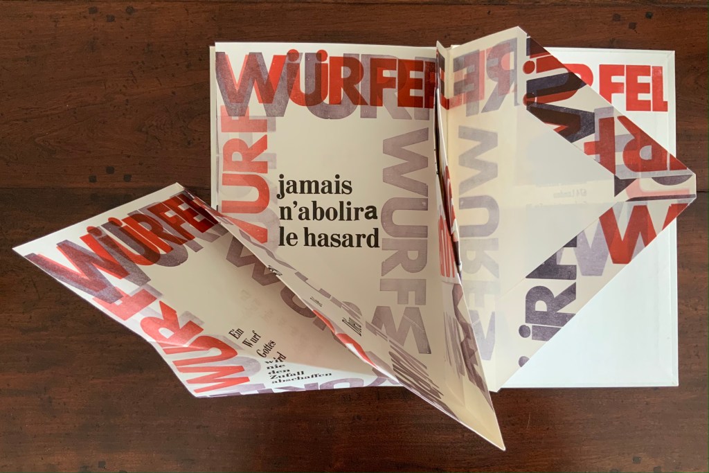
“Throw of the dice”, “dice throw” or “throwing dice” are all reasonable translations of Würfelwurf, but not “a throw of the dice”, which most German translators render as ein Würfelwurf when tackling Mallarmé’s Un Coup de Dés. But then Reinhold Nasshan is not translating the poem. As the subtitle indicates, he is making “a fragmentary approach”, an approximation.
The very structure and working of Nasshan’s Würfelwurf underscore his title’s distinction between a single act and repetition of the act. On its front cover, the word würfelwurf splits in two, one half printed over the other on the slip woven into the slits in the front cover. The slip angles downward from left to right suggesting action, which comes aplenty inside the book.
Some pages are cut, their corners folded and tucked in. One gathering consists of a sheet 688 x 470 mm that is creased with mountain- and valley-folds and untrimmed at the bottom edge so that it unfolds into a base that spills out beyond the covers. Pages take on dice-shaped edges and planes that seem to roll from within and against the book. The achieved effect of motion recalls Marcel Duchamp’s Nude Descending a Staircase (No. 2) or Umberto Boccioni’s Unique Forms of Continuity in Space.
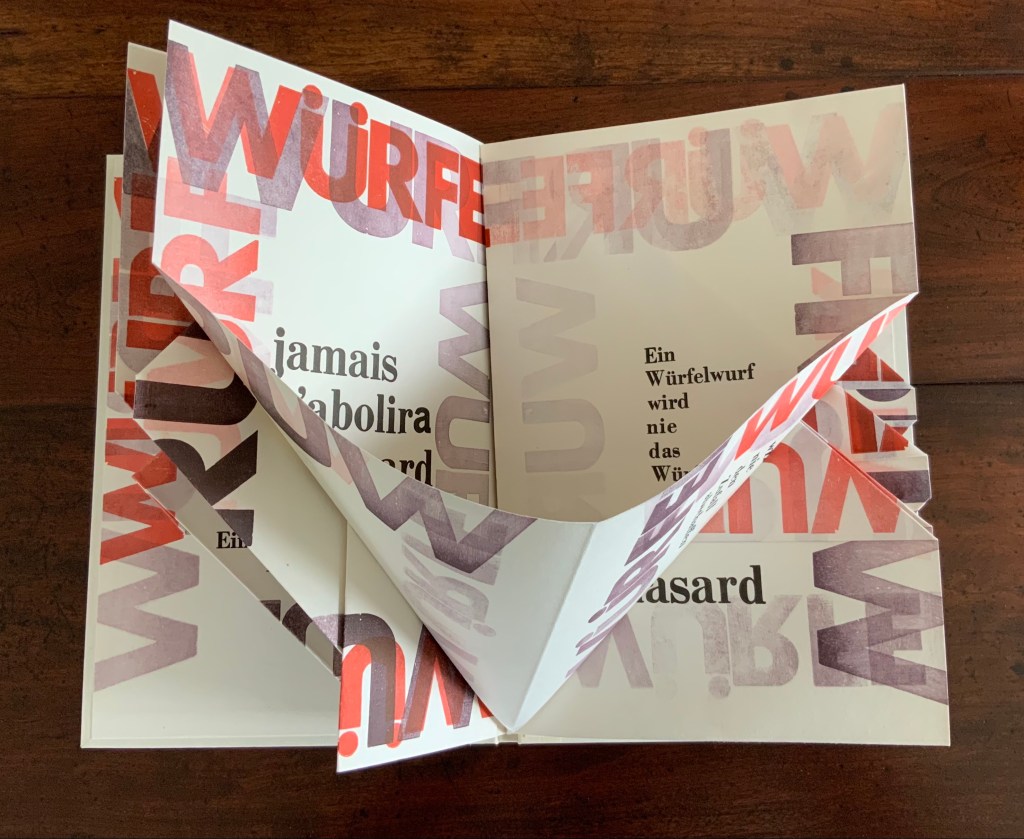
Although the title of Mallarmé’s poem appears, most of the text scattered across the surfaces comes from his other writings; for example, peindre, non la chose, mais l’effet qu’elle produit (“to paint, not the thing, but the effect it produces”); tout, au monde, existe pour aboutir à un livre (“everything in the world exists to end up in a book”); and Das Buch ist eine totale Expansion des Buchstabens (“The book is a total expansion of the letter”). When that large folded gathering comes, though, the Mallarmé’s words begin to be jumbled: Ein Würfelwurf wird nie das Würfelspiel abschaffen (“A throw of the dice will never abolish the game of dice”) and Ein Wurf Gottes wird nie den Zufall abschaffen (“A throw from God will never abolish chance”).
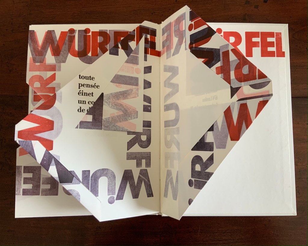
Strangest of all is the mangling of émet from the poem’s final line Toute pensée émet un coup de dés (“All thought emits a throw of the dice”). The word becomes éinet. Not French, not German. Perhaps a typo of “in” for “m”? As it turns out, according to the artist, it is a fluke that the letter “m” available in the font on hand printed poorly, so “i” and “n” provided an alternative three vertical strokes.
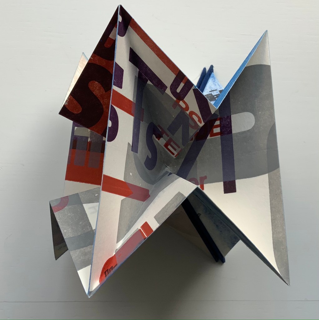
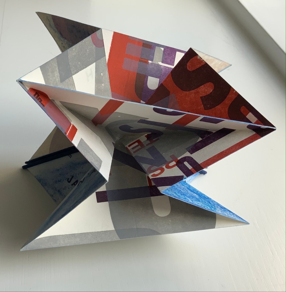
Un Coup: Stéphane Mallarmé (1997)
Un Coup: Stéphane Mallarmé (1997) Reinhold Nasshan Flexible triangular cloth-covered book boards, 4 cotton paper squares folded into origami water bomb base and glued. Triangle: 127 x 127 x 179 mm; Square “pages”: 166 x 166 mm. Acquired from the artist, 24 February 2021. Photos of the work: Books On Books Collection. Displayed with artist’s permission.
Nasshan also refers to this as a “letter sculpture”. Inviting the reconfiguring as with the works of Eleonora Cumer or Bruno Munari, or simply constant fiddling as with a paper fortune teller, Un Coup is more three-dimensional than Würfelwurf. As with Würfelwurf, this work lets the “moment of movement itself, the transition between the throw and the impact of the dice, emerge graphically” (moment der bewegung selbst den ubergang zwischen dem werfen und dem auftreffen der wurfel, graphisch hervortreten zu lassen). With less surface than Würfelwurf, though, it has fewer extracts from Mallarmé’s writings. Indeed, along with the physical shape shifting, the enlarged letters overprinted at multiple angles to one another combine to make this work more abstract than extract. But because text and book are material from which, on which and with which Nasshan creates, the abstract retains its links to the book.
Also a painter, Nasshan’s works fall into two categories or surfaces — painted books and painted canvases. Though lacking the shape of a book, his abstract paintings retain that link to “the world of Letters” in shapes and figures that evoke hieroglyphics, Chinese characters, typography and even cave paintings. His influences appear equally eclectic — though more Kandinsky, Klee and Miró than Pollock or Rothko — which matches up with his choice of substrates in fiction and nonfiction. When not choosing works from the ancient, classical or Romantic periods (from Gilgamesh to Seneca to Hölderlin), he chooses Apollinaire, Beckett, Celan, Joyce or Wittgenstein among others from the Modern period.
A wider audience would profit from Nasshan’s works. At least these two and others that might enter the Books On Books Collection will be available in the 2022 exhibitions celebrating the 125th anniversary of the publication of Un Coup de Dés in Cosmopolis (May 1897).
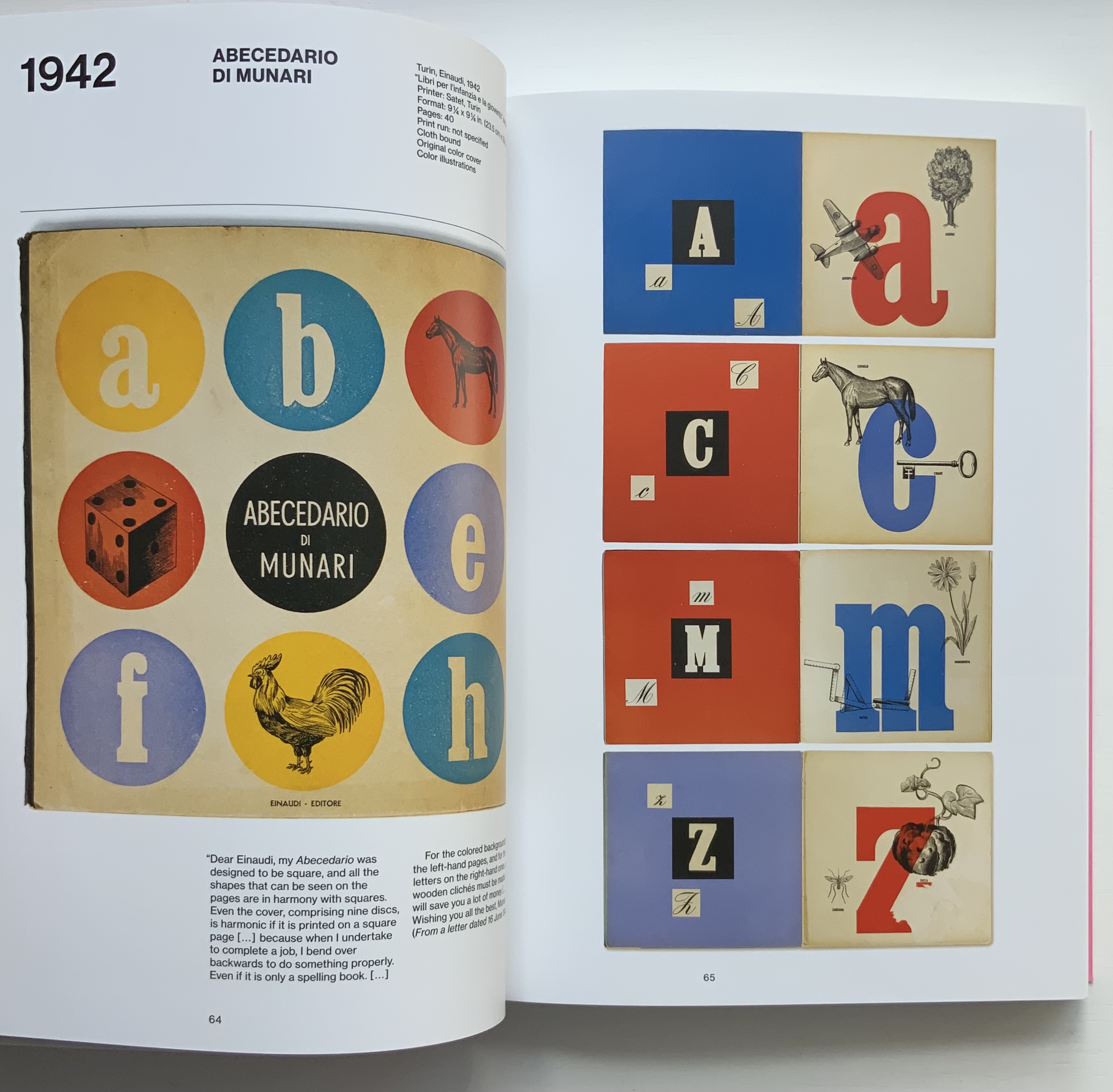
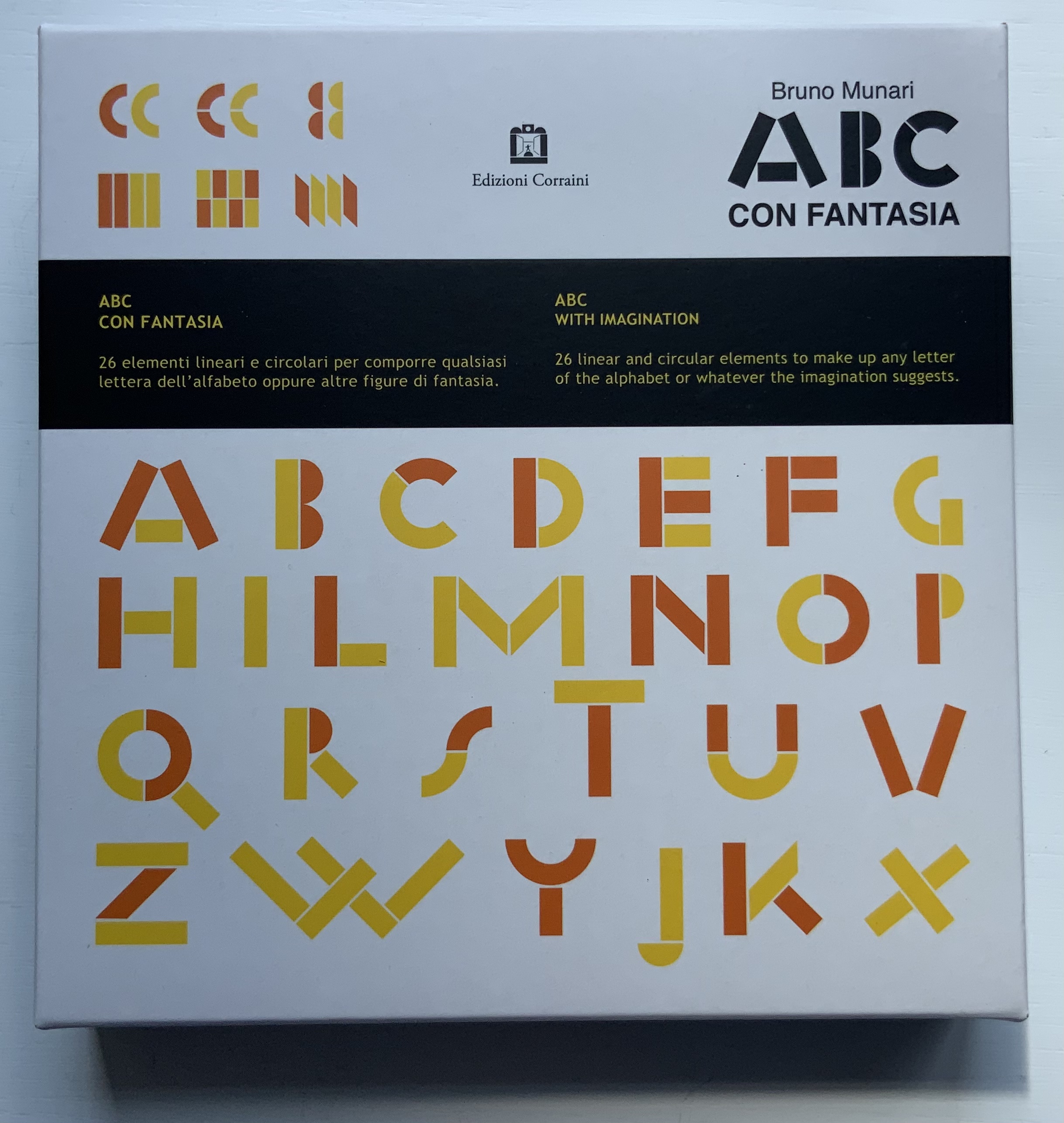
Giorgio Maffei’s 2008 definitive collection of book designs by Bruno Munari brings together two of Italy’s renowned book artists. Giorgio Maffei’s own work, his writing and gallery/bookshop (highlighted by his son Giulio Maffei’s extraordinary video catalogues Le vite dei libri) warrant a catalogue raisonné in their own right. The Italian edition published by Munari’s long-time publisher Maurizio Corraini was followed up in 2015 by this translation by Martin John Anderson and Thomas Marshall in 2015. For the Books On Books Collection, one of the great pleasures of Munari’s works is its attention to the alphabet, which this book documents.
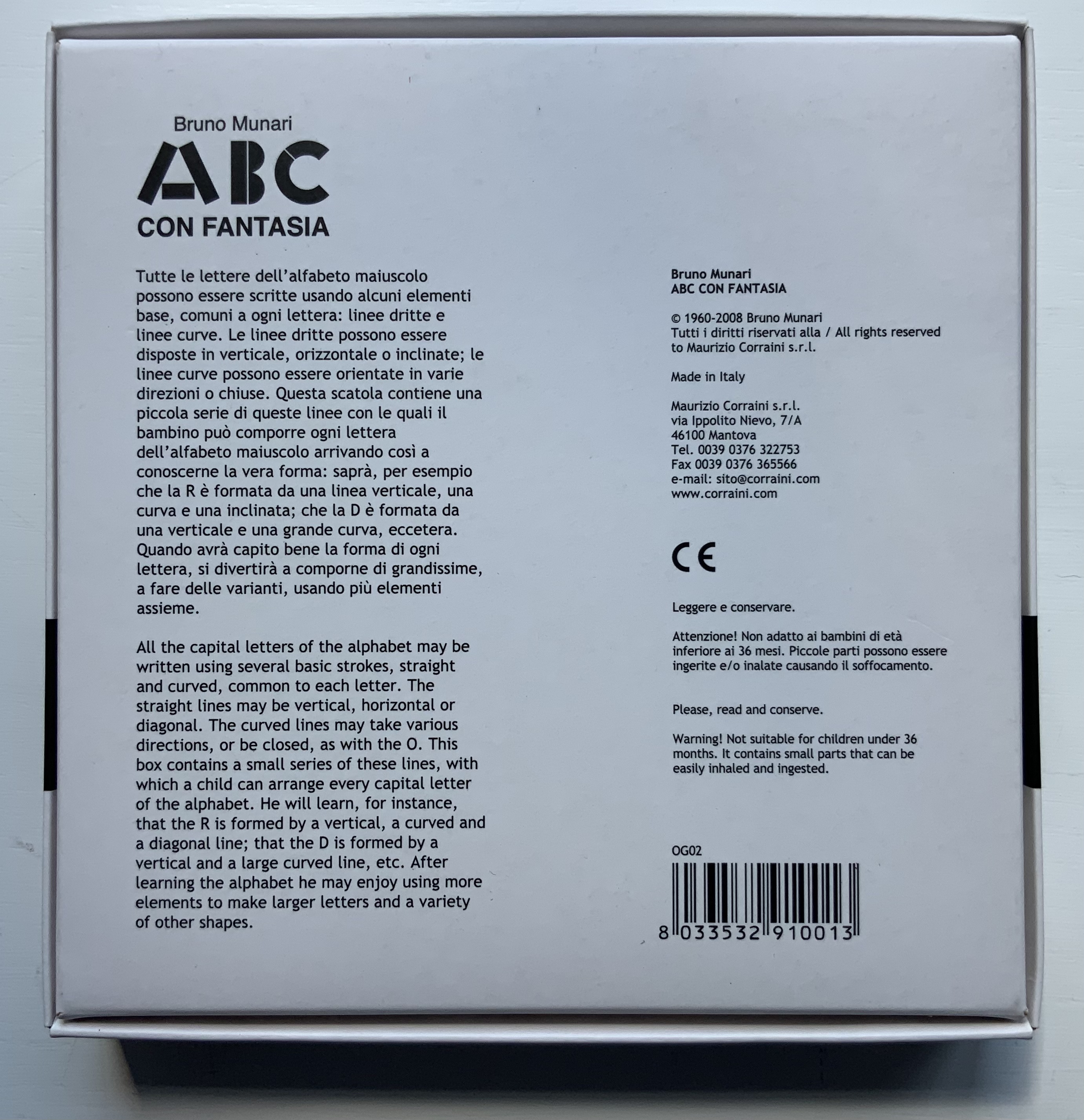
Although not shown in Munari’s Books, an alphabet-related work that underscores Picasso’s calling Munari “our Leonardo” is ABC con fantasia (1973/2000). If we are to believe Fra Luca Pacioli, it was Leonardo da Vinci who inspired his “straight lines and curves” exposition for creating letters. Following in their footsteps, Munari provides the linear and curvilinear basics for the collector and offspring to join the game.
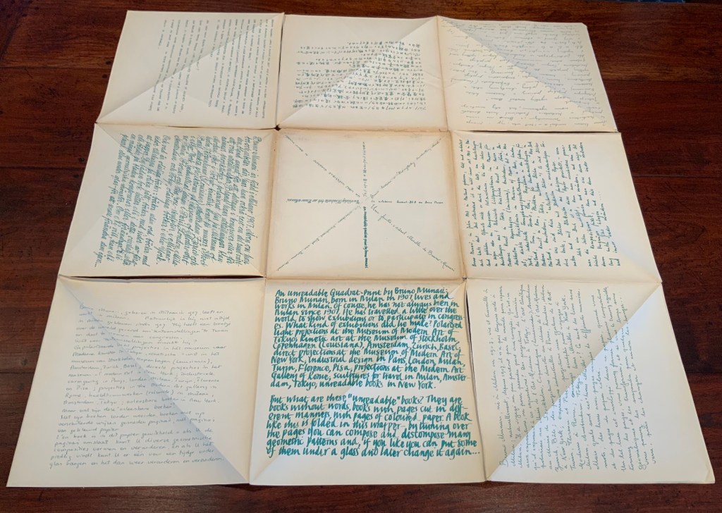
Another pleasure is how Munari’s works lead to other works in the collection. Just by preceding them in Pieter Brattinga’s Kwadraatblad/Quadrat-prints series, Munari’s An Unreadable Quadrat-Print (1953), below, conjures up Wim Crouwel‘s, Gerard Unger‘s, Timothy Epps and Christopher Evans‘, and Anthon Beeke‘s more alphabetical contributions.
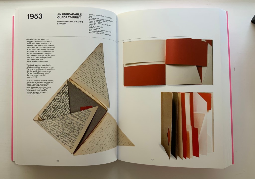
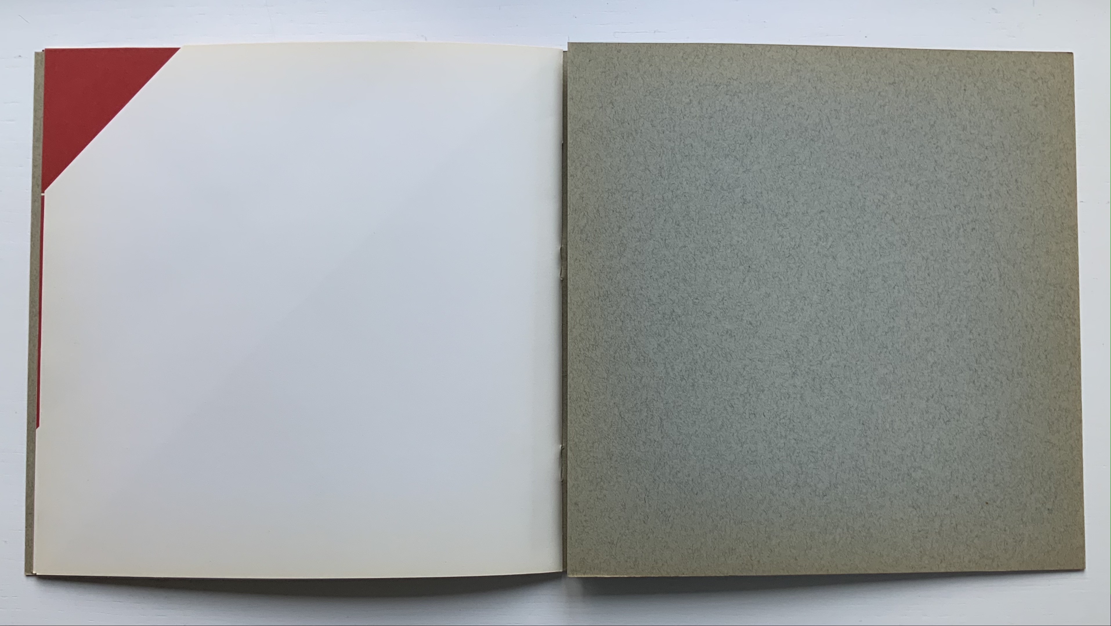
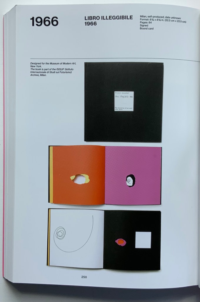
Libro illeggibile bianco e rosso / An unreadable Quadrat-Print / Een onleesbaar kwadraat blad / Ein unlesbares Quadrat-Blatt (1953)
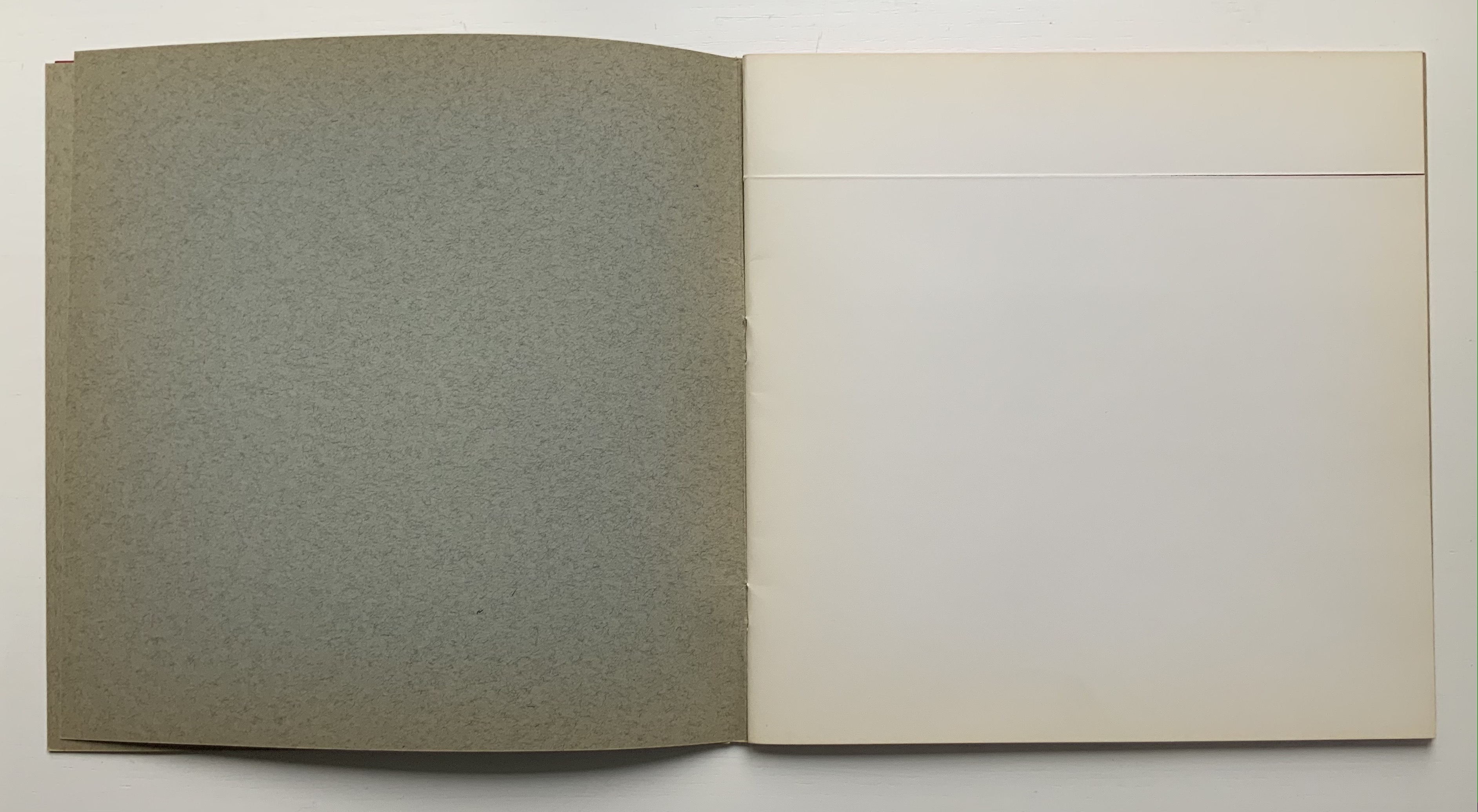
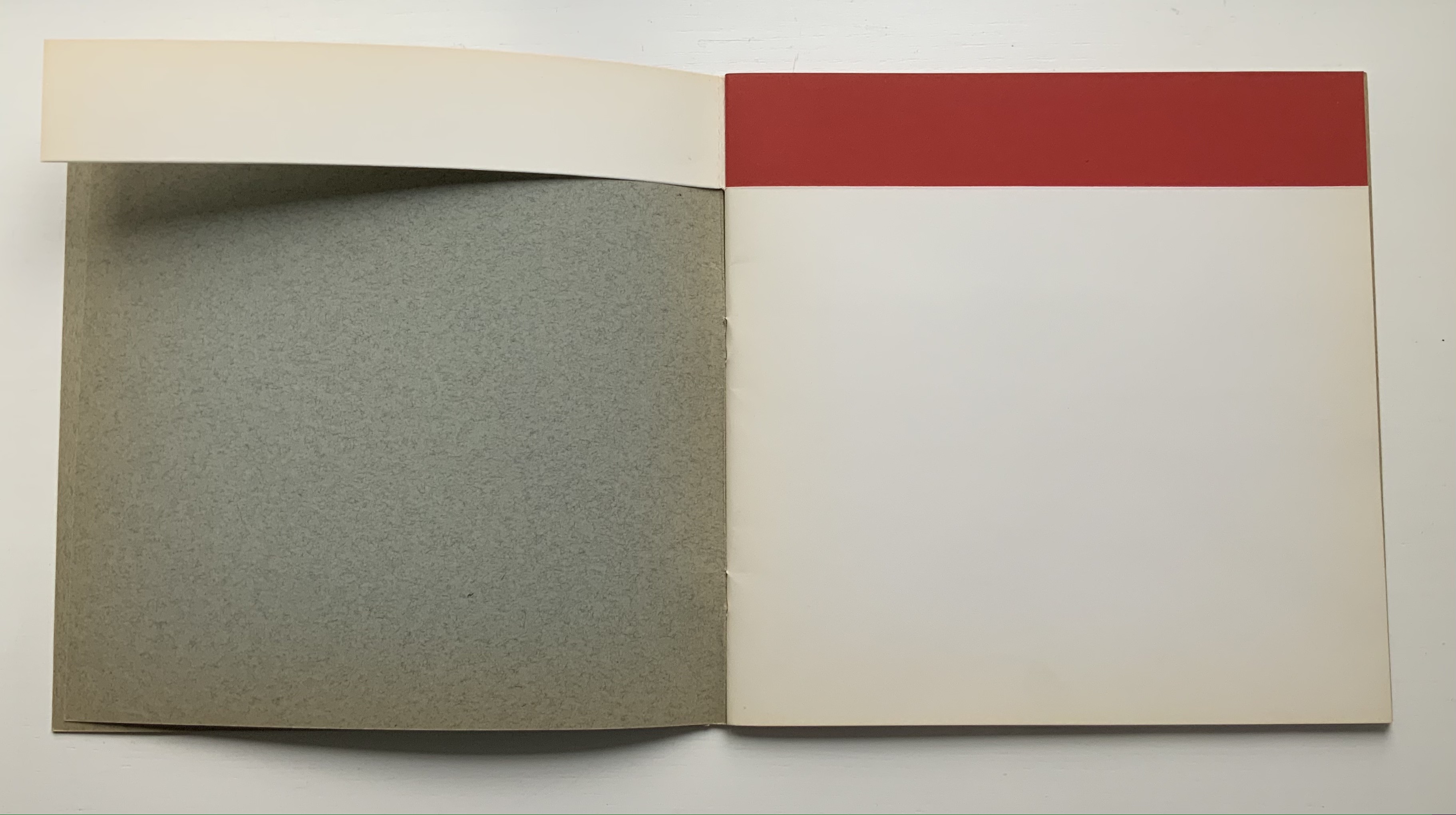
Although there are no words on numbered pages that have to fall in the right order, An Unreadable Quadrat-Print still presents the author/printer/binder with a challenge in imposition. White and red alternate, which is easy enough, but to cut or not cut a folio on the left and right, how to cut it, how to place the differently cut folios in the right order to achieve the variation in images when the pages turn, how to ensure a sewable area down the center for each folio whether it has a horizontal cut extending into the spine or a diagonal one extending from some point along the spine — that is impressive. It speaks to the sculptural process and result in making books, as well as the sculptural process of reading them.
The following sequences — the book’s first five double-page spreads and then its last six — take a normal page-turning approach, always turning from the upper right corner of whatever shape/page is available. Note how, in the last six double-page spreads, the pages and shapes become more complex.
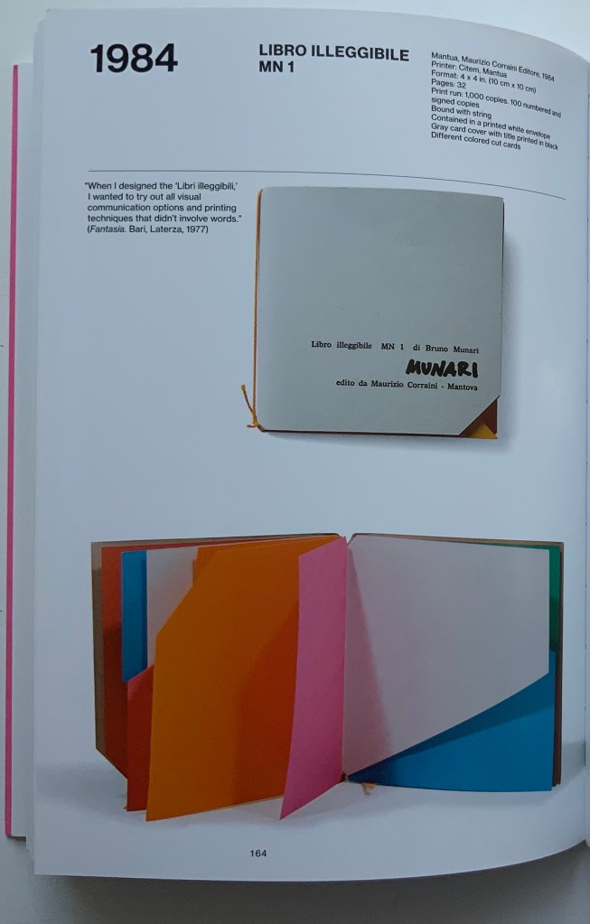
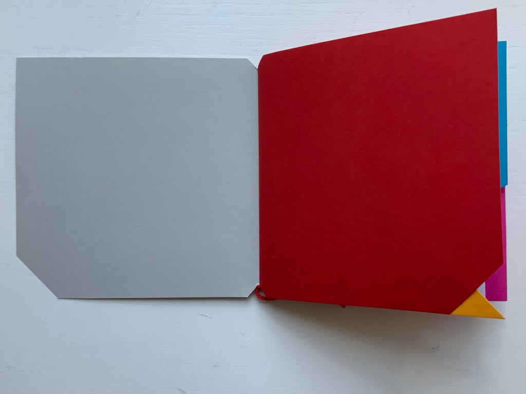
Libro illeggibile (1966), below left, calls to mind Katsumi Komagata’s A Cloud (2007), and the one in the middle foreshadows Eleonora Cumer’s subtle artistry with transparent paper in Circoscrivere lo spazio No. 3 (2021). While Munari’s rare works press modest budgets, some of it — in its simplicity and popular appeal — has led Corraini Edizionito put it within easier reach. Numerous reissues of the 1984 Libro illeggibile MN 1 have pushed its price to €5. Short of the artist’s signature (which would likely obstruct the aesthetic intention), a copy from the latest 5000-copy print run will “perform” and deliver the same experiential value as one from the earliest run.
Munari’s many series of illegible books tap into book artists’ longstanding and ongoing preoccupation with whether a book without words can communicate information, narrative, sensations or feelings through material, shape or color and their permutations. The colors, shape, feel and binding of Libro illeggibile MN 1 evoke simple and sophisticated pleasure in their juxtaposition and sequence. The unchanging straightness of the top edge and the anchoring red thread of the binding set off the changeability of shapes and colors.
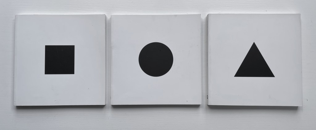
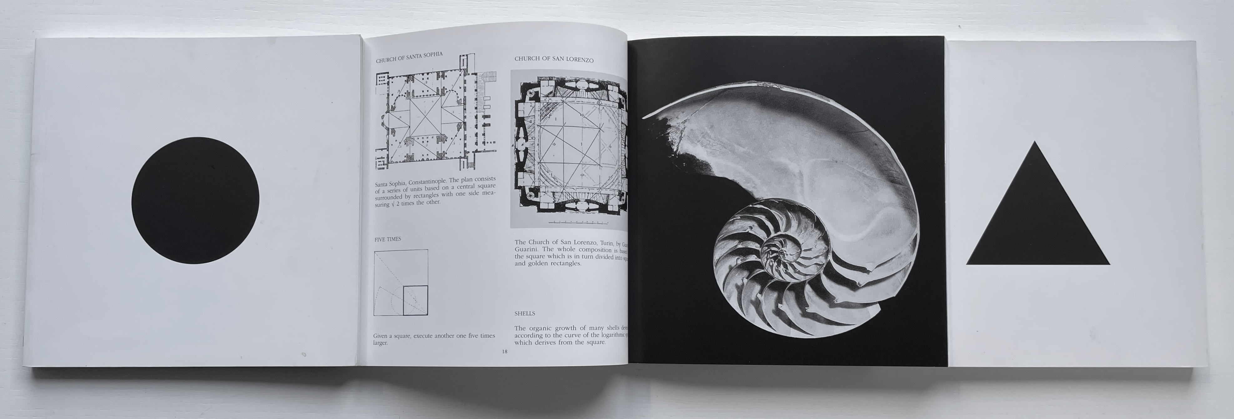
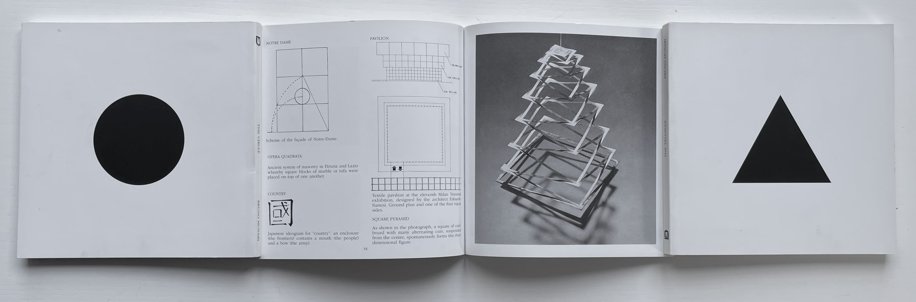
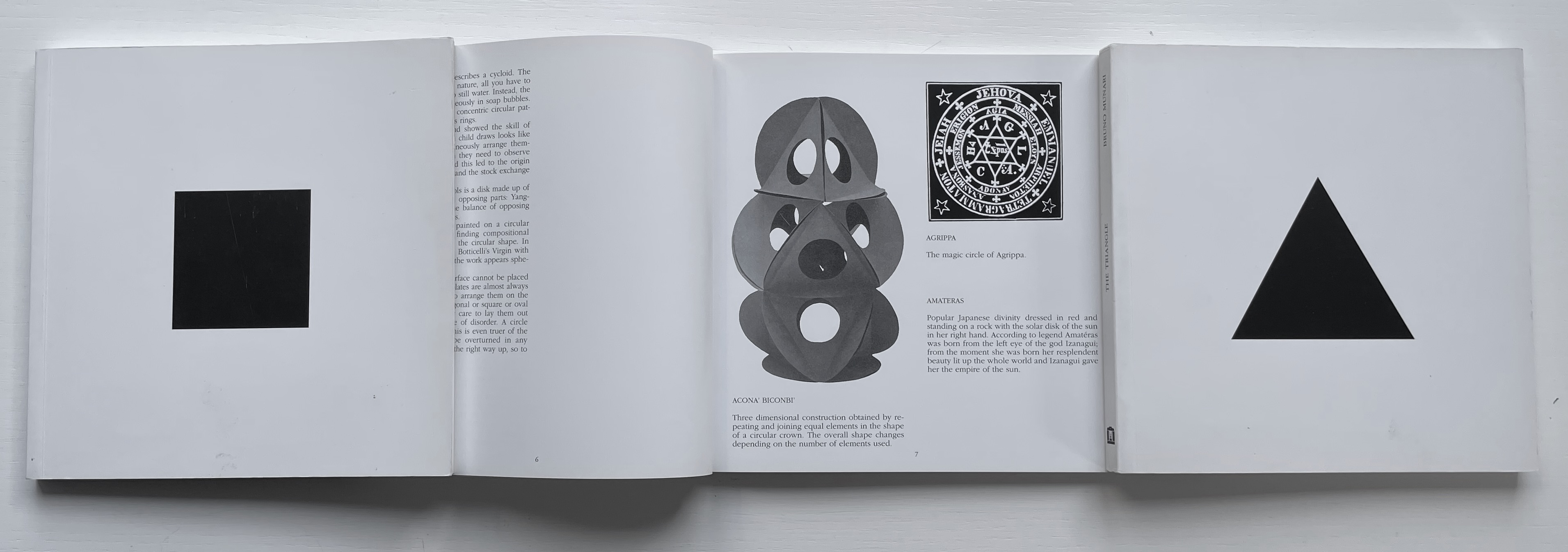
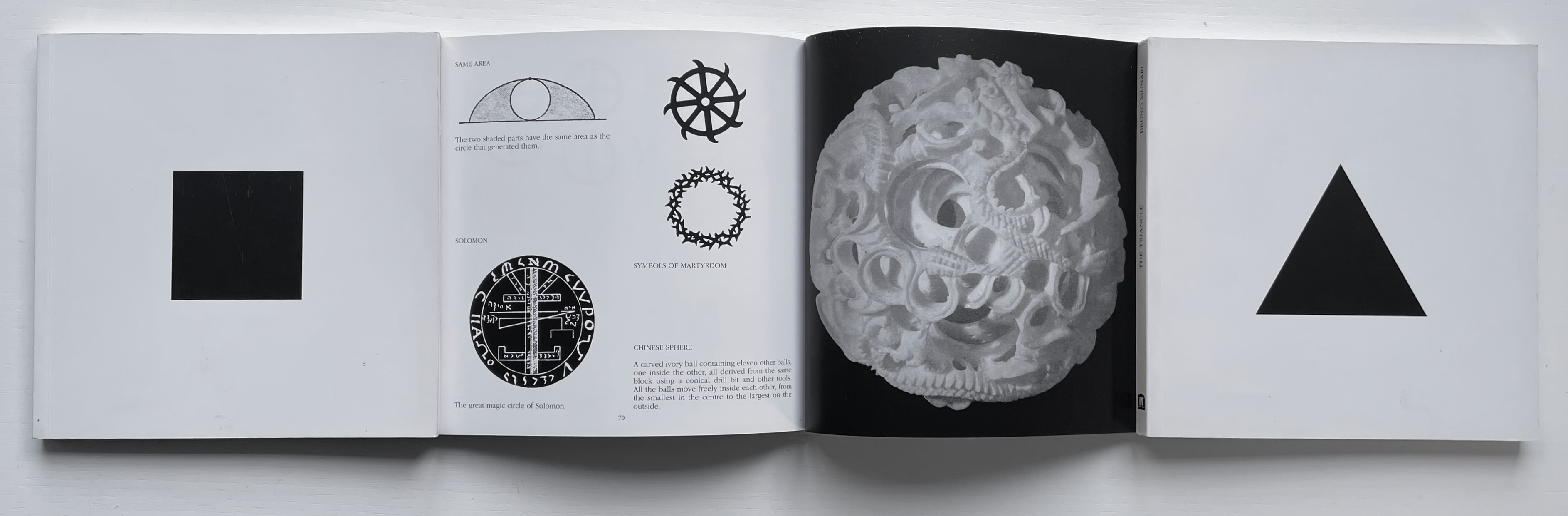
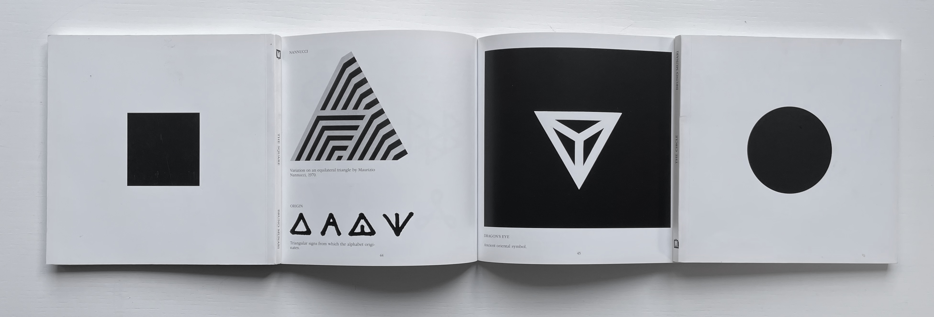
The Square (1960), The Circle (1964) and The Triangle (1976)
Although not a book of Munari’s making, David A. Carter’s Le sculture da viaggio di Munari is one way of bringing the spirit of Munari’s “travel sculptures” into the collection. Carter’s homage carries the blessing of Corraini Edizioni, further justifying its inclusion.
Travel sculptures started off as small sculptures (some even pocket-sized) to carry with you, so you could take part of your own culture to an anonymous hotel room. Later they were turned into ‘travel sculptures’, five or six metres tall and made of steel. One of these was seen for a few months in Cesenatico, another one in Naples. Others are sleeping among huge trees in the Alto Adige region.’ This is how Italian designer Bruno Munari (1907-1998) described his ‘travel sculptures’, which in turn inspired American illustrator and designer David A. Carter for this pop-up book. –Corraini Edizioni website. Accessed 3 August 2021.
Munari’s travel sculptures also recall works in the collection like Cumer’s scultura da viaggio dipinta n.2(2017), Komagata’s「Ichigu」(2015) and, albeit less portable, Ioana Stoian’s Nous Sommes (2015).
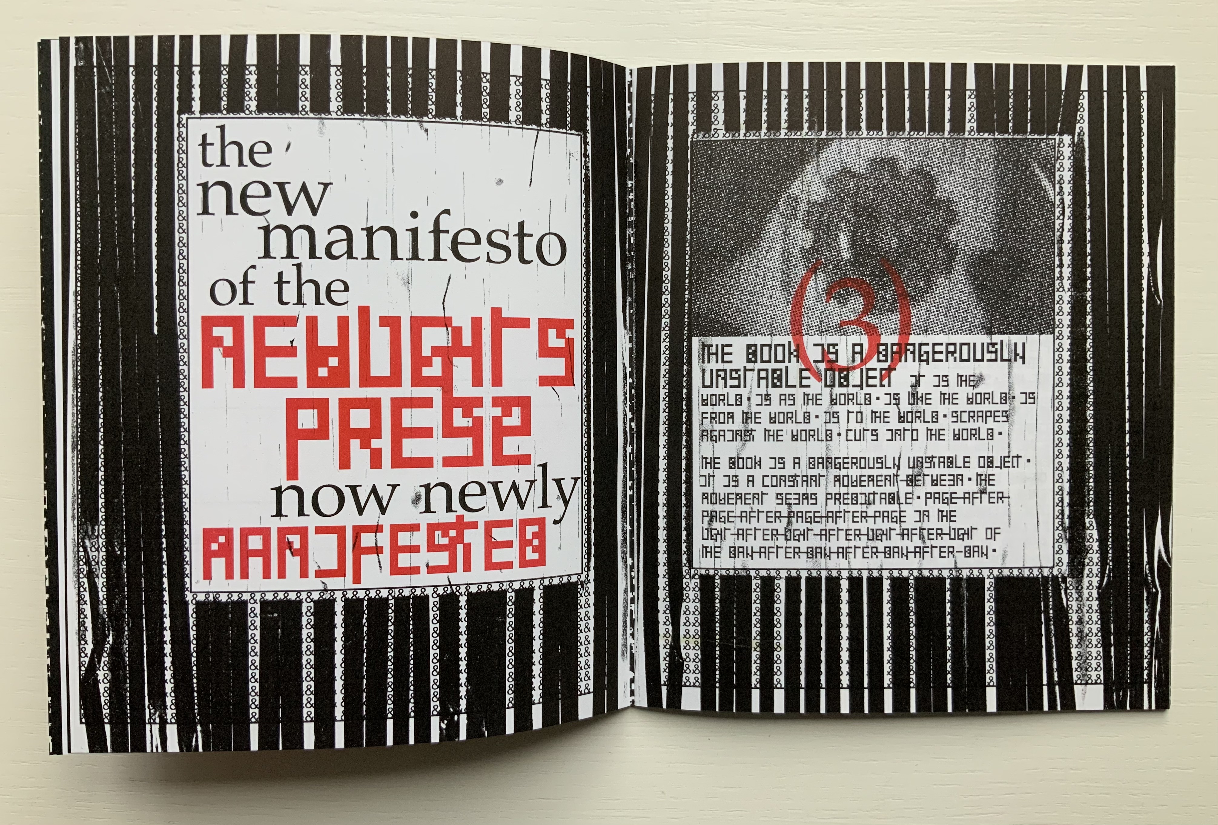
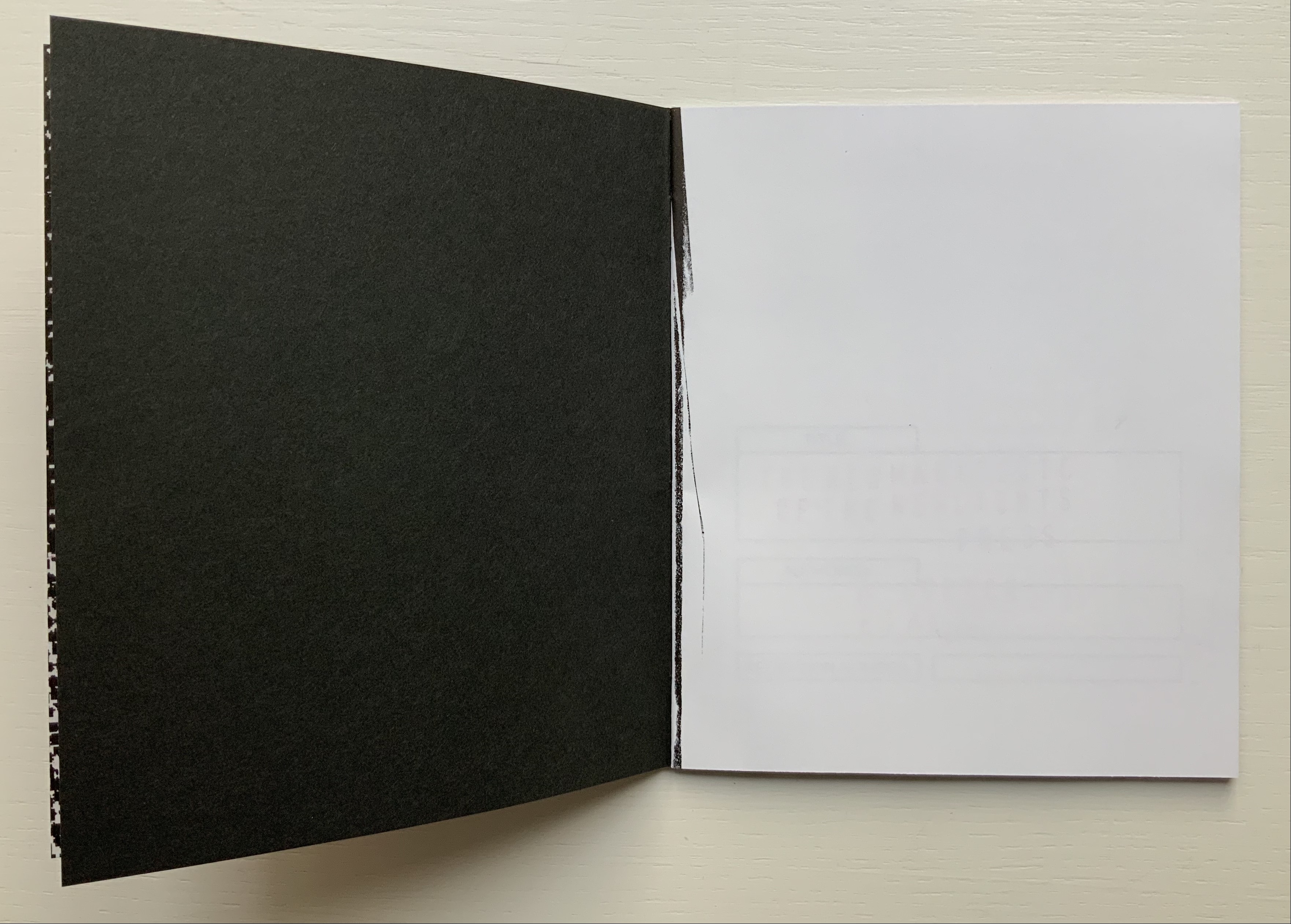
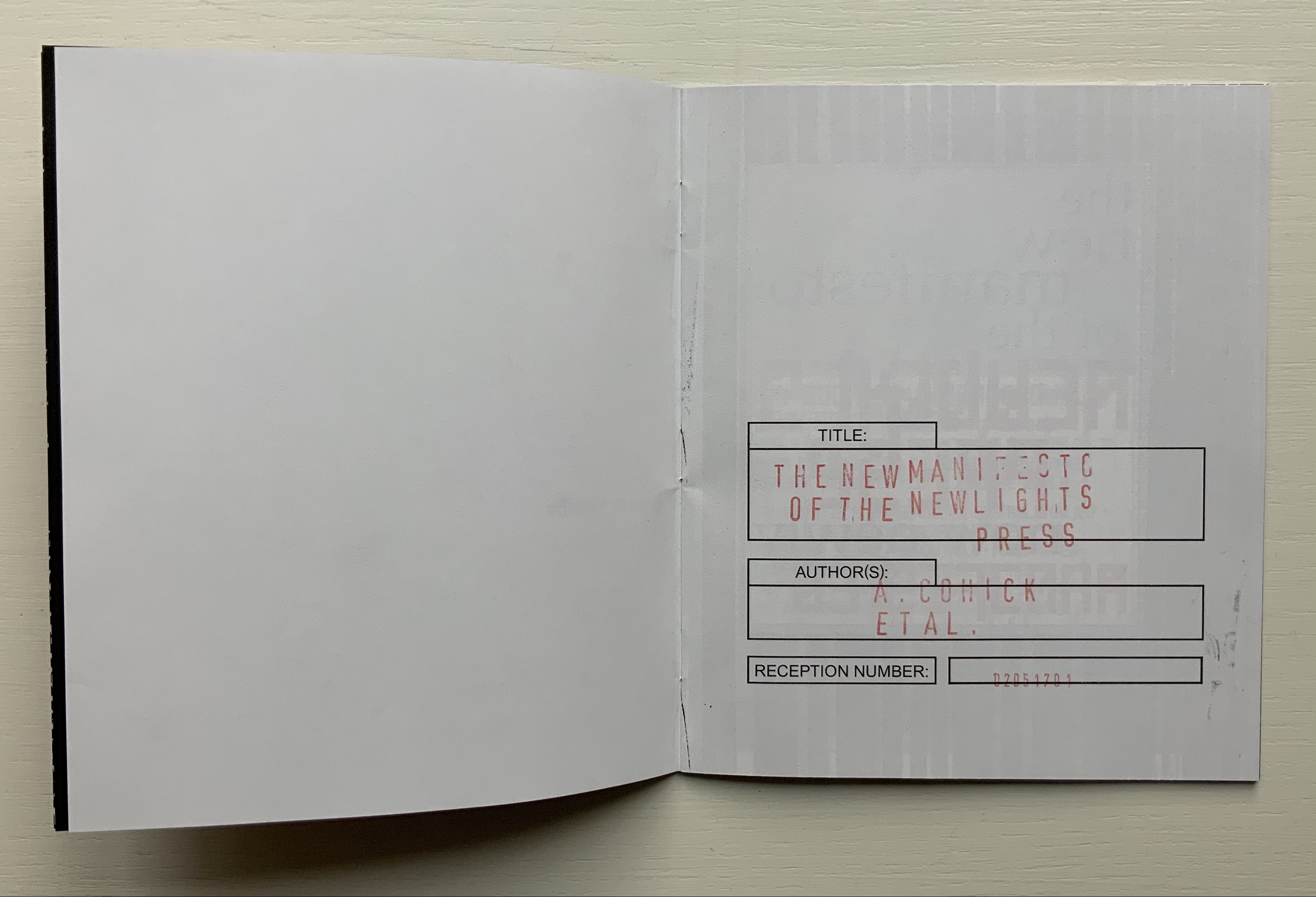
The New Manifesto of the NewLights Press (third iteration) (2017)
The New Manifesto of the NewLights Press (third iteration) (2017) Aaron Cohick Booklet, saddle-stapled, risograph, letterpress/collagraph, and hand painting. H165.1 x W139.7 mm (closed), 20 pages. #000611, unlimited, iterative edition. Acquired from New Lights Press, 11 December 2020. Photos: Books On Books Collection. Displayed with permission of the artist.
The New Manifesto of the NewLights Press (third iteration) has multiple starting points. Even in its first iteration, we have
The book is a dangerously unstable object, always between, continuously opening. It is interstitial, occupying many planes at once.
Digital technology has killed the book, finally.
The book is an impossible thing — comprised entirely of edges and full of holes. It moves. It happens in between.
Readers move through authors and books. Books move through readers and authors. Authors move through books and readers. They exist between each other’s pages. They only exist in between.
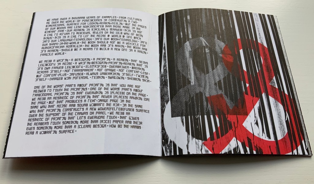
The form of the book, the history of the book, and the processes involved in its production provide a foundation for rethinking and re-evaluating the dominant discourse(s) of contemporary art.
The book … exemplifies a model that expands beyond form and content…. It is a field, whose axis points [form, content, production and reception] are always held in tension. In this model a piece or practice is a “zone of activity.”
Moreover, there are ten refinements on these starting points, touching on Julia Kristeva’s “intertextuality”, Roland Barthes’ “death of the author”, Michel Foucault’s “death of the book” and much more in the same vein. Each iteration even has diagram and footnotes, underscoring the academic nature of the starting points.
By its third iteration, The New Manifesto‘s words been further refined as a combination of announcement, exposition, lyric and prayer. It soars beyond literary theories and finds birds of a closer feather among Ulises Carrión and Michalis Pichler.
The book is a dangerously unstable object // It is a series of edges // Once clustered and knotted // Now open and spreading // Now cutting and bending // Mostly // The book betrays // Mostly // The book howls // The book falls apart in the face of our anguish // In the face of our quiet // In the silence of our slipping // Mostly // It will also always be something else // That we did not // Can not yet // See // The book is a remarkable technology // It is a shimmering substance // It is a noise of the hands and thought // The book is perhaps now a dead thing // In the hands of the dead // So be it // We never mattered much anyway // Beyond our capacity to consume // Our capacity to labor // We are fuel // So be it // We remain in the dark // With these books // The original autonomous window technology that is us looking through // At // In // Against // With care // The book returns our labor to us //
If a new edition of Publishing Manifestos is ever issued, Cohick’s hortatory words should be considered. The words, however, cannot be considered alone. Over the three iterations, The New Manifesto — the only one in the collection and, therefore, the only one tangible for the visitor — has “participated more & more in the world of visual art”. Cohick’s use of the collagraphic technique increases. It adds painterliness to the booklets as well as a sense of depth and spatial play within the page, across the gutter and from recto to verso pages. In a series of online essays for the College Book Art Association, Cohick confirms the pleasure and intent here:
Collagraph is a well-known technique and is usually taught as part of introductory letterpress courses. It has an immediacy and fidelity that is very exciting—you can stick a leaf or other flat object to a block, print it, and get a decent image of that object. Unfortunately it usually stops there. Those flat objects are hard to push beyond that initial single-color print. Linoleum, photopolymer, wood and metal type, and to some extent woodcut are all made to be “neutral” printing surfaces—flat and smooth. Trying to get collagraph to be flat and smooth begs the question: why use collagraph at all? In collagraph the material that makes the plate is not neutral—the material is exactly the point. That embrace of material and its many, varied effects and marks is what moves collagraph closer to the direct markmaking of drawing/painting. It makes all of those “unacceptable” (or abject?) marks readily available. Relief collagraph printed with letterpress equipment can be a method of painting or drawing in multiple, with control as good as—if not better than, but also different from—the hand. “You’re doing it all wrong (Part 2)“
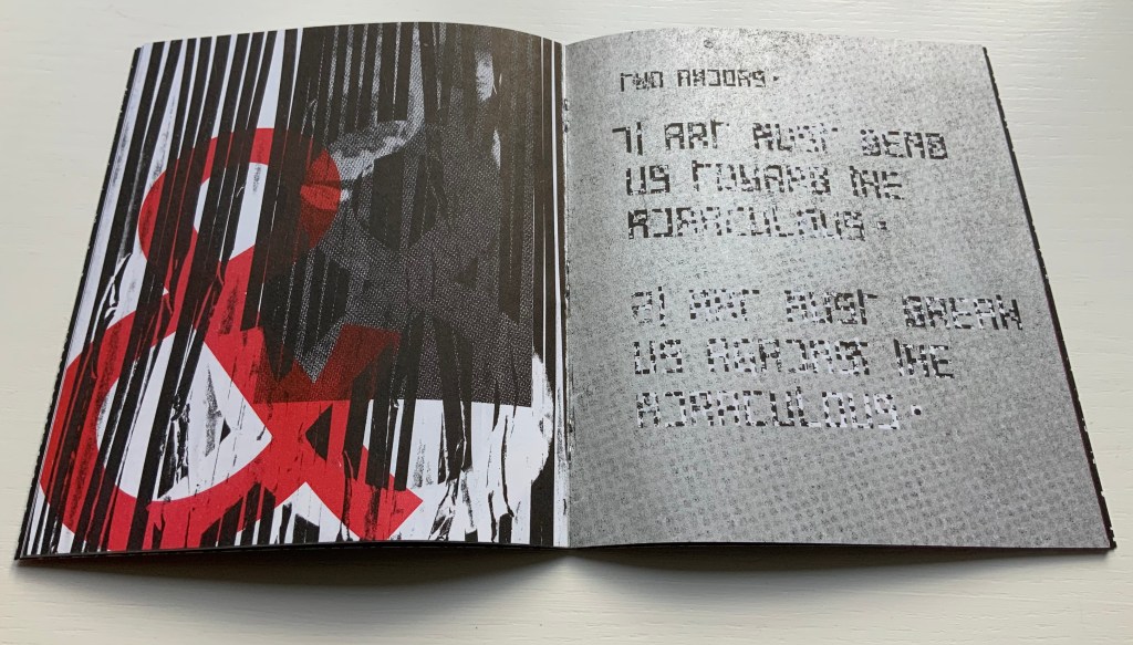
From the first iteration of the manifesto, black & white details of Jan Van Eyck’s The Arnolfini Marriage appear and are manipulated on the cover and throughout. Although they recede in the second iteration, they move strikingly to the fore in the third. Constantly alongside the Arnolfini details has been the ampersand, enlarged, reversed, in different colors, and present — almost ornamentally — within the text line. The increased visuality of the third iteration announces itself on the booklet’s cover and inside with the grainy enlarged detail of the mirror from The Arnolfini Marriage. What do the Arnolfini details signify? Although Van Eyck’s original itself is straightforwardly representational, its meanings are not always any clearer than that of its use in Cohick’s collage. With his slices of black (“a series of edges”) obscuring the image of the groom, perhaps Cohick is compounding obscurities to present “something else // That we did not // Can not yet // See”.
And what about the large overlapping ampersands in red and gray, systematically reversed and alternating in color? Are they emphasizing the “and so on and so on” of tradition in Cohick’s painterly printing technique? Are they alluding to the joining of hands in the marriage? Are they alluding to, and performing, a marriage of the book and visual art? On a verso page in the manifesto’s first iteration, he writes, “The form of the book, the history of the book, and the processes involved in its production provide a foundation for rethinking and re-evaluating the dominant discourse(s) of contemporary art.” On the facing recto page, the Arnolfini bride in reverse from the original extends her hand to a reversed ampersand.
In perhaps the most important enhancement of the third iteration’s visuality, Cohick’s full-blown typographic redesign of the alphabet occupies the visual foreground, middle ground and background. It is as if Cohick sets out to demonstrate Mallarmé’s proposition that the book is the “total expansion of the letter”. The first iteration’s completely legible Palatino, Arial and Placard Condensed typefaces used in the text line have yielded to what Cohick calls a “dislegible” font, which he often reverses, lays out as occasional “running sides” rather than “running heads”, and subjects increasingly to collagraphic layering. In his “You’re doing it all wrong” series, Cohick explains:
If “legible” and “illegible” are binary opposites, then the term “dislegible” is about looking at the space between those two poles. Dislegibility displaces, dislocates, deforms, and/or disrupts the process of reading, with the ultimate goal of making that process of reading (dis)legible to the reader. The dislegible can be read, but it resists closure or certainty. “You’re doing it all wrong (Part 1)“
Also contributing to dislegibility is the reversal of images, the ampersand and letters. More than that, the reversal reminds us of what is involved in letterpress production — the inked relief surface and its reversed image or letter to be transferred to paper. Always in tension with form, content and reception, production makes up the open field from which the artist’s book emerges. The third iteration exudes production’s physicality. A black saturated endleaf bleeds over onto a stark white sheet that faces a stamped title page, intensifying a feel of mechanical working. Letterforms behave as so much raw material — as if they were oil, acrylic, brick or mortar — to be re-seen from different angles, noted for more than one function and their text read for more than one meaning.
According to Cohick, “For art to thrive, form and content must be in a dynamic relationship… It must contain enough disruptions, ambiguities, and peculiarities to resist the deadly state of stable signification.” The iterations of The New Manifesto enact that statement.
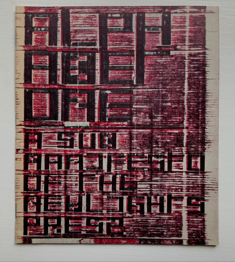
Alphabet One: A Submanifesto of the NewLights Press (2017)
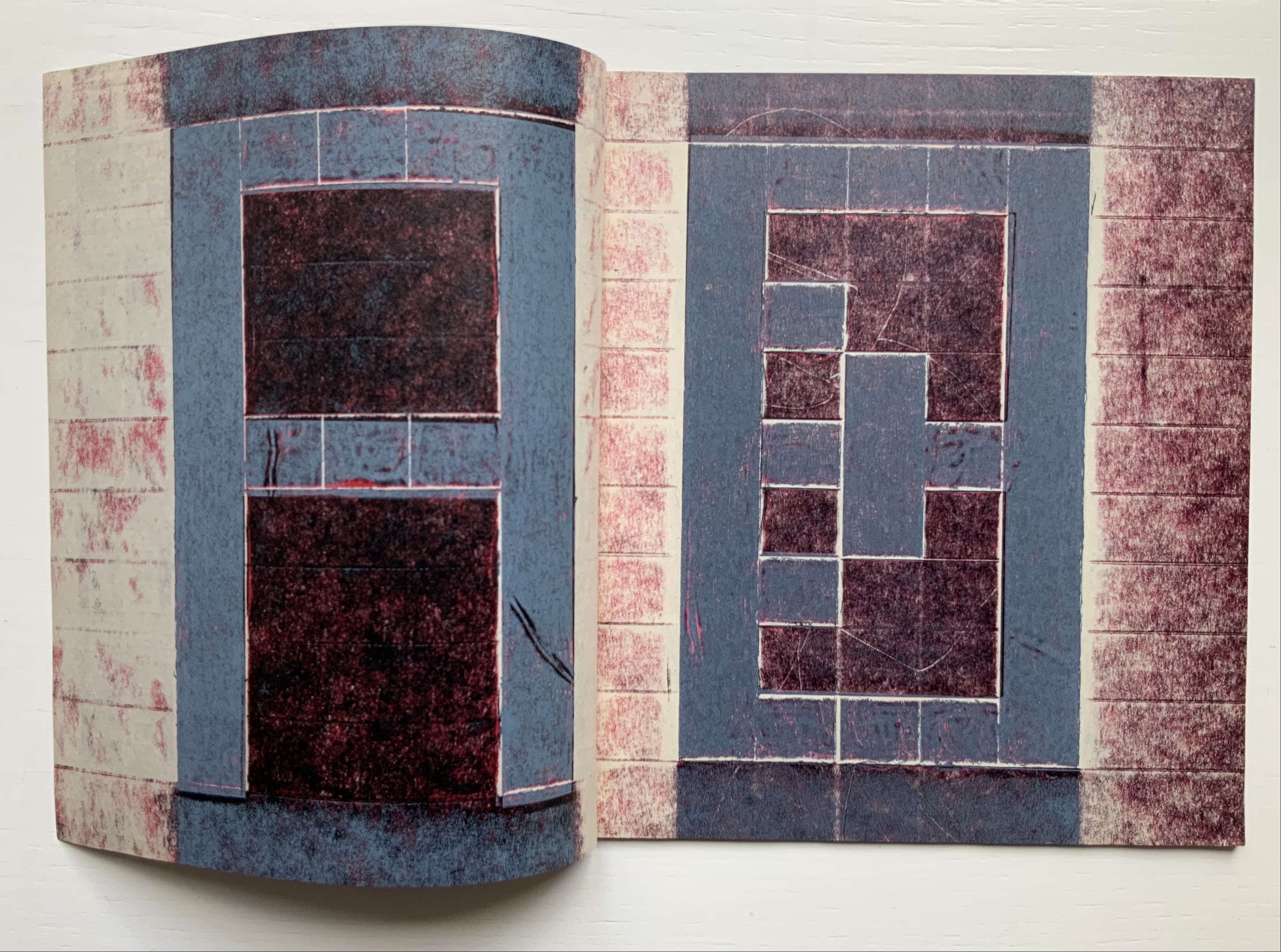
Alphabet One: A Submanifesto of the NewLights Press (2017) Aaron Cohick Booklet, center-stapled. Letterpress printed from woven collagraph blocks on newsprint. H165 x W140 mm, 28 pages. Acquired from the artist, 11 December 2020. Edition of 250, unnumbered. Photos: Books On Books Collection, displayed with permission of the artist.
Alphabet One, “companion book to the third iteration of The New Manifesto of the NewLights Press”, presents Cohick’s “complete ‘noise’ alphabet, in order, in condensed and full form”. In The New Manifesto, Cohick has described the book as “a noise of the hands and thought”. Well then, being a book, Alphabet One demonstrates that the manifesto is the alphabet, and the alphabet is the manifesto, and “woven collagraph blocks” could hardly be less “a noise of hands and thought”. Lest those inferences seem strained, continue reading the passage Cohick reproduces from The New Manifesto immediately after the reference to the “complete ‘noise’ alphabet”:
This is not a utopian program // This is not an alphabet for saving the world // Such a thing is a dangerous lie // This is one possibility // Not a tool // But a movement-between // An object-between // A growing // Changing thing // Meant to do just that // It is about attention and its revitalization // It is about structure and our being in it //
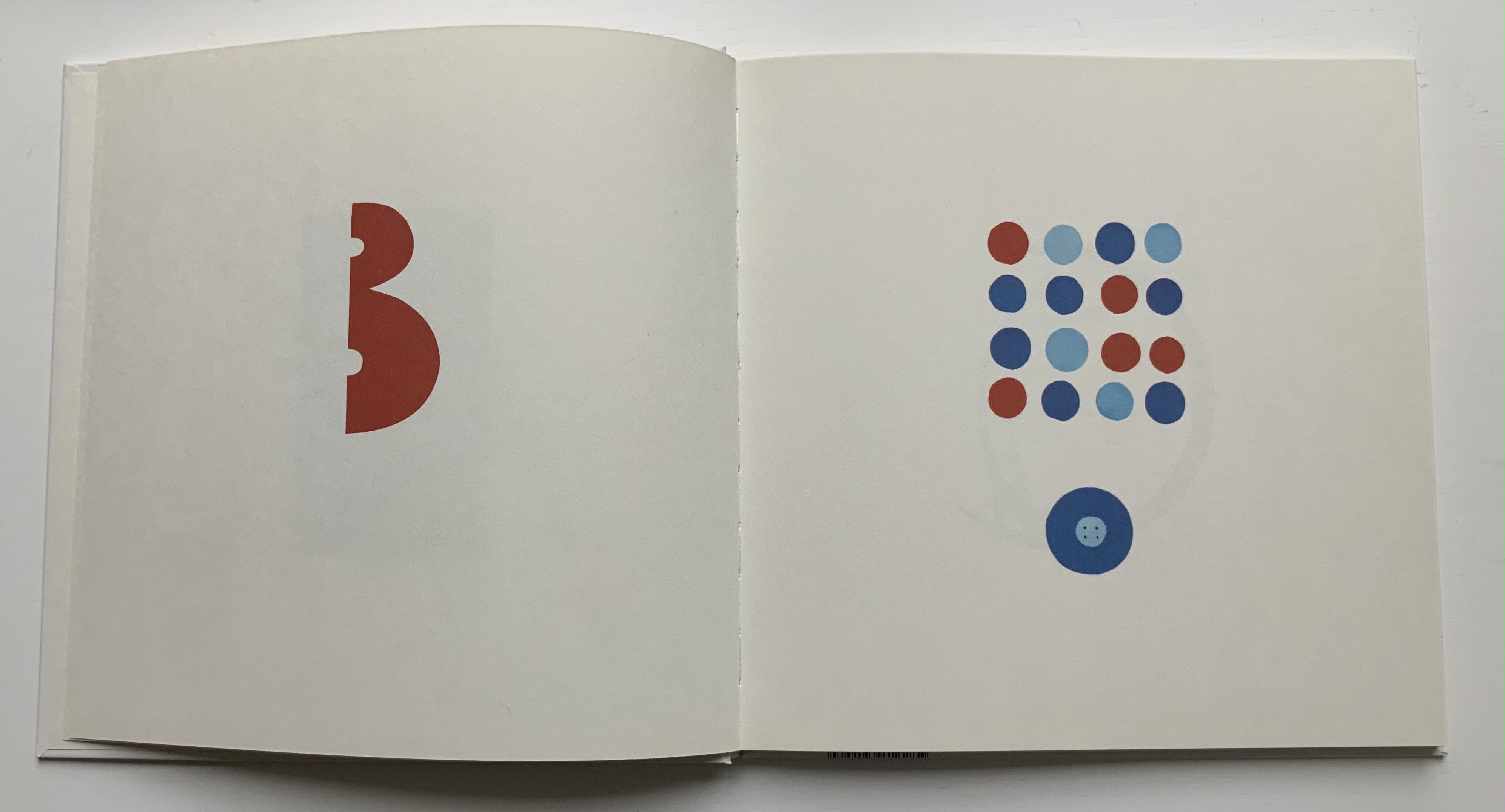
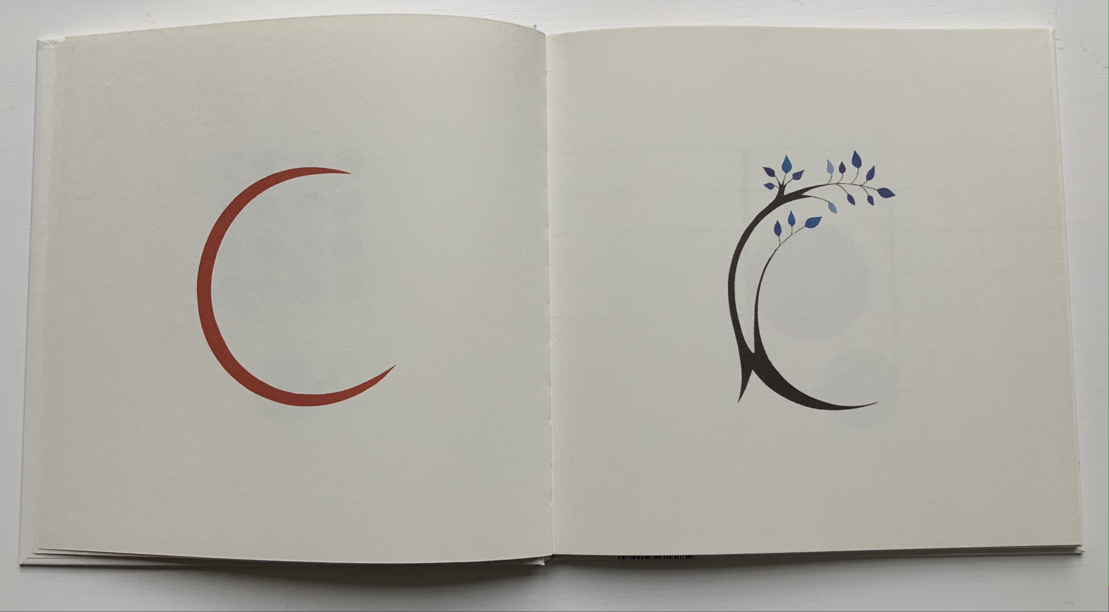
A, B, C, D. Photos: Books On Books Collection.
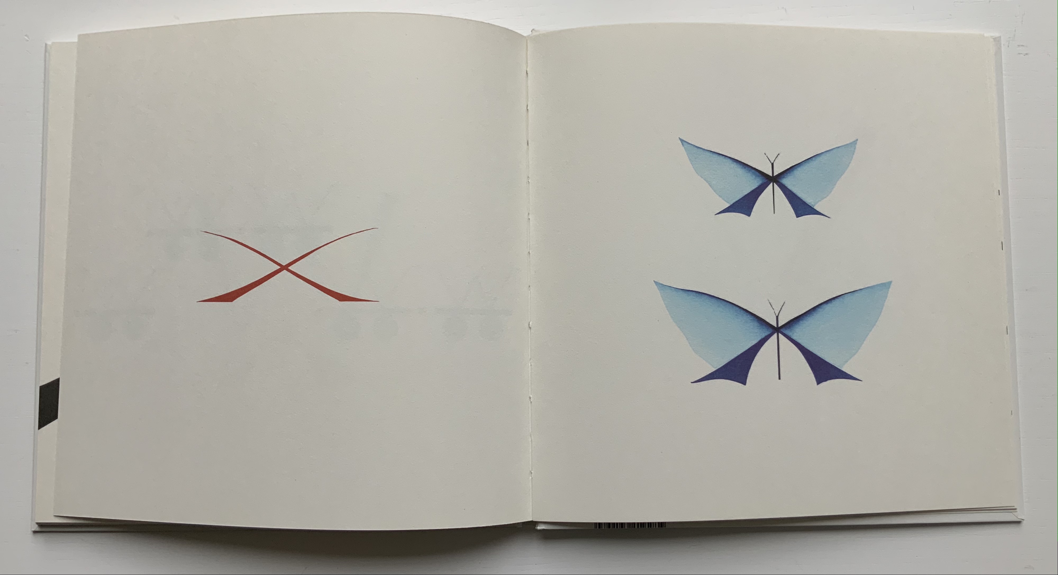
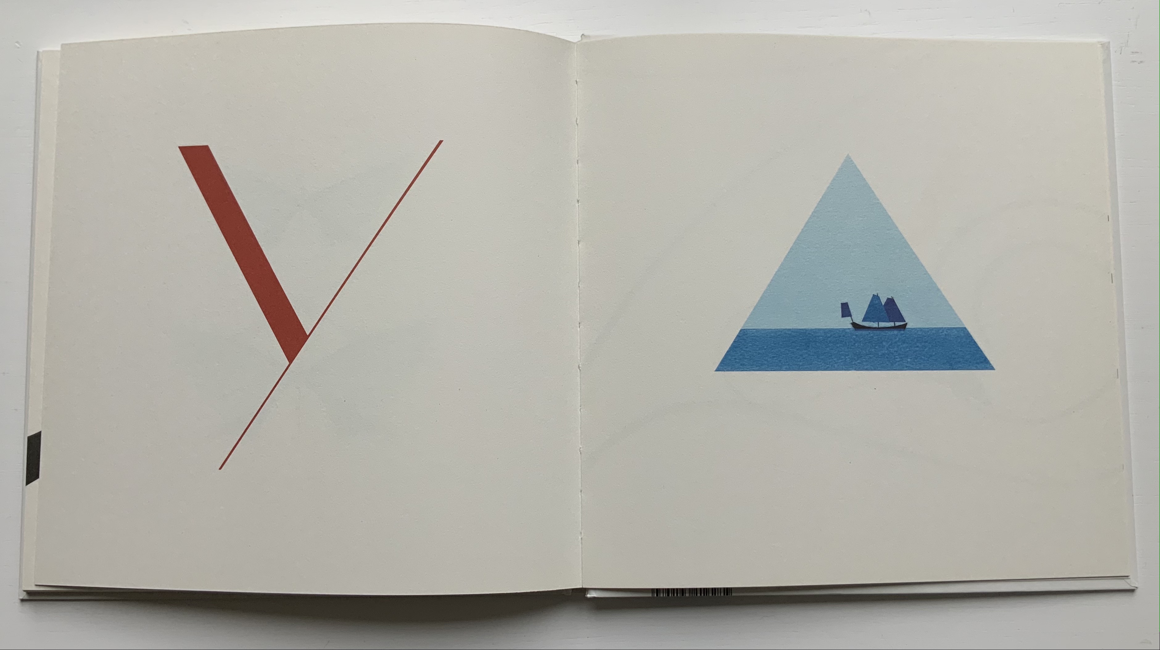
W, X, Y, Z. Photos: Books On Books Collection.
It cannot be an accident that the “noise” alphabet’s letterforms arise from varyingly shaded bricks: rose, gray, reddish gray and reddish black. To left and right of each letter, the rose color dominates. A reddish gray bar tops and tails each letter. The color gray forms the “strokes” of each letter. Reddish black fills the counters. Extracting the signal from the noise of the alphabet or books does not come easily. This is intentional. Just as The New Manifesto says,
With these books // The original autonomous window technology that is us looking through // At // In // Against // With care //The book returns our labor to us //
Days Open Air (2016)
Days Open Air(2016) Aaron Cohick Booklet, center-stapled, H203 x W152, 12 pages. Edition of 100, of which this is #40. Acquired from the artist, 11 December 2020. Photos: Books On Books Collection, displayed with artist’s permission.
Days Open Air is one of those books returning our labor to us that The New Manifesto announces. Cohick call it “an artists’ book/poem thing … an experiment: with our new Risograph, with the alphabet, with writing, with random numbers, and with noise.” Letterforms stretch. Words run sideways, they break in the middle across lines, even across pages.
Look-See (REAED) (2014)
Look-See (REAED) (2014) Aaron Cohick Print. H300 x W456 mm. Photos: Books On Books Collection, displayed with artist’s permission.
More evocative of barcode stripes than bricks, the letterform strokes in this poem-print-poster stretch even more than in Days Open Air. Printed on a Vandercook 219 from vinyl and gesso collagraph blocks, the letterforms challenge us to “look” and “see”. An angle at the top right, two angles midway on the right and two counters condensed to small squares suffice to define the first letter — R. The letters E and A are more efficient, requiring only the placement of two counters each. Note how the textural effect of the gesso and letterpress printed collagraph on chipboard joins The New Manifesto‘s celebration of the physicality and noise of production.
In Cohick’s world, the book and art make, and should be perceived as, a “strange” continuity. His vision and embrace of the collagraph suggest a 21st century version of William Blake. He names his nearer contemporaries as Ken Campbell, Walter Hamady, Amos P. Kennedy, Jr., Karen Kunc, Emily McVarish, Dieter Roth and Nancy Spero. In the Books On Books Collection, those far and near can also be found in Eleonora Cumer, Raffaella della Olga and Geofroy Tory.
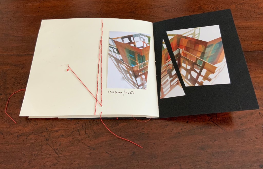
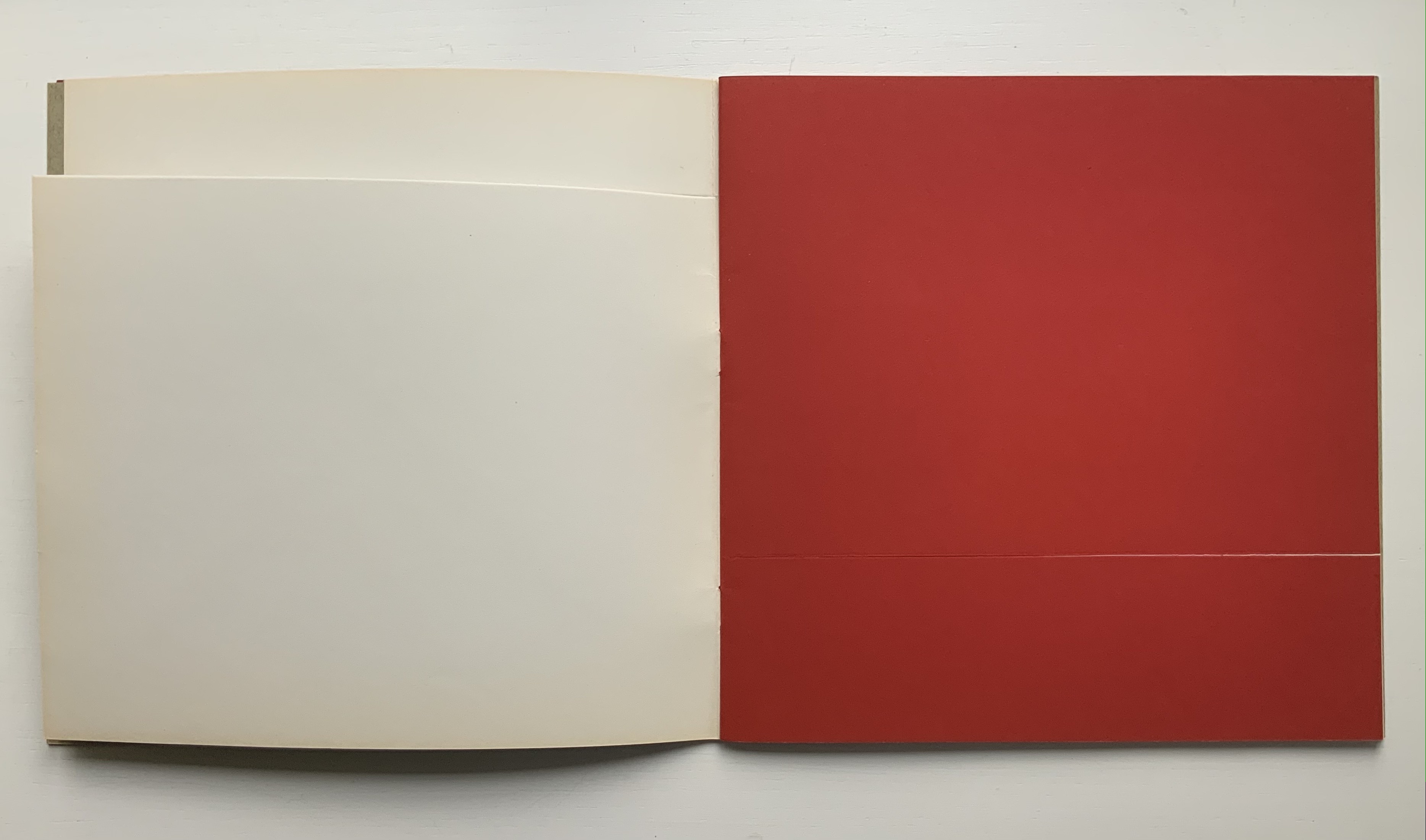
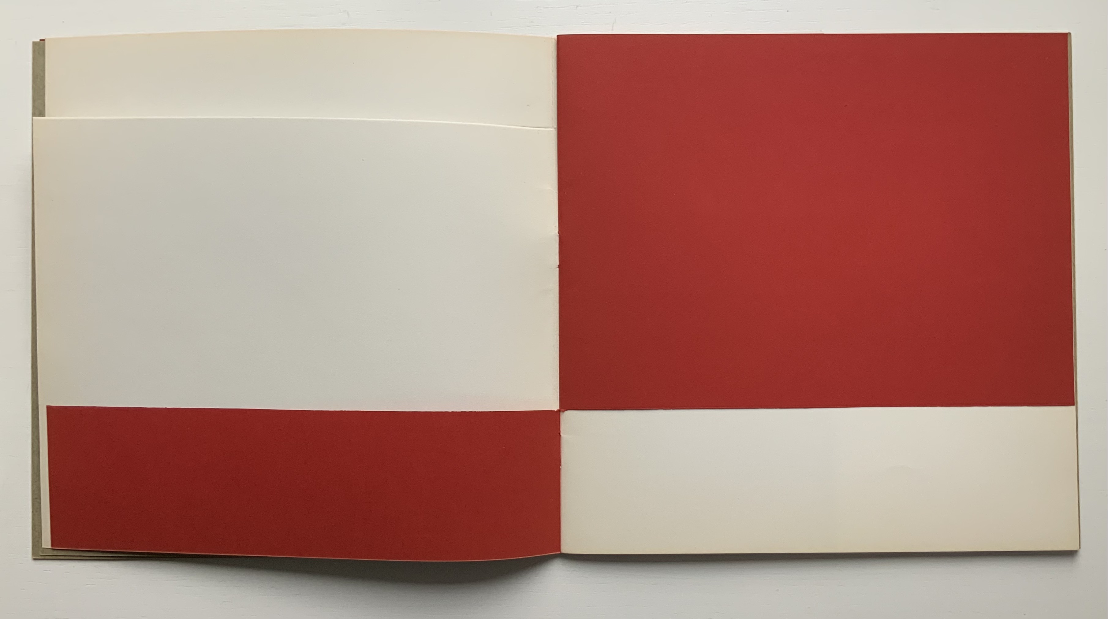
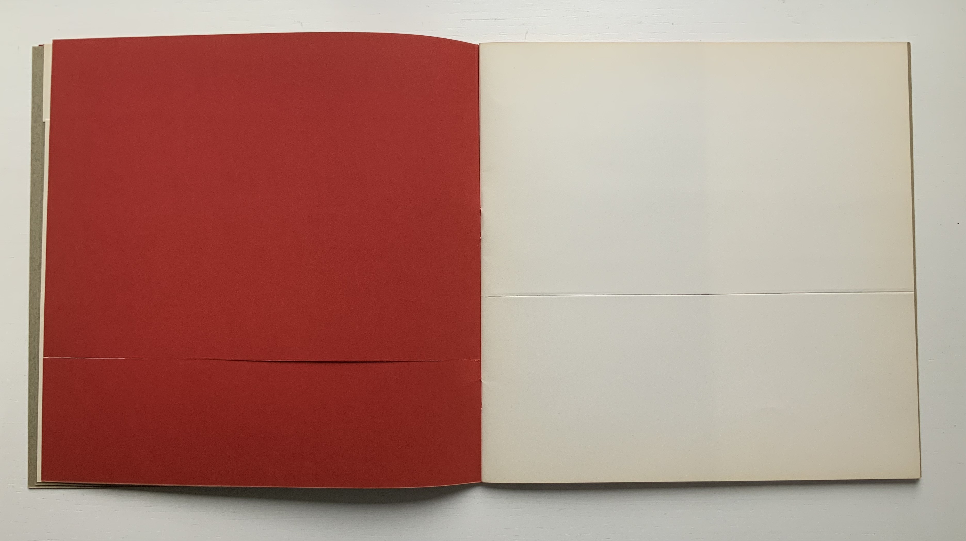
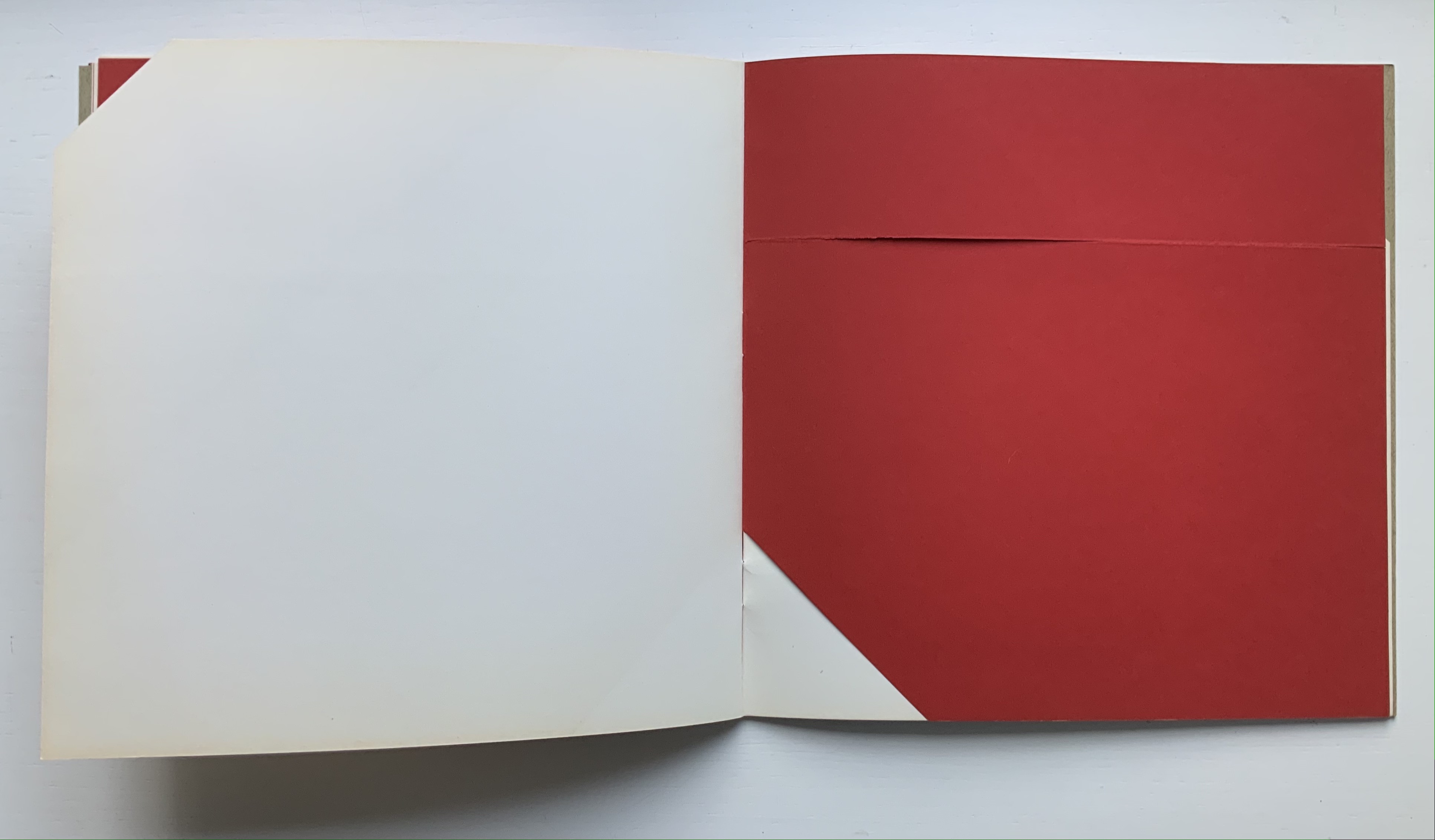
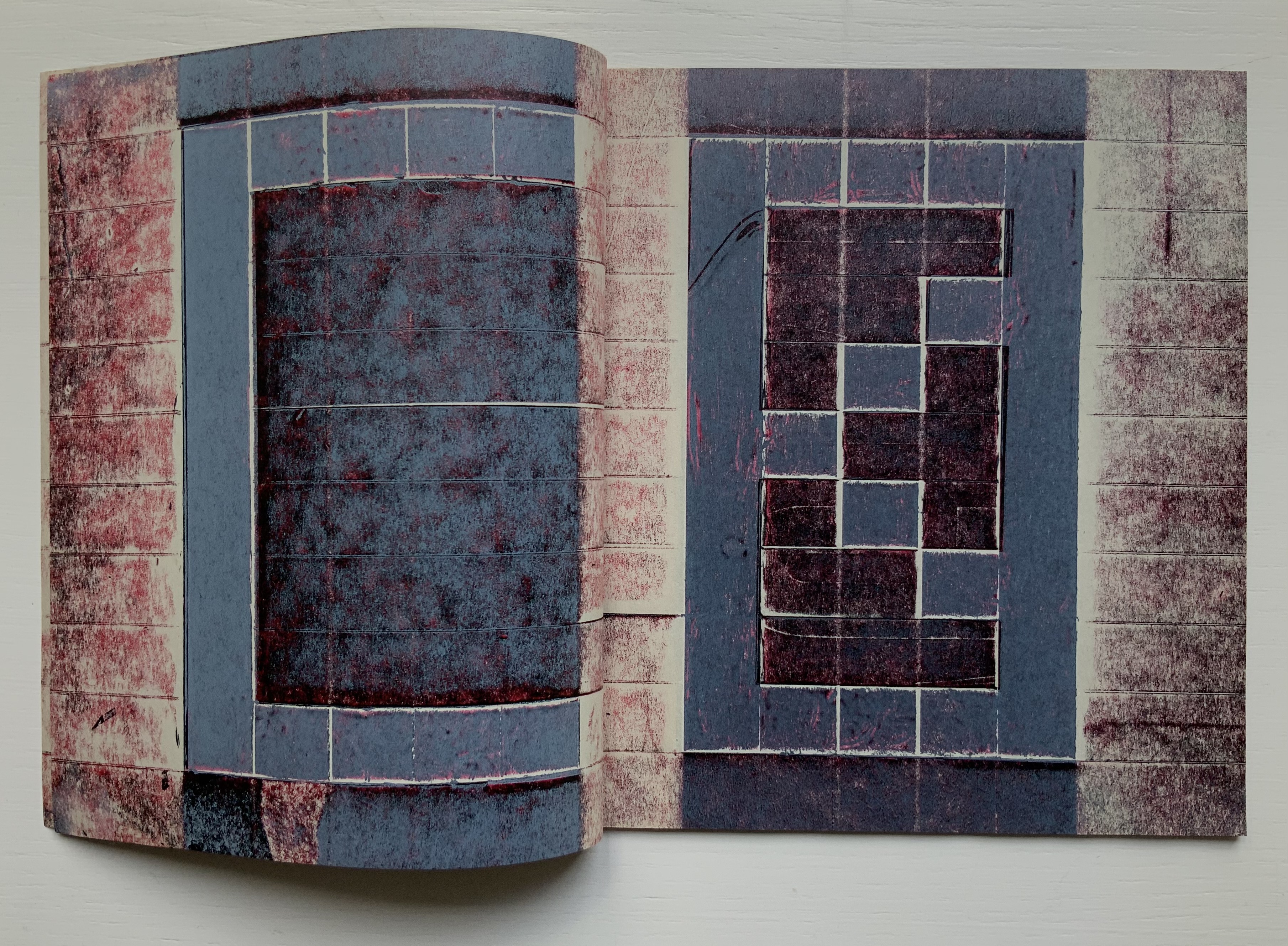
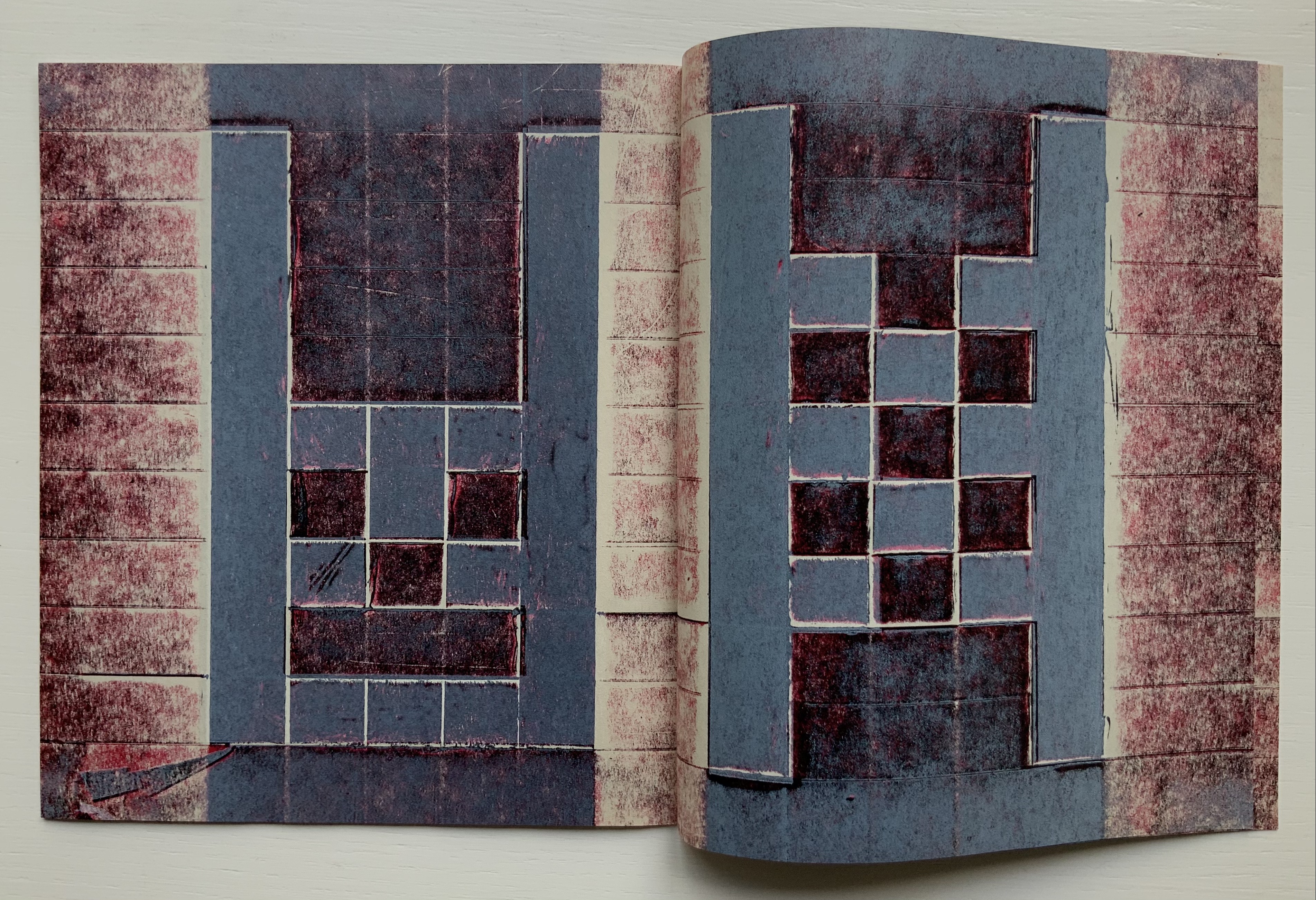
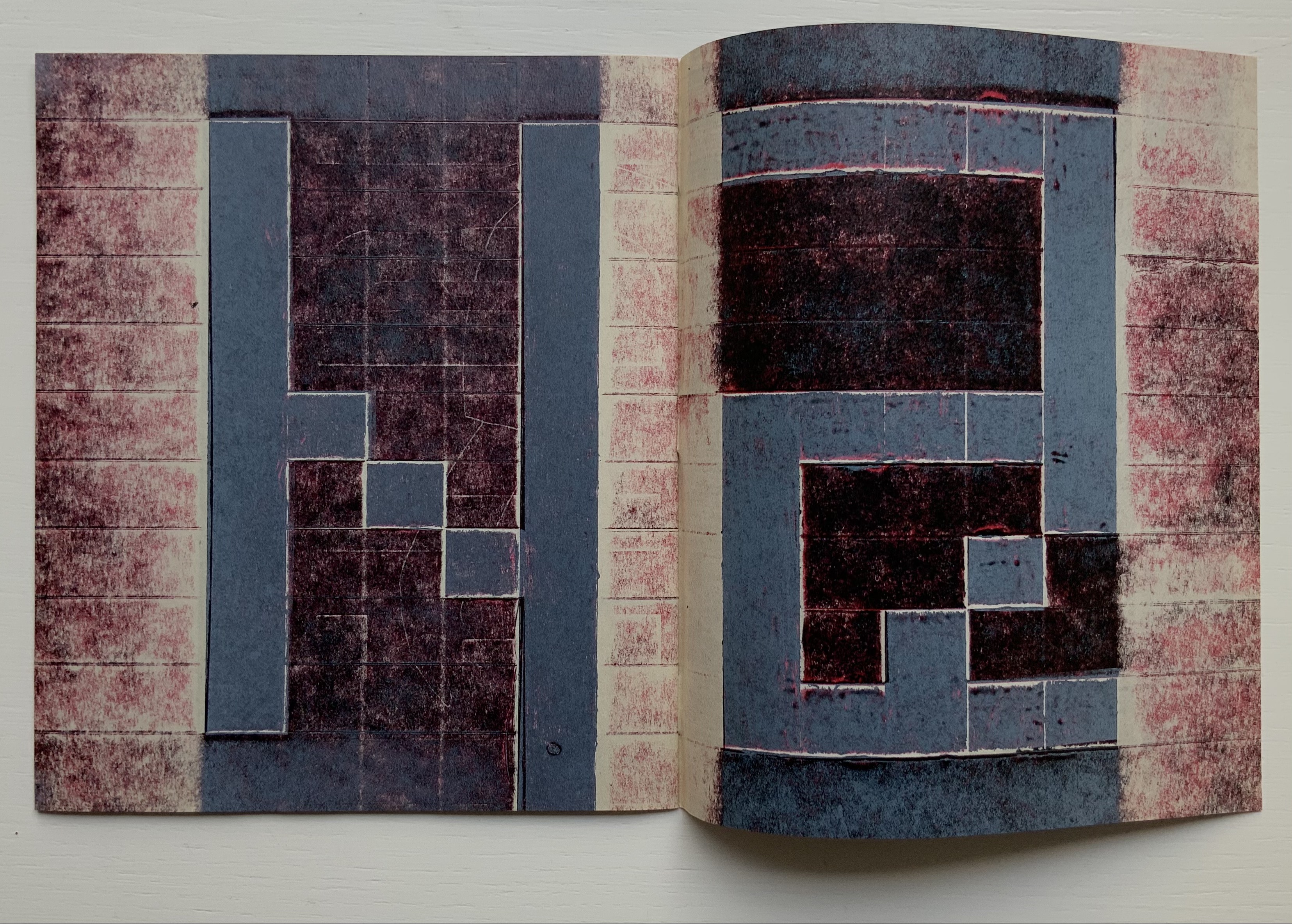
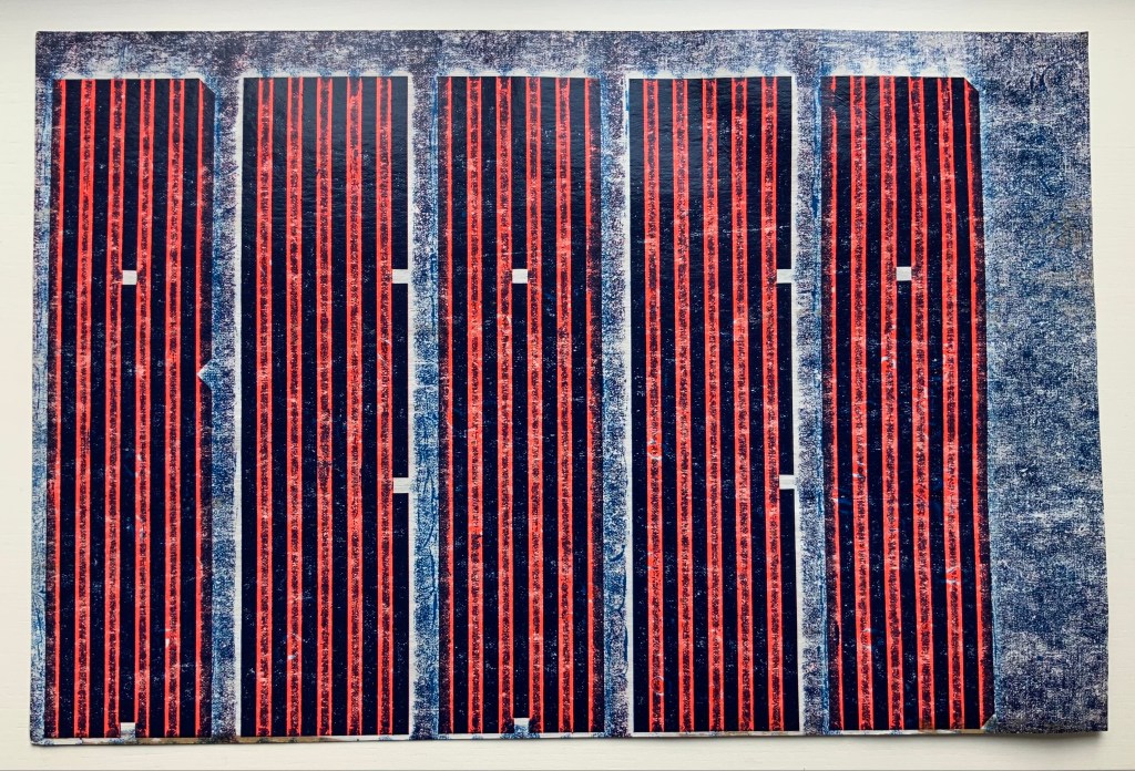
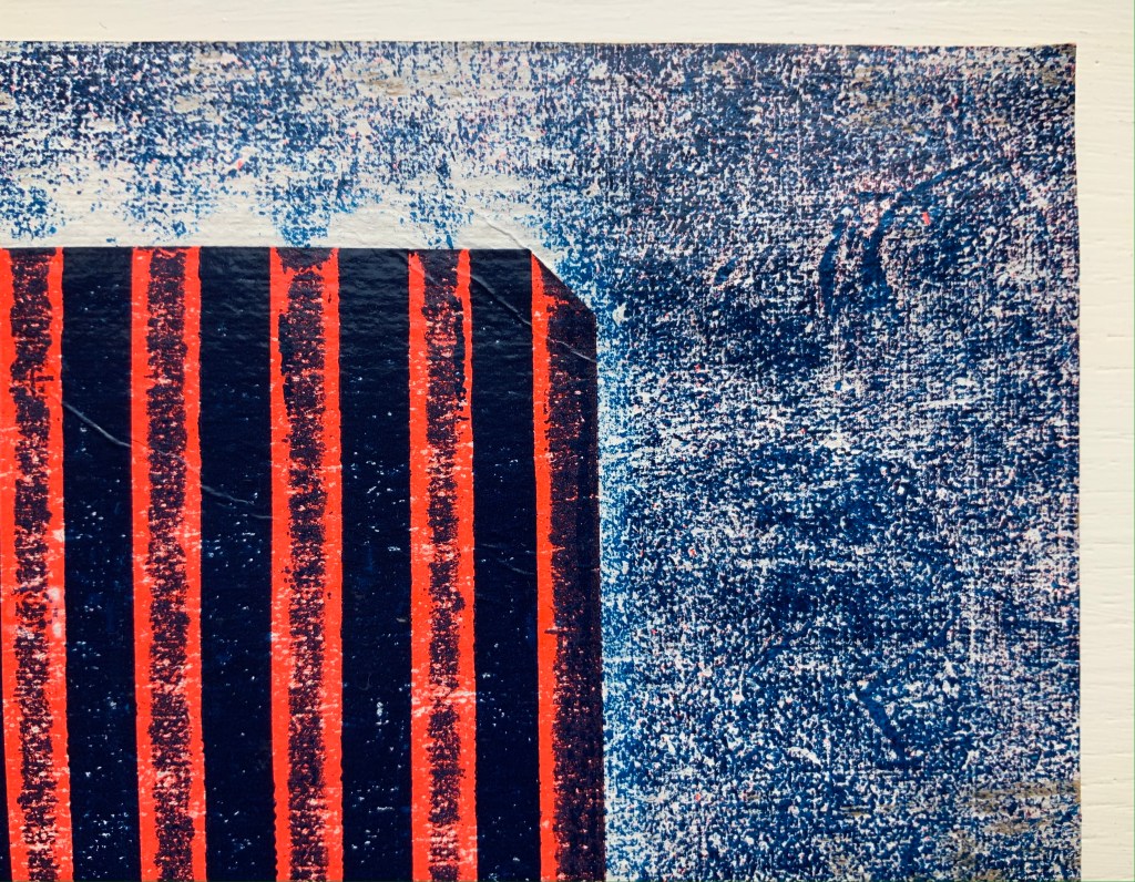
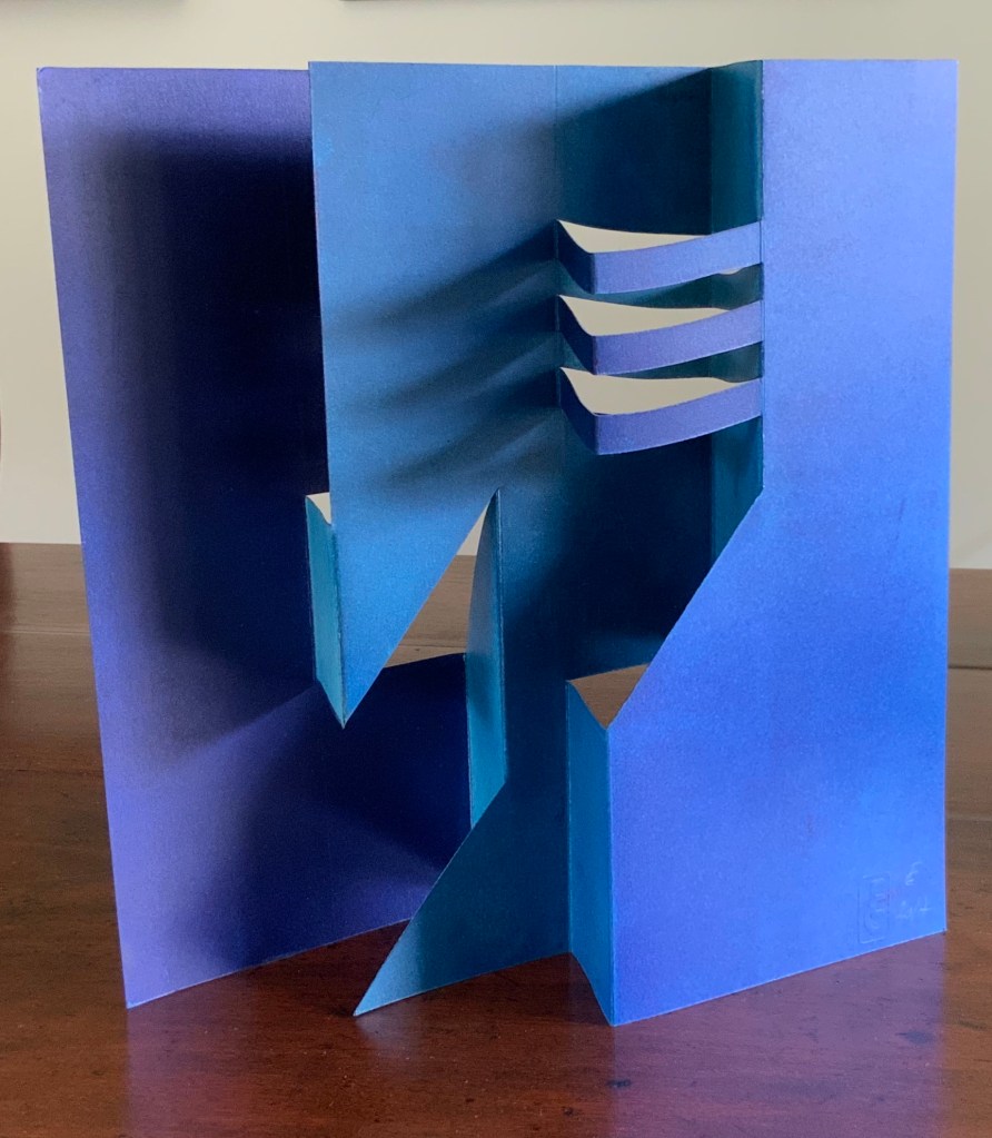
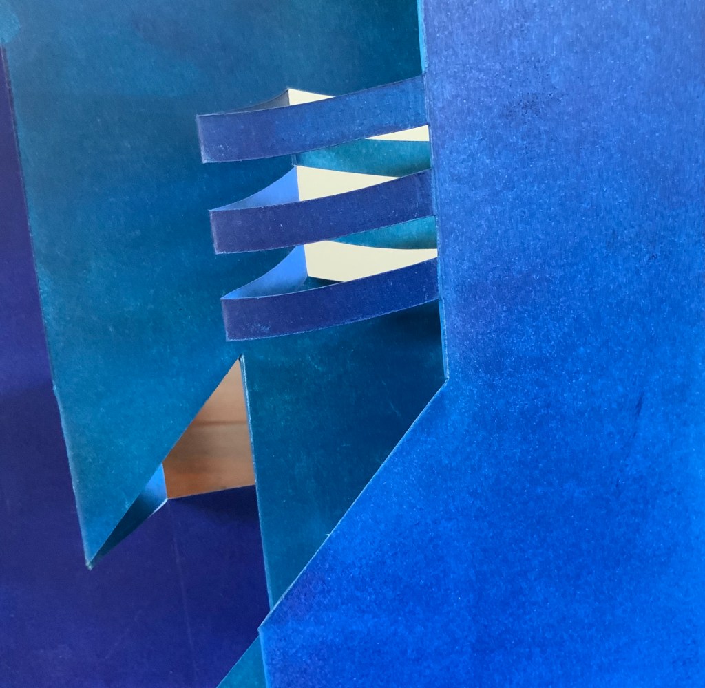
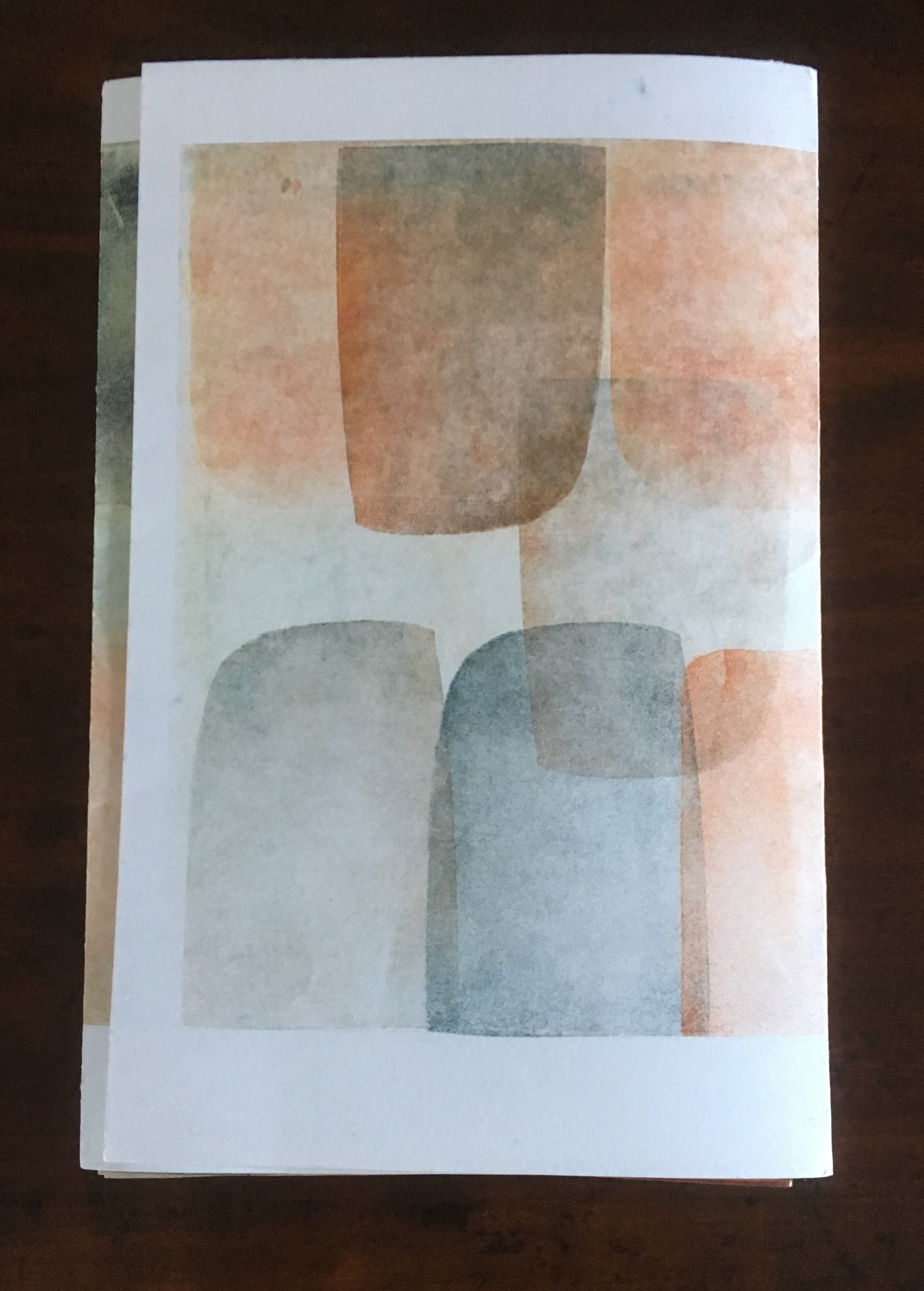
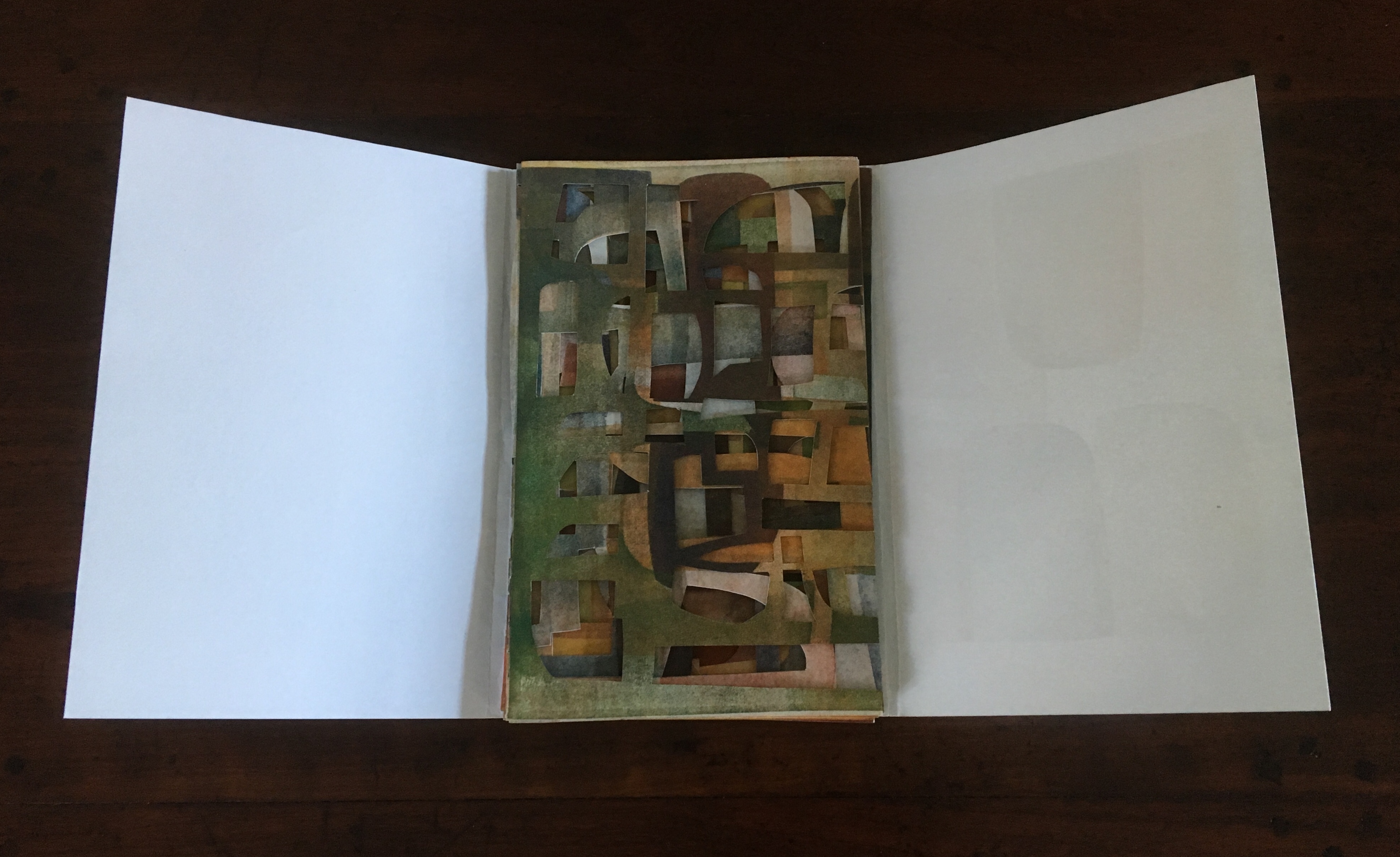
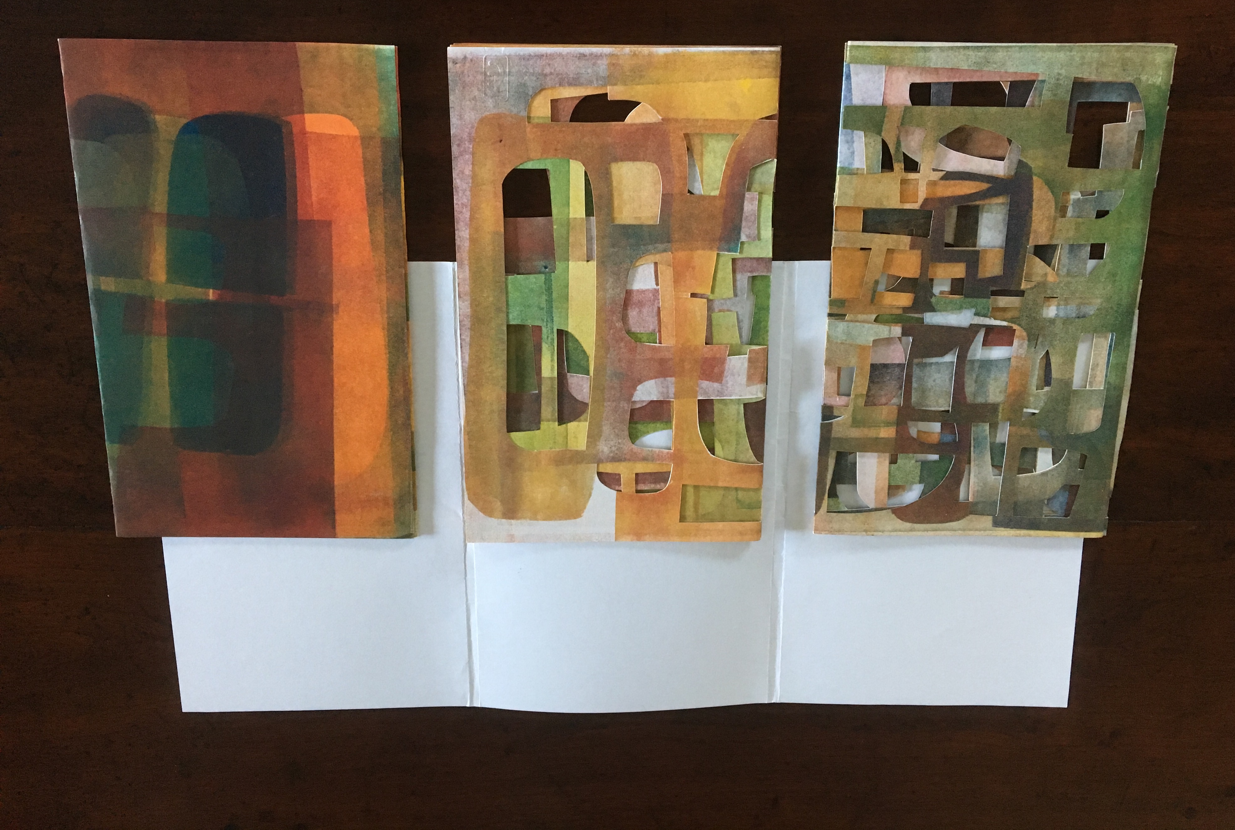
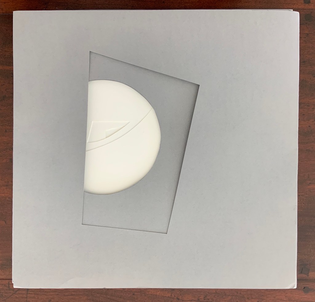
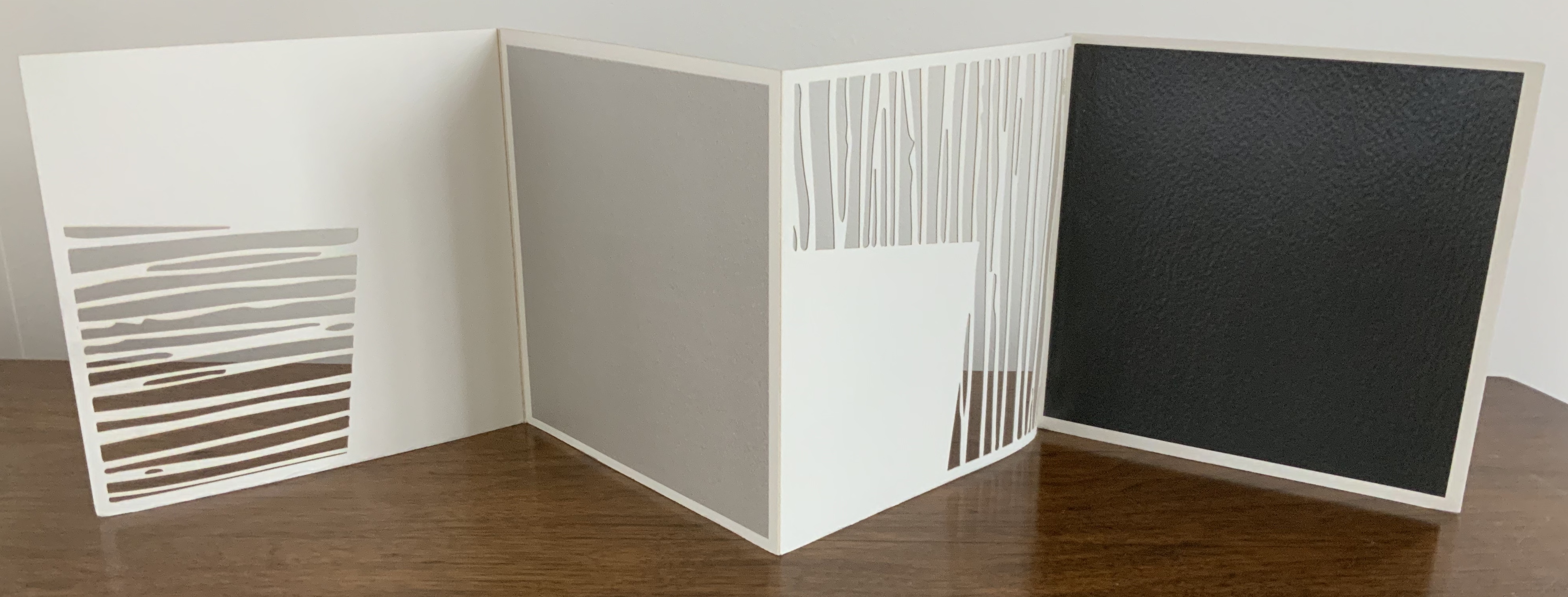
variazione (2015) Eleonora Cumer Linocut on card and tarlatana. Unique. H287 x 416 mm closed. Showing front and back covers. Acquired from the artist, 16 September 2017.
Centrally open view, showing printed linen crape (tarlatana) pages.
Views of the three “double-page spreads.
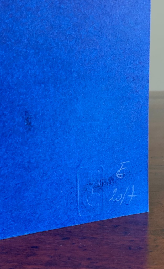
Open envelope for note of thanks. Container for the work. Both with pin-pricked and thread-sewn images. Container initialed and dated on reverse.
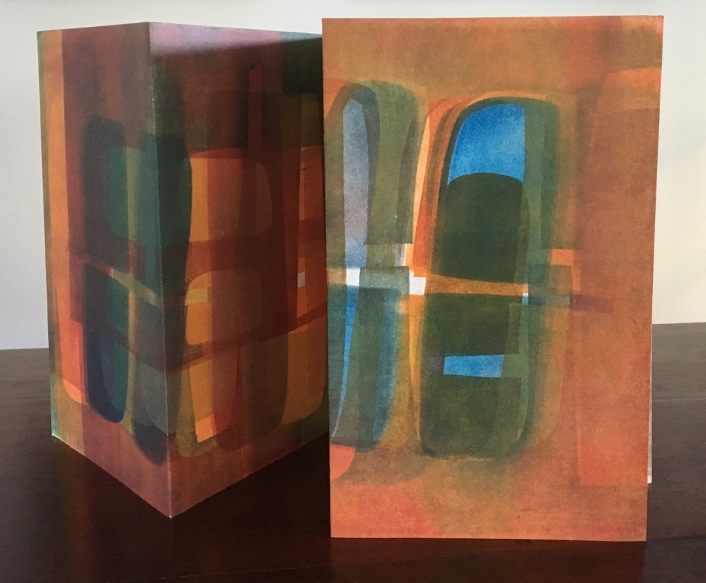
scultura da viaggio dipinta n.2 (2017)
scultura da viaggio dipinta n.2/ sculpture de poche peinte n. 2 (2017) Eleonora Cumer Single sheet of card, cut and painted front and back. Unique, embossed with artist’s stamp and initialed. H250 x W116 mm closed, H250 x W270 mm open. Acquired from the artist, 16 September 2017.
Cumer’s scultura da viaggio builds on Bruno Munari’s portable or “travelling sculptures”, but they could just as easily have emerged from her own earlier works such as l’attesa, visioni urbani and contaminazione.
l’attesa/ l’attente (2010)
l’attesa/ l’attente (2010) Eleonora Cumer Three-dimensional accordion book with painted front and back pages in painted case. H135 x W125 mm closed, H135 x W 1200 mm open. Unique. Acquired from the artist, 16 September 2017. Selected for the Abracadabra Bookcase Exhibition, Barcelona, May 2010.
Internal and external views of open cover.
“Reading” the opened concertina l’attesa (“the wait”).
Front view of l’attesa.
Rear view of l’attesa.
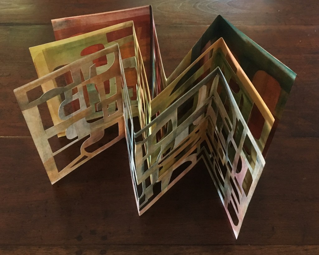
visioni urbane/ visions urbane (2015)
visioni urbani/urban visions (2015) Eleonora Cumer Three cards, tri-fold, painted front and back, and cut, encased in a duo-fold sheet, painted on one side. H240 x 150 mm closed, H240 x 600 mm open Unique. Acquired from the artist, 16 September 2017.
Opening the work.
Rear view, top view.
contaminazione (2015)
contaminazione (2015) Eleonora Cumer Four sheets of card, each cut and folded into three panels. H300 x W300 mm closed, H300 x 900 mm open. Acquired from the artist, 16 September 2017.
View of the four component cards.
Duo-fold gray cover H302 x W315 mm closed, H302 x W943 mm open. Fourth component card, initialed and dated by the artist.
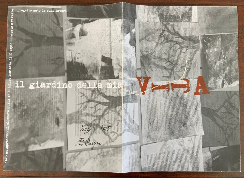
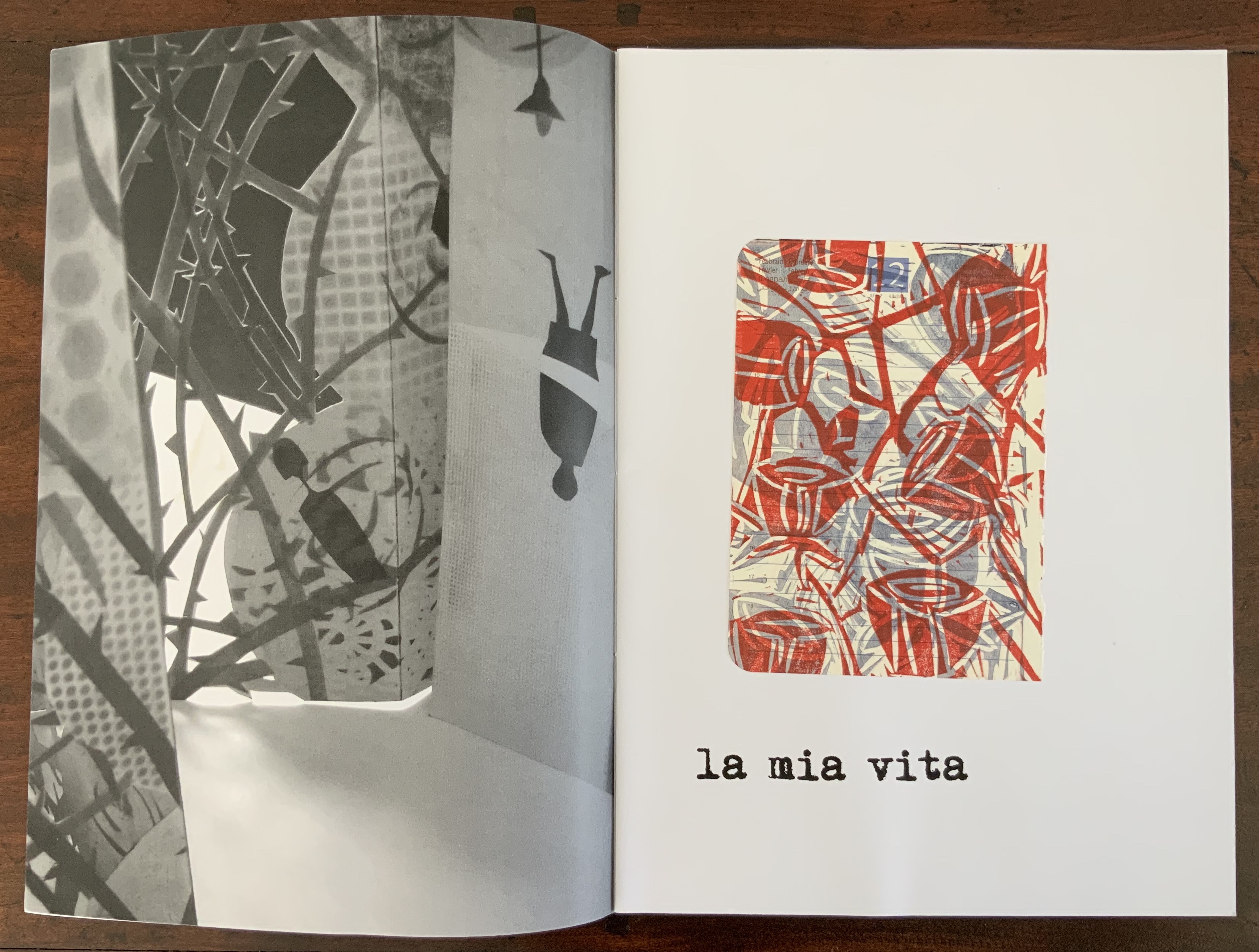
il giardino della mia VITA (2015)
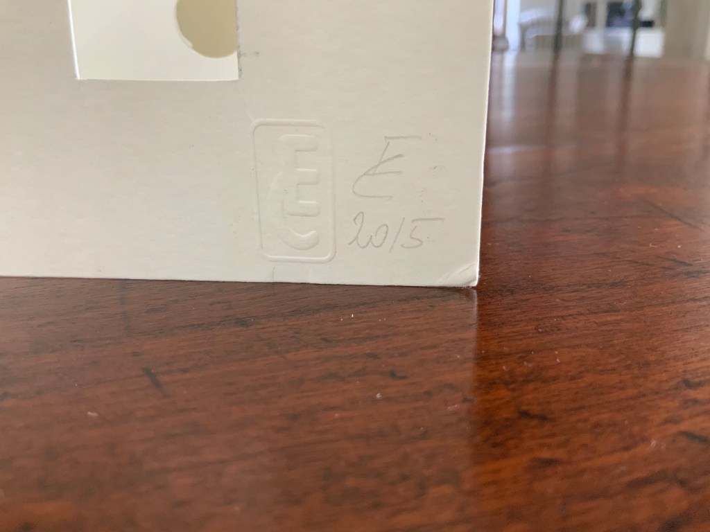
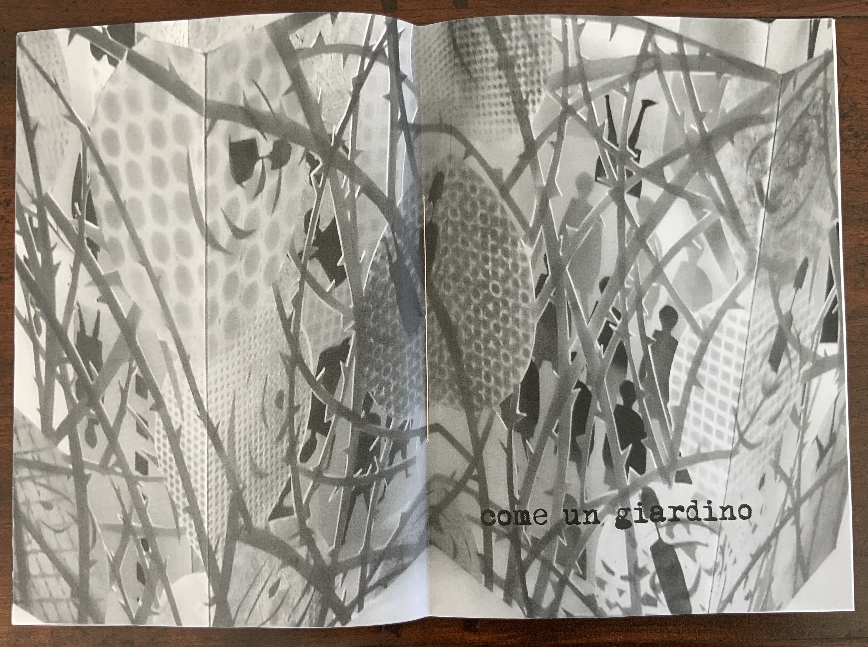
il giardino della mia VITA (2015) Eleonora Cumer Hand-sewn booklet of hand-stamped photo-collaged paper. Glassine envelope, glued to page 6, contains shards of coloured glass. H288 x W205 mm closed, H288 x W410 open. Edition of 50 numbered and signed, of which this is #20. Acquired from the artist, 16 September 2017.
The text in English: “The garden of my life: my life like a garden or better”
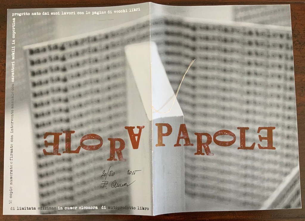
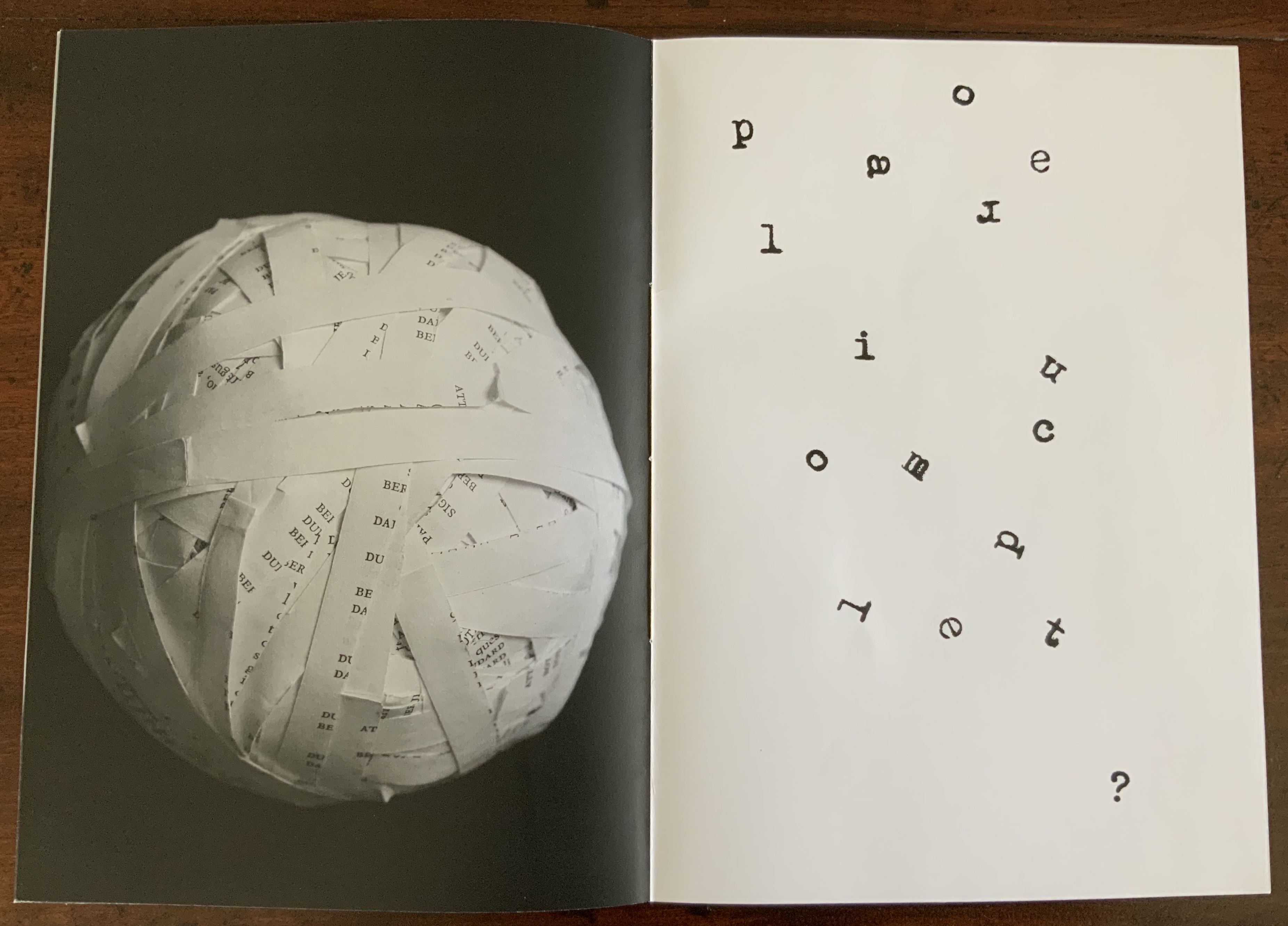
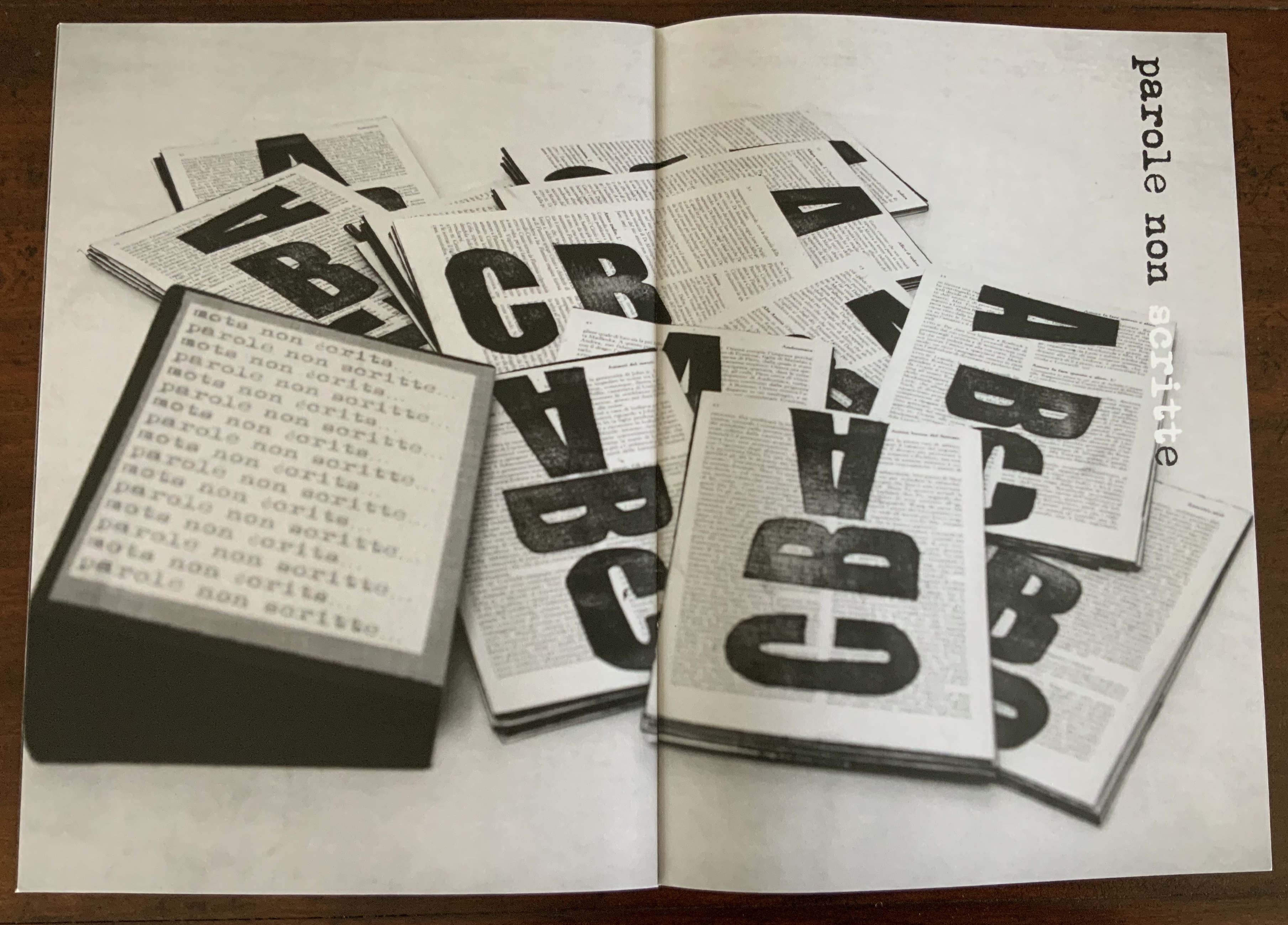
PAROLE (2015)
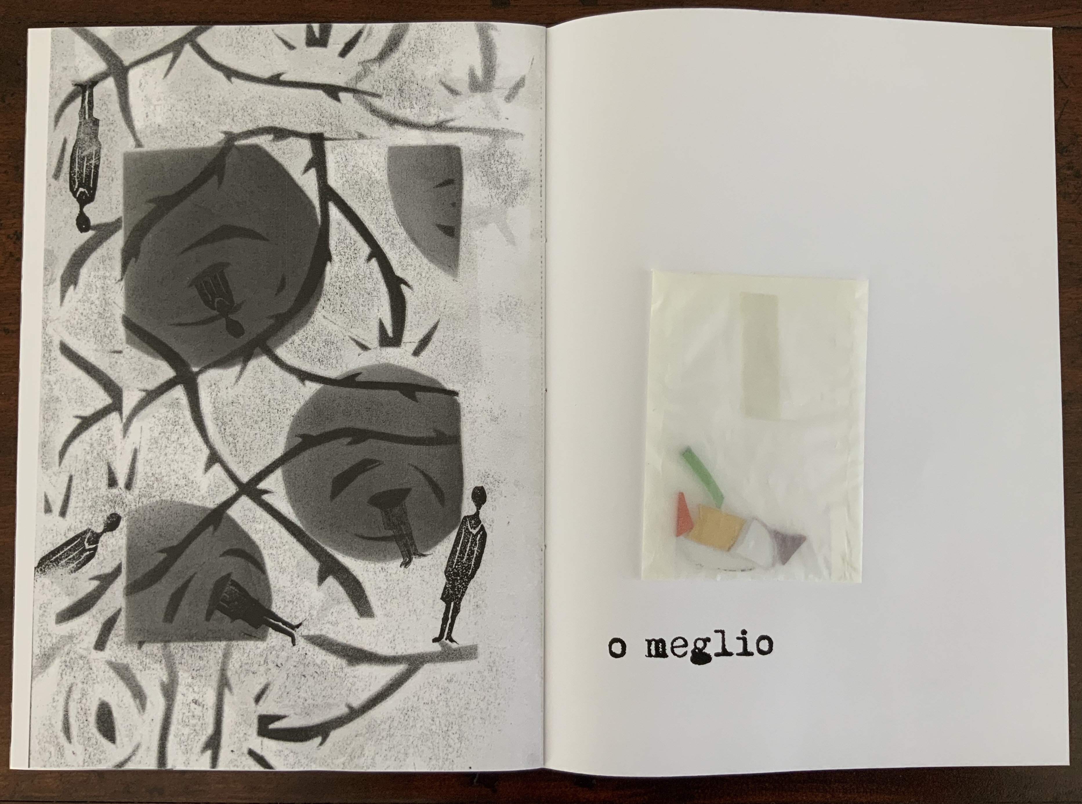
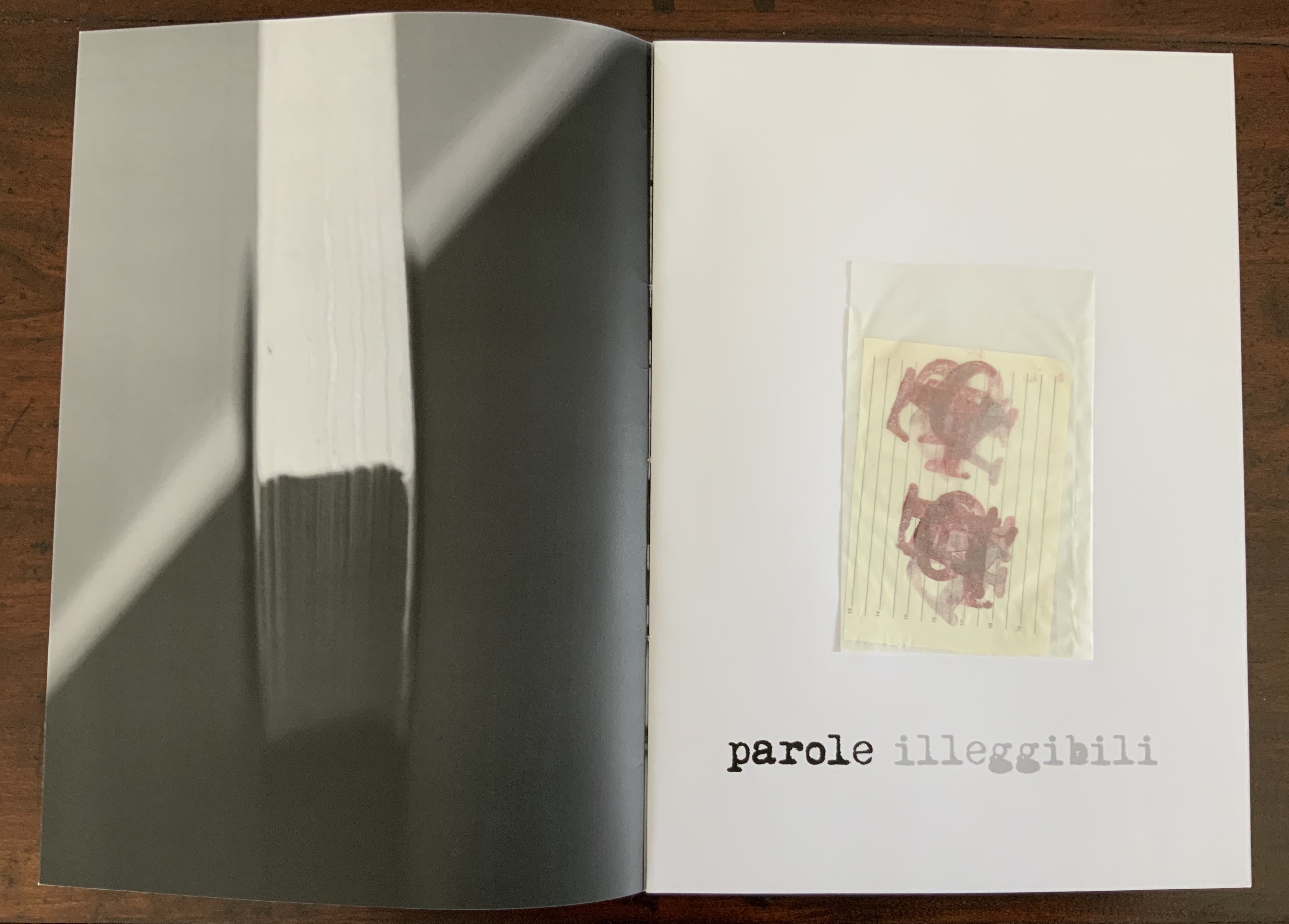
Parole (2015) Eleonora Cumer Hand-sewn booklet of hand-stamped photo-collaged paper. Glassine envelope, glued to page 2, contains slip of lined paper hand-stamped with the letters of the word “parole” superimposed on one another in two groups. H288 x W205 mm closed, H288 x W410 open Edition of 50 numbered and signed, of which this is #20. Acquired from the artist, 16 September 2017.
The text in English: ”Words: unreadable words, incomplete words, unspoken words”
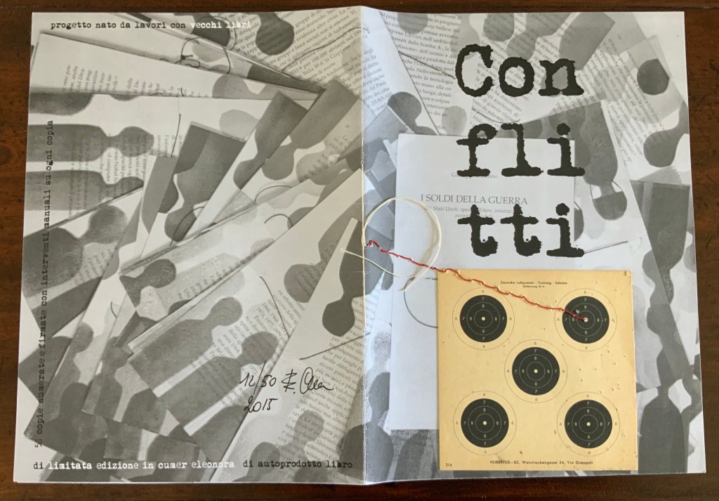
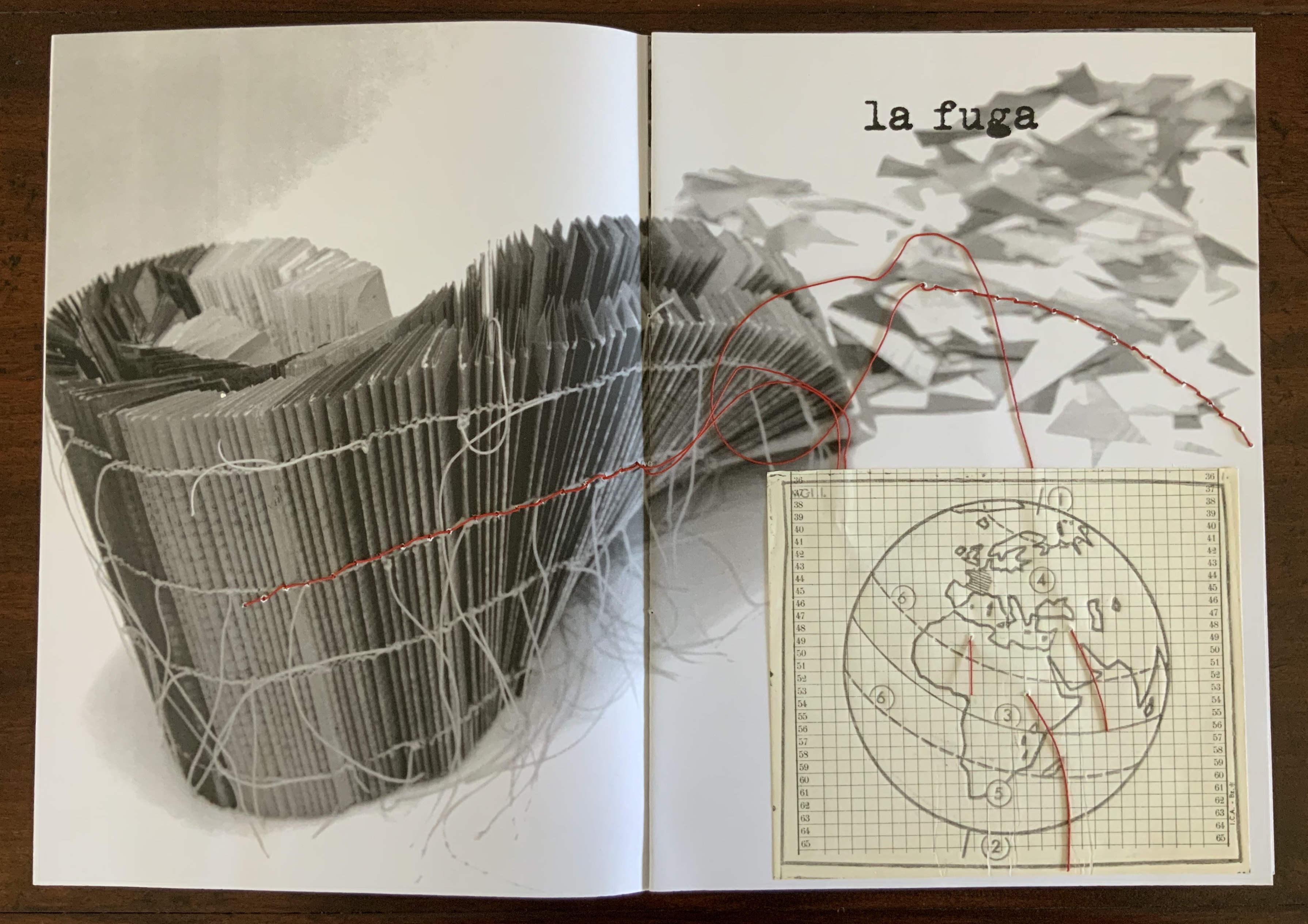
Conflitti (2015)
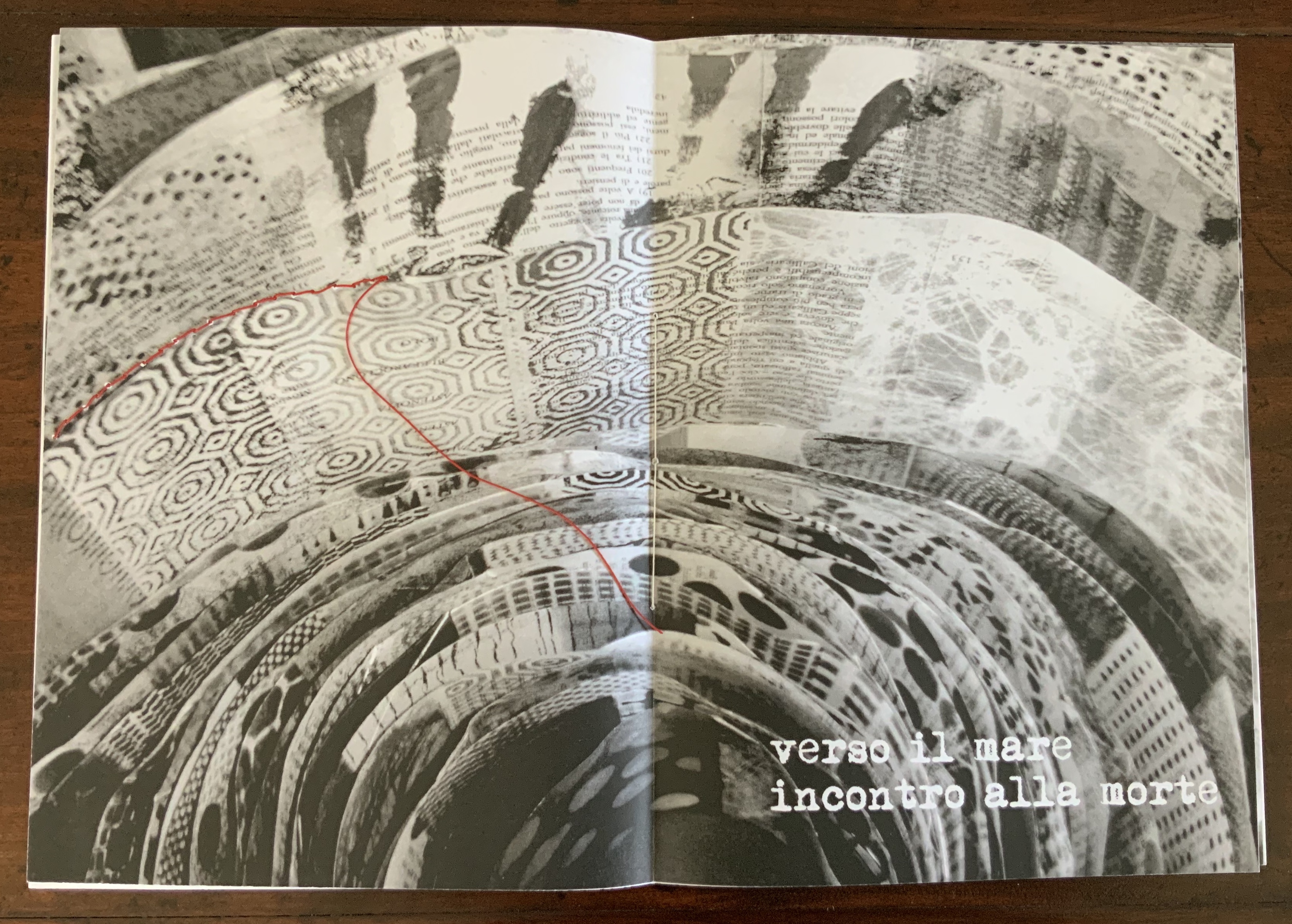
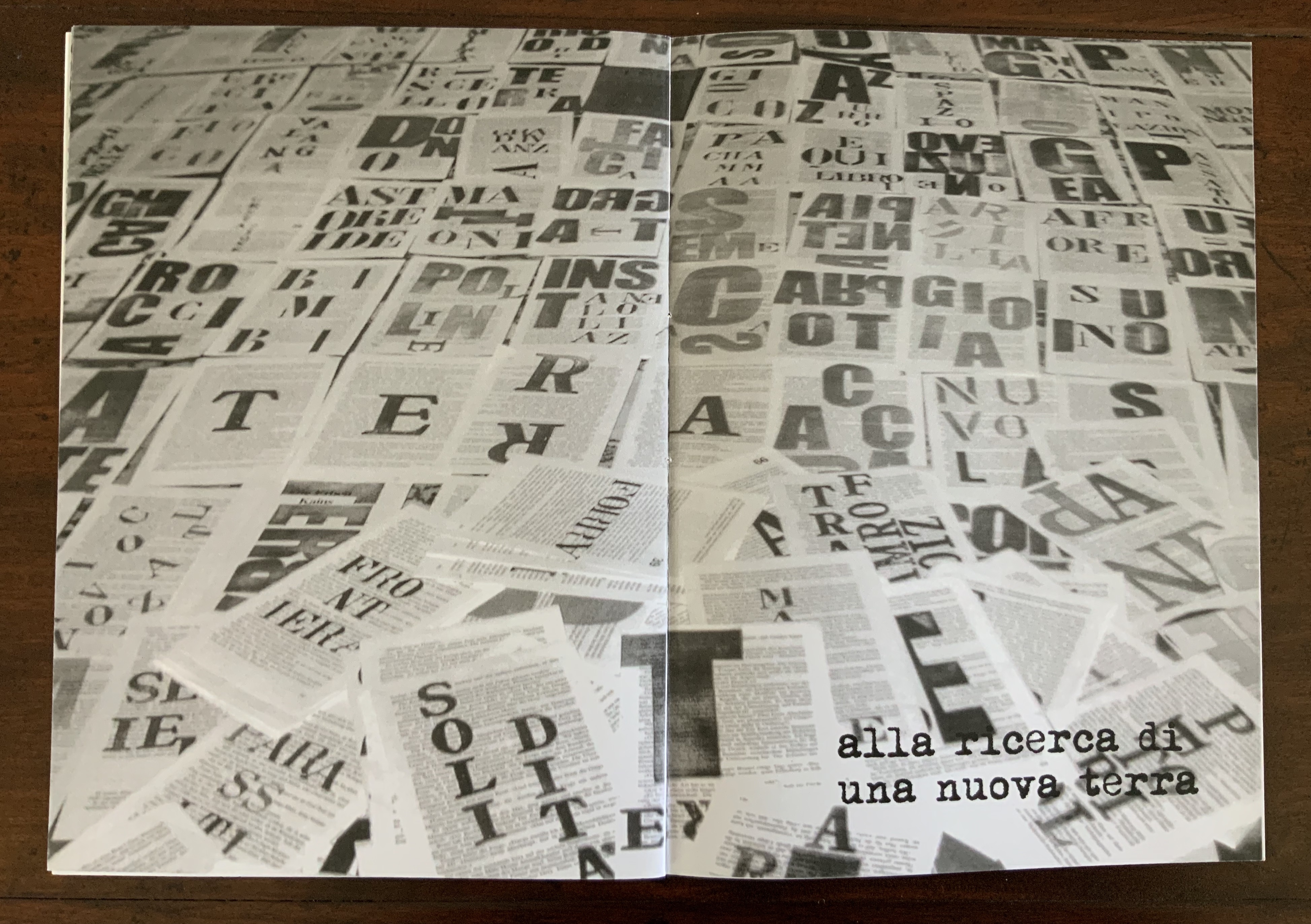
Conflitti (2015) Eleonora Cumer Hand-sewn booklet of hand-stamped photo-collaged paper. German air rifle training disc (distance 10 m) sewn with red thread and glued to cover; exiting on page 1, the red thread crosses to pages two and three; page two includes a pastedown grid, labelled in its margin with the abbreviation for an anti-cholergenic incapacitating chemical weapon. H288 x W205 mm closed, H288 x W410 open. Edition of 50 numbered and signed, of which this is #16. Acquired from the artist, 16 September 2017.
The text in English: “Conflict: the flight to the sea to meet death in search of a new land”
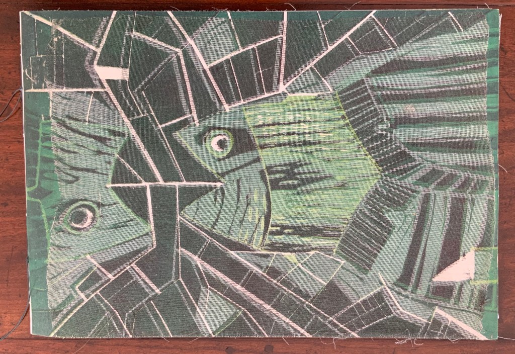
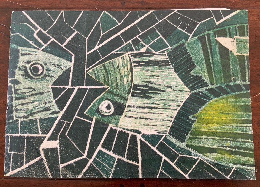
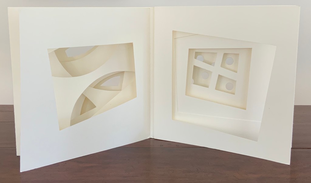
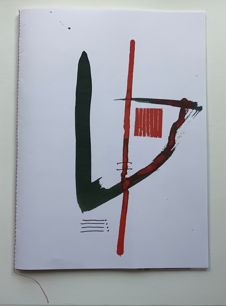
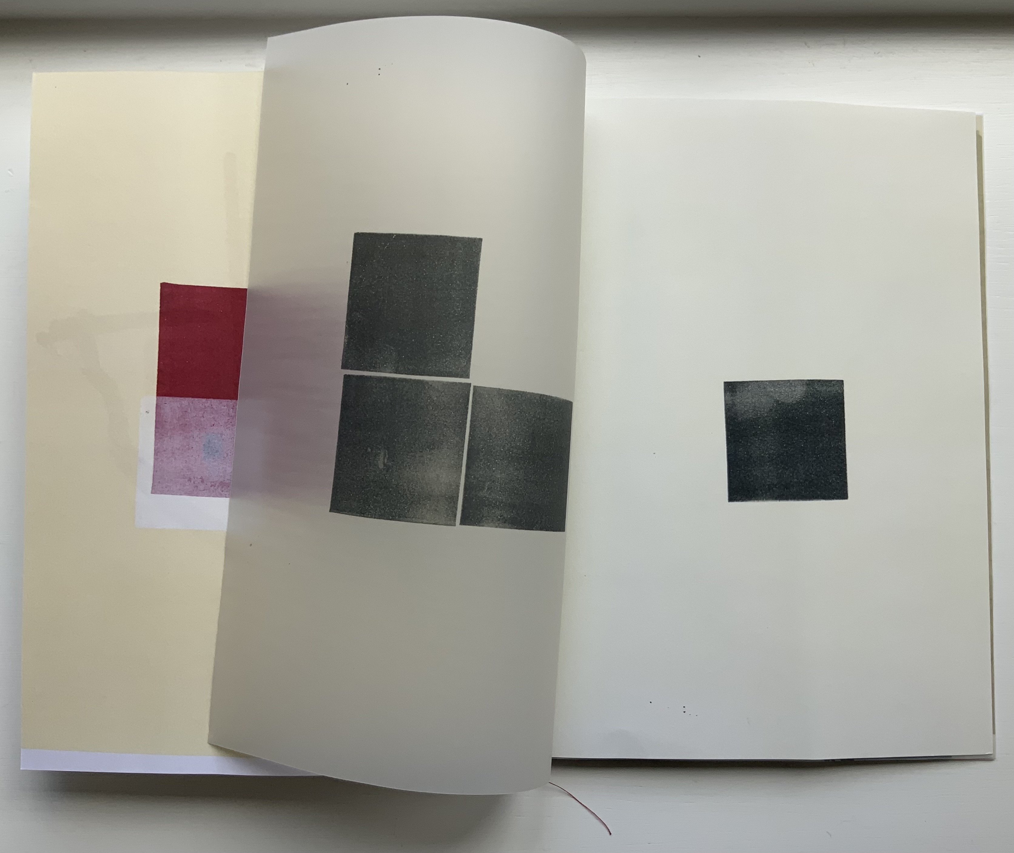
Circoscrivere lo spazio (2021)
Circoscrivere lo spazio No. 3 (2021) Eleonora Cumer Booklet with alternating folios of papers and folded inserts. H275 x W200. mm. Edition of 15, of which this is #10. Acquired from the artist, 26 May 2021. Photos: Books On Books Collection.
The thick stroke of black on the front cover runs downwards, then veers diagonally and upwards to the right. As it does, it narrows, reddens and loops over a leftward thrust suggesting a needle crossing under the moderately thick red stroke that tilts off center. The two thin red stitch-like lines further down the length of that off-center stroke strengthens the suggestion. Something is being bound or stitched together.
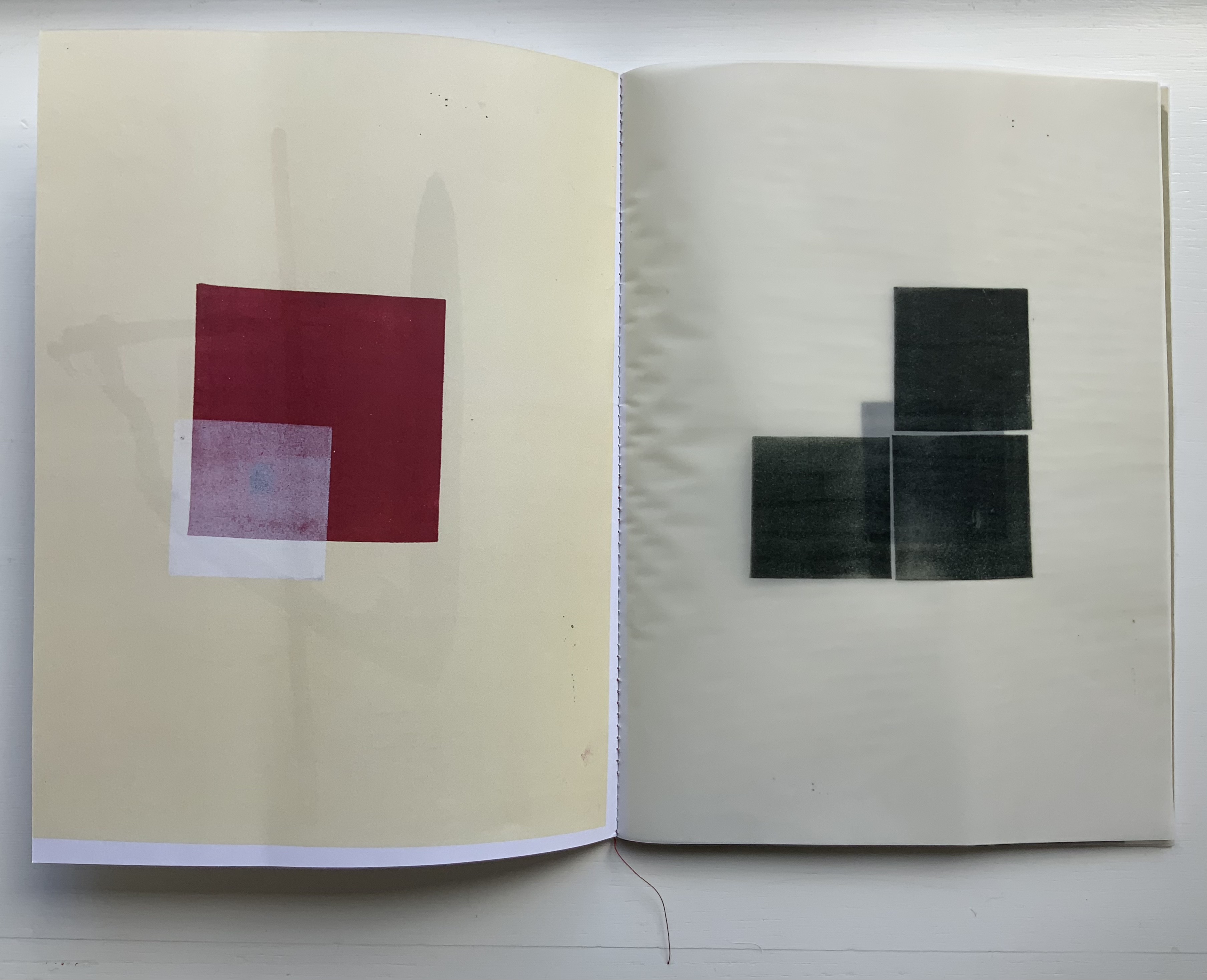
When the booklet opens, a translucent page appears on the right. It bears three black squares, but an off-center fourth peeks through them. As the translucent page turns, a crackling sound startles while the page with the off-center square comes into view. It is made of the same paper as the front cover but inked slightly less yellow than is the inside of the front cover. The smudges lightening the upper righthand corner of the fourth black square fool the eye into seeing another translucent layer, an illusion strengthened by another illusion. Looking to the left, the eye sees through the real translucent sheet the white margins at the foot and center of the inside front cover, and it appears that the translucent sheet has the same margins and an undertone of yellow aligned with that on the inside front cover. Not so.
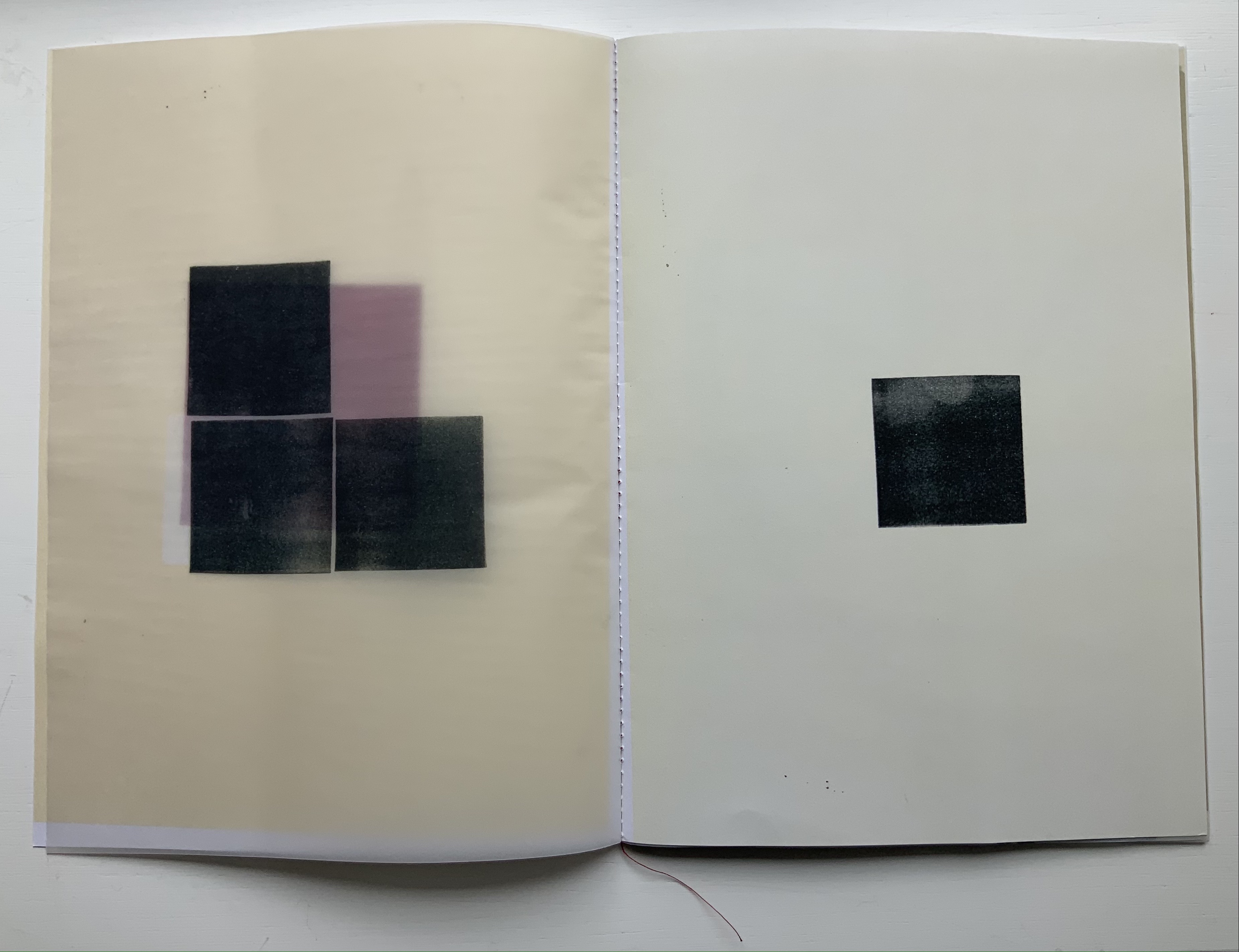
The next two double-page spreads tease and hint to the eye in the same and different ways. Stitching images like those on the front cover reappear but now enlarged. Another crackling sheet of translucent paper covers an enlarged black square, which turns out to be an insert of black paper embroidered with red thread. When the hooked-needle image overlays the other stitchery images on the white verso page, it becomes clear that the insert hides another smaller insert. Smaller, yes, but with its own widening surprise — two valley folds that are really mountain folds when the insert unfolds completely over the double-page spread.
All of these “deceptions” — and others to come in the booklet — involve circumvention of circumscription. Circoscrivere lo spazio (“To circumscribe space”) and the next work are Cumer’s most sophisticated metaphoric works in the Books On Books Collection.
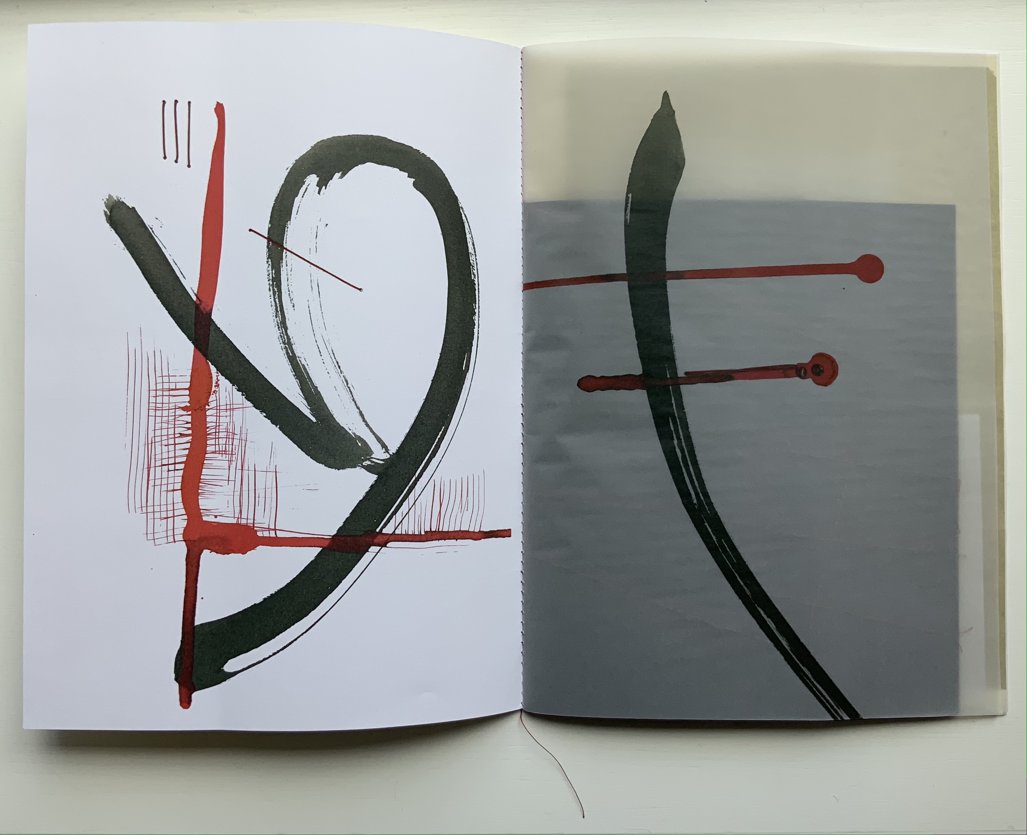
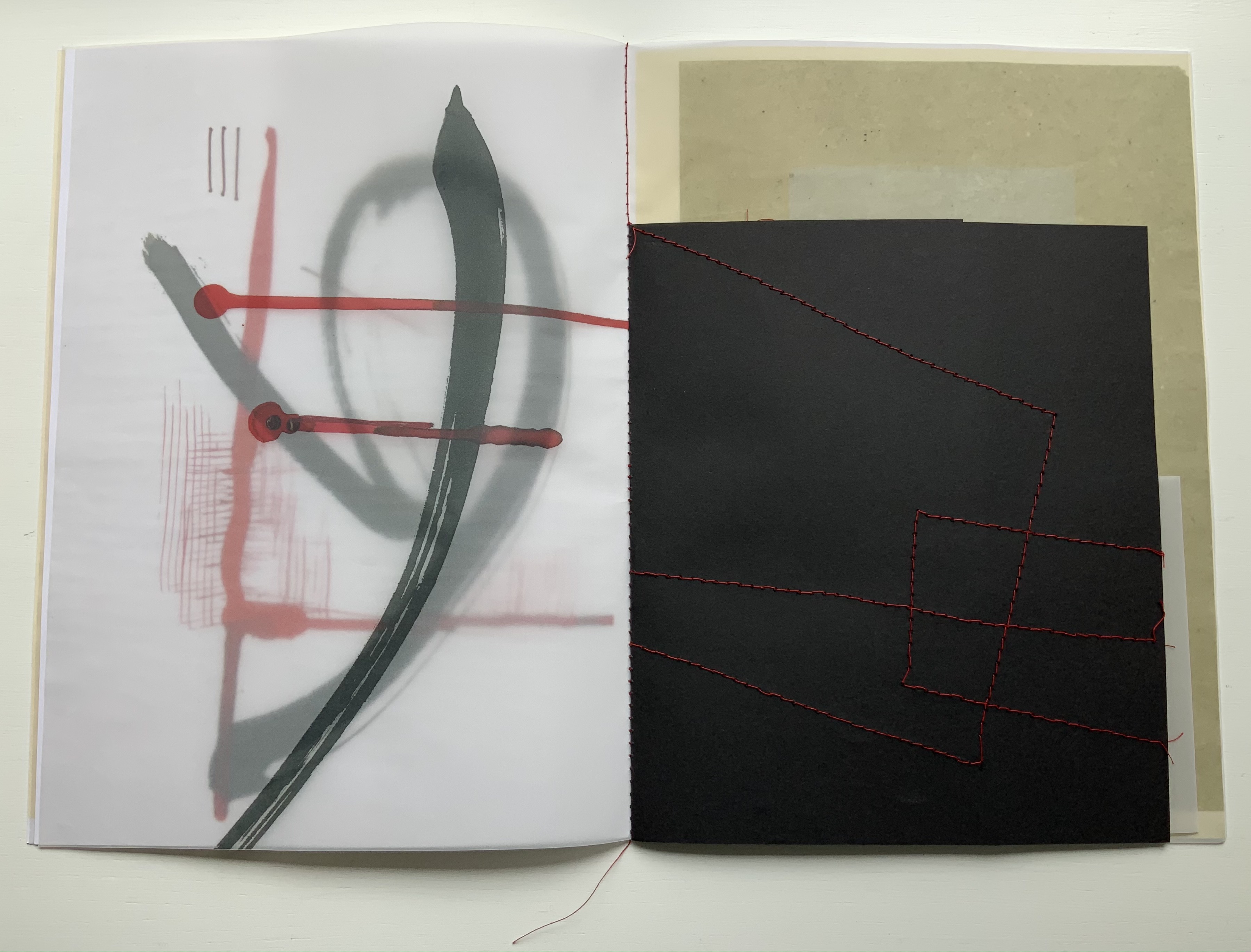
Cercare nella memoria (2021)
Cercare nella memoria (2021) Eleonora Cumer Booklet of translucent papers, center sewn, hole-punched and strung together with a single thread. H195 x W140 mm. Edition of 15, of which this is #1. Acquired from the artist, 26 May 2021. Photos: Books On Books Collection.
Each copy is printed with a photocopier, then subjected to different manual interventions: embroidered images in red thread, ink and watercolor, wax seals, a translucent white single-sheet insert, and collage with tarlatana. The binding is twofold: a single brown thread sewn through the fold of the gathered folios, and a punched hole through which a single red thread is loosely strung, secured with a single stitch through the spine and two drops of sealing wax, one on the back and one on the front over a knot in the thread.
Each of these material and technical details, by itself and together, contributes to the meaning of this work, spelled out in its title: Cercare nella memoria (“To seek in memory”). When we speak of searching our memories, we speak in metaphors and images. Many of them are here in this booklet: pulling on a thread, losing the thread, picking up the thread, tying a string around a finger, circling in on something, holes in recollection, and peeling back layers of memory. The drops of sealing wax might jog the memory of Giordano Bruno’s Thirty Seals, the third volume in his Art of Memory. Pulling on that thread might lead to the discovery of a resemblance between Bruno’s seals and Cumer’s images.
Cercare is smaller than Circoscrivere. It may, perhaps, have fewer moving parts. But it is more dense, more crowded, more delicate, and more violent with its splashing red and lines crashing across one another — and, for anyone who thinks seriously about memory, more frightening.
Giordano Bruno’s “The Bookbinder” seal from Julia Buntaine Hoel’s “The Art of Memory” (2018 to present). Accessed 27 June 2021.
Further Reading
“Eleonora Cumer”, WorldCat Identities. Accessed 5 September 2019.
It can be hard to find the time to experiment with your art. Often you feel everything we create should be a finished artwork but it is extremely valuable to take the time to just play. It can feel like a waste of time but often from these opportunities the most fascinating results, techniques and […]
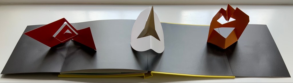
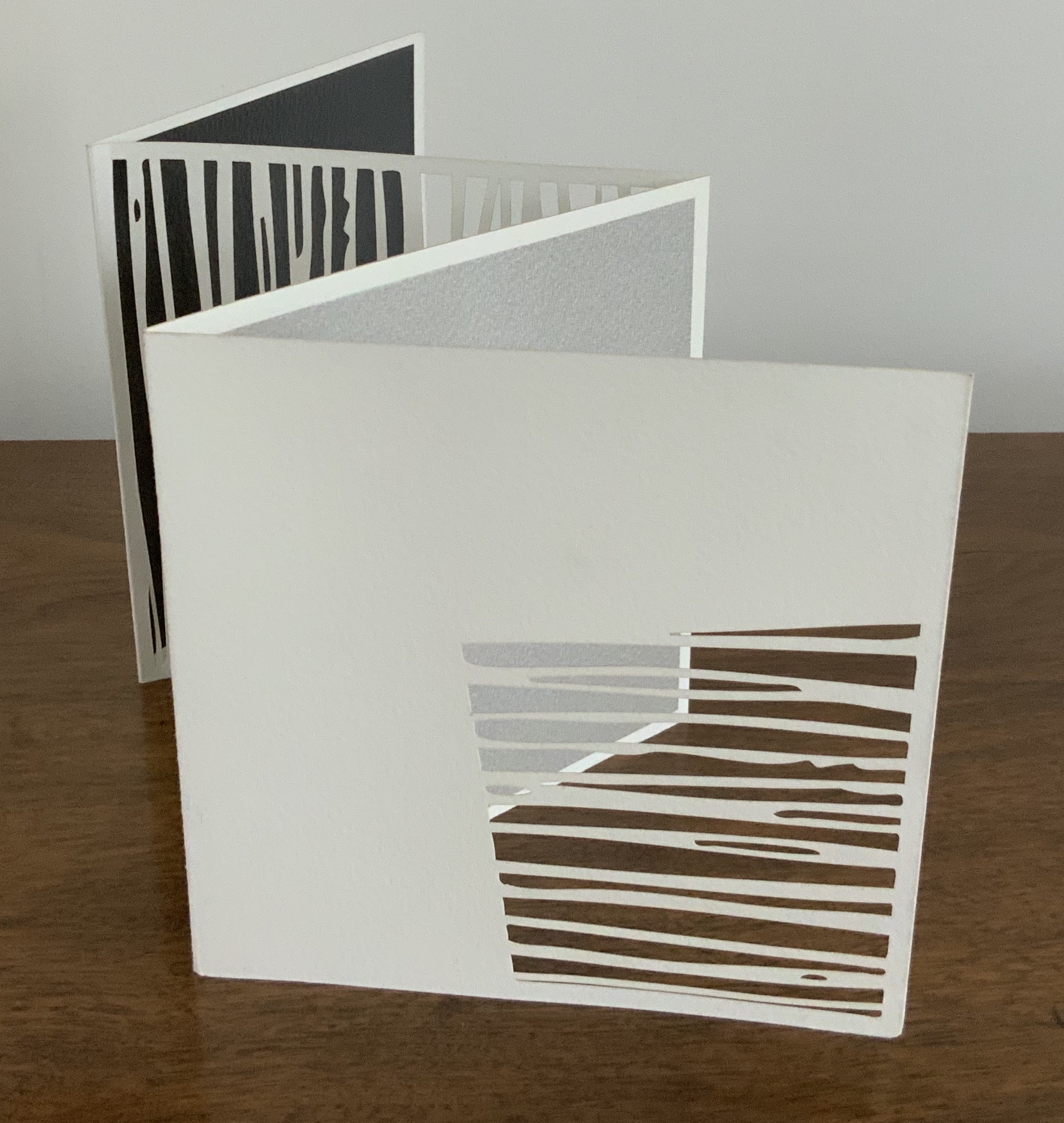
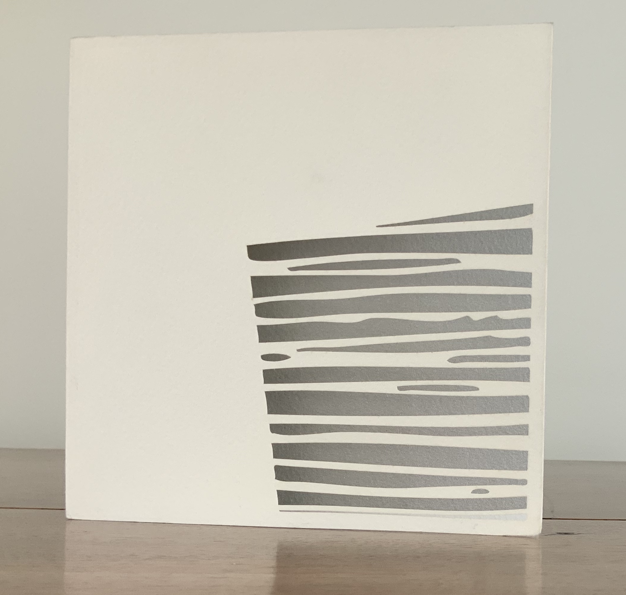
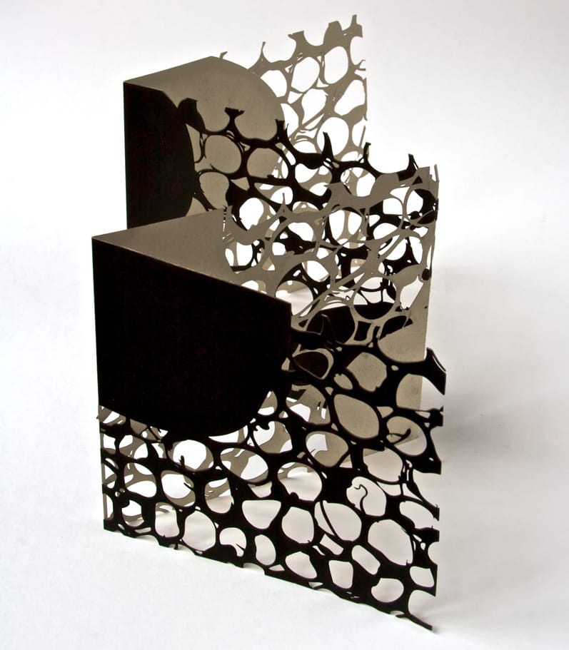
Untitled (2006) Jenny Smith Matte-beige slot-and-tab case containing eight-panel leporello, four panels lasercut and three screenprint. Case: 167 x 167 mm; Book: 165 x 165 mm. Edition of 25 of which this is #21. Acquired from the artist, 31 July 2017. Photo: Courtesy of the artist.
Photos: Books On Books Collection.
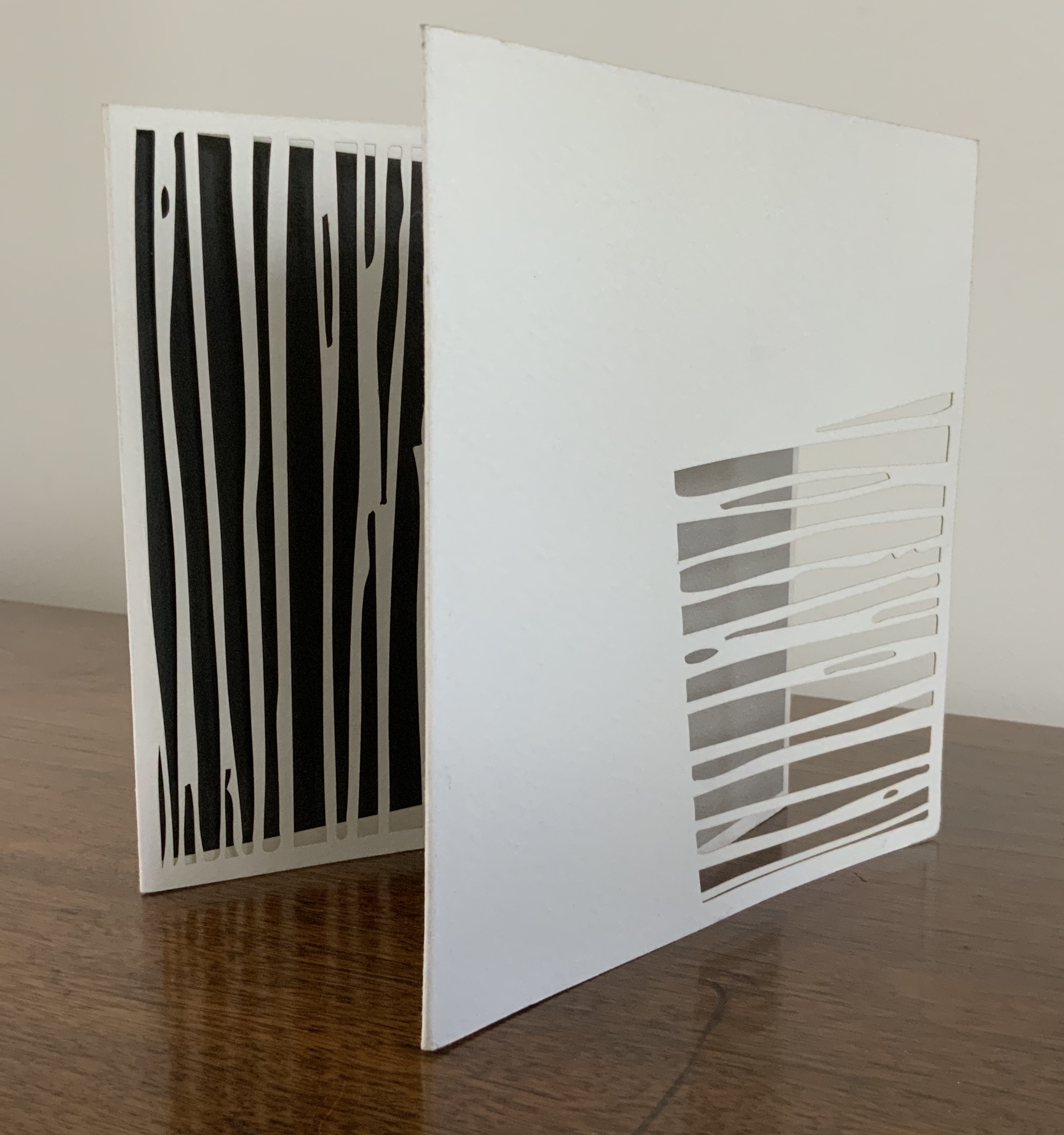
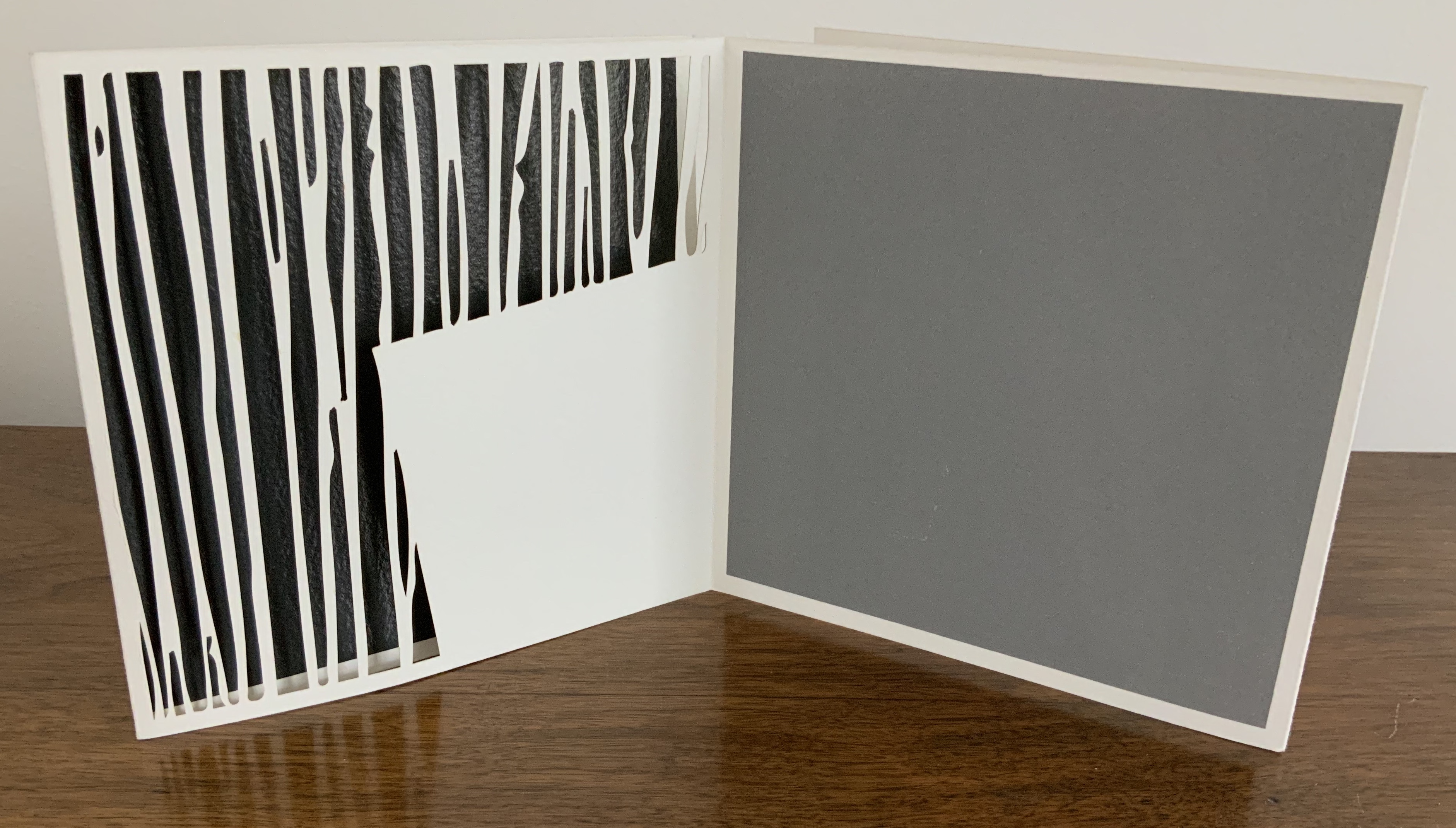
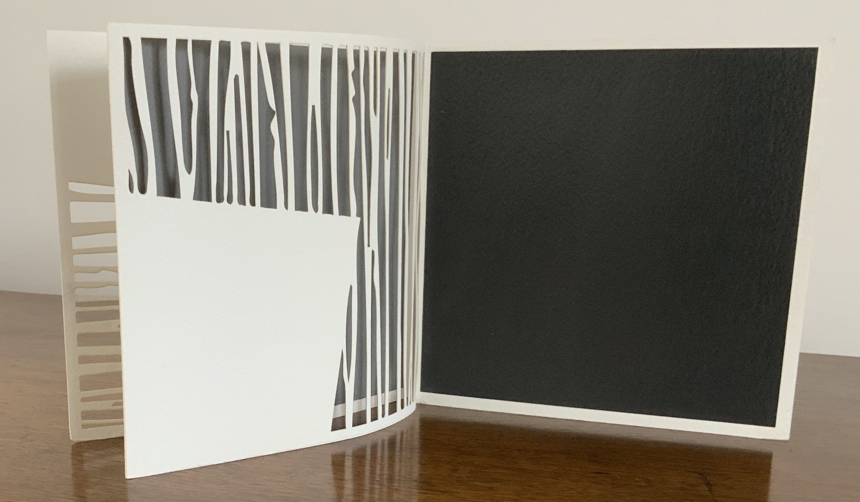
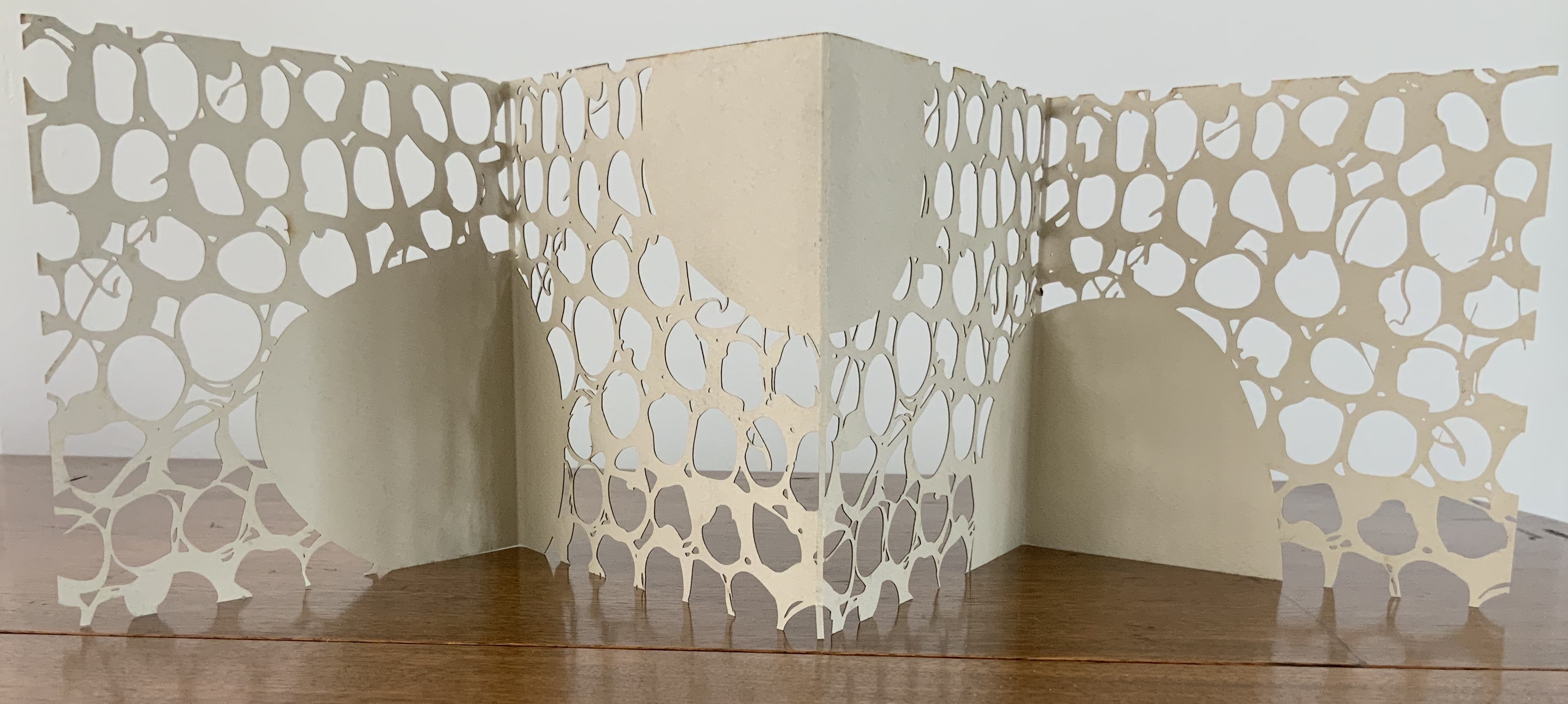
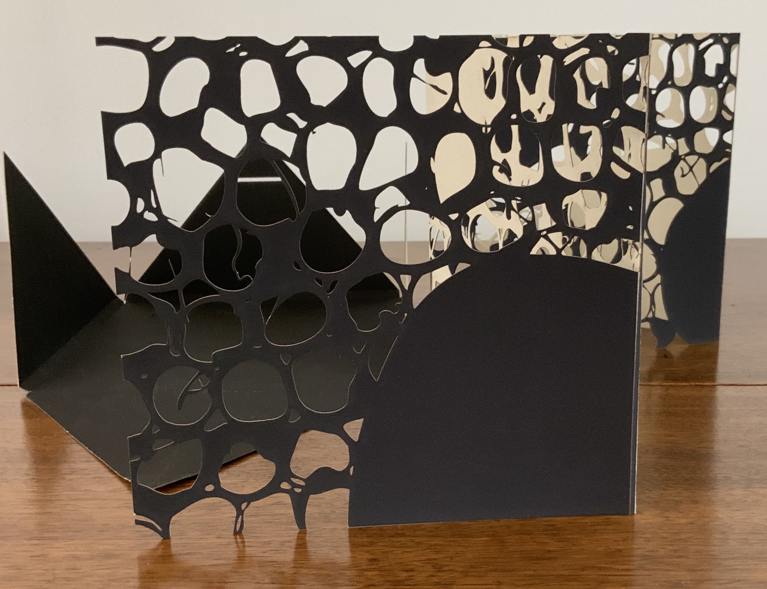
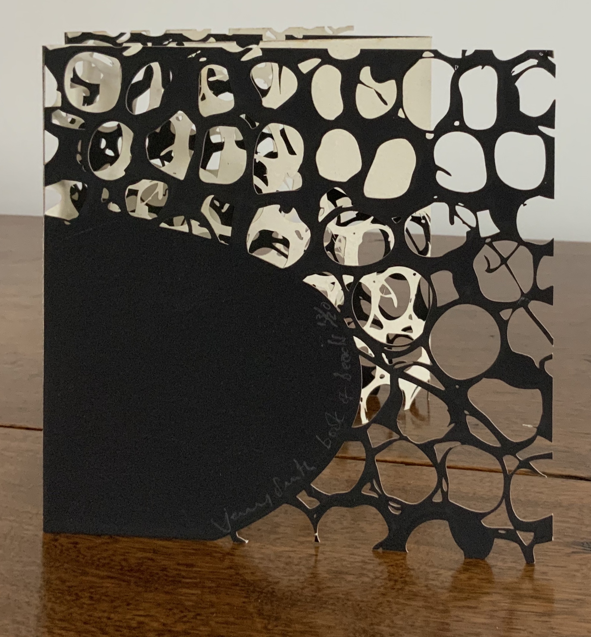
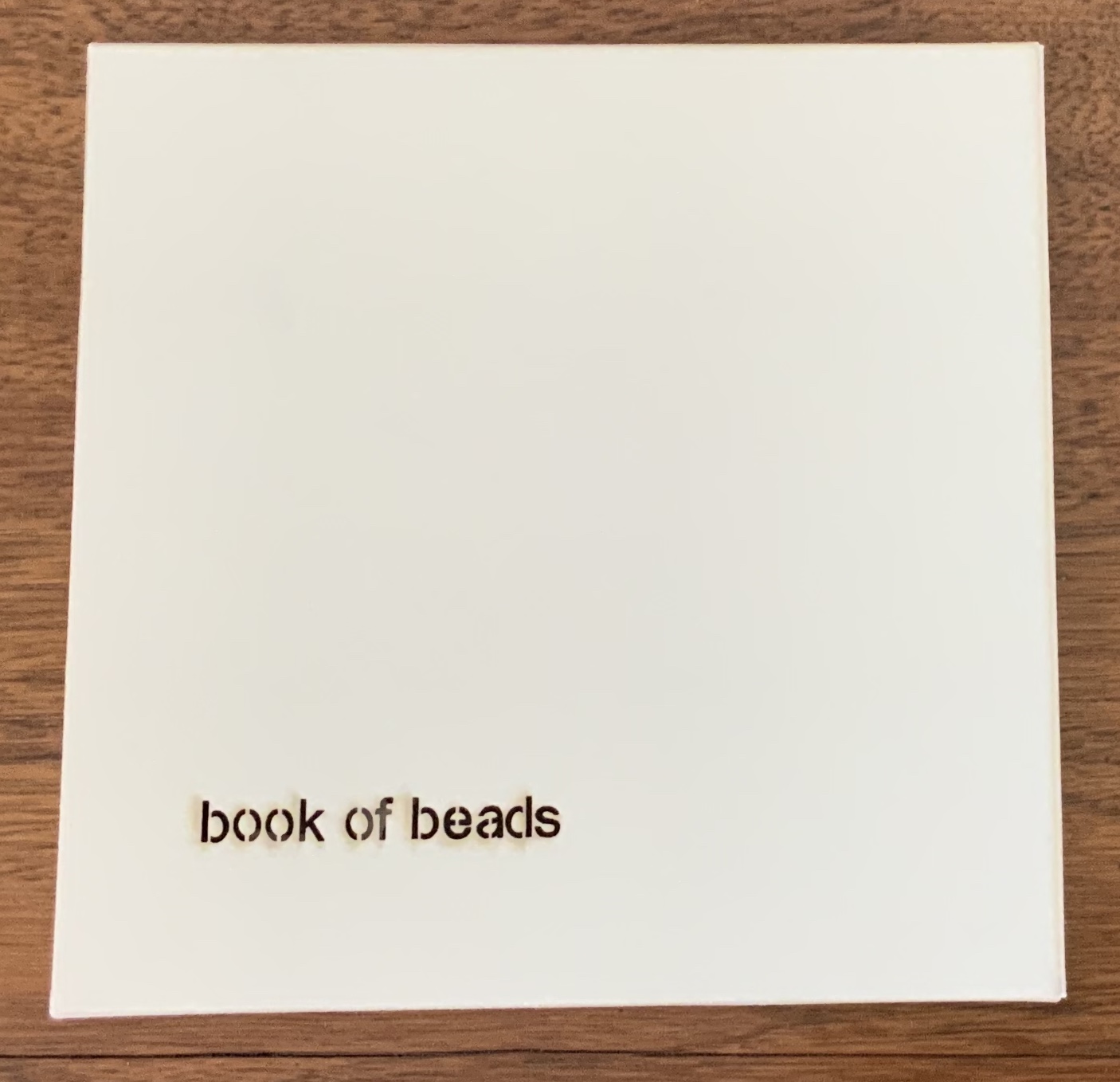
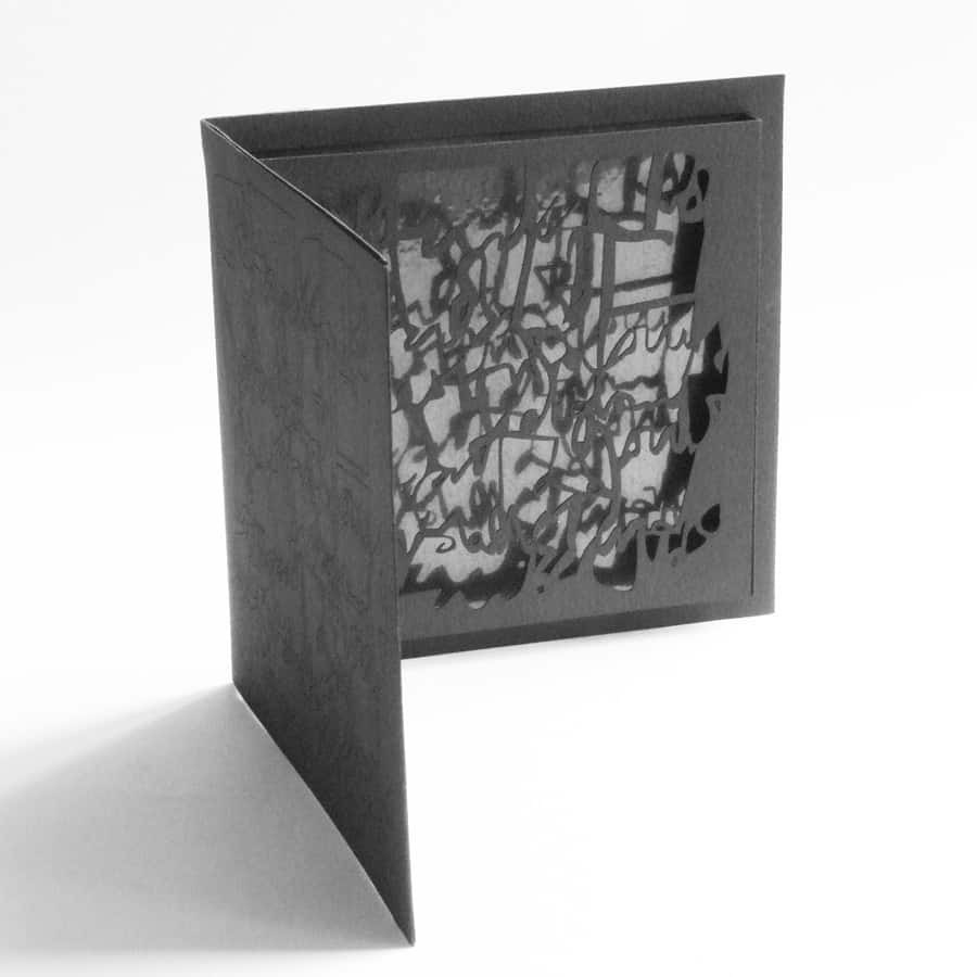
Book of Beads (2008)
Book of Beads (2008) Jenny Smith Case of beige matte-finish, screenprint black interior, title lasercut: 165 x 165 mm; Book in accordion-fold, eight panels lasercut, taupe on one side, screenprint black on other, 160 x 160 mm Edition of 20 of which this is #13. Acquired from the artist, 31 July 2017. Photo: Courtesy of the artist.
Photos: Books On Books Collection.
The interlocking views of panels through panels foreshadow a work by Katumi Komagata:「Ichigu」(2015). The fine tendrils in the cutting may remind some of works by Béatrice Coron or Merrill Shatzman.
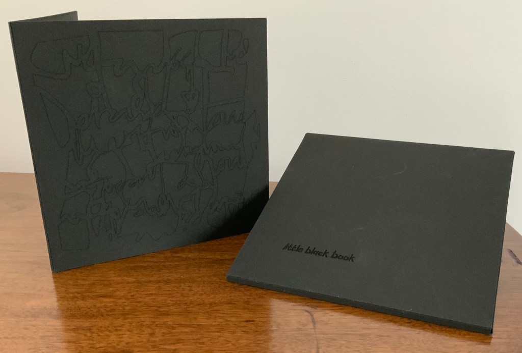
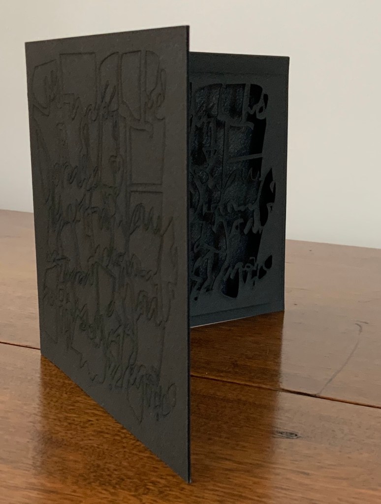
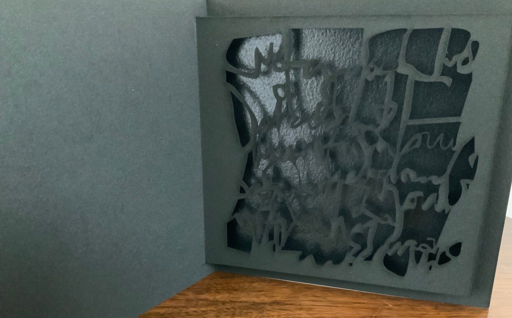
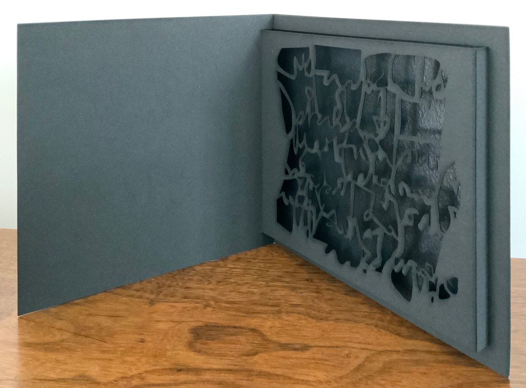
Little Black Book (2009)
Little Black Book (2009) Jenny Smith Matte-black slot-and-tab case containing matte-black single fold booklet; cover engraved with an abstract, calligraphic design that is cut out inside on the pop-up page and reappears in shadow against a gloss black screenprint insert behind the pop-up page. Case: 167 x 167 mm; Book: 160 x 160 mm; Pop-up page: H140 x W150 mm. Edition of 20, of which this is #14. Acquired from the artist, 31 July 2017. Photo: Courtesy of the artist.
The grassy nature of the 2013 installation and its engagement with children may remind the reader/viewer of Water on the Border (1994) by Helen Douglas and Telfer Stokes. For some, the interaction of cage and words in the 2016 installation may recall Bird Language (2003) by Xu Bing.
Further Reading
“Medicinal Art”, Studio Pavilion, 19 September 2019. Accessed 2 May 2020.