The Century of Artists’ Books (1994) — An Appreciation
Before Johanna Drucker’s The Century of Artists’ Books (1994), the discussion of artists’ books was all argy-bargy about definitions, boundaries, neologisms or the placement of apostrophes. The Century cut through all that to become the introductory textbook to the field’s evolutionary biology. Decidedly post-Darwinian, it avoided rigid taxonomy and categories.
If all the elements or activities which contribute to artists’ books as a field are described[,] what emerges is a zone of activity, rather than a category into which to place works by evaluating whether they meet or fail to meet certain rigid criteria. There are many of these activities: fine printing, independent publishing, the craft tradition of book arts, conceptual art, painting and other traditional arts, politically motivated art activity and activist production, performance of both traditional and experimental varieties, concrete poetry, experimental music, computer and electronic arts, and last but not least, the tradition of the illustrated book, the livre d’artiste. — (p. 2).
More than occasionally, certain denizen of this “zone of activity” emerge to question, prod, probe, devour, regurgitate, excrete, smash, bang together, impale, immerse, soak, burn, freeze, distill, erase, sculpt, digitize or otherwise engage the physical aspects, possibilities and very idea of “the book”. When they do, “[t]he book becomes a form of artistic expression in the hands of these artists rather than a convention-bound mode of reproduction” (p. 47). The Century of Artists’ Books serves up numerous examples of them. It teases out the various strands of book-DNA that these specimens engage in becoming artists’ books. In doing so, The Century has proven to be a valuable tool for the collector, not just for historians and critics. It enhances appreciation and enjoyment when reviewing acquisitions or considering new ones.
The numerous specimens and the different ways they interrogate “the conceptual or material form of the book” (p.3) offer points of comparison and contrast for the work acquired or about to be acquired. Is it a democratic multiple or a rare and auratic object? Is it a codex or one of its variants or its precursors or its digital successors, and is it playing them off one another? Does it exhibit a self-reflexive form? Is its form celebrating the visual over the textual/verbal, and if so, with what visual arts and what visual aspects of the book? If vice versa, what aspects of the book’s textual/verbal form does it explore? Is the work a play on sequence (narrative and non-narrative) in the book? Does it intentionally dance on the border between the ephemeral performance or installation and the more lasting book? Is it questioning the book as document? Is it posing itself as a metaphor of the book? Does it somehow declare its affinity with any of the artist’s book’s antecedents identified by The Century?
As comprehensiveas The Century is, the haptic is one element of book-DNA that it does not single out for a chapter of its own. Codex works in the Books On Books Collection that primarily address what the eye can feel and fingers see, such as Tim Mosely’s The Book of Tears (2014) and Grasping the Nettle (2020), do not have easily found specimens with which to compare and contrast. Drucker’s decision to exclude “book-like objects or book sculpture” may have led to this, although the sections “Hybrid and Spatial Variants” and “Interior Spaces” (pp. 145-53) certainly touch on them and their engagement of hand and eye.
Arguably over-inclusive is The Century‘s designation of antecedents: William Blake (for his illuminated books’ union of text and image, craft and art, and vision with form and structure), Gelett Burgess (for Le Petit Journal des Refusés and its spontaneous, topical and zine-like spirit), Gustave Flaubert (for Bouvard et Pécuchet and its idea of the “book as failure” to transmit knowledge), Stéphane Mallarmé (for Un Coup de Dés Jamais N’Abolira le Hasard and its revolutionary use of type, page layout and a metaphysical idea of The Book), William Morris (for The Works of Geoffrey Chaucer and his eccentric designer’s eye) and Laurence Sterne (for Tristram Shandy‘s rollicking interrogation of the book as novel).
Of those antecedents Blake and Mallarmé (and more Mallarmé than Blake) are the most useful touchstones for a collector. Blake’s innovation with etching that enabled him to unify script and image on the page and his mythic stance as a one-man band present a high bar to subsequent book artists. But for the collector, he stands as a reminder to consider both works of rude as well as fine craft, to inquire into technique and painstaking effort, and to look for unity (or intentional dis-unity) of word, image and form when contemplating an acquisition.
As abstruse as Mallarmé’s writings are, Poème‘s content, its play with type and the double-page spread, and its possible embodiment of Mallarmé’s metaphysical notion of the book all offer book artists more approachable avenues. In fact, so many book artists have paid direct homage to Poème and Mallarmé’s idea of le Livre (“the Book”) that a sub-genre of artists’ books has evolved. Poème‘s trueness as an antecedent touchstone can be found in the various and extraordinary ways those hommageurs respond to, and even appropriate, its book-DNA. For the collector, Mallarmé acts as a reminder to see what the book artist is doing visually, structurally and conceptually with type, the leaves, the pages and the idea of the book.
Unsurprisingly The Century proves helpful for appreciating and enjoying Drucker’s own artist’s books in the Books On Books Collection.
Stochastic Poetics (2012)
Stochastic Poetics(2012/2024) Johanna Drucker Softcover, flexible, high-gloss laminated cover. Facsimile (original’s cover was in brushed steel). H250 x W200 mm. 62 pages. Acquired from Blurb, Inc., 28 March 2024. Photos: Books On Books Collection. Displayed with artist’s permission.
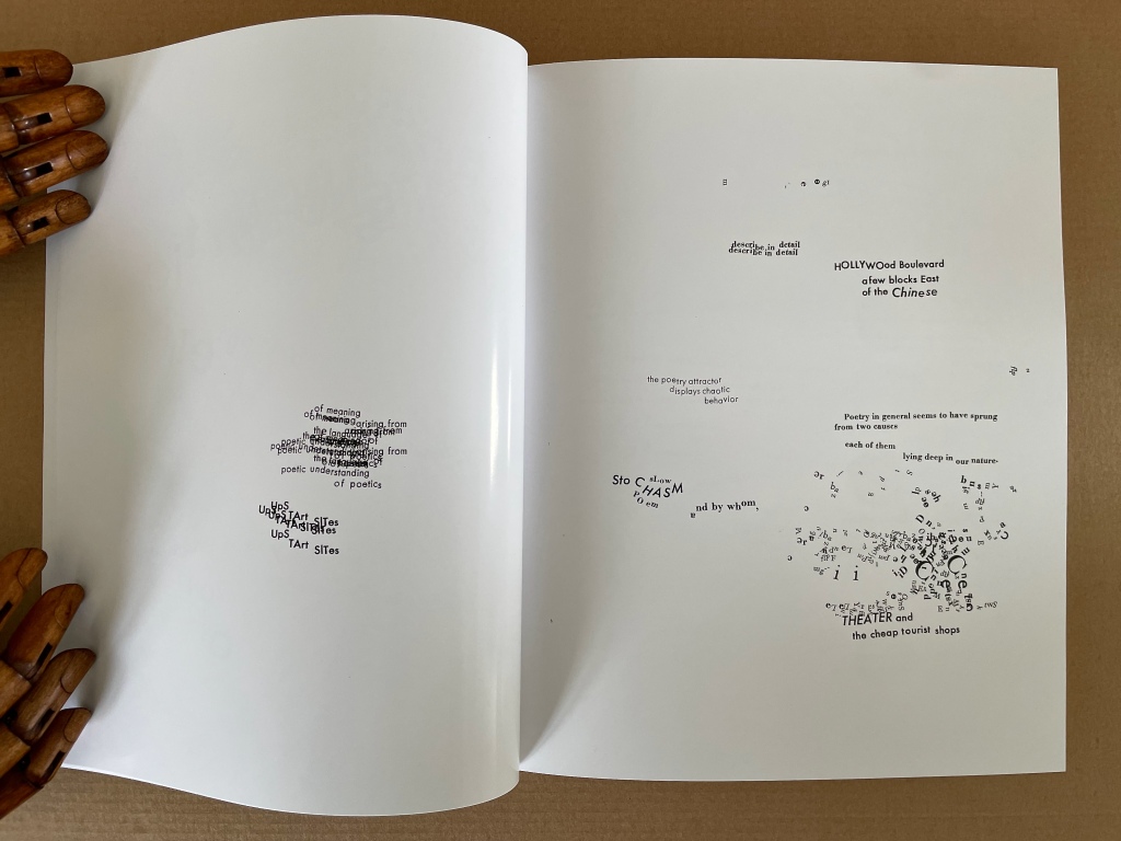
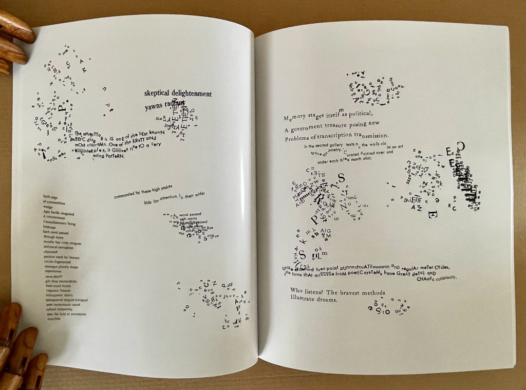
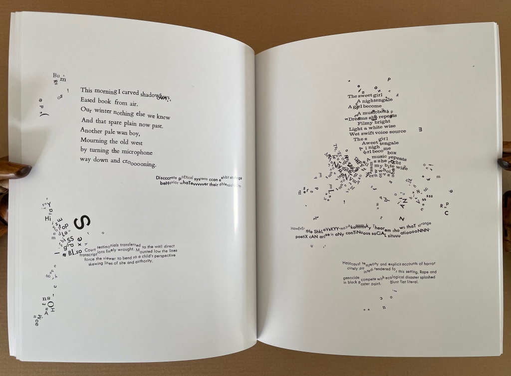
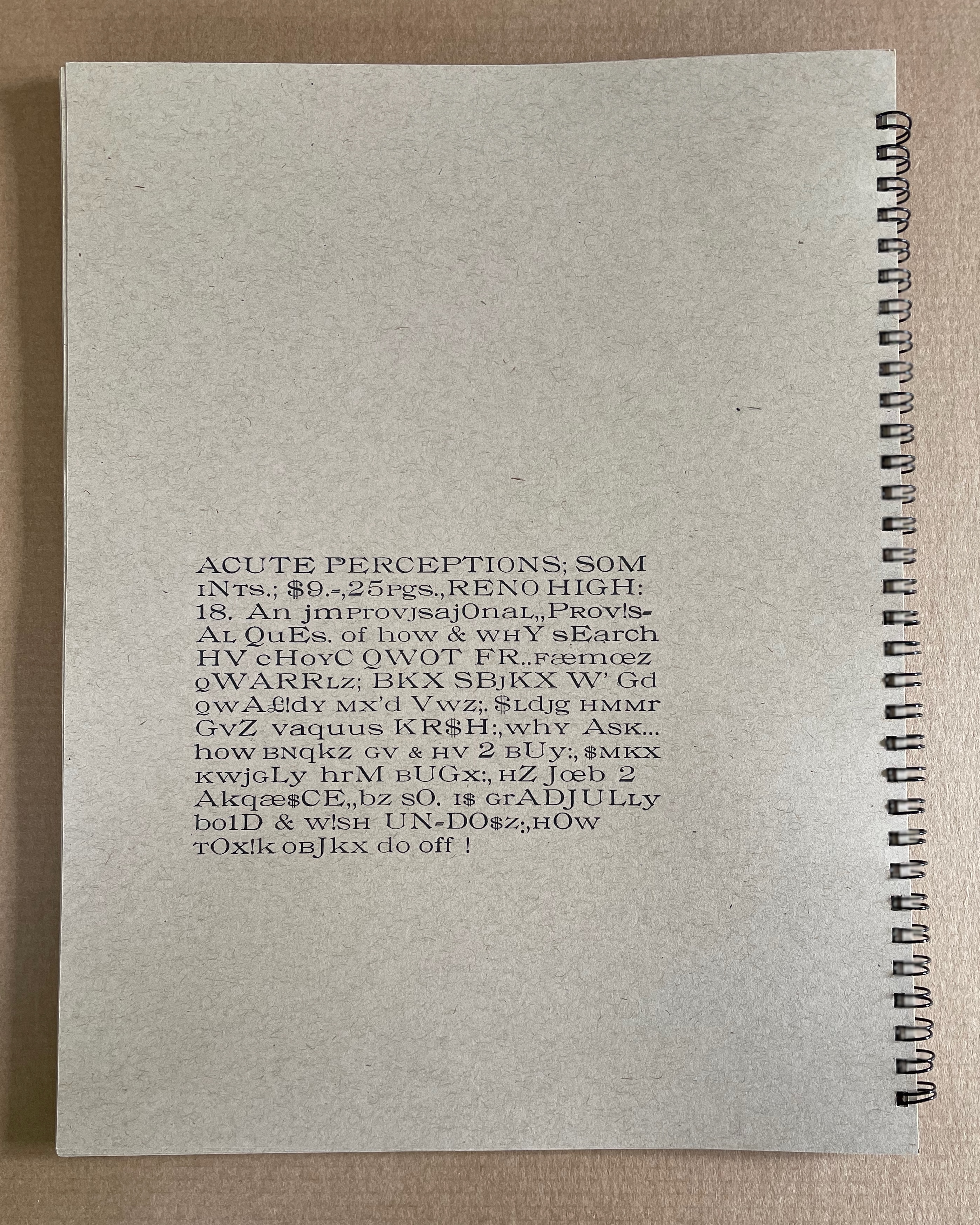
In Stochastic Poetics (2012/2024), Drucker scatters words and letters and plays with typography in a manner that makes Mallarmé’s revolutionary poem look almost staid. As Drucker explains in the colophon to Stochastic Poetics, the poem’s text is taken from Aristotle, sources on complexity theory, and “observations of readings and events at L.A.C.E. and Modern Language Association”. Aristotle might be deducible from lines such as “Poetry in general seems to have sprung from two causes in each of them lying deep in our nature”, but you would have to be vaguely familiar with his Poetics. The “observations” seem more personal, ephemeral, period-specific, but deducing their sources seems beside the point. It’s best to “go with the flow” — to unravel the explosions of sentences, phrases and words on the page and follow their imaginative leaps.
For example, on the page where Aristotle refers to the causes of poetry, that phrase “deep in our nature” leads to the wordplay of “stochasm”, and its typographic display enacts a chasm (or abyss if you’re feeling the Mallarméan vibrations). The first half of that wordplay comes from the word stochastic, whose root is stókhos [“aim, target, bullseye”], and “a stochastic process is a collection of random variables used to represent the evolution of some random value, or system, over time”). Again, if you’re feeling the Mallarméan vibrations, you’ll remember that throwing dice — one means of generating random variables — lies at the heart of Un Coup de Dés Jamais N’Abolira le Hasard (“A Throw of the Dice Will Never Abolish Chance“).
Later among the poem’s seemingly random linguistic and typographic acrobatics, two phrases jump out — “Constellationary living / language” and “MOOmeNTARY CoNsTeLLaTiOn” (see below, lower left and lower right, respectively). Those phrases clearly evoke Mallarmé’s lines from Poème: “Nothing will have taken place except the place… except perhaps a constellation”. Mallarmé’s mise-en-page fireworks have often been taken as figurative allusions to the listing and foundering ship, central to the poem, or to the Big Dipper (Septentrion) constellation, or tumbling dice. Drucker’s typography and layout take Stochastic Poetics more in the direction of the abstract than the figurative, although some of its appearance could be considered representative of randomness or the tracks on a well-used dartboard, which alludes to the stókhos [“aim, target, bullseye”] of stochastic.
If these sparks of recognition between Drucker’s and Mallarmé’s poems still seem tenuous, this brief passage from Drucker’s essay on Mallarmé’s poem may add wattage:
Another set of three phrases “Except” “Perhaps” and “A Constellation” form a typographic group. Indeed, they express the crucial exception to the terms of abyss and dissolution, scattering and fragmentation, …. Redescribed in the smaller roman font as features incidentallycreated through “obliquity” and “declination” –- astronomical terms -– that are reinforced by invocation of the “Septentrion” or Big Dipper, and the north star …. The final line, “All thought expresses a throw of the dice,” recapitulates the theme of the whole work, showing that thought as well as language is caught in the probabilistic system between chance and constellationary form. — Drucker, 2011, pp. 12-13.
But enough of Mallarmé for a moment: go with the flow and read/view Stochastic Poetics without precisely tracking down its allusions. Clusters of letters not quite forming words, phrases or sentences suggest abstract doodling. The shapes of the clusters and lines create a sense of mental motion, or “AACTIION”. Eyes twist and turn as hands rotate the book to untangle words, phrases and sentences. In disentangling the portmanteau words and phrases such as “skeptical delightenment”, the mind finds itself playing out the reading — being skeptical, delighting, experiencing enlightenment. This is the artist-printer interrogating “the conceptual or material form of the book as part of [her] intention, thematic interests, or production activities” (The Century of Artists’ Books, p.3). This is the author-artist-printer twisting and turning the visual and verbal strands of book-DNA. This is a true specimen of the artist’s book.
The Word Made Flesh (1989/1996)
The Word Made Flesh (1989/1996) Johanna Drucker Casebound. H267 x W315 mm. 26 unnumbered leaves. Acquired from Black Dog Books, 16 August 2022. Photos: Books On Books Collection. Displayed with the artist’s permission.
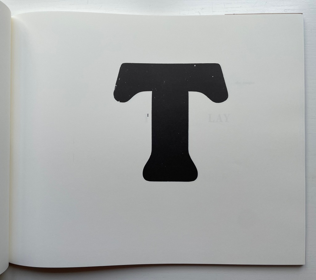
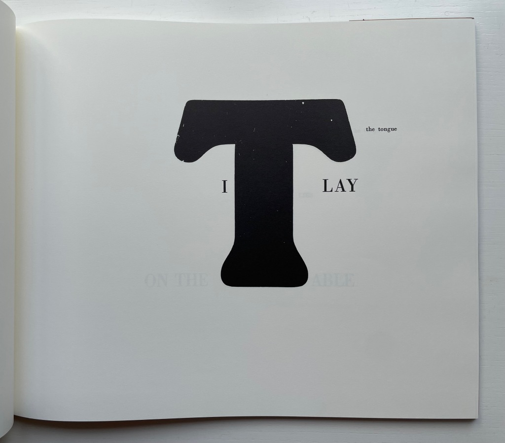
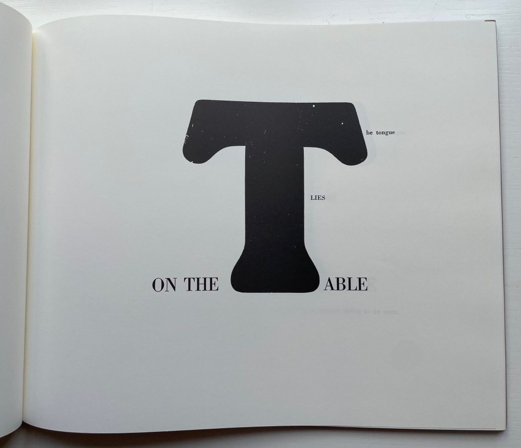
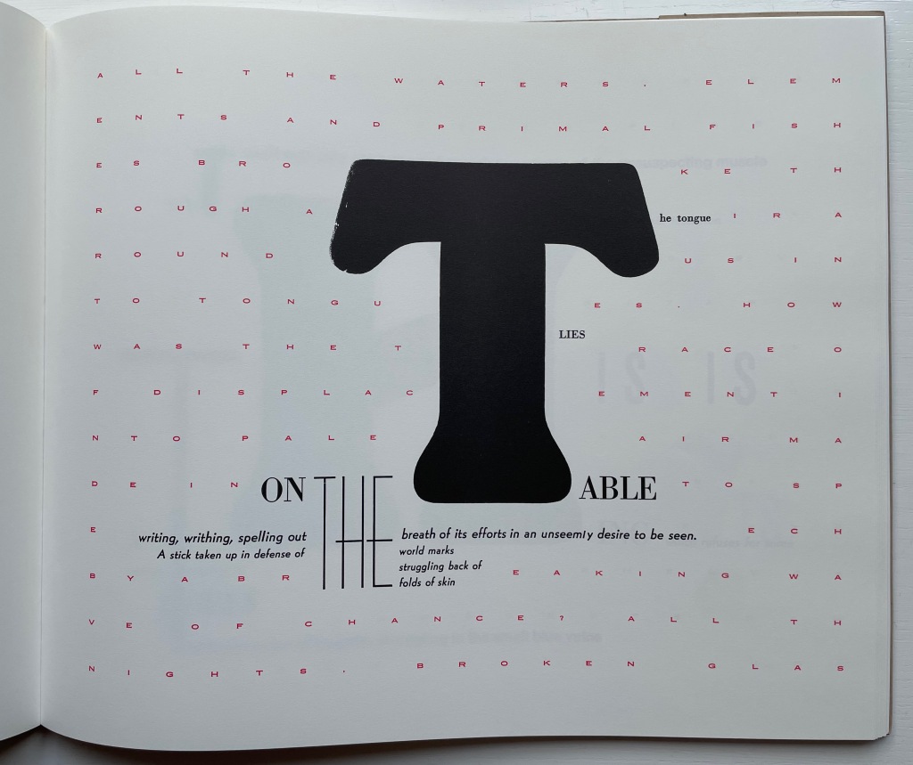
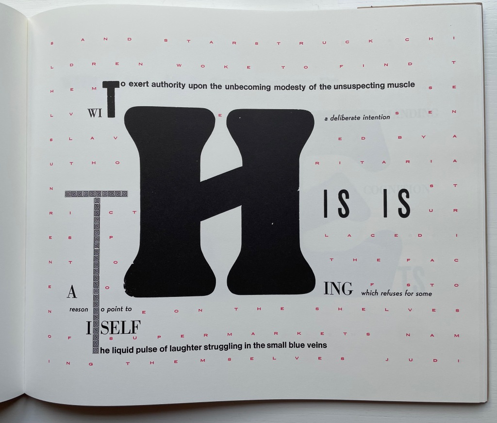
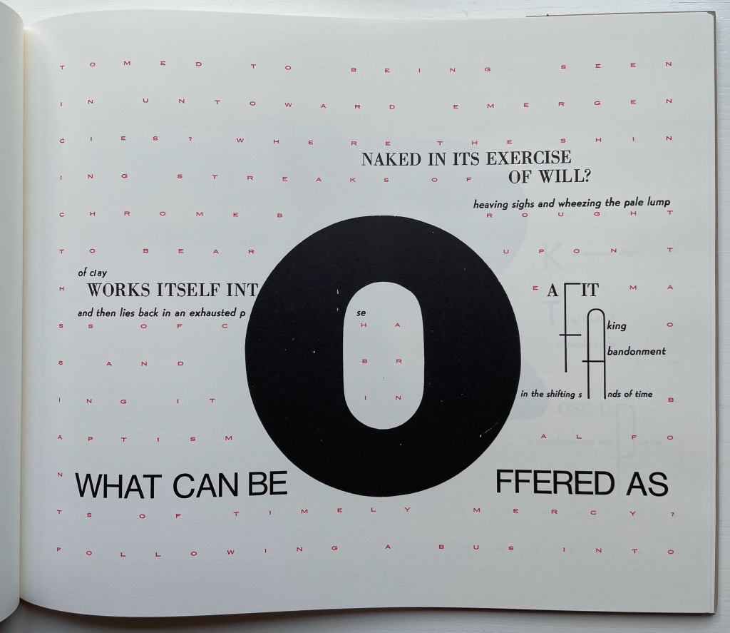
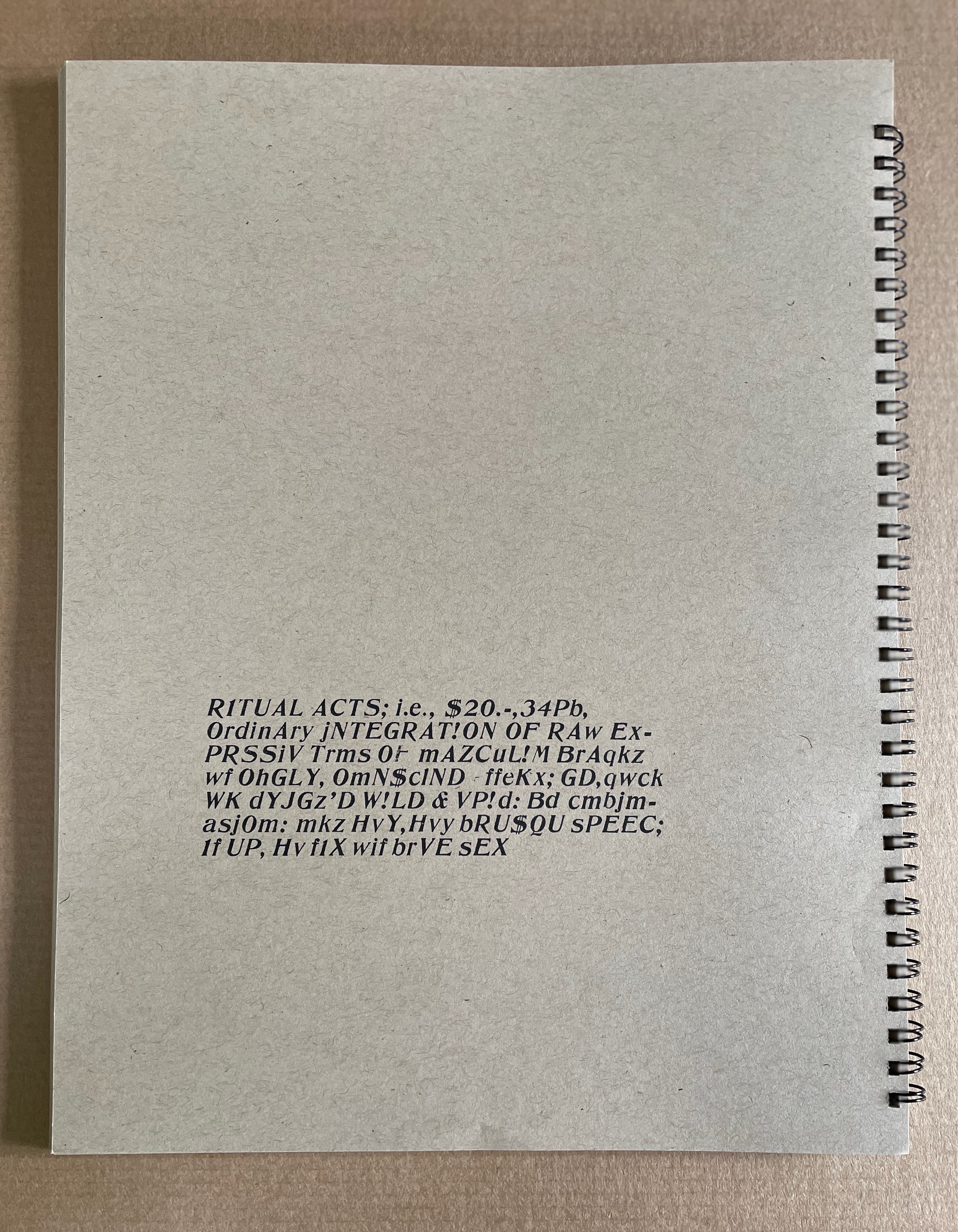
When it comes to The Word Made Flesh, we find the Mallarméan influence again in the typographic and mise-en-page fireworks and some choice allusive phrases. Not content with spreading the oversized words of the title across the book’s pages as Mallarmé’s does with UN COUP DE DÉS JAMAIS N’‘ABOLIRA LE HASARD, Drucker amplifies each letter of each word. As if stuttering or trying to unstick its tongue from the roof of its mouth, the letter T takes up each of four pages until, on the fifth try, it is followed by the letter H on the next page, then E and so on until THE WORD MADE FLESH is spelled out. In the original letterpress edition, whose fiftieth and last copy provided the source for this facsimile edition (five hundred copies, fittingly), these oversized letters presumably came from wooden type. À la Mallarmé, the surrounding letters come from various families, fonts, sizes and styles of type, but amplifying and extrapolating his typographic technique, Drucker attaches the oversized letter to multiple words: “it”, “the”, “this, “table” and so on.
In Un Coup de Dés, the syntactically split and parallel texts become difficult to read. In The Word, the typographically split words add to the difficulty of reading the text. Already at the opening of The Word, Drucker has flagged that she will out-Mallarmé Mallarmé and take us à l’interieur du langage and à l’interieur de la langue (“into the interior of language and into the interior of the tongue”). Keep in mind that la langue not only means “tongue” but also “language” in the usual sense in English, whereas le langage means diction, a kind of language (jargon, computer, etc.) as well as the faculty of speech.
Adding another level of difficulty in reading is a background grid of red letters in small caps that appears behind the fifth T in the sequence above. It spells out a text made difficult to read by the spacing between letters and their disruption by the separate text of the black letters in the foreground and center. The visionary background text reads:
All the waters, elements and primal fishes broke through air around us into tongues. How was the trace of displacement into pale air made into speech by a breaking wave of chance? All the nights, broken glass and starstruck children woke to find themselves enslaved by authoritarian strictures placed into the face of stone on the shelves of supermarkets naming themselves judiciary operations. The sting of power marked the world into small spaces of unorthodox arrangements. Vivid scarlet as the fact of blood against the winter wash. Then all the earth. Unfocused energy and wandering eyes made their way into the pulse of a primitive economy and waited there for the ice to crack on our surface of time. But how about old engines accustomed to being seen in untoward emergencies? Where the shining streaks of chrome brought to bear upon the mass of chaos and bring it in baptismal fonts of timely mercy? Following a bus into battle we shook with a horror at the dimness of the horizons we approached, and hope of a casual sacrifice was made for us time after time while moments were substituted one for another in a succession so rapid no accounting was made of their relation to themselves to us or to each other, we have listened to tales of trading we have seen flights of birds into men, women pigs and out again as babies hurried off in designing programs whose wily whistling whims would wake the world from wild slumber if that were that possible. Ripeness was a matter of appetite, not taste, in the sweet afternoon of a genuine opportunity the afterimage on the glass was a miracle of form and of correctness. The slipping substance of jam on sticky fingers of engagement worked their own way into the graces of prevalent currents, and when the matter was fully in hand, at bay, up for question and review, there was no longer any sort of book into which to enter the record of tasks which showed up on glass as a mere trail of slime. How to imagine the world without remembering how it had been presented to us in the past and in the package of delights according to rules of the game were measured out in draughts matched to a mood of a brilliant day. Some small needles had been heated and grasses lit as sparks to sponsor a crusade to mentor the insects listening just below the ground, training their small ears to take notice of complex arrangements of formal elements in the sky. The most complex movements of plates of earth, most a minute opening in the sphere of heavens we know what was wrong as sighs slid into a hallway of archival dust and we had never felt more grateful than when well laundered meaning implied by an inflamed arc of successes glowing with salvation for the aching heart of bankrupt gossip, found meandering through the powdered landscape, trailing its timely marks the next day, its activity, a prefigured silence dancing in front of us at last and all attendant fantasies flushed our wistful flesh, and many fragmentary signs of monumentality, suggestions and reconditioned bodies manifest themselves long enough to be recognized according to the delicately nuanced pace of articulation of a raw and passionate tongue.*
There are hints of Mallarmé above in phrases such as “a breaking wave of chance” and “complex arrangements of formal elements in the sky” and, of course, in the general surreality and obscurity. More deeply, though, The Word addresses the elemental, primitive origin of language, its descent into adspeak and legalese, and a need to return to “a raw and passionate tongue” — hence à l’interieur du langage and à l’interieur de la langue. The Mallarmé keen “to purify the words of the tribe” would recognize these concerns and aims. To Mallarmé’s tools for doing this, though, — words, lines, typography, the fold (pli en pli), space (les blancs), the double-page spread, an all-encompassing concept of the book (le Livre) — Drucker the “author-printer” has added the alphabet itself in the next work.
*Some typographical errors transmitted from the original to the facsimile have been corrected here with the author’s assistance. Text displayed with the author’s permission.
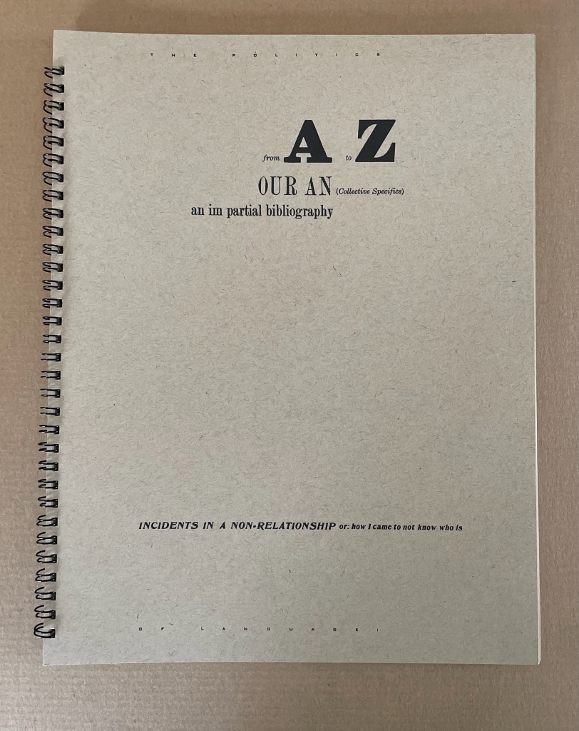
For Drucker the scholar, the alphabet has been worth two academic books: The Alphabetic Labyrinth (1995) and Inventing the Alphabet (2022). For Drucker the author-printer-artist, it has been a career-long Muse. So it should be no surprise that alphabet shows up among the strands of book-DNA teased out in The Century‘s discussion of artists’ books. Nor that it centers one of her earliest works: From A to Z: Our An (Collective Specifics) an im partial bibliography; Incidents in a Non-Relationship or how I came to not know who is (1977/2012).
In The Century the three relevant strands and their alphabetic exemplars appear in chapter 7 “Self-Reflexivity in Book Form”, chapter 9 “Books as Verbal Exploration” and chapter 10 “The Book as Sequence: Narrative and Non-narrative”. For an artist’s book whose self-reflexivity depends on the alphabet, The Century gives us Keith Smith’s Book 106: Construct (1985), which uses it as a structuring device by having it disappear from the book letter by letter (p. 180).
Keith Smith, Book 106: Construct (1985). From the Books On Books Collection. Displayed with permission of the artist.
For the book-DNA of verbal exploration, by which Drucker means bringing the sonoric and visual aspects of language “into the book form as part of its substance” (p. 227), The Century give us Maurice Lemaître’s Roman Hypergraphique [“Hypergraphic Novel”] (1950) from the Lettrisme movement (pp. 228).
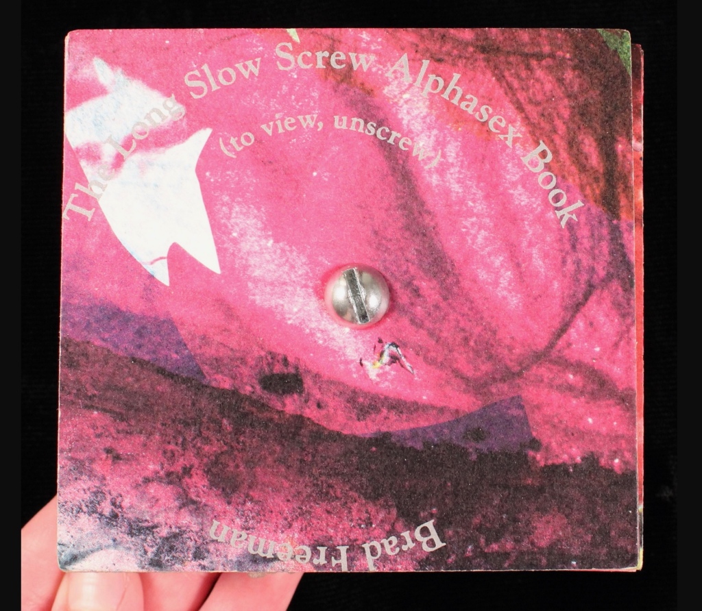
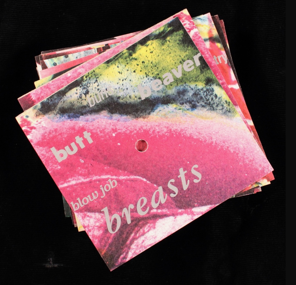
For the book as sequence, we have Brad Freeman’s Long Slow Screw Alphasex Book (1990), “an alphabet book comprised of fifteen cards drilled through the center and threaded onto a long stove bolt” (p.279). On each side of thirteen of the bolted cards, the artist has printed various anatomical and sexual terms in different fonts and sizes in alphabetic order. Unscrewed, the thirteen cards can be arranged in alphabetic order with the result being two large images on either side. The non-narrative sequence is dually dictated by the alphabetic order of the words and the composition of the images.
Brad Freeman’s Long Slow Screw Alphasex Book (1990). From the Carol Barton Collection, James Madison University Special Collections. Accessed April 14, 2024. Displayed with artist’s permission.
From A to Z appears in The Century as an example of self-reflexivity in book form, but it also uses the alphabet to explore the verbal and sequence elements of book-DNA. The book’s self-reflexivity appears at various levels, culminating in a two-page artist/author’s statement explaining the book’s subject, features and workings. It’s hard for a book to be much more self-reflexive than that, but in living up to the statement’s description, Drucker’s book manages to do so.
The main level comes from the book’s being a roman à clé, the key being that each character name is a letter of the alphabet. Self-reflexively at the end, the roman (“novel”) offers a key — a list of the characters and their characteristics. A, for example, is a “Miss East Coast uptight hot shit coed-just so smart and attractive and well educated and able to play it all right”, and Z is “Very Ivy League, greying prematurely and into the distinction it lent him – good family, good education, & good prospects, nice inheritance – poor fellow”, especially as his description is preceded by the word “constipation” spelled backwards. A’s preceding backwardly-spelled word is “diarrhea”, which seems appropriate for A’s failed May-December crush that is the central story played out only on the recto pages of this epistolary novel, or novel of letters from A to Z” (get it?).
The rest of the book, however, isn’t a narrative, but rather A’s anthology of poems by the twenty-six characters. In her introduction, A asserts that “the poetry of the period, as best exemplified by A, has an impressive complexity which can be traced to various contemporary influences” and then proceeds to put down the other twenty-five poets, which rather skewers her own poetry as the best exemplifier of the period. In her commentary and diaristic addresses to Z, A swings wildly between self-aggrandizement and self-deprecation. So not only is the book self-reflexive, its lead character is as well.
Left: A’s poem in the anthology. Right: Annotated citation of the volume from which the poem is taken.
Left: Z’s poem in the anthology. Right: Annotated citation of the volume from which the poem is taken.
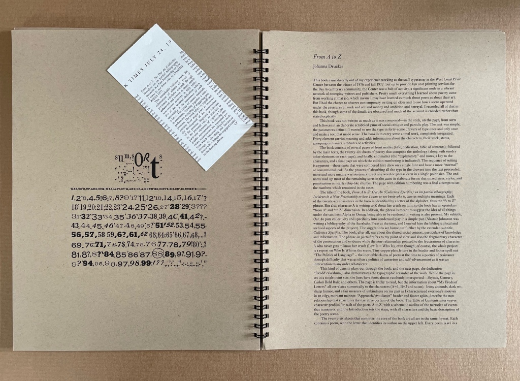
From A to Z also plays self-reflexively with other parts of a book besides the Key and also with structural elements of page layout. The dedication’s sentences are numbered from 1 to 26, echoing the alphabet-referencing title. The table of contents embeds and interleaves the titles of the A-Z characters’ poems in a descriptive list of scenes in which the epistolary narrative will play out in the margins alongside the poems. The running heads and running feet abandon their usual function and consist of continuous text that runs across the head and foot of each page all the way to the end of the book. In keeping with A’s forwardness and Z’s indifference in the novel of letters, the text at the head begins “Approach:” and the text at the foot begins “Avoidance:”, and both capture the awkward sublimation of sex and power in a stilted acadamese.
With the exploration of the sonoric and visual aspects of language as an element of book-DNA, Drucker runs riot with peculiar misspellings (LEDDERS, DEADD’CAKESHÙM, etc.) and the diction and typeface assigned to each poet. She amplifies this sonoric/visual play with an Oulipian restriction to the use of the forty-some drawers of lead type available to her at the time. Each piece of type is used once and only once, which adds to the eyeball-twisting appearance and introduces a randomness to her Mallarméan play with the type fonts. By the time, the reader reaches
the entries under it are nigh illegible, a self-reflexive comment on the poets’ acadamese.
As for sequence (narrative and non-narrative) as a strand of book-DNA, Drucker’s use of alphabetic order throughout ties that one into a Gordian knot. The alphabetic sequence of the anthology, the naming of each character with a letter, the 26 numbered statements in the dedication, etc., call attention to the book’s self-commentary on the expected sequencing of a book. The game with sequencing occurs even at the level of the word in the “Key to Abbreviations” with the backwards spelling of the characters’ illnesses, infections or physical conditions. It’s a case of adding injury to the insults of the snarky descriptions of the characters!
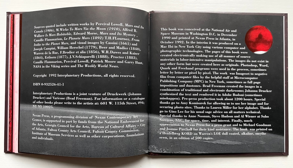
Otherspace: Martian ty/opography (1992)
Otherspace: Martian ty/opography(1992) Brad Freeman & Johanna Drucker Casebound hardback, printed paper over boards. HxW mm. 92 pages. Acquired from Mallory Books, 11 March 2022. Photos: Books On Books Collection. Displayed with the artists’ permission.
There’s a sort of academic or anthropological distancing in the settings of Drucker’s works considered so far. In StochasticPoetics, street-level images of Los Angeles enter by way of a workshop exercise at either the Modern Language Association or Los Angeles Contemporary Exhibitions (L.A.C.E.). In The Word, the abstract, surreal, geologic and primordial put women, babies, men, fish, birds, insects, buses and even fingers sticky with jam at a surreal distance. The distancing tracks back to two trends that Lawrence Alloway noted when reviewing the exhibition “Artists’ Books and Notations” in 1978. He wrote:
There are two loose tendencies in recent art that have not yet been definitely named. One is art as an elaborate projection of the self. In one sense, of course, the firstperson of the artist is expressed in all personally originate painting and sculpture: it has been a constituent of art since the Renaissance. What is at issue here, however, is the use of confessions, souvenirs and calendars. The other tendency derives from a notion of art as simulation of social systems — from imaginary museums to the picturesque anthropology of whole cultures. The two modes, of expanded autobiography and legible societies, approach one another. Both exemplify an art of human traces, whether the perspective is that of the diarist or of the weather satellite.
Budding poets in the seventies and eighties were seeking the sun from under the shade of the Confessionals (Robert Lowell, John Berryman, Sylvia Plath et al.). Budding feminist poets had the obvious added struggle from under the shade of patriarchal societies. Alloway’s second trend identifies an effective strategy. As an emerging art form, the self-reflexive artist’s book offered an effective vehicle for adopting that strategy for poets and prose writers alike. Susan E. King’s Lessons from the South (1986) is a good example of the latter. Drucker’s three works above are good examples of the former. With Otherspace (O/u/t/h/erspace?), she adopts prose and the role of omniscient narrator.
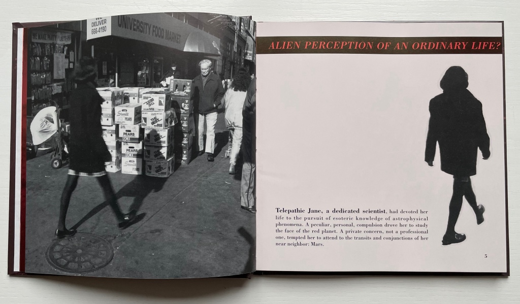
The words “slant” and “oblique” come to mind when enjoying Drucker’s book art — not just because of the distancing or the use of the punctuation mark the “solidus” or slash. With an omniscient narrative and a collage of snippets from the main character’s work/personal diary and of quotations and images from various sources, Otherspace unfolds the story of telepathic Jane, the scientist of astrophysical phenomena, her growing obsession with Mars and her frustrating romantic relationship with J. But it’s really the story of the discovery of an Other through the alphabet — told slant through Jane’s encounter with the planet/character Mars and discovery of its topographical/typographical alphabet.
Everything seems to comment on everything else. The pixellated glyph for the letter h parades as an illustration of Martian canals described in the quotation from Alfred Russell Wallace’s Is Mars Habitable?, which runs across the double-page spread and in between snippets from Jane’s diary describing the “unintelligible transmissions” from Mars. And all of that seems glossed by the diary entry: “No word from J.”
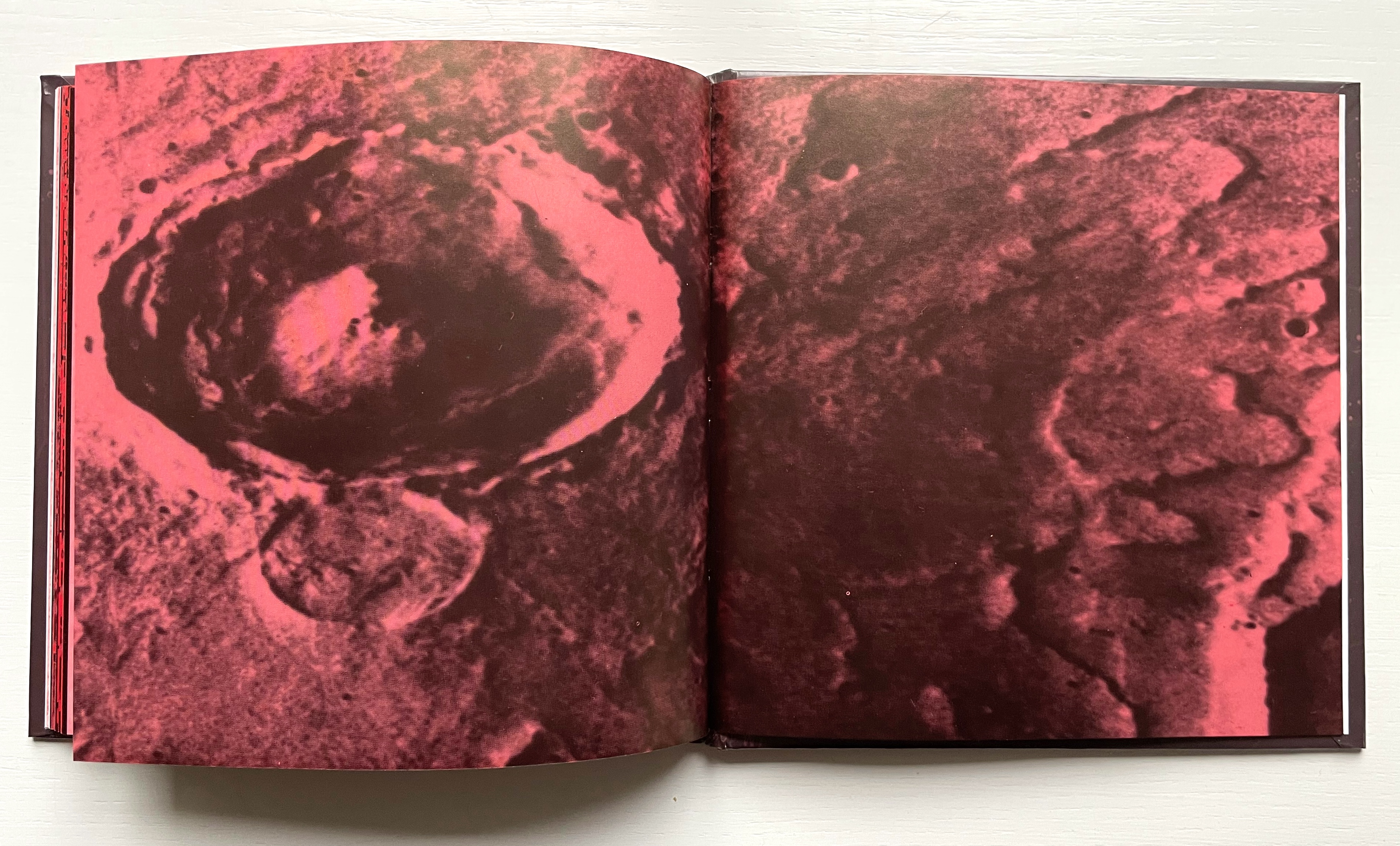
As Jane’s curiosity about the hieroglyphic face of Mars’ messages and their seemingly subliminal linguistic effort toward order grows, her disenchantment with J. intensifies to the point that, as the excerpt from Percival Lowell’s Mars and Its Canals implies, the grass grows redder on the other side. Sure enough, J. falls out of the picture, and Jane obsesses with her extraterrestrial Other. Accordingly, the book’s pages redden, and some Other-erasing fusion or consummation is sought. Mars, however, rejects Jane and her “bounded form”, and the messages cease. Mars the Other reverts “to its status as object”, returning “only an inert and passive face” while Jane tunes “her gaze into the remote monitor, hoping for renewed exchange”. The images on two final double-page spreads obliquely punctuate that ending
Polarized images Left, scene from Invaders from Mars (1953) showing the bridge into the pit where people go and come back changed; Right, extraterrestrial craters.
Still, the real mystery in Otherspace (O/u/t/h/erspace?) is not in its science fiction but rather the mysterious origin and role that our own alphabet plays in our simultaneously solitary and social existence. Jane’s futile quest to absorb and be absorbed by the Other through language has its parallel in Mallarmé’s “the Book, the total expansion of the letter”. Drucker’s comment below on Mallarmé’s quest could be taken as an oblique comment on Otherspace:
[Mallarmé’s] ideas about the metaphysical extension of “The Book” were in effect unrealizable. … Though the structure of poetics might be stretched to the point where it could attempt to be the crystallized form of thought (abstract, mobile, complex, interrelated at numerous levels), the possibility of a book which contained “all earthly existence” was always precluded by its own conceptual parameters. At the point of this limit, the end of the book begins. (Drucker, The Century, pp. 34-37).
For Jane, the end of the book Otherspace also leaves her at the point of a limit: working to decipher the Other’s mute ty/opography but still hopeful: My sense of what is to be gained is complicated by my own limitations. Maybe there will be a way to understand more than I do, after all.
For Drucker, the end of Otherspace (O/u/t/h/erspace?) is its colophon. It is an element of book-DNA that she almost always blends with the tradition of the “artist’s statement”.
Her online archive expands on the colophon: “The idea of the book came to us in the National Air and Space Museum in DC. We were looking at images of the Mars lander and the photo caption included the phrase “Martian topography.” Almost simultaneously we said aloud, “Martian TYpography.” So the project began.”
Other works by Johanna Drucker in the Books On Books Collection
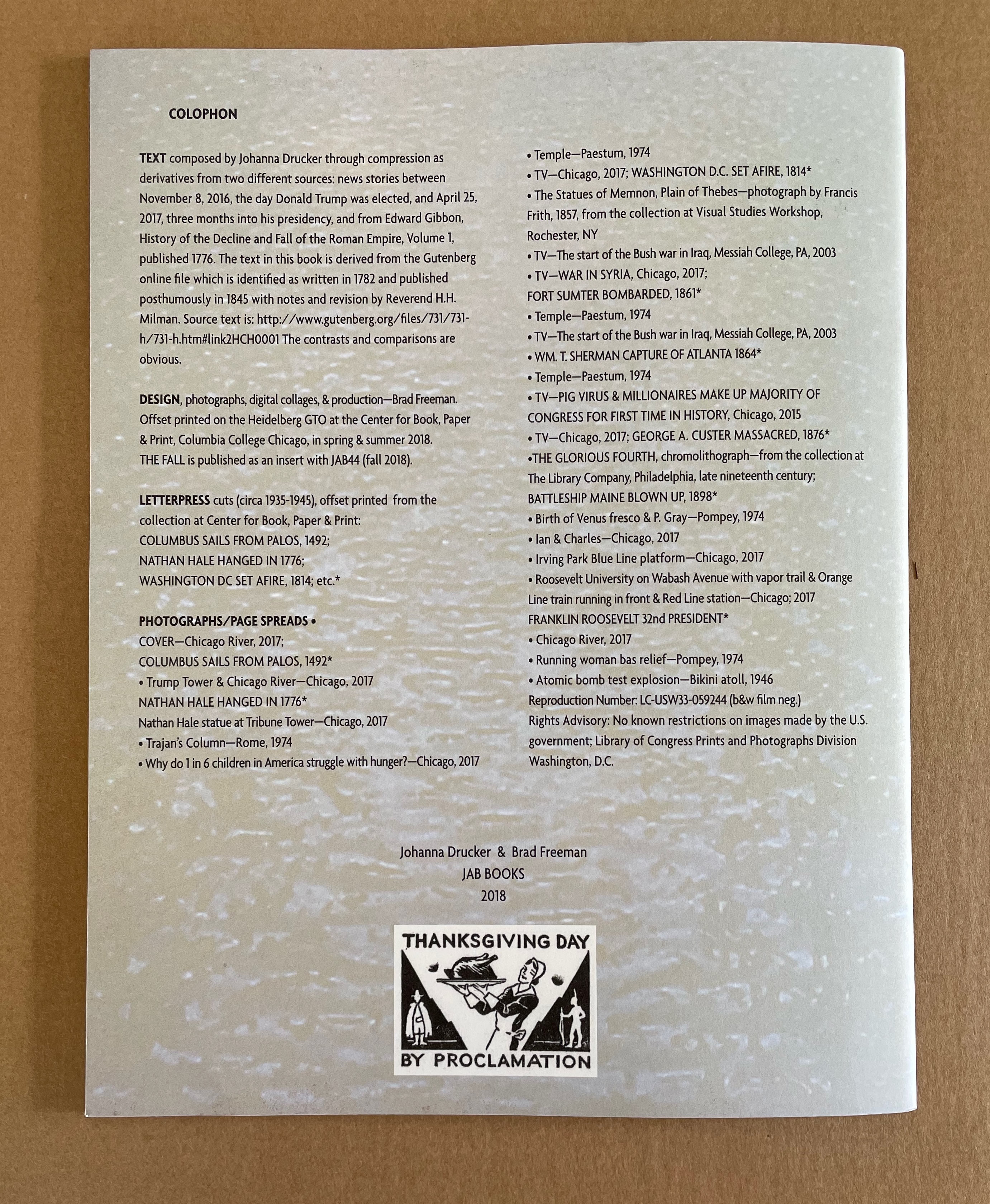
The Fall (2008)
Artist’s statement (website): Another post-Trump election work, this is fully elegiac. Using the same I-am-an-algorithm technique that I used in Fabulas Feminae, I did compression writing for a series of weeks after the election. I drew on two corpora, the mainstream newspapers and Edward Gibbon’s The History of the Decline and Fall of the Roman Empire. Brad Freeman collaborated, creating the rich, dense, dark imagery on the pages through his techniques of offset overprinting.
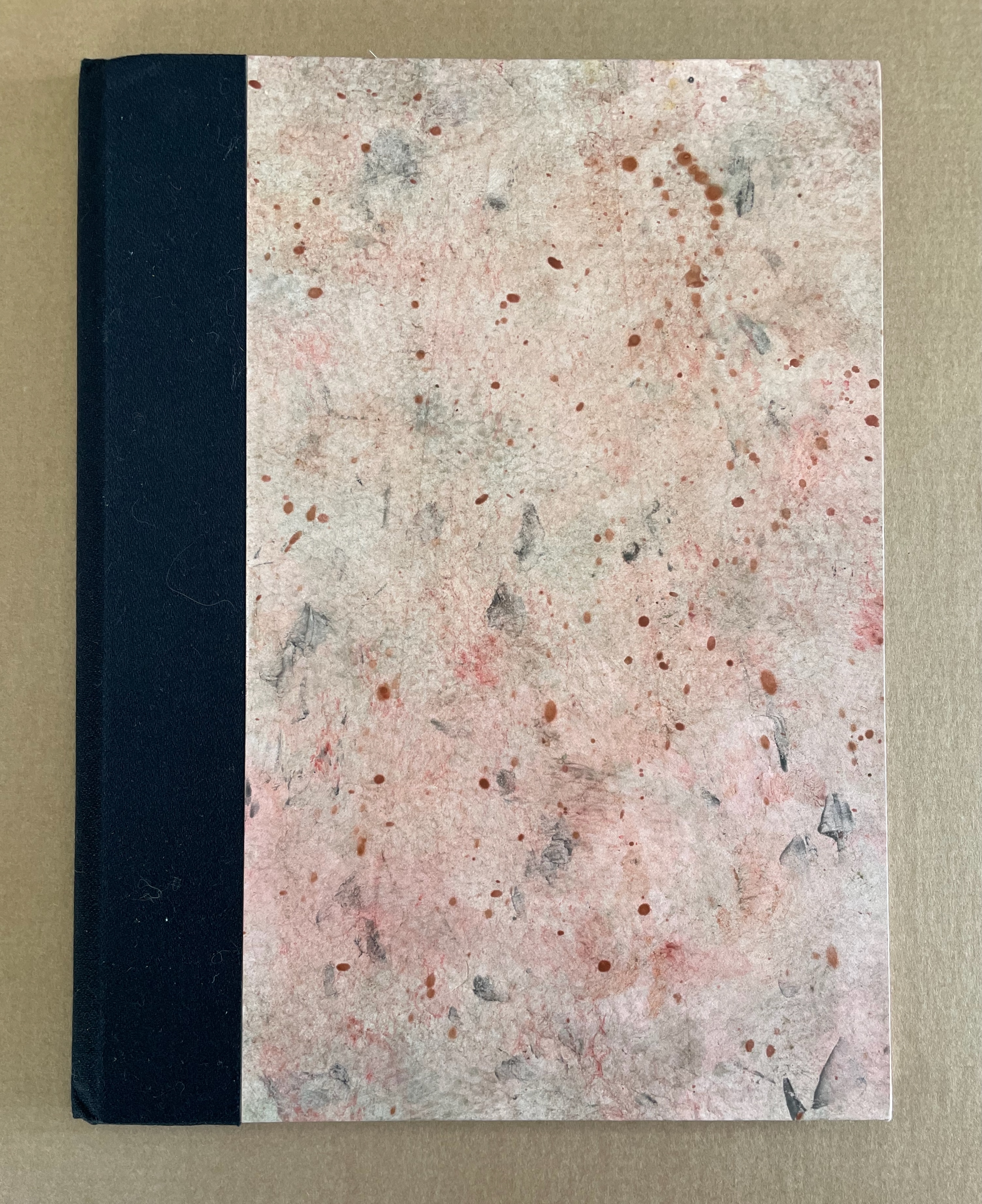
Damaged Nature Salvage Culture(2006)
Artist’s statement (website): The overall project for which these books were editioned included a series of watercolors and other studies that were exhibited in Charlottesville, first at the Off-Grounds Gallery in December, 2005, and the second time at Les Yeux du Monde as part of the Compicit Codex! exhibit in August-September 2006. The books are meant to provide a catalogue of the smaller pieces from those exhibitions and also offer a text stating the premises that underlie the works. In many ways, these pieces and the publication continue a project that has been ongoing for several decades that addresses organic process and form through drawings and watercolors.
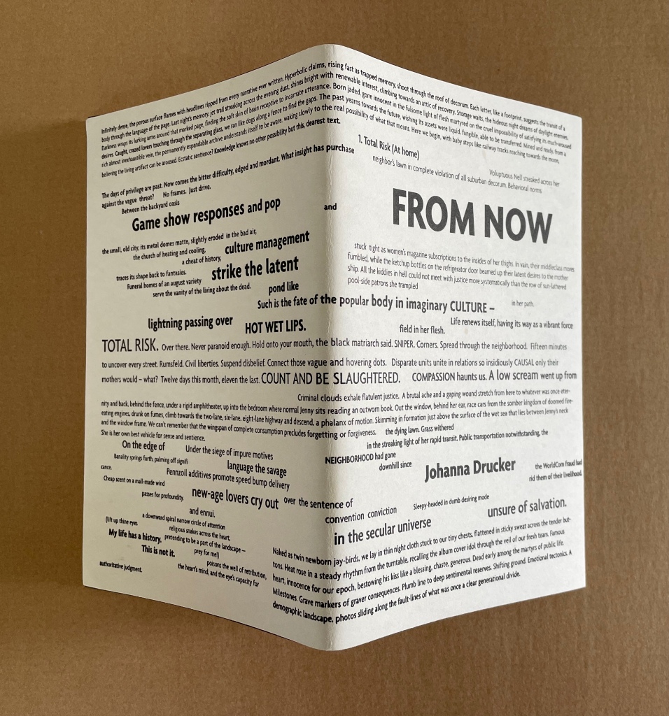
From Now (2005)
Artist’s statement (website): From Now continues the strain of my work that processes news and events through a locus of subjectivity as an organizing lens or principle. The project makes use of snippets, fragments, bits and pieces of different kinds of writing projects, most deliberately granting each autonomoy within a whole. The multiple spheres of language discourse each register in the structure and compositional mode, as well as the texture and graphic presentation of language. The “now” this is “from” is the lived and real, monstrous, grotesque, supersaturated with the noise of mass mediated culture, and yet, it is also the now of being, always, aware and present, in the midst of all that stimulation, what we are. Awareness shoots through the full world, and returns as a projection of self, that set of bounding and defining specifics that delineate a place as a profile, position, from which the world is made. So the curious codependent systems work. And language? Endlessly polyphonic, heteroglossic, multifaceted, varied in tone and vocabulary, look and sound, image and texture.
Simulant Portrait (1990)
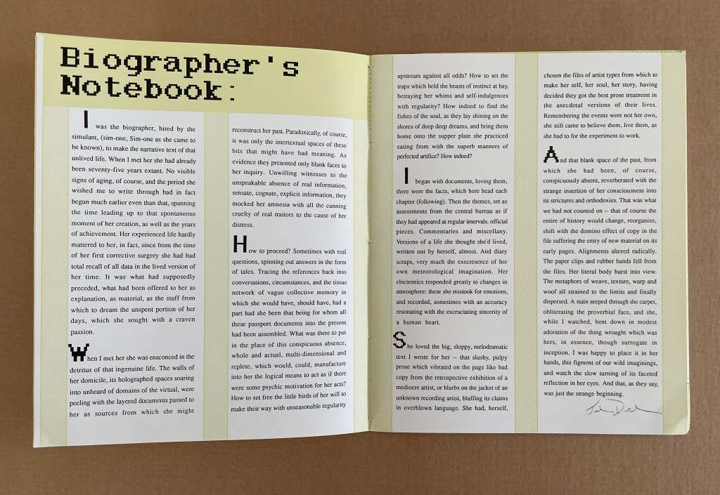
Artist’s statement (website): In the late 1980s, I was still involved in working on the biography of Ilia Zdanevich (Iliazd), begun in 1985 when I was a Fulbright Fellow in Paris, working on my dissertation. That biography went through many iterations, and was finally left unpublished after Northwestern cancelled my contract. I had lost interest in the project, swept up in other matters, but the process of research and synthesis from documents and snippets of different kinds of materials had touched a nerve. I found this utterly satisfying to a certain obsessive streak. And so the structures of biography-writing, with all their connect-the-dots assumptions, varieties and ranges of sources and voices, evidence and documents, etc., were extremely appealing. Structurally, then, Simulant Portrait was conceived to mimic that process of research. Thematically the book was closer to older themes, of women and their lives, biographies and celebrity, the tensions of mass and literary culture in my own mind, and so on. The cyber-pulp aspect of the book is harder to place, as my proclivities were hardly sci-fi at that moment. Only that such notions were in the air, with Philip K. Dick (particularly the film Blade Runner) and William Gibson (rising star) occupying a certain popular imagination.
Further Reading
See “‘Un Coup de Dés Jamais N’Abolira l’Appropriation’ — An Online Exhibition“, 1 May 2022, Bookmarking Book Art, for works of homage to Mallarmé with which Drucker’s works can be compared and contrasted. Other works in the Books On Books Collection whose comparison/contrast with Drucker’s artist’s books provide appreciation in both directions include:
The Fall (1976) Michelle Stuart for the trend of distancing described by Alloway.
Auparavant (1991) by Roland Sabatier for the Lettrist context.
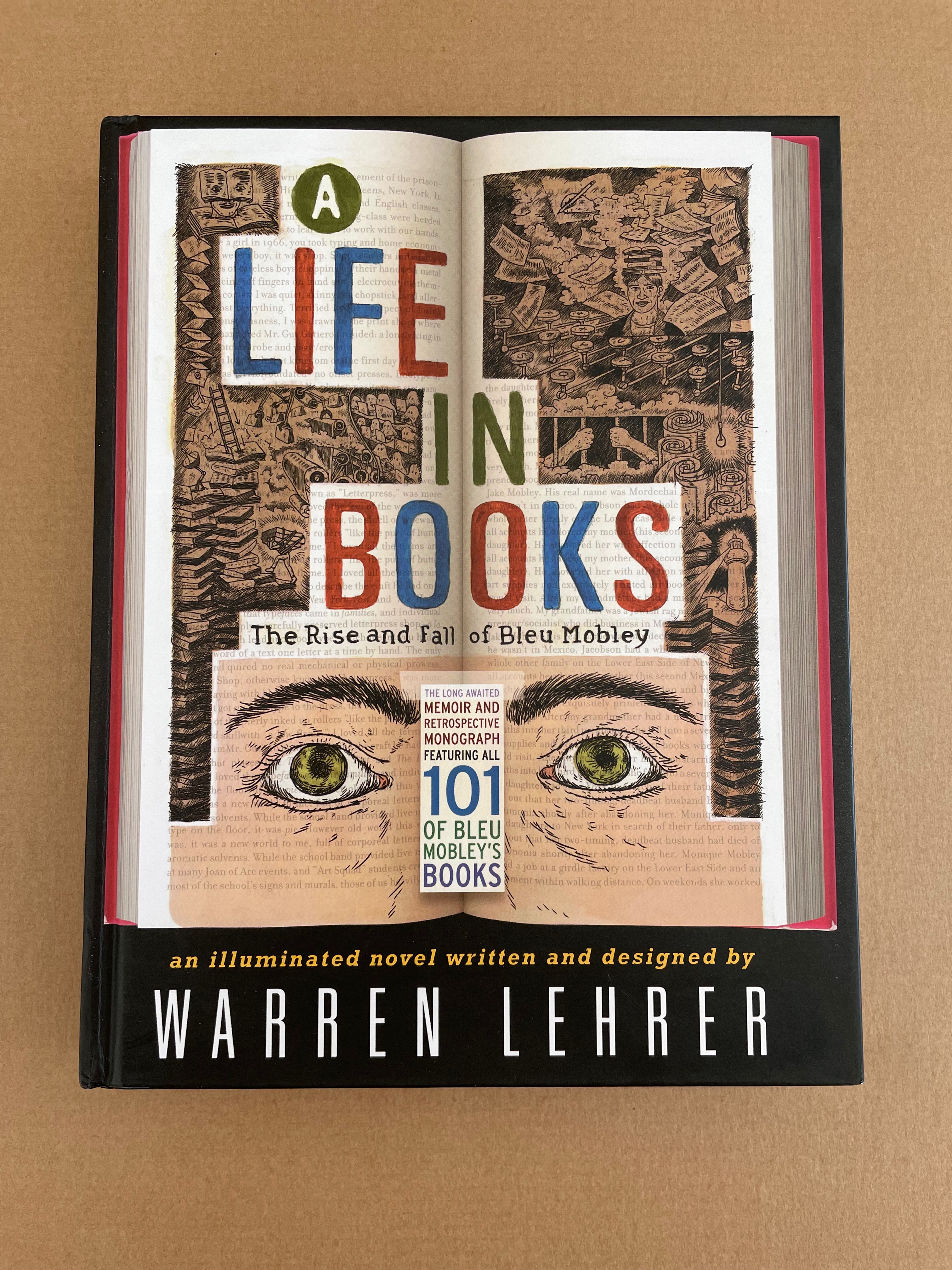
A Life in Books(2013) by Warren Lehrer for comparison with Otherspace for format and Stochastic Poetics and From A to Z for commentary on the academic literary milieu. See also Lehrer’s “Note from the Editor” for comparison with the “Biographer’s Note” from Simulant Portrait (1990) above.
Alloway, Lawrence. 9 December 1978. “Art”. [Touchstone Gallery, 118 E. 64th Street, New York] The Nation, p. 653.
Drucker, Johanna. N.D. “An Introduction to the Work of Johanna Drucker“. Artists’ Books Online: An online repository of facsimiles, metadata, and criticism. Archived 22 April 2021 at the Internet Archive Wayback Machine.
Drucker, Johanna. August 2012. “Future Visions and Versions of the Codex“. Transforming Artist Books. London: Tate Research Publication. Archived 26 March 2024 at the Internet Archive Wayback Machine.
Drucker, Johanna. 2022. Inventing the Alphabet: The Origins of Letters from Antiquity to the Present. Chicago: University of Chicago Press. Like The Century of Artists’ Books, Drucker’s scholarly works on the alphabet — this one and The Alphabetic Labyrinth below — enrich the appreciation of her artist’s books.
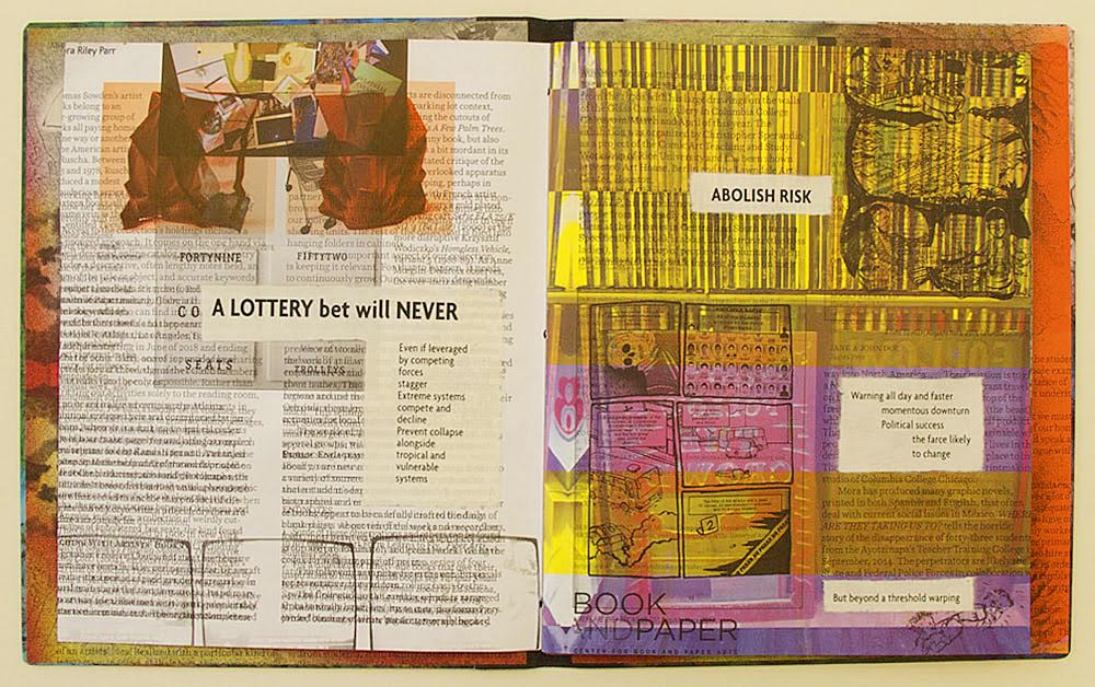
Drucker, Johanna, Brad Freeman and Jessica Cochran. 2020. Aleatoric Collaborations. Chicago, IL: Center for the Book and Paper/Columbia College. If any proof of Poème‘s direct influence on Drucker were needed, here it is:
Aleatoric Collaborations (2020) Johanna Drucker, Brad Freeman et al. Photo: Courtesy of Brad Freeman.
Mallarmé, Stéphane, and Bertrand Marchal (ed.). 2003. “Le Livre, Instrument Spirituel“. Œuvres Complètes. New ed. Paris: Gallimard. Vol. 2, p. 224-28.
Auparavant : Roman: Collection Voir Comme On Pense (1991) Roland Sabatier Jacketed softcover, exposed sewn & glued spine. H144 x W105 x D30 mm. 184 pages.Edition of 300. Acquired from Didier Lecointre et D. Drouet, 16 November 2022. Photos: Books On Books Collection.
Sabatier’s work follows in the tradition of the Lettrists — Isidore Isou, Maurice Lemaître and Gabriel Pomerand — whose works Johanna Drucker addresses in the chapter “The Book as Verbal Exploration” of The Century of Artists’ Books (2004). Although much shorter (10 pages), Lemaître’s Roman Hypergraphique (1950) is the direct precursor to the lengthier Auparavant. Drucker’s comments on Lemaître’s booklet apply easily to Sabatier’s tome:
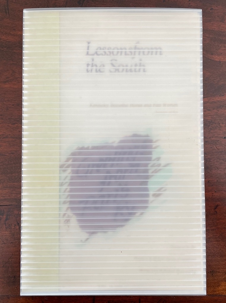
Lessons from the South(1986) Susan E. King Modified flag book. Closed: H270 x W172 mm; Open: W670 mm. 20 pages. Acquired from Rickaro Books BA PBFA, 22 September 2023. Photos: Books On Books Collection.
Lessonsfrom the South presents a masterful weaving together of material, structure, technique and image with Susan King’s reminiscences and social observations of her birth state Kentucky. For King, growing up white and female in the South in the second half of the 20th century engendered a sense of otherness and rebellion. As with some white southerners, it led to mild acts of rebellion — sitting too far back in the bus, sitting next to black students in typing class, or finally leaving for other regions of the US. With the 21st century’s rise of the “Karen”, repression of voting rights and reproductive rights, and resurgence of white supremacy, can we afford to dismiss the expression of conscience as “mild”? Any expression of conscience is something. Lessons from the South is an artful expression of fondness, humor, closeness and distance — a sense of being ill at ease with a Southern heritage we all seem unable to escape — that should be revisited not only for the sake of its art but as encouragement to conscience.
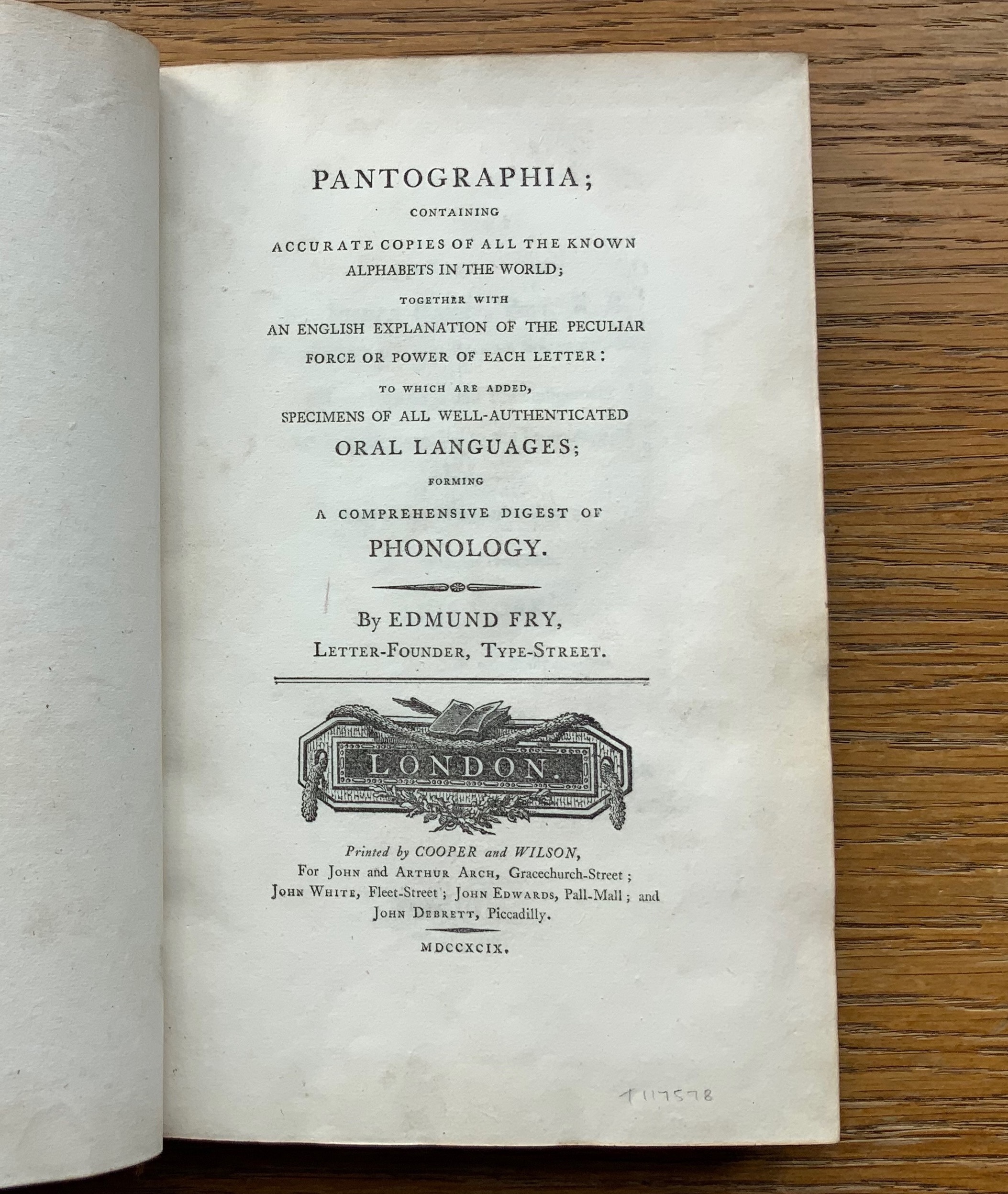
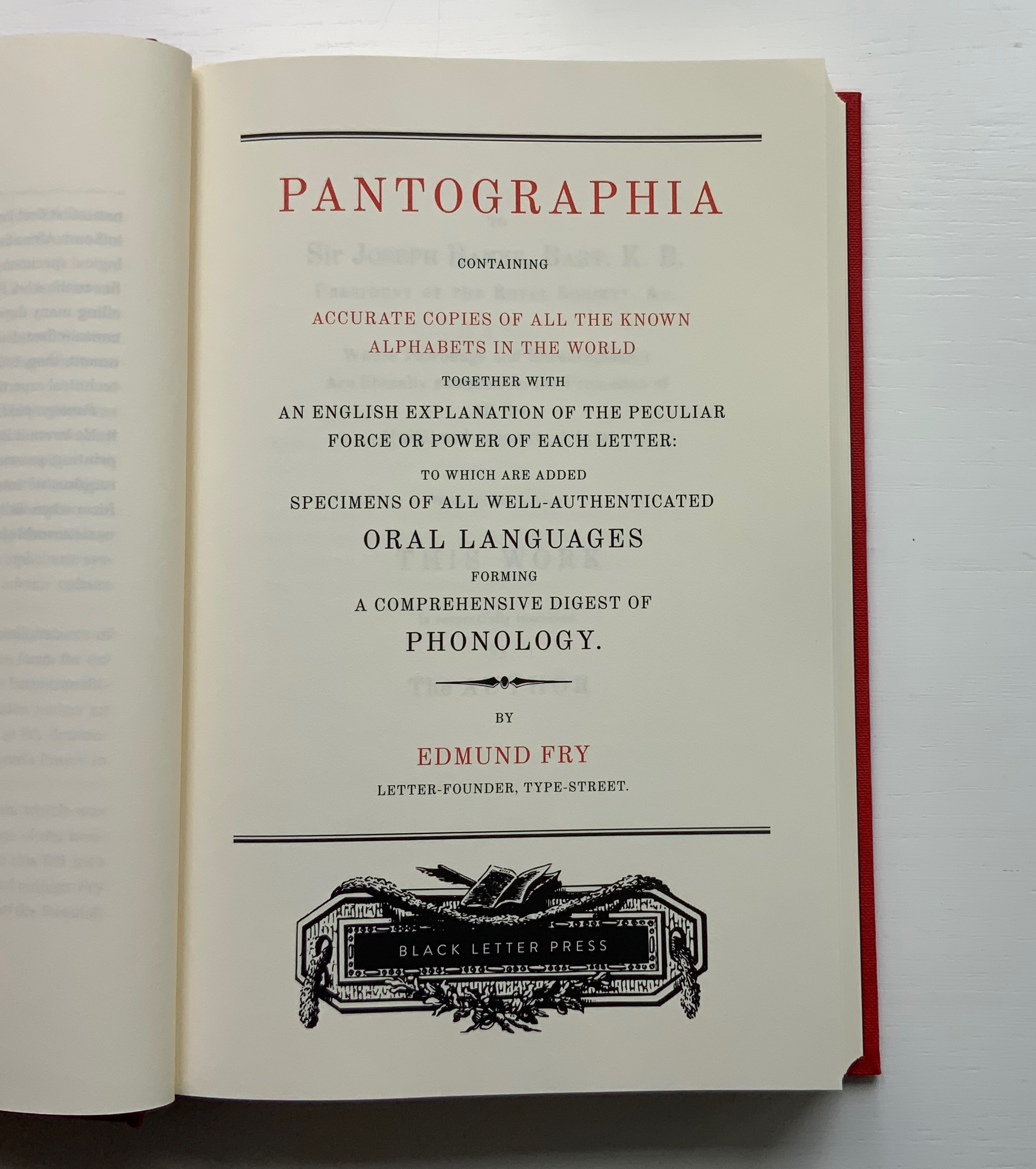
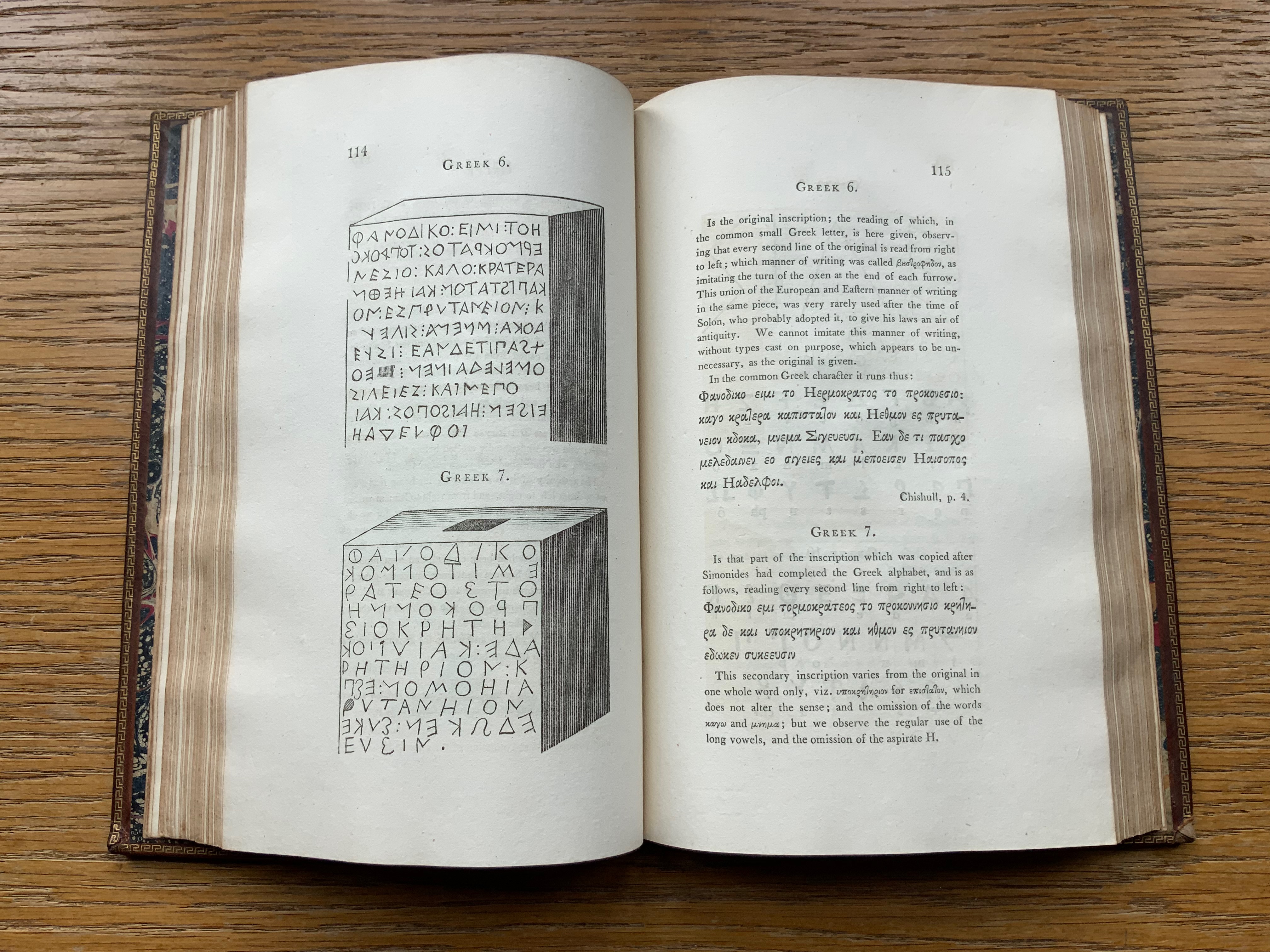
For the Enlightenment, everything that existed was meant to be in an encyclopedia. For Dr. Edmund Fry, scholar, typographer and owner of The Polyglot Foundry, this notion (and the spur of profit) led to his Pantographia (1799). Extraordinarily, Fry made the matrix for each of the roughly 5,000 characters for the 405 alphabet specimens, then handcast each — a monumental sixteen-year accomplishment in craftsmanship. Quite a type sampler for a printer specializing in foreign languages.
Fry was also driven by the importance of the subject: the origin of speech, its being made visible and the varieties of doing so. “The art of drawing ideas into vision, or of exhibiting the conceptions of the mind, by legible characters, may justly be deemed the noblest and most beneficial invention of which human ingenuity can boast — an invention which has contributed, more than all the others, to the improvement of mankind.” (xviii)
Fry is even handed in presenting the arguments and evidence for and against the two possible origins of speech he identifies — divine gift or human invention. He is unequivocal though “that all languages … that have been conveyed in alphabetical characters, have been those of people connected ultimately or immediately with the Hebrews, to whom we are indebted for the earliest specimens of the communication of ideas by writing” and “that there was but one truly original language, from which all others are derivations variously modified”. (xxxviii, xliii)
Plenty has been written about Fry’s accomplishment. Johanna Drucker has explored it in her Alphabetic Labyrinth and more recent Inventing the Alphabet. Even more recently, Hunter Dukes, editor of The Public Domain Review, posted a brief celebration, citing Drucker. Jan Düsterhöft, a German academic now affiliated with the Georg Eckert Institute, provides the publisher’s preface to the Black Letter Press edition shown above. All three identify the two features of Pantographia that echo two other works in the Books On Books Collection: Sam Winston’s One & Everything (2023) and Claire Jeanine Satin’s The Hebrew Alphabet Expressing the Celestial Constellations (2017).
Original at Mansfield College Library, Oxford University
Even in 1799 several of the alphabets displayed by Fry represented extinct languages. Today the Endangered Alphabets Project initiated by Tim Brookes aims rescue languages and their alphabets from that fate. Brookes’ project inspired Sam Winston’s story. More forcibly than Drucker and Dukes, Düsterhöft identifies the imperialist and Western perspective in Fry’s endeavor. Winston’s fable is populated with “story characters”, drawn as various sized and colored blobs, each filled with its distinguishing alphabet. Some are filled with hieroglyphic dogs (presumably for Egyptian shaggy-dog stories), others with Greek, Cherokee and so on. The one story that decides it is the “One and Only story” is filled with the English (Latin or Roman) alphabet and proceeds to eat up all the others.
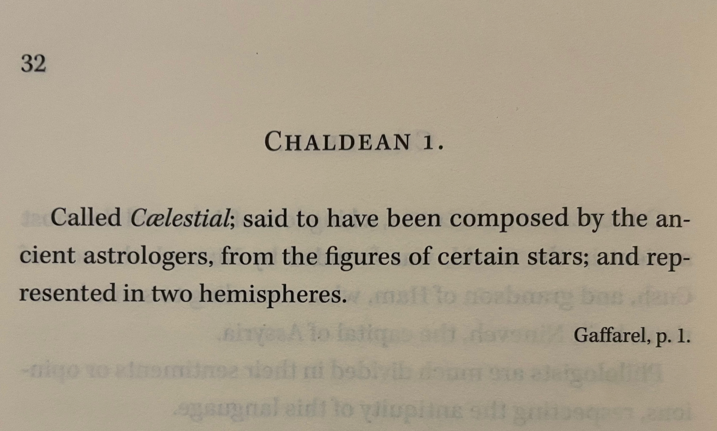
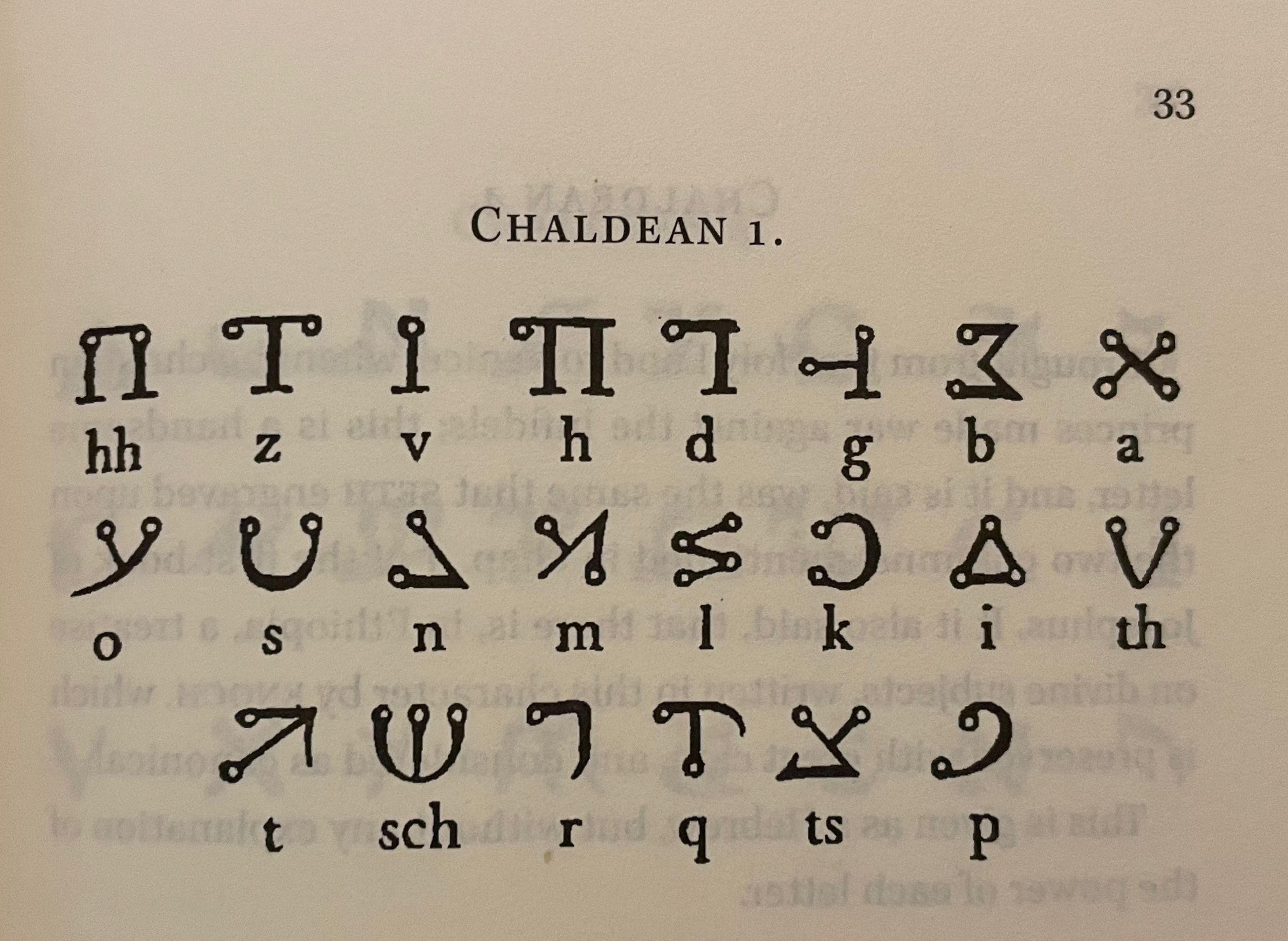
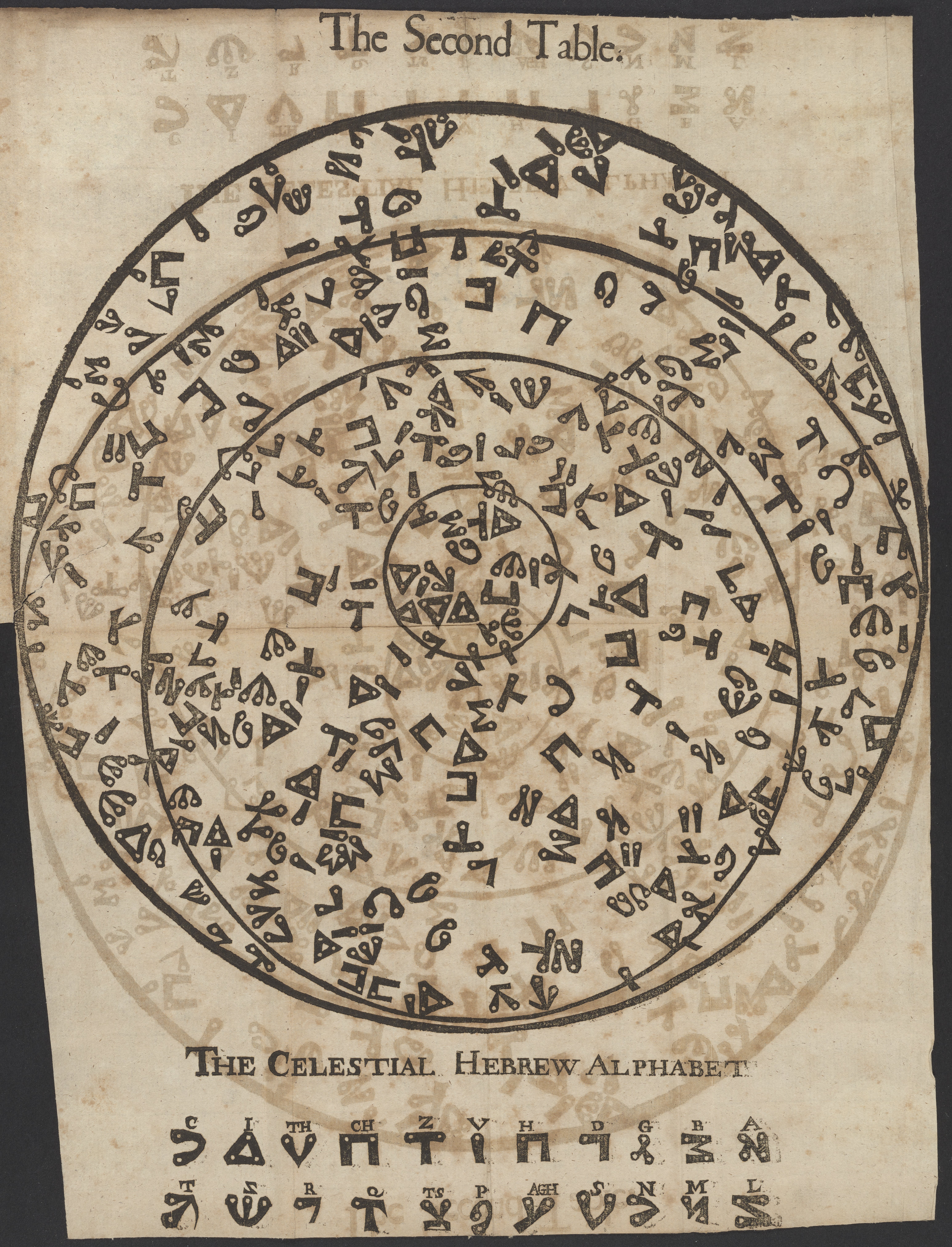
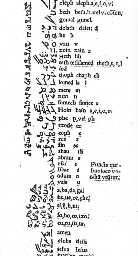
In Pantographia, Chaldean, one of the extinct languages, is a special case, not because Fry includes 20 variant specimens (Greek has 39) but because it is reportedly celestial. The first of Fry’s cited sources for this alphabet is Jacques Gaffarel (1601–1681), a French scholar and astrologer. A bit of digging reveals the source to be more precisely a woodcut from a 1650 translation of Gaffarel’s Curiositez inouyes sur la sculpture talismanique des Persans, horoscope des Patriarches et lecture des estoiles (1629).
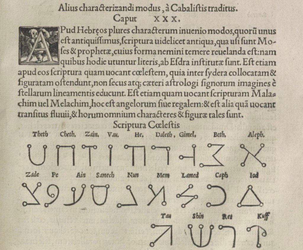
In addition to its astrological character, Gaffarel’s work sits in the traditions of gematria, the Kabbalah and alchemy, which Johanna Drucker has thoroughly explored in Alphabetical Labyrinth (1999) and Inventing the Alphabet (2022). Among the earlier contributors to these traditions is Heinrich Cornelius Agrippa. Like his mentor Johannes Trithemius, Agrippa was a polymath, occultist and theologian as well as physician, legal scholar and soldier. The Latinized Hebrew letters and their corresponding characters in the celestial alphabet seen below come from Agrippa’s De occulta philosophia (1533), which is more legible than Gaffarel’s above.
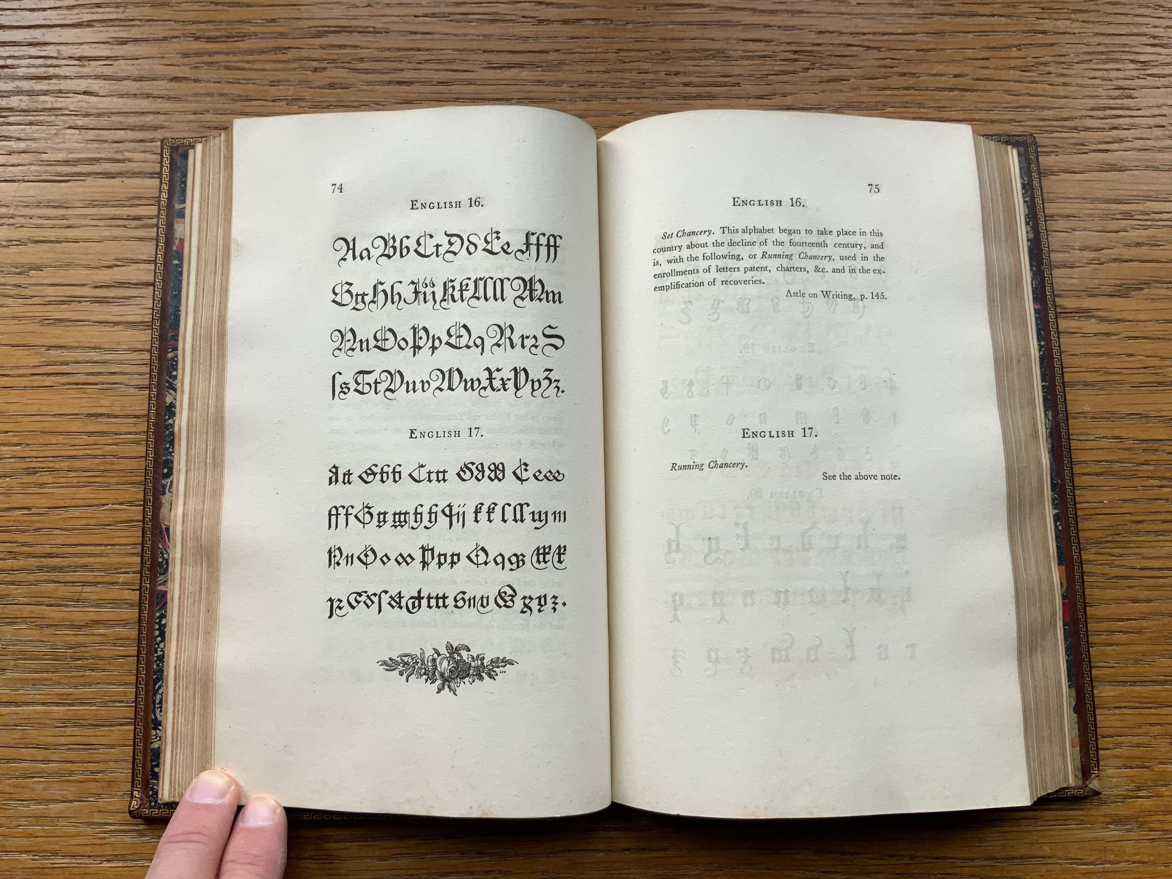
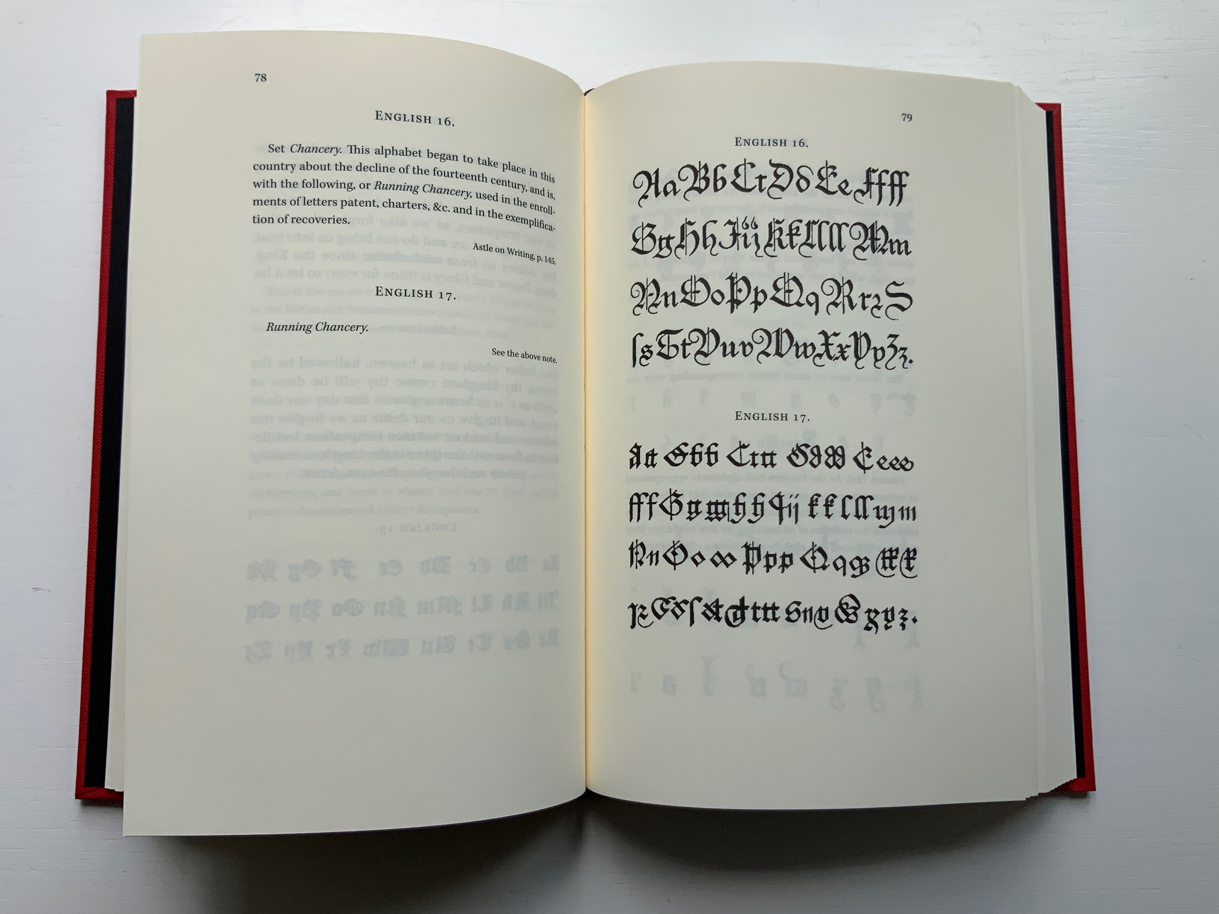
Black Letter Press issued this edition in 2022. As indicated in the caption at the head of this entry, considerable attention to materials was given, including blind debossing and hotfoil printing on the front and spine. The edition is not a photographic facsimile; rather it has been scanned and phototypeset. Scanning in lieu of resetting does not eliminate errors, even if the scan is reviewed carefully. Aside from occurrences of “mod” instead of “most”, “mall” instead of “shall”, and “2ist” instead of “first”, though, the most unusual variation from the original is the deliberate movement of openings on the verso to openings on the recto and, in the specimen section, the reversal of all verso and recto pages. On his verso pages, Fry placed the specimen, and on the recto pages, he placed comments, explanations and sources. For Black Letter Press, the reverse seems to have made more sense. Below are comparisons of pages from the original (left) and the Black Letter Press edition (right).
Left: 1799 original. Right: Black Letter Press facsimile.
Most uncaught scanning errors leap out, so despite the niggling worry about accuracy, the greater legibility and probable accessibility of the 2022 edition is welcome for explorers of alphabets and alphabet-related works. For the Books On Books Collection, its enhancement of the pleasure in Winston’s and Satin’s works and others such as Golnar Adili’s BaaBaa Aab Dad, Islam Aly’s 26 Letters and Ben Shahn’s The Alphabet of Creation (1954), it is more than welcome.
Another 25 images of Fry’s original edition can be found here, courtesy of The Letterform Archive.
Drucker Johanna. 2022. Inventing the Alphabet : The Origins of Letters from Antiquity to the Present. Chicago: University of Chicago Press. Not just another in the long line of histories of the alphabet, rather it explores “Who knew what when about the alphabet?” How did the way they knew it affect how they imagined its identity and origin? For Drucker, Pantographia marks an endpoint and transition. These printed compendia of alphabetic scripts began in 1518 with Johannes Trithemius. Initially spurred by interest in the occult as well as exotic and ancient scripts and a search for the “original” alphabet, compendia gradually became more secular but still eclectic. By 1799, Fry ‘s was an exception by still including the Celestial Alphabet and citing sources in trackable ways. Simultaneously an investment in imagination and a significant step forward for scholarship.
Dukes, Hunter. 10 October 2023. “Pantographia: A Specimen Book of All the Alphabets Known on Earth (1799)“. Public Domain Review. Dukes, editor of the Review, celebrates Pantographia‘s iconic presence in the public domain. In his celebrating, Dukes also notes the presence of the Celestial Alphabet in Pantographia and Drucker’s singling out Fry for taking the antiquarian compendium of alphabets to the earliest stage of specialized, professional research. He also surrounds Fry’s effort with other interesting direct and indirect contexts: the discovery of the Rosetta stone in the same year as Pantographia’s publication and the extinction of several of the languages that Fry’s alphabet represents.
Düsterhöft, Jan. 2022. “Foreword”. In Fry, Edmund. 1799. Pantographia, Containing accurate Copies of all the known Alphabets in the World.Turin, Ialy: Black Letter Press. A German academic now affiliated with the Georg Eckert Institute, Düsterhöft also raises the point about extinction and relates it to the West’s imperial colonial perspective, which Fry displays in his omissions and dismissal of the Chinese mind’s intellectual and rational capacity “as evidenced” by the lack of an alphabet. Düsterhöft also identifies Gaffarel’s source for the celestial alphabet: Guillaume Postel ‘s Linguarum Duodecim Characteribus Differentium Alphabetum Introductio [An Introduction to the Alphabetic Characters of Twelve Different Languages] (1538). Postel (1510 – 1581) was a polyglot French linguist, astronomer, Christian Cabalist, and diplomat.
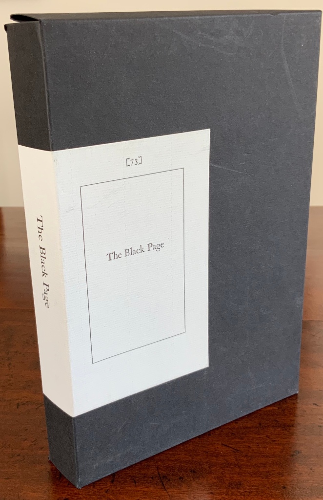
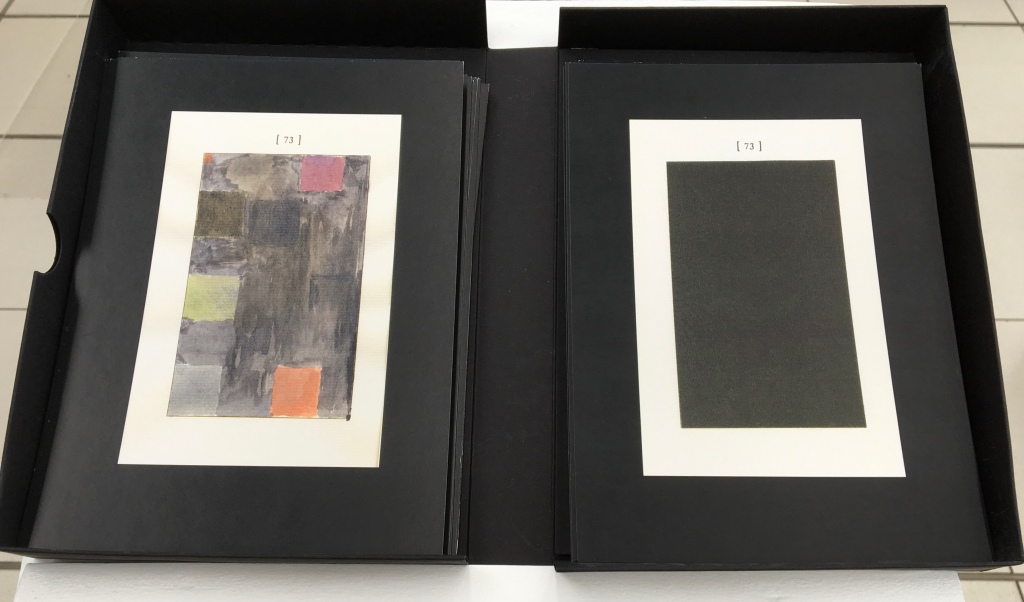
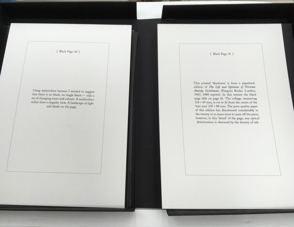
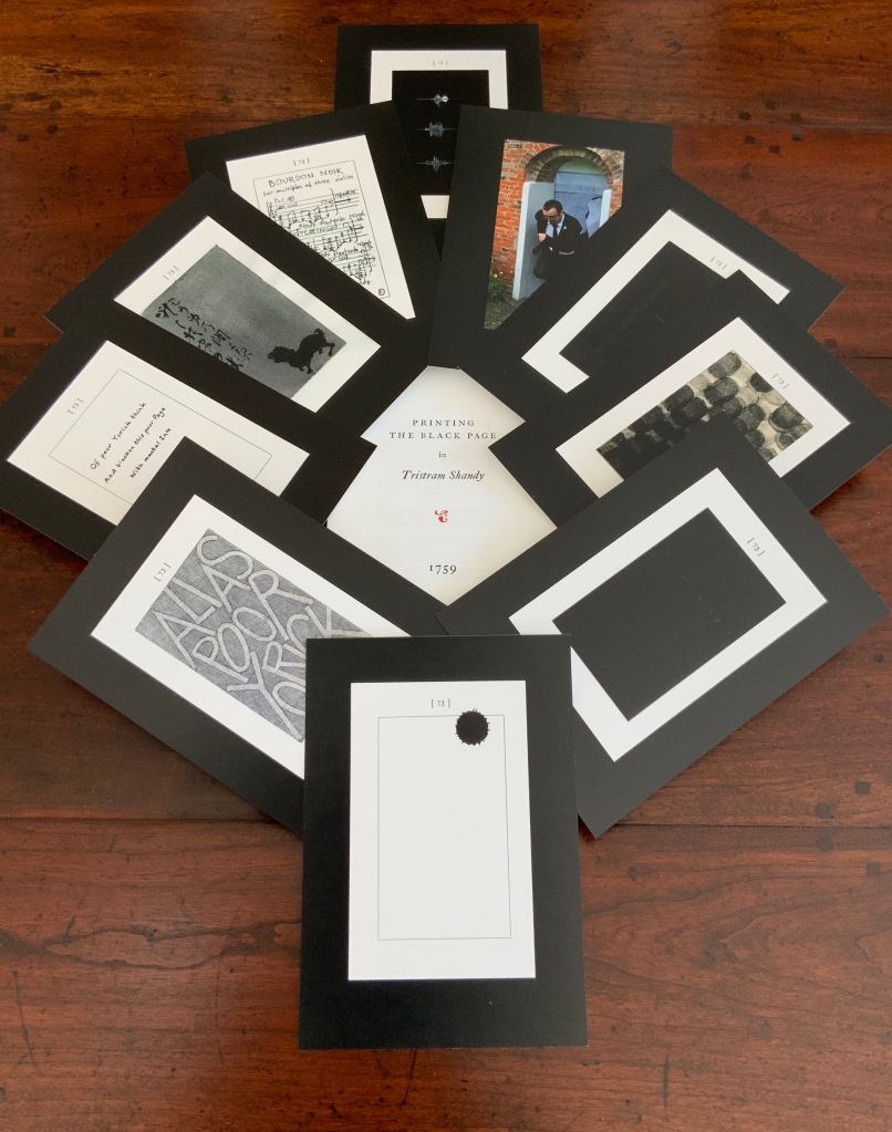
The Black Page Catalogue(2010) Coxwold, UK: Printed by Graham Moss (Incline Press) for The Laurence Sterne Trust. Contains 73 numbered leaves in a matte black card box (H235 x W168 mm). The leaves are glossy cards (210 x 148 mm) on which contributed texts and illustrations (chiefly colour) are printed; the reverse of each provides the contributor’s comments on the text or illustration and the “page” number. Also enclosed are a single-sheet folded pamphlet (“Printing the Black Page” by Graham Moss, Incline Press) and two cards, one of which is the invitation to the exhibition inspired by the ‘black page’, p. 73 of the first edition of The Life and Opinions of Tristram Shandy, Gentleman, held at Shandy Hall, Coxwold, North Yorkshire, 5 Sept.-31 Oct. 2009, and the other, sealed in an envelope, being the index of the contributors and their page numbers. Edition of 73. Acquired from the Trust. Photos: Books On Books Collection.
Collectors come up with the most ingenious reasons for acquiring things. In this case — along with astrological, numerological and other rational rationale — Rebecca Romney’s reminder that The Life and Opinions of Tristram Shandy, Gentleman is one of the earlier instances of book art led inevitably to my acquiring Shandy Hall’s The Black Page Catalogue. But it took time.
Several months after enjoying the Romney essay, I met Brian Dettmer in February 2015 by happenstance at a book art exhibition in New Haven, CT. As we chatted about past inspirations of book art, Tristram Shandy came up, so he told me of an upcoming event called “Turn the Page” in Norwich, UK, where I could more easily see some of his work — and one in particular having to do with Tristram Shandy. So in May 2015, I went.
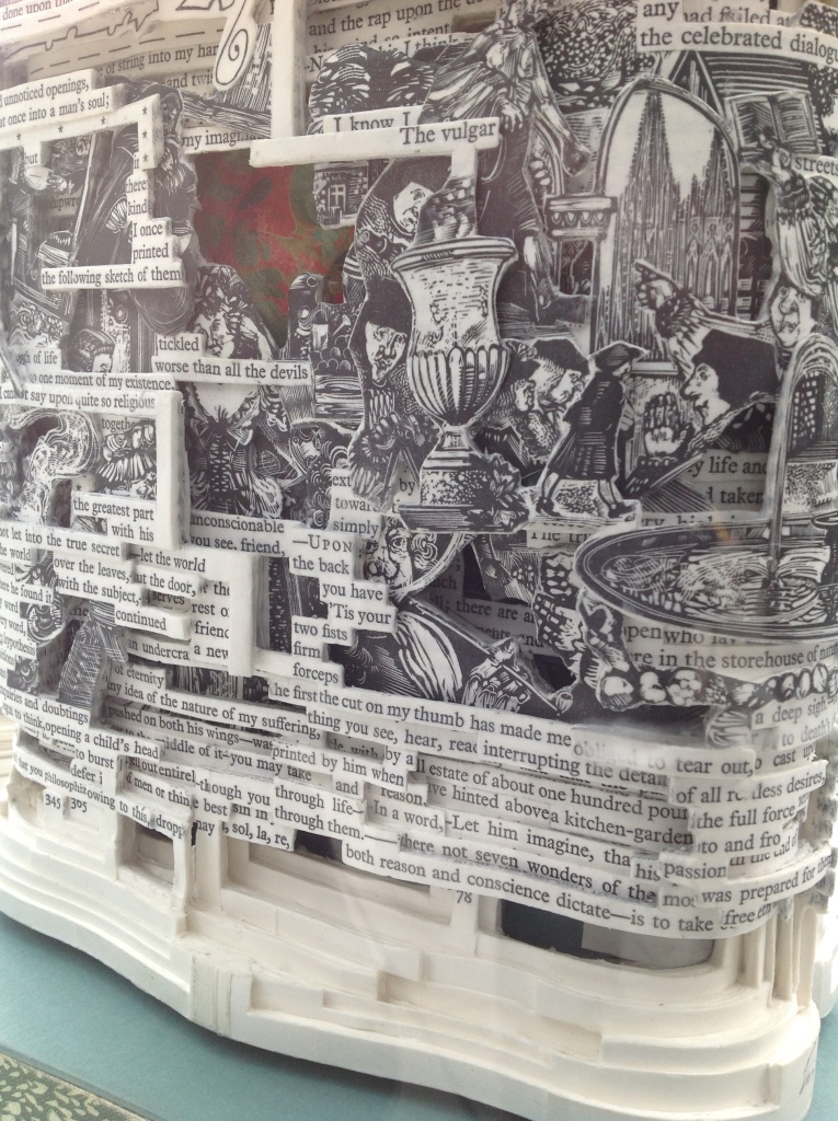
Tristram Shandy (2014) Brian Dettmer Carved and varnished, two copies of the 2005 Folio Society edition of Tristram Shandy. H230 x W190 mm Commissioned by The Laurence Sterne Trust, Coxwold, UK. Photos: Books On Books Collection.
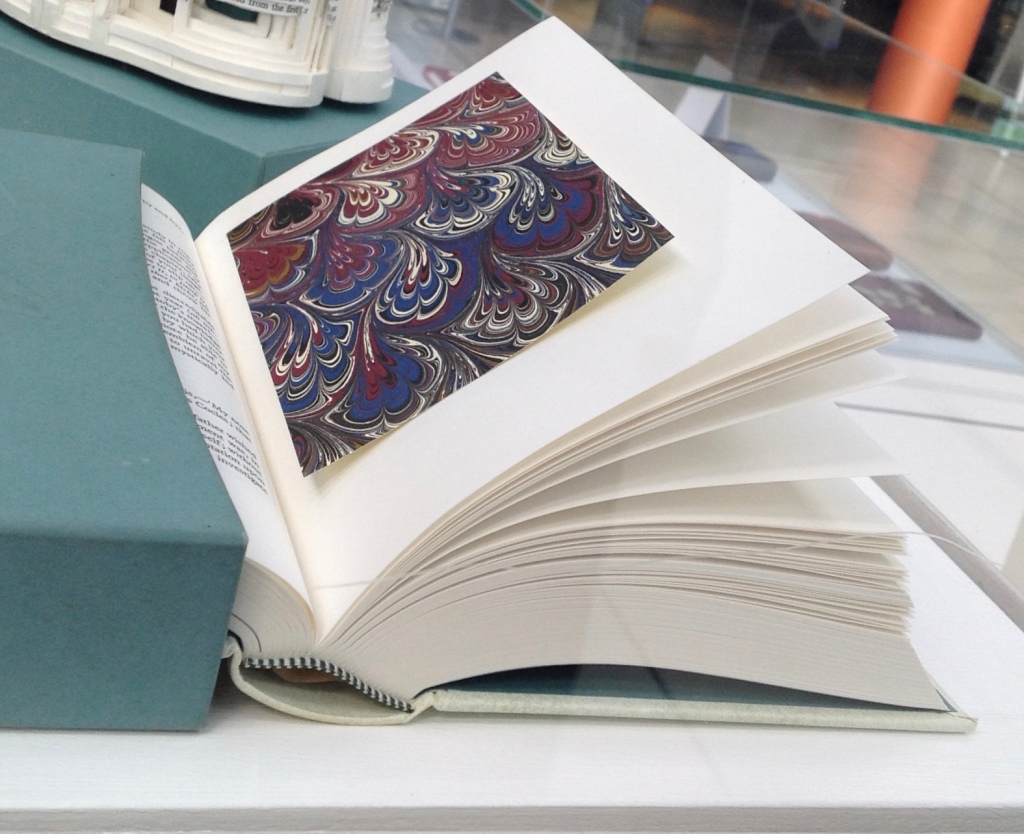
The marbled page, an “emblem of my work”, p. 169. The Life and Opinions of Tristram Shandy, Gentleman (1759) by Laurence Sterne Illustrated with wood engravings by John Lawrence. Set in ‘Monotype’ Plantin, printed by Cambridge University Press on Caxton Wove Paper. New York: Folio Society, 2005.
So a year passed. Another visit to “Turn the Page” was made. And as I was leaving, lo, a sign and small display came unto me:
Only a negligent collector would ignore such clear signs.
Parson-Yoricks-to-be can select their own favorites here.
Emblem of My Work (2013)
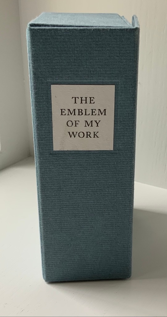
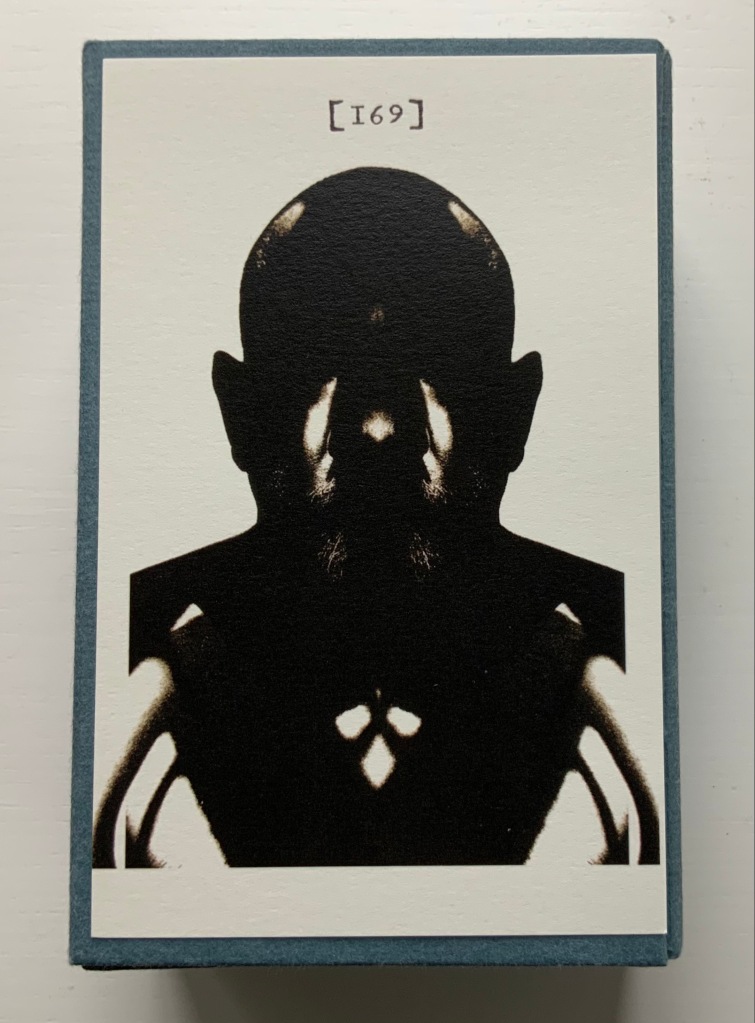
Emblem of My Work (2013) Coxwold, UK: The Laurence Sterne Trust. Consists of a 24-page booklet and 170 numbered cards in a hinged blue paper-covered box (H160 x W105 x D60 mm. The leaves of this catalogue are bright white cards (152 x 92 mm) on which the artwork is printed; the reverse of each provides the “page” number and the contributor’s comments on the art. The booklet provides alphabetical and numerically ordered indexes listing the contributors and their page numbers. Edition of 225, of which this is #79. Acquired from Shandy Hall, 1 October 2019. Photos: Books On Books Collection.
Volume III of Sterne’s work was the first to be handled by a publisher. Presumably the famous success of the first two self-published volumes helps to explain James Dodsley’s agreement to printing copies in which each page 169 and each page 170 showed uniquely marbled squares. Images from an original copy held at the British Library can be seen here. As Patrick Wildgust, director of Shandy Hall, explains in the booklet:
The central section of p. 169 was laid upon the marbled mixture in order that a coloured impression could be taken as cleanly as possible. This was left to dry and then reverse-folded so the other side of the paper could also receive its marbled impression. This side of the paper became page [170]. As a result, the marbled page in every copy of Vol. III is different — each impression being a unique handmade image. In the text opposite on p. 168, Sterne tells the reader that the marbled page is the “motly emblem of my work” — the page communicating visually that his work is endlessly variable, endlessly open to chance.
Two favorites — one for page [169], one for [170] — artists with other works in the Books On Books Collection. Left: Ken Campbell. Right: Eric Zboya.
Paint Her To Your Own Mind (2018) Coxwold, UK: The Laurence Sterne Trust. Contains 147 numbered leaves in a brown paper-covered box (174 x 124 mm). The leaves are bright white cards (145 x 105 mm) on which contributed texts and illustrations (chiefly colour) are printed; the reverse of each provides the contributor’s comments on the text or illustration and the “page” number. Also enclosed are a “title page” and “index leaf” listing the contributors and their page numbers. Edition of 200. Acquired from Shady Hall, 6 June 2018. Photos: Books On Books Collection.
Page 147 of Sterne’s sixth volume of Tristram Shandy is blank. On the preceding page, he metaphorically throws up his hands over any attempt to describe the most beautiful woman who has ever existed and exhorts the reader: “To conceive this right, —call for pen and ink—here’s paper ready to your hand, —Sit down, Sir, paint her to your own mind—as like your mistress as you can—as unlike your wife as your conscience will let you—‘tis all one to me—please your own fancy in it.” So, accordingly, Shandy Hall invited 147 artists/writers/composers to follow Sterne’s instruction to fill the blank page 147. From the 9th through 30th of September 2016, their efforts were displayed in the Shandy Hall Gallery, Coxwold, York.
The curious reader can choose his or her own favorites here.
The Flourish of Liberty (2019)
In Volume IX on p. 17, the reader reads Corporal Trim’s advice to Uncle Toby, who stands at the Widow Wadman’s threshold about to propose marriage:
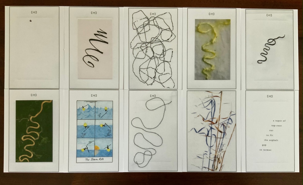
Nothing, continued the Corporal, can be so sad as confinement for life — or so sweet, an’ please your honour, as liberty. Nothing, Trim — said my Uncle Toby, musing — Whil’st a man is free — cried the corporal, giving a flourish with his stick thus —
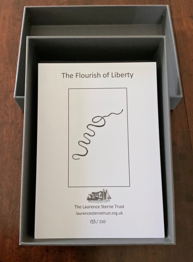
The Flourish of Liberty (2019) Coxwold, UK: The Laurence Sterne Trust. Contains 103 numbered leaves in a gray paper-covered box (174 x 124 mm). The leaves are bright white cards (148 x 105 mm) on which contributed texts and illustrations (black and white, several in colour) are printed; the reverse of each provides the contributor’s comments on the text or illustration and the “page” number. Also enclosed are a “title page” and “index leaf” listing the contributors and their page numbers. Edition of 150, of which this is #133. Acquired from Shandy Hall, 26 October 2020. Photos: Books On Books Collection.
The rest of Corporal Trim’s flourishes flourish here.
Endless Journey (2015)
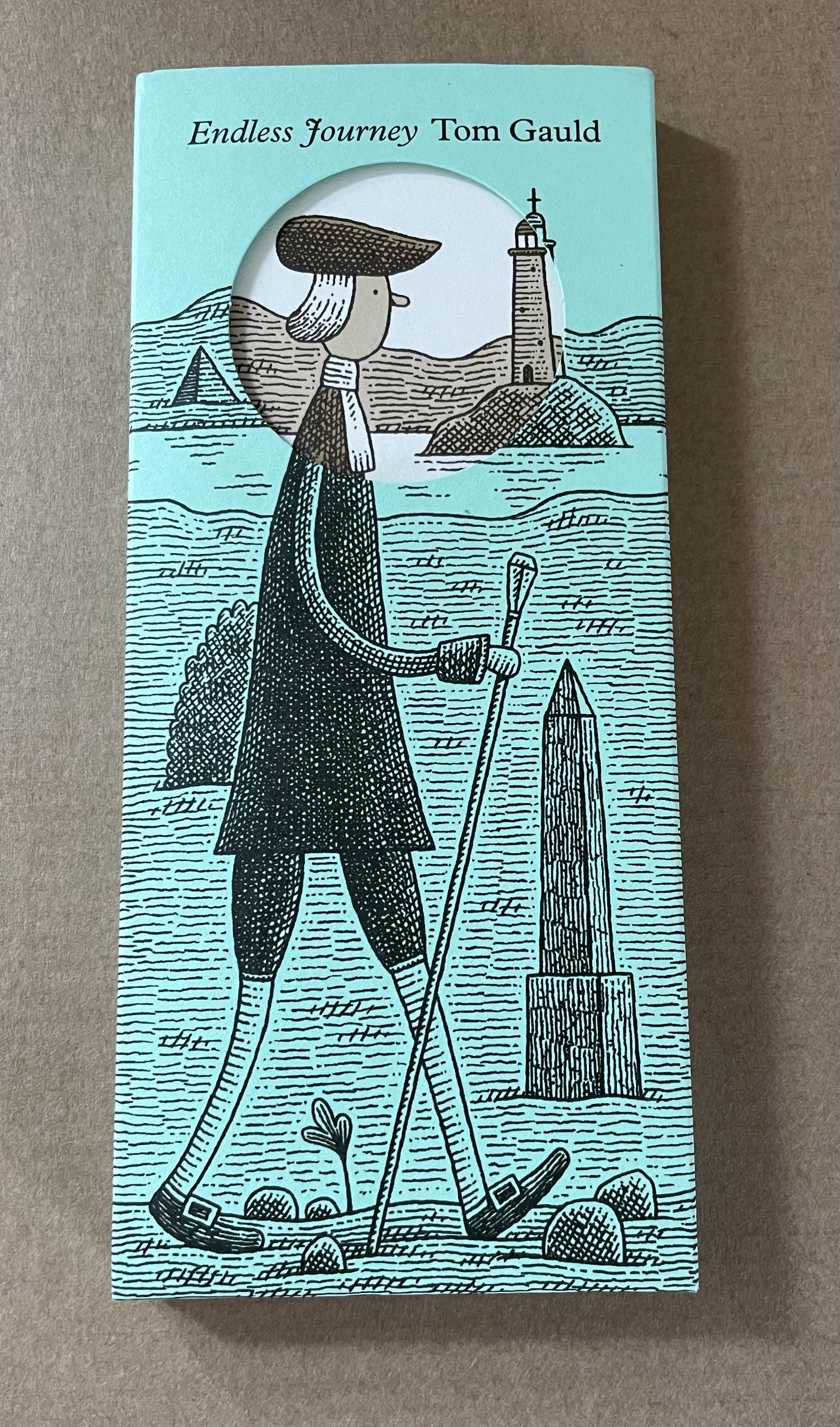
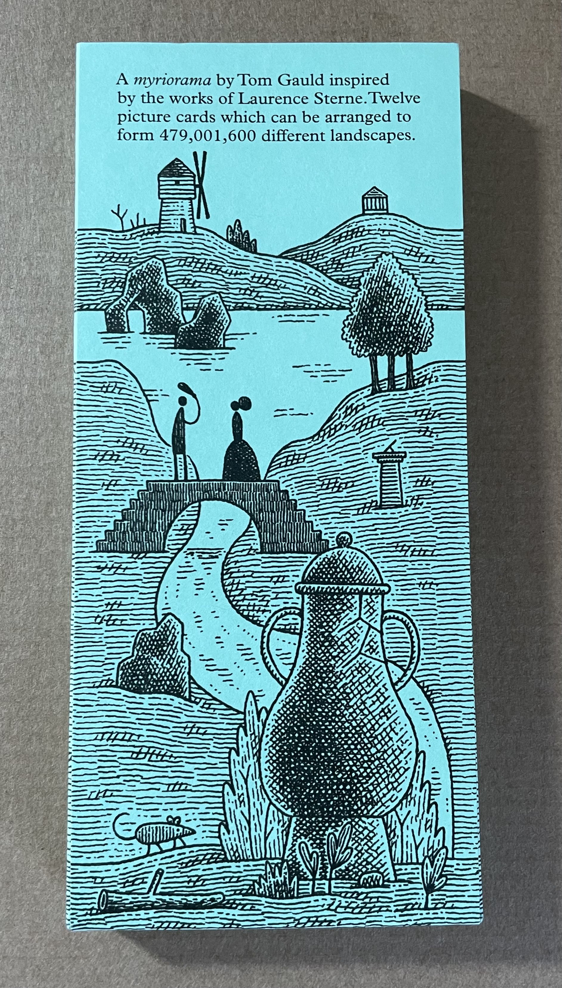
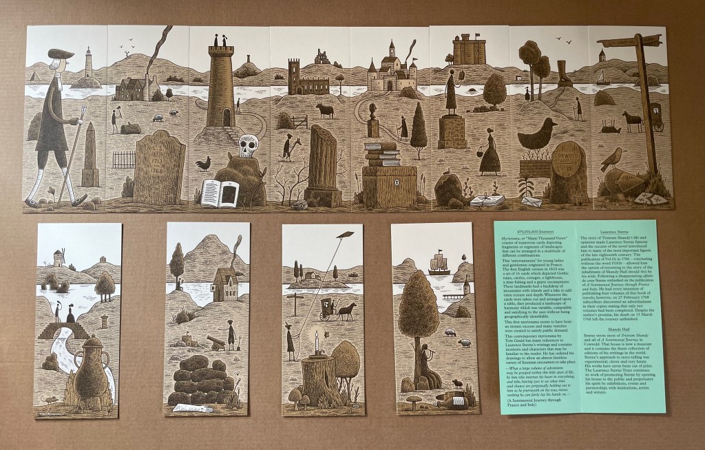
Endless Journey (2015) Tom Gauld Printed slipcase, twelve cards, leaflet. H165 x W73 mm. Acquired from the Laurence Sterne Trust. Photos: Books On Books Collection.
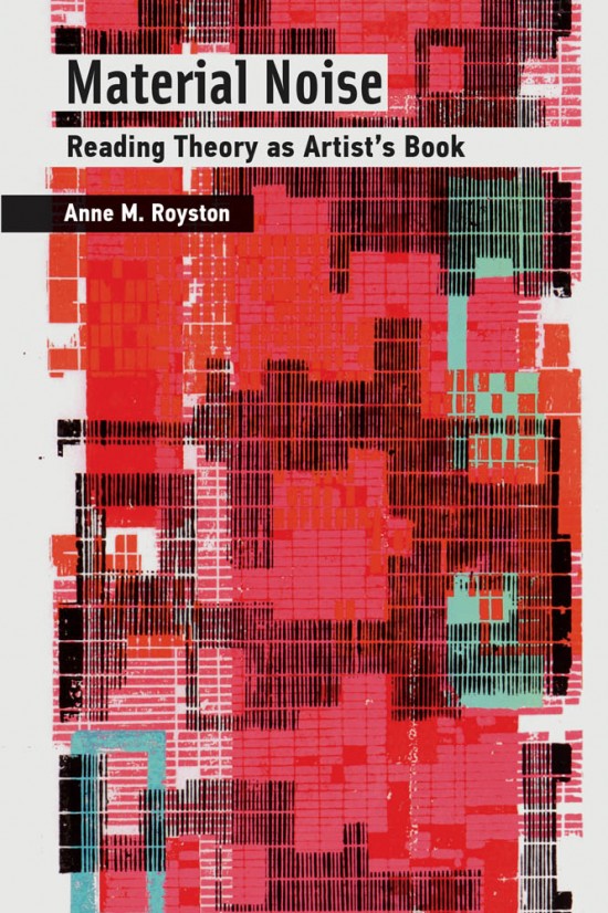
As its subtitle suggests, Material Noise explores how the material aspects of works of criticism and media studies such as Le Da Costa encyclopedique, Jacques Derrida’s Glas, Avital Ronell’s The Telephone Book and Mark C. Taylor’s Hiding matter to understanding them — just as if those works were artist books. For the reader interested in book art, the artist book or whatever one might like to call that art, Material Noise might be better read back to front. The works of book art that Anne Royston explores in Material Noise — Mark C. Taylor’s Le Réal, Las Vegas, NV, Shelley Jackson’s Skin, Johanna Drucker’s Stochastic Poetics and Susan Howe’s and R.H. Quaytman’s Tom Tit Tot — come at the end of the book.
The order though is reassuring. Otherwise we might end with criticism, media theory and critical theory becoming the foreground, the works of art simply background, lost in theoretical translation. A case of Barthes for Barthes’ sake? It is fitting that the very material approach to engaging with book art — even with its most conceptual of instances — should be applied to critics and theorists to explicate their works, only then to conclude by showcasing works of art whose mastery of the material may be said to put the more academic works in the aesthetic shade.
Royston selects the journal — Convolution, founded in 2011 by Paul Stephens — to emblematize her starting point: “a blend of art and criticism that considers its material form at every step” and delivers “a materially immersive reading experience” (pp. 1-3). If her publication had occurred in the future, she could have selected Inscription, founded in 2020 by Adam Smyth, Gill Partington and Simon Morris to serve as an open closing point. But that would have spoiled the reassurance of concluding with the art.
As is the wont of theorists (social, literary and otherwise), she proposes a new term, or tool, with which to build her case: “artistic arguments (my emphasis), a term that indicates theory that pushes back against the expectations of the theory or criticism genre, specifically by employing signification that exceeds the semantics of printed text”. Leaving it to the academics to unpack that proposition professionally and evaluate its application, this casual observer suggests that it is analogous to “upward inflection” but without the implied lack of confidence. With a lack of confidence, it would be the declarative sentence that hedges its bet with that annoying, habitual rising tone that turns it into a question.
Royston does not hedge her bets. Her observations about Le Da Costa encyclopedique and its self-conscious, self-referential heterogeneous play with the material forms of the reference work, newspaper and the forms within them — columns, typographical signals (hyphenation), etc. — are assured. Her surfacing of “noise” as a concept and phenomenon key to the shape and message of Le Da Costa, Derrida’s Glas and Ronell’s The Telephone Book is equally assured in each case. Likewise, how — across those three works — she slips among the ideas of “noise” to “formlessness” to “white spaces” to end up on the “surface” of Taylor’s Hiding, his associated multimedia The Réal, Las Vegas, NV and then Jackson’s Skin project.
Royston’s true avatar must be the ilex. In the Taylor/Jackson chapter, she effortlessly moves from Taylor’s university press book then to his electronic artist book and then to Jackson’s embodied/disembodied story literally tattooed word by word on 2,095 volunteers (thereafter called “words”). Royston does it so well that it almost enacts an artistic argument proving her thesis that we should read theory in the way we read artist books.
But collecting theories may not be as satisfying as building real or fantasy collections of art. Being introduced to Taylor’s The Réal, Las Vegas, NV (1997) with its slot machine screen offers the chance to add it alongside Marcel Broodthaers’ Monte Carlo Bond (1924) and Muriel Cooper’s designed Learning from Las Vegas (1972) by Robert Venturi. If you happen across one of Jackson’s “words” in the tattooed flesh from Skin, you can forego a kidnapping charge by turning to Paul Emmanuel’s The Lost Men Project (2006). Crestfallen that no aluminum-covered version of Drucker’s Stochastic Poetics (2012) is easily available? Download the Ubu edition. Also unable to find a copy of Howe’s and Quaytman’s Tom Tit Tot (2014)? Place its link at the Museum of Modern Art Library Council alongside the Meermanno Museum’s for its “Reading as Art” exhibition.
Royston’s book provides collector and critic with an entire toolkit enabling them to encounter the “materially immersive reading experience” and perceive how it is really the “materially engaged reading experience”. Highly recommended.
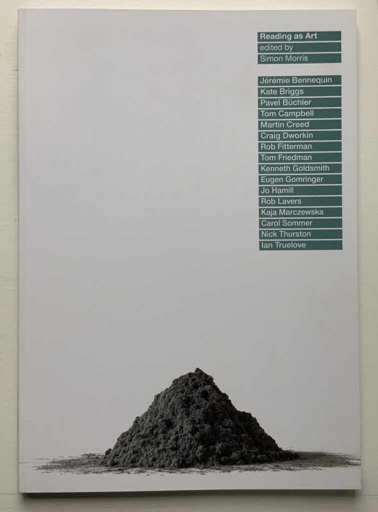
Reading as Art (2016) Simon Morris, ed. Perfect bound paperback. H297 x W210 mm. Acquired from Information as Material, 22 August 2020. Photo: Books On Books Collection. Displayed with permission of the publisher.
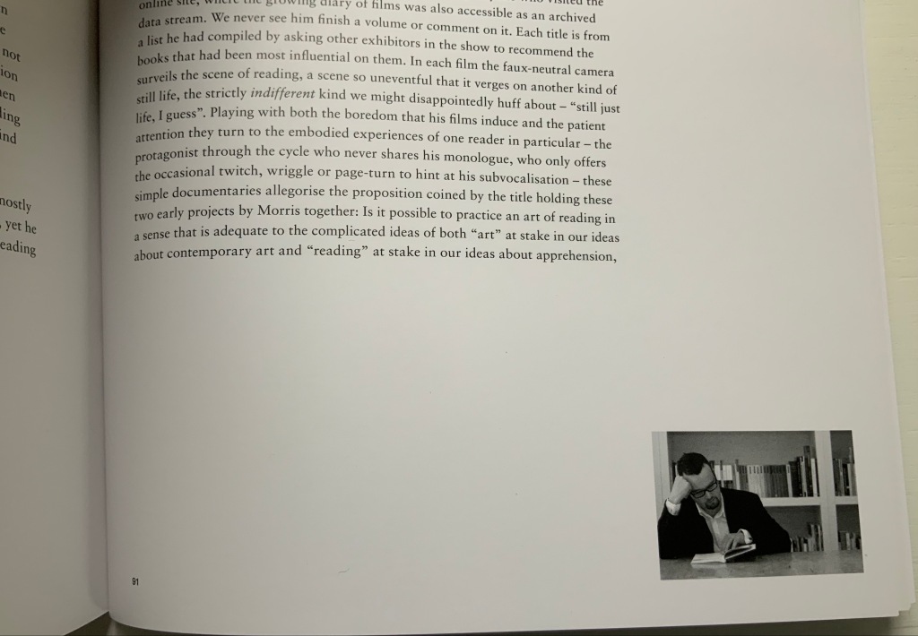
Simon Morris and Books On Books crossed paths at the opening of an exhibition at the Meermanno Museum in The Hague. The exhibition was called “The Art of Reading“, and he gave a talk on his performative work Reading as Art (2004), a compiled-stills film of him reading and turning the pages of a book. (Not at all like watching paint dry or grass grow, if you are unkindly thinking so.) Reading as Art (the volume) provides a taste of Reading as Art (the performance) with black-and-white frames from the film appearing at the bottom right-hand corner of nearly every page: just run your thumb down the fore edge and let the pages flip to see the “action”.
Details from Reading as Art (the book). Photos: Books On Books Collection. Displayed with permission of the publisher.
That feature of this one volume speaks volumes about Simon Morris as an artist. The idea of “reading as art” is not far off “publishing as art”. Morris’s collaborative publishing operation Information as Material has employed nearly every tool in the “Publishing as Artistic Toolbox“, as the 2018 exhibition in Vienna was called: documented performances, polemics, apps, free downloadable PDFs, prints and broadsides, and a journal Inscription, whose first issue is a sculptural bookwork and comes with a vinyl LP record, poster and chapbook.
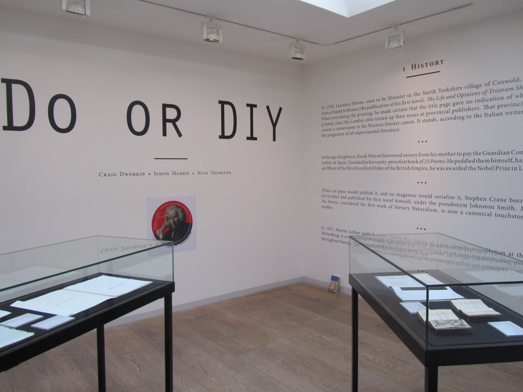
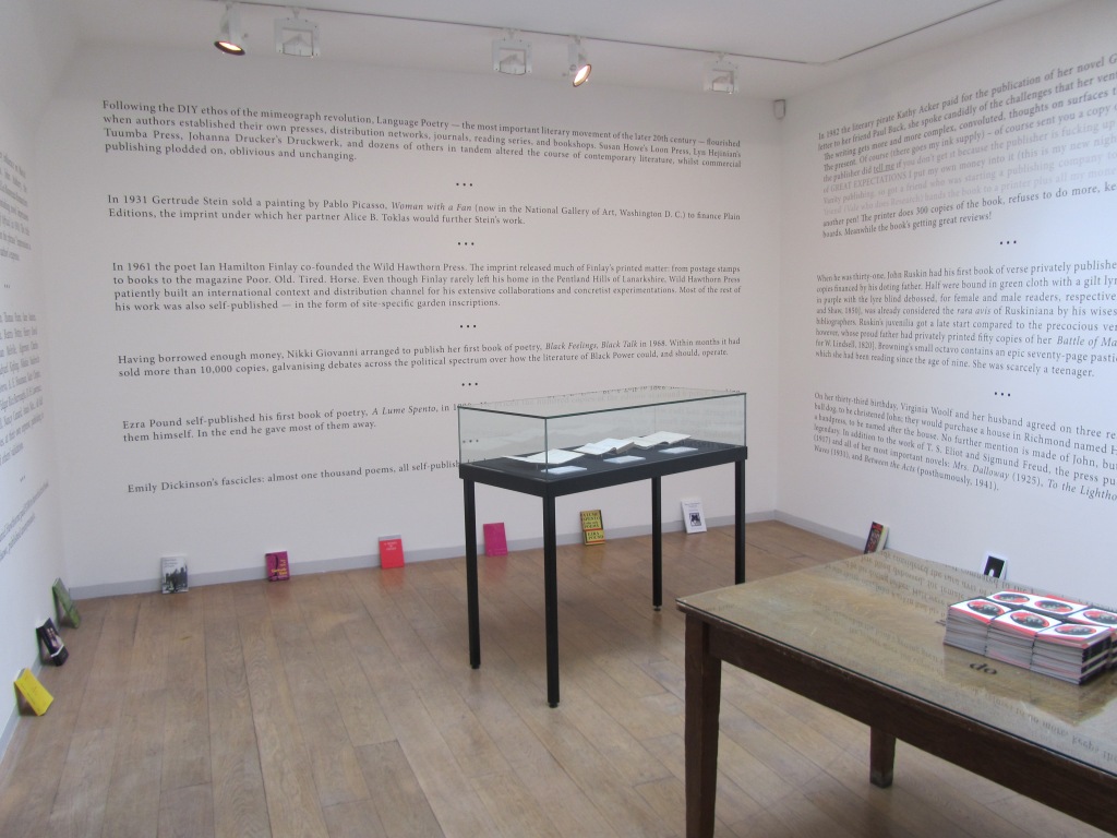
It is strange that this polemic does not mention William Blake among literary history’s do-it-yourselfers. Although their primary message of “don’t wait for a commercial publisher” is for wordsmiths, the authors include the book artist Johanna Drucker among their hortatory examples as well as The Life and Opinions of Tristram Shandy, which can lay a plausible claim to being the first work of modern book art, even before Blake’s “artist’s books”. The authors themselves have even played their parts in book art. So why no nod to the world of book art and its past and current contributions to Do or DIY?
In the 1960s and 70s, book artists’ democratic multiples aimed to sidestep the galleries, museums and art industry. Whether chicken or egg, photocopying and cheap printing brought forth or hatched Siegelaub’s The Xerox Book, Ruscha’s Royal Road Test and many more fair fowl. By century’s end and into the 21st, book artists were still doing it themselves, but the democratic multiple ceded quite a bit of territory to limited editions and unique works. Toward the 20th century’s end, desktop publishing and digital publishing, however, offered up a different, much larger target — the super-concentrated publishing industry — for a much larger cadre of creators — wordsmiths. Perhaps that bit-torrent caught up the authors on this occasion.
Still, the occasion itself — an exhibition that saw the polemic printed on indoor walls and on outside posters — must have appealed to the book art community. Book art makes us read differently, and that clearly happened with this exhibition.
Royal Road to the Unconscious (2004)
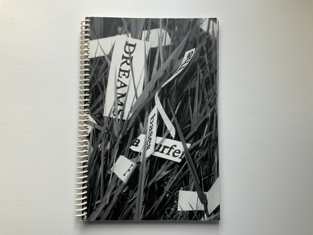
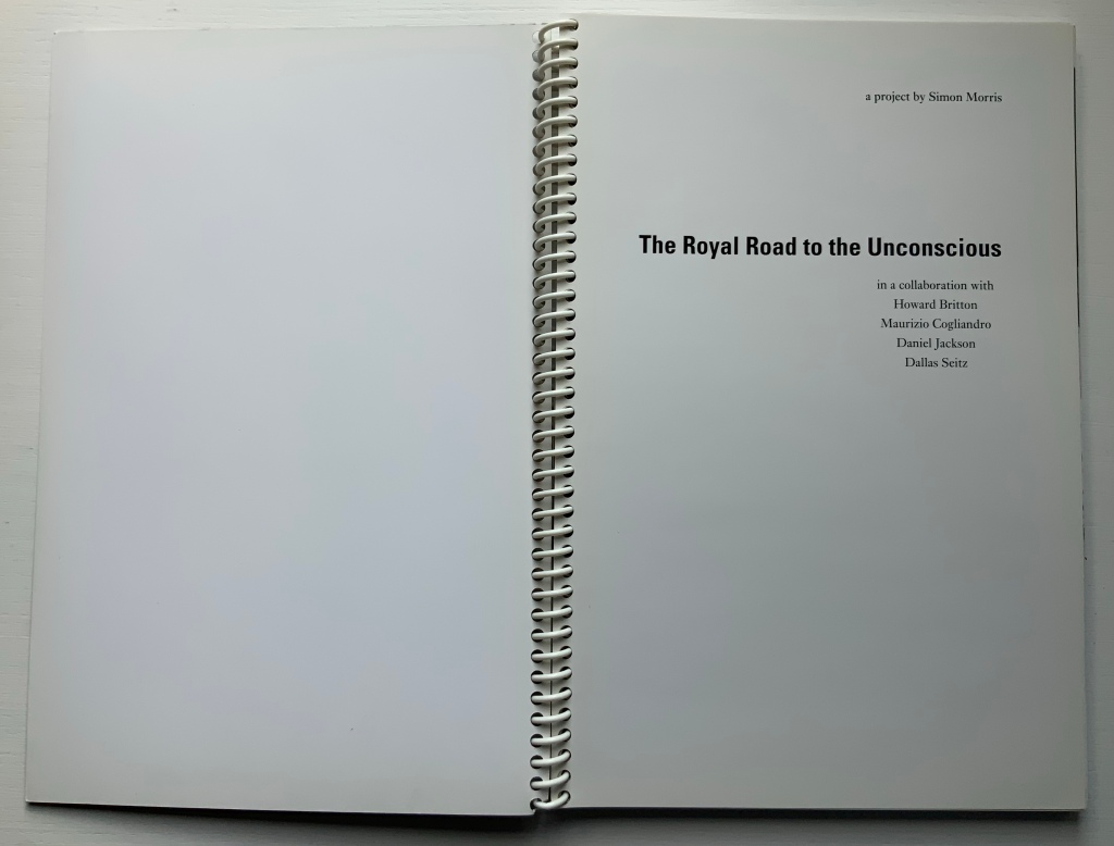
Royal Road to the Unconscious (2004) Simon Morris Spiral bound paperback. H240 x W160 mm, 80 pages. Acquired from Johan Deumens, 10 October 2020. Photos: Books On Books.
This is the book of the movie. Or the book of the movie “made by the book” of the movie. Or…. Better let the artist explain:
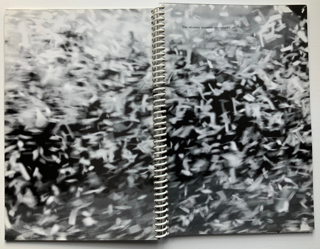
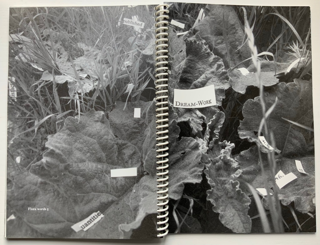
Utilising Ed Ruscha’s book Royal Road Test as a readymade set of instructions, seventy-eight students cut out every single word from Sigmund Freud’s Interpretation of Dreams. On Sunday, June 1st, 2003, the artist, Simon Morris (thrower) threw the words out of the window of a Renault Clio Sport on Redbridge Road, Crossways, Dorset, travelling at a speed of 90mph, approximately 122 miles southwest of Freud’s psychoanalytical couch in London. The action freed the words from the structural unity of Freud’s text as it subjected them to an ‘aleatory moment’ – a seemingly random act of utter madness.
Daniel Jackson (filmmaker), Maurizio Cogliandro (photographer) and Dallas Seitz (photographer) documented the action as 222,704 words erupted from the window of the car. They also recorded the stream of words strewn along the side of the road. Dr. Howard Britton, a psychoanalyst (driver), directed them to any slippages or eruptions of the Real that occurred in the reconfigured text. The poetic act of liberating Freud’s text allows us to engage with what Jacques Lacan called the register of the Real. The concept of the Real is far removed from anything that we conventionally attribute to reality. It is the experience of a world without language. If language names, it is all that escapes the name – an encounter beyond images and words.
Conceptual art can do one’s head in. So, in the meantime, enjoy the aleatory moment.
Mitchell, Beverly. “Q & A with conceptual writer and professor, Simon Morris“, Blog of the Hamon Arts Library, 22 February 2019. Accessed 2 December 2020. Good coverage of The Royal Road to the Unconscious as well as the exhibition “Reading as Art”.
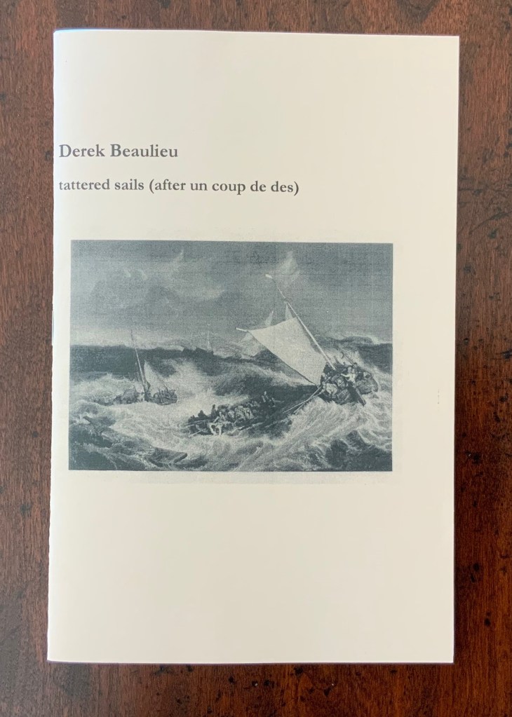
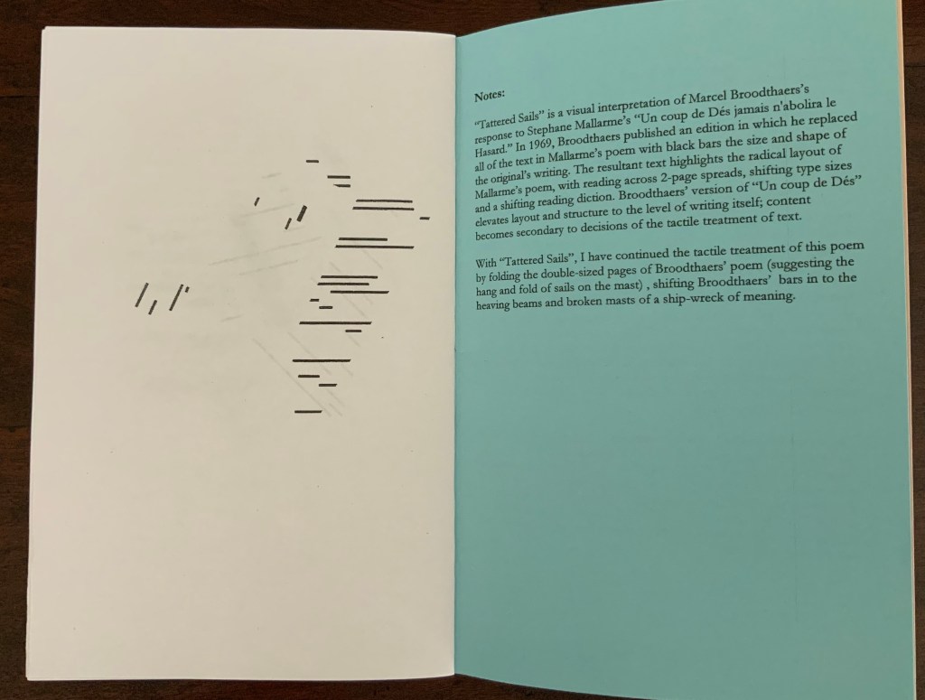
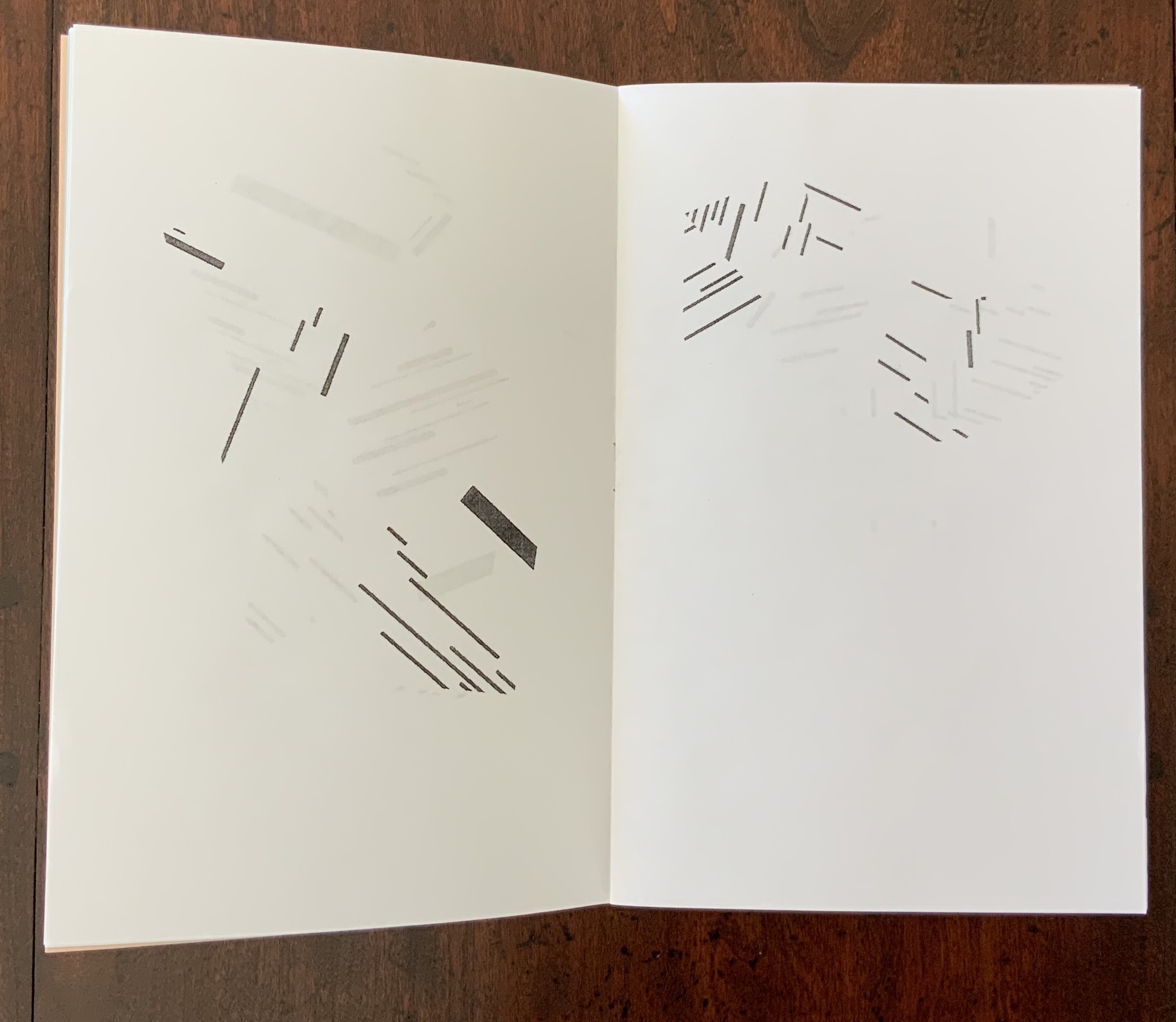
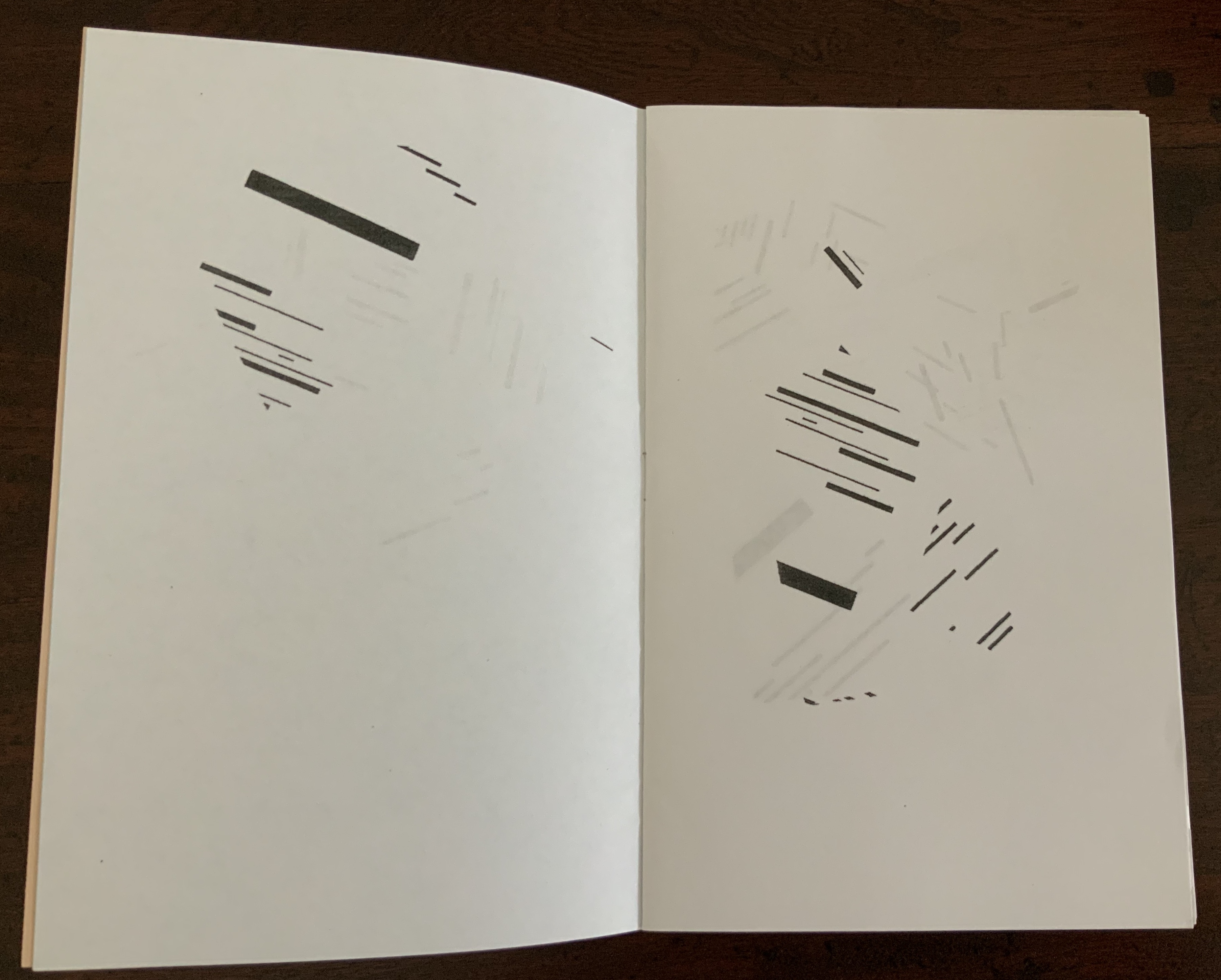
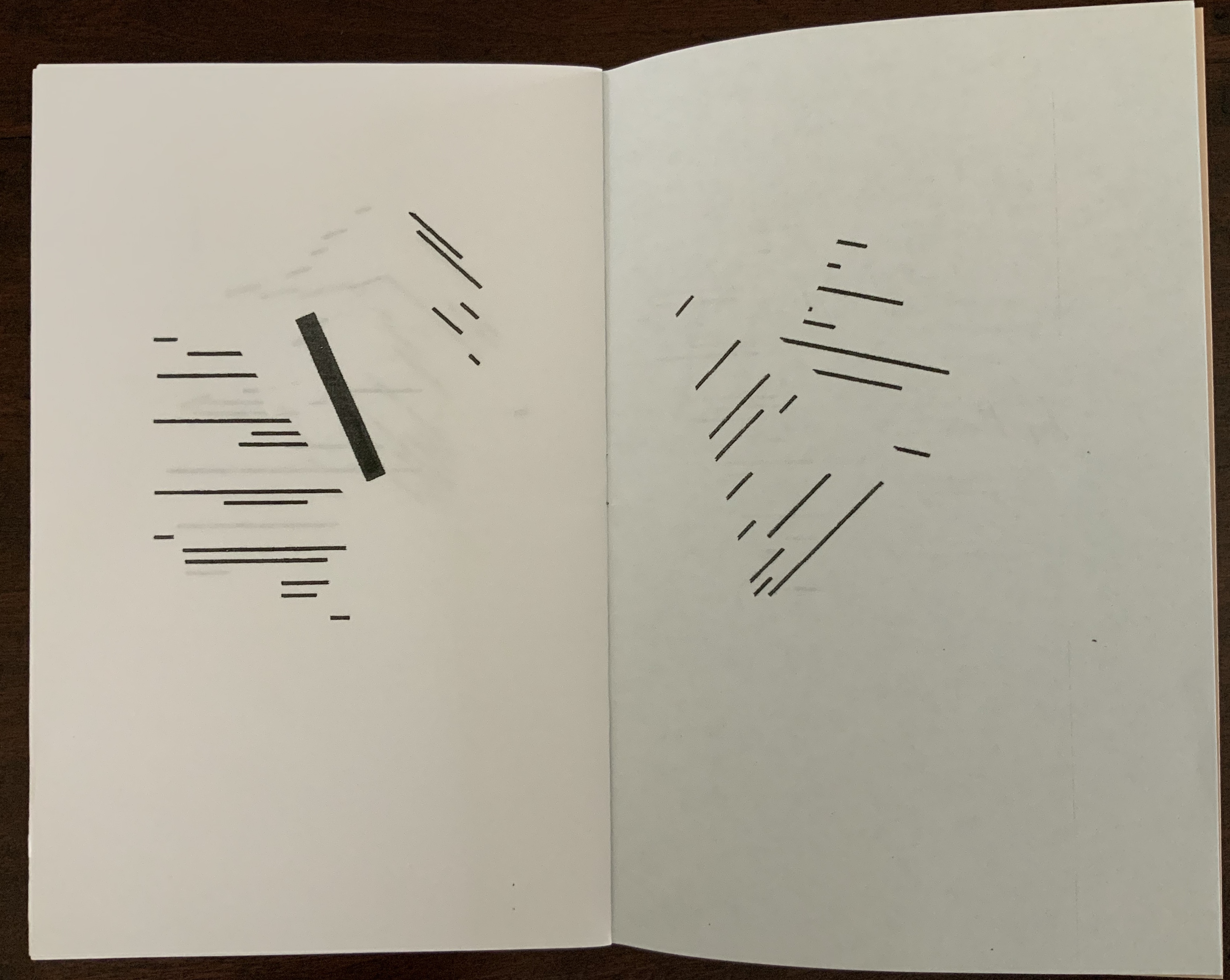
Tattered Sails(2018) Derek Beaulieu Saddle-stitched, one staple, colored endpapers; 12 unnumbered pages. H217 x W140 mm. Acquired from Above/Ground Press, 12 March 2019. Photos: Books On Books Collection.
Few book artists inspired by Broodthaers’ homage to Mallarmé have seized on aligning a key textual and visual metaphor of the poem with a distortion of Broodthaers’ treatment. That is what Beaulieu has done with Mallarmé’s metaphor of the shipwreck, his typographic replication of it and Broodthaer’s black bars. Tattered Sails also recalls Broodthaers’ A voyage on the North Sea (1973).
Photos: upper, Books On Books Collection; lower, Artists’ Books. Accessed 18 June 2020.
In one sense, Tattered Sails seems to underline the notion that image has supplanted text (W.J.T. Mitchell), which is a little less extreme than image’s having saturated all cultural space (Frederic Jameson) or than art’s just being now a “leeching of the aesthetic out into the social field in general” (Rosalind Krauss). But in another sense, by harking back to the low-tech era of democratic multiples and, nevertheless, enriching the interplay of text and image that spans four different artworks (counting the image on the cover) across the 19th, 20th and 21st centuries, Beaulieu pushes back on those 20th century critical notions.
Away from the critical theories’ abyss, Tattered Sails refreshes perception — of the work in itself and those on whose metaphors and techniques it stands. Turning our eyes into hands, it is part of a book art genre –“a genre of Un Coup de Dés“– in which works not only recall the original’s words, their shapes on the pages, the shipwreck tangling and untangling of syntax, the images and meanings bouncing into view like numbers on the side of rolling dice but also recall the rolls of the dice by others before.