The Fall(1976) Michelle Stuart Saddlestitched with staples in landscape format, glossy paper. H x W mm. 28 pages. Acquired from Specific Object, 15 March 2024. Photos of the work: Books On Books Collection.
The Fall is one of the earliest publications of Printed Matter, founded in 1976 by a group of individuals working in the arts (among them artist Sol LeWitt and critic Lucy Lippard).
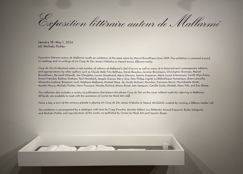
Why should an obscure poem like Stéphane Mallarmé’s groundbreaking Un Coup de Dés Jamais N’Abolira le Hasard: Poème (1897) have become the cornerstone of an art-industrial complex of literary, critical and artistic responses ranging from essays, books, edited collections, countless editions, and appropriations in the form of fine press livres d’artiste, book art and sculptures, films and theater, ballets and fado, musical compositions, digital programs and installations, and even pavement art?
Handscapes (2016) Margaret (Molly) Coy & Claire Bolton Casebound, hand sewn and bound with doublures and two ribbon bookmarks. H260 x W310 x D30. 80 folios. Edition of 12, of which this is #9. Acquired from the artists, 19 October 2023. Photos: Books On Books Collection. Displayed with artists’ permission.
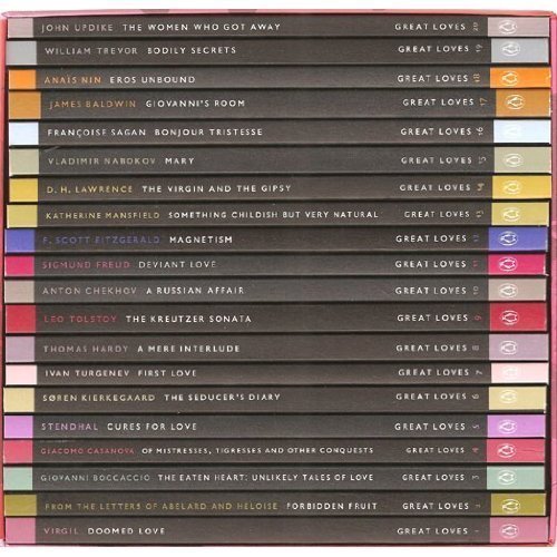
Penguin’s 2007 series “Great Loves” is a twenty-book set of short paperbacks with selections from the usual suspects (D. H. Lawrence) and the unusual (Søren Kierkegaard). The selection of eleven tales from Giovanni Boccaccio’s Decameron provides Carolyn Thompson with the opportunity to create a work of altered book art enjoyable on several levels.
The unaltered cover promises one thing. Its “under-the-cover” title page delivers another.
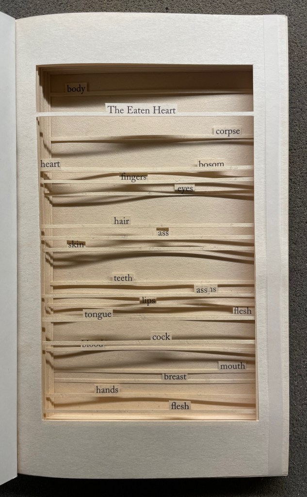
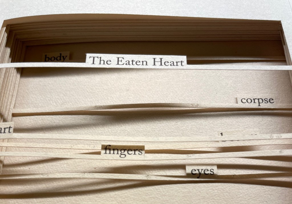
The Eaten Heart (2013)
The Eaten Heart(2013) Carolyn Thompson Altered perfect bound paperback. H180 x W111 mm. 124 pages. Edition of 3, of which this is #2. Acquired from Eagle Gallery, 7 October 2023. Photos: Books On Books Collection. Displayed with artist’s permission.
Thompson’s chosen technique of removing text with a scalpel enacts one of the paradoxical meanings of the revealed tell-tale title it presents: the scalpel has eaten away all the text on this title page except for the text chosen as the title. Boccaccio’s text is there but not there, and the “under-the-cover ” title nods toward his missing content. Leaving only words referring to the body, Thompson’s work of book art celebrates the raunchy “under the covers” innuendo in Boccaccio’s text.
The transparent tape that holds the body of cut pages together (just detectable in the image of the title page above) can be removed and the pages turned (carefully!). Below is page 11 “in motion”.
The sequence of pages 116 to 119 below shows that, while the verso pages do not play a role in the work, the movement of words on the recto side away from those that follow them, revealing the blank sheet at the end, invites musing about their possible relationship as well as marvelling at the artist’s delicate patience applied to the indelicate.
Later on, using the 50 books in the Penguin Modern Box Set (2018), Thompson created text pieces, drawings, embroideries, prints and additional altered books in the spirit of The Eaten Heart. The Laurence Sterne Trust exhibited the full set of works at Shandy Hall, York, in 2019. Eagle Gallery hosted them again in London in February 2020, and the same year, After Capote: When Truman met Marlon, her altered version of Truman Capote’s The Duke and His Domain in the series, won the Minnesota Center for Book Arts Prize People’s Book Art Award.
The more wide-ranging but more consolidating work that follows demonstrates Thompson’s indefatigable originality and insatiableness as a re-purposing artist.
The Beast in Me (2021)
The Beast in Me (2021) Carolyn Thompson Print. 130 x 130 cm. Acquired from Information as Material, October 2021. Photos: Books On Books Collection. Displayed with artist’s permission.
Although The Beast in Me has a previous iteration from 2014, this one commissioned for the second issue of Inscription: The Journal of Material Text (the “holes issue”) expands to over 500 snippets of text beginning with ‘I’ from eight different novels. Its manner of doing so makes The Beast in Me simultaneously centrifugal and centripetal in its effect — perhaps more emblematic of Inscription‘s coverage in its “holes issue” than the impressive work chosen for the covers.
Here is Thompson’s description of the commissioned work:
The statements (over five hundred of them) are presented one after another in a circular narrative with no natural beginning or ending and can therefore be read from any point. When removed from their original context, they become ham-fisted stabs at self-revelation and blurted snapshots of confession. They contradict one another, and the narrator. The piece explores the power struggle within all of us, where different aspects of our personalities vie for dominance over one another at any given moment, while others yearn for internal balance. The narrative, whilst light and frivolous in places, descends into a sinister and uncontrollable rant in others.
If we accept the print’s invitation as we would a book’s invitation to read — to engage in narrative — we find that human identity’s ever precarious balance — between inward and outward forces, its introverted and extroverted elements, the being apart and the being a part of, and integration vs disintegration — is captured sharply. A blank center, a void or hole — there but not there — defined by fragments simultaneously flying outward and pressing inward.
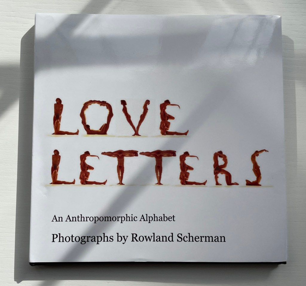
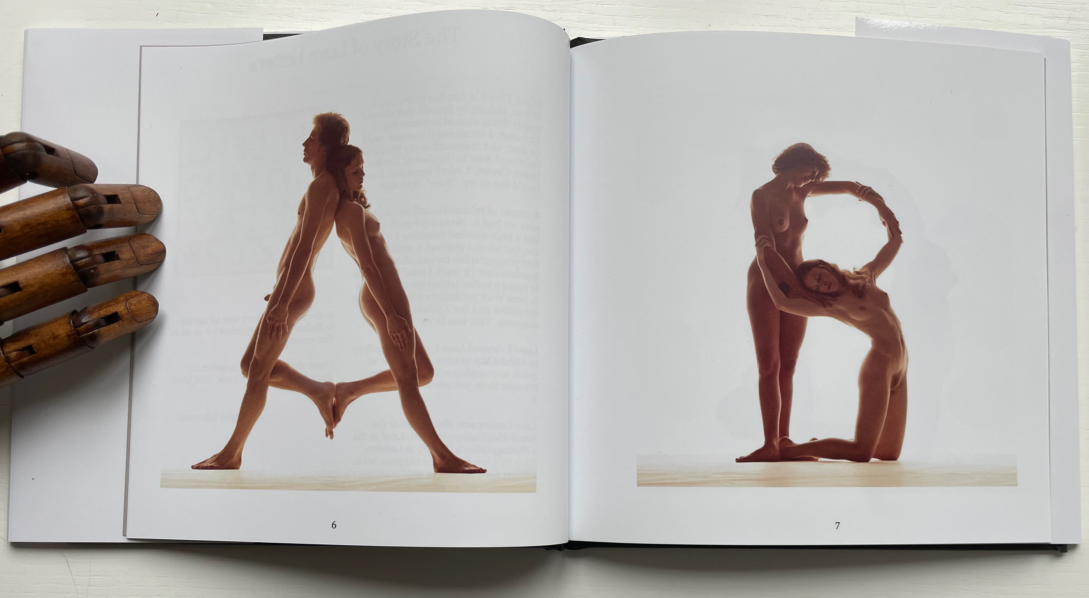
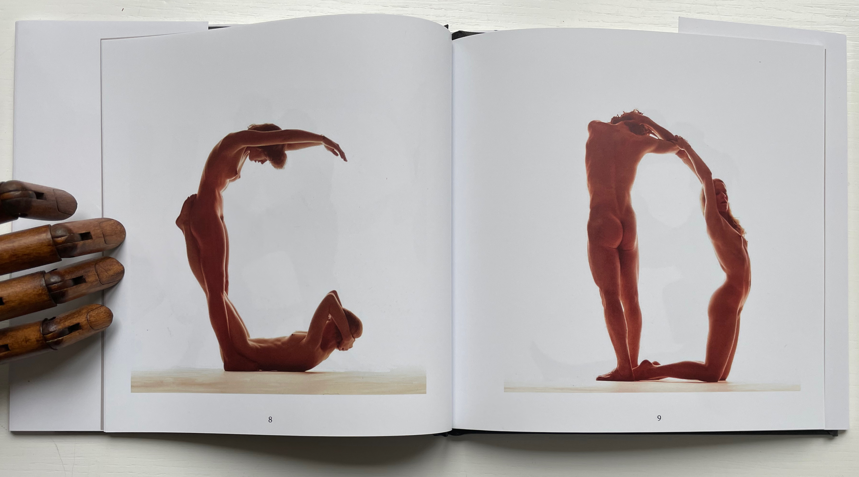
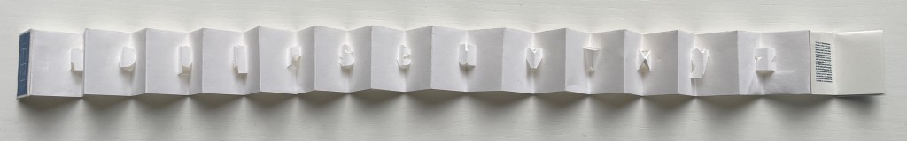
Love Letters: An Anthropomorphic Alphabet (2008) Rowland Scherman Casebound, doublures, perfect bound. H178 x W180 mm. 34 pages. Acquired from Rowland Scherman, 3 March 2023. Photos of the book: Books On Books Collection. Displayed with permission of Rowland Scherman.
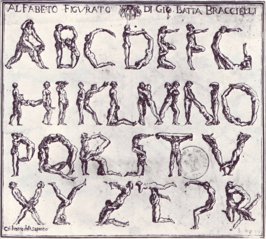
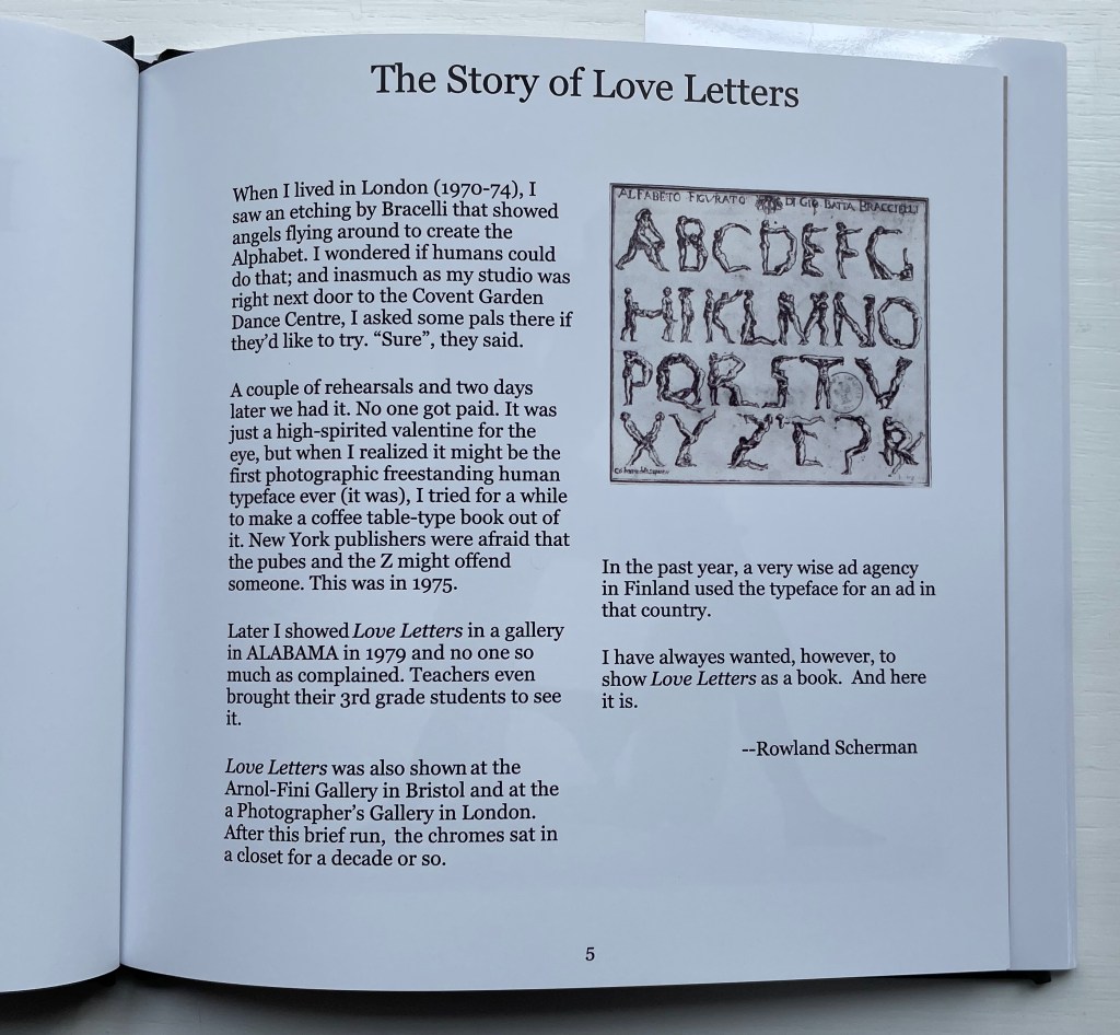
Giovanni Battista Bracelli’s “Alfabeto Figurato”, a single-sheet etching, occurred well after Carravagio’s presence there earlier in the century but well within the sphere of his ongoing influence. The print’s contortions of human bodies to display that most human of inventions — the alphabet — would probably have pulled a sneer of admiration from him. Maybe Bracelli had heard of the 5th-century comic playwright Kallias, who had his chorus dance (no doubt “cheek to cheek”) the shapes of the Ionian contenders for letterforms. In 1969, Anthon Beeke and Ed van der Elsken had their naked models arrange themselves into the alphabet on the studio floor and took photos from above. When Rowland Scherman saw Bracelli’s print on a London bus 340 years later, he wondered if human bodies could actually hold those poses or ones like them.
In the third decade of the 21st century, when book bannings and body shaming have reached new heights (or depths), Scherman’s “Story of Love Letters” might leave the reader wondering if we are now running headlong past Kallias and the 5th century into the pre-alphabetic world.
Dukes, Hunter. 27 April 2023. “Punctuation Personified (1824)“. The Public Domain Review. Not only could letters be formed with the human body, so could quotation marks and square brackets.
Erwin Huebner is a professor at the University of Manitoba engaged in research and teaching cell and developmental biology. He is also a book artist and miniaturist. Following his work, the Books On Books Collection has started small and hopes to grow into his larger works. At both ends of the spectrum, Huebner’s themes resonate with the integration of art and science, a recurrent focus of the collection (see Further Reading below).
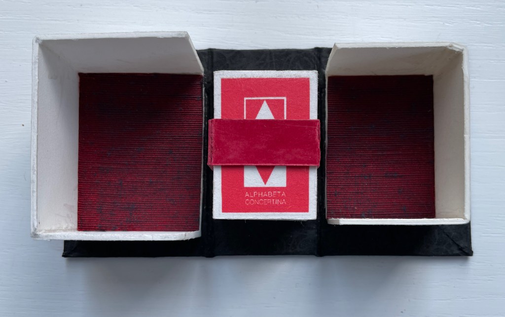
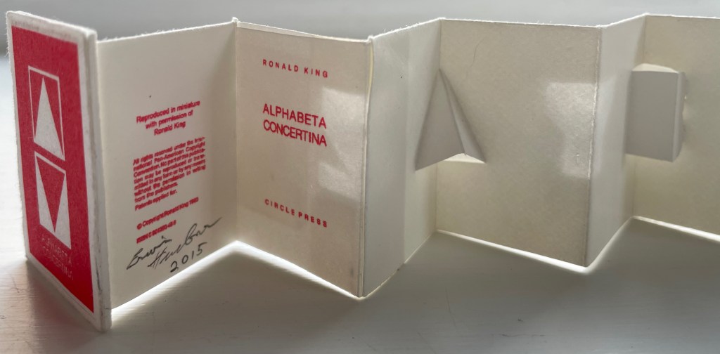
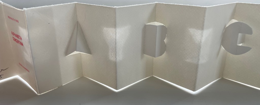
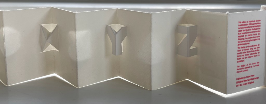
Alphabeta Concertina Majuscule (2015)
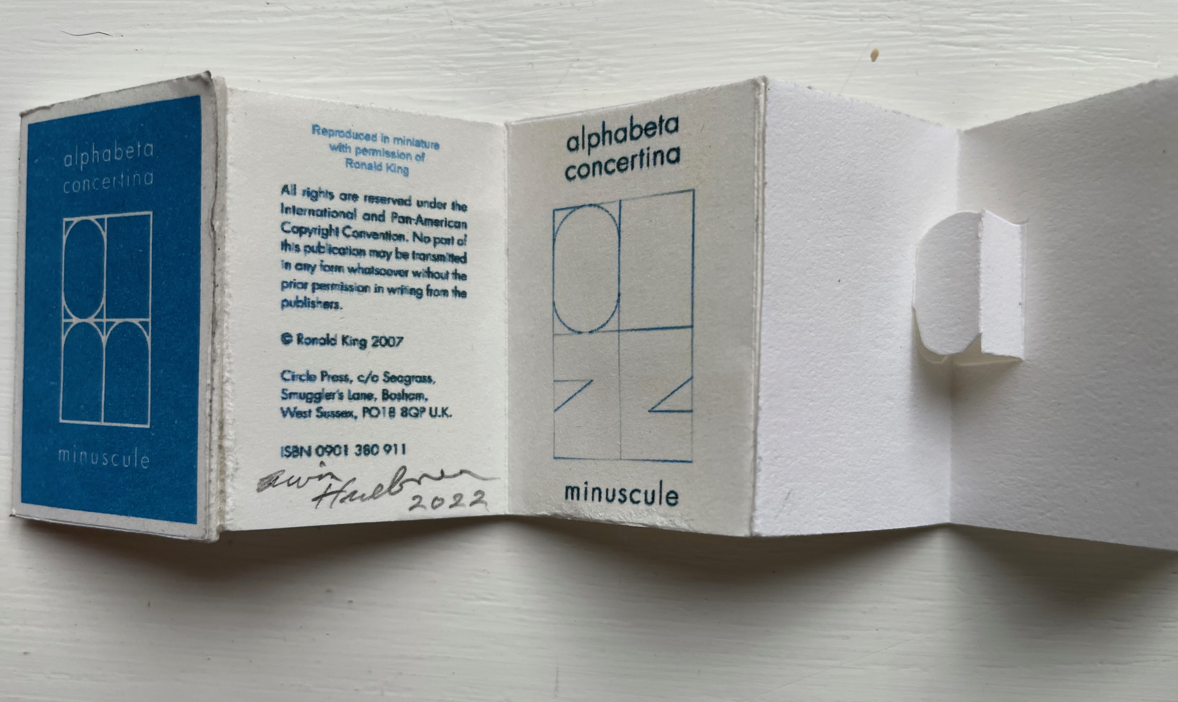
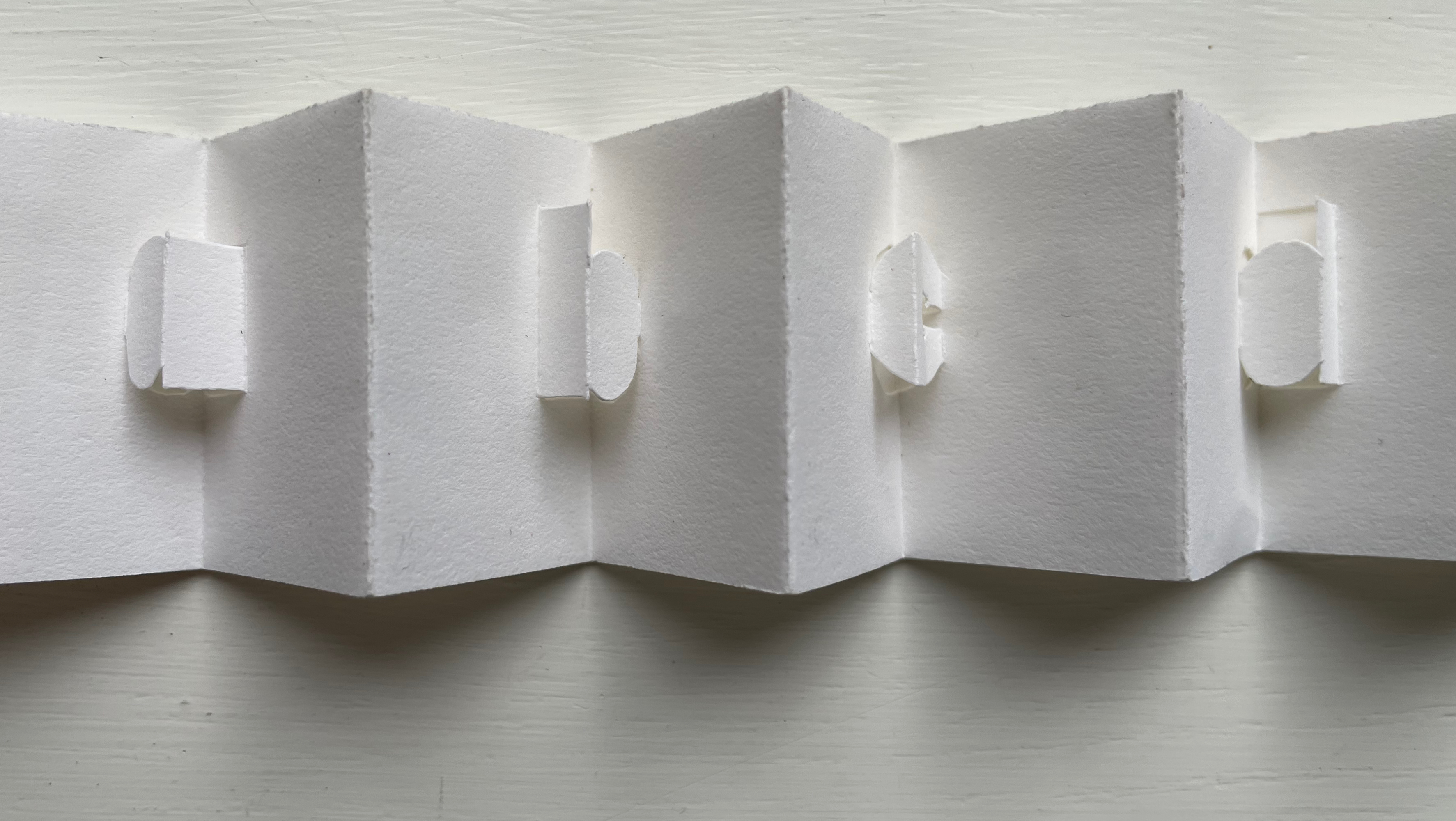
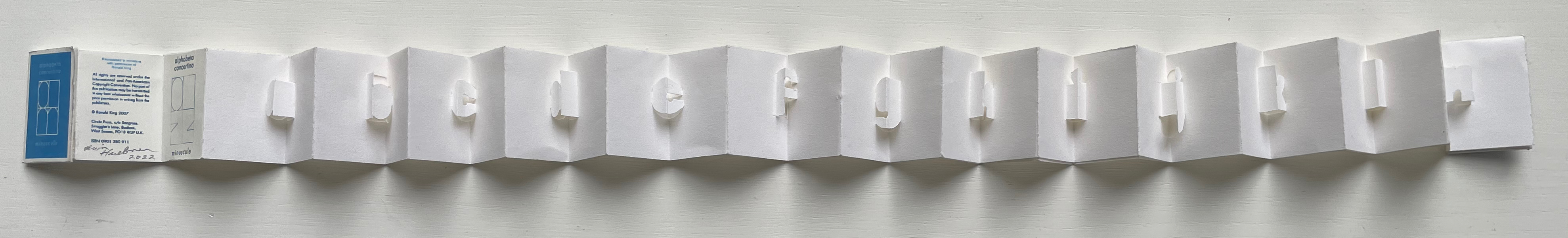
Alphabeta Concertina (2015) Erwin Huebner (with permission of Ron King) Miniature double-sided leporello. H 1.5 x W 1.0 x D 0.75 in. Edition of 4. Acquired from Erwin Huebner, 20 January 2023. Photos: Books On Books Collection.
The geometry and invention of Ron King’s work must have appealed to a kindred spirit in Erwin Huebner. The classificatory nature of the alphabet must also have spoken to Huebner’s inner Linnaeus. As 2023 is the 270th anniversary of Linnaeus’ Species Plantarum, which introduced his classification system, it is an auspicious moment for Huebner’s miniature versions of King’s alphabet concertinas to join the Books On Books Collection and be included works in the Bodleian exhibition “Alphabets Alive!” (19 July 2023 to 24 January 2024, Weston Library, Oxford).
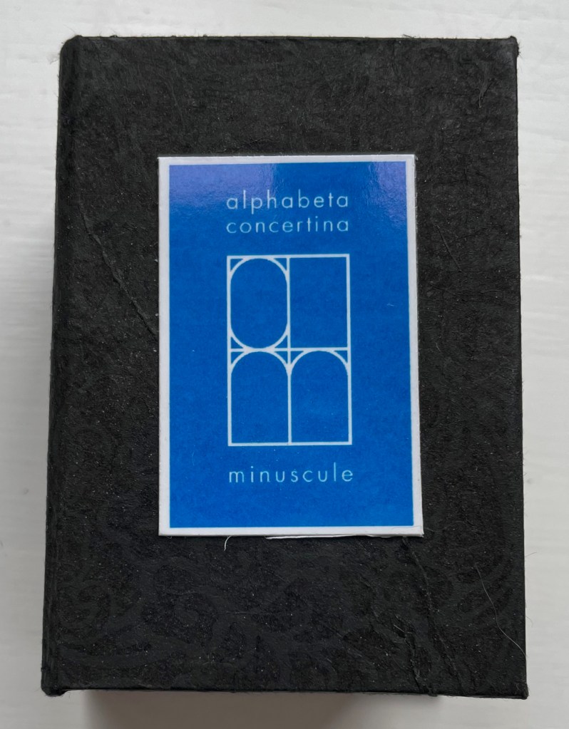
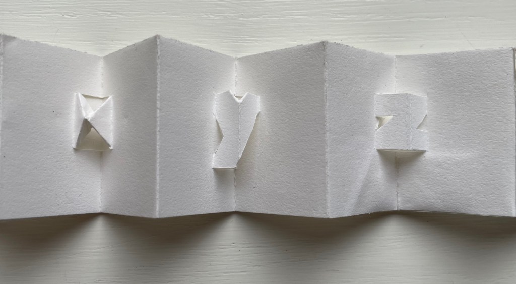
alphabet concertina miniscule (2022)
alphabet concertina miniscule (2022) Erwin Huebner (with permission of Ron King) Miniature double-sided leporello. H 1.5 x W 1.0 x D 0.75 in. Acquired from Erwin Huebner, 20 January 2023. Photos: Books On Books Collection.
Both the majuscule and miniscule concertinas are double-sided with half the alphabet on one side and half on the other just as King designed from the first with The White Alphabet and the majuscule concertina in 1984 and subsequently 2007 with the miniscule.
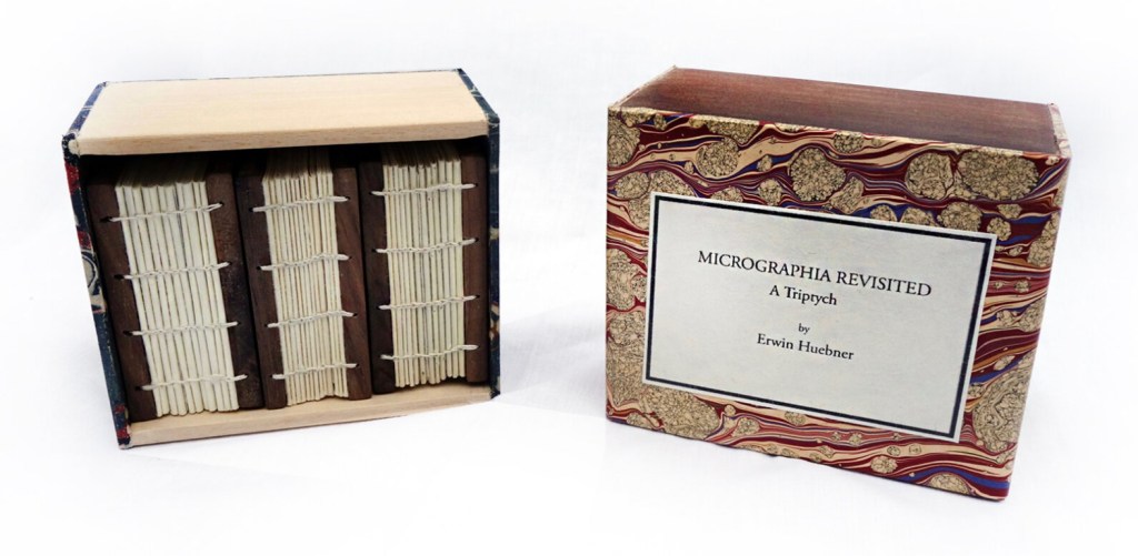
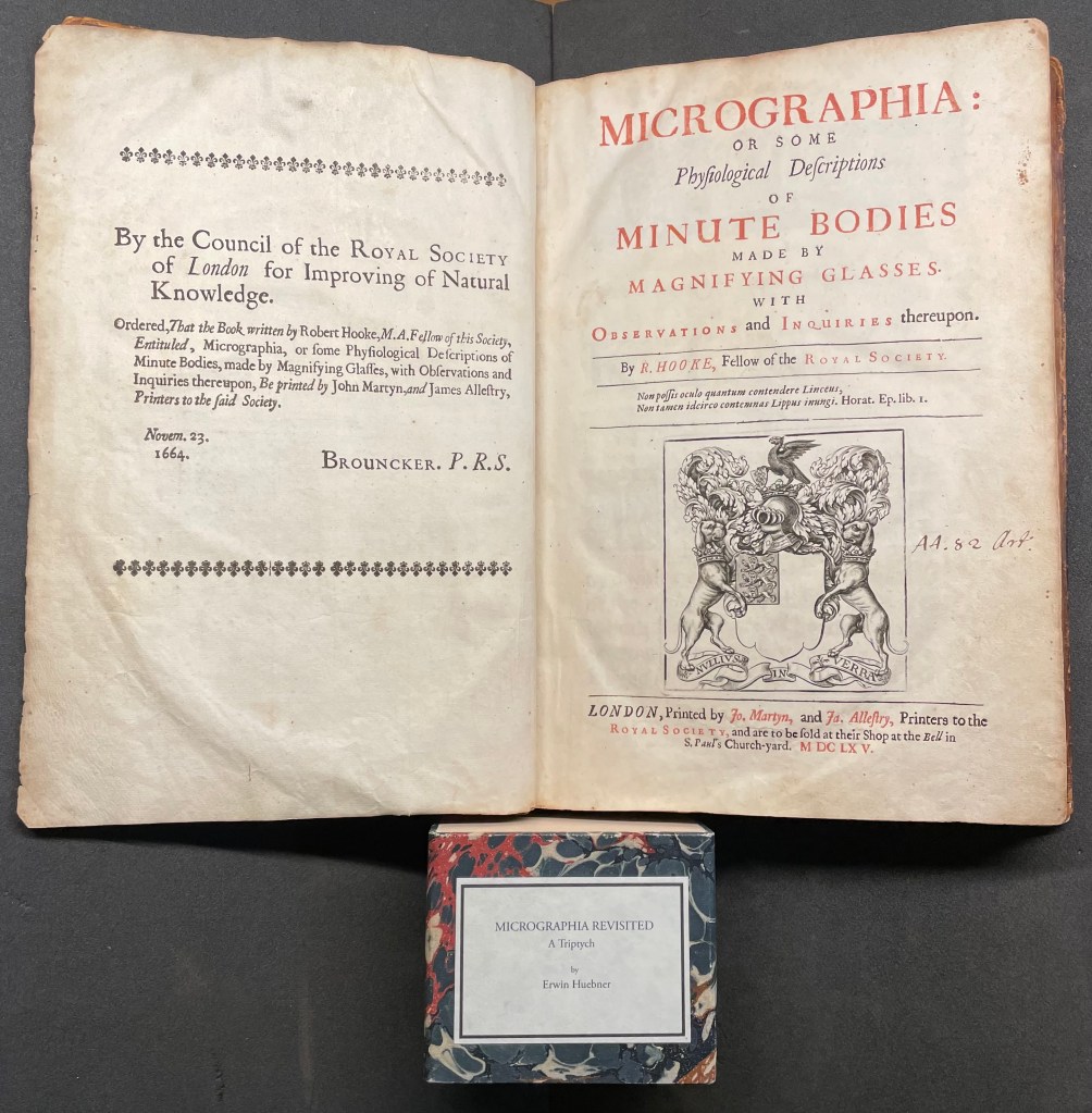
Micrographia Revisited (2017)
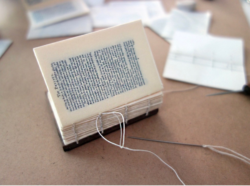
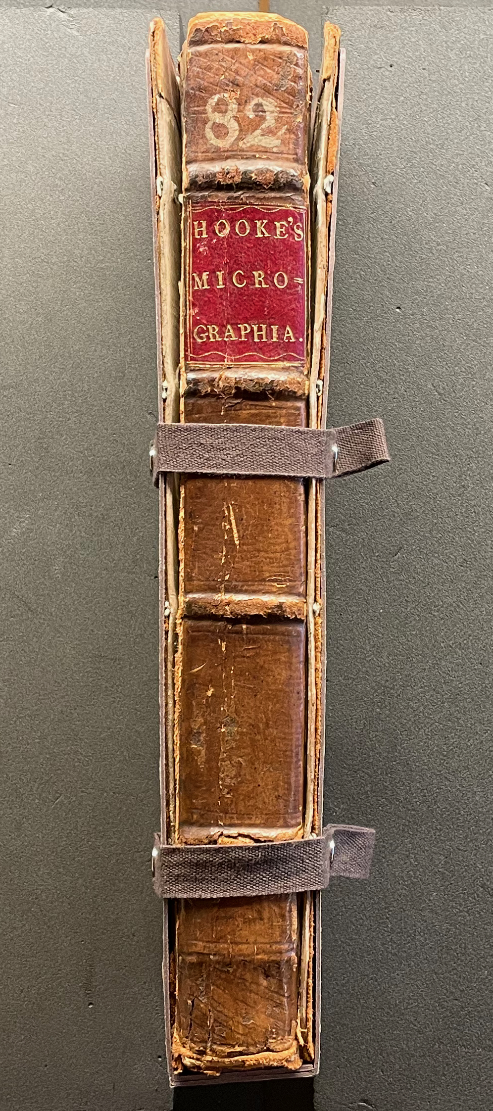
Micrographia Revisited: A Triptych (2017) Erwin Huebner Box with 3 Coptic-bound volumes, each H 2.625 x W 1.875 x variable depth. Edition of 3. Acquired from Erwin Huebner, 20 January 2023. Photos: Courtesy of the artist.
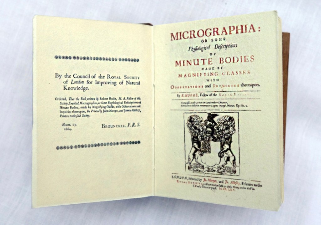
Despite Francesco Stelluti’s Melissographia (1625), Robert Hooke’s Micrographia: Or Some Physiological Descriptions of Minute Bodies Made by Magnifying Glasses with Observations and Inquiries Thereupon (1665) was long thought to be the first publication with illustrations drawn from observation with a microscope. Given Huebner’s scientific and artistic careers, it would seem impossible for him to resist paying homage to this work. Indeed, in his larger artist’s books, he has incorporated entire microscopes, but here, he exploits the technological advances of photography and electron microscopy and joins them with the craft of bookbinding to produce just as wondrous a work. Using Scanning Electron Microscopy (SEM), Huebner has created images of the same or similar objects to those Robert Hooke observed in the 1600’s. One of the volumes in the triptych presents these photographic results, and the other two present a reprint of Micrographia.
The coptic binding to black walnut covers, the wooden case covered in marbled paper and the subtitle create a suitable medieval/Renaissance air for this homage.
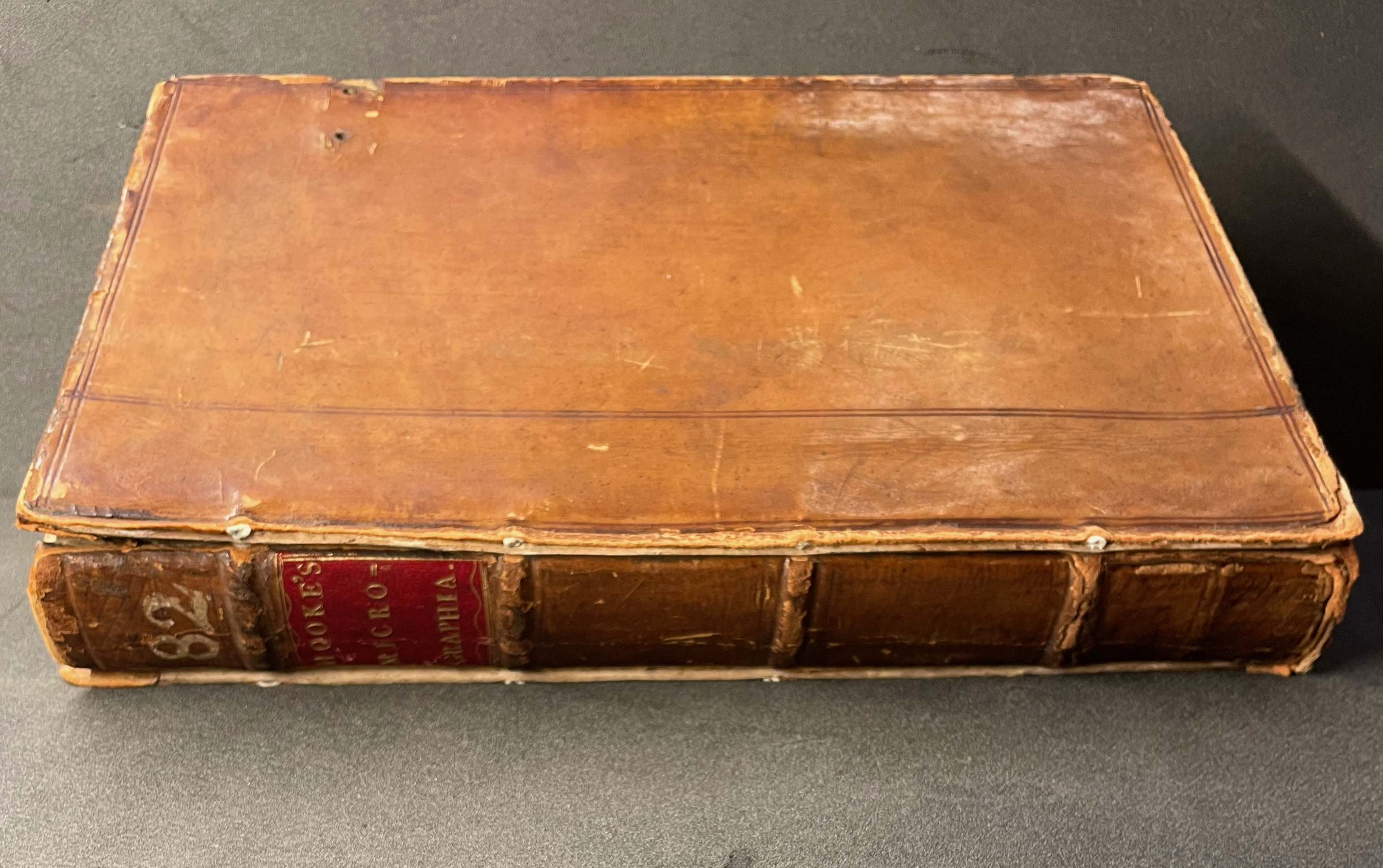
Living in a village near Oxford and having access to the Bodleian Libraries, I took Micrographia Revisited on a pilgrimage to compare it with a copy of the original not far from Hooke’s alma mater Wadham College.
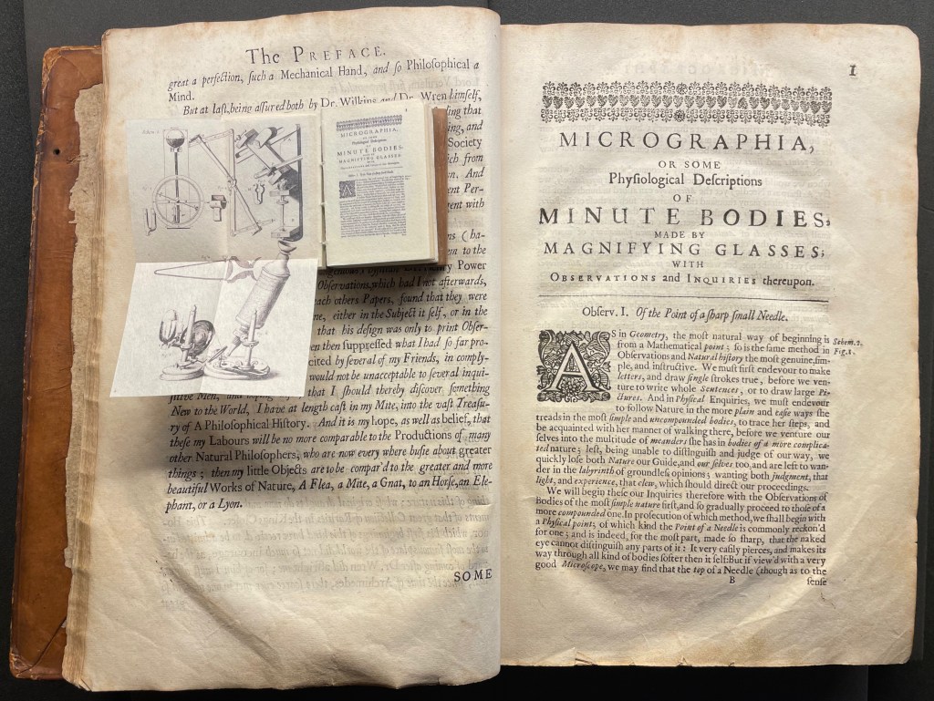
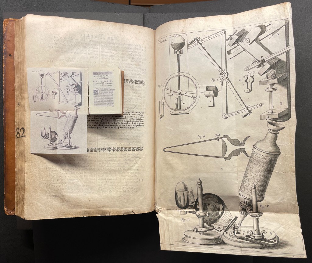
Among the many outstanding features of Huebner’s homage is his use and placement of fold-outs to capture the larger plates in Hooke’s original, all of which were placed in an appendix and some of which were also printed as fold-outs. In the juxtapositions below, note how Huebner has placed Hooke’s illustration of his equipment at the end of the Preface.
Sitting atop the double-page spread showing the end of the Preface and page 1 of Hooke’s original is Micrographia Revisited, open to Huebner’s fold-out of Hooke’s illustration of his equipment. Hooke’s same fold-out illustration from the appendix is juxtaposed below with Huebner’s.
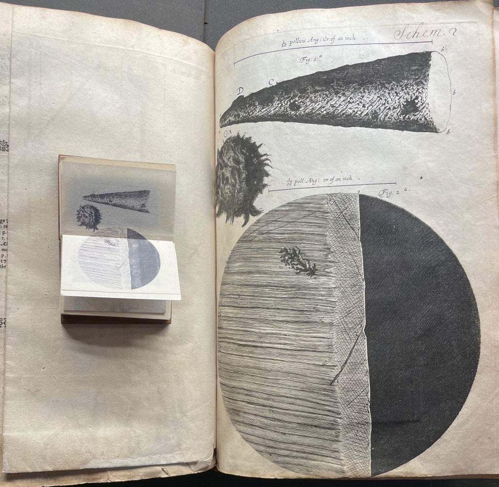
Hooke’s first two objects under the microscope Hooke are the point of a needle (described on pages 1-3) and the edge of a razor (described on pages 4-5). Huebner transforms Hooke’s single-page plate illustrating what he describes into a double-page spread between pages 2 and 3 of Micrographia Revisited.
Juxtaposing Huebner’s double-page presentation of Hooke’s drawings of a needle point and edge a razor with Hooke’s single-page presentation.
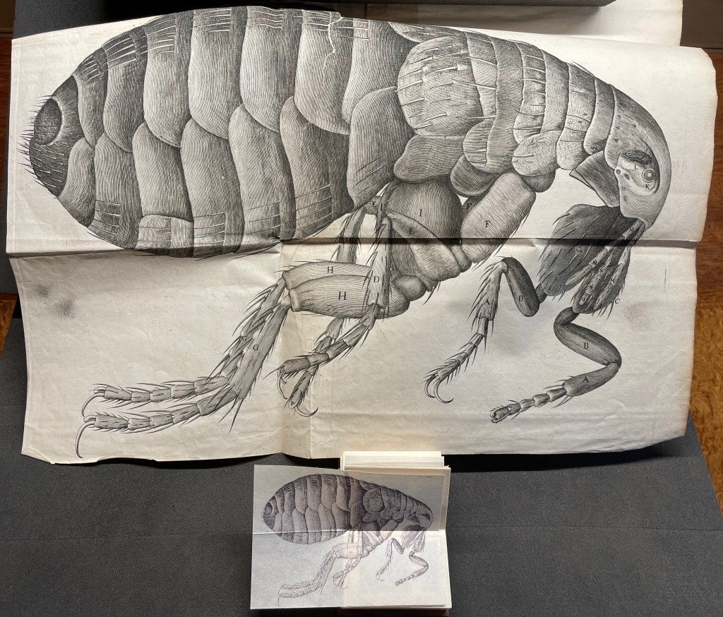
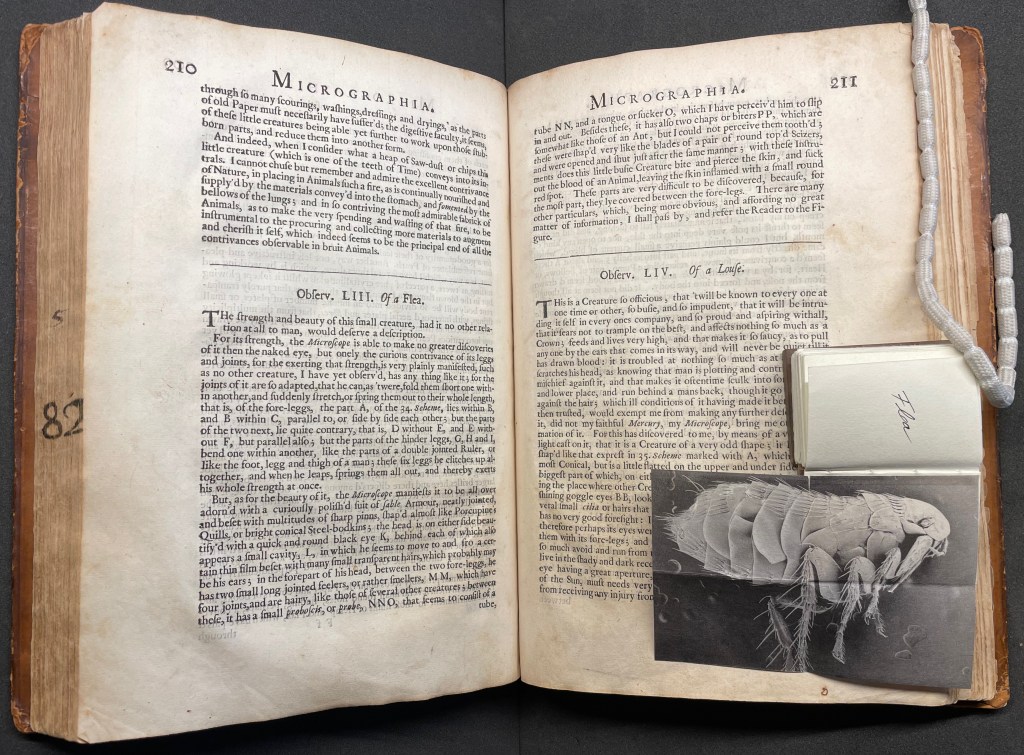
Hooke’s large fold-out of his flea may display the most impressive drawing in the book. The description appears on page 210, and the fold-out is in the appendix. Huebner’s double-fold fold-out of the illustration falls between pages 210 and 211.
The flea from Micrographia juxtaposed with that from Micrographia Revisited.
But most impressive of all is Huebner’s SEM image of a flea and its testament to Hooke’s powers of observation and skills as a draughtsman.
In the spirit of “standing on the shouders of giants”.
A Typographic Abecedarium(2015) Ornan Rotem Perfect bound in a softcover case. H174 x W176 mm. 136 pages 1 poster (64 x 48 cm, folded to 16 x 16 cm). Acquired from Devils in the Detail Ltd, 14 March 2023. Photos of the book: Books On Books Collection. Displayed with permission of the artist.
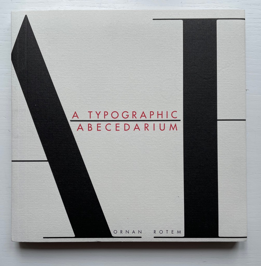
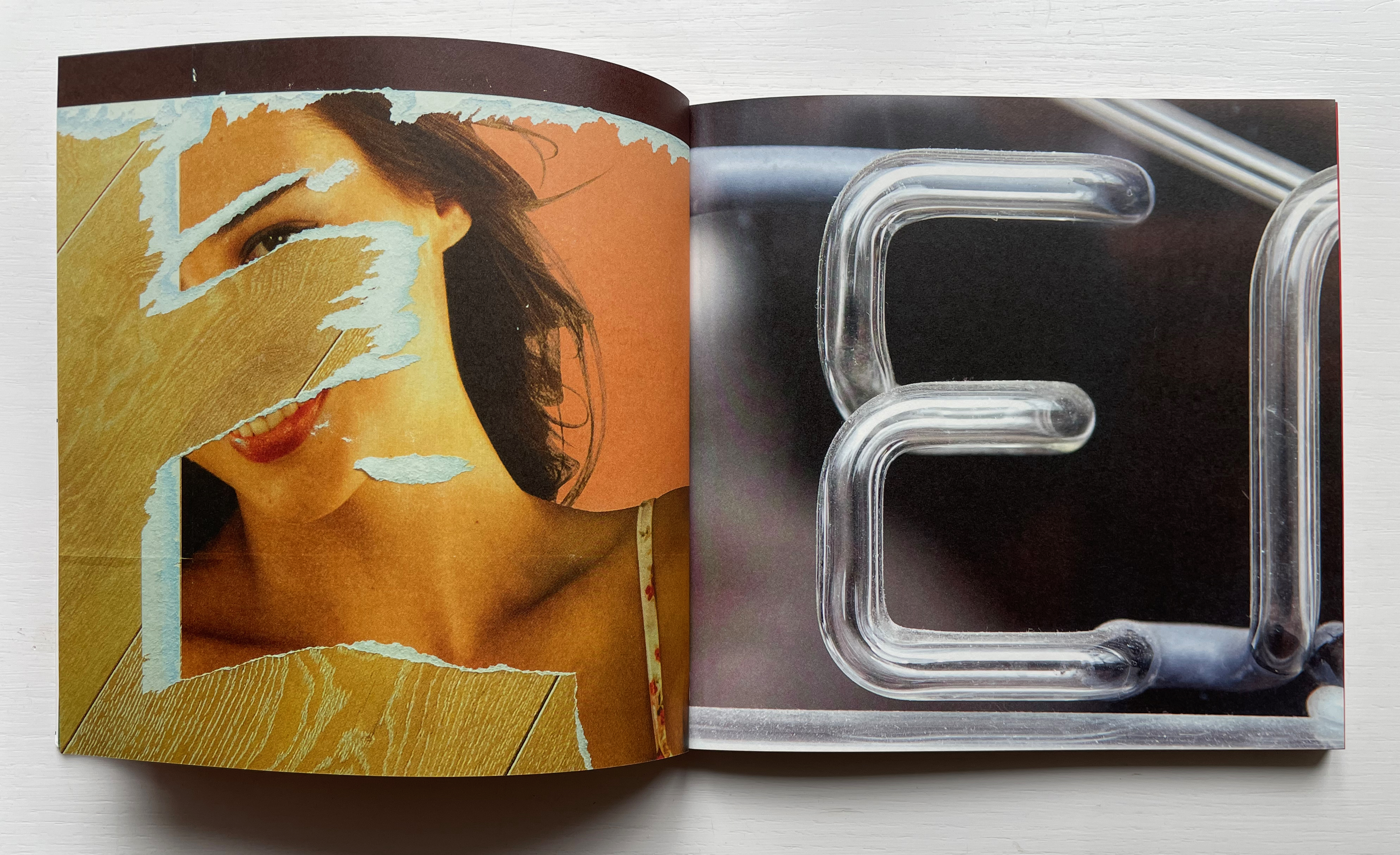
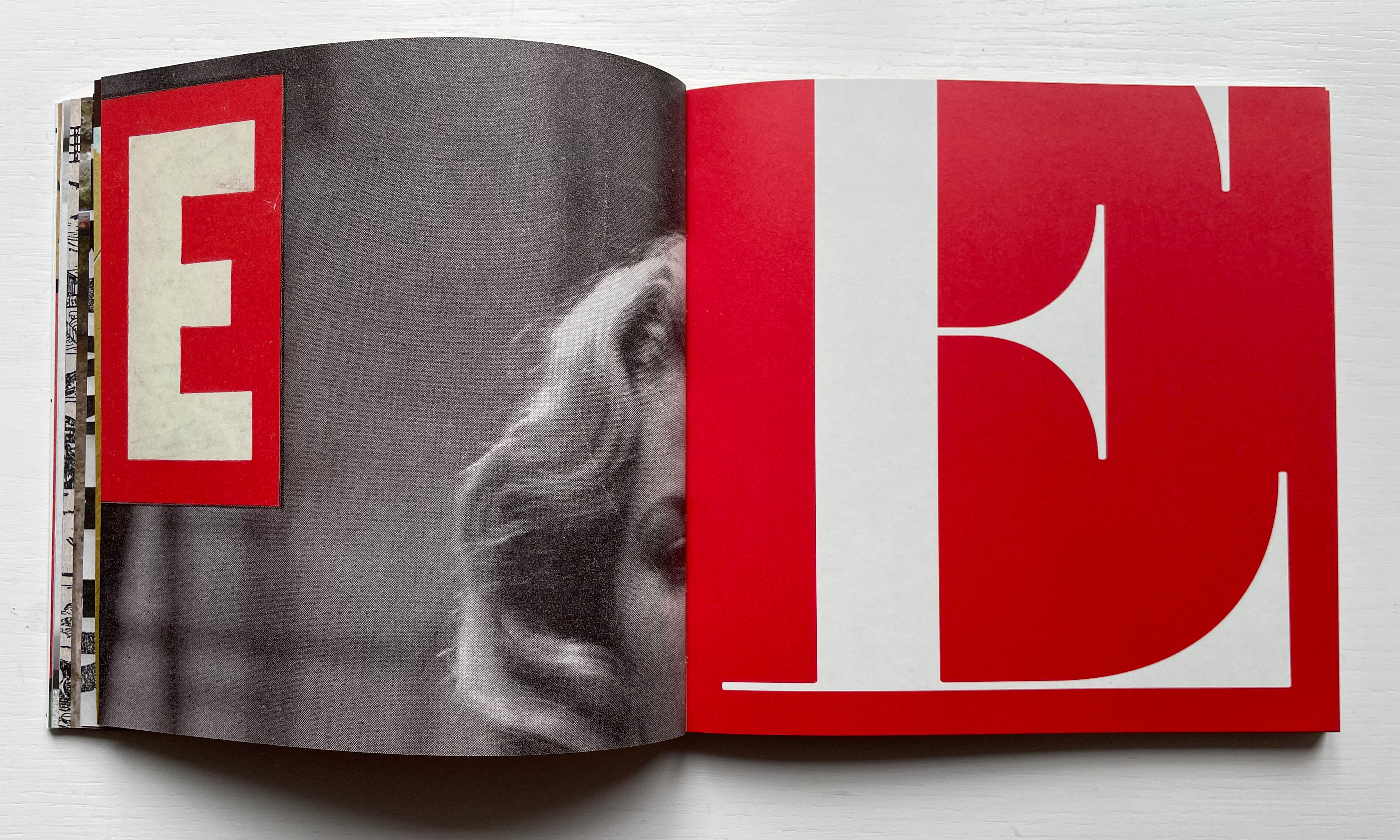
Ornan Rotem calls his book a “photo-typographic essay … a meditation … [e]xploring the relationship between typography and the visual world around us ….” As shown in the double-page spread below, his meditation is shaped across a four dimensional views of the letterform: the four-dimensional, three-dimensional, two-dimensional and the one-dimensional. At the end of the essay, there are 26 miniature essays that will send the reader back to enjoy each letter’s four dimensional entries again.
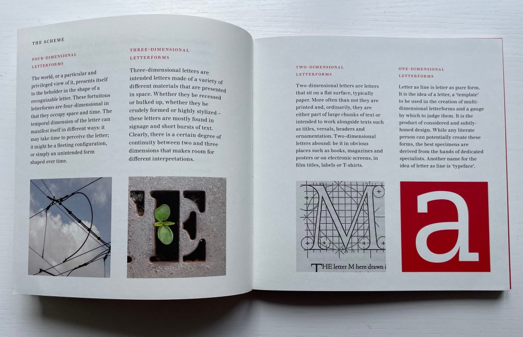
Everywhere you look you can see an E smiling at you (just saying it induces a smile). In 1969, Georges Perec, whose own name has four Es, tried exorcising the E by writing an esoteric 300-page novel, La disparition, without ever using one. I wonder how he would have felt had he come across this E — which was shot in Paris — when he was writing the novel. ¶ If you want to endow letters with character, then I suppose E would be the lively sort, hence the printed form comes from a 1948 cover of LIFE magazine.
Much is packed into these miniature essays. Naturally for an artist’s book celebrating type, there are the necessary self-referential typographic puns in the one above: character and sort. In all, there is the evidence of the long, multi-place, multi-source contemplative gestation of the work. In the example above, the allusion to Perec’s novel leads to the 1969 photo in Paris (or was it vice versa?). The typographic puns lead to a search for an E from a LIFE cover (again, or was it vice versa?). This circular connectedness over time, text and image highlights the self-referentiality of the genre of the artist’s book.
While the dense allusiveness might suggest that this is a work limited to an adult audience, A Typographic Abecedarium does find favor with a younger audience — no doubt because it speaks to the phenomenon of seeing letters everywhere and in multiple dimensions.
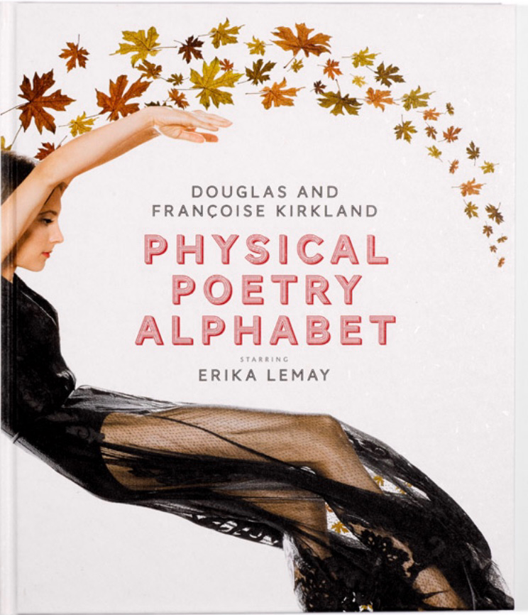
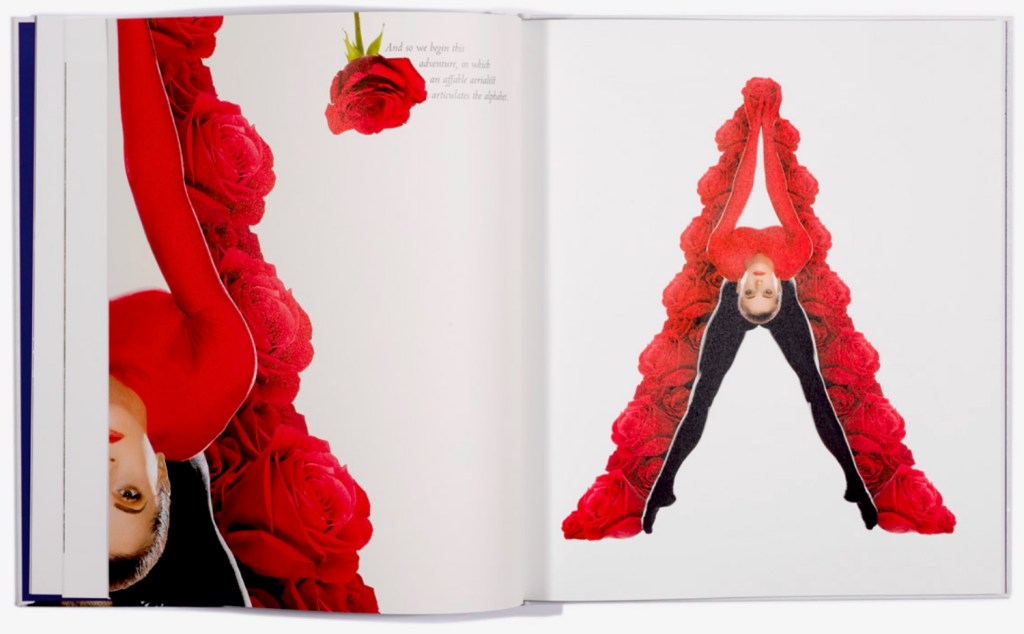
Physical Poetry Alphabet (2018) is a curious work. The Thames & Hudson-style production values combined with the knowledgeable essay in it by Ornan Rotem makes one think of Andrew Robinson’s The Story of Writing, an actual Thames & Hudson book. While the acrobatics of Erika Lemay echo the longstanding tradition of modeling the letters with the human body, followed by Erté, Vítězslav Nezval, Anthon Beeke and Rowland Scherman and so ingeniously summarized by Lisa Merkin, Lemay’s elaborate costumes and the scene design echo the traditions of Hollywood, Las Vegas and the fashion industry, which is not surprising given the involvement of Douglas Kirkland, portrait photographer to the stars. A Typographic Abecedarium strikes its singular target of “photo-typographic essay”. Having too many targets, Physical Poetry Alphabet perhaps misses its several bull’s eyes, but to follow along with its mixed metaphors, it undeniably delivers a shop full of eye candy.
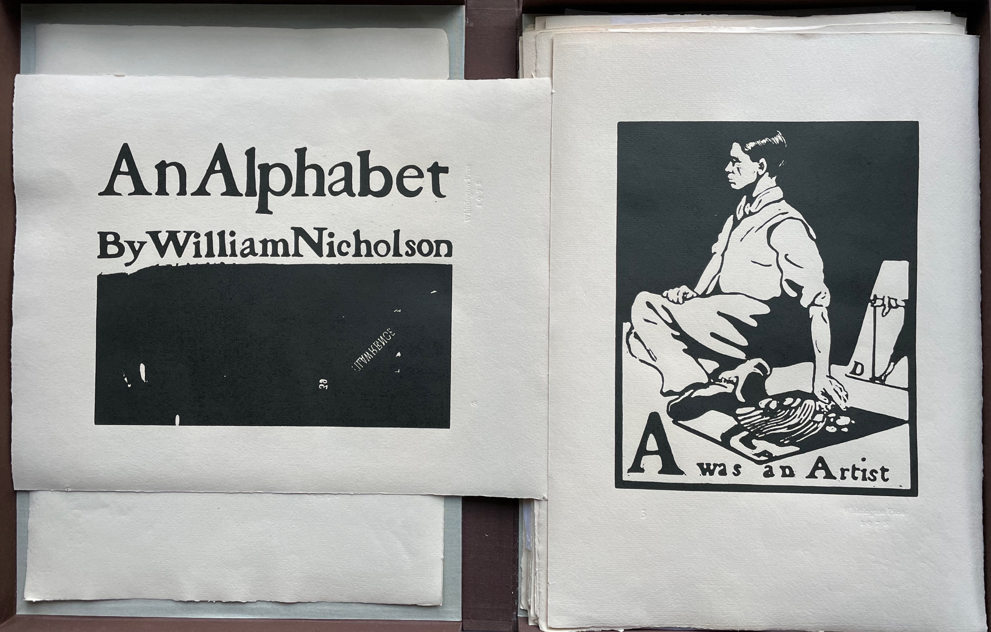
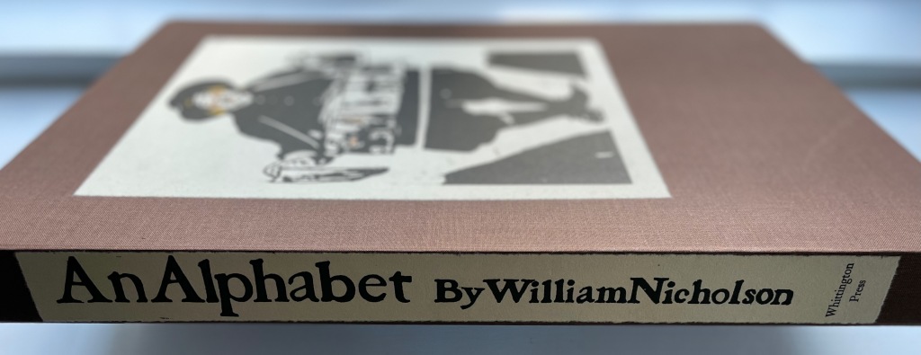
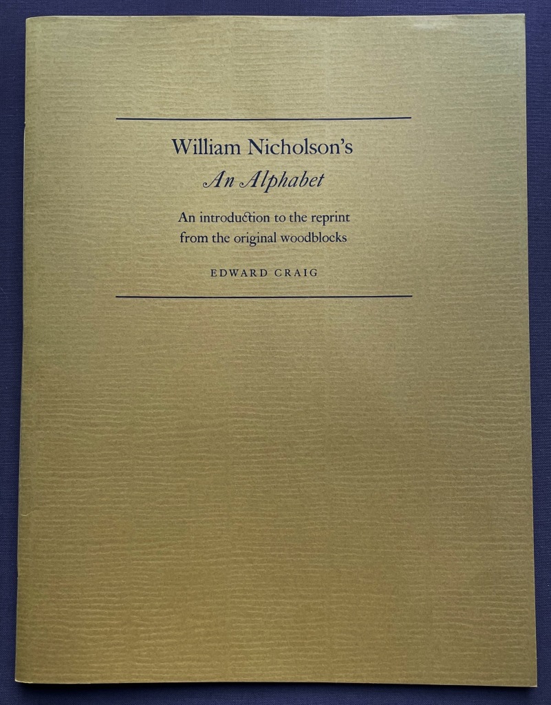
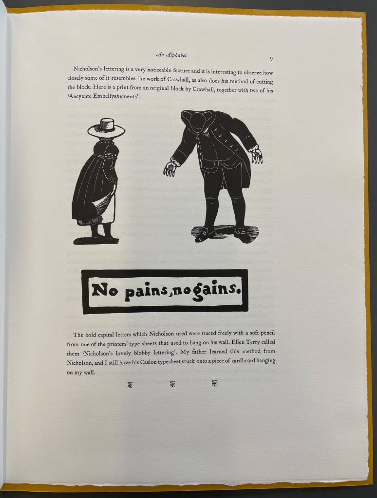
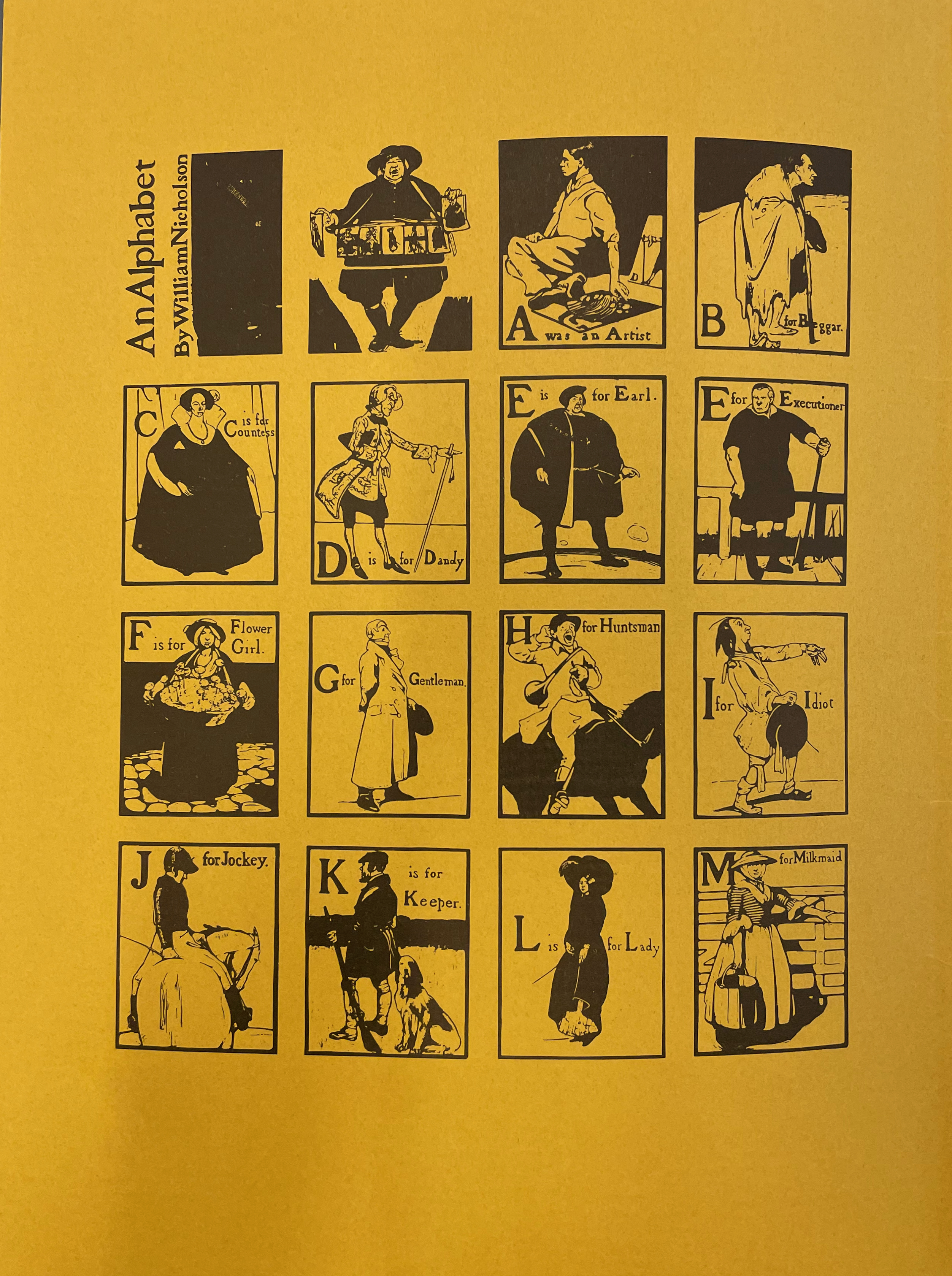
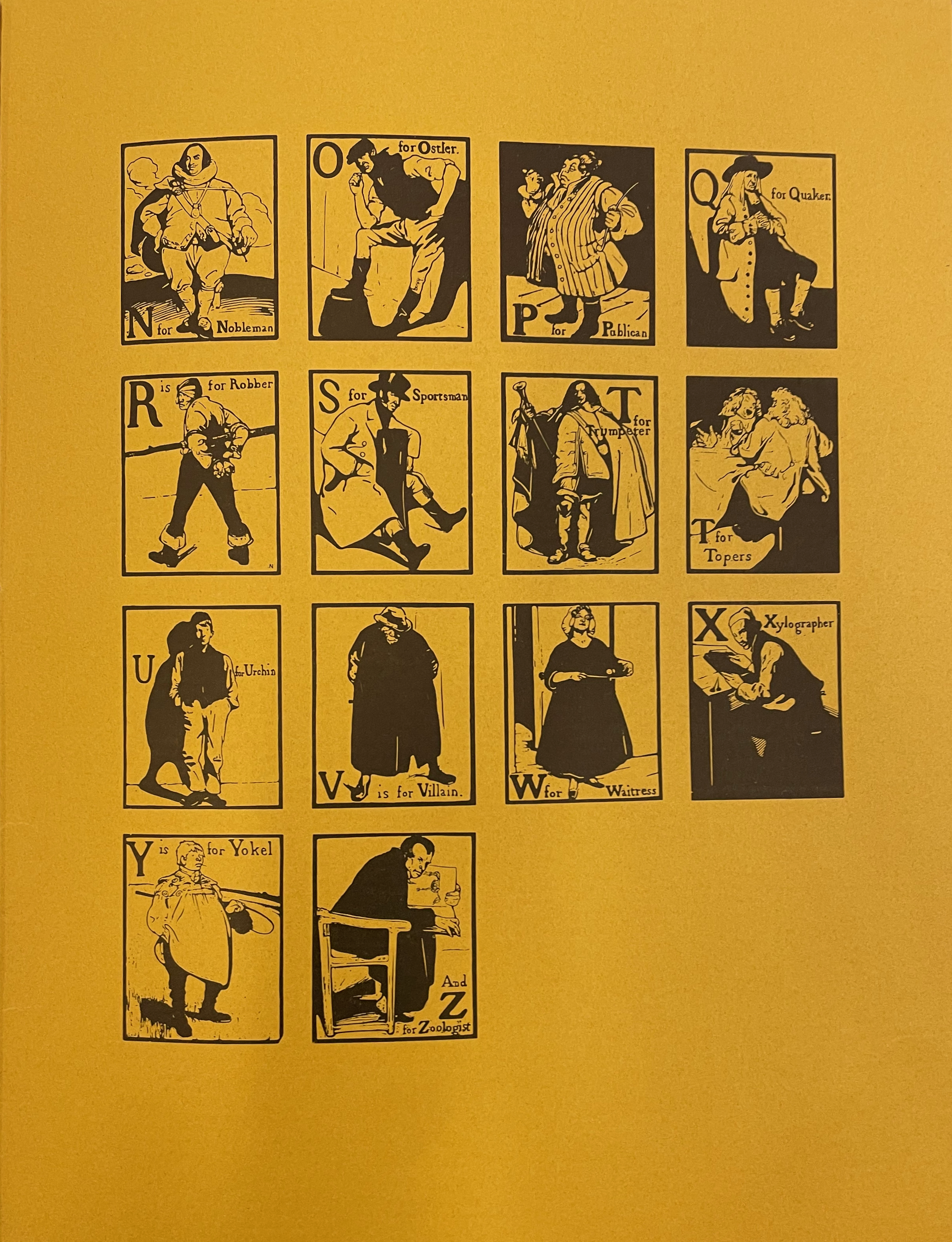
William Nicholson’s An Alphabet appeared in 1898. Eighty years later, with access to the original woodblocks (thanks to William Heinemann Ltd, which subsequently placed them with the Victoria & Albert Museum), Whittington Press and Edward Craig found themselves in a position to reproduce this famous alphabet. Craig, the son of Edward (Ted) Gordon Craig, who learned wood engraving from Nicholson, also had his father’s diaries as well as his own memories on which to draw for the booklet that accompanies the prints in this folio box. It provides a rich and diverse background that adds to their enjoyment. Craig brings to life the context and ties of friendship in which Nicholson’s art came on the scene. He even includes prints from three blocks cut by Joseph Crawhall (he of Old Aunt Elspa’s ABC fame) to show the affinities between Nicholson’s lettering and images and those of Crawhall.
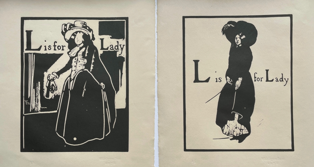
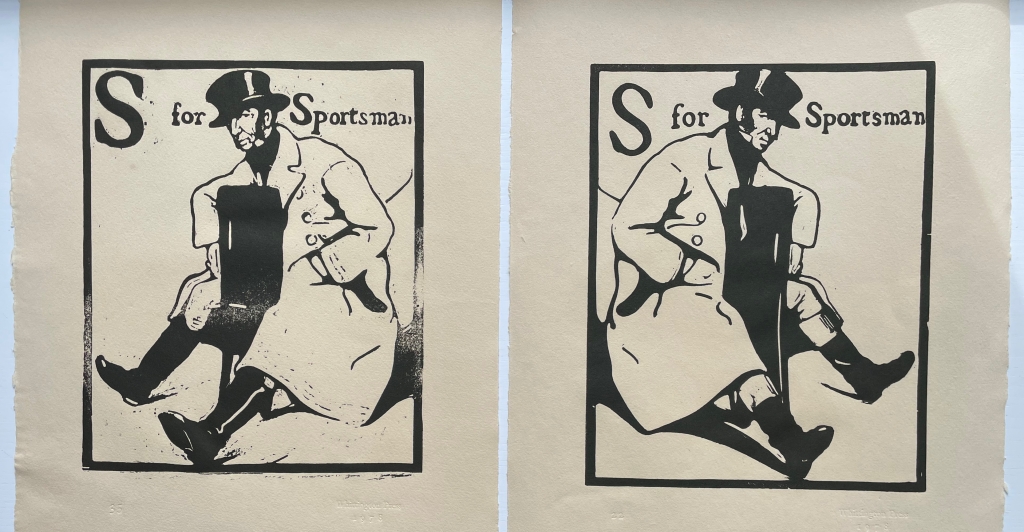
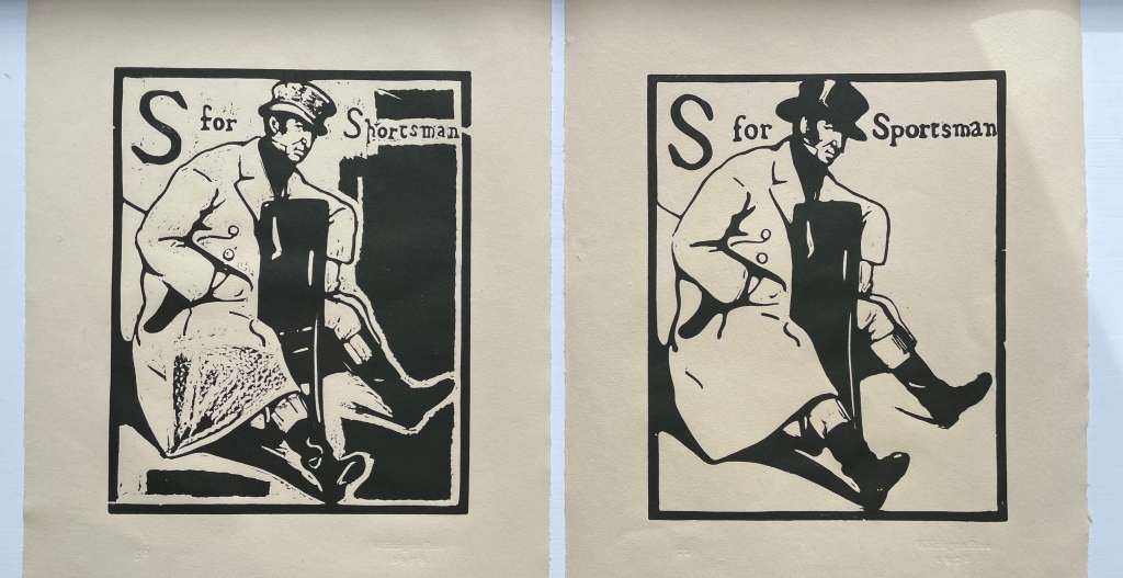
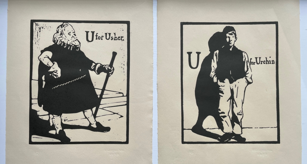
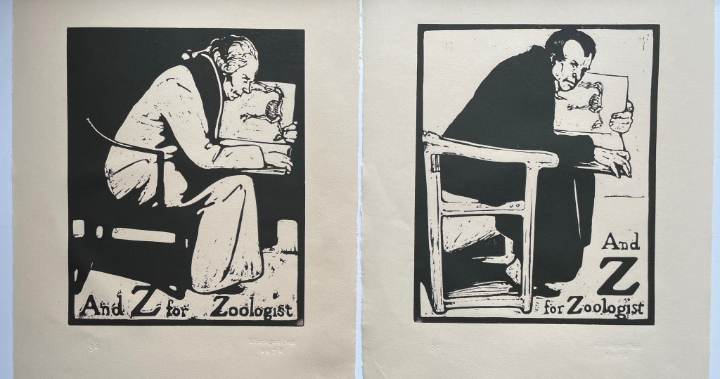
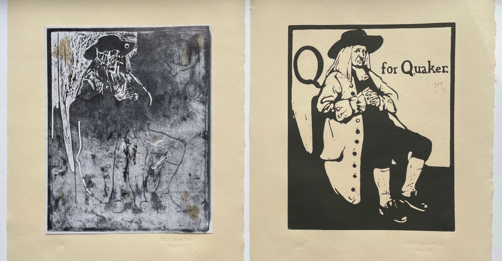
The booklet’s inclusion of 28 thumbnails of the reproduced prints is a helpful quick guide to the portfolio, but this particular edition contains 38 prints. Among them are some unused prints — a Quakeress, an Usher replaced by the Urchin, and alternative versions of the Jockey, Lady, Sportsman and Zoologist. Also included is a photo of the woodblock for the Quaker. Alongside Craig’s description of Nicholson’s two preferred courses of design and drawing, the discards and the photo offer a very real sense of Nicholson at work when placed side by side with the final designs:
After some preliminary scribbling … he would convey what he wanted from that scribble to a piece of very thin paper, or tracing paper, by inserting a black transfer paper between the two layers, then, peering into the maze of lines, he would select just those that he fancied and trace them through. …. His other method … was to draw direct onto the block with a brush heavily loaded with India ink, then, when it was dry, to refine the design by drawing over it with great care, using a softish pencil. The lead pencil shone like silver on the Indian ink and added to the excitement when the next process, that of cutting, revealed the beautiful honey-coloured boxwood below.
Discarded vs final
Discarded vs final
Discarded vs final
Discarded vs final
Discarded vs final
Discarded vs final
Photo of discarded block, final design
Craig’s booklet draws on Marguerite Steen’s 1943 biography as well as his father’s diaries, both sources rich in anecdotes and observations about Nicholson, James Pryde (his colorful partner in their J&W Beggarstaff Brothers venture), moments of time and place and the social circles in which they moved. Steen must have had access to Ted’s diaries or heard the tales directly from him. Here are Steen and Craig on a scene at the Denham “Eight Bells”, a defunct pub where William Nicholson, his wife Mabel and her brother James lived (Jimmy came to visit for two days and stayed two years):
Steen: The floor was littered with scraps of brown paper, black paper, red paper, William and Jimmy argued for hours about spacing–for which Jimmy had a great eye. Oddly enough, he was impatient and clumsy-handed when it came to execution…. With the scissors he was completely outclassed by William–who used a knife on glass, and on whom fell most of the execution of the schemes they planned together. … From all accounts, William did the lion’s share of the Beggarstaff work, so it is amusing to find in a published interview of the period Jimmy taking the lead, “telling the tale,” with only an occasional, rather lordly, reference to his partner. (p. 56)
Craig from Ted’s diary: One visit to Denham found Nicholson on the floor pinning out rolls of brown paper. With a brief ‘Hello Ted’, he carried on working at great speed with a penknife, cutting up pieces of black paper on which were scribbled a few guide lines in chalk and arranging the shapes to resemble a huge figure in a cloak. A face and hands from some buff-coloured paper were being produced by Jimmy, who was draped over a chair in the corner; these were ‘floated’ into position, then pinned. They stood on chairs to look down on their work, then added a few extra shapes in coloured paper here and there. Suddenly a figure like one of the Three Musketeers materialised. They seemed pleased enough, and Jimmy remarked that ‘it would be good for something’. (p. 3)
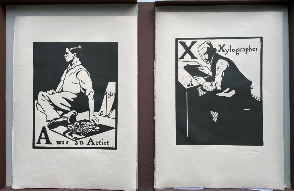
Several sources identify “A was an Artist” as Nicholson’s self-portrait, but might that three-quarters portrait of the Xylographer also be a self-portrait? Or is it his partner James Pryde in a portrait additional to the one of him in “B for Beggar”? Such is the speculation to which the warm color of Craig’s text and the vibrant reproductions created with Whittington Press would lead anyone exploring this portfolio.
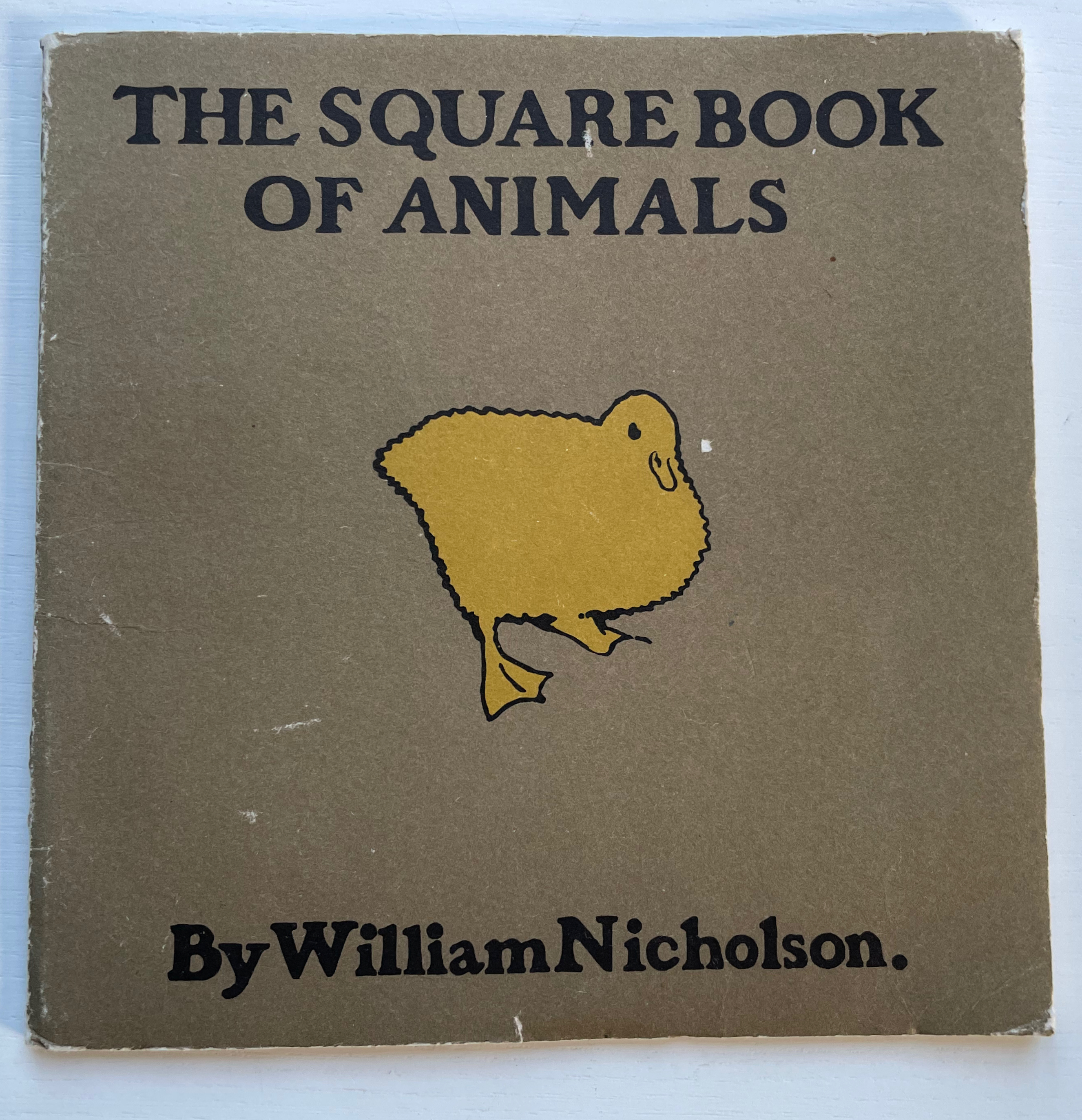
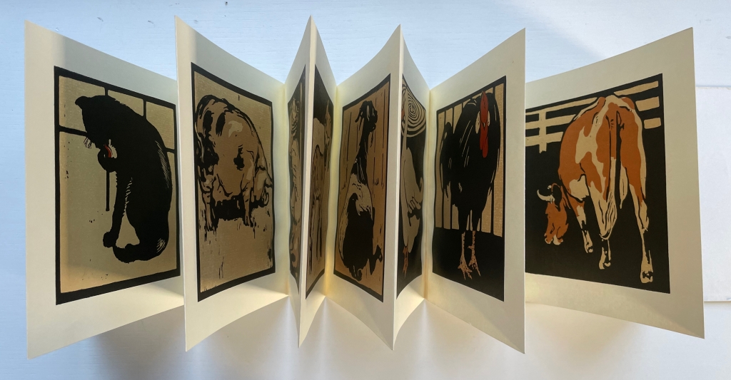
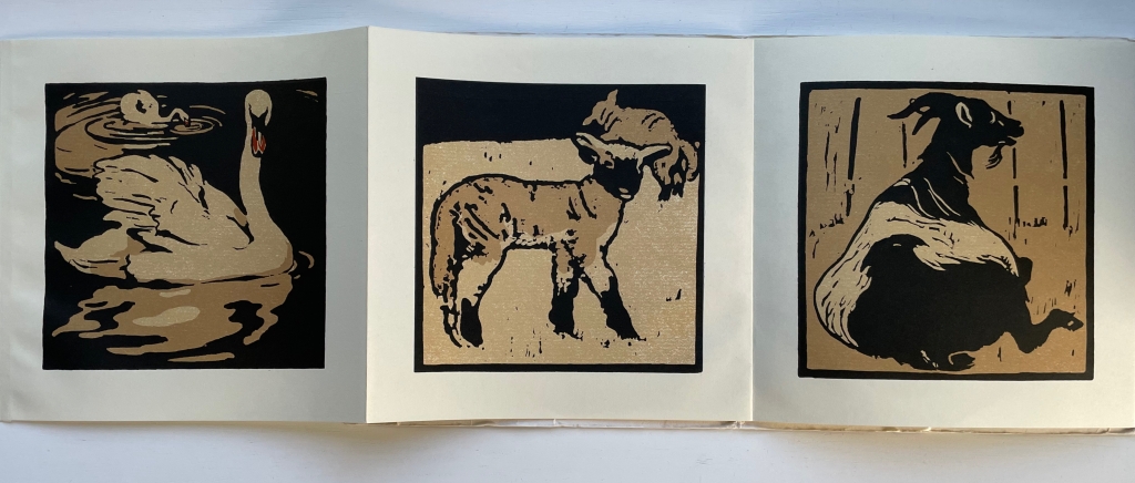
The Square Book of Animals (1900/1979)
The Square Book of Animals(1900/1979) William Nicholson Softcover, leporello. 290 x 290 mm. 12 panels. 2nd edition. Acquired from M.G. Manwaring, 2 April 2023. Photos: Books On Books Collection.
Scolar Press redesigned and re-originated the 1900 edition and brilliantly chose this leporello format, which makes one wish that Nicholson had added the book as artistic medium to his toolkit, which besides woodcuts and wood engraving included lithographs, oils, watercolors, tempera, frescos, painting on glass and photography. Given his poster work for the theater and exposure to the stage (the actor Henry Irving was a family friend and source of free tickets, and actress Ellen Terry was the mother of his friend Ted Craig) and given his facility with paper as a medium, Nicholson could have made pop-up and tunnel books of genius. But portraits, landscapes and still life beckoned as Colin Campbell tracks and explores so well in his two books (see below).
In the Books On Books collection, several works provide enjoyable comparison with Nicholson’s art: Carton Moore Park’s Alphabet of Animals (1899), C.B. Falls’ ABC Book (1923), Christopher Wormell’s An Alphabet of Animals (1990), Enid Marx’s Marco’s Animal Alphabet (2000) and Nick Wonham’s A Charm of Magpies (2018).
Campbell, Colin; James, Merlin; Reed, Patricia; and Schwarz, Sanford. 2004. The Art of William Nicholson. London; New York: Royal Academy of Arts ; Distributed in the U.S. and Canada by H.N. Abrams.