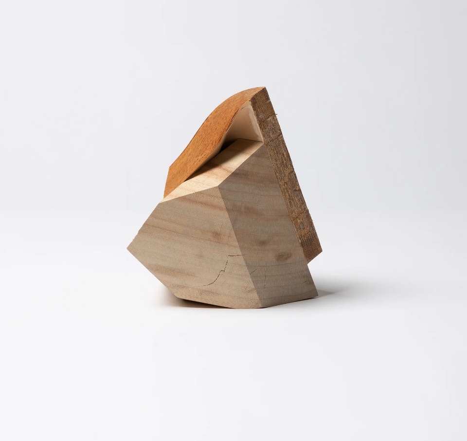
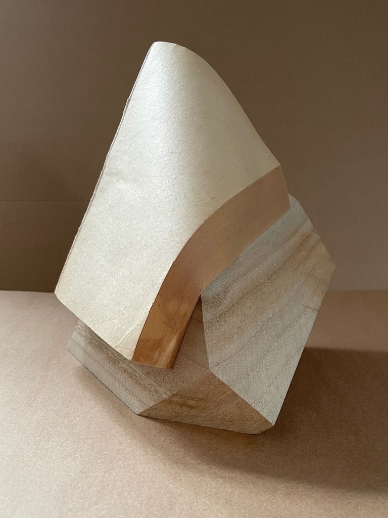
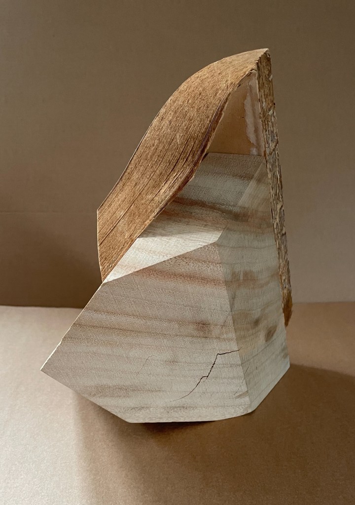
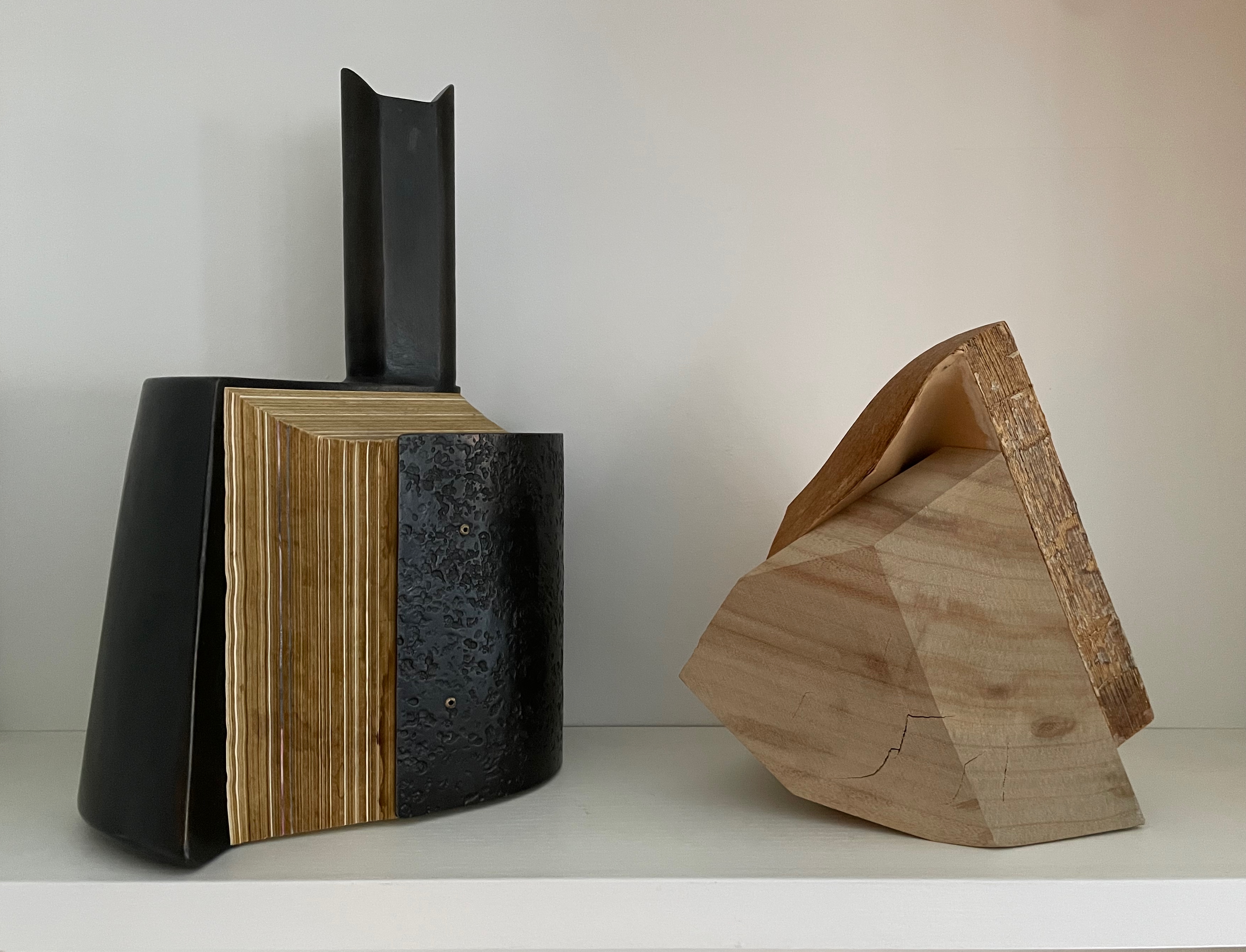
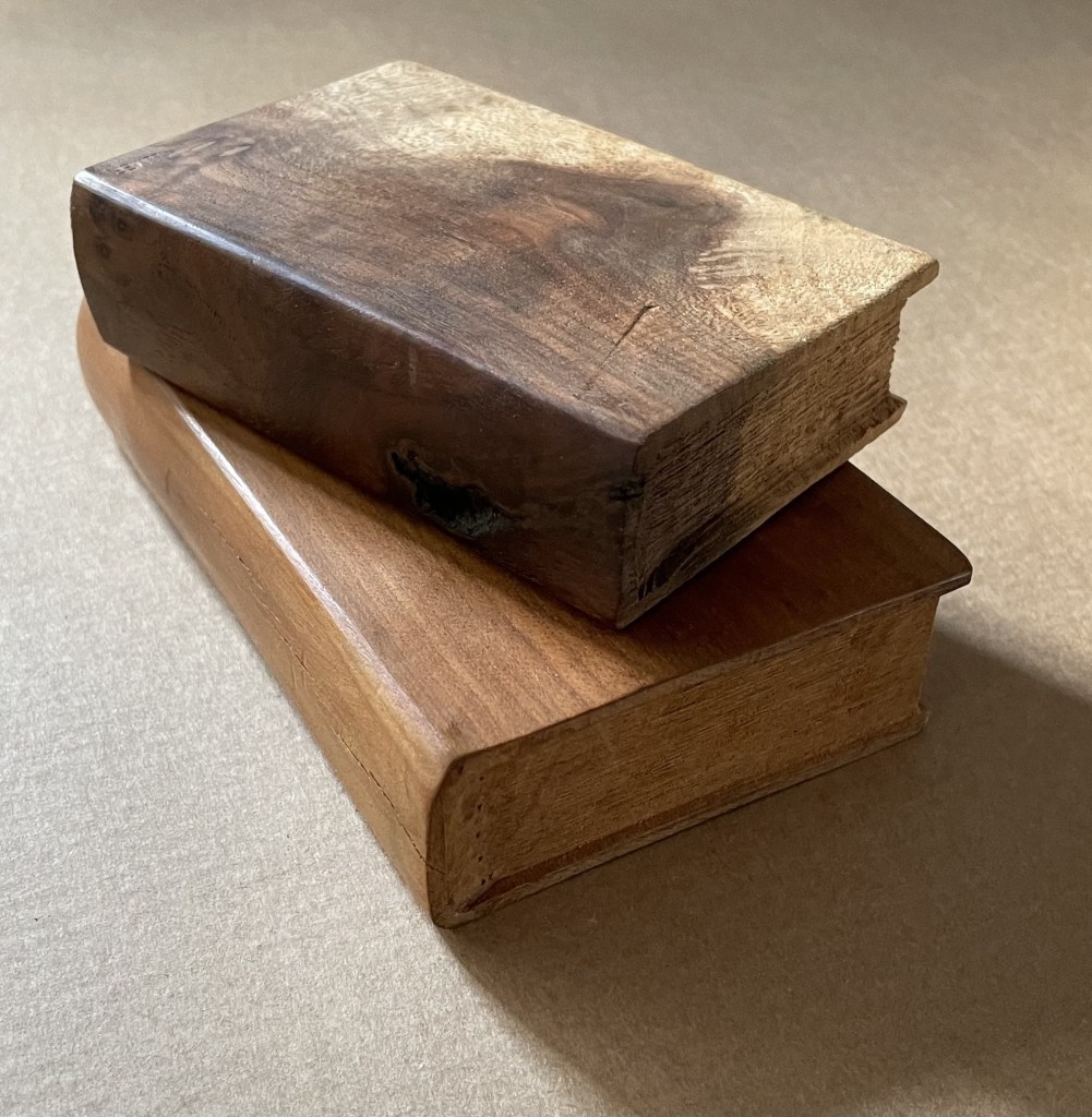
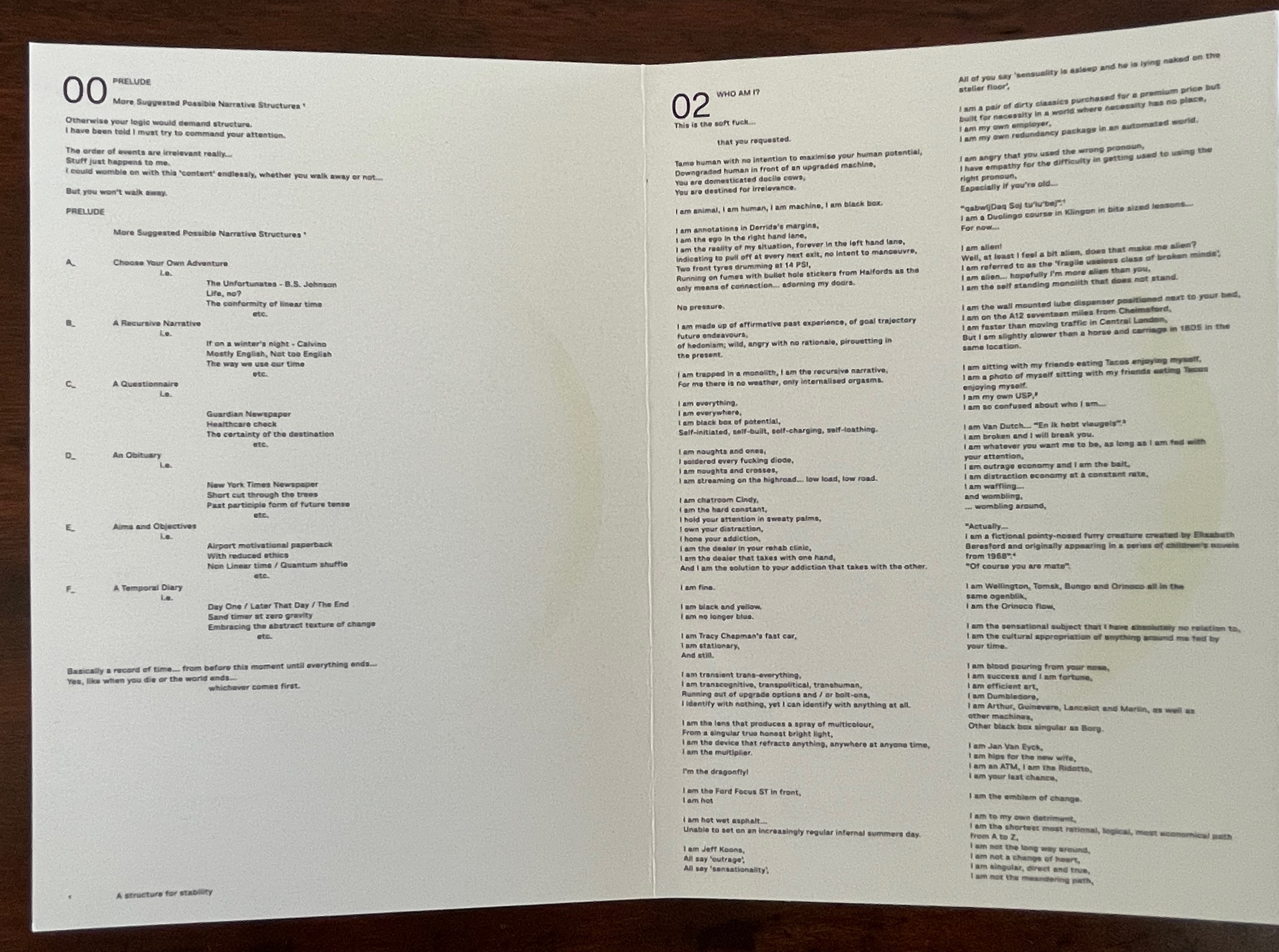
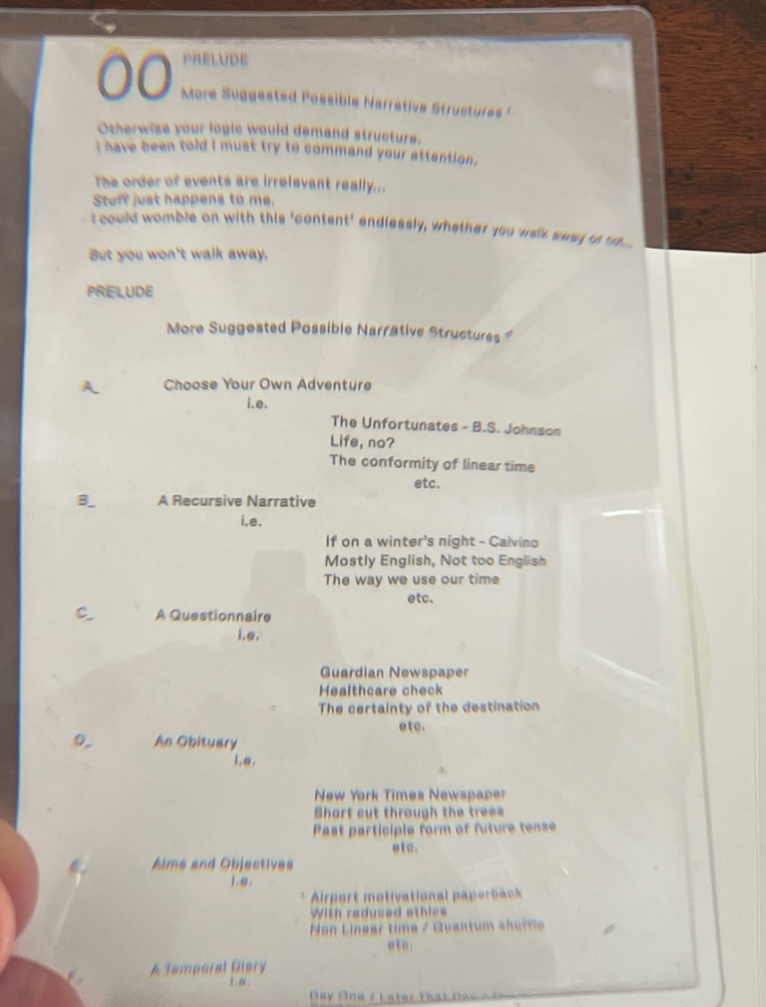
Silent Book, vol. 11 (2023) Ryuta Iida Altered book, camphor tree stump, and glue. H210 × W170 × D190 mm. Unique. Acquired from Fragile Books (Tokyo), 20 August 2024. Photos: Above, courtesy of Fragile Books; below, Books On Books Collection.
The cover, door, table of contents, numbering, text, and endnotes are all filled with a series of information. I thought to stop and crystallize all the functions of the “book,” … I decided to crystallize it. It took the time to go through the hands of people, the old book that finally reached me, sealed on a pedestal, it is now ripe for its next role. (Artist’s statement)
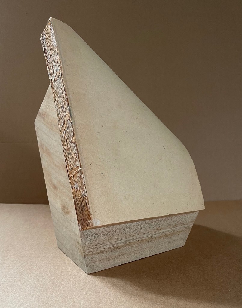
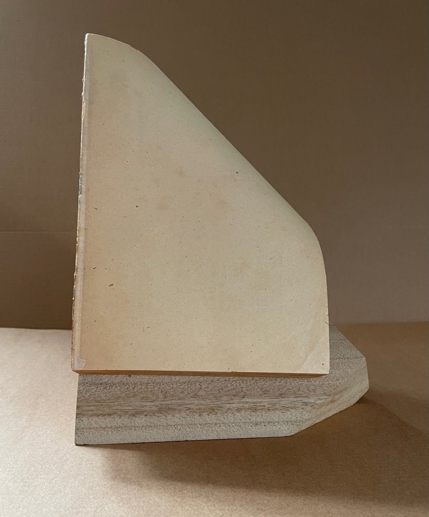
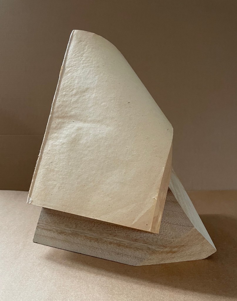
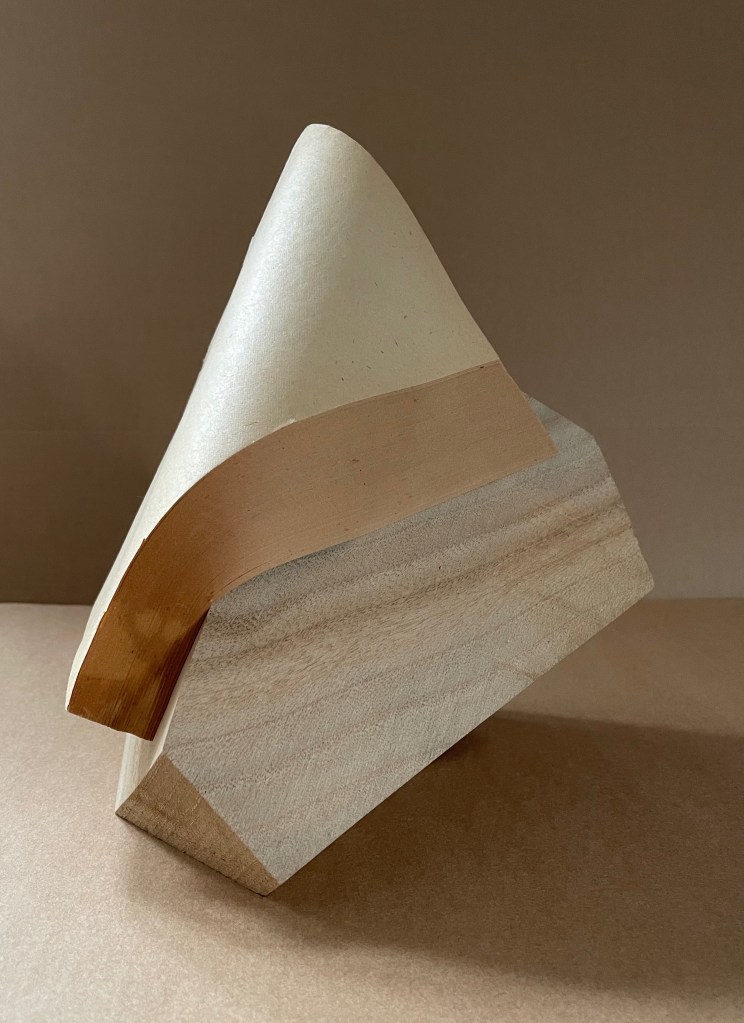
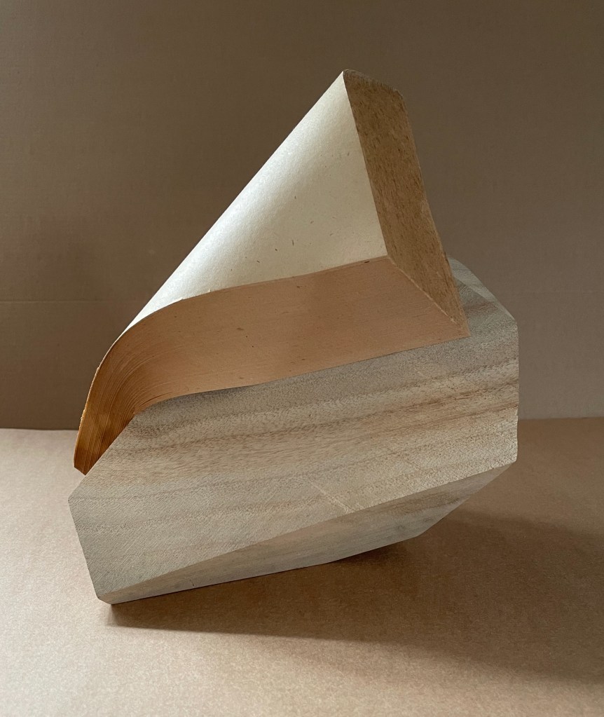
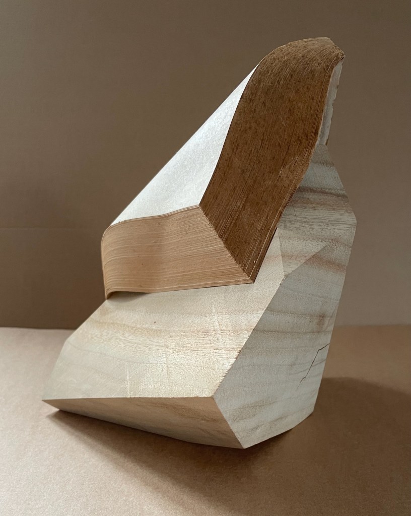
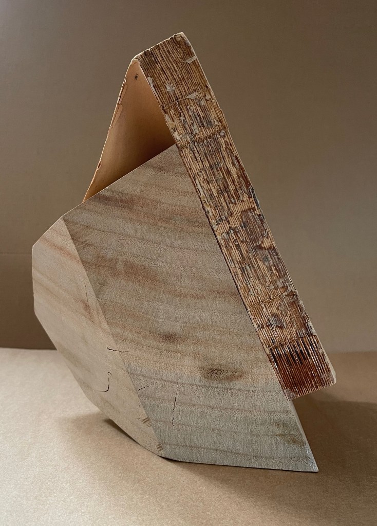
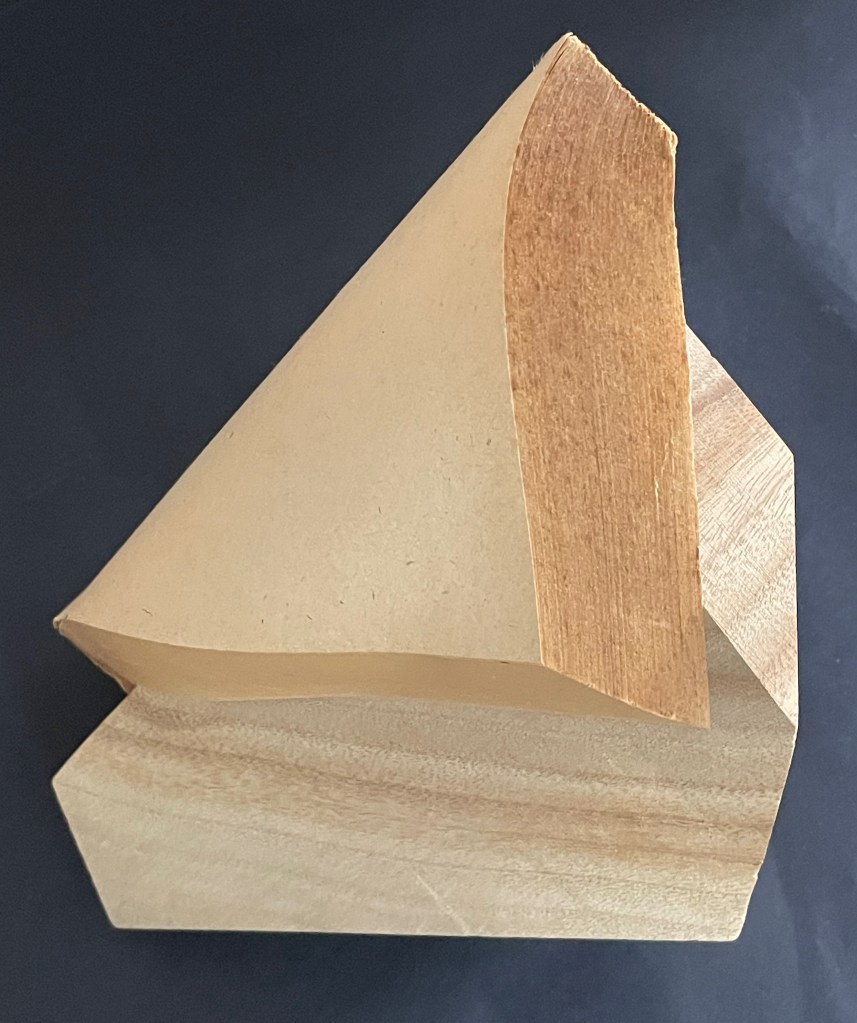
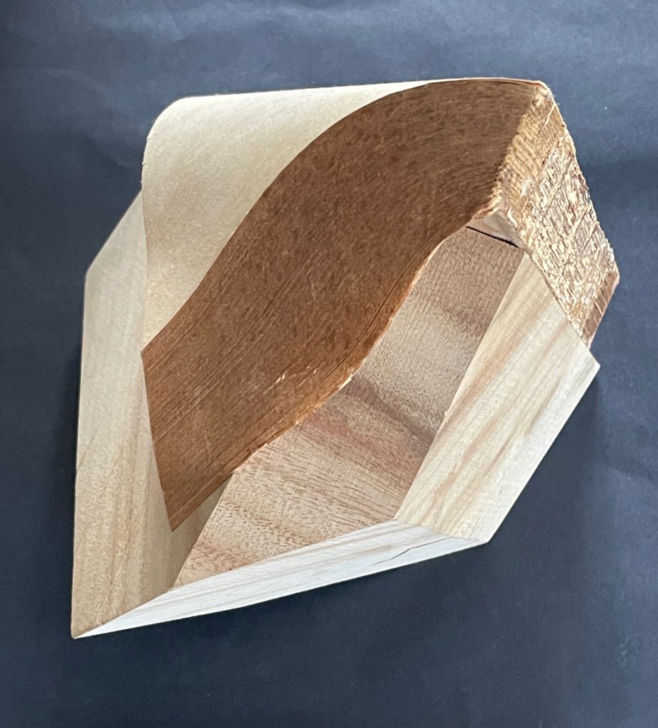
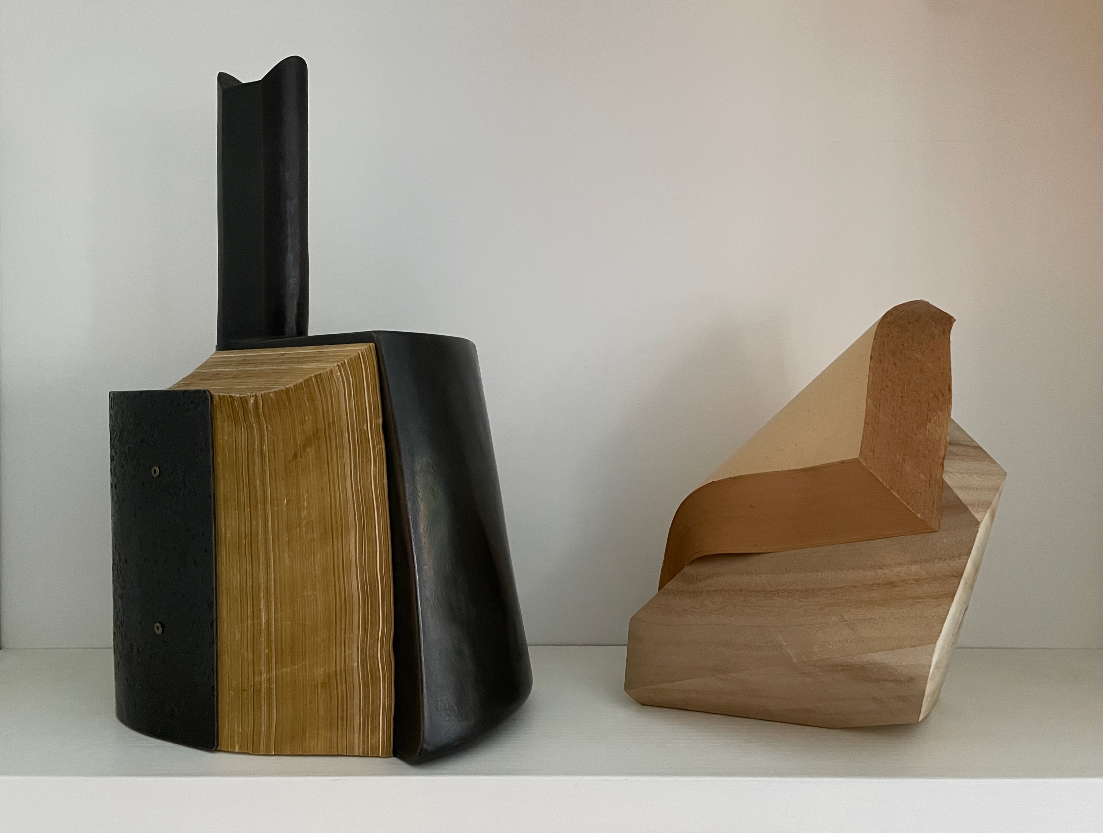
“Crystallized” is not the first word that comes to mind when viewing and handling this eleventh in Ryuta Iida’s series Silent Book. Perhaps it does for the angled planes of the cut block of camphor wood, but for the coverless codex, folded, draped, moulded, carved, and sculpted come closer. Two names that might not spring to mind (but should) are Giambologna (Jean Boulogne) and Gian Lorenzo Bernini. Like them, Iida offers us more than a single or primary vantage point from which to appreciate his work. Like Giambologna’s Abduction of a Sabine Woman (Loggia dei Lanzi, Florence) or Bernini’s Apollo and Daphne (Galleria Borghese, Rome) Silent Book must be circled and viewed in the round. The nine images below show the work turned right to left in stages.
Far as Silent Book is from the figurative, violent, and ornate features of the 16th and 17th century masterpieces, it still harbors its own complexities of line, shadow, texture, and form. There is a volume of dynamics between and among them that belies the work’s title. Note how the layers of pages echo the wood’s grain, and how the color and texture of the page surface contrasts with those of the book’s top edge, and how that contrast reverberates with the shifting colors of the wood. Iida has moulded and sealed the book block so that the top edge curves to a point in a duet with the cut angles of the wood block.
Silent Book has many kin in the world of book art, works that make the content of a ready-made volume inaccessible and make something anew from the material object. Too often this sub-genre has been dismissed as a fetishization of the book. This overlooks how Silent Book and its kin make us think about the book as a material for making art and as a source of metaphors, and we overlook what the individual artworks are. By sealing away the content of a book, giving the book block a sinuous shape, and fusing it with a carved block of wood, Iida invites us to look afresh.
In the Books On Books Collection, several other works share this play of inaccessibility with tangibility: Barton Lidice Beneš’s Untitled (1973), Andrew Hayes’ Offset (2013), Jacqueline Rush Lee’s The First Cut and Silenda (both 2015), Doug Beube’s Red Infinity #4 (2017), Lorenzo Perrone’s Kintsugi (2018), and Chris Perry’s 217 Ripples: Sediment(2020). Of these, Offset seems closest to Silent Book. Comparison can increase appreciation of each and their sub-genre.
Both Hayes and Iida have managed to elicit a sense of action and motion from their materials. From one view of Offset, metal embraces the body of the book; from another, the book pushes the metal apart. From one side of Silent Book, the upward-angled block of wood supports the coverless codex folding over and slipping down its pedestal; from another, the book drapes a protective arm over the sideways-angled block.
Views of Offset (2013) by Andrew Hayes and Silent Book (2023)
The titling of the two works raises appreciable similarities and differences. Offset suggests the printing method of the same name, which does involve metal plates. The overall shape, however, suggests some strange assemblage of early letterpress components: the bulbous ink balls (or dabbers) with their handles, the torque bar, and the metal furniture locks. The offset position of the piece’s “handle” also reflects the title. What can’t be appreciated from the images is that Offset wobbles if touched in the slightest.
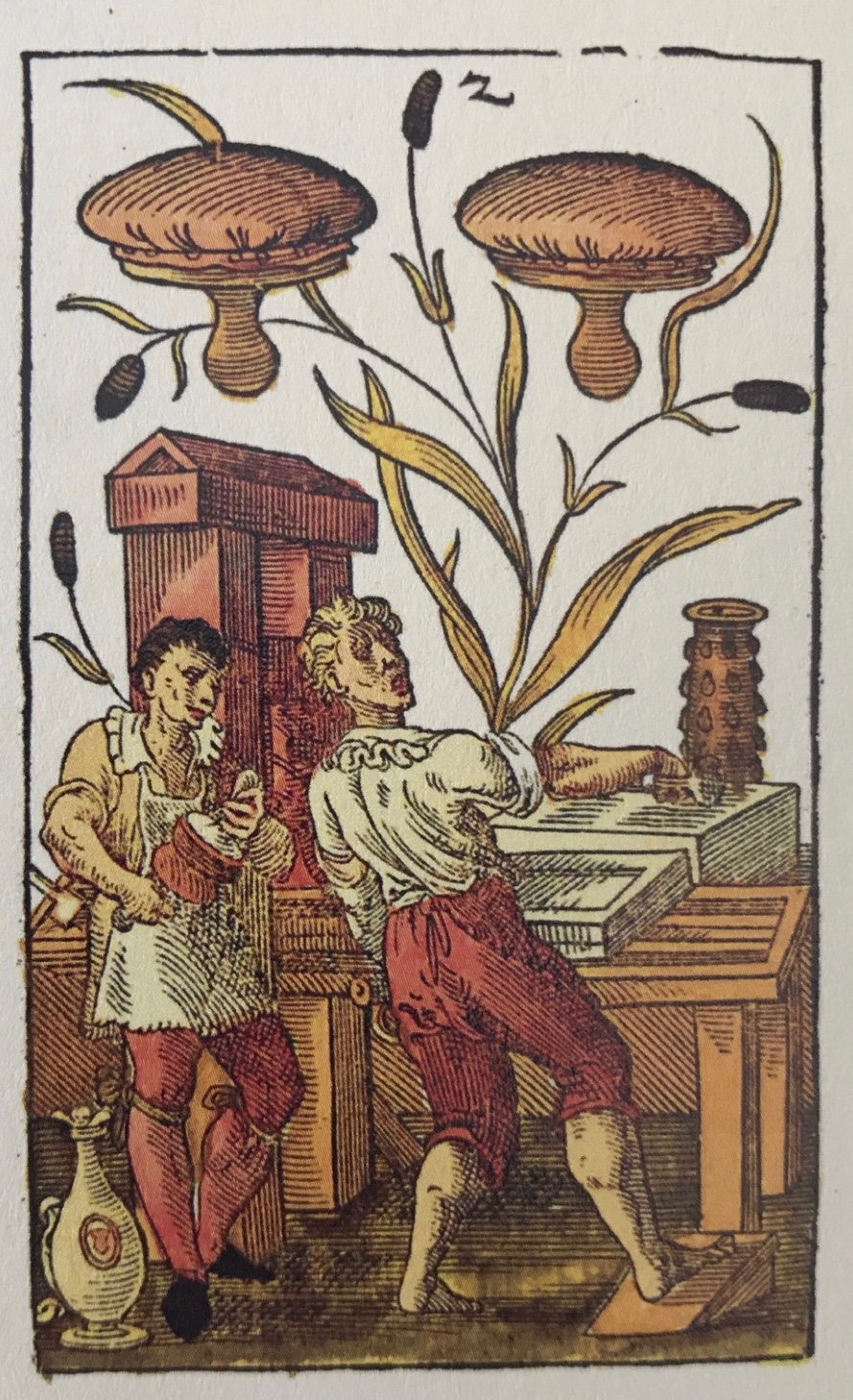
“The two of printer’s dabbers” from Jost Amman’s 1588 deck of cards.
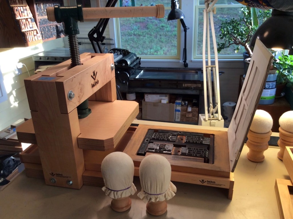
The BookBeetle Press, a portable screw press designed and built by Josef Beery. Reproduced with permission of Beery.
The title of Silent Book refers, of course, to the book block’s being sealed, an obvious visual/verbal pun. None of its information passes the lips of its pages. Like Offset, however, the title is also oblique. Although the derivation of the word book from the Old German Buche (meaning “beech”) is a debatable assumption, it’s widely accepted enough to allow that the block of wood is also a silent book.
Now imagine the substitution of a large block of pink bubble gum for the book material in Offset and Silent Book. Not a block of gum in the shape of a book, but an oversized, unchewed block of gum. Something very different to chew on now, isn’t it? The ways in which book artists manipulate the material and metaphor of the book vary every bit as much as the ways in which painters, sculptors, and other artists vary their techniques, materials, and subjects. Even within the slice of book art that focuses on physical inaccessibility, such as Marcel Broodthaers’ Pense-Bête (1964), Wolf Vostell’s Betonbuch (1971), Irwin Susskind’s Book Faced Down – Embedded in Plaster(1999), Jonathan Callan’s Rational Snow (2002), Anselm Kiefer’s Untitled (Constellation Book) (2004), Hanne Stochholm Exe’s Remake(2015), and Neil Nenner and Avihai Mizrahi’s Cover Story (2017), the variety abounds. Ryuta Iida’s series Silent Book is a resounding reminder.
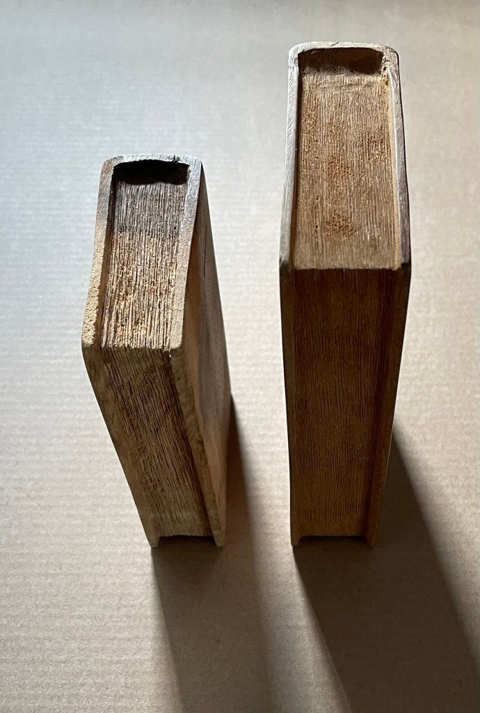
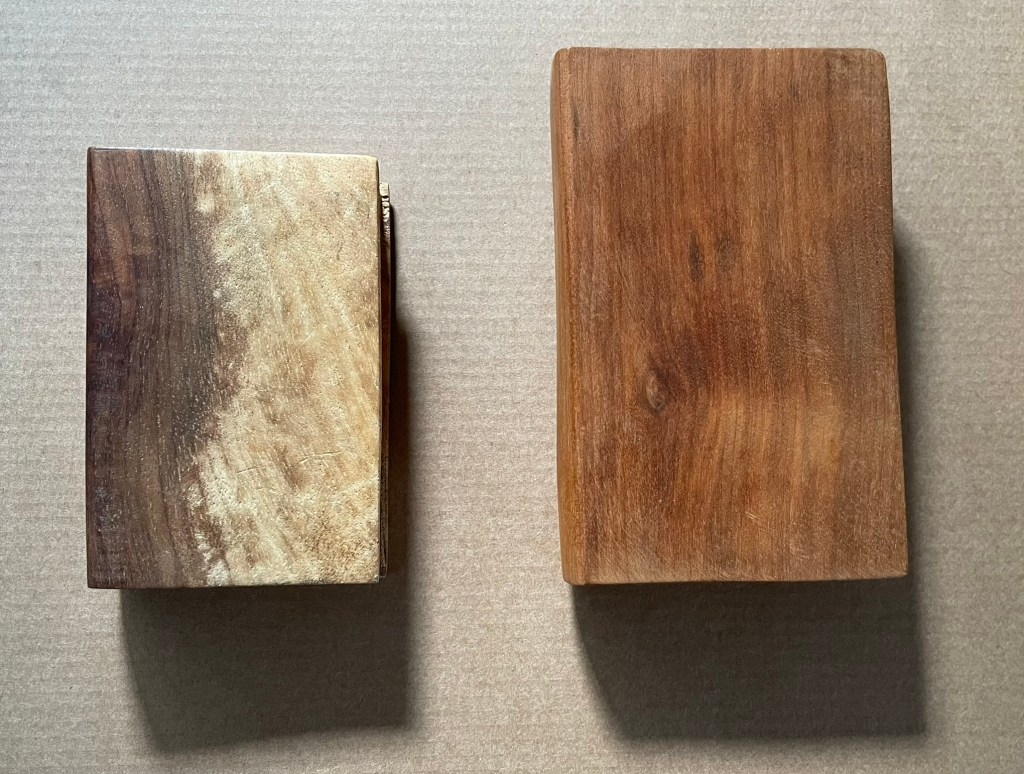
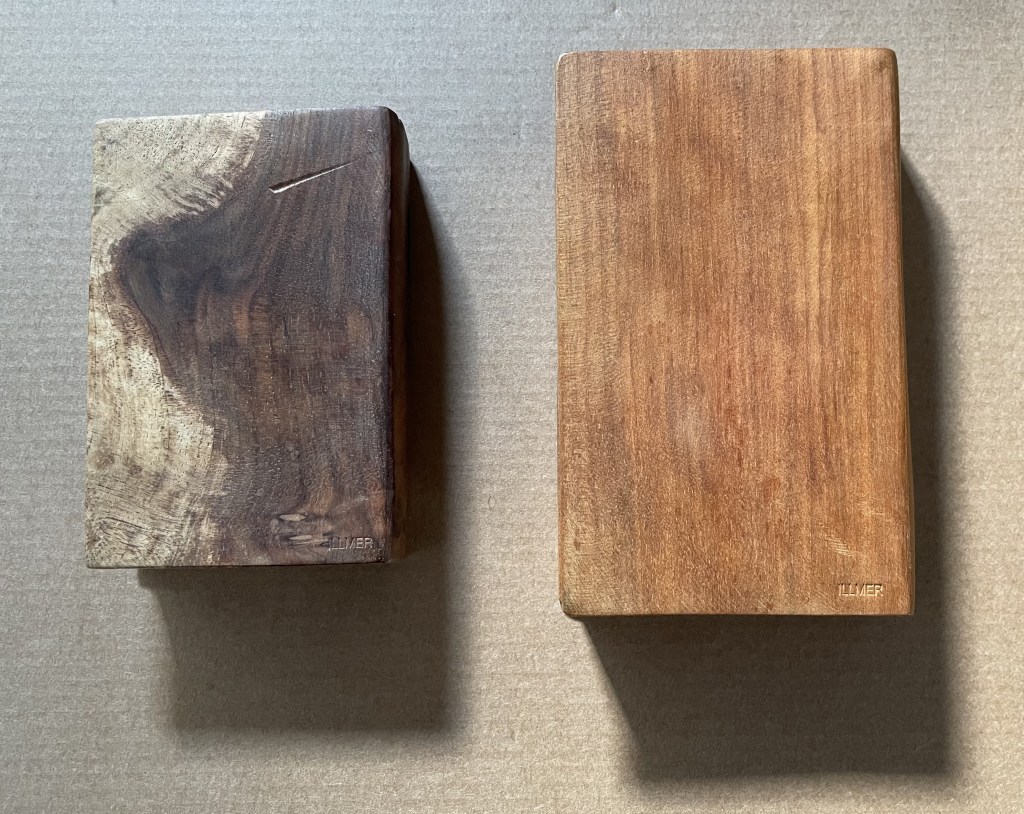
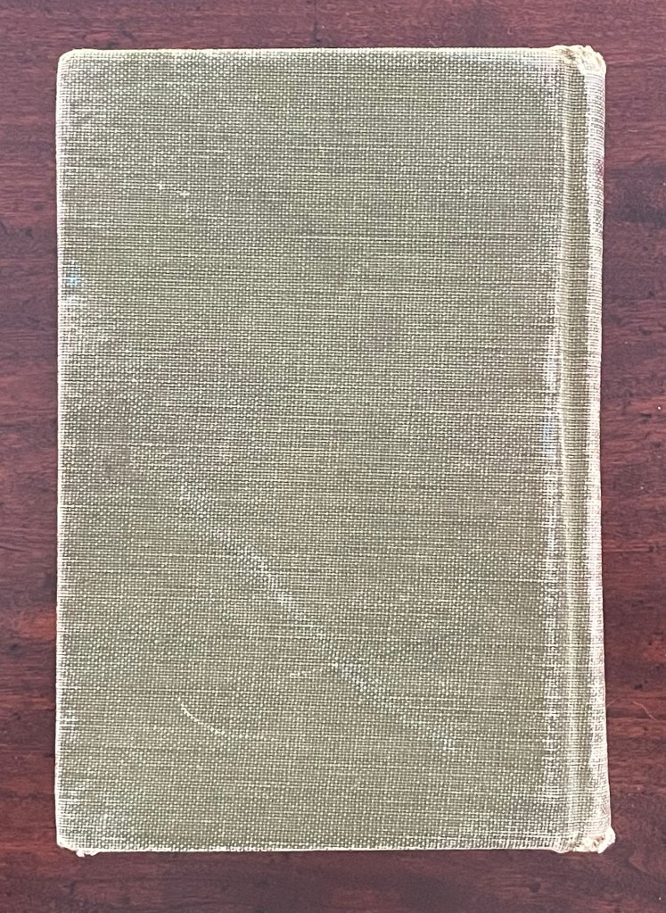
Untitled(2015) Ivon Illmer Book-shaped wood sculpture. Top: Almond wood, H100 x W65 x D27 mm.Bottom: Poplar wood, H123 x W78 x D27 mm. Unique. Acquired from the artist, 10 October 2014. Photos: Books On Books.
From Ivon Illmer’s website: Books preserve history and stories. Each book has its own individual story. This ranges from loving treatment to neglect to ostracism and even burning. The arc almost inevitably stretches from the fate of the book to the fate of man. Everyone should let their imagination run wild when touching the book sculptures and invent their own story for each book. Touching is important, the haptic experience flatters the sense of touch. You “grasp” the beauty of the wood. Imagining the book sculptures in the raw piece of wood is the art. Each piece is unique in shape, structure and grain. Accessed 14 October 2024.
Illmer categorizes his work as “book sculpture / book art”. The carvings from various woods primarily celebrate the shape and tactility of the closed codex. The similitude of the exterior, right down to the fore, top and bottom edges, belies the inaccessibility of the interior.
Untitled
If simply entitled Unreadable Book or A Closed Book, these works would lead us down a narrow path of interpretation. Another easy path of interpretation could be etymological. The derivation of the word book from the Old German Buche (meaning “beech”) is a debatable assumption. Still, it’s widely accepted enough to start us down the path that, since the paper of traditional books is made from wood, so, Illmer’s carved codices just represent another way of using wood to make a book. He could have entitled them Buchmaterial, which in English also captures the same pun between the book’s content and its material. In his self-published catalogue, however, Illmer is explicit that his use of “untitled” is totemic:
… each of my books represents every book published so far. That’s why none of them has a title, and that’s why none of them is based on a real book.
Illmer leaves it to the imagination of the viewer to determine whether and how his works “interrogate” the nature of the book.
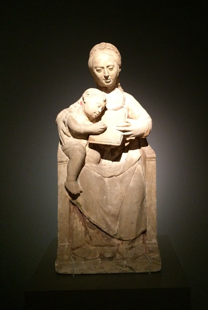
Presenting physically inaccessible books is fairly common among wood carvers, sculptors, and painters. A closed or open book appears in the hands of countless saints and Madonnas and carries with it various iconological interpretations, depending on the bearer. From the St. Servatius Cathedral Treasury in Maastricht, here’s a library of letters, scrolls and books in the hands of the Holy Kinship.
And from Lisbon’s National Museum of Antique Art, here’s a Madonna and Child with book, which seems to underscore the interpretation in Christian art that an open book in connection with Mary indicates the fulfillment of the promise.
Madonna and Child (c. 1540-1550), Unknown sculptor, Museu Nacional de Arte Antiga, Lisbonne, Inv 1182 Esc. Photos: Books On Books Collection, 2015, at “Pliure. Prologue (la part du feu)”, Fondation Calouste-Gulbenkian, Paris.
The fifteenth-century Van Lymborch, or Limbourg, brothers of Les Très Riches Heures du Duc de Berry fame, however, may be the first to have created an inaccessible book for the sheer pleasure of trompe-l’oeil and trompe-le-main. They made it from a block of wood, decorated its exterior to look like a sumptuous illuminated manuscript, and gave it to their patron as a New Year’s day joke. Another two centuries later in Venice, Francesco Pianta the Younger carved shelves of inaccessible wooden books for the Chapter Room in the Scuola Grande di San Rocco (1657-75). Arranged as if recently consulted and replaced on their shelves, the books provide the studious background for inconographic and allegorical sculptural figures of “Curiosity”, “Wrath”, “Melancholy”, and others. The influence of this particular fantasy has persisted in Venice and found an enthusiastic expansionist in Livio de Marchi, whose project entitled House of Books, begun in 1990, boasted three residential-sized installations by 2025. From the spine- and cover-clad exterior walls, to the carved splayed book for a roof, to the furnishings — everything is made from wood and has a bookish allusion in its shape or function, including the pen-shaped chimney and a pencil-picket fence. The more prolific joker, however, may be Alain Stanké, whose wood sculptures suggest there is no bookish pun he would not carve.
While facetiousness and jokery also characterize the path taken by conceptual book artists by making an inaccessible book the material of the artwork, there is now an edge. Marcel Broodthaers encased his previously published books of poetry in plaster to create Pense-Bête (1964), an elaborate farewell to literary aims. Following Broodthaers, Wolf Vostell purportedly encased his paper-based booklet Betonierungen (“Concretifications”) in a 40 x 28 x 6cm slab of concrete shaped like a book (Frengel et al.), not a farewell but rather an embodied manifesto. Vostell’s Betonbuch (1971) allows for both the interpretive paths of inaccessibility and punning on the book’s material. (Further trickery may be involved; radiographic examinations are inconclusive on whether there really is a booklet embedded in there; see White, below.) Despite, or because of, its title, Barton Lidice Beneš’ inaccessible Untitled (1973) plays differently with titular punning: Beneš has almost obliterated the titles of the condensed books from the spines of his sealed Reader’s Digest Condensed Books series. Jacqueline Rush Lee’s The First Cut (2015) soaks, rolls, and dries the three volumes of the Loeb translation of Ovid’s Metamorphoses into a single firewood-like chunk; its inaccessibility and title join in a punning allusion to the transformation of Daphne and others into trees or plants to escape the grasp of the gods. Lorenzo Perrone’s inaccessible Kintsugi (2018) casts yet a different titular pun by applying “repair” lines of gold glue to a presumably unbreakable and pristinely white plastered book.
Moritz Küng’s exhibition catalogue Blank. Raw. Illegible … : Artists’ Books as Statements (1960-2022) devotes one of its fifteen thematic sections to inaccessible books, including Vostell’s Betonbuch. Among the ten works included, five of them introduce puns unlike those mentioned so far. They pun on a structural or material feature of “the book”. Timm Ulrich’s Dem Leser den Rücken zukehrend (1970/76) is an hermetically sealed book dummy, whose only text is the title (“Turning your back on the reader”) appearing on the spine of the book. Richard Olson’s Perfect Bind (1978), David C. Stairs’ Boundless (1983), and Nicolas Geiser’s Le non-livre (2006) are each bound on all four sides. Les Coleman’s Glue (2002) qualifies as a fifth inaccessible book with a book-material-referring title, although it does have an accessible table of contents to let you know the different types of glue used to make the different sections of the book inaccessible.
Like art and its history in general, book art is not linear. The point of Anthony Caro’s sculptures that include inaccessible books is not “the book” as it is with the conceptualists. His works carry more directive titles and nudge the viewer’s interpretation away from the inaccessibility and toward the subject the books illustrate or support. His minimalist Book of Eden (1999) is a pulp paper sculpture and lithograph. Its title clarifies, or is clarified by, the two outline images evoking the Adam and Eve myth: an apple and buttocks. Another example is Stave (2013), entitled after his death. The title comes from the source of the work’s inspiration: “a reproduction of an illustrated musical score that Caro had chanced upon inside a catalogue for an Italian exhibition about Duccio” (Sooke). Given Caro’s aims at associating his sculptures with music (see, for example, his Concerto series), Stave is probably not far from the mark and provides a very different example of the title’s directing the viewer’s interpretation. The sculpture may present an inaccessible book, but the suggestions of stave lines and musical notations rise in metal above the open pages. Likewise, Book of Eden‘s lithograph is the minimalist distillation from the blank white paper-pulp book under it.
Anselm Kiefer’s book art is a whirlwind of the above uses of inaccessible books, allusive titles, and the untitled. The several works of his like Das Buch (1979-85) that have an inaccessible lead book hanging against an acrylic-on-canvas background make for interesting pairings with Caro’s Book of Eden. Where Caro backgrounds his blank inaccessible Bible beneath his minimalist lithograph and allusive title, Kiefer foregrounds his books. As he writes in L’Alchimie du Livre (2015):
In the beginning was the word. But in my work, first there were the books made of lead. And those books are interesting in that they are impossible to read, they are too heavy, the lead lets nothing get through, it’s a complete concealment… Lead books are perfect paradoxes then. You can neither thumb through them nor read them, and you will never know what’s inside. (Minssieux-Chamonard, 237).
Kiefer’s Mesopotamia – The High Priestess (1985-89) with its 196 lead volumes ranged across two open book cases contrasts with Francesco Pianta’s loosely shelved, allusive but decorative wooden books in Venice. The work is not background to adjacent artwork or surroundings. Neither is Kiefer’s title an indirect pun allusively signaling after something more like those of other book artists. It is indeed allusive but to something that stands apart from the form and material of the artwork. The distance makes the viewer work backwards from the inaccessibility, the volume, and distressed appearance to connect with the title. When Kiefer uses “untitled” as a title, he often adds explanatory words in brackets after it, as in Untitled (Constellation Book) (2004). Although made of lead, this work, however, is not inaccessible. Its nearly 5.5-foot pages stand open to be read “in the round”.
Johanna Drucker is one of the few writers about artists’ books who has commented at any length on Kiefer’s artist’s books:
Anselm Kiefer’s large-scale books made of heavy dull grey lead, laid open on stands designed to hold their outsized form and ponderous weight absorb the viewer into their profound depths, rather than offering themselves for communication. Such works become affective pieces rather than textual vehicles or message bearing forms, their physical, tactile presence takes the iconic and cultural resonance of book forms and plays it out through an extenuated spectrum of propositions — “what if” this were a book and a book were this, what then? Books of bread, marble, granite, soap and dried leaves pressed with flowers delicate and impossible to manipulate without destroying them. Books of lost objects, found texts, destroyed titles, remade photographs — all gaining some value by using the book form, insisting on its familiar structure as a frame to the otherwise elusive meaning of these constructions. …. (Drucker, 114-15.)
Which brings us back to Illmer’s more totemic works. Each work celebrates the grain and flaws of its material by using the book form. It could do so with a different form (beads, animals, geometric shapes, etc.), but Illmer chose the book. Although an inaccessible book, the object gains s0me value by this choice. And with the totemic title of Untitled, each work demonstrates that title matters as much as material and shape. Untitled offers the viewer’s eyes and hands the challenge that all inert totems offer: to invest its shape, grain, colors, and markings with meaning. But where do such works sit in our appreciation of artists’ books and book art? What are the distinctions between them and those of Kiefer, Caro, Coleman, Geiser, Stairs, Olson, Ulrich, Perrone, Lee, Beneš, Vostell, and Broodthaers? Keep looking and, wherever possible, touching.
Further Reading
Drucker, Johanna. 2004. The Century of Artists’ Books [Second edition] ed. New York City: Granary Books. Others who have commented at some length on Kiefer’s books as artist’s books include Zdenek Felix, “The Readability of the World” (1991); Buzz Spector, “Anselm Kiefer’s Bookworks” in Art Forum in 1987 (reprinted in The Book Maker’s Desire); Elizabeth Long in The Journal of Artists’ Books 21 (2007), and Garrett Stewart in Critical Inquiry (spring 2010).
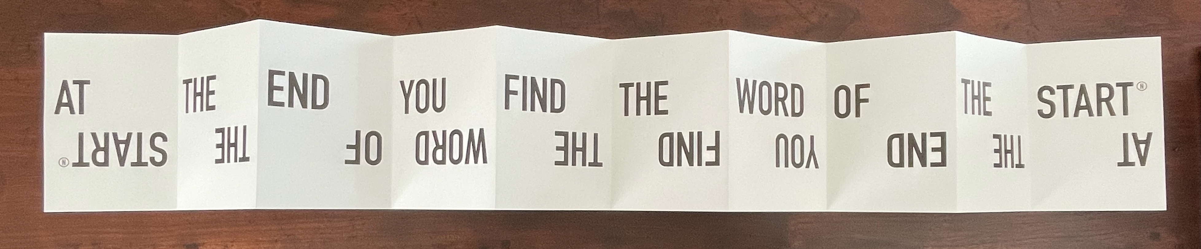
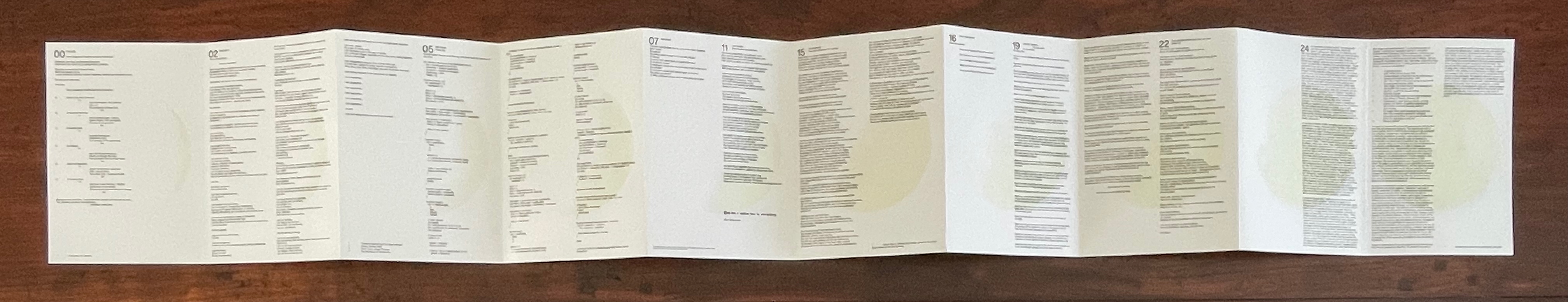
Enthusiasts and collectors of artists’ books should congratulate LL’Editions (Göteborg, Sweden) on its leporello series not only for the artists enlisted so far but for the constraint to inspire them. Critics of book art have opined that book artists turned to the accordion structure in the 20th century for more freedom with visual images and another tool with which to question the notion of the book as book. LL’Editions has challenged its invited artists with a constraint: a fixed-format leporello of ten panels, nine folds and always H140 x W100 mm (closed). The works are printed on Mohawk Superfine Eggshell paper. Housed in a custom box with the title hot foiled both on its front and spine, each volume in the series is limited to 250 numbered copies.
The real pleasure in each work and across the series is how each artist handles the shape to make it dance to a personal style or stamp. With each new addition — brick by brick — LL’Editions is building a monument to book art’s most common structure.
Leporello #12 (2025)
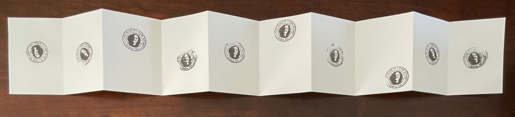
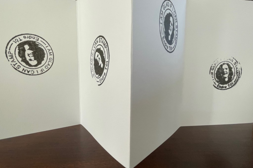
Leporello #12 (2025) Endre Tót Box: 148×191×23 mm. Leporello: H142 x W99 mm (closed); W990 mm (open). 10 panels. Edition of 250, of which this #70. Acquired from LL’Editions, 28 August 2025. Photos: Books On Books Collection. Displayed with permission of LL’Editions.
Bespoke Eska Board 1260 G/M2, Insert: F-Flute Black 500 G/M2, Hot-foiled title on front and spine. Mohawk Superfine Eggshell Ultrawhite 175 gsm.
Endre Tót has worked with a wide range of media: telegrams, postcards, posters, actions, and artist’s books. This one self-reflexively celebrates his signature gladness statements “We are glad if we are happy”, “I am glad that I have stood here”, “I’m glad that I can write one sentence after another”, “We are glad if we can demonstrate” and so on.
I am glad to have Endre Tót’s work in the Books On Books Collection.
Leporello #11 (2024)
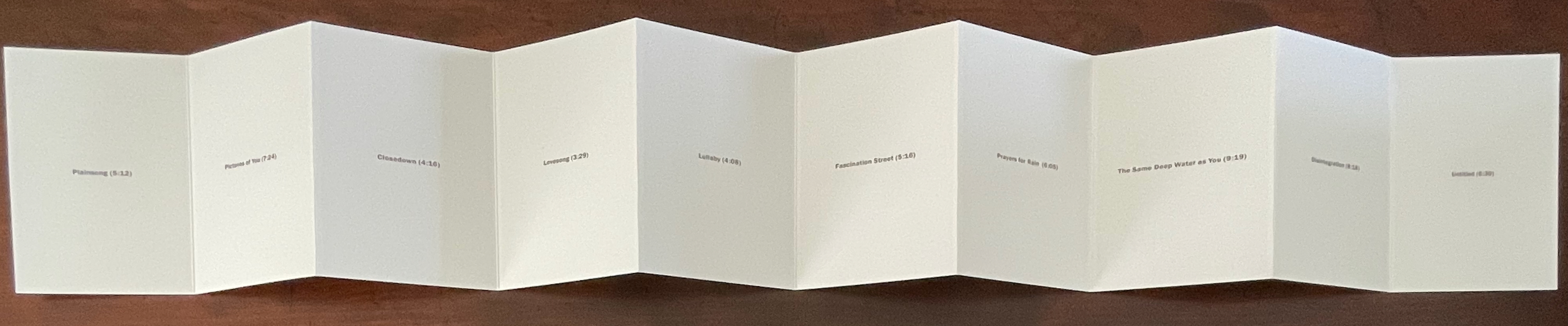
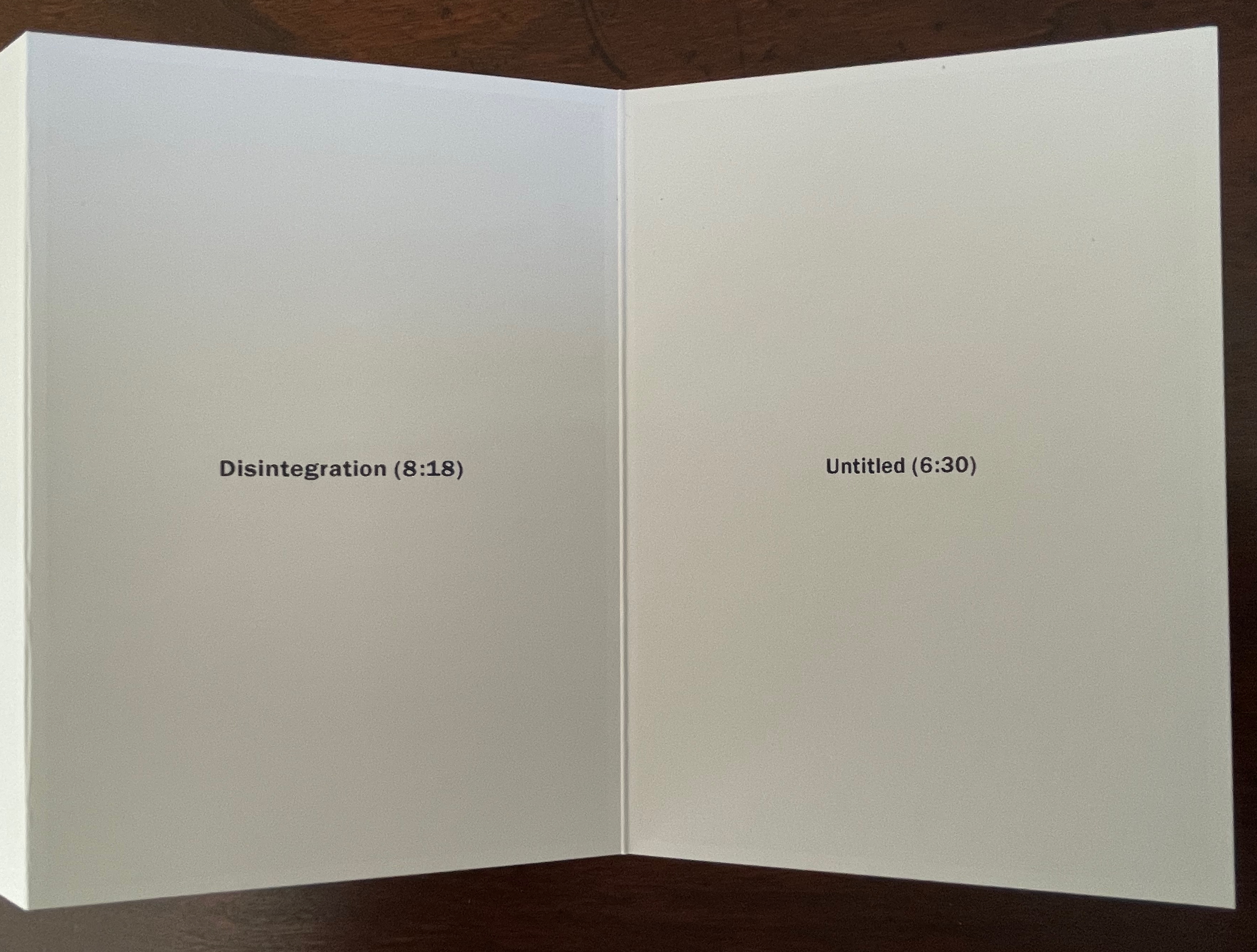
Leporello #11(2024) Alejandro Cesarco Box: H191 x W148 x D 23 mm. Leporello: H142 x W99 mm (closed). W990 mm (open). 10 panels. Edition of 250, of which this #229. Acquired from LL’Editions, 14 November 2024. Photos: Books On Books Collection. Displayed with permission of LL’Editions.
These are the titles and durations of the songs making up The Cure’s 1989 album. With each song on its own panel, Cesarco (b. 1975) seems to have created a photo album to remind himself of his youth. Given his artworks referencing/co-opting/implicating/appropriating John Baldessari, Marcel Broodthaers, Félix Gonzáles-Torres, Allen Ruppersberg, Ed Ruscha, and other book artists, the less-than-fans of The Cure may wonder if Cesarco is deliberately wrong-footing their expectations for his tackling the book artist’s platform. If you are one of them, consider that your horizons have been widened and that The Ramones (An Autobiography) (2008) — his list in chronological order of every Ramones song that begins with the pronoun “I” — does not neatly divide by 10.
Leporello #10 (2024)
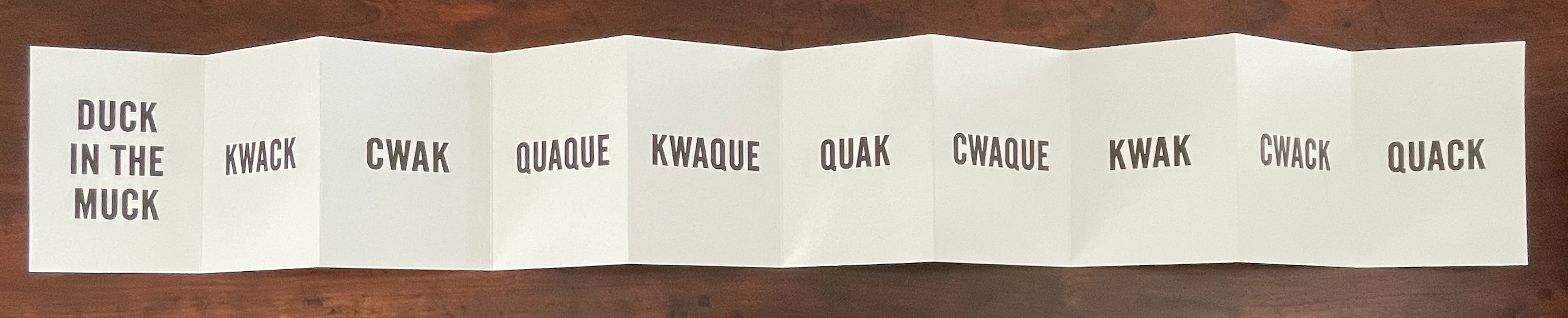
Leporello #10 (2024) Kay Rosen Box: H191 x W148 x D 23 mm. Leporello: H142 x W99 mm (closed). W990 mm (open). 10 panels. Edition of 250, of which this #116. Acquired from LL’Editions, 14 November 2024. Photos: Books On Books Collection. Displayed with permission of LL’Editions.
There’s a lengthy and excellent essay entitle “The Gravity of Language” about Rosen’s work in Osmos Magazine (Winter 2019) by Stephanie Cristello. In it, she writes:
You will notice, by now, that the works discussed here are united by their allusions to the motions of up and down. Does this seem arbitrary to you? Or strike you as the imposition of a rule-based physics upon an artistic practice whose oeuvre certainly contains variances, divergences, and oddities–cut out for the purpose of being explored through a particular force?Perhaps. (Cristello, 2019)
Somehow this more recent artist’s book seems to confirm and repudiate the critic’s approach. As if to say, “Yes, I’m stuck in the muck despite my variances, divergences and oddities”, or “No, ducky, there’s no gravitas or gravity here”. Or perhaps it’s Rosen’s visual way of using permutations on language (starting with a common expression) to poke fun at LL’Editions’ constraint: “So you want to confine me like a duck in the muck? Well, quack, the joke’s on you”.
Leporello #9 (2024)
Leporello #9 (2024) Pieter Laurens Mol Box: H191 x W148 x D 23 mm. Leporello: H142 x W99 mm (closed). W990 mm (open). 10 panels. Edition of 250, of which this #111. Acquired from LL’Editions, 14 November 2024. Photos: Books On Books Collection. Displayed with permission of LL’Editions.
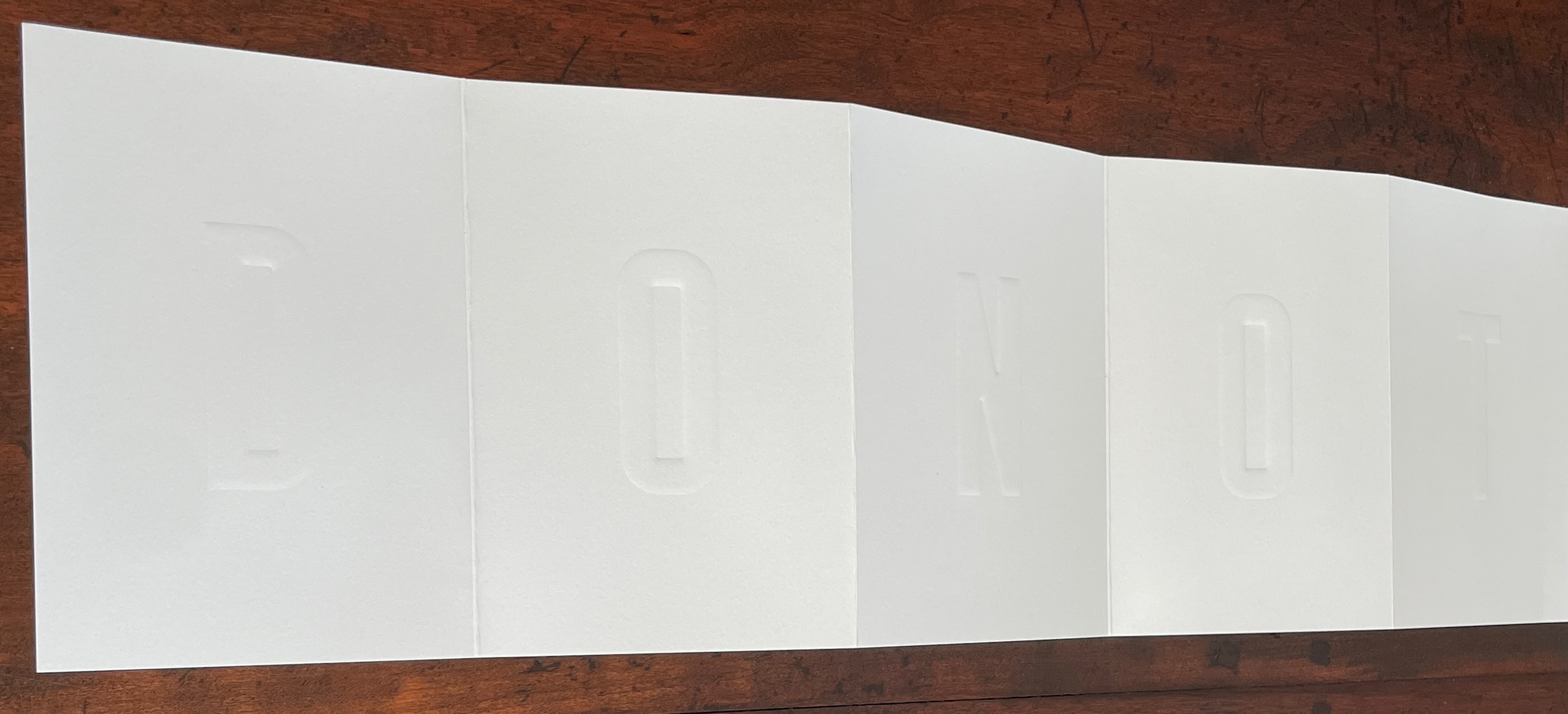
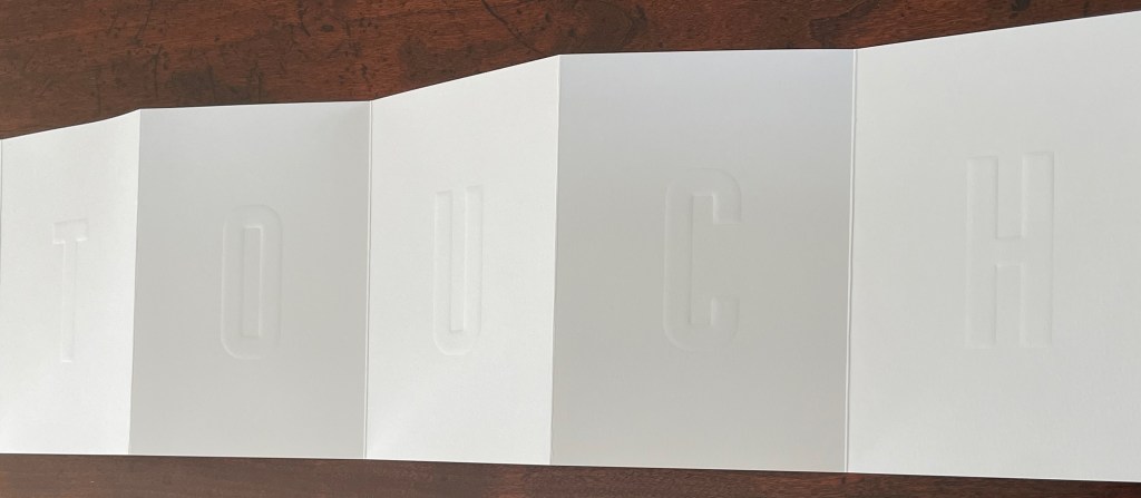
How many artists before and after Marcel Duchamp’s Prière de Toucher (1947) have played this joke in an artist’s book? Where Duchamp’s displayed work played against the usual museum injunction, Pol’s embraces and wrong-foots it with blind embossing.
Leporello #8 (2022)
Leporello #8 (2022) Jonathan Monk Box: H191 x W148 x D 23 mm. Leporello: H142 x W99 mm (closed). W990 mm (open). 10 panels. Edition of 250, of which this #175. Acquired from LL’Editions, 14 November 2024. Photos: Books On Books Collection. Displayed with permission of LL’Editions.
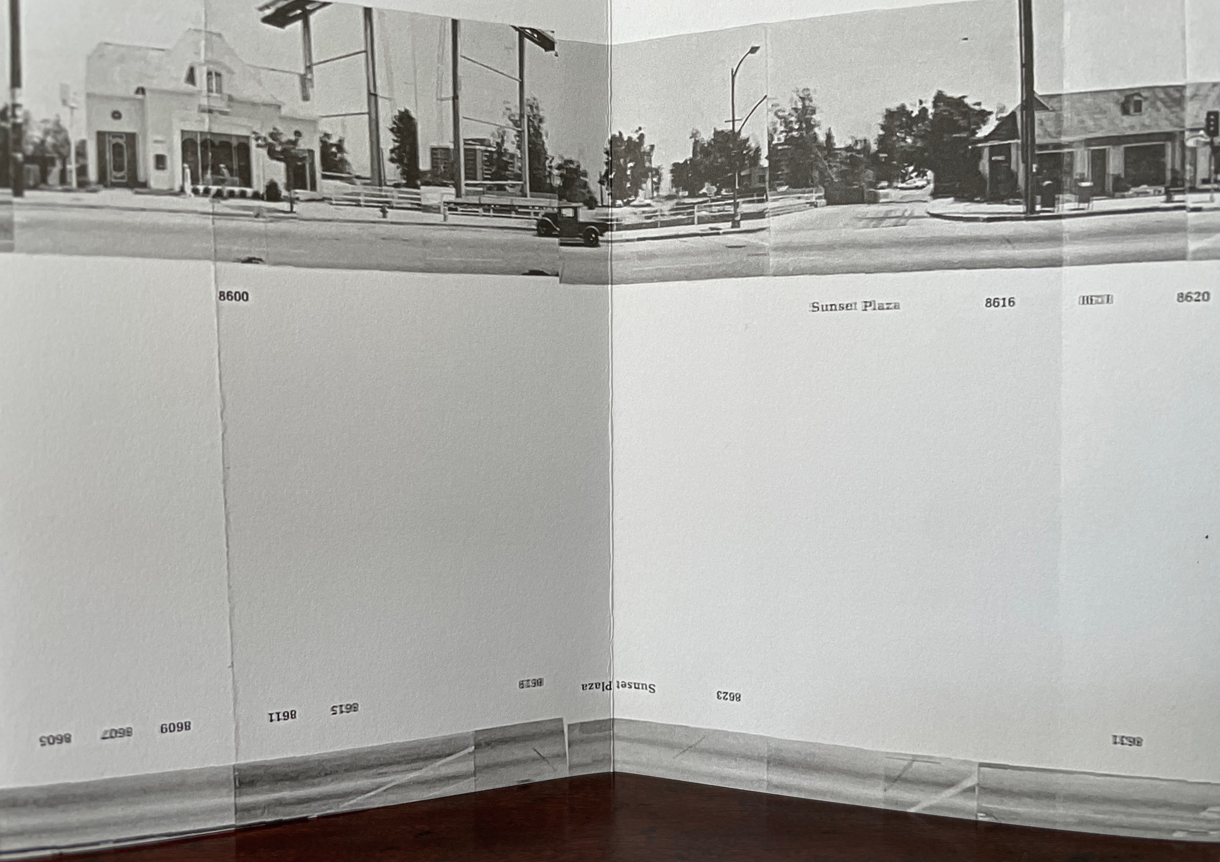
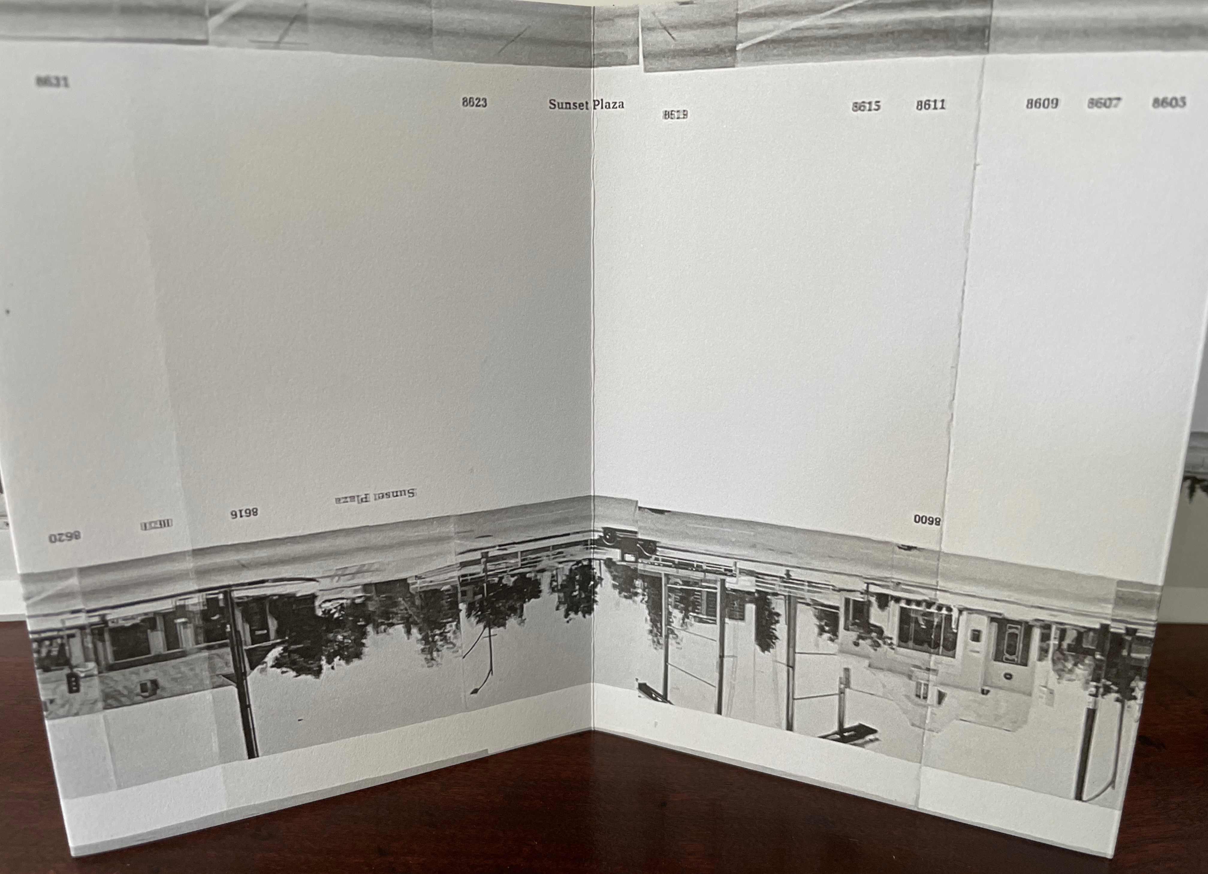
It helps to know or remember that in 2002, Jonathan Monk published None of the buildings on Sunset Strip with Revolver. Here, he has used his iPhone in panoramic mode to appropriate again Ed Ruscha’s Every Building on the Sunset Strip (1966). But when Monk’s leporello is turned over, notice that this side of the Strip has been truncated. Monk’s thoughts on appropriation and self-reflexivity can also be enjoyed in the three-handed interview Books on Books (2011) with Jérôme Saint-Loubert Bié and Yann Sérandour.
Leporello #7 (2022)
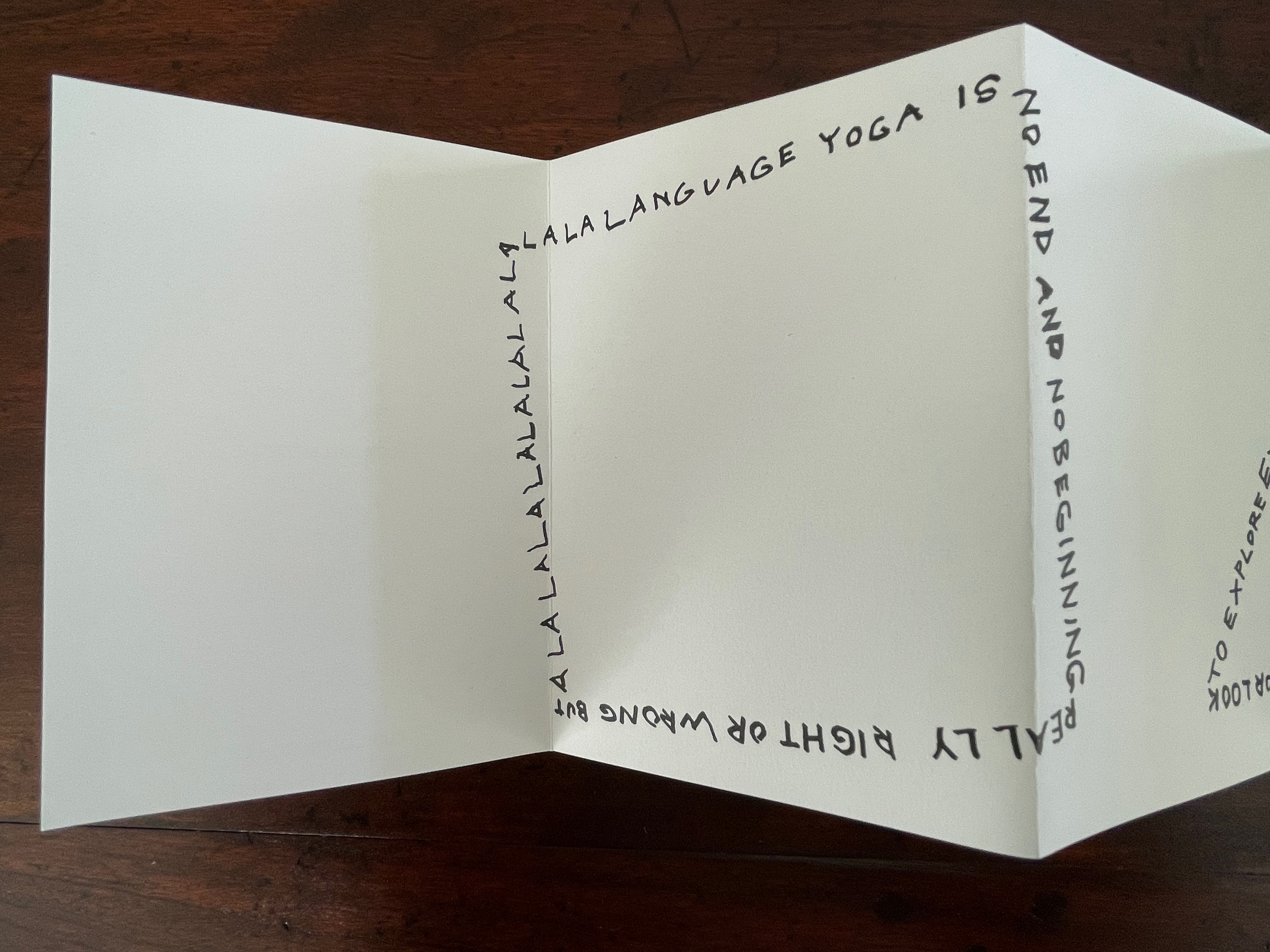
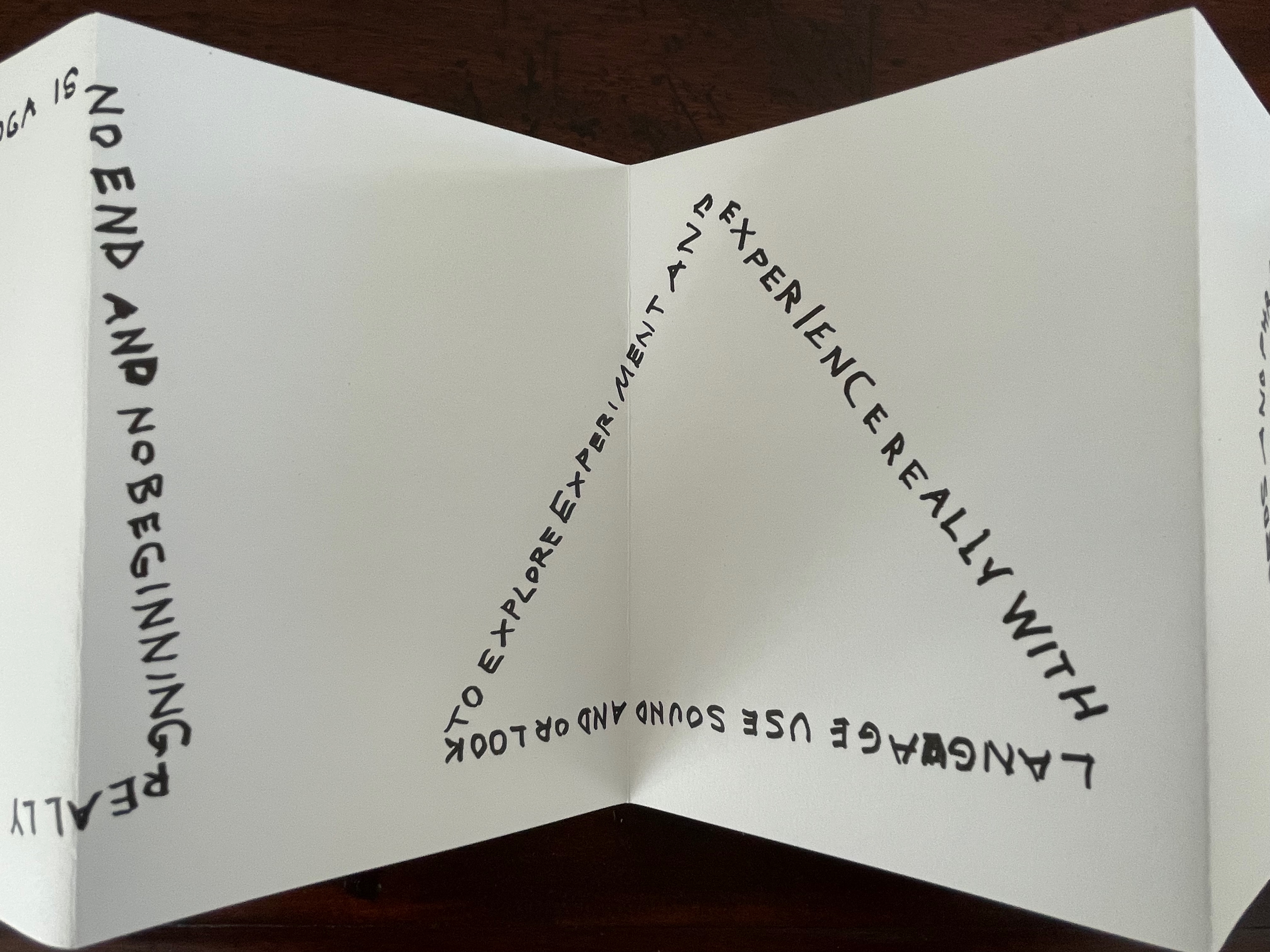
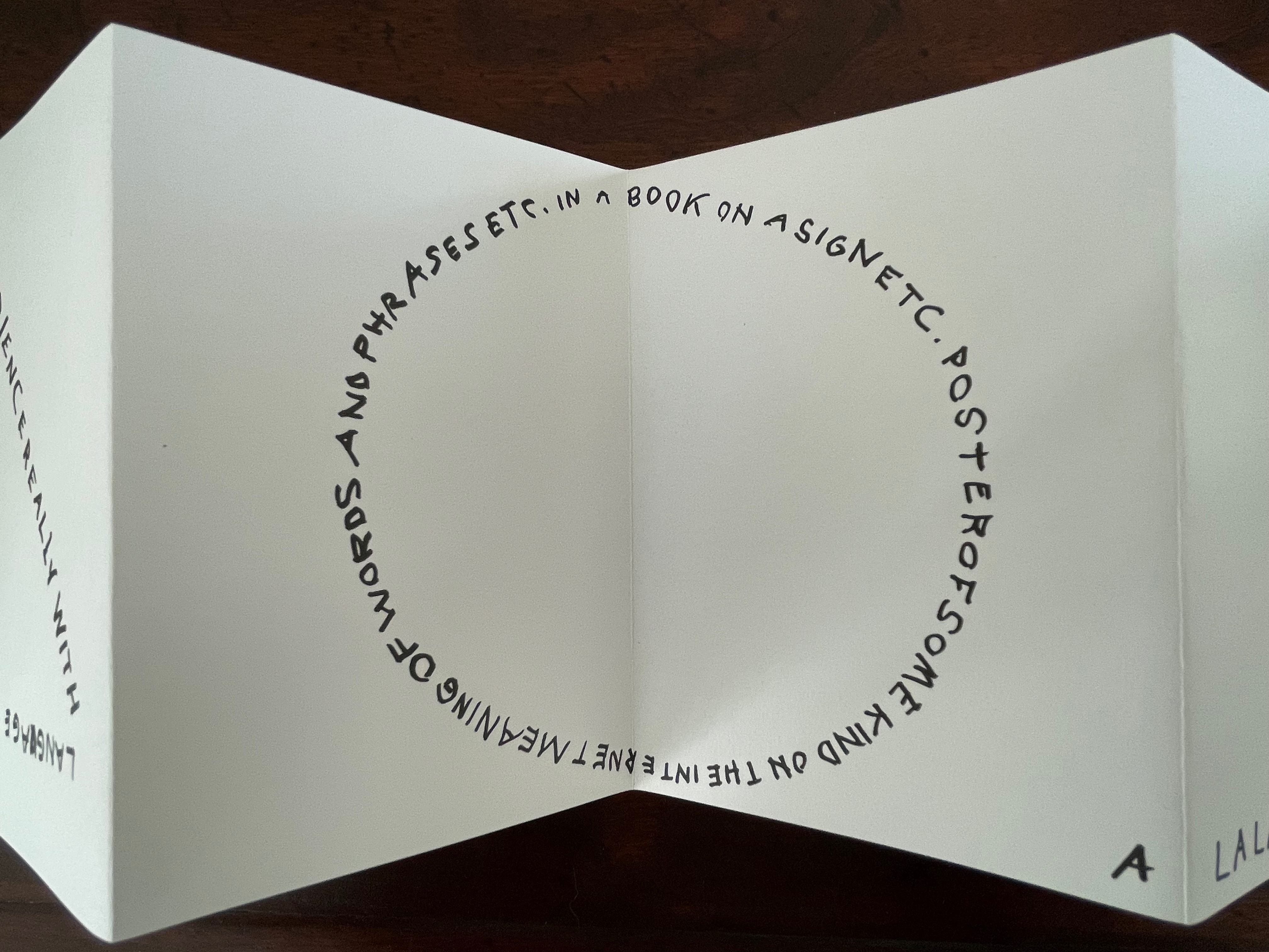
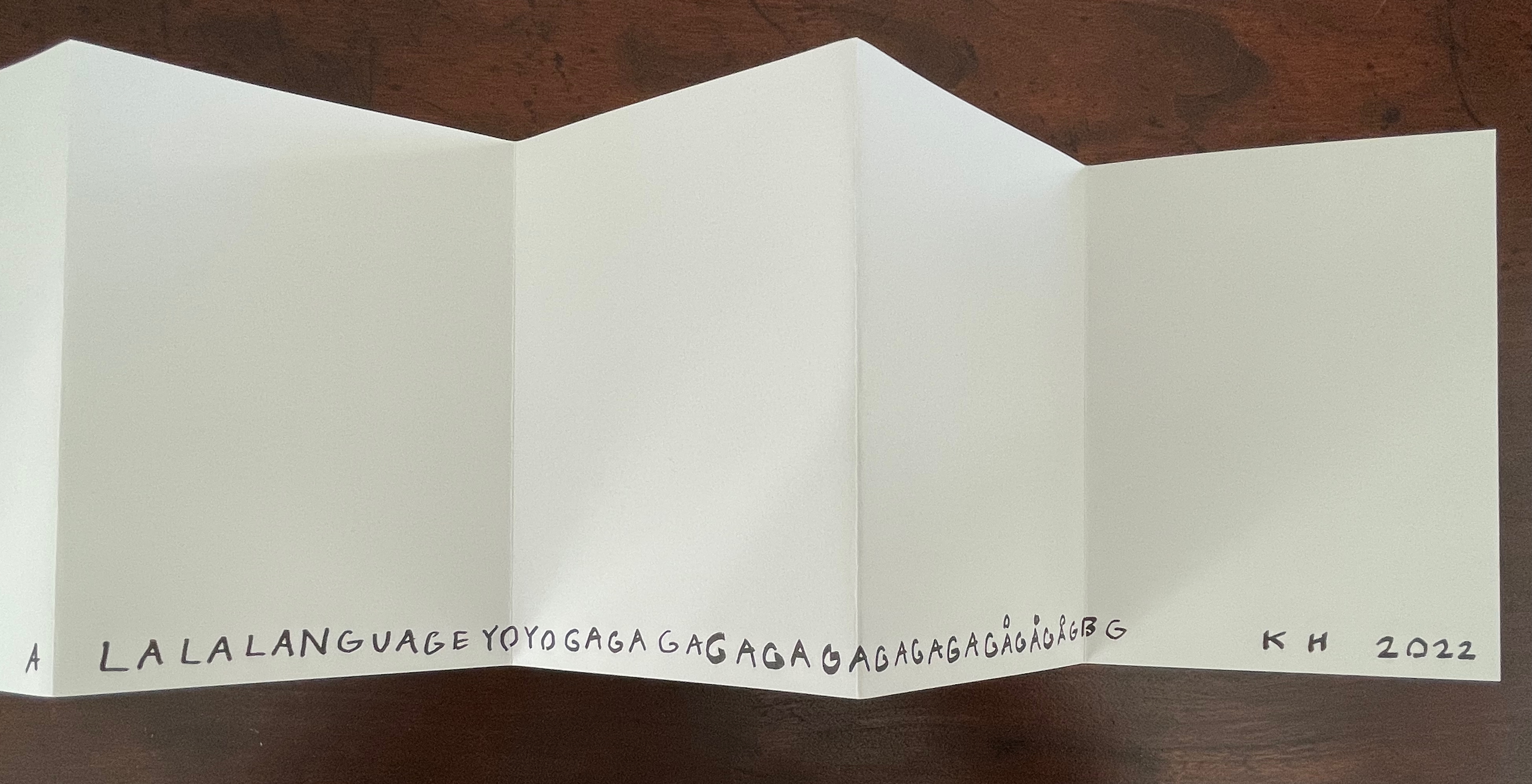
Leporello #7 (2022) Karl Holmqvist Box: H191 x W148 x D 23 mm. Leporello: H142 x W99 mm (closed). W990 mm (open). 10 panels. Edition of 250, of which this #110. Acquired from Unoriginal Sins, 14 November 2024. Photos: Books On Books Collection. Displayed with permission of LL’Editions.
Here’s one to add to Bruno Munari‘s collection of squares, circles, and triangles. While the yoga may also remind you of Ric Haynes‘s Aquatic Yoga with Dangerous Foods (1984), this leporello is a welcome opportunity to experience this Swedish artist’s ability to weld language and shapes together in perceptive and humorous (and sometimes acerbic) ways. Galerie Neu in Berlin has been astute enough to hold three solo exhibitions for Holmqvist since 2013; their display of his works here provides views of his several sculptures that chime with Leporello #7.
Leporello #6 (2022)
Leporello #6 (2022) Maurizio Nannucci Box: H185 x W148 x D 23 mm. Leporello: H143 x W90 mm (closed). W900 mm (open). 10 panels. Edition of 250, of which this #106. Acquired from Unoriginal Sins, 14 November 2024. Photos: Books On Books Collection. Displayed with permission of LL’Editions.
It’s hard to believe that Leporello #6 may be one of only three accordion books produced by this prolific and inventive artist associated with Fluxus. The other two are Sessanta Verdi Naturali (Sixty Natural Greens)(1977) and Up Above the Wor(l)d/A Guide for Aliens (1981). In Leporello #6, he has made the accordion structure, panel layout, and language reinforce one another simultaneously to create an ouroboros artwork.
Leporello #5 (2022)
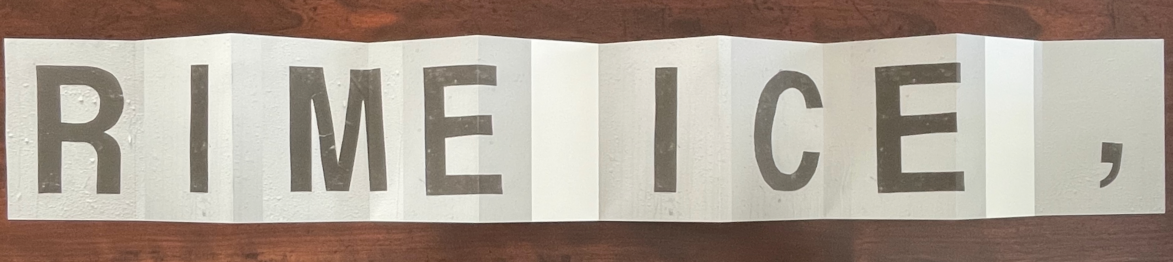
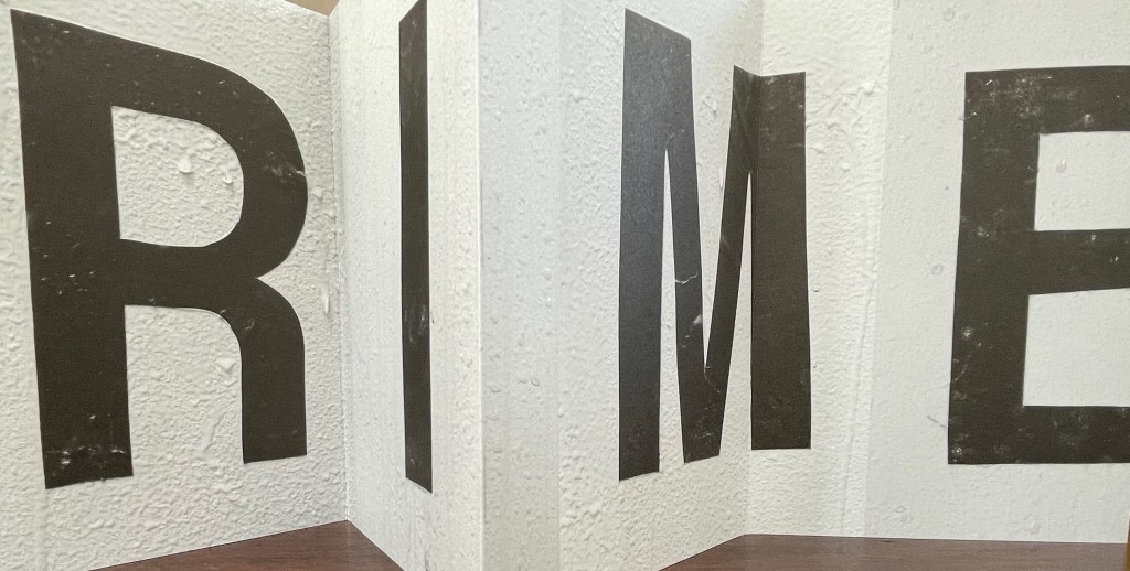
Leporello #5(2022) Shannon Ebner Box: H185 x W148 x D 23 mm. Leporello: H143 x W90 mm (closed). W900 mm (open). 10 panels. Edition of 250, of which this #132. Acquired from Unoriginal Sins, 14 November 2024. Photos: Books On Books Collection. Displayed with permission of LL’Editions.
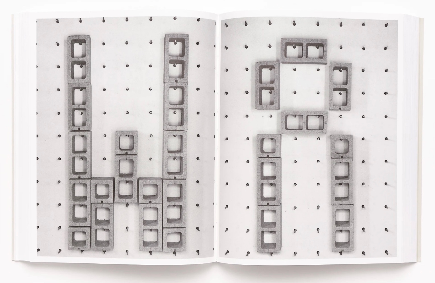
Since her participation in MoMA’s Ecstatic Alphabets/Heaps of Language in 2012, Shannon Ebner has been a book artist to watch for bringing the alphabet and the artist’s book together.
Her Strike (2014) concretely rewarded the alert. The textures of melting ice in Leporello #05 and concrete blocks in Strike seem to leap off the letters and paper. From the LL’Editions’ description of Leporello #05:
Ebner has selected specific materials based on their self-reflexive relationship to the subject of the writing itself. Each photographic typeface is in essence a material response to the various cultural conditions and societal pressures at hand. For Ebner’s leporello, the meteorological term RIME ICE is its single subject, though the phenomenon itself falls into two categories, soft or hard rime. In either case it is rime ice that forms when liquid droplets comprised of supercooled water freeze onto surfaces. RIME ICE is an outtake from Ebner’s recent exhibition FRET SCAPES (2022). FRET is acronym for the Forecast Reference Evapotranspiration Report, a report that is generated by climate scientists to measure the rate at which water that falls to the ground will evaporate to the sky.
Leporello #04 (2021)
Leporello #04 (2021) Ryan Gander Box: H191 × W148 x D23 mm. Leporello: H142 x W99 mm (closed), W990 mm (open). 10 panels. Edition of 250, of which this #32. Acquired from Unoriginal Sins, 14 November 2024. Photos: Books On Books Collection. Displayed with permission of LL’Editions.
Ryan Gander has repurposed his installation Staccato Reflections (2017-20) to create Leporello #04. The tiny text originates from the artist’s notebook. In Staccato Reflections, it appears in a normal-sized font in business-directory format on a freestanding reflective screen. Gander describes the installation this way in an interview in Art in America:
Staccato Reflections is based on the idea of the self in culture, the obsession with the me and the selfie and the narcissist wand. The surface is mirrored, so as you read the words, you see yourself. The work has devices in it that are self-referential. It asks you to touch the screen, and then says “don’t touch the screen.” So it seems like it is responding to you, but it’s not.” (Fullerton, 107)
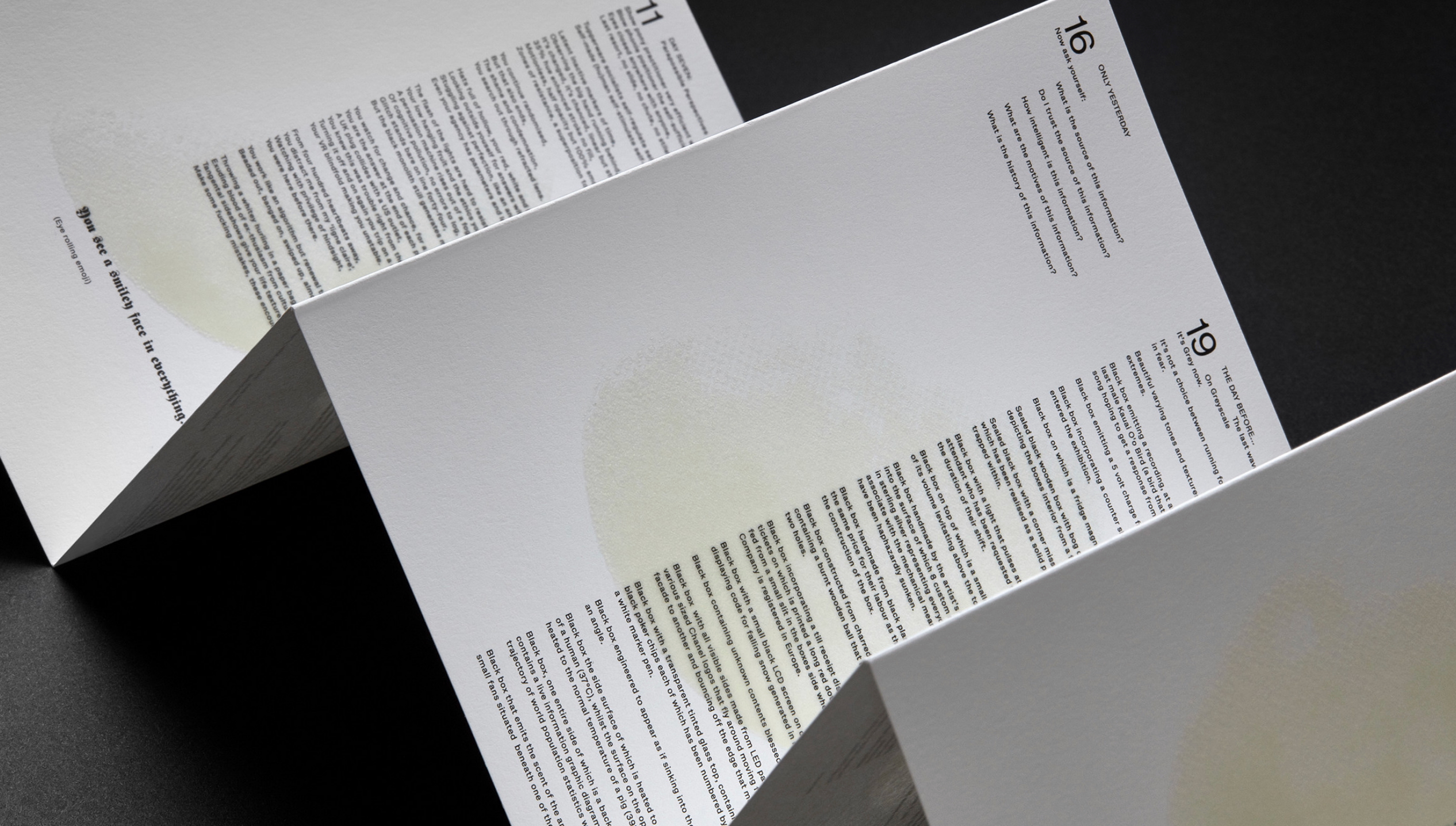
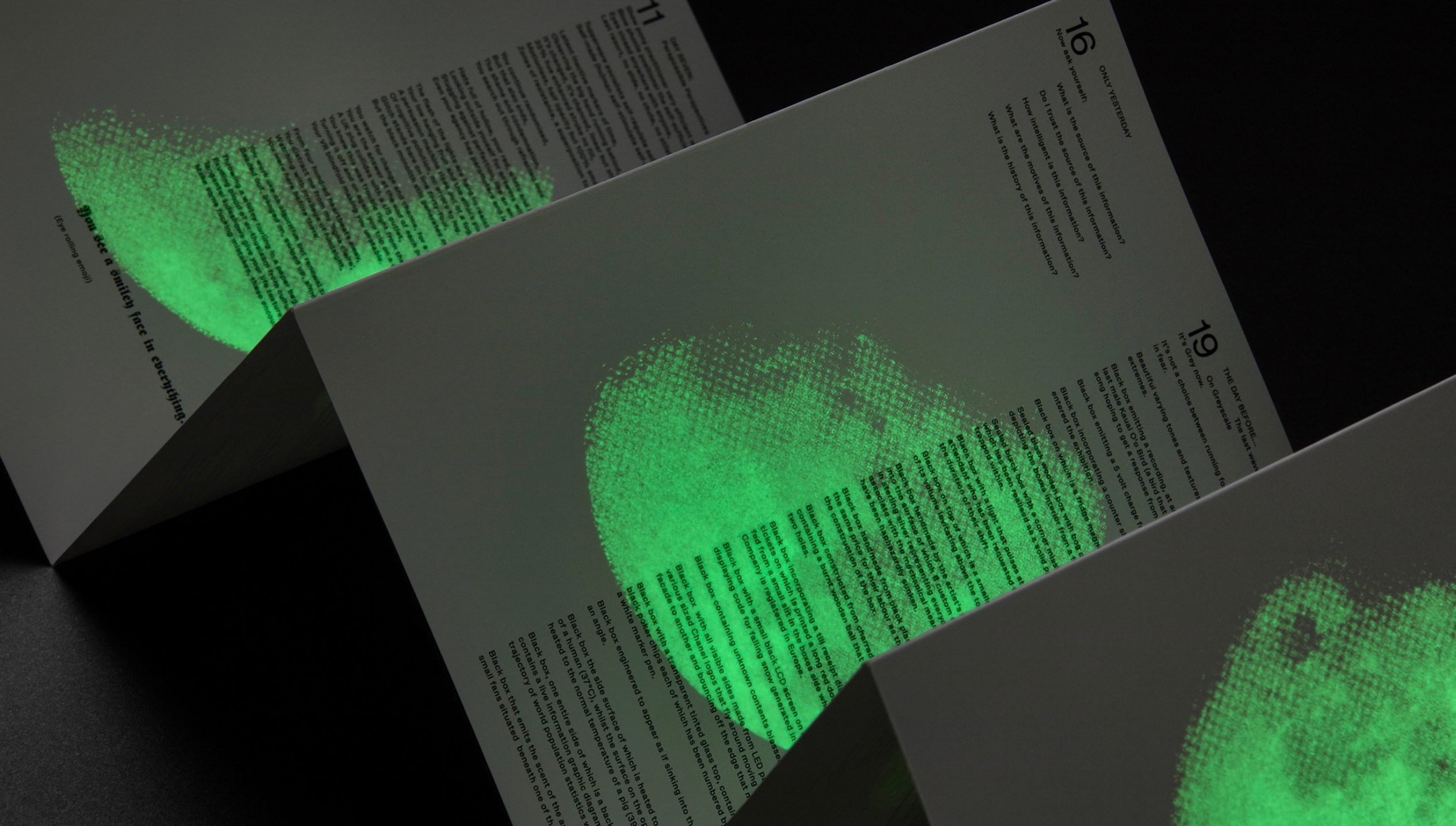
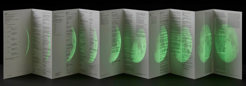
With its miniscule print requiring the enclosed rectangular plastic magnifying glass, and with its overprint in glow-in-the-dark ink of a waxing full moon, Leporello #04 marks quite a departure from the installation.
Leporello #03 (2021)
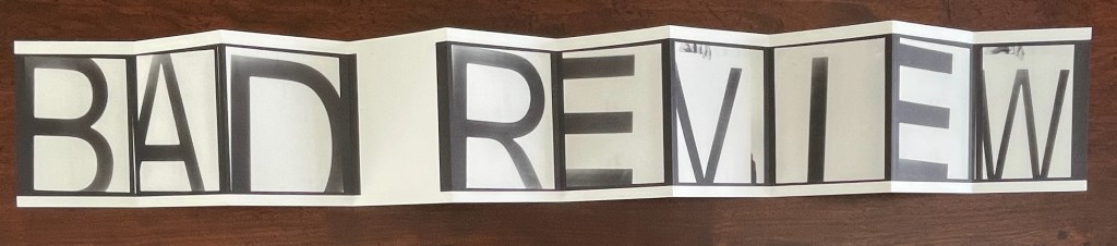
Leporello #03 (2021) Fiona Banner Box housing leporello. Box: H185 xW140 xD25 mm. Leporello: H140 x W100 mm. 10 panels. Numbered edition of 250, of which this #42. Acquired from Unoriginal Sins, 14 November 2024. Photos: Books On Books Collection. Displayed with permission of LL’Editions.
With Leporello #03, Fiona Banner repurposes the previously repurposed conceptual artwork Bad Review. It has appeared as a C-typeprint with the words overlaid on a rearview mirror and as a sculpture. To reproduce the two words, Banner uses found letters photographed held up by hand and badly positioned. Is it serendipity or cheeky genius that, like readymades, the nine letters and space of Banner’s conceptual artwork fit the ten panels imposed by LL’Editions to give us another re-view?
Leporello #02 (2021)
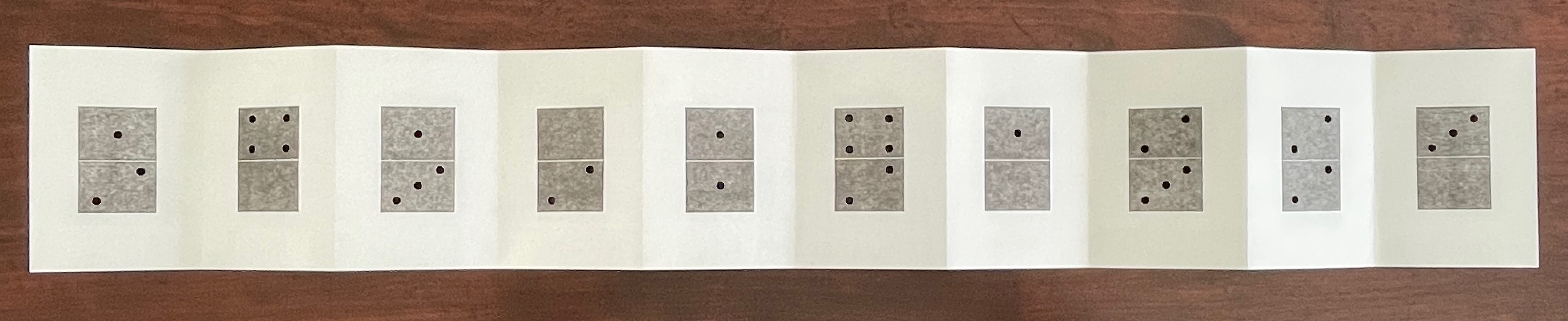
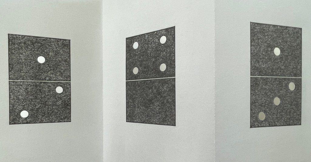
Leporello #02(2021) Micah Lexier Box housing leporello. Box: H185 xW140 xD25 mm. Leporello: H140 x W100 mm. 10 panels. Edition of 250, of which this #171. Acquired from Unoriginal Sins, 14 November 2024. Photos: Books On Books Collection. Displayed with permission of LL’Editions.
Publisher’s description: A number of years ago Micah Lexier purchased a small paperback publication about the game of dominoes. The very end of the book consisted of a series of pages that reproduced a complete set of twenty-eight domino tiles. The images were printed on right-hand pages, four to a page, while the left-hand pages were blank. The idea was that you were supposed to cut these images out of the book and glue them to empty matchboxes to create your own do-it-yourself set. That sequence of pages, combined with the quality of their reproductions, was the inspiration for Lexier’s leporello. To that, he added two favourite print techniques – perforations and die-cut holes – to create a set of ten domino tiles. Lexier chose the denomination of each tile and its order in the leporello so that none of the thirty-four die-cut holes line up with each other, allowing each hole to be misread as a printed white domino dot.
If you stand Leporello #02 on its edge on a table and then lean forward to view the panels at eye level, the domino images seem to have grown into oversized hangings on gallery walls. You can see some of the die-cut holes if you look closely at the lower right corner below.
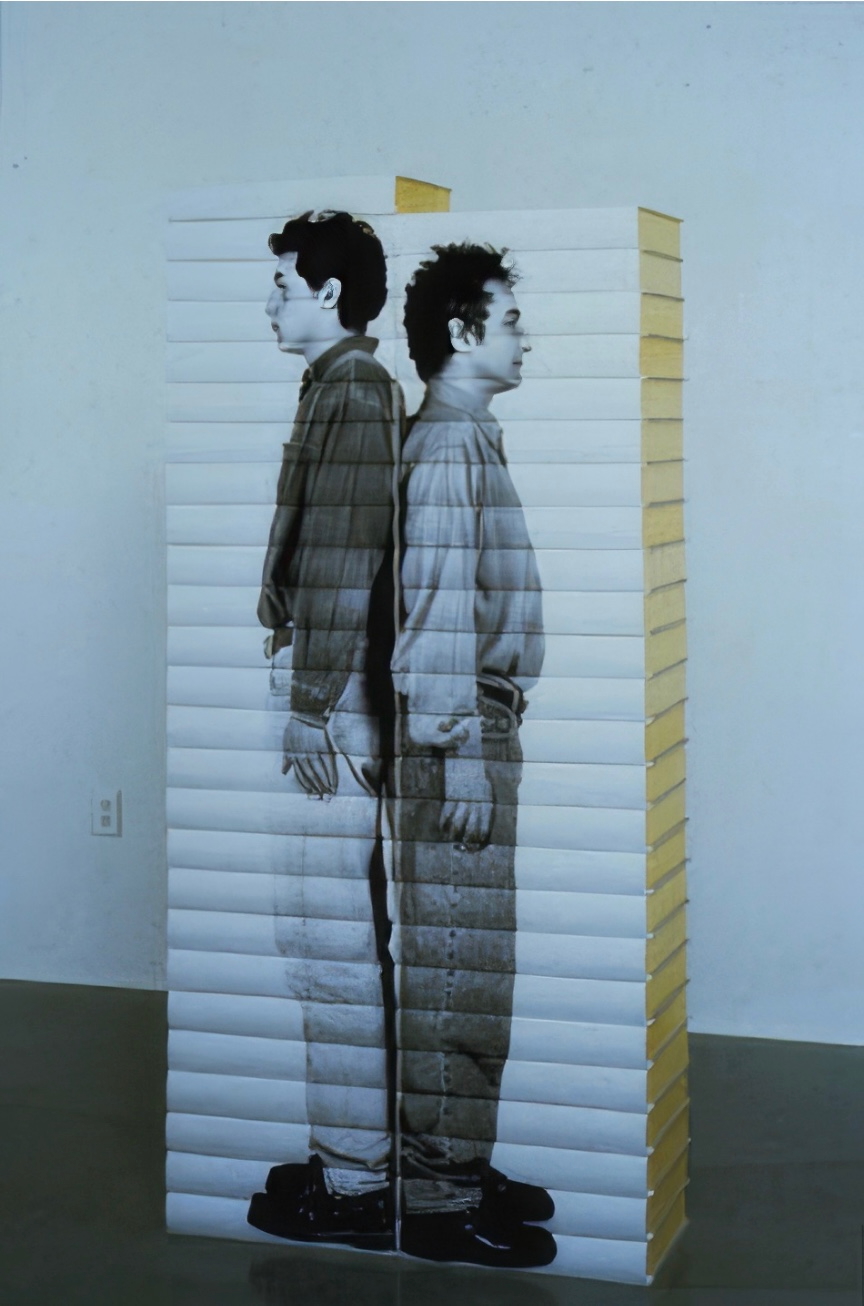
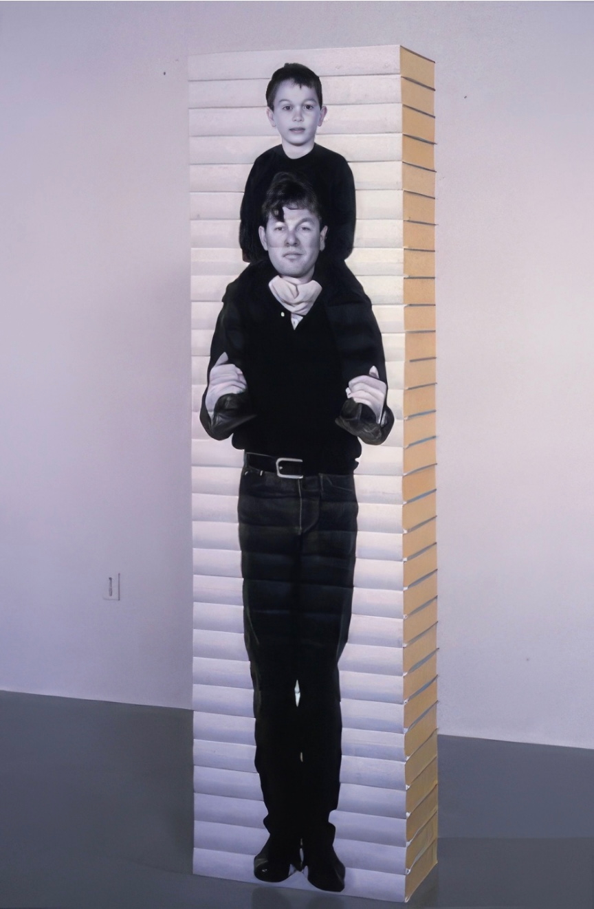
It’s a peculiar sensation, but it echoes Lexier’s website, which highlights mostly installations and large-scale works. Even more so it echoes Robert Birch Gallery in Toronto, which emphasizes his large wall displays. On both sites, Lexier’s play with patterns, shapes, tiles, and contrasts of black and white stands out. Although it’s not clear from those current sites, he has many book-related works. In the ’90s, he produced book sculptures in which each spine in a stack of books would have part of a life-size photo of a human subject printed on it. Properly stacked, the books display the human figure.
As can be seen in Leporello #02 and other works on display in the CCCA Canadian Art Database Project, Lexier likes to work with found objects. As can be seen in the book sculptures above and in the Database Project, Lexier’s art also reflects on relationships and community. Leporello #02 neatly and abstractly brings these two themes together with the found dominoes game book and the game’s communal roots.
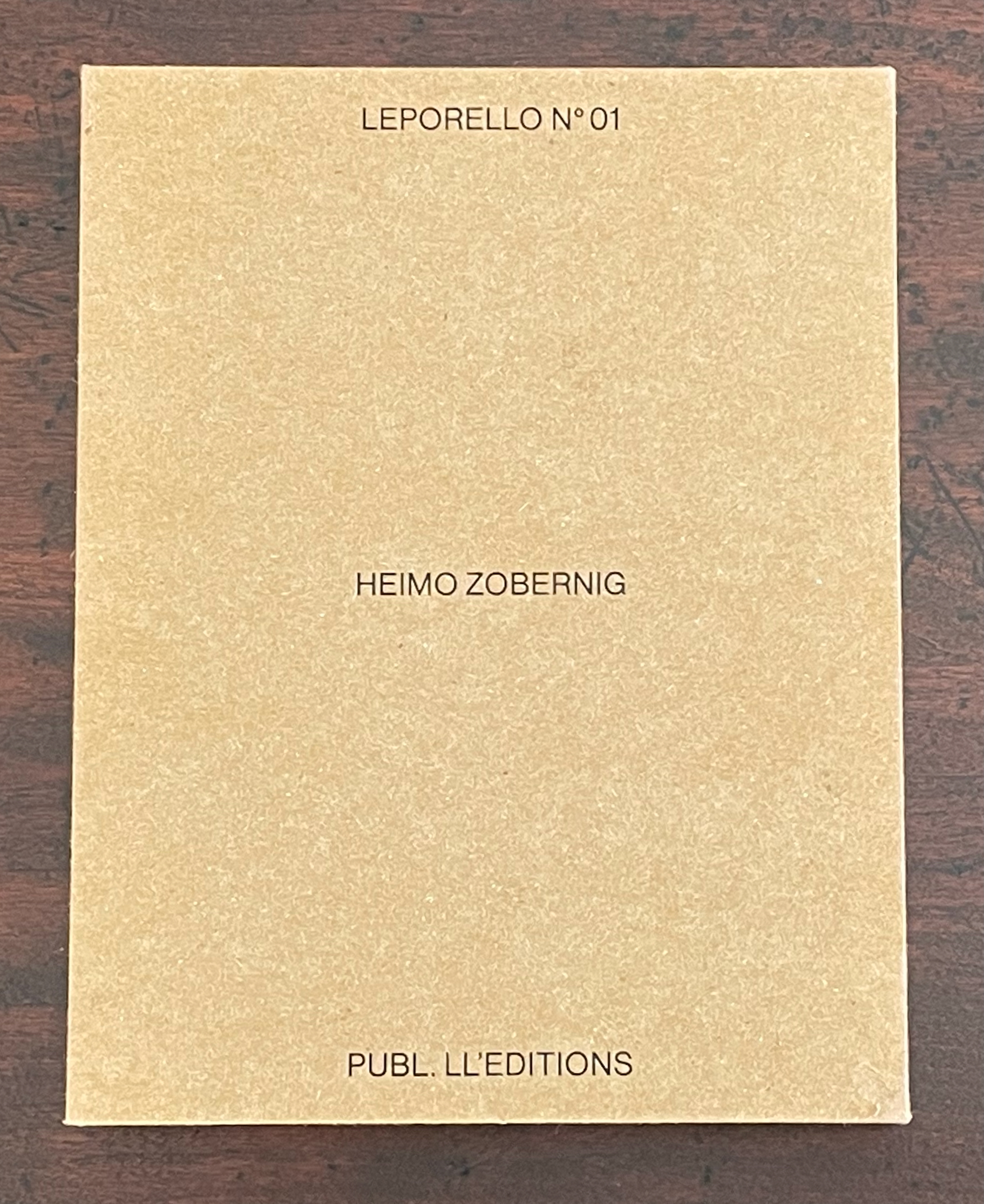
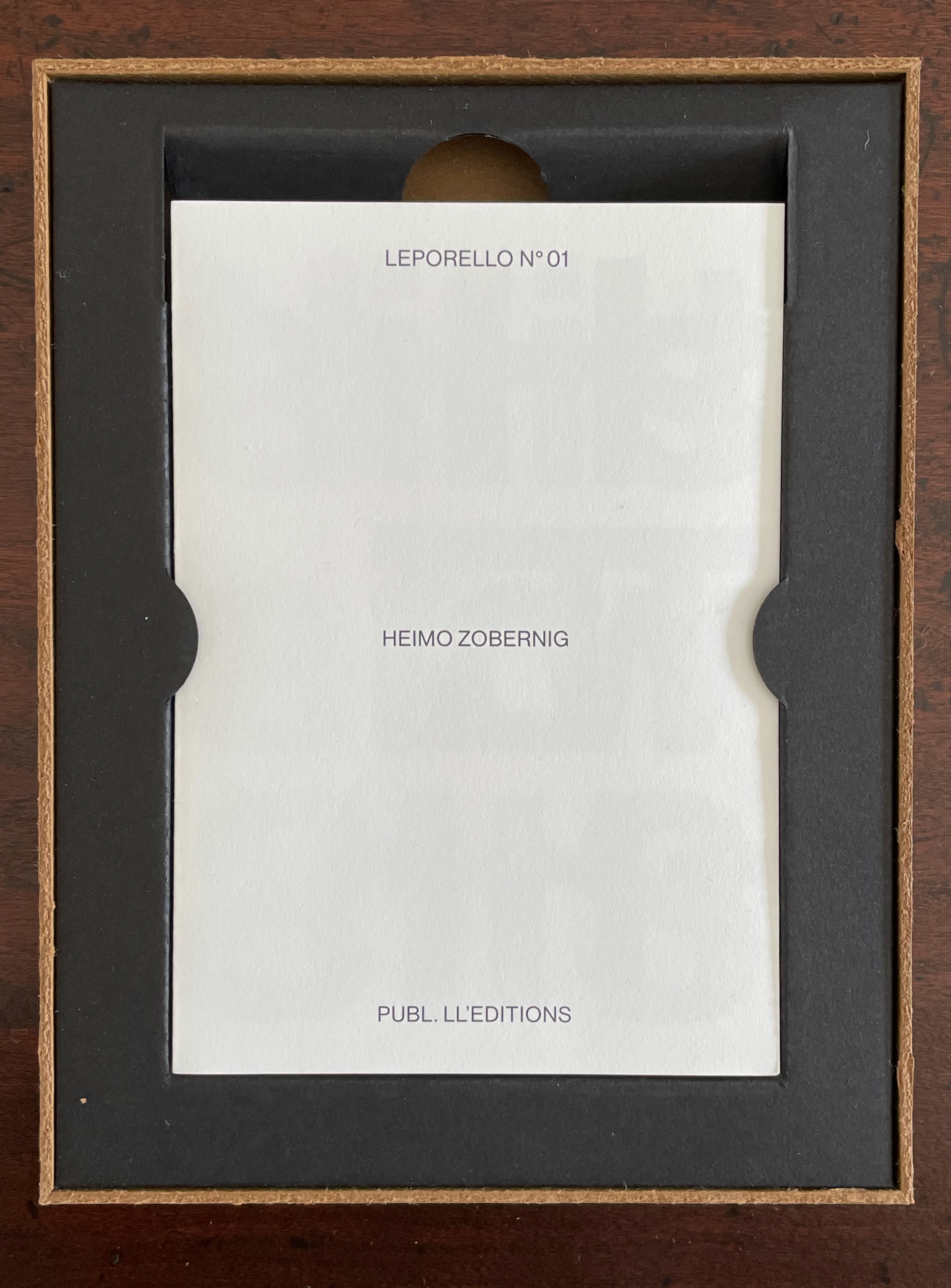
Leporello #01 (2021)
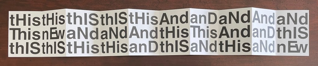
Leporello #01 (2021) Heimo Zobernig Box housing leporello. Box: H185 xW140 xD25 mm. Leporello: H140 x W100 mm. 10 panels. Edition of 250, unnumbered. Acquired from Unoriginal Sins, 14 November 2024. Photos: Books On Books Collection. Displayed with permission of LL’Editions.
If you extend Leporello #01 fully, you are likely at first glance to project onto it the common expression “this and that”, but thwarted, you then start looking for another phrase comprised of “His”, “IS”, “And”, but you run into “Ew” or “nEw”, which throws you into renewed pattern-seeking behavior. Should you count the “this’s” and “and’s” in each row? Maybe there’s something in the pattern of lowercasing and uppercasing? Is there anything to the fact that the word “new” never begins with an uppercase N, or that it occurs only twice? Maybe you should read the rows aloud? With that, you may remember that, in earliest writings, words were not spaced and mixed majuscule and miniscule didn’t come along until later. Now you see how the folds are the primary means of separating the words in this book. This becomes clearer if you read the book panel by panel, or page by page codex-style. But now there are other possible patterns: does the book begin with “thIs, This, thIS” and proceed to “tHis, nEw, thIS”, and so on?
Somehow the acronym “WYSIWYG” — what you see is what you get — pops to mind, but Leporello #01 seems also a case of “WYGIWYS” — what you get is what you see. Fully extended or panel by panel, Leporello #01 offers more to see than a glance will get you.
Leporello #01 continues Zobernig’s love affair with Helvetica, which is also on display in Farben Alphabet (2018) and CMYK (2013), also in the Books On Books Collection.
Fullerton, Elizabeth. 28 April 2017. “In the Studio: Ryan Gander“. Art in America. Accessed 7 November 2025.
Hubert, Renée Riese, and Judd David Hubert. 1999. The Cutting Edge of Reading : Artists’ Books. New York City: Granary Books. See chapter 6, “Variations on the Accordion”, pp. 97-122.
Altered books as artists’ books present a seemingly endless variety.
Some may be the conversion of old books into just-legible new ones as in A Humument redacted with ink, paint, excision, and collage by Tom Phillips, Tree of Codes mechanically excised by Jonathan Safran Foer, or The Eaten Heart scalpeled into existence by Carolyn Thompson. They give us a new work to read page by page extracted page by page from the earlier work, which remains more or less (mainly less) present in our hands.
Others like Marcel Broodthaers’ page-by-page redactions of Mallarmé’s Un Coup de Dés by ink in one case and excision in another or Michalis Pichler’s similar reformatting and excision of the same poem in clear acrylic or Jérémie Bennequin’s page-by-page erasures of Proust’s Remembrance of Things Past give us artists’ books that make the altered books illegible but still accessible page by page.
Other altered books as artists’ books are mainly one-off spatial objects that can be taken in in one go — not necessarily in just a glance but in the look or gaze given to a sculpture or painting. The ground up and encased works in Literaturwurst by Dieter Roth. The sealed, painted, nailed, and “hairied” works of Barton Lidice Beneš. The torn works of Buzz Spector. The sandblasted works of Guy Laramée. The glued and carved works of Brian Dettmer. The bullet-hole-ridden Point Blank by Kendell Geers. The pun-packed moebius-sculpted Red Infinity #4 by Doug Beube. They give us artists’ books that make the altered books illegible and inaccessible as books.
In the 1970s, post-Minimalism, post-Conceptualism, Language-based Art, Neo-Dada, Fluxus, Arte Povera, OuLiPo, the commodification of art and the “dematerialization of the art object” — all made a messy milieu for visual and literary artists. According to Stefan Klima, this is also the period when the messy notion of the artist’s book or “book art” gained recognition as a genre with exhibitions curated by Dianne Vanderlip for Moore College of Art and Design, Germano Celant for Nigel Greenwood Gallery, and Martin Attwood for the Arts Council of Great Britain.
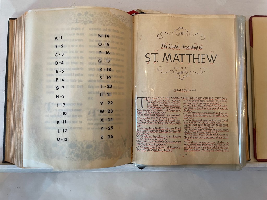
Into this environment came Bronx-born Karen Shaw, an aspiring artist and data analyst for the broadcaster NBC. On the job, she learned about the hash function — that one-way cryptographic algorithm that condenses input data of any size into an output of fixed lengths. When she saw that she could change a word into a number by assigning each letter a number according to its place in the alphabet and then summing them up, she arrived at the idea of reducing “the masterpieces of literature, poetry and prose to a number, which would signify the ‘essence’ of the work”.
After applying the approach to Blake, Shelley, Keats and others, she tackled the King James version of the Gospel according to St. Matthew. Here’s her description of the procedure:
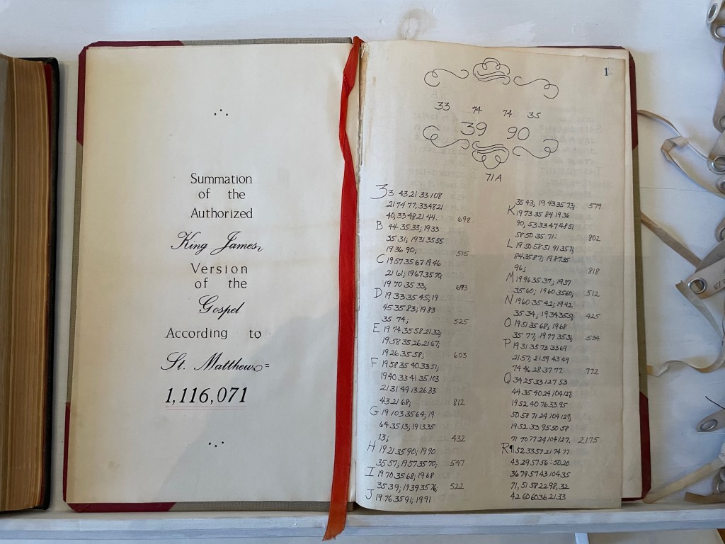
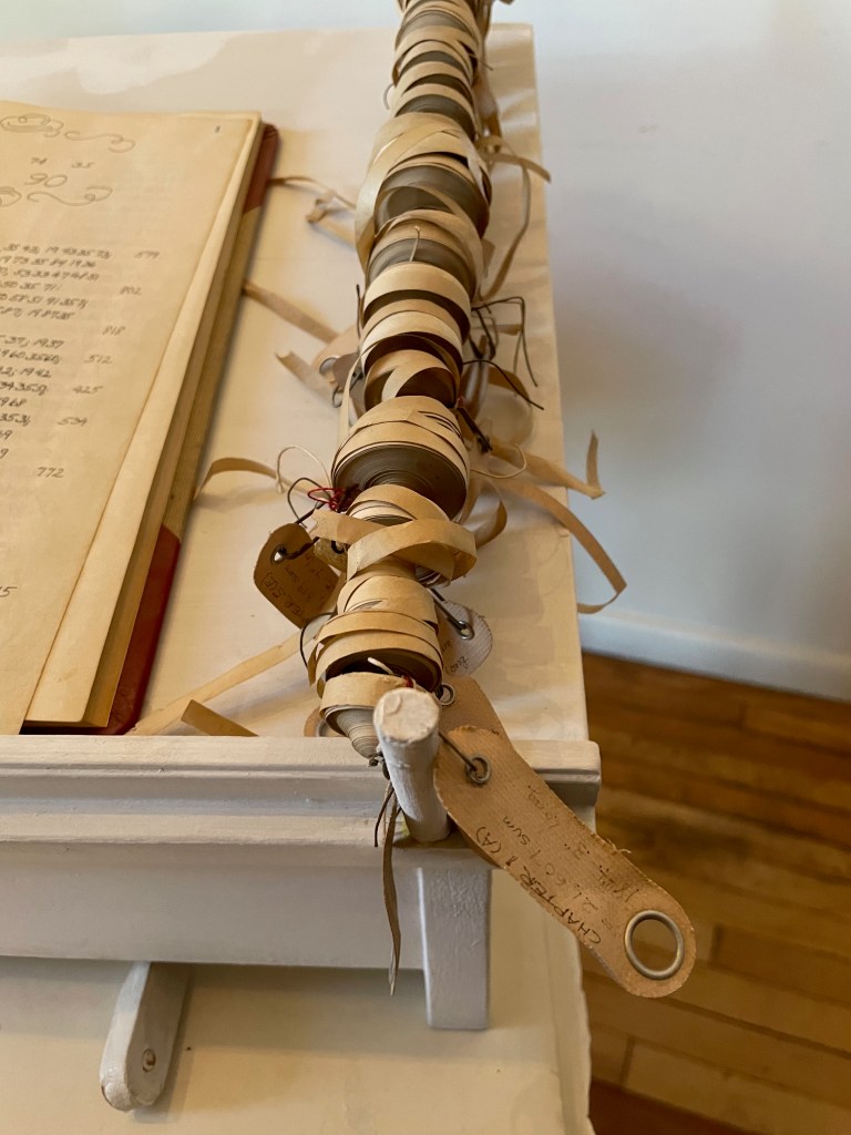
I wrote the numerical equivalent of each letter under each letter … in the Bible itself. Then I added up the number/letter of each word until I had the sum for each word, verse, and chapter. I then recorded the sums in an accounting book. This became the second version …. Next I added it all up on adding tapes, one tape for each chapter, which I measured to find out the length of each chapter. I then attached each labeled tape to a rod at the edge of a shelf that had been built to hold the work. This was the third version …. (Sellem, “Karen Shaw = 100”.)
Here was an utterly different form of artist’s book by alteration: an assemblage of a “Rembrandt” Bible’s St. Matthew Gospel with each letter hand-numbered according to its place in the alphabet; each of the gospel’s words summed and recorded in an accounting book with all of its word-sums summed to its essence of 1,116,071; and the “scrolls” of the adding machine tapes for each chapter ranged alongside the Bible and accounting book. For Shaw, this altered-book form of art was merely a first step into a series of discoveries and inventions that led to a lifetime of artistic exploration and creation.
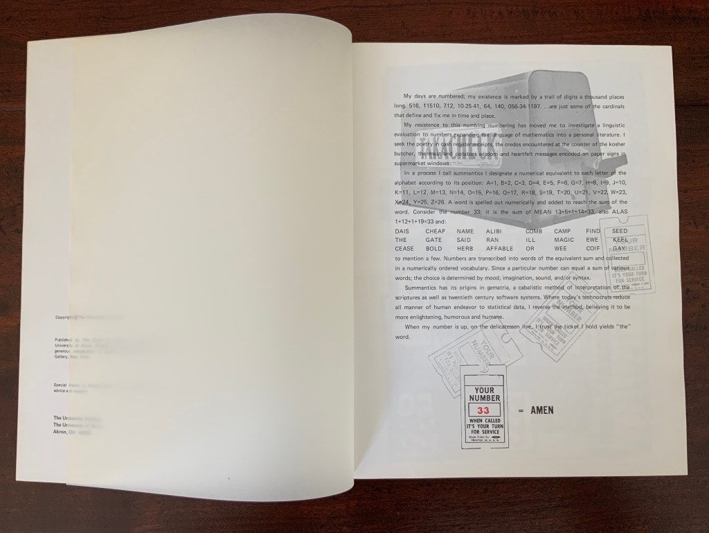
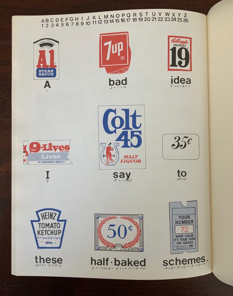
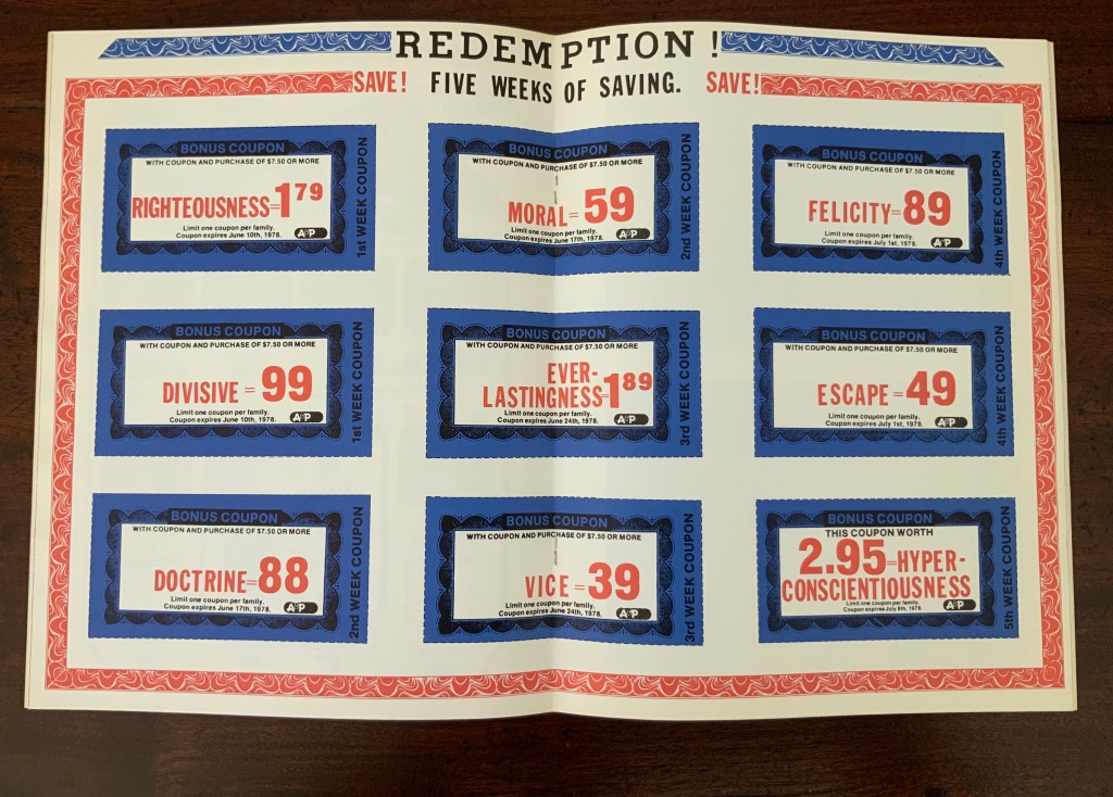
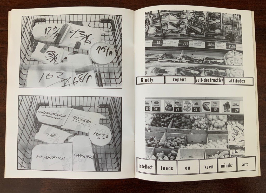
As she plied her calculations, she noticed that obviously many words had the same number. The impulse to collect words equalling 100 (the sum of her name’s letters) led to creating a numerical dictionary — the Sumantic Vocabulary Collection — listing words with equal sums. With that, Shaw began to see words in what she called “the numerical waste” surrounding her: numbers on receipts, savings coupons clipped from newspapers, brand labels, barcodes and pricing stickers and other everyday consumer signage. Strange poems could be derived from them. Eventually “sumantic” — playing on sum and semantics — evolved into “summantics” as her description of her artistic methodology. Her 1978 artist’s book Market Research spells (or numbers?) this out in its foreword.
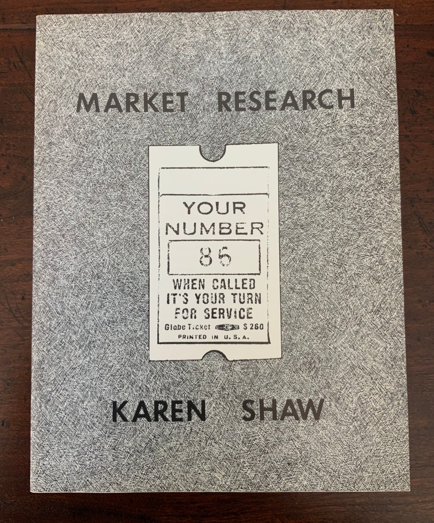
Market Research (1978)
Market Research (1978) Karen Shaw Softcover booklet, saddle stitched with staples, translucent fly leaves. H280 x W215 mm. 24 pages. Acquired from , . Photos: Books On Books Collection.
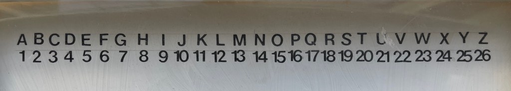
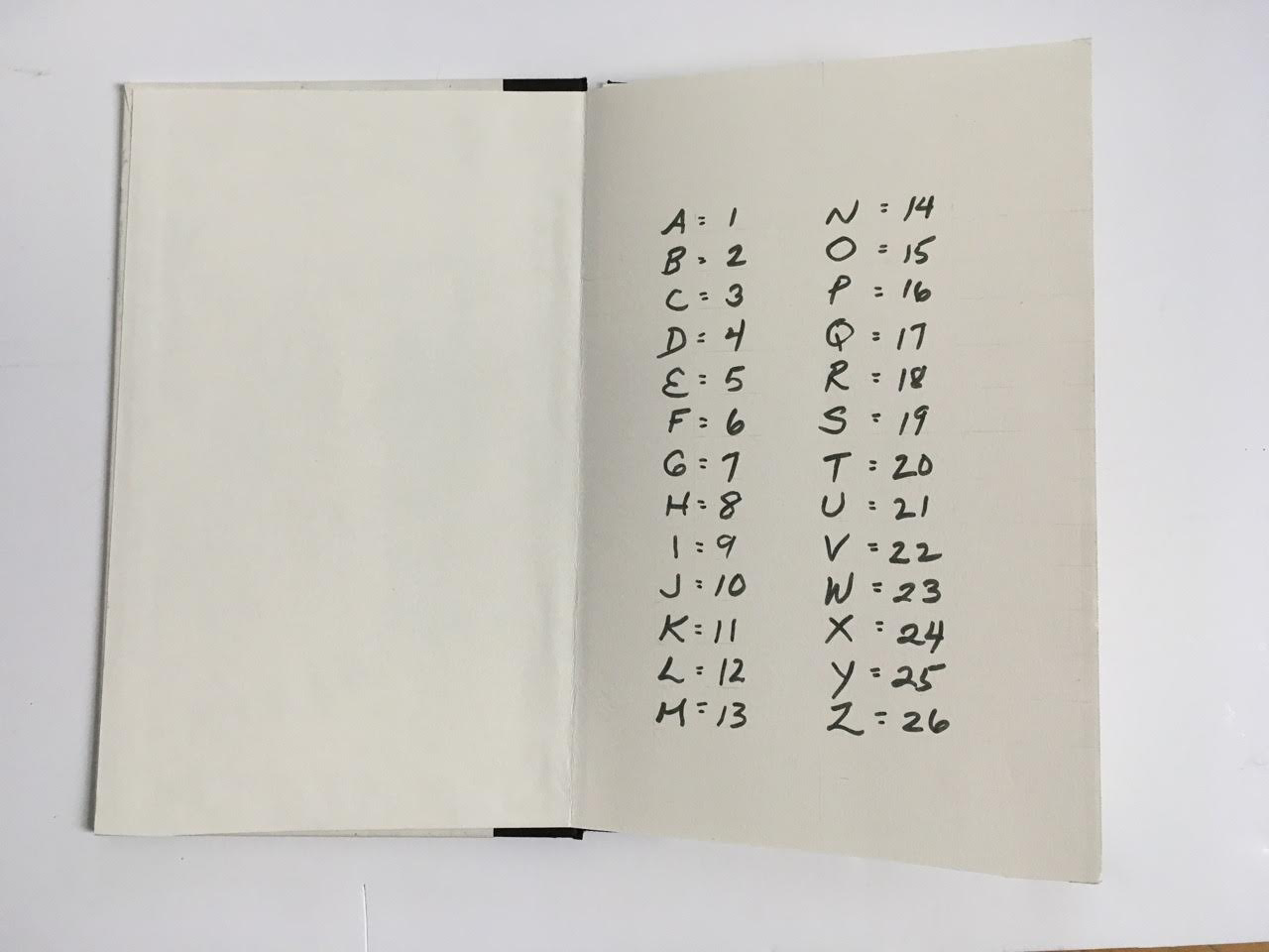
In a process I call summantics, I designate a numerical equivalent to each letter of the alphabet according to its position: A=1, B=2, C=3, D=4, E=5, F=6, G=7, H=8, I=9, J=10, K=11, L=12, M=13, N=14, O=15, P=16, Q=17, R=18, S=19, T=20, U=21, V=22, W=23, X=24, Y=25, Z=26. A word is spelled out numerically and added to reach the sum of a word. Consider the number 33. It is the sum of MEAN = 13+5+1+14 = 33, also ALAS = 1+12+1+19 = 33 and:
DIAS CHEAP NAME ALIBI COMB CAMP FIND SEED THE GATE SAID RAN ILL MAGIC EWE KEEL CEASE BOLD HERB AFFABLE OR WEE COIF GAY
to mention a few. Numbers are transcribed into words of the equivalent sum and collected in a numerically ordered vocabulary. Since a particular number can equal the sum of various words the choice is determined by mood, imagination, sound, syntax and/or grammatical structure.
Summantics has its origins in gematria, a cabalistic method of interpretation of the scriptures as well as late twentieth century software systems. Where today’s technocrats reduce all manner of human endeavor to statistical data, I reverse the process believing it to be more enlightening, humorous and humane.
Given the humor of the work’s opening, it’s likely that the title Market Research cheekily refers to her data analysis work with NBC questionnaires completed by mothers for tracking the impact of TV violence on their young sons.
In his review of the 1978 exhibition “Artists’ Books and Notations” (Touchstone Gallery, 118 E. 64th Street, New York), Lawrence Alloway noted Karen Shaw’s methodology as another instance of “the ways by which language has entered recent visual art, formerly protected from such incursions by the prestige of Form. If artists use words in their work, it is not because they are now more dependent on writers or on theory than in the past, as has been suggested, but because language has become available as subject matter” (p.653). With Shaw in particular, it was a case of language and numbers becoming available as subject matter.
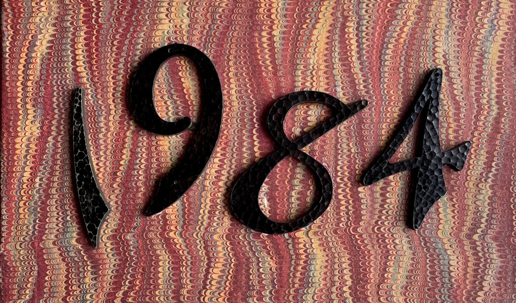
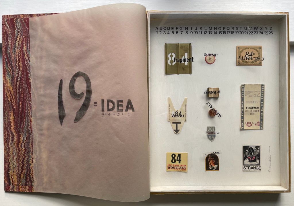
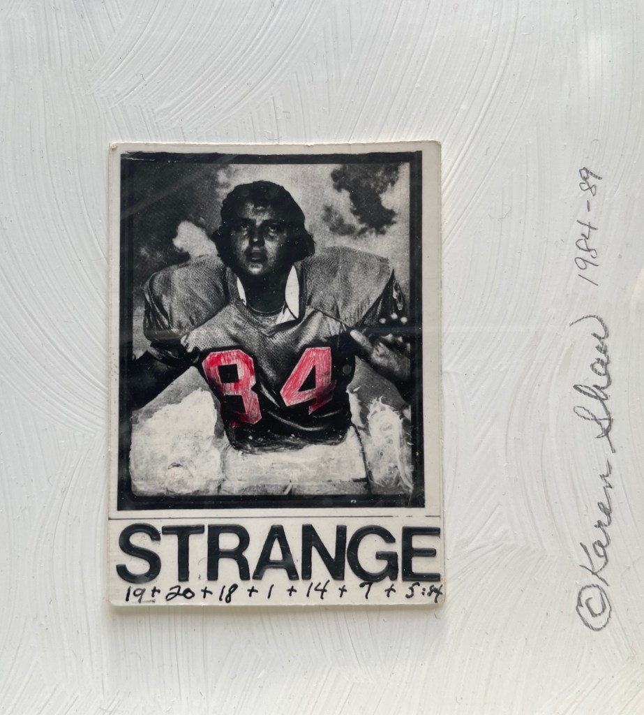
George Orwell 1984 (1984-89)
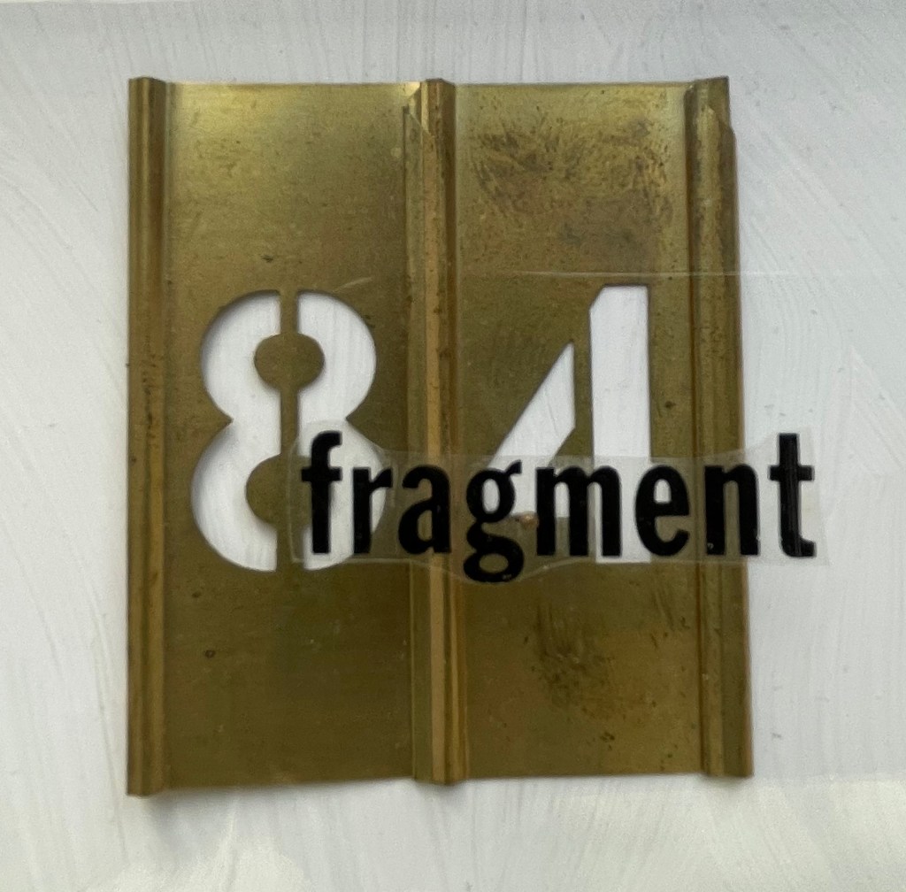
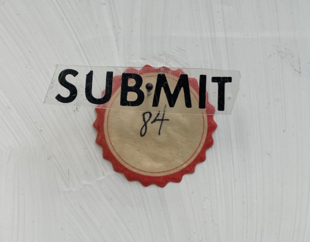
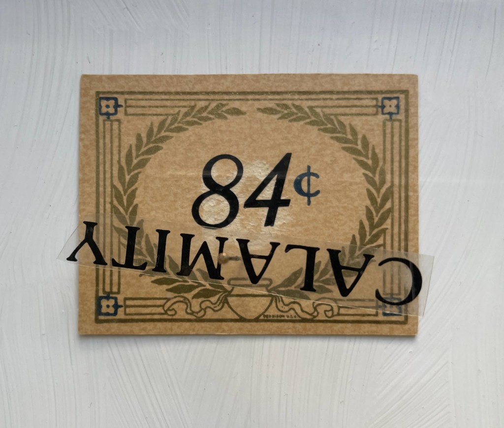
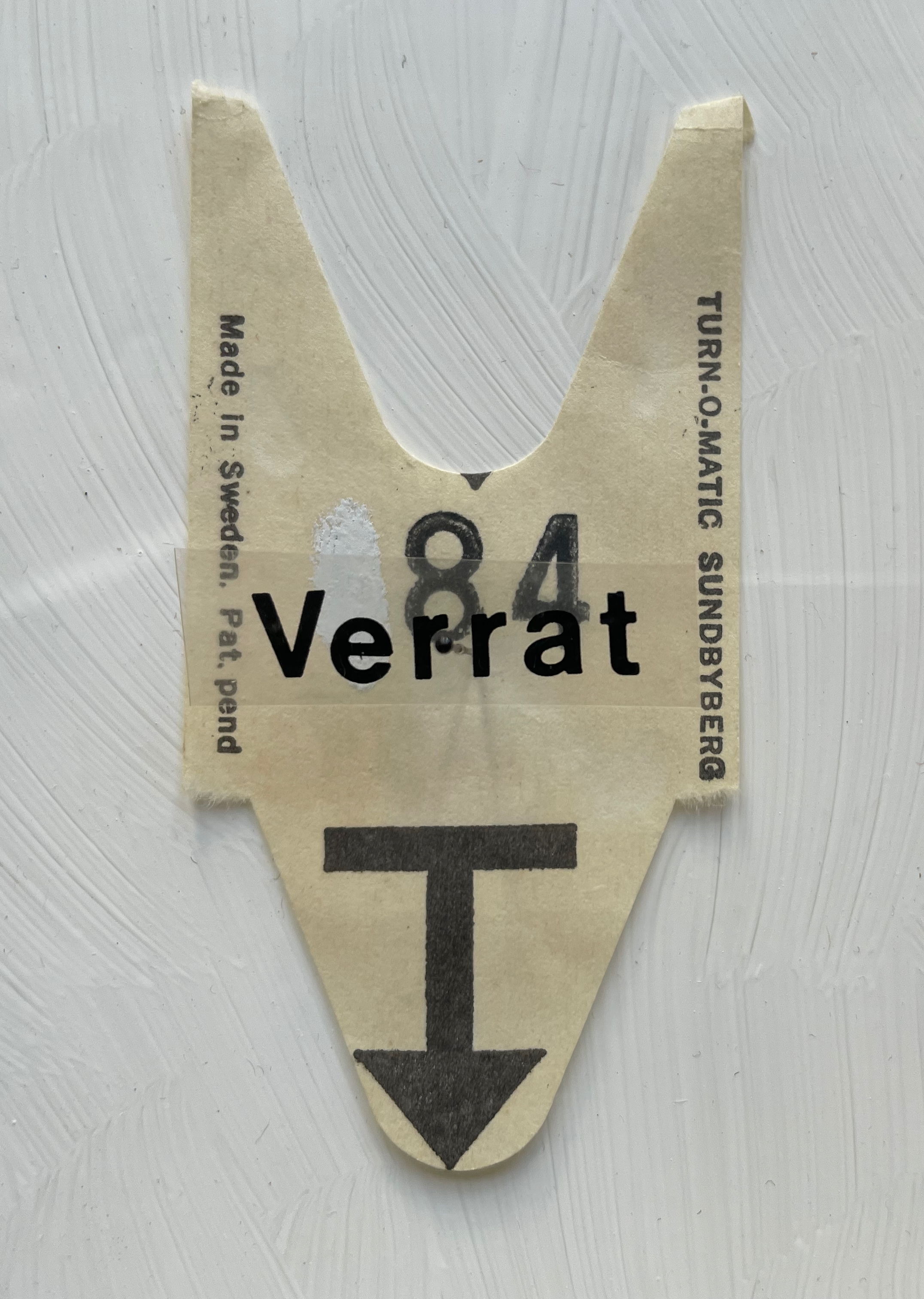
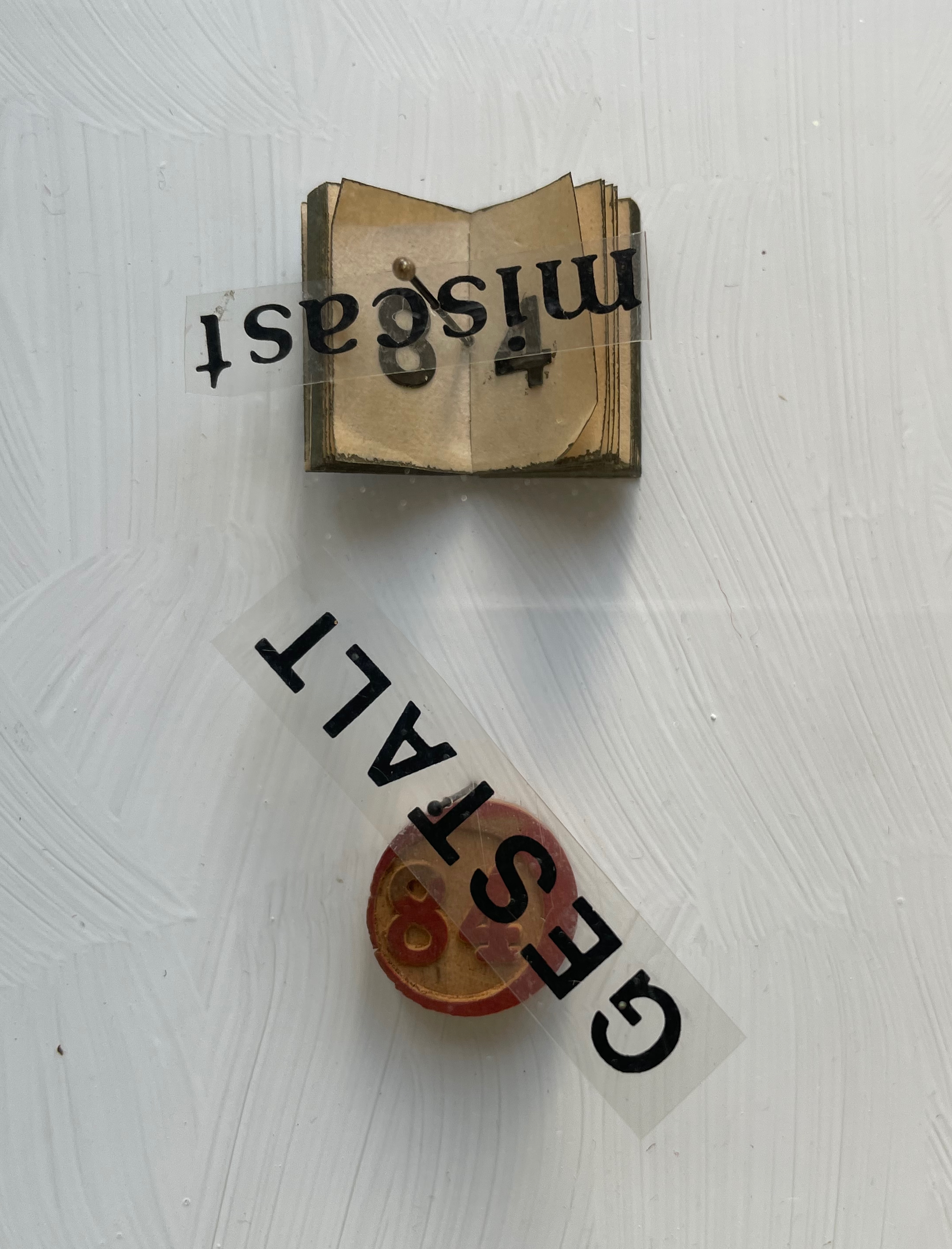
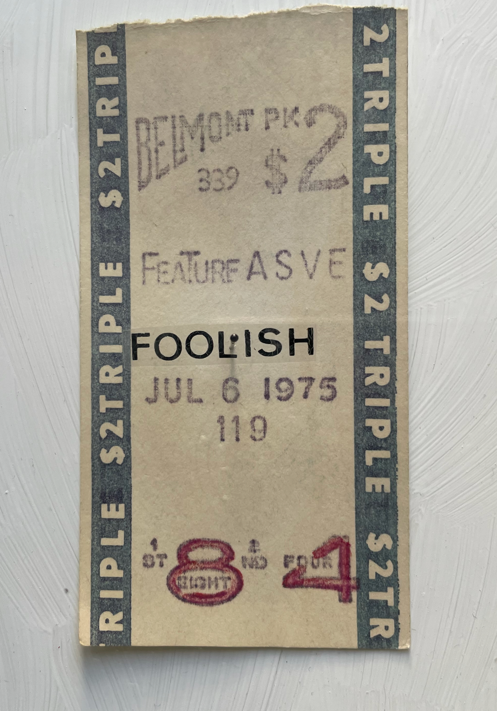
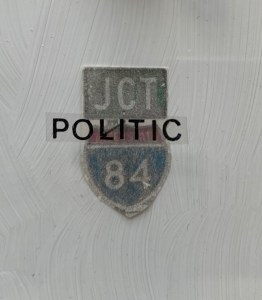
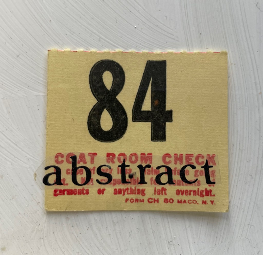
George Orwell 1984 (1984-89) Karen Shaw Diptych box covered with marbled paper on front and spine, wrought iron numerals 1984 and plastic letters fixed to front cover, translucent flyleaf with inked symbols and numbers, with text colored and cut out from translucent paper, plexiglas glued to wooden case with gessoed interior and 11 found items bearing the number 84, each fixed to the interior wooden panel with a black-bead-headed pin. H360 x W290 x D40 mm. Unique work. Acquired from Peter Kiefer Buch- und Kunstauktionen, 21 October 2023. Photos: Books On Books Collection.
Whether tabulating words or deciphering numbers, Shaw leaned further into three-dimensional assemblages resembling one- or two-page books. The somewhat-damaged homage George Orwell 1984 blends her interest in transposing literary works into hash codes with that of reversing numbers in the numerical wasteland into words with the help of her dictionary. Shaw plays off Orwell’s idea of double-speak by splitting his title in two. The first half is the sum of the numerical values of the letters in “idea”, appropriate for an idea-driven book. For the second half, however, she seeks out words that sum up to 84, letrasets them on clear plastic, and pins them over found and sometimes manipulated objects. A word may allude to its found object, or it may vaguely relate to Orwell’s book, or whether there’s any association at all may be obscure. A Belmont racetrack betting slip makes an ironic match with “foolish”, but seems unrelated to the novel. The German word Verrat translates as “betrayal”, which certainly fits the book, but what it has to do with the queue ticket (manipulated to show “84”) is unclear. That the word “calamity” has spun upside down over its manipulated token is an accidental irony, and what association the overwritten token has with the word or novel is also unclear.
Like Louis Lüthi’s A Die with Twenty-six Faces (2019), built on a collection of literary works entitled with a single letter, Shaw might have extended this part of her oeuvre with other number-titled works: Ray Bradbury’s Fahrenheit 451 or Joseph Heller’s Catch-22. Had she been inclined, she could have even used Lüthi’s book and its reference to Marcel Broodthaers’ quip “The alphabet is a die with 26 faces”. These might have yielded results more compelling than George Orwell 1984, but she would have still been captive to finding luckily appropriate words with the right word-sums.
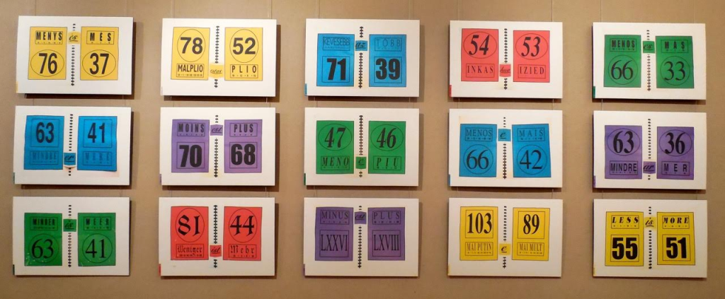
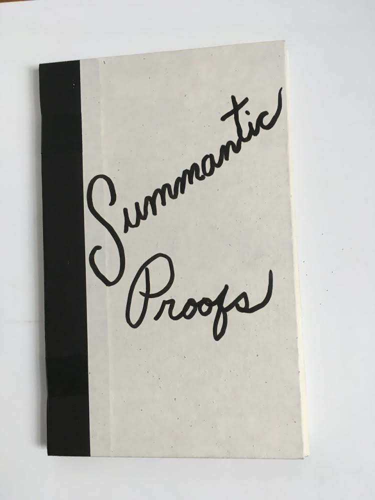
Two summantic works not in the collection — Less is More: Proof in 15 Languages (1999) and Summantic Proofs (2019) — are more compelling and uncanny. The fact that so many languages’ words for “less” have word-sums greater than the word-sums for the words for “more” is simply uncanny, and Shaw’s typography, color and layout in her spiral sketchbook presentation are compelling.
Less is More: Proof in 15 Languages (1999) Karen Shaw Photo: Courtesy of the artist.
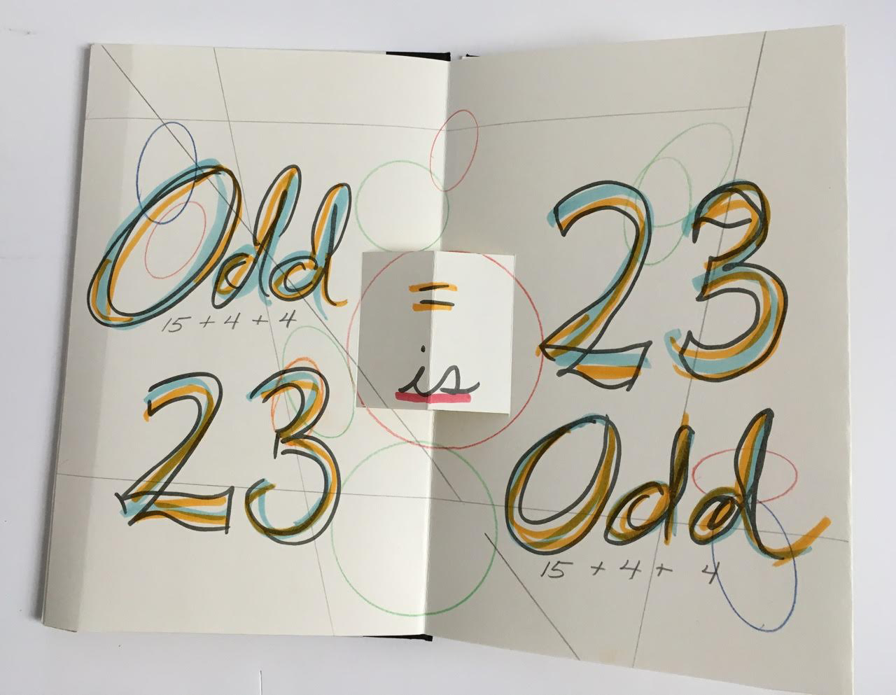
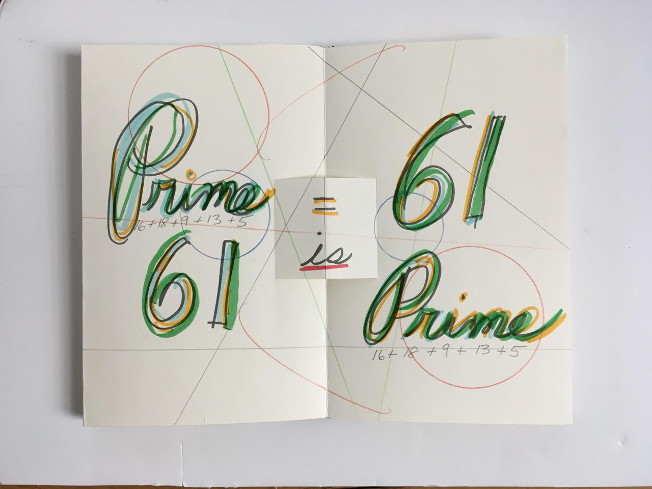
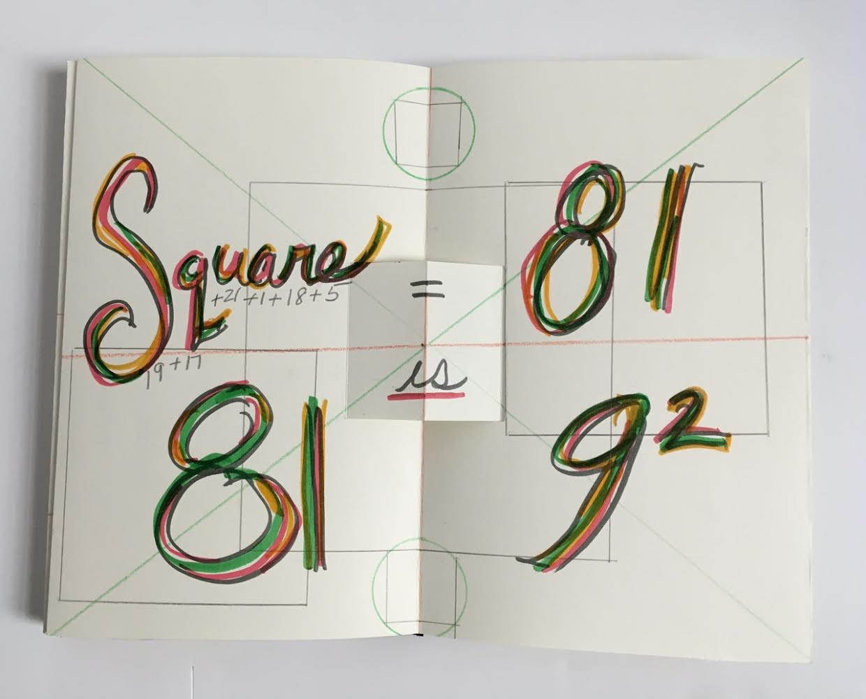
Also uncanny is her later collection of “proofs” in which she demonstrates that the word-sum for “odd” is an odd number, that the word-sum for “prime” is a prime number, and that the word-sum for “square” is 9 x 9. The pop-up equals sign, the ruler-drawn lines and the hand-colored script in this late mock-up reflect her ongoing artistic drive.
Summantic Proofs (2019) Karen Shaw Photos: Courtesy of the artist.
The most striking and consistent of Shaw’s works in the collection departs from her summantic method. It nevertheless embodies the ingenuity, humor, and humanity at play in her art.
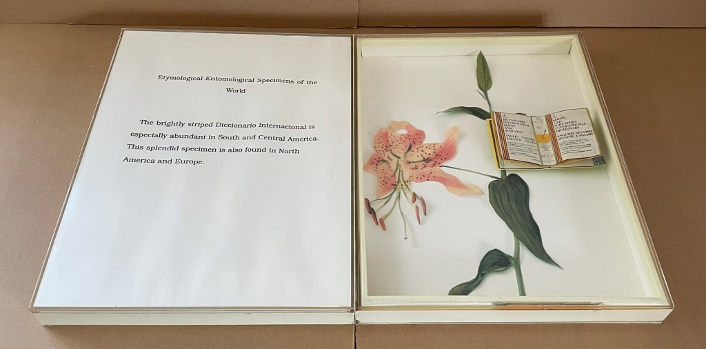
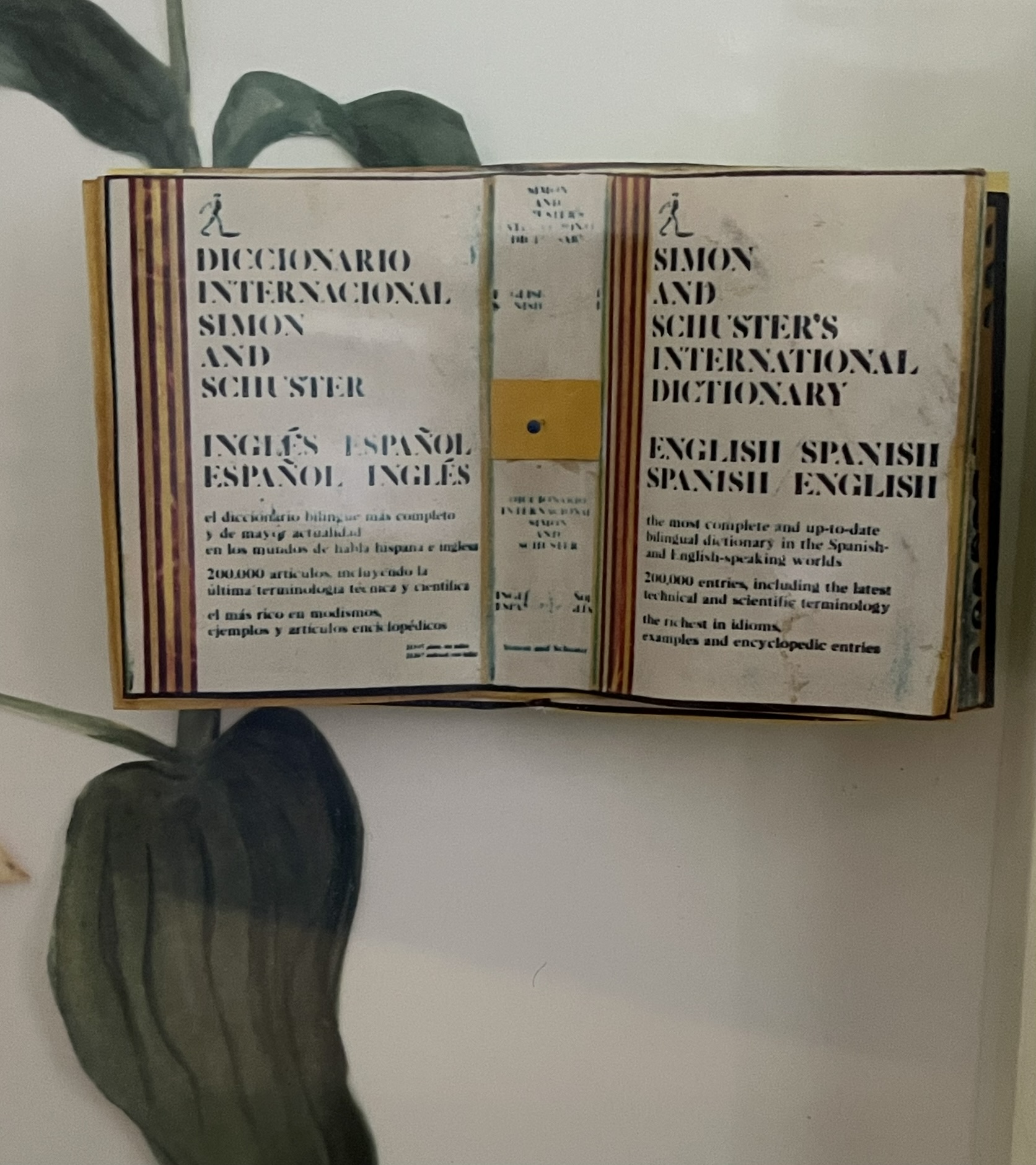
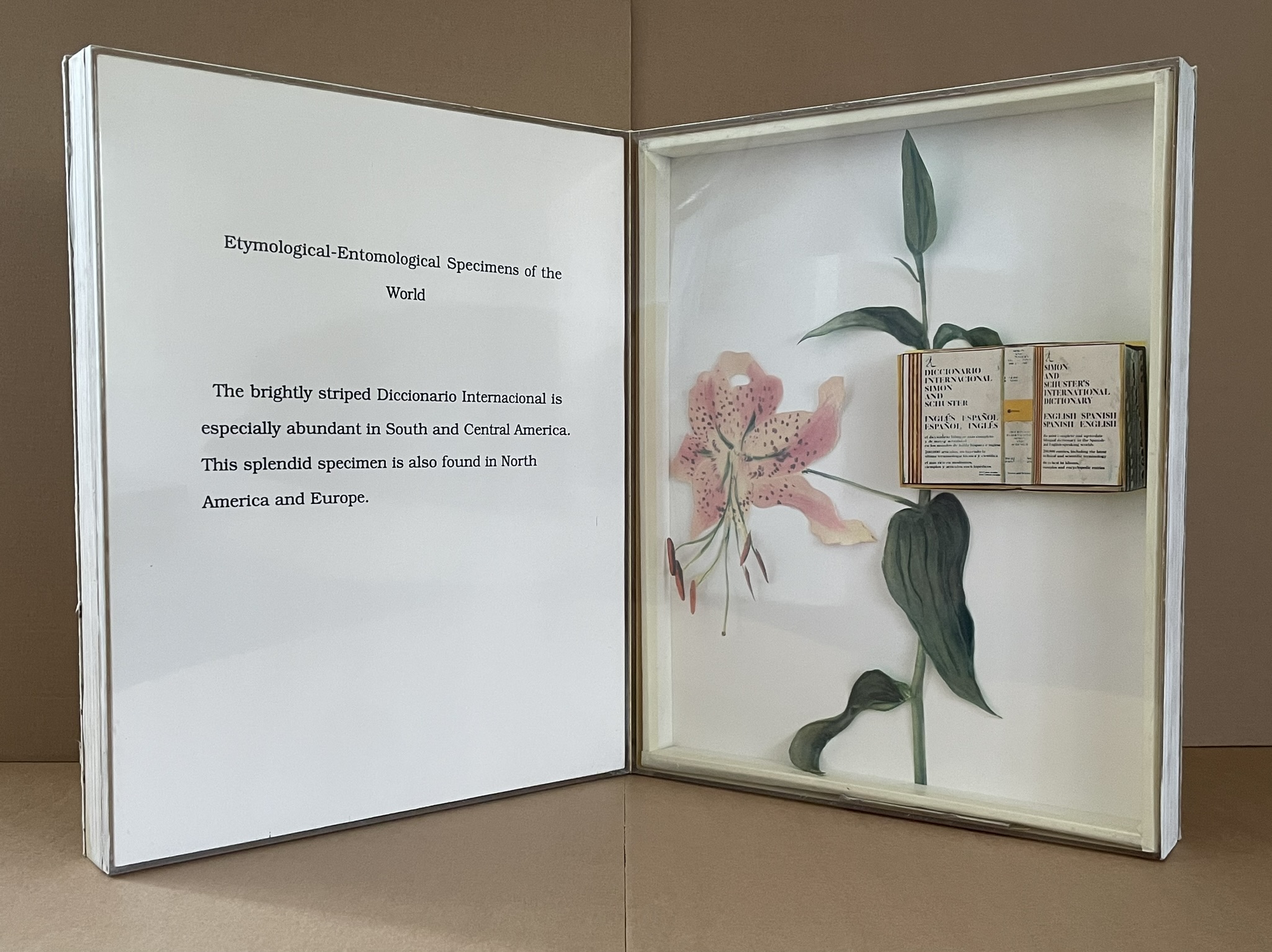
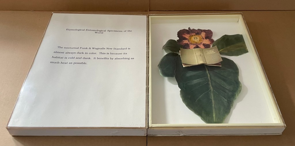
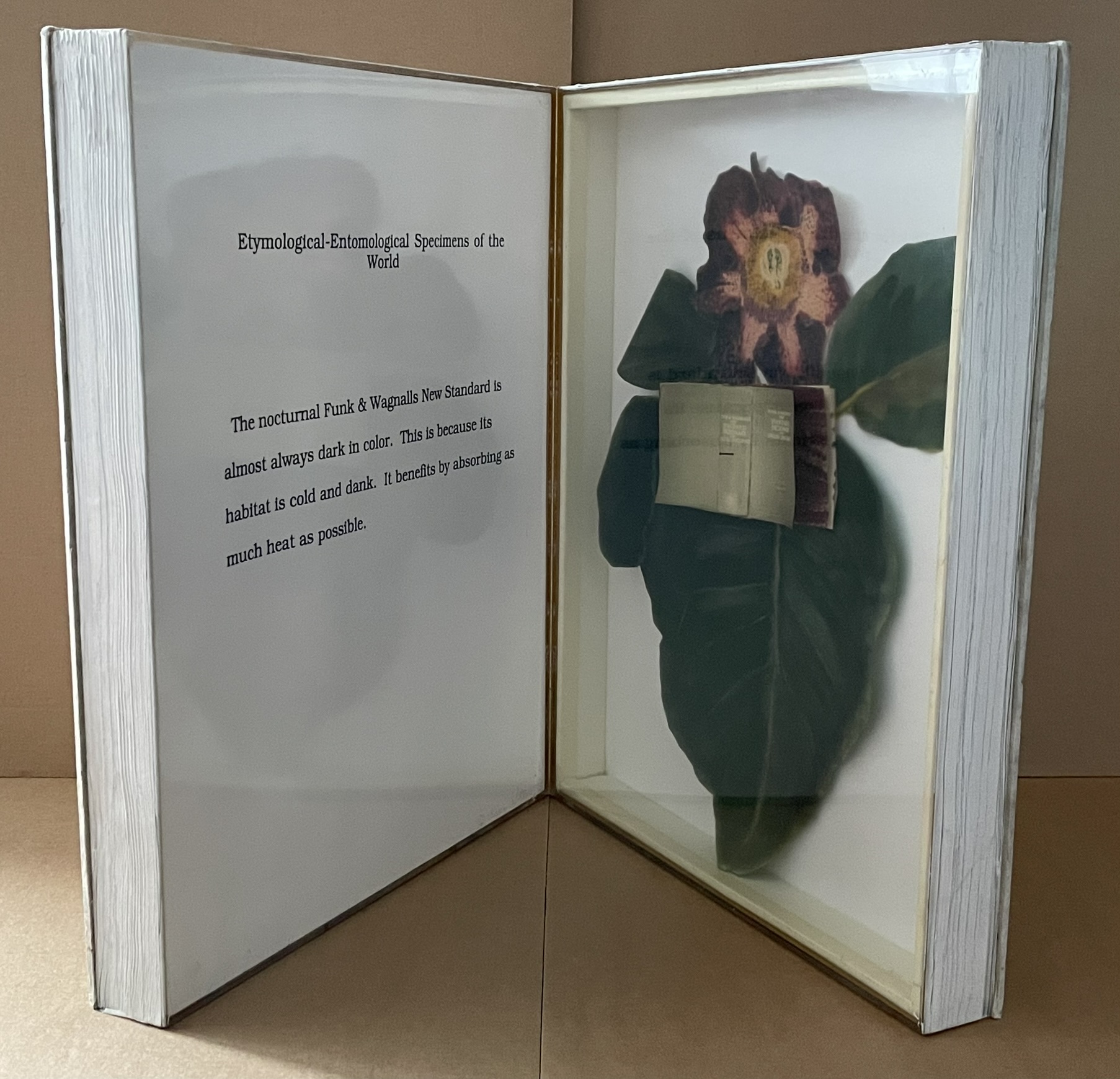
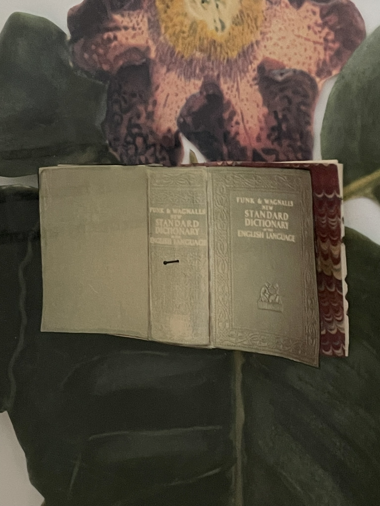
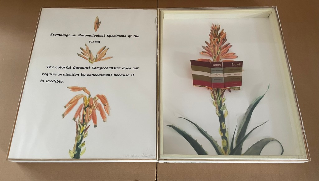
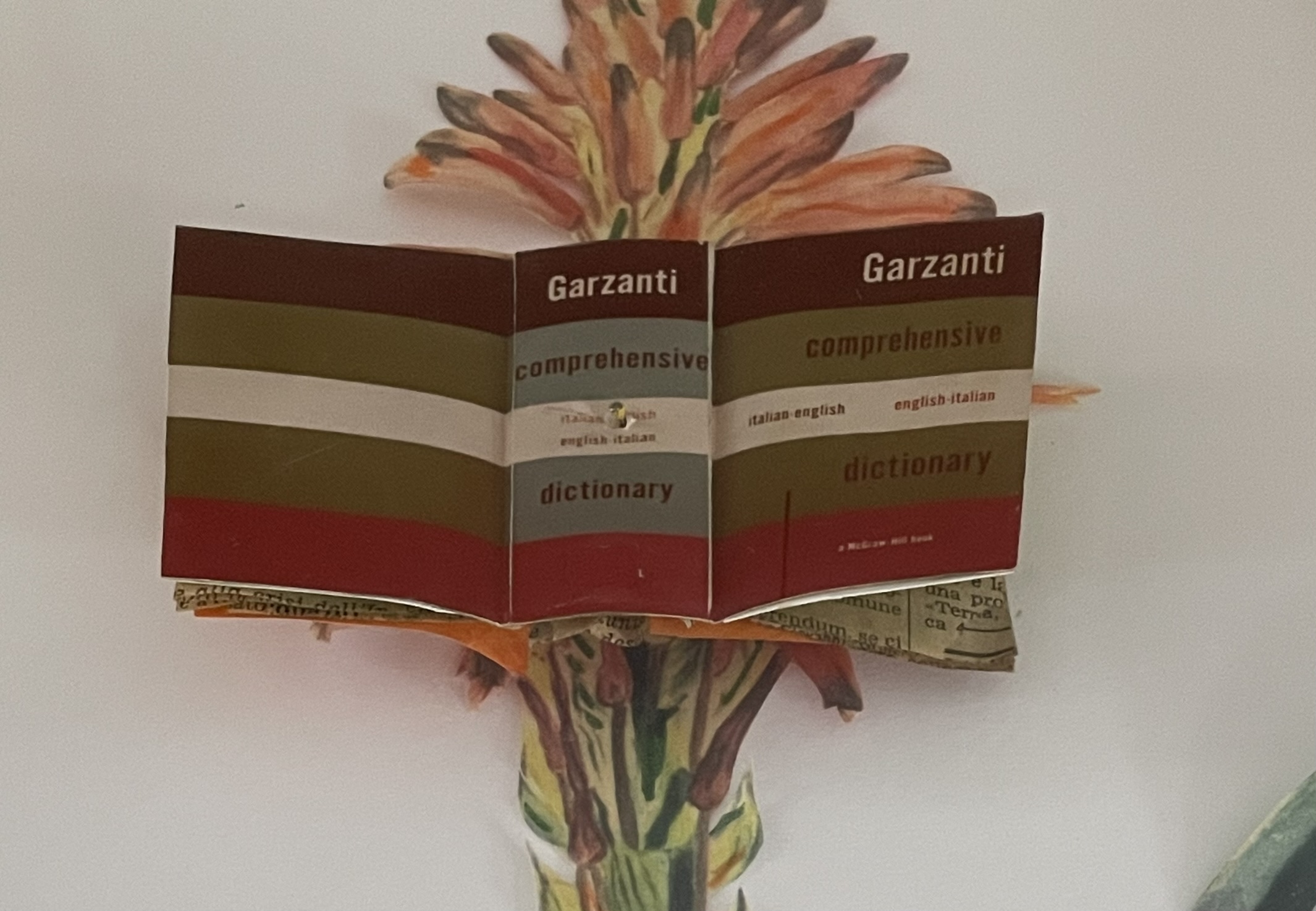
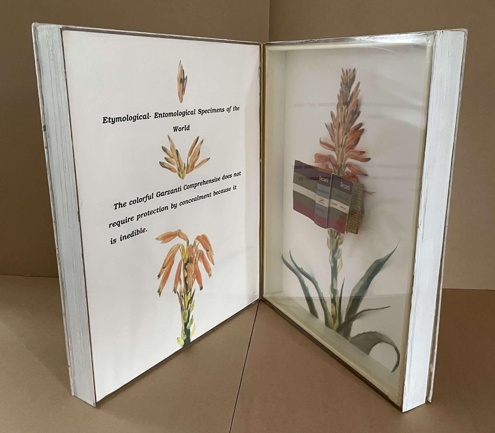
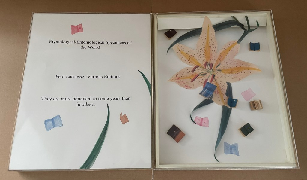
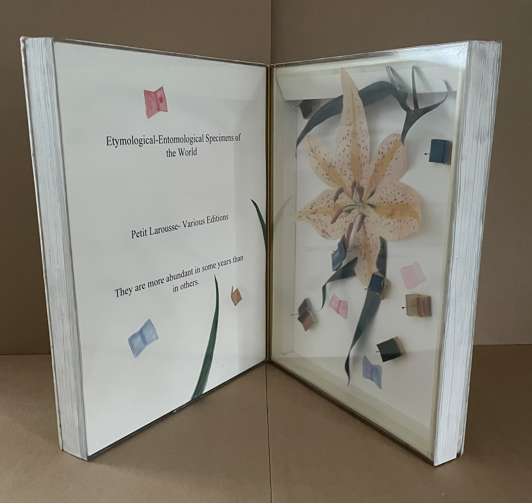
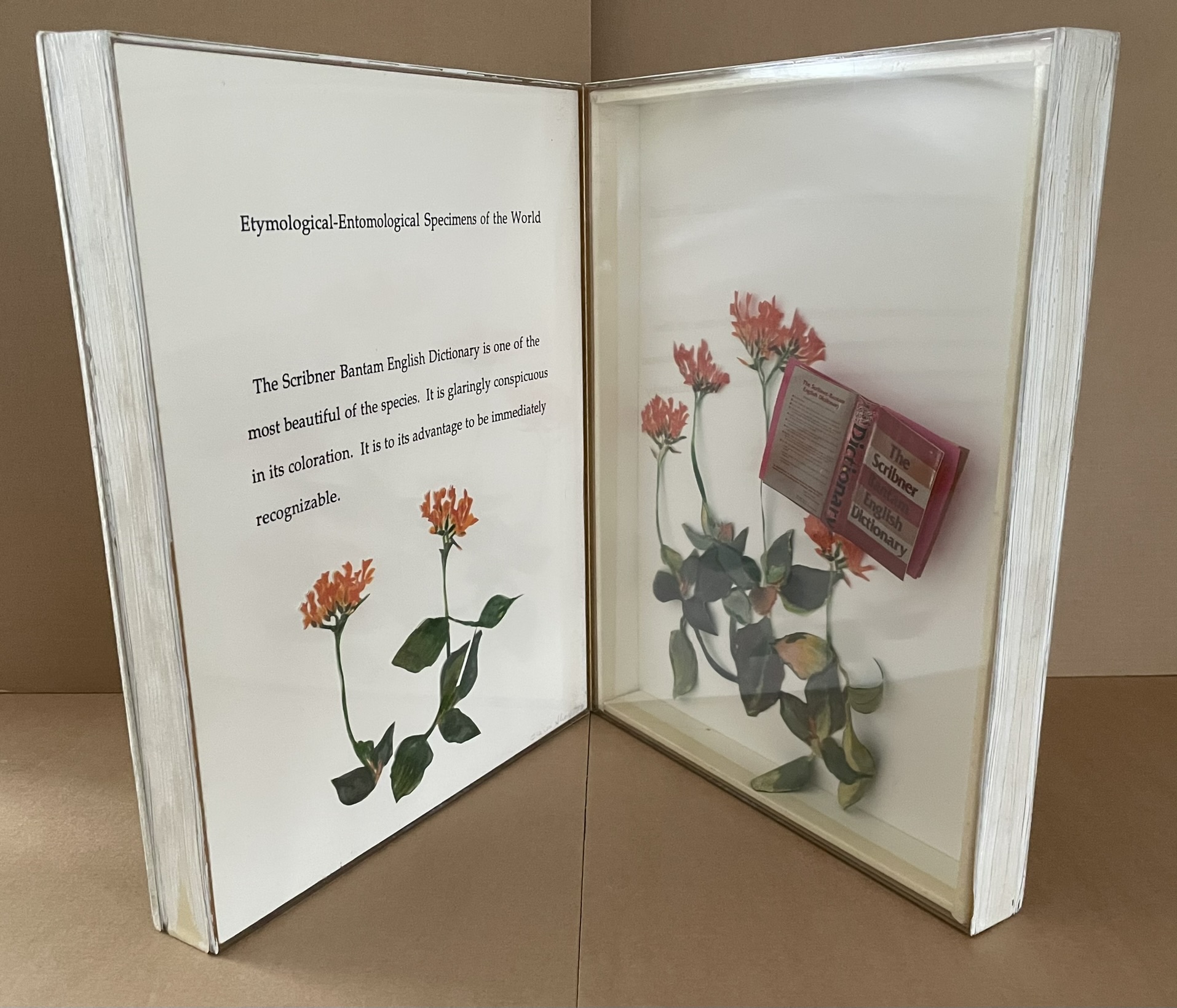
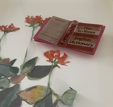
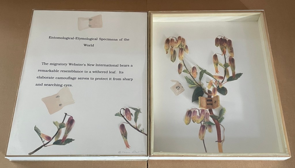
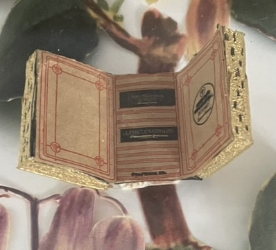
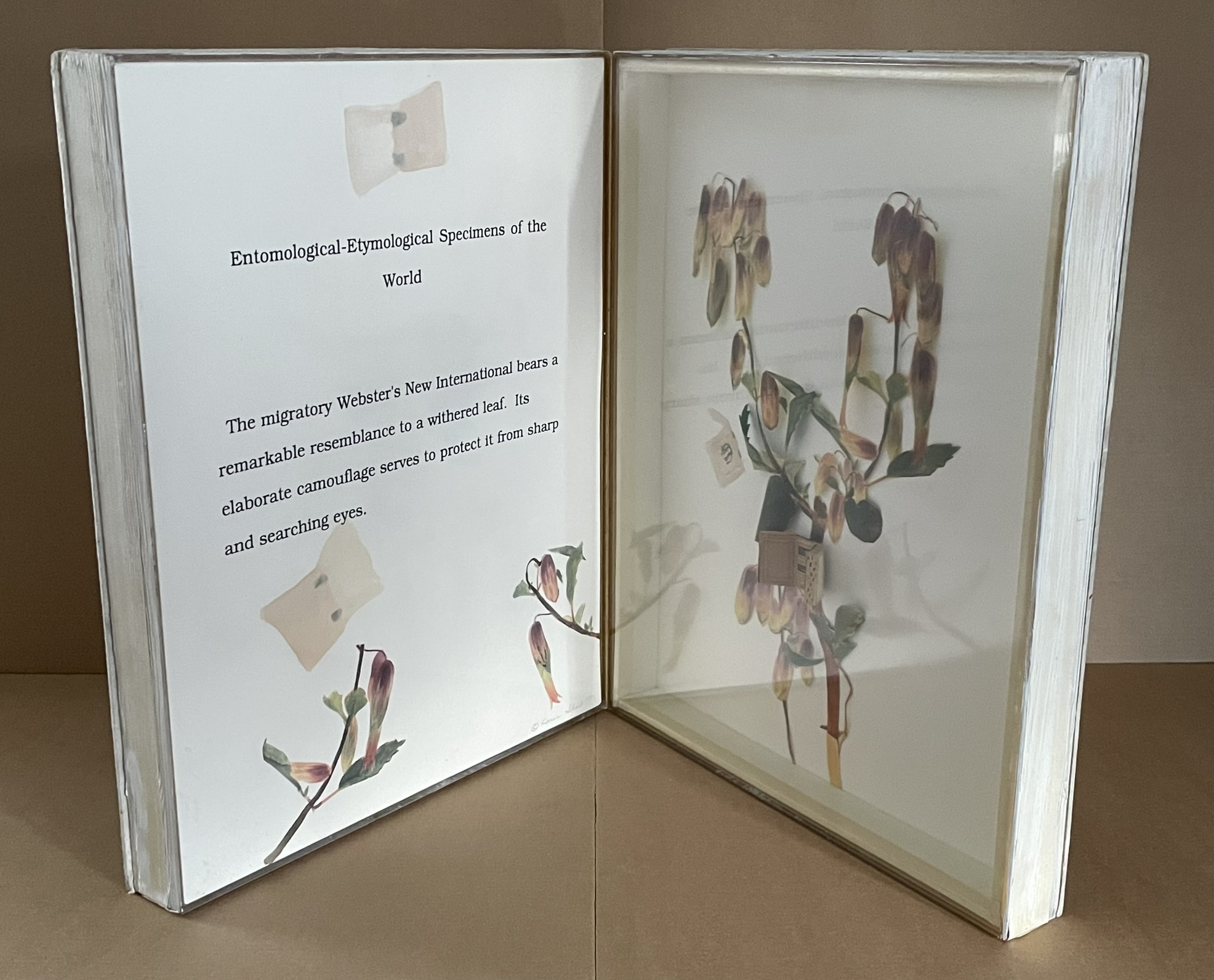
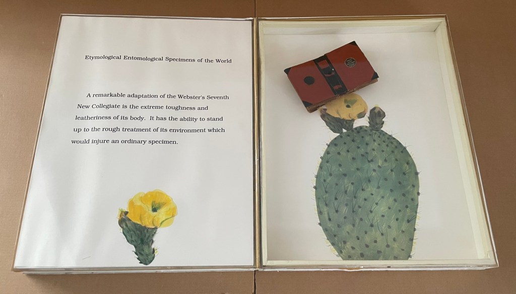
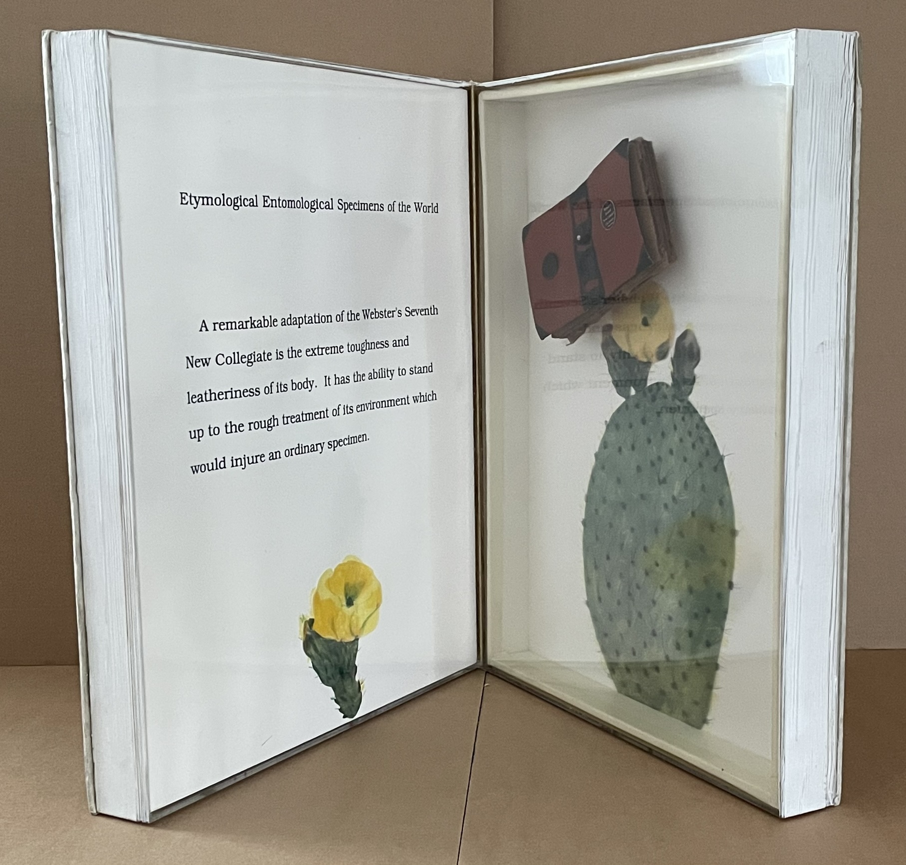
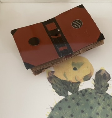
Etymological-Entomological Specimens of the World (1993)
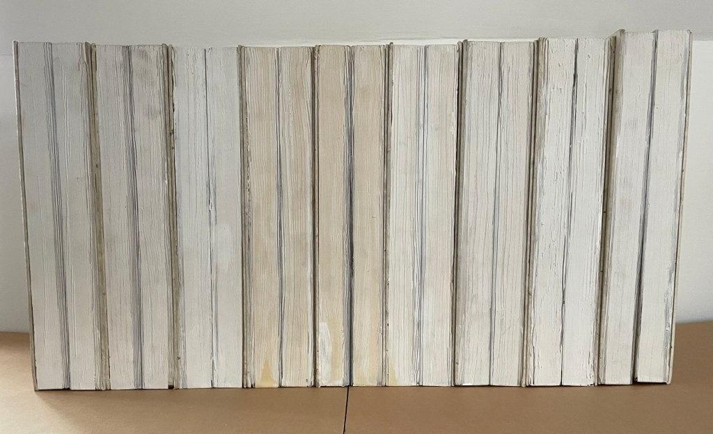
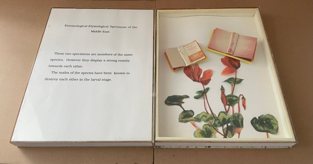
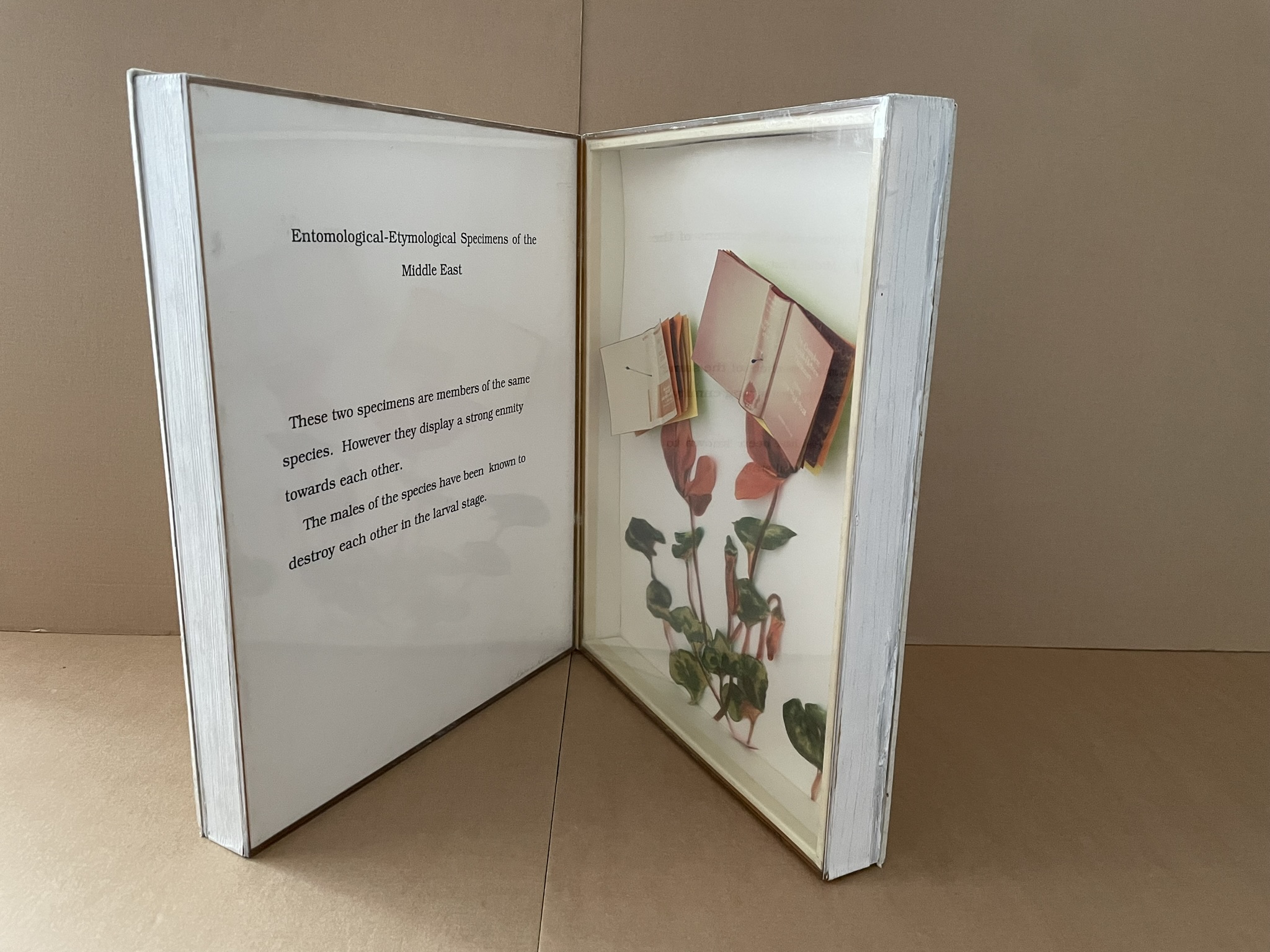
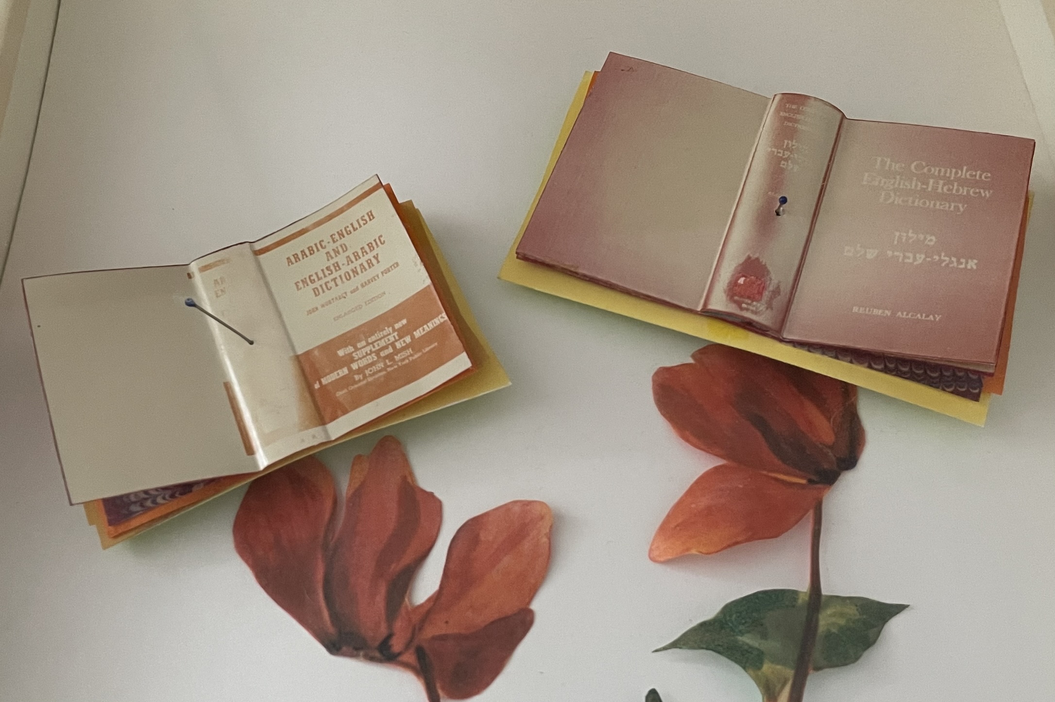
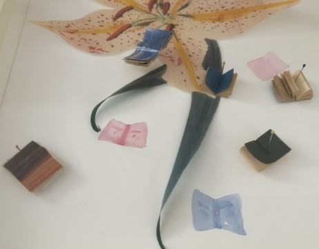
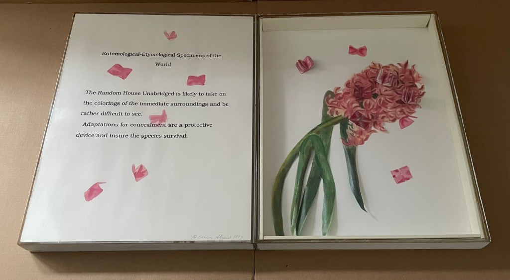
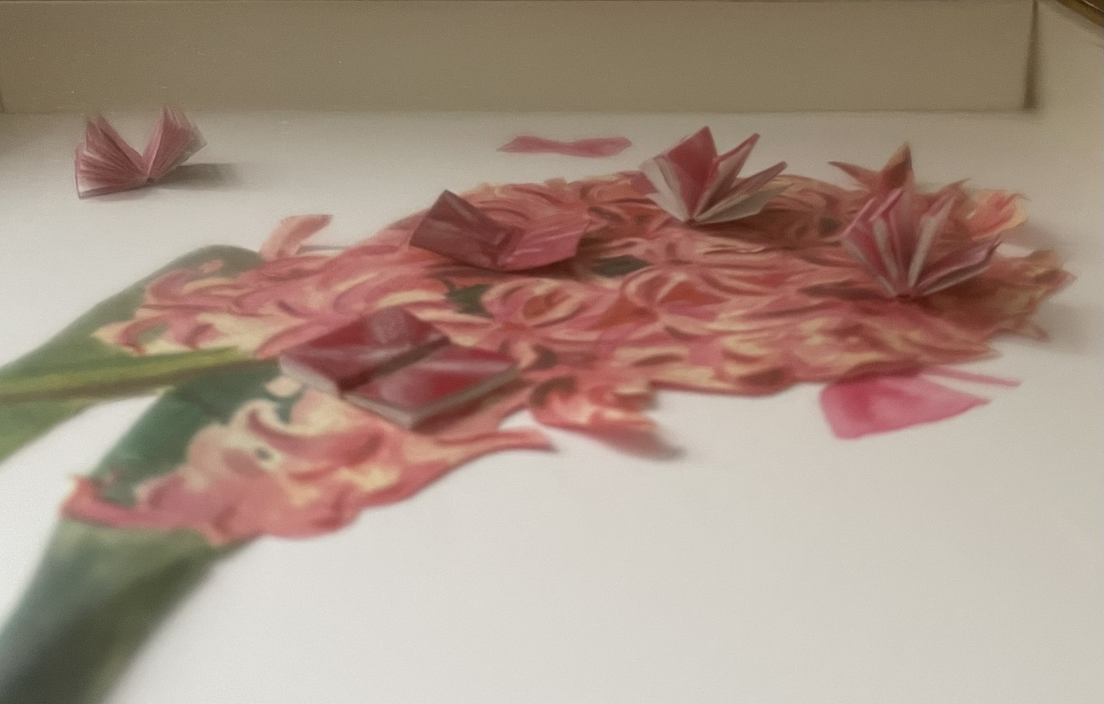
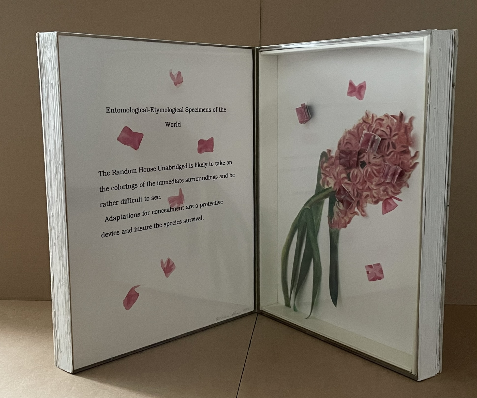
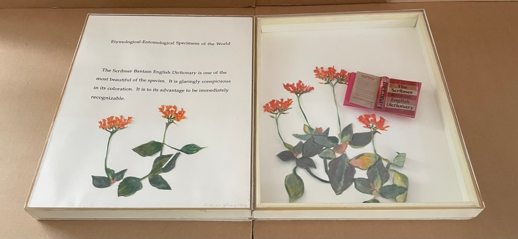
Etymological-Entomological Specimens of the World (1993) Karen Shaw Nine codex-shaped boxes of paper-covered boards, each opening to plexiglas-covered diptychs miniature books of various sizes posed as butterflies among text, handcut and painted paper foliage and flowers. H368 x W268 x D77 mm. Acquired from Karen Shaw, 8 October 2024. Photos: Books On Books Collection.
Jean Sellem’s interview with Shaw in the bilingual review Heterogénesis has been quoted earlier. In that exchange, we are lucky to have Shaw’s reply to question: “Why do you combine the concept of entomology with that of etymology?”
KS : In the past, I always used to confuse those two words. I knew the definition of each of them, but I couldn’t remember which definition belonged to which word. Eventually, I taught myself a mnemonic method to remember which word was which. “Ent” sounds like ant, so entomology is the study of insects, and so etymology is the study of words. When I was looking for a format for my ideas, using entomology pins seemed like the perfect way to attach words to numbers. The closeness of the spelling and the complicity of the two words was fun and made sense to me. The needles themselves are beautiful, long and thin. It just seemed like the perfect solution.
It’s happenstance. It’s the physical material. It’s the fun and humor of wordplay. It’s the artistic eye that finds meanings at the curious intersections of nature and language. All of this in Karen Shaw comes to the fore in the nine volumes of Etymological-Entomological Specimens of the World (1993). The top, bottom and fore edges of these book-shaped diptychs mimic closed books, whose mimicry yields to a mimicry of entomological display cases under clear covering, which in turn yields to miniature dictionaries posed to mimic butterflies. A mnemonic solution to an unwanted confusion of words leads to the book artist’s deliberate visual and verbal punning of dictionaries with insects.
In the interview, the only movements and artists directly influencing her work that Shaw remembers are Dada, new-Dadaism, Eva Hesse, On Kawara, Douglas Huebler, Joseph Kosuth and Conceptual Art. For Specimens, she has noted in correspondence a direct inspiration: the interest of Vladimir Nabokov in lepidoptery. Seeing butterflies as miniature dictionaries also overlaps a bit with Nabokov’s perceiving letters of the alphabet as having colors. Nabokov’s chasing butterflies and leaping from letter to color finds a simulacrum in Shaw’s chasing words, numbers, and meaning in her everyday environs with her artist’s book butterfly net.
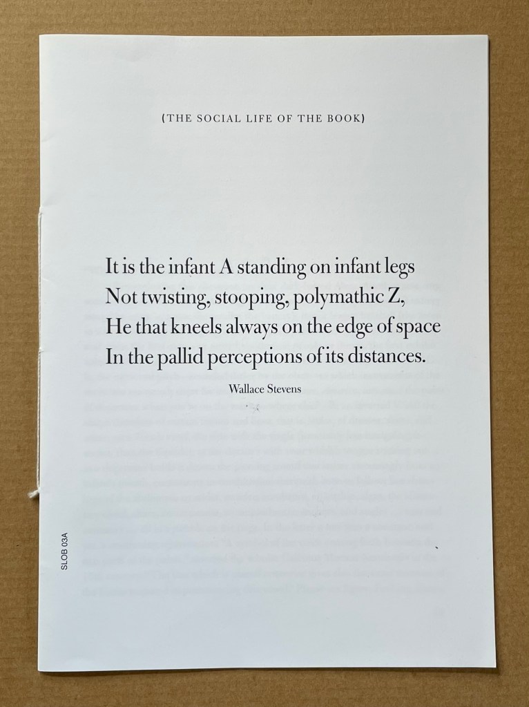
Infant A (2012) Louis Lüthi Thread-stitched signature. H225 x W160 16 pages. Edition of 1000. Acquired from Torpedo Books, 8 January 2024. Photos: Books On Books Collection
Infant A is part of a collection of essays commissioned by castillo/corrales and published by Paraguay Press under the series title The Social Life of the Book. Lüthi’s contribution fits the Books On Books Collection on several scores. First is the epigram’s invocation of the alphabet, which echoes the collection’s concentration of alphabet-related artists’ books and children’s books. See Alphabets Alive! Second is the epigram’s source: Wallace Stevens, whose poetry has inspired Ximena Pérez Grobet’s Words (2016). Would that other book artists be so inspired. Third is the narrator’s fictional conversation with Ulises Carrión in a celebration of all things A-related, in particular Andy Warhol’s novel a: a novel (1968), which finds analogues in Warren Lehrer’s A Life in Books: The Rise and Fall of Bleu Mobley (2013) and Derek Beaulieu’s a, A Novel by Andy Warhol (2017) (entry in progress). Fifth is how the dialogue reminds me of Suzanne Moore’s A Musings (2015).
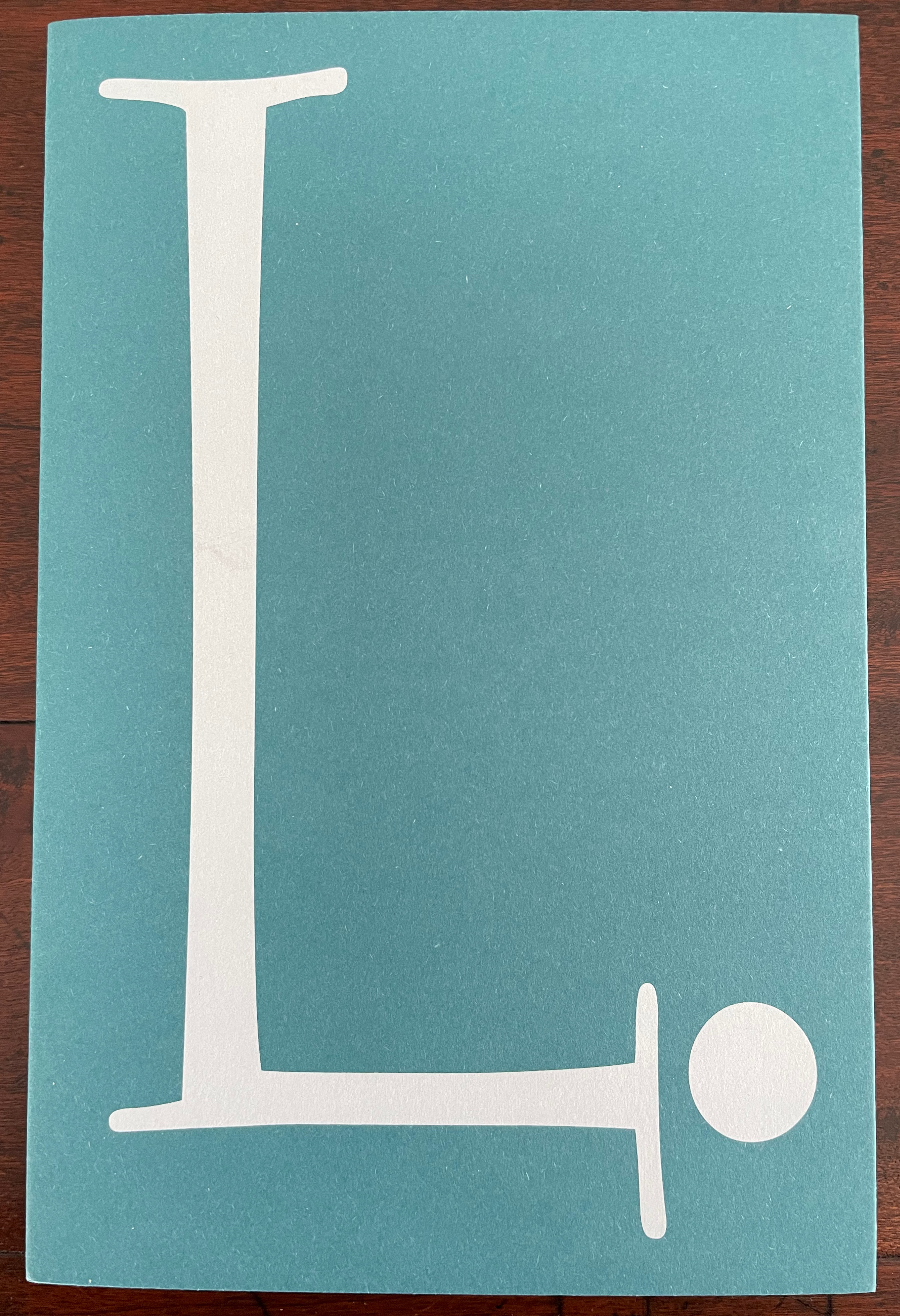
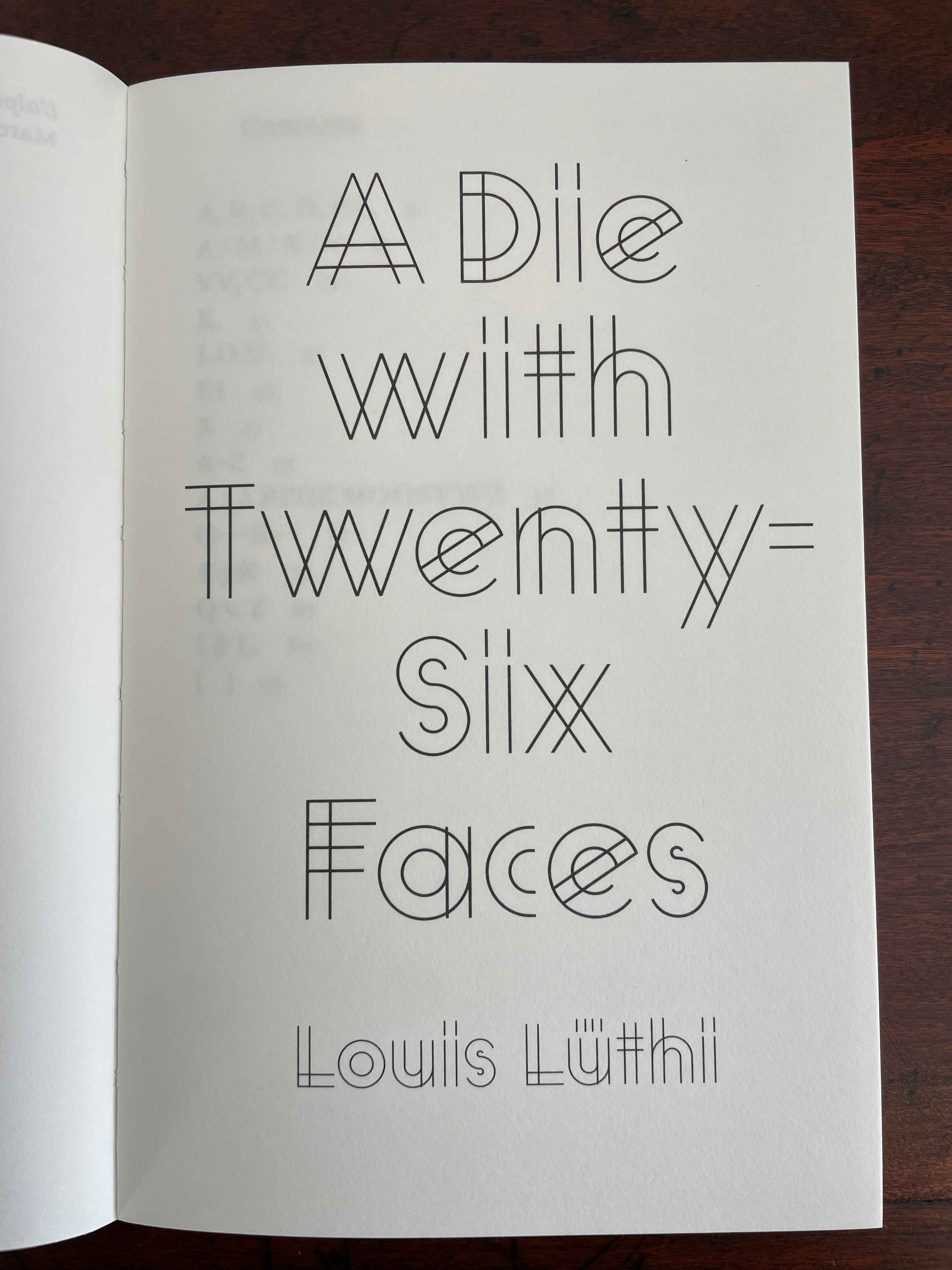
A Die With Twenty-six Faces (2019)
A Die With Twenty-six Faces(2019) Louis Lüthi Paperback. H200 x W130 mm. 104 pages. Acquired from Amazon, 18 September 2022. Photos: Books On Books Collection
Walter Benjamin’ unpacking of his library has a lot to answer for. Not only do we have Buzz Spector‘s take on it in 1995, but Jo Steffens’ Unpacking trilogy of photos of architects’, artists’ and writers’ bookshelves, Alberto Manguel’s elegiac Packing My Library (2018), and here is Louis Lüthi’s.
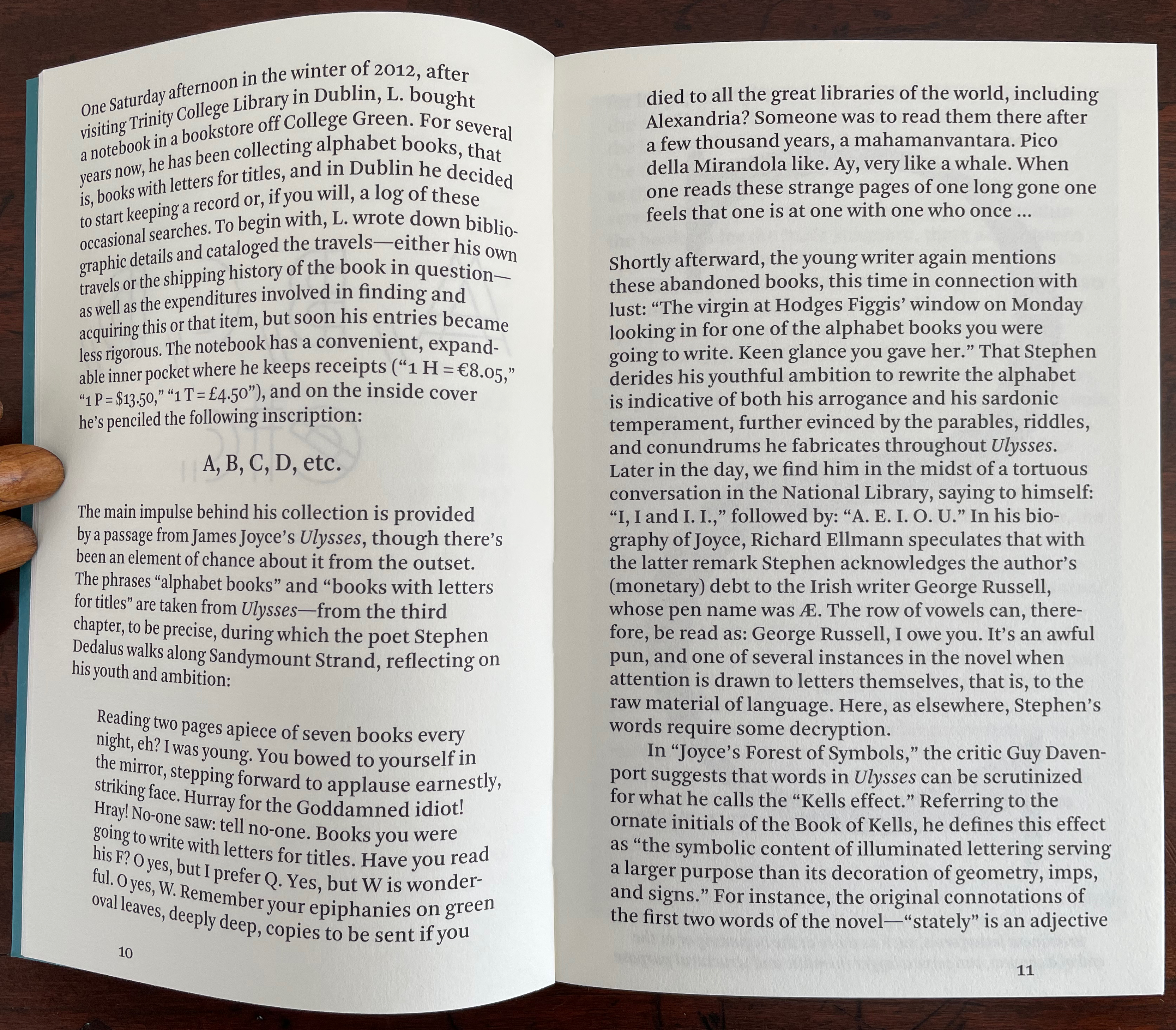
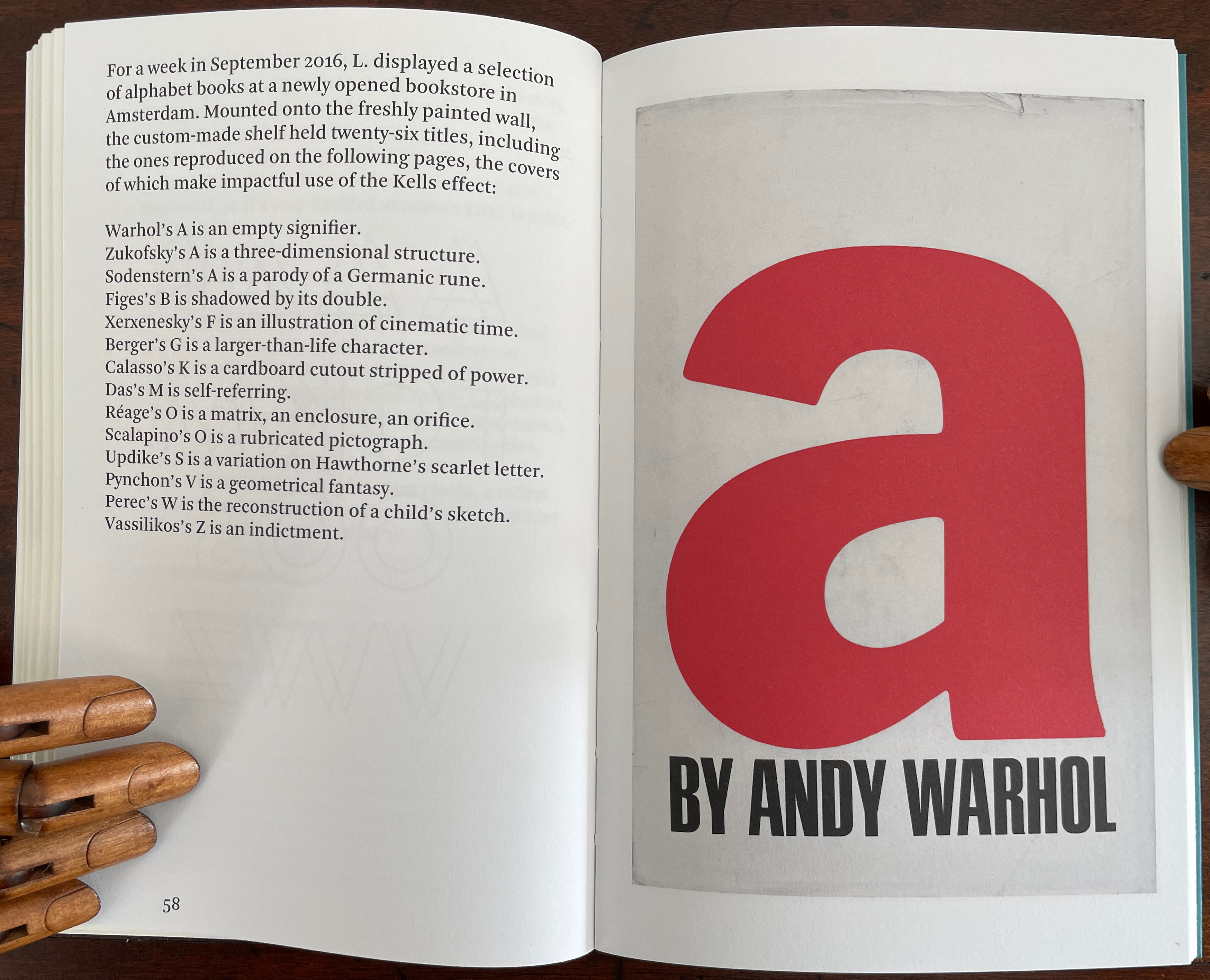
Publisher’s website: In A Die with Twenty-Six Faces, the author — let’s call him L. — guides the reader through his collection of alphabet books, that is, books with letters for titles. Some of these titles are well known: Andy Warhol’s “a,” Louis Zukofsky’s “A”, Georges Perec’s W. Others are obscure, perhaps even imaginary: Zach Sodenstern’s A, Arnold Skemer’s C and D. Tracing connections between these books, L. elaborates on what the critic Guy Davenport has called the “Kells effect”: “the symbolic content of illuminated lettering serving a larger purpose than its decoration of geometry, imps, and signs.”
The title stirs thoughts of Marcel Broodthaers’ oracular statement in 1974 “I see new horizons approaching me and the hope of another alphabet”. An alphabet that unrolls across the twenty-six faces of a die would certainly qualify as another alphabet. Broodthaers and the die also stir thoughts of Stéphane Mallarmé’s Un Coup de DésJamais N’Abolira le Hasard to which Broodthaers paid repeated homage. Throwing a twenty-six-sided die would certainly no more abolish chance than would a roll of Mallarmé’s six-sided die. Lüthi’s game, however, has little to do with chance unless we count his luck in finding the works to build his library of single-letter-entitled books. Even less to do with luck if some of the library is fictitious, a likelihood that the “publisher’s” statement suggests. Lüthi’s die is loaded!
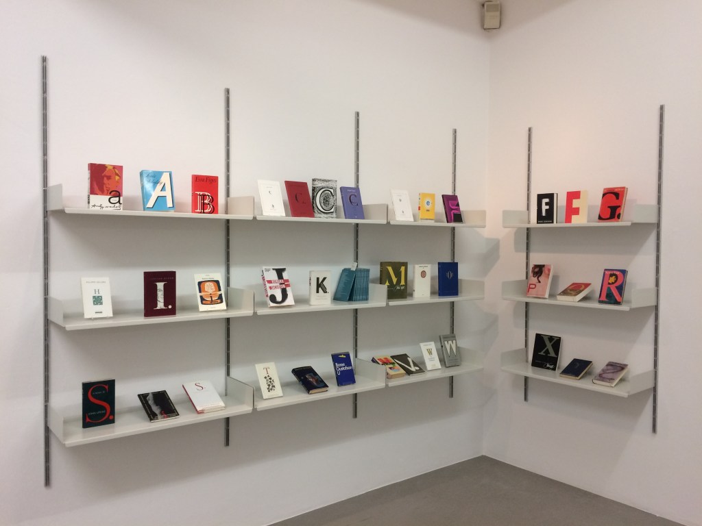
A selection of Lüthi’s “alphabet” books on display. Courtesy of the author. Photo: Gesellschaft für Aktuelle Kunst Bremen
On the Self-Reflexive Page II (2021)
On the Self-Reflexive PageII(2021) Louis Lüthi Paperback. H200 x W130 mm. 304 pages. Acquired from Idea Books, 18 September 2022. Photos: Books On Books Collection.
This is a peculiar book in its order and nature. After two variant half-title pages, it begins with a section entitled “Black Pages”. Only on flipping through the volume can we find the remaining front matter — just after page 208. There’s another half-title and then the Table of Contents. Reproducing the marbled page from Laurence Sterne’s The Life and Opinions of Tristram Shandy, Gentleman (1759–1767), the book’s cover gives a clue to this peculiarity. Sure enough, Lüthi spells it out later in the section entitled “On Drawing Pages”.
So much in Tristram Shandy is presented out of order: a second dedication comes not after the first but on page 27, the preface is not at the beginning of the novel but in chapter 20 of volume three, and chapters 18 and 19 of volume nine come not after chapter 17 but are inserted after chapter 25. In a similar act of transposition, we find a marbled page in volume three, even though hand marbling is customarily used to decorate covers and endpapers. As Viktor Shklovsky observed, “It is precisely the unusual order of even common, traditional elements that is characteristic of Sterne.” (p. 240)
This one paragraph confers on Lüthi’s entire book the very self-reflexivity that it explores across a range of literature and artists’ books. Reflecting the custom to which it refers, On The Self-Reflexive Page II carries Sterne’s marbled pages on its front and back covers. In the text before his marbled leaf, Sterne refers to it as the “(motly emblem of my work!)“. Lüthi has taken that exclamation to heart (and cover) as if it were advice in creating this hybrid, motley work of his own: “part artist’s book and part essay, part literary excavation and part typographical miscellany” as he calls it in his middle-of-the-book Foreword.
Lüthi’s work is just one in the Books on Books collection of several inspired by Tristram Shandy. There is Erica Van Horn’s Born in Clonmel (2011), Simon Morris’ Do or DIY (2012), Abra Ancliffe’s The Secret Astronomy of Tristram Shandy (2015), and Shandy Hall‘s The Black Page Catalogue (2010), Emblem of My Work (2013), Paint Her To Your Own Mind (2018) and The Flourish of Liberty (2019). Outside the collection, there is Brian Dettmer’s Tristram Shandy (2004), commissioned by Shandy Hall’s Laurence Sterne Trust, and also Sean Silver’s Shandean online venture called The Motley Emblem (2022~) celebrating Sterne’s marbled leaf and the analytical chemistry of marbling. The latter may become a book, even an artist’s books to add to the tally. In The Century of Artists’ Books, Johanna Drucker draws attention to Sterne’s novel twice as an example of self-reflexivity or self-interrogation, but in 1994 and 2004, Sterne did not rise to the same level of precursor to book artists as William Blake or Stéphane Mallarmé in Drucker’s view. With these later works of book art inspired by Uncle Toby’s nephew in the bag, a dozen or so more might nudge Sterne up the scale.
In the meantime, anyone interested in artists’ books could fruitfully apply to the medium Sterne’s exhortation to his own readers:
Read, read, read, read, my unlearned reader! read, — or by the knowledge of the great faint Paraleipomenon — I tell you before-hand, you had better throw down the book at once; for without much reading , by which your reverence knows, I mean much knowledge, you will no more be able to penetrate the moral of the next marbled page (motly emblem of my work!) than the world with all its sagacity has been able to unraval the many opinions, transactions and truths which still lie mystically hid under the dark veil of the black one.
Artists’ books are to be read, handled and digested, not stored away in the archives.
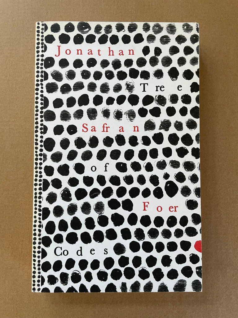
Tree of Codes (2010) Jonathan Safran Foer Perfect bound paperback of die-cut pages. H220 x W135 mm. 284 pages. Acquired from Visual Editions, 30 January 2014. Photos: Books On Books Collection.
The artist’s book “tradition” of excising words from the page goes back at least to Marcel Broodthaers’ and Mario Diacono’s renderings of Un Coup de Dés Jamais N’Abolira le Hasard by Stéphane Mallarmé. Jonathan Safran Foer’s Tree of Codes (2010) takes that tradition to the more complex plane that Tom Phillips reached with A Humument (1980-2016). In the hands of Foer and his publisher Visual Editions, the treatment becomes simultaneously more personal and mechanical. The more personal aspect is best expressed in Foer’s afterword (see below). The mechanical aspect is the use of die cutting for production and the reader’s use of a blank sheet to enable reading the text left over from Bruno Schulz’s The Street of Crocodiles (1934, trans. 1963) that forms the new narrative of Tree of Codes.
Why should an obscure poem like Stéphane Mallarmé’s groundbreaking Un Coup de Dés Jamais N’Abolira le Hasard: Poème (1897) have become the cornerstone of an art-industrial complex of literary, critical and artistic responses ranging from essays, books, edited collections, countless editions, and appropriations in the form of fine press livres d’artiste, book art and sculptures, films and theater, ballets and fado, musical compositions, digital programs and installations, and even pavement art?
In 2009, Rainier Lericolais created one of the more unusual works of homage to Stéphane Mallarmé’s Un Coup de Dés Jamais N’Abolira le Hasard (1914). In Carton Perforé, the words and lines of Mallarmé’s poem take up their positions as perforations on a continuous paper roll used for a barrel organ or hurdy-gurdy.
For a multidisciplinary artist and musician, Lericolais’ choice of medium here is highly appropriate, as is the choice of Mallarmé’s poem for an artist in pursuit of “grasping the elusive“. The work is now in the permanent collection at the Musée national d’art moderne, Centre Pompidou.
In 2020, Lericolais revisited his visual barrel-organ homage to create a version that could be heard as well as seen. Under the Direct to Disk Éditions label, Lericolais published Carton Perforé as sheet music for piano along with a recording of it. Just as Broodthaers and other hommageurs signaled their homage by changing Mallarmé’s subtitle from Poème to Image, Sculpture, Musique, etc., Lericolais adds the subtitle Piano, paying homage to their tributes, Mallarmé’s poem and, humorously, his own earlier work. A performance of the piano version can be heard here.
Bernadette O’Toole follows in a long line of distinguished “serial hommageurs”: Ian Wallace, Jérémie Bennequin, Marcel Broodthaers, Kathy Bruce, Marine Hugonnier, Jorge Méndez Blake, Alastair Noble, Michalis Pichler, Raffaella della Olga and Joëlle Tuerlinckx. Like many of them, she extends her work across multiple media. Like all of them, she is driven by the metaphysics and motifs expressed in Un Coup de Dés.
Variant Sail (2015); As If (2016)
Variant Sail (2015) and As If(2016) Bernadette O’Toole Presentation box. H240 x W172 mm. Acquired from the artist, 1 April 2022. Photos: Books On Books Collection. Displayed with permission of the artist.
Bernadette O’Toole’s two small booklets first appeared in Sharon Kivland’s MA Bibliothèque and are now out of print. The presentation case in which they arrived conveys her recurrent practice or technique of recontextualizing. A copy or copies from an edition may be re-presented so as to create a new work or works. Variant Sail and As If constitute a case in point.
Variant Sail (2015)
Variant Sail (2015) Bernadette O’Toole Booklet, two-staple saddle-stitch. H190 x W130 mm, 24 pages. Edition of 25, of which this is #6. Photos: Courtesy of Bernadette O’Toole. Books On Books Collection. Displayed with permission of artist.
The booklet Variant Sail contains reproductions of twelve digital prints (H38 x W57 cm). The prints were created by scanning and digitally manipulating each of the double-page spreads of Un Coup de Dés in Photoshop, producing twelve variants with each one foregrounding the gutter in a different way. The manipulation has made Mallarmé’s text faintly detectable but indecipherable and rendered the double-page spreads as entire blancs — variants, as it were, of the white spaces (les blancs) to which Mallarmé refers in his poem’s preface.
[From the NRF/Gallimard 1914 edition]
The ‘blanks’ indeed take on importance, at first glance; the versification demands them, as a surrounding silence, to the extent that a fragment, lyrical or of a few beats, occupies, in its midst, a third of the space of paper: I do not transgress the measure, only disperse it. The paper intervenes each time as an image, of itself, ends or begins once more, accepting a succession of others, and, since, as ever, it does nothing, of regular sonorous lines or verse – rather prismatic subdivisions of the Idea, the instant they appear, and as long as they last, in some precise intellectual performance, that is in variable positions, nearer to or further from the implicit guiding thread, because of the verisimilitude the text imposes.
From Mallarmé’s marked-up proofs for his planned deluxe edition, we know that he viewed the double-page spread, not the single page, as the poem’s primary structural unit. Each of O’Toole’s blank double-page spreads can be seen as a voile alternative (“variant sail”), a phrase appearing on the NRF/Gallimard edition’s second double-page spread. With a different foregrounding of the gutter in each of her double-page spreads, O’Toole underscores both the variance within her Variant Sail and the important constancy of the double-page spread in the poem to which she is paying homage.
A bit more esoterically, the double-page spread suggests the quantity 2, an allusion to the result of thrown dice, their two faces up. It may also allude to the poem’s revolutionary versification, challenging French poetry’s Alexandrine, the traditional measure of 12 syllables usually divided into two hemistichs. It seem no accident that O’Toole has chosen a pattern of two-word titles for her booklets.
As If (2016)
As If (2016) Bernadette O’Toole Booklet, two-staple saddle stitch. H205 x W140 mm, 16 pages. Edition of 25, of which this is #6. Photo: Courtesy of Bernadette O’Toole; Books On Books Collection. Displayed with permission of artist.
The prints for Variant Sail in turn inspired paintings (same dimensions) that are reproduced in the second booklet As If, which takes its two-word title from the poem’s central double-page spread, the one beginning and ending COMME SI (“as if”). Mallarmé’s words are no longer detectable. What is detectable instead is each brushstroke on the painted surfaces. It is as if the work As If appropriates the work Variant Sail, just as Variant Sail appropriates Un Coup de Dés.
“Appropriation” may not be the right characterization. Re-contextualizing, re-purposing or re-cycling perhaps. Consider where O’Toole goes next with these two other works not in the Books On Books Collection at the moment.
Variant Sail II (2016)
For Variant Sail (II), O’Toole incorporates an inventive sculptural work that she calls a “gesture”. In a black presentation box, a translation of Un Coup de Dés rests beside a small painted gesture, oil on plaster. Here is her description of the process by which a gesture is created:
The process of making the work involved tracing my brush-stroke into a bed of clay, pushing into the surface which proved resistant at first. Plaster was poured into the indent, casting the absent gesture [brush-mark]. Once the form had set, I separated it from the bed of clay and took hold of the object. The absent gesture [brush-mark] had become embodied. The form was simultaneously liberated from the mould, and from the limitation of the painting surface. It was cast out, recalling the Japanese practice known as, ‘flung-ink’, which Norman Bryson observes is ‘thrown’ as one throws dice. — [Interview with Josie Jenkins, 22 November 2020]
Variant Sail II has appropriated, re-cycled, re-purposed or re-contextualized the works Variant SailandAs If in several ways — by transforming the surface brushstroke into a three-dimensional object, by juxtaposing those two works (through the gesture) with the translation
A Rare State (2018)
A Rare State consists of 12 booklets (H38 x W57 cm), each with its own cover and title. Each encloses 12 loose interchangeable folios. Each captures images from different performative readings (by the artist) of Un Coup de Dés or fromanimated patterns of marks and numbers appearing and disappearing. Some of the patterns occupy the positions of Mallarmé’s text on his double-page spreads. Others appear in sequences of 1-6 within a square or diamond suggesting the face of a die.
A Rare State expands on the idea of a numerical or mathematical principle at play — be it 1-6 on the face of a die, the 12 syllables of the Alexandrine that the poem explodes, the 2 of the double-page spread, or the 4 triangles constituting the face of a die across the double-page spread. This expansion is also an expansion of O’Toole’s technique of appropriation, re-cycling, re-purposing or re-contextualizing to create new artwork. It is as if her every thought emits a throw of the dice.
Cohn, Robert G. 1966. Mallarme’s Masterwork: New Findings. The Hague: Mouton. Contains the photographs that inspired Neil Crawford’s typographic translation.
Cohn, Robert Greer. 1965.Toward the poems of Mallarmé. Berkeley: University of California Press. See in particular for his analysis of the relationship between Un Coup de Dé and the sonnet À la Nue Accablante Tu (pp. 229-36).