In the 1970s, post-Minimalism, post-Conceptualism, Language-based Art, Neo-Dada, Fluxus, Arte Povera, OuLiPo, the commodification of art and the “dematerialization of the art object” — all made a messy milieu for visual and literary artists. According to Stefan Klima, this is also the period when the messy notion of the artist’s book or “book art” gained recognition as a genre with exhibitions curated by Dianne Vanderlip for Moore College of Art and Design, Germano Celant for Nigel Greenwood Gallery, and Martin Attwood for the Arts Council of Great Britain.
Into this environment came Bronx-born Karen Shaw, an aspiring artist and data analyst for the broadcaster NBC. On the job, she learned about the hash function — that one-way cryptographic algorithm that condenses input data of any size into an output of fixed lengths. When she saw that she could change a word into a number by assigning each letter a number according to its place in the alphabet and then summing them up, she arrived at the idea of reducing “the masterpieces of literature, poetry and prose to a number, which would signify the ‘essence’ of the work”.
After applying the approach to Blake, Shelley, Keats and others, she tackled the King James version of the Gospel according to St. Matthew. Here’s her description of the procedure:
I wrote the numerical equivalent of each letter under each letter … in the Bible itself. Then I added up the number/letter of each word until I had the sum for each word, verse, and chapter. I then recorded the sums in an accounting book. This became the second version …. Next I added it all up on adding tapes, one tape for each chapter, which I measured to find out the length of each chapter. I then attached each labeled tape to a rod at the edge of a shelf that had been built to hold the work. This was the third version …. (Sellem, “Karen Shaw = 100”.)
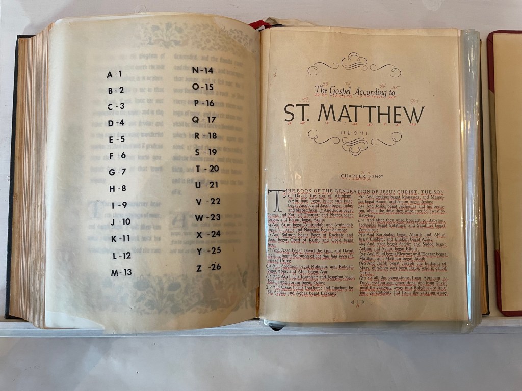
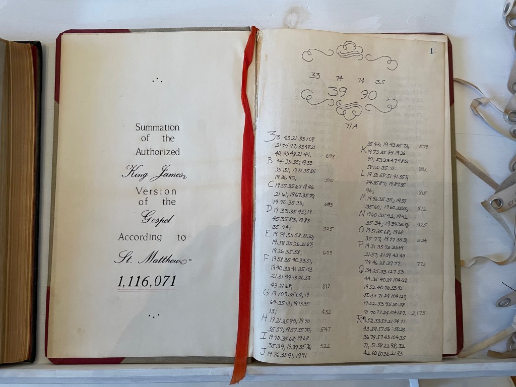
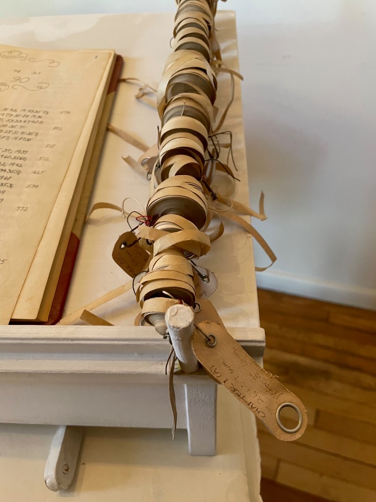
Here was an utterly different form of artist’s book by alteration: an assemblage of a “Rembrandt” Bible’s St. Matthew Gospel with each letter hand-numbered according to its place in the alphabet; each of the gospel’s words summed and recorded in an accounting book with all of its word-sums summed to its essence of 1,116,071; and the “scrolls” of the adding machine tapes for each chapter ranged alongside the Bible and accounting book. For Shaw, this altered-book form of art was merely a first step into a series of discoveries and inventions that led to a lifetime of artistic exploration and creation.
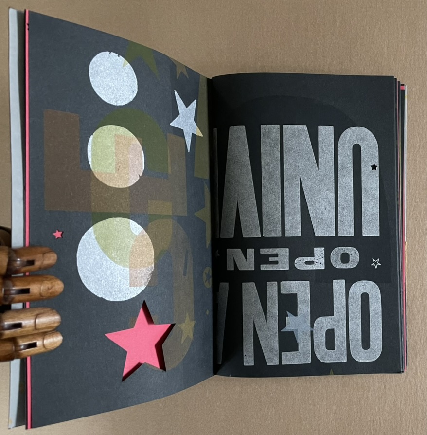
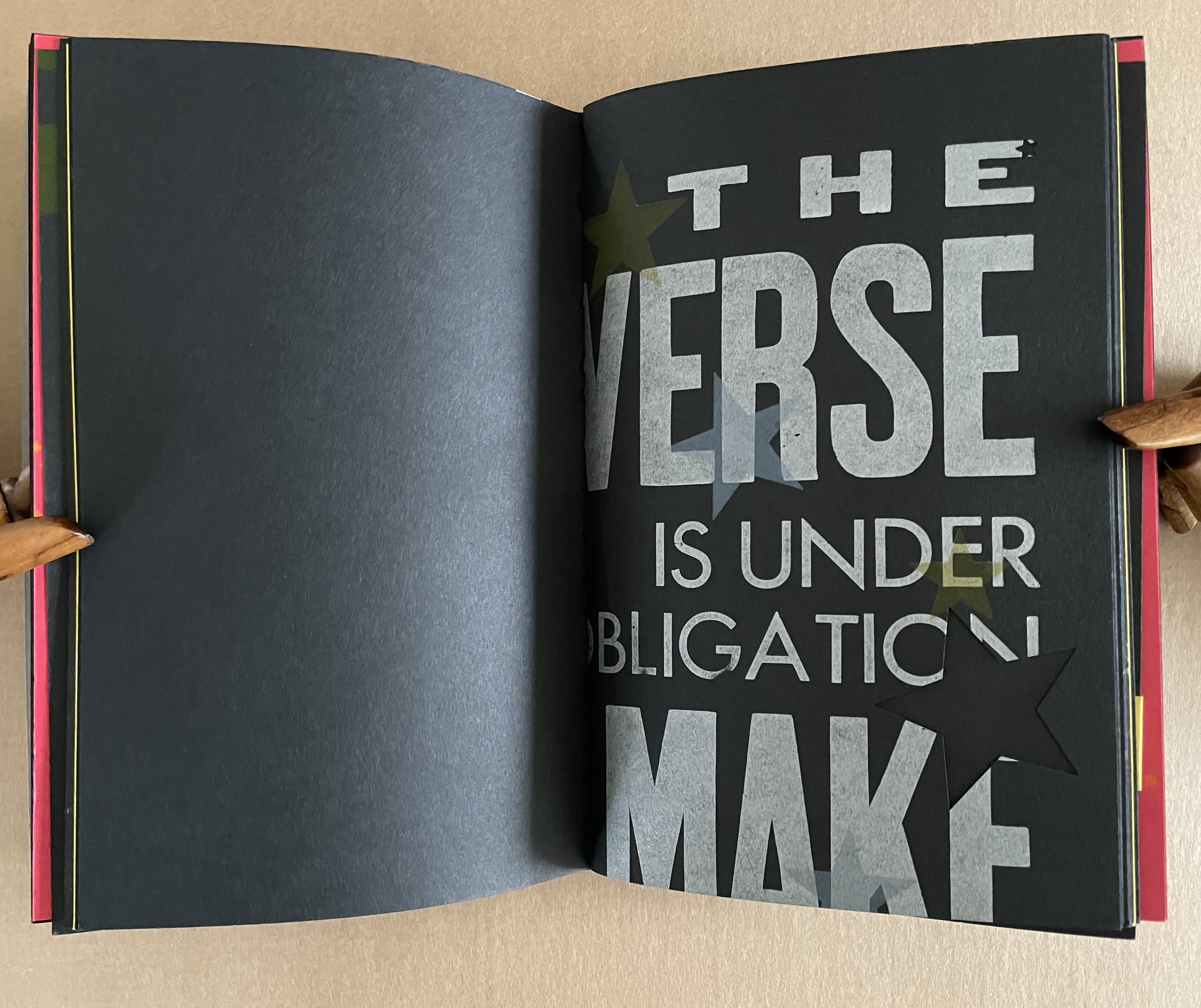
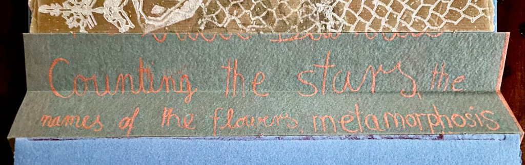
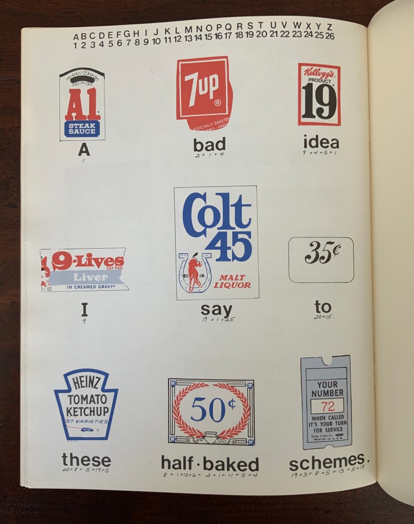
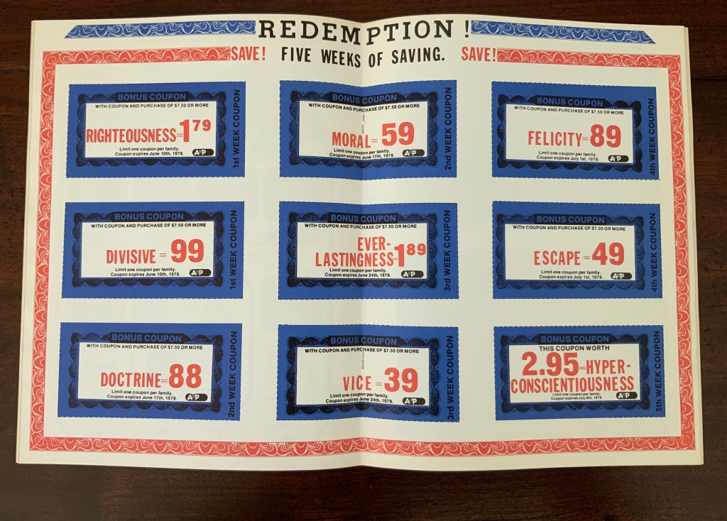
As she plied her calculations, she noticed that obviously many words had the same number. The impulse to collect words equalling 100 (the sum of her name’s letters) led to creating a numerical dictionary — the Sumantic Vocabulary Collection — listing words with equal sums. With that, Shaw began to see words in what she called “the numerical waste” surrounding her: numbers on receipts, savings coupons clipped from newspapers, brand labels, barcodes and pricing stickers and other everyday consumer signage. Strange poems could be derived from them. Eventually “sumantic” — playing on sum and semantics — evolved into “summantics” as her description of her artistic methodology. Her 1978 artist’s book Market Research spells (or numbers?) this out in its foreword.
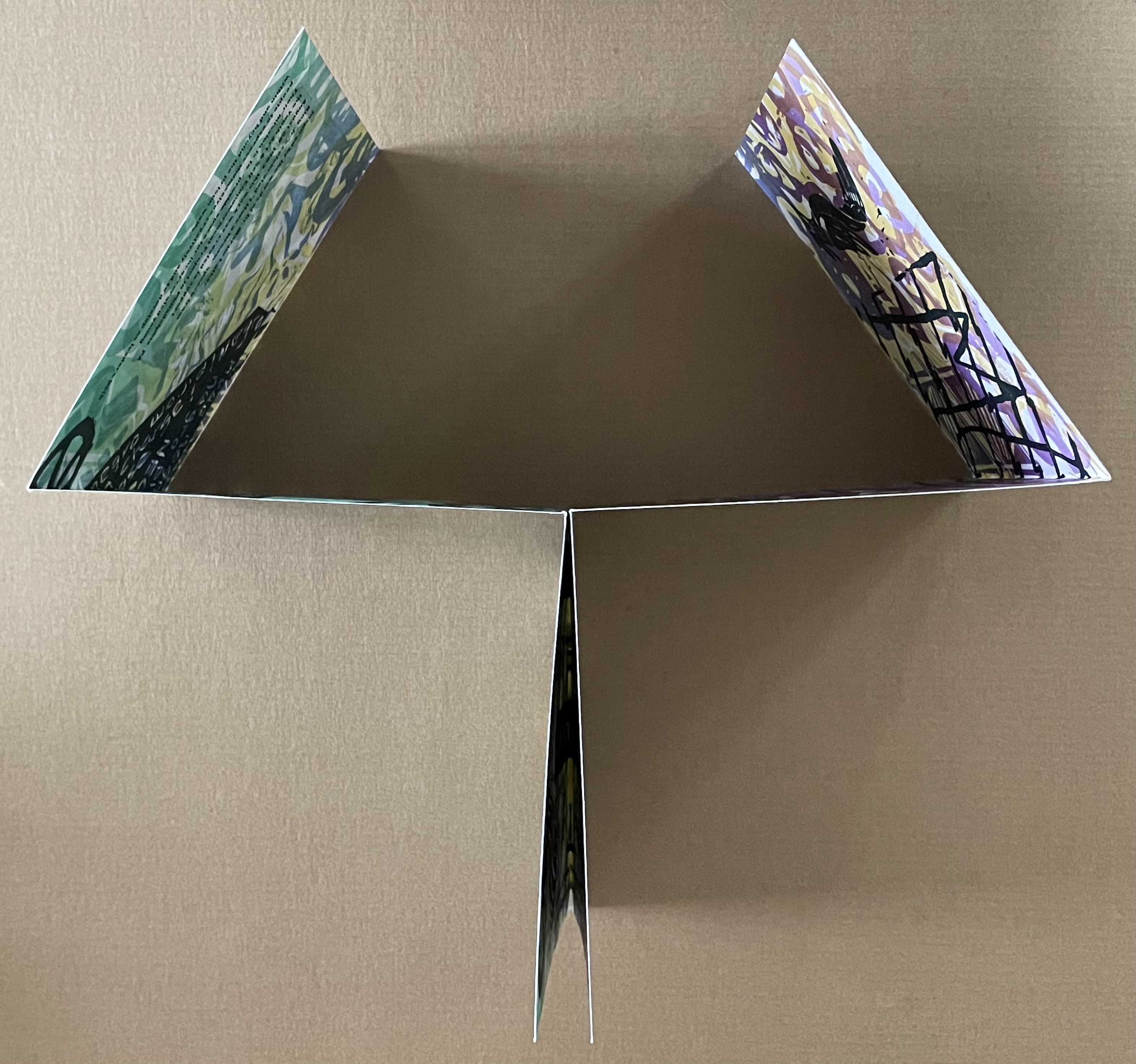
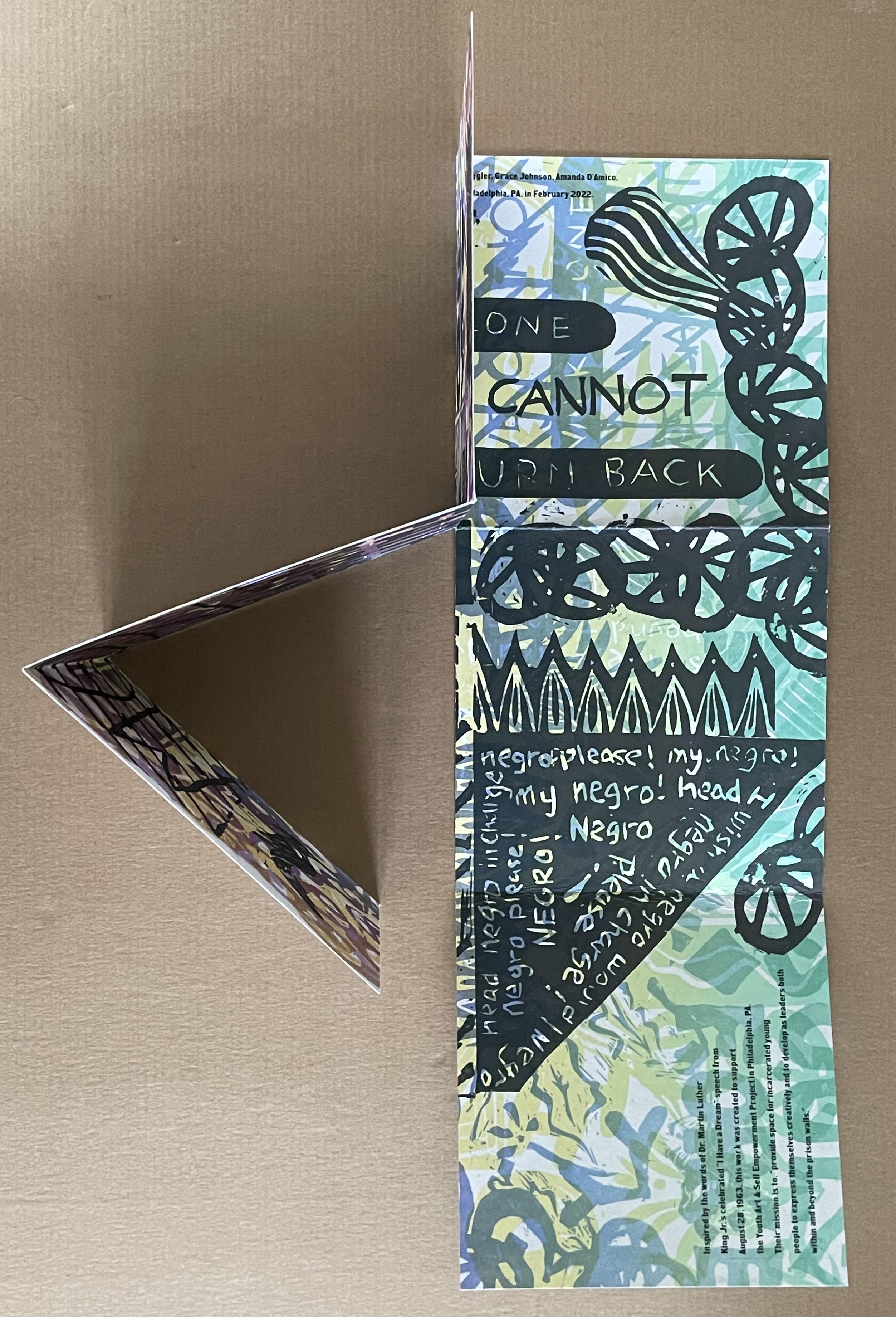
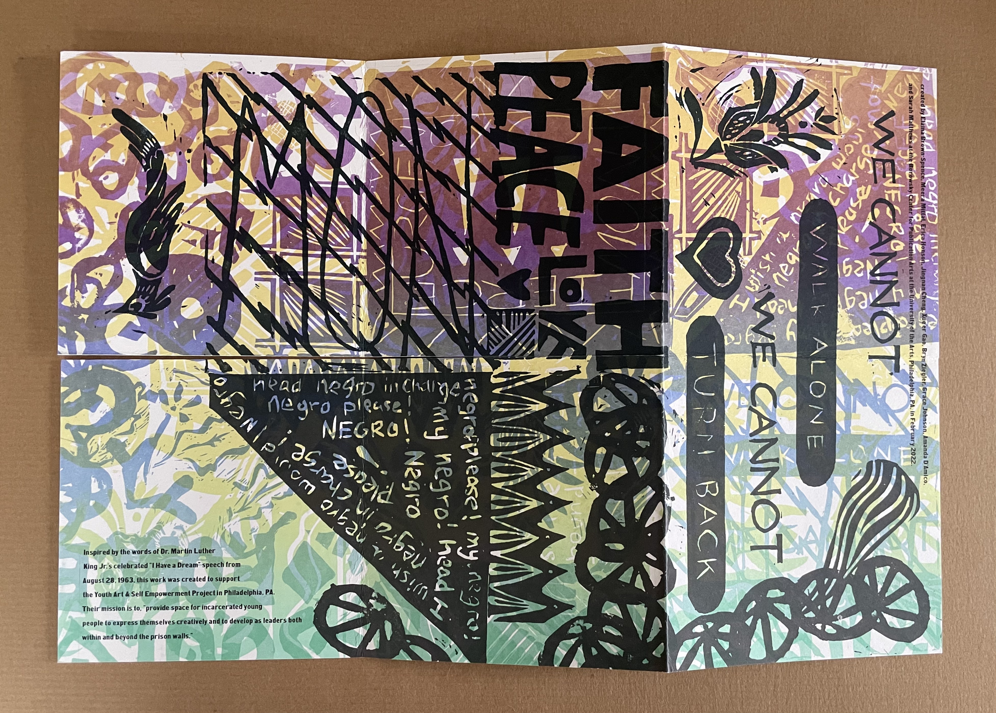
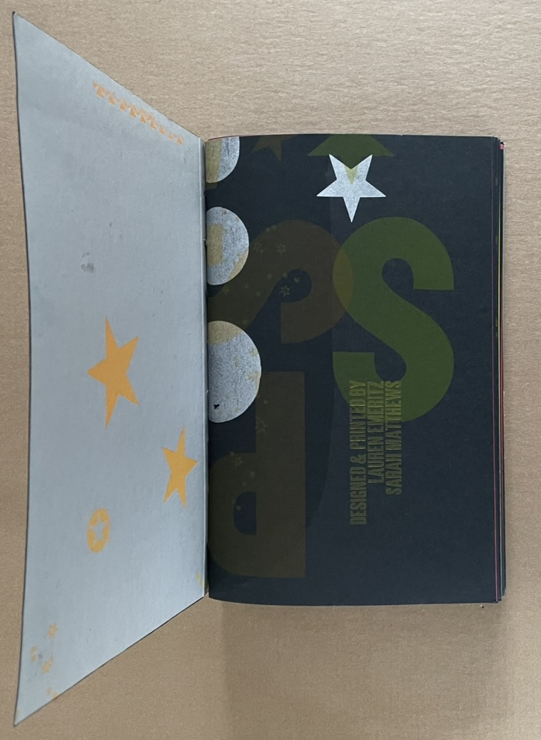
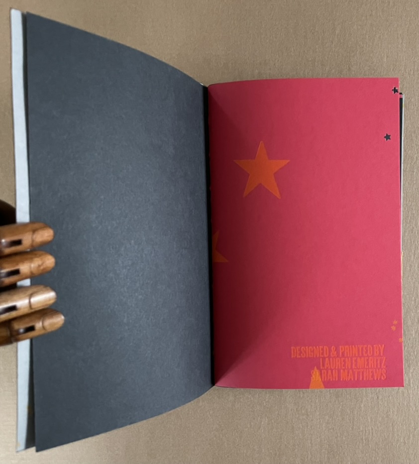
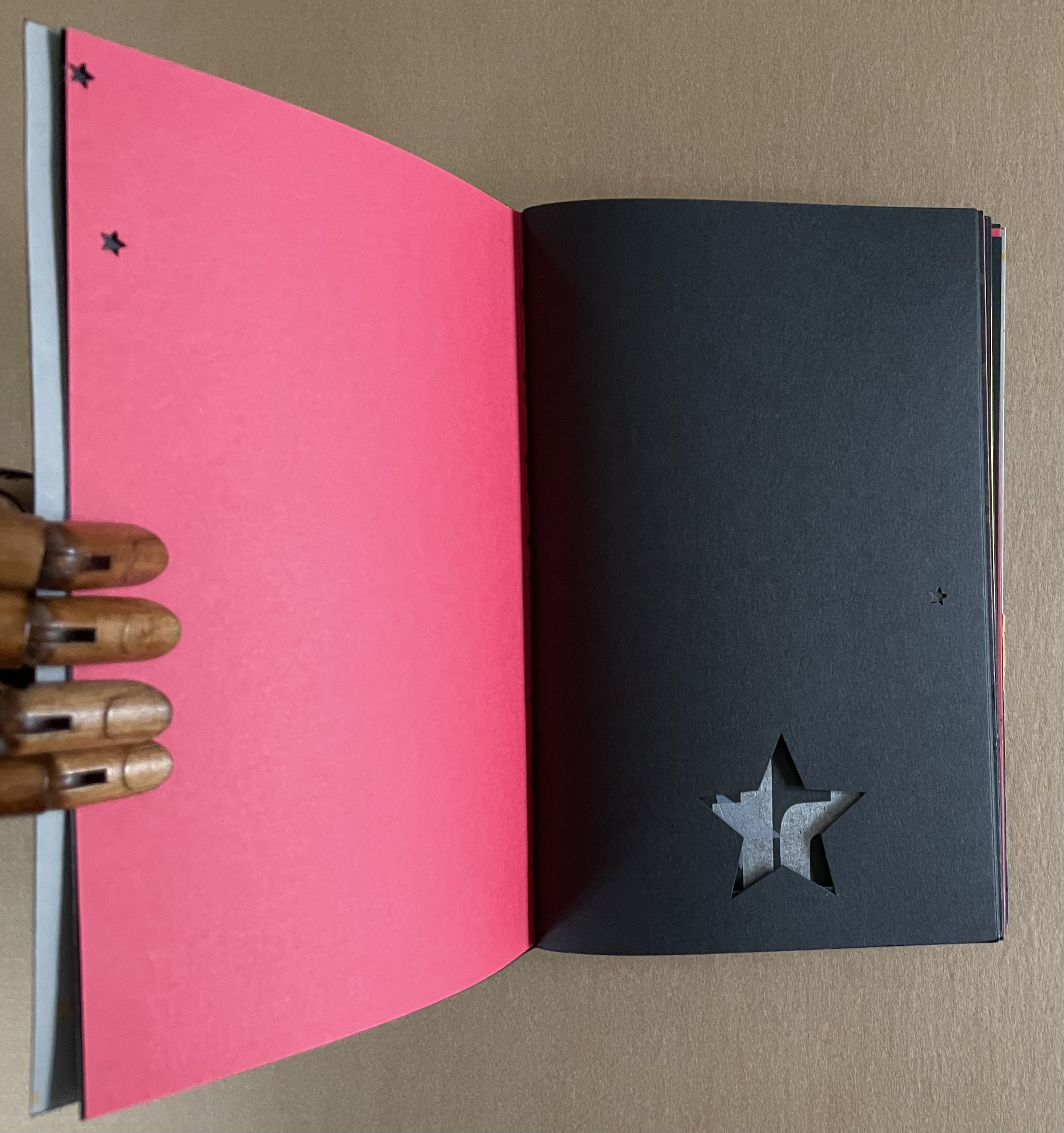
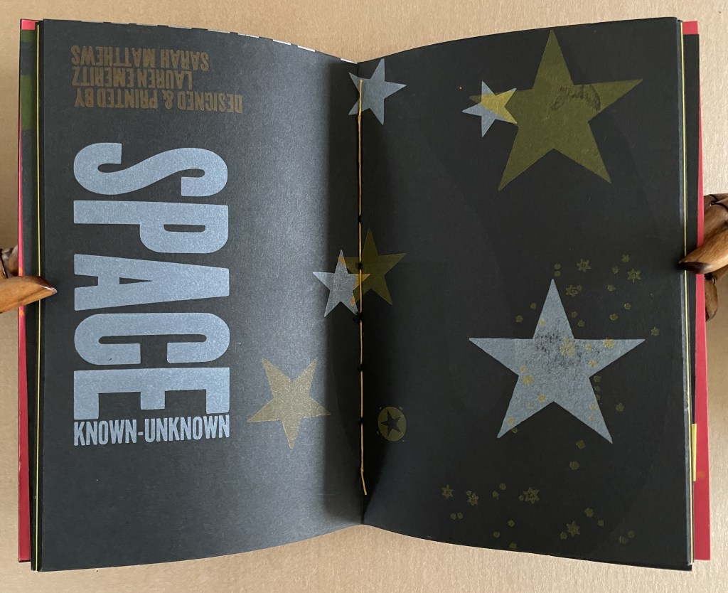
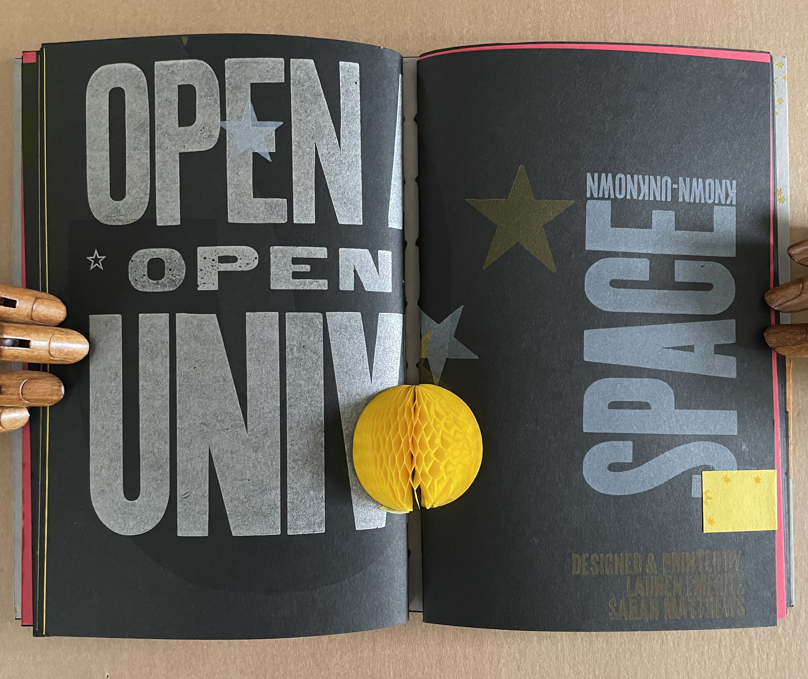
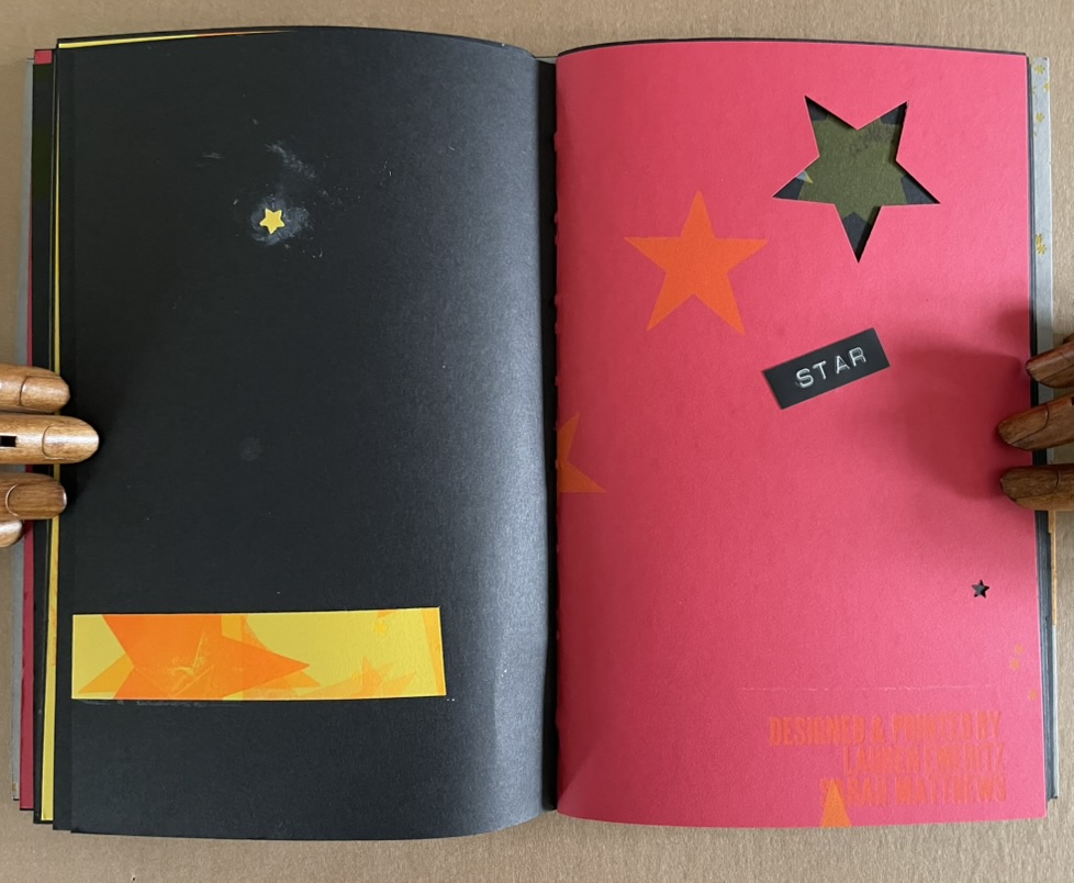
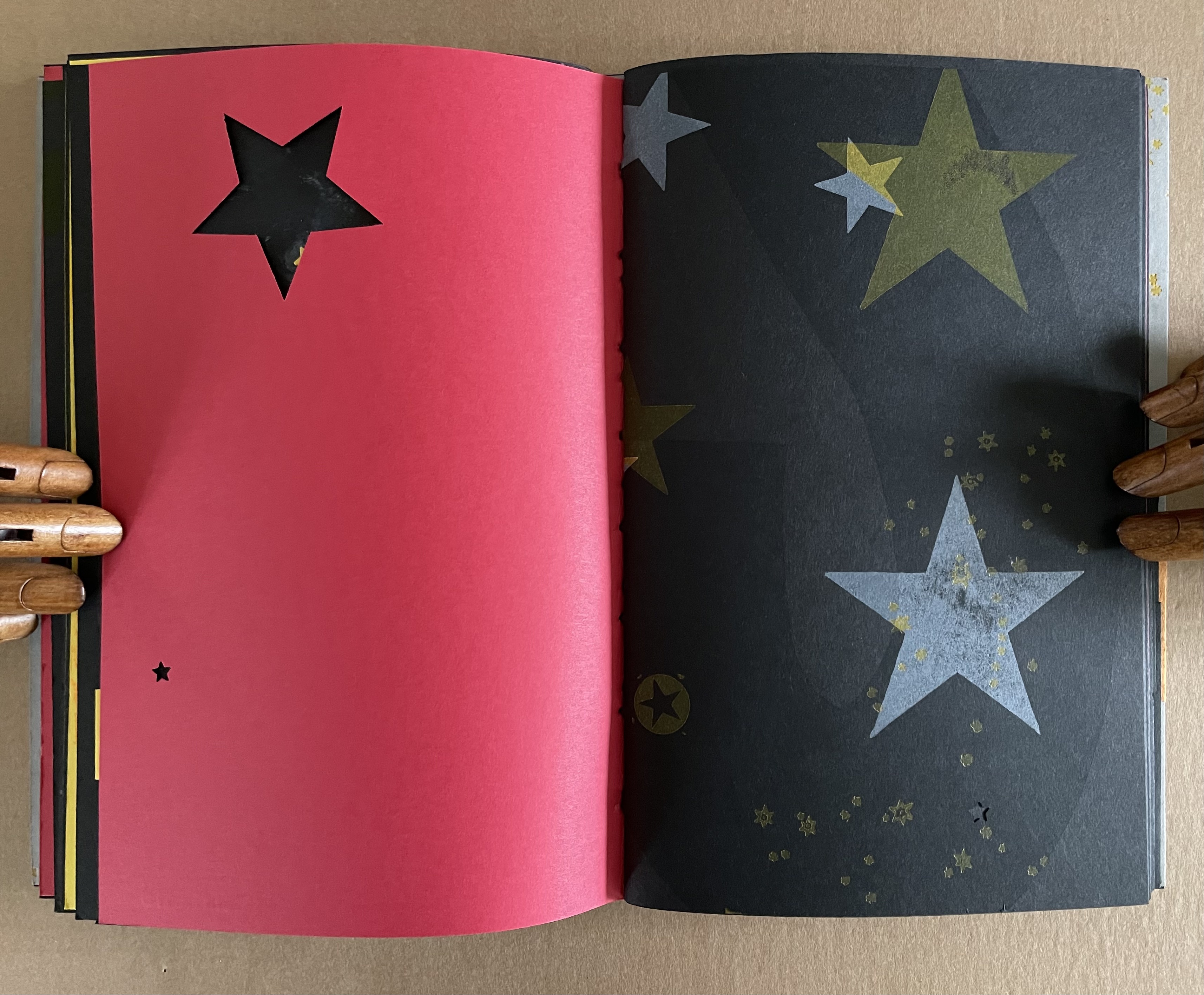
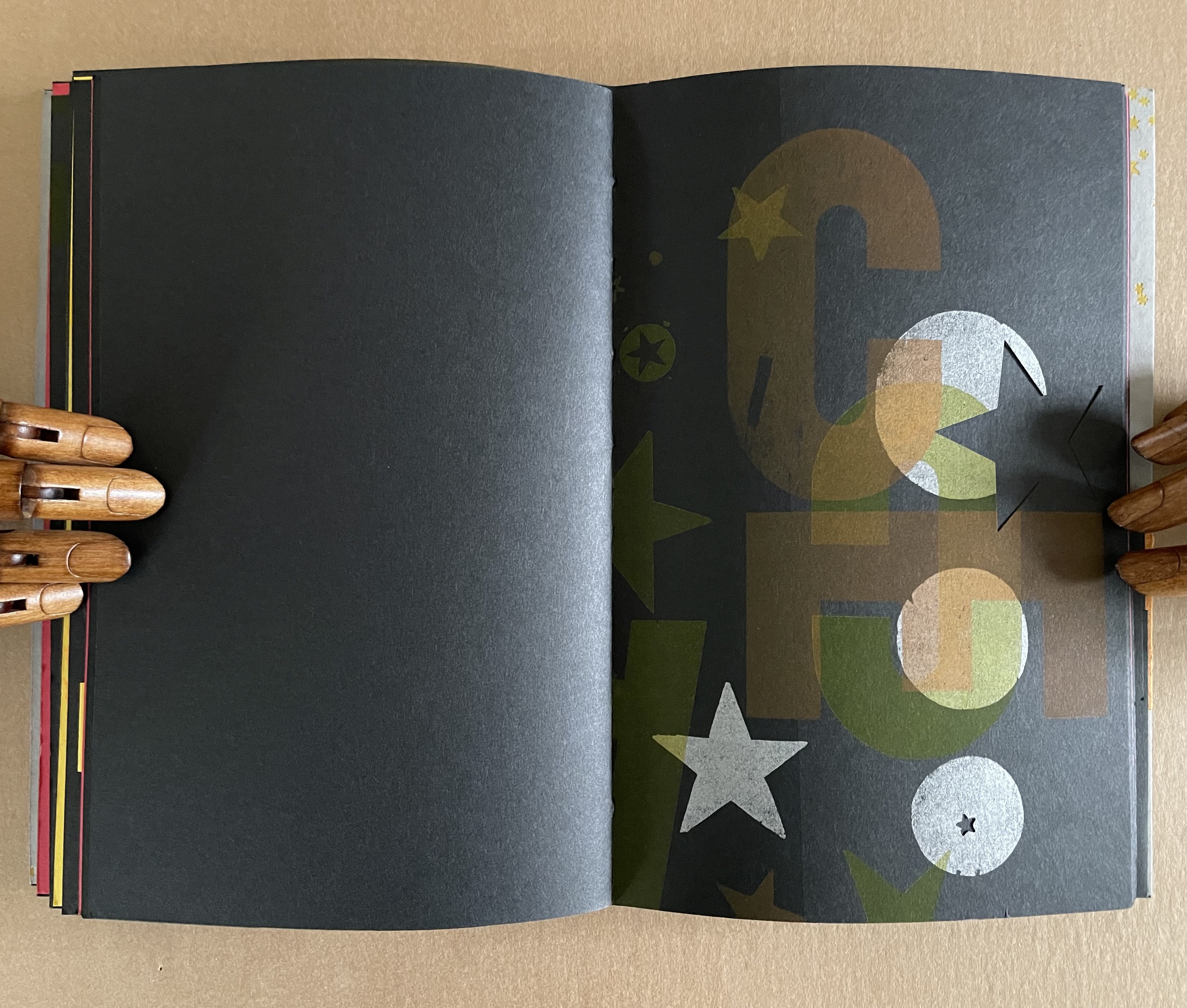
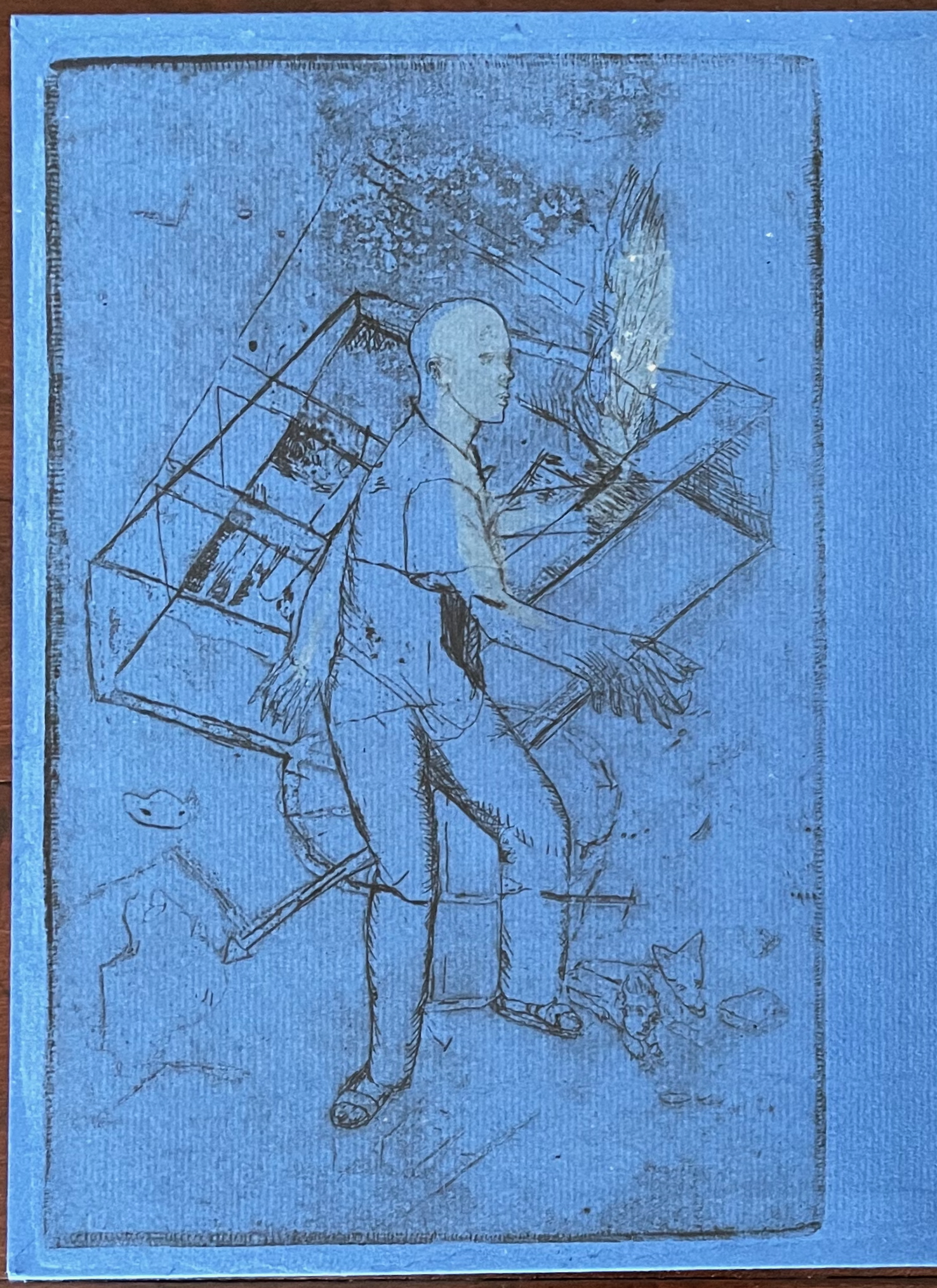
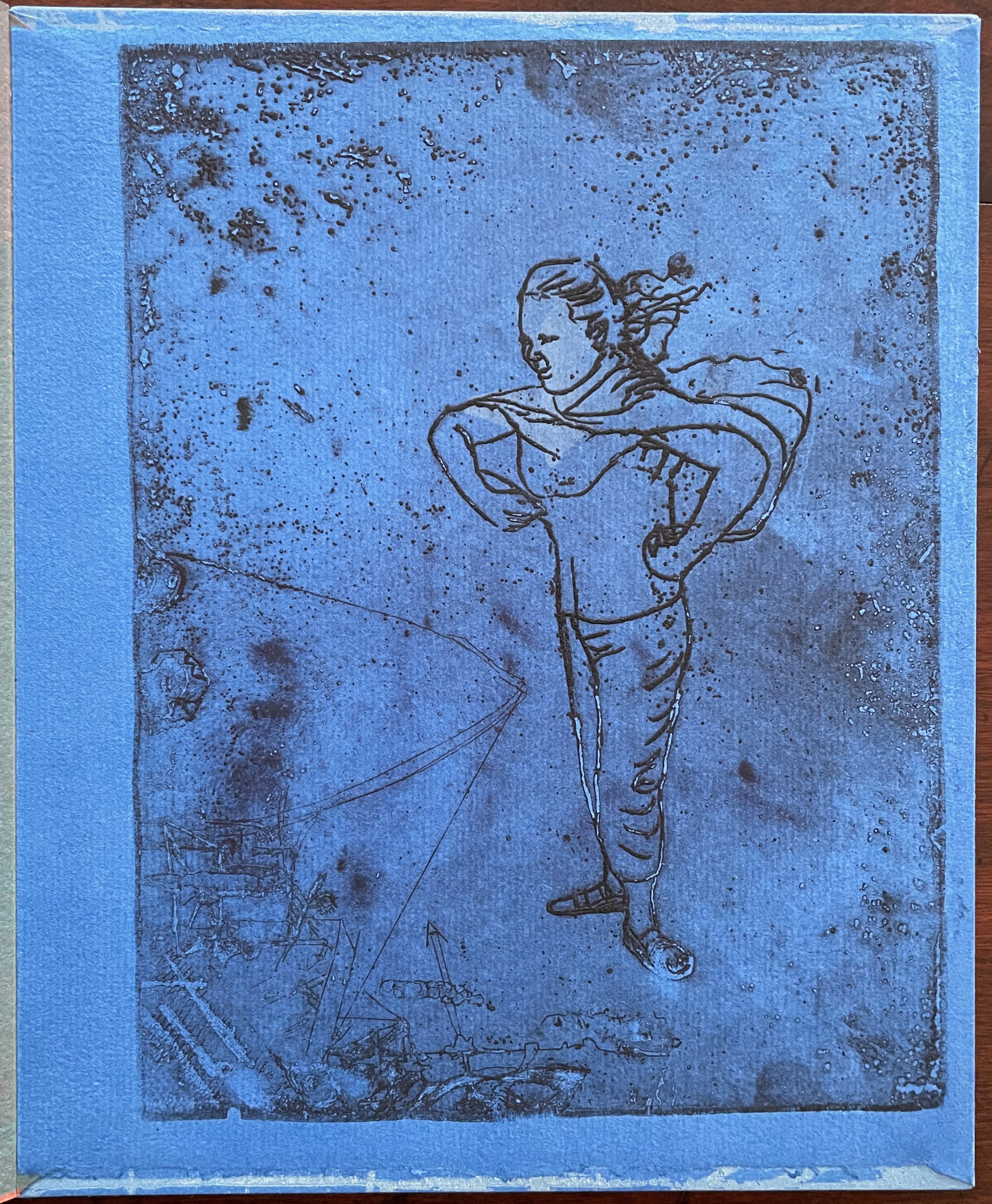
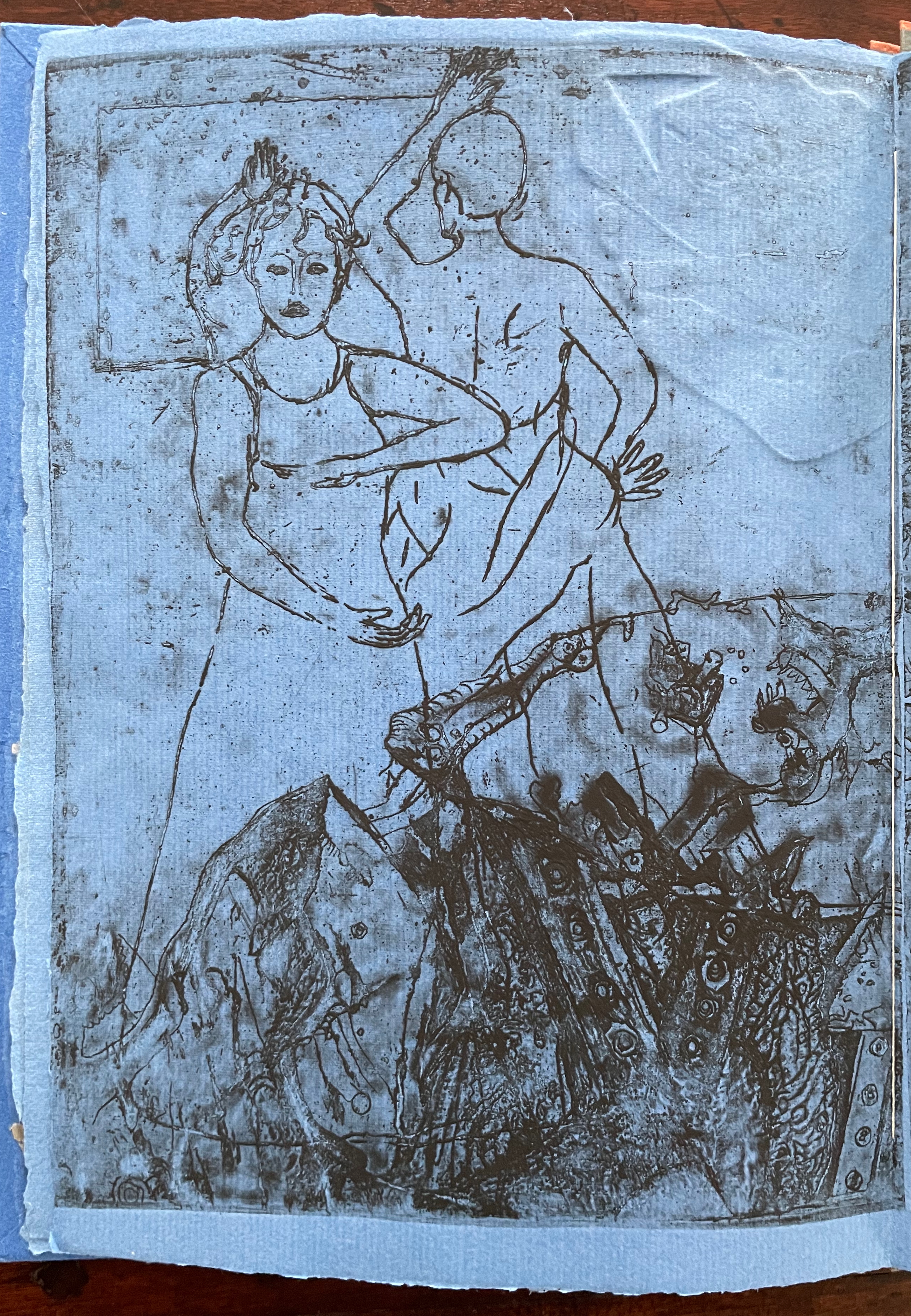
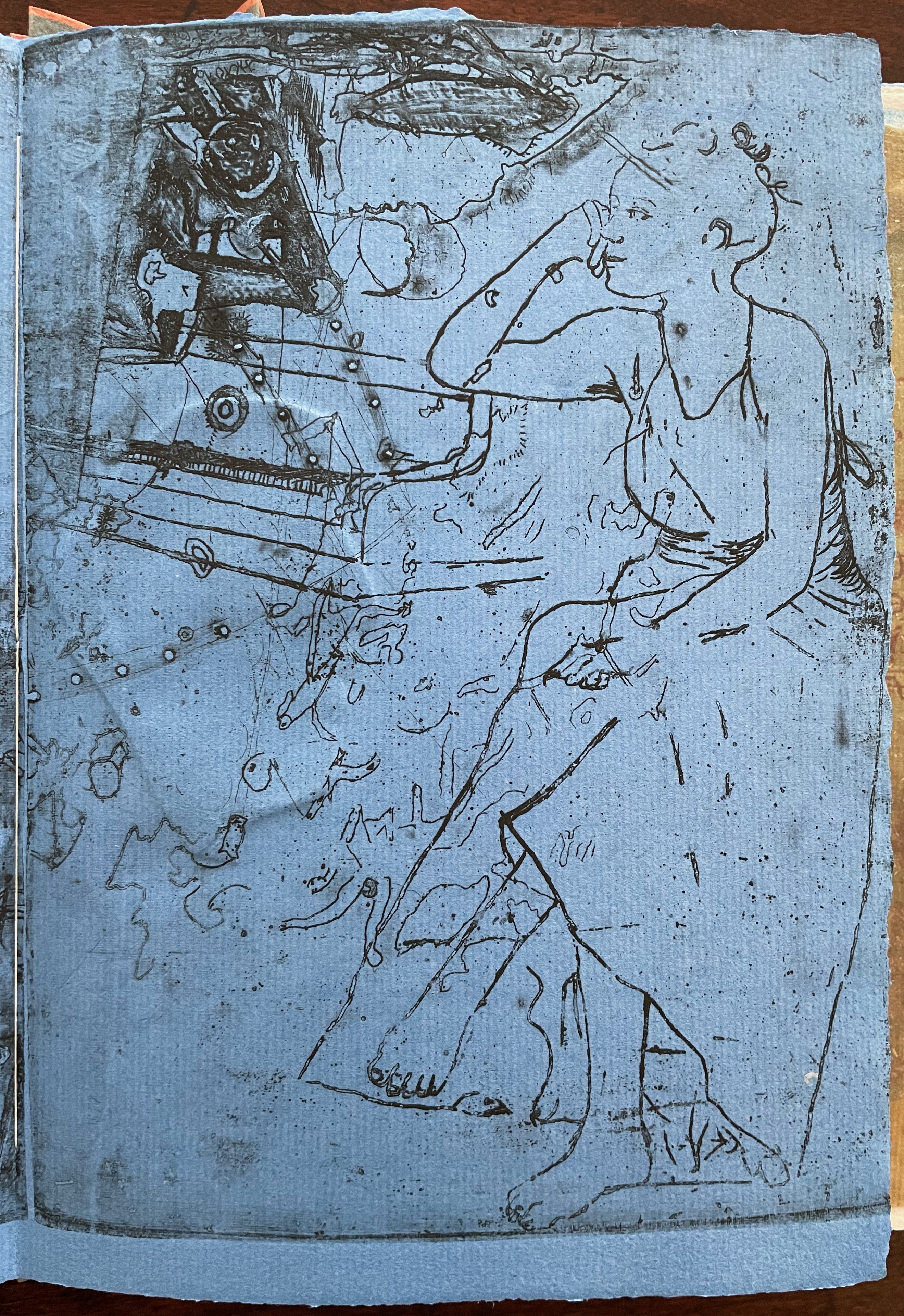
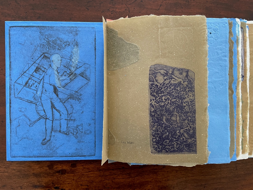
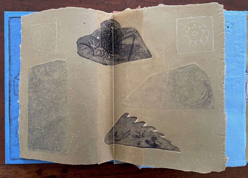
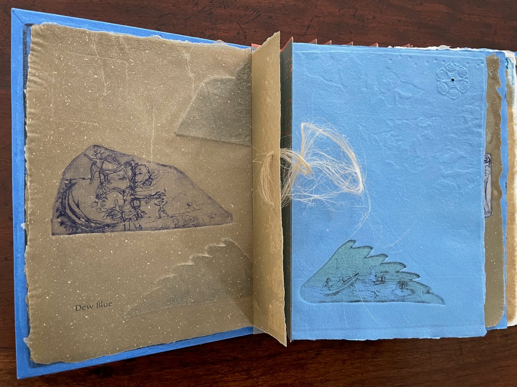
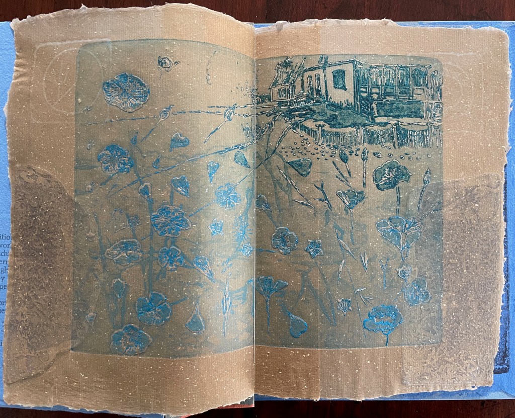
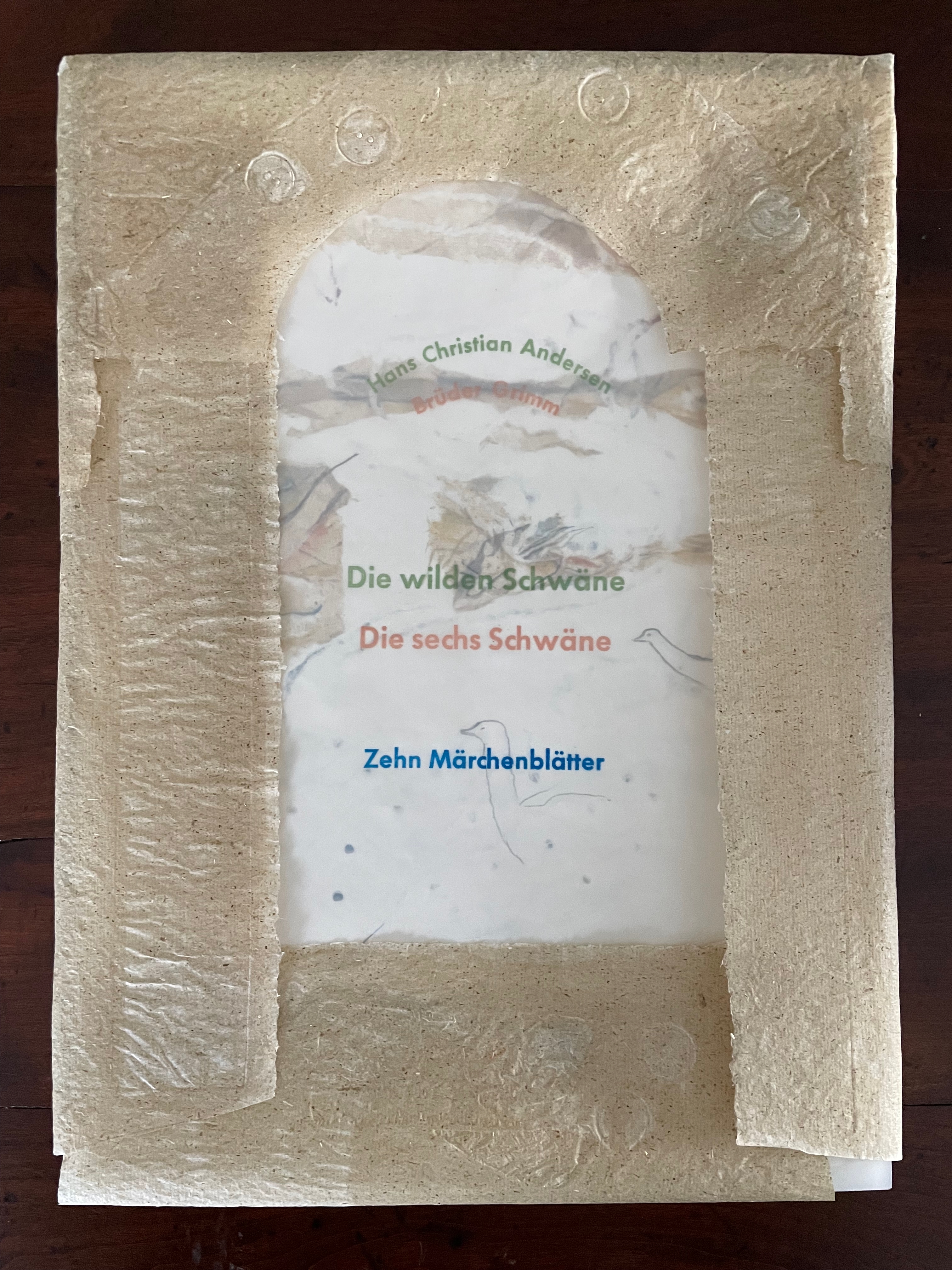
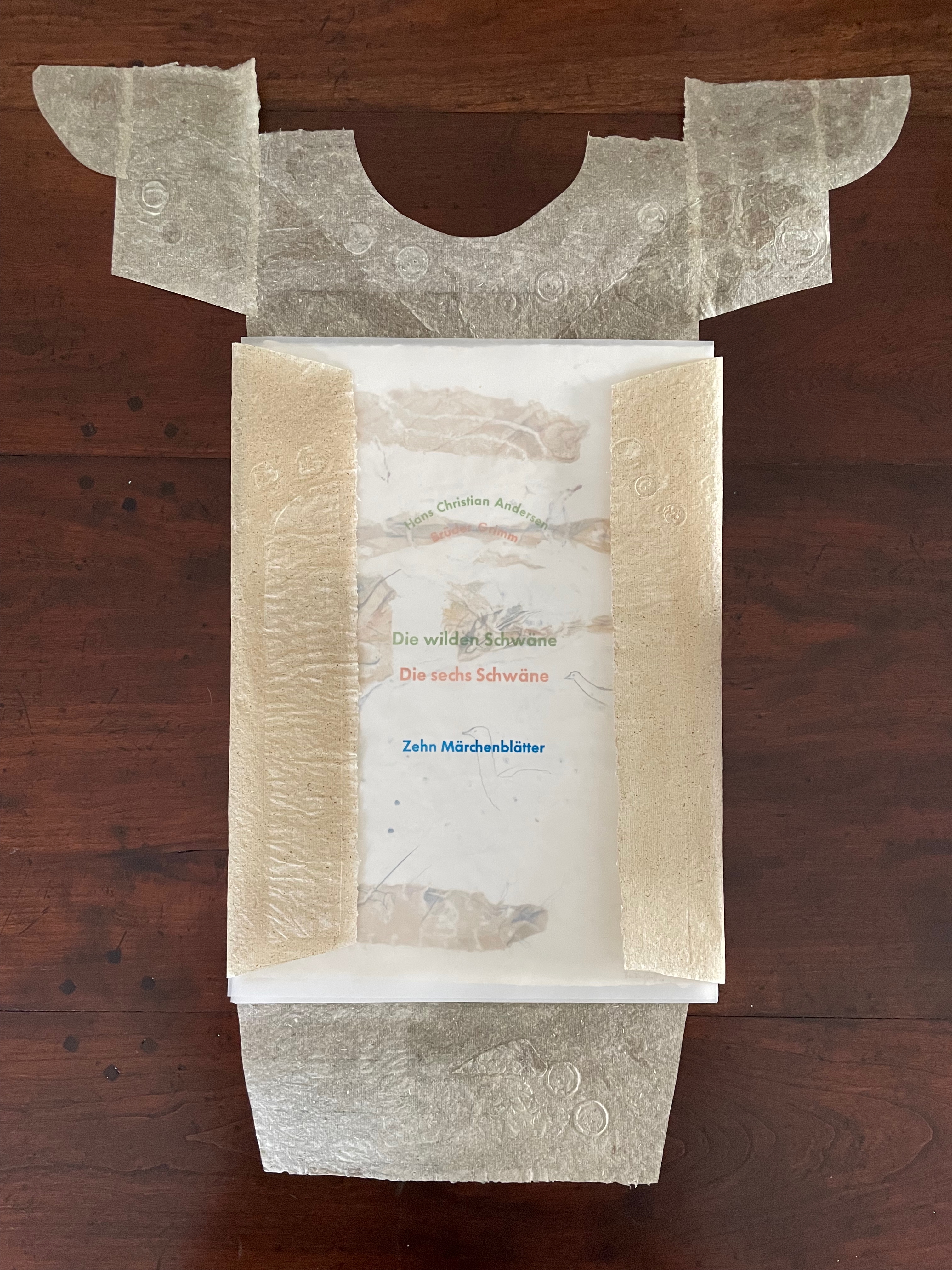
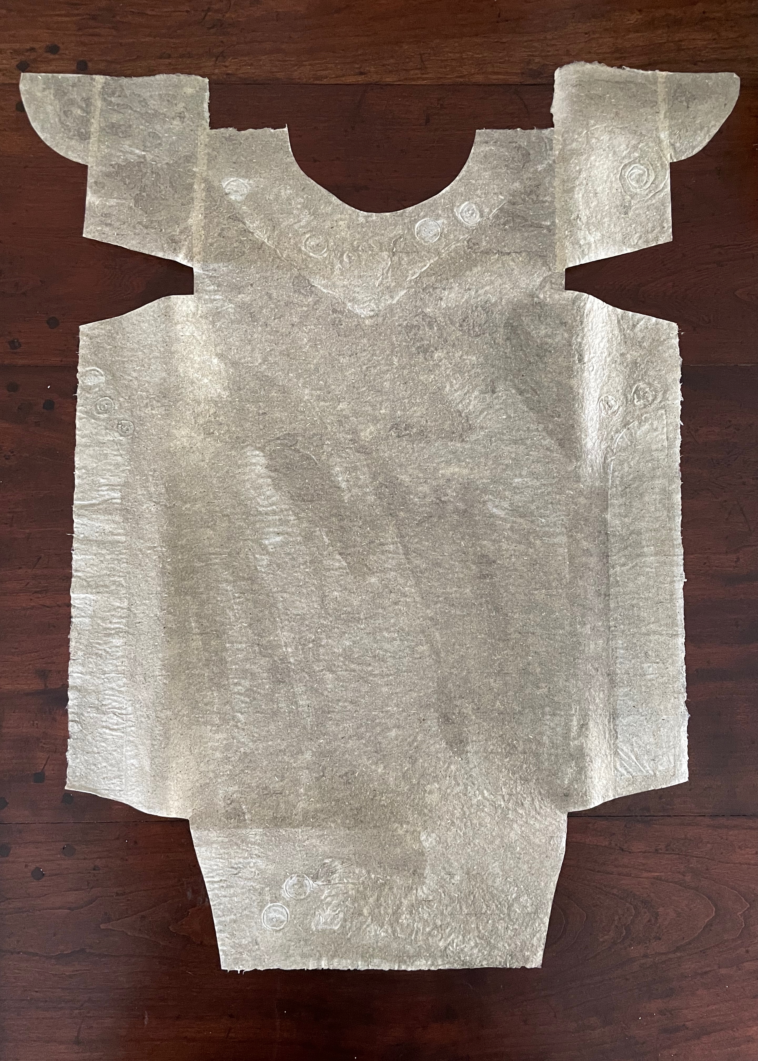
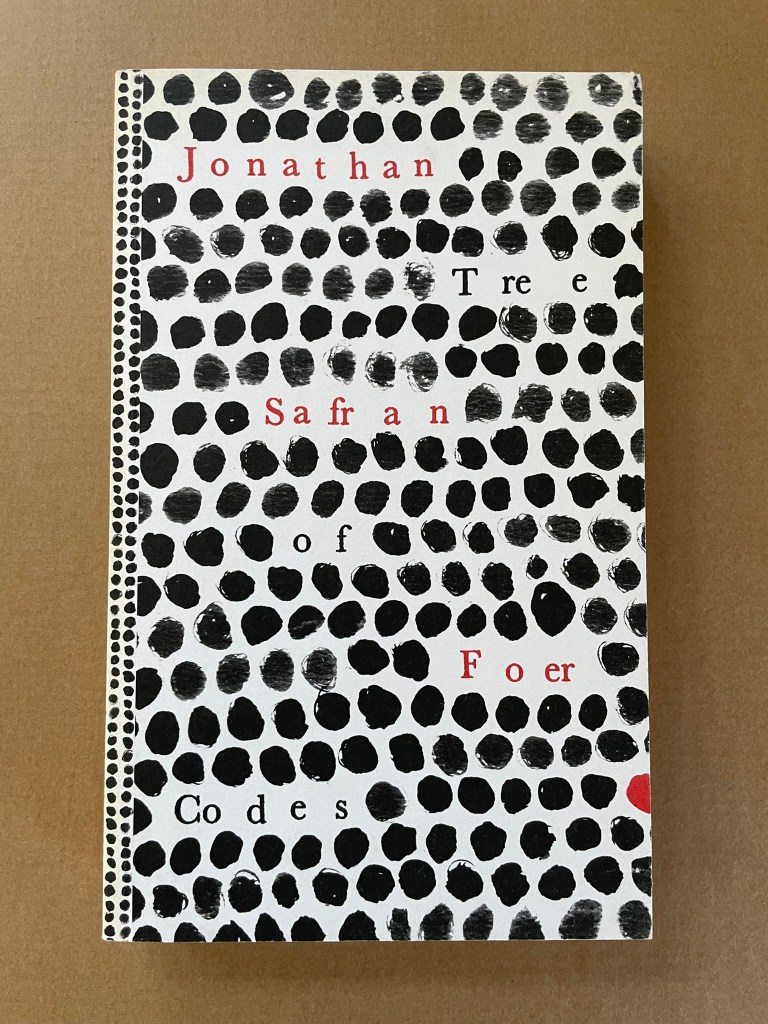
Market Research (1978)
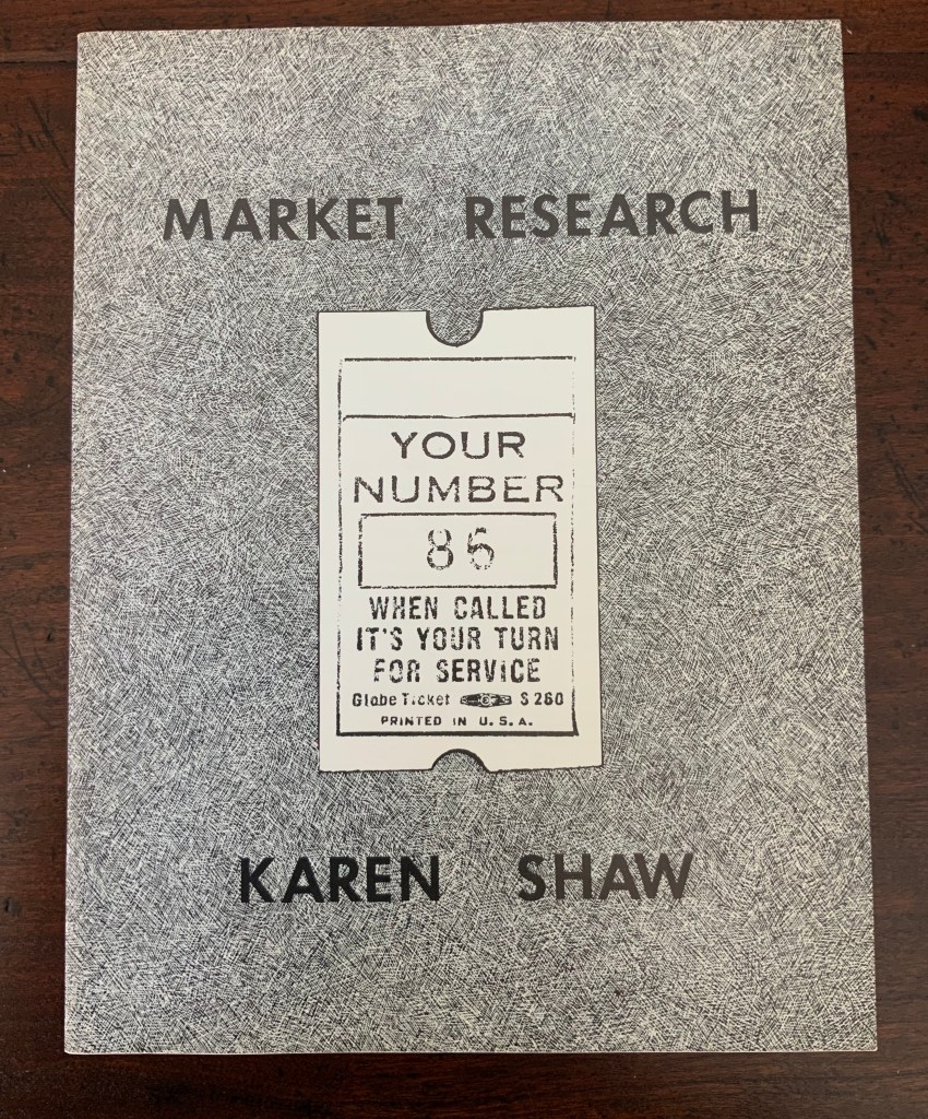
Market Research (1978)
Karen Shaw
Softcover booklet, saddle stitched with staples, translucent fly leaves. H280 x W215 mm. 24 pages. Acquired from , .
Photos: Books On Books Collection.
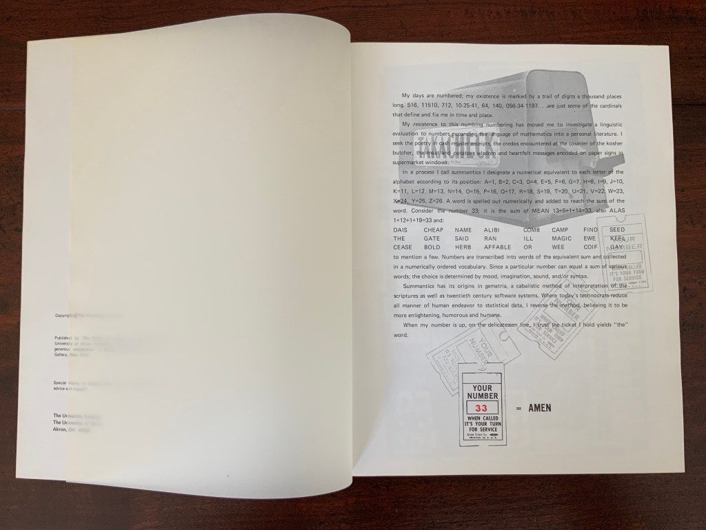
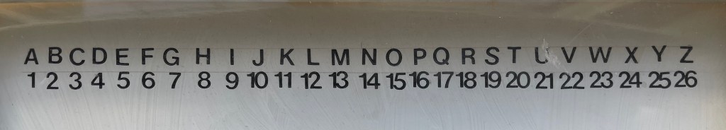
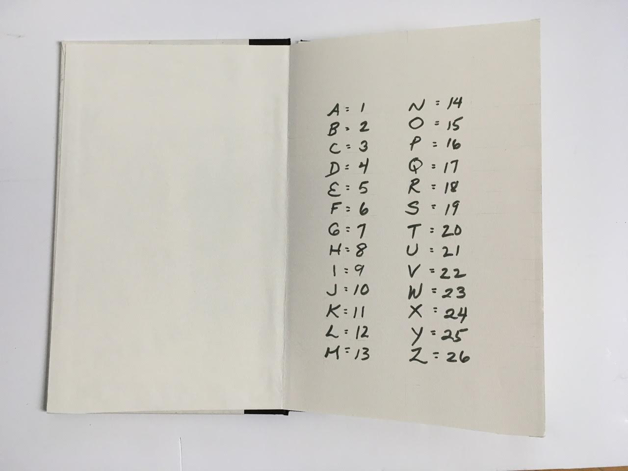
In a process I call summantics, I designate a numerical equivalent to each letter of the alphabet according to its position: A=1, B=2, C=3, D=4, E=5, F=6, G=7, H=8, I=9, J=10, K=11, L=12, M=13, N=14, O=15, P=16, Q=17, R=18, S=19, T=20, U=21, V=22, W=23, X=24, Y=25, Z=26. A word is spelled out numerically and added to reach the sum of a word. Consider the number 33. It is the sum of MEAN = 13+5+1+14 = 33, also ALAS = 1+12+1+19 = 33 and:
DIAS CHEAP NAME ALIBI COMB CAMP FIND SEED
THE GATE SAID RAN ILL MAGIC EWE KEEL
CEASE BOLD HERB AFFABLE OR WEE COIF GAY
to mention a few. Numbers are transcribed into words of the equivalent sum and collected in a numerically ordered vocabulary. Since a particular number can equal the sum of various words the choice is determined by mood, imagination, sound, syntax and/or grammatical structure.
Summantics has its origins in gematria, a cabalistic method of interpretation of the scriptures as well as late twentieth century software systems. Where today’s technocrats reduce all manner of human endeavor to statistical data, I reverse the process believing it to be more enlightening, humorous and humane.
Given the humor of the work’s opening, it’s likely that the title Market Research cheekily refers to her data analysis work with NBC questionnaires completed by mothers for tracking the impact of TV violence on their young sons.
In his review of the 1978 exhibition “Artists’ Books and Notations” (Touchstone Gallery, 118 E. 64th Street, New York), Lawrence Alloway noted Karen Shaw’s methodology as another instance of “the ways by which language has entered recent visual art, formerly protected from such incursions by the prestige of Form. If artists use words in their work, it is not because they are now more dependent on writers or on theory than in the past, as has been suggested, but because language has become available as subject matter” (p.653). With Shaw in particular, it was a case of language and numbers becoming available as subject matter.
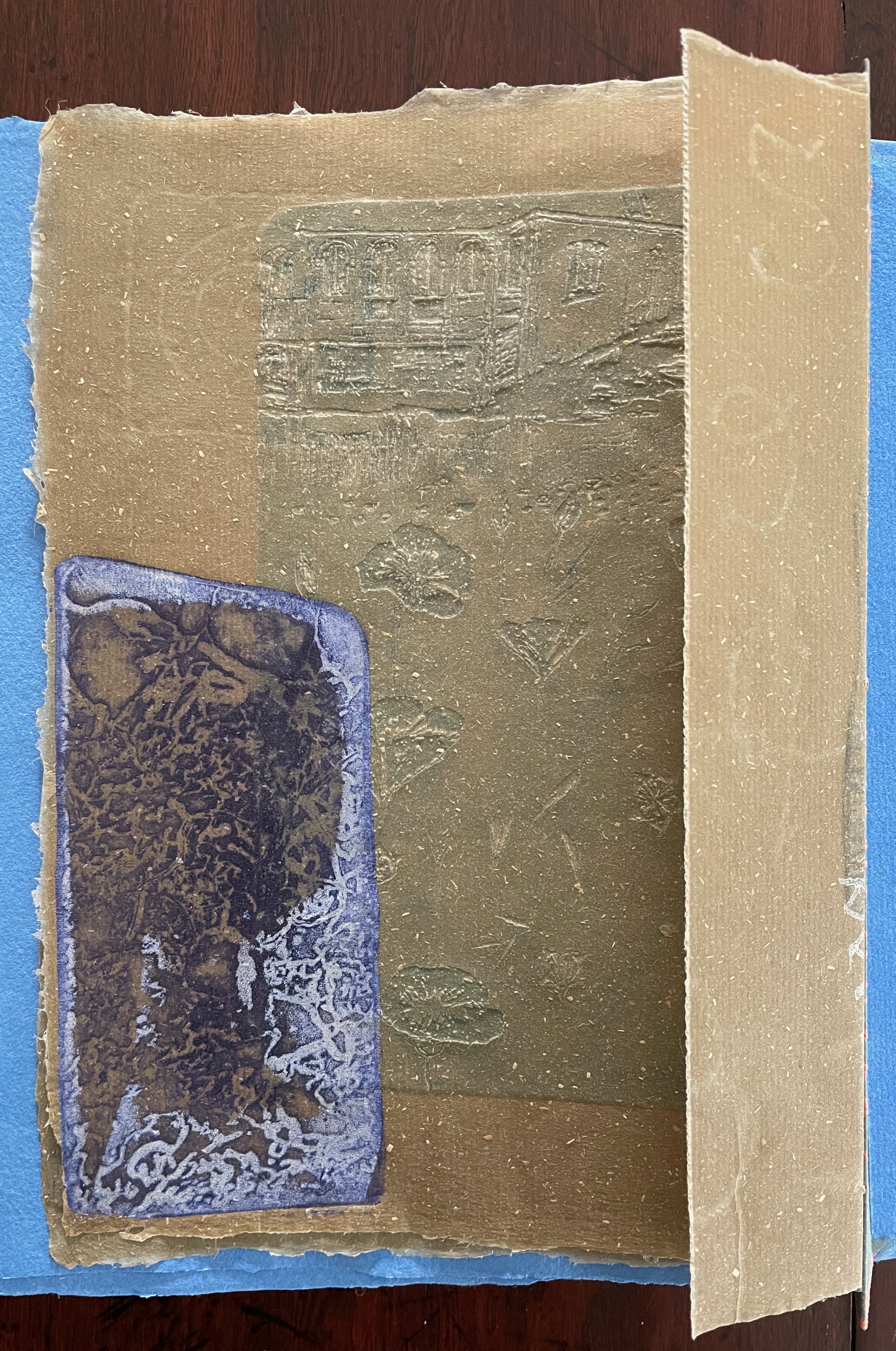
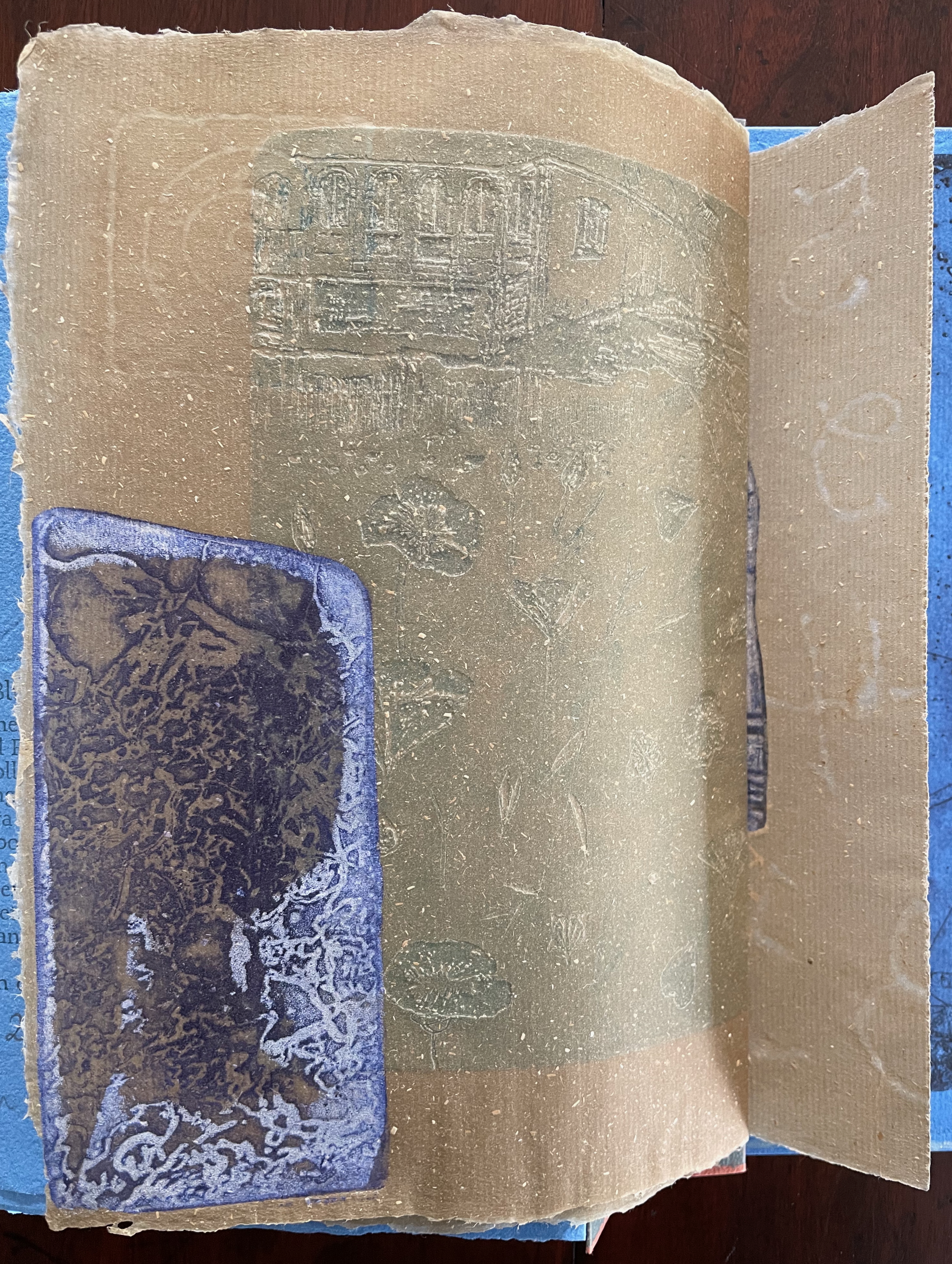
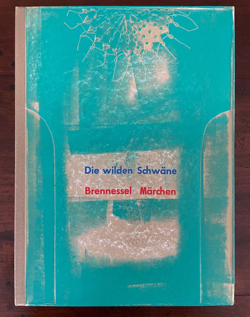
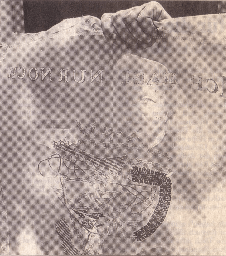
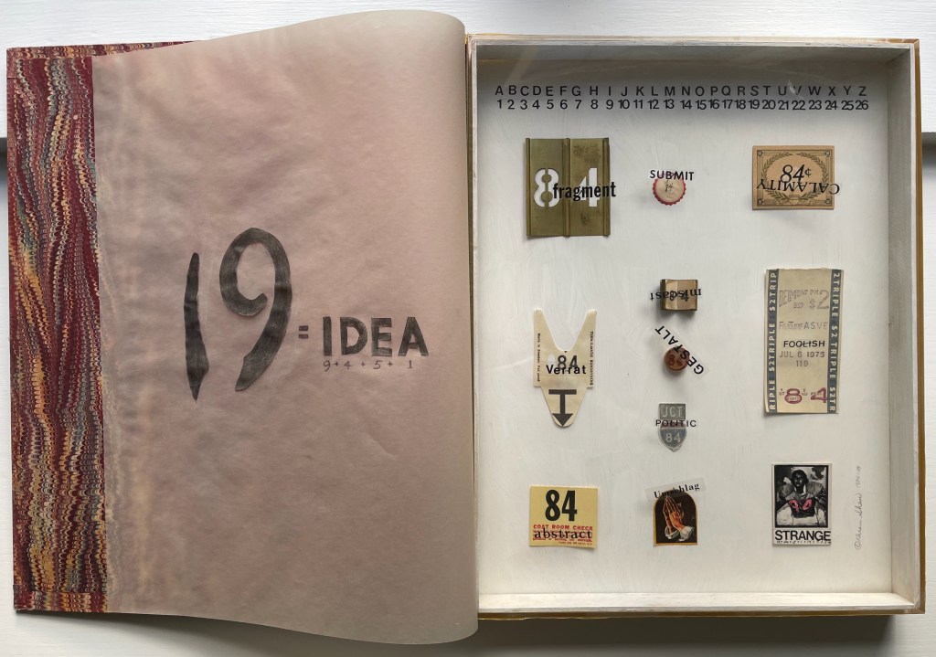
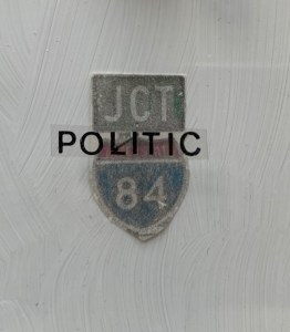
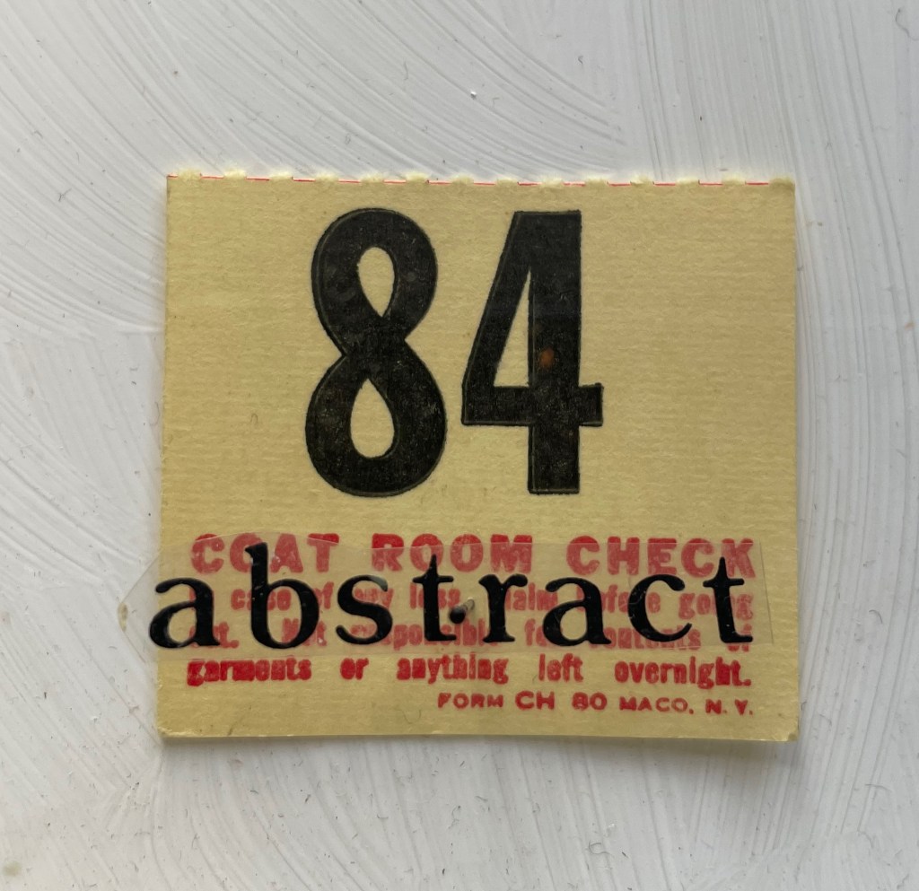
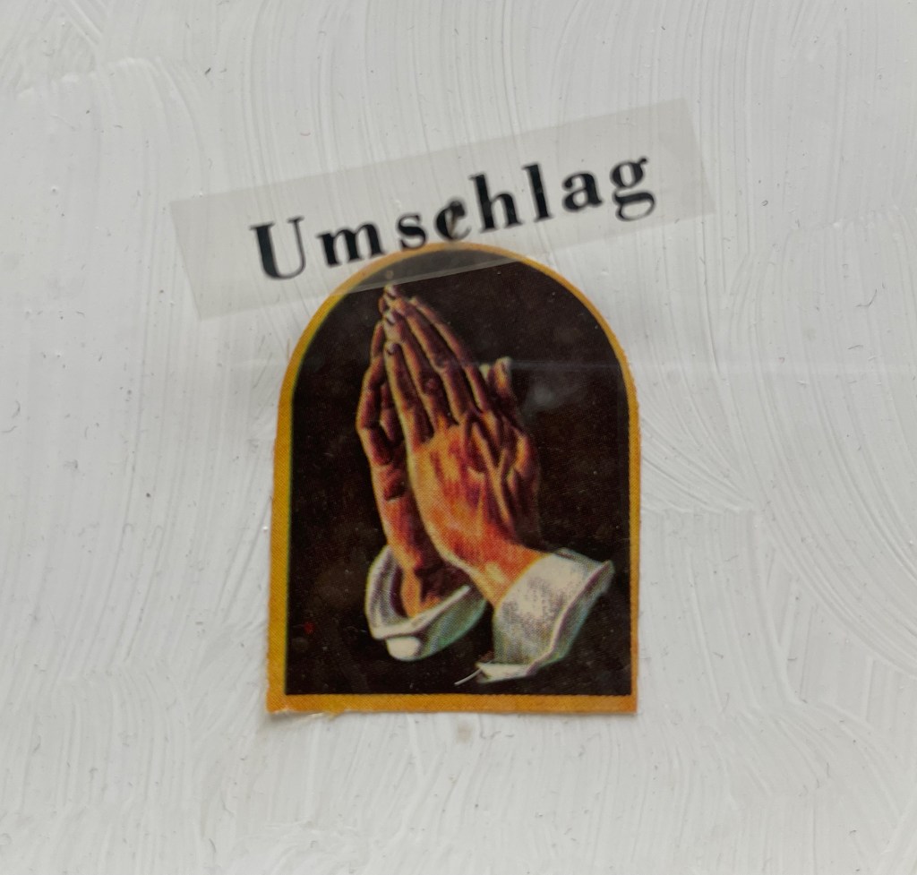
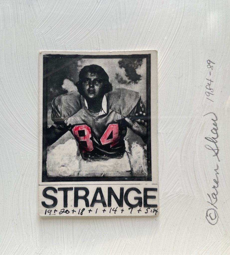
George Orwell 1984 (1984-89)
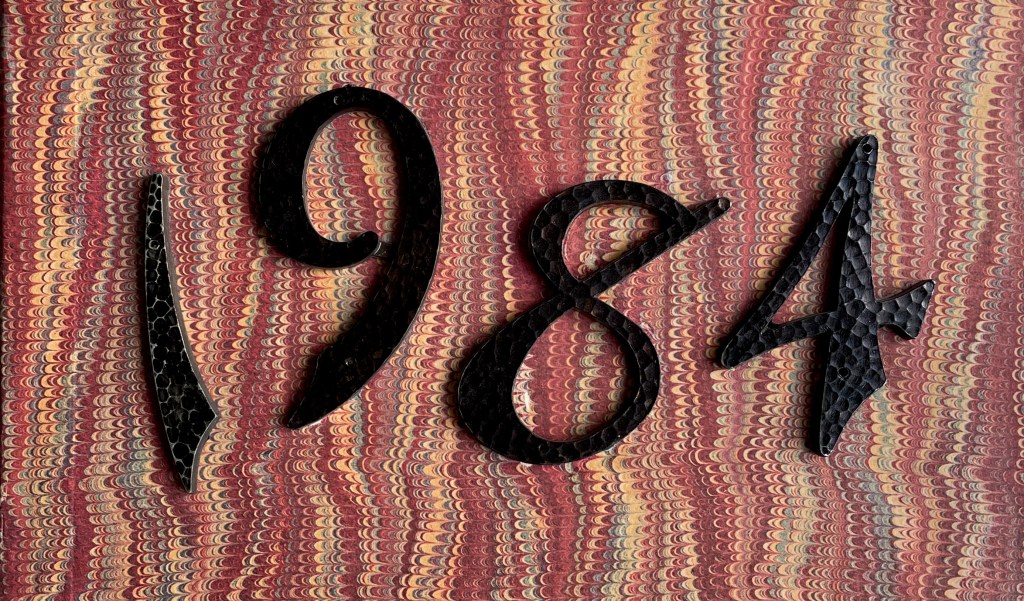
George Orwell 1984 (1984-89)
Karen Shaw
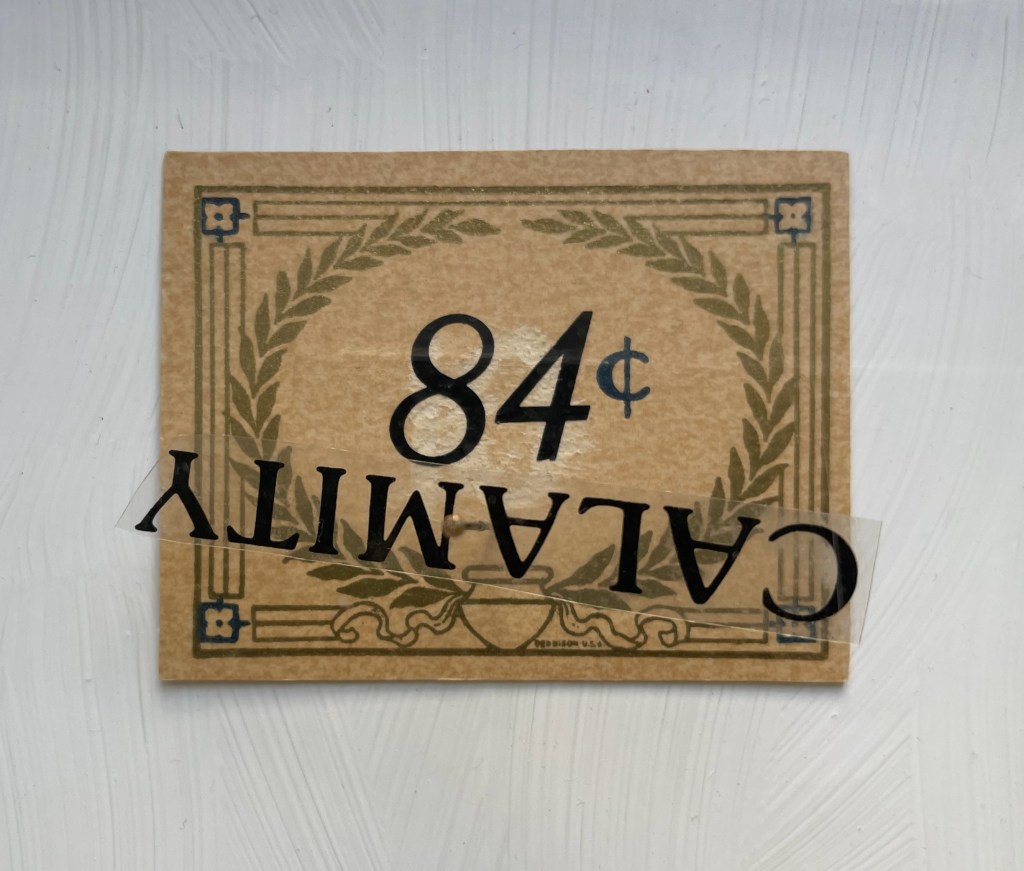
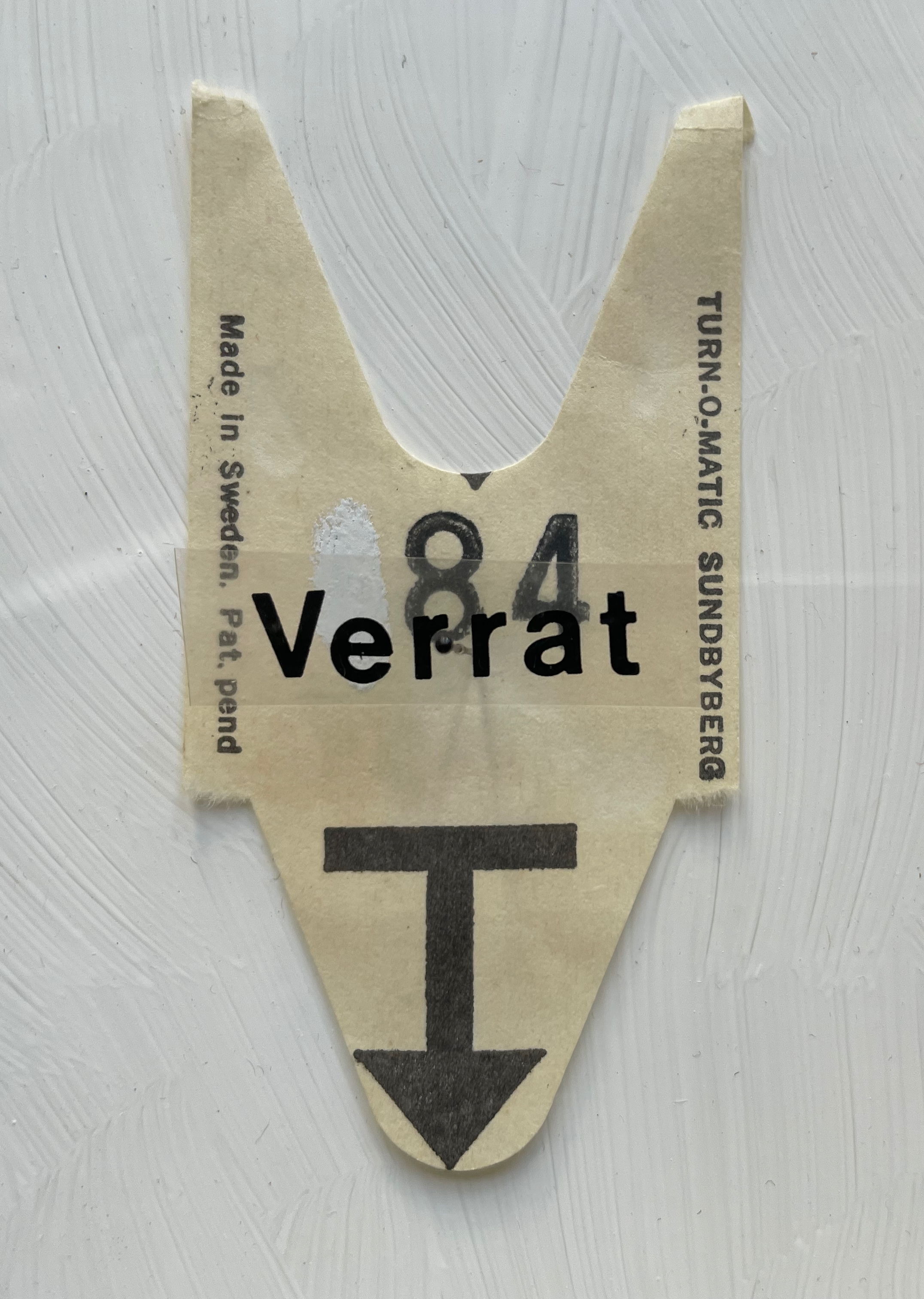
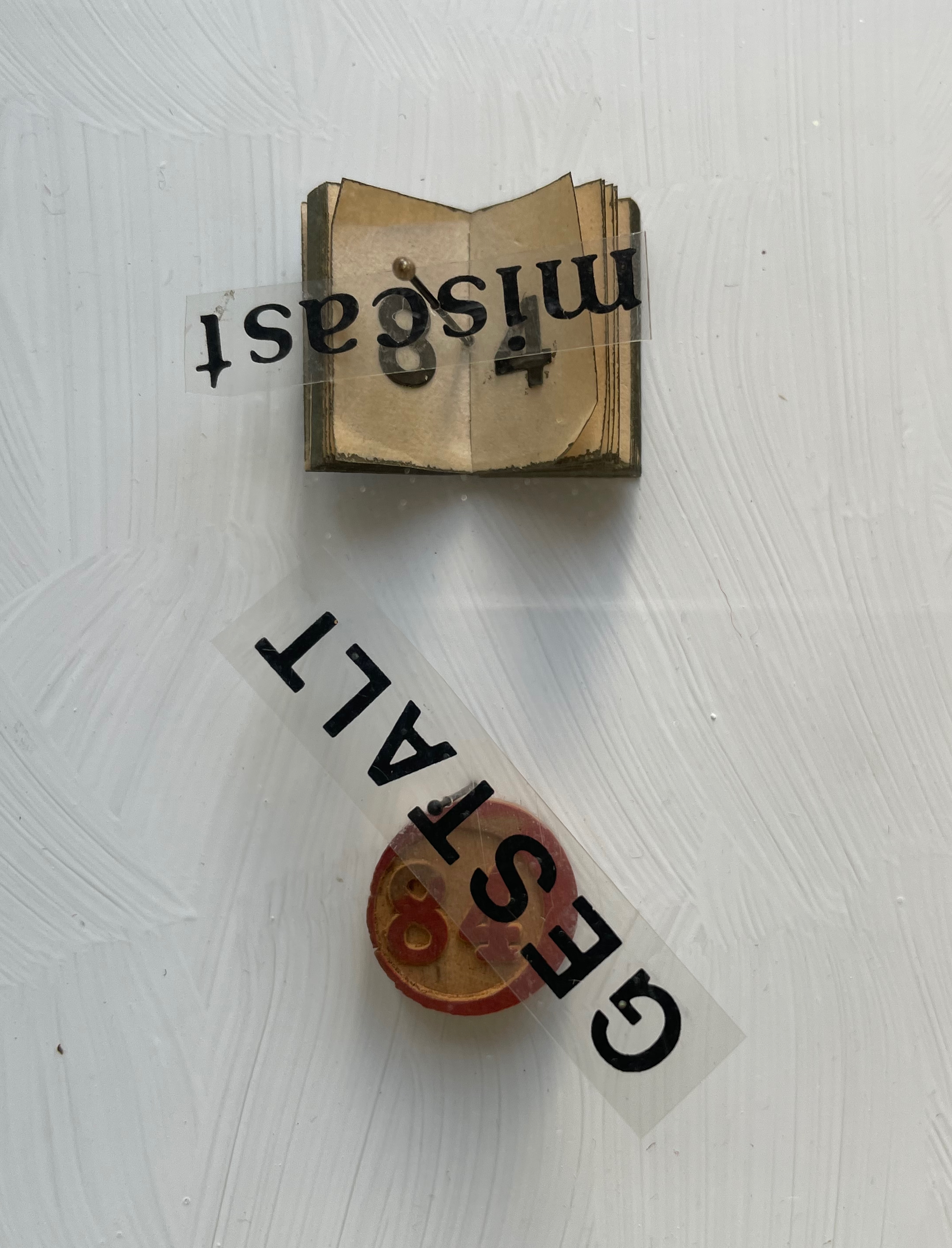
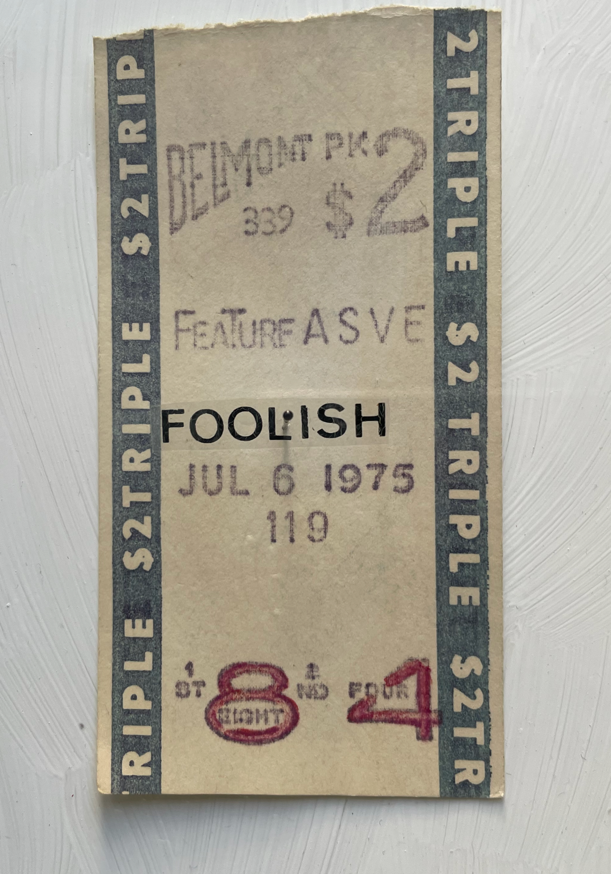
Diptych box covered with marbled paper on front and spine, wrought iron numerals 1984 and plastic letters fixed to front cover, translucent flyleaf with inked symbols and numbers, with text colored and cut out from translucent paper, plexiglas glued to wooden case with gessoed interior and 11 found items bearing the number 84, each fixed to the interior wooden panel with a black-bead-headed pin. H360 x W290 x D40 mm. Unique work. Acquired from Peter Kiefer Buch- und Kunstauktionen, 21 October 2023.
Photos: Books On Books Collection.
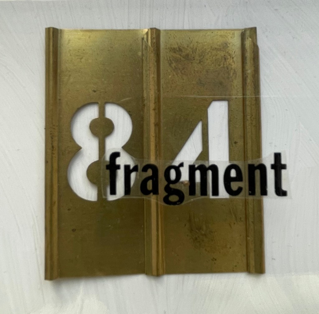
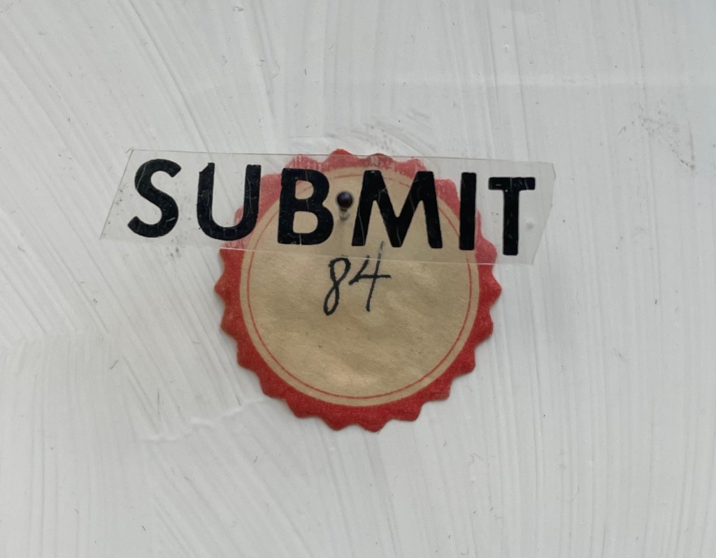
Whether tabulating words or deciphering numbers, Shaw leaned further into three-dimensional assemblages resembling one- or two-page books. The somewhat-damaged homage George Orwell 1984 blends her interest in transposing literary works into hash codes with that of reversing numbers in the numerical wasteland into words with the help of her dictionary. Shaw plays off Orwell’s idea of double-speak by splitting his title in two. The first half is the sum of the numerical values of the letters in “idea”, appropriate for an idea-driven book. For the second half, however, she seeks out words that sum up to 84, letrasets them on clear plastic, and pins them over found and sometimes manipulated objects. A word may allude to its found object, or it may vaguely relate to Orwell’s book, or whether there’s any association at all may be obscure. A Belmont racetrack betting slip makes an ironic match with “foolish”, but seems unrelated to the novel. The German word Verrat translates as “betrayal”, which certainly fits the book, but what it has to do with the queue ticket (manipulated to show “84”) is unclear. That the word “calamity” has spun upside down over its manipulated token is an accidental irony, and what association the overwritten token has with the word or novel is also unclear.
Like Louis Lüthi’s A Die with Twenty-six Faces (2019), built on a collection of literary works entitled with a single letter, Shaw might have extended this part of her oeuvre with other number-titled works: Ray Bradbury’s Fahrenheit 451 or Joseph Heller’s Catch-22. Had she been inclined, she could have even used Lüthi’s book and its reference to Marcel Broodthaers’ quip “The alphabet is a die with 26 faces”. These might have yielded results more compelling than George Orwell 1984, but she would have still been captive to finding luckily appropriate words with the right word-sums.
Two summantic works not in the collection — Less is More: Proof in 15 Languages (1999) and Summantic Proofs (2019) — are more compelling and uncanny. The fact that so many languages’ words for “less” have word-sums greater than the word-sums for the words for “more” is simply uncanny, and Shaw’s typography, color and layout in her spiral sketchbook presentation are compelling.
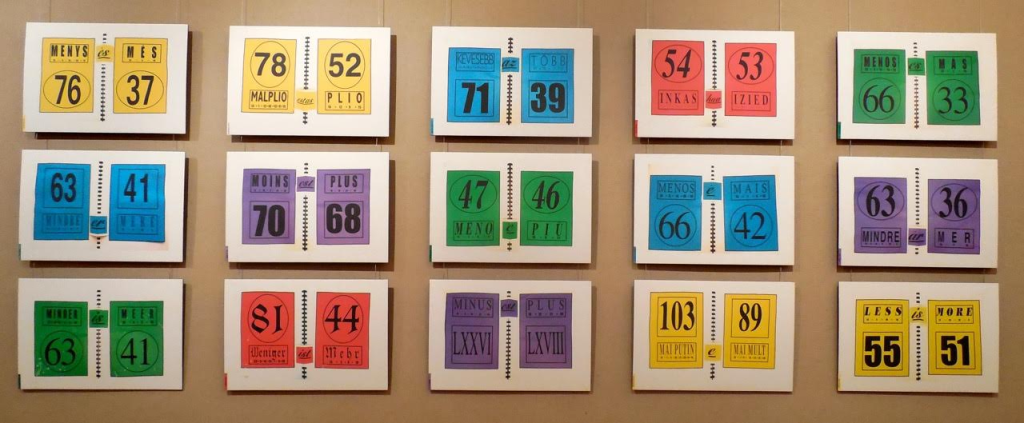
Less is More: Proof in 15 Languages (1999)
Karen Shaw
Photo: Courtesy of the artist.
Also uncanny is her later collection of “proofs” in which she demonstrates that the word-sum for “odd” is an odd number, that the word-sum for “prime” is a prime number, and that the word-sum for “square” is 9 x 9. The pop-up equals sign, the ruler-drawn lines and the hand-colored script in this late mock-up reflect her ongoing artistic drive.
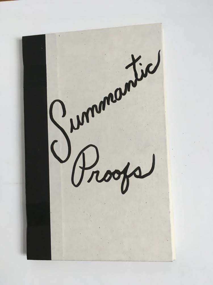
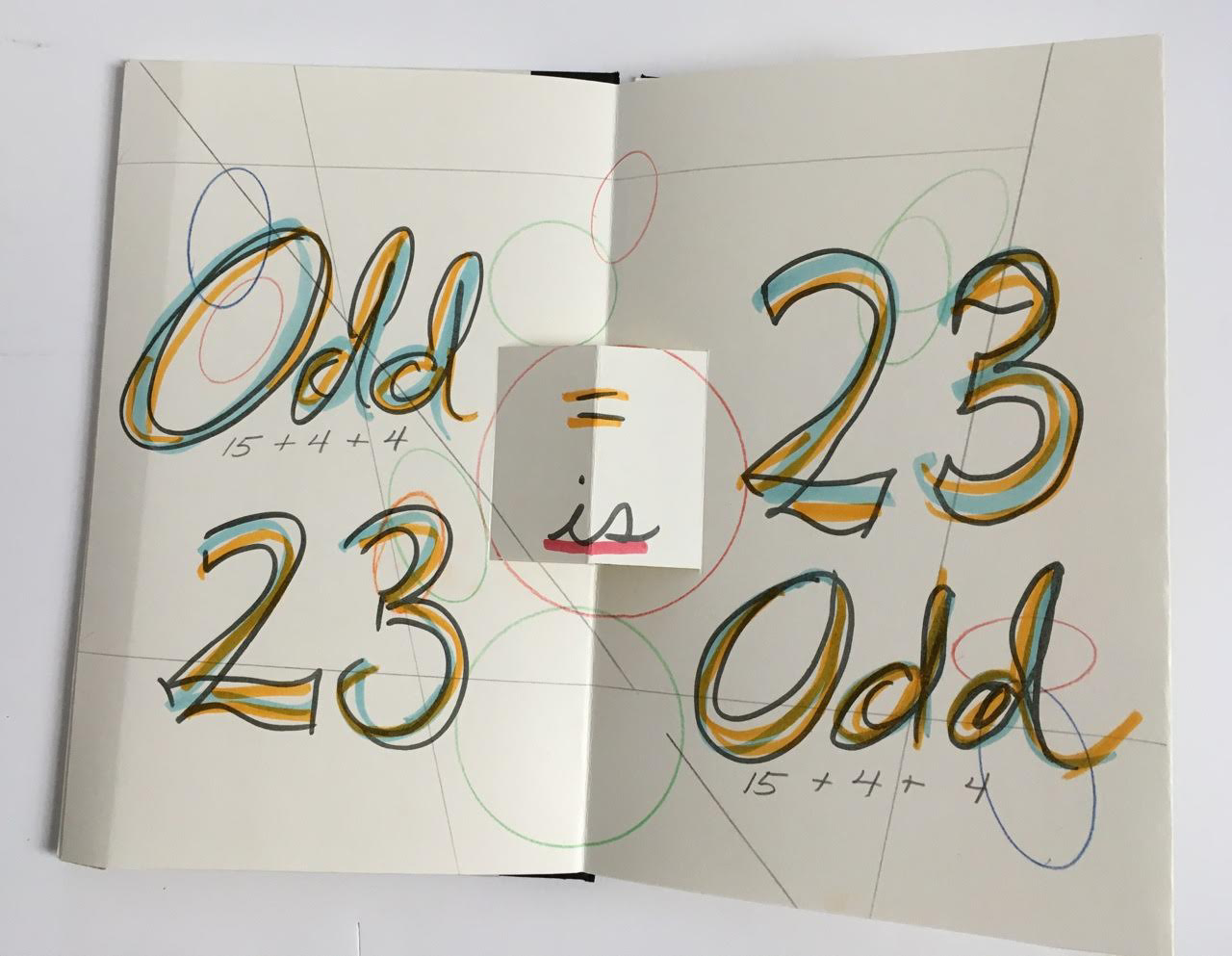
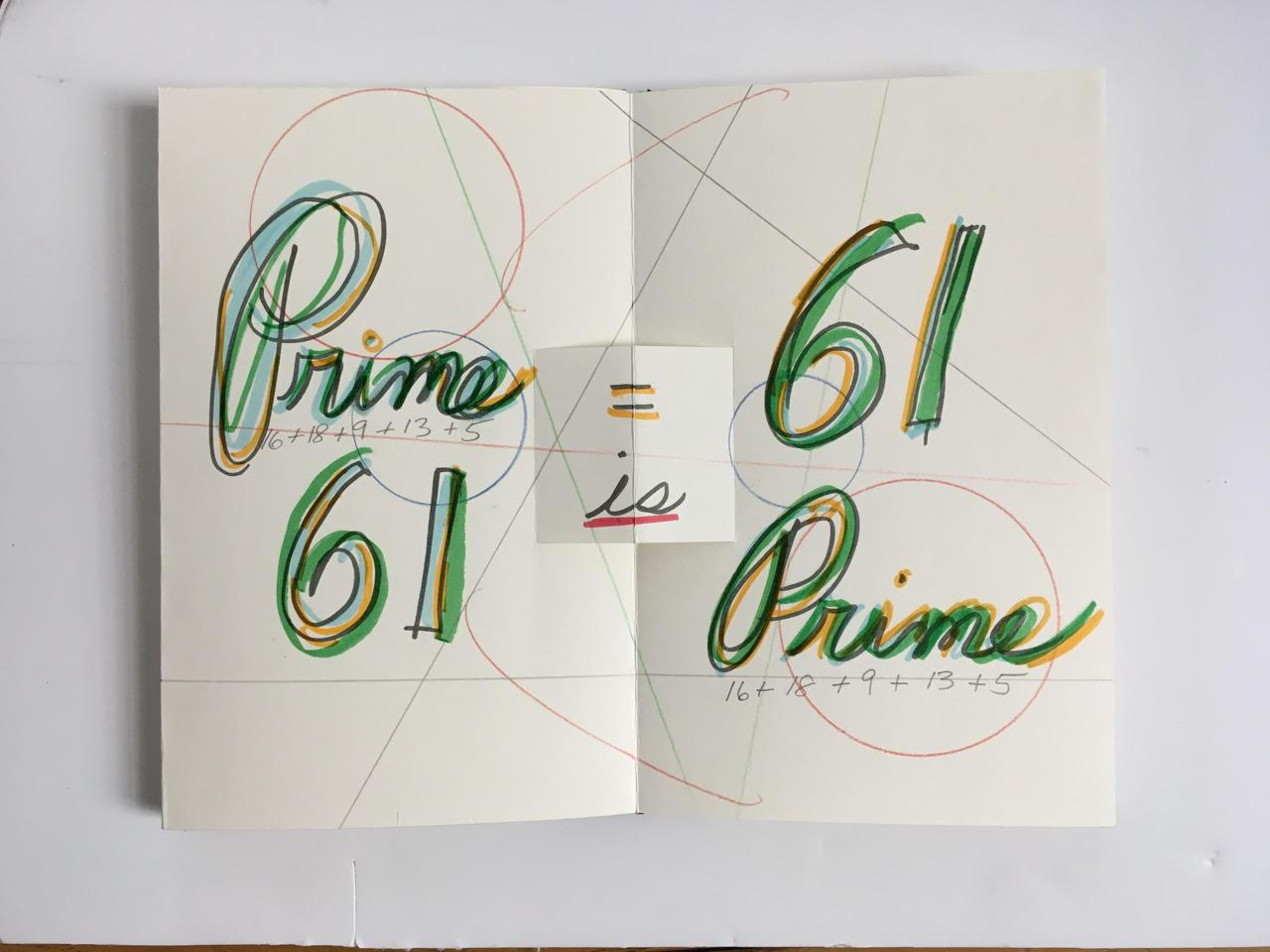
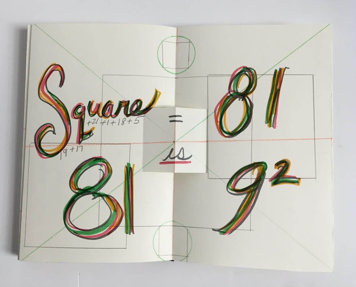
Summantic Proofs (2019)
Karen Shaw
Photos: Courtesy of the artist.
The most striking and consistent of Shaw’s works in the collection departs from her summantic method. It nevertheless embodies the ingenuity, humor, and humanity at play in her art.
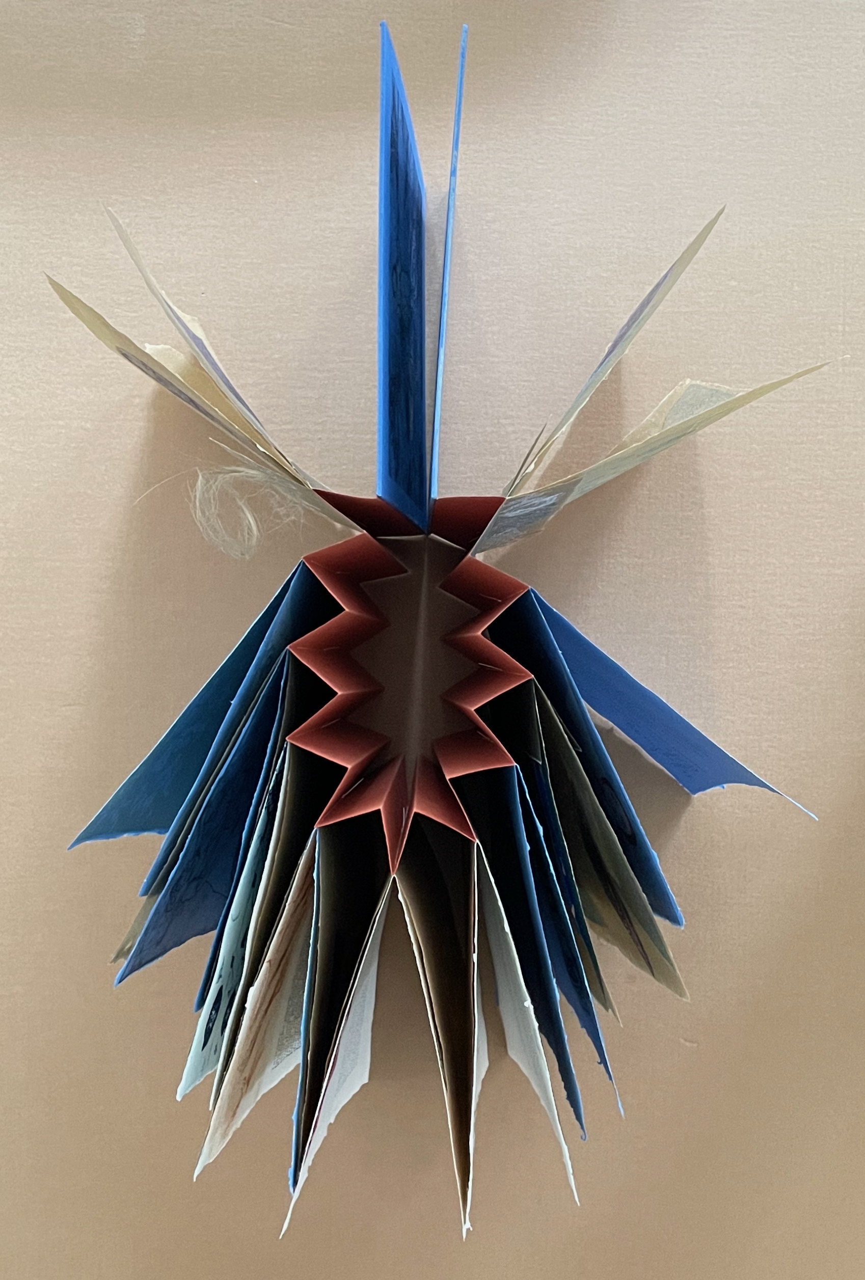
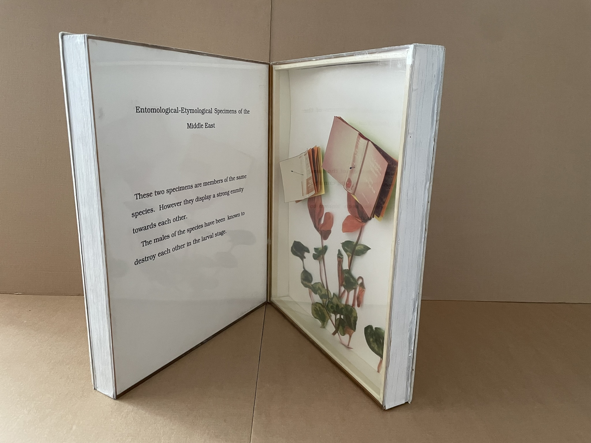
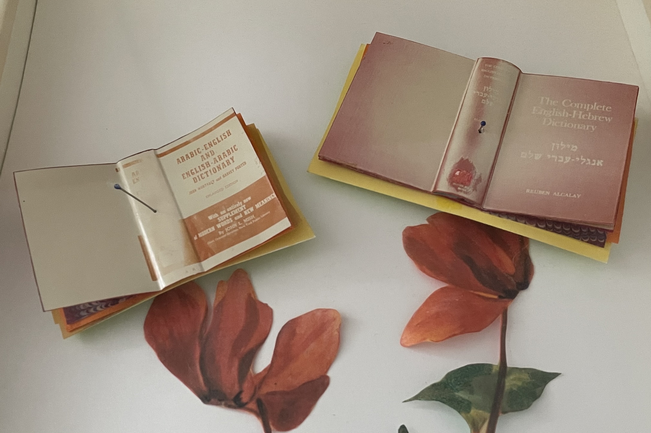
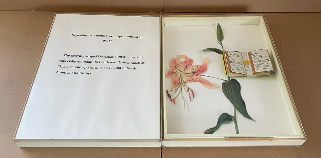
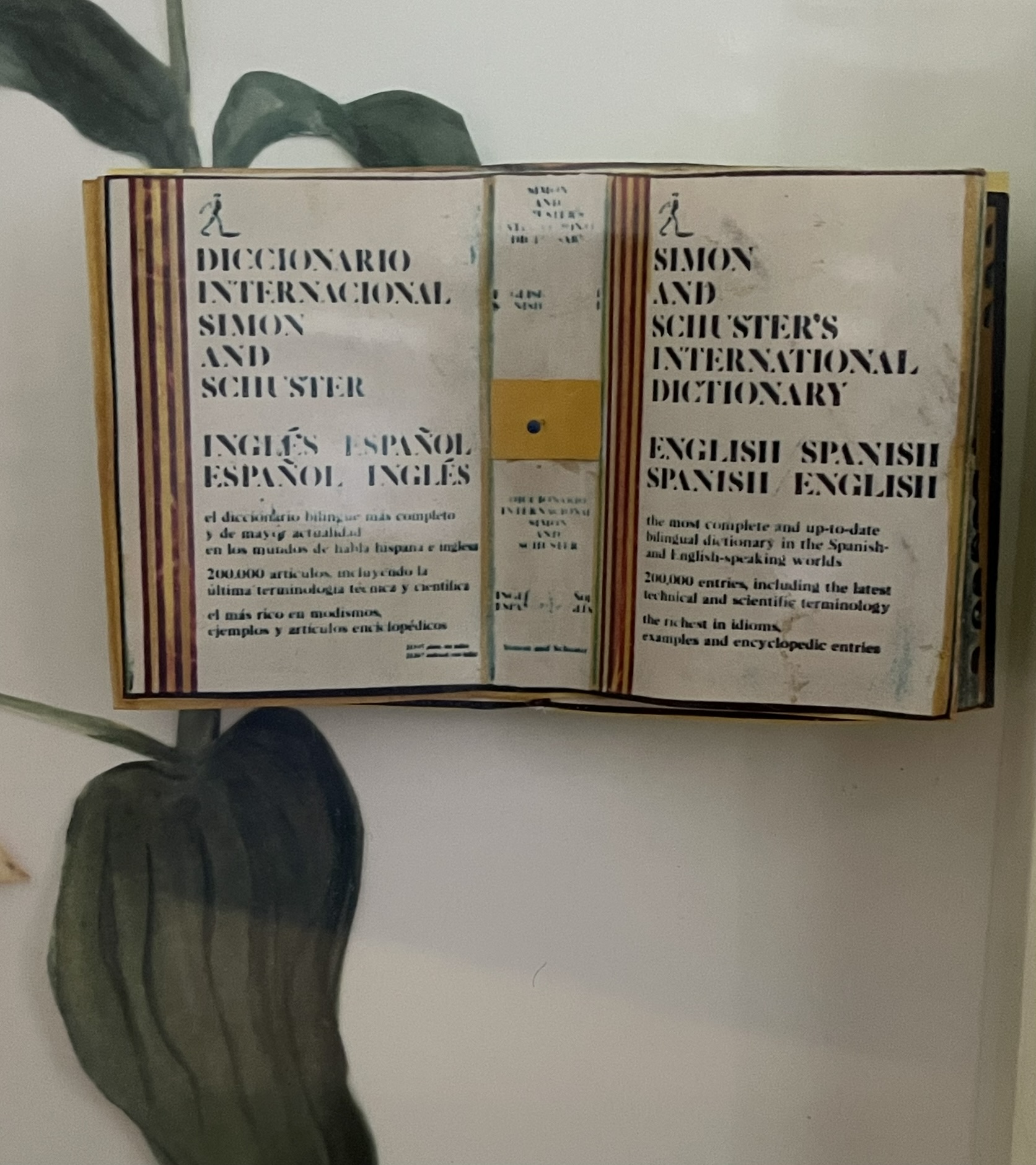
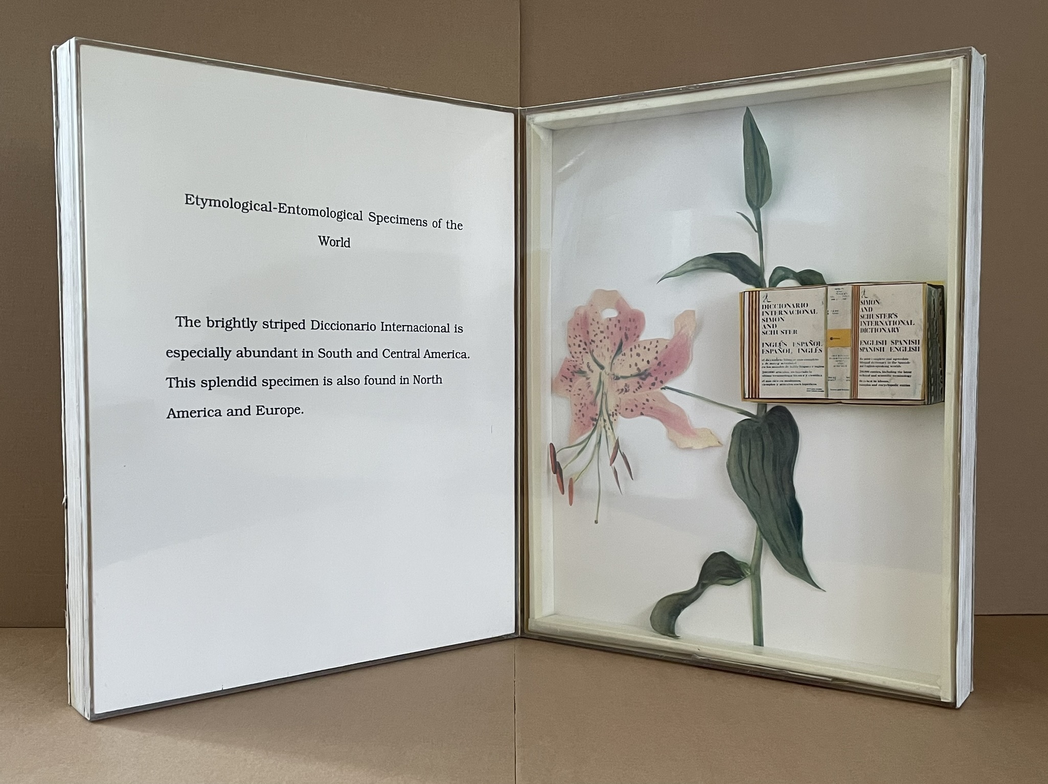
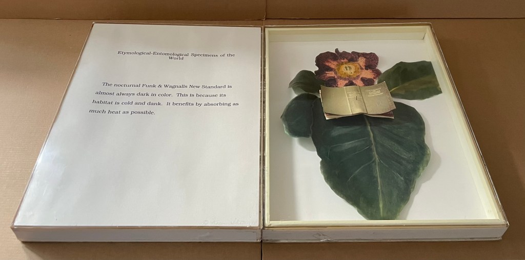
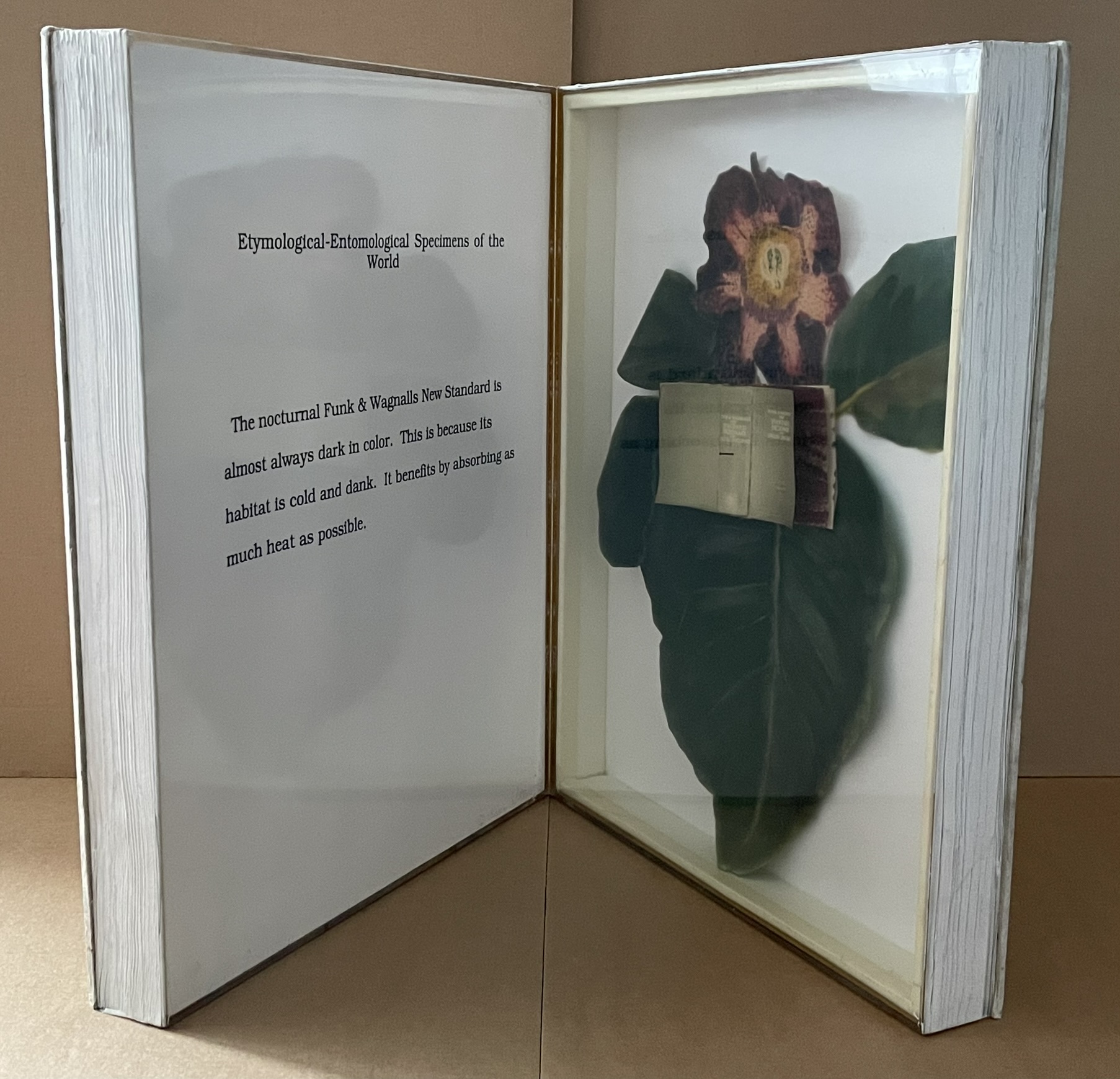
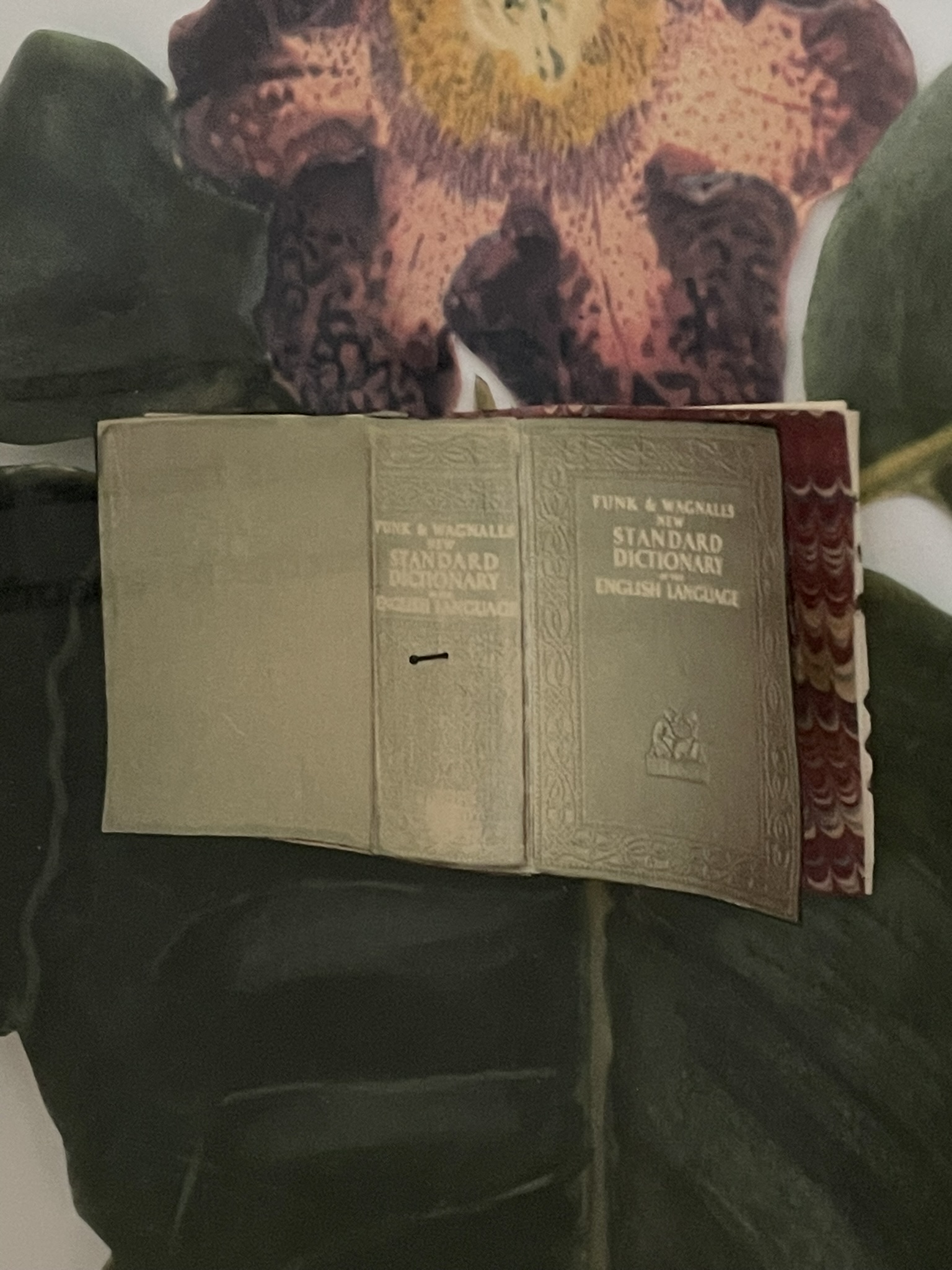
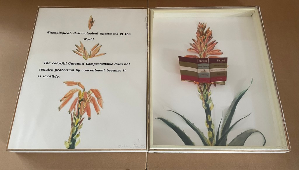
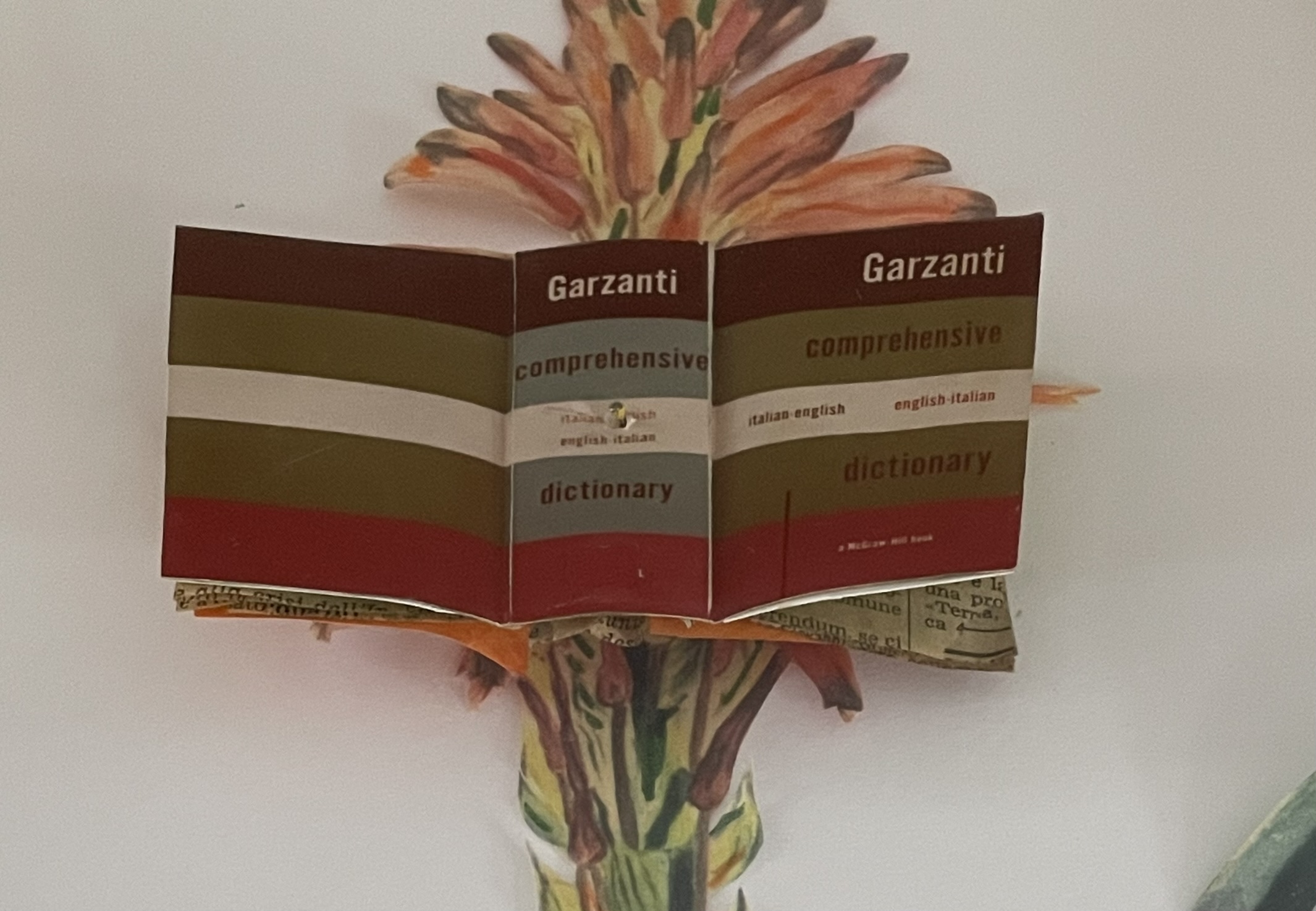
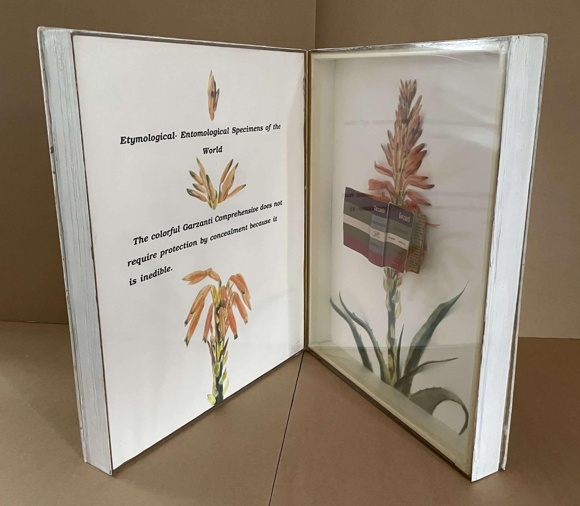
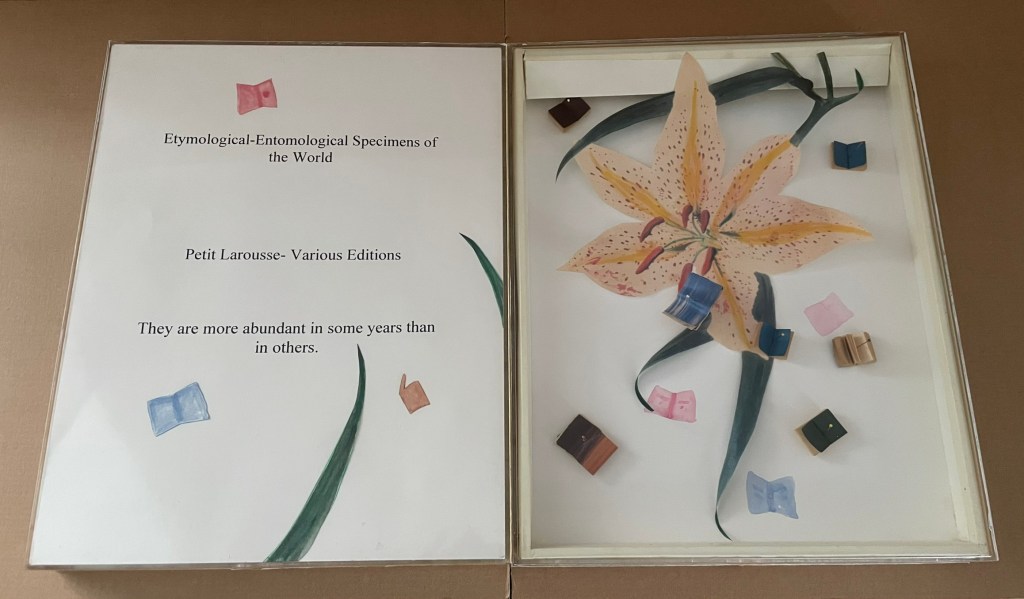
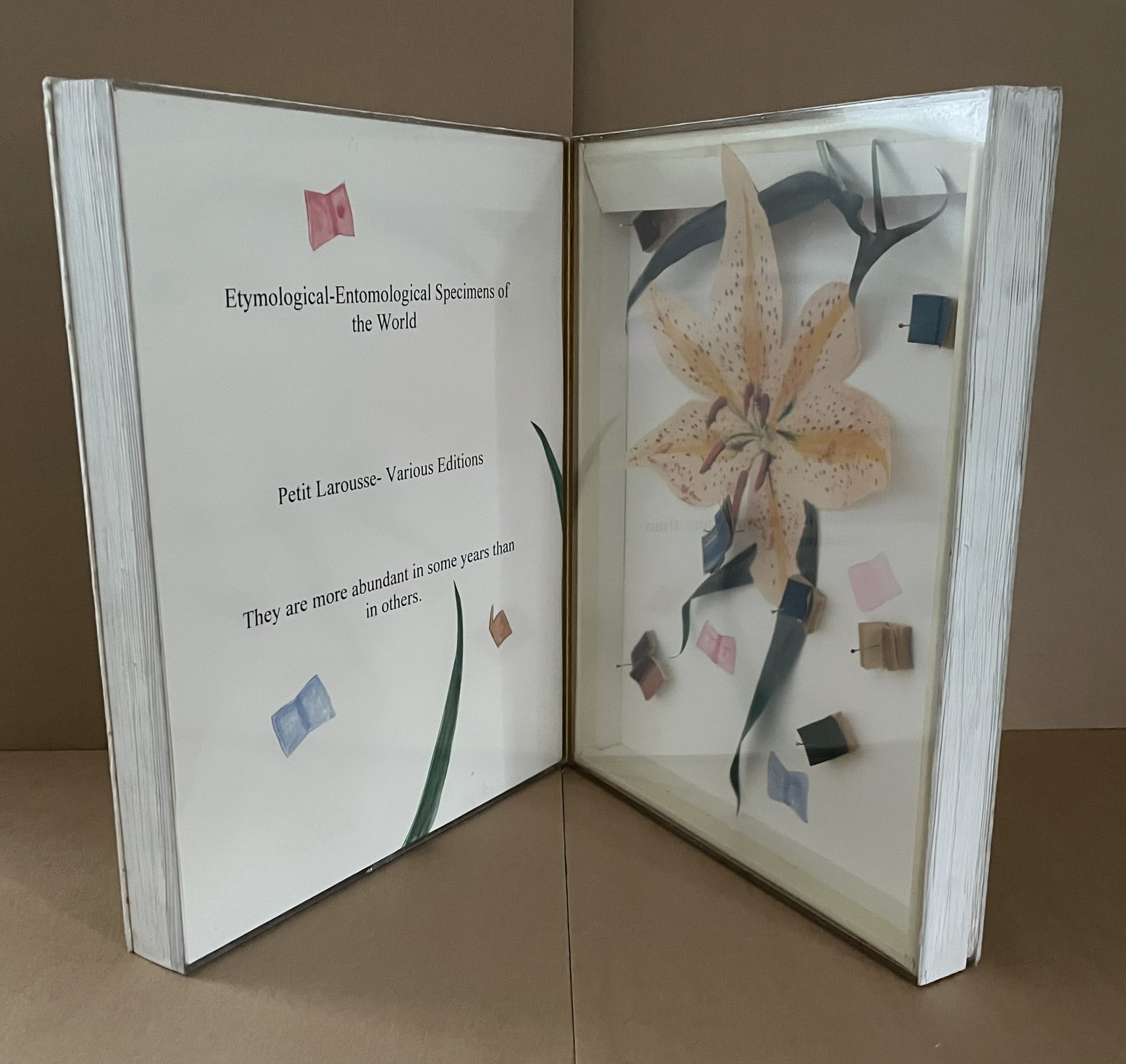
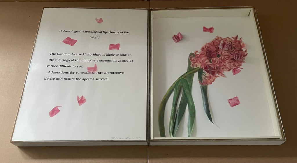
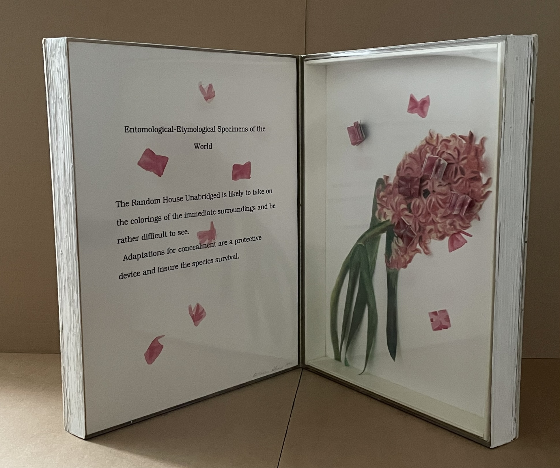
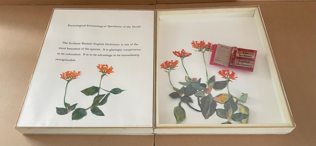
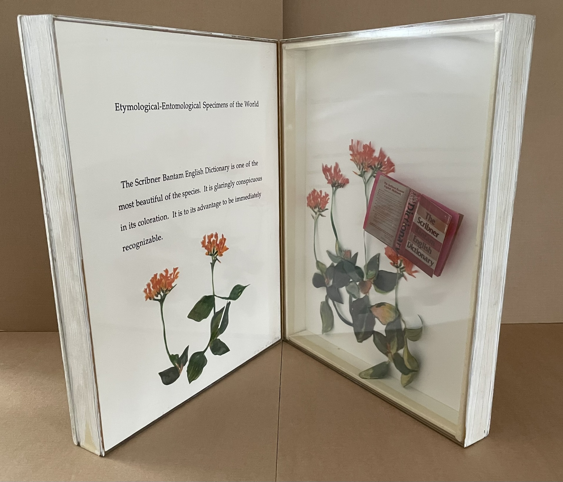
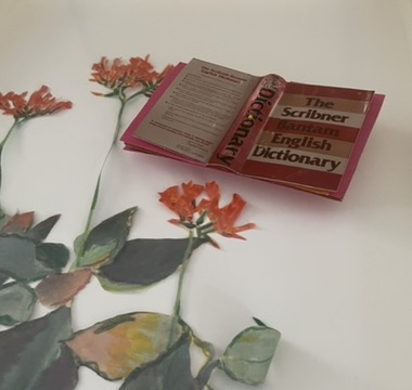
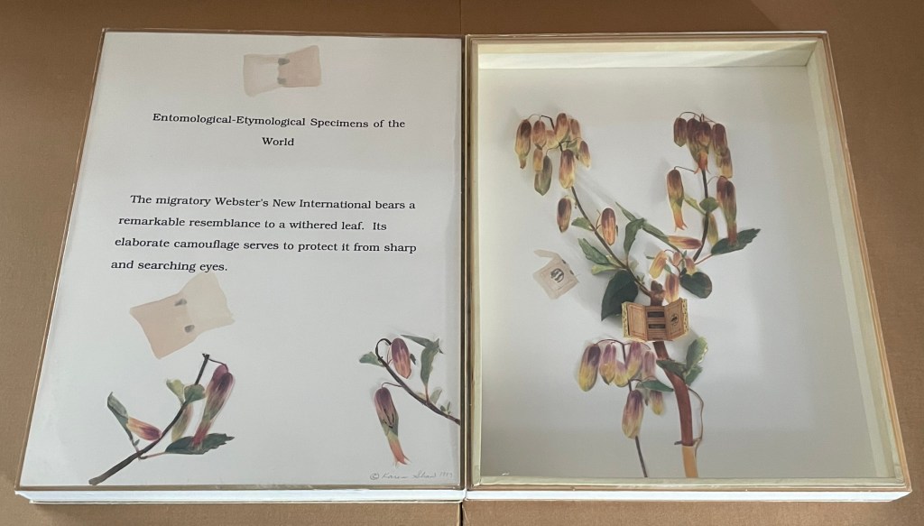
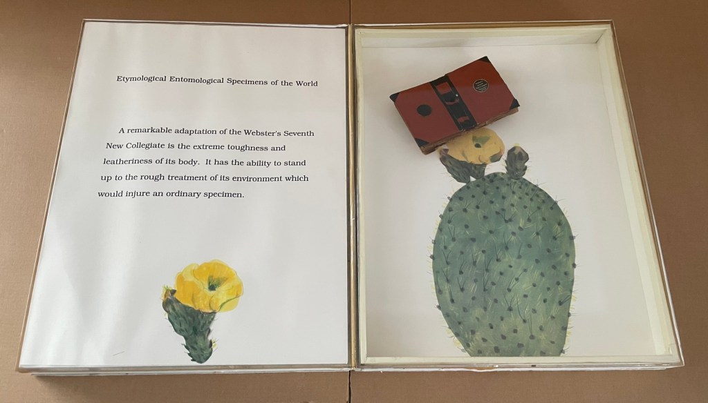
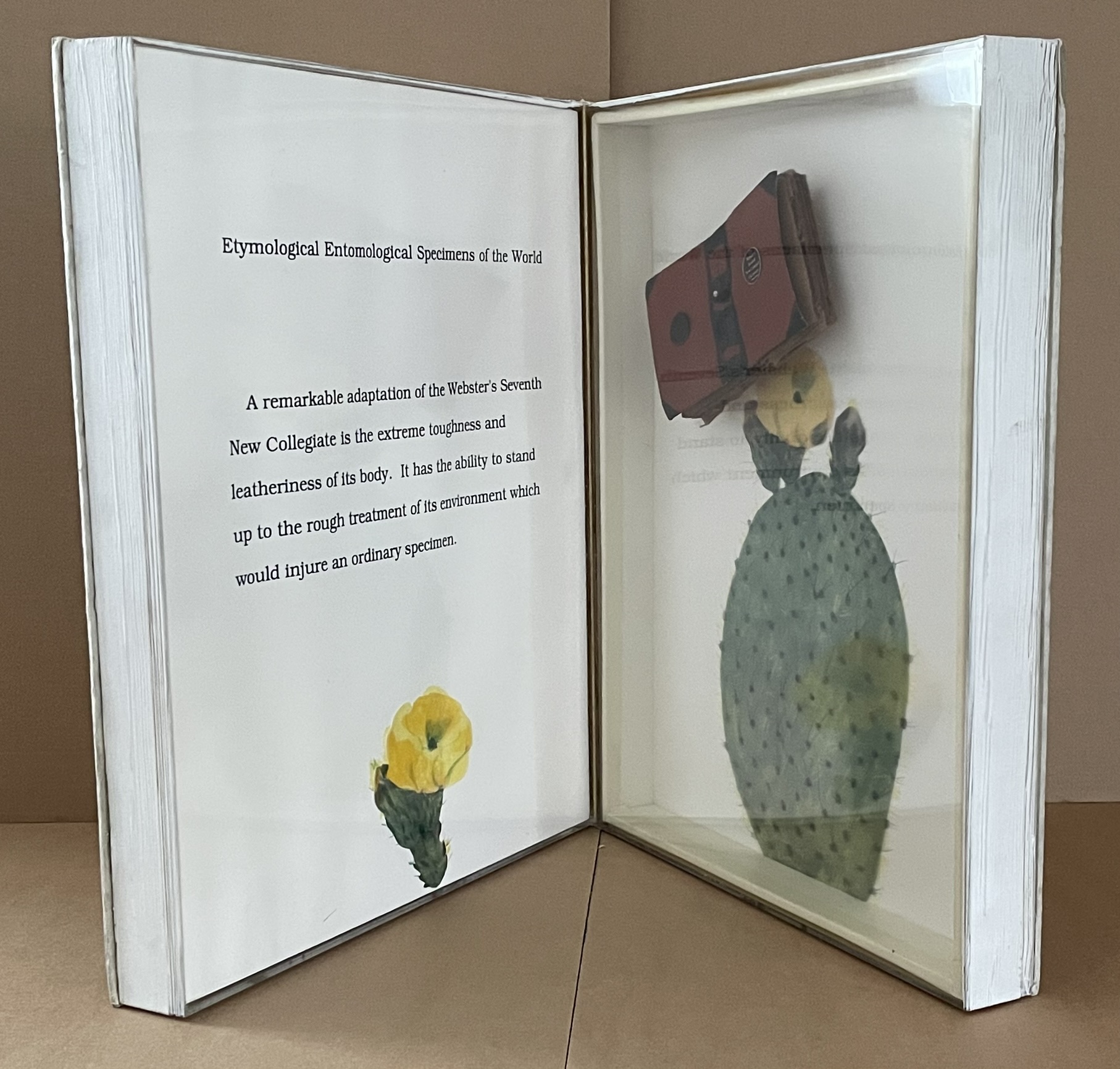
Etymological-Entomological Specimens of the World (1993)
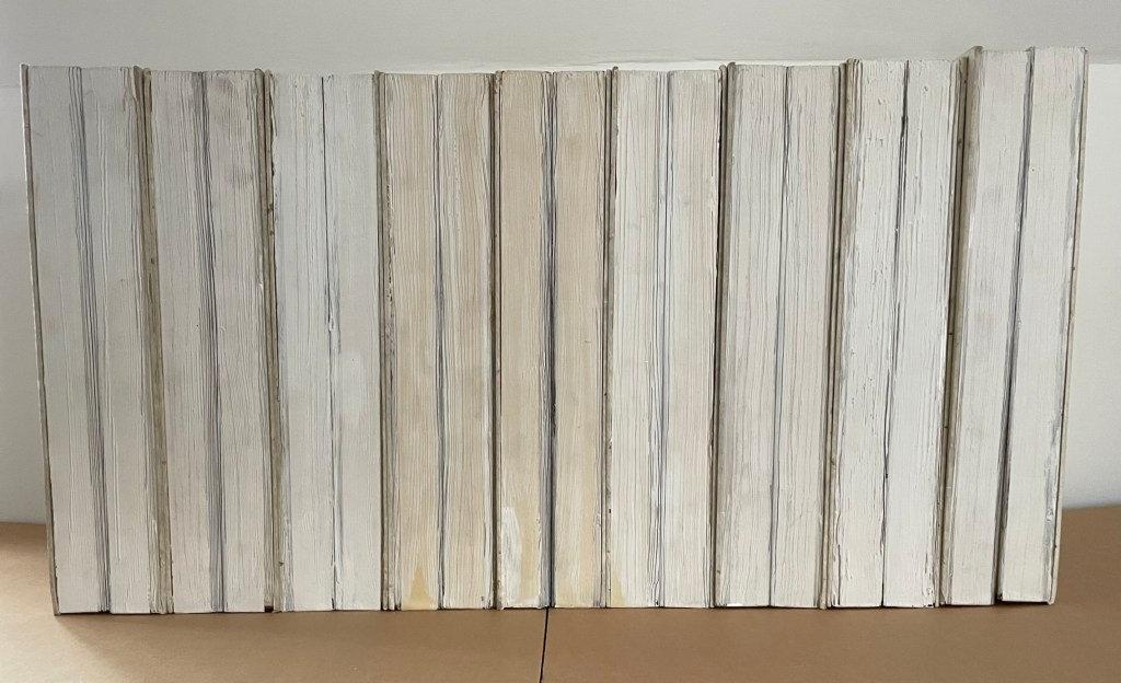
Etymological-Entomological Specimens of the World (1993)
Karen Shaw
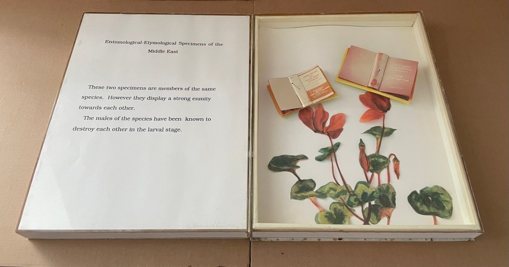
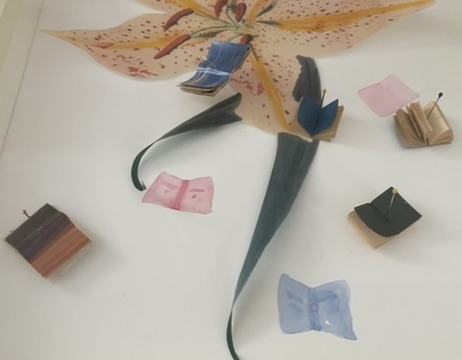
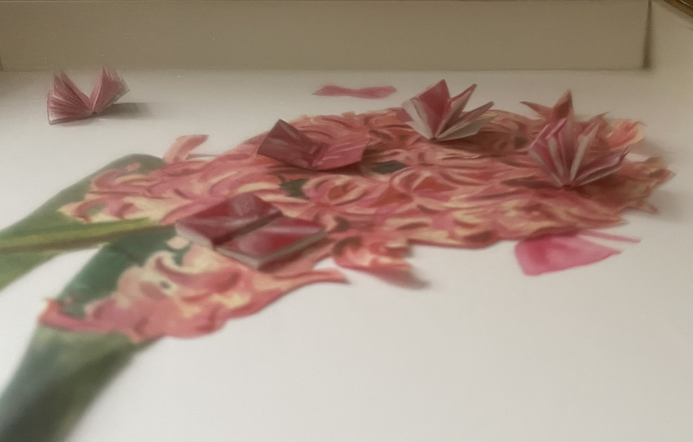
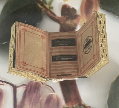
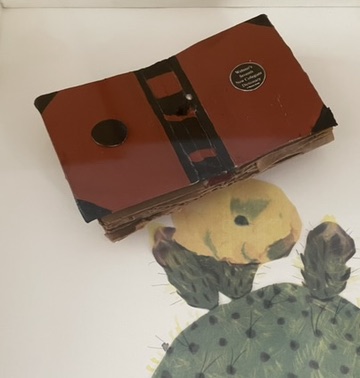
Nine codex-shaped boxes of paper-covered boards, each opening to plexiglas-covered diptychs miniature books of various sizes posed as butterflies among text, handcut and painted paper foliage and flowers. H368 x W268 x D77 mm. Acquired from Karen Shaw, 8 October 2024.
Photos: Books On Books Collection.
Jean Sellem’s interview with Shaw in the bilingual review Heterogénesis has been quoted earlier. In that exchange, we are lucky to have Shaw’s reply to question: “Why do you combine the concept of entomology with that of etymology?”
KS : In the past, I always used to confuse those two words. I knew the definition of each of them, but I couldn’t remember which definition belonged to which word. Eventually, I taught myself a mnemonic method to remember which word was which. “Ent” sounds like ant, so entomology is the study of insects, and so etymology is the study of words. When I was looking for a format for my ideas, using entomology pins seemed like the perfect way to attach words to numbers. The closeness of the spelling and the complicity of the two words was fun and made sense to me. The needles themselves are beautiful, long and thin. It just seemed like the perfect solution.
It’s happenstance. It’s the physical material. It’s the fun and humor of wordplay. It’s the artistic eye that finds meanings at the curious intersections of nature and language. All of this in Karen Shaw comes to the fore in the nine volumes of Etymological-Entomological Specimens of the World (1993). The top, bottom and fore edges of these book-shaped diptychs mimic closed books, whose mimicry yields to a mimicry of entomological display cases under clear covering, which in turn yields to miniature dictionaries posed to mimic butterflies. A mnemonic solution to an unwanted confusion of words leads to the book artist’s deliberate visual and verbal punning of dictionaries with insects.
In the interview, the only movements and artists directly influencing her work that Shaw remembers are Dada, new-Dadaism, Eva Hesse, On Kawara, Douglas Huebler, Joseph Kosuth and Conceptual Art. For Specimens, she has noted in correspondence a direct inspiration: the interest of Vladimir Nabokov in lepidoptery. Seeing butterflies as miniature dictionaries also overlaps a bit with Nabokov’s perceiving letters of the alphabet as having colors. Nabokov’s chasing butterflies and leaping from letter to color finds a simulacrum in Shaw’s chasing words, numbers, and meaning in her everyday environs with her artist’s book butterfly net.
Karen Shaw
27 March 2025
Further Reading
Alloway, Lawrence. 9 December 1978. “Art”. The Nation, p. 653.
Hofberg, Judith. 2001. Women of the Book: Jewish Artists, Jewish Themes. Boca Raton, FL: FAU.
Sellem, Jean. 2020. “Karen Shaw = 100“. Heterogénesis: Review of Visual Arts.
Shaw, Karen. 1 December 2022. “Summantics”. Typo: A Journal of Lettrism, Surrealist Semantics and Constrained Design. No. 1.
Nabokov, Vladimir. 5 June 1948. “Butterflies: The Childhood of a Lepidopterist“. The New Yorker.