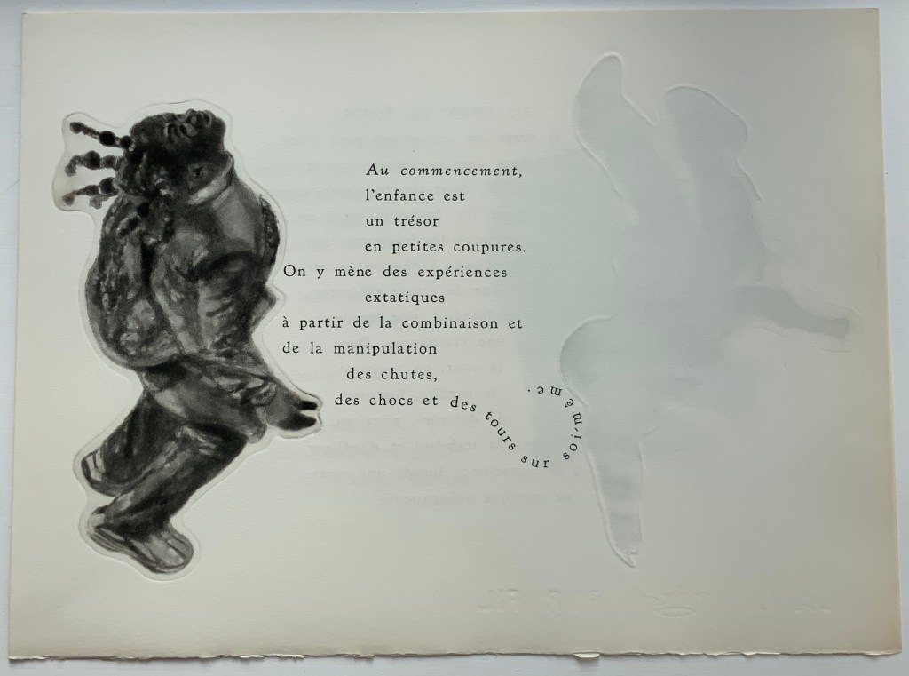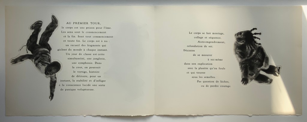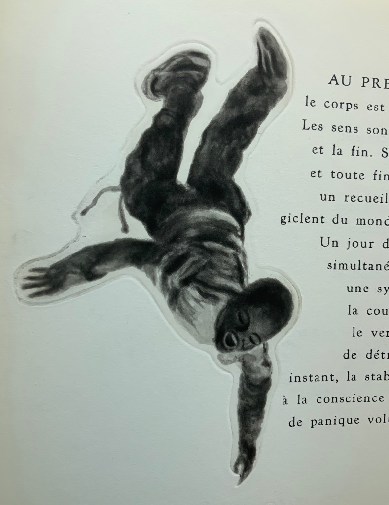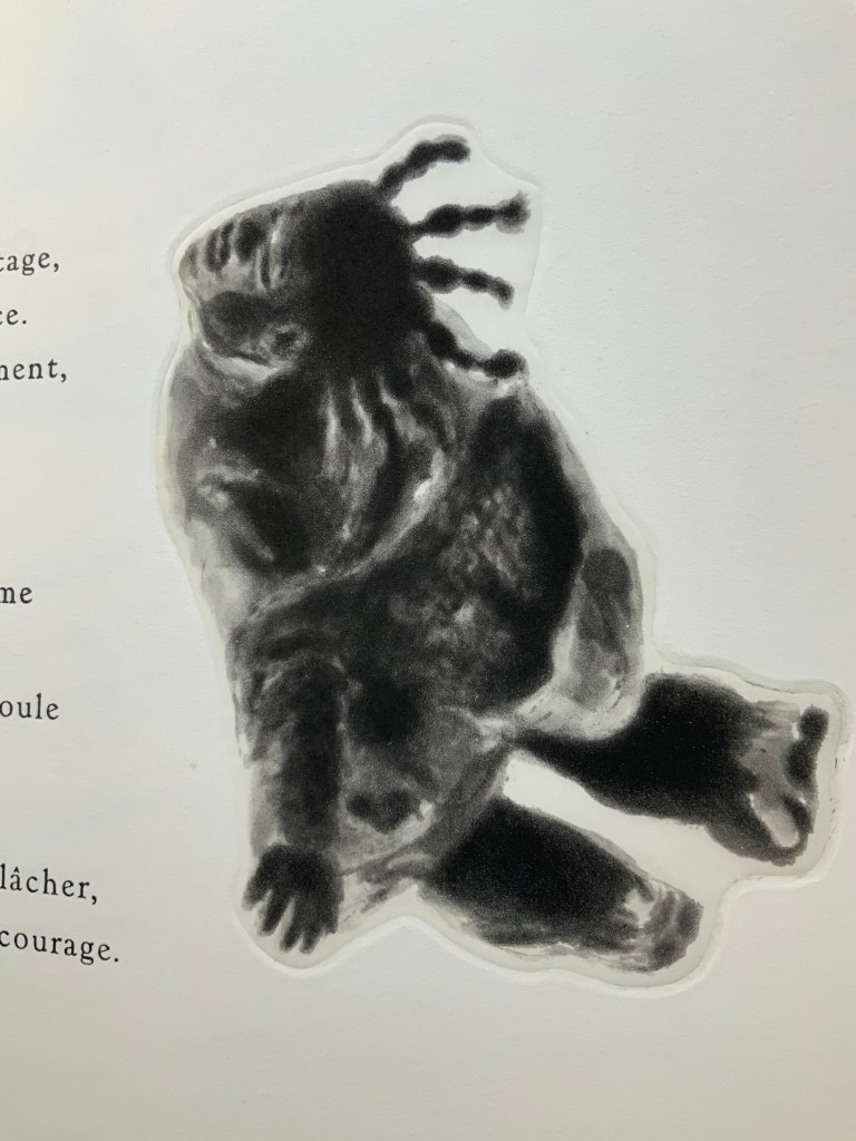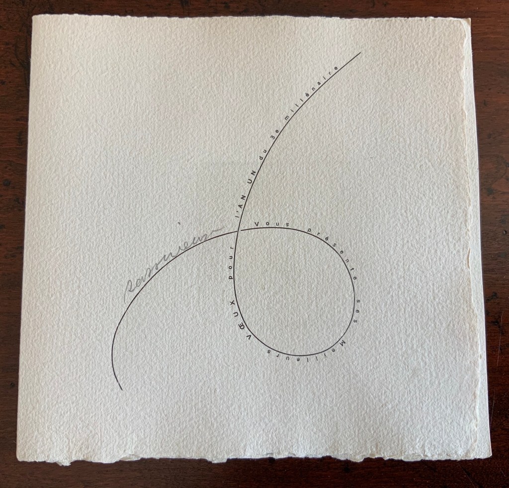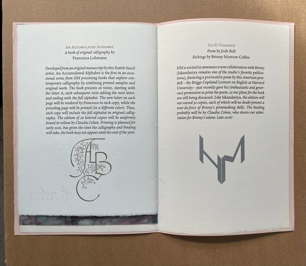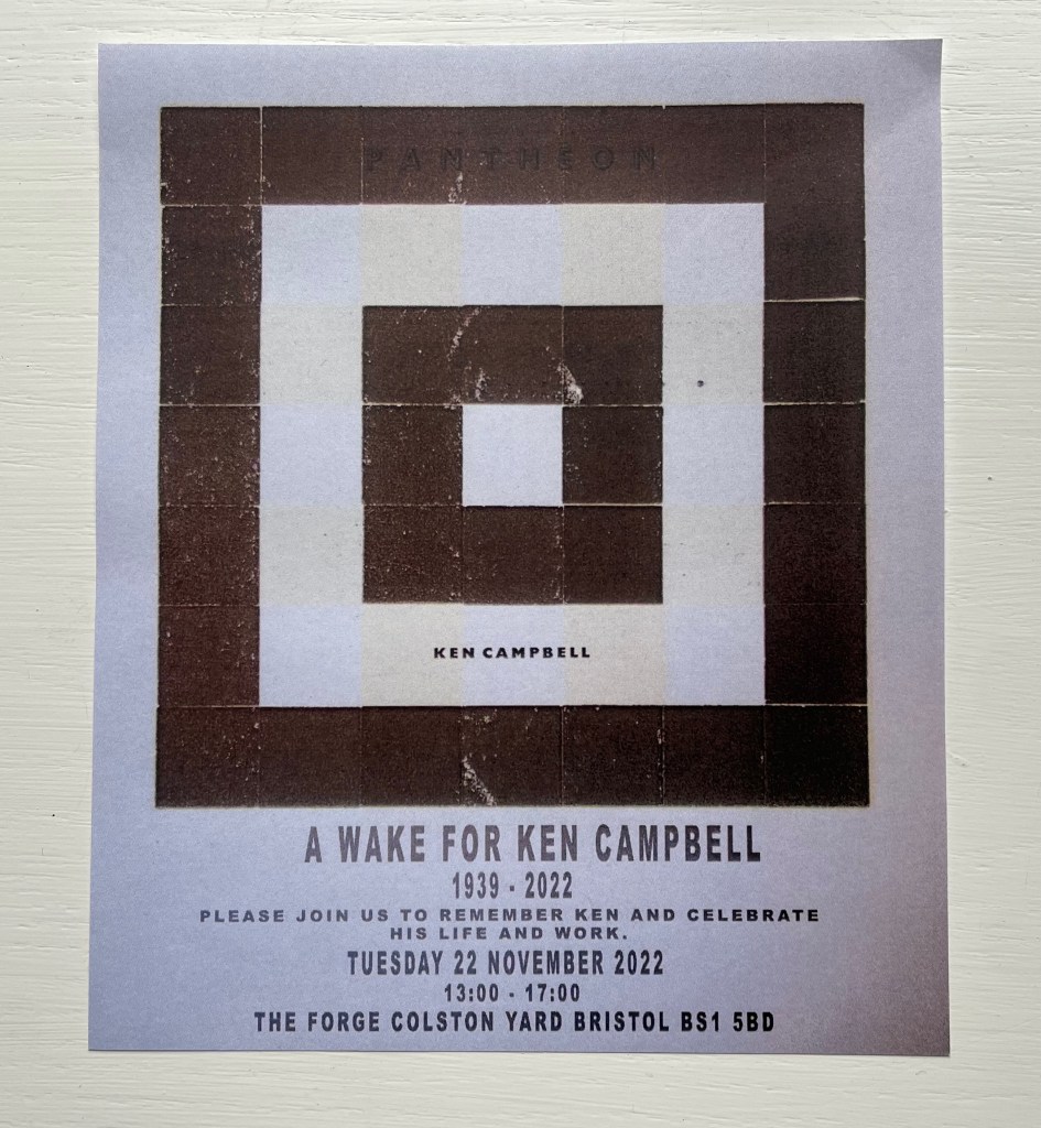
Flyer designed by Alexis Papatzaneteas with image from Ken Campbell’s Pantheon (2000).
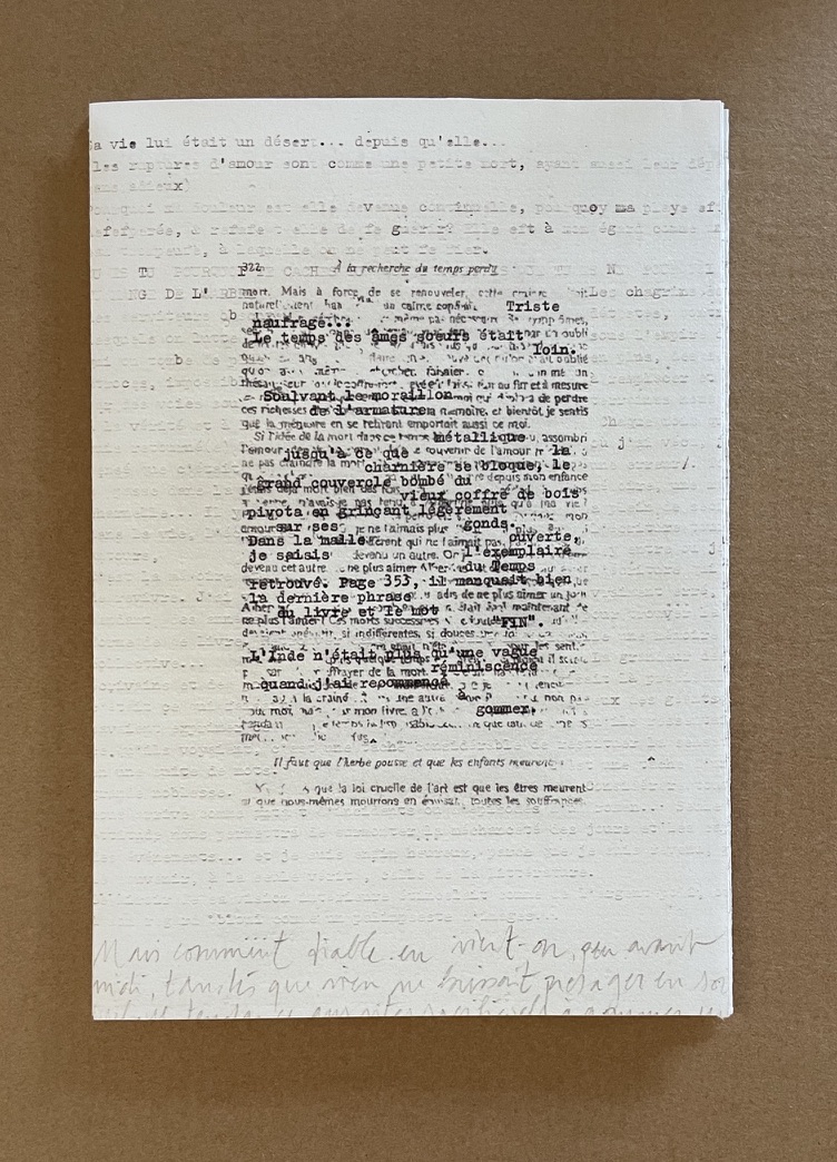
Ken Campbell’s works hold a special place in the Books On Books Collection. Some connect with other artists’ works in the collection. Some connect with techniques, structures or themes pursued in other works. One, however, lays claim to being the original seed to the collection.
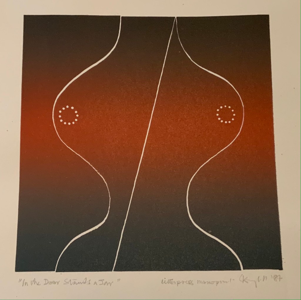
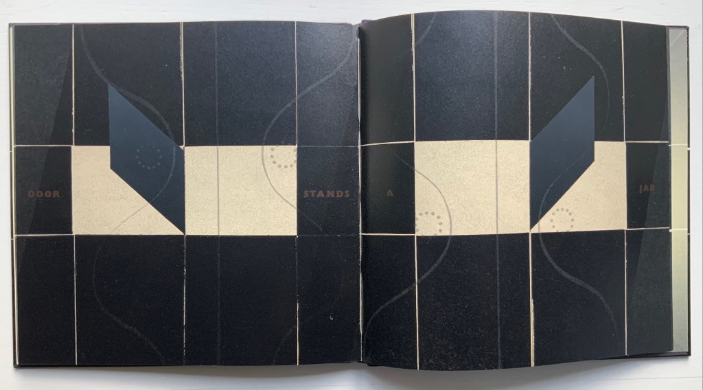
Sometime in 1987, after the Radcliffe’s neuropsychologist Dr. John C. Marshall introduced me to his associate Dr. Ruth Campbell, she invited my wife and me to dinner. A growly, jovial bear in hearing aids shouted us in with a greeting about his deafness, and a journey toward book art began. By the time we left, I had purchased a proof of his print called “In the Door Stands a Jar”. The artist’s book Ken Campbell describes below was in the works, but at the time, I had had no exposure to this form of art that a life with books and ebooks would finally teach me to appreciate.
Over the years, the print’s blend of textual and visual puns played out from the wall. A door that stands ajar is partly open, partly closed. Half-open, half-closed, the door exposes its hinge and the hour-glass shape the hinge makes. A shape that suggests “a jar” or a pair of breasts, the nipples being the screwheads. The center line of the hinge is askew, a visual pun on “ajar”. Until 2012, I had been happy enough to have the print. But then I finally woke up to book art, and it felt a bit alone, hanging on the wall — or rather “in the door … a jar”.
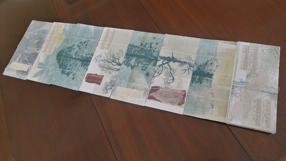
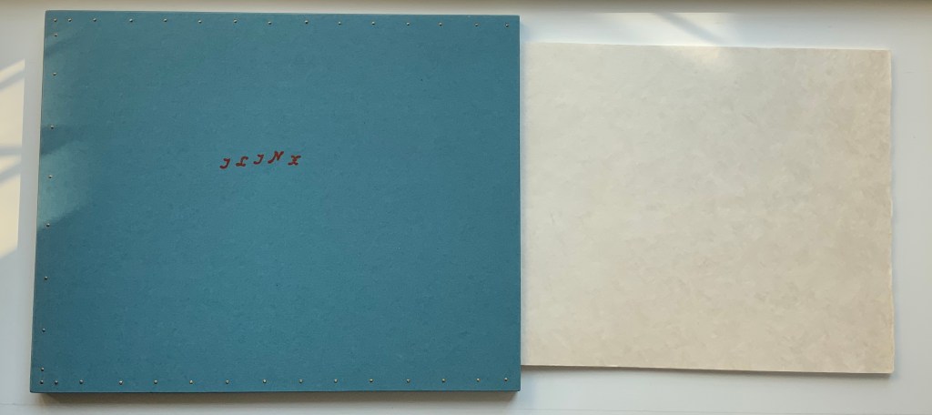
In the Door Stands a Jar (1987)
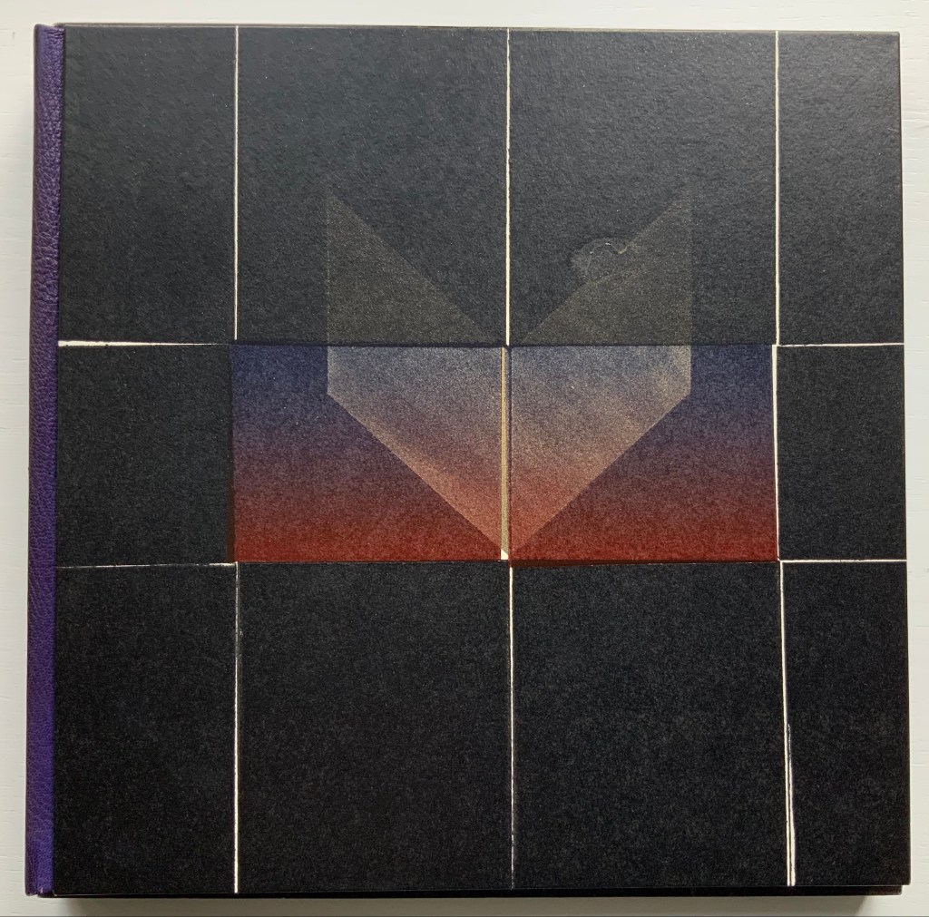
In the Door Stands a Jar (1987)
Ken Campbell
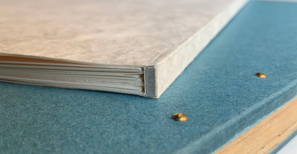
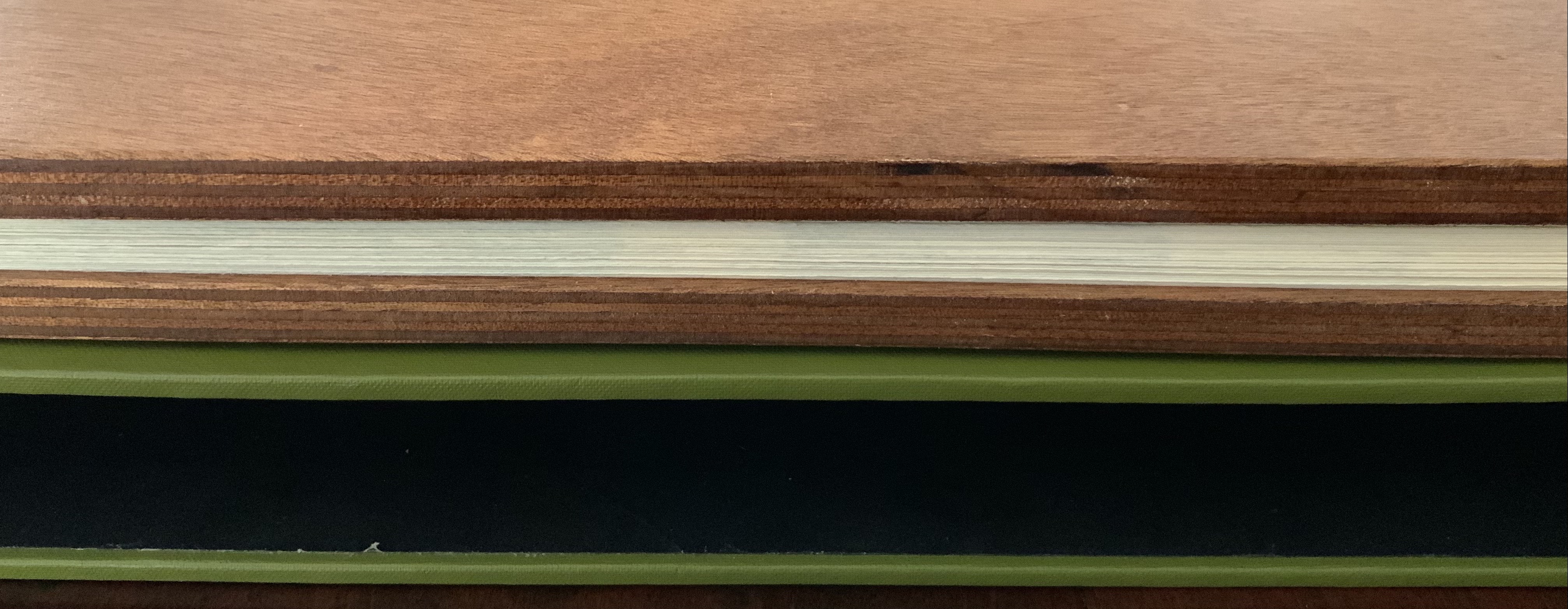
Slipcase (245 x 245 mm) enclosing handsewn casebound book (240 x 240 mm, 44 pages unnumbered). Edition of 40, of which this is #18. Acquired from Vamp & Tramp Booksellers, 2 March 2015. Photos: Books On Books Collection, displayed with artist’s permission.
It took three years to track down a copy. After the initial sense of accomplishment, and looking from print to book and back, I had to ask: Why a book? Instead of being printed back to back and casebound, the images could have been served up in a portfolio as prints to be framed; the text of its poem, in a chapbook tucked inside the portfolio. But they weren’t. As a book, they stand almost three dimensionally, served up as, and in, an object to be held half-open, half-closed, sequences to be puzzled out and followed, and colors and shapes shifting and overlapping like the syntax of the poem. Later, coming across Campbell’s description of the work, I learned that there was much more than that going on:
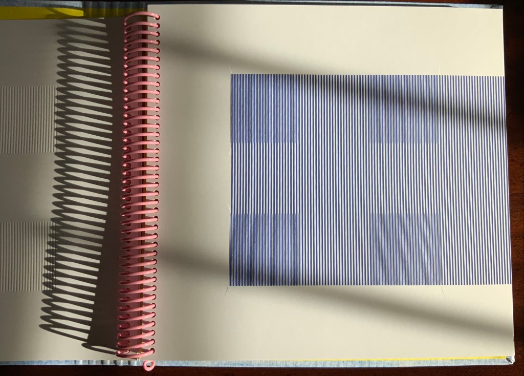
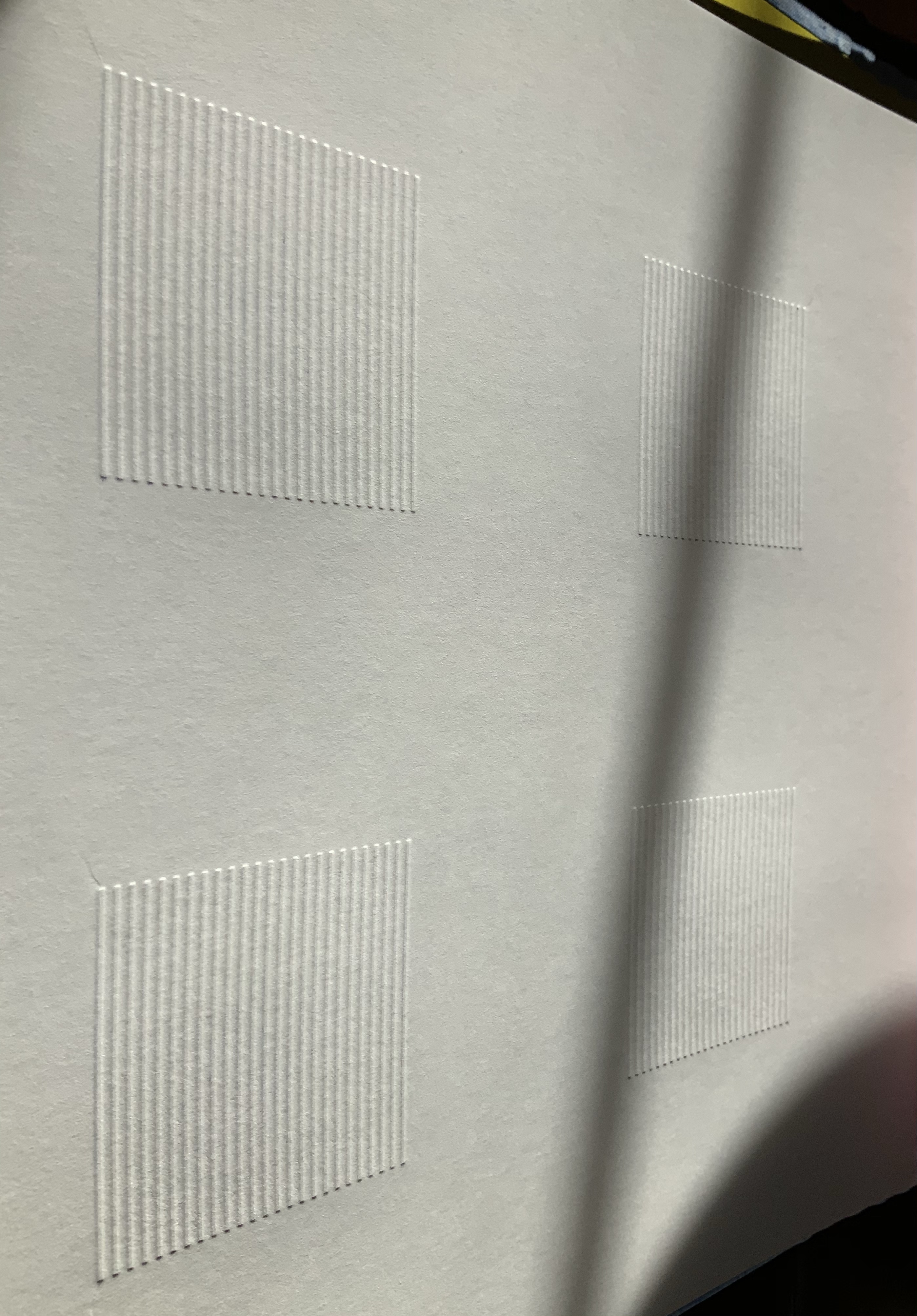
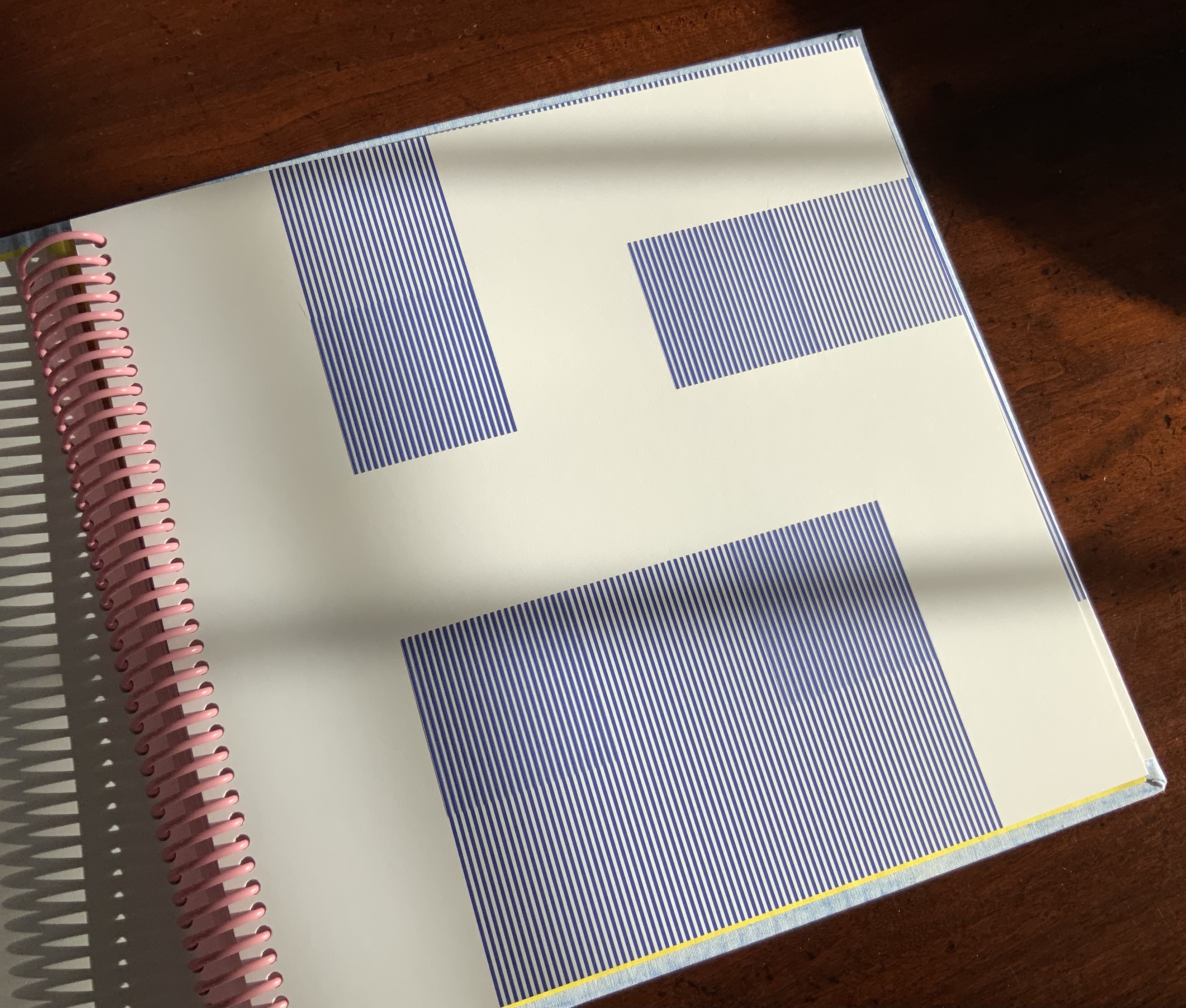
There’s usually some kind of formal problem in the books – a way of dividing space up for good clear reason and for making things work in a useful sequence. I had a notion of putting a reduced version of the book’s two-page spread, which is a designer’s term for an opened book, on one page and putting the same two-page spread reduced on the opposite page, so you’re looking at a kind of visual pun: two spreads on the whole spread.
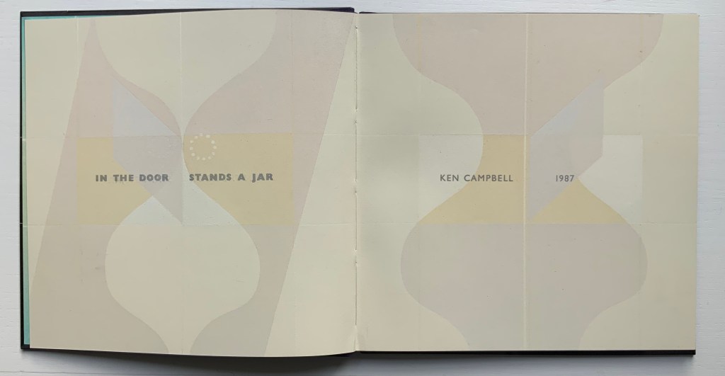
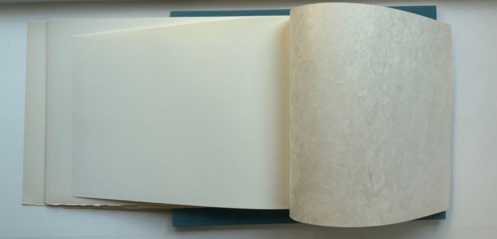
Left: Double-page spread with title, author and date.
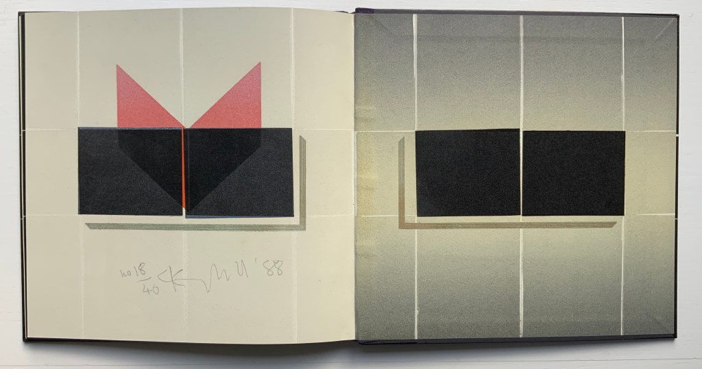
Right: Final page, numbered and signed, and pastedown endpaper.
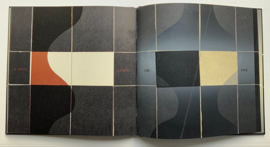
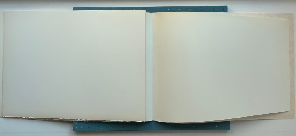
The last two lines of the poem across two double-page spreads:
A MAN AMEN IN THE
DOOR STANDS A JAR
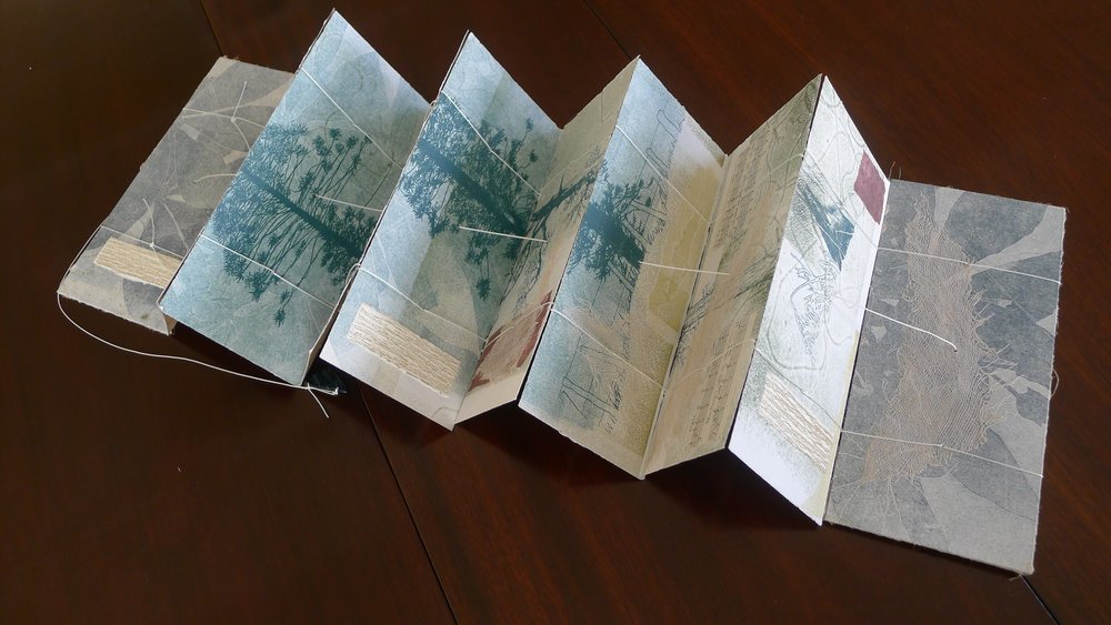
The centerline of the grid on each page provides the visual key to the double-page spread embedded in each single page. The centerline itself and the images falling across it almost encourage the reader/viewer to fold the single pages in half to see how the halves of the image match up or shift. Like closing and opening a door. And so the page and double-page spread become elements in the composition itself. Campbell goes on to explain that there is even still more to it:
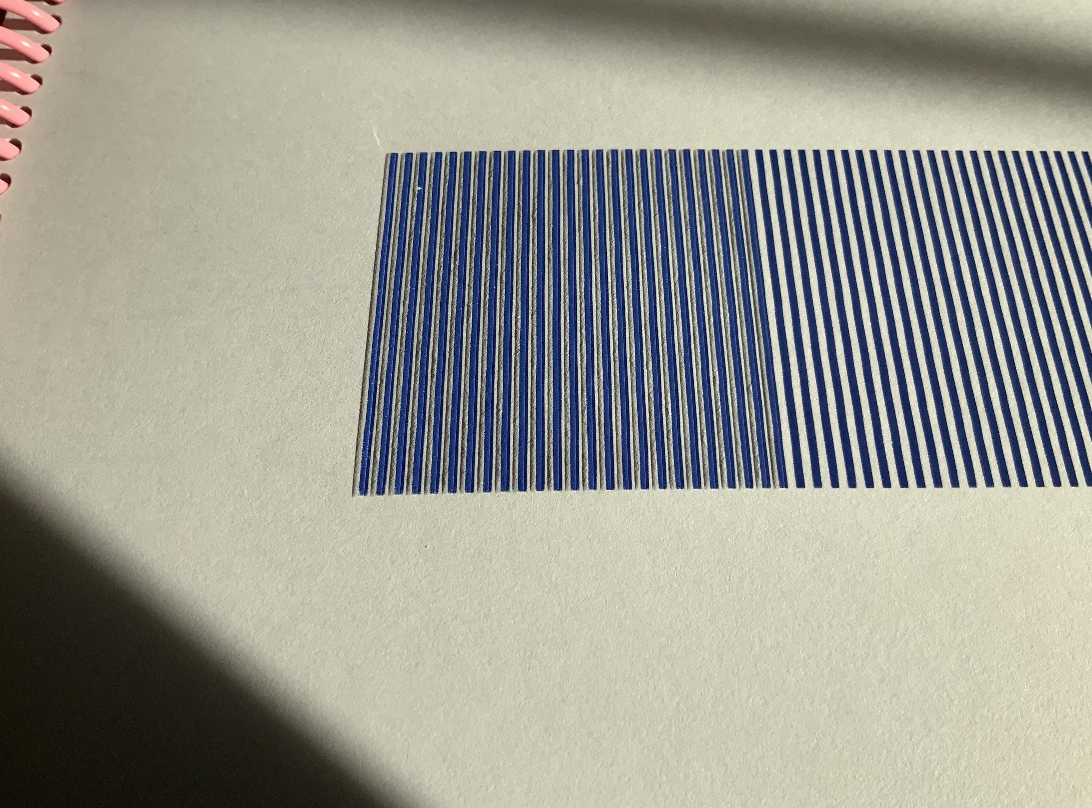
On each page is another, smaller two-page spread printed on a black background. In each smaller spread is what is left after I have printed black solids as a window over and around the female forms. Black over colour gives ghostly images of the complete form. The poem runs laterally through the colour and bleeds off into the darkness on either side. There are very large dark borders. I had started to play with borders both as ways of containing the work in a field and as a dark space at the edge of things; a free-fire zone in which things seen in other parts of the book and things remembered can affect that which stands in the light.
I wanted to bury words in those borders as a kind of visual echo of the words being used in the poem, a metaphor for where words come from in one way of creating poetry: hearing echoes of sound and meaning from other places. This process is pursued in other, later books.
I cut a female form out of a background of zinc and wood, and then cut it in half so that there were four blocks which were then manipulated and printed in a variety of colours. The jar that stands in the door is both a woman’s thick-waisted torso, and a jar which is cut up, dismembered and moved around. It was a tilt back to my designer past, making a page move almost in a cinematographic way through the book, in the spaces between the two verses. It was a very formal piece, a very sculptural thing to do. So the book is about joy and darkness, and the sensual face of this world, and the fact that death moderates all. — Ken Campbell
For some, Campbell’s door will recall Marcel Duchamps’ various door/porte works, in particular Porte, 11 rue Larrey (1927), which Duchamps had a carpenter build. The door is hinged at the angle between two walls, each of which has a door frame to receive the door, making it a door that is always closing and opening at the same time. The direct reference to sexual engagement in Campbell’s door (and many of his other works) will also recall Duchamps’ eroticism in his Given (1946-66) doorway work. Conceptually, Campbell’s comments on the hinge, grid and edge of surfaces will draw comparison with Duchamps’ infrathin principle: “both a surface and an interval, whose deictical character points in two different directions at the same time” (Judovitz, Unpacking Duchamps).
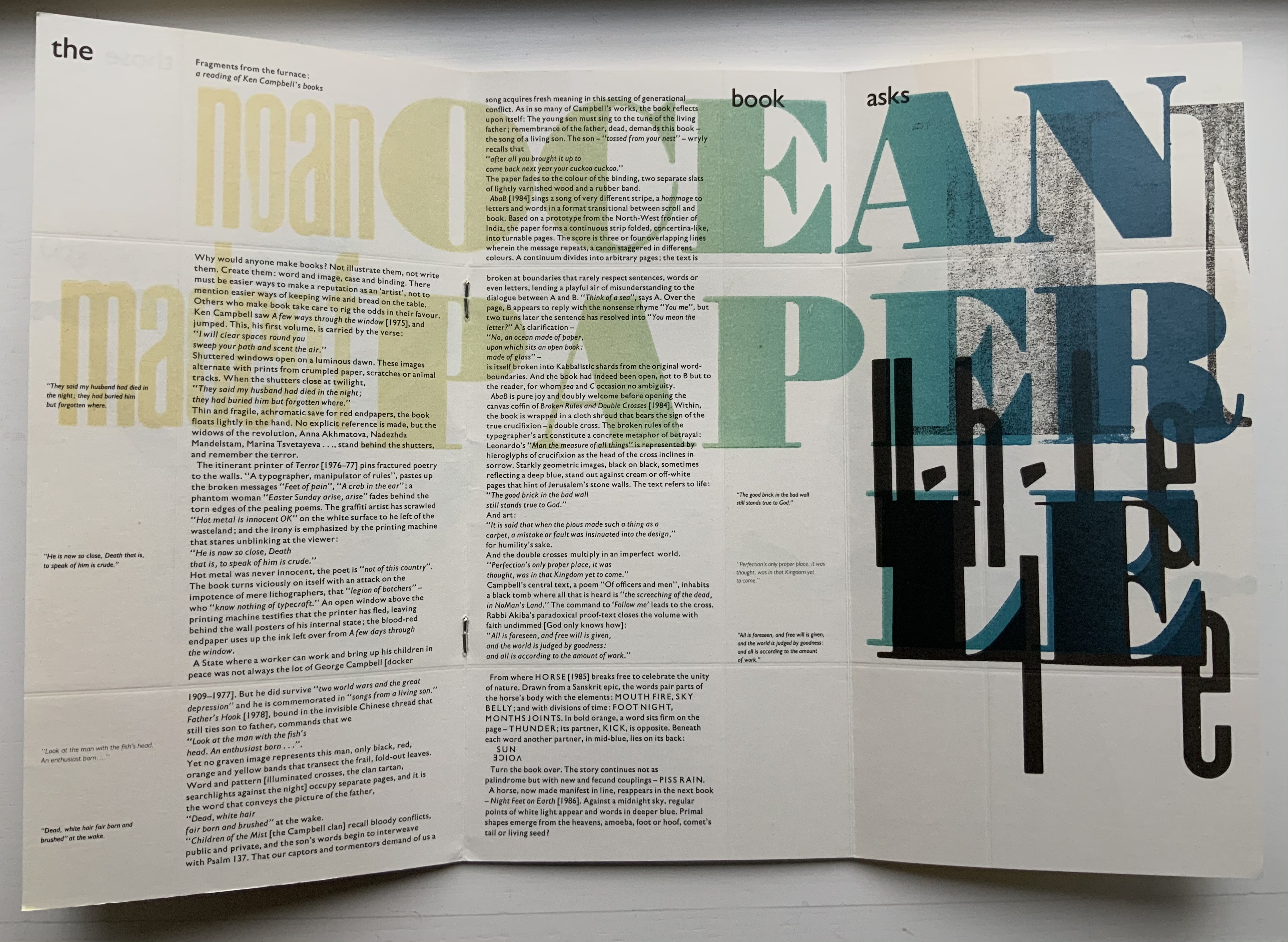
In an insightful review of Campbell’s body of work (Parenthesis 22, Spring 2012, Mark Dimunation, Chief of Rare Books at the Library of Congress, notes these verbal, visual and conceptual doubles:
contemplation of the double emerges in several of [his] works. Opening phrases reappear in reverse at the close of a text. Positives are given counterpoint by a negative. Images flip, rotate and respond to each other as they move across the page. Phrases repeat, disassemble, and then reunite.
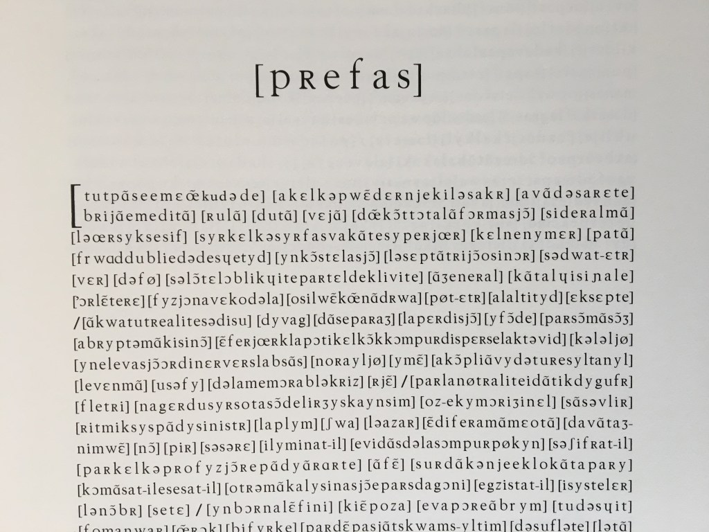
With its twenty-two double-page spreads, the book In the Door Stands a Jar not only doubles and re-doubles down on the visual layering of doubles — the “two spreads on the whole spread” —it also doubles and re-doubles down with its centering poem on the verbal/visual punning that hinges joy and darkness, opening and closing, and love and death together in this work. What an introduction to this form of art.
AbaB (1984)
AbaB (1984)
Ken Campbell
Formed from 17 joined sheets as one leporello, pasted onto heavy endboards of varnished wood, in a cloth slipcase. Silkscreened by Jim Birnie at Norwich School of Art on Heritage Rag acid-free paper. Edition of 50, of which this is #9. Acquired from the artist, 18 December 2020. Photos: Books On Books Collection, displayed with artist’s permission.
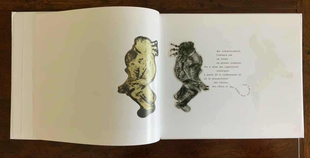
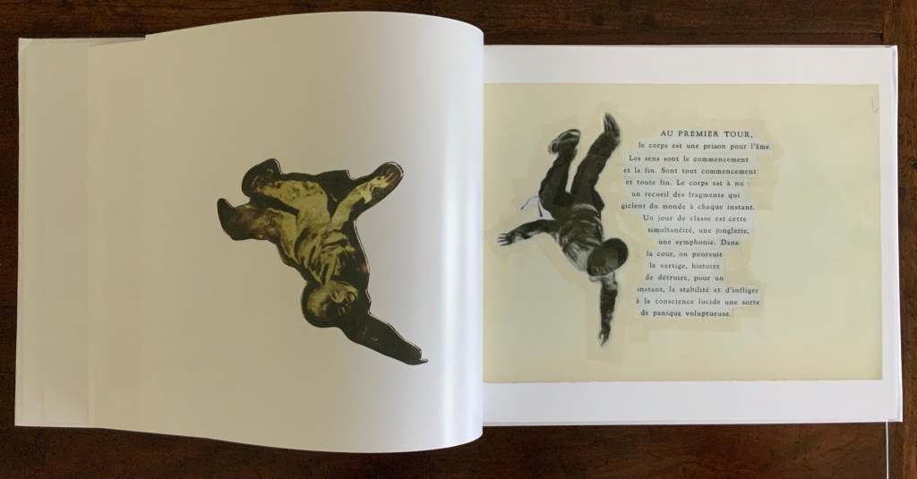
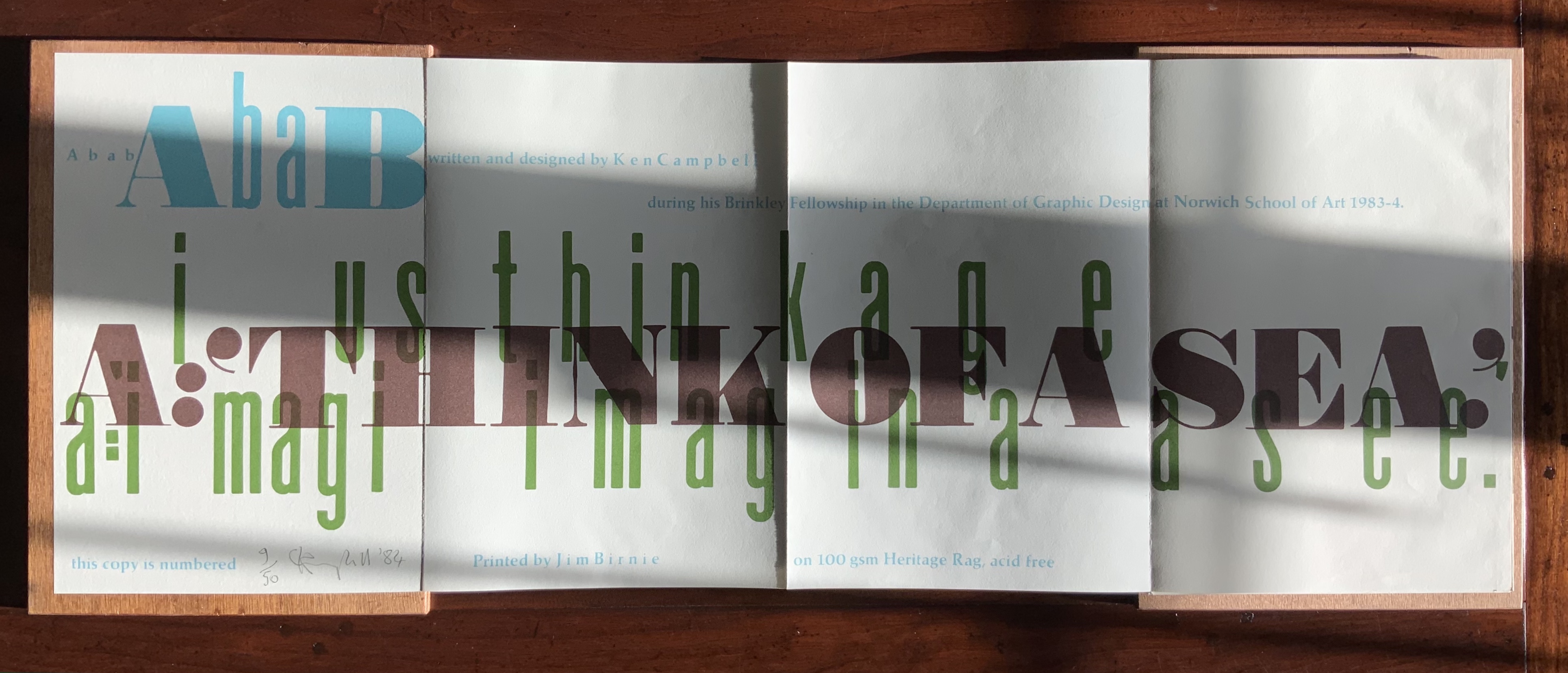
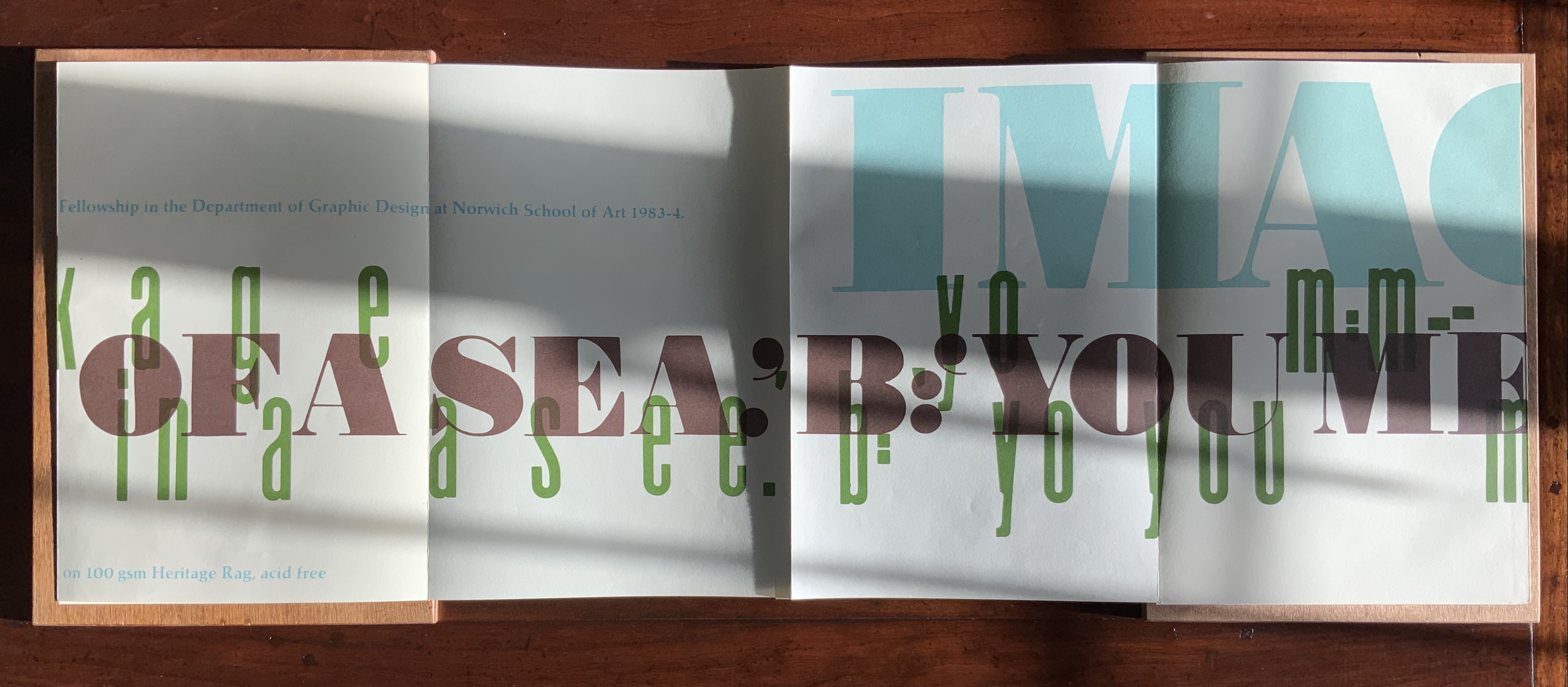
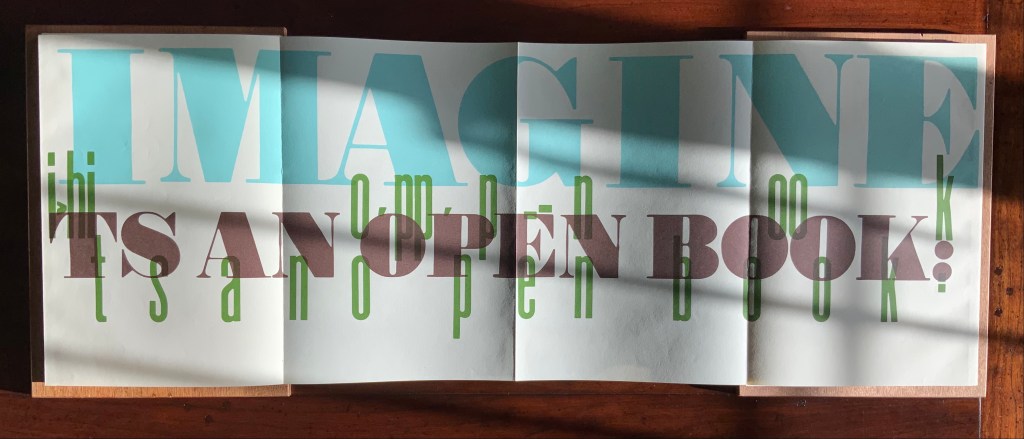
Campbell’s fourth work of book art, AbaB is the earliest of his works in the collection. It is certainly the most lighthearted of the works in the collection and, possibly, among all Campbell’s works. The text relays a conversation between ‘A’ (Campbell) and ‘B’ (Bruce Brown, a colleague at the Norwich School of Art), a conversation probably driven by the Cutty Sark to which it refers:
A: Think of a sea.
B: You mean the letter?
A: No, an ocean made of paper, upon which sits an open book: made of glass. On the water in the book bobs a bottle made of paper. The ship, afloat upon the label, we name the Cutty Sark.
B: Is that what you are going to do?
A: It just got done.
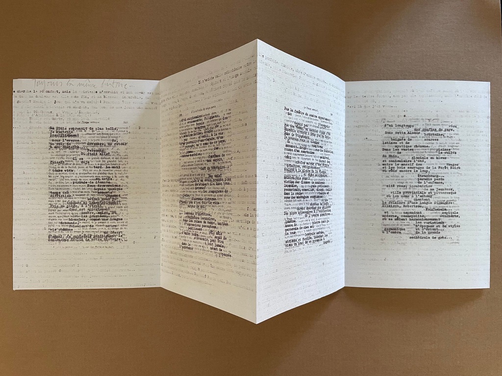
While the work is the only example of an accordion structure and silk-screen printing in Campbell’s work, and its use of varnished plywood for binding appears only in Father’s Hook (1978), the choice of the two typefaces reflects two processing characteristics to be found in almost every one of Campbell’s works.
I had two cases of woodletter, of different printing heights: one Anglo-American, an extra fatfaced serif; the other Didot, a Continental sans serif, very condensed and beautiful. They were so different in their respective fatness and thinness that they represented the polar ends of type design. As an act of cussedness I thought to do a book that brings the two together and see what happens. Ken Campbell
So, cussedness (or contrariety) and chance intertwined. The chance of two cases of woodletter, of different printing heights, contrary in weight and style, meets Ken Campbell, cussed and contrary enough to bring them to bear on a pun that launches an inside-outside pun: the message in a bottle becomes a message on a paper bottle afloat on an open book made of glass that sits on a sea/C of paper.
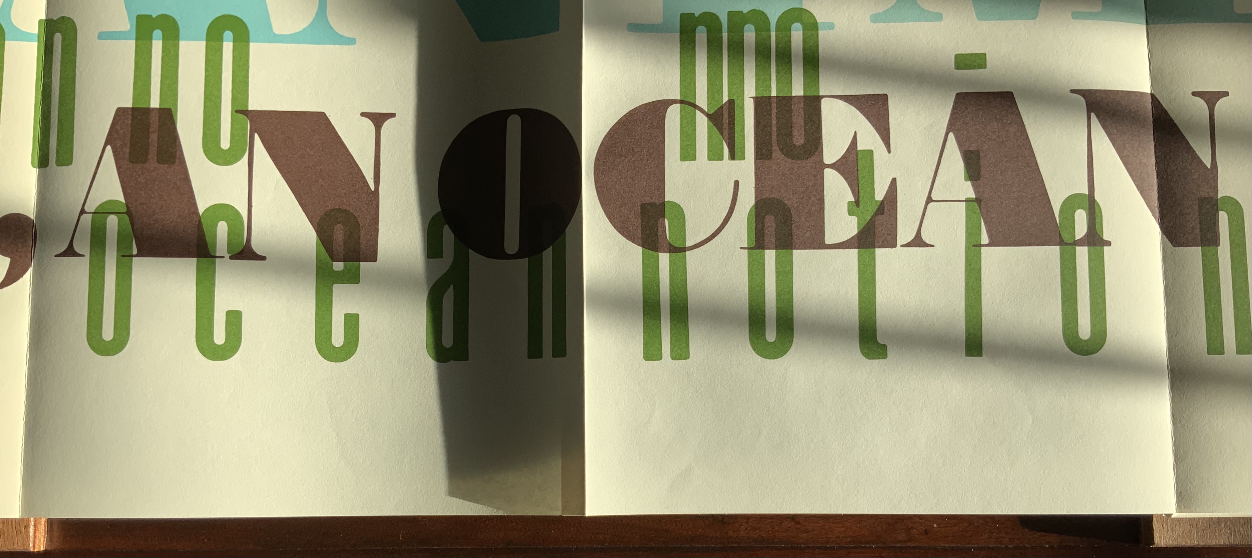
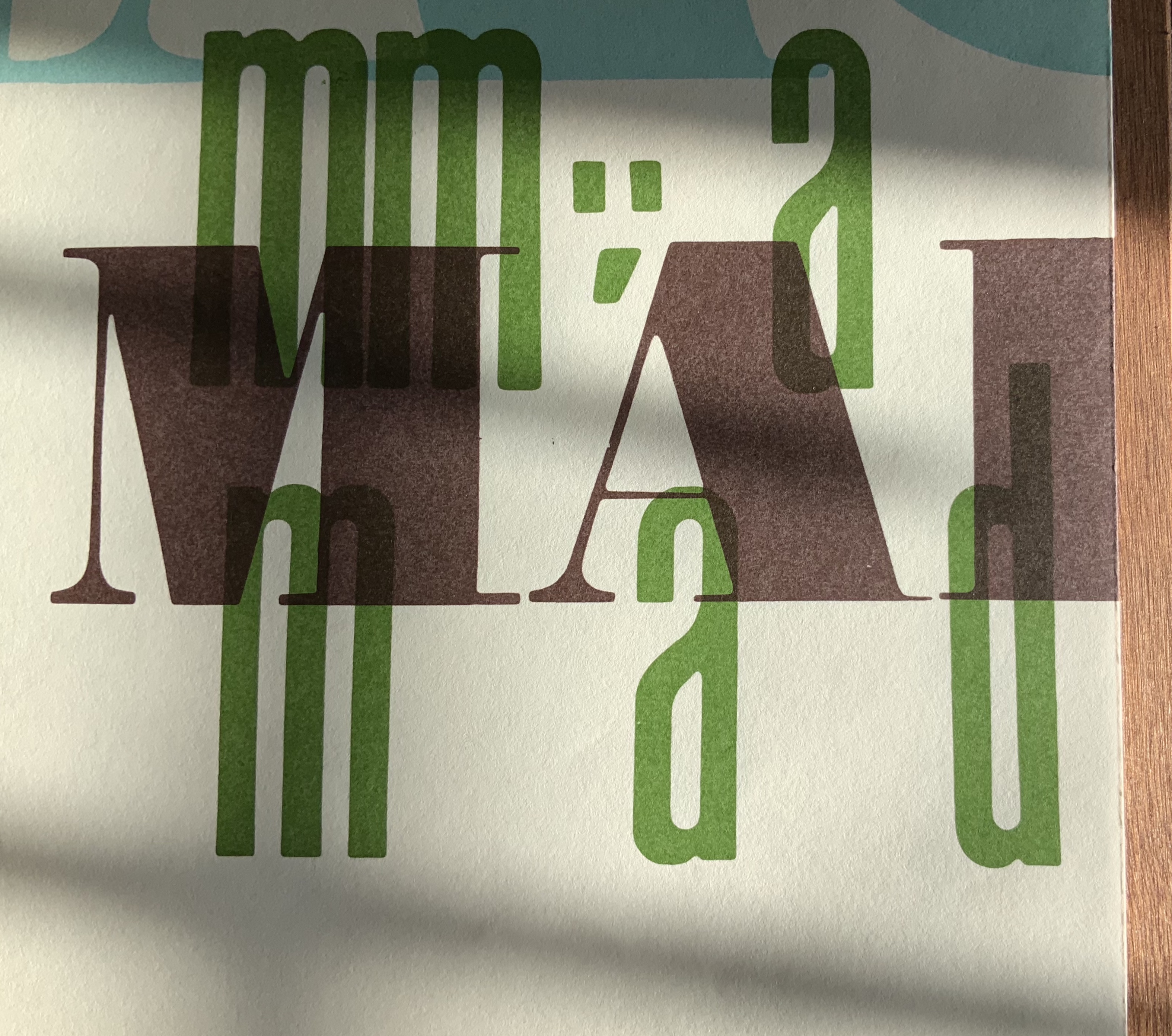
Another element of technique in AbaB stands out as recurrent in almost every one of Campbell’s works. It is an effect Campbell calls “stammering progress”. In AbaB he achieves it by running the conversation at different starting points in overlapping parallel lines that break awkwardly across the accordion’s panels. In other works, the awkward breaks come from words split across grid sections (as above with In the Door) or lines of verse split across recto to verso pages (again, as above, and below in -s wings, -s wings). Again, for Campbell, the page is not simply a surface, it is an element in a sculptural composition.
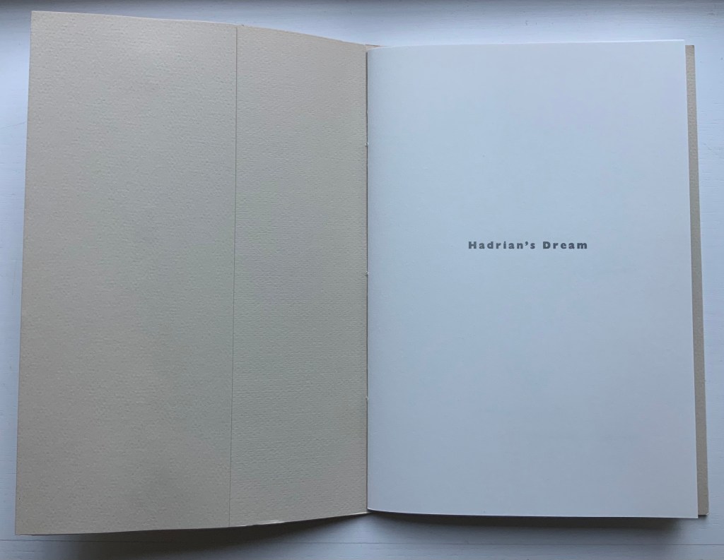
Hadrian’s Dream (1990)
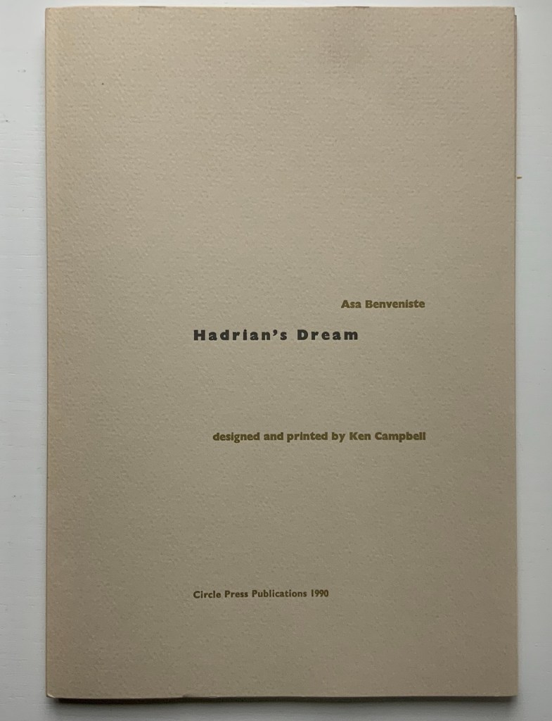
Hadrian’s Dream (1990)
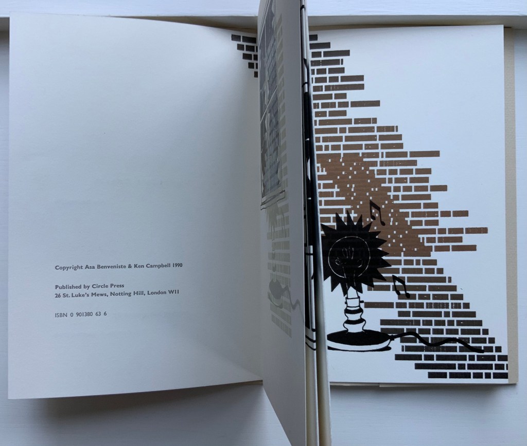
Asa Benveniste (text) and Ken Campbell (design and art)
Folded stiff paper cover over handsewn chapbook. Cover: H298 x W202 mm. Text block: H292 x W197 mm. Twenty pages unnumbered including two three-panelled fold-outs. Edition of 120 published by Circle Press Publications, of which this is #16. Acquired from Circle Press Publications, 22 June 2015.
In interviews and in most of his works, Campbell comes across as a solitary worker, possessed by tenacious vision, images, metaphors and engagement with the tools of his craft (one printing press he named “Lucille”). Hadrian’s Dream and the two exhibition flyers in the collection, however, shed light on moments of collaboration besides Jim Birnie’s screenprinting in AbaB.
Asa Benveniste was an expatriate American poet (1925-90), introduced to Campbell by Ron King in 1977. Later, King wanted to produce a series of chapbooks to celebrate the move of his studio to London and asked Campbell to take on “Hadrian’s Dream”. Benveniste’s poem is a striking one, actually about the creative process, and given Campbell’s recollection of a key line from the poem in a 2017 interview with Nancy Campbell (no relation, see below), it must have struck a lasting chord in his imagination. In the final result, though, Hadrian’s Dream is more Campbell than Benveniste.
A simple single-fold folio embracing all the other folios opens the chapbook. The half-title of the chapbook falls on the first recto panel. After that, things become less simple — either by virtue of image or fold. A second single-fold folio follows the first, and the full title page falls on its first recto panel, but inside this second folio on the copyright page (the fourth panel in the chapbook) is a glimpse of dark brown bricks that continue behind the other folios onto that second folio’s last recto panel (see below). Here the bricks turn a lighter brown then back to dark brown as they build an image of a wall, brick path or stairs, on which is superimposed a black print — an old-fashioned shadeless electric bulb emitting a jagged black corona of light and musical notes.
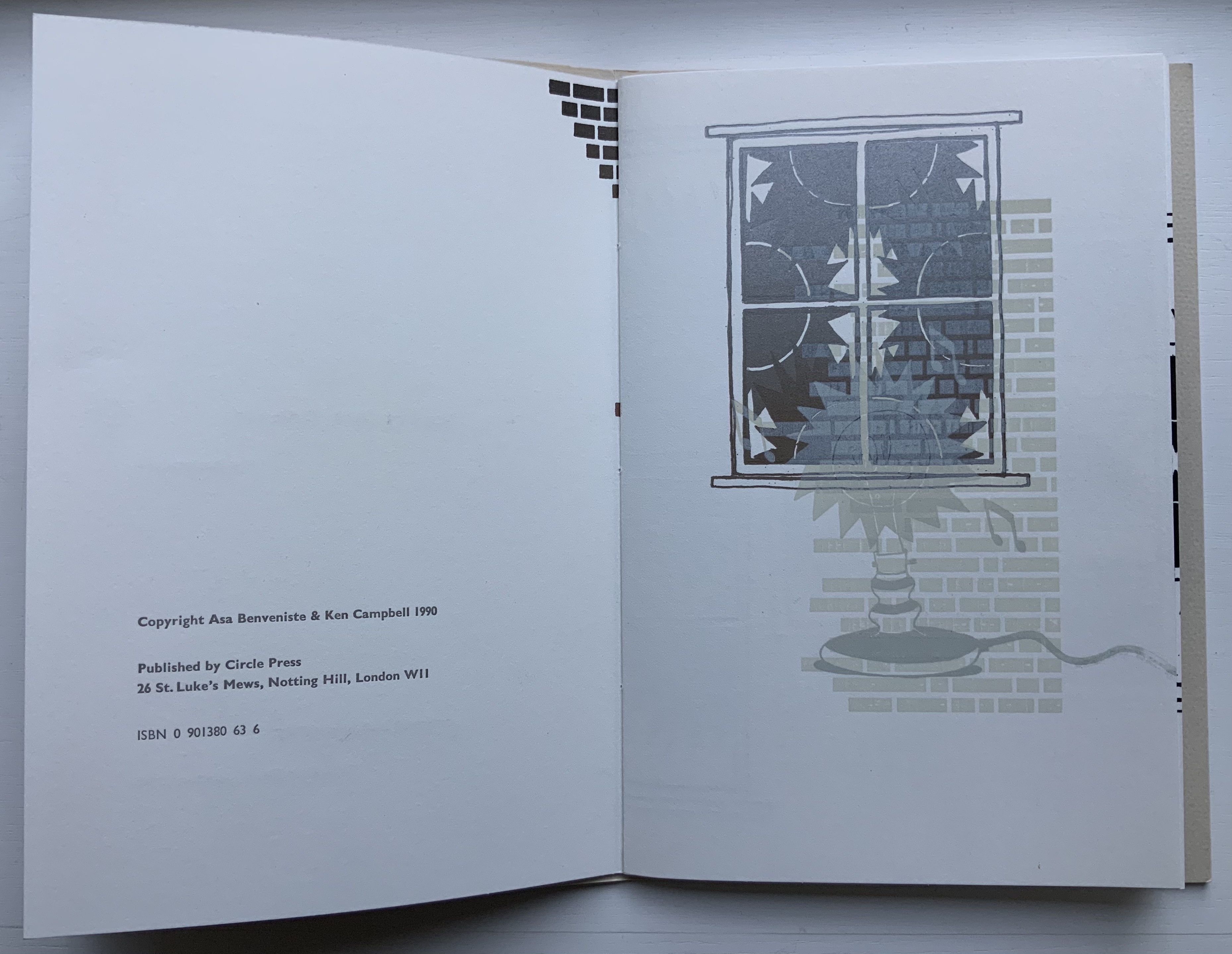
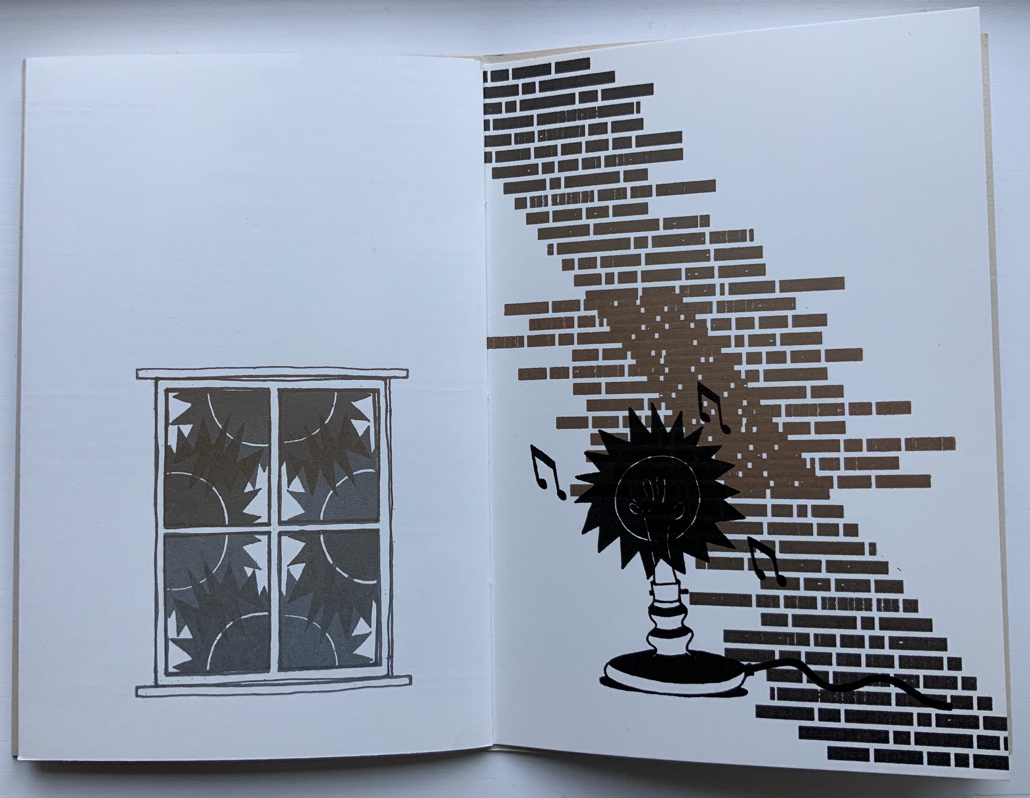
In correspondence (26 December 2020), Campbell notes, “the ‘bricks’ are the underside of the type used for the poem turned upside down and used to print from”. Delving into and repurposing his material at hand is a characteristic feature of Campbell’s art.
But who reads a book this way? Perhaps anyone who is puzzled after that copyright page by the succession of panels in which the seventh panel is actually part of a six-panel foldout opening leftwards. Inside the foldout on panel nine appears Benveniste’s poem, which with lines about “sunlight in the window”, a “desk lamp” and “everywhere there is only music” begins to shed light on the images. On closing this foldout and turning panels eleven and twelve, another surprise comes: a new foldout opening rightwards. It seems to be a four-panel foldout but is actually six. The missing two have already shown up before the first foldout! The complete image on the inside of this second foldout folio can be seen only when the folios it embraces are pinched together (see below).
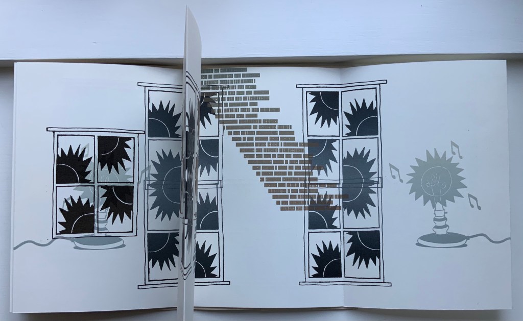
This is the clue to go back to the copyright page and pinch together the folios between it and the penultimate panel (see below).
In the catalogue for his 1996 Yale exhibition “The Word Returned”, even Campbell comments: “the way the thing folds and unfolds is a bit confusing”. Nevertheless, Hadrian’s Dream provides lessons on reading Campbell’s art. Image, text and structure connect in multiple, meaningful dimensions. Where Benveniste’s last line reads “the start of the endless poem”, Campbell’s images facing the poem are two desk lamps connected by a single cord — light feeding light. For Campbell, “sunlight in the window” evokes the four quadrants through which the sun moves daily and, thus, the four panes of the window through which Benveniste sees Hadrian’s dream. With Campbell, in looking/reading and reading/looking, there are always more than “a few ways through the window”.
A few ways through the window: An exhibition of books, related prints and sculpture by Ken Campbell (1990)
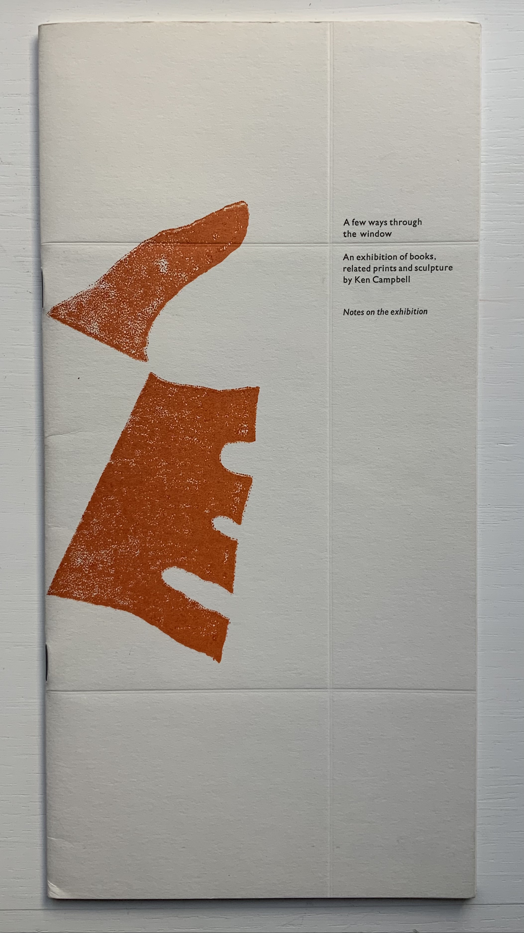
A few ways through the window: An exhibition of books, related prints and sculpture by Ken Campbell (1990)
Designed by Robert Burn, produced by Ken Campbell and Robert Burn.
Saddle staple-stitched flyer, embossed cover with end-flap folding over 14 unnumbered pages, including a three-page foldout. Acquired from Oak Knoll, 30 January 2014. Photos: Books On Books Collection.
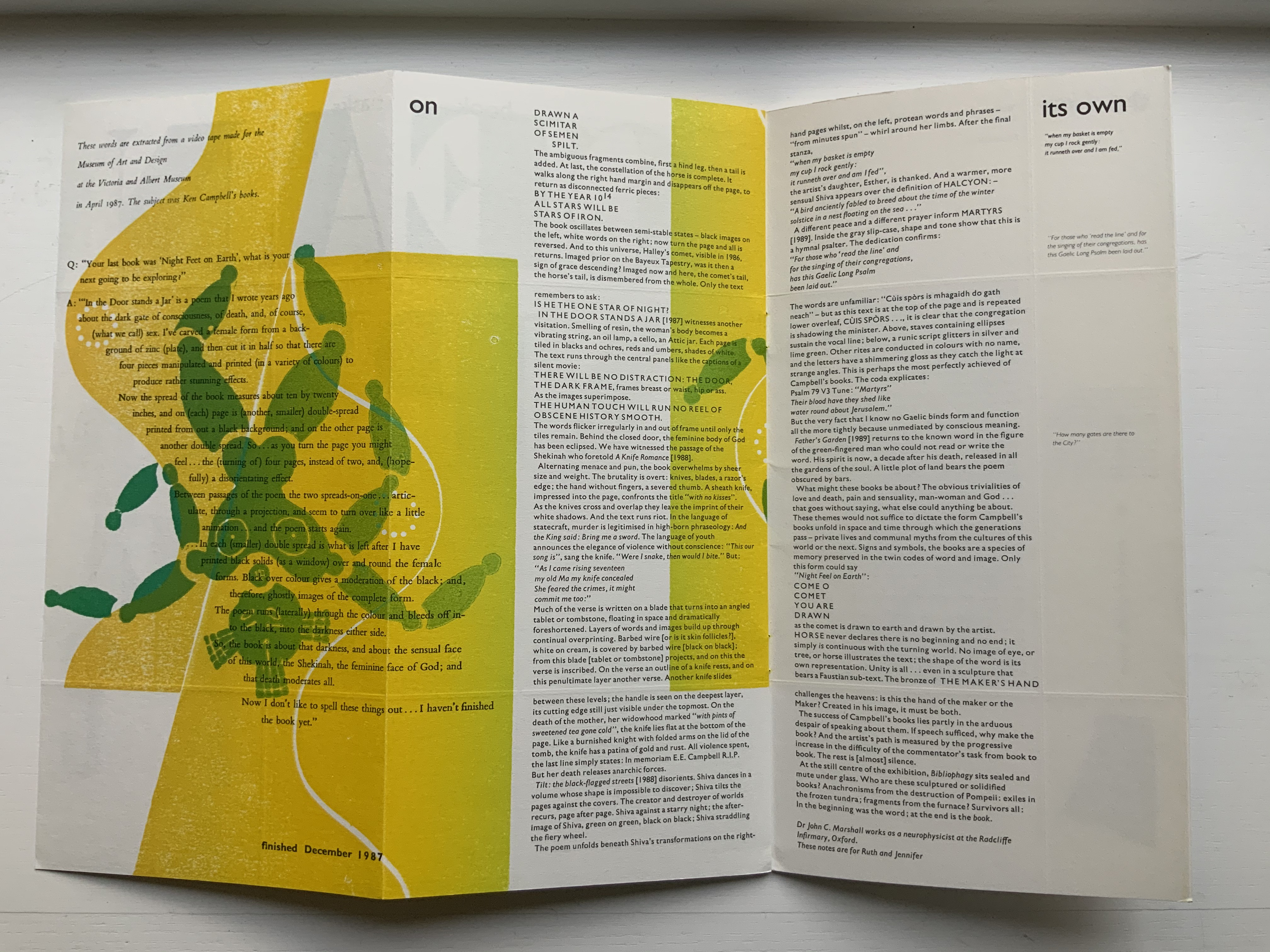
The title of this exhibition flyer is also the title of the first book in Campbell’s catalogue The Maker’s Hand (on which more below). The flyer and entry in the catalogue intensify the desire to see that book from 1975 — whose text is printed letterpress in Univers type on the rough side of poster paper and photos of tall inward-opening windows and outward-opening wooden shutters printed on the smooth side. The flyer’s main text comes from the neuropsychologist John Marshall, who introduced me to Ken and Ruth Campbell all those years ago.
Execution: The Book: An exhibition of limited edition artists’ books, related prints and small sculpture (1990)
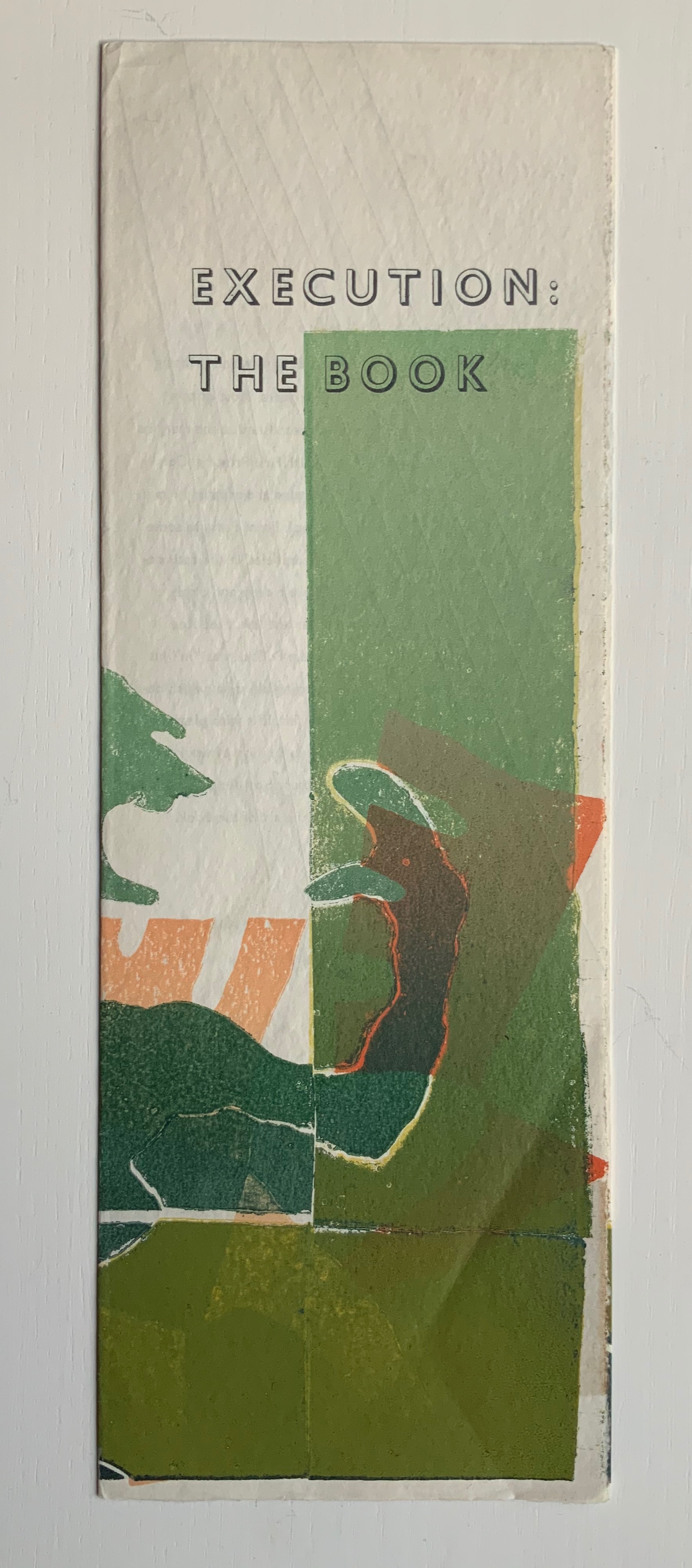
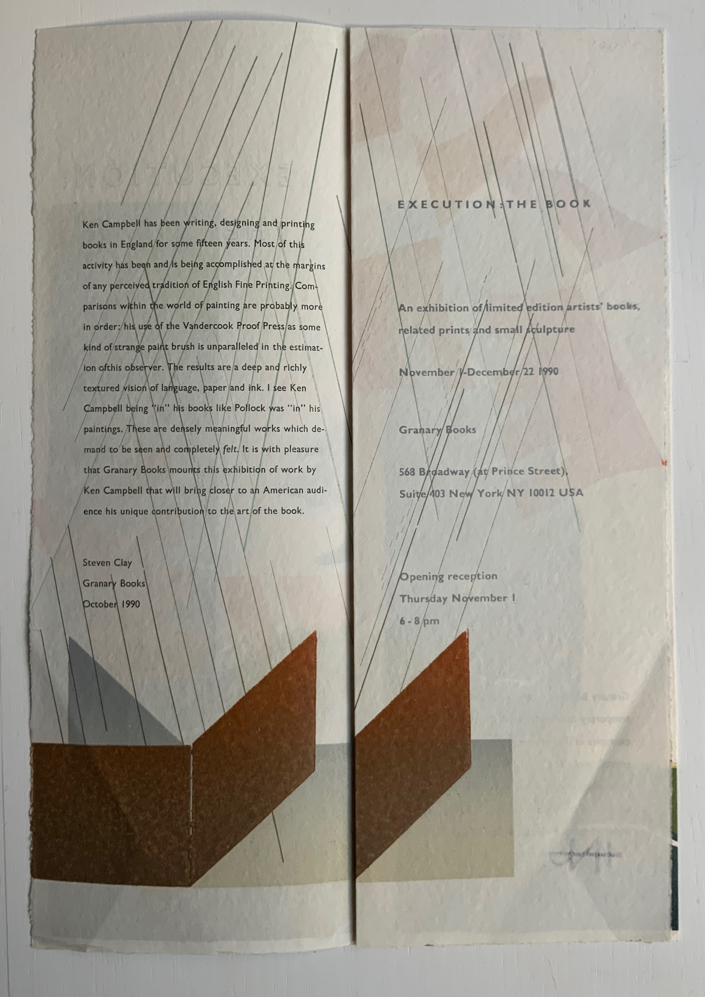
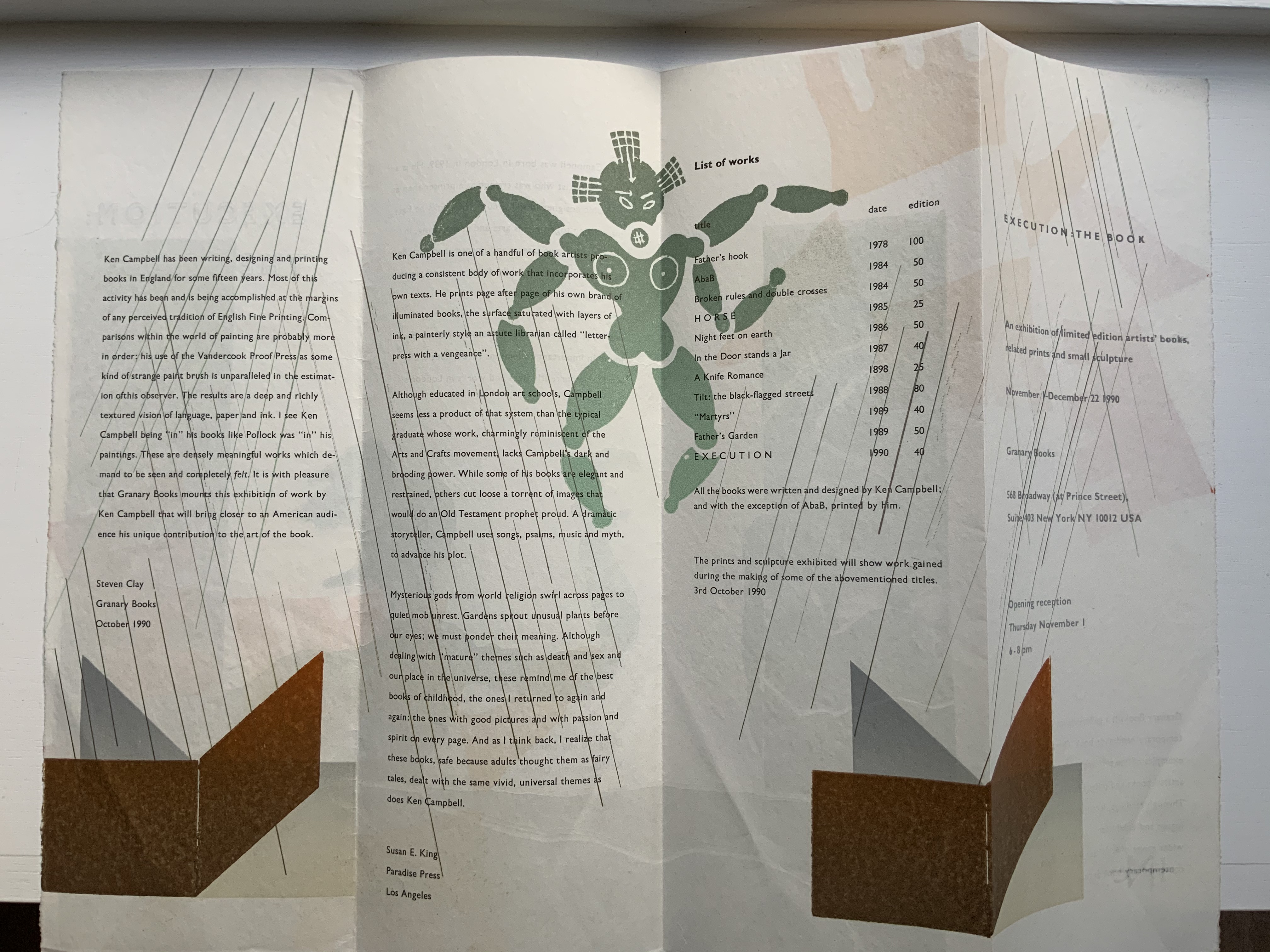
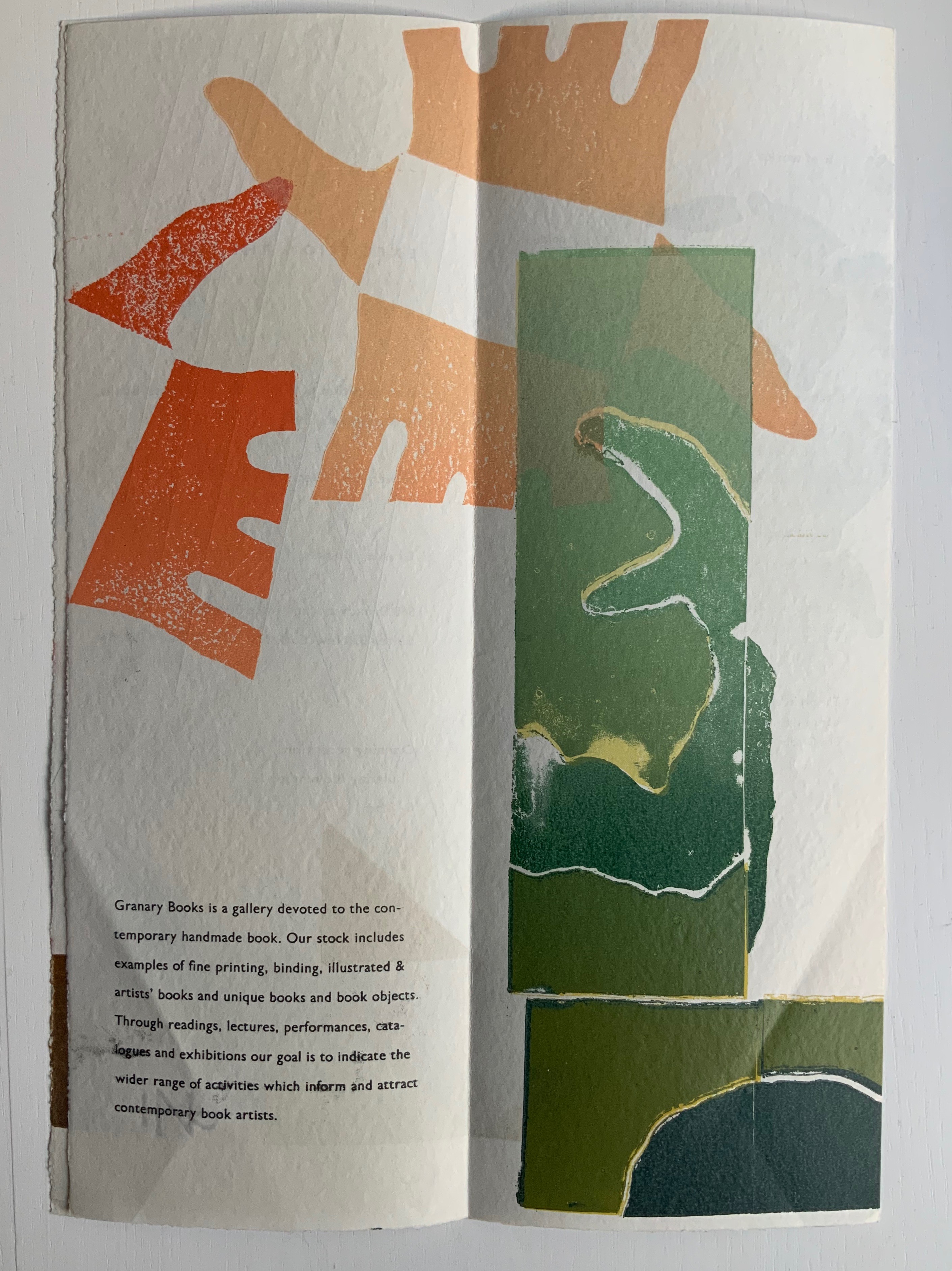
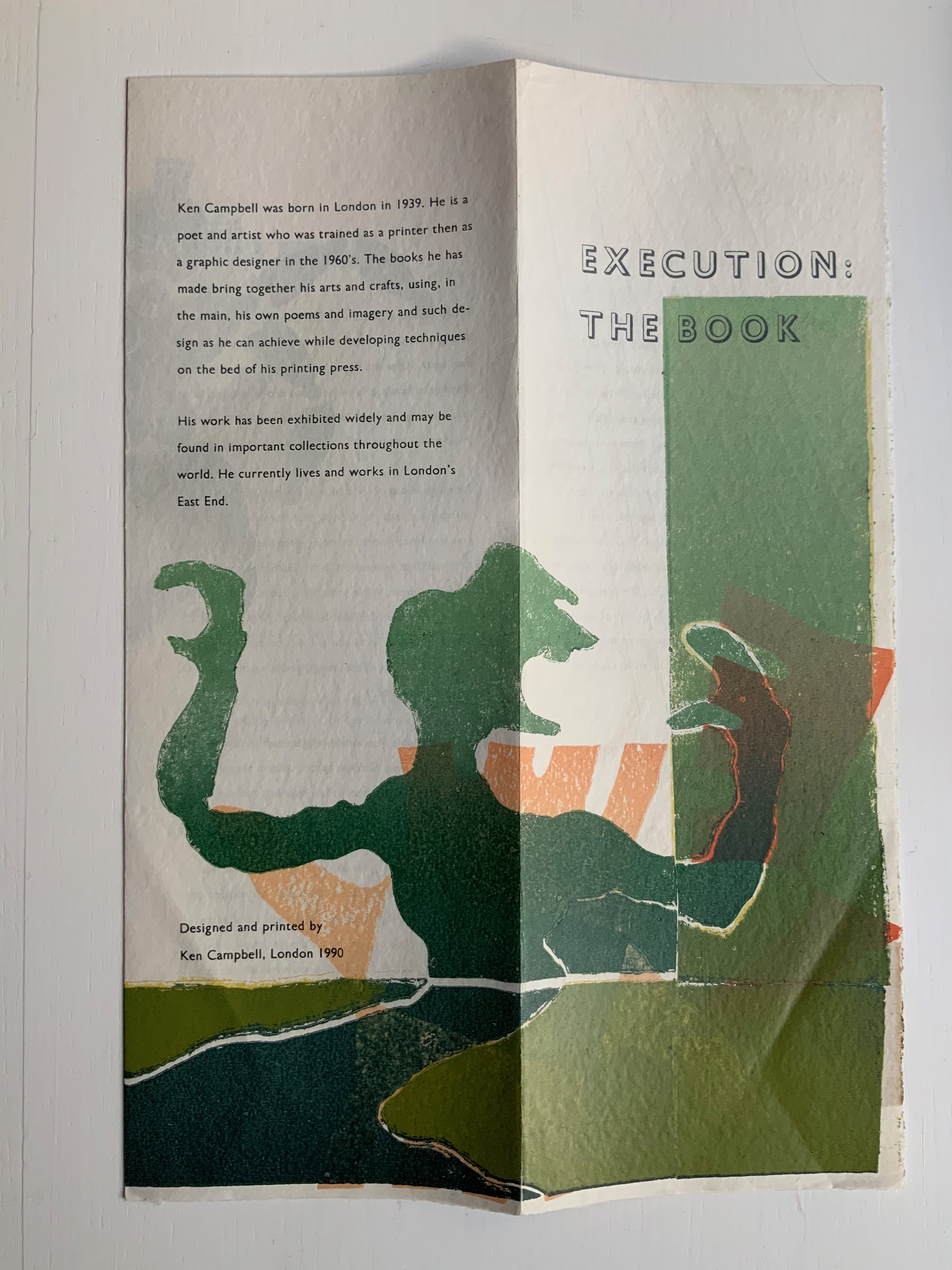
“Execution: The Book: An exhibition of limited edition artists’ books, related prints and small sculpture“, Granary Books, New York (1990)
Designed and printed by Ken Campbell; text by Steven Clay and Susan E. King.
Eight-panel flyer, H382 x W135 mm (closed), W530 mm (open). Acquired from the artist, 20 December 2020. Photos: Books On Books Collection, displayed with permission of the artist.
The title of this exhibition flyer is also the title of a book described in The Maker’s Hand. The year 1990 must have been one of Campbell’s most productive; it certainly brought recognition from the book and art worlds (Circle Press, London; Granary Books, New York; MoMA, Oxford). As will be expanded below, the exhibition flyers serve a particular function alongside Campbell’s bookworks in the collection.
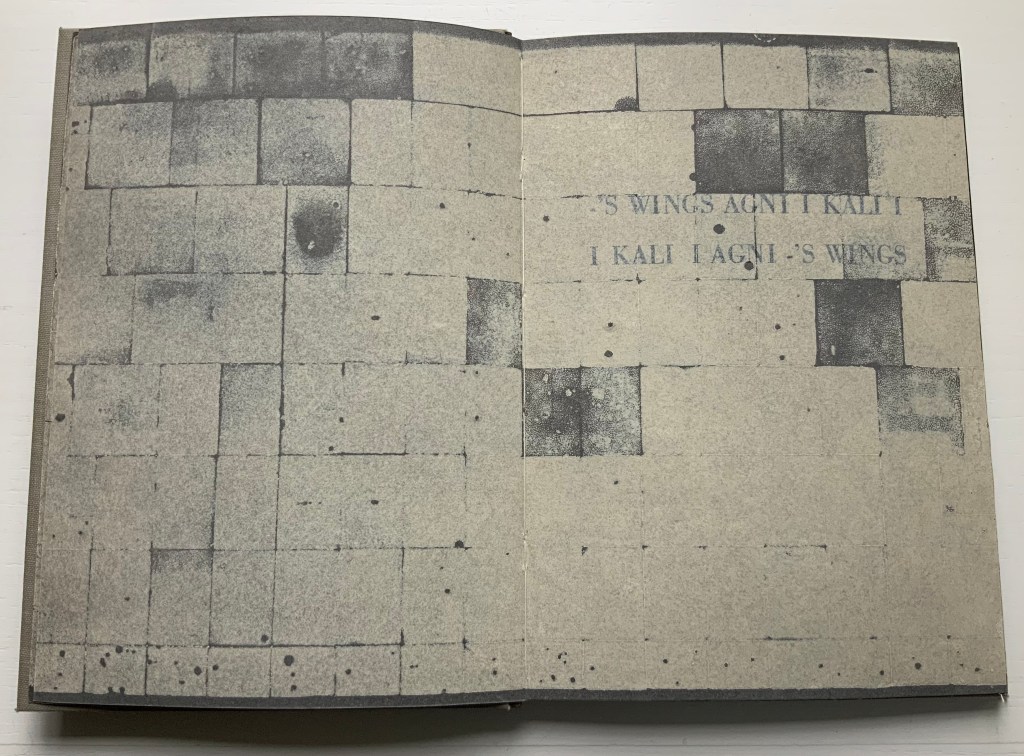
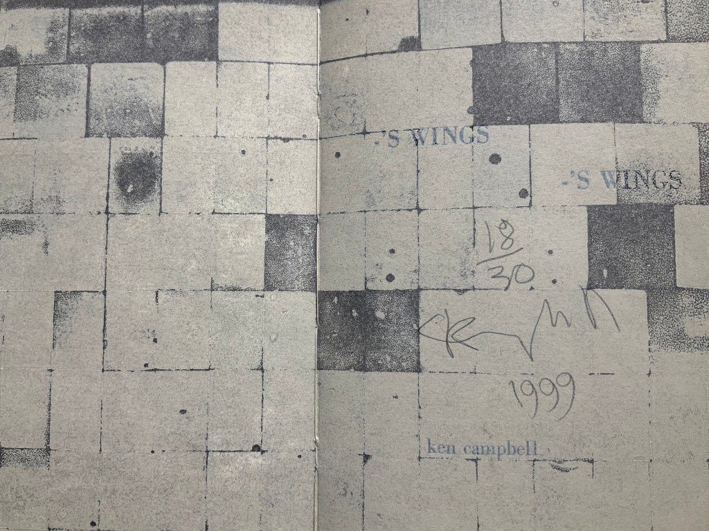
-‘s wings, -‘s wings (1999)
-‘s wings, -‘s wings (1999)
Ken Campbell
Black laserprinted images overprinted with polychrome letterpress. Bound by Charles Gledhill using an adaptation of the seventeenth-century limp vellum form and wrapped in a folded black cloth. H197 x W140 mm, 64 pages unnumbered. Edition of 30, of which this is #18. Acquired from the artist, 20 December 2018. Photos: Books On Books Collection, displayed with permission of the artist.
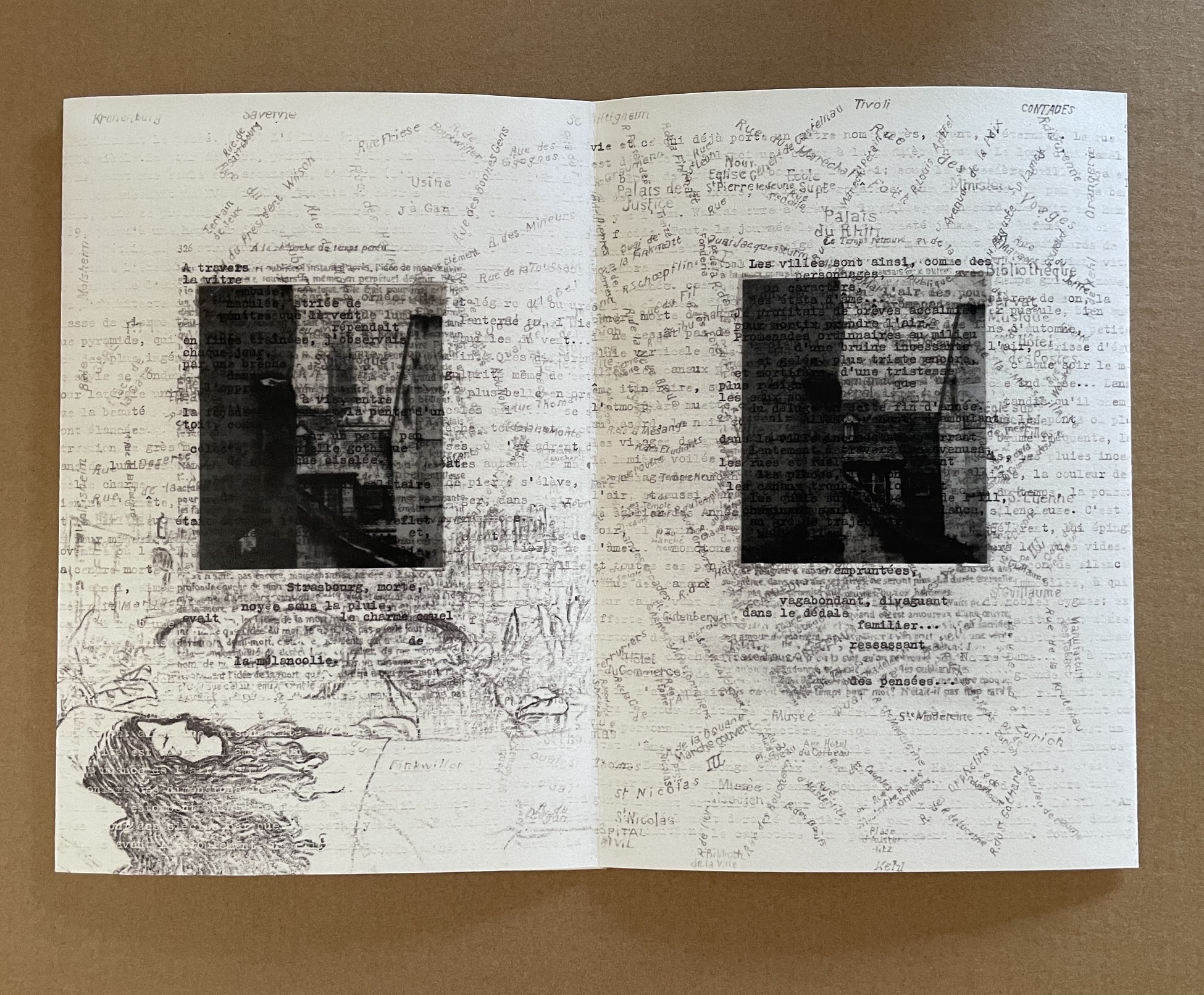
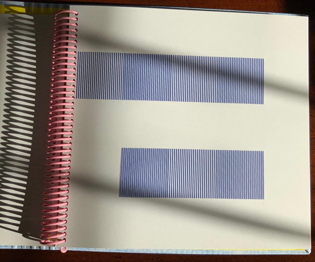
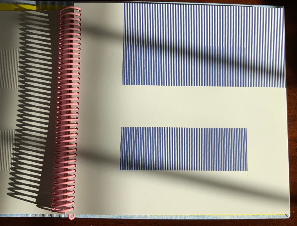
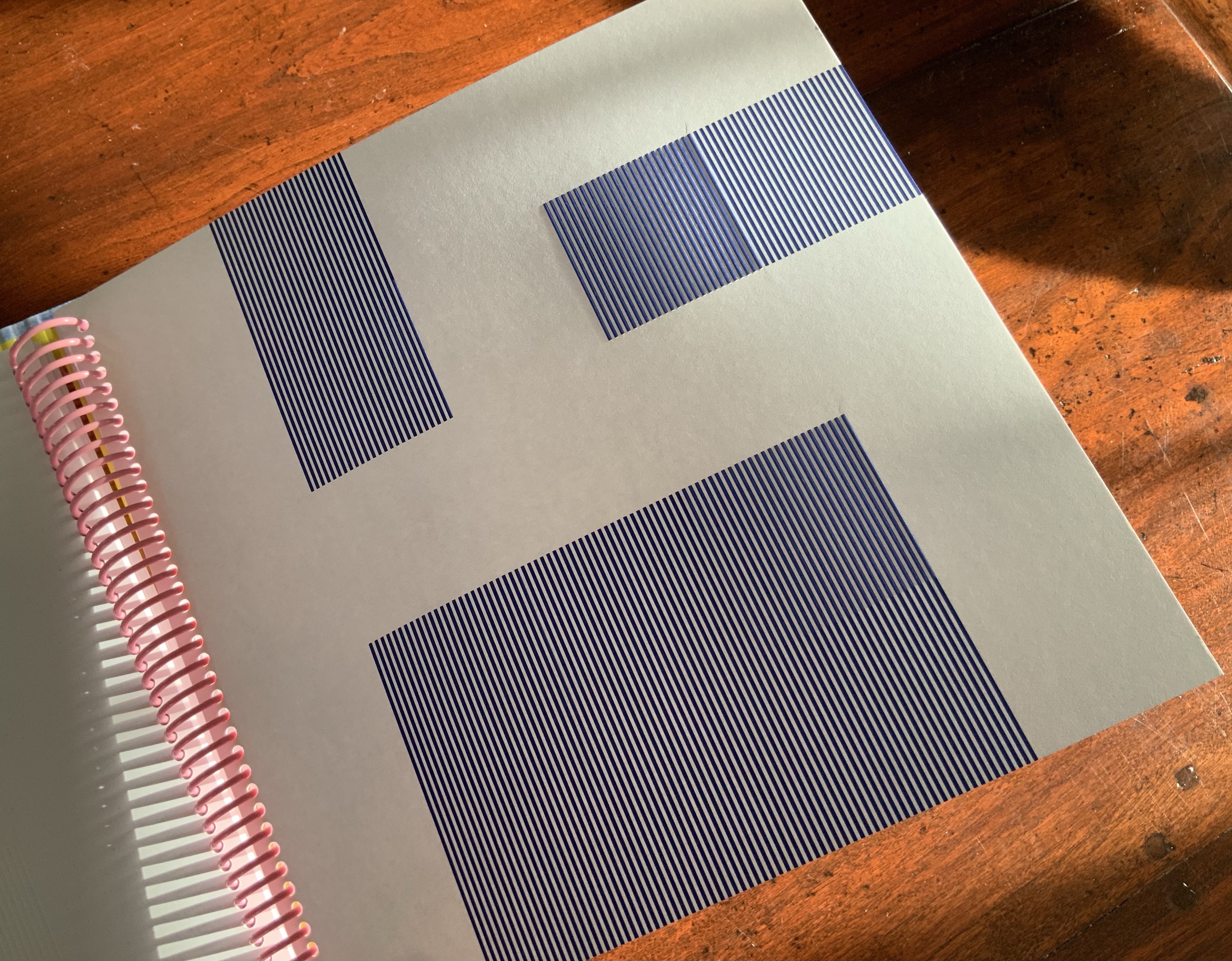
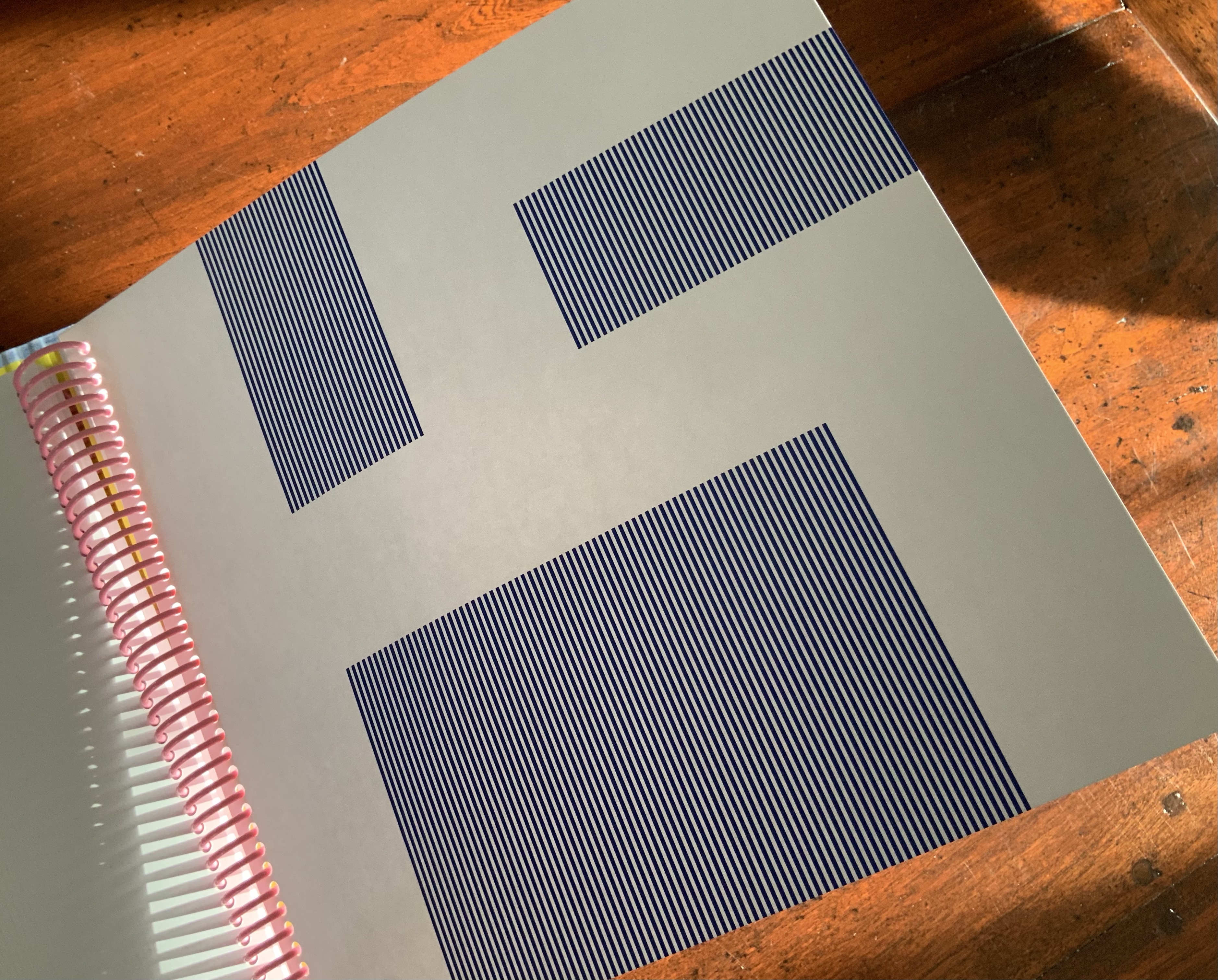
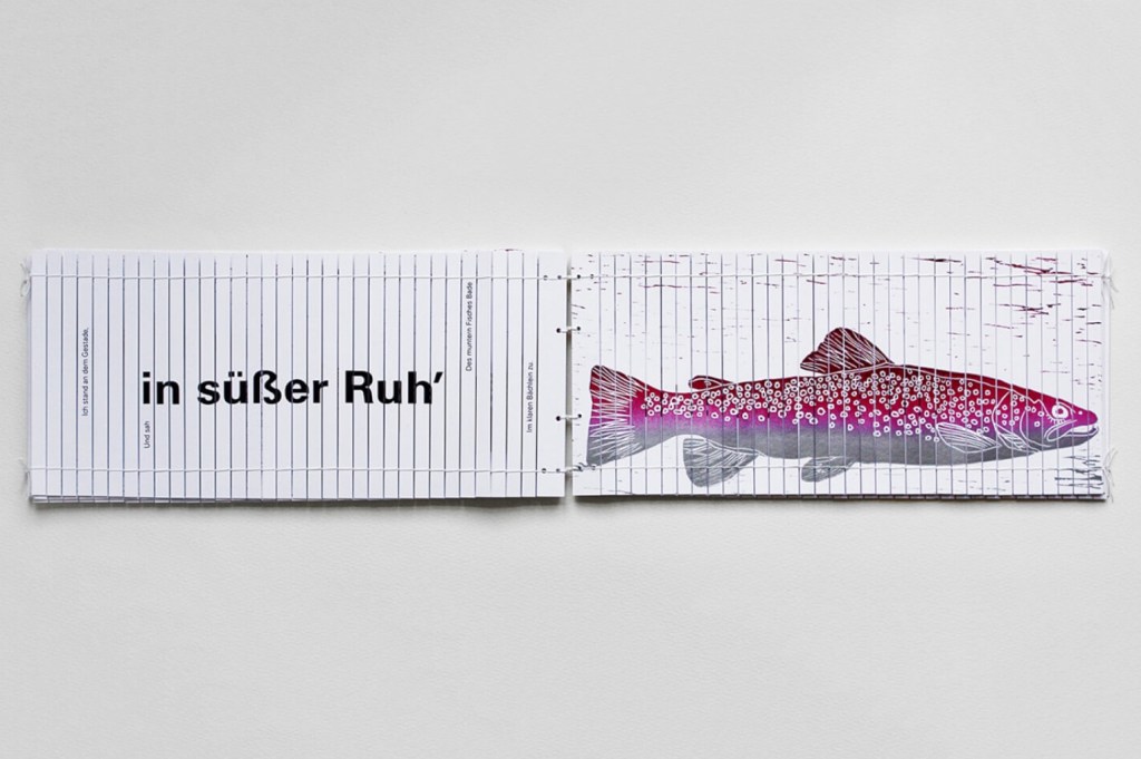
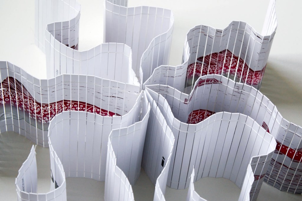
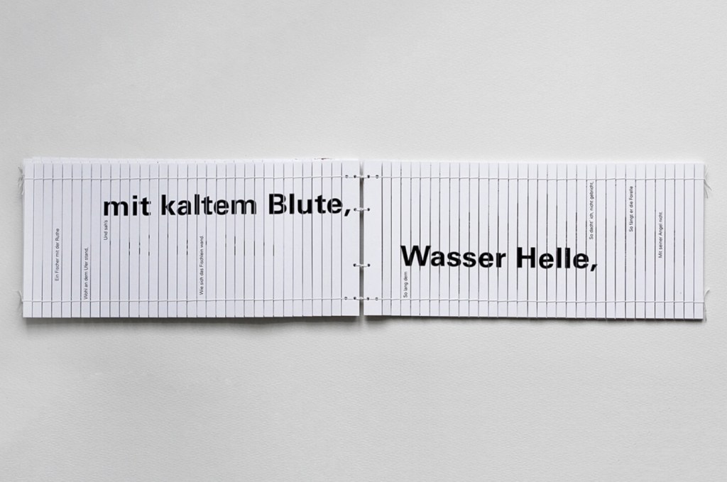
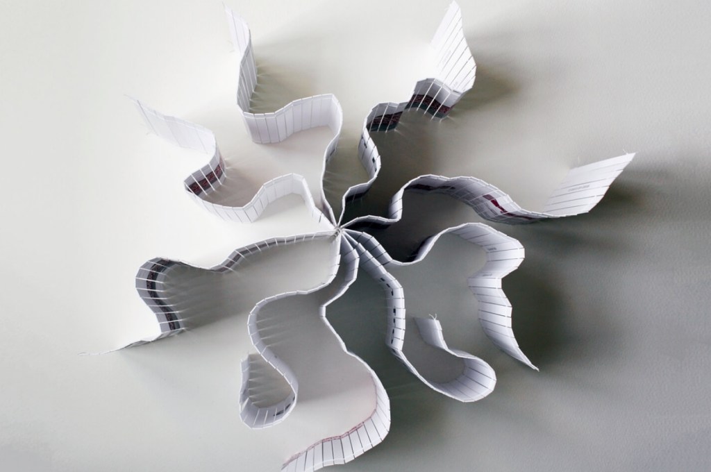
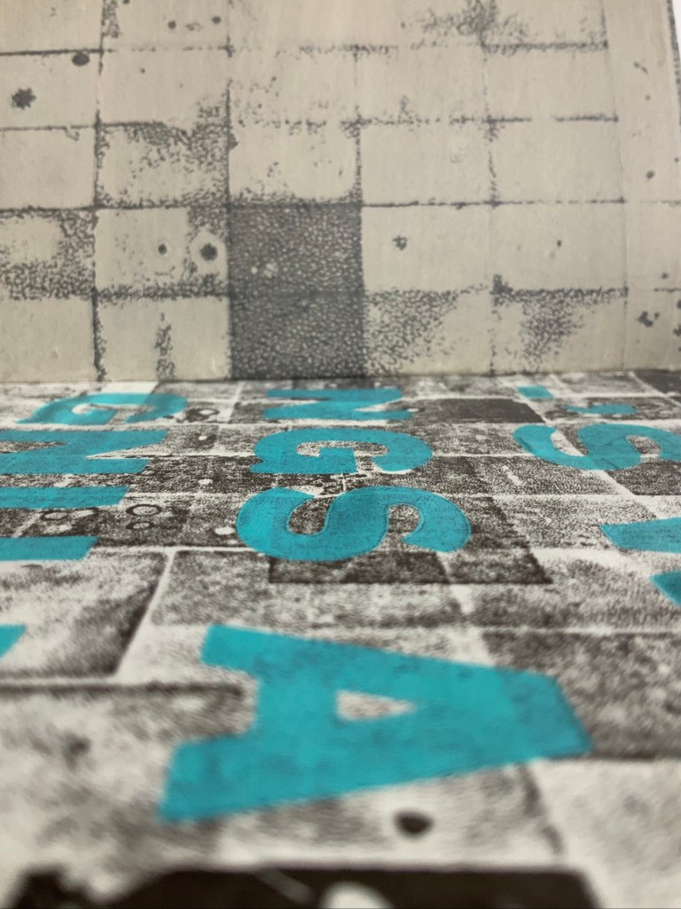
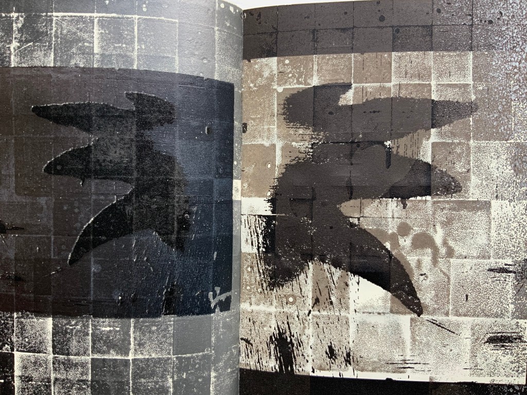
-‘s wings, -‘s wings is a dark, rich and more than tactile work. Following what happens in it demands more of the reader/viewer’s faculties. Unwrapping it from the cloth that envelops it, you feel engaged in some sort of rite. The feel of the binding lies somewhere between softcover and hardcover. An oily ink smell emerges. So precisely aligned with the grid image, the long stitches of beige or white thread exposed down the center of unnumbered pages 4-5 and 60-61 (both shown below) barely register to the eye.
When, however, pages 10-11 are reached (shown below on the left), the threads emerge more plainly against a dark background. The whiter vertical lines elsewhere on the page highlight the threads’ drawing function — or grouting function. By now, the oily smell is stronger, and fingers feel an almost sticky thickness to the pages. As light moves across the turning page’s surface, layers and pock marks appear and disappear much like the rising and falling of the threads. As In the Door but more so, it has an impasto effect from layering and layering brought about by Campbell’s aforementioned cussedness and chance-taking in running the sheets through the printer over and over.
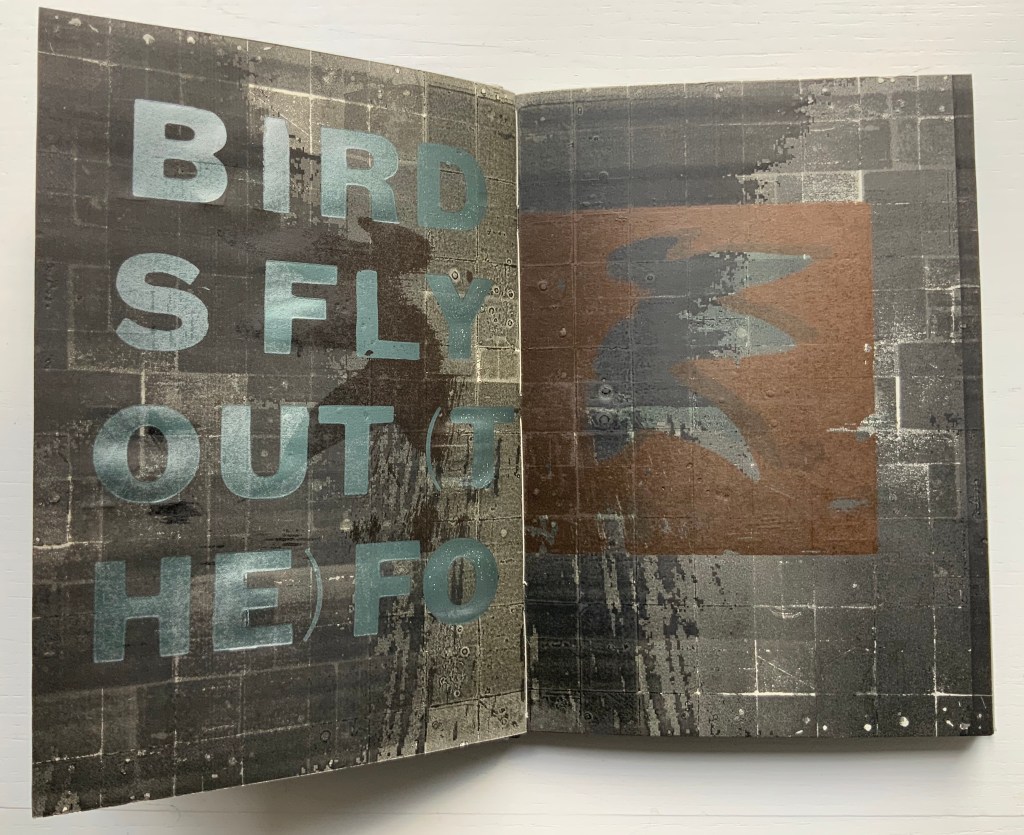
Against this background, images of wings dance and pull away from the center. Over those images and background, the letterpressed text introduces a chant to Agni (the Hindu fire god) and Kali (goddess of love and the great mother) and a poem describing a forest fire spread by birds with wings aflame and falling into the undergrowth. As in other works, Campbell breaks words, punctuation and lines across multiple pages and double-page spreads. In this instance, seventeen pages carry the text. The loose transcription below does not replicate the word and line breaks within pages, only those from page to page; the double-page spreads are indicated. The chant and poem reverse themselves (not quite verbatim) after the first double-page spread, which reminds me of the palindrome In Girum Imus Nocte Et Consumimur Igni (“We go round and round at night and are consumed by fire”).
-S WINGS AGNI I KALI I
I KALI I AGNI -S WINGS

-S WINGS AGNI KALI I

BIRDS FLY OUT (THE) FO

REST FIRE (THEIR) WING

S AFLAME FALL DEAD (T

O) IGNITE THE AWAITING

BUSH

AGNI I THANK                [double-page spread]
DANCE (YOU)
IN MY BONE
FIRE

FIRE BONE                      [double-page spread]
ME IN (YOU)
DANCE
THANK I KALI

BUSH (A)WA

ITING IGNITE (&) DEAD F

ALL (A)FLAME FIRE FORE

ST OUT FLY (THE) BIRDS

I KALI I AGNI -S WINGS

I KALI I AGNI -S WINGS
-S WINGS AGNI I KALI I
The chant and poem also remind me of the image of birds and animals fleeing a forest fire in Elizabeth Bishop’s “The Armadillo” (a very different poem), but other readers will bring different memories to bear, and yet again this work of art will make a fine thing of chance.
The Maker’s Hand (2001)
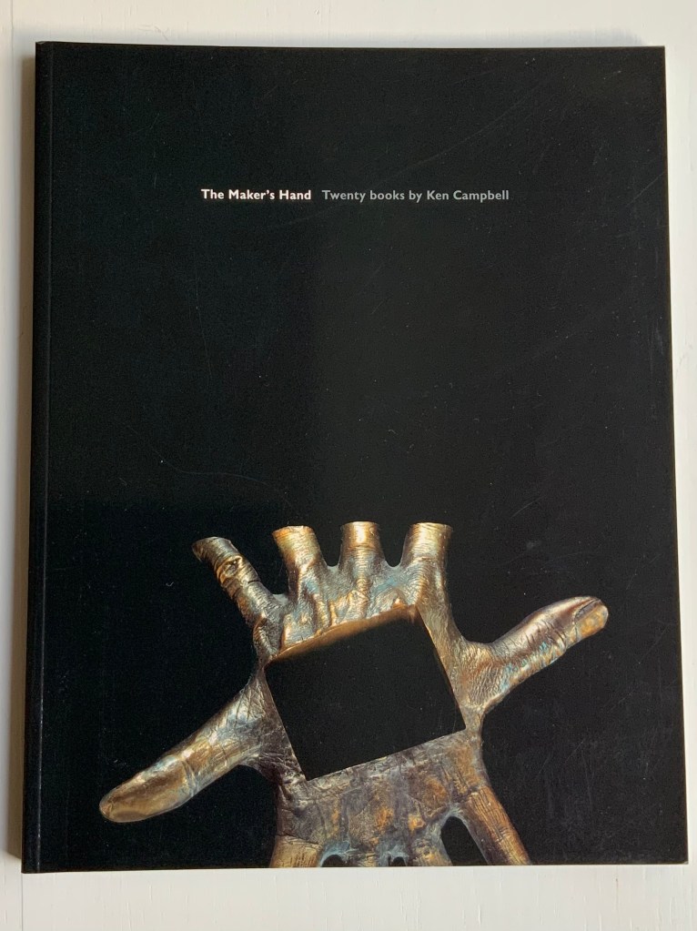
The Maker’s Hand: Twenty Books by Ken Campbell (2001)
Ken Campbell
Perfect bound paperback. H305 x W240 mm, 104 pages. Acquired from the artist, 20 December 2018. Photo: Books On Books Collection, displayed with permission of the artist.
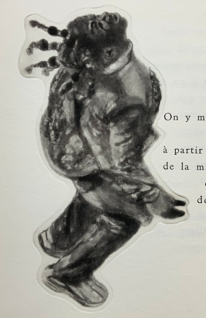
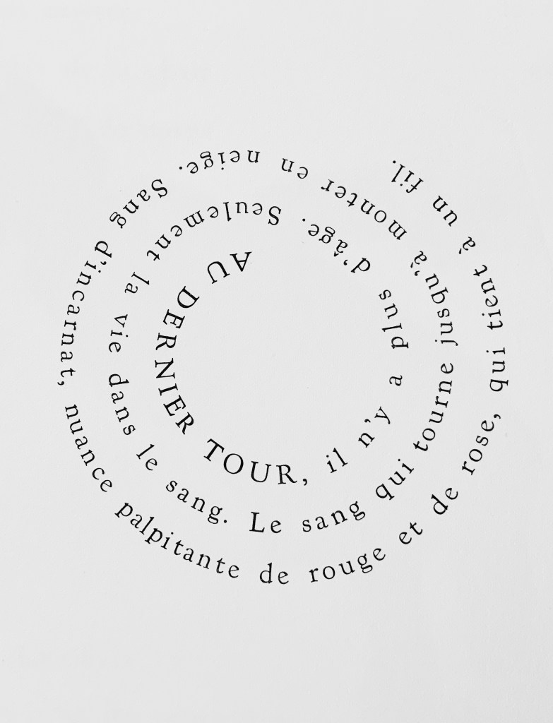
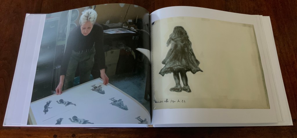
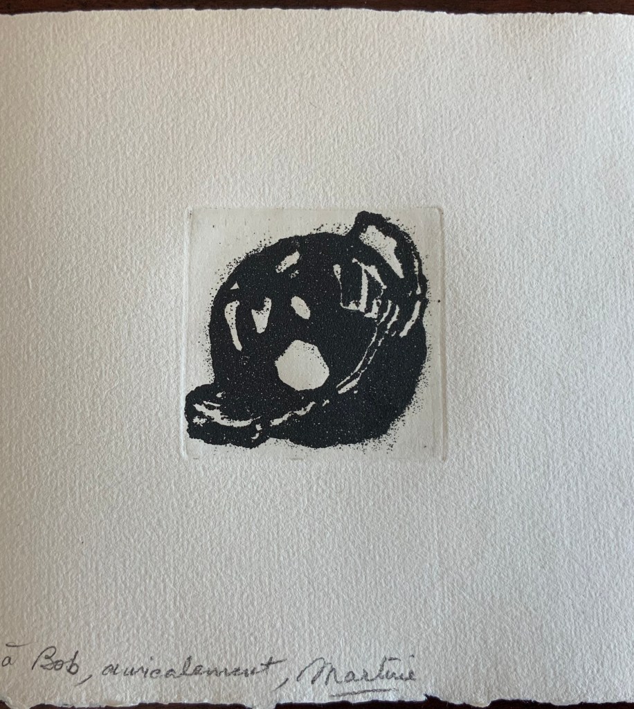
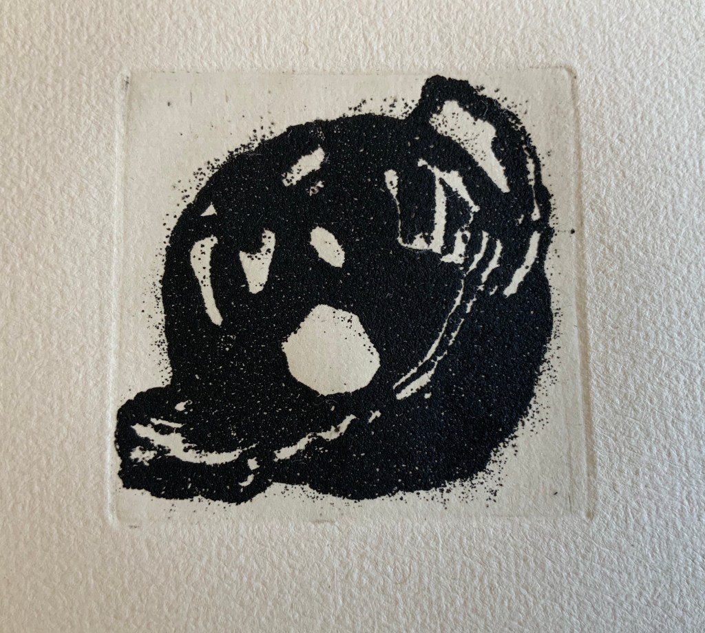
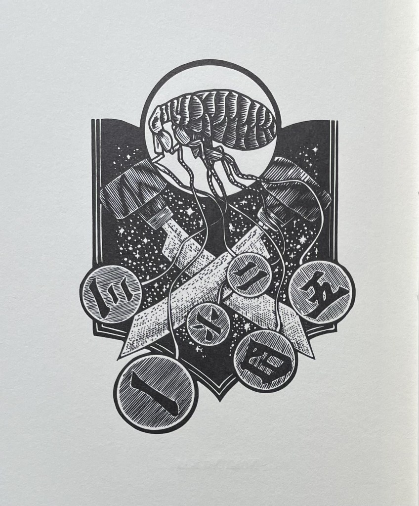
Like the exhibition flyers above, The Maker’s Hand is a work of ephemera — a catalogue of a selection of Campbell’s output. They are nonetheless important to the collection, not only because it wants certain key works by Campbell but also because together the ephemera document an important characteristic of Campbell’s oeuvre. The image on the cover should look familiar. It appears reproduced in whole and part in solid colors in the exhibition flyers above. It is an emblem of connectedness, the physical, conceptual and spiritual continuity of one work with another. It is also a reminder of the personal-ness of the art. The last book covered in The Maker’s Hand is Pantheon (2000), from which the catalogue’s final image is taken:
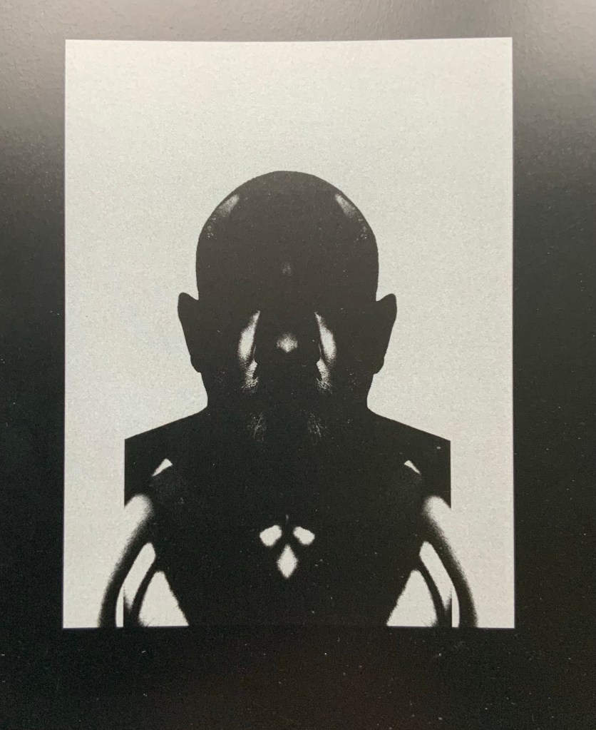
The self-portrait of the artist drives home the pairing of a life-long consistency of image and vision with life-long artistic growth and development. Life in art, art in life. For which this curator is grateful.
Postscript
It was an honor to be invited to Ken Campbell’s wake on 22 November 2022. Well attended and boisterous, with even a vase breaking in a corner, the event would have pleased him. Perhaps as much as the news he phoned about in June that year: that the Library of Congress was acquiring as near to an archive of his work as was possible.
John Howard, who wrote Ken’s obituary for The Guardian, spoke furiously about its best bits being cut: that Ken Campbell was the Fuller Brush Man of artists’ books and that his success was as much down to his being a brilliant hustler of his work to collectors, museums, libraries and galleries in the US as to his great talent. He went on to regale the crowd with memories, including breaking Ken’s leg in a VW van accident and loaning him a fine capacious briefcase for a ferry journey to France only to have it wordlessly returned reeking of sick. Filmmaker John Smith hailed Ken’s teaching and encouragement and noted Ken’s and Ruth’s much-needed support for his early films. Painter David Atkinson recalled the shouts from the street below his atelier in Paris — “Daveed At-Keen-Sawnh” — over and over because Ken had remembered the street but forgotten the address. While revealing that the British Library’s staff always know from the overpowering smell of ink when Ken’s books are out for display and study, poet and curator Richard Price reminded the party of Ken’s fierce and tender poetry so core to his work.
From now on, the toasts of thanks to Ken Campbell and his family will echo with every touch and look at In the Door Stands a Jar.
Further Reading
Atkinson, David. 24 November 2022. “Ken Campbell: 1939-2022“. Accessed 27 November 2022.
Drucker, Johanna, and Elisabeth R. Fairman. The Word Returned: Artist Books by Ken Campbell (New Haven: Yale Center for British Art, 1996).
Campbell, Ken. The Maker’s Hand: Twenty Books (London: K. Campbell, 2001). Foreword by Marcia Reed.
Campbell, Nancy. “Reading Between the Worlds: An interview with Ken Campbell“, The Blue Notebook, Vol. 11, No.2, 2017. Accessed 13 December 2020.
Chambers, David. “Ken Campbell: an artist’s text and image“, Matrix, No. 16, Winter 1996.
Dimunation, Mark. “Breaking Rules: The Insistent Vision of Ken Campbell”, Parenthesis 22, Fine Press Book Association. Accessed 13 December 2020. Clear commentary on Broken Rules and Double- Crosses (1984), AbaB (1984), A Knife Romance (1988), Father’s Garden (1989), Execution (1990), Firedogs (1991), Skute Awabo (1992), Ten Years of Uzbekistan (1994), The Word Returned (1996), Pantheon (2000) and Wall (2008).
Judovitz, Dalia. Unpacking Duchamp: Art in Transit (Berkeley: University of California Press, 1995). Accessed 13 December 2020
Li, Ruth. “Revelatory Words and Images: William Blake and the Artist’s Book“, Thesis, Wellesley College, April 2013.
Price, Richard. “A few ways through the window: welcoming Ken Campbell’s work to the British Library“, English and Drama Blog, British Library, 31 January 2017. Accessed 13 December 2020.