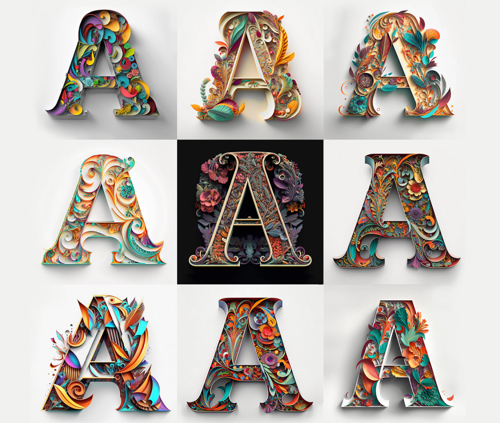
While working on the “Alphabets Alive!” exhibition with the Bodleian to open in July 2023, I came across this project site page by Yevhen Berdnikov, a calligrapher based in Kyiv, Ukraine.
Since “Alphabets Alive!” would primarily concern the creative relationship of artists’ books with alphabets and other writing systems, an AI-generated rendition of the alphabet (humankind’s second-greatest invention, language being the first) was a natural for inclusion. Given the short notice, the artist’s lack of bookmaking experience and — oh yes — the ongoing Russian invasion of Ukraine and attacks on Kyiv, a book was out of the question. Still, with one of the exhibition’s display cases being devoted to artists’ books driven by calligraphy and another to ones driven by color, some way of including these letter images prompted by Yevhen Berdnikov and generated by the text-to-image AI Midjourney from the company of the same name begged to be found.
Paper Cut Alphabet (2023)
Paper Cut Alphabet (2023) Yevhen Berdnikov Poster. H x W. Acquired from Yevhen Berdnikov, 8 March 2023. Images courtesy of Yevhen Berdnikov and reproduced with permission.
When the digital file for the poster first arrived, the treatment of letter Z was a surprise. Even without its current caption, the implication of the treatment was obvious to anyone who knew Berdnikov’s nationality and had seen news images of Russian tanks and military vehicles with Z painted on them. An AI-generated letter Z exists in the Paper Cut Alphabet Project’s files, but, in preparing the poster for a public exhibition, Berdnikov could not bring himself to prompt the AI to generate a symbol that had become intolerable and particularly loathsome on the anniversary of the invasion.
Chance is a well-known muse to many artists. Midjourney, the application, requires an extensive amount of “prompting” — detailed text describing the image it will create. As Berdnikov notes above, the same text can generate different results, which implies an element of randomization at work in the application. But how could a randomizing function yield a meaningful absence of image in response to prompting text? How could machine learning enable Midjourney on its own to compile this version of the alphabet without that particular and human creative intervention?
Even while acknowledging his intervention in Paper Cut Alphabet, Berdnikov insists that he is not the artist, but isn’t his use of Midjourney analogous to Vermeer’s presumed use of a camera obscura to achieve the detail and perspective we see in his paintings? If he did use that technology, does it warrant calling his paintings “device-generated”? Even so, this viewer “feels” the human artists behind View of Houses in Delft (c. 1658) and Paper Cut Alphabet (2023).
Berdnikov’s comments above and his demurrer at being named the “artist” of Paper Cut Alphabet reflect an inquisitive, open and thoughtful mind. Whatever its undetermined implications, the result of his wielding this new artist’s tool is decidedly art.
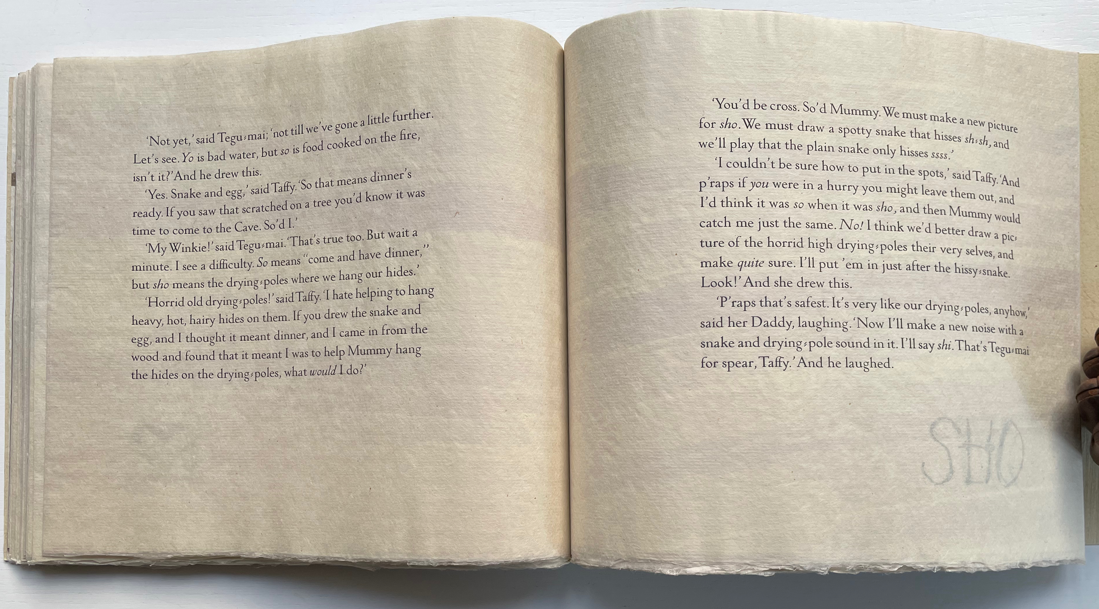
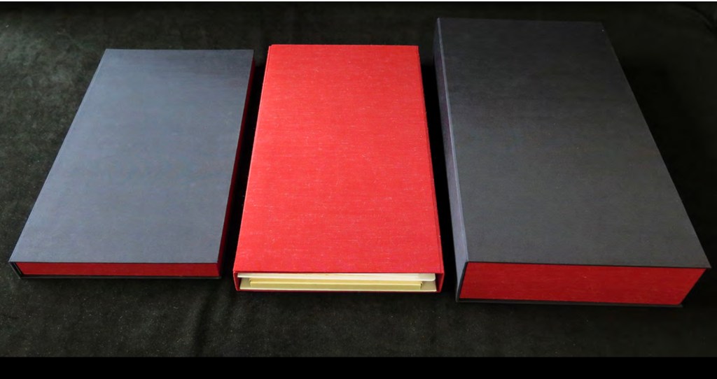
The Neolithic Adventures of Taffi-Mai Metallu-Mai (1997)
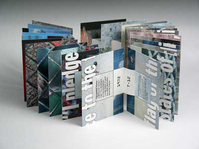
The Neolithic Adventures of Taffi-Mai Metallu-Mai(1997) Gerald Lange and Rudyard Kipling H216 x W260 mm. 55 pages with 17 additional illustrated page inserts. Edition of 150, of which this is #149. Acquired from the artist, 11 Febuary 2023. Photos: Books On Books Collection. Displayed with the artist’s permission.
Gerald Lange’s choice of “How the First Letter Was Written” and “How the Alphabet Was Made” from Rudyard Kipling’s Just So Stories (1902) for this elaborate, delicate but robust edition was fitting. By 1997, he had founded the Bieler Press (1975), co-founded the Alliance for Contemporary Book Arts (1987) and edited its journal AbraCadaBrA for seven years, had been the Master Printer at USC Fine Arts Press and selected as the first recipient of the prestigious Carl Hertzog Award for Excellence in Book Design (1991) and was about to publish the first edition of his Printing Digital Type on the Hand-Operated Flatbed Cylinder Press (now in its fifth edition, 2018). In keeping with his interests leading up to this work, Lange letterpress-printed it from handset Monotype Pastonchi and a digitally altered version of Berthold Post Antiqua. More to the point, as he noted on the Bieler Press site, he chose the stories for “their affinity with subjects related to the lettering arts”. If that affinity is not clear enough from the text, Lange’s treatment underscores it in subtly ingenious ways.
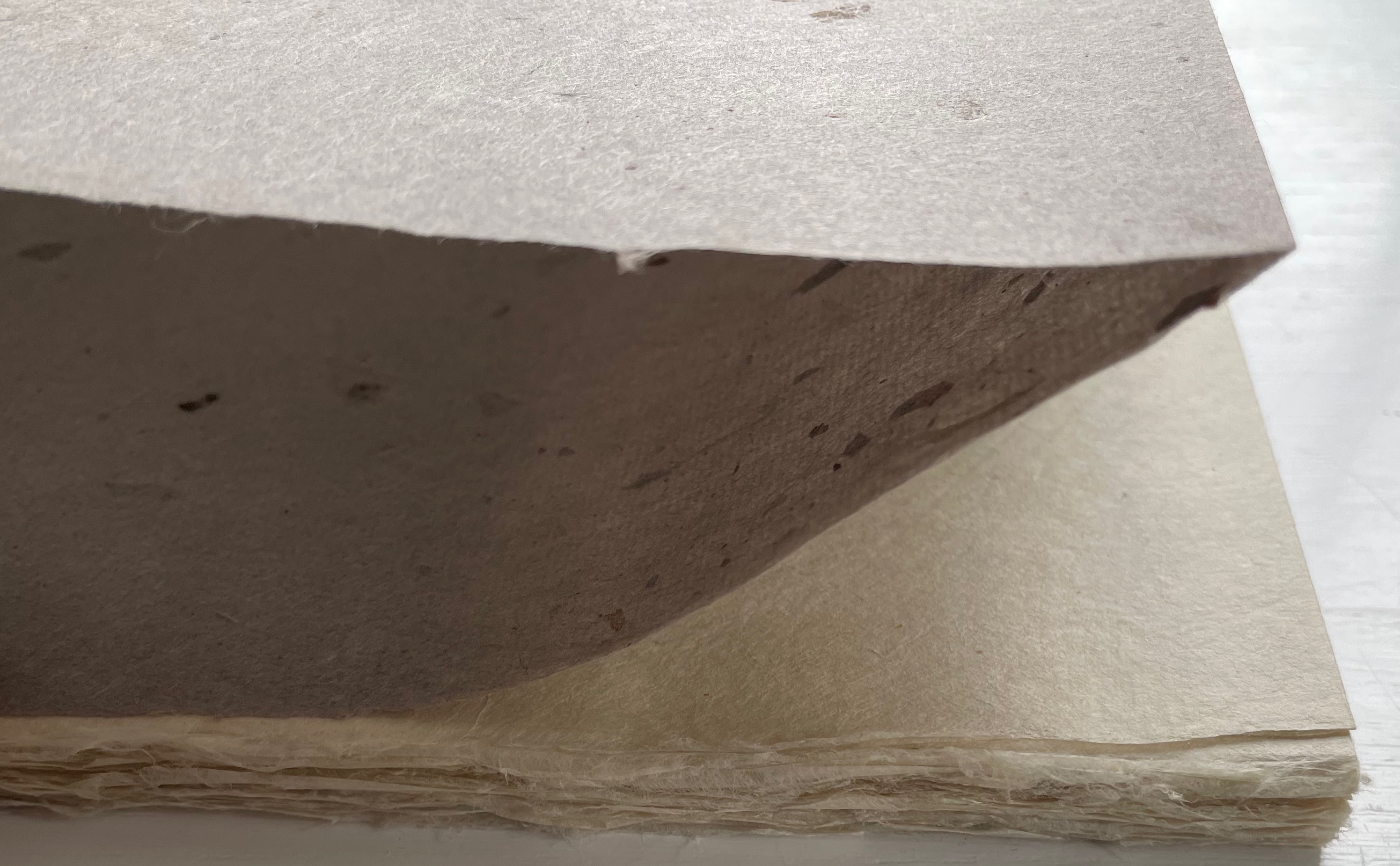
Kipling attributes the drawings throughout to his heroine, Taffi and her father. Where others like Macmillan Children’s Books have rendered them boldly, Lange prints the primitive petroglyph-like images on separate Gampi sheets inserted between the folded Kitakata text leaves of the tortoise shell edge-sewn binding. Those text leaves are individually water colored on their reverse sides (urazaiki manner based on nihonga painting) so that the pictographs beneath reveal themselves through a striated layer. The color and striations are reminiscent of cave paintings. Additional Asian papers (Kasuiri and Chirizome for end sheets, Cogan Grass for covers) increase the work’s tactility — simultaneously soft and rough, flimsy and tough — and contribute a grassy smell redolent of the stories’ physical setting.
The quality and rightness of choices in structure, material and process have placed several of Lange’s works in The British Library, University of California (various), Columbia University, Harvard University, University of Minnesota, New York Public Library, Princeton University, Stanford University, Victoria and Albert Museum, Yale University and others. The initial reason bringing this particular work into the Books On Books collection was its representation of book art inspired by the alphabet. That Robin Price, several of whose works are also in the Books On Books collection, assisted with the design came as a bonus. That this is one of the last bound copies of The Neolithic Adventures of Taffi-Mai Metallu-Mai makes it a treasure.
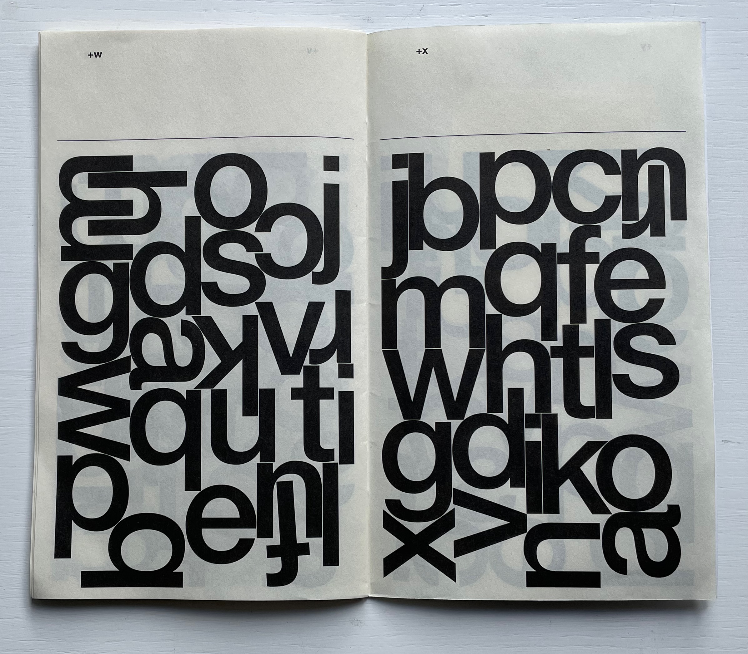
Automatically Arranged Alphabets (2015) Experimental Jetset Staple-stitched “zine” with screenprinted silver cover. H180 x W160 mm. 24 pages. Acquired from the Newbridge Project, 18 September 2022. Photos: Books On Books Collection.
On their website, the studio posted an automated gif of this typographic experiment involving software-generated compositions (archived here).
Beautiful typography meets beautiful calligraphy at the other end of the spectrum of technique in the Books On Books Collection with Francesca Lohmann’s later calligraphic work An Accumulated Alphabet (2017).
Experimental Jetset (a phrase excerpted from the title of a 1994 Sonic Youth album) is an Amsterdam-based design collective founded by Danny van den Dungen, Marieke Stolk and Erwin Brinker in 1997. New York’s MoMA, clearly a fan of the studio’s work, holds a significant collection of their work. From the studio’s description of it here, their participation in MoMA’s 2012 exhibition Ecstatic Alphabets/Heaps of Language clearly influenced Automatically Arranged Alphabets, whose series of automated sketches were made in 2014-15.
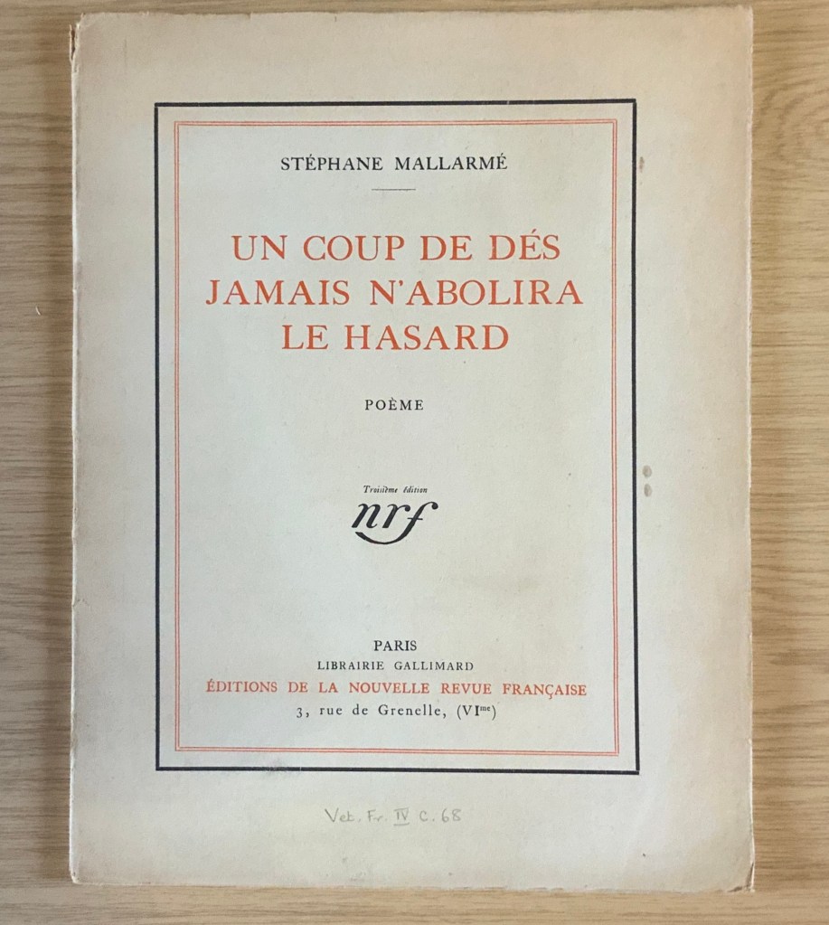
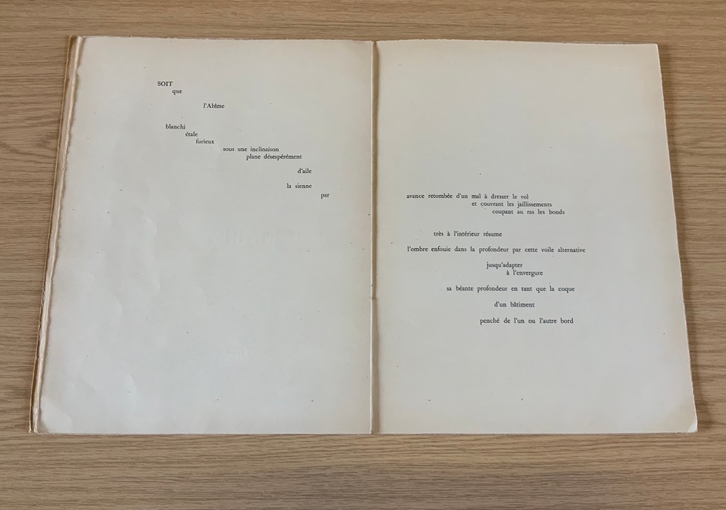
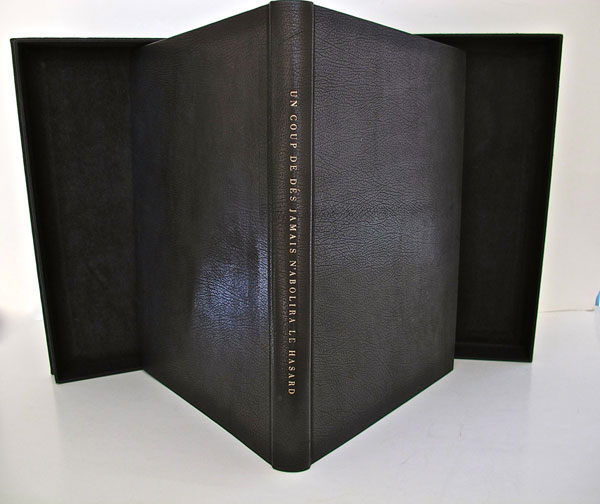
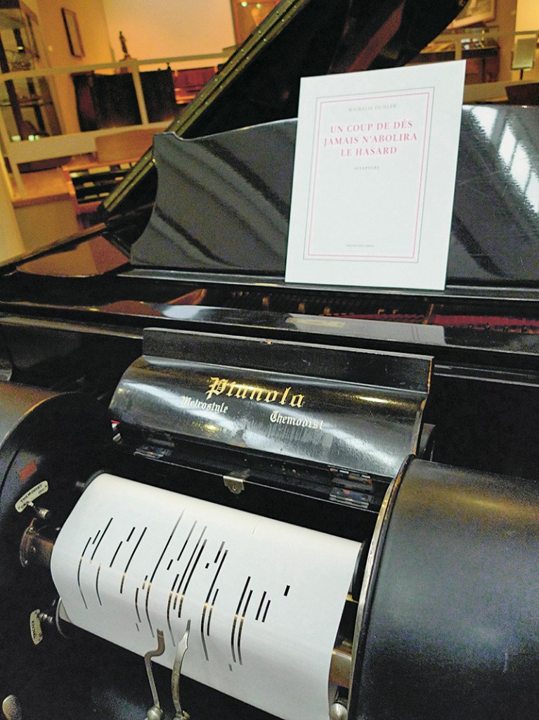
It was 1913. Stravinsky’s ballet “The Rite of Spring” debuted. The Cubists, Constructivists, Suprematists, Futurists all bound onto the art scene, many of them showcased in the Armory Show in New York that year. The Nouvelle revue française (NRF) attempted the first book form of Stéphane Mallarmé’s Un Coup de Dés Jamais N’Abolira le Hasard, which revived that 1897 typographic disruption of the page and prepared the ground for dozens of works of book art since. And Blaise Cendrars and Sonia Delaunay-Terk announced and published what they called le premier livre simultané. It was La Prose du Transsibérien et de la petite Jehanne de France.
From the Bodleian Library collection Photos: Books On Books
From the National Art Library, Victoria & Albert Photo: Books On Books
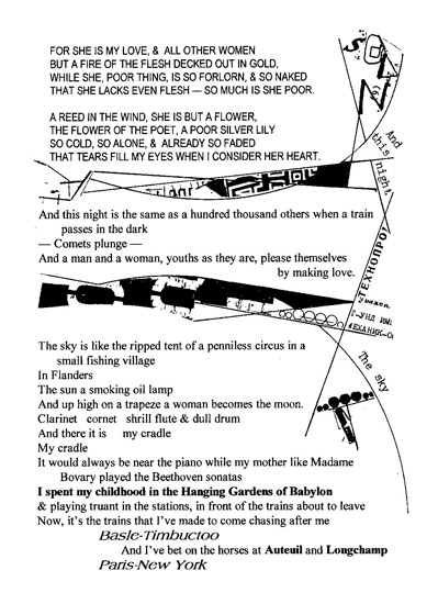
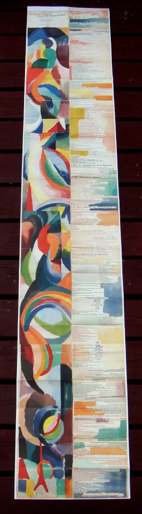
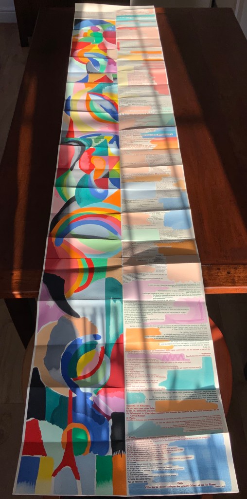
Like Mallarmé, Cendrars disrupts the page with multiple typefaces (thirty distinct ones in his case) and scattered placement of lines and stanzas. But La Prose presents an even more physical and structural disruption of the page and book than Un Coup de Dés. Unlike the latter, La Prose unfolds — twice — in an accordion format to over two metres in length or rather height since the text descends on the right and ends alongside the interlinked images of the Eiffel Tower and a Ferris wheel at the foot of the accordion. Cendrars and Delaunay had aimed to produce 150 copies of La Prose because, placed end to end, that would have equalled the Eiffel Tower’s height.
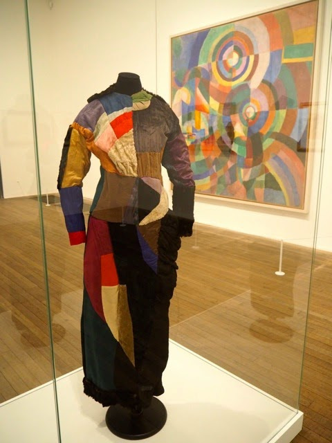
More than this monumental, sculptural, typographic and physical disruption of page and book, La Prose presents a temporal disruption. By le premier livre simultané, Cendrars meant a simultaneity of the verbal and visual — the way that text and image appear all at once — en un éclair. Early Bohemian that he was, Cendrars was co-opting a fair bit of artistic and literary theorising by the Cubists, Futurists and others. Most important and of the moment was his co-opting of Robert and Sonia Delaunay’s colour theory of simultanéisme. The “couleurs simultanées de Mme Delaunay-Terk” had also appeared in her 1913 robe simultanée and paintings. Building on a French scientist’s exposition on how perception of colours changes depending on the colours around them, the Delaunays claimed that rhythmic, musical and spatial synaesthetic elements were also at play. Sonia Delaunay asserted that the artwork produced for La Prose was not in response to reading the poem but hearing it from Cendrars. (Listen to it for yourself here.)
In presenting the adolescent Cendrars travelling physically eastward on the Transsibérien, travelling mentally to Flanders-Basle-Timbuctoo-Auteuil-Longchamps-Paris-New York while still registering the landscape outside, seeing the maimed and wounded returning from the front of the Russo-Japanese war, conversing with a prostitute named after Joan of Arc, doubting himself as a poet, and so on until a sudden transposition back to Paris, the process poem juxtaposes the sacred and profane, past/present/future, stationary and dynamic, national and international in outlook and locale. In short, simultaneously. In a format that is bound and unbound, the poem mirrors the swirling, interacting shapes and colours beside and in which it moves — and vice versa.
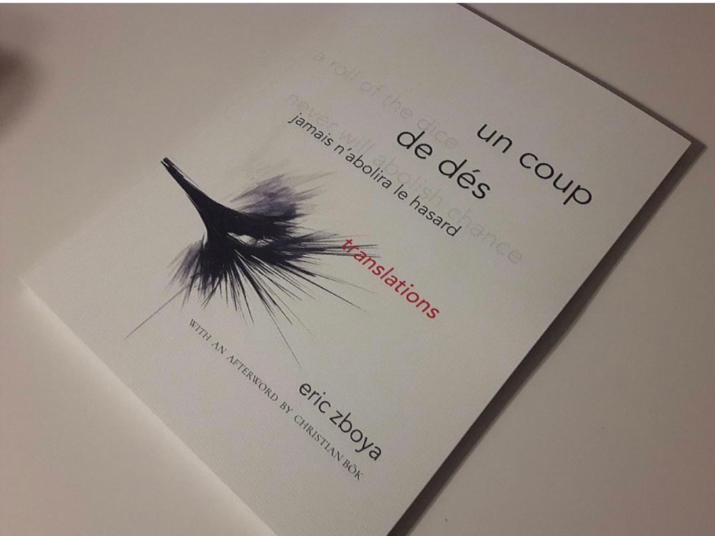
However more disruptive of the page and book La Prose may have been, it did not inspire the profusion of direct re-interpretations (or appropriations) that Un Coup de Dés prompted from artists such as Jérémie Bennequin, Ellsworth Kelly, Man Ray, Didier Mutel, Michel Pichler, Eric Zboya and dozens of others.
Not until 2001 did a re-versioning of La Prose appear. Tony Baker and Alan Halsey published an English translation and codex re-formatting. Its black on white imagery is reminiscent of the Russian Futurists, the type is monochromatic, and the typefaces, fonts and weights vary but not as much as in La Prose.
Baker and Halsey note in their colophon:
So far as we’re aware no translation of the poem into English has ever been attempted to give a sense of Cendrars and Delaunay’s original conception, not the least reason for which may have been the difficulty until recently of seeing the first edition, even in reproduction. — Prose of the Trans-Siberian and of the Little Jeanne de France (Sheffield: West House Books, 2001)
A well-founded lament — at least for the book art community. Not until 2000 had there been a reduced-scale reproduction of La Prose. It appeared in Granary Books’ A Book of the Book by Jerome Rothenberg and Steven Clay across a four-page foldout in the embrace of Ron Padgett’s English translation. Only in 2008 was there a full-scale, full-colour offset facsimile, produced by Yale University Press with an appended translation. It is now out of print.
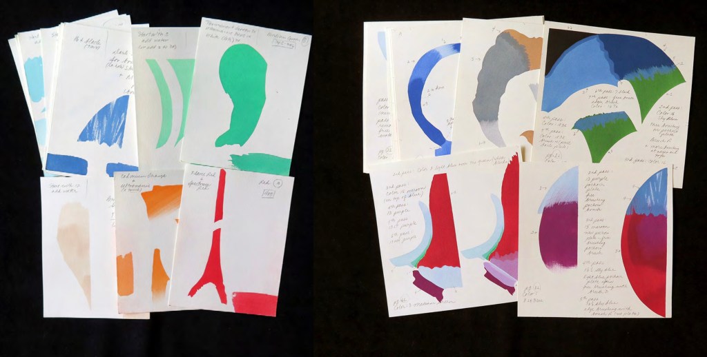
With her work La Prose du Transsibérien Re-creation (2019), Kitty Maryatt has changed all that. With this deuxième livre simultané, she has more than caught the echo of Cendrars/Delaunay’s original and its arrival. As scholar, artist and veritable impresaria, she has reinvigorated the book art/arts community with the legacy of La Prose.
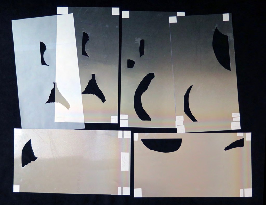
Her blogspot documents the research and production with rich details about sourcing the type, learning about stencil-cutting from Atelier Coloris (one of the few remaining businesses devoted to pochoir), determining the recipes for the ink colours, testing papers (Zerkall Crème, Biblio, and Rives HW), creating a census of the existing 1913/14 originals and their locations — all that and more, including the use of bacon fat and a wine bottle filled with lead shot. She also organized a documentary by Rosylyn Rhee: “The Pochoir Re-creation of La Prose du Transsibérien”. It brings the importance of the original and this re-creation to life in the expressions and voices of prominent collectors, librarians and scholars, artists, rare book dealers and the project’s funders.
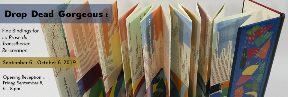
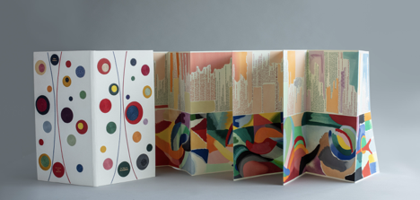
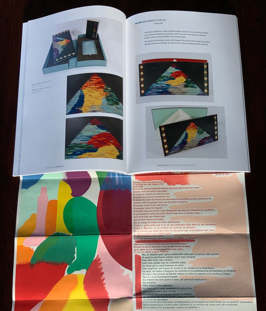
In addition, Maryatt has been either a contributor to, or the motivating force behind, several symposia and exhibitions such as “Paris 1913: Reinventing the Artist’s Book” (at the Legion of Honor Museum in San Francisco, 2018) and “Drop Dead Gorgeous”. The latter is a travelling exhibition resulting from invitations to twenty-four book artists and designer bookbinders to design and create bound copies of La Prose du Transsibérien Re-creation. For the San Francisco venue, Maryatt prepared a workshop on traditional French pochoir and provided text for the exhibition catalogue (available from the online store of the San Francisco Center for Books).
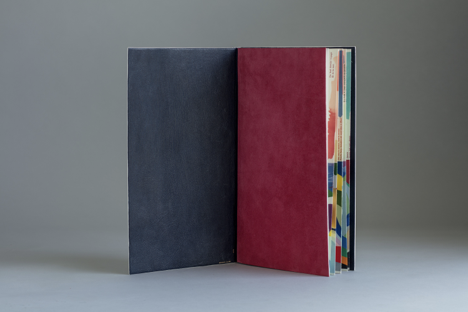
Monique Lallier’s fine binding of La Prose du Transsibérien Re-creation Photos: Courtesy of Monique Lallier
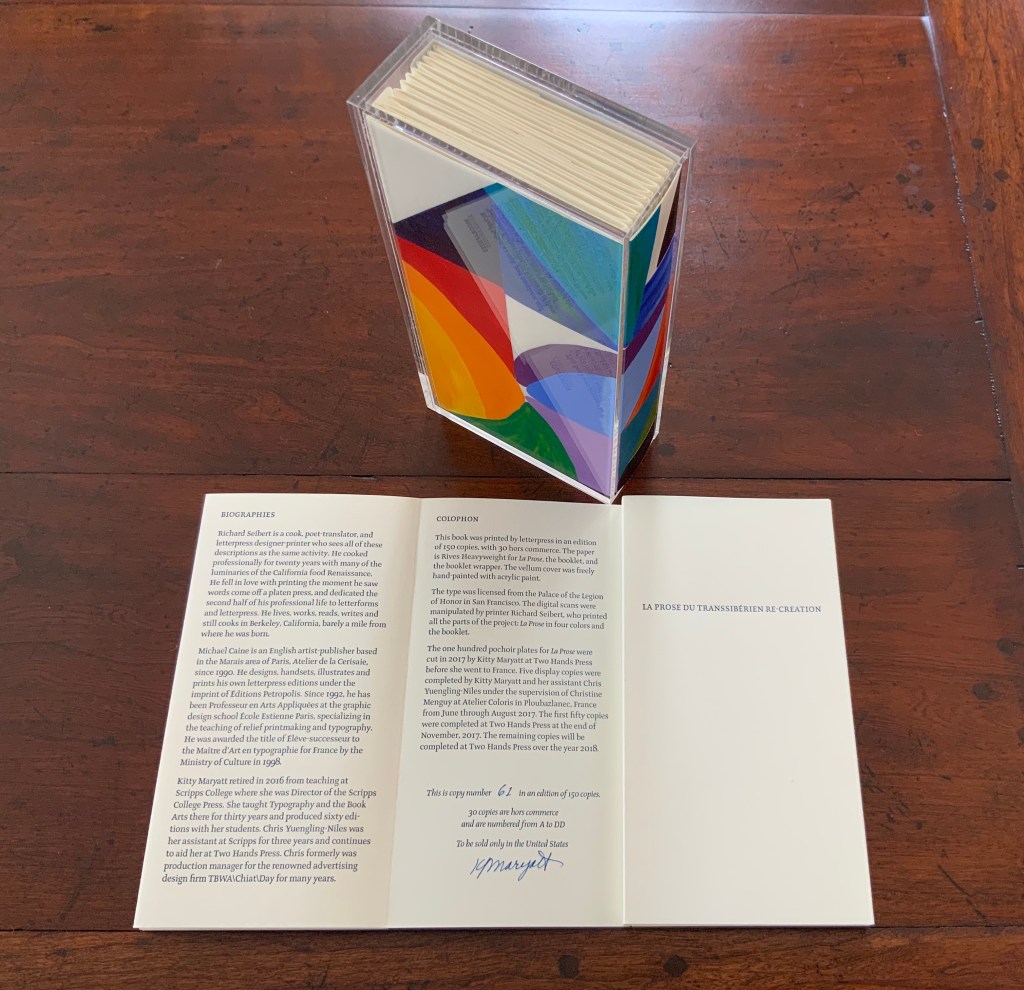
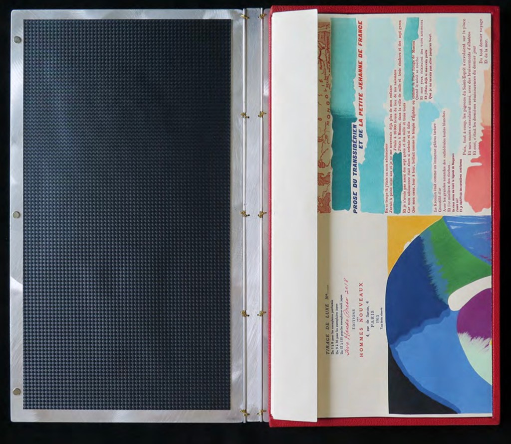
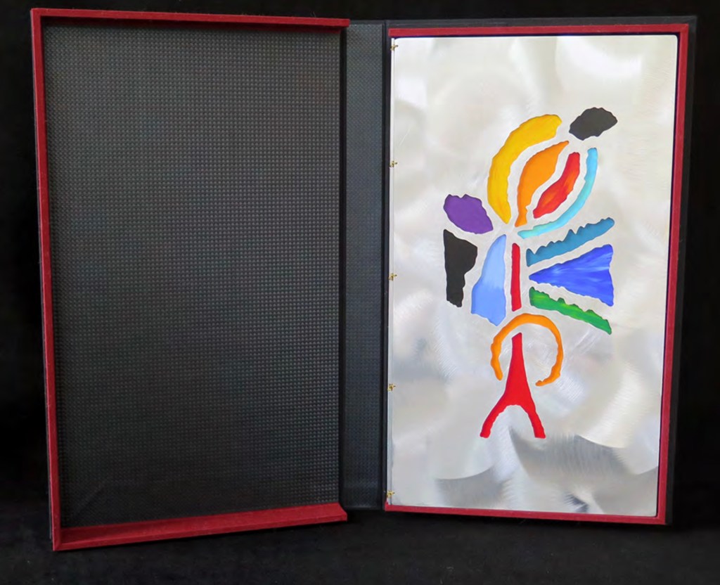
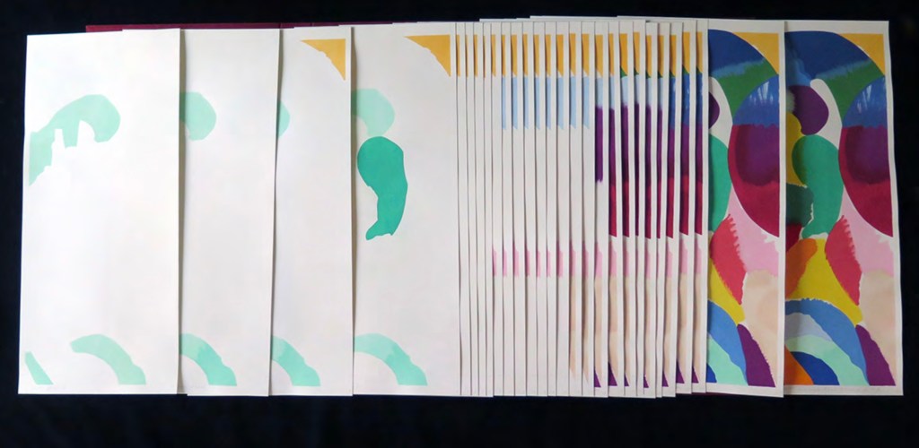
The pinnacle of Maryatt’s efforts, of course, is the standard and deluxe editions of La Prose. Both editions consist of 4 pages, glued together to create the tall single page. For the standard edition, the page is folded into 21 sections and loosely placed in a painted vellum cover with a booklet describing the project and production. An acrylic slipcase houses the covered bundle.
The standard edition Slipcase: H195 x W108 x D45 mm. Wrapper: H182 x W97 x D35 mm. Leporello: H81 x W95 mm (closed). H1954 x W160 mm (open). Booklet: H81 x W94 mm (closed), W1055 mm (open). Photo: Books On Books
Photo: Books On Books
Photos: Books On Books
For the deluxe edition, the single page is left double-wide, accordion-folded double-tall between aluminum covers and housed in a clamshell box. A separate case holds the painted vellum cover, colour cards, Sonia’s visual vocabulary, 27 progressives for page one, 5 pochoir plates with tracing paper and registration system, the booklet with introduction and colophon, and the list of 30 typefaces Cendrars used. A large clamshell box houses this separate case and the boxed book. The colour cards include the recipe for mixing the gouache, and Sonia’s visual vocabulary shows the numbered steps of operations. The progressives for page one show the steps for doing the pochoir stencils and handwork.
The deluxe edition Photos: Courtesy of Kitty Maryatt
Any institution with a focus on book art or the graphic arts should seek out the standard edition of La Prose du Transsibérien Re-creation. Any institution with a focus on teaching and practice in those domains should seek out the deluxe edition. As indefatigable as Cendrars and as productive as Delaunay, Kitty Maryatt has provided the basis of master classes for generations. Now it is up to the book art community to respond as it has to Un Coup de Dés.
A shorter version of this essay appears in Parenthesis 39, Fall Issue, 2020.
Further Reading
Ashton, Doré. “On Blaise Cendrars. . . But I Digress.” Raritan 31, no. 2 (2011): 1-42,164. An entertaining extended anecdote sketching Cendrars and his milieu.
Gage, John. Colour and Meaning : Art, Science and Symbolism(Berkeley, CA: University of California Press, 1999). Despite her works’ better quality and representation of simultanéisme, Gage focuses on Robert and mentions Sonia only in passing or footnotes. (Telling that the Tate chose Sonia not Robert for a retrospective in 2015.) Nevertheless, there are passages that place her work in context.
P.198: Chevreul’s “privileging of the harmony of complementaries was essentially in the context of ‘painting in flat tints’, a method developed largely in the decorative arts, but which was increasingly integrated into many branches of French painting in the second half of the nineteenth century …”.
P.254 “When, probably early in 1912, Delaunay wrote to Kandinsky outlining his theories, he had shifted to a rather different approach, claiming: ‘the laws I discovered … are based on researches into the transparency of colour, that can be compared with musical tones. This has obliged me to discover the movement of colours.’ …
P.256 [Delaunay’s] Essay on Light, which was composed in the summer of 1912, attributed the movement of colours less to transparency than to the qualities of hue: ‘Movement is given by the relationship of unequal measures, of contrasts of colours among themselves which constitute Reality. The reality has depth (we see as far as the stars), and thus becomes rhythmic Simultaneity.’”
P.257 “For Chevreul in 1839 such painting [in flat tints] had only a decorative, accessory function, but the Delaunays did not feel the distinction, and Sonia had recently been experimenting with flat colours in appliqué textiles and in bookbindings decorated with collage.”
Maryatt, Kitty. “A Bookmaker’s Analysis of Blaise Cendrar’s and Sonia Delaunay’s La Prose du Transsibérien et de la Petite Jehanne de France”, The Quarterly Newsletter(Fall 2016), The Book Club of California. Online version available here.
Maryatt, Kitty. Interview with Steve Miller, Book Arts Podcasts, School of Library Information and Sciences, University of Alabama, 13 January 2006.
Rothenberg, Jerome; Clay, Steven. A Book of the Book: Some Works & Projections about the Book & Writing (New York City: Granary Books, 2000). Contains an excerpt from Perloff’s book above, Ron Padgett’s translation of La Prose and a four-page foldout showing a full-color photo-reduction of the 1913 original.
Shingler, Katherine. “Visual-verbal encounters in Cendrars and Delaunay‘s La Prose du Transsibérien“, e-France: an on-line Journal of French Studies, Vol. 3, 2012, pp. 1-28. Accessed 15 November 2019. Along with Perloff’s book, this is the best explication of the work and its lineage with Mallarmé’s Un Coup de Dés.
Woodall, Stephen. “La Prose du Transsibérien et de la Petite Jehanne de France”, Insights from the de Young and Legion of Honor (San Francisco: Fine Arts Museums of San Francisco, 2020. A spectacular website presenting the original work in its context and its influences on subsequent book art. The work can be viewed panel by panel, and its overall structure is presented in an animation of its unfolding and refolding.
Xu Bing: Thought and Method Ullens Center for Contemporary Art (UCCA) (尤伦斯当代艺术中心) 21 July through 18 October 2018, Beijing
For most of us, the only glimpse of the 2018 Beijing exhibition Xu Bing: Thought and Method will have come from online articles, screen shots and a short film or two. By noting commentaries contemporaneous with the exhibition and linking them to older related articles and books, Books On Books aims to enhance appreciation of the exhibition and Xu’s work as well as findability of the latter. Throughout, where known, links to institutions holding Xu’s works are provided.
May 2018 saw the first announcement of the Xu Bing retrospective, his “most comprehensive institutional exhibition” to date, according to Sue Wang writing for CAFA Art Info.
July 2018, just before the exhibition’s opening, Helena Poole’s article arrived to guide the reader on what to expect from the exhibition. One of its useful observations is the influence of the printmaking tradition of Lu Xun on Xu’s early prints. Although not a printmaker himself, Lu stimulated the tradition with his activist writing and encouragement of woodcut printmaking in the journals of the Morning Flower Society (朝花社) founded in 1929. In Art in Print (May-June 2016), the reader can find a useful background on Lu Xun and a selection of images from the New Woodcut Movement that will deepen Poole’s guidance.
Also helpful to a better appreciation of the prints are two online displays of images (more than offered by Wang and Poole): ArtThat eLite and RADII China’s “Photo of the Day”. Both displays enable us to see that, while Xu’s early prints — for example, The End of a Village (1982) — reflect the New Woodcut Movement style, his later work is at once more subtle and abstract than that of the early revolutionary periods and yet still evocative of the figurative, the diurnal and strife. The subtlety lies in the shift from the depiction of workers’ strife to the strife between sense and nonsense or language and concept, between cultures and their languages, and between the individual and polity.
Just after the exhibition’s opening, two excellent overviews of Xu’s career and art appeared in July. Sue Wang followed up her May announcement with a translation of an essay by Lin Jiabin expanding on the exhibition’s title Xu Bing: Thought and Method. Rather than focus on any one work, Lin Jiabin digs into the artist’s thought and method. Among Lin’s several useful insights are these:
Xu Bing adheres to the essence of simplicity and wisdom of eastern culture, and also faces the world in a broader sense. His works are forward-looking and vigilant; at the same time, his works under the guise of dislocation, multi-level social issues and cultural thinking sway and excite each other. [Emphasis added]
… the new work is an excavation and extension of something that is valuable in the past and that was not fully realized. It actually has a “cue” effect. Xu Bing said, “As long as you are sincere, no matter what form these works are, big or small, no matter how early or late, actually the final relationship between them is like constructing a closed system.” [Emphasis added]
Through the transformation of old artistic languages and the creation of new languages, the artist provides the audience with a variety of channels for entry and exploration. [Emphasis added]
The second overview — Grace Ignacia See’s “UCCA Presents …” in The Artling — takes a more descriptive and linearly developmental view following the exhibition’s division into three sections, “a direct reflection of the turning points in [Xu’s] artistic context and processes”.
The first section:
Book from the Sky (1987-1991), Ghosts Pounding on the Wall (1990-1991), and Background Story (2004-present) allow viewers to observe the means in which Xu’s meditations on signification, textuality, and linguistic aporia have been evoked;
The second section:
A, B, C… (1991), Art for the People (1999) and Square Word Calligraphy (1994-present) project his explorations of hybridity, difference, and translingual practice through his works;
The third section:
his more recent works Tobacco Project (2000-present), Phoenix (2008-2013), Book from the Ground (2003-present) and his first feature length film Dragonfly Eyes (2017), exist as commentaries on economic and geopolitical changes that have contributed towards China’s societal evolution and the world’s in the last hundred years.
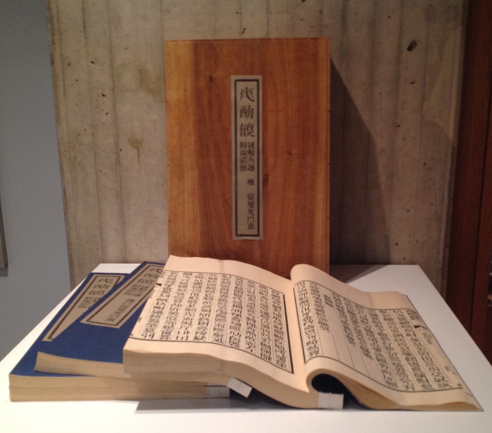
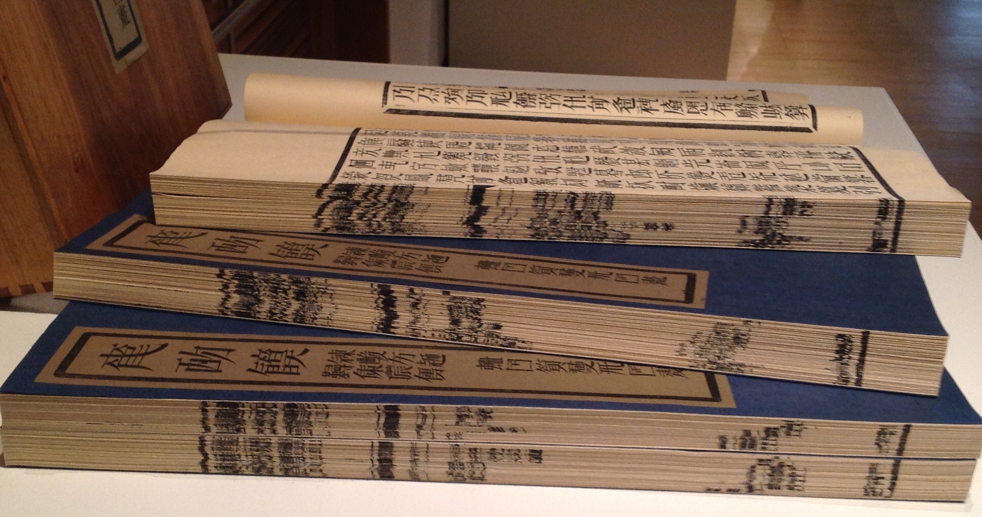
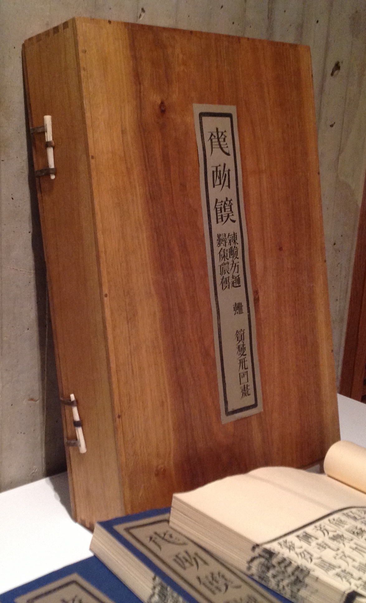
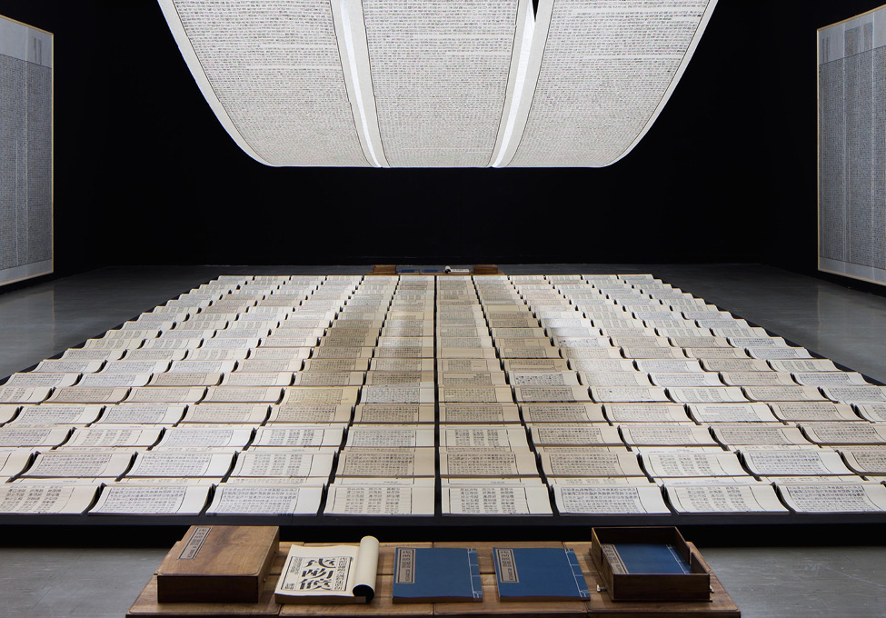
Tianshu or Book from the Sky, consisting of four volumes enclosed in a fastened wooden box, is a challenge to find, almost as much a challenge as being in the right place to see its installation version. The greatest challenge for a Westerner, however viewing the work, is grasping a Chinese viewer’s perception of it. How to imagine markings that, at first, look like the characters of the roman alphabet and even seem to form combinations that look like words and sentences but, on closer inspection, are not any letter, word or sentence known or knowable to the Western eye. Xu carved 4000 wooden stamps for characters that look like Chinese characters but are not and proceeded to have the four volumes printed under his instruction — as well as scrolls and wall hangings for installations.
Tianshu/Book from the Sky (1991) Xu Bing From the Allan Chasanoff Collection, Yale University Art GalleryFore edges of the four volumesClose-up of the container and its catch mechanism, which is repeated on the other edge.
Book from the Sky (1991) Xu Bing View of installation
For a lengthier description and appreciation of Tianshu, John Cayley’s commentary and lecture are only surpassed by his book, where he writes:
[Tianshu is] not an object. It’s not a painting or a sculpture or even a book as such. It’s a configuration of objects and materials that represent a concept and provide some evidence or record of the development of the concept and the making of its constituent elements. You can’t possess it. You either have to find some elaborate way to acquire a personal record of the work or you have to take part in a process that allows the installation to remove itself into a museum or major gallery where this representation, beyond an individual’s acquisitive capacities, can be preserved for collective curated culture. In a sense, I’m helping you to ‘own’ the Tianshu by writing this.
Given the challenge of tracking down locations to visit where Tianshu has been acquired, Cayley’s “help” is welcome. The Beijing exhibition’s installation can be seen at the 4’04” mark in the UCCA video.
Although nicely illustrated in See’s article, Ghosts Pounding the Wall (1990) needs a bit more commentary for a fuller appreciation. According to Julia F. Andrews and Kuiyi Shen in The Art of Modern China (2012), the work was Xu’s response to the criticism that Book from the Sky demonstrated he had lost his way “like ghosts pounding the wall” (p. 258). It’s also worth noting that these two works have in common the process of turning one form of work into another.
Just as Book from the Sky consists of the four volumes in a wooden box yet is also an installation with scrolls and wall panels repeated in multiple venues, Ghosts Pounding the Wall began as the performance by Xu and his students wearing bright yellow jackets, stenciled with characters from Book from the Sky, and rubbing ink on rice paper fastened piece by piece across a one-kilometer stretch of the Great Wall and also is the installation. The latter is nicely shown in See’s article and can also be seen in the UCCA video at the 5’20” mark. Xu’s performance was one of “ghosts pounding the wall”; the installation, one of the ghostly impressions from that pounding of the wall. This characteristic or method in Xu’s art is one to watch for in almost all of his work.
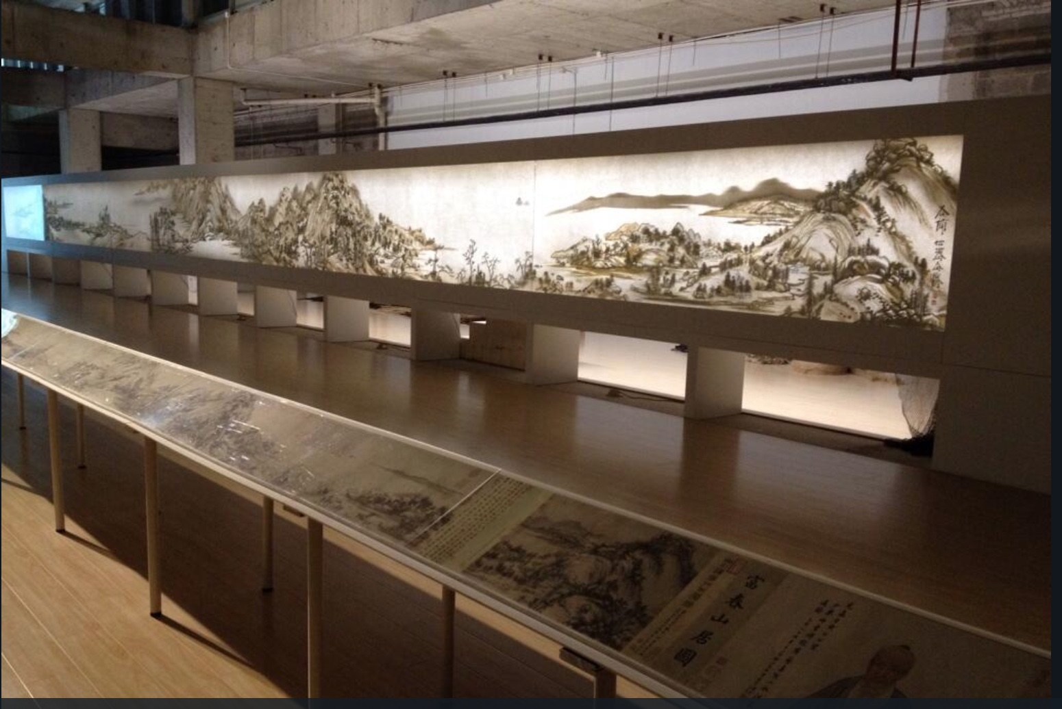
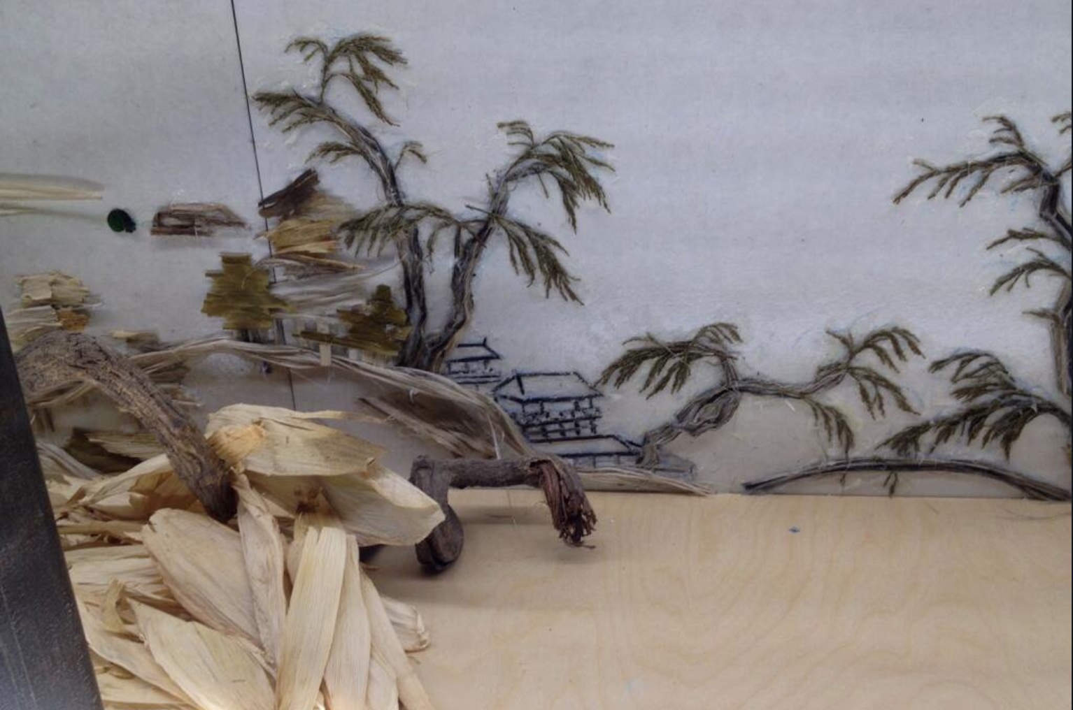
Background Story, the third work in this section, is an installation and as such only fully accessible when in situ like Ghosts and later works. It first appeared in 2004. What appears to be a Chinese landscape printed on rice paper secured in a long row of joined-up lightboxes extending across the space of the host gallery is actually formed of shadows cast by objects on the other side of the lightboxes, which are open to view. Over time, the installation has developed as a series, with each version being based on a different ancient Chinese landscape painting. Usually the painting belongs to the institution where the work is installed. Four of the versions can be found at these links to videos and a slide show: 2011, 2012, 2014, 2015. The 2018 version can be found in the UCCA video at the 6’16“ mark.
In the meantime, another earlier essay from Sue Wang provides useful insights on experiencing the version based on the painting “Dwelling in Fuchun Mountains” by the Yuan dynasty painter Huang Gongwang. This version appeared in 2014 in Beijing as jointly organized by the Inside-Out Art Museum, Jing & Kai, the Rose Goldsen Archive of New Media at Cornell University, Life Bookstore and SDX Joint Publishing Company.
Front and back of Background Story: Dwelling in Fuchun Mountains (2014) Xu Bing Photo credit: Joy Lidu Yi
Wang also includes an interview with Xu about the process and intent of Background. The work marks a departure from Xu’s traditional materials: ink, paper, print, characters and language, but as Xu points out to Wang:
… whether using ink or not isn’t the issue at the core, while the most important thing is what the artist wants to express. It is necessary to think of what material does well in the presentation of the expected effect and the words of the artist. It may be a new language that no one speaks, it is a new language of the time, so it is in need of finding a new way of speaking ….
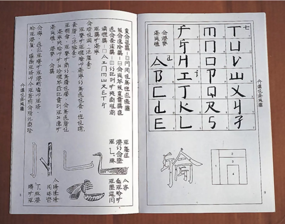
The second section of the 2018 Beijing exhibition brought into focus Xu’s deepening thought about language and culture when confronted with English and the art scene in the US and elsewhere in the West. See’s article highlights A, B, C… (1991) and Square Word Calligraphy (1994-present) as examples of Xu’s “explorations of hybridity, difference, and translingual practice through his works”. One of those works is An Introduction to Square Word Calligraphy (2000), a woodblock hand-printed accordion book with ink rubbings and wood cover. It is a textbook written by Xu Bing for users to learn the square word calligraphy writing system invented by the artist himself. The “installation version” consists of a classroom set up for learning and practicing the system.
An Introduction to Square Word Calligraphy (2000) Xu Bing
Columbia University has produced a video of one such installation, which demonstrates the fun of interacting with art. For most of us, though, an easier means of interacting with square word calligraphy and owning a bit of Xu’s art is to purchase the children’s songbook shown below.
Another book by Xu, related to this third section of the Beijing exhibition and available for purchase, is Book from the Ground(2014), telling a day in the life of Mr. Black, an office worker — told completely in the symbols, icons, and logos of modern life. Xu’s playful but serious, to-and-fro treatment of language, meaning and cultures is another recurrent characteristic of his work.
Book from the Ground (2000) Xu Bing From the Hanes Library, University of North Carolina – Chapel Hill Notice the difference in size. On the left is the “Chinese” edition; on the right, the “English”. Why the quotation marks? There are no differences in the icons in which the narrative is written! Of course, the book trade being what it is, the traditional trim sizes are one cultural difference Xu could not erase.
Full appreciation of Xu’s signature interest in language — text and art, culture and meaning — would have sent the attendee in Beijing back from section two or three to section one to look at Book from the Sky again.
Serendipitously, another Xu exhibition was running nearby at INK Studio in Beijing at the same time: Xu Bing: Language and Nature. That show’s curator, Dr. Britta Erickson, is also the author of The Art of Xu Bing: Words without Meaning, Meaning without Words (2001). Her book covers many of the works in sections one and two and delivers insightful, plain-language readings of them that add considerably to the appreciation of Xu’s art. Again, as with the UCCA retrospective, Radii China delivers some outstanding photos from the INK Studio exhibition, and its briefest description makes the reader hunger for more as well as an actual visit:
… a selection from his The Living Word series in which the Pinyin Chinese word for bird, niao, transforms over a series of serial sculptures into the simplified character 鸟, then the traditional character 鳥, then, finally, into a small flock of birds soaring toward the gallery’s skylight.
A visitor could have hardly hoped to take in the UCCA and INK exhibitions in less than several days.
Xu’s conceptualism, genius for planning and meaningful attention to the detail of material recurs again and again in his work. He has a deft wittiness and patient, opportunistic eye, ear and even nose for enriching his artwork after the fact. Section three’s strong odor of tobacco must have underscored that to visitors.
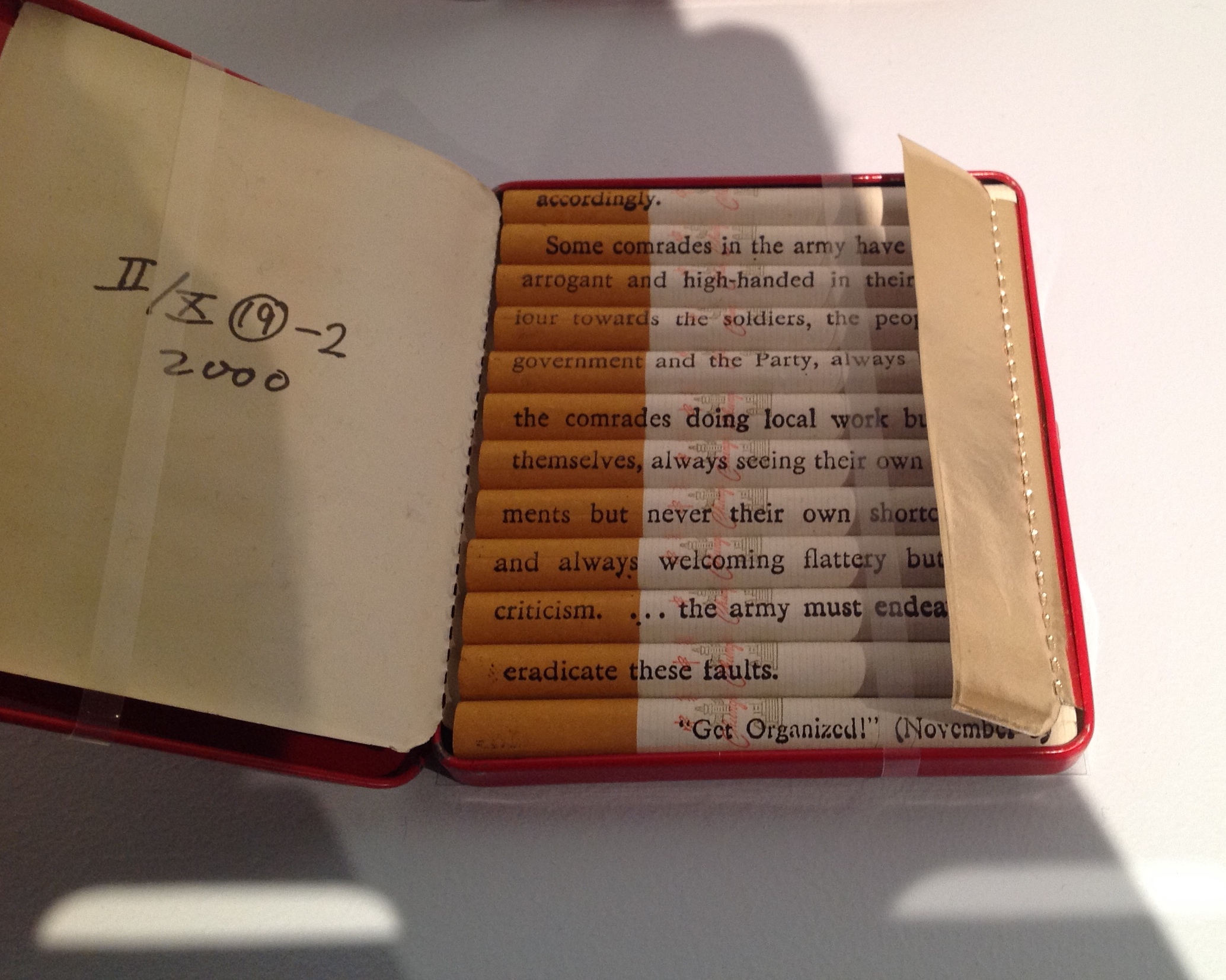
Xu’s Tobacco Project trilogy, which began in 1999, incorporates Red Book (with Chinese and English inscriptions on each cigarette from Mao’s little Red Book), the floor sculpture Honor and Splendor (composed of 660,000 Fu Gui cigarettes) and several other related works. For an earlier in-depth piece on the Tobacco Project (and extensive illustrations), the reader can go to John Ravenal’s description in Blackbird (Fall 2011, Vol 10, No. 2). As the curator who organized the Tobacco Project exhibition in 2011, Ravenal’s perspective is unique. Like John Cayley, Ravenal also produced a book — Tobacco Project, Duke/ Shanghai/ Virginia, 1999–2011 (2011).
Introducing another of Xu’s major works — Phoenix (2008-13), not in the exhibition — See argues, contrary to Lin Jiabin, that Xu has been on a path to a shift in focus:
Phoenix (2008-13) and Dragonfly Eyes (2017) further highlight Xu’s … shift towards the economic and geo-political, where the first comments on China’s breakneck development and the latter dramatizes the role of individuals within the framework of an ever-expanding surveillance network.
See’s comments on these works closing section three of the Beijing exhibition miss the presence of a tension in them — or rather tensions present in all of Xu’s works from the very beginning. In a way, those ongoing tensions support the analysis of Lin Jiabin and how Xu’s works “sway and excite each other”.
August 2018. Enid Tsui surfaced the primary tension a few weeks later — worth the wait for the artful weaving of her own observations with Xu’s comments — in a “long read” in the South China Morning Post Magazine. That tension is between, on the one hand, the exquisite and, on the other, the cynical, the pessimistic, the ugly and anger. For Tsui, the anger is most evident in “Xu’s latest, and most bizarre, work … Dragonfly Eyes (2017)”:
His team edited 10,000 hours of surveillance footage into an 80-minute feature film loosely structured around the story of a man running after the woman he loves. There are no actors or cameramen. … Xu used only clips that were never meant to be seen in public. Film critics were baffled. Xu says the work is, once again, about how we are shaped by culture. The scenes in Dragonfly Eyes hardly fill you with joy: beauty parlours selling cosmetic surgery packages; aggressive customers in a shop; drab, anonymous streets. Scenes of terrible natural catastrophes or accidents add to the general atmosphere of doom. There is an uncustomary fury here about the state of the world, beyond the film’s obvious reference to how we are all being surveilled by invisible, all-seeing eyes.
“The exquisite” shows in the attention to detail and exactitude of execution. There are other tensions at play within and across Xu’s works: cynicism vs idealism, pessimism vs optimism, tranquillity vs anger, sense vs nonsense, meaning vs meaninglessness, beauty vs ugliness. But if The Beijinger‘s regular arts columnist, G.J. Cabrera, is right in his August article extolling the accessibility of Xu’s art,
… the exhibition is rife with examples of how Xu’s witty thought processes can find technically challenging ways to address questions about linguistic processes or historical circumstance, which resonate not only in his homeland but also worldwide. The content is surprisingly accessible and not at all obscured by the dense narrative which could easily hijack the content when dealing with such deep themes.
G.J. Cabrera,”State of the Arts“, The Beijinger, 29 August 2018. Accessed 2 September 2018
then shouldn’t those tensions be able to shape our appreciation of the works without explanations from articles and essays like this one and those above? If we are attentive enough, yes. Xu’s works are clever and beautiful enough, sometimes appalling and shocking enough, almost always playful and serious enough to make the viewer pause and attend — to hear Xu’s works say, “Language, the things of our cultures and their differences are not always what they seem”.
The New Concrete: Visual Poetry in the 21st Century is a testament on where this art made of letters has been and where it goes. We have put a sharp focus on the word ‘new’ in our title, exploring how image manipulation, cut and paste, digital text and the internet have all influenced work in this area. One of the most exciting strands can be seen in the work of James Hoff and Eric Zboya who use algorithms and viruses to form work in which text is in the back – rather than foreground; the ghost of the machine of visual poetics. This isn’t a book that could have been made through simply surfing the web. We asked all 106 contributors to suggest names of poets or artists that we should consider for the book. Visual poets spiralled into more visual poets. We have looked at well over 500 possible candidates. Enjoy the knowledge with us.
Among the Books On Books favorites included in this volume are Sam Winston, Julie Johnstone, Ian Hamilton Finlay and Vito Acconci. For a related MoMA exhibition of artists engaged in the material use of letters, words and language (Ecstatic Alphabets, Heaps of Language), click here.
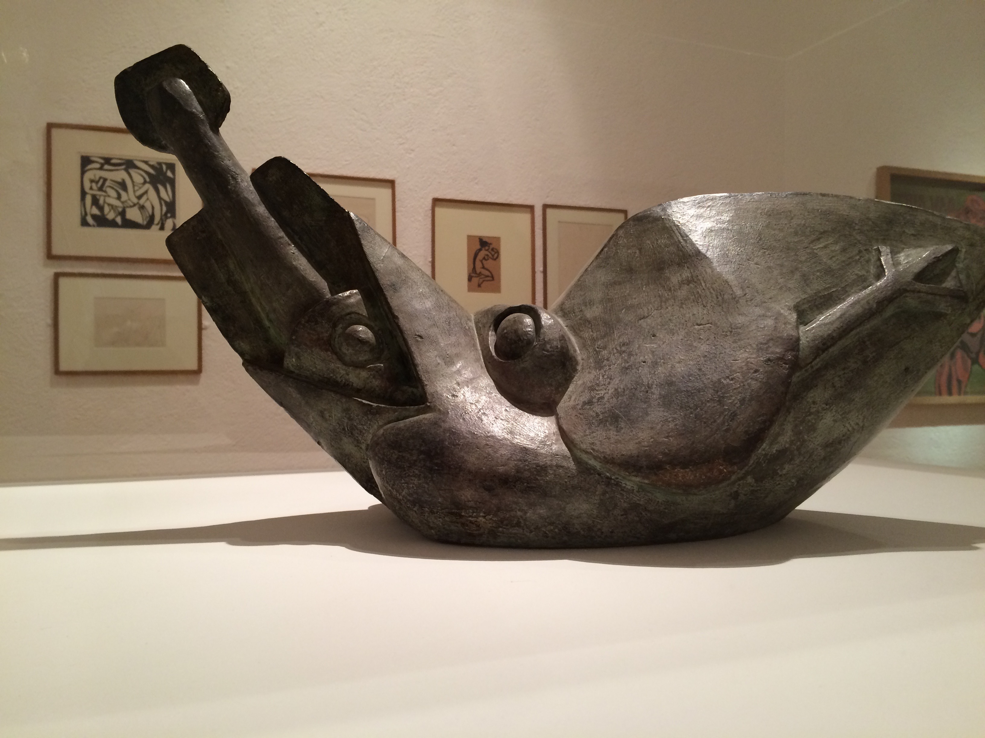
Henri Gaudier-Brzeska, Bird Swallowing a Fish, 1913-14 Kettle’s Yard exhibition, 2015
The Gaudier-Brzeska exhibition, the finale before Kettle’s Yard would close for years, had drawn me to Cambridge. I spent hours there. Exhausted, I was walking back to the train past the Fitzwilliam Museum. I had read somewhere that Xu Bing would have a small solo exhibition at the Fitzwilliam.
from Xu Bing, Book from the Ground: From Point to Point (MIT Press, 2014)
I own a copy of Xu Bing’s Book from the Ground: From Point to Point – a pictographic account of twenty-four hours in the life of “Mr. Black,” a typical urban white-collar worker – and I had seen Book from the Sky at the Odd Volumes exhibition of Yale’s Allan Chasanoff Collection. So I took a chance.
Xu Bing, Book from the Sky, 1991 The Allan Chasanoff Collection, Yale University Art Gallery
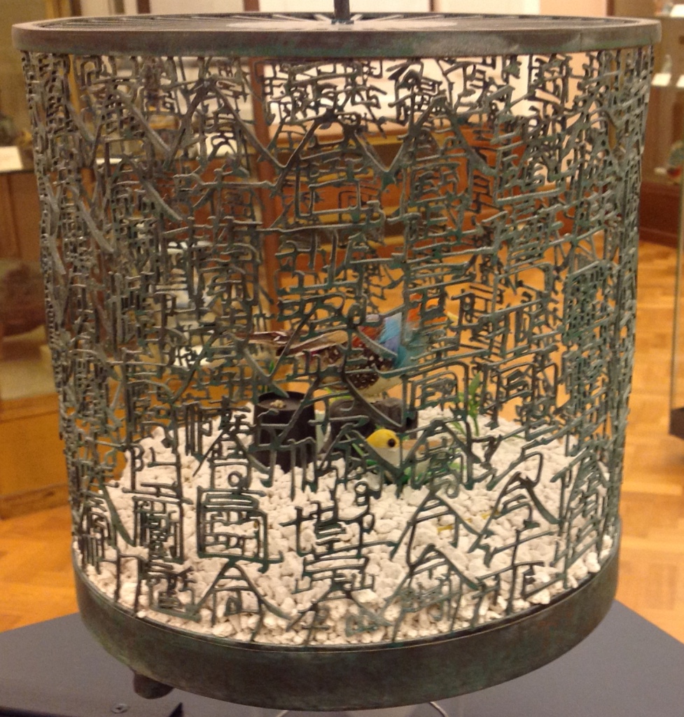
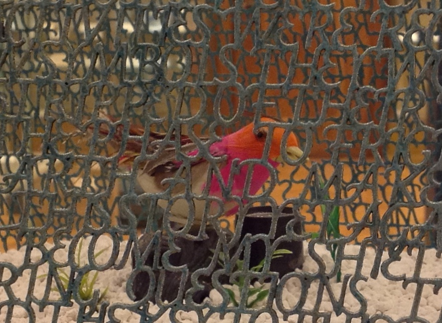
After first not recognizing my mispronunciation of Xu Bing and then hunting through some brochures, the attendants at the information desk directed me downstairs to a room of Chinese porcelain just outside the museum shop. Among the glass cases of blue and white: Bird Language (2003), four brass and copper birdcages, containing toy birds that sing at the clap of your hands. The mesh of two of the cages are composed of words in the Latin alphabet, the other two in Xu Bing’s faux Chinese calligraphy. According to his site, “The words are questions that people have asked Xu Bing about art, and his answers.”
Xu Bing, Bird Language, 2003 Four brass and copper birdcages containing sound-activated toy birds, the cage mesh composed of English and “square word calligraphy”, gravel.
Detail. Xu Bing, Bird Language, 2003
They remind me of Gaudier-Brzeska’s Bird Swallowing a Fish, just a question of timing and the juxtaposition of two artists fascinated with a union of the animistic and mechanistic? Maybe it is these few other degrees of separation: Gaudier-Brzeska’s catalyzing effect on Ezra Pound in 1913, Pound’s creative misunderstanding of Chinese calligraphy, Pound’s disputably indisputable influence on the author of “Sailing to Byzantium” (1927), whose birds are “Of hammered gold and gold enamelling … set upon a golden bough to sing ….”, and now Xu Bing’s toy birds that require the body not the “Soul [to] clap its hands” and let the birds do the singing.
Xu Bing’s Book from the Sky must have been even more impressive in its Metropolitan Museum display (2013/14) than its partial form at the Yale Gallery (2015) as shown above, but that’s part of the pleasure of conceptual art. Whether billowing overhead on scrolls suspended from the ceiling and walls or juxtaposed in their bound book form with their wooden case, these hand-bound deliberately indecipherable, meaningless Chinese calligraphic forms printed from hand-carved wood blocks sing in the mind and soul. But what is that song? We have the impression of meaning, an impression conveyed by graphic gesture and the traditional containers of meaning. But there is a slippage between the impression of meaning and grasp of meaning. Perhaps that is Xu Bing’s song.
The Khan Academy’s socio-political take on Xu Bing’s Book from the Sky — comparing it to Ai WeiWei’s performance art of smashing a Han dynasty vase — may usefully decipher the song for some. I think it misses a more profound point that Charlie Bennett approaches in his Aestheticareview of Xu Bing’s installation version of Book from the Ground (just closed on 28 February 2016 at the Centre for Chinese Contemporary Arts in Manchester, UK). The interactive mixed-media installation recreated Xu Bing’s art studio, including double-page spreads of the book pinned up on a wall, over-sized blow-ups of the pictographs from the book and two computers for visitors’ use.
Book from the Ground is also the name of Xu’s language-learning software program, which attendees can access on PCs in the gallery space. When words are typed into the tool, they are transformed into Xu’s pictographic language. It recalls a previous work of Xu’s, Introduction to [New] English Calligraphy (1994), which combines installation and interactive art, as visitors of a simulated classroom attempt to write what seems to be traditional Chinese calligraphy. But in the act of copying out the symbols on display, they realise the characters are reconfigured Roman letters that spell out words in legible English. Book from the Ground goes further in questioning transcultural communication; it instigates dialogue across borders only by negating all cultural differences in a de-localised set of coded representations.
With its English and Chinese birdcages, Bird Language, too, echoes Introduction to New English Calligraphy. But in the viewer’s interaction with the latter, the meaning that emerges is not what the viewer “intends” by copying out pretty lines. The experience of “communicated meaning” or “almost communicated meaning” seems accidental or magical. Likewise in Bird Language, we know that the sensor activates the toy bird and suspect a connection between the “magically activated” songs and the word-mesh cages. We suspect meaning. We know the artist’s hand formed metal letters to form metal words in two different languages. We suspect that each cage forms a narrative. We suspect there are differences in the narratives from the difference in round and square cage, English and Chinese cage. For some, that experience of suspicion might be frustrating; for others, delighting.
On further reflection, I think Xu Bing’s art challenges that modernist “union” of the animistic and mechanistic. With the sound-activation of digital birdsong and software-translation of words into pictographs, Bird Language and Book from the Ground (the installation) offer the slippery intersection of the animistic, the mechanistic and the digital. Intersection is not always union, if by “union” we mean equivalence, meaning and clarity. “Made in China” birds are not swallowing or regurgitating brass symbols. Animistic and mechanistic input to digital translation or replication do not always yield union — equivalence, meaning or clarity. But in Xu Bing’s hands and mind — in their intersection with our hands and minds — they yield a suspicion of union. They yield art.
Detail. Xu Bing, Bird Language, 2003
Detail. Xu Bing, Bird Language, 2003
Further reading:
Wang, Sue. “‘Xu Bing’: The Art View and Action Logic of a Fatalist”, 12 January 2018. A lengthy piece on the occasion of the Xu Bing retrospective in Wuhan, his first large-scale solo exhibition in China since returning ten years ago.
Beitler, Daniel. “Xu Bing Tests the Limits of Language in Unique Exhibition“, Macau Daily Times, 20 November 2017.
From www.youtube.com – May 25, 2017 1:55 PM
This video recounting Xu Bing’s life and work so far (from his start in China to the 90s in New York then back again to Beijing) broadens the appreciation of each work and the connections among them across time and place.
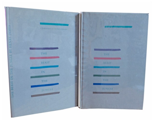
Henry James, The Beast in the Jungle, 1903. Allen Press, 1963. The copy shown is one of only 15 copies with an extra suite of 16 artist’s proofs, each titled, numbered 9/15 and signed by the artist in a separate portfolio. Displayed online at Sophie Schneideman – Rare Books and Prints.
In his Books and Vines essays, Chris T. Adamson provides fresh, personal and insightful comments on fine book productions and their content such as Henry James’ “The Beast in the Jungle” from the Lewis and Dorothy Allen Press in 1963, pictured above. An oenophile, as the title of his series suggests, Adamson also occasionally offers tips on the best wines with which to decant and read these works.
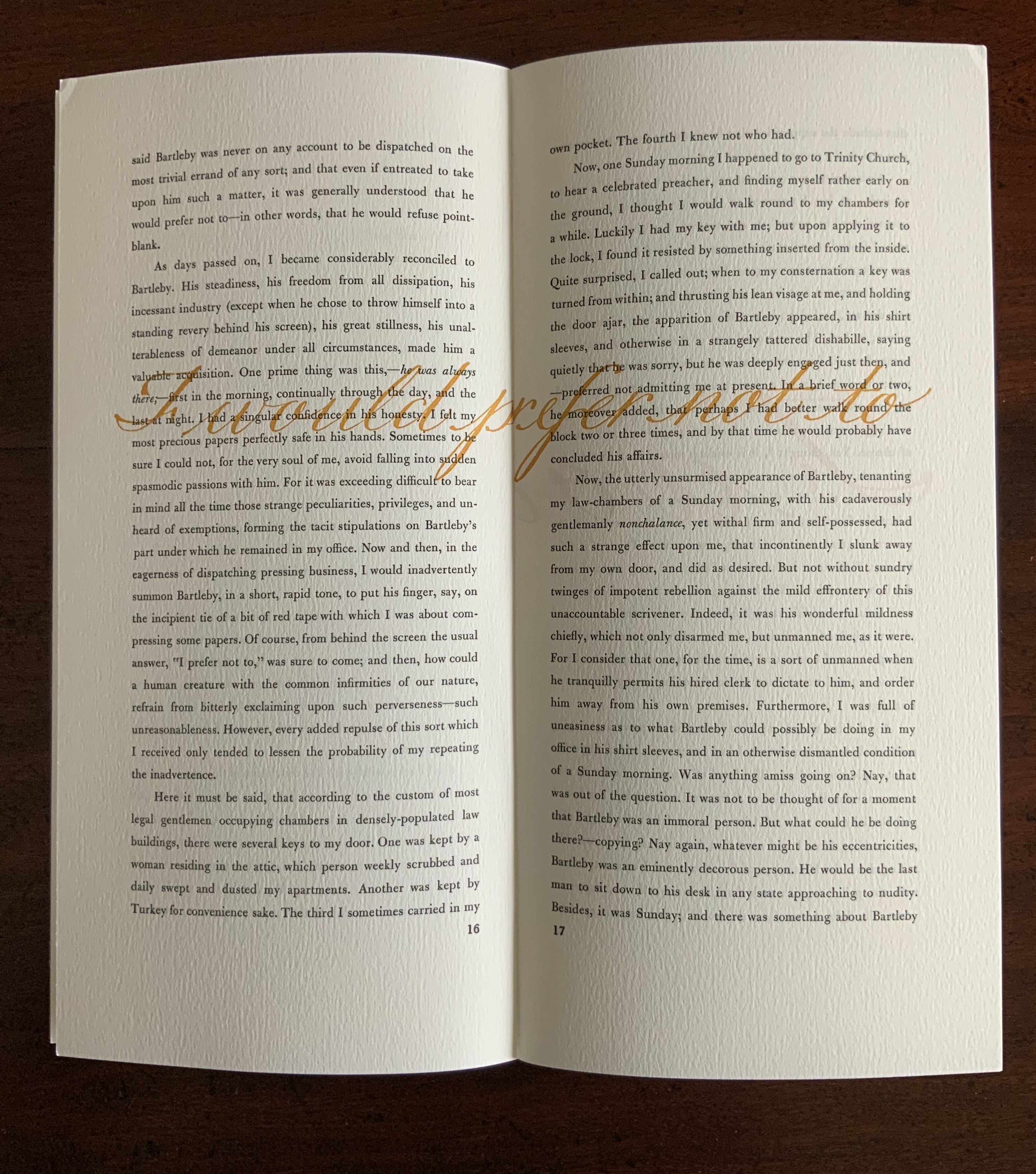
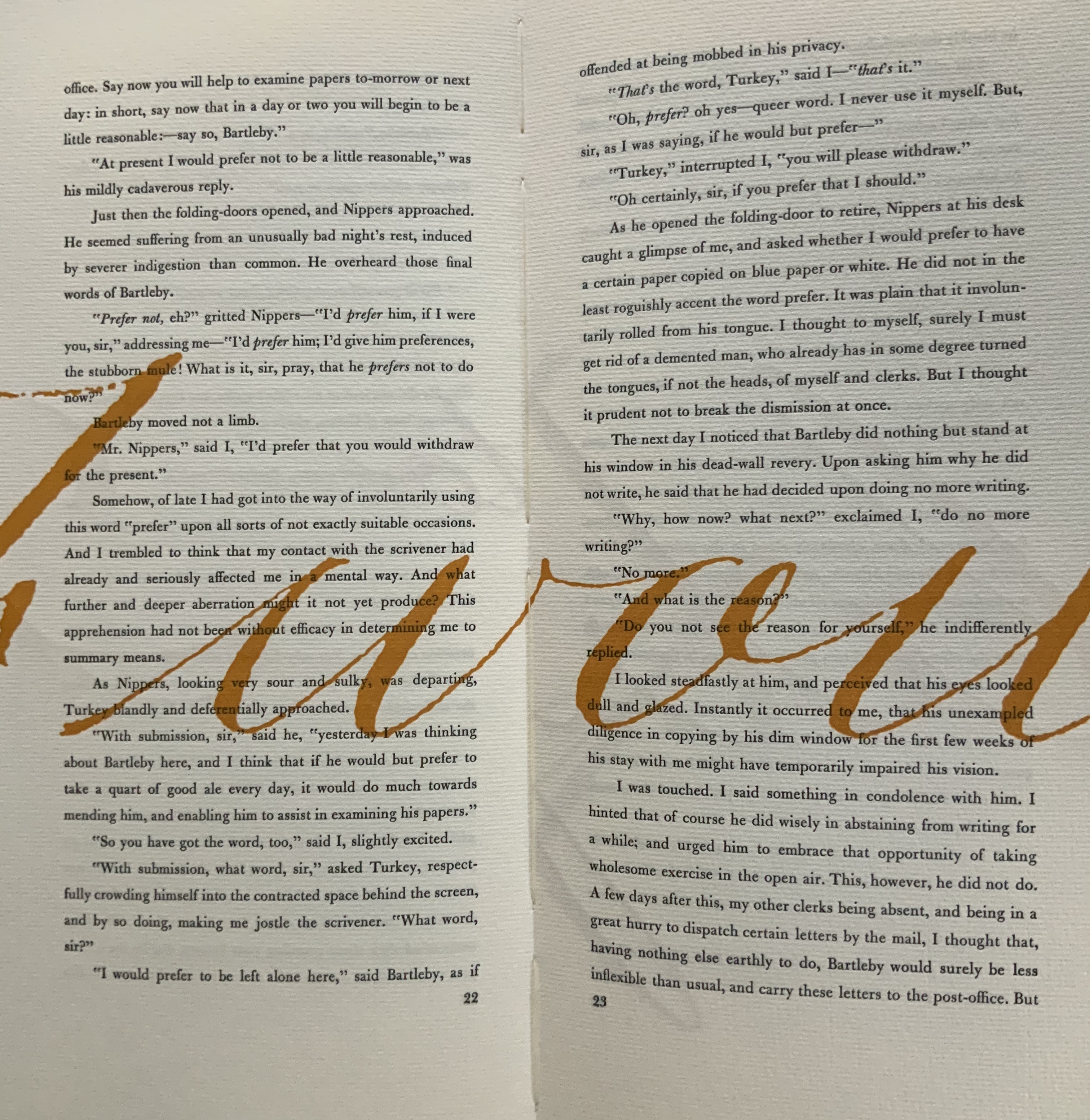
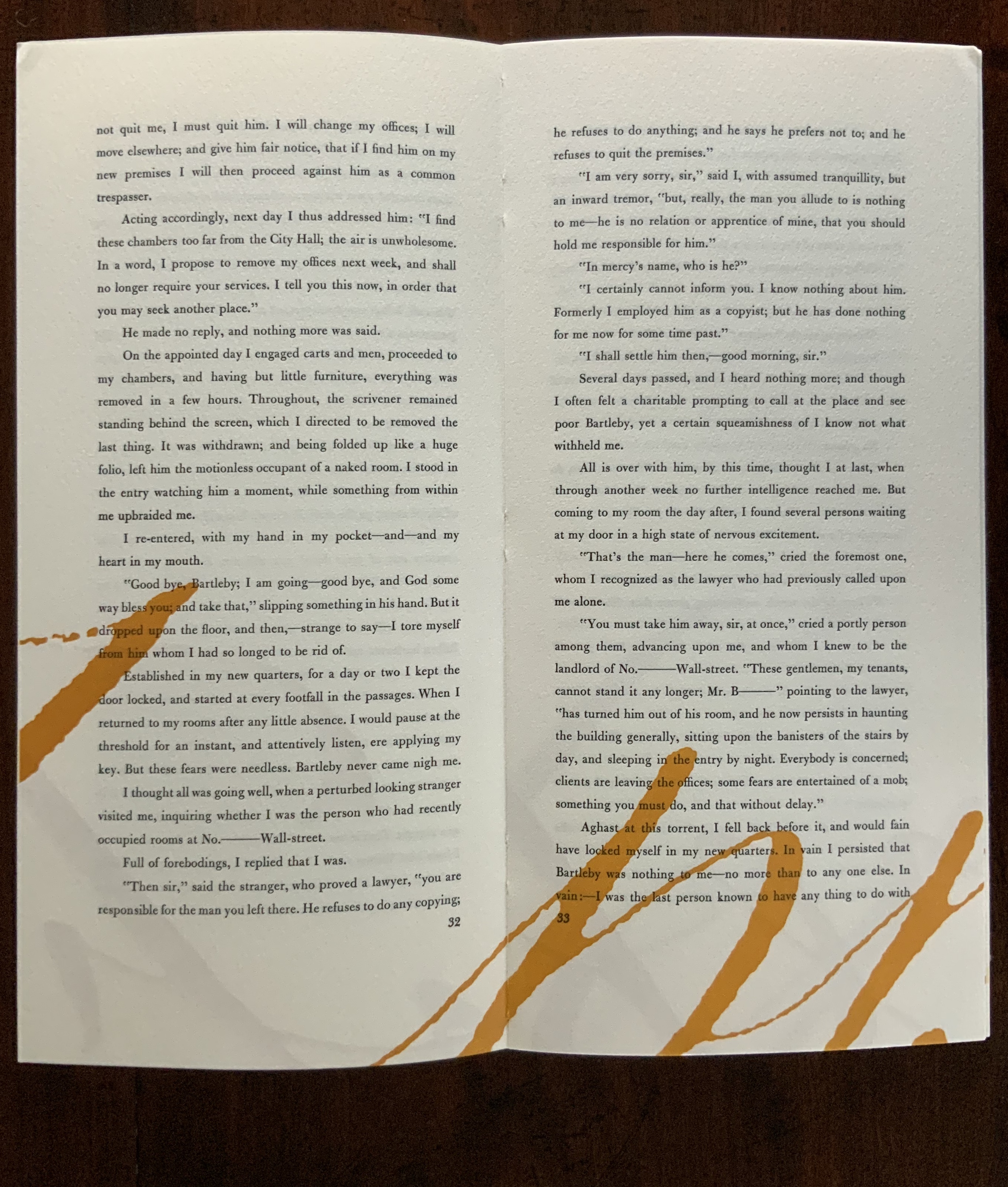
James is a favorite author at Books On Books as is Herman Melville. Indulge the punning coincidence of Adamson’s introducing us to Wilber Schilling’s Indulgence Press and his edition of Melville’s “Bartleby the Scrivener: A Story of Wall Street“. Schilling’s edition of “Bartleby” – with Suzanne Moore’s original hand lettering of Bartleby’s classic statement “I would prefer not to” first appearing fully legible then becoming larger until it literally falls off the bottom of the final page – was an early career statement of an interest in more than fine press work but in book art as well.
Consider Schilling’s Half-Life/Full-Life and its binding a variation on the accordion/flag structure of Hedi Kyle and Claire Van Vliet. The complexity of the form marries well with that of the intertwining, interleaving text and photos along the timelines of the Doomsday Clock and global warming.
Half Life/Full Life Wilber Schilling, 2009 ISBN: 0-9742191-5-0 Cover
Schilling’s photography in Half Life/Full Life speaks to the importance of that craft in his overall portfolio. His photos of aging, decayed and unbound books are haunting and remind me of the found art of M.L Van Nice.
Schilling has collaborated with Thomas Rose (visual artist and professor at the University of Minnesota), Michael Dennis Browne (poet and librettist), Rick Moody (author of The Ice Storm) and Patricia Hampl (MacArthur Fellow poet and novelist). He has collaborated with Daniel E. Kelm (book artist, founder of the Garage Annex School for Book Arts and a collaborator with Suzanne Moore).
Given the influence of Marcel Duchamp and Joseph Cornell on works such as Arthur & Barbara (Arthur Danto and Barbara Westman) or Surplus Value Books: Catalog Number 13, you might say that Schilling has attempted to collaborate with them as well. The danger in that, of course, is highly derivative artwork. That early-career whiff of genius in commissioning the now famous calligrapher Suzanne Moore to hand letter “I would prefer not to” and spreading it in ever larger size across the pages might be what takes Schilling’s work beyond the derivative. His work is worth examining with that anticipation.
Postscript
The Books On Books Collection now holds a copy of Schilling’s edition of Bartleby as well as works by Suzanne Moore.
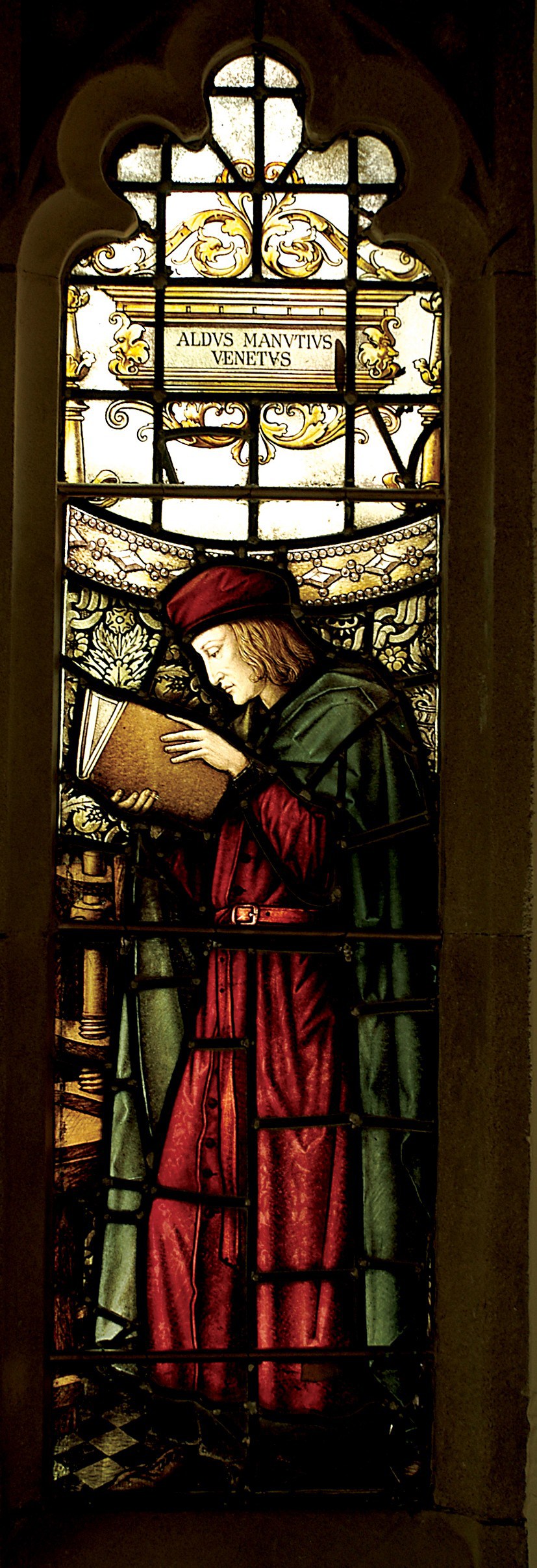
Aldus Manutius, John Rylands Library, University of Manchester
Merchants of Print from Venice to Manchester, 29 January to 21 June 2015, John Rylands Library, University of Manchester, UK:
This exhibition celebrates the legacy of Aldus Manutius (1449 – 1515), an Italian humanist scholar who founded the Aldine Press at Venice. His publishing legacy includes scholarly editions of classical authors, the introduction of italic type, and the development of books in small formats that were read much like modern paperbacks. The firm was continued after his death by his son and grandson until 1598. John Rylands Library, University of Manchester website, accessed 17 May 2015
Back in February as I enjoyed Oxford’s recognition of the 500th anniversary of the death of Teobaldo Manucci, the Manchester exhibition was already running. Where the Oxford event focused on the more architectural motifs distinguishing early Venetian from Roman printing, the Manchester event dwelt more on the educational thrust, technical and business aspects of the Aldine legacy and provenance of the Manchester collection.
The Manchester focus on provenance wends its way back through the library’s donors dedicated to the cause of education (if not to impressing its practitioners with the importance of the woolen industry’s contribution to it) to the Renaissance circle on which Manutius depended:
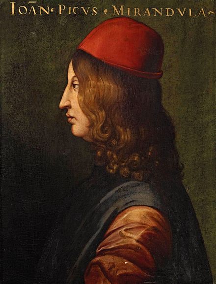
Giovanni Pico della Mirandola, 1463-1494 Uffizi Gallery, Florence
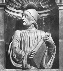
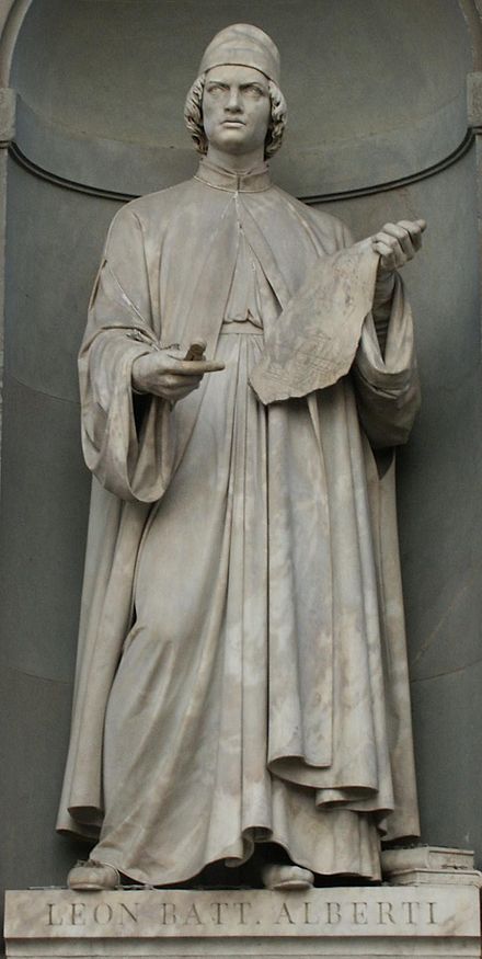
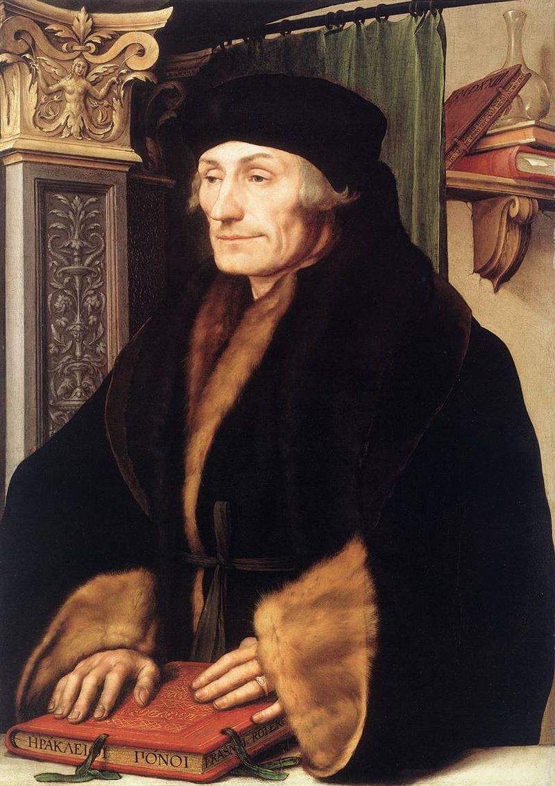
In 1482 Manutius lived with Pico della Mirandola and served as tutor to his nephews, the sons of the Princess of Carpi. Like the later, beneficent Manchester merchants, Pico’s family contributed financially to the cause: they funded the opening of the Aldine printing office in Venice in 1494. Of course, Pico made more than a patron’s financial contribution to the cause. Along with Cardinal Bessarion, Marsilio Ficino, Leon Battista Alberti and Erasmus – all known intimately to Manutius – Pico drove the revival of learning embodied in the output of the Aldines and numerous other printers (John Addington Symonds, Renaissance in Italy, Volume 2 (of 7): The Revival of Learning, John Murray, 1914).
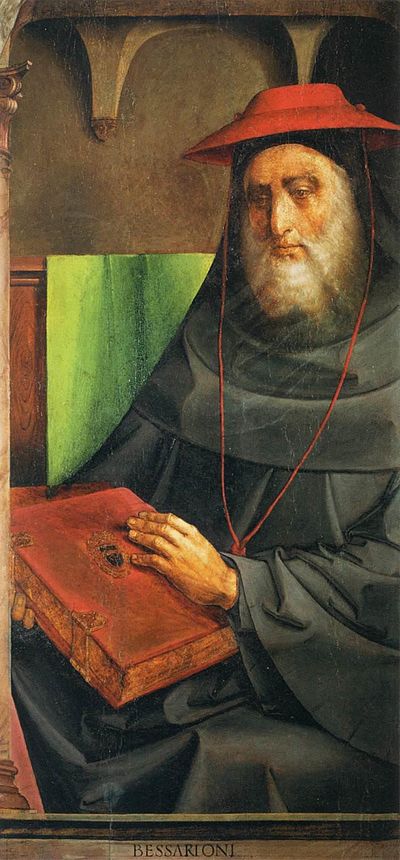
Cardinal Bessarion, Justus van Gent and Pedro Berruguete , (Les Hommes Illustres)
Marsilio Ficino, Duomo, Florence
Leon Battista Alberti, Piazza degli Uffizi, Florence
Desiderius Erasmus, 1523?, Hans Holbein the YoungerThe Manchester exhibition closes this month.
The next major Aldine event is the summer school hosted by The Catholic University in Siena (31 August – 3 September) and jointly organized by the Centro di ricerca europeo libro editoria biblioteca (CRELEB). Other events with dates still to be confirmed are planned in Brighton, Treviso, Milan and Arezzo.
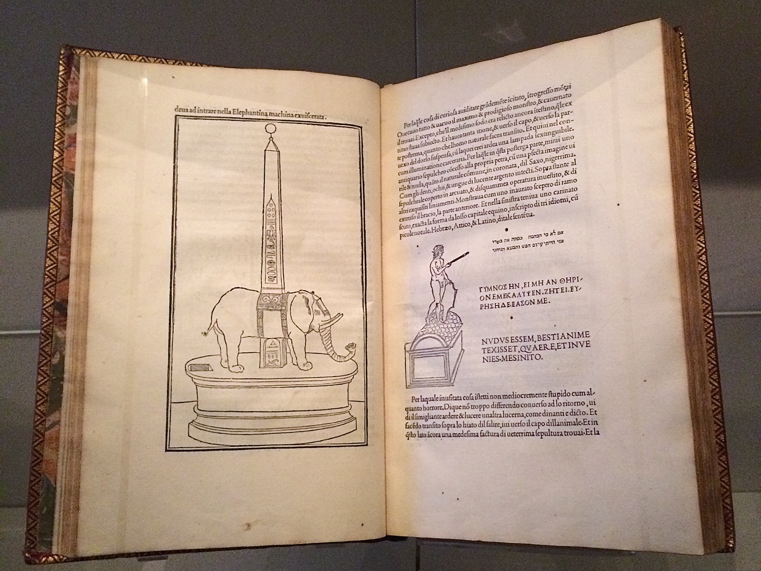
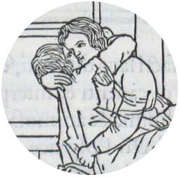
Late afternoon before the long worn wooden benches in the Bodleian’s Convocation Hall, 500 years after the death of Aldus Manutius, Oren Margolis served his audience well, providing them with a richer appreciation of the “finest printed book of the entire Renaissance”* – the Hypnerotomachia Poliphili – and of its publisher Aldus Manutius.
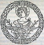
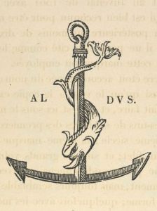
Drawing our attention to the more sculptural qualities of Venetian Renaissance printed books over the Florentine and to the evidence of the humanist agenda that drove Manutius, he led us to the page where Poliphilo (lover of all things, but in particular Polia, the ideal woman pursued to the end of the book) stands before a carving that foreshadows the Aldine Press device: a dolphin entwined around the shank of an anchor. The Aldine Press device was inspired by a similar image on an ancient Roman coin given by Pietro Bembo to Aldus, who wrongly associated it with Augustus and his proverb Festina lente (“Make haste slowly”) and adopted both for his printing and publishing business.
Erasmus praised Aldus, saying that he was “building a library which knows no walls save those of the world itself”.
For all of 2015, the world enjoyed a multitude of celebrations of the contribution of Aldus Manutius to publishing, printing and the book. After Gutenberg, Fust and Schoeffer, Aldus Manutius was perhaps the most important printer of the Renaissance. His portable books are still here, although locked away or displayed under glass, no longer so portable. Until now.
The Manutius Network 2015 provides a running list, links for some of which are provided below, including the online exhibition associated with Margolis’s talk. See also below, added in May 2016, the belated exhibition “Aldo Manutius: The Renaissance in Venice” at the Gallerie dell’Accademia in Venice.
From Crispin Elsted’s review of the Thames & Hudson facsimile edition of the Hypnerotomachia Poliphili. Parenthesis, December 2000, No. 5:
I once spent three hours in a library with a copy of the Aldine edition of Hypnerotomachia Poliphili, and I have never known a book take my breath away so consistently. Every page is a masterpiece: the dance of text with the more than 170 woodcuts; the firm, male stature of the typeface; the crisp spring of the impression; the elegant proportion of the page — all combine to an end in which the craft of printing and design carry the text into an atmosphere not of its own making. This new edition has the appearance of a fine actor in a part lately played by a great one. Here are the signs of the grace that greatness lent the commonplace five centuries ago; and in these signs, the commonplace finds here another advocate for its small claims to our time.
Timelines are, of course, for looking further back as well as forward. Earlier this year, April 2012 marked the fifteenth anniversary of the publication of Liane Lefaivre’sLeon Battista Alberti’sHypnerotomachia Poliphili: Re-Configuring the Architectural Body in the Early Italian Renaissance (Cambridge, MA: MIT Press, 1997) and the online publication of The Electronic Hypnerotomachia, which contains the facsimile text and illustrations. The online publication of extracts from Lefaivre’s book illustrates the linking prefigured by the “card stack” approach of HyperCard. What MIT Press and TU Delft, Lefaivre’s affiliation, host on their servers are not ebooks or even e-incunabula of the sort we experience today, but they are clearly forerunners to them.
In twenty-eight more months, December 2014, we will see the 515th anniversary of the original work’s publication by Aldine Press (Venice, December 1499). The founder Aldus Manutius did not normally publish heavily illustrated books. The Hypnerotomachia Poliphili was the exception and the only commissioned work that Manutius undertook. The exception reflects favorably on the overall success of his business and supports the view that Venice had become the capital of printing and publishing very shortly after the invention of printing by moveable type.
The book unveils an inscrutable, almost comic-book-illustrated story, glittering with made-up words in Greek, Latin, Hebrew and Arabic (including proto-Greek, -Hebrew and -Arabic fonts). In addition to the page displays sculpted into shapes such as goblets, this one volume displayed the technological mastery of and improvement on the new Roman (as opposed to the heavy Gothic) typeface Bembo. According to Norma Levarie in The Art & History of Books (New York, 1968), this singular volume revolutionized typography in France in less than twenty-five years.
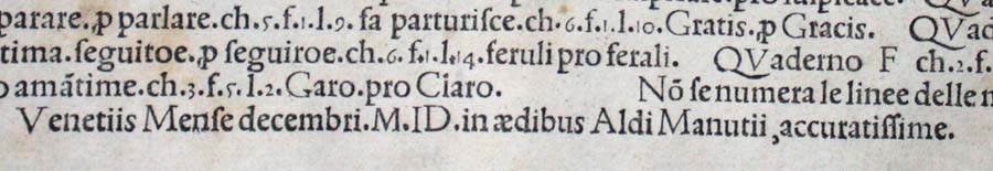
Somewhat like software releases, though, the 1499 edition came with bugs. The colophon to the Hypnerotomachia Poliphili falls at the end of a full page of errata.
“Venice Month December. 1499. in the house of Aldus Manutius, most accurately done.”
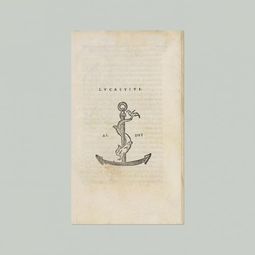
Initiated in 2015 in celebration of the anniversary and acknowledgement of the more than 100 Aldine editions in the Wosk McDonald Collection, Simon Fraser University’s Aldus@SFU is the digitization of 21 Aldine volumes published between 15011 and 1515. The image above is the edition of Lucretius’ De rerum naturam, published just after Manutius’ death in 1515.


 Consider Schilling’s Half-Life/Full-Life and its binding a variation on the accordion/flag structure of Hedi Kyle and Claire Van Vliet. The complexity of the form marries well with that of the intertwining, interleaving text and photos along the timelines of the Doomsday Clock and global warming.