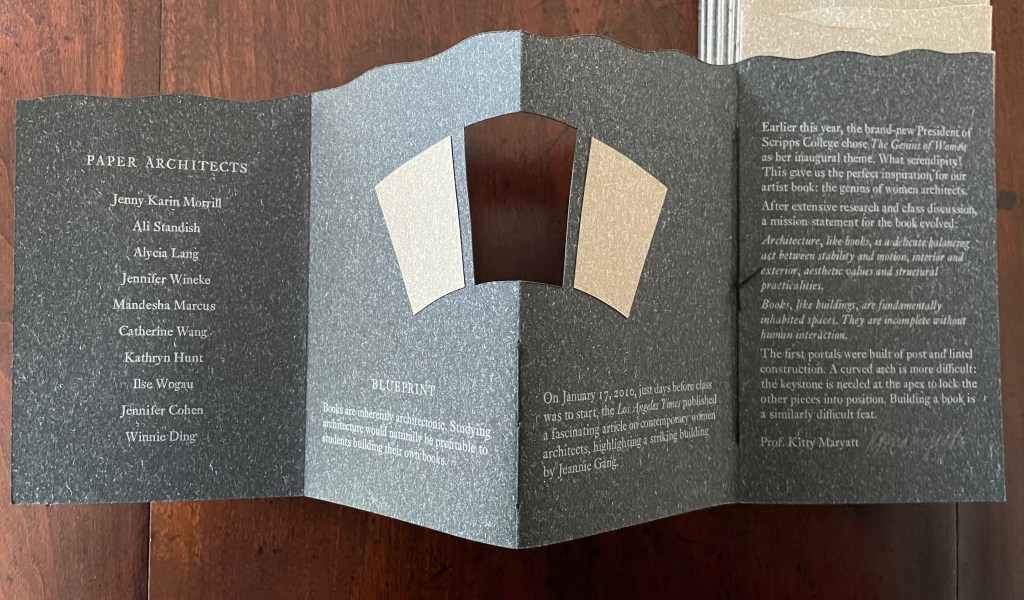
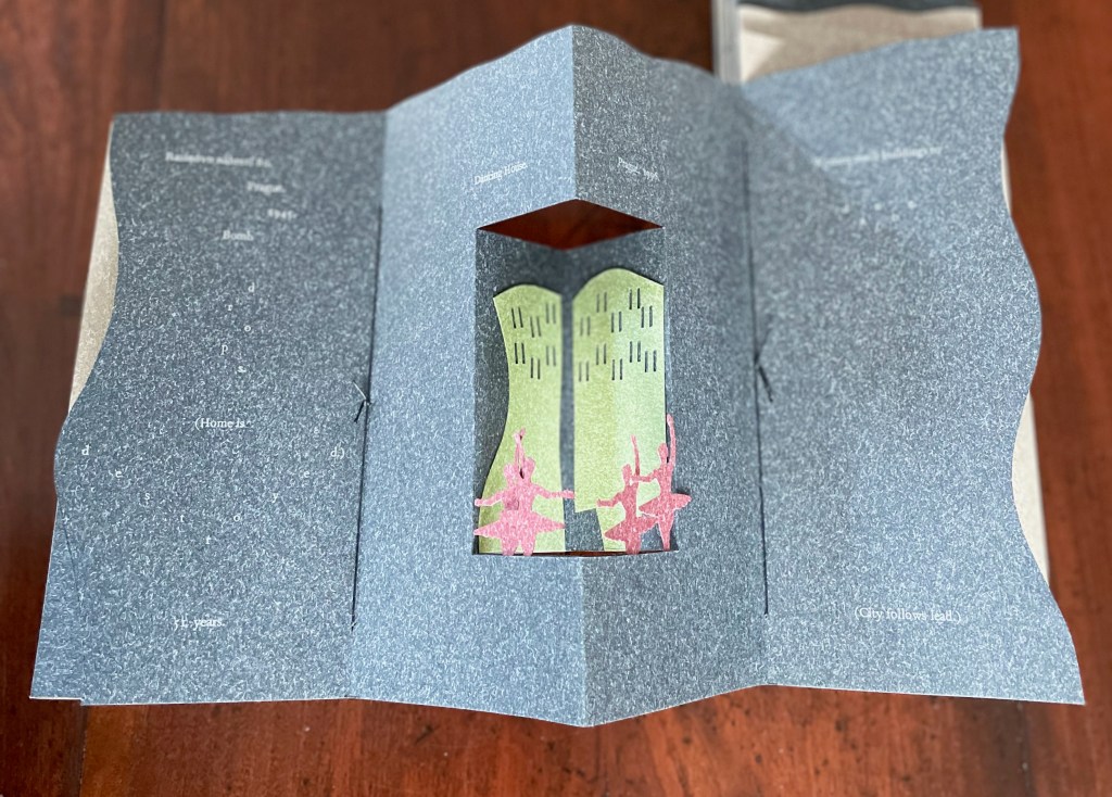
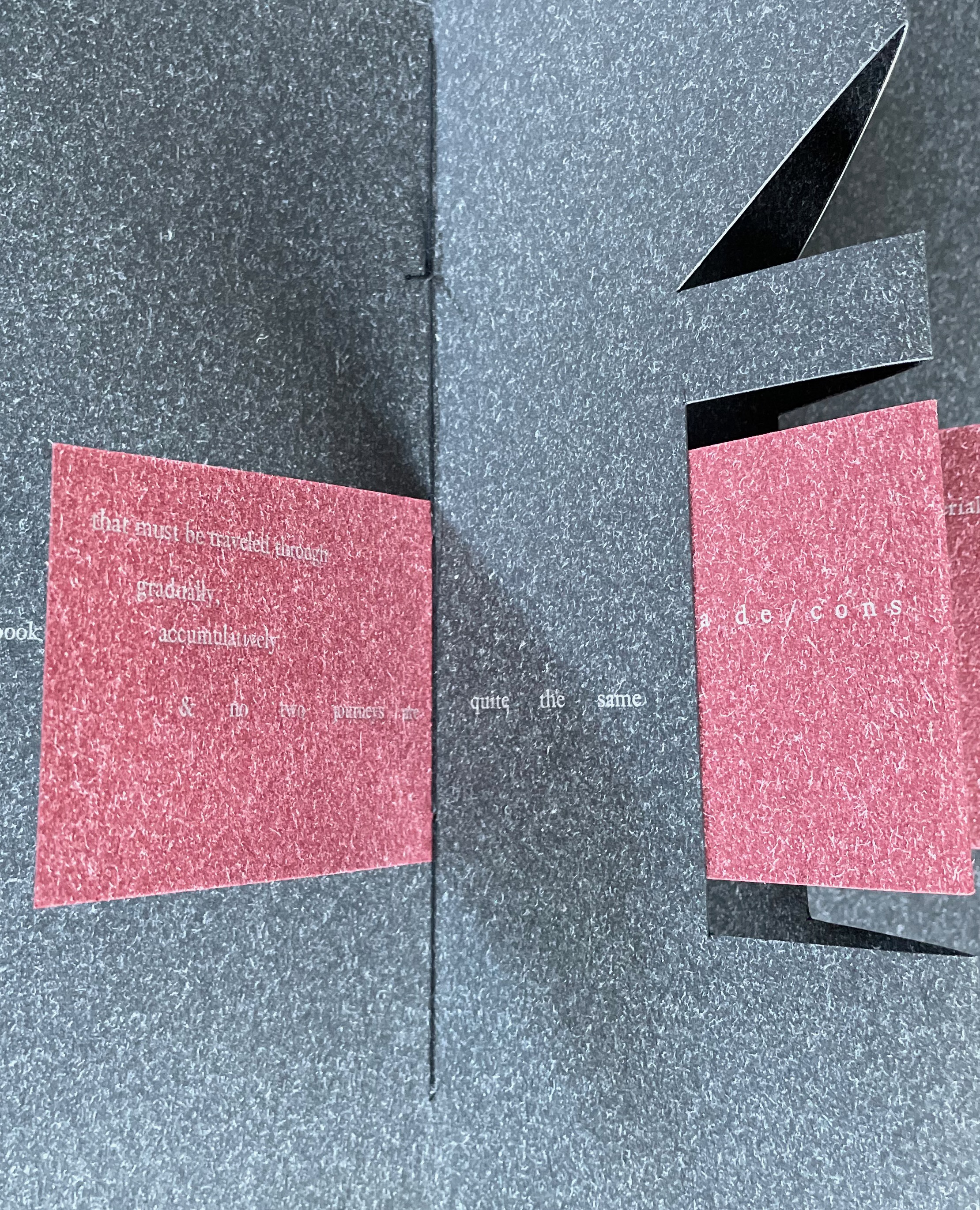
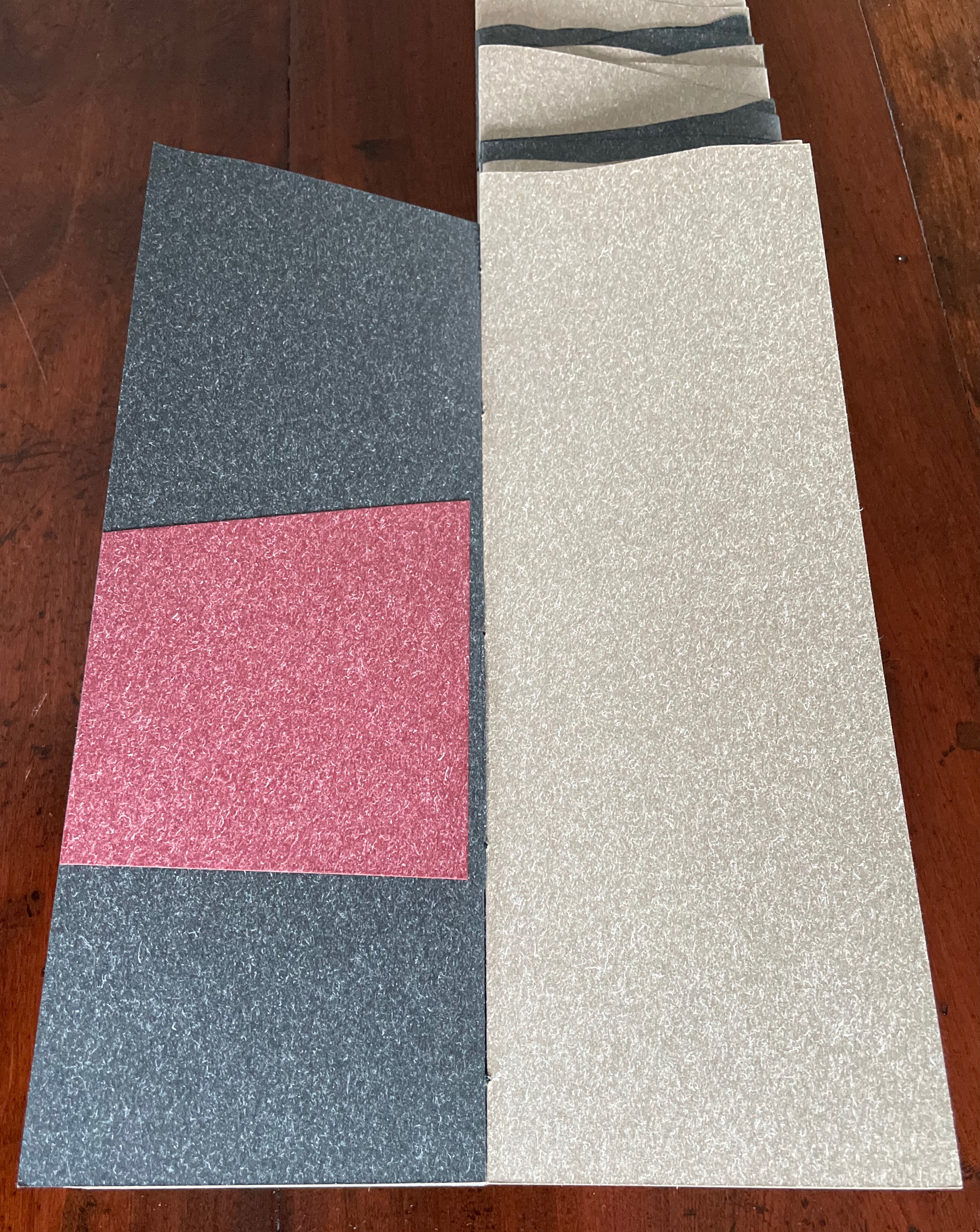
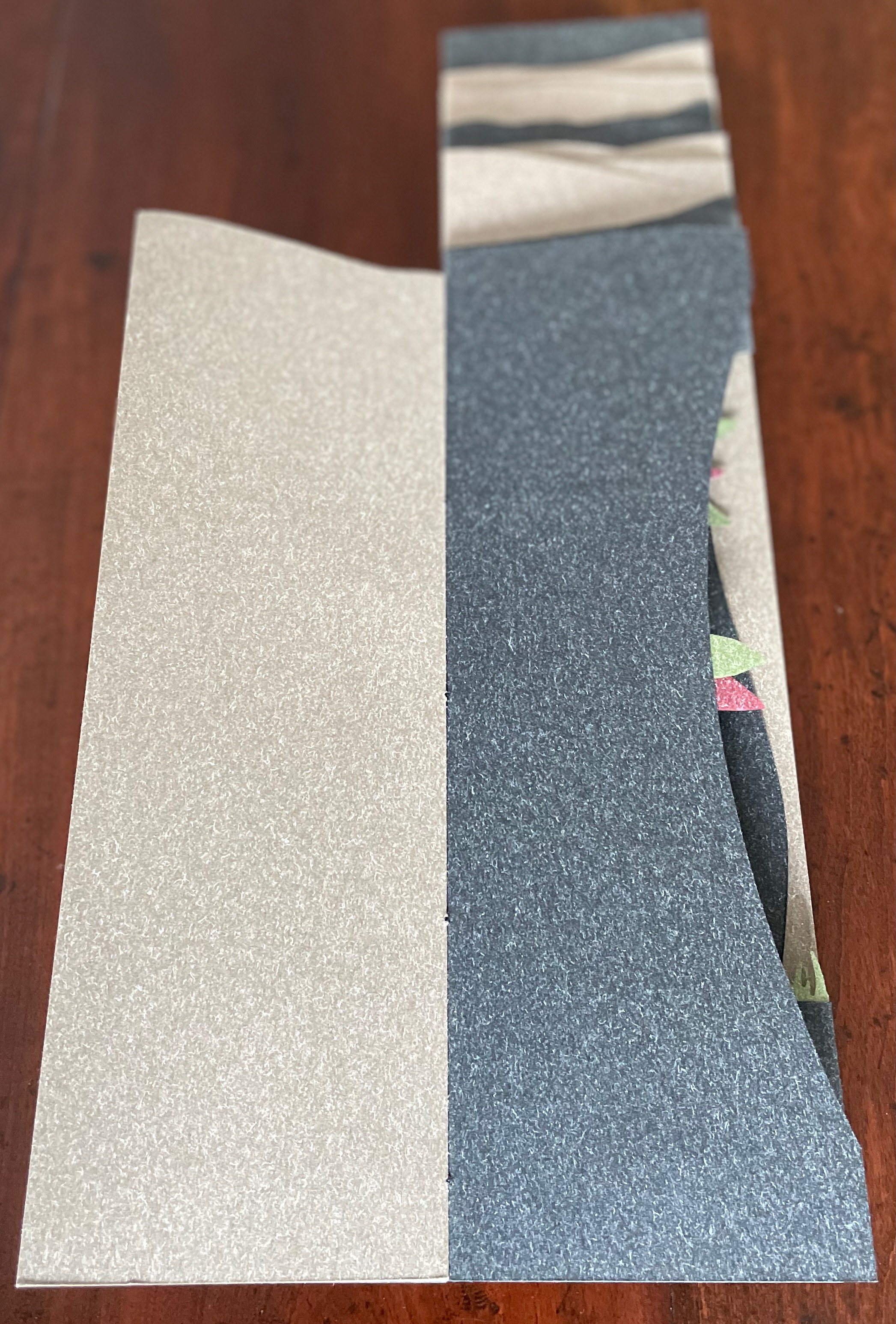
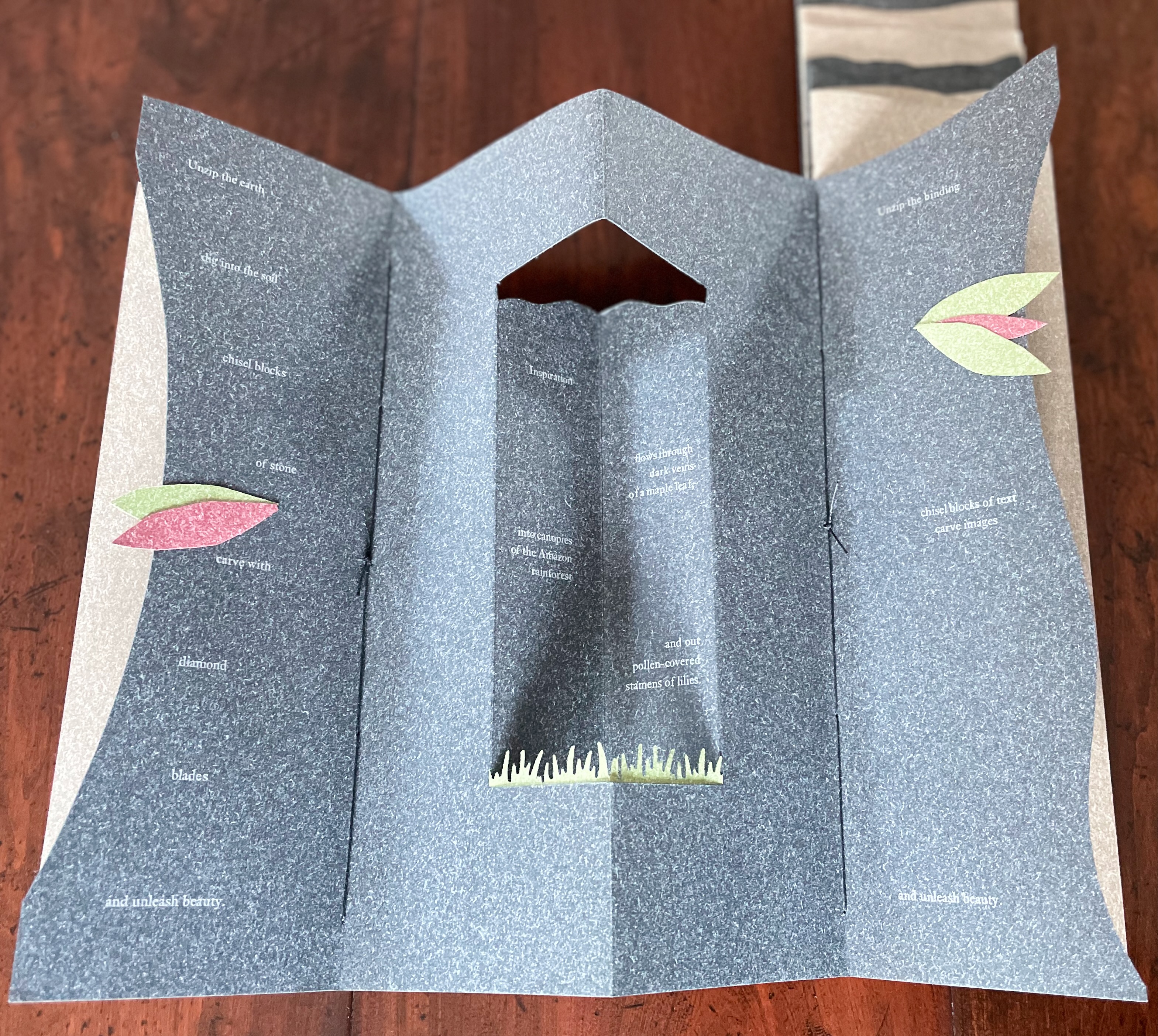
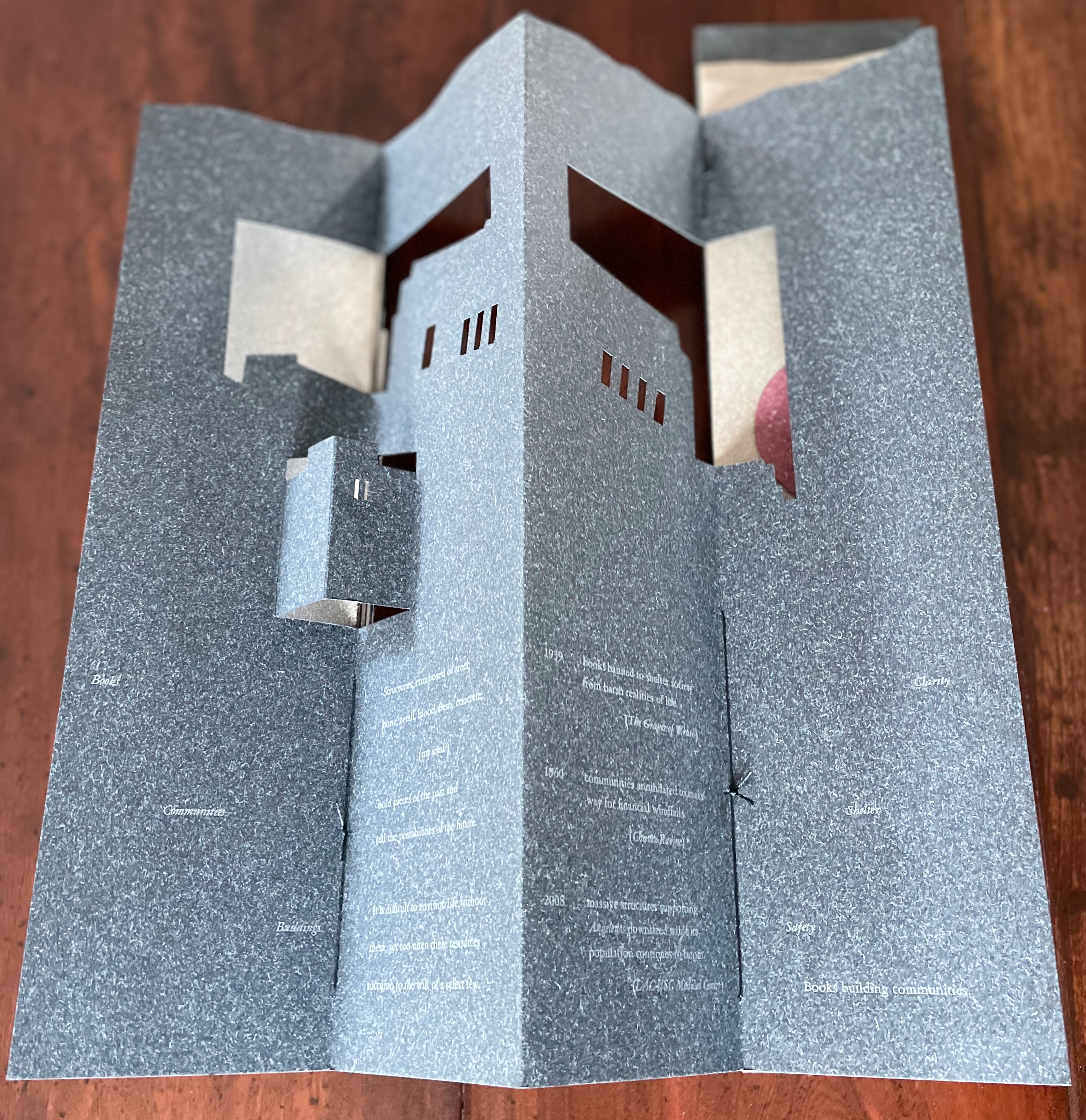
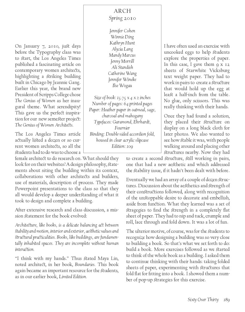
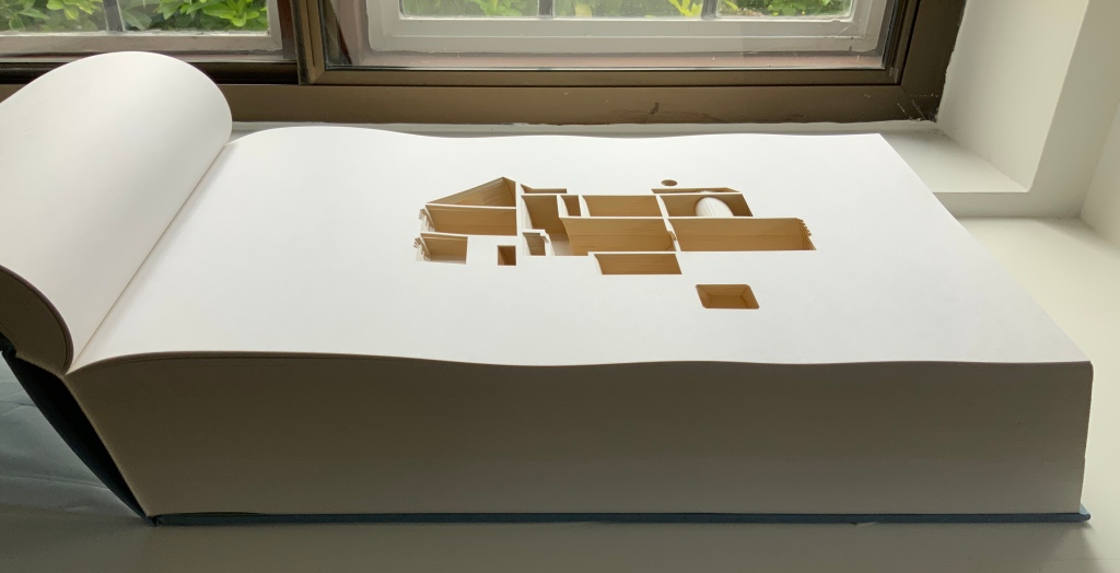
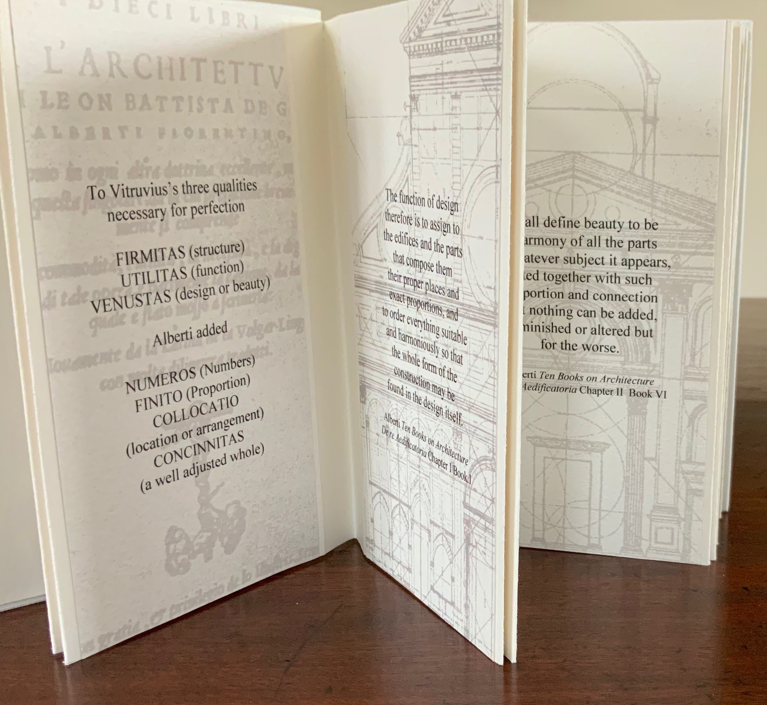
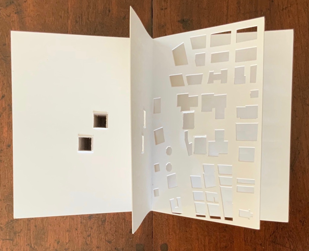
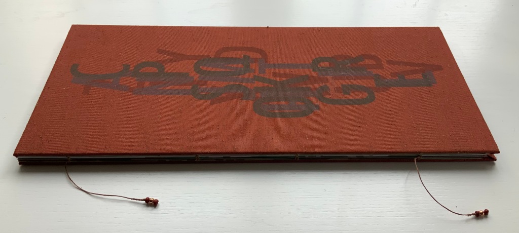
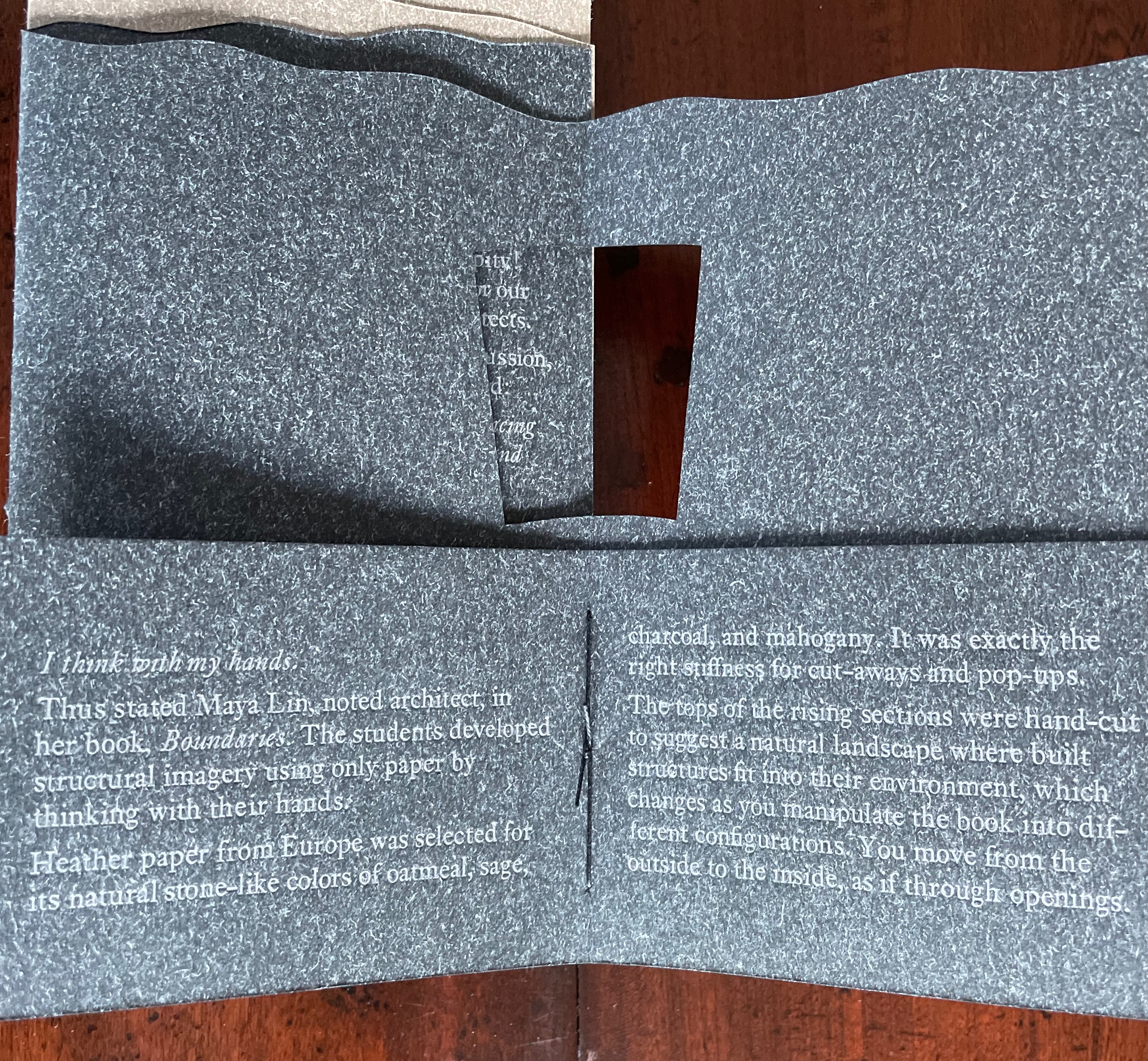
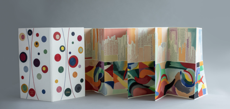
Arch (2010) Kitty Maryatt, Jenny Karin Morrill, Ali Standish, Alycia Lang, Jennifer Wineke, Mandesha Marcus, Catherine Wang, Kathryn Hunt, Ilse Wogau, Jennifer Cohen and Winnie Ding Acrylic slipcase, leporello formed of self-covering booklets sewn together. Slipcase: H410 x W110 x D50. Leporello: H400 x W 90 mm (closed). 64 pages. Unnumbered copy from edition of 109. Acquired from Bromer Booksellers, 7 December 2022. Photos: Books On Books Collection
Nôtre-Dame de Paris (1831), Archdeacon Claude Frollo points to the book in his hand and then to the cathedral and says, “This will kill that”. It is ironic that Hugo’s book (popularly known now by its English title The Hunchback of Nôtre-Dame) was written in large part to save the then-decaying cathedral (post-Revolution, it served as a warehouse), and it succeeded. It is also ironic that, while the fictional character’s metaphor has a point about the book’s permanence of replicability outlasting the building’s permanence of stone, it misses the collaborative foundations of both.
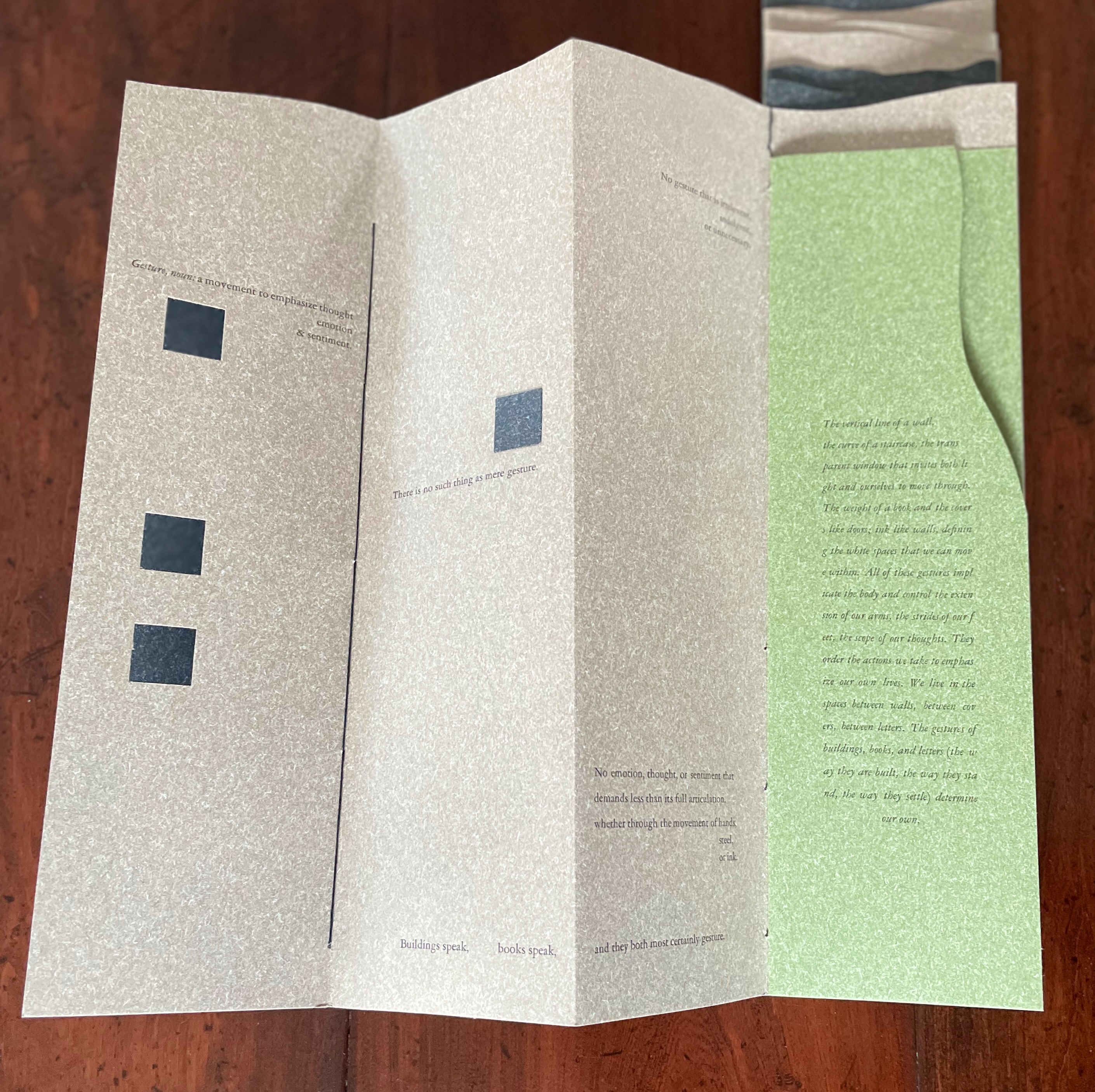
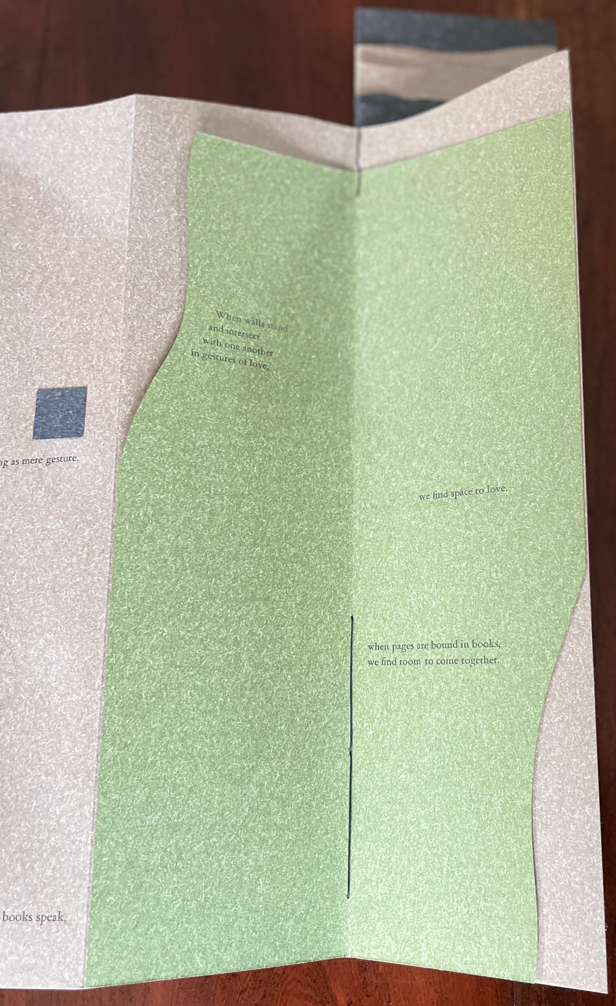
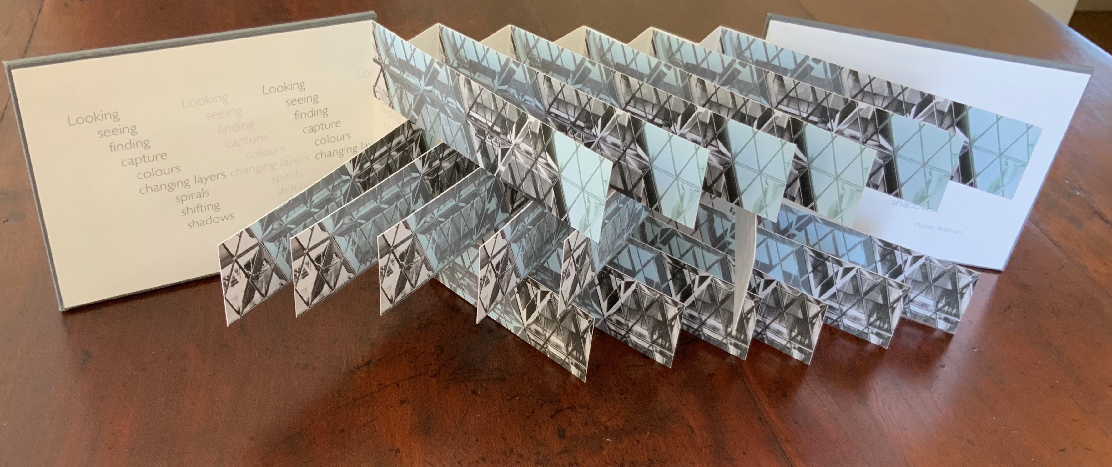
Arch (2010), created by ten students at Scripps College under the direction of Kitty Maryatt, reminds us that the creation of a book — even a work of book art — is a collaborative effort. All the students involved in the design, planning and production were women, a happenstance serendipitously blessed ahead of time by a Los Angeles Times article celebrating women architects. Drawing on that article and Maya Lin’s Boundaries (2000) as well as other research, the students agreed on a mission statement for the work: “Architecture, like books, is a deliberate balancing act between stability and motion, interior and exterior, aesthetic values and practicalities. Books, like buildings, are fundamentally inhabited spaces. They are incomplete without human interaction.”
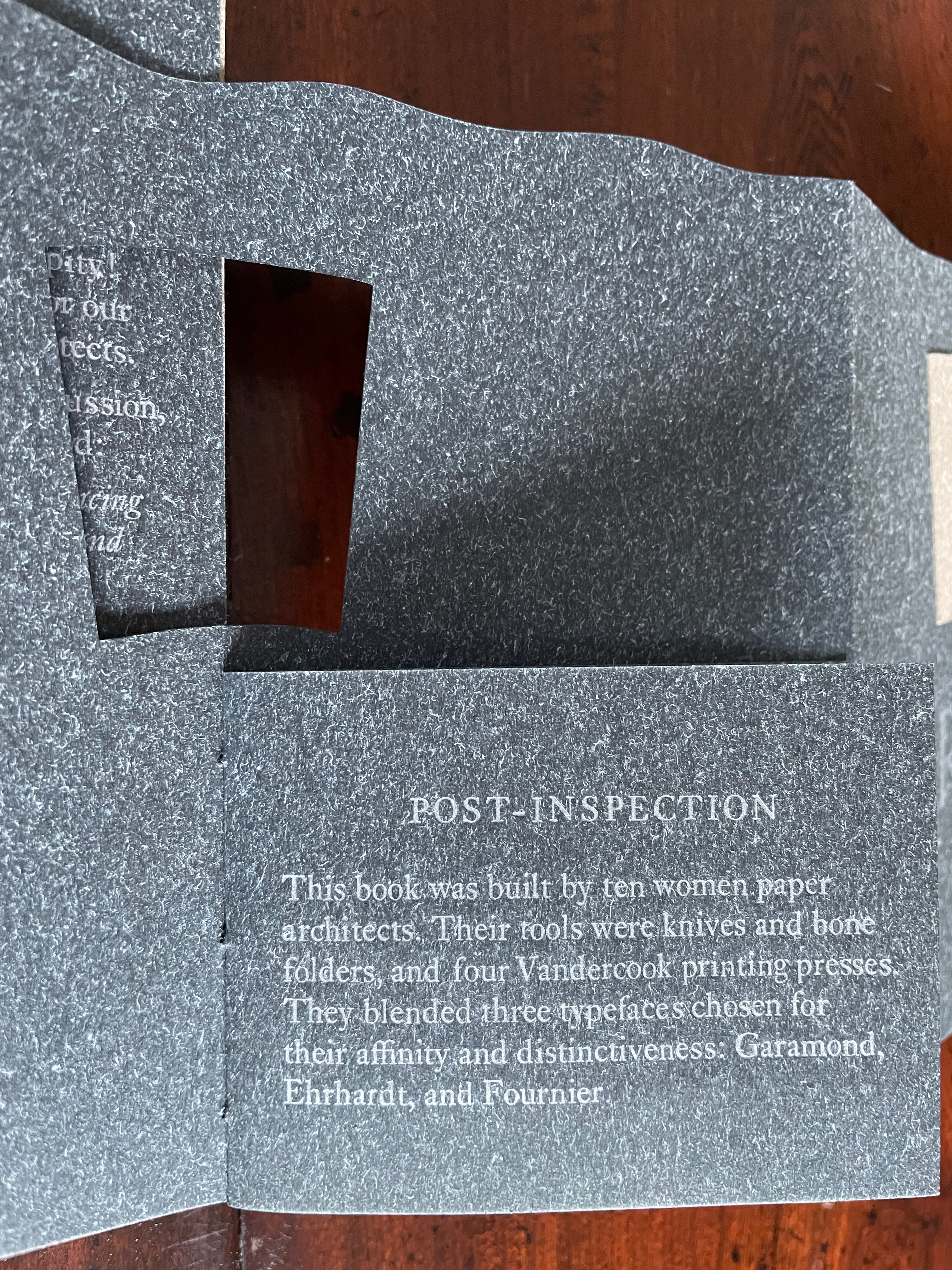
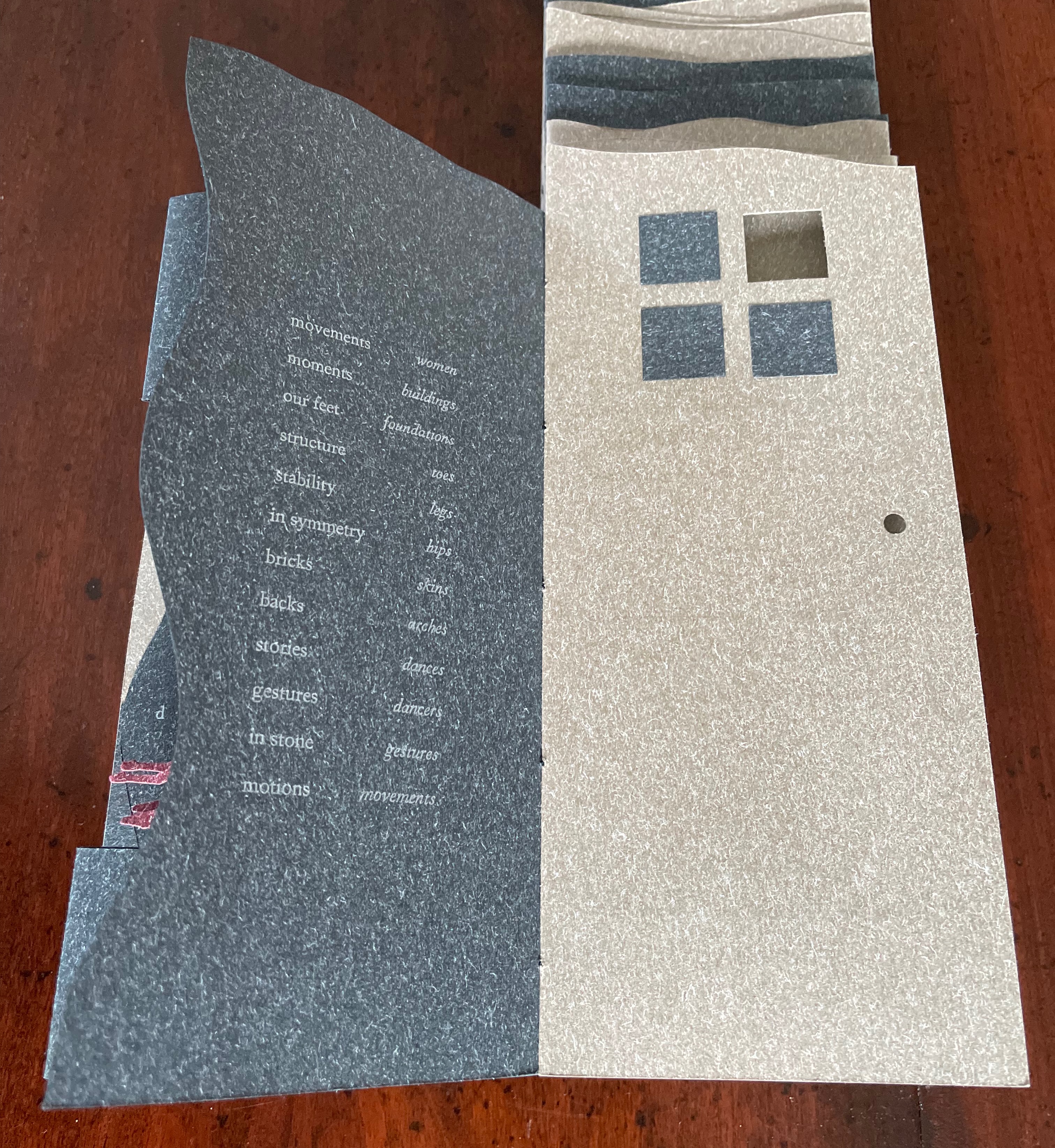
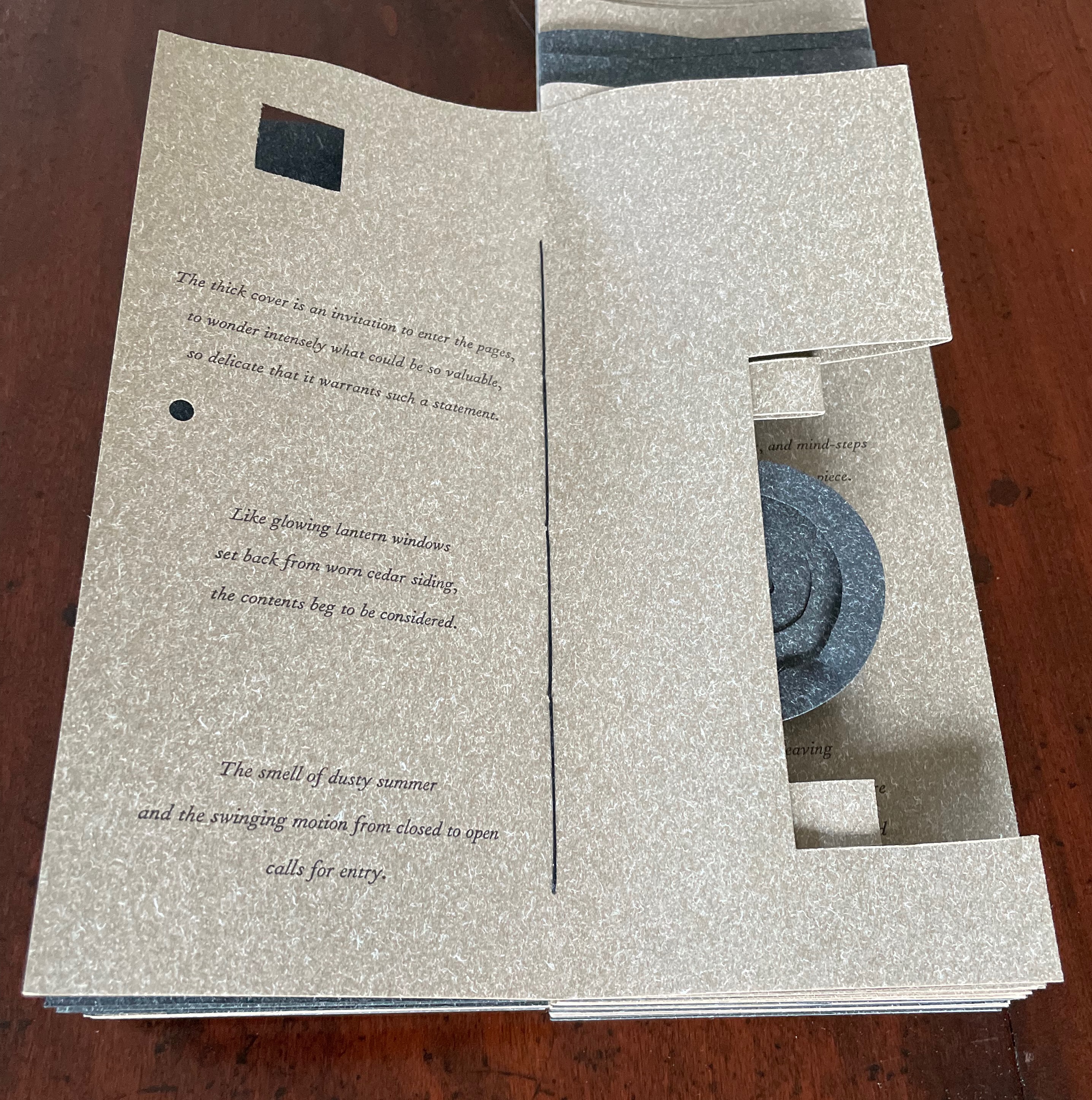
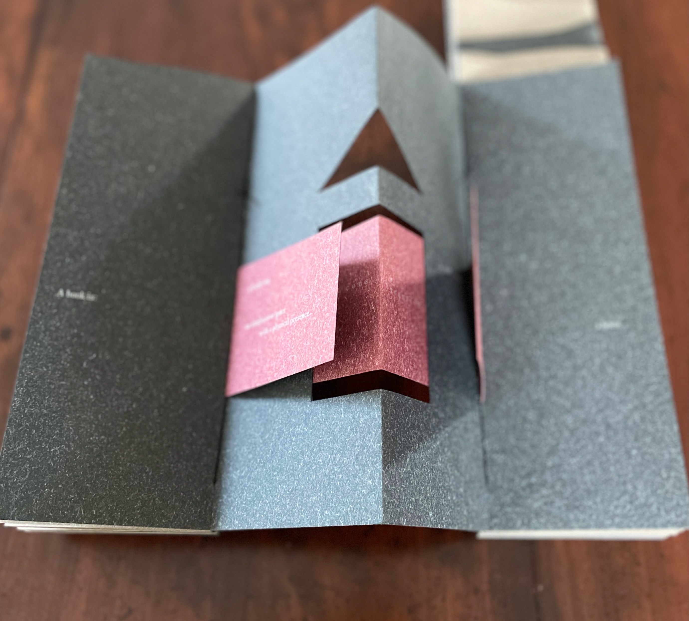
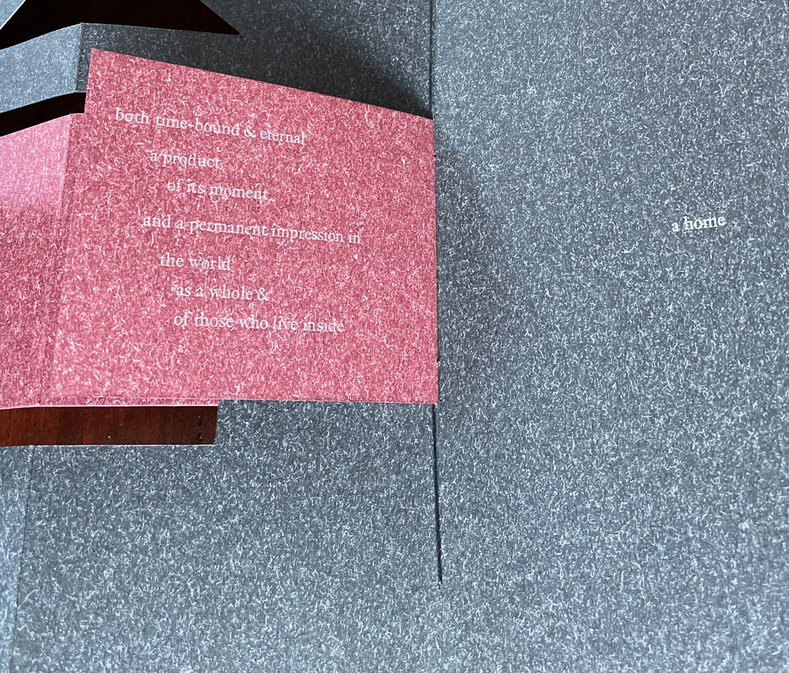
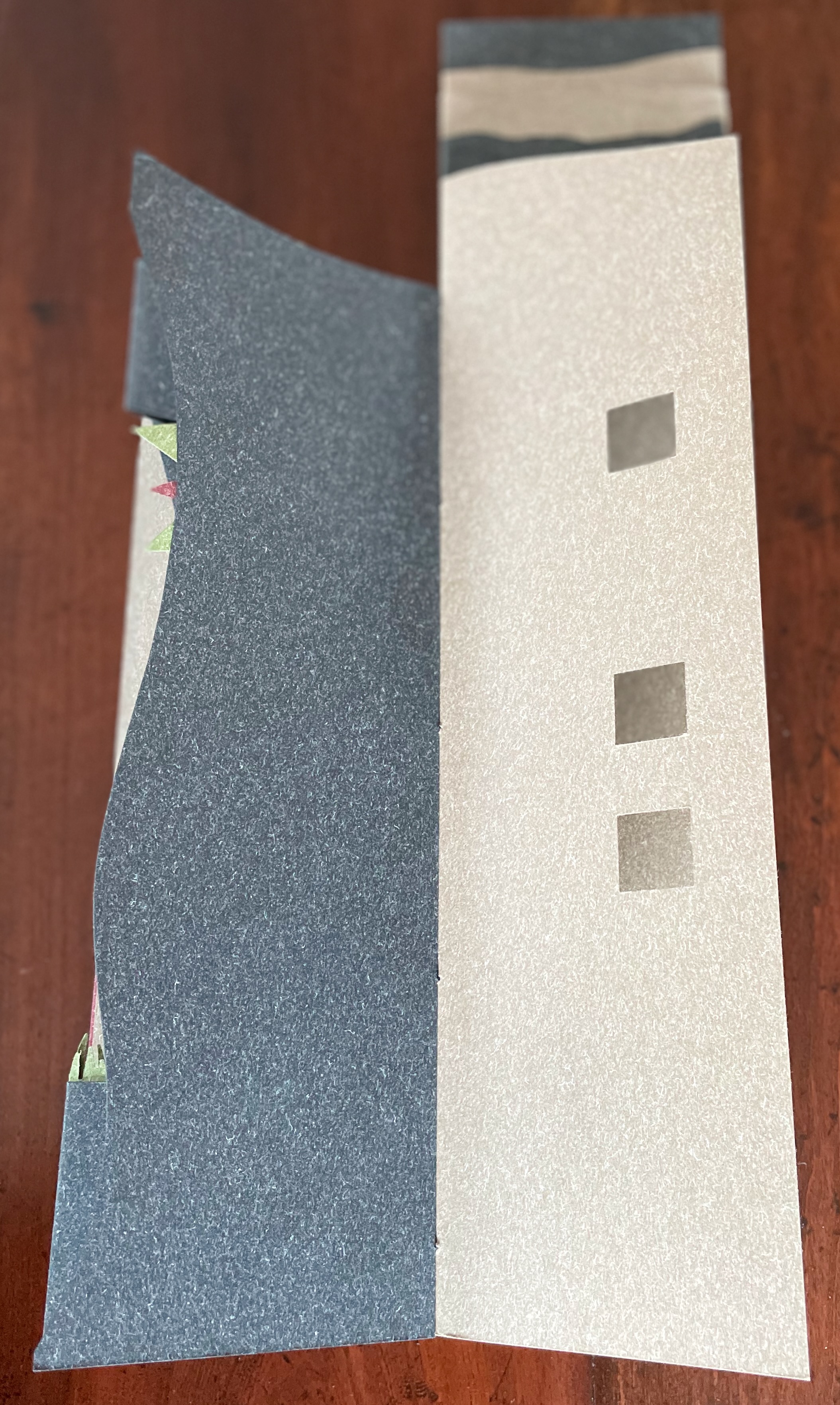
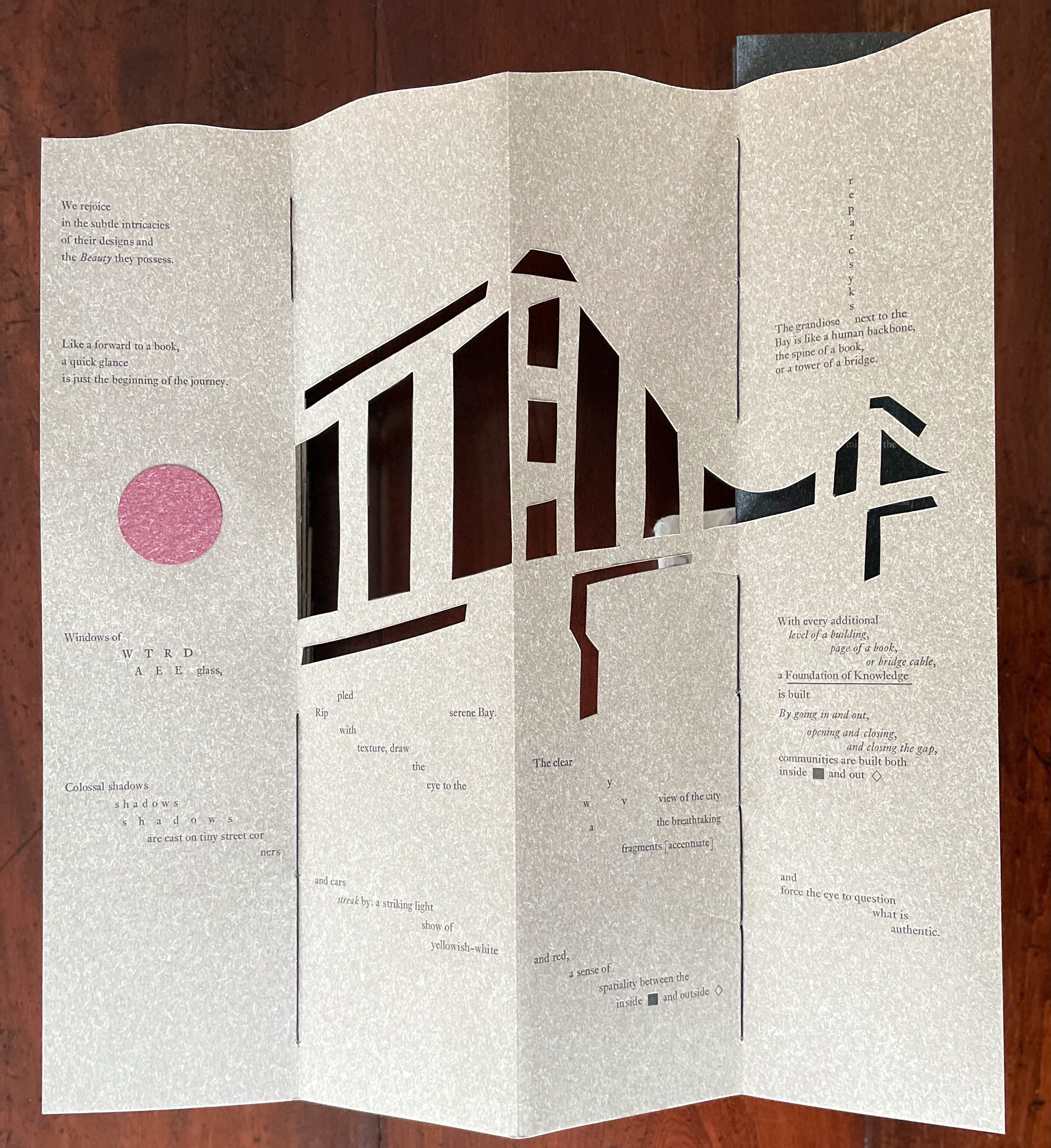
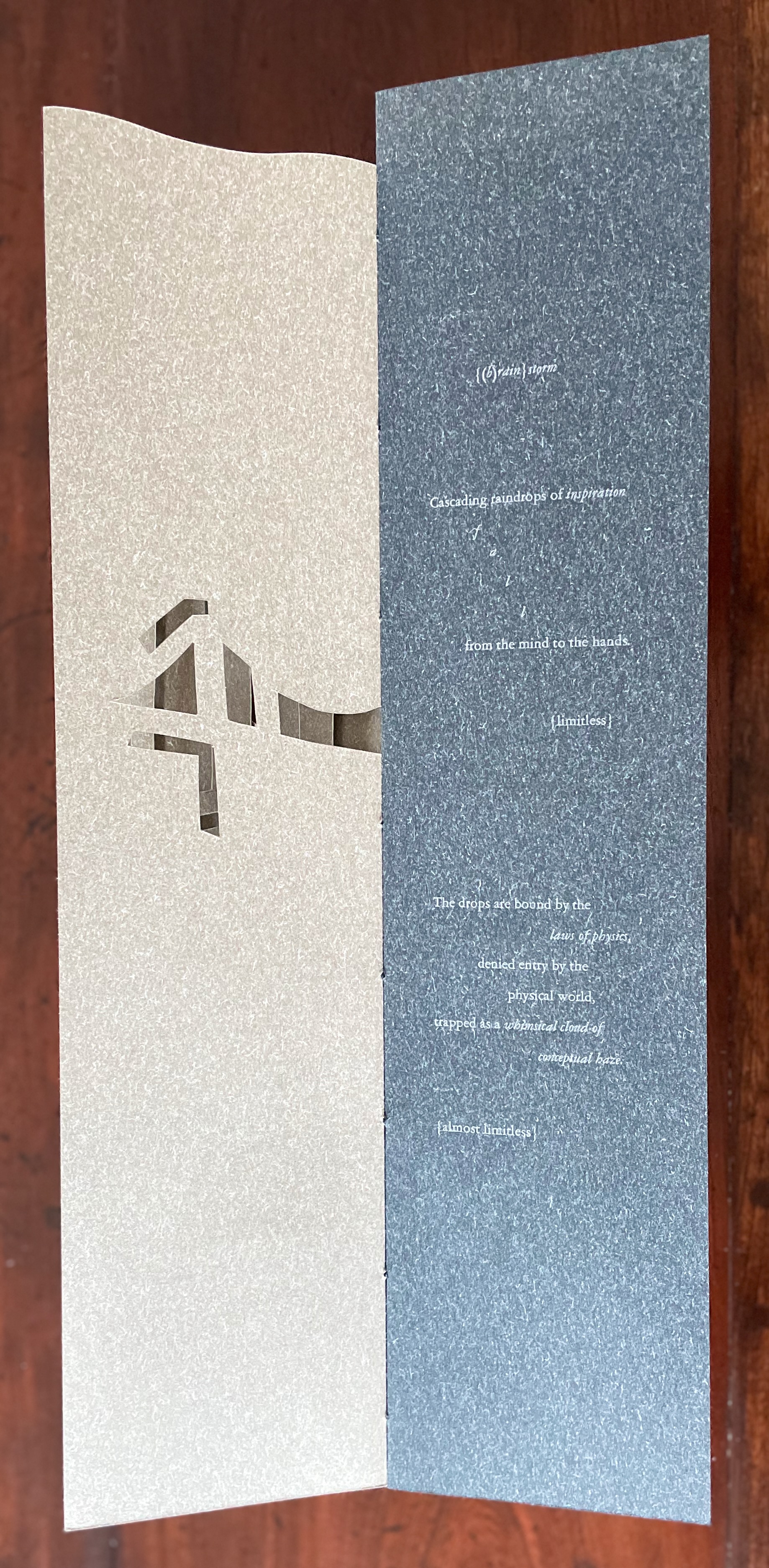
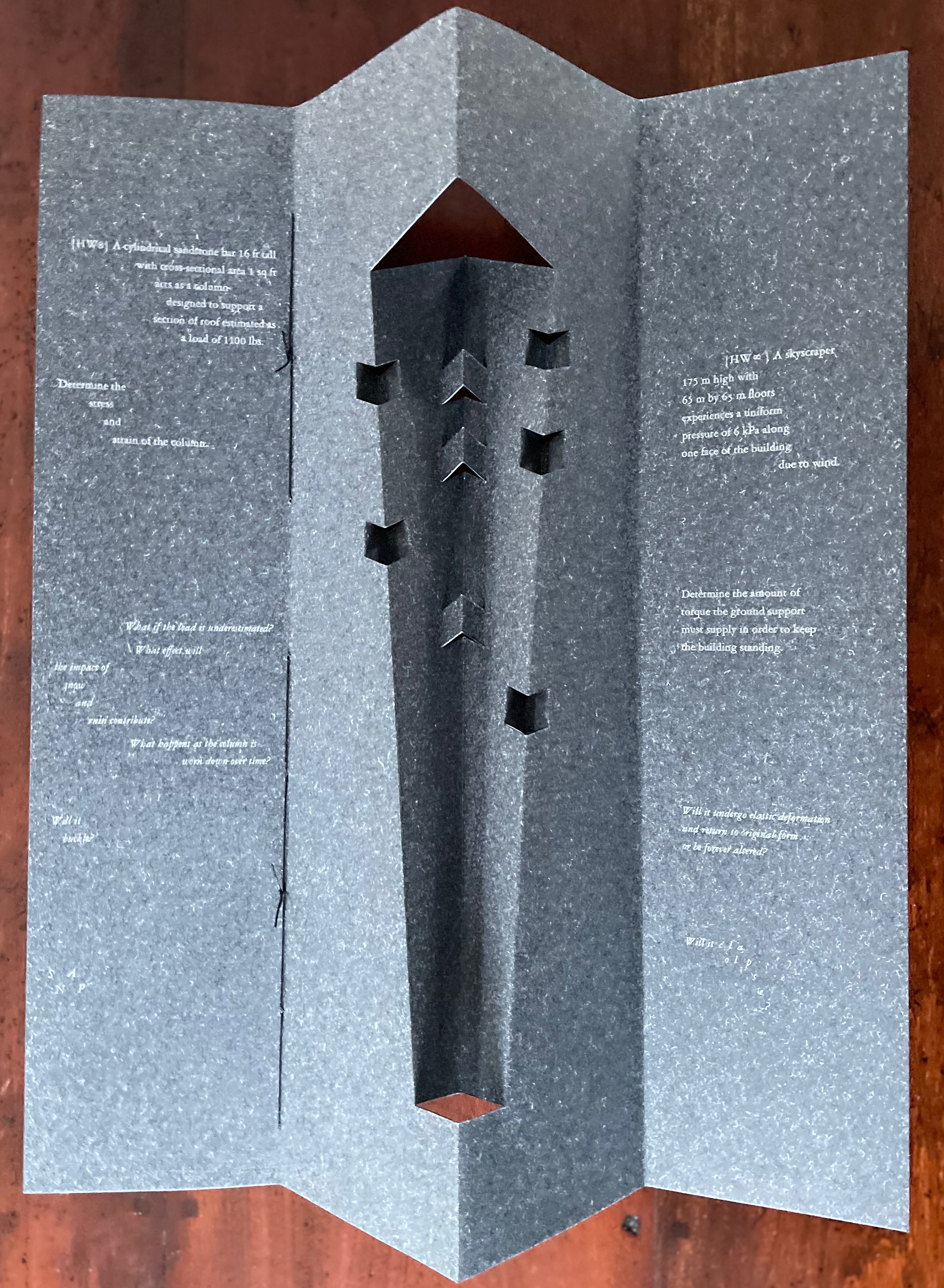
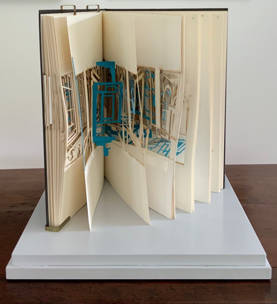
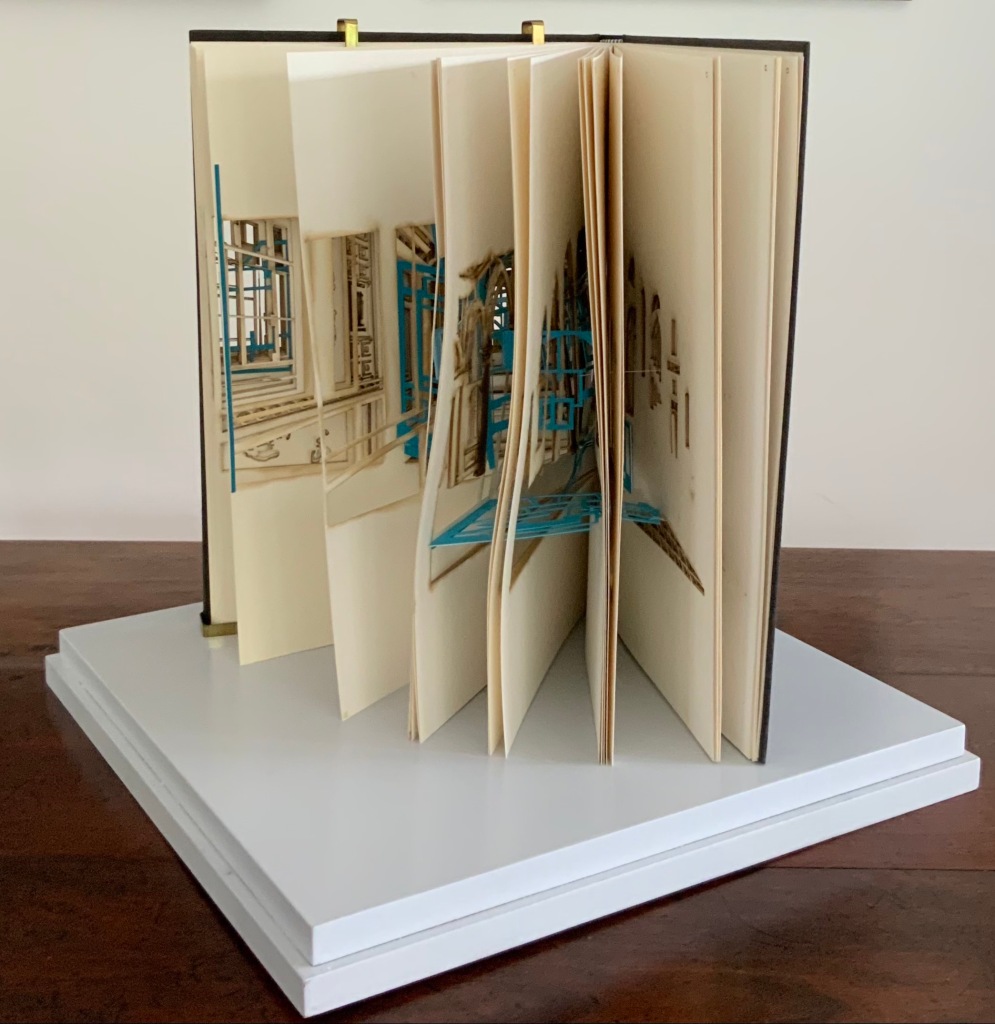
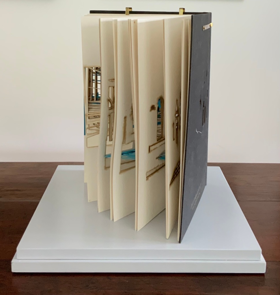
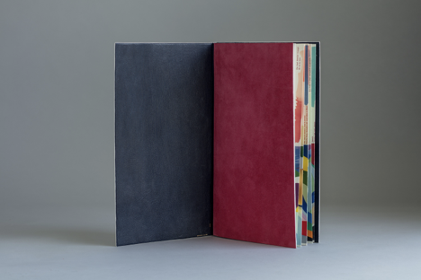
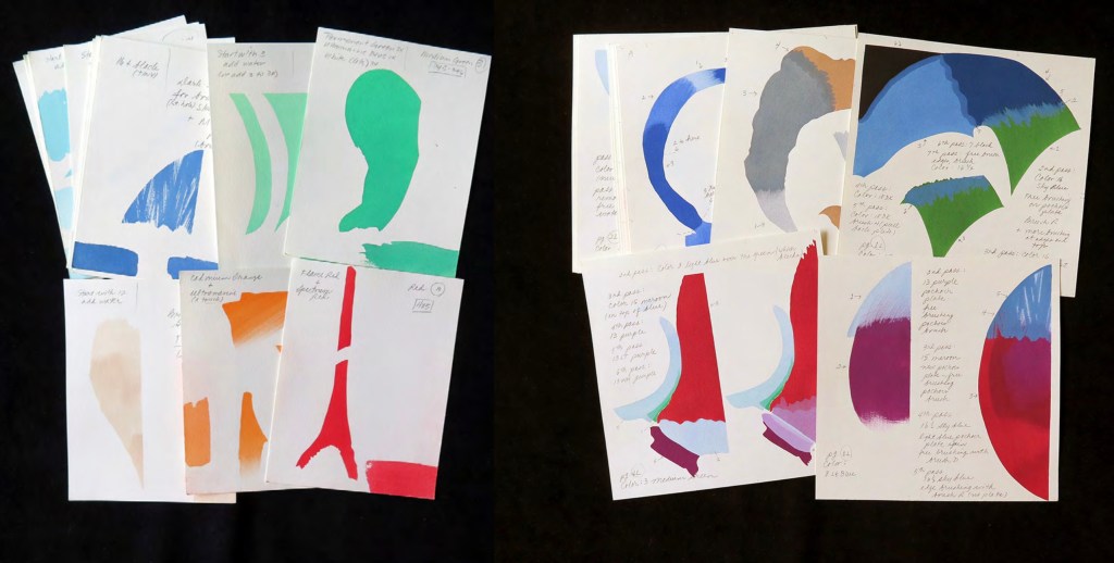
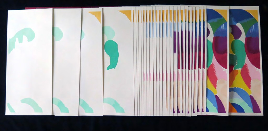
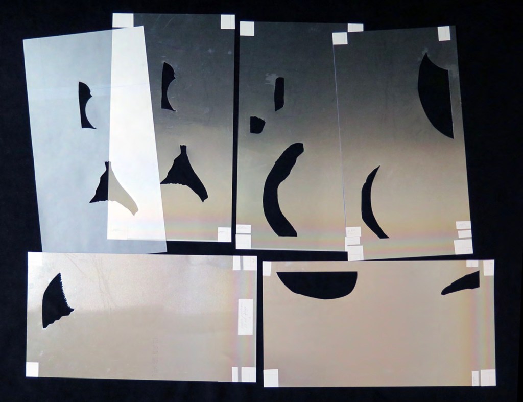
Clever structural use of paper with a stone-like appearance, paired with apt choices of text matched with equally judicious choices in typography, evoke the similarities between books and buildings. Each architect/bookmaker’s contribution is a self-covering booklet in leporello format. Of different heights, the booklets are sewn together to create a tiered tower to be housed in an acrylic slipcase.
The first booklet, open below, incorporates Maryatt’s introduction, entitled “Blueprint”, all of which appears in the work’s entry in the publication Sixty over Thirty: Bibliography of Books Printed Since 1986 at the Scripps College Press (2016). The entry is reproduced in full further below.
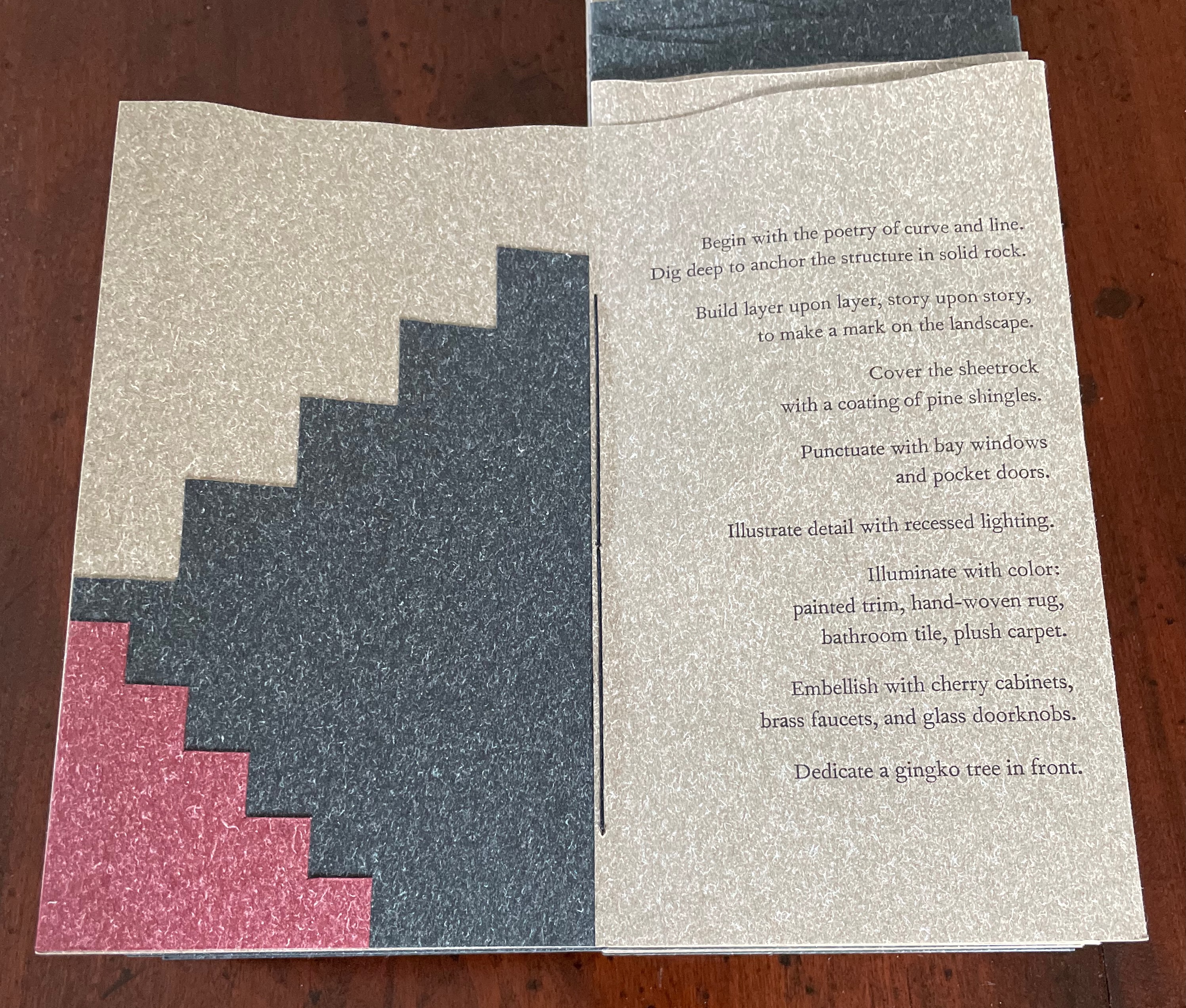
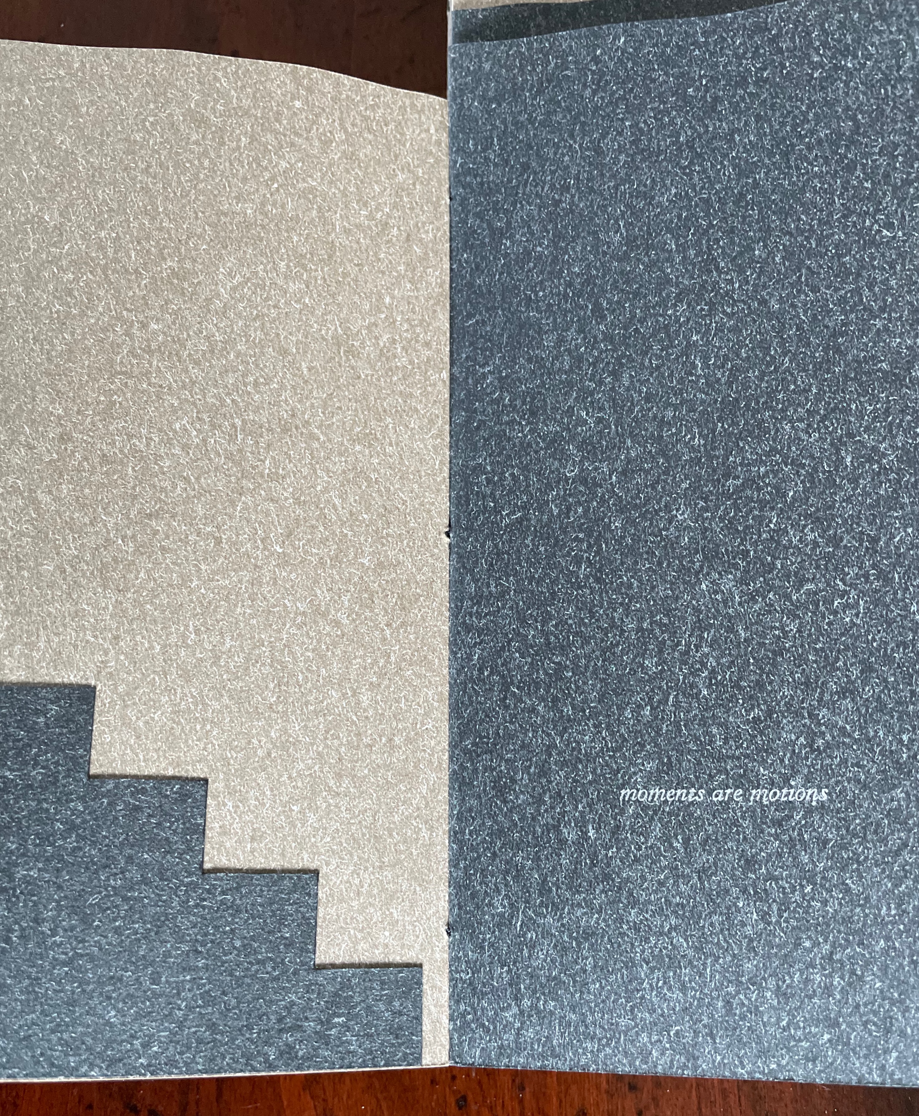
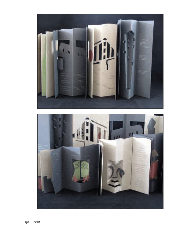
The next booklet lists the sources of architectural inspiration, and as the lattice door on the list’s facing page turns, two sets of stairs, cutouts in contrasting colors, ascend on the verso page to the text that begins at the top of the recto page and ends at the foot of descending stairs on the next double-panel spread. Like Maya Lin, Maryatt’s students built their works by learning to think with their hands. The reader, too, has to think with the hands to experience fully this booklet and those that follow. The whole work conjures up the titles of Juhani Pallasmaa’s books — The Thinking Hand and The Embodied Image. Readers of this online entry will have to expand the images below, enjoy the words and imagine their way through with the title of another of his books — The Eyes of the Skin.
Lynn, Greg. 2004. Folding in Architecture Rev. ed. Chichester, West Sussex: Wiley-Academy. See for references to Mario Carpo, Gilles Deleuze and Peter Eisenman.
Macken, Marian. Binding Space: The Book as Spatial Practice (London: Taylor and Francis, 2018). A trained architect and book artist, Macken articulates and illustrates the how and why of the overlap between architecture and book art.
Williams, Elizabeth. 1989. “Architects Books: An Investigation in Binding and Building”, The Guild of Book Workers Journal. 27, 2: 21-31. This essay not only pursues the topic of architecture-inspired book art but turns it on its head. An adjunct professor at the time, Williams set her students the task of reading Ulises Carrión’s The New Art of Making Books (Nicosia: Aegean Editions, 2001) then, after touring a bindery, “to design the studio and dwelling spaces for a hand bookbinder on an urban site in Ann Arbor, Michigan”. But before producing the design, the students were asked “to assemble the pages [of the design brief and project statement] in a way that explored or challenged the concept of binding”. In other words, they had to create bookworks and then, inspired by that, create their building designs. Williams illustrates the essay with photos of the students’ bookworks. [Special thanks to Peter Verheyen for this reference.]
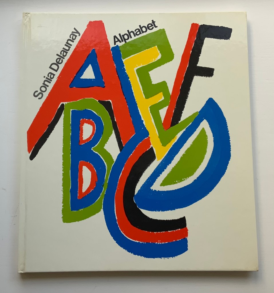
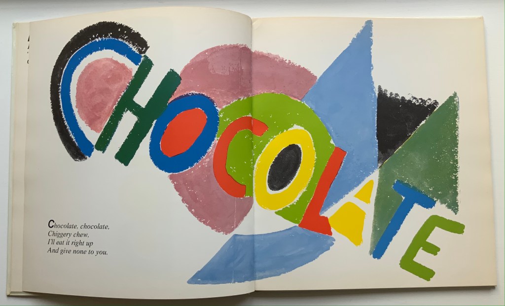
Alphabet (1972) Sonia Delaunay Casebound, illustrated paper over boards. H285 x W255 mm. 54 pages. Acquired from Argosy Bookstore, 7 August 2021. Photos: Books On Books Collection.
Building on a French scientist’s exposition of how perception of colors changes depending on the colors around them, Sonia and Robert Delaunay claimed that rhythmic, musical and spatial synesthetic elements were also at play. At least one page in Sonia Delaunay’s Alphabet suggests that this theory of simultanéisme may have extended to the sense of taste.
The lithographs that led to Alphabet appeared ten years before Delaunay’s death, so maybe it is greedy to wish for at least a fine press edition rather than this trade edition. Given the effort and inspiration needed to fuse the elements of alphabetic art with the elements of book art, it is definitely greedy to wish for an artist’s book edition.
Sonia Delaunay’s genius for merging colors, shapes, canvas, paper and fabric was celebrated in “Sonia Delaunay – A Retrospective” at the Tate Modern in 2015. Asserting a family bond with Delaunay, the artist Alla Malomane revived Maison Sonia Delaunay in 2014. In 2019, Kitty Maryatt re-created Delaunay and Blaise Cendrars’ famous work of book art, which they called le premier livre simultané — La Prose du Transsibérien et de la petite Jehanne de France. And more recently, the exhibition “Maison Sonia” appeared at the Kunstmuseen Krefeld in Germany. So perhaps Sonia Delaunay’s spirit endures, and a greedy wish may be fulfilled by some quarter. Since Maryatt’s effort, a pochoir revival certainly seems to be afoot.
What is it about artists’ books and architecture that they intersect so often? Architectural interiors and exteriors, ideas, themes, styles, landmark dwellings and edifices have found their metaphorical expression and embodiment in book art with such regularity that they make up a genre within the genre. Perhaps it is that, as Victor Hugo expresses it in Nôtre Dame de Paris (1831/1902),
… the human race has two books, two registers, two testaments: masonry and printing; the Bible of stone and the Bible of paper. … The past must be reread upon these pages of marble. This book, written by architecture, must be admired and perused incessantly; but the grandeur of the edifice which printing erects in its turn must not be denied. (Book V, Chapter 2, p. 187)
Or perhaps it is even more fundamental. As Hugo asserts in his posthumous The Alps and the Pyrenees (1890/1895):
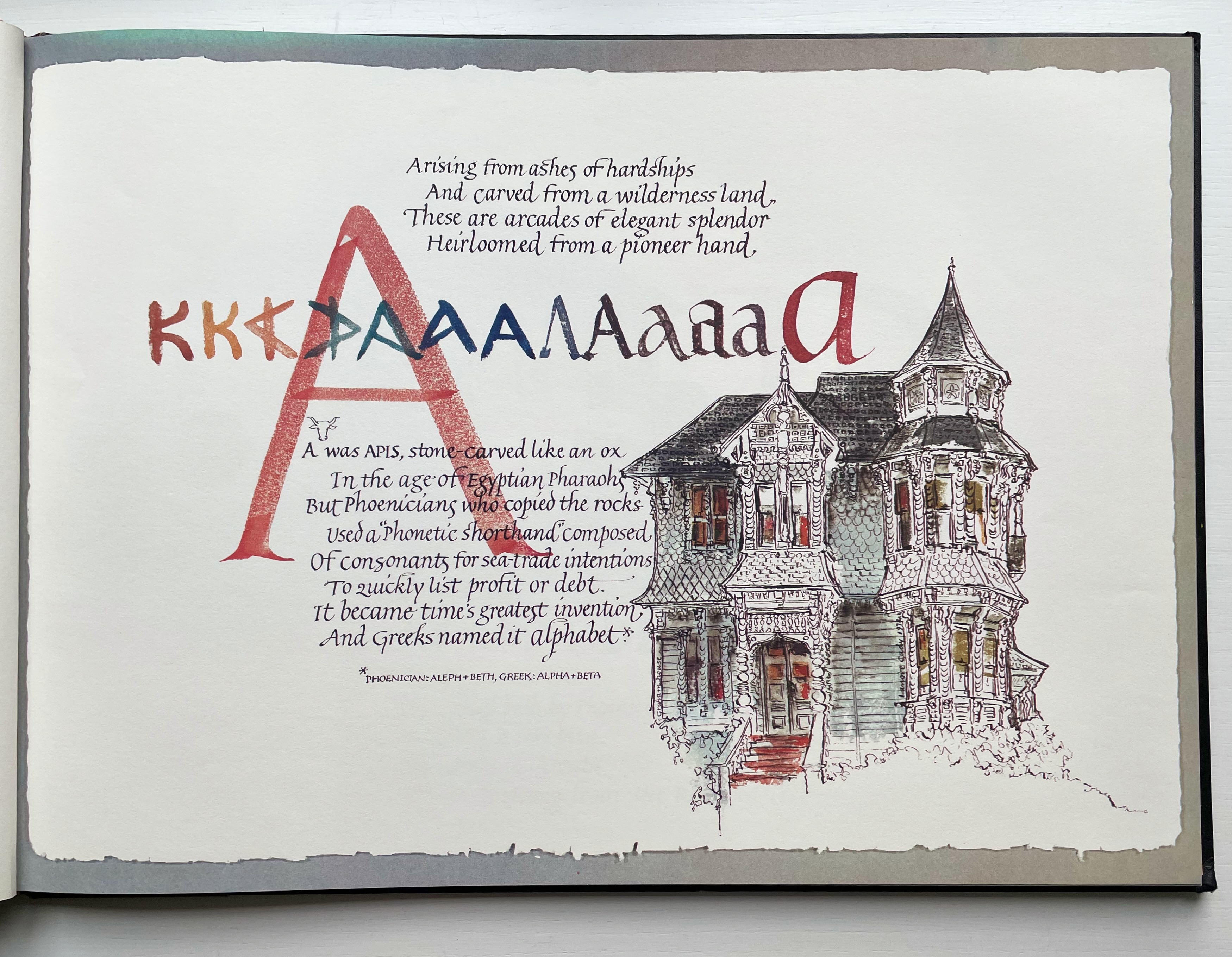
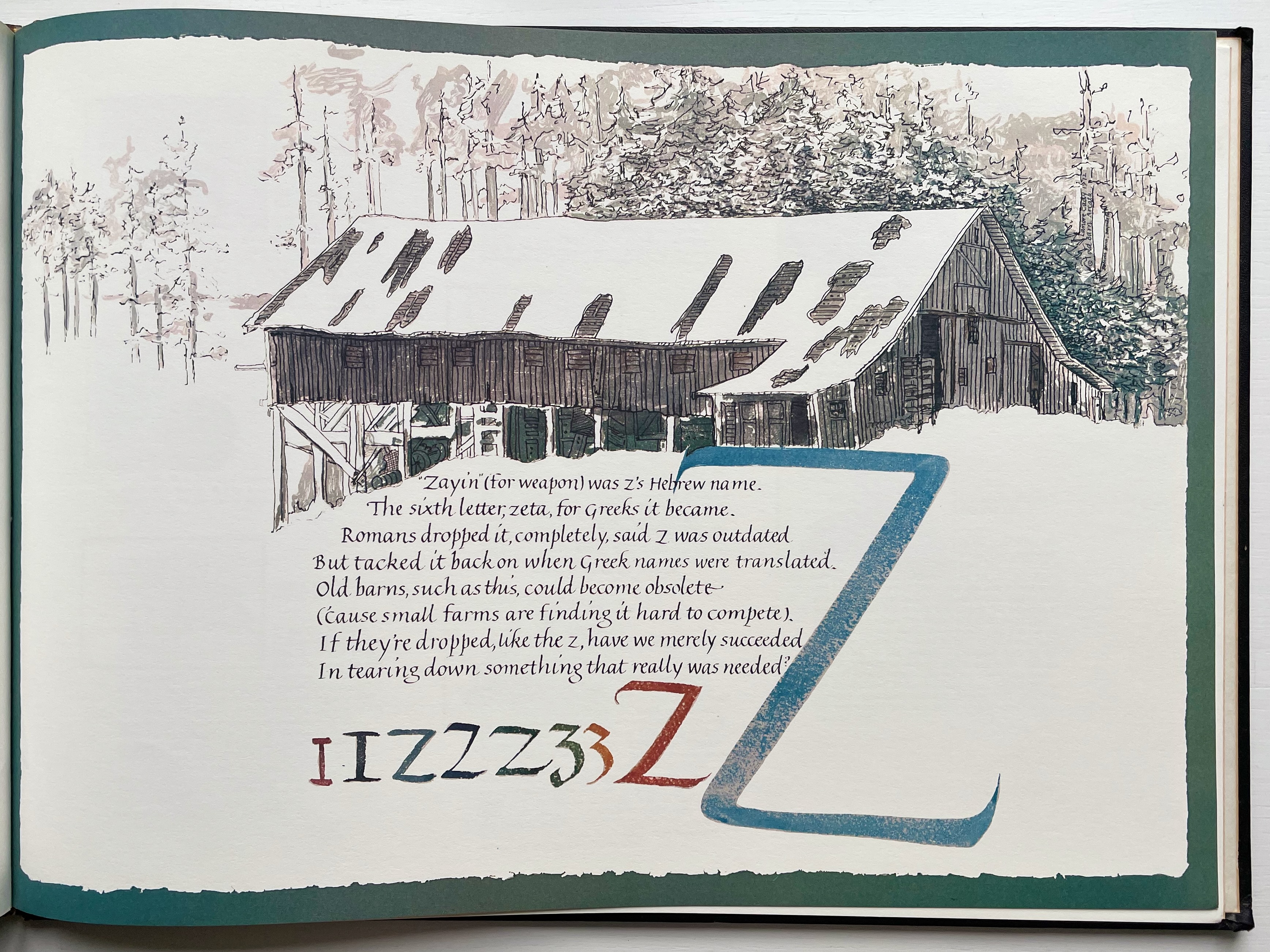
All letters were signs at first, and all signs were images at first…. Human society, the world, man as a whole, is in the alphabet….A is the roof, the gable with its cross-beam, the arch, arx; … Z is the lightning, it is God. (pp. 64-65)
Beneath the mysticism and pareidolia, Hugo is on to something. Maybe the affinity of books and architecture lies in the origin of the raw material of books — the alphabet — whose second letter comes from a mark signifying shelter or house.
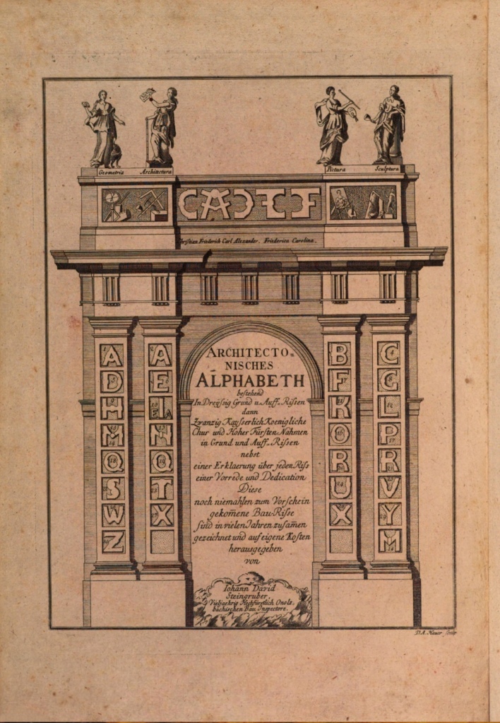
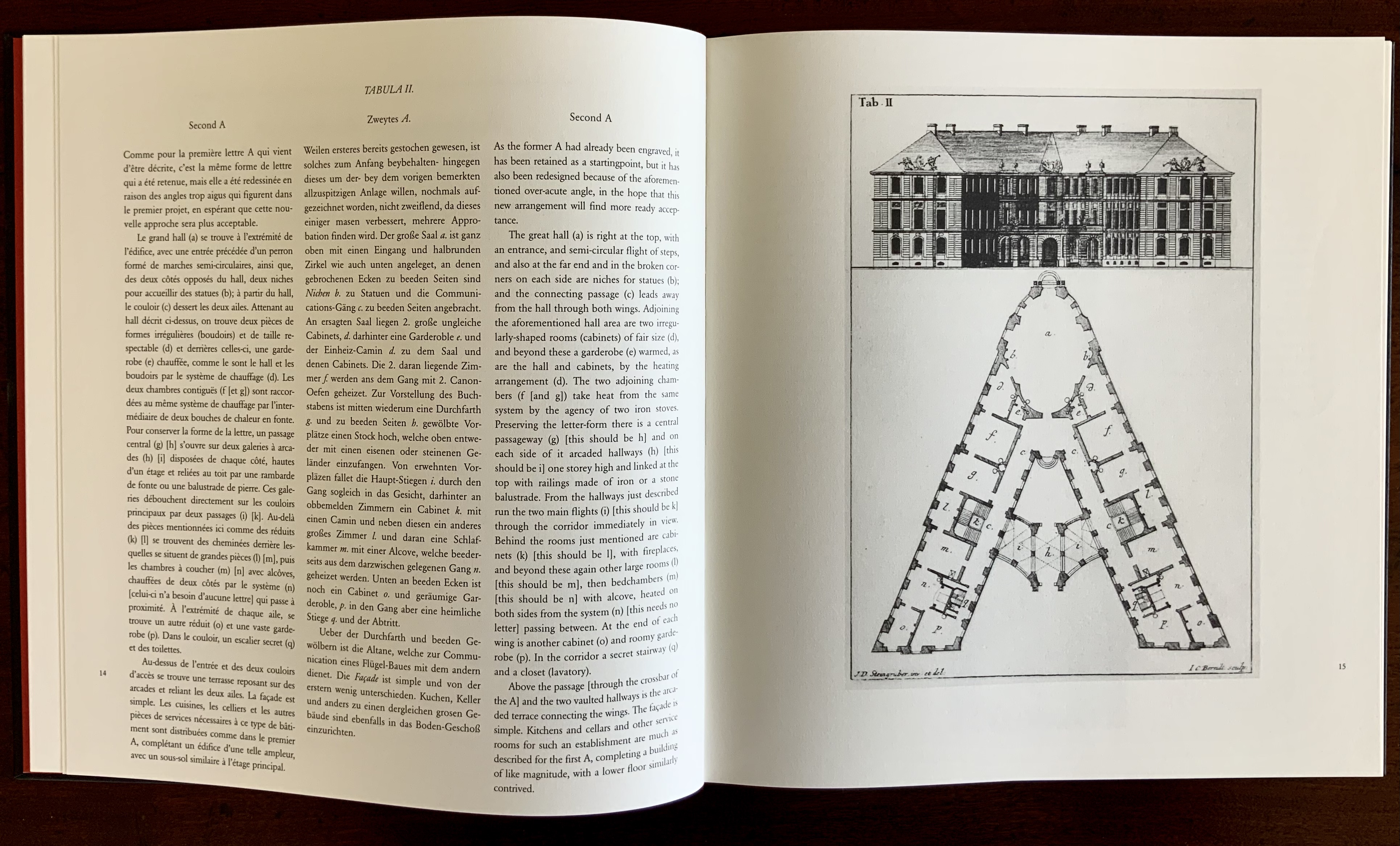
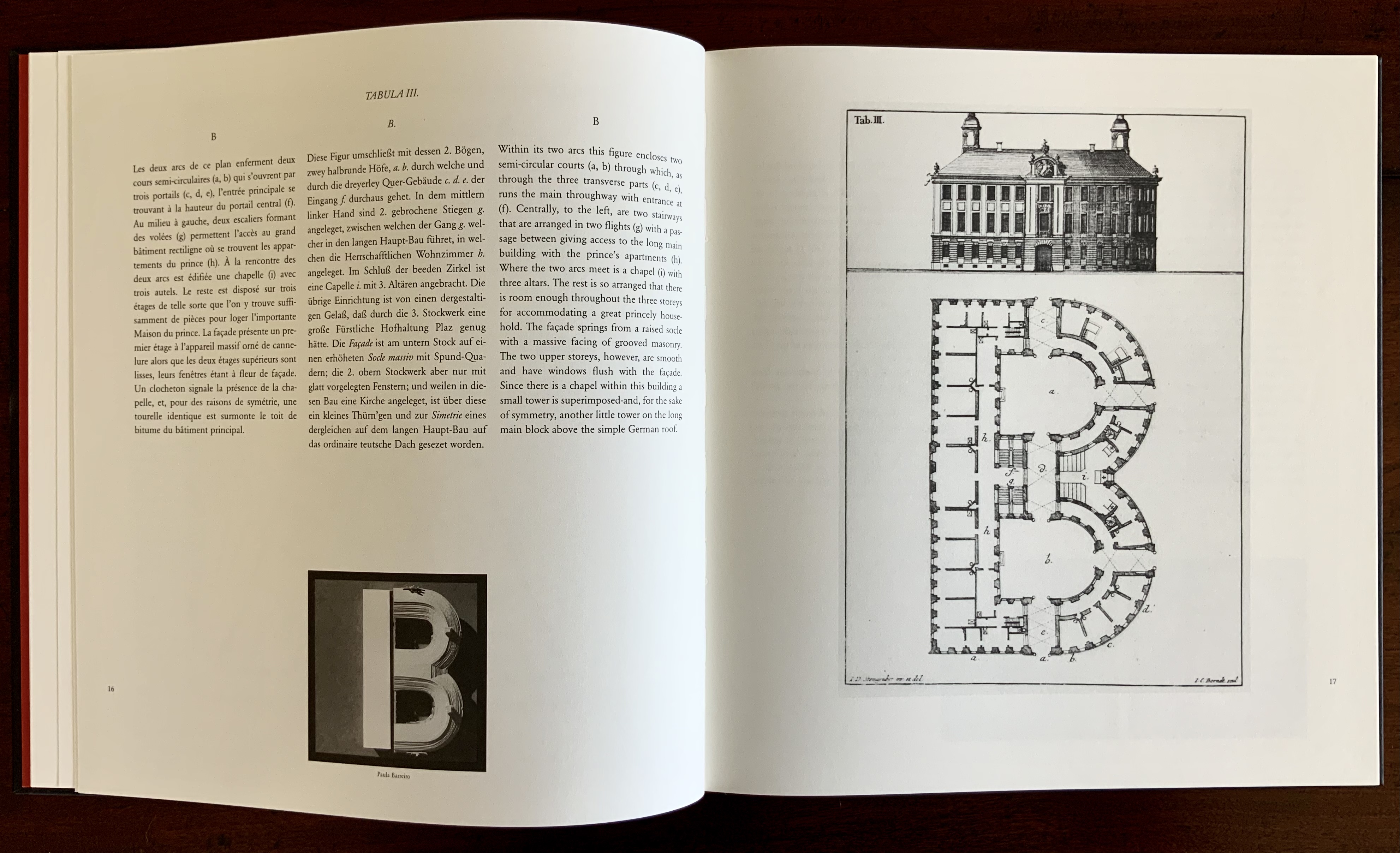
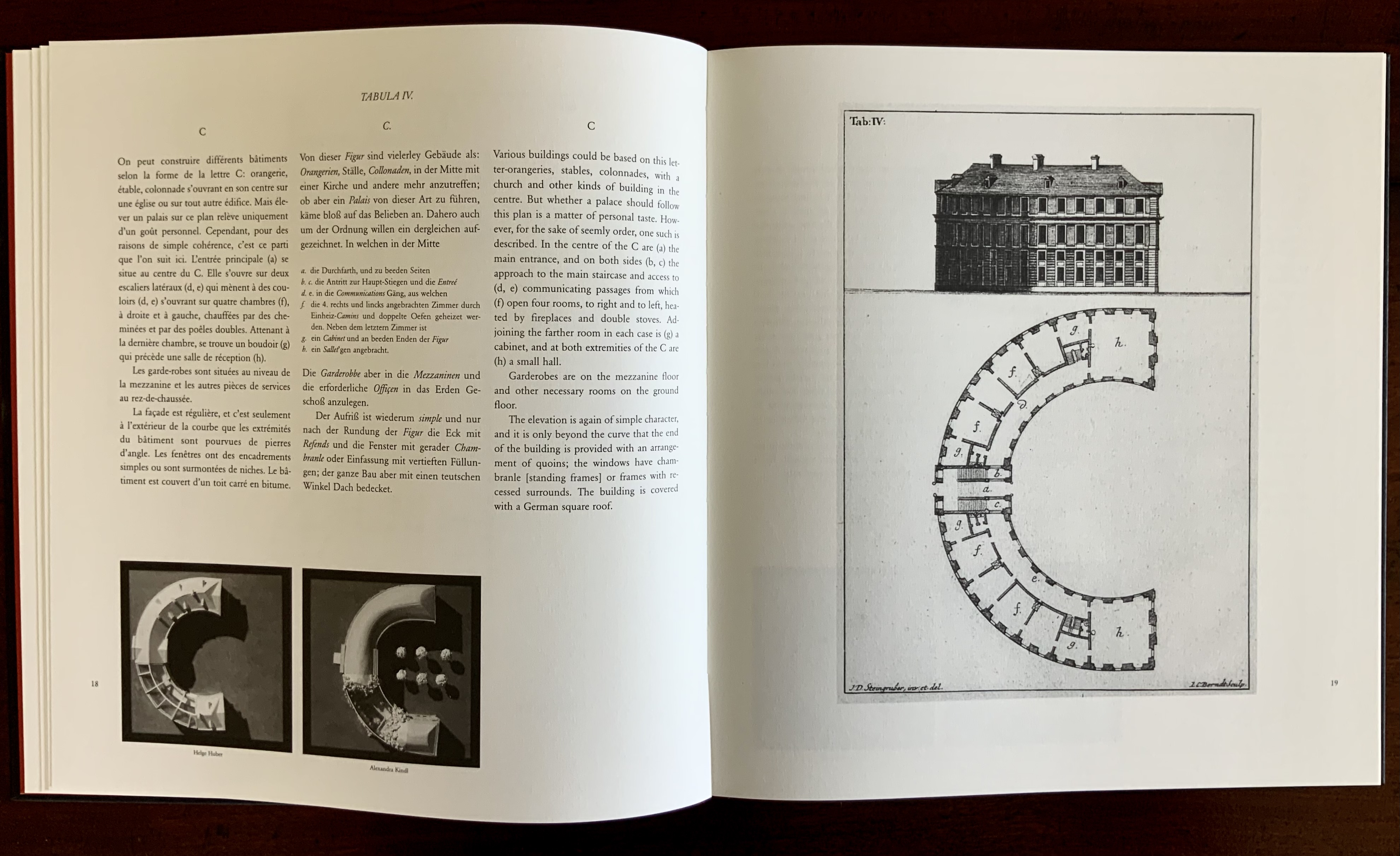
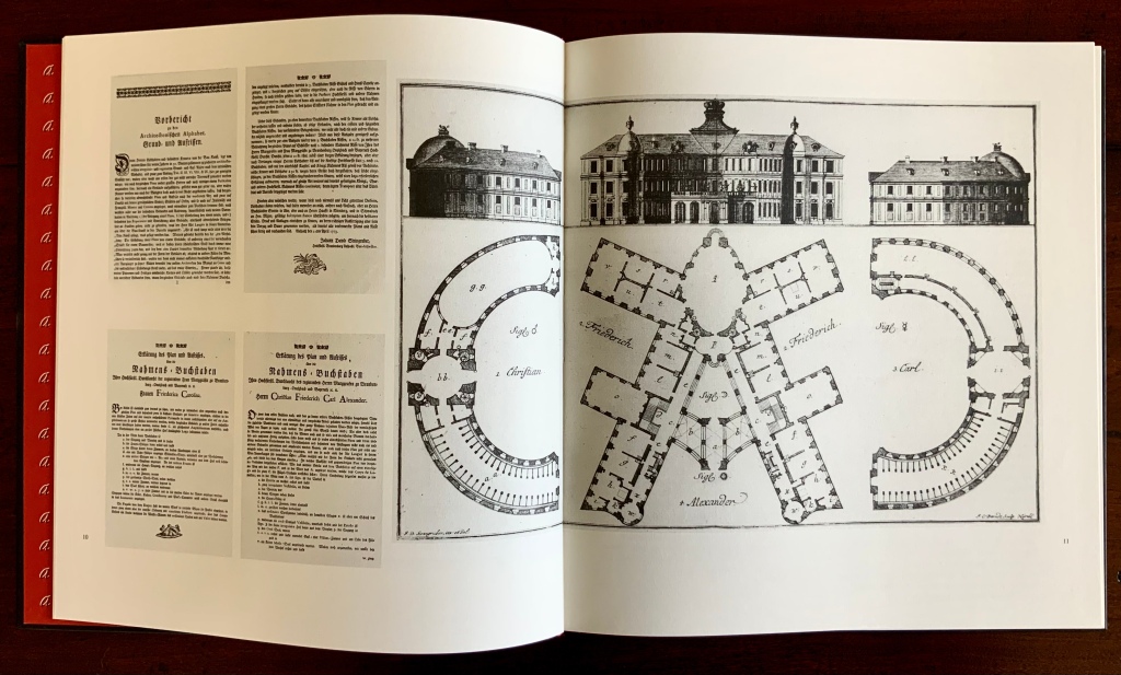
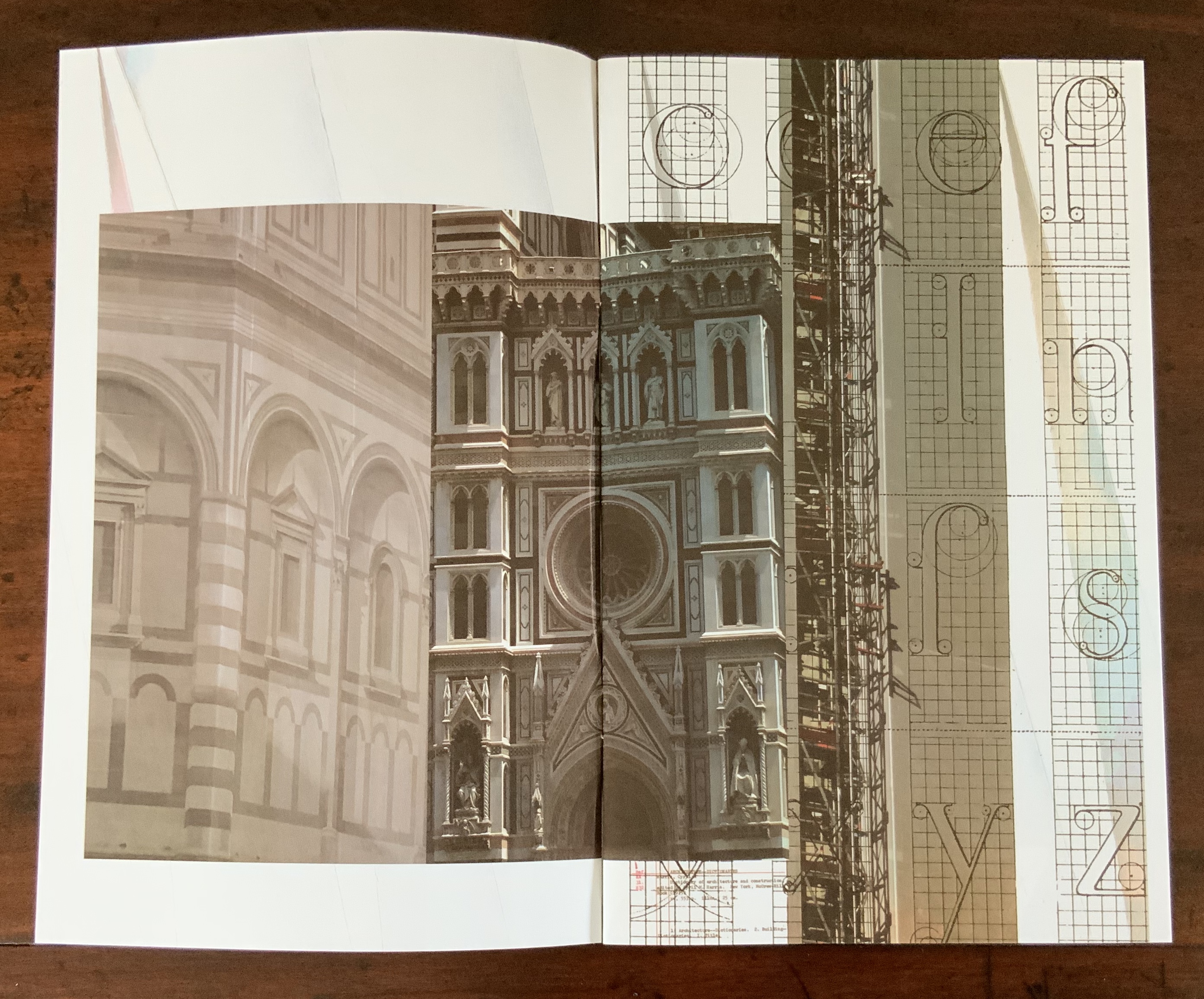
This wondering and wandering about the intersection of architecture and the artist’s book is prompted by the 250th anniversary of the publication of Johann David Steingruber’s Architectonisches Alphabeth(1773). This postcard-famous volume of print folios depicts architectural elevations and plans for residences in the shape of the letters of the alphabet. It is dedicated to Christian Friedrich Carl Alexander, Margrave of Brandenburg-Ansbach, not to be confused with the paying dedicatee of Bach’s Brandenburg Concertos, the Margrave of Brandenburg-Schwedt. By a baroque coincidence, however, the first Brandenburg concertos, the ones composed by Giuseppe Torelli and influencing Bach, are dedicated to the Margrave of Brandenburg-Ansbach, then George Friedrich II, Alexander’s great-uncle who employed Torelli as court composer. Unlike Bach, however, Torelli received no direct payment for his composition. Steingruber too had to be satisfied with his payment as an appointee (court and public surveyor, and later principal architect of the board of works).
Steingruber may have felt he had good reason to be miffed. After all he had published the volume in installments at his own expense and made sure that the Margrave’s monogram (and that of Carolina Frederica, his wife) in building form appeared in the span above the roman arch on the title page. His elevations and plans draw attention to the heating, kitchen, toilet and servants’ arrangements as if conferring with a prospective client ready to commission one of these typographic palaces. Perhaps he was thinking, Who would not want a serif with a view? Or conduct guests on a tour of the bowl, capline, crossbar, stem, stroke and tail of the property? In a flourish that illustrates the intersection of book and architecture, the title page presents the title and subtitle inside an arch and serves double duty as a Table of Contents with thumbnail images of the letter-shaped buildings to come inscribed on the columns.
Munich, Bavarian State Library
To celebrate the Architectural Alphabet‘s 250th anniversary, this online essay/exhibition explores sixteen propositions about the affinity of architecture and artists’ books. Examples supporting each proposition include works from within and without the Books On Books Collection, and each example includes a link or links for additional views of the work. Every effort has been made to provide bibliographical (or webliographical?) links from WorldCat and the Internet Archive. The former will allow the reader to find local libraries that hold a copy of the exhibited work to be viewed in person; the latter will partly address the problem of broken links. Where broken links (or factual errors) do appear, readers are encouraged to alert the curator in the Comments section at the end of the essay/exhibition.
Proposition #1: The affinity of architecture and artists’ books lies in the alphabet.
Architectonisches Alphabeth (1773/1995) Prepared by Joseph Kiermeier-Debre and Fritz Franz Vogel for Ravensburger Verlag.
Of course the first exhibit would be Steingruber’s Architectural Alphabet, but related works — before and after, published or built — will clamor for admission: Geofroy Tory’s Champ Fleury (1529/1927/1998), Antonio Basoli’sAlfabeto Pittorico(1839/1998), Giovanni Battista de Pian’s Alphabetto Pittoresque (1842), and Daniel Libeskind’s Contemporary Jewish Museum (2000), whose form within the walls of a former power substation is composed of two Hebrew letters — the Yud and the Chet — which make up the word Chai (“Life”).
Left to right: Tory/Rogers, Basoli, Battista de Pian (Photos by Books On Books Collection), Libeskind (The Yud Gallery, Photo by Paul Dyer).
Lanore Cady’s Houses & Letters(1977) is another work supporting the proposition, in this case with calligraphy, watercolor and verse.
More than the novel inventions and historical associations above, though, the space within and around a letter, a building and the artist’s book suggests the real root of the affinity. As cultural historian Fiona MacCarthy put it: “‘the Italians knew by instinct what we are slowly grasping, that the meaning of the city is not so much a matter of the buildings as the spaces in between.’” To which John Ryder added: “‘This is exactly how typography works.’” (From David Esslemont’s Inside the Book, 2002). And it is exactly how book art works.
Proposition #2: The affinity of architecture and artists’ books lies in telling stories.
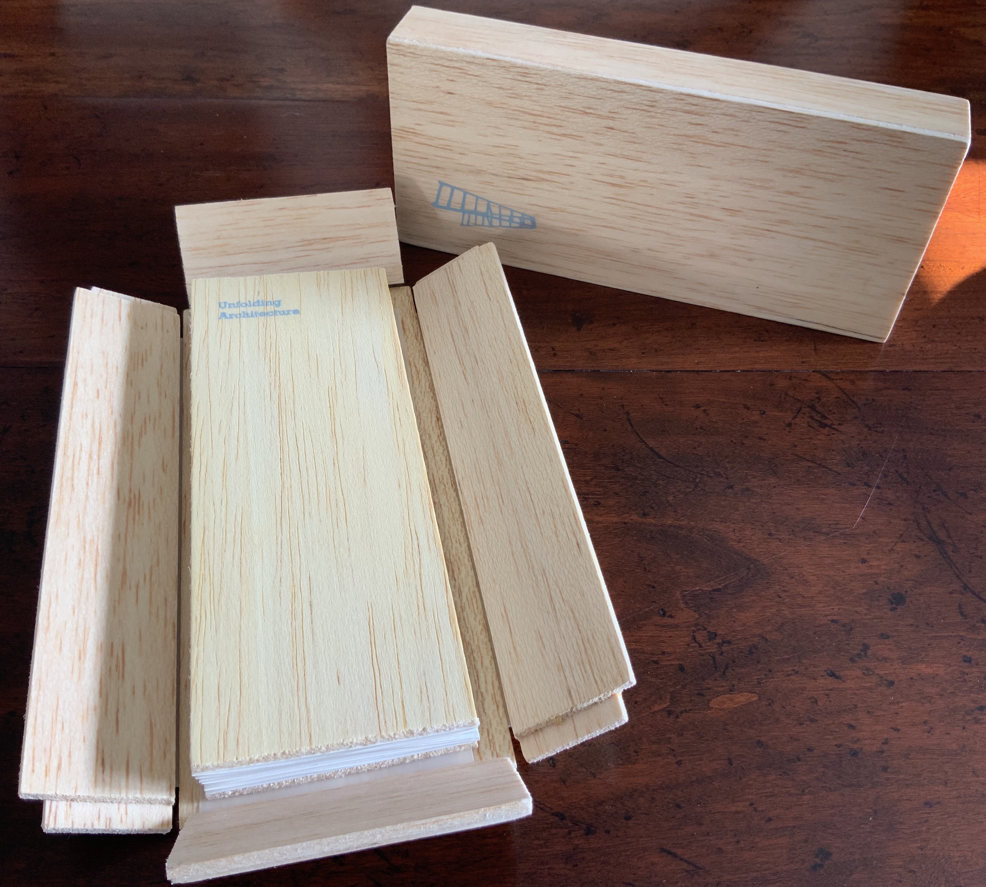
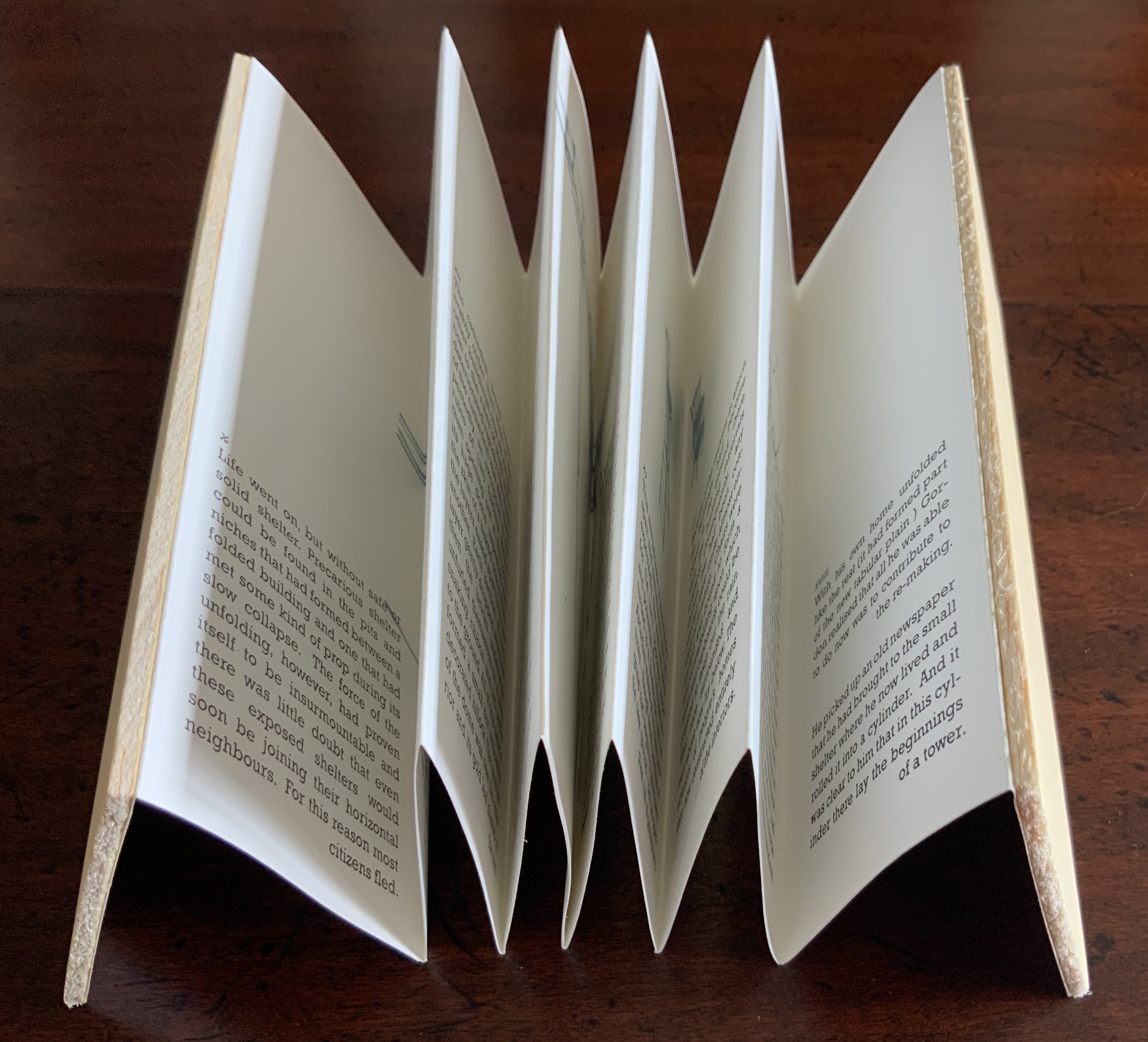
As Daniel Libeskind has said, “For me, a building is a medium to tell a story.” Emily Speed’s Unfolding Architecture (2007) tells the tale of Gordon, a city dweller who witnesses the collapse of public buildings and, ultimately, his own home as the urban fabric begins to unfold around him — a story replicated by the housing’s structure and the book’s accordion fold.
But Ulises Carrión denied that books are about narrative. Instead they are about space and time, which leads to the next proposition.
Proposition #3: The affinity of architecture and artists’ books lies in space and time.
Olafur Eliasson’s Your House (2006) is a laser-cut model of his residence in Copenhagen at a scale of 1:85, which means that each page equates to a 220 mm section of the actual house. In the film Russian Ark (2003), Aleksandr Sokurov made cinematic history with his one continuous shot in 90 minutes, depicting a 17th century time traveller moving through different periods of history as he moves through the rooms of St. Petersburg’s Winter Palace. The film inspired Johan Hybschmann’sBook of Space (2009).
How do you read works like this? The size, weight and delicacy of Eliasson’s book and the fragility of Hybschmann’s book and its need for an armature to freeze-frame it defy a simple turning of pages. They must be turned slowly and carefully. Both works heed the task of the arts as posed by architect Juhani Pallasmaa for our age of speed: to defend the comprehensibility of time, its experiential plasticity, tactility and slowness (The Embodied Image, p. 78).
Proposition #4: The affinity of architecture and artists’ books lies in process.
A trained architect and book artist, Marian Macken articulates and illustrates in her book Binding Space why and how the artist’s book can serve as an important tool for design, documentation and critique of architecture. Macken’s perceptive descriptions show how to observe materiality and its functioning and understand how they contribute to the making of art.
Investigating bookness results in the book becoming a highly productive intervening medium with which one can imagine, investigate, analyze, represent and exhibit particular qualities — haptically, and with narrative and ambiguity — of a built environment and the design process. Through the book, we read spatial practice anew (p. 163).
Reading Macken’s book will sharpen the ability of any reader or viewer to appreciate book art, especially her Ise Jingū: Beginning Repeated. Ise Jingū is a Shinto shrine complex in the Mie Prefecture, Japan. “Once every 20 years, since … the seventh century, every fence and building is completely rebuilt on an identical adjoining site, a practice of transposition known as shikinen-zōkan” (Binding Space, p. 101). For Macken, this ritualistic rebuilding poses architecture as performative process rather than as inert object; it “manifests the replication of a beginning, of a process” (p. 100).
Macken’s artwork consists of 61 loose sheets with a watermarked image within each, the number reflecting the 61 iterations of the shrine up until the making of this work of book art. The watermark is a perspective image based on Yoshio Watanabe’s photograph of the Inner Shrine, taken in 1953 on the occasion of the 59th rebuilding. The contrast of the watermark in kozo and the movement of its placement from one sheet to the next entice reflection on the phenomenon of representation and the architectural process of shikinen-zōkan.
Proposition #5: The affinity of architecture and artists’ books lies in phenomenology.
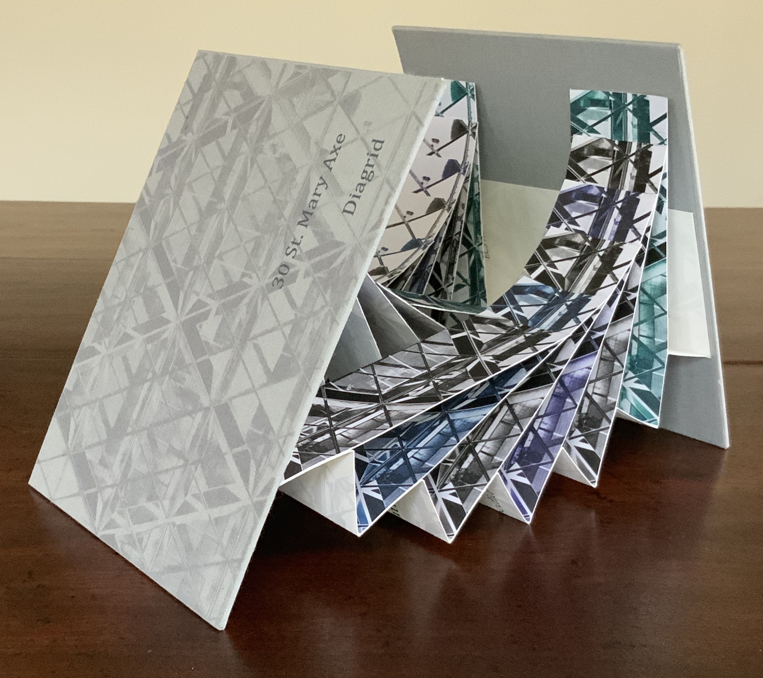
Architects such as Alfredo Muñoz and his firm ABIBOO, Juhani Pallasmaa and Peter Zumthor are among those often associated with architectural phenomenology, concerned with perception psychology, focused on the primacy of sensory and experiential qualities. Norman Foster and phenomenology are not so often yoked, but 30 St Mary Axe: Diagrid (2009) and 30 St. Mary Axe: Cladding(2009)– Mandy Brannan’s treatments of his iconic London office tower (aka “the Gherkin”) that refocus the perception and experience of it — might prompt reconsideration.
Proposition #6: The affinity of architecture and artists’ books lies in geometry.
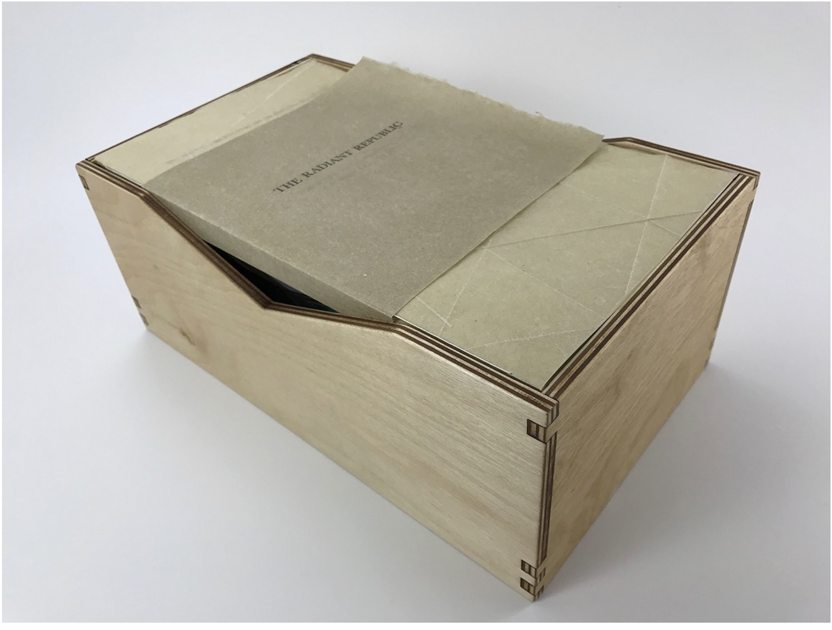
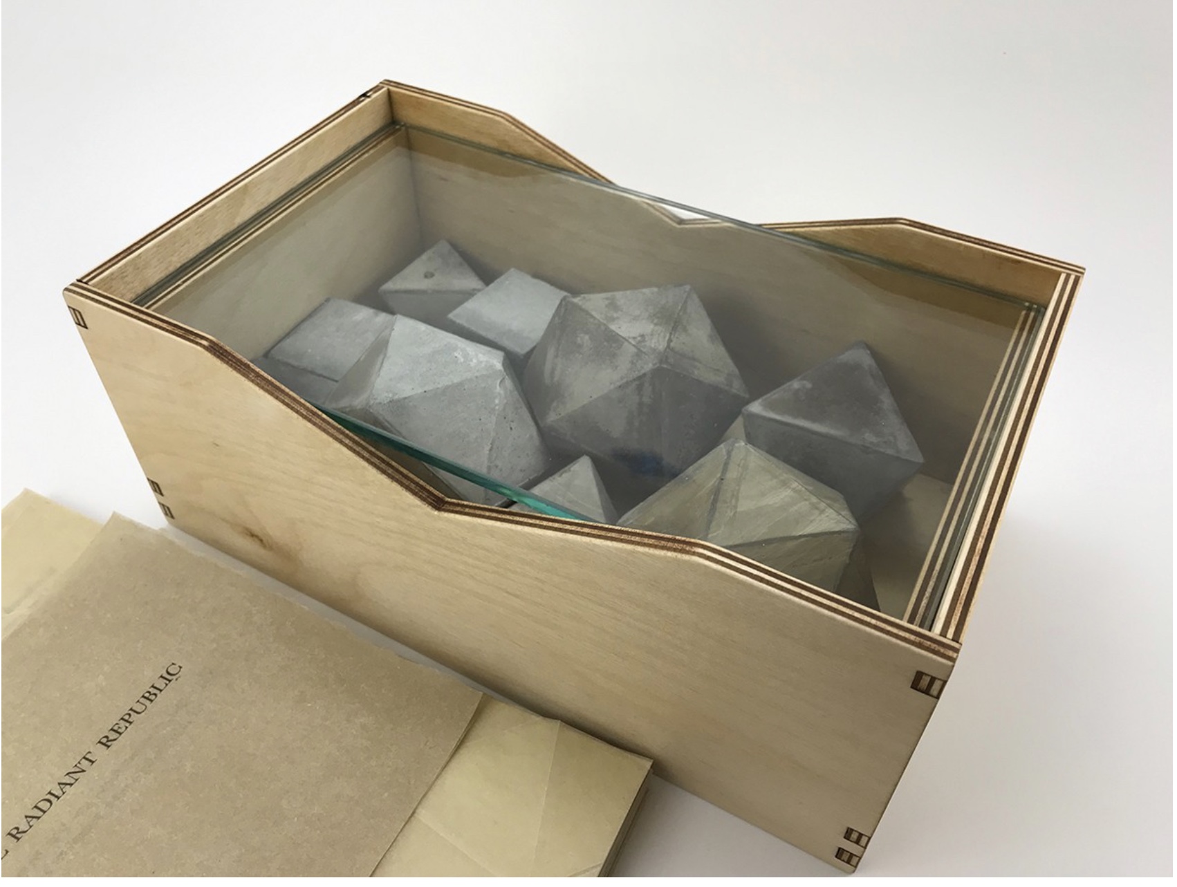
Sarah Bryant’s The Radiant Republic(2019) insightfully integrates Plato’s and Le Corbusier’s texts and ideas. The very physicality of the blond wood, linen cover, glass window, concrete representations of Platonic solids, embossed type and sewn papers could easily be a response to Juhani Pallasmaa’s comment: “The current overemphasis on the intellectual and conceptual dimensions of architecture contributes to the disappearance of its physical, sensual and embodied essence” (The Eyes of the Skin, p. 35).
Proposition #7: The affinity of architecture and artists’ books lies in modelling.
Helen Malone’s Ten Books of Architecture (2017) takes a broad historical and, most important, haptic view of architecture from Vitruvius to Hadid. Each of the ten books is a bookwork that models its architectural subject.
Proposition #8: The affinity of architecture and artists’ books lies in folding.
At the end of the 20th century, architects like Peter Eisenman, Jeffrey Kipnis and Greg Lynn latched on to computer-aided design and Gilles Deleuze’s Le pli: Leibniz et le baroque (1988) / The Fold: Leibniz and the Baroque (1993). This led to real constructions such as Eisenman’s Rebstock Park in Frankfurt as well as to the seminal books Folding in Architecture (1993), edited by Lynn, and Folding Architecture 92003) by Sophia Vyzoviti.
Folded book pages rarely generate a work that rises above mere craft. Heather Hunter’s Observer Series: Architecture(2009) achieves the necessary height. It combines the altered book with an accordion book that incorporates a found poem composed of the words excised and folded outwards from the folded pages of The Observer’s Book of Architecture.
Proposition #9: The affinity of architecture and artists’ books lies in light.
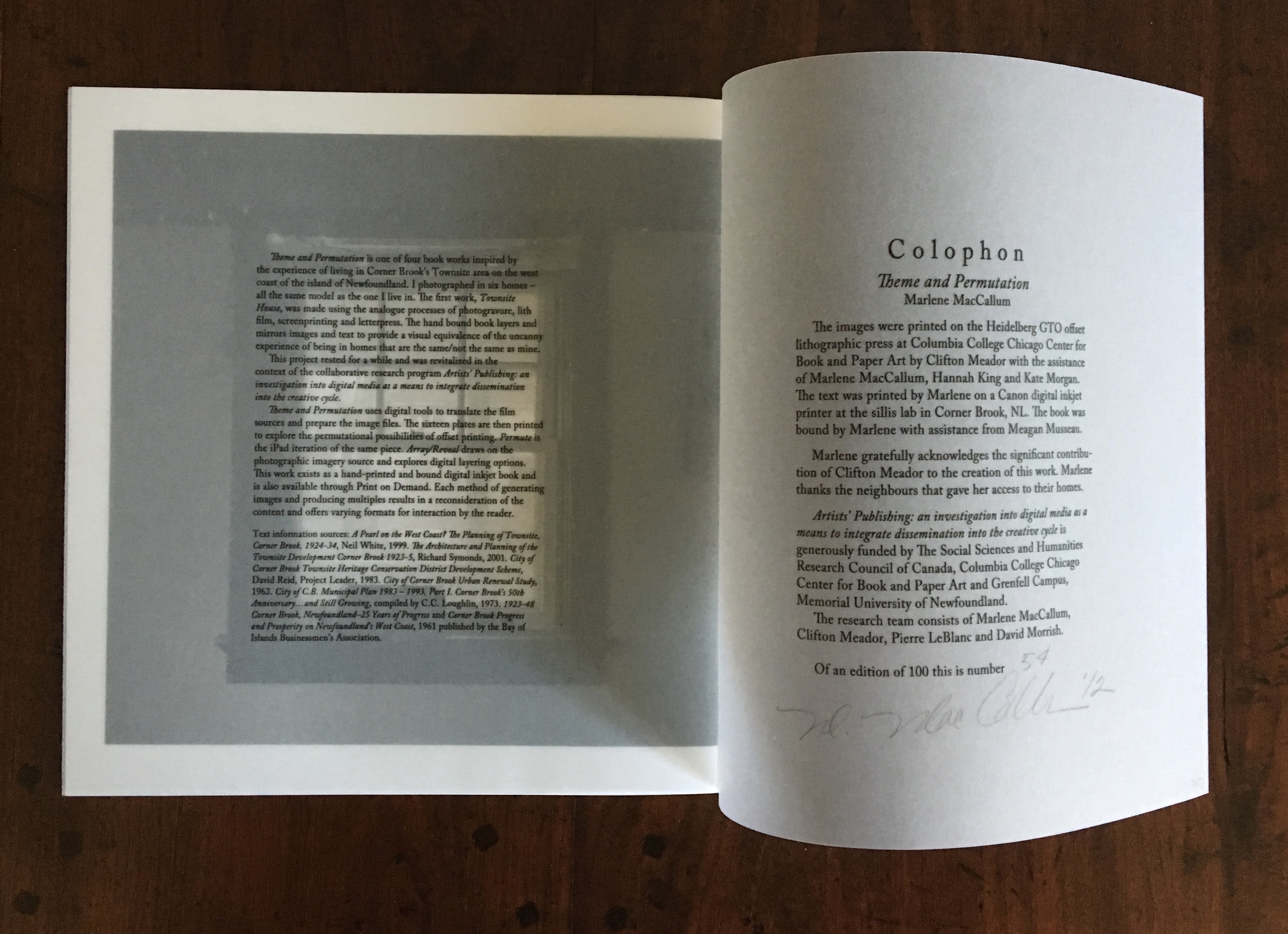
Marlene MacCallum’sTheme and Permutation(2012) is a response to the permutations and variations over time in five houses built to a common plan in Townsite area of Corner Brook, Newfoundland. MacCallum used digital tools to translate the original film source of eight different window images from the houses. A tritone image of a single Townsite window under translucent pages opens the book. As the pages turn, new window images appear and layer over each other, darkening up to the book’s mid-point. In the center spread, two text blocks appear speaking to the history, architectural permutations and economic shifts of the Townsite area. The tonality begins to lighten over the ensuing new combinations of window layers. A third text block of personal narrative is introduced, and a tritone image of one of the Townsite windows in its original condition concludes the work.
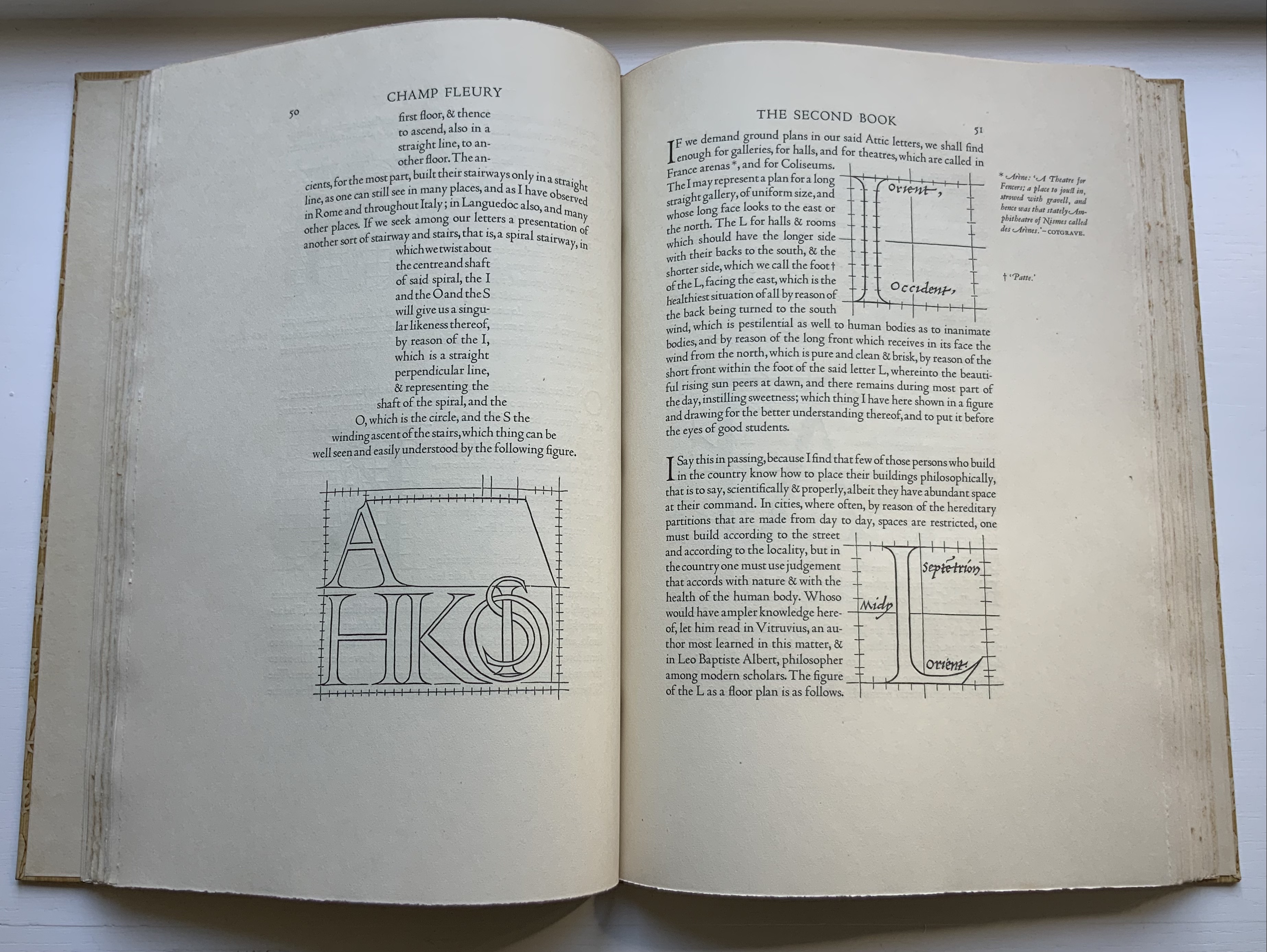
Proposition #10: The affinity of architecture and artists’ books lies in perspective.
Cees Nagelkerke’s Piranesian Window (1996) resides in the Vedute Foundation’s collection of “spatial manuscripts”, invited works that must conform to the dimensions of the Gutenberg Bible. Piranesian Window‘s form and title capture multiple meanings of vedute (“views”). Views are things seen — which this spatial manuscript is. Views are prospects from which to see — which a window offers. Views are perspectives — for which Giambattista Piranesi’s etchings are famous. Views are thoughts held — which “Piranesian” implies (the work’s title could be that of a manuscript on art history and philosophy). Piranesi’s mid-eighteenth century etchings Vedute di Roma(“Views of Rome”) and Carceri d’invenzione (“Imaginary Prisons”) are the obvious sources of inspiration, but Nagelkerke provides an interview describing the dream source of the work:
– … Please, continue relating your dream … – I wandered through vast ruins … along wrecked bridges … feeling remarkably at ease. – How did you find the window in this windowless world? – When a cool breeze wafted inside, I suddenly saw it. It showed a landscape, within the distance a city. There was complete tranquillity and harmony there, like in a painting by Piero della Francesca … I stood there for some considerable time and I became increasingly saddened, because I discovered that I was looking at something that had vanished forever. – But how did you manage to take the window? – I wanted to touch it … as a result, I immediately fell down. The gap left in the wall closed by itself … I picked it up and continued on my way, meeting people who spoke to me saying that I should leave the Carceri. I was taken to a gateway. No one looked at, or said anything about, the window… In the square where I found myself, there was an intense, chaotic commotion. The window still reflected something of the vast space I had left. The exterior showed traces of the wall in which it had been mounted. I looked through it and saw everyday life …
Proposition #11: The affinity of architecture and artists’ books lies in archaeology.
Mill: A journey around Cromford Mill, Derbyshire (2006) by Salt + Shaw (Paul Salt and Susan Shaw) is the result of the artists’ exploration of Cromford Mill in Derbyshire, the first water-powered, cotton-spinning mill developed by Richard Arkwright in 1771. Bound in a cover of recycled wooden library shelves, three plaster cast blocks and seven calico pocket pages containing hidden texts imply the hidden archaeological history to be found. The forensic-like casts are taken from interior surfaces, and the texts walk the reader step by step through each area of the mill.
Proposition #12: The affinity of architecture and artists’ books lies in assemblage and collage.
Based on an architectural installation at the Minnesota College for Art and Design and drawing on her photos of Ayvalik, Amsterdam, Florence, Istanbul, New York City, Rome, San Diego and Venice, Karen Wirth’sPaper Architecture (2017) certainly prompts a revisit to MoMA’s “Cut ’n’ Paste: From Architectural Assemblage to Collage City“, 10 July 2013 – 5 January 2015, to prove this proposition.
Proposition #13: The affinity of architecture and artists’ books lies in luxe.
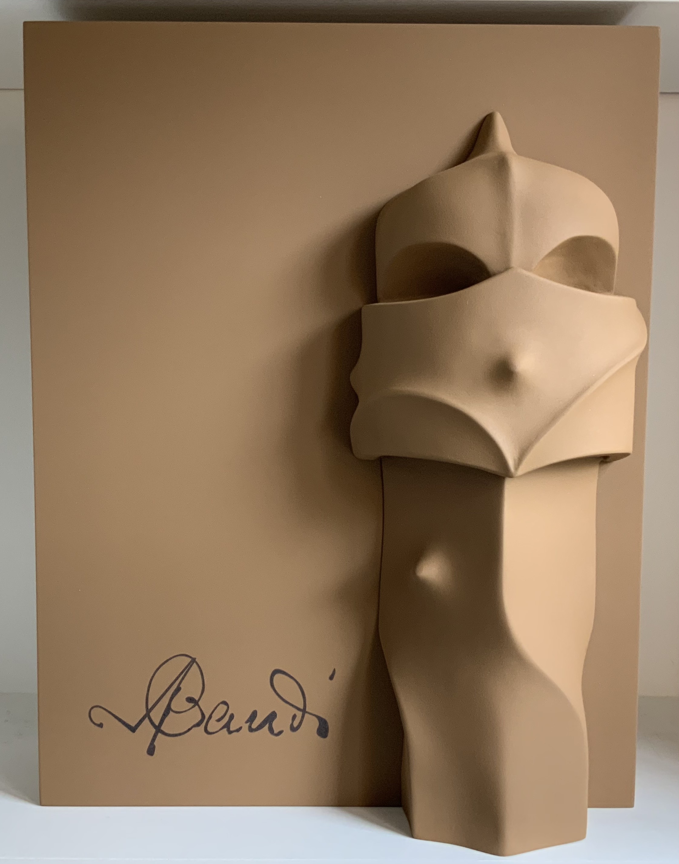
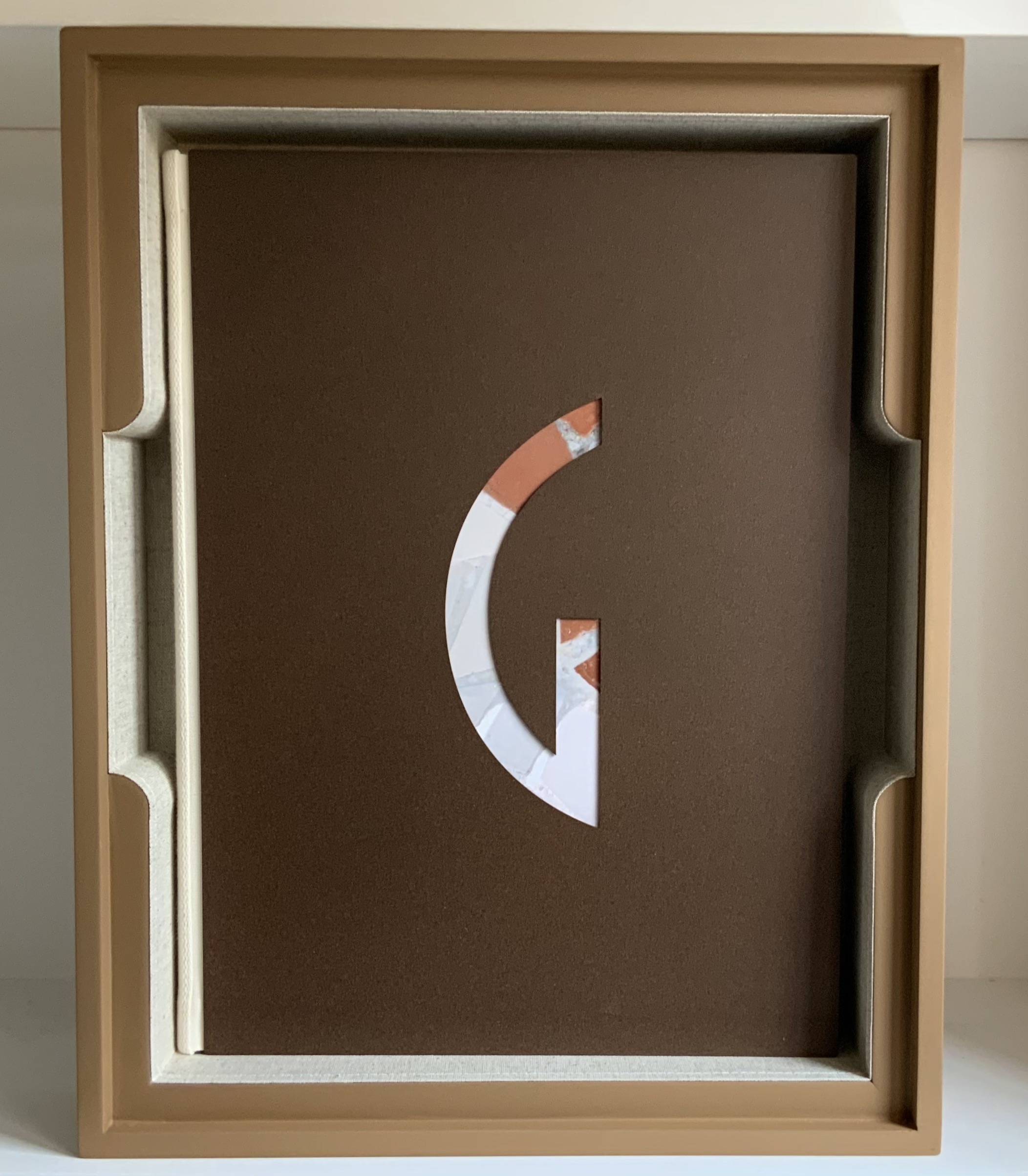
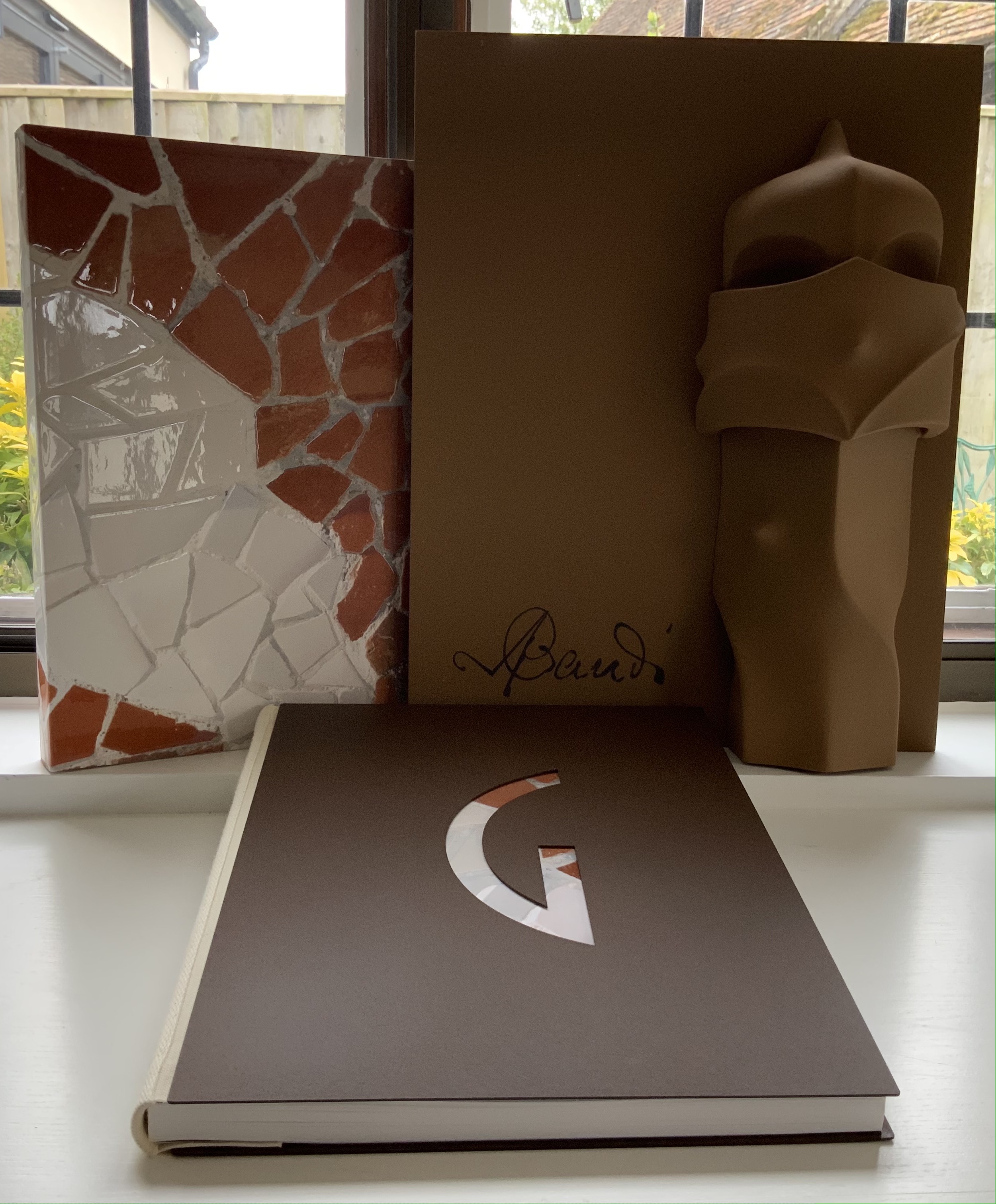
Early theorists, critics and artists of book art expended great effort to exclude livres d’artiste and deluxe productions from the definition of a form of art that struggled to find a name: artist’s book, artists’ books, bookworks, book art, etc. The spectrum from objects of conspicuous consumption to democratic multiples characterizes both architecture and book art. Antoni Gaudí’s architectural efforts easily span that spectrum — from his Casa Milà to his tiles found underfoot in Barcelona’s Passeig de Gràcia. Under the guidance of Juan José Lahuerta (chief curator at the National Museum of Art of Catalonia), the publisher Artika produced Gaudí Up Close(2020), enclosed in a wooden case with marble sculpture finished in paint, cement powder and anti-graffiti varnishes and lined with Naturlinnen fabric.
Gaudí Up Close(2020) Published by Artika. Photos: Books On Books Collection.
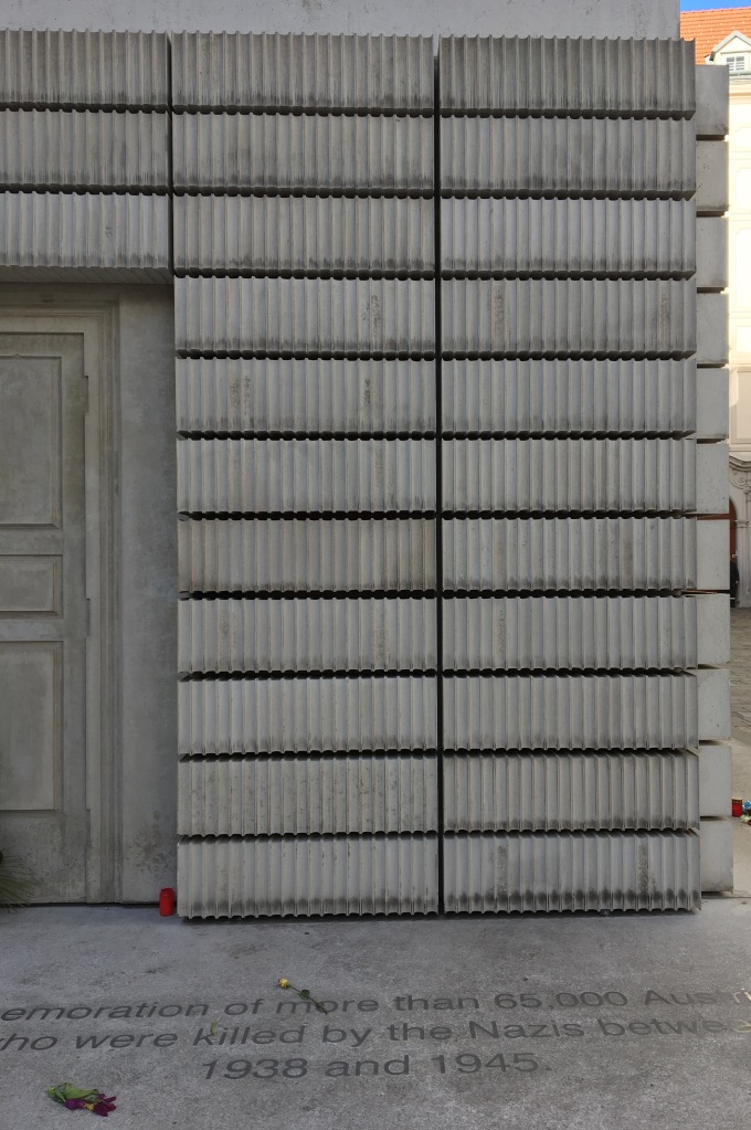
Proposition #14: The affinity of architecture and artists’ books lies in the memorial.
As you turn the corner into Judenplatz in Vienna, Rachel Whiteread’s great cube appears showing only the fore edge of book after book. As you hold J. Meejin Yoon’s small white brick of paper and turn its thick pages, a small pinhole appears on the page. Then two larger square holes emerge, one of which falls over the pinhole. Page after page, the two square holes repeat, creating two small dark wells in the field of white, until on the last page they take their place in the cut-out schematic footprint of the city blocks and buildings surrounding the Twin Towers. Whiteread’sNameless Library (2000) and Yoon’sAbsence (2004) surely underscore this proposition of memorial.
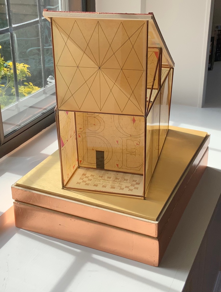
Proposition #15: The affinity of architecture and artists’ books lies in the sacred.
Jeffrey Morin and Steven Ferlauto’s Sacred Space (2003) is an intimate monument of book art. Made intimate by the content and texture of its book, made more intimate by the viewer’s having to construct the chapel. Made monumental by the echo of typographic history, made more monumental in Galileo Galilei’s echo from its floor: Mathematics is the alphabet with which God has created the universe.
Proposition #16: The affinity of architecture and artists’ books lies in collaboration.
In Victor Hugo’s Nôtre-Dame de Paris (1831), Archdeacon Claude Frollo points to the book in his hand and then to the cathedral and says, “This will kill that”. It is ironic that Hugo’s book (popularly known now by its English title The Hunchback of Nôtre-Dame) was written in large part to save the then-decaying cathedral (post-Revolution, it served as a warehouse), and it succeeded. It is also ironic that, while the fictional character’s metaphor has a point about the book’s permanence of replicability outlasting the building’s permanence of stone, it misses the collaborative foundations of both.
Created by ten students at Scripps College under the direction of Kitty Maryatt, Arch (2010) reminds us that the creation of a book — even a work of book art — is a collaborative effort.
Arch (2010) Kitty Maryatt, Jenny Karin Morrill, Ali Standish, Alycia Lang, Jennifer Wineke, Mandesha Marcus, Catherine Wang, Kathryn Hunt, Ilse Wogau, Jennifer Cohen, Winnie Ding Photos: Books On Books Collection
Maryatt’s preface to Arch is entitled “Blueprint” and is brief enough to warrant citing in full:
Books are inherently architectonic. Studying architecture would naturally be profitable to students building their own books.
On January 17, 2010, just days before class was to start, the Los Angeles Times published a fascinating article on contemporary women architects, highlighting a striking building by Jeannie Gang.
Earlier this year, the brand-new President of Scripps College chose The Genius of Women as her inaugural theme. What serendipity! This gave us the perfect inspiration for our artist book: the genius of women architects.
After extensive research and class discussion, a mission statement for the book evolved:
Architecture, like books, is a delicate balancing act between stability and motion, interior and exterior, aesthetic values and structural practicalities.
Books, like building, are fundamentally inhabited spaces. They are incomplete without human interaction.
The first portals were built of post and lintel construction. A curved arch is more difficult: the keystone is needed at the apex to lock the other pieces into position. Building a book is a similarly difficult feat. — Professor Kitty Maryatt
Conclusion: The affinity of architecture and artists’ books lies in our attraction to the beauty of form.
No doubt the proximity of the need for shelter and the need for oral and written language have played some gravitational role of mutual attraction for architecture and books (and latterly artists’ books). But equally, both architecture and artists’ books speak to our attraction to the beauty of form. All of the examples above are re-offered here in support of this proposition. Look at them again.
“Architecture”, “art” and “the book” are all fluid concepts. So it should be no surprise that we arrive at the equally fluid similes: architecture is like book art, book art is like architecture.
An earlier version of this essay appeared in The Blue Notebook, Volume 16 No 2, Spring – Summer 2022.
Further Reading
“Architecture“. 12 November 2018. Bookmarking Book Art.
Lynn, Greg. 2004. Folding in Architecture Rev. ed. Chichester, West Sussex: Wiley-Academy. See for references to Mario Carpo, Gilles Deleuze and Peter Eisenman.
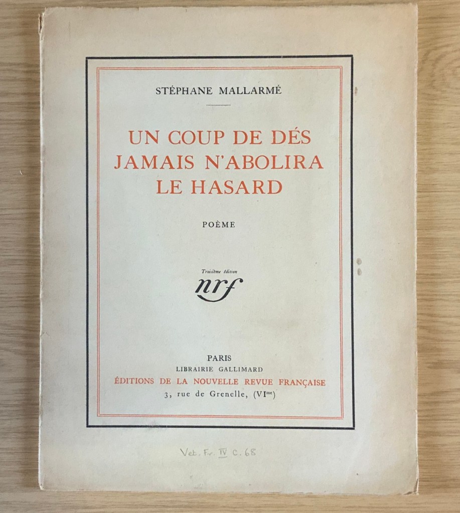
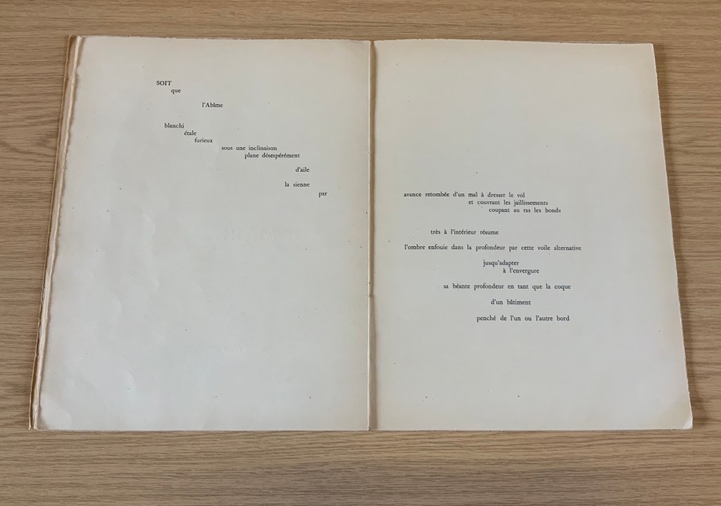
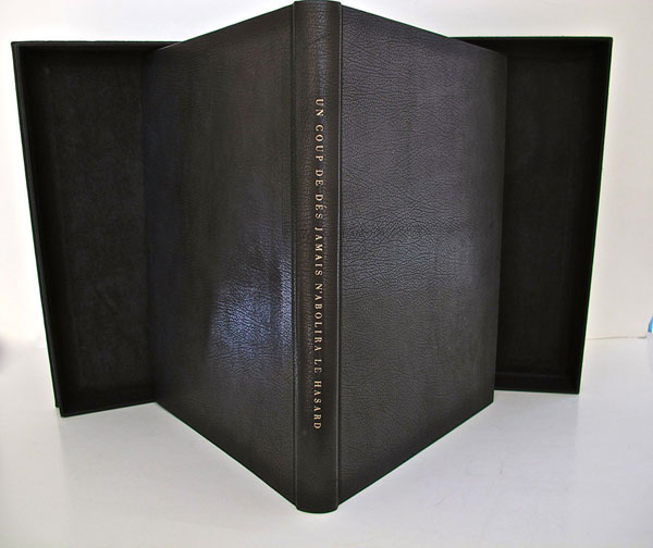
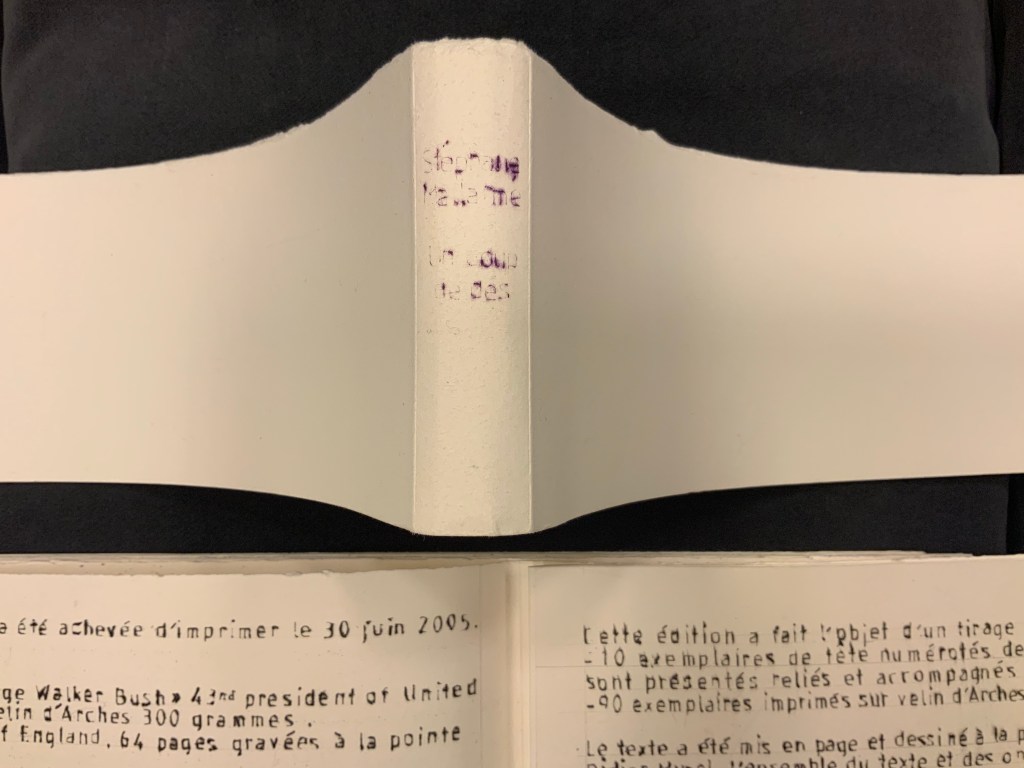
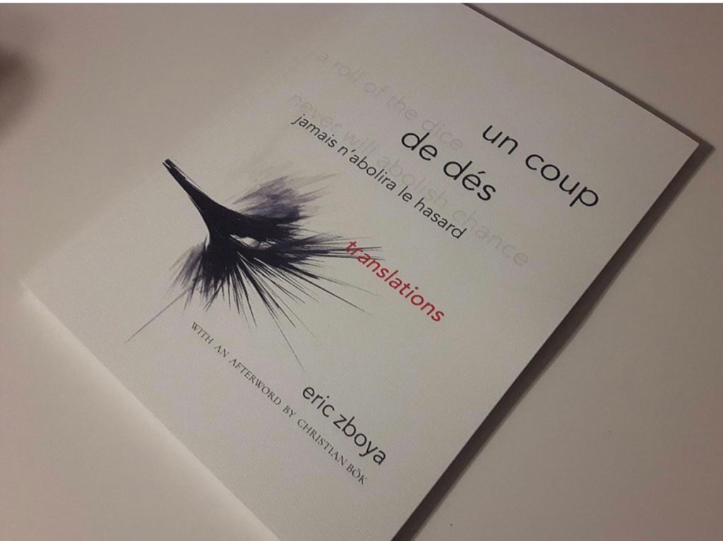
It was 1913. Stravinsky’s ballet “The Rite of Spring” debuted. The Cubists, Constructivists, Suprematists, Futurists all bound onto the art scene, many of them showcased in the Armory Show in New York that year. The Nouvelle revue française (NRF) attempted the first book form of Stéphane Mallarmé’s Un Coup de Dés Jamais N’Abolira le Hasard, which revived that 1897 typographic disruption of the page and prepared the ground for dozens of works of book art since. And Blaise Cendrars and Sonia Delaunay-Terk announced and published what they called le premier livre simultané. It was La Prose du Transsibérien et de la petite Jehanne de France.
From the Bodleian Library collection Photos: Books On Books
From the National Art Library, Victoria & Albert Photo: Books On Books
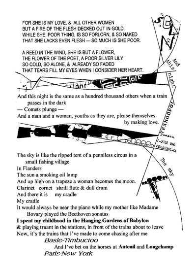
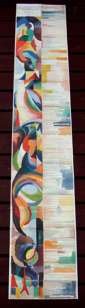
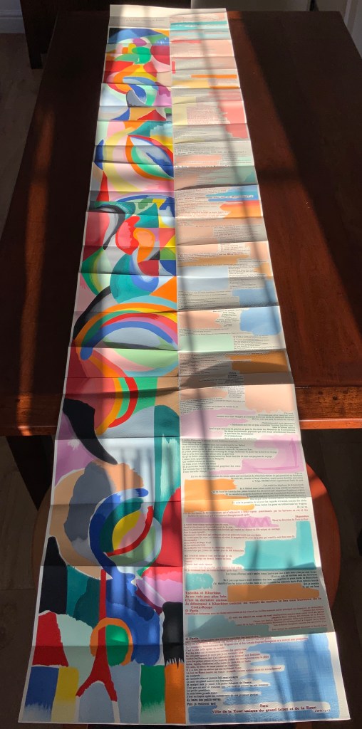
Like Mallarmé, Cendrars disrupts the page with multiple typefaces (thirty distinct ones in his case) and scattered placement of lines and stanzas. But La Prose presents an even more physical and structural disruption of the page and book than Un Coup de Dés. Unlike the latter, La Prose unfolds — twice — in an accordion format to over two metres in length or rather height since the text descends on the right and ends alongside the interlinked images of the Eiffel Tower and a Ferris wheel at the foot of the accordion. Cendrars and Delaunay had aimed to produce 150 copies of La Prose because, placed end to end, that would have equalled the Eiffel Tower’s height.
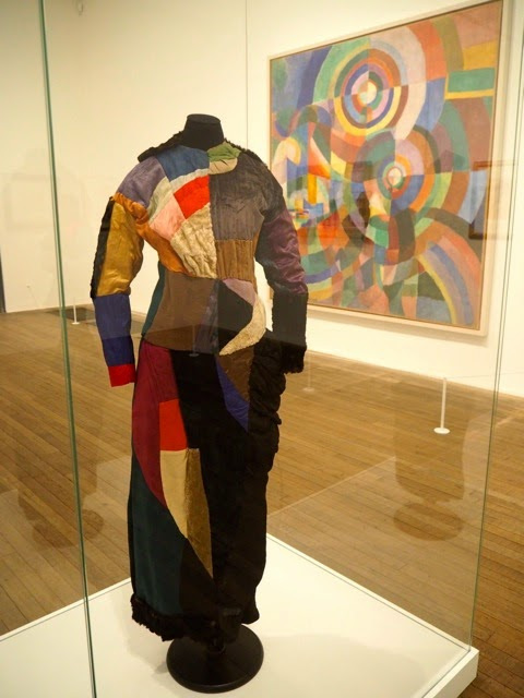
More than this monumental, sculptural, typographic and physical disruption of page and book, La Prose presents a temporal disruption. By le premier livre simultané, Cendrars meant a simultaneity of the verbal and visual — the way that text and image appear all at once — en un éclair. Early Bohemian that he was, Cendrars was co-opting a fair bit of artistic and literary theorising by the Cubists, Futurists and others. Most important and of the moment was his co-opting of Robert and Sonia Delaunay’s colour theory of simultanéisme. The “couleurs simultanées de Mme Delaunay-Terk” had also appeared in her 1913 robe simultanée and paintings. Building on a French scientist’s exposition on how perception of colours changes depending on the colours around them, the Delaunays claimed that rhythmic, musical and spatial synaesthetic elements were also at play. Sonia Delaunay asserted that the artwork produced for La Prose was not in response to reading the poem but hearing it from Cendrars. (Listen to it for yourself here.)
In presenting the adolescent Cendrars travelling physically eastward on the Transsibérien, travelling mentally to Flanders-Basle-Timbuctoo-Auteuil-Longchamps-Paris-New York while still registering the landscape outside, seeing the maimed and wounded returning from the front of the Russo-Japanese war, conversing with a prostitute named after Joan of Arc, doubting himself as a poet, and so on until a sudden transposition back to Paris, the process poem juxtaposes the sacred and profane, past/present/future, stationary and dynamic, national and international in outlook and locale. In short, simultaneously. In a format that is bound and unbound, the poem mirrors the swirling, interacting shapes and colours beside and in which it moves — and vice versa.
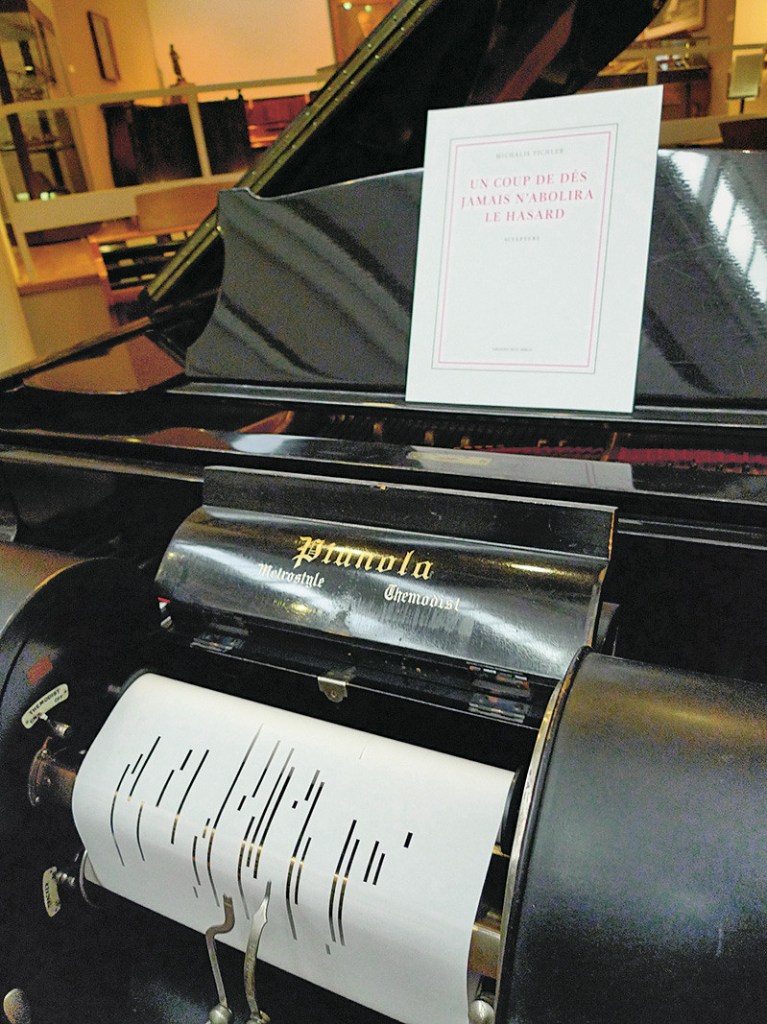
However more disruptive of the page and book La Prose may have been, it did not inspire the profusion of direct re-interpretations (or appropriations) that Un Coup de Dés prompted from artists such as Jérémie Bennequin, Ellsworth Kelly, Man Ray, Didier Mutel, Michel Pichler, Eric Zboya and dozens of others.
Not until 2001 did a re-versioning of La Prose appear. Tony Baker and Alan Halsey published an English translation and codex re-formatting. Its black on white imagery is reminiscent of the Russian Futurists, the type is monochromatic, and the typefaces, fonts and weights vary but not as much as in La Prose.
Baker and Halsey note in their colophon:
So far as we’re aware no translation of the poem into English has ever been attempted to give a sense of Cendrars and Delaunay’s original conception, not the least reason for which may have been the difficulty until recently of seeing the first edition, even in reproduction. — Prose of the Trans-Siberian and of the Little Jeanne de France (Sheffield: West House Books, 2001)
A well-founded lament — at least for the book art community. Not until 2000 had there been a reduced-scale reproduction of La Prose. It appeared in Granary Books’ A Book of the Book by Jerome Rothenberg and Steven Clay across a four-page foldout in the embrace of Ron Padgett’s English translation. Only in 2008 was there a full-scale, full-colour offset facsimile, produced by Yale University Press with an appended translation. It is now out of print.
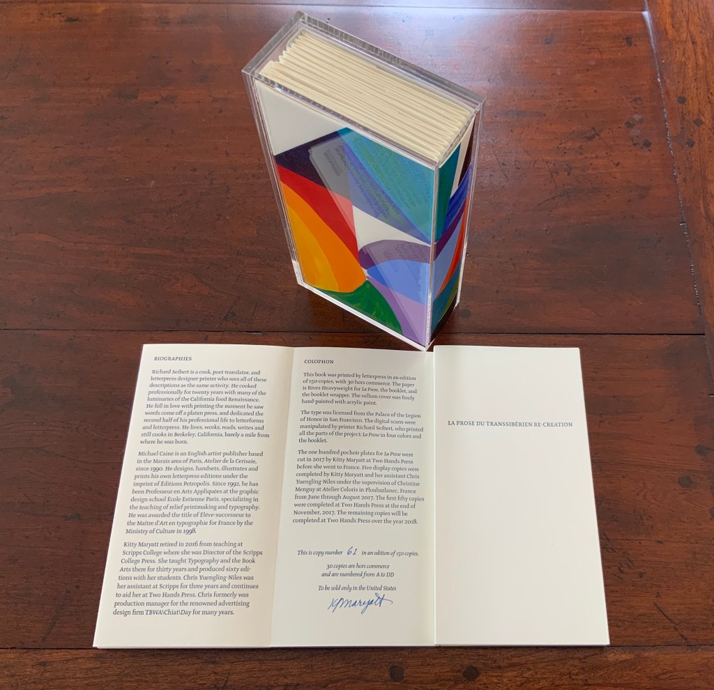
With her work La Prose du Transsibérien Re-creation (2019), Kitty Maryatt has changed all that. With this deuxième livre simultané, she has more than caught the echo of Cendrars/Delaunay’s original and its arrival. As scholar, artist and veritable impresaria, she has reinvigorated the book art/arts community with the legacy of La Prose.
Her blogspot documents the research and production with rich details about sourcing the type, learning about stencil-cutting from Atelier Coloris (one of the few remaining businesses devoted to pochoir), determining the recipes for the ink colours, testing papers (Zerkall Crème, Biblio, and Rives HW), creating a census of the existing 1913/14 originals and their locations — all that and more, including the use of bacon fat and a wine bottle filled with lead shot. She also organized a documentary by Rosylyn Rhee: “The Pochoir Re-creation of La Prose du Transsibérien”. It brings the importance of the original and this re-creation to life in the expressions and voices of prominent collectors, librarians and scholars, artists, rare book dealers and the project’s funders.
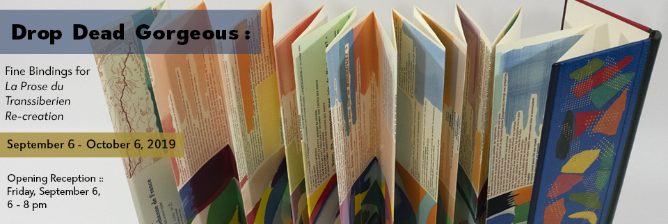
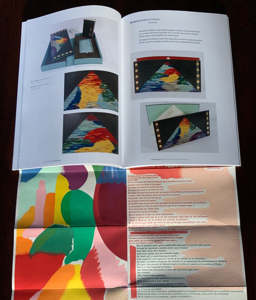
In addition, Maryatt has been either a contributor to, or the motivating force behind, several symposia and exhibitions such as “Paris 1913: Reinventing the Artist’s Book” (at the Legion of Honor Museum in San Francisco, 2018) and “Drop Dead Gorgeous”. The latter is a travelling exhibition resulting from invitations to twenty-four book artists and designer bookbinders to design and create bound copies of La Prose du Transsibérien Re-creation. For the San Francisco venue, Maryatt prepared a workshop on traditional French pochoir and provided text for the exhibition catalogue (available from the online store of the San Francisco Center for Books).
Monique Lallier’s fine binding of La Prose du Transsibérien Re-creation Photos: Courtesy of Monique Lallier
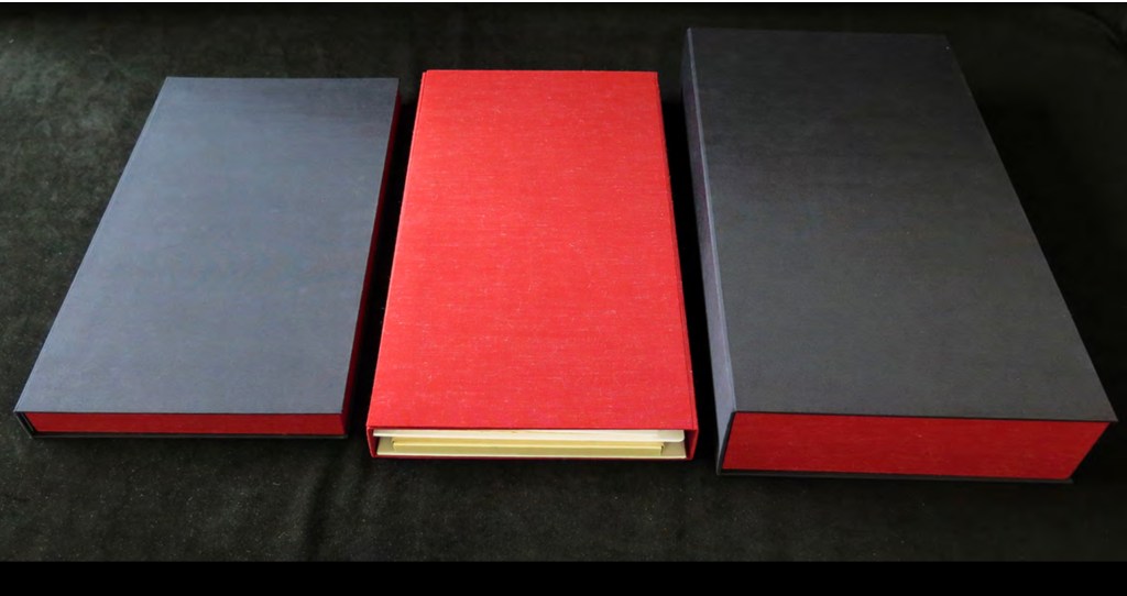
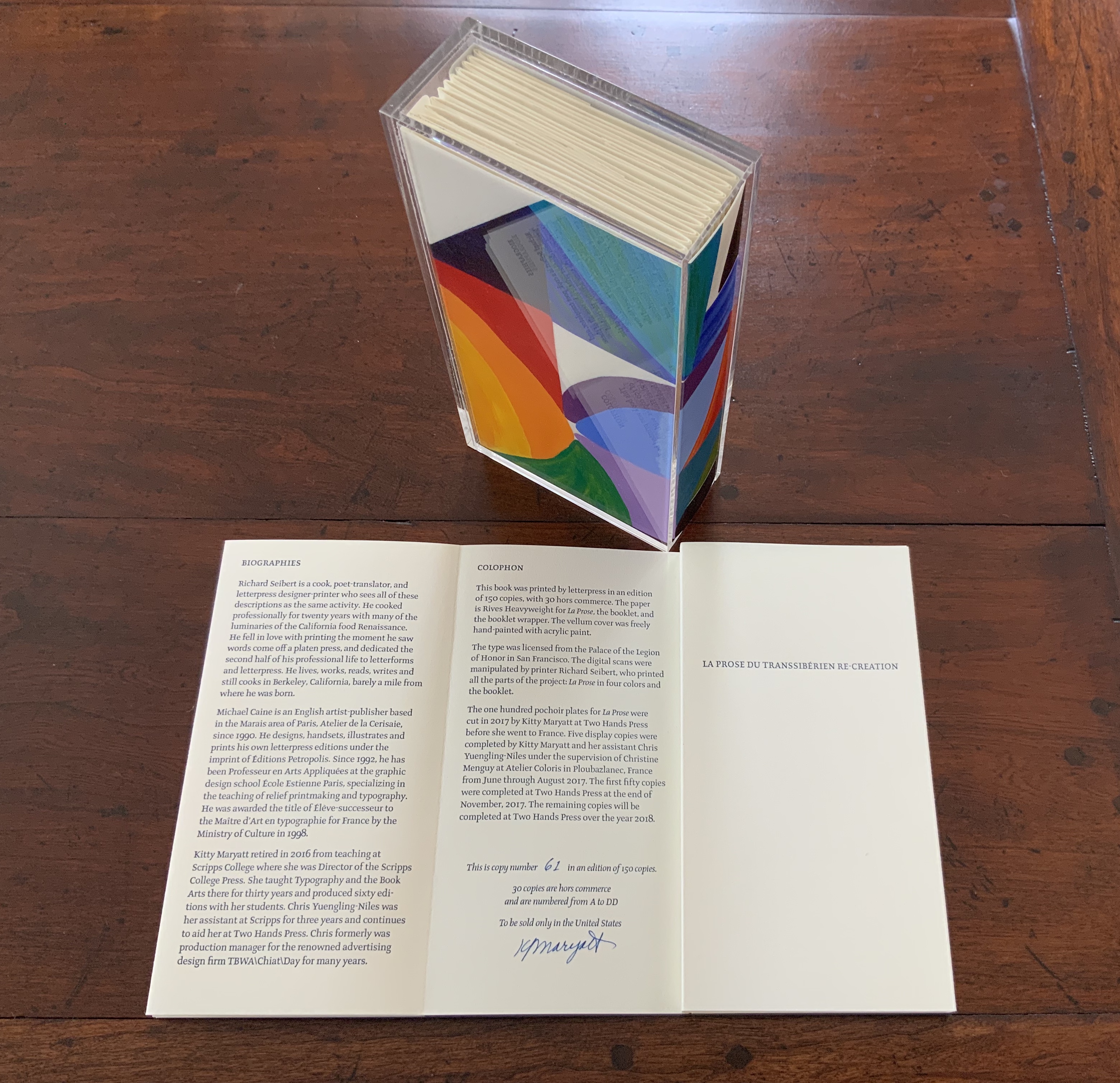
The pinnacle of Maryatt’s efforts, of course, is the standard and deluxe editions of La Prose. Both editions consist of 4 pages, glued together to create the tall single page. For the standard edition, the page is folded into 21 sections and loosely placed in a painted vellum cover with a booklet describing the project and production. An acrylic slipcase houses the covered bundle.
The standard edition Slipcase: H195 x W108 x D45 mm. Wrapper: H182 x W97 x D35 mm. Leporello: H81 x W95 mm (closed). H1954 x W160 mm (open). Booklet: H81 x W94 mm (closed), W1055 mm (open). Photo: Books On Books
Photo: Books On Books
Photos: Books On Books
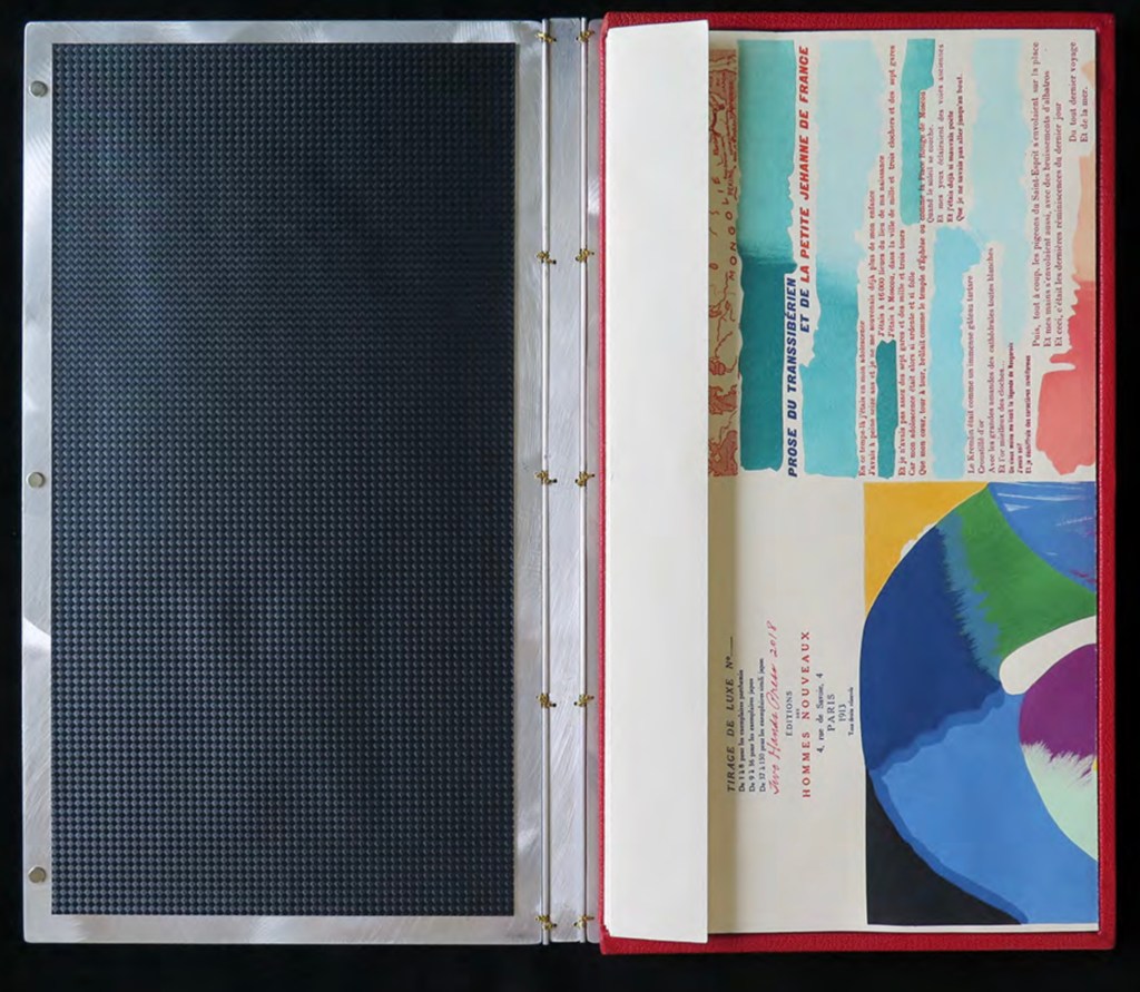
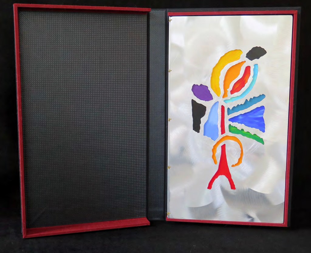
For the deluxe edition, the single page is left double-wide, accordion-folded double-tall between aluminum covers and housed in a clamshell box. A separate case holds the painted vellum cover, colour cards, Sonia’s visual vocabulary, 27 progressives for page one, 5 pochoir plates with tracing paper and registration system, the booklet with introduction and colophon, and the list of 30 typefaces Cendrars used. A large clamshell box houses this separate case and the boxed book. The colour cards include the recipe for mixing the gouache, and Sonia’s visual vocabulary shows the numbered steps of operations. The progressives for page one show the steps for doing the pochoir stencils and handwork.
The deluxe edition Photos: Courtesy of Kitty Maryatt
Any institution with a focus on book art or the graphic arts should seek out the standard edition of La Prose du Transsibérien Re-creation. Any institution with a focus on teaching and practice in those domains should seek out the deluxe edition. As indefatigable as Cendrars and as productive as Delaunay, Kitty Maryatt has provided the basis of master classes for generations. Now it is up to the book art community to respond as it has to Un Coup de Dés.
A shorter version of this essay appears in Parenthesis 39, Fall Issue, 2020.
Further Reading
Ashton, Doré. “On Blaise Cendrars. . . But I Digress.” Raritan 31, no. 2 (2011): 1-42,164. An entertaining extended anecdote sketching Cendrars and his milieu.
Gage, John. Colour and Meaning : Art, Science and Symbolism(Berkeley, CA: University of California Press, 1999). Despite her works’ better quality and representation of simultanéisme, Gage focuses on Robert and mentions Sonia only in passing or footnotes. (Telling that the Tate chose Sonia not Robert for a retrospective in 2015.) Nevertheless, there are passages that place her work in context.
P.198: Chevreul’s “privileging of the harmony of complementaries was essentially in the context of ‘painting in flat tints’, a method developed largely in the decorative arts, but which was increasingly integrated into many branches of French painting in the second half of the nineteenth century …”.
P.254 “When, probably early in 1912, Delaunay wrote to Kandinsky outlining his theories, he had shifted to a rather different approach, claiming: ‘the laws I discovered … are based on researches into the transparency of colour, that can be compared with musical tones. This has obliged me to discover the movement of colours.’ …
P.256 [Delaunay’s] Essay on Light, which was composed in the summer of 1912, attributed the movement of colours less to transparency than to the qualities of hue: ‘Movement is given by the relationship of unequal measures, of contrasts of colours among themselves which constitute Reality. The reality has depth (we see as far as the stars), and thus becomes rhythmic Simultaneity.’”
P.257 “For Chevreul in 1839 such painting [in flat tints] had only a decorative, accessory function, but the Delaunays did not feel the distinction, and Sonia had recently been experimenting with flat colours in appliqué textiles and in bookbindings decorated with collage.”
Maryatt, Kitty. “A Bookmaker’s Analysis of Blaise Cendrar’s and Sonia Delaunay’s La Prose du Transsibérien et de la Petite Jehanne de France”, The Quarterly Newsletter(Fall 2016), The Book Club of California. Online version available here.
Maryatt, Kitty. Interview with Steve Miller, Book Arts Podcasts, School of Library Information and Sciences, University of Alabama, 13 January 2006.
Rothenberg, Jerome; Clay, Steven. A Book of the Book: Some Works & Projections about the Book & Writing (New York City: Granary Books, 2000). Contains an excerpt from Perloff’s book above, Ron Padgett’s translation of La Prose and a four-page foldout showing a full-color photo-reduction of the 1913 original.
Shingler, Katherine. “Visual-verbal encounters in Cendrars and Delaunay‘s La Prose du Transsibérien“, e-France: an on-line Journal of French Studies, Vol. 3, 2012, pp. 1-28. Accessed 15 November 2019. Along with Perloff’s book, this is the best explication of the work and its lineage with Mallarmé’s Un Coup de Dés.
Woodall, Stephen. “La Prose du Transsibérien et de la Petite Jehanne de France”, Insights from the de Young and Legion of Honor (San Francisco: Fine Arts Museums of San Francisco, 2020. A spectacular website presenting the original work in its context and its influences on subsequent book art. The work can be viewed panel by panel, and its overall structure is presented in an animation of its unfolding and refolding.
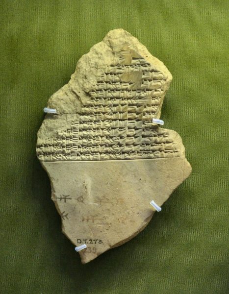
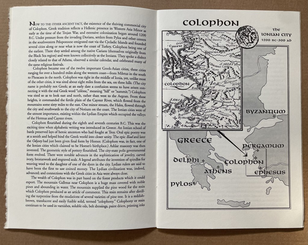
This tale comes from J. S. Kennard’s short 1901 tome on the colophon — that last page at the end of a manuscript or book. The colophon has served many purposes: giving the title of the work, identifying the scribe or printer, naming the place and date of completion or imprint, thanking and praising the patron, bragging, blaming, apologizing, entreating, praying and much more. Examples can be traced back to clay tablets and forward to websites.
Cuneiform tablet from the Library of Ashurbanipal, British Museum. Interesting that the colophon was added in ink after the clay had dried.
Its presence on websites may be one of those decried skeuomorphic hangovers from book publishing, but perhaps the colophon has an underlying value or purpose to serve in both the analogue and digital worlds. The late Bill Hill, who wrote the 1999 Microsoft white paper “The Magic of Reading” and was an early contributor to online typography, suggested making colophons a compulsory standard for website design and asked:
Why not introduce the venerable concept of the colophon to the Web? Could it be used to drive a new business model for fonts which would benefit the font industry, web developers and designers – and the people who visit their sites? [Sadly this page at the Bill Hill’s site is no longer available.]
Fanciful? Perhaps, but not much more fanciful than Erasmus’ proffered explanation of the word “colophon”. His expanded edition of Adagia printed by Manutius in 1508 includes this adage:
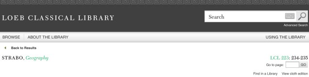
Colophonemaddidit He added the colophon. This came to be used when the finishing touch is added to something, or when some addition is made without which a piece of business cannot be concluded. The origin of the adage is pointed out by Strabo in … his Geography, …
And here is Strabo from the Loeb Classical Library online; scroll down to paragraph 28:
As venerable a publishing custom as the colophon may be, it is more honoured in the breach than the observance. Book artists tend to be more observant, but not religiously so, and of course some works of book art might be disfigured by a colophon. Still, there are sound reasons why book artists should bother themselves with a colophon — even if it stands apart from the work. In her review of Book Artists and Artists Who Make Books (2017), India Johnson gives one of those sound reasons:
It’s probably impossible to include every detail of production in a colophon—but some give it their best stab, exhaustively listing everyone that took part in a project. More concise colophons recap only the most relevant details of making—perhaps those the primary creator feels will factor saliently into making meaning of the book.
The convention of the colophon in our field exposes an assumption that the meaning of an artwork is informed not only by the finished product, but by the specifics of artistic labor. “Book Artists and Artists Who Make Books“, CBAA, 1 October 2018. Accessed 3 October 2018.
If craft does figure in a work’s meaning, then the more we can see how it figures, the greater our ability to appreciate and understand the work. For conveying insight — what materials and from what sources, what processes, what tools, who contributed, where and when the work occurred — the colophon stands ready. But where does it stand?
A contemporary of Kennard, A.W. Pollard declared that, to be a proper colophon, it had to appear at the conclusion or summit of the work. Artful as are some of the manuscripts and books that Kennard and Pollard cite, none push the envelope in the manner that works of contemporary book art do. Which brings us to another reason for book artists to consider the colophon: inspiration from history or tradition.
The last page of the codex may be a rightful spot for placing the codex, but what if the bookwork’s shape is challenging or musing about the shape of the book? Finishing touches might go anywhere. Think of Van Eyck’s self-portrait hidden in a reflection in The Arnolfini Portrait, or that of Vélazquez in Las Meninas.
Historians’ diligent cataloging of the “hands” of the scribes has enriched the self-identifications in colophons and connected those craftspersons with additional manuscripts. Book artists who use calligraphy or involve calligraphers should ponder the implications of this tool historians use to identify scribes by the style of their “hands”.
What potential, meaningful “tells” in a work’s colophon might the book artist or calligrapher leave to enrich the work — and provide insights for historians and connoisseurs poring over the finishing touch?
The colophon’s underlying value or purpose warrants book artists’ thinking about recording it offline and online, though this might be stretching the definition of the colophon. Our enjoyment of Kitty Maryatt’s 2018 reconstruction of La prose du Transsibérien et de la Petite Jehanne de France (1913) by Blaise Cendrars and Sonia Delaunay is certainly enhanced by the “colophonic” booklet she included with the work and the “About” page online.
Perhaps the story of the little “i” left over – the colophon – will prod the future historians of book art to examine bookworks and their artists’ websites for those finishing touches and stir artists to bestow that last finishing touch for the sake of the work’s soul if not their own.
A Prospect of Colophons
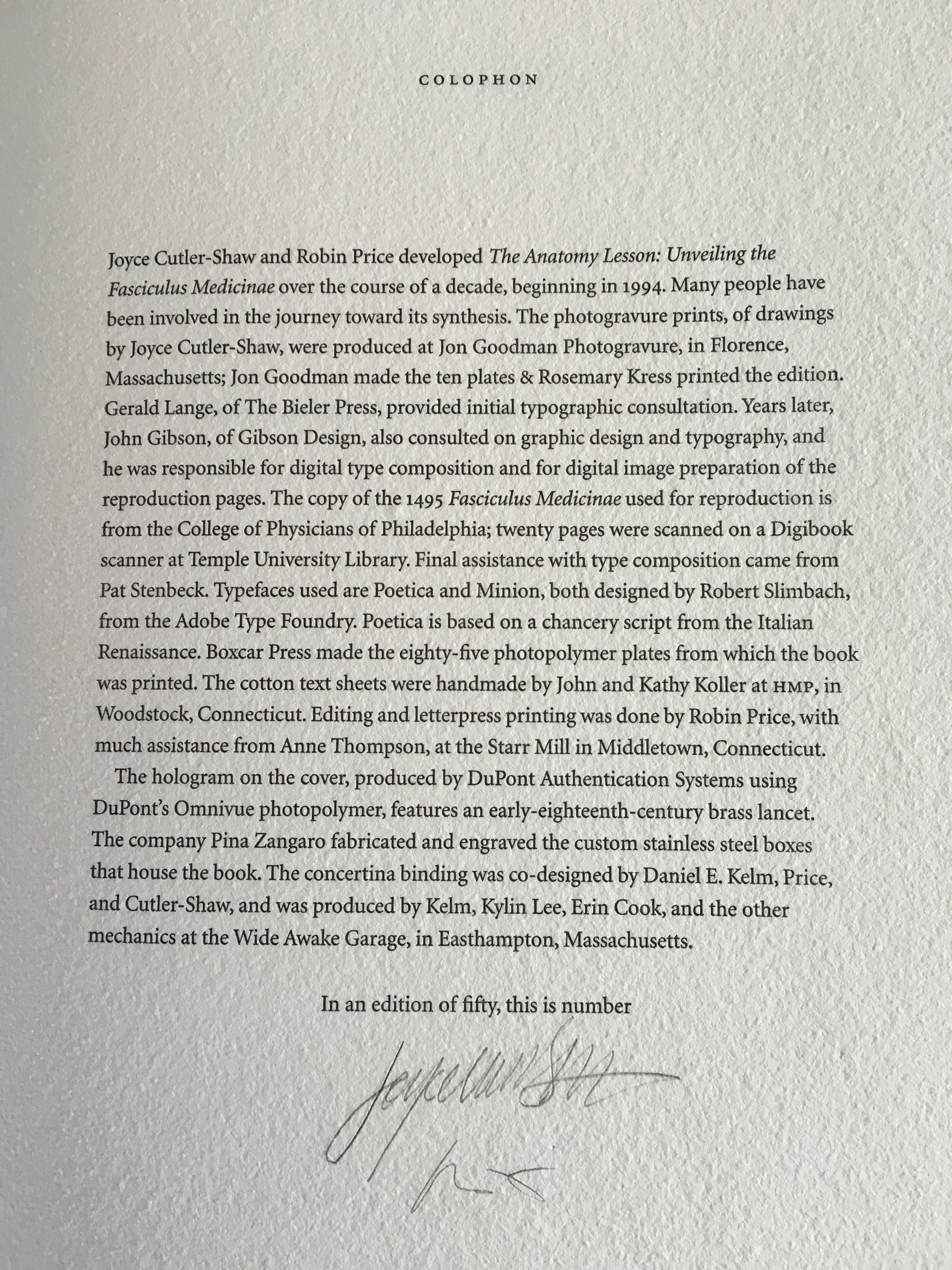
The Anatomy Lesson: Unveiling the Fasciculus Medicinae (2004) Joyce Cutler-Shaw The careful reader will notice that the edition number is missing. This instance of the work is one of the binder’s signed but unnumbered copies, having been acquired directly from Daniel E. Kelm.
Lyn Dillin, The Ballad of the Self Same Thing (2019) Can this be the first rhyming colophon?
Finding Home (2016) Louise Levergneux This may not be the first bilingual colophon I have seen, but its being inside the top of the box enclosing the work makes it the first to occupy the physical summit a work.
Theme and Permutation (2012) Marlene MacCallum This double-page spread reveals process information about the work that adds to the reader/viewer’s appreciation of the themes and permutations occurring in the pages.
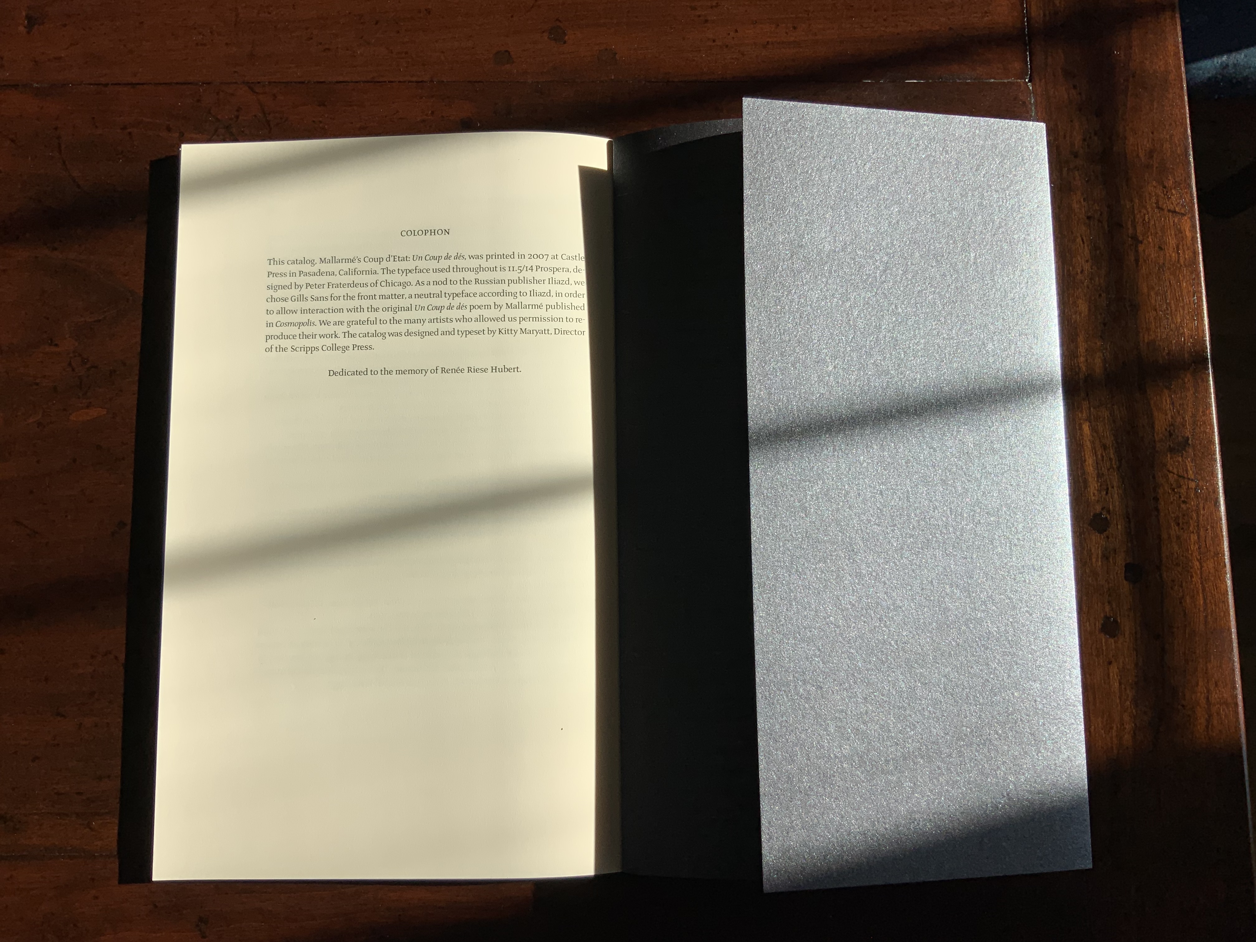
Mallarmé’s Coup d’État (2007) Kitty Maryatt The colophon’s nod to Iliazd sends the reader/viewer back to the start of this catalogue that is a bookwork in its own right.
La prose du Transsibérien Re-Creation (2019) Kitty Maryatt A “colophon within a colophon”. The booklet providing details about the original work and Maryatt’s re-creation has an accordion structure and collapses into its own tri-fold wallet, which fits within the cover of the main work, seen here in its acetate holder.
L is for Lettering (2011) Cathryn Miller This hilarious and touching abecedary parades as a marked work handed in for a course, a portrait of the artist within a contemplation of the past and future of typography and letterpress. This colophon embodies the finishing touch.
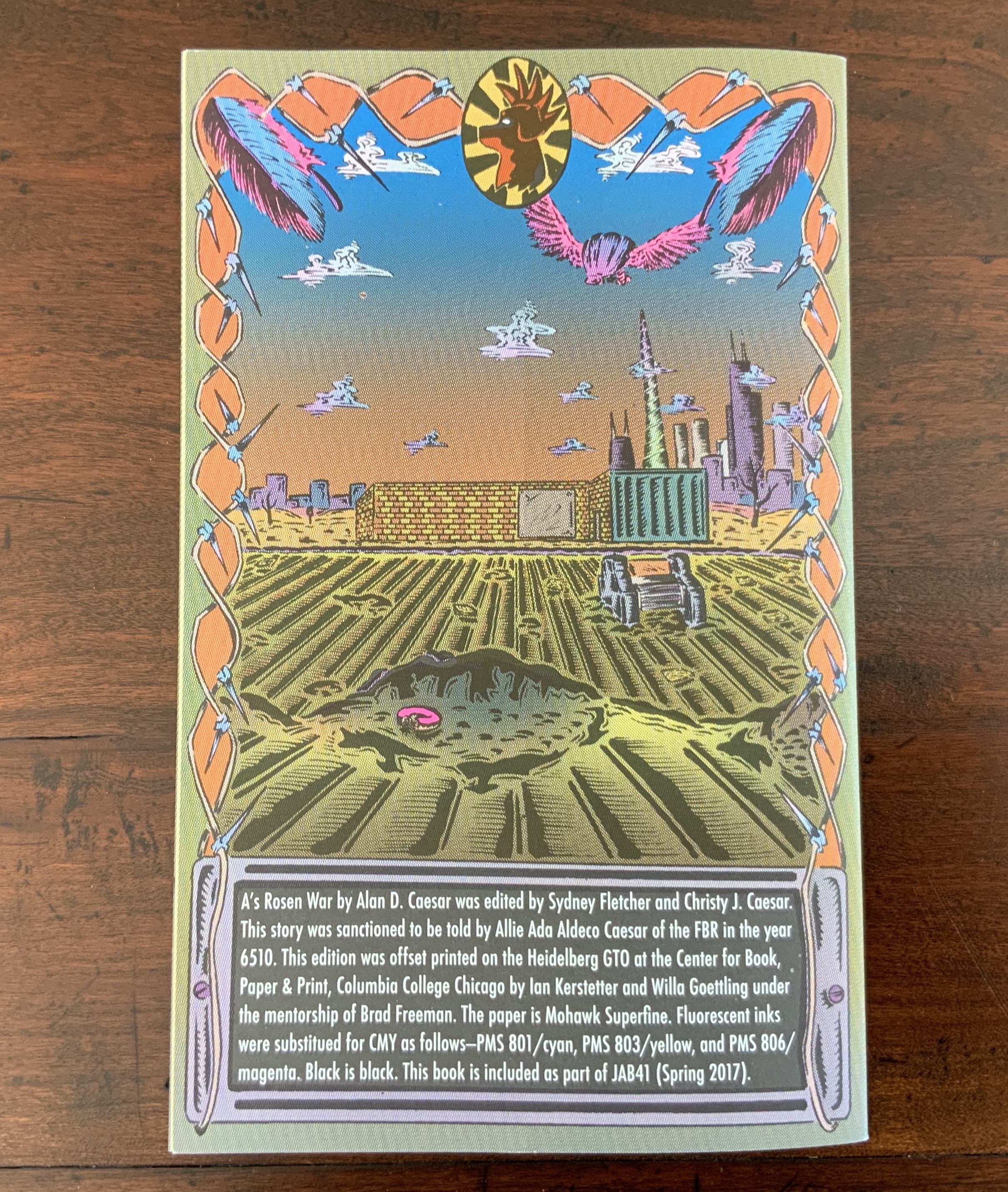
A’s Rosen War (2017) Alan Caesar This colophon continues the premised date with which this work of science fiction book art begins.
Richard Gameson. The Scribe Speaks? Colophons in Early English Manuscripts. Cambridge: Cambridge University Press, 2001. (See for the human interest: “I, Aelfric, wrote this book in the monastery of Bath”; “Pray for Wigbald”; “Just as the port is welcome to sailors, so is the final verse to scribes”.)
Hurtig, Alain. “Les colophons“. L’outil typographique. Accessed 26 January 2022. (Seventeen brilliantly designed and shaped colophons.)
Joseph Spencer Kennard. Some early printers and their colophons. Philadelphia : G.W. Jacobs and Co., 1902. (Less academic but just as interesting and typographically more fun than Gameson.)
Ming-Sun Poon, “The Printer’s Colophon in Sung China, 960-1279”, The Library Quarterly,43:1 (January 1973). (See for the 34 calligraphic inscriptions and the colophon to the Diamond Sutra: “On the 15th of the 4th moon of the 9th year of Hsien-t’ung [May 11, 868], Wang Chiek on behalf of his two parents reverently made this for universal free distribution.”)
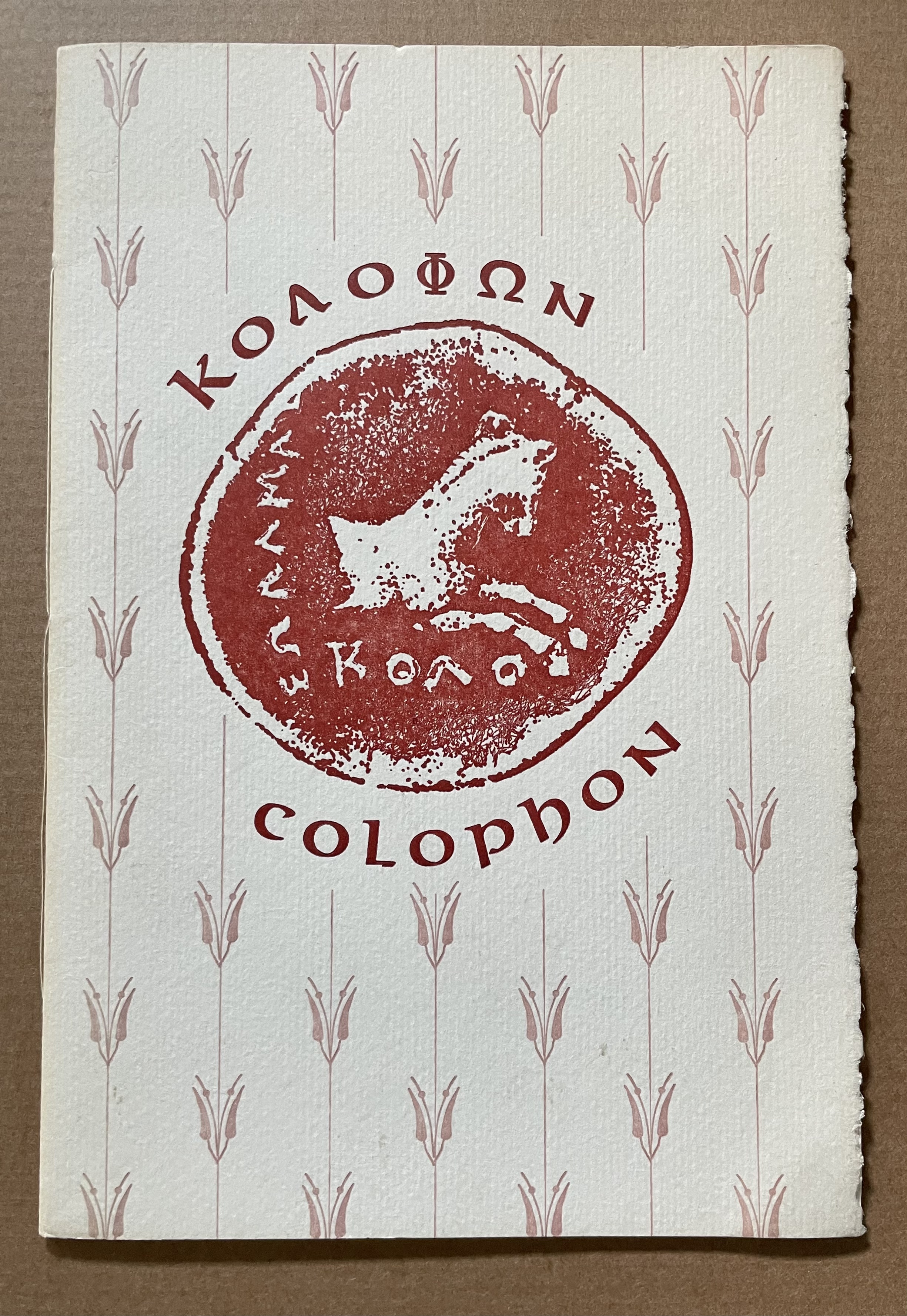
The intriguing derivation of the word “Colophon” (1994) David C. Weber Sewn booklet. H230 x W155 mm. [16] pages. Acquired from Cotswold Internet Books, 7 May 2023. Photos: Books On Books Collection.
Pollard, Alfred W. Last Words on the History of the Title-Page, with Notes on Some Colophons and Twenty-Seven Fac-Similes of Title-Pages. Burt Franklin Research & Source Works Series, 668. B. Franklin, 1971. Pollard, Alfred W. 1859-1944. Last Words on the History of the Title-Page, with Notes on Some Colophons and Twenty-Seven Fac-Similes of Title-Pages, by Alfred W. Pollard. J.C. Nimmo, 1891. Pollard, Alfred W. 1859-1944. An Essay on Colophons, with Specimens and Translations, by Alfred W. Pollard, and an Introduction by Richard Garnett. The Caxton Club, 1905. Pollard, Alfred W., and Richard Garnett. An Essay on Colophons : With Specimens and Translations. Burt Franklin Bibliography and Reference Series ; #142. Burt Franklin, 1968. Van Elverdinghe, Emmanuel. “Modèles et Copies : Étude d’une Formule Des Colophons de Manuscrits Arméniens (VIIIe – XVIIIe Siècles).” Dissertation, 2017.