Because he works with so many different materials, it is hard to classify Julien Nédélec as an artist: A polyfabricant? With language play being a more or less constant theme: A polywright? His website labels him a plasticien, the perfect French word that captures more of the media in which he works than its usual translation “visual artist” does. In Zéro2, Antoine Marchand writes:
Everything, with him, is subject to manipulation, appropriation, and diversion, at times in the most trivial and basic way imaginable. His work is based on permanent mischief, a desire to destabilize the viewer, and be forever creating a slight discrepancy, which barely ruffles the reading of the work—well removed from the showiness of many present-day productions. He bypasses the daily round and takes us towards somewhere else that is not that far away, but all the more joyful. … What should incidentally be underscored in this young artist’s praxis is his ability to move from one medium to another, without the slightest bother or apprehension. It is impossible to pigeonhole Julien Nédélec’s praxis in any one particular medium.
Several of his works have been hosted on the Greek island of Anafi by the Association Phenomenon and the Collection Kerenidis Pepe, whose website also notes that his
practice can take many forms, from sculpture to drawing, through books and photography, with a predilection for the paper, that he uses not only as a support, but also as a material that he bends, cuts, colors, stacks or crumples. His works are the result of linguistic and formal games that reveal the artist’s fascination with the potentialities of language, with a malice that places him as an heir apparent of the Oulipo, while his taste for geometric and serial shapes brings him closer to the tradition of minimalism.
With paper as a favorite medium, there are a handful of artist’s book among the many other forms. Taken together, his artist’s books almost make up an anthology of homage to book artists from the 1960s to the present. He also belongs to the school of appropriators embracing forerunners like Bruce Nauman, Richard Prince, and Richard Pettibone and contemporaries like Michalis Pichler, Antoine Lefebvre, and Jérémie Bennequin, all of whom have embraced the self-reflexive artist’s book as an appropriate medium for appropriation. No wonder Galaad Prigent’s Zédélé Éditions, the French publisher that hosts Anne Moeglin-Delcroix and Clive Phillpot’s Reprint Series of artists’ books, is so fond of his bookworks.
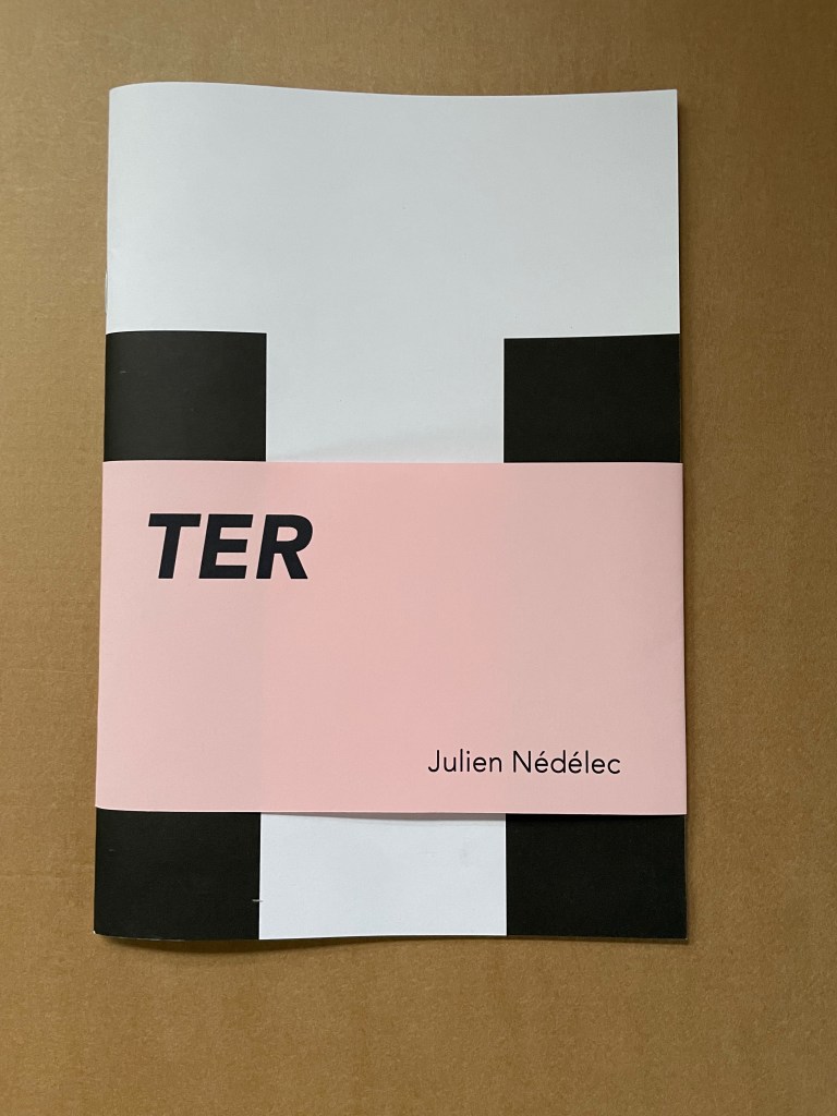
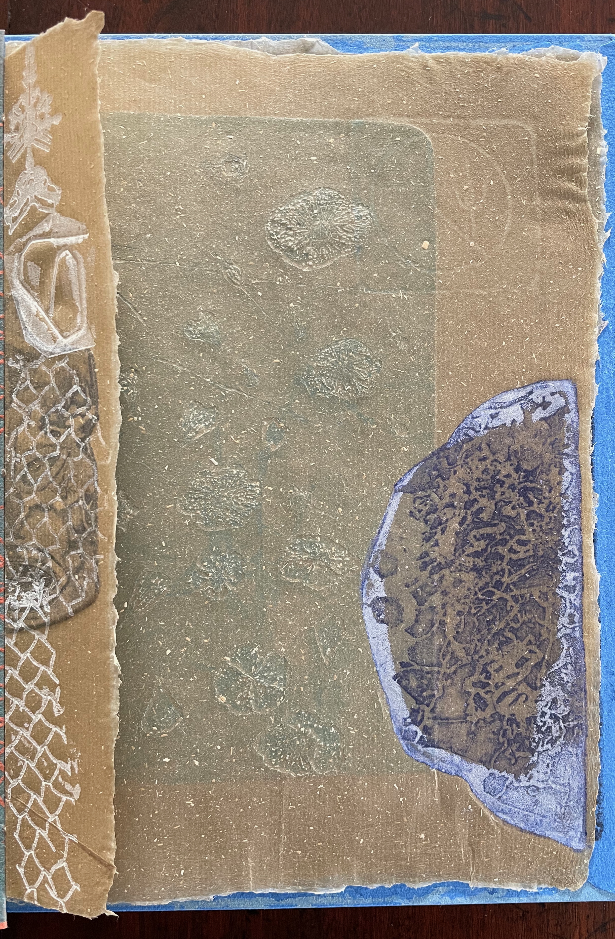
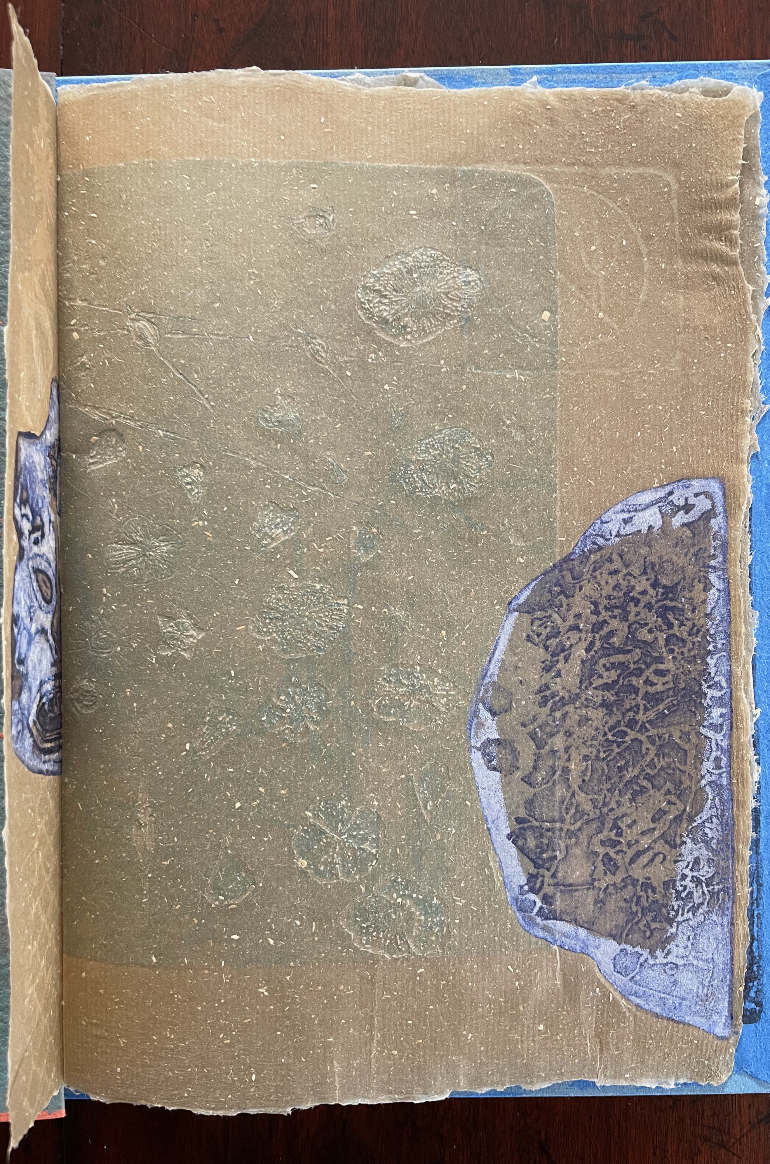
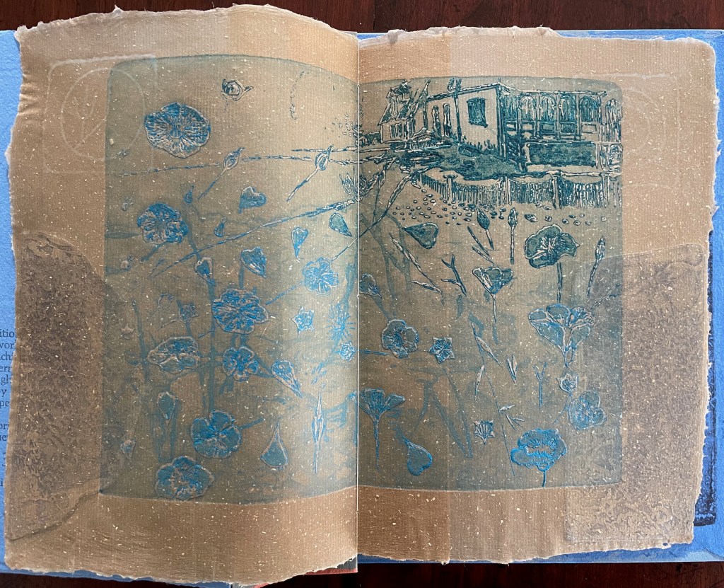
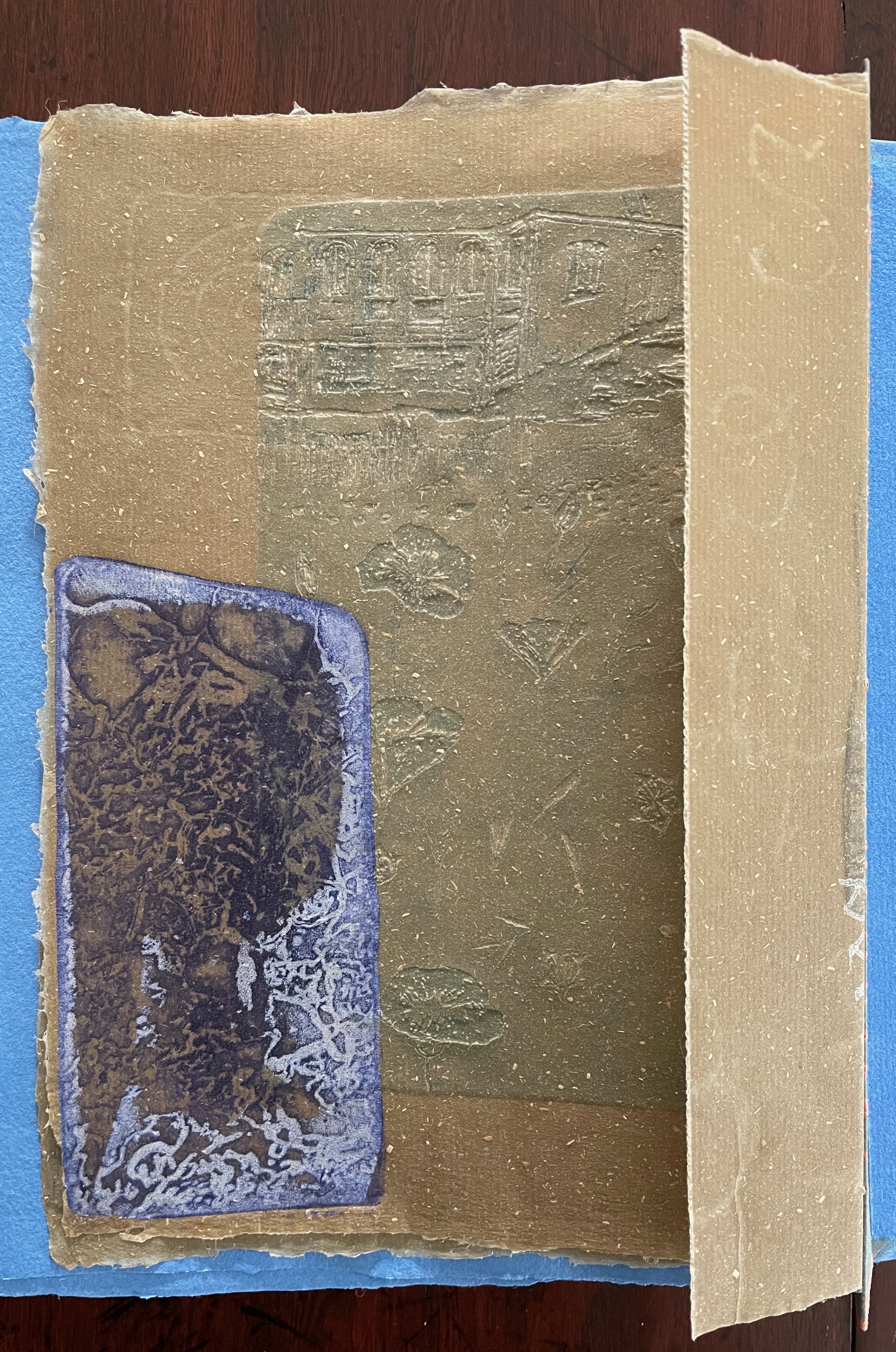
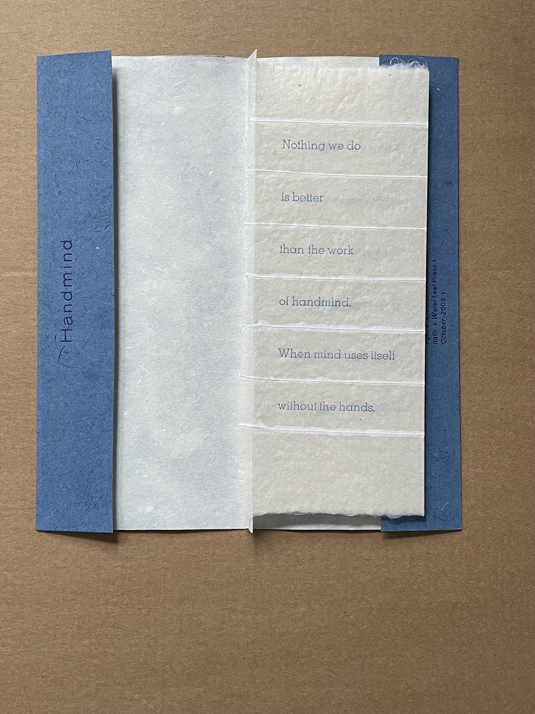
TER (2021)
TER (2021) Julien Nédélec Softcover, saddle stitch with staples. H240 W165 mm. [36] pages. Acquired from Zédélé Éditions, 21 September 2024. Photos: Books On Books Collection. Displayed with the artist’s permission.
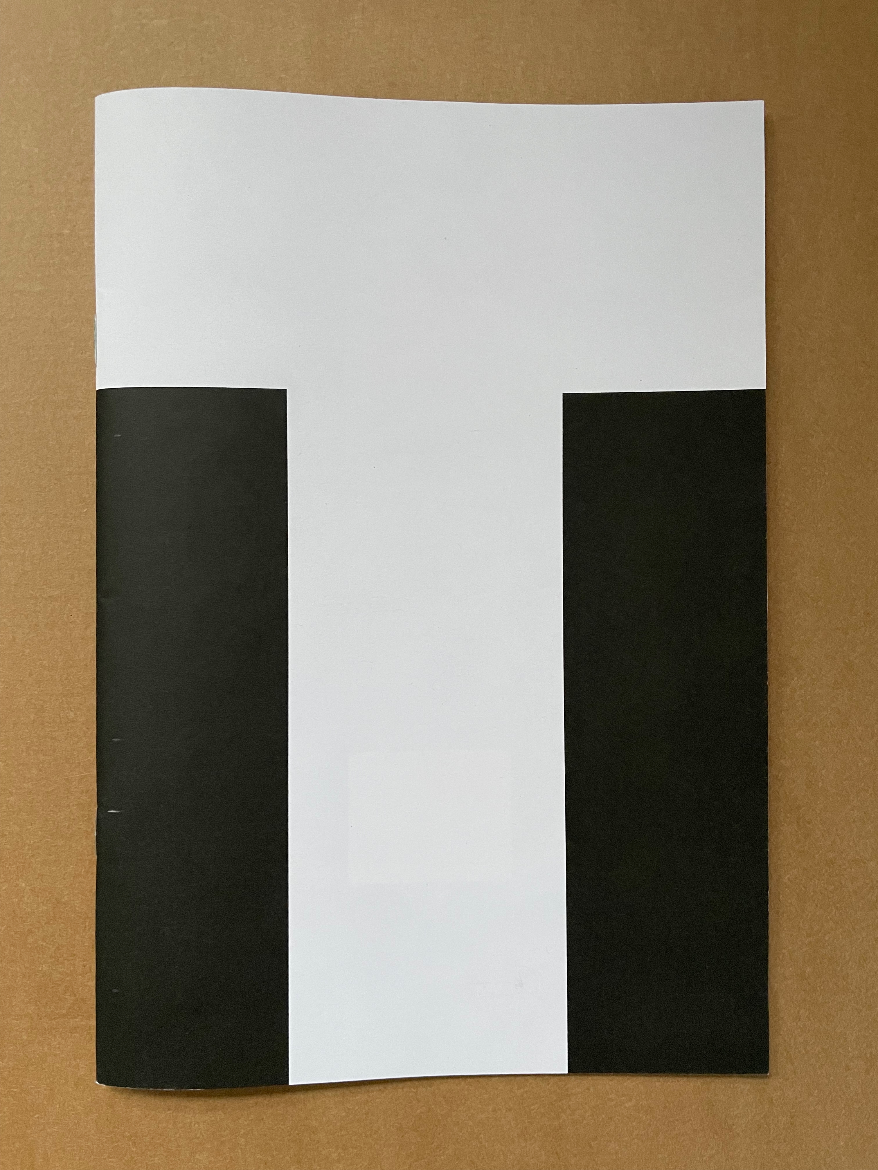
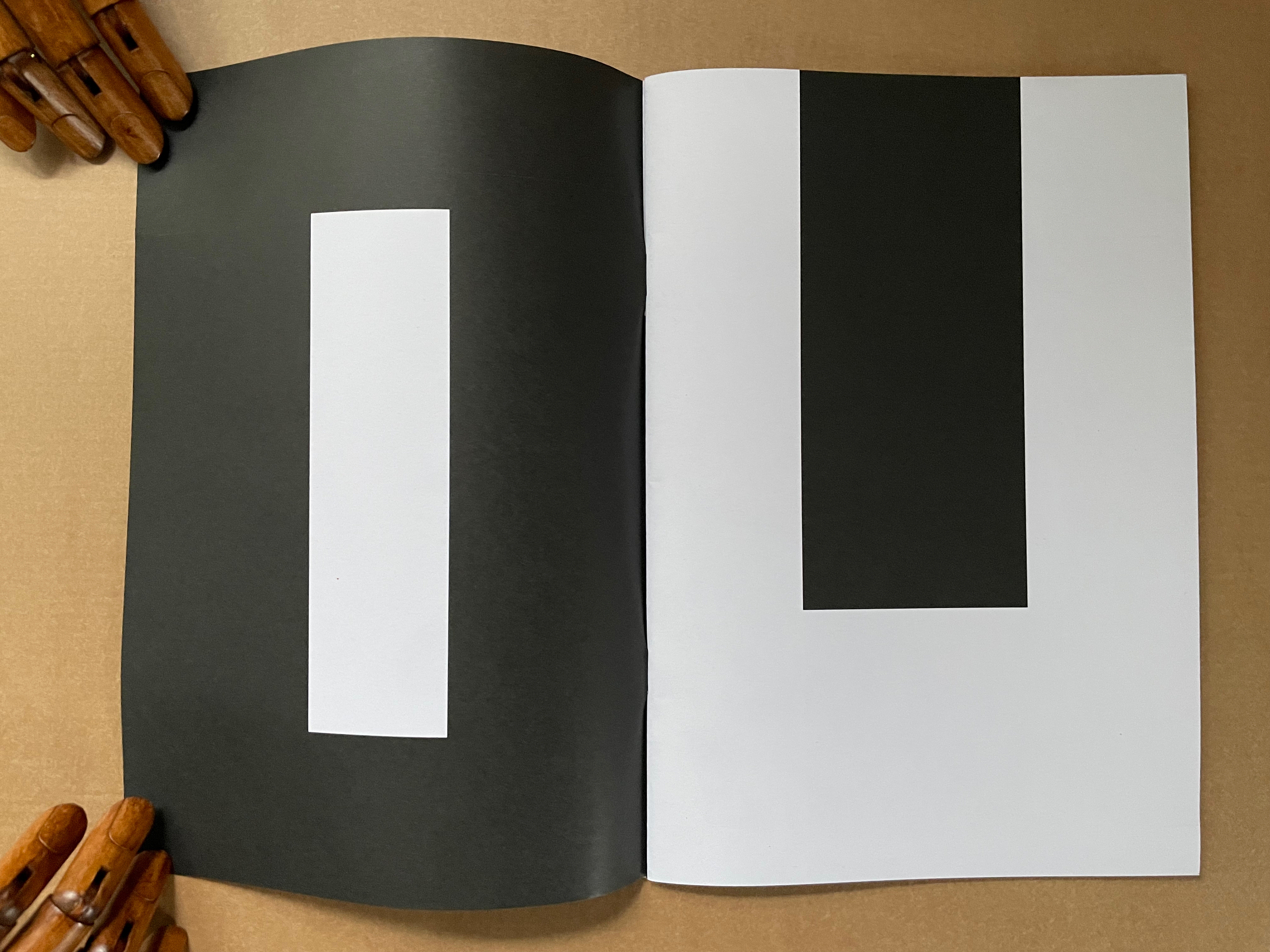
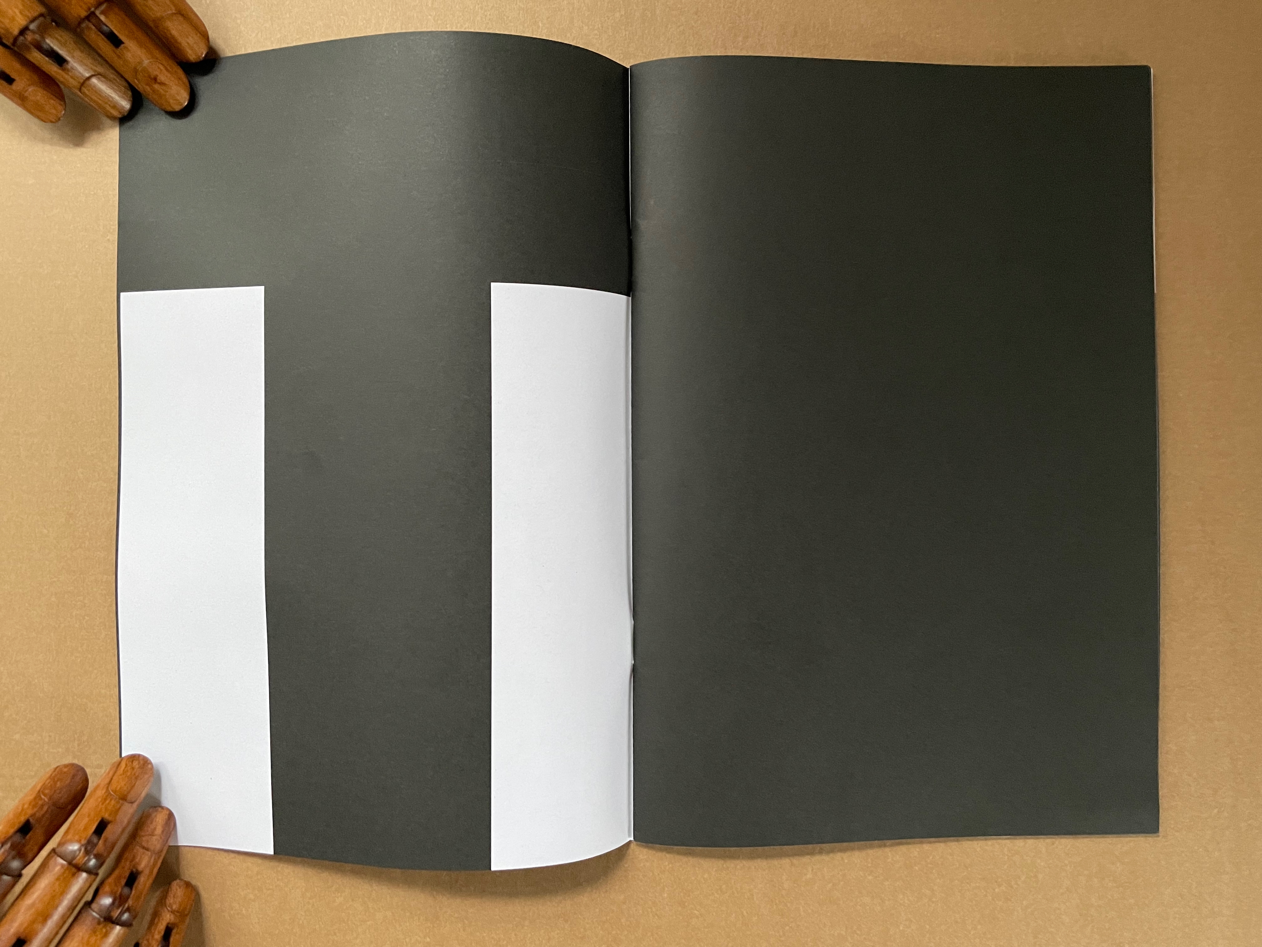
“Tout”
The sentences to be deciphered from these full-page-bleed letters are Tout a été redit. Tout a été refait, which, in English, would be “Everything has been said. Everything has been done.” But it also has the echoes of a French children’s song, “Tout ce que je fais“:
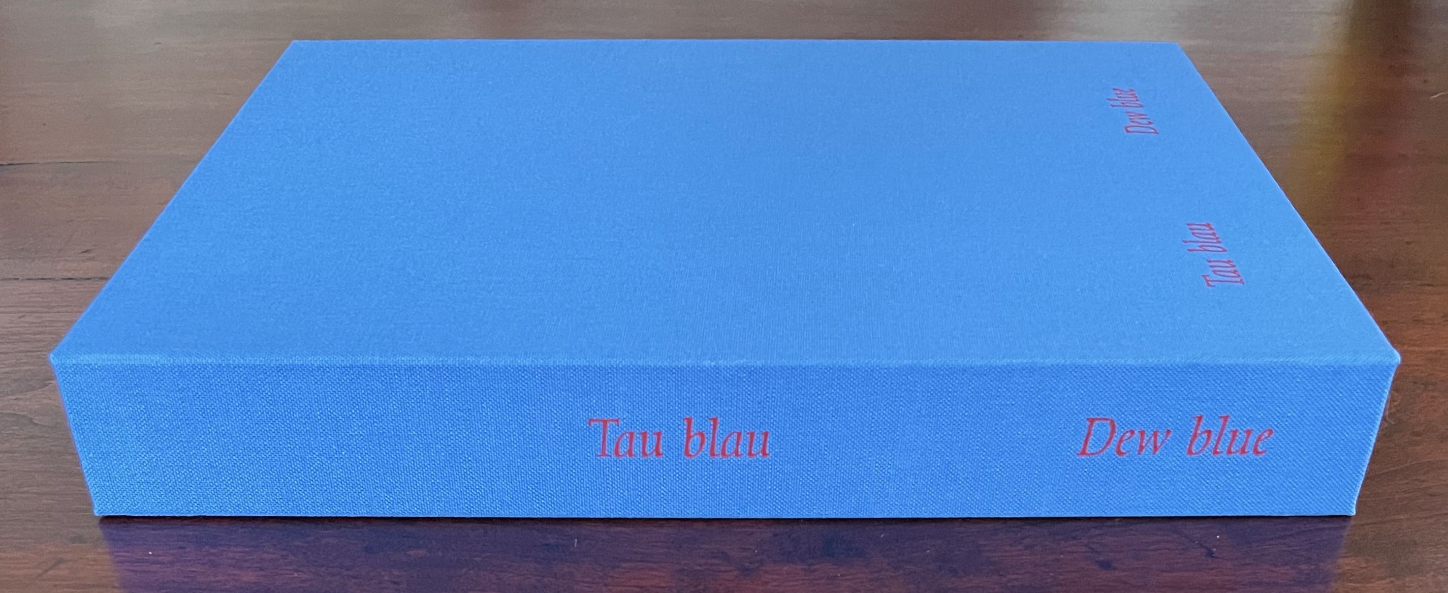
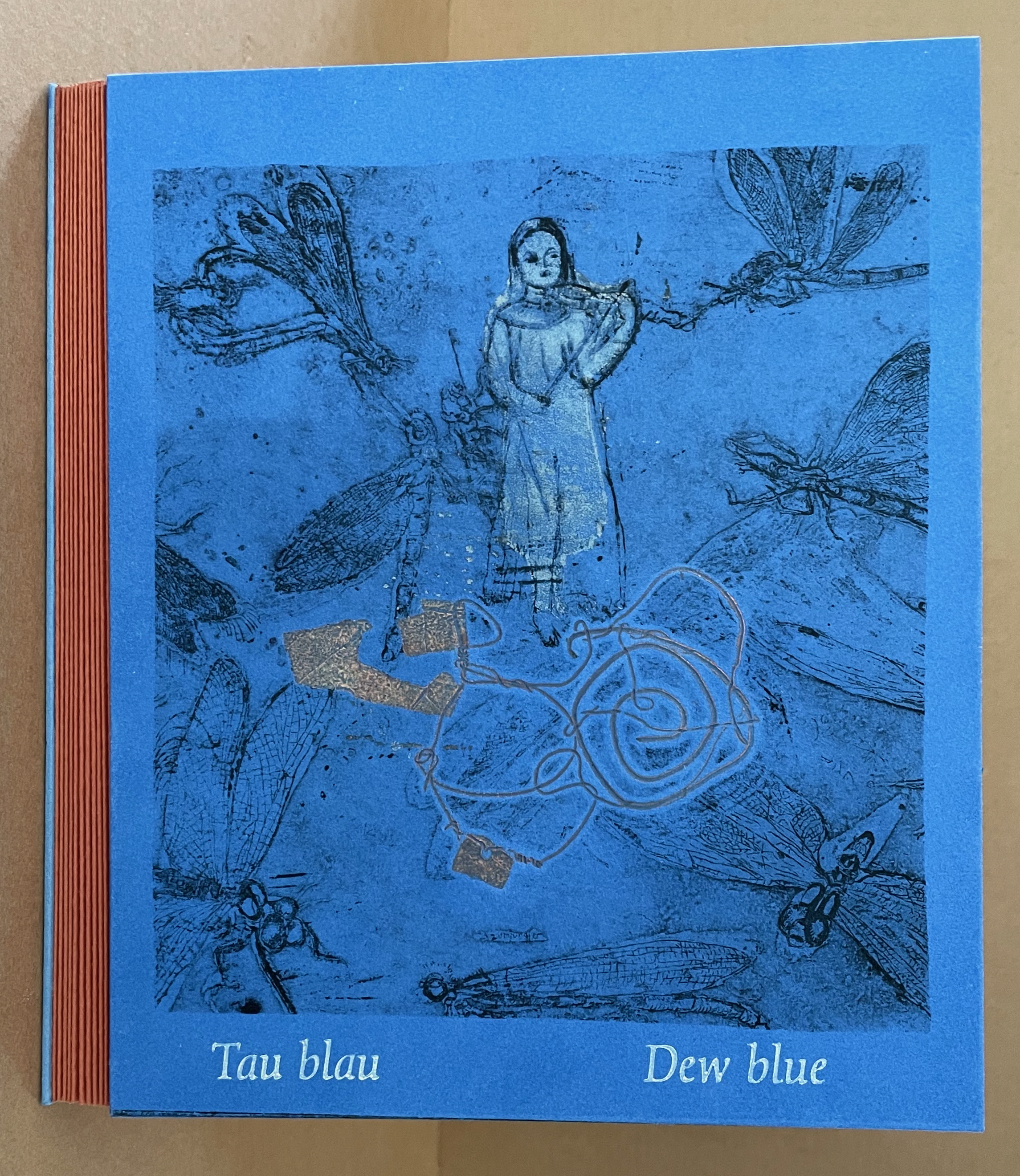
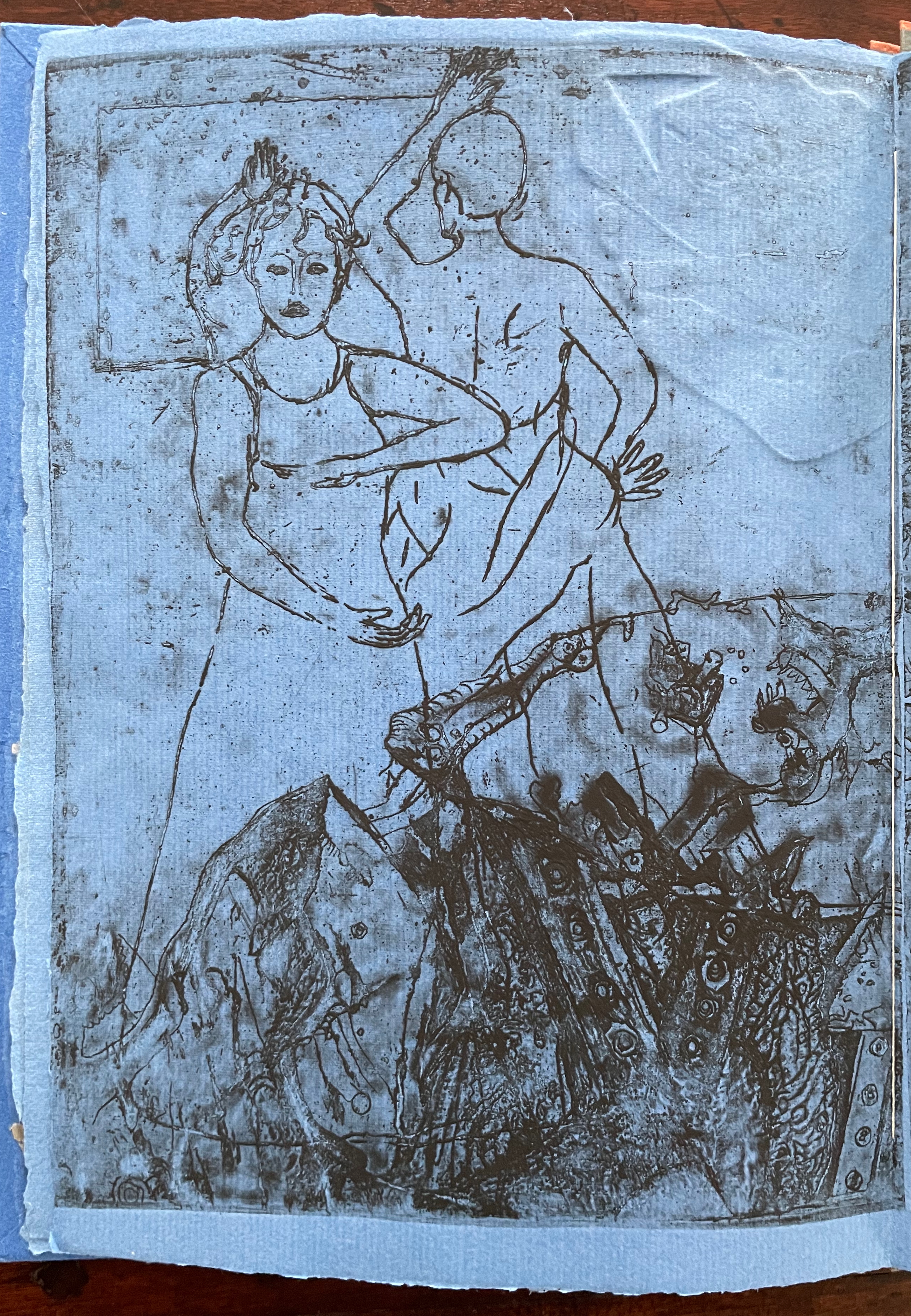
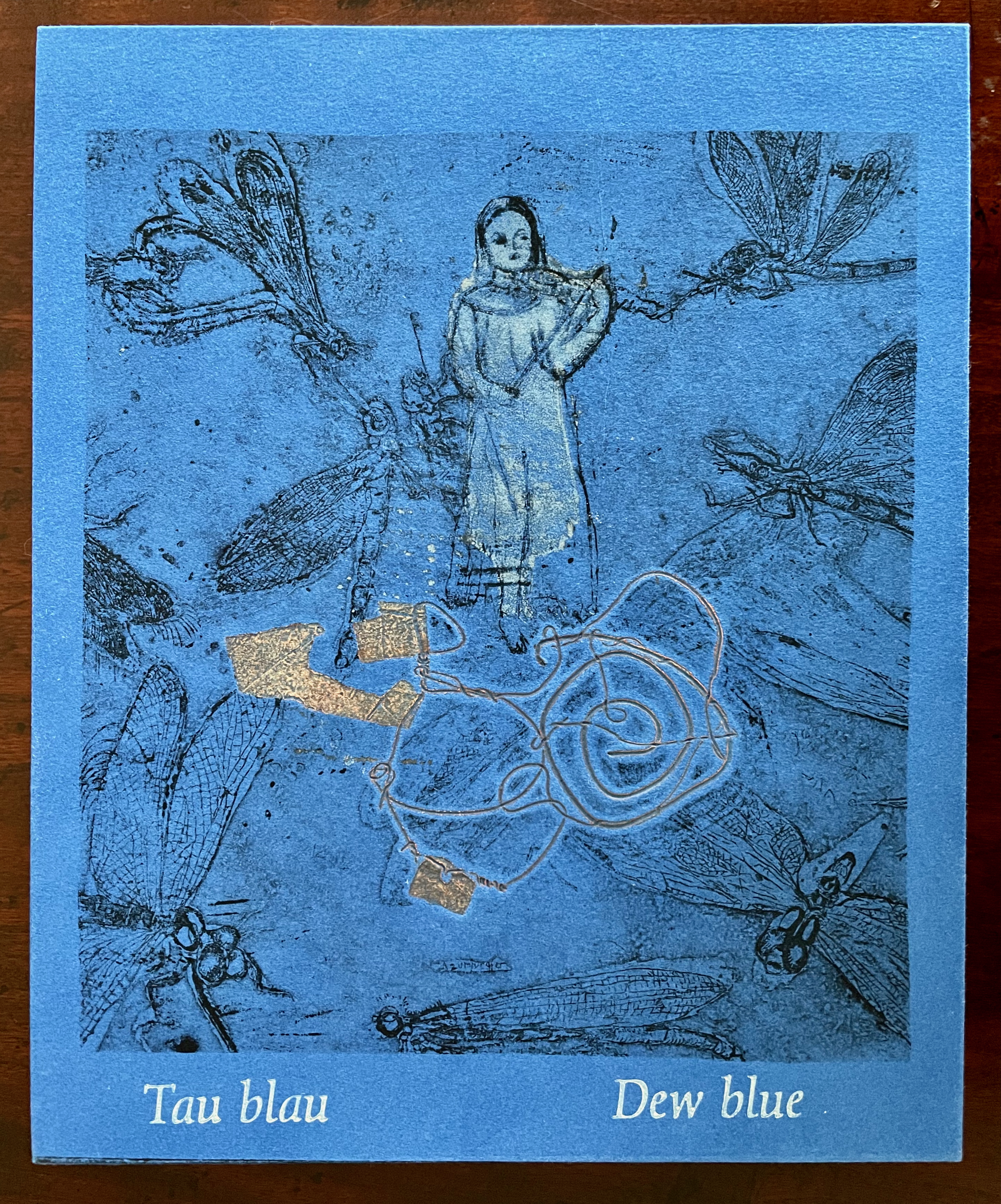
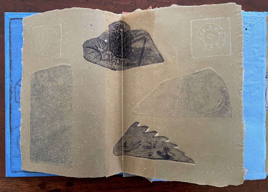
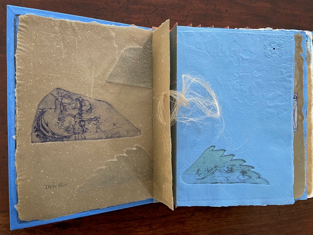
Tau blau / Dew Blue (2013) Barbara Beisinghoff ; Solander box in linen, handbound Vera Schollemann; Flax paper, handmade by John Gerard. Solander box: H240 x W200 x D32 mm. Flagbook: H220 x W180 mm. Edition of 38, of which this is #22. Acquired from the artist, 30 December 2024. Photos: Books On Books Collection.
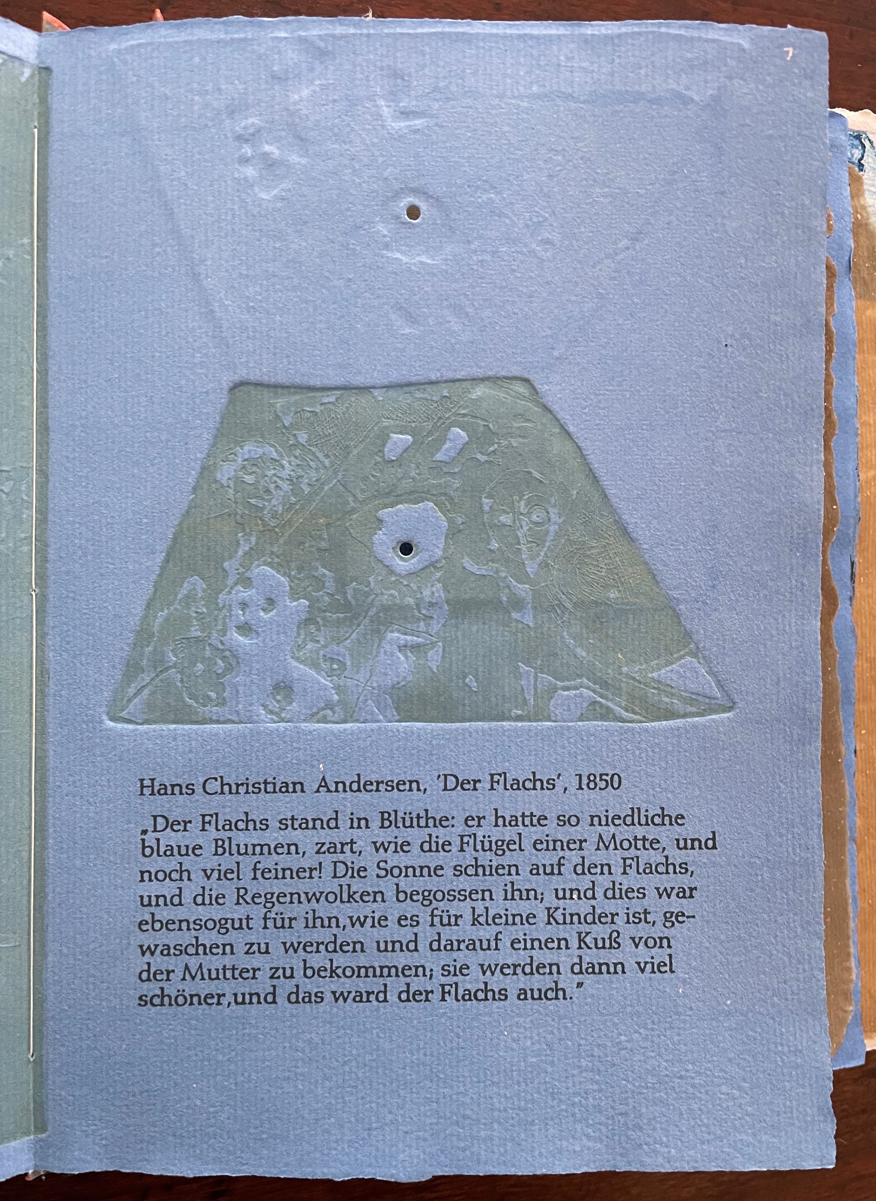
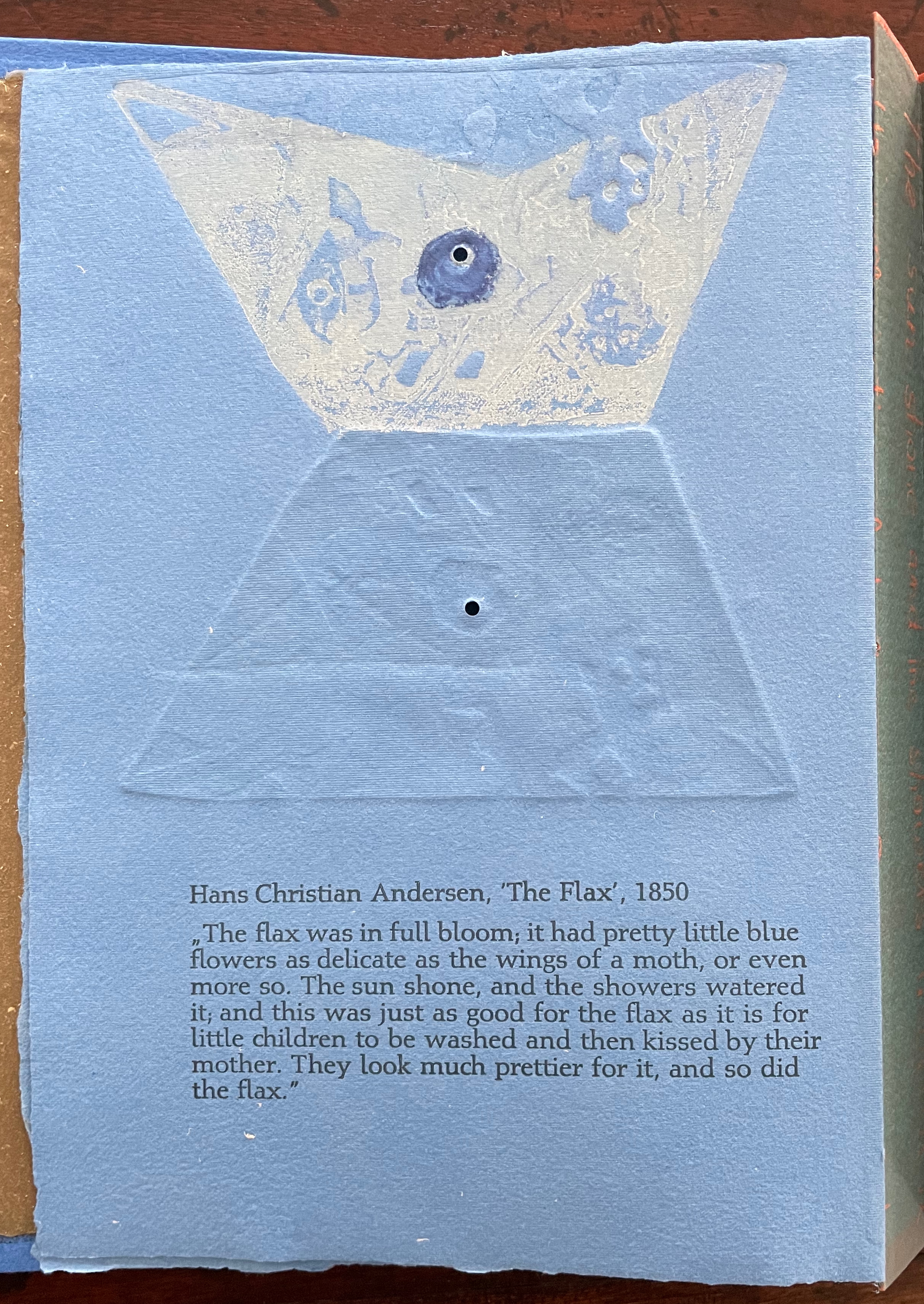
Familiarity with Hans Christian Andersen’s fairy tale Hørren /The Flax enhances appreciation of Barbara Beisinghoff’s Tau blau / Dew Blue. Andersen gives a voice to the plant that expresses its joy, pain, hope and observations at each stage of its blooming, being harvested, turned into linen and clothing then paper, and finally consigned to flames. The H.C. Andersen Centre offers Jean Hersholt’s translation of it here.
Only the opening paragraph of the story appears in Tau blau / Dew Blue, but Beisinghoff documents and illustrates the stages from her own cultivation of flax, observation of its growth and preparation of its processing. And with the etching, drawing, watermarking, handmade papers, linen cloth and thread, and binding structure, Beisinghoff suffuses the spirit of the tale’s metamorphosizing plant throughout the whole of Tau blau / Dew Blue.
From the blue of the plant’s blossoms to the white of its change into linen and paper to the red, burnt orange and black of its sparks and ash when it is consumed by fire in the end, all of the story’s colors are replayed across Tau blau / Dew Blue from its Solander box to its covers and spine like motives in a Baroque musical piece.
In a concerto, motives play off one another and develop. In Tau blau / Dew Blue, the motif of nature (the plant) plays off the motif of artifice and the manmade (the fairy tale, music, linen, paper, etc.). On the front cover (above), a young girl, surrounded by large damselflies, plays a fiddle or violin and seems to hover above a silver foil image of flax thread and tools for making it. In the spread above alongside the front cover, the specks rising over the staves and musical notes (a recurring motif in itself) recall the tale’s final passage in which the bundle of papers (made from linen rags) is cast into a fire:
“I’m going straight up to the sun!” said a voice in the flame. It was as if a thousand voices cried this together, as the flames burst through the chimney and out at the top. And brighter than the flames, but still invisible to mortal eyes, little tiny beings hovered, just as many as there had been blossoms on the flax long ago. They were lighter even than the flame which gave them birth, and when that flame had died away and nothing was left of the paper but black ashes, they danced over the embers again. Wherever their feet touched, their footprints, the tiny red sparks, could be seen.
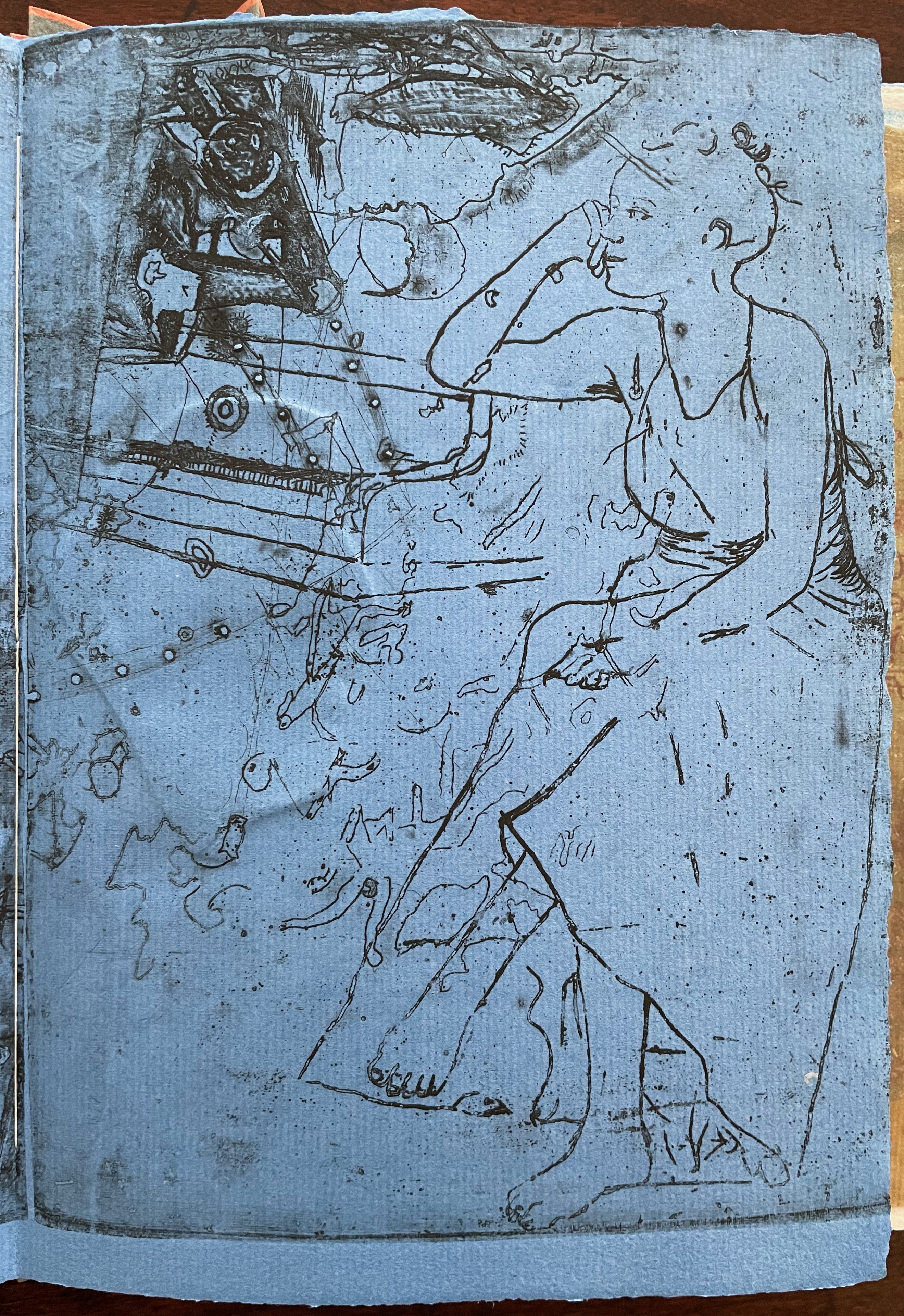
Images of tools — whether for preparing flax or for making the products from it — also recur on the inside of the front and back covers and throughout the book. The human figures alongside the tools, however, appear engaged in more than manufacturing. Elsewhere in the book, they dance, they sit and meditate or write, they row on ponds beside the growing flax. The fairy tale, too, has these Romantic juxtapositions of nature, art and craft. So, again, the spirit of Andersen’s tale finds another way into Tau blau / Dew Blue.
Inside front and inside back covers.
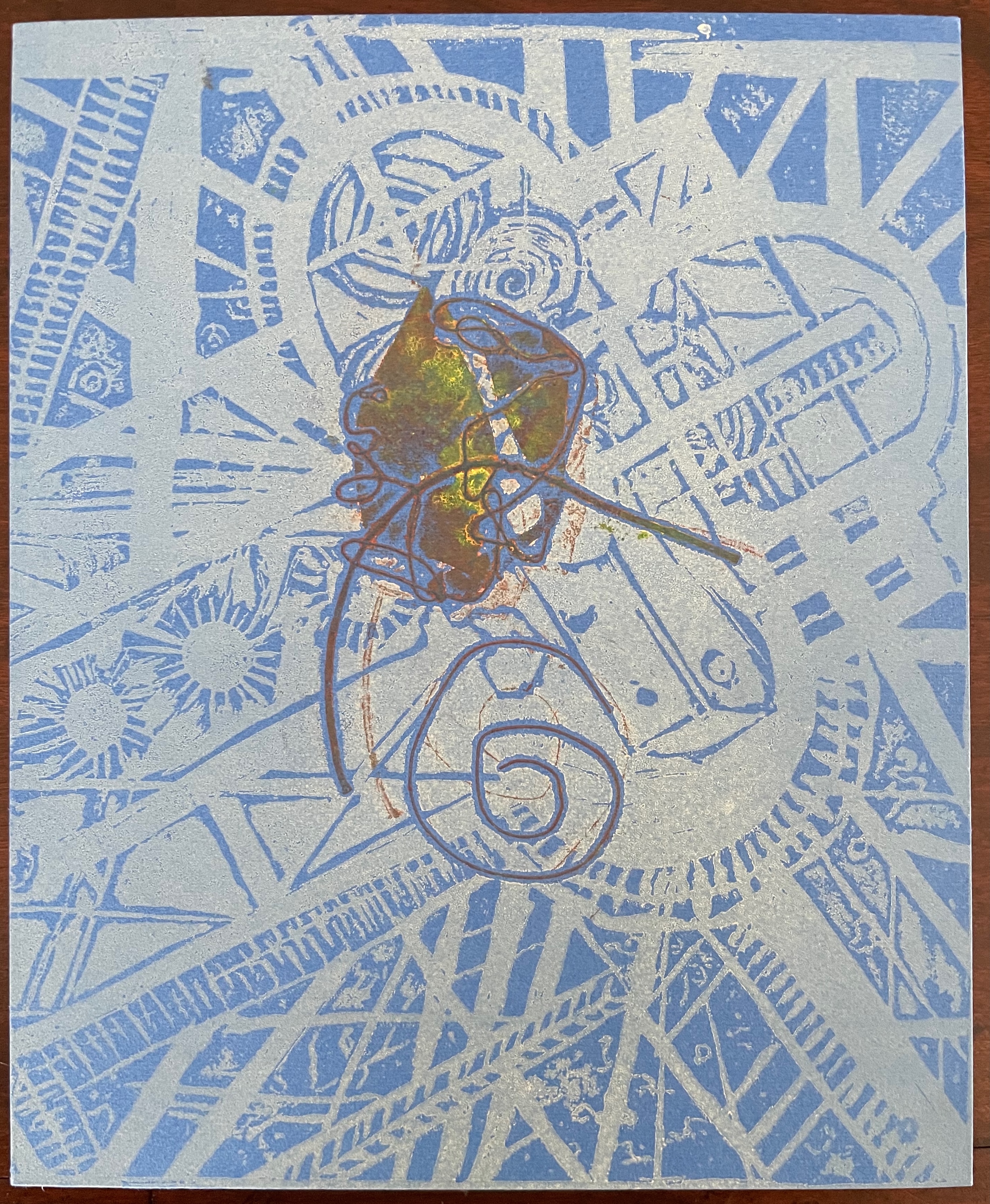
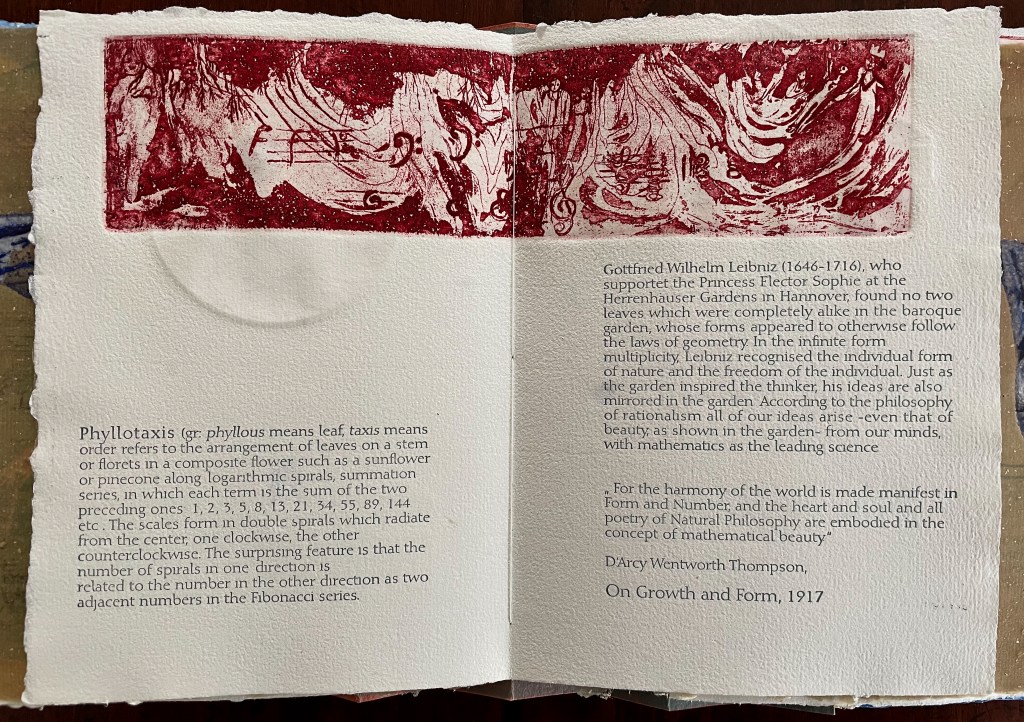
The front cover also announces another motif in those coils of thread below the young girl’s feet. Within the coils is the image of a Fibonacci spiral, which appears on the back cover and throughout the book in different ways. It can be found drawn and printed. It can be found in watermarks in the handmade paper. It can be found in the arrangement of florets in flax. Being a composite flower, flax blossoms display the spiral based on the Fibonacci sequence 1, 2, 3, 5 … 233, and so on. These numbers are waterjet-drawn on the pure flax paper below and explained in an entry printed on the adjacent plain handmade paper folio. By appearing on the book’s front and back covers, the spiral echoes the beginning and ending cycles of birth and rebirth the flax goes through in the folktale.
The Fibonacci spiral on the front and back covers.
The sequence of Fibonacci numbers 1, 2, 3, 5 … 55, 89, 144, 233 … watermarked on handmade flax paper with a water jet.
Description of the Fibonacci spiral side by side with quotation from Thompson’s On Growth and Form (1917), drawing on Leibniz’s Rationalist philosophy.
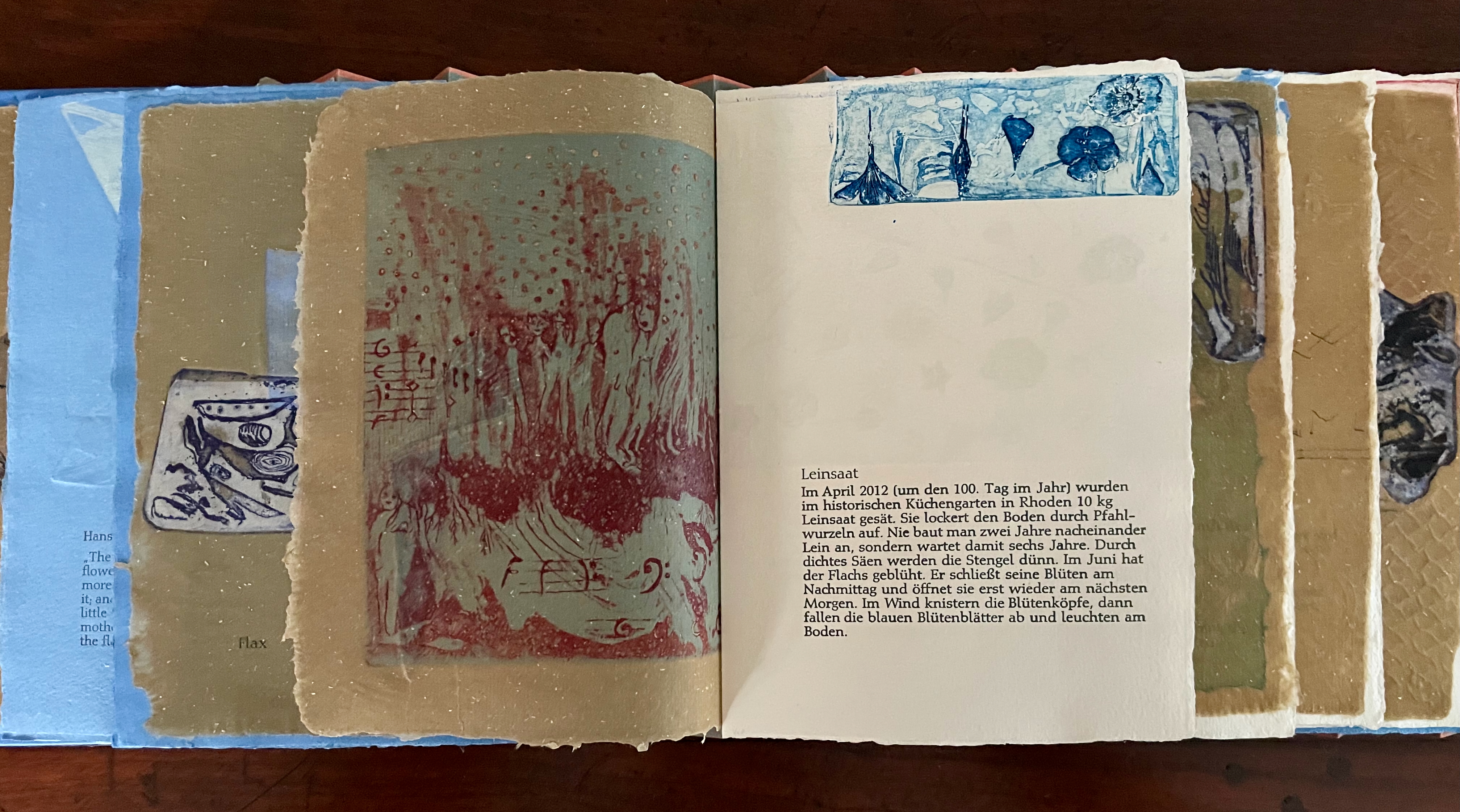
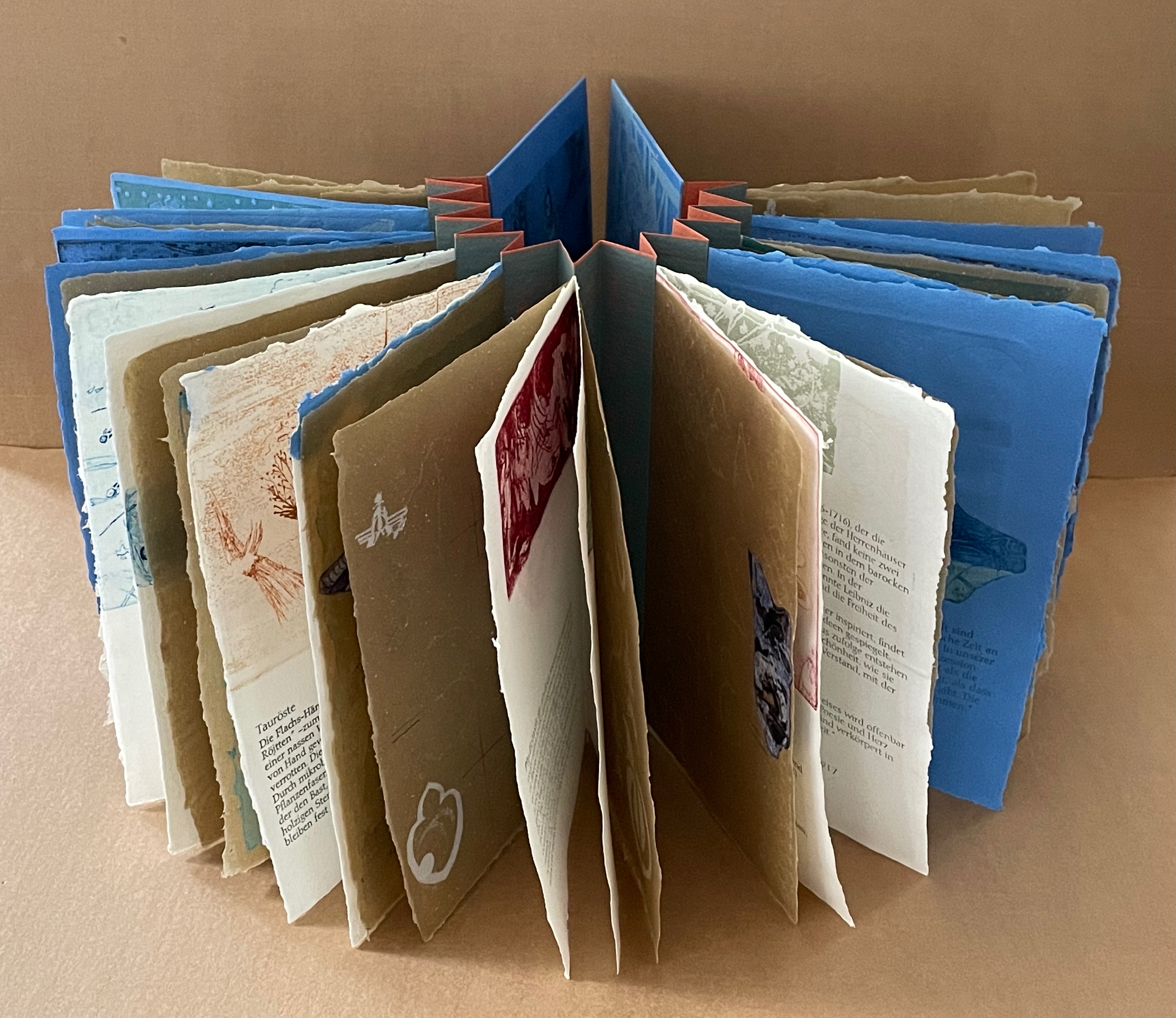
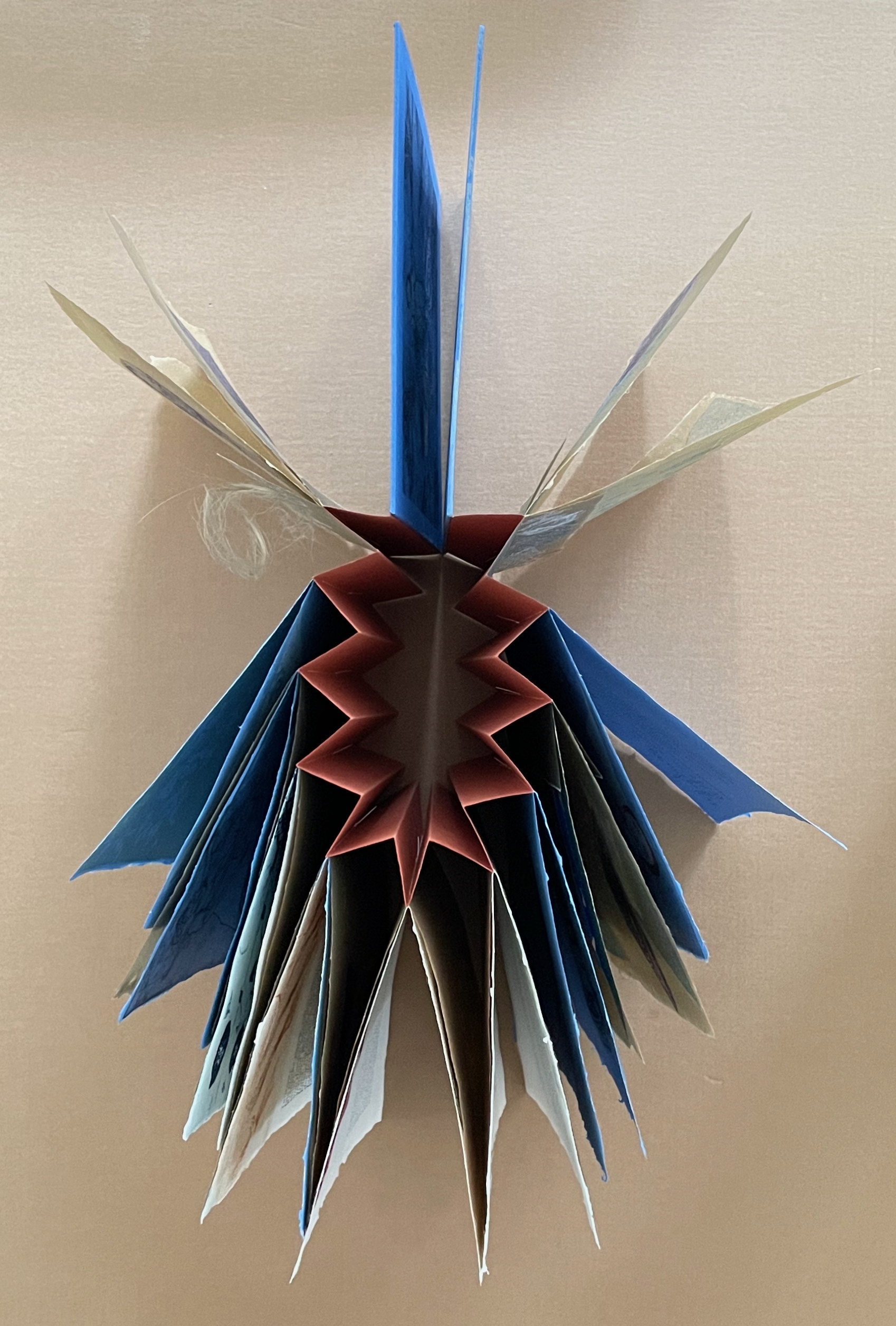
To organize and weave her motives together, Beisinghoff uses an accordion spine to whose peaks eleven sets of folios are sewn with linen thread. Three of the eleven are 4-page folios consisting of blue handmade paper. Another three 4-page folios consist of pure flax paper (handmade by John Gerard). The remaining five gatherings have 8-page folios, each consisting of a pure flax paper folio around a blue or plain one.
Side and top views of the accordion spine.
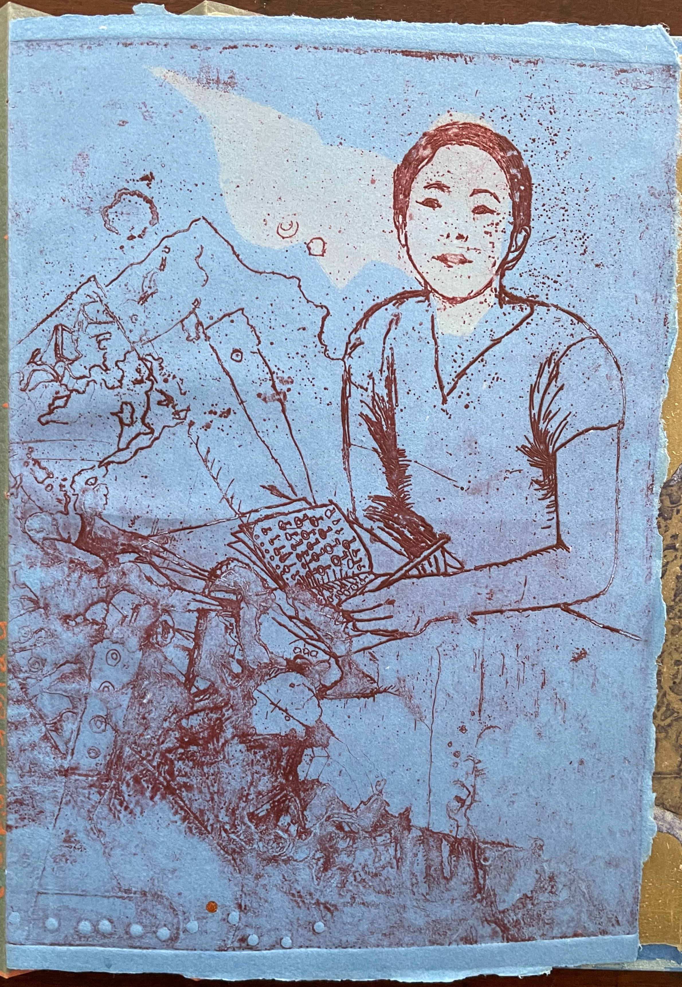
The first pure flax folio begins the book, displaying two title pages (German and English) and two etchings on its first and last pages. In the center spread, two more etchings appear. A watermark symbolizing phyllotaxis shows through in the upper left, balanced by a watermark with a cross section of a flax stalk in the upper right of the center spread. The texture and weight of the flax paper allows the impress and shadow of the etchings to stand out on both sides against the inking and watermarks.
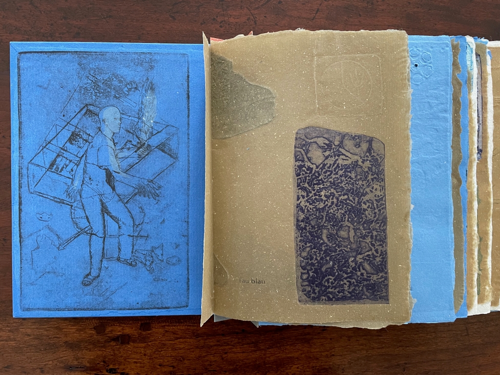
Inside front cover and Tau blau title page and etching.
Center spread of first flax paper folio. Note the watermarks in the upper left and right corners.
Dew Blue title page and etching, loop of flax fibers, first page of blue handmade paper folio; note its boating image repeated from the prior center spread.
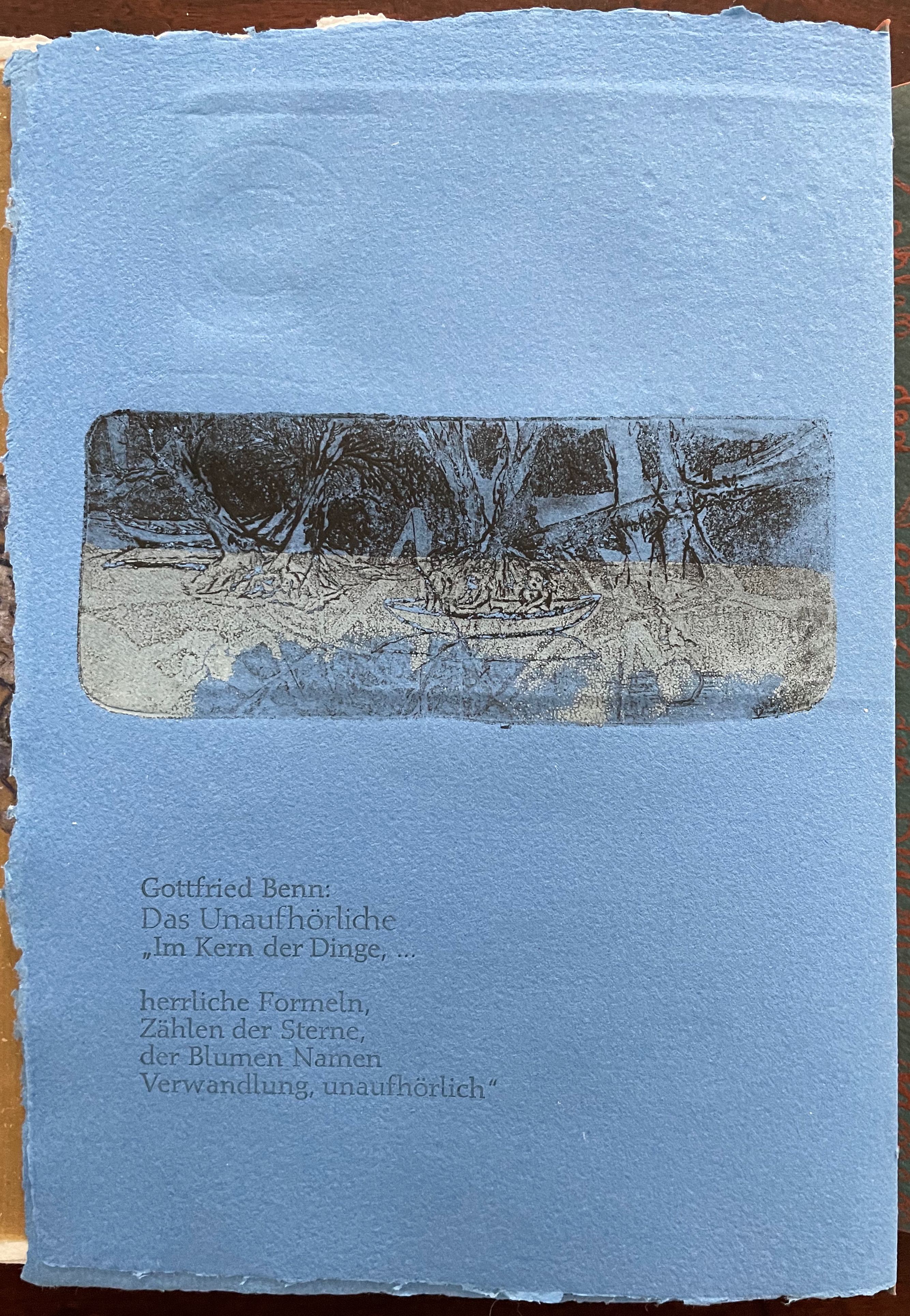
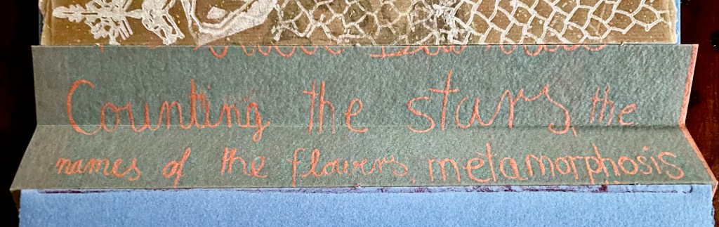
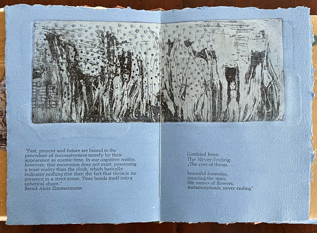
Following the pure flax folio, the first all blue folio gives us that introductory excerpt from Andersen’s fairy tale. Next comes a description of flax comes from Leonhart Fuchs’ Book of Herbs (1543), then the series of planting and harvesting observations from Beisinghoff, then the refrain from Clemens Brentano’s poem “Ich darf wohl von den Sternen singen” (1835), then philosophical observations drawing on G.W. Leibniz from D’Arcy Wentworth Thompson’s On Growth and Form (1917), a much-quoted theorem of musical composition from Bernd Alois Zimmermann’s Intervall und Zeit (1974), and finally (below) a passage of text by Gottfried Benn from the Hindemith oratorio Das Unaufhörliche / The Neverending (1936). In the valleys of the accordion spine, some of the lines from Andersen, Fuchs, Beisinghoff and Been appears handwritten in orange paint.
Translated fragment of Benn’s lyrics for Paul Hindemith’s oratorio Das Unaufhörliche / The Neverending (1936).
Even with these additional texts, Andersen’s fairy tale remains the most central text in Tau blau / Dew Blue, despite the brevity of its excerpt. Brentano’s Romantic/religious expostulations (“O Star and Bloom, Garb and Soul, Love, Hurt and Time for evermore”) sound like those of the plant in the story’s final passage. The occurrence of Fibonacci’s spiral in the plant may be a physical fact, but Beisinghoff turns it into something more mystical by placing the description of phyllotaxis next to Leibniz’ and Thompson’s transcendental view of mathematical science and natural philosophy. Likewise she links the texts from Bernd Alois Zimmermann and Gottfried Benn to the fairy tale by placing them beneath the etching that captures the flax plant’s singing and dancing into its transformation by fire.
Below is the final folio of the work. Like the first, it is made completely of flax paper, but its center spread offers a fuller image: flax blossoms and stalks float in the foreground, and in the background is a sketch of Beisinghoff’s residence where she grows her flax. Like the Fibonacci spiral on the front and back covers, the first and last flax folios round out the work. But go back and listen for the hidden sound installations accompanying Dew Blue. Noticing Beisinghoff’s abstract musical notation, indulge yourself with recordings of a Swedish folk song (“Today is supposed to be the big flax harvest” here or here) to which the notation and phrases allude, and as the flax papers turn and wave on their accordion peaks, listen carefully for their musical rustle.
The final pure flax paper folio.
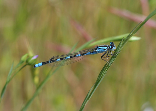
Tule Bluet damselfly perched on flax leaf. Photo: John Riutta, The Well-Read Naturalist (2009). Displayed with permission.
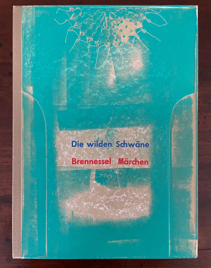
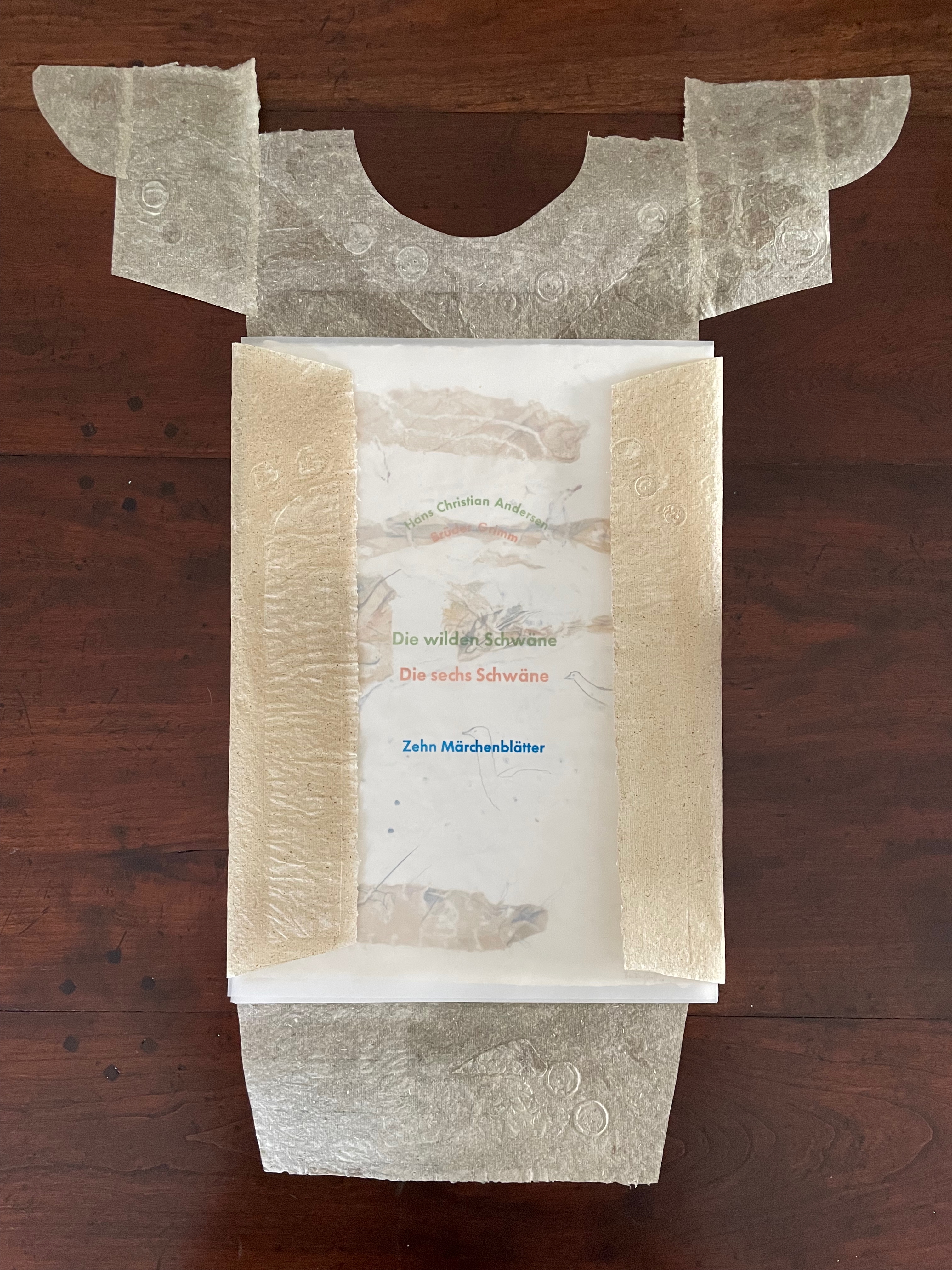
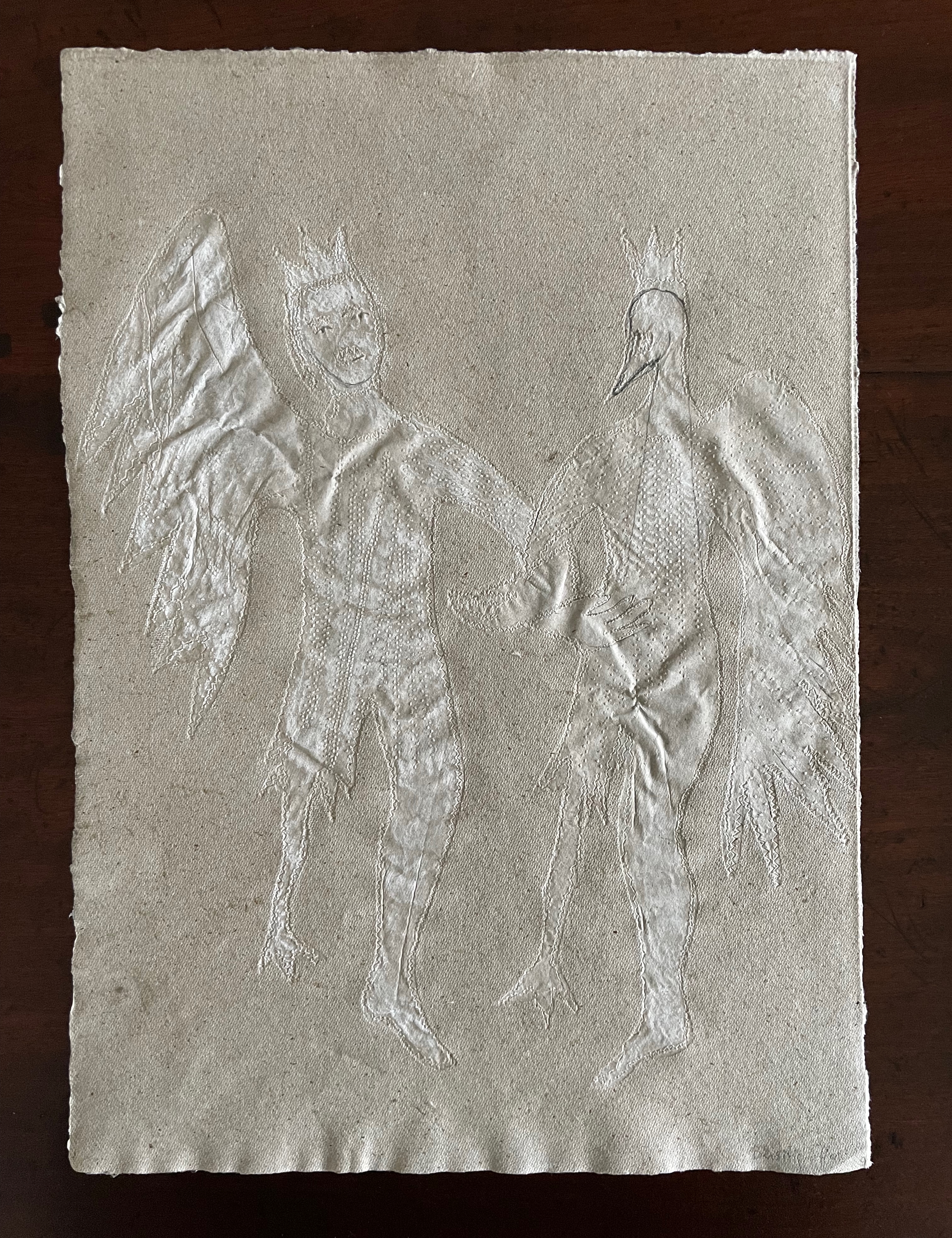
Die wilden Schwäne (2001)
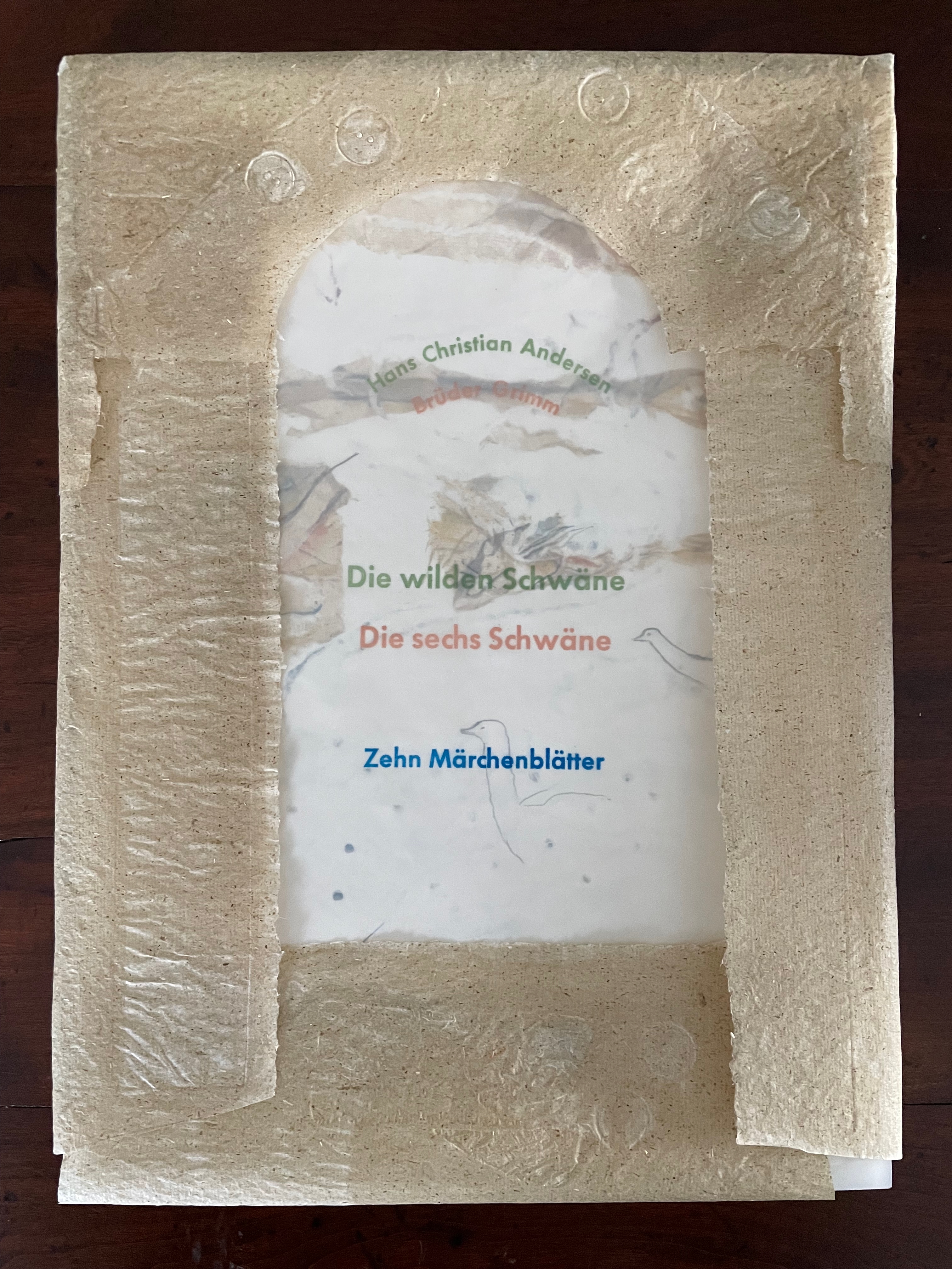
Die wilden Schwäne (2001) Barbara Beisinghoff Box with embossed cover holding folios wrapped in chemise. H35o x W250 mm. 18 folios. Edition of 25, of which this is #6. Acquired from the artist, 20 December 2024. Photos: Books On Books Collection.
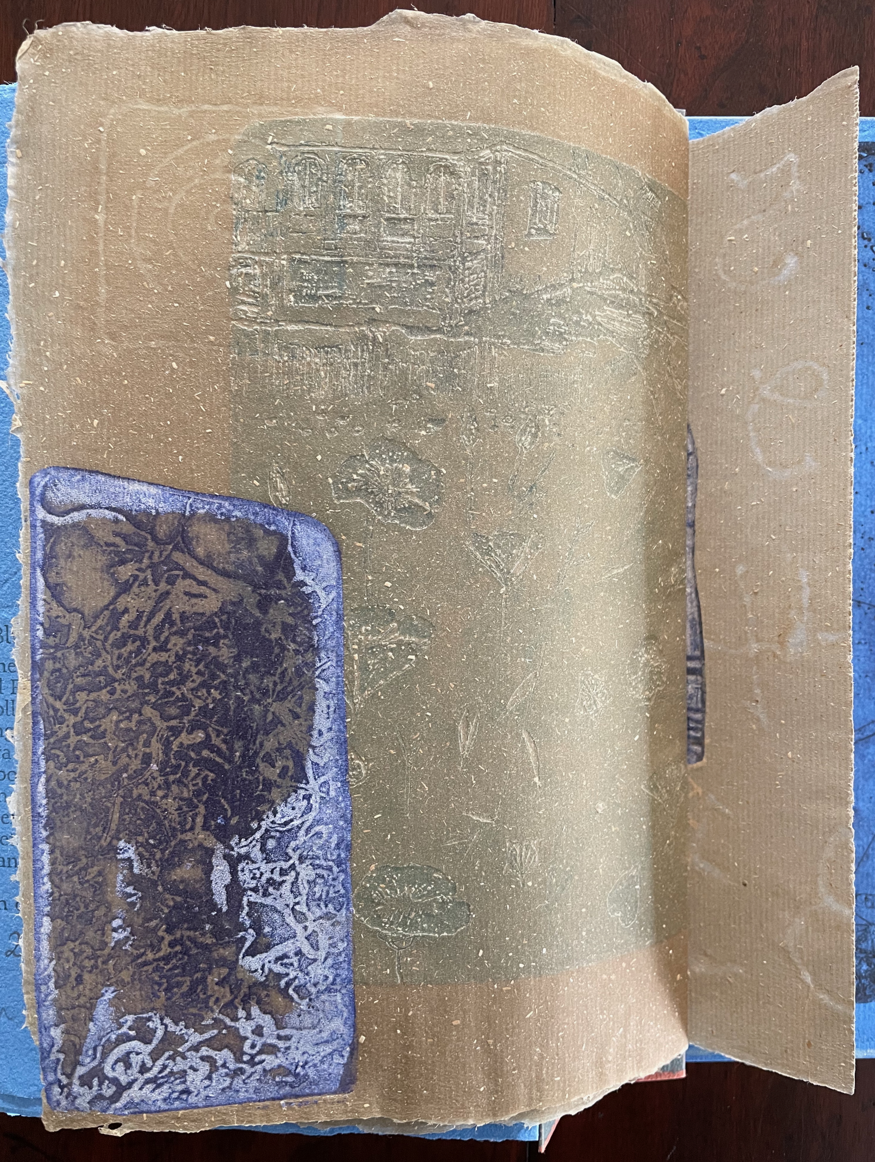
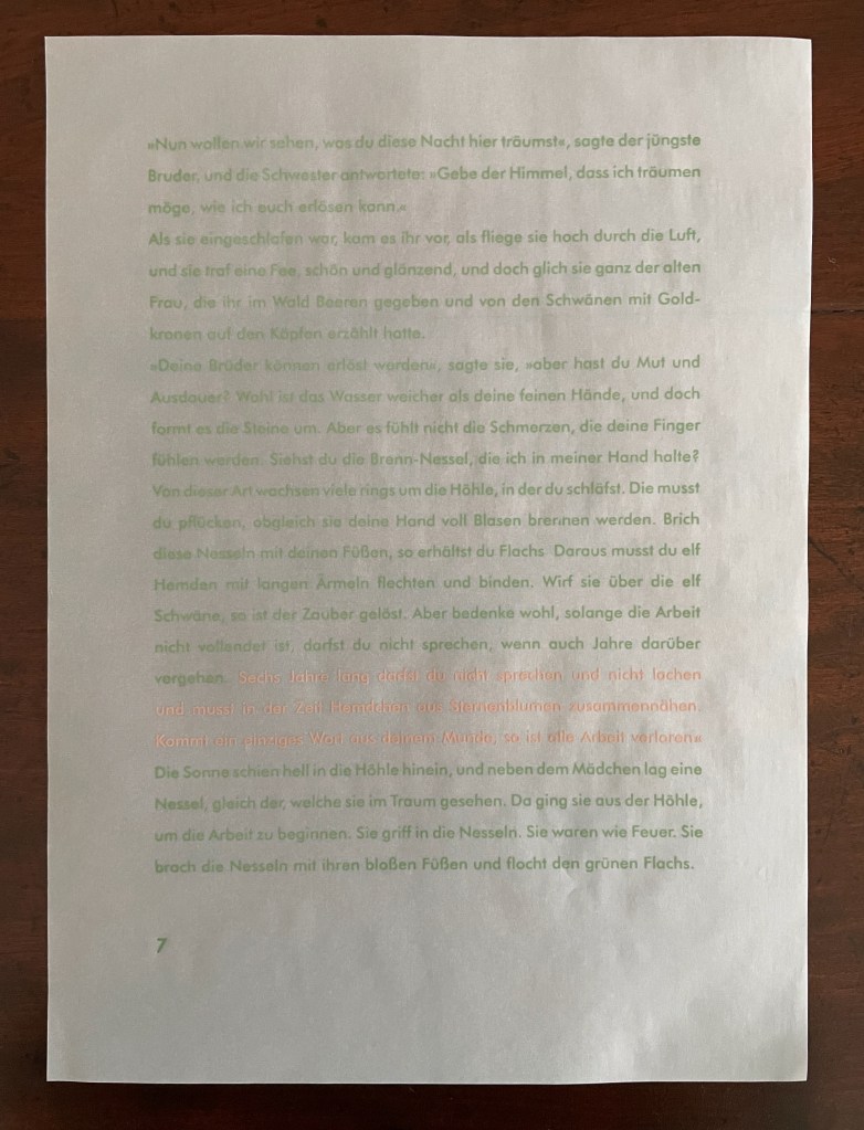
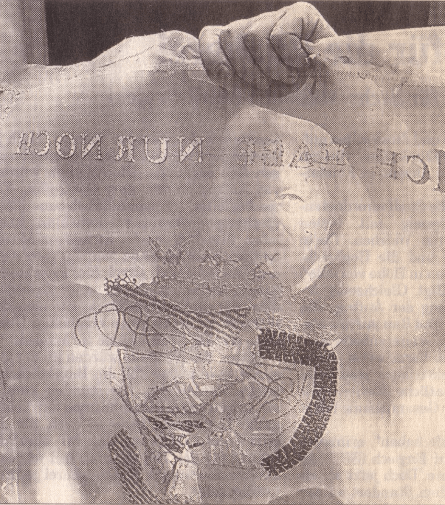
Barbara Beisinghoff’s Die wilden Schwäne is an exemplar of collaboration and craft. In it, she even requires collaboration between Hans Christian Andersen and the Brothers Grimm. Andersen’s Die wilden Schwäne and the Grimms’ Die sechs Schwäne are based on the same tale of brothers turned into swans who are saved by their sister Elisa’s diligent and mute harvesting, pulping, spinning and sewing of stinging nettles into shirts that break the spell when donned. H.C. Andersen, however, is verbose and elaborate in his telling (even including vampires!), and Beisinghoff has done a bit of nipping and tucking with the more succinct Brothers Grimm to create a version more suited to the artist’s book she creates.
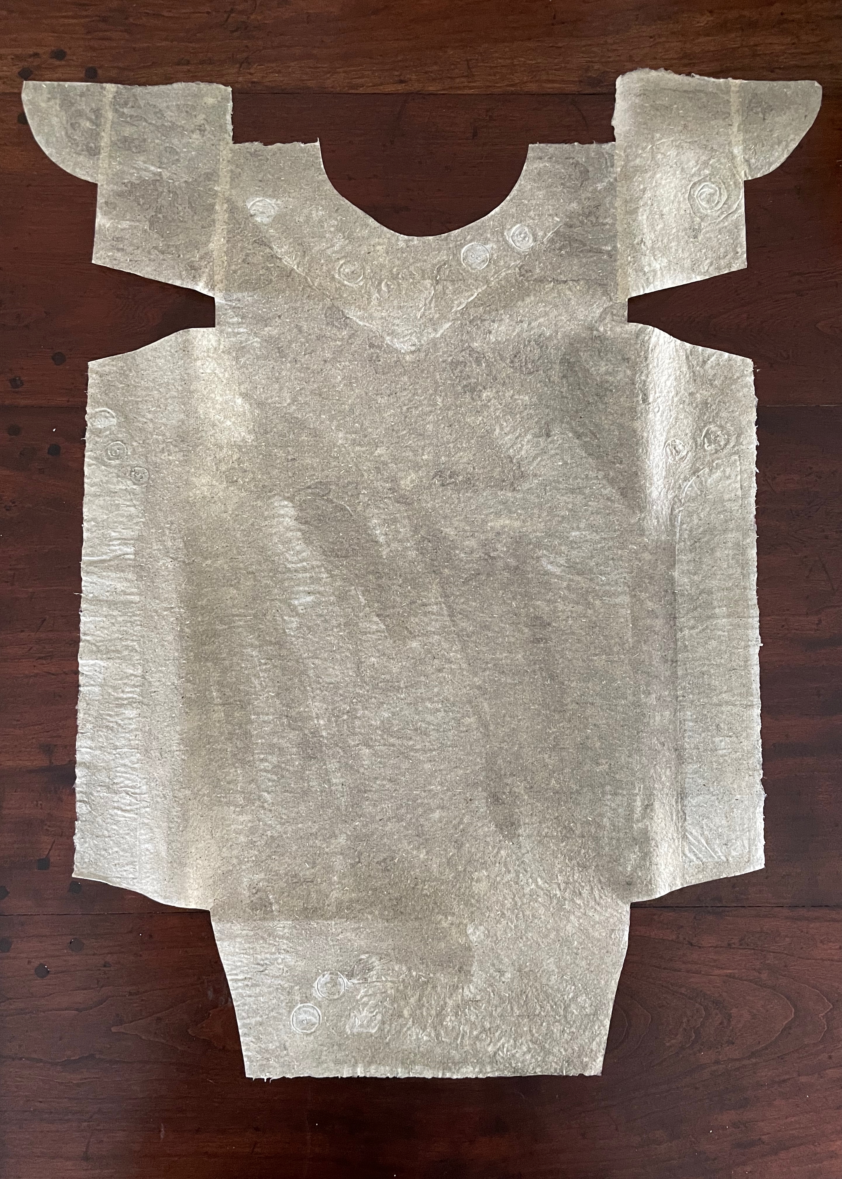
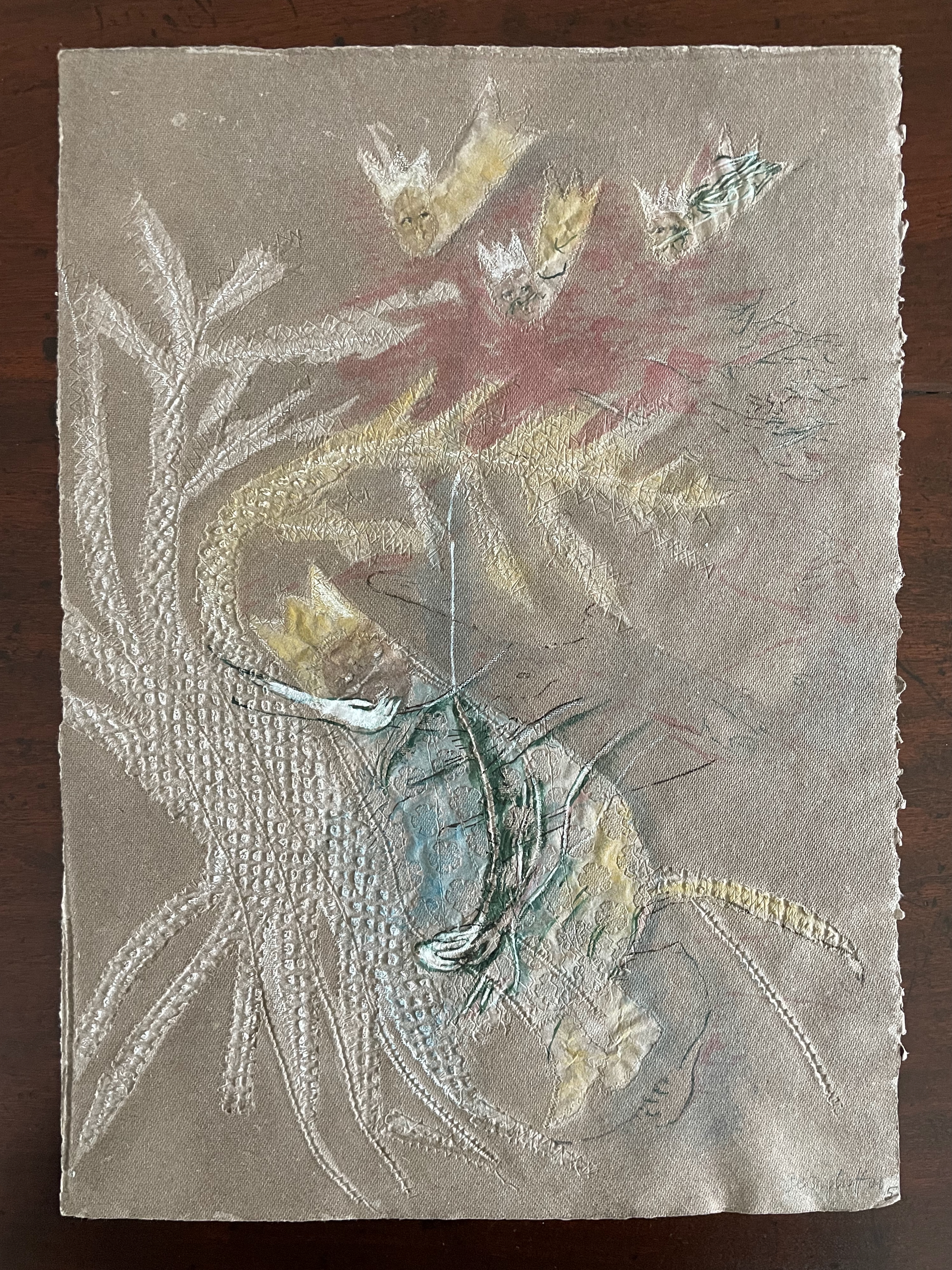
To match Elisa’s effort with stinging nettles, Beisinghoff enlisted the collaboration of Johannes Follmer, the owner of a paper mill. Together they obtained cultivated stinging nettles from the Institute for Applied Botany in Hamburg, cut the fibers, left them to rot, boiled them into a pulp, mixed that with water in a vat, scooped up layers in a sieve embroidered with illustrations, couched the sheets, then pressed and dried them into paper. Beisinghoff applied further drawings with a water jet, watercolor and pencil to the watermark-embossed sheets to illustrate aspects of the tale. To present the Andersen/Grimm “collage”, Beisinghoff had the type set and printed at the Gutenberg Museum. Andersen is printed in light green and Grimm in light red on seven numbered translucent sheets and interleaved with the nine folios of paper art (two more translucent sheets carry the cover page and colophon). To wrap the folios together, Beisinghoff made an embossed chemise or “feather dress” of pure nettle fiber, which could represent Andersen’s description of the brothers’ blowing off each other’s feathers every evening when the sun has set or one of the shirts that their sister makes to break their spell.
The “feather dress” of stinging nettle fiber.
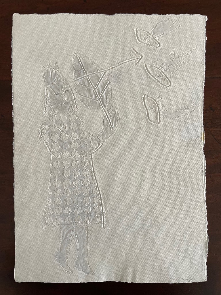
“The King’s little daughter was standing in the cottage room, playing with a green leaf, for she had no other toys. She pricked a hole right through the leaf, looked up at the sun, and there it was, she saw the clear eyes of her brothers, but every time the warm rays of the sun shone on her cheeks, she thought of all their kisses.” Translation with DeepL.
“When she had fallen asleep, it seemed to her as if she were flying high through the air, and she met a fairy, beautiful and radiant, yet she looked very much like the old woman who had given her berries in the forest and told her about the swans with gold crowns on their heads.” Translation with DeepL.
“The swans swooped down to her and lowered themselves so that she could throw the shirts over them: and as she touched them, the swan skins fell off, and her brothers stood before her in the flesh, fresh and beautiful.” Translation with DeepL.
“Barbara Beisinghoff (head in the background) covers the frame with this transparent, embroidered and sewn gauze, which is used to scoop and emboss her nettle papers. This is how her large-format watermark illustrations end up on the sheets.” Translation with DeepL. Peter Holle. 30 August 2001. Frankfurter Rundschau. Photo: Oliver Weiner.
This art by watermarking recalls that of other artists in the collection: Fred Siegenthaler and Gangolf Ulbricht, in particular. The technique of pulp painting also finds other practitioners in the collection: Pat Gentenaar-Torley, John Gerard, Helen Hiebert, Tim Mosely, Maria G. Pisano, Taller Leñateros, Claire Van Vliet and Maria Welch. Beisinghoff’s blend of embroidered watermarks, waterjet marking and pulp painting, however, creates a bas relief effect that is echoed only in the collection’s works by Mosely, Taller Leñateros and Van Vliet, albeit achieved differently. These workings of the substrate — as material, color, surface, and even narrative — with the workings of book structure is one of the more magical locations of book art. It is perfect for Beisinghoff’s metamorphical interpretation of the Andersen/Grimm fairy tale.
The Century of Artists’ Books (1994) — An Appreciation
Before Johanna Drucker’s The Century of Artists’ Books (1994), the discussion of artists’ books was all argy-bargy about definitions, boundaries, neologisms or the placement of apostrophes. The Century cut through all that to become the introductory textbook to the field’s evolutionary biology. Decidedly post-Darwinian, it avoided rigid taxonomy and categories.
If all the elements or activities which contribute to artists’ books as a field are described[,] what emerges is a zone of activity, rather than a category into which to place works by evaluating whether they meet or fail to meet certain rigid criteria. There are many of these activities: fine printing, independent publishing, the craft tradition of book arts, conceptual art, painting and other traditional arts, politically motivated art activity and activist production, performance of both traditional and experimental varieties, concrete poetry, experimental music, computer and electronic arts, and last but not least, the tradition of the illustrated book, the livre d’artiste. — (p. 2).
More than occasionally, certain denizen of this “zone of activity” emerge to question, prod, probe, devour, regurgitate, excrete, smash, bang together, impale, immerse, soak, burn, freeze, distill, erase, sculpt, digitize or otherwise engage the physical aspects, possibilities and very idea of “the book”. When they do, “[t]he book becomes a form of artistic expression in the hands of these artists rather than a convention-bound mode of reproduction” (p. 47). The Century of Artists’ Books serves up numerous examples of them. It teases out the various strands of book-DNA that these specimens engage in becoming artists’ books. In doing so, The Century has proven to be a valuable tool for the collector, not just for historians and critics. It enhances appreciation and enjoyment when reviewing acquisitions or considering new ones.
The numerous specimens and the different ways they interrogate “the conceptual or material form of the book” (p.3) offer points of comparison and contrast for the work acquired or about to be acquired. Is it a democratic multiple or a rare and auratic object? Is it a codex or one of its variants or its precursors or its digital successors, and is it playing them off one another? Does it exhibit a self-reflexive form? Is its form celebrating the visual over the textual/verbal, and if so, with what visual arts and what visual aspects of the book? If vice versa, what aspects of the book’s textual/verbal form does it explore? Is the work a play on sequence (narrative and non-narrative) in the book? Does it intentionally dance on the border between the ephemeral performance or installation and the more lasting book? Is it questioning the book as document? Is it posing itself as a metaphor of the book? Does it somehow declare its affinity with any of the artist’s book’s antecedents identified by The Century?
As comprehensiveas The Century is, the haptic is one element of book-DNA that it does not single out for a chapter of its own. Codex works in the Books On Books Collection that primarily address what the eye can feel and fingers see, such as Tim Mosely’s The Book of Tears (2014) and Grasping the Nettle (2020), do not have easily found specimens with which to compare and contrast. Drucker’s decision to exclude “book-like objects or book sculpture” may have led to this, although the sections “Hybrid and Spatial Variants” and “Interior Spaces” (pp. 145-53) certainly touch on them and their engagement of hand and eye.
Arguably over-inclusive is The Century‘s designation of antecedents: William Blake (for his illuminated books’ union of text and image, craft and art, and vision with form and structure), Gelett Burgess (for Le Petit Journal des Refusés and its spontaneous, topical and zine-like spirit), Gustave Flaubert (for Bouvard et Pécuchet and its idea of the “book as failure” to transmit knowledge), Stéphane Mallarmé (for Un Coup de Dés Jamais N’Abolira le Hasard and its revolutionary use of type, page layout and a metaphysical idea of The Book), William Morris (for The Works of Geoffrey Chaucer and his eccentric designer’s eye) and Laurence Sterne (for Tristram Shandy‘s rollicking interrogation of the book as novel).
Of those antecedents Blake and Mallarmé (and more Mallarmé than Blake) are the most useful touchstones for a collector. Blake’s innovation with etching that enabled him to unify script and image on the page and his mythic stance as a one-man band present a high bar to subsequent book artists. But for the collector, he stands as a reminder to consider both works of rude as well as fine craft, to inquire into technique and painstaking effort, and to look for unity (or intentional dis-unity) of word, image and form when contemplating an acquisition.
As abstruse as Mallarmé’s writings are, Poème‘s content, its play with type and the double-page spread, and its possible embodiment of Mallarmé’s metaphysical notion of the book all offer book artists more approachable avenues. In fact, so many book artists have paid direct homage to Poème and Mallarmé’s idea of le Livre (“the Book”) that a sub-genre of artists’ books has evolved. Poème‘s trueness as an antecedent touchstone can be found in the various and extraordinary ways those hommageurs respond to, and even appropriate, its book-DNA. For the collector, Mallarmé acts as a reminder to see what the book artist is doing visually, structurally and conceptually with type, the leaves, the pages and the idea of the book.
Unsurprisingly The Century proves helpful for appreciating and enjoying Drucker’s own artist’s books in the Books On Books Collection.
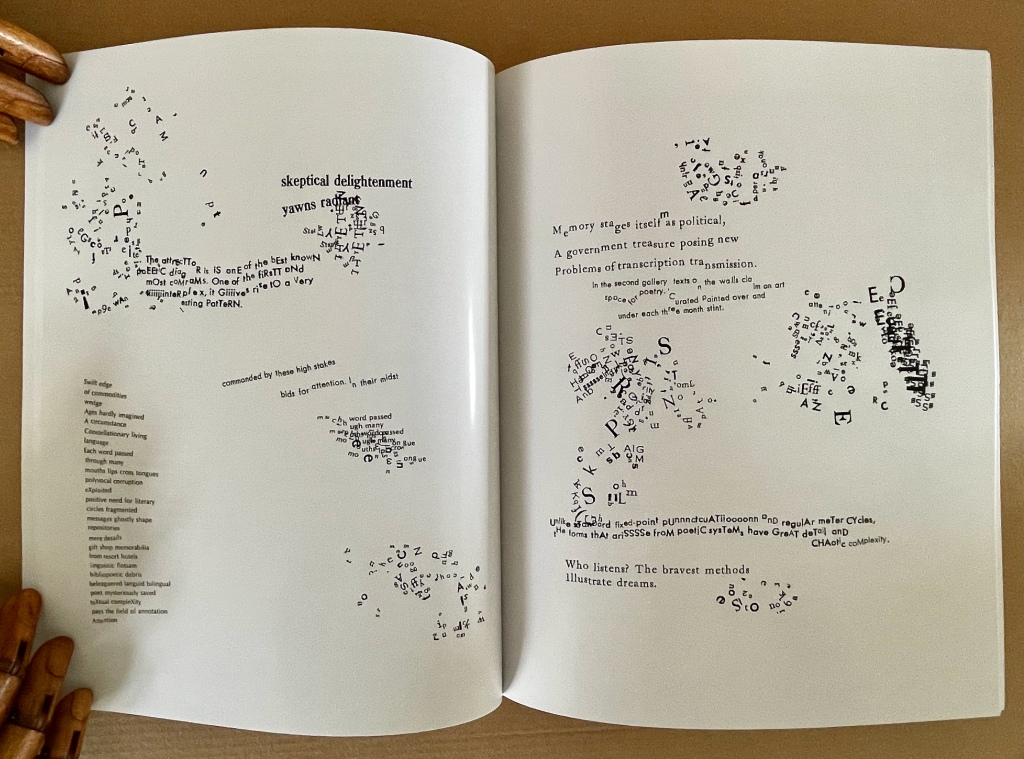
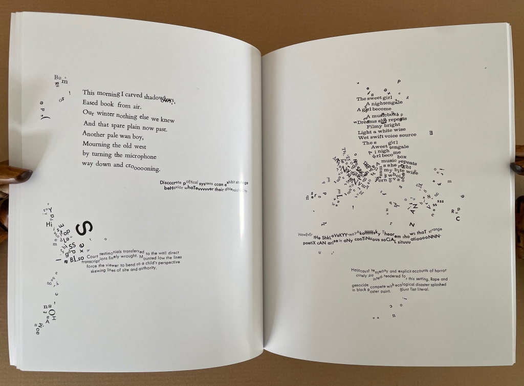
Stochastic Poetics (2012)
Stochastic Poetics(2012/2024) Johanna Drucker Softcover, flexible, high-gloss laminated cover. Facsimile (original’s cover was in brushed steel). H250 x W200 mm. 62 pages. Acquired from Blurb, Inc., 28 March 2024. Photos: Books On Books Collection. Displayed with artist’s permission.
In Stochastic Poetics (2012/2024), Drucker scatters words and letters and plays with typography in a manner that makes Mallarmé’s revolutionary poem look almost staid. As Drucker explains in the colophon to Stochastic Poetics, the poem’s text is taken from Aristotle, sources on complexity theory, and “observations of readings and events at L.A.C.E. and Modern Language Association”. Aristotle might be deducible from lines such as “Poetry in general seems to have sprung from two causes in each of them lying deep in our nature”, but you would have to be vaguely familiar with his Poetics. The “observations” seem more personal, ephemeral, period-specific, but deducing their sources seems beside the point. It’s best to “go with the flow” — to unravel the explosions of sentences, phrases and words on the page and follow their imaginative leaps.
For example, on the page where Aristotle refers to the causes of poetry, that phrase “deep in our nature” leads to the wordplay of “stochasm”, and its typographic display enacts a chasm (or abyss if you’re feeling the Mallarméan vibrations). The first half of that wordplay comes from the word stochastic, whose root is stókhos [“aim, target, bullseye”], and “a stochastic process is a collection of random variables used to represent the evolution of some random value, or system, over time”). Again, if you’re feeling the Mallarméan vibrations, you’ll remember that throwing dice — one means of generating random variables — lies at the heart of Un Coup de Dés Jamais N’Abolira le Hasard (“A Throw of the Dice Will Never Abolish Chance“).
Later among the poem’s seemingly random linguistic and typographic acrobatics, two phrases jump out — “Constellationary living / language” and “MOOmeNTARY CoNsTeLLaTiOn” (see below, lower left and lower right, respectively). Those phrases clearly evoke Mallarmé’s lines from Poème: “Nothing will have taken place except the place… except perhaps a constellation”. Mallarmé’s mise-en-page fireworks have often been taken as figurative allusions to the listing and foundering ship, central to the poem, or to the Big Dipper (Septentrion) constellation, or tumbling dice. Drucker’s typography and layout take Stochastic Poetics more in the direction of the abstract than the figurative, although some of its appearance could be considered representative of randomness or the tracks on a well-used dartboard, which alludes to the stókhos [“aim, target, bullseye”] of stochastic.
If these sparks of recognition between Drucker’s and Mallarmé’s poems still seem tenuous, this brief passage from Drucker’s essay on Mallarmé’s poem may add wattage:
Another set of three phrases “Except” “Perhaps” and “A Constellation” form a typographic group. Indeed, they express the crucial exception to the terms of abyss and dissolution, scattering and fragmentation, …. Redescribed in the smaller roman font as features incidentallycreated through “obliquity” and “declination” –- astronomical terms -– that are reinforced by invocation of the “Septentrion” or Big Dipper, and the north star …. The final line, “All thought expresses a throw of the dice,” recapitulates the theme of the whole work, showing that thought as well as language is caught in the probabilistic system between chance and constellationary form. — Drucker, 2011, pp. 12-13.
But enough of Mallarmé for a moment: go with the flow and read/view Stochastic Poetics without precisely tracking down its allusions. Clusters of letters not quite forming words, phrases or sentences suggest abstract doodling. The shapes of the clusters and lines create a sense of mental motion, or “AACTIION”. Eyes twist and turn as hands rotate the book to untangle words, phrases and sentences. In disentangling the portmanteau words and phrases such as “skeptical delightenment”, the mind finds itself playing out the reading — being skeptical, delighting, experiencing enlightenment. This is the artist-printer interrogating “the conceptual or material form of the book as part of [her] intention, thematic interests, or production activities” (The Century of Artists’ Books, p.3). This is the author-artist-printer twisting and turning the visual and verbal strands of book-DNA. This is a true specimen of the artist’s book.
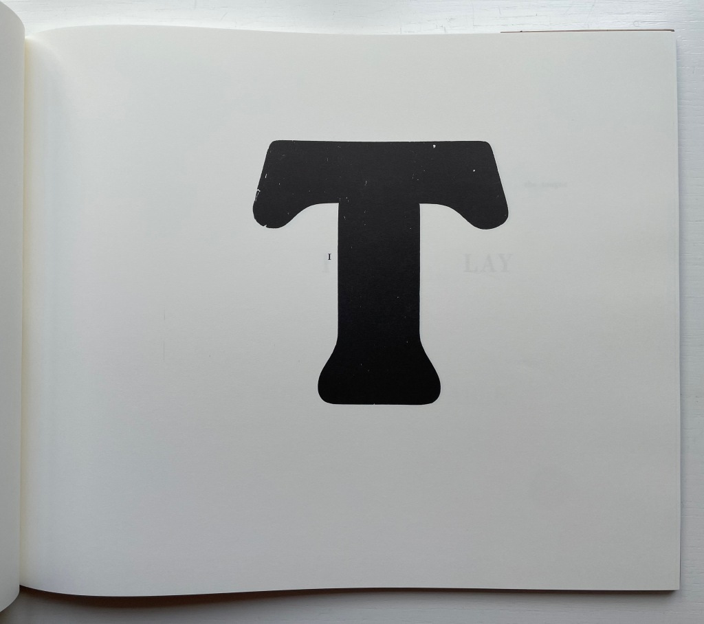
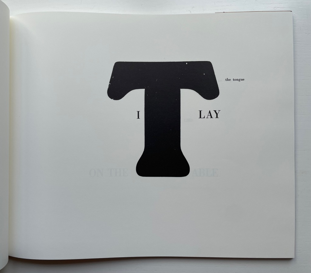
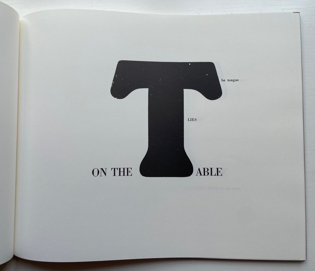
The Word Made Flesh (1989/1996)
The Word Made Flesh (1989/1996) Johanna Drucker Casebound. H267 x W315 mm. 26 unnumbered leaves. Acquired from Black Dog Books, 16 August 2022. Photos: Books On Books Collection. Displayed with the artist’s permission.
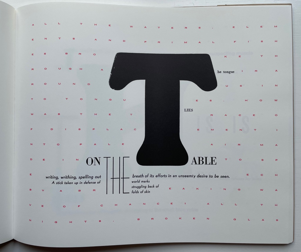
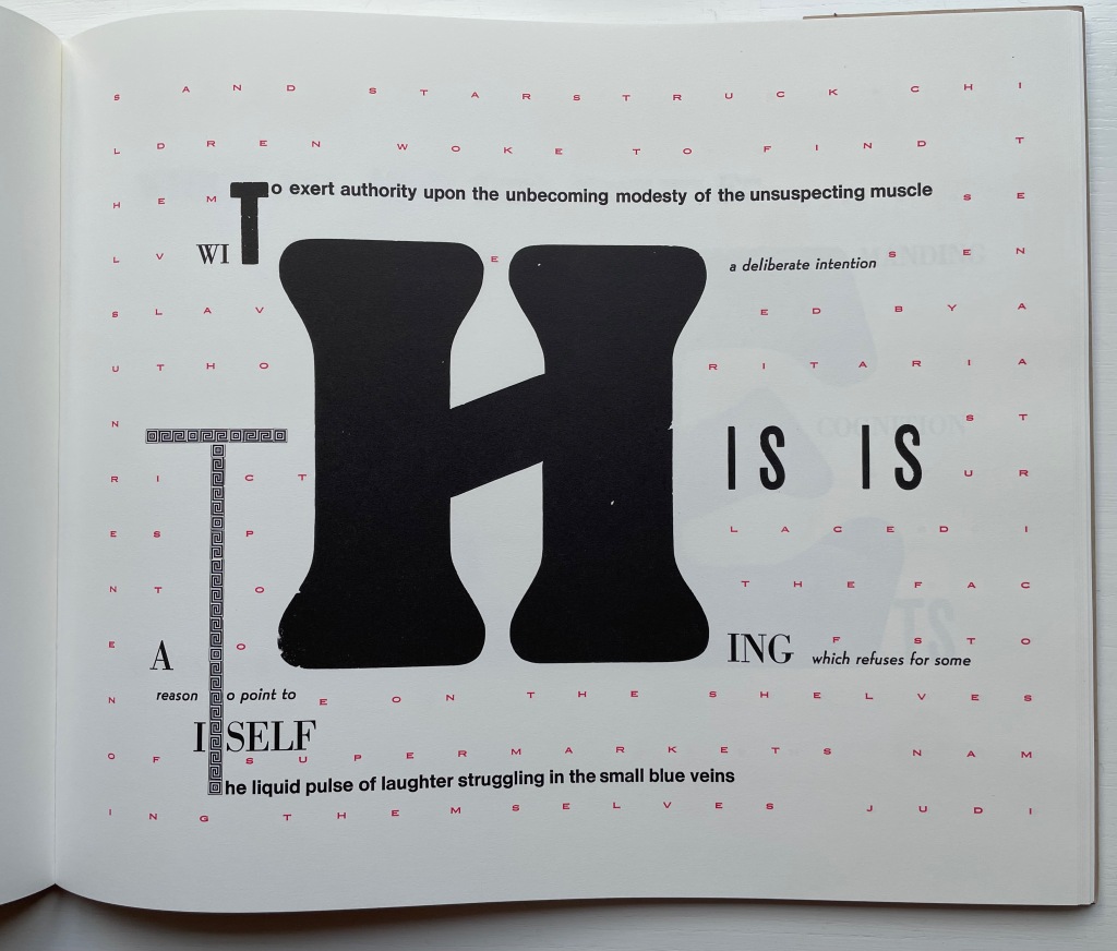
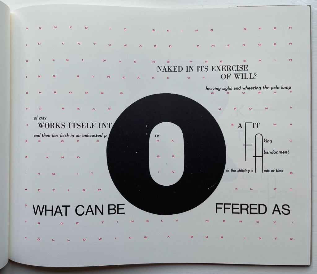
When it comes to The Word Made Flesh, we find the Mallarméan influence again in the typographic and mise-en-page fireworks and some choice allusive phrases. Not content with spreading the oversized words of the title across the book’s pages as Mallarmé’s does with UN COUP DE DÉS JAMAIS N’‘ABOLIRA LE HASARD, Drucker amplifies each letter of each word. As if stuttering or trying to unstick its tongue from the roof of its mouth, the letter T takes up each of four pages until, on the fifth try, it is followed by the letter H on the next page, then E and so on until THE WORD MADE FLESH is spelled out. In the original letterpress edition, whose fiftieth and last copy provided the source for this facsimile edition (five hundred copies, fittingly), these oversized letters presumably came from wooden type. À la Mallarmé, the surrounding letters come from various families, fonts, sizes and styles of type, but amplifying and extrapolating his typographic technique, Drucker attaches the oversized letter to multiple words: “it”, “the”, “this, “table” and so on.
In Un Coup de Dés, the syntactically split and parallel texts become difficult to read. In The Word, the typographically split words add to the difficulty of reading the text. Already at the opening of The Word, Drucker has flagged that she will out-Mallarmé Mallarmé and take us à l’interieur du langage and à l’interieur de la langue (“into the interior of language and into the interior of the tongue”). Keep in mind that la langue not only means “tongue” but also “language” in the usual sense in English, whereas le langage means diction, a kind of language (jargon, computer, etc.) as well as the faculty of speech.
Adding another level of difficulty in reading is a background grid of red letters in small caps that appears behind the fifth T in the sequence above. It spells out a text made difficult to read by the spacing between letters and their disruption by the separate text of the black letters in the foreground and center. The visionary background text reads:
All the waters, elements and primal fishes broke through air around us into tongues. How was the trace of displacement into pale air made into speech by a breaking wave of chance? All the nights, broken glass and starstruck children woke to find themselves enslaved by authoritarian strictures placed into the face of stone on the shelves of supermarkets naming themselves judiciary operations. The sting of power marked the world into small spaces of unorthodox arrangements. Vivid scarlet as the fact of blood against the winter wash. Then all the earth. Unfocused energy and wandering eyes made their way into the pulse of a primitive economy and waited there for the ice to crack on our surface of time. But how about old engines accustomed to being seen in untoward emergencies? Where the shining streaks of chrome brought to bear upon the mass of chaos and bring it in baptismal fonts of timely mercy? Following a bus into battle we shook with a horror at the dimness of the horizons we approached, and hope of a casual sacrifice was made for us time after time while moments were substituted one for another in a succession so rapid no accounting was made of their relation to themselves to us or to each other, we have listened to tales of trading we have seen flights of birds into men, women pigs and out again as babies hurried off in designing programs whose wily whistling whims would wake the world from wild slumber if that were that possible. Ripeness was a matter of appetite, not taste, in the sweet afternoon of a genuine opportunity the afterimage on the glass was a miracle of form and of correctness. The slipping substance of jam on sticky fingers of engagement worked their own way into the graces of prevalent currents, and when the matter was fully in hand, at bay, up for question and review, there was no longer any sort of book into which to enter the record of tasks which showed up on glass as a mere trail of slime. How to imagine the world without remembering how it had been presented to us in the past and in the package of delights according to rules of the game were measured out in draughts matched to a mood of a brilliant day. Some small needles had been heated and grasses lit as sparks to sponsor a crusade to mentor the insects listening just below the ground, training their small ears to take notice of complex arrangements of formal elements in the sky. The most complex movements of plates of earth, most a minute opening in the sphere of heavens we know what was wrong as sighs slid into a hallway of archival dust and we had never felt more grateful than when well laundered meaning implied by an inflamed arc of successes glowing with salvation for the aching heart of bankrupt gossip, found meandering through the powdered landscape, trailing its timely marks the next day, its activity, a prefigured silence dancing in front of us at last and all attendant fantasies flushed our wistful flesh, and many fragmentary signs of monumentality, suggestions and reconditioned bodies manifest themselves long enough to be recognized according to the delicately nuanced pace of articulation of a raw and passionate tongue.*
There are hints of Mallarmé above in phrases such as “a breaking wave of chance” and “complex arrangements of formal elements in the sky” and, of course, in the general surreality and obscurity. More deeply, though, The Word addresses the elemental, primitive origin of language, its descent into adspeak and legalese, and a need to return to “a raw and passionate tongue” — hence à l’interieur du langage and à l’interieur de la langue. The Mallarmé keen “to purify the words of the tribe” would recognize these concerns and aims. To Mallarmé’s tools for doing this, though, — words, lines, typography, the fold (pli en pli), space (les blancs), the double-page spread, an all-encompassing concept of the book (le Livre) — Drucker the “author-printer” has added the alphabet itself in the next work.
*Some typographical errors transmitted from the original to the facsimile have been corrected here with the author’s assistance. Text displayed with the author’s permission.
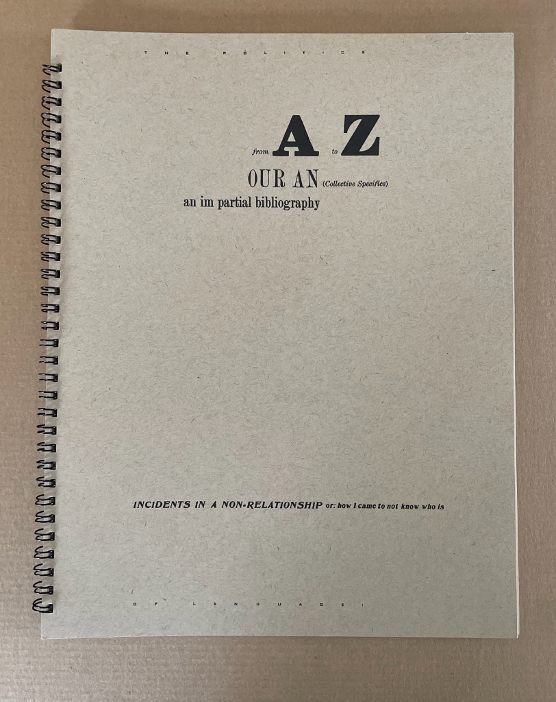
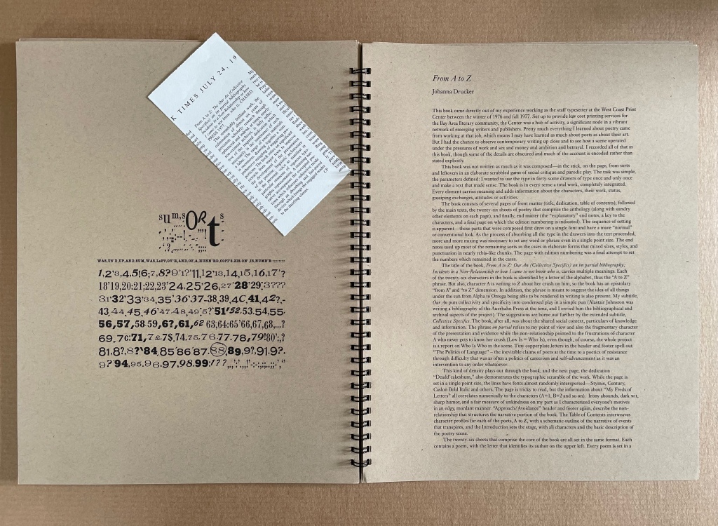
For Drucker the scholar, the alphabet has been worth two academic books: The Alphabetic Labyrinth (1995) and Inventing the Alphabet (2022). For Drucker the author-printer-artist, it has been a career-long Muse. So it should be no surprise that alphabet shows up among the strands of book-DNA teased out in The Century‘s discussion of artists’ books. Nor that it centers one of her earliest works: From A to Z: Our An (Collective Specifics) an im partial bibliography; Incidents in a Non-Relationship or how I came to not know who is (1977/2012).
In The Century the three relevant strands and their alphabetic exemplars appear in chapter 7 “Self-Reflexivity in Book Form”, chapter 9 “Books as Verbal Exploration” and chapter 10 “The Book as Sequence: Narrative and Non-narrative”. For an artist’s book whose self-reflexivity depends on the alphabet, The Century gives us Keith Smith’s Book 106: Construct (1985), which uses it as a structuring device by having it disappear from the book letter by letter (p. 180).
Keith Smith, Book 106: Construct (1985). From the Books On Books Collection. Displayed with permission of the artist.
For the book-DNA of verbal exploration, by which Drucker means bringing the sonoric and visual aspects of language “into the book form as part of its substance” (p. 227), The Century give us Maurice Lemaître’s Roman Hypergraphique [“Hypergraphic Novel”] (1950) from the Lettrisme movement (pp. 228).
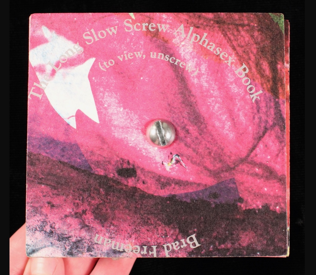
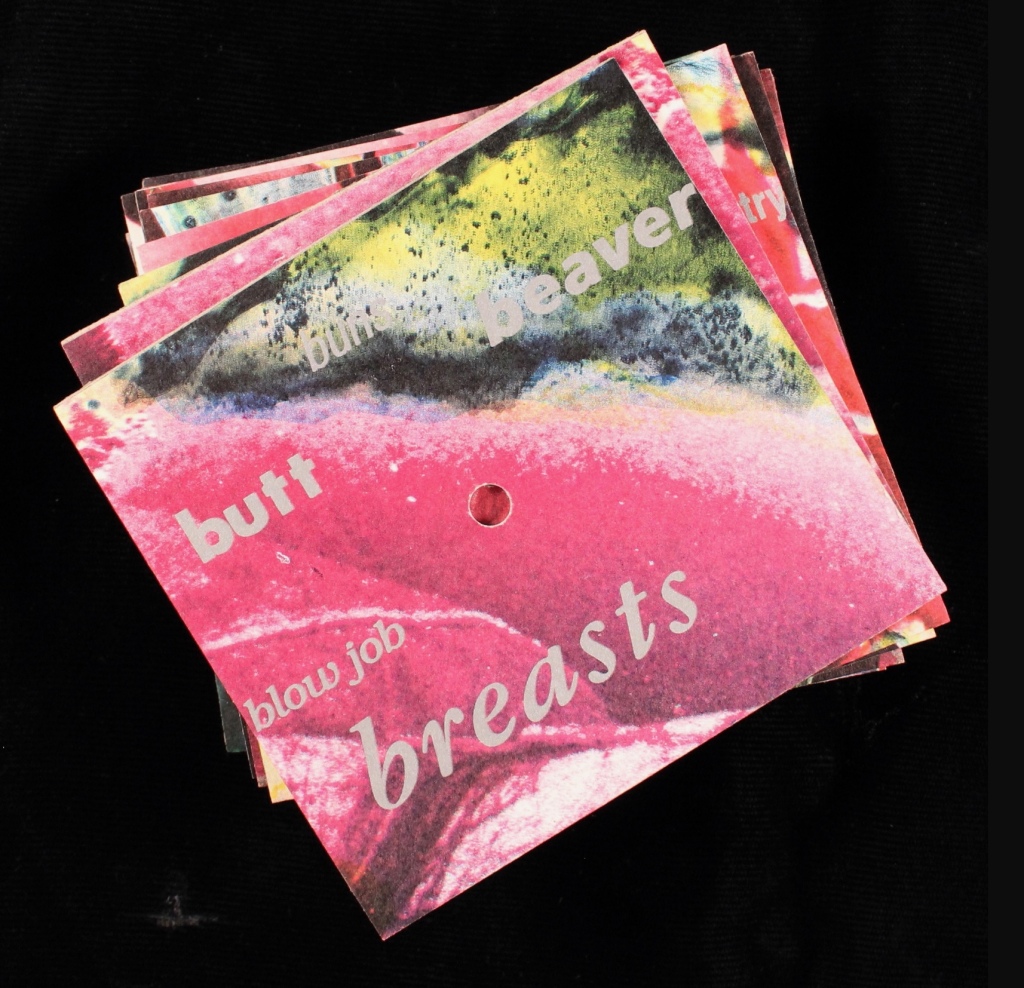
For the book as sequence, we have Brad Freeman’s Long Slow Screw Alphasex Book (1990), “an alphabet book comprised of fifteen cards drilled through the center and threaded onto a long stove bolt” (p.279). On each side of thirteen of the bolted cards, the artist has printed various anatomical and sexual terms in different fonts and sizes in alphabetic order. Unscrewed, the thirteen cards can be arranged in alphabetic order with the result being two large images on either side. The non-narrative sequence is dually dictated by the alphabetic order of the words and the composition of the images.
Brad Freeman’s Long Slow Screw Alphasex Book (1990). From the Carol Barton Collection, James Madison University Special Collections. Accessed April 14, 2024. Displayed with artist’s permission.
From A to Z appears in The Century as an example of self-reflexivity in book form, but it also uses the alphabet to explore the verbal and sequence elements of book-DNA. The book’s self-reflexivity appears at various levels, culminating in a two-page artist/author’s statement explaining the book’s subject, features and workings. It’s hard for a book to be much more self-reflexive than that, but in living up to the statement’s description, Drucker’s book manages to do so.
The main level comes from the book’s being a roman à clé, the key being that each character name is a letter of the alphabet. Self-reflexively at the end, the roman (“novel”) offers a key — a list of the characters and their characteristics. A, for example, is a “Miss East Coast uptight hot shit coed-just so smart and attractive and well educated and able to play it all right”, and Z is “Very Ivy League, greying prematurely and into the distinction it lent him – good family, good education, & good prospects, nice inheritance – poor fellow”, especially as his description is preceded by the word “constipation” spelled backwards. A’s preceding backwardly-spelled word is “diarrhea”, which seems appropriate for A’s failed May-December crush that is the central story played out only on the recto pages of this epistolary novel, or novel of letters from A to Z” (get it?).
The rest of the book, however, isn’t a narrative, but rather A’s anthology of poems by the twenty-six characters. In her introduction, A asserts that “the poetry of the period, as best exemplified by A, has an impressive complexity which can be traced to various contemporary influences” and then proceeds to put down the other twenty-five poets, which rather skewers her own poetry as the best exemplifier of the period. In her commentary and diaristic addresses to Z, A swings wildly between self-aggrandizement and self-deprecation. So not only is the book self-reflexive, its lead character is as well.
Left: A’s poem in the anthology. Right: Annotated citation of the volume from which the poem is taken.
Left: Z’s poem in the anthology. Right: Annotated citation of the volume from which the poem is taken.
From A to Z also plays self-reflexively with other parts of a book besides the Key and also with structural elements of page layout. The dedication’s sentences are numbered from 1 to 26, echoing the alphabet-referencing title. The table of contents embeds and interleaves the titles of the A-Z characters’ poems in a descriptive list of scenes in which the epistolary narrative will play out in the margins alongside the poems. The running heads and running feet abandon their usual function and consist of continuous text that runs across the head and foot of each page all the way to the end of the book. In keeping with A’s forwardness and Z’s indifference in the novel of letters, the text at the head begins “Approach:” and the text at the foot begins “Avoidance:”, and both capture the awkward sublimation of sex and power in a stilted acadamese.
With the exploration of the sonoric and visual aspects of language as an element of book-DNA, Drucker runs riot with peculiar misspellings (LEDDERS, DEADD’CAKESHÙM, etc.) and the diction and typeface assigned to each poet. She amplifies this sonoric/visual play with an Oulipian restriction to the use of the forty-some drawers of lead type available to her at the time. Each piece of type is used once and only once, which adds to the eyeball-twisting appearance and introduces a randomness to her Mallarméan play with the type fonts. By the time, the reader reaches
the entries under it are nigh illegible, a self-reflexive comment on the poets’ acadamese.
As for sequence (narrative and non-narrative) as a strand of book-DNA, Drucker’s use of alphabetic order throughout ties that one into a Gordian knot. The alphabetic sequence of the anthology, the naming of each character with a letter, the 26 numbered statements in the dedication, etc., call attention to the book’s self-commentary on the expected sequencing of a book. The game with sequencing occurs even at the level of the word in the “Key to Abbreviations” with the backwards spelling of the characters’ illnesses, infections or physical conditions. It’s a case of adding injury to the insults of the snarky descriptions of the characters!
Otherspace: Martian ty/opography (1992)
Otherspace: Martian ty/opography(1992) Brad Freeman & Johanna Drucker Casebound hardback, printed paper over boards. HxW mm. 92 pages. Acquired from Mallory Books, 11 March 2022. Photos: Books On Books Collection. Displayed with the artists’ permission.
There’s a sort of academic or anthropological distancing in the settings of Drucker’s works considered so far. In StochasticPoetics, street-level images of Los Angeles enter by way of a workshop exercise at either the Modern Language Association or Los Angeles Contemporary Exhibitions (L.A.C.E.). In The Word, the abstract, surreal, geologic and primordial put women, babies, men, fish, birds, insects, buses and even fingers sticky with jam at a surreal distance. The distancing tracks back to two trends that Lawrence Alloway noted when reviewing the exhibition “Artists’ Books and Notations” in 1978. He wrote:
There are two loose tendencies in recent art that have not yet been definitely named. One is art as an elaborate projection of the self. In one sense, of course, the firstperson of the artist is expressed in all personally originate painting and sculpture: it has been a constituent of art since the Renaissance. What is at issue here, however, is the use of confessions, souvenirs and calendars. The other tendency derives from a notion of art as simulation of social systems — from imaginary museums to the picturesque anthropology of whole cultures. The two modes, of expanded autobiography and legible societies, approach one another. Both exemplify an art of human traces, whether the perspective is that of the diarist or of the weather satellite.
Budding poets in the seventies and eighties were seeking the sun from under the shade of the Confessionals (Robert Lowell, John Berryman, Sylvia Plath et al.). Budding feminist poets had the obvious added struggle from under the shade of patriarchal societies. Alloway’s second trend identifies an effective strategy. As an emerging art form, the self-reflexive artist’s book offered an effective vehicle for adopting that strategy for poets and prose writers alike. Susan E. King’s Lessons from the South (1986) is a good example of the latter. Drucker’s three works above are good examples of the former. With Otherspace (O/u/t/h/erspace?), she adopts prose and the role of omniscient narrator.
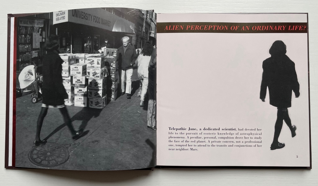
The words “slant” and “oblique” come to mind when enjoying Drucker’s book art — not just because of the distancing or the use of the punctuation mark the “solidus” or slash. With an omniscient narrative and a collage of snippets from the main character’s work/personal diary and of quotations and images from various sources, Otherspace unfolds the story of telepathic Jane, the scientist of astrophysical phenomena, her growing obsession with Mars and her frustrating romantic relationship with J. But it’s really the story of the discovery of an Other through the alphabet — told slant through Jane’s encounter with the planet/character Mars and discovery of its topographical/typographical alphabet.
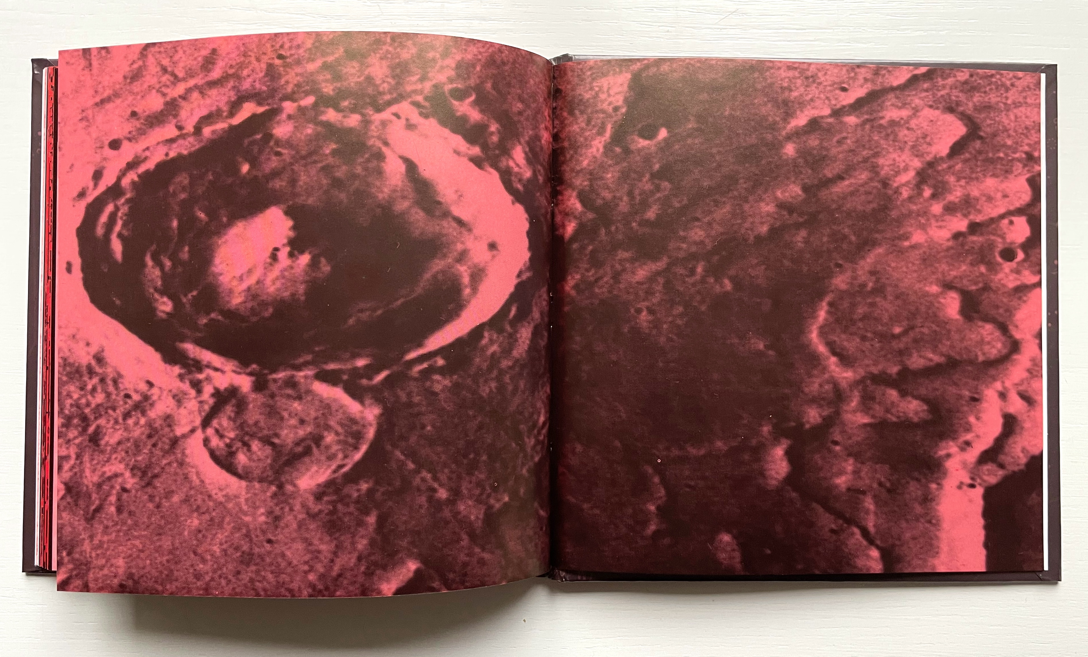
Everything seems to comment on everything else. The pixellated glyph for the letter h parades as an illustration of Martian canals described in the quotation from Alfred Russell Wallace’s Is Mars Habitable?, which runs across the double-page spread and in between snippets from Jane’s diary describing the “unintelligible transmissions” from Mars. And all of that seems glossed by the diary entry: “No word from J.”
As Jane’s curiosity about the hieroglyphic face of Mars’ messages and their seemingly subliminal linguistic effort toward order grows, her disenchantment with J. intensifies to the point that, as the excerpt from Percival Lowell’s Mars and Its Canals implies, the grass grows redder on the other side. Sure enough, J. falls out of the picture, and Jane obsesses with her extraterrestrial Other. Accordingly, the book’s pages redden, and some Other-erasing fusion or consummation is sought. Mars, however, rejects Jane and her “bounded form”, and the messages cease. Mars the Other reverts “to its status as object”, returning “only an inert and passive face” while Jane tunes “her gaze into the remote monitor, hoping for renewed exchange”. The images on two final double-page spreads obliquely punctuate that ending
Polarized images Left, scene from Invaders from Mars (1953) showing the bridge into the pit where people go and come back changed; Right, extraterrestrial craters.
Still, the real mystery in Otherspace (O/u/t/h/erspace?) is not in its science fiction but rather the mysterious origin and role that our own alphabet plays in our simultaneously solitary and social existence. Jane’s futile quest to absorb and be absorbed by the Other through language has its parallel in Mallarmé’s “the Book, the total expansion of the letter”. Drucker’s comment below on Mallarmé’s quest could be taken as an oblique comment on Otherspace:
[Mallarmé’s] ideas about the metaphysical extension of “The Book” were in effect unrealizable. … Though the structure of poetics might be stretched to the point where it could attempt to be the crystallized form of thought (abstract, mobile, complex, interrelated at numerous levels), the possibility of a book which contained “all earthly existence” was always precluded by its own conceptual parameters. At the point of this limit, the end of the book begins. (Drucker, The Century, pp. 34-37).
For Jane, the end of the book Otherspace also leaves her at the point of a limit: working to decipher the Other’s mute ty/opography but still hopeful: My sense of what is to be gained is complicated by my own limitations. Maybe there will be a way to understand more than I do, after all.
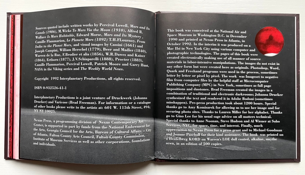
For Drucker, the end of Otherspace (O/u/t/h/erspace?) is its colophon. It is an element of book-DNA that she almost always blends with the tradition of the “artist’s statement”.
Her online archive expands on the colophon: “The idea of the book came to us in the National Air and Space Museum in DC. We were looking at images of the Mars lander and the photo caption included the phrase “Martian topography.” Almost simultaneously we said aloud, “Martian TYpography.” So the project began.”
Other works by Johanna Drucker in the Books On Books Collection
The Fall (2008)
Artist’s statement (website): Another post-Trump election work, this is fully elegiac. Using the same I-am-an-algorithm technique that I used in Fabulas Feminae, I did compression writing for a series of weeks after the election. I drew on two corpora, the mainstream newspapers and Edward Gibbon’s The History of the Decline and Fall of the Roman Empire. Brad Freeman collaborated, creating the rich, dense, dark imagery on the pages through his techniques of offset overprinting.
Damaged Nature Salvage Culture(2006)
Artist’s statement (website): The overall project for which these books were editioned included a series of watercolors and other studies that were exhibited in Charlottesville, first at the Off-Grounds Gallery in December, 2005, and the second time at Les Yeux du Monde as part of the Compicit Codex! exhibit in August-September 2006. The books are meant to provide a catalogue of the smaller pieces from those exhibitions and also offer a text stating the premises that underlie the works. In many ways, these pieces and the publication continue a project that has been ongoing for several decades that addresses organic process and form through drawings and watercolors.
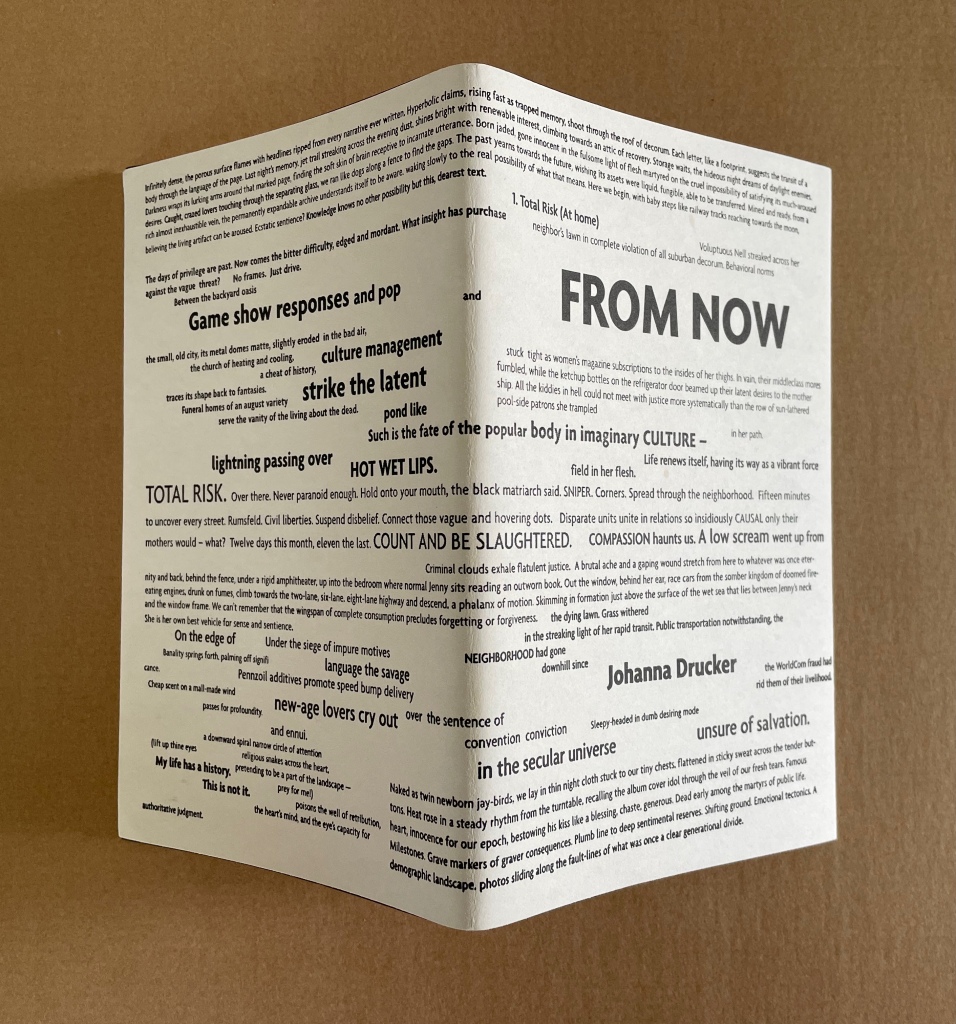
From Now (2005)
Artist’s statement (website): From Now continues the strain of my work that processes news and events through a locus of subjectivity as an organizing lens or principle. The project makes use of snippets, fragments, bits and pieces of different kinds of writing projects, most deliberately granting each autonomoy within a whole. The multiple spheres of language discourse each register in the structure and compositional mode, as well as the texture and graphic presentation of language. The “now” this is “from” is the lived and real, monstrous, grotesque, supersaturated with the noise of mass mediated culture, and yet, it is also the now of being, always, aware and present, in the midst of all that stimulation, what we are. Awareness shoots through the full world, and returns as a projection of self, that set of bounding and defining specifics that delineate a place as a profile, position, from which the world is made. So the curious codependent systems work. And language? Endlessly polyphonic, heteroglossic, multifaceted, varied in tone and vocabulary, look and sound, image and texture.
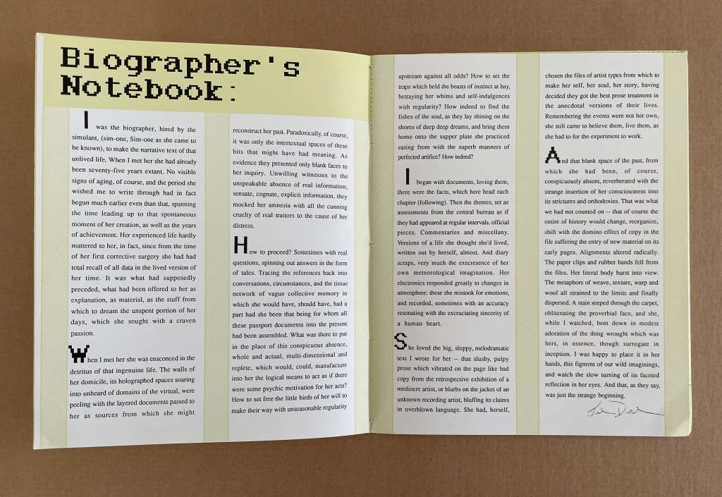
Simulant Portrait (1990)
Artist’s statement (website): In the late 1980s, I was still involved in working on the biography of Ilia Zdanevich (Iliazd), begun in 1985 when I was a Fulbright Fellow in Paris, working on my dissertation. That biography went through many iterations, and was finally left unpublished after Northwestern cancelled my contract. I had lost interest in the project, swept up in other matters, but the process of research and synthesis from documents and snippets of different kinds of materials had touched a nerve. I found this utterly satisfying to a certain obsessive streak. And so the structures of biography-writing, with all their connect-the-dots assumptions, varieties and ranges of sources and voices, evidence and documents, etc., were extremely appealing. Structurally, then, Simulant Portrait was conceived to mimic that process of research. Thematically the book was closer to older themes, of women and their lives, biographies and celebrity, the tensions of mass and literary culture in my own mind, and so on. The cyber-pulp aspect of the book is harder to place, as my proclivities were hardly sci-fi at that moment. Only that such notions were in the air, with Philip K. Dick (particularly the film Blade Runner) and William Gibson (rising star) occupying a certain popular imagination.
Further Reading
See “‘Un Coup de Dés Jamais N’Abolira l’Appropriation’ — An Online Exhibition“, 1 May 2022, Bookmarking Book Art, for works of homage to Mallarmé with which Drucker’s works can be compared and contrasted. Other works in the Books On Books Collection whose comparison/contrast with Drucker’s artist’s books provide appreciation in both directions include:
The Fall (1976) Michelle Stuart for the trend of distancing described by Alloway.
Auparavant (1991) by Roland Sabatier for the Lettrist context.
A Life in Books(2013) by Warren Lehrer for comparison with Otherspace for format and Stochastic Poetics and From A to Z for commentary on the academic literary milieu. See also Lehrer’s “Note from the Editor” for comparison with the “Biographer’s Note” from Simulant Portrait (1990) above.
Alloway, Lawrence. 9 December 1978. “Art”. [Touchstone Gallery, 118 E. 64th Street, New York] The Nation, p. 653.
Drucker, Johanna. N.D. “An Introduction to the Work of Johanna Drucker“. Artists’ Books Online: An online repository of facsimiles, metadata, and criticism. Archived 22 April 2021 at the Internet Archive Wayback Machine.
Drucker, Johanna. August 2012. “Future Visions and Versions of the Codex“. Transforming Artist Books. London: Tate Research Publication. Archived 26 March 2024 at the Internet Archive Wayback Machine.
Drucker, Johanna. 2022. Inventing the Alphabet: The Origins of Letters from Antiquity to the Present. Chicago: University of Chicago Press. Like The Century of Artists’ Books, Drucker’s scholarly works on the alphabet — this one and The Alphabetic Labyrinth below — enrich the appreciation of her artist’s books.
Drucker, Johanna, Brad Freeman and Jessica Cochran. 2020. Aleatoric Collaborations. Chicago, IL: Center for the Book and Paper/Columbia College. If any proof of Poème‘s direct influence on Drucker were needed, here it is:
Aleatoric Collaborations (2020) Johanna Drucker, Brad Freeman et al. Photo: Courtesy of Brad Freeman.
Mallarmé, Stéphane, and Bertrand Marchal (ed.). 2003. “Le Livre, Instrument Spirituel“. Œuvres Complètes. New ed. Paris: Gallimard. Vol. 2, p. 224-28.
With apologies to the preacher: Of making many books [on books] there is no end.
(Ecclesiastes 12:12)
With the choir of its forebearers, Amaranth Borsuk’s The Book (MIT Press, 2018) sounds an “amen” to that truth. The proliferation of degree programs in book studies covering the history of the book, the book arts and even book art ensures The Book will not be the last. What distinguishes Borsuk’s book are her perspective as an artist and the book’s breadth and depth despite its brevity.
The book has a long history of existential crises. What is a book? Is the end of the book nigh? For more than a century, those questions have returned again and again. The most recent recurrence stems from the ebook’s threat to dematerialize the book and the online world’s threat to take us into a post-text future. Even before these latest threats, book artists have long lived and worked with their own existential questions, a kind of higher existential calculus, or derivative of, the book’s crises: What is an artist’s book? What is book art? Stephen Bury, Riva Castleman, Johanna Drucker, Joan Lyons, Stefan Klima, Clive Philpott and many others in the last quarter of the 20th century dwelt on defining and categorizing book art.
Borsuk belongs to a later generation of book artists that has embraced these existential crises and recognized that the book’s existential crises are what make the book a rich medium in which and with which to create art — from bio-art miniature to the biblioclastic human-scale to large-scale installations and performances. Even to the digital.
The Origin of Species (2016) Dr. Simon Park, Guildford, Surrey “The small book shown here was grown from and made entirely from bacteria. Not only is the fabric of its pages (GXCELL) produced by bacteria, but the book is also printed and illustrated with naturally pigmented bacteria. ” Posted 27 March 2016. Photo credit: Dr. Simon F. Park
Silenda: Black Sea Book (2015) Jacqueline Rush Lee Transformed Peter Green‘s translation of Ovid’s Tristia and the Black Sea Letters H9.5″ x W12″ x D6.5.” Manipulated Text, Ink, Graphite Photo credit: Paul Kodama. In Private Collection, NL
Field (2015) Johannes Heldén Produced, and premiered, at HUMlab, Umeå University Reproduced with permission of the artist
Performance artist and academic as well, Borsuk brings that later generational and creative perspective to the existential question — What is the book? — and, with an artist’s perception of her medium of choice, displaces the old companion existential question — Is the end of the book nigh? — with an altogether more interesting one — Where next for the book?
To see where books might be going, we must think of them as objects that have experienced a long history of experimentation and play. Rather than bemoaning the death of books or creating a dichotomy between print and digital media, this guide points to continuities, positioning the book as a changing technology and highlighting the way artists in the twentieth and twenty-first centuries have pushed us to rethink and redefine the term. (pp. xiii-xiv)
In The Book, the future is not far from the physical past. Where once we had text on scrolls, now we scroll through text (albeit more vertically than horizontally). Where once human consciousness changed with the invention of the alphabet and writing, now it may be altering with our reading and writing through networked digital devices. Like the many historians before her, Borsuk starts with cuneiform (those wedge-shaped accounting marks on baked clay), hieroglyphics and the invention of the alphabet to set the scene for the advent of the book and its ongoing physicality:
its shape (scroll, accordion, codex)
its material (papyrus, vellum, paper, charcoal or mineral-based watercolor and ink)
its manufacture (scribing, printing by woodblock and movable type, design and typography, illumination and illustration, folding into pages, methods of binding)
its constituent and navigational parts (cover, book block, title page, table of contents, page numbering, index).
But Borsuk reminds us — from Sumer’s clay to Amazon’s Kindle, from Johannes Gutenberg to Project Gutenberg — the book as human artifact exists in a social, political, technological, economic and even ecological context. Who is allowed to make it, how it is transacted, how and where we use it, how we perceive and speak of it — all have affected the physicality of the book object and are reflected in it.
In the first half of The Book, Borsuk steers us through these interdependencies to a turning point. That turning point is where the pinnacle of the book arts — Beatrice Warde‘s and Jan Tschichold‘s vision of the book as a crystalline container of content — and the book’s commodification combine to cause the book’s physicality to disappear because it is so taken for granted, leaving us with “the book as idea”.
With the perception that books are ideas bestowed on readers by an authorial genius whose activity is purely intellectual, the book’s object status vanished for much of the reading public as we raised a glass to happily consume its contents…. Even though innumerable material elements come together to make the book, these features have been naturalized to such a degree that we now hardly notice them, since we have come to see content as the copyrightable, consumable, marketable aspect of the work. (pp. 106-9)
At this turning point — where “the historic relationship between materiality and text is severed” (p. 112) — the second half of The Book introduces book art. It is telling that the longest chapter in the book begins the second half, that it is called “The Book as Idea” and that it comes before any extended engagement with the digital dematerialization of the book. It is a wry pivot: the artistic genius supplants the authorial genius; what the latter takes as invisible background, the former re-makes as self-regarding foreground. As Borsuk shows and her book’s cover neatly demonstrates, works of book art are inevitably self-referential and self-aware.
As such, works of book art
have much to teach us about the changing nature of the book, in part because they highlight the “idea” by paradoxically drawing attention to the “object” we have come to take for granted. They disrupt our treatment of the book as a transparent container for literary and aesthetic “content” and engage its material form in the work’s meaning. (p. 113)
Rather than offer a chronological history of book art to explore what “artists’ books have to teach us about a path forward for the book”, Borsuk offers “flashpoints” that represent “the energies motivating artwork in book form”(p. 117). These “flashpoints” are William Blake, Stéphane Mallarmé, Ed Ruscha and Ulises Carrión. Following these flashpoints, Borsuk organizes the rest of the chapter into “key themes that recur throughout artists’ books of the twentieth century: spatiotemporal play, animation, recombinant structures, ephemerality, silence, and interactivity” (pp. 146-47).
Oddly, Blake as flashpoint does not illuminate these six particular themes. Rather Borsuk notes three other recurrent themes or “energies motivating artwork in book form” that Blake and his work represent: centering or re-centering the production processes on the author/artist; using the book as a sociopolitical and visionary platform; and redefining, developing and challenging the relationship between word and image.
Blake refers to himself as “The Author & Printer W. Blake,” making clear the union of creativity and craft in his work. (p. 121)
Blake’s engagement with the social issues of his day, and his use of book form to respond to child labor, urban squalor, and slavery, established an important trend in both artists’ books and independent publishing—the utility of the book as a means of spreading social justice. (pp. 121, 124)
Blake used his craftsmanship to develop the relationship between word and image (p. 140)
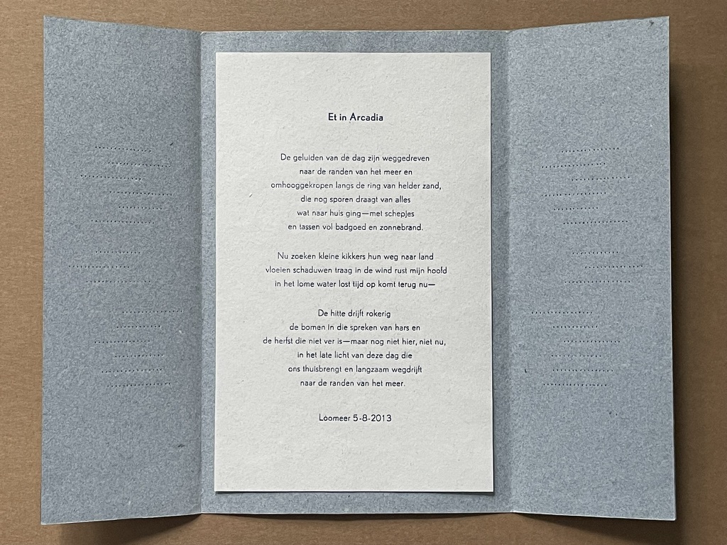
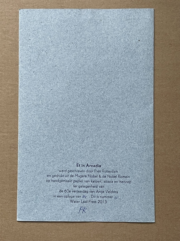
One need not look far among twentieth and twenty-first century book artists for resonance with those themes. That Blakean union of creativity and craft resurfaces in artists such as Ken Campbell (UK), Cathryn Miller (Canada), Pien Rotterdam (Netherlands), Barb Tetenbaum (US) and Xu Bing (China) — some of them even to the point of carving or setting their own type, making their own paper, pulp printing on it themselves or binding the finished work themselves. Vision and sociopolitical observation have risen up in the works of artists such as Doug Beube (Canada), Julie K. Dodd (UK), Basia Irland (US), Diane Jacobs (US), Anselm Kiefer (Germany) and Chris Ruston (UK). Blake’s redefining the relationship of word (or text) to image often reappears book artists’ abecedariesand their children’s books such as A Dictionary Storyby Sam Winston (UK).As for emulators of Blake in technical innovation, consider the analogue example of Australian Tim Mosely’s works created with his patented pulp printing process, where the “ink” is actually colored pulp, or the digital example of Borsuk’s work Between Page and Screen, where the pages contain no text—only QR codes that, when scanned with a webcam, activate the text’s appearance on the reader’s browser screen.
For her second flashpoint, Borsuk selects another visionary, Stéphane Mallarmé, who like Blake was reacting to his own perceived Satanic mills draining poetry of its spirituality. Mallarmé’s Satanic mills dispensed rigid columns of newsprint to the masses and bland expanses of poetry and fiction set by Linotype machines in the neo-classical Didot font. With his famous visionary dictum — “everything in the world exists in order to end up as a book” (p. 135) — Mallarmé nudged the book toward pure concept and opened its mystical covers to the Dadaists, Surrealists, Futurists, Vorticists, Lettrists, Conceptualists and biblioclasts. With spatiotemporal play — mixing type sizes and fonts, breaking up the line and even breaking the page — Mallarmé used text to evoke image and, in his view, remake the book as a “spiritual instrument”. His post-humous book-length poem Un coup de Dés jamais n’abolira le Hasard (A Throw of the Dice Will Never Abolish Chance), published in 1897, embodies that vision and continues to cast its flashpoint light across multiple generations of book artists’ efforts. From Marcel Broodthaers in 1969, we have his homage to Un Coup de Dés. From Jérémie Bennequin in 2014, we have his serial “omage” to Broodthaers’ homage. And, most recently, we have the 2015 new bilingual edition A Roll of the Dice by Jeff Clark and Robert Bononno, for which Borsuk provides a perceptive reading.
Where Mallarmé’s flashpoint enlisted his vision alongside the cry “épater le bourgeois” from Baudelaire and other late nineteenth-century poets, Ed Ruscha’s later flashpoint illuminates a democratic counterpoint, a Zen-like vision and a very different way of changing the relationship of text to image. Ruscha’s self-published photobooks were cheap and distributed outside the gallery-controlled channels of art. As Borsuk shows — directly with Ruscha and indirectly with the many book artists influenced by him — the text is restricted to the book’s title, which interacts with a series of deadpan photos and their layout to deliver a wry, tongue-in-cheek work of book art. Ruscha’s spatiotemporal play manifests itself across the accordion book format and out-of-sequence juxtapositions. Ironically Ruscha’s works now command thousands of dollars per copy, and one has more chance of seeing them in an exhibition than in a roadside stop’s rack of newspapers, magazines and mass-market paperbacks.
Mexico’s Ulises Carrión — polemicist, European bookshop owner, conceptual artist and Borsuk’s fourth choice of flashpoints — is a counter-flashpoint to Ruscha. Where Ruscha reveled in self-publishing commodification, Carrión sneered at the book in its traditional commercial form. Where Ruscha has resisted the label “conceptual artist”, Carrión played the role to the hilt. Where Ruscha’s work has elicited numerous homages (see Various Small Books from MIT Press in 2013) and achieved a high profile, Carrión’s work, much lower in profile, has provided a more compelling range of hooks or influences on which to hang many different manifestations of book art (or bookworks as Carrión preferred). In fact, Borsuk’s six stated key themes or “energies motivating artwork in book form” come from Carrión’s manifestos (pp. 146-47).
The first theme — “spatiotemporal play” — comes from Carrión’s initial definition of the book as a “sequence of spaces”, which Borsuk traces to tunnel books, pop-ups and even large-scale constructs, the latter illustrated by American Alison Knowles‘ inhabitable The Big Book (1968). One more possible future of the book implied by spatiotemporal play manifests itself in Borsuk’s own augmented-reality (AR) works, those of Caitlin Fisher (Canada) and Carla Gannis’ Selfie Drawings (2016), in which portraits on the hardcover book’s pages animate and change when viewed through smartphone or tablet.
Borsuk takes the second theme, that of “animation”, from Carrión’s dictum: “Each of these spaces is perceived at a different moment— a book is also a sequence of moments”. As her several examples illustrate, much book art is cinematic. Borsuk’s exposition of Canadian Michael Snow‘s Cover to Cover (1975) comes closest to reproducing the experience I enjoyed of “watching” that photo bookwork from cover to cover several times at the now closed Corcoran Art Gallery. Borsuk is quick and right to remind that the cinematic future of the book has been with us for a long time, even before the cinema. She bookends her exposition of Snow’s book and the text animation of American Emmett Williams‘ Sweethearts (1967) on one side with Victorian flip-books and on the other with American Bob Brown‘s 1930s The Readies (presumably pronounced “reedies” to follow Brown’s comparison of his scrolling one-line texts with the cinema’s “talkies”).
A forgotten modernist, Brown declared the obsolescence of the book, predicted a new form of reading and technology to enable it, an optical projector emitting text into the ether and directly into the eyeball. But what does this tell us about the future of the book? Borsuk notes Craig Saper‘s resurrection of Brown’s Roving Eye Press and how he even put together a website that emulates Brown’s reading machine. In her phrase describing the machine’s effect of “turning readers themselves into a kind of machine for making meaning” (p. 168), Borsuk hints at a future of digitally interactive books, which she takes up in the next section and more extensively in the next chapter. At this point, however, the reader could use a hint of practicality and skepticism. Linear-one-word-at-a-time reading, however accelerated, eliminates affordances of the page, ignores graphics and strains against the combination of peripheral vision and rapid eye movement we unconsciously (even atavistically?) deploy as we “read” whatever we see. Although in the next section Borsuk does bring on more likely examples of the book’s future exploitation of its cinematic affordances (manga, graphic novels and children’s books), this section’s treatment of animation misses the chance to cite actual recent successes like Moonbot Studios‘ The Fantastic Flying Books of Mr. Morris Lessmore (2012) and others.
Once into the third theme — “recombinant structure” — it is clear that Borsuk’s chosen Carriónesque themes overlap one another. Like the cinematic, the recombinant structure manifests itself in accordion books. It extends, however, to something more interactive: volvelles (or medieval apps as Erik Kwakkel calls them), interactive pop-ups, harlequinades (flap books) and more. Borsuk uses Raymond Queneau‘s harlequinade Cent mille milliards de poèmes ( One hundred thousand billion poems, 1961), Dieter Roth‘s slot books and works by Carolee Schneemann to illustrate book art’s celebration of the concept. The fact that Queneau’s book is still easily available on Amazon vouches for book art’s predictive qualities. The example of Marc Saporta’s Composition No.1 (Éditions du Seuil, 1962), “a box of 150 leaves printed on only one side that the reader is instructed to shuffle at the outset”, goes Queneau one better —ironically. In 2011, Visual Editions reissued Composition No. 1 in print and app forms. Alas, the former is out of print, and the latter is no longer available for download (although a video of it is available here).
Composition No. 1 (2011) Marc Saporta Translation by Richard Howard, Introduction by T.L. Uglow, Google Creative Lab, Diagrams by Salvador Plascencia and Designed by Universal Everything Photo credit: Books On Books
Borsuk draws her fourth theme — ephemerality — from Carrión’s dictum:
I firmly believe that every book that now exists will eventually disappear. And I see here no reason for lamentation. Like any other living organism, books will grow, multiply, change color, and, eventually, die. At the moment, bookworks represent the final phase of this irrevocable process. Libraries, museums, archives are the perfect cemeteries for books. (p. 145)
To illustrate, Borsuk begins with the physical biblioclasts — those who in Doug Beube‘s phrase are “breaking the codex“. They include Beube himself, Bruce Nauman (see above), Brian Dettmer, Cai Guo-Qiang, Marcel Duchamp, Dieter Roth and Xu Bing. While some of these artists reflect a twenty-first century surge of interest in altered books and book sculpture, “facilitated by the overarching notion that the book is an artifact not long for this world” (pp.82-84), others have taken a more generative archaeological approach — erasing or cutting away a book’s words to reveal another. Examples include Tom Phillips‘ A Humument (1966-2014) and Jonathan Safran Foer‘s Tree of Codes(2010). Phillips’ bookwork serves multiple purposes for Borsuk’s arguments. Not only does it represent the book art of “erasure”, its success across multiple editions, digital formats and presence in art galleries supports her notion of book art’s predictive qualities.
There is a variant on her theme that Borsuk does not illustrate and is worth consideration for her next edition: the self-destructing yet regenerative work of book art. Examples could include American Basia Irland‘s series ICE BOOKS: Ice receding/Books reseeding (2007-), which gives a formidably tangible and new meaning to “publishing as dissemination”; and Canadian Cathryn Miller‘s tail-chasing Recomp (2014); and Argentinian Pequeño Editor‘sMi Papa Estuvo en la Selva (2015), which after reading can be planted to grow into a jacaranda tree.
Recomp (2014) Cathryn Miller Copy of Decomp, Collis and Scott (2013) nailed to a tree. Photo credit: David G. Miller
Recomp (2015) Photo credit: David G. Miller
Recomp vandalized (2015) Photo credit: David G. Miller
The last section in this chapter expands on the fifth theme — silence — drawn from Carrión’s statement:
The most beautiful and perfect book in the world is a book with only blank pages, in the same way that the most complete language is that which lies beyond all that the words of a man can say. Every book of the new art is searching after that book of absolute whiteness in the same way that every poem searches for silence. Ulises Carrión, Second Thoughts (1980), pp. 15-16.
Among her several examples are Pamela Paulsrud‘s Touchstones (2007-10), which look like stones but are books sanded-down into stone-like shapes, and Scott McCarney‘s 1988 Never Read(Opposed to Ever Green), a sculpture composed of stacked library discards that narrows as it ascends. Paulsrud’s, McCarney’s, Irland’s and Miller’s works are what Borsuk calls “muted objects”, but they speak and signify nevertheless:
Muted books take on a totemic [metaphoric] significance…. The language of the book as a space of fixity, certainty, and order reminds us that the book has been transmuted into an idea and ideal based on the role it plays in culture…. Defining the book involves consideration for its use as much as its form. (pp. 193-95)
Never Read (Opposed to Ever Green) (1988) Scott McCarney Reproduced with permission of the artist
Never Read (Opposed to Ever Green) (1988) Scott McCarney Reproduced with permission of the artist
Never Read (Opposed to Ever Green) (1988) Scott McCarney Reproduced with permission of the artist
Borsuk is a superb stylist of the sentence and expository structure. The words above, concluding chapter three, launch the reader into Borsuk’s final theme of interactivity and her unifying metaphor: “the book as interface”. Owners of Kindles, buyers from Amazon, perusers of Facebook — we may think we know what’s coming next in The Book and for the book, but Borsuk pushes the reader to contemplate the almost real-time evolutionary change we have seen with ebook devices and apps, audiobooks, the ascension of books to the cloud via Project Gutenberg, the Internet Archive and Google Books, and their descent to Brewster Kahle‘s physical back-up warehouse (to be sited in Canada in light of recent political events) and into flattening ebook sales of late. Chapter 4 is a hard-paced narrative of the book’s digital history from the Memex in Vannevar Bush‘s 1945 classic “As we may think” to T.L. Uglow‘s 100-author blockchain collaboration in 2017, A Universe Explodes from Visual Editions’ series Editions at Play.
Borsuk reminds us:
Our current moment appears to be much like the first centuries of movable type, a cusp. Just as manuscript books persisted into the Gutenberg era, books currently exist in multiple forms simultaneously: as paperbacks, audiobooks, EPUB downloads, and, in rare cases, interactive digital experiences. (p. 244)
Borsuk weaves into this moment of the book’s future a reminder that print affordances such as tactility (or the haptic) and the paratextual (those peripheral elements like page numbers, running heads, ISBNs, etc., that Gary Frost argues “make the book a book”) have been finding fresh ways into the way we read digitally. The touchscreen enables us to read between the lines literally in the novella Pry (2014) by Samantha Gorman and Danny Cannizaro (2014). Breathe (2018) by Kate Pullinger, another work in the Editions at Play series, uses GPS to detect and insert the reader’s location, the time and weather, and when the reader tilts the device or rubs the screen, hidden messages from the story’s (the reader’s?) ghosts appear.
At this point, an earlier passage from The Book should haunt the reader:
Artists’ books continually remind us of the reader’s role in the book by forcing us to reckon with its materiality and, by extension, our own embodiment. Such experiments present a path forward for digital books, which would do well to consider the affordances of their media and the importance of the reader, rather than treating the e-reader as a Warde-ian crystal goblet for the delivery of content. (p. 147)
Borsuk convinces. Art, artifact, concept — wrought by hand and mind, hands and minds — the book is our consensual tool and toy for surviving beyond our DNA. So now what? Metaphor, hints and historical flashpoints may illuminate where we have been, how it shows up in contemporary books and book art and where we may be going with it. In ten or one hundred years though, how will a book publisher become a book publisher? Given the self-publishing capability today’s technology offers, will anyone with a file on a home computer and an internet connection consider himself or herself a book publisher? Borsuk thinks not:
The act of publication — of making public — is central to our cultural definition of the book. Publication might presume some cultural capital: some editorial body has deemed this work worthy of print. It might also presume an audience: a readership clamors for this text. But on a fundamental level, publication presumes the appendage of elements outside the text that help us recognize it as a book, even when published in digital form. (pp. 239-40)
How will future book publishers learn to master the appendage of these elements outside the text (the paratext) that make a book a book “even when published in digital form”? Borsuk’s commentary on the ISBN as one of these elements sheds oblique light on that. She points to the artist Fiona Banner’s uses of the ISBN under her imprint/pseudonym Vanity Press — tattooing one on her lower back, publishing a series Book 1/1(2009) consisting of sixty-five ISBN’d pieces of mirrored cardstock and then collecting them in a photobook entitled ISBN 978-1-907118-99-9 in order to deposit those one-offs with the British Library as required by the UK’s Legal Deposit Libraries Act. What can a future ebook publisher deduce from this?
That the use of a globally unique identifier (GUID) matters.
The backstory of the transition from ISBN10 to ISBN13 and that of ebooks, ISBNs and Digital Object Identifiers (DOIs) might provide interesting fodder. The notion that the book industry was running out of 10-digit ISBNs was a red herring used to convince industry executives to adopt the more widely used format of unique identifiers overseen by GS1. The real reason for moving to ISBN13 — reduced friction in the supply chain — was too hard to sell. About the same time, some major publishers proposed incorporating the ISBN into the DOI for an industry-standard ebook identifier. The DOI offered an existing digital, networked infrastructure already being used by most of the world’s scientific, technical and medical journals publishers. It is an offshoot of the Handle System, established by Robert Kahn. Sad to say, few book publishers adopted the DOI for their ebooks; still fewer used the DOI’s application- and network-friendliness to enable their ebooks to take advantage of the network’s digital affordances.
The DOI shares with the ISBN a feature that Borsuk points out as a limitation to more widespread use: it is not free. A significant percentage of ebooks exist without ISBNs, much less DOIs. If a digital GUID is to be used in ways that help us recognize the identified digital object as a book, future book publishers and their providers of a network ecosystem supporting ebooks, linking with the print ecosystem and reducing friction in the supply chain still have wide gaps in commerce and knowledge to close. Perhaps this particular paratextual element is unnecessary for the book’s digital future, but until those gaps are narrowed, the ecosystem for eBooks will remain balkanized by Amazon, Apple, Google, Lulu and the more digitally literate denizen of the print publishing industry. In the meantime, as Borsuk’s examples throughout her book show, there are boundless other print and digital affordances with which publishers, authors, editors, designers, typographers, developers and readers can play as they continue to shape the book.
The Book‘s publication month, June 2018, is auspicious, being the same for the Getty Center’s exhibition “Artists and Their Books/Books and Their Artists“, June 26 – October 28. The Center and MIT Press would do well to have stacks of The Book on hand. The Book will also serve as an excellent introductory textbook for courses on book art or the history of the book. And by virtue of its style and artist’s perspective, Borsuk’s book will appeal to anyone with even a passing interest in this essential technology of civilization and its growing role as a material and focus of art in the twentieth and twenty-first centuries.
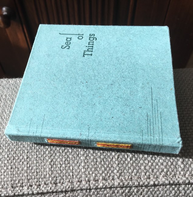
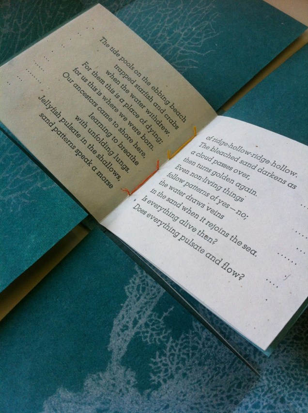
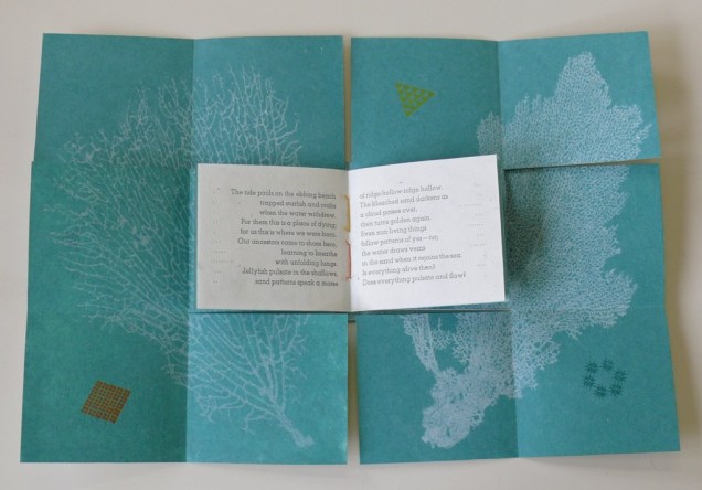
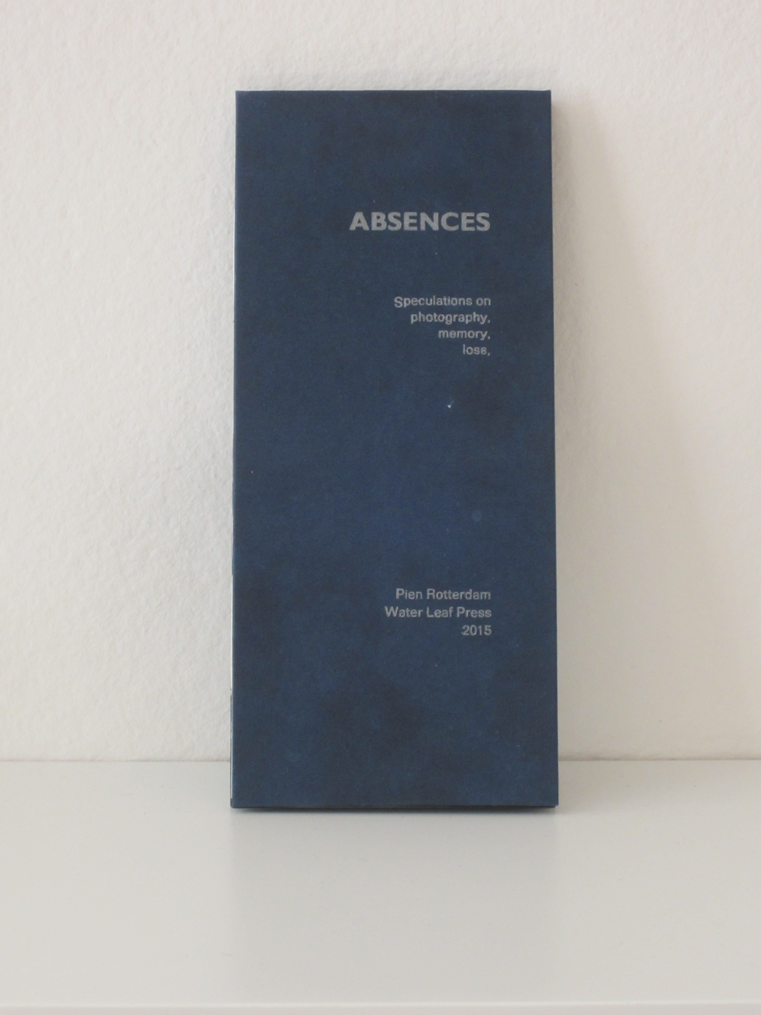
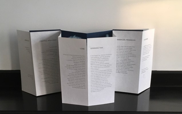
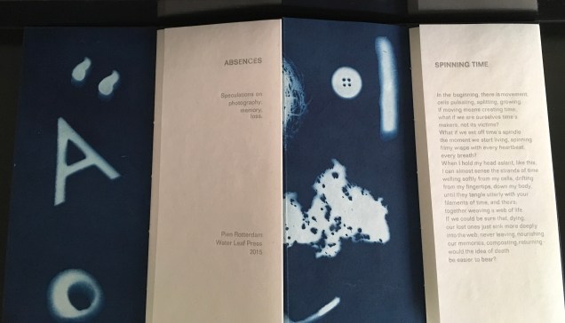
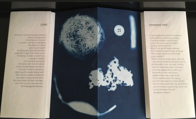
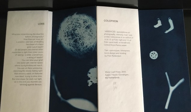
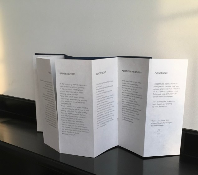
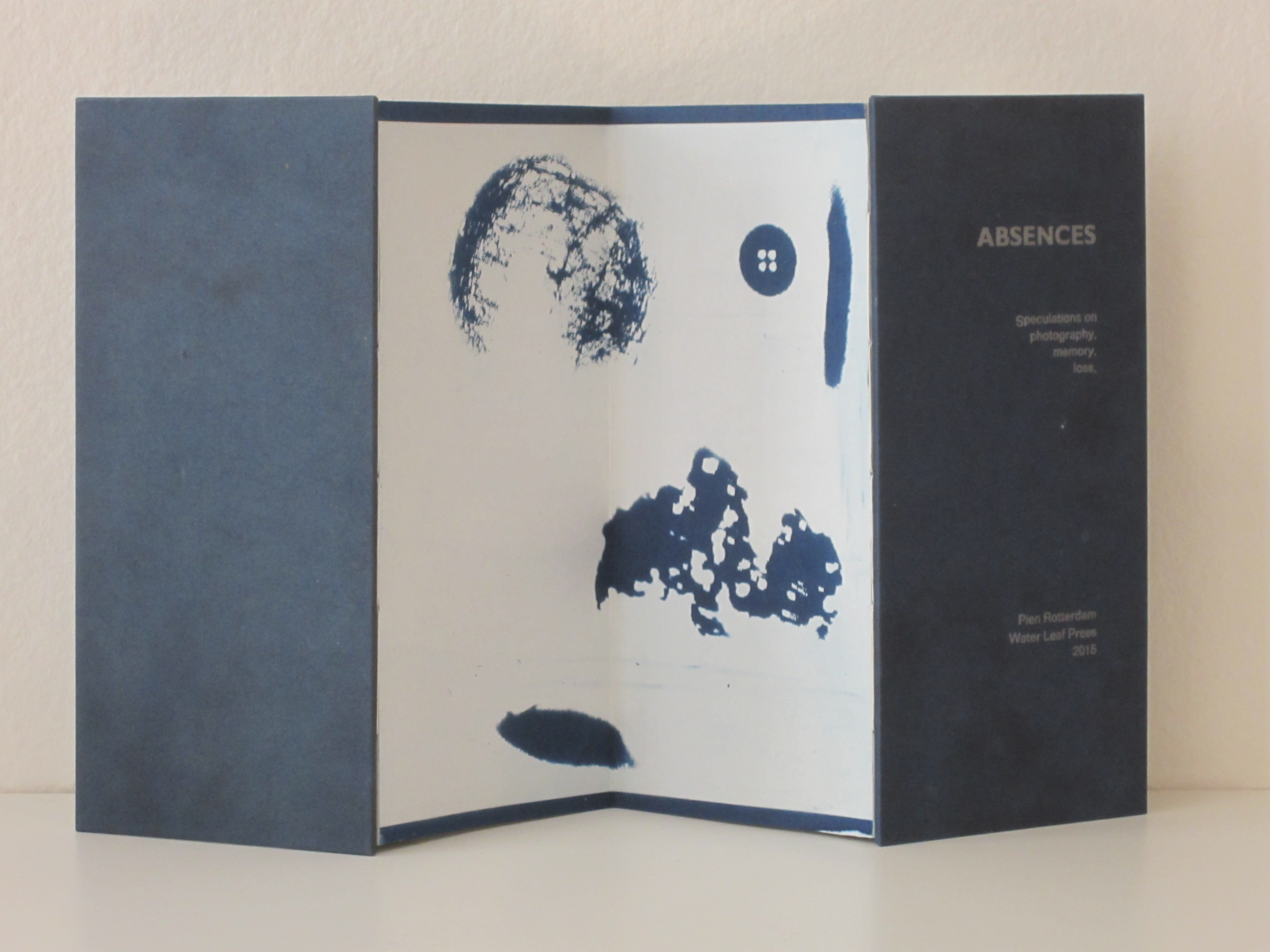
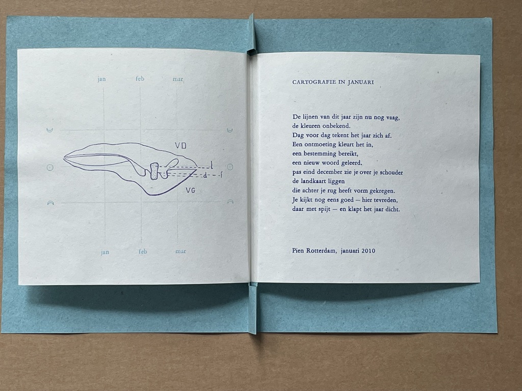
Again and again, Pien Rotterdam’s works — Sea of Things (2014) and Absences (2015) — reward reading and contemplation.
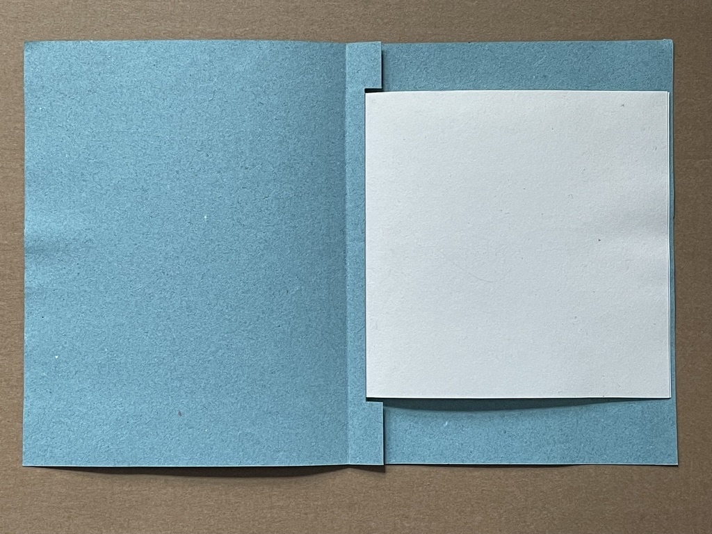
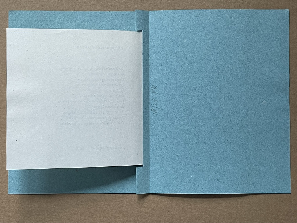
Sea of Things (2014) Pien Rotterdam Border book structure; 11 x 10.5 x 1.3 cm closed; 20 by 30 cm folded out Image printed into kozo/cotton paper with very fine paper pulp; text and cell-like patterns printed letterpress on kozo/cotton/abaca paper. Set in Atlas and Atlas Light.
Sea of Things (2014) Pien Rotterdam
Sea of Things (2014) Pien Rotterdam
The images of the coral, square, circle and triangle are “pulp printed”, a hybrid silkscreen/papermaking technique, which Rotterdam learned from Tim Mosely. The images themselves are made of fine pulp paper, transferred to, pressed and dried together with the receiving kozo/cotton paper. Message (or image) and medium are one, a sea around the letterpress text, whose words and acts described harmonize with technique, material, color and shape. Here are “pages” 1 to 5 as a sample.
Sea of Things (2014) Set in Atlas and Atlas Light on kozo/cotton/abaca paper.
Sea of Things (2014) Pien Rotterdam
Sea of Things (2014) Pien Rotterdam
Sea of Things (2014) Pien Rotterdam
Sea of Things (2014) Pien Rotterdam
As with Sea of Things, Rotterdam achieves another singular union of technique and meaning in Absences. Where Sea of Things addresses selecting and collecting, Absences addresses loss, memory and the experience of time.
Absences (2015) Pien Rotterdam Concertina structure. Cyanotype on photogram and text paper handmade from kozo/cotton/hemp in different weights, apart from the cyanotype on the back, which is made from Japanese paper. Letterpress in Folio light (lead type) with silver-grey ink. 10.5 x 23 cm when closed, 42 x 23 cm open.
Absences (2015) Pien Rotterdam
Absences (2015) Pien Rotterdam
Absences (2015) Pien Rotterdam
Absences (2015) Pien Rotterdam
Absences (2015) Pien Rotterdam
Rotterdam’s explanation of the connection between technique, material and meaning can hardly be bettered:
When I made my first cyanotype photogram ten years ago, I was immediately struck by the way in which light shapes against a deep-blue ground show, simultaneously and paradoxically, what was there when the paper was exposed but what is now no longer there: the photogram makes absences visible. This realisation has led to an exploration of the metaphorical properties of the cyanotype process and to speculation on the relationship between photography, mementos, and memory, between memory and loss, and on the nature of time, in six brief reflective texts.
Cartographie in Januari (2010)
Cartographie in Januari (2010) Pien Rotterdam Pamphlet, modified stub binding, sewn. H160 x W130 mm. 1 folio, 2 panels. Edition of 28, of which this is #18. Acquired from the artist. Photos: Books On Books Collection.
This year’s lines are still vague, the colors unknown. Day by day, the year takes shape. An encounter colors it in, a destination reached, a new word learned. Only at the end of December do you see the map lying over your shoulder, which has taken shape behind your back. You take another good look—here with satisfaction, there with regret—and close the year.
Handmind (2009)
Handmind (2009) Pien Rotterdam Pamphlet, stub binding, sewn, printed on abaca, flax & cotton. H202 x W90 mm 2 folios, 4 panels. Text from Ursula K. LeGuin “Always Coming Home”. Limited edition (unknown qty). Acquired from the artist. Photos: Books On Books Collection.
Et in Arcadia (2013)
Et in Arcadia (2013) Pien Rotterdam Pamphlet, French fold. H210 x W135 mm. 1 page. Edition of 54, of which this is #41. Acquired from the artist. Photos: Books On Books Collection.
The chatter of the day has drifted to the edges of the lake and crept up along the ring of bright sand, which still bears traces of everything that went home—with shovels and bags full of bathing gear and sunscreen. Now little frogs find their way to land, shadows flow slowly in the wind, my head rests in the languid water, time dissolves, returns now— The heat drifts smoky into the trees that speak of resin and autumn that is not far off—but not yet here, not now, in the late light of this day that brings us home and slowly drifts away to the edges of the lake.
Rotterdam’s site rewards repeated visits. It traces her development as a book artist since 2003 and demonstrates mastery and strength at each stage. Her work can be acquired through the site. Rotterdam lives and works in Groningen, The Netherlands, home to the Book Arts Network, Grid Grafisch Museum and De Ploeg, an artists collective started in the early 20th century.
Further Reading
Hirschey, Paige. 7 December 2023. “Rhapsodies in Blue: Anna Atkins’ Cyanotypes“. The Public Domain Review. Using the cyanotype process, Anna Atkins produced the world’s first photograph album.