Infant A (2012) Louis Lüthi Thread-stitched signature. H225 x W160 16 pages. Edition of 1000. Acquired from Torpedo Books, 8 January 2024. Photos: Books On Books Collection
Infant A is part of a collection of essays commissioned by castillo/corrales and published by Paraguay Press under the series title The Social Life of the Book. Lüthi’s contribution fits the Books On Books Collection on several scores. First is the epigram’s invocation of the alphabet, which echoes the collection’s concentration of alphabet-related artists’ books and children’s books. See Alphabets Alive! Second is the epigram’s source: Wallace Stevens, whose poetry has inspired Ximena Pérez Grobet’s Words (2016). Would that other book artists be so inspired. Third is the narrator’s fictional conversation with Ulises Carrión in a celebration of all things A-related, in particular Andy Warhol’s novel a: a novel (1968), which finds analogues in Warren Lehrer’s A Life in Books: The Rise and Fall of Bleu Mobley (2013) and Derek Beaulieu’s a, A Novel by Andy Warhol (2017) (entry in progress). Fifth is how the dialogue reminds me of Suzanne Moore’s A Musings (2015).
A Die With Twenty-six Faces (2019)
A Die With Twenty-six Faces(2019) Louis Lüthi Paperback. H200 x W130 mm. 104 pages. Acquired from Amazon, 18 September 2022. Photos: Books On Books Collection
Walter Benjamin’ unpacking of his library has a lot to answer for. Not only do we have Buzz Spector‘s take on it in 1995, but Jo Steffens’ Unpacking trilogy of photos of architects’, artists’ and writers’ bookshelves, Alberto Manguel’s elegiac Packing My Library (2018), and here is Louis Lüthi’s.
Publisher’s website: In A Die with Twenty-Six Faces, the author — let’s call him L. — guides the reader through his collection of alphabet books, that is, books with letters for titles. Some of these titles are well known: Andy Warhol’s “a,” Louis Zukofsky’s “A”, Georges Perec’s W. Others are obscure, perhaps even imaginary: Zach Sodenstern’s A, Arnold Skemer’s C and D. Tracing connections between these books, L. elaborates on what the critic Guy Davenport has called the “Kells effect”: “the symbolic content of illuminated lettering serving a larger purpose than its decoration of geometry, imps, and signs.”
The title stirs thoughts of Marcel Broodthaers’ oracular statement in 1974 “I see new horizons approaching me and the hope of another alphabet”. An alphabet that unrolls across the twenty-six faces of a die would certainly qualify as another alphabet. Broodthaers and the die also stir thoughts of Stéphane Mallarmé’s Un Coup de DésJamais N’Abolira le Hasard to which Broodthaers paid repeated homage. Throwing a twenty-six-sided die would certainly no more abolish chance than would a roll of Mallarmé’s six-sided die. Lüthi’s game, however, has little to do with chance unless we count his luck in finding the works to build his library of single-letter-entitled books. Even less to do with luck if some of the library is fictitious, a likelihood that the “publisher’s” statement suggests. Lüthi’s die is loaded!
A selection of Lüthi’s “alphabet” books on display. Courtesy of the author. Photo: Gesellschaft für Aktuelle Kunst Bremen
On the Self-Reflexive Page II (2021)
On the Self-Reflexive PageII(2021) Louis Lüthi Paperback. H200 x W130 mm. 304 pages. Acquired from Idea Books, 18 September 2022. Photos: Books On Books Collection.
This is a peculiar book in its order and nature. After two variant half-title pages, it begins with a section entitled “Black Pages”. Only on flipping through the volume can we find the remaining front matter — just after page 208. There’s another half-title and then the Table of Contents. Reproducing the marbled page from Laurence Sterne’s The Life and Opinions of Tristram Shandy, Gentleman (1759–1767), the book’s cover gives a clue to this peculiarity. Sure enough, Lüthi spells it out later in the section entitled “On Drawing Pages”.
So much in Tristram Shandy is presented out of order: a second dedication comes not after the first but on page 27, the preface is not at the beginning of the novel but in chapter 20 of volume three, and chapters 18 and 19 of volume nine come not after chapter 17 but are inserted after chapter 25. In a similar act of transposition, we find a marbled page in volume three, even though hand marbling is customarily used to decorate covers and endpapers. As Viktor Shklovsky observed, “It is precisely the unusual order of even common, traditional elements that is characteristic of Sterne.” (p. 240)
This one paragraph confers on Lüthi’s entire book the very self-reflexivity that it explores across a range of literature and artists’ books. Reflecting the custom to which it refers, On The Self-Reflexive Page II carries Sterne’s marbled pages on its front and back covers. In the text before his marbled leaf, Sterne refers to it as the “(motly emblem of my work!)“. Lüthi has taken that exclamation to heart (and cover) as if it were advice in creating this hybrid, motley work of his own: “part artist’s book and part essay, part literary excavation and part typographical miscellany” as he calls it in his middle-of-the-book Foreword.
Lüthi’s work is just one in the Books on Books collection of several inspired by Tristram Shandy. There is Erica Van Horn’s Born in Clonmel (2011), Simon Morris’ Do or DIY (2012), Abra Ancliffe’s The Secret Astronomy of Tristram Shandy (2015), and Shandy Hall‘s The Black Page Catalogue (2010), Emblem of My Work (2013), Paint Her To Your Own Mind (2018) and The Flourish of Liberty (2019). Outside the collection, there is Brian Dettmer’s Tristram Shandy (2004), commissioned by Shandy Hall’s Laurence Sterne Trust, and also Sean Silver’s Shandean online venture called The Motley Emblem (2022~) celebrating Sterne’s marbled leaf and the analytical chemistry of marbling. The latter may become a book, even an artist’s books to add to the tally. In The Century of Artists’ Books, Johanna Drucker draws attention to Sterne’s novel twice as an example of self-reflexivity or self-interrogation, but in 1994 and 2004, Sterne did not rise to the same level of precursor to book artists as William Blake or Stéphane Mallarmé in Drucker’s view. With these later works of book art inspired by Uncle Toby’s nephew in the bag, a dozen or so more might nudge Sterne up the scale.
In the meantime, anyone interested in artists’ books could fruitfully apply to the medium Sterne’s exhortation to his own readers:
Read, read, read, read, my unlearned reader! read, — or by the knowledge of the great faint Paraleipomenon — I tell you before-hand, you had better throw down the book at once; for without much reading , by which your reverence knows, I mean much knowledge, you will no more be able to penetrate the moral of the next marbled page (motly emblem of my work!) than the world with all its sagacity has been able to unraval the many opinions, transactions and truths which still lie mystically hid under the dark veil of the black one.
Artists’ books are to be read, handled and digested, not stored away in the archives.
Battledore(2019) Bård Ionson Digital photo of oscilloscope art on walnut, with leather straps & tacks. H229 x W127 mm. Animation of oscilloscope art with Artivive. Resolution: 3840 × 2160 px. File format: mp4. Duration: 1’0″ sec. File Size: 74.1 MB. Acquired from the artist, 1 March 2019. Photos: Books On Books Collection. Displayed with permission of the artist.
The artifact displayed here is a vehicle for a digital artwork in which oscilloscope drawings are animated in augmented reality and which exists as an NFT (Non-Fungible Token). To view the digital artwork, open the camera on a smartphone, point it at the QR code below, and download the Artivive app. Open the Artivive app and position the phone’s camera over the artifact or even its image above.
Each of the alphabet characters transforms into a logo (or image of a product associated with the company behind the logo). The letters represent Apple, Boeing, Comcast, Disney, Exxon, Ford, Google, HBSC, ING, JP Morgan Chase, Koch, Lockheed Martin, Microsoft, Nestle, Orbital, Phiser, QinetiQ, Raytheon, SkullCandy, TiVO, Unilever, Volume Integration, Winchester, Xerox, Yandex and Zinga.
Now that A is for Apple Inc. rather than the fruit, Ionson wonders, “What are our children learning as they navigate digital devices vs. when children used wooden tablets with narrow ideas presented with pictograms.” He goes on about the entities behind Battledore‘s letters, “Many of these are companies that manufacture weapons of war or are players in an information war. Many countries and organizations are using the information space of social media and news in a disinformation war. It is a digital battle now.”
To drive this home with several layers of irony, Battledore is offered as the learning tool needed to
Train your children for the battles of the 21st Century. Where brands, countries and organized crime compete for your allegiance. Using art, history, finance, education, news, war, social media and religion they fight to keep a hold on your mind. Learn to fight back by subverting the tools they wield.
At one layer of irony, the physical artifact shown above lies dormant just as it did until the teacher “activated” it with classroom recitation of the letters. But now, in augmented reality, the letters seem to come to life revealing hidden entities associated with them. Now, the reader/viewer has to engage in a digital transaction, point a digital handheld device at the letters, and peer to see and learn, letter by letter, what the letters “really” stand for — all while a looping track of electronic battle-game sounds plays on. Viewed on a laptop or desktop, these video clips at Elementum, Patreon and ARTificial show the transformations without the need of a smartphone. Caveat: whether phone or laptop, lower the speakers’ volume before activating!
While the word “battledore” serves the artist’s metaphoric purpose, it introduces another layer of irony (unintentional according to the artist) in that the physical artifact is a horn-book, not a battledore, which was the later paper version of the horn-book. An additional unintentional irony is that, as illustrated by Andrew White Tuer, the “dean” of horn-book history, the old artifact itself was often wielded as a weapon.
Some transformations are easy to follow and connect with a corporate entity. Others — such as the Q becoming a missile launcher because Q is for QinetiQ — require a bit of digging (online, of course). The original teaching device was not without its “corporate” — or rather religious, economic and patriotic — associations, but they were more obvious in the text, emblem and images on both front and back of the artifact.
Facsimile horn-books. Real cow horn is used for the cover of the horn-book at the lower left. Gene Wilson
The NFT element of this work is yet another level of irony. It begins with a paradox and a pair of causes. The paradox is ownership in the digital age. Most digital objects — downloadable music or book files — are not owned securely. Whether subject to the supplier’s whims or errors (like Amazon’s now infamous overnight removal of Orwell’s 1984 from its customers’ Kindles) or to obsolescence (by operating system upgrades or by outright abandonment of file formats such as Adobe Flash), we do not so much own digital assets as lease them with fingers crossed for luck while the vendors’ fingers are crossed behind their backs.
The irony raised by Battledore‘s NFT status is the underpinning technology’s claim of redefining and securing unique ownership in a digital work of art. A long explanatory article in The Verge provides an amusing and clear explanation of non-fungible tokens and blockchain technology. Although a digital artwork can be copied many times by many viewers even if it’s included with an NFT,
… NFTs are designed to give you something that can’t be copied: ownership of the work (though the artist can still retain the copyright and reproduction rights, just like with physical artwork). To put it in terms of physical art collecting: anyone can buy a Monet print. But only one person can own the original.
A metaphysical or aesthetic precursor to all this can be found in Walter Benjamin’s seminal essay “The Work of Art in the Age of Mechanical Reproduction”. He writes,
The presence of the original is the prerequisite to the concept of authenticity. And
that which withers in the age of mechanical reproduction is the aura of the work of art.
So in Benjamin’s terms, the Monet original has authenticity, it has aura. NFTs and blockchain technology aim/claim to replace the “presence of the original”, its “unique presence”, its “aura” with “ownership of the work” as the “prerequisite to authenticity”. By associating a piece of wood, leather, metal tacks and inscribed plastic with the digital asset, Ionson physically and ironically underscores the paradox of digital ownership.
The NFT feature of Battledore also carries with it a pair of causes. The first cause has an analogue in the late 20th-century theories about book art: that this new form of art arose as a means of bypassing art galleries and gatekeeping authorities of art. Likewise, NFTs and blockchain technology have their roots in peer-to-peer (P2P) networks in which data resides in whole or distributed state across a network of distributed servers. The purpose of P2P is to protect data from the threat and vulnerabilities of centralized control. Battledore leverages its digital format and that anti-authoritarian tradition of NFTs to subvert the corporate enemy on the digital battlefield.
The second cause, related to the first, is economic and financial and linked to copyright. In the physical world, authors’ and artists’ ability to be remunerated from the sale and re-sale of copies or original works is attenuated. They might receive royalties from copies sold by the intermediary publisher or a percentage from an original sold by the gallery or to a collector, but there is no economic framework for remuneration from subsequent transactions. NFTs and blockchain technology provide the digital artist an option for ongoing remuneration. Whenever the NFT is exchanged, a new block in the chain arises, and the whole chain is aware of it. So the digital artist can set financial terms not only for the initial financial transaction but also for subsequent ones.
When the Books On Books Collection is donated to the Bodleian Libraries, the chain of digital ownership will extend by one more block. The wallet in which the Battledore NFT and financial terms, if any, reside will transfer to the Bodleian with a digitally secure chain of custody and provenance. Of course, with the accompanying transfer of the physical artifact associated with the NFT, the artist and collector will be giving an ironic wink of the eye to the amusement and relief of the Keeper of Rare Books at the Bodleian.
Benjamin, Walter. 1969. “The Work of Art in the Age of Mechanical Reproduction“. Illuminations, edited by Hannah Arendt, translated by Harry Zohn, from the 1935 essay. New York: Schocken Books. Accessed 7 July 2023.
“How does a book reflect a distinct way of thinking about a subject? How does the page become a dynamic landscape of visual and conceptual ideas?” So begins the description for a workshop run by Ken Botnick in 2017. His two works in the Books On Books Collection answer those questions with a resounding “This is how“.
Table of Contents (2020)
Table of Contents (2021) Ken Botnick Slipcased, boards with exposed sewn binding. Slipcase: H270 x W170 mm; Book: H265 xW185 mm, 56 pages. Edition of 20, of which this is #5. Acquired from the artist, 3 May 2022. Photos: Courtesy of the artist; Books On Books Collection. Displayed with permission of the artist.
Table of Contents has no table of contents. Instead the whole book is a meditation on a table of contents — that of James J. Gibson’s The Senses Considered as Perceptual Systems (1966). On the inside cover, Botnick characterizes Table of Contents as a “book-length visual/textual poem” and identifies the cento as its model. Cento is short for the Latin centonibus (“patchwork”) and describes the technique of appropriating others’ lines of verse to compose an original “collage” poem. Rather than lines from poems, though, Botnick has appropriated text from Gibson’s table of contents and figure labels.
Here is Gibson’s complete table of contents:
Gibson, The Senses Considered as Perceptual Systems, pp. ix-xiv. Internet Archive.
Here is Botnick’s selection of text:
Table of Contents Compression waves from a vibratory event How are associations between events detected? The stationary information for seeing one thing through another Radiation from a luminous source The physical reality of speech The diffusion of volatile substances The development of selective attention The superfluous appeal to memory The consequences of inadequate information The consequences of rigidity The special consequences of light Transmitted light and transparent surfaces The structuring of light by means other than reflection The structuring of light by alphabetic writing The stable and unbounded character of the phenomenal visual world The perception of chemical values in the sea The inspired air The beginning of a theory
But that is not how Botnick’s cento is presented. In calling it a “visual/textual poem”, Botnick is too modest. It is much more than visual/textual: it is visual, textual, auditory and haptic — and is so from the start, proceeding by contrasts and complements, provoking multi-sensory activity and responses.
First of all, the slipcase is more of a “slipsleeve” from which the spine protrudes for fingers and eyes to feel the exposed binding threads, the pattern of knots and the ridges of the gathered signatures. This is the sewn boards structure, credited to Gary Frost, more on that later. The spine and fore edge offer bright colors that contrast with the deeply black sleeve that displays three slanting parallel cutouts in the cloth, exposing the board it covers. The pattern those cutouts make will become a recurrent visual and tactile theme as the pages turn.
As the tightly fitting sleeve pulls away from the board-stiff book, they make a “shirring” sound together. As the front cover turns, the title page bows upward showing nine impressed parallel lines beneath the words “Table of Contents”, and when that page turns, it crackles and makes a shuffling sound as its edge drags across the following bright blue page.
Through that bright blue translucence, the pattern from the slipsleeve reappears but rearranged and multiplied into a zigzag spectrum of colors. The physical turning of the translucent page “exposes” that zigzag spectrum and the second line of text in this poem: “Compression waves from a vibratory event”. Gibson’s text refers to the perception of sound or physical vibrations, and Botnick poetically overlays this with his selection of papers and introduction of zigzag waves of color. The zigzag pattern and its rounded elements, which on some pages are scattered, elongated, cross-hatched or sharp-edged, contribute a recurrent visual syncopated rhythm through the book. Toward the end, the zigzag moves into a more consistently vertical and angular, almost helical, appearance.
First leaf turned, second leaf turning, third leaf revealed.
Zigzag pattern scattered. Zigzag pattern become helical.
To deliver other visual and haptic effects, Botnick prints his translucent papers sometimes only on their reverse sides, sometimes on both, sometimes to the point of opacity as with the first leaf and other times to the point of transforming the colors about to appear on the next sheet beneath as with the second and third leaves. Of course, this changes the feel of the sheet from one side to the other. Botnick also uses six different paper types (including one with a watermark designed for this edition and made at Dieu Donné Paper). The variety in printing and papers introduces additional tactile and visual rhythms: slick and matte, smooth and rough, dark and light, etc. Again, proceeding by contrasts and complements, provoking multi-sensory activity and responses.
Visual effects achieved by printing on both sides of translucent paper layered over fine print paper.
Visual effects achieved by printing translucent paper to near opacity on one side, spot printing on the other side and layering that sheet over a translucent paper printed on one side.
Variation of paper types.
The sewn boards structure, executed by Emdash studio member Robin Siddall, offers the most effective means of achieving the sensory effects intended with the variety of papers, ink colors and printing techniques, as well as delivering a lay-flat binding. Each four-page signature consists of two separate sheets glued to the inner edges of a narrow folded card (the board) sewn and linked to the boards of the signatures before and after. The card used for those hinges is a Japanese washi called Moriki, known for its folding strength and colors, but how particularly apt those multiple hinges and colors are for this patchwork poem.
Detail of an open signature exposing the thread sewn through the board and showing the leaves glued to the edges of the board.
Gibson defines the haptic system as that “by which animals and men are literally in touch with the environment” (p.97). On the penultimate double-page spread, Botnick reveals the environment that touched his “book-length visual/textual poem” into existence: one of pandemic, isolation, violent exposure of institutionalized racism, the “Big Lie” and insurrection. Set in the now familiar zigzag pattern, the revelatory text annotates the lines of appropriated text and the prints, connecting both with the environment and the meditation on perception. Botnick’s book is certainly a distinctive interweaving way of thinking about these threads.
It is telling that Table of Contents ends with black and gray, the colors that dominate the other work in the collection: Diderot Project (2015), which presents this pronouncement from Odilon Redon:
Even without the prismatic range of colors in Table of Contents, Botnick’s Diderot Project (2015) may outstrip the former in the number of ways in which Botnick makes not only the page but also the codex itself “become a dynamic landscape of visual and conceptual ideas”.
Diderot Project (2015)
Diderot Project (2015) Ken Botnick H290 x W194 mm, 150 pages. Edition of 70, of which this is #32. Acquired from the artist, Photos: Courtesy of the artist; Books On Books Collection. Displayed with permission of the artist.
Clearly, like Table of Contents, this work is a “book-length visual/textual poem”, so it offers some insights on the book artist’s favorite rhymes, rhythms, metaphors, techniques and themes. First and foremost is his taking a literary work as his muse. With Table of Contents, it is James J. Gibson’s psychology book; in this case, it is Denis Diderot’s multi-volume Encyclopédie (Encyclopedia), a decades-long project with Jean le Rond d’Alembert and 138 other contributors. Nodding to the multiple volumes of the Encyclopedia, the artist refers to the sections of his work as Volumes 1, 2 and 3, although they are bound as one binding. The three volumes’ titles follow the Encyclopedia‘s overarching categories in its “System of Human Knowledge”: Memory, Reason, and Imagination. Digitally captured images from the Encyclopedia‘s plate volumes abound.
Table of Contents
Diderot Project, however, is not a condensed version or description of the Encyclopedia. Like literary works of ekphrasis whose words meditate on a visual object, Diderot Project is book art that meditates — inversely — on a literary work. The cover to Diderot Project does not show its name where the title is expected, rather it shows the name of its object of meditation. And it displays that name in a distinctive monumental way.
The front cover’s silver slab serif italic letters in all caps on textured, triple-dyed flax paper and the back cover’s diagram in the same palette strike chords that reverberate throughout the work. The chords are both obvious and subtle. Immediately, with a pattern of silver-gray compasses and directional stars, the doublures repeat the cover’s black and silver notes but on a less textured paper. Curiously the fly leaves of the doublures are not really fly leaves because they are pasted at their fore edges to separate leaves of black paper: a subtle hint to look beneath the surface, inquire into the mechanics. (An irresistible side note on the mechanics of the binding: the binder Daniel E. Kelm, in tipping the black fly leaf to the outer printed one, extends the fly leaf further into the book as a tipped-on hinge inserted through the first two signatures. The detailed image below on the right shows the hinging edge of the fly leaf between the signatures.)
L-R: Inside back cover, doublure with compass and directional star motif; Inside front cover, doublure leaf anchored to fly leaf; Binding detailed view of hinging edge of fly leaf extending between signatures.
Following that almost-Chinese fold of a flyleaf, the half-title drops any pretense of hinting. Turning the half-title with its 3×4 grid of black, brown, tan and gray squares on translucent paper reveals that the squares have been created by printing in silver, copper, light brown tint and no ink on the reverse. Underneath the half-title leaf lies another black page with the recurring silver-gray image of four buckets linked by their handles. The pattern of buckets is parallel to the interlinked image of compass and directional star on the doublures. It is another subtle hint: this time, to look at patterns for their similarities and differences arising from the mechanics of effects, to consider the commonality of tools whether at the low or high end of culture.
L-R: Half-title on translucent paper; inked reverse of half-title and the interlinking buckets.
If this reaction to the prelims seems a stretch, then the following run of folios surely validates it. Not only does the text articulate the parity of craft and tools (métier) with art and science, the watermark hand gestures to it, then the watermark hand joins its mirror image “to tie” the knot of the binding thread, and then the second watermark hand joins its printed mirror image at the same point. These six pages enact parallels of similarities and differences.
The layering of translucent paper printed on one or both sides, which also occurs in Table of Contents, is another of Botnick’s favorite techniques. He has even delivered a lecture at the Getty Research Institute entitled “Transparency as Metaphor“. Botnick’s use of it in the sequence below invites the reader/viewer to meditate with him on “the nature of craft, tools, memory, and imagination, while provoking questions about authorship in artists’ books”.
Running across the four pages of the two leaves of UV Ultra Clearfold, the enlarged present, past and future letters call on perception, memory and imagination to decipher the name: Diderot, emerged and submerged. However large his name is cast, though, is Diderot the author? By bracketing these transparencies with an image of a manufactory or workshop and a crowd of listeners and observers with pens poised, Botnick evokes the other 139 contributors to the Encyclopedia and his own host of collaborators, including Kelm (binding), Paul Wong (papermaking) and, importantly the Emdash studio (Catherine Johnson, Ben Kiel, Karen Werner and, in New Delhi, Ira Raja).
Tools, the workplace and studio lie at the heart of the Diderot Project‘s second volume, which boasts the following complex foldout which in itself validates Roland Barthes’ statement from his essay on the Encyclopedia‘s plates: “The object is the world’s human signature”.
Sensation, perception and the natural world lie at the heart of the third volume, and here is another of Botnick’s favorite techniques: typographic distinction. The right-side up text on the verso page is set in Walbaum, as is every instance of Diderot’s text. The upside down text on the verso and all the text on the recto are set in Trade Gothic, as is the case for more contemporary authors (Michel Foucault and Walter Benjamin, respectively, in these instances). Note how Foucault’s upside down text reflects the action in the image of the camera obscura, and picks up the theme of perceptual flipping initiated with the watermark hand in Volume 1 and Diderot’s enlarged name across the translucent pages in Volume 2.
Both Table of Contents and Diderot Project reward revisiting for this kind of close reading, close looking, close fingering and close listening. Close comparison and contrast as well because together they answer “How does a book reflect a distinct way of thinking about a subject? How does the page become a dynamic landscape of visual and conceptual ideas?”
With the exception of Unpacking my Library and Between the Sheets, Spector’s works in the Books On Books Collection fall into the category of ephemera. More than most book artists’ ephemera such as invitations, broadsides and the like, however, Buzz Spector’s ephemera have that self-reflexiveness so characteristic of book art.
Artist, curator and historian Jeffrey Abt wrote that the “irresistible” idea of placing an exhibition of artists’ books alongside the University of Chicago Library’s collection “broadly representative of the history of the book” started with a visit to famed art dealer Tony Zwicker‘s studio. It was also, however, almost as if he were taking a cue from this statement by artist-printers Betsy Davids and Jim Petrillo just the year before:
A representative collection of artists’ books often does not seem visually remarkable in a gallery, where a wide range of visual experience is the norm. The same collection, installed in a library or bookstore, can seem visually startling almost beyond the limits of decorum. — “The Artist as Book Printer: Four Short Courses”).
While Abt’s introductory essay rings the historical changes on the roots of book art — once there was Mallarmé’s Un Coup de Dés Jamais N’Abolira Le Hasard, but before Mallarmé, there was William Blake — the works included and the catalogue’s design ring some chimes of their own about book art. One way or another, all book art self-consciously draws attention to some particularly bookish element. For the most part, the 49 works listed in this catalogue ring true. The catalogue’s design itself, however, not only chimes to that notion of self-reflexiveness but also to wider notions about the nature of book art within contemporary art.
Not long after this exhibition, Spector wrote of “the language of the book” and all its parts — pages, signatures, cover, letter forms and their placement on the page, etc. — as having a syntax (“Going Over the Books”). With its pencil-circled numbers, alignment guides, pastedowns and other designer’s marks appearing throughout — as if a printer’s devil had run amok and let the marked-up proofs go to press unchanged — the catalogue draws attention to that syntax, the underlying processes of bookmaking and, therefore, this object’s “bookness”. The colophon’s note initialed by Jeffrey Abt to Buzz Spector and “pasted” on the last page jokingly rings the self-reflexive chime of the markings throughout the catalogue.
The second chime comes in the catalogue’s verbal and visual punning. Like book art, punning is self-reflexive, words playing on words. The title ”the book made art” can be read with different meanings: “the book made into art”, “art that is bookish” and so on. The catalogue’s trim and two-dimensional representation of three-dimensions create the visual pun of a glass or white cube. The verbal and visual puns also play with Abt’s “irresistible” context. Here in the Joseph Regenstein Library was an exhibition catalogue, teasing the viewer with a reminder that vitrines separated them from the bookworks. Reviewing two other exhibitions of book art, Spector elaborated explicitly on his visual tongue-in-cheek irony:
The dilemma in staging exhibitions of books as art objects is the denial of access to the work that conservation necessarily demands. … and it is a morethan passing irony that implications of hermeticism and elitism should surround books shown to a public using the library as a means of gaining access to texts. — “Art Readings”.
The catalogue also teases with its title and design by suggesting that once books have been placed on display like this, the setting is no longer a library but a “white cube gallery“. As the catalogue progresses, black-and-white photos of items from the exhibition appear on the verso page in frames that appear to be hanging on the trompe l’oeil cube’s rear wall.
Poster distributed on the University of Chicago campus. The image combines Michael Kostiuk’s Airplane Shadow Book (1981/82) with a variation of the catalogue cover. Photo: Courtesy of the artist.
But a viewer standing in the “brutalist” construct of the Regenstein Library and holding the finished catalogue might have asked, “What makes these objects I cannot touch — or, in some cases even if I could, cannot read — art?” There is the catalogue’s third chime. From the start, book art has faced a constant definitional or identity crisis and even the challenge “but is it art?” The catalogue’s title echoes Lucy Lippard’s Duchampian proposition: “It’s an artist book if an artist made it, or if an artist says it is”. The catalogue’s design says, “This is the gallery, these are the objects on display in it, they are art”.
The “white cube gallery” brings on a fourth and final ironic chime. In the 1970s and early ‘80s, artists’ books were pitched as a “democratic” medium and means by which art could escape the clutches of the gallery and reach a wider public. In another catalogue — the one for the 1973 Moore College exhibition, nominated as the first of book art — John Perreault writes:
Books as art, from the artist’s point of view and the viewer’s point of view, are practical and democratic. They do not cost as much as prints. They are portable, personal, and, if need be, disposable. Because books are easily mailed, books as art are aiding in the decentralisation of the art system. — “Some Thoughts on Books as Art”.
By the mid-80s, lo and behold, The Book Made Art’s catalogue-cum-gallery jokingly recaptures “books as art”. And in a further irony, by the mid-80s and since, the increased rareness and price of such bookworks have made them into galleries‘ and museums’ expensive objects of desire. Including this catalogue.
The Library of Babel (1991)
The Library of Babel Curated and edited by Todd Alden; catalogue designed by Buzz Spector. Dos-à-dos binding, offset. H241 x 177 mm Buffalo, NY: Hallwalls Contemporary Art Center, Hallwalls Inc., 1991. Photo of the work: Books On Books Collection.
As with The Book Made Art, Spector uses the cover (this time with a photograph of The Library of Babel) to introduce the self-reflexivity so characteristic of book art, but he does not stop there. Pagination and the back-to-back binding structure work together to evoke a mirror’s reflection; the last page of the first half “faces” the last page of the second half.
Photo of the work: Books On Books Collection.
The first half contains Todd Alden’s essay “The Library of Babel: Books to Infinity”, Paul Holdengräber’s “Unpacking Benjamin’s Library: Bibliomania in Dark Times”, and a checklist of the 34 works by their 10 artists.
Photo of the work: Books On Books Collection.
The second half contains half-tones of selected works and brief CVs of the artists. Among the half-tones are also photographs of works referenced by Alden (one by Jasper Johns, two by Marcel Broodthaers). Notice how the rules change position in the footers of the two halves, again evoking the back-to-front theme of the dos-à-dos binding.
Photo of the work: Books On Books Collection.
As in The Book Made Art, Spector had an entry in “The Library of Babel“ exhibition. With its torn pages, North Sea (for M.B.) (1990) echoes Altered LeWitt (1985), further below, but it is instead a work 10 feet long and presented on a table appropriately jutting out from the wall like a pier. “M.B.” is Marcel Broodthaers, to whose works there are multiple and layered references. The eleven “waves” of torn pages placed in a row on top of the steel shelf are the excised material from another of Spector’s works: Marcel Broodthaers, made from eleven copies of the Walker Art Center’s 1987 catalogue to Broodthaers’s first U.S. retrospective. Spector painted all the pages in each copy with white gesso before excising them and leaving behind his 1990 “altered Broodthaers”.
Marcel Broodthaers (1990) Buzz Spector An altered copy of: Marcel Broodthaers (Minneapolis/New York: Walker Art Center/Rizzoli, 1989). Photos: Courtesy of Buzz Spector.
He saved the excised “wedges” and bound them at the fore edges. Because the gesso does not completely obscure the text and images from the catalogues, viewers who come close to the work can see slivers of some of Broodthaers’ works along with the word fragments typical of Spector’s altered books.
North Sea (for M.B.) (1990) Buzz Spector Books, steel, gesso, 25 x 96 x 10 inches Collection Orange County Museum of Art,CA; Museum purchase with additional funds provided by Peter and Eileen Norton and the National Endowment for the Arts, a federal agency. Photo: Courtesy Orange County Museum of Art.
Spector’s library contains a copy of Broodthaers’ 1974 artist book, A Voyage on the North Sea. These layered references and self-references — direct references to Broodthaers’ A Voyage, indirect references through the self-reference to Spector’s Marcel Broodthaers (1990) — bring into sparkling focus two features of book art and, in particular, late 20th century book art: reverse ekphrasis and bookworks in conversation with one another.
When a visual work of art inspires poetry or prose, the literary result is called ekphrastic: “the verbal representation of visual representation”. But where the poets Keats, Auden and Jarrell, for example, use words to “recreate”, re-present, evoke or respond to works of art — an antique urn, a painting by Brueghel and Donatello’s sculpture of “David” — book artists have in turn used the letter, words, actual books, the physical materials of the book or even the shape of books, their functions or processes of making them to create works of art. A kind of ekphrasis in reverse.
Not only does Spector perform this reverse ekphrasis with exhibition catalogues in North Sea (M.B.), he does it in conversation with a multimedia work by Broodthaers. Works in conversation with one another is also a common occurrence in poetry. An entire anthology showcases these poems that talk to other poems. The later work not only evokes the earlier work, it illuminates and adds to it. In book art, other instances include Bruce Nauman’s Burning Small Fires (1968), a one-sheet folded book of photos of Ed Ruscha’s Various Small Fires and Milk (1964) being set on fire and burning to ash, and Dennis Oppenheim’s Flower Arrangement for Bruce Nauman (1970), a leporello which refers to Nauman’s Flour Arrangements (1967), a video in which the artist pours over 50 pounds of flour on a mock talk-show studio floor and then sculpts it into ephemeral shapes. Nauman’s shift to an ingenious folded single-sheet structure and Oppenheim’s shift (and pun) to an accordion view of flowers are part of the addition to their conversations with their very structurally different counterparts. Spector’s shift to the sculptural is part of the addition to his conversation with Broodthaers’ book and video. Consider not only Spector’s gessoed sea of pages and the pier, but also those two 19th century black bronze sailing ship bookends evoking the 19th century nautical painting that Broodthaers appropriated in A Voyage on the North Sea.
North Sea (for M.B.) (1990) Buzz Spector Books, steel, gesso, 25 x 96 x 10 inches Collection Orange County Museum of Art,CA; Museum purchase with additional funds provided by Peter and Eileen Norton and the National Endowment for the Arts, a federal agency. Photo: Courtesy Orange County Museum of Art.
Unpacking my Library (1994-95) Buzz Spector Leporello full-colour offset printed; folded H100 x W155 mm, unfolded W3600 mm; Cleveland Center for Contemporary Art. Installation exhibited at the San Diego State University Art Gallery, 1-31 October 1994. Photo of the work: Books On Books Collection.
Clearly from his entry in The Library of Babel, Spector’s artistic output extends beyond altered books and catalogue design to larger scale installations. One of the more well-known, Unpacking my Library imposes multiple orders on what Walter Benjamin called “the chaos of memories”. How “multiple orders”? First, because of its subtleties; second, because of its several forms.
From the start at the San Diego State University Art Gallery, 1-31 October 1994, the installation imposed the order of “descending height” on Spector’s library, unpacked and displayed across one shelf attached along the white walls of a room in the gallery. The single shelf ran 188 feet.
Although Spector is rejecting the library’s traditional method of making sense of a collection of books — ordering by academic category — in favor of a physical criterion, the title imposes another method of making sense — allusion. The installation makes “more” sense if you have read Walter Benjamin’s essay “Unpacking My Library — A Talk on Collecting” (1931). If you haven’t, then, on the reverse of the leporello produced with the Cleveland Center for Contemporary Art, are these two sentences from the essay:
This or any other procedure is merely a dam against the spring tide of memories which surges toward any collector as he contemplates his possessions. Every passion borders on the chaotic, but the collector’s passion borders on the chaos of memories.
So what has ordering by height to do with the chaos of memories? Well, if the order of the personal library had been chronological by acquisition, that would be an assertion against chaos, a kind of aide- mèmoire. If the order had been by the library’s traditional method, again that would be an assertion against chaos. Benjamin and Spector embrace the chaos. Spector’s at-first amusing and puzzling organization of his library prods the viewer into the chance to do somewhat the same — to wander along the shelf with that phrase of process hovering in the mind and be reminded of books once read (when? where?), familiar and almost-familiar names and places (from when or where?) and subjects studied (what did that cover?). But the viewer also experiences a surge of unknown names, places and subjects, and spines that mystify.
The allusion to Benjamin’s essay offers another way of making sense of this experience into which the viewer is prodded. If a personal library is a kind of self portrait you can detect from the clues that its usual groupings into fiction, biographies, history, science, etc., give us about the owner, then here the order by height washes them and the portrait away. And if the viewer knows the essay, Benjamin’s last sentence may come to mind:
So I have erected one of [the real collector’s] dwellings, with books as the building stones, before you, and now he going to disappear inside, as is fitting. — Walter Benjamin, “Unpacking My Library”
Spector mentions this disappearance in a video record of the making and showing of the installation. Whether or not the installation’s spectator knows Benjamin’s essay, the installation’s title is a clue to the imposition of a fictional order. “Unpacking my library” is a phrase implying an activity that is just getting going. For his essay, Benjamin created the fiction of the reader’s being present as the library is being unpacked. Likewise for Spector’s installation, any spectator walking into it has entered a fiction. Spector’s library has already been unpacked, sorted on the floor and placed on the single shelf running around the room.
Of course, however, the owner of the leporello form of Unpacking my Library does not experience this fiction as directly. The opening and arranging of the leporello is a hands-on activity; the unpacking of Spector’s library occurs panel by panel in the reader’s hands. The library’s arrangement by height appears more gradually than in the gallery. Once the bookwork is fully extended, the installation’s fiction then becomes more readily available to the leporello’ s reader/viewer.
Photo of the work: Books On Books Collection.
As fictions, Benjamin’s essay and Spector’s installation need an ending. Benjamin’s technique is to disappear into his collection. Spector chooses a different technique. In correspondence with Books On Books, he writes:
The length of all the publications in my library was 165 feet; the single shelf, at the UCSD Art Gallery, on which they were placed ran 188 feet. That additional space implied a future, and life-affirming, growth of my collection. — Buzz Spector, 26 March 2020.
Photo of the work: Books On Books Collection.
Whether it is leporello or installation, the reader/viewer of Unpacking my Library is launching and launched on this open-ended ending.
The Book Maker’s Desire (1995)
The Book Maker’s Desire: Writings on the Art of the Book Buzz Spector Pasadena, CA: Umbrella Editions, 1995. 2nd printing. Cover design by Buzz Spector. Image: History of Europe (1983) by Buzz Spector; plaster over found book, 10.5 x 12 x 15 inches. Photo of the work: Books On Books Collection.
Spector’s essays are tonic. His comments on Margaret Wharton’s bookworks could refresh any reader and viewer lucky enough to see her works (Union League Club-Chicago or Yale) or remind the viewer of them when looking at works by later artists such as Thomas Wightman or the “Mystery Book Artist of Edinburgh”. In the past few months, Walter Hamady and John Baldessari have died, and Spector’s essays on them bring them both and particular works of theirs to present life. His essay and letter on Broodthaers would enhance any reading of the artists who have stood on Broodthaers’ shoulders to address Mallarmé’s Un Coup de Dés: Bennequin, Mutel, Pichler, Wyn Evans, Zboya. The essay “Going Over the Books” may have inspired Alden’s curation of ‘The Library of Babel” exhibition.
The essays are not entirely the point of having The Book Maker’s Desire in the Books On Books Collection. What completes the point is the cover design. The object on the book’s front cover is Spector’s own work History of Europe (1983), which pays homage to Broodthaers’ Pense-Bête (1964). But look closer. The cover stock has elements of text and colour seeping through, almost as if it were made of shredded books. The aptness and artistry of the cover design make The Book Maker’s Desire an object of desire in and of itself.
Detail of cover: Books On Books Collection.
Along with Unpacking my Library, Between the Sheets (2003) is the only other of Spector’s limited edition artist’s books in the Books On Books Collection. It is the solo exhibition to the joint exhibition of The Book Made Art (1986), described at the outset of this entry. In Between the Sheets, Spector again shows the self-reflexiveness of book art but also demonstrates how originality can spring from it.
Between the Sheets (2003)
Between the Sheets (2003) Buzz Spector Cloth over boards, Japanese stab binding, 15 folded sheets, outer sides offset printed with enlarged “authors’ photos” clipped from dust jackets of art books repurposed by Spector for his bookworks, inner side printed (recto only) with text by and selected by Spector. H157.5 x W216 x D12.7 mm. Edition of 40, of which this is #40. Acquired from Olive Branch Press, 26 June 2020. Photos of the work: Books On Books Collection.
Unlike Altered Lewitt (1985) and North Sea (for M.B.) (1990), which appropriate and alter named works, Between the Sheets is made at two or three removes from its source material. In the first instance, Spector clipped authors’ photos from the dust jackets of their books (unnamed), then rephotographed and printed them at enlarged scale in offset editions. These prints were then bound together to make books. As with Altered Lewitt and other works, Spector then tore strips in a sequence of decreasing increments from the spreads so as to form a wedge-shaped cross section of the image block. In the next remove, this process left a pile of torn strips, and from these torn strips, Spector has proceeded to create Between the Sheets. With images on one side and text imposed on the reverse, these folios are folded and bound at their open ends with Japanese stab binding.
The work’s main thrust is philosophically, artistically and self-reflexively aesthetic. It quotes from the French philosopher Guy Debord, the Belgian artist Marcel Broodthaers and Spector himself. The quotation from Debord comes early on, the first after the title page and two of prefatory explanation, and very much sets the tone.
Diversion is the opposite of quotation, of the theoretical authority which is always falsified by the mere fate of having become a quotation — a fragment torn from its context, from its movement … [Debord]
With Between the Sheets, we have on our hands a decidedly multi-layered diversion. At one layer, it diverts by questioning Debord’s own words, consigning their “theoretical authority” to a fate of falsification by “having become a quotation — a fragment torn from its context”. Like a fun-house mirror, the page bows to give this distorted reflection of Debord’s words.
But is it a diversion? After all, the “truth” of Between the Sheets rests at least in part in its composition from fragments. At this other layer, Between the Sheets “quotes” the fragments torn from the context of another of Spector’s artwork. In turn, that other artwork was composed of prints of photographic “quotations”, the fragments torn from authors’ images on dust jackets (the coverlets for the source books and their sheets). It is no accident that, when the sheets of Between the Sheets are bowed to permit a look inside, the images bracket the text pages like single quotation marks.
Another quotation resting between the sheets comes from Spector’s own essay on Ann Hamilton in The Book Maker’s Desire (p.63):
A printed page to whose every word is attached a tiny stone. It is as if an edifice of ancient language had crumbled under the force of centuries, leaving a granular residue that still corresponded to the structure of now vanished thought. [a page by Ann Hamilton]
Spector runs the risk of “Debord-ing” himself here with his self-quotation, but he only succeeds in diverting this reader back to the essay on Hamilton’s work and specifically the four works commissioned to benefit The New Museum of Contemporary Art in New York:
The artist chose a total of fifty four volumes (40 in the edition, plus 14 artist’ proofs) for the untitled project. These found books, mostly old novels or poetry, were selected for a variety of physical characteristics –size, wear, and paper quality — and for their typographic layout. Each book was opened to its middle, where six or eight pages were cut from the text block and reattached, edge-to-edge, to the right-hand side of the opened page spread, making an accordian-fold [sic] extension from the book. The eight pages thus displayed were meticulously rendered unreadable by Hamilton and several attendants who glued tiny stones over every word on the visible side. (p. 63)
Is it a coincidence that Between the Sheets also consists of 40 in the edition just like Hamilton’s commission? Spector quotes not only images and words from others’ works and his own, he quotes the details of their production and form. It is certainly no coincidence that Between the Sheets quotes the stab bound structure of Marcel Broodthaers’ A Voyage on the North Sea. After all, in his hidden prefatory explanation, Spector makes no bones about the fact that Between the Sheets arose in part from his astonishment at finding the page numbers hidden within the bound edge of A Voyage. But how did he find them? In the process of creating his own North Sea (for M.B.) (1990). So yet another self-quotation of production process.
Spector’s forthright quotations are divertingly sly. When he cites Broodthaers between these sheets,
he is also echoing Broodthaers’ injunctions in A Voyage on the North Sea:
Before cutting the pages the reader had better beware of the knife he will be wielding for the purpose. Sooner than make such a gesture, I would prefer him to hold back that weapon, dagger, piece of office equipment which, swift as lightning, might turn into an indefinite sky. … These pages must not be cut.
Of course, Spector did not cut the pages; he tore them.
Another sly diversion is sex. By using photos of male and female authors and by interposing suggestive phrases inside the folds (“a movement of bodies together as one body” and “peek between the sheets”), Spector spices up the obvious diversion of sex in his work’s title. But the slyness re-diverts via Broodthaers to Mallarmé, whose poem Un Coup de Dés Jamais N’Abolira le Hasard (1897) Broodthaers “knifed up” at the very level of the words and whose contemplations of the letter, the page and the fold have taken on an erotic tone that Spector embraces in A Book Maker’s Desire:
When Stéphane Mallarmé described the folded and uncut signatures of books as “virginal,” awaiting the penetration of the “paper knife,” he identified an erotics of reading. (p.15)
The topography of an open book is explicit in its erotic associations: sumptuous twin paper curves that meet in a recessed seam. Page turning is a series of gentle, sweeping gestures, like the brush of fingers on a naked back. Indeed, the behavior of readers has more in common with the play of intimacy than with the public decorum of art viewing or music listening. Most of us read lying down or seated and most of us read at least partially unclothed. We dress up to go out and look at art; undressed, in bed, we read. We seek greater comfort while reading than the furnishings of museums or concert halls will ever grant us. When we read — the conventional distance between eye and page is around fourteen inches — we often become the lectern that receives the book: chest, arms, lap, or thighs. This proximity is the territory of embrace, of possession; not to be entered without permission. (p.17)
There is much more between the sheets of Between the Sheets. I wish that the 40 copies could find many more readers/lovers to embrace its diversions.
Buzz Spector: Alterations (2020)
Buzz Spector: Alterations (2020) Buzz Spector Gretchen L. Wagner; Elizabeth Wyckoff; Andrea Ferber Brochure. H254 x W256 mm, 4 unnumbered pages. Acquired from the artist, 23 June 2020. Photos of the work: Books On Books Collection.
Three items of ephemera conclude this entry. The first is a pristine copy of the announcement for Spector’s retrospective at the Saint Louis Art Museum, held 20 November 2020 through 31 May 31 2021, along with a copy of it with the front cover hand torn by the artist. The second is the catalogue from his show in 2021 Between the Lines. With both, Spector makes an ephemeral piece echo the works in the exhibition. The third item is a hand torn postcard reproducing his drawing Torn Flag (2022).
Between the Lines (2021)
Between the Lines (2021) Buzz Spector Elizabeth Wyckoff, Gretchen L. Wagner, Meredith Malone, Michael Garzel, Jane E. Neidhardt Perfect bound paperback. H268 x W 230 mm, 81 pages. Acquired from the artist, 10 March 2021. Photo of the work: Books On Books Collection.
The Zolla/Lieberman Gallery, which has supported Spector’s work since 1995, sponsored this monograph following 2020/21 retrospective held at the Saint Louis Art Museum. As a slightly less ephemeral item, it neatly rounds off this entry. Its cover image shows one of Spector’s well-known alterations: Altered LeWitt (1985), one of five of the found and hand-torn catalogue: Sol LeWitt, Drawing Series I, II, III, IIII A & B (Turin, Italy, at the Galleria Sperone, 1974). Compare it with North Sea (for M.B), above, which Spector created five years after Altered LeWitt. Spector extends the technique and concept across the two works in distinctive ways to echo two distinctive artists and yet also speak to commonalities and originality among the three artists.
Photo of Between the Lines (pp. 12-13): Books On Books Collection.
Between the Lines‘ presentation of the works is spectacular. Recalling the effect in The Book Made Art (above), they seem to float three dimensionally on the page. The detail photo of Unpacking my Library across a double-page spread offers a good example, especially when compared with the images above.
Photo of Between the Lines (pp.16-17): Books On Books Collection.
Between the Lines also provides the opportunity to end this entry with an image of the work incorporating an image of the author and his generosity toward his fellow bookworkers. Note in particular the reference to Michael Garzel, the monograph’s designer and creator of the typeface used so strikingly on the cover, for chapter titles and here in the heading “Acknowledgments”.
Photo of Between the Lines (pp. 4-5): Books On Books Collection.
Torn Flag (2024)
Torn Flag(2024) Buzz Spector Postcard. Acquired from the artist, 26 February 2024. Photos: Books On Books Collection.
Revisiting Spector’s works this time was prompted by an invitation from the Center for Book Arts to “BookTalk: Full Dress or Half Dress, Not Casual with Buzz Spector” on 8 October 2024. The postcard reproduces the drawing Torn Flag (2022), a 565 × 1118 mm drawing (graphite on paper) that appeared in the Zolla/Lieberman Gallery. Spector describes the postcard as an “(informal) edition … Elegy to the Divided States”. Ephemeral though the postcard may be, its tearing makes a self-reflexive artistic gesture. But it also serves as an injunction: Vote. Always.
Revised entry: 7 October 2024; 24 September 2021; original entry, 31 March 2020.
Further Reading
“Buzz Spector“, Bookmarking Book Art, 12 March 2016.
Davids, Betsy, and Jim Petrillo. “The Artist as Book Printer: Four Short Courses” in Artists’ Books: A Critical Anthology and Sourcebook, edited by Joan Lyons (Rochester, NY: Visual Studies Workshop Press, 1985), p. 160.
Drucker, Johanna. 2004. The Century of Artists’ Books [Second edition] ed. New York City: Granary Books. See pages 118-19 for perceptive comments on Spector’s A Passage (1994) and his method of torn pages.
Lippard, Lucy. “New Artist’s Books” in Artists’ Books. A Critical Anthology and Sourcebook, edited by Joan Lyons (Rochester, NY: Visual Studies Workshop Press,1985), p. 53.
Mathews, Emily, and Sylvia Page. “Off the Shelf and Into the Gallery: Librarians on Spector”, Buzz Spector: Off the Shelf, Grunwald Gallery of Art, October 19 — November 16, 2012 (Bloomington, IN: Grunwald Gallery of Art, Indiana University, 2012), pp. 9-15.
Otten, Liam. “A sea of torn pages“, The Source, Washington University in St. Louis, 26 February 2010. Accessed 26 March 2020.
Perloff, Nancy. 2016. Explodity : Sound, Image, and Word in Russian Futurist Book Art. Los Angeles, California: Getty Research Institute. See pages 179-81 for perceptive comments on Spector’s A Passage (1994), a variant on biblioclasm and example of what Spector calls “a ‘conceptual purity’ because it engages completely with the book as a book.” (p.180)
Perrault, John. “Some Thoughts on Books as Art” in Artists Books, Moore College of Art, 23 March – 20 April 1973, curated by Dianne Perry Vanderlip (Philadelphia, PA: Moore College of Art, 1973), p. 21.
Schlesinger, Kyle. “The Missing Book”, Buzz Spector: Off the Shelf, Grunwald Gallery of Art, October 19 — November 16, 2012 (Bloomington, IN: Grunwald Gallery of Art, Indiana University, 2012), pp. 17-25.
Spector, Buzz. “Going Over the Books” in The Book Maker’s Desire (Pasadena, CA: Umbrella Editions, 1995), p. 8.
Spector, Buzz. “Art Readings” in The Book Maker’s Desire (Pasadena, CA: Umbrella Editions, 1995), p. 13.
Spector, Buzz. “I stack things. I tear stuff up”, Buzz Spector: Shelf Life: selected works, Bruno David Gallery, January 22 — March 6, 2010 (Saint Louis, MO: Bruno David Gallery, 2010).
Spector, Buzz. 25 March 2021. “Art Speaks“. Saint Louis Art Museum. Video series of artists’ talks. Accessed 23 August 2021.
13 March 1911(2019) Adam Smyth Perfect bound paperback. H175x W115 mm, 64 pages. Edition of 500. Acquired from Information as Material, 10 October 2020.
Although unremarkable in its production values, 13 March 1911 enters the collection as a brilliant composite with roots in OuLiPo, Grangerism and the collage technique, Walter Benjamin’s Illuminations and The Arcades Project and Stéphane Mallarmé’s “The Book, Spiritual Instrument”. The date is the birth date of Smyth’s grandfather, and it is what confronts us in a photographic detail of a newspaper masthead.
From OuLiPo, Smyth takes the rule of constraint to guide his creation. The constraint is that the content presented must refer to events occurring on 13 March 1911 and in chronological order. Added to the constraint are citability of each source, which often takes Smyth to the Internet and Wayback Machine. Although focused on a single day in time, the writer, book and reader fly back and forth as if tethered together in a time machine composed of print and digital reference material.
Strictly with Grangerism, there should be a previously published book into and onto which the reader/actor inserts, pastes and attaches clippings relevant to the book in hand. Instead of a book in hand, Smyth has a date in hand to which the clippings accrue. And in keeping with this non-material target for Grangerizing, Smyth’s collage technique eschews visual and physical overlapping, rather it lies more in overlapping different types of sources of “data”: newspaper articles, classified ads, advertisements, Captain Scott’s journal, weather reports, obituaries, theater reviews and much more.
In a sort of reversal of Benjamin’s unpacking his library, Smyth packs snippets from history into this one book that turns on his grandfather’s birth date. It is not that Smyth can recreate him with all these snippets, or that the reader can ever know the man from those snippets — anymore than a reader of every single book in Benjamin’s library could recreate Benjamin or know him from doing so.
Like Benjamin in Arcades, Smyth is a collector of fragments by which he tries to make the past present. But Smyth’s time machine is also richly multi-dimensional — especially in its being digitally and print powered. What Smyth gives himself and the reader is an extended moment of recognizing the wide-flung welter around any of us at any time and the wryness, despair, amusement, inspiration and poignancy of trying to define, find and memorialize others (however close) or ourselves by that welter — however retrievable or citable the elements of it.
Finally, Smyth gives us one day’s proof of Mallarmé’s dictum: “everything in the world exists to end up in a book”. And so it ends up in the Books On Books Collection.
Further Browsing
Information as Material (Smyth’s 13 March 1911 is a publication with IAM, which offers works from authors such as Derek Beaulieu, Francesca Capone, Craig Dworkin, Andrew Dodds, Sharon Kivland, Simon Morris and Nick Thurston).
Architecture — be it theory, principles, practices or instances — inspires book art. Lay the book flat; you have a foundation. Open and turn it on its fore-edge; you have a roof beam or arcade. Stand it upright; you have a column or tower. Turn the front cover; you open a door. Put the text and types under a microscope; you have a cityscape. As the examples in this virtual exhibition show, architecture-inspired book art goes beyond these simple analogies.
There are seemingly unrelated texts that help considerably in going there. The Eyes of the Skin (2005) and The Embodied Image (2010) by Juhani Pallasmaa, architect, teacher and critic, are two of them. He writes as if he were an artist preparing an artist’s statement or descriptions of the book art below. The title of his earlier book gives away his alignment with the visual and tactile nature of book art. Pallasmaa’s two books will enrich anyone’s enjoyment of the works shown and mentioned here.
Malone’s Ten Books of Architecture is a good place to start in the collection. Like Pallasmaa, Malone takes a broad historical and, most important, haptic view of architecture from Vitruvius to Hadid. Each of the ten books is a bookwork that exemplifies its subject.
Adapted tunnel book with accordion sides Photo: Books On Books Collection
A watercolour at the tunnel’s end to evoke the stained glass clerestory windows in the Basilique Saint-Denis, Paris Photo: Books On Books Collection
The aspiration to fuse the cosmic and the human, divine and mortal, spiritual and material, combined with the systems of proportion and measure deriving simultaneously from the cosmic order and human figure, gave architectural geometries their meaning and deep sense of spiritual life.The Embodied Image, p. 23.
And further apropos the link between the book and architecture, consider the connection that Vasari drew between Gutenberg and Alberti:
In the year 1457 [sic], when the very useful method of printing books was discovered by Johann Gutenberg the German, Leon Batista [sic], working on similar lines, discovered a way of tracing natural perspectives and of effecting the diminution of figures by means of an instrument, and likewise the method of enlarging small things and reproducing them on a greater scale; all ingenious inventions, useful to art and very beautiful. Lives of the Most Eminent Painters, Sculptors and Architects, vol. 1, trans. Gaston Du C. de Vere (London: Medici Society/ Philip Lee Warner, 1912-1914), 494.
In “An Architectural Confession”, Pallasmaa writes:
One’s most important teacher may have died half a millennium ago; one’s true mentor could well be Filippo Brunelleschi or Piero della Francesca. I believe that every serious artist — at the edge of his/her consciousness — addresses and offers his/her work to a superior colleague for approval.The Eyes of the Skin, p. 82.
This curiously textured cube sits perfectly alongside Pallasmaa’s observation: “The basic geometric shapes have their symbolic connotations, but more important than their conventional meanings are their conceptual and visual organising powers” (The Embodied Image, p. 58).
A short trip around this small pyramid as a reminder of the entrances that were always on the far side of museums you visited Photos: Books On Books Collection
This edition of Malone’s Ten Books is unique in its inclusion of Hadid, who is not mentioned in either of Pallasmaa’s books but whose artistry and turn to the organic and curves of nature certainly fit with their spirit. Photo: Books On Books Collection
Malone’s Ten Books has a predecessor in Laura Davidson’s contribution to the 1994 Smithsonian show on book art inspired by its collection of rare science books (see section below). Although there is also Karen Wirth’s sculptural take on the Ten Books as well as Ron Keller’s take (see section below) on Palladio’s Fours Books of Architecture, which is Palladio’s take on Vitruvius, I have not found any other Vitruvian-inspired works of book art. (Pointers welcome.)
These two works — 30 St Mary Axe: Diagrid (2009) and 30 St. Mary Axe: Cladding(2009) — are among several architecture-inspired works of book art that Brannan has created. The text in one of those several — Situated — could have come straight from Pallasmaa, Bachelard or Merleau-Ponty:
Being situated is generally considered to be part of being embodied, but it is useful to consider each perspective individually. The situated perspective emphasizes that intelligent behaviour derives from the environment and the agent’s interactions with it.
30 St Mary Axe: Diagrid(2009) Mandy Brannan London has nicknamed the building at 30 St. Mary Axe “the Gherkin”. Photo: Books On Books Collection
In the The Radiant Republic (2019), Sarah Bryant (Big Jump Press) brings together concrete, wood, glass, paper, ink and embossed printing, sewn binding, box container and texts from Plato and Le Corbusier.
Note the embossed text on the verso. Across the five volumes, the embossed text is the same as that printed in ink, but it runs in fragments backwards from this last page of the last volume to the last page of the first volume. Photo: Books On Books Collection
Bryant’s insightful integration of Plato’s and Le Corbusier’s texts and ideas and her setting them in the physicality of the blond wood, linen cover, embossed type and sewn papers could easily be a response to Pallasmaa’s comment in The Eyes of the Skin: “The current overemphasis on the intellectual and conceptual dimensions of architecture contributes to the disappearance of its physical, sensual and embodied essence.” (p. 35)
Chinese Whispers (1975) is conceptual, visual and spatial narrative that takes the reader into a “game of embedded games”: a game of Chinese Whispers used by the artists to combine the process of making a book with the process of recovering an old cottage, making a corner cupboard, making jam, making ideas and making an exit.
Chinese Whispers(1975) Helen Douglas and Telfer Stokes Photo: Books On Books Collection
The selection of images above begins with the front cover’s photo of a patch of grass outside an abandoned farm building and ends with the back cover’s photo of the underside of the patch of grass. In between, the pages take the viewer through the trimmed hedge and the doorway into the room, through the building, the stocking of the shelves, using of the stock and closing of the shed cupboard, and so back to the other side of the patch of grass. As Stokes explained in the Journal of Artist’s Books (Vol. 12, 1999):
We started with the corner cupboard, that was the part that occupied our thinking most, that and the two colour vignettes (as we called them) printed on different stock. But then we started to think backward to what might be before the cupboard’s construction. To the thing before that, and the thing before that, and the thing before that which was cutting of the hedge and before that which was the boot brush which we called the hedgehog- that was where the book started. Then we started to photograph from that point forward, through the book.
The work blends the features of book structure, collage and montage to create something that resonates uncannily with Pallasmaa’s approving citations of Bachelard’s central idea of the hearth and domicile as central to our time-bound “being-in-the-world”.
Your House is a laser-cut model of Olafur Eliasson’s residence in Copenhagen at a scale of 1:85, which means that each page equates to a 220 mm section of the actual house. How do you read a work like this — physically? At the 22″ mark in this video, the pages fall in a cascade like a flipbook, but for the most part, their size, accumulated bulk and weight — and delicacy — defy that handling. As in the video below, they must be turned slowly and carefully. Your House heeds the task of the arts as posed by the architect Juhani Pallasmaa, “in our age of speed, …to defend the comprehensibility of time, its experiential plasticity, tactility and slowness” (The Embodied Image, p. 78).
Folded book pages rarely generate a work that rises above mere craft. Heather Hunter’s Observer Series: Architecture (2009) achieves the necessary height. It combines the altered book with an accordion book that incorporates a found poem composed of the words excised and folded outwards from the folded pages of The Observer’s Book of Architecture.
The very fact of a found poem made of excised words that happen to fall at the folds shaping a column from a book on architecture chimes with the title of Bachelard’s The Poetics of Space.
Chicago Octet (2014) byMarlene MacCallum embodies the collaborative creative approach often taken in architects’ practices. Collaborative working arises almost as frequently in book art. Think of Blaise Cendrars and Sonia Delaunay, Helen Malone and Jack Oudyn, Julie Chen and Clifton Meador, Robin Price and Daniel Kelm. Many more can be added. As described by MacCallum:
From May 19 – 26, 2014 a group of eight gathered at the Columbia College Center for Book and Paper Arts for a final collaborative project. This event was organized by Clifton Meador and myself and included David Morrish, Scott McCarney, and four Grenfell Campus BFA (Visual Arts) grads, Stephen Evans, Maria Mercer, Virginia Mitford, and Meagan Musseau…. The letterpress printing consisted of a word selected by each participant printed on one of Scott’s folded structures. The images were a digital layering of every cityscape photograph that I made and then inkjet printed on top of the letterpress. The final folded structure was designed by Mary Clare Butler. The case was designed and built by Scott McCarney, the front cover embossment was by David Morrish and Clifton Meador.
Chicago Octet(2014) Marlene MacCallum Hand bound artist’s book with folded paper structure, letterpress and inkjet printing, 6.5 × 3 × 0.5 inches (closed dimension). Photo: Books On Books Collection
Photo: Books On Books Collection
Chicago Octet fully unfolded, 17.5 × 11.5 inches Photo: Books On Books Collection
Can you hear the traffic and sense the layers of experience? What Pallasmaa writes here of rock art in Africa and Australia reminds me of Chicago Octet (or is it vice versa?): “
At the same time that great works of art make us aware of time and the layering of culture, they halt time in images that are eternally new. … Regardless of the fact that these images may have been painted 50,000 years ago, … we can … hear the excited racket of the hunt.The Embodied Image, p. 109.
Sacred Space(2003) is an intimate monument of book art. Made intimate by the content and texture of its book, made more intimate by the viewer’s having to construct the chapel. Made monumental by the echo of typographic history, made more monumental in Galileo Galilei’s echo from its floor: Mathematics is the alphabet with which God has created the universe.
Sacred Space (2003) Jeffrey Morin and Steven Ferlauto Book: Reduction linoleum prints with typographic illustrations using overprinting of letterforms; open spine sewn with brown cord binding; brown cloth-covered boards; title and design on front board; endpapers of handmade paper from Nepal. Book: 6 x 14.25″; 17 leaves. Chapel kit: Six walls, roof, base. Walls: copper rod skeleton with Okawara rice paper skin covered with a casting resin. Book and kit housed in wooden box. Roof copper-leafed Davey board. Roof forms the tray in which the book rests. Base: Box lid becomes the base for the chapel. Brass holes in the base allow the rods to fit exactly. Print pattern on the base becomes the floor pattern. Box painted with copper leaf. Sculpture base 15.75 x 11.5″, height 12″. Edition of 35, of which this is #23. Photo: Books On Books Collection.
Mill: A journey around Cromford Mill, Derbyshire (2006) is the result of the artists’ exploration of Cromford Mill in Derbyshire, the first water-powered, cotton-spinning mill developed by Richard Arkwright in 1771. Solid, plaster cast blocks are held softly between calico pages containing hidden texts, bound in recycled wooden library shelf covers that indicate there is history to be found within.
Mill: A journey around Cromford Mill, Derbyshire (2006) Salt + Shaw (Paul Salt and Susan Shaw) Photo: Books On Books Collection
Having Mill is like having the building inside your house.
When Emily Speed is not creating architectural costumes for architectural performative art, she creates artist’s books to express her inner edifices. Unfolding Architecture (2007) coheres title, metaphor, narrative, image, technique of silk-screening, letterpress, texture of paper and wood, the workings of the accordion and box enclosure — all — into an artwork about un-cohering.
Unfolding Architecture(2007) Emily Speed Double-sided accordion book, attached to balsa wood covers, housed in a hinged, covered box of balsa wood. Book – H190 x W70 x D18 mm (closed), H190 x ~W2280 (open); Box – H203 x W88 x D63 mm; 24 panels, including cover panels. Edition of 90, of which this is #7. Acquired from the artist, 24 October 2020.
Architecture plays more than an inspirational role in Karen Wirth’s portfolio. As mentioned above, she has created her own take on Vitruvius’ Ten Books. She designed the Gail See Staircase at Open Book and the Hiawatha Light Rail Station, both in Minneapolis. The collage work Paper Architecture is based on an architectural installation at the Minnesota Center for Arts Design and draws on Wirth’s photos of Ayvalik, Amsterdam, Florence, Istanbul, New York City, Rome, San Diego and Venice.
In The Embodied Image, Pallasmaa singles out “the collaged image” as creating “a dense non-linear and associative narrative field through initially unrelated aggregates, as the fragments obtain new roles and significations through the context and dialogue with other image fragments” (pp.71-72). The materially disparate words in the title of Wirth’s work imply the dialogues she creates among paper, designs of letters and architecture, buildings across time and the globe, and photos tinted, four-colour, and black-and-white in palimpsest.
For Wirth’s own comments about the intersection of book art and architecture, see her interview with Betty Bright.
Former professor and head of the Department of Architecture at MIT’s School of Architecture and Planning, Yoon is now Gale and Ira Drukier Dean of the College of Architecture, Art and Planning at Cornell University. She is also cofounder of Höweler + Yoon, a design-driven architecture practice. Absence appears to be her only work of book art so far.
When you hold this small white brick of paper and turn its thick pages, a small pinhole appears on the page. Then two larger square holes emerge, one of which falls over the pinhole. Page after page, the two square holes repeat, creating two small dark wells in the field of white, until on the last page they take their place in the cut-out schematic footprint of the city blocks and buildings surrounding the Twin Towers of New York City. What you hold in your hands at the end is an object of art and book of memorial prayer.
Absence (2003) J. Meejin Yoon Photo: Books On Books
Other sites, other works
Twice a semester, the Environmental Design Library at the University of California, Berkeley hosts “Hands On: An Evening with Artists’ Books”. In 2017, one evening’s theme was “Building on the Built”, illustrated by 25 works of book art. Organised by 23 Sandy Gallery in the same year, “BUILT“ was an international juried exhibition featuring 66 artist books by 51 artists examining the relationship between contemporary book art practices and architecture, engineering, landscape and construction.
Arranged alphabetically by artist’s name, this section provides links to works from these two exhibitions as well as other collections, exhibitions, installations and recommendations from the Book-Arts listserv members.
A Crisis Ethicist’s Directions for Use: Or How to be at Home in a Residence-cum-Laboratory (2003) Inge Bruggeman Photos: Courtesy of the artist
On her site, Bruggeman writes, “This book/box project is built around excerpts from Architectural Body by Madeline Gins and Arakawa…. incorporates a blueprint of their Bioscleave House as part of the imagery….”. Somewhat like A Clockwork Orange or perhaps more like Heideigger’s tomes, the Gins and Arakawa book is a challenge to the reader’s expectations of diction and syntax.
Richard Minsky: Model of Buckminster Fuller’s Tetrascroll (1979). See also Polly Lada-Mocarski, Richard Minsky and Peter Seidler, “Book of the Century: Fuller’s Tetrascroll“, Craft Horizons, October 1977 (Vol. 7, No. 35). For one (very helpful) reading of Tetrascroll see Jessica Prinz’s “The ‘Non-Book’: New Dimensions in the Contemporary Artist’s Book” in The Artist’s Book: The Text and its Rivals, a special two-issue volume of Visible Language, Vol. 25, Nos. 2/3, edited by Renée Riese Hubert (Providence, RI: Rhode Island School of Design, 1991), pp. 286-89.
Building Blocks Book XVII (2017) Sumi Perera Photos by artist’s permission
Going against the usual structure of the book, that of a beginning, a middle and an end, Perera provides a space for infinite possibilities and multiple authors, creating “modules that can be re-sequenced and re-aligned to develop variable permutations and encourage participatory involvement, to share the final editorial control with the viewer to transform the ever-evolving work”.These possibilities for variable permutations are no more evident than in her constantly evolving project, Building Blocks Book, and its numerous subsequent iterations including The Negative Space of Architecture and The House That Jack Never Built (2008). Once again we find Perera exploring human interaction, not only with the concepts and her quizzical ideas surrounding architectural and public spaces and how we build between and move within, but also the physical interaction with the artists’ books she produces – the rearrangement and reinsertion of pages which allow the audience and participants new opportunities and pathways to proceed. Through the positive and negative space of the page or the type font, the Underground versus over ground, the artist takes us on journeys that are at once fluid and at other times obstructive. In these cityscapes, the U-turn is as common as the page turn – a necessary rupture in a free-flowing narrative. Chris Taylor, From Book to Book (Leeds: Wild Pansy Press, 2008).
Robbin Ami Silverberg: Home Sweet Home (2006). Artist’s description — “an architectural album of an imaginary middle-class suburban house, … its plans and layout [filled] with the many proverbs I’ve found about women in the home. The book was printed to look like the almost obsolete technique of Diazo printing (blue-printing), but in fact, it is archival inkjet.”
Spiral Dome: Sculptures in Paper and Steel (2016) Thomas Parker Williams Photos: Courtesy of the artist
Update: With the addition of Marian Macken’s book Binding Space, mentioned above, comes the Vedute Foundation, a collection of objects/manuscripts by artists/designers/architects created within the constraint that each work has the proportion of the Gutenberg Bible and the relationship of ‘Text’ and ‘Form’ as its subject. For this essay in Books On Books and for the Books On Books Collection’s acquisition of the Merrion edition of Johann David Steingruber’s Architectural Alphabet, the most apropos and favorite work in the Vedute collection is K (1996) by Peter Wilson.
K(1996) Peter Wilson “This contribution (a double volume) is based on the letter ‘K’ (an atom of language), materialised within the Gutenberg proportions in sturdy plywood. It is the responsibility of an architect not only to ‘give form’ but also to explore latent interiorities, potential spatialities. Here the ‘K’ interior has its own inherent geometric agenda − a tunnel, a tube, an inverting telescope (apex mirror). Object becomes instrument (a window to the antipodes even), a trigger for multiple ‘K’ vectors (textural and spatial).” Bolles+Wilson
23 Sandy Gallery. 2017. Built: an international exhibition of contemporary artist books, April 7-May 27, 2017. Portland, Oregon: 23 Sandy Gallery. “… examining the relationship between contemporary book art practices and architecture, engineering, landscape and construction as form, function and structure. Book artists took this opportunity to re-image the ways we as designers, of either books or buildings can inhabit and shape the world around us. Our disciplines have a natural synergy. After all, books and buildings are both kinetic, sequential, structural and time based. BUILT examines the relationship between the built and the book. BUILT features 66 artist books by 51 artists from across the country and as far away as Canada, United Kingdom and Australia.” Publisher’s website.
Sophia Kramer, “Variations of Vitruvius: Four Centuries of Bookbinding and Design”, The Met, 22 August 2018. This essay reviews and illustrates the conservation and rehousing of ninety-five copies of De Architectura libri decem (The Ten Books of Architecture) by Marcus Pollio in the collection of the Department of Drawings and Prints. They are part of a donation of 356 publications from the architect William Gedney Beatty (1869–1941). For book artists, the section on a 1556 edition with double volvelles to display a theater design should be of interest.
Marian Macken, Binding Space: The Book as Spatial Practice (London: Taylor and Francis, 2018). A trained architect and book artist, Macken articulates and illustrates the how and why of the overlap between architecture and book art.
David Sume, The architectural nature of the illustrated books of Iliazd : (Ilia Zdanevich, 1894-1975, University of Montreal, 2019. This dissertation is a reminder that the importance of architecture to book art reaches back to the avant-garde and modernists of the early 20th century — and more important, that its importance may lie beneath the surface.
Elizabeth Williams, “Architects Books: An Investigation in Binding and Building”, The Guild of Book Workers Journal, Volume 27, Number 2, Fall 1989. This essay not only pursues the topic of architecture-inspired book art but turns it on its head. An adjunct professor at the time, Williams set her students the task of reading Ulises Carrión’s The New Art of Making Books (Nicosia: Aegean Editions, 2001) then, after touring a bindery, “to design the studio and dwelling spaces for a hand bookbinder on an urban site in Ann Arbor, Michigan”. But before producing the design, the students were asked “to assemble the pages [of the design brief and project statement] in a way that explored or challenged the concept of binding”. In other words, they had to create bookworks and then, inspired by that, create their building designs. Williams illustrates the essay with photos of the students’ bookworks. [Special thanks to Peter Verheyen for this reference.]
Clock Watching, 2006, Andrew Eason “What happens when we’re not watching the clocks? A short piece where ordered Newtonian time gives out and something a bit more interesting takes over instead.”
Based in Bristol, Andrew Eason creates and teaches book art. One of his more interesting bookworks is Clock Watching, but he is more than a book artist watching the clock or posterity. Consider these concluding paragraphs to “The Critical Commonwealth,” his essay contributed to the 2010-11 Book Artists’ Yearbook.
If we are to say that artists’ books count in contemporary art practice, we have to connect those circuits up with the wider critical discussion. Books have made this difficult, because in themselves, as objects, they harbour an insular perfection of their own. They have a persuasive individual completeness that only a wider context can begin to describe and elucidate. This security is part of their appeal, of course. But it also trips us up as we try to write about them, as the temptation is to treat every book as a world in itself, separate from any other and from the world outside. Walter Benjamin, writing of the early books of his childhood, confides, ‘whereas now content, theme and subject-matter are extraneous to the book, earlier they were solely and entirely in it’.
We should move towards a perception of practice, tactics and desires extraneous to the insufficiently-permeable identity of ‘artists books’. Like Benjamin, we should allow our perception of what is inside books to be informed by that which is outside them. The critical commonwealth that artists’ books belong to is none other than that of contemporary art practice. This realisation reframes the question of how to discover the relevance of artists’ books. It has nothing to do with their definition, or categorisation, and everything to do with what they say and what they make possible. They’re art.
The digital revolution is one of those extraneities that Eason and other book artists must have in mind. As is evident from the link, his Clock Watching is a pdf flipbook and seems to be viewable only on his website — a book in a browser. Any critique of the work would take into account the artist’s accommodation for non-Flash browsers and his choices of the application’s functionalities (automated page-turning, click to turn, click and drag to turn, thumb-nail presentation, print not allowed, download not allowed, etc.). On the iPad, the ability to zoom in to appreciate the chalk-drawn figures over the tinted collage of landscape foreground and background surpasses that of the cursor-bound MacBook Pro (circa 2009), but the work is dated 2006, and one would have hoped for greater visual control to pore over the tinted rocks and roots in the twilight scenes. But attention to technical extraneities are not the only ones Benjamin or Eason expect of the artist and viewer.
The work poses its question of measured time in words and then in images that suggest the vegetal, cultural and mortal passage of time. The strangely tinted foliage is moving through its seasons. The chalked characters are from different times and suggest Ovid’s Metamorphoses and the influence of other literary and artistic forebearers. But does Clock Watching succeed in bringing what is outside the clock and outside its medium — book, book-in-browser, book art — within itself? Time, as they say, …
In addition to making his own bookworks and inviting us onto the grounds of the critical commonwealth, Andrew Eason has posted a tunnel book: The Thames Tunnel. Be sure to hover over the holes in the cover and click on the dropdown “Look through.”
Here is the collection citation should you happen to be near the Brunel Collection in Bristol and wish to make an appointment to see the work:
Repository University of Bristol Library Special Collections
Level Collection Ref No DM327
TitleIllustrated booklet advertising the Thames Tunnel
Date 1827 Extent 1 item Description ‘Sketches and Memoranda of the works for the Tunnel under the Thames from Rotherhithe to Wapping [London]: published and sold at the Tunnel Works, Rotherhithe, and by Harvey and Darton, 55 Gracechurch Street, 1827’.
26 p., [13] leaves of plates (4 folded). Copy available in the Eyles Collection, TA820.L6 SKE.
The original posting (20120815) begins beneath the image. The updates are flagged below.
Somewhat similar to the discussion kicked off by Jason Pontin in Technology Review, this collection of viewpoints pulled together by Anna Lewis of ValoBox for The Bookseller‘s digital blog FutureBook puts the case for HTML5 over the app/device.
“. . . HTML5 has laid down a new marker in browser standards. Not only does it enable offline capability through caching of content, it also lets you create websites that feel like native apps. The browser is certainly becoming a very different beast. So, does this mean publishers should rethink their approach to the browser, and see it as a way to deliver content, not just discover it?”
How the answers to this question play out affects the evolution of the book. Bookmark the concept if not this web page.
Also a three-part series of postings by Bill McCoy, Director of the International Digital Publishing Forum (IDPF), has begun at Tools of Change today (20120816). The first in the series articulates a key point about the book as content,
“. . . over time there will continue to be an increasing ability to conveniently publish directly to the cloud, as well as increasing acceptance by end users of cloud-based consumption. Perhaps someday the idea of a “file” will even become obsolete. But, at a minimum for many years to come – and possibly forever – it seems obvious that there will continue to be a significant role for reified content objects [italics added], particularly portable documents.”
Books On Books will add links to the second and third of McCoy’s postings by as they occur. The concept of the book as a reified content object (techy as the phrase may be) has its bibliographic and critical forerunners (in the work of McKerrow, Benjamin, Barthes, Ong and others) and its contemporaries (in the work of Illich, Hayles, Michael Joyce and others).
On its surface, the debate in which HTML5, EPUB 3, iOS apps, the ebook, the cloud are swimming seems to be a competition of technical approaches and tools. Beneath its surface, however, stirs something vital to the future of the book.
Updated bookmark begins here (20120817). . .
Before Bill McCoy’s next posting (see above for the first), Jeremy Greenfield at Digital Book World (DBW) usefully flagged a timely collection of postings supporting “the cloud trumps the future” perspective on ebooks: Hachette’s return on its investment in the cloud, the State Department backing off its Kindle deal in order to research other options (cloud-based being the implication), the major textbook publishers’ adaptation to Virtual Learning Systems and MOOCs (massive open online courses), etc.
The “cloud” view, however, recalls an apt caution Michael Joyce made in his Adam Helms lecture in Stockholm in 2001:
Digital culture reels and swaggers like a drunken plowman who dreams of taking flight, relieved of mortal weight and presence. . . . an old dream, perhaps the oldest of human culture . . . . Much is made of how the digital escapes fixedness, . . . from electrons hurtling along copper corridors, upward to switched registers of transient values, and ultimately to brilliant phosphor letterforms which disappear like fireflies in a billion recurring twilights of a nanosecond’s duration.
However we situate ourselves in place and time alike. Cyberspace is not exempt from the mortal and moral geometry wherein we place our hope and find our future.
This from one of the pioneers of the ebook. What is ironic here and now is that Joyce made these comments while comparing ebooks to print books, yet today they are equally applicable when comparing ebooks in ereaders to ebooks in the cloud. As the ebook in the ereader stands with the printed book as a “reified content object,” the cloud gathers.
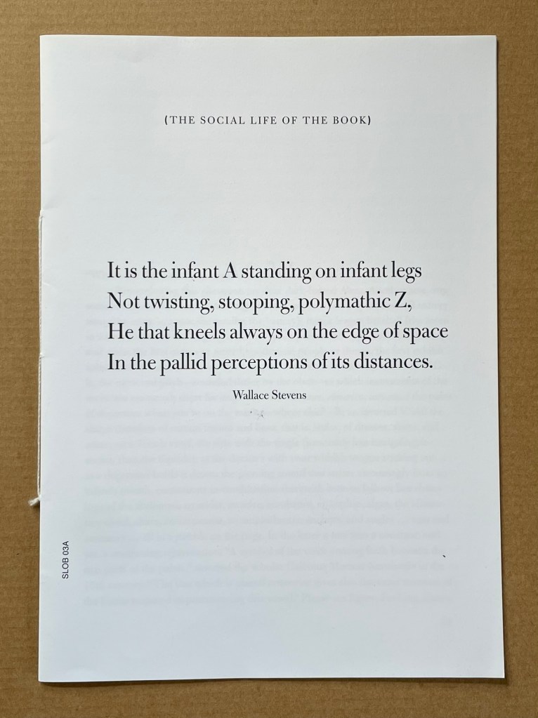


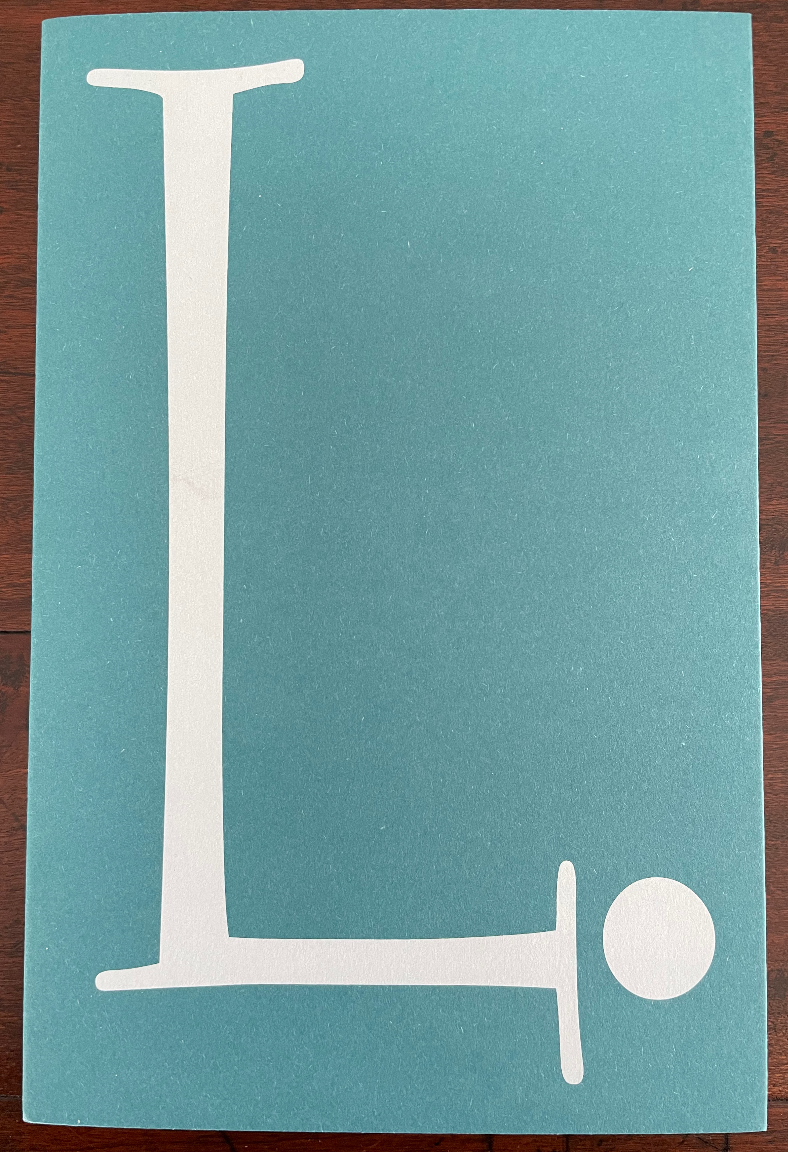
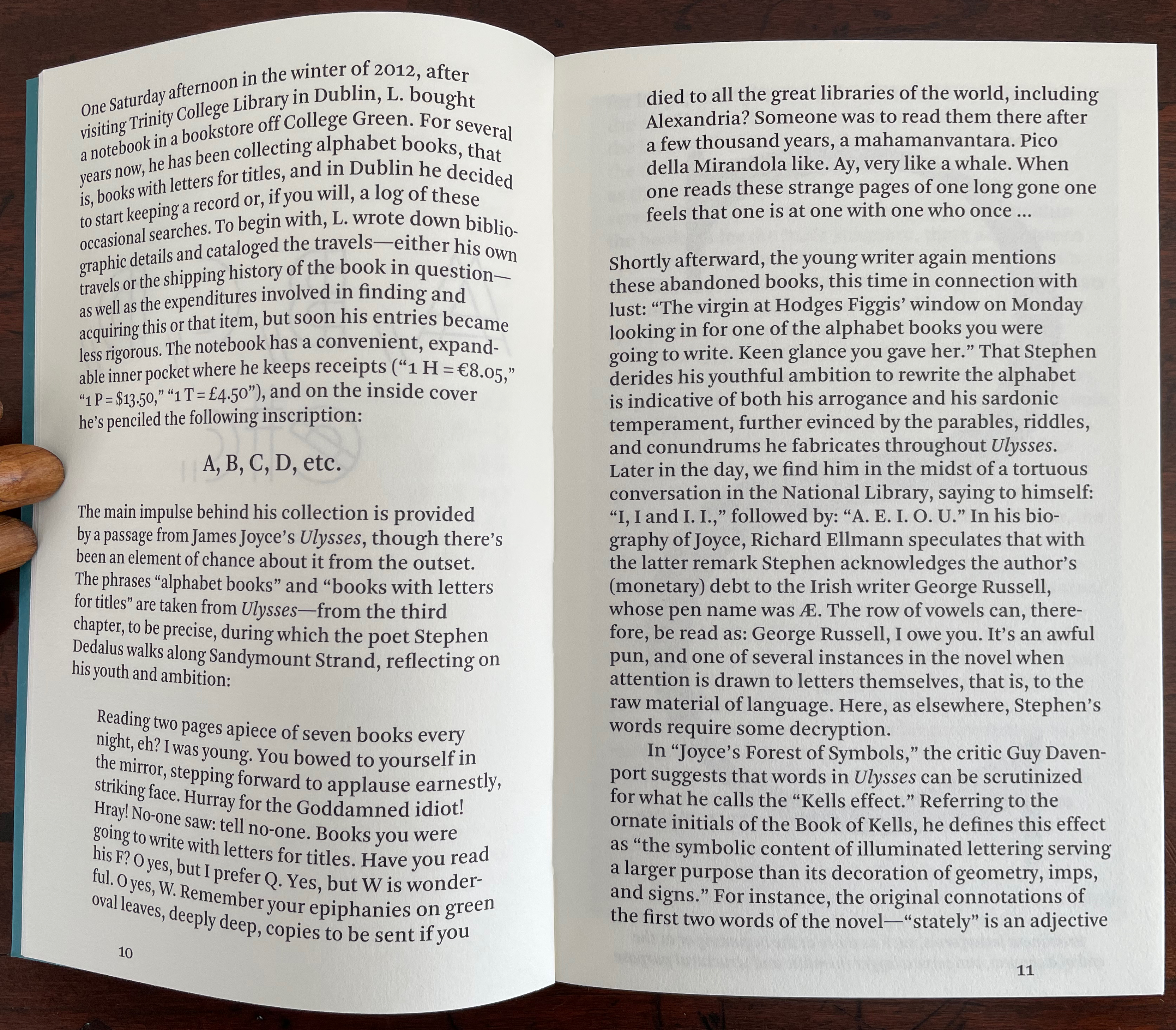
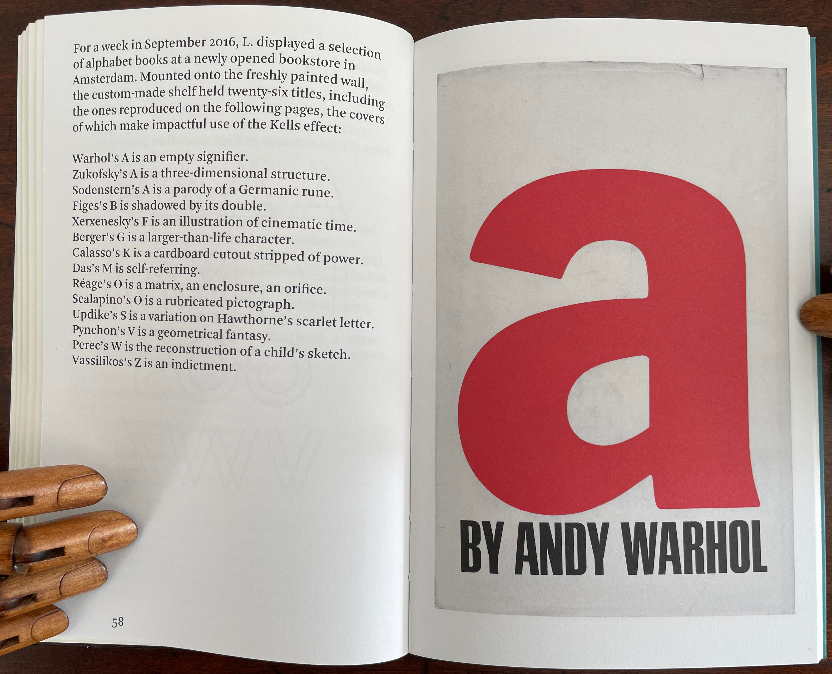
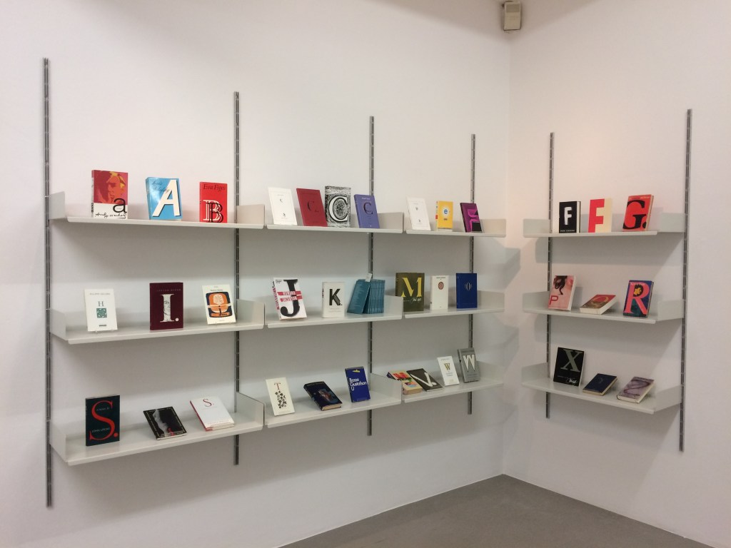


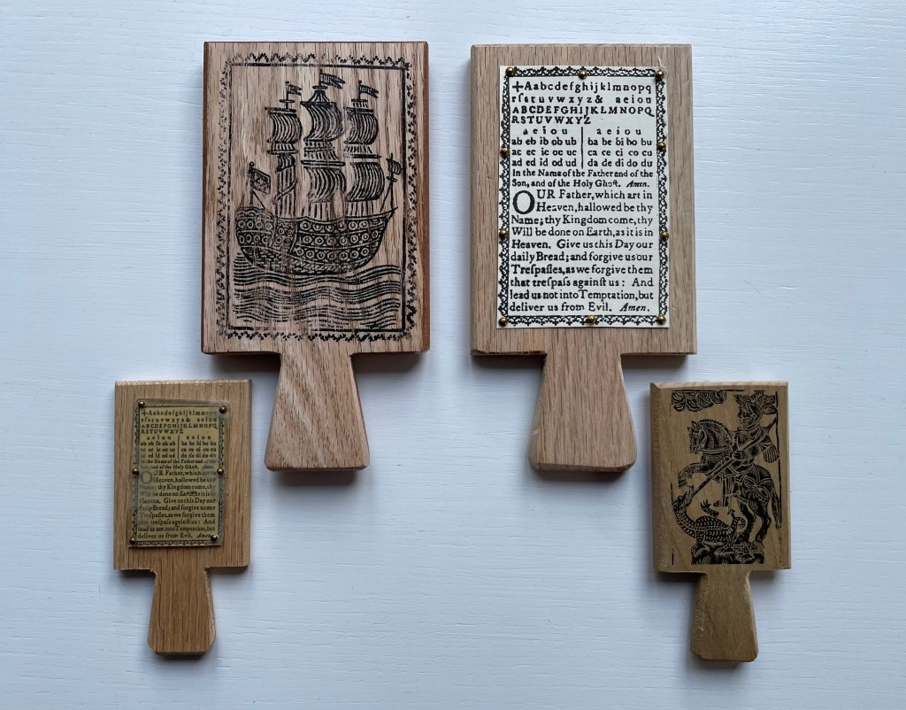
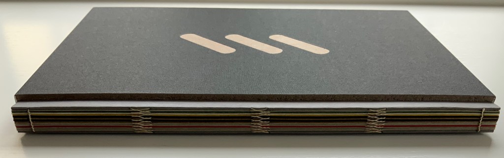


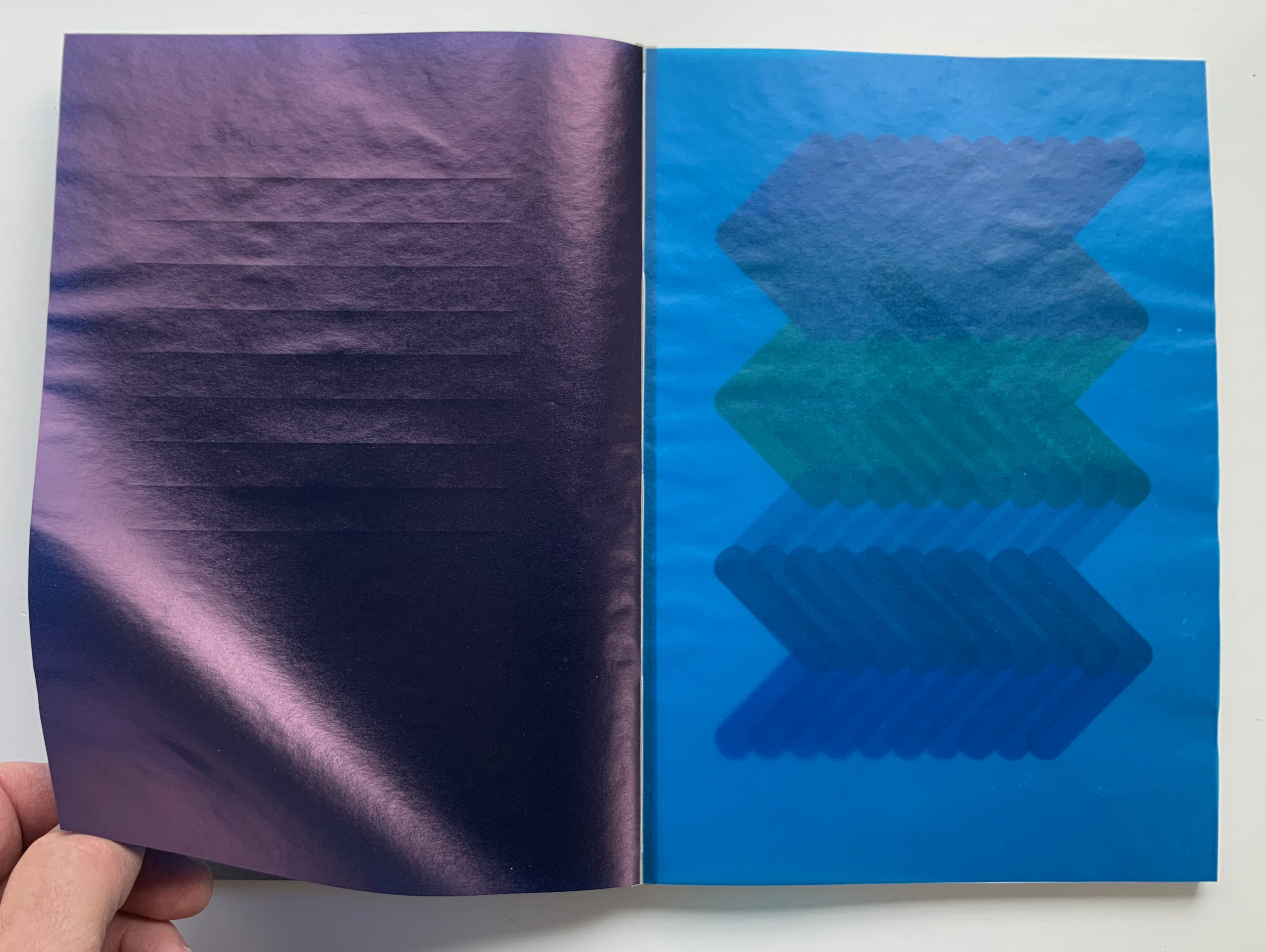

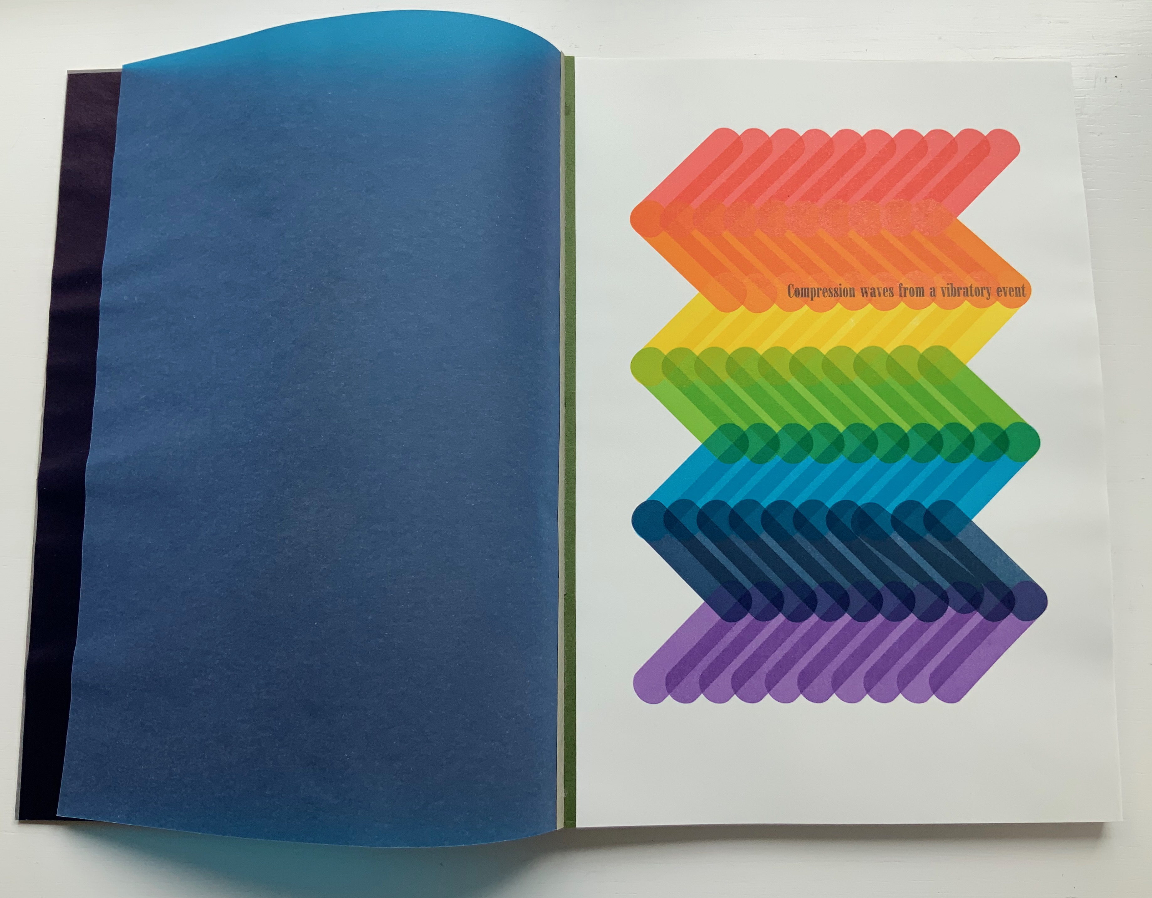
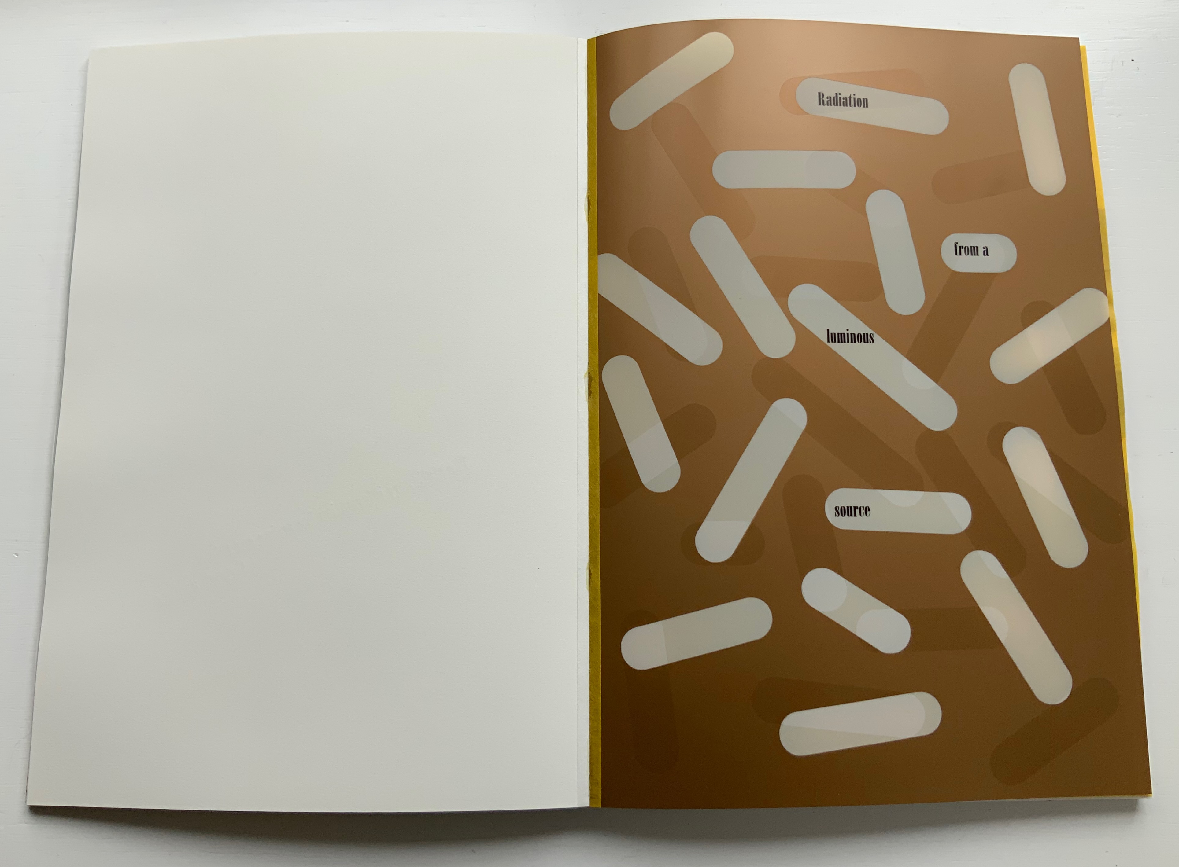
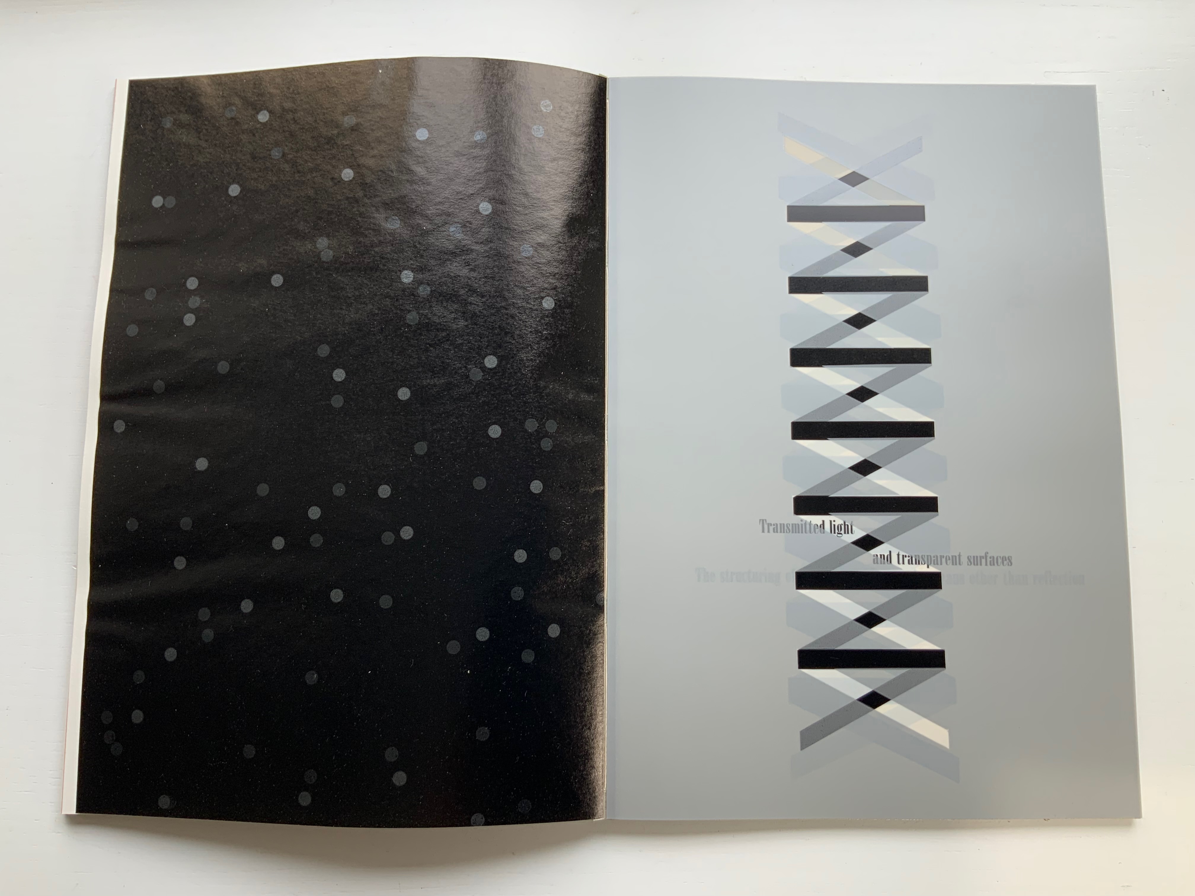
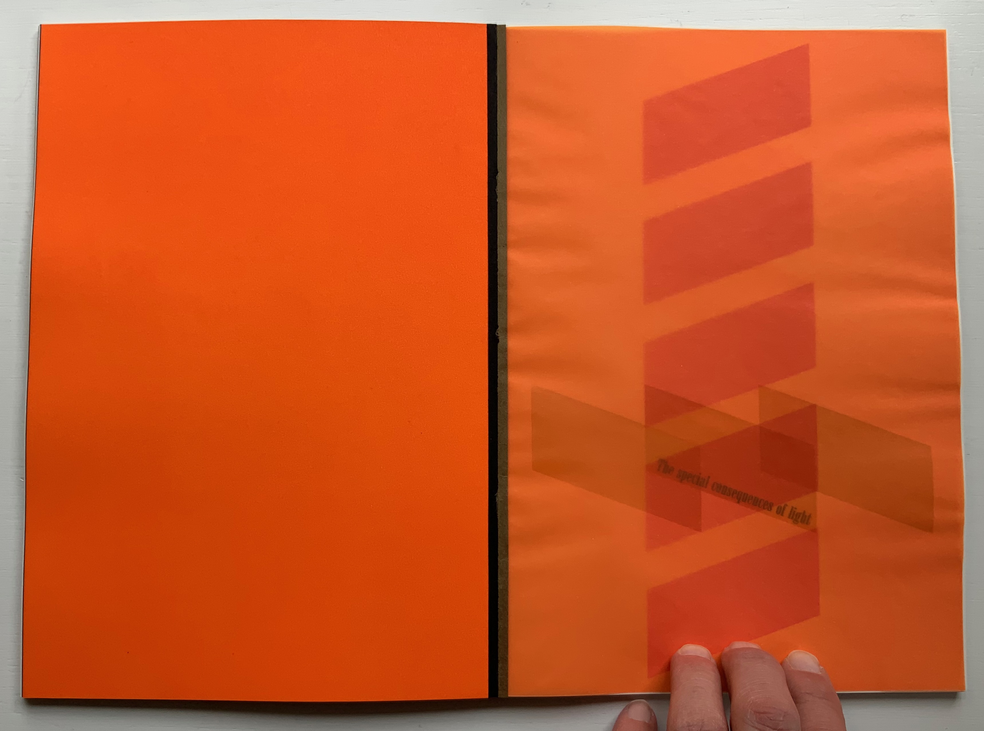
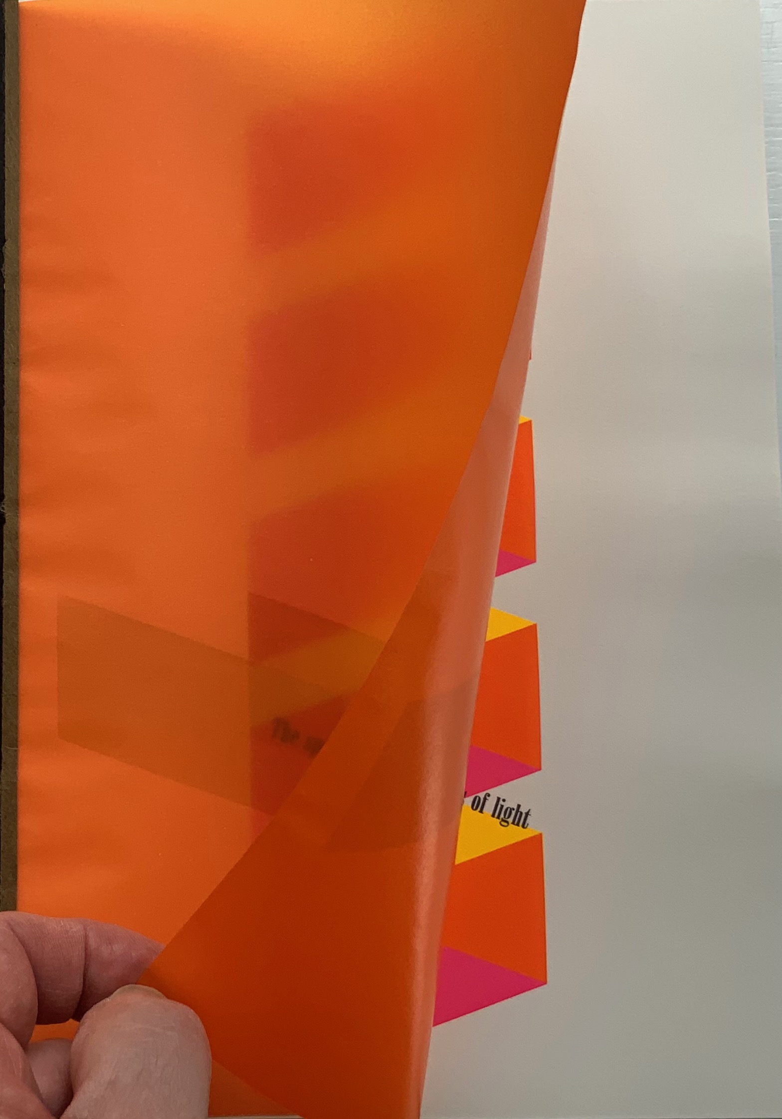

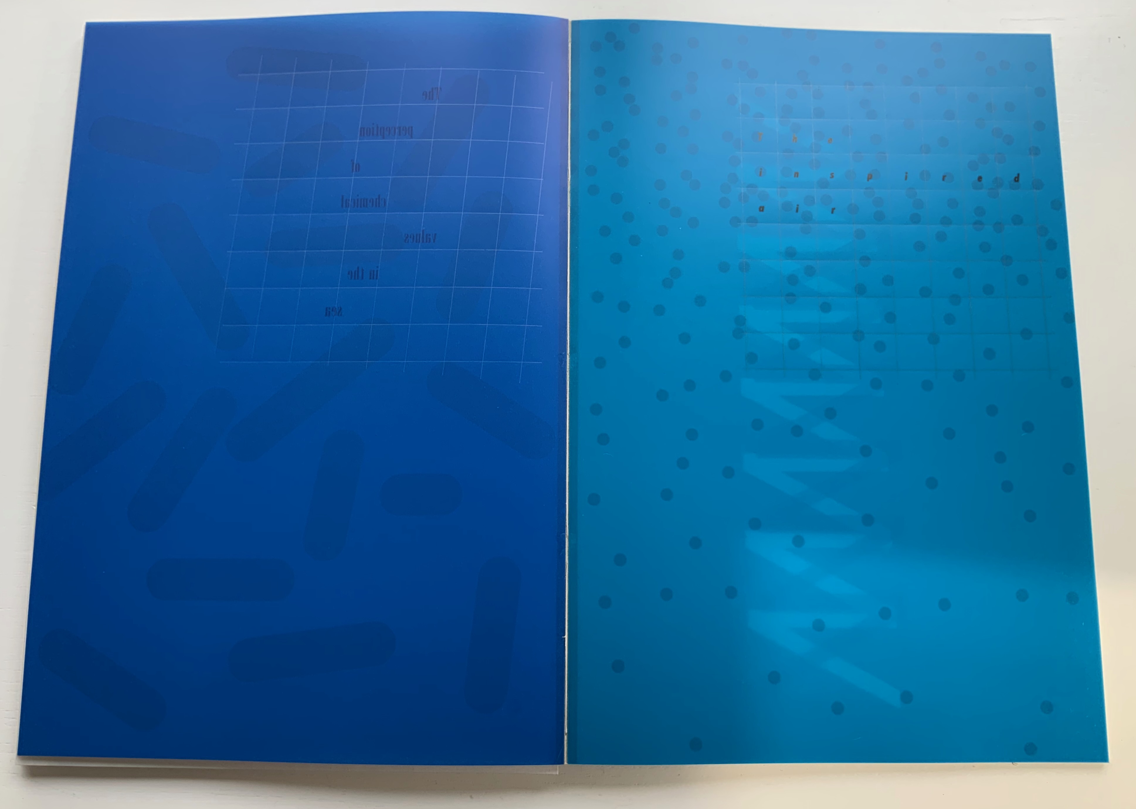

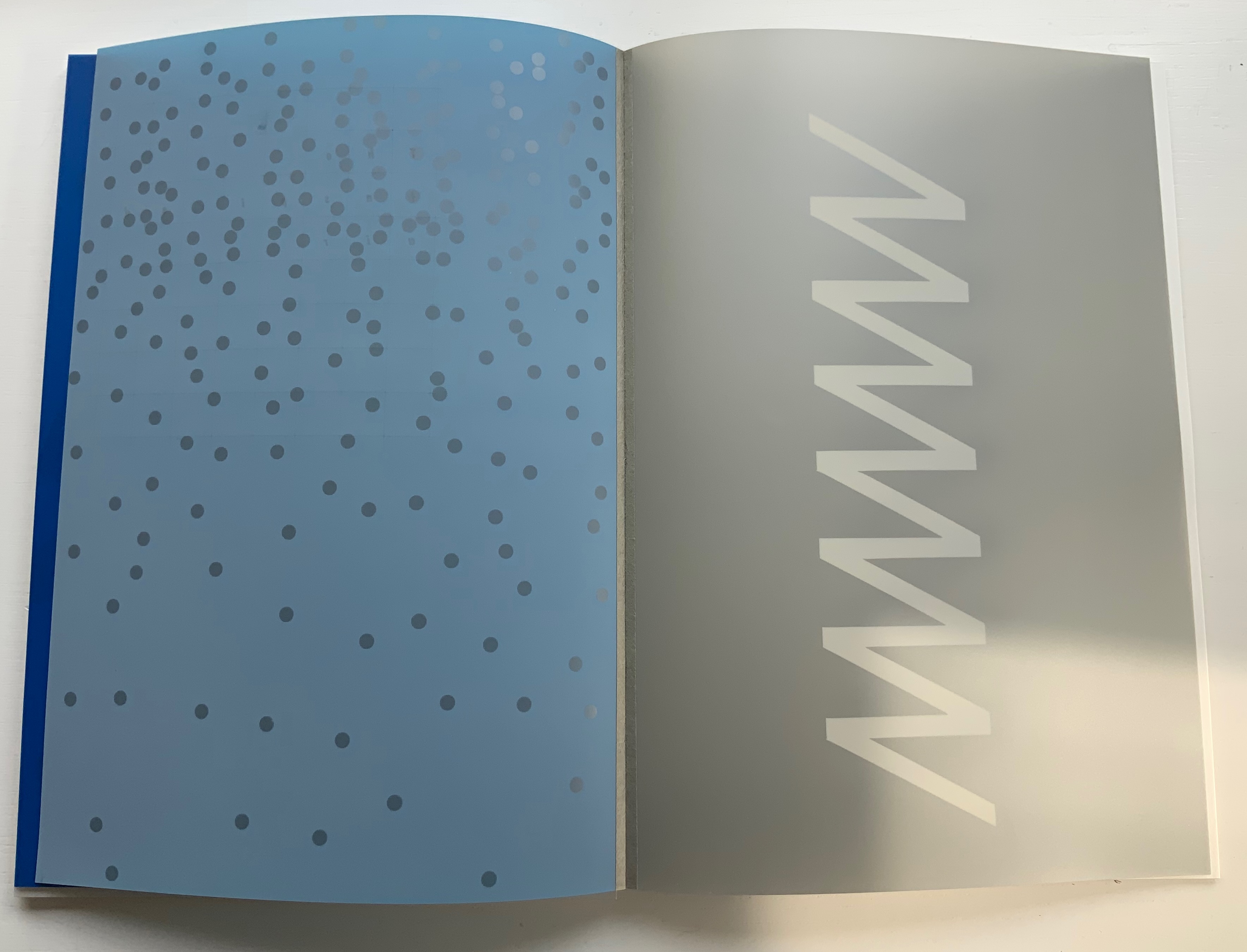


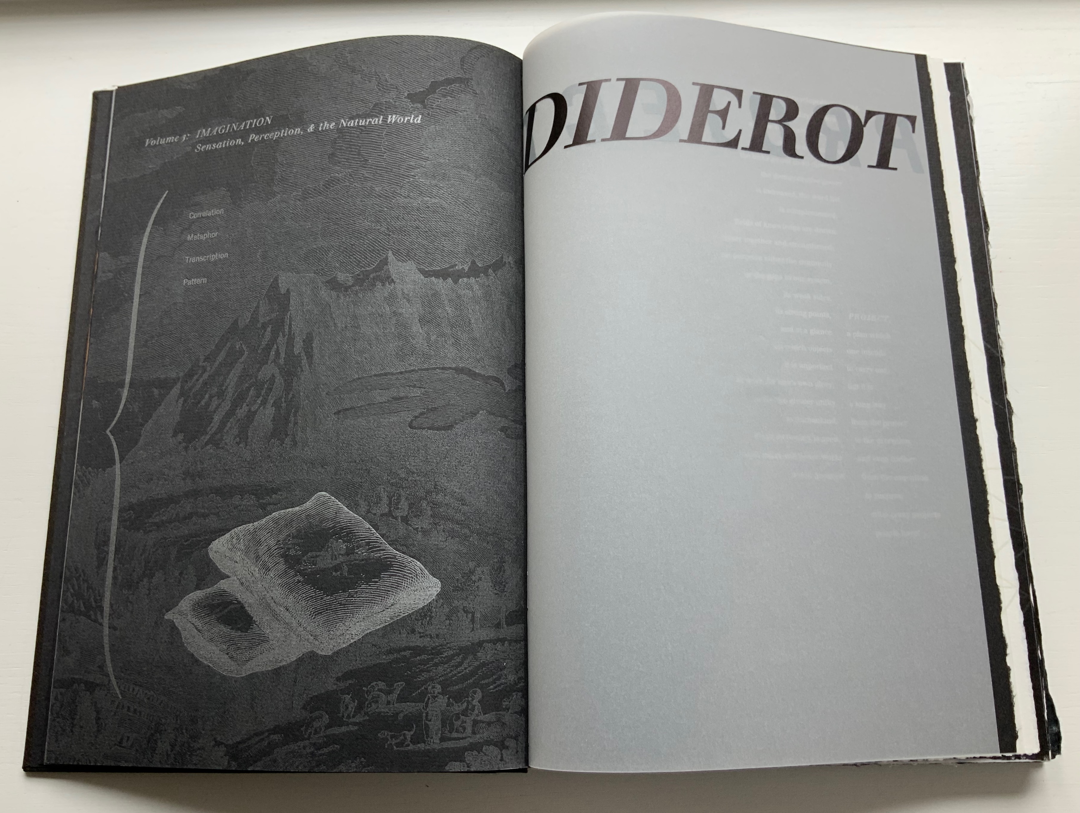
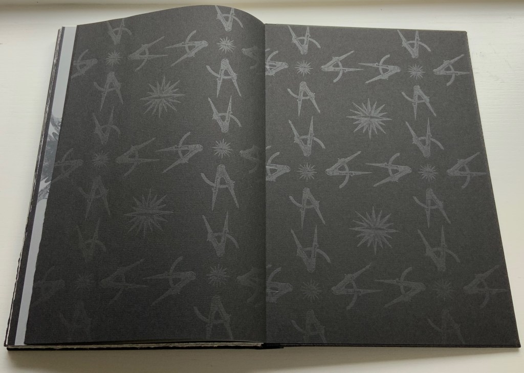
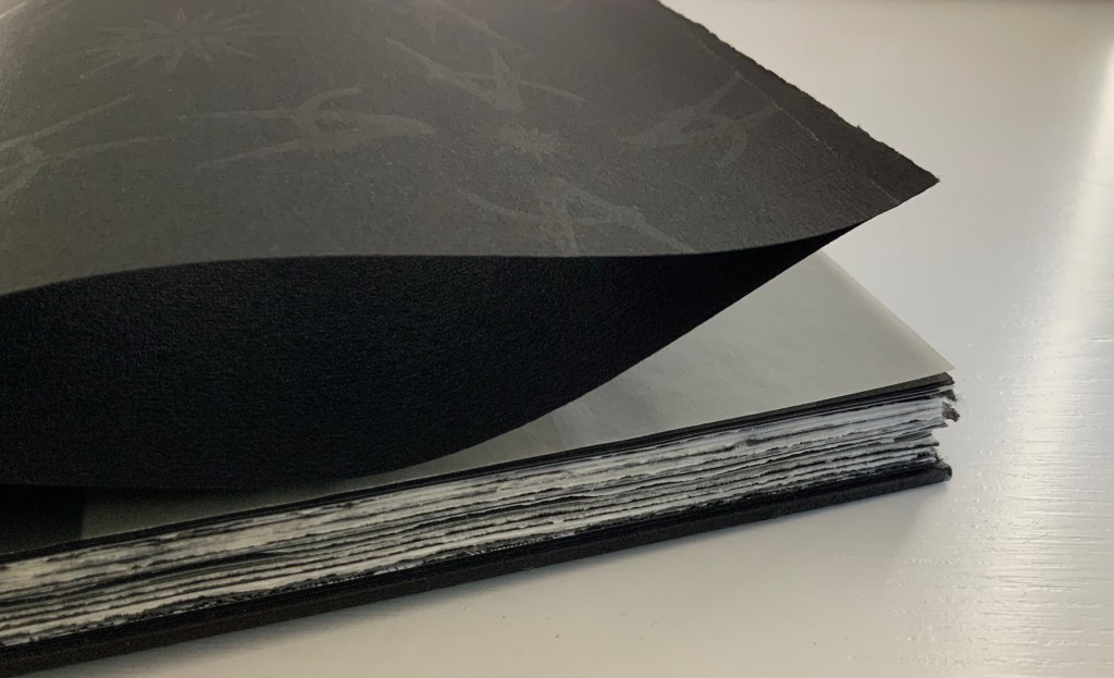

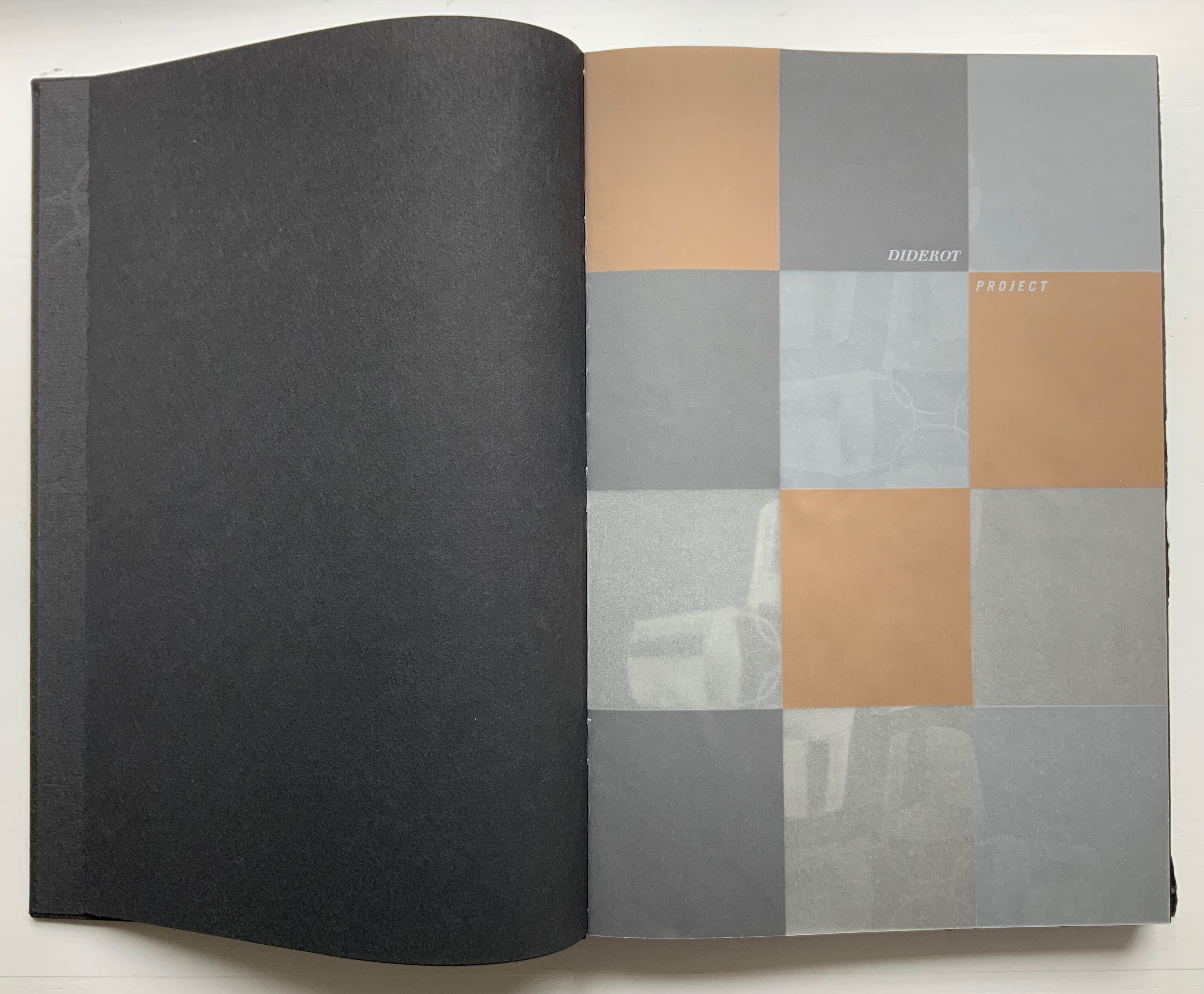


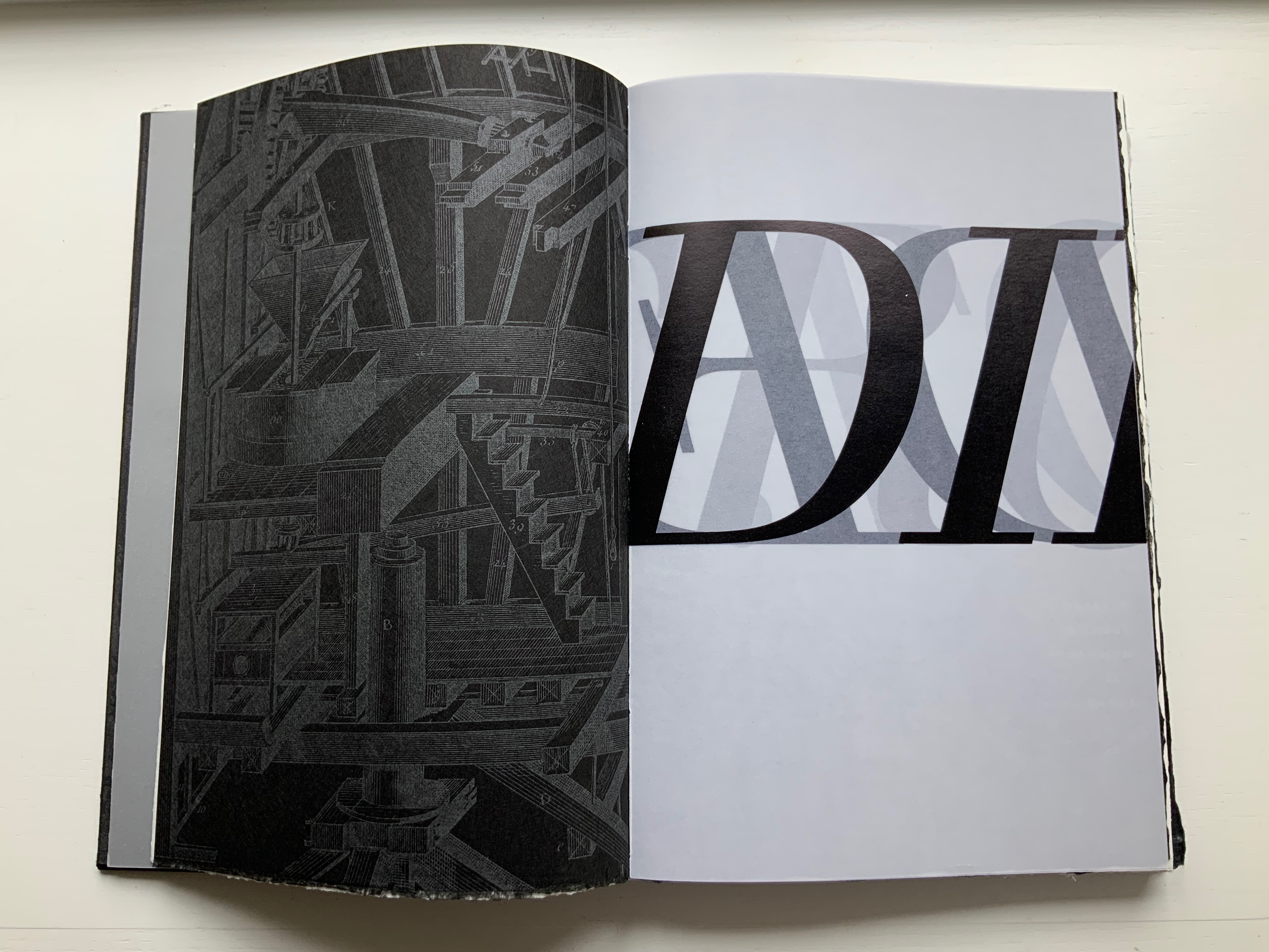
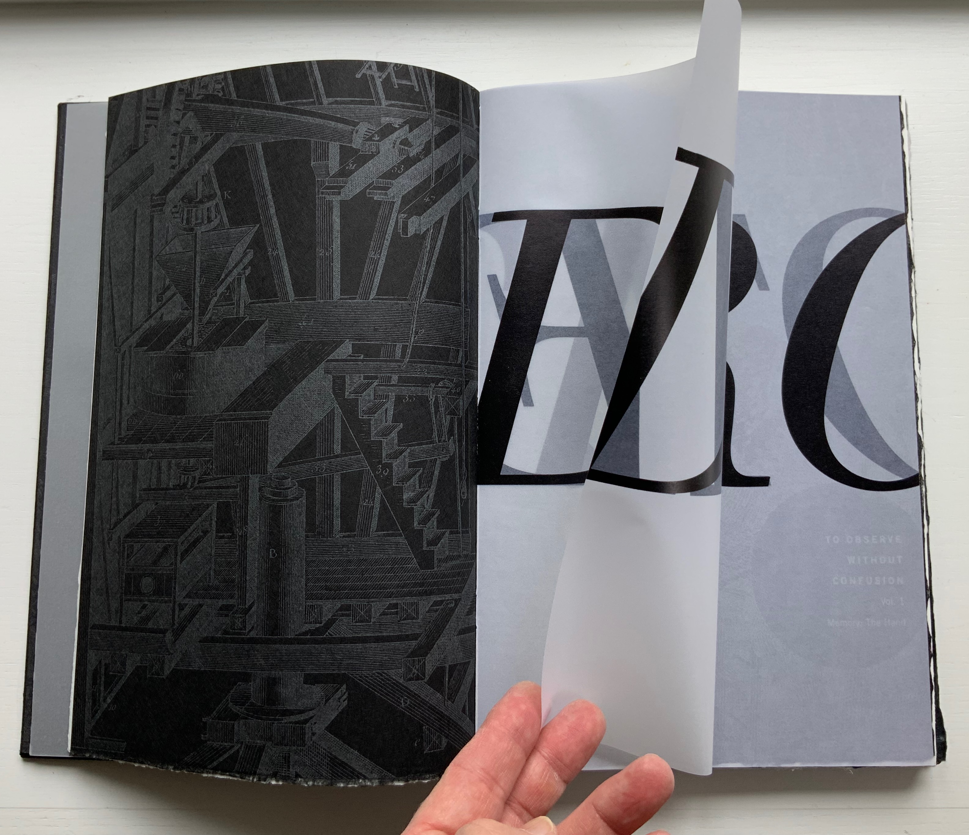
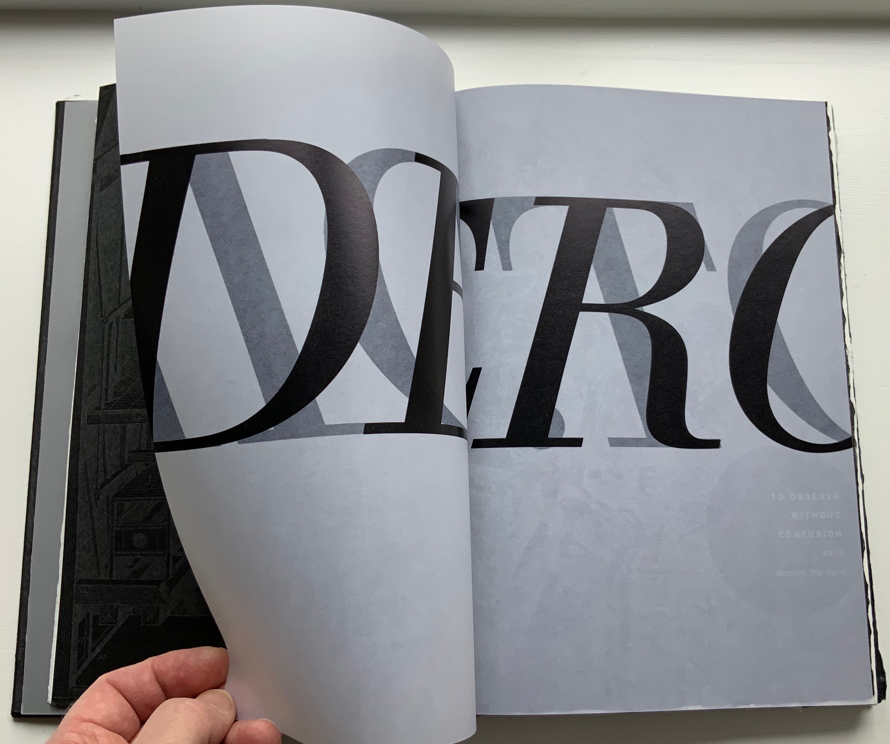

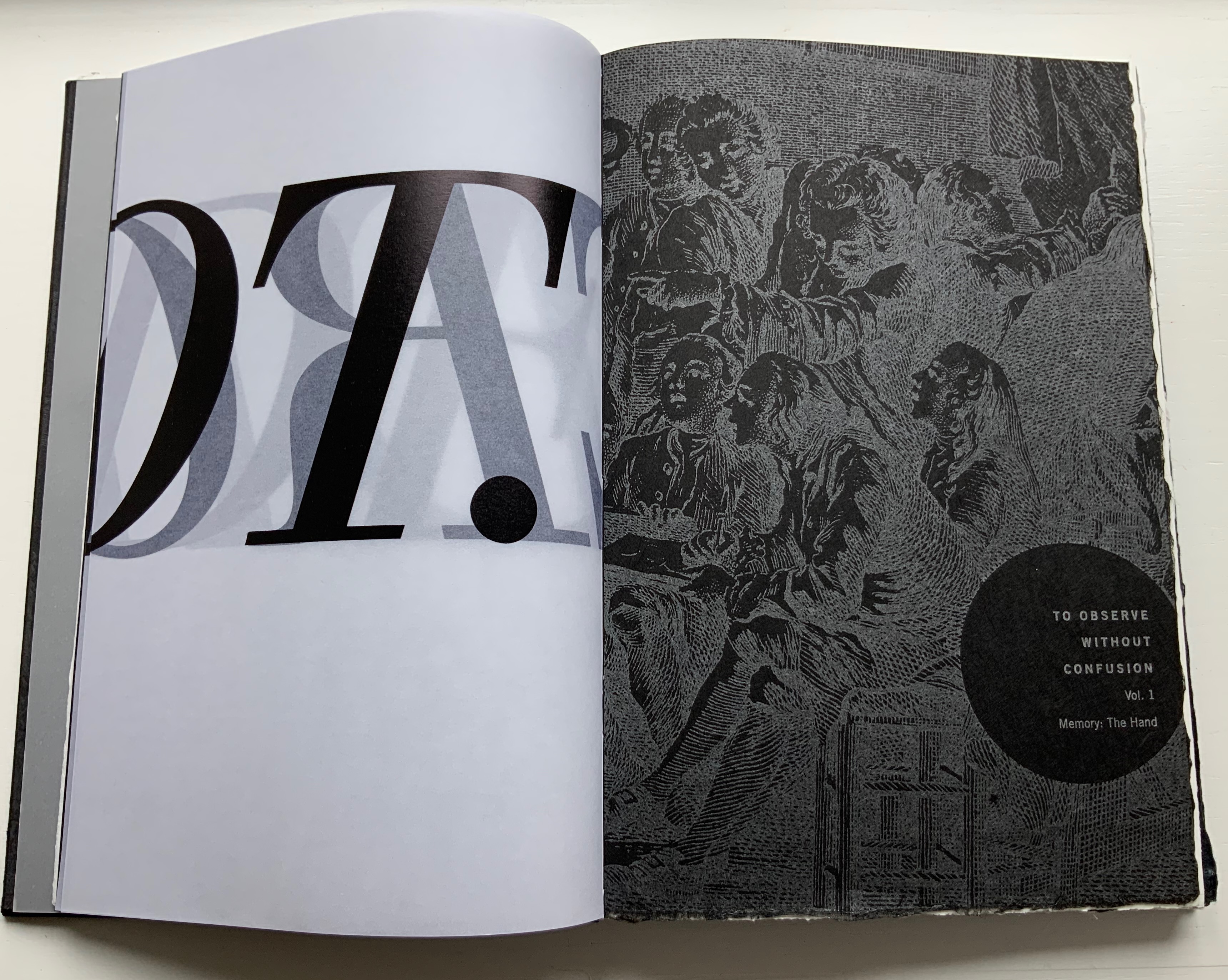

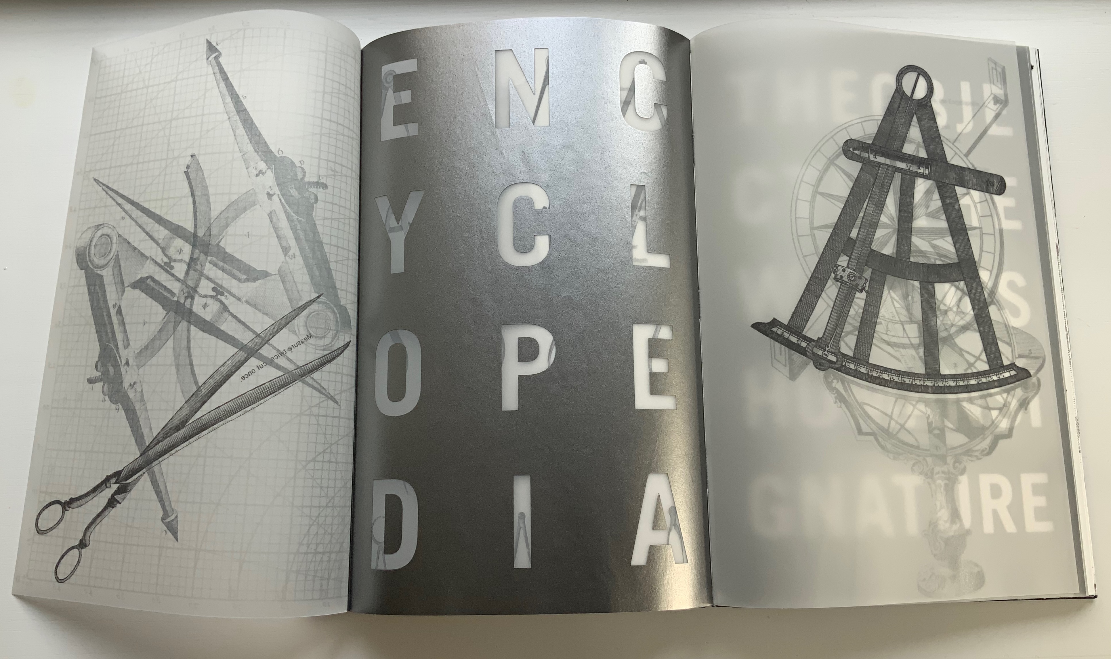
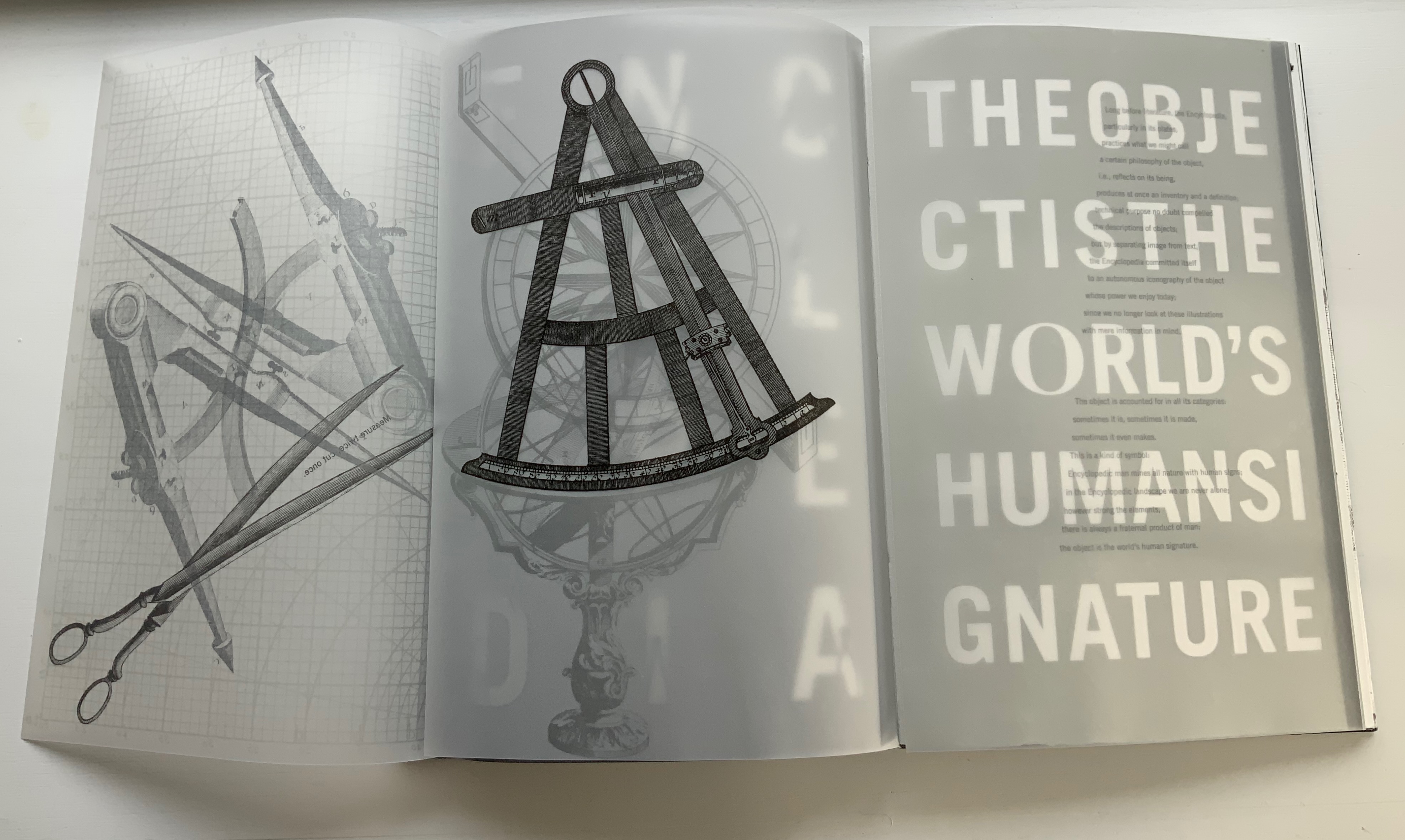


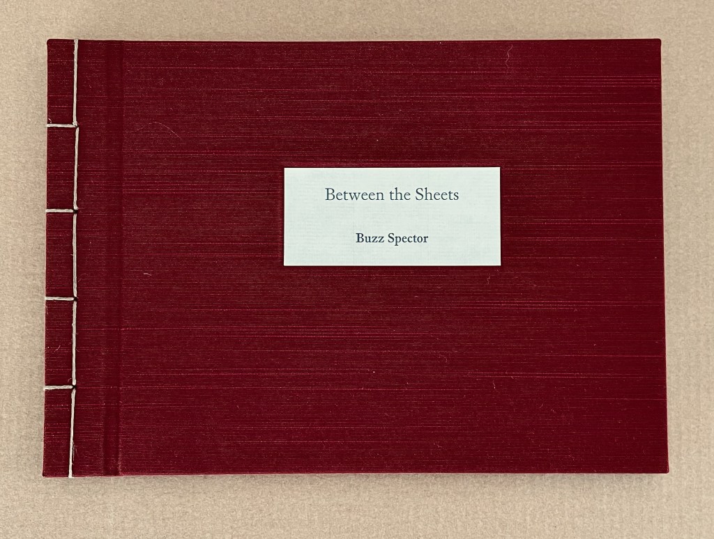
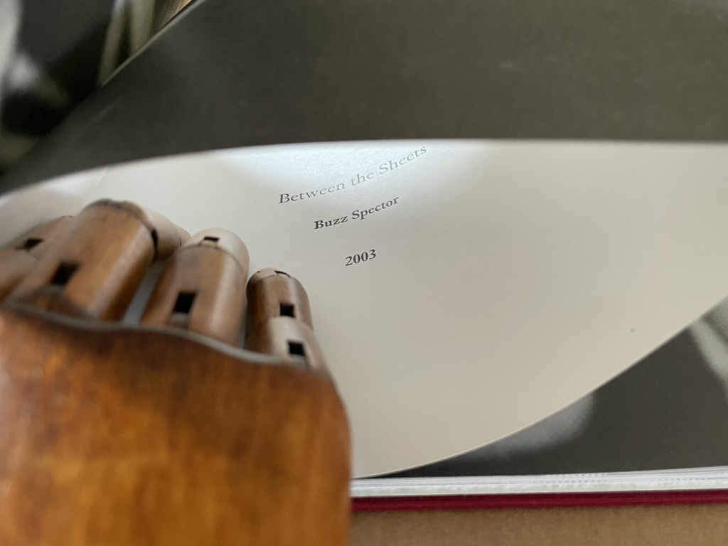
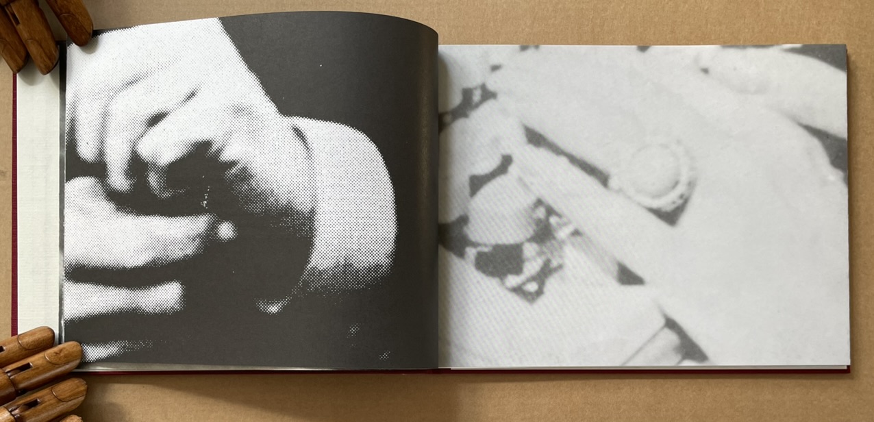
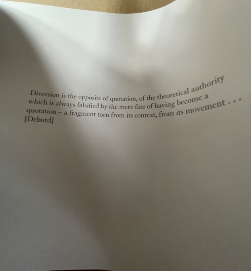
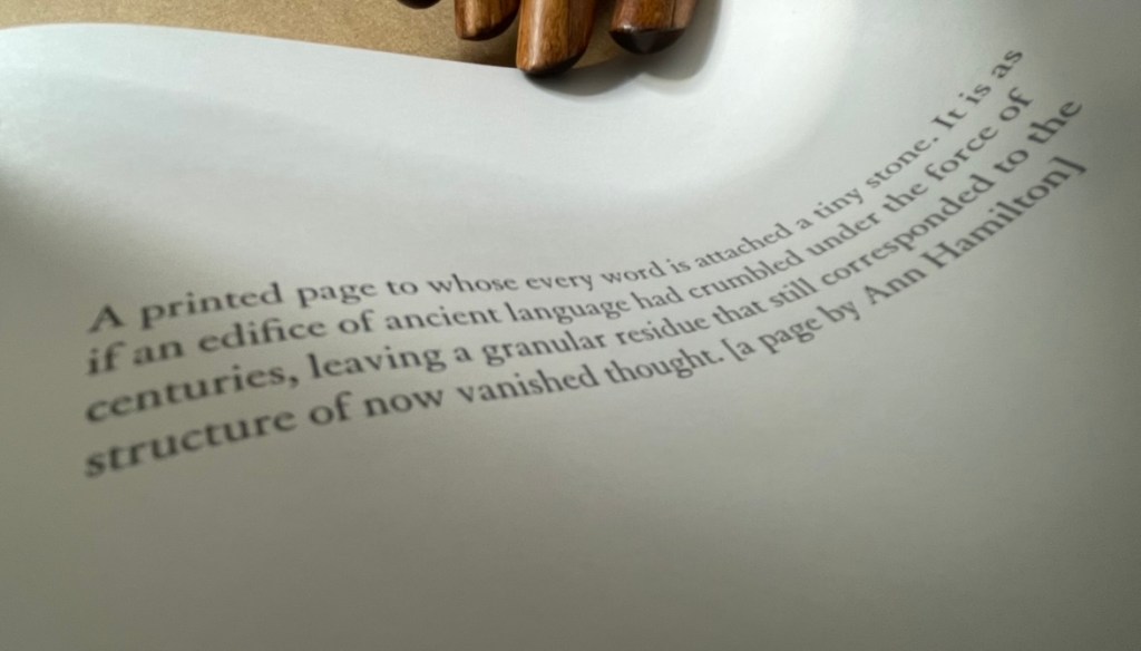
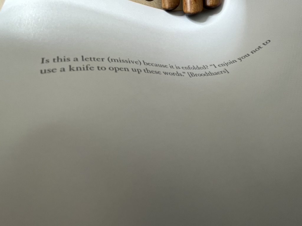


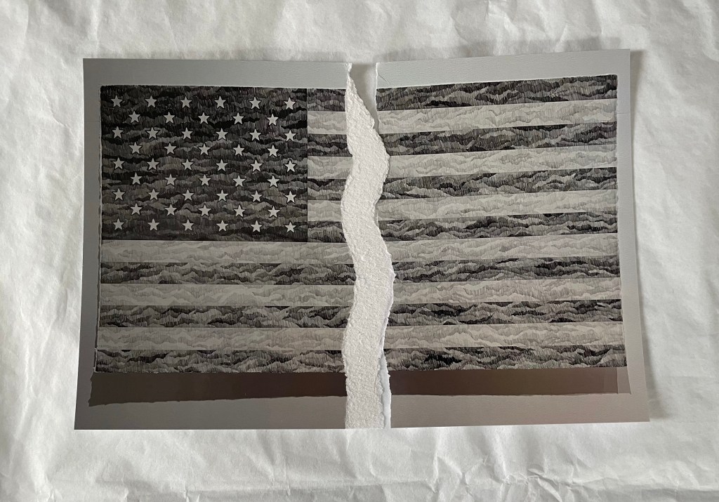
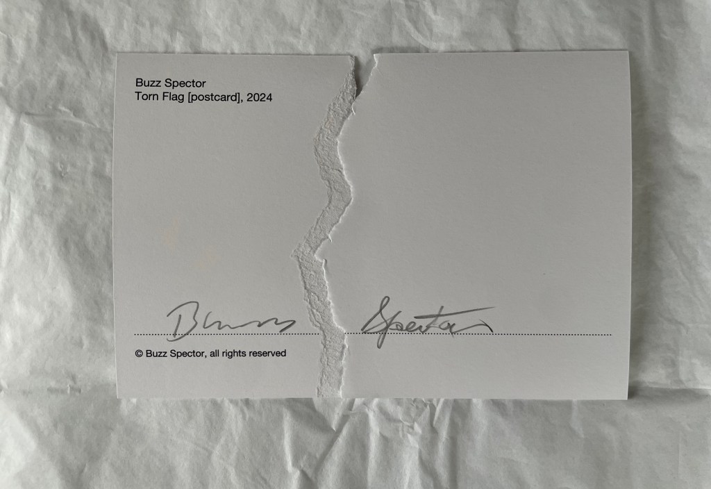
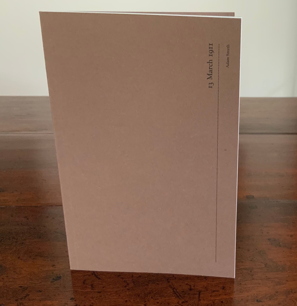
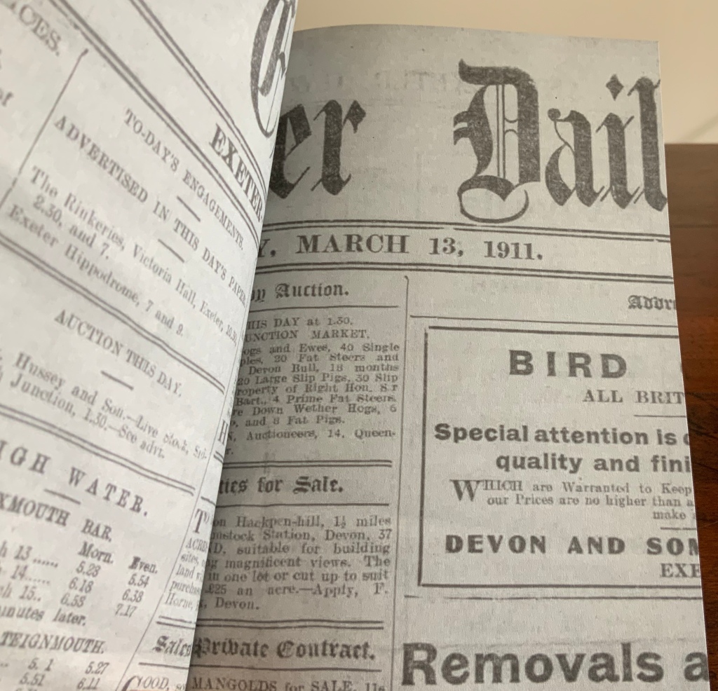
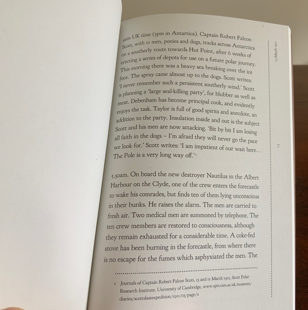
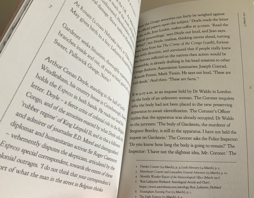
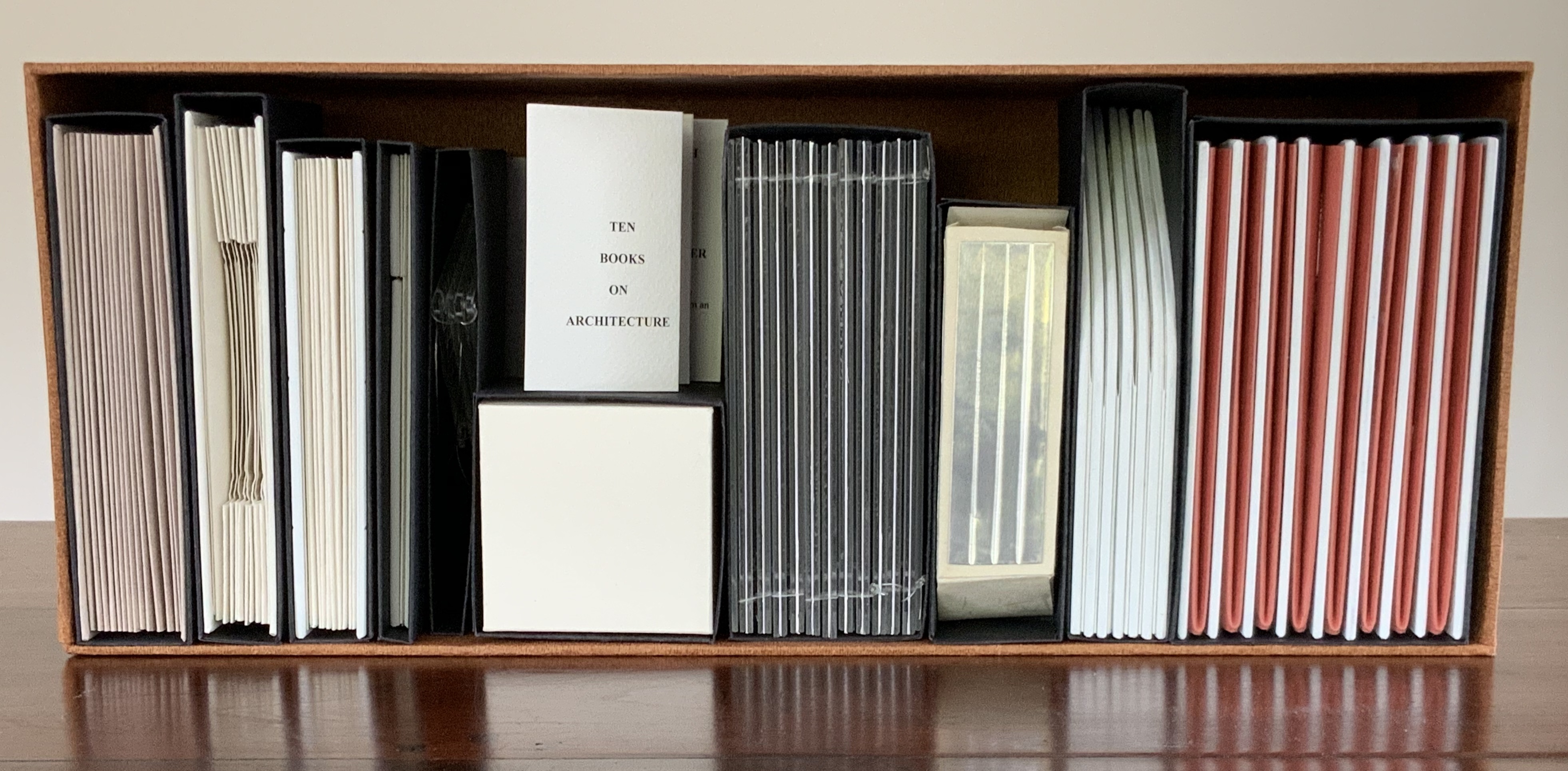
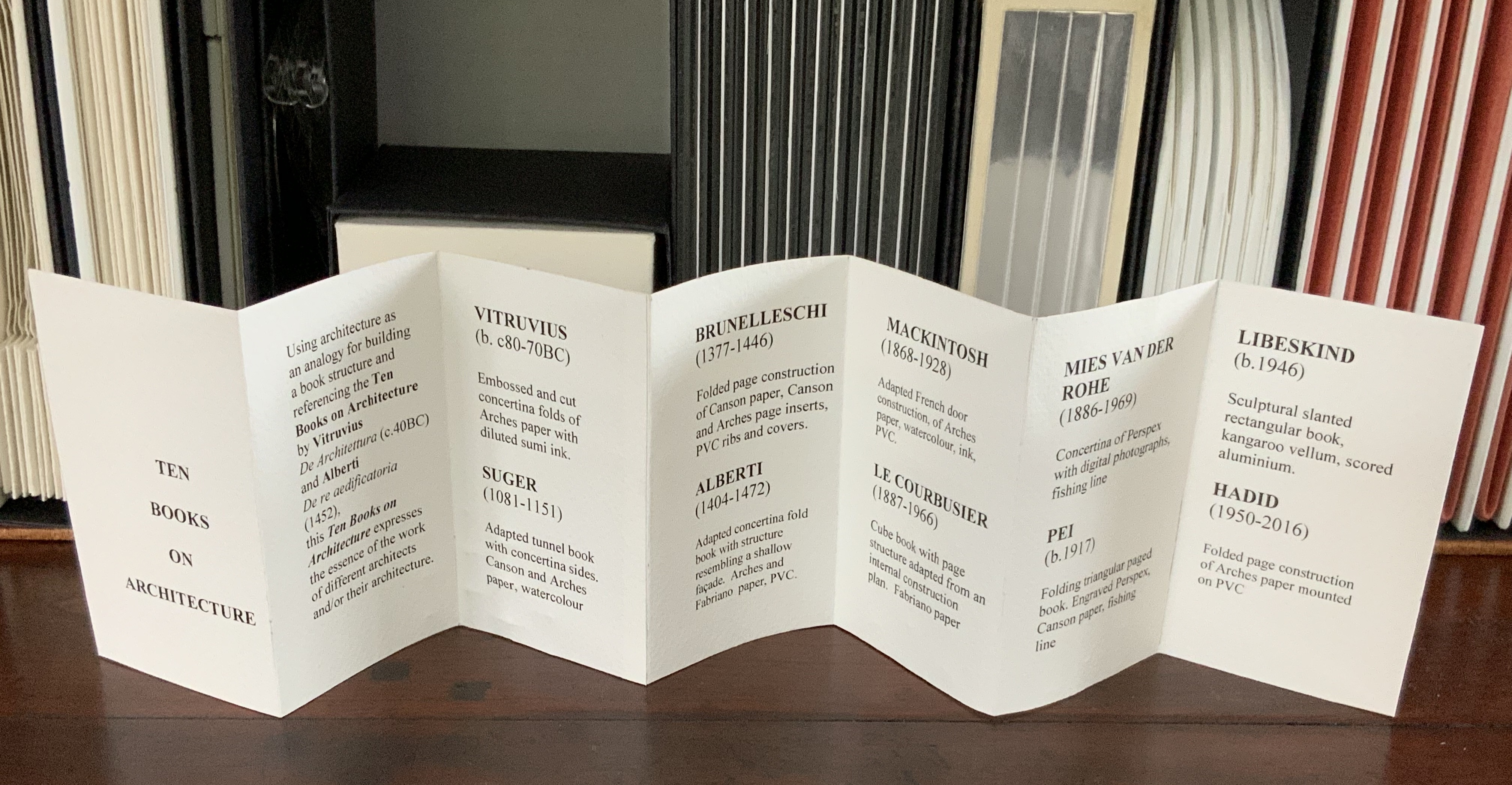

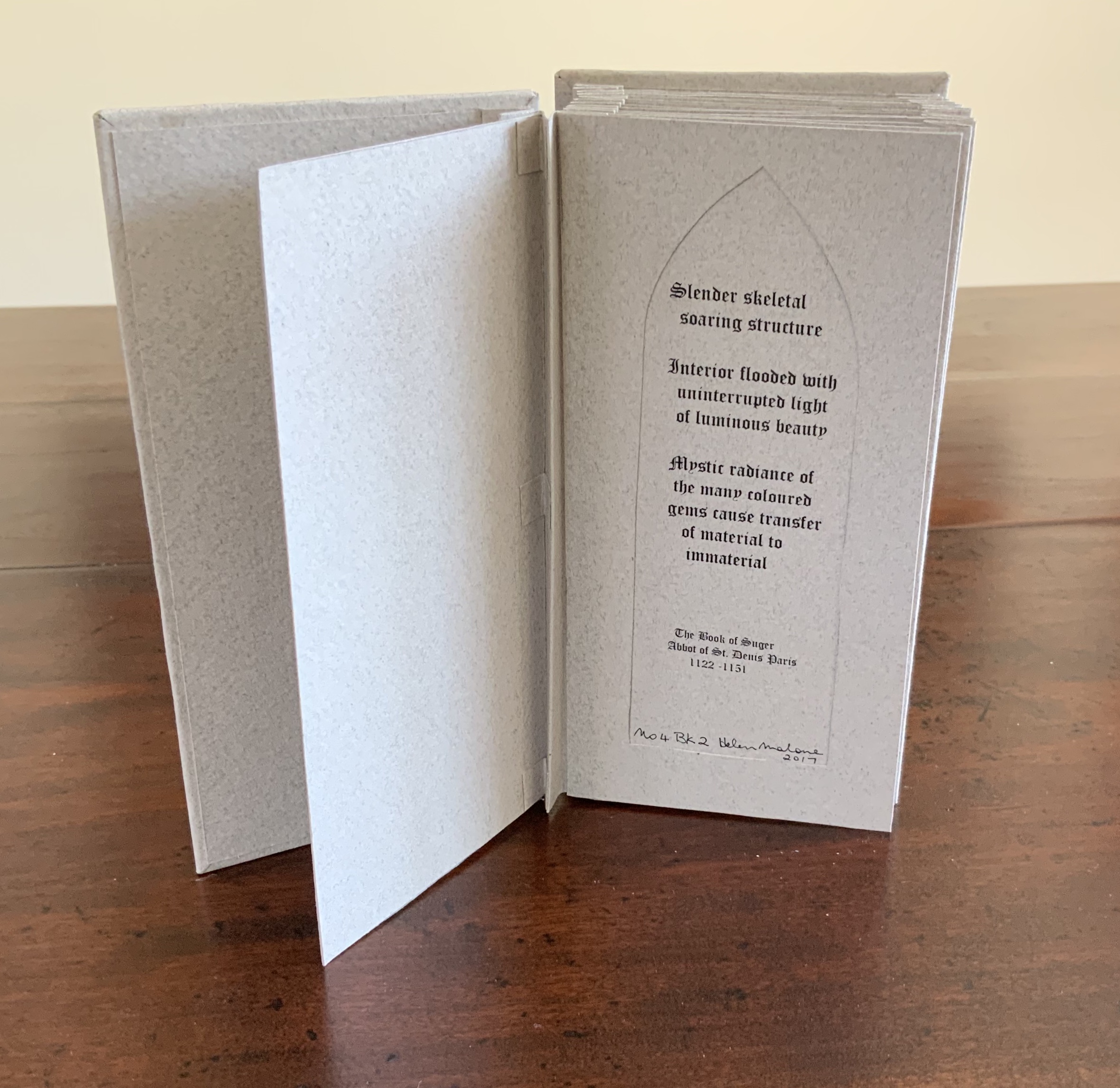

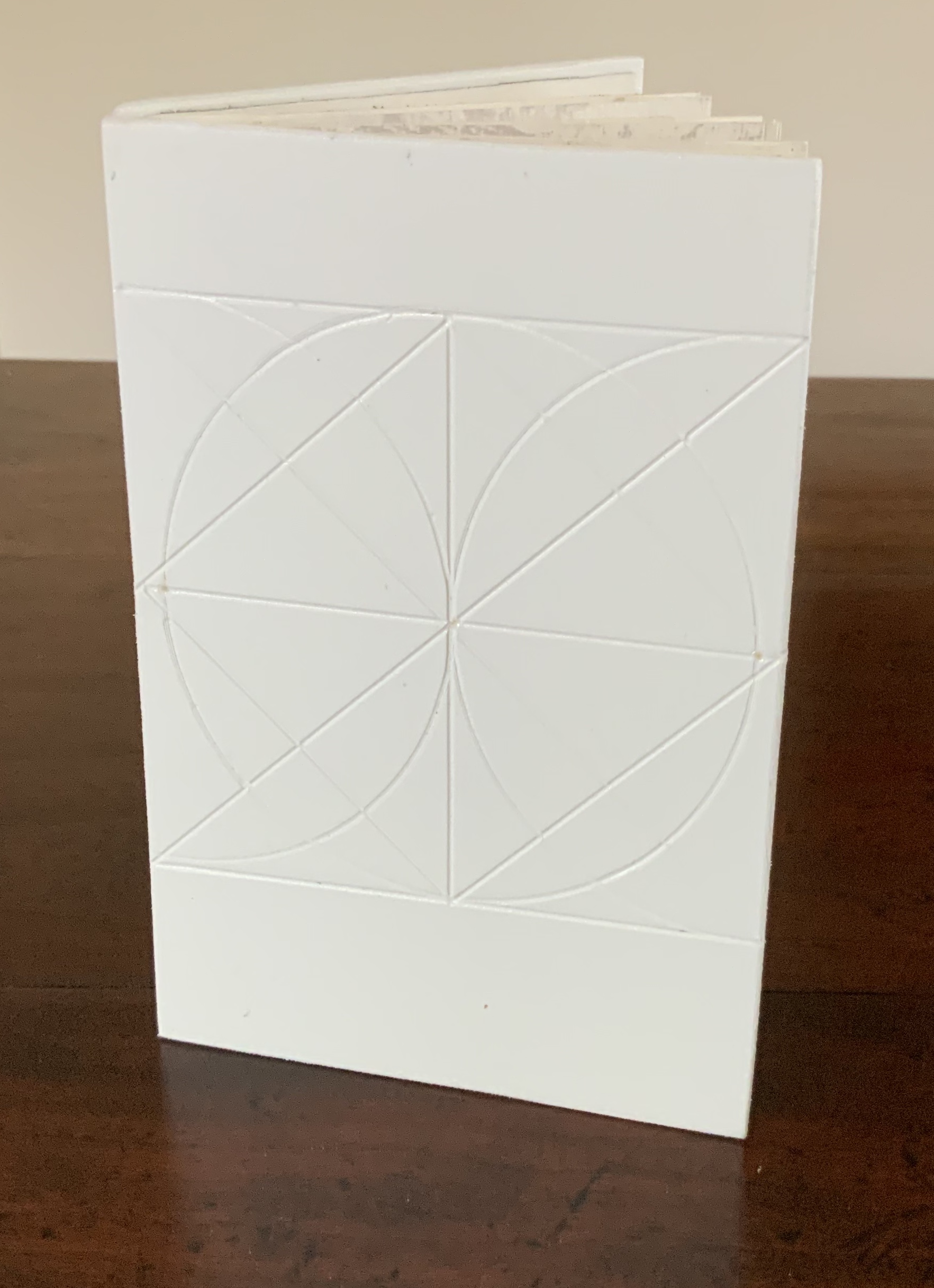

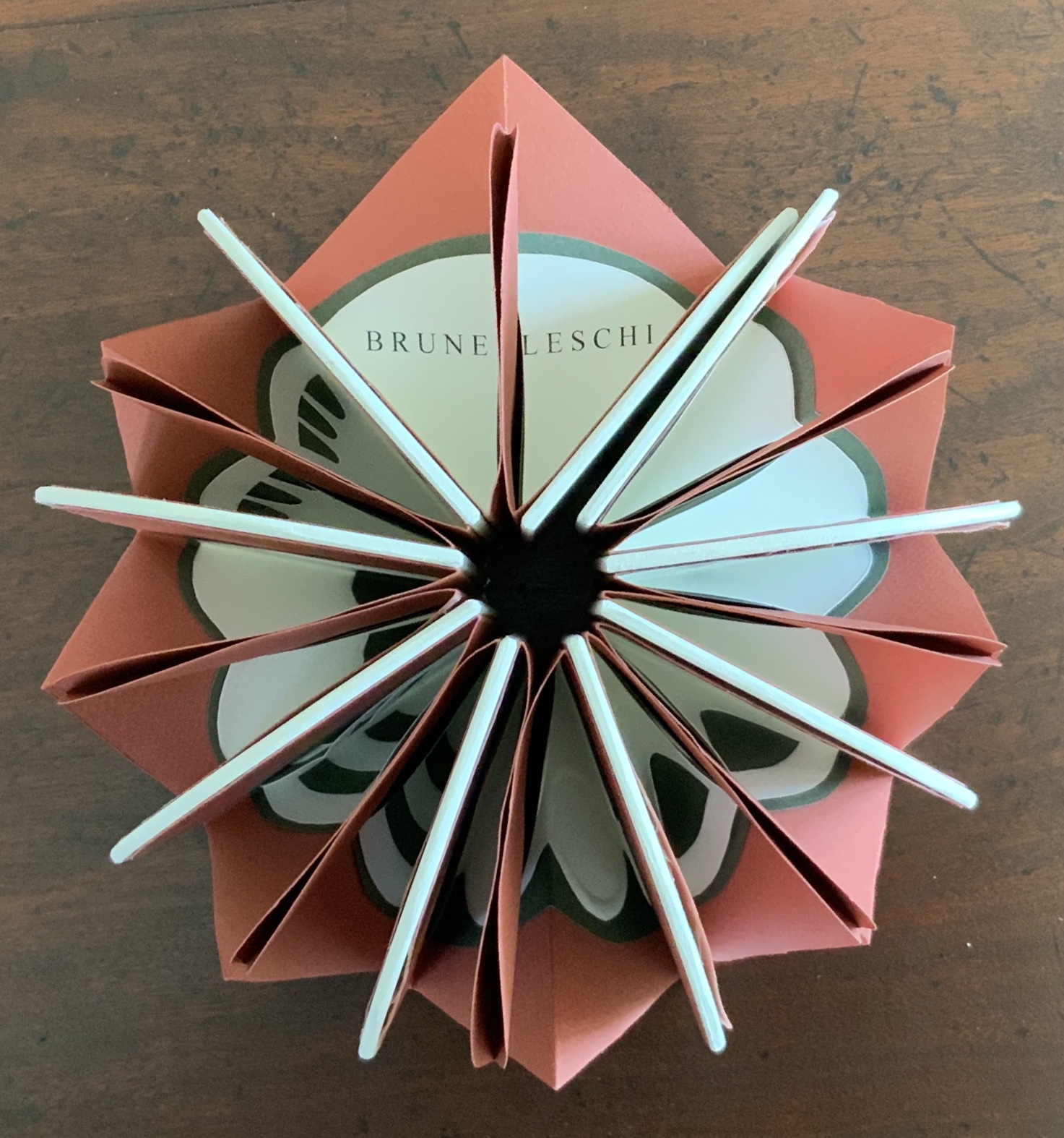


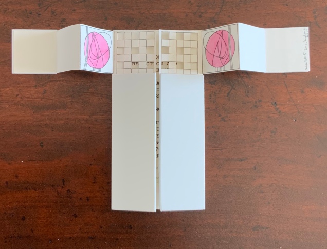
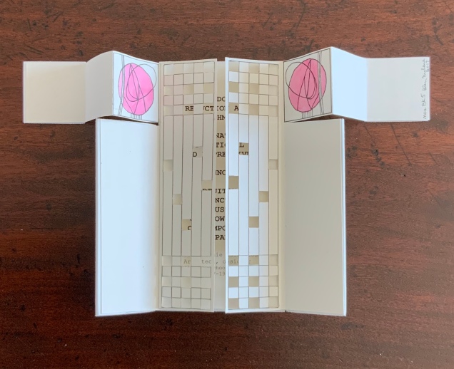


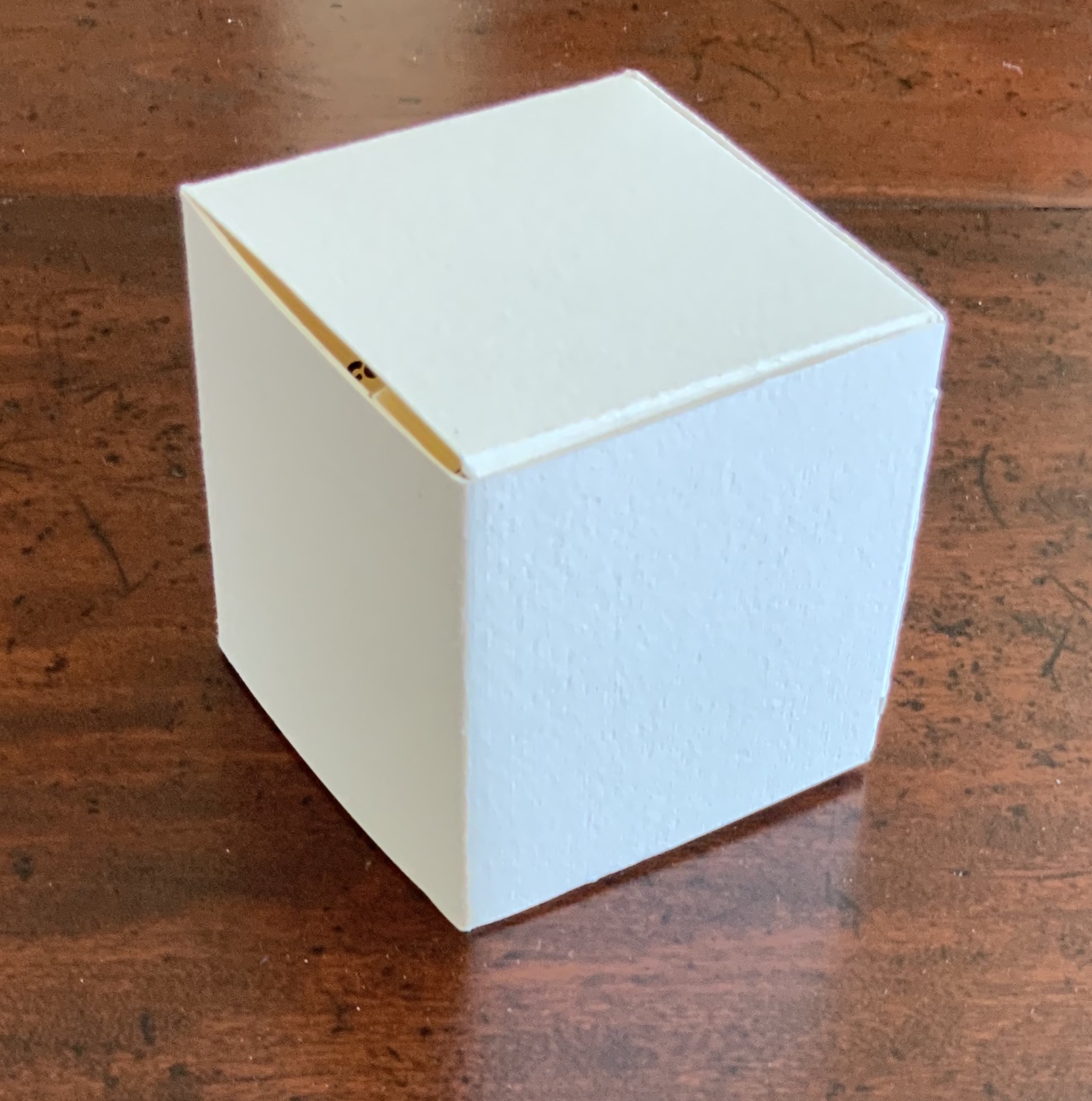

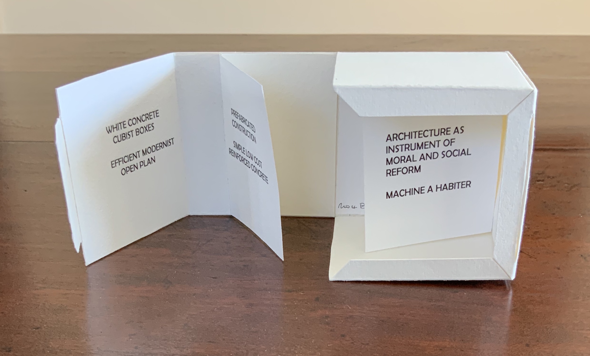
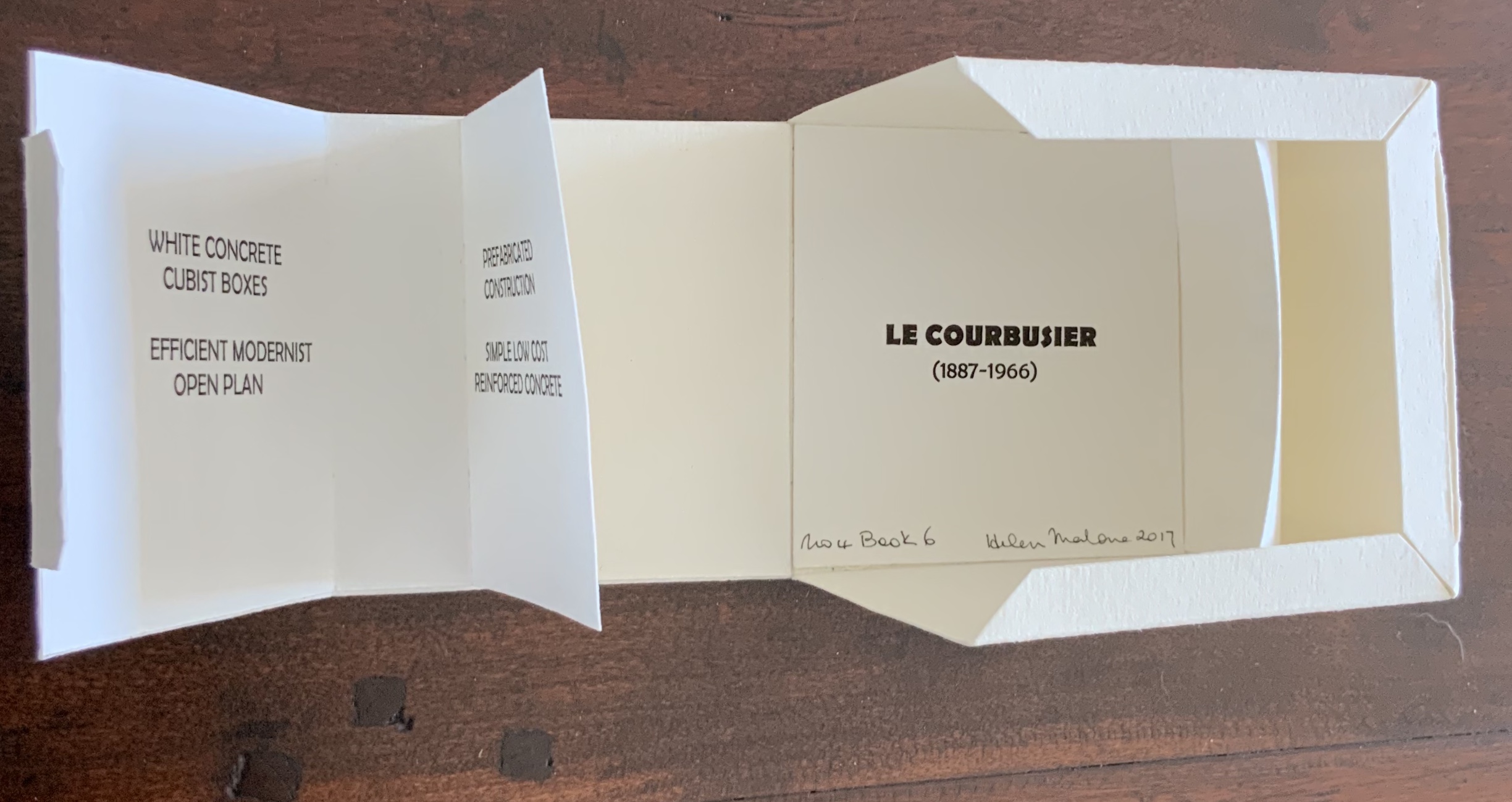
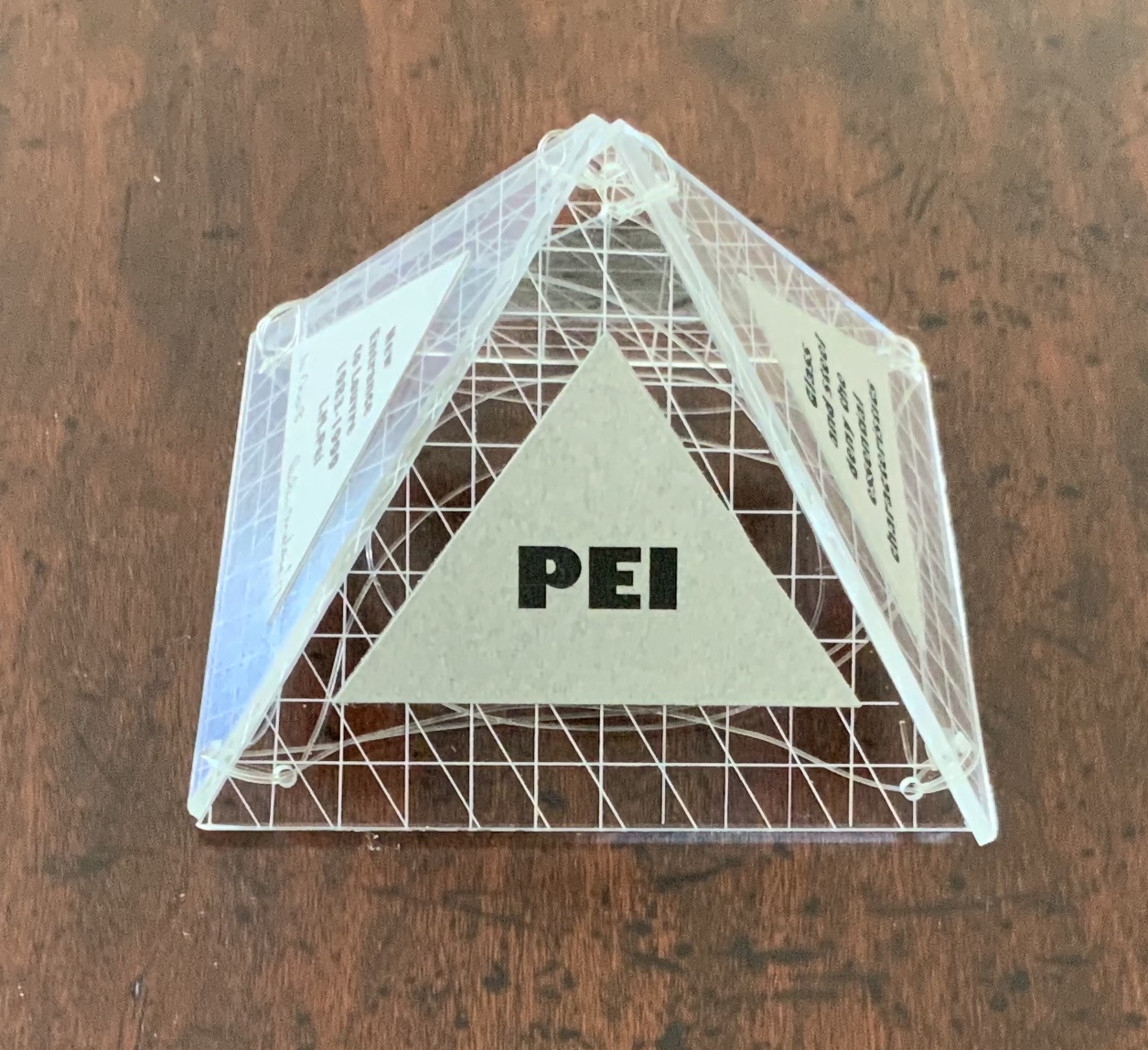


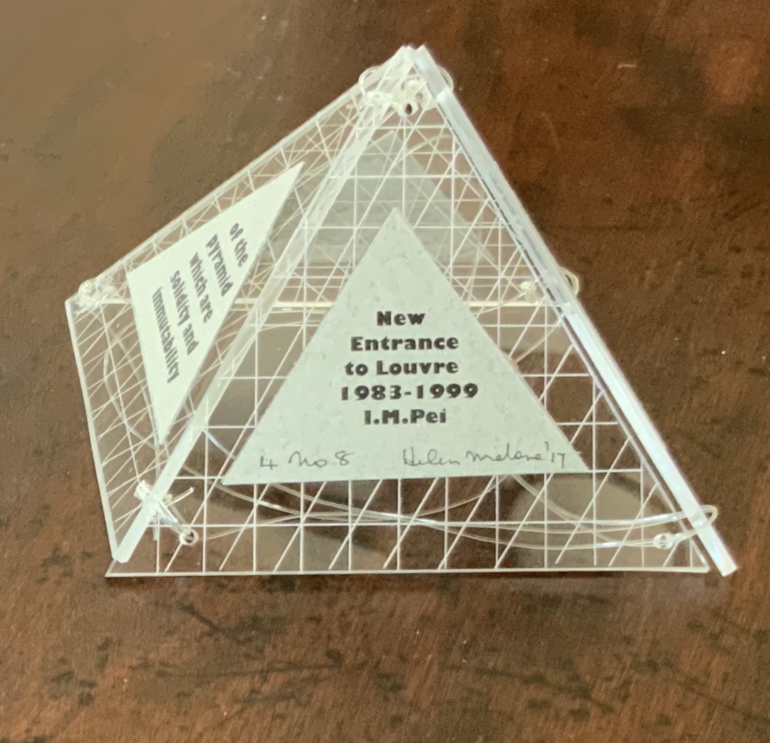
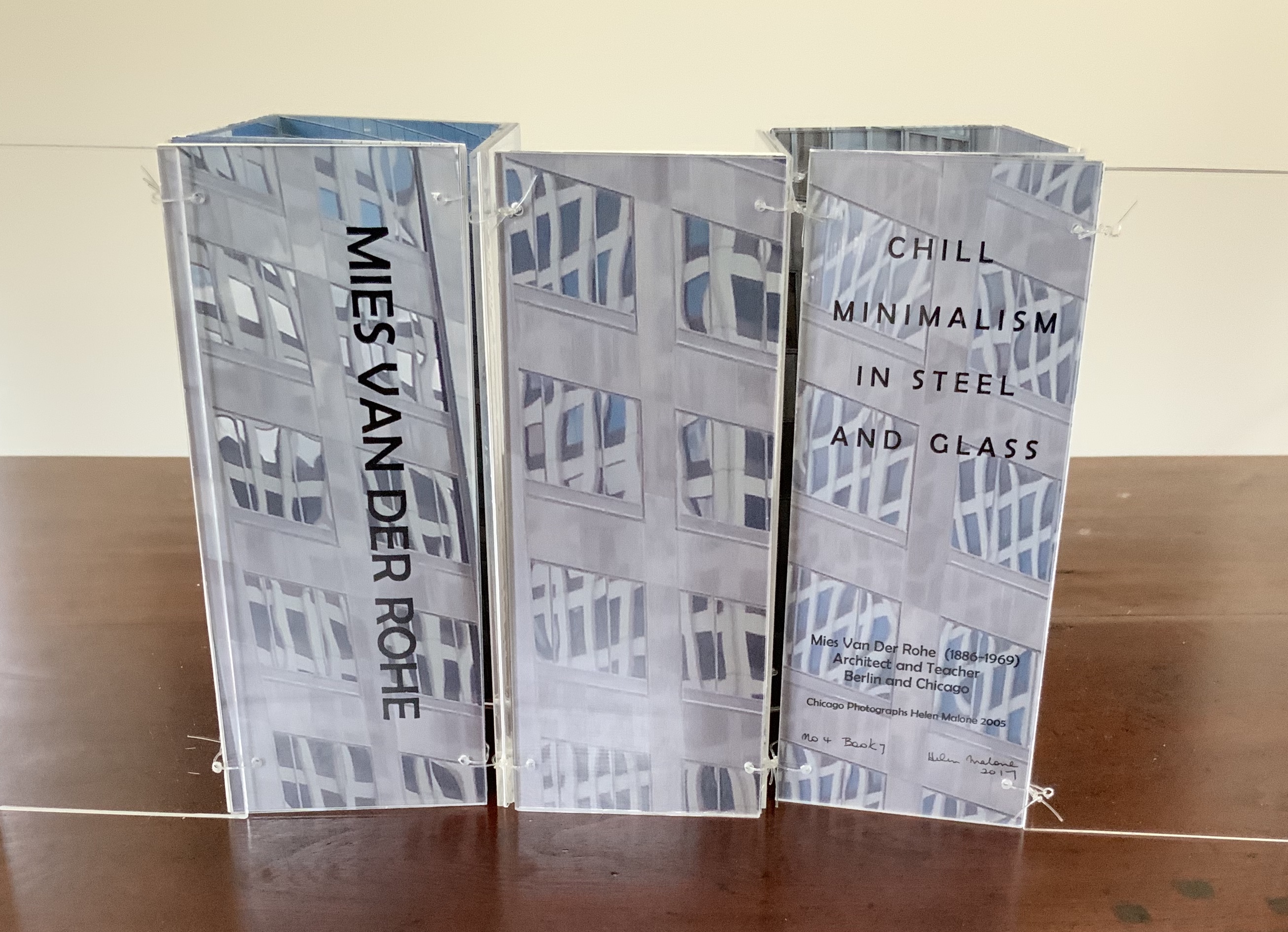

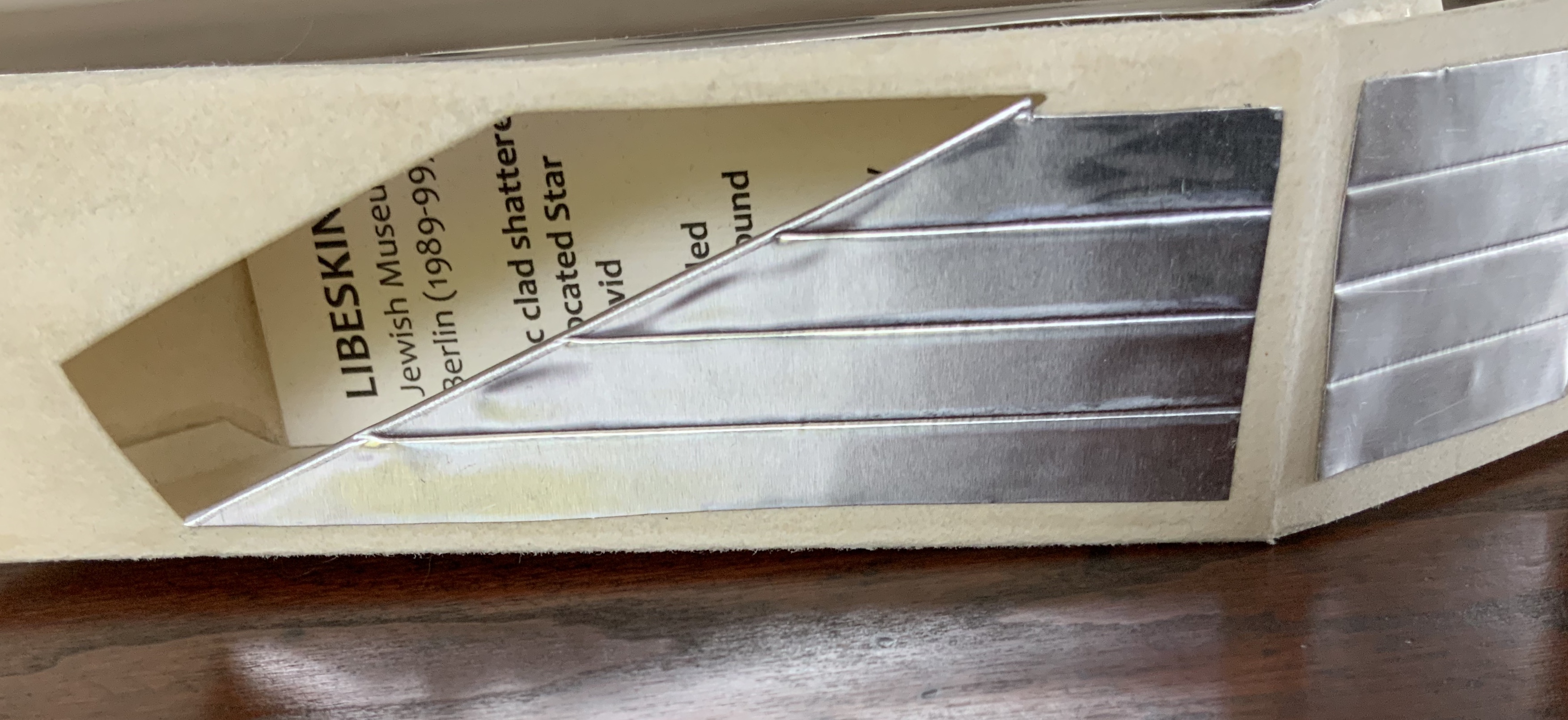

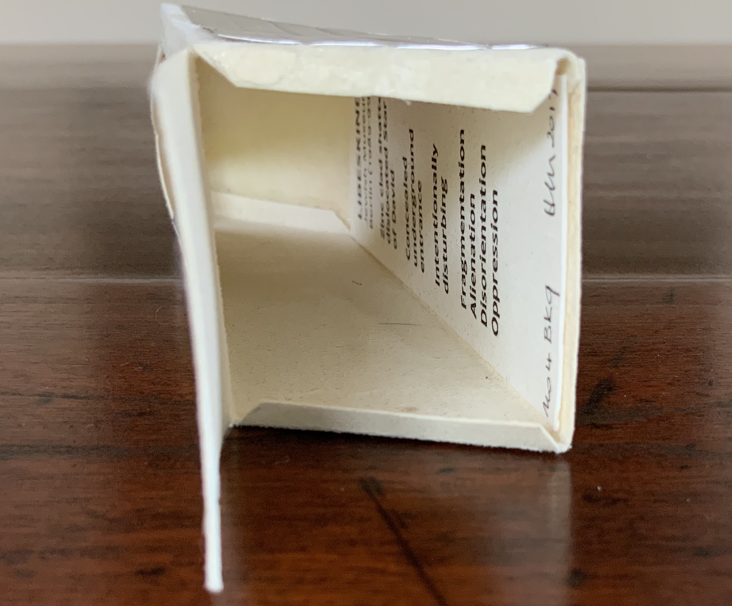
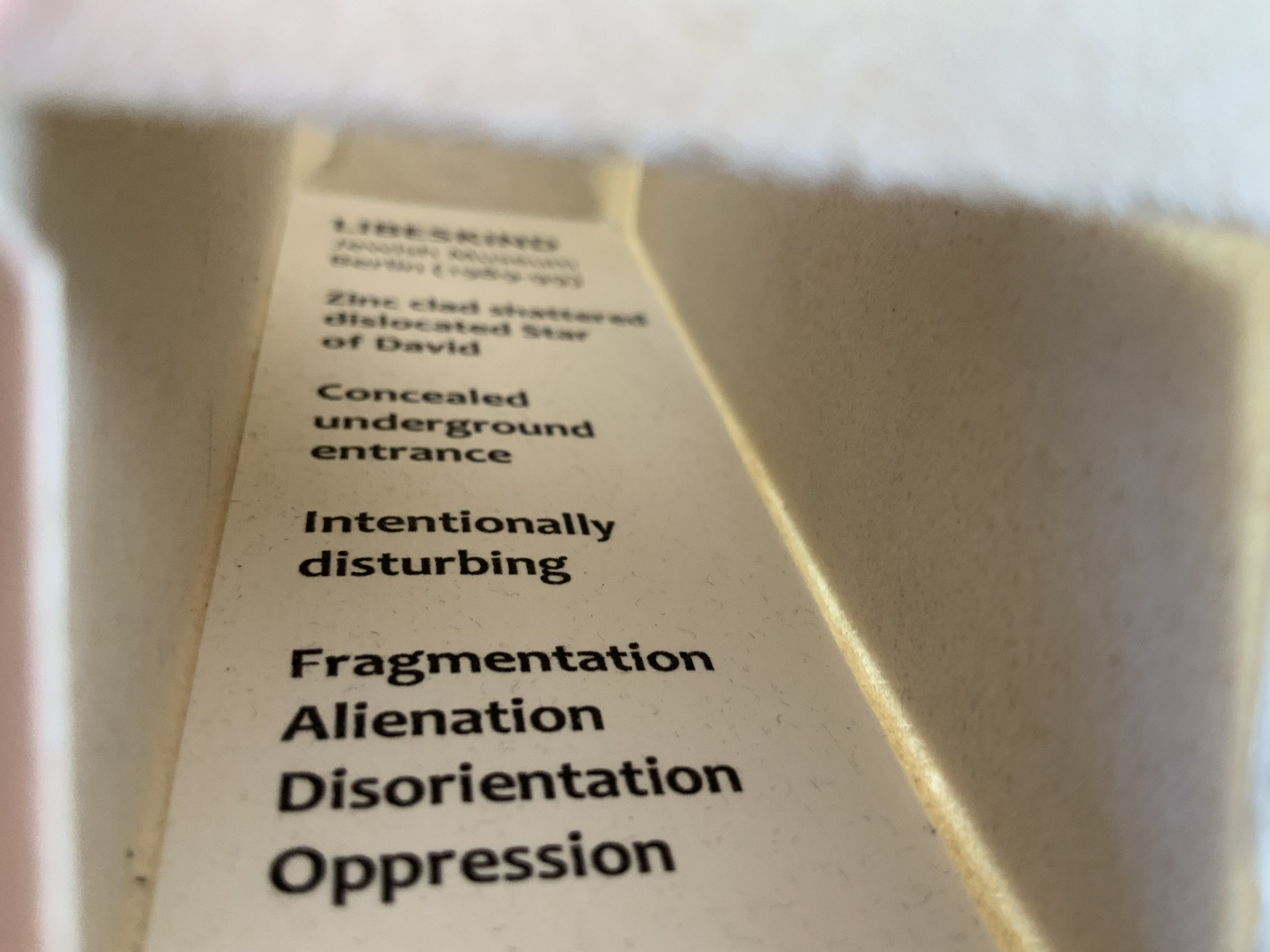

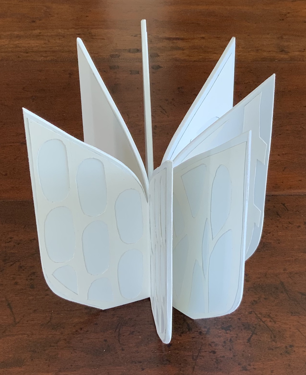
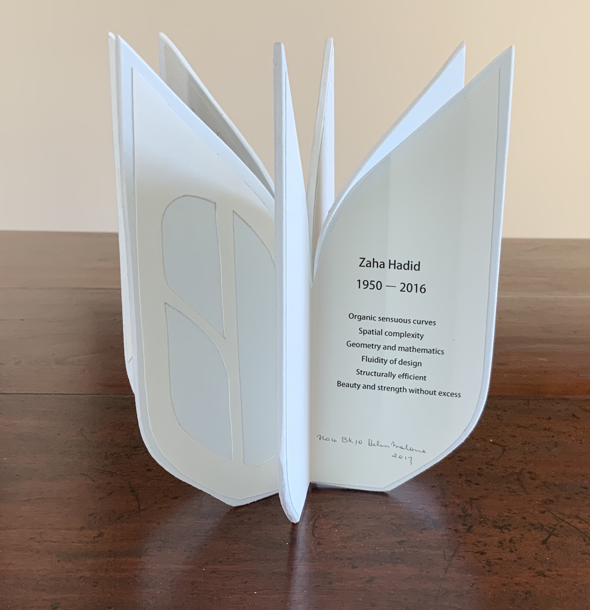

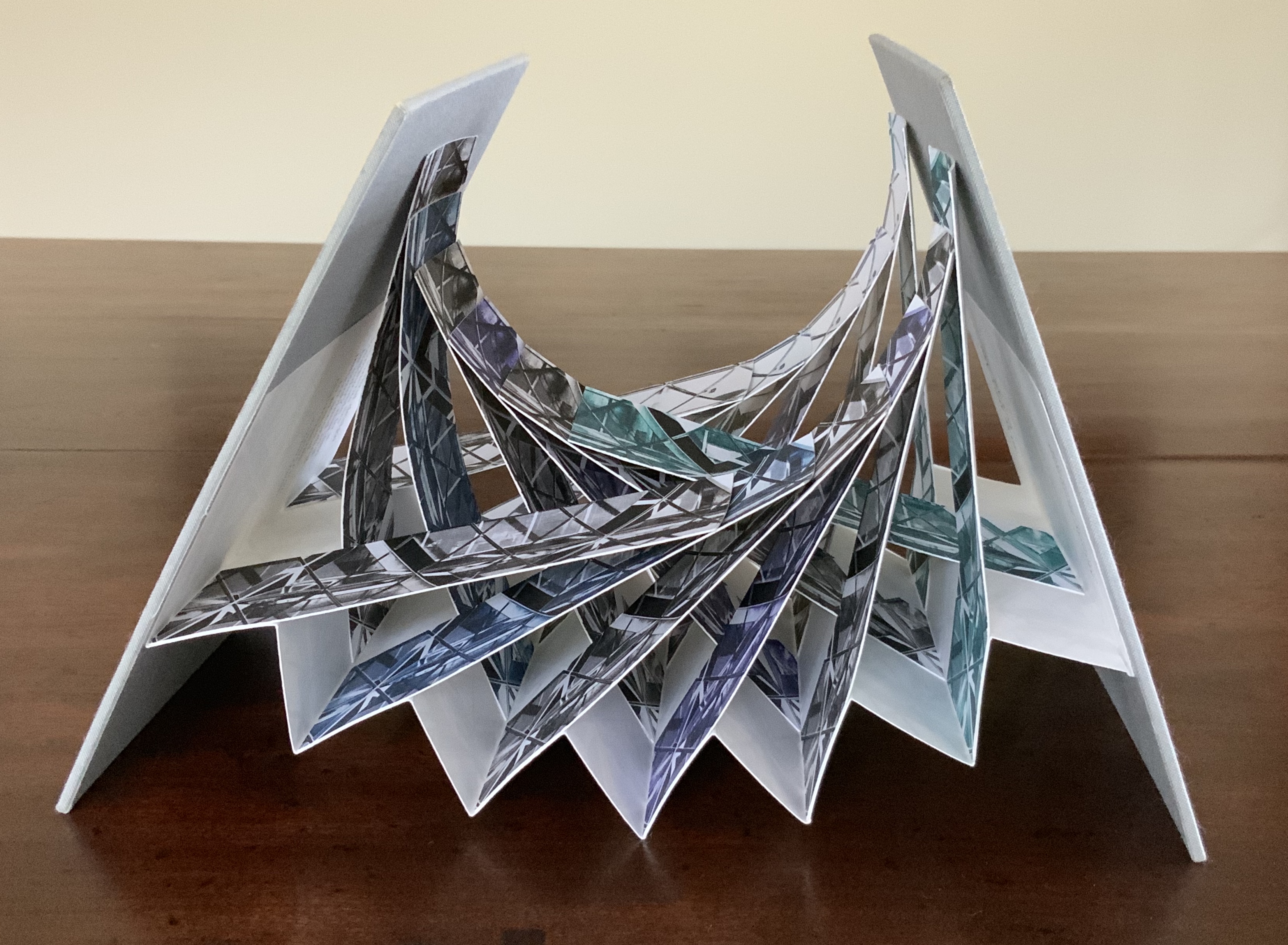
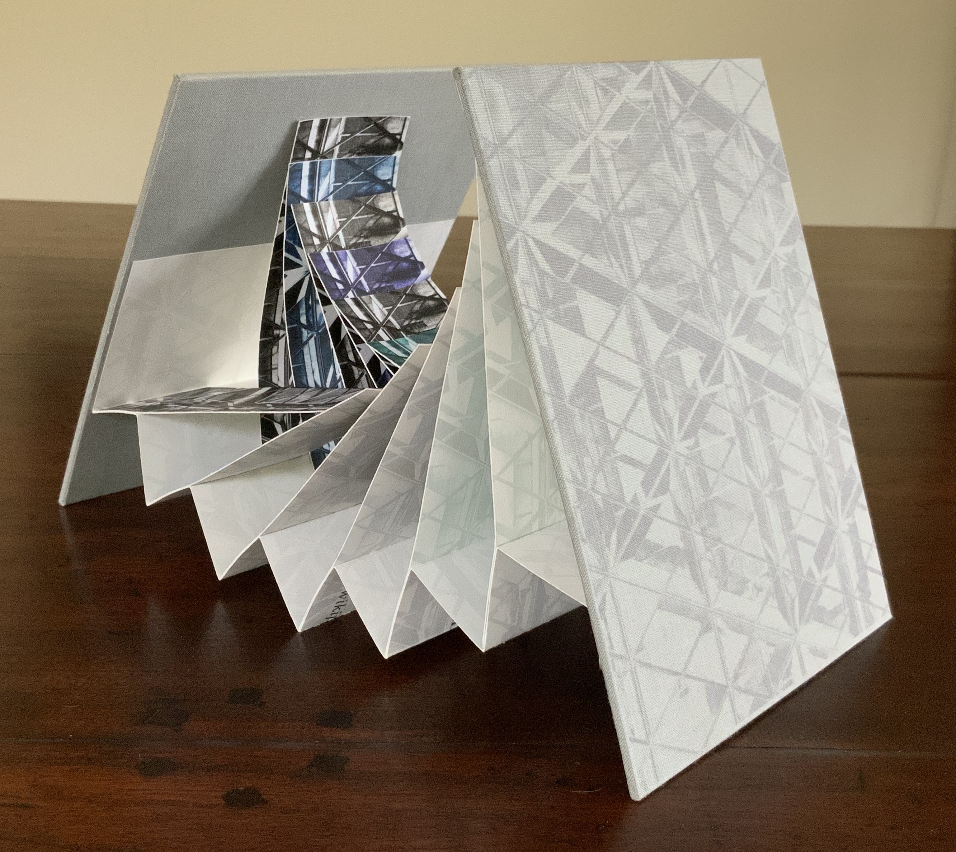
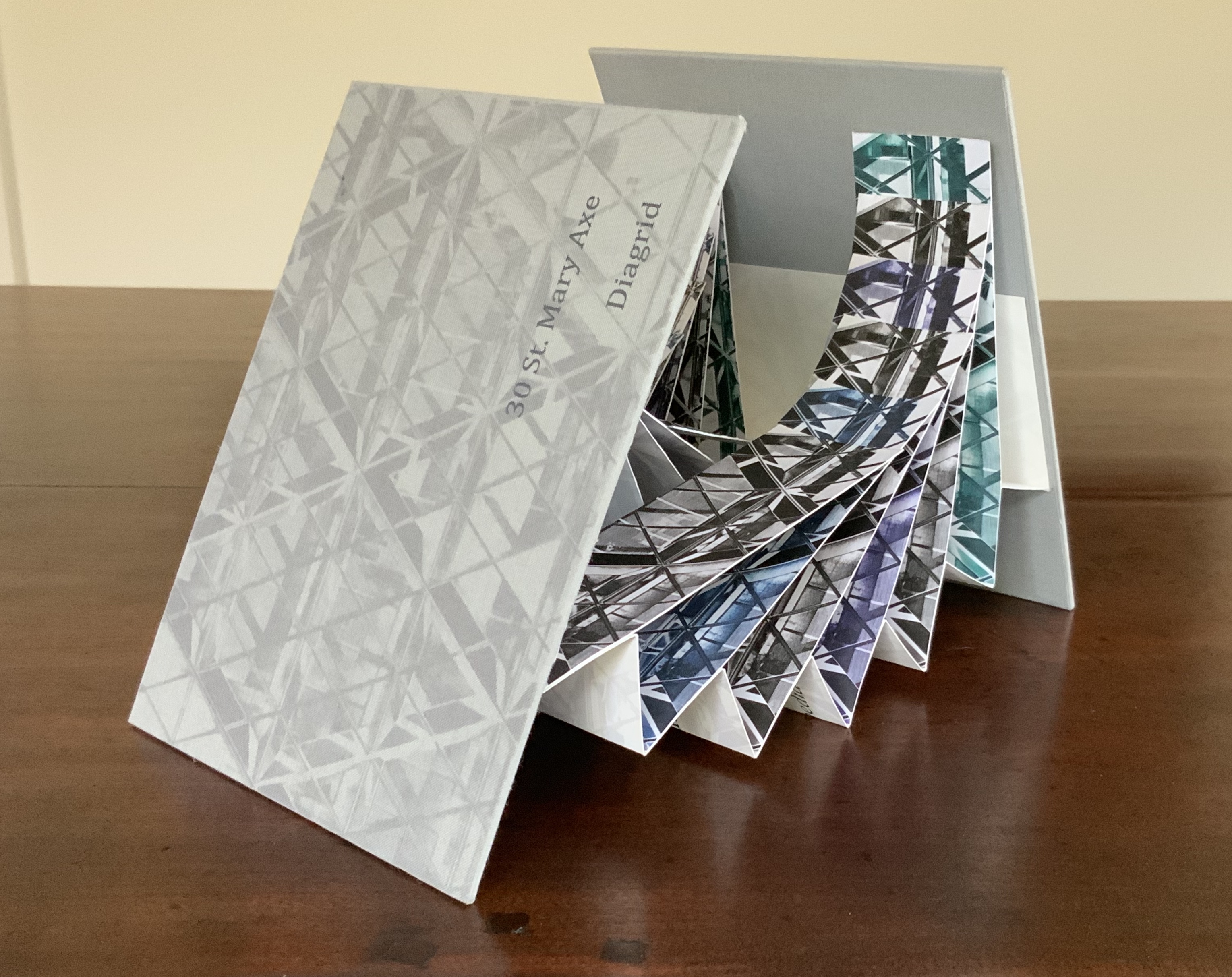
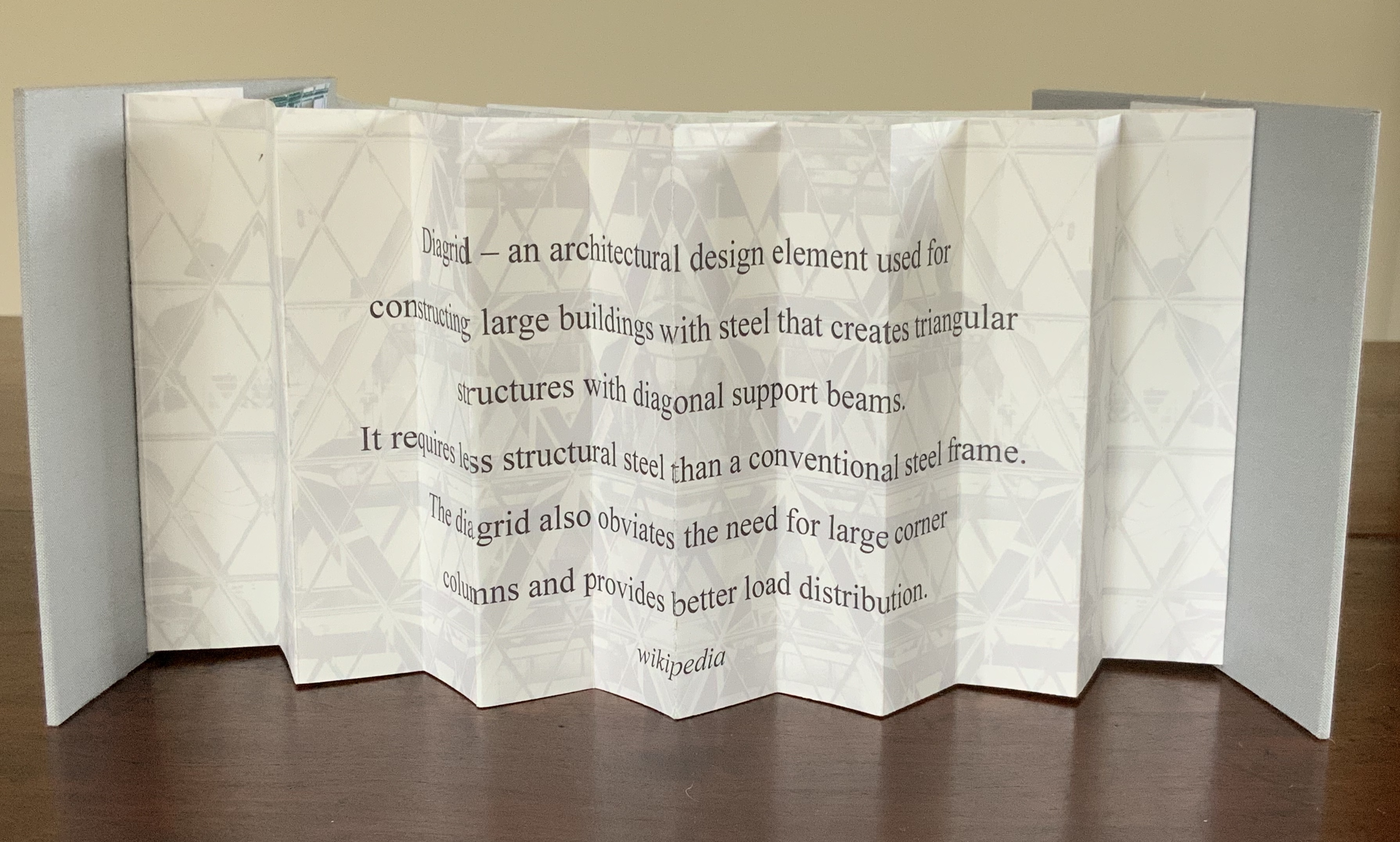
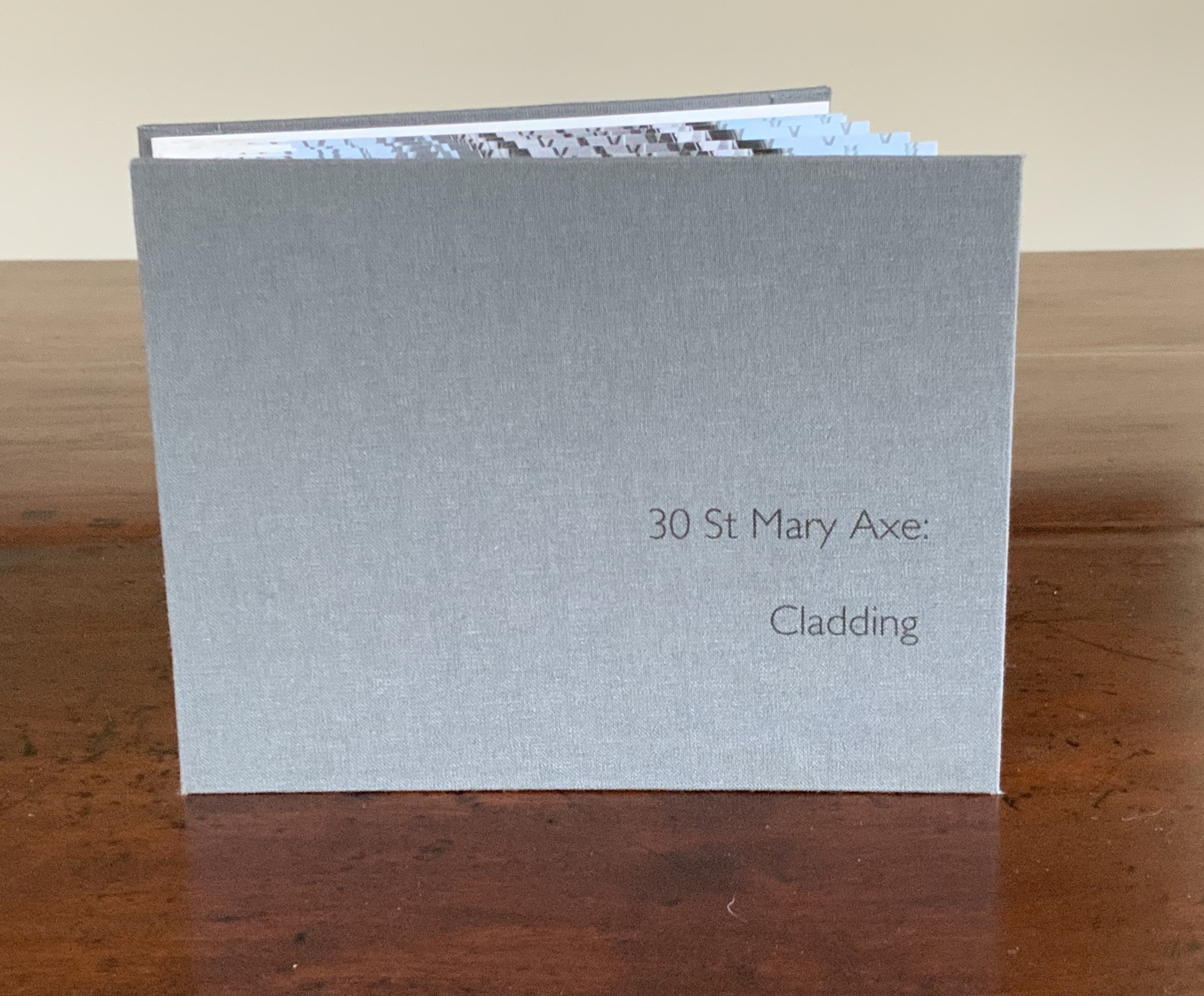
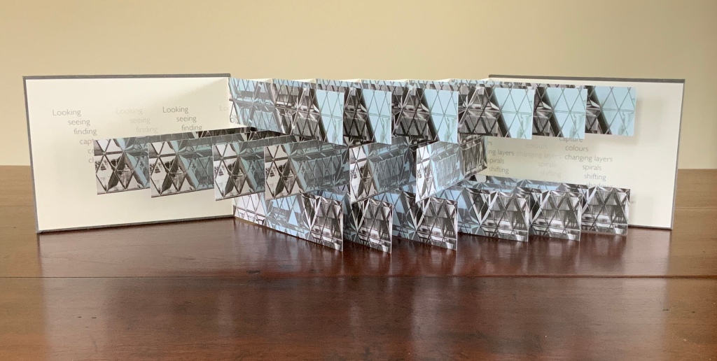
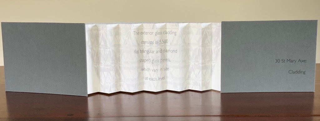

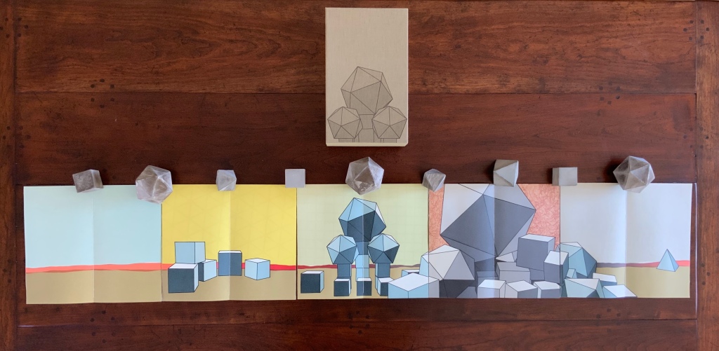
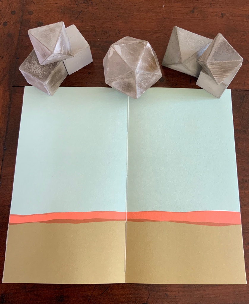
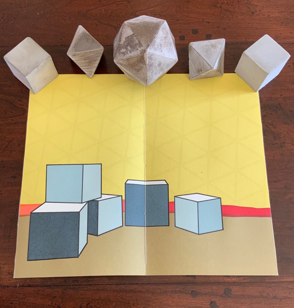
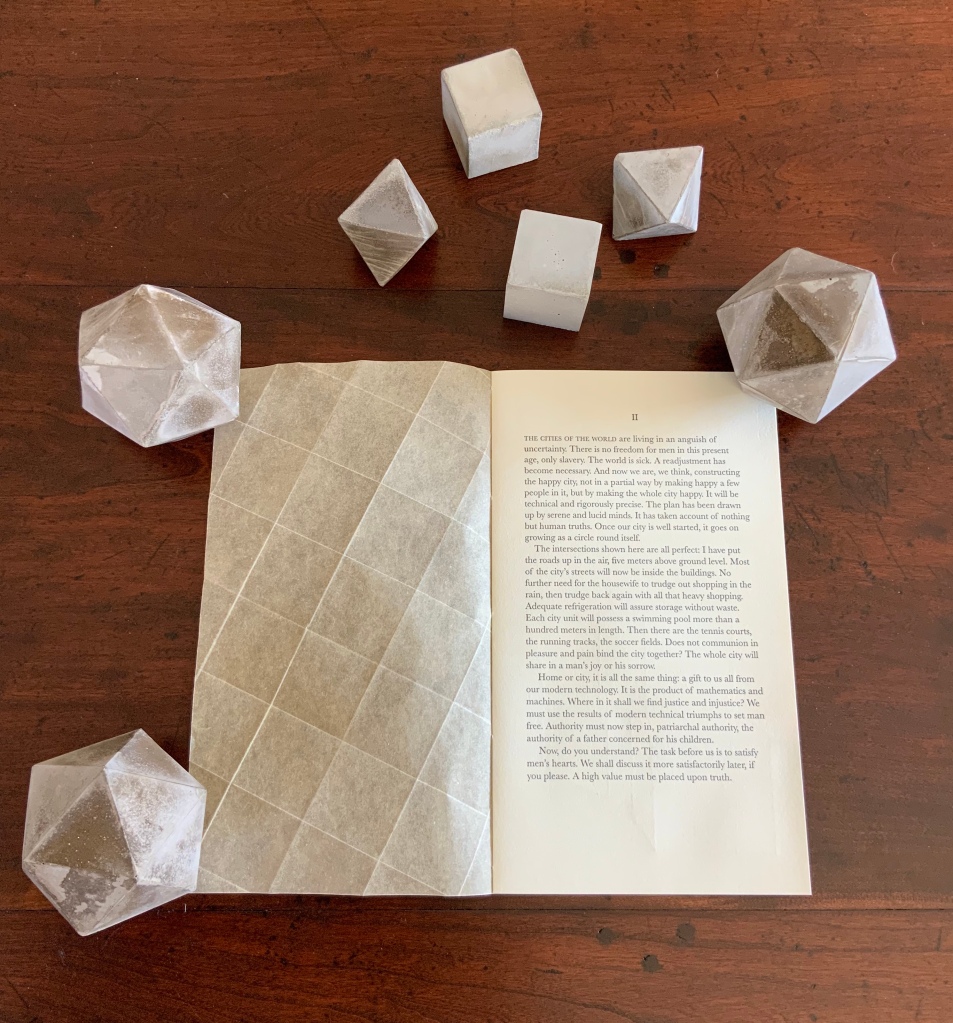
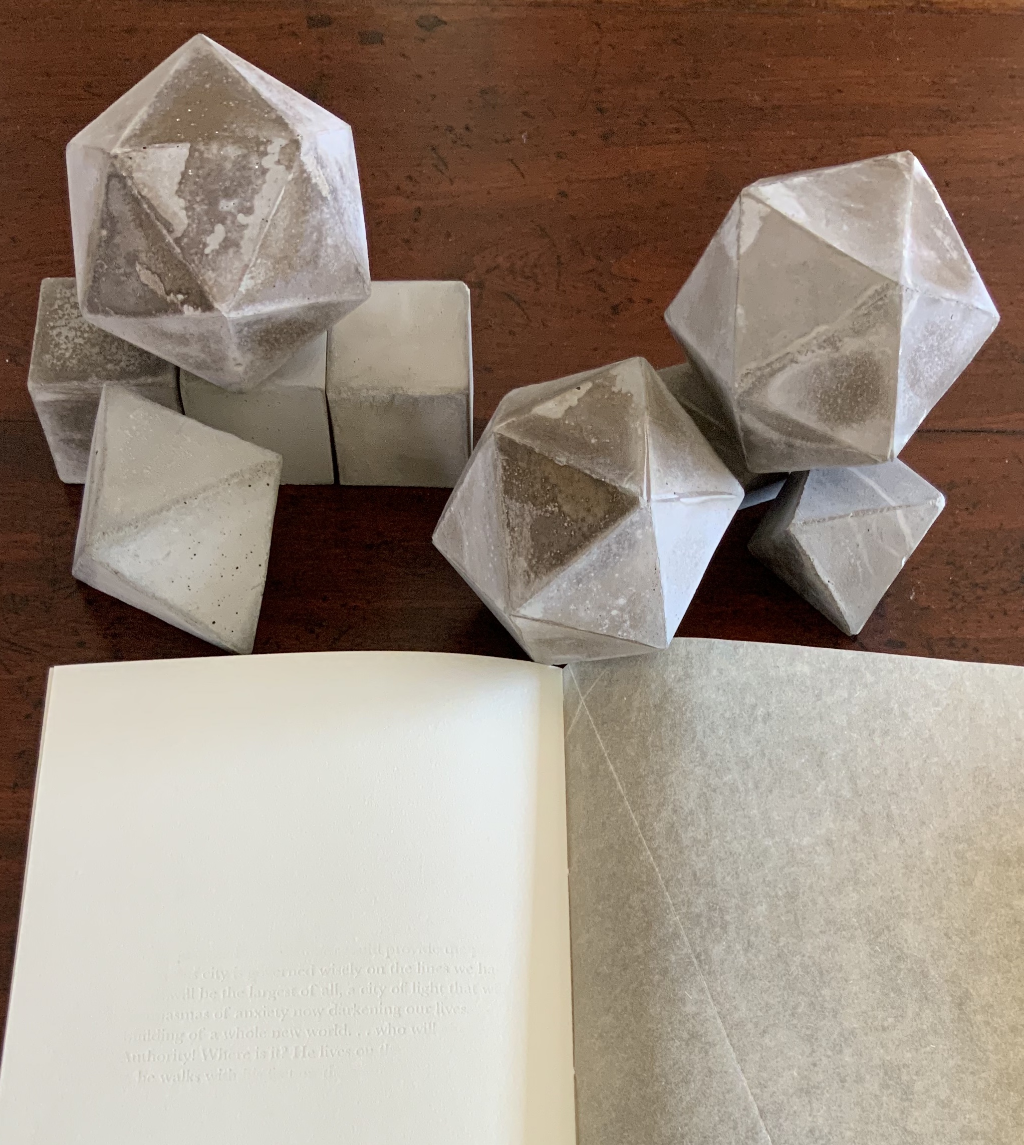
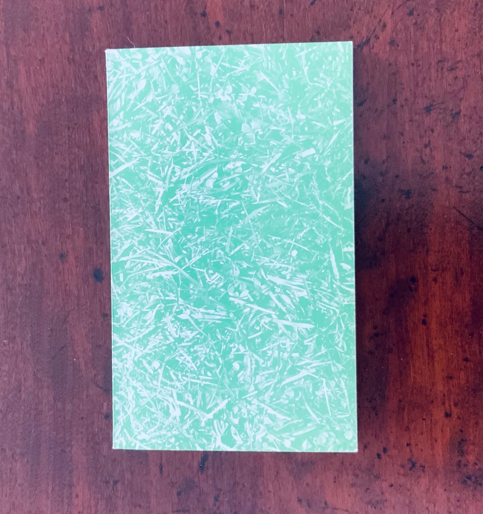
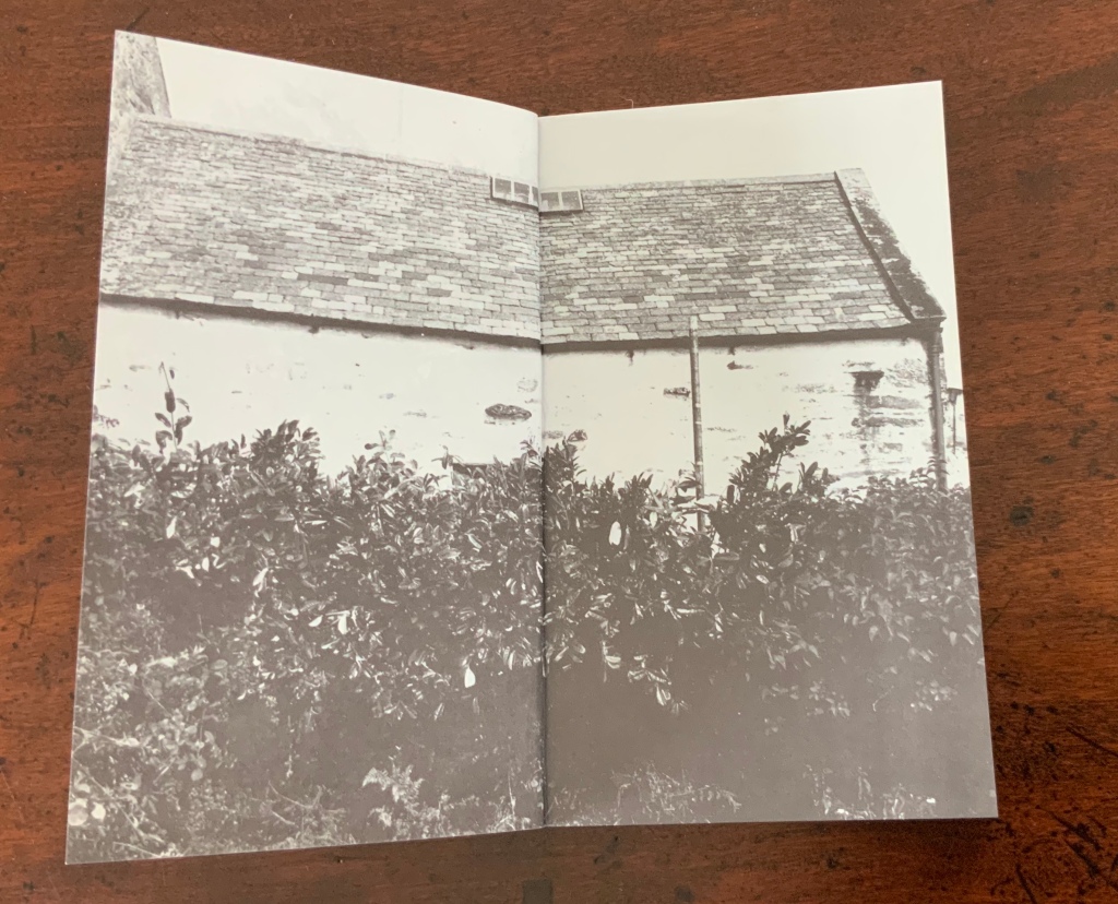
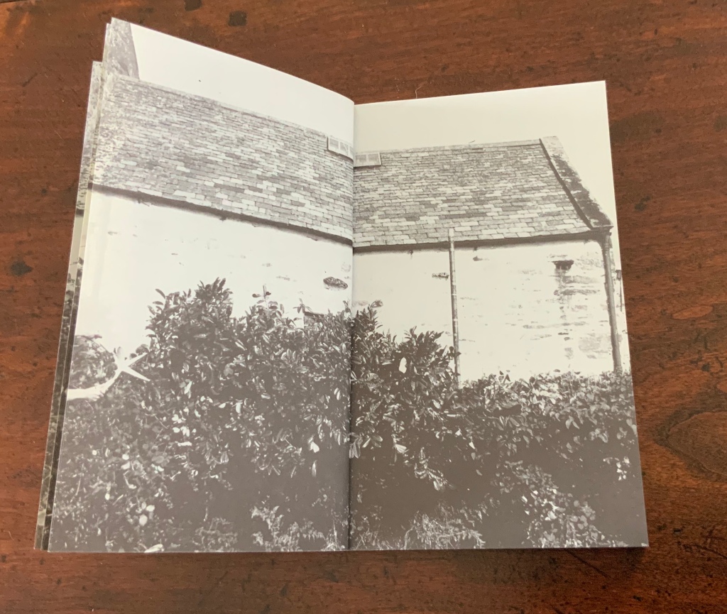
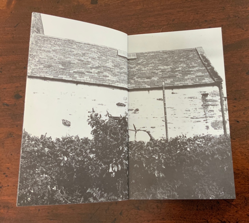
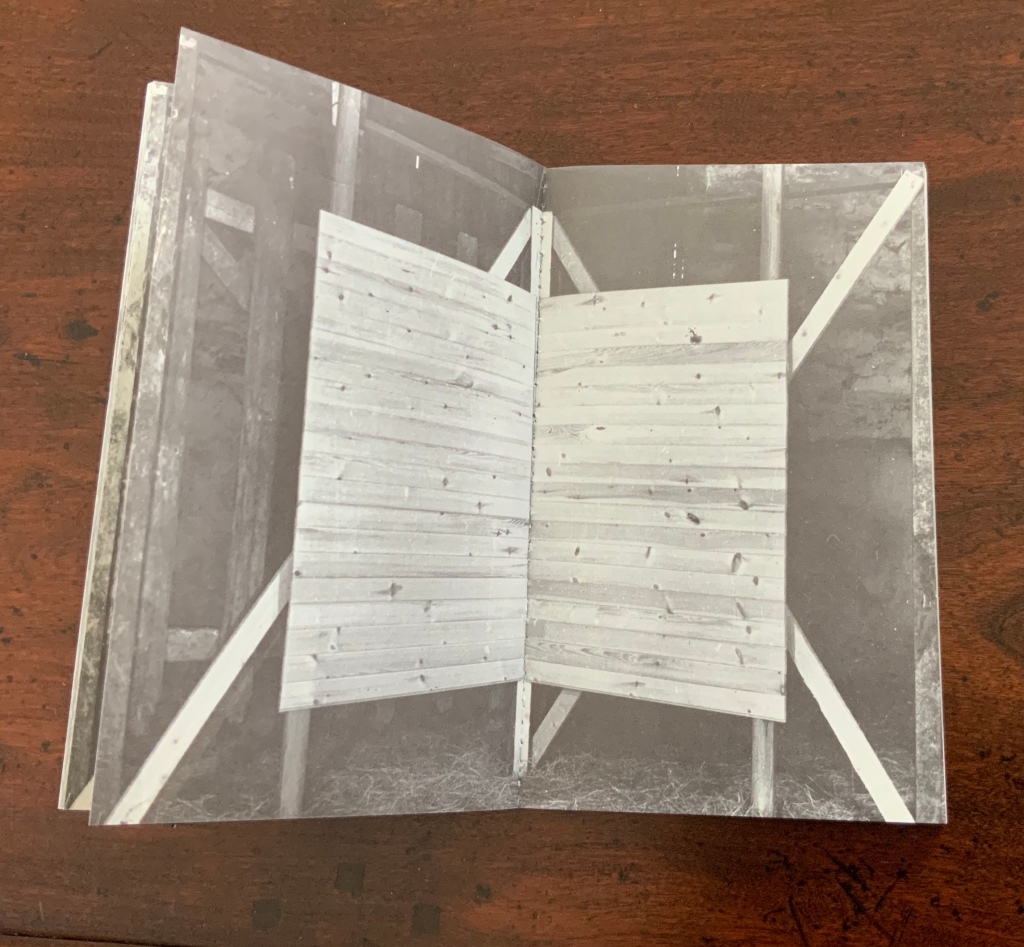
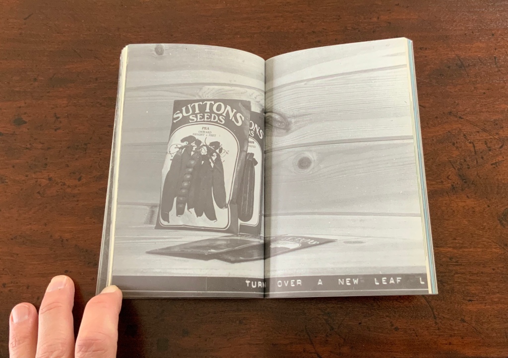
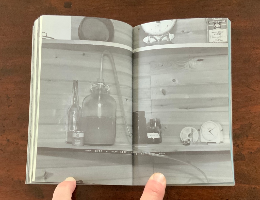
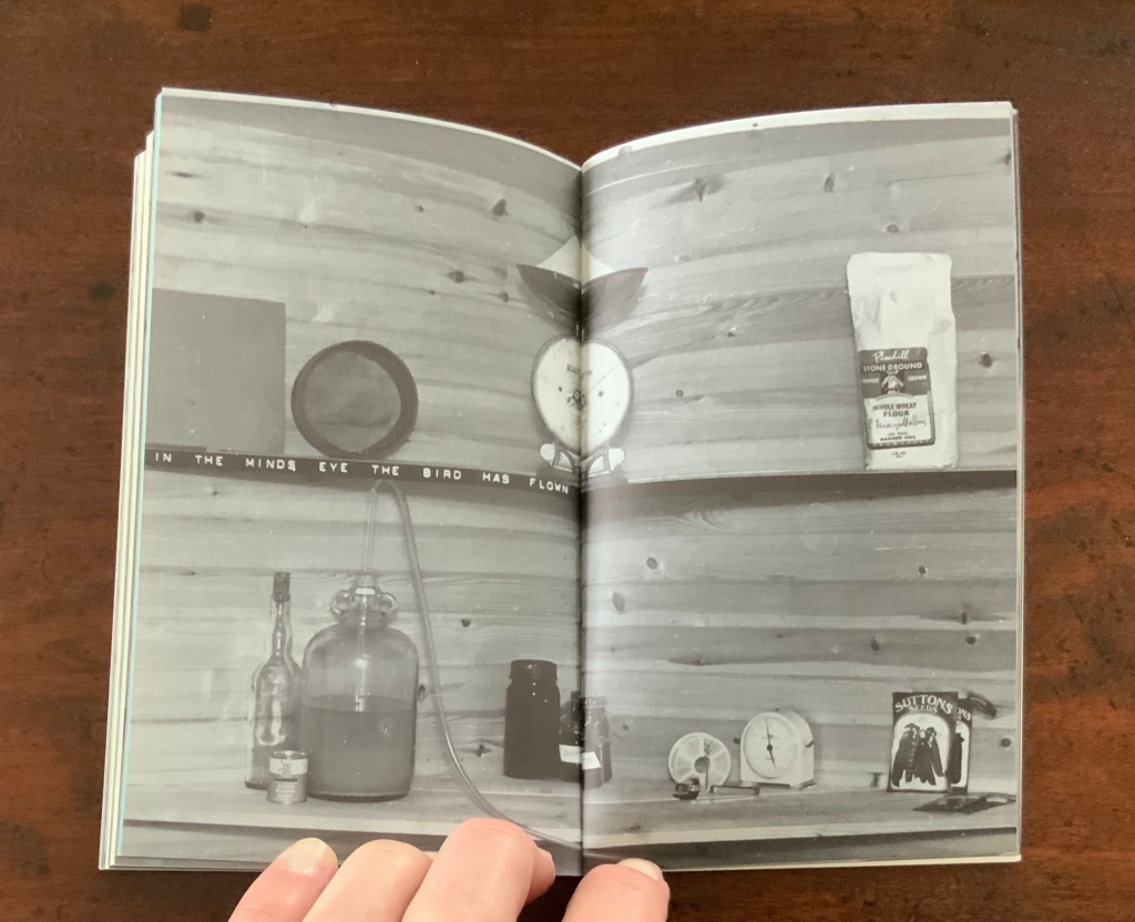
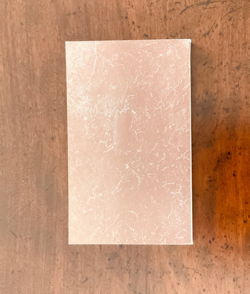


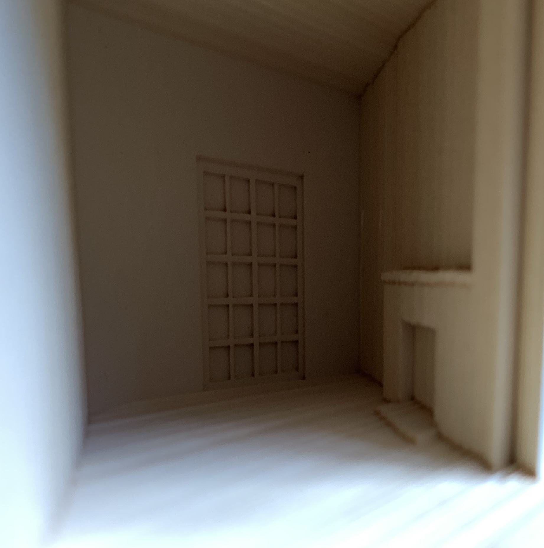
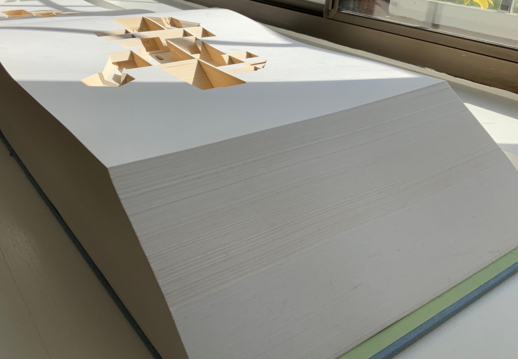
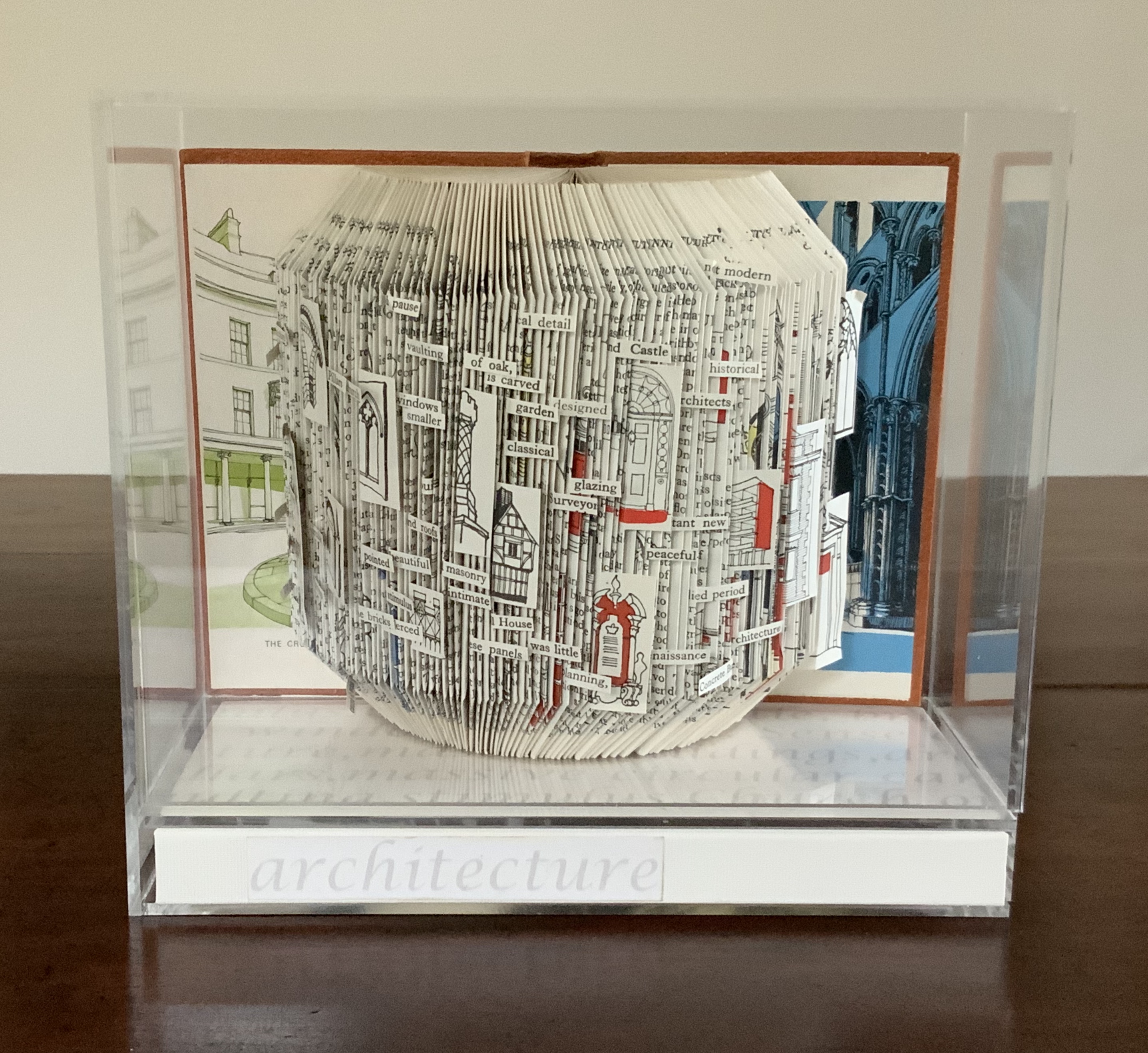
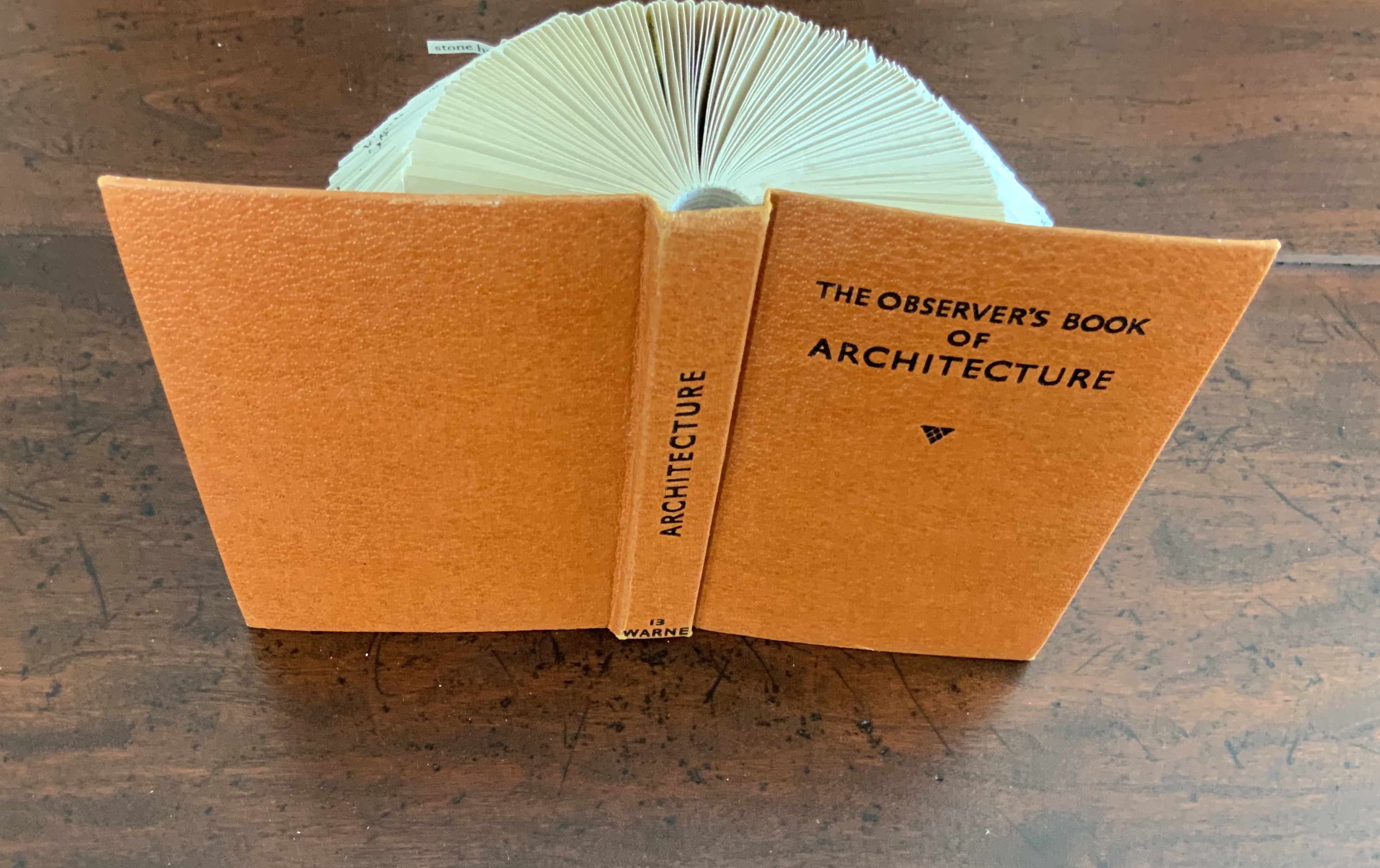
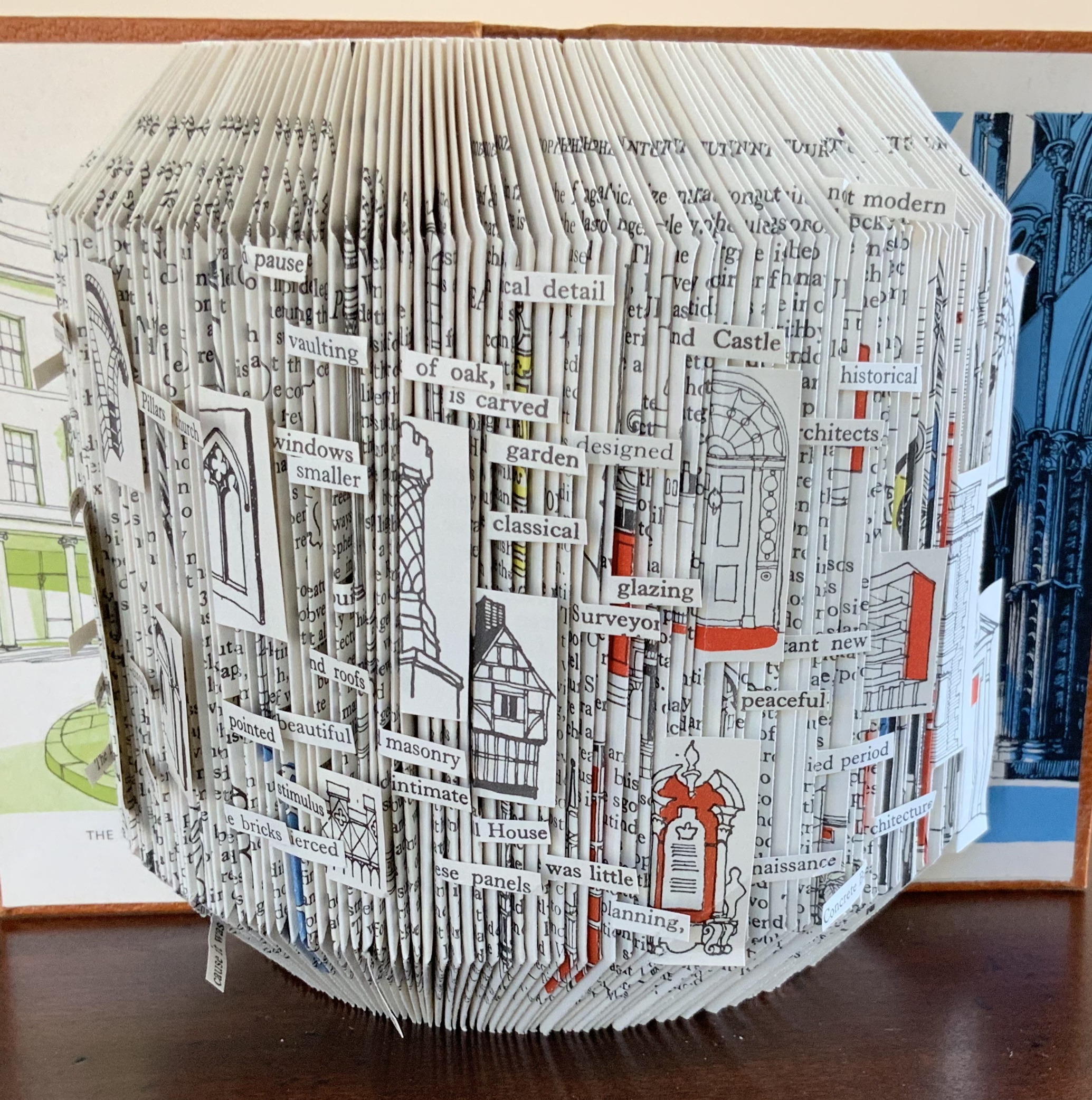

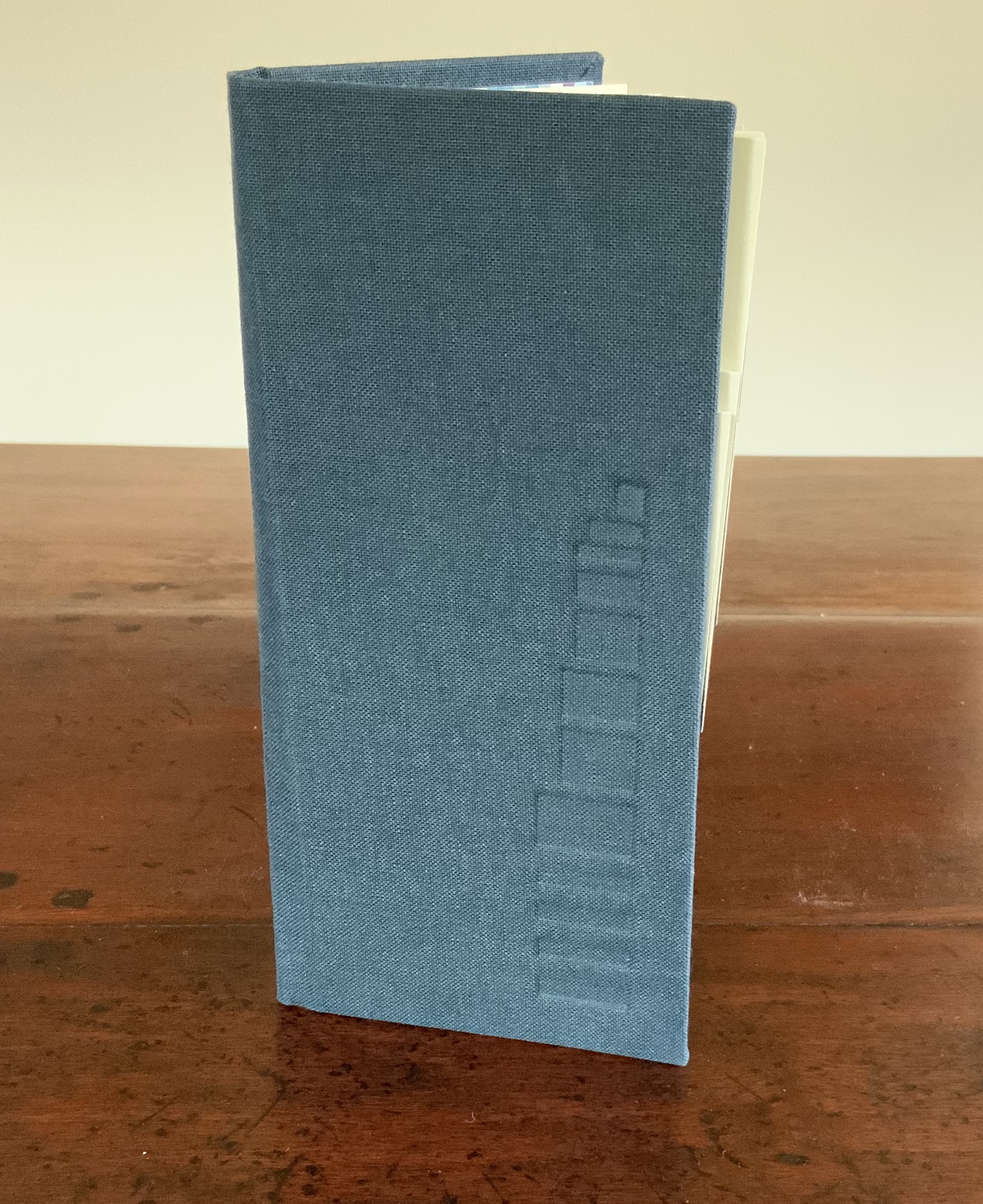


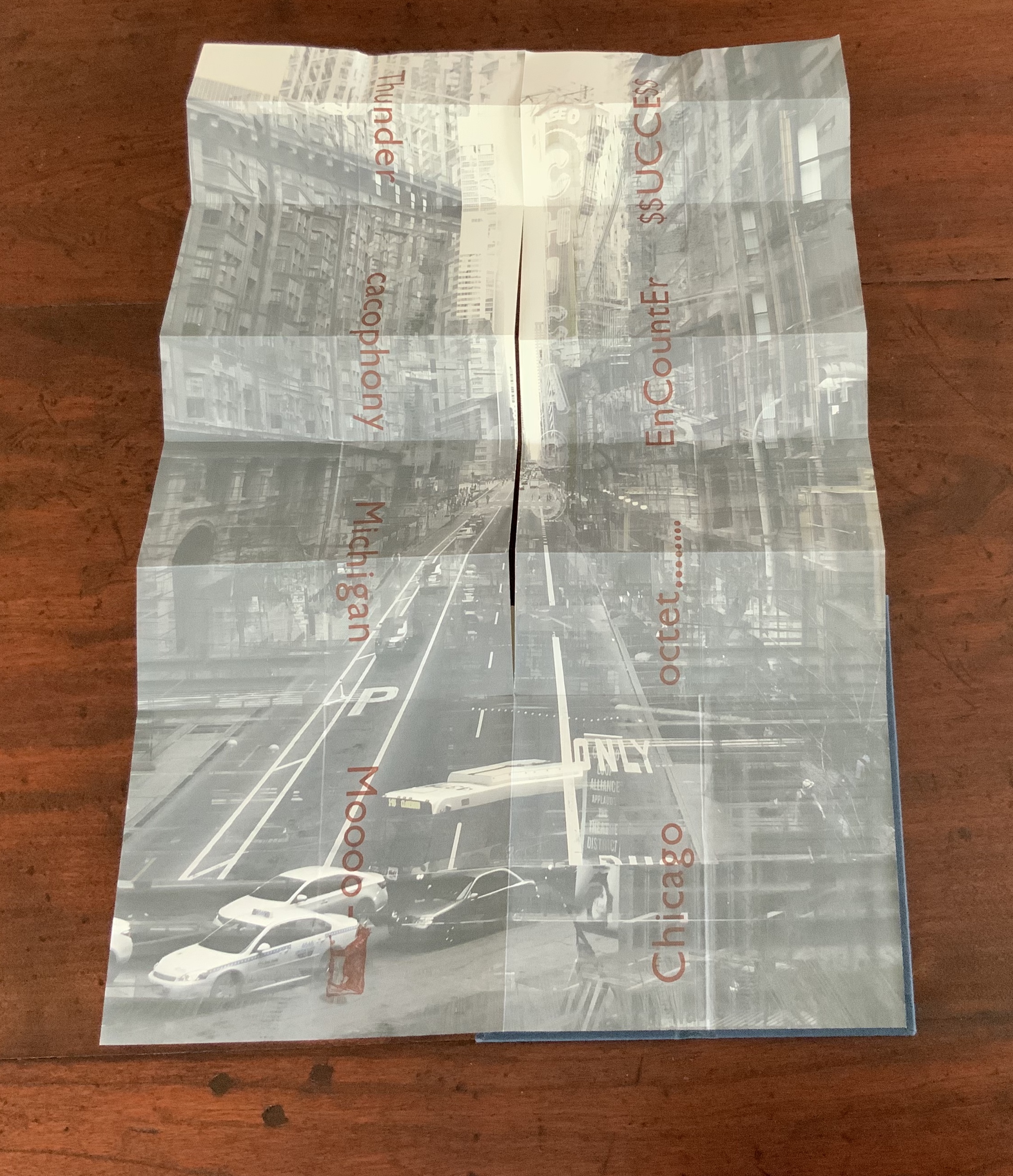
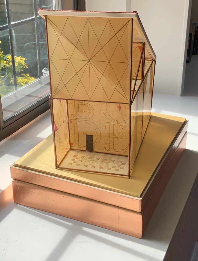

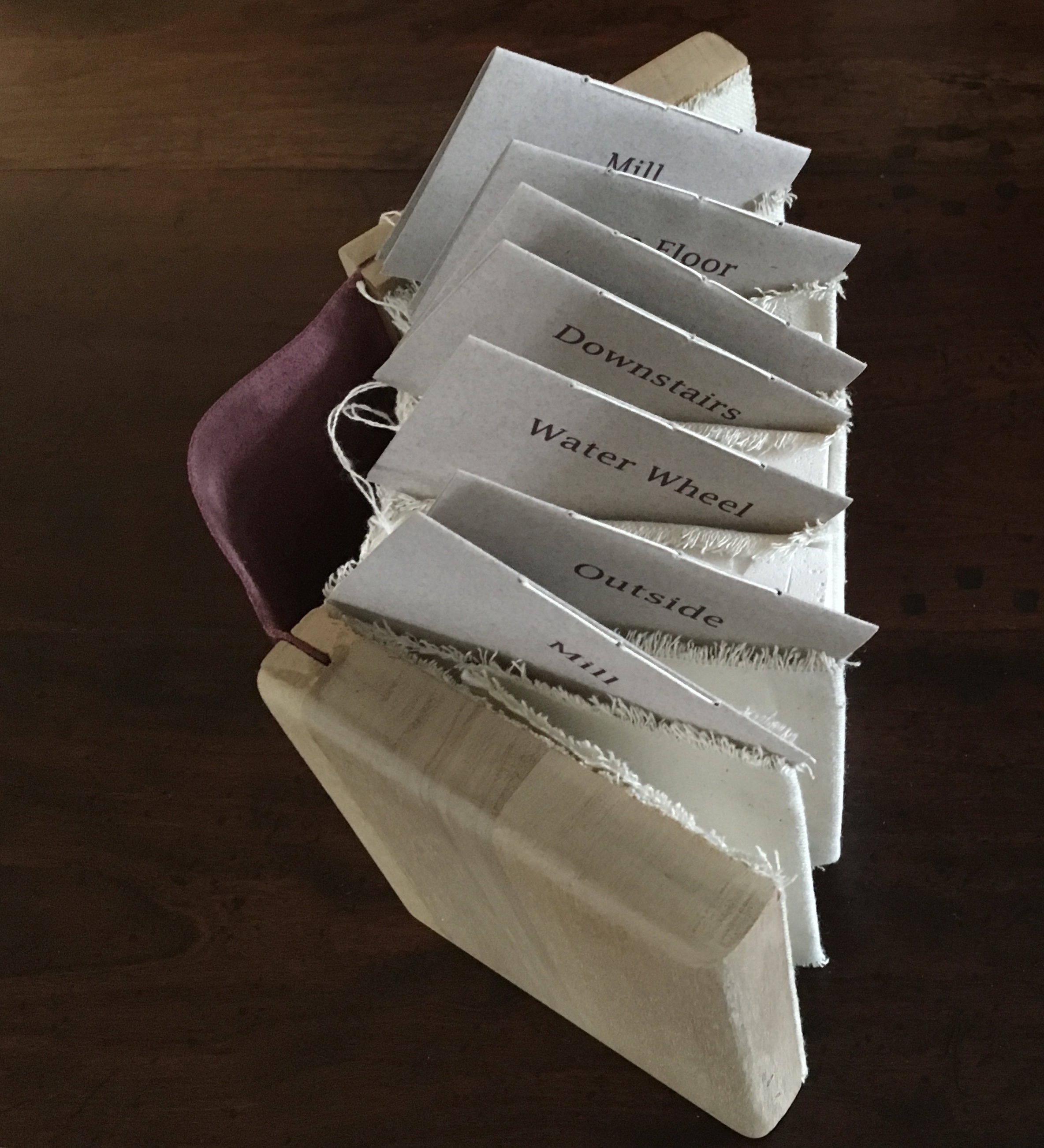
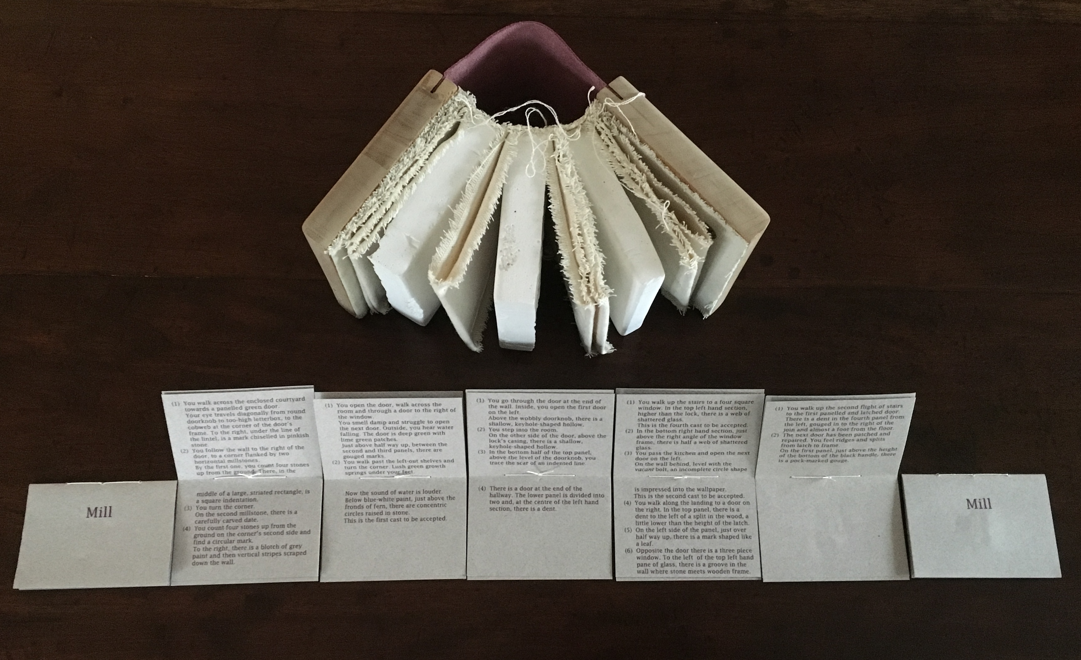
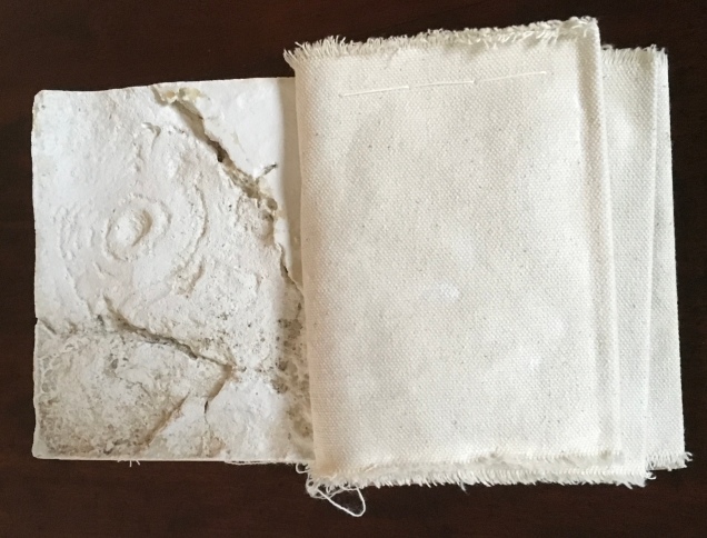

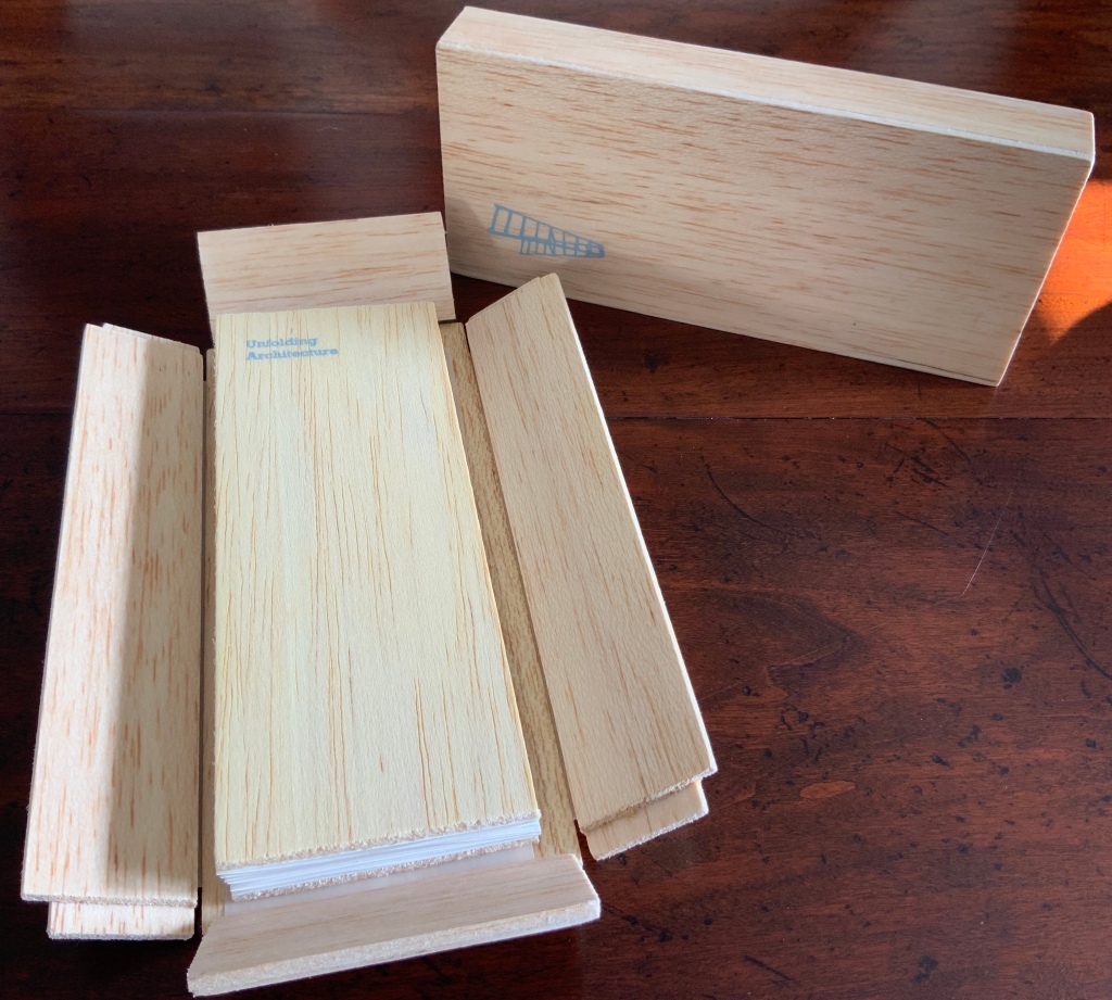
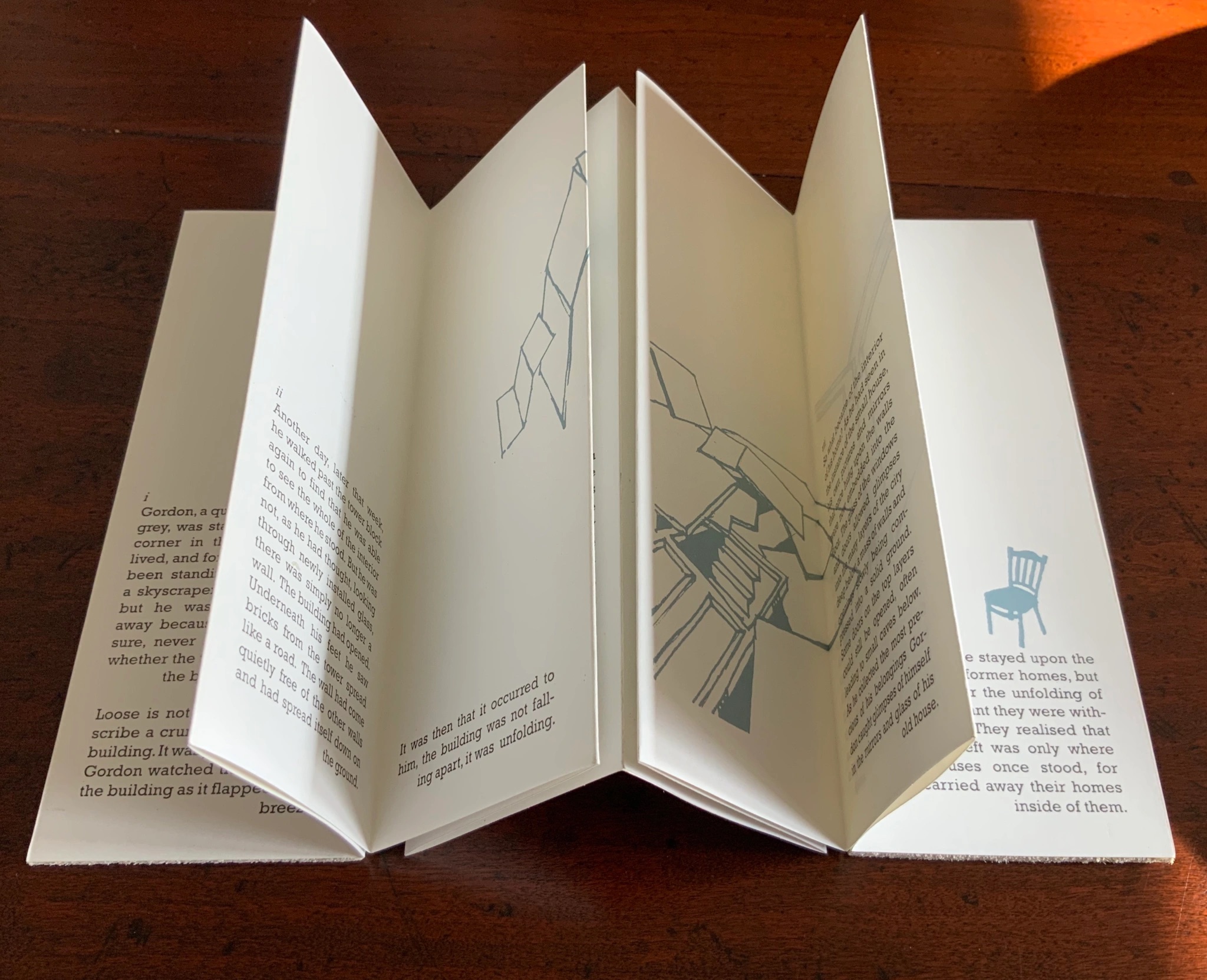
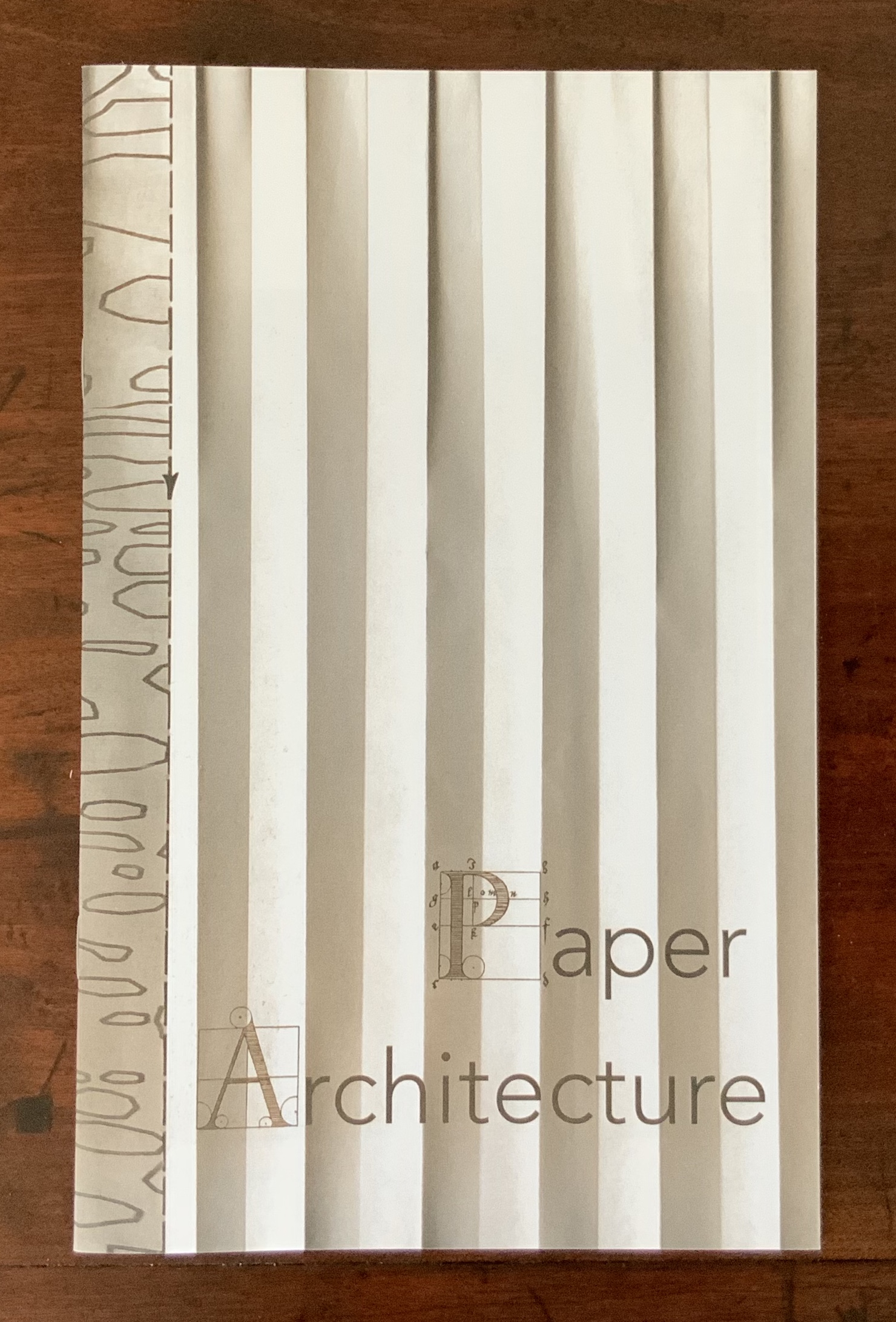
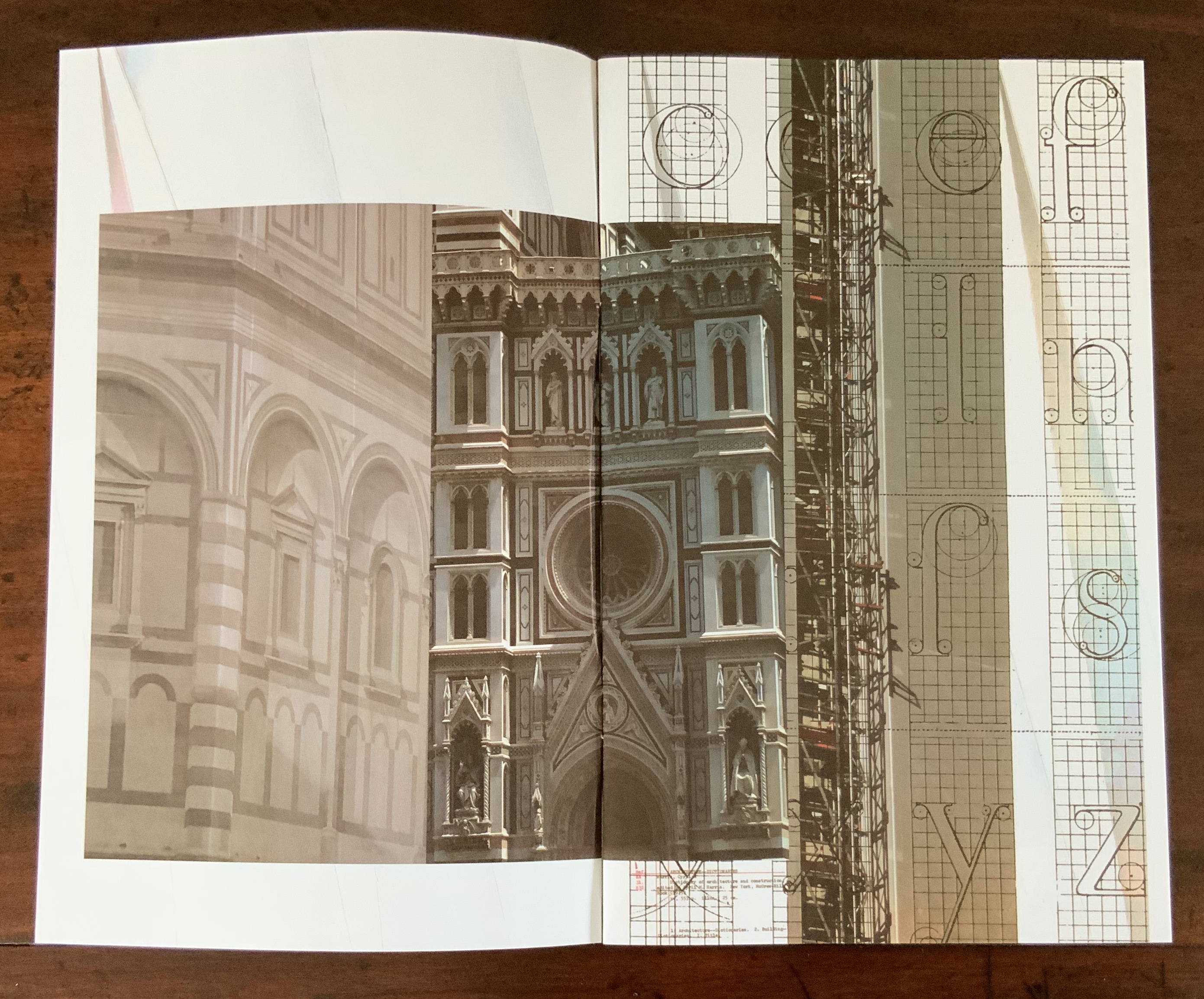
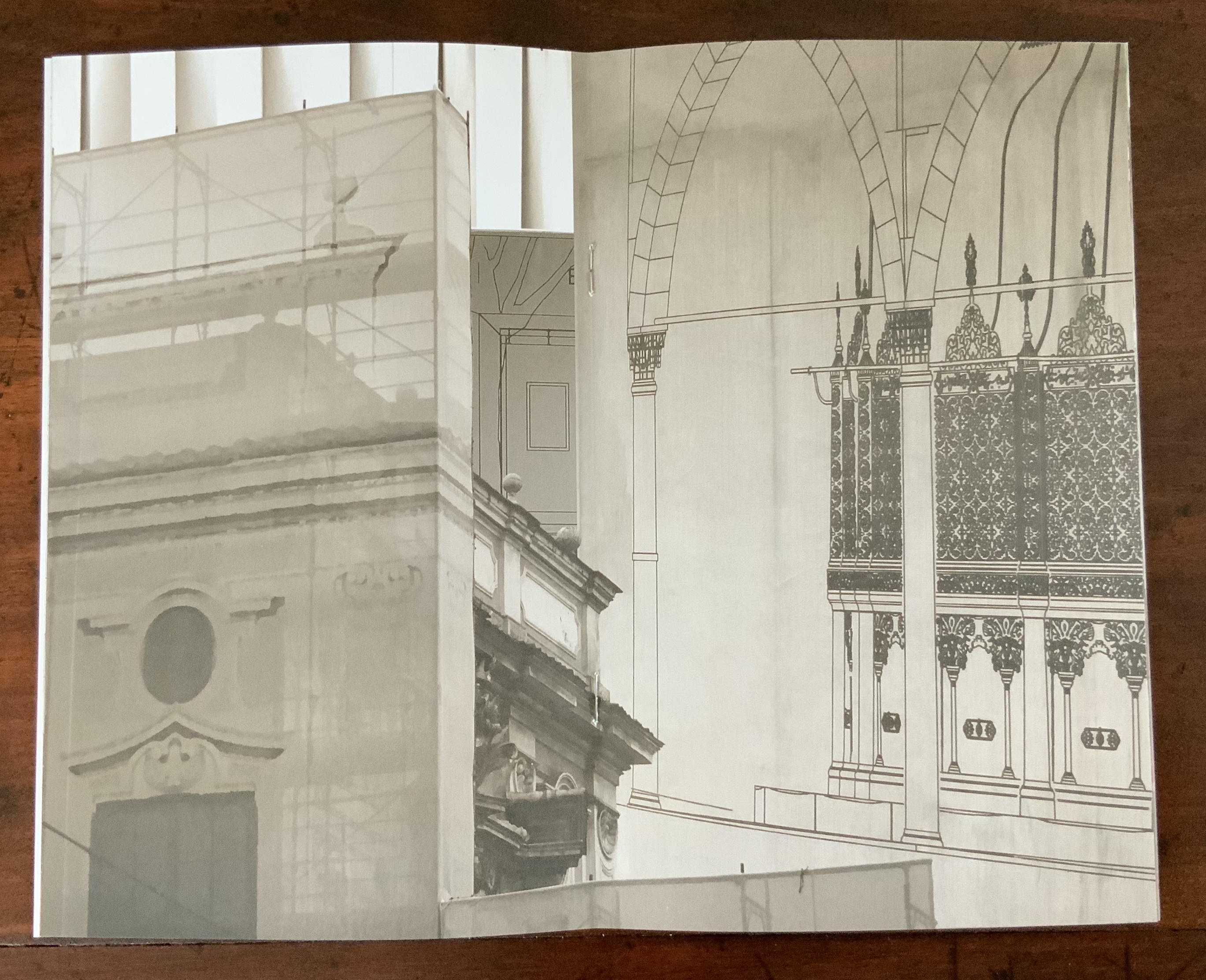
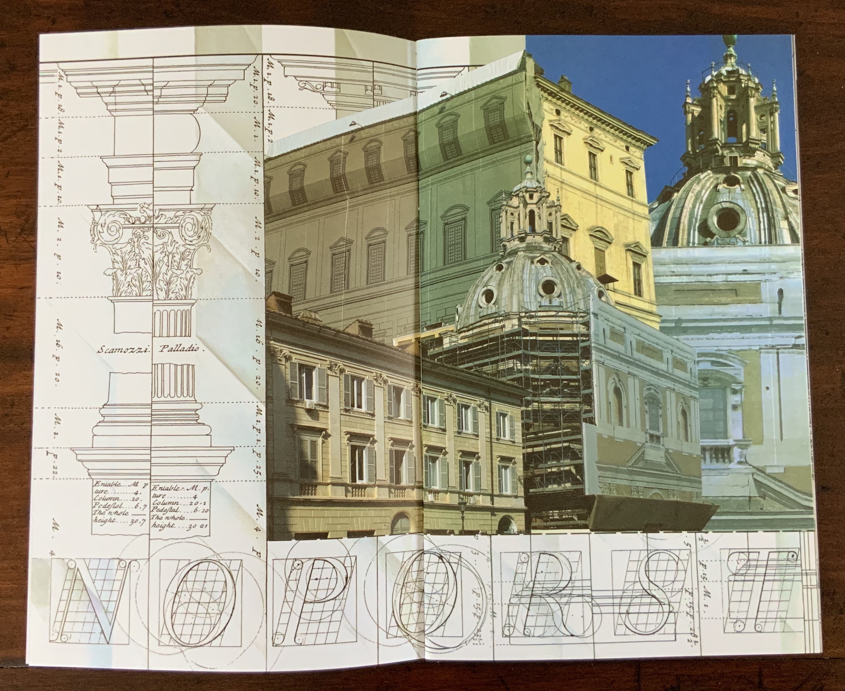
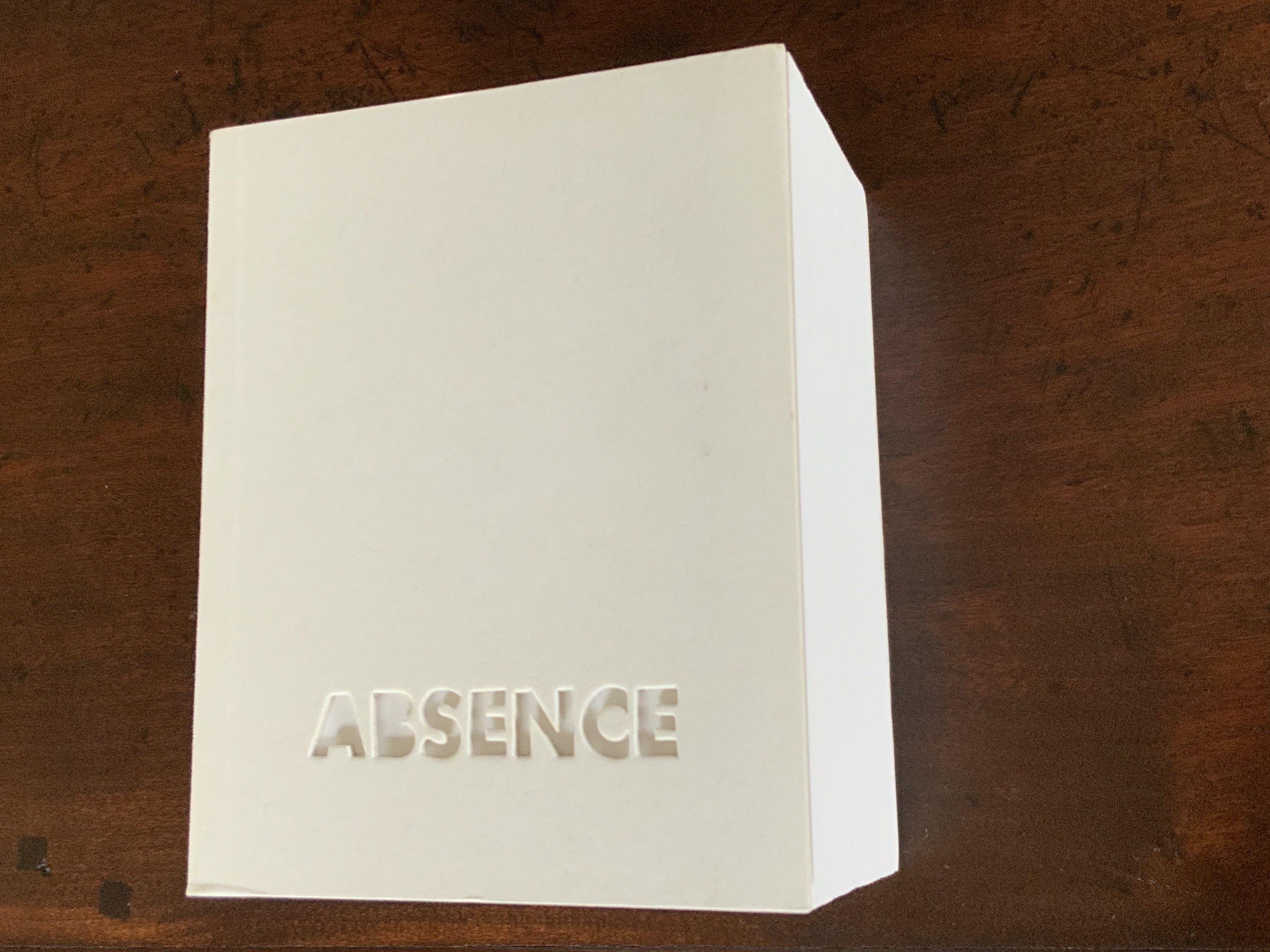
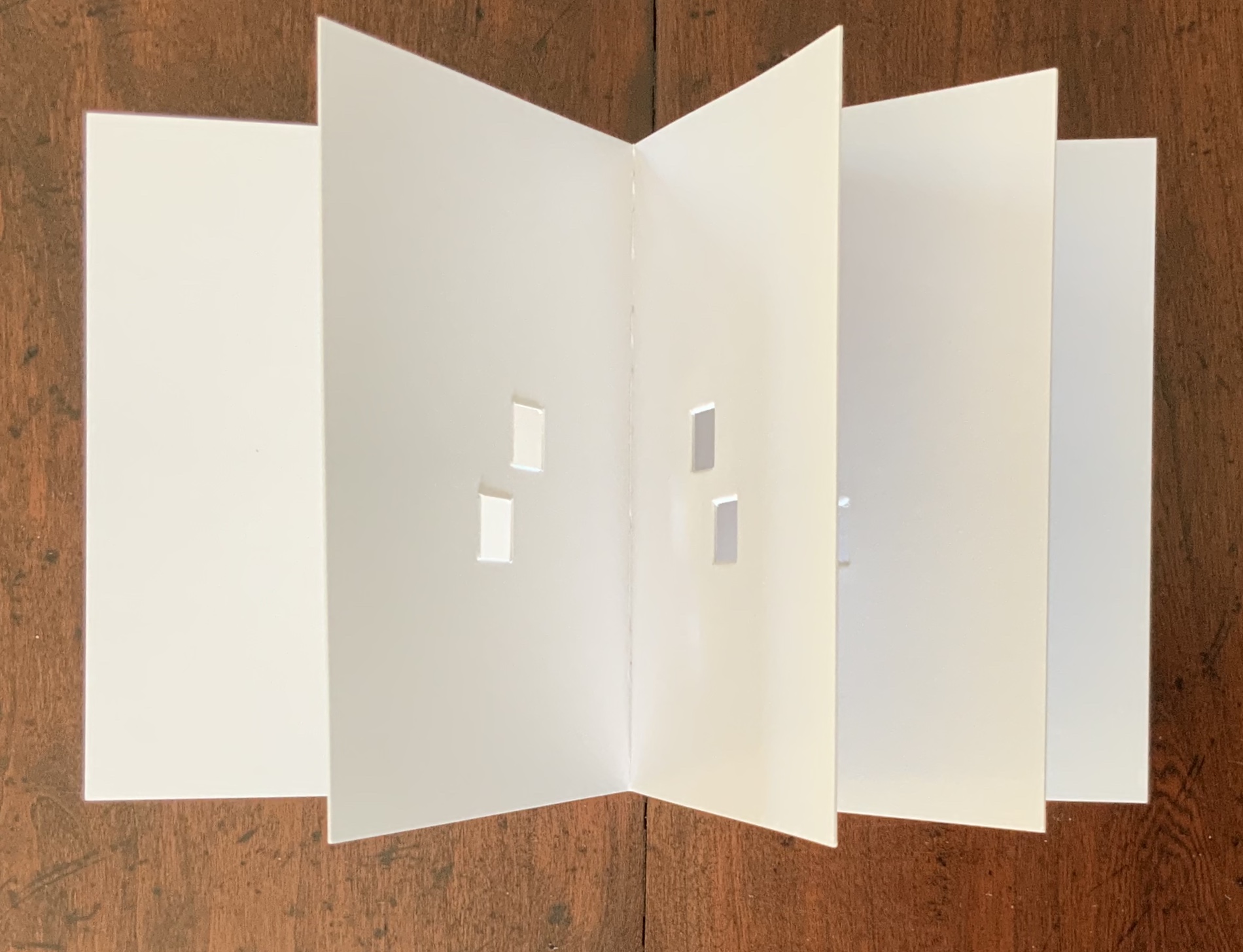
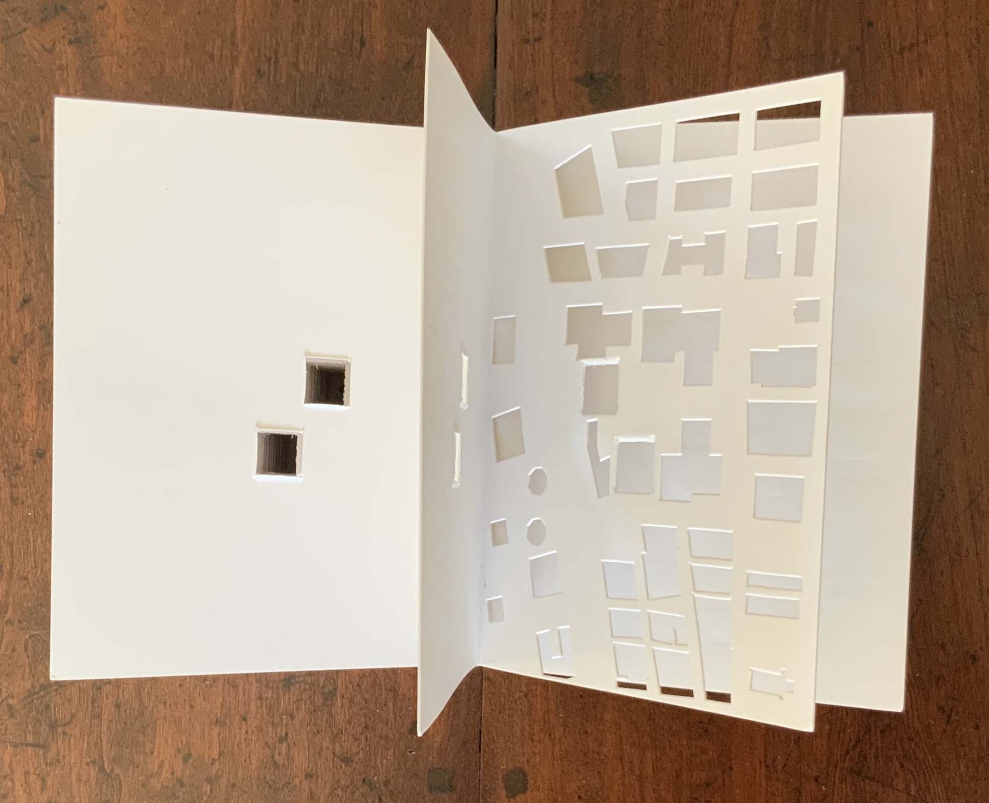
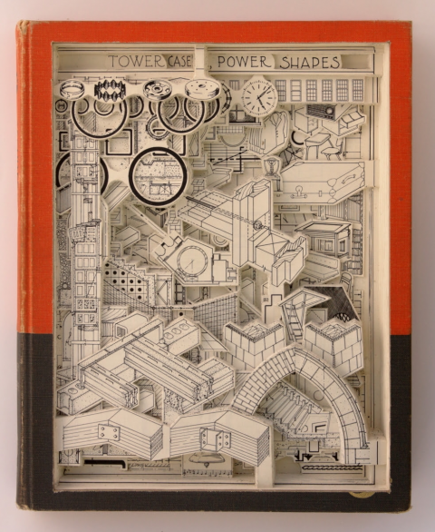
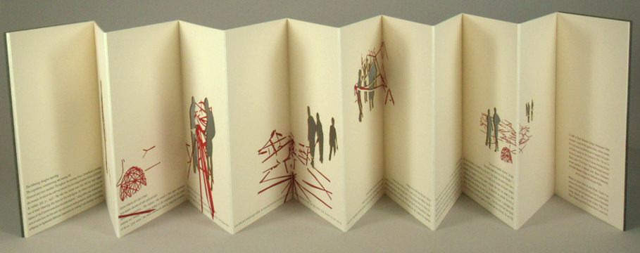
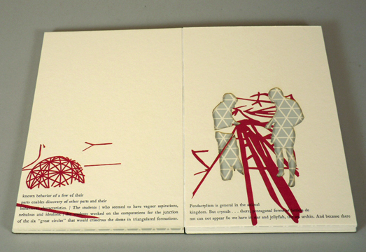
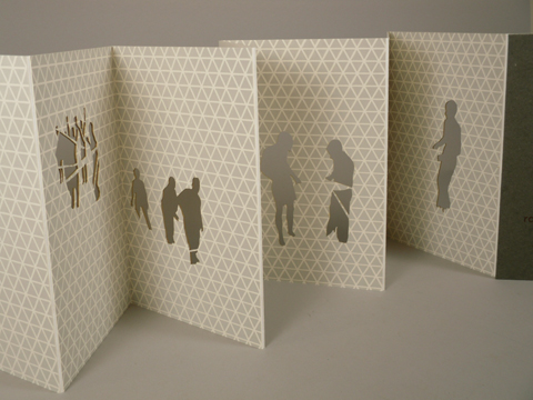
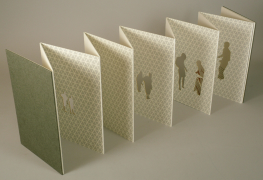
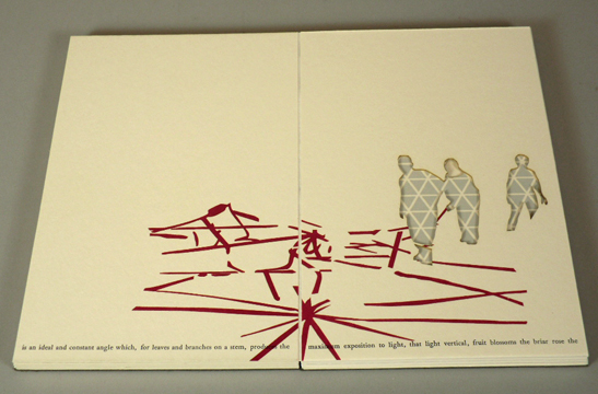

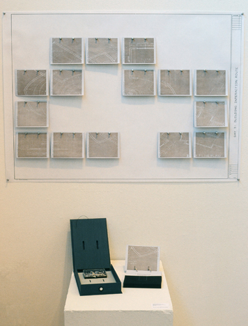


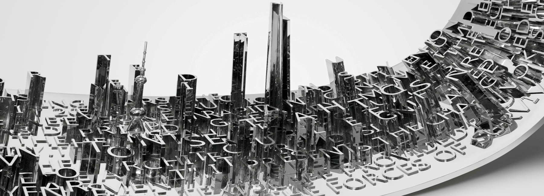


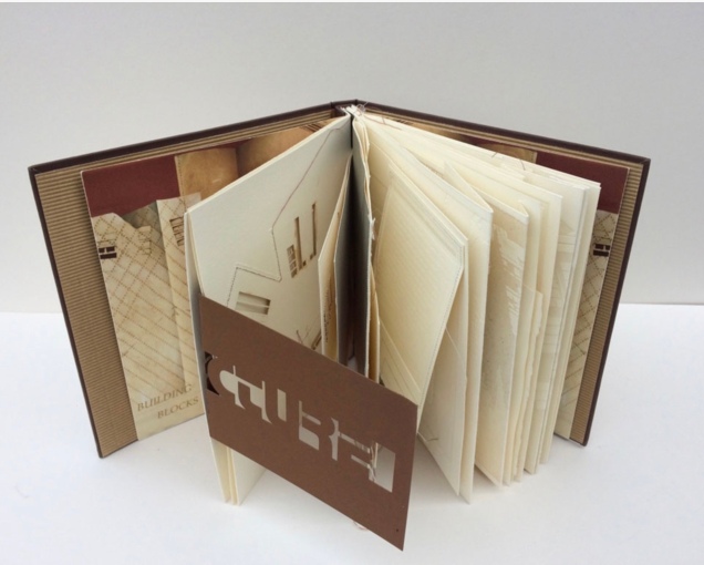
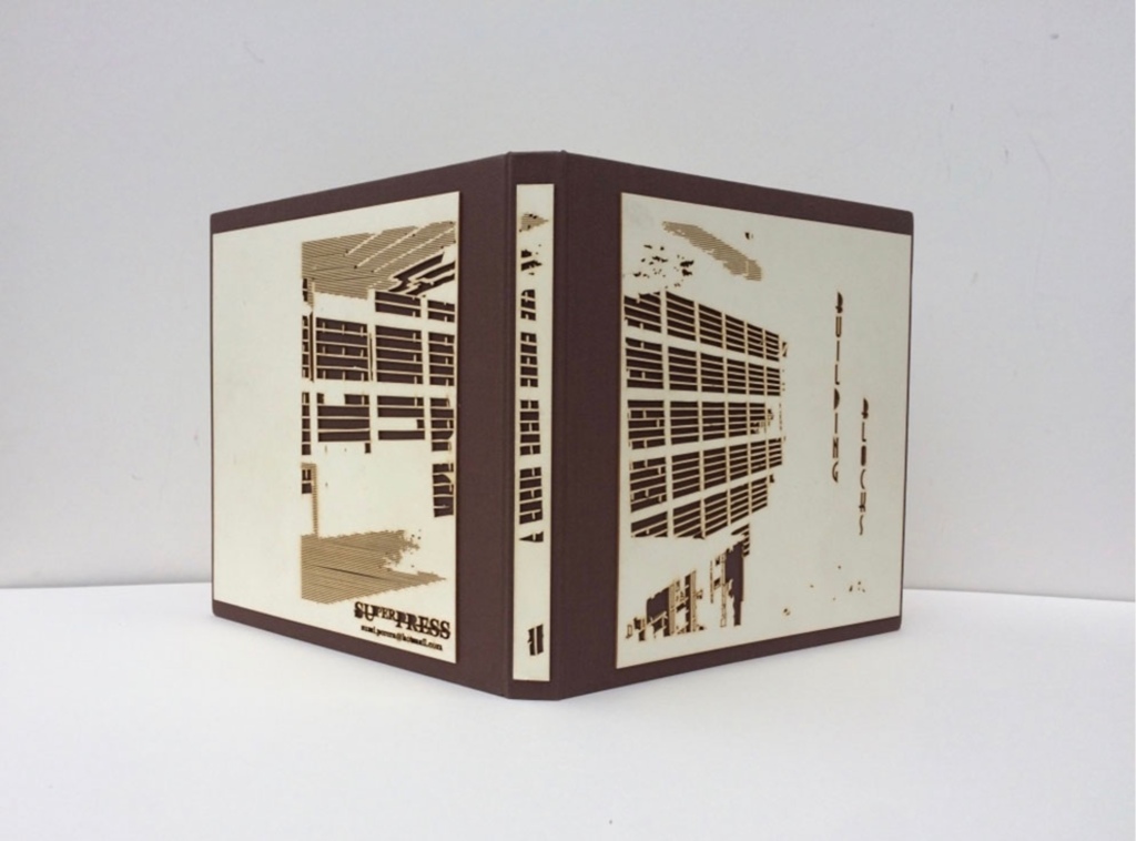
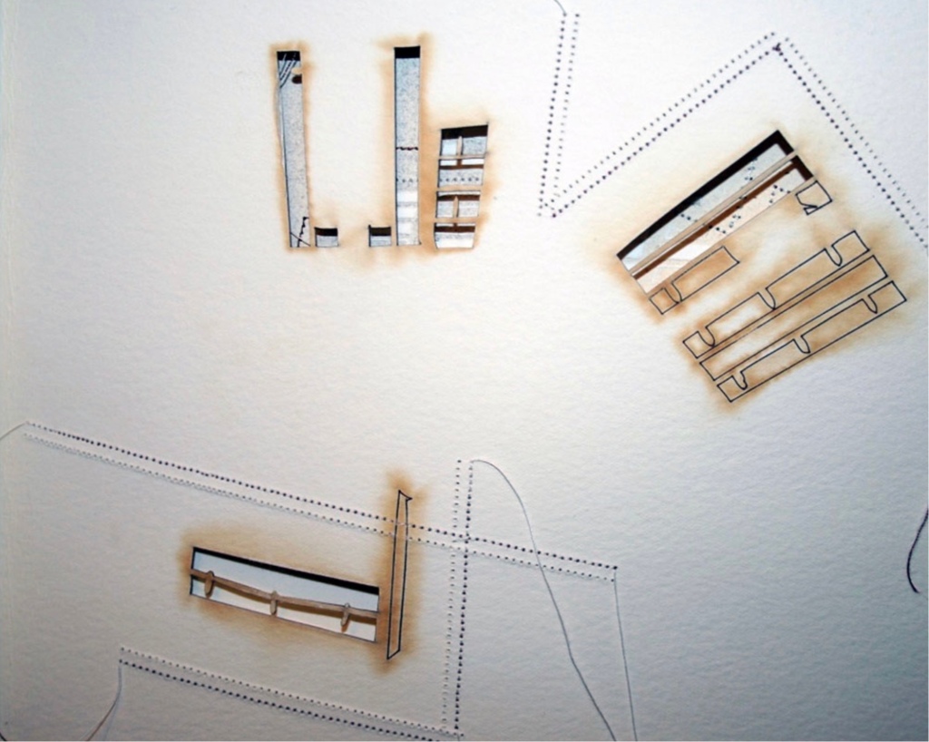
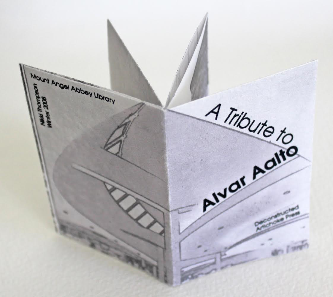
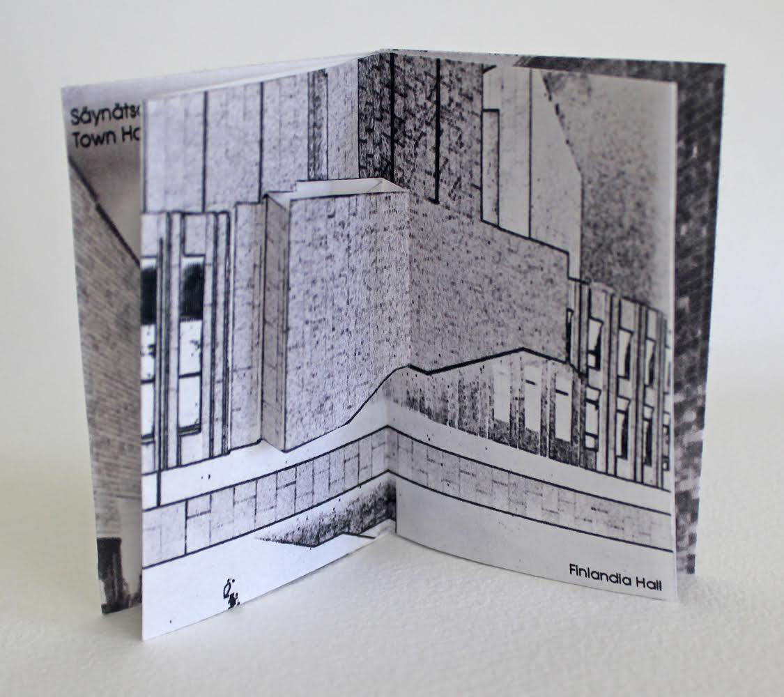
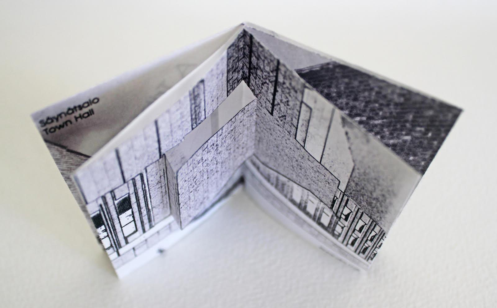

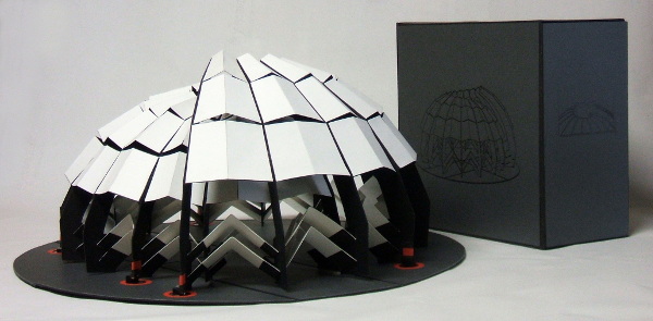
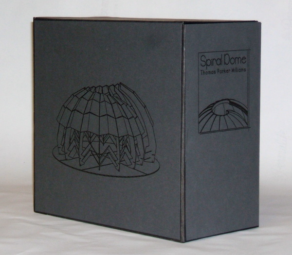
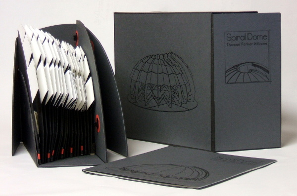
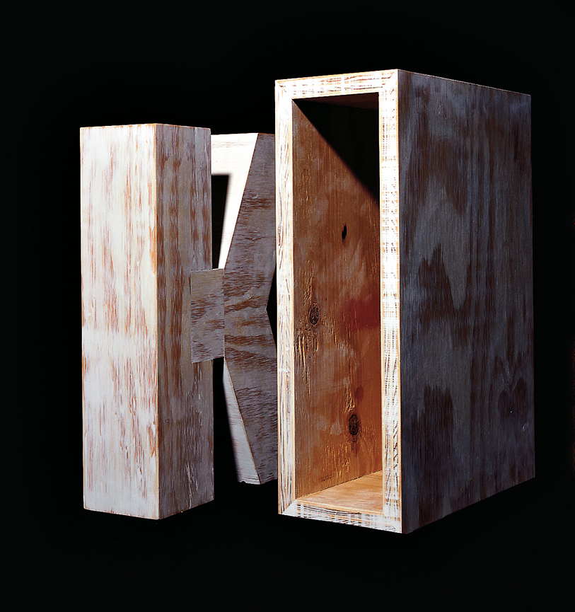


