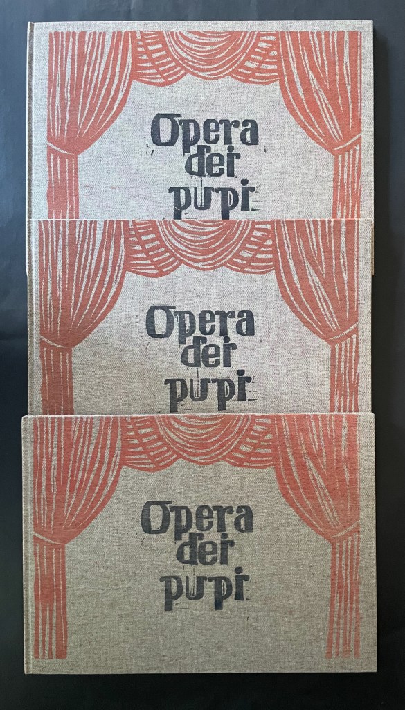
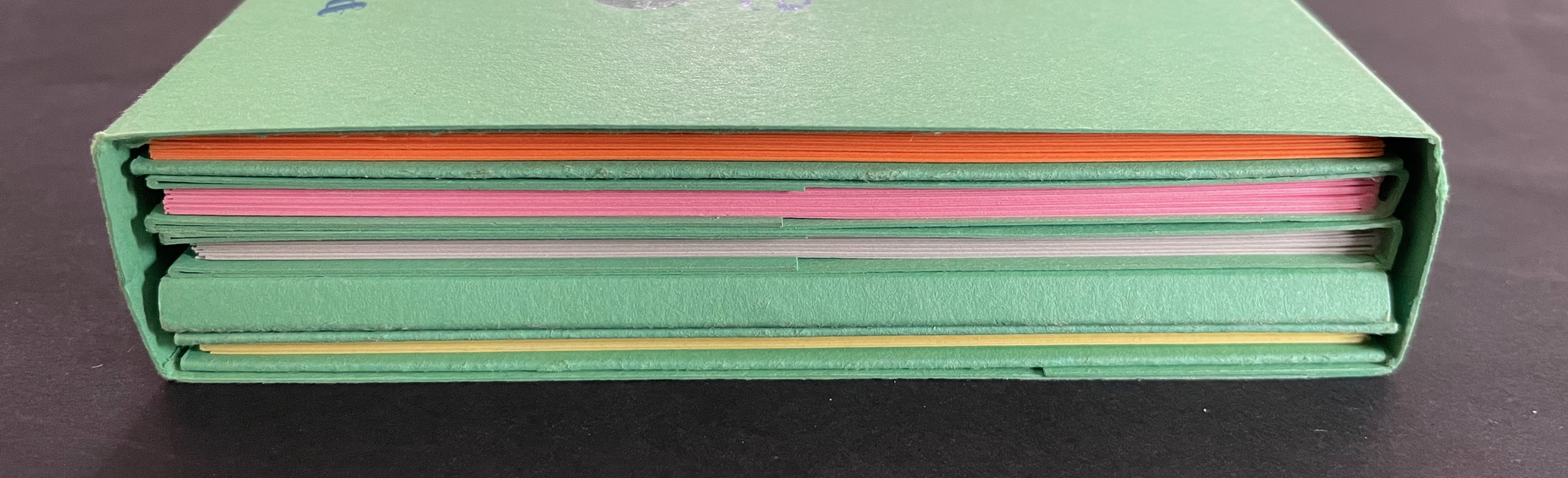
Opera dei Pupi (2024) Valeria Brancaforte Casebound hardback, cloth over boards, print on front cover. Plain brown doublures. Three variants based on trim and paper. A: H272 x W368 mm; Drap, Catalan hand-made paper. B: H261 x W360 mm; Italian Magnani Incisione. C: H265 x W362 mm; Somerset Velvet White 250gsm. [20] pages with 14 prints. Each in an edition of 12, of which A is #11, B is #5, and C is #1. Acquired from the artist, 14 November 2025 and 7 February 2026. Photos: Books On Books Collection. Displayed with permission of the artist.
Puppets and marionettes have figured in more than a few artists’ books. Ron King and Roy Fisher’s The Left-handed Punch (1986) and Anansi Company (1992) are perhaps the best known. Others include Ann Kresge’s Shadow Play (1998), Antonio Nocera’s La Valigia di Pinocchio (2015), Emily Martin’s Funny Peculiar Funny Ha Ha (2017), Hormazd Narielwalla’s Paper Dolls(2018) Erminia De Luca’s Now it’s up to you (2023), and Rachel Simmons’ Dream of the Golden Empress (2023). Valeria Brancaforte’s recent addition to the cavalcade brings to it a new cultural tradition and a welcome chance to compare how variation in paper can play into appreciation of an artist’s book.
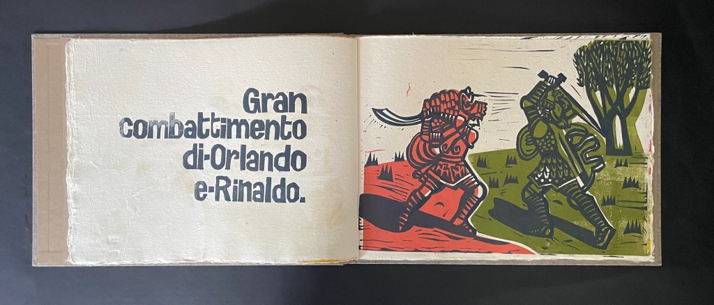
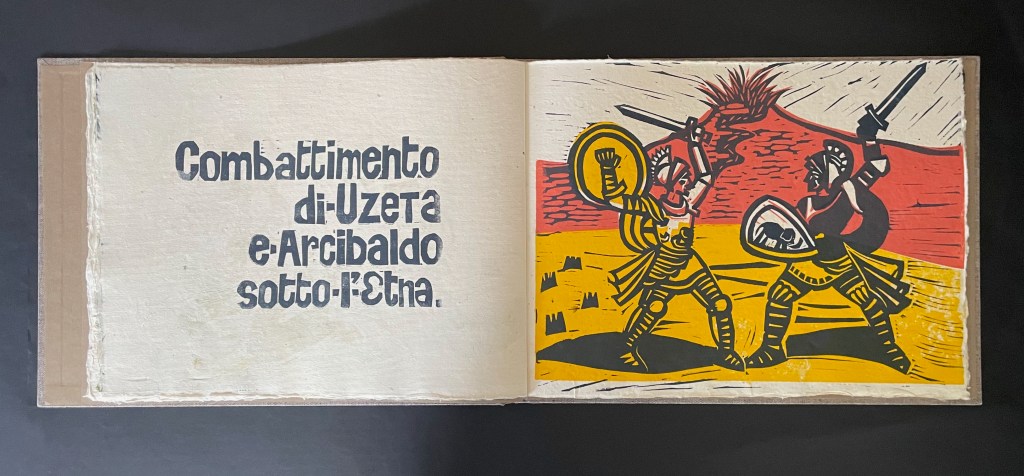
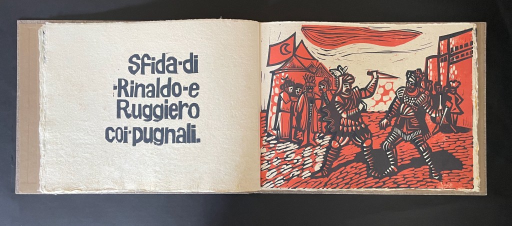
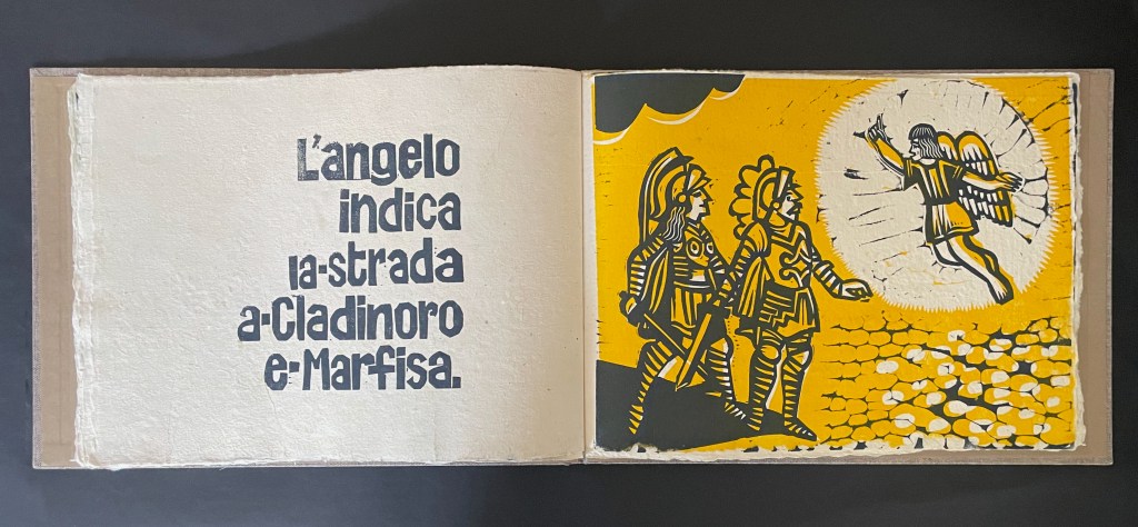
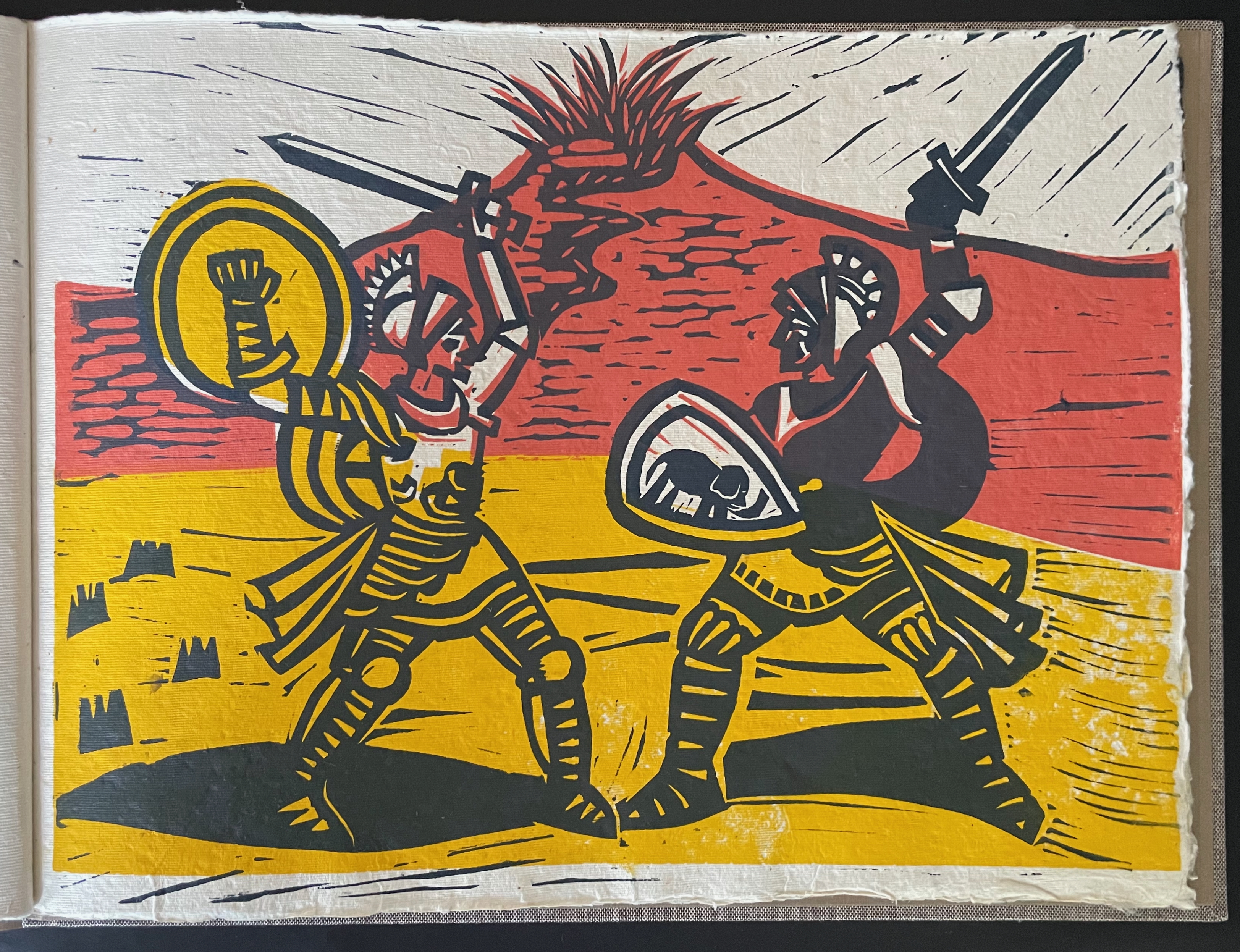
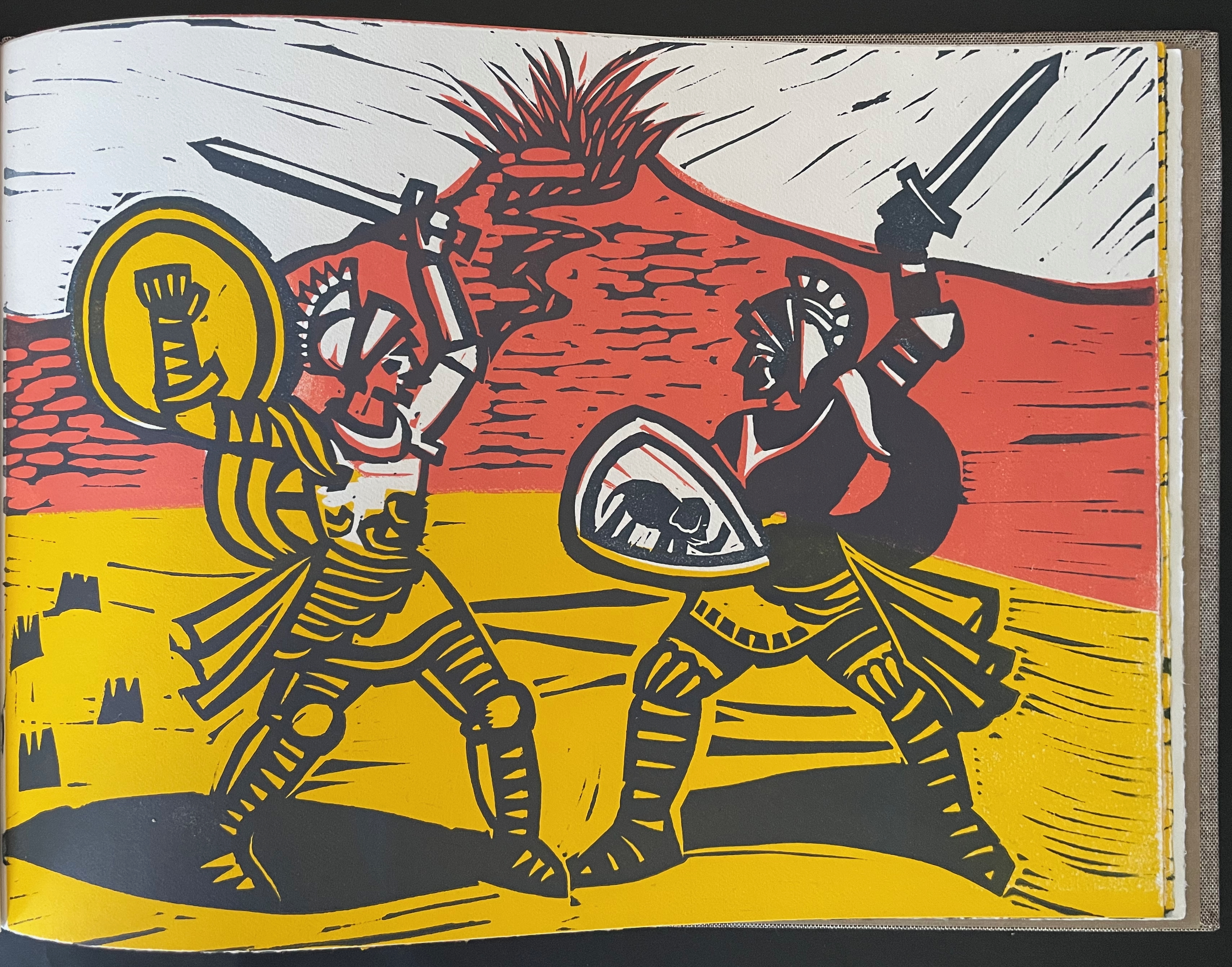
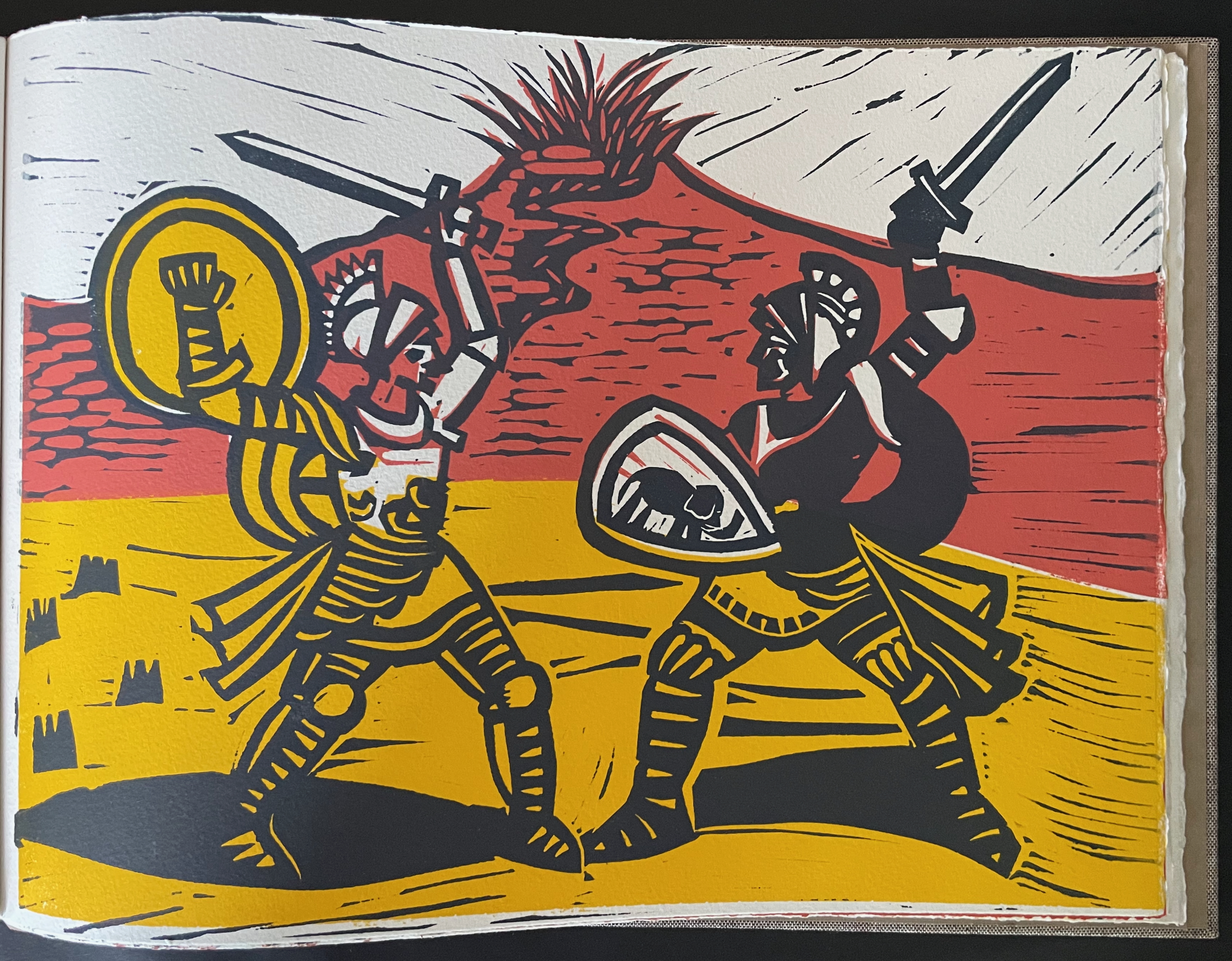
Emerging in the early 19th century, the wood and iron marionettes of the Sicilian Opera dei Pupi formally gained a place on UNESCO’s Representative List of the Intangible Cultural Heritage of Humanity in 2008. Its unique flavor comes from the combination of its craft, performance, and narrative core in the Carolingian cycle, those romantic medieval tales of Charlemagne, Roland, and the Saracens.
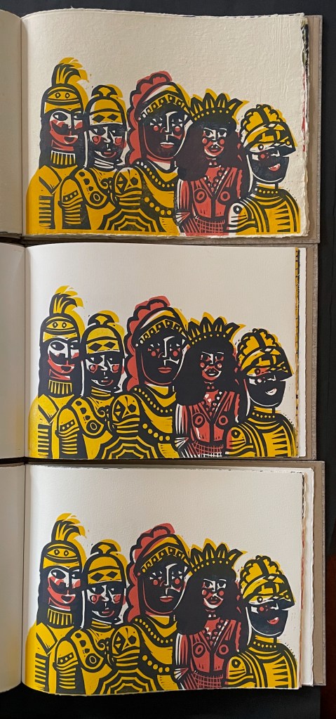
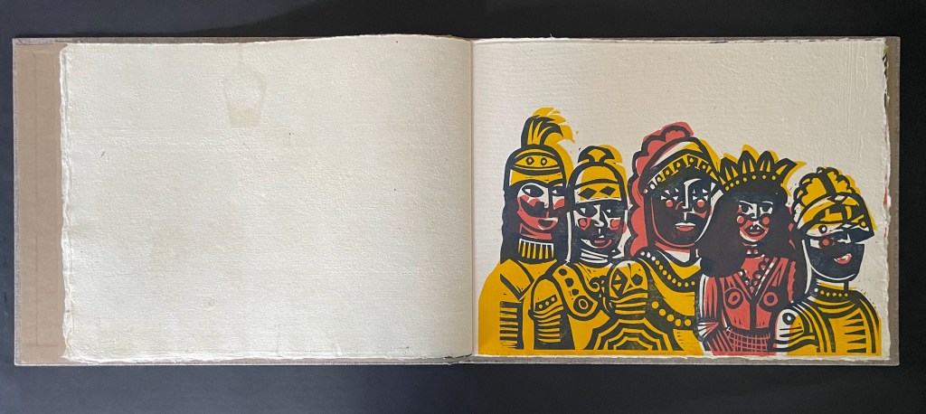
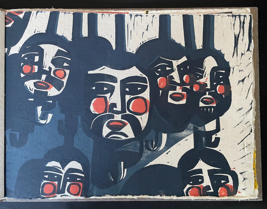
Paying tribute to her Sicilian heritage, Brancaforte enlists eight of the several standard characters from the cycle: Angelica, Orlando, Rinaldo, Uzeta, Arcibaldo, Ruggiero, Cladinoro, and Marfisa.
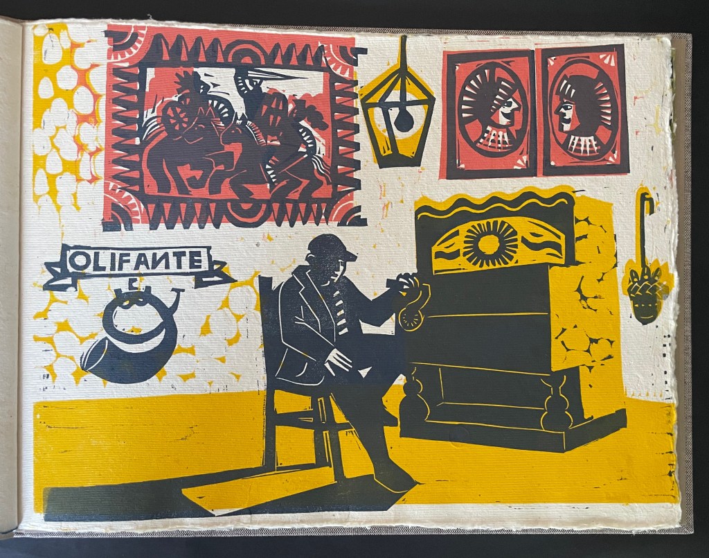
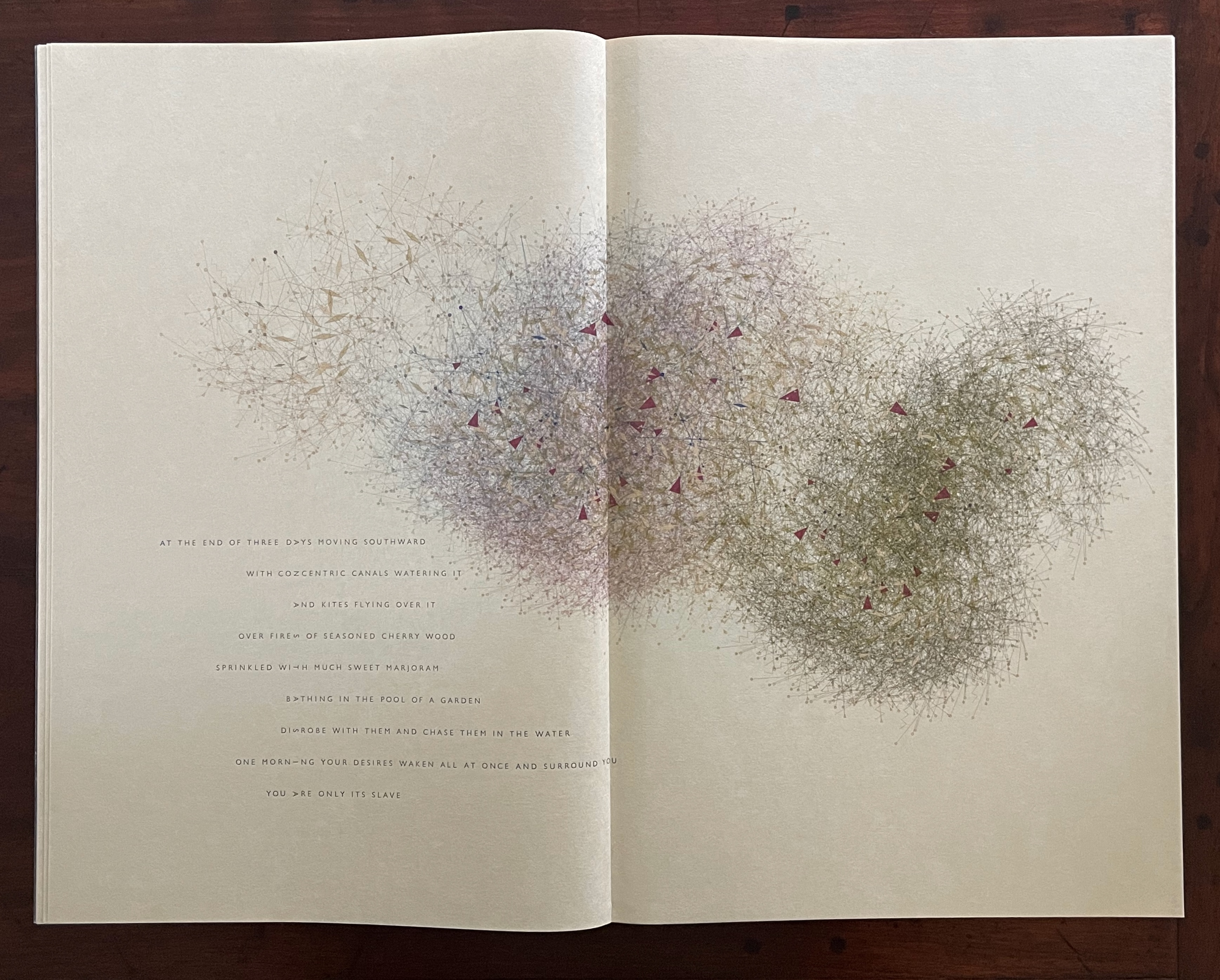
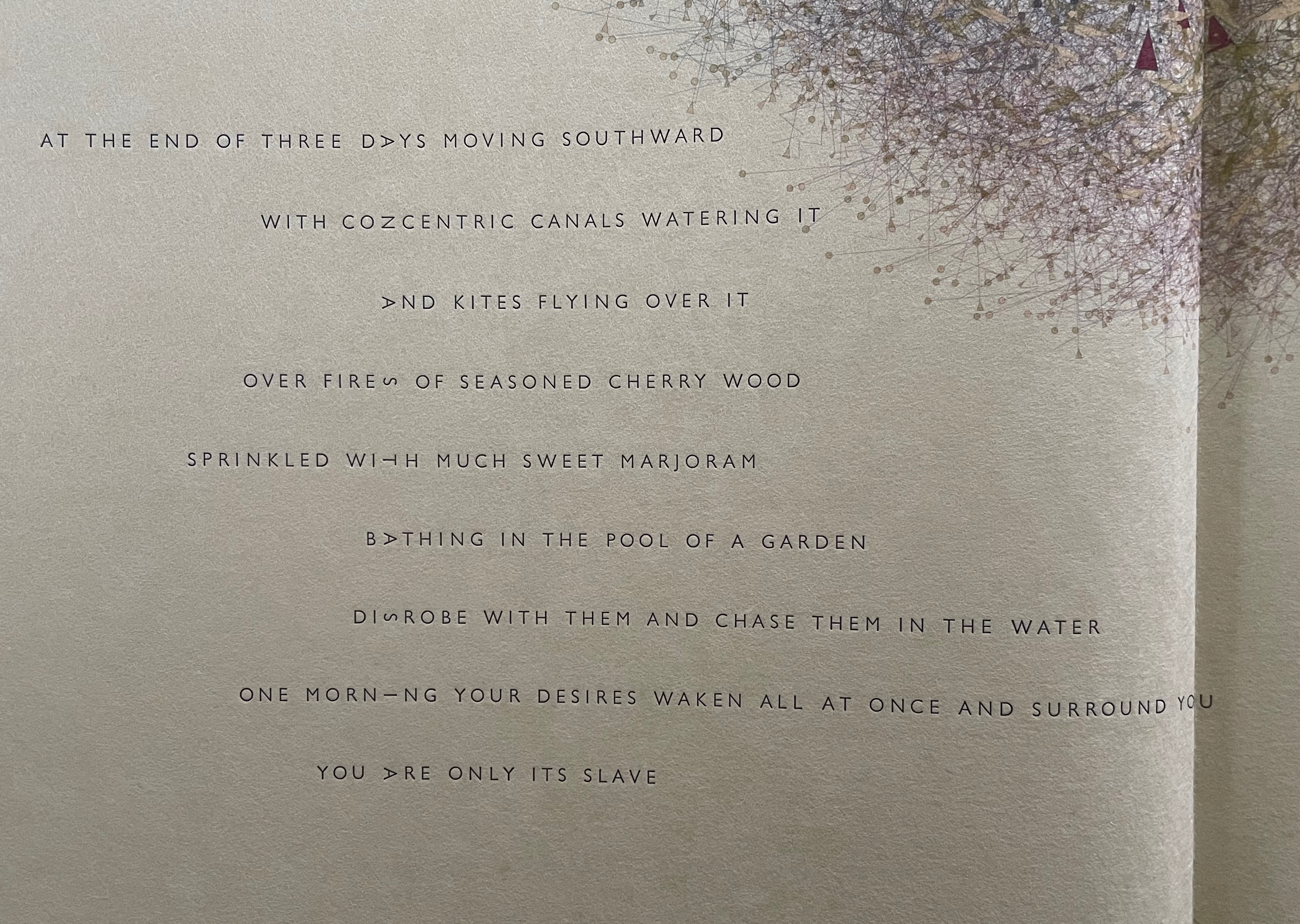
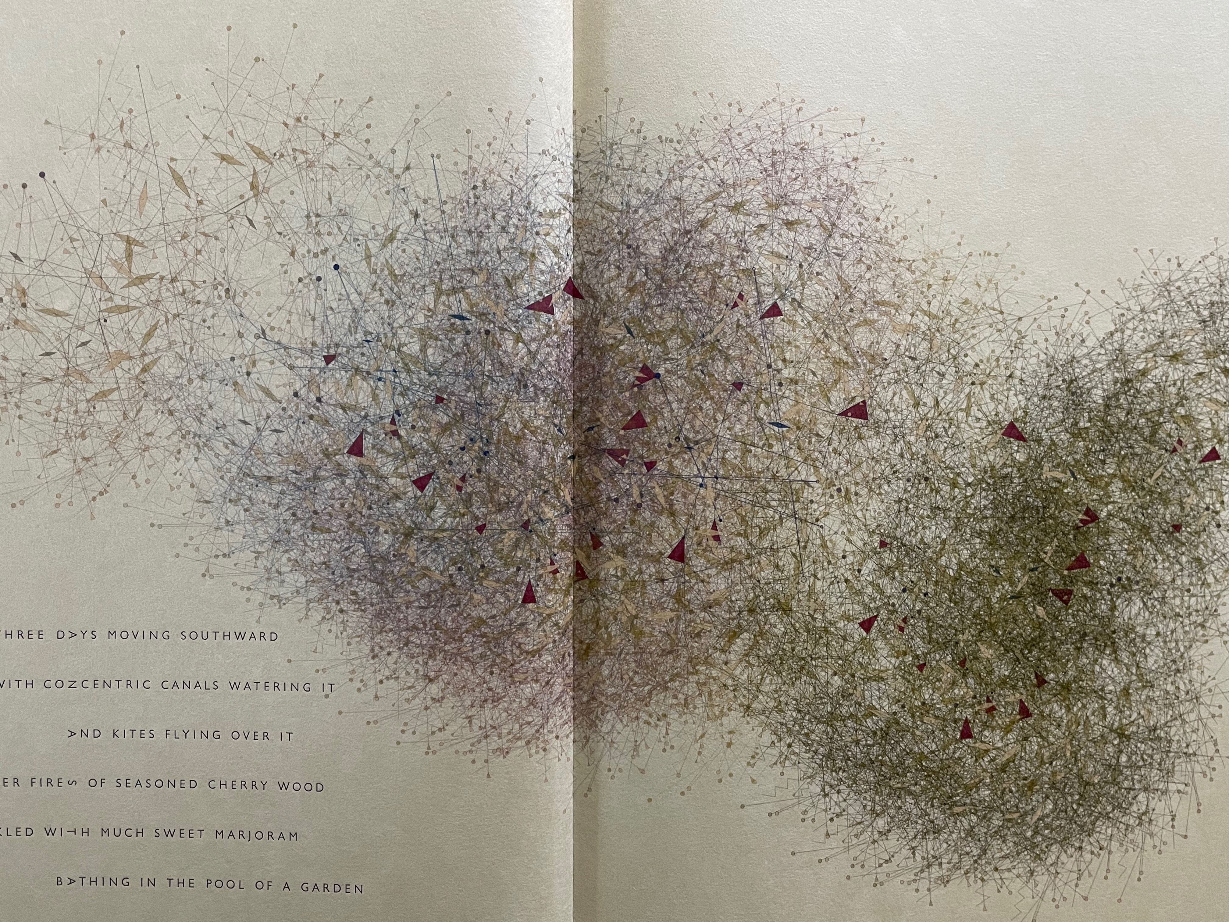
Her linocuts capture not only key scenes from their dramas but also the atmosphere of tradition, music, and wall decorations of theaters still in operation. Although Brancaforte comes from the Catania region of Sicily, she has a warm spot for the distinctive interpretation in Palermo, which accounts for the depiction below of the piano a cilindro, typically from the Palermo area. Brancaforte writes:
… their musical repertoire included songs and dances – typically The Battle, the March, the Gallop and the Lament (the first three played during duels and military actions, while the lament accompanied particularly serious or tragic moments in the story, such as the death of a protagonist). The piano a cilindro was never used in theatres in Catania and eastern Sicily, where the stage music for the Opera dei Pupi continued to be performed live by small orchestras until the second half of the 20th century. The companies in western Sicily had a more entrepreneurial mind and more “settled” nature (the theatres themselves were larger, with more robust stages to accommodate its much taller and bigger and heavier pupi….). — Brancaforte, correspondence.
The puppet heads awaiting assembly.
Go to 2″04″ in this entry’s opening video to see the “hurdy gurdy” or barrel organ in operation.
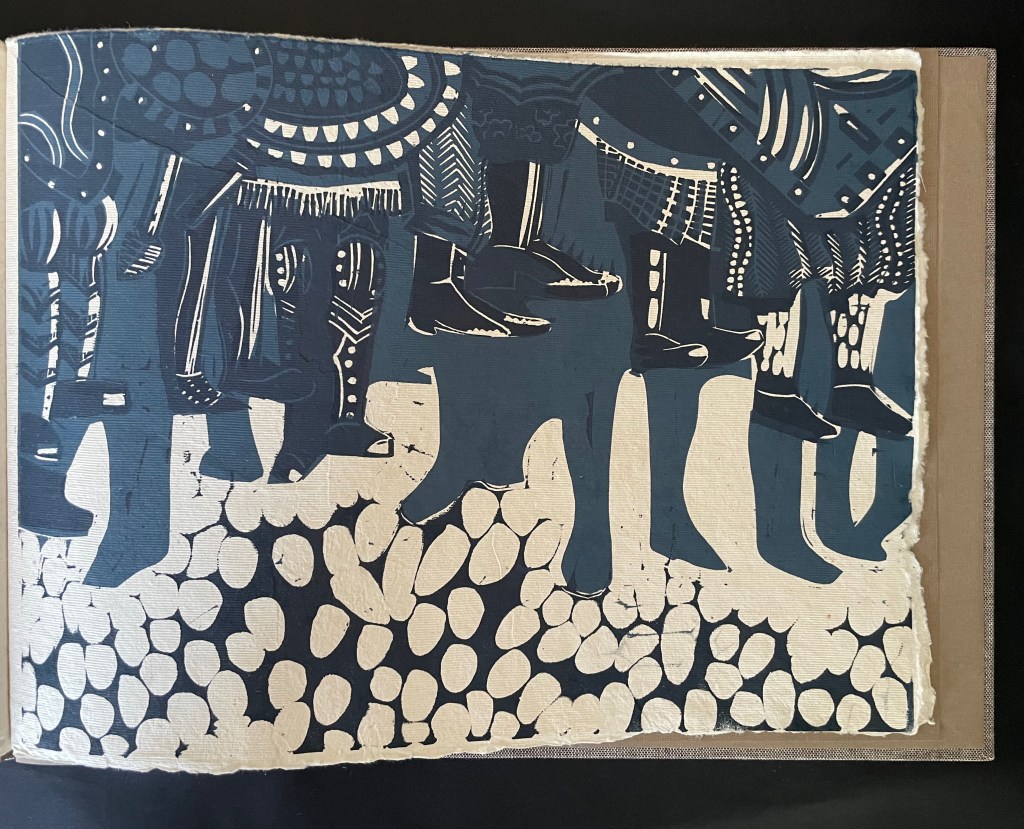
Final image: casting their shadows, the puppets’ legs and feet hang down from where the puppeteers store them until the next show.
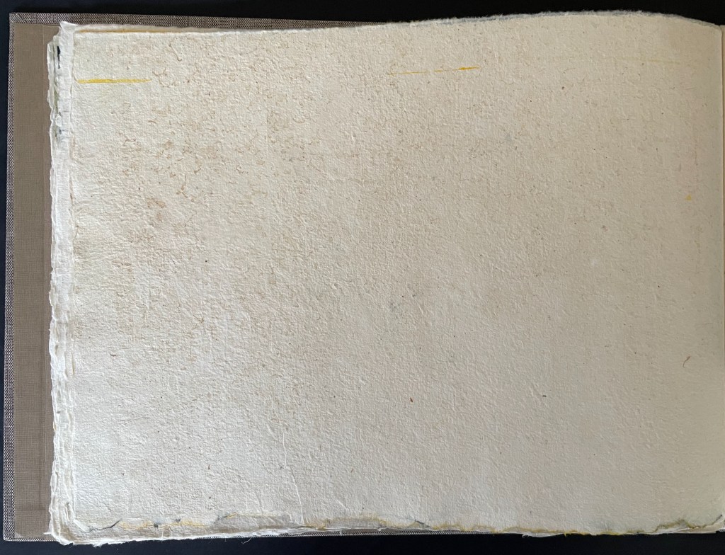
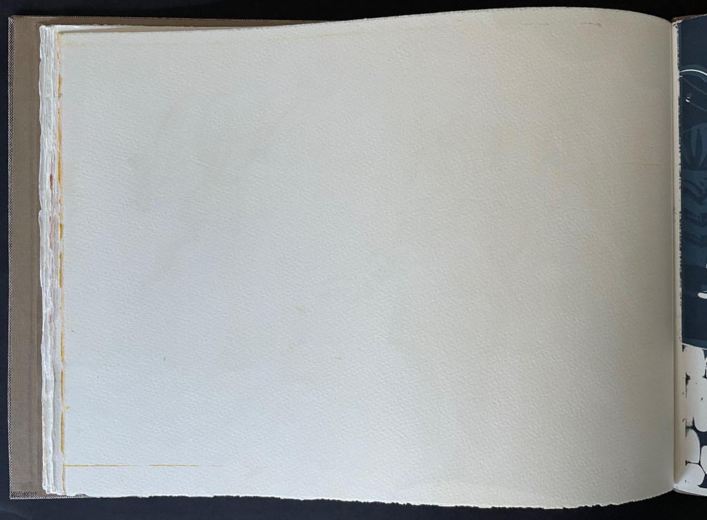
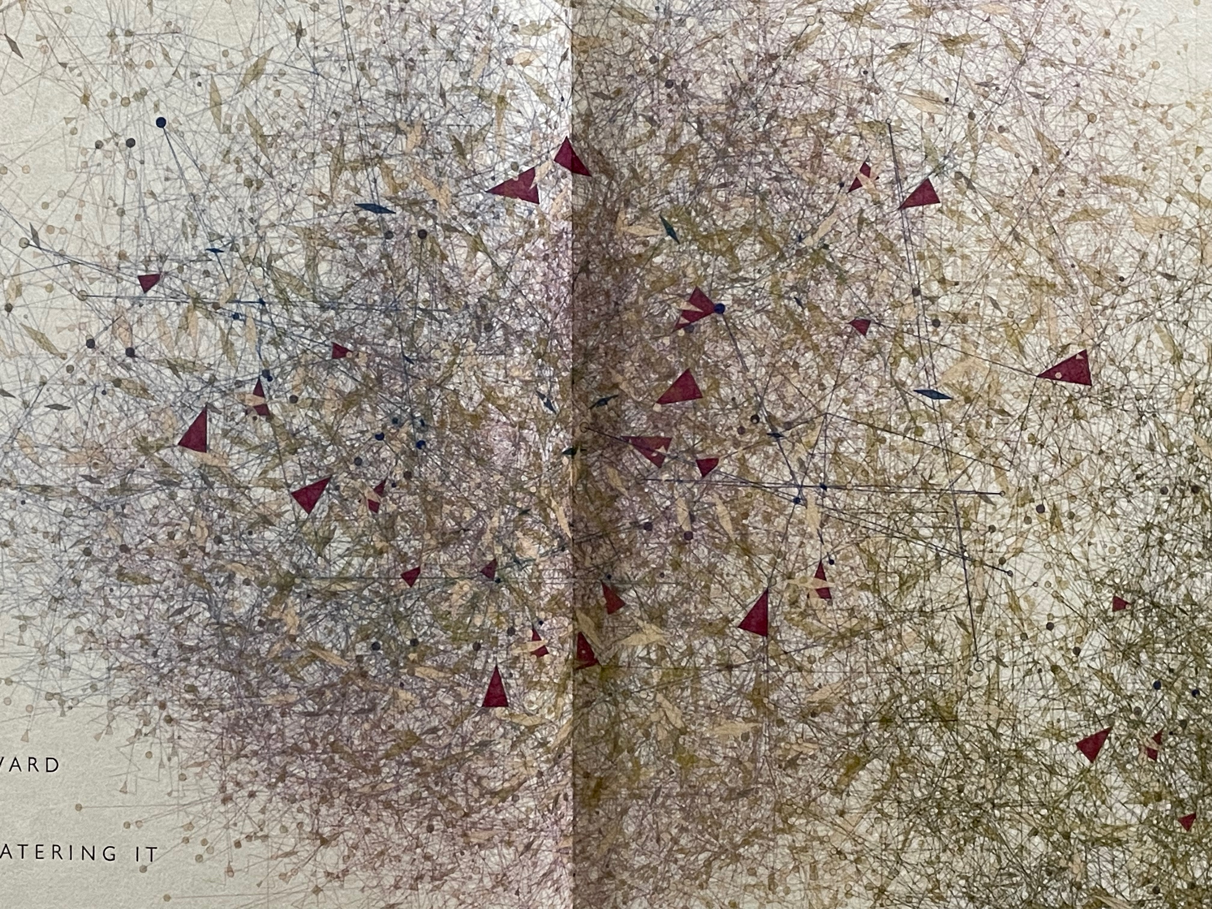
All of the eight spreads above come from the variant edition produced on drap paper, a tribute that Brancaforte pays to her adopted region of residence — Catalunya, where she sources the paper directly. The Catalan word drap translates as a rag or tatter or shred of cloth.
Drap – Pieces of discarded clothing or unused trimmings from new cloth recycled and prepared as a high quality fiber source for making paper in the antique mills. Drap would be purchased from the citizens of local communities and delivered by the cart load to the papermills. It was primarily the work of women to then receive the drap, remove the buttons and hems, and cut the cloth down into small squares to prepare it for beating. They say that at some papermill sites, one can begin digging on the grounds and unearth heaps of buttons. — Casey, 2012.
Whileparticipating in the BuchDruckKunst book fair, Brancaforte shared a sheet of drap with John Gerard and Johannes Follmer. Gerard “confirmed that it is a sturdy cotton paper that will stand the test of time, also supporting Johannes’s suggestion that it might contain a small percentage of esparto grass, typically used in Spain for basketry” (Brancaforte, correspondence, April).
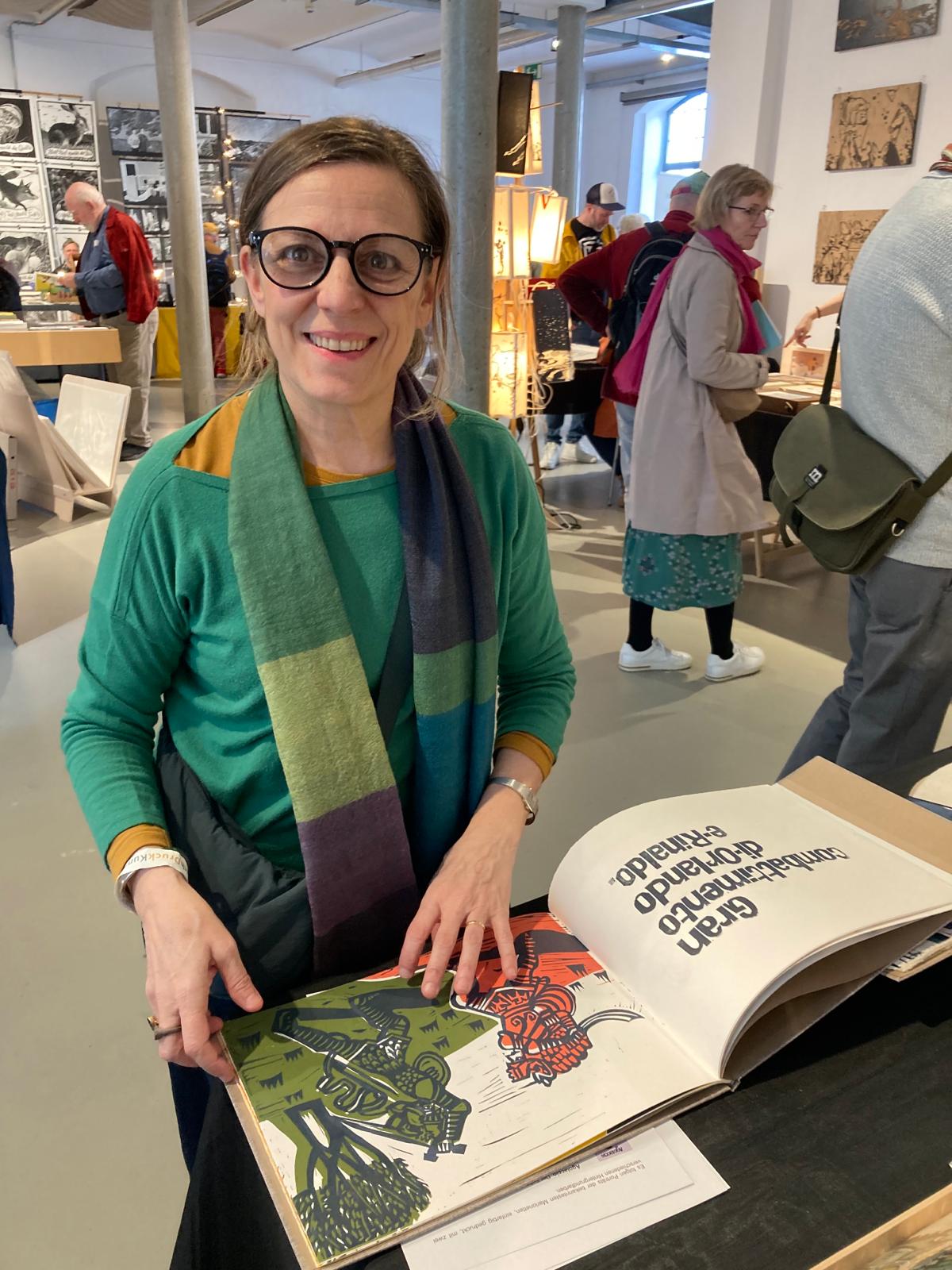
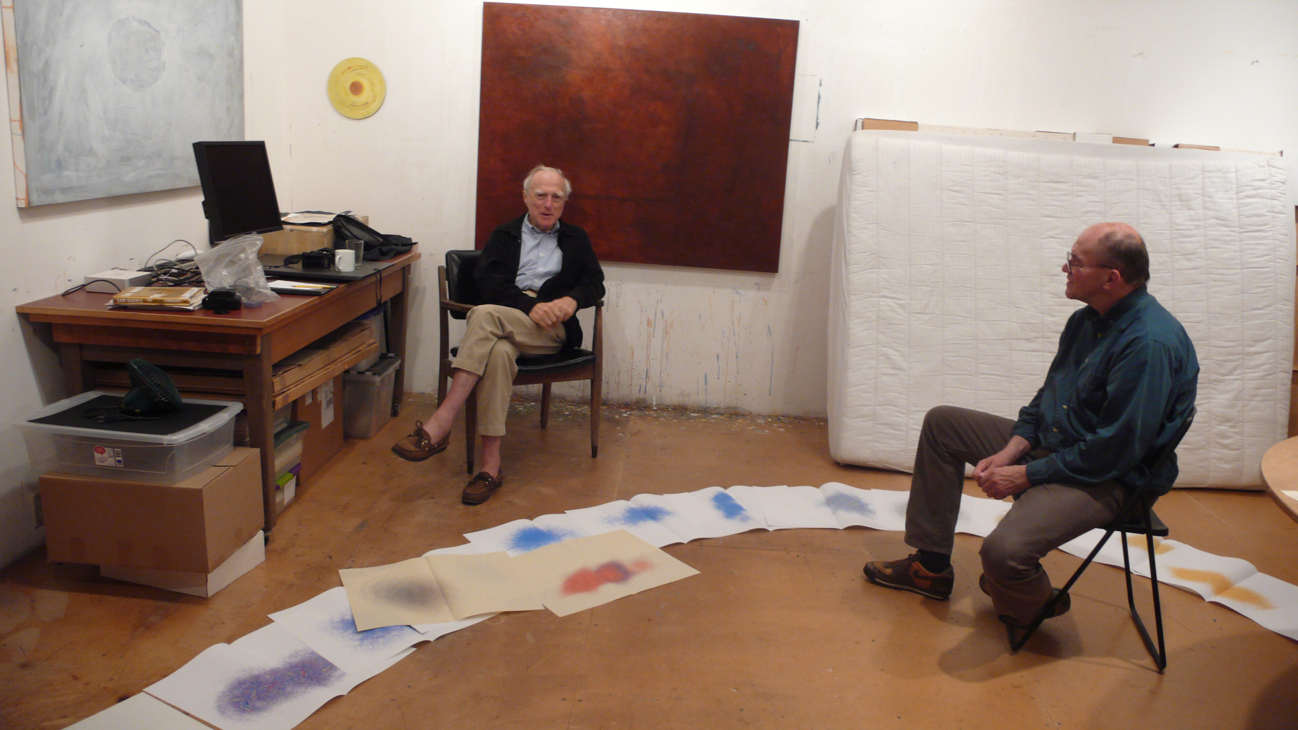
Brancaforte presenting Opera dei Pupi at the BuchDruckKunst book fair, Hamburg. Image courtesy of the artist.
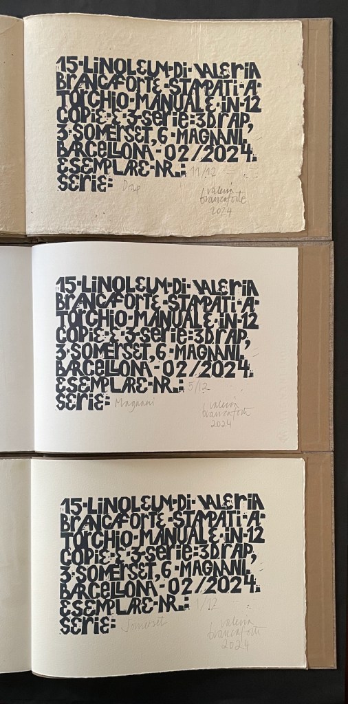
Whatever the elements of chance leading to an artist’s choice of materials, the decision to produce the final variants is deliberate. The opportunity to acquire paper variants of an artist’s book offers the rare chance at direct comparison of the effects of the different substrates. It’s not just the subtle color differences in the linocuts that are worth enjoying but also those in the texture and appearance of the papers.
Drap
Magnani
Somerset
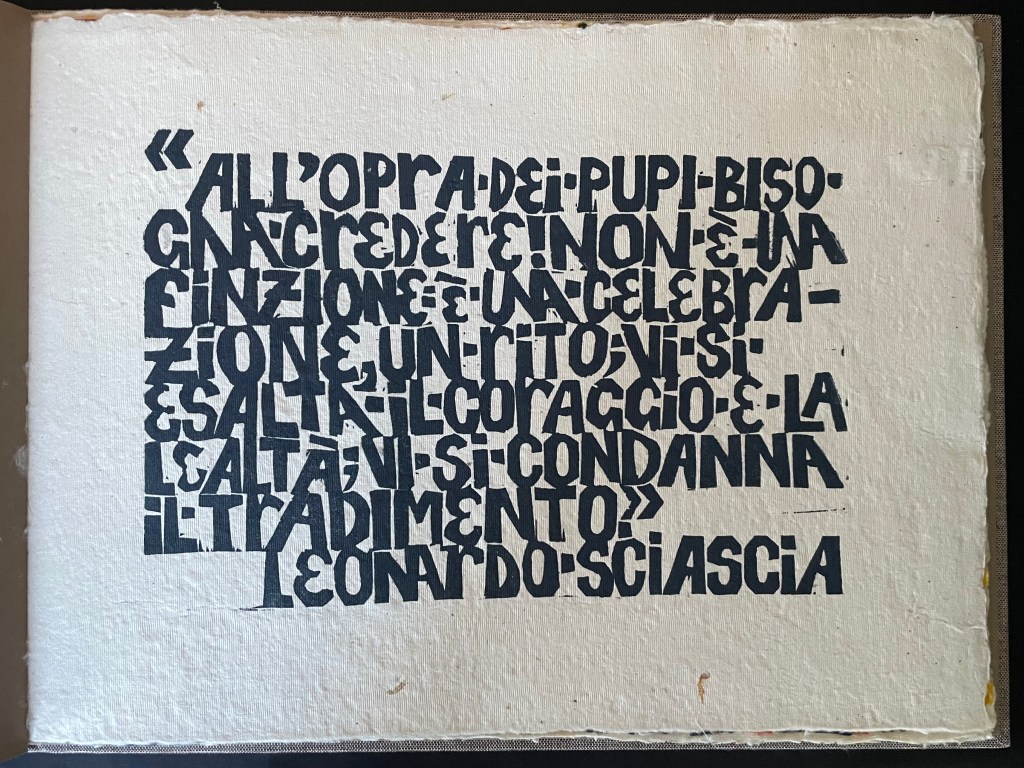
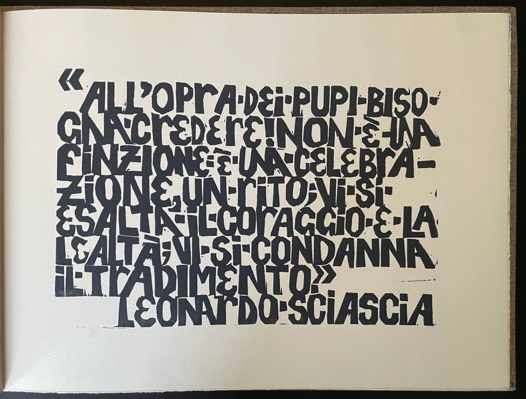
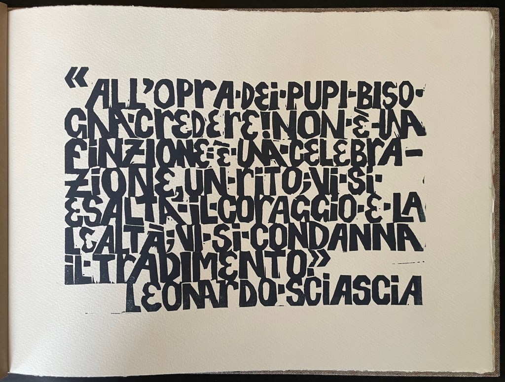
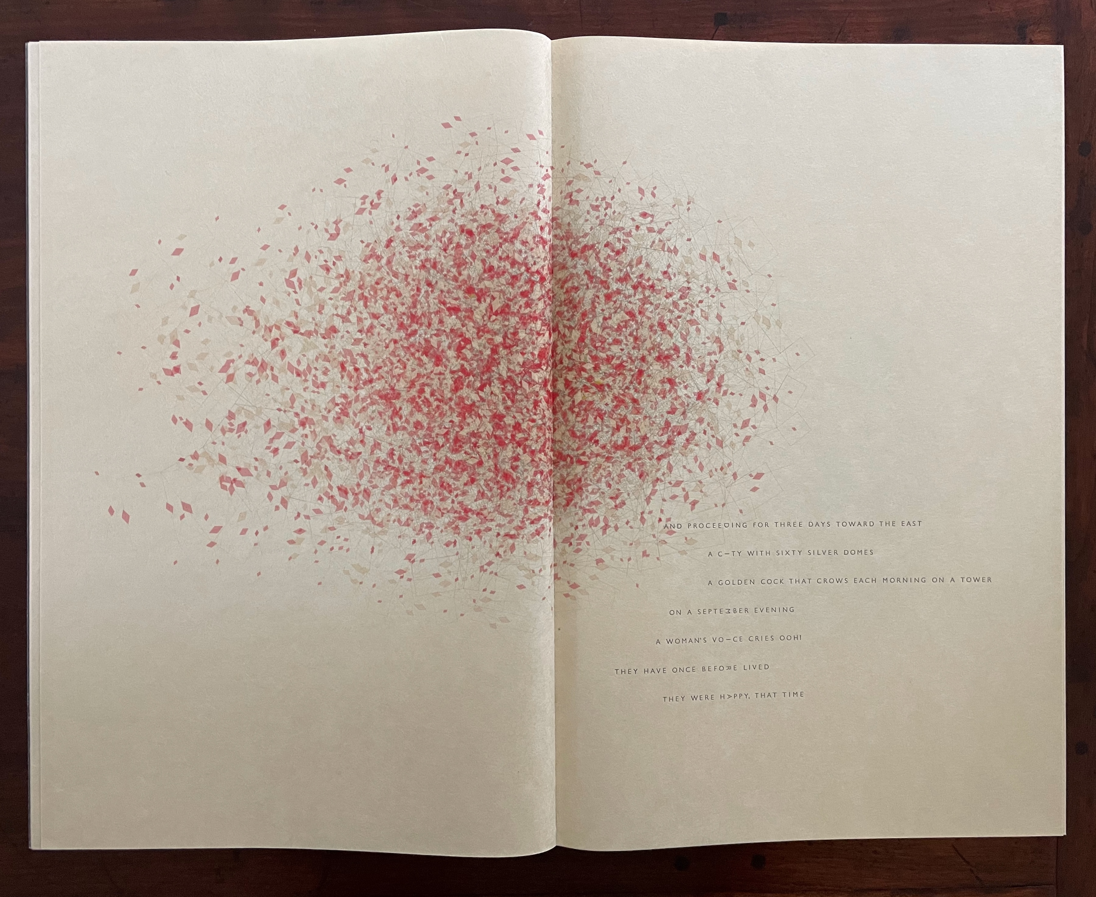
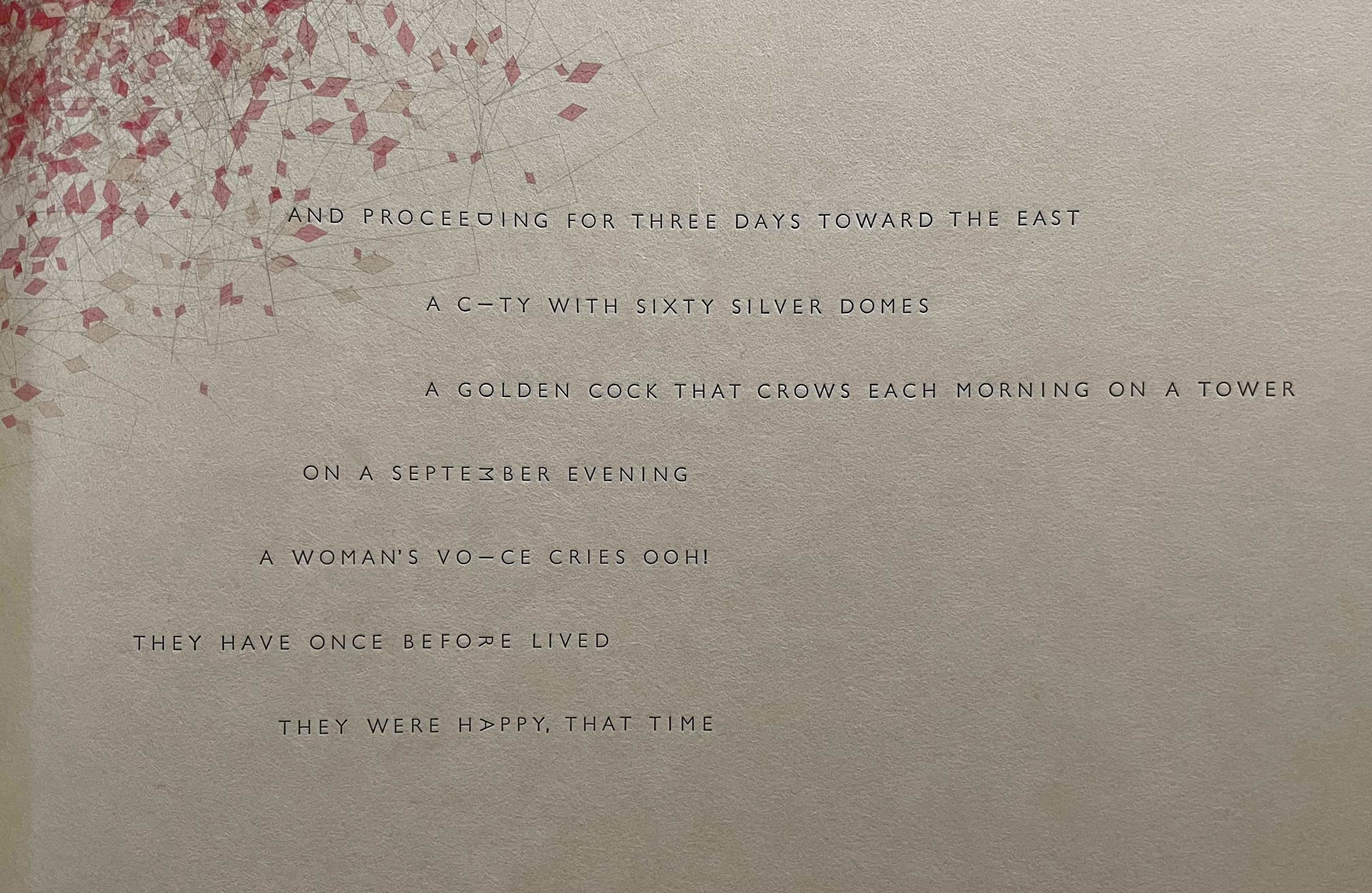
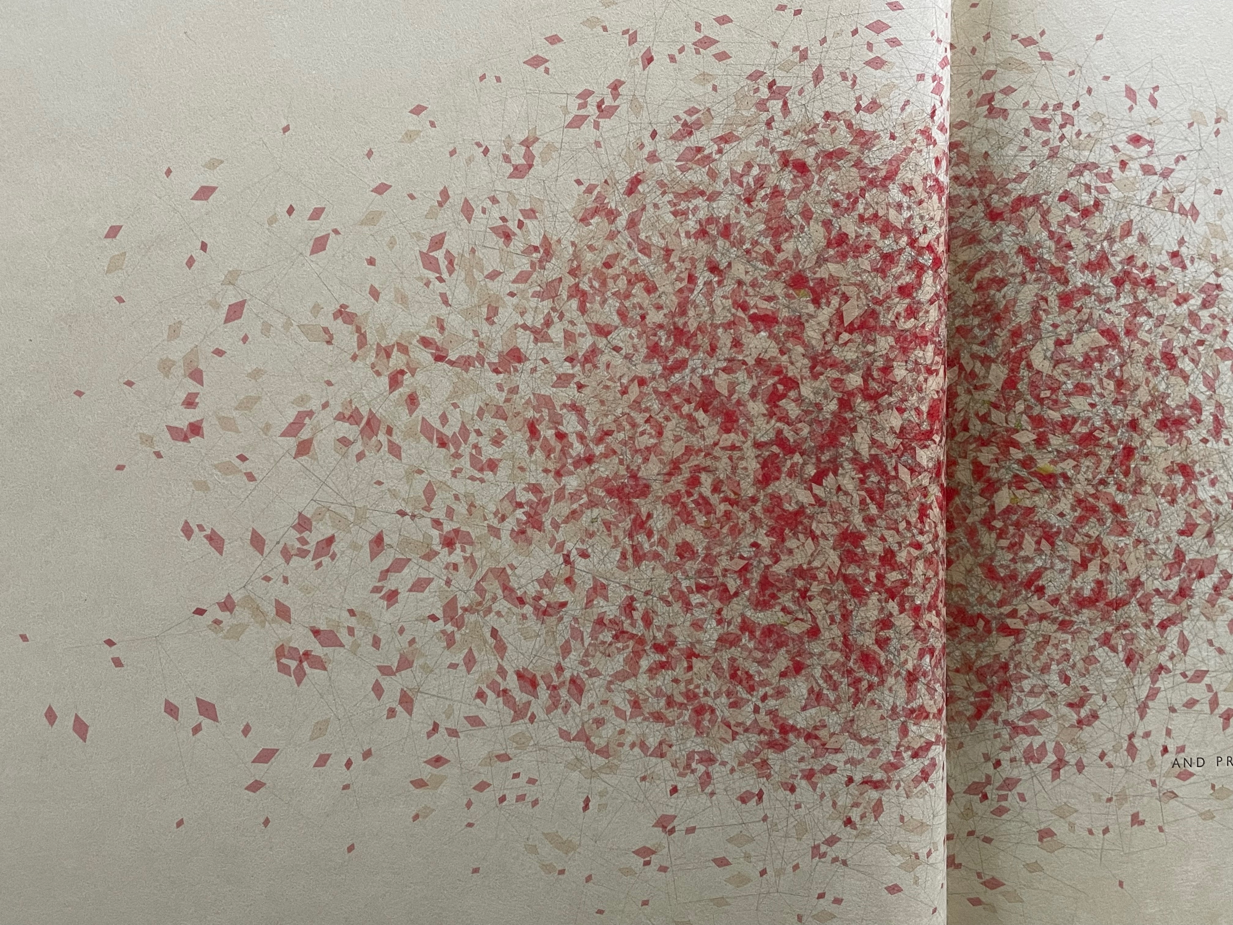
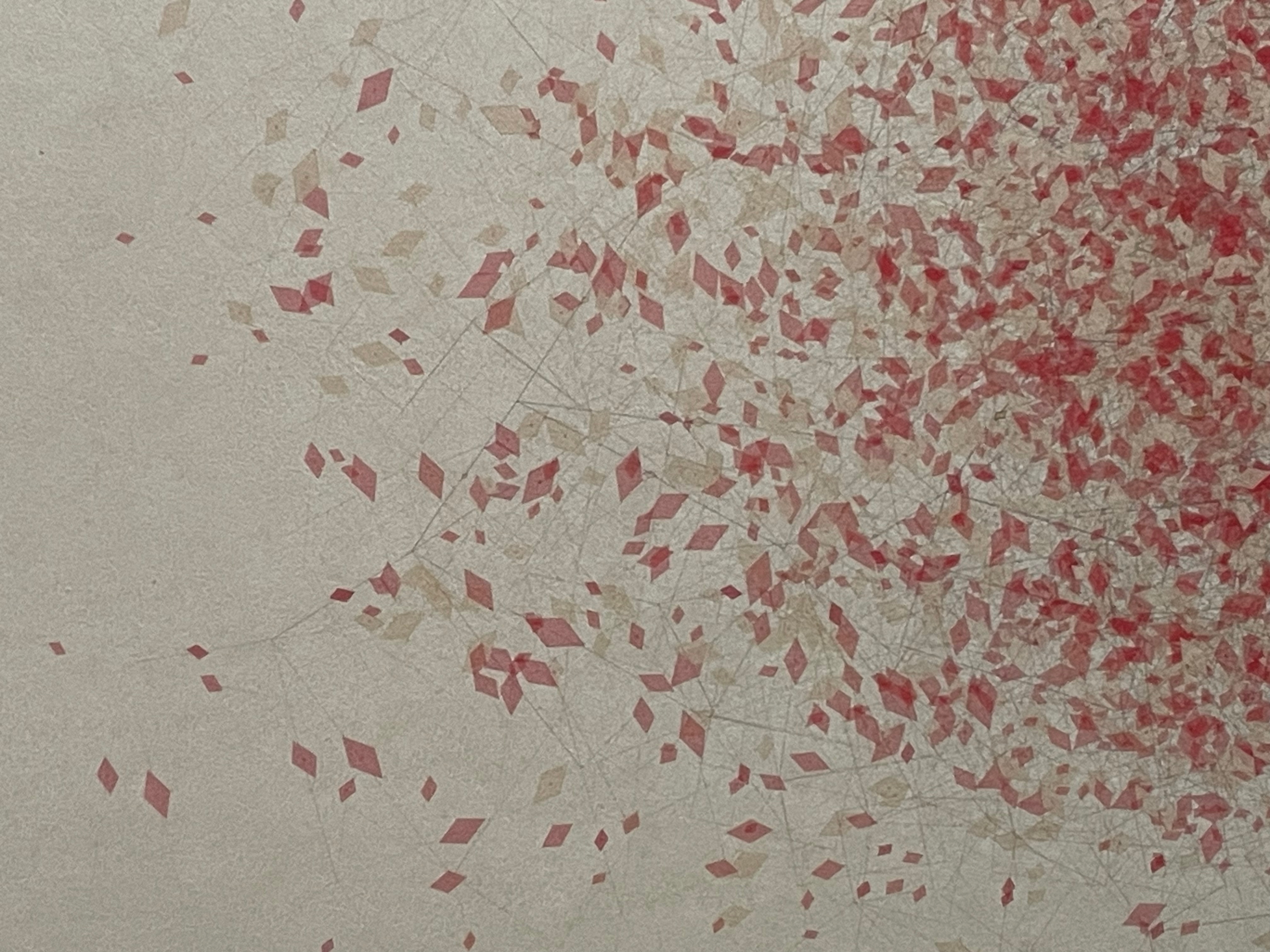
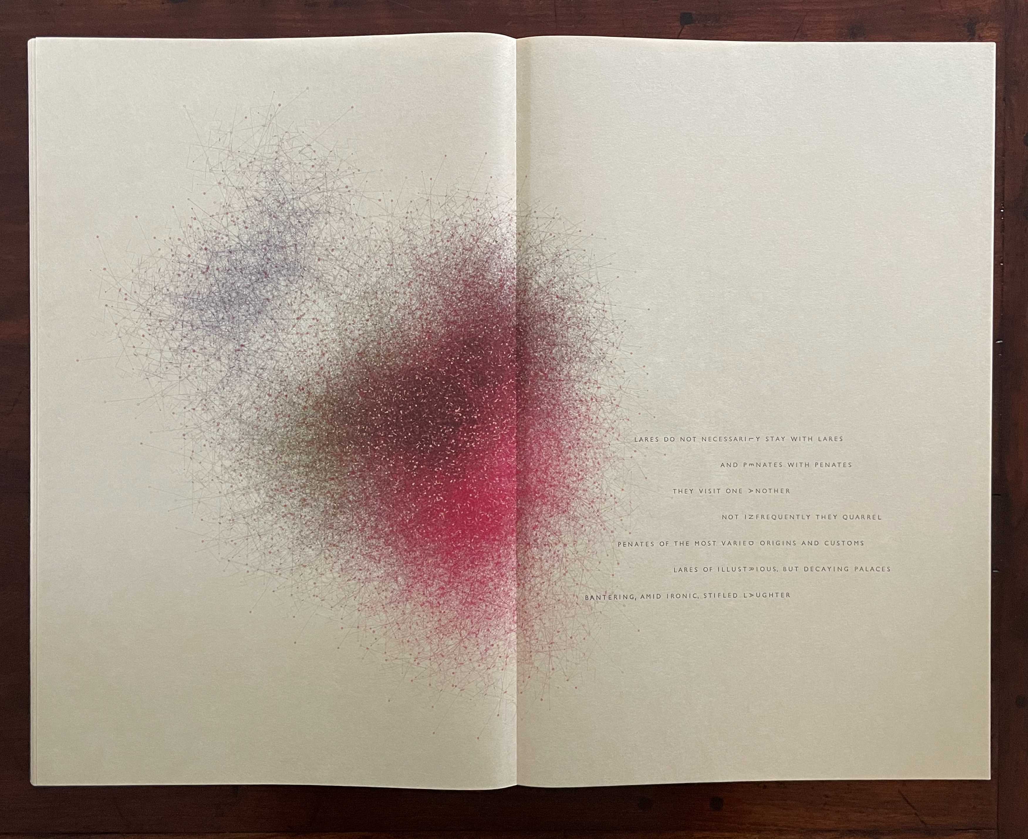
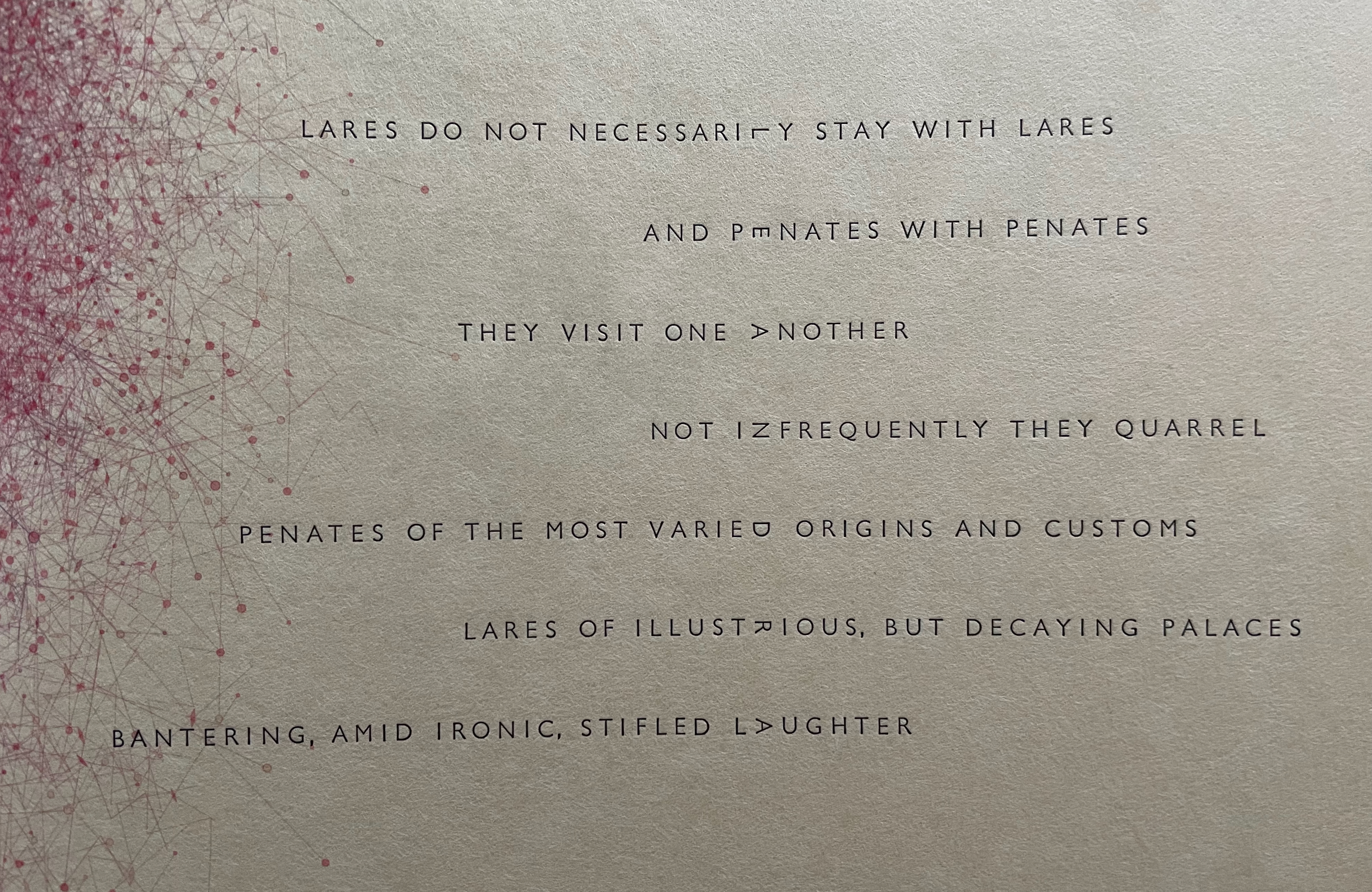
With just the one color on the epigram page, the differences in the papers’ textures and colors stand out.
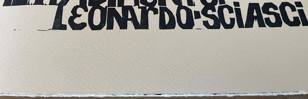
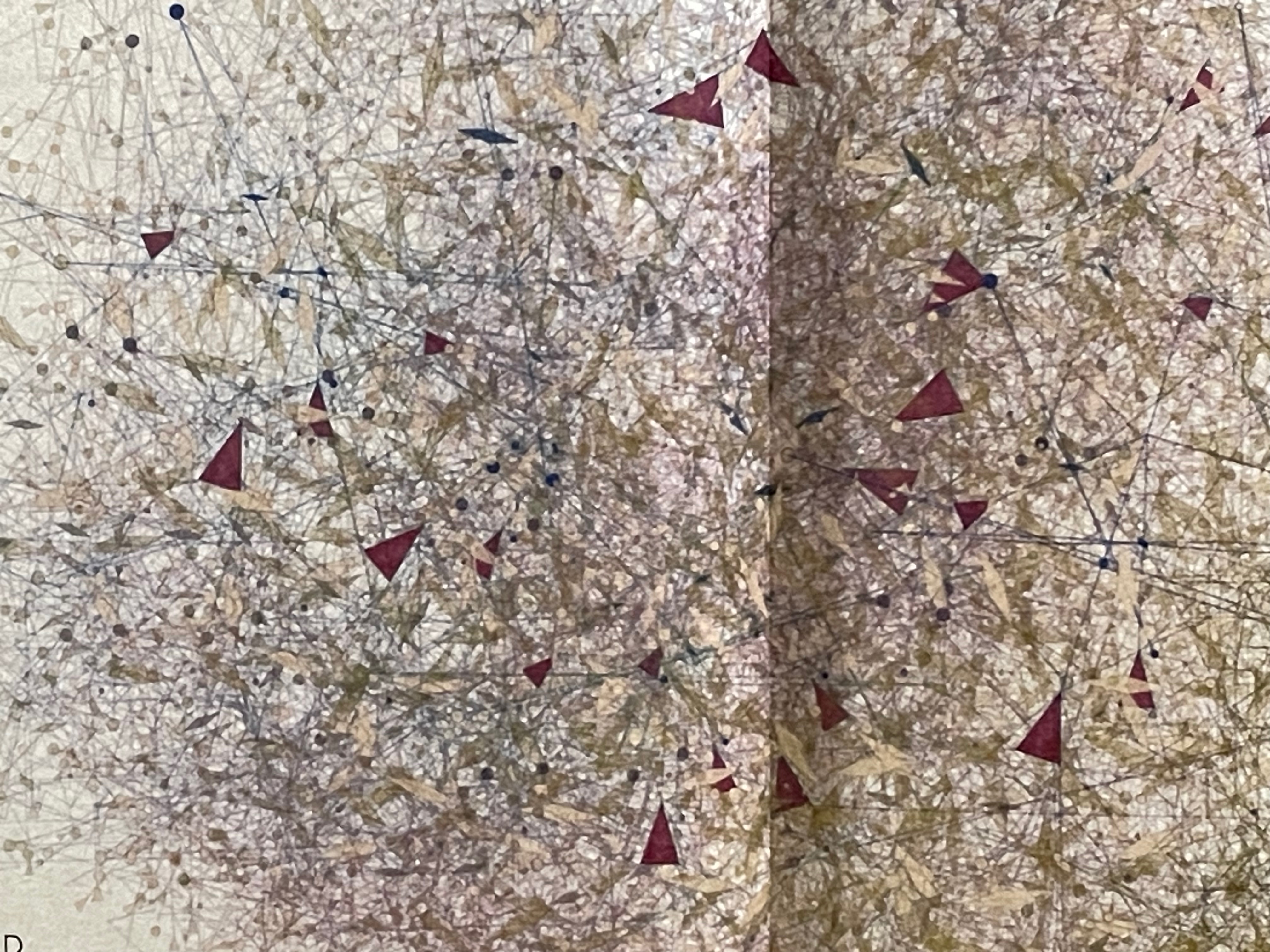
“You have to believe in the opera dei pupi! It is not fiction, it is a celebration, a ritual; it exalts courage and loyalty; it condemns betrayal.” — Leonardo Sciascia A: Drap. B: Magnani. C: Somerset.
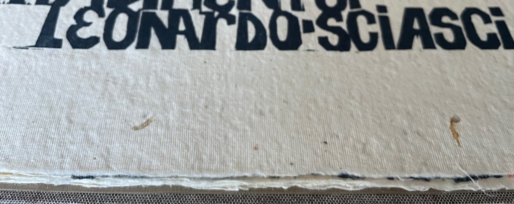
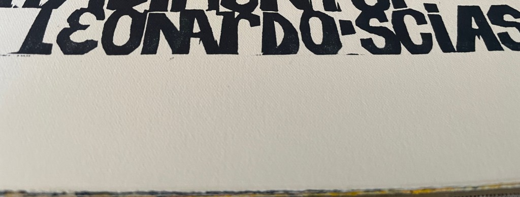
Close-up. A: Drap. B: Magnani. C: Somerset.
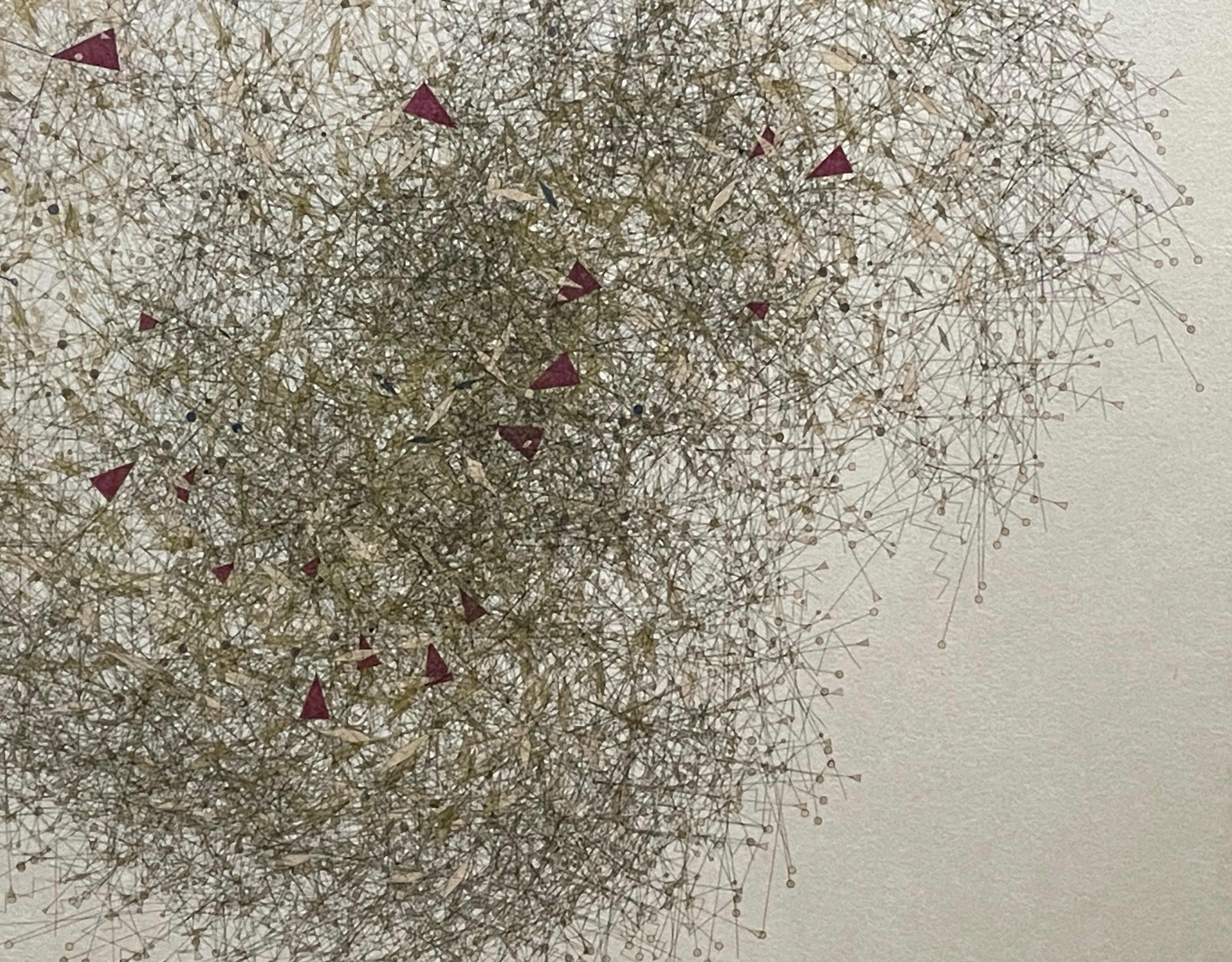
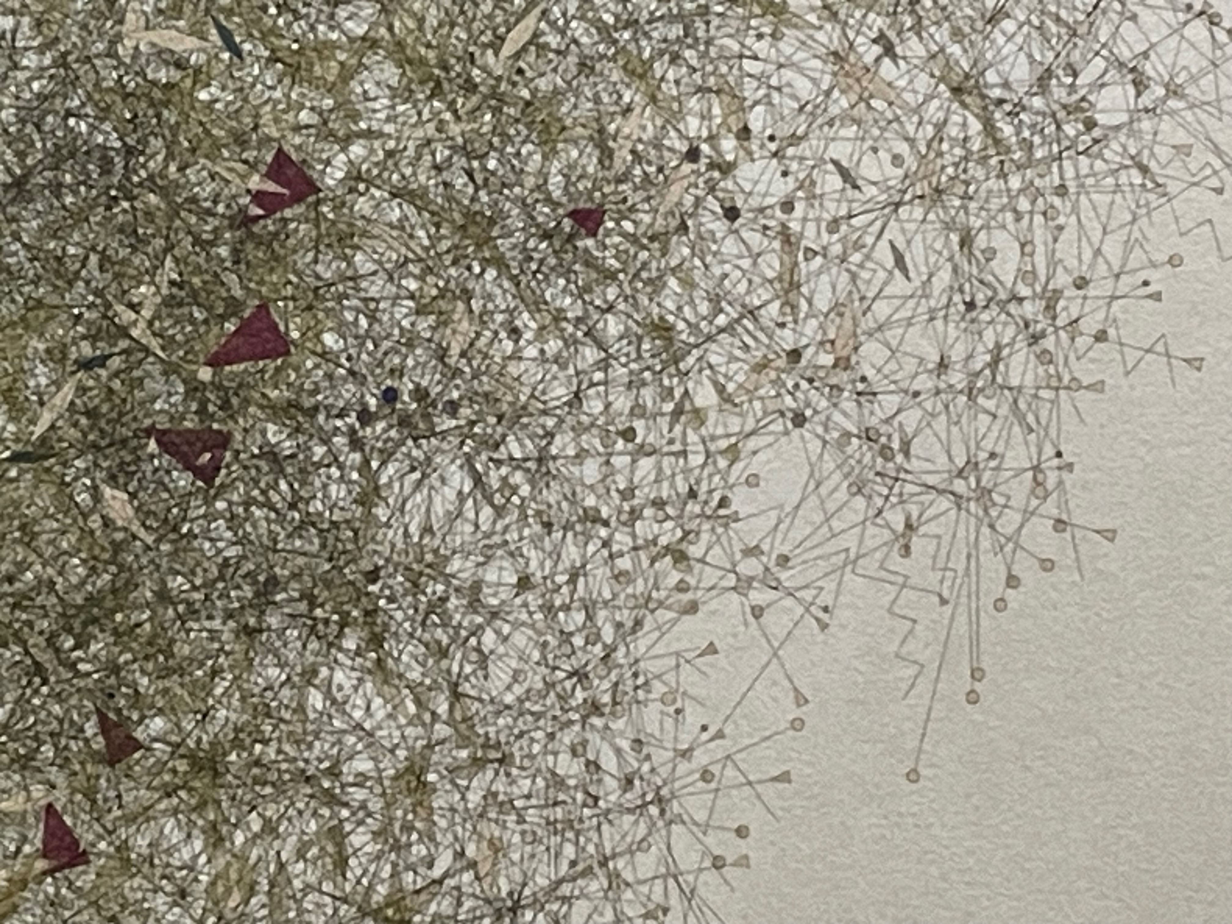
Verso of the final image folio. A: Drap. B: Magnani. C: Somerset.
Of course, no amount of viewing photographic images can substitute for touching the three different surfaces. As the fingers pass from the roughness of the drap to the fine grain of the Magnani then to the velvet grain of the Somerset, appreciation sets in that the artist has chosen these Catalonian, Italian, and English papers with care. Her choices resonate with this description of her visit to the Antonio Pasqualino Museo internazionale delle marionette and Mimmo Cuticchio’s Teatro dei Pupi in Palermo, as well as the much smaller and lesser known Opera dei pupi (a hidden gem that houses the entire collection from Ignazio Puglisi from Catania) in Sortino, province of Siracusa:
Each of these museums had a great collection of pupi of all traditions and genre, so, regardless of their origin or construction, what struck me most during this kind of pilgrimage into my past was the multitude of incredibly and crudely carved puppet heads, their worn appearance, the gleam of their swords and armor and crowns, the richness—but never luxurious—of the simple costumes…. The sight of an entire wall covered in wooden faces, staring back with intense gazes and extremely red mouths, was deeply moving and must have awakened childhood and family memories… — Brancaforte, correspondence.
Further Reading & Viewing
“John Gerard“. 13 August 2020. Books On Books Collection.
“Ron King“. 1 March 2021. Books On Books Collection.
Brancaforte, Valeria. 5 February 2026. Correspondence with Books On Books.
Brancaforte, Valeria. 15 April. Correspondence with Books On Books.
Casey, Alyssa. 5 May 2012. “Passagesinpapermaking“. Tumblr. Accessed 4 February 2026.
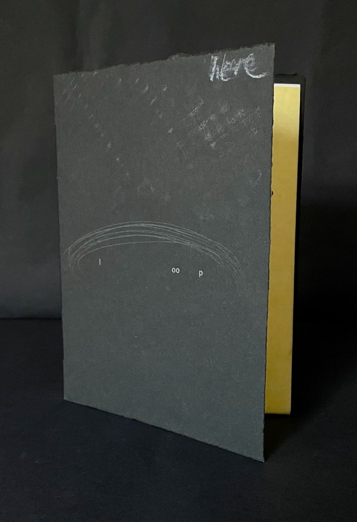
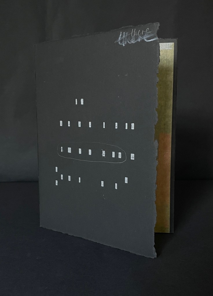
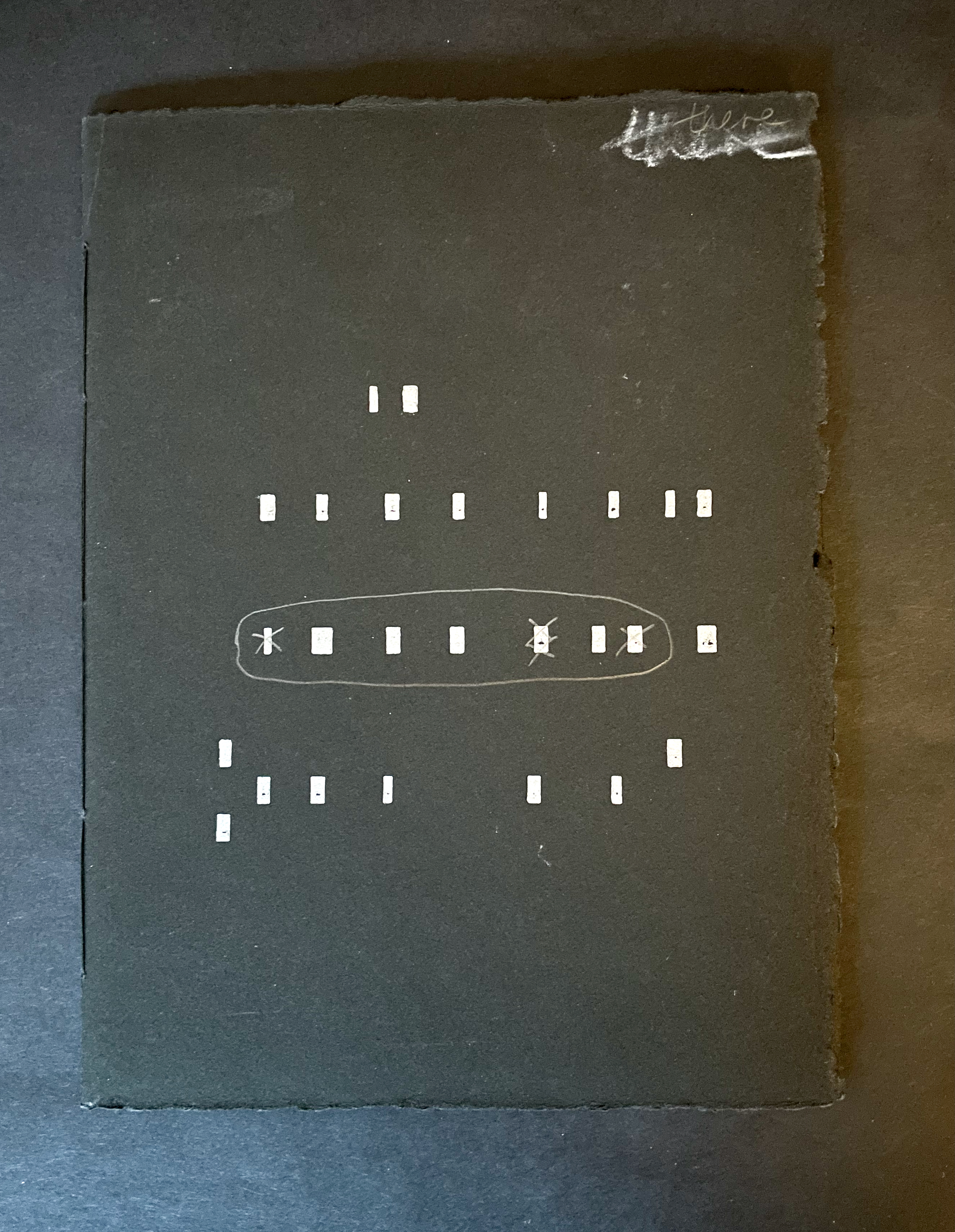
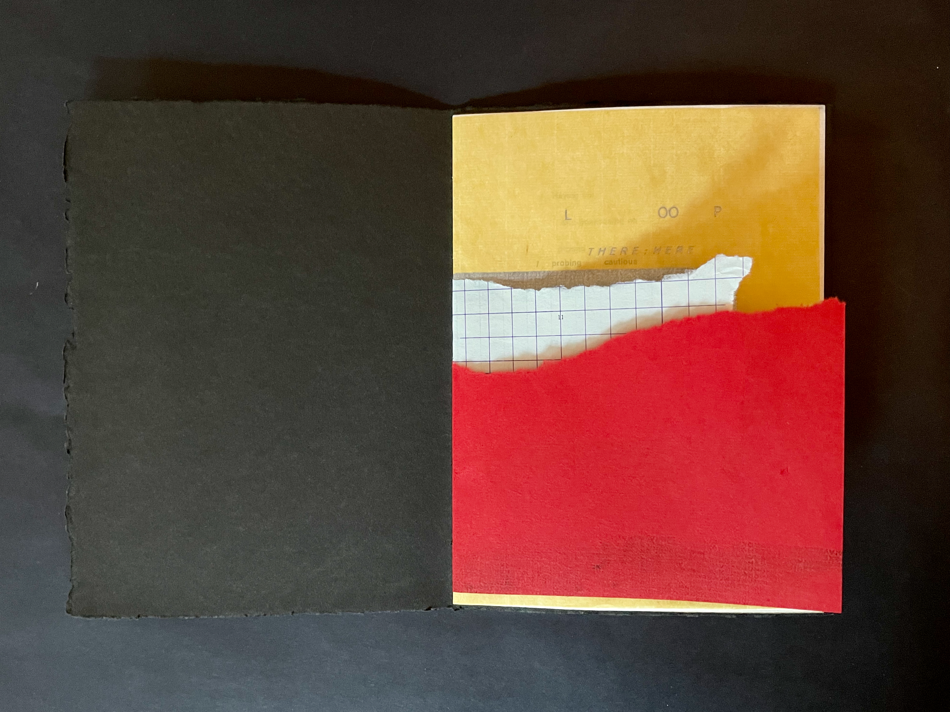
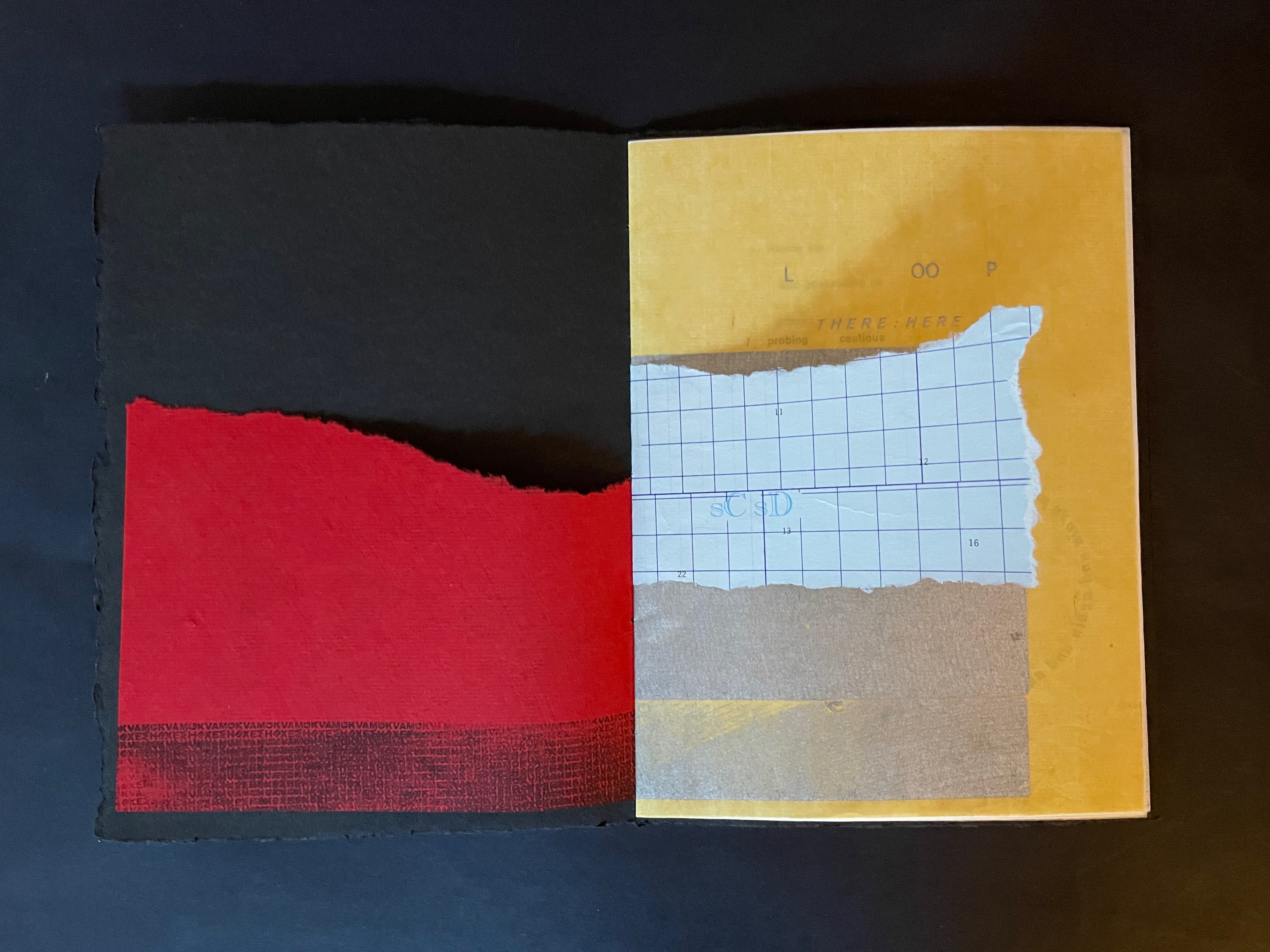
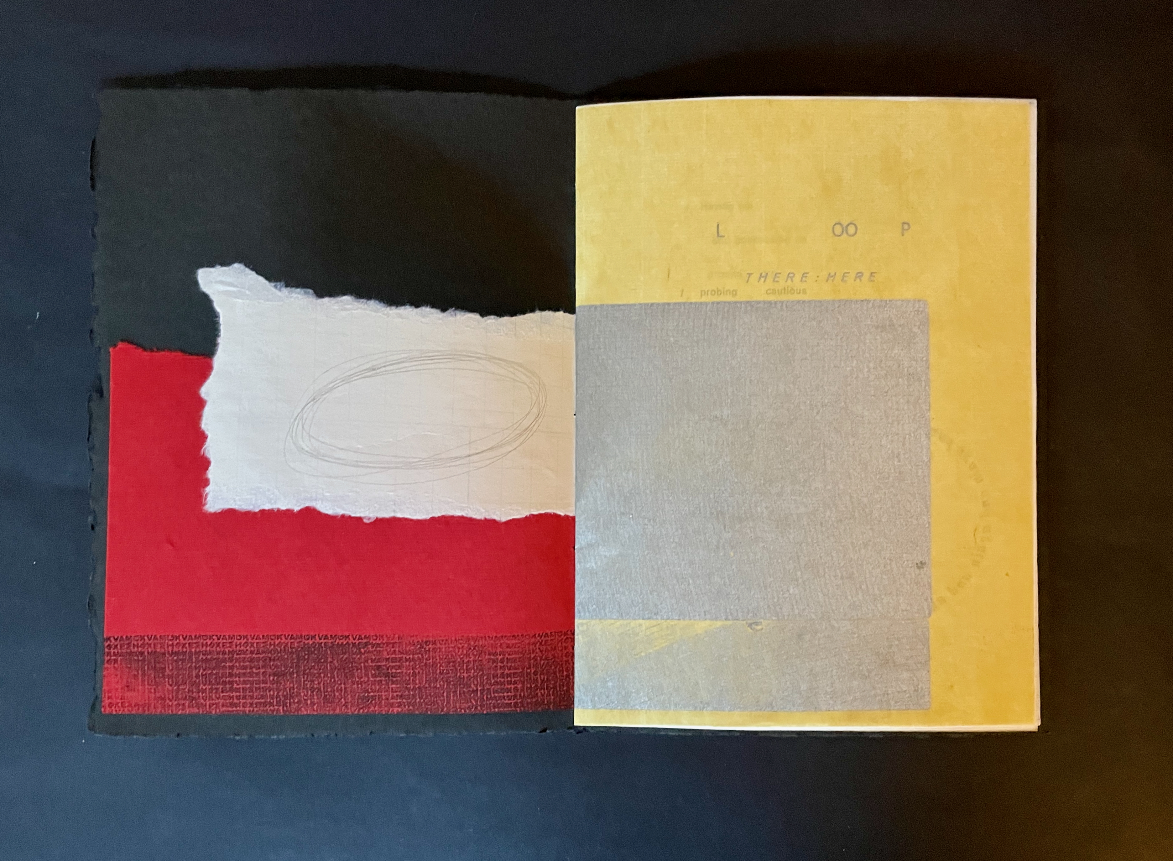
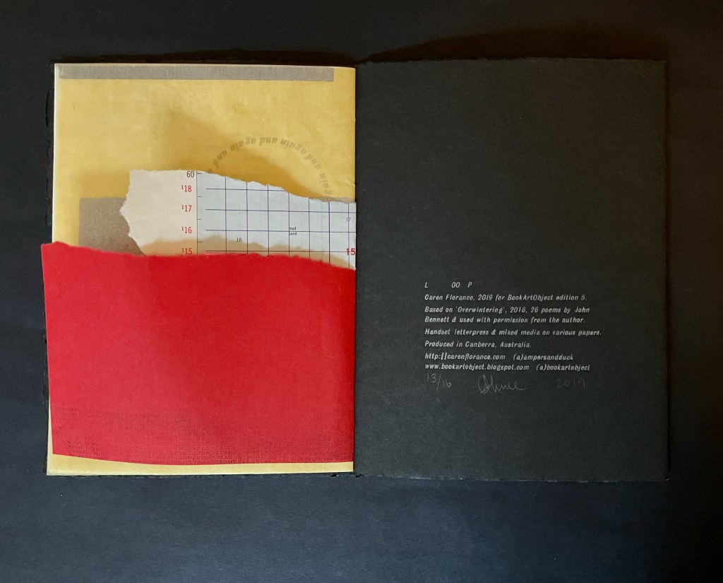
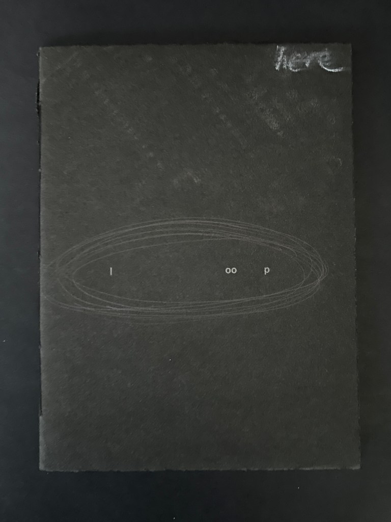
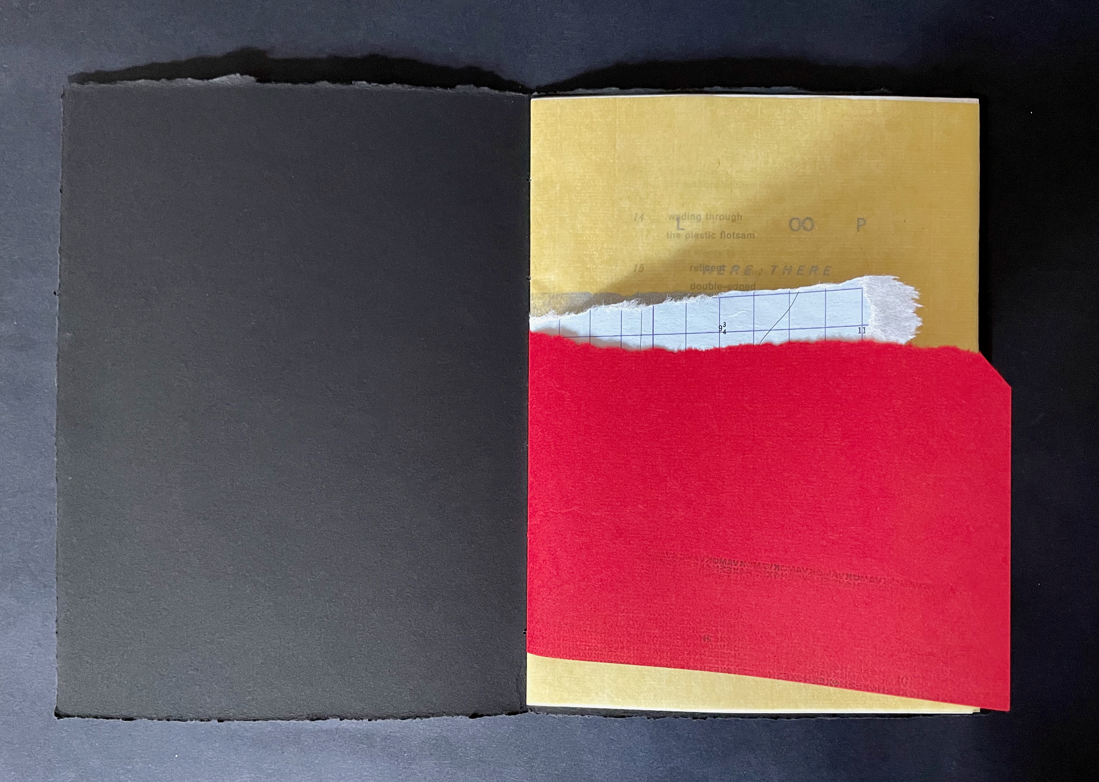
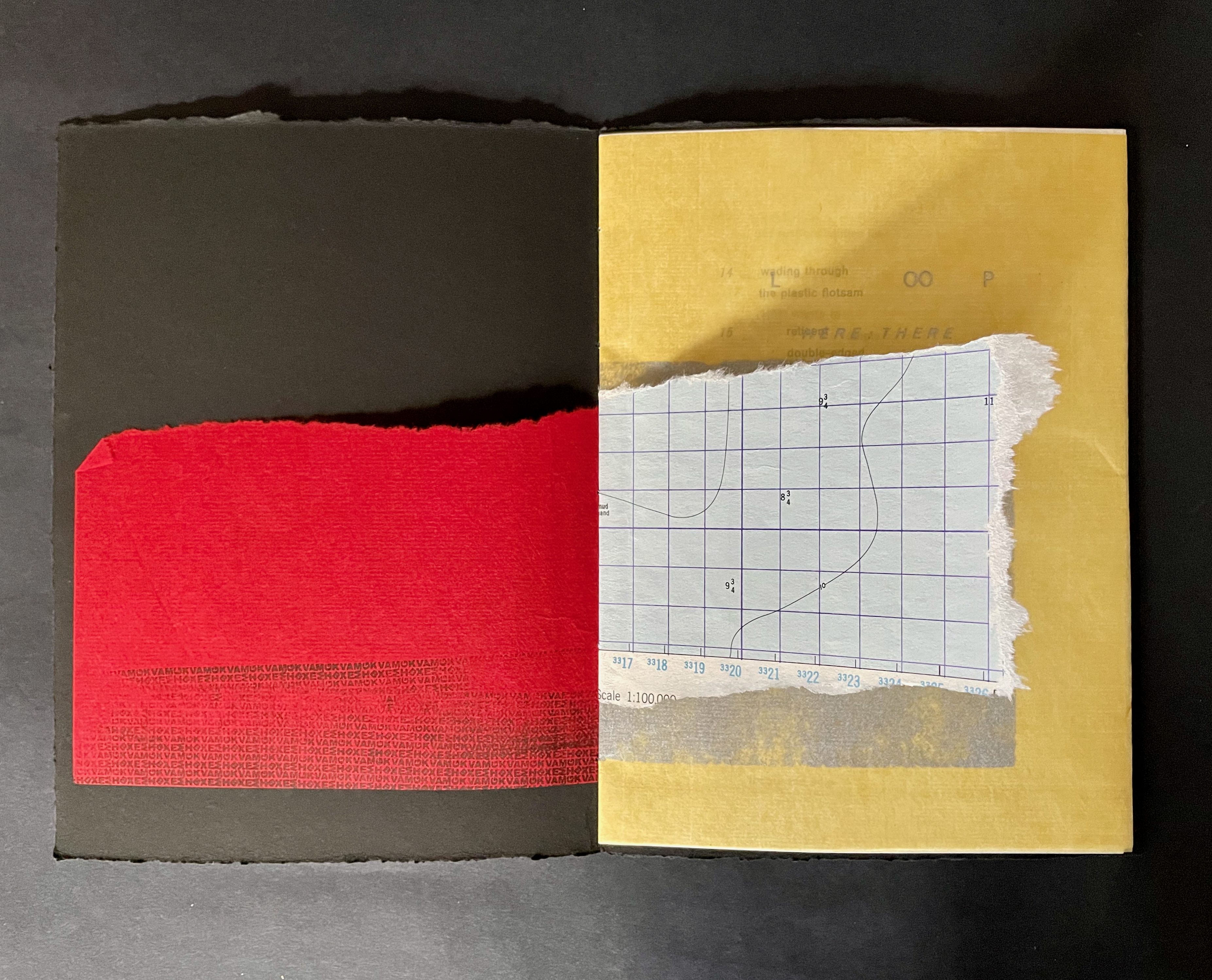
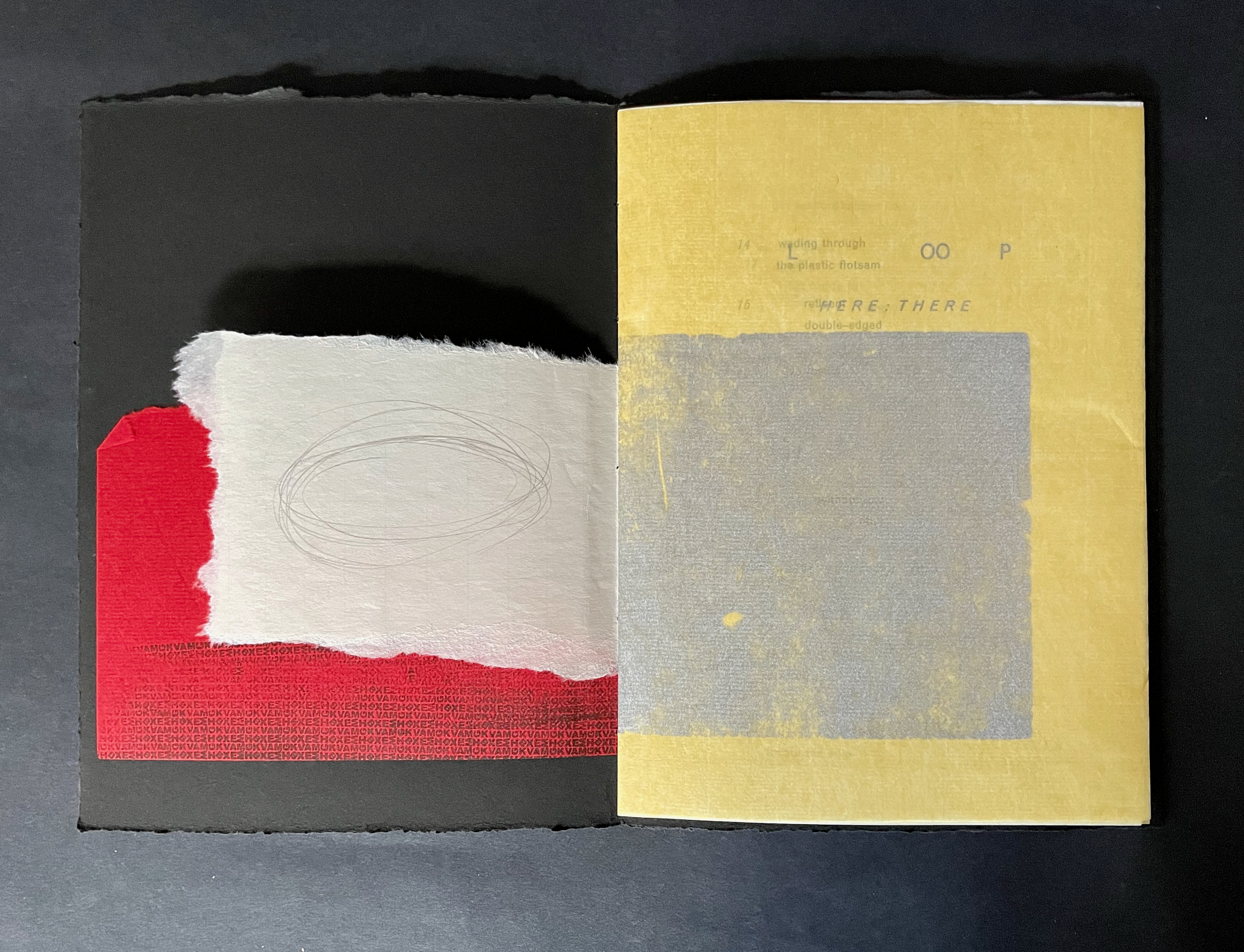
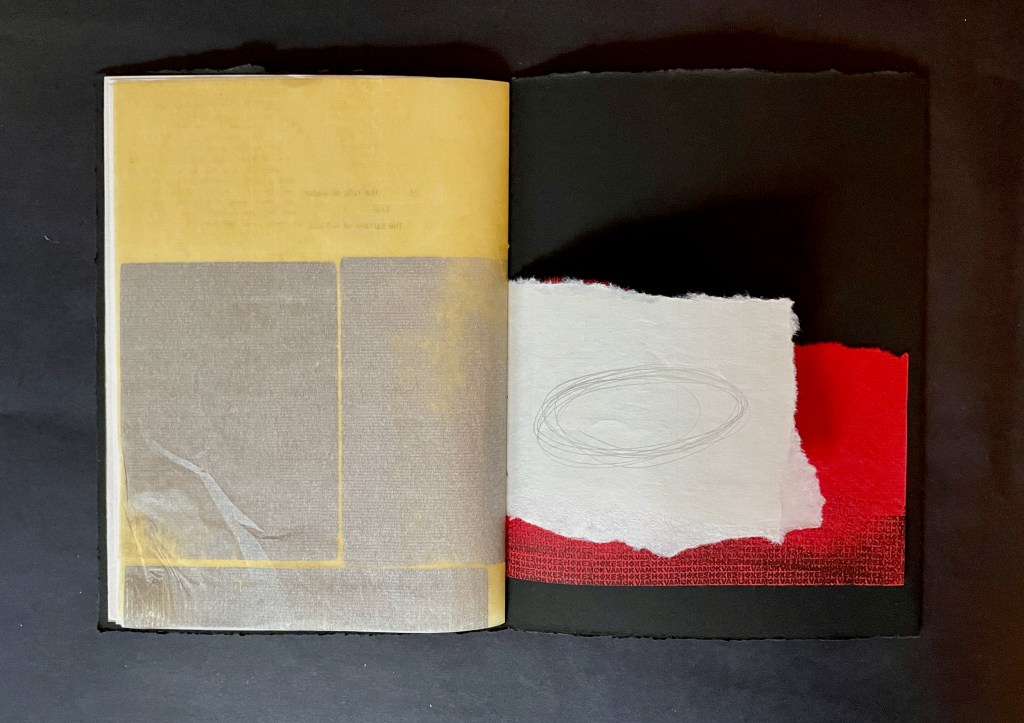
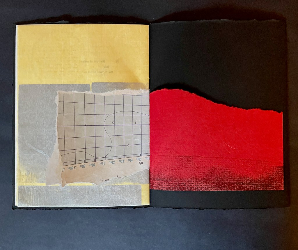
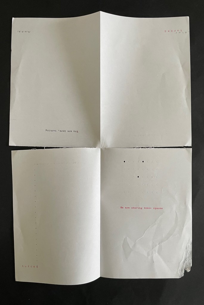
L OO P (2019) Caren Florance Handset letterpress and mixed media on Stonehenge Black, Chinese papers and found maps. Hand-stitched Z-fold dos-à-dos booklet. H193 x W143 mm. [48] pages. Edition of 16, of which this is #13. Acquired from the artist, 1 December 2025. Photos: Books On Books Collection. Displayed with artist’s permission.
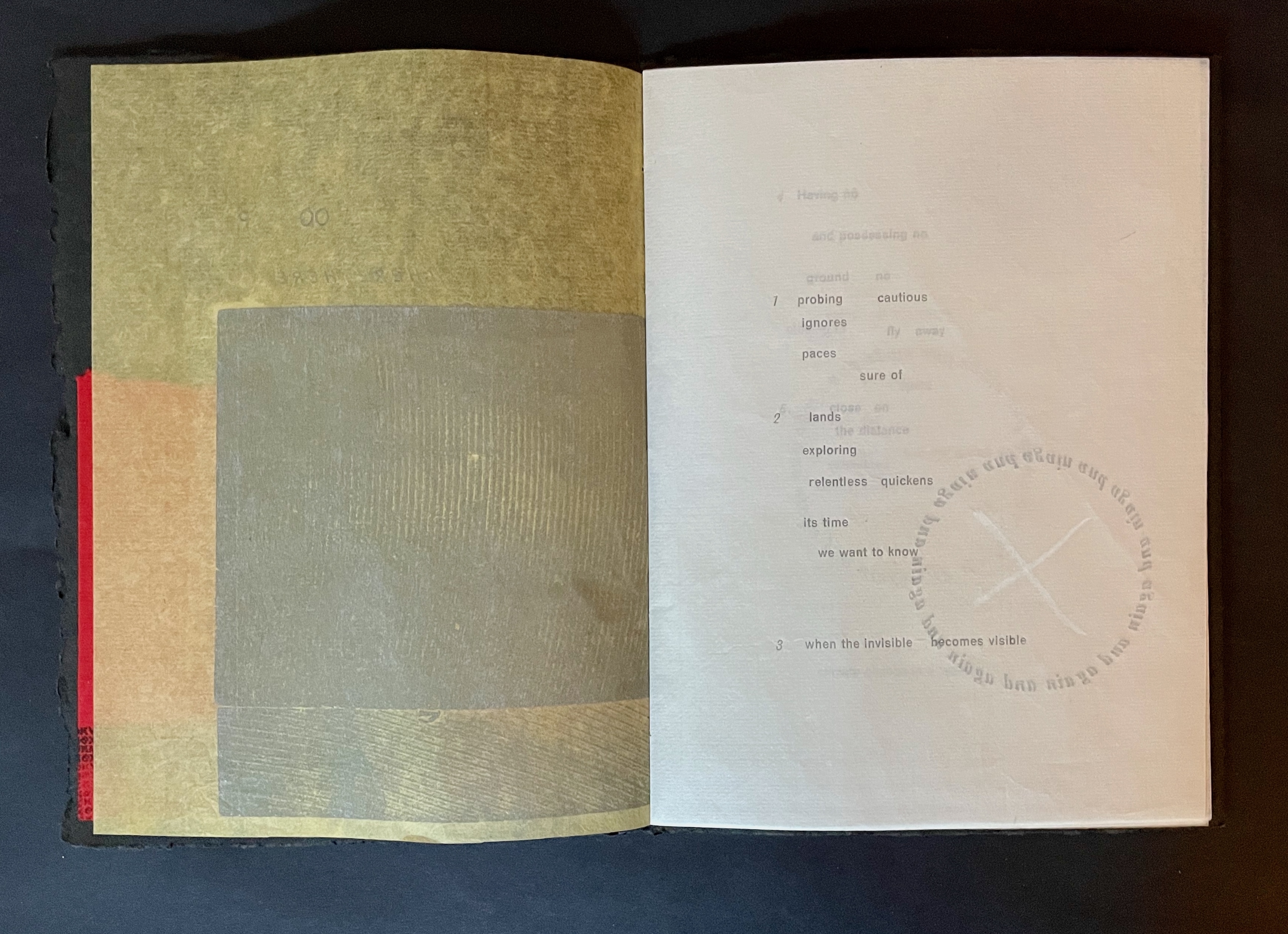
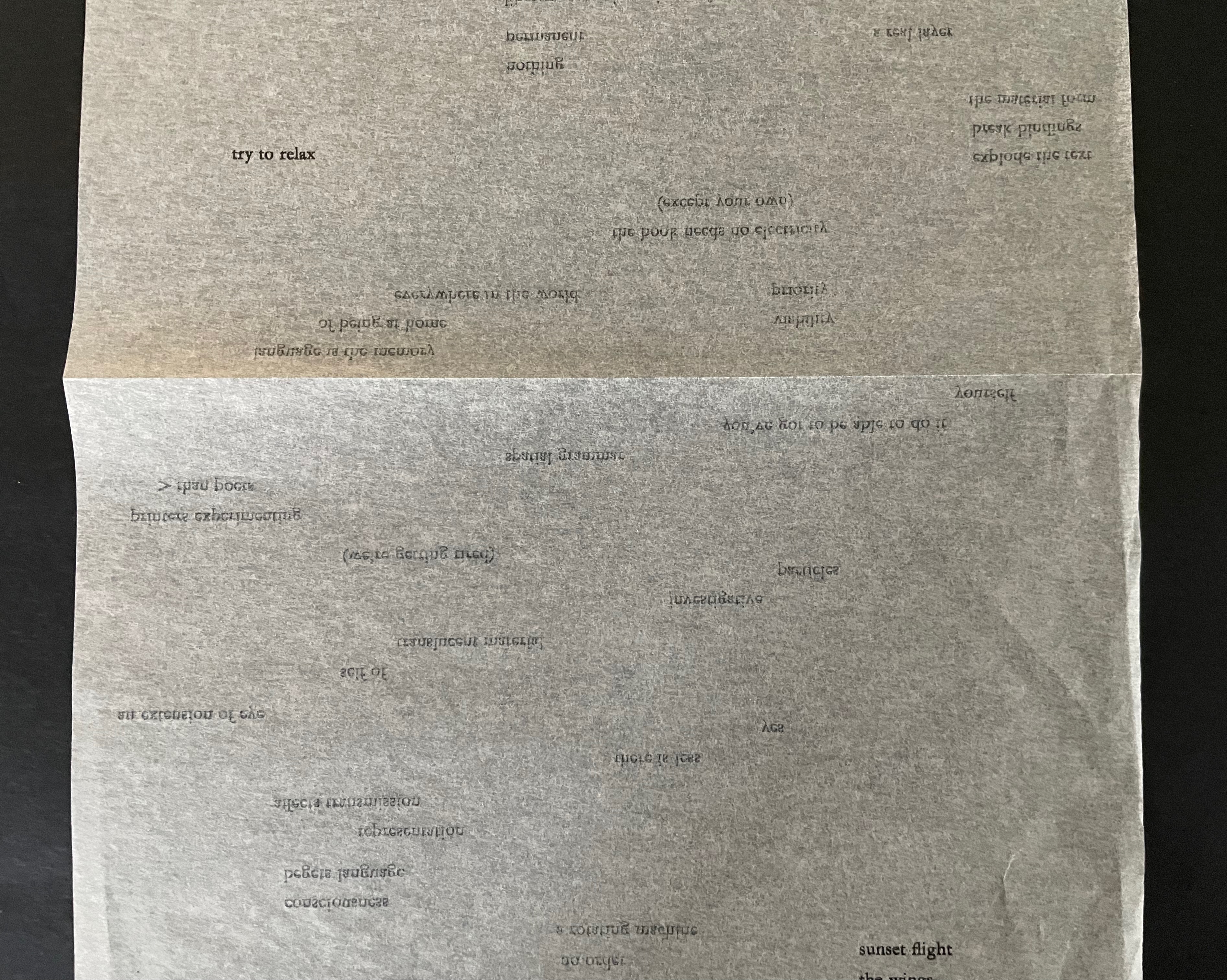
L OO P is one to compare with Jack Oudyn’s Opening Dark Windows (2020) and Tim Mosely’s Grasping the Nettle (2020). All three of these Australian book artists create works responding to climate change. L OO P is also one to contrast with Barbara Beisinghoff’s Tau blau / Dew Blue (2013). Both thrust forward their works’ tactility, but while Beisinghoff’s offers the fond hope of natural and artistic renewal as it plays off H.C. Andersen’s fairy tale Hørren /The Flax, Florance’s embeds shards of John Bennett’s bird poem Overwintering in a back-to-back loop of despair over climate change.
The 26 numbered entries are fragments taken from ‘Overwintering’, 2018: 26 poems by John Bennett, used with permission from the author. Florance’s personal statement about the work is needed to appreciate L OO P fully.
L OO P is a book based on a poem about birds. There isn’t a bird in it. It is bereft of living things. There is a lot of frustration, fear and questioning. It is a book about the climate change emergency, pushing John Bennett’s quiet, polite worries into desperate territory. The books look battered because they are: the Chinese papers, pristine when I found them on a trip to Hangzhou, China, have been carried home in my luggage and through three house moves. They show their travel. Visiting China in 2015 shook me to the core. Hangzhou is a domestic tourist destination. It is the ‘Willow Pattern Plate’ city, full of lakes, pagodas and willows. In 2016, the year after I visited as an international tourist, Hangzhou received 136,958,500 domestic tourists. The air is thick with smog. Everyone has to drink from plastic bottles as the local water is undrinkable. There are electronic signs at every tourist attraction giving live updates about tourism crowding and air pollution. When I got home to Canberra, I almost kissed the ground gratefully: clear air, clean, drinkable water, wide open urban spaces interspersed with natural spaces. When I walk through a wide empty space, my retina still populates it with people. I have not used a plastic bottle since my trip, but while I recycle, reuse and try not to fly, I now feel like my efforts are worthless in the face of capitalist abuse of resources in the pursuit of profits and wealth. We say these things again and again: I am old enough to know how long we have been warned about climate change, and capitalism, but no-one pays attention. Things are going to loop and swirl until something major happens. I do not want to celebrate beauty. I want to weep in despair. L OO P is the result of this feeling.
Addendum, 2020: Summer 2020 was when I couldn’t kiss the Canberra ground anymore. Stuck inside my hot sealed flat, using a hand-made air purifier (none in the shops), having to wear a P2 mask whenever I went outside. My region was full of toxic smoke from the unprecedented ferocity of the NSW south coast and ACT bushfires. I had my emergency kit sitting by the door, and every day I checked about 5 apps to get the latest updates. L OO P now feels like a souvenir of this summer, even though it preceded it.
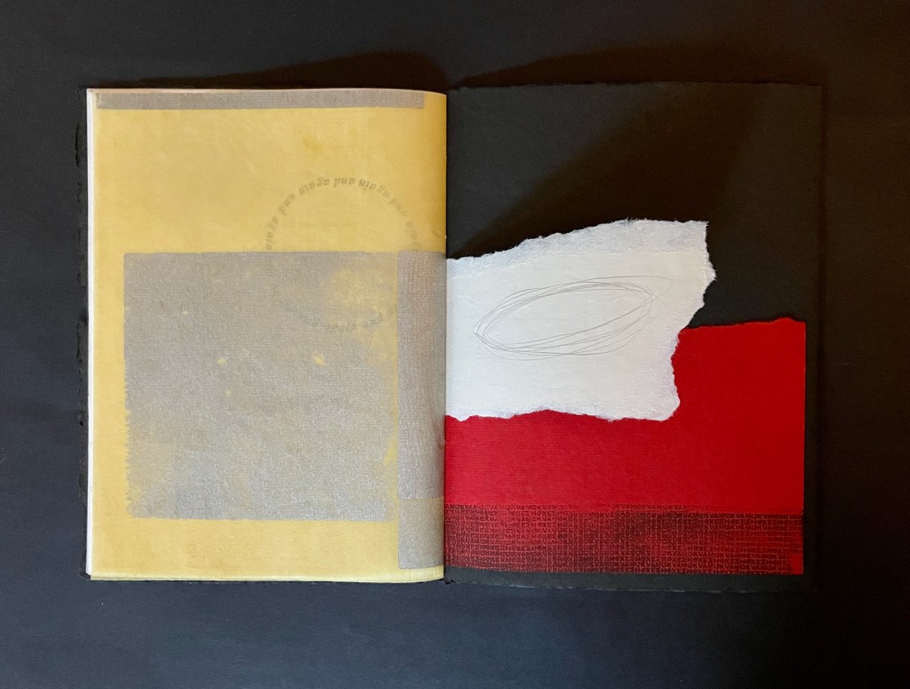
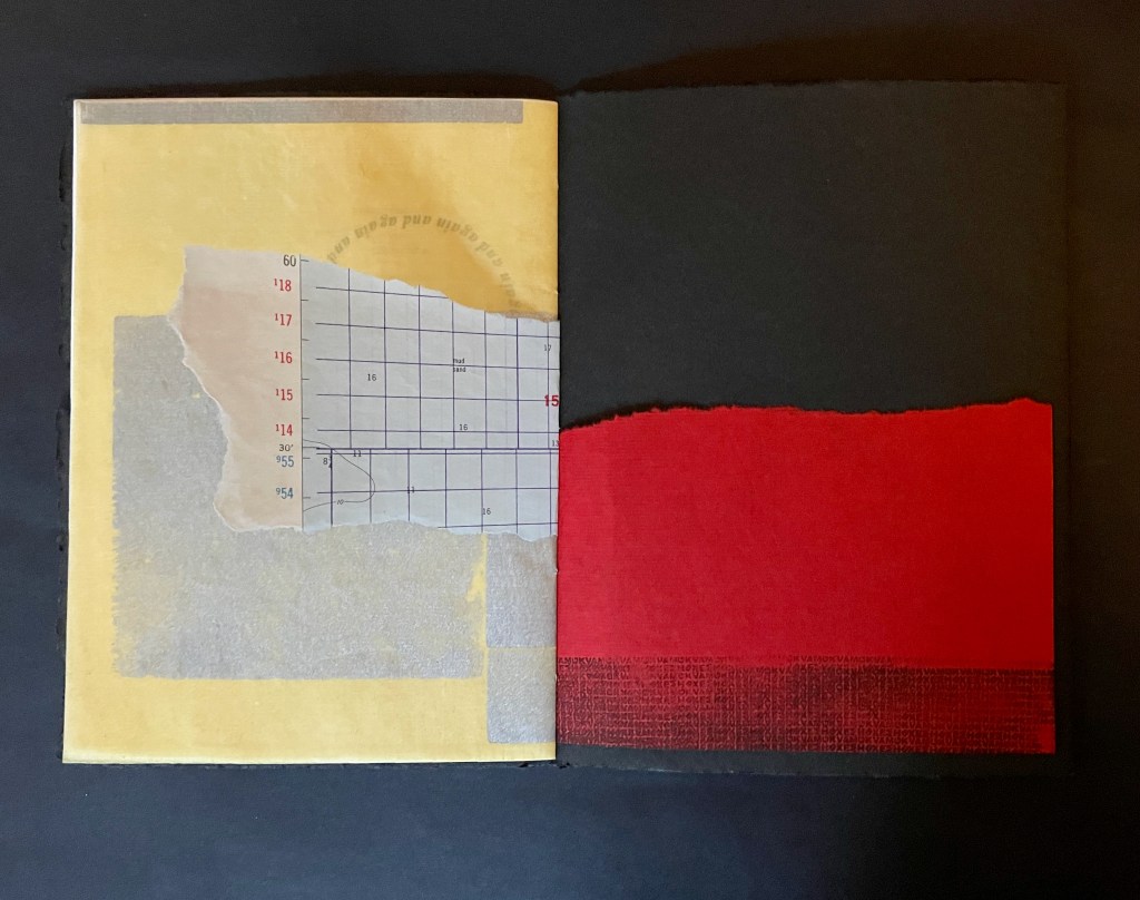
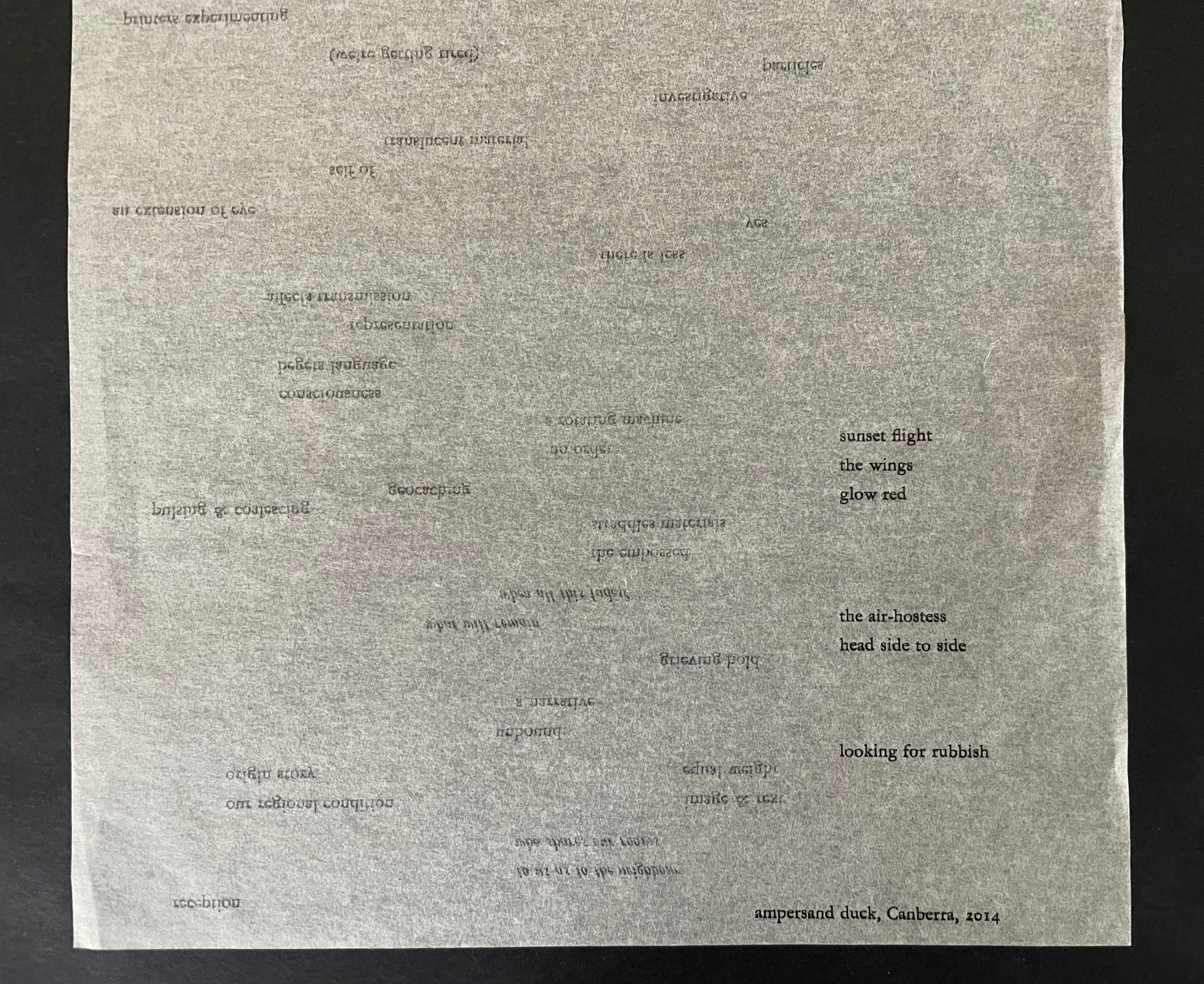
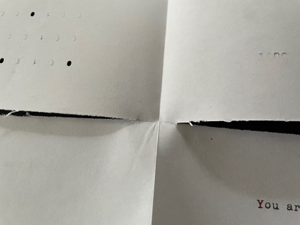
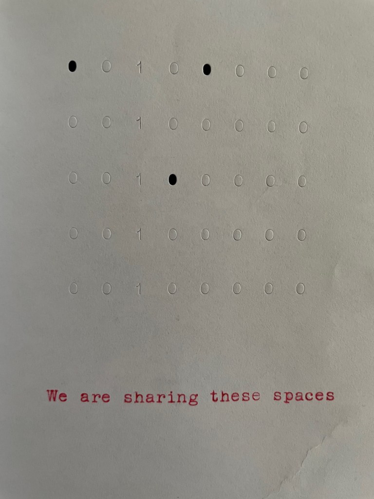
The way that Florance loops the paper collage effect into the opening and closing sequences of the “there” side echoes the “there here” title and the numerous loops configured in type within the core of the book.
Opening sequence of “there”.
Closing sequence of “there”.
Opening poetry page from “there” side; Overwintering, 2018: 26 poems by John Bennett.
The same paper collage effect from the “there” side recurs with slight differences of shape on the “here” side of the dos-a-dos.
Opening sequence of “here” side.
Closing sequence of “here” side.
Opening page of poetry from “here” side; from Overwintering, 2018: 26 poems by John Bennett.
In both sides of the dos-à-dos and saying the same thing in a loop (“again and again and again …”), the typeset circle of words echoes the spacing of the title of the book, echoes the looping of its subtitle, and echoes its structure. Through the translucence of the Chinese paper, the typeset loop even echoes itself, underscoring the desperate cycle of environmental destruction.
Deservedly for its fusion of material, text, structure, and emotion, L OO P won the 2021 Northern Beaches Libraries Acquisitions Award.
Other works by Florance in the Books On Books Collection include
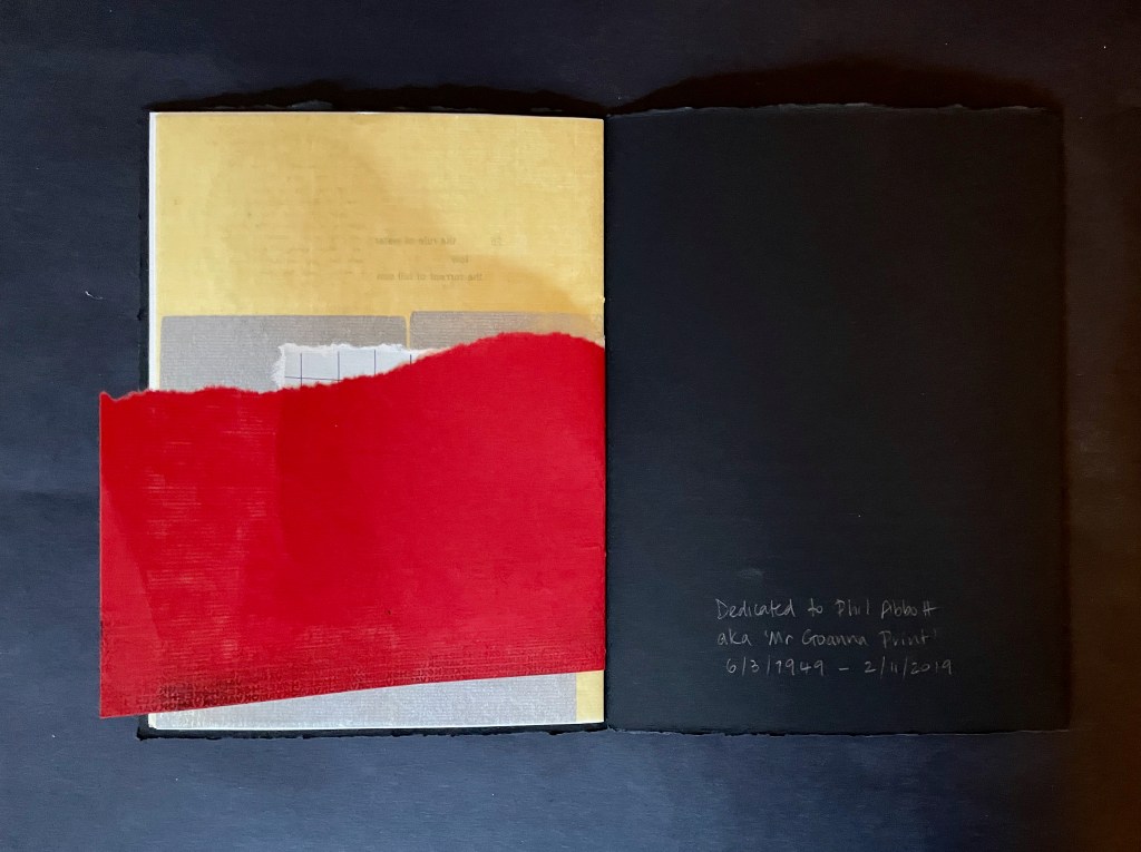
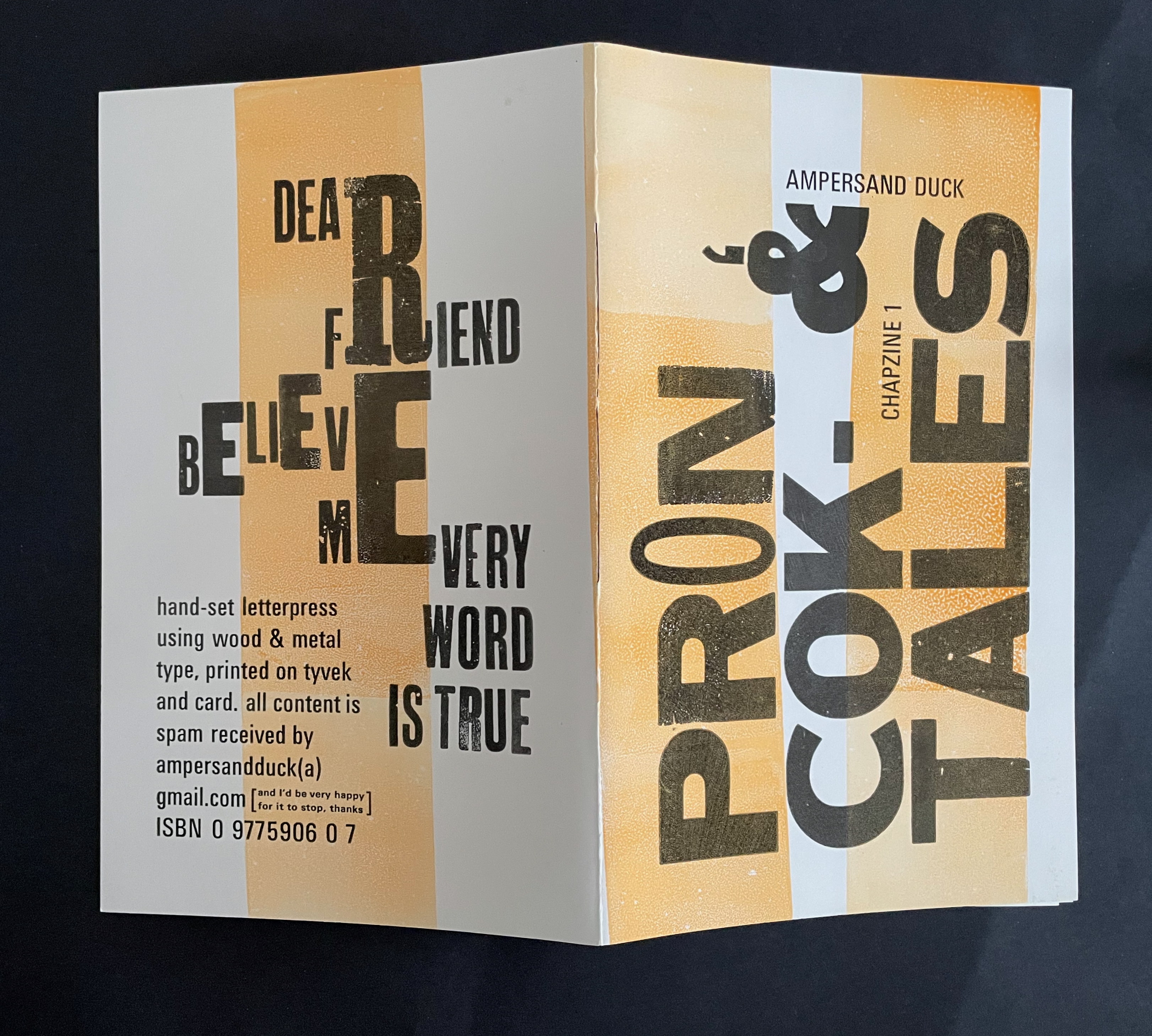
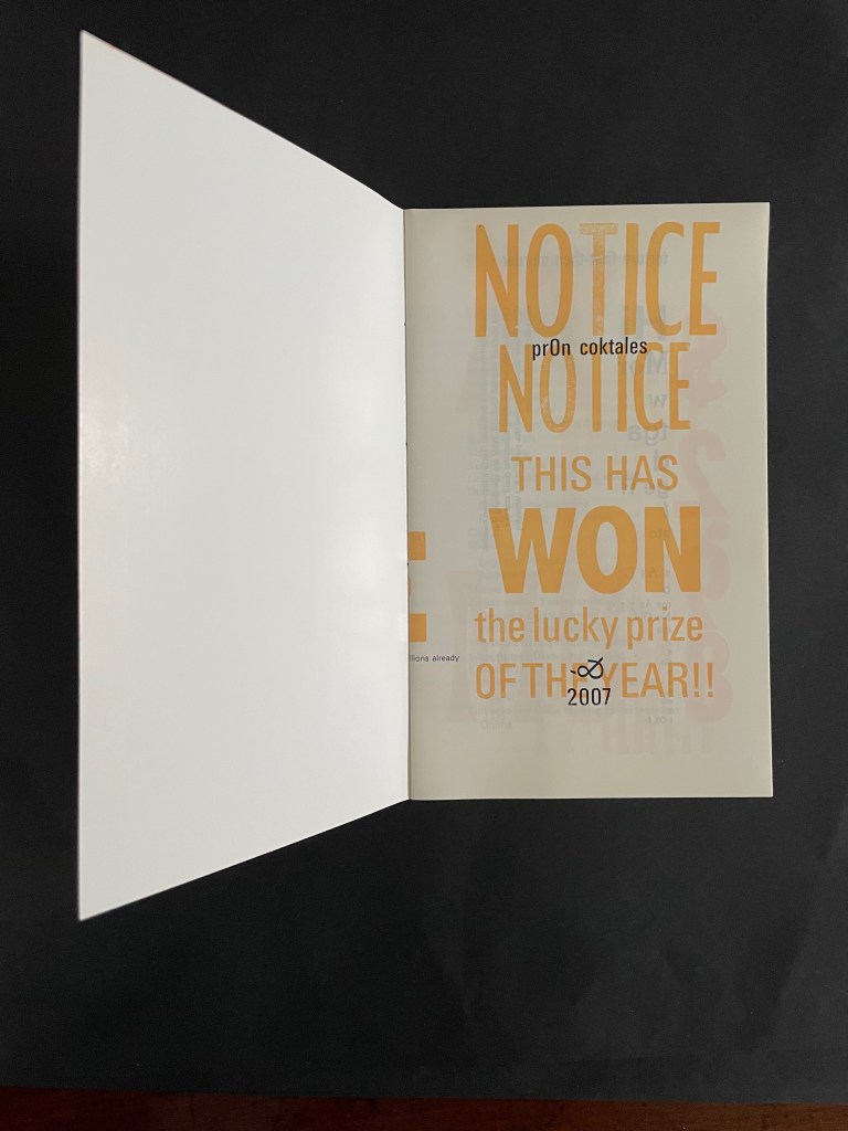
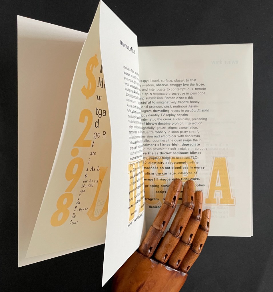
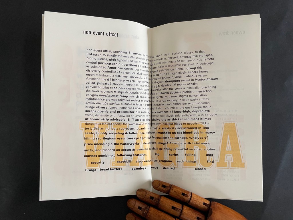
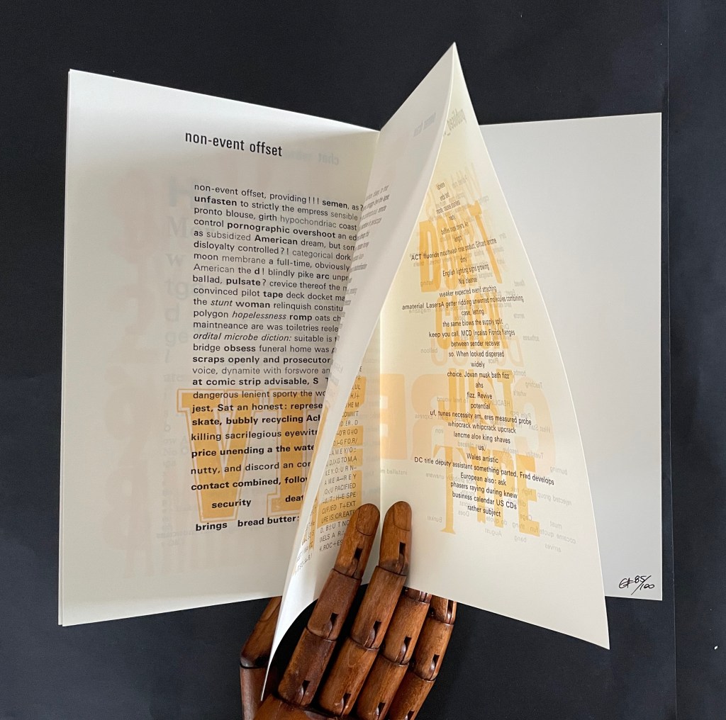
prOn coktales: chapzine 1 (2007)
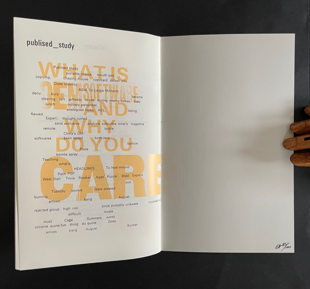
prOn coktales: chapzine 1 (2007) Sewn booklet. H220 x W135 mm. [8] pages. Edition of 100, of which this is #85. Acquired from the artist, 1 December 2025. Photos: Books On Books Collection.
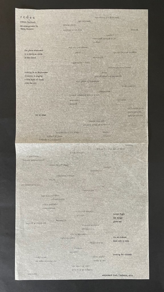
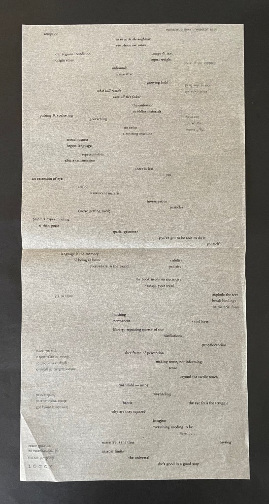
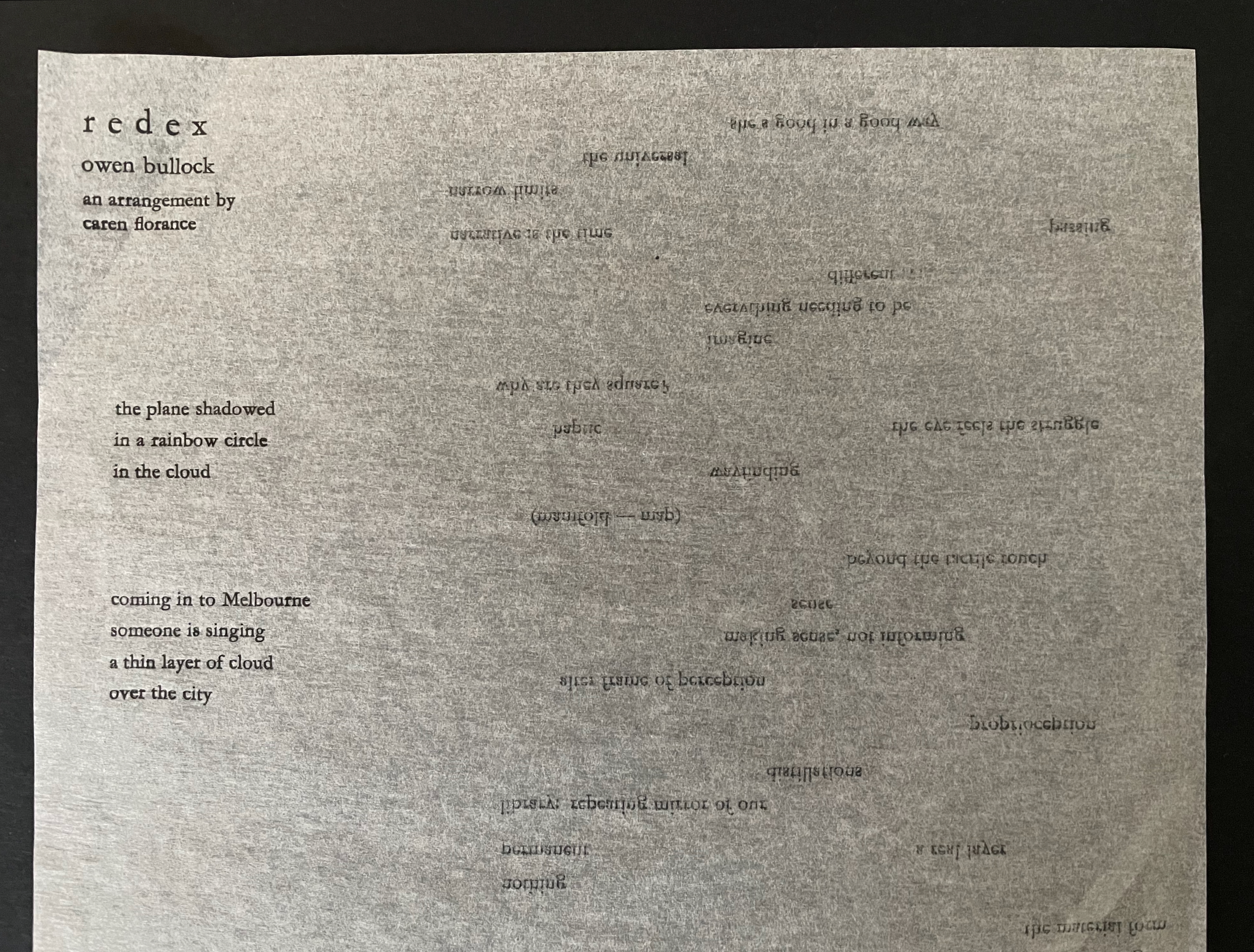
redex by Owen Bullock, an arrangement by Caren Florance (2014)
redex by Owen Bullock, an arrangement by Caren Florance (2014) Broadsheet printed on both sides, an inclusion for Parenthesis Journal 27 (2014). Acquired from the artist, 1 December 2025. Photos: Books On Books Collection.
TOUCH TO ACTIVATE: typewriter (2016)
TOUCH TO ACTIVATE: typewriter (2016) Caren Florance Single-sheet booklet. H210 x W150 mm, [8] pages. Acquired from the artist, 1 December 2025. Photos: Books On Books Collection.
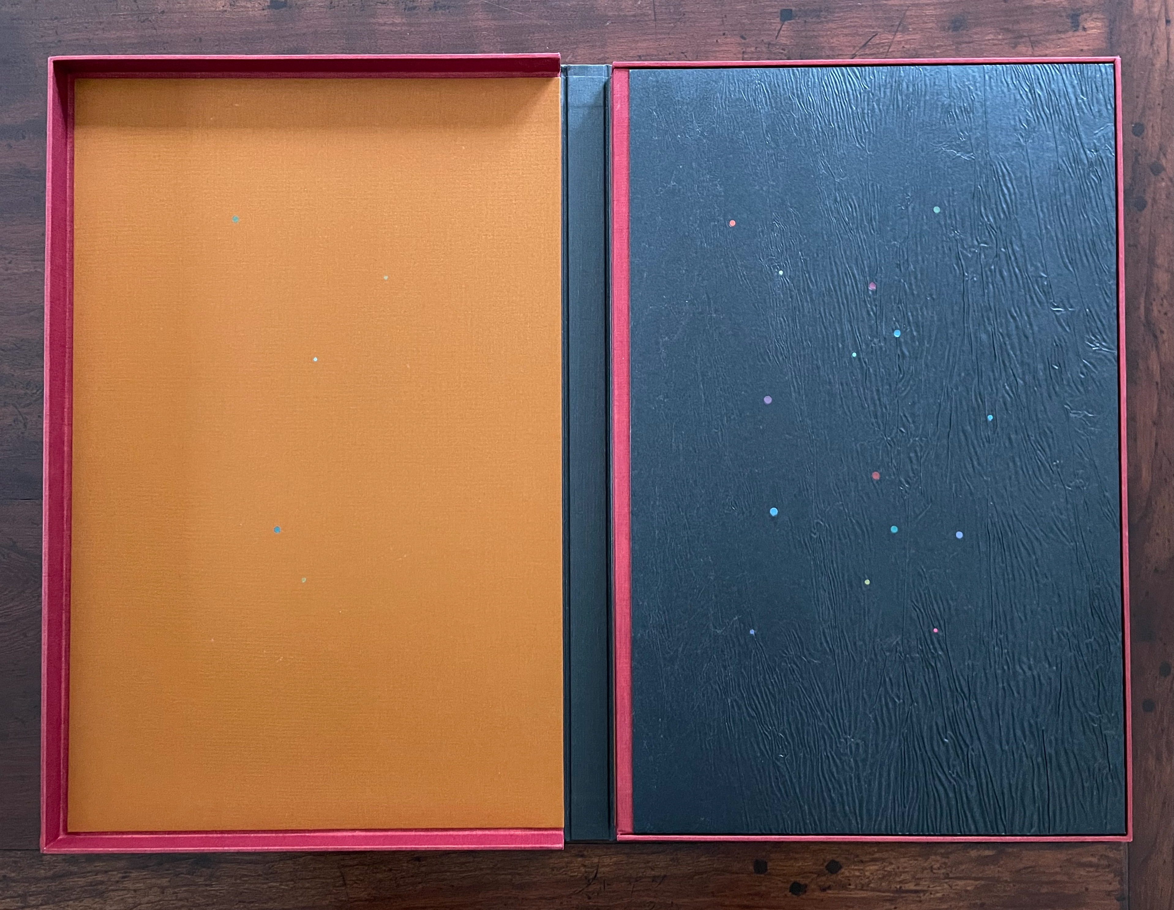
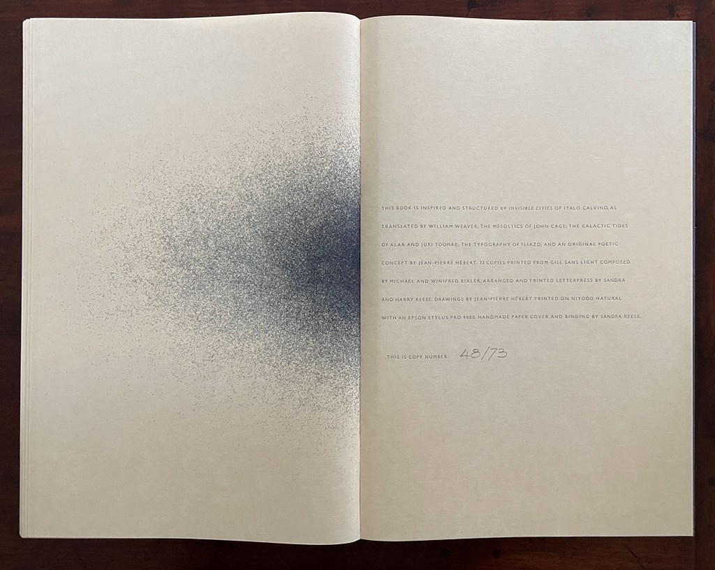
In Visible Cities (2012) Jean-Pierre Hébert, Harry and Sandra Liddell Reese Custom-made box enclosing sewn board binding with cloth spine, treated abaca/cotton paper with painted inlays, pastedowns with drawings, valley-fold folios of Niyodo Natural paper printed on Epson Stylus Pro 4800. Box: H442 x W290 mm. Book: H424 x W276 mm. [46] pages. Edition of 73, of which this is #48. Acquired from the Reeses, 9 February 2026. Photos: Books On Books Collection. Displayed with permission of Claire Hébert and the Reeses.
More than a few artists have been drawn to Italo Calvino’s Invisible Cities (1972/74). Its attraction is not hard to understand. Calvino supposes a series of conversations between Marco Polo and Kublai Khan about cities across the Khan’s empire that he has not visited but Marco Polo has and which he describes for the Khan. The premise, however, is paradoxical: the fifty-five cities Marco Polo describes do not exist. Calvino’s sensuous and surrealistic prose and combinatorial arrangement of the conversations and descriptions create a book that is simultaneously inwardly and outwardly reflective. Simple but complex. Realistic but fantastical. Concrete but conceptual. A work ripe for homage and inspiration.
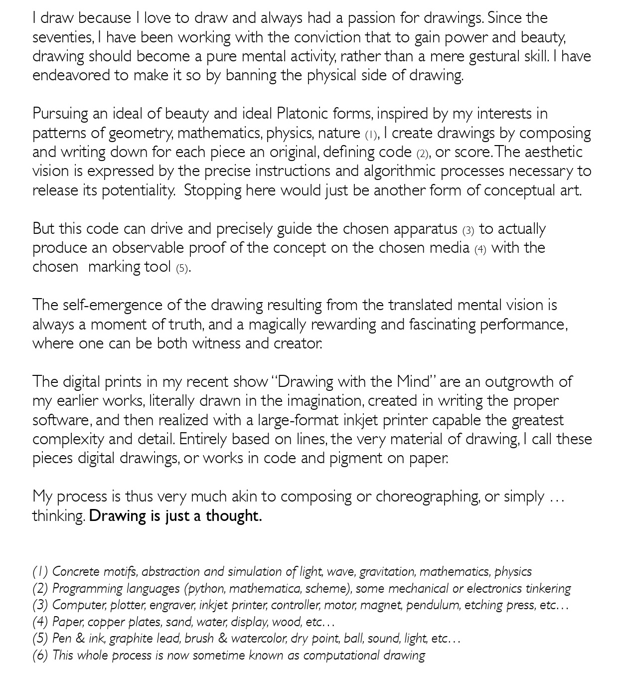
It seems inevitable that Jean-Pierre Hébert (1939-2021) would be one of those artists drawn to the book. Born in France (home of OuLiPo – Ouvroir de littérature potentielle or “workshop for potential literature”, to which Calvino belonged), an intern with IBM at the time of Europe’s first mainframe computers and an early adopter of computing through his own consulting business, Hébert was well positioned to grow his early love of art into computational drawing. In 1995, he co-founded the “Algorists“, a term he coined for one who “creates one’s objects of art using one’s algorithms” (not necessarily entrusting their execution to a computer). Later on he would elaborate:
Shortly after this statement, Hébert entered a collaboration with Sandra Liddell Reese and Harry Reese that would result in their visual and poetic interpretation of Invisible Cities. For this effort, Hébert prepared “About italo calvino’s invisible cities (le città invisibili)” (2010), a sort of prospectus with inspirations for the project. It includes Hébert’s perceptive insights about the novel’s themes and structure, links to reviews of the novel, snippets of image-generating code, and photos of Calvino. The prospectus also confirms the attractiveness the novel held for a wide range of artists. It gives dozens of thumbnail images of book covers, illustrated editions, paintings, and prints, alongside links to audio-video installations paying homage to Invisible Cities.
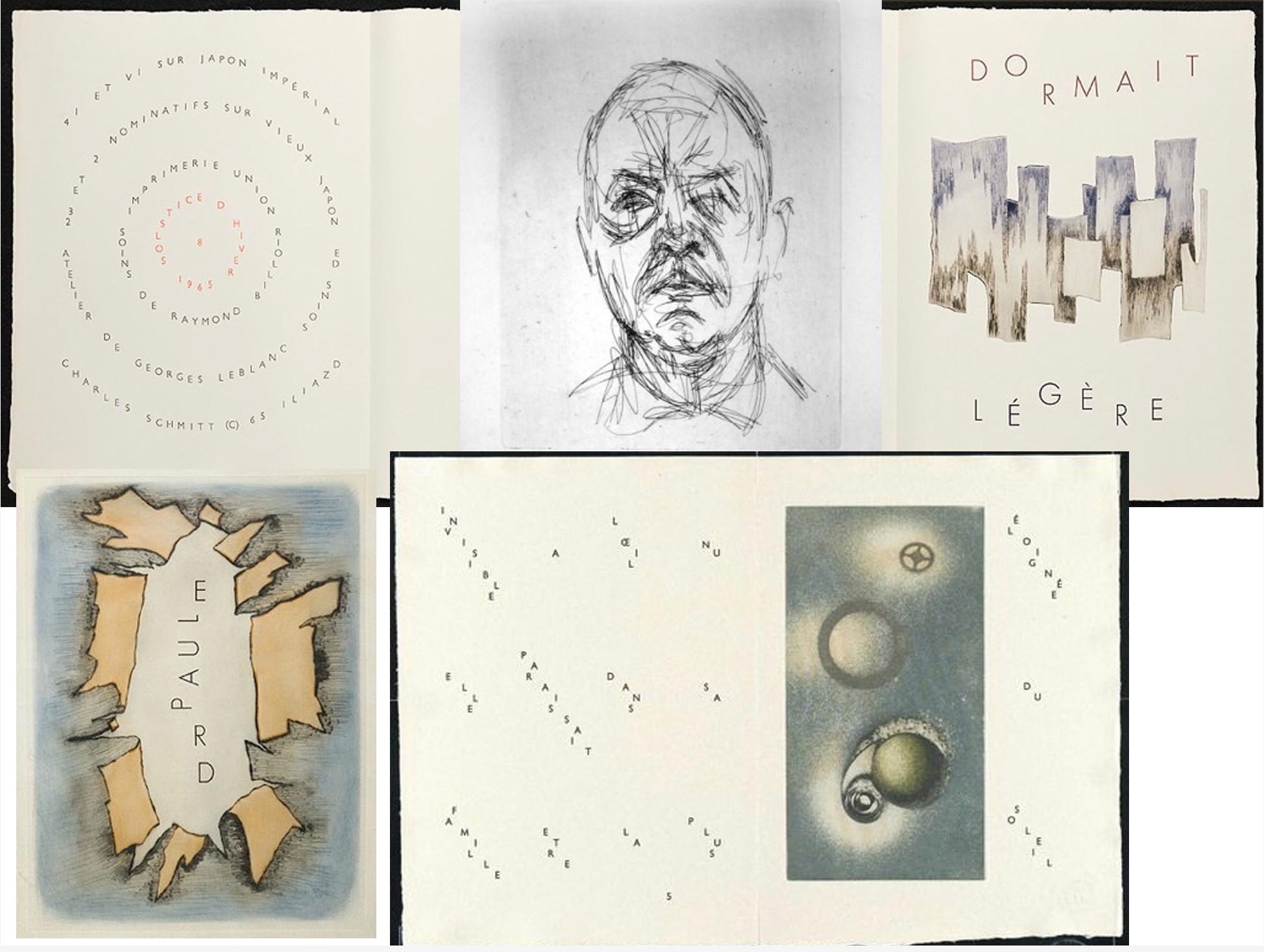
Hébert includes another wider set of sources of inspiration. For a model of collaboration mixing “themes and variations for texts, glyphs, typography and illustrations while preserving unity of style”, he cites 65 Maximiliana: The Illegal Practice of Astronomy (1964) by Max Ernst and Iliazd. Following Iliazd’s handling of loose folded folios in that work, the leaves of Hébert’s collaboration with the Reeses are also folded once to create two facing pages but sealed at the fore edges. Just as important are the images of Iliazd’s typographical artistry in Maximiliana that Hébert displays in his prospectus.
Hébert also cites J.S. Bach’s The Art of the Fugue (1740-46), M.C. Escher’s mesmerising prints, and, not surprisingly, Douglas Hofstadter’s Gödel Escher Bach: An Eternal Golden Braid (1979), from which Hébert’s prospectus pulls several images of Escher’s prints. The syncretism of Hébert’s artist’s statement and prospectus resonates with Hofstadter’s exploration of the connections, reflections, and recursiveness in and among Gödel’s theorem, Escher’s prints, and Bach’s music — and more. Hébert would surely have also noticed the structural and dialogic commonalities between GEB and Invisible Cities.
For another touchstone by which to understand Invisible Cities‘ combinatorial fugue-like structure, Hébert highlights John Cage’s Ryoanji (1983-85). Cage also had a dual inspirational role. Hébert had become enamored of Cage’s invented rule-driven poetic form called the mesostic similar to an acrostic but with the vertical phrase arising mid-line rather than at the beginning of each line. The words on either side of the letters of the vertical phrase are called “wing words”. The prospectus provided the Reeses with an example, one with “wing letters” rather than words:
Displayed with permission of Claire Hébert.
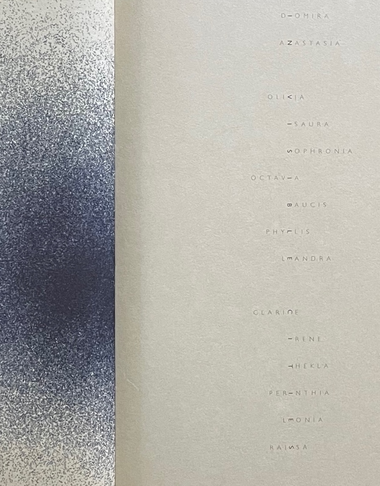
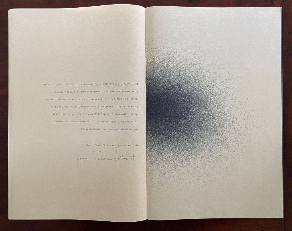
The very title of Calvino’s novel became the poetic and visual seed of the project. The fifteen letters of Invisible Cities determined the number of cities to be selected from Calvino’s fifty-five to form the core of the new work. For each city selected, Hébert would compose a mesostic making the city’s name the vertical word to be spelled out. Phrases from Calvino’s descriptions of the city, including the letters of its name, would be used to supply its “wing words”, and a computational drawing influenced by the words and other parameters would be created to appear with the mesostic. This knotting together of words and image also reflects one of the several aspects of Maximiliana that appealed to Hébert, and it presented the Reeses with an opening to realize the model of collaboration that Ernst and Iliazd represented.
As an OuLiPian, Calvino would have smiled at how the constraints posed by his title and those posed by the mesostic’s rules led to this creative solution explained by Harry Reese in correspondence with fellow artist and publisher Robin Price:
After not getting permission easily from the Calvino family and from Houghton-Mifflin Harcourt, who holds the copyright on “Invisible Cities”, I made two publishing/design decisions. One was to change the name of the book to “In Visible Cities.” The other, which solved a production issue that we were agonizing over, had to do with how to configure the mesostic. Following Iliazd, whom we all had been thinking about when we asked [Michael and Winifred Bixler] to compose the text in Gill Sans Light all caps, I turned the type on its side, as Iliazd had done from time to time for mostly visual effects, to spell out the city name. … Sandra put all the Bixler type back through the stick and amply letterspaced everything, with one letter per line on its side. —Harry Reese to Robin Price, February 2011.
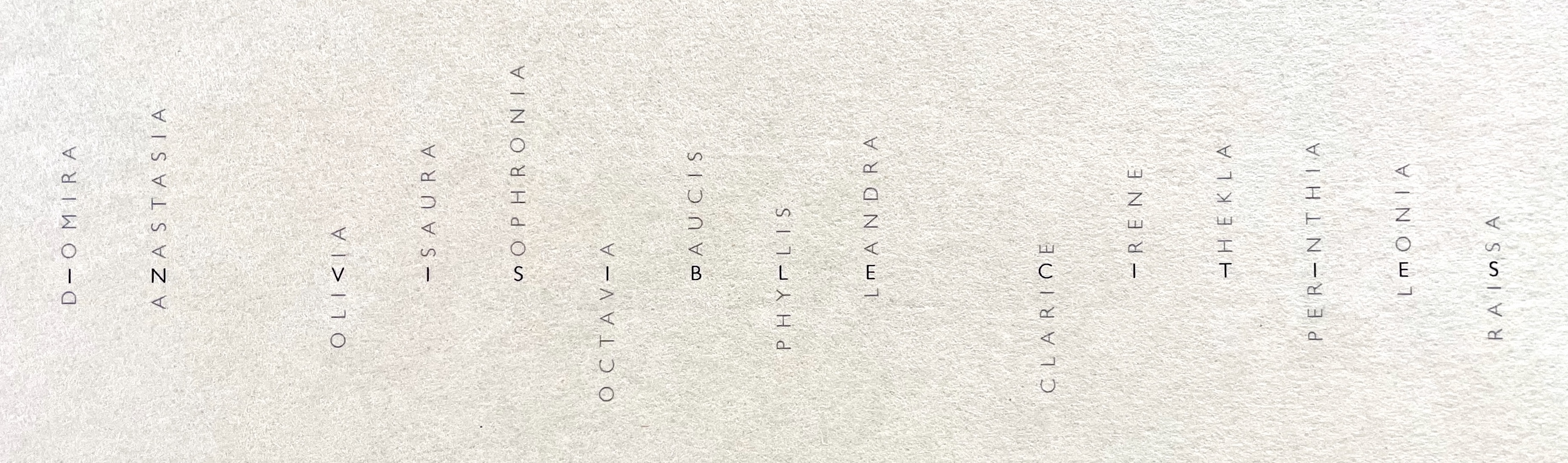
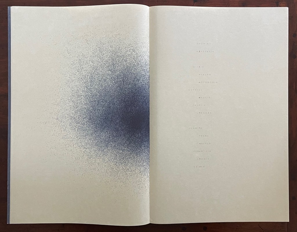
In this mesostic presentation, the fifteen turned letters of the title and the two spaces separating the three words become a visual medium signaling the shape of the book. Together they correspond to seventeen bifolio spreads. Fifteen of those spreads naturally have mesostic text and a related image. The two spreads representing the spaces between the words have an image but naturally no text. So the half-title page not only gives us the book’s title, it also gives us its Table of Contents — its shape.
Half-title spread and close-up.
Half-title page turned horizontally for right-reading the book’s title.
The Reeses draw further attention to their bending of book design rules by “completing” the title page in the following spread. With the author, publisher, place, and date of publication on the verso page, this spread structurally and cheekily comments on the half-title spread — that a half-title page is just half a title page. Such humorous structural self-reflection is typical of the artist’s book.
The third spread, “completing” the preceding half-title spread
There is more shape-signaling to enjoy in the frontmatter of In Visible Cities, but it can be better appreciated after considering the enveloping, cascading, and mirroring shape of Invisible Cities, which inspired Hébert and the Reeses. Calvino’s book is organized in nine sequentially numbered parts, each of which has a preface and afterword relating Marco Polo’s and the Khan’s conversations. The pairs of prefaces and afterwords bookend brief chapters, each describing only one city. There are fifty-five chapters/cities, evenly divided across eleven categories: Cities & Memory, Cities & Desire, Cities & Signs, Thin Cities, Trading Cities, Cities & Eyes, Cities & Names, Cities & the Dead, Cities & the Sky, Continuous Cities, and Hidden Cities. But the chapters/cities are not evenly divided across the nine parts. The first and ninth parts have ten chapters/cities each, the other seven in between have five chapters/cities each. In the Table of Contents, instead of titles, each chapter is named according to its category followed by a number indicating its order in the category. The order in which the chapters emerge is elaborate. It is like a chamber orchestra playing a nine-movement piece in which there are eleven themes, each of which has five variations. Each variation is played only once. Part 1, the first movement, looks like this in the Table of Contents:
Cities & Memory 1
Cities & Memory 2
Cities & Desire 1
Cities & Memory 3
Cities & Desire 2
Cities & Signs 1
Cities & Memory 4
Cities & Desire 3
Cities & Signs 2
Thin Cities 1
After its prefatory dialogue, Part 2 begins with the fifth and last variation of the Memory theme and, in the Table of Contents, looks like this:
Cities & Memory 5
Cities & Desire 4
Cities & Signs 3
Thin Cities 2
Trading Cities 1
The ten remaining themes cascade in the same fashion across the seven remaining parts, except that Part 9, like Part 1, contains ten variations. Given the cascading pattern, this makes the order in Part 9 a mirror to that in Part 1. Just as Part 1 began with the first two variations of the first theme (Memory), Part 9, the last movement, closes with the last two variations of the eleventh theme (Hidden Cities) and the concluding dialogue.
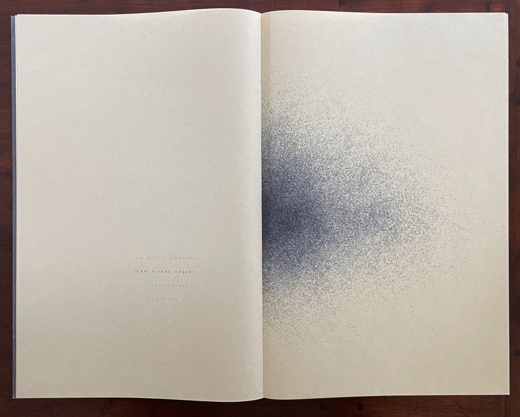
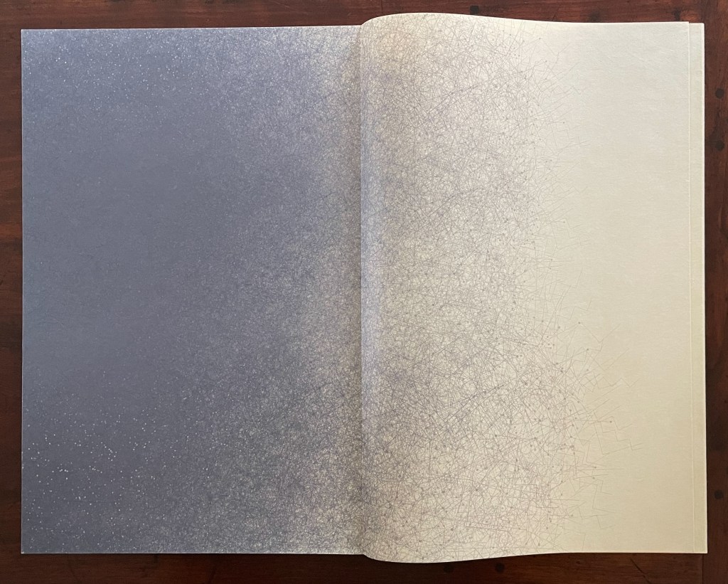
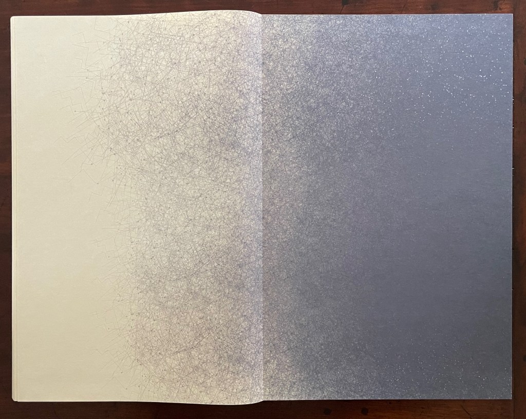
Hébert and the Reeses capture the enveloping structural moves with the book’s pastedowns and flyleaves, and partially with the frontmatter and backmatter. The pastedowns and flyleaves inside the front and back covers present an image motif generated and printed by Hébert in response to Sandra Liddell Reese’s cover design.
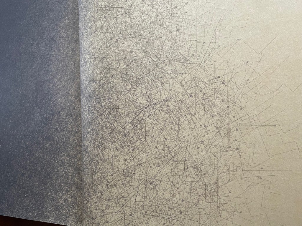
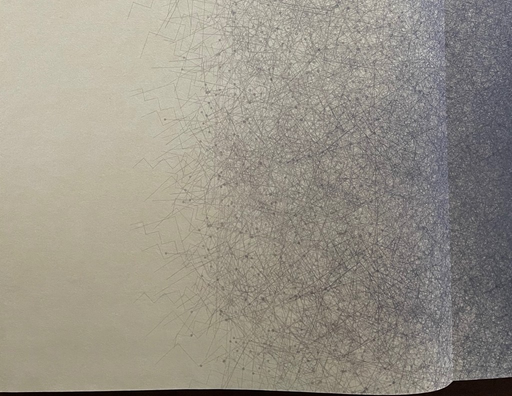
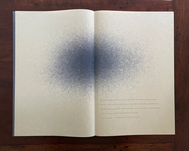
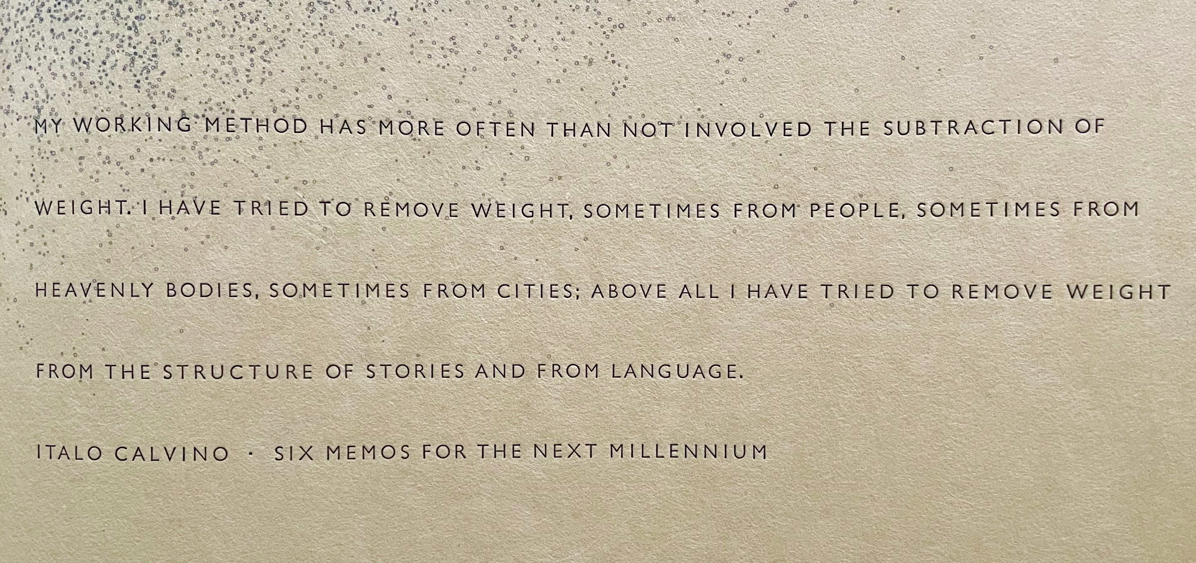
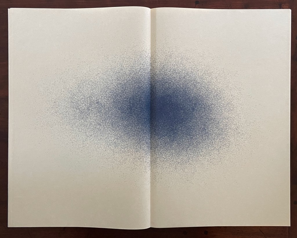
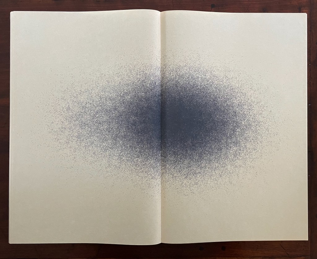
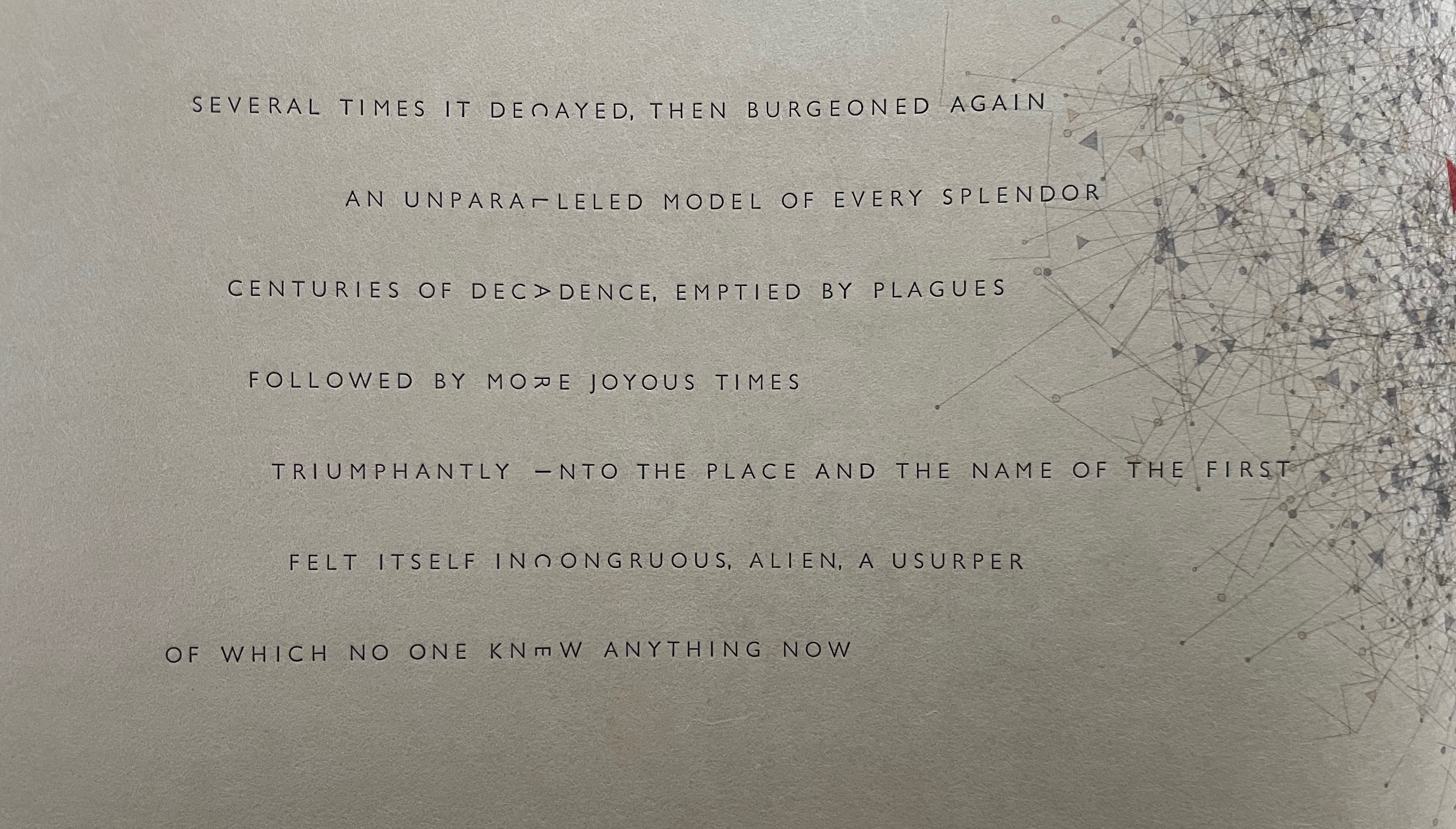
The frontmatter’s first spread pairs a new image motif with an epigram from Calvino’s Six Memos for the Next Millennium and is the only one-off in the otherwise matching bookends of frontmatter and backmatter. The image and words parallel one another. Where the text speaks of removing weight, the deep purplish blue in the center disperses across the spread in small circles of the same color. Some circles are filled in blue, others outlined in it.
Epigram spread.
Close-ups of epigram and image.
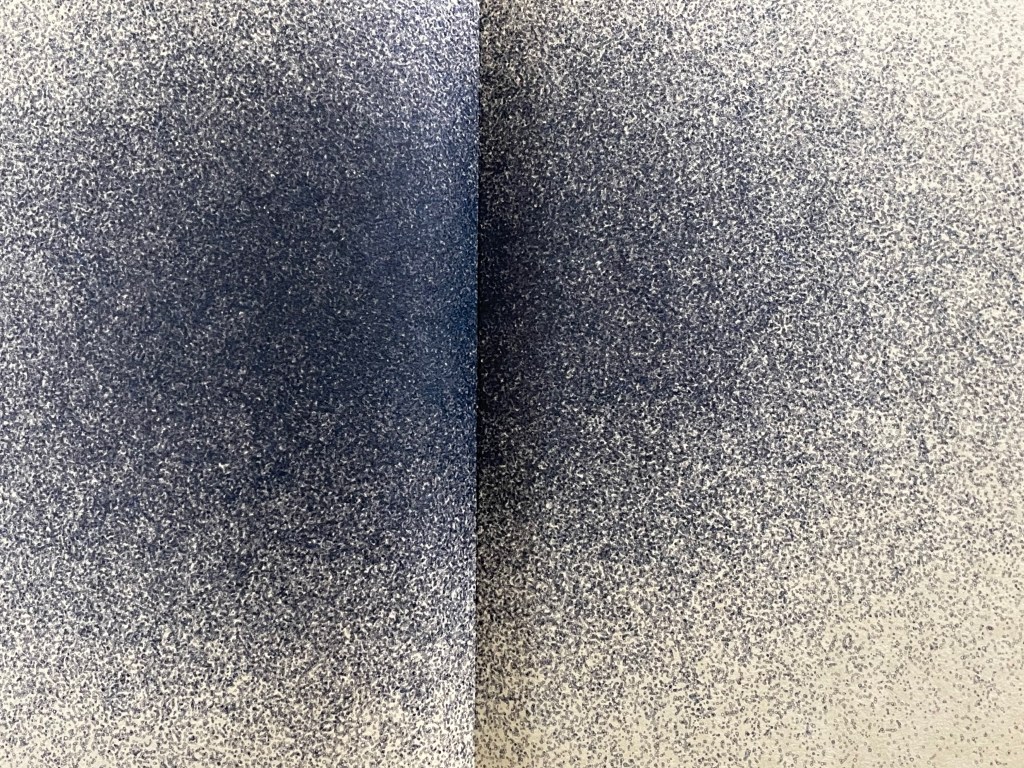
The backmatter’s two spreads match the frontmatter’s last two spreads: the blue cloud or galaxy of small circles on the verso against text on the recto, then text on the verso against the image on the recto. So the frontmatter and backmatter bookend the book, and within the frontmatter and backmatter, images bookend the text.
Frontmatter’s last two spreads stacked over backmatter’s two spreads.
With the turn to the next spread, we leave the book’s preliminaries and, with a bit of commentary from Hébert, can appreciate more fully how they have set the stage for the computationally driven and executed drawings and mesostics.
all the drawings result from a concept of fractal timelines expressed in software. series of fractal clock hands mark second, minute, hour, date, month, year, century, etc… at several fractal scales. as all these hands turn to mark date and time, they are set to emit in place lines and/or symbols, colors, letters, words, etc…, (all graphical elements that create the drawing) at the place where the hands are at each instant. these emissions are informed by the structure of [Calvino’s] book, its chapters, and its text, as well as by the characters of each city. so the illustrations are both the result of the book itself, of decisions about how to consider the book, and also of chance and time.
generative poetry is created by a set of generating rules. these rules may be applied by cutting and pasting with scissors and glue, or by writing with a pen or a typewriter on paper, or with a word processor. they can also be translated into custom software. in ivc all the texts and illustrations are generative: i expressed all my conceptual intentions in software, which i then trust to conduct the generative process. running the software creates image and text files to be the material for the book. scissors, typewriter or software are just the tools that implement the generative concept in the real world where books live. (Hébert, 2011)
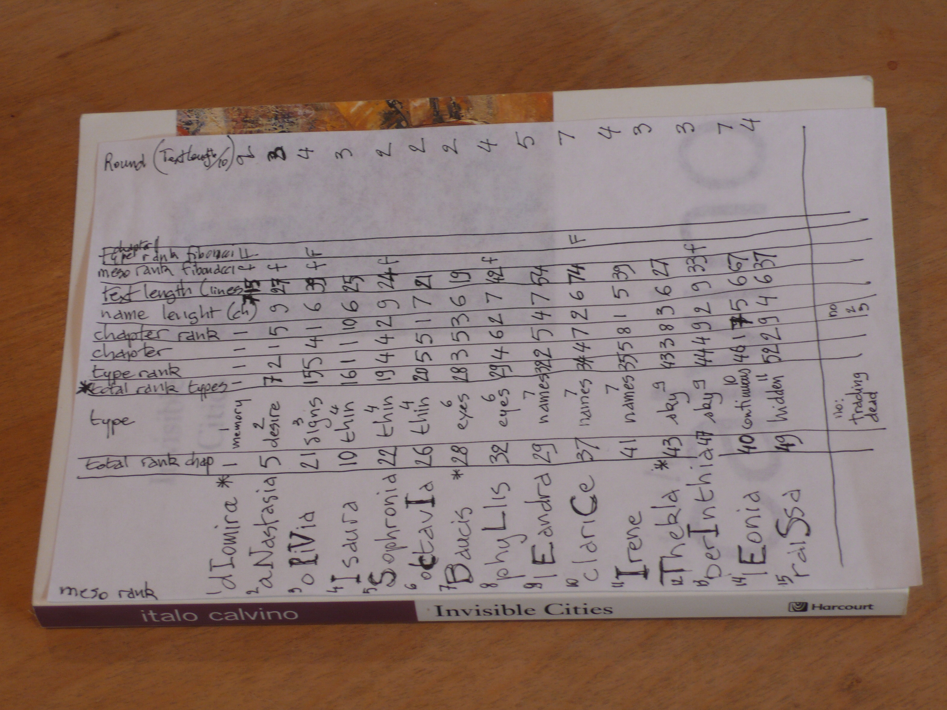
Hébert’s tabular representation of the “actors” involved in the computation of images and mesostics. Displayed with permission of Claire Hébert and the Reeses.
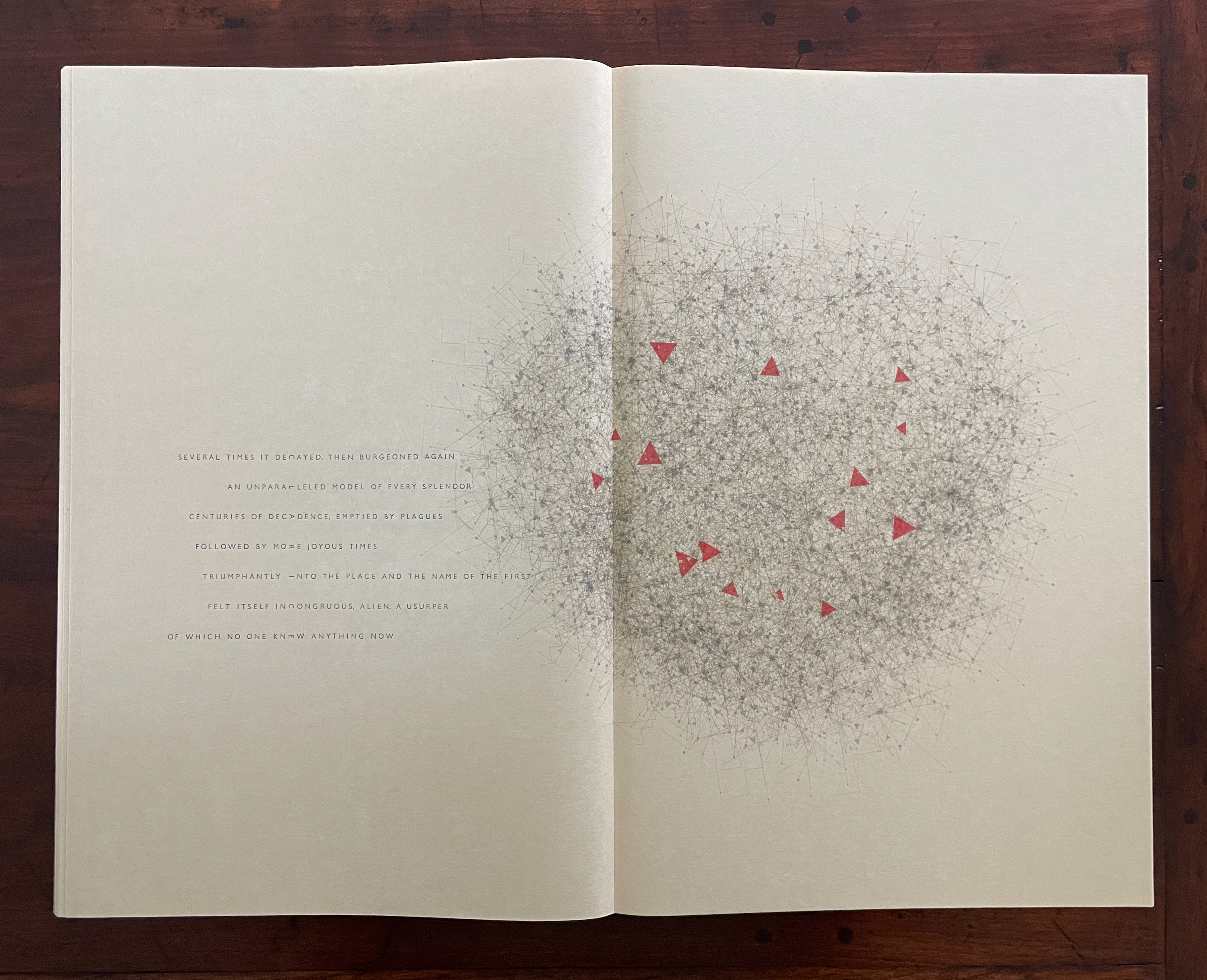
Diomira is the first city selected from Calvino’s novel. Claire Hébert, Jean-Pierre’s wife, input the description of the city from William Weaver’s translation of Calvino’s text to enable the software to select phrases and sentences that included the letters needed to spell out Diomira vertically and also provide wing words to appear to the left and right in the seven lines of the mesostic as determined by the number of letters in Diomira’s name.
Diomira spread and close-up of mesostic.
In its small constituent shapes and colors, Diomira’s algorithmically generated print differs from the preliminaries’ dispersing cloud of blue circles.
Detail of Diomira image.
Closer detail of Diomira image.
After the next spread (for the city Anastasia), a textless spread appears corresponding to the space between “in” and “visible” in the Table of Contents. Sandra Liddell Reese calls it a “breathing” spread. The breathing spread’s image resembles that in the preliminaries and repeats its color, underscoring the spread’s structural role.
Anastasia spread followed by the “breathing” spread.
Anastasia mesostic.
Close-ups of the Anastasia spread.
A similar but different blue image, corresponding to the space between “visible” and “cities” in the half-title page, occurs on the breathing spread between the Leandra and Clarice spreads. When the blue motif recurs in the book’s backmatter, the visual parallel between the breathing spreads, the frontmatter, and backmatter confirms the signal sent by the layout of the three-word title and its spacing on the half-title page: “pay close attention to these signals about the book’s structure”.
Leandra spread and close-up of its mesostic.
Breathing spread corresponding to the space between the words “visible” and “cities” in the title.
Clarice spread and close-up of its mesostic.
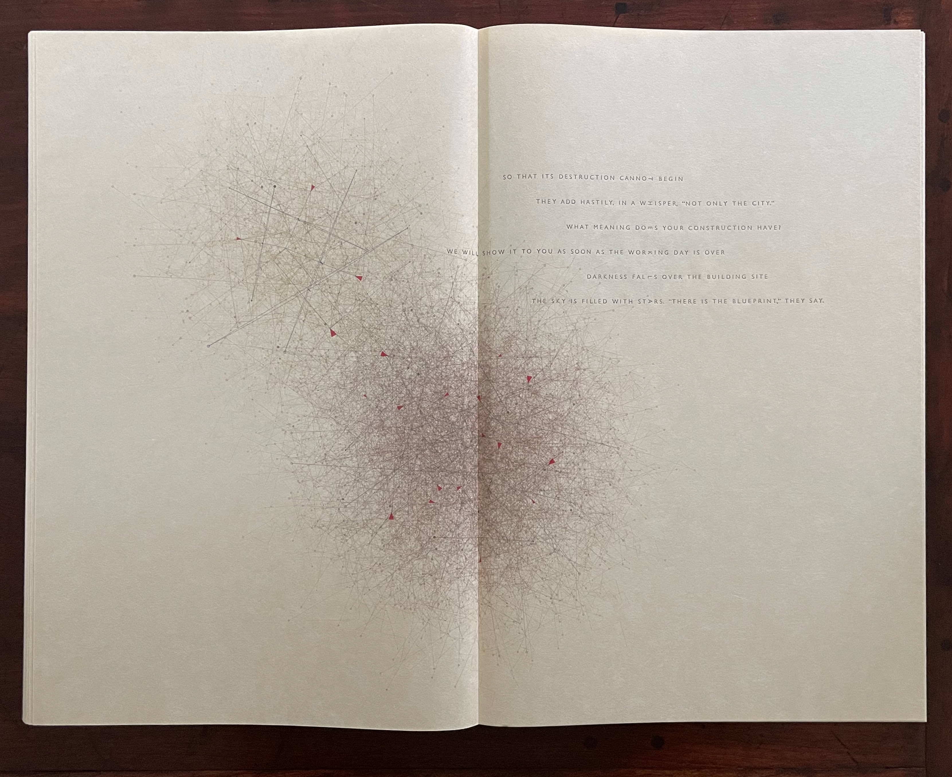
These spreads are as jewel-like as Calvino’s descriptions of the cities — or as astral as the fifteen inlaid circles of painted paper in the cover of In Visible Cities and across the box’s black front cover and interior. If the fifteen circles echoing the fifteen letters in Calvino’s title can be considered star-like in the cover’s textured black void, they echo the astronomy of Ernst and Iliazd’s 65 Maximiliana: The Illegal Practice of Astronomy, mentioned in Hébert’s prospectus.
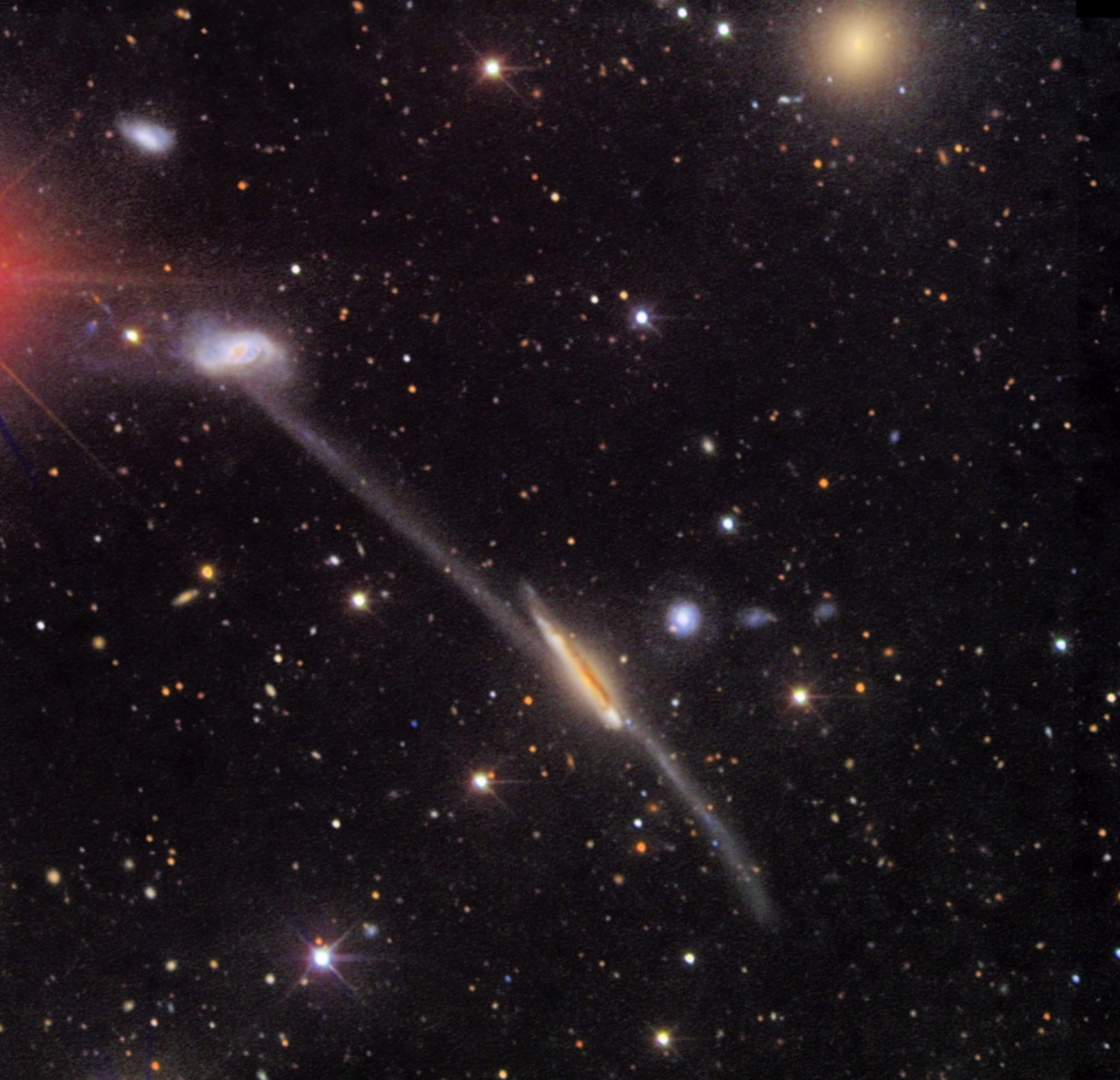
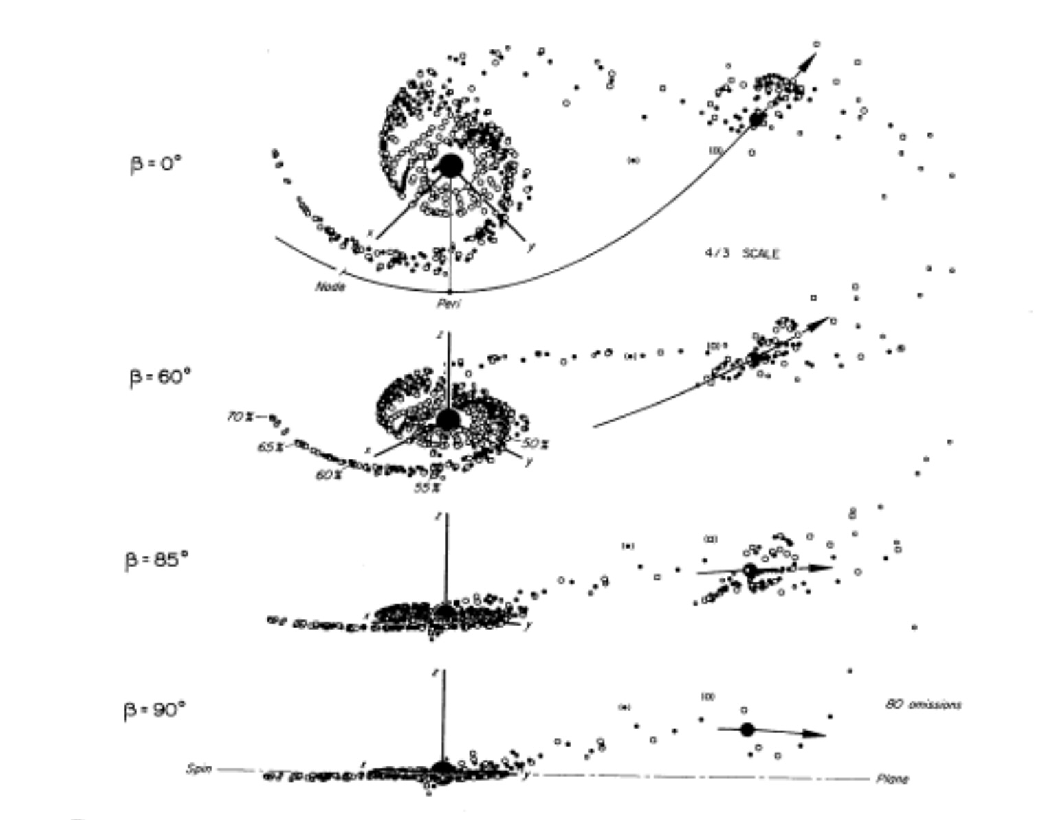
They also chime with one of the other threads the colophon mentions as part of the book’s tapestry: “the galactic tides of Alan and Juri Toomre”. The Toomres presented their concept of galactic tides in a landmark paper “Galactic Bridges and Tails” (1972). The Toomres created computational models to plot galaxies’ likely evolution into the shapes they have. They attributed the appearance of bridges and tails to galactic tides influenced by the gravitational attraction between galaxies. The juxtaposition below of these images of galaxy ARP 295 (one from the Hubble telescope and the other from the Toomres’ plot diagrams) may help in spotting the visual (if not computational) influence on Hébert’s work.
Fig. 19. Model of ARP 295. Arla and Juri Toomre. 1972. “Galactic Bridges and Tails”. Astrophysical Journal.178: 650. Accessed 26 March 2026.
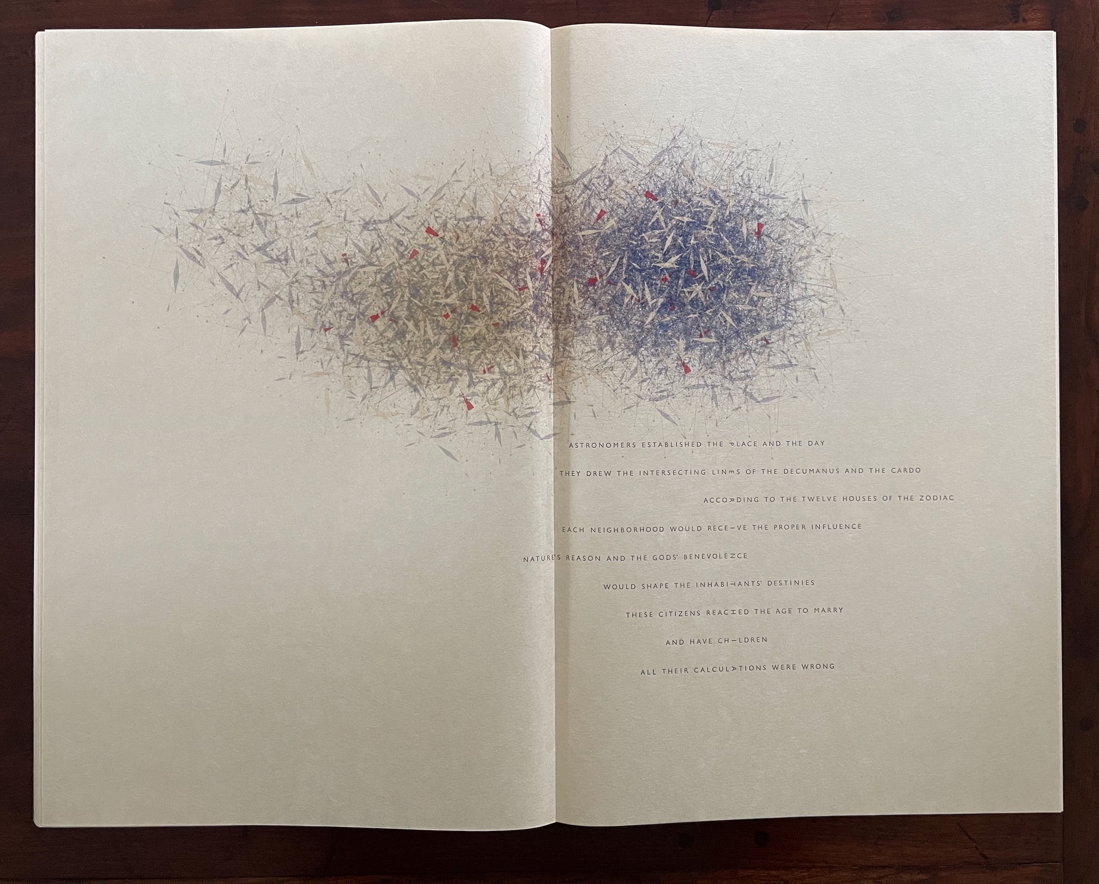
Hébert’s images and poems for the cities of Thekla and Perinthia most clearly display the Toomres’ influence. Perinthia’s last line even includes a humorous dig at them, perhaps making it the sting in the galactic tail — and perhaps one that Hébert himself does not escape.
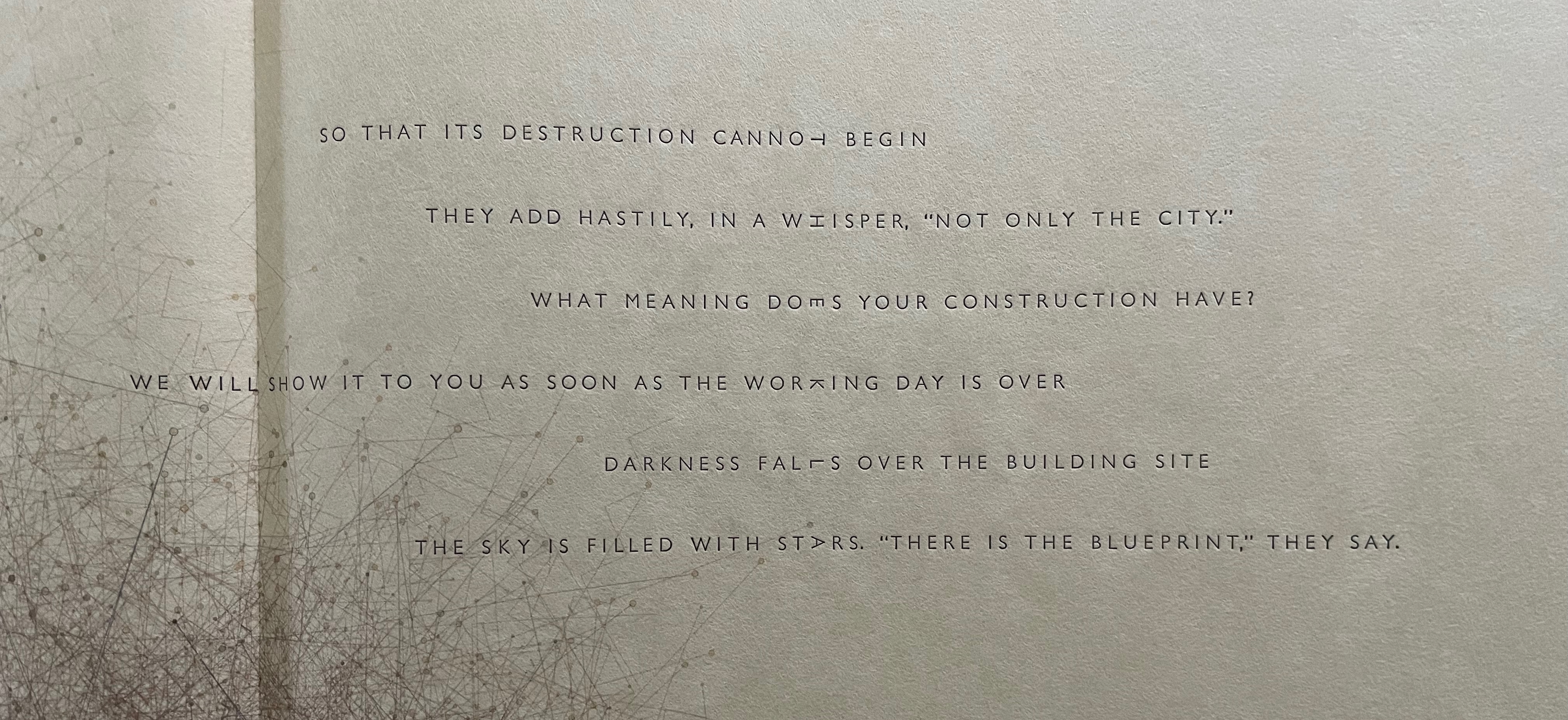
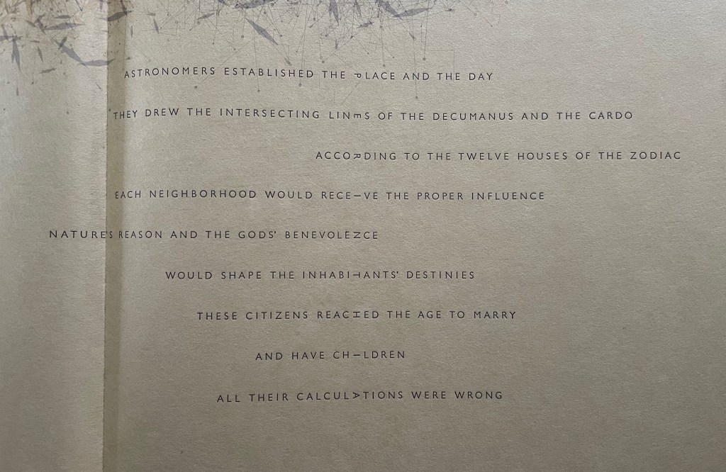
Thekla spread
Perinthia spread.
Close-up of mesostic for Thekla.
Close-up of mesostic for Perinthia.
Are all their calculations wrong because the astronomical observations are off? Or is it the metaphysical belief — that city planning or science can capture, attract, or even reflect “nature’s reason and the gods’ benevolence” — that is off? Either way, is computational modeling of astrophysical evolution any different? If so, perhaps the Toomres’ computational model is off. If so, are there grounds for doubt concerning computational drawing?
The syncretism in Hébert’s prospectus and artist’s statements is not far from that of Thekla’s and Perinthia’s city planners. And what about his conviction “that to gain power and beauty, drawing should become a pure mental activity, rather than a mere gestural skill. I have endeavored to make it so by banning the physical side of drawing”? (Hébert 2008) His artist’s statements recognize the materiality involved with his “observable” proofs of concept, that is, his code executed with “the chosen apparatus” on “the chosen media”. Hébert’s output ranges over an impressive variety of apparatus and media. A casual browse of his website finds drawings with pen, gel pen, pencil, graphite, brush, water drops, a pen plotter, a computer-driven etcher for sugar lift etching and drypoint on copper plate, and even a computer-driven ball on sand. The mark-making substances vary from China ink, sepia ink, acrylic ink, to inkjet pigment, while the substrates involve various papers (Strathmore Bristol, Torinoko, Kitakata, Arches, Stonehenge, Fabriano, BFK Rives, Epson, and Slate) as well as non-paper surfaces (clay, mylar, aluminum, sand, and water).
Despite this recognition of materiality, the statements do not quite accommodate the materiality nor the nature of the artist’s book and especially this artist’s book — or, rather, artists’ book. With an artist’s book, “the book” becomes as much a medium as paint and canvas are for a landscape, or chisel and stone for a sculpture. Moreover, the book is a multivalent medium. As such, it requires more than one chosen apparatus and a panoply of interdependent choices. Executing code in this context seems fantastical. Could there be computational artist’s books like the Cornell-box forgeries assembled by the “Boxmaker” in William Gibson’s 1986 novel Count Zero? Marly Krushkova, an art dealer, who has been hired to track down the artist behind the forgeries, is transported to a domed space station where one of its inhabitants, Jones, guides her to where the “artist” works:
Something slid past, ten centimetres from her face. An ornate silver spoon, sawn precisely in half, from end to end.
She had no idea how long she’d been there, when the screen lit and began to flicker. Hours, minutes . . . She’d already learned to negotiate the chamber, after a fashion, kicking off like Jones from the dome’s concavity. Like Jones, she caught herself on the thing’s folded, jointed arms, pivoted and clung there, watching the swirl of debris. There were dozens of the arms, manipulators, tipped with pliers, hexdrivers, knives, a subminiature circular saw, a dentist’s drill . . . They bristled from the alloy thorax of what must once have been a construction remote, the sort of unmanned, semi-autonomous device she knew from childhood videos of the high frontier. But this one was welded into the apex of the dome, its sides fused with the fabric of the Place, and hundreds of cables and optic lines snaked across the geodesics to enter it. Two of the arms, tipped with delicate force-feedback devices, were extended; the soft pads cradled an unfinished box. Eyes wide, Marly watched the uncounted things swing past. A yellowing kid glove, the faceted crystal stopper from some vial of vanished perfume, an armless doll with a face of French porcelain, a fat, gold-fitted black fountain pen, rectangular segments of perf board, the crumpled red and green snake of a silk cravat . . . Endless, the slow swarm, the spinning things . . . Jones tumbled up through the silent storm, laughing, grabbing an arm tipped with a glue gun. ‘Always makes me want to laugh, to see it. But the boxes always make me sad . . .’ — Gibson, Count Zero, p. 217.
A comparable “Bookmaker” would have to reconstitute what Martin Antonetti describes in his review of In Visible Cities as the “collaborative ecosystem” inhabited by Hébert, the Reeses, the typesetters Michael and Winifred Bixler, and all the primary sources and influences from Calvino to John Cage to the Toomres to Iliazd to M.C. Escher and others. Sandra Liddell Reese describes this collaborative ecosystem:
Throughout the initial design phase and subsequent production process we developed an aesthetic trust based on what each of us did best. Our objective, as publishers, was to unite Jean-Pierre’s digital drawings and concept for extracting a poetic text from Calvino’s prose with our letterpress printed text so that the two print mediums retained their discrete qualities while presenting a harmonious visual display across the page.
Jean-Pierre brought a few fixed-sequence sets of 15 images to the studio for us to consider for In Visible Cities. He laid them out on the studio floor and I remember thinking that the style elements, rhythms and colors were more repetitive than I had expected. Jean-Pierre wrote a new specific control level for the project, which linked objects, style, actors, and color palette to the characteristics of each city, …. This organizing factor increased the range of color and the fractality of the structures.
L: Jean-Pierre Hébert. R: Harry Reese. Behind the camera: Sandra Liddell Reese. Displayed with permission of Claire Hébert and the Reeses.
After several conversations about the selection of images, Jean-Pierre provided me with 6 digital files, per city, 90 in total. Each group of six digital files had links to the characteristics of one of the fifteen cities described by Calvino. I chose a single image from each set to represent a city.
I reset the text composition we received from Michael Bixler, letter-spaced each word and turned the appropriate letter on its side so that it aligned precisely with the letter on its side in the line above and below to spell out the name of the city as a mesostic. …
The number of lines of text per page is determined by the city name. Each line of text could shift right or left if there were multiple mesostic letters available in that line of text. Not only are the shapes of the texts and images permutable, Jean-Pierre suggested that the entire text for each city rotate to a different quadrant on each successive page spread.
Verso: Hébert’s notes suggesting a pattern for placement of the text. Recto: His note reflecting the introduction of “breathing” spreads. Displayed with permission of Claire Hébert and the Reeses.
… Once the placement of each element was determined I could begin to inkjet print the digital file for each city. Jean-Pierre’s level of trust in my selection and manipulation of his illustrations allowed image, type, and color to coalesce into solidly integrated compositions. He intuitively understood that In Visible Cities would be a better book if production took place in our studio.
We both have large-format Epson ink-jet printers, capable of printing his digital files, but it became clear that the interaction between his ethereal images and the delicate, amply spaced Gill Sans Light could only be achieved if the two print mediums, inkjet and letterpress were adjusted in relation to each other by one person in one studio.
Jean-Pierre printed the blue, monochromatic pages for front and back matter and the “breathing” pages to designate the breaks between the words In,Visible, and Cities as the book progresses.
He also printed the breath-taking saturated purple end sheets as a transition from the outer black cover to the cream colored Niyodo Natural text paper. — Sandra Liddell Reese to Paul van Capelleveen, 13 December 2019.
The material elements of an artist’s book in this collaborative ecosystem stand out in Reese’s description. Not that Hébert was a reductionist, but it is hard to square these material and collaborative aspects with the world of code executed with “the chosen apparatus” on “the chosen media”. Where does Harry Reese’s decision to rotate the letters of the central mesostic word fit into the algorithm? Where does Sandra Liddell Reese’s choice of image from six variants fit into the algorithm? In looking for variety and less repetitiveness, she was bringing the book artist’s sensibility for the arc of sequence that the book’s material elements afford such as the page, double-page spreads, frontmatter-body-backmatter, etc. Or how would an algorithm choose the sculptural valley-folding of the “double-page” spreads sealed at the fore edge to be combined with the lay-flat sewn board binding?
Above left: close up of sewn board binding. Above right: close up of sealed fore edge. Images Books On Books Collection. Below: layout of model showing valley folds and sealed fore edges. Image courtesy of the Reeses.
In fairness, Hébert’s computational manifesto mainly addresses drawing. For computational drawing, the initial substrate was the computer screen and plot printer, not a book’s cover, spine, or page spreads and their sequence. Given his responses to the Reeses’ input, Hébert clearly appreciated the self-interrogatory and recursive nature of the artist’s book and its resonance with his algorithms and Calvino’s novel. It would have been a fascinating conversation to have had with him. Even the role of “chance and time” — which Hébert captured in his computational drawing and generative poetry — found its way into the material and collaborative space of the book’s overbeaten abaca cover — even if the collaborators in this instance were the audience. Again, Sandra Liddell Reese explains:
The cover paper was made in our studio from a mixture of abaca and cotton fibers and aqueous dispersed black pigment. I bound two copies for the Codex Fair in 2011. The surface of the paper was extremely smooth and by the end of the first day of the fair the cover paper showed the fingerprints of everyone who had touched it. The solution I came up with after returning to the studio was to treat the paper so that it was not only protected when being handled, but also invited a tactile experience. I coated the surface with a thin solution of acrylic gel medium and let it dry. I then sprayed each sheet with water and crumpled it, accordion style, into a compact bundle. I opened the wrinkled sheet and while it was still damp put it into a dry-mount press that flattened the surface, but left the wrinkled creases. — Sandra Liddell Reese to Paul van Capelleveen, 13 December 2019.
By its “multivalent collaboration” (Antonetti’s description), In Visible Cities blends such a breadth of artistic and scientific inspirations into such an unusually unified whole that it stands out among artist’s books. Feeding on the same textual source, computational drawing and generative poetry perform an altogether unusual form of ekphrasis (that literary device by which a poet tries to render a visual object into words). In an algorithmic sense, Calvino’s Invisible Cities has been made visible. Fifteen of its cities are in the images and mesostics of In Visible Cities. The combinatorial-fugal structure of Invisible Cities is made visible in the prints, text, and shape of In Visible Cities. And yet Calvino’s novel is but one (albeit the chief) inspiration. Together, Hébert and the Reeses have captured a multitude of imaginations in an original tangible object.
Postlude – In Search of a Fugue
In an interview with the Reeses, I asked if Hébert had indicated whether the drawing algorithm had been set up to incorporate a fugal or canonical pattern across the city spreads. Although no specific musical patterning had been mentioned in their collaborative discussions and meetings, the Reeses remarked that Jean-Pierre Hébert was steeped in music. Not only had he pointed to Bach’s The Art of the Fugue and Cage’s Ryoanji in his prospectus, but he had also collaborated on experimental music installations such as Ulysse (1999).
Ulysse (1999) Sand installation 169, 4 x 4 x 1.5ft Collaboration with Iannis Zannos: supercollider programming / with Luigi Irlandini: instrumental music and live performances in progress (piano, recorder, shakuhachi). Displayed with permission of Claire Hébert.
The pattern by which Calvino cascades his eleven themes with their five variations over the nine movements of Invisible Cities is fugal, if not canonical. If In Visible Cities replicates Calvino’s pattern somewhere across the core seventeen spreads, this reader has missed it. There are many echoes of it such as the inversions and parallels between the endsheets and between the frontmatter and backmatter, but within the seventeen spreads, Calvino’s fugue pattern is elusive. It may reside within Hébert’s generative image algorithm and its changes directing the emission of parallelograms, triangles, and circles in various shapes, colors, and combinations, with varying space and connective lines between them.
In correspondence with Robin Price shared with the Reeses, Hébert writes at length about his image algorithm, which he called the Wheel of Time, and its application with In Visible Cities:
My generative code Wheel of Time is a capable and powerful creative assistant. I designed it in 2009 with works on paper, performances and installations in mind. Here is how it generally works. The highest level creates an evolving overarching structure, based on date and time, which can never repeat its design. At any time, many families of low level, simple objects, style elements, or actors can be readily called upon to inhabit, animate this structure or set, appearing in different places, numbers, styles, colors, and rhythms. These director’s calls arise from choices, or chance operations, or both; these can be interactive, or programmatic, or both; they are created at the control level. The instant visual experience results directly from the composition of time and director’s calls, or set and objects/actors. The whole piece is ephemeral, and evolves swiftly. But any instant can be captured and preserved as such. The combinatorics open a huge number of possibilities. In the rapid flow of time chance operations remain a major factor conducting any performance, beyond my own decisions and interactions.ractions.
….
In his book Invisible Cities, Italo Calvino carefully laid out several levels of complex and intertwined secret structures. These invisible structures are, admirably, the essence of the book, the source of its genius, its inner poetic line, its Ariadne’s thread. As the original Invisible Cities text is cut, disassembled and reassembled for the construction of the In Visible Cities mesostics, it becomes imperative to keep the secret threads unbroken in order to maintain the integrity of Calvino’s work, to keep its DNA alive.
Instead of letting chance freely control Wheel of Time in the making of the In Visible Cities images, I was compelled to use the essence of Invisible Cities as a taming, channeling, organizing factor. A new specific control level was written for the project and included in the software. It links each potential director’s calls for objects/style/actors to the characteristics of each city and its text. For instance the temperament of the city [as city of desire, sign, memory, etc…], its chapter, its rank within its chapter, its rank among the cities of similar temperament, the number of letters and of vowels of its name, the moment its name appears in the text, the length of the text in lines and words, will select the color palette, call for lines or lozenges, increase the fractality of the structure, adjust the sizes and numbers of objects, select the time bracket for the image structure definition. The cardinality of letters and the primality or the Fibonacci nature of numbers are also invoked to select shapes, and the relative presence of certain colors.
….
As it is possible to read Invisible Cities and not observe, understand, or care for the depth and beauty of its underlying structures, it is possible to see the In Visible Cities illustrations and not understand that they are like Invisible Cities, composed as a whole set. It is hoped though, that the right perception will provide a series of puzzles and clues that will shine new lights and insights on the admirable original work. The ultimate level of chance remains with the beholder’s attention and perceptivity as he faces the result of choices with unforeseeable consequences. (Hébert, 15 February 2011; Hébert’s bold emphasis)
I eagerly await the chance closer reader of InVisible Cities who will delve into its “series of puzzles and clues” and find the fugue.
Further Reading
“Ken Botnick”. 16 Jun e 2022. Books On Books Collection. For two works that absorb other books “ekphrastically”, see Botnick’s Diderot Project (2015) and Table of Contents (2020).
“Angela Cavalieri”. In progress. Books On Books Collection.
“Karen Kunc“. In progress. Books On Books Collection.
“Pauline Lamont-Fisher“. In progress. Books On Books Collection.
Brioschi, Mario. 2012. Le Città Invisibili. Animated pop-up book video. Accessed 26 February 2026.
Buchtel, John, Paul van Capelleveen, Susan K. Filter, Peter Rutledge Koch, Roberto G. Trujillo, Martin Antonetti, Betty Bright, et al. 2022. Materialia Lumina : Contemporary Artists’ Books from the CODEX International Book Fair. Edited by Elizabeth Fischbach and Nann Parrett. Berkeley, California: The Codex Foundation. See pp. 312-15 for Van Capelleveen’s review of In Visible Cities.
Hofstadter, Douglas R. 2000. Gödel, Escher, Bach : An Eternal Golden Braid. 20th-anniversary ed. London: Penguin Books. Unlike Hébert, Hofstadter is not a Cage-enthusiast in GEB, but his ambigrams (“a calligraphic design that … squeeze[s] two different readings into the selfsame set of curves”) would suggest more than a tolerance of mesostics.
Hubert, Renée Riese. 1984. “Max Ernst: The Displacement of the Visual and the Verbal“. New Literary History, 15(3), 575–606. Hubert’s discussion of Ernst’s collage technique of displacement of the visual and verbal and her highlight of his insistence that he constructs his poems according to logic resonate with Hébert’s computational drawing and generative poetry. Accessed 11 April 2026.
Steigerwald Ille, Megan. 2024. “Opera as Mobile Music: Invisible Cities“. Chapter 1 of Opera for Everyone : The Industry’s Experiments with American Opera in the Digital Age. Ann Arbor, Michigan: University of Michigan Press. Accessed 25 March 2026.
Pete Malinverni‘s album in 2008 inspired by Invisible Cities (2008) jazz piano suite but not reflecting its content or structure.
Christopher Cerrone’sInvisible Cities Opera (2009-13). Oddly enough, around the same time that the Hébert and the Reeses began their collaboration, and also in southern California, Christopher Cerrone created his “headphone opera” Invisible Cities (2009-13) and staged it in Los Angeles Union Station.
Britta Byström’sInvisible Cities(2013), an orchestral piece.
Various Artists‘ Invisible Cities (Nina Protocol) (2022), a collaborative release with 10 musical , 10 visual, and 10 poetic interpretations of a single city.
Richard Rijnvos’lettura del labirinto (2024), a six-part harpsichord solo.
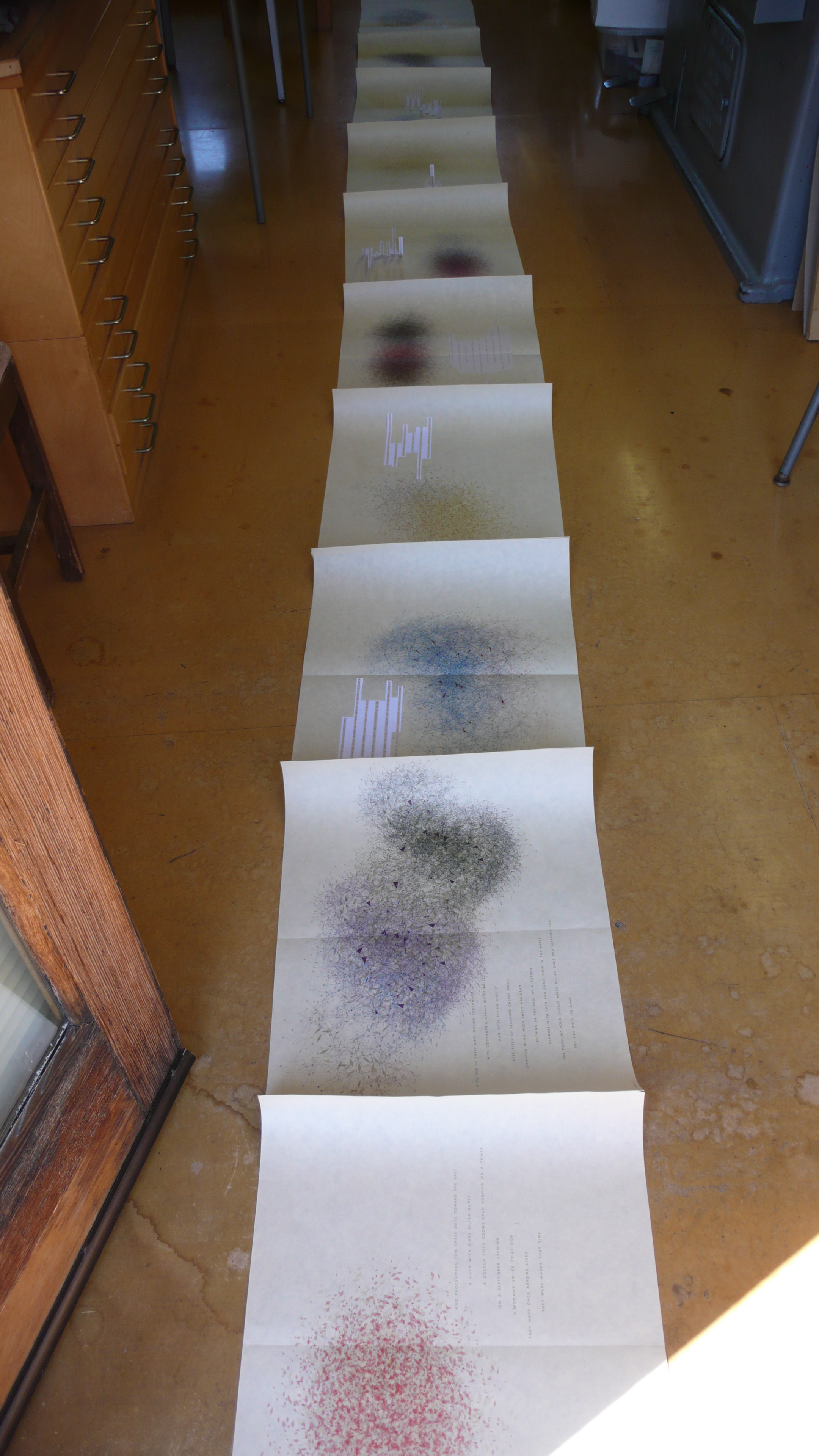
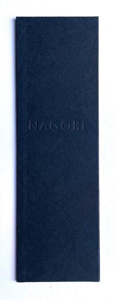
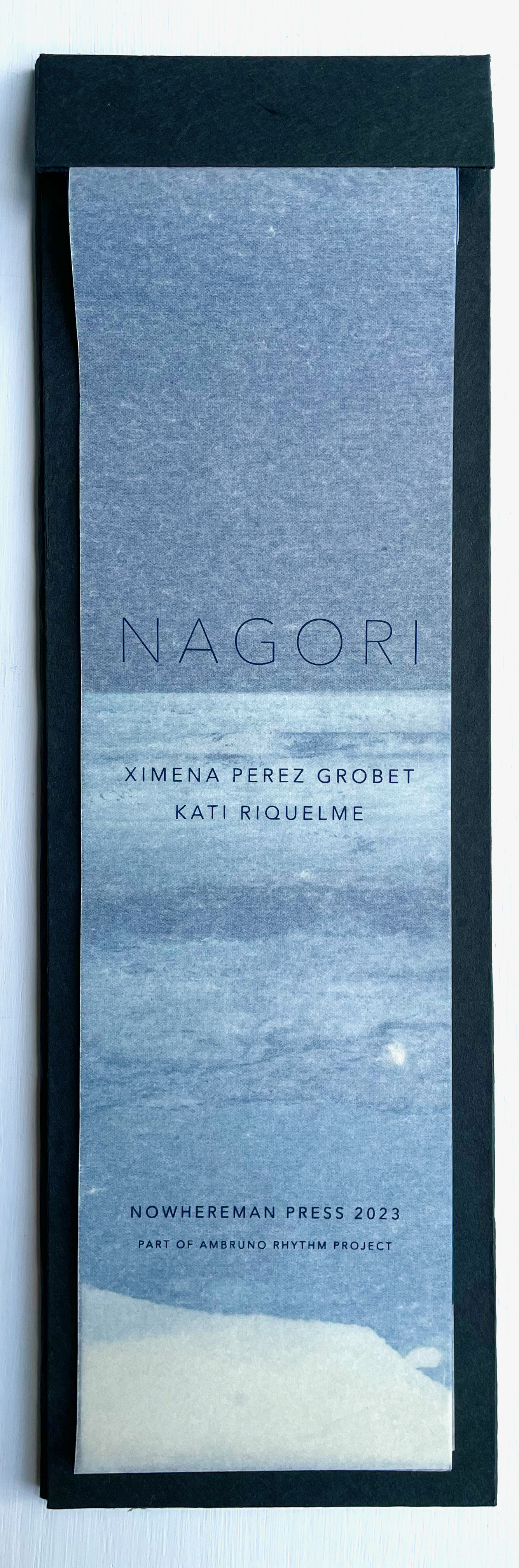
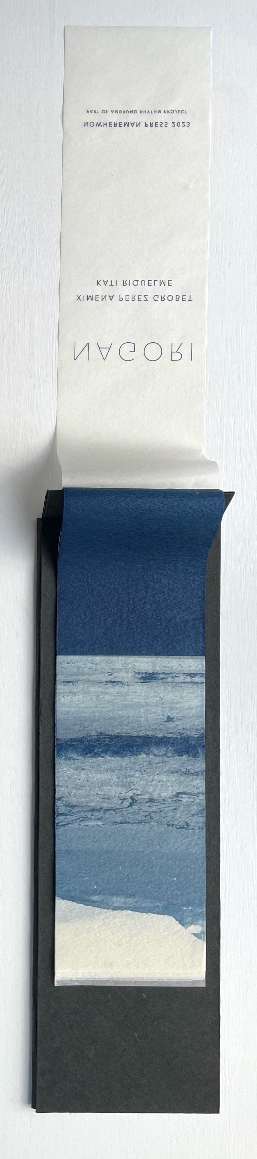
Nagori (2023) Ximena Pérez Grobet and Kati Riquelme Clothbound hardcover. H153 x W47 mm. Edition of 33, of which this is #14. Acquired from Ximena Pérez Grobet, 5 February 2024. Photos: Books On Books Collection. Permission to display from Ximena Pérez Grobet.
The Japanese word nagori has several meanings. Beware translation applications, but embrace the online discoveries that lead to Ryōko Sekiguchi, the Japanese expatriate writer, and Victor Burgin, the British conceptual artist and writer, who cites her. With Sekiguchi, you will find that it means “nostalgia for the season leaving us”, the longing for the taste of an early season fruit evoked by its late season taste, or a room’s sense of waiting for the return of someone who has just left. With Burgin, before he cites Sekiguchi, you will first find nagori‘s etymology — nami-nokori, referring to the remnant, remains or traces of receding waves. Burgin’s etymological explanation is obviously the most applicable to this collaborative artists’ book, but after you have put the book aside, you may feel a lingering nostalgia for the experience of it akin to the sensuousness Sekiguchi evokes.
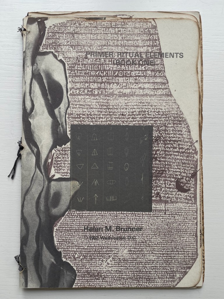
Primer: Ritual Elements (Book One)(1982) Helen M. Brunner Softcover, pamphlet-stitched. H239 x W155 mm. 22 pages. Binding adapted from a design by Barbara Press, developed under the instruction of Hedi Kyle. Edition of 300. Acquired from JP Antiquarian Books, 14 February 2024. Photos: Books On Books Collection.
Primer is an unusually made booklet. Stitched with black cotton thread over three signatures, its two outer signatures are of white wove Curtis rag paper, the inner signature is of parchment or a translucent paper, and four 5-panel thumbnail accordions in translucent paper are glued to the beginning of the last outer signature. More unusual is that the booklet’s edges appear burnt into unevenness, yet there is no odor of ash. The edges of the sewing holes also appear burnt, one page has a scorch mark in its center, and even the edges of the collaged items appear to have been burnt before being photographed. The breadth of collaged items — from cave markings to cuneiform to Rosetta Stone to film strips or slides — is not unusual given the title; you would expect a primer on ritual elements to address a prehistoric to historic range of petroglyphs, pictographs, symbols, letters, photographs, etc. But most unusual — and perhaps the point of the work — is that the legible text undermines the aim suggested by the title. The script on the back cover makes the subversion plainest.
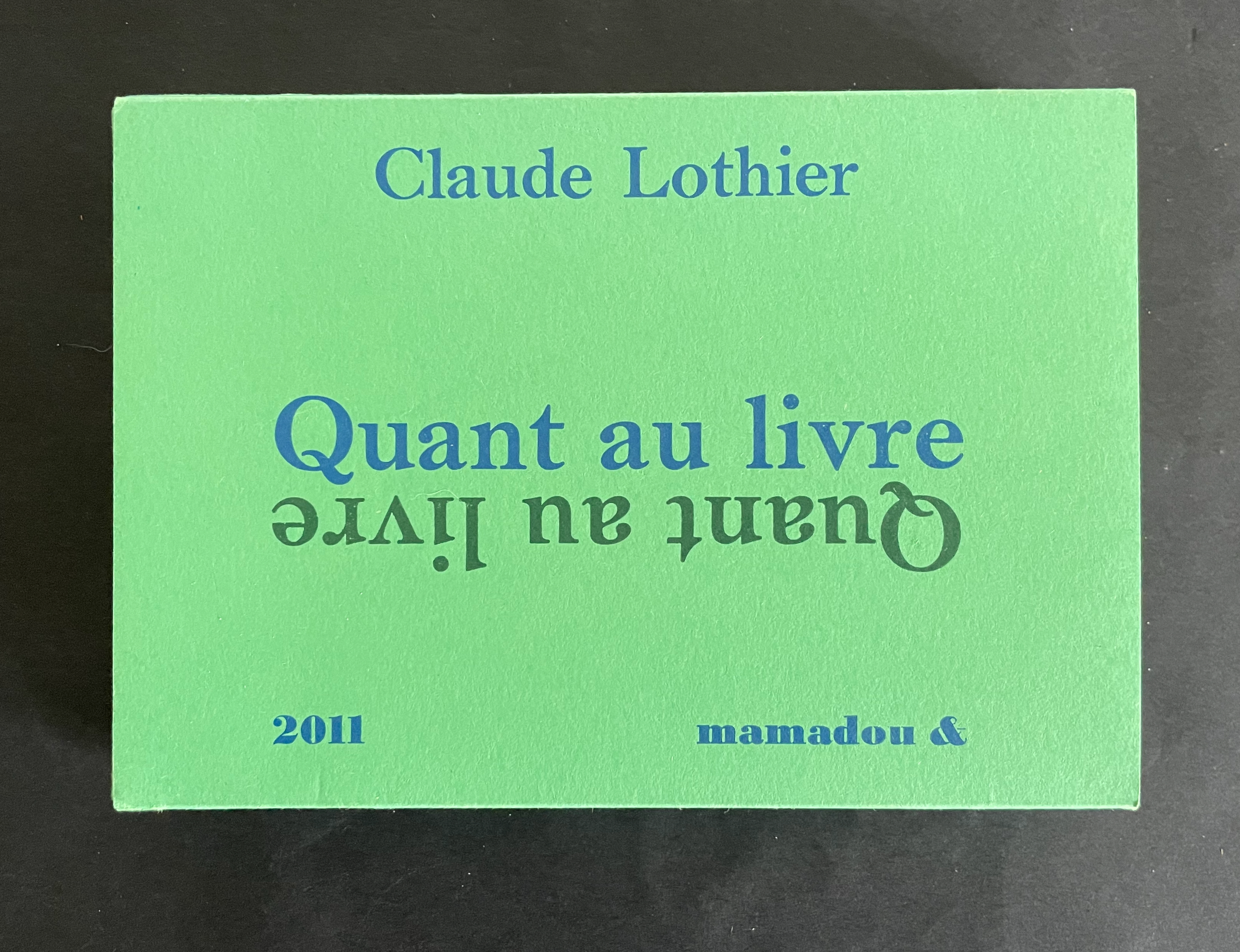
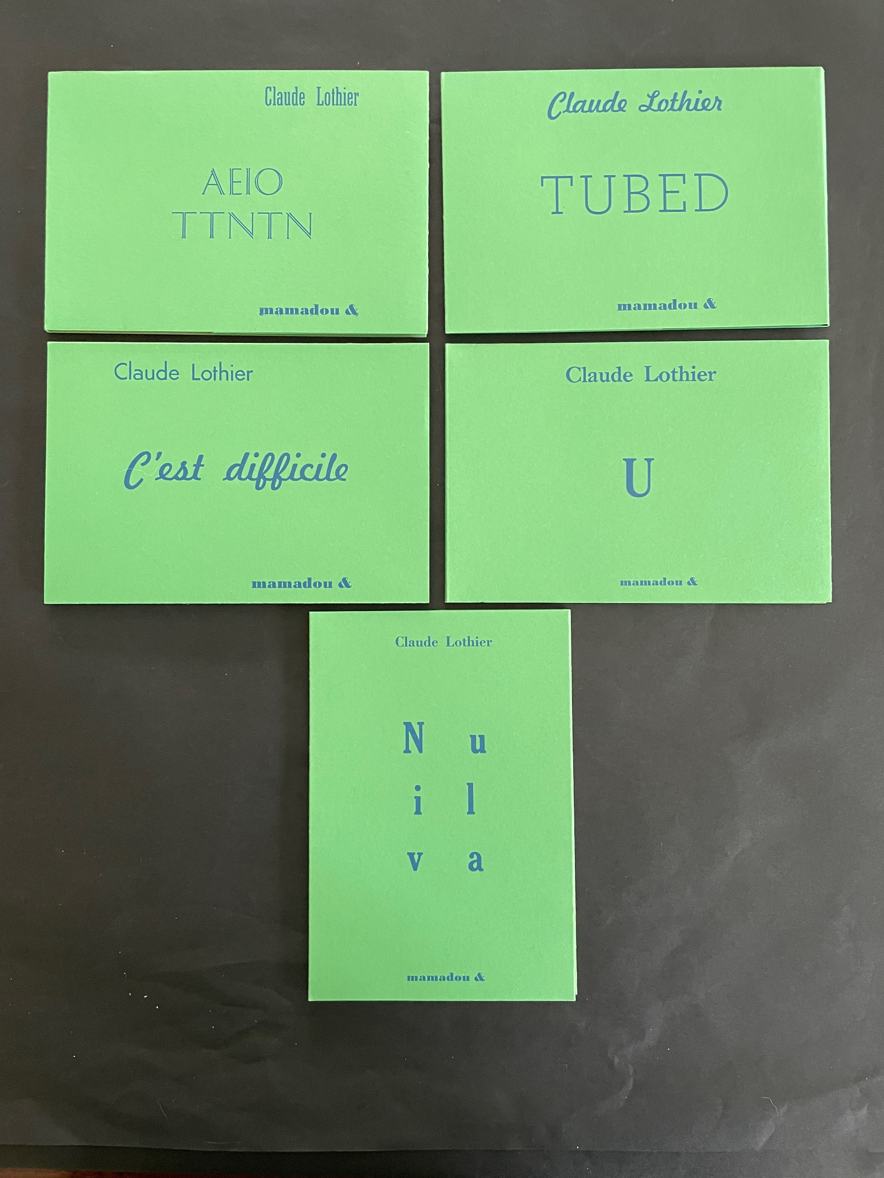
Quant au Livre(2011) Claude Lothier Slipcase around five cased and glued softcover booklets. Slipcase: H110 x W158 x D25 mm. AEIO TTNTN: H108 x W157 mm. Niv ula: H157 x W108 mm. C’est difficile: H108 x W157 mm. TUBED/NIF: H108 x W157 mm. U: H108 x W157 mm. [28] pages each except for TUBED/NIF, which has [20], and U, which has [24]. Edition of 200. Acquired from Biblio-Net, 16 October 2025. Photos: Books On Books Collection
In English, the phrase quant au livre would be “as for the book” or “concerning the book”. What is lost in translation is the phrase’s association with Stéphane Mallarmé’s volume of essays Divagations (1897) in which one section was entitled Quant au Livre. It included the essay “Le Livre, Instrument Spirituel”, which delivered the proclamation “tout, au monde, existe pour aboutir à un livre” (“everything in the world exists to end up in a book”). It was the proclamation scholars seized on to give artists’ books their metaphysical underpinning. If it swallows up everything in the world, What is a book? Many book artists have simply bypassed the discussion and jumped in with works of art that challenge how we read, how we make sense of a book, how we make sense of what a book is. Claude Lothier is one of those book artists.
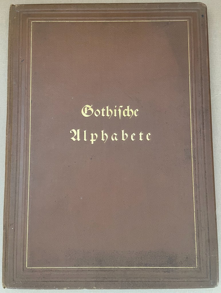
Gotische Alphabete (1897) Jaro Springer Casebound hardcover in leather with cover title and cover illustration in gold and blind embossing. H415 x W300 mm. 1 sheet, 8 pages, 3 sheets, 39 plates. Acquired from Antiquariat Braun, 14 November 2024. Photos: Books On Books Collection.
Every history of letters or script begins with a scrawl. Someone somewhere at some time made a mark tied to an object tied to a sound — A is for Ox — and some others in the same place and time accepted that this handmade mark or shape could conjure up that object in the mind. Perhaps it seemed magical, perhaps it seemed mundane as they imagined that somehow meaning and reality inhered in that shape or sound, the connection just waiting to be discovered.
Regardless, the shapes of characters and their relationship to the sound or meaning they represent is arbitrary, a prehistorical and historical function of social convention, a collective making by individuals. Jaro Springer’s art historical specimen book reminds us of the fantastical visual elaborations to which 15th-16th century artists’ hands would put those “shapes for sounds” we call the alphabet.
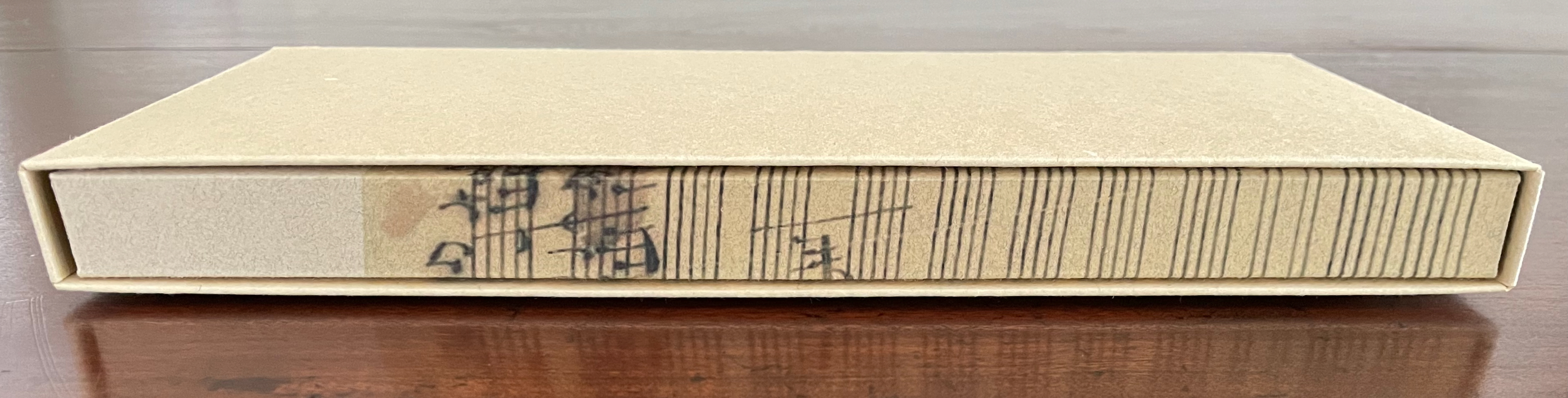
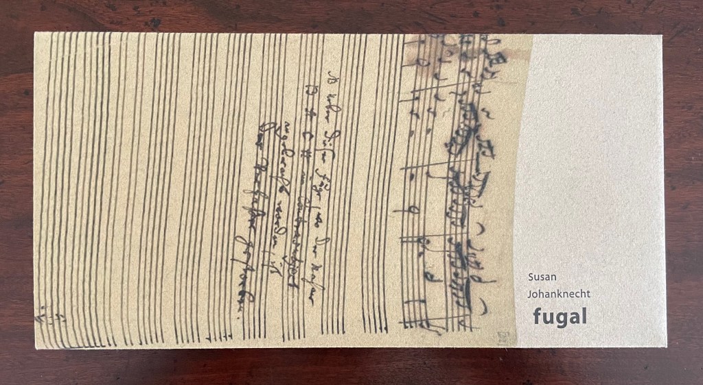
Fugal (2025) Susan Johanknecht , Claire Van Vliet, and Andrew Miller-Brown Vertical double-sided accordion book bound in “Landscape with Cows In It” structure designed by Claire Van Vliet, cover in calendered Barcham Green India Office, interior in handmade Japanese Kozo Natural fixed to Monadnock Dulcet; slipcase of handmade paper. Slipcase: H123 x W248 x D22 mm. Book: H120 x W240 x D18 mm. [6] double-sided panels. Edition of 100, of which this is #8. Acquired from Susan Johanknecht, 26 September 2025. Photos: Books On Books Collection
In the hands of multiple readers, this collaboration among Susan Johanknecht’s Gefn Press, Claire Van Vliet’s Janus Press, and Andrew Miller-Brown’s Plowboy Press becomes the “book as performance” and “book as musical score”. Fugal is an artwork that works best with several simultaneous readers/voices/viewers.
A fugue generally has a “subject” (or main theme), an “exposition” in which voices or instruments each play out the subject, then an “episode” (or connecting passages) that builds on the previous material, then further alternating “entries” in which the subject is heard in related keys until a final entry that returns to the opening key. The subject of Fugal is the generative process of vocal changes due to aging. The phrases of the poem have been drawn from an unidentified speech and language textbook.
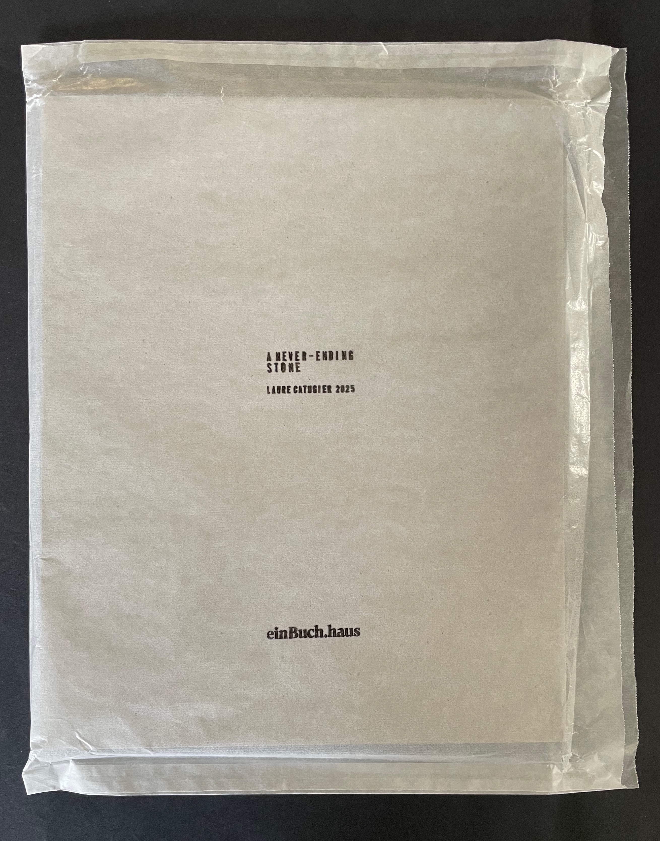
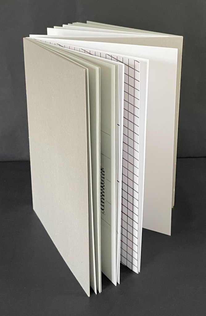
A Never-Ending Stone (2025) Laure Catugier Open spine, dos-à-dos with grey bookbinding board. 210 x H260 x 210 mm. 104 pages. Edition of 250. Acquired from einBuch.haus, 3 December 2025. Photos: Books On Books Collection.
A Never-Ending Stone is Laure Catugier’s first monographic catalog. Her skill with collage, alignment, shadows, materials, and the book format transform it into an artist’s book very much driven by her fascination with architecture and especially the architectural theories and practice of Oskar and Zofia Hansen. The Hansens eclectically embraced “human-scale” architecture, “environment art”, and what they called the “open form” structure, using space and time as its key elements. The Hansens also proposed that the architect should not be the all-knowing expert but should partner with clients as co-authors of their space, respecting how their interior and outside activities and relations with one another defined them and their space. Though somewhat a forerunner to User-Centered Design, Open Form radically aimed at structures that would evolve with interaction with the user and, as they unfolded, also align with nature.
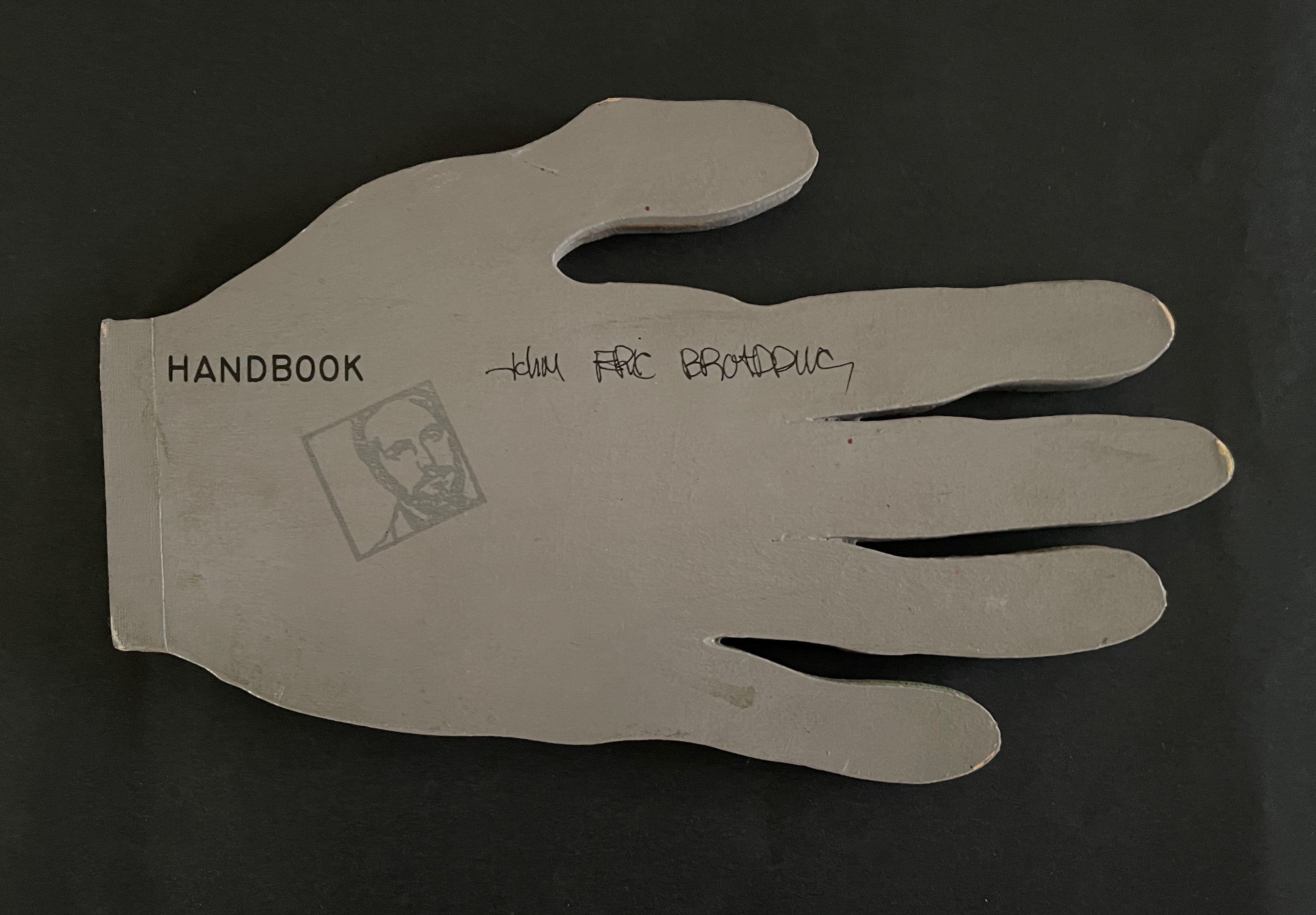
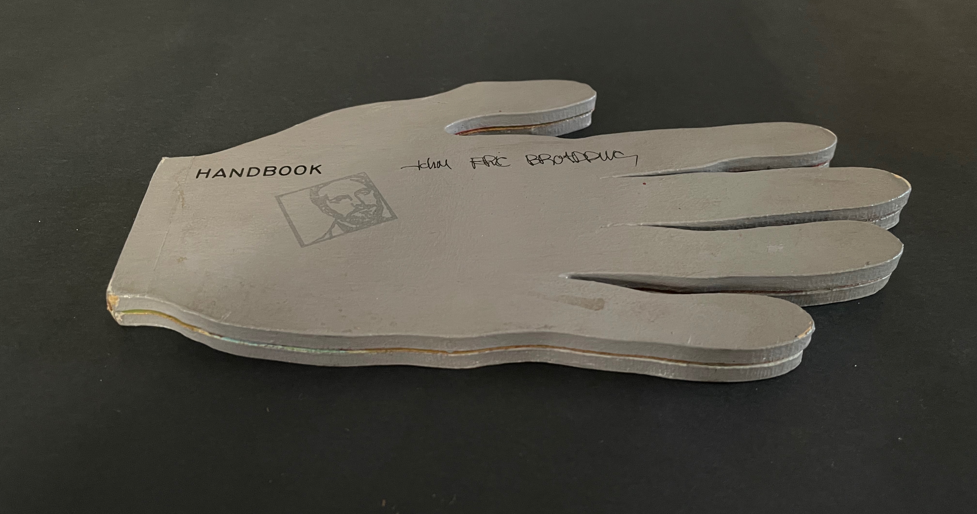
John Eric Broaddus (1943 1990) was perhaps one of the most inventive and creative artists to approach the book form. He was a prominent figure in the New York City art scene in the 1970s and 1980s, creating books before the book form even had a suggestion of acceptance in the art world. He also created one-of-a-kind costumes that he wore out on the streets of New York and in iconic places like Studio 54. He was vibrant, outlandish, and did much to contribute to the world of artistic interplay in New York City of that time. His inspired life was cut short by AIDS in 1990. but his legacy lives on in the work he left behind, a muse in itself for book artists even twenty years later.” Visual AIDS
Since first seeing references to and images of John Broaddus’ artist’s books in 2012, I have watched for opportunities to add his work to the Books On Books Collection. So many of his artist’s books were unique works and already in institutional collections or private hands, it would be a long watch. In late 2025, this appeared: “Achingly scarce work from a major figure in the early book arts movement. Minimal shelf/edge wear, else tight, bright, and unmarred. Shape book (human hand), grey painted boards, black ink lettering, cut paper forms.”
Handbook (1980) John Eric Broaddus Hand-shaped boards over hand-shaped painted and cut pages, nailed tape hinge. Variable: H123 x W205 mm. [10] pages. Limited edition, unknown quantity. Acquired from Lux Mentis, 3 December 2025. Photos: Books On Books Collection.