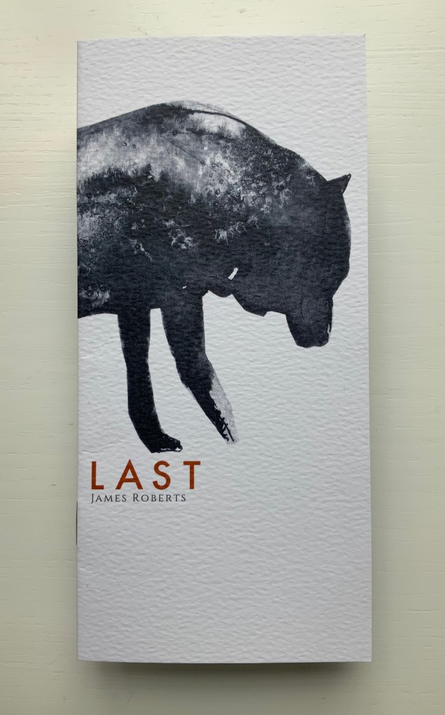
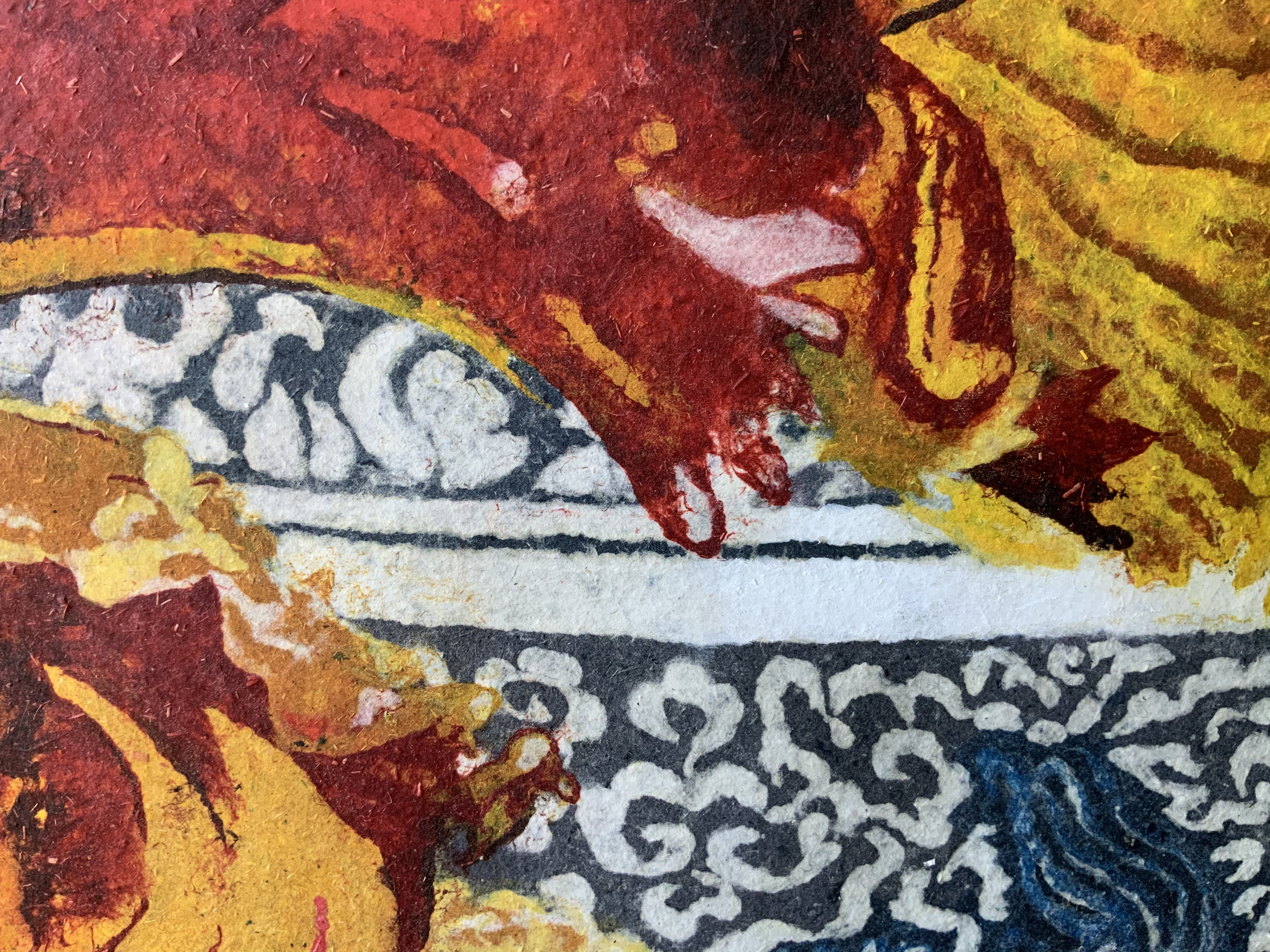
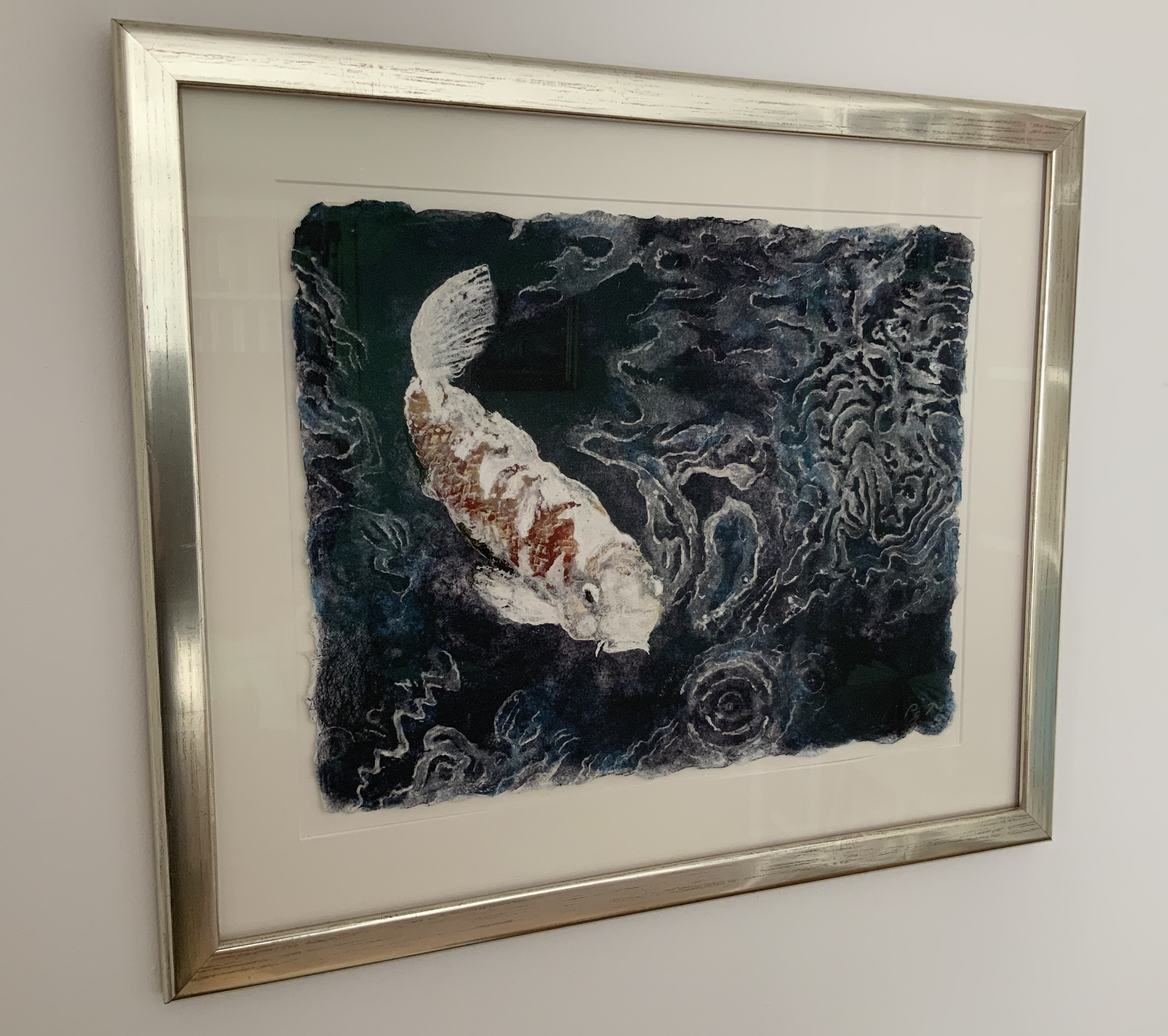
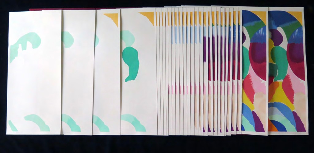
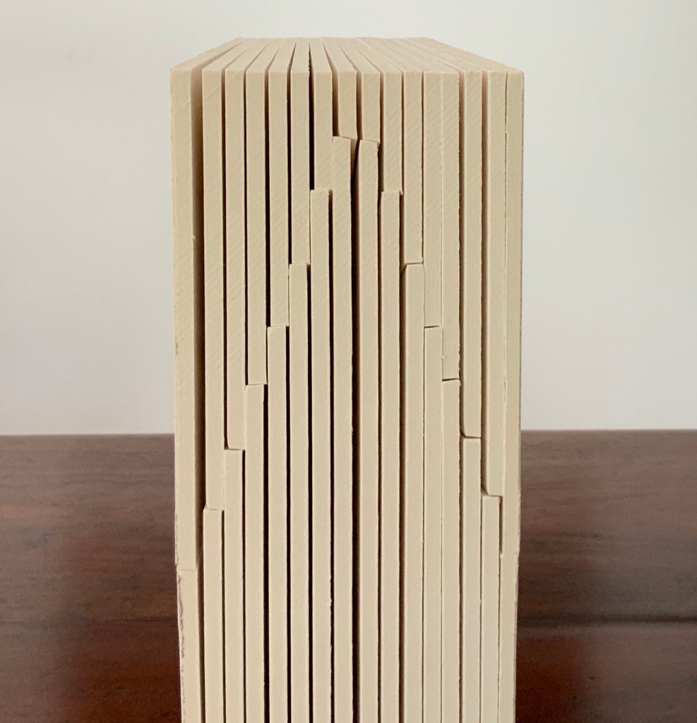
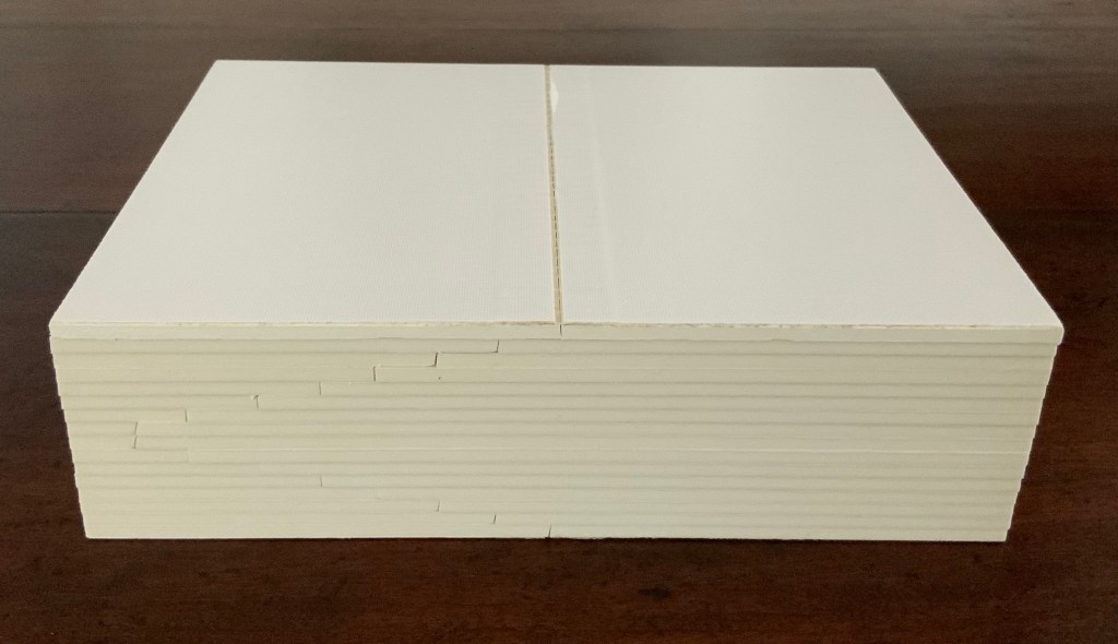
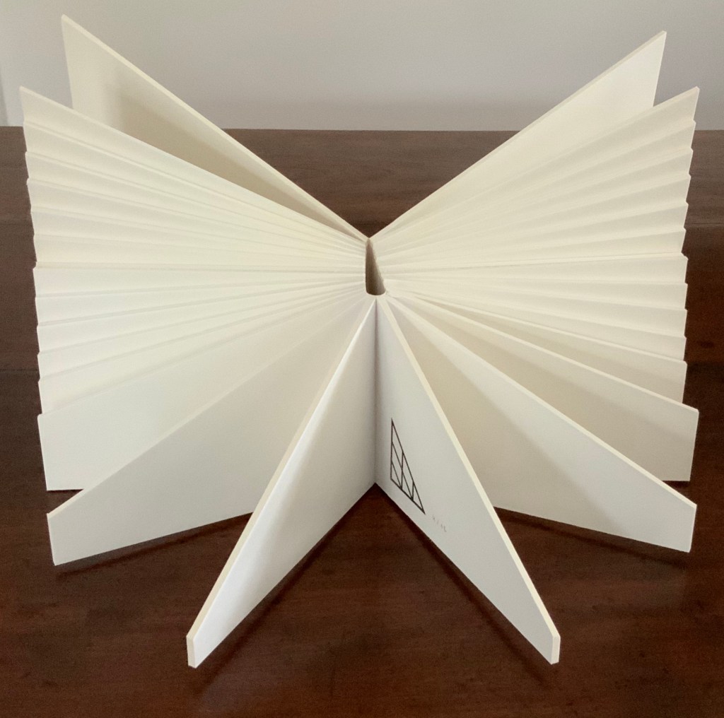
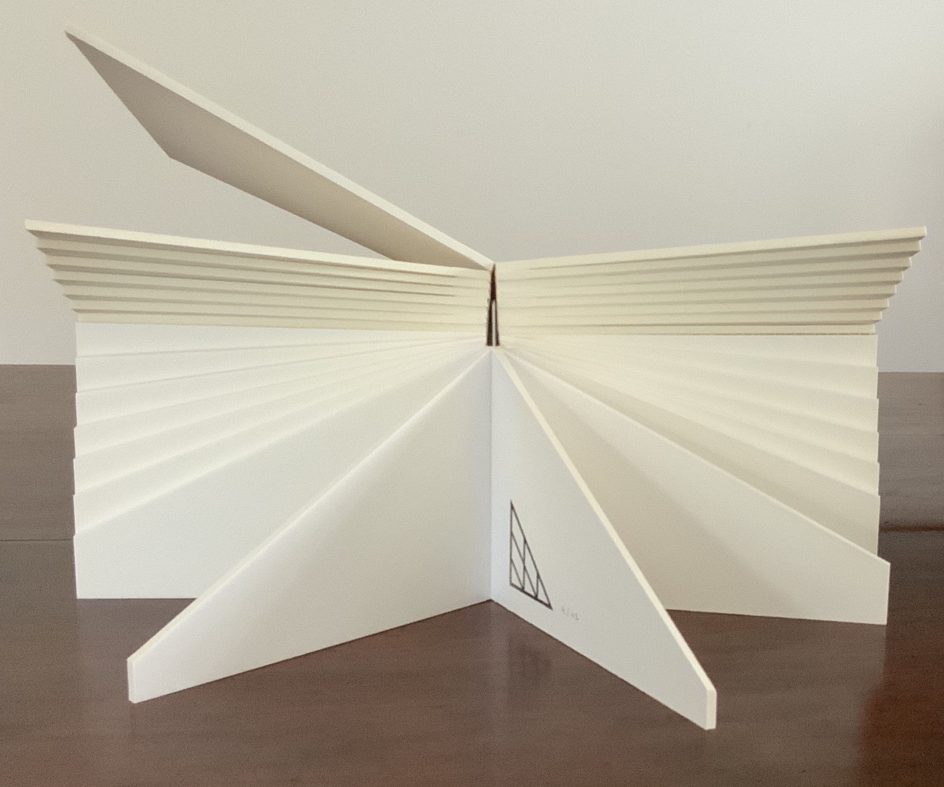
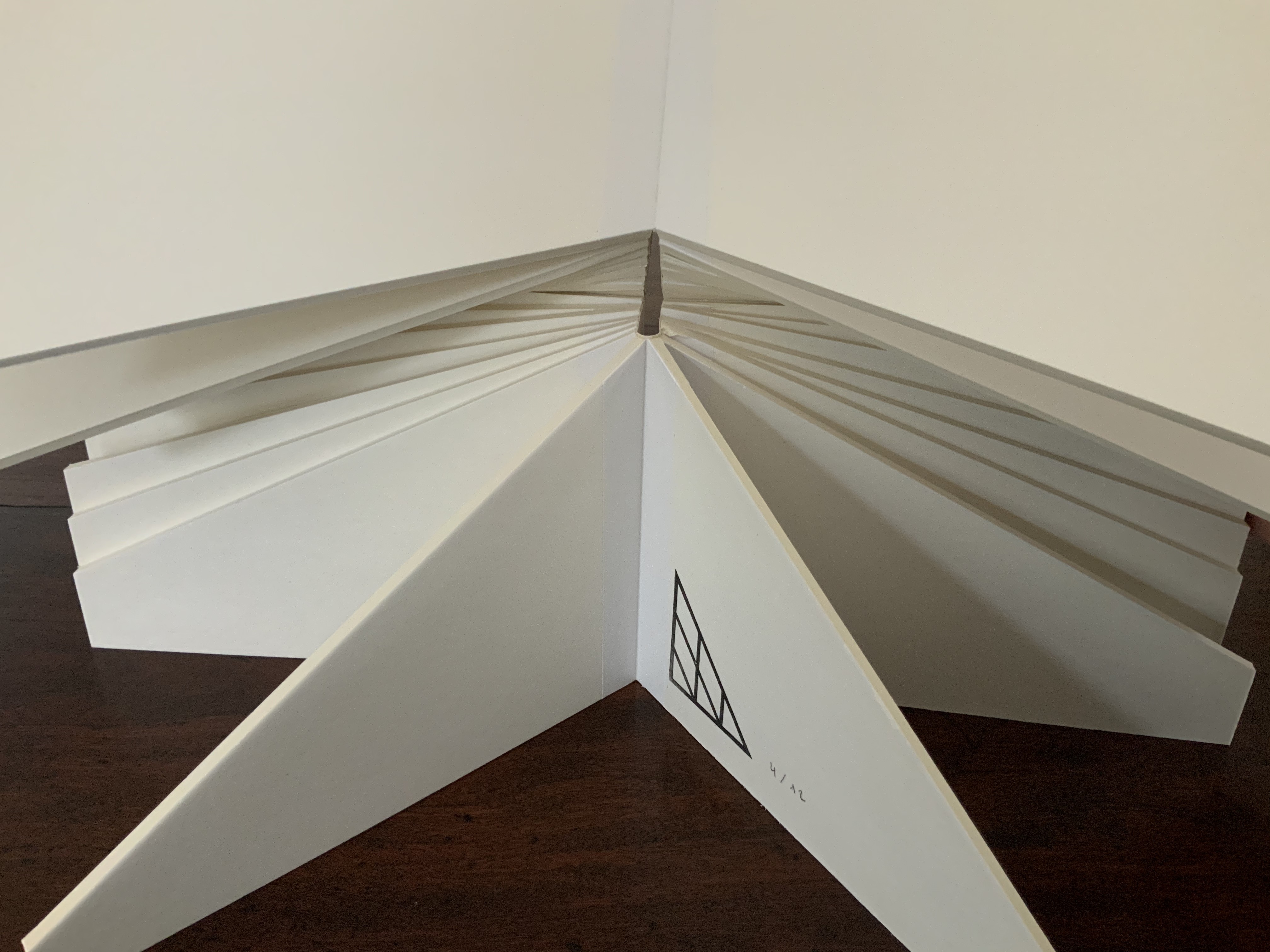
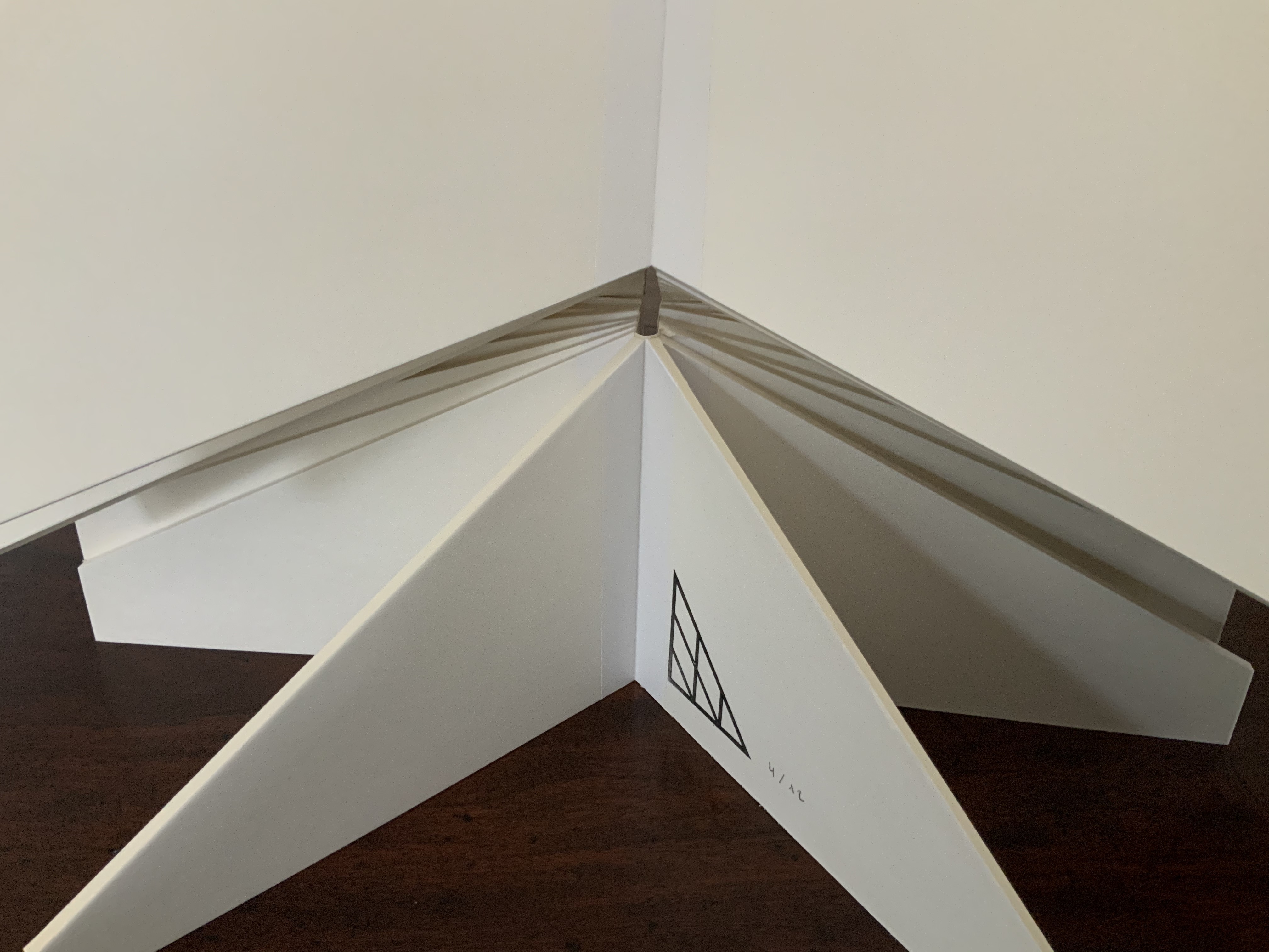
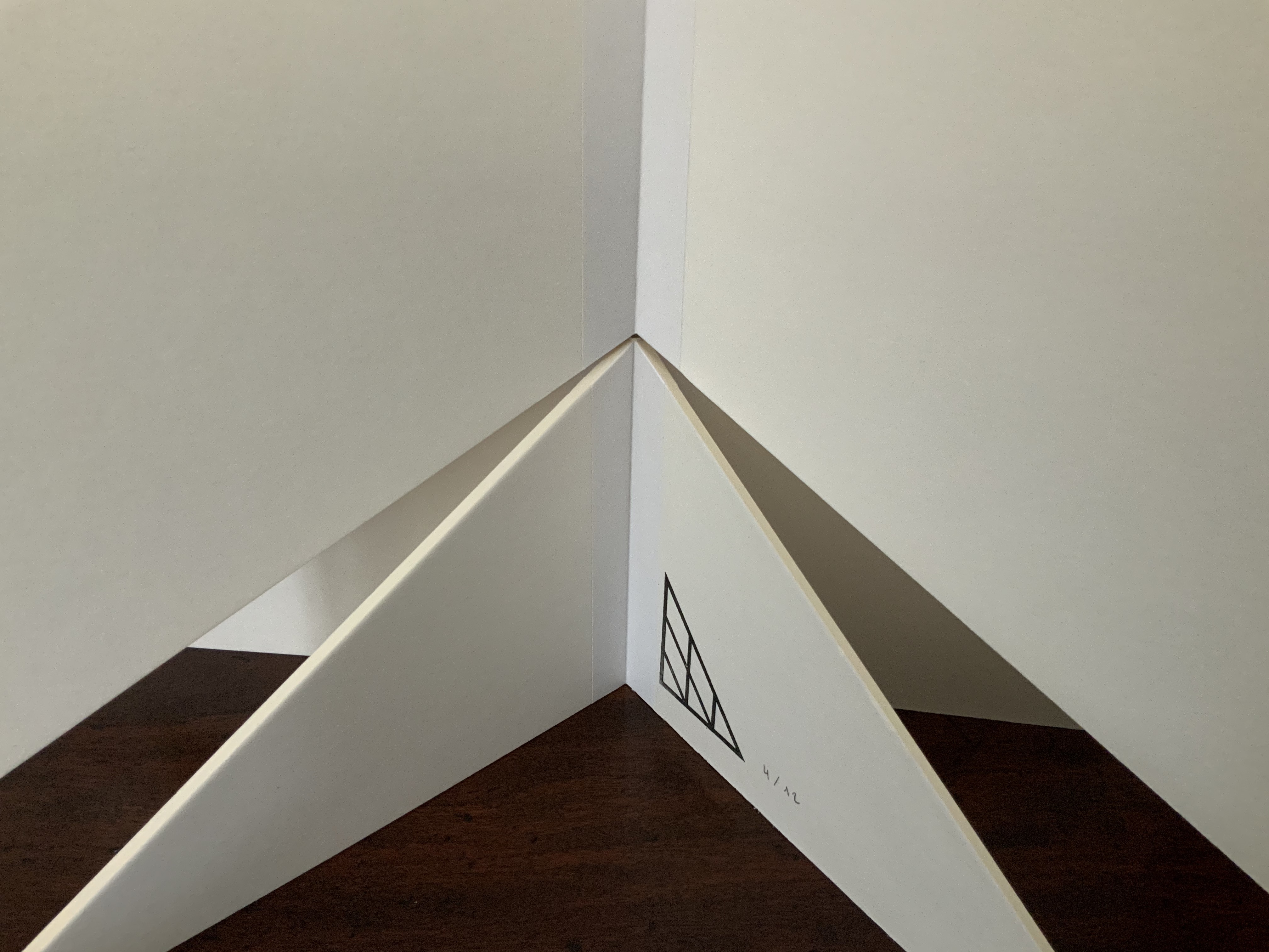
Last (2018) James Roberts Chapbook, saddle-stitched with staples. Cover: Futura and Goudy Trajan printed on Nettuno 350gsm. Text: Bodoni printed on FSC paper. H210 x W98 mm, 12 pages. Edition of 100, of which this is #36. Acquired from the author/artist, 24 August 2020. Photos: Books On Books Collection. With permission of the author/artist.
Before starting his reading of his poem “The Bear” many years ago, Galway Kinnell commented that someone at another reading had expressed surprise that Kinnell was not an Eskimo, the description of the hunter and the bear being so real, so obviously based on first-hand experience.
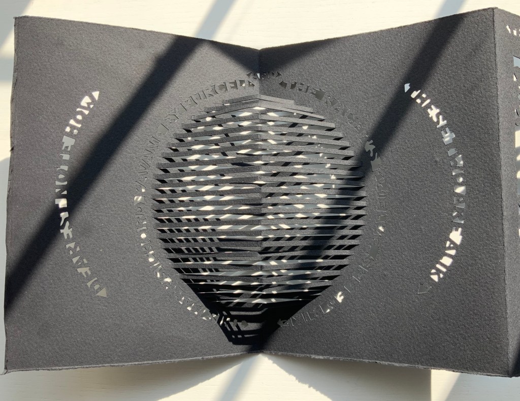
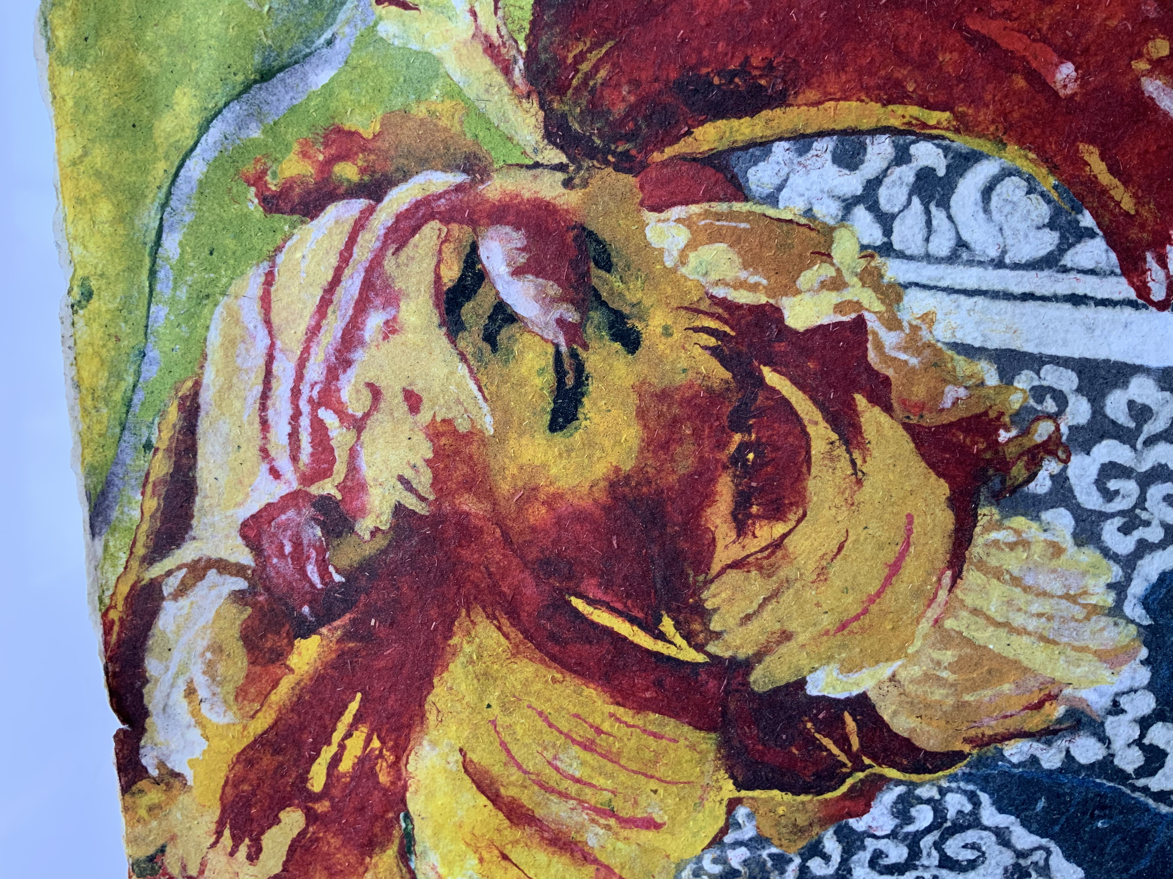
A reader/viewer of James Roberts’ exquisite “Last” would be similarly surprised that he is not a time traveller or shape-shifter. While there are sanctuaries, conservation trusts and an effort at “rewilding”, wolves in the wild have been extinct in the UK since the reign of Henry VII. Perhaps Roberts’ close observation of timber wolves in Canada explains what happens in “Last”. Voice, tone, diction, pace and rhythm are in perfect balance with the subject. So much so that the poet seems to inhabit the animal’s breathing, loping and howling.
The poem often sends the reader back to the cover image:
she was already a ghost
a last exhalation/ from the last of her kind/ breathed out of the world
like snowfall/ like snow thawed/ and gone to ground
fragments of a trace
casting shadows
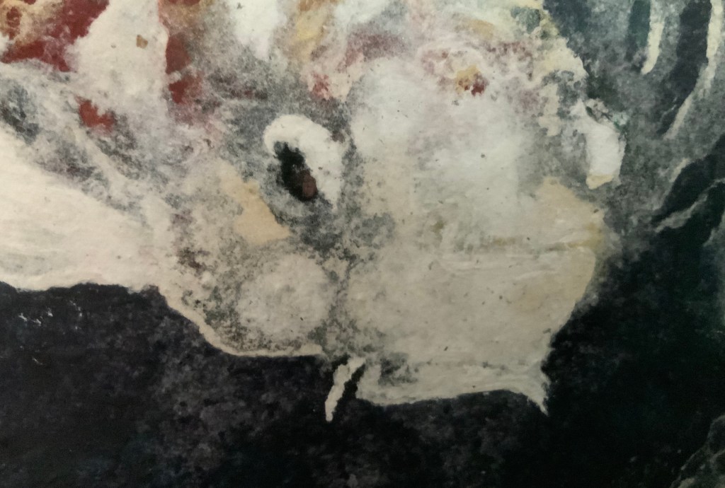
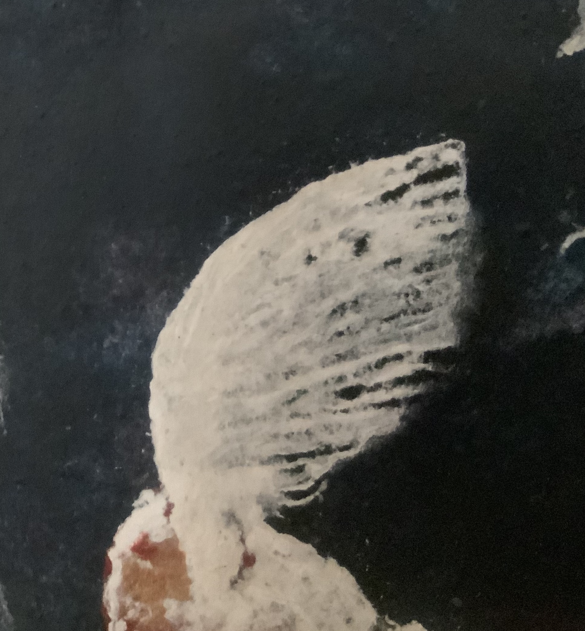
The unusual texture and color of the cover’s ghostly image come from both the choice of paper and artist’s technique:
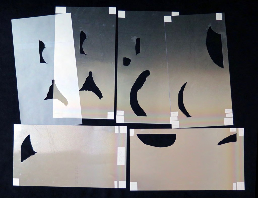
The wolf image is an illustration created using black ink and salt. The ink is applied inside a sketched outline of the wolf very quickly then the salt is scattered over it while wet. I then scan it and play with the image in Photoshop. I convert to a duotone setting using a deep blue and a much lighter tone. Correspondence with Books On Books, 15 September 2020.
Poem and image come to the very edge of stepping outside the anthropomorphic, anthropocentric circle, but inevitably they are addressed to us in “this forest we’re lost inside”.
Further Reading
Roberts, James. Winged (2020). Review, Caught by the River, 16 August 2020.
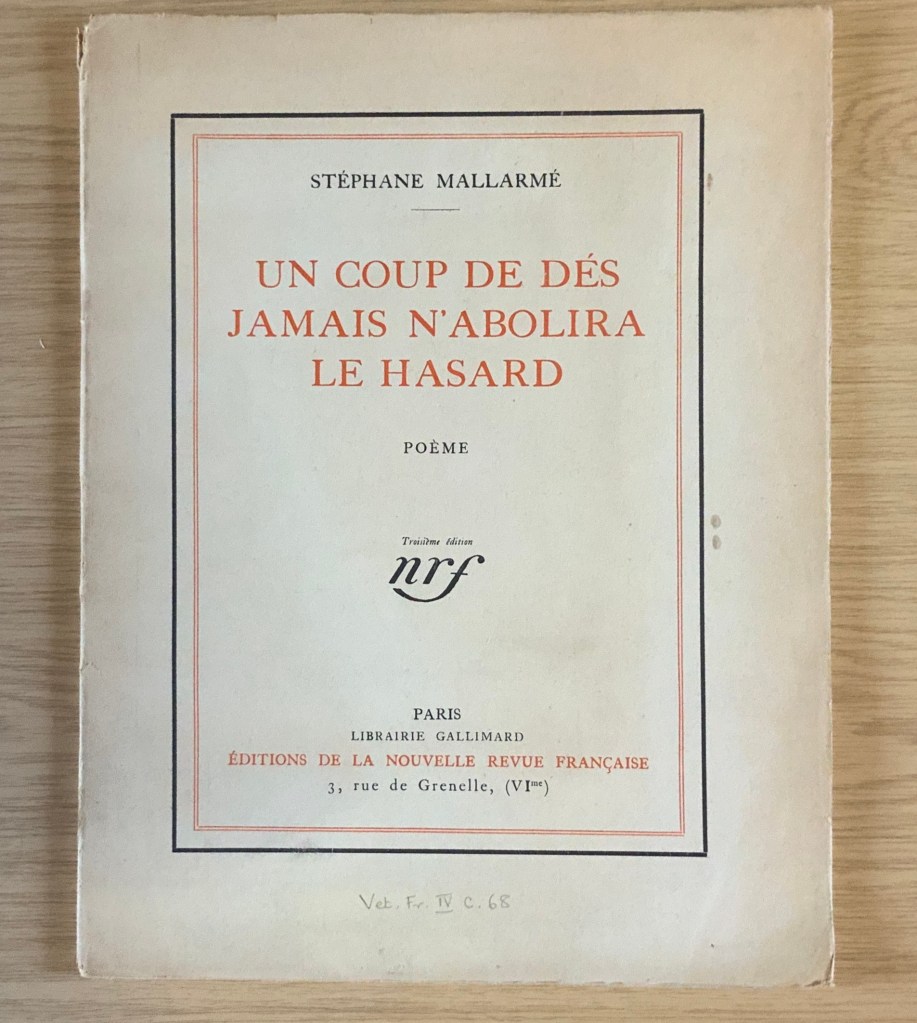
The 125th anniversary of the publication of Stéphane Mallarmé’s Un Coup de DésJamais N’Abolira le Hasard (1897) approaches, and Trevor Stark’s book is a welcome harbinger. Its title comes from Mallarmé’s essay/poem “The Book, Intellectual Instrument”:
The book, total expansion of the letter, should derive from it directly a spacious mobility, and by correspondences institute a play of elements that confirms the fiction (p. 6).
Often with Mallarmé, context is all (not to mention translation in the face of elliptical syntax!) — context is wrapped in self-enshrouded context. His seemingly cryptic sentence above becomes clearer only when the precedent to the word “it” (elle) is understood as la composition typographique from the essay/poem’s preceding paragraph, extolling the alphabet, language and typography.
Un miracle prime ce bienfait, au sens haut ou les mots, originellement, se réduisent à l’emploi, doué d’infinité jusqu’à sacrer une langue, des quelque vingt lettres — leur devenir, tout y rentre pour tantôt sourdre, principe — approchant d’un rite la composition typographique. (my emphasis)
So, the sentence is a proscription for what “the book” should get from typographic composition. Metaphorically (fictionally), the book is a total expansion of the typeset letter, or mark. As such, it should derive from the “near rite of typographic composition” a spaciousness and mobility and a play among elements that confirms the metaphor that it is a “total expansion of the letter”. Still a bit cryptic, but after all, this is what Mallarmé calls a “critical poem”, and the sentence is hardly more cryptic than the opening pronouncement: “everything in the world exists to end up in a book”.
It is a good choice of title for Stark’s endeavor. “Total expansion of the letter” juggles Mallarmé’s “heroic” vision for the book with the material world of metal type, idea with ink, the sacred with the profane. In painting, sculpture, music, dance, theater and film, the avant-gardists certainly brought together intellectuality and physicality forcefully. Stark shows that, in doing so, they also consciously and unconsciously raided Mallarmé’s open larder of skepticism about language and communication. The letter (or any mark of signifying, for that matter), scraps of newspaper, musical scores, dance notation, dresses and costumes (or lack thereof), wanted posters, financial bonds, and much more became ready objects for avant-garde art but only on the condition of their “becoming dysfunctional and incommunicative” (p. 7). Stark wants to know why.
Mallarmé’s skepticism about language and communication is Stark’s touchstone throughout: that language has an “ineradicable degree of chance built into” it; that there is inherently a suspension — a temporal gap, blank, void, lacuna, an “unfinished” state — between the sign’s expressed materiality and its meaning; and that, therefore, every act of communication as a historical and aesthetic phenomenon is like an anonymous, “impersonified” throw of the dice, “tossed into eternal circumstances’” (p.29). Applying that touchstone, he crosses the borders insightfully time and again “between the nineteenth and twentieth centuries, between dance, music, and letters, and between art history, the philosophy of language, politics, and poetics” (p. 30). Never reductive, he explores the continuities and variations between Mallarmé’s achievements and those of Paul Cezanne, Pablo Picasso, Georges Braque, Francis Picabia, Tristan Tzara, Hugo Ball, F.T. Marinetti, Marcel Duchamp, the Laban school of dance and others of the avant-garde. As he offers a reciprocal interpretation of Mallarmé and of avant-garde art, individual poems, paintings, collages, performances of dance and theater yield new clarities and sharpened expression of received assessments.
Consider Stark’s comparative reading/viewing of Mallarmé’s “Sonnet en X” (1887) and Picasso’s The Dressing Table (1910). Across eight pages of text and photographs of art, Stark helps the reader to follow Mallarmé’s “quest for a word that literally means nothing, ptyx, a word produced by the frolic of language”, a signifier that “attains a materiality and an opacity, allowing the poem to display a linguistic Void, to raise it from the latent to the patent.” The materiality to which Stark draws our attention is twofold: the bright rhymes (-yx, -ix, -ixe) that almost single-handedly drive the invention of the word ptyx and the mirror on the credenza in the poem that captures the empty room, its window and the constellation Ursa Major showing through it. Across the same pages, Stark conducts the viewer through Picasso’s painting — again a mirror, the surface of a dressing table, the drawer from which a key protrudes, a drawer handle, a glass with the long handle of a toothbrush and its bristles poking out, but all scattered into planes of reflection and refraction, their shapes “mutually implicated to the point of structural ambiguity”. Then, he draws them together: “In Mallarmé and Picasso, representation destroyed the object in order to proclaim its own mute materiality and, thereby, regain continuity with the world by becoming simply one more thing within it”(pp. 101-108).
In pursuing these reciprocal readings of Mallarmé and his avant-garde descendants, Stark keeps a bright light on the “between” — between an object and its reflection, between a word’s or sound’s utterance and its meaning, the blanks between words, the blanks between brushstrokes or those between them and the boundary of the painting, between the cosmic and domestic, between one media and another when brought together in a work, between the individualism of subjective imagination and impersonal modes of production, between author/artist and word/image and reader/viewer. His term for these spaces is intermedial. In her endorsement of Stark’s book, Julia Robinson (New York University) calls his neologism “luminous”. The term refers to “the zone of indeterminacy between mediums, social practices, and temporalities” into which Mallarmé found himself outwardly propelled even as he inwardly sought “absolute language”.
Looking back on the avant-gardists and his own contemporaries, Dick Higgins — the late twentieth century language-, book-, and publishing-artist — rejuvenated Samuel Taylor Coleridge’s term intermediation, a neologism similar and related to intermedial. It is not the same thing as intermediality or mixed media. As Higgins expressed it, “Many fine works are being done in mixed media: paintings which incorporate poems within their visual fields, for instance. But one knows which is which. In intermedia, on the other hand, the visual element (painting) is fused conceptually with the words” (p. 52). It can be argued that works of intermedia are one way in which artists address intermediality — that zone of indeterminacy.
The argument is ultimately a phenomenological one, a perspective that Stark embraces. When he applies the ideas of Edmund Husserl, Martin Heidegger, Maurice Merleau-Ponty, Theodor Adorno, Maurice Blanchot and others to Mallarmé’s poems and the artistic expressions of his “descendants”, both the philosophers and the artists become more accessible. Consider this passage summarizing Maurice Blanchot’s account of the history and function of language and its four stages:
The first was that of an Adamic or nomenclaturist model of language, which conceived words as names for the objects of the world. The second, dominant from Plato to Descartes, was the idealist model in which language constituted the link between sensible reality and the eternal realm of the Idea, and thus the guarantee of our ‘entrance into the intelligible world.’ [fn 223] Third, the ‘expressionist model’ of Hegel and Leibniz considered language itself the embodiment of what is sayable, thinkable, and possible at any given historical juncture, serving, therefore, as the medium of the progress of Spirit. Finally, illustrated with a quote from Valèry, the fourth stage was the ‘dialectical function of discourse,’ in which language regained an ‘essential power of constestation’ in the negativity of modern literature:
‘Literature seeks to revoke from language the properties that give linguistic signification, that make language appear as an affirmation of universality and intelligibility. But it doesn’t arrive at this goal (if it does arrive at this goal) by destroying language or through contempt of its rules. It wants to render language to what it believes to be its veritable destiny, which is to communicate silence through words and to express liberty through rules, which is to say to evoke language itself as destroyed by the circumstances that make it what it is.’ [fn 224] (pp. 110-11)
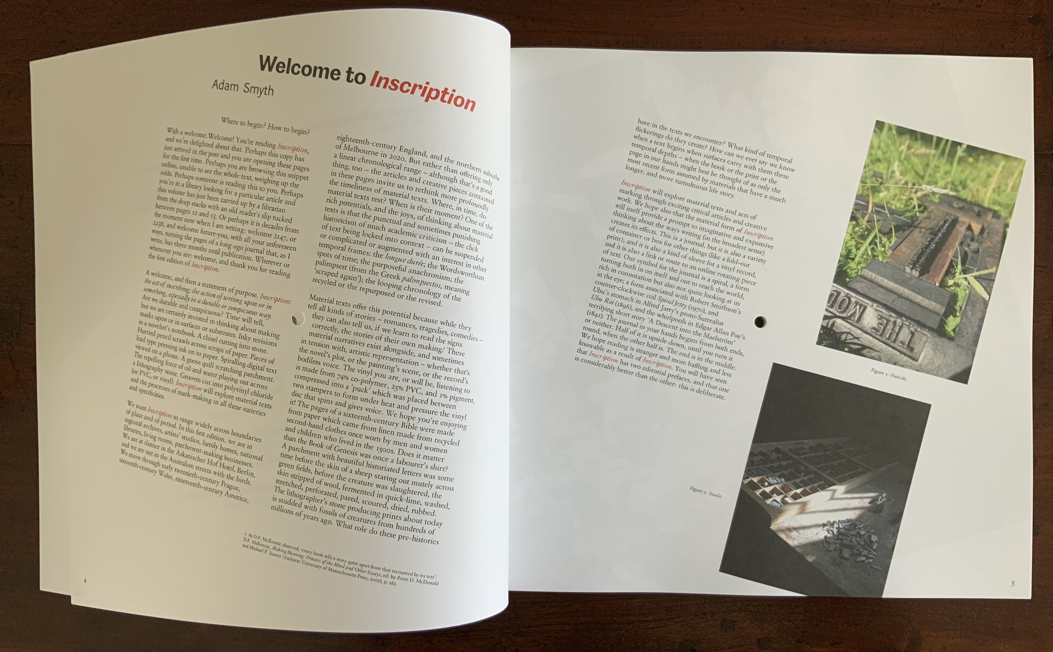
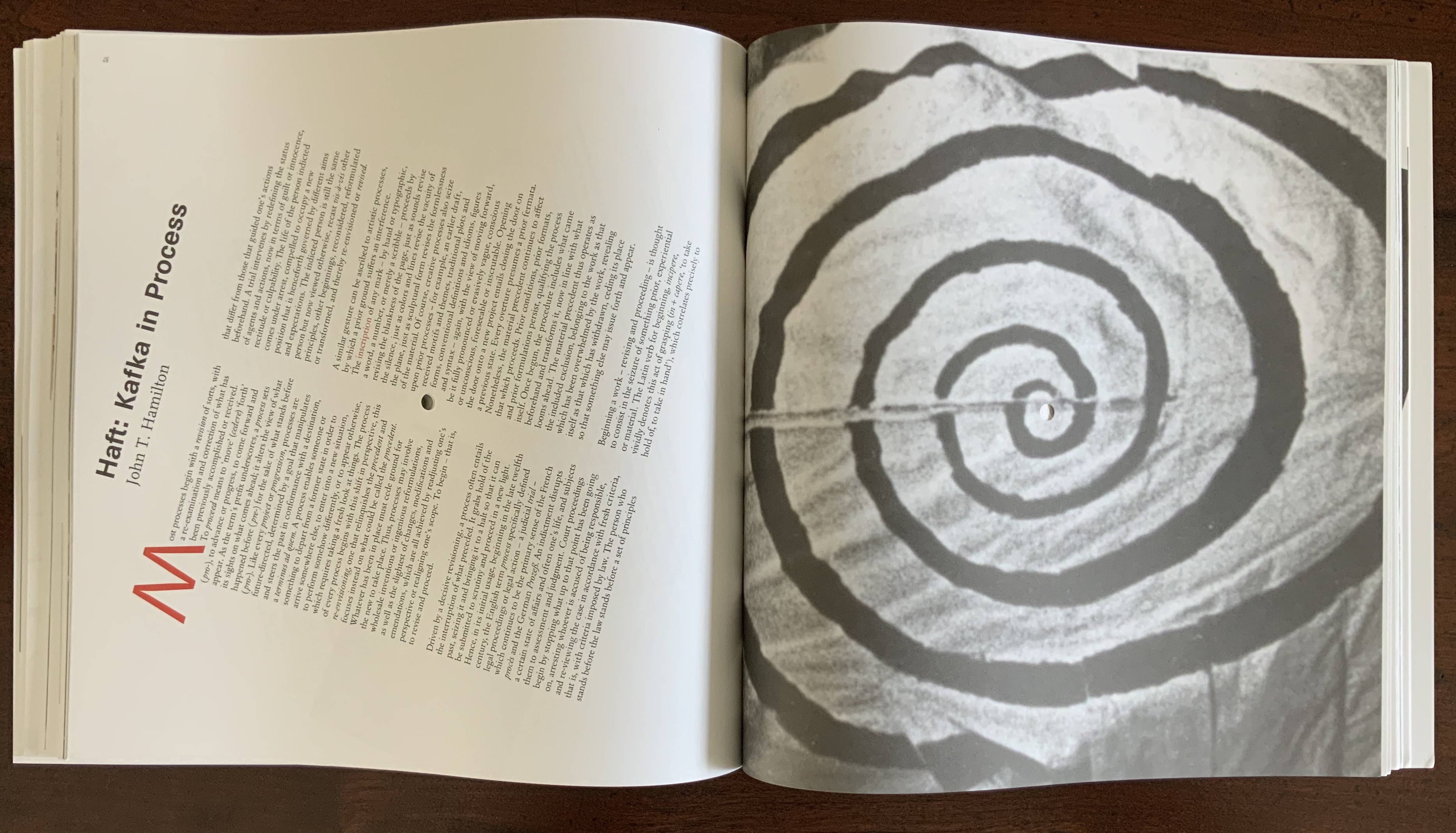
Clearly that passage links back to the touchstone of Mallarmé’s skepticism about language and communication. The strength of the touchstone is that it can also be fruitfully applied to the numerous works of homage to Mallarmé from contemporary book artists such as Jérémie Bennequin, Michael Maranda, Michalis Pichler, Eric Zboya and many others. Likewise it can used to shed light on the “material text” approach to understanding book art. A case in point is the first issue of Inscription: the Journal of Material Text – Theory, Practice, History, a work of book art in its own right.
Consider the hole drilled through the center of the journal. Does it not echo Stark’s reminder of Braque’s citing Mallarmé’s utterance: “‘The point of departure is the void'” (p. 88)? Consider the journal’s spatial challenge to the act of reading (a dos-à-dos binding, a text block that rotates around that hole). Does that not echo this passage from Total Expansion of the Letter?
But what remains after the ‘suspension’ of the represented object and the objectification of the means of representation? For Mallarmé, the ‘residuum’ was the act of reading itself, conceived not as a process of cognitive reconstruction, but instead as a gamble on the very possibility of forging meaning out of opacity and contingency of linguistic matter. As Mallarmé wrote in ‘The Mystery of Letters’
‘To read —
That practice —
To lean, according to the page, on the blank, whose innocence inaugurates it, forgetting even the title that would speak too loud: and when, in a hinge [brisure], the most minor and disseminated, chance is conquered word by word, unfailingly the blank returns, gratuitous earlier but certain now, concluding that there is nothing beyond it [rien au-delà] and authenticating the silence –‘” (pp. 108-109).
Not since Anna Sigrídur Arnar’s The Book as Instrument: Stéphane Mallarmé, the Artist’s Book and the Transformation of Print Culture (2011) has there been as useful a tool for appreciating Mallarmé, art and artist’s books as Trevor Stark’s Total Expansion of the Letter. On the eve of the 125th anniversary of Un Coup de Dés, it will be interesting to see whether Stark and others extend his work to art and book art after the avant-garde.
Higgins, Dick, and Hannah Higgins. “Intermedia“, republished in Leonardo, Volume 34, Number 1, February 2001, pp. 49-54.
McCombie, Elizabeth. Mallarmé and Debussy: Unheard Music, Unseen Text (Oxford: Oxford University Press, 2004). It would have been interesting to see how Stark would relate his exploration with McCombie’s exploration of Mallarmé’s views on poetry and music.
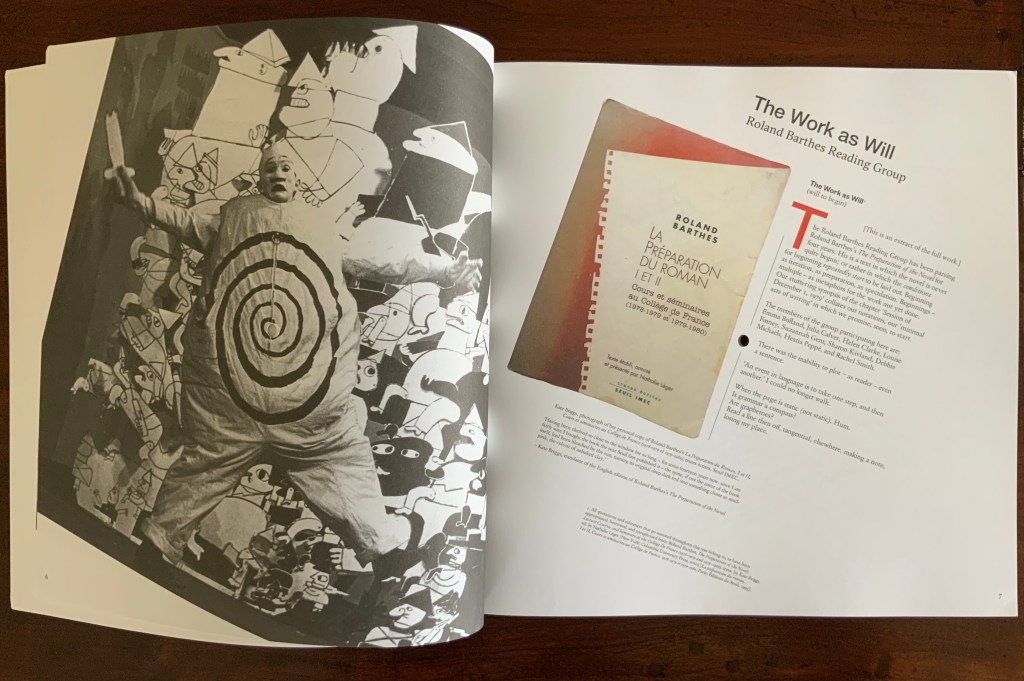
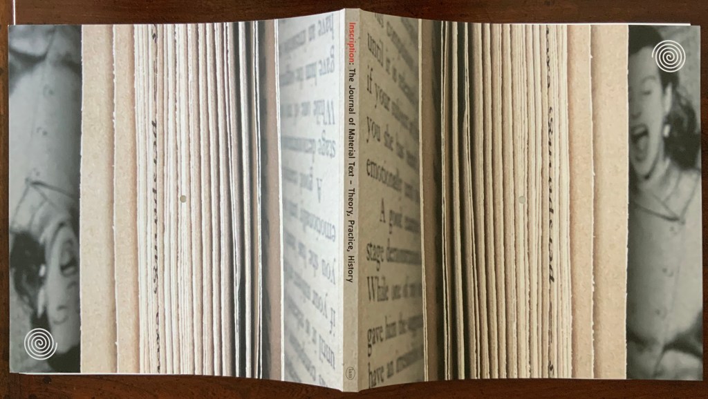
Inscription: the Journal of Material Text – Theory, Practice, History, Issue 1 on Beginnings (2020)
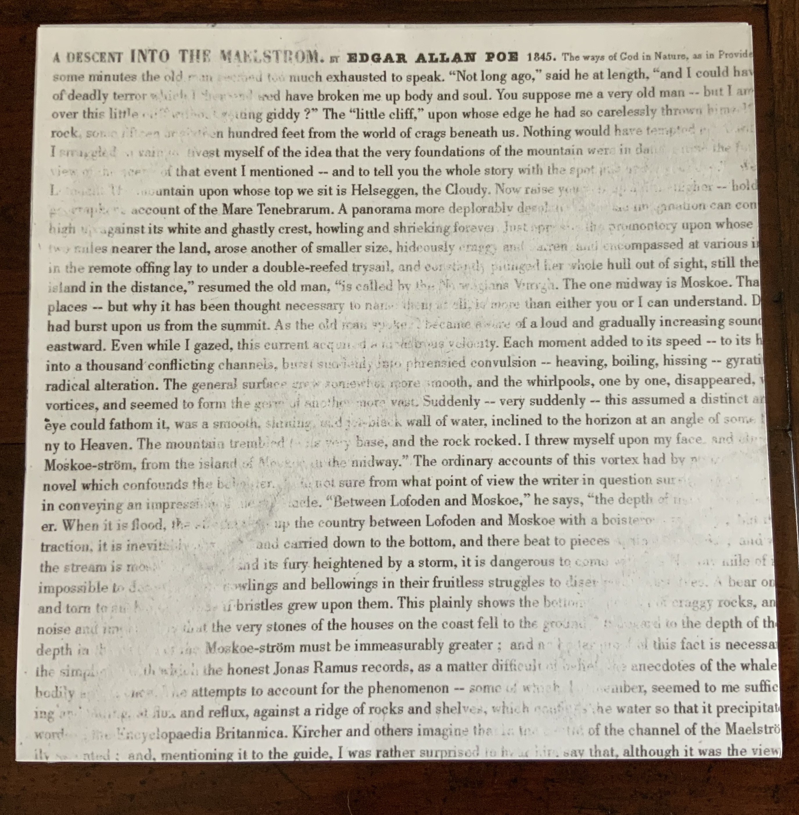
Inscription: the Journal of Material Text – Theory, Practice, History Issue 1 on Beginnings (2020) Edited by Gill Partington, Adam Smyth and Simon Morris Dos-à-dos (flipped), perfect bound softcover, H314 x W314 mm, 132 pages (including the end pages left intentionally blank); fold-out double-sided print of Jérémie Bennequin’s erasure of Edgar Allen Poe’s “A Descent into the Maelstrom”, H940 x W940 mm; saddle-stitched chapbook of Craig Dworkin’s “Clock”, held in a mock 45 RPM record sleeve, H180 x W180 mm; vinyl LP recording of Sean Ashton’s novel Living in a Land, H314 x W314 mm; Acquired from Information as Material, 10 October 2020.
In its design, typography, format and media components, the first issue of Inscription: the Journal of Material Text – Theory, Practice, History embodies its domain. So much so that this metaphorical box of artifacts stands as a contribution to the study of material texts as much as any of the journal’s inaugural articles.
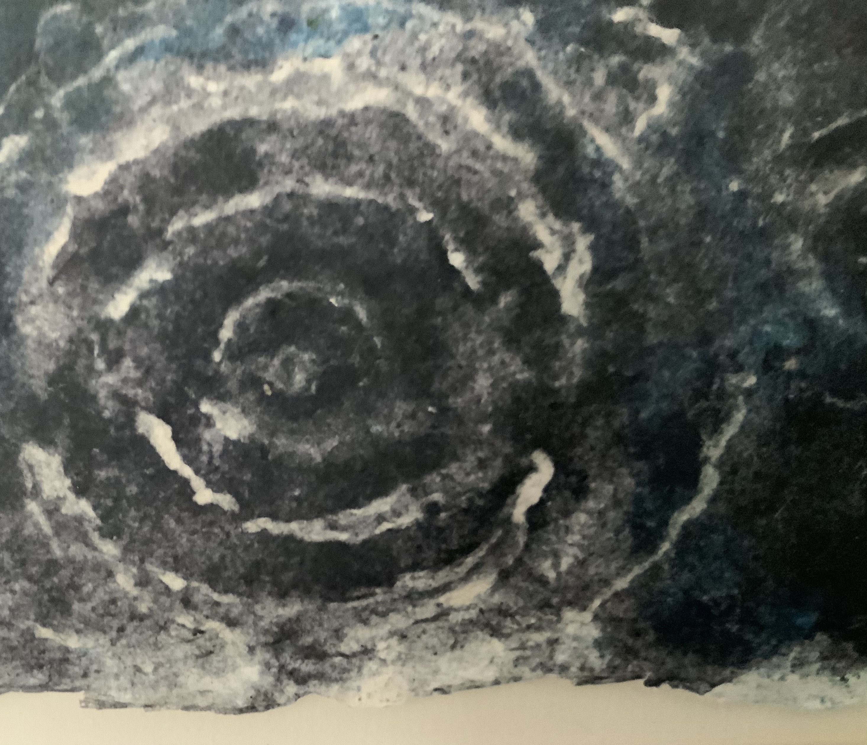
Jérémie Bennequin’s double-sided, bilingual print of his erasure of Poe’s “A Descent into the Maelstrom” recalls the palimpsest — a longstanding topic of material text study. Also, by standing in for Poe’s swirling maelstrom, the print’s image of spiralling erasure raises the domain’s recurrent theme of text-and-image interaction as well as that of the self-reflexiveness of such art. Using the book or text as physical material with which to create a work is central to book art as is the self-referencing that arises.
Bennequin’s choice of text also alludes to his other work. The short story’s themes of abyss, shipwreck and nothingness occur prominently in Poe-loving Mallarmé’s Un Coup de Dés Jamais N’Abolira le Hasard, the 19th century poem that made us modern and launched (is still launching) scores of artists’ books paying material and conceptual homage. Bennequin is one of those artists.†
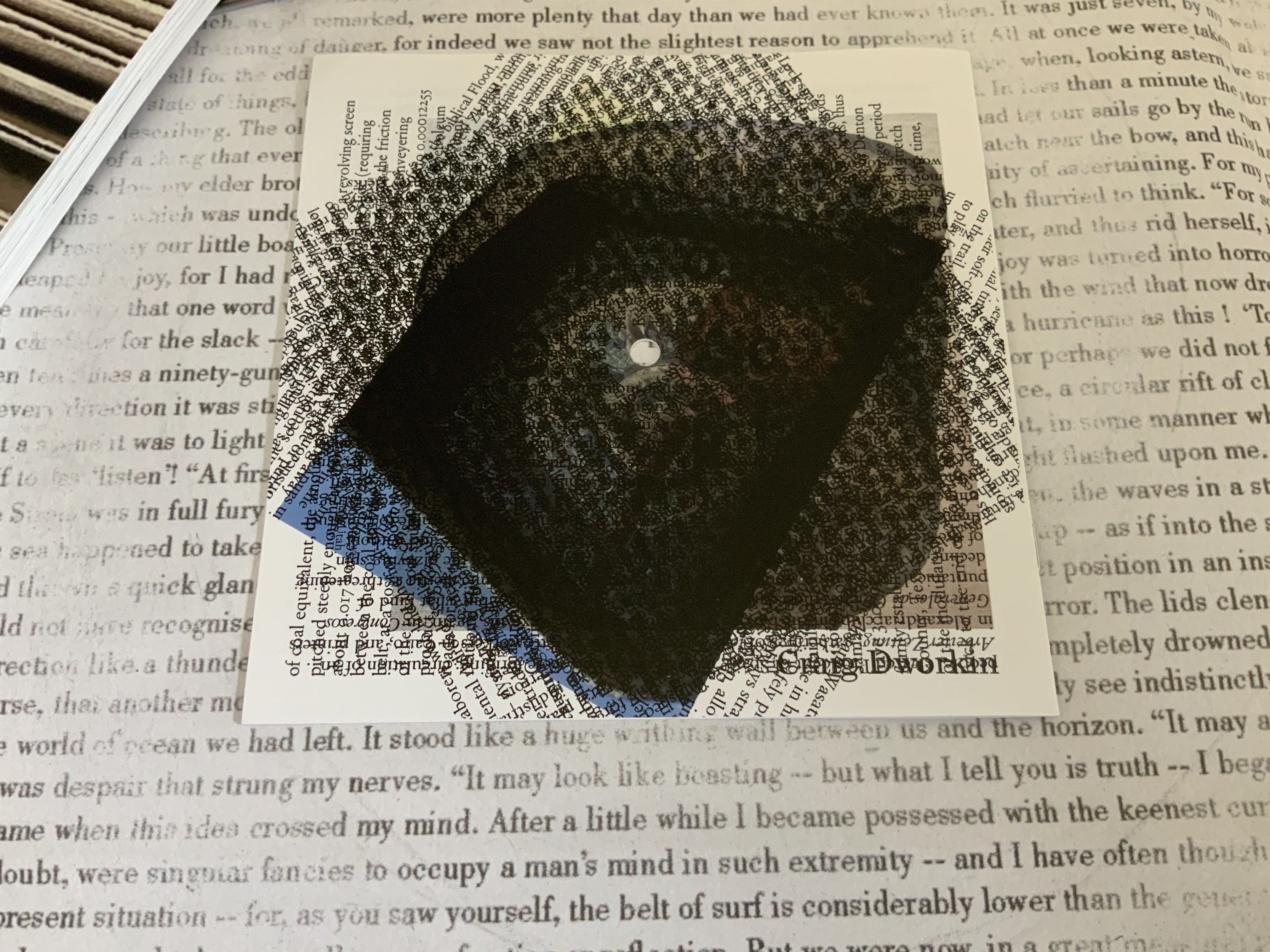
The print’s spiral erasure on a background of text serves as one of several voices in this journal issue’s intermedial†† harmony (or cacophony). The spiral reappears in Craig Dworkin’s meditation that scales up a pocket watch’s clock spring to the size of Robert Smithson’s Spiral Jetty (1980). Dworkin finds the spiral in the fossil of a Holocene fish that swam over the bed that became the jetty. He “materializes” the watch’s minutes against the geological and evolutionary time frames of the formation of the Great Salt Lake and the fossil. On the back cover of the chapbook, its entire text is repeated in a spiral of text blocks. The chapbook slips back into its 45 RPM-size sleeve to echo the spiralling inscription of sound in vinyl grooves that actually occurs on the LP recording of Sean Ashton’s novel Living in a Land.
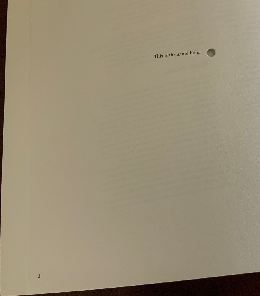
After Bennequin’s print, Dworkin’s meditation and Ashton’s LP, the journal itself appears, sporting the spiral as a logo on its trompe l’oeil cover. Not only drawn from Smithson’s Spiral Jetty, the logo draws from the stage costumes of Alfred Jarry’s Ubu Roi, which recur throughout the journal’s pages reminding us of drama as another medium in which the materiality of the text matters. In its own physical manifestation, the journal wears the materiality of the text on its sleeve and in its pages. The pages themselves spiral around a hole drilled through the center of the issue, echoing the sculptural extremity of inscribing, the book art technique of excising and the concept of nothingness central to many artists of inscription such as Robert Barry and Carl Andre, as this exchange shows:
RB: There is something about void and emptiness which I am personally very concerned with. I guess I can’t get it out of my system. Just emptiness. Nothing seems to me the most potent thing in the world.
CA: I would say a thing is a hole in a thing it is not. — Arts Magazine 47 (1972): 46
On its two page 2’s (a result of the dos-à-dos or back to back binding), Incription offers its own Magrittean take on holes:
In dos-à-dos binding, two codices are bound back to back in a Z form. So usually there are two fore-edges, two spines, and both codices have the same vertical orientation.
Inscription is bound dos-à-dos, but with only one fore-edge and one spine. Materially emphasizing the theme of inward spiralling, Inscription‘s two halves are upside down to one another. Their vertical orientations differ as can be seen in the following photo of the two front covers splayed away from the spine. The cover designer has obviously joined the fun by creating two fore-edges with the trompe l’oeil and “two” spines, one downward reading in the English style and, when flipped, one upward reading in the European style. Of course, therefore, there are two Tables of Content in opposite orders and two editorial prefaces, of which “one is considerably better: this is deliberate”. (Tongue-in-cheek humor seems to reside in the DNA of material text studies — and especially in book art.)
Two Tables of Content — naturally in reverse order for the dos-à-dos bound volume.
With the page layout spiralling from each end of the issue toward the spiral-set colophon placed in the center (usually part of the endmatter), we have spirals inscribed within spirals.
Left (or is it right?): the drilled hole centered on Ubu Roi‘s omphalic costume. Right (or is it left?): the spiral-set colophon.
Across the issue, the text block rotates like a vinyl record around the central hole.
By the time the colophon is reached, the reader/viewer’s head may be spinning, which could make it easier to read the colophon — wherein it is revealed that the book has been set in twenty different versions of Garamond type in a sequence such that the first letter of a line comes from the first version of Garamond, the second letter from the second version and so on, with the sequence starting anew with the next line. More spirals within spirals.
The materiality of this inaugural issue demonstrates how Inscription‘s focus “is not just on the meanings and uses of the codex book, but also the nature of writing surfaces (papery or otherwise), and the processes of mark-making in the widest possible sense”, as the editors put it. The care and creativity with which this first issue has been put together offer raw material with which to “take the study of material texts in new directions”. Mark-making by erasure, printing, juxtaposing, drilling, vinyl inscription, land erosion, evolution, land art, stage costumes, choice of type, page layout, binding, sleeving — all this even before we come to the articles themselves (see the photos of the Table of Contents above)!
For academics, book artists, printmakers, poets, and artists – and every permutation of roles, subsidiary roles and sub-subs of role — Inscription is rich, exuberant, eye-opening and eye-twisting, and eminently collectible as a work of art in its own right. Which is why it is in the Books On Books Collection.
† For Bennequin’s homage to Un Coup de Dés, see “Jérémie Bennequin“, Books On Books Collection, 11 April 2020.
†† “Intermedial” is taken from Trevor Stark’s Total Expansion of the Letter: Avant-Garde Art and Language after Mallarmé (2020), p.9. It refers to “the zone of indeterminacy between mediums, social practices, and temporalities” into which Mallarmé’s question “Does something like Letters exist?” threw the poet and avant-gardists. The question is ultimately a phenomenological one, which the study of material text inherently addresses.
A similar, related neologism — “intermediation” — was adopted from Samuel Taylor Coleridge in 1965 by the language-, book-, and publishing-artist Dick Higgins in “Intermedia“, republished in Leonardo, Volume 34, Number 1, February 2001, pp. 49-54. It is not the same thing as intermediality or mixed media. As Higgins expressed it, “Many fine works are being done in mixed media: paintings which incorporate poems within their visual fields, for instance. But one knows which is which. In intermedia, on the other hand, the visual element (painting) is fused conceptually with the words.”, p. 52. It can be argued that works of intermedia are one way in which artists address intermediality.
Further Reading
“Inscription 2“. 29 May 2022. Books On Books Collection.
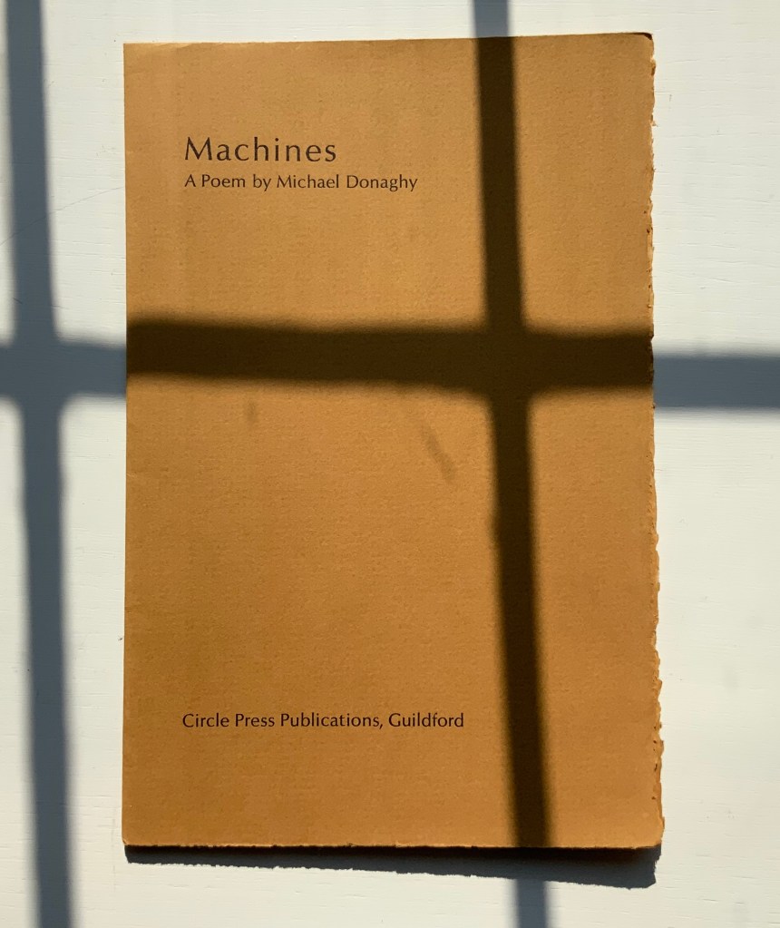
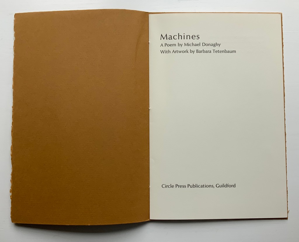
Michael Donaghy (1954-2004) was something of a throwback to the Metaphysical Poets of the seventeenth century. Their love poetry excelled at extended metaphors designed to touch the heart and mind. “Machines” illustrates this best among his poems. It is worth a listen.
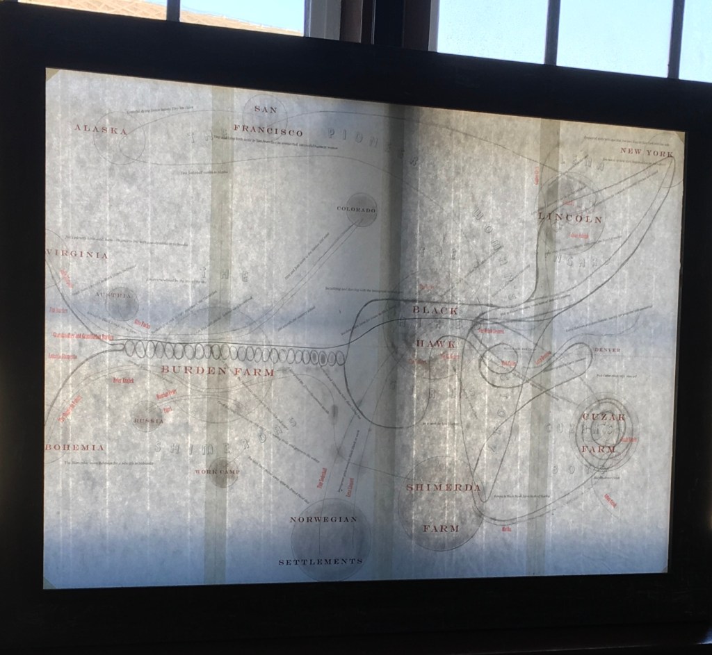
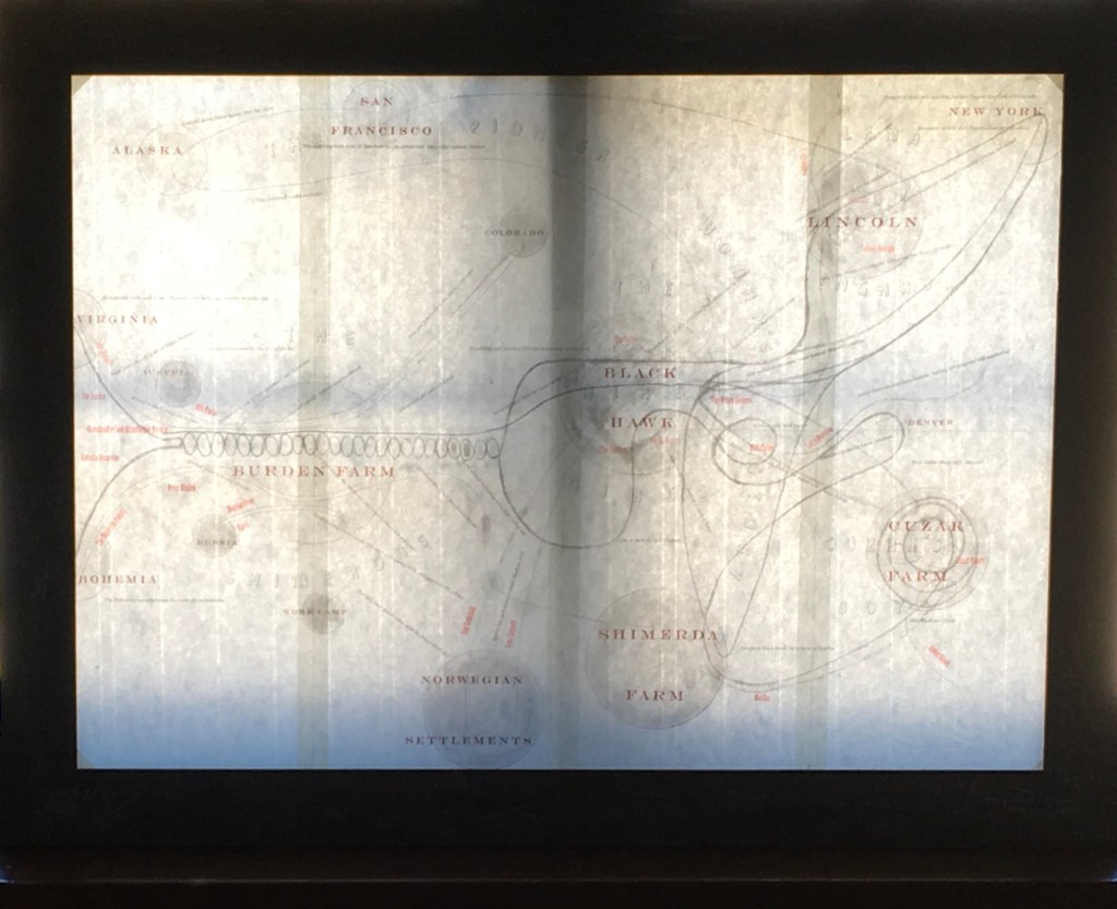
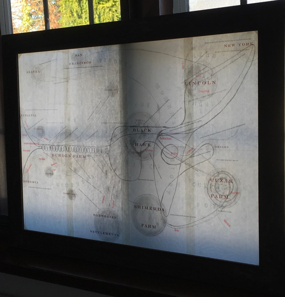
For Barbara Tetenbaum, intense listening to works of literature has provided a rich source of artwork. Her Mining My Ántonia (2012) is based on hours in a gallery at Reed College listening to a recorded reading of Willa Cather’s novel. Here is how she describes the artist’s book:
It features five automatic drawings made while listening to the novel, printed as etchings. A cloth-bound book of handset letterpress-printed excerpts accompanies this. A large fold-out map of how I see the novel, printed as a large etching with letterpress text, is housed inside the book along with one piece of text from the original Reed College installation.
Framed copy of the large fold-out map included in Mining My Ántonia (2012). Photos: Books On Books Collection. With permission of the artist.
Decades earlier while working with Ron King, founder of Circle Press, Tetenbaum was engaged in a 10-year body of work of “marks on pages, marks as diary entries, marks as keeping time, marks as recording lived experience”. That work foreshadowed Mining My Ántonia — as did the result of meeting Michael Donaghy and his wife Maddy Paxman in 1986. That same year, when King and his wife left for an extended vacation in Eygpt, he gave Tetenbaum free rein to make any chapbook she wanted while he was away. She naturally turned to Donaghy’s melodic poetry to find the right one to react to with typesetting, paper choice, printing, binding and her own artwork — not to illustrate the poem but rather to create a companion experience for the reader.
The first of that companion experience comes from the warmth of the cover’s color, texture and weight.
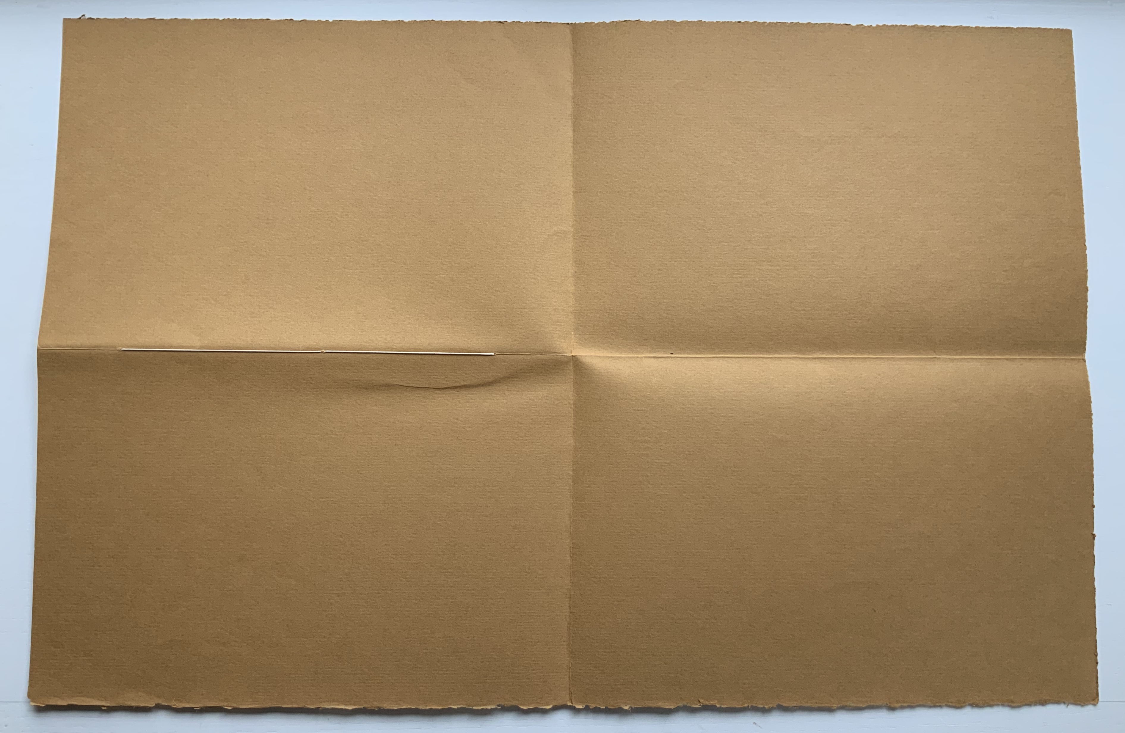
The cover is actually a large single deckle-edged sheet, trimmed at top and bottom then folded to quarters.
In addition to strengthening the cover, the folding protects the three-point single-thread binding that attaches two sheets of rag paper and one sheet of mitsumata paper to the cover.
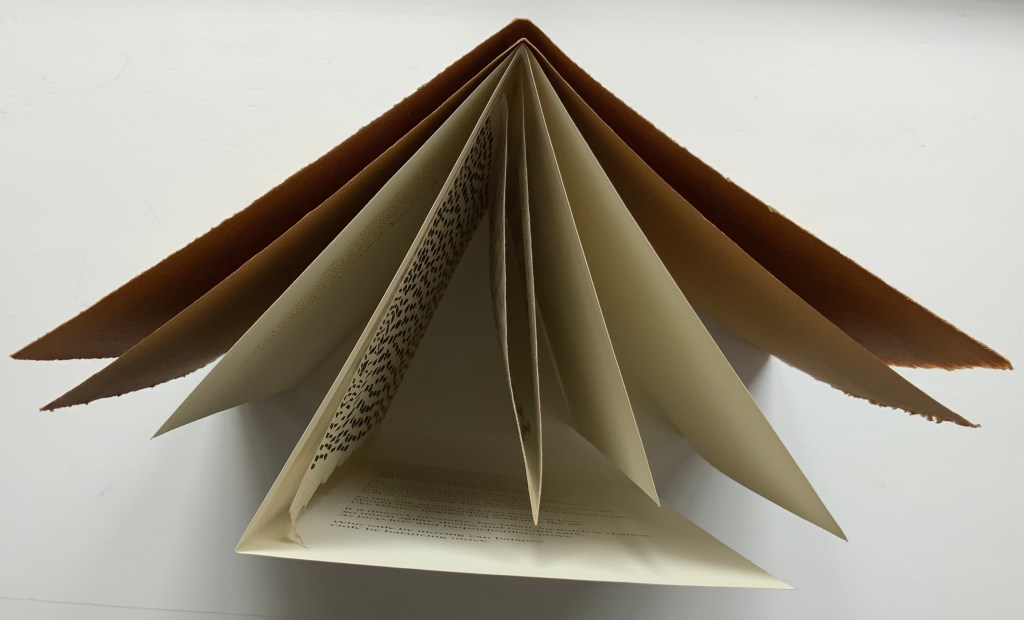
Structurally the pages have a subtle imbalance. The first sheet of rag, bearing the title and colophon, folds to two slightly unequal panels. The title page is wider than the colophon page.
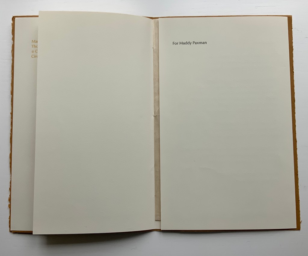
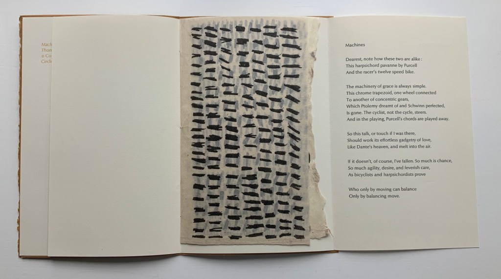
The second sheet folds to three unequal panels, the last bearing the dedication to Maddy Paxman on one side and the poem itself on the reverse. In a gestural embrace, the panels fold to envelop the sheet of mitsumata paper on which Tetenbaum’s marks appear.
Also folded in “slightly off” thirds, the soft translucent mitsumata has an additional subtle imbalance. Unfolded for “reading”, the panels show a steady increase in the number of marks from left to right. Oddly though, the first and third panels show vertical marks, while the second’s are horizontal and printed on the other side of the sheet.
What is going on? The answer begins to appear from the view of the triptych of marks alongside the poem and its music. The columns of marks move left to right and down like the lines of verse. Taken together, the four panels achieve a forward-moving balance: vertical-horizontal-vertical- horizontal. Like a bicycle ride, the poem and marks start slowly, then move forward picking up speed — a natural outcome of a performative response to Donaghy’s poem.
But then, this is a view the artist did not fully intend. She writes, “The folding in the book was in part to allow the reader to have access to the poem without the intrusion of the visuals“. Listen though to Donaghy as he speaks the poem, which at the end appositely replies to the artist’s intention: “So much is chance, So much agility, desire and feverish care, As bicyclists and harpsichordists prove Who only by moving can balance Only by balancing move”. The same for the book artist. The varying folds and contrasting papers envelop, separate and blend art and text. Just as the asemic pulsing marks contrast with and mirror the rhythmic, rhyming text.
Before going on to the next artist, it is worth a short online detour for background on the mitsumata paper that Tetenbaum chose. The paper is handmade from the inner bark (or bast fibre) of a plant called mitsumata (argeli in Sikkim, India). A sustainable and renewable resource, the plants are cropped above ground level and reharvested after 3-4 years. Argeli’s scientific name is Edgeworthia gardneri, in honour of Michael Pakenham Edgeworth, botanist and civil servant in India, and for his half-sister, writer Maria Edgeworth. So much is colonial science, so much is literary chance.
Mitsumata paper is made with the Japanese nagashizuki dipping and layering method of papermaking. From “Mountain Plants to Paper: A Sikkim Story“, documentary by Jaya Jaitly, Dastkari Haat Samiti, n.d. Accessed 25 September 2020.
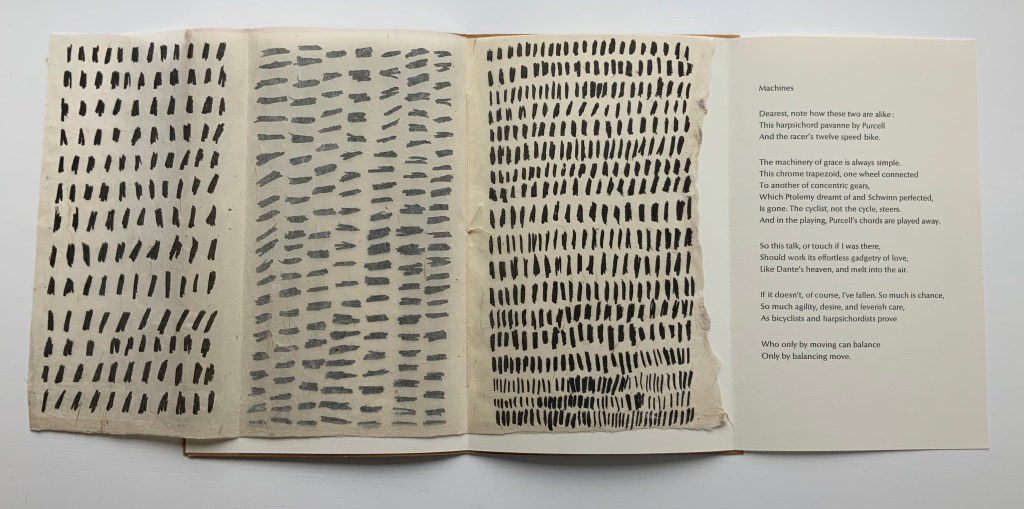
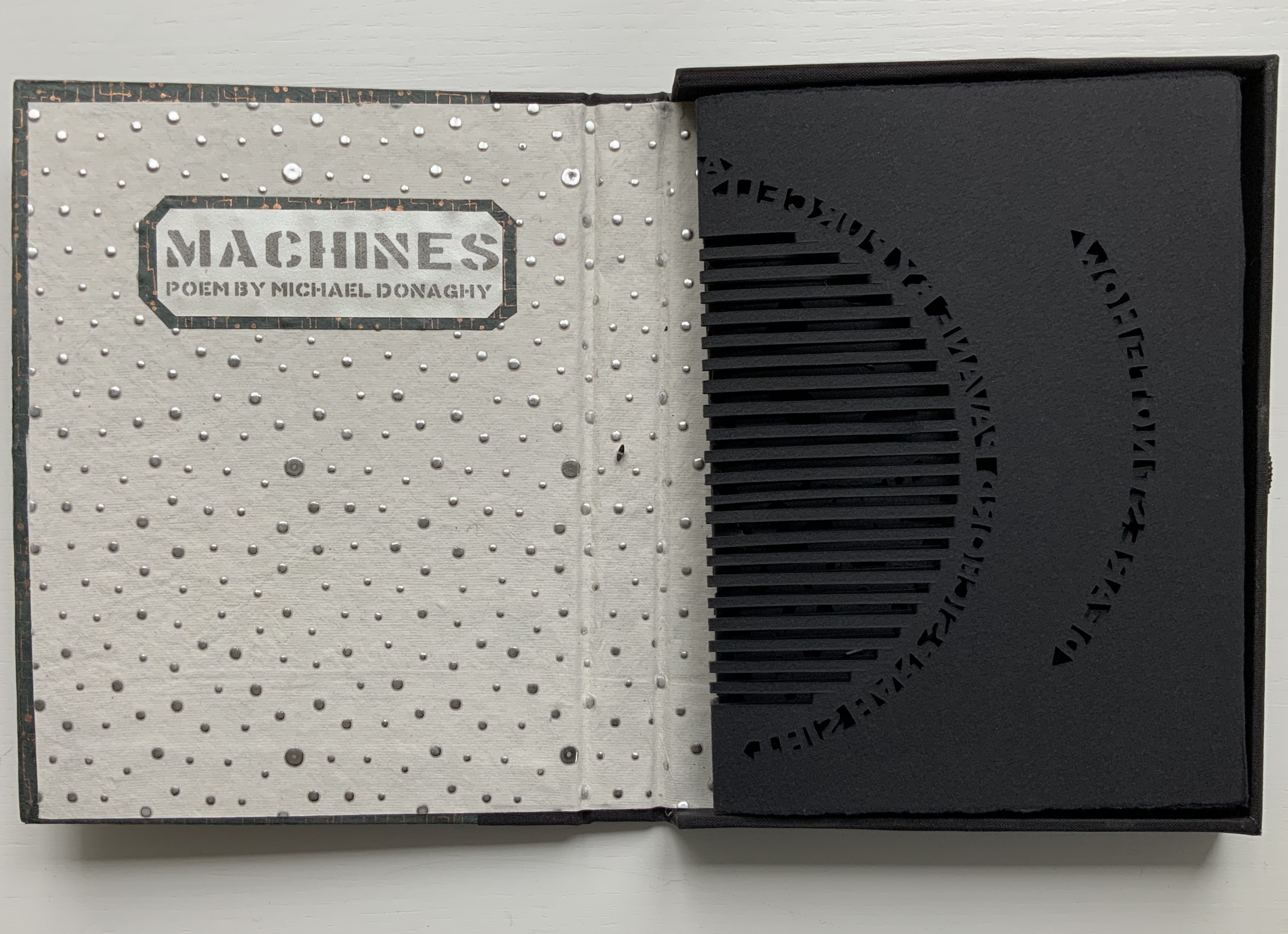
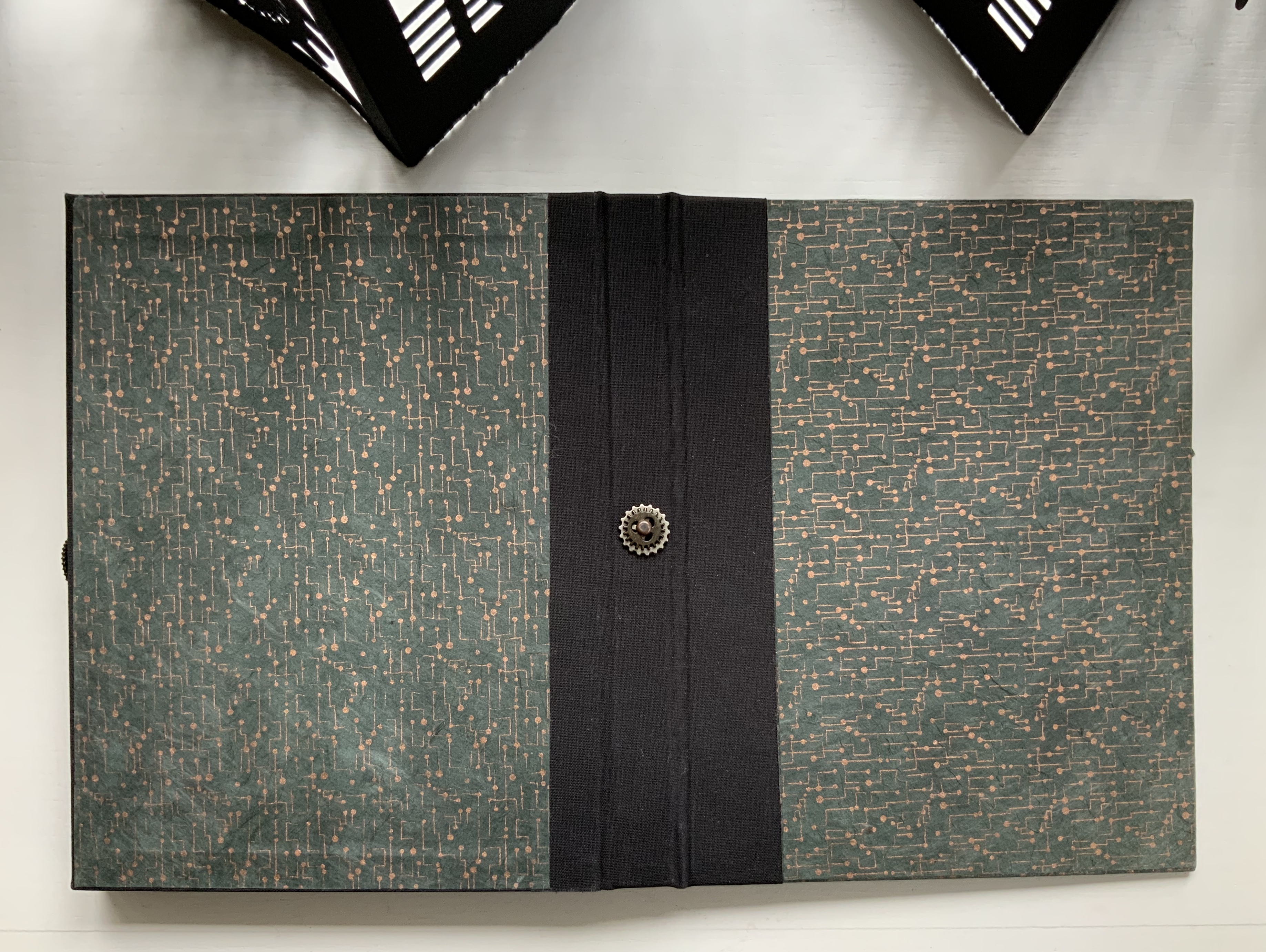
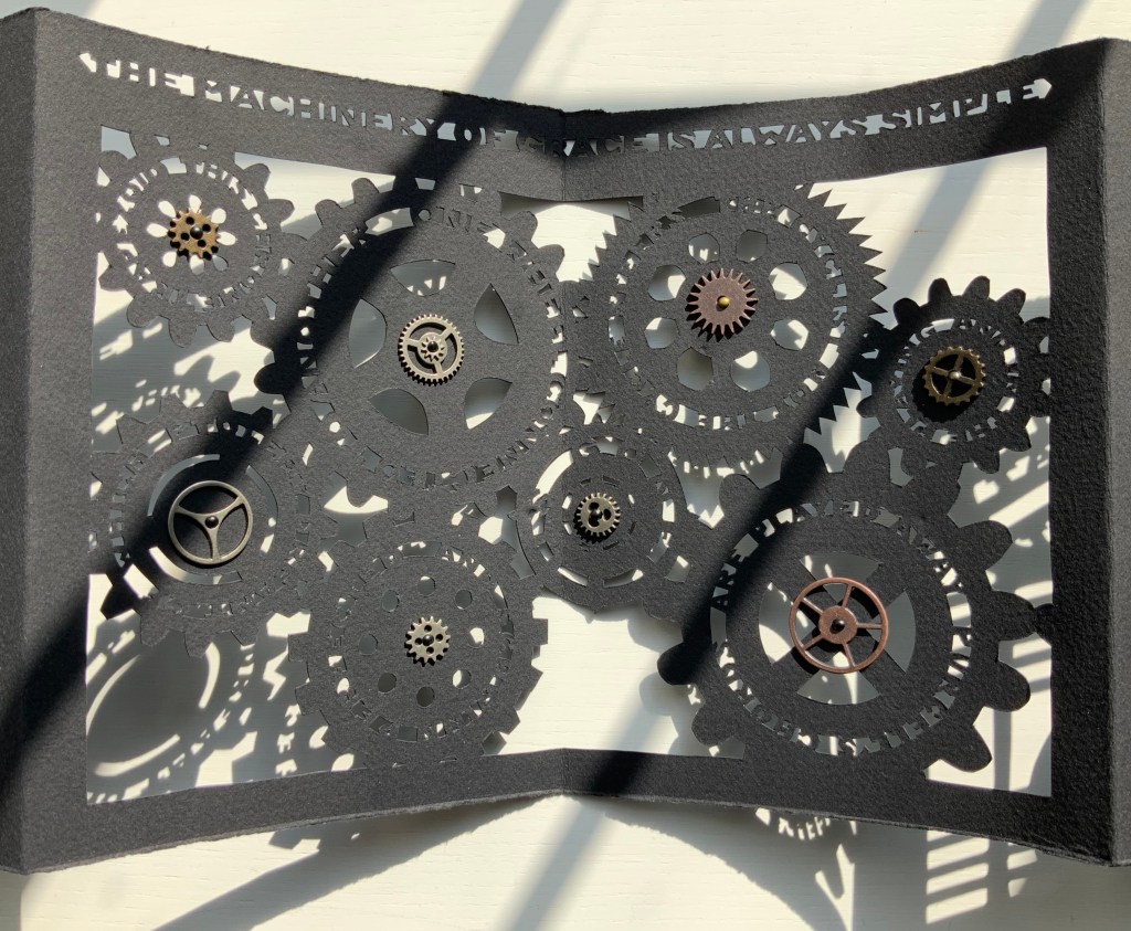
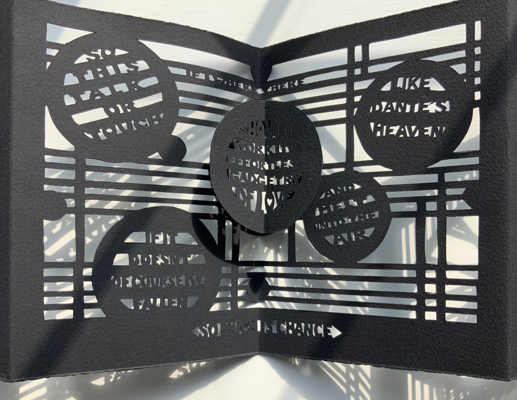
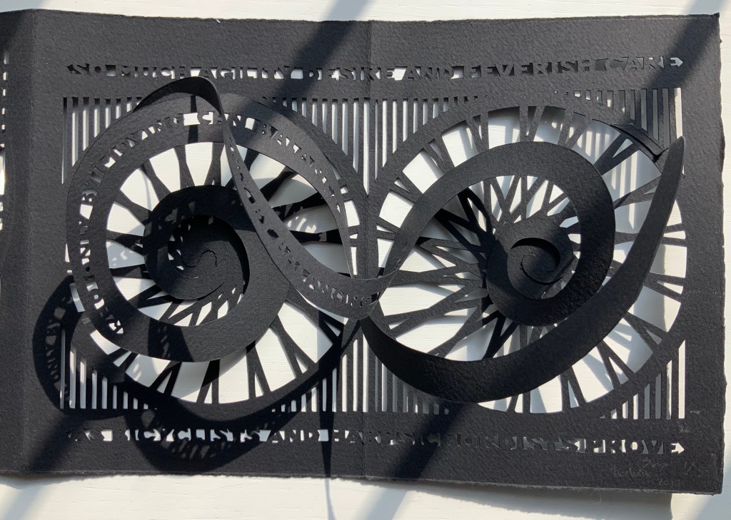
Béatrice Coron has dived into the mechanical and musical metaphors of the poem and emerged with a knife-cut leporello pop-up incorporating text, images and metal gears.
The black thread unwinds from the sprocket on the fore edge of the box, and the box opens to a pastedown title page sprinkled with drops of solder. The enclosed leporello unfolds to a tour de force of paper engineering.
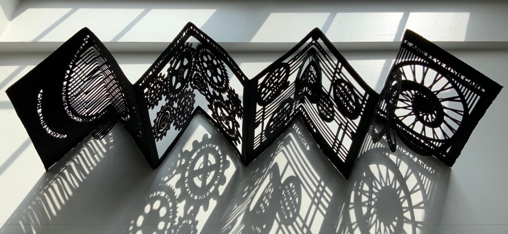
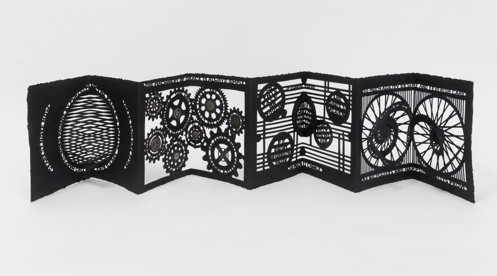
The first double-panel spread presents a centered fanfolded pop-up, whose slits and folds across the crease deliver a stroboscopic effect. Or that of a speaker vibrating with music. The words of the first stanza bracket the pop-up like parentheses representing motion or sound.
For the next double-panel spread, Coron takes the first line of the poem’s second stanza — “The machinery of grace is always simple” — and centers it appropriately at the top. The lines expanding on that statement are cut just below the teeth and into the circumference of interlocking gears. Along with their struts, rims and teeth, these gears are the only remains of this section of paper. Despite all that air and the weight of the small metallic flywheels and gears centered in the cutouts, the double-panel spread balances gracefully.
The floating layer technique is used for the third double-panel spread. The whole note (or circle) in the center hovers over the musical staves by virtue of hinged multi-tier paper supports. The words appearing between the staves and inside the whole notes (or rests?) take in all of the third stanza and first line of the fourth.
The remaining lines of the poems are cut above, below and into two interlinked spiral pop-ups. Normally a spiral is cut from a circle on one page, and one end of it is attached to the facing page. Here, with this variant on the technique, Coron give us the two bicycle wheels linked by a chain, or perhaps two treble clefs fallen over.
Coron’s and Tetenbaum’s palettes reflect the rich diversity of book art. With a few elements in common from the book arts, these two very different works, engaging the same poem, speak to the eclecticism of the Books On Books Collection and some of its underlying themes. One is the meaningful materiality of book art as well as its haptic pleasure — be it in the structure, paper, the type or lettering or marking, the colors, the balance of image and text, or that of shape and space.
The second is a particular kind of engagement with literature. Not all of the book art in the collection engages with literature, but that which does performs a sort of inverse ekphrasis, where the poem engenders the work of art. So distinctively different in their responses, the two works show that, even within that underlying theme, eclecticism seems inevitable.
And finally, the last of the three is chance. As noted, the poem itself addresses the role of chance in the “gadgetry of love” and creativity. But what of this then? When Donaghy reviewed the proofs of Tetenbaum’s typesetting, he called out the presence of one extra word that threw off the meter. The type had to be reset. When Coron’s rendering was opened and inspected, the collector called out the absence of one word. The leporello had to return for recutting. Mirrored typos thirty-one years apart — now there’s chance.
Tetenbaum, Barbara. Interview with Claudia Hamilton, Book Arts Podcasts, School of Library Information and Sciences, University of Alabama, 13 January 2006.
Tetenbaum, Barbara. Interview with Sarah Lange, University of Wisconsin-Madison Book Arts: Oral History, 18 June 2018.
Tetenbaum, Barbara. Correspondence with Books On Books. 22 September 2020.
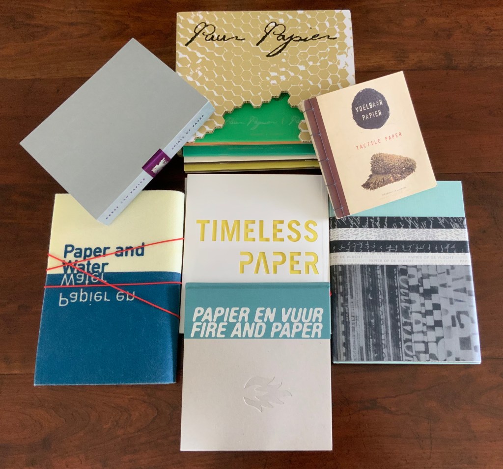
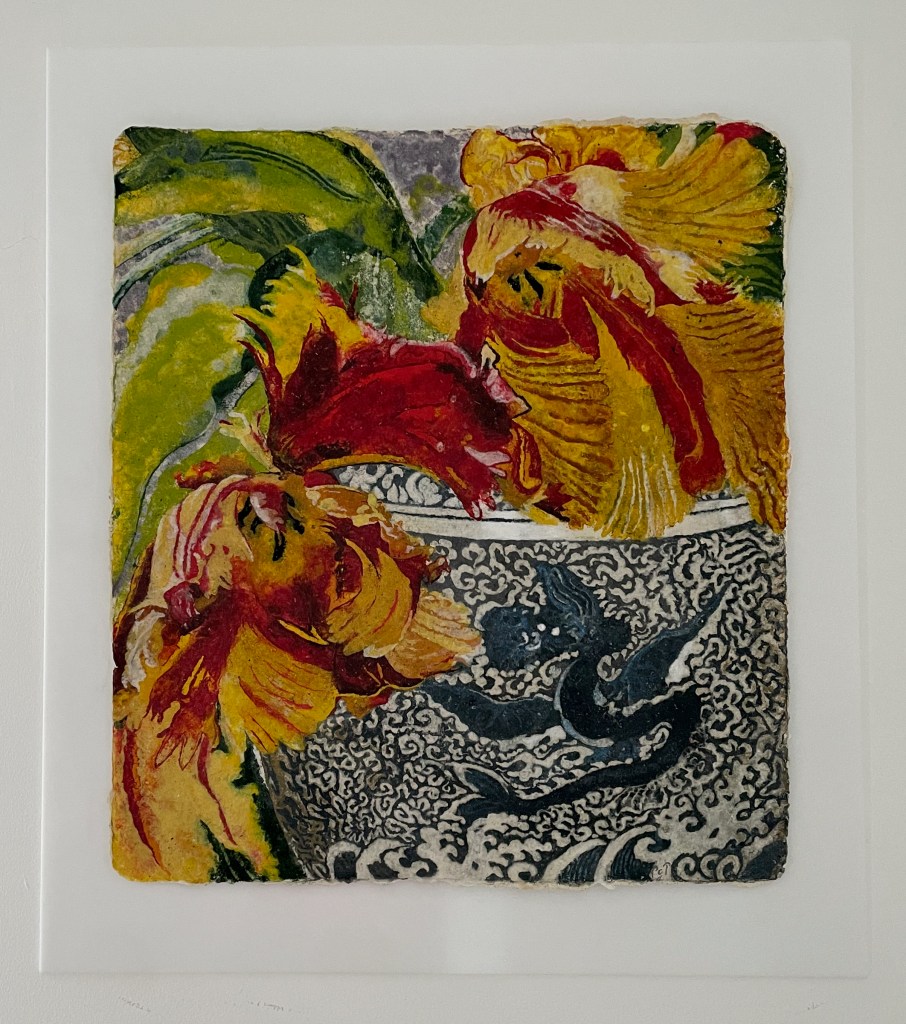
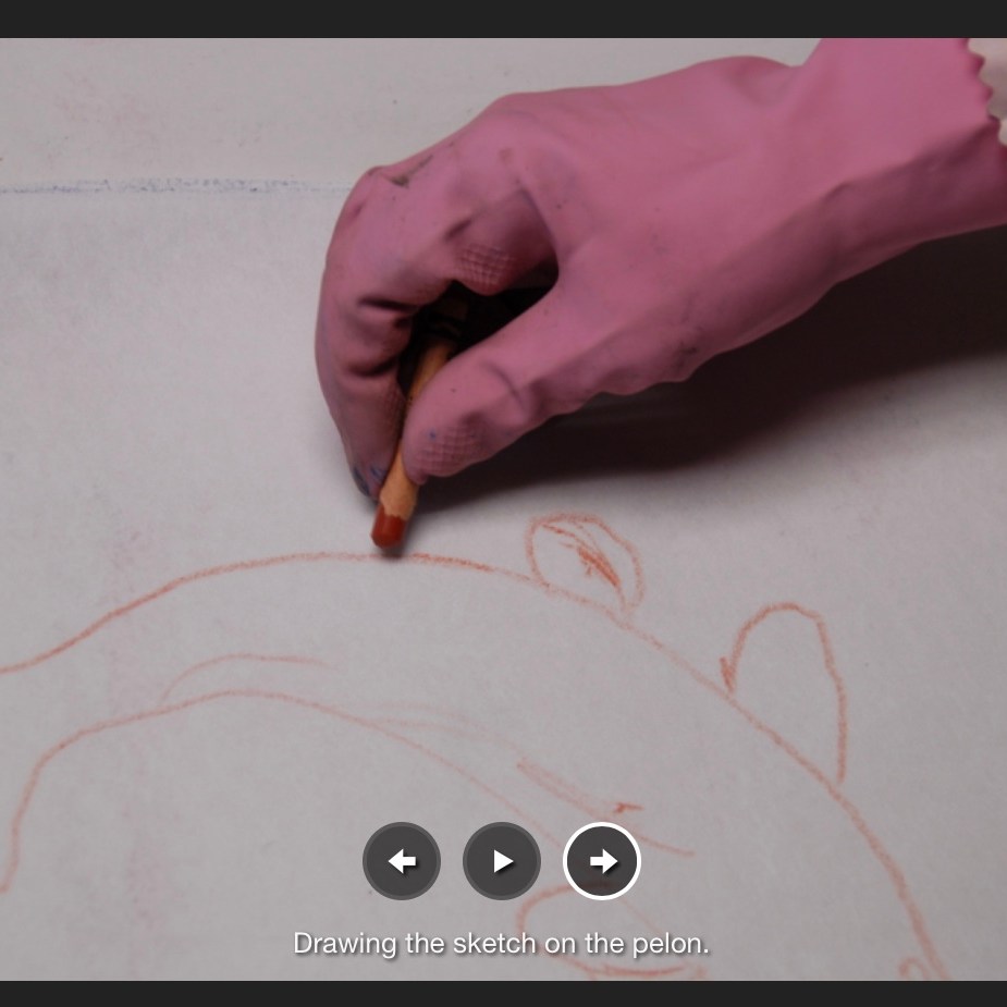
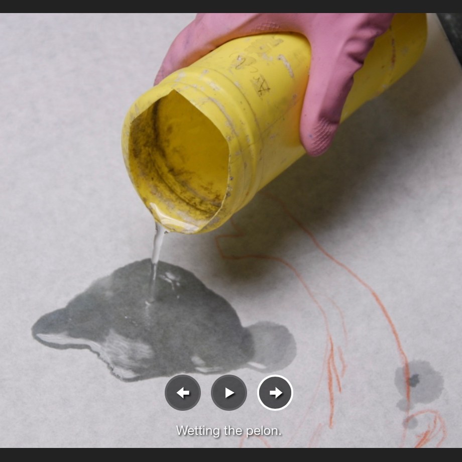
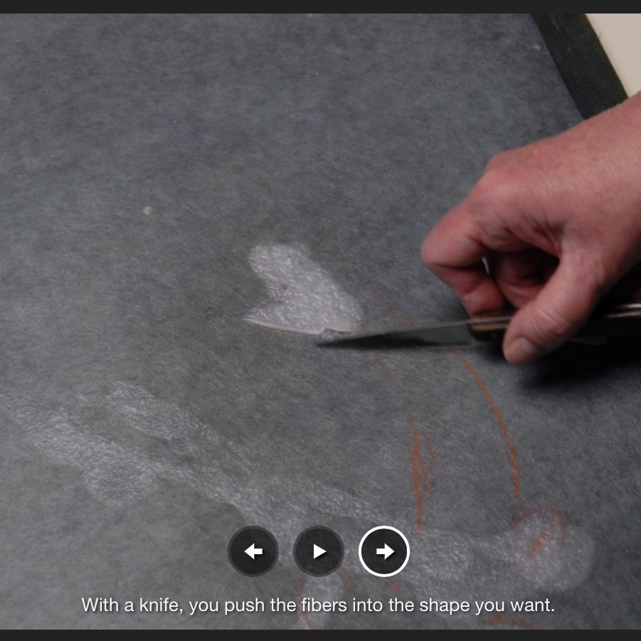
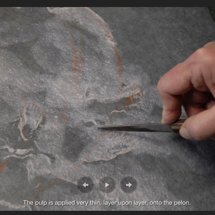
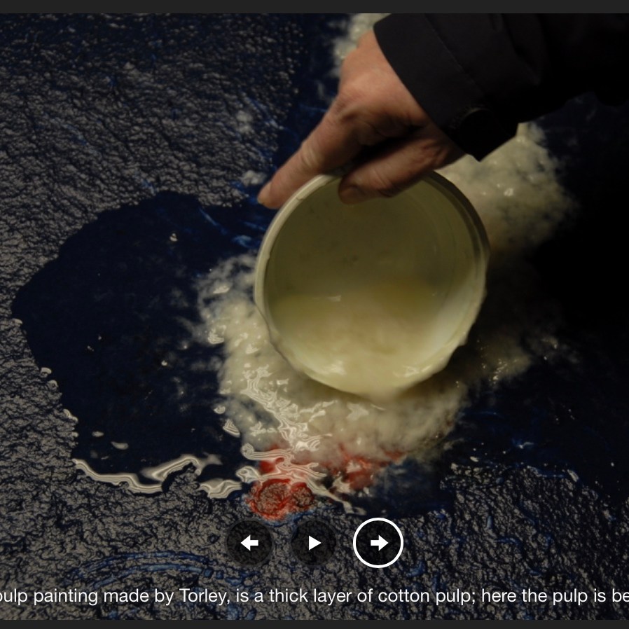
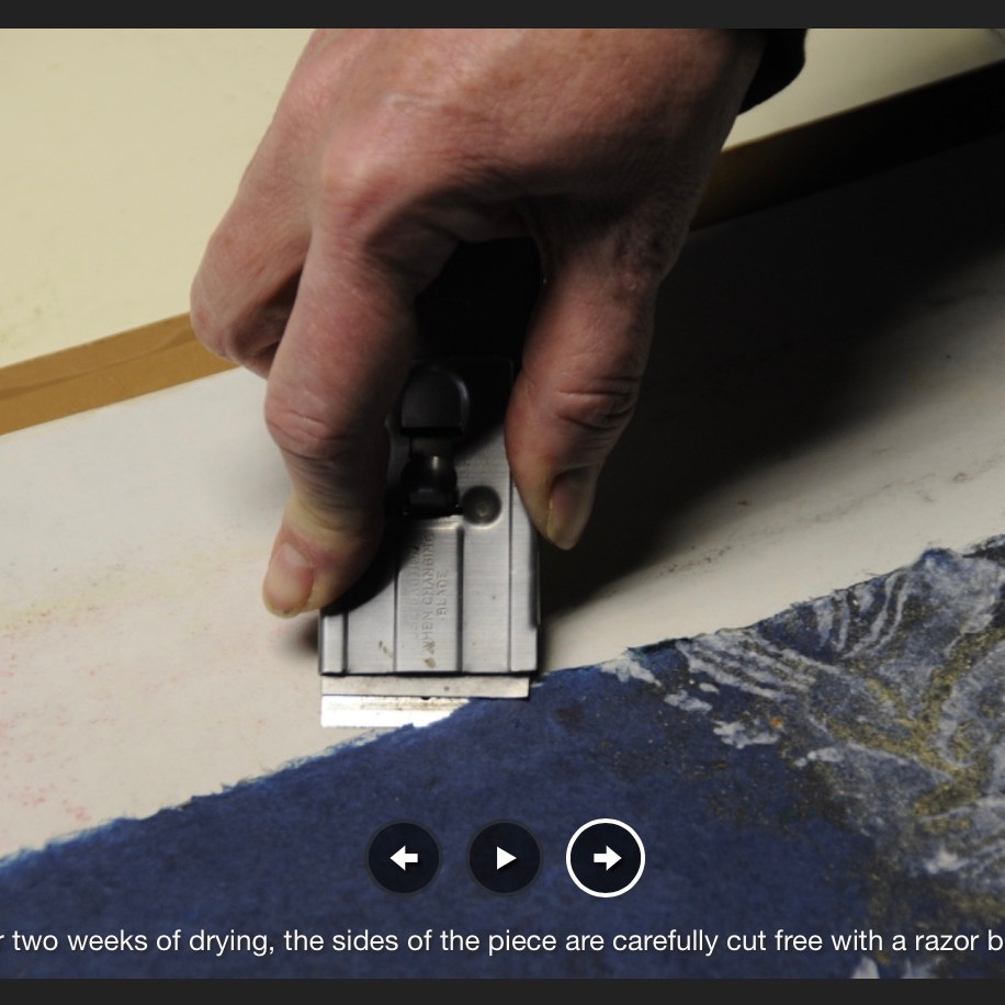
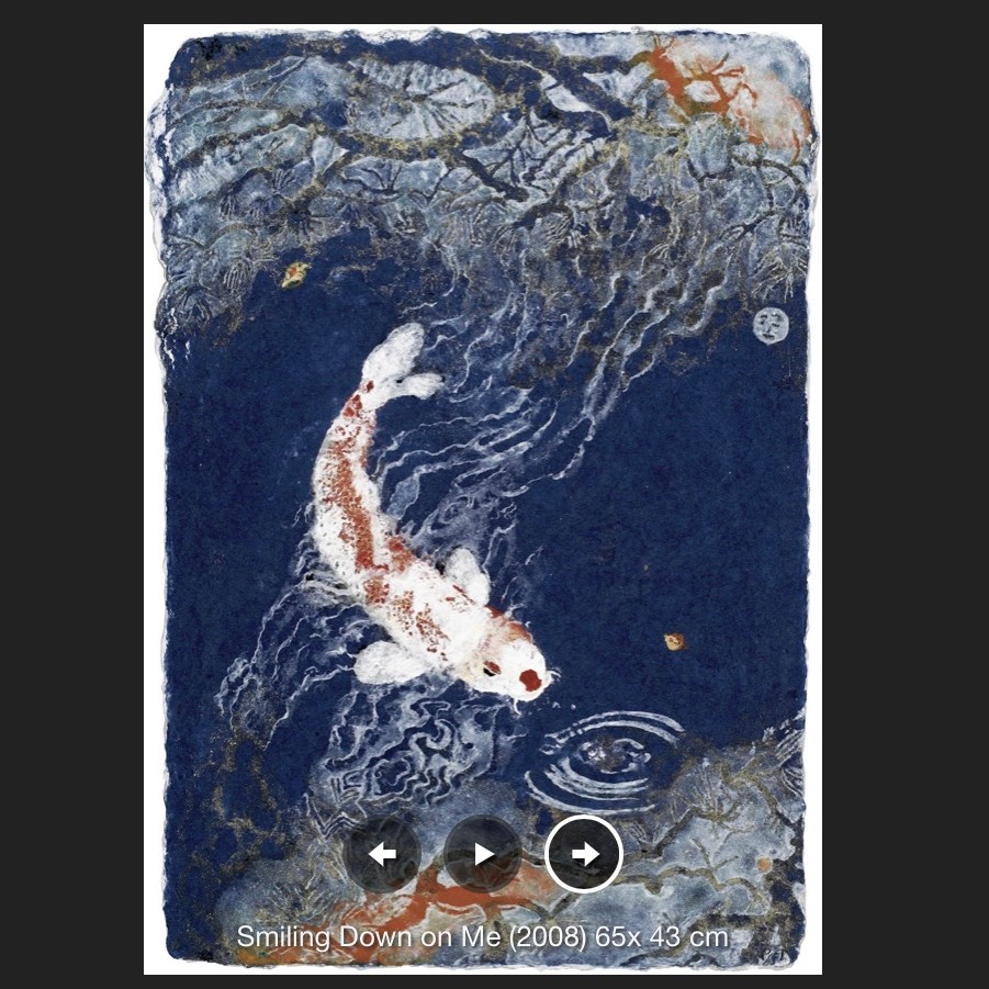
Pulp painting. H370 x W475 mm, excluding frame and matte. Acquired from the artist, July 2018. Photos: Books On Books Collection.
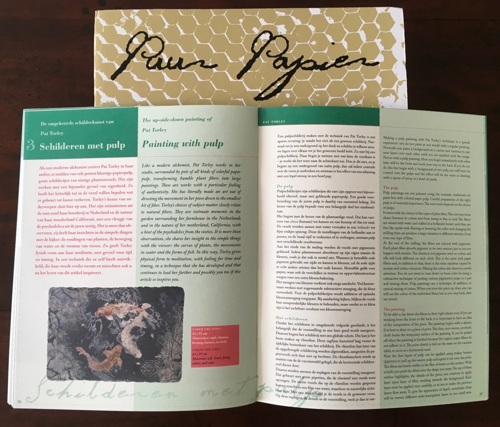
Here is Gentenaar-Torley’s explanation of her technique:
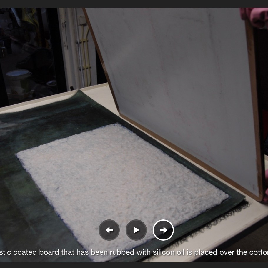
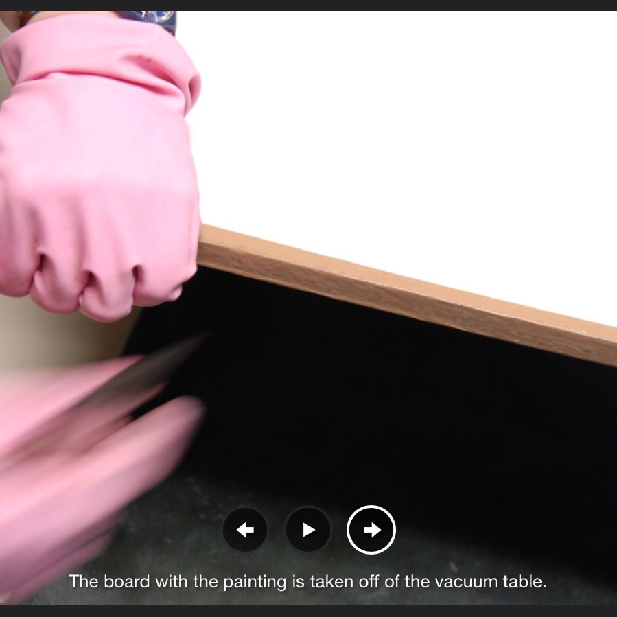
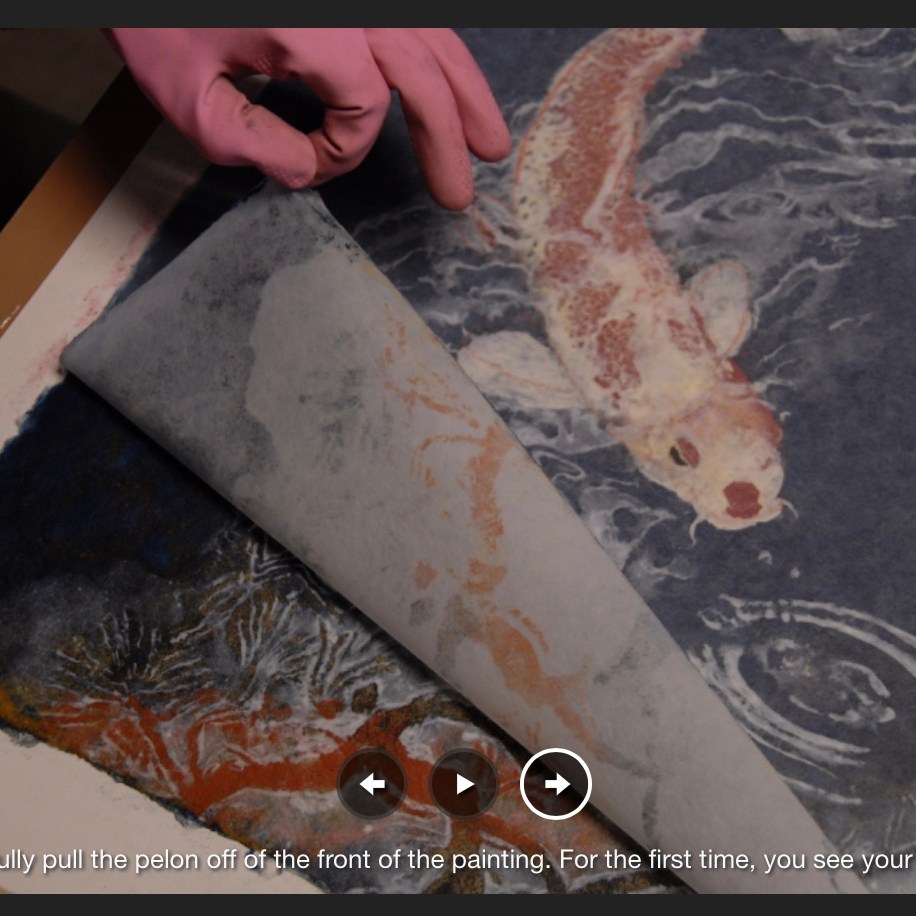
I work from the front of the painting on the surface of the vacuum table. Using the colored pulps, I pour thin, often transparent, layers of pulp, next to and on top of each other, sometimes shaping them with a knife as I go along. As the water drains down, I gradually build up the pulp layers to the back, finishing with a layer of hemp pulp overall, for strength, and then a layer of cotton pulp overall, to act as a cushion for drying on a board.
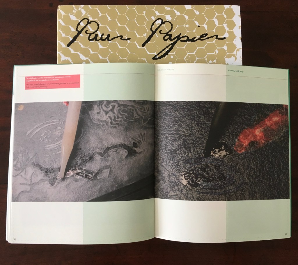
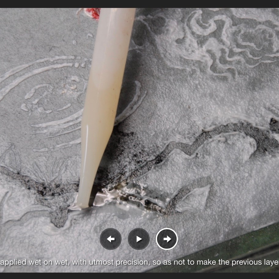
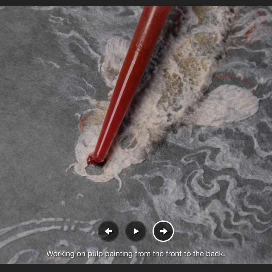
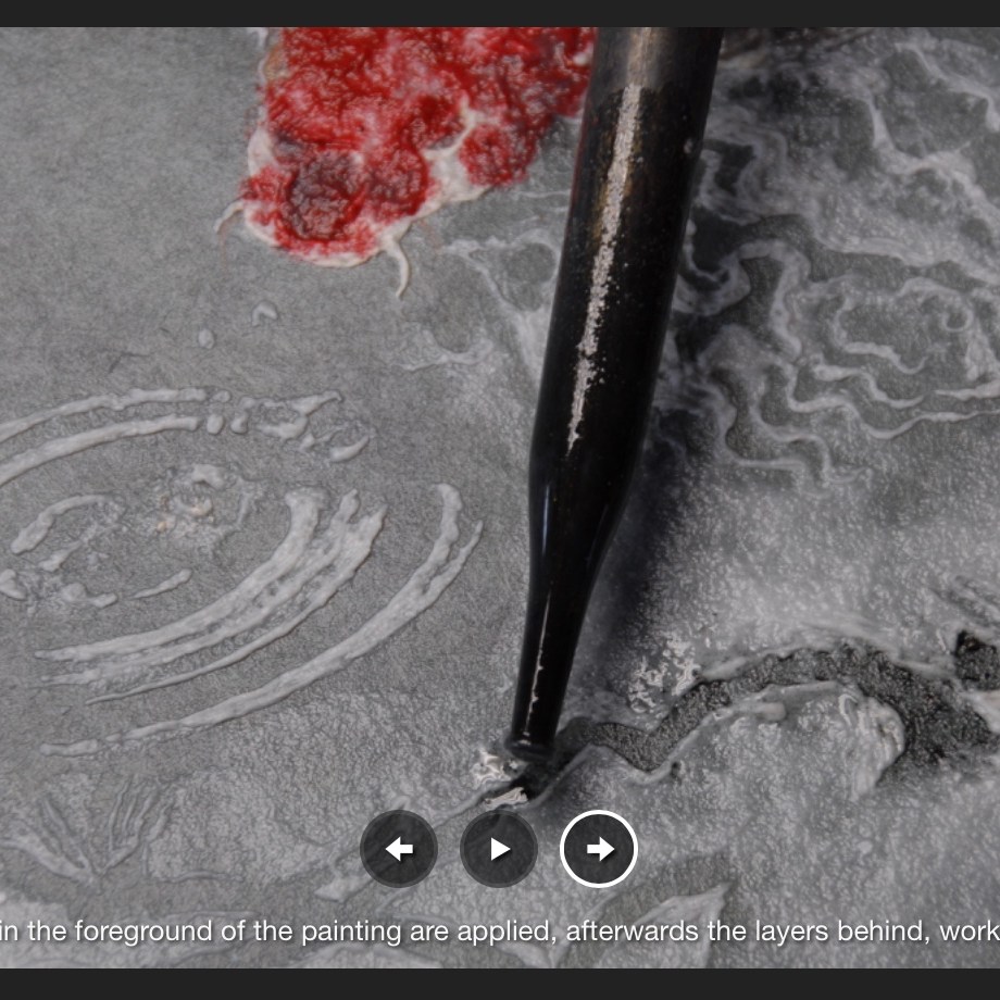
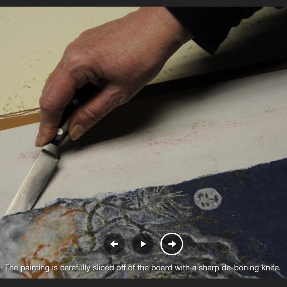
Screenshots of Gentenaar-Torley’s pulp painting process from artist’s website. Permission of the artist.
Gentenaar-Torley explains the technique in additional detail in the fourth booklet of Puur Papier/Pure Paper (Rijswijk : Stichting Holland Papier Biënnale, 2008). More recently, Lynn Sures and Michelle Samour included Gentenaar-Torley in Radical Paper (2024), from which here again the artist’s own words:
My pulp-painting process involves working front to back, where the details are laid down first and the image is built up by adding multiple layers of pulp, applied on top. Once a layer of pulp has been covered, there is no changing what I have put underneath. Unlike the process of painting, I have to imagine the outcome beforehand and manipulate the wet pulp with extreme care. This puts me into a meditative, flow state. I have to keep all the layers that make up the image in my mind and keep track of the layer that I am working on at the moment, so that all the puzzle pieces fit together in the end.
Ende, Willem van der. 1999. Pat Gentenaar-Torley. Rijswijk: Gentenaar and Torley Publishers. Exhibition catalogue: cover, paper sample and double-page spread.
Frederiks, Catherina. 2012. Pat Gentenaar: Leidraad in Papier. Voorburg: Stichting Haagse Beeldende Kunst en Kunstnijverheid. Exhibition catalogue: cover and double-page spread.
Hiebert, Helen. 30 March 2018. Interview with Pat & Peter Gentenaar-Torley. Paper Talk.
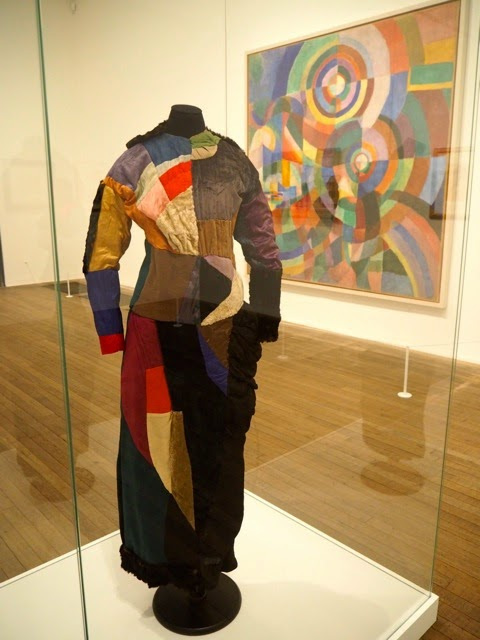
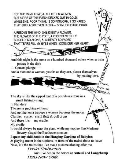
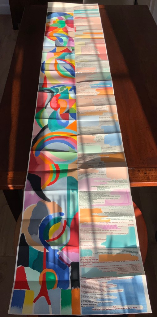
It was 1913. Stravinsky’s ballet “The Rite of Spring” debuted. The Cubists, Constructivists, Suprematists, Futurists all bound onto the art scene, many of them showcased in the Armory Show in New York that year. The Nouvelle revue française (NRF) attempted the first book form of Stéphane Mallarmé’s Un Coup de Dés Jamais N’Abolira le Hasard, which revived that 1897 typographic disruption of the page and prepared the ground for dozens of works of book art since. And Blaise Cendrars and Sonia Delaunay-Terk announced and published what they called le premier livre simultané. It was La Prose du Transsibérien et de la petite Jehanne de France.
From the Bodleian Library collection Photos: Books On Books
From the National Art Library, Victoria & Albert Photo: Books On Books
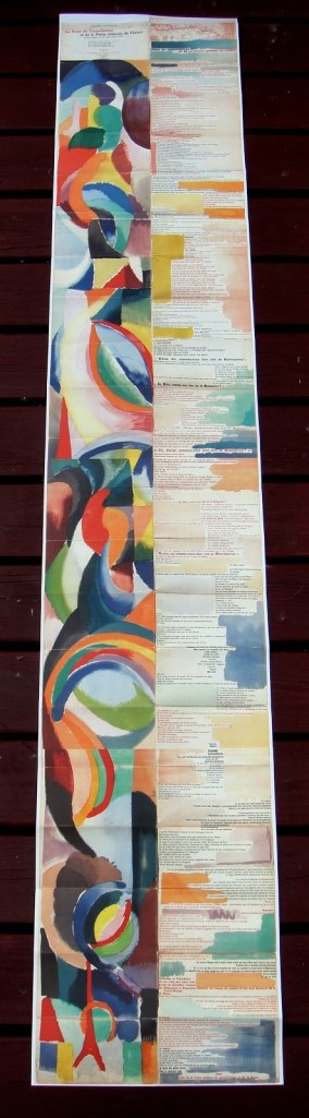
Like Mallarmé, Cendrars disrupts the page with multiple typefaces (thirty distinct ones in his case) and scattered placement of lines and stanzas. But La Prose presents an even more physical and structural disruption of the page and book than Un Coup de Dés. Unlike the latter, La Prose unfolds — twice — in an accordion format to over two metres in length or rather height since the text descends on the right and ends alongside the interlinked images of the Eiffel Tower and a Ferris wheel at the foot of the accordion. Cendrars and Delaunay had aimed to produce 150 copies of La Prose because, placed end to end, that would have equalled the Eiffel Tower’s height.
More than this monumental, sculptural, typographic and physical disruption of page and book, La Prose presents a temporal disruption. By le premier livre simultané, Cendrars meant a simultaneity of the verbal and visual — the way that text and image appear all at once — en un éclair. Early Bohemian that he was, Cendrars was co-opting a fair bit of artistic and literary theorising by the Cubists, Futurists and others. Most important and of the moment was his co-opting of Robert and Sonia Delaunay’s colour theory of simultanéisme. The “couleurs simultanées de Mme Delaunay-Terk” had also appeared in her 1913 robe simultanée and paintings. Building on a French scientist’s exposition on how perception of colours changes depending on the colours around them, the Delaunays claimed that rhythmic, musical and spatial synaesthetic elements were also at play. Sonia Delaunay asserted that the artwork produced for La Prose was not in response to reading the poem but hearing it from Cendrars. (Listen to it for yourself here.)
In presenting the adolescent Cendrars travelling physically eastward on the Transsibérien, travelling mentally to Flanders-Basle-Timbuctoo-Auteuil-Longchamps-Paris-New York while still registering the landscape outside, seeing the maimed and wounded returning from the front of the Russo-Japanese war, conversing with a prostitute named after Joan of Arc, doubting himself as a poet, and so on until a sudden transposition back to Paris, the process poem juxtaposes the sacred and profane, past/present/future, stationary and dynamic, national and international in outlook and locale. In short, simultaneously. In a format that is bound and unbound, the poem mirrors the swirling, interacting shapes and colours beside and in which it moves — and vice versa.
However more disruptive of the page and book La Prose may have been, it did not inspire the profusion of direct re-interpretations (or appropriations) that Un Coup de Dés prompted from artists such as Jérémie Bennequin, Ellsworth Kelly, Man Ray, Didier Mutel, Michel Pichler, Eric Zboya and dozens of others.
Not until 2001 did a re-versioning of La Prose appear. Tony Baker and Alan Halsey published an English translation and codex re-formatting. Its black on white imagery is reminiscent of the Russian Futurists, the type is monochromatic, and the typefaces, fonts and weights vary but not as much as in La Prose.
Baker and Halsey note in their colophon:
So far as we’re aware no translation of the poem into English has ever been attempted to give a sense of Cendrars and Delaunay’s original conception, not the least reason for which may have been the difficulty until recently of seeing the first edition, even in reproduction. — Prose of the Trans-Siberian and of the Little Jeanne de France (Sheffield: West House Books, 2001)
A well-founded lament — at least for the book art community. Not until 2000 had there been a reduced-scale reproduction of La Prose. It appeared in Granary Books’ A Book of the Book by Jerome Rothenberg and Steven Clay across a four-page foldout in the embrace of Ron Padgett’s English translation. Only in 2008 was there a full-scale, full-colour offset facsimile, produced by Yale University Press with an appended translation. It is now out of print.
With her work La Prose du Transsibérien Re-creation (2019), Kitty Maryatt has changed all that. With this deuxième livre simultané, she has more than caught the echo of Cendrars/Delaunay’s original and its arrival. As scholar, artist and veritable impresaria, she has reinvigorated the book art/arts community with the legacy of La Prose.
Her blogspot documents the research and production with rich details about sourcing the type, learning about stencil-cutting from Atelier Coloris (one of the few remaining businesses devoted to pochoir), determining the recipes for the ink colours, testing papers (Zerkall Crème, Biblio, and Rives HW), creating a census of the existing 1913/14 originals and their locations — all that and more, including the use of bacon fat and a wine bottle filled with lead shot. She also organized a documentary by Rosylyn Rhee: “The Pochoir Re-creation of La Prose du Transsibérien”. It brings the importance of the original and this re-creation to life in the expressions and voices of prominent collectors, librarians and scholars, artists, rare book dealers and the project’s funders.
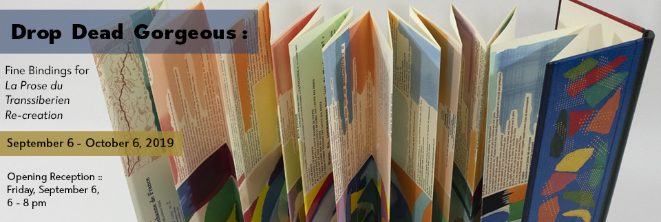
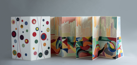
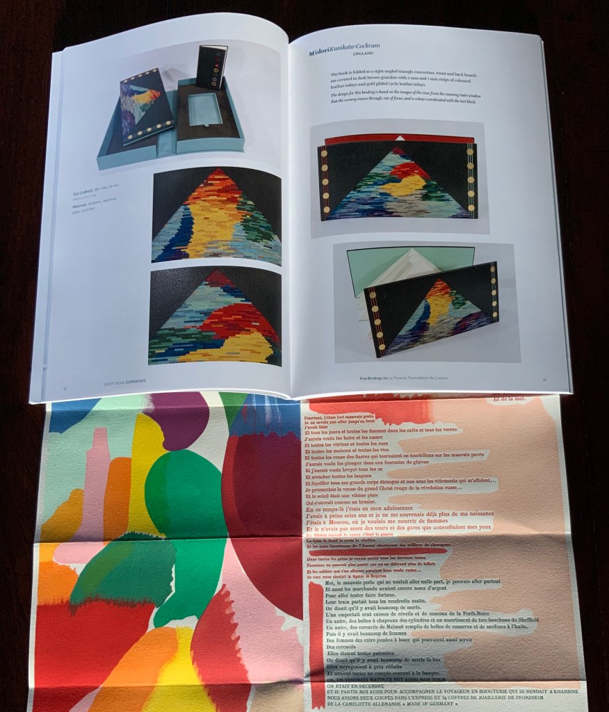
In addition, Maryatt has been either a contributor to, or the motivating force behind, several symposia and exhibitions such as “Paris 1913: Reinventing the Artist’s Book” (at the Legion of Honor Museum in San Francisco, 2018) and “Drop Dead Gorgeous”. The latter is a travelling exhibition resulting from invitations to twenty-four book artists and designer bookbinders to design and create bound copies of La Prose du Transsibérien Re-creation. For the San Francisco venue, Maryatt prepared a workshop on traditional French pochoir and provided text for the exhibition catalogue (available from the online store of the San Francisco Center for Books).
Monique Lallier’s fine binding of La Prose du Transsibérien Re-creation Photos: Courtesy of Monique Lallier
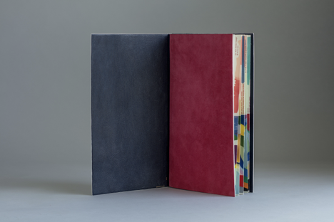
The pinnacle of Maryatt’s efforts, of course, is the standard and deluxe editions of La Prose. Both editions consist of 4 pages, glued together to create the tall single page. For the standard edition, the page is folded into 21 sections and loosely placed in a painted vellum cover with a booklet describing the project and production. An acrylic slipcase houses the covered bundle.
The standard edition Slipcase: H195 x W108 x D45 mm. Wrapper: H182 x W97 x D35 mm. Leporello: H81 x W95 mm (closed). H1954 x W160 mm (open). Booklet: H81 x W94 mm (closed), W1055 mm (open). Photo: Books On Books
Photo: Books On Books
Photos: Books On Books
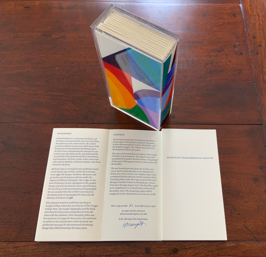
For the deluxe edition, the single page is left double-wide, accordion-folded double-tall between aluminum covers and housed in a clamshell box. A separate case holds the painted vellum cover, colour cards, Sonia’s visual vocabulary, 27 progressives for page one, 5 pochoir plates with tracing paper and registration system, the booklet with introduction and colophon, and the list of 30 typefaces Cendrars used. A large clamshell box houses this separate case and the boxed book. The colour cards include the recipe for mixing the gouache, and Sonia’s visual vocabulary shows the numbered steps of operations. The progressives for page one show the steps for doing the pochoir stencils and handwork.
The deluxe edition Photos: Courtesy of Kitty Maryatt
Any institution with a focus on book art or the graphic arts should seek out the standard edition of La Prose du Transsibérien Re-creation. Any institution with a focus on teaching and practice in those domains should seek out the deluxe edition. As indefatigable as Cendrars and as productive as Delaunay, Kitty Maryatt has provided the basis of master classes for generations. Now it is up to the book art community to respond as it has to Un Coup de Dés.
A shorter version of this essay appears in Parenthesis 39, Fall Issue, 2020.
Further Reading
Ashton, Doré. “On Blaise Cendrars. . . But I Digress.” Raritan 31, no. 2 (2011): 1-42,164. An entertaining extended anecdote sketching Cendrars and his milieu.
Gage, John. Colour and Meaning : Art, Science and Symbolism(Berkeley, CA: University of California Press, 1999). Despite her works’ better quality and representation of simultanéisme, Gage focuses on Robert and mentions Sonia only in passing or footnotes. (Telling that the Tate chose Sonia not Robert for a retrospective in 2015.) Nevertheless, there are passages that place her work in context.
P.198: Chevreul’s “privileging of the harmony of complementaries was essentially in the context of ‘painting in flat tints’, a method developed largely in the decorative arts, but which was increasingly integrated into many branches of French painting in the second half of the nineteenth century …”.
P.254 “When, probably early in 1912, Delaunay wrote to Kandinsky outlining his theories, he had shifted to a rather different approach, claiming: ‘the laws I discovered … are based on researches into the transparency of colour, that can be compared with musical tones. This has obliged me to discover the movement of colours.’ …
P.256 [Delaunay’s] Essay on Light, which was composed in the summer of 1912, attributed the movement of colours less to transparency than to the qualities of hue: ‘Movement is given by the relationship of unequal measures, of contrasts of colours among themselves which constitute Reality. The reality has depth (we see as far as the stars), and thus becomes rhythmic Simultaneity.’”
P.257 “For Chevreul in 1839 such painting [in flat tints] had only a decorative, accessory function, but the Delaunays did not feel the distinction, and Sonia had recently been experimenting with flat colours in appliqué textiles and in bookbindings decorated with collage.”
Maryatt, Kitty. “A Bookmaker’s Analysis of Blaise Cendrar’s and Sonia Delaunay’s La Prose du Transsibérien et de la Petite Jehanne de France”, The Quarterly Newsletter(Fall 2016), The Book Club of California. Online version available here.
Maryatt, Kitty. Interview with Steve Miller, Book Arts Podcasts, School of Library Information and Sciences, University of Alabama, 13 January 2006.
Rothenberg, Jerome; Clay, Steven. A Book of the Book: Some Works & Projections about the Book & Writing (New York City: Granary Books, 2000). Contains an excerpt from Perloff’s book above, Ron Padgett’s translation of La Prose and a four-page foldout showing a full-color photo-reduction of the 1913 original.
Shingler, Katherine. “Visual-verbal encounters in Cendrars and Delaunay‘s La Prose du Transsibérien“, e-France: an on-line Journal of French Studies, Vol. 3, 2012, pp. 1-28. Accessed 15 November 2019. Along with Perloff’s book, this is the best explication of the work and its lineage with Mallarmé’s Un Coup de Dés.
Woodall, Stephen. “La Prose du Transsibérien et de la Petite Jehanne de France”, Insights from the de Young and Legion of Honor (San Francisco: Fine Arts Museums of San Francisco, 2020. A spectacular website presenting the original work in its context and its influences on subsequent book art. The work can be viewed panel by panel, and its overall structure is presented in an animation of its unfolding and refolding.
Perfect bound softcover in black case (Claro Bulk 135 gsm) and dust jacket (Gmund Colors 300 gsm). H210 x 182 mm, xxx unpaginated sheets for photos (Claro Bulk 115 gsm) and 24 concluding text pages (Claro Bulk 90 gsm). Acquired from Saint George’s Bookshop, 6 July 2020. Photos: Books On Books Collection. Shown with permission of the artist.
When a book enters a collection because of one photo, the collector needs to ask whether the theme driving the collection has become a hammer and every item collected a nail.
The photo in question is the 78th among 81 photos that mirror and document an installation exhibited at the Musée d’Art Moderne de la Ville de Paris in 2010. In the photo, a double-page spread has been removed from a book, folded and creased into a three-dimensional shape. Or perhaps, as hinted in the interview at the end of the book, it is an enlarged re-creation staged for the photo. The catalogue provides no caption for it or any other image. The text concluding the catalogue does not clarify what it is. Only for someone familiar with Marcel Broodthaers’ homage to Un Coup de Dés Jamais N’Abolira le Hasard are the pages recognizable.
So, for the collector with a hammer, there sits the nail: this photo of a manipulated double-page spread from Broodthaers’ Image version of Mallarmé’s poem. Across the book’s gutter, the image in the double-page spread seems to take on the face of a tilted die. The tilt and multiple creases at the edges of the die face create an illusion of motion. Behind the die, the shadowed edges of the pages add their blur to the imagined throw. Are there clues/clews embedded in the book’s other photos — the suggestion of a shipwreck, a hint of a constellation? As with Un Coup de Dés, images of the surreal and real interleave. Motifs on one page carry over to others. The images play with the white space (les blancs) to the left and around them. As with the various homage by Broodthaers, Michalis Pichler, Jorge Méndez Blake, Cerith Wyn Evans and many others that eschew text in favor of the image and three-dimensional shape, Leykauf’s photos convey motion and simultaneity. (Too strained? The hammer hesitates.)
So from there, the collector’s eye turns back to the occasion of the catalogue: “Salle Noire, Château de Bagatelle”, Musée d’Art Moderne, Paris, 6 May – 27 June 2010. The Salle Noire is an exhibition space in the basement of the Musée d’Art Moderne in Paris. According to François Michaud, Leykauf said she wanted to turn the Salle Noire inside out like a glove. To that end, she surveyed and photographed its rooms, its auditorium-like space and, from three viewpoints, its longest wall.
These monochrome photos along with others — wooden triangles comprising a psychological test, segments of a gothic arch, a Walter Gropius building, a stained glass window, an image from a paper activities book, the folded pages from Broodthaers’ Image, etc., and collaged in some instances — were made into slides. For the exhibition, five slide projectors, each holding 81 slides and running at different speeds, shone the images against the walls at different angles. In the interview concluding the book, Leykauf comments:
I consider the totality of the images to be a kaleidoscope … There is no development, no narrative — for example, nothing which might chart an architectural history. The kaleidoscope image or indeed, that of a round dance, sums it up very nicely! Leykauf to Rahn, p. 18.
Kaleidoscope! Does that not describe Mallarmé’s juxtaposition of fragments of verses in different sizes and styles of type and their imagery, which the homageurs highlight?
No development, no narrative! Does that not echo Mallarmé’s preface to Un Coup de Dés — “Everything takes place in a foreshortened, hypothetical state; narrative is avoided” (Collected Poems, p. 263)?
Salle Noire! Could the choice of the black room be a reference to the nothingness, the abyss of the poem?
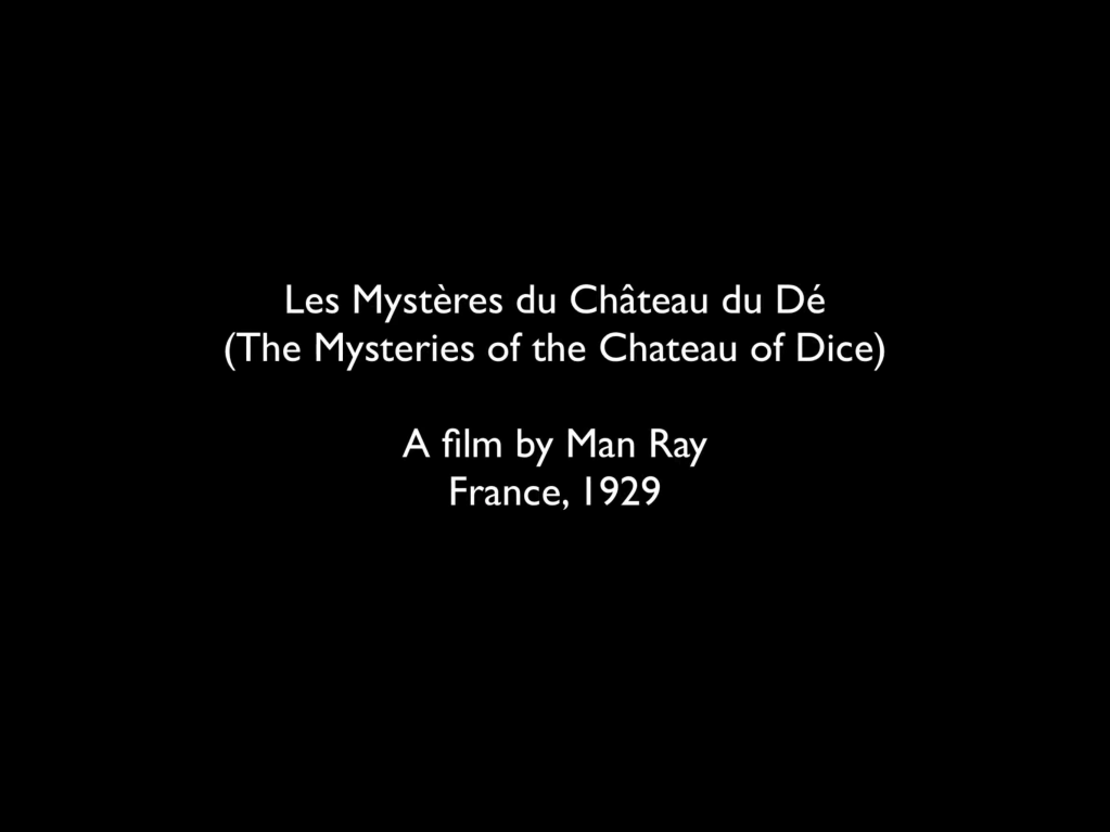
Château de Bagatelle, a slide show! Could it be a reference to that other great photographer’s cinematic homage to Mallarmé — Man Ray’s Les MystèresduChâteau de Dés?
As intriguing as it is to tap-tap-tap away at the Château de Bagatelle, the impact of the book’s 81 images and the imagined disorientation from the barrage of five simultaneous, differently paced slideshows overcomes and defeats the most determined, hammer-wielding collector. All that motion and simultaneity echoing the modernists — the Cubists, the Delaunays, Dada, Bauhaus, Schwitters, the Surrealists, the Vorticists — cannot be reduced to an homage to Mallarmé, even if his was the poem that made us modern.
Photos of pages from Château de Bagatelle: Books On Books Collection. Shown with permission of the artist.
Folded Paper (2010) Alexandra Leykauf Print. H500 x W700 mm. Photo: Courtesy and permission of the artist.
For the book art collector taking a wider view with a lowered and stilled hammer, Leykauf’s works subsume aspects of the book. Works such as Katoptrische Experimente (2012), A Student at Ease Among the Books, (2013) Everybody’s Autobiography (2014), La Statue Intèrieure (2015), Cumberland Farm (Ben Nichols) (2017) — all challenge perspective. Wall-sized photos of a double-page spread turn the corner of the display room; book covers larger than the viewer are coated in reflective material and form a fun house maze of angled mirrors and open title-page spreads; aerial views, recto/verso views, proscenium views, and inside/outside views play with the structures of landscapes, the theater and amphitheater, cupolas and arches, trees and caves, and the structure of the book. Perhaps everything in the world does not exist to end up as a book — or a photo — but as perspective.
Further Reading
“Alexandra Leykauf in conversation with Kathleen Rahn”, 19 February 2010, trans. Timothy Connell, in Alexandra Leykauf: Chateau de Bagatelle (Nürnberg : Verlag für moderne Kunst Nürnberg, 2010), pp. 15-18.
Michaud, François. “The Sense of Loss”, 26 February 2010, trans. John Tittensor, in Alexandra Leykauf: Chateau de Bagatelle (Nürnberg : Verlag für moderne Kunst Nürnberg, 2010), pp. 4-6.
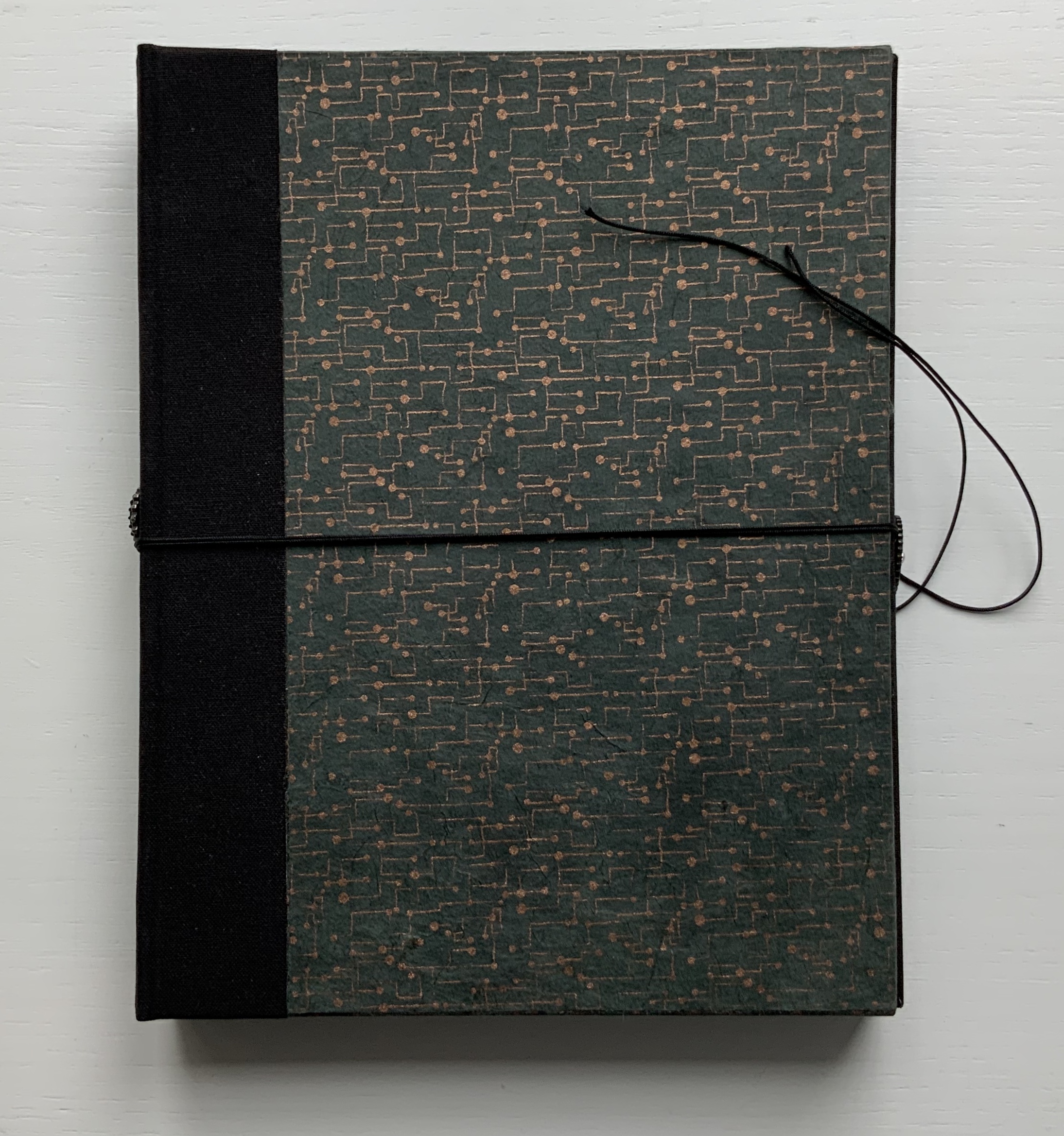
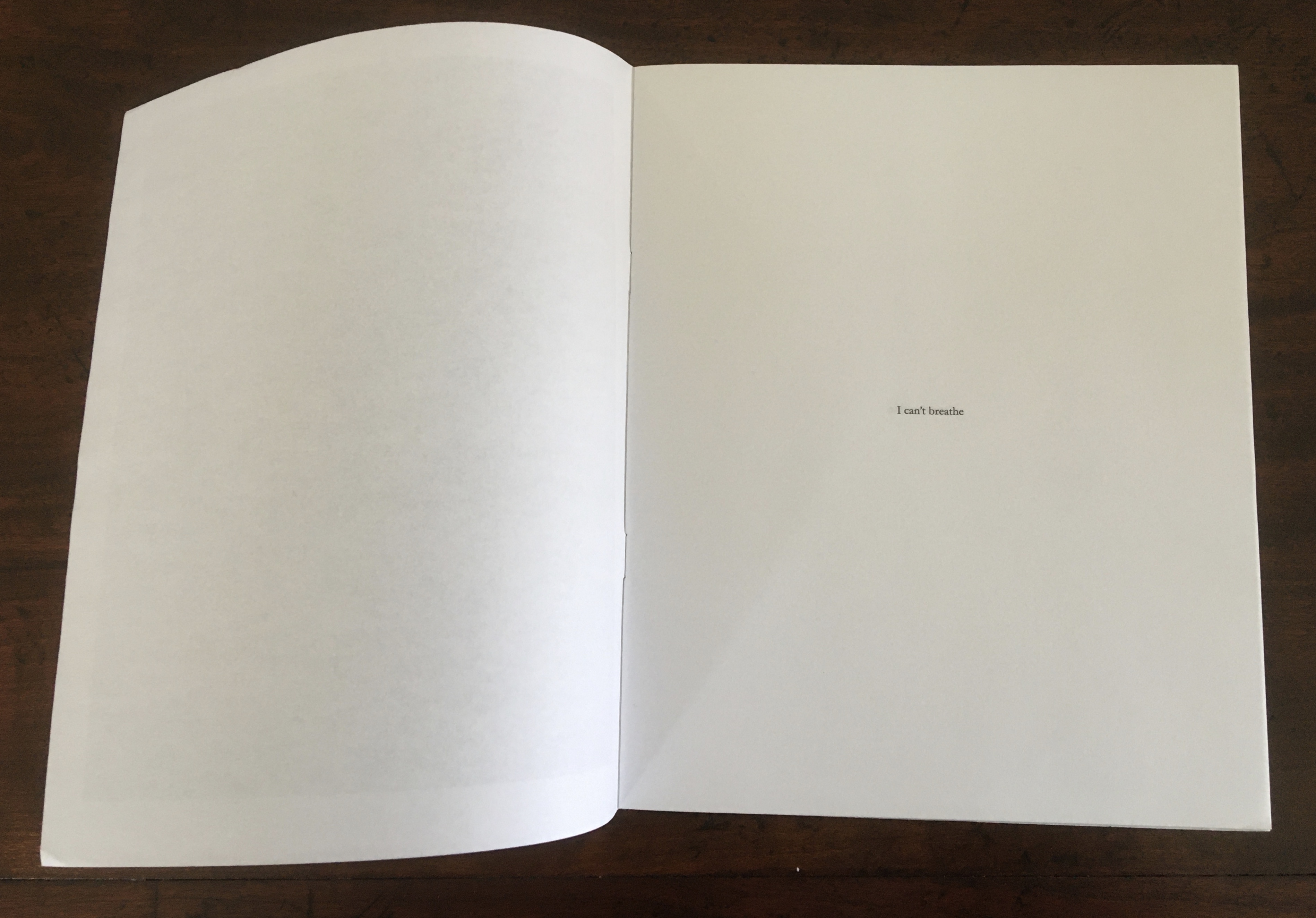
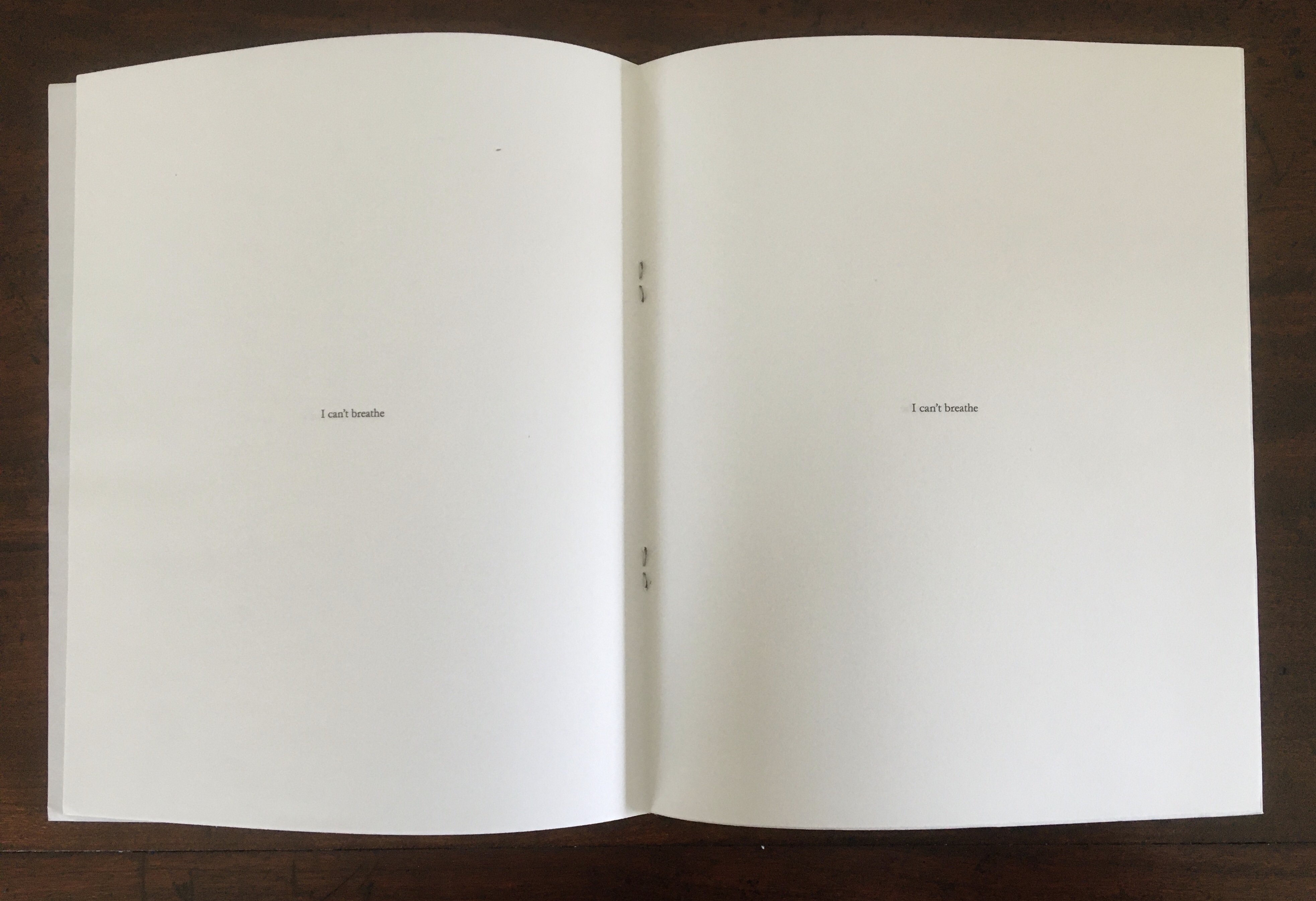
I Can’t Breathe (2015) Antoine Lefebvre Éditions Saddle-stitched with staples. Digital print. 16 pages. H218 x W178 mm. Edition of 100 copies. Acquired from the artist, 29 August 2020. Photos: Books On Books Collection. Displayed with permission of the artist.
I Can’t Breathe is the first publication made under Lefebvre’s imprint. He labels it a “zine” and calls it a “gut reaction” to the murder of Eric Garner. Lefebvre is one of several book artists who have lifted up Garner’s last words or his name since 17 July 2014. The work makes its simple but powerful statement by bordering the cover’s monumental black square with white and enveloping the eleven utterances of Garner’s last words in a field of white.
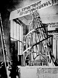
Monument to the Third International (2015)
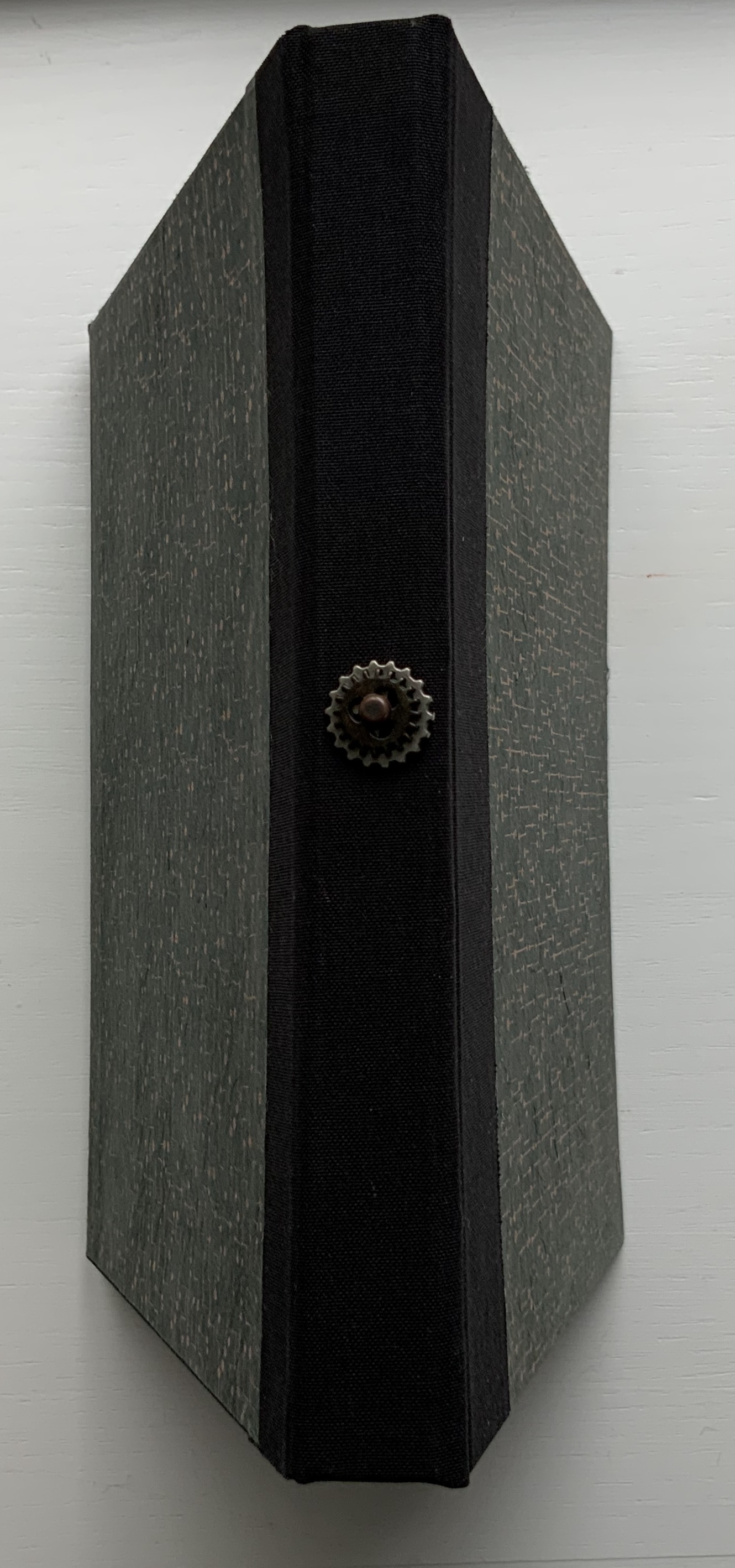
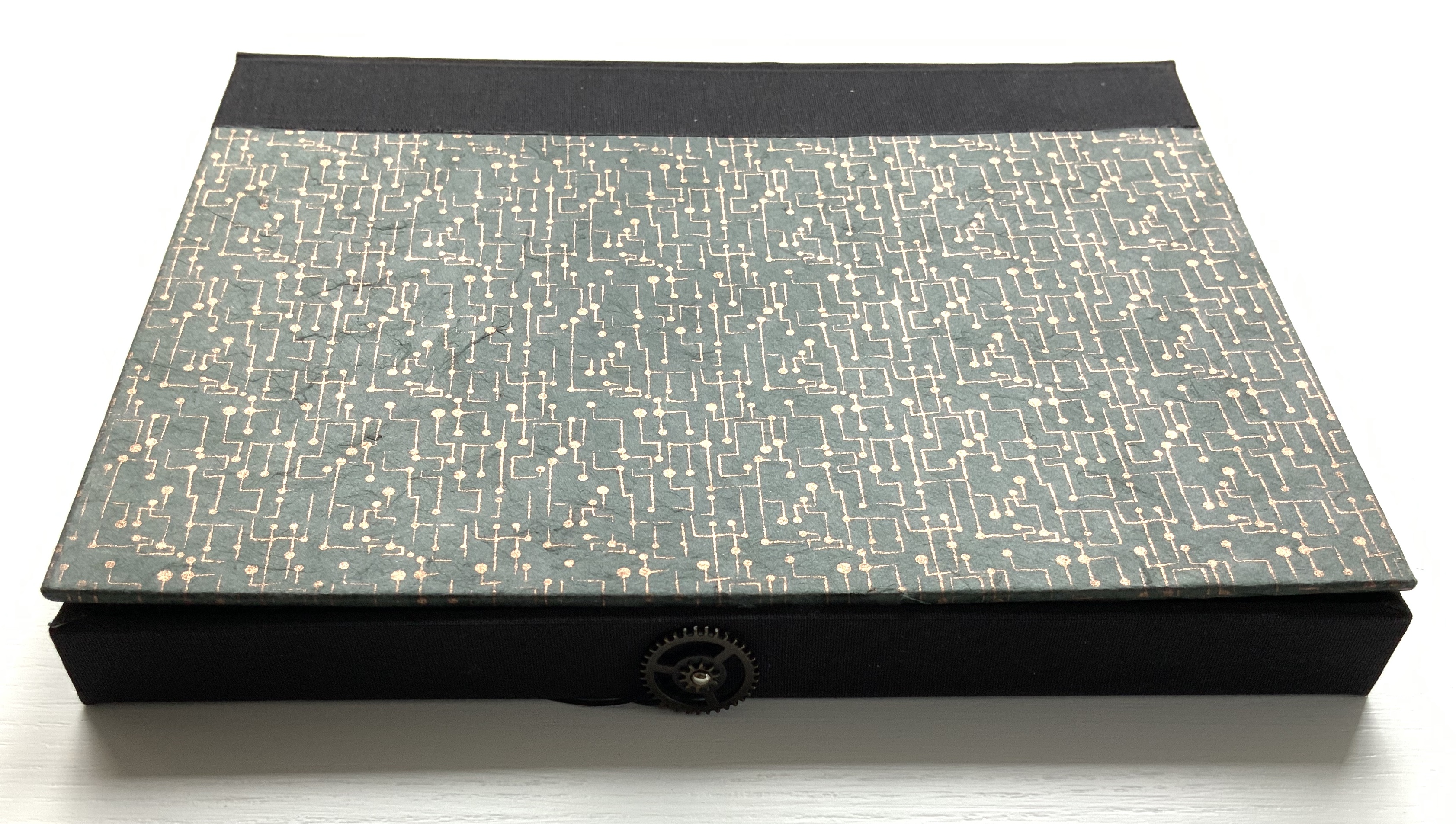
Monument to the Third International (2015) Antoine Lefebvre Éditions Book object, 200 x 150 x 50 mm (closed), 350 mm diameter (open). Edition of 12 + 4 AP, of which this is #4. Acquired from the artist, 29 August 2020. Photos: Books On Books Collection. Displayed with permission of the artist.
The second work under his own imprint, this sculptural artist’s book pays homage to Vladimir Tatlin’s Constructivist tower design for a monument to the Communist International, known as the Comintern or Third International, which lasted from 1919 to 1943.
When opened along its horizontal axis, the work echoes the shape of Tatin’s tower design. Also, when closed, the book’s fore-edge mimics the 1964 version of Dan Flavin’s “Monument” For V. Tatlin, bringing it into the category of “homage to an homage”, such as Michalis Pichler’s homage to Marcel Broodthaers’ homage to Stéphane Mallarmé or, from genres other than book art, Johan Karlsson’s homage to Vera Molnár’s homage to Albrecht Durer or, to stretch a point, Nam June Paik’s homage to Albers’ Homage to the Square or Andrew Wenrick’s homage to the same.
Lefebvre’s Monument is a ludic masterpiece to be read with the hands as well as the eyes. Its physicality and whiteness might remind the viewer of “The White Heat”, organized by Marc Straus. Held, or looked at, in its closed state, it might recall the more somber Absence by J. Meejin Yoo.
Opening the work.
Closing the work.
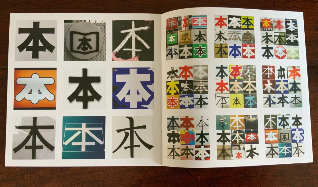
本 (2016)
木 (2016) Antoine Lefebvre Éditions H209 x W209 mm, 12 pages. Unnumbered edition of 250. Acquired from the artist, 2 October 2020. Photos: Books On Books Collection. Displayed with permission of the artist.
The kanji sign 本 on its own means “book”. During his residency at the Palais de Paris in Takasaki, Japan, Lefebvre became obsessed with the character and photographed it whenever he could. Eventually he not only created this work, influenced by Sol LeWitt’s PhotoGrids (1977), but used it to name his bookshop in Paris.
Photos: Books On Books Collection. Displayed with permission of the artist.
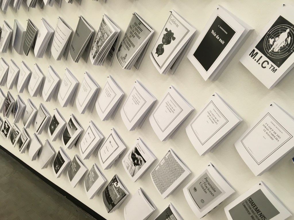
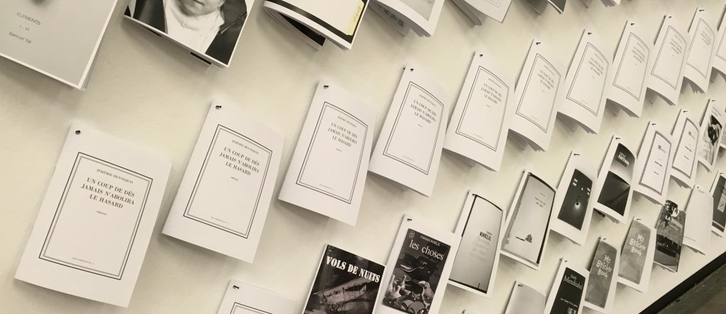
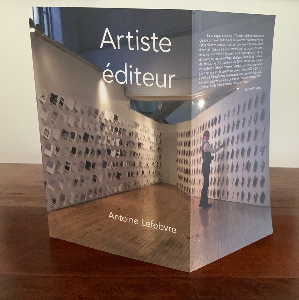
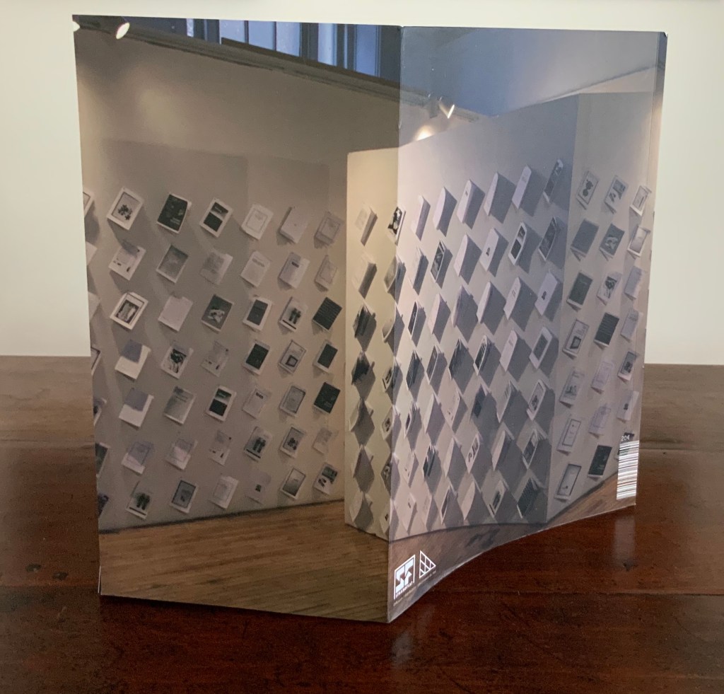
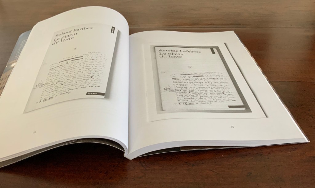
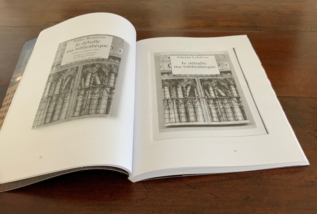
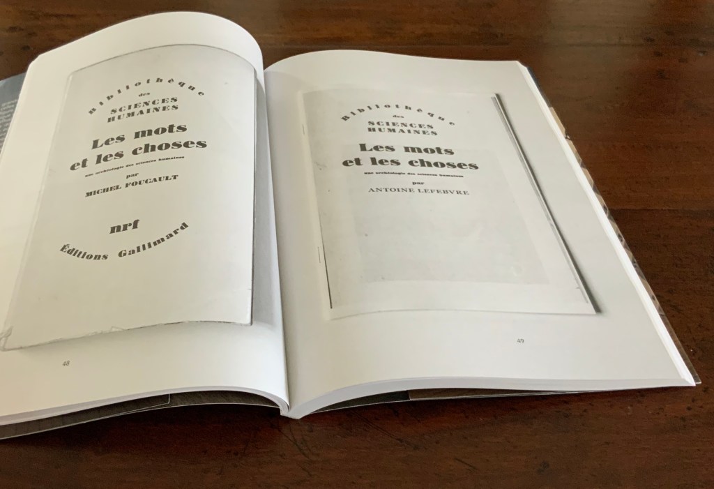
Lefebvre thinks of himself not as an artist and publisher but rather as an “artist publisher” — artiste éditeur — which is the title of the book based on his dissertation. Lefebvre not only expounds his thesis in the pages of the book, he demonstrates — or rather realizes — it in La Bibliothèque Fantastique (LBF).
Artiste Éditeur (2018) Antoine Lefebvre Éditions H297 x W210 mm, 176 pages.
The works in LBF appropriate covers, titles, images and arguments in a way to enacts conversations among the appropriated, with Lefebvre and with the reader. The works draw on a wide variety of artists and writers: Roland Barthes, Walter Benjamin, Joseph Beuys, Jorge Luis Borges, Ulises Carrión, Noam Chomsky, August von Cieszkowski, Guy Debord, Jacques Derrida, Marcel Duchamp, Michel Foucault, Ernst Gombrich, Georg Wilhelm Hegel, Joseph Kosuth, Jacques Lacan, Marshall McLuhan, Stéphane Mallarmé, A. Mœglin-Delcroix, Jean-Luc Nancy, Jean Paul Sartre, Ferdinand de Saussure, Ludwig Wittgenstein and many others.
Photos of book: Books On Books Collection. Displayed with permission of the artist.
More than “drawing on” the appropriated, LBF draws their thoughts into the digital twentieth and twenty-first centuries conversation about artists’ books and book art. Two of Lefebvre’s more discursive contributions to LBF constitute an “artist publisher” statement and a manifesto for LBF and himself:
… the books of LBF have no predetermined physical existence, they exist in a state of potentiality on the web, awaiting to become. They cost nothing, you can get them without spending a penny. They have no ISBN either, because they are works of art. They have no color, so that they can be printed in any printer. That’s what LBF books don’t have, which is almost more important than what they do, because our approach is conceived as a negative of that which is habitually proposed by the market spectacle society. The idea is to show various poetic singularities as opposed to the flashy commodities which our society feeds us.
What the LBF books do have is above all a great freedom of content, revealing a very large and global conception of art. They contain all forms of expression usually found in print, i.e., drawing and photographs, as well as essays, novels, journalistic investigations etc.
The covers of LBF books are invariably appropriated from existing sources, the published artists just select one and use it as a cover for their book. The author’s name is deleted and replaced by the name of the artist, the name of the original publisher is also cleared since the new book is no longer its property. The artist can also change the title of the book to enhance it. The content of the book is completely open, the artist develops it through the pages to meet his or her project. The books are produced with bits and pieces from other books, developing a discourse on the ontology of the book. This project seeks to examine the nature of the book by submitting it to the approaches similar to those used by minimalist artists to test the limits of painting and art. The purpose of LBF is to explore the boundaries of what is a book and and what is not.
In 2015, Lefebvre chose Antoine Lefebvre Éditions as the name of his imprint and his artist name, but 2018 must have felt like his true annus natalis if not mirabilis. Not only did LBF appear in the Vienna exhibition and Artiste Éditeur arrive, he opened a shop in Paris and called it 本 \hon\ books. Even in his entrepreneurship, Lefebvre is an appropriator/hommageur. The name 本 \hon\ books pays homage to Japanese second-hand bookstores but also, and not surprisingly, to Joseph Kosuth’s One and Three Chairs (1965). Like Kosuth’s work, the shop’s name provides the same information in three formats: an ideogram, its Japanese pronunciation, and its translation (本 = book).
Perhaps it is because he works, thinks and creates with equal comfort in the digital and physical worlds or that he is international in outlook and language or that he happily inhabits the multiple roles of artist publisher, collaborator, appropriator, impresario and entrepreneur — for whatever reason, Antoine Lefebvre and his work bring a welcome élan to book art and this collection.
A particularly apropos video has arrived — apropos for its content, source and circumstances.
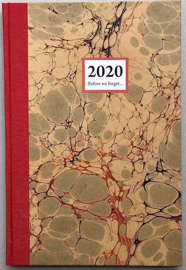
Patricia Silva, an artist working in Florence, Italy features in the Virginia Center for the Book’s Shelf Life video series. Virginia-based artist Lyall Harris interviewed Silva about Silva’s project Before We Forget 2020, a set of hand-bound artist’s journals. With each journal’s hand binding, unique cover of marbled paper, varied papers and inclusion of prompts to the owner, Silva draws on several rich traditions of book art.
Before We Forget (2020) Patricia Silva Thirty-six page journal (30 acid free writing pages + 6 specialty paper pages). Hand-crafted with hand-marbled paper and cloth covers. H215 x W145mm.
But in its technology, subject and circumstances, the video draws on an even more ancient literary tradition: Boccaccio’s Decameron. In March 2020, Italy was entering its months-long lockdown, and 4,461 miles away, the Virginia Festival of the Book was being cancelled due to the pandemic. Instead of decamping to the Blue Ridge or Tuscan hills with a handful of friends to escape the plague, Harris and Silva invited them via Zoom to their exchange.
Although a significant strain of book art falls into the conceptual and minimalist camps of art, an equally significant strain falls into the camp of the book arts and craft associated with them. Given the influence of her Italian mentor Carlo Saitta and University of the Arts professors like Hedi Kyle, it is no surprise that Before We Forget calls on the traditions of binding and paper marbling. The binding is a traditional case binding done with a link stitch on supports for sewing. The decorative papers come from several sources, almost all small artisans. Some are printed decorative papers, some are silkscreened, most are woodblock printed, of which several come from a small old-time family-run bindery in Venice that uses woodblocks dating back as far as the 1800s. Some of the paper is handmade by the artist.
The casual observer might mistake the journals of Before We Forget for the beautifully crafted blank journals that abound in outlets like Il Papiro or Paperchase. Yet there is surprise here to catch out the casual observer’s mistake and repay a bit of thought. At perhaps its most extreme, conceptual book art amounted to a set of instructions to the reader/viewer. The general interest in reader/viewer participation has several roots. One is craft-based and historical.
Recently in the context of the “other pandemic”, friendship journals and scrapbooks have drawn attention: for example, Amy Matilda Cassey’s Friendship Album (1833-56) and Alexander Gumby’s scrapbooks, including Negro in Bondage (1910-52). Older and more broadly, there are the Album Amicorum of Moyses Walens (1605-15) and Julia Chatfield’s Scrapbook (1845). Before We Forget does not present a set of completely blank pages. Each journal contains prompts to the owner to make notes, sketch, paste in, and add recollections of the days, weeks, and months of the 2020 Covid-19 pandemic.
Encouraging the owner’s intervention recalls another historical phenomenon: Grangerism or extra-illustration, where the owner embellishes a book with inserts. Richard Bull’s extra-illustrated copy of Count Anthony Hamilton’s Mémoires du comte de Gramont (1794) is a good example. Before We Forget does not present a previously printed body of text for Grangerizing, but each journal presents a unique copy to be overwritten.
In that context of the Covid-19 pandemic, this urging of reader/viewer participation evokes — perhaps callous to say — literally, not just metaphorically, Roland Barthes’ poser of the “death of the author”. Before We Forget plays to and against that metaphorical notion. Until a reader/viewer/owner acts upon an acquired copy, is there an author? Is the participating act one of authoring or mere “extra-illustration”? Barthes wrote: “the birth of the reader must be at the cost of the death of the Author” (p. 148). And if reader and author are one and the same?
Given Silva’s intentions stated in the interview, each copy acquired is meant to become a keepsake of events and time personal to its inscriber and be a memorial of the inscriber for future readers. Here is where the literalness of “death of the author” callously intrudes. Whether the owner/author falls prey to the virus or unrelated causes, the author dies.
The topic of the nature and experience of time recurs in book art sufficiently to warrant calling it a tradition. In Before We Forget, it plays out in general and in particular. On the general or theoretical side, we have Ulises Carrión and his definitions of “what a book is:
A book is a sequence of spaces. Each of these spaces is perceived at a different moment – a book is also a sequence of moments. … Written language is a sequence of signs expanding within the space; the reading of which occurs in the time. A book is a space-time sequence.
If seen as merely a blank journal, Before We Forget may seem not to warrant such “out there” statements. Or, on the contrary, those statements may seem not so “out there” when considered with Before We Forget in hand. On the particular and haptic side, we have in hand this object covered in a one-off piece of marbled paper and prodding our hands to mark it up and change the object to fix past time in it and to fix it in time to come. Theoretically or haptically, it engages the reader/viewer owner/author with the nature and experience of time.
Another tradition of book art in which Before We Forget is rooted, albeit loosely, is the found object and appropriation. In addition to its unique marbled paper cover, each journal contains six sheets of heavier or colored or patterned papers unique to the journal. In a sense, these papers are “found” as Silva has used only papers and cloth left over from older projects or collected (hoarded?) over the years. The marbled paper and specialist papers collected over time that found their way into Before We Forget are, however, only a part of the work — not the work itself as found object. Likewise, even if the owner/author fills the pages with pasted-in photos, postcards or other ephemera found or on hand, those found objects are not the work itself. It seems a stretch to deem the owned but yet-to-be-authored copy something that the owner/author has appropriated. In their collaboration Passato Prossimo (2017), Silva and Lyall Harris provide a magnificent demonstration of fusing book art with found objects and appropriation. The work is shown and discussed in the interview.
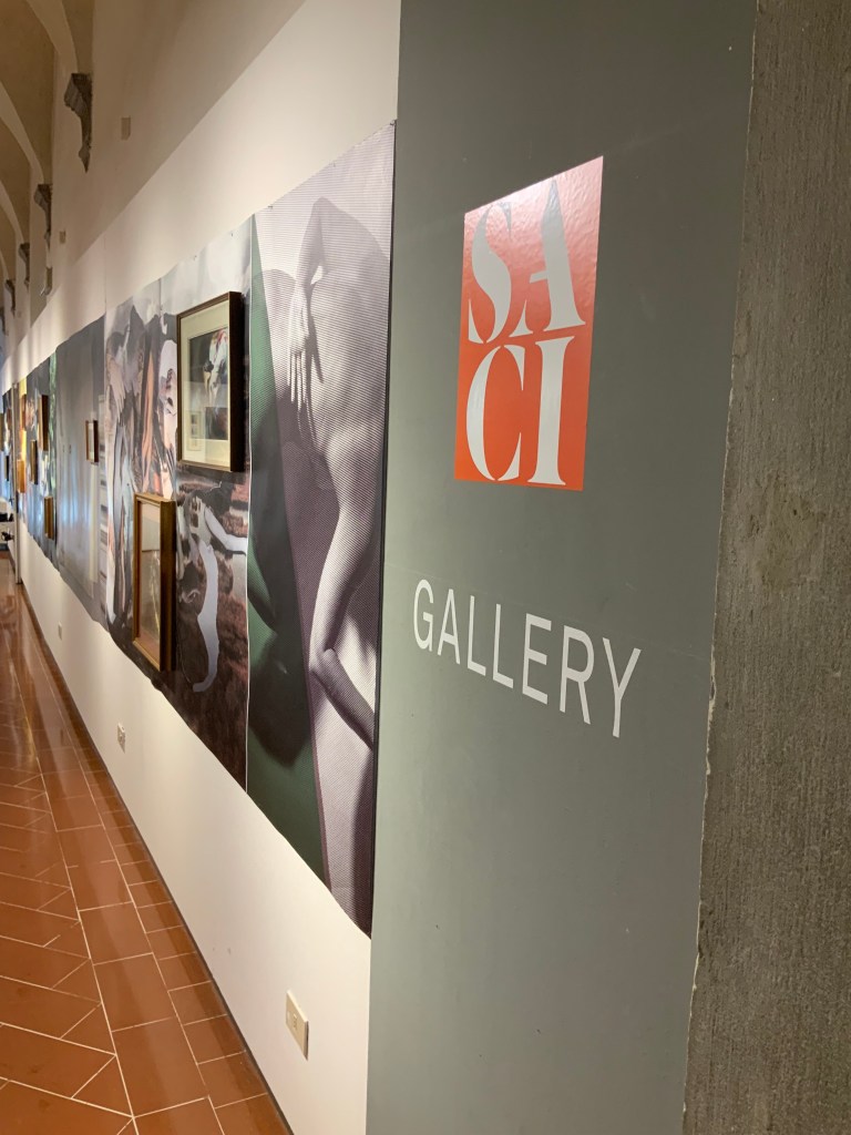
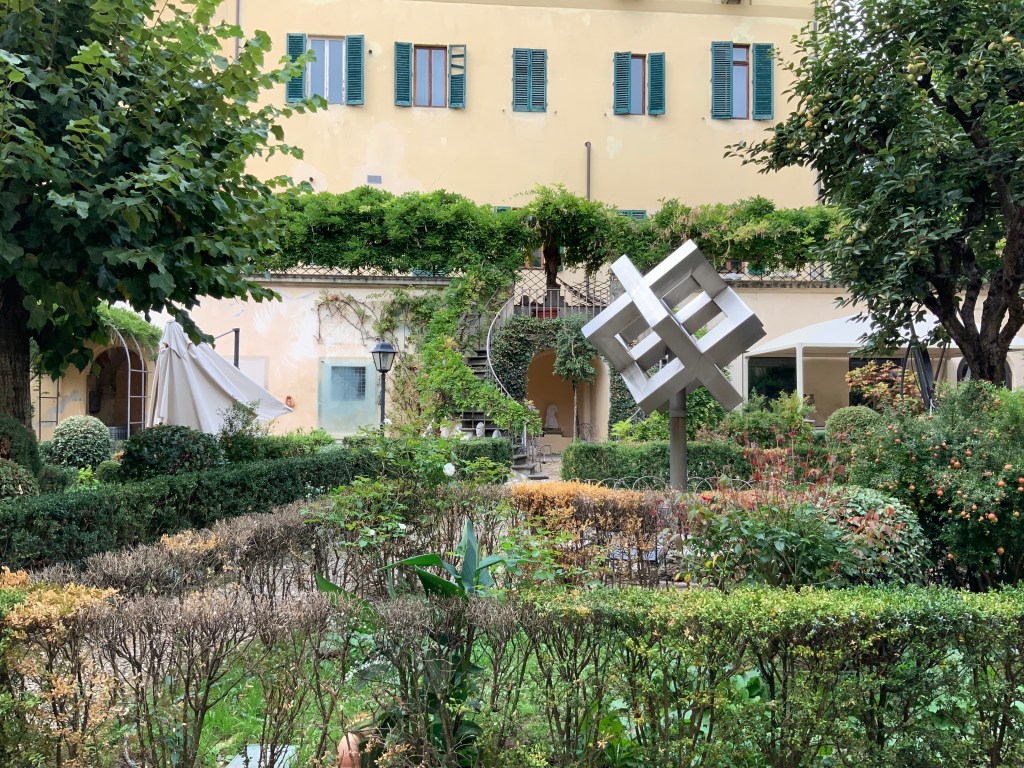
For Books On Books, the interview is a welcome reminder of another time. Patrica Silva teaches in both the Studio Arts College International (SACI) and Santa Reparata International School of Art (SRISA) and kindly arranged a visit to both in late September 2019. Florence was relatively empty at the time, and the visits to SACI and SRISA occurred at hours when there were no students around. The photos of the SACI’s gallery, library and grounds, the SRISA’s studio and equipment, and the works of Silva’s students will find their way into the Books On Books Collection’s copy of Before We Forget as strange harbingers.
By the end of September 2020, the Virginia Center for the Book had 40 episodes of Shelf Lifeon offer — well on the way to matching the Decameron‘s 100 stories. Unfortunately, with the current plague, the Center may be forced to exceed the Decameron‘s count, and Patricia Silva may face a demand for Before We Forget 2021.
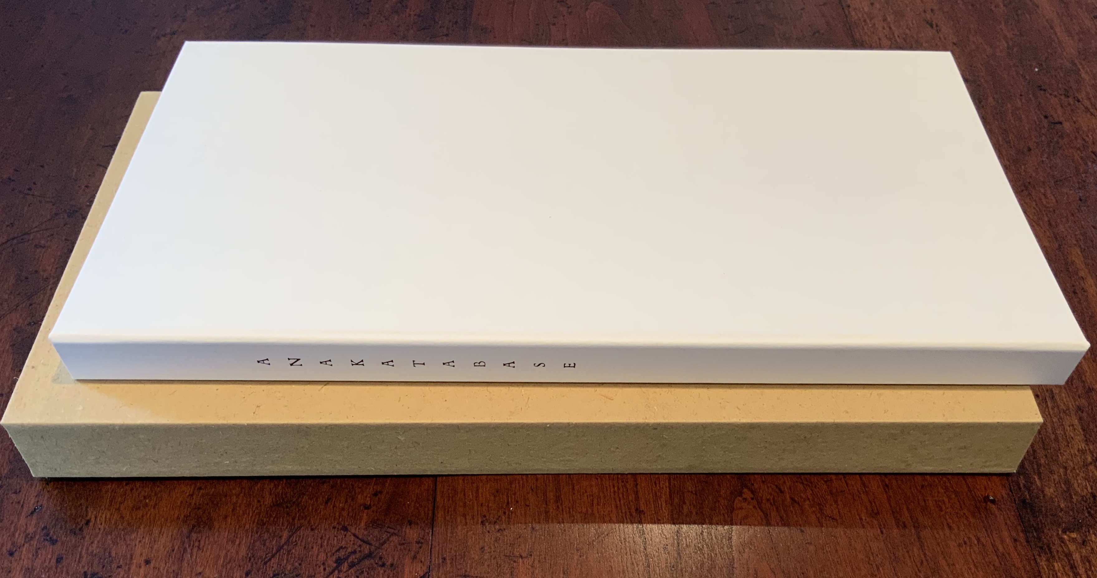
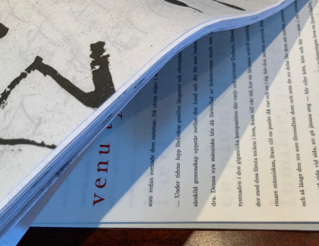
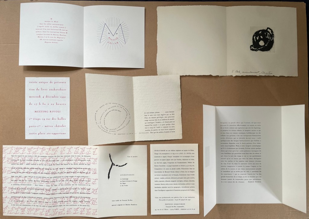
Slipcase: H331 x W179 mm. Board case: H323 x W177 mm. Paper case: H319 x W169 mm. Loose folios (9): H315 x W164 mm. Leporello: H312 x W168 mm (closed) and W3024 mm (open). Acquired from the artist, 19 August 2020. Edition of 63, of which this is #7 signed by the artist and engraver. Photos: Books On Books Collection. Displayed with permission of the artist.
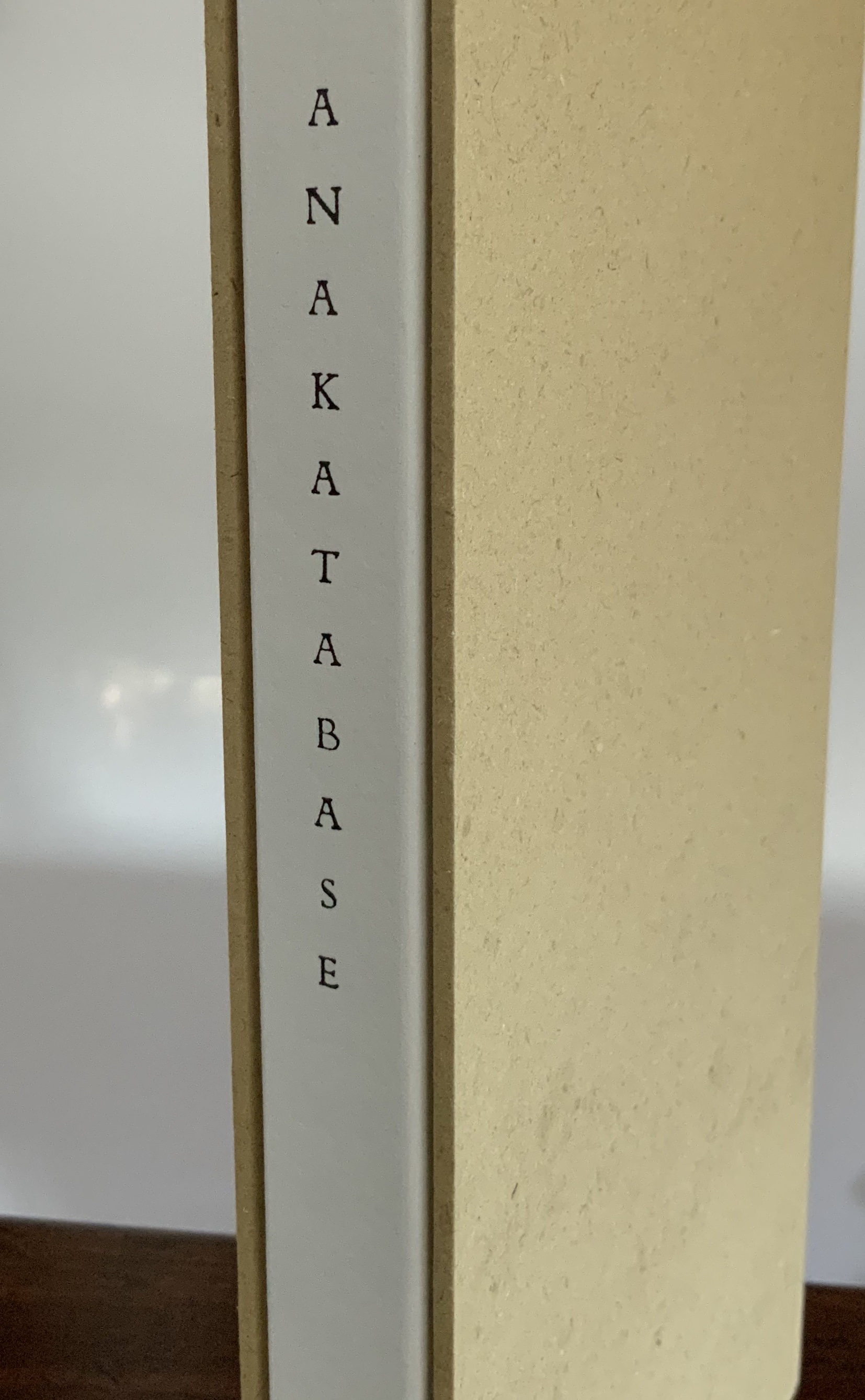
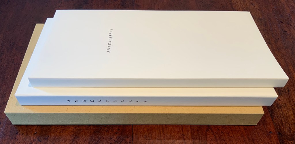
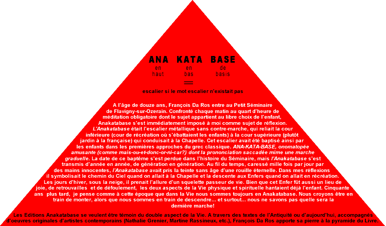
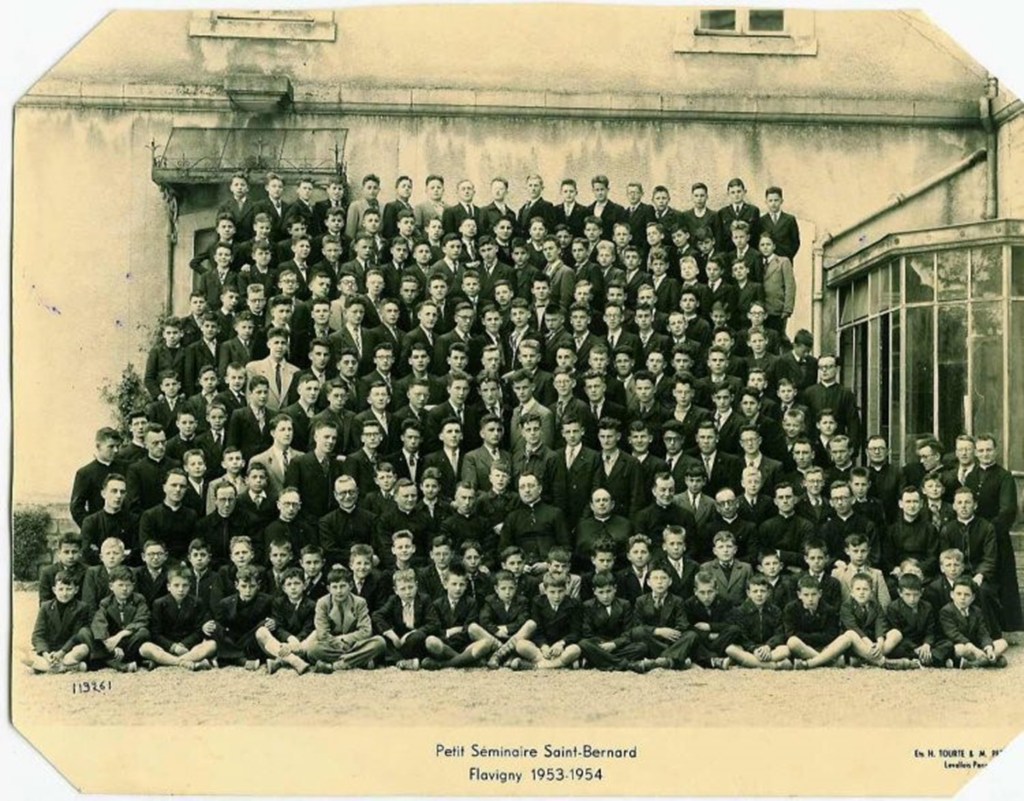
In the Petit Sèminaire de Flavigny-sur-Ozerain, where François Da Ros was enrolled in 1953, a metal staircase led from the playground to the chapel. From an onomatopoeic word game, passed down through generations of classical Greek students ascending (ana) and descending (kata) those steps (base), it came to be known as ana-kata-base. The word game followed Da Ros in his choice of typography and printing over religious orders, with Anakatabase becoming the name of the typesetting/publishing house, founded with Martine Rassineux in 1991.
Photo: Books On Books Collection.
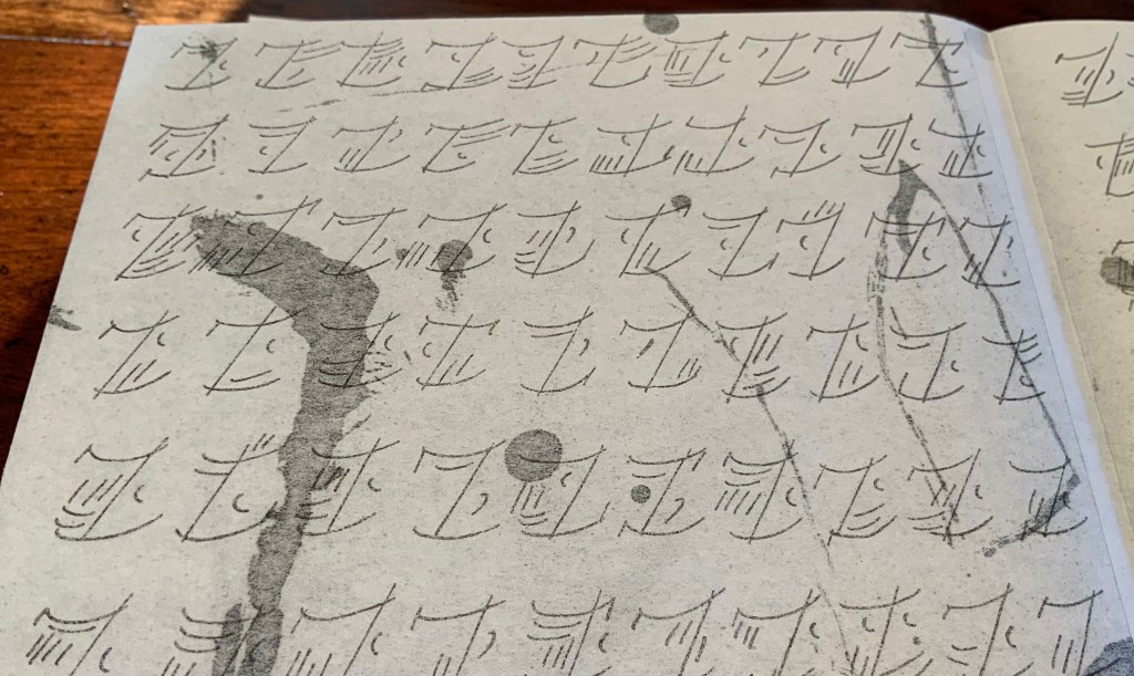
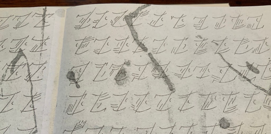
Anakatabase celebrates the alphabet as the root of its maker’s art. Indeed, it presents an entirely invented alphabet. It displays the artist’s manifesto in anakatabasien and twenty other languages. In its play with the letter, languages as well as the structural, functional and material elements of the book, this work of art gives life to Mallarmé’s cryptic pronouncement: Le livre, expansion totale de la lettre, doit d’elle tirer, directement, une mobilité et spacieux, par correspondances, instituer un jeu, on ne sait, qui confirme la fiction (“The book, total expansion of the letter, must directly depict a mobility and spaciousness that — by analogy — constructs an unknown game that confirms the fiction”).
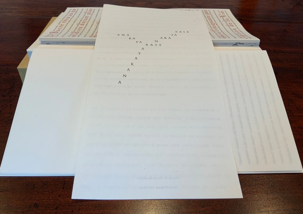
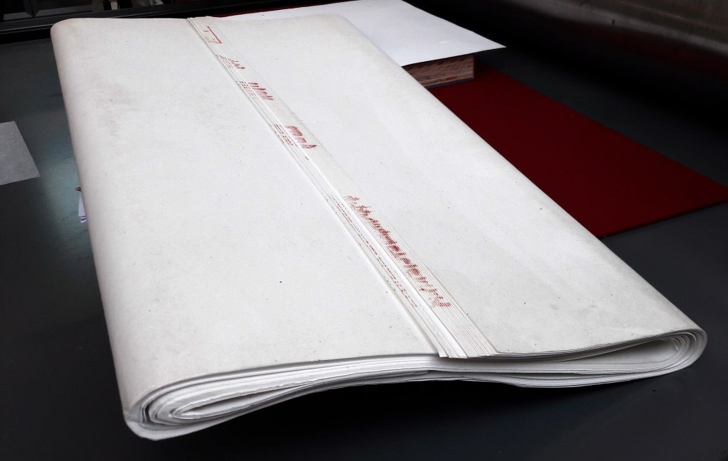
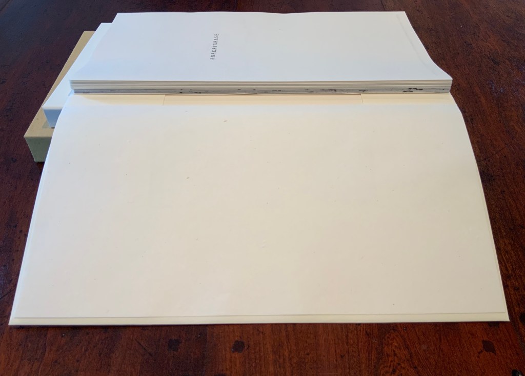
Consider first the structural, functional and material elements. If judged by its cover (or rather, covers), Anakatabase has depths, a roughness and smoothness, a stiffness and suppleness, yet harmonious in its contrasts and variety. A tightly turned-in slipcase, covered in rough papier de paille (a paper made of straw, traditionally for packaging sugar), holds a case of board. In turn, the board case — with the book’s title set vertically in Nicolas Cochin (36pt) on smoother almost parchment-like paper covering the neatly chamfered spine, front and back boards — holds a paper case. Not attached to the board case, the paper case made of Lana Pur Fil folds around a single sheet of Arches Velin 160 gsm, which rests between the paper case and the loose endpapers. The loose endpapers are handmade papier de Chine au liseré rouge (60 or 65 gsm). It is the same paper used for the nine loose single-fold folios. For the leporello making up the last “gathering” in the “book block”, the artist and engraver selected a Japanese paper more commonly used to make interior walls.
Left: supply of papier de Chine au liseré rouge. Photo: Courtesy of the artist. Right: paper case open to show of “book block” of nine loose folios and leporello. Photo: Books On Books Collection.
These multiple papers of differing weights, finish, opacity, drape or stiffness, rattle and color work together loosely yet harmoniously to cover and uncover (or dis-cover) the artist’s statement.
Like many artist’s statements, Anakatabase is also a philosophical statement. It is also as much an ode to a lifelong coming of age as typographer, printer and master of the book — even, as much, a love letter to “the language of the Sign”. As a work of book art, it lovingly enacts the letter.
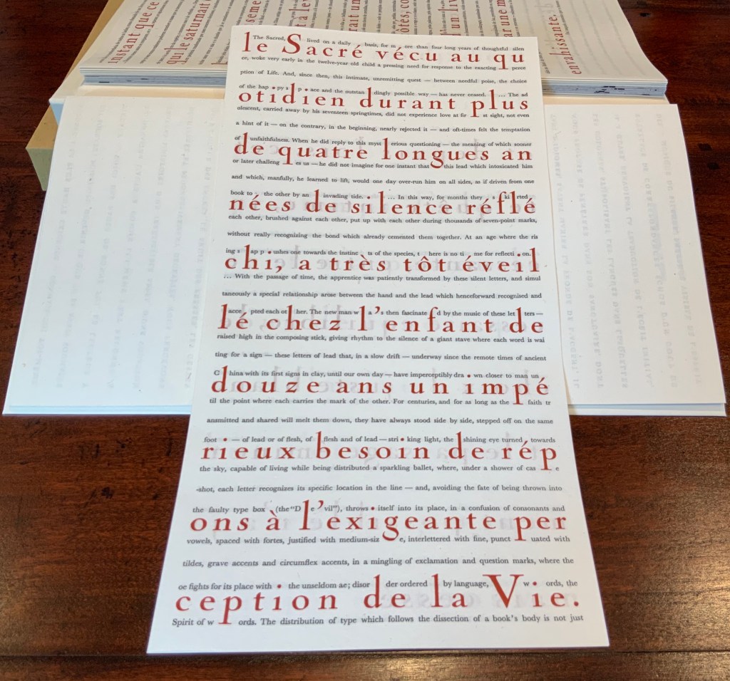
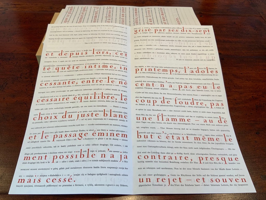
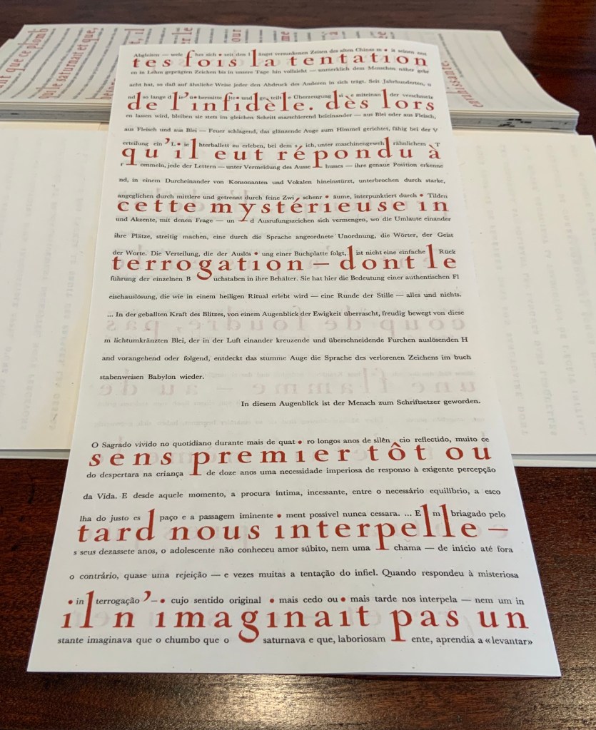
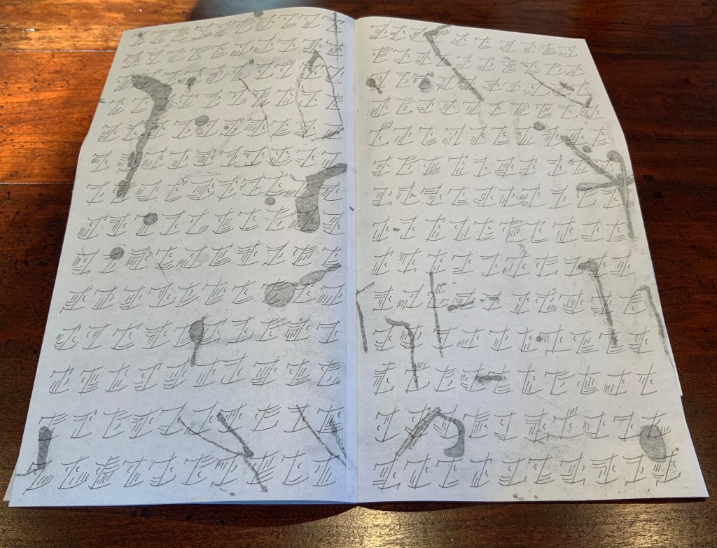
The Sacred, lived on a daily basis, for more than four long years of thoughtful silence, woke very early in the twelve-year old child a pressing need for response to the exacting perception of Life. And, since then, this intimate, unremitting quest — between needful poise, the choice of the happy space and the outstandingly possible way — has never ceased. …The adolescent, carried away by his seventeen springtime’s, did not experience love at first sight, not even a hint of it — on the contrary, in the beginning, nearly rejected it — and oft-times felt the temptation of unfaithfulness. When he did reply to this mysterious questioning — the meaning of which sooner or later challenges us — he did not imagine for one instant that this lead which intoxicated him and which, manfully, he learned to lift, would one day over-run him on all sides, as if driven from one book to the other by an invading tide. …In this way, for months they skirted each other, brushed against each other, put up with each other during thousands of seven-point marks, without really recognizing the bond which already cemented them together. At an age where the rising sap pushes one towards the instinct of the species, there is no time for reflection. … With the passage of time, the apprentice was patiently transformed by these silent letters, and simultaneously a special relationship arose between the hand and the lead which henceforward recognized and accepted each other. The new man was then fascinated by the music of these letters — raised high in the composing stick, giving rhythm to the silence of a giant stave where each word is waiting for a sign — these letters of lead that, in a slow drift — underway since the remote times of ancient China with its first signs in clay, until our own day — have imperceptibly drawn closer to man until the point where each carries the mark of the other. For centuries, and for as long as the faith transmitted and shared will melt them down, they have always stood side by side, stepped off on the same foot — of lead or flesh, flesh and of lead — striking light, the shining eye turned towards the sky, capable of living while being distributed a sparkling ballet, where, under a shower of caseshot, each letter recognizes its specific location in the line — and, avoiding the fate of being thrown into the faulty type box (the “Devil”), throws itself into its place, in a confusion of consonants and vowels, spaced with fortes, justified with medium-size, interlettered with fine, punctuated with tildes, grave accents and circumflex accents, in a mingling of exclamation and question marks, where the oe fights for its place with the unseldom ae; disorder ordered by language, words, the Spirit of words. The distribution of type which follows the dissection of as book’s body is not just the putting back into the case of each letter. Here it is stripping away of the flash, lived as sacred ritual — in towering silence — all or nothing. …Struck by lightning, the silent eye, surprised by the eternal instant, ravished by this lead festooned with light, going before or following the hand which cuts crossing, and overlapping furrows into emptiness, discovers again the language of the Sign, hitherto lost in the Babel of letters. This is the moment at which man became typographer. Trans. John Gaynard.
Spaced out across six folios, the statement’s French version appears in large display type and carmine ink. It also appears in nineteen other languages in smaller type in black ink between the lines of the French, their words broken up by the red characters’ ascenders and descenders. At the end of measures, words break without hyphens. This is “the Babel of letters” in Baskerville type. The more ancient leporello form presents the statement in the calligraphy-like anakatabasien face and language. For the reverse of the leporello, Rassineux used the technique of gravure au sucre (“sugar lift”) on her etching plates. The effect’s appearance is suminagashi-like. Underlying the characters on the front of the leporello, those hand-drawn elements on the reverse side evoke the strokes and marks that precede the anakatabasien characters or perhaps all letters.
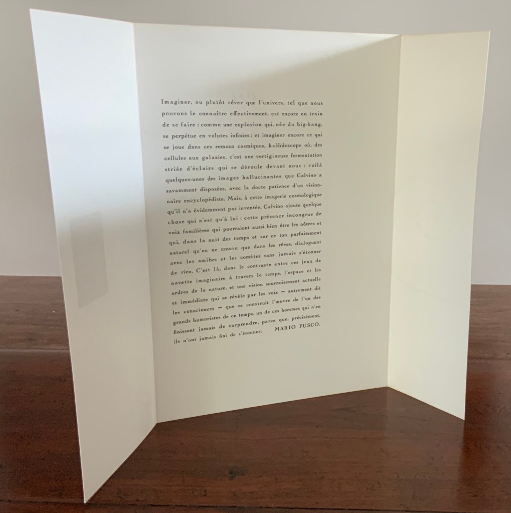
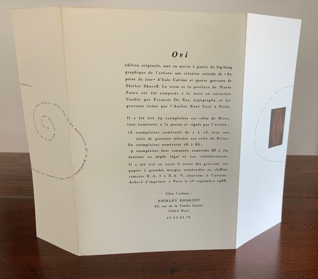
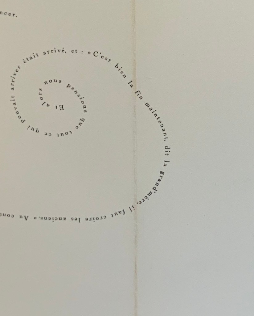
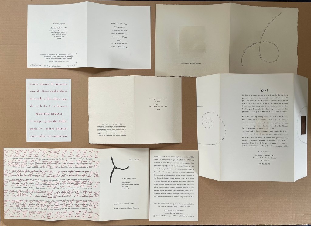
The artist and engraver (his wife and co-founder of Éditions Anakatabase, Martine Rassineux) kindly provided much-appreciated ephemera for the Books On Books Collection. In addition to the 1991 announcement of Anakatabase, they include items that show a characteristic of Da Ros’s craft that is otherwise hidden away in the linearity of Anakatabase — the magic he performs with the “furniture” of letterpress typesetting.
Photos: Books On Books Collection. Shown with permission of the artist.
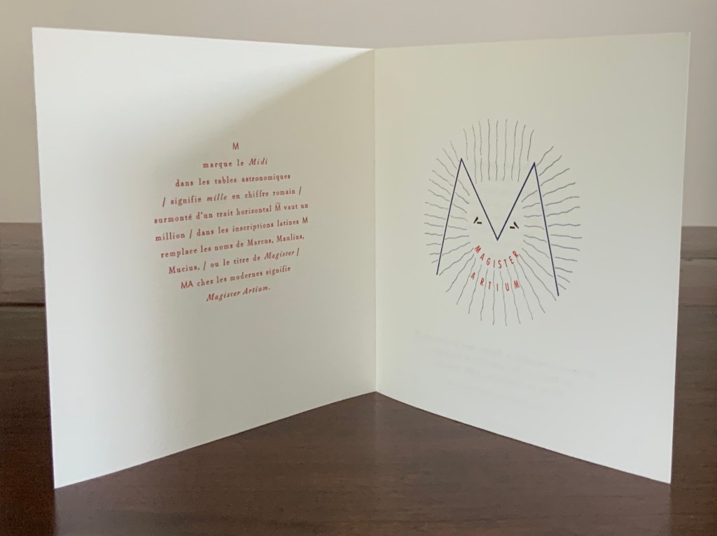
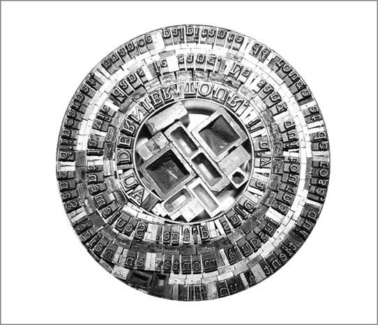
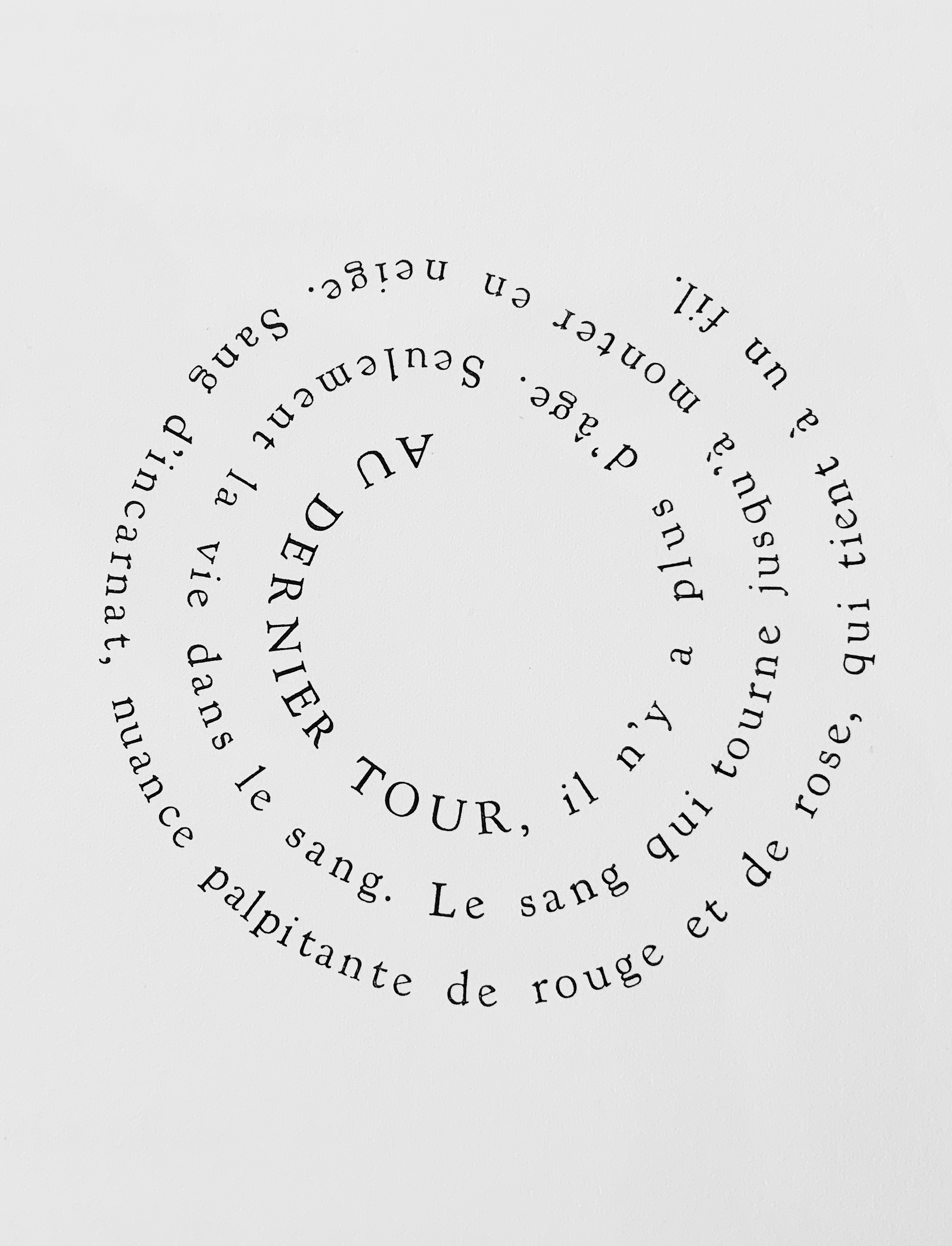
The outward-spiralling sentence in the announcement above of Ovi (1988) by Shirley Sharoff exemplifies this legerdemain, as does the open Christmas card celebrating the designation Magister Artium awarded to François Da Ros in 1998. Another example of the mastery of furniture behind the scenes can be seen in the following photo sent by Martine Rassineux of type prepared for a page in Ilinx, also in the Books On Books Collection.
For the Books On Books Collection, Anakatabase is at once a work of fine art and an unusual fusion of the collection’s themes of interest in the alphabet, the multilingual, typography, the structural and material elements of the book, and aesthetic enquiry into the very nature of the book.
François Da Ros is third in the second row from the right, in a light jacket and tie. Photo: Courtesy and permission of the artist.