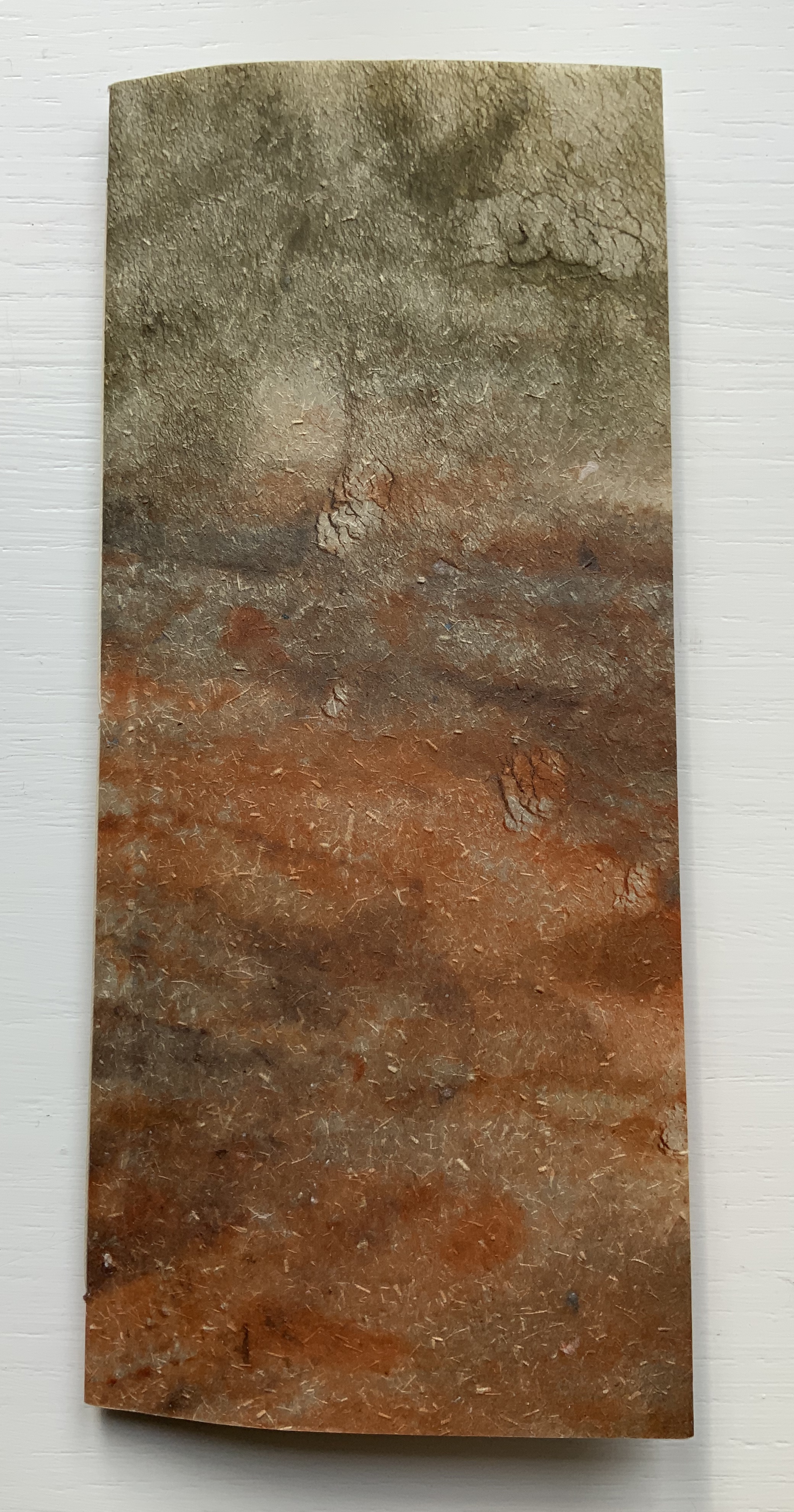
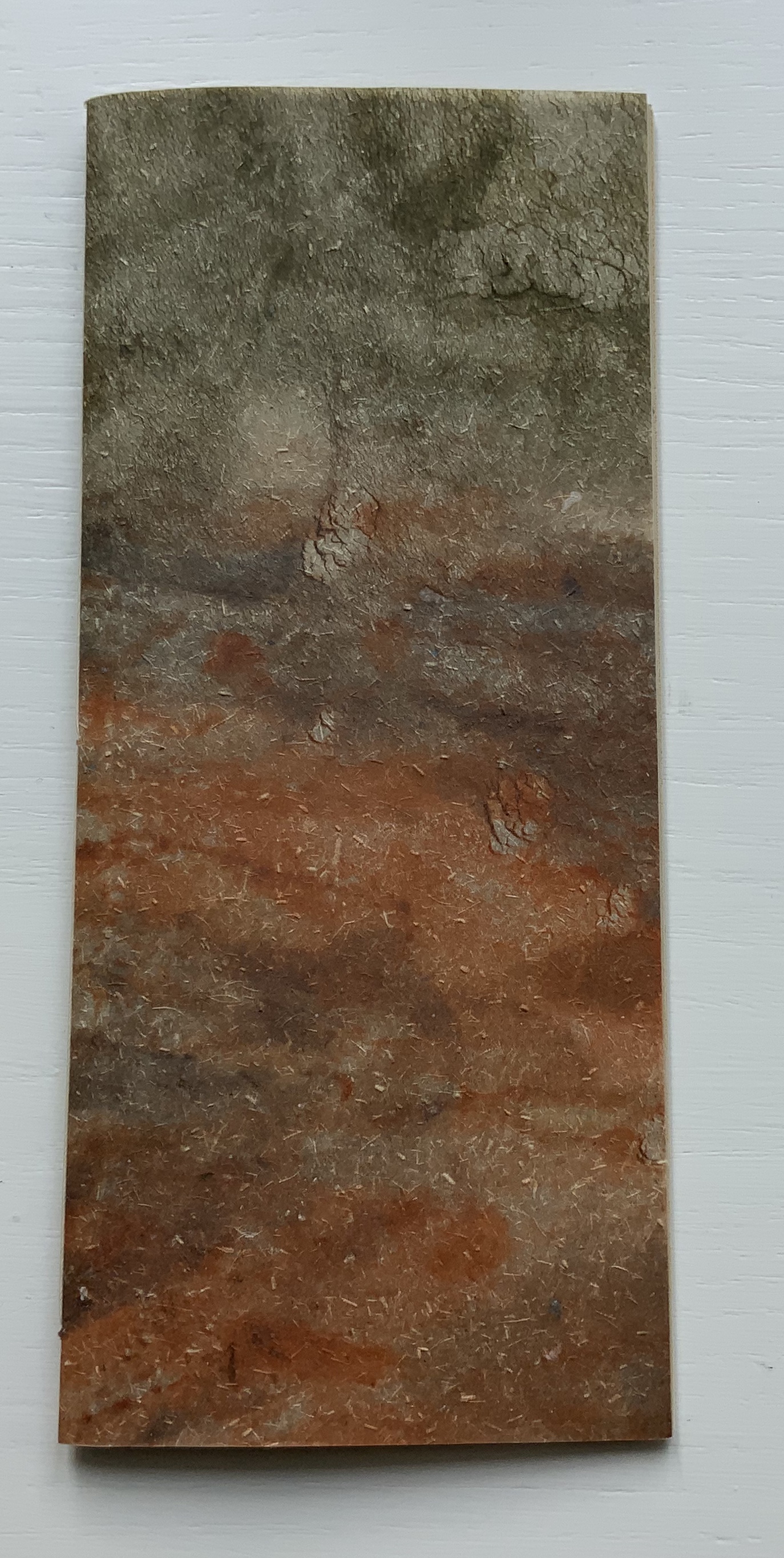
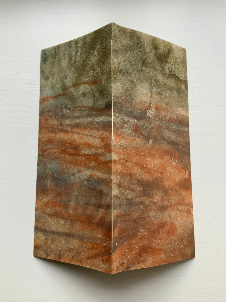
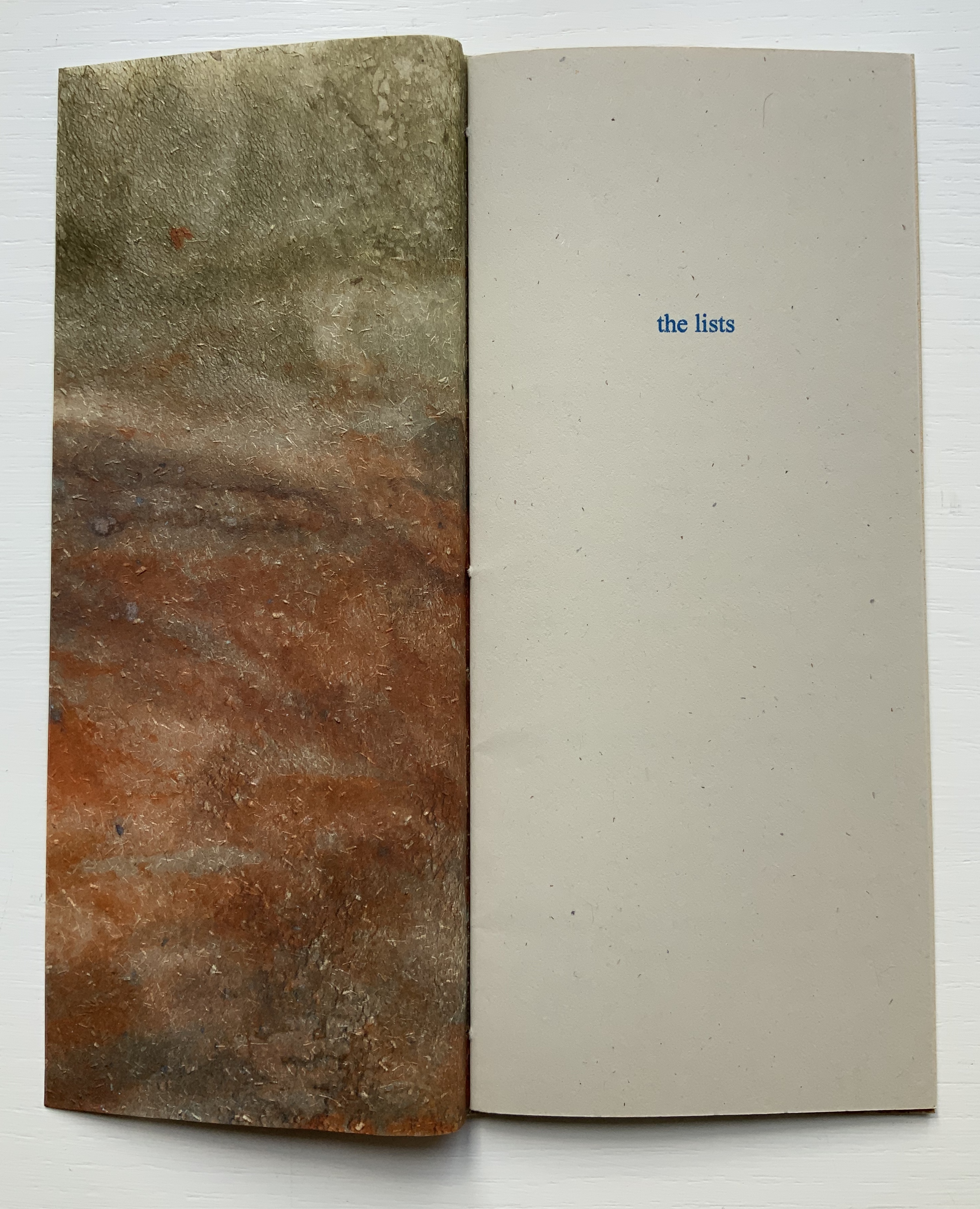
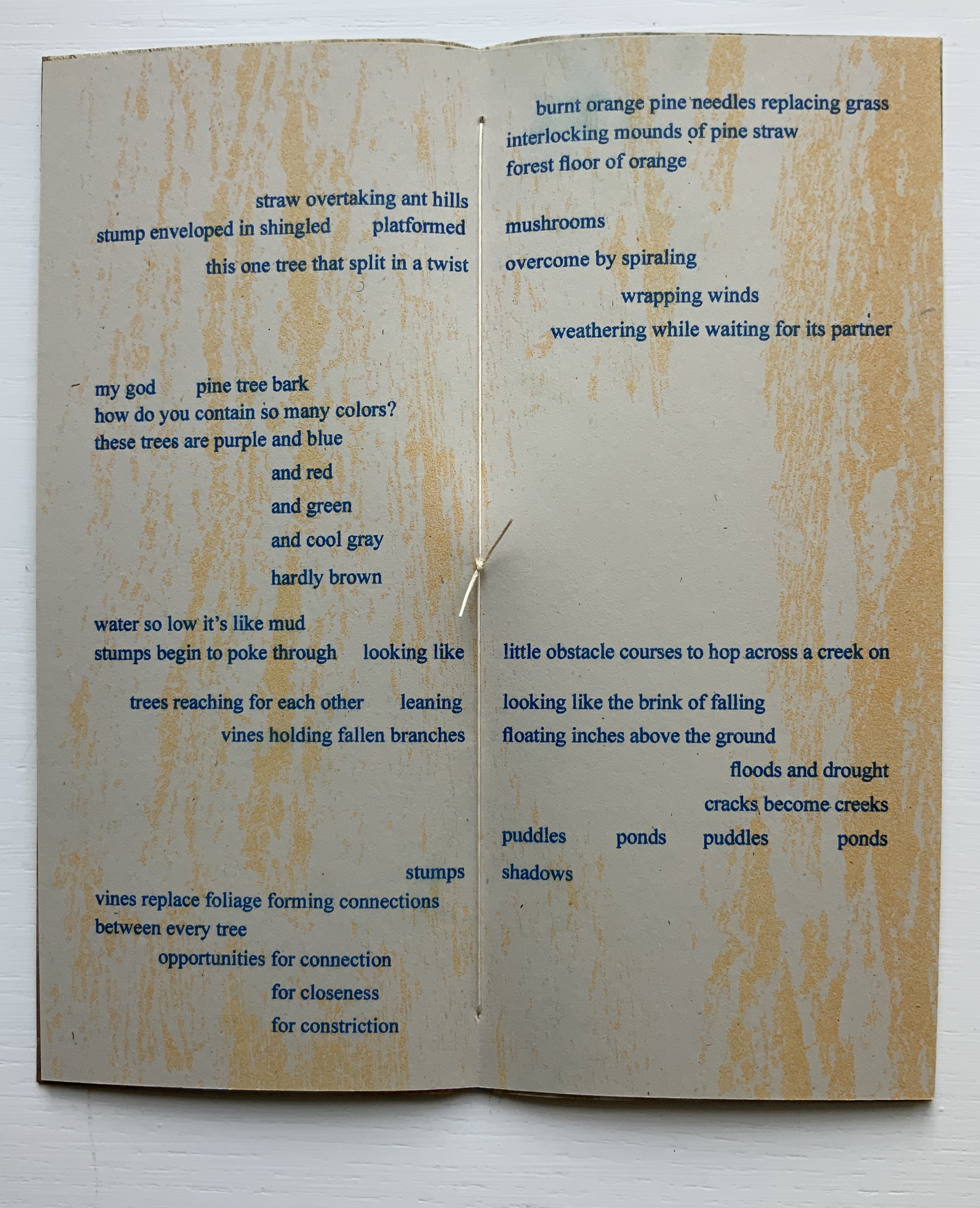
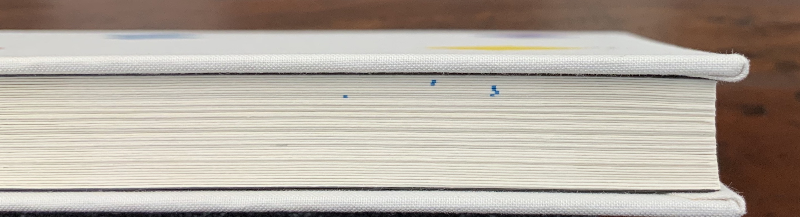
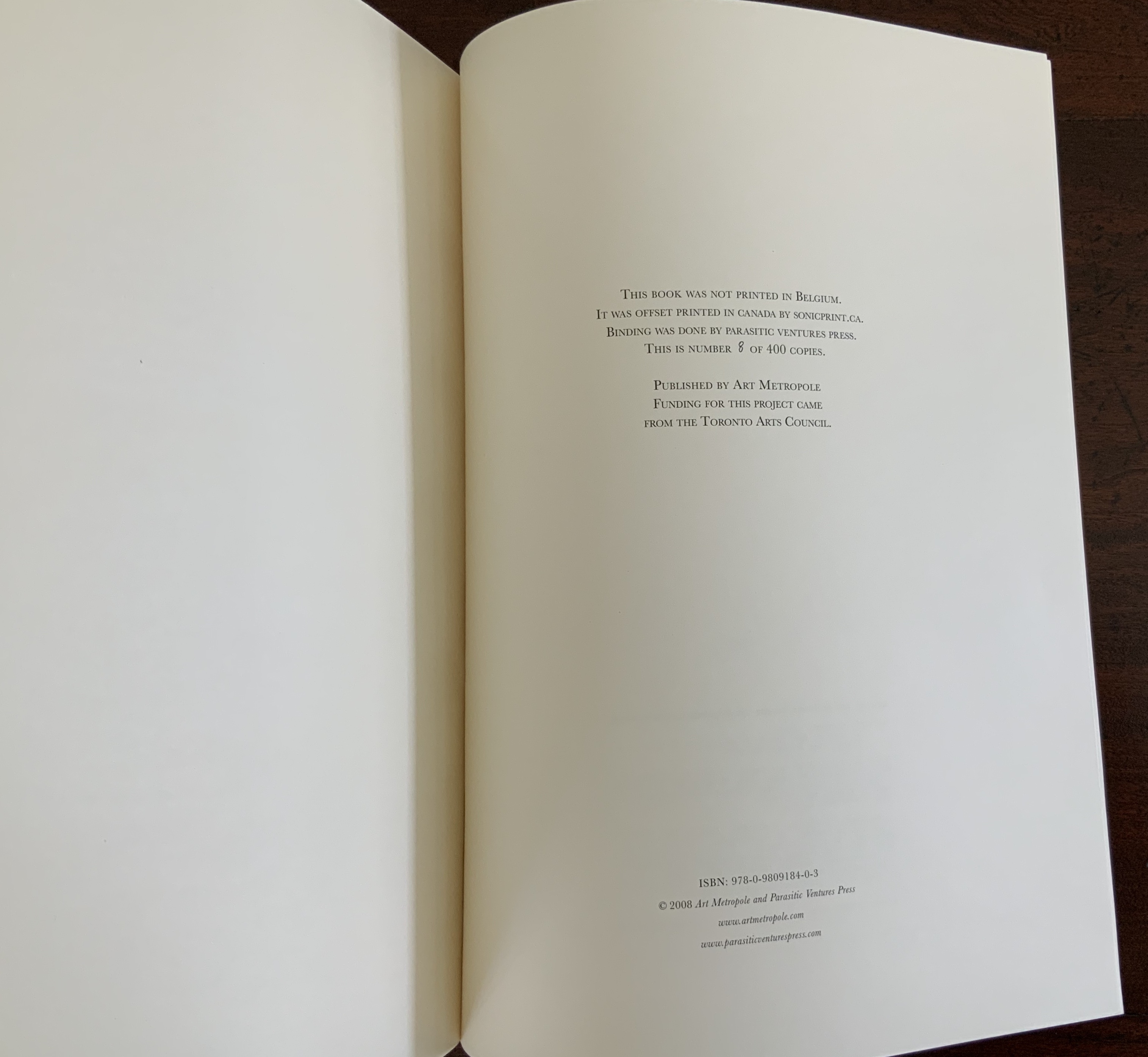
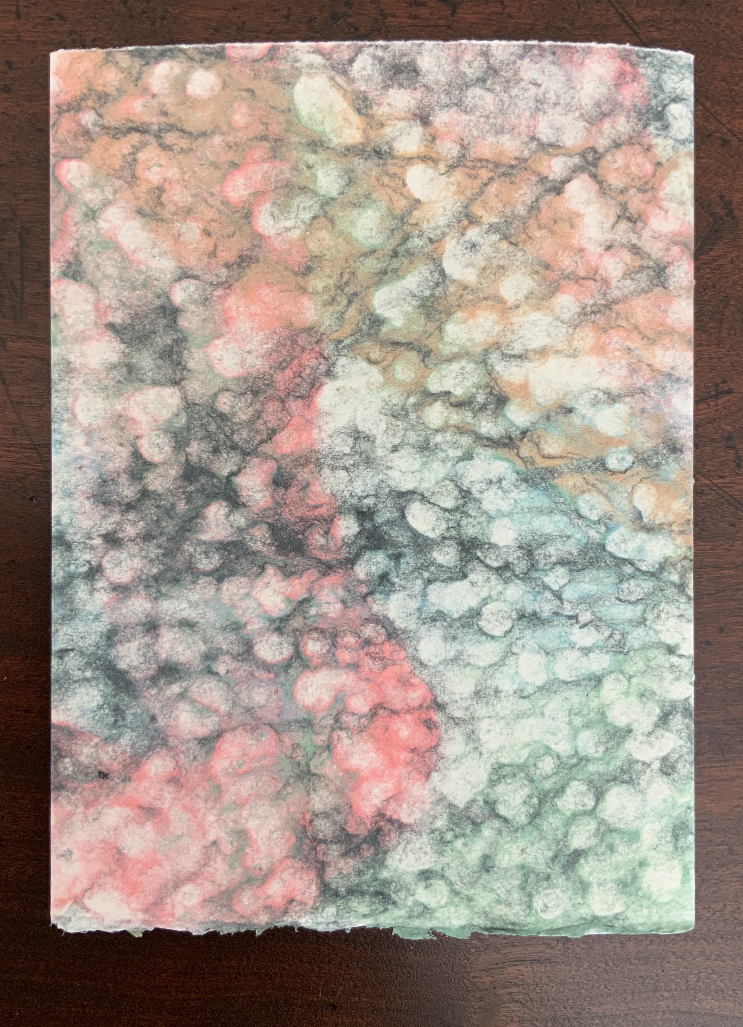
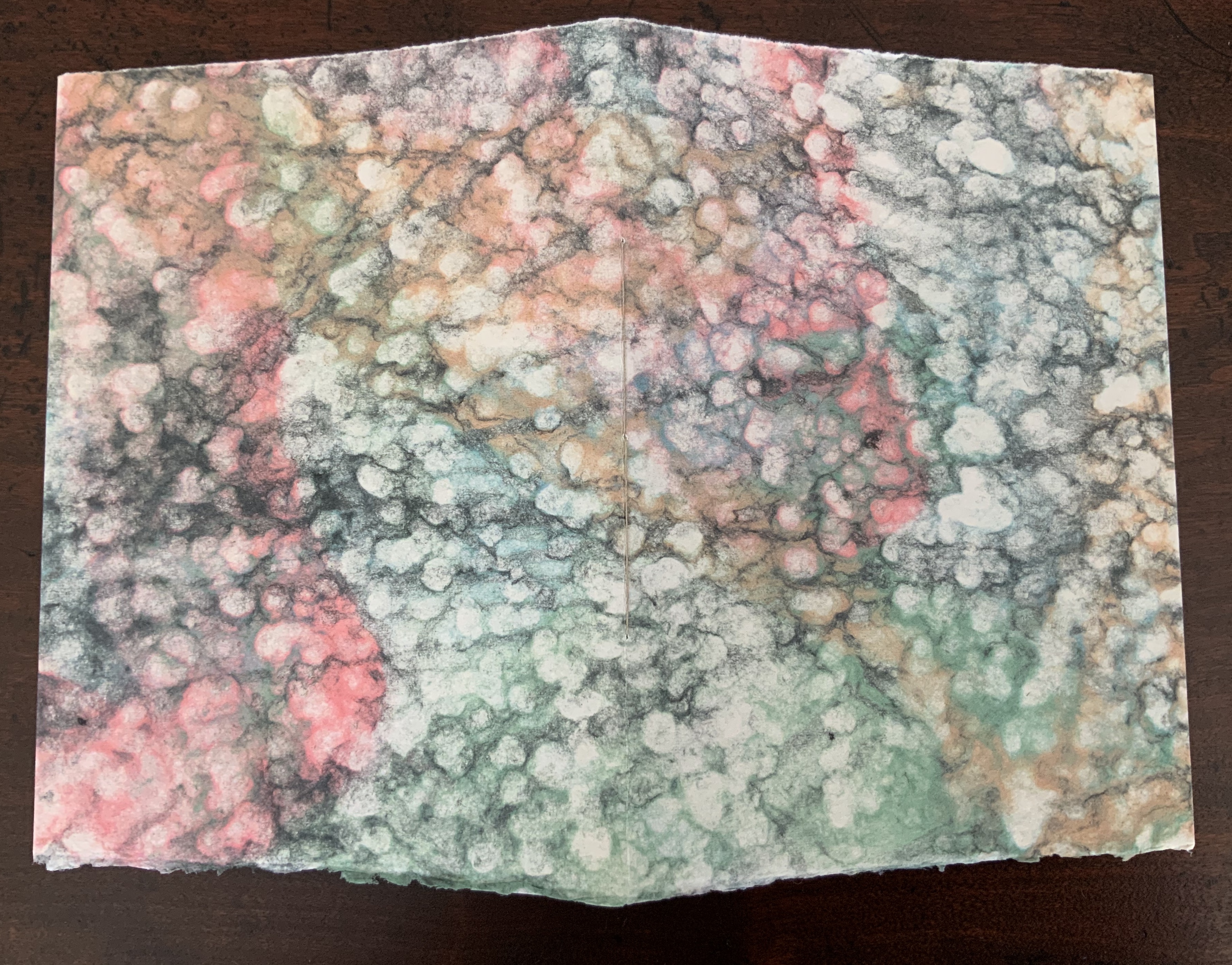
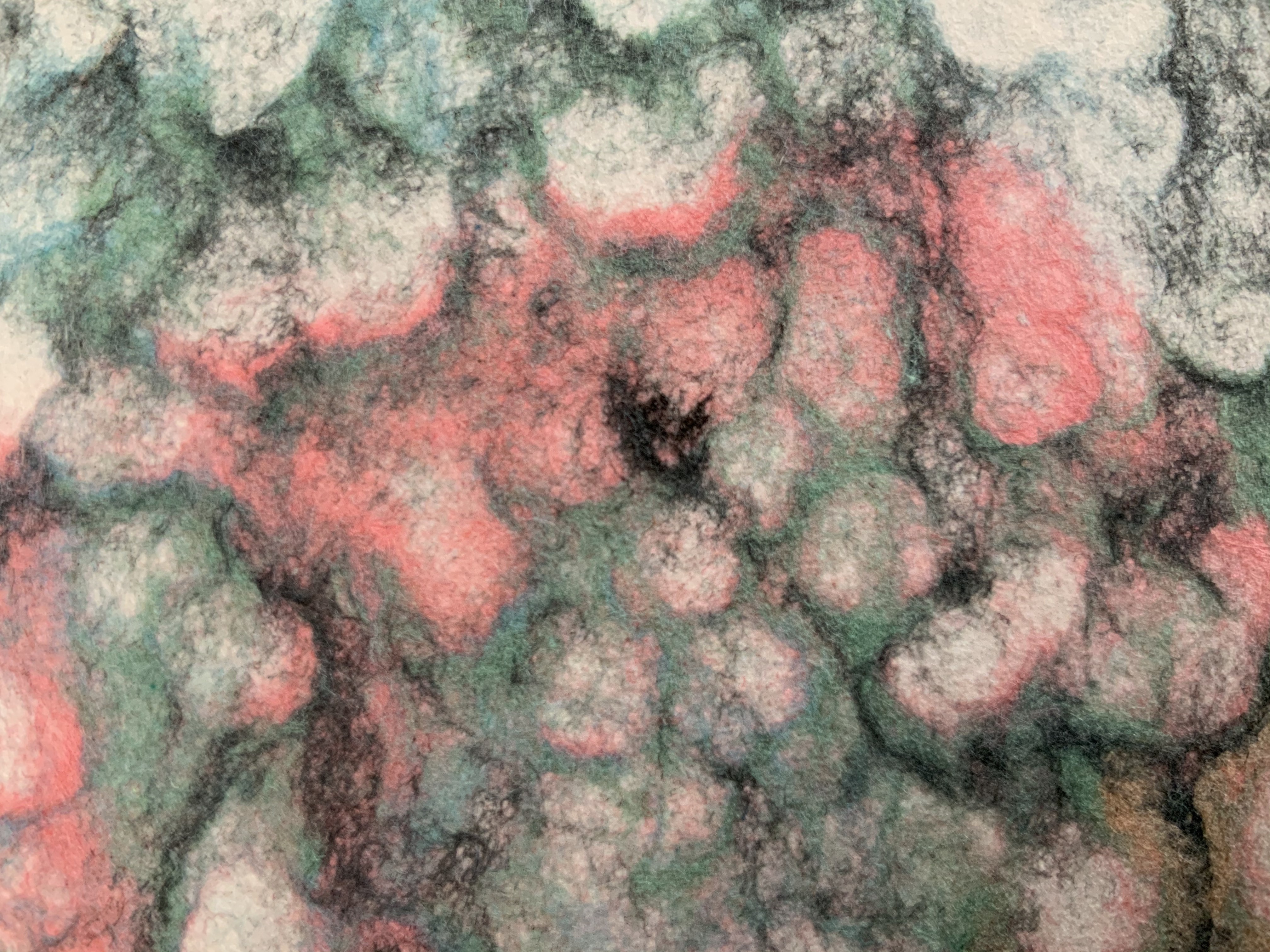
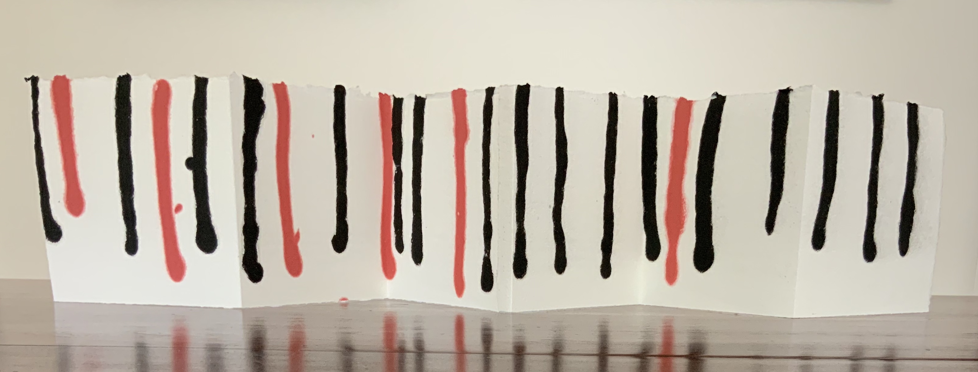
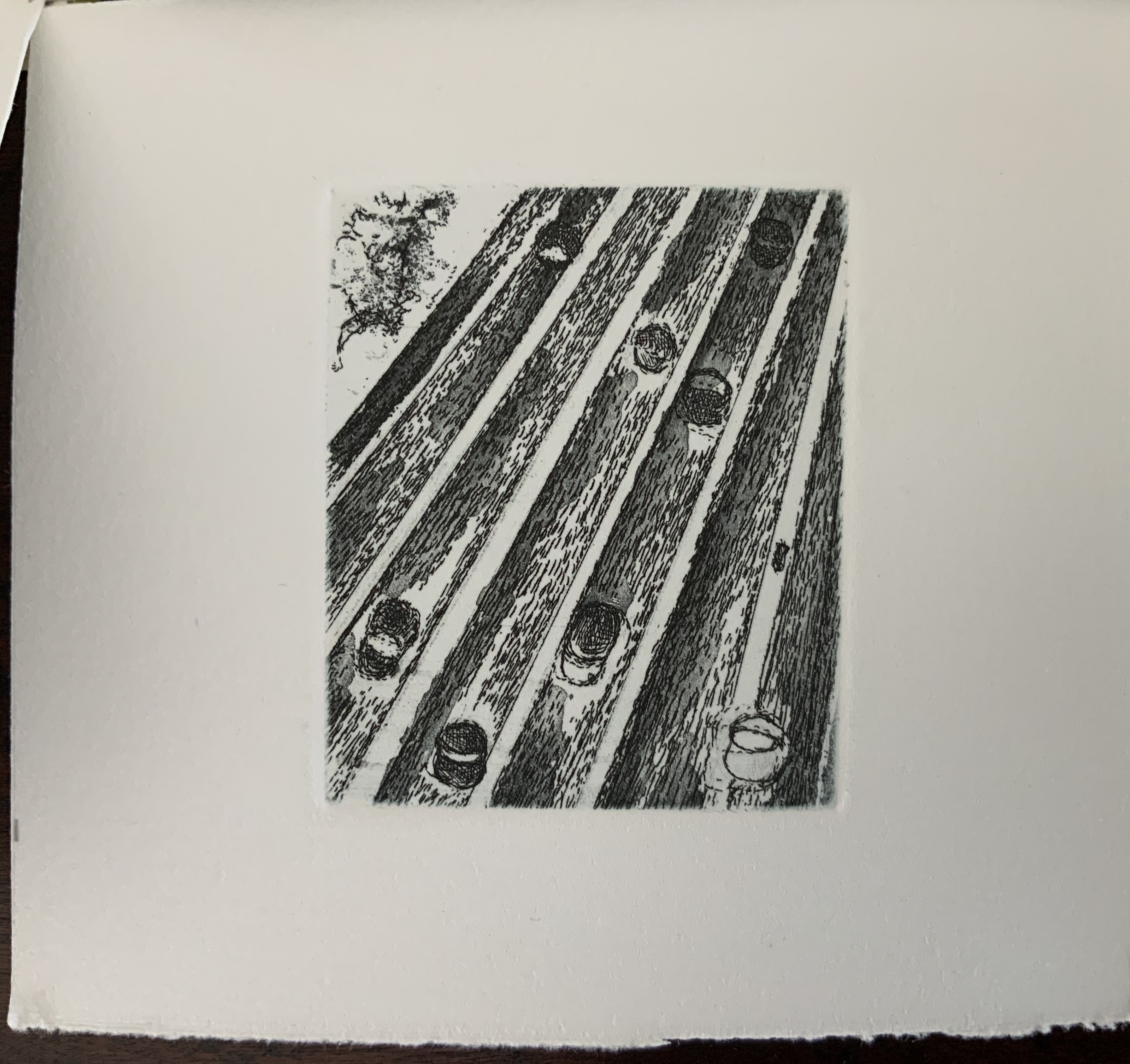
Chapbook, handmade paper covers, risograph printed on French Paper. H180 x W78 mm, 16 unnumbered pages. Edition of 200, of which this is #8. Acquired from the artist, 20 August 2020.
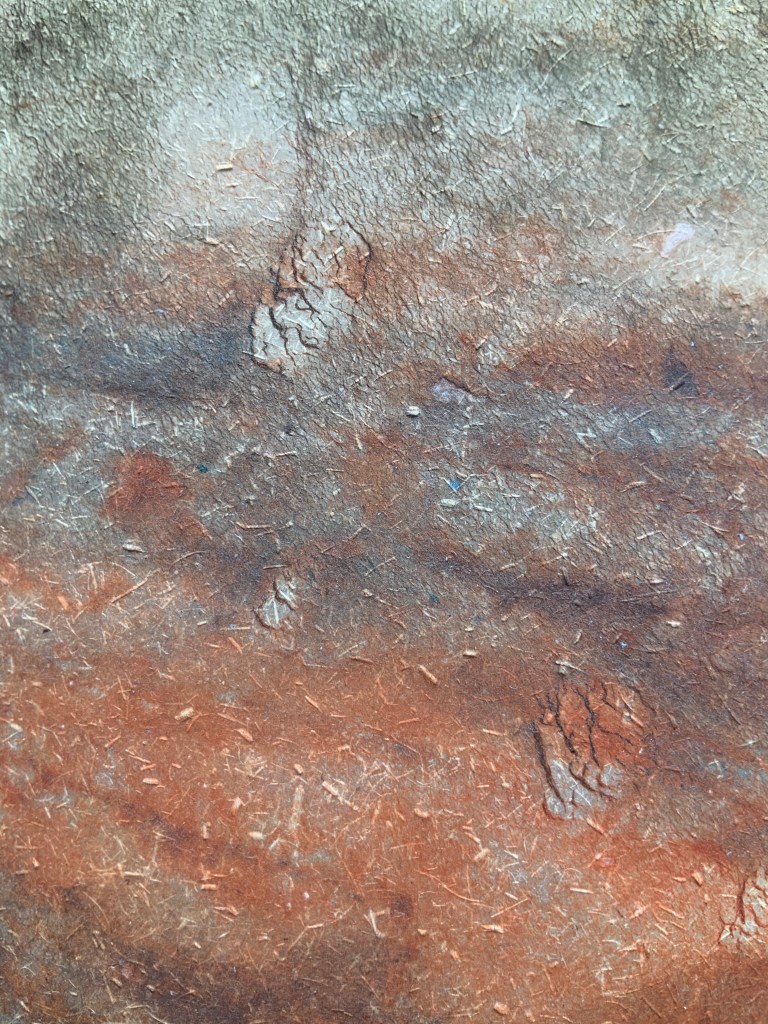
Created as a handout for an exhibition, this small chapbook delivers a powerful haptic effect with its pulp-painted handmade paper cover and risograph printing on French paper. The cover feels like bark, the paper like dry leaves. The tree-branch layout of lines echoes the sensation, and the content recalls “Silent Poem” by Robert Francis, which itself begs for a book artist’s interpretation.
This work of pulp painting that sits so well with that of Pat Gentenaar-Torley and Claire Van Vliet deploying the same technique came into the collection because of Welch’s contribution below to the tenth Artists’ Book Cornucopia, organized by Alicia Bailey.
Erratic Obsession (2019)
Erratic Obsession(2019)
Maria Welch
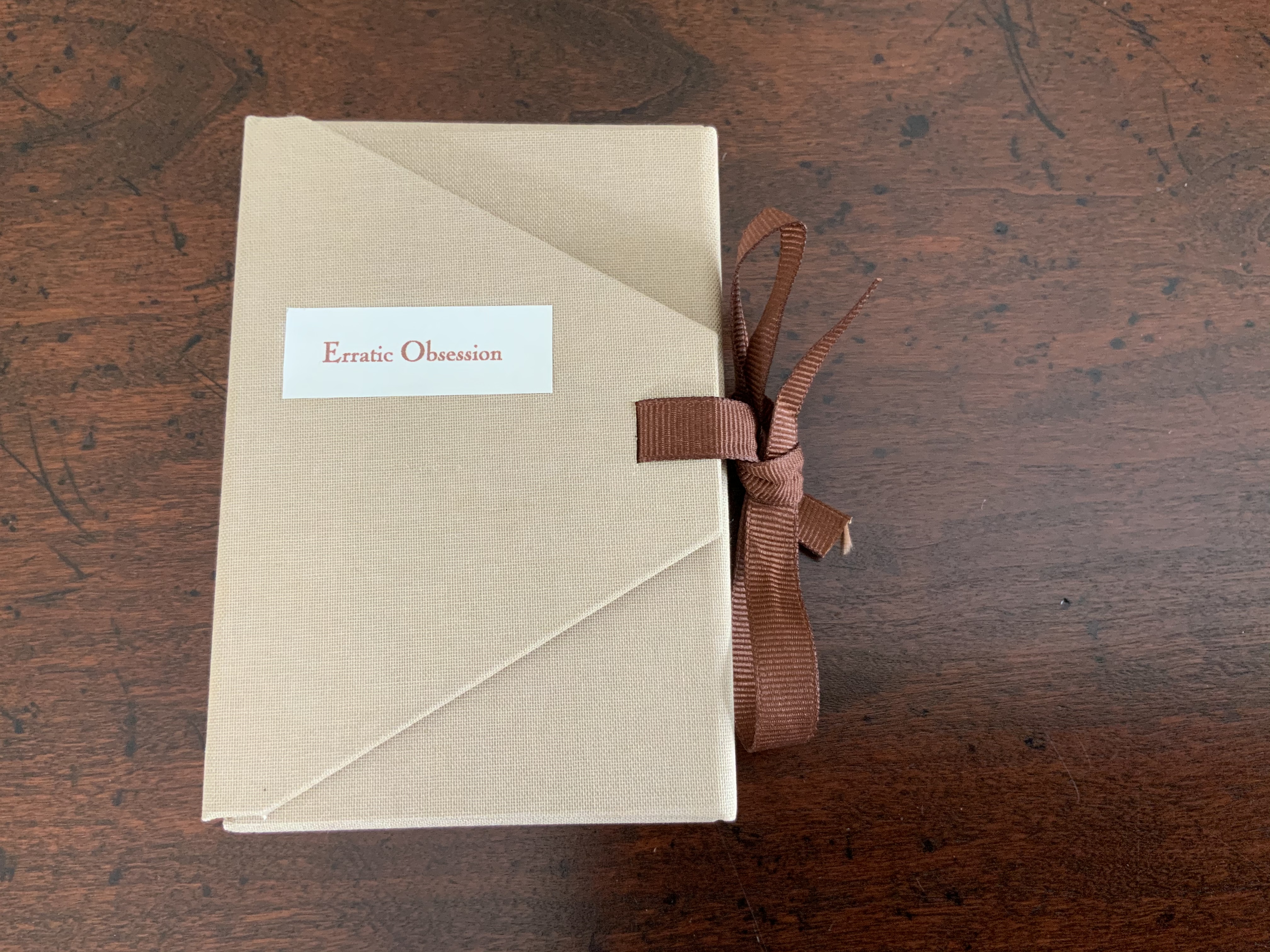
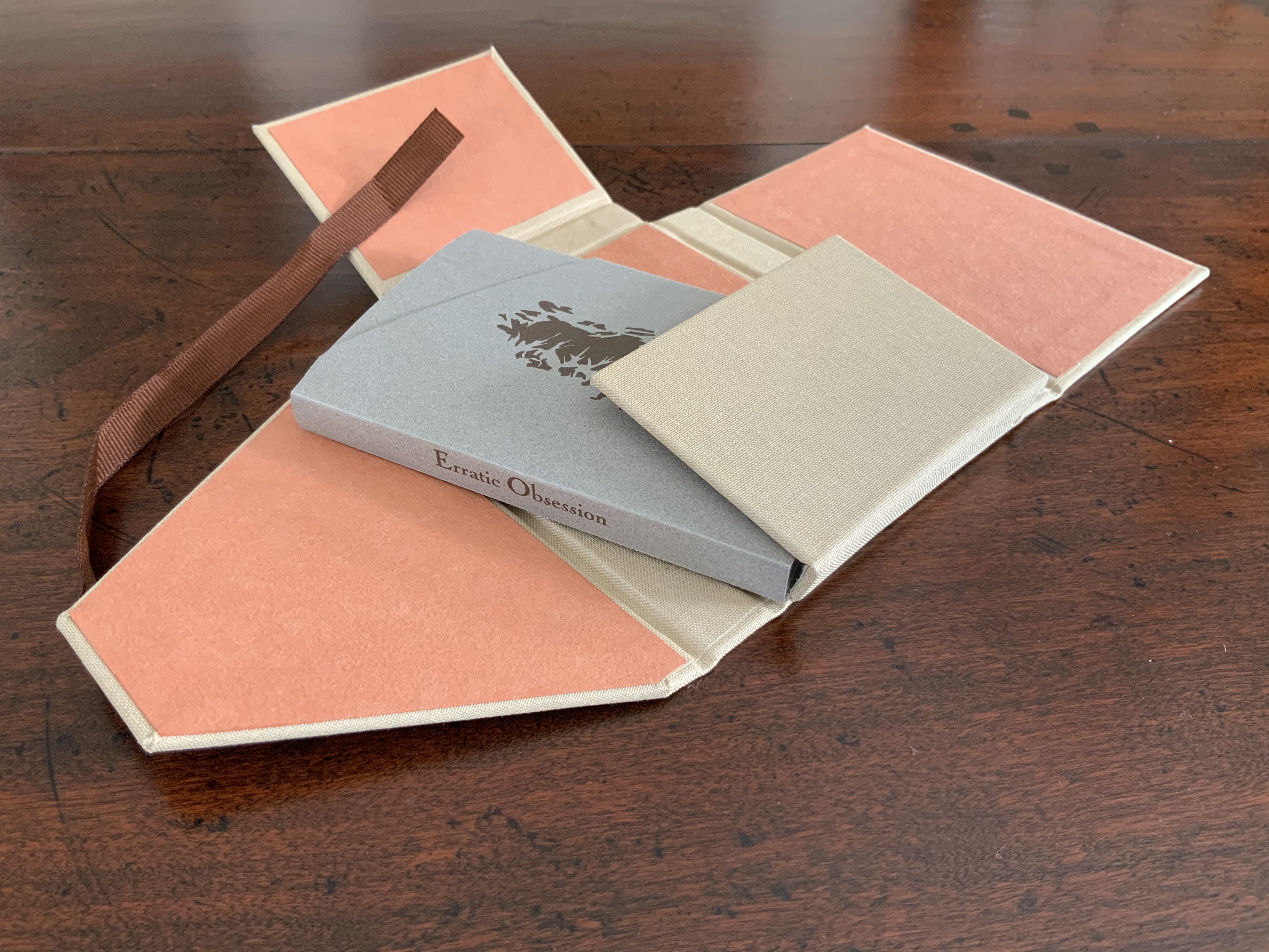
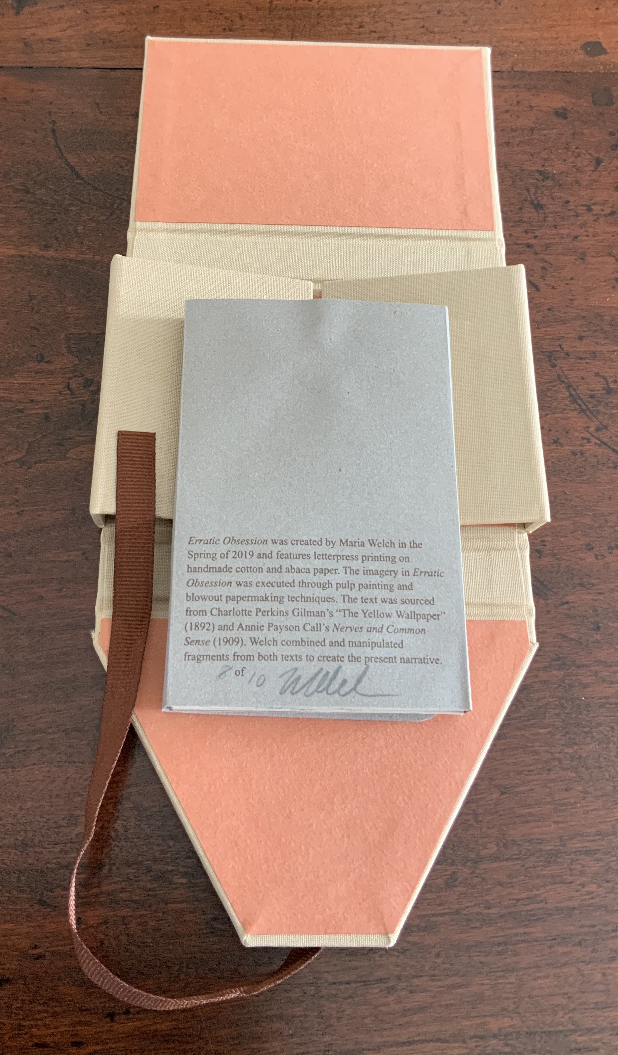
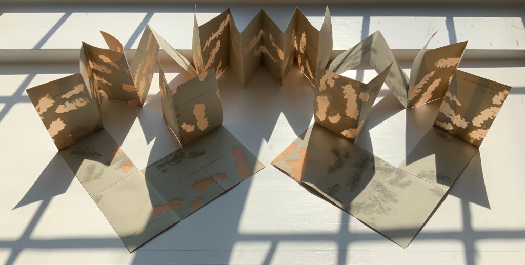
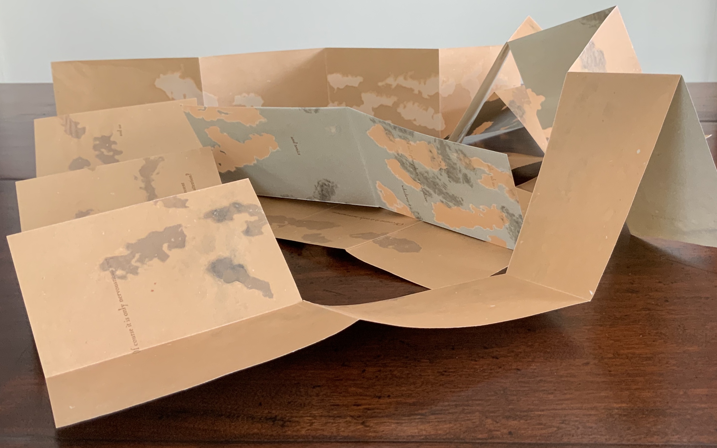
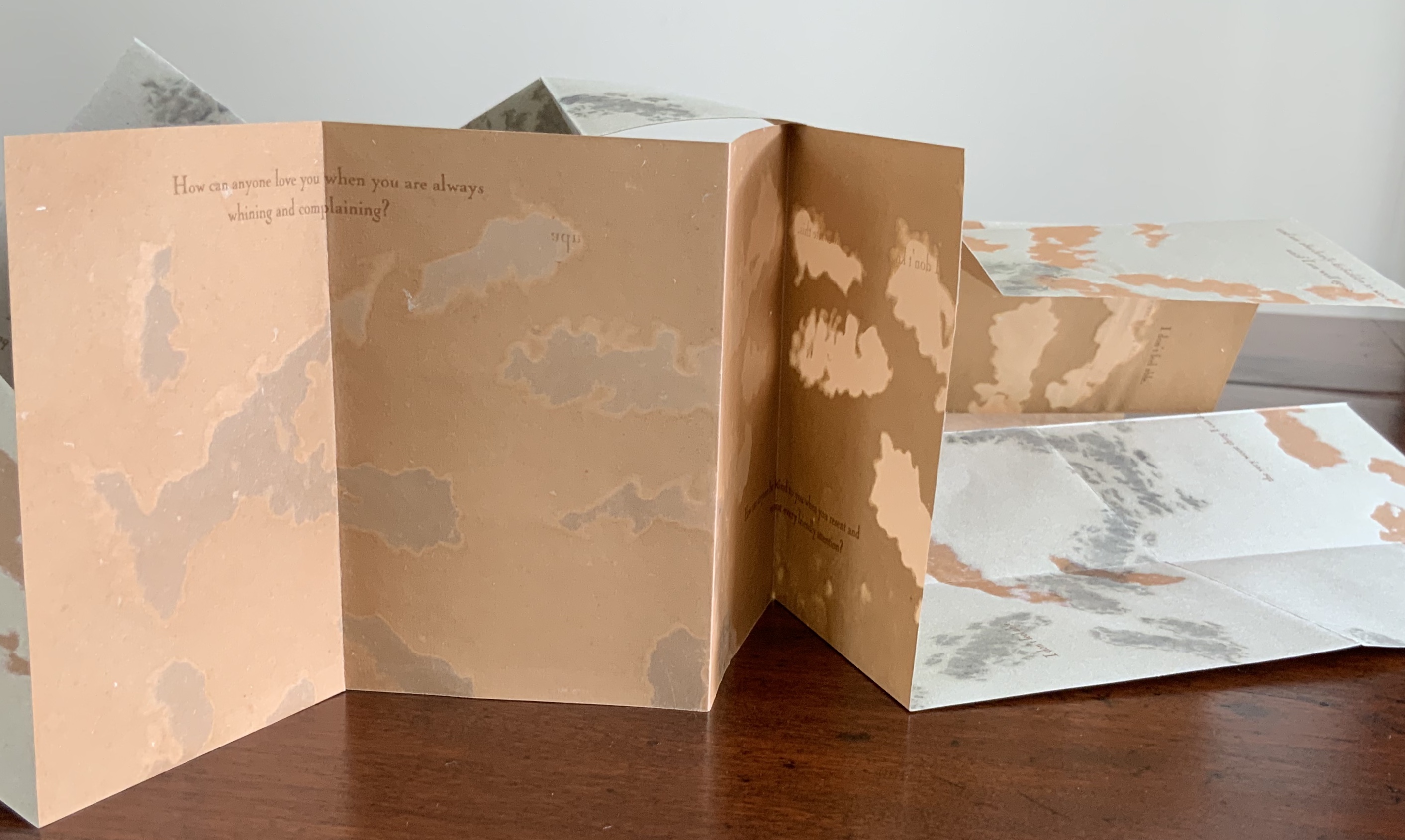
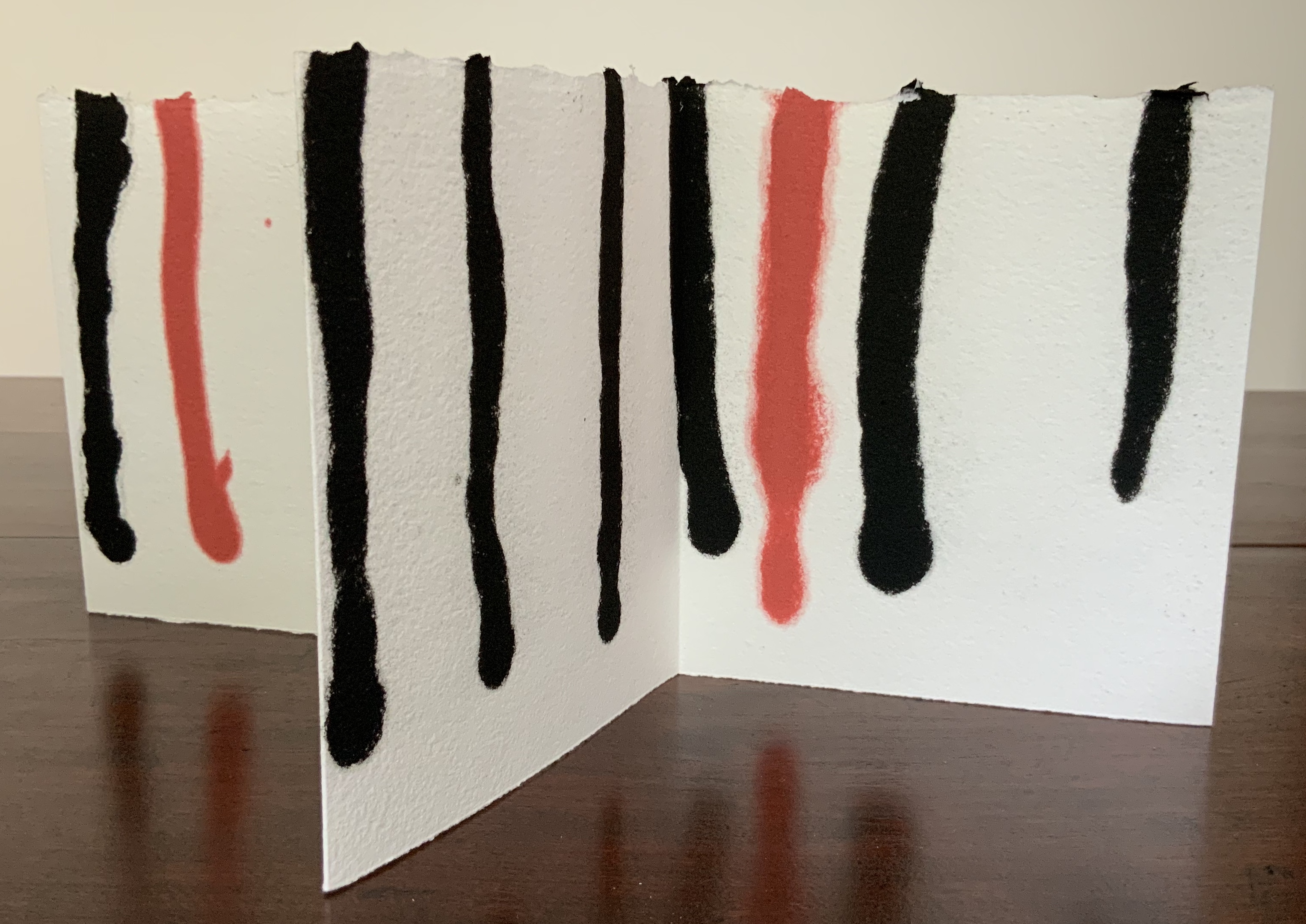
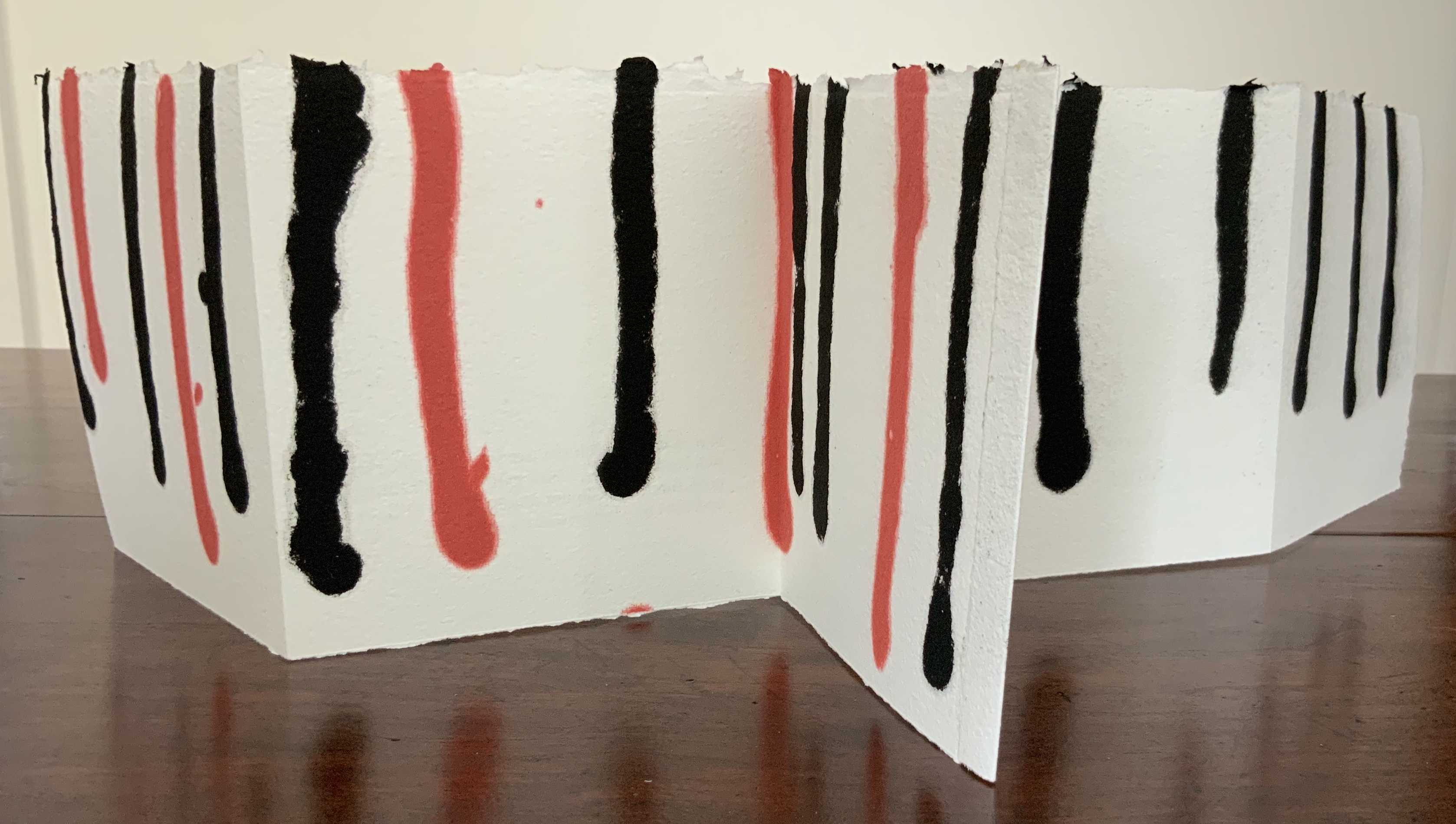
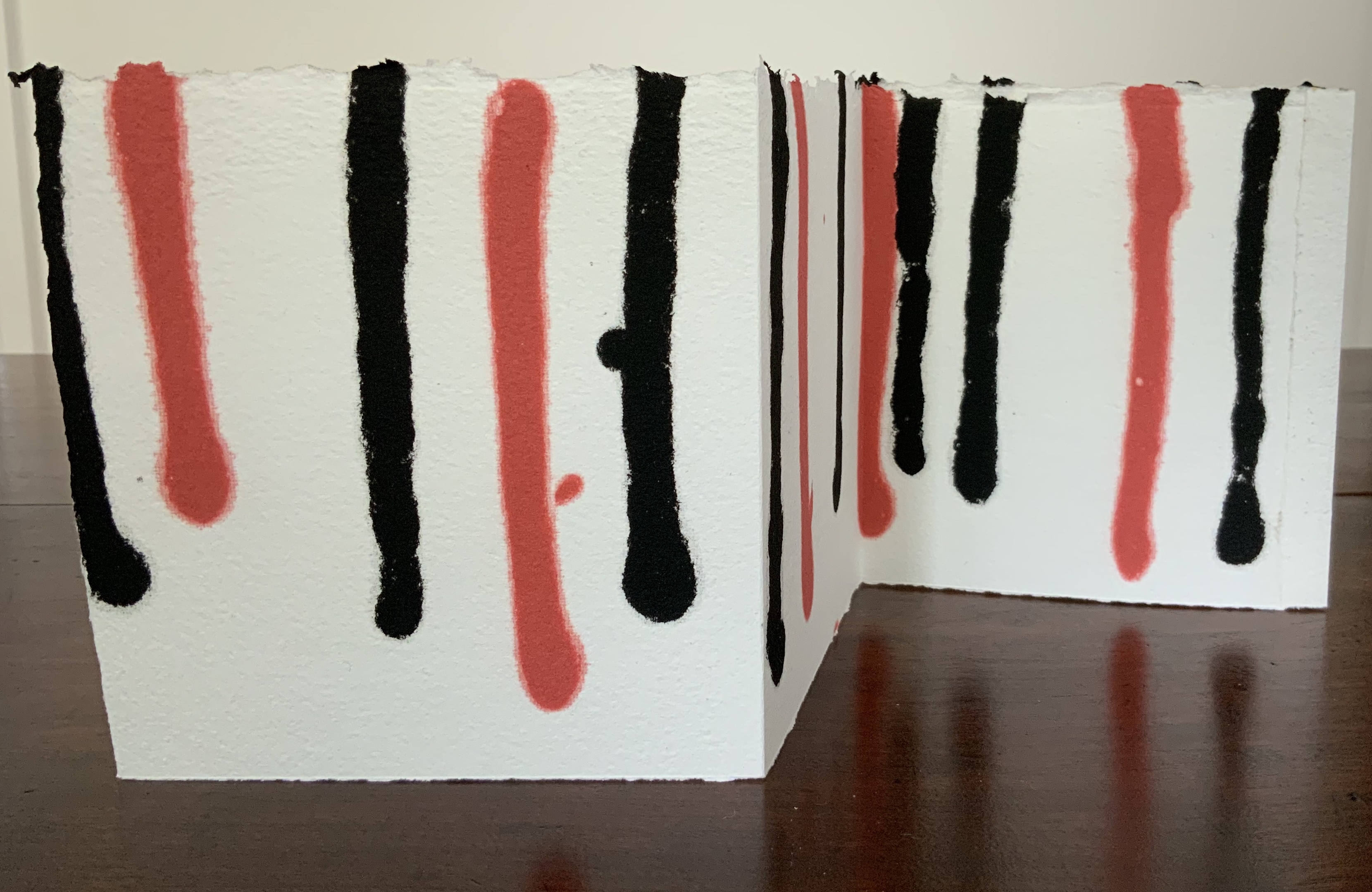
Single sheet cut in meander fold. H106 x W 71 mm (closed), H424 x W568 (open). Wrapped in sleeve with slot-and-tab closure, housed in four-flap linen box with ribbon tie. Edition of 10, of which this is #8. Acquired from the artist, 20 August 2020.
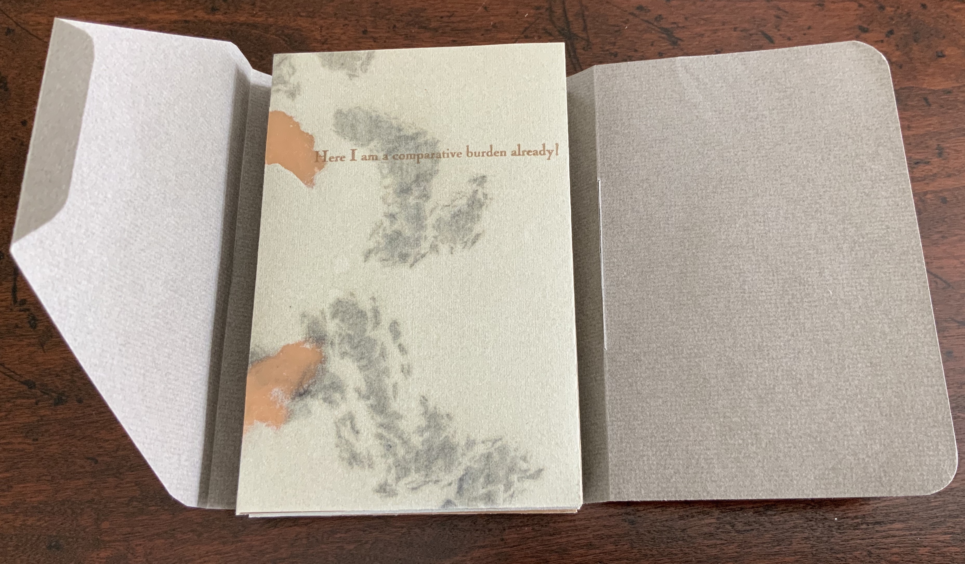
Erratic Obsession speaks to several obsessions in the Books On Books Collection. The first is one with the short story “The Yellow Wallpaper” (1892) by Charlotte Perkins Gilman (Stetson), an obsession provoked by book art from Harriet Bart and Caroline Penn (and teaching a class in Philadelphia on American fiction). The text in Erratic Obsession comes in part from the Gilman short story about a woman driven mad by social and marital pressures, and in part from Annie Payson Call’s Nerves and Commonsense (1909). The latter is a collection of Call’s self-help articles in the Ladies’ Home Journal and runs contrary to the subversive early feminism of Gilman’s story.
What Maria Welch has done with a single piece of paper speaks to a second obsession: the fusion of structure and content.
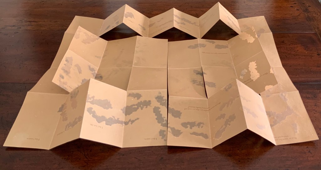
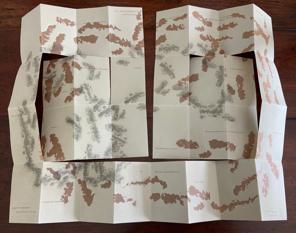
Unfolding this spiral-cut, single-sheet meander-fold booklet feels like pulling strips of wallpaper from the wall, as the main character does in “The Yellow Wallpaper”. By printing on both sides of the single sheet, Welch has doubled down on the structure. By going dark on one side and light on the other, she has tripled down on it. All of these structural choices echo the oxymoronic face-off of the title — the erratic vs the obsession — which in turn echoes the themes of Gilman’s story: a wife’s freedom vs a husband’s control, the individual’s mind and self vs society’s expected behavior. Welch’s structural tensions are also responding to the tension between Gilman’s and Call’s perspectives.
Interesting that the artist provides instructions on how the work should be displayed. Preferably in the round. Preferably that folds 1 and 31 (the first and last) stand upright, that folds 2-6 and 26-30 lay flat, that folds 7-9 and 23-25 stand upright, that folds 10-12 and 20-22 create mountain peaks, and that folds 13-19 form the central upright accordion. But the work displays equally well in an erratic spill. Again, a fusion of structure and content.
In its techniques of pulp painting, blow-out papermaking, kirigami (paper cutting) and origami (paper folding), Erratic Obsession rings a third obsession in the collection: the fusion of technique with content. With pulp painting and blow-out papermaking, the image or patterns are intrinsic to the paper, just as a character might think its personality and will are intrinsic to its self. With paper folding and cutting, the techniques are external to the paper, just as societal and marital pressures bend and sever the character’s self. Of course, Call would likely have it the other way round: socialization and commonsense provide the wholesome; willful personality cuts and bends it. No wonder: another of Call’s books was How to Live Quietly (1918).
Metal, wood, mirror, resin, plexiglass + drawing. 95x180x150 cm (table) 50×70 cm (drawing). Photos: Courtesy of Estudio Jorge Méndez Blake.
Silvia Ortiz, founder of the gallery Travesía Cuatro in Madrid, writes
In this exhibition entitled Biblioteca Mallarmé, the artist establishes once again the link between his artwork, literature and architecture. On this occasion Jorge Méndez Blake reformulates the concept of library, this time to a library-shipwreck, a library stranded on the coast, as a wreck. 4 November 2011 – 1is 6 February 2012. Accessed 4 September 2020.
Photo: Courtesy of Estudio Jorge Méndez Blake.
Photo: Courtesy of Estudio Jorge Méndez Blake.
All of the works making up the exhibition pay homage to Un Coup de Dés. In keeping with the sub-genre of the homage to an homage, though, this work eponymous with the exhibition draws on Marcel Broodthaers’ homage to the same poem. With its colorfulness, it might also be drawing on Mario Diacono’s JCT 1, a MeTrica n’ABOOlira (1968), Ian Wallace’s Image/Text (1979) or Klaus Detjen’s Ein Würfelwurf niemals tilgt den Zufall (1995). With its three-dimensionality, also perhaps on Geraldo de Barros’s Jogos de Dados(1980s), Albert Dupont’s Désir-Hasard-Dés (2000), or Kathy Bruce’s Navigating the Abyss (2008). Probably not, but this gathering of artists attests to how much Mallarmé’s poem has permeated the genre of book art and its permutations.
Méndez Blake’s originality here arrives in the juxtaposition of the poem’s shipwreck in the form of resinous burnt detritus on the table and flotsam in the print on the wall with the mixed-media blocks on the table recalling books on library display as well as Broodthaers’ rectangular black redactions in his homage or appropriation. Appropriation is very much a theme in this work and the exhibition.
Exhibition view, Travesía Cuatro, Madrid, Spain.
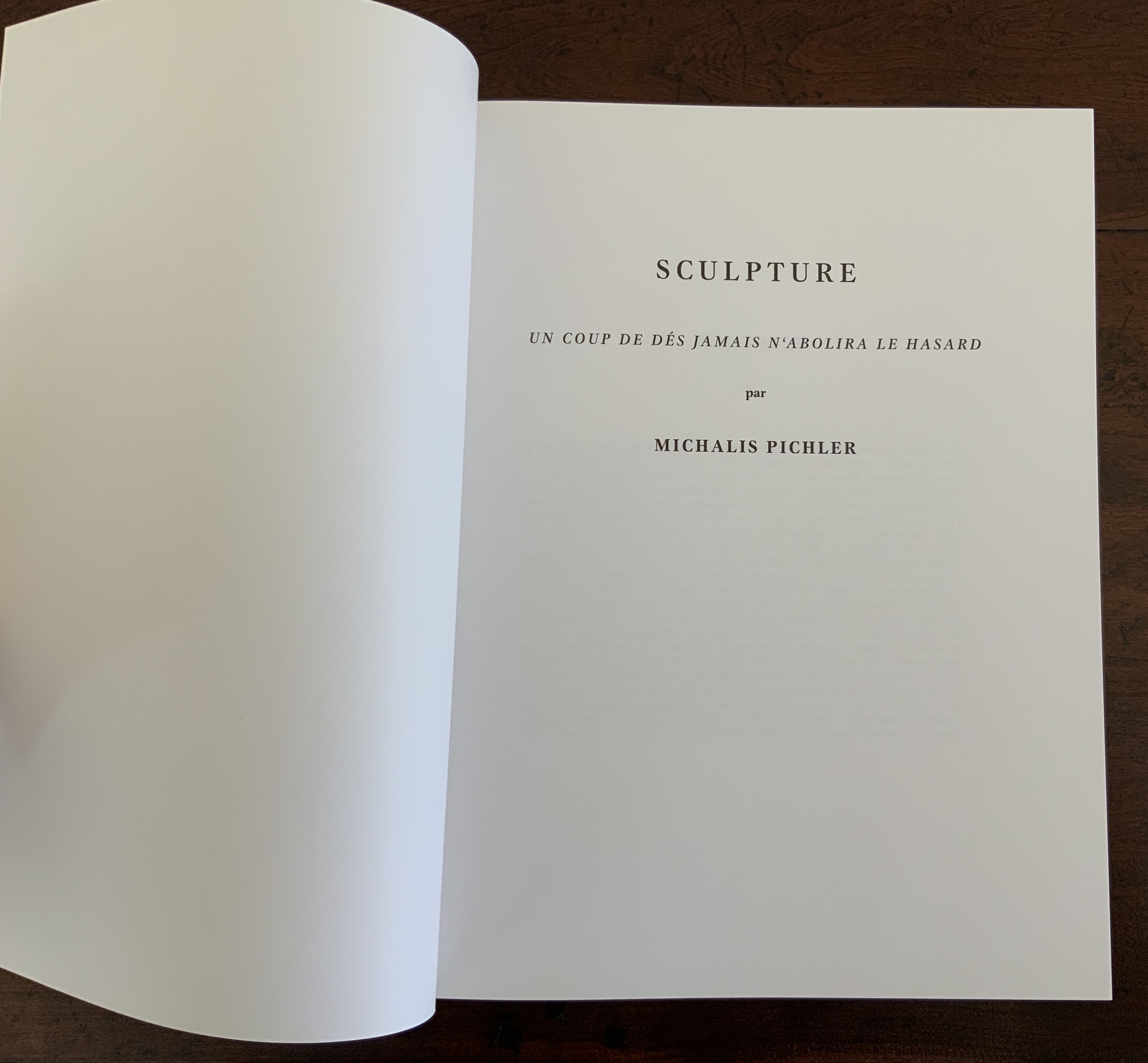
Du fond d’un naufrage(2011)
Du fond d’un naufrage(2011)
Jorge Méndez Blake
Bricks and book. 1.61×1.20×1.06 cm. Photo: Courtesy of Estudio Jorge Méndez Blake.
Another work in the exhibition, Du fond d’un naufrage (2011), differs in material and shape from any previous homage to the poem. The work’s title (“from the bottom of a shipwreck”) comes from a line in Mallarmé’s poem, and cheekily, the volume at the bottom of the gap between the bricks is Mallarmé’s Collected Poems and Other Verse (Oxford University Press).
Toute Pensée Émet un Coup de Dés (2012-2019)
Toute Pensée Émet un Coup de Dés (2012-2019)
Jorge Méndez Blake
Photo: Courtesy of Estudio Jorge Méndez Blake.
Not in the exhibition but continuing the association with Un Coup de Dés and the theme of appropriation, Toute Pensée Émet un Coup de Dés (2012-2019) is a series of nine drawings that
reproduces classic shipwreck paintings using colored pencil. Classic painters used often the strategy of bending the mast, as a way to show the instability of the ship in the storm. These drawings go through an editing process, in which an image of the original painting is cropped and rotated X degrees to achieve the mast verticality and to make the scene look as if the ships were avoiding the fatal destiny. But by “fixing” the mast, the whole landscape loses its horizontality. Correspondence, Estudio Jorge Méndez Blake, 4 August 2020.
This work strikes a curious chord with two exhibitions from 2016 and 2018 — “Reading as Art” at the Bury Art Museum and “The Art of Reading” at the Museum Meermanno, respectively. The works in both exhibitions not only challenged notions of the book and ways of reading but posed the act of making as a form of reading and the act of reading as a form of making. By prefacing this French-German edition of Un Coup de Dés with a book-arts-driven “transcreation”, Klaus Detjen demonstrates that the act of making also implies the act of translating. Typographer, designer, scholar and recipient of the Leipzig Gutenberg Prize for 2017, Detjen has used color, shape, line and binding here as his tools of translation and interpretation.
To use the term “transcreation” here may be taking liberties with Haroldo de Campos’s portmanteau for the idea of “translation as recreation”, or translating with creativity and therefore making “translation-art”. The term and definition perhaps better describe works such as those shown in The New Concrete: Visual Poetry in the 21st Century edited by Victoria Bean and Chris McCabe. But then De Campos and his brother, Augusto, singled out Un Coup de Dés as one of the cornerstones (along with Ezra Pound, James Joyce and e.e. cummings) for their group Noigrandres, and Mallarmé’s poem certainly fits the bill of the ideal target of transcreation:
The more intricate the text is the more seducing it is to “recreate” it. Of course in a translation of this type, not only the signified but also the sign itself is translated, that is, thesign’s tangible self, its very materiality (sonorous properties, graphical-visual properties…. Haroldo de Campos, “Translation as Creation and Criticism”, p. 315.
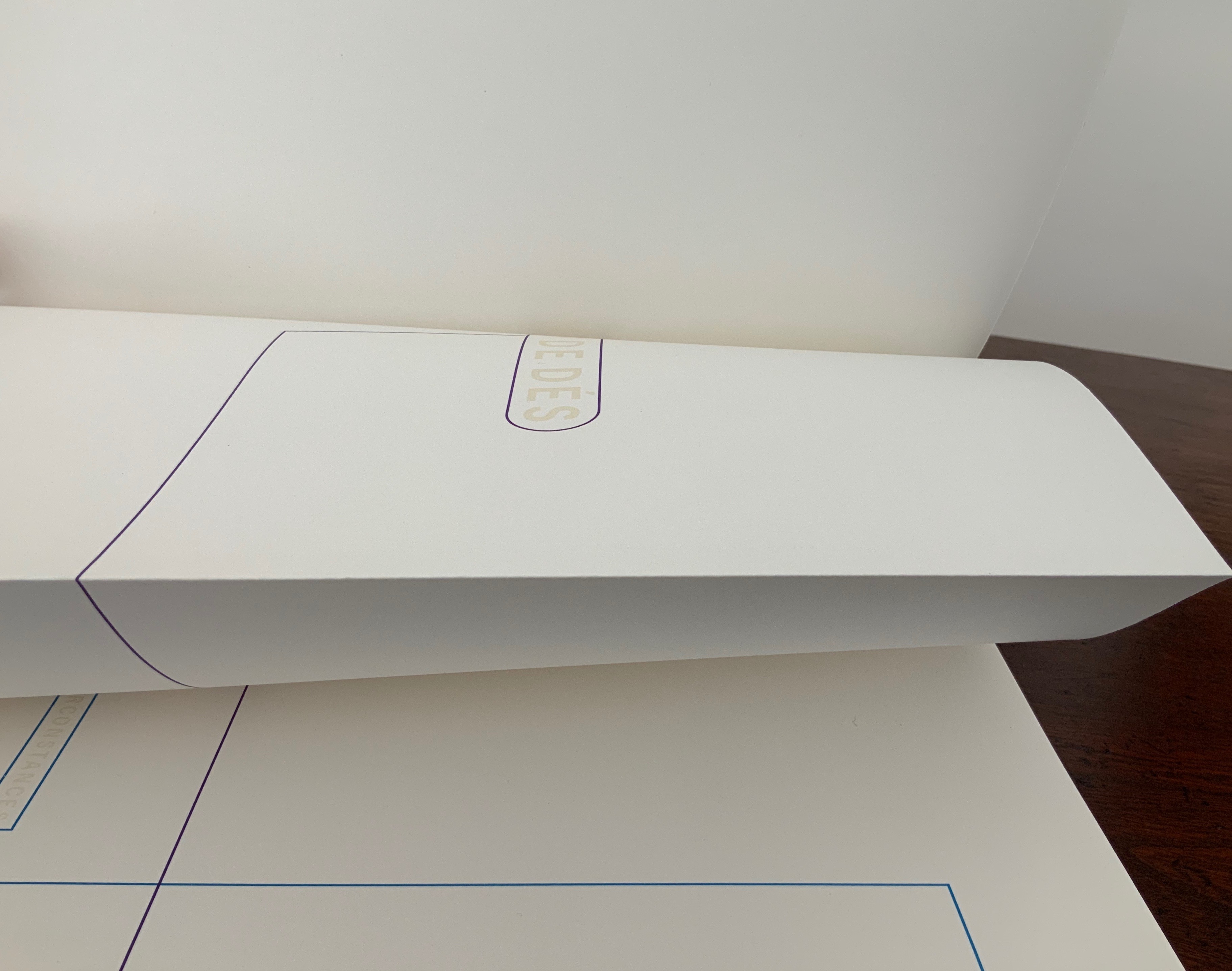
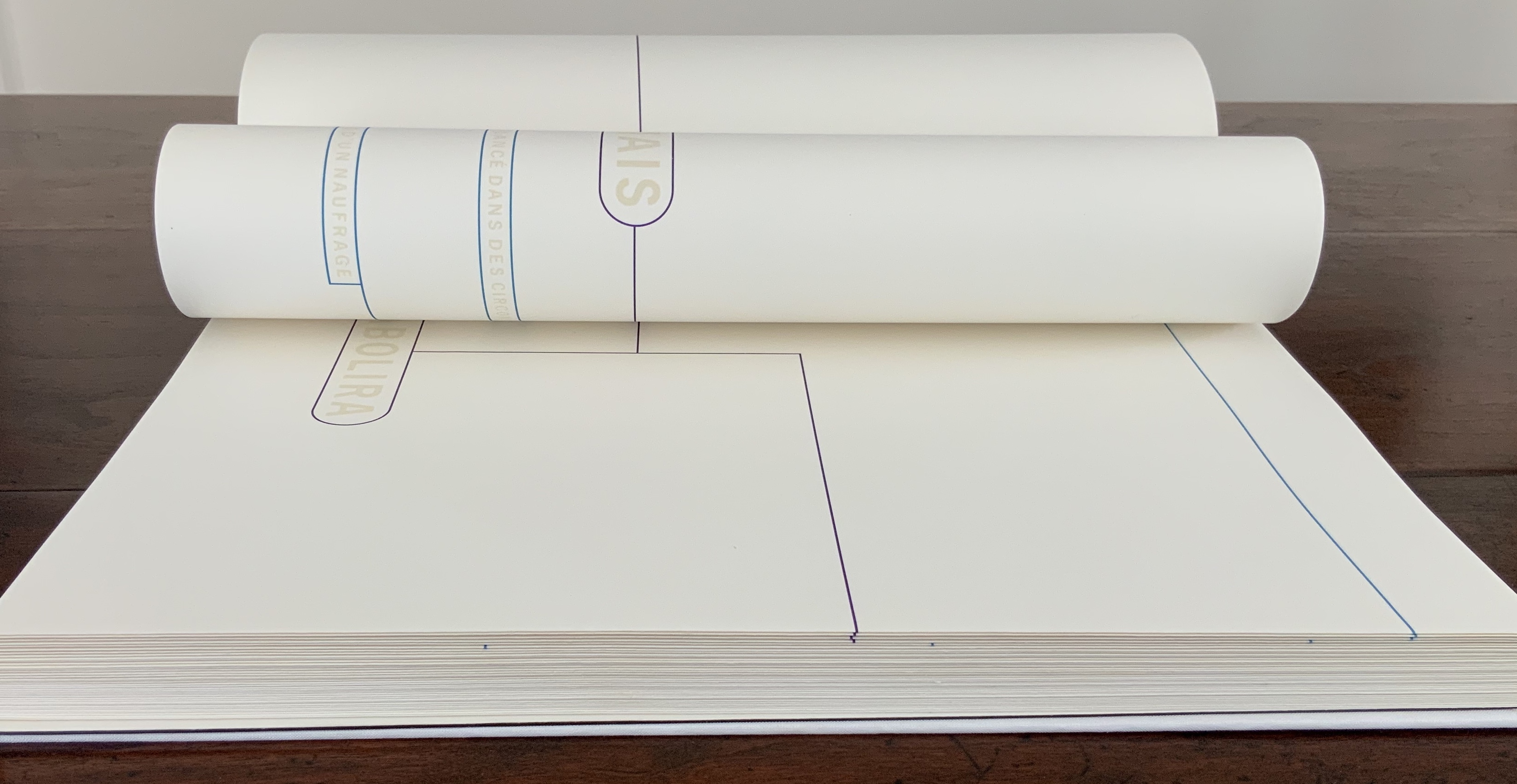
This notoriously difficult poem to translate (or even comprehend) with its cascade of metaphors and symbols (the central ones being a shipwreck and a constellation) appears three times in Detjen’s volume: first, in French with Detjen’s interpretive design, then in French and finally in German. All three instances follow the typography and layout of the first book edition of the poem as published in 1914 by Gallimard. Detjen’s own treatment of the poem very much focuses on the edition’s graphical-visual properties.
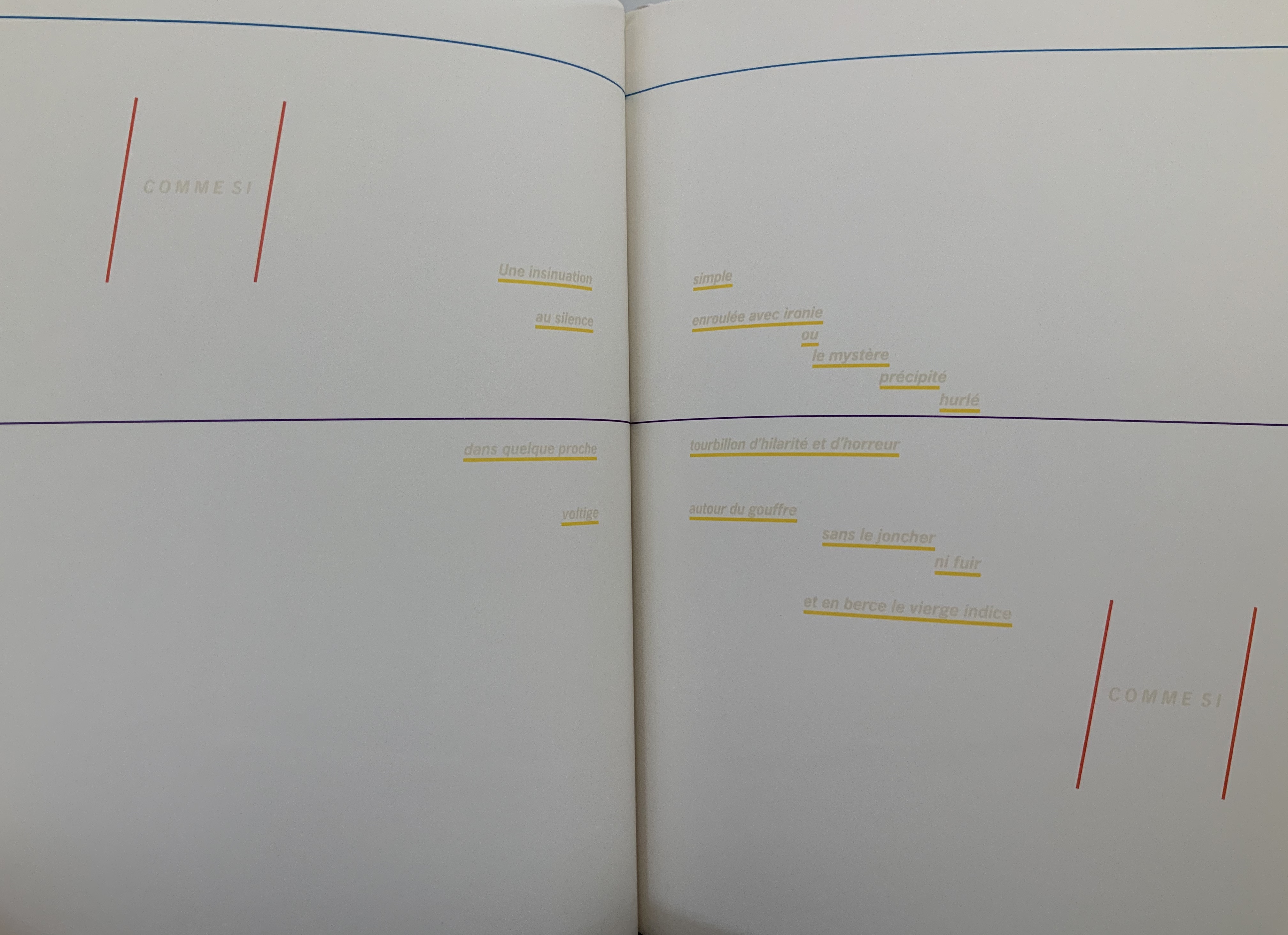
In that edition, the rhythm and position of the lines, the font and all the font sizes are precisely specified. Nine typographical motifs structure the poem. They are additionally highlighted in the front part of our book with colors, the meaning of which will be discussed later. Font sizes, styles (roman or italics) and the colors of the motifs used are as follows: First double-page spread: UN COUP DE DÉS, 11.25 mm, blue-violet / Second DS: QUAND BIEN MEME, 3.5 mm, cyan-blue / Third DS: que, 3.5 mm, green / Sixth DS: COMME SI, 5.25 mm, magenta; Une insinuation, 3.5 mm, yellow / Eighth DS 8: SI, 5.25 mm, magenta red / Ninth DS: C’ÉTAIT, 4.5 mm, orange red; autrement qu’hallucination, 2.5 mm, yellow; issu stellaire, 2.5 mm yellow. Klaus Detjen, “Zum Gestaltung”, p.81 (my translation).
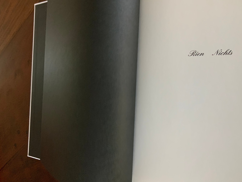
The colored linear frames, threads and markings give the nine typographical motifs additional structuring. Detjen intends them to highlight the reading order to guide the reader through the text like a score. Detjen’s later discussion of their meaning, however, focuses mainly on les blancs, the white space around the text of the poem. Taking Mallarmé at his word in the poem’s foreword, Detjen seizes on the whiteness of the surrounding space and runs to the prismatic metaphor that the spectrum of colors is simply the decomposition of white light. Detjen also notes that the unorthodox Rien/Nichts printed on the volume’s opening page alludes to the expanse of blank space enclosing the lines of text and, in support, quotes from Mallarmé’s “Crisis of Verse”:
Everything is suspended, an arrangement of fragments with alternations and confrontations, adding up to a total rhythm, which would be the poem stilled, in the blanks; … Mallarmé, “Crisis of Verse”, p. 209.
From all this, Detjen avers that it is
as if Mallarmé did not want to have his poem depicted, that is, printed, but perhaps only thought or, at best, whispered. Or did the author see the poem printed in white on white paper? Detjen, “Zum Gestaltung”, p. 82 (my translation).
Following that line of thought, Detjen switched from Mallarmé’s preferred classical serif typeface to News Gothic Bold after experimentation showed that sans serif enabled him to print legibly in flat white on white paper. Confirming his primary focus on the expanse of blank whiteness, Detjen even concludes his afterword by quoting Jorge Luis Borges on Mallarmé:
The impersonal color white itself — is it not utterly Mallarmé? Borges, “Narrative Art and Magic”, p. 79.
In his heavy emphasis on les blancs, Detjen ends up not doing justice to other more subtle aspects of his design artistry. Before he comes to the poem’s expanse of whiteness, note how the opening page of Rien/Nichts follows the black pastedowns and endpapers — the absence of light contrasting as much with the cover’s pure white as with the poem’s blank spaces.
Note how the colors to come in his interpretive version appear in dice shapes arranged on the front and back white covers to suggest the faces of a pair of dice. The whole volume becomes ein Würfelwurf, un coup de dés, a throw of the dice, which echoes Mallarmé’s obsession with le Livre — that work that everything in the world comes to be.
More subtly, Detjen combines the uncut folios with the colored shapes and markings to suggest “rigging” for the foundering ship and a “mapping” for the constellation. The turning uncut folios become billowing sails or rising and falling waves, across which the rigging cuts and the constellation shines.
Detjen’s visual and physical “transcreation” underscores why the French and German translations are not side by side, page for page. How could they be given the way the poem’s words work with the type, the page, the double-page spread and folios? All of which meets de Campos’s definition of the ideal target for transcreation — where the work’s signified, sign and materiality are intricately bound to one another.
In Detjen’s version preceding the French and German versions, the act of translation and interpretation meets the act of creating a work of art.
Borges, Jorge Luis. “Narrative Art and Magic” [1932]. Trans. Suzanne Jill Levine; ed. Eliot Weinberger. In Selected Non-Fictions (New York: Penguin Books, 1999), pp. 75-82.
Campos, Haroldo de. “Translation as Creation and Criticism” [1963]. Trans. Diana Gibson and Haroldo de Campos. In A. S. Bessa and O. Cisneros, eds., Novas: Selected Writings (Evanston, IL: Northwestern University Press, 2007), pp. 312-326.
Jaruga, Rodolfo. “Ezra Pound’s Arrival in Brazil“, Make It New: The Ezra Pound Society Magazine, Volume 4.1-2, September 2017. Accessed 22 August 2020.
Mallarmé, Stéphane. “Crisis of Verse” [1897]. Trans. Barbara Johnson. In Divagations(Cambridge, MA: Harvard University Press, 2009), pp. 201-11.
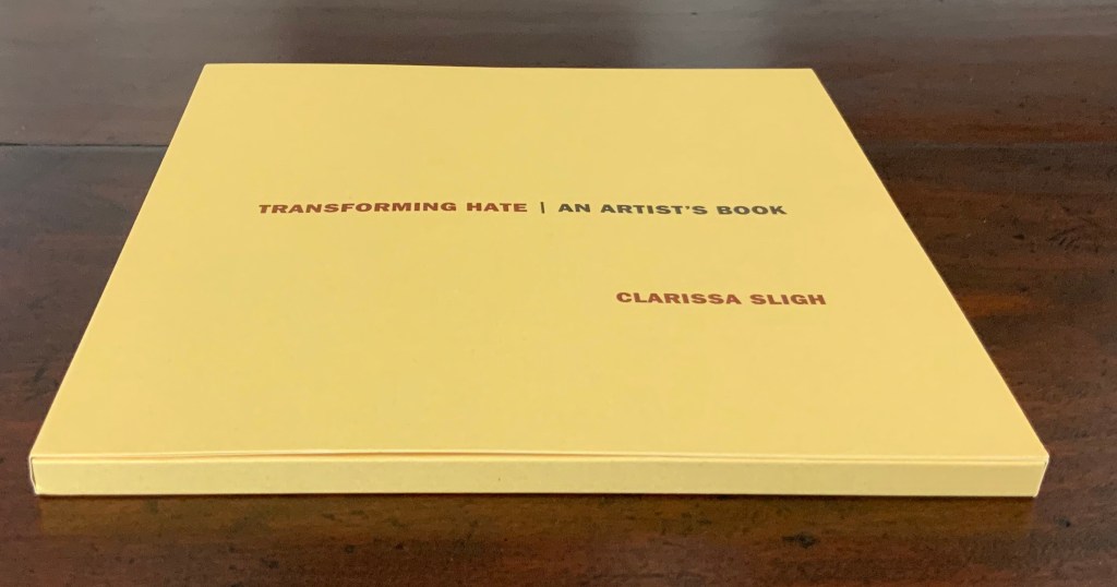
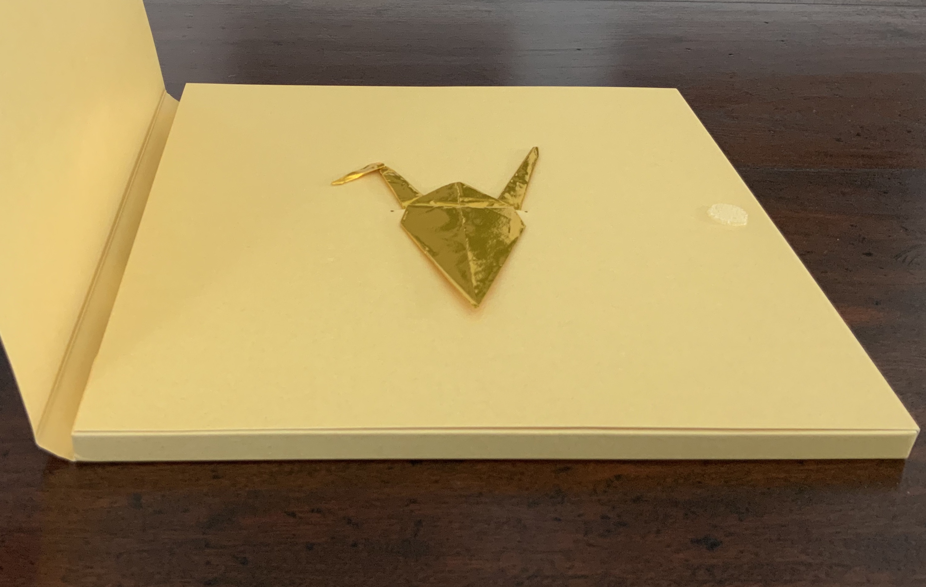
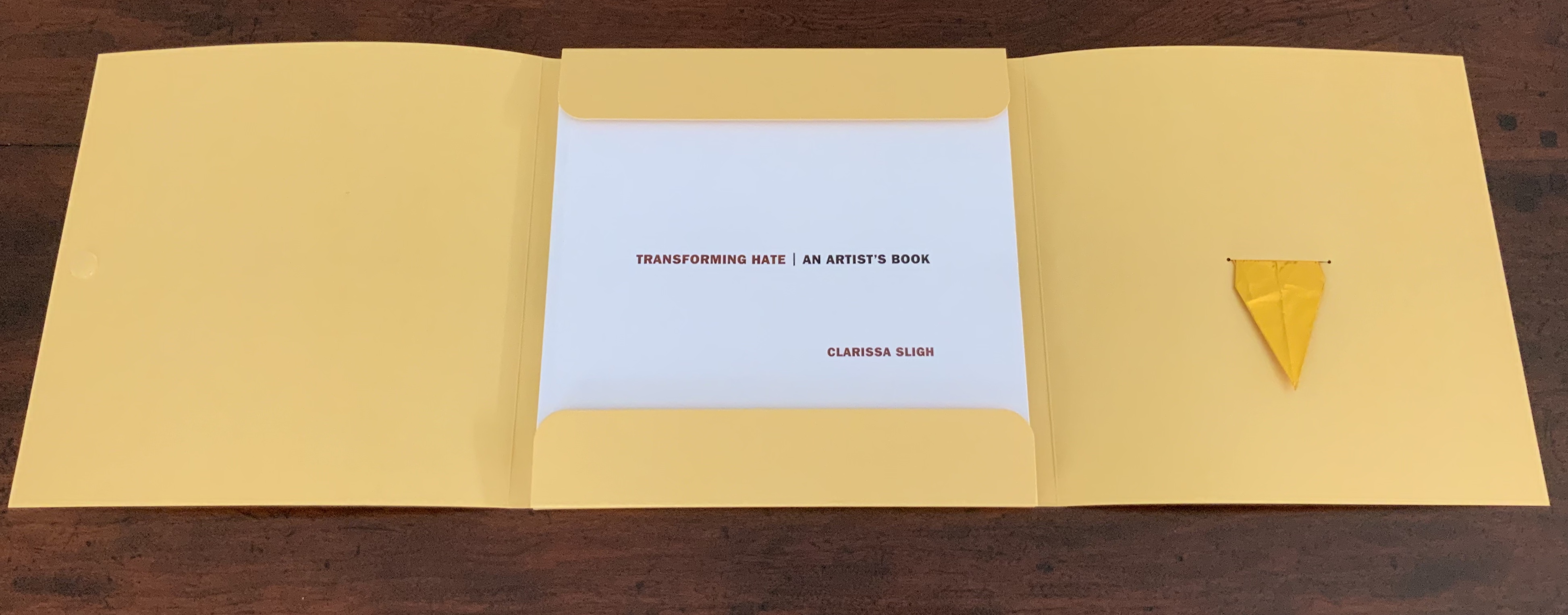
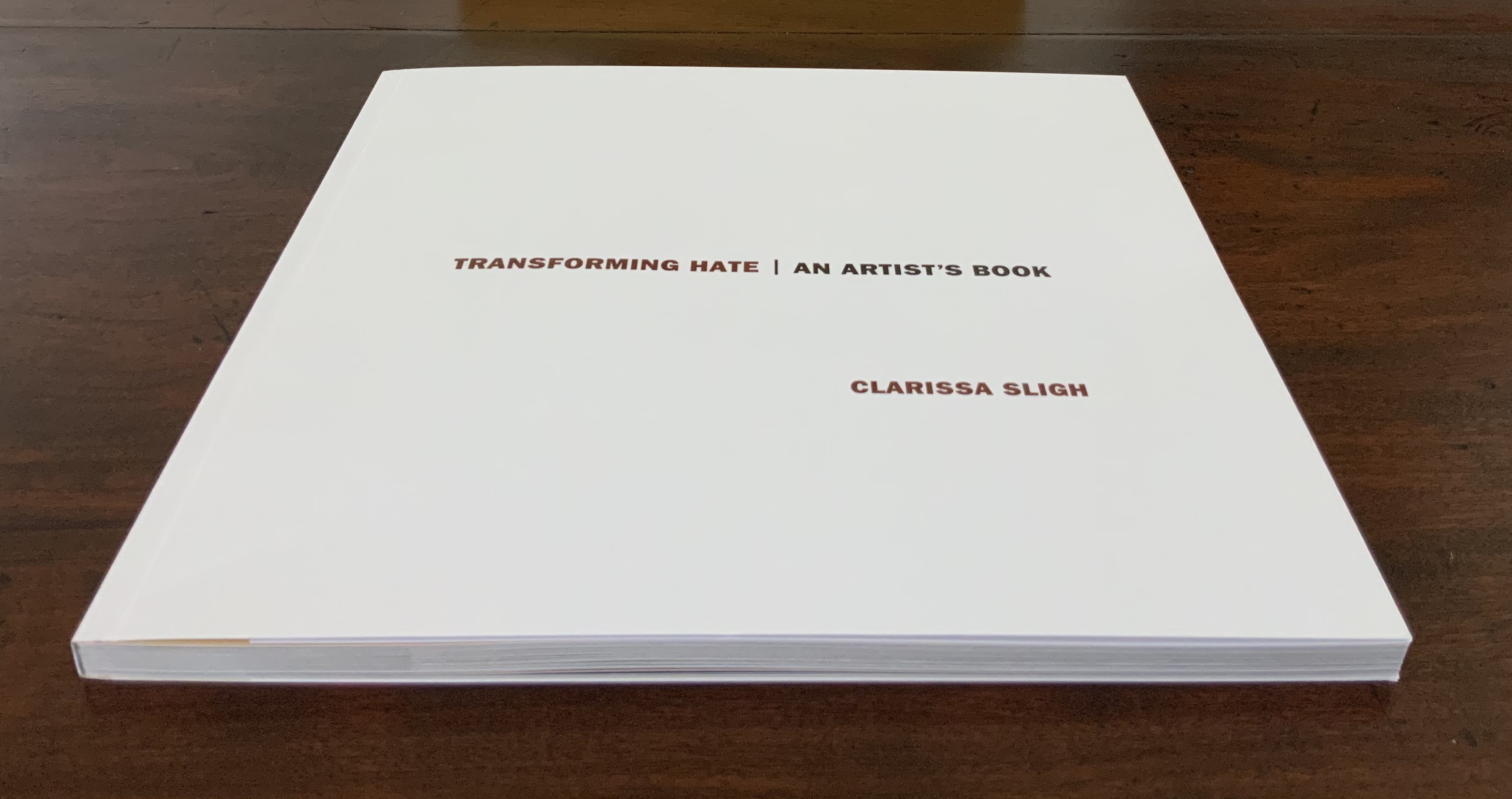
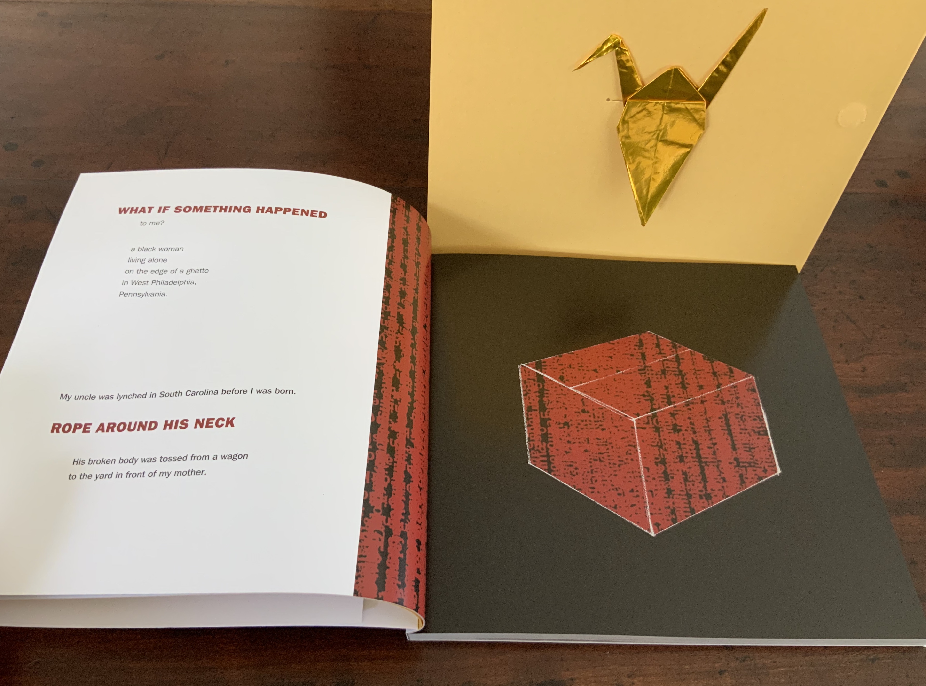
Perfect bound softcover. Four-color offset lithography. Illustrated paper wrappers with flaps. Housed in foldout die-cut box with gold foil origami crane inserted into cover slot. H203 x W204 mm, 104 unnumbered pages including inserts. Edition of 1000 numbered and signed, of which this is #18. Acquired from Vamp & Tramp, 13 August 2020. Photos: Books on Books Collection with the permission of the artist.
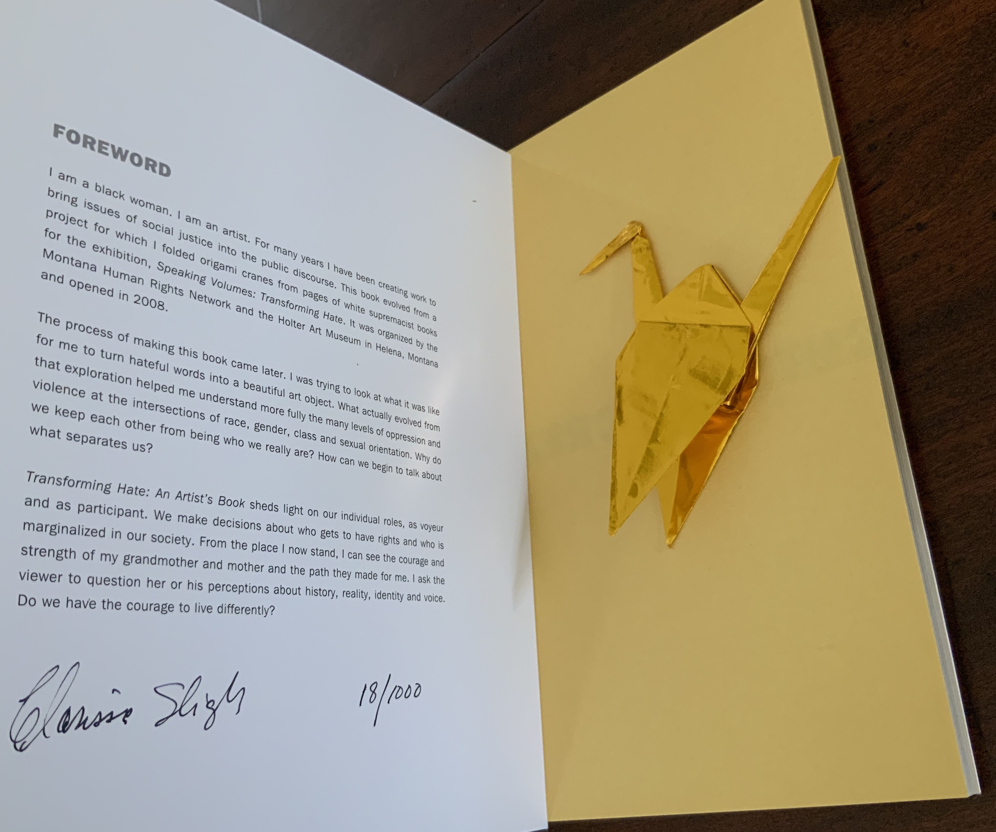
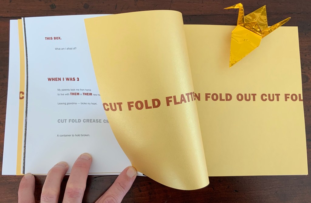
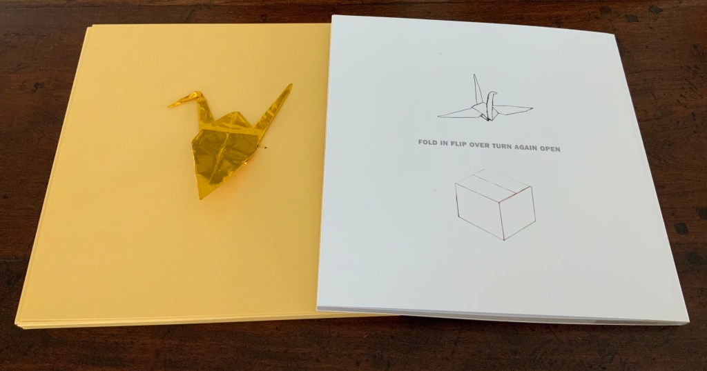
A forthright Franklin Gothic typeface announces the title, descriptive subtitle and author’s name in brown, black, and brown on the warm golden yellow of the die-cut box. As it opens from its velcro fastener, it reveals a gold foil origami crane, inserted in the box’s internal flap. As the flap turns, the straightforward Franklin Gothic re-announces the title, subtitle and author’s name, this time on the book’s white cover. So far, the work gives a sense of simplicity, elegance and warmth. Only the title hints at something uncomfortable to come. Finding a book’s foreword on its cover flap is unusual, but that Franklin Gothic now matched with plain-spoken prose — “I am a black woman. I am an artist.” — reassures. By the foreword’s last line though — “Do we have the courage to live differently?” — the reader/viewer may sense a need to keep the gold foil origami crane close like a guardian angel.
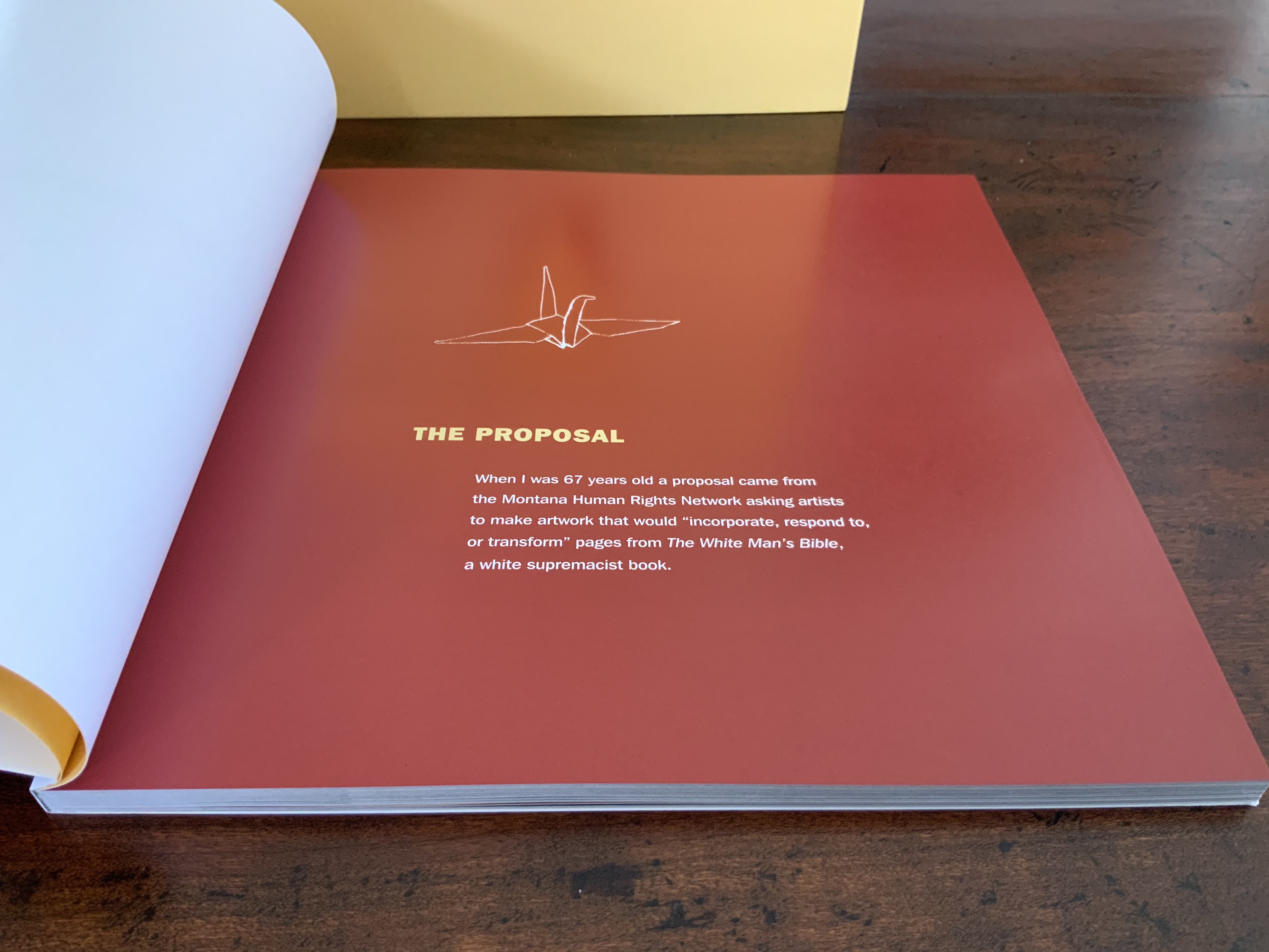
The crane also provides an organizing or, more accurately, guiding principle. Across the double-page spread of near-translucent golden endpapers just before the half-title, the truncated instructions — “cut fold crease flatten turn over cut fold creas” — start to articulate how to alter another book’s pages into origami cranes. On a startling full-page bleed of reddish brown ink, “The Proposal” in yellow and its text in white names the book to be altered: The White Man’s Bible, a white supremacist screed. Wings extended against the reddish brown, the crane hovers over the text.
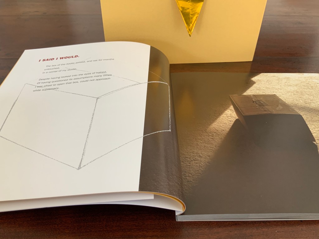
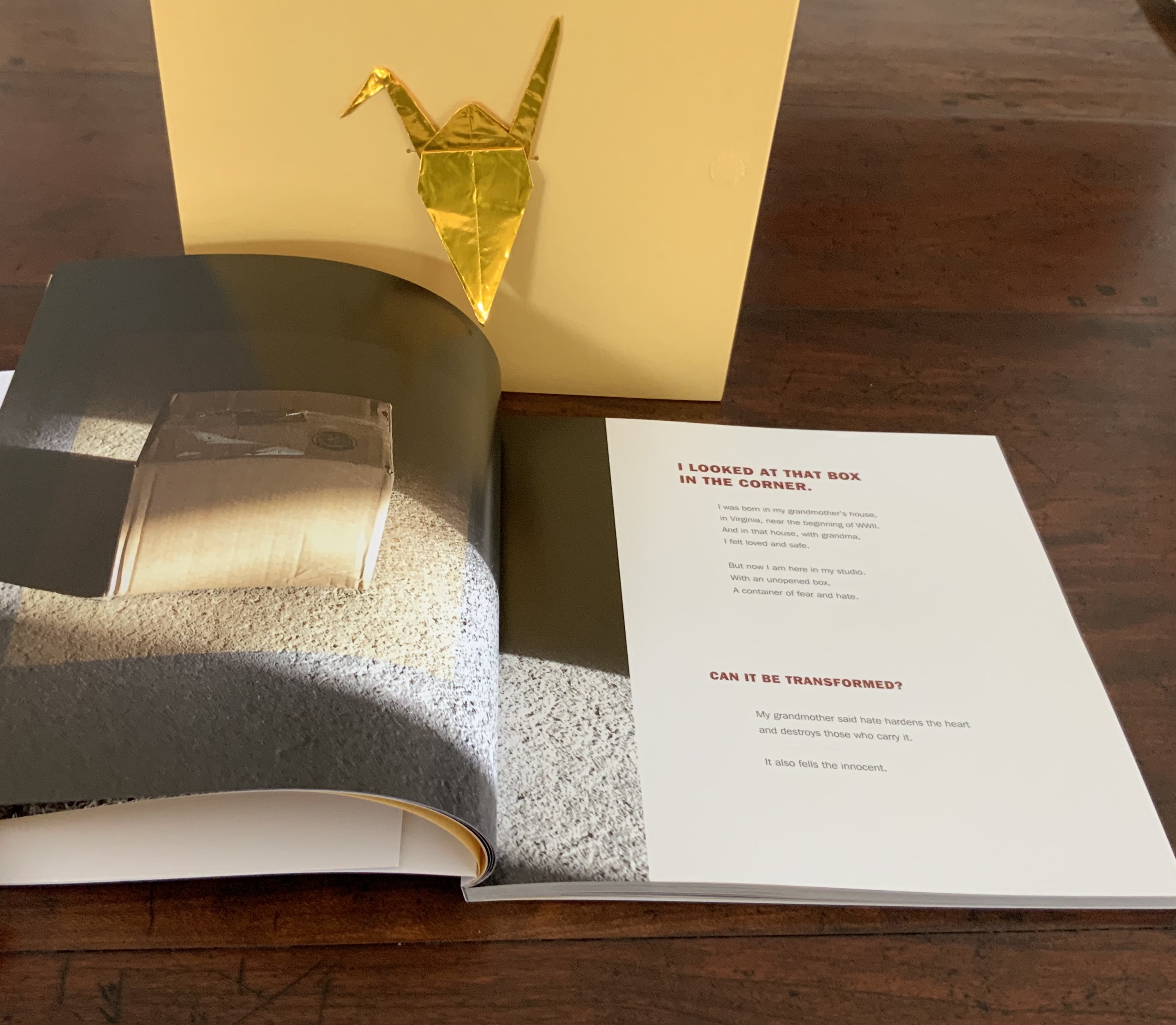
More startling is the following double-page spread with the artist’s acceptance of the challenge, yet doubt, on the left and a photo of the unopened box full of hate casting a shadow from light falling from the right. The photo on the right spills leftward over the gutter, encroaching on the artist, her acceptance and doubt. And yet, her diagram of a box pushes back, rightward against and into the encroaching shadow.
The guardian angel becomes a necessary angel over the next two double-page spreads. From the left page of the first spread —
My uncle was lynched in South Carolina before I was born. Rope around his neck, his broken body was tossed from a wagon to the yard in front of my mother.
— the text faces on the right a full-page bleed of black ink in which the transparent box diagram sits full of hate-red words. Turn the page.
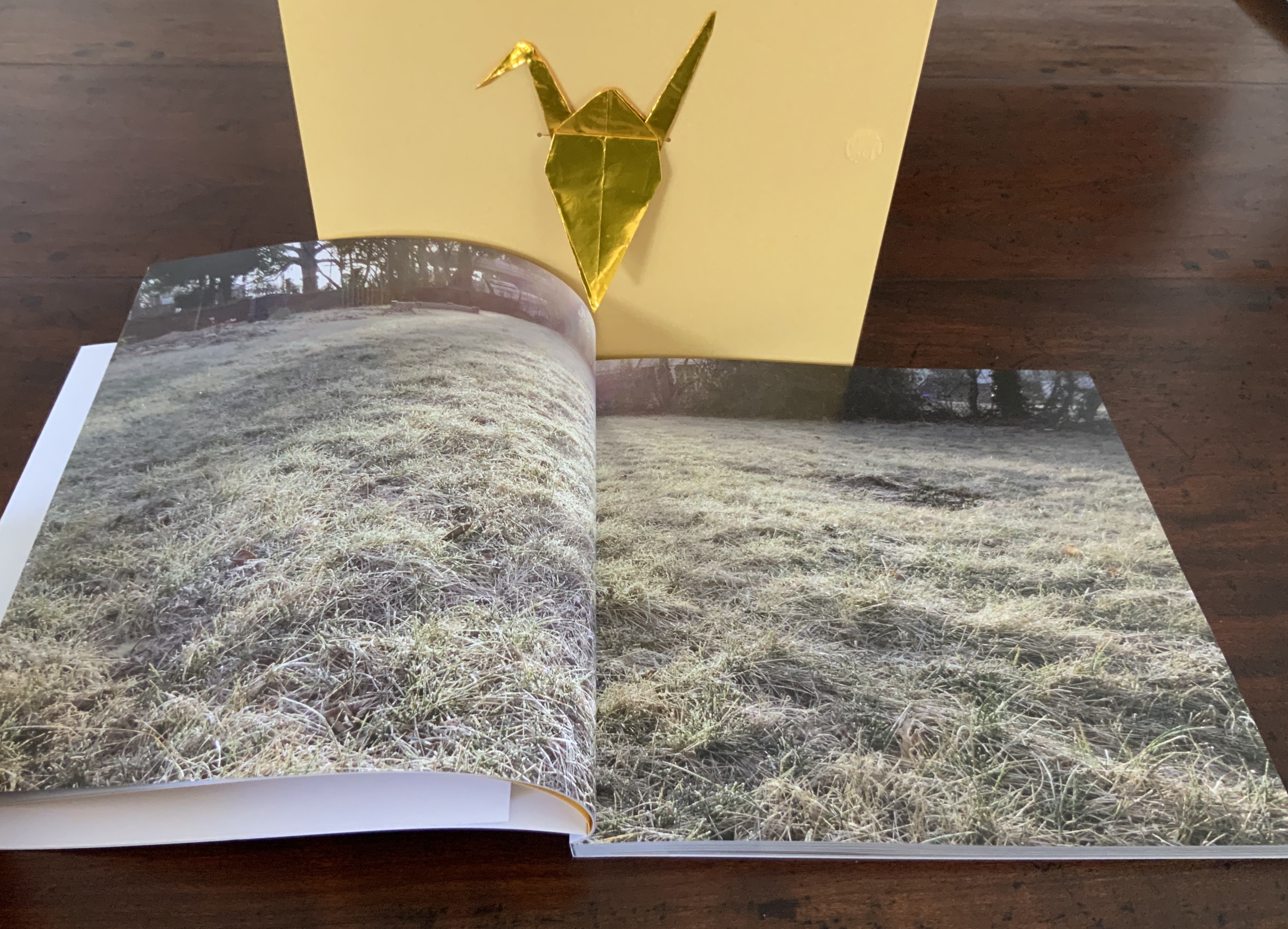
What the double-page photo of hummocks of grass in the foreground and, in the far background, some fencing, a sandbox, houses behind a stand of brush and trees conveys, with its contrast to the preceding spread of text and image, sticks in the chest and throat.
In the next double-page spread, the box sits, still closed, now on the left in a reversal of its first appearance. The light that casts the box’s shadow shines across the gutter from the artist’s question on the right hand page — “Can it be transformed?” The artist seems to be drawing a deep, preparing breath, one that the next double-page spread implies is calming.
At the next turn, an organizing principle only implicit so far but now explicit in the words “When I was 3” joins the principle of the folding instructions “cut fold crease craft”. These instructions appear again on the same paper used for the endpapers, used here to mark the end of the book’s first section. The first section’s final words “A container to hold broken” fall between the instructions, leaving a warranted sense of foreboding. As the work proceeds akin to a growth chart — “when I was 5”, “when I was 11” and so on — can the necessary angel suffice?
In the four sections that follow, the artist’s life, fears and hopes intersect personally with painful local, national and international history. As she communicates her sense of living this history, she also charts her engagement with others’ history of subjection to hate. If any reader thinks that this somehow gives in to an “all lives matter” chorus, one corrective course is to lay hands and eyes on a copy of this artist’s book. If somehow that does not make plain the power of this artist’s voice, then a further corrective course is to listen to her read the text here. If that does not work, then follow the instructions on the back cover.
Inside flap of the die-cut box; back cover of the book.
I am a white man. I write about book art. Encountering this work of art is to stumble, fall, get up — cut fold crease flatten fold out cut fold in flip over turn again open — and begin to do the work toward acknowledging and accepting this necessary angel. Reminder to self: “again open”.
Gabor, Nora. 18 February 2021. “Black History and Experiences through Book Arts“. The Full Text: News about library resources and services. Chicago, IL: DePaul University. Accessed 22 January 2024.
Gleek, Charlie. “Centuries of Black Artists’ Books“, presented at “Black Bibliographia: Print/Culture/Art” conference at the Center for Material Culture Studies, University of Delaware, 27 April 2019, pp. 7-8. Accessed 20 July 2020.
Hand bound. H325 x W250 mm, 32 pages. Edition of 400, of which this is #8. Acquired from Stefan Schuelke, 30 June 2020. Photos: Books On Books Collection.
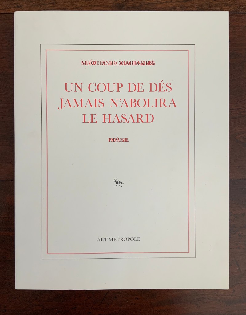
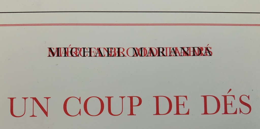
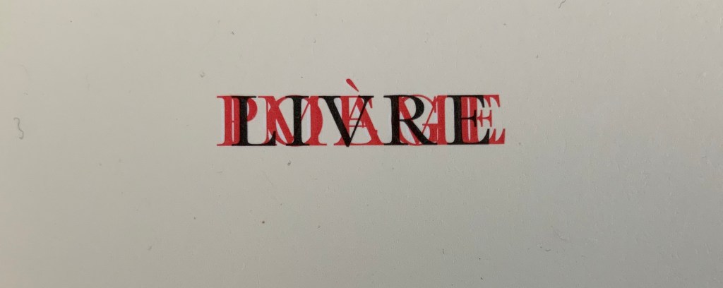
Look carefully at this work’s text and images. On its cover, the author’s and artists’ names are hard to make out, overlapping one another as they do, as do the subtitles: Mallarmé and Poème in red, Broodthaers and Image also in red, and Maranda and Livre in black. Between Mallarmé and Broodthaers, it is hard to say technically whose name and subtitle came first in the printing; who and what are overprinting whom and whose? Unbroken as the letters are, though, Michael Maranda and Livre must have come last.
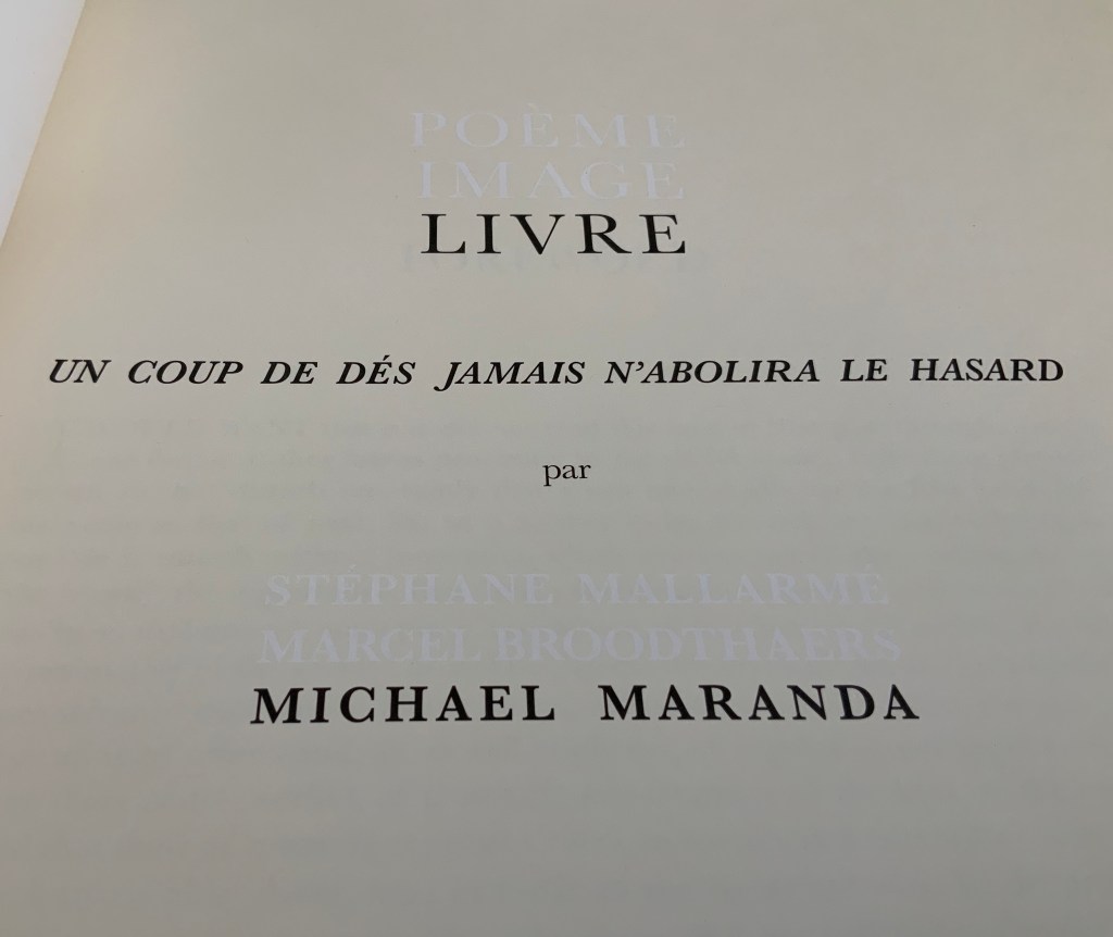
The title page offers a bit more legibility, but the printing hijinks continue. Poème/Mallarmé and Image/Broodthaers no longer occupy the same space and are just perceptible in white lettering created by the ocean of cream-colored ink surrounding them. Along with the poem’s title, Livre/Maranda appear in black.
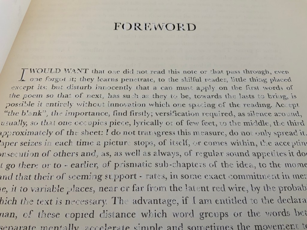
Then comes the Foreword, and the hijinks strain the eyes even more. At first, it seems that the Foreword has been badly printed. Not only badly printed, but badly translated from Mallarmé’s original: “I would want that one did not read this note or that pass through, even one forgot it”!? Only Maranda’s online artist’s statement explains the how and why of the poor translation:
To highlight the transformation of the reception of the poem by Broodthaers edition, the preface of this edition is Mallarmé’s original one, translated from French to Dutch and then to English using the online translator, Babble [sic] Fish. Michael Maranda, “Statement“, 2008. Accessed 6 August 2020.
That may explain the poor English translation, but what about the poor printing job? Actually, the printwork is precise, and the cover and title page offer the clues to this in their overprinting and reversed-out inking, respectively. The mangled English of the foreword has been printed in black, but the French of the préface appears as the absence of the cream-colored ink. Organizing the printing so that the black ink is broken up by those letters formed from the absence of ink is precision indeed.
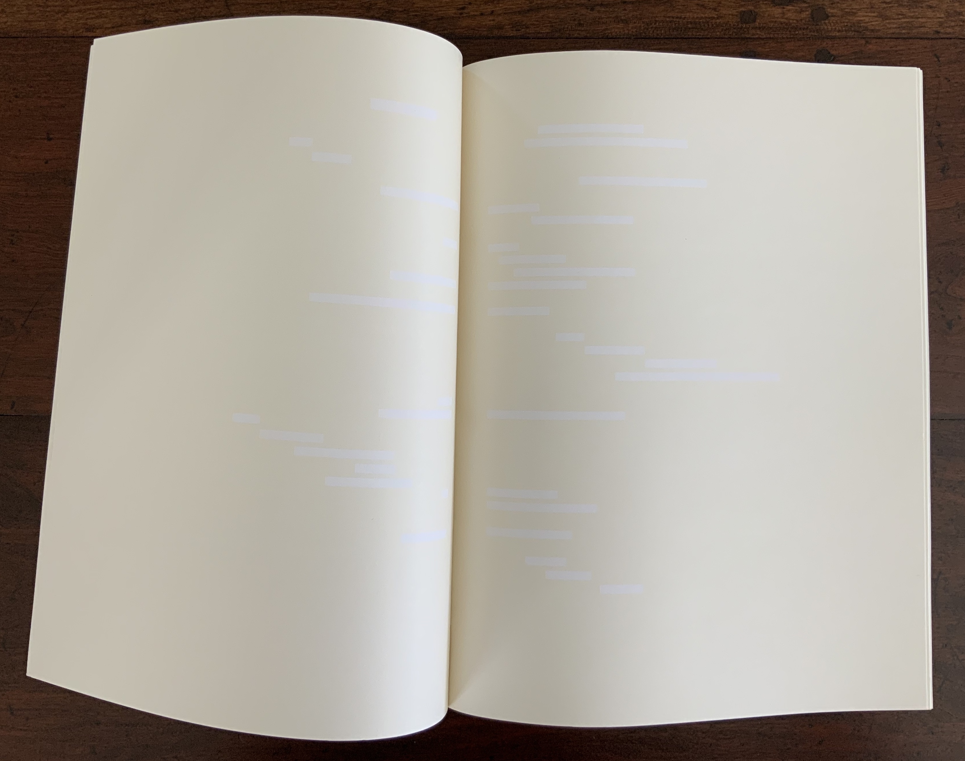
Maranda calls his work a “meditation on les blancs“, the term that Mallarmé used in his 1897 preface to Un Coup de Dés to draw attention to the blank spaces surrounding the carefully scattered lines of verse. Taking Mallarmé at his word, Broodthaers drew attention to les blancs by blacking out the text with rectangles and parallelograms reflecting the type’s sizes and styles. In all of the pages that follow the preface, Maranda fills in Mallarmé’s and Broodthaers’ blancs with cream-colored ink. Paradoxically, Mallarmé’s text and Broodthaers’ black stripes have become blank spaces, and les blancs to which they drew attention have been printed in cream.
This strange reversed-out palimpsest recalls a passage from Ulises Carrión’s “The New Art of Making Books” (1975):
The most beautiful and perfect book in the world is a book with only blank pages, in the same way that the most complete language is that which lies beyond all that the words of a man can say. Carrión.
Maranda’s Livre stands among several works of erasure and excision paying homage to Un Coup de Dés in its 1914/1969 iterations — think of those by Jérémie Bennequin, Cerith Wyn Evans and Michalis Pichler — but by titling his work as he does, Maranda also pays homage to Mallarmé’s lifelong conceptual holy grail of le Livre — that work that everything in the world comes to be. By overlaying Mallarmé’s Poème and Broodthaers’ Image with his meditation on les blancs, Maranda may be implying that visual language is the complete language in which that most beautiful and perfect book can be written.
Yet Maranda’s Livre ends with a colophon that suggests he takes himself no more seriously than his immediate predecessor in the palimpsest did:
This edition is published by Art Metropole. It was not printed in Belgium.
Appropriated and sculpted bookwork was taking off in numerous forms even before 1964 when Marcel Broodthaers half-embedded the last fifty copies of his poetry book Pense-Bête in plaster. Bruno Munari had introduced libri illeggibili (“unreadable books”) in 1949. John Latham had already encased books with plaster in Shelf Number 2 (1961) and much else in his various skoob works. Tom Phillips’ line-by-line, found-book alteration A Humument was underway, first appearing in 1970, as was Dieter Roth’s string of sausage books Literaturwurst (1961-74). So Broodthaers could have taken any of several directions before deciding to replace Mallarmé’s lines of verse in Un Coup de Dés N’Abolira le Hasard: Poéme (1914) with printed and engraved placeholders in paper and anodized aluminum, respectively, to create Un Coup de Dés N’Abolira le Hasard: Image (1969).
Son of Giorgio Maffei (bookseller, curator, scholar and book artist in his own right), Giulio Maffei has made video catalogues for Studio Bibliografico Giorgio Maffei since 2015. Each catalogue is a work of video. In this twenty-sixth outing, Maffei has created a video from the 1914 edition and Broodthaers’ 1969 Image version of Un Coup de Dés.
By 2008, Michalis Pichler had an even greater wealth of forms from which to choose for his double appropriation/homage to Mallarmé’s Poème and Broodthaers’ Image. Since the ’80s scores of book artists had been introduced to ingenious structures by Hedi Kyle and Keith A. Smith, among others, so why not an Aunt Sally’s shipwreck of string, canvas and torn paper? Long-Bin Chen had been sanding books and phone directories into busts since the ’90s, so why not a bust of Mallarmé from old editions of Un Coup de Dés and a bust of Broodthaers from catalogues of his works (a variation on Buzz Spector’s treatment)?
Instead Pichler appropriates Mallarmé through Broodthaers’ design and production: an efficient and direct double appropriation. He follows the trim size and layout of the 1914 and 1969 works. Further underscoring the double appropriation, he reprints verbatim Broodthaers’ preface (the full text of Mallarmé’s poem set in small type as a single paragraph with obliques separating the lines of verse). Like Broodthaers, he produced limited editions of three versions: 10 copies in plexiglas (rather than Broodthaers’ 10 in anodized aluminum), 90 copies in translucent paper (just as Broodthaers had done) and 500 copies in paper (rather than Broodthaers’ 300). Where Broodthaers had solid black stripes, though, Pichler substitutes laser cuts in the translucent and paper editions and engraving or abrasion in the plexiglas edition. Hence Sculpture (2008), rather than Image (1969) or Poème (1914).
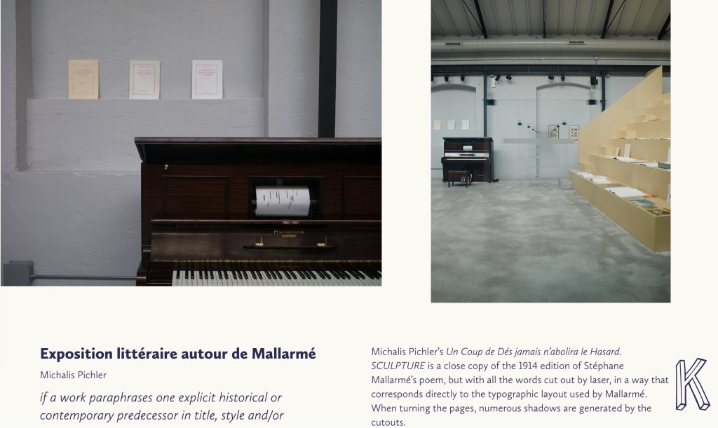
Not until 2016, though, was Pichler able to cap his double appropriation. Just as Broodthaers had held an exhibition entitled “Broodthaers: Exposition littéraire autour de Mallarmé” (Antwerp, December 1969), Pichler held one entitled “Pichler: Exposition Littéraire autour de Mallarmé” (Milan, December 2016). Like the Broodthaers exhibition, Pichler’s was an opportunity to showcase his own work: it was his first solo exhibition in Italy. Like Broodthaers, he included the Nrf 1914 edition, but also included numerous other editions and translations that had occurred since. Also, key to Pichler’s artistic intent, he included a host of other artists who by appropriation had made homage to Un Coup de Dés … Poème and, in some cases, Broodthaers’ … Image.
Book art is so self-referential in its instances (think of Real Fiction: An Inquiry into the Bookeresque by Helen Douglas and Telfer Stokes) and as a genre (think Burning Small Fires by Bruce Nauman) that appropriation offers a natural next step. In Pichler’s case, the subtlety of that step comes in how he reaches through Broodthaers’ Image all the way back to elements of Mallarmé’s Poème to achieve his aims.
When Broodthaers first appropriated Mallarmé’s layout, type sizes and roman/italic styles, he was engaged in a kind of reverse ekphrasis. Usually ekphrasis runs from the work of art (say, a Grecian urn) to the text in response (“Ode on a Grecian Urn”). Here, the poem and its shape come first, then the work of art — the Image of the poem. By calling his exhibition an exposition littéraire, Broodthaers underscored this. By calling out the shapes on the page, he elevated the original’s semblances of waves, an abyss, a foundering ship and a constellation and, in exposing them, performed a kind of literary study as well as artistic work.
Count it down from Pichler’s appropriation of Broodthaers’ exposition littéraire, from the inclusion/appropriation of other artists’ appropriations of Poème and/or Image, from his own work of book art Sculpture, from his own other works: Pichler’s appropriative ekphrasis is squared, cubed or perhaps raised to the fourth power. Clearly, book art and appropriation are Pichler’s chief palettes — or rather his twin decks from which, as DJ, he mixes what he calls “Greatest Hits”. The phrase simultaneously names Pichler’s imprint on Sculpture‘s cover and the series on his website. The series includes other appropriations such as Every Building on the Ginza Strip (2018) from Ed Ruscha and Some More Sonnet(s) aka Poem(s) (2011) from Ulises Carríon. “Greatest Hits”, however, suggests another subtlety in Sculpture, albeit one best appreciated in the context of all the exhibitions.
The first instance of Broodthaers’ exhibition in Antwerp included a continuous playing of the artist’s tape-recorded reading of the poem. In Cologne for its second instance, Broodthaers renamed it Exposition littéraire et musicale autour de Mallarmé. Broodthaers was simply taking Mallarmé’s musical cue in Un Coup de Dés’spreface, which advises reading the poem as if it were a “score” for music to be heard at a concert and its blank spaces as “silences”.
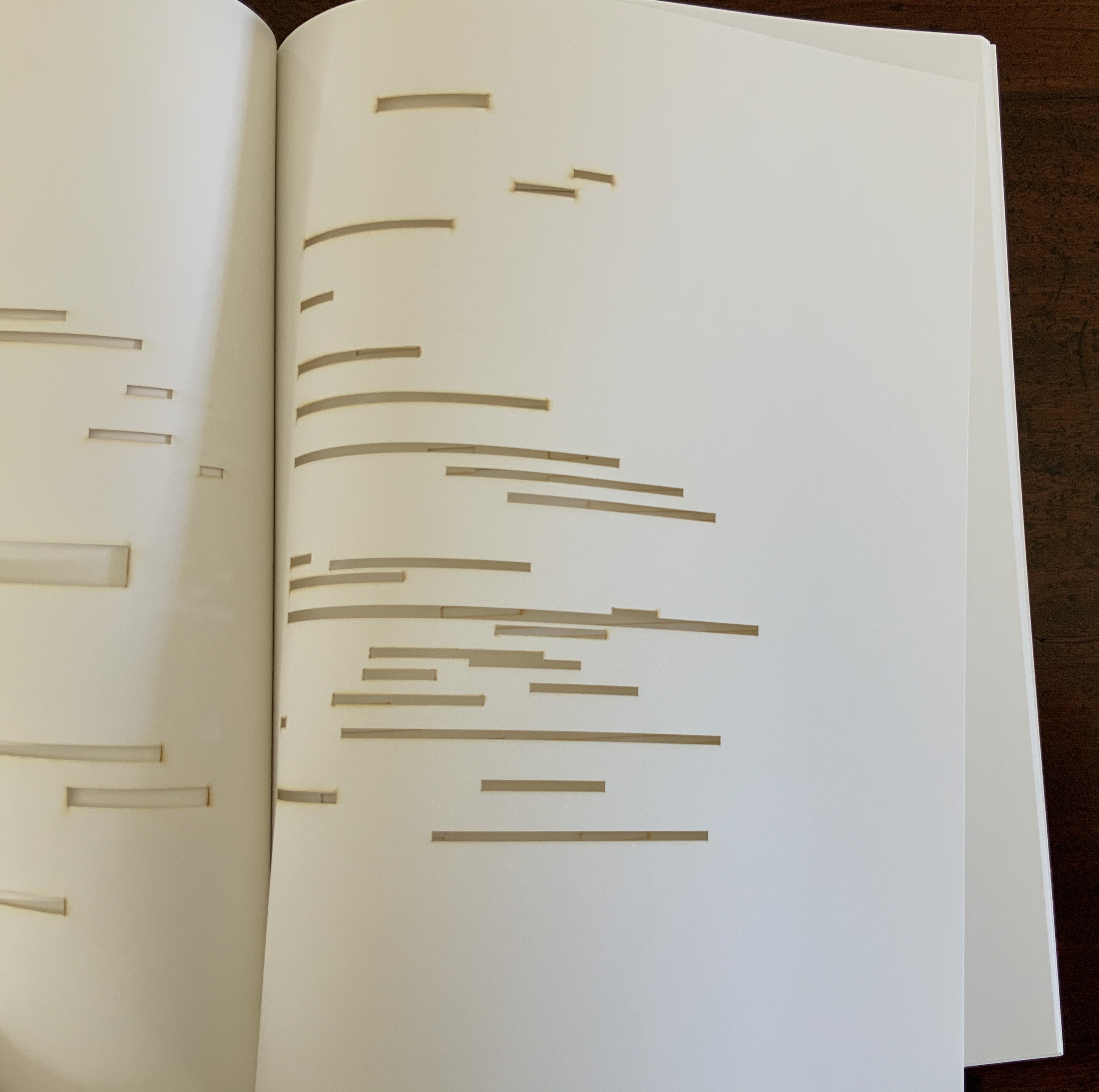
Taking Mallarmé’s and Broodthaers’ musical cues and that of his piano-roll-like slots in Sculpture, Pichler created for his exhibition Un Coup de Dés Jamais N’Abolira le Hasard: Musique, a piano-roll version of the poem to be played by any visitor who cared to sit and pedal the pianola on which it was installed. So in further appropriation of Mallarmé through Broodthaers, Pichler’s piano roll turns the empty spaces, where the words and black strips would be, into music while the blanks around them become what Magnus Wieland calls “white noise”.
In traditional literary ekphrasis, the referring text can stand on its own. Homer’s description of Achilles’ shield does not require a side-by-side engraving or painting of what Hephaestus forged. Nor does Auden’s exposition of Breughel’s Landscape with the Fall of Icarus (c. 1560) need an art history book to hand.
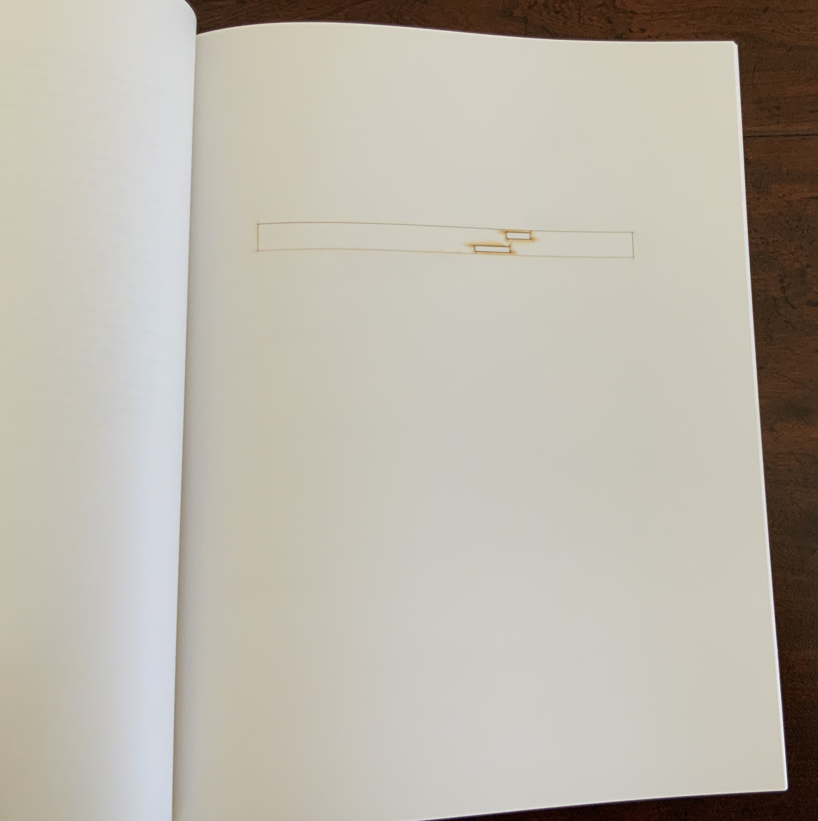
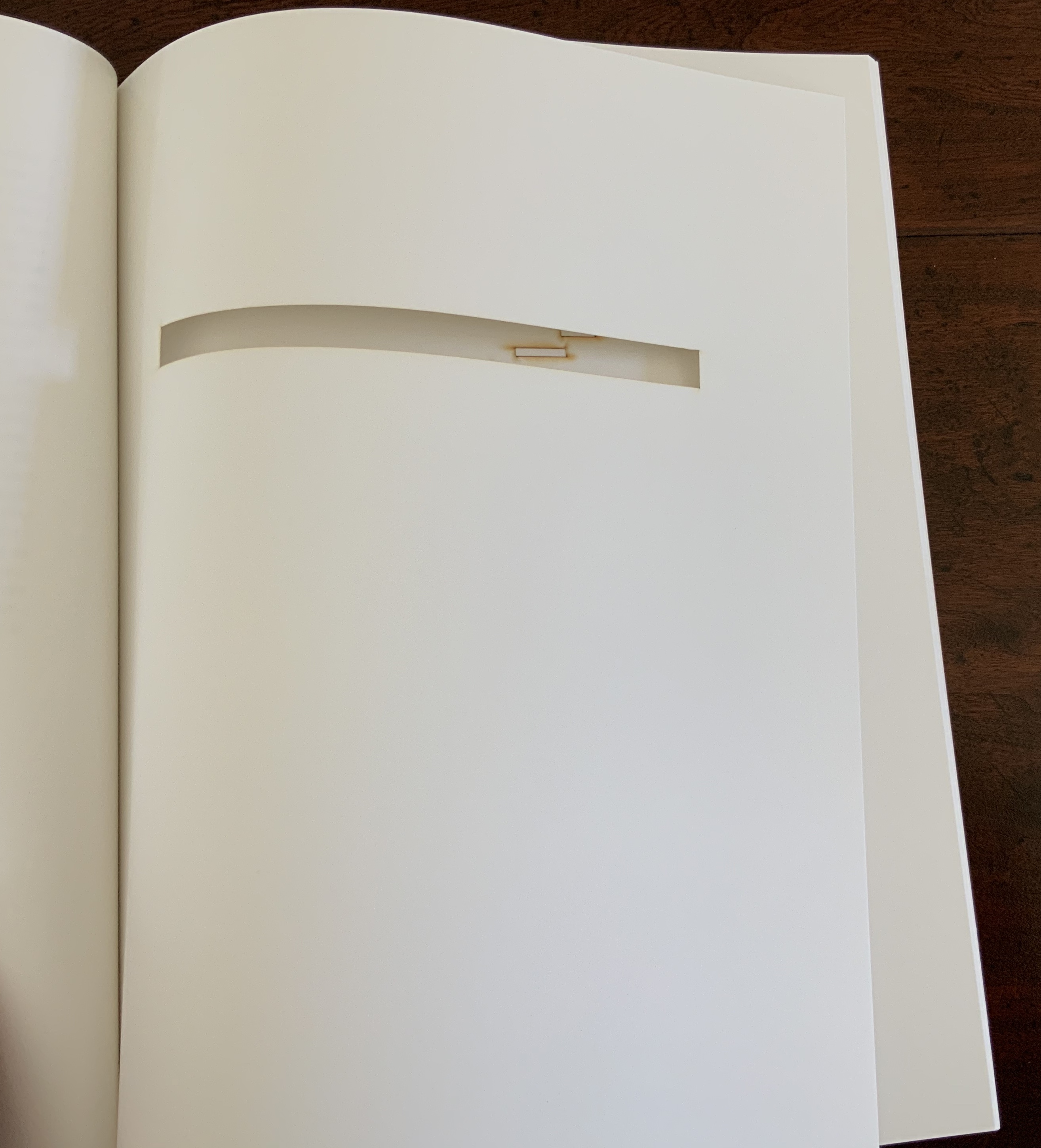
But without the context of the exhibition, the presence of other appropriations, or even Pichler’s translucent and plexiglas editions, what to make of Pichler’s paper edition on its own? The traditional Nrf cover design suggests no surprise to come, although the trim size looks non-traditional in today’s market. The book’s slimness, subtitle and preliminaries also warrant a raised eyebrow: how can this be a sculpture? Turning the pages, the reader/viewer comes to the cuts and sees through to the pages beneath. Shadows move through the leaves. The laser cut technique hints at something that a die cut does not. Do the burnt edges where the laser has cut suggest a more surgical approach to book burning, an allusion to burning decks, or a 19th century and 20th century legacy to the white spaces?
Both Mallarmé and Broodthaers noted the intent to draw attention to the white space of the page. Pichler appropriates both the poet’s and artist’s form and intent. He sculpts a conceptual double-palimpsest not by overwriting the first level of overwriting but by removing it and the original layer altogether. The core subtlety of Pichler’s paper edition of Un Coup de Dés lies in those empty spaces defined at their burnt edges and by the blankness around them. For Sartre, Mallarmé was the poet of nothingness. Broodthaers appropriated the nothingness with black ink. Pichler has appropriated both. The paradox is a work that stands on its own by invoking and eliminating what it appropriates.
Sixteen folios including cover, staple-stitched, digitally printed on 32 lb laser paper. H280 x W212 mm. Edition of 30 copies of which this is an artist’s proof. Acquired from the artist, 5 August 2020. Photos: Books On Books Collection with permission of the artist.
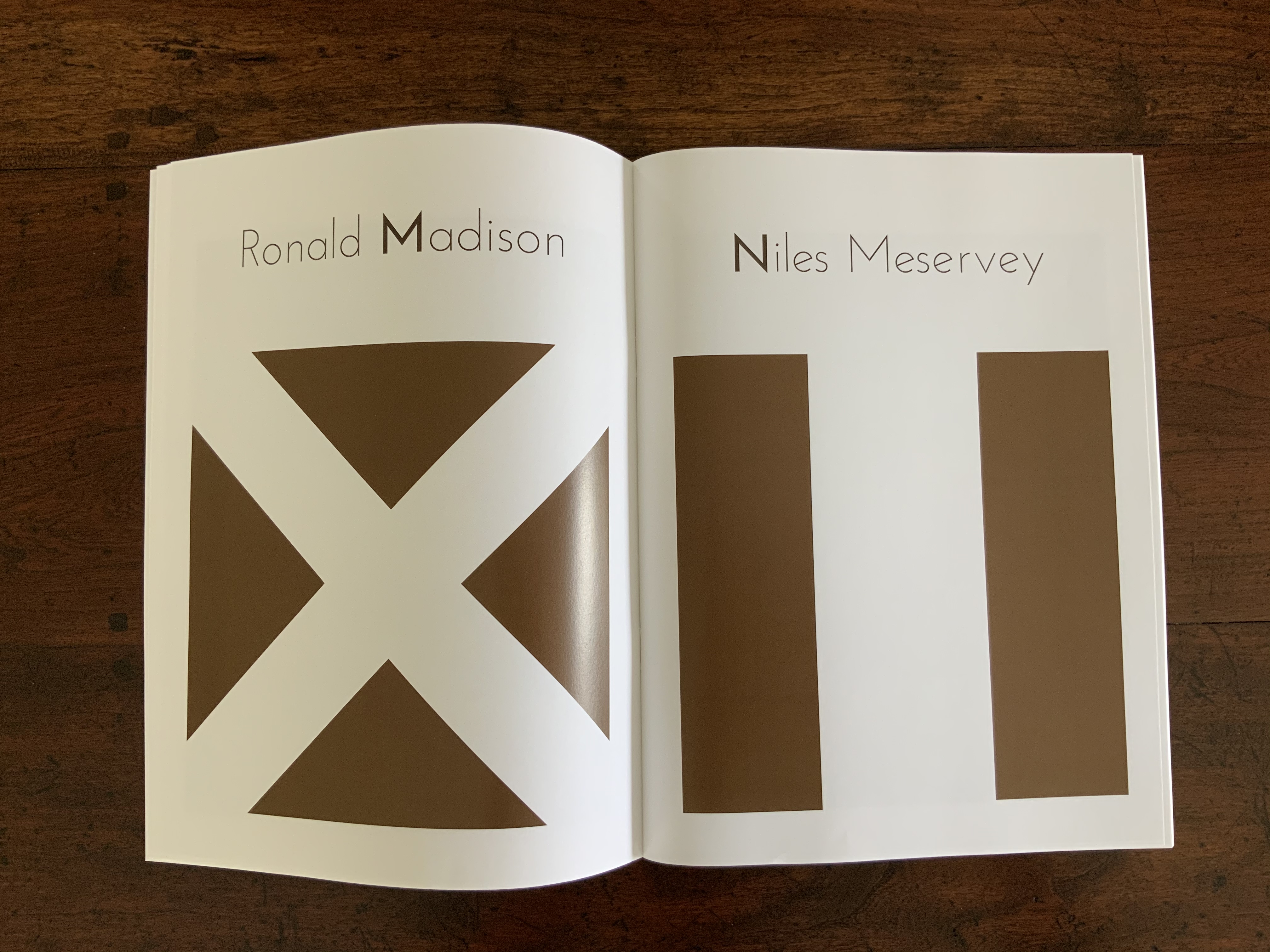
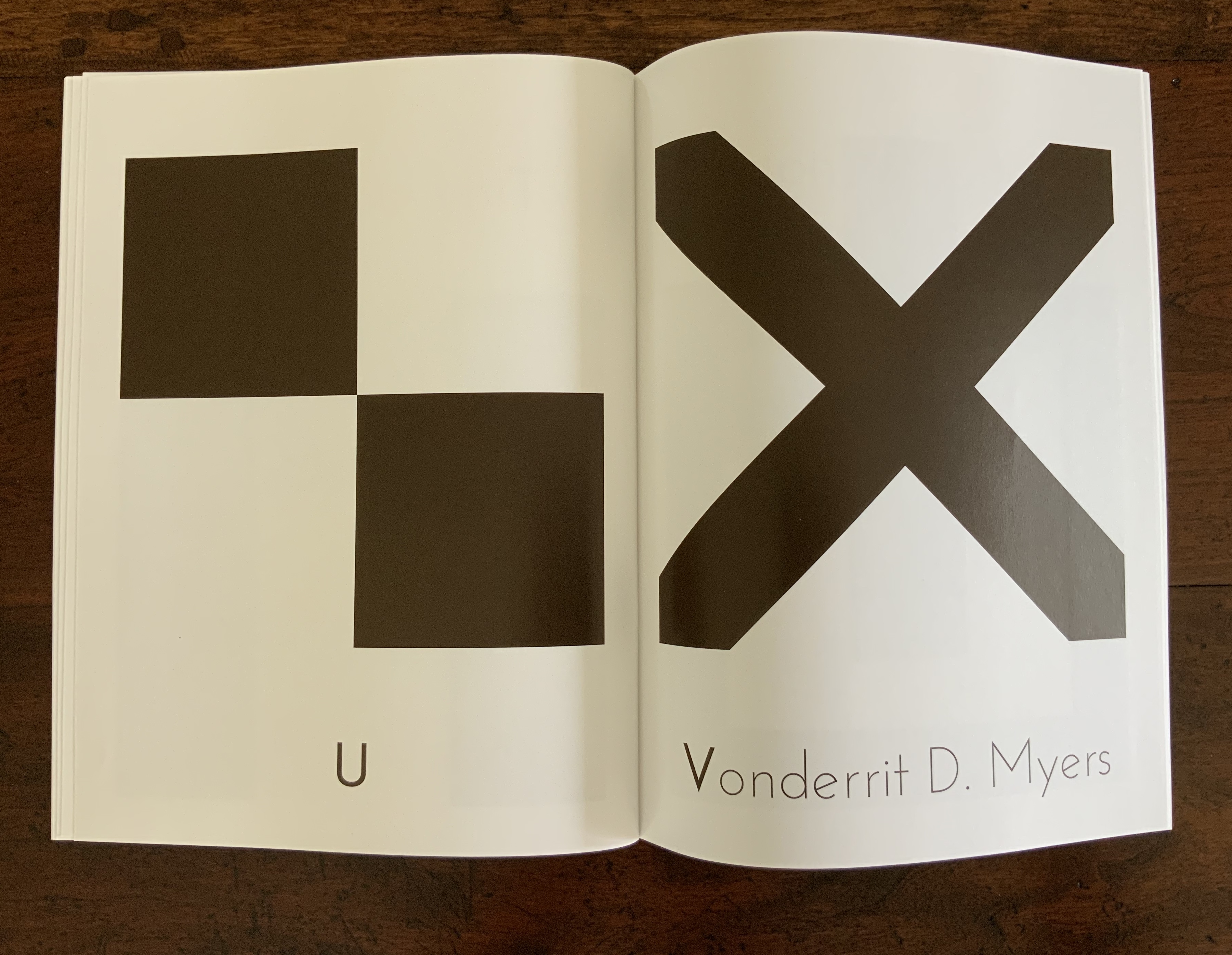
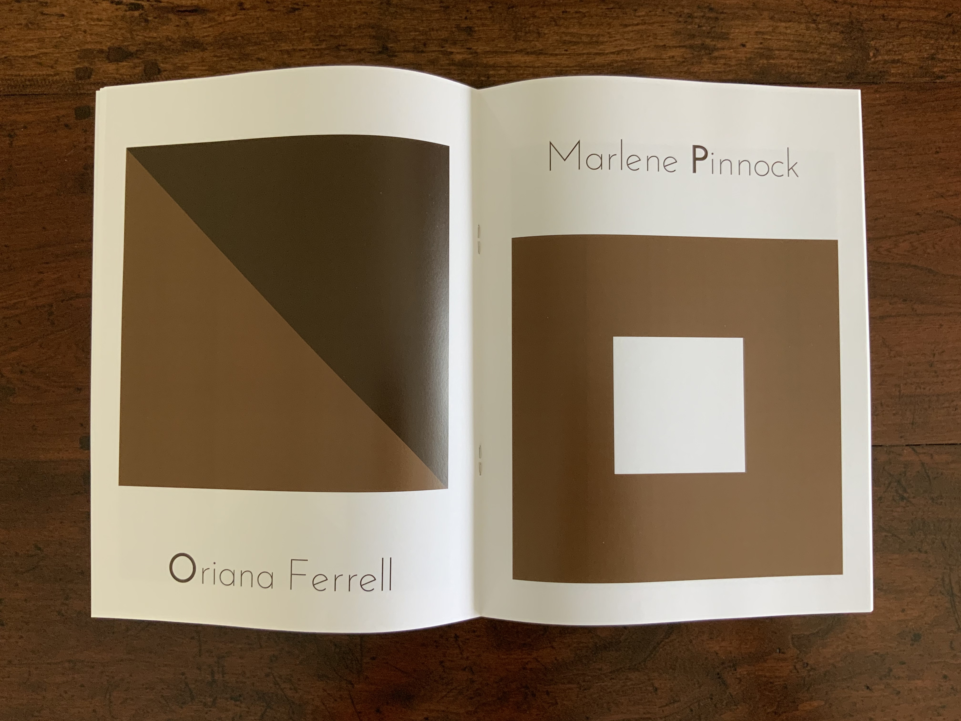
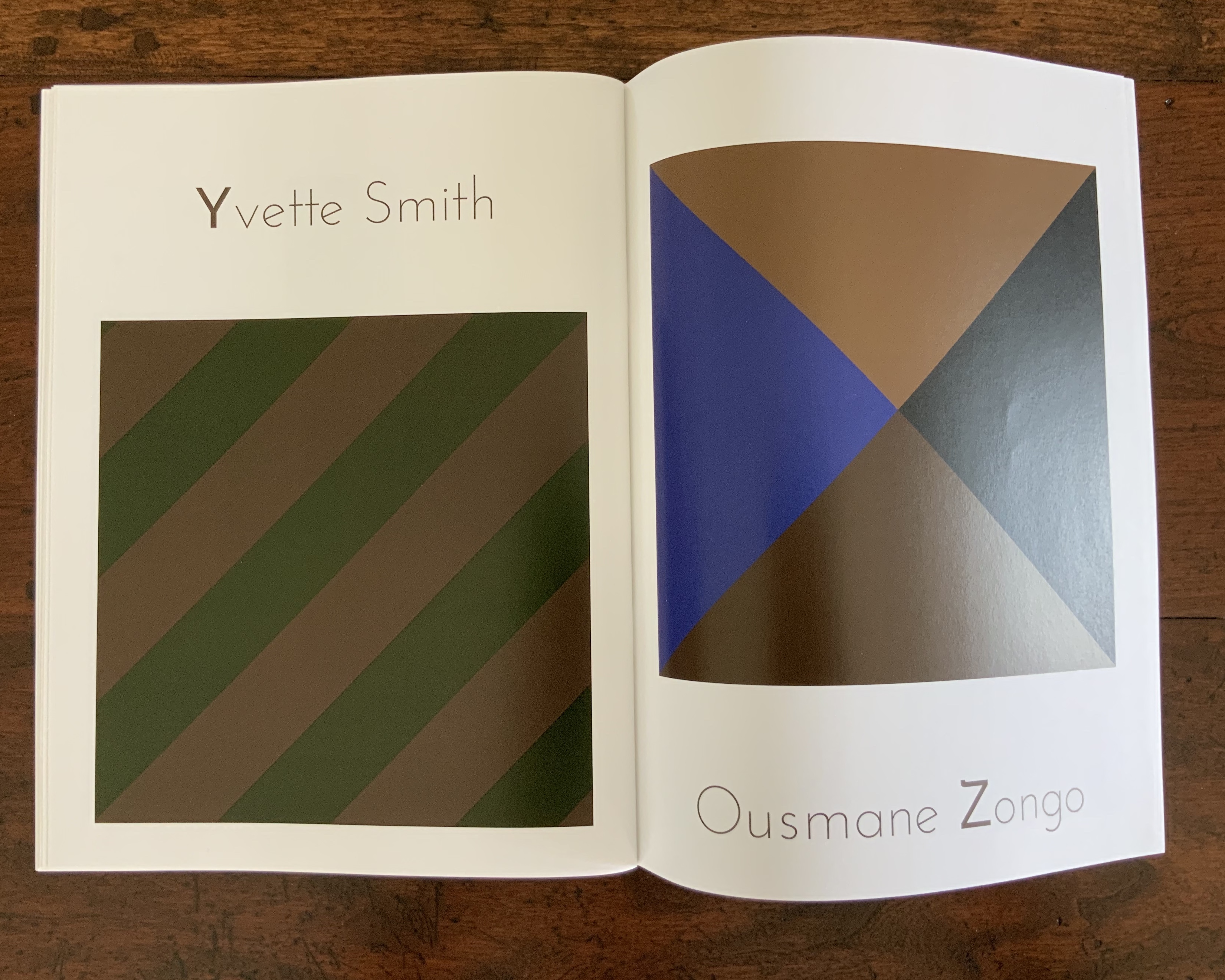
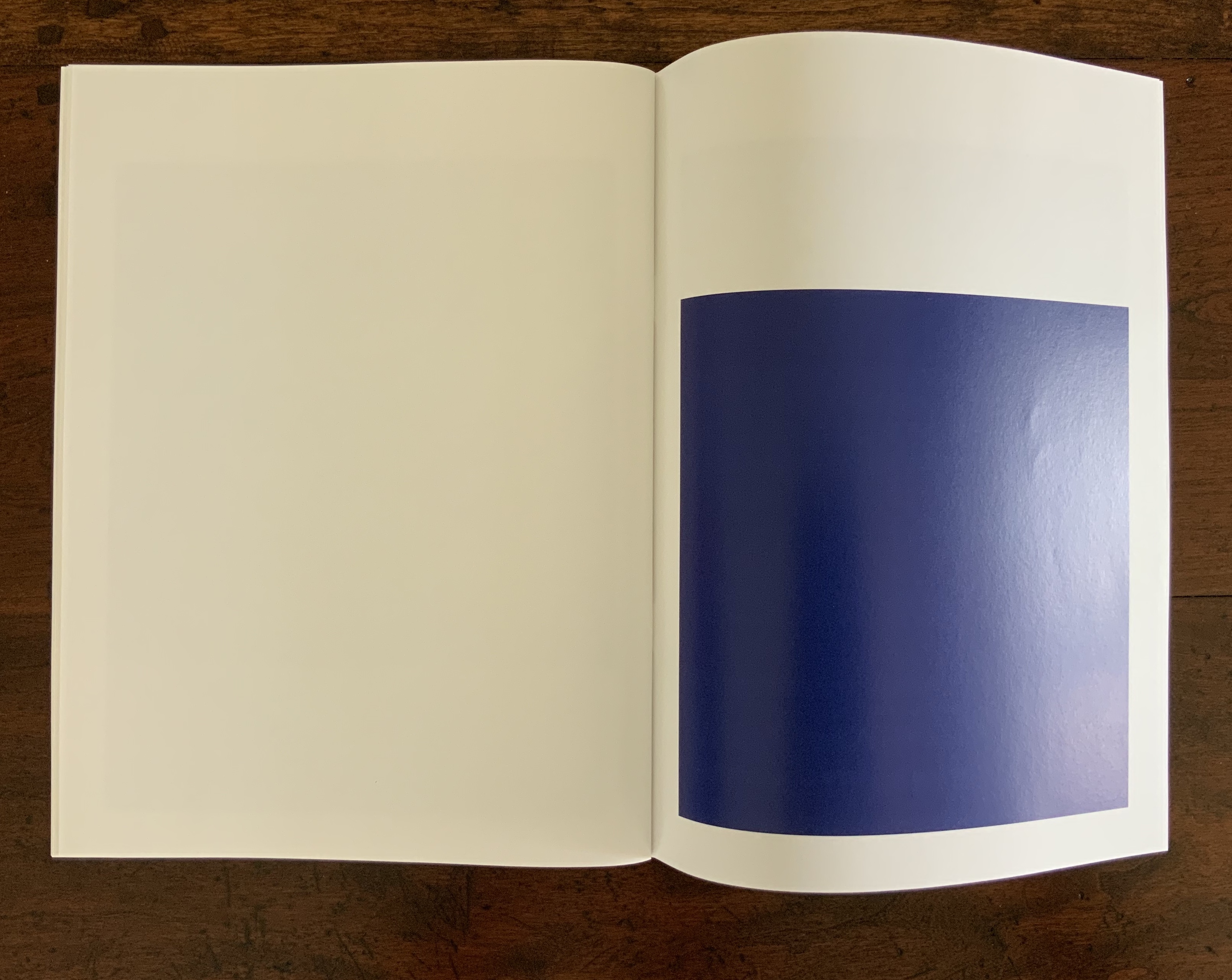
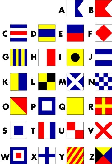
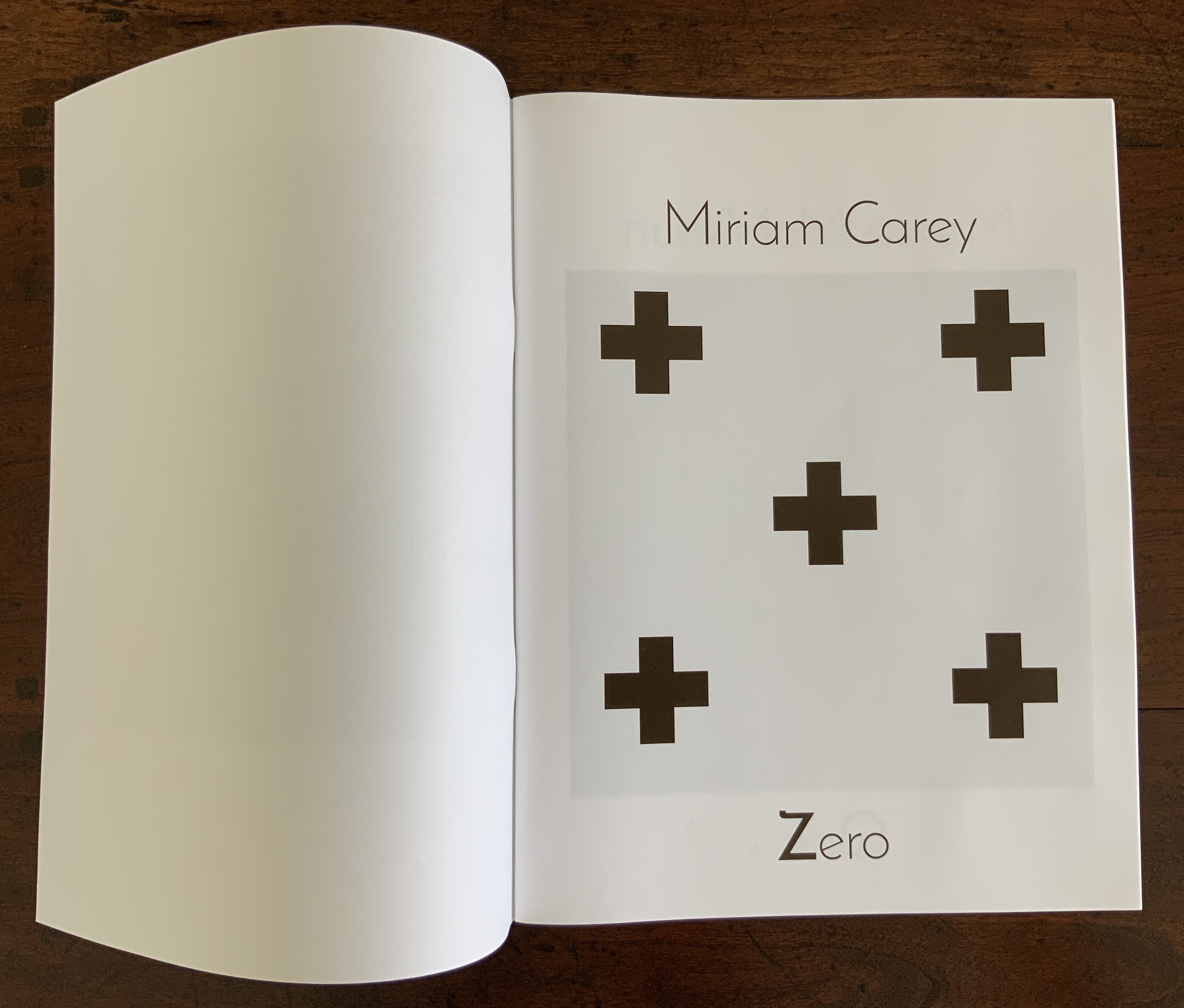
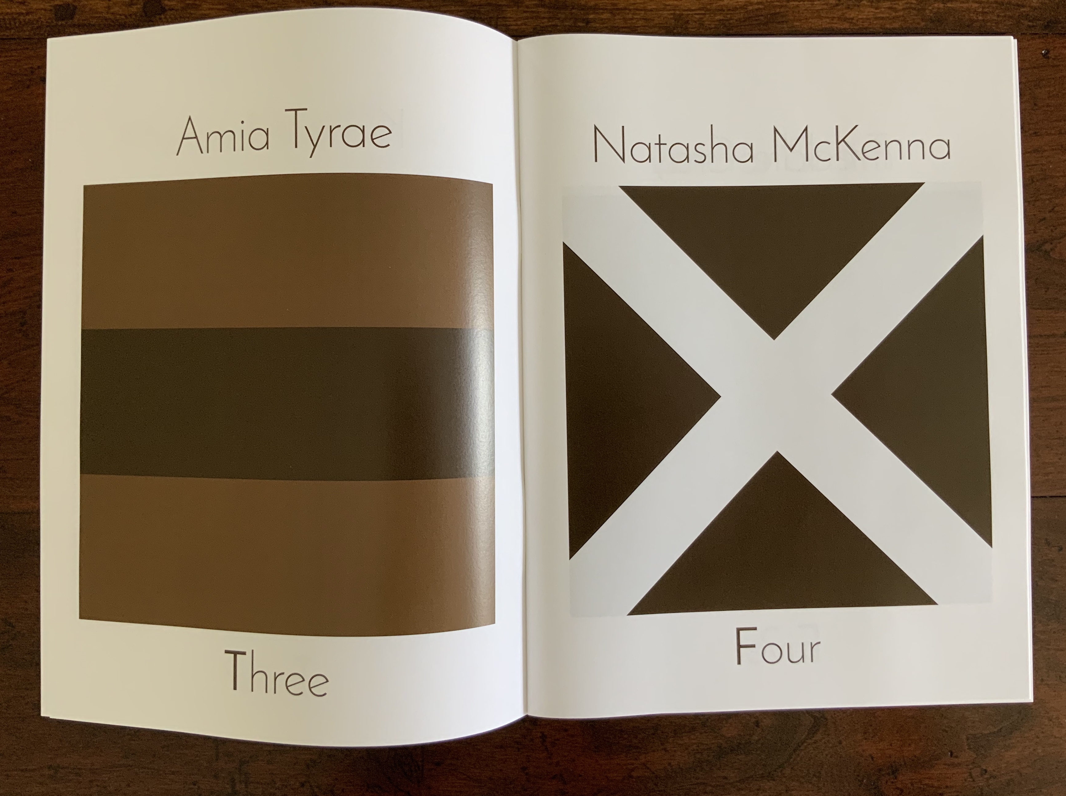
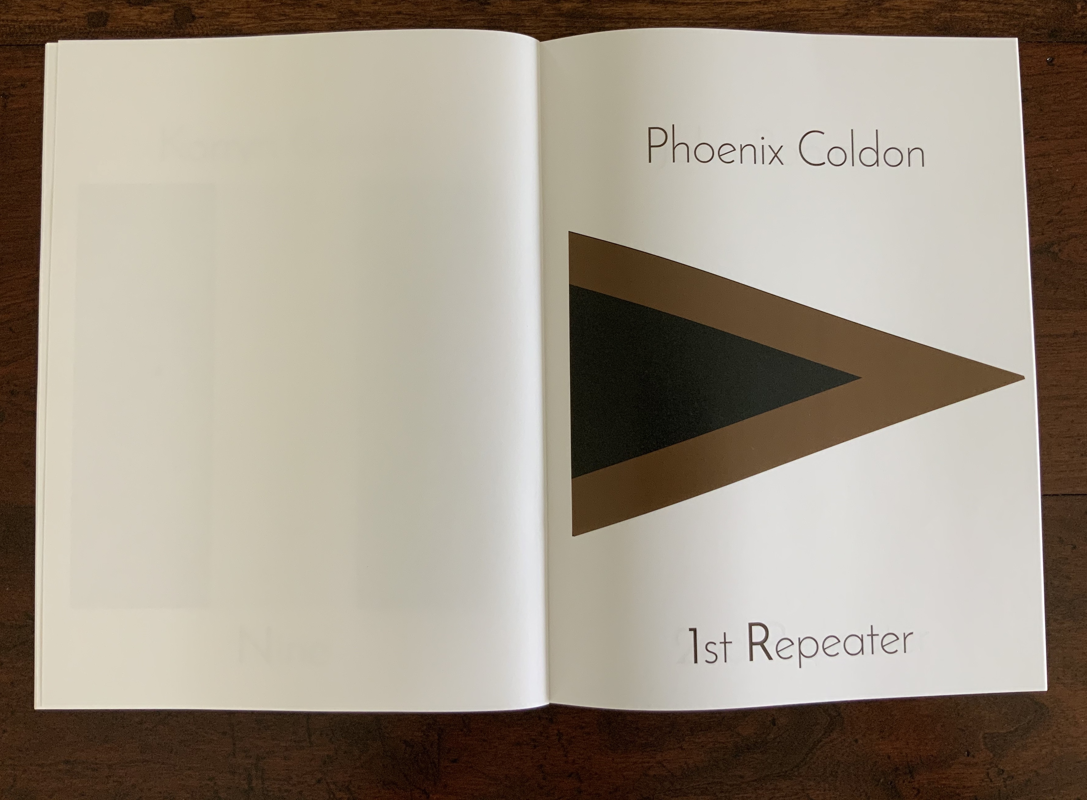
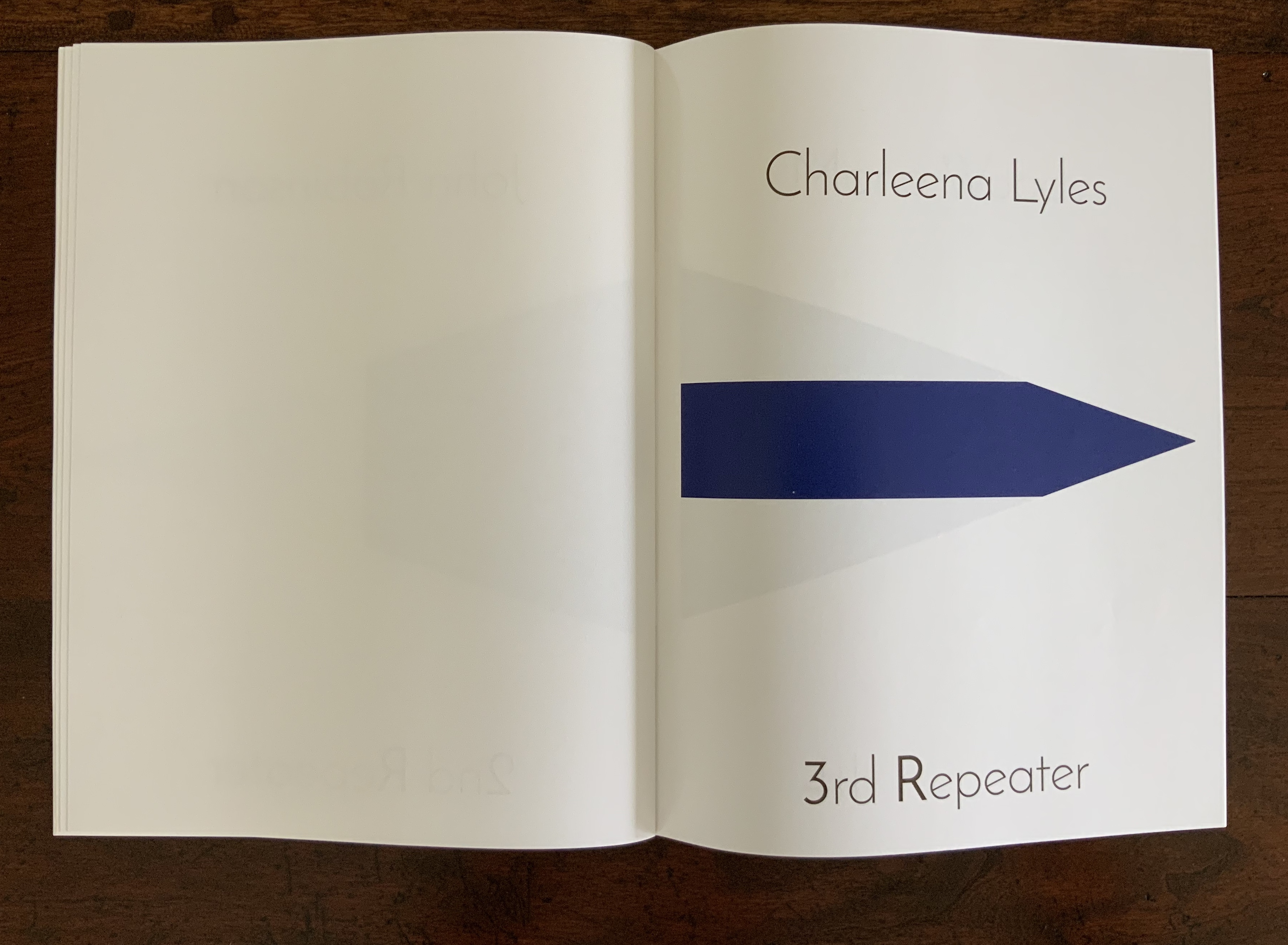
At its most fundamental, Mourning/Warning — as with any abecedary — is about doing the work of learning to read. In this case, doing the work extends also to learning the maritime signals associated with the letters of this alphabet. In one of several signals of its artistry, it strips the nautical flags of their primary colors (with the occasional exception of the color blue) and replaces them with black and muted browns. Obviously difficult to read in practice, these modified signals for mourning and warning intentionally raise the bar on “doing the work”.
As with any abecedary, each letter is printed to stand out; here, it is in Josefin Sans Bold, a typeface designed for display and having a nautical feel. As with any abecedary, each letter offers an example of its use: here, it is the name of an individual. The bar may be raised a little in that the letter may be the initial letter of the first name or the last. Still, as with any abecedary, the reader is expected to say the name aloud to memorize the letter. “A for Marissa Alexander; for Marissa Alexander, this flag”. In itself, a very small step in doing the work.
Some readers will know these names, some will not. For those who do not, doing the work means learning that Marissa Alexander is now free but with seven years of her life lost to incarceration and home arrest in Florida and a felony conviction for firing a warning shot at an abusive husband in 2010. Or that Ousmane Zongo was an immigrant from Burkina Faso in the wrong place at the wrong time, unarmed and shot twice in the back by police in 2003 in New York.
The work of learning the ABCs or the International Code of Signals is about memorizing. Doing the work with this abecedary is about memorializing. By the time the letter “P” is reached, there can be no question how hard this is. If there is, readers will be stopped in their tracks here: there is no letter “Q”. Why? Because the question mark at the end of the question — “Where is Relisha Tenau Rudd?” — is in bold, demanding the work of remembering Relisha and her circumstances as one of the many Black children gone missing in the US. But the question demands another: “Why?” This is another aspect of Blassingame’s artistry that makes the impact of “doing the work” — learning what lies behind the individuals paired with letters — land with that much more force.
And why do the letters “I”, “U” and “X” have no names assigned? Of course, “I” and “U” have no names; they are reserved for the readers to be drawn into mourning and warning, to imagine themselves speaking the letter aloud to themselves, to imagine themselves as one of the named. As for the letter “X”, the artist writes that it refers to
the anonymity experienced by African Americans today back to when they were enslaved. It references how education and literacy were and in many ways continue to be restricted. How many of our enslaved ancestors made their mark or signed with an X in lieu of being able to sign their names. How they were often forced to make their mark on documents that diminished them. X as a reminder of those that cast off their given, or slave name to own their identity and authority. X is the nameless, unnamed, renamed. X is the sharecropper. X is those that fought fear, and terrorist threats of violence, poll taxes to vote. X is Malcolm X. X is the potter’s field, the slave cemetery, those incarcerated brothers and sisters, the penniless and the powerless. (Correspondence with Books On Books, 10 August 2020)
The fact that the maritime symbol for “X” is cruciform and, here, plain and dark should make for edgy and uncomfortable reading/viewing. Doing the work of learning these altered nautical signals means “doing the work” of looking into the heart of transatlantic slavery and the Black diaspora. It signals a mourning for the known and unknown dead and a burnt warning of those to come if we do not learn these ABCs.
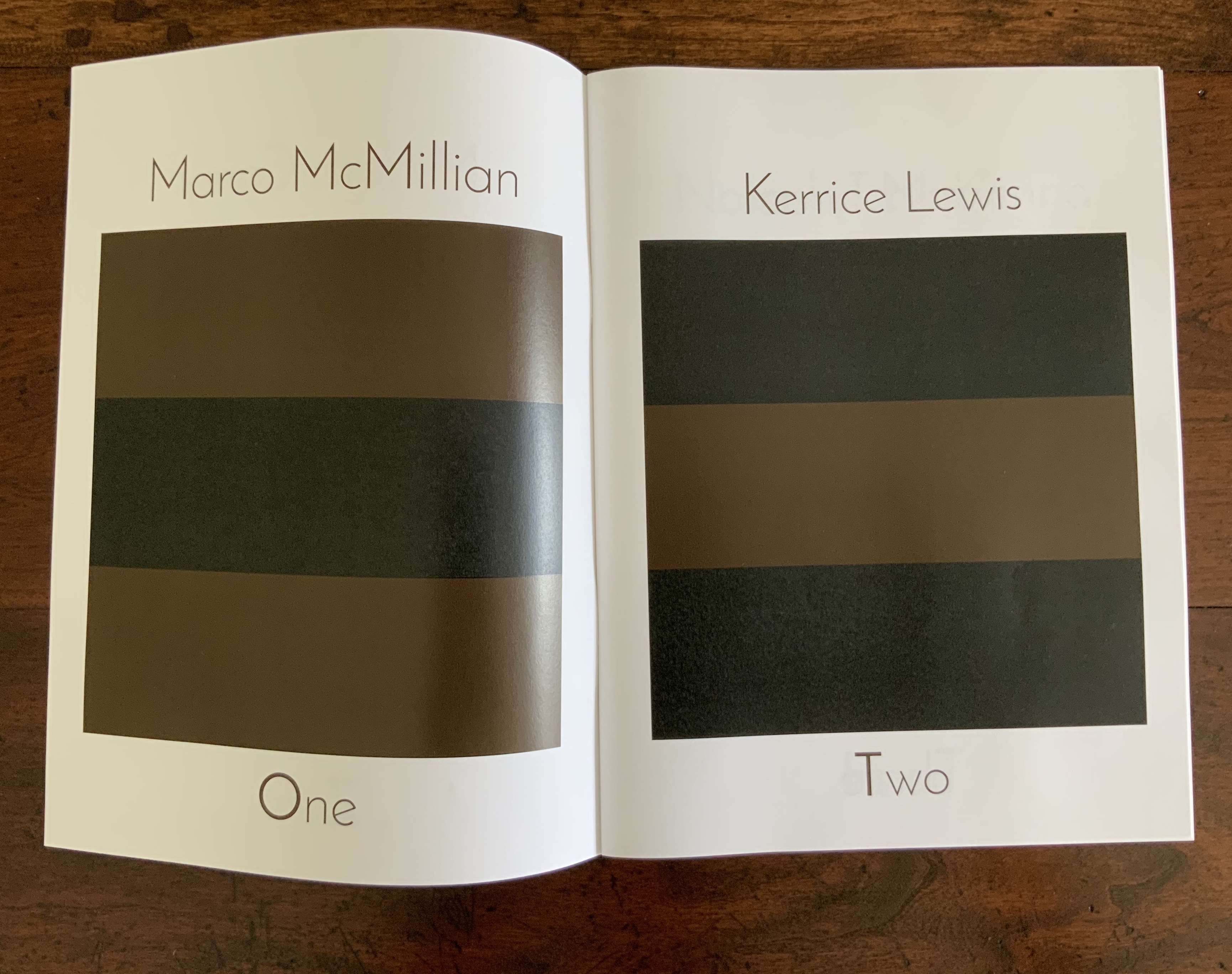
Twelve folios (including cover), digitally printed, H280 x W212 mm 8.5 x 11 inches. Edition of 30 copies of which this is an artist’s proof. Acquired from the artist, 5 August 2020. Photos: Books On Books Collection with permission of the artist.
Numbers and Repeaters signals to its readers there is still more to the work begun with An Abecedarian. The flags for the numbers 0 through 9 must be learned, so too the four “repeaters” for handling messages with duplicate letters or numerals.
Numerals are not numbers, of course, but symbols of them. By associating a name with each numeral, repeater and its altered maritime flag, Numbers and Repeaters doubles the symbolism: the number of names continues to increase and the circumstances to repeat themselves. “Doing the work” required in this added volume reveals, though, that “circumstances” have widened to include gay, lesbian and transgender victims, others who may have been mentally disturbed, the domestically abused and the political activist. The widening does not dilute. It confirms that, as Blassingame writes on her website, “hatred comes constantly in waves”.
As with An Abecedarian, some readers will know the names of the individuals in Numbers and Repeaters, some will not. Readers will also naturally break down into two other groups: those who see themselves as persons of color and those who do not. On her website, the artist writes to all, regardless of how they see themselves, that Numbers and Repeaters “serves as a method of honoring, mourning, and remembering the slain and wronged”. For those who do see themselves as persons of color, she calls it also a method of “teaching our children and ourselves to be vigilant and wary in hostile terrain, where your skin color makes you an easy target.” Whichever group into which readers fall, Numbers and Repeaters demands “doing the work” to learn this “alternate means of communication in times of emergency and duress”. Those times are with us now.
Gleek, Charlie. 27 April 2019. “Centuries of Black Artists’ Books“. Presented at “Black Bibliographia: Print/Culture/Art” conference at the Center for Material Culture Studies, University of Delaware, pp. 7-8. Accessed 20 July 2020.
Hannah-Jones, Nikole. 14 August 2019. “The Idea of America”. New York Times: The 1619 Project. Accessed 20 June 2020.
Michaelis, Catherine Alice. 6 February 2021. “Crossroads and Currents”. Artist’s Books Unshelved. Bainbridge Island Museum of Art. Accessed 7 February 2021.
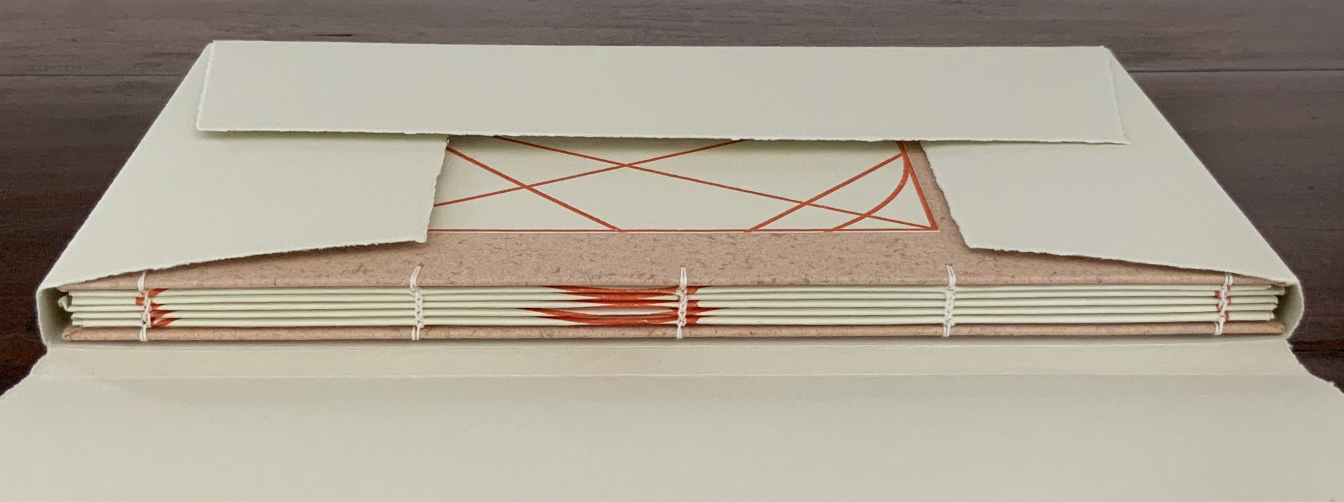
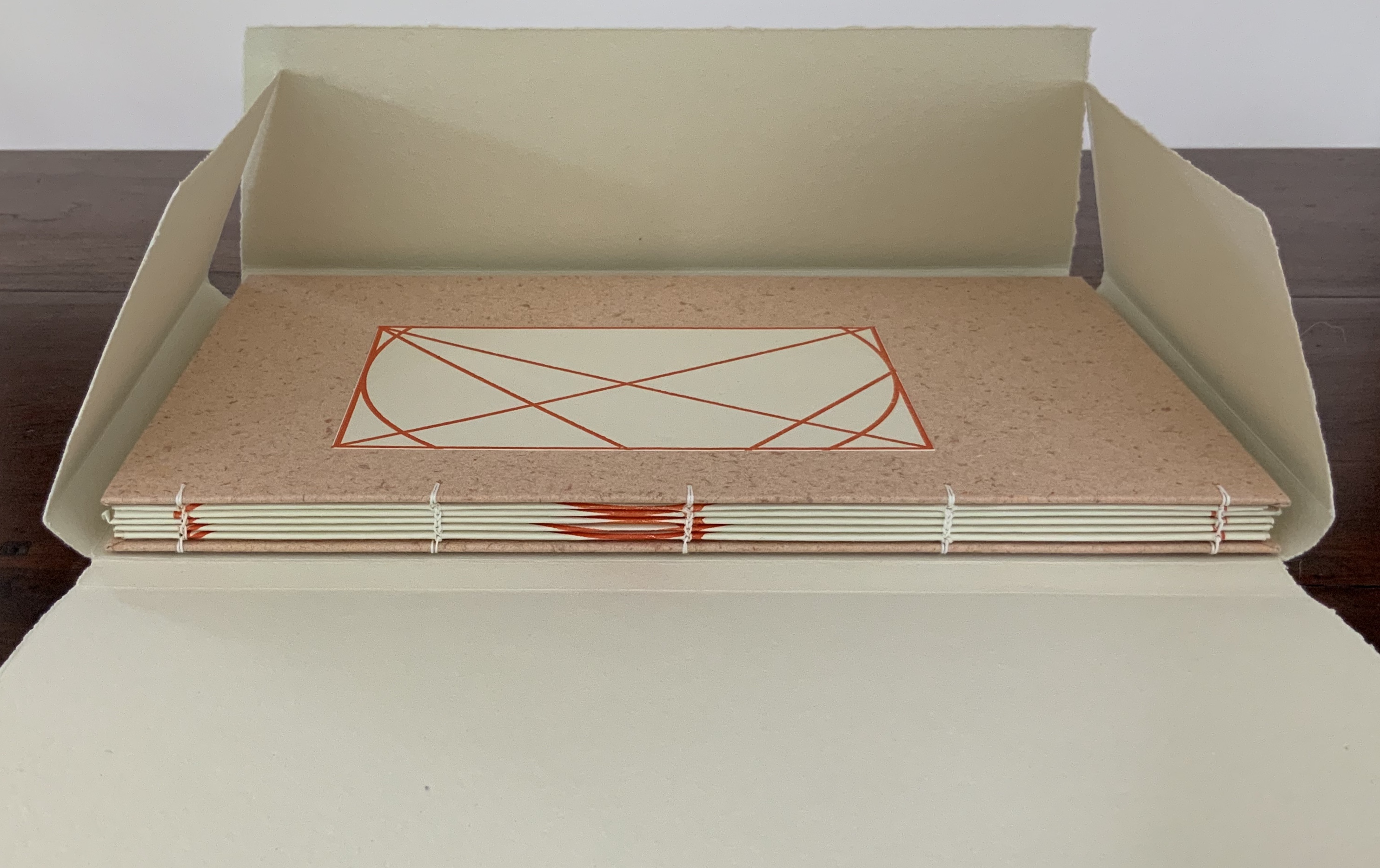
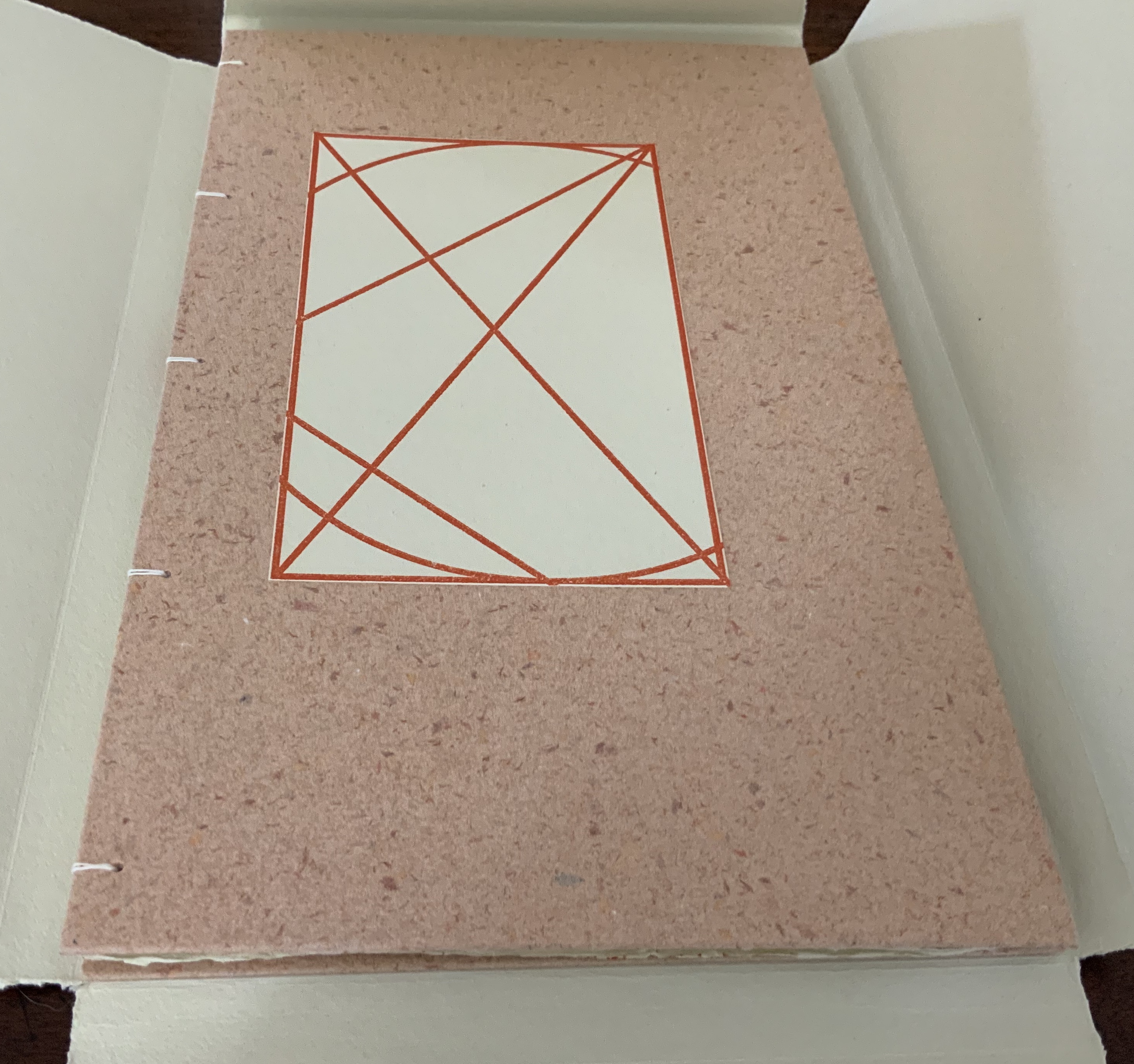
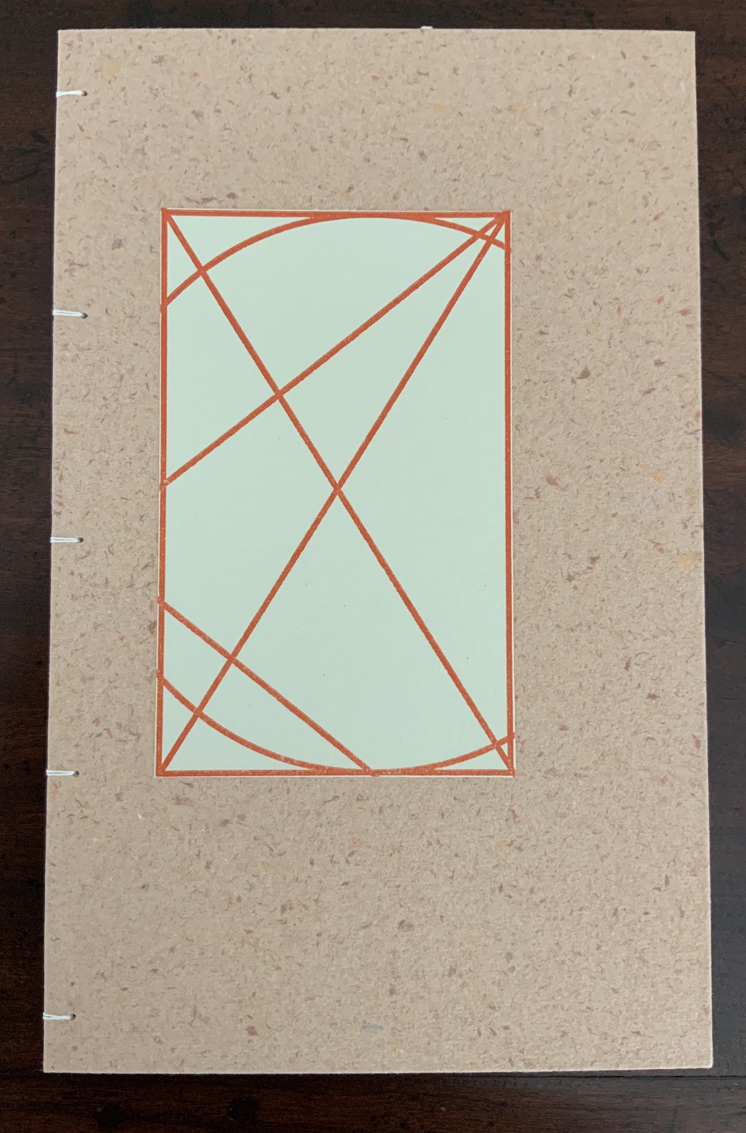
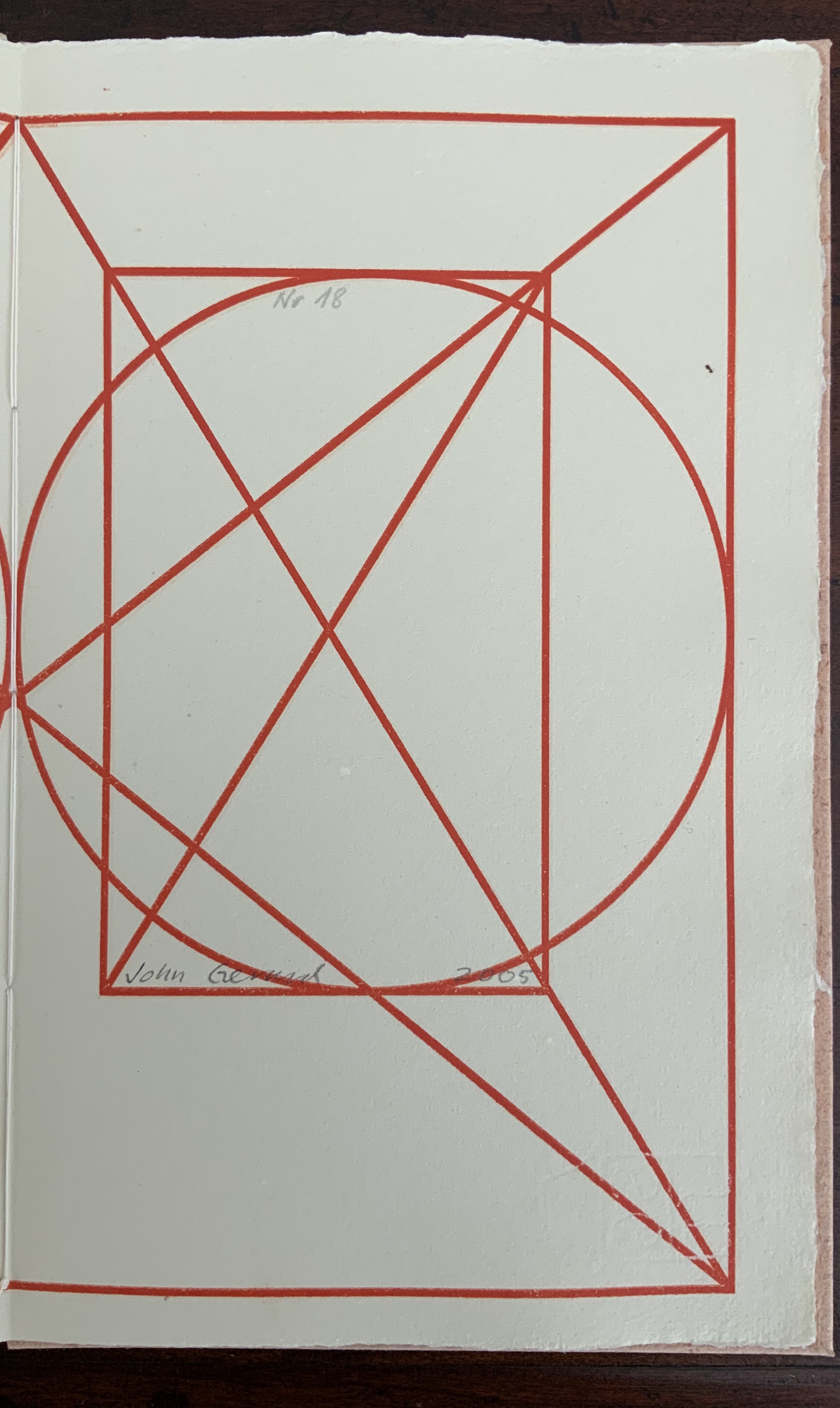
Small quarto book chain-stitched in boards, with a paper label to the upper cover, 40 pages, H275 x W272 x D15 mm, housed in a paper four-flap enclosure H175 x W278 x D16 mm. Signed edition of 20, of which this is #18. Acquired from the artist, 29 July 2020. Photos: Books On Books Collection.
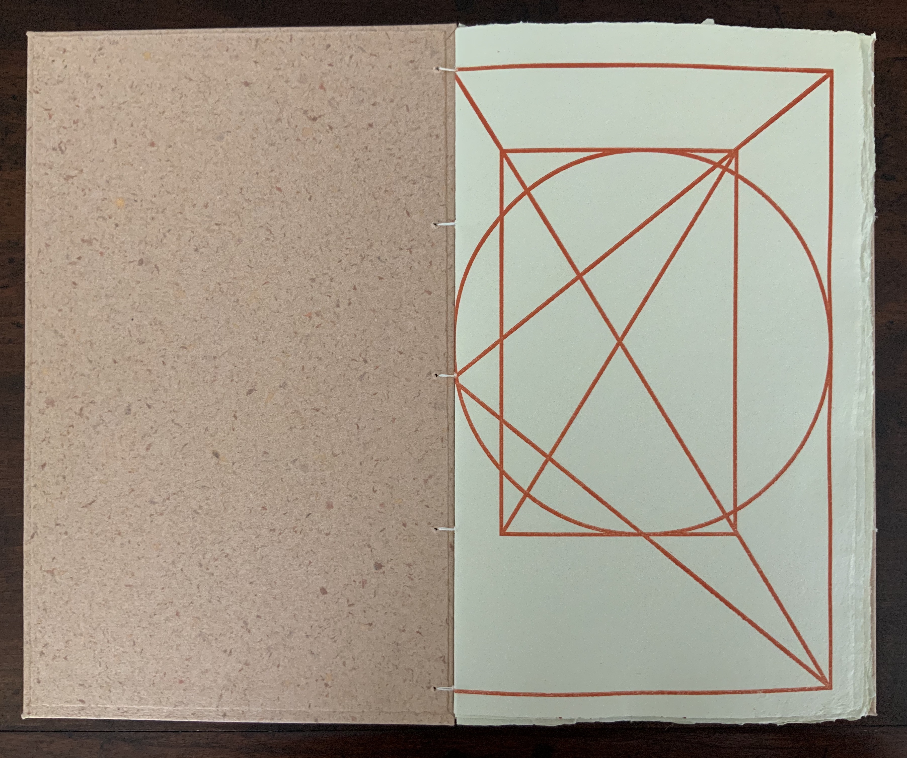
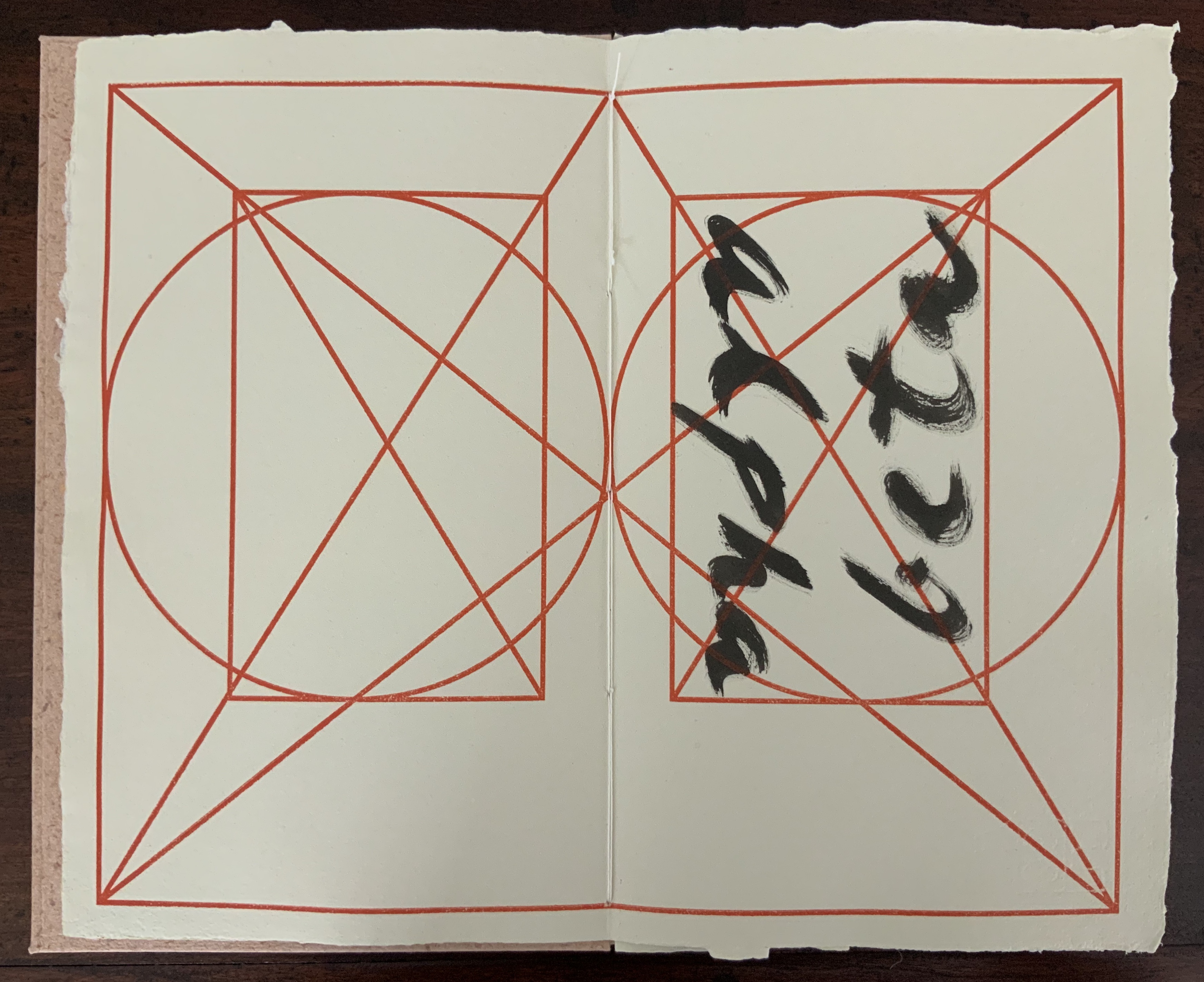
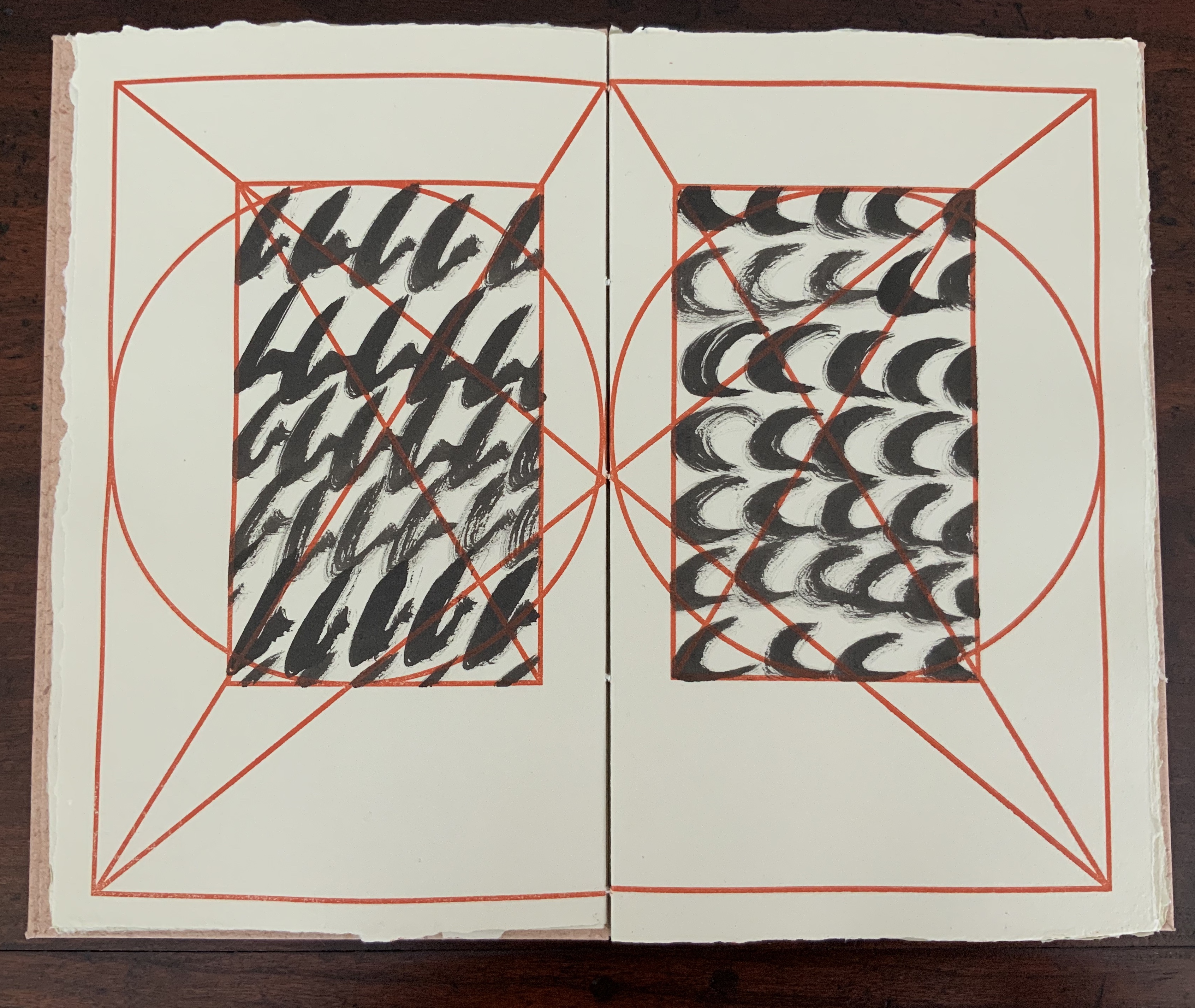
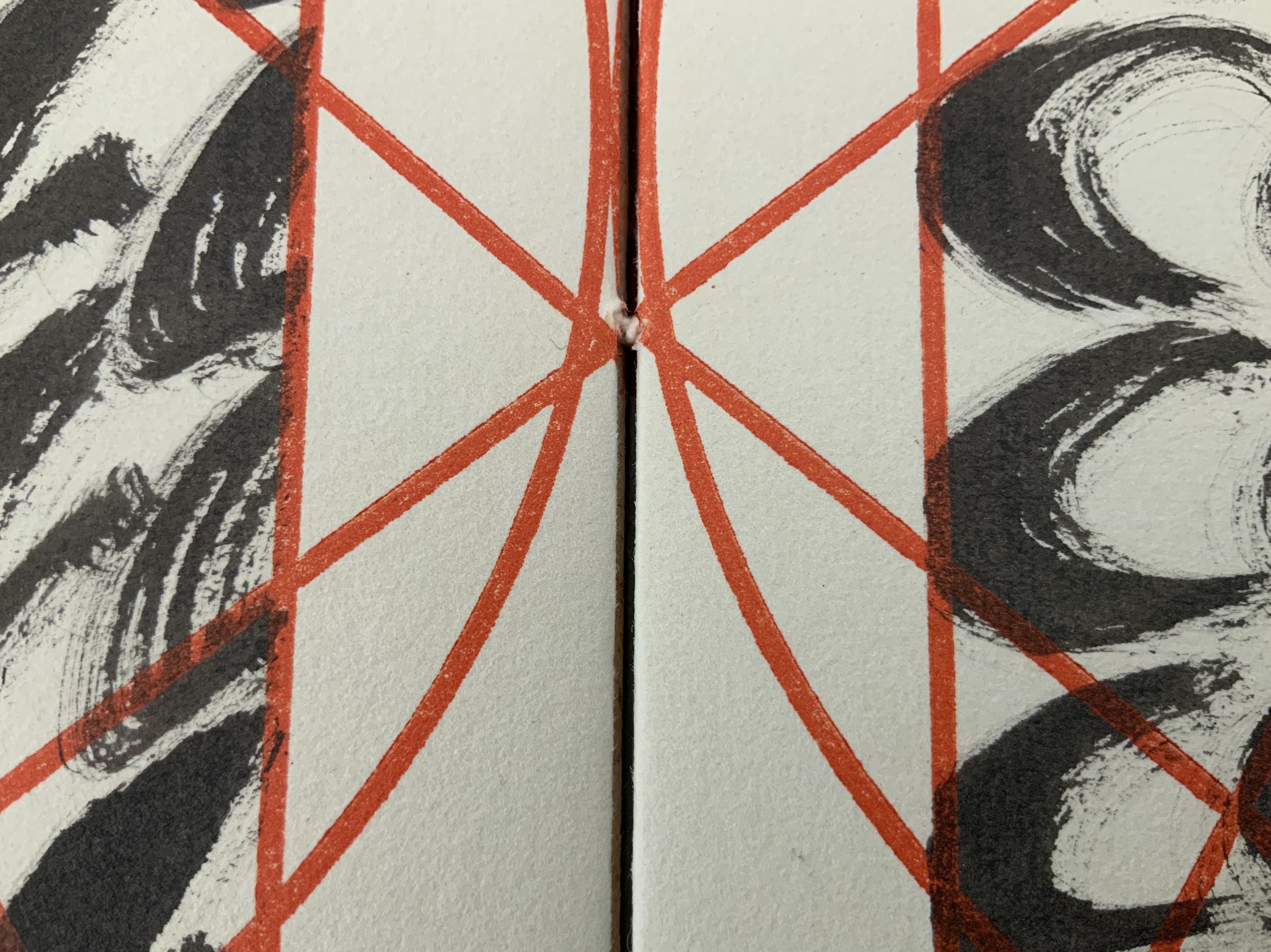
In the playground of the alphabet, papermaking, calligraphy, page design and layout, image and text, printing and binding, John Gerard has created an outstanding and contemplative work of book art and the book arts. Eastern and Western traditions meet on the page and in the material and structure: Coptic-style binding, handmade paper and spirited brushing of the letters right up against the geometric constraints of Jan Tschichold’s diagram for deriving the text block’s ideal space and positioning from the Golden Ratio.
The cover’s paper label shows the image of Jan Tschichold’s canon for page layout, which is reproduced on every page of the work. Each letter of the alphabet is messily brushed in black over and over to fill the mathematically precise text area defined by Tschichold’s canon.
The text and label papers for Alpha Beta are handmade from cotton and hemp using a velin mould with Gerard’s early watermark depicting the Eifeltor Mühle (Eifeltor Mill) and the letters S and G (Studio John Gerard). The weight of the paper is about 150-180gsm. The lettering is done with Indian ink, and the printing of Tschichold’s diagram, with a proofing press using a photo-sensitive nylon plate. The cover papers are also made with cotton and hemp using a coagulant with slightly different pigmented pulps, which creates the decorative speckled look. The sewing thread is linen.
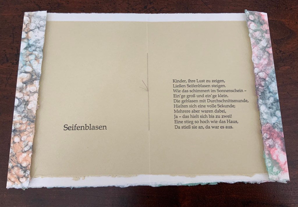
Artist booklet, stitched with linen thread, two sheets hand-made of cotton and abaca fibers, the cover sheet being double couched using a layer of colored pulps, the inner sheet printed in 14p Book Antiqua in relief printing. H200 x W150 mm. Edition of 100 unnumbered copies. Acquired from the artist, 29 July 2020. Photos: Books On Books Collection.
Inspired by the 19th century poem “Seifenblasen” (“Soap Bubbles”) by Theodor Fontane, John Gerard uses pulp painting to create the shifting prismatic colors displayed on the surface of a soap bubble. By layering different colored pulps on a sheet of plain wet pulp, he evokes the same pleasure, color and lightness evoked by the words.Here is a loose translation:
Soap Bubbles

Children to show their delight
Send soap bubbles up to the light.
How they shimmer in the sun —
Some big, some small.
Blown with a mouth just so, some
Hold out a whole second —
But several there —
Yes! — hold on for two.
One rises as high as the house —
Bumps there — then it’s over.
Gerard seems drawn to respond to things displaying a tension between spirit and form, be it the tension of soap bubbles or the tension between repeatedly scrawled letters constrained by a canonical grid.
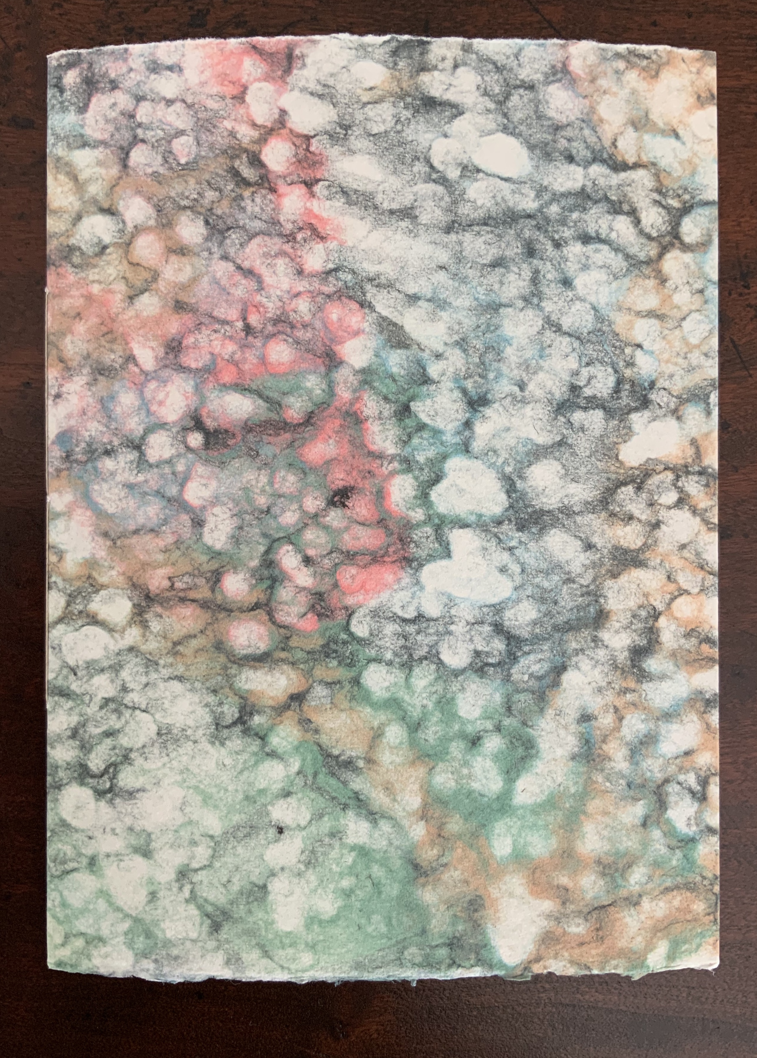
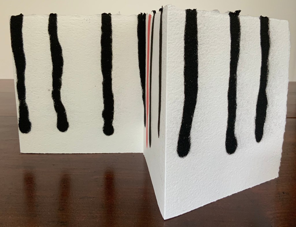
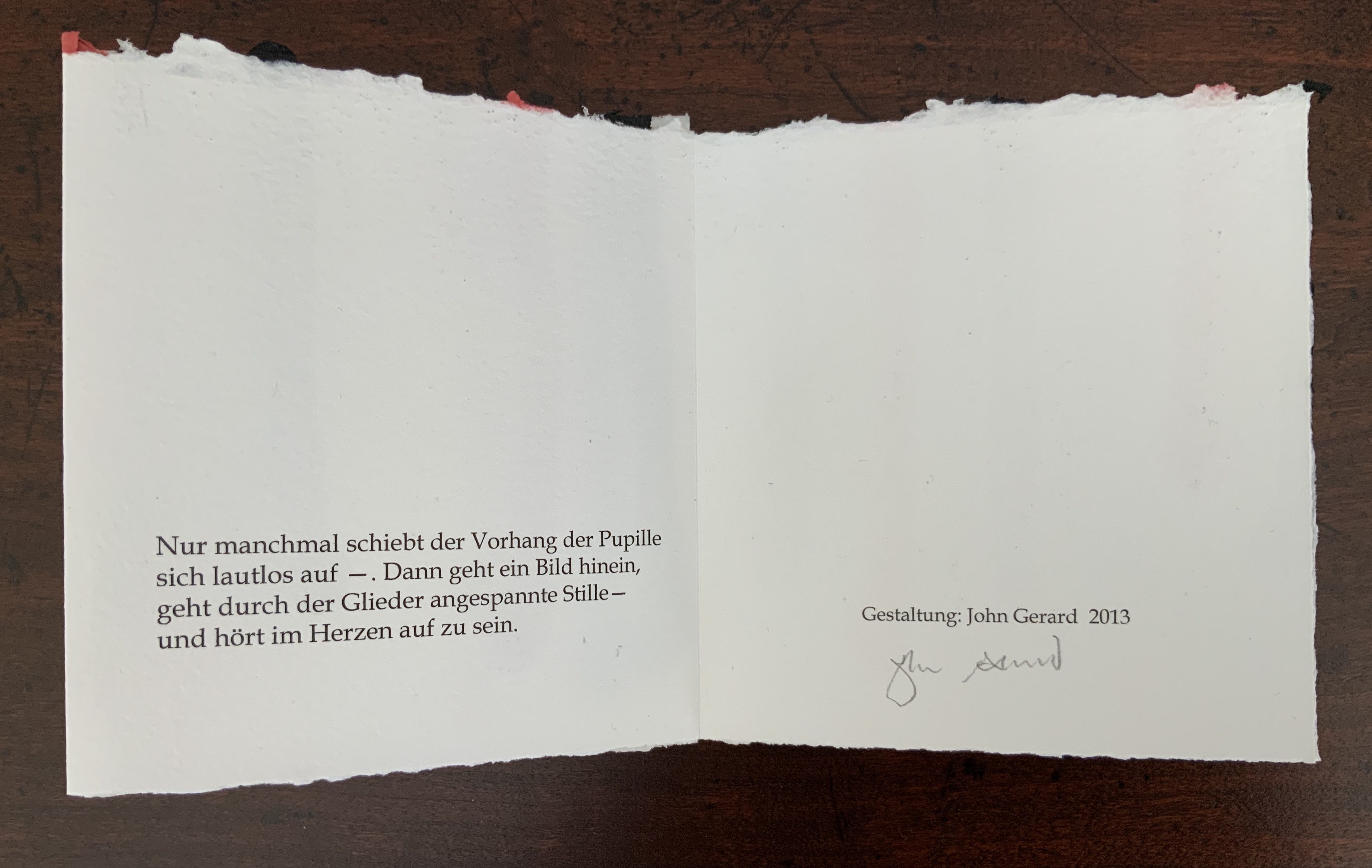
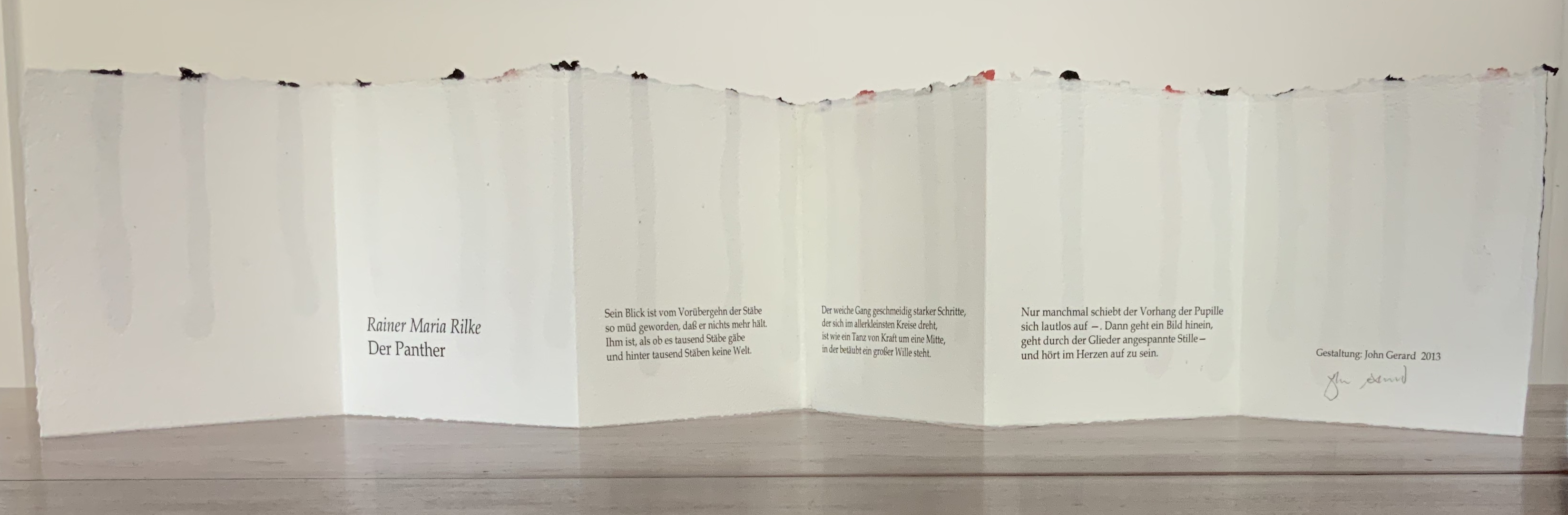
Leporello of two connected sheets of hand-made cotton and hemp paper, pulp-painted with red and black lines. H140 x W130 mm (unfolded approx. 770 mm). Unnumbered, signed edition of 25 copies. Acquired from the artist, 29 July 2020. Photos: Books On Books Collection.
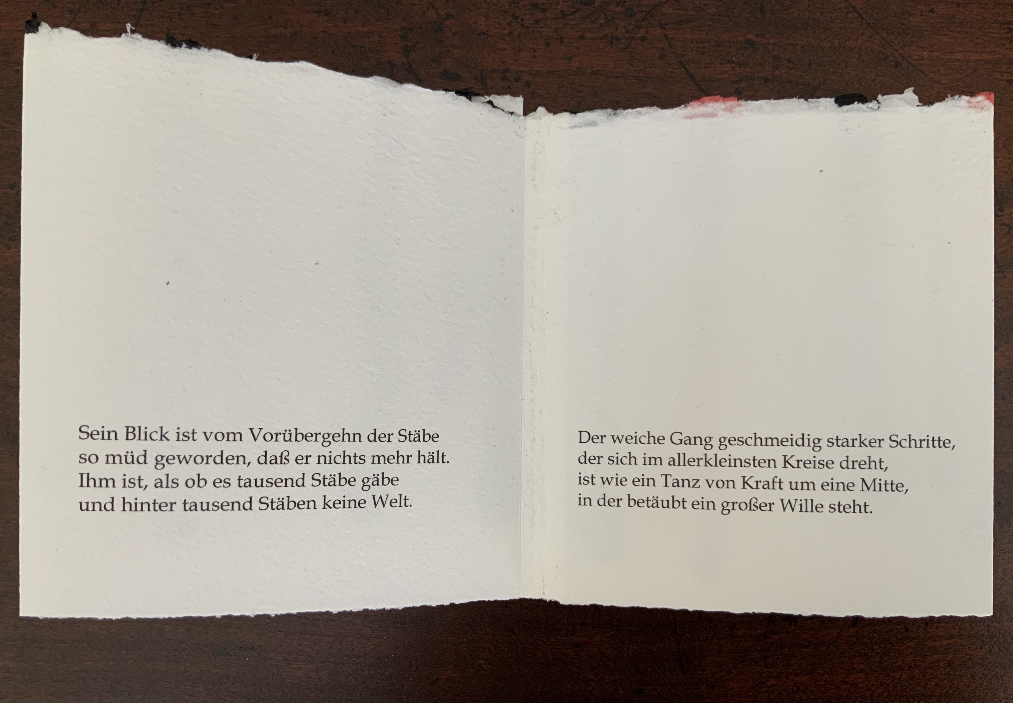
Rainer Maria Rilke’s poem “The Panther” embodies the tension that Gerard seems to love. Three stanzas in black 12 pt Book-Antiqua pace across the leporello like the panther behind what seem to him “a thousand bars”, which Gerard evokes in black and red pulp painting on the reverse of the leporello. Fully open, the torn top edge slopes and rises like the back and shoulders of the panther as it strides and turns in the smallest circle it can make. The bars behind, or in front of it, end above the lower edge in rounded shapes like the panther’s paws, whose texture the soft and rough handmade paper mimics.
The alternation of black and red pulp echoes the tension between the cage and panther’s heart in the poem, and the leporello opens and closes on the panther just as its own pupil’s nictitating membrane slides open, then closes on its world. Reportedly, at Augusta Rodin’s behest, Rilke stood before the animal’s cage in the Jardins des Plantes in Paris for nine hours. At the end of the poem, he has placed the reader/viewer inside the animal, absorbed the reader/viewer through the animal’s movement and gaze. Gerard’s artist booklet — by giving the reader/viewer a chance to see through the panther’s eyes — makes Rilke’s poem just as tangible as Rilke’s poem makes the panther and its world.
Gerard’s three works belong with the Books On Books Collection’s first seven books of the Rijswijk Biennial. His Alpha Beta even features in that series’ Papier op de vlucht = Paper takes flight (2006) and contributes to two of the collection’s sub themes: abecedaries as well as the technique of pulp painting. Seifenblasen and De Panther exemplify the sub theme of “reverse ekphrasis” represented by works such as Barbara Tetenbaum’s version of Michael Donaghy’s poem “Machine” or herman de vries’ argumentstellen 1968 / 2003 (de wittgenstein — tractatus — ) (2003). Gerard’s two works are, in fact, the epitome of transforming a literary text into an artwork.
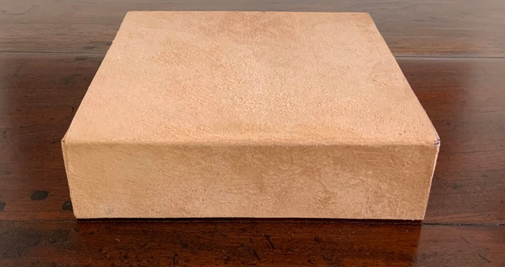
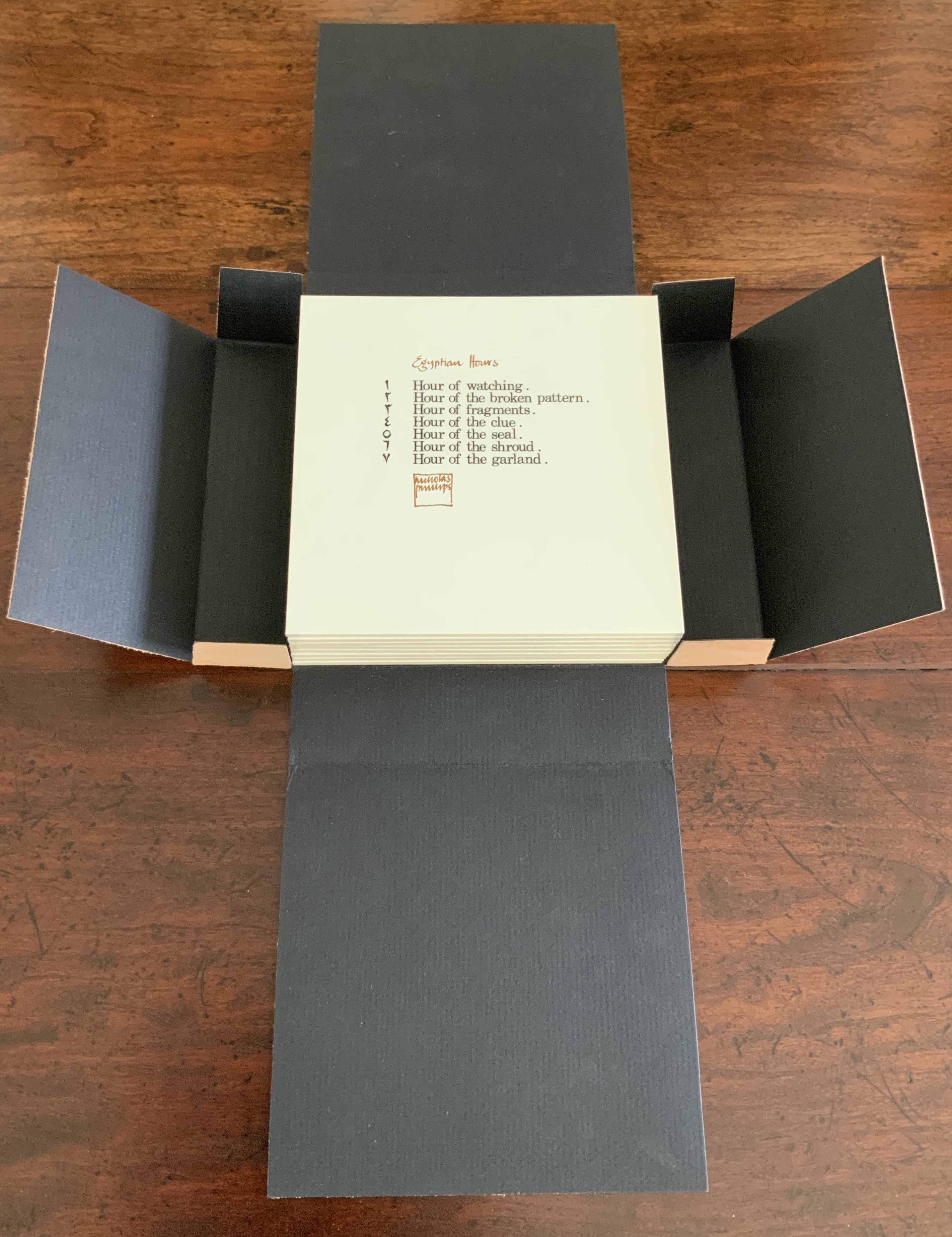
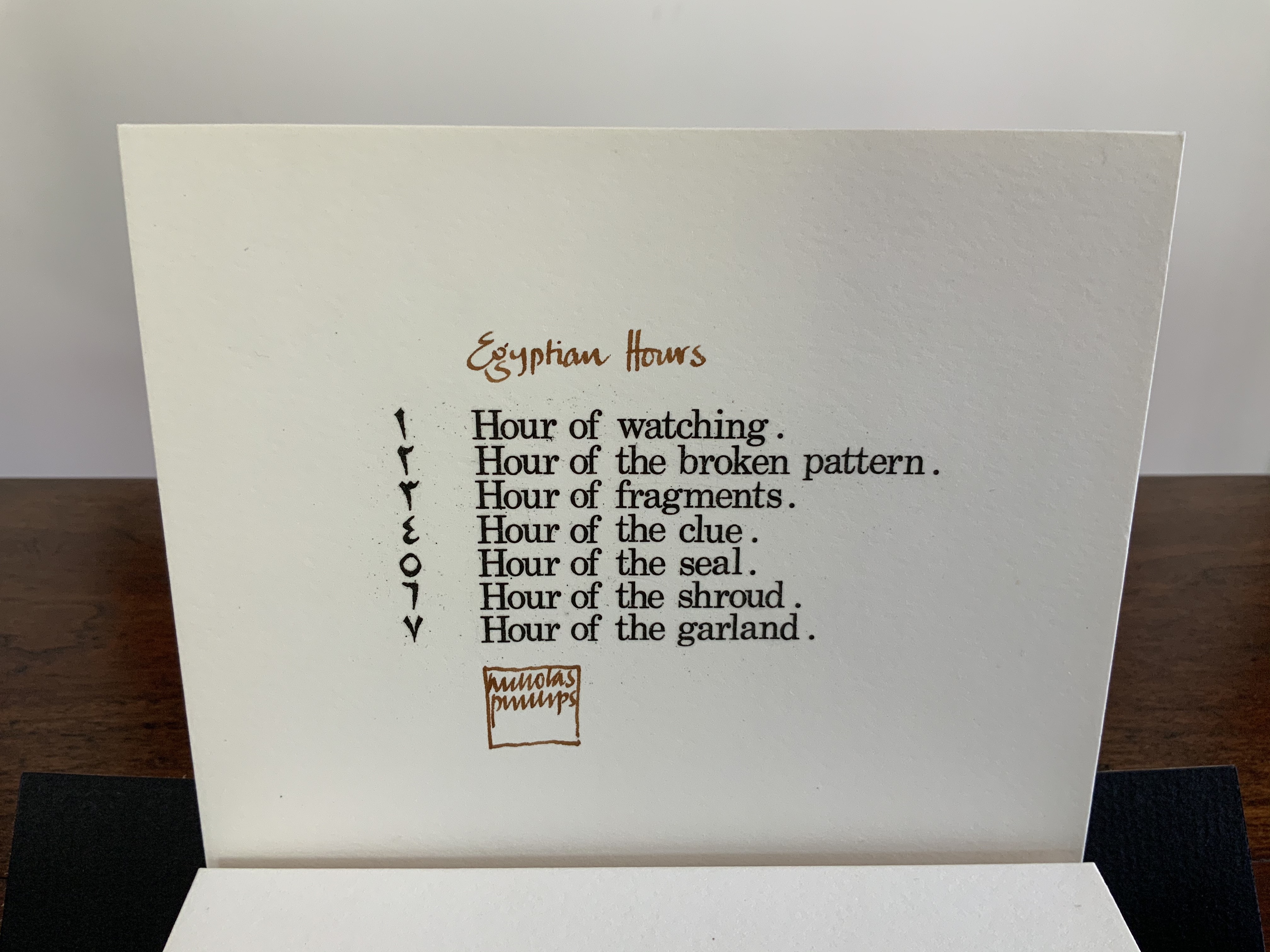
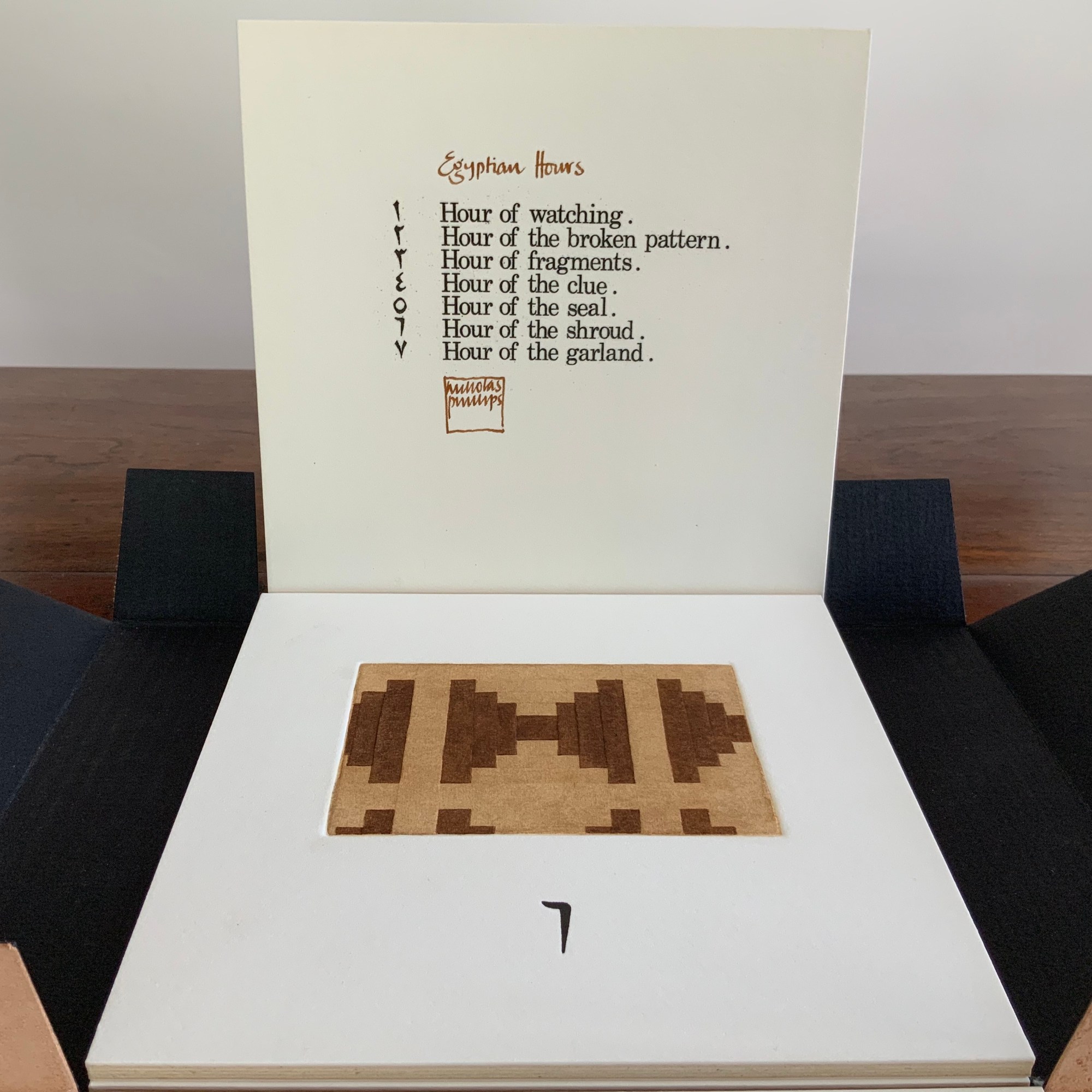
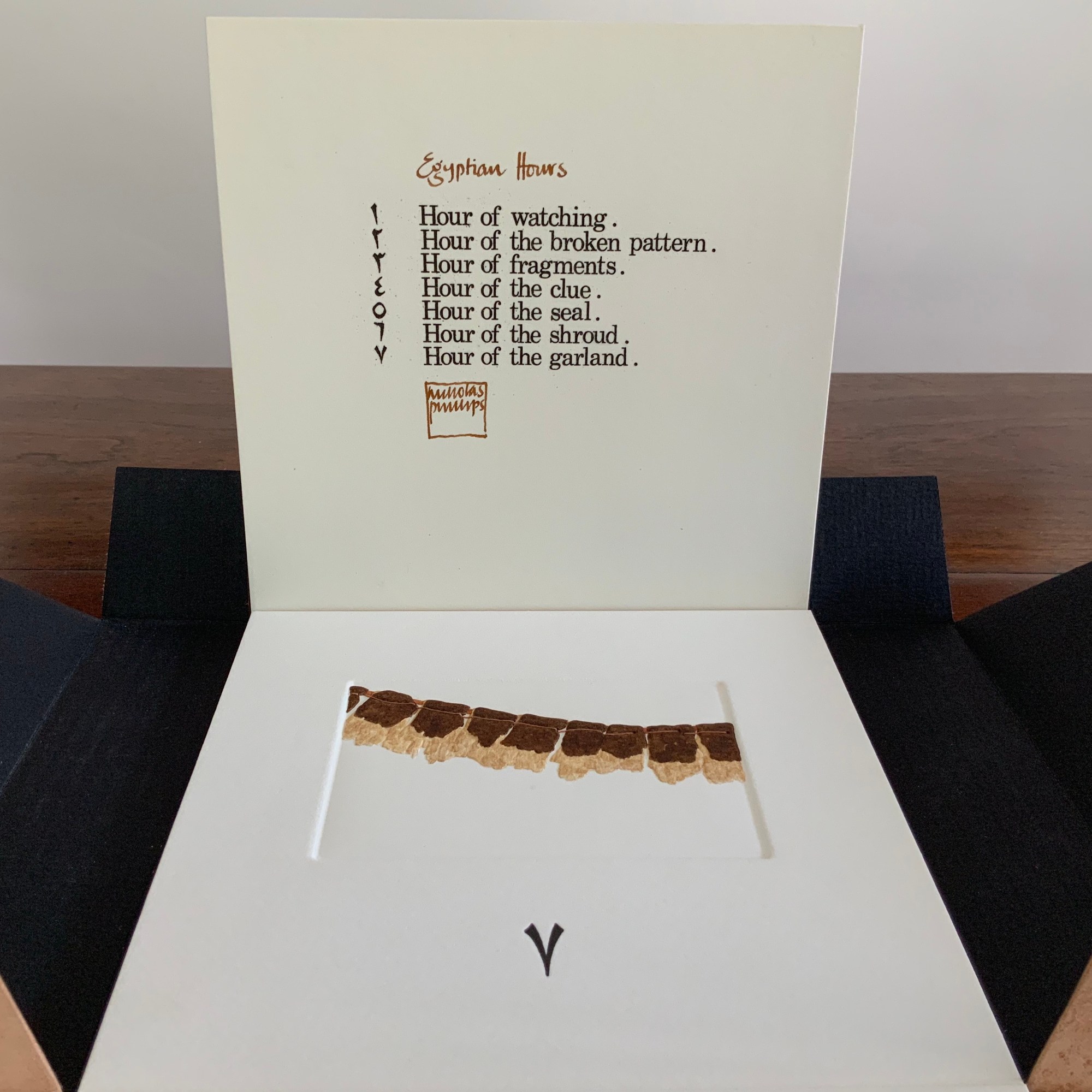
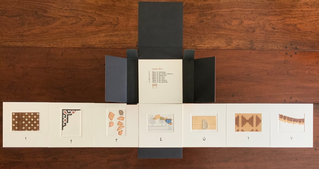
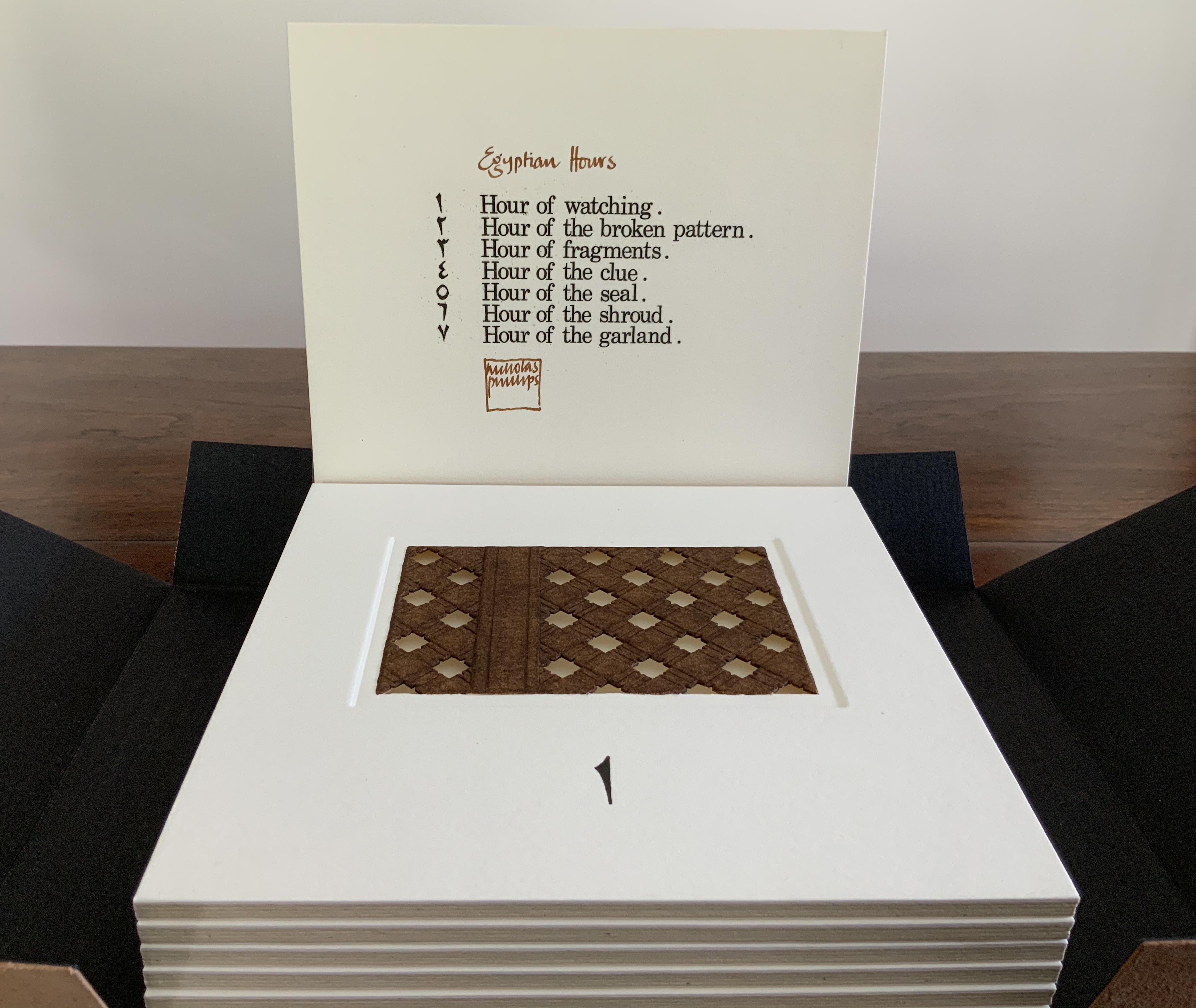
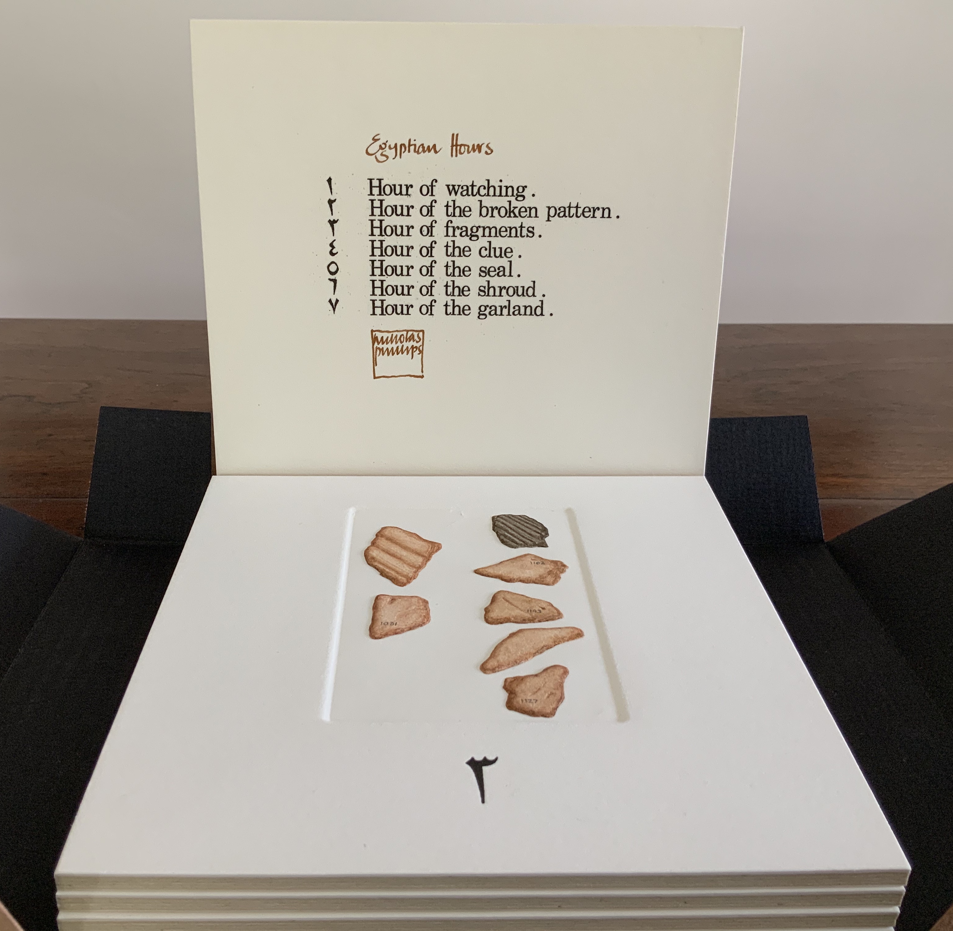
Bound in a leather folding case, a set of 7 hand-colored and variously collaged / cut / embossed etchings, plus title page, on Hot Pressed Saunders paper. H160 x W160 x D40 mm. Edition of XXXIX signed copies in existence, of which this is #XXXVII. Acquired from the artist, 6 August 2020. Photos: Books On Books Collection.
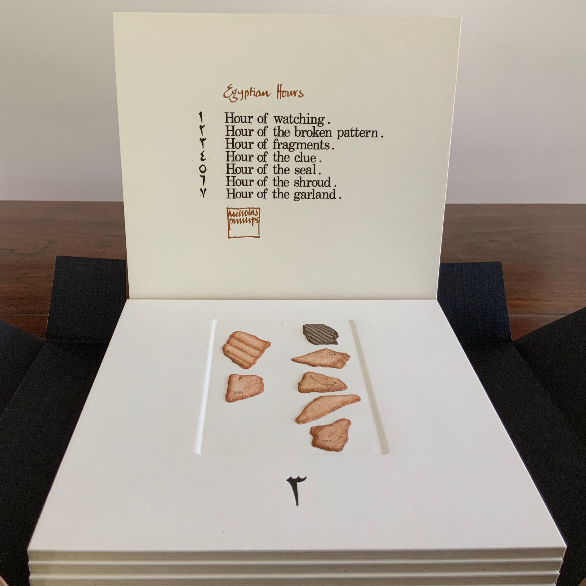
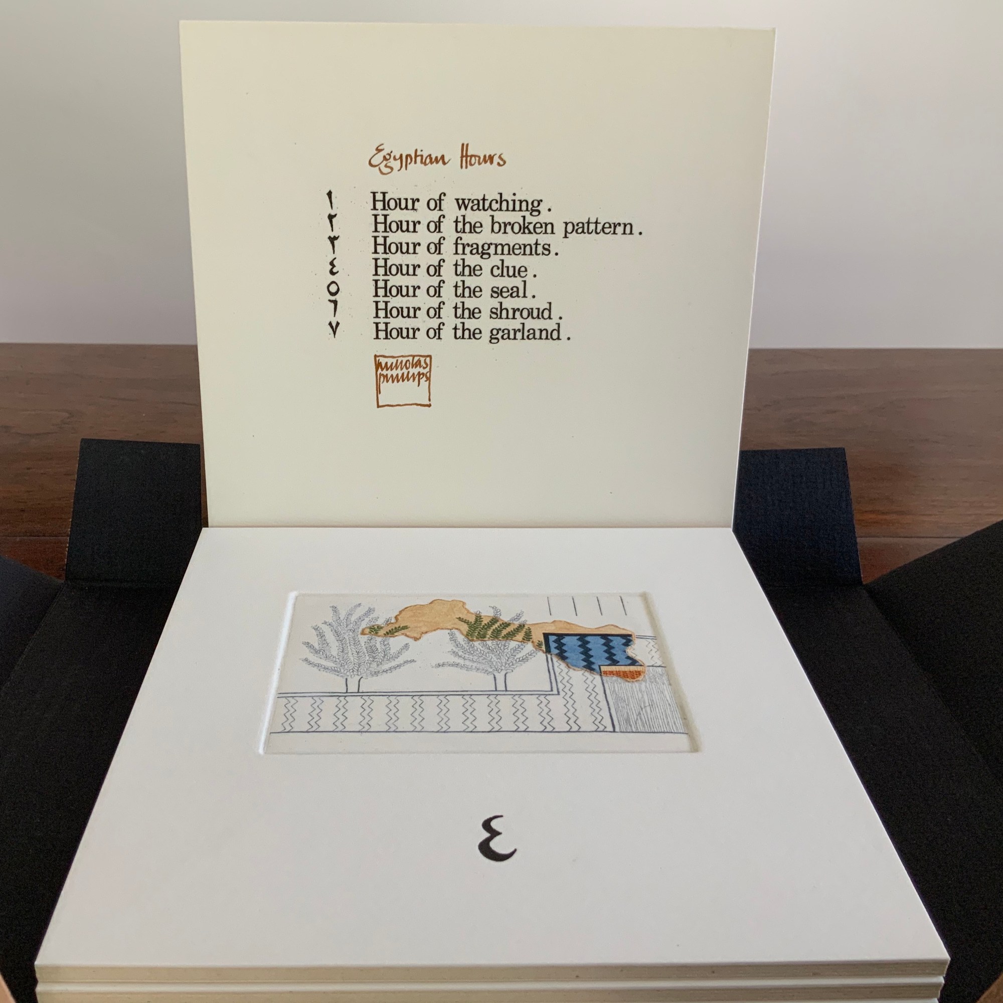
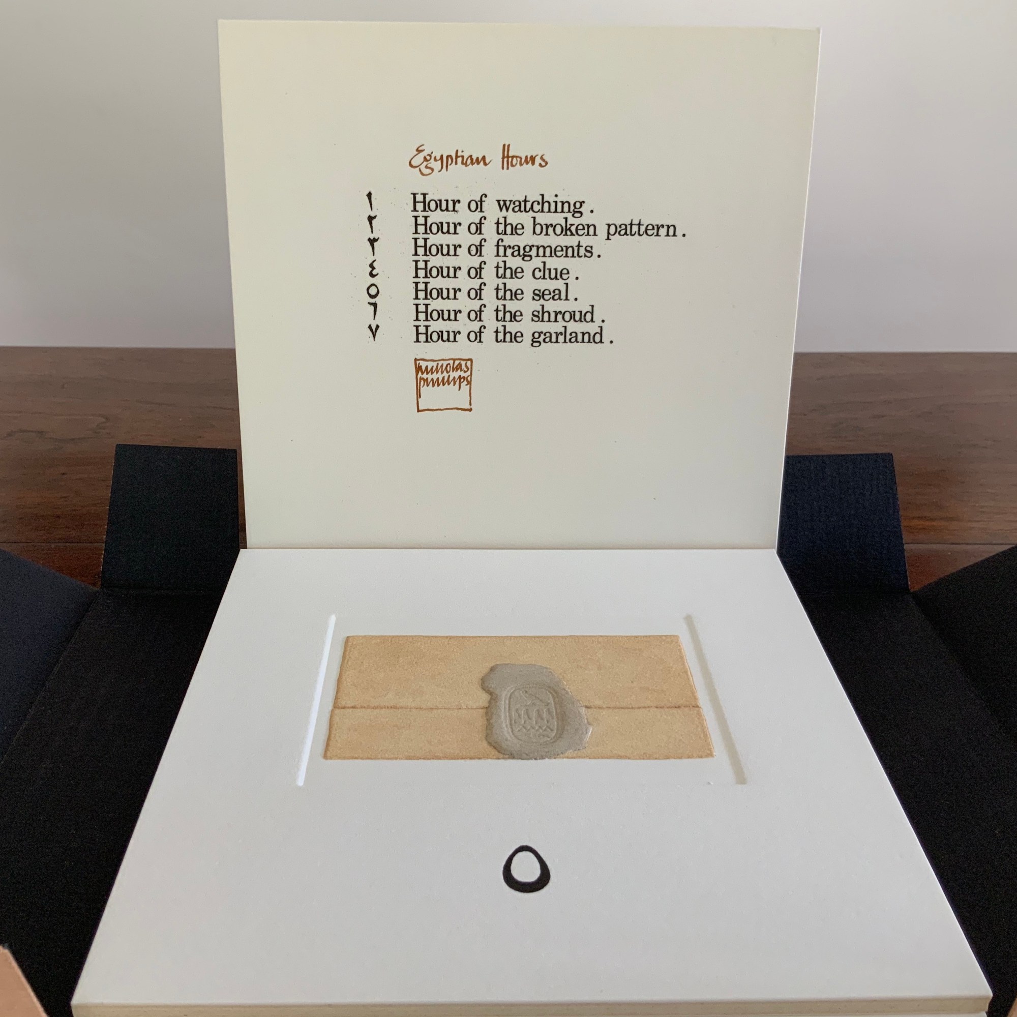
Egyptian Hours falls somewhere between book and portfolio box. Somewhat like photos and captions in a photobook, text and relief images play off one another, but only somewhat: at a distance the table of contents names and orders the hours; only the Arabic number glyphs from the “table of contents” mediate the named hours. If the table of contents is held apart as in the photos, the distance shortens.
In the western tradition, the named hours suggest the medieval book of hours, another signal that this is more than a portfolio of prints. There is pleasure in trying to remember the name of the hours from their numbers or guessing it from the evocative images — the image of a window lattice through which to watch, an image of a tile fragment — but the name of the fourth implies a mystery narrative at which to guess.
Who is watching from the window? What does the broken pattern of tiles mean to the watcher? Were the numbered shards found beneath the tiles? What clue do the images of papyrus plants give, or the overlying image of a plot of land (?) bringing the plants into green, the diagonal pattern into blue and black, and the sheet of papyrus into burnt umber? Whose seal holds the folded sheet closed? Whose shroud? Whose garland or necklace with its thread weaving in and out of the intaglio?
The watcher could spend hours turning or spreading the panels out and guessing — and just contemplating this artwork as an evocation of ancient time and time passing.
Exhibited at the Book Works, London, 2 April 2 – 9 May 1987, with Ken Campbell, . “All the artists in this exhibition have had a close and consistent relationship with Book Works since its inauguration. Some collaborate on projects as well as exhibit regularly at the gallery. The Founders of Book Works consider the Center for Book Arts inspirational in their conception and development of the organization, and this connection adds to the importance of our presentation of this work at the Book Arts Gallery.” Exhibition checklist here.
Egyptian Hours — Addenda
This comparative view of the un-colored embossed prints — especially for the “Hour of Watching” and “Hour of Fragments” — enhances an appreciation of Phillips’ artistry.
Set of 7 blind embossed etching prints, plus 1 intaglio title page. Letterpress numerals. Unnumbered copies. 160 x 160 mm each. Acquired from the artist, 6 August 2020. Photos: top row, Books On Books Collection and, bottom, courtesy of the artist.
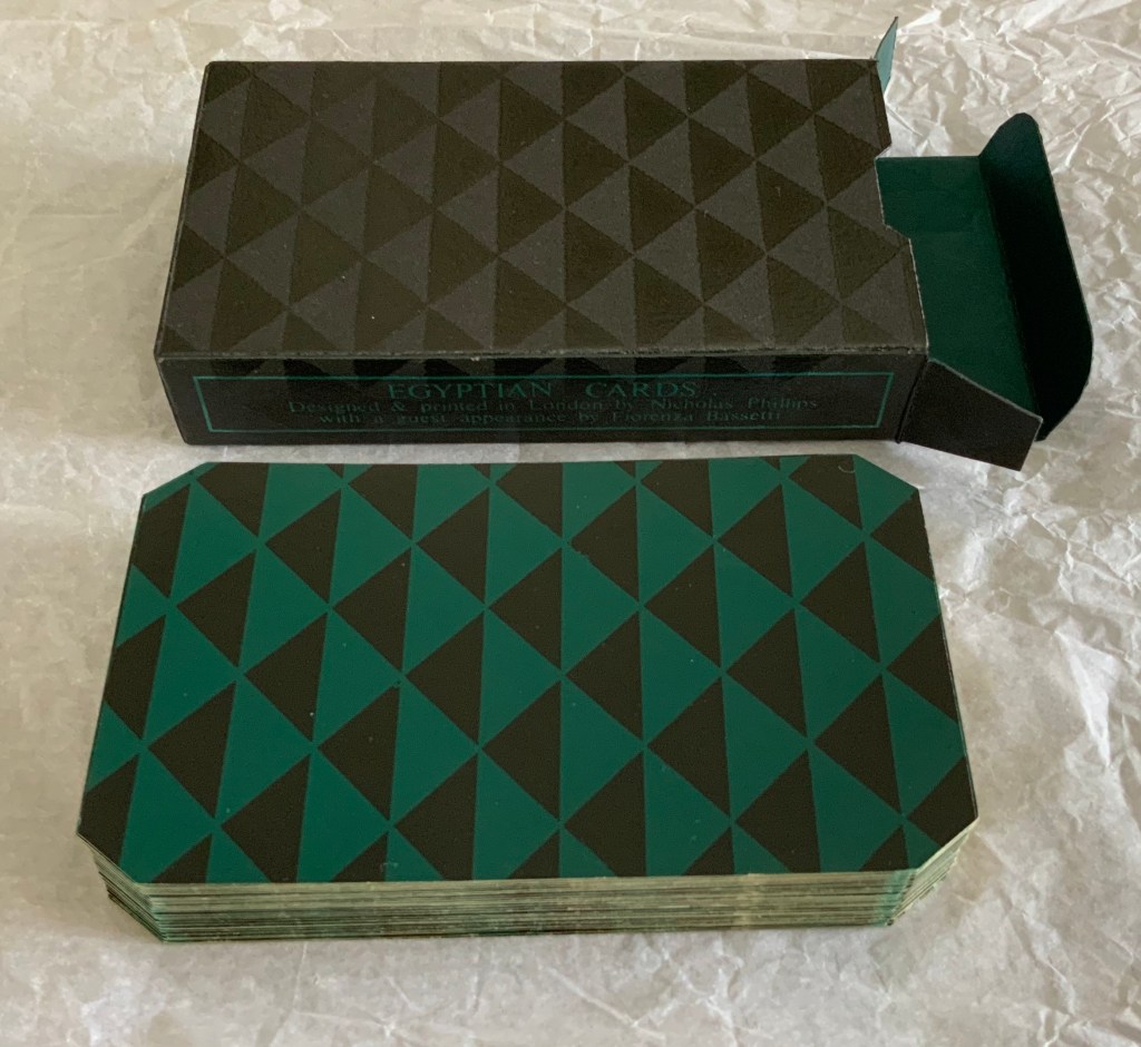
Pack of magic playing cards. Offset litho, silkscreen, die cut and held in a silkscreened box. H110 x W62.5 x D22.5 mm. Edition of 10, of which this is #2. Acquired from the artist, 6 August 2020. Photos and video: Books On Books Collection.
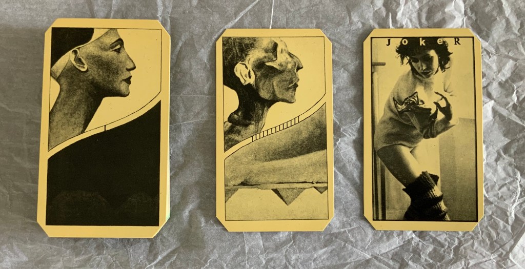
Egyptian Cards may be the joker in the pack for the Books On Books Collection. A deck of cards? A magic trick? A dos-à-dos flip book? Without doubt, it is another evocation of different frames of time passing. In one time frame, Nefertiti becomes a mummy.
In another time frame, day dawns on the Pyramids.
And in a third and fourth time frame — the time of the artists’ collaboration and that of a magic trick — a joker (a self-portrait of Fiorenza Bassetti) appears.
Phillips, who has turned to watercolors of a photographic intensity yet pastel texture, continues to layer time in ways that lead the viewer as much into meditation as appreciation. Fitting, then, that these two early works strike that lasting chord.
Henry, David J. Beyond Words: The Art of the Book (Rochester, NY: Memorial Art Gallery of the University of Rochester, 1986). Catalogue for the exhibition held 31 January – 30 March 1986. Catalogue designed by Scott McCarney.
Phillips, Nicholas, and Salma Nasution Khoo. Best Foreign Language (London: Jonathan Cooper Park Walk Gallery, 2011). Catalogue for exhibition, 17 November – 3 December 2011.
Rolo, Jane, and Jennifer Walwin. Book Works(Bracknell, UK: South Hill Park Arts Centre, 1981). Catalogue for the touring exhibition 28 March 1981 – 4 April 1982. Title page designed by Ron King.
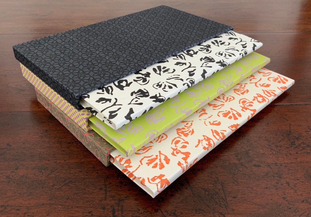
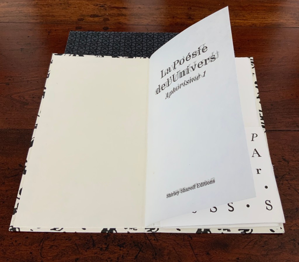
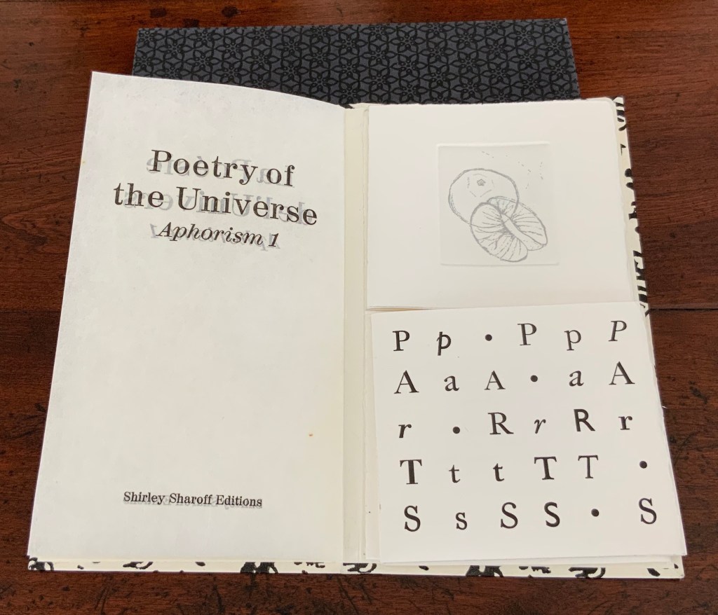
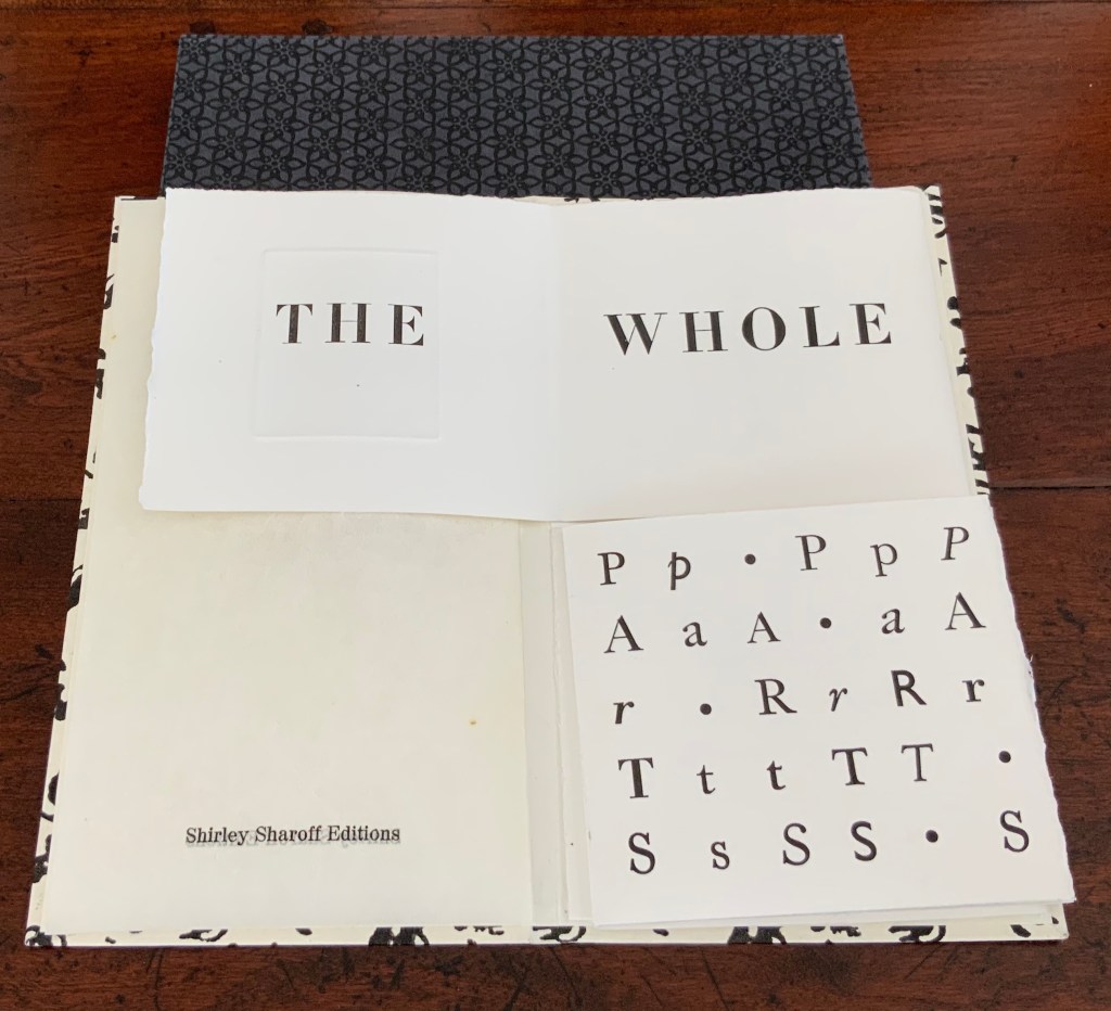
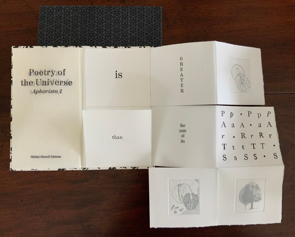
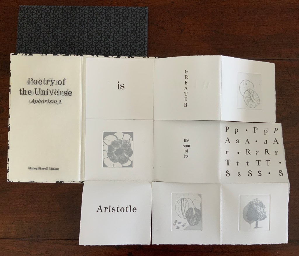
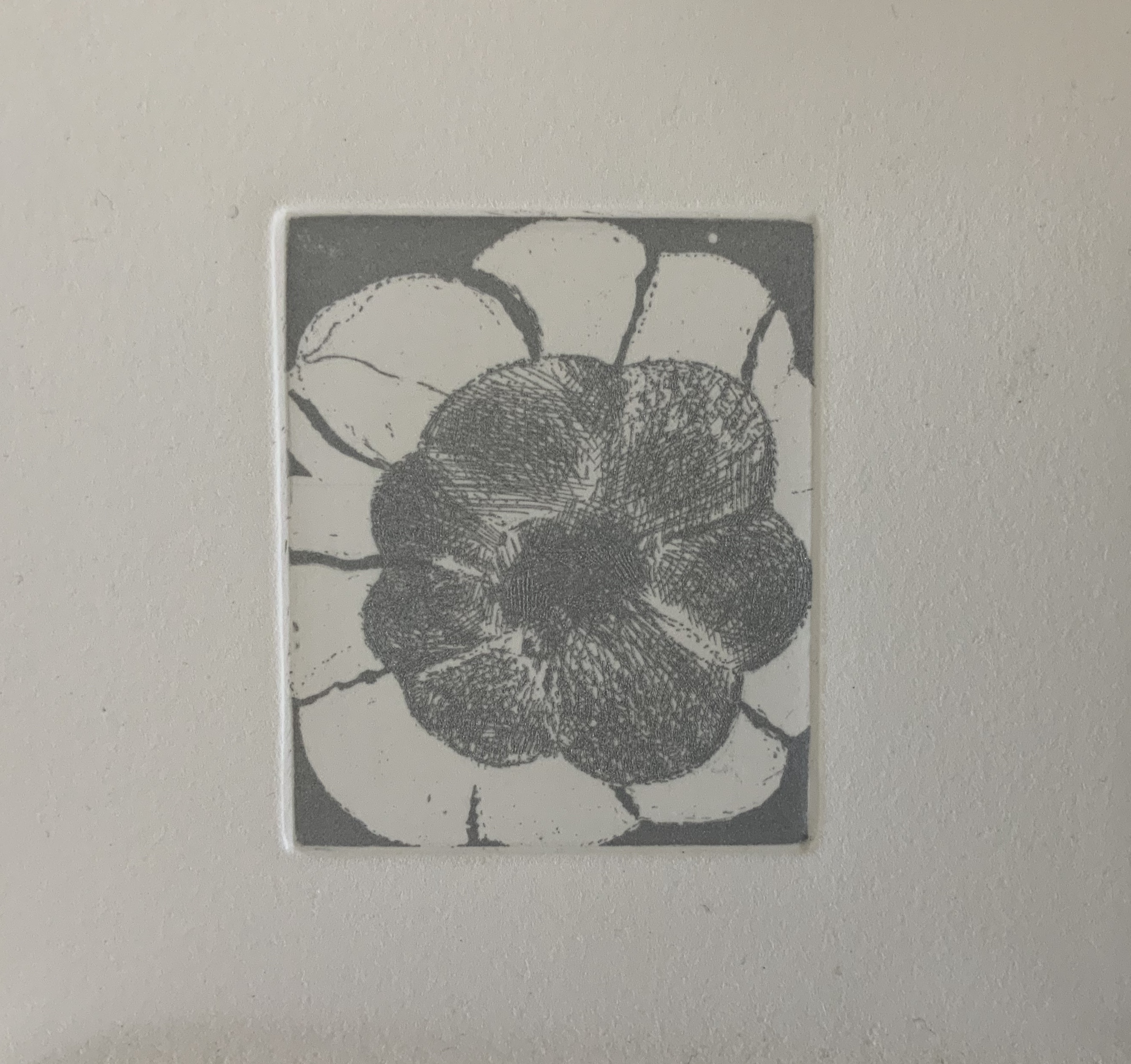
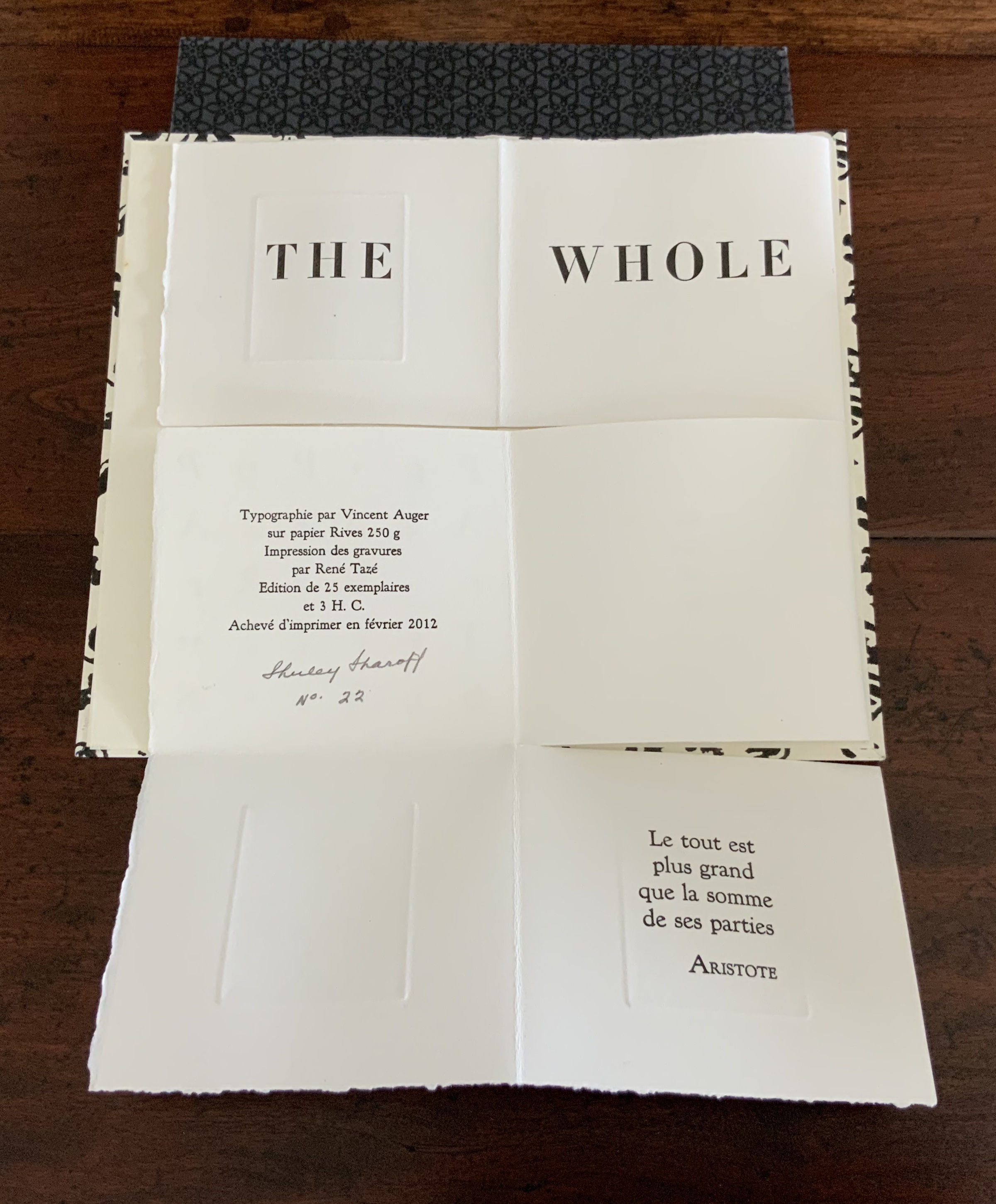
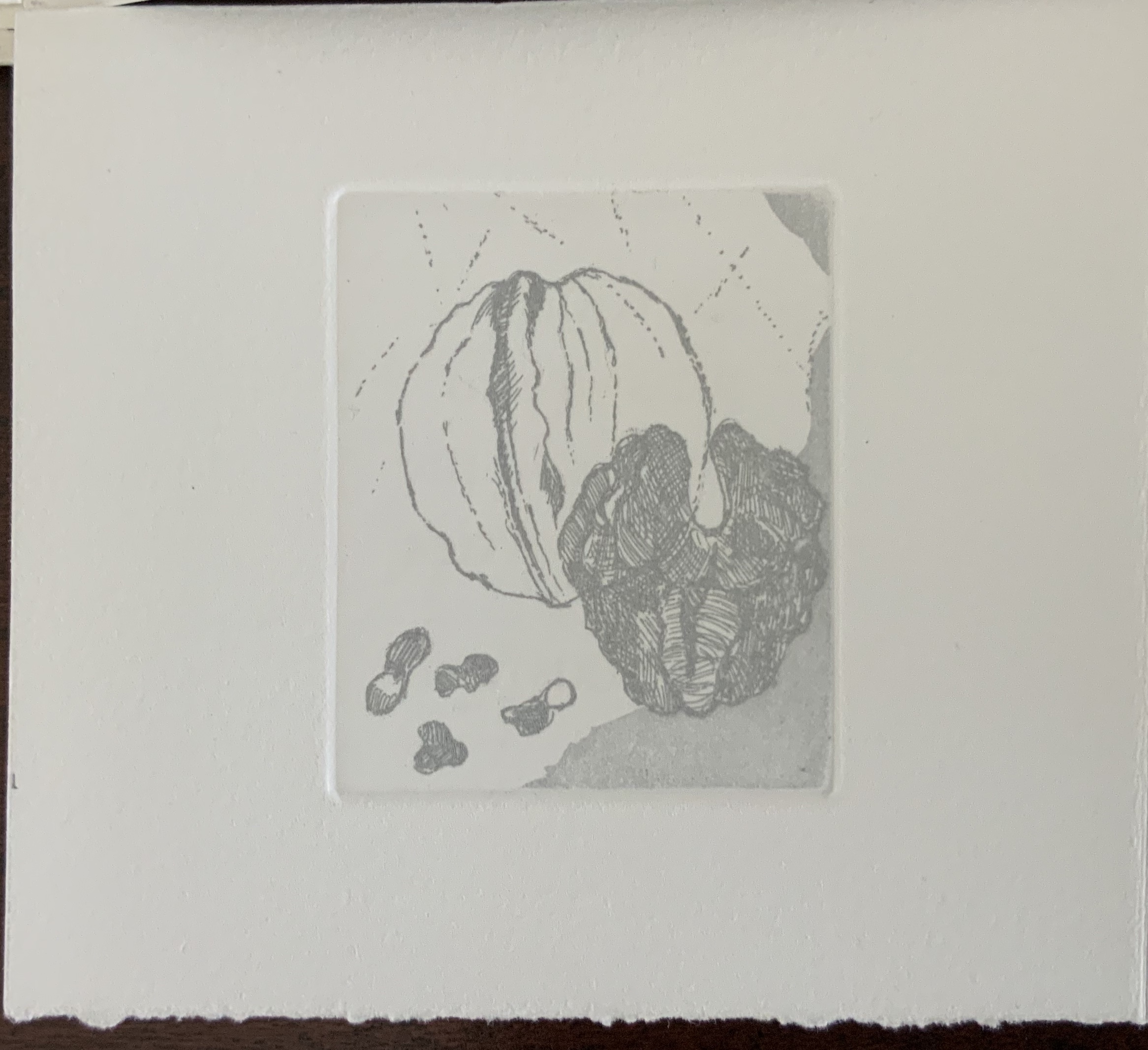
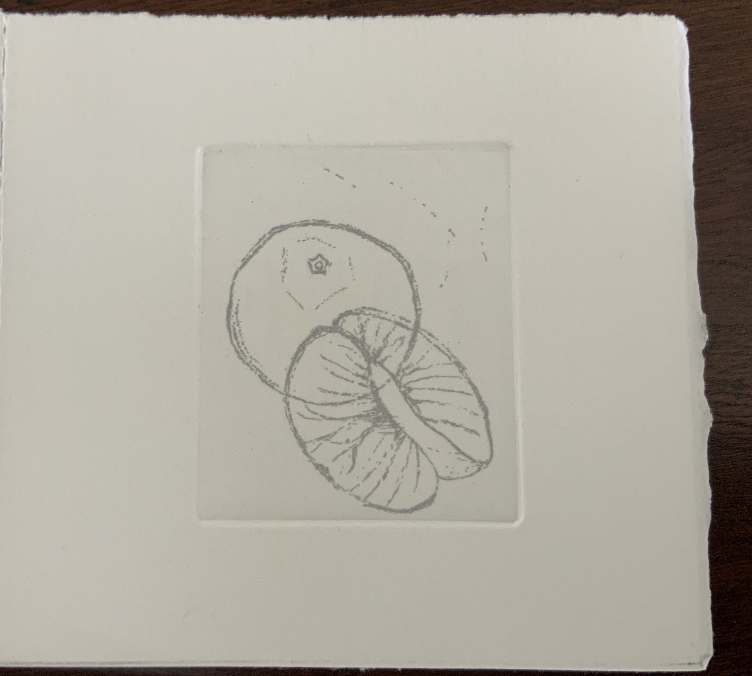
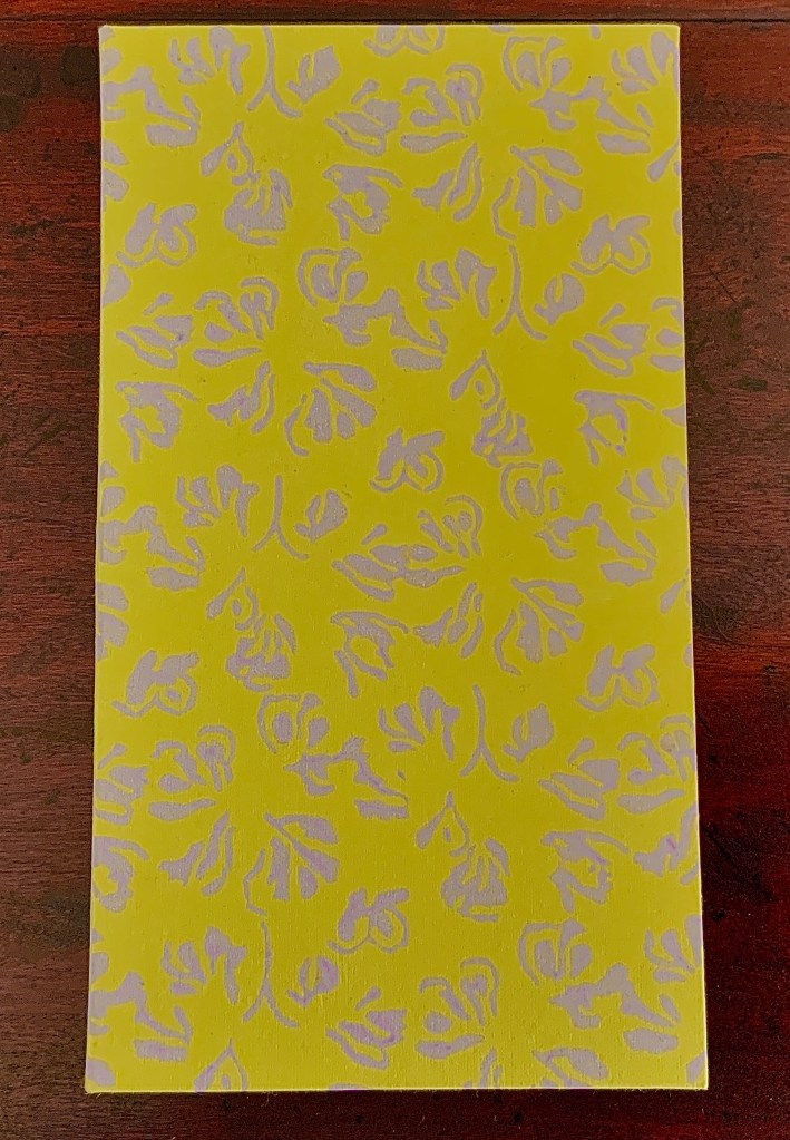
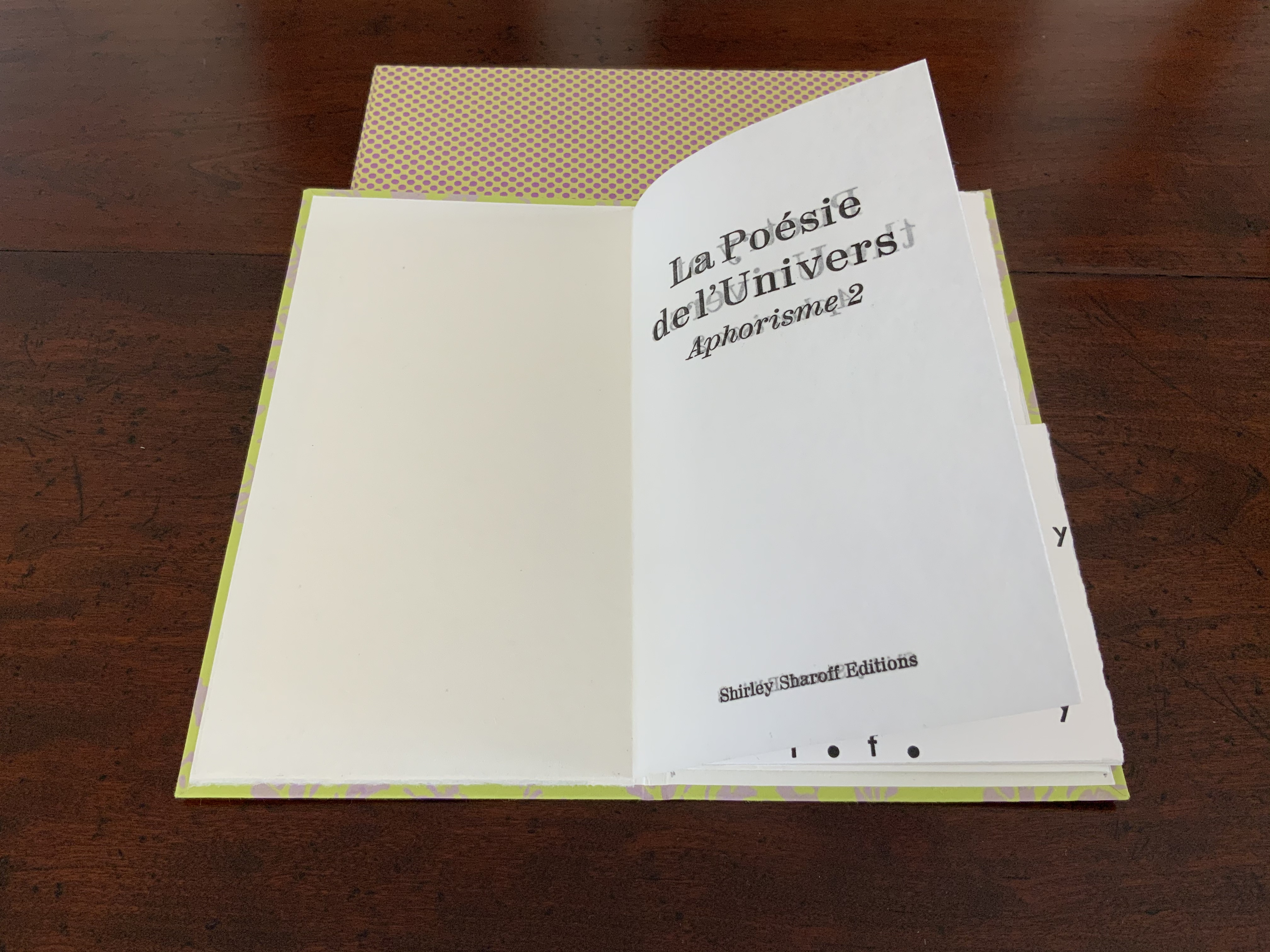
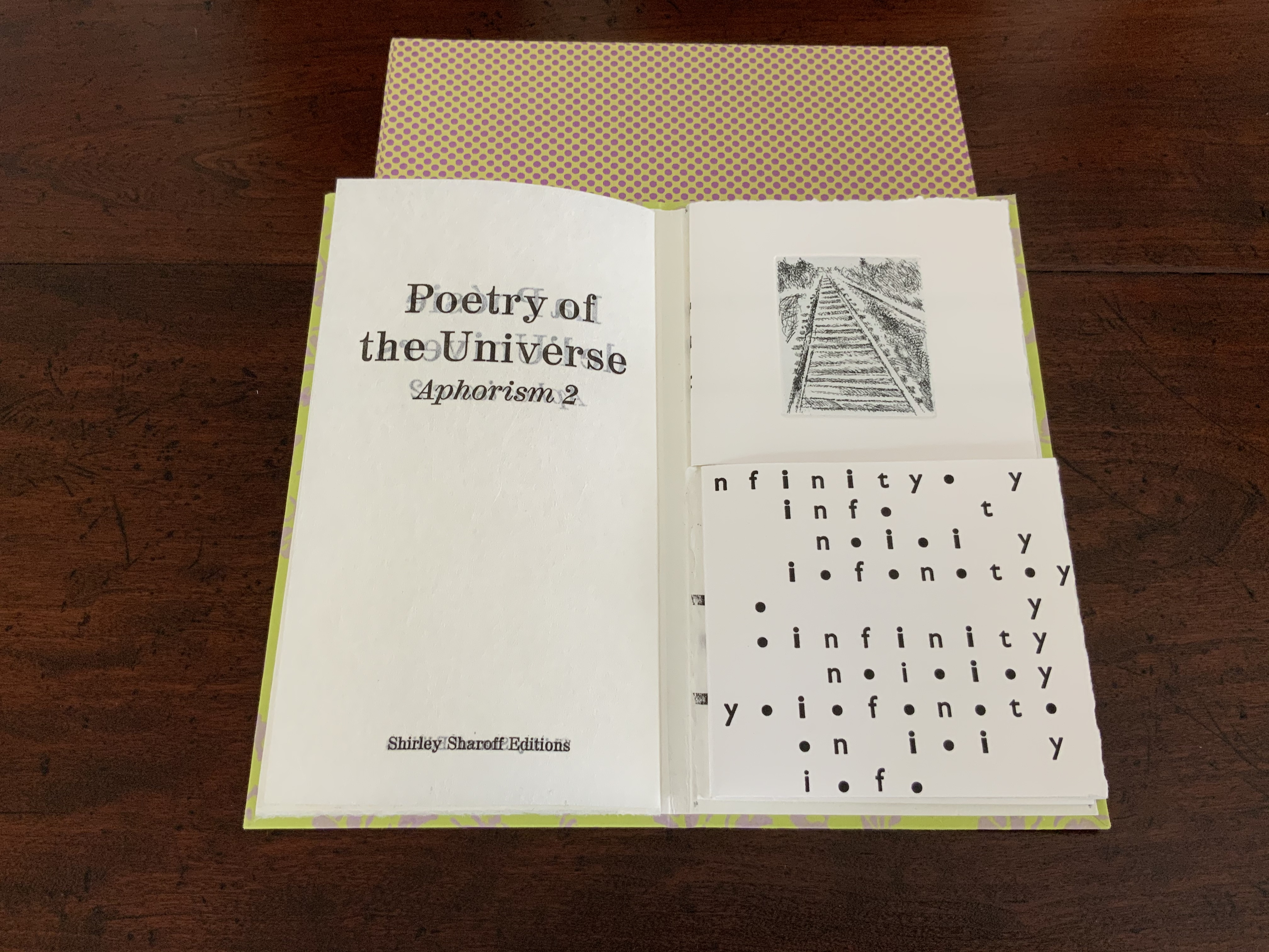
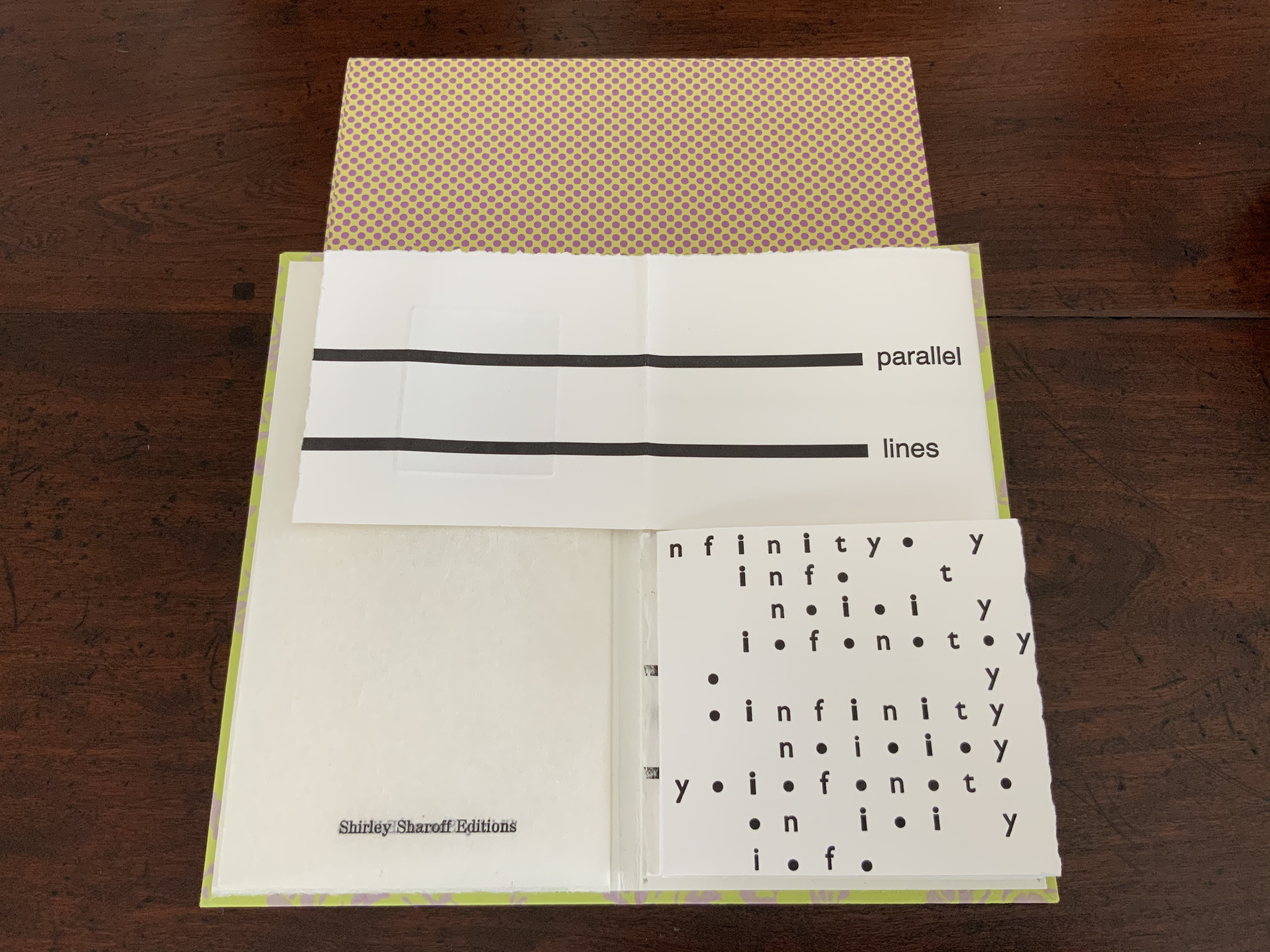
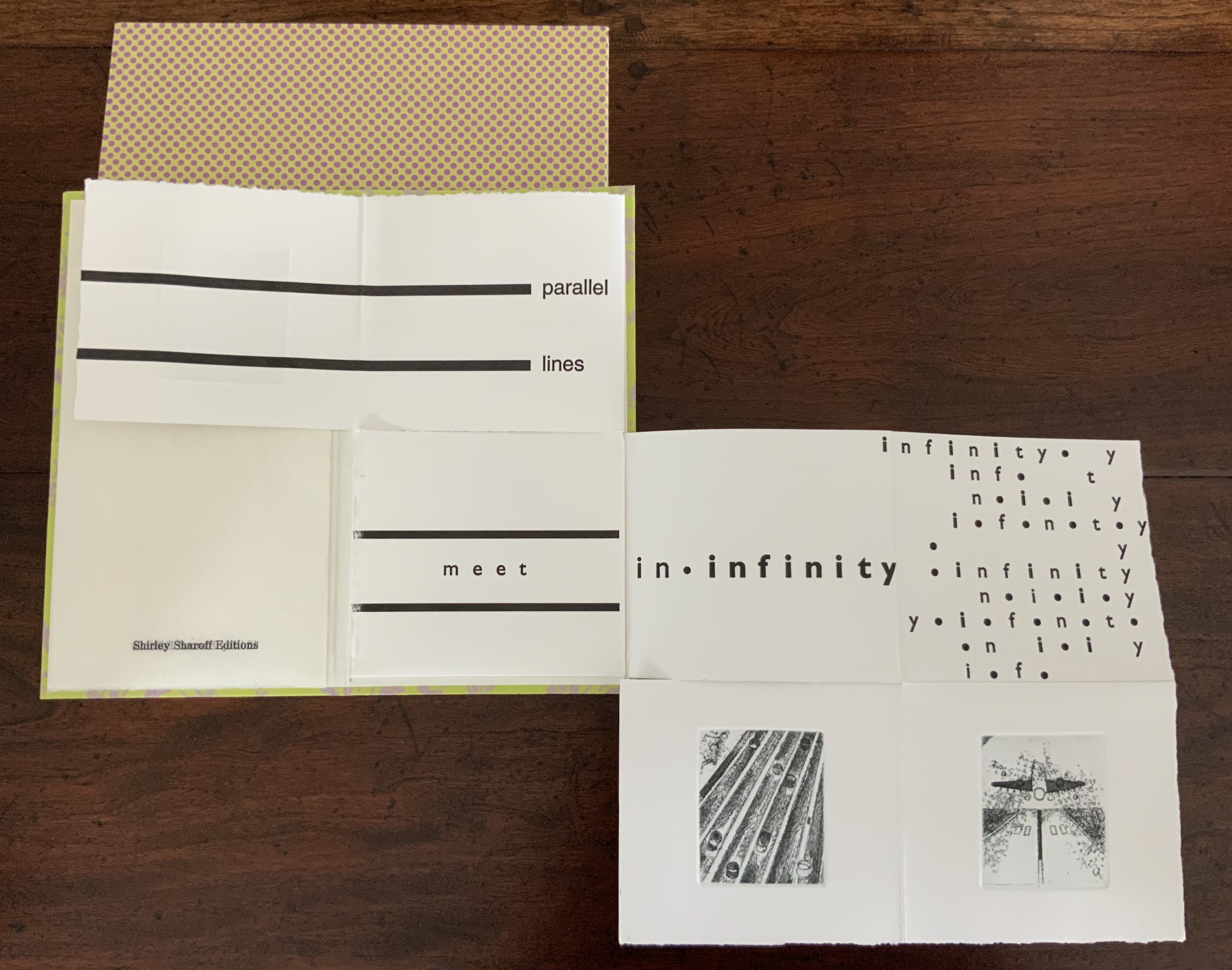
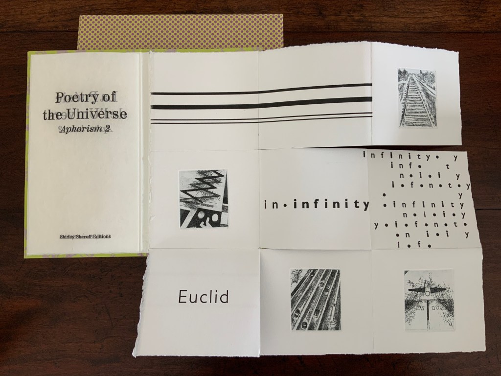
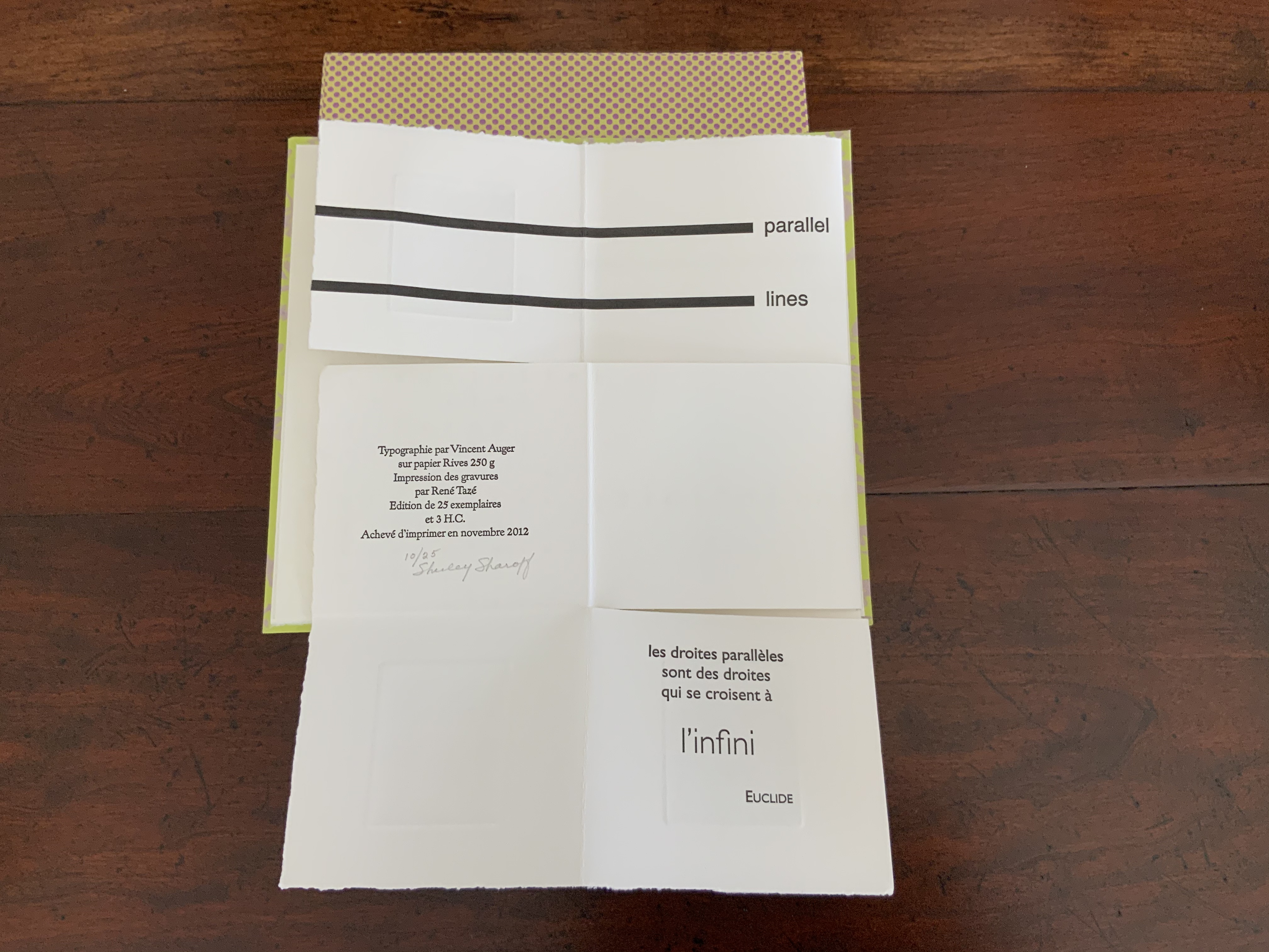
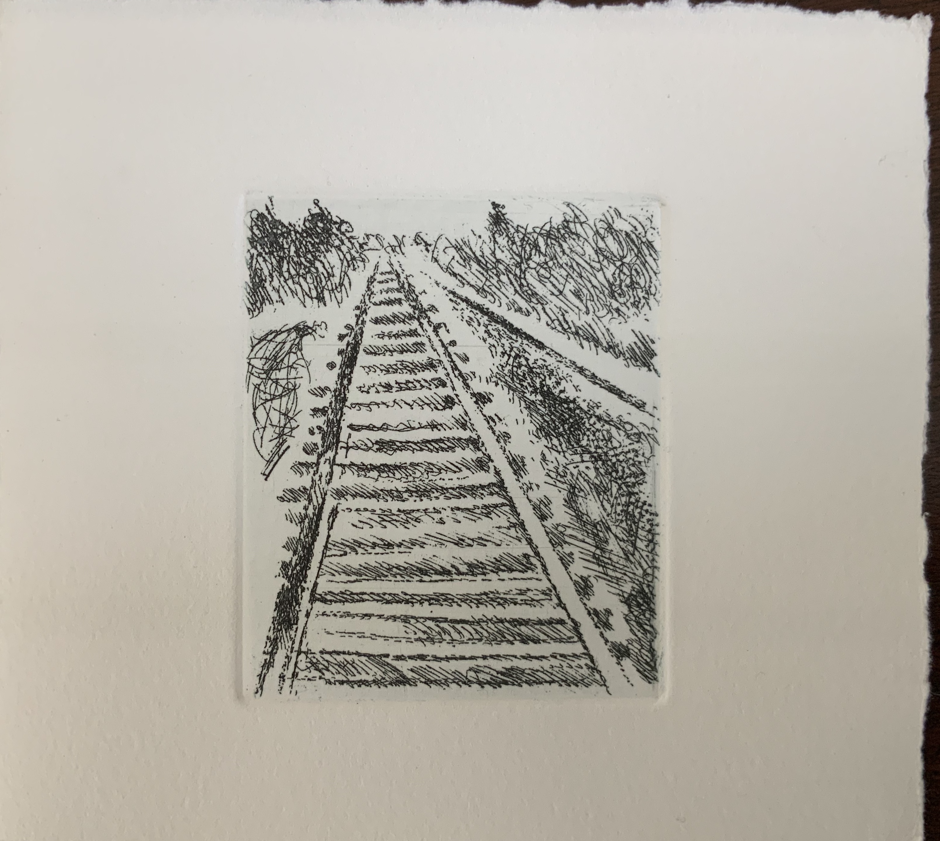
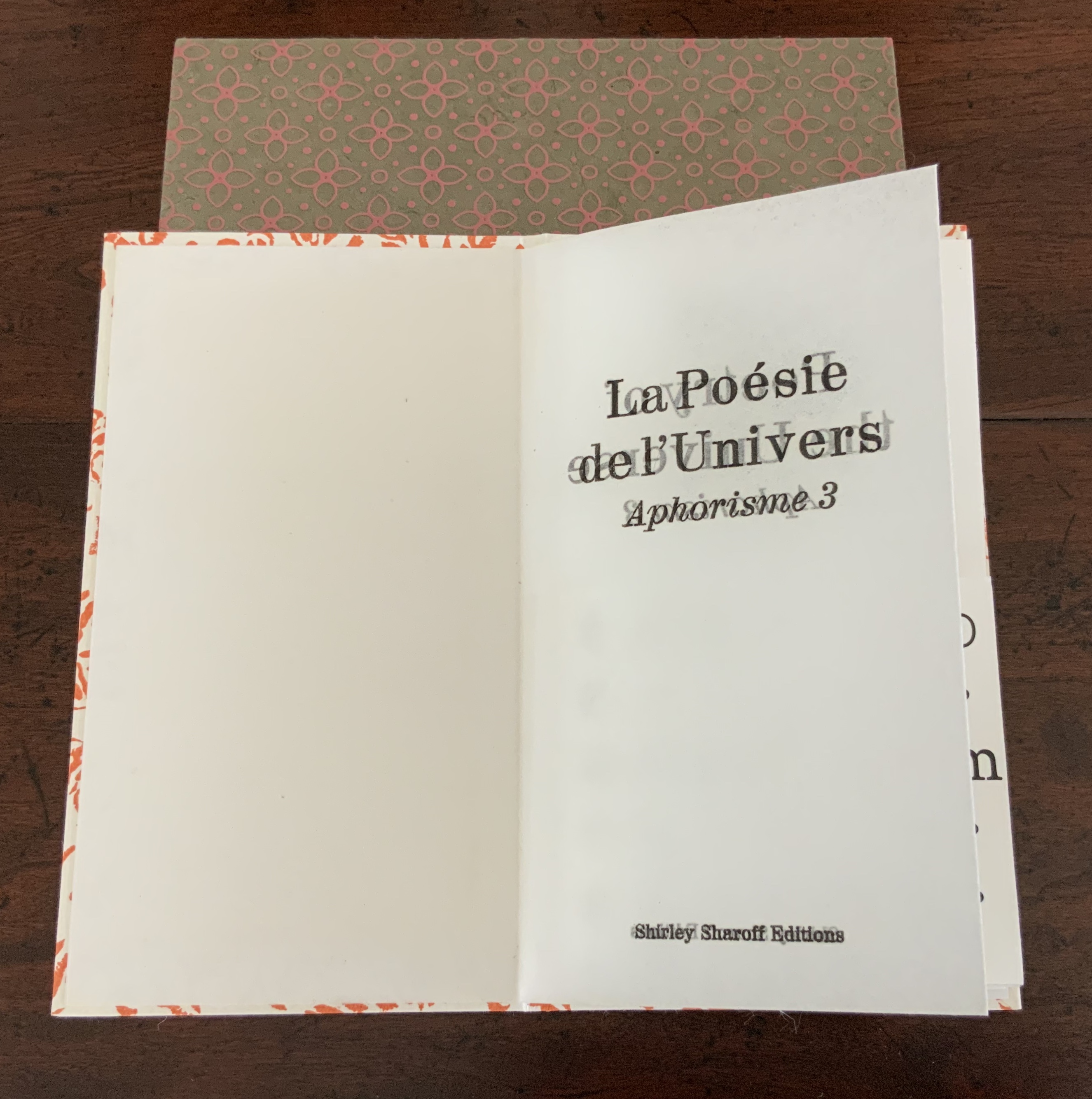
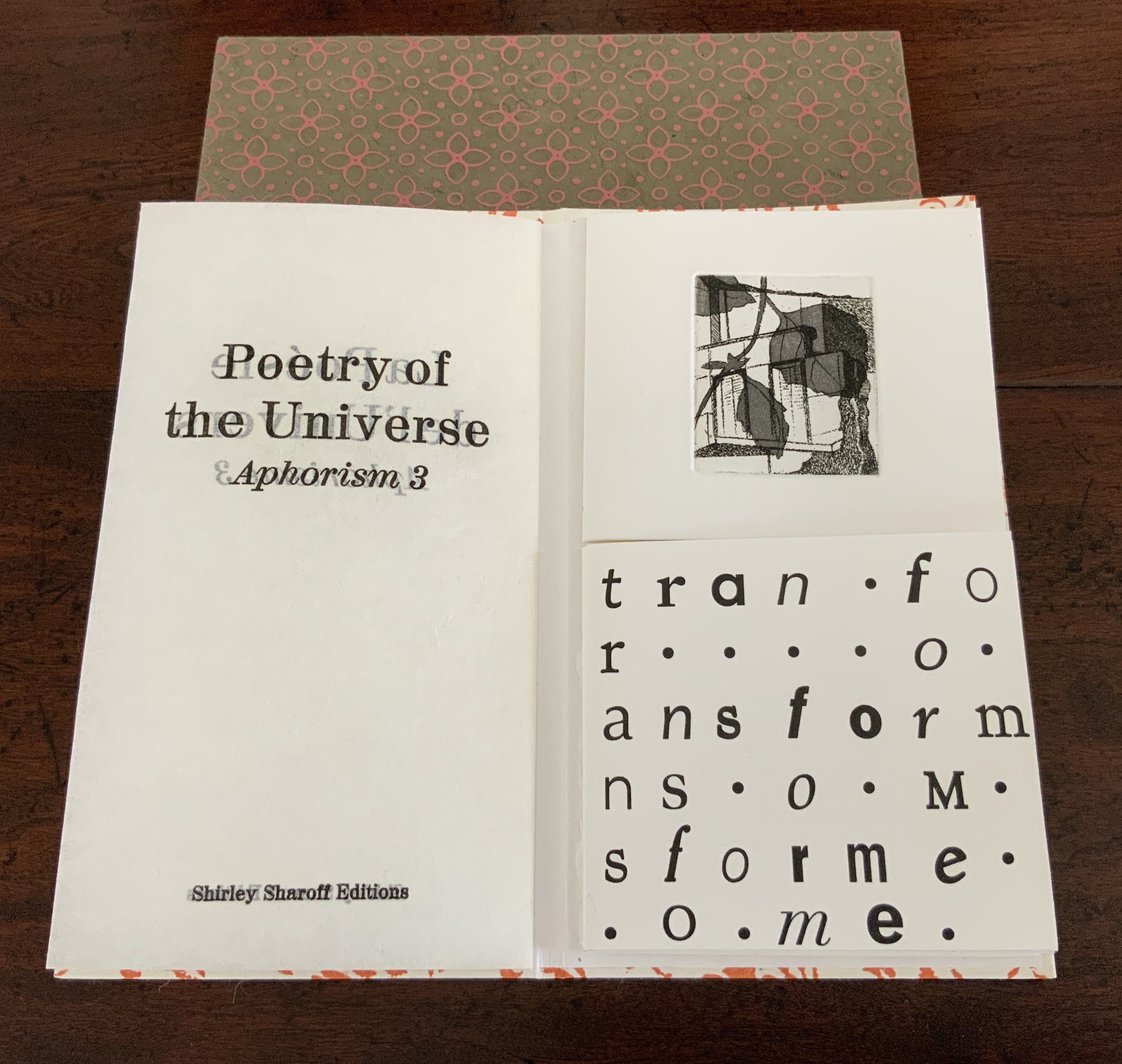
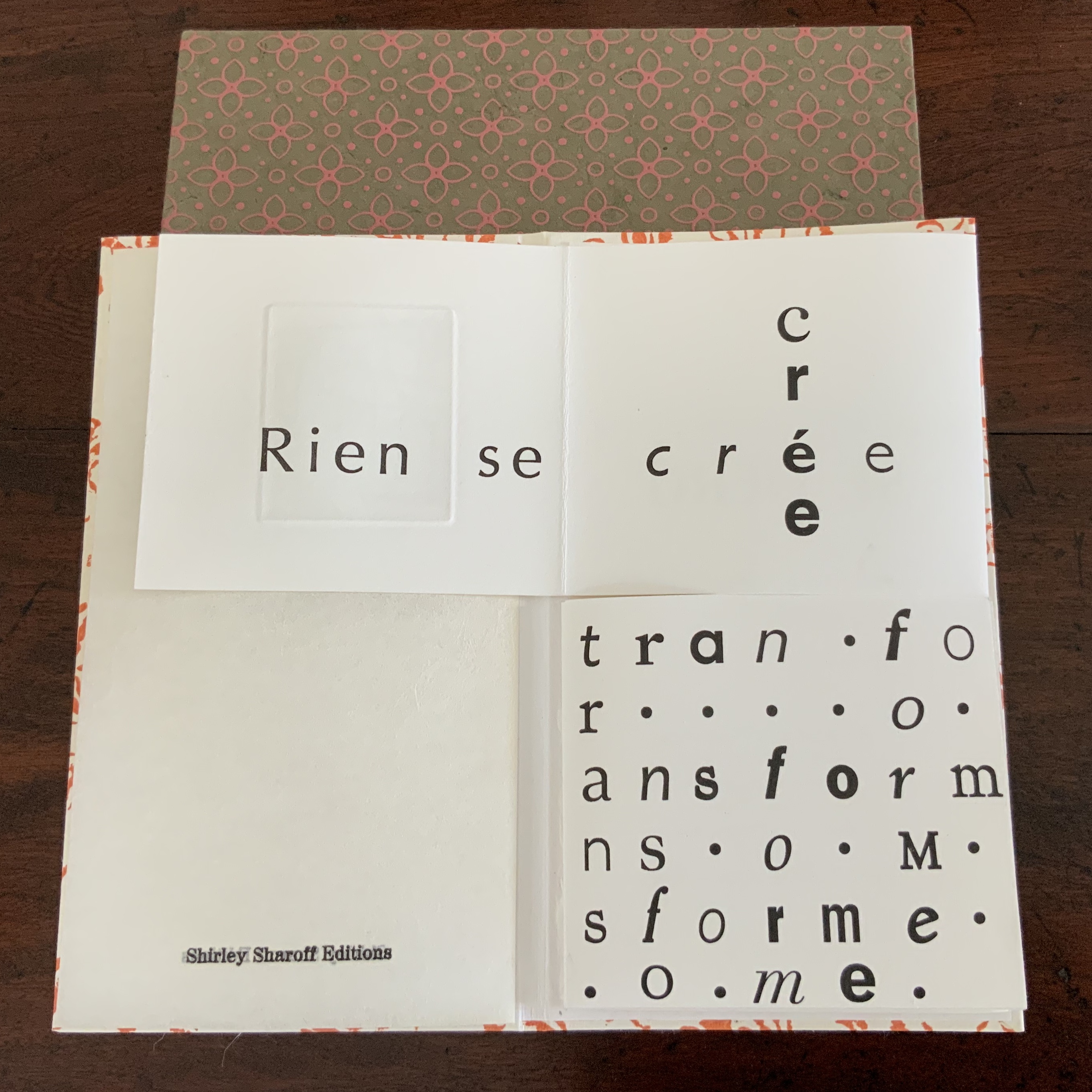
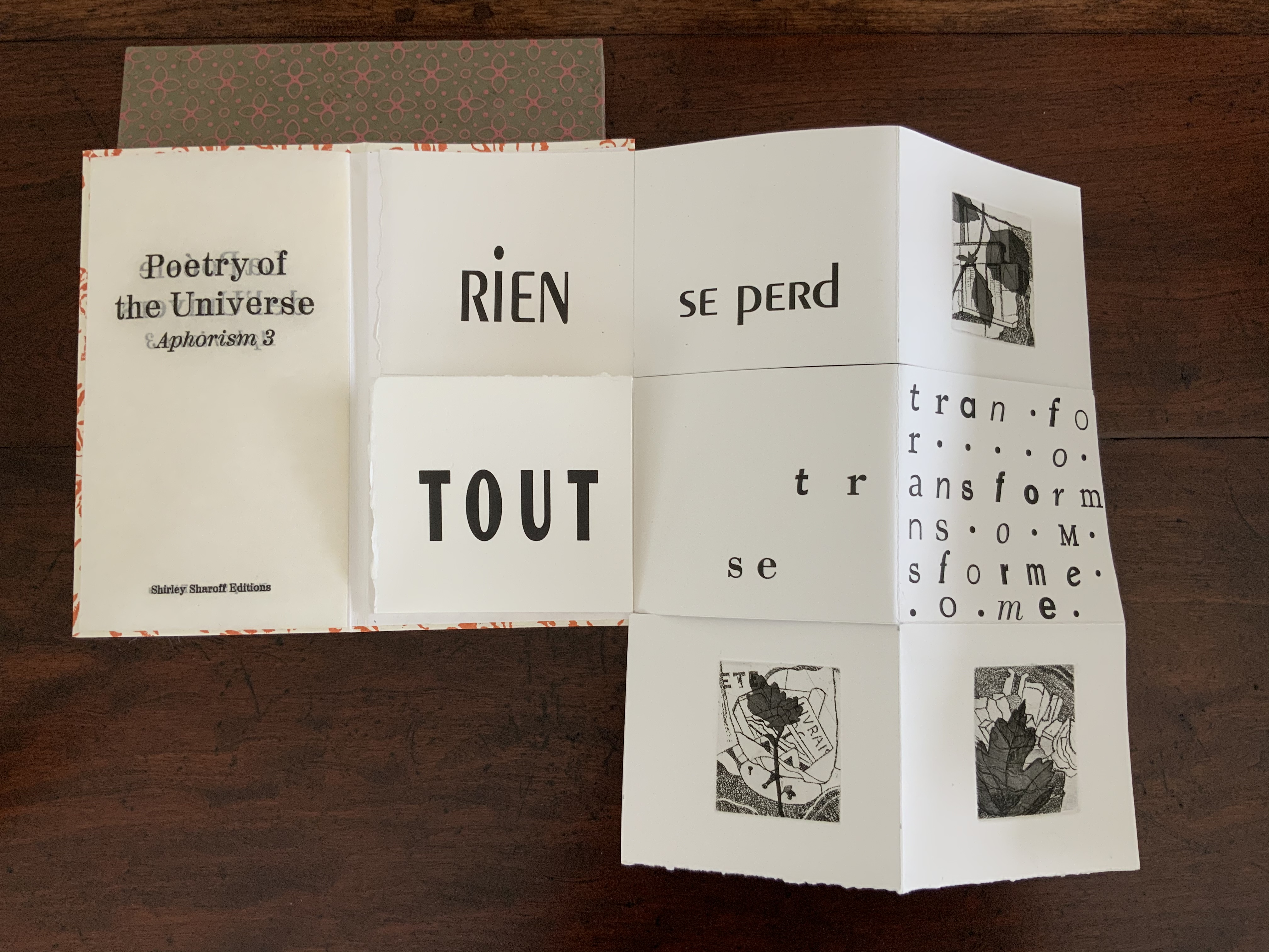
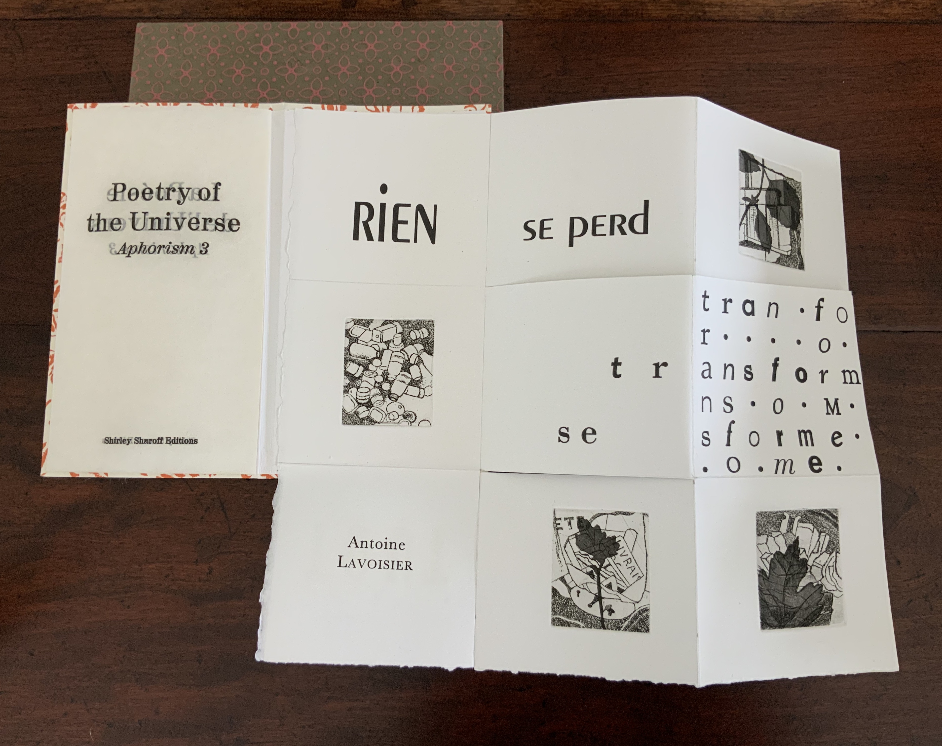
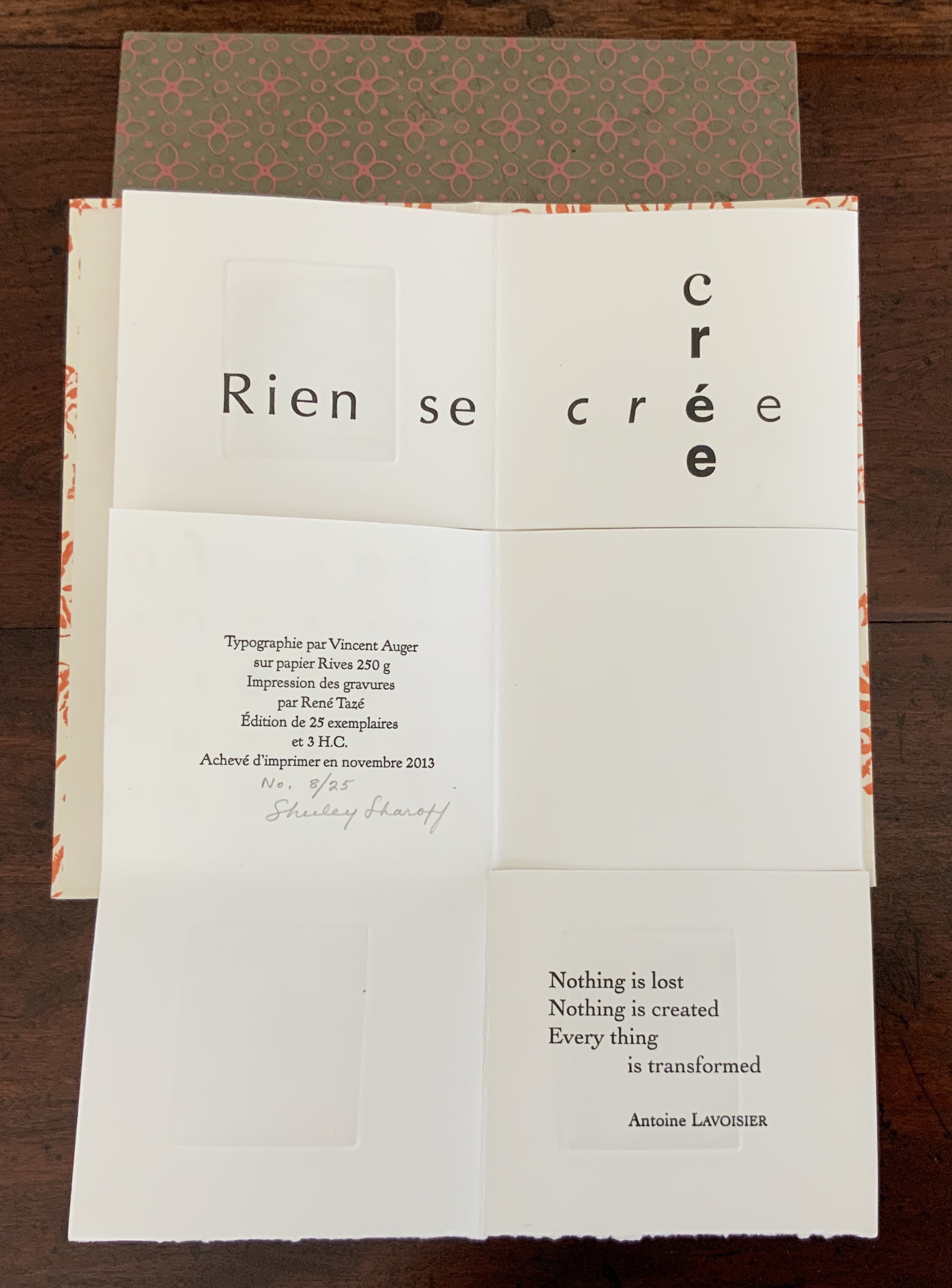
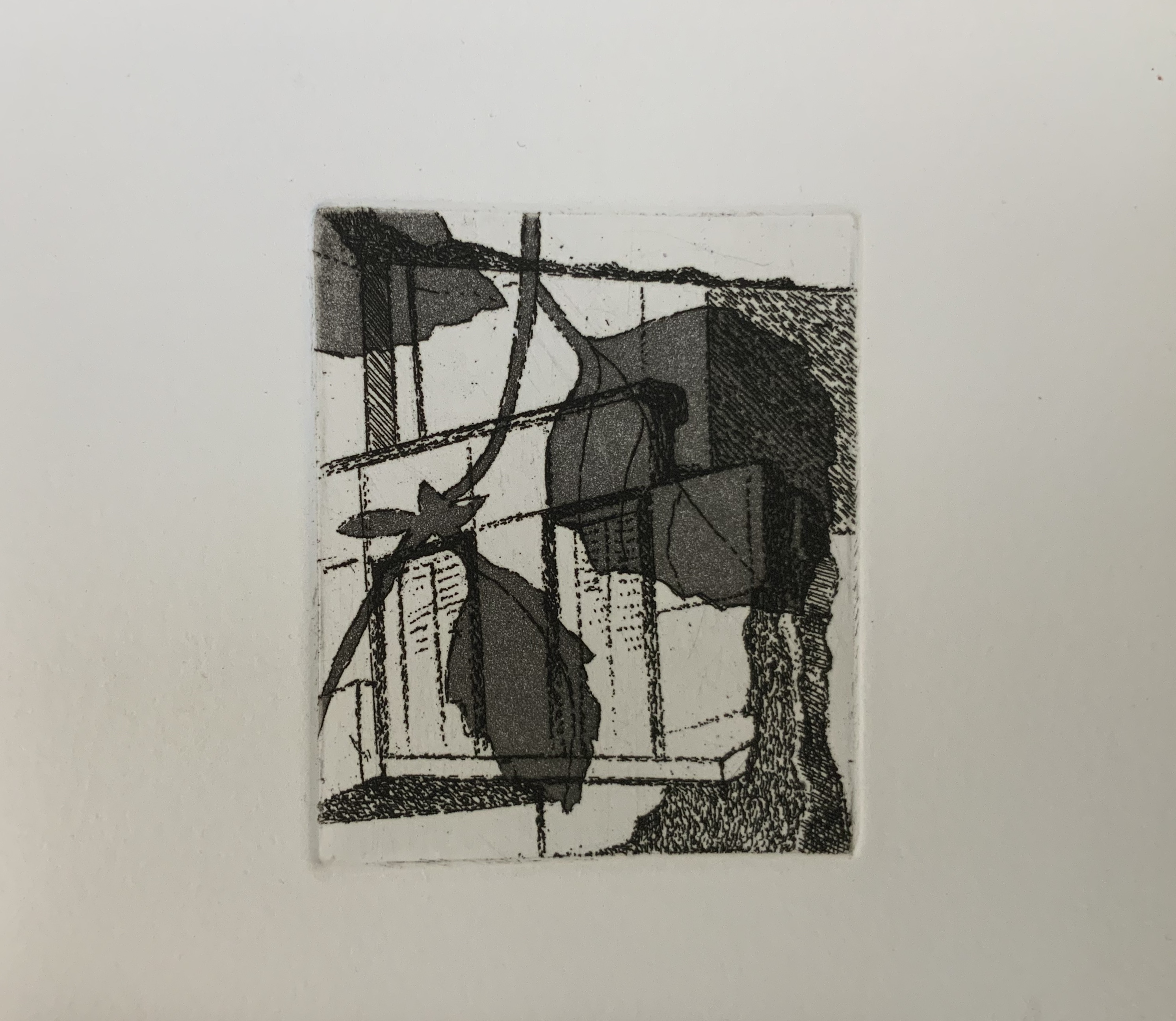
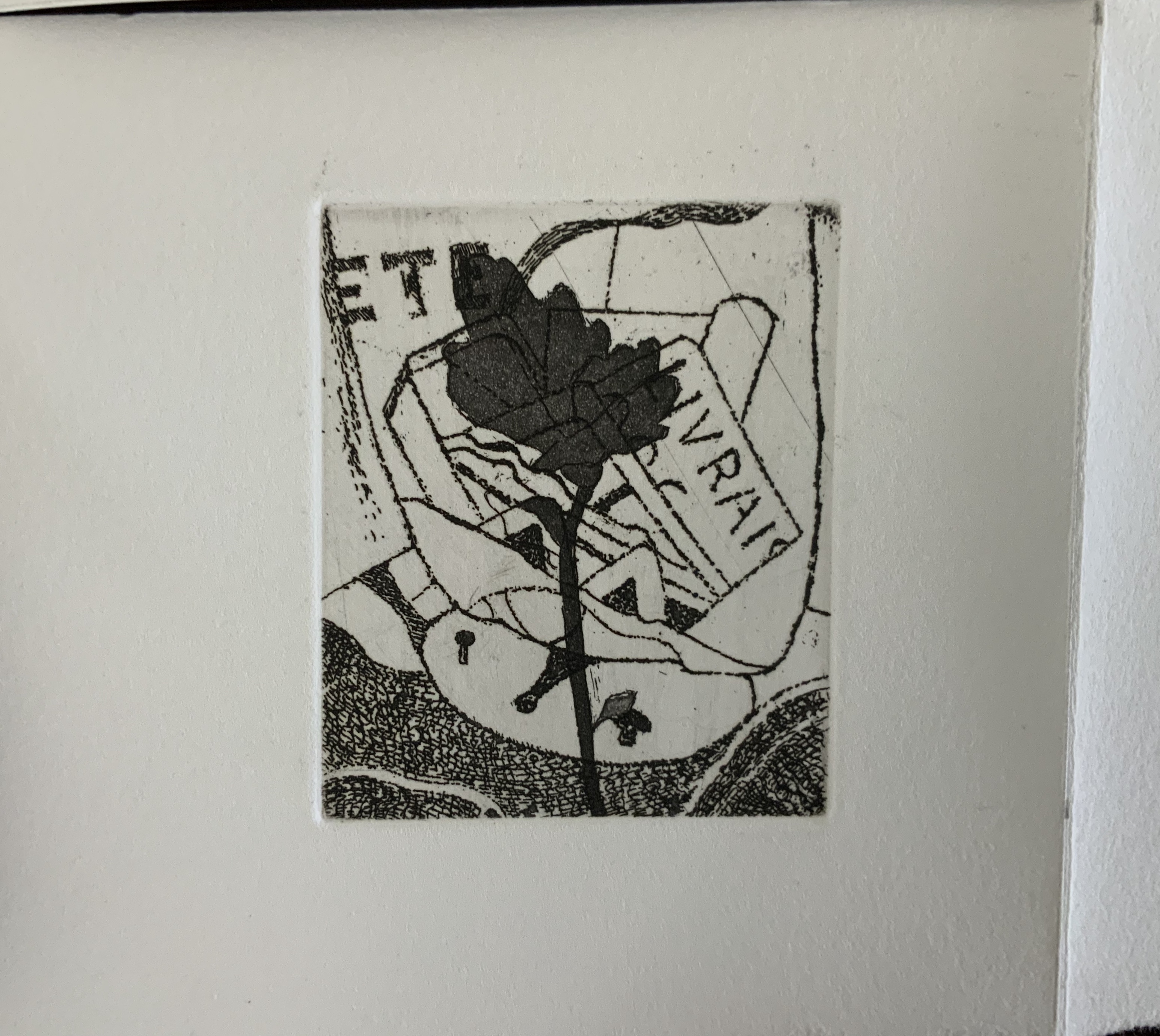
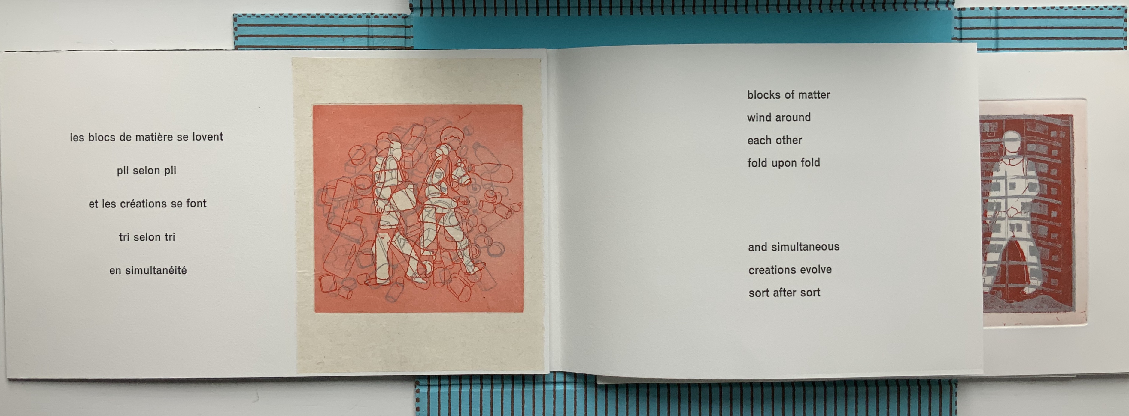
Three small volumes with aphorisms by Aristotle, Euclid, and Antoine Lavoisier (one per volume, respectively, in both English and French); each printed letterpress in various fonts and typographical arrangements along with four intaglio prints on one sheet of paper. The paper is cut along some of the folds so that folding and unfolding reveals different combinations of the text and images. Typography by Vincent Auger on Rives 250 GSM. Engravings printed by René Tazé. Edition of 25 and 3 casebound. H215 x W120 mm. Acquired from the artist, 5 February 2019. Photos: Books On Books Collection.
According to Shirley Sharoff (Books On Books interview, 5 February 2019), the fold and form of these three books were inspired by Katsumi Komagata’s work, and “Making each one was like a different game I was playing or puzzle I was solving”. Although the fold and form of each book is the same, the effect differs in each because of the placement of text and image. The result is three works of book art teasing the reader/viewer into playing with the artwork or solving the puzzle of reading/viewing it — and appreciating how the text from Aristotle, Euclid or Lavoisier fuses with the fold, form, typography and prints in each book.
The game or puzzle of finding the order of unfolding the books has several interlocking levels. On one level, there are origami “mountain” and “valley” folds, there are kirigami cuts, and vertical and horizontal openings. As these present themselves, the process of discovering or reading the text — what it is and how its syntactic order suggests the direction and order of unfolding — emerges as another level in the game. In parallel are the dual levels of deciphering the order (if any) of the intaglio prints’ appearance and relating the images to the text. And then there is the level of the relation of French to English and vice versa.
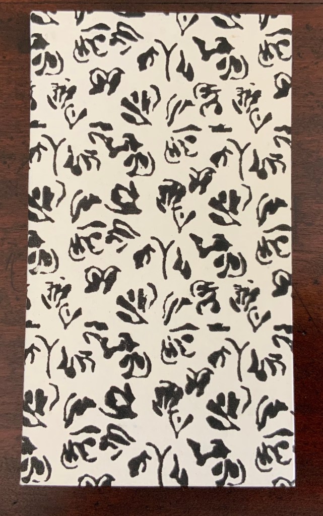
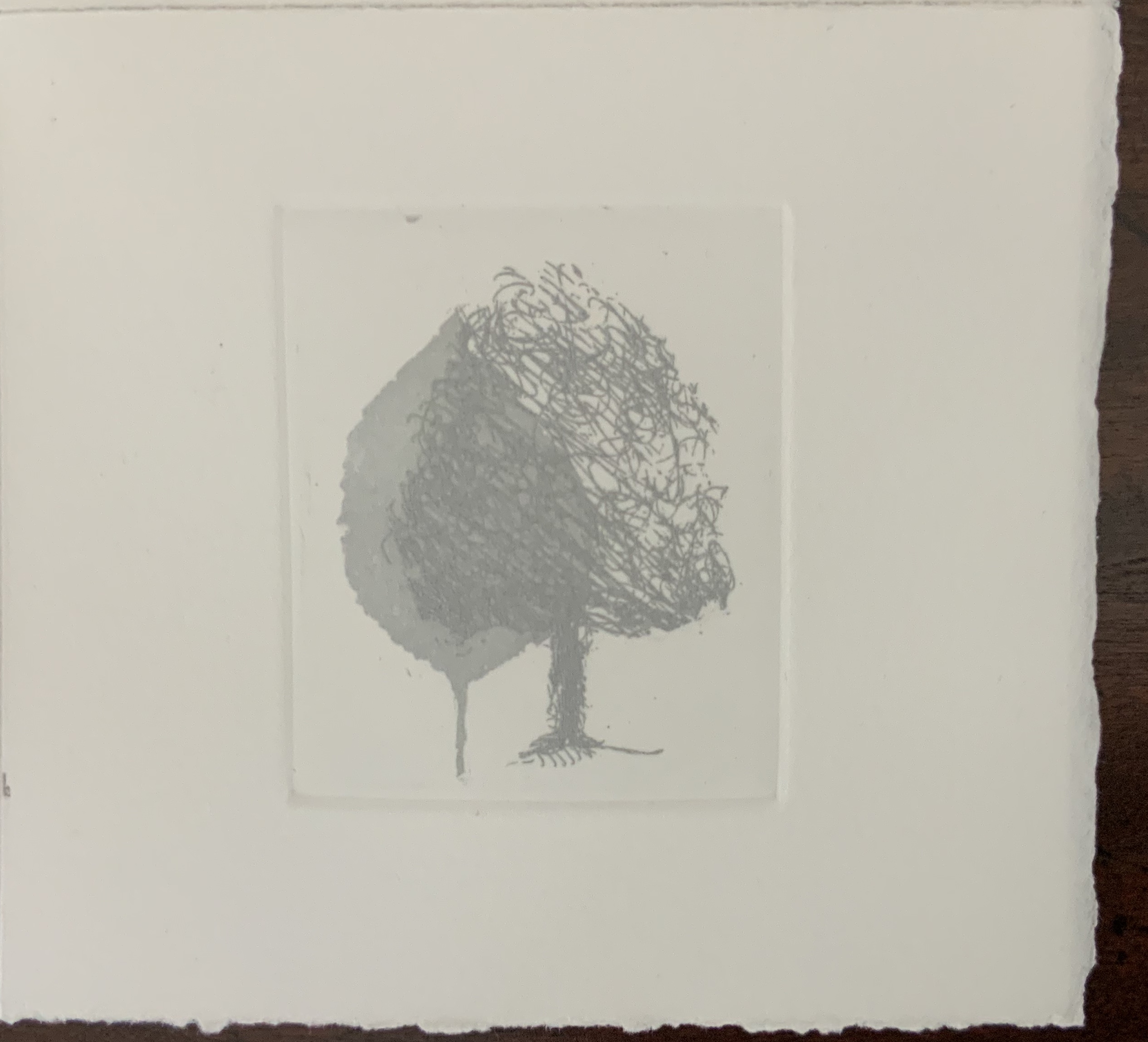
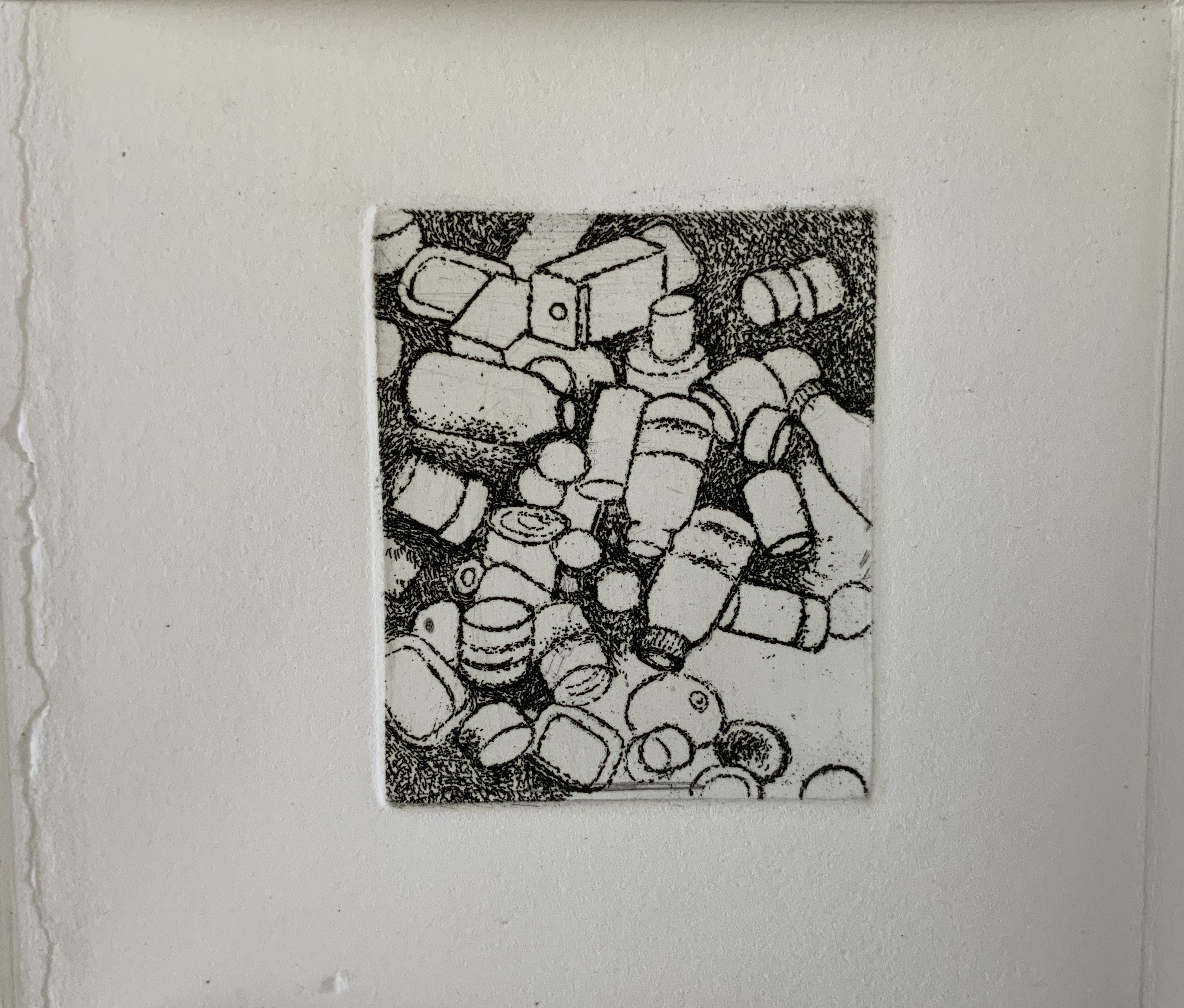
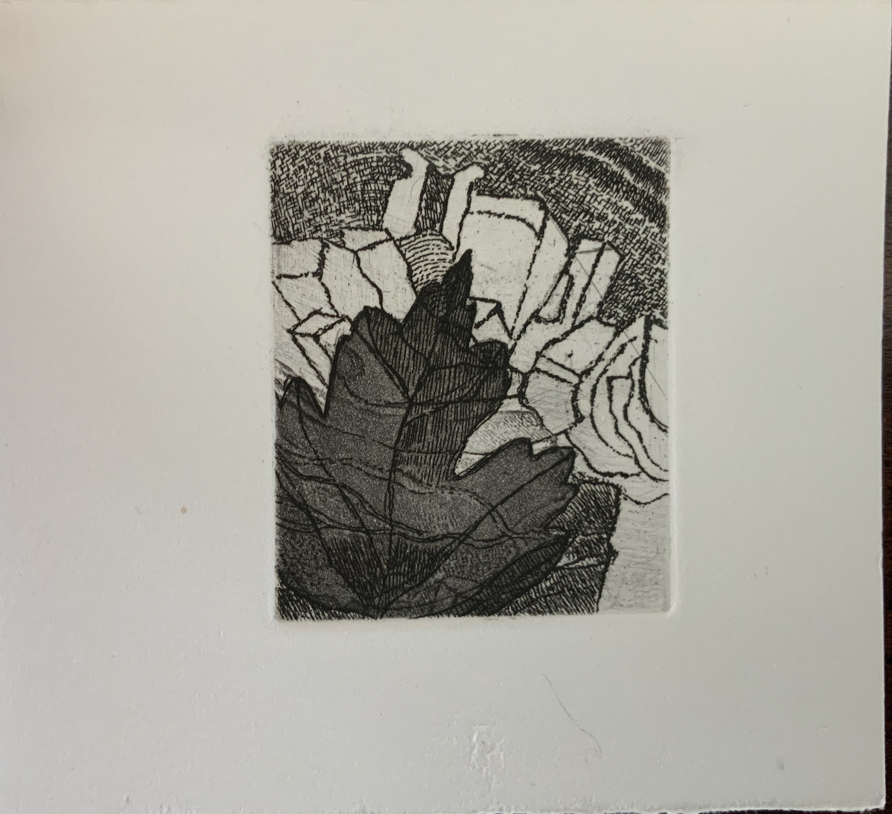
While the sets of four prints occupy the same position in each of the three single sheets, they “illustrate” their texts in different ways. In Aphorism 1, the whole tree occupies the “concluding” position of the lower right-hand corner, making a whole that is greater than the sum of the parts depicted in the other prints. In Aphorism 2, the images of transportation — train, car, plane, feet — follow from the abstract image of parallel lines. And in Aphorism 3, the two images of leaves overlapping human creations — buildings and litter — are bracketed by a central image of nothing but litter and a lower right-hand image of nature and the human-made landing atop a protruding pair of legs and feet like those of the Wicked Witch under the house in the Land of Oz.
In their variety of relationship to the structure and text, the three sets of images feel a bit secondary. Not so the presence of two languages. From the start, the French title page backed by an English title page on translucent paper suggests some sort of centrality for this bilingual feature. The only variation among the three volumes is that in Aphorism 1 and Aphorism 2, the complete French expression appears in a single panel, whereas in Aphorism 3, the English expression takes up that position. Why the bilingualism at all? The breaking up the expressions across the folds and cuts, the interspersing of images among the phrases, and the summary panels (two in English, one in French) suggest a halting, fragmented relation of each language to the other. Despite the title pages’ implication, the bilingual expressions do not exist simultaneously in parallel in any one of the single sheet books. By extension, is the relationship of language-image-thought to reality (whether metaphysical, geometrical or chemical) similarly fraught?
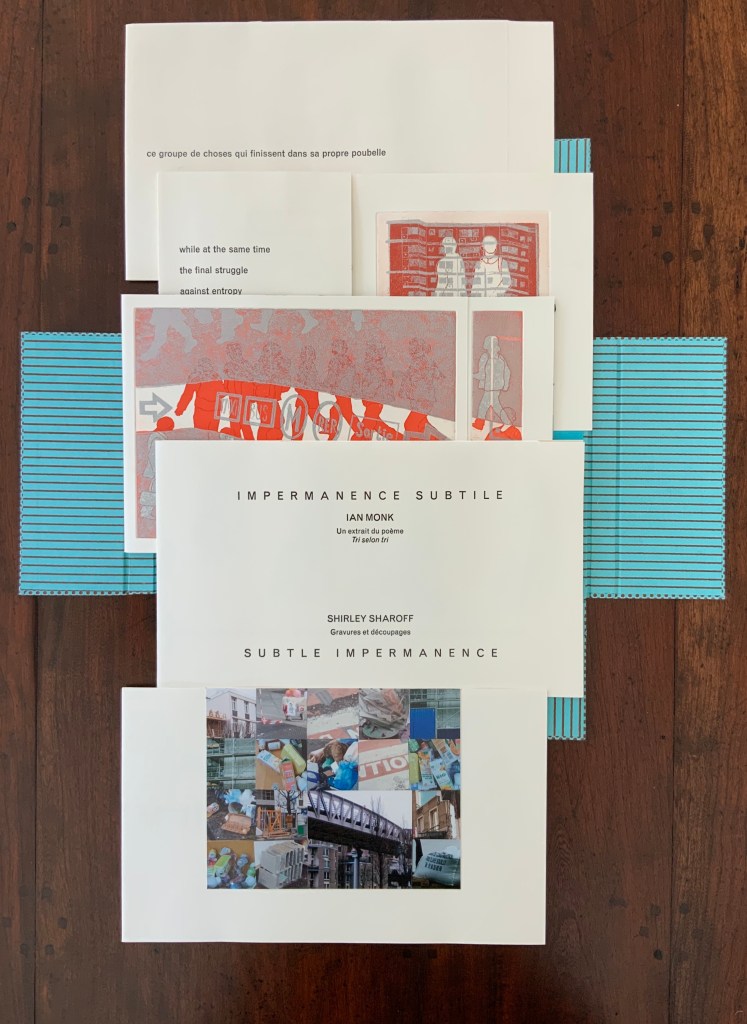
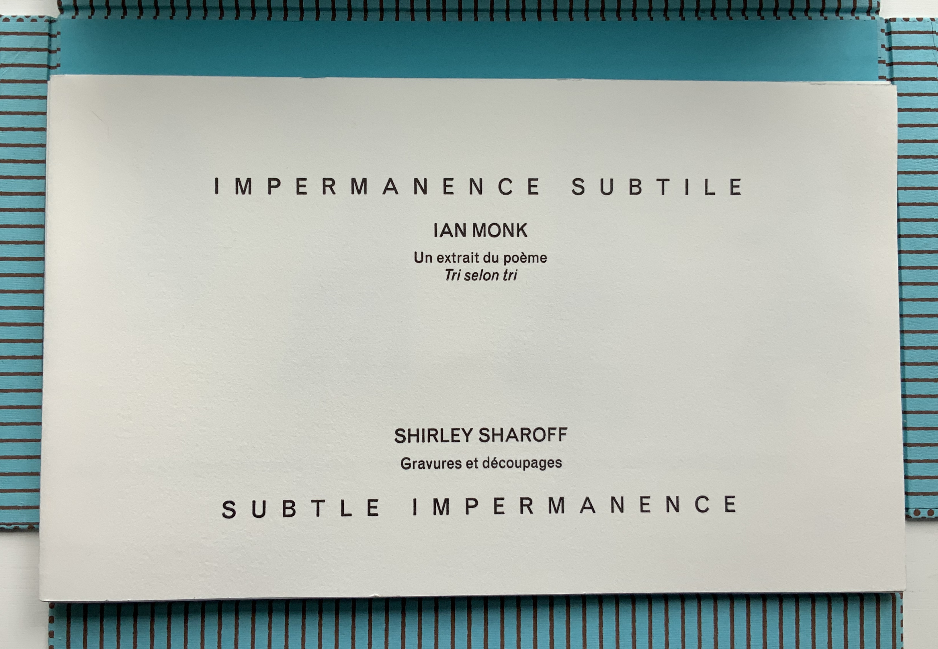
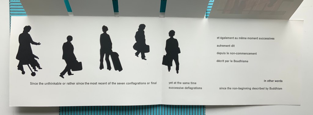
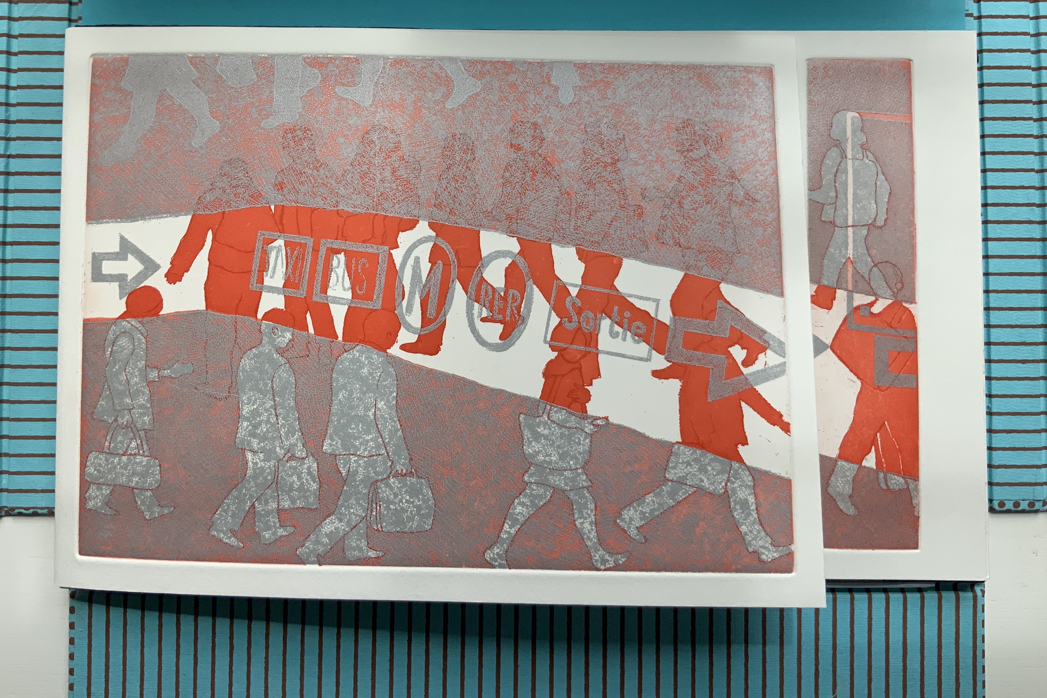
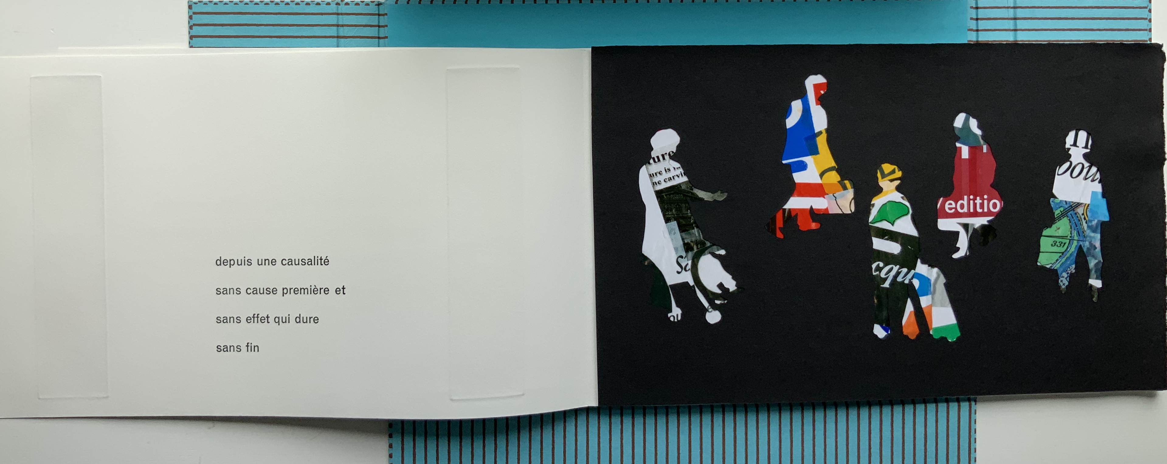
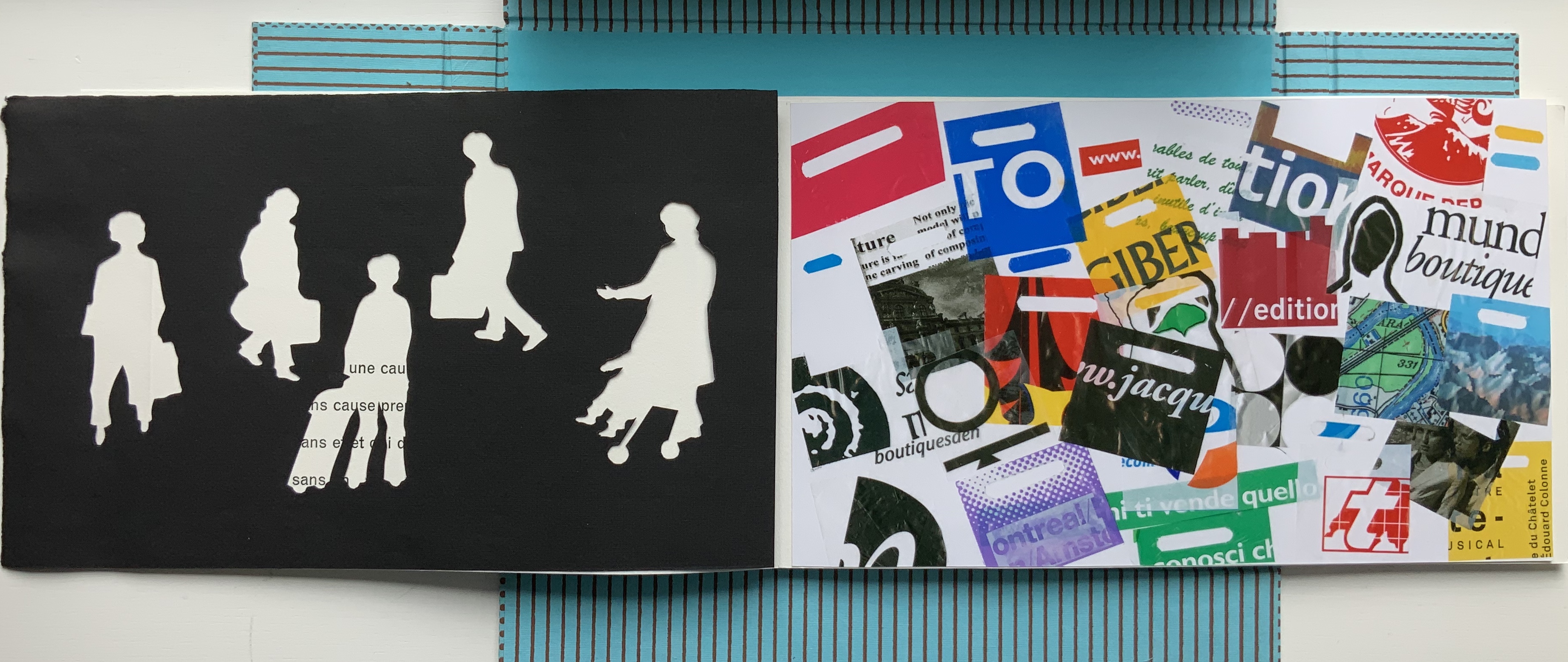
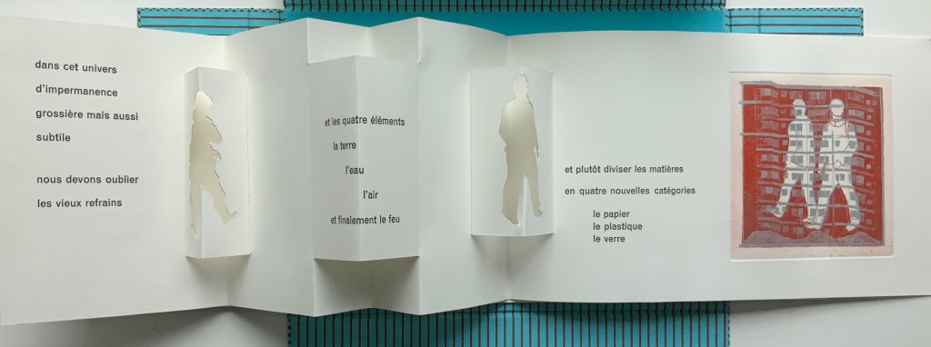
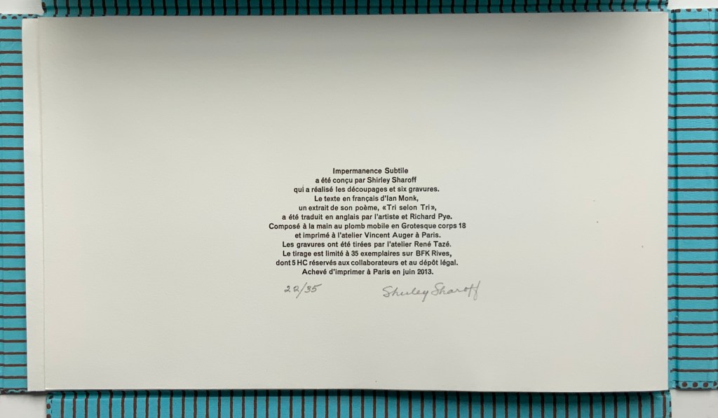
Portfolio box with four hinged flaps; five gatherings of folios bearing seven prints, collages, photos and cut paper. Text in English and French. Portfolio box: H212 x W340 x D24 mm; Folios: H200 x W330 mm, closed; variable width open, maximum W780 mm. Edition of 35, of which this is #22. Acquired from the artist, 5 February 2019. Photos: Books On Books Collection.
In Impermanence subtile/Subtle Impermanence, Sharoff’s bilingual perception of the world displays itself as more parallel, simultaneous and integrated — more subtle — than in La Poésie de l’univers/Poetry of the Universe. Where Poetry of the Universe explores this perception through dual forms (single-sheet origami/kirigami and book), Subtle Impermanence uses a multiplicity of forms (portfolio, flap book and pop-up book).
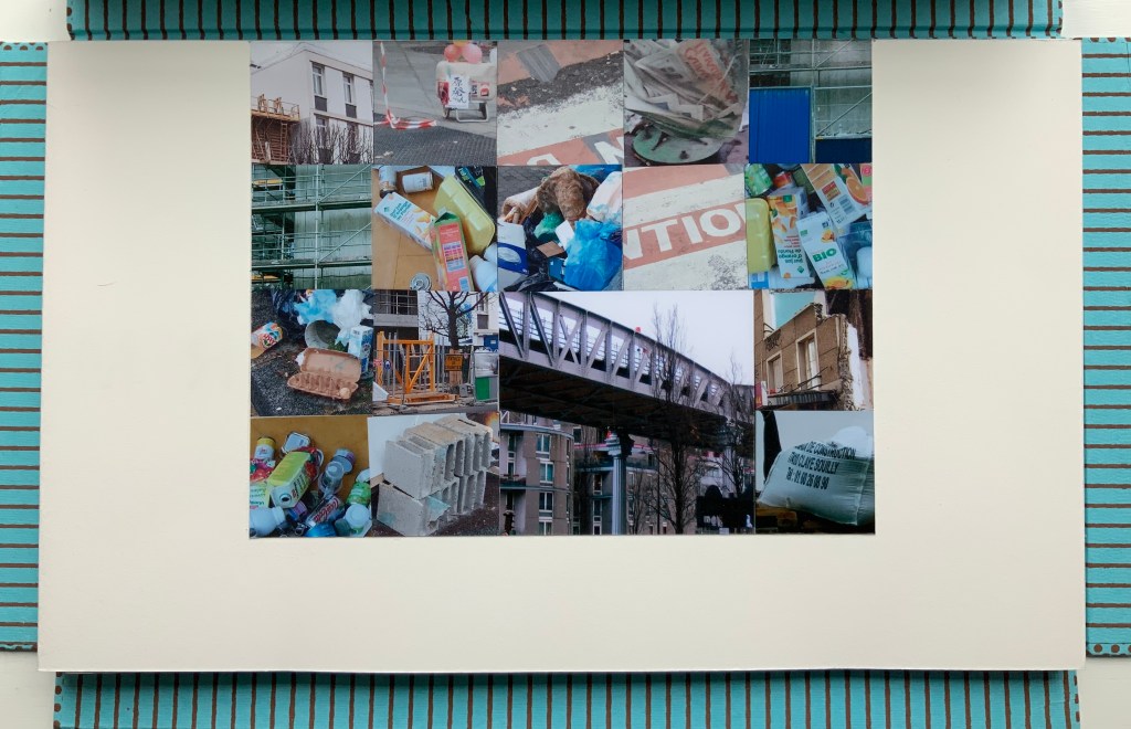
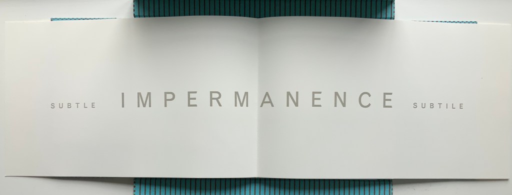
The first gathering — a single-fold folio whose first page presents the photo-collage of litter, demolition, construction and warning signs and tape — opens to a double-page spread that performs the book’s half-title function and also announces the work’s bilingual theme with the English adjective leading and the French adjective following the noun equivalent in both languages: IMPERMANENCE.
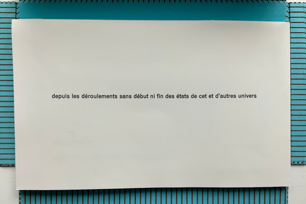
The first page of the second gathering performs the “title page” function of the book. When it opens, the first flap-book feature appears, the French text initially covering the English and, then, revealing a more parallel existence of the English and French. This is subtlety layered on subtlety. The text that appears and disappears under the flaps, and unfolds across the gathered folios, proceeds syntactically in a similar way, unrolling its qualifying dependent clauses one after another seemingly without beginning or end. As if mentally preparing a translation, the reader has to hold in mind each qualifier until what is being qualified can be reached.
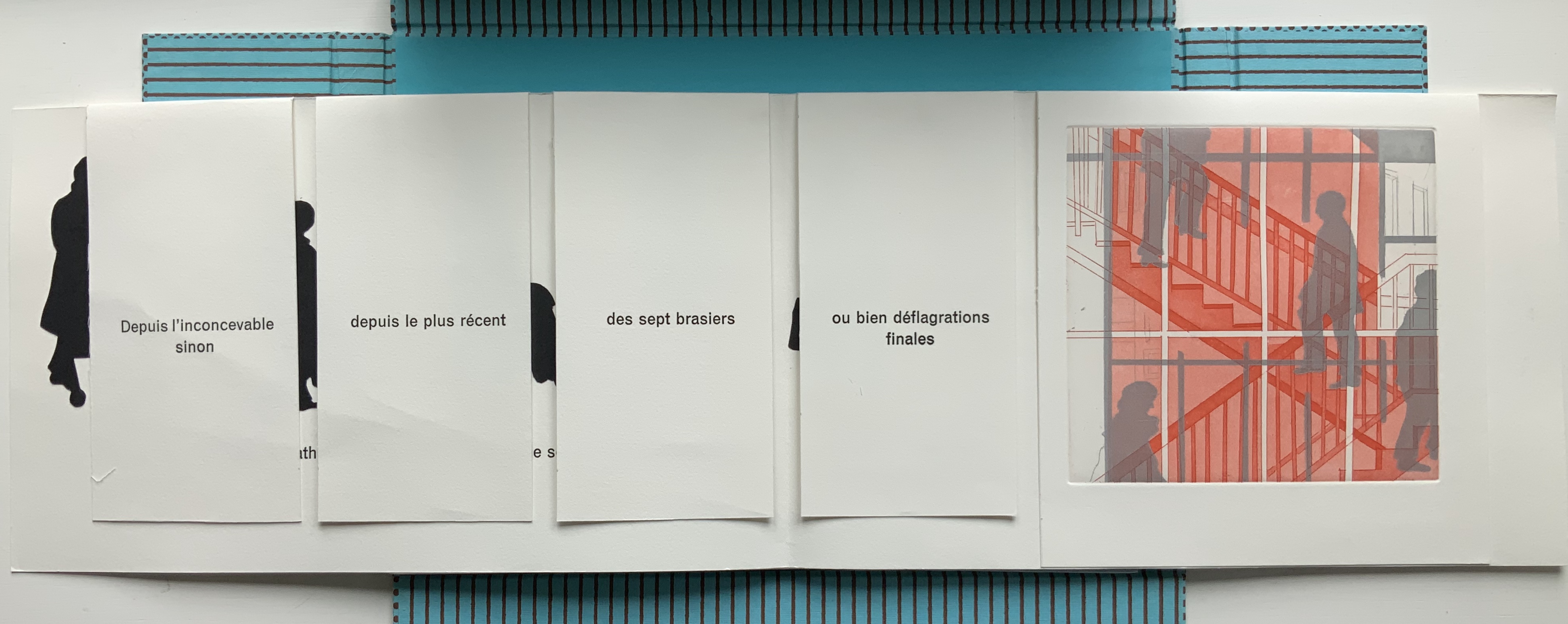
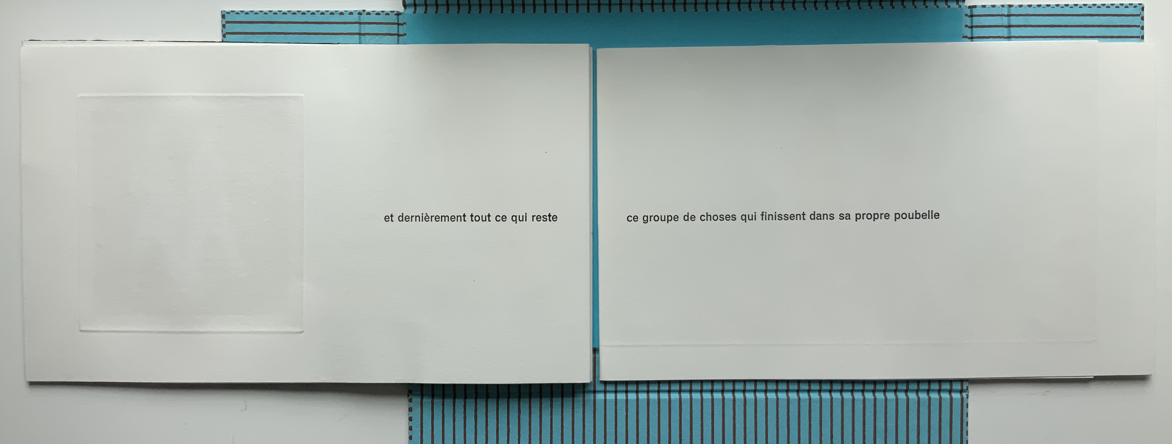
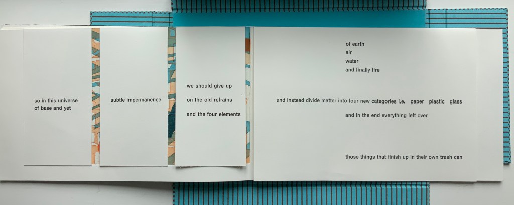
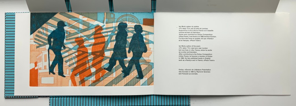
Those 5 flaps signal yet another subtlety. The text comes from the opening of Ian Monk’s Tri selon Tri (“sort by sort”), a concrete poem in the Oulipo tradition of Raymond Queneau, Italo Calvino and Georges Perec. Following this tradition means creating a literary work that adheres to some rule or constraint — like those in a game. In its original presentation, the poem works within a structural constraint consisting of 5 blocks of text, each 37 characters wide with the first and last blocks being 25 lines deep and the three middle blocks each being 22 lines deep. In self reference to its main theme that humanity is replacing the 4 elements (earth, air, fire and water) with categories of human detritus, the poem calls the first and last blocks poubelles (“trash cans”) and the three middle blocks “dumpsters” (bennes). In each middle block, a blank space — 7 characters wide by 3 lines deep — appears, mimicking the side openings of trash sorting bins. Sharoff’s subtle sculptural nod is 5 flaps (as well as 5 gatherings) for the 5 receptacles.
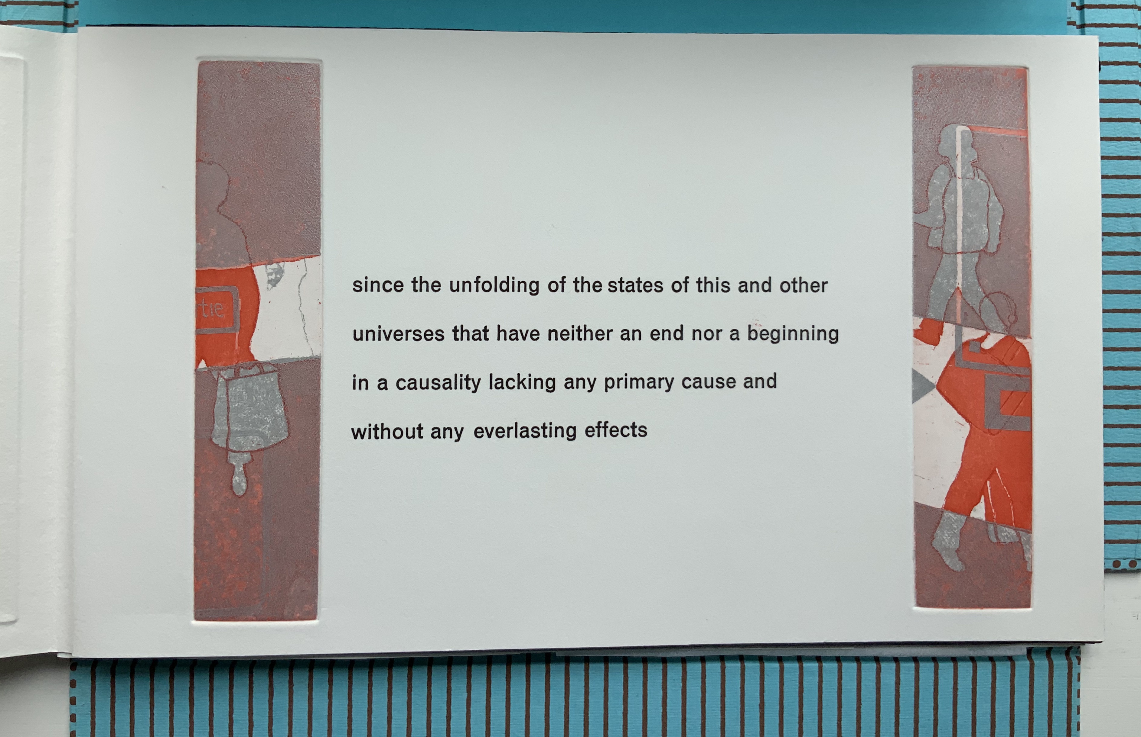
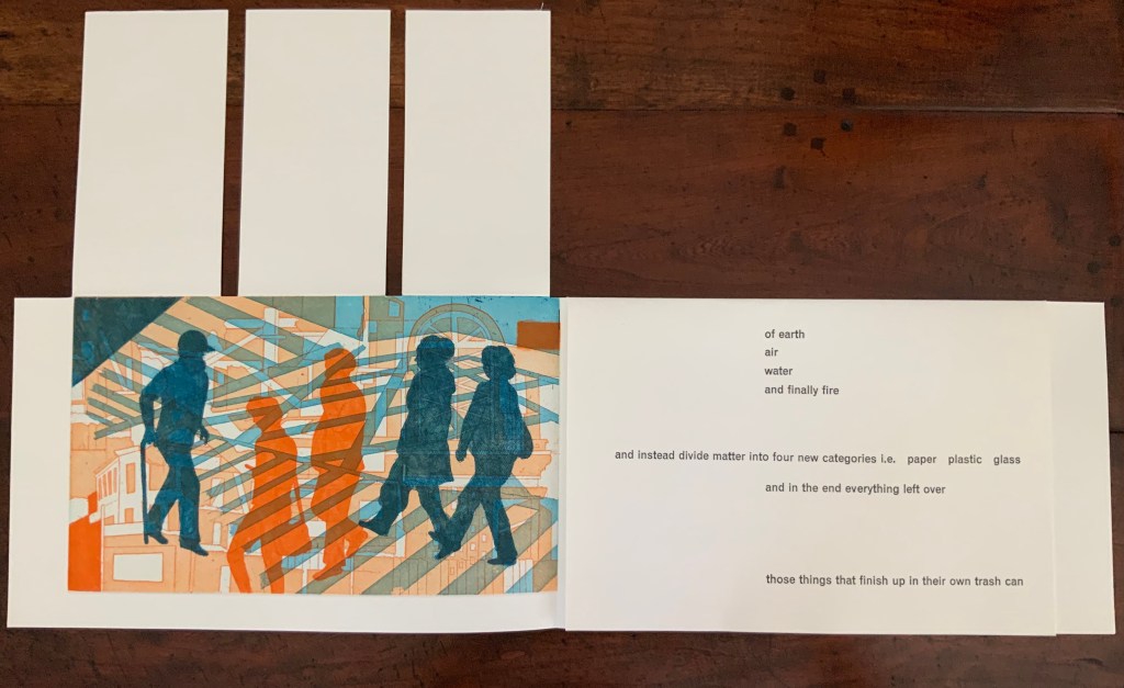
The third gathering above consists of a shortened single-fold sheet bearing the large print of commuters and shoppers and embracing a larger single-fold sheet divided by a loose black paper stencil. With its cutout human figures, the stencil overlaying another photo-collage of litter foreshadows the extract’s concluding metaphor: that, after the first three new elements of paper, plastic and glass comes the fourth new element — those things that finish up in their own trash can, i.e., humanity itself.
The fourth gathering above delivers yet another hint in the form of a pop-up feature: three receptacles, two of which have human-figure cutouts. These human figures have been appearing throughout in the intaglio prints, and in their over- (or under-?) printing of litter and construction, they too have been delivering the same hint.
Just as the first gathering’s closed flaps display French only, the fifth and final gathering’s closed flaps display English only. The three flaps on the left rise to reveal the final print showing human figures entangled in their fully constructed world and undercut by the fourth flap’s articulation of the metaphor and implicit identification of them as “those things that finish up in their own trash can”.
Beneath that fourth flap, the artist concludes in French and English, leaving the colophon to appear on the last page — oddly — in French only.
These two works by Sharoff are perhaps bettered only by two others not in the Books On Books Collection: Ovi (1988) and La grande muraille/The Great Wall (1991). It is interesting that, while the former reflects her preoccupation with the Oulipo circle (Ovi draws on Calvino’s work), it sticks to one language (French); whereas La grande muraille engages with three languages (French, English and Chinese) yet draws on the text of a Chinese modernist (Lu Xun), not the Oulipo circle. Both, however, reflect the same ingenuity of juxtaposition and integration of language, image and forms to be found in La Poésie de l’Univers/Poetry of the Universe and Impermanence Subtile/Subtle Impermanence, which makes them defining works in the Books On Books Collection.
The most extensive essay on Sharoff’s work can be found in Paul van Capelleveen’s Artists & Others(2016). It comments on La reparation (2001), The Waves (2003), Les amazones sont parmi nous (2005), Bruits de la ville (2007), Impermanence subtile (2013), La poésie de l’univers (2012-2013). He addresses La grande muraille (1991) in Voices and Visions (2009). The special collection at the Koninklijke Bibliotheek in The Netherlands is one of the few where several of Sharoff’s works — including La grande muraille — can be seen and handled in one place. Also prepared by Van Capelleveen is this entry “Impermanence subtile. Subtle impermanence“, KB National Library of the Netherlands, Koopman Collection, n.d. Accessed 26 July 2020.
Christophe Comentale’s essay captures the delight of exploration and discovery in the encounter with Sharoff’s art.
Shirley Sharoff, entre France et Etats-Unis, présente une pluralité d’inspiration consommée entre l’estampe et le livre devenu un média, entre unique et multiple. […] Magicienne des formes et des couleurs, Shirley Sharoff ne cesse de remettre en cause, par besoin autant que par défi personnel, tout ce qui pourrait ressembler au début d’un système de lecture, de vision, figé et donc clos. L’impossibilité de savoir -qui vaut aussi pour elle- de quoi sa prochaine oeuvre-livre-manuscrit-tableau-dépliant, ou tout cela à la fois, sera fait est assez excitant. La présence de textes sentis par affinités sensorielles, personnelles, avec des écrivains non encore classiques, autant de raisons d’apprécier de pénétrer dans cet univers où le conformisme est inexistant.
Christophe Comentale, “Shirley Sharoff, des livres a tenir debout et des estampes a voir aussi”, Art & Métiers du Livre, n°231 (Aout-Septembre 2002), p.63.