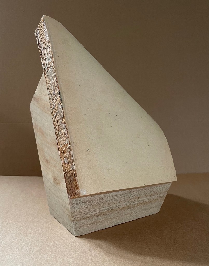
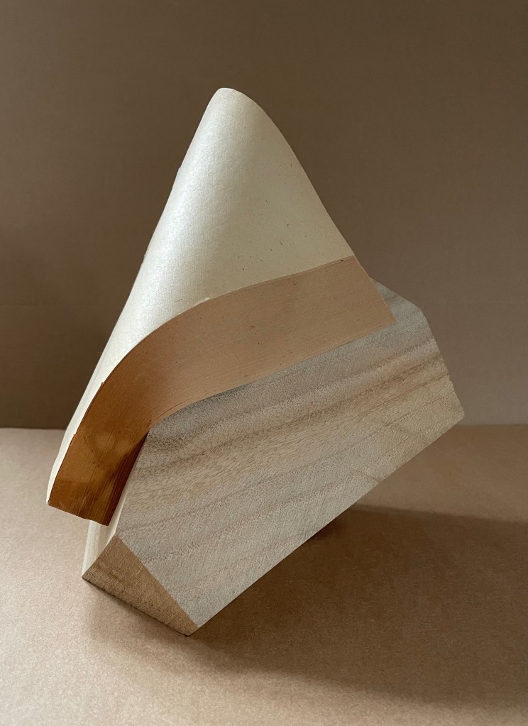
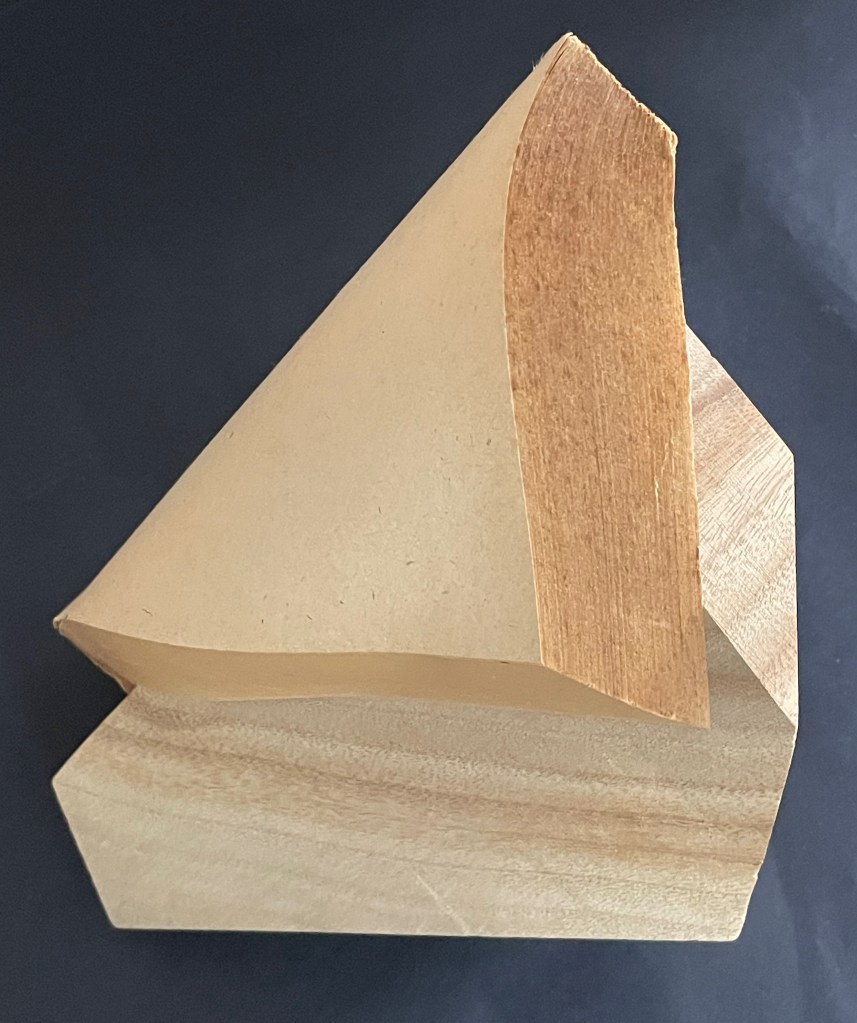
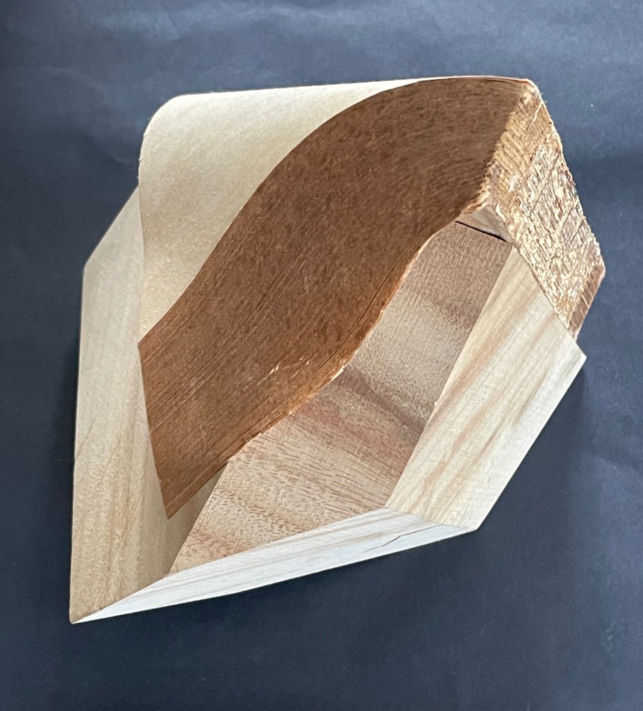
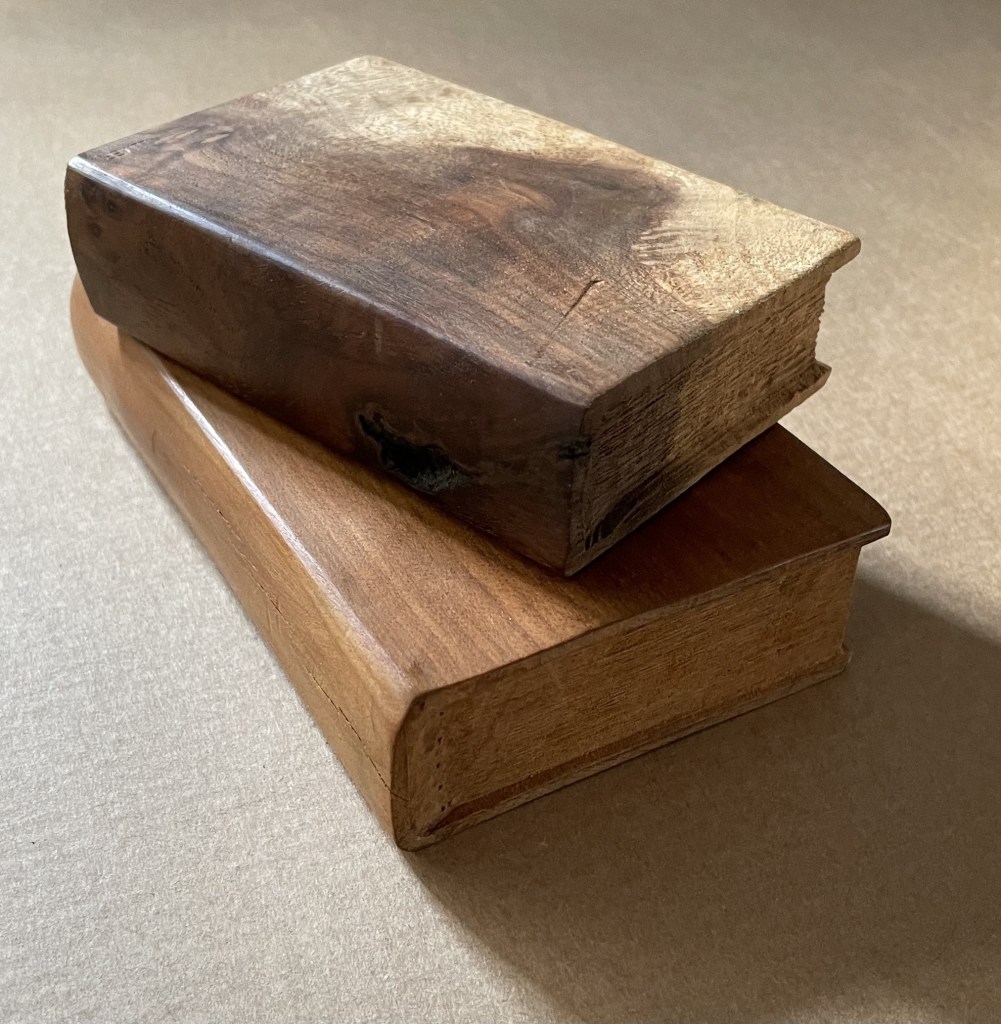
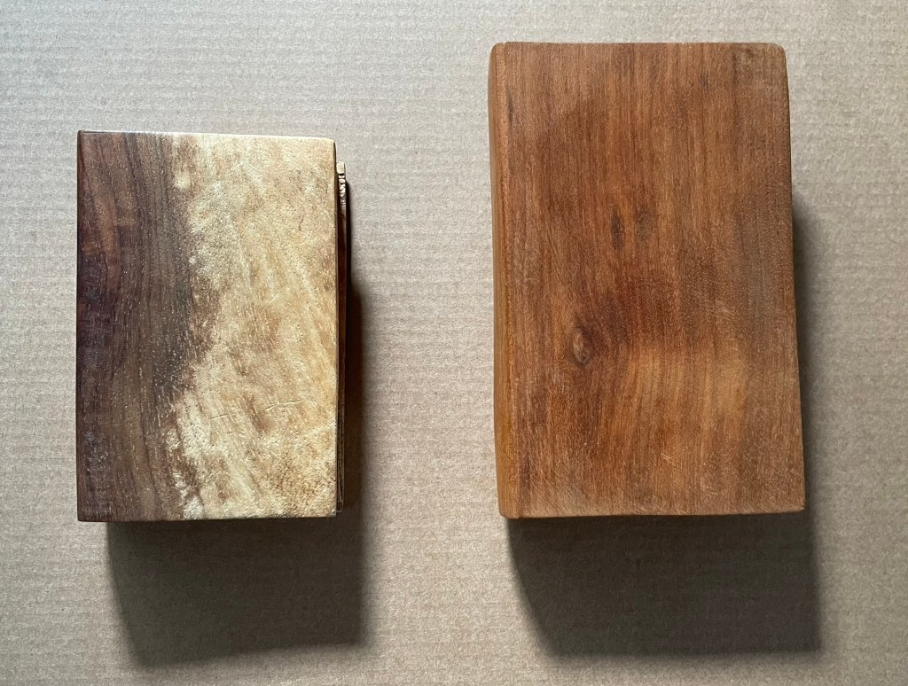
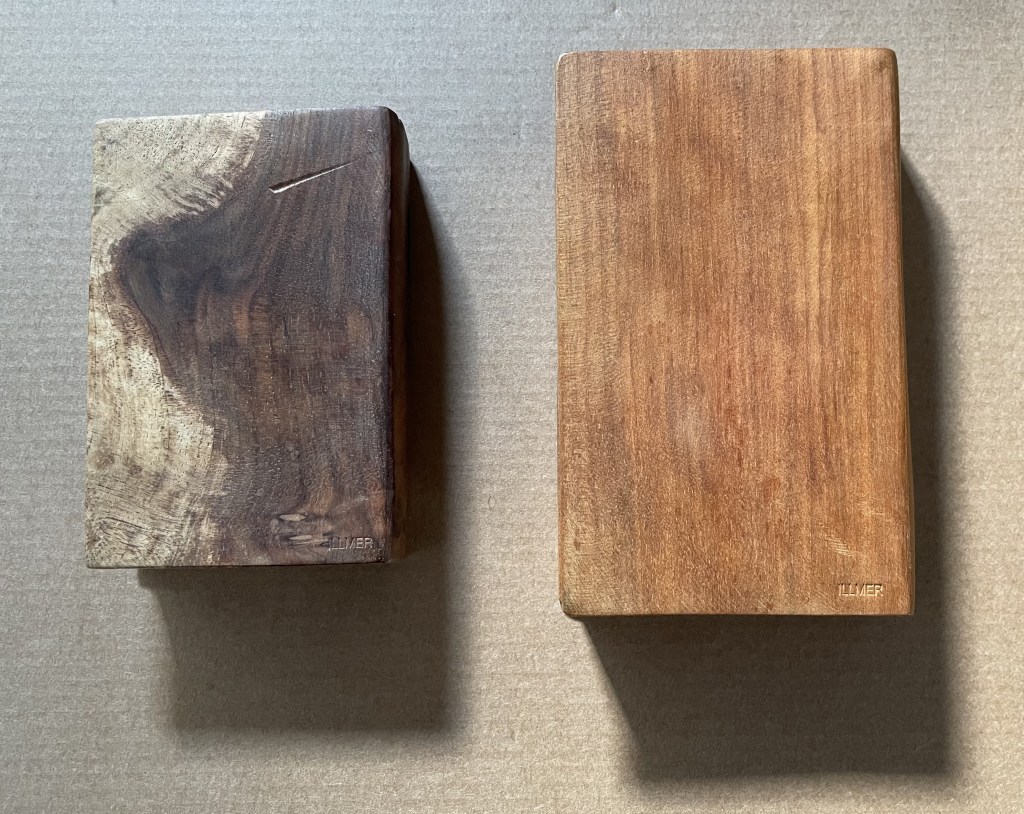
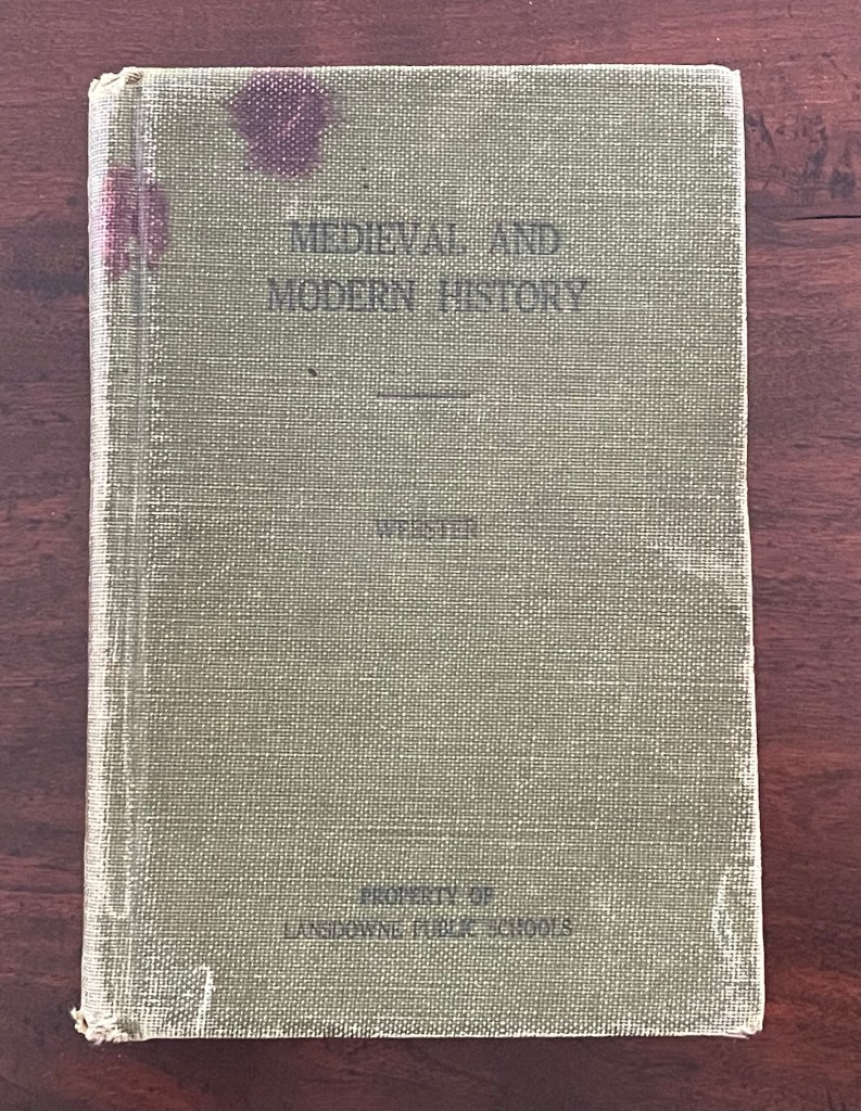
Silent Book, vol. 11 (2023) Ryuta Iida Altered book, camphor tree stump, and glue. H210 × W170 × D190 mm. Unique. Acquired from Fragile Books (Tokyo), 20 August 2024. Photos: Above, courtesy of Fragile Books; below, Books On Books Collection.
The cover, door, table of contents, numbering, text, and endnotes are all filled with a series of information. I thought to stop and crystallize all the functions of the “book,” … I decided to crystallize it. It took the time to go through the hands of people, the old book that finally reached me, sealed on a pedestal, it is now ripe for its next role. (Artist’s statement)
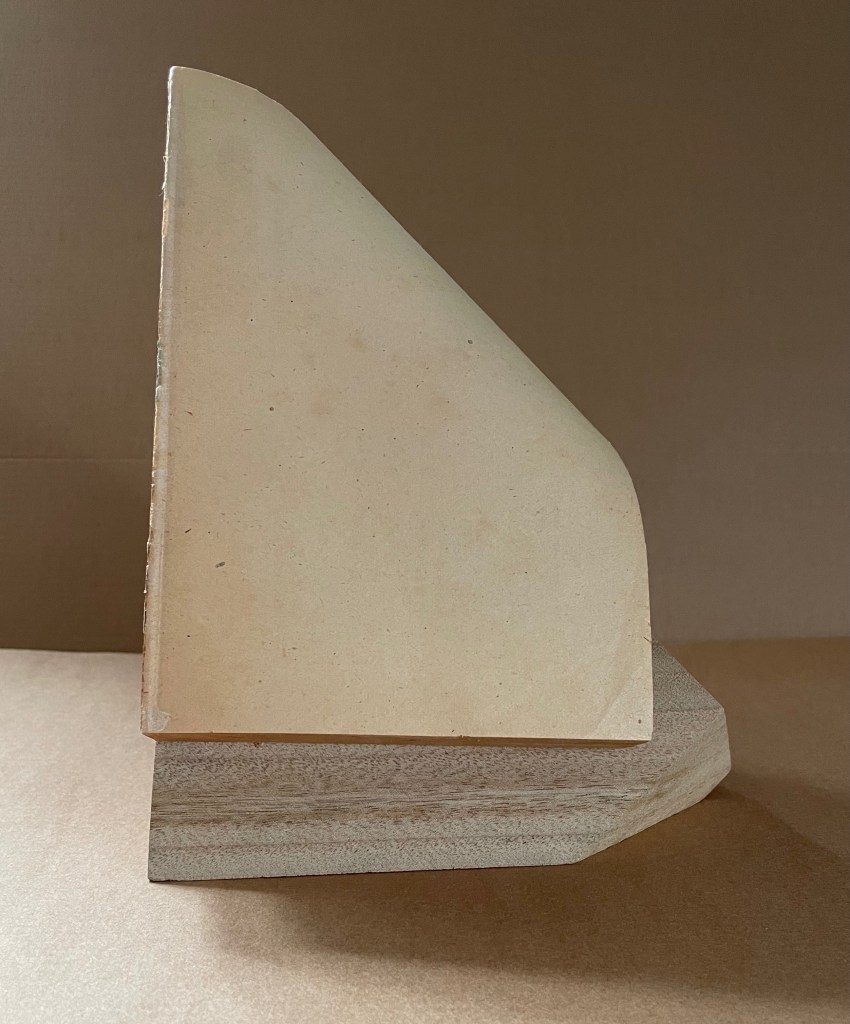
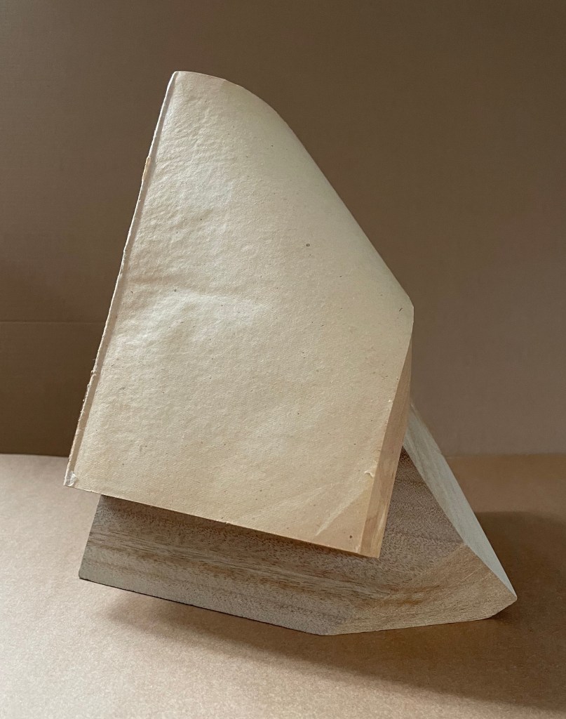
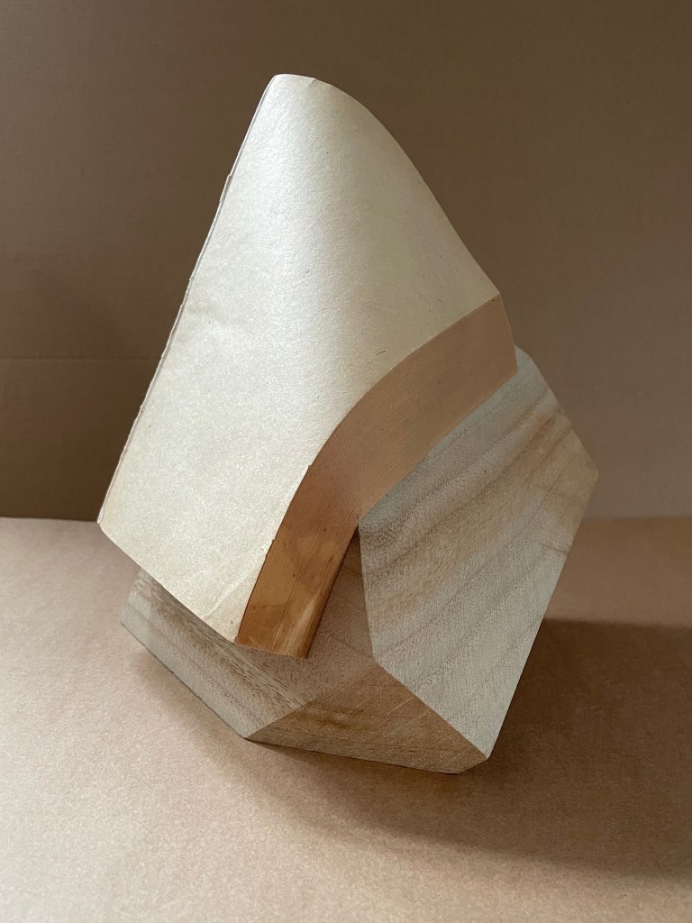
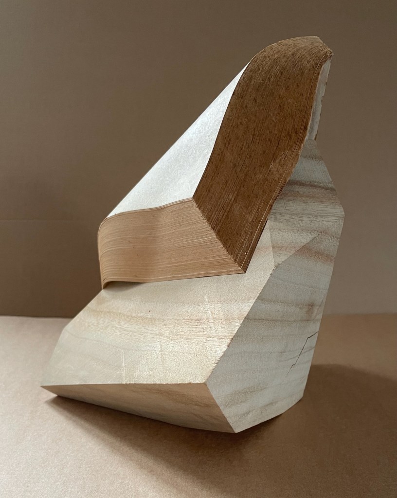
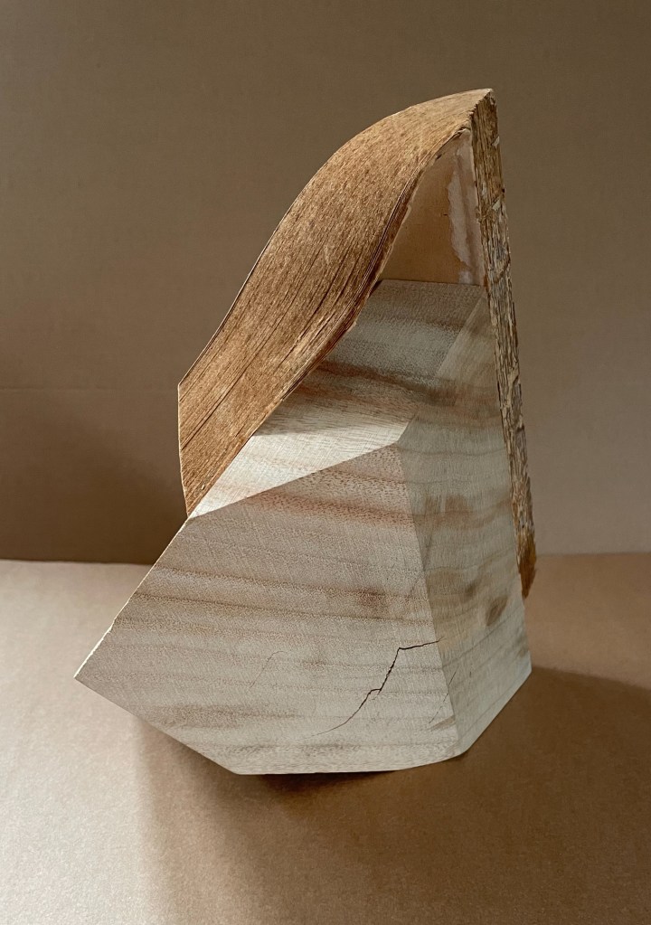
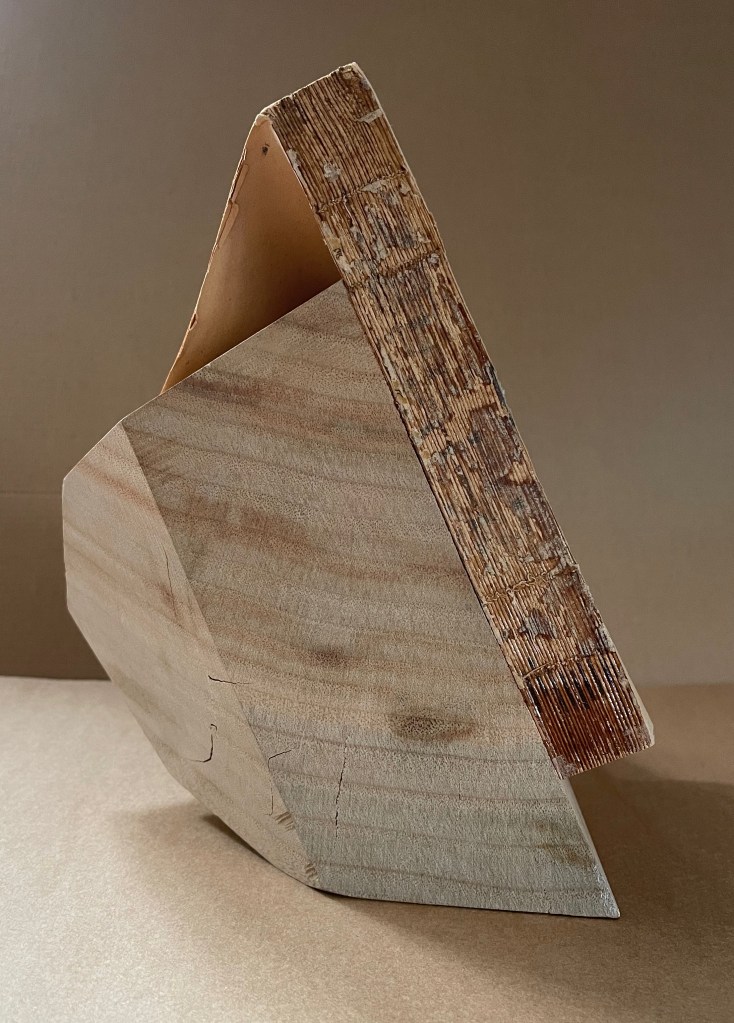
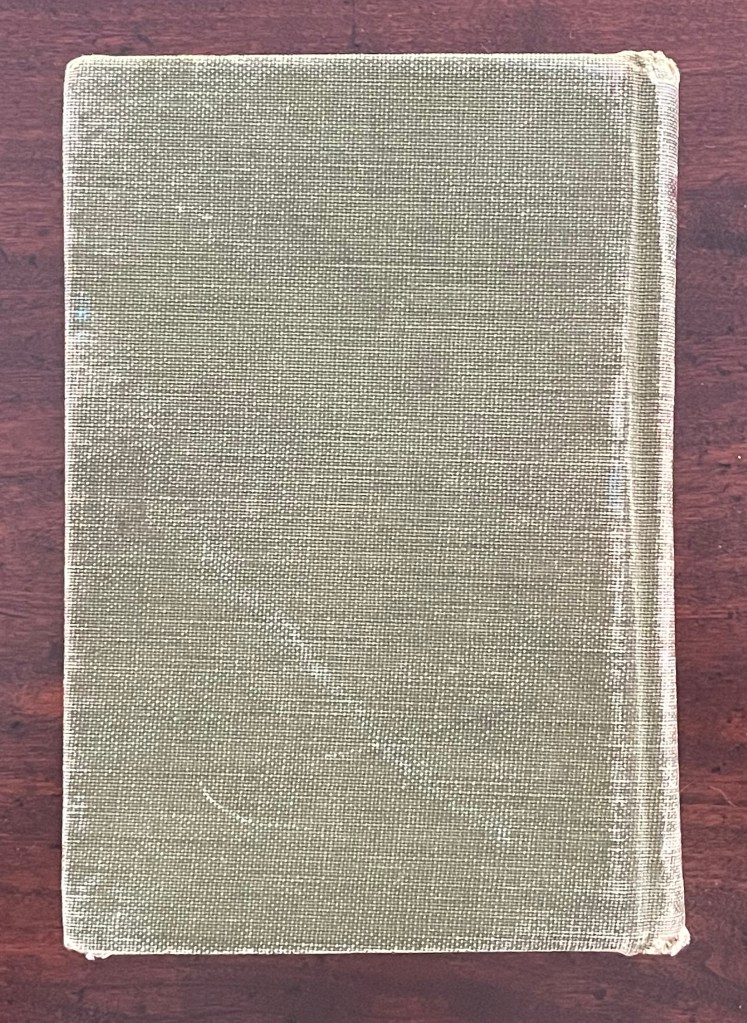
“Crystallized” is not the first word that comes to mind when viewing and handling this eleventh in Ryuta Iida’s series Silent Book. Perhaps it does for the angled planes of the cut block of camphor wood, but for the coverless codex, folded, draped, moulded, carved, and sculpted come closer. Two names that might not spring to mind (but should) are Giambologna (Jean Boulogne) and Gian Lorenzo Bernini. Like them, Iida offers us more than a single or primary vantage point from which to appreciate his work. Like Giambologna’s Abduction of a Sabine Woman (Loggia dei Lanzi, Florence) or Bernini’s Apollo and Daphne (Galleria Borghese, Rome) Silent Book must be circled and viewed in the round. The nine images below show the work turned right to left in stages.
Far as Silent Book is from the figurative, violent, and ornate features of the 16th and 17th century masterpieces, it still harbors its own complexities of line, shadow, texture, and form. There is a volume of dynamics between and among them that belies the work’s title. Note how the layers of pages echo the wood’s grain, and how the color and texture of the page surface contrasts with those of the book’s top edge, and how that contrast reverberates with the shifting colors of the wood. Iida has moulded and sealed the book block so that the top edge curves to a point in a duet with the cut angles of the wood block.
Silent Book has many kin in the world of book art, works that make the content of a ready-made volume inaccessible and make something anew from the material object. Too often this sub-genre has been dismissed as a fetishization of the book. This overlooks how Silent Book and its kin make us think about the book as a material for making art and as a source of metaphors, and we overlook what the individual artworks are. By sealing away the content of a book, giving the book block a sinuous shape, and fusing it with a carved block of wood, Iida invites us to look afresh.
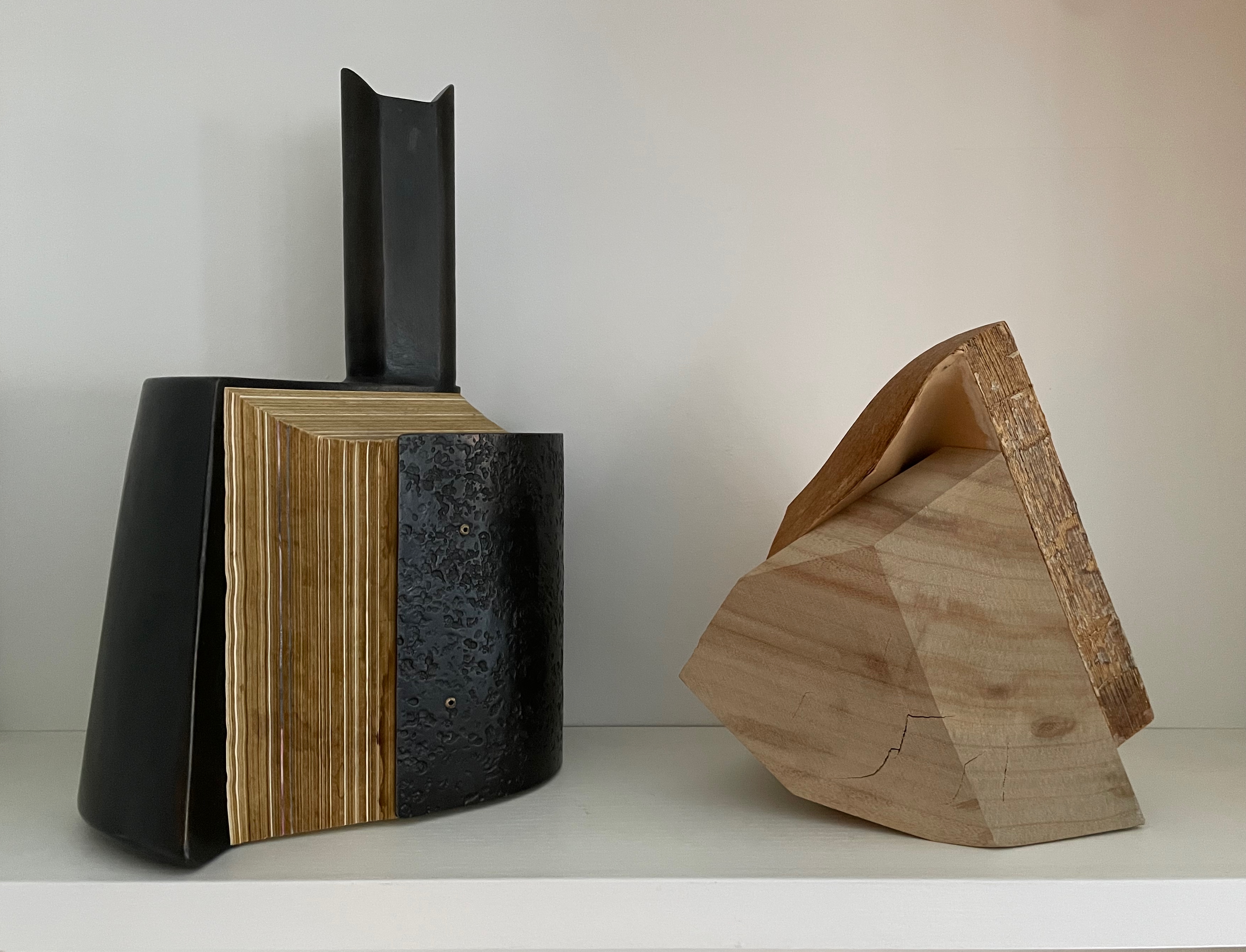
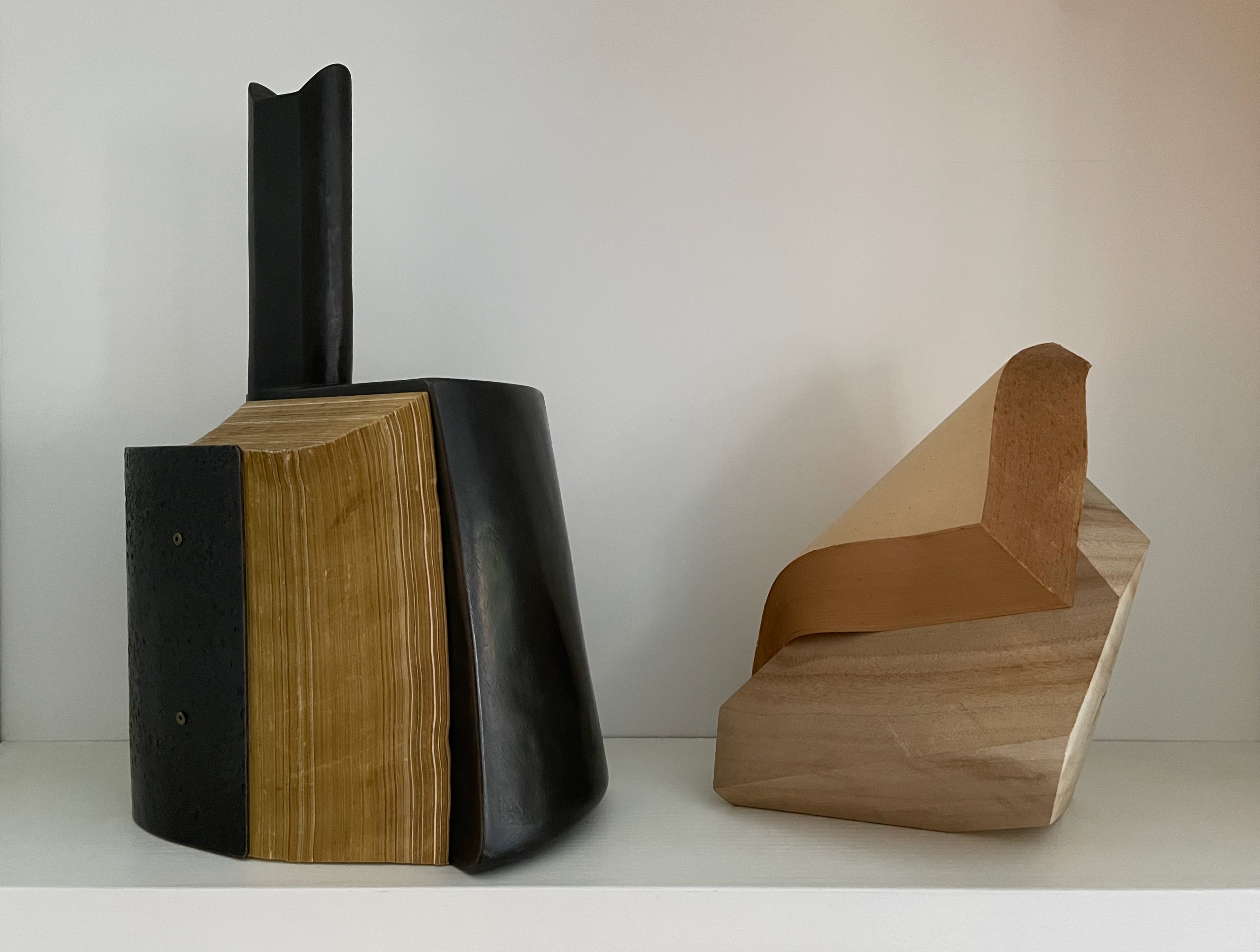
In the Books On Books Collection, several other works share this play of inaccessibility with tangibility: Barton Lidice Beneš’s Untitled (1973), Andrew Hayes’ Offset (2013), Jacqueline Rush Lee’s The First Cut and Silenda (both 2015), Doug Beube’s Red Infinity #4 (2017), Lorenzo Perrone’s Kintsugi (2018), and Chris Perry’s 217 Ripples: Sediment(2020). Of these, Offset seems closest to Silent Book. Comparison can increase appreciation of each and their sub-genre.
Both Hayes and Iida have managed to elicit a sense of action and motion from their materials. From one view of Offset, metal embraces the body of the book; from another, the book pushes the metal apart. From one side of Silent Book, the upward-angled block of wood supports the coverless codex folding over and slipping down its pedestal; from another, the book drapes a protective arm over the sideways-angled block.
Views of Offset (2013) by Andrew Hayes and Silent Book (2023)
The titling of the two works raises appreciable similarities and differences. Offset suggests the printing method of the same name, which does involve metal plates. The overall shape, however, suggests some strange assemblage of early letterpress components: the bulbous ink balls (or dabbers) with their handles, the torque bar, and the metal furniture locks. The offset position of the piece’s “handle” also reflects the title. What can’t be appreciated from the images is that Offset wobbles if touched in the slightest.
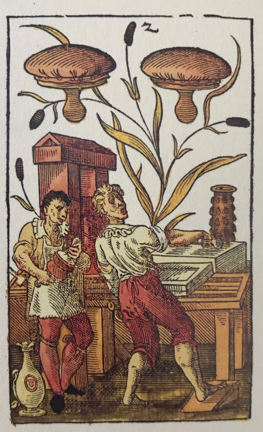
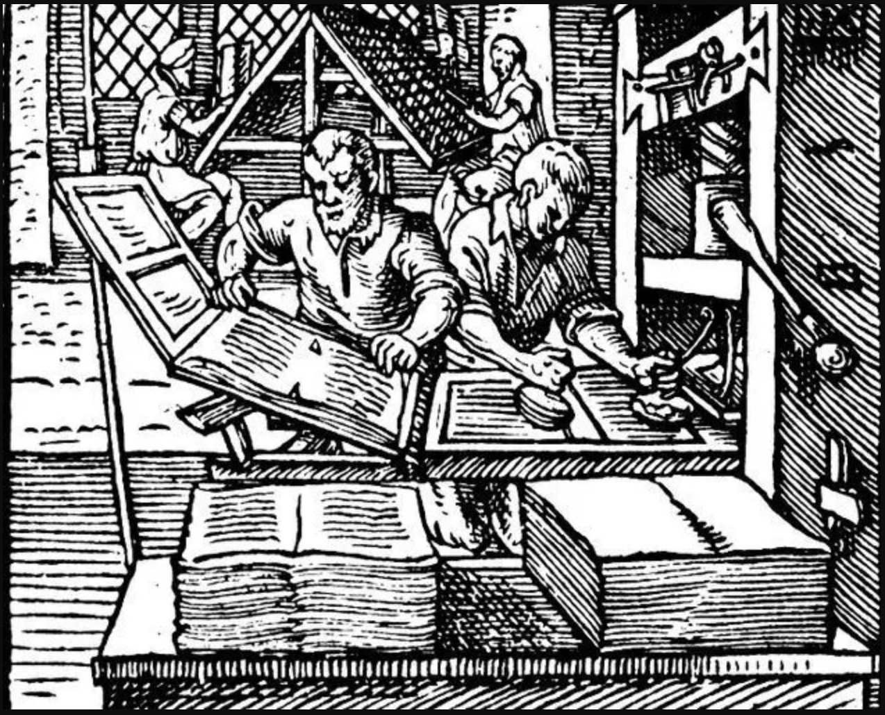
“The two of printer’s dabbers” from Jost Amman’s 1588 deck of cards.
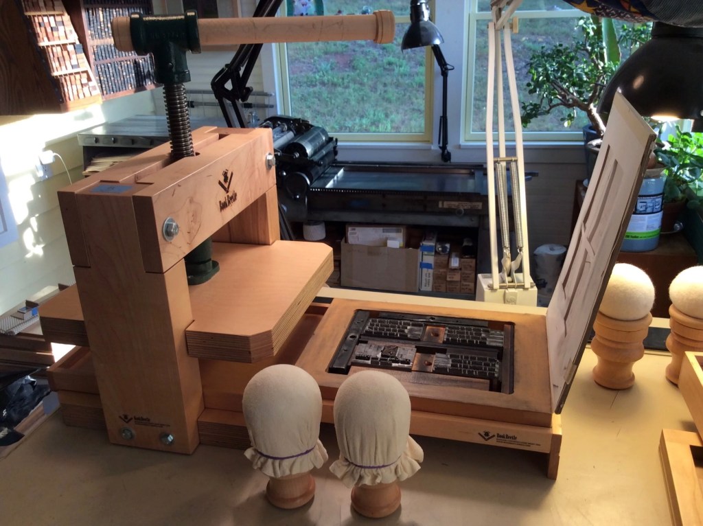
The BookBeetle Press, a portable screw press designed and built by Josef Beery. Reproduced with permission of Beery.
The title of Silent Book refers, of course, to the book block’s being sealed, an obvious visual/verbal pun. None of its information passes the lips of its pages. Like Offset, however, the title is also oblique. Although the derivation of the word book from the Old German Buche (meaning “beech”) is a debatable assumption, it’s widely accepted enough to allow that the block of wood is also a silent book.
Now imagine the substitution of a large block of pink bubble gum for the book material in Offset and Silent Book. Not a block of gum in the shape of a book, but an oversized, unchewed block of gum. Something very different to chew on now, isn’t it? The ways in which book artists manipulate the material and metaphor of the book vary every bit as much as the ways in which painters, sculptors, and other artists vary their techniques, materials, and subjects. Even within the slice of book art that focuses on physical inaccessibility, such as Marcel Broodthaers’ Pense-Bête (1964), Wolf Vostell’s Betonbuch (1971), Irwin Susskind’s Book Faced Down – Embedded in Plaster(1999), Jonathan Callan’s Rational Snow (2002), Anselm Kiefer’s Untitled (Constellation Book) (2004), Hanne Stochholm Exe’s Remake(2015), and Neil Nenner and Avihai Mizrahi’s Cover Story (2017), the variety abounds. Ryuta Iida’s series Silent Book is a resounding reminder.
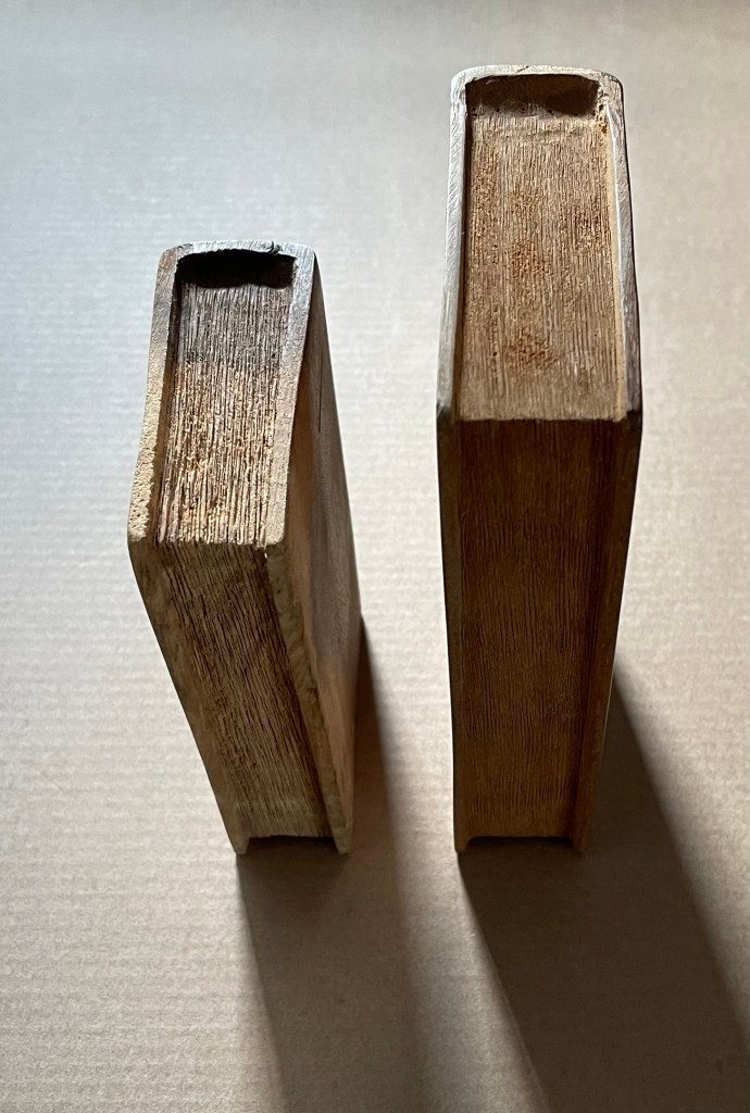
Untitled(2015) Ivon Illmer Book-shaped wood sculpture. Top: Almond wood, H100 x W65 x D27 mm.Bottom: Poplar wood, H123 x W78 x D27 mm. Unique. Acquired from the artist, 10 October 2014. Photos: Books On Books.
From Ivon Illmer’s website: Books preserve history and stories. Each book has its own individual story. This ranges from loving treatment to neglect to ostracism and even burning. The arc almost inevitably stretches from the fate of the book to the fate of man. Everyone should let their imagination run wild when touching the book sculptures and invent their own story for each book. Touching is important, the haptic experience flatters the sense of touch. You “grasp” the beauty of the wood. Imagining the book sculptures in the raw piece of wood is the art. Each piece is unique in shape, structure and grain. Accessed 14 October 2024.
Illmer categorizes his work as “book sculpture / book art”. The carvings from various woods primarily celebrate the shape and tactility of the closed codex. The similitude of the exterior, right down to the fore, top and bottom edges, belies the inaccessibility of the interior.
Untitled
If simply entitled Unreadable Book or A Closed Book, these works would lead us down a narrow path of interpretation. Another easy path of interpretation could be etymological. The derivation of the word book from the Old German Buche (meaning “beech”) is a debatable assumption. Still, it’s widely accepted enough to start us down the path that, since the paper of traditional books is made from wood, so, Illmer’s carved codices just represent another way of using wood to make a book. He could have entitled them Buchmaterial, which in English also captures the same pun between the book’s content and its material. In his self-published catalogue, however, Illmer is explicit that his use of “untitled” is totemic:
… each of my books represents every book published so far. That’s why none of them has a title, and that’s why none of them is based on a real book.
Illmer leaves it to the imagination of the viewer to determine whether and how his works “interrogate” the nature of the book.
Presenting physically inaccessible books is fairly common among wood carvers, sculptors, and painters. A closed or open book appears in the hands of countless saints and Madonnas and carries with it various iconological interpretations, depending on the bearer. From the St. Servatius Cathedral Treasury in Maastricht, here’s a library of letters, scrolls and books in the hands of the Holy Kinship.
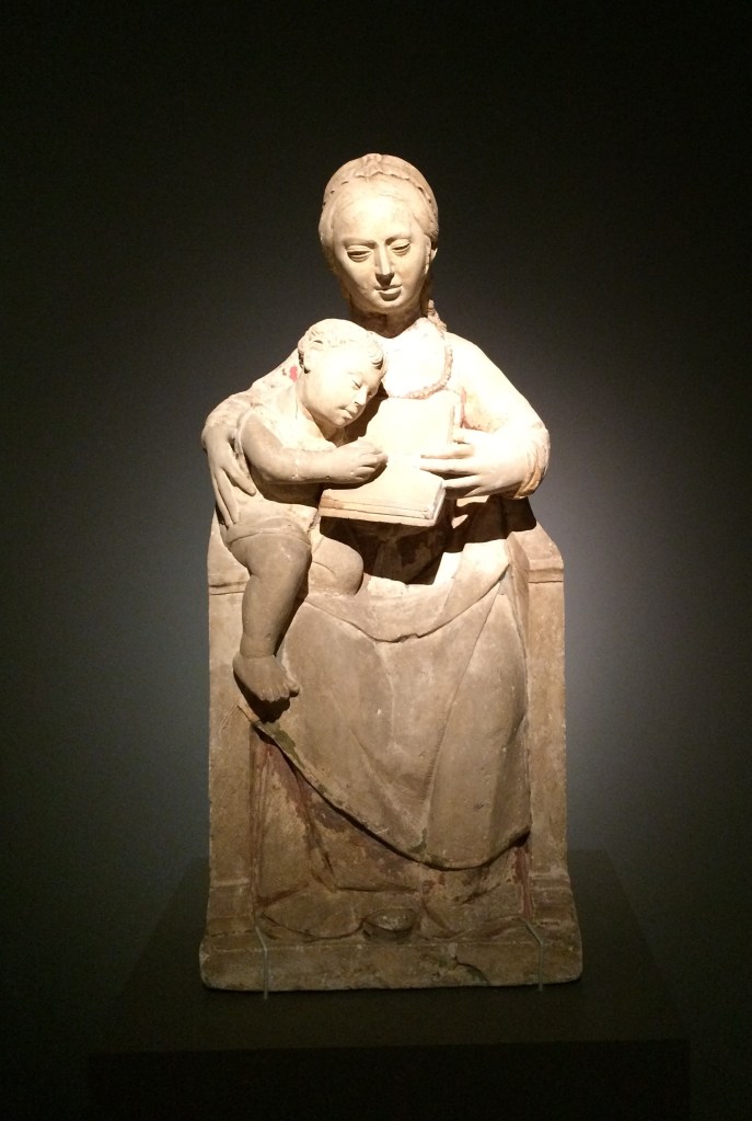
And from Lisbon’s National Museum of Antique Art, here’s a Madonna and Child with book, which seems to underscore the interpretation in Christian art that an open book in connection with Mary indicates the fulfillment of the promise.
Madonna and Child (c. 1540-1550), Unknown sculptor, Museu Nacional de Arte Antiga, Lisbonne, Inv 1182 Esc. Photos: Books On Books Collection, 2015, at “Pliure. Prologue (la part du feu)”, Fondation Calouste-Gulbenkian, Paris.
The fifteenth-century Van Lymborch, or Limbourg, brothers of Les Très Riches Heures du Duc de Berry fame, however, may be the first to have created an inaccessible book for the sheer pleasure of trompe-l’oeil and trompe-le-main. They made it from a block of wood, decorated its exterior to look like a sumptuous illuminated manuscript, and gave it to their patron as a New Year’s day joke. Another two centuries later in Venice, Francesco Pianta the Younger carved shelves of inaccessible wooden books for the Chapter Room in the Scuola Grande di San Rocco (1657-75). Arranged as if recently consulted and replaced on their shelves, the books provide the studious background for inconographic and allegorical sculptural figures of “Curiosity”, “Wrath”, “Melancholy”, and others. The influence of this particular fantasy has persisted in Venice and found an enthusiastic expansionist in Livio de Marchi, whose project entitled House of Books, begun in 1990, boasted three residential-sized installations by 2025. From the spine- and cover-clad exterior walls, to the carved splayed book for a roof, to the furnishings — everything is made from wood and has a bookish allusion in its shape or function, including the pen-shaped chimney and a pencil-picket fence. The more prolific joker, however, may be Alain Stanké, whose wood sculptures suggest there is no bookish pun he would not carve.
While facetiousness and jokery also characterize the path taken by conceptual book artists by making an inaccessible book the material of the artwork, there is now an edge. Marcel Broodthaers encased his previously published books of poetry in plaster to create Pense-Bête (1964), an elaborate farewell to literary aims. Following Broodthaers, Wolf Vostell purportedly encased his paper-based booklet Betonierungen (“Concretifications”) in a 40 x 28 x 6cm slab of concrete shaped like a book (Frengel et al.), not a farewell but rather an embodied manifesto. Vostell’s Betonbuch (1971) allows for both the interpretive paths of inaccessibility and punning on the book’s material. (Further trickery may be involved; radiographic examinations are inconclusive on whether there really is a booklet embedded in there; see White, below.) Despite, or because of, its title, Barton Lidice Beneš’ inaccessible Untitled (1973) plays differently with titular punning: Beneš has almost obliterated the titles of the condensed books from the spines of his sealed Reader’s Digest Condensed Books series. Jacqueline Rush Lee’s The First Cut (2015) soaks, rolls, and dries the three volumes of the Loeb translation of Ovid’s Metamorphoses into a single firewood-like chunk; its inaccessibility and title join in a punning allusion to the transformation of Daphne and others into trees or plants to escape the grasp of the gods. Lorenzo Perrone’s inaccessible Kintsugi (2018) casts yet a different titular pun by applying “repair” lines of gold glue to a presumably unbreakable and pristinely white plastered book.
Moritz Küng’s exhibition catalogue Blank. Raw. Illegible … : Artists’ Books as Statements (1960-2022) devotes one of its fifteen thematic sections to inaccessible books, including Vostell’s Betonbuch. Among the ten works included, five of them introduce puns unlike those mentioned so far. They pun on a structural or material feature of “the book”. Timm Ulrich’s Dem Leser den Rücken zukehrend (1970/76) is an hermetically sealed book dummy, whose only text is the title (“Turning your back on the reader”) appearing on the spine of the book. Richard Olson’s Perfect Bind (1978), David C. Stairs’ Boundless (1983), and Nicolas Geiser’s Le non-livre (2006) are each bound on all four sides. Les Coleman’s Glue (2002) qualifies as a fifth inaccessible book with a book-material-referring title, although it does have an accessible table of contents to let you know the different types of glue used to make the different sections of the book inaccessible.
Like art and its history in general, book art is not linear. The point of Anthony Caro’s sculptures that include inaccessible books is not “the book” as it is with the conceptualists. His works carry more directive titles and nudge the viewer’s interpretation away from the inaccessibility and toward the subject the books illustrate or support. His minimalist Book of Eden (1999) is a pulp paper sculpture and lithograph. Its title clarifies, or is clarified by, the two outline images evoking the Adam and Eve myth: an apple and buttocks. Another example is Stave (2013), entitled after his death. The title comes from the source of the work’s inspiration: “a reproduction of an illustrated musical score that Caro had chanced upon inside a catalogue for an Italian exhibition about Duccio” (Sooke). Given Caro’s aims at associating his sculptures with music (see, for example, his Concerto series), Stave is probably not far from the mark and provides a very different example of the title’s directing the viewer’s interpretation. The sculpture may present an inaccessible book, but the suggestions of stave lines and musical notations rise in metal above the open pages. Likewise, Book of Eden‘s lithograph is the minimalist distillation from the blank white paper-pulp book under it.
Anselm Kiefer’s book art is a whirlwind of the above uses of inaccessible books, allusive titles, and the untitled. The several works of his like Das Buch (1979-85) that have an inaccessible lead book hanging against an acrylic-on-canvas background make for interesting pairings with Caro’s Book of Eden. Where Caro backgrounds his blank inaccessible Bible beneath his minimalist lithograph and allusive title, Kiefer foregrounds his books. As he writes in L’Alchimie du Livre (2015):
In the beginning was the word. But in my work, first there were the books made of lead. And those books are interesting in that they are impossible to read, they are too heavy, the lead lets nothing get through, it’s a complete concealment… Lead books are perfect paradoxes then. You can neither thumb through them nor read them, and you will never know what’s inside. (Minssieux-Chamonard, 237).
Kiefer’s Mesopotamia – The High Priestess (1985-89) with its 196 lead volumes ranged across two open book cases contrasts with Francesco Pianta’s loosely shelved, allusive but decorative wooden books in Venice. The work is not background to adjacent artwork or surroundings. Neither is Kiefer’s title an indirect pun allusively signaling after something more like those of other book artists. It is indeed allusive but to something that stands apart from the form and material of the artwork. The distance makes the viewer work backwards from the inaccessibility, the volume, and distressed appearance to connect with the title. When Kiefer uses “untitled” as a title, he often adds explanatory words in brackets after it, as in Untitled (Constellation Book) (2004). Although made of lead, this work, however, is not inaccessible. Its nearly 5.5-foot pages stand open to be read “in the round”.
Johanna Drucker is one of the few writers about artists’ books who has commented at any length on Kiefer’s artist’s books:
Anselm Kiefer’s large-scale books made of heavy dull grey lead, laid open on stands designed to hold their outsized form and ponderous weight absorb the viewer into their profound depths, rather than offering themselves for communication. Such works become affective pieces rather than textual vehicles or message bearing forms, their physical, tactile presence takes the iconic and cultural resonance of book forms and plays it out through an extenuated spectrum of propositions — “what if” this were a book and a book were this, what then? Books of bread, marble, granite, soap and dried leaves pressed with flowers delicate and impossible to manipulate without destroying them. Books of lost objects, found texts, destroyed titles, remade photographs — all gaining some value by using the book form, insisting on its familiar structure as a frame to the otherwise elusive meaning of these constructions. …. (Drucker, 114-15.)
Which brings us back to Illmer’s more totemic works. Each work celebrates the grain and flaws of its material by using the book form. It could do so with a different form (beads, animals, geometric shapes, etc.), but Illmer chose the book. Although an inaccessible book, the object gains s0me value by this choice. And with the totemic title of Untitled, each work demonstrates that title matters as much as material and shape. Untitled offers the viewer’s eyes and hands the challenge that all inert totems offer: to invest its shape, grain, colors, and markings with meaning. But where do such works sit in our appreciation of artists’ books and book art? What are the distinctions between them and those of Kiefer, Caro, Coleman, Geiser, Stairs, Olson, Ulrich, Perrone, Lee, Beneš, Vostell, and Broodthaers? Keep looking and, wherever possible, touching.
Further Reading
Drucker, Johanna. 2004. The Century of Artists’ Books [Second edition] ed. New York City: Granary Books. Others who have commented at some length on Kiefer’s books as artist’s books include Zdenek Felix, “The Readability of the World” (1991); Buzz Spector, “Anselm Kiefer’s Bookworks” in Art Forum in 1987 (reprinted in The Book Maker’s Desire); Elizabeth Long in The Journal of Artists’ Books 21 (2007), and Garrett Stewart in Critical Inquiry (spring 2010).
Altered books as artists’ books present a seemingly endless variety.
Some may be the conversion of old books into just-legible new ones as in A Humument redacted with ink, paint, excision, and collage by Tom Phillips, Tree of Codes mechanically excised by Jonathan Safran Foer, or The Eaten Heart scalpeled into existence by Carolyn Thompson. They give us a new work to read page by page extracted page by page from the earlier work, which remains more or less (mainly less) present in our hands.
Others like Marcel Broodthaers’ page-by-page redactions of Mallarmé’s Un Coup de Dés by ink in one case and excision in another or Michalis Pichler’s similar reformatting and excision of the same poem in clear acrylic or Jérémie Bennequin’s page-by-page erasures of Proust’s Remembrance of Things Past give us artists’ books that make the altered books illegible but still accessible page by page.
Other altered books as artists’ books are mainly one-off spatial objects that can be taken in in one go — not necessarily in just a glance but in the look or gaze given to a sculpture or painting. The ground up and encased works in Literaturwurst by Dieter Roth. The sealed, painted, nailed, and “hairied” works of Barton Lidice Beneš. The torn works of Buzz Spector. The sandblasted works of Guy Laramée. The glued and carved works of Brian Dettmer. The bullet-hole-ridden Point Blank by Kendell Geers. The pun-packed moebius-sculpted Red Infinity #4 by Doug Beube. They give us artists’ books that make the altered books illegible and inaccessible as books.
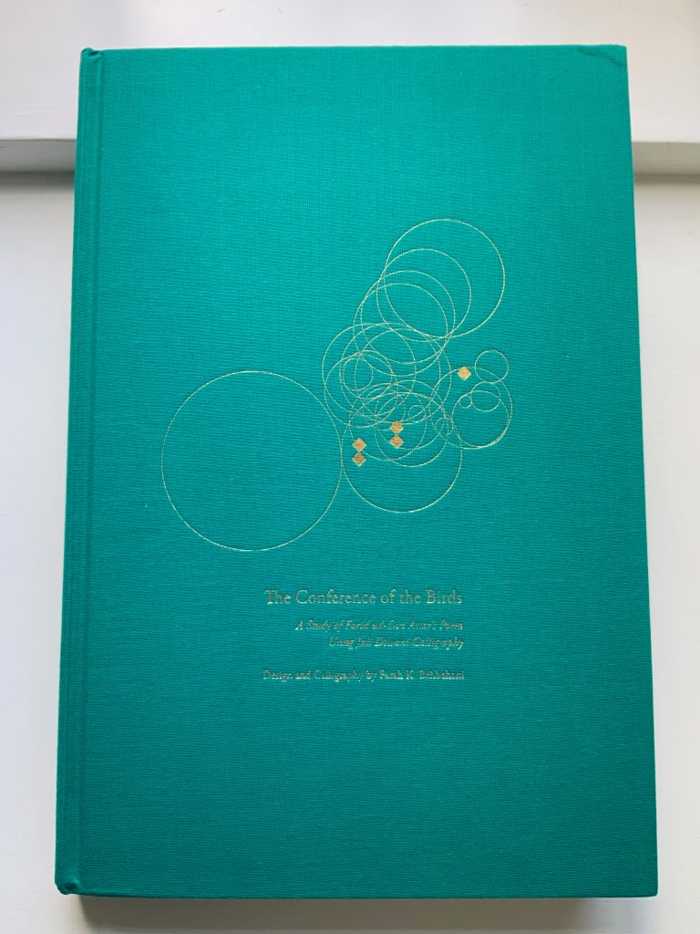
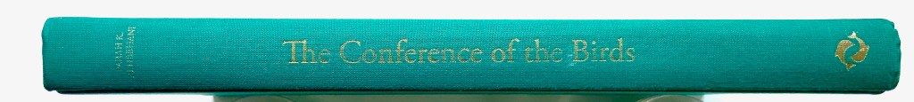
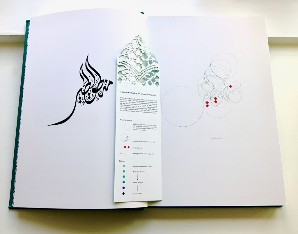
The Conference of the Birds (2009) Farah K. Behbehani and Farid ud-Din Attar. Casebound cloth over boards, stamped in gold foil. H340. 166 pages (56 of them foldouts). Acquired from Saba Books, 5 June 2022. Photos: Books On Books Collection. Displayed with permission of the artist.
The Conference of the Birds is a twelfth-century Sufi allegorical poem by Farid ud-Din Attar. A gathering of the world’s birds, each representing a different aspect of human nature, debate who should be king of all the birds. Led by the Hoopoe, they agree to seek the advice of the mythological being – the Simorgh. After an arduous and winnowing journey, thirty of them arrive at the home of the Simorgh to find a surprising answer.
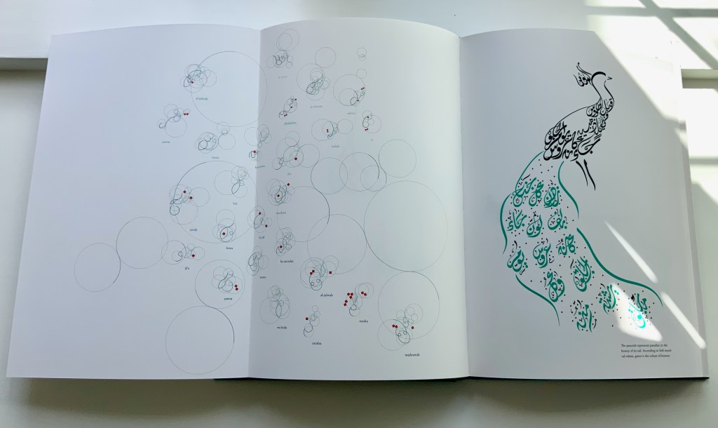
Farah Behbehani has selected thirteen of Attar’s stories and interpreted them within a journey-like creation of her own in the calligraphic style called Jali Diwani. As with many enlightening journeys, the destination is the journey itself — learning to read Jali Diwani calligraphy and, thereby, celebrate the beauty of the tale and its telling.
A passage from the story starts each chapter, and an image of the bird whose story it is is rendered in Jali Diwali. A tasseled bookmark provides the key to following the stroke-by-stroke illustration of how to read a representative line from the Arabic version of the story (a literal English translation is provided).
This book’s features (56 foldouts, embossing, gold foil, die-cut pages and that unusual bookmark) place it outside the mainstream output of its traditional commercial publisher Thames & Hudson and is as close to being an artist’s book from such a source as could be imagined. It is certainly available only through rare book dealers and occasionally by auction.
Behbehani’s Conference of the Birds fits in the Books On Books Collection alongside Golnar Adili’s Baabaa Aab Daad (2020), Islam Aly’s 28 Letters (2013), Masoumeh Mohtadi’s Blindness (2020) and Rana Abou Rjeily’s Cultural Connectives. Disregard any implication that these works represent a single aesthetic. The artists hail from different countries and draw on different traditions. Yet each work reaches across the cultural divide between the Near East and the West. Reaching across does not mean eliminating the differences. Consider Behbehani’s work in relation to Brian Goggins ‘ Language of the Birds (2006-2008), a site-specific sculptural light installation for a public plaza in San Francisco; Anselm Kiefer’s Für Fulcanelli – die Sprache der Vögel (2013), a massive sculpture of leaden bird wings and books; and the delicate but weighty cages in Bird Language(2003) by Xu Bing.
If anything draws all of these works together, it is the chord that language and image strike across time and cultures.
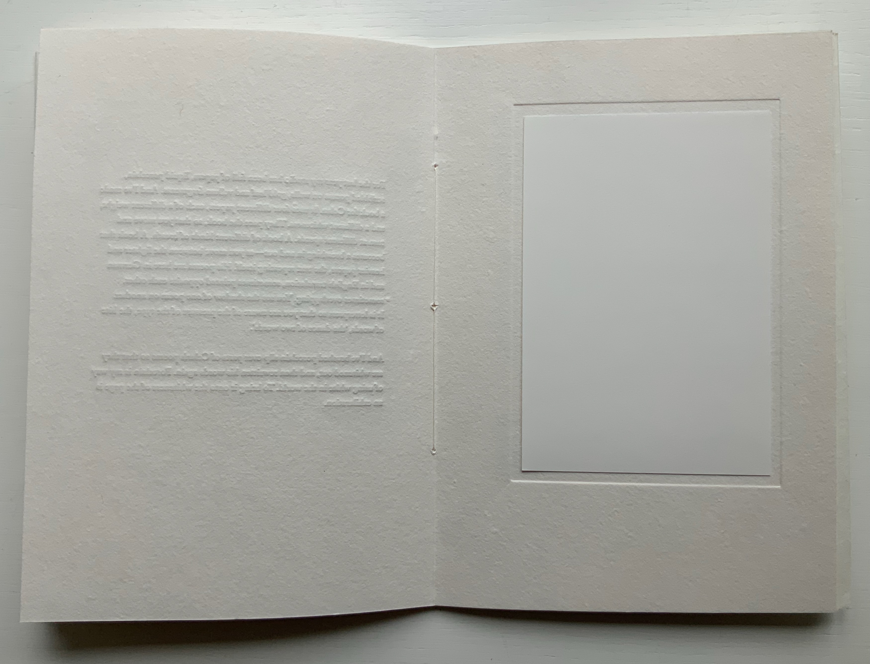
breath [prospectus](2019) Edmund de Waal Papercased sewn booklet. H214 x W152 mm, 16 pages. Acquired from Lady Elena Ochoa Foster, 28 June 2022, “Sensational Books” exhibition at the Bodleian Libraries. Photos of the work: Books On Books Collection.
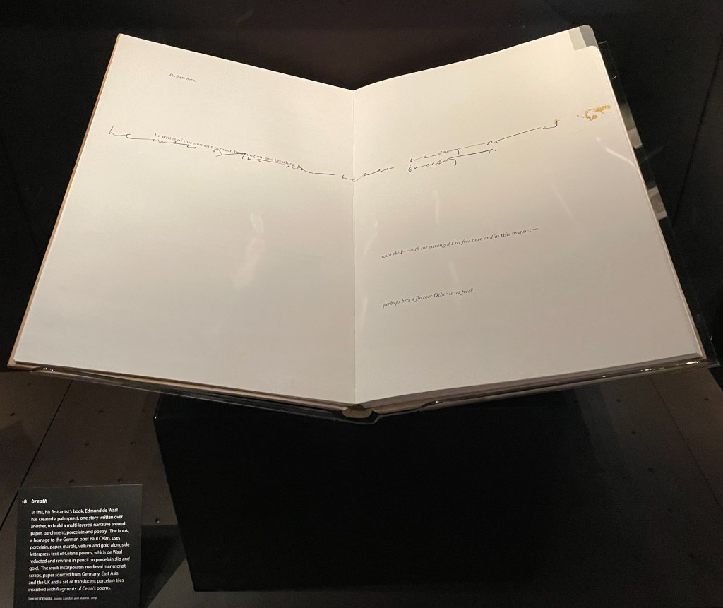
In correspondence with Ivorypress in 2019, I first learned of Edmund de Waal’s artist’s book inspired by the later works of Paul Celan. With the help of Ivorypress, de Waal created breath as an artwork consisting of the artist’s book (in a limited edition of six), a series of vitrines, shelves and diptychs conceived as open books, and a reading room. His aim was to pay homage to the Romanian poet Paul Celan, in whose last books “there is more white page than word”, as de Waal puts it. The only way to have seen the book then would have been to fly to Madrid.
In a major surprise, a copy of the edition appeared at the formal opening of the exhibition “Sensational Books” at the Weston Library, part of the Bodleian Libraries (Oxford, 28 June 2022). Heightening the surprise was Edmund de Waal’s delivering a talk about the work to open the exhibition. And capping the surprise was Lady Elena Ochoa Foster’s kind gift of this eponymous booklet describing breath. Perhaps the surprise of a long anticipation’s being met, or de Waal’s impassioned talk, or the kindness of the gift created a susceptibility to the raw emotion on, in and beneath the whiteness of this work. But no, it is objectively there. De Waal’s booklet, photos from the exhibition and the Ivorypress videos further below help to understand from where the power of breath comes.
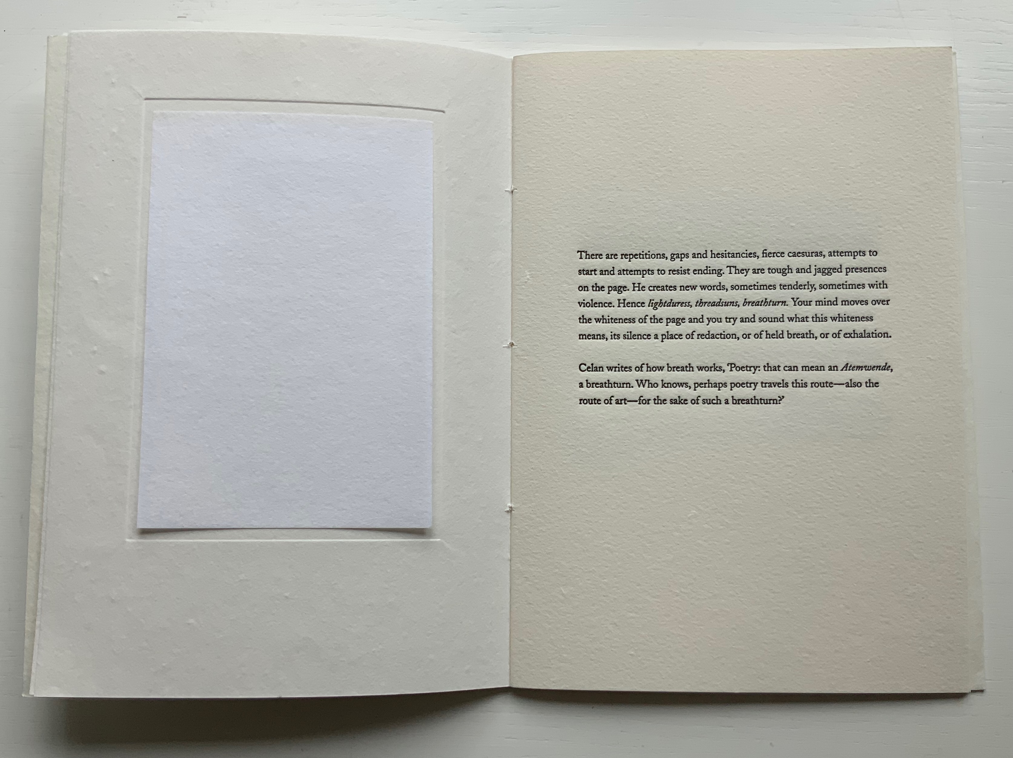
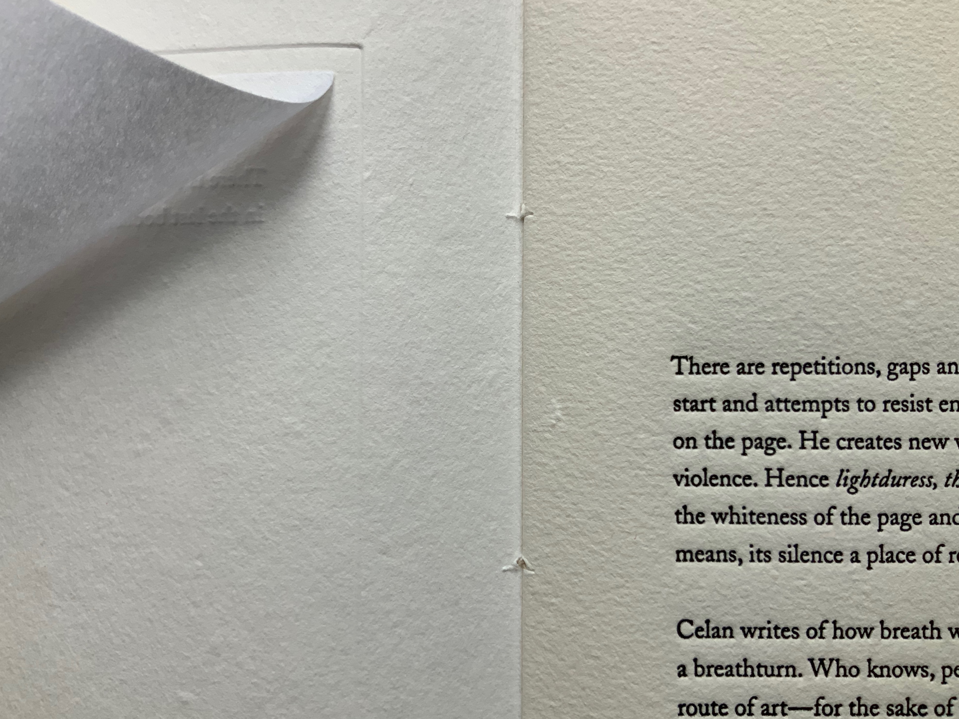
One of the booklet’s inserts is a square of white paper (perhaps the G.F. Smith Colorplan Ice White, one of the four different papers used in the artist’s book). Opposite the insert, de Waal writes, “Your mind moves over the whiteness of the page and you try and sound what this whiteness means, its silence a place of redaction, or of held breath, or of exhalation.” The close-up of the insert turned shows the paper’s degree of translucence that de Waal uses to great effect in his artist’s book as can be seen in the videos. The close-up also gives a view of the bite of the letterpress in the raised impression from the page before and the ink-filled depth on the facing page. This kind of material contrast recurs — bite and breath, white and black, lighter and heavier papers, rougher and smoother — in the larger work in so many ways.
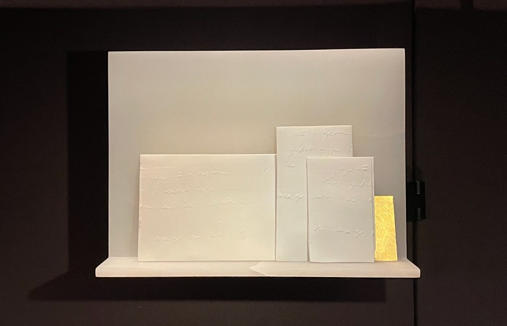
These visual, tactile and conceptual workings realize in small what the artist’s book accomplishes on a larger almost monumental scale. The artist’s book measures 453 x 673 x 43 mm and runs to 104 pages and is housed in a wooden box that converts to a lectern and provides storage for the translucent ceramic works on which Celan’s words are inscribed.
Another source of the larger work’s power is the porcelain slip that de Waal has brushed over parts of Celan’s poems to create a white surface on which he rewrites Celan’s words. Porcelain is de Waal’s tool. When asked what he does, he often puns in reply, “I throw pots”. The presence of porcelain slip in a work of such size, materiality and grounding in Celan’s poetry of coming to grips with the Shoah conjures a more somber pun on creativity and destruction. It establishes a paradoxical, metaphorical union of fragility, breakage and exhalation with strength, restoration and inhalation.
Showcased at “Sensational Books” exhibition, Weston Library, Oxford University. Photo: Books On Books, 8 July 2022.
Showcased at “Sensational Books” exhibition, Weston Library, Oxford University. Photo: Books On Books, 8 July 2022.
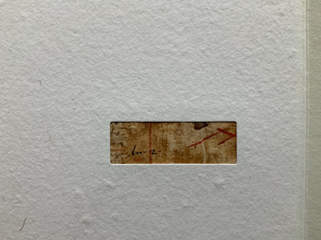
Just as the book, ceramics and lectern constitute another layer to the installation work, there are layers in the artist’s book itself, some of them hidden. The use of porcelain slip to cover Celan’s words has already been mentioned. Another layer lies in the binding, executed by Shepherds, Sangorski & Sutcliff. As was done in the early days of bookbinding, scraps of previously published material line the spine. For this purpose, De Waal collected scraps of medieval manuscripts previously used for binding. Binding within binding, centuries within centuries. By tucking away underneath the paper binding’s flap the only colored image in the booklet, an image that even looks like a scrap of illuminated manuscript, de Waal alludes to this practice.
While the scraps embedded in breath‘s binding are not materially perceptible, knowledge of it enriches the reader/viewer’s perception. Enriched perception enriches the work. As de Waal writes in the booklet and as we hear in the videos, “All books are palimpsests. As we read and reread, we re-create texts”. As readers/viewer responding to breath, each of us brings a layer to the palimpsest.
My response brings to the palimpsest another layering artist who celebrates Celan in works of book art: Anselm Kiefer. The juxtaposition provokes an intake of breath as it brings to mind Shulamith (1990) in homage to Celan’s “Todesfugue” (“Death Fugue”) or The Secret Life of Plants (2008) shown with a sound installation of Celan’s poetry and also sponsored by Ivorypress. So different from the whiteness of breath and its materiality of porcelain, wood, gold and paper, Shulamith is 64 pages made of lead, hair and ashes (1010 x 630 x 110 mm), and The Secret Life of Plants is 18 pages made of oil on lead over cardboard (1900 x 1400 x 200 mm). Both are dark and foreboding works. The artists themselves, too, differ in their roots. As told in The Hare with Amber Eyes (2010), de Waal’s family, the Viennese Ephrussis, were persecuted by the Nazis. Kiefer’s father was a soldier in the Wehrmacht, which we know from Kiefer’s infamous early works incorporating photos of him in his father’s uniform and giving the Nazi salute. Where de Waal evokes breath and whiteness, Kiefer evokes death and leadenness. Yet both fuse materiality and visual representation with text (whether explicit, implicit or hidden) to stand with Celan’s agony and creative spirit and achieve an originality, an independence that is nevertheless dependent on history.
De Waal, Edmund. 2021 “Breath“, In Paul Celan Today: A Companion, edited by Michael Eskin, Karen Leeder and Marko Pajević. Berlin, Boston: De Gruyter. 319-324.
Granero, Natalia, and Gunnar B. Kvaran. 2019. Anselm Kiefer: livres et xylographies: [catalogue de l’exposition, Montricher Fondation Jan Michalski pour l’écriture et la littérature du 8 février au 12 mai 2019 ; Oslo Astrup Fearnley Museet du 30 mai au 15 septembre 2019].
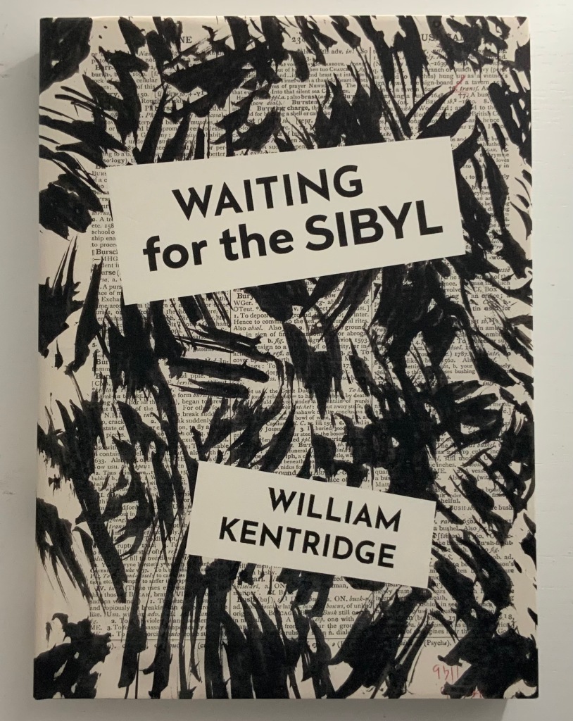
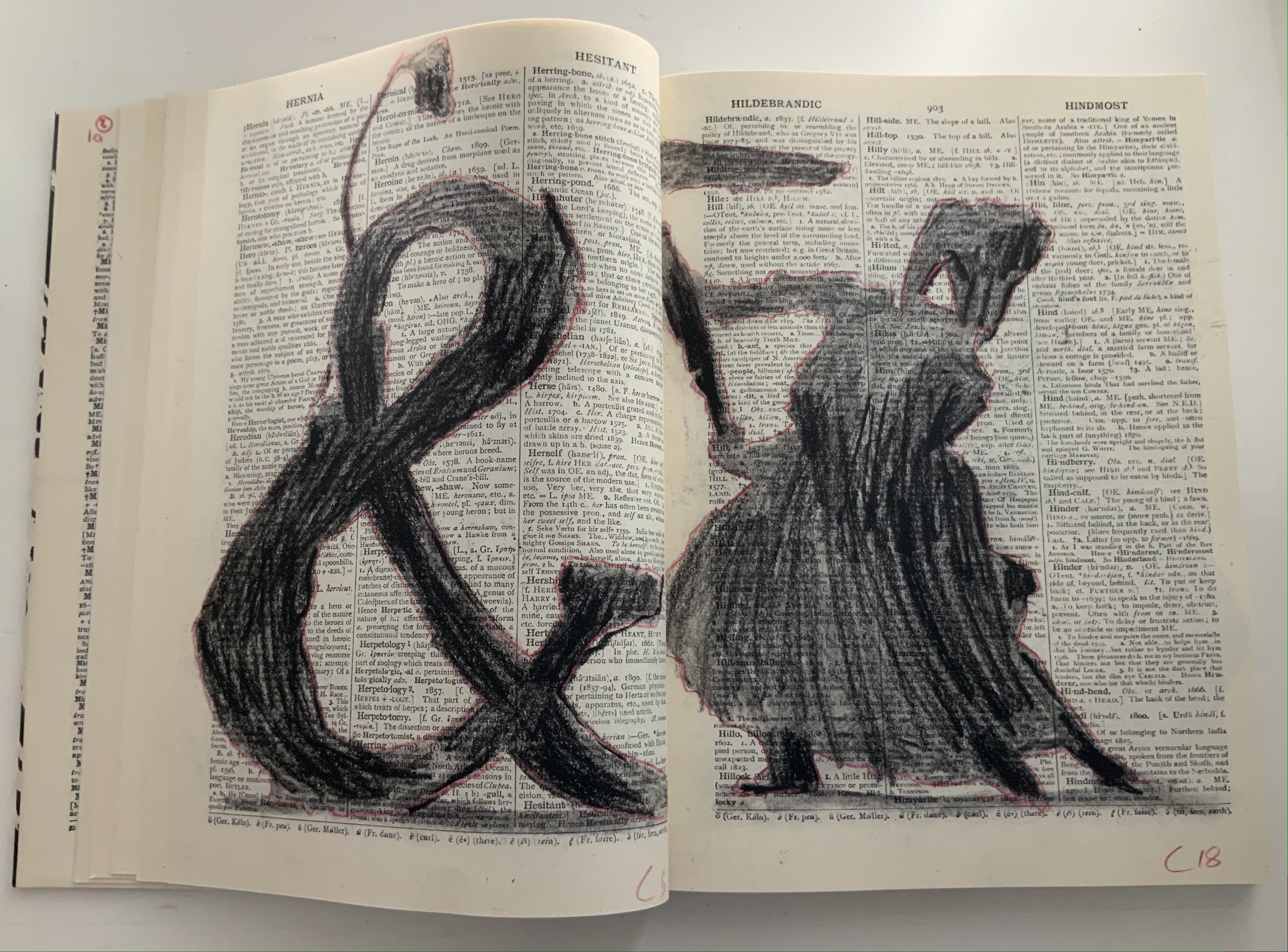
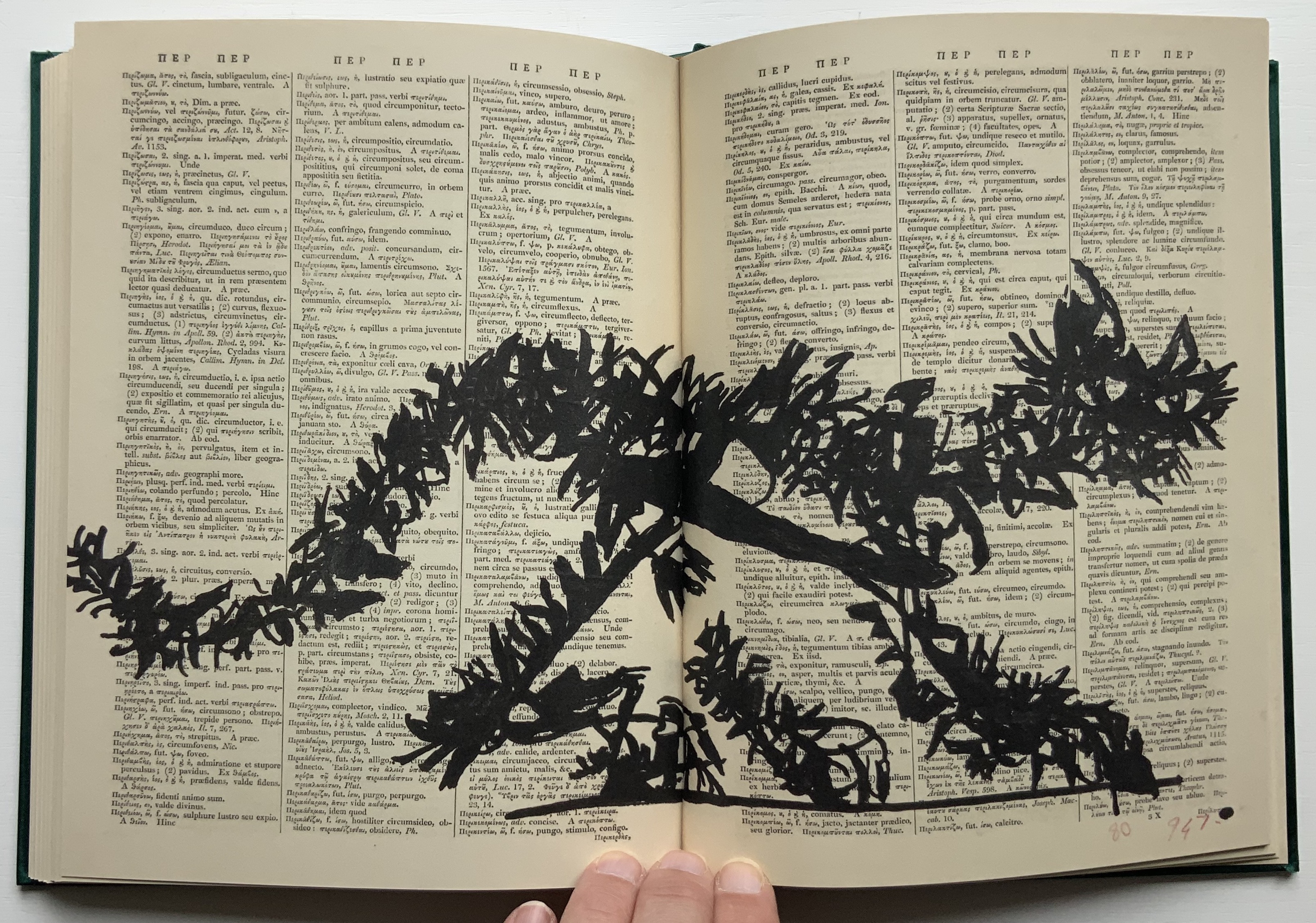
Waiting for the Sibyl (2020) William Kentridge Casebound and dustjacketed. H275 x W200 mm, 360 unnumbered pages. Acquired from Blackwells, 1 July 2021. Photos of the work: Books On Books Collection. Displayed with permission of the artist and the Marian Goodman Gallery.
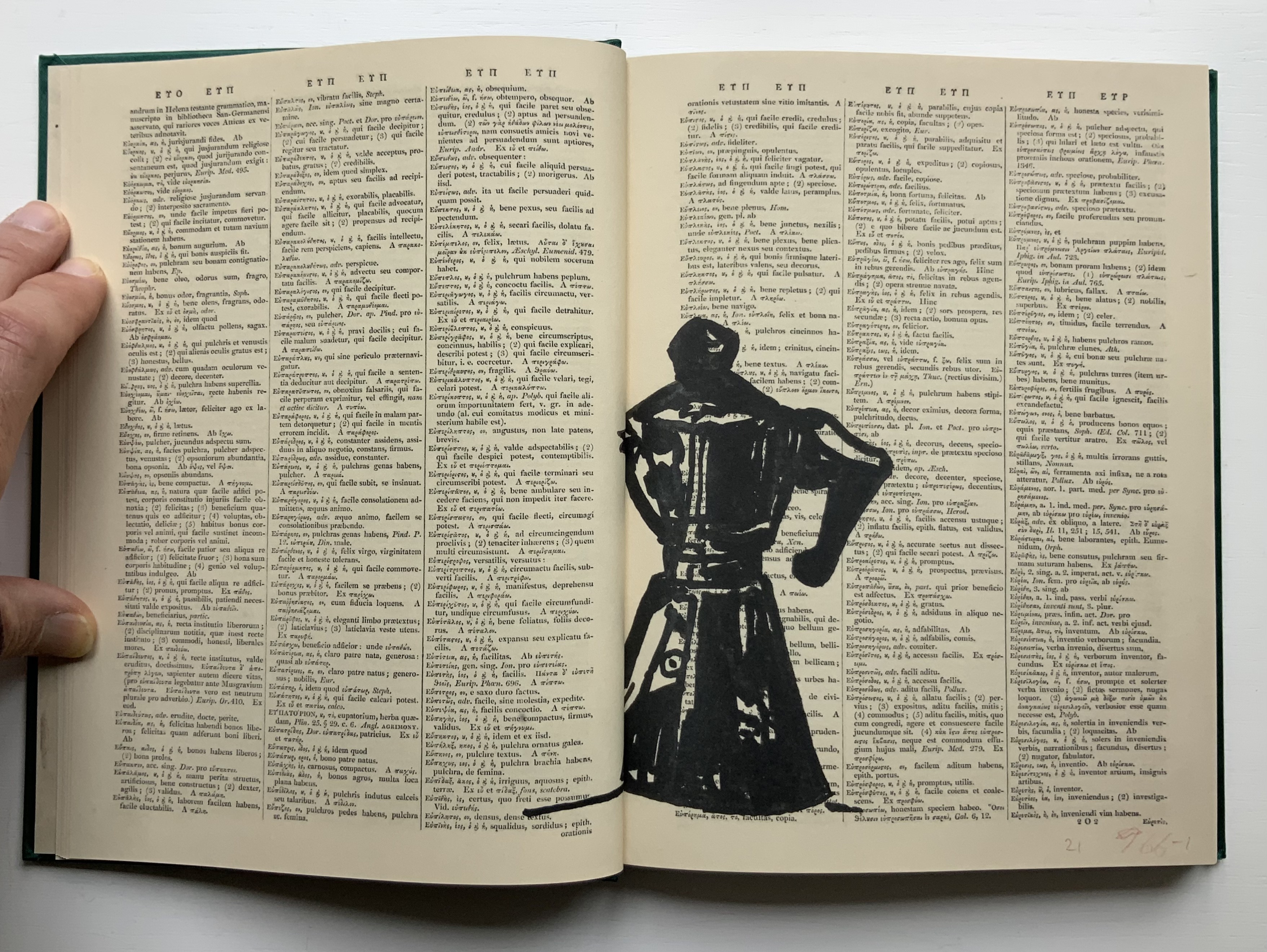
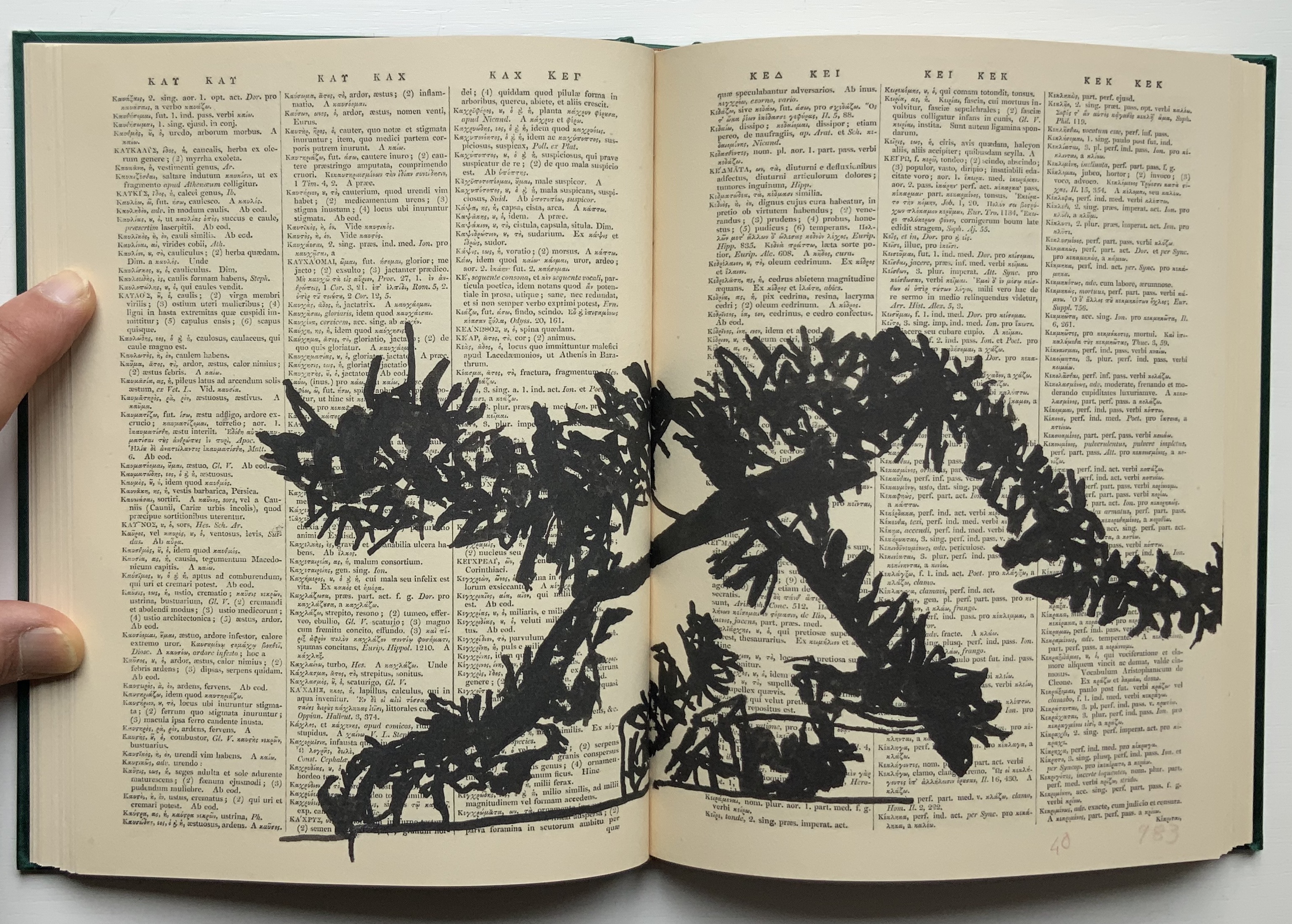
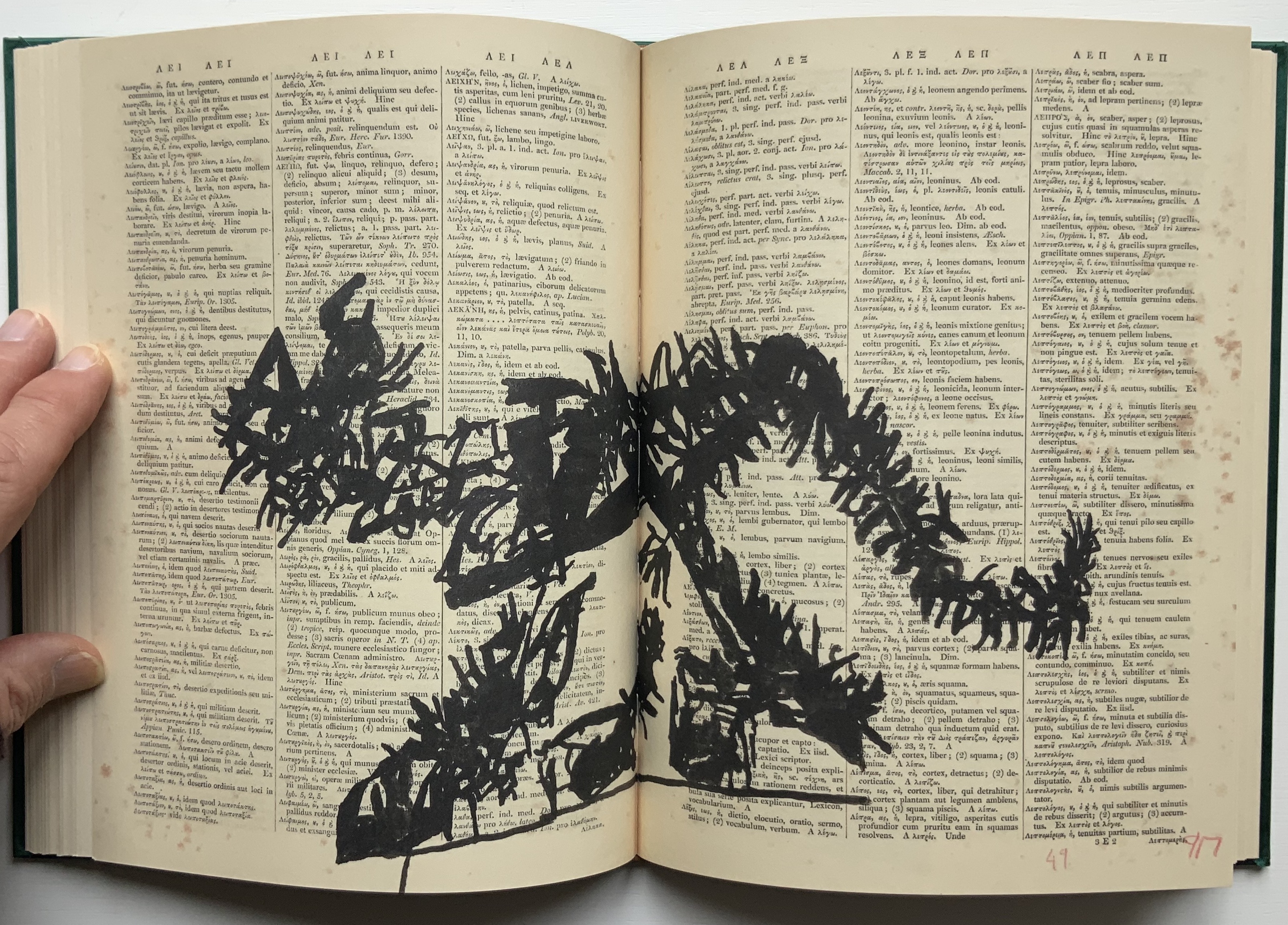
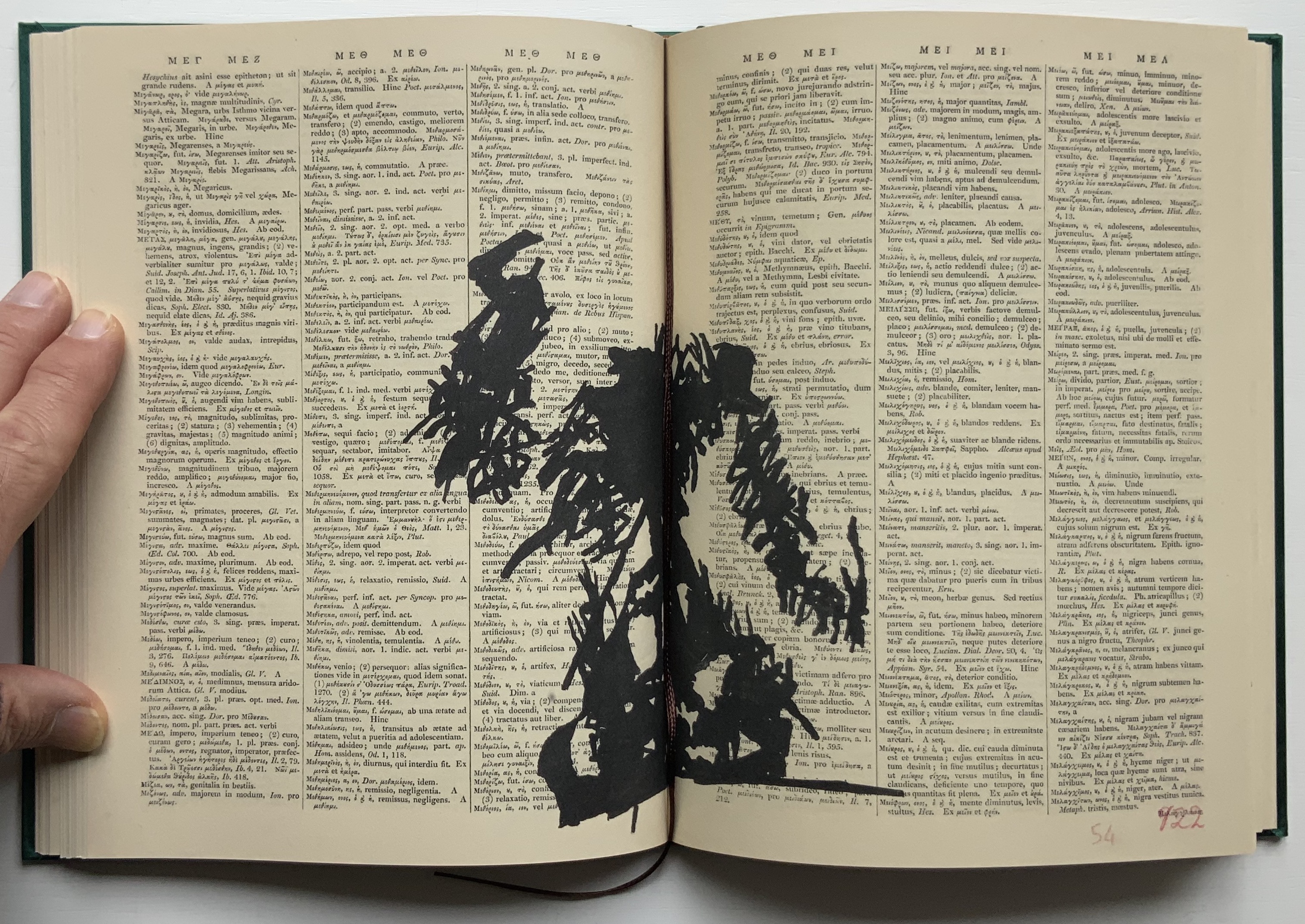
Like the ancient Greek playwrights, William Kentridge begins his chamber opera’s retelling of the Cumaean Sibyl’s myth in medias res — in this case, in the middle of the dictionary at the letter M. Redactions and marks build and build across the dictionary pages, a visual prelude like a musical one. Then they suddenly disappear, leaving the “stage” to unmarked pages from the letter A, a thunderclap announcement in all caps bold and then an explanatory statement slightly reduced in volume with a lighter type face and uppercase with lowercase letters. What is going on?
Because performance of the opera was curtailed by the pandemic beginning in 2019/2020, we have only a few short clips from a trailer and filmed rehearsals to guess at how a live performance might have unfolded: this short clip posted by Teatro dell’Opera di Roma, this one from Quaternaire, this one from The Red Bridge Project and this version posted by the Centre for the Less Good Idea. A description from the Théâtres de la Ville de Luxembourg tells us that the performance consists of a series of six short scenes. From the Red Bridge Project, coordinating the commission, we have Kentridge’s description of four of them:
A scene in the waiting room for the Sibyl. A scene about which is the right decision and which is the wrong one. How do you know which is the chair that will collapse when you sit on it and which is the chair that will support you? Is the plane that you’re rushing to catch the one that will crash or do you relax and not catch that plane and take the next one − and in fact that is the one that crashes?
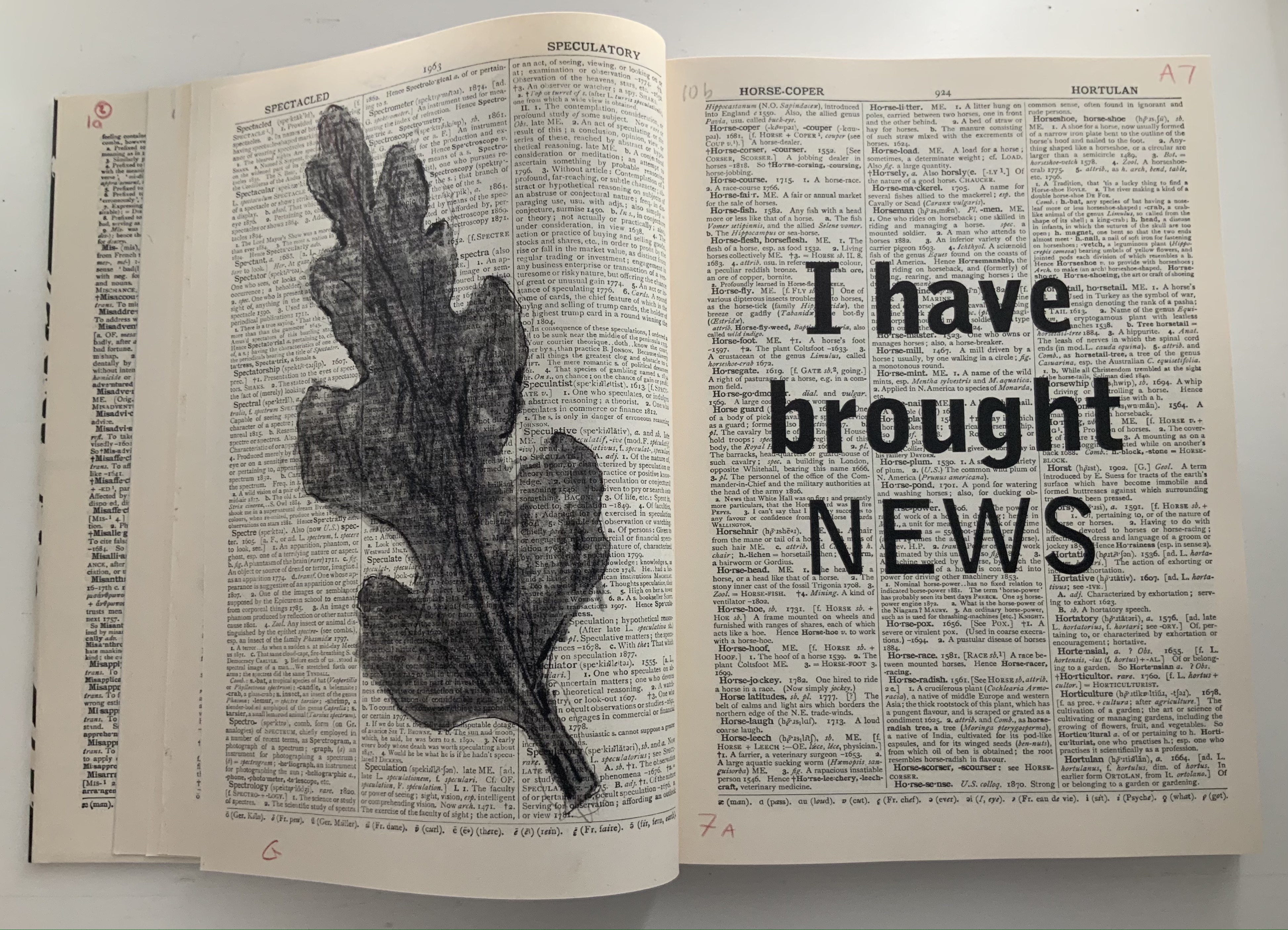
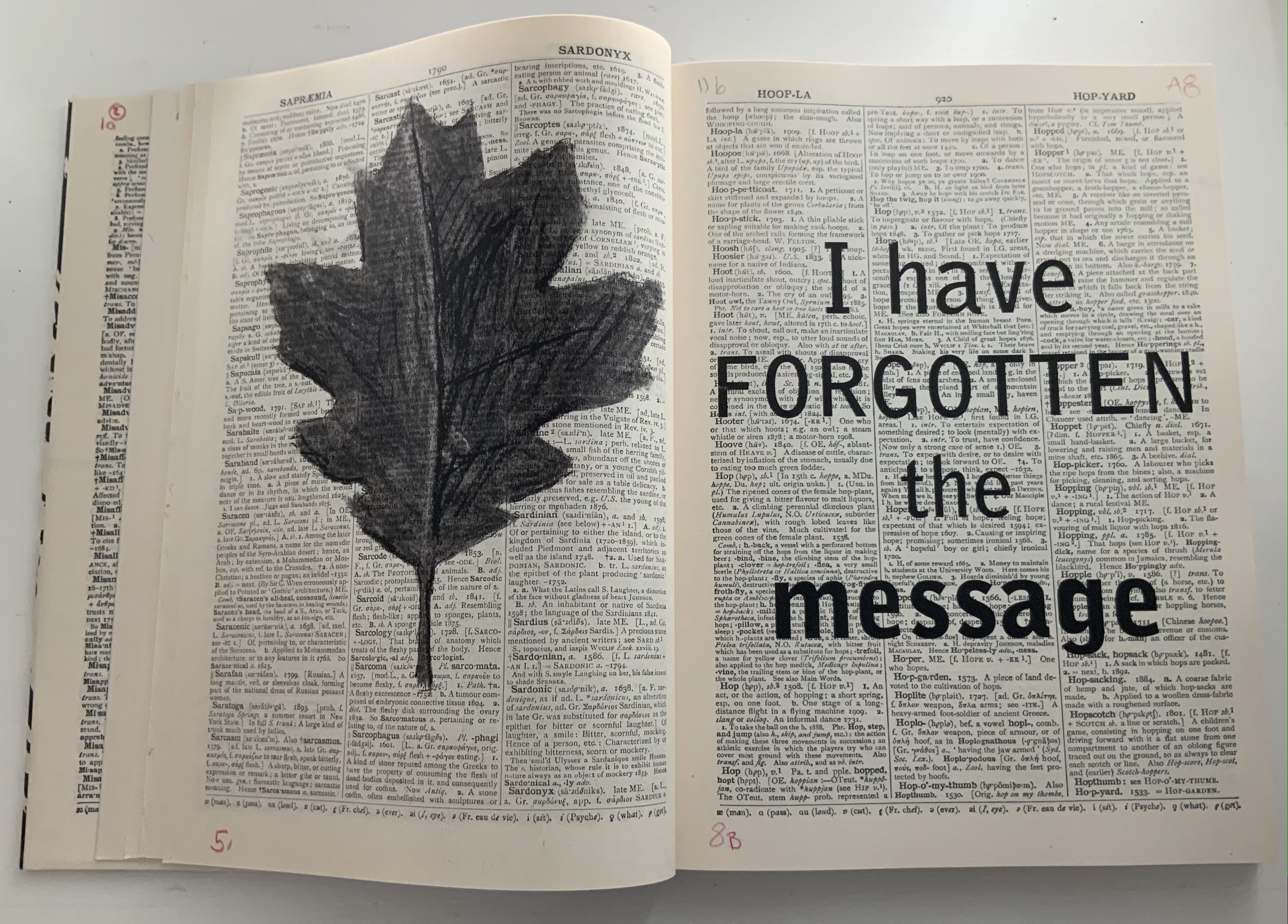
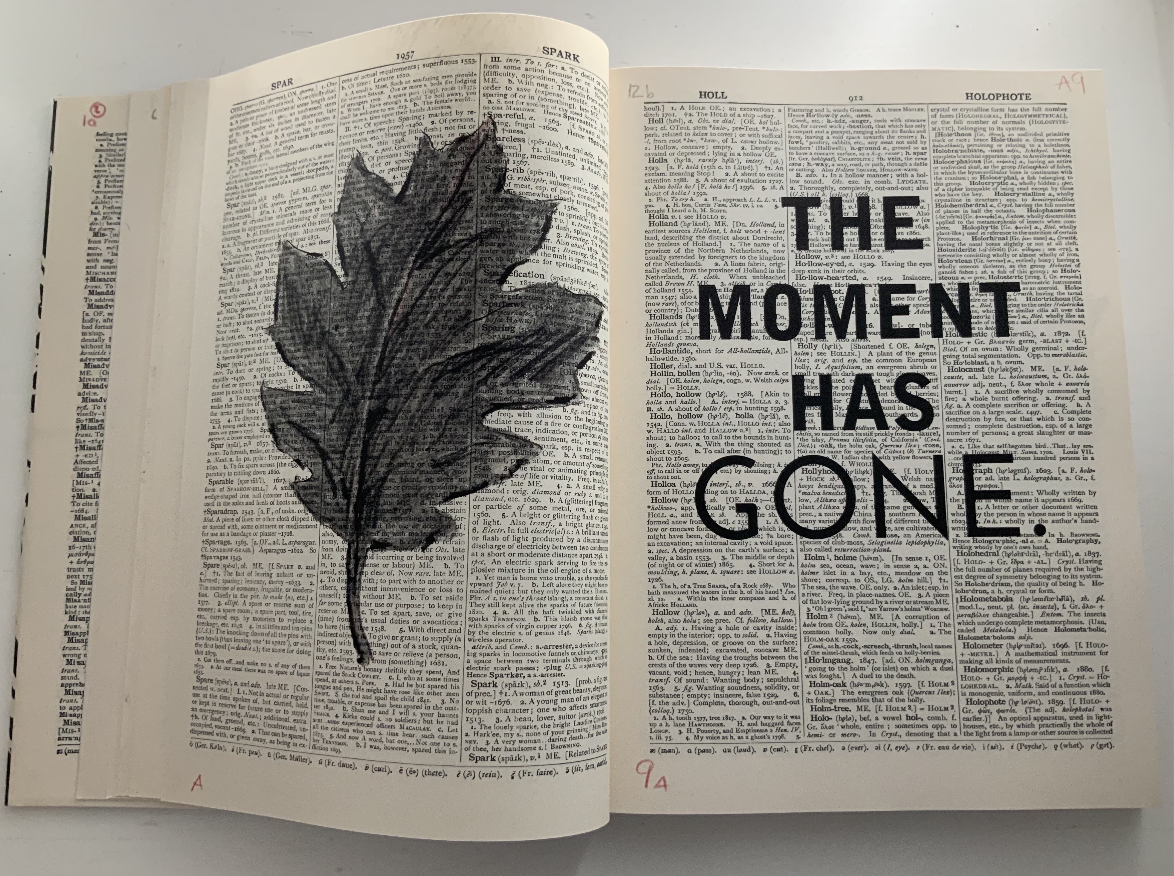
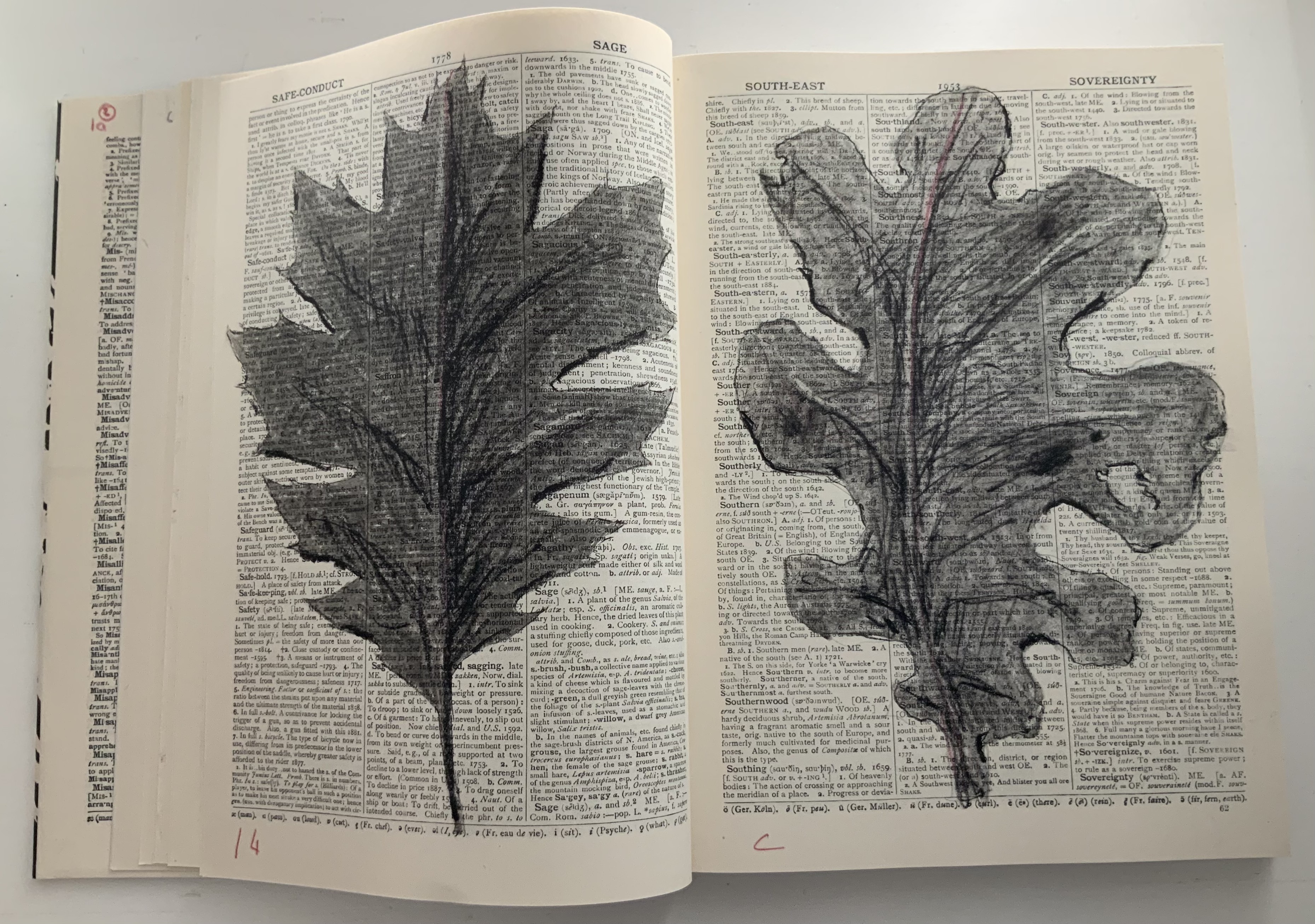
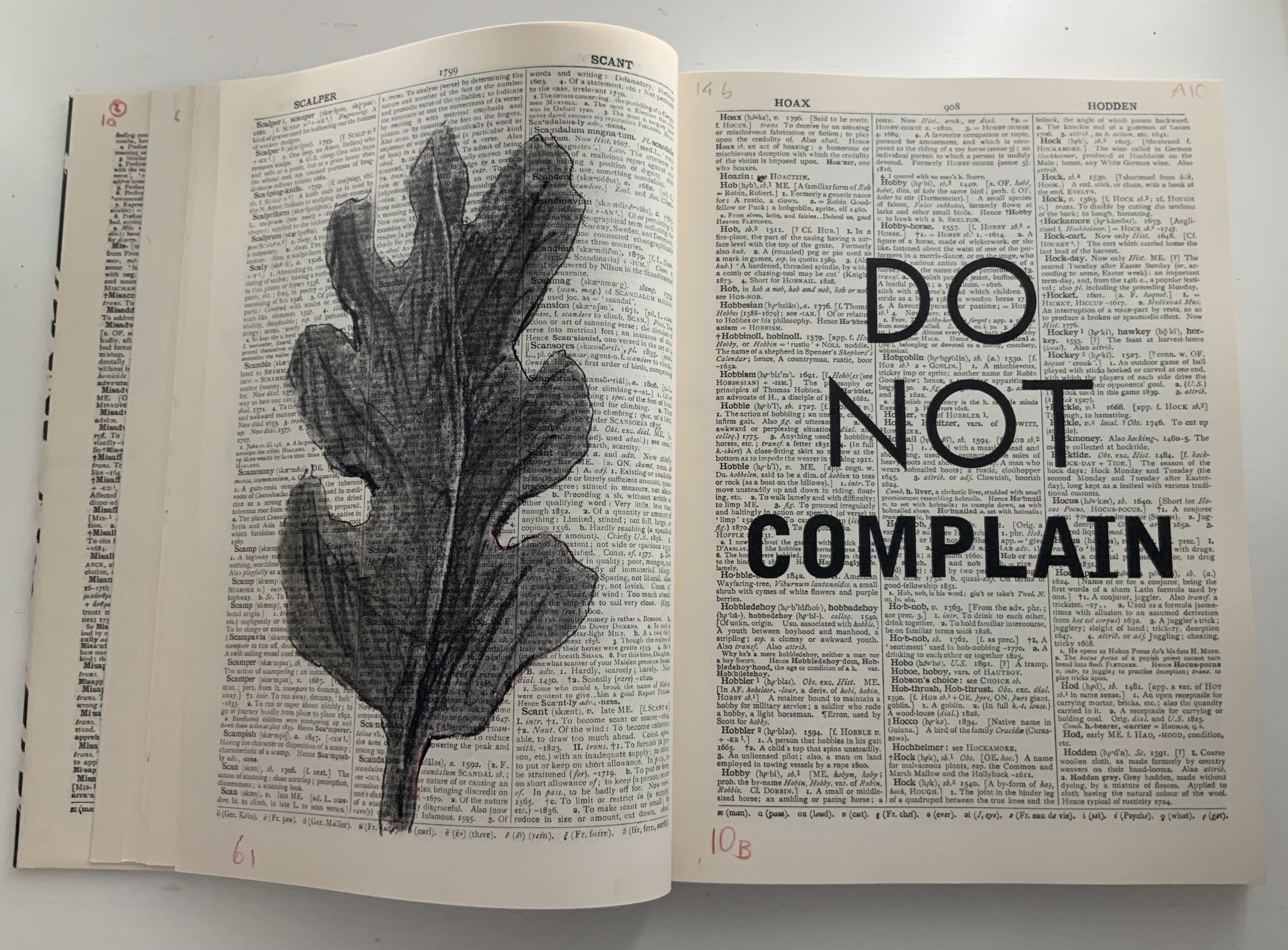
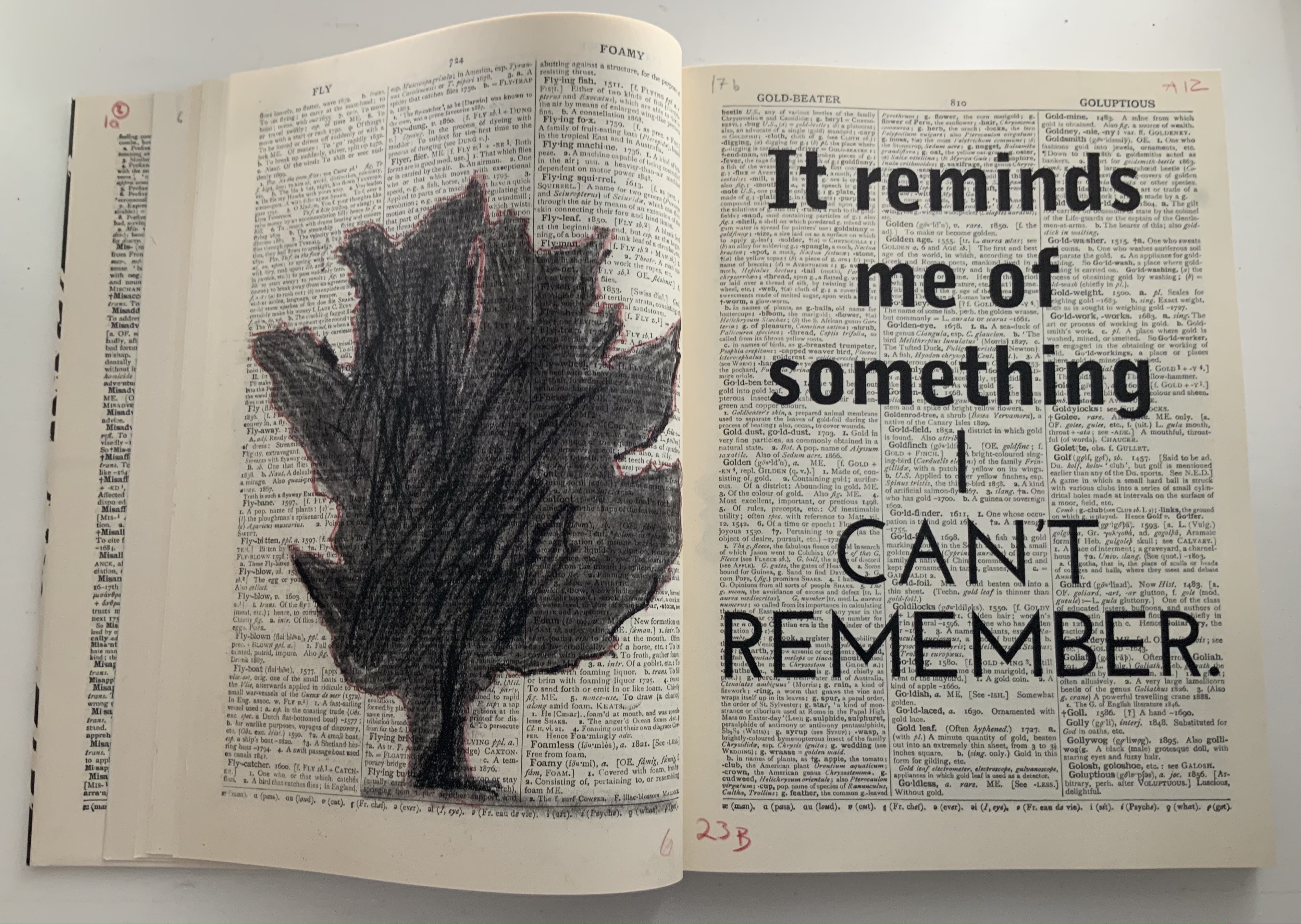
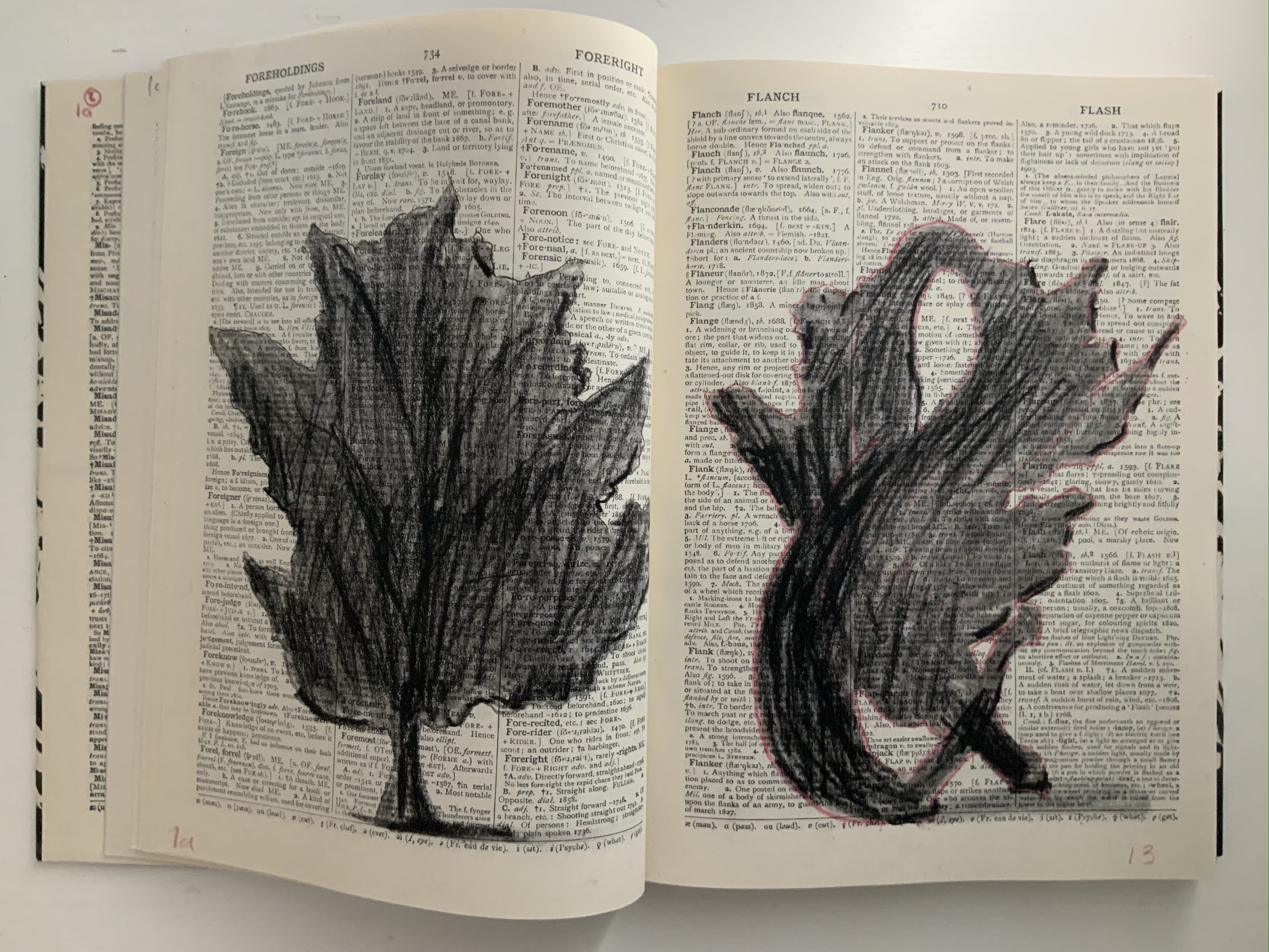
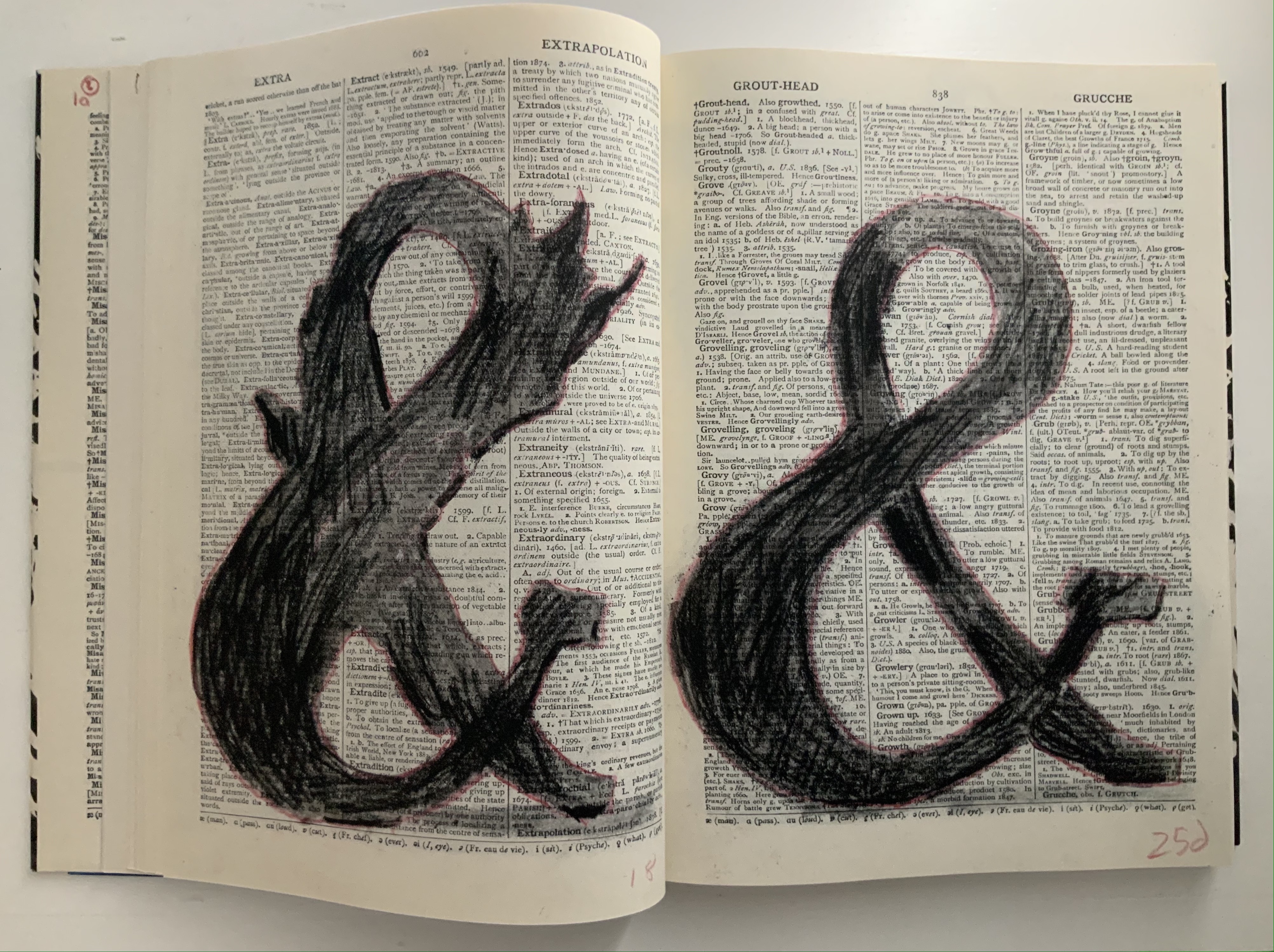
Judging from the videos and description, it is presumptuous to declare that the book and opera begin in medias res. Almost anywhere in the out-of-order pages or chaotic rehearsal scenes of performers snatching at and reacting to the scattered leaves of books, typescript and so on is the middle. But if the left-to-right reading convention of the Western codex prevails, the text to be sung continues to rumble along in the codex after the thunderous proclamations. The chorus or speaker seems to falter, admitting to having forgotten the message and losing the moment of its delivery. All the while, the libretto is being joined on the left by gradually forming images of leaves (a maple and an oak), an allusion to the leaves on which the Cumaean Sibyl would write the predictions of fate she had sung but which would be scattered and whirled by the wind before the supplicant could claim his or her rightful leaf.
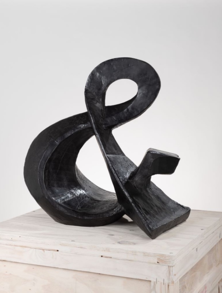
As occurs in Kentridge’s other bookworks, these gradual formations draw on the flip-book tradition, introducing that other recurrent media in his work — film — as well as performing an echo of the projections in the to-be performed opera. As the leaves assert themselves, the speaker’s confidence returns in all caps, a larger face and some bold. And while the speaker quickly recedes into lowercase and a lighter typeface, only able of being reminded “of something I can’t remember”, a leaf begins to metamorphose into a tree, an ampersand and then a dancer. Metamorphosis is that mythical translation of one being or object into another. Metaphor is that figure of speech that uses one object to remind us of another. “Etc., etc.” is what we say when we can’t remember or be bothered to complete a statement or series of examples. What Kentridge offers here is unquestionably not mixed metaphor but rather metaphor-mosis.
The metamorphosing ampersand recalls an illustrative example from another of Kentridge’s favored media — sculpture. As Kentridge puts it:
The turning sculptures I’ve made in the past have all been ones which have one moment of coherence, when the different components of the sculpture align. From one viewpoint they turn into a coffee pot, a tree, a typewriter, an opera singer. And then, as the sculpture turns, the elements fragment into chaos. — from The Red Bridge Project site, accessed 21 July 2021.
Ampersand (2017) William Kentridge Bronze, 85 x 82 x 54 cm, 87 kg Courtesy the artist and Goodman Gallery
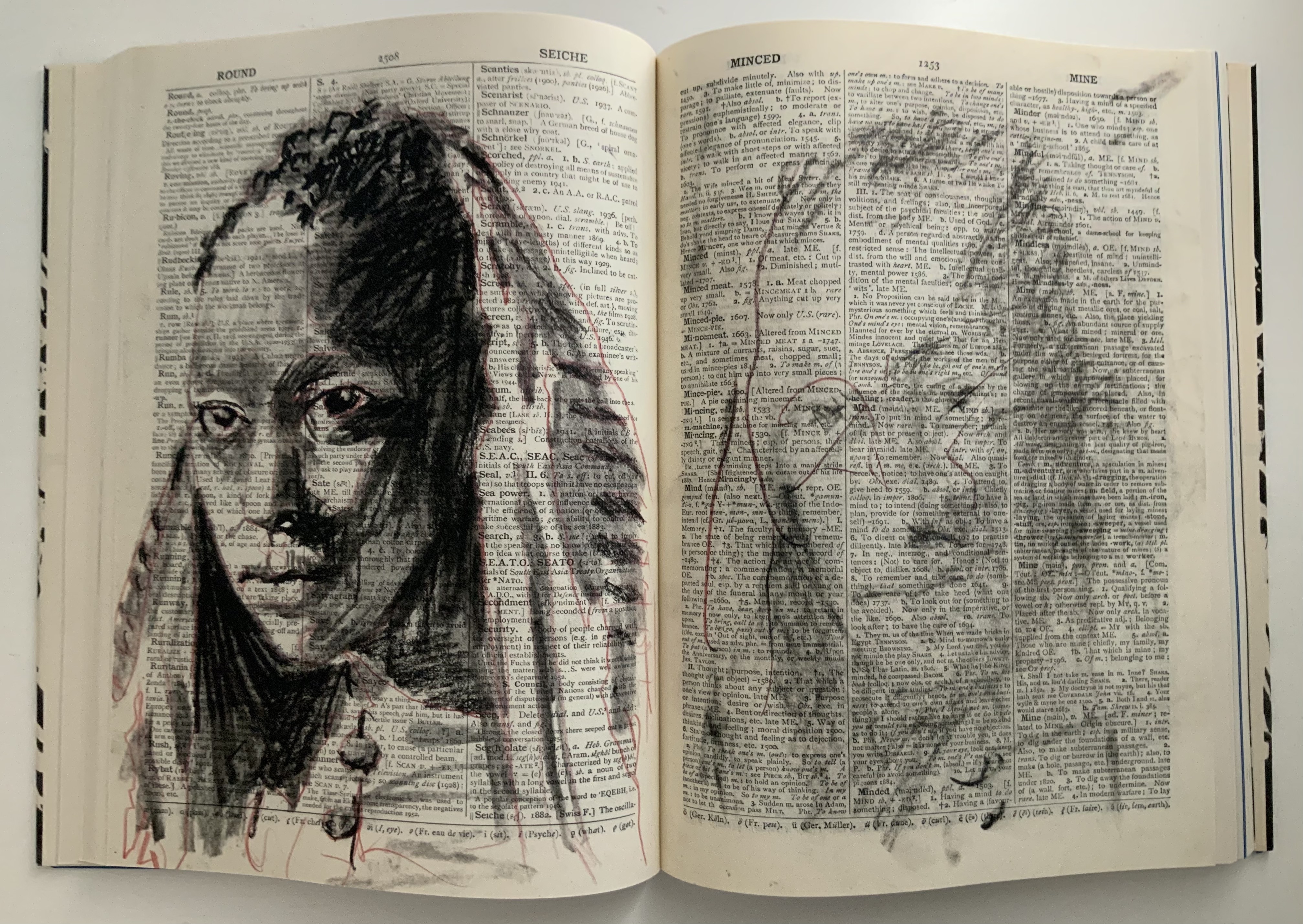
Even though there is a speaker/singer for the libretto, the dancer has the central role in the opera. Performed by Teresa Phuti Mojela, the dancer casts her shadow over the projected pages and seems to “dance” the prophecies. Kentridge notes in the book’s afterword that he has added images of her to stand in for her projected shadows. As this sequence in the codex shows, the dancer/Teresa Phuti Mojela is the Sibyl.
In addition to containing the libretto, serving as part of the setting for the actual performance, presenting the central player and the Sibyl’s transformation into her, demonstrating the dancer’s performance (when flipped like a flip-book) and exemplifying the key props (prophecies on leaves), the codex also reflects the collaborative creative effort that Kentridge extols in describing the opera’s preparation:
… when we had our first workshop in Johannesburg, in which we brought together the singers, the pianist, a dancer to be the Sibyl, costume designer, set designer, videographer, the editor of the animations I’ve been drawing, we discovered very quickly that the magic of the piece was in the live performance of the music. At this point the project became possible to do only if we could have these singers on stage.
As the book’s last page notes, creative collaboration among Kentridge and Anne McIlleron (editors), Oliver Barstow (designer), Alex Feenstra (lithographer) and robstolk® (lithographer and printer) is what has made this work of art possible.
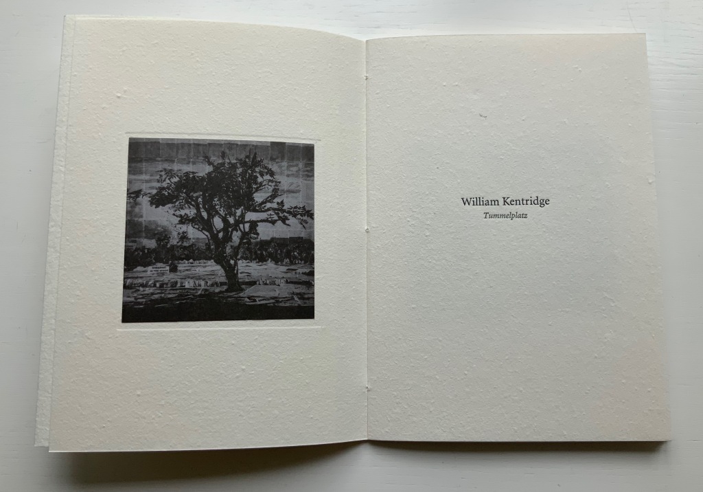
Tummelplatz (2016)
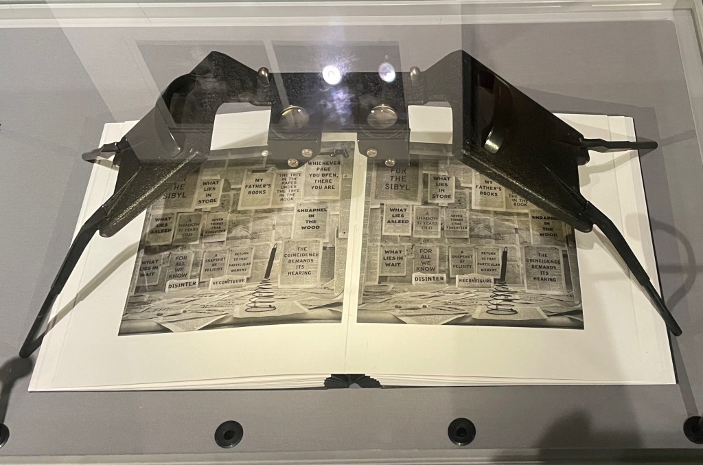
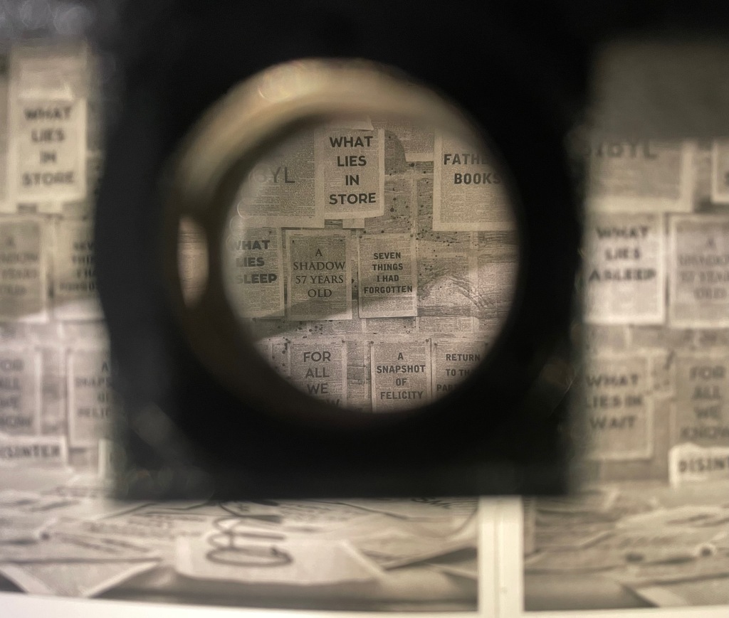
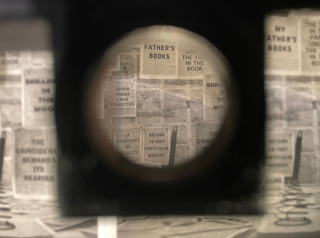
Tummelplatz (2016) William Kentridge Papercased sewn booklet. H214 x W152 mm, 16 pages. Acquired from Lady Elena Ochoa Foster, 28 June 2022, “Sensational Books” exhibition at the Bodleian Libraries. Photos of the work: Books On Books Collection.
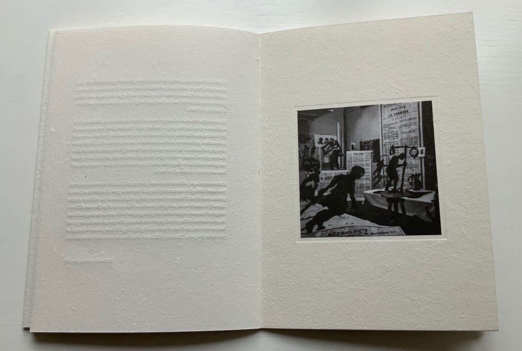
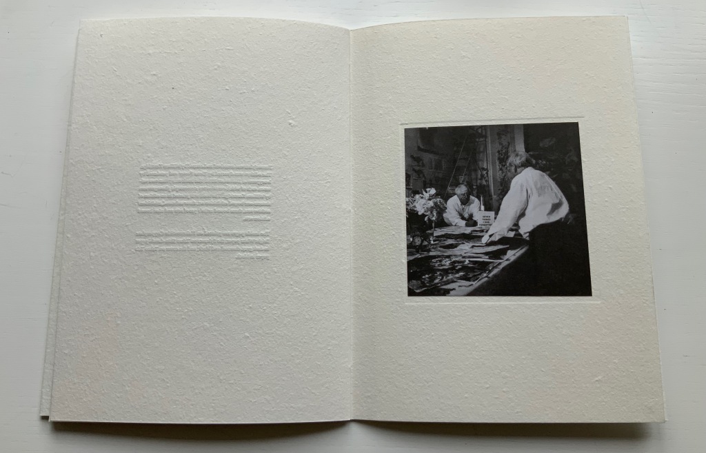
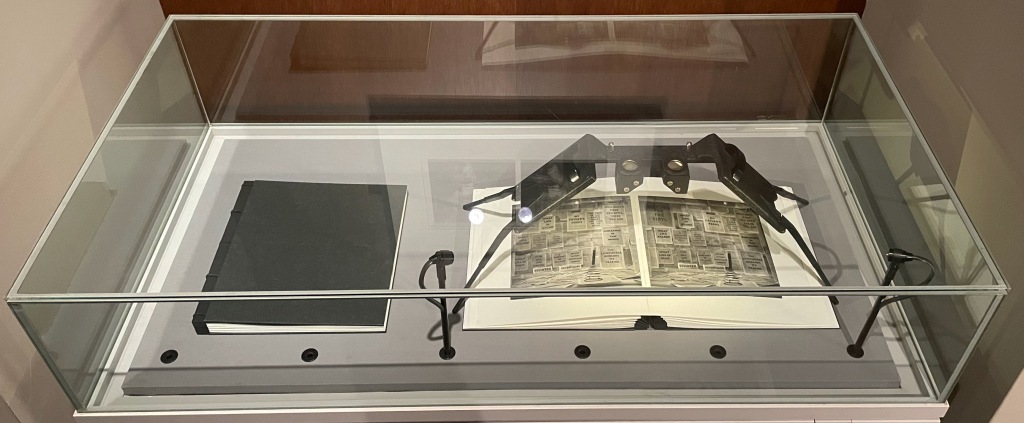
In Tummelplatz the booklet created for the Ivorypress exhibition of the larger eponymous work, William Kentridge explains that tummelplatz is Freud’s term for the space between analysts and their patients. But its literal translation is “playground”, which might be the perfect word for William Kentridge’s studio. The studio is the actual setting for the series stereoscopic photographs reproduced as photogravure images in the double volume of Tummelplatz. With the artist’s charcoal drawings of a landscape background pinned to the walls and others cut out as foreground figures and fixed into position, the studio was transformed into a sort of diorama in which the artist himself posed. A stereoscopic viewing device in fixed position over the volume invites the reader/viewer to join Kentridge in his playground.
These are images that have to be read, not scanned like flat photos. The eyes’ focus has to jump from layer to layer, element to element. In the exhibition “Sensational Books”, Tummelplatz is set up within a glass case, so only one scene is available for viewing and reading, and the distance imposed by the extra layer of glass makes the sensation hard to appreciate. Nevertheless, there is enough of it to set the reader/viewer to wondering whether the technique, the effect of the photogravure and this three-dimensional precursor to virtual reality have transformed him or her into the patient and the work of art itself into the analyst. Or whether it’s just a playdate with William Kentridge in his playground.
Showcased at “Sensational Books” exhibition, Weston Library, Oxford University. Photo: Books On Books, 8 July 2022.
Showcased at “Sensational Books” exhibition, Weston Library, Oxford University. Photo: Books On Books, 8 July 2022.
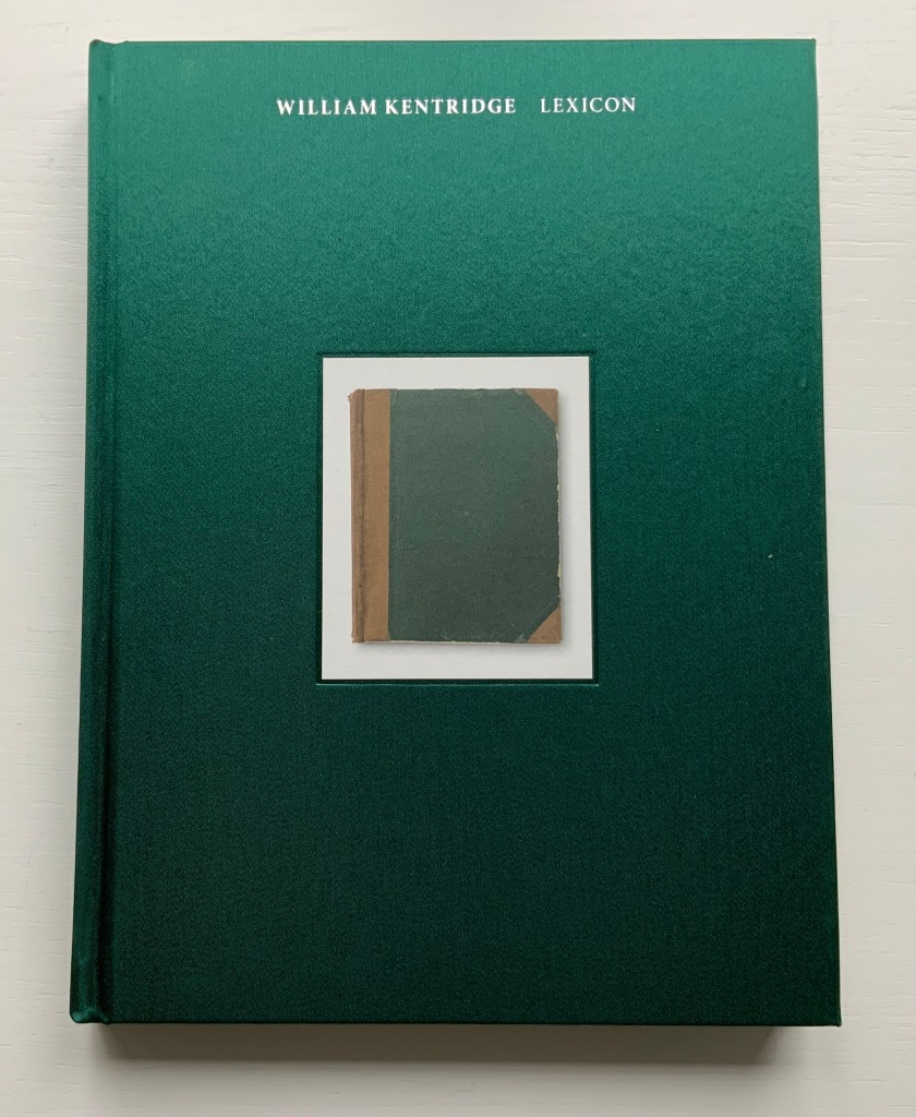
William Kentridge : Lexicon (2011)
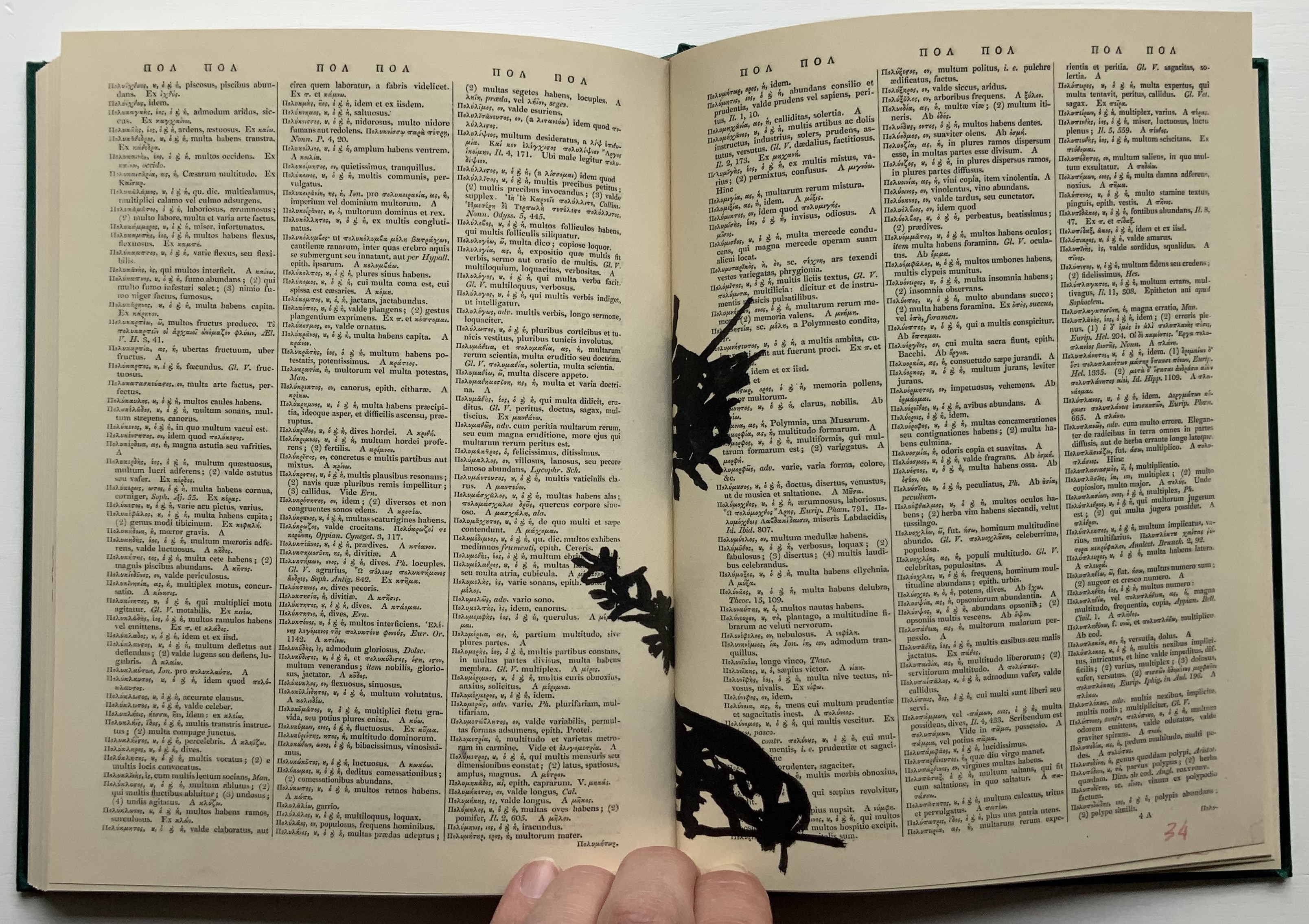
William Kentridge : Lexicon (2011) William Kentridge Cloth boards, sewn bound. H234 x W177 mm, 160 pages. Acquired from Specific Object, 2 May 2021. Photos of the book: Books On Books Collection. Permission courtesy the artist and Goodman Gallery.
The first work by Kentridge I ever saw displayed was 2nd Hand Reading (2014) at the Museum Meermanno (The House of the Book) in The Hague. The exhibition was called The Art of Reading and had been curated by Paul van Capelleveen. Curator at the Dutch national library and advisor to the Meermanno, he felt strongly that the challenges of artist books cannot be understood “under glass” and insisted that each work be touchable. So under his supervision, I was able to flip through 2nd Hand Reading and also watch the projected animation of stop-motion images across the pages being flipped. While the forward motion of the animation offers a narrative, its substrate — pages of the Shorter Oxford English dictionary on historical principles — contradicts any notion of logical beginning, middle and end: the drawn-upon pages are not in the original’s paginated or alphabetical order.
Compared to 2nd Hand Reading‘s 800 pages, Lexicon at 160 pages provides a small reminder of the experience. Bound in a green satin-sheen cloth, Lexicon begins as a facsimile edition of an antiquarian Latin-Greek dictionary. The dictionary’s browned pages and antique languages perform the role of drawing surface or projection screen for a flip-book metamorphosis. In scrawly black ink drawings, an Italian coffee pot emerges from the gutter and starts to tilt and turn.
Gradually the pot changes into a black cat, striding from right to left. Not the direction in which Western reading and narratives usually proceed. In its transformation and movements, the cat seems to pivot on itself as it turns and strides across the Latin and Greek like Rilke’s panther behind its bars until it turns back into a coffee pot. Or does it?
That drawing in the center certainly looks like the coffee pot, but as the pages turn, the cat returns to stride from left to right, expanding then shrinking until it is swallowed by the gutter.
The reference to Rilke’s panther is actually Kentridge’s, made ex post facto in the next book in the Collection.
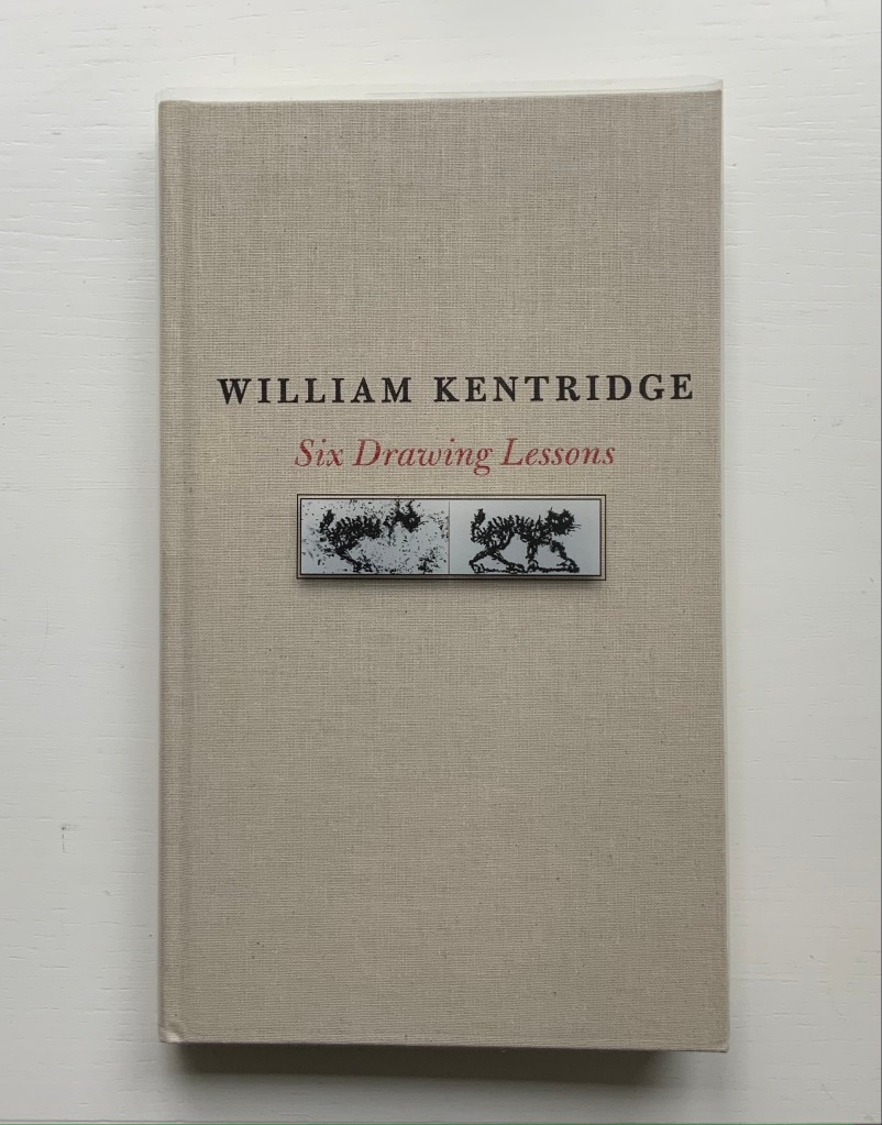
Six Drawing Lessons (2014)
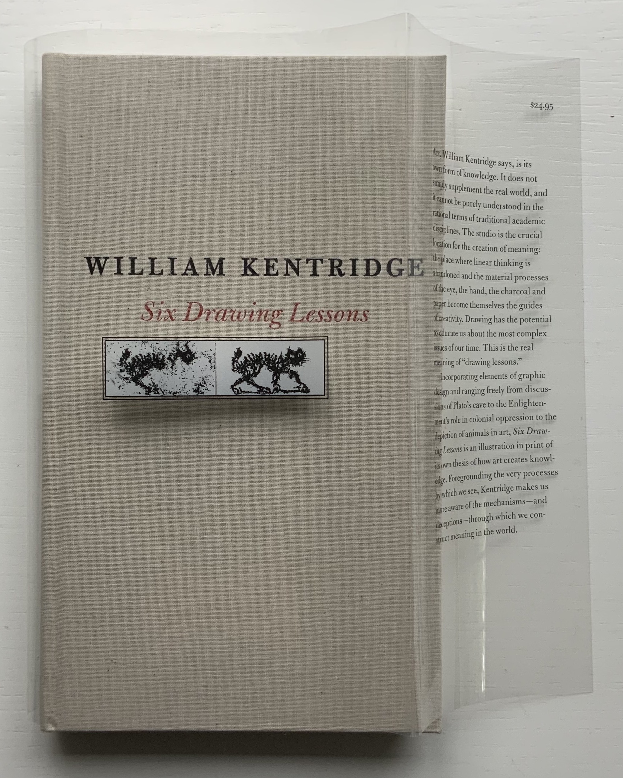
Six Drawing Lessons(2014) William Kentridge Cloth boards, sewn bound. H x W mm, 208 pages. Acquired from Amazon, 23 March 2019. Photos of the book: Books On Books Collection. Permission courtesy of the artist and Goodman Gallery.
You rarely see a clear dustjacket. Of course, if it has type printed on it, you can see it. Still, it is rare, and in this case — in light of Kentridge’s film artistry — transparently ingenious.
The six lessons — Kentridge’s Charles Eliot Norton Lectures delivered at Harvard — begin with an extended riff on Plato’s allegory of the cave. Variations on the riff recur throughout — applied to film projected from behind the audience, to a stage design of The Magic Flute as the bellows of a tripod camera, to transformations and metamorphoses and to the mining caves under Johannesburg. Kentridge’s interpretation of Plato’s cave reminds me of José Saramago’s interpretation in A Caverna (2014) and Guy Laramée’s homage to A Caverna. All three address “the great cloud of unknowing“, a kind of knowing by not knowing — but without God.
A Caverna (2012) Guy Laramée Portuguese-Spanish dictionary carved. Wood and velvet plinth, wood-framed glass cover. H260 x W276 x D226 mm Acquired from William Baczek Fine Arts, 12 September 2017.
What’s remarkable is how Kentridge brings so many variations, seeming tangents and media in the lectures into coherence. Or perhaps not so remarkable given that he manages it across his body of work and the multiple media in which he works. In breadth of stuff and raw material to hand and in his head, Kentridge himself identifies Picasso’s studio practices and work as an influence. Although not mentioned, Anselm Kiefer’s works such as Das Lied von der Zeder – Für Paul Célan (“The song of the cedar – for Paul Célan”, 2005) and his studio at La Ribaute, near Barjac in France, come to mind in these lectures. Likewise another artist called to mind is Xu Bing, especially his Landscape/Landscript (2013) and massive junk assemblage Phoenix (2008-15) among other works. Both Kiefer and Xu use the book as a medium with which to fuse language or text with the visual. All three artists confront similarly dark, raw cultural inheritances. Kentridge’s lectures, especially Lessons Two and Three, make plain his apartheid inheritance and its presence in his art.
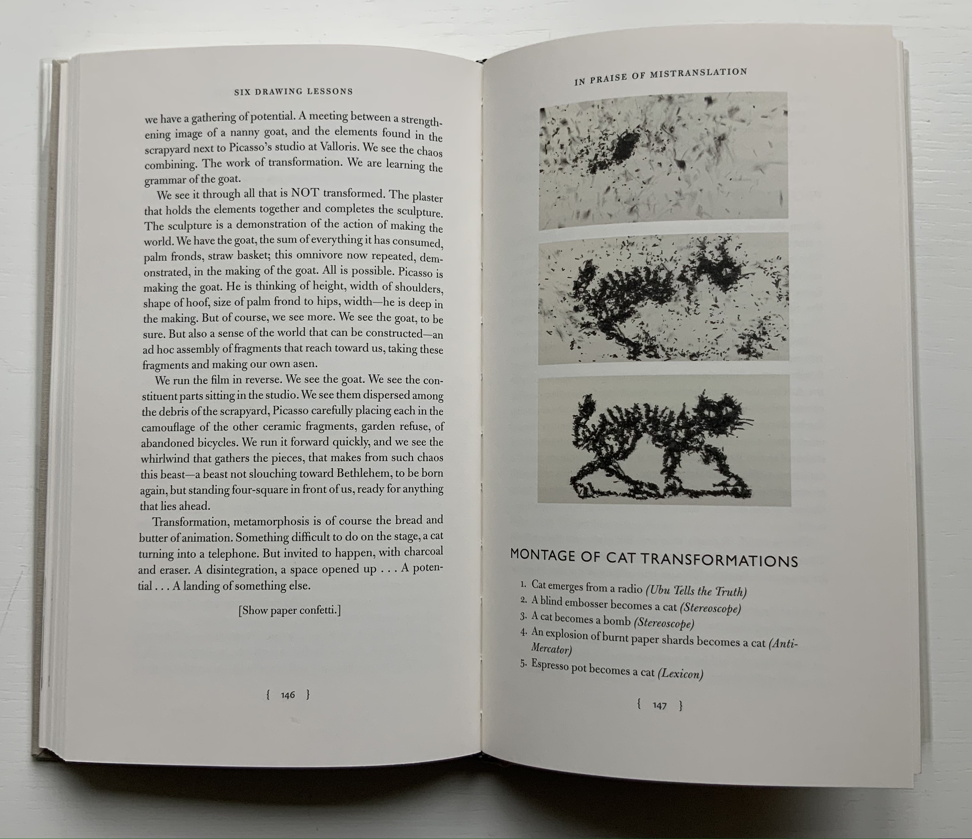
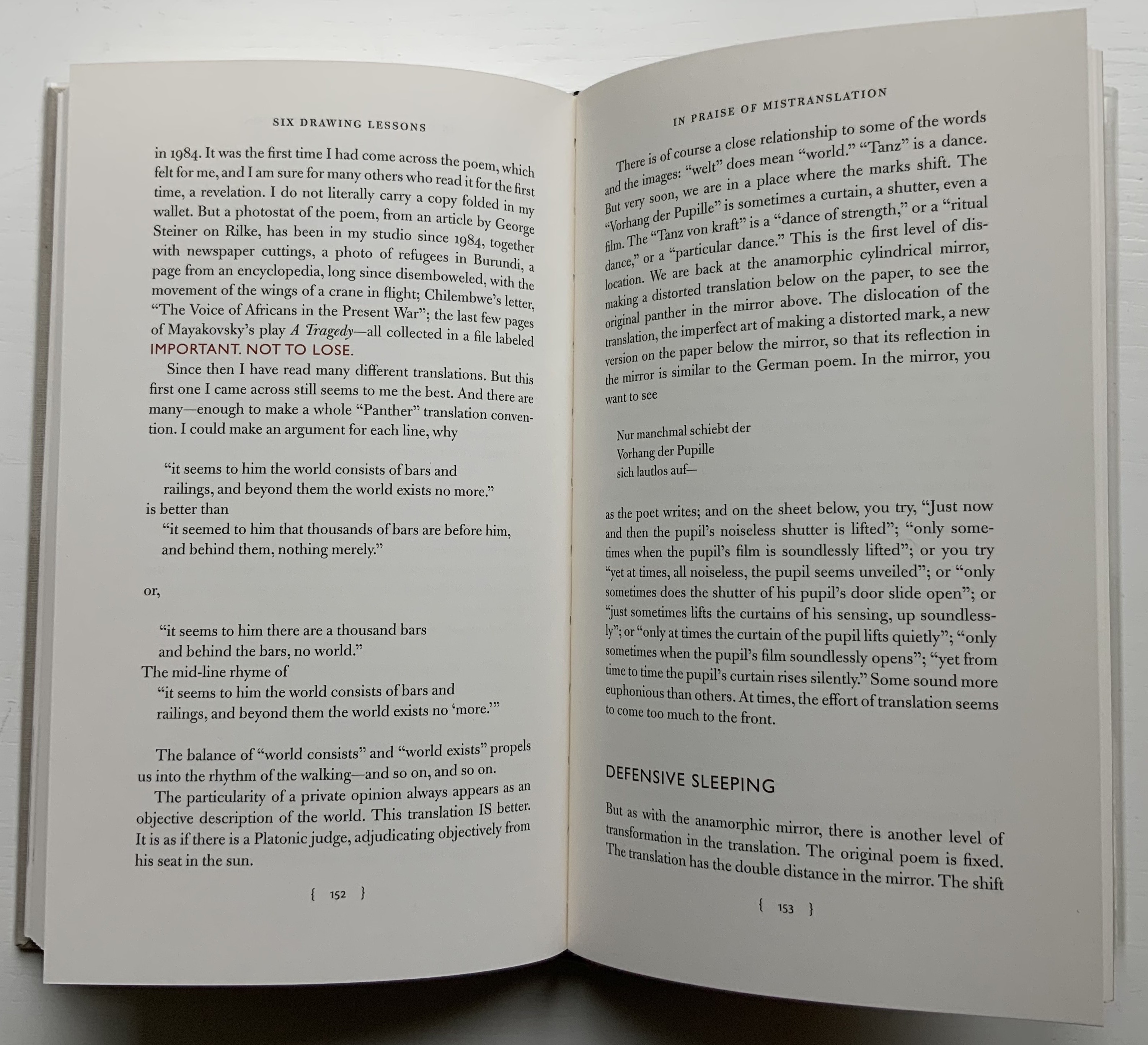
Circling back to the book as artistic medium, the fifth and sixth lessons provide an important insight that underscores Kentridge’s artistry there. “Lesson Five: In Praise of Mistranslation” reproduces Rilke’s “Der Panther” and Richard Exner’s translation of it in full. In that same lesson, Kentridge presents us with a montage of the feline transformations and names the works from which they come, one of them of course being Lexicon.
Before going back to Lexicon for the cat, the reader/viewer would do well to wait for Kentridge to expand in the sixth lesson on the lines describing the panther’s walk around his cage as “a dance of strength round a centre where a mighty will was put to sleep”. He writes:
There is no avoiding it. …it is the circle in the studio, the endless walking around the studio, … Again here we go back to Rilke’s panther, and the radical insufficiency, the radical gap in the center. There has to be some gap, some lack, which provokes people to spend 20 years, 30 years, making drawings, leaving traces of themselves. It has to do with the need to see oneself in other people’s looking at what you have made.
With that, remember the cat — metamorphosing from the Italian coffee pot that slips from Lexicon‘s gutter, prowling from right to left, turning back into the coffee pot, striding from left to right and then being sucked into the center. Can you ever look the same way at the gutter of a book?
Kentridge, William. 2012. Six Drawing Lessons, Charles Eliot Norton Lectures, Harvard University. Six videos from the Mahindra Humanities Center, posted 14-15 January 2020. Lesson 1, Lesson 2, Lesson 3, Lesson 4, Lesson 5, Lesson 6. Accessed between 1 April 2019 and 21 July 2021.
Krauss, Rosalind E. 2017. William Kentridge. Cambridge, Mass: MIT Press.
Mudam Luxembourg. 11 – 12 Jun 2021. “Sibyl“. Announcement. Accessed 22 July 2021. “Waiting for the Sibyl, co-commissioned by the Théâtres de la Ville de Luxembourg, Teatro dell’Opera di Roma and Dramaten – Stockholm and created in collaboration with choral director and dancer Nhlanhla Mahlangu and composer Kyle Shepherd, unfolds in a series of six short scenes, …”
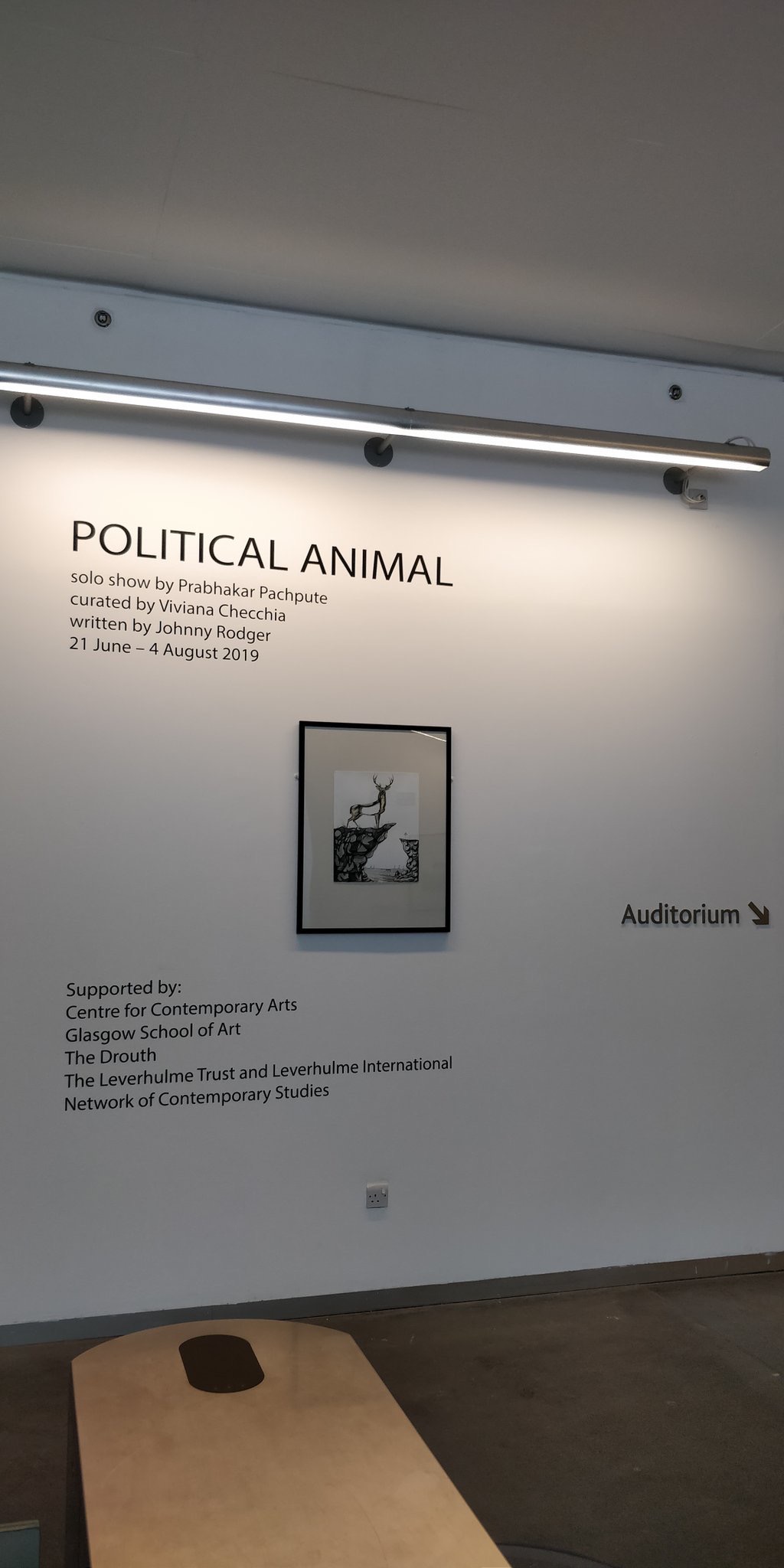
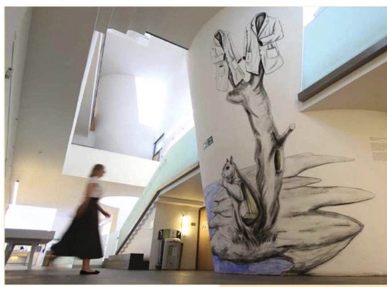
From 21 June to 4 August 2019, the Glasgow School of Art hosted an exhibition curated by Vivianna Checchia based on and named after the artist’s book Political Animal by Johnny Rodger (text) and Prabhakar Pachpute (drawings). The event is particularly noteworthy as an addition to this list of large-scale works of book art.
With Pachpute’s involvement, Checchia transformed the gallery at 167 Renfrew Street in Glasgow into “a book”, its pages consisting of Pachpute’s A3 framed drawings, drawings directly on the gallery’s walls as well as 3D objects, and the curator’s notes/bibliography delivered as displayed copies of the works referenced. Walking and looking become “reading”.
Earlier “walk-through books” include Alison Knowle’s The Big Book (1968) and Anselm Kiefer’s The Rhine (1982-2013), but Political Animal, the exhibition, takes large-scale book art and what we mean by the book just that “little” bit further.
Further Reading
Borsuk, Amaranth. The Book (Cambridge, MA: MIT Press, 2018). Reviewed here.
Malaya, Vinutha. “Art of the Book”, Pune Mirror, 18 July 2019. Accessed 9 September 2019.
Daniel Knorr’s Expiration Movement (2017), an installation work for Documenta 14 held in Kassel, Germany and Athens, Greece, received good coverage in The Art Newspaper:
Knorr’s work in Greece, meanwhile, entails collecting discarded objects from the streets of Athens, then inserting and pressing them into books. They will be sold during the show and will finance the production of the smoke in the Fridericianum in Kassel.
Romanian Knorr is known for his eyebrow-raising political installations such as STASI Stones (made of Stasi documents pulped à la Dieter Roth, mixed with water and oil, and then displayed in Berlin). Those “litter press” books sold to finance the smoke machine atop the Fridericianum, built in 1779, one of the oldest public museums in the world, and host to documenta since 1955) further secure the added accolade “book artist”.
Like the many layers of meaning that book art can convey, smoke billowing from a chimney in Europe, in particular Germany, evokes several responses: concentration camps, book burning, a pope’s election. Also, books incorporating Athens’ litter allude to the protracted socioeconomic difficulties Greece has had in its relationship with the EU, again in particular Germany (both the debt and refugee crises). Knorr’s work has much in common with the atmospherics of the work of another eyebrow-raising artist, Anselm Kiefer, well-known for his book art.
Daniel Knorr: Materialization / Documenta 14 Athens. Installation and performance with found objects and video at Athens Conservatoire (Odeion), Athens (Greece). April 6, 2017. In his performance, Daniel Knorr pastes pieces of scrap materials to the pages of his artist book, which he sells at EUR 80 a piece, to fund his work Expiration Movement Manifest.
Knorr’s production line creating the “litter press” books makes for quite a contrast with that over 500 years ago.
With apologies to the preacher: Of making many books [on books] there is no end.
(Ecclesiastes 12:12)
With the choir of its forebearers, Amaranth Borsuk’s The Book (MIT Press, 2018) sounds an “amen” to that truth. The proliferation of degree programs in book studies covering the history of the book, the book arts and even book art ensures The Book will not be the last. What distinguishes Borsuk’s book are her perspective as an artist and the book’s breadth and depth despite its brevity.
The book has a long history of existential crises. What is a book? Is the end of the book nigh? For more than a century, those questions have returned again and again. The most recent recurrence stems from the ebook’s threat to dematerialize the book and the online world’s threat to take us into a post-text future. Even before these latest threats, book artists have long lived and worked with their own existential questions, a kind of higher existential calculus, or derivative of, the book’s crises: What is an artist’s book? What is book art? Stephen Bury, Riva Castleman, Johanna Drucker, Joan Lyons, Stefan Klima, Clive Philpott and many others in the last quarter of the 20th century dwelt on defining and categorizing book art.
Borsuk belongs to a later generation of book artists that has embraced these existential crises and recognized that the book’s existential crises are what make the book a rich medium in which and with which to create art — from bio-art miniature to the biblioclastic human-scale to large-scale installations and performances. Even to the digital.
The Origin of Species (2016) Dr. Simon Park, Guildford, Surrey “The small book shown here was grown from and made entirely from bacteria. Not only is the fabric of its pages (GXCELL) produced by bacteria, but the book is also printed and illustrated with naturally pigmented bacteria. ” Posted 27 March 2016. Photo credit: Dr. Simon F. Park
Silenda: Black Sea Book (2015) Jacqueline Rush Lee Transformed Peter Green‘s translation of Ovid’s Tristia and the Black Sea Letters H9.5″ x W12″ x D6.5.” Manipulated Text, Ink, Graphite Photo credit: Paul Kodama. In Private Collection, NL
Field (2015) Johannes Heldén Produced, and premiered, at HUMlab, Umeå University Reproduced with permission of the artist
Performance artist and academic as well, Borsuk brings that later generational and creative perspective to the existential question — What is the book? — and, with an artist’s perception of her medium of choice, displaces the old companion existential question — Is the end of the book nigh? — with an altogether more interesting one — Where next for the book?
To see where books might be going, we must think of them as objects that have experienced a long history of experimentation and play. Rather than bemoaning the death of books or creating a dichotomy between print and digital media, this guide points to continuities, positioning the book as a changing technology and highlighting the way artists in the twentieth and twenty-first centuries have pushed us to rethink and redefine the term. (pp. xiii-xiv)
In The Book, the future is not far from the physical past. Where once we had text on scrolls, now we scroll through text (albeit more vertically than horizontally). Where once human consciousness changed with the invention of the alphabet and writing, now it may be altering with our reading and writing through networked digital devices. Like the many historians before her, Borsuk starts with cuneiform (those wedge-shaped accounting marks on baked clay), hieroglyphics and the invention of the alphabet to set the scene for the advent of the book and its ongoing physicality:
its shape (scroll, accordion, codex)
its material (papyrus, vellum, paper, charcoal or mineral-based watercolor and ink)
its manufacture (scribing, printing by woodblock and movable type, design and typography, illumination and illustration, folding into pages, methods of binding)
its constituent and navigational parts (cover, book block, title page, table of contents, page numbering, index).
But Borsuk reminds us — from Sumer’s clay to Amazon’s Kindle, from Johannes Gutenberg to Project Gutenberg — the book as human artifact exists in a social, political, technological, economic and even ecological context. Who is allowed to make it, how it is transacted, how and where we use it, how we perceive and speak of it — all have affected the physicality of the book object and are reflected in it.
In the first half of The Book, Borsuk steers us through these interdependencies to a turning point. That turning point is where the pinnacle of the book arts — Beatrice Warde‘s and Jan Tschichold‘s vision of the book as a crystalline container of content — and the book’s commodification combine to cause the book’s physicality to disappear because it is so taken for granted, leaving us with “the book as idea”.
With the perception that books are ideas bestowed on readers by an authorial genius whose activity is purely intellectual, the book’s object status vanished for much of the reading public as we raised a glass to happily consume its contents…. Even though innumerable material elements come together to make the book, these features have been naturalized to such a degree that we now hardly notice them, since we have come to see content as the copyrightable, consumable, marketable aspect of the work. (pp. 106-9)
At this turning point — where “the historic relationship between materiality and text is severed” (p. 112) — the second half of The Book introduces book art. It is telling that the longest chapter in the book begins the second half, that it is called “The Book as Idea” and that it comes before any extended engagement with the digital dematerialization of the book. It is a wry pivot: the artistic genius supplants the authorial genius; what the latter takes as invisible background, the former re-makes as self-regarding foreground. As Borsuk shows and her book’s cover neatly demonstrates, works of book art are inevitably self-referential and self-aware.
As such, works of book art
have much to teach us about the changing nature of the book, in part because they highlight the “idea” by paradoxically drawing attention to the “object” we have come to take for granted. They disrupt our treatment of the book as a transparent container for literary and aesthetic “content” and engage its material form in the work’s meaning. (p. 113)
Rather than offer a chronological history of book art to explore what “artists’ books have to teach us about a path forward for the book”, Borsuk offers “flashpoints” that represent “the energies motivating artwork in book form”(p. 117). These “flashpoints” are William Blake, Stéphane Mallarmé, Ed Ruscha and Ulises Carrión. Following these flashpoints, Borsuk organizes the rest of the chapter into “key themes that recur throughout artists’ books of the twentieth century: spatiotemporal play, animation, recombinant structures, ephemerality, silence, and interactivity” (pp. 146-47).
Oddly, Blake as flashpoint does not illuminate these six particular themes. Rather Borsuk notes three other recurrent themes or “energies motivating artwork in book form” that Blake and his work represent: centering or re-centering the production processes on the author/artist; using the book as a sociopolitical and visionary platform; and redefining, developing and challenging the relationship between word and image.
Blake refers to himself as “The Author & Printer W. Blake,” making clear the union of creativity and craft in his work. (p. 121)
Blake’s engagement with the social issues of his day, and his use of book form to respond to child labor, urban squalor, and slavery, established an important trend in both artists’ books and independent publishing—the utility of the book as a means of spreading social justice. (pp. 121, 124)
Blake used his craftsmanship to develop the relationship between word and image (p. 140)
One need not look far among twentieth and twenty-first century book artists for resonance with those themes. That Blakean union of creativity and craft resurfaces in artists such as Ken Campbell (UK), Cathryn Miller (Canada), Pien Rotterdam (Netherlands), Barb Tetenbaum (US) and Xu Bing (China) — some of them even to the point of carving or setting their own type, making their own paper, pulp printing on it themselves or binding the finished work themselves. Vision and sociopolitical observation have risen up in the works of artists such as Doug Beube (Canada), Julie K. Dodd (UK), Basia Irland (US), Diane Jacobs (US), Anselm Kiefer (Germany) and Chris Ruston (UK). Blake’s redefining the relationship of word (or text) to image often reappears book artists’ abecedariesand their children’s books such as A Dictionary Storyby Sam Winston (UK).As for emulators of Blake in technical innovation, consider the analogue example of Australian Tim Mosely’s works created with his patented pulp printing process, where the “ink” is actually colored pulp, or the digital example of Borsuk’s work Between Page and Screen, where the pages contain no text—only QR codes that, when scanned with a webcam, activate the text’s appearance on the reader’s browser screen.
For her second flashpoint, Borsuk selects another visionary, Stéphane Mallarmé, who like Blake was reacting to his own perceived Satanic mills draining poetry of its spirituality. Mallarmé’s Satanic mills dispensed rigid columns of newsprint to the masses and bland expanses of poetry and fiction set by Linotype machines in the neo-classical Didot font. With his famous visionary dictum — “everything in the world exists in order to end up as a book” (p. 135) — Mallarmé nudged the book toward pure concept and opened its mystical covers to the Dadaists, Surrealists, Futurists, Vorticists, Lettrists, Conceptualists and biblioclasts. With spatiotemporal play — mixing type sizes and fonts, breaking up the line and even breaking the page — Mallarmé used text to evoke image and, in his view, remake the book as a “spiritual instrument”. His post-humous book-length poem Un coup de Dés jamais n’abolira le Hasard (A Throw of the Dice Will Never Abolish Chance), published in 1897, embodies that vision and continues to cast its flashpoint light across multiple generations of book artists’ efforts. From Marcel Broodthaers in 1969, we have his homage to Un Coup de Dés. From Jérémie Bennequin in 2014, we have his serial “omage” to Broodthaers’ homage. And, most recently, we have the 2015 new bilingual edition A Roll of the Dice by Jeff Clark and Robert Bononno, for which Borsuk provides a perceptive reading.
Where Mallarmé’s flashpoint enlisted his vision alongside the cry “épater le bourgeois” from Baudelaire and other late nineteenth-century poets, Ed Ruscha’s later flashpoint illuminates a democratic counterpoint, a Zen-like vision and a very different way of changing the relationship of text to image. Ruscha’s self-published photobooks were cheap and distributed outside the gallery-controlled channels of art. As Borsuk shows — directly with Ruscha and indirectly with the many book artists influenced by him — the text is restricted to the book’s title, which interacts with a series of deadpan photos and their layout to deliver a wry, tongue-in-cheek work of book art. Ruscha’s spatiotemporal play manifests itself across the accordion book format and out-of-sequence juxtapositions. Ironically Ruscha’s works now command thousands of dollars per copy, and one has more chance of seeing them in an exhibition than in a roadside stop’s rack of newspapers, magazines and mass-market paperbacks.
Mexico’s Ulises Carrión — polemicist, European bookshop owner, conceptual artist and Borsuk’s fourth choice of flashpoints — is a counter-flashpoint to Ruscha. Where Ruscha reveled in self-publishing commodification, Carrión sneered at the book in its traditional commercial form. Where Ruscha has resisted the label “conceptual artist”, Carrión played the role to the hilt. Where Ruscha’s work has elicited numerous homages (see Various Small Books from MIT Press in 2013) and achieved a high profile, Carrión’s work, much lower in profile, has provided a more compelling range of hooks or influences on which to hang many different manifestations of book art (or bookworks as Carrión preferred). In fact, Borsuk’s six stated key themes or “energies motivating artwork in book form” come from Carrión’s manifestos (pp. 146-47).
The first theme — “spatiotemporal play” — comes from Carrión’s initial definition of the book as a “sequence of spaces”, which Borsuk traces to tunnel books, pop-ups and even large-scale constructs, the latter illustrated by American Alison Knowles‘ inhabitable The Big Book (1968). One more possible future of the book implied by spatiotemporal play manifests itself in Borsuk’s own augmented-reality (AR) works, those of Caitlin Fisher (Canada) and Carla Gannis’ Selfie Drawings (2016), in which portraits on the hardcover book’s pages animate and change when viewed through smartphone or tablet.
Borsuk takes the second theme, that of “animation”, from Carrión’s dictum: “Each of these spaces is perceived at a different moment— a book is also a sequence of moments”. As her several examples illustrate, much book art is cinematic. Borsuk’s exposition of Canadian Michael Snow‘s Cover to Cover (1975) comes closest to reproducing the experience I enjoyed of “watching” that photo bookwork from cover to cover several times at the now closed Corcoran Art Gallery. Borsuk is quick and right to remind that the cinematic future of the book has been with us for a long time, even before the cinema. She bookends her exposition of Snow’s book and the text animation of American Emmett Williams‘ Sweethearts (1967) on one side with Victorian flip-books and on the other with American Bob Brown‘s 1930s The Readies (presumably pronounced “reedies” to follow Brown’s comparison of his scrolling one-line texts with the cinema’s “talkies”).
A forgotten modernist, Brown declared the obsolescence of the book, predicted a new form of reading and technology to enable it, an optical projector emitting text into the ether and directly into the eyeball. But what does this tell us about the future of the book? Borsuk notes Craig Saper‘s resurrection of Brown’s Roving Eye Press and how he even put together a website that emulates Brown’s reading machine. In her phrase describing the machine’s effect of “turning readers themselves into a kind of machine for making meaning” (p. 168), Borsuk hints at a future of digitally interactive books, which she takes up in the next section and more extensively in the next chapter. At this point, however, the reader could use a hint of practicality and skepticism. Linear-one-word-at-a-time reading, however accelerated, eliminates affordances of the page, ignores graphics and strains against the combination of peripheral vision and rapid eye movement we unconsciously (even atavistically?) deploy as we “read” whatever we see. Although in the next section Borsuk does bring on more likely examples of the book’s future exploitation of its cinematic affordances (manga, graphic novels and children’s books), this section’s treatment of animation misses the chance to cite actual recent successes like Moonbot Studios‘ The Fantastic Flying Books of Mr. Morris Lessmore (2012) and others.
Once into the third theme — “recombinant structure” — it is clear that Borsuk’s chosen Carriónesque themes overlap one another. Like the cinematic, the recombinant structure manifests itself in accordion books. It extends, however, to something more interactive: volvelles (or medieval apps as Erik Kwakkel calls them), interactive pop-ups, harlequinades (flap books) and more. Borsuk uses Raymond Queneau‘s harlequinade Cent mille milliards de poèmes ( One hundred thousand billion poems, 1961), Dieter Roth‘s slot books and works by Carolee Schneemann to illustrate book art’s celebration of the concept. The fact that Queneau’s book is still easily available on Amazon vouches for book art’s predictive qualities. The example of Marc Saporta’s Composition No.1 (Éditions du Seuil, 1962), “a box of 150 leaves printed on only one side that the reader is instructed to shuffle at the outset”, goes Queneau one better —ironically. In 2011, Visual Editions reissued Composition No. 1 in print and app forms. Alas, the former is out of print, and the latter is no longer available for download (although a video of it is available here).
Composition No. 1 (2011) Marc Saporta Translation by Richard Howard, Introduction by T.L. Uglow, Google Creative Lab, Diagrams by Salvador Plascencia and Designed by Universal Everything Photo credit: Books On Books
Borsuk draws her fourth theme — ephemerality — from Carrión’s dictum:
I firmly believe that every book that now exists will eventually disappear. And I see here no reason for lamentation. Like any other living organism, books will grow, multiply, change color, and, eventually, die. At the moment, bookworks represent the final phase of this irrevocable process. Libraries, museums, archives are the perfect cemeteries for books. (p. 145)
To illustrate, Borsuk begins with the physical biblioclasts — those who in Doug Beube‘s phrase are “breaking the codex“. They include Beube himself, Bruce Nauman (see above), Brian Dettmer, Cai Guo-Qiang, Marcel Duchamp, Dieter Roth and Xu Bing. While some of these artists reflect a twenty-first century surge of interest in altered books and book sculpture, “facilitated by the overarching notion that the book is an artifact not long for this world” (pp.82-84), others have taken a more generative archaeological approach — erasing or cutting away a book’s words to reveal another. Examples include Tom Phillips‘ A Humument (1966-2014) and Jonathan Safran Foer‘s Tree of Codes(2010). Phillips’ bookwork serves multiple purposes for Borsuk’s arguments. Not only does it represent the book art of “erasure”, its success across multiple editions, digital formats and presence in art galleries supports her notion of book art’s predictive qualities.
There is a variant on her theme that Borsuk does not illustrate and is worth consideration for her next edition: the self-destructing yet regenerative work of book art. Examples could include American Basia Irland‘s series ICE BOOKS: Ice receding/Books reseeding (2007-), which gives a formidably tangible and new meaning to “publishing as dissemination”; and Canadian Cathryn Miller‘s tail-chasing Recomp (2014); and Argentinian Pequeño Editor‘sMi Papa Estuvo en la Selva (2015), which after reading can be planted to grow into a jacaranda tree.
Recomp (2014) Cathryn Miller Copy of Decomp, Collis and Scott (2013) nailed to a tree. Photo credit: David G. Miller
Recomp (2015) Photo credit: David G. Miller
Recomp vandalized (2015) Photo credit: David G. Miller
The last section in this chapter expands on the fifth theme — silence — drawn from Carrión’s statement:
The most beautiful and perfect book in the world is a book with only blank pages, in the same way that the most complete language is that which lies beyond all that the words of a man can say. Every book of the new art is searching after that book of absolute whiteness in the same way that every poem searches for silence. Ulises Carrión, Second Thoughts (1980), pp. 15-16.
Among her several examples are Pamela Paulsrud‘s Touchstones (2007-10), which look like stones but are books sanded-down into stone-like shapes, and Scott McCarney‘s 1988 Never Read(Opposed to Ever Green), a sculpture composed of stacked library discards that narrows as it ascends. Paulsrud’s, McCarney’s, Irland’s and Miller’s works are what Borsuk calls “muted objects”, but they speak and signify nevertheless:
Muted books take on a totemic [metaphoric] significance…. The language of the book as a space of fixity, certainty, and order reminds us that the book has been transmuted into an idea and ideal based on the role it plays in culture…. Defining the book involves consideration for its use as much as its form. (pp. 193-95)
Never Read (Opposed to Ever Green) (1988) Scott McCarney Reproduced with permission of the artist
Never Read (Opposed to Ever Green) (1988) Scott McCarney Reproduced with permission of the artist
Never Read (Opposed to Ever Green) (1988) Scott McCarney Reproduced with permission of the artist
Borsuk is a superb stylist of the sentence and expository structure. The words above, concluding chapter three, launch the reader into Borsuk’s final theme of interactivity and her unifying metaphor: “the book as interface”. Owners of Kindles, buyers from Amazon, perusers of Facebook — we may think we know what’s coming next in The Book and for the book, but Borsuk pushes the reader to contemplate the almost real-time evolutionary change we have seen with ebook devices and apps, audiobooks, the ascension of books to the cloud via Project Gutenberg, the Internet Archive and Google Books, and their descent to Brewster Kahle‘s physical back-up warehouse (to be sited in Canada in light of recent political events) and into flattening ebook sales of late. Chapter 4 is a hard-paced narrative of the book’s digital history from the Memex in Vannevar Bush‘s 1945 classic “As we may think” to T.L. Uglow‘s 100-author blockchain collaboration in 2017, A Universe Explodes from Visual Editions’ series Editions at Play.
Borsuk reminds us:
Our current moment appears to be much like the first centuries of movable type, a cusp. Just as manuscript books persisted into the Gutenberg era, books currently exist in multiple forms simultaneously: as paperbacks, audiobooks, EPUB downloads, and, in rare cases, interactive digital experiences. (p. 244)
Borsuk weaves into this moment of the book’s future a reminder that print affordances such as tactility (or the haptic) and the paratextual (those peripheral elements like page numbers, running heads, ISBNs, etc., that Gary Frost argues “make the book a book”) have been finding fresh ways into the way we read digitally. The touchscreen enables us to read between the lines literally in the novella Pry (2014) by Samantha Gorman and Danny Cannizaro (2014). Breathe (2018) by Kate Pullinger, another work in the Editions at Play series, uses GPS to detect and insert the reader’s location, the time and weather, and when the reader tilts the device or rubs the screen, hidden messages from the story’s (the reader’s?) ghosts appear.
At this point, an earlier passage from The Book should haunt the reader:
Artists’ books continually remind us of the reader’s role in the book by forcing us to reckon with its materiality and, by extension, our own embodiment. Such experiments present a path forward for digital books, which would do well to consider the affordances of their media and the importance of the reader, rather than treating the e-reader as a Warde-ian crystal goblet for the delivery of content. (p. 147)
Borsuk convinces. Art, artifact, concept — wrought by hand and mind, hands and minds — the book is our consensual tool and toy for surviving beyond our DNA. So now what? Metaphor, hints and historical flashpoints may illuminate where we have been, how it shows up in contemporary books and book art and where we may be going with it. In ten or one hundred years though, how will a book publisher become a book publisher? Given the self-publishing capability today’s technology offers, will anyone with a file on a home computer and an internet connection consider himself or herself a book publisher? Borsuk thinks not:
The act of publication — of making public — is central to our cultural definition of the book. Publication might presume some cultural capital: some editorial body has deemed this work worthy of print. It might also presume an audience: a readership clamors for this text. But on a fundamental level, publication presumes the appendage of elements outside the text that help us recognize it as a book, even when published in digital form. (pp. 239-40)
How will future book publishers learn to master the appendage of these elements outside the text (the paratext) that make a book a book “even when published in digital form”? Borsuk’s commentary on the ISBN as one of these elements sheds oblique light on that. She points to the artist Fiona Banner’s uses of the ISBN under her imprint/pseudonym Vanity Press — tattooing one on her lower back, publishing a series Book 1/1(2009) consisting of sixty-five ISBN’d pieces of mirrored cardstock and then collecting them in a photobook entitled ISBN 978-1-907118-99-9 in order to deposit those one-offs with the British Library as required by the UK’s Legal Deposit Libraries Act. What can a future ebook publisher deduce from this?
That the use of a globally unique identifier (GUID) matters.
The backstory of the transition from ISBN10 to ISBN13 and that of ebooks, ISBNs and Digital Object Identifiers (DOIs) might provide interesting fodder. The notion that the book industry was running out of 10-digit ISBNs was a red herring used to convince industry executives to adopt the more widely used format of unique identifiers overseen by GS1. The real reason for moving to ISBN13 — reduced friction in the supply chain — was too hard to sell. About the same time, some major publishers proposed incorporating the ISBN into the DOI for an industry-standard ebook identifier. The DOI offered an existing digital, networked infrastructure already being used by most of the world’s scientific, technical and medical journals publishers. It is an offshoot of the Handle System, established by Robert Kahn. Sad to say, few book publishers adopted the DOI for their ebooks; still fewer used the DOI’s application- and network-friendliness to enable their ebooks to take advantage of the network’s digital affordances.
The DOI shares with the ISBN a feature that Borsuk points out as a limitation to more widespread use: it is not free. A significant percentage of ebooks exist without ISBNs, much less DOIs. If a digital GUID is to be used in ways that help us recognize the identified digital object as a book, future book publishers and their providers of a network ecosystem supporting ebooks, linking with the print ecosystem and reducing friction in the supply chain still have wide gaps in commerce and knowledge to close. Perhaps this particular paratextual element is unnecessary for the book’s digital future, but until those gaps are narrowed, the ecosystem for eBooks will remain balkanized by Amazon, Apple, Google, Lulu and the more digitally literate denizen of the print publishing industry. In the meantime, as Borsuk’s examples throughout her book show, there are boundless other print and digital affordances with which publishers, authors, editors, designers, typographers, developers and readers can play as they continue to shape the book.
The Book‘s publication month, June 2018, is auspicious, being the same for the Getty Center’s exhibition “Artists and Their Books/Books and Their Artists“, June 26 – October 28. The Center and MIT Press would do well to have stacks of The Book on hand. The Book will also serve as an excellent introductory textbook for courses on book art or the history of the book. And by virtue of its style and artist’s perspective, Borsuk’s book will appeal to anyone with even a passing interest in this essential technology of civilization and its growing role as a material and focus of art in the twentieth and twenty-first centuries.
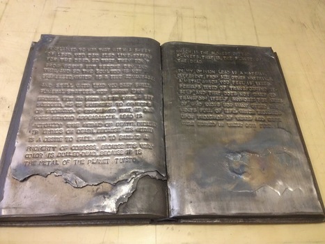
Lost Fight, 2014 Encyclopedia volume, lead, metal paint
The passage here, rendered by blind embossing on lead and metal paint, comes from Primo Levi’s essay on lead in his book The Periodic Table.
It reminds me of Anselm Kiefer’s lead books with wings (The Language of the Birds, 2013), which you can read about here: http://wp.me/p2AYQg-Lu. It’s a curious, leaden but uplifting, fitting but outrageous conjunction: Van Zanten’s personal grappling with depression, the concentration-camp survivor who ultimately succumbed to depression and suicide, and the Nazi-saluting artist who asserts that history is a weight that must be borne and embraced and lead is the only substance that is weighty, “alchemical” and mutable enough to bear it.
Van Zanten’s appropriation of Levi for her project “Depression” is somewhat less outré than Sylvia Plath’s appropriation of Jewishness in “Daddy”, which is barely less outré than Kiefer’s Nazi salutes. But all three are essential, outrageous and shocking appropriations, just as the appropriation of books as “just another material” with which to create art is essential, outrageous and shocking.