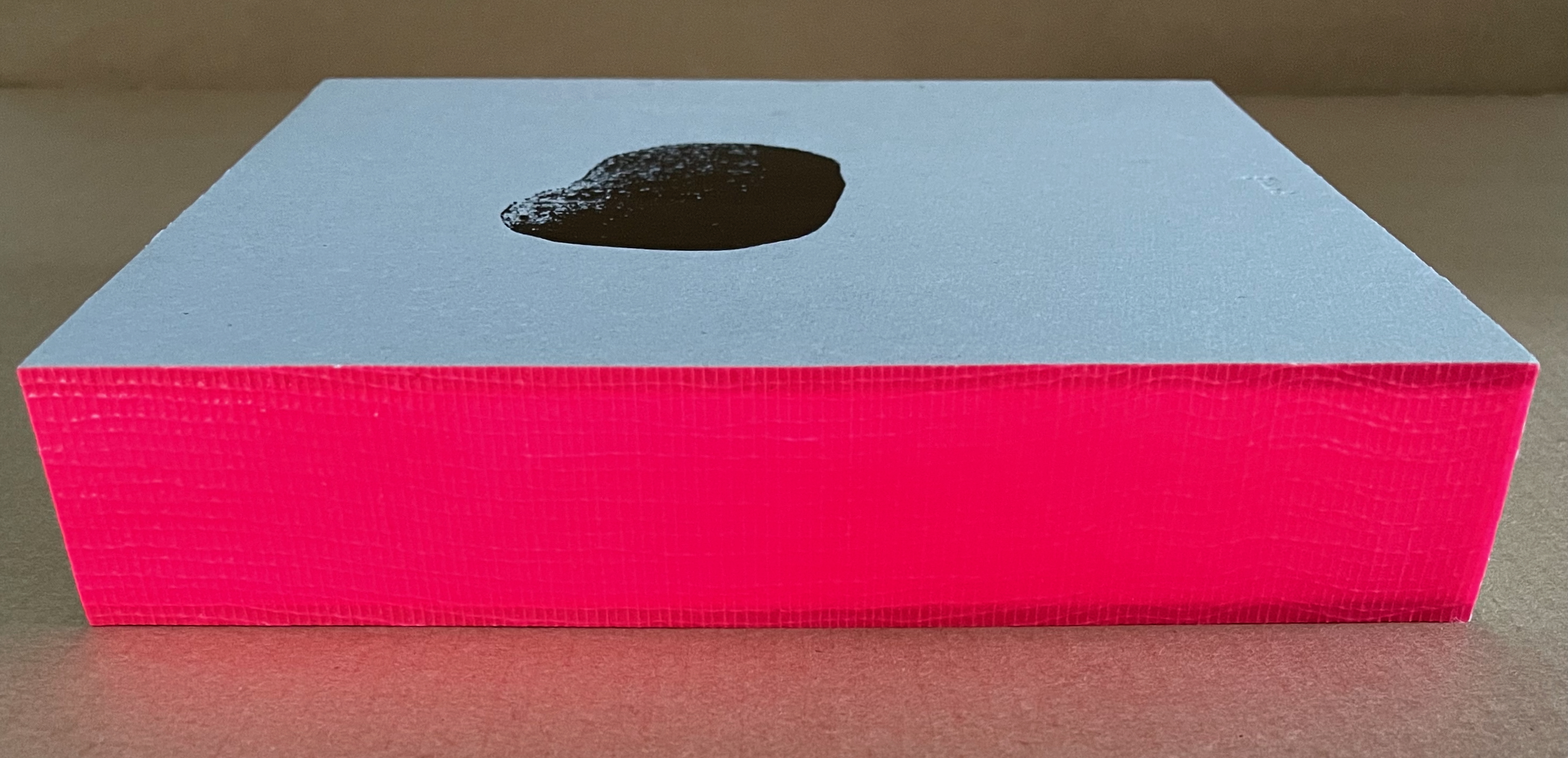
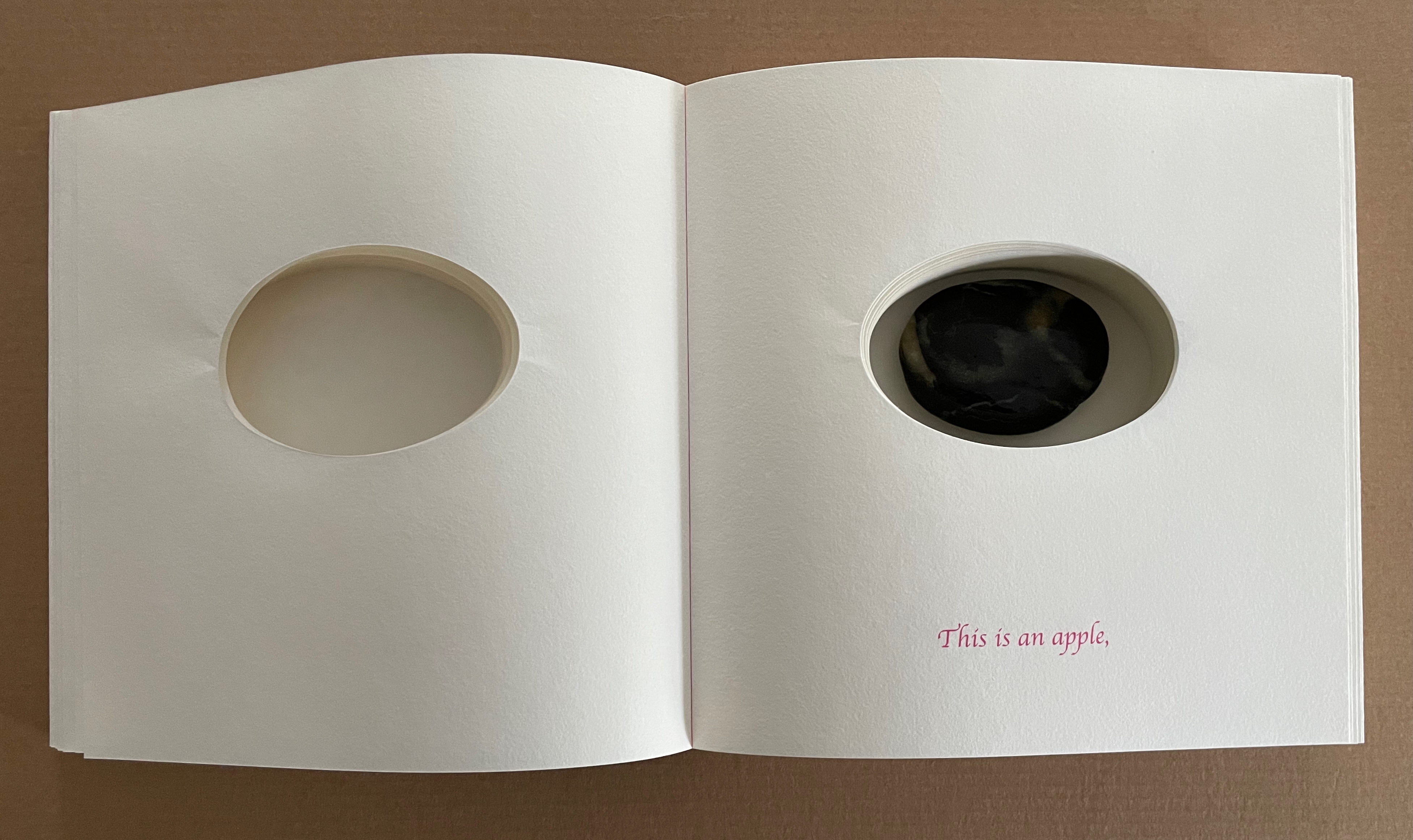
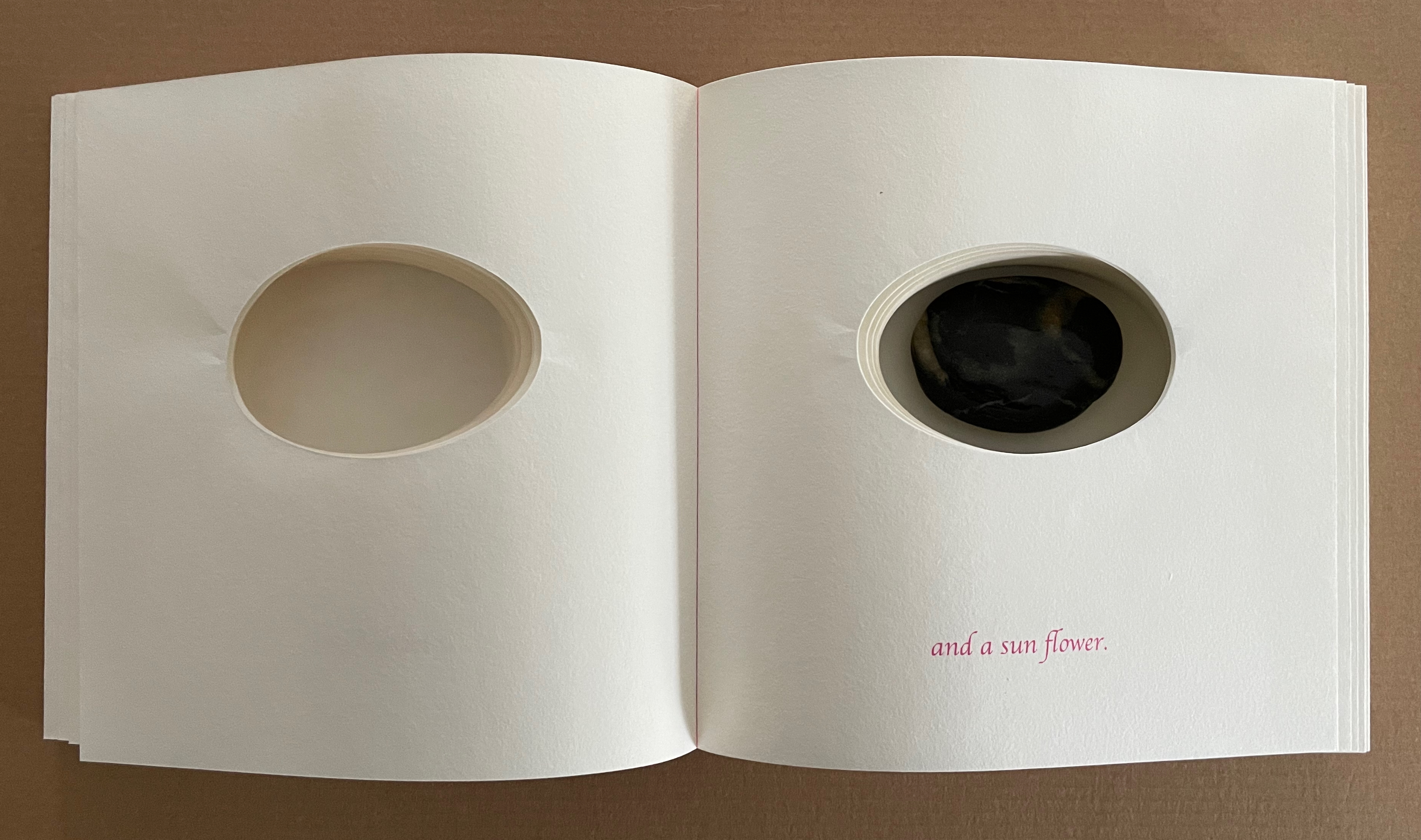
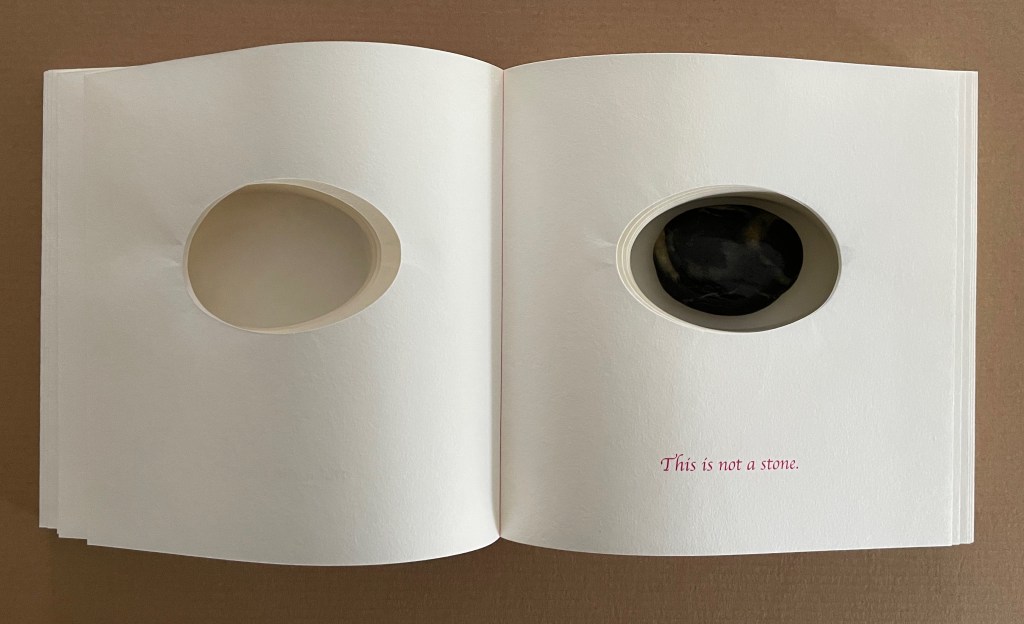
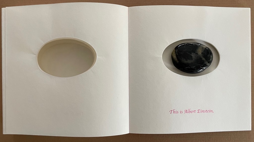
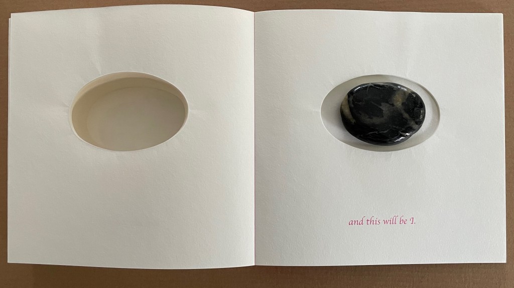
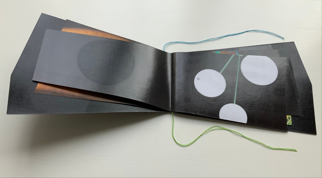
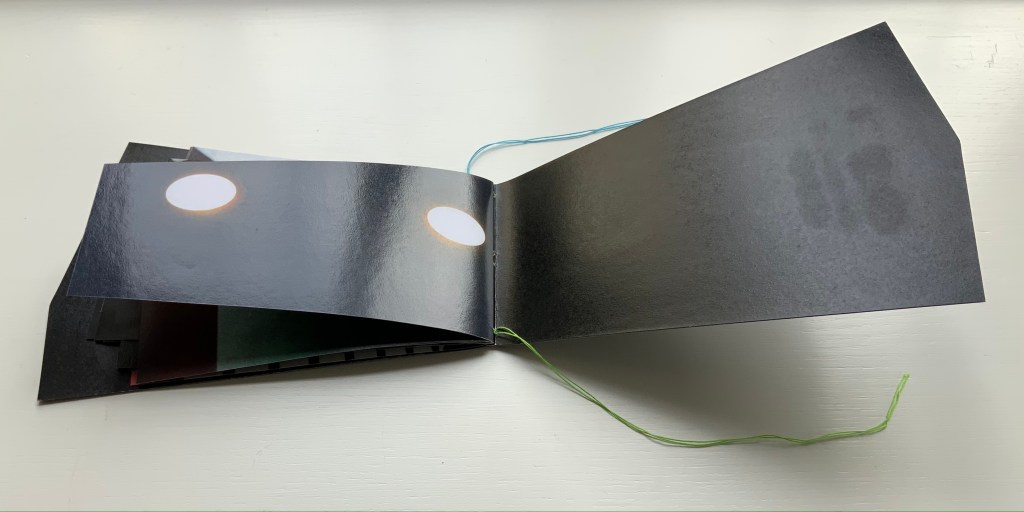
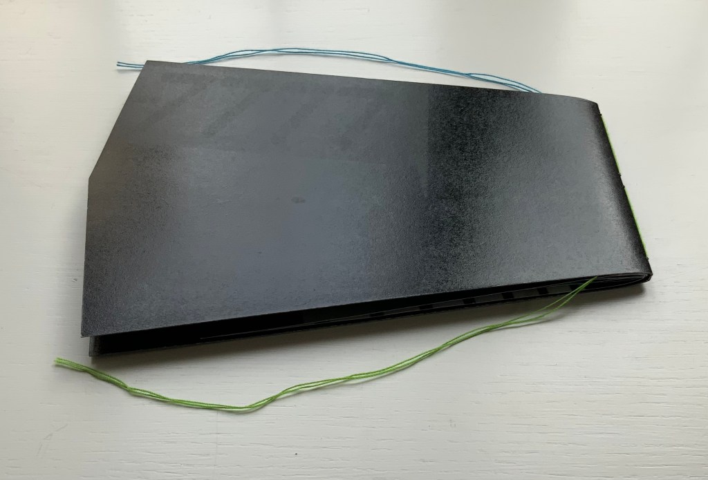
This is not a stone (2017) Sunkyung Cho Exposed spine binding with cross weave filament tape, board-covered. 170 x 170 mm. Acquired from SpazioB**K, 6 April 2025. Photos: Books On Books Collection.
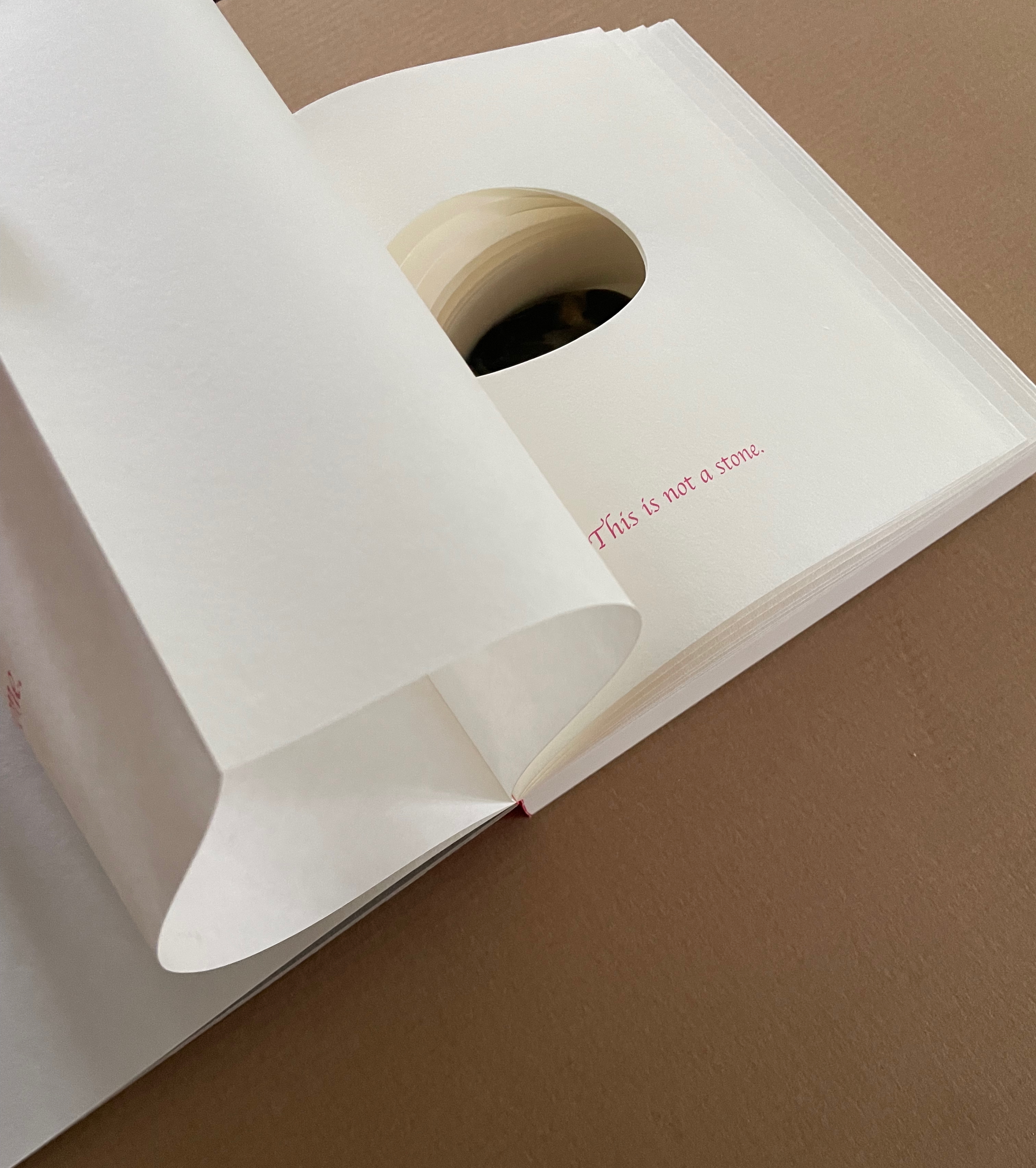
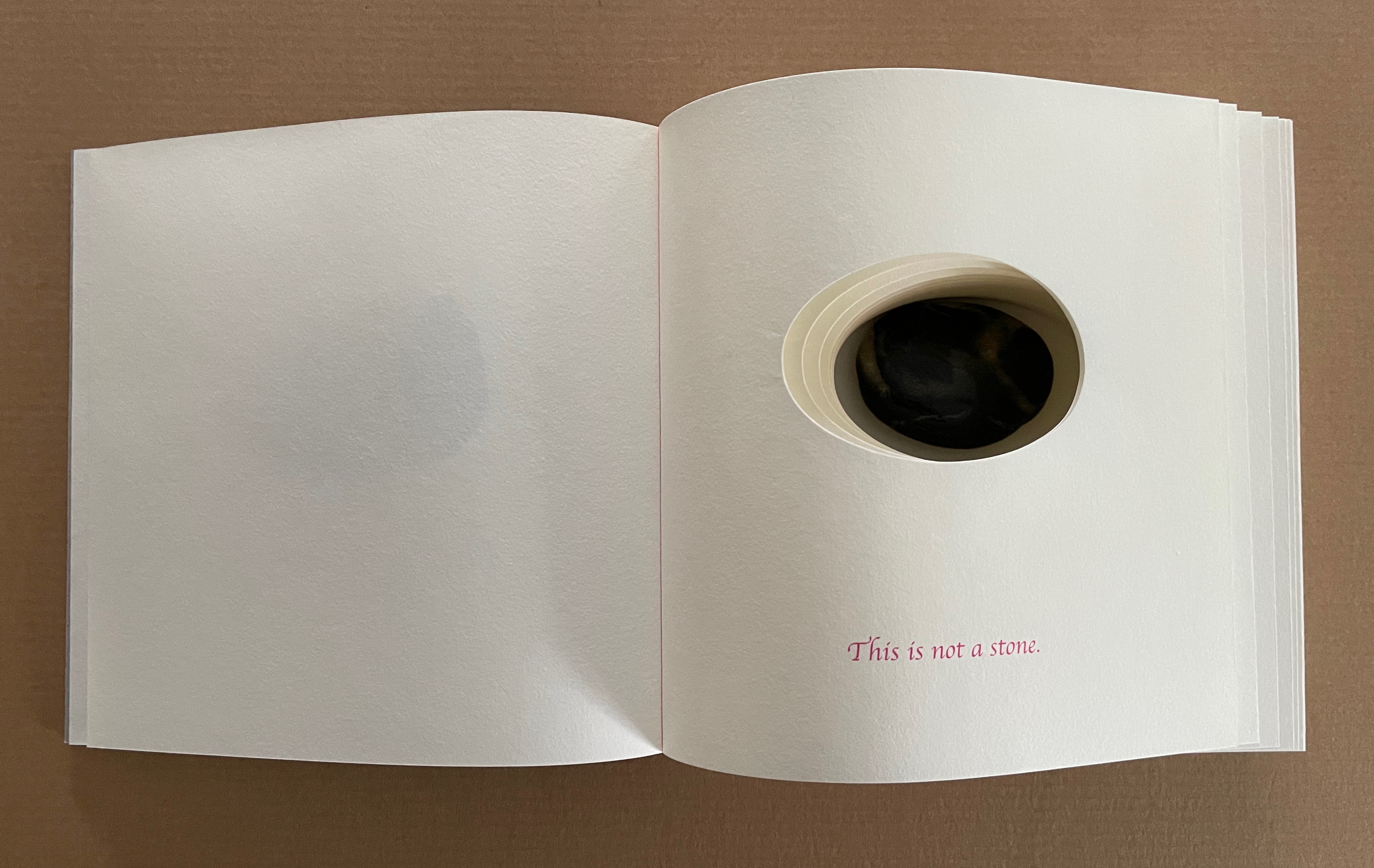
Just as you think this will be another two-dimensional riff on René Magritte’s The Treachery of Images (aka Ceci n’est pas une pipe), the Chinese fold title page turns to reveal a cutout well with a stone at the bottom.
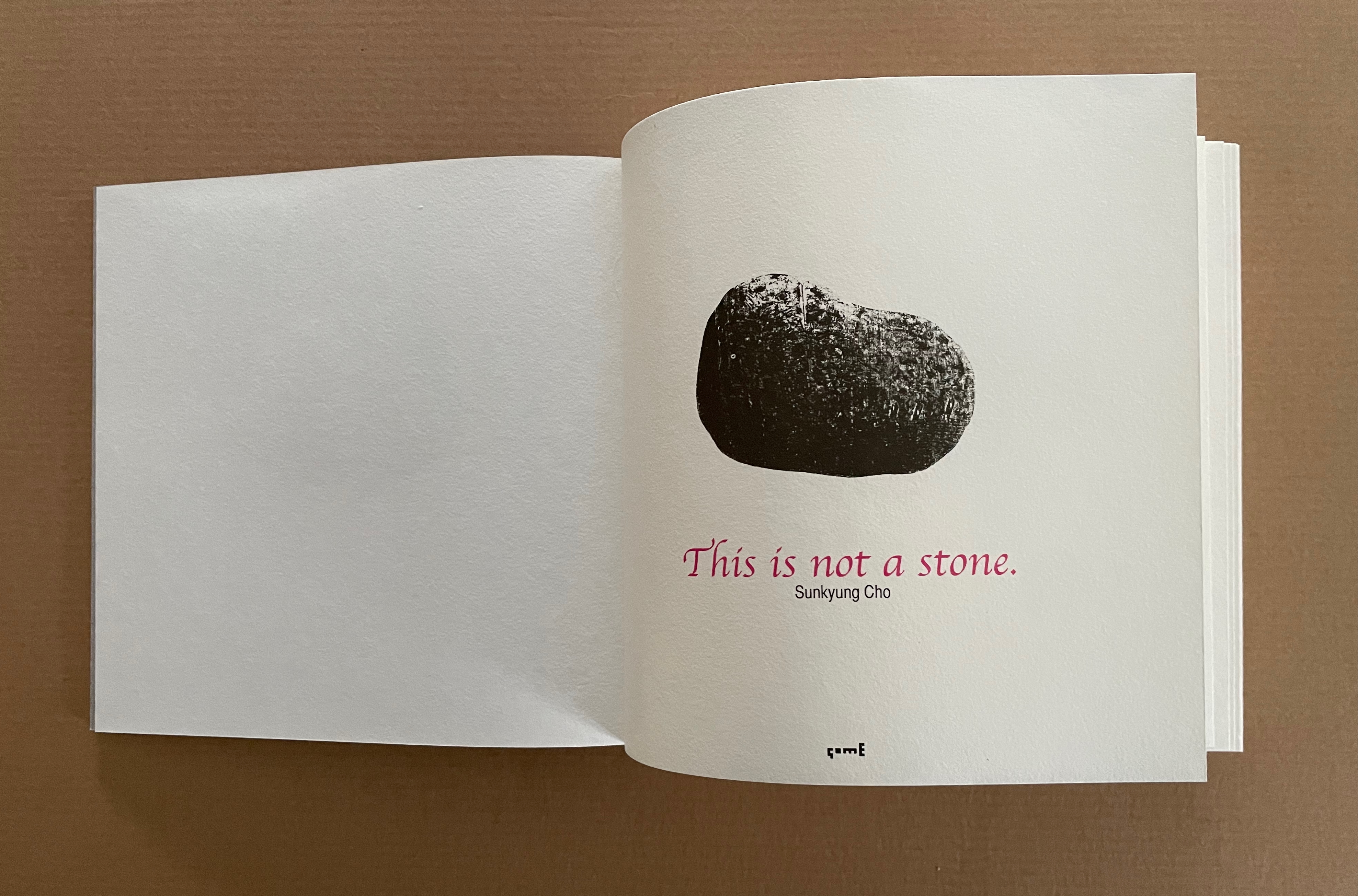
With the turn of the next two pages, it appears we are in for a series of metaphors and riddles, and something more than a three-dimensional riff on the anti-metaphor and the gap between words (symbols) and objects. First, this not-a-stone is “an apple,” but then turn the next page, and the not-a-stone is also “a sun flower”. Is there some law of commutation that applies: If not-a-stone = apple, and not-a-stone = sun flower, therefore, apple = sun flower? Because it is round, because it is vegetal?
Over the next turns, we have “the Sun” and “the earth”, then “a crystal” and “a flake of snow in the Himalyas”, then “a beetle” and “a scorpion”, and on the pairs go, each separated with the spread “This is not a stone”. All along, while being urged to deny the evidence of reality, we are asked to accept the evidence of metaphor and imagination. Naturally our inbred pattern-seeking and ludic behaviors kick in, as if this were a game of “Twenty Questions”. But the pairs run the gamut of Animal, Vegetable, Mineral and beyond.
By the last page, it is as if we are playing “Twenty Questions” with the stone itself. That is, if the “I” is the stone saying, “and this will be I”. Is the stone uttering a deliberate a-grammatical union of subject (I) and object (me)? Is it a verbal visual pun (I-eye) evoking Emersonian Transcendentalism? Perhaps this stone that says “This is not a stone” is a Cretan philosopher’s stone, and round and round we will go.
On the artist’s website (www.somebooks.kr), the product page displays this Korean expression and its translation: 하나의 돌은 돌이자 다른 모든 것이다 [“One stone is a stone and everything else”]. It does not appear anywhere in the book, so perhaps it is unfair to invoke it as confirmation of any reading of This is not a stone. On the other hand, if you are going to play “Twenty Questions” with a Cretan philosopher’s stone, cheating may be your best option.
The other works by Sunkyung Cho in the collection are wordless, except for their titles, and lean more toward children’s books than This is not a stone. Like so many artists’ books, they occupy that crossover zone discussed by Sandra Beckett, Johanna Drucker, and Carol Scott (see Further Reading).
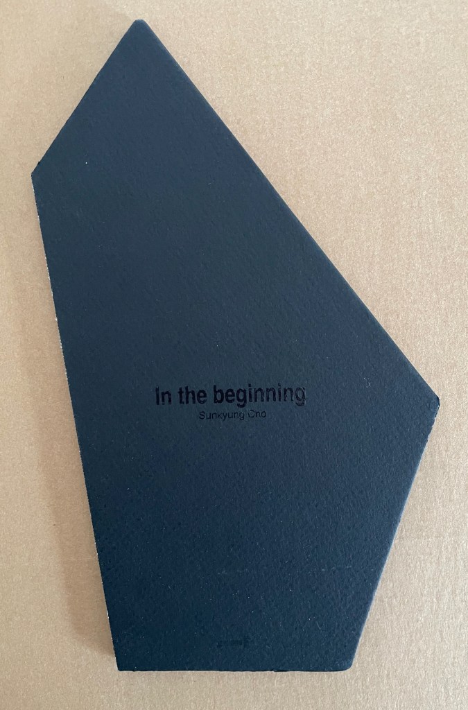
In the beginning (2012)
In the beginning(2012) Sunkyung Cho Softcover, sewn, exposed spine binding with cross weave filament tape. H260 x W150 mm. [36] pages. Unknown edition, of which this is #146. Acquired from SpazioB**K, 6 April 2025. Photos: Books On Books Collection.
From the artist’s website: 빛 이전의 태초, 사회화되기 이전의 인간에 대해 생각하는 책. [“In the beginning before light, a book that thinks about people before they became socialistic.”]
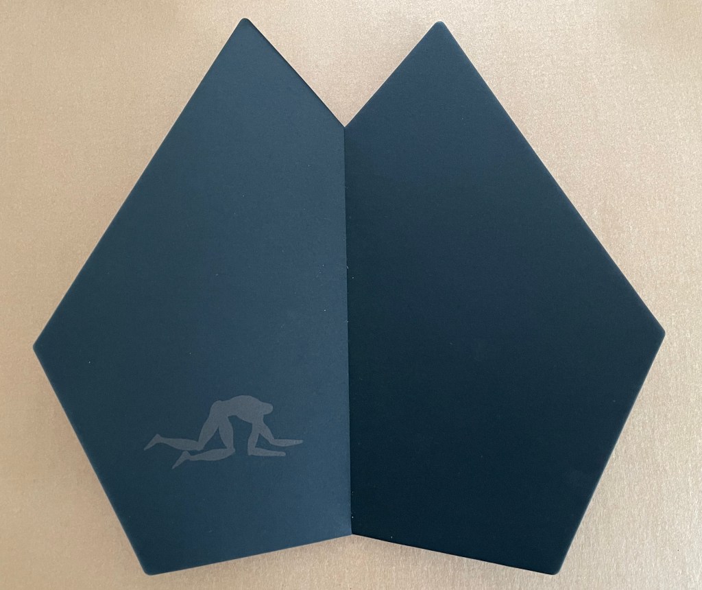
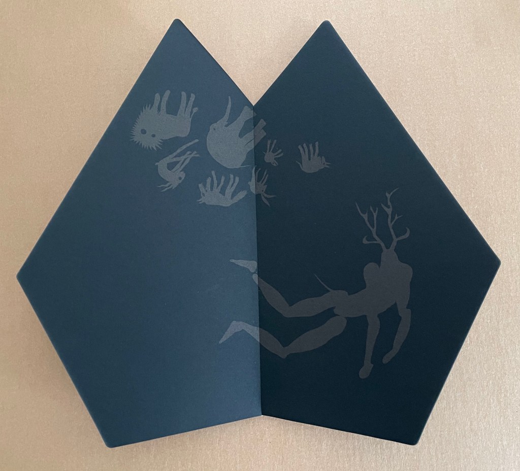
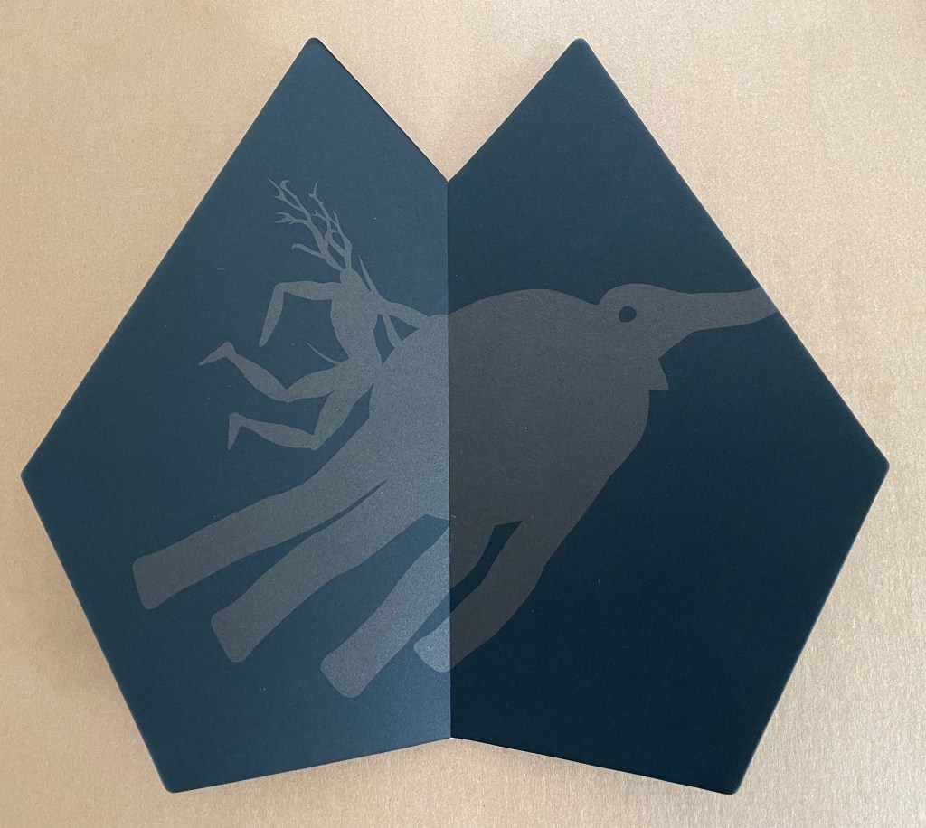
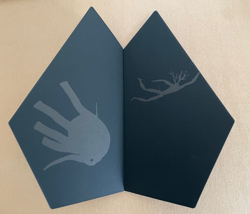
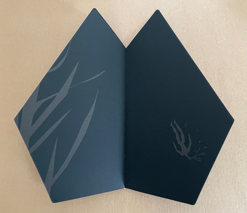
A translation that resonates more with the paper, structure, and images might be “A book contemplating the primordial state of the human before light and socialization.” Such a book would, of course, not have the normalized appearance we enlightened and socialized humans expect. Hence the black oddly shaped covers and leaves across which the gray, almost headless creature crawls on all fours and begins to sprout antlers or branches.
When other creatures enter the primordial state, they are oriented to it differently, which our branch-headed forebearer notices and tries to assume but fails.
Having failed, our precursor tries to merge with one of the other creatures, but this elephant-like being will have none of him and flings the proto-human off.
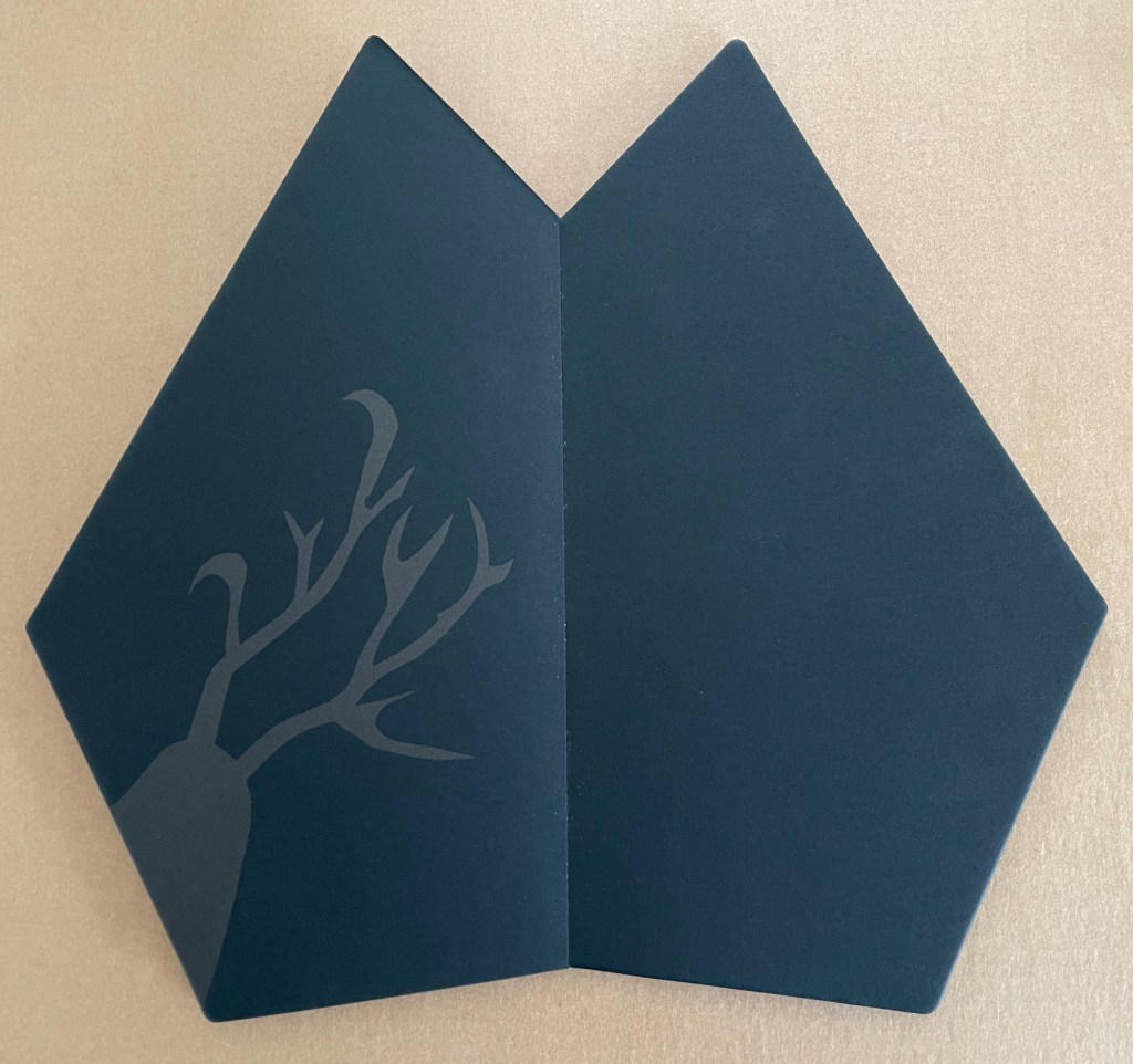
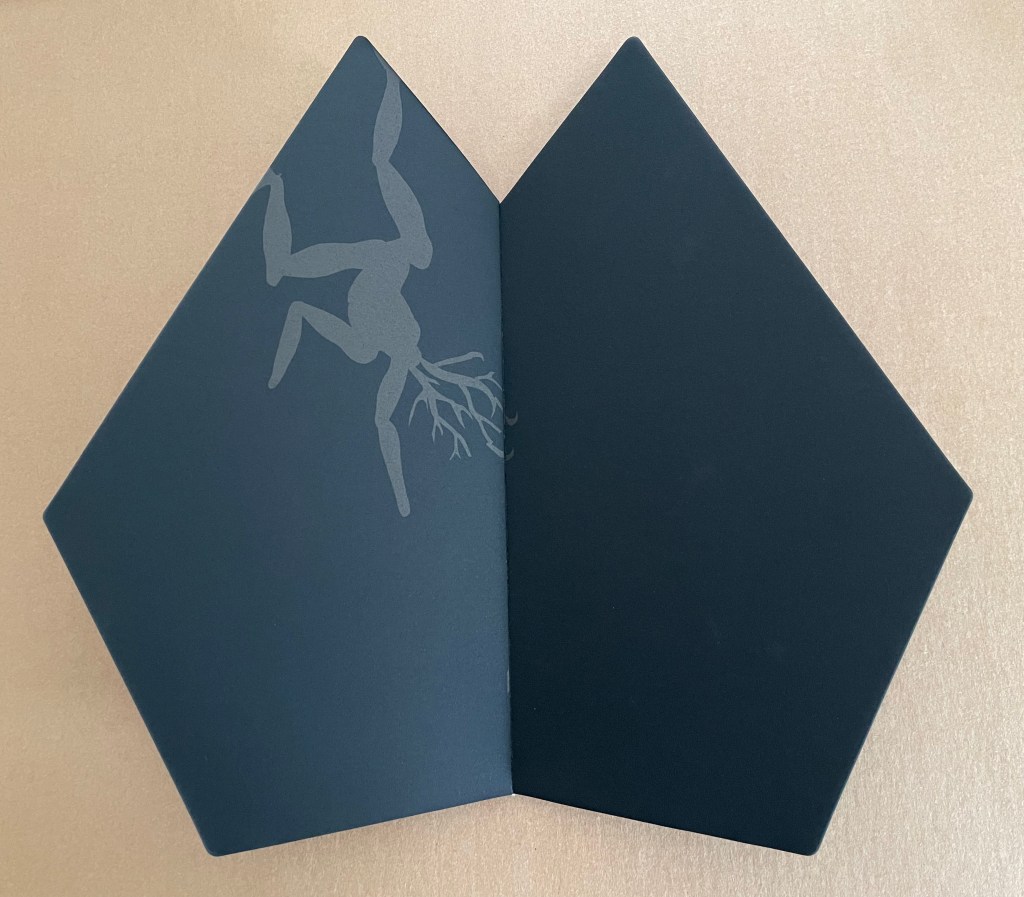
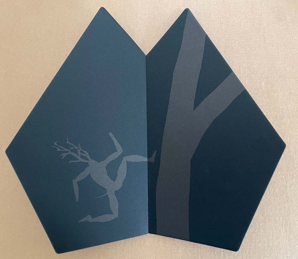
Whereupon, branch-head seeks affiliation with the vegetable kingdom and climbs toward the top.
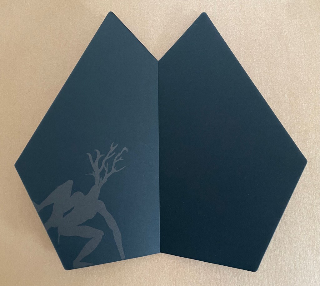
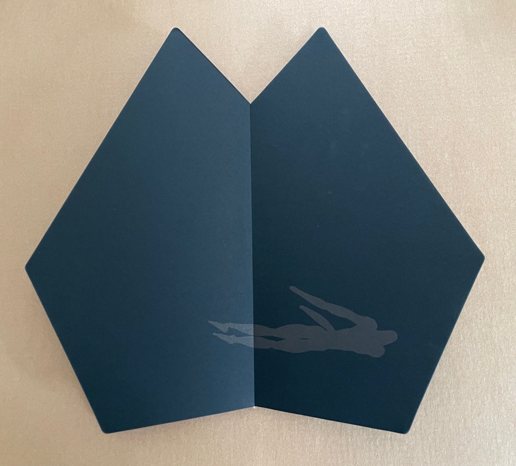
Having reached the top, our forebearer confronts and succumbs to the source of light and, having fallen and lost the semblance of antlers or branches (or both), yearns with arms outstretched for what once was.
The book’s unusual shape recalls Helmut Löhr’s Visual Poetry (1987), Kevin Osborn’s Tropos (1988), and Philip Zimmermann’sHigh Tension (1993), where likewise the shape contributes to meaning.
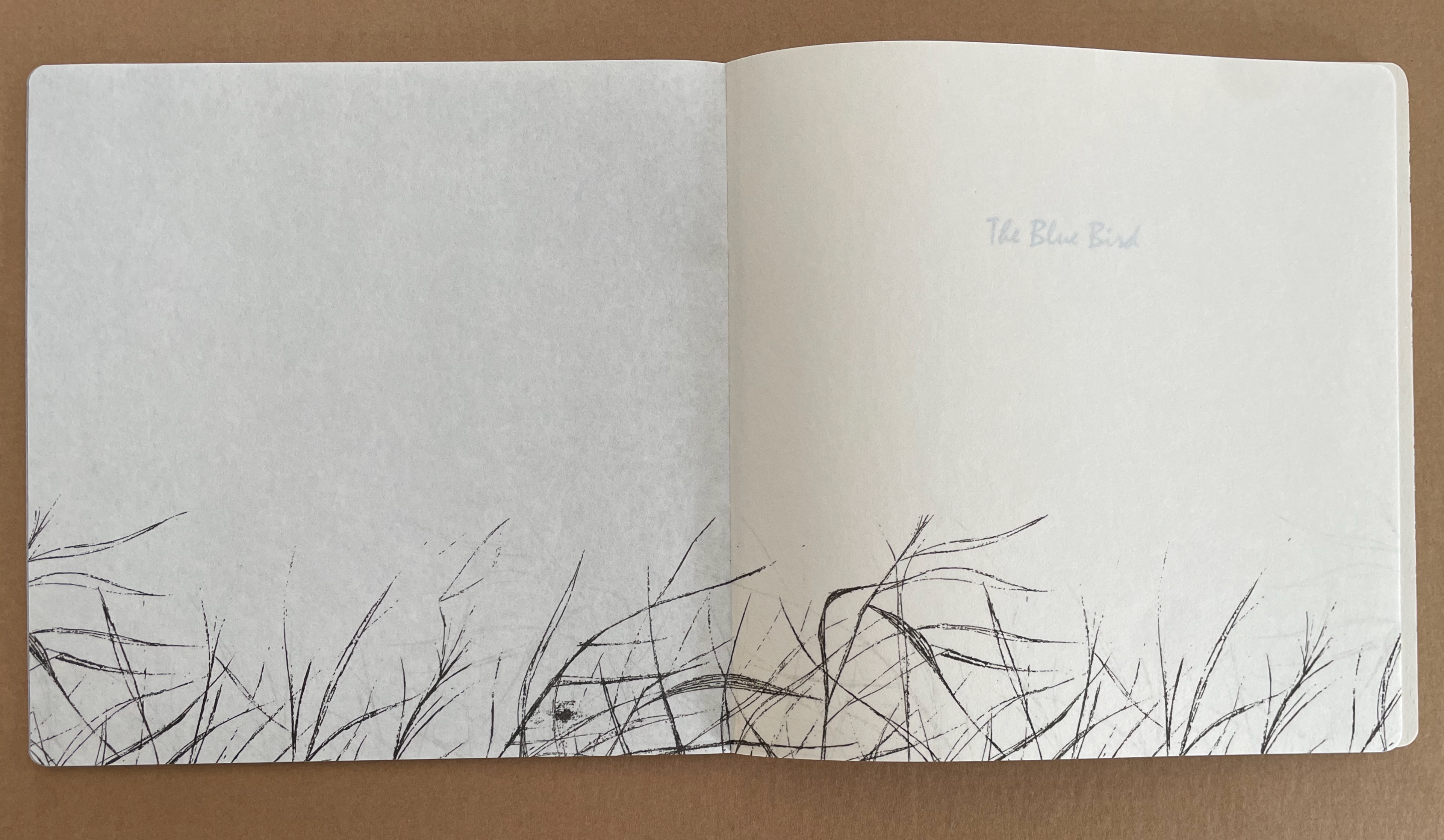
The Blue Bird (2011)
The Blue Bird (2011) Sunkyung Cho Exposed spine binding with cross weave filament tape, board-covered. 200 x 200 mm. [40] not including 2 illustrated fly leaves. Acquired from SpazioB**K, 6 April 2025. Photos: Books On Books Collection.
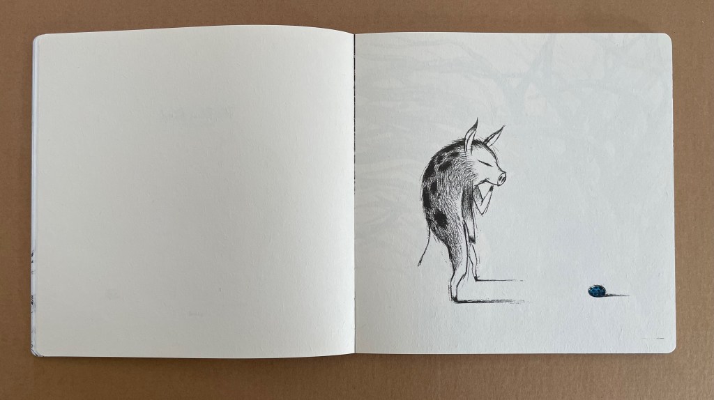
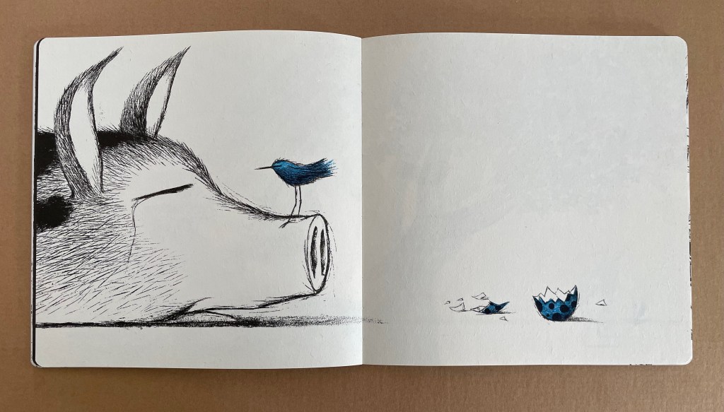
The Blue Bird leans much more toward the children’s book end of the crossover spectrum than in the beginning. The website’s description of it — “Blue Bird and Boar’s story of how to be a child and parent” — underscores all of the physical evidence except for the delicate nature of the paper. It is hard to imagine a copy surviving childhood use. But that might well be in keeping with the tender mix of joy and sadness in the tale.
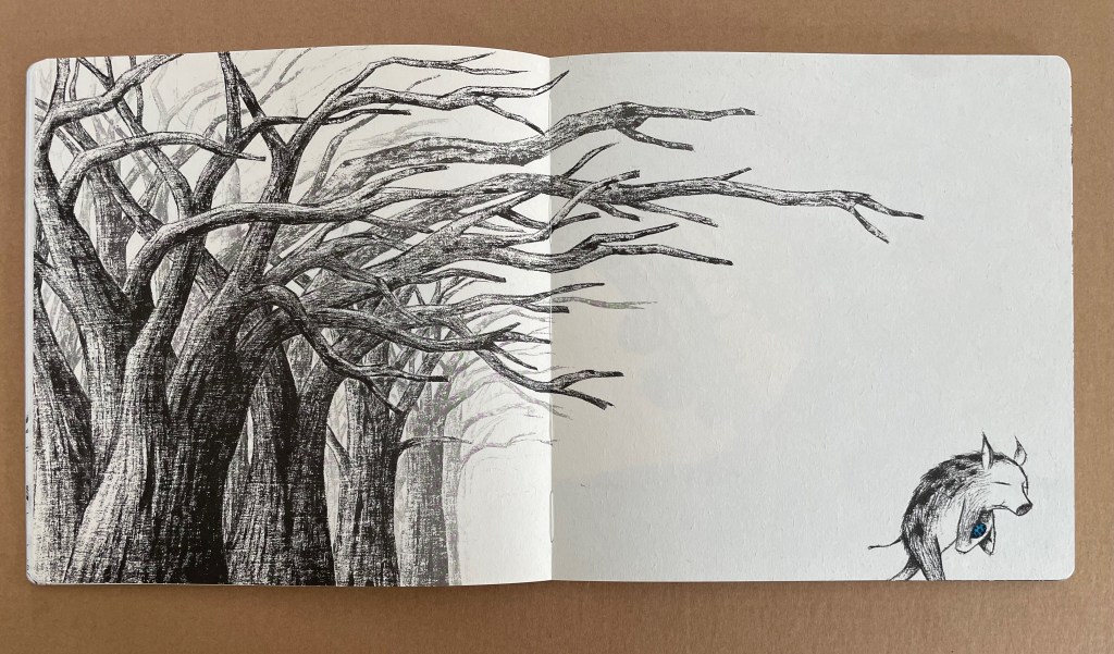
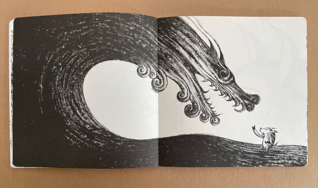
The simplicity and evocative sophistication of composition and line eliminate the need for any words to carry the narrative. In the sequence below, Boar’s protective parental handling of the egg against wind and wave ends in predictable exhaustion and birth.
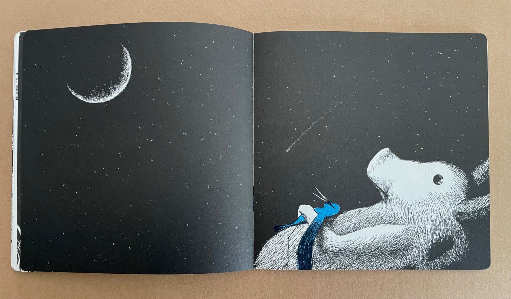
The remainder of the book in which Boar introduces Blue Bird to the world of foraging, running, jumping, sky- and star-gazing is landbound. Boar climbs trees to let Blue Bird sleep there, but when returns to the ground to sleep, Blue Bird follows, preferring to nestle against Boar under the stars.
Boar’s continued efforts to teach Blue Bird about flight lead to a separation that some parents may not be ready to explain to a child.
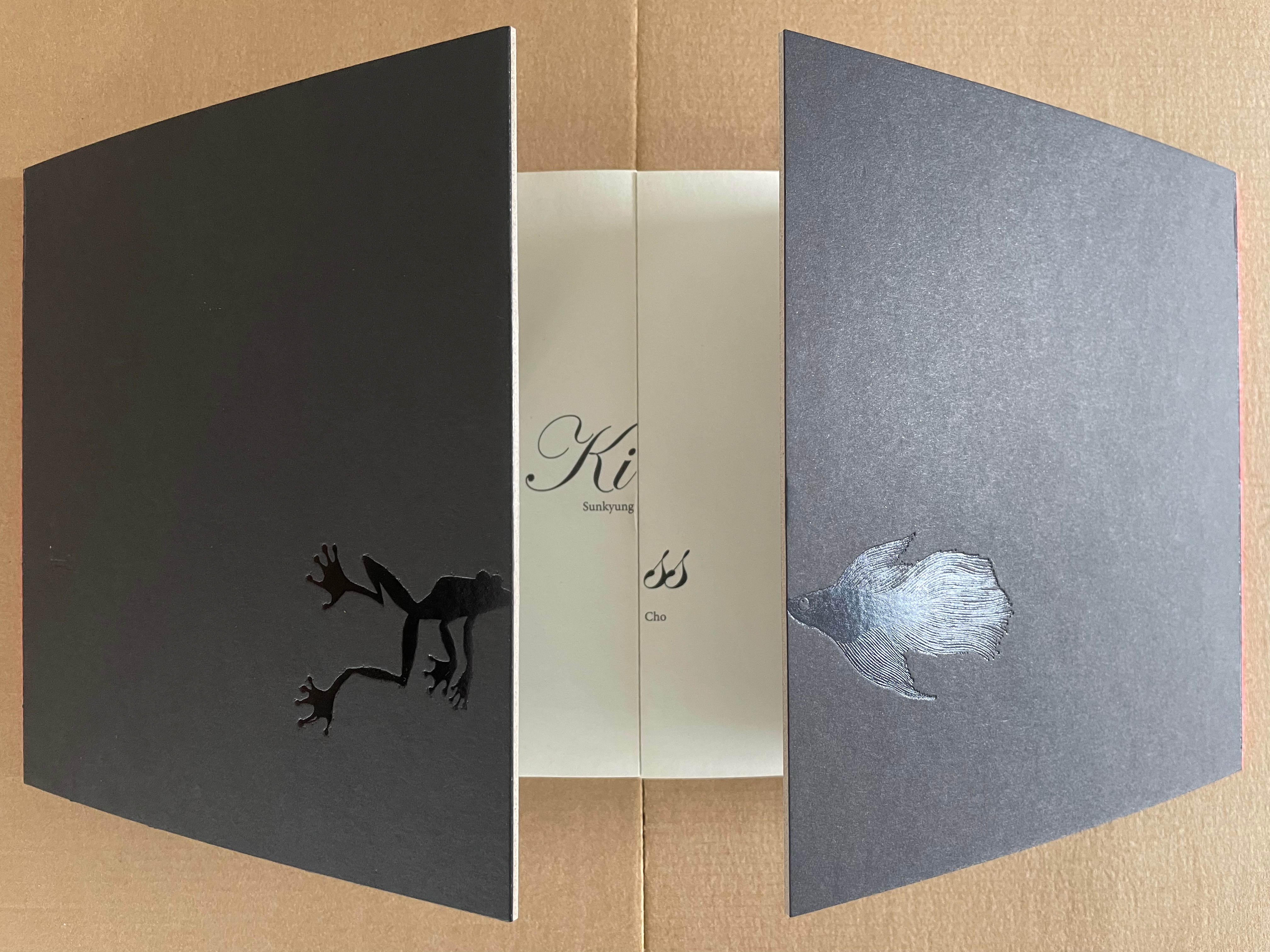
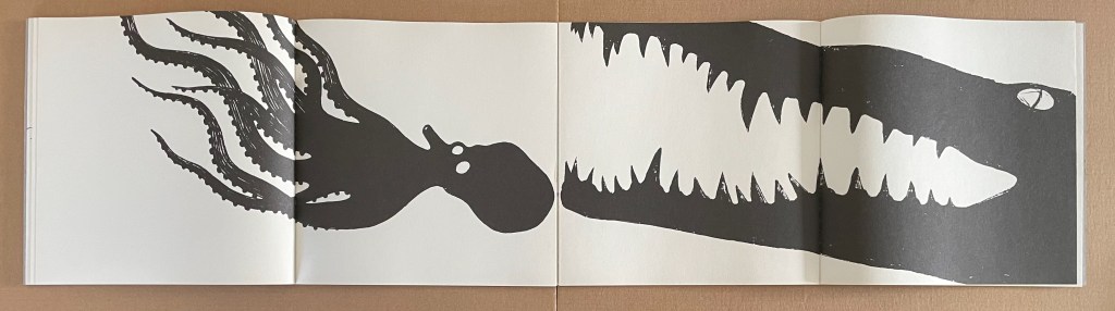
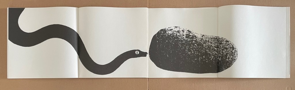
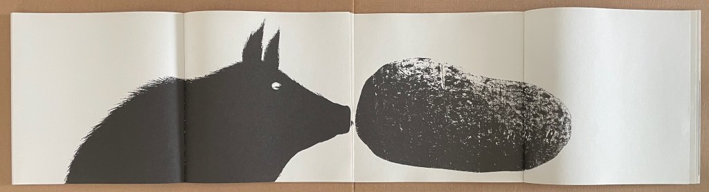
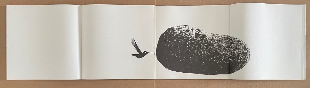
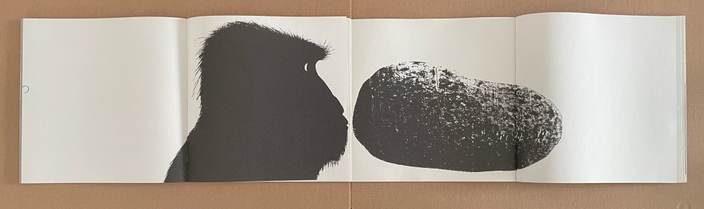
Kiss (2015)
Kiss (2015) Sunkyung Cho Board-covered books, bound face-to-face, exposed spine binding with cross weave filament tape. H200 x W400 mm (open); W800 (open). [16] Chinese fold folios. Acquired from Somebooks, 6 April 2025. Photos: Books On Books Collection.
Kiss is far more whimsical. It works somewhat like a harlequinade, allowing multiple juxtapositions of images. The structure by which it does this is complex enough and the juxtapositions, subtle enough, that adult assistance is likely required. The book is actually two books joined at edges of their back covers, one opening to the left and the other, to the right.
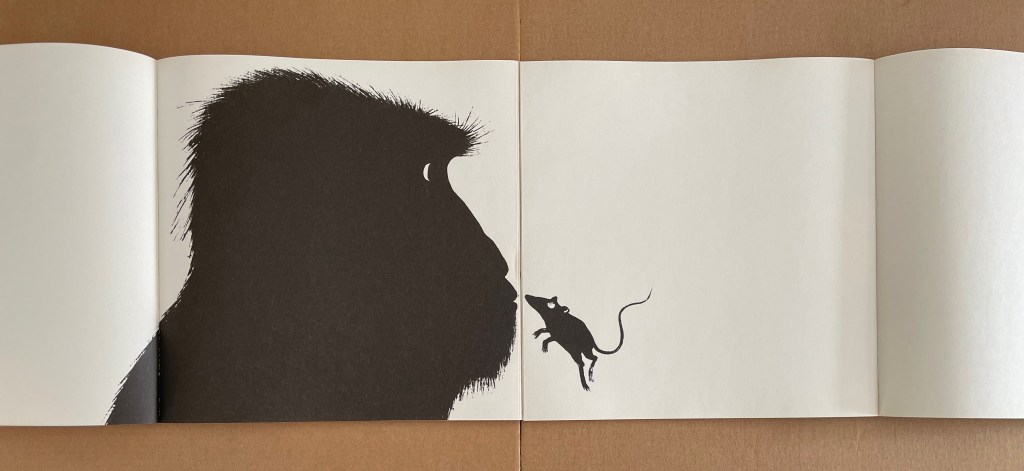
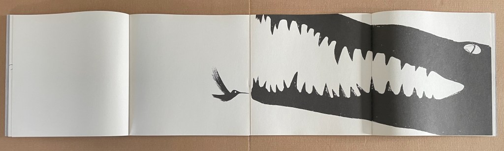
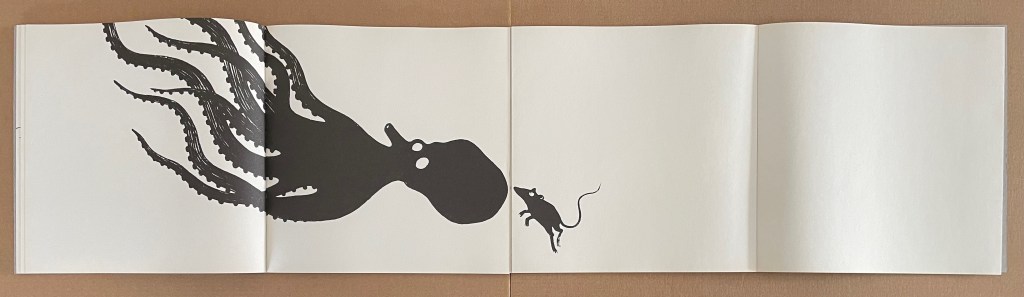
The precision of the registration between the facing books will generate delight as a gorilla kisses a mouse. The mouse kisses a bird. The bird, a crocodile. The crocodile, a gorilla or octopus. The octopus, a mouse or frog. And so on with sharks, snakes, and others.
Among the effective subtleties that more experienced observers will note are Cho’s handling of bleeds and the facing sets of double-page spreads. The large expanses of white behind each of any two smaller figures facing each other from single pages contribute to a non-threatening delicate kiss. The larger, more threatening creatures extend across their double-page spreads and even bleed off their pages. When they meet, or when one of them meets a smaller figure, there is an edge. It may be an edge of curiosity on one side or the other or both, but it is likely also one of threat and unease.
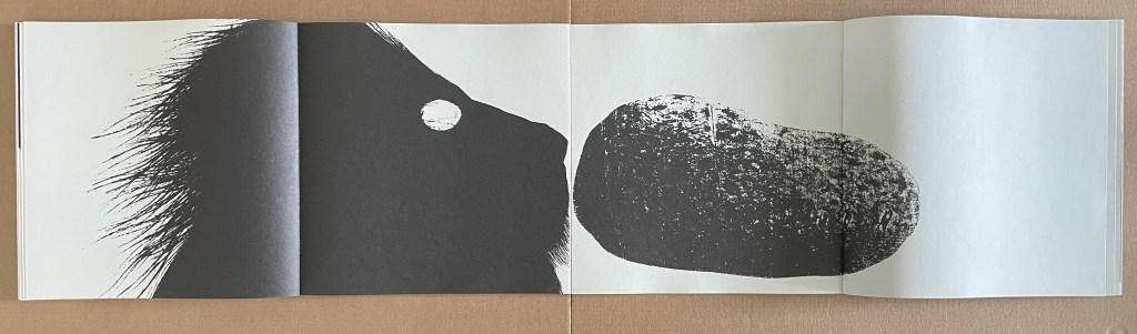
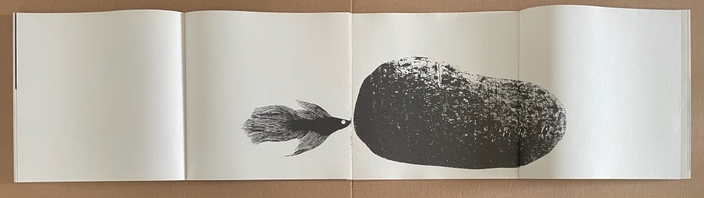
Another subtlety is the handling of the human figure. It occurs in the recto book. Like the smaller figures, it occupies a single page with a page of white behind it. It is expressionless, regardless of what it faces whether fish or lion. Oddly, the fish seems to be curious, and the lion, reserved.
Here is another subtlety that Cho raises. The last figure in the recto book is a stone, large enough to extend over its double-page spread. No doubt it is an anthropomorphizing tendency to read something (puzzlement, curiosity, annoyance, etc.) into the silhouette of each creature confronting the stone. But it is only the stone and human that exude indifference.
Scott, Carole. 2014. “Artists’ books, Altered books, and Picturebooks”. In: B. Kümmerling‐Meibauer, ed.,Picturebooks: Representation and Narration. London, New York: Routledge.
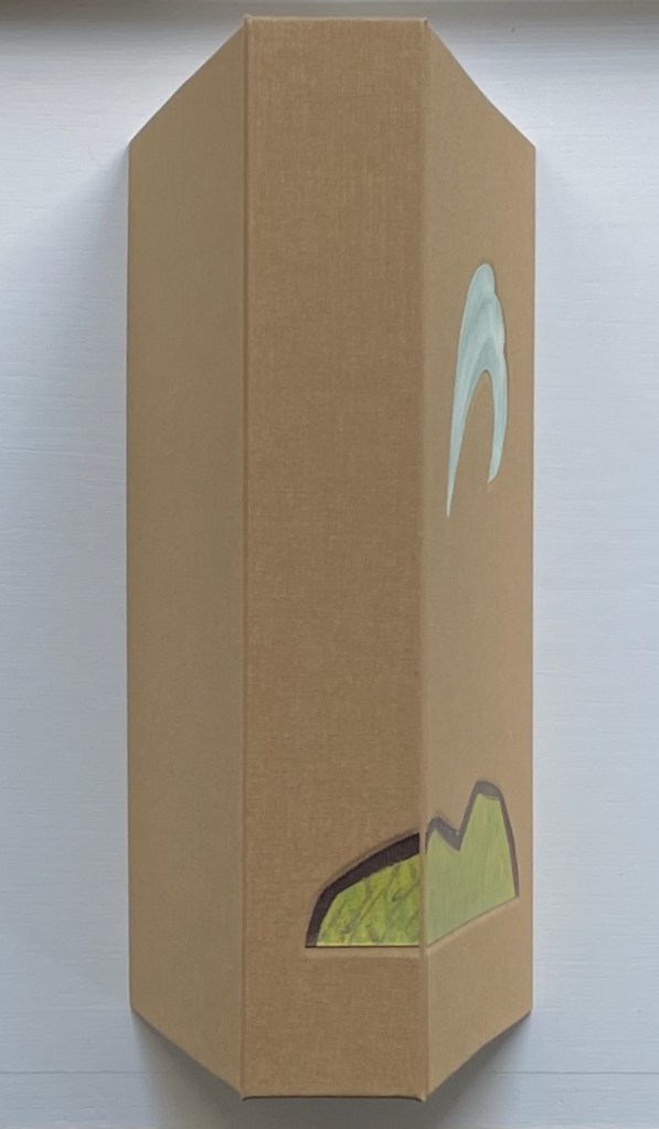
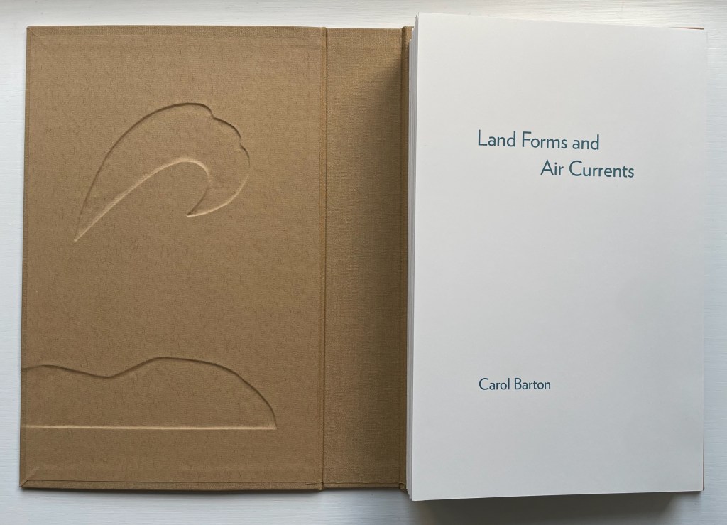
Land Forms and Air Currents (2014) Carol Barton Leporello (with 11 pop-ups) fixed to inside cover of case, cloth over board, debossed with fitted, pastedown artwork on front cover and spine. Cover: H292 x W192 x D50 mm. Leporello: H275 x W175 mm. 37 panels. Edition of 25, of which this is #21. Acquired from the artist, 27 October 2023. Photos: Books On Books Collection. Displayed with artist’s permission.
Carol Barton’s reputation for paper-engineering, supported by her well-received multi-volume The Pocket Paper Engineer, should not overshadow appreciation of her talents with watercolor and words. With its poems of free verse, scanned watercolors and pop-up structures all by the same author/artist, Land Forms and Air Currents (2014) qualifies as a champion of the Blakean tradition in artists’ books.
ABCing: Seeing the Alphabet Differently Colleen (Ellis) Comerford (2010) Board book, illustrated paper-on-board cover. H160 x W160 mm. 66 pages. Acquired from Powell’s Bookstore, 29 June 2023. Photos: Books On Books Collection. Displayed with artist’s permission.
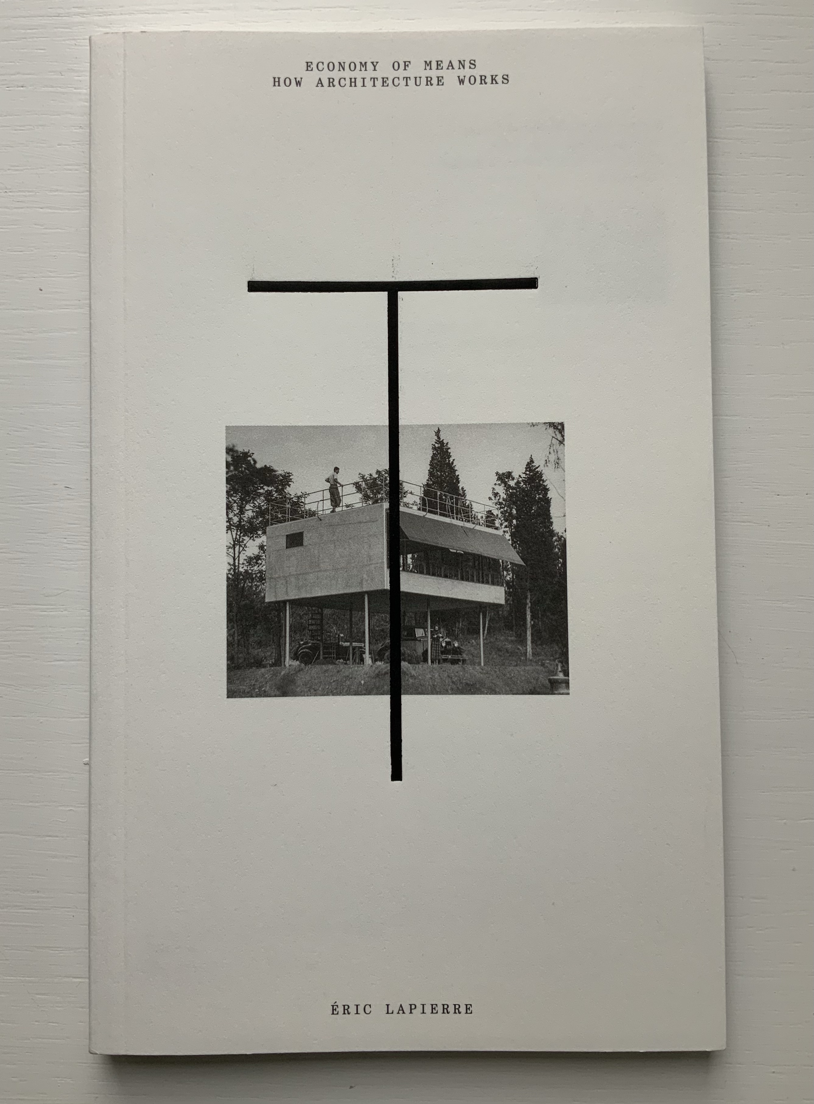
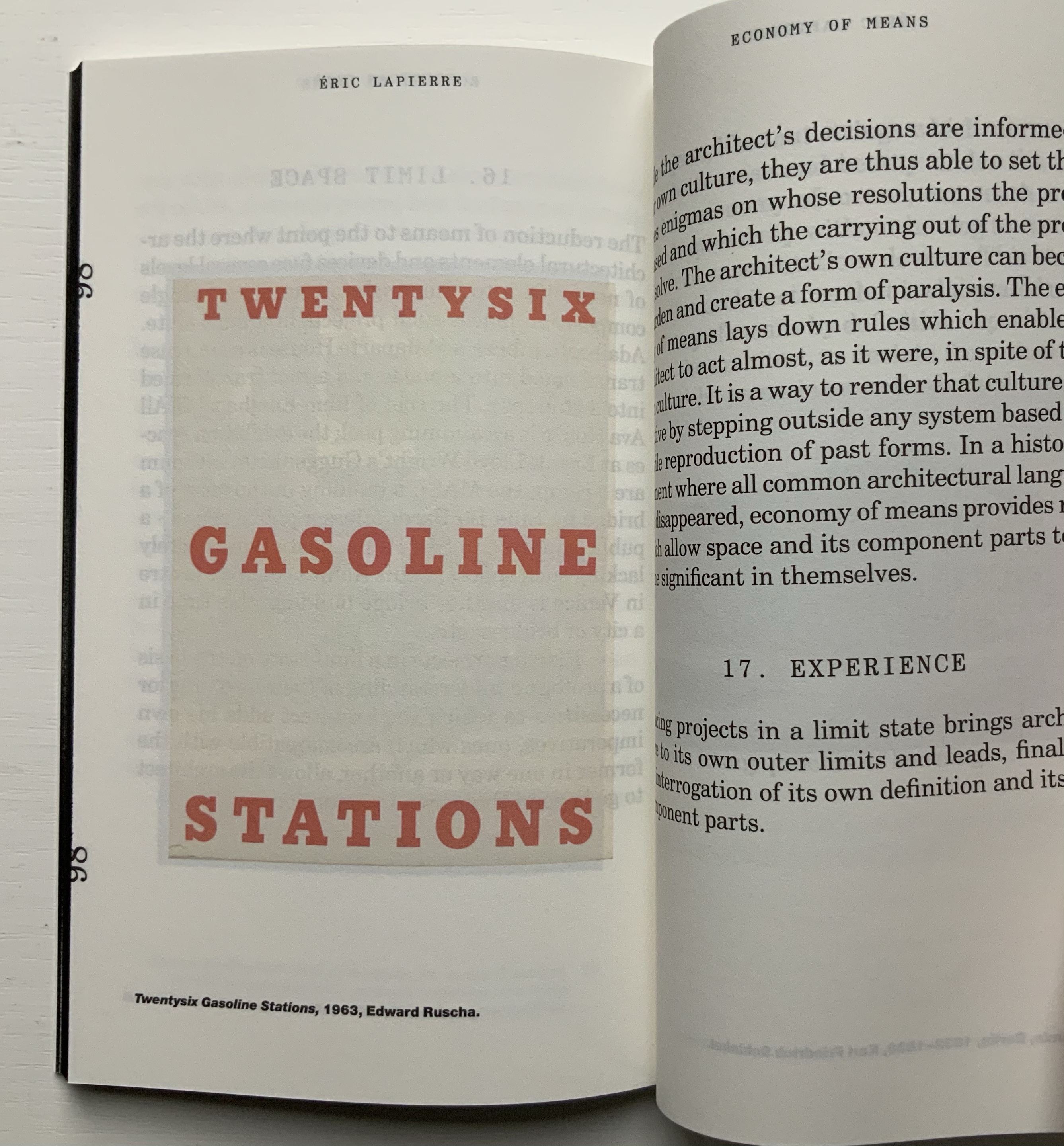
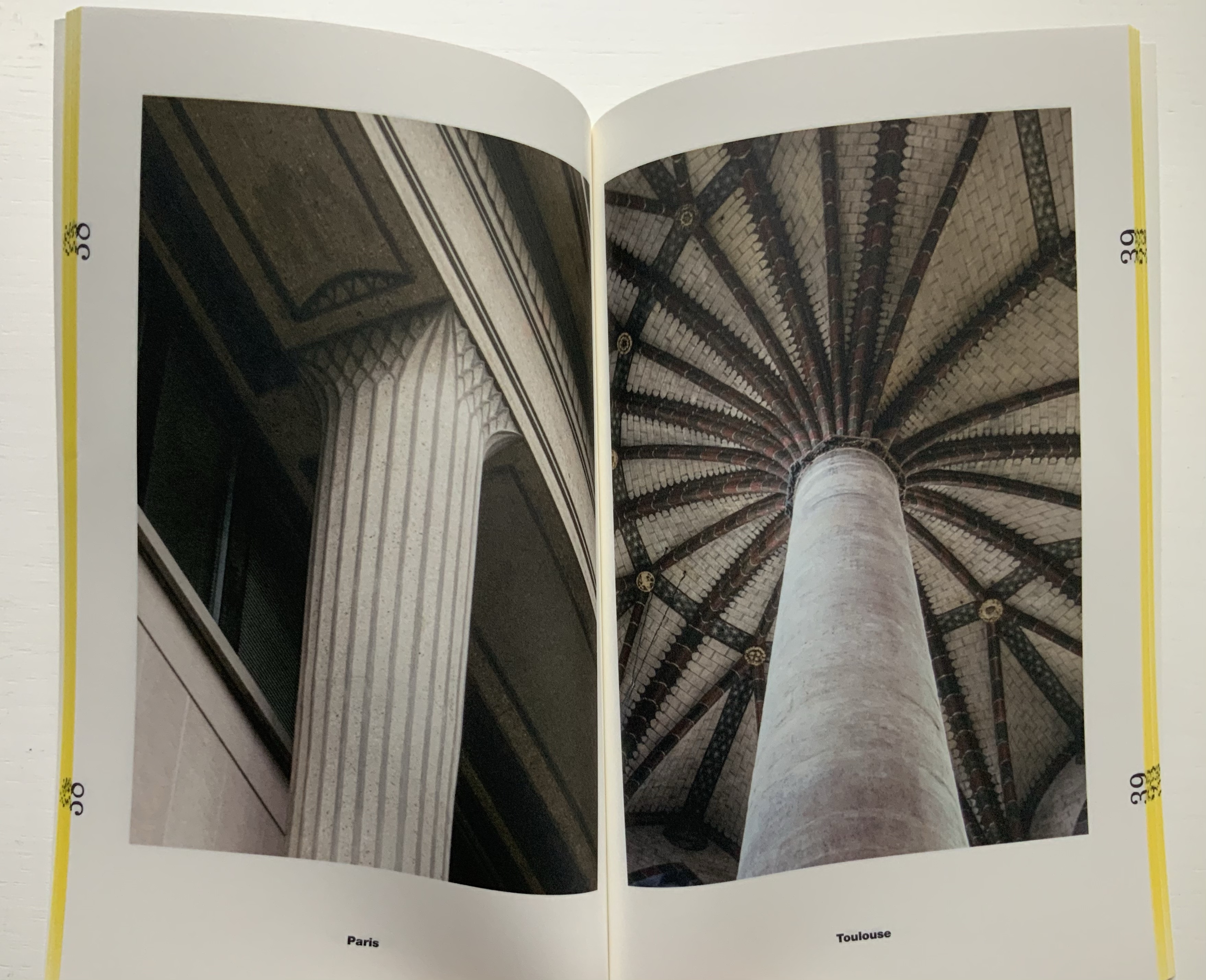
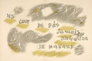
“The Poetics of Reason” was the title and theme for the fifth Lisbon Architecture Triennale in 2019 (the first was in 2007). Awarded the ADG Laus 2020 Golden Prize in the category of editorial graphic design, this work stands well with Bruno Munari’s three small 1960’s books on the square, circle and triangle, now available in a single volume, and calls to mind several works testifying to the relationship between architecture and book art. In the first of the five volumes, Éric Lapierre even interweaves with his text on architectural rationality illustrations from book artists such as Bernd and Hilla Becher, Sol Lewitt and Ed Ruscha — all without comment, in itself conveying their implicit relevance. His similar display of a page from Stéphane Mallarmé’s Un Coup de Dés Jamais N’Abolira le Hasard — that progenitor of modern and post-modern book art — speaks to the role that space — les blancs, as Mallarmé calls it — plays in these adjacent communities.
136 pages
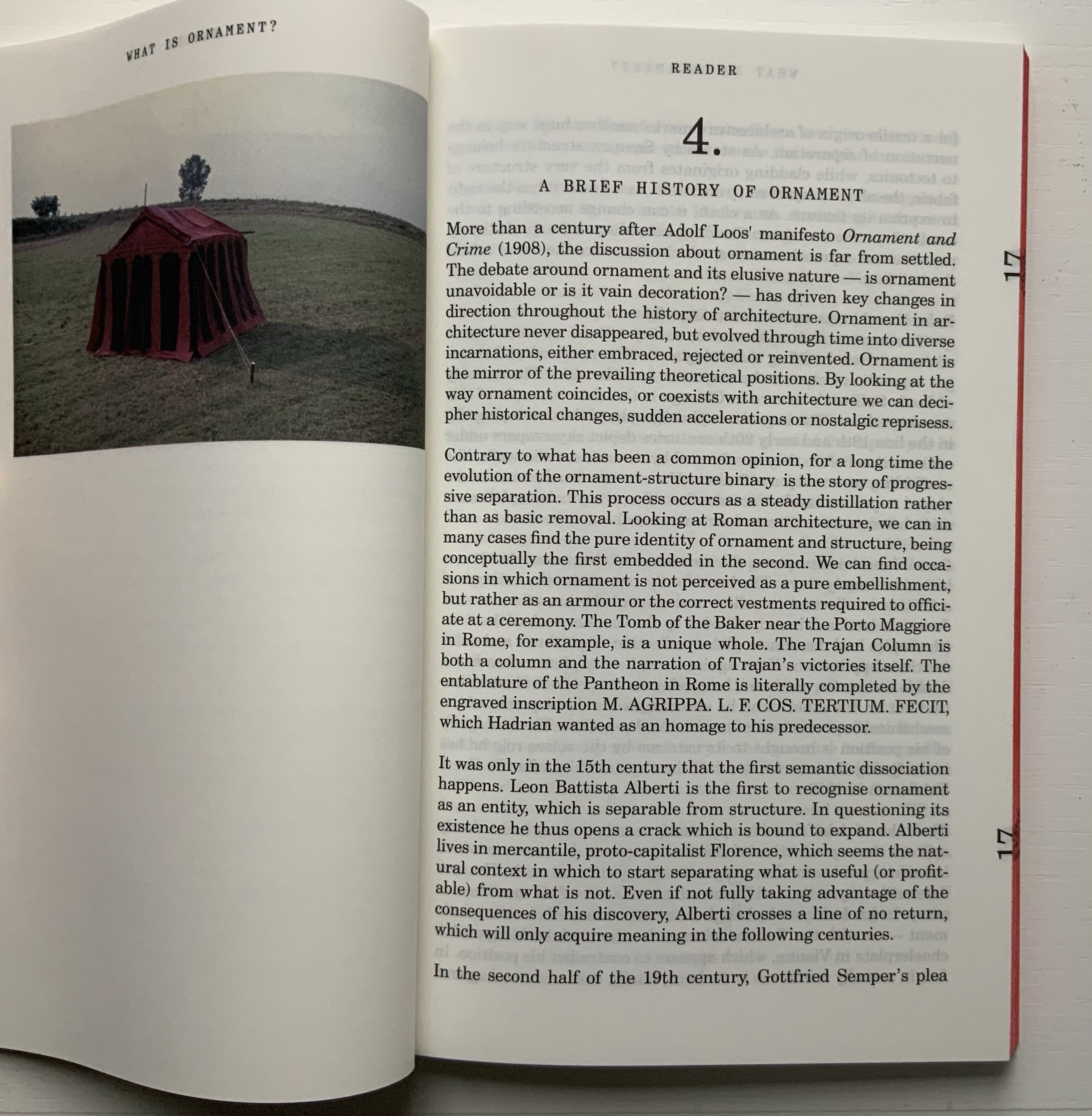
The second volume, by Ambra Fabi and Giovanni Piovene, draws in Leon Battista Alberti, of course, whose columns ornament works by Mari Eckstein Gower, Helen Malone and many other book artists.
136 pages
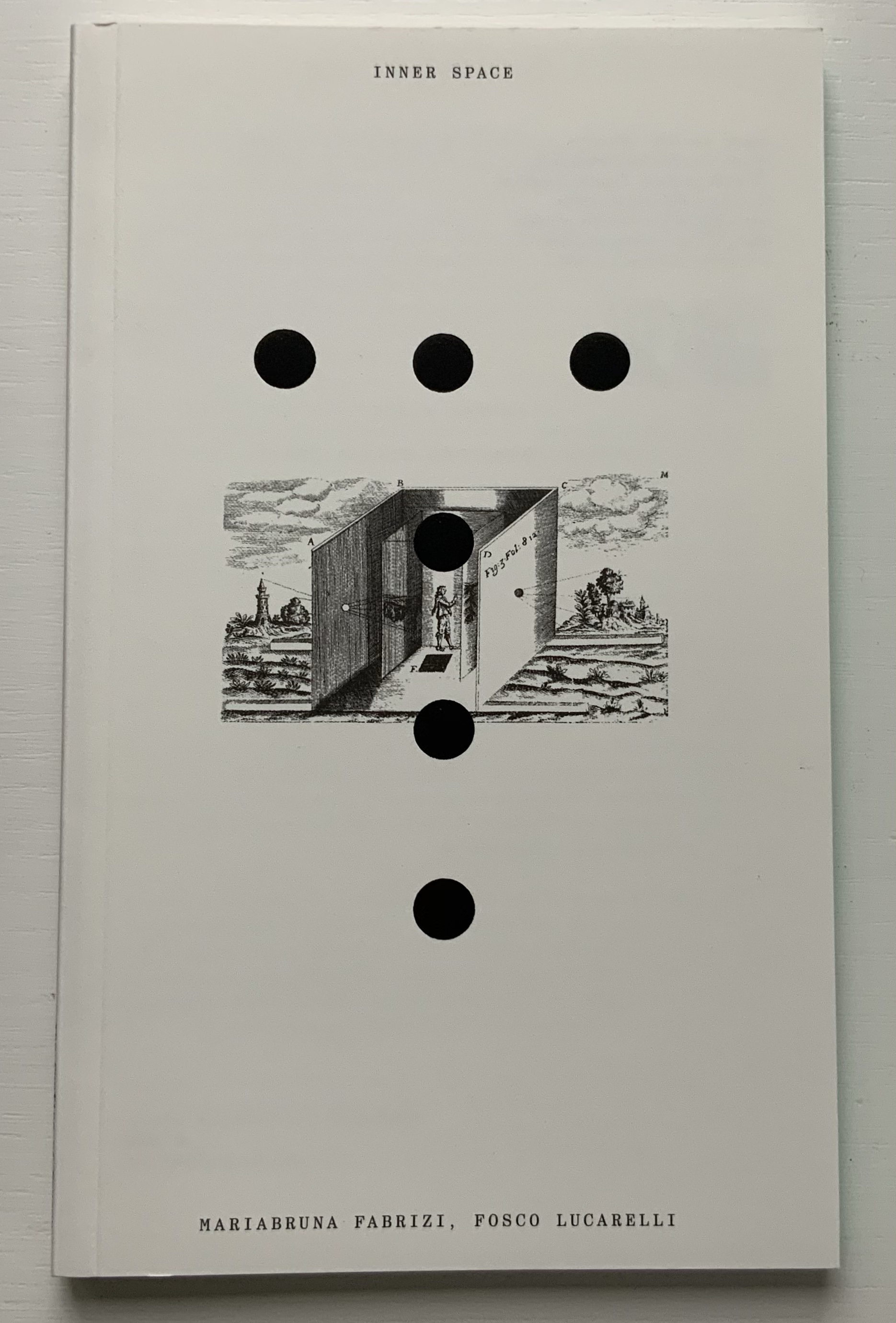
Drawing on Gaston Bachelard and Juhani Pallasmaa as it does, the third volume, by Mariabruna Fabrizzi and Fosco Lucarelli, calls to mind the work of Olafur Eliasson and Marian Macken here in the Books On Books Collection and elsewhere. Anyone familiar with Richard Niessen’s The Typographic Palace of Masonry will appreciate Fabrizzi and Fosco’s exploration of where architecture, imagination and memory intersect.
136 pages
In the lengthiest of the five volumes, Sébastien Marot takes us into the territory of urban architecture and the anthropocene, also occupied by book artists Sarah Bryant, Emily Speed, Philip Zimmermann and many others.
216 pages
The last and shortest volume, put together by Laurent Esmilaire and Tristan Chadney, consists mostly of photos that may remind the viewer of Irma Boom’s Elements of Architecture, with Rem Koolhaas, or Strip, with Kees Christiaanse — especially in conjunction with the tinted fore edges.
88 pages
Referenced below, Pedro Vada’s review of the Triennale and the five separate sites across which it occurred in Portugal provides more insight into the five volumes themselves. Marco Ballesteros LETRA website provides additional images of the five volumes’ design.
Further Reading
“Architecture“. 12 November 2018. Books On Books Collection.
SOCKS Studio, an extraordinary website run by Fabrizzi and Lucarelli.
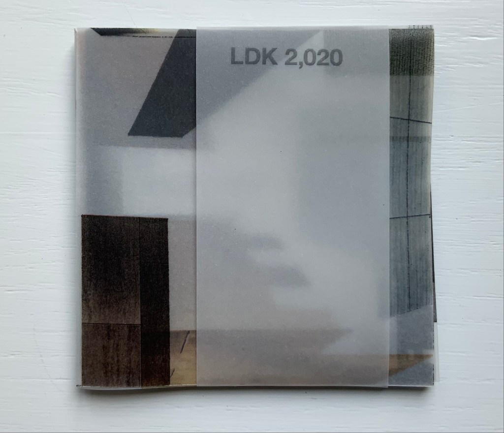
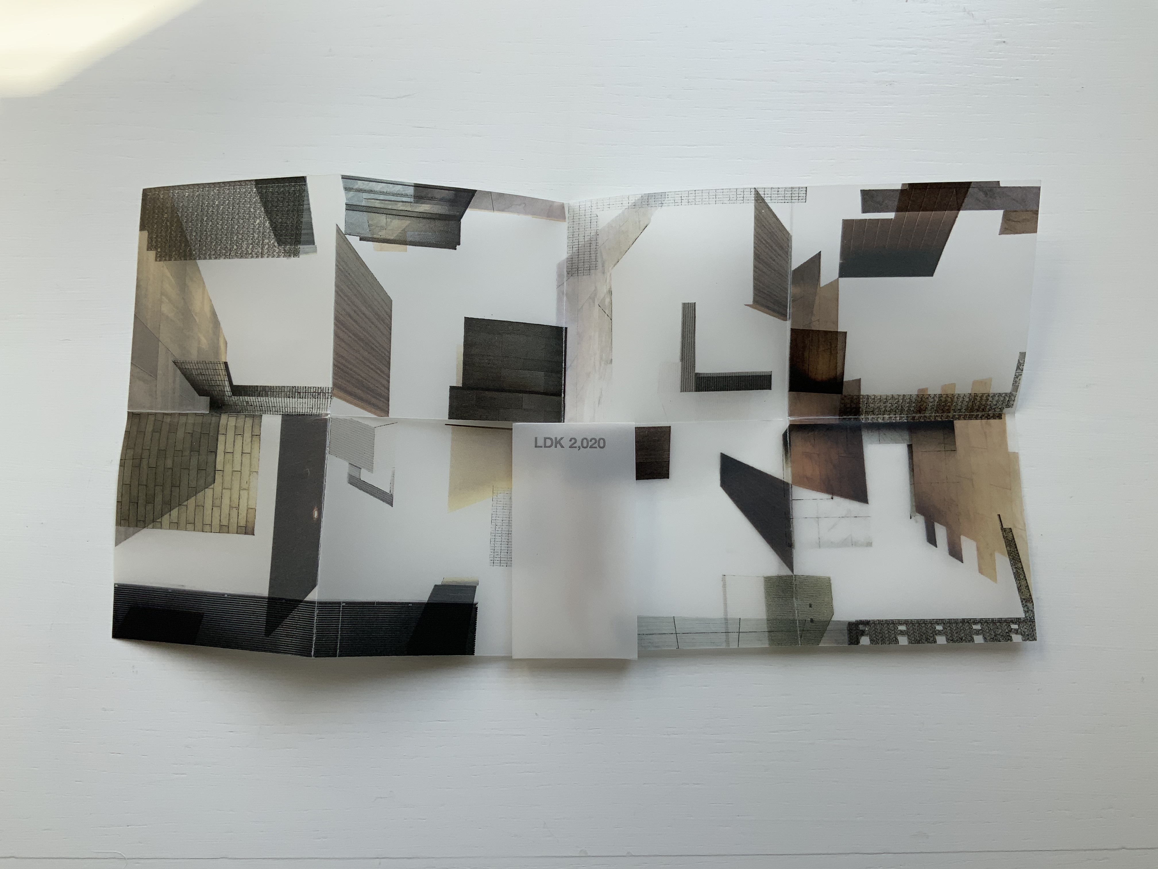
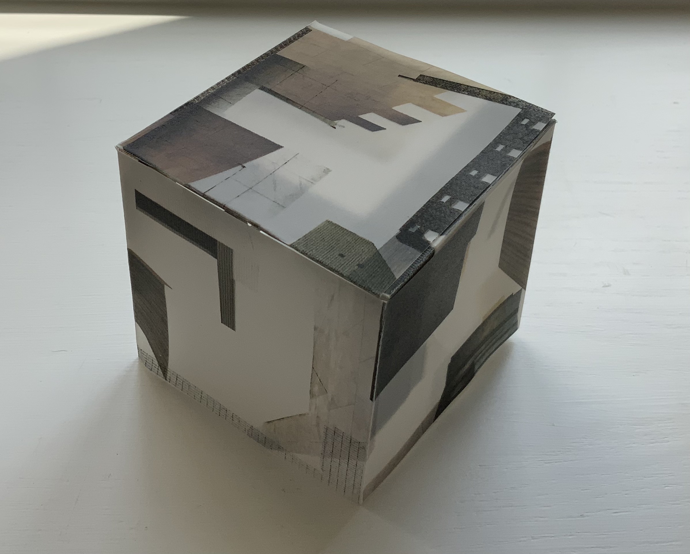
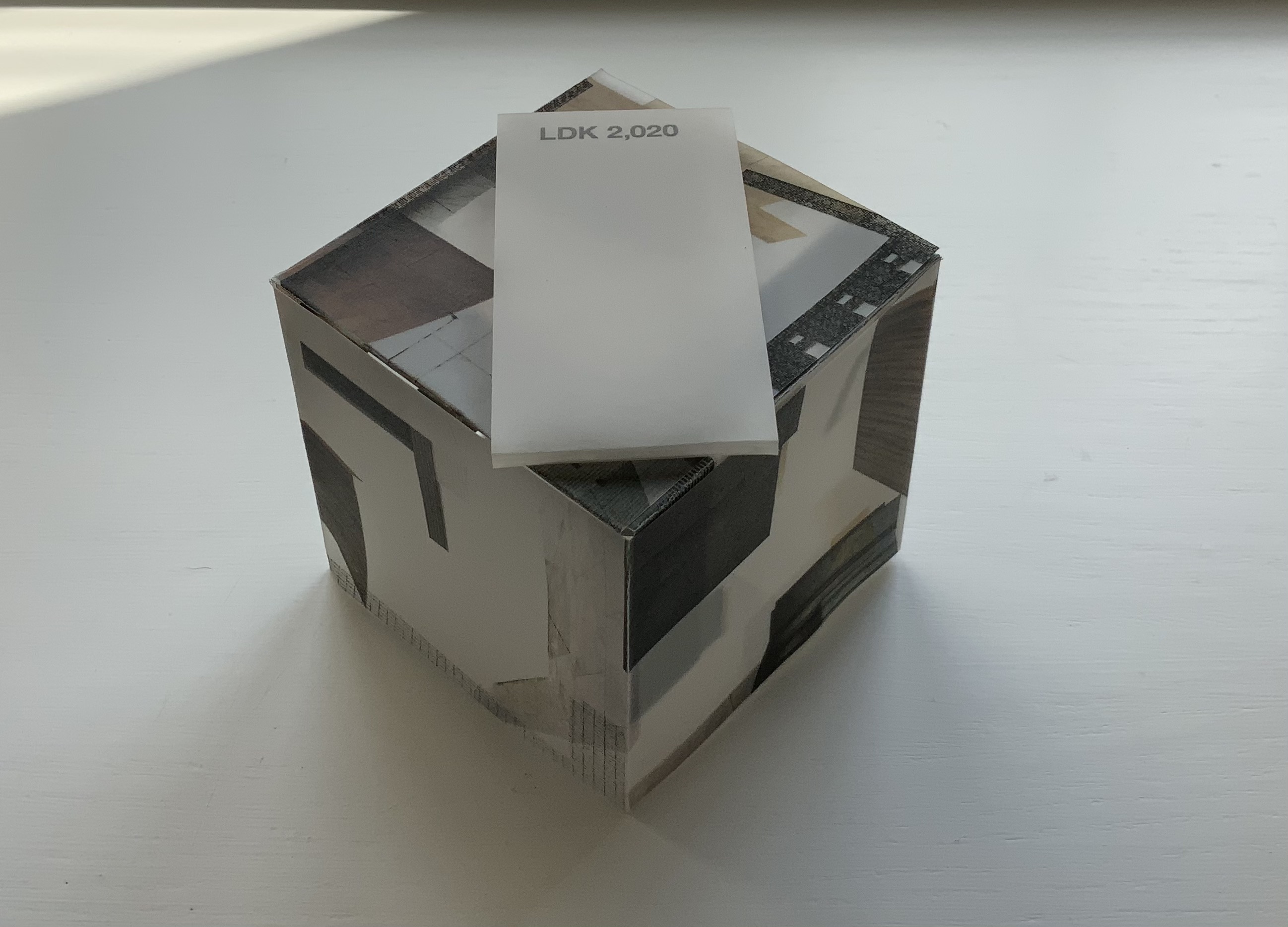
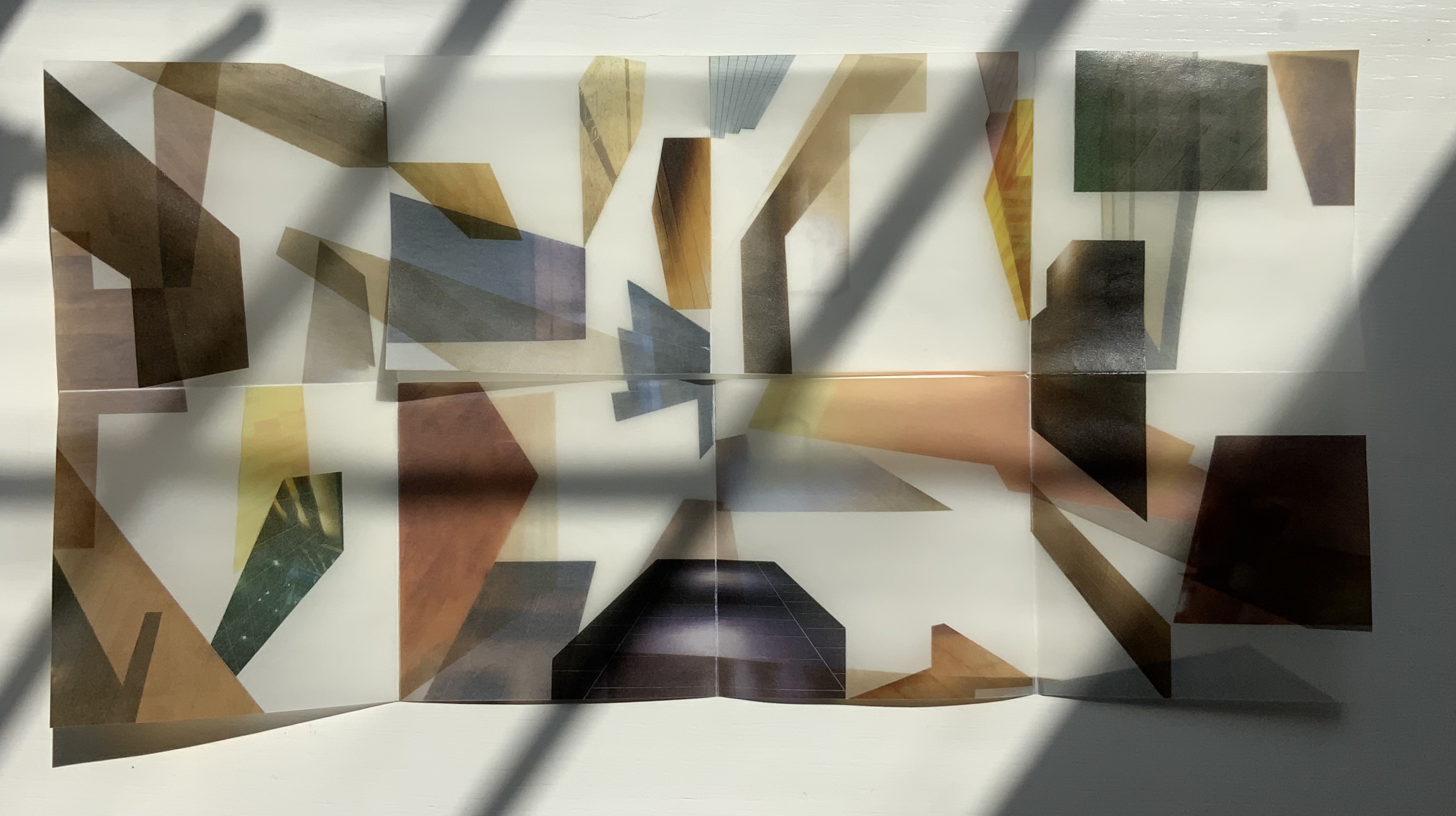
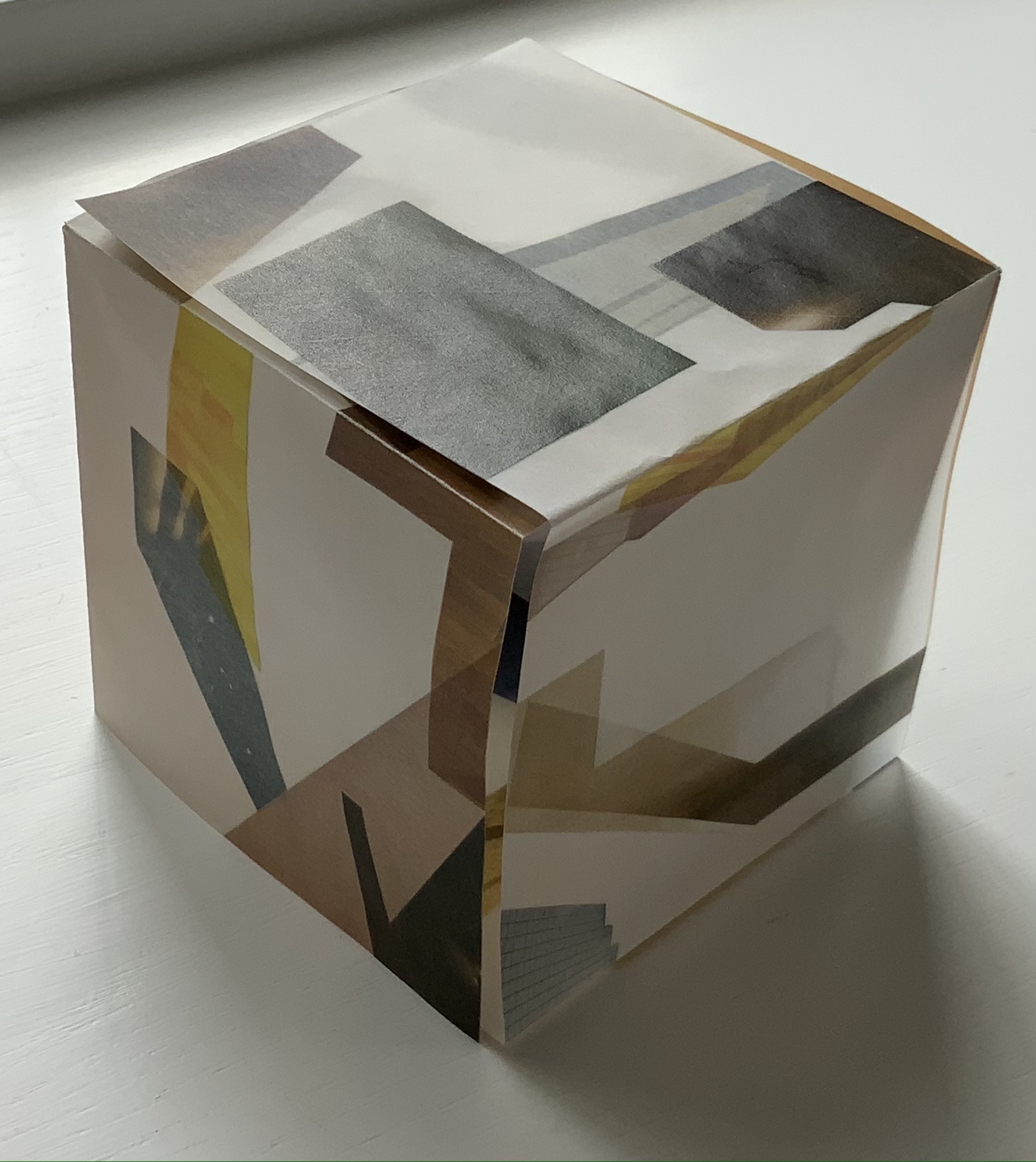
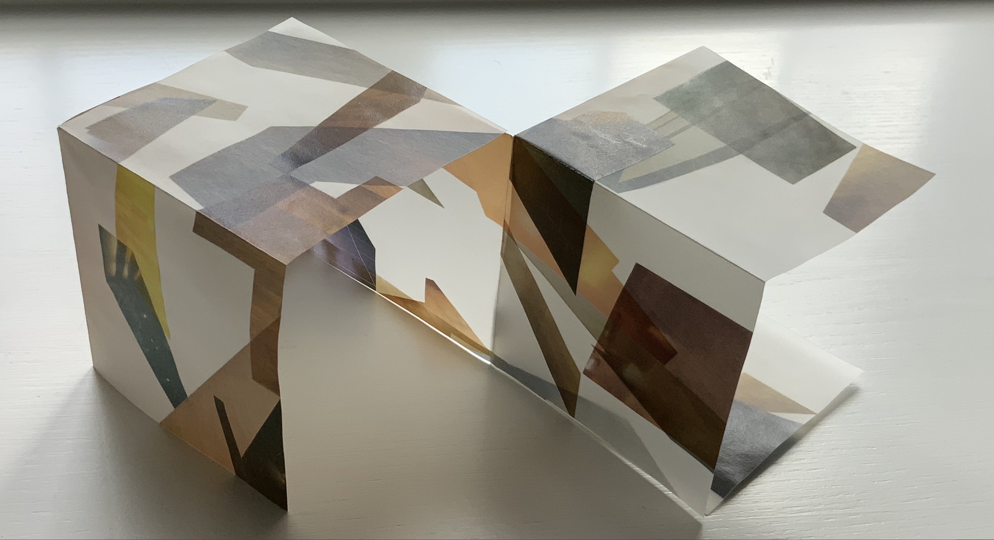
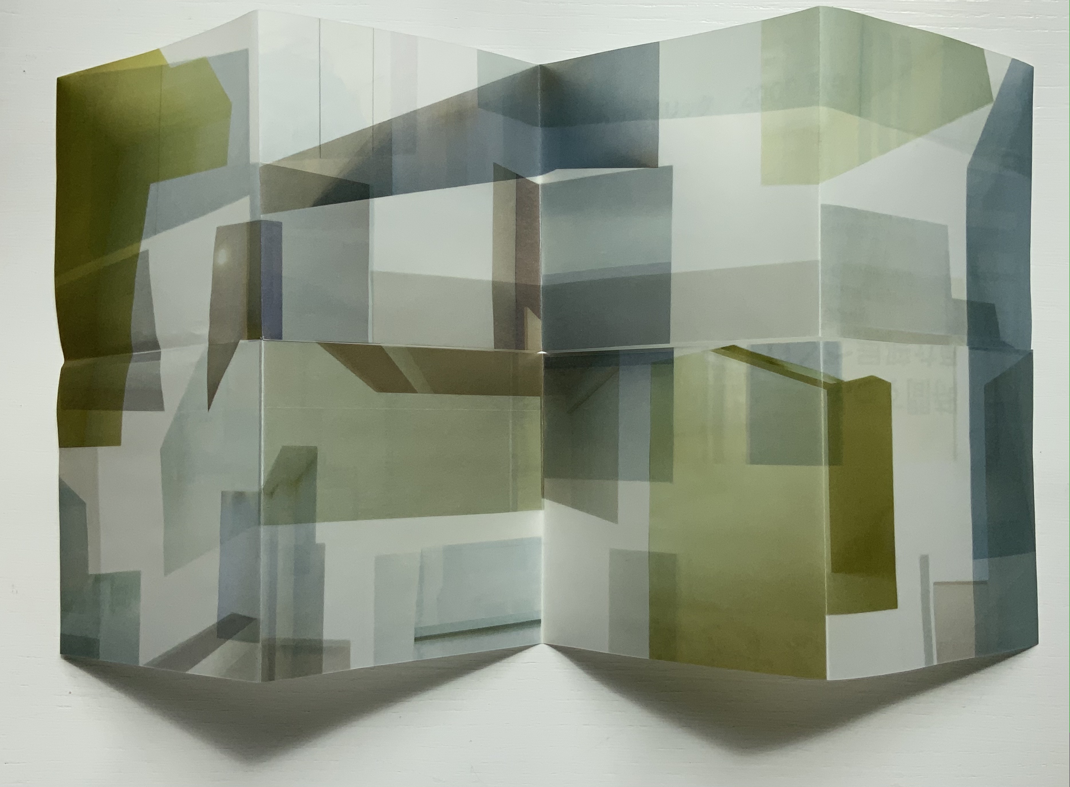
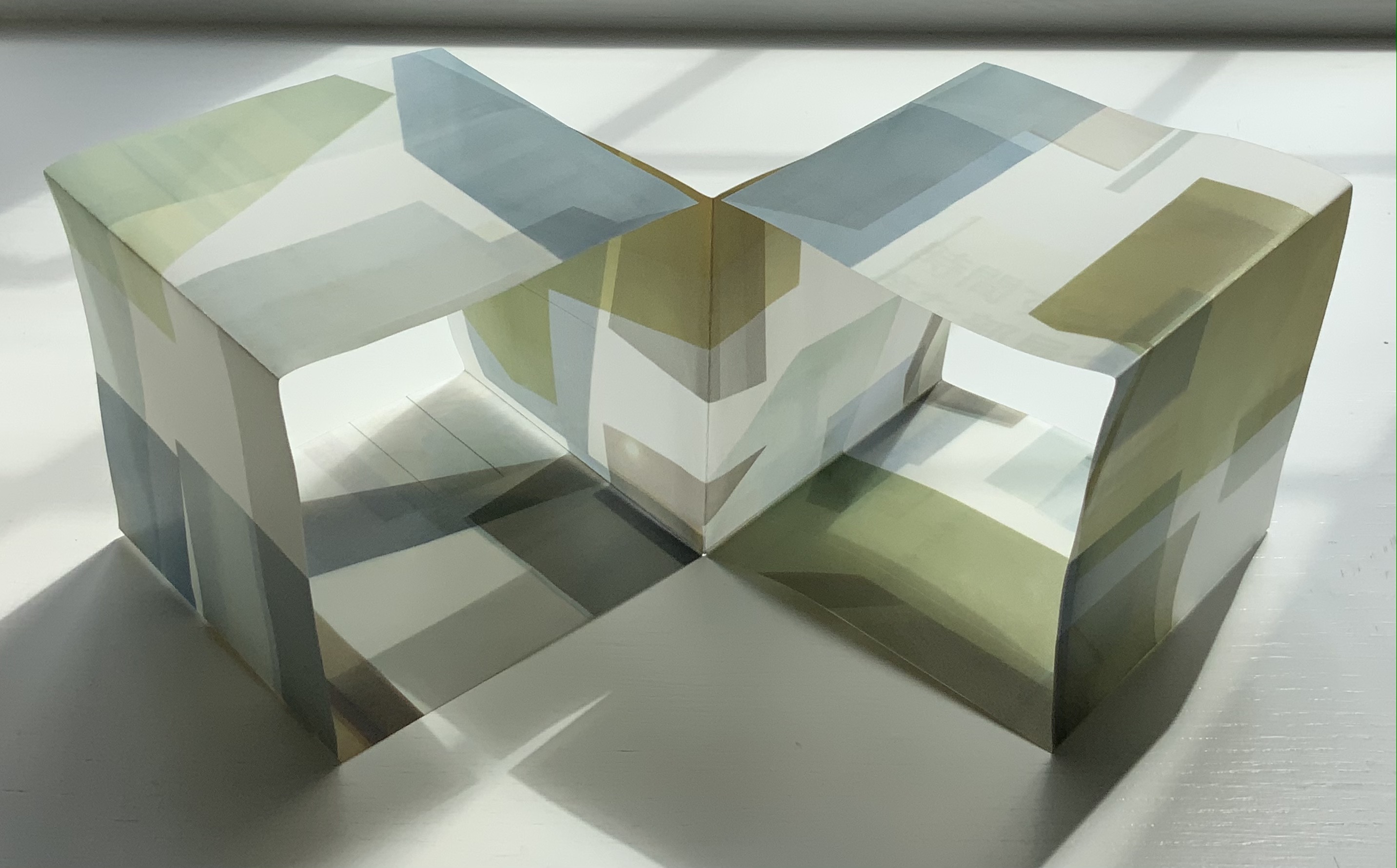
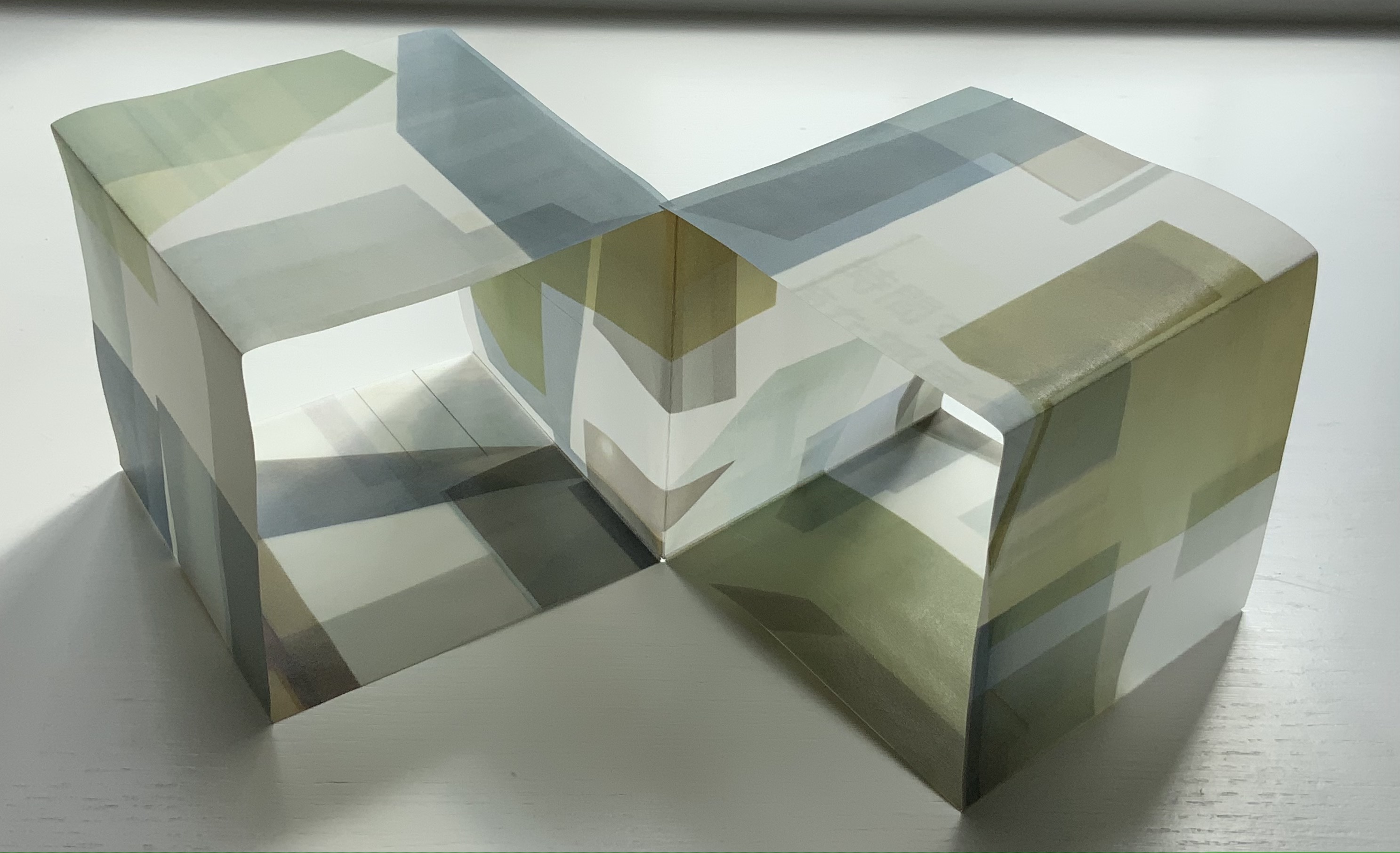
LDK 2,020 (2020) Yasushi Cho Banderole bound, single sheet cut and folded accordion style. 75 x 75 mm. Edition of 45, of which this is #7. Acquired from the artist 10 April 2021. Photos: Books On Books Collection.
LDK 2,020, LDK FL00R and LDK 2,009 make up part of a series. Their letters L, D and K stand for Living, Dining and Kitchen and are the usual abbreviations in Japanese apartment/flat sales leaflets. Every day they arrive or can be picked up on the street, and Cho creates collages from them, digitally printing them on stiff translucent paper to be cut and creased, then folded into an accordion-style booklet. For the reader, the folds and cuts of the stiff translucent paper make a tricky “assembly and disassembly” — or reading — of the work to make it into a cube or other three-dimensional shape.
In the process of flattening the booklets into a single sheet, then folding and creasing and re-creasing, the reader wonders how the aspects of LDK may have fit together before their abstraction into the collage. Eventually though, the assembly creates objects whose interiors are their exteriors — and vice versa — and inevitably recall the shoji screens still used in traditional houses and even apartments.
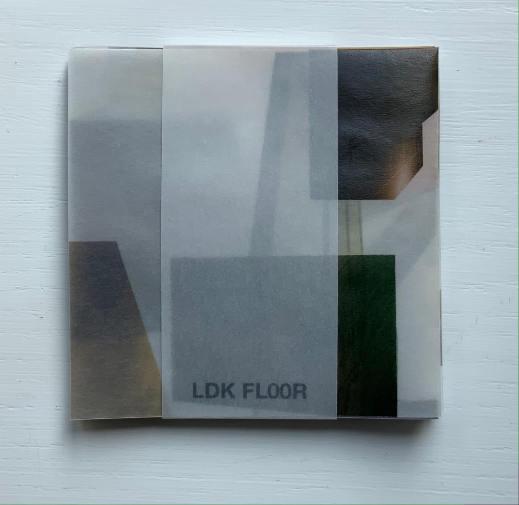
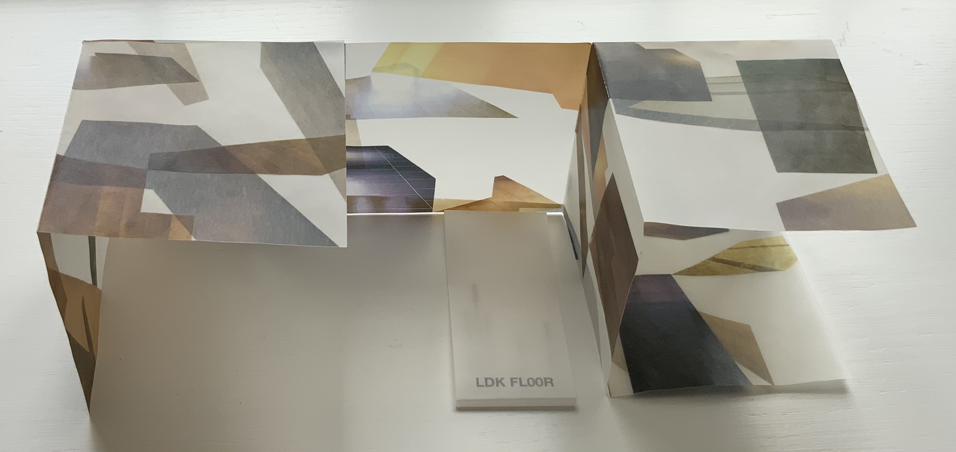
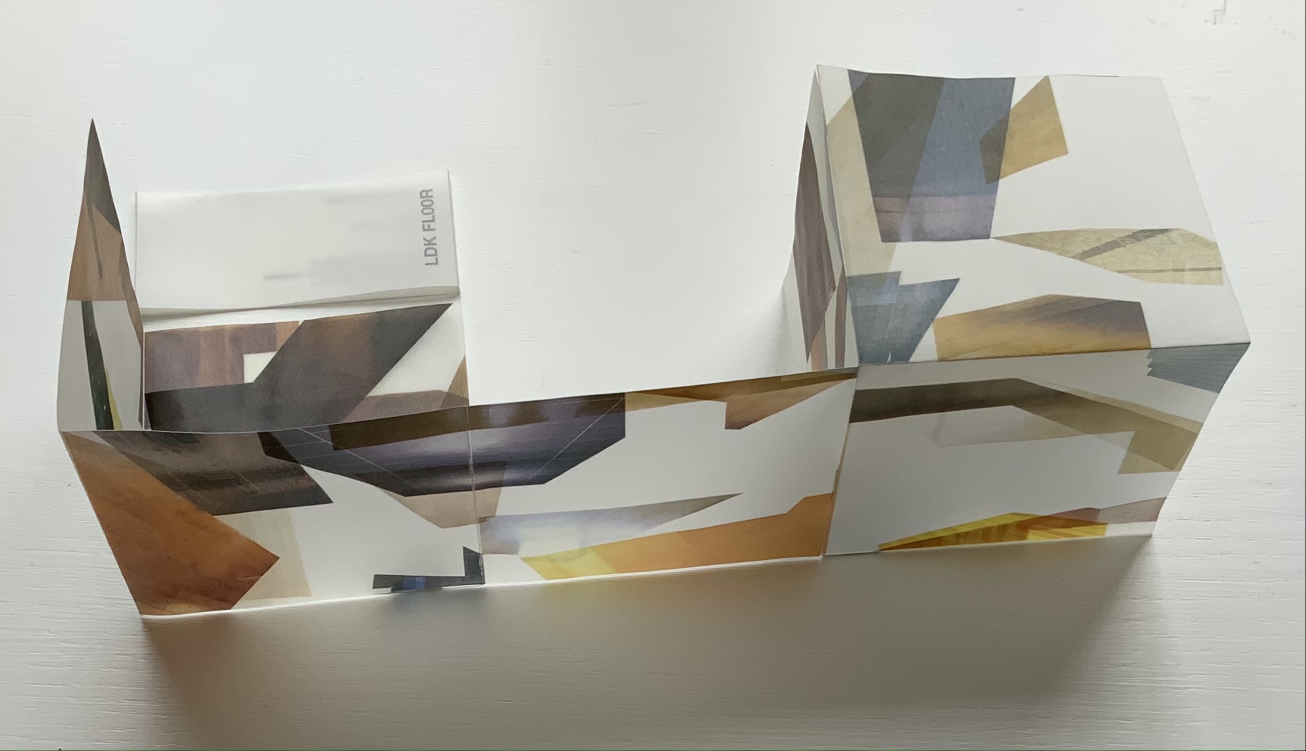
LDK FL00R (2010)
LDK FL00R (2010) Yasushi Cho Banderole bound, single sheet cut and folded accordion style. 85 x 85 mm. Edition of 45, of which this is #3. Acquired from the artist, 10 April 2021. Photos: Books On Books Collection.
Like the commas in LDK 2,020 (above) and LDK 2,009 (below), the zeroes in LDK FL00R play on the apartment prices listed in the sales leaflets, but also allude to the apartments’ floor numbers. The wordplay of the titles echoes the playful multiple shapes that the sheets can take and the resulting multiple views of the collages. The collaged images in LDK FL00R, however, are of the floor surfaces only.
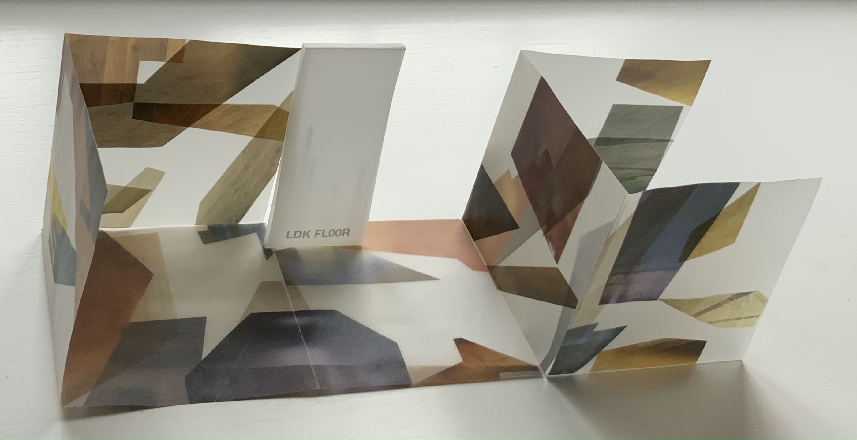
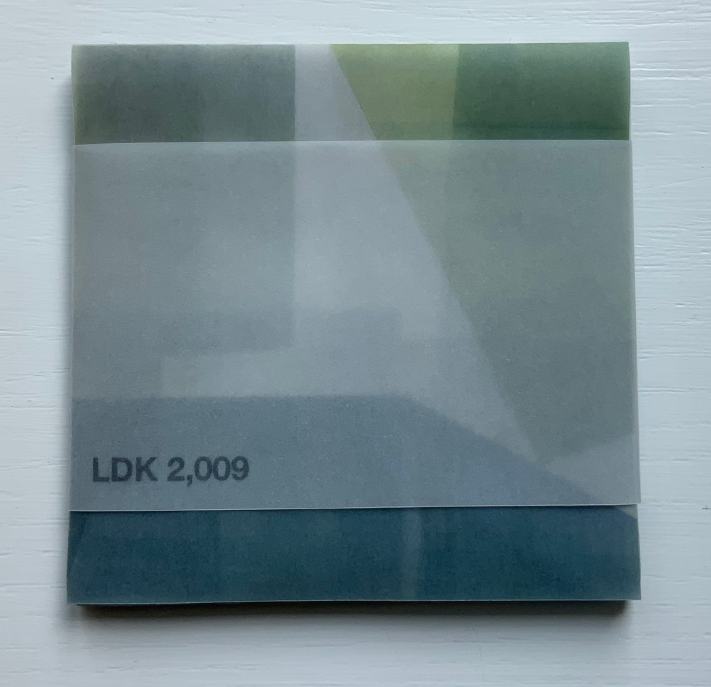
LDK 2,009 (2009)
LDK 2,009 (2009) Yasushi Cho Banderole bound, single sheet cut and folded accordion style. 75 x 75 mm. Edition of 45, of which this is #36. Acquired from the artist, 10 April 2021. Photos: Books On Books Collection
With smaller works of book art, size can disguise their depth and impact. In “reading” LDK 2,009 and its companions, an extraordinary depth and impact emerge. As the opened books assume their shapes and take their place in display, another element of the artful choice of material and printing technique emerges: the resulting play of light. This is a theme that Cho explores in two very different ways in the next works.
.interior (2010)
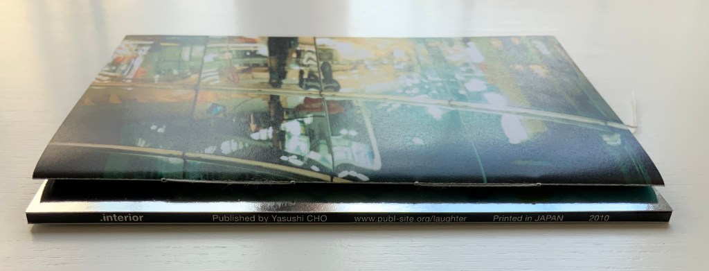
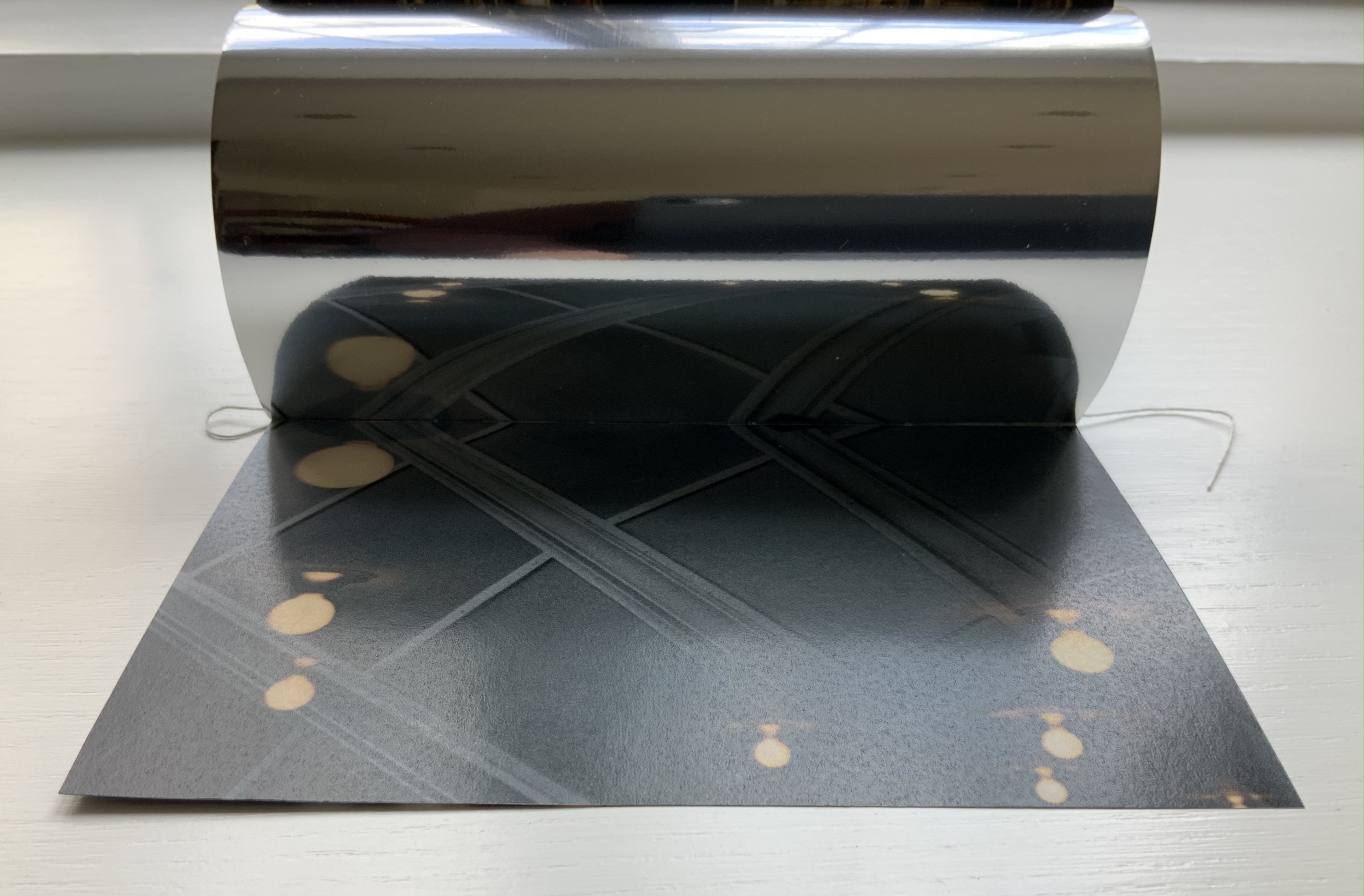
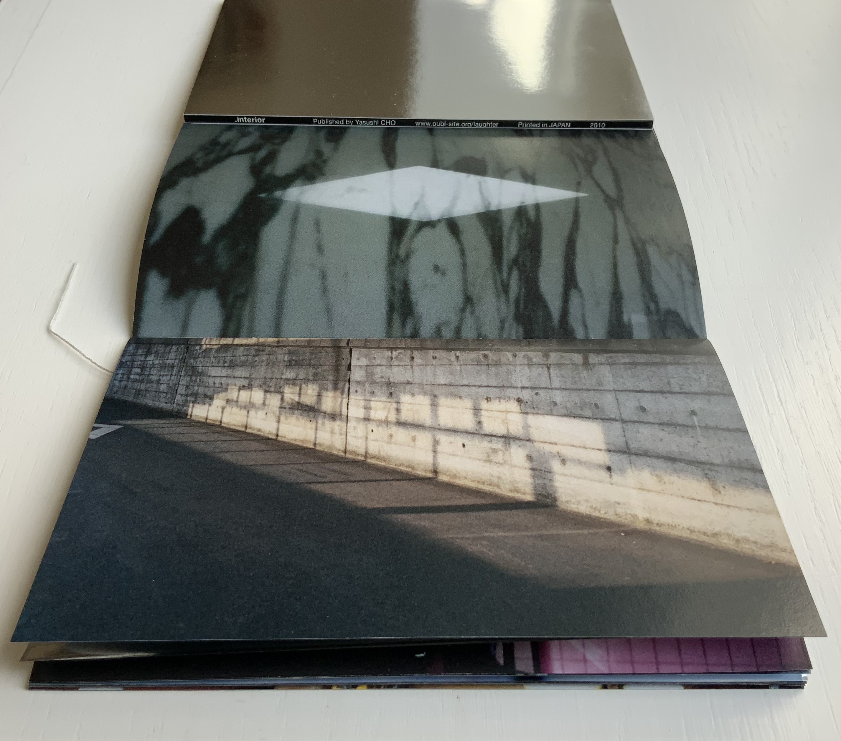
.interior (2010) Yasushi Cho Slipcase. Booklet, sewn. H150 x W98 mm, 24 pages. Edition of 30, of which this is #4. Acquired from the artist, 10 April 2021. Photos: Books On Books Collection.
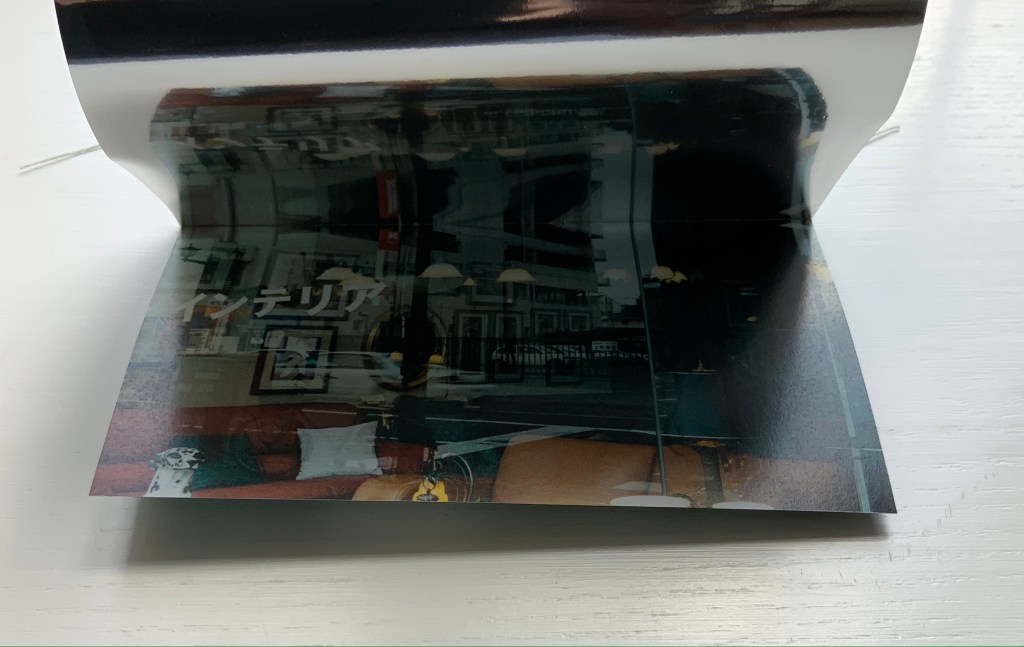
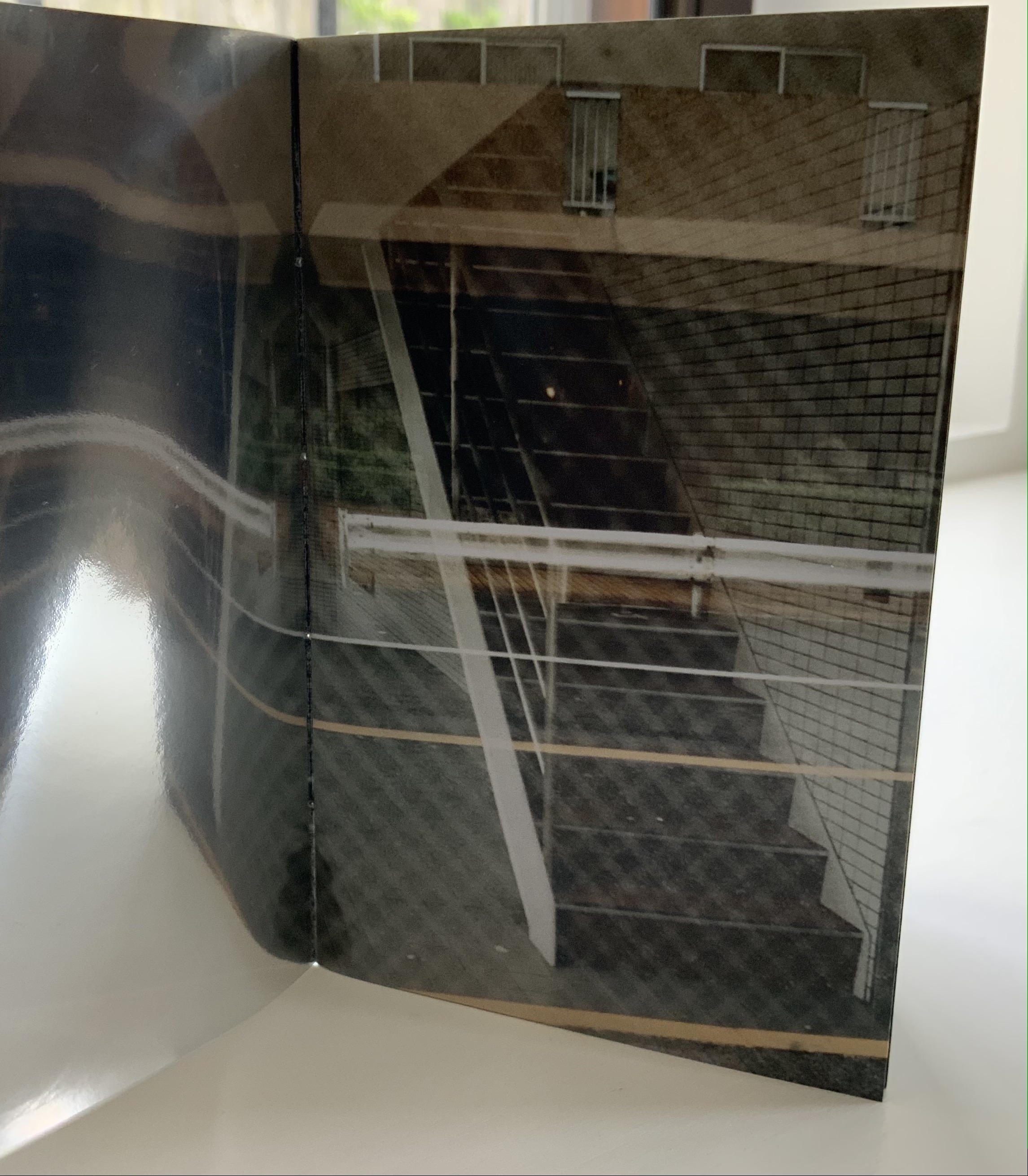
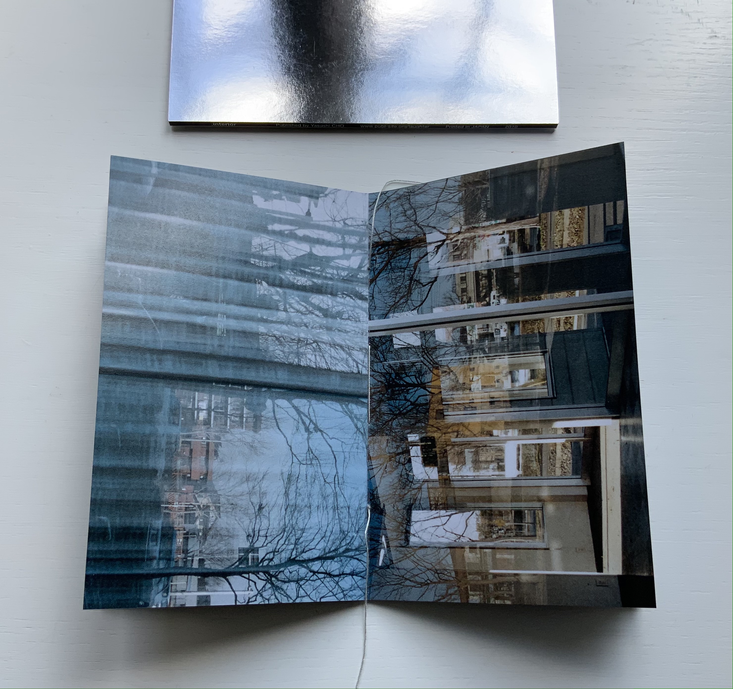
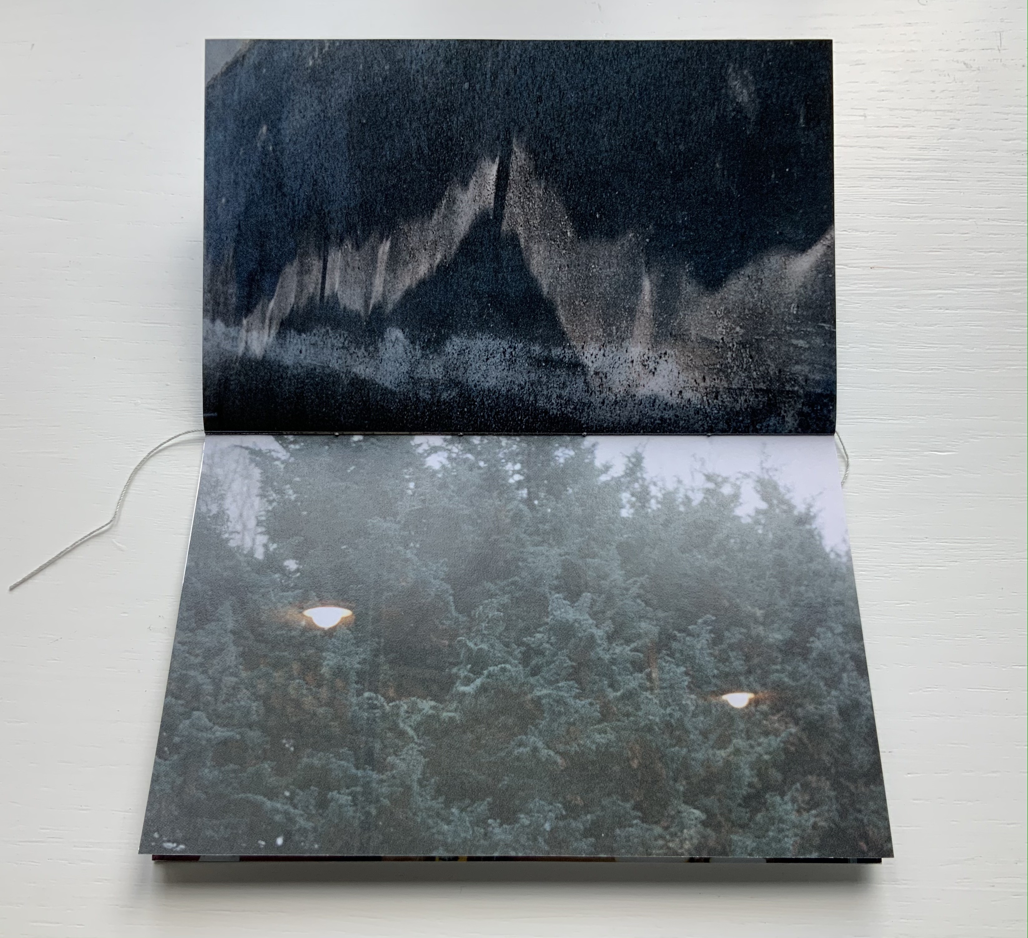
The photos in Cho’s book display views of the outside world, some of which appear to have been taken from inside an apartment whose interior is reflected in its window. Other photos display interiors — a café, an empty store — taken from an exterior vantage, resulting in reflections from the establishments’ window fronts. Some — a carpark, a walkway — seem unmediated. The playful title .interior, taken from the transposition of ・インテリア printed in the window below, and displayed on the spine of the mirrored slipcase above, confirms the artist’s theme of exploring the paradox of interior vs exterior, reflection and the mediation of vantage points.
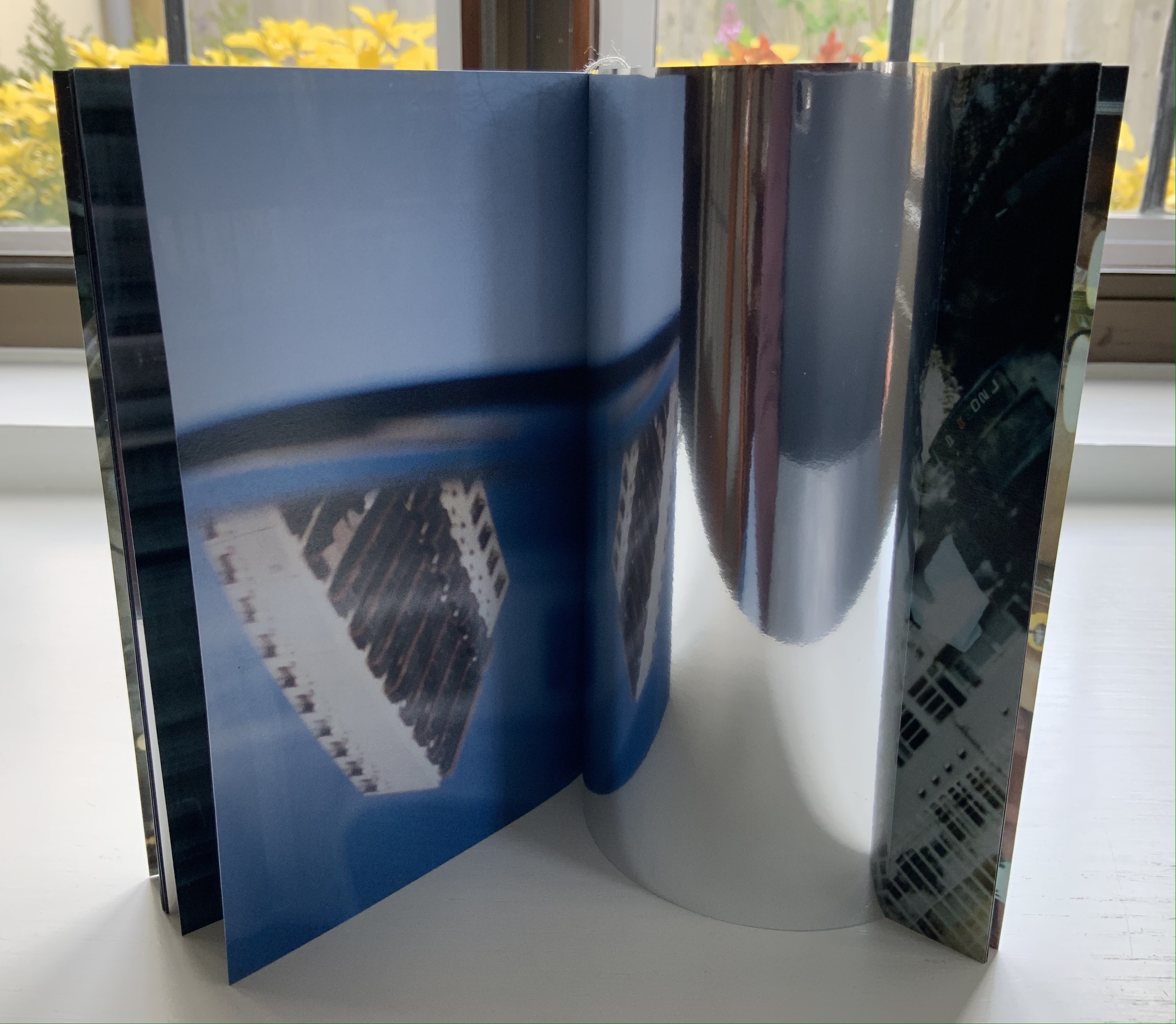
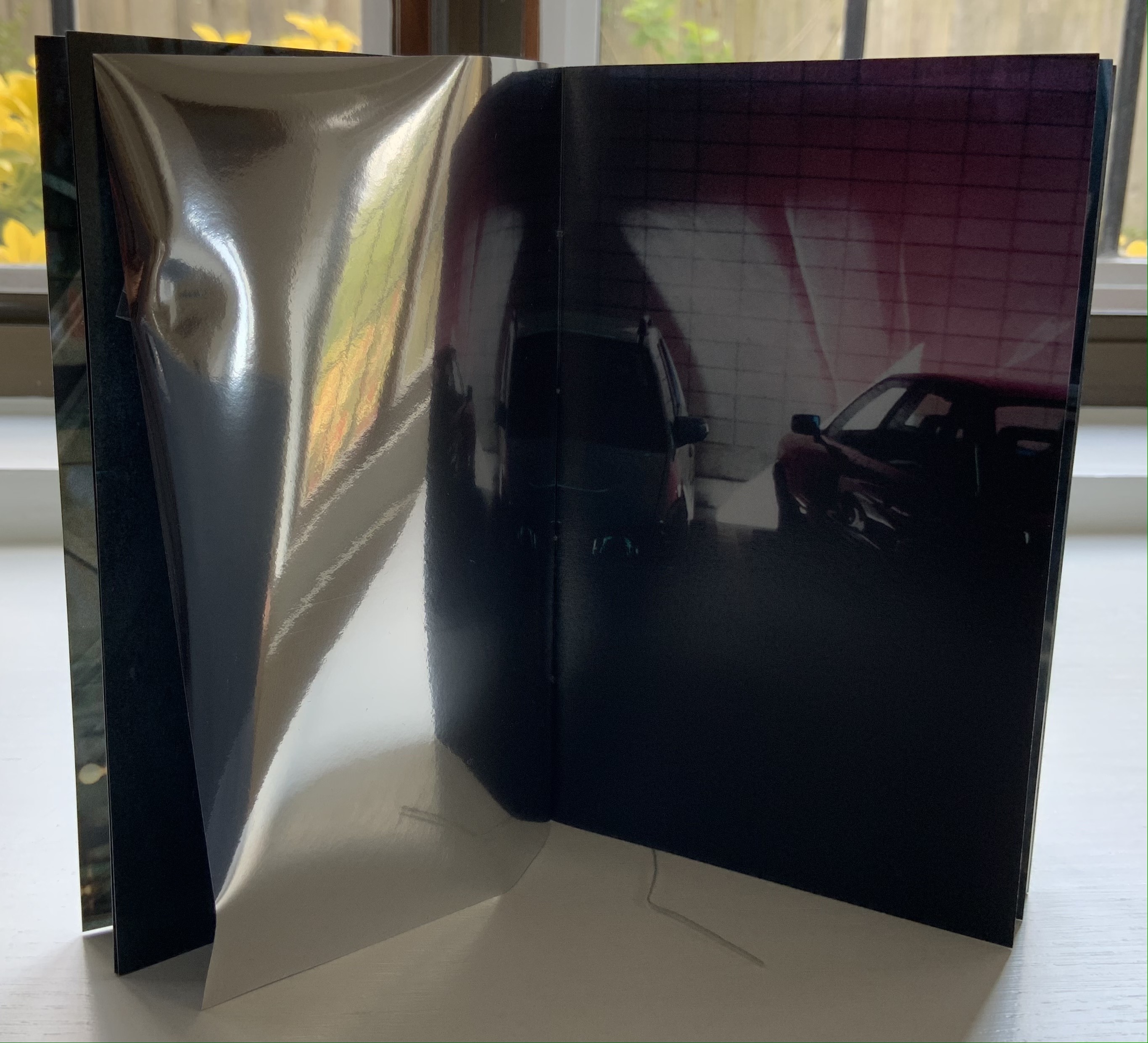
The work’s theme of reflection is also compounded by the flimsy mirrored paper interpersed between some (not all) of the recto and verso pages. Depending on the image reflected and how the mirrored paper is turned, the reader may find a simple duplicate or an extension of a pattern. Above, the shop’s interior duplicates itself upside down; below, the high rise against a blue sky duplicates itself.
Above, the staircase seems to curve behind itself, the reflected car extends the row of parked cars, and below, the ceiling and light fixtures extend their pattern into the mirror.
Where the recto and verso are not divided by the mirrored paper, other permutations on the theme of reflection occur. Below, in the center of the book, the window in the recto page seems to reflect the vantage point from which the verso page’s photo was taken. The virtuosity in manipulating vantage points here recalls that of Michael Snow’s Cover to Cover (1975) and Marlene MacCallum’s Theme and Permutations (2012) or Shadow Cantos(2018-19).
In its composition, the photography fascinates the eye, and Cho’s use of the book and mirrored paper to present and transform the photos fascinates the mind, provoking contemplation of the paradoxes of interior, exterior and their reflections. No doubt, a gallery show could deliver similar fascination, but as a book, .interior is more than a gallery of artwork: it is a work of art.
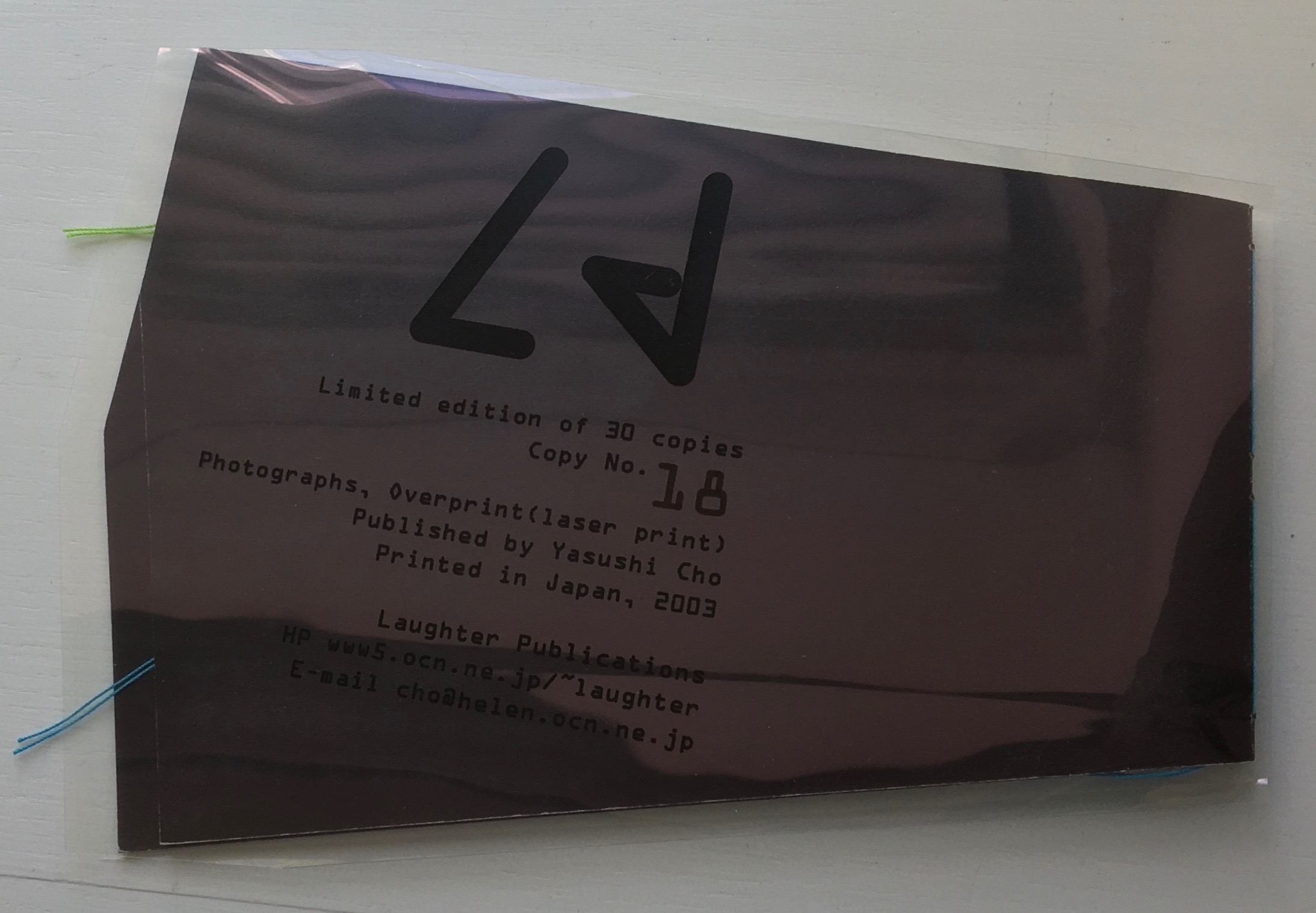
Ld (2003)
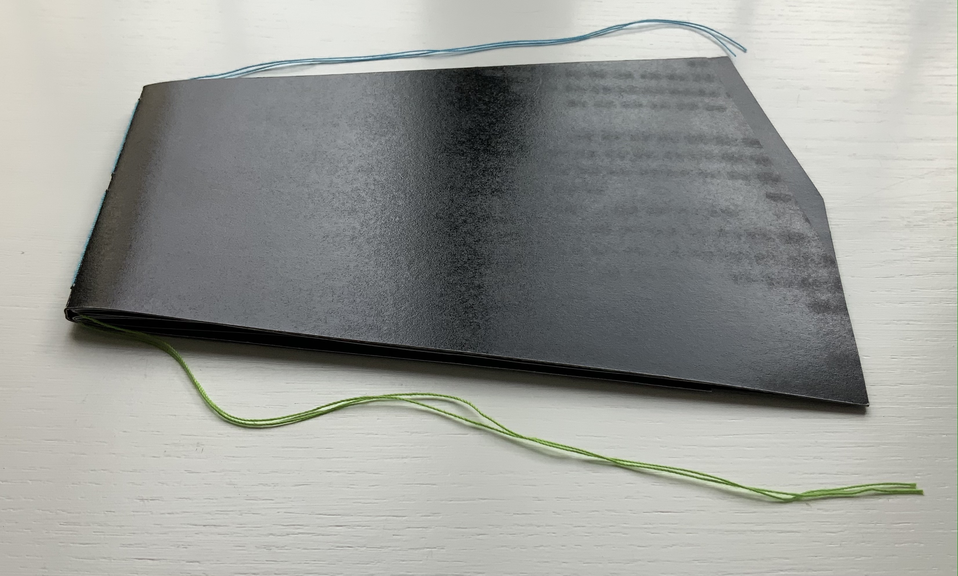
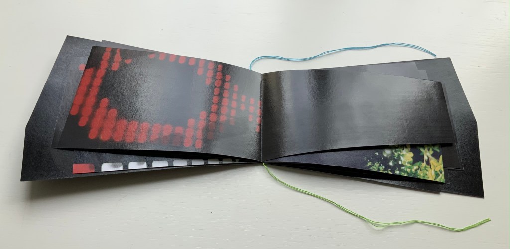
Ld (2003) Yasushi Cho Acetate sleeve. Booklet, handsewn. A5 nonstandard trim, 32 pages. Edition of 30, of which this is #18. Acquired from the artist, 10 April 2021. Photos of the work: Books On Books Collection.
If the stylized letters “L” and “d” do not suffice to distinguish this work from the LDK series, its shape, content and source certainly do. The way the images, surfaces and shapes play off one another suggests that “L” stands for light, and “d” for dark. The very different source from which the work arises — a night-time walk and shoot in Tokyo — confirms it.
On the black pages, the artist has overprinted in black to give a shadowy depth to the images and surface. The images in the dark sometimes reflect the images in the light — sometimes from the facing page, other times from previous pages. Below, for instance, the film-sprocket shapes just visible on a previous verso page’s lower edge reappear faintly, enlarged and in black over the red lights. The red lights, in turn, reappear faintly, also enlarged and in black on the lower half of the narrowing recto page.
These reflections begin to suggest those retinal images that appear after a flash of light or when eyes are held too tightly closed — both of which conjure up a night-time photo shoot in an environment of contrasts between neon lights or spotlights and the shadows they cast. By staring at the bright images on one page (below), the reader may also experience additional retinal images on the facing page.
The irregularly shaped pages recall Philip Zimmermann’s High Tension (1993) or Helmut Lohr’s Visual Poetry (1995). Cho’s pages alternate at angles, narrow or widen. With the flashes between light and dark, they evoke the photographer’s searching eye, focusing lens and movement through night-time Tokyo.
Both .interior and Ld are sophisticated — materially, conceptually and in execution. With the LDK series, they make a strong addition to the Books On Books Collection.
I tried to “define the book” when I designed (one of my books) Cover to Cover hoping that the “reader” would have a multi-sensory experience of the nature of what she/he held in her/his hands. (from The Book: 101 Definitions)
Cover to Cover (1975)
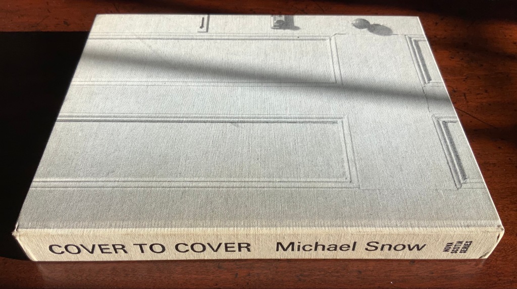
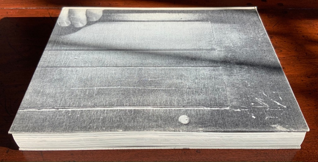
Cover to Cover (1975) Michael Snow Cloth on board, sewn and casebound. H230 x W180 mm. 310 unnumbered pages. Published by Nova Scotia College of Art and Design. Unnumbered edition of 300. Acquired from Mast Books, 10 December 2020. Photos of the work: Books On Books Collection.
After a long search since first sight of it in 2016 at Washington, D.C.’s now defunct Corcoran Gallery library, the original hardback edition of Michael Snow’s Cover to Cover (1975) finally joins the Books On Books Collection. Thanks to Philip Zimmermann, more readers/viewers have the chance to experience Cover to Cover — if only through the screen — than the original’s 300 copies and Primary Information’s 1000 facsimile paperback copies will allow.
Amaranth Borsuk describes the work and experience of it in The Book(2018), as do Martha Langford in Michael Snow (2014), Marian Macken in Binding Spaces (2017) and Zimmermann in his comments for the exhibition “Book Show: Fifty Years of Photographic Books, 1968–2018” (for all, see links below). Like Chinese Whispers by Telfer Stokes and Helen Douglas and Theme and Permutation by Marlene MacCallum, Michael Snow’s Cover to Cover evokes an urge to articulate what is going, how the bookwork is re-imagining visual narrative, how it is making us look, and how it makes us think about our interaction with our environs and the structure of the book.
The already existing commentary about Cover to Cover sets a high hurdle for worthwhile additional words. One thing going on in the book, though, seems to have gone unremarked. Some critics have asserted that, other than its title on the spine, the book has no text. There is text, however. It occurs within what I would call the preliminaries, and they show us how to read the book.
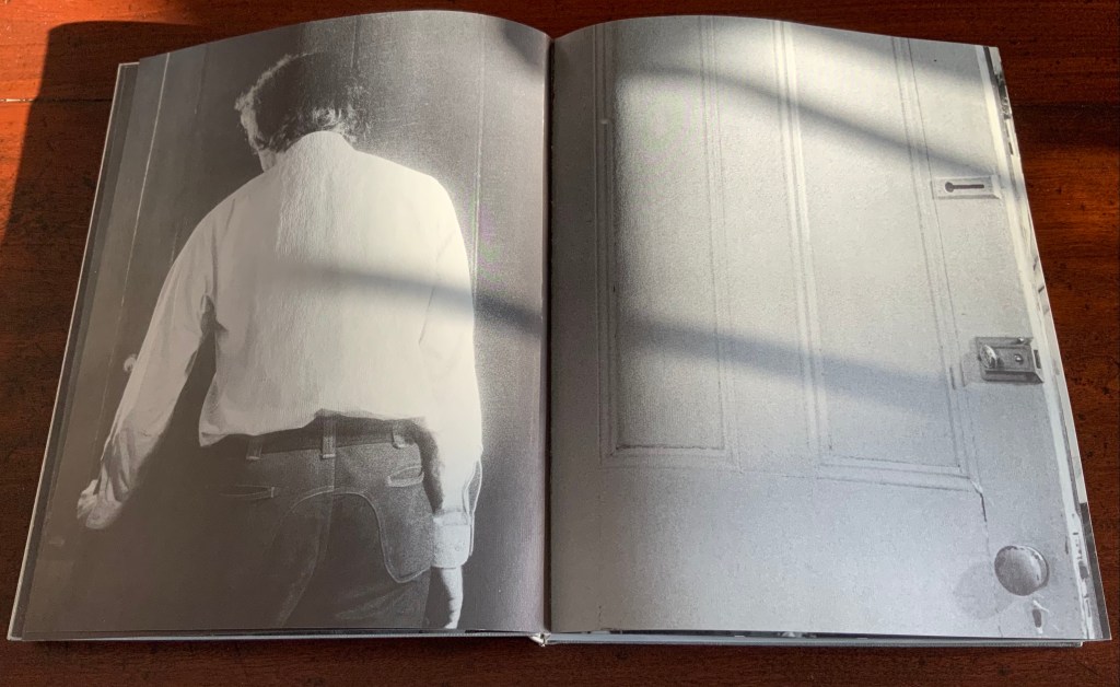
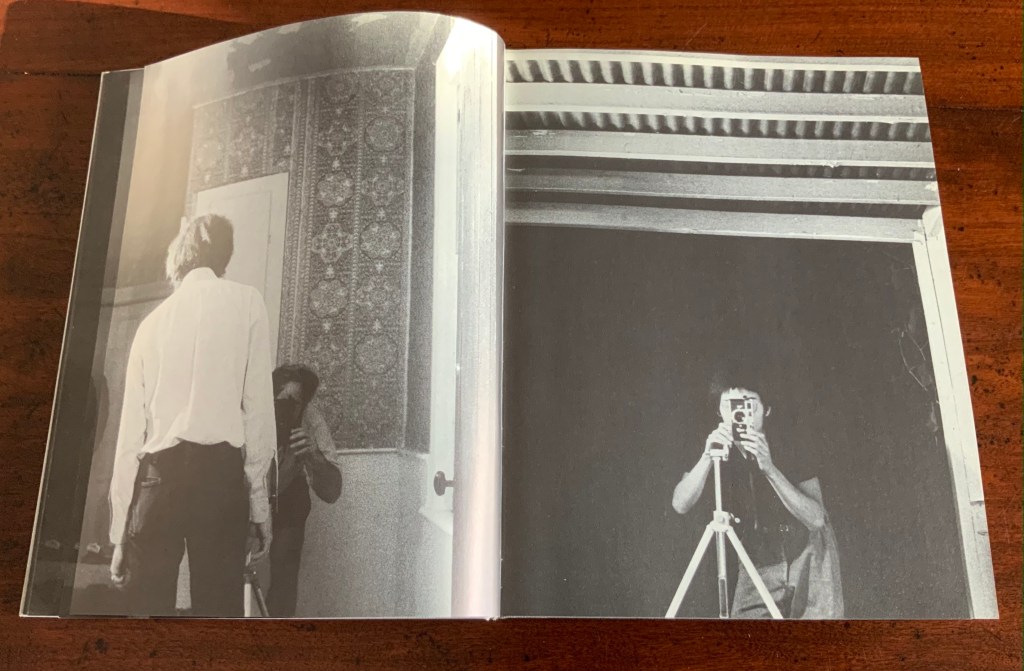
On the front cover, we see a door from the inside. Then, on its pastedown endpaper, the author outside the door with his back to us.
Front cover; pastedown end paper and page “1”.
On turning the “inside door” (page “1” of the preliminaries), we see in small type a copyright assertion and the Library of Congress catalogue number appearing vertically along the gutter of pages “2-3” (a tiny clue as to what is going on).
Pages “2-3”
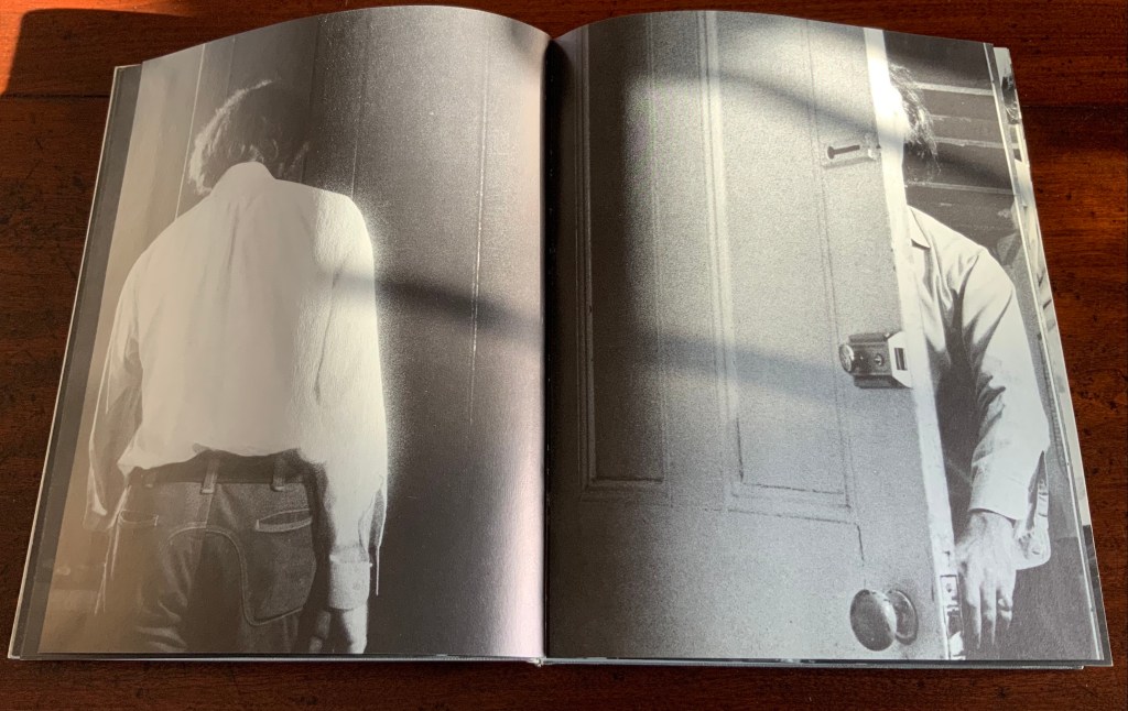
Over pages “4” through “14” from the same alternating viewpoints, the author reaches for the door handle, the door is seen opening from the inside, and the artist is seen walking through the door (from the outside) and into the room (from the inside). But who is recording these views?
Pages “10-11”, “12-13”, “14-15”
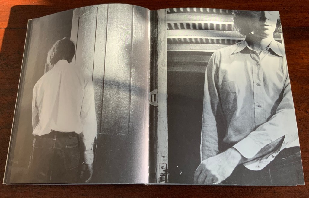
Over pages “16” through “24”, two photographers appear. Facing us, they are bent over their cameras — the one outside, clean shaven and wearing a short-sleeved shirt, is behind the author, and the one inside, bearded and wearing shorts, is in front of the author. As the author moves out of the frame, we see that the photographer inside is holding a piece of paper in his right hand. All of this occurs through the same alternating viewpoints. At page “21”, the corner of that paper descends into the frame of the inside photographer’s view of the outside photographer, and after the next switch in viewpoint that confirms what the inside photographer is doing, we see a completely white page “23”, presumably the blank sheet that is blocking the inside photographer’s camera aperture. Page “24” is the outside photographer’s view of the inside photographer whose face and camera are blocked by the piece of paper.
Pages “16-17”, pages “20-21” and pages “24-25”
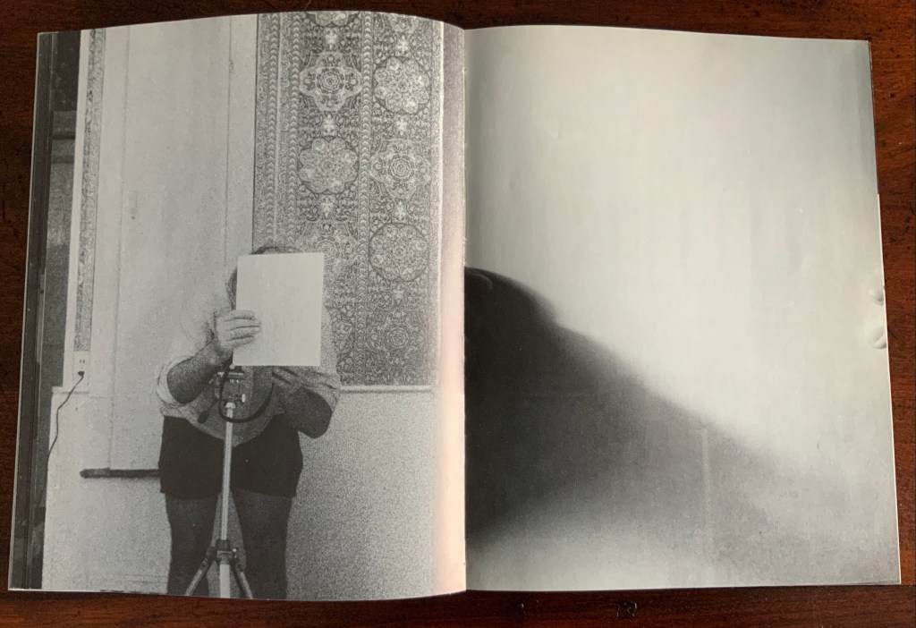
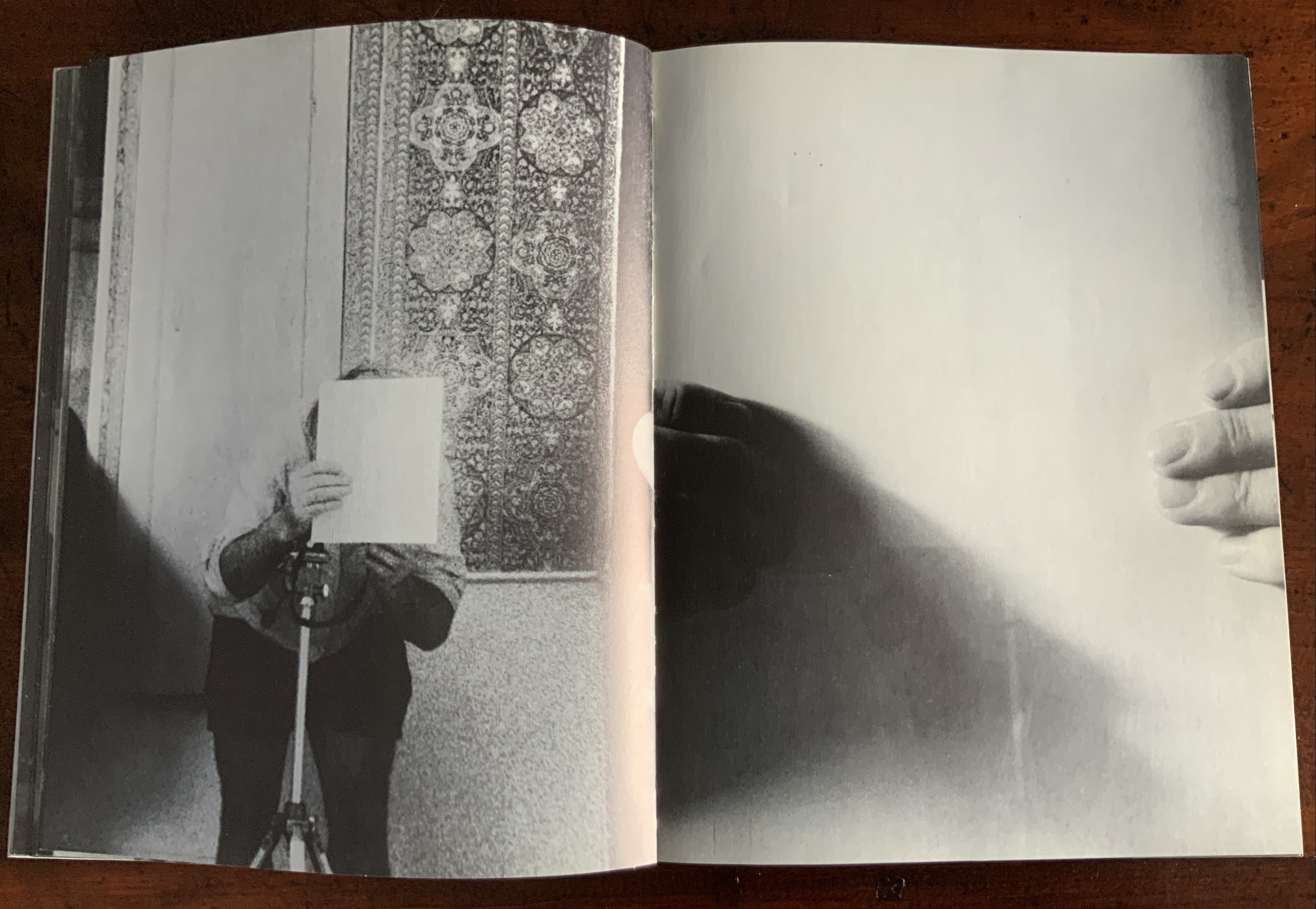
After the sequence above, something stranger still happens: on the left, a photo of the inside photographer holding the blank paper in front of his face appears. We can tell it is a photo by the tip of the thumb holding it (look in the gutter) between pages “26 and 27”. It is the developed photo the outside photographer just took of the inside photographer with his face and camera hidden by the sheet of paper. The image on page “27” is the reverse of that photograph. We can tell by the fingers on the right holding it.
Pages “26-27”
We are looking at images of images. But on pages “30-31”, whose fingers are holding the image of images?
Pages “30-31”
From there on, we see images of this piece of paper being manipulated by one pair of hands. The thumbs appear on the verso (the view from the outside photographer’s perspective), the fingers on the recto (the view seen by the inside photographer). By page “34”, it has been flipped upside down (the inside photographer is standing on his head), and on page “35”, we see a close up of the blank reverse side of the paper being held between the two photographers. By page “37”, we can see the blank side of the photo paper being fed into a manual typewriter. The pair of hands feeding the paper into the typewriter cannot belong to one of the photographers. Who is the typist — the author?
Pages “34-35” and pages “36-37”
For both pages “42” and “43”, the perspective is that of a typist advancing the photo paper and typing the title page of the book. On both pages, we can see the ribbon holder in the same position. As it progresses, more and more of the outside photographer’s camera appears above the typed page. Page “45” presents itself as the full text of the book’s title page, curling away from the typist and revealing the inside photographer on the other side of the typewriter. Page “46” shows the upside-down view of the title page as it moves toward the inside photographer and reveals the outside photographer on the other side of the typewriter. Not only are we seeing images of images, we are witnessing the making of the book’s preliminaries.
Pages “42-43”, “44-45”, and “46-47”.
From page “48” through page “54”, the photographers alternate views of blank paper advancing through the typewriter. By pages “55” and “56”, the typewriter has moved out of the frame. Look carefully at page “56”, however, and you can see the impression of the typewriter’s rubber holders on the paper. As a book’s preliminaries come to a close, there is often a blank verso page before the start of the book. If Cover to Cover is following that tradition, page “56” is that blank page at the end of the preliminaries, and page “57”, showing a record player, is the start of the book.
Pages “56-57”.
Zimmermann notes that, at somewhere near the book’s midpoint, the images turn upside down, and that readers who then happen to “flip the book over and start paging from the back soon realize that they are looking at images of images produced by the two-sided system, and indeed the very book that they are holding in their hands”. He notes this as another mind-bender added to the puzzlement of the two-sided system with which the book begins. Yet the long set of preliminaries foretold us that the upside-downness, back-to-frontness and self-reflexivity of images of images were on their way. Without doubt, Cover to Cover is an iconic work of book art.
Further Reading
Afterimage (1970). No. 11, 1982/83. On the occasion of an exhibition of his films at Canada House in London, an entire issue on Snow’s work.
… Cover to Cover is the result of another distanced use of self in the course of art-making. Snow is subject/participant as he and his actions are observed and analyzed by two 35 mm cameras… simulataneously recording front and back, the images then placed recto-verso on the page… Snow is subject observed in the book at the same time that he is also choosing and making decisions about images. Cover to Cover in 360 pages, [sic] becomes a full circle — front door to back door or the reverse. The book is designed so that it can be read front to back and in such a way that one is forced to turn it around at its centre in order to carry on. Regina Cornwell in Snow Seen and “Posting Snow”, Luzern catalogue.
But as the scene “progresses,” an action is not completed within the spread, but loops back in the next one, so that the minimal “progress” extracted from reading left to right is systematically stalled each time a page is turned, and the verso page recapitulates the photographic event printed on the recto side from the opposite angle. This is the disorienting part: to be denied “progress” as one turns the page seems oddly like flashback, which it patently is not; it might be called “extreme simultaneity.” Two versions of the same thing (two sides of the story) are happening at the same time. Zimmerman.
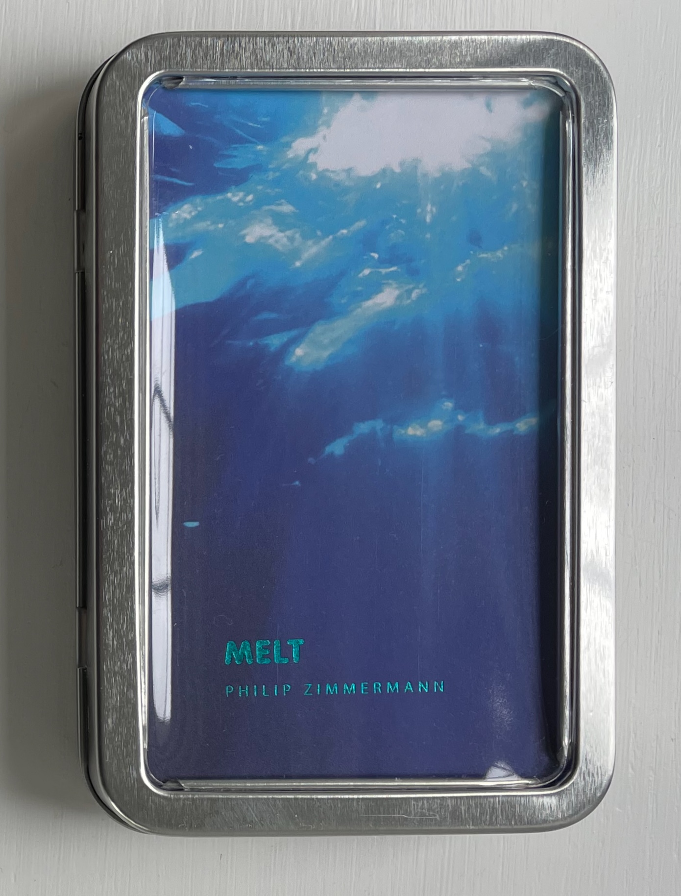
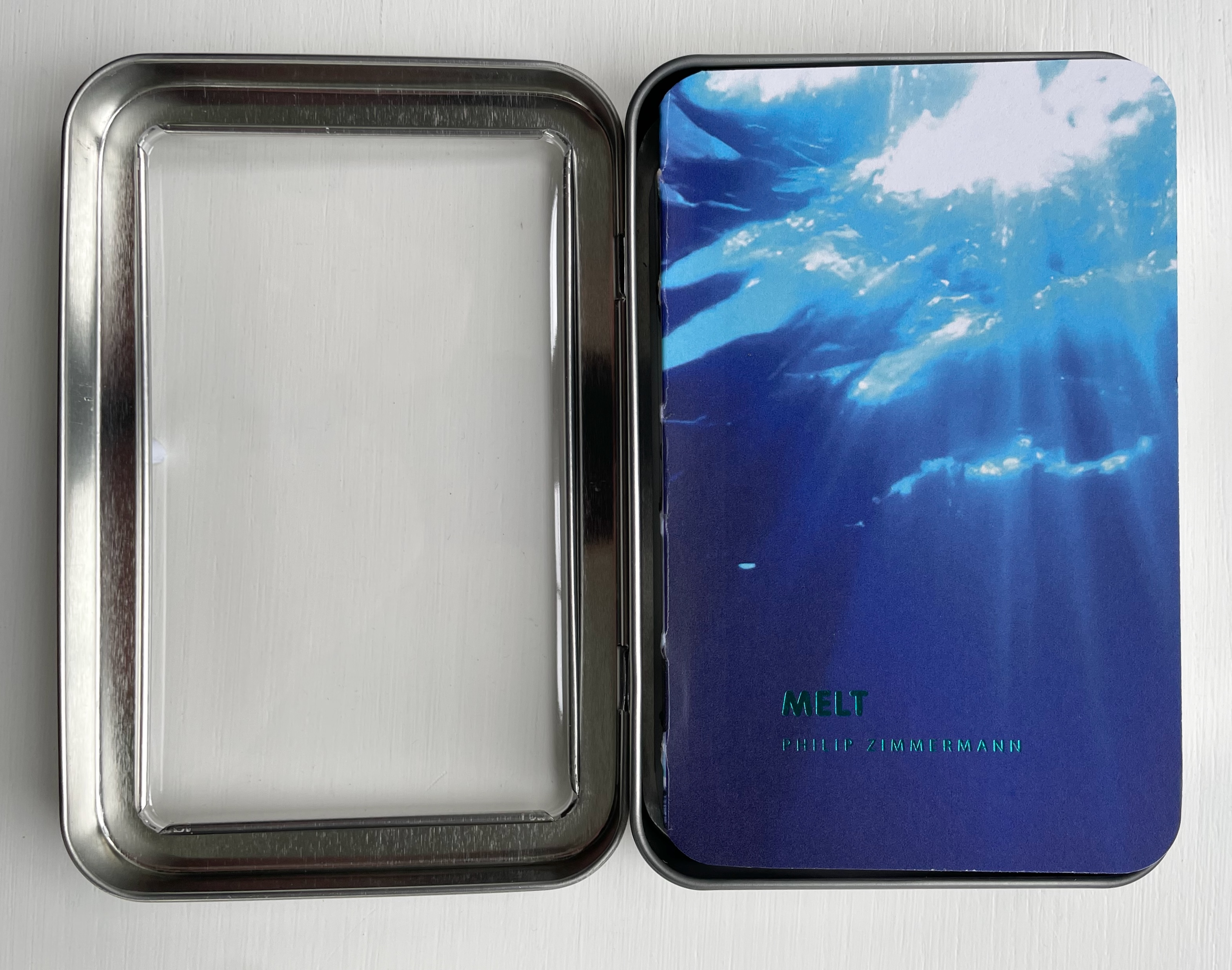
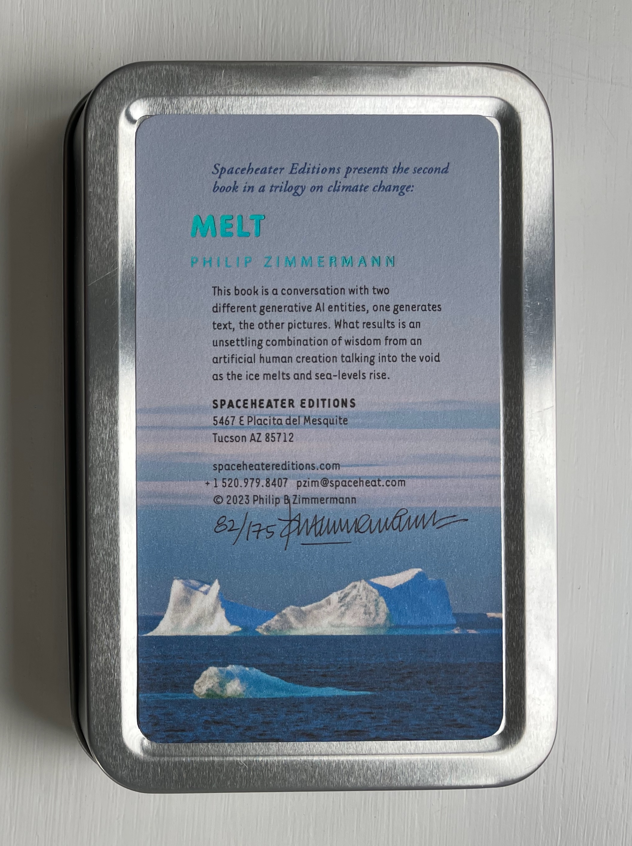
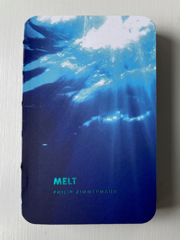
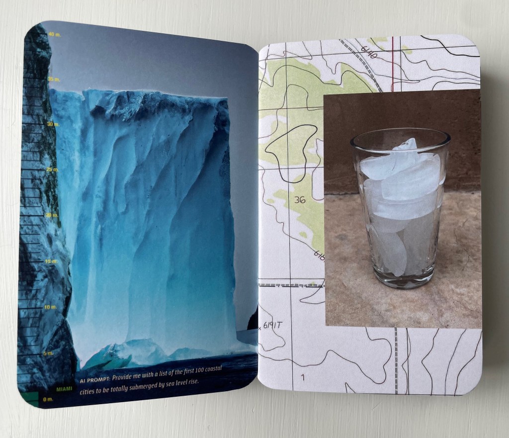
Melt(2023) Philip Zimmermann Smyth-sewn book with exposed spine, and enclosed in a small tin box with a clear window on the front. Box: H140 x W93 x D24 mm; Book: H130 x W93 x D16 mm. 200 pages. Edition of 175, of which this is #82. Acquired from Spaceheater Editions, 4 February 2024. Photos: Books On Books Collection.
Melt is the second work in a climate change trilogy, the first being Landscapes of the Late Anthropocene (2017/19), which appears below. More complex in its material, Melt may self-ironically have a larger carbon footprint than its predecessor more from its process than the material involved. As the artist describes it,
… it is also a conversation with two generative artificial intelligence entities. ChatGPT and DALL-E, both from Open AI: one generates the text, the other the pictures. What results is an unsettling combination of wisdom from an artificial human creation talking into the void as the ice melts and sea-levels rise.
And Melt is high-tech in other ways as well. It is
printed by one of the latest updated printing technologies, high-speed UV-cured inkjet. It was printed on a Komori Impremia IS29s digital press at Spectrum Printing in Tucson, Arizona. It is a new and improved version of that digital inkjet sheet-fed printing method that is not only very fast, but also light-fast, and uses stochastic imaging, which means there are no halftone dots. The finished prints rival or exceed the quality of high-quality offset lithography.
If the printing industry has in fact been reducing its CO2 emissions and since digital press printing is self-evidently more environmentally friendly than earlier processes (Kariniemi, 2010), Melt has a reduced carbon footprint on that score. The carbon footprints of ChatGPT and DALL-E, however, are not nil (Heikkilä, 2022).
So their use in Melt must increase its footprint, as must the use of traditional bookmaking technology and material: smyth sewing, glue, paper, foil, etc. There’s even the non-traditional material of the tin box and its clear plastic window. As becomes evident by the end of the book, all this is a complex irony not lost on the artist. Indeed the irony becomes self-referential in the book art tradition of self-referentiality.
Melt is a grimly playful book.
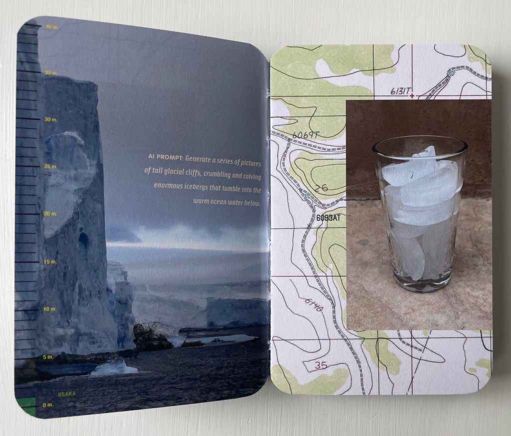
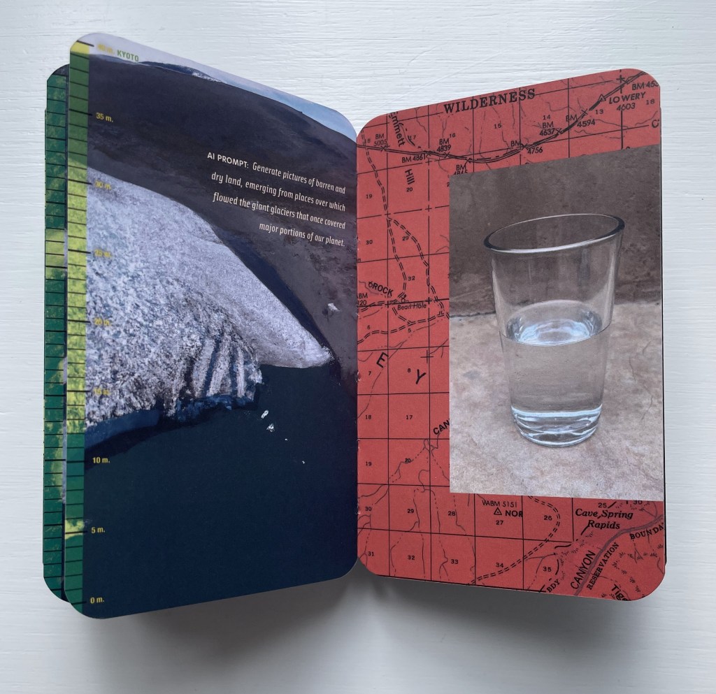
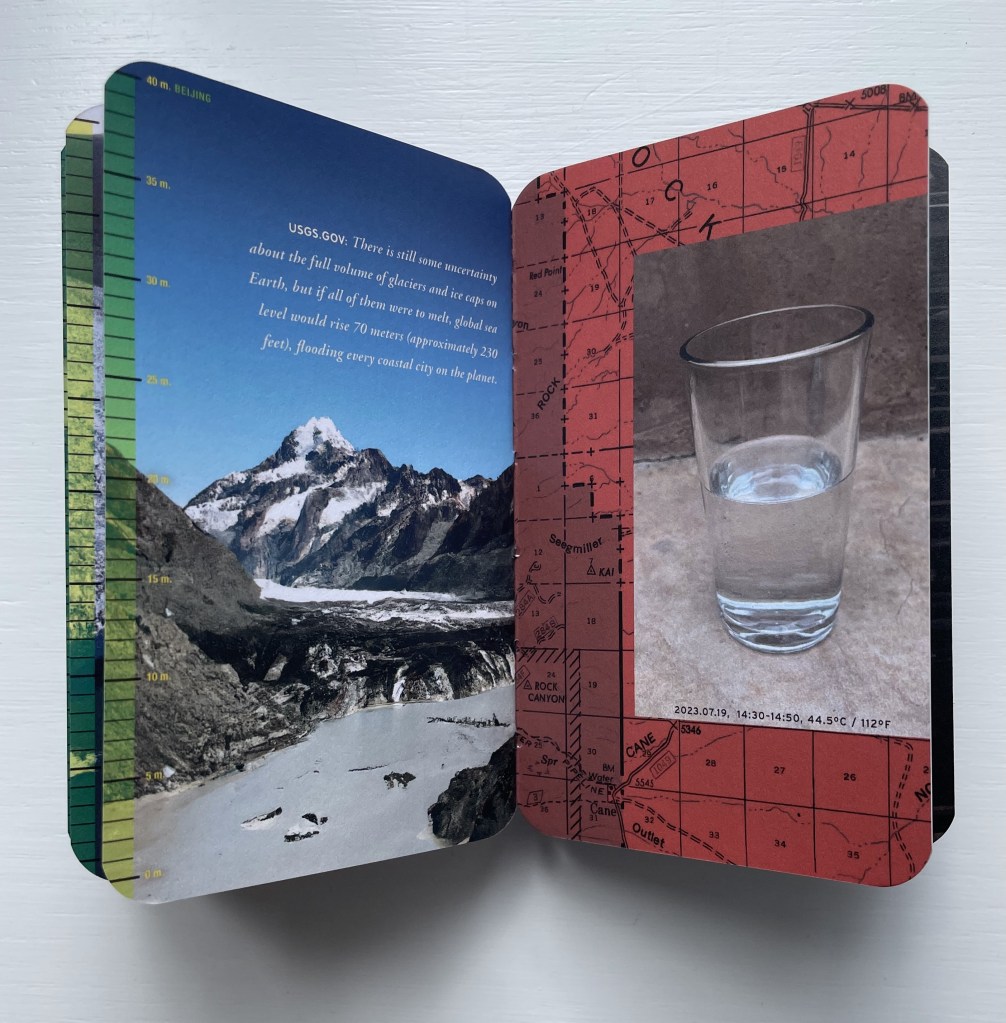
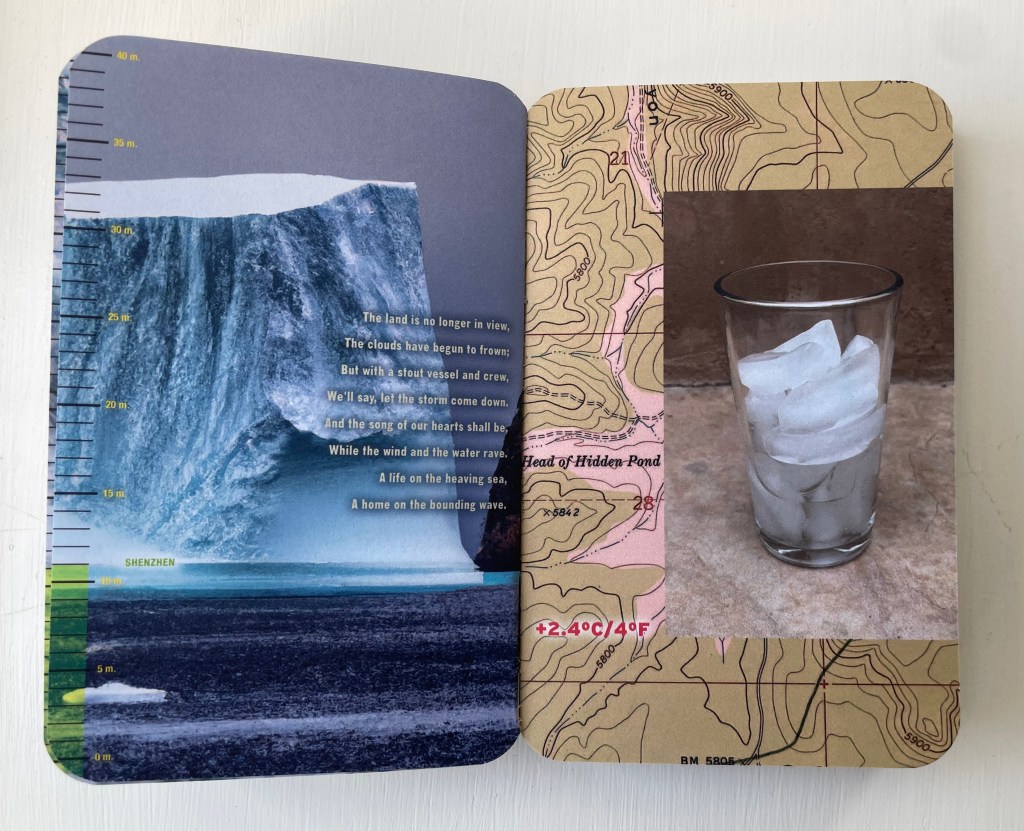
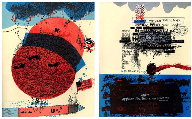
Its DALL-E dialogue of prompt and response focuses attention on the polar images generated on the lefthand page. While that’s going on, and in response to an AI prompt to list the first 100 coastal cities that will be submerged by rising tides, a scale on the lefthand edge shows the rise in sea-level and provides the answer to the prompt by pairing the sea level with the city falling beneath it — the first two being Miami and Osaka. By the end of the book, the last two cities to be submerged are Kyoto and Beijing.
While these verso page images are appearing, another set of images vies for attention on the recto pages — scans of old land maps and a superimposed time-lapse photo of a glass of melting ice. The maps show traditionally hot areas in Arizona and New Mexico, and as the book progresses, the maps redden while the ice melts, which can be appreciated by riffling the pages like a flipbook (see video of this here).
For the slower page-by-page reading, there are the instructions addressed to ChatGPT and its various textual responses to them. The human book artist is having his grim fun with this AI and with us. Part way through, over DALL-E’s images of calving glaciers, he superimposes lyrics of the 19th century song “A Life on the Ocean Wave” with obvious (for us humans, at least) irony.
Shenzhen “is no longer in view”.
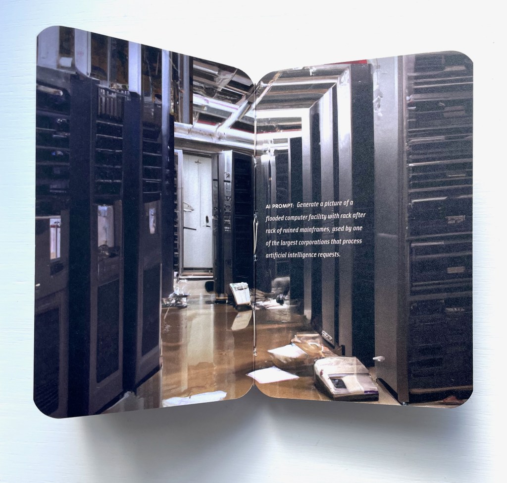
But then, just to rub it in, he prompts ChatGPT to “Write a few paragraphs on how the poem (and later song lyrics) “A Life on the Ocean Wave”, by Epes Sargent, relates to sea-level rise, metaphorically, ironically, or otherwise”. ChatGPT’s eerily human-sounding response is a joke on us climate-changing humans, perhaps matched only by the artist’s prompting DALL-E to “generate a picture of a flooded computer facility with rack after rack of ruined mainframes, used by one of the largest corporations that process artificial intelligence requests”. Below is Dall-E’s final image. One wonders what ChatGPT might write if prompted “Write a few paragraphs on what you as an AI think of the image below”.
By playing DALL-E and its images off ChatGPT and its text, Melt notches up an innovation in the tradition of image-text interplay in artist’s books. We’ve already seen the subtle calling attention to this with the flipbook mechanics vs the slow read of AI text. There’s also ChatGPT’s speculation on the relevance of Robert Frost’s poem “Fire/Ice” to climate change, which the artist juxtaposes with DALL-E’s verso polar images that face the reddening recto pages. Even more directly Zimmermann calls attention to the interplay by asking ChatGPT to come up with a list of images to illustrate climate change and generate a sense of urgency, which DALL-E seems to ignore as it carries on with its own verso-page dialogue of prompts and polar images.
As suggested at the start of this entry, perhaps the most subtle reference to book art’s traditions comes at the end of the book. Melt‘s final image can be read not only as an ironic joke on the AIs but as a joke on us and a self-referential claim by Melt. The jokes, of course, are that the AI pontificating about climate change has an impact on its own environment, and that all of the impacts are our impacts. As for Melt‘s self-referential claim, consider the Dutch artist Thijs Biersteker’s words:
… artwork and installations that uncover and visualize the environmental impact of AI and tools like ChatGPT are essential in today’s rapidly evolving world. By raising awareness, humanizing the technology, encouraging responsible behavior, providing a platform for dialogue, fostering emotional connections, and promoting environmental stewardship, art can play a pivotal role in addressing the environmental challenges posed by AI. Through creative expression, we can inspire meaningful change and ensure a sustainable future for both AI and the environment. — Woven Studio [before 7 May 2023].
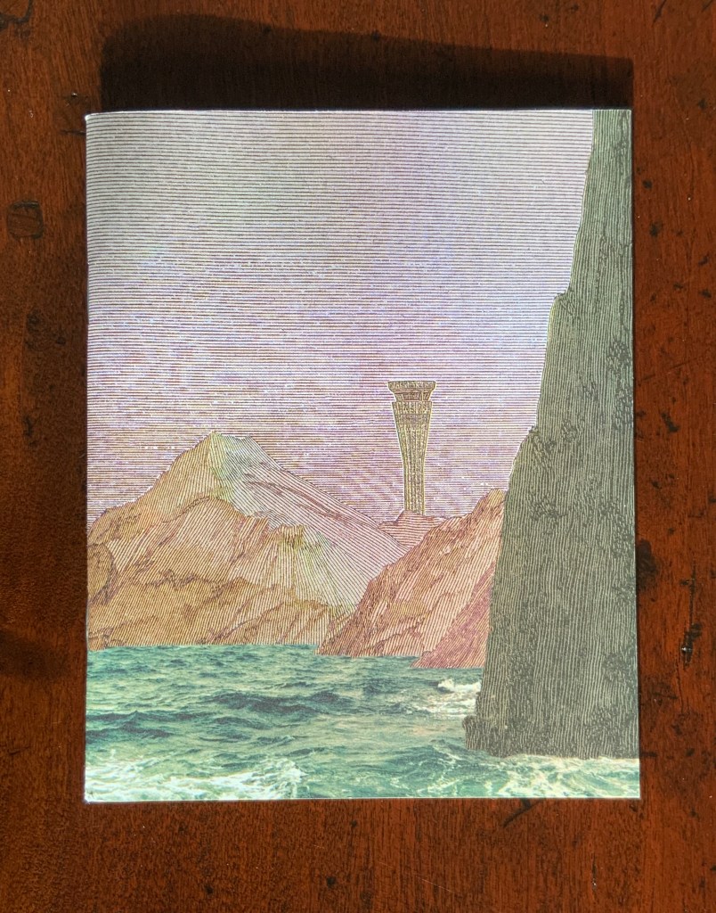
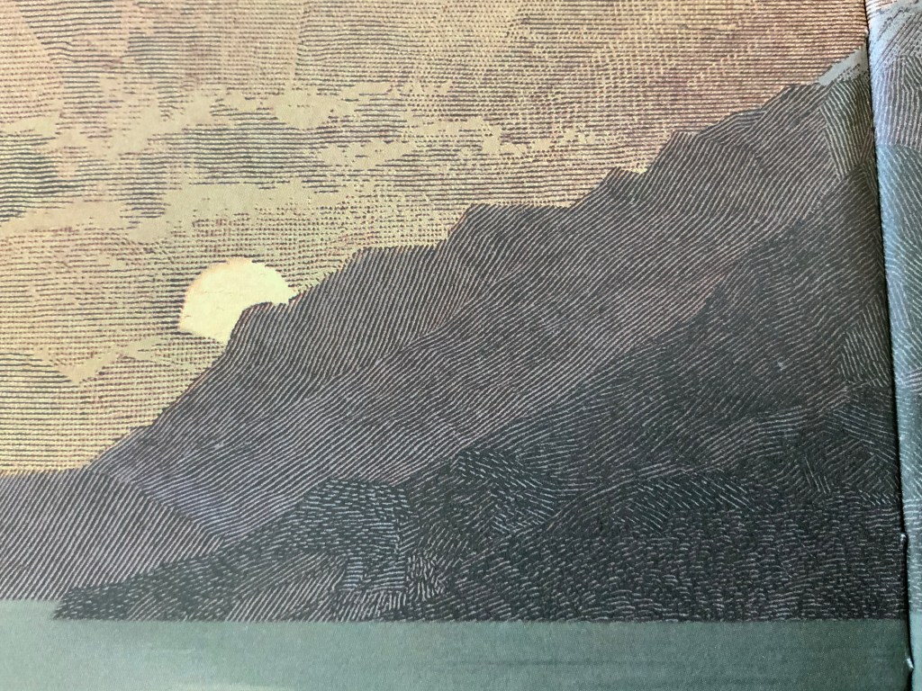
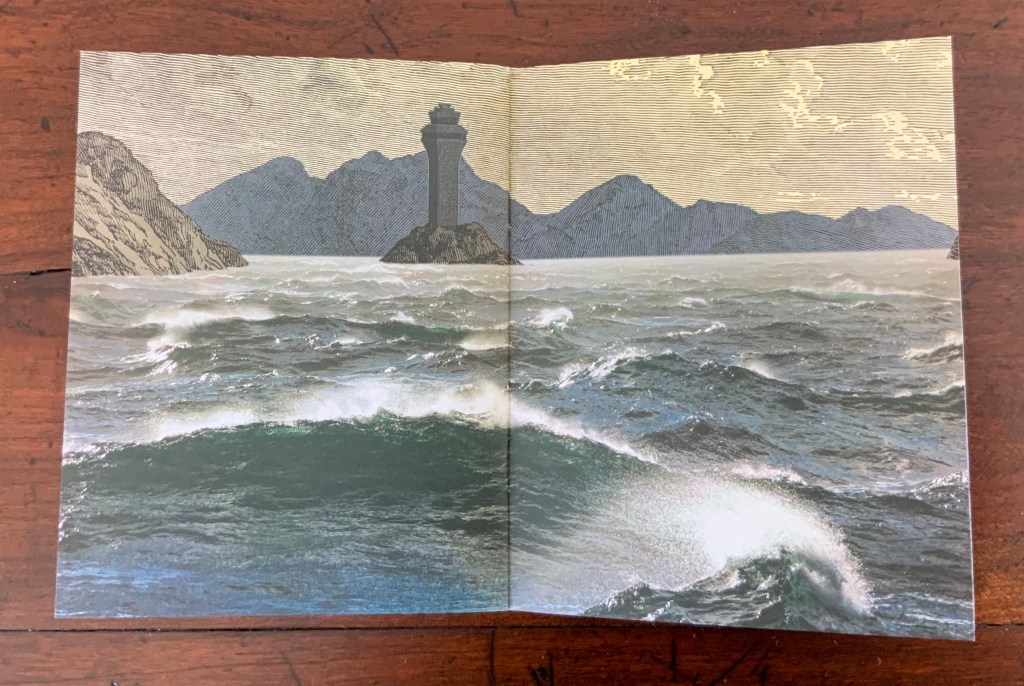
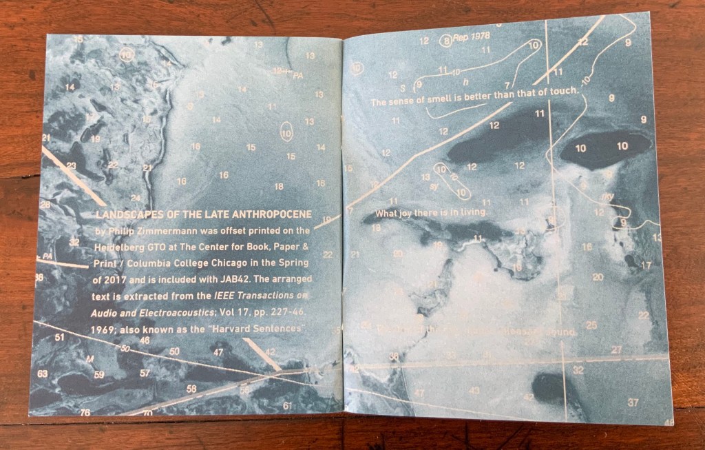
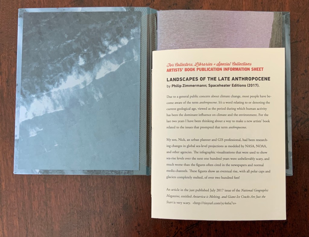
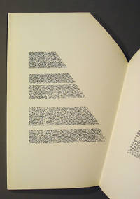
It opens with sunrise, closes with sunset. Each landscape shows water meeting land. Airport control towers appears in each landscape. Some stand on promontories, some are nearly submerged. Tinted pages of NOAA charts of the Bahamas, Florida Keys and Gulf of Mexico lay between the pages of landscapes. The sentences placed across the charts in silvery white come from the random-seeming, poetic-sounding “Harvard Sentences“, used by audio engineers and speech scientists in Harvard’s Psycho-Acoustic Laboratory from the mid-20th century to the present to test the effects of noise on comprehension.
There are 72 ten-sentence banks in the Harvard Sentences. The artist’s choice of three sentences for each chart page is like a painter’s choice of colors and strokes.
“Men think and plan and sometimes act” is the first chosen. “A pink shell was found on the sandy beach” is the last. In between come “reds” like “Let it burn, it gives us warmth and comfort”, “greens” like “Lush ferns grow on the lofty rocks” or “blacks” like “That move means the game is over”. The sentences seem to change their color or meaning as the eye moves among the landscapes. What color has “Canned pears lack full flavor”?
The only other man-made structure in the book appears halfway through: the roof of a log cabin with the water almost to the eaves.
A small work of book art with an overwhelming force.
Under his Spaceheater Editions imprint, Zimmermann also produced a limited hardback edition, which includes an eight-page sewn pamphlet describing the work.
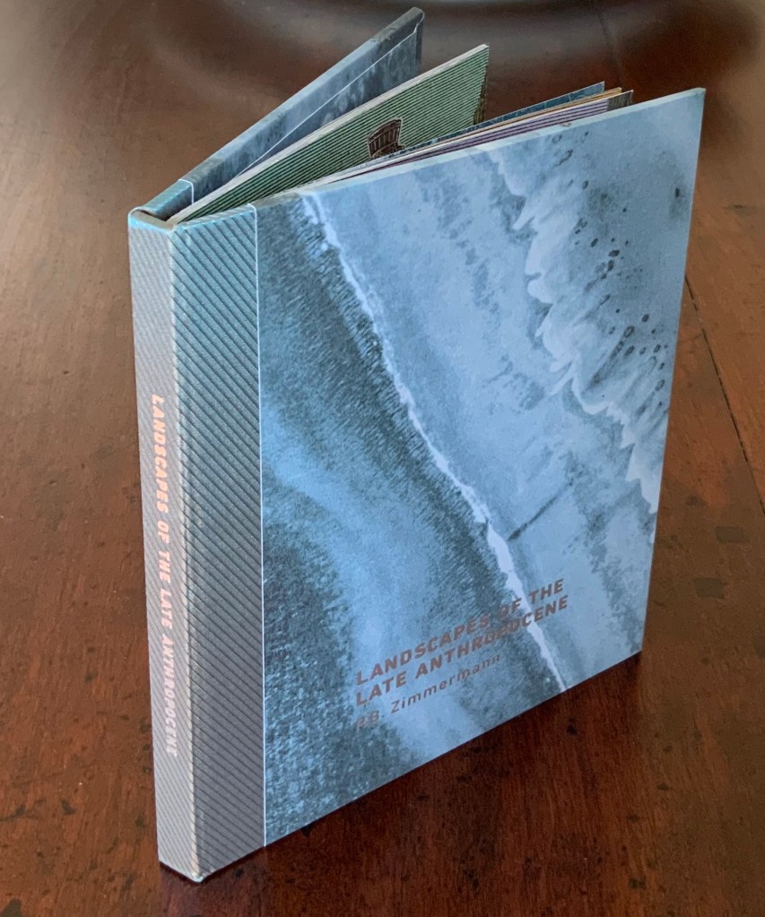
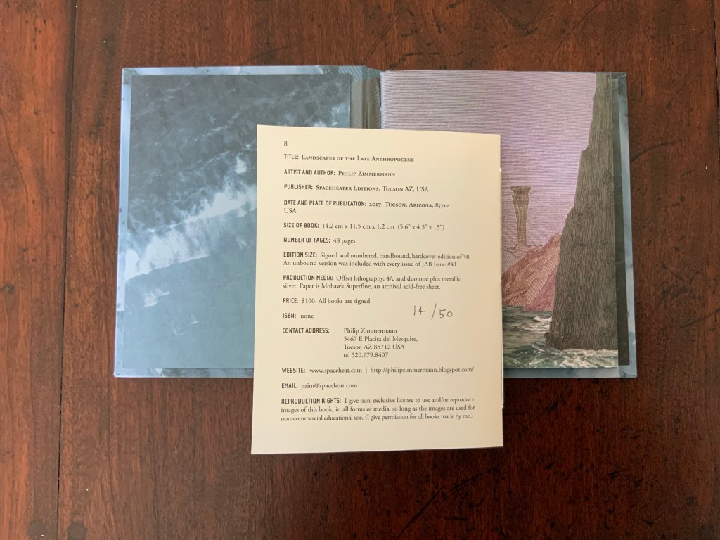
Landscapes of the Late Anthropocene (2019) Philip Zimmermann Offset lithography, 4/c and duotone plus metallic silver. Paper: Mohawk Superfine. 142 x115 x 12 mm. Acquired from the artist, 23 February 2020. Photos: Books On Books.
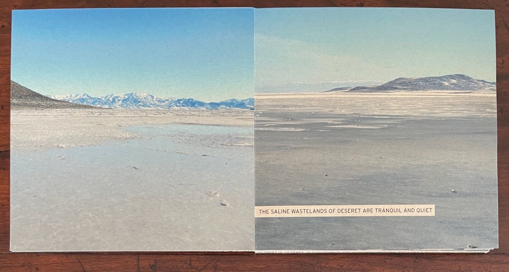
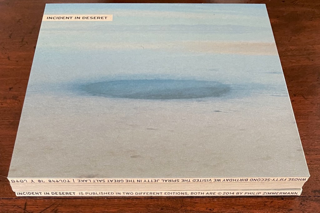
Incident in Deseret (2014)
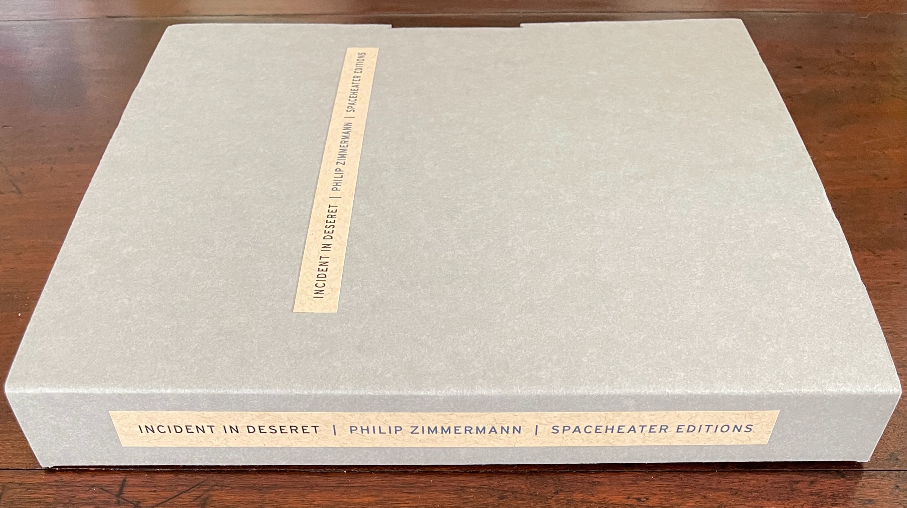
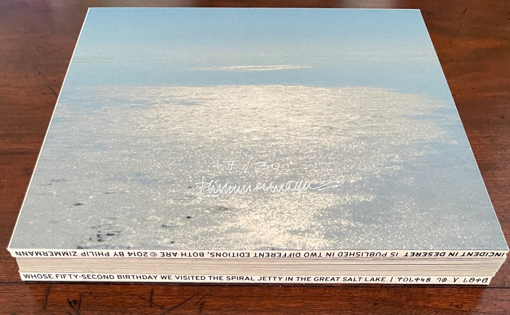
Incident in Deseret(2014) Philip Zimmermann Hard-covered board book with drum-leaf binding, enclosed in archival box with title pasted on front cover and spine. Box: H212 x W215 x D25 mm; Book: 203 x 203 x D20 mm. 30 pages. Edition of 30, of which this is #17. Acquired from Spaceheater Editions, 4 February 2024. Photos: Books On Books Collection.
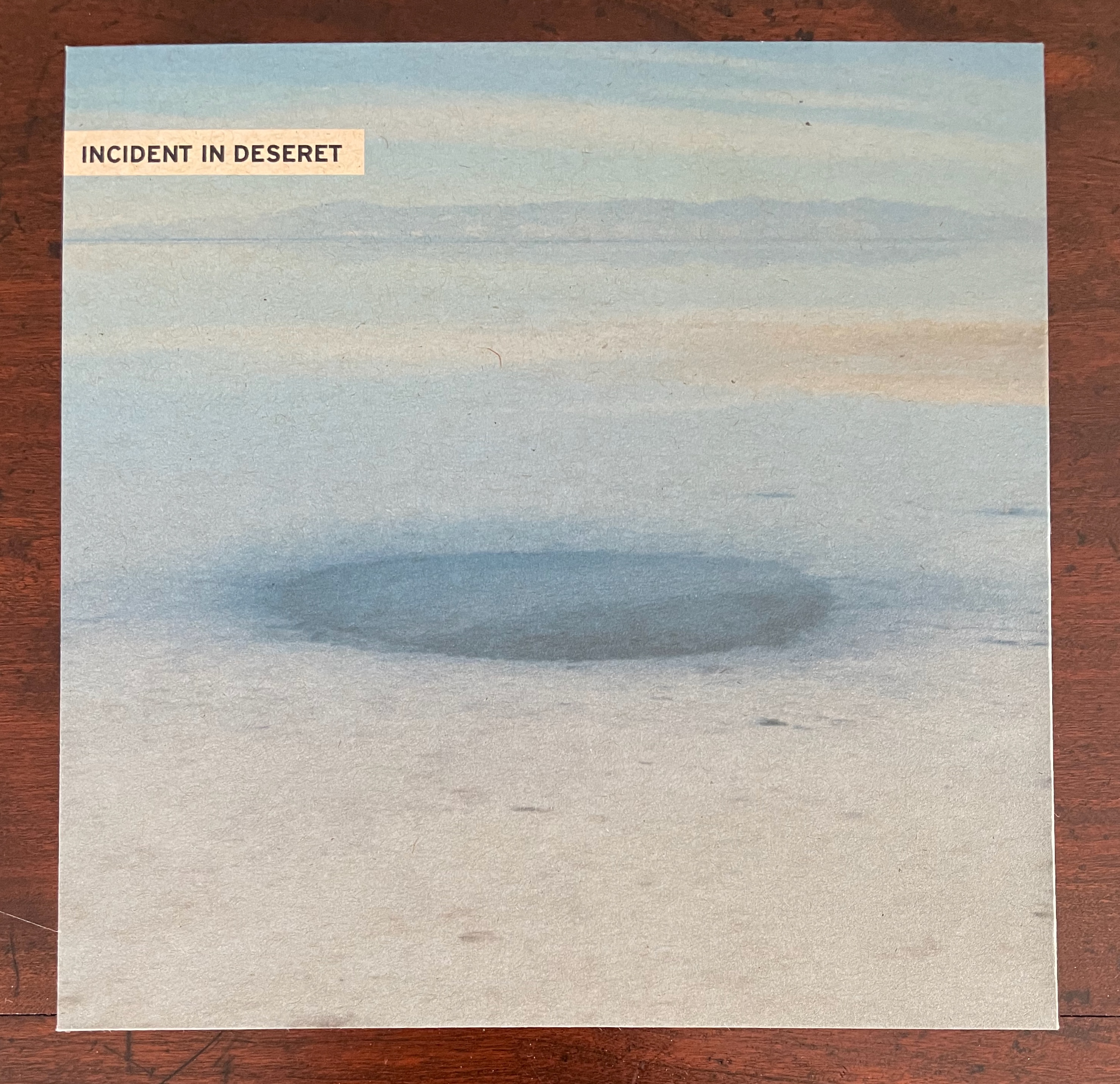
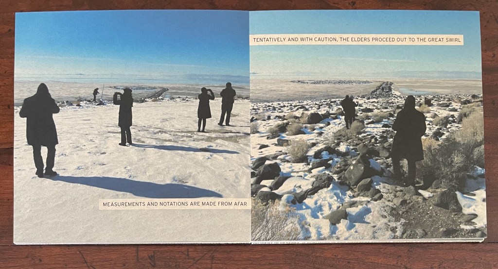
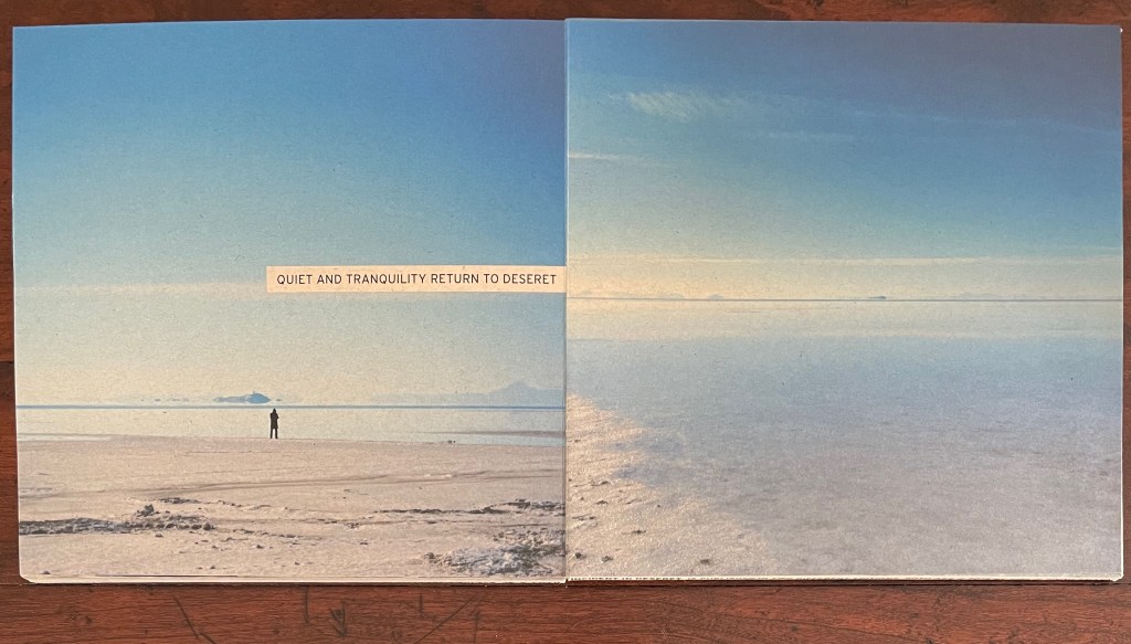
Incident in Deseret wastes no time and little space on preliminaries. The board book pulls you in straightaway — just the way a children’s board book might — with impressive edge-to-edge photos of the setting. Where you would expect to find the text of a copyright page, title page, etc., the only words you see are as much the opening to a mystery as an identification of the locale. After all, “deseret” might be a typo for “desert” unless you know that it is the name the Mormons called the provisional state from which Utah emerged. If you do, you will likely identify the wasteland as Utah’s Great Salt Lake. But given that only the edges of the book’s drumleaf binding provide the confirming details (more on this later), you can safely conclude that this preliminaries-less opening reflects a clear intention: to reserve the book’s pages for telling a story.
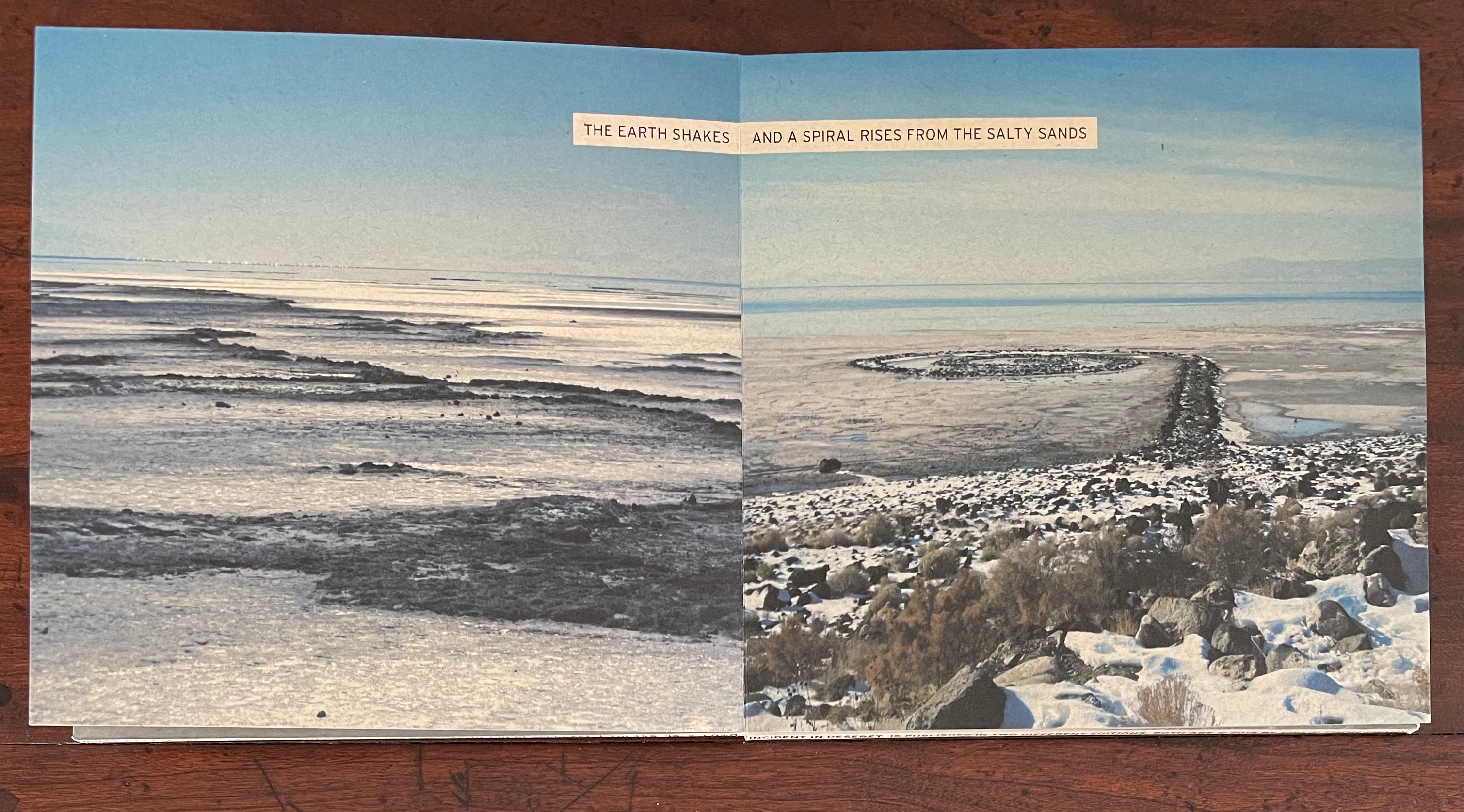
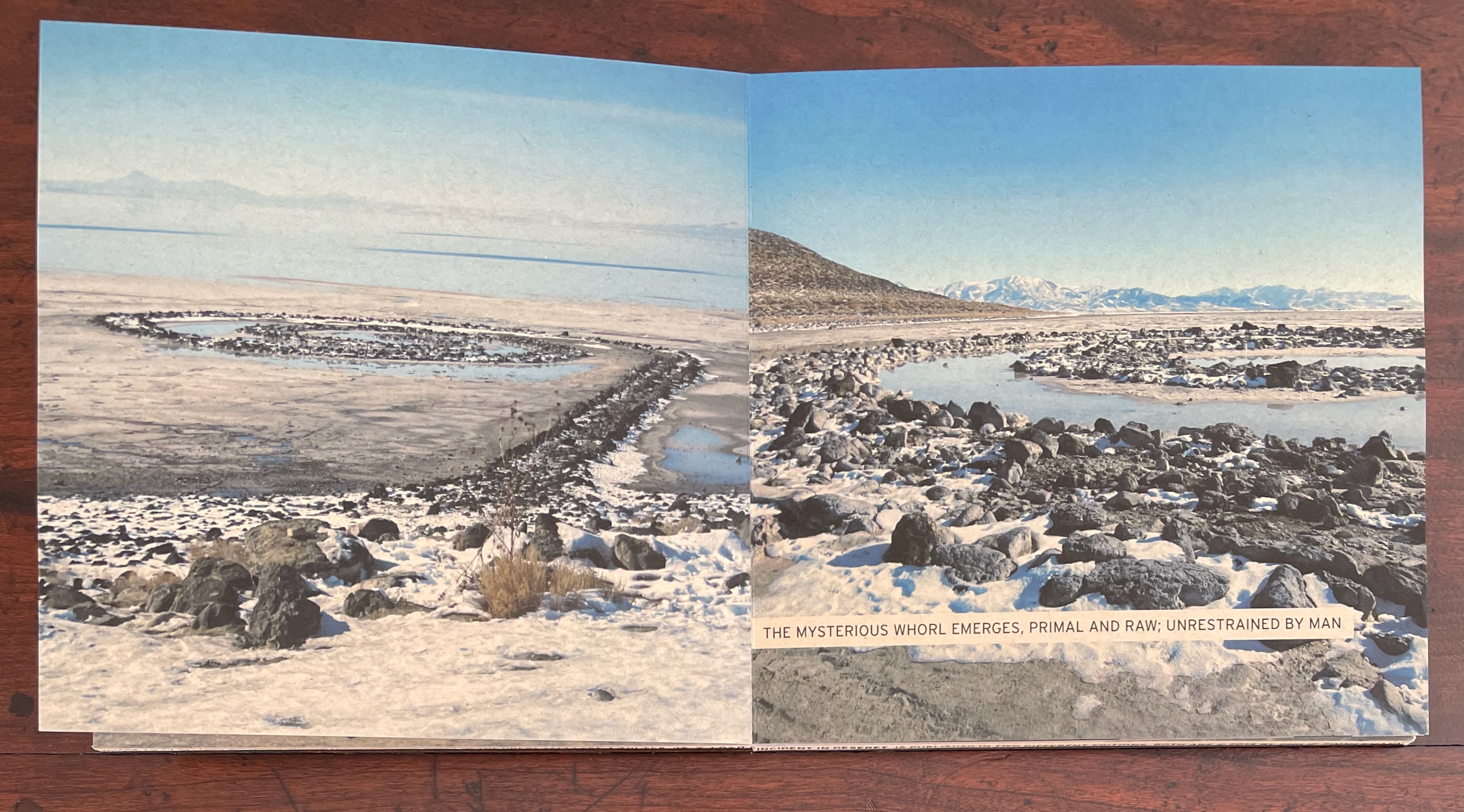
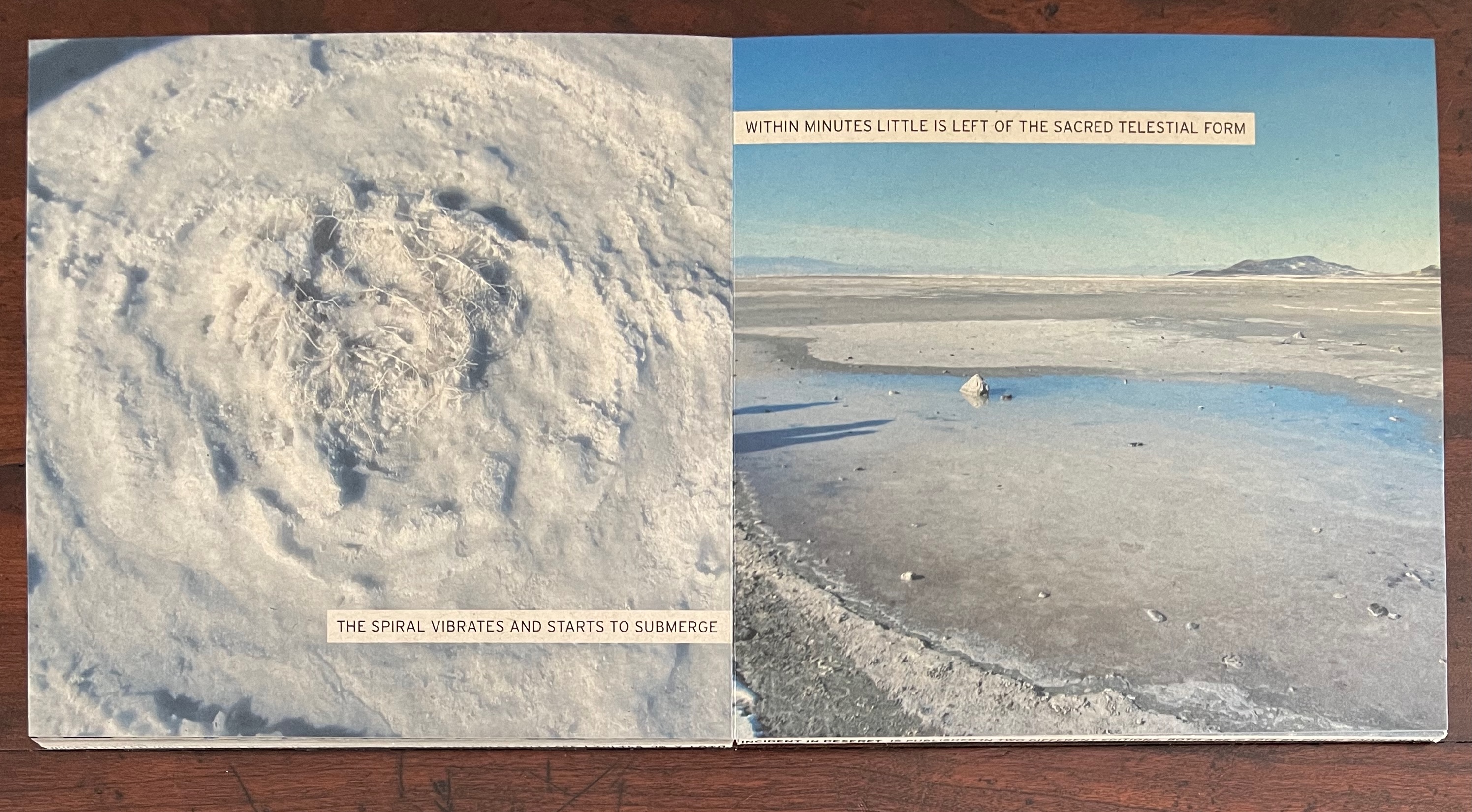
The story’s first action adds to its fictitious fiction. It is no accident that Robert Smithson’s The Spiral Jetty is not named within the book but only on the edges of the covers. The iconic artwork in a remote desert is being appropriated, tongue in cheek, as a supernatural phenomenon “unrestrained by man” despite being very much a human work of art imposed on the natural.
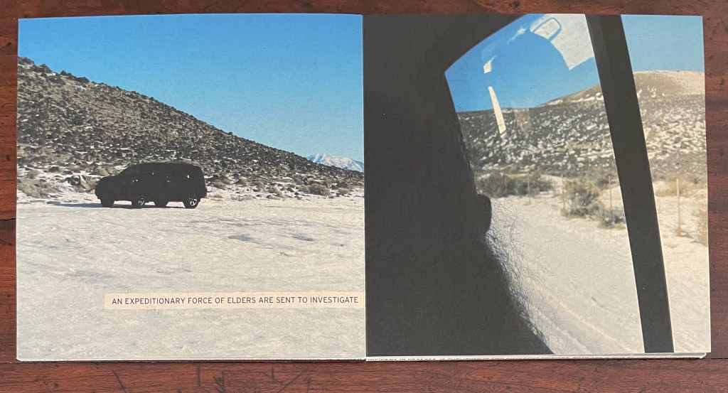
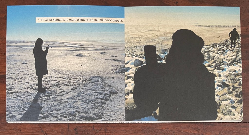
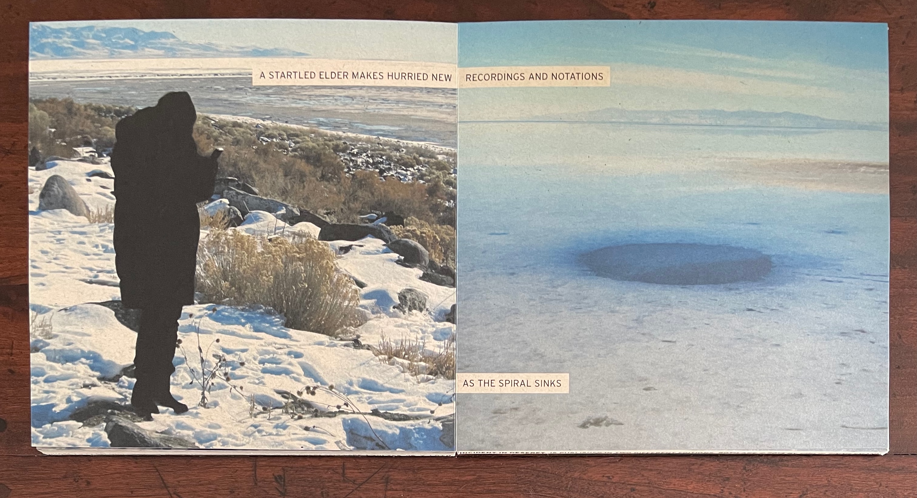
The arrival of “Elders”, all in black, heightens the religious overtones, but as with Smithson’s artwork, the religious term is being appropriated: the Elders’ activity seems more that of scientists and surveyors, which later in the book they confirm by arguing “over the cosmic reasons for the spiral”, checking and rechecking their observations, making final calculations.
On the other hand, what kind of scientists and surveyors use “celestial nauvoocorders”? Like the setting, Nauvoo is borrowed from the Mormons, a name that their founder Joseph Smith gave to Commerce, Illinois upon settling there in 1840 for six years. Although Smith wrote that the name derived from the Hebrew word meaning “beautiful”, the word “nauvoocorder” is the artist’s portmanteau for the Elders’ cameras recording the phenomenon of “celestial beauty”, and so is “nauvooite” for the chunks of salt they collect. Other borrowings from the Mormons are “Kolobian” (relating to Kolob, the heavenly body nearest to the throne of God) and “telestial” (“Of or pertaining to the lowest degree of glory“), but in the context of the story, the words could come from a tale of science fiction.
And eventually the final main activity is one of science fiction, and like much of science fiction, the conclusion to the story closes full circle.
A further word about the binding that has facilitated this uninterrupted tale.
With the unusual drumleaf binding, the artist gives himself the space for the absent preliminaries. It expands the edges of the front and back covers. Here is where the copyright page, title page and dedication appear. Printed around the front drumleaf cover’s four edges is the following:
Incident in Deseret | Philip Zimmermann | Spaceheater Editions | 𐐸𐐬𐑊𐑉𐑌𐑅 𐐻𐐭 𐑄 𐑊𐐫𐑉𐐼 𐐸𐐬𐑊𐑉𐑌𐑅 𐐻𐐭 𐑄 𐑊𐐫𐑉𐐼 | Published by Spaceheater Editions | 5467 East Placita del Mesquite, Tucson Arizona 85712 | http://www.spaceheatereditions.com | 520.979.8407 | This book is dedicated to Karen on whose fifty-second birthday we visited The Spiral Jetty in the Great Salt Lake | 𐐸𐐬𐑊𐑉𐑌𐑅 𐐻𐐭 𐑄 𐑊𐐫𐑉𐐼
And around the back drumleaf cover’s four edges:
Incident in Deseret is published in two different editions, both are 2014 by Philip Zimmermann 𐐸𐐬𐑊𐑉𐑌𐑅 𐐻𐐭 𐑄 𐑊𐐫𐑉𐐼 | This book is one of a series of seven books inspired by a group visit on 2014.01.05 to Robert Smithson’s Spiral Jetty, each book by a different artist.| 𐐸𐐬𐑊𐑉𐑌𐑅 𐐻𐐭 𐑄 𐑊𐐫𐑉𐐼 𐐸𐐬𐑊𐑉𐑌𐑅 𐐻𐐭 𐑄 𐑊𐐫𐑉𐐼 | One in a series of seven books on the theme of The Spiral Jetty
The Deseret characters along the covers’ edges come from a public domain TrueType font called Huneybee Regular, which seems to be no longer available. The font here comes from the Deseret Alphabet Translator, which first appears on 17 September 2014 in the Internet Archive. The last three words in Deseret — 𐐻𐐭 𐑄 𐑊𐐫𐑉𐐼 — are “to the Lord”, but the first — 𐐸𐐬𐑊𐑉𐑌𐑅 — does not work as the intended transliteration of “Praise”. It should be 𐐑𐐡𐐁𐐞 in all caps or 𐐑𐑉𐐩𐑆 in cap and lowercase. In all caps, the entire phrase would be 𐐑𐐡𐐁𐐞 𐐓𐐅 𐐜 𐐢𐐃𐐡𐐔, but in the story’s context, accuracy in a particular religious script is not the point. More to the point is the way the script happens to echo the shape of Smithson’s Spiral Jetty, which Zimmermann has hijacked for the mysterious appearance and disappearance for the Elders’ investigation and interpretation. In that echo, the edges are drawn into the story.
Faith fascinates Zimmermann as an artist rather than a believer. Like many book artists, he finds in religion a source of commentary on human interaction with the environment (as above) and on humans’ interaction with one another (so below).
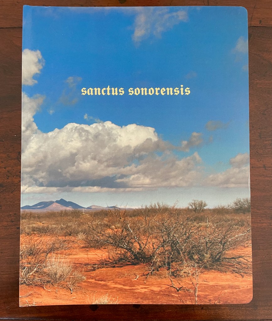
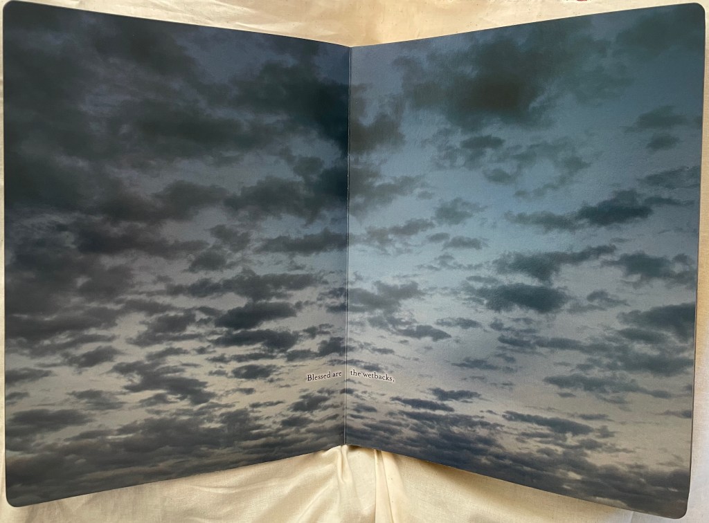
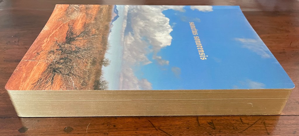
Sanctus Sonorensis (2009)
Sanctus Sonorensis (2009) Philip Zimmermann Perfect bound, self-covering board book, illustrated cover, gilt on top, bottom and fore edges. Gold-foiled title on the cover and spine. Four-color offset lithography. H273 x W208 x D35 mm. 90 pages. Edition of 1000. Acquired from Spaceheater Editions, 4 February 2024. Photos: Books On Books Collection.
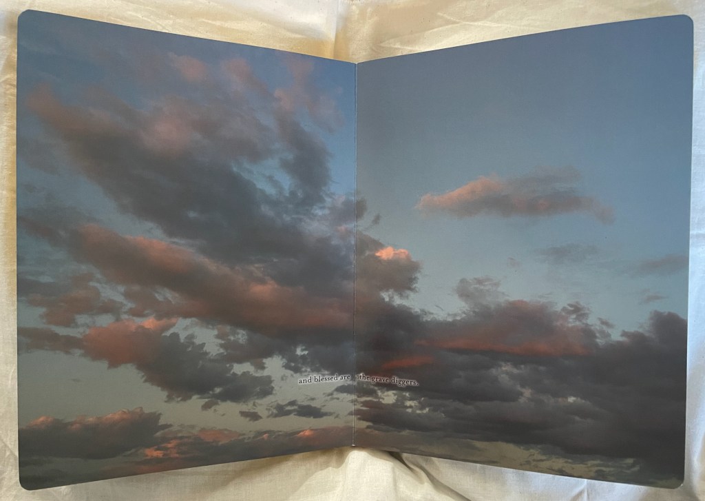
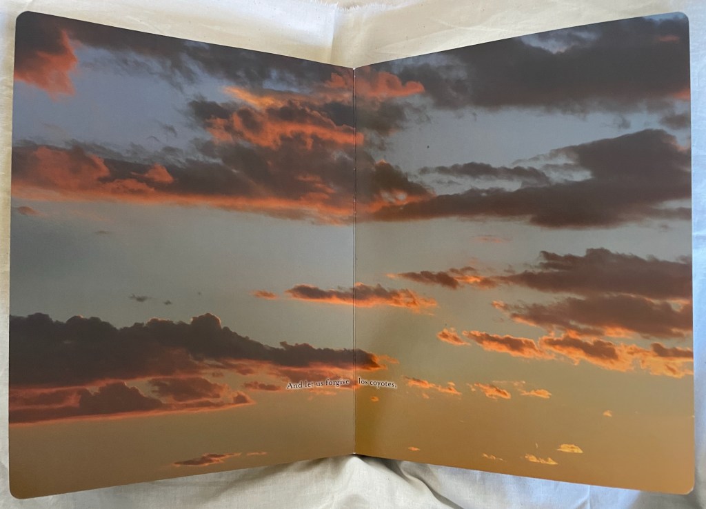
Sanctus Sonorensis begins and ends with double-page ground-level view of a patch Sonoran desert. In between, a series of spectacular double-page skyscapes takes the reader from dawn to moonrise over the desert. A litany of blessings — from “blessed are the wetbacks” to “blessed are the grave diggers” — occupies thirty-three of the double-page spreads. The roles are not exactly at odds with the Beatitudes of the New Testament, but they are insistently more numerous and particular. By the time evening is coming on in this location, the reader is safe to assume that these blessings are on illegal migrants. But who is extending the blessings? The deity, the artist, the migrants, non-migrants?
It’s complicated. There are mixed “material” signals on the journey as well. The rounded corners and gilt edges are reminiscent of religious breviaries or missals suit the text, but the board book construction is more common to children’s books, and yet the boards’ gilt edges urge more careful and slow page turning than do children’s books.
Also in contrast with the gilt rounded corners of a breviary or missal are the full-bleed double-page photos recalling a photobook or magazine. Yet the constant skywards view reinforces a prayerful, not playful or casual, perspective. That view would most likely belong to migrant eyes. Perhaps the blessings are self-blessings. For the non-migrant reader, the particularity of the roles and prayerful perspective might at least prompt an empathetic (or at least sympathetic) attitude, and perhaps that reader joins in the blessings.
As the blessings come to an end, there is a text-less double-page spread of a sunset sky. Then as the sunset deepens in the next spread, more text appears, akin to another New Testament prayer:
As this list continues — “let us forgive the Border Patrol, let us forgive the Minutemen, let us forgive la migra” — it seems to come more from the migrant perspective. Los coyotes (above) refer to the people smugglers on the southern US border. La migra is short for inmigracíon or immigration and can be short for migrant, but it is also migrants’ slang for any immigration officials. If a non-migrant reader is uttering this invocation, it would have to be one who has signed on in all humility to the irony of William Tyndale’s version of the Lord’s Prayer in Luke 11:
And forgive us our trespasses, as we forgive those who trespass against us.
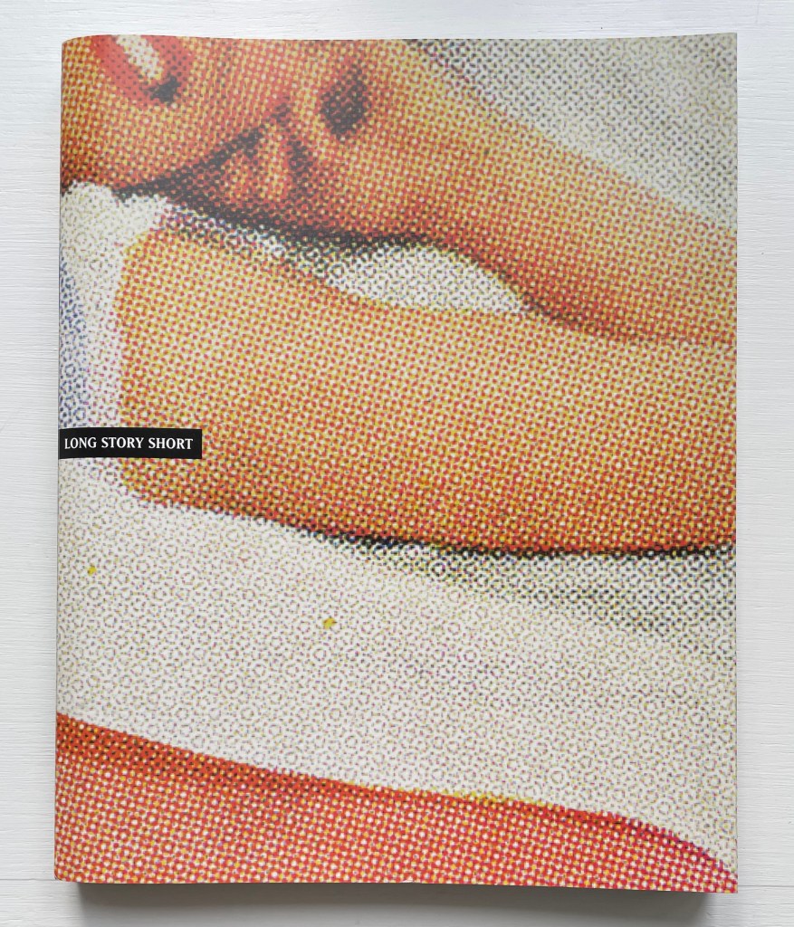
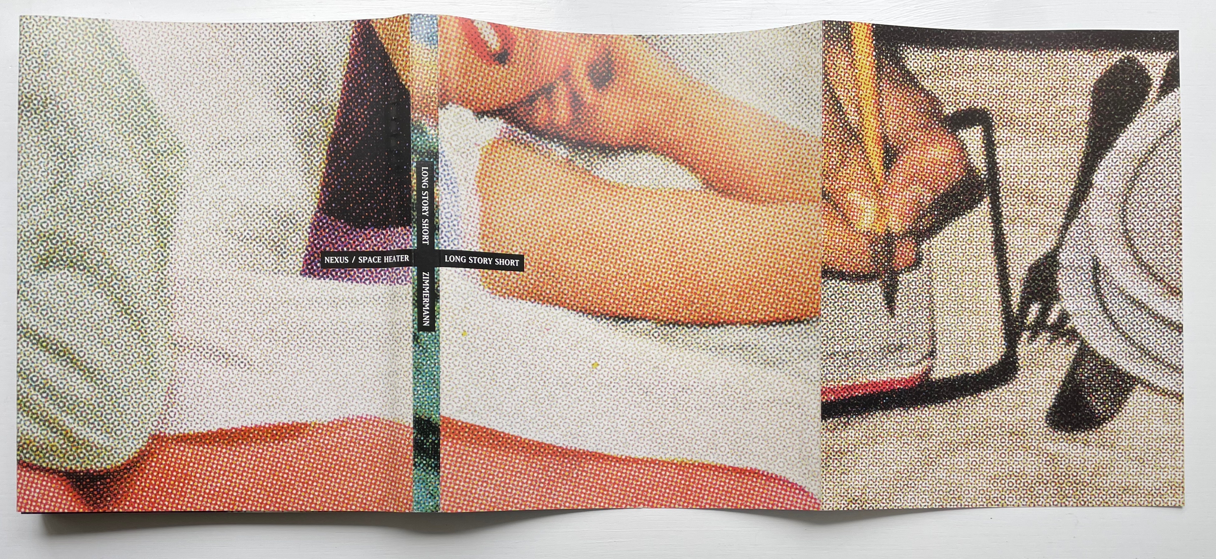
Long Story Short: Home is Where the Heart Is (1997-99) Philip Zimmermann Wire-o-binding with wrap-around softcover, optical plastic title page H267 x W212 x D15 mm. 145 pages, including cover and wrap-around cover. Edition of 750. Acquired from the artist, 4 February 2024. Photos of the work: Books On Books Collection.
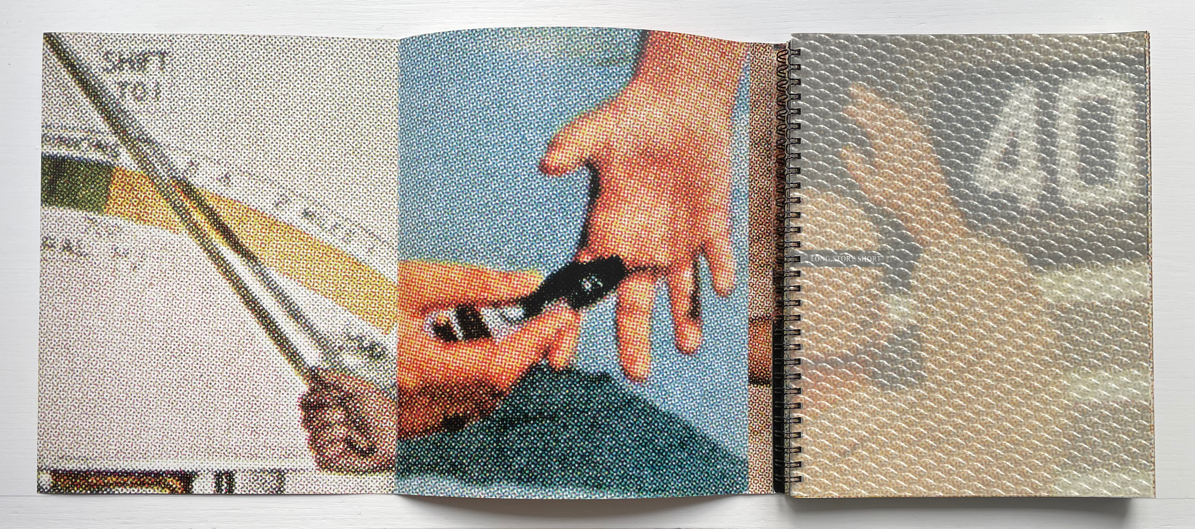
A cross between shaggy dog story, magician’s show and artist’s book, Long Story Short is anything but short. Opening the book delivers several tricks at once. First, there’s the “reveal” of the wire-o-binding hidden by the wraparound cover. At the same time, there’s the strange half-title page that seems embedded in some sort of thick piece of plastic, but this is an optical illusion that becomes apparent as you lift the thin sheet of plastic from over the half-title page underneath. But before you turn the eye-tricking plastic sheet fully to the left, you notice the cover’s folded flap.
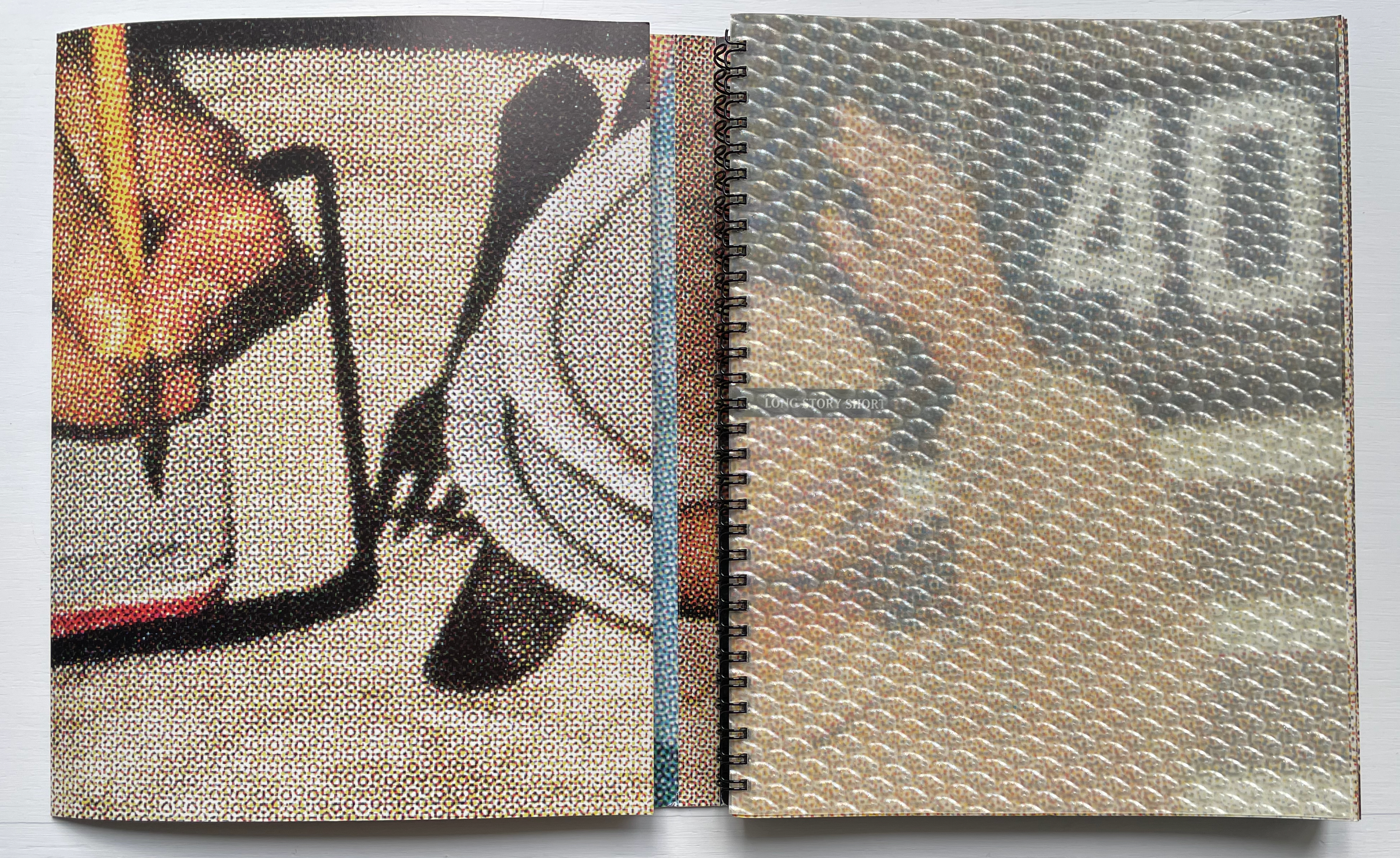
If you fold that flap out, the three-page spread probably leaves you puzzled. Other than the recurrent enlarged halftone dots and the images of hands, there’s not much in common across the spread to offer a clue to what’s going on. It’s enough to make you turn the whole thing over to see if the other side offers a clue.
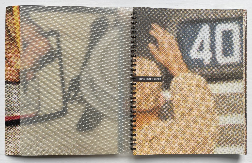
Hmm, while the outside of the wraparound cover shows a double-page spread with a joined-up image, the flap page, now on your right, does not seem to relate to it — other than with the enlarged halftone dots and the hands. Oh well, back to the beginning to turn that plastic sheet. Resting on a single sheet, the uncovered half-title page salutes the number 40 while its verso partner takes on a 3D appearance. Still a puzzle, but the next double-page spread with its magician’s show of an empty pair of hands crossed (or a mirror image of a single hand open) confirms the handsy theme and trickery afoot — or rather at hand. So turn the recto page (again, a single sheet), and the verbal-visual punning starts — from scratch, of course.
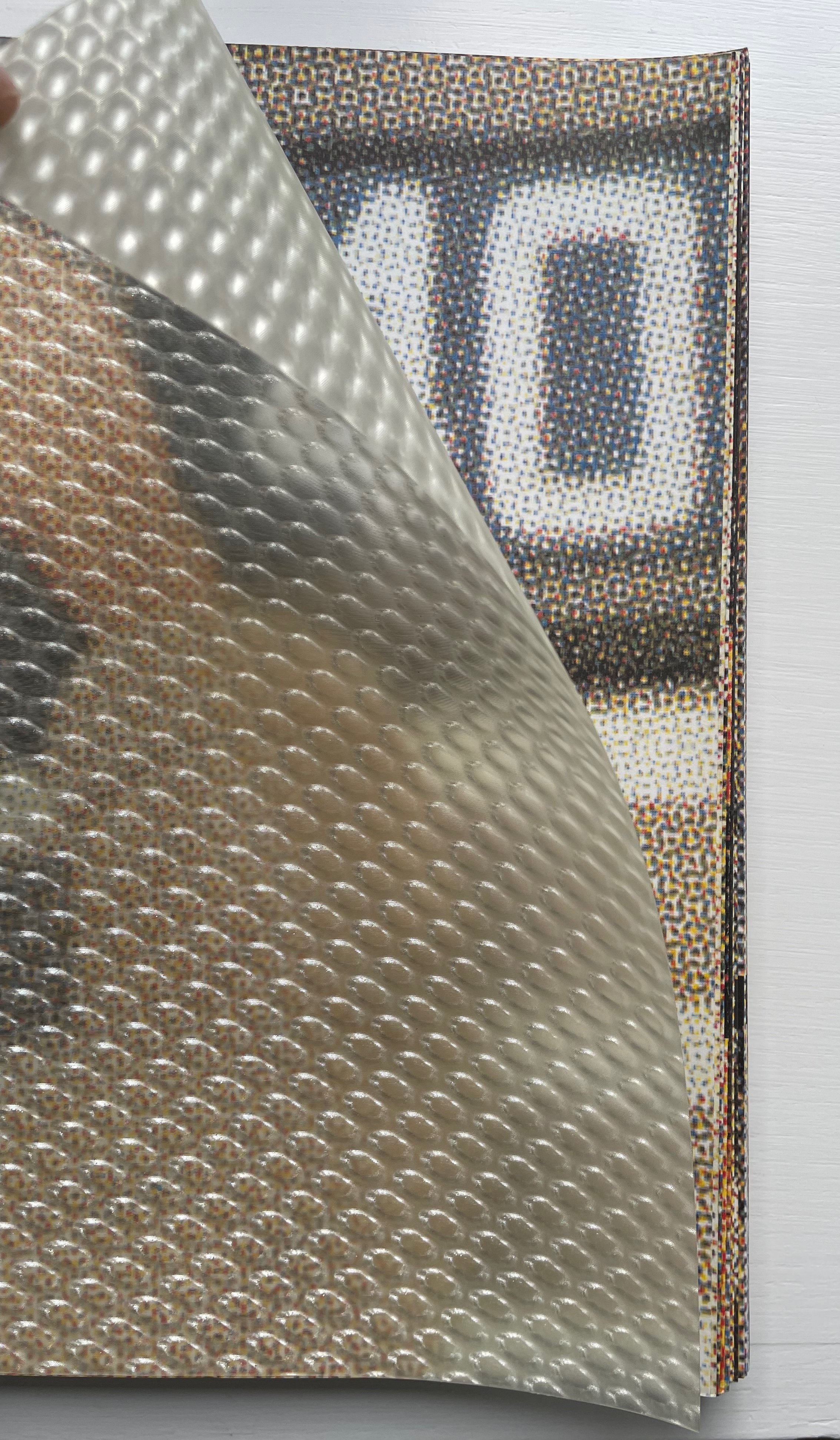
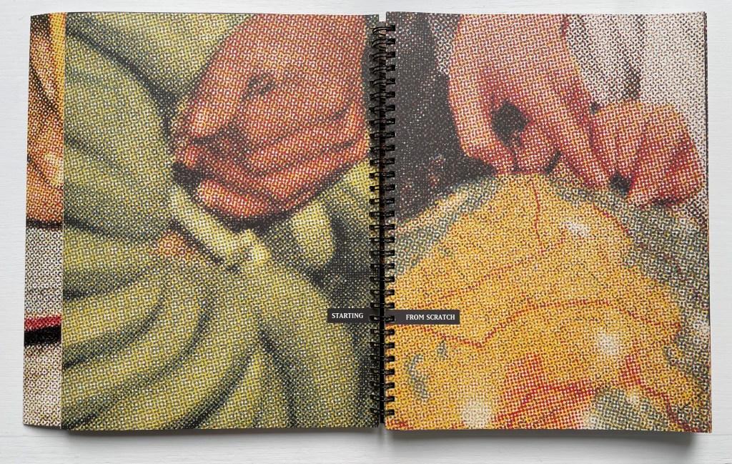
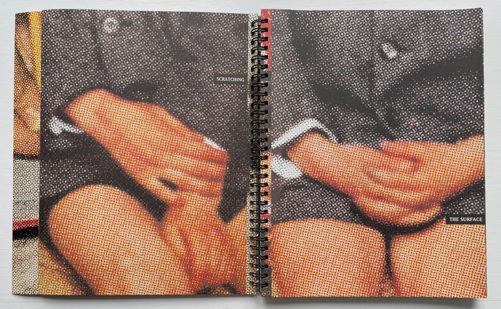
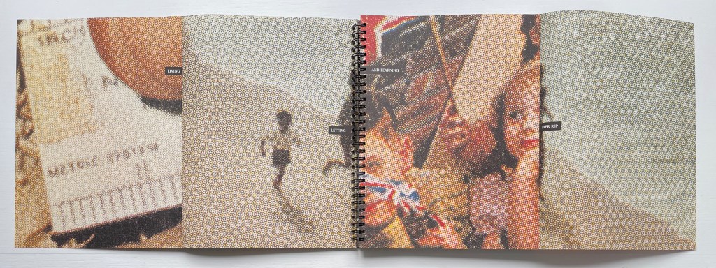
Will this be a children’s picture book about where green bananas come from? But wait, your fingertips are telling you that the recto page is on a folded sheet. Turn it, and the word game and the double-spread of two folded sheets on which it appears tell you that you are just scratching the surface. So open up the two folded sheets to find out what’s below the prim and proper.
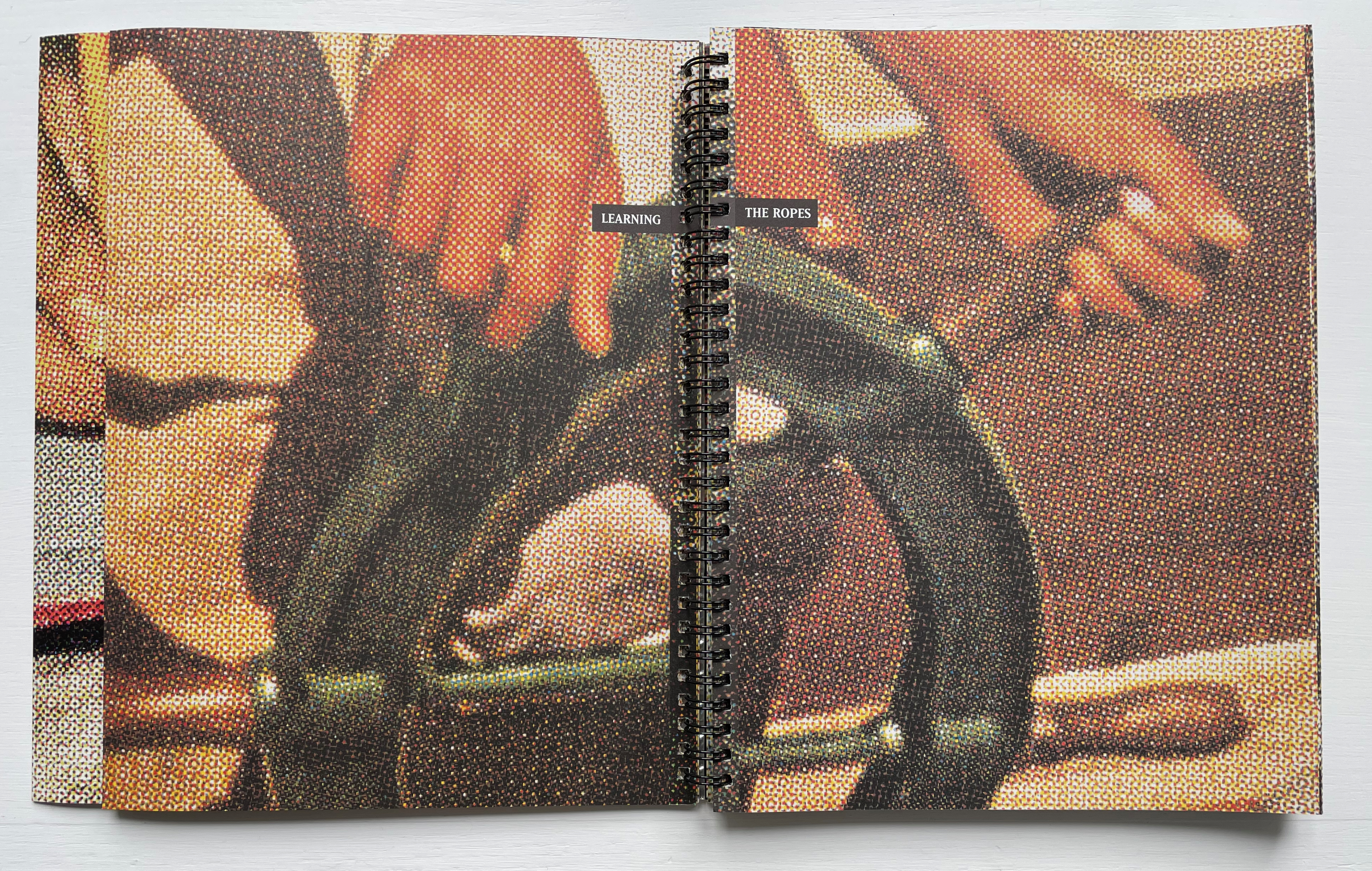
So now you know that this artist’s book is about “living and learning” and jumping over one page to another to do it. It’s about different measures (metrics) of the same thing and the borders they signal along which we have to run, “letting her rip” as in splitting a photo in two and leaping across an ocean to another country. It seems you are being whisked back in time to childhood, and if you refold the sheets and turn the page, there’s your 1950s dad looking over your shoulder, pointing something out in that long-ago country or sending you to the corner. It’s all about “learning the ropes” as the next double-spread of two folded sheets suggests.
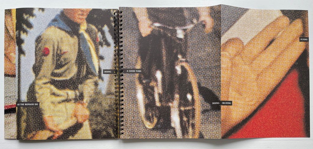
Like the splitting of phrases across pages, the book’s mix of single sheets and folded sheets slows down its reading. You have to take care to pick them apart. Another technique that makes this long story anything but short is a kind of harlequinade of aphorisms. From folded to unfolded, a spread can turn one saying into another, or on a single page, you may have to read diagonally from right to left, or you may find a phrase wrapping around the edge of the page and becoming yet another phrase and another as the sheets fold and unfold.
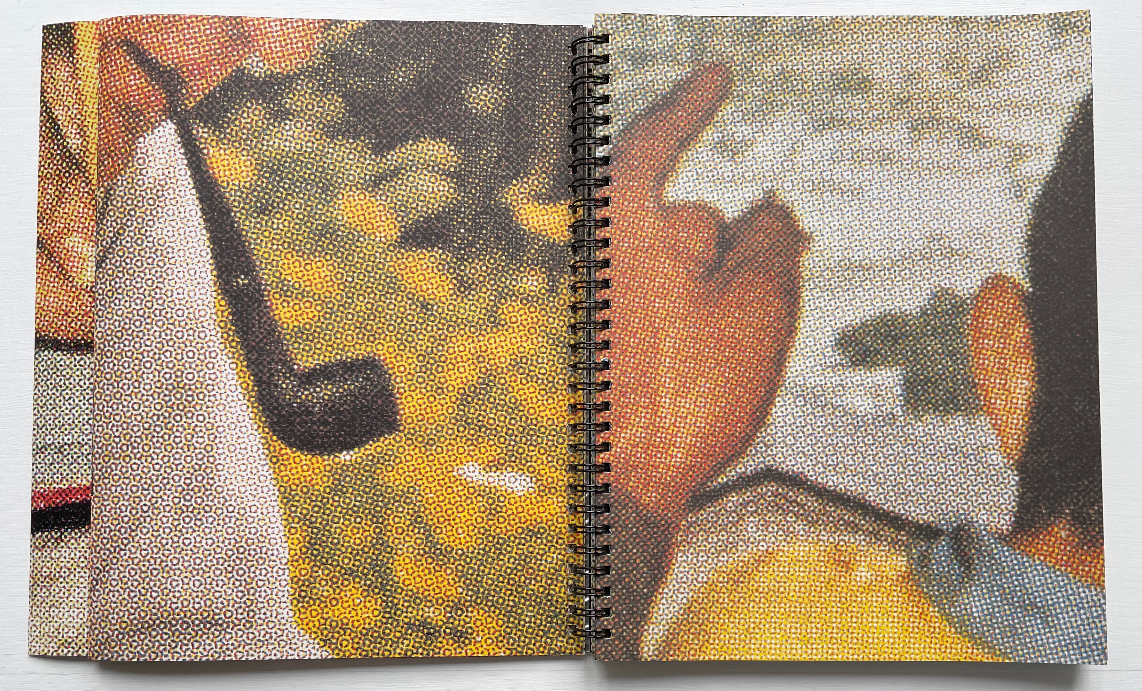
If you are not a Boomer, you can turn to the artist’s description to learn that all of the images come from sections of Look, Life, and other magazines from the fifties. Artists and close readers will appreciate his expansion on the technique of using large halftone dots:
I wanted all of the blown up halftone dots to be the same size, so I used a screen angle indicator to determine the line ruling of the originals and then used a calculator to determine the blown up size of the dots of the final image. I had a small rectangular mask that I would then place over the printed photo images to determine the crop. Then I scanned them in at very high resolution so that they could be blown up.
Despite its blurring or dissolving effect, the technique delivers a kind of visual unity or binding across the many crops and jumps from one image to another and across the single sheets and folded sheets. It combines with the recurrence of hand images to hold the work together. This tension between unity and fragmentation also plays out across the aphorisms breaking up and then reforming. And if in all that tension you cannot determine exactly what the long story short is, well then, “live and learn”.
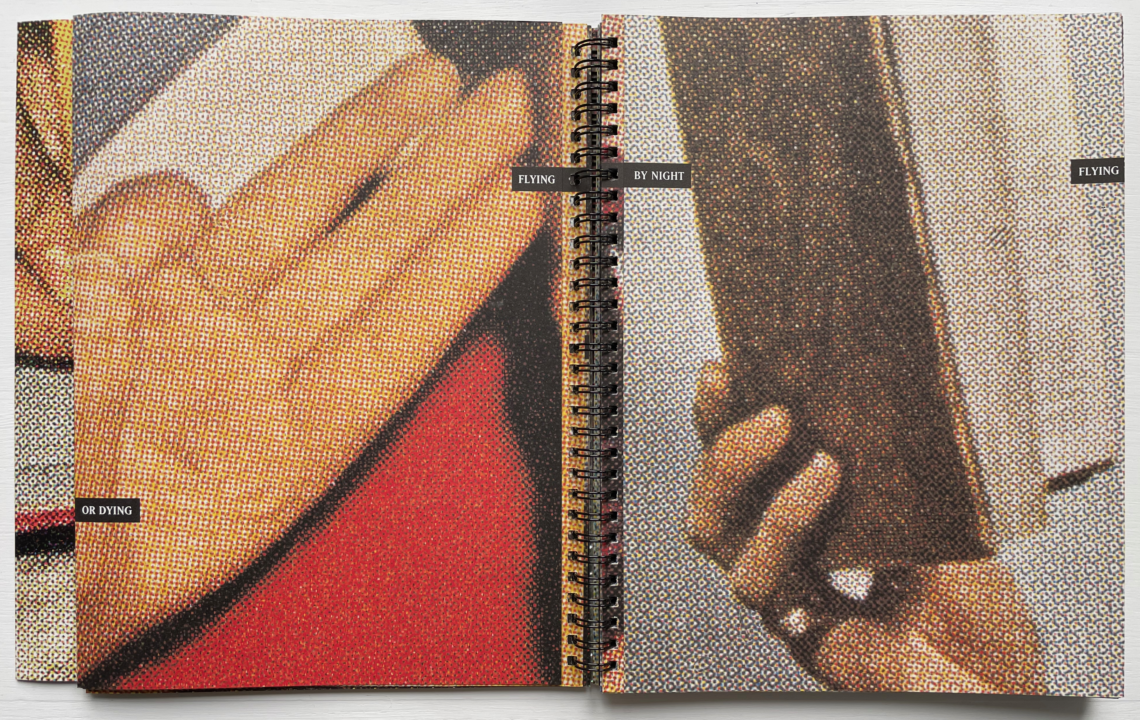
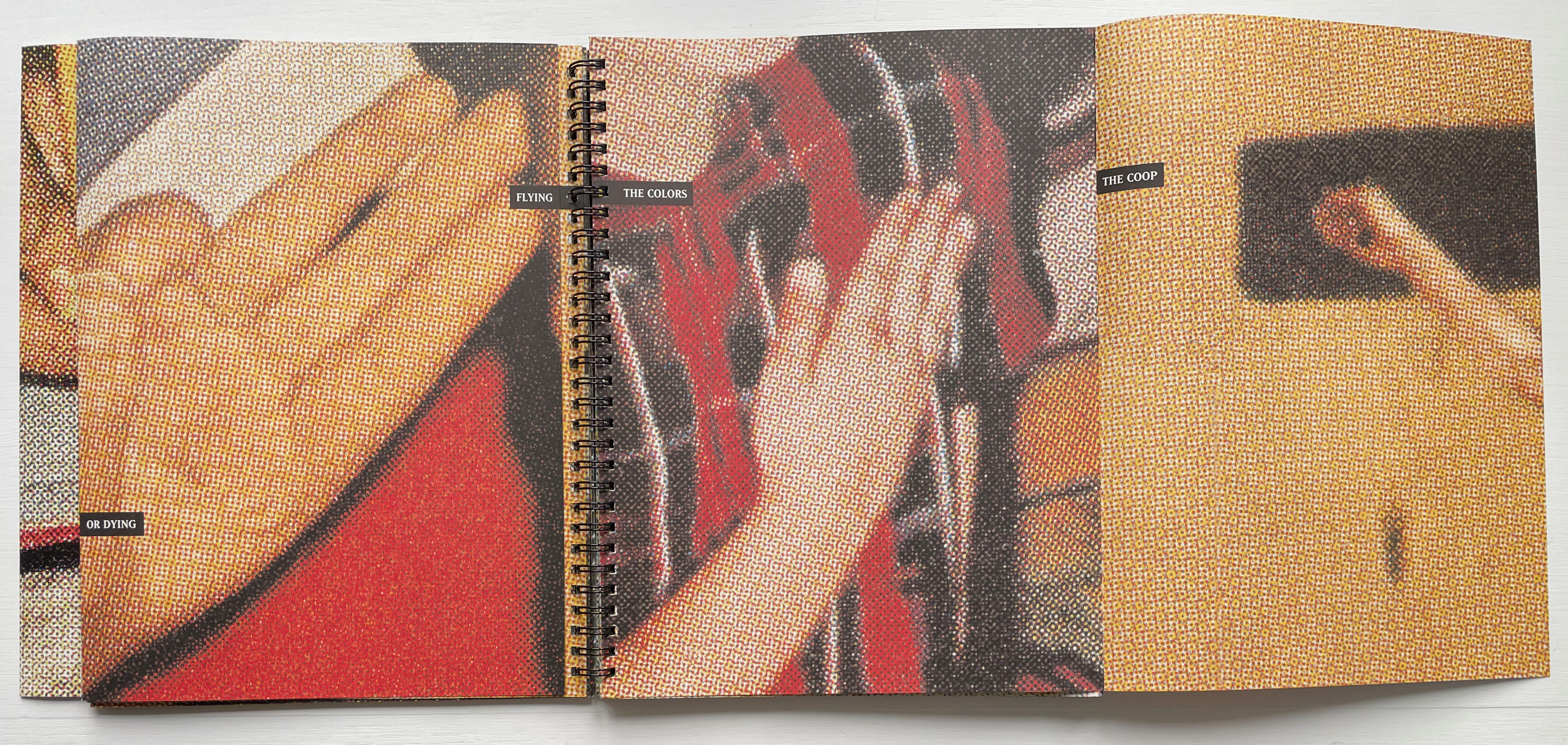
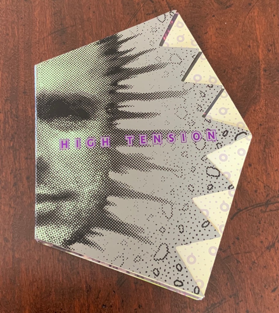
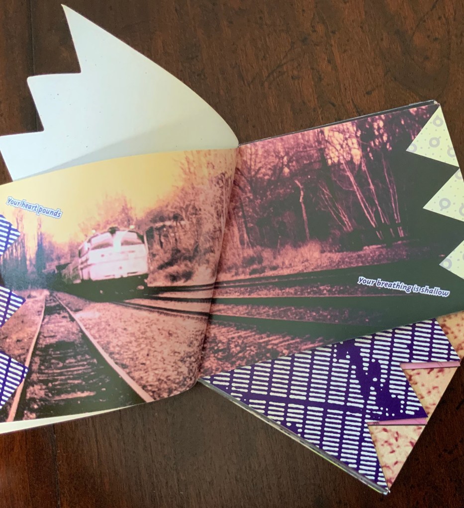
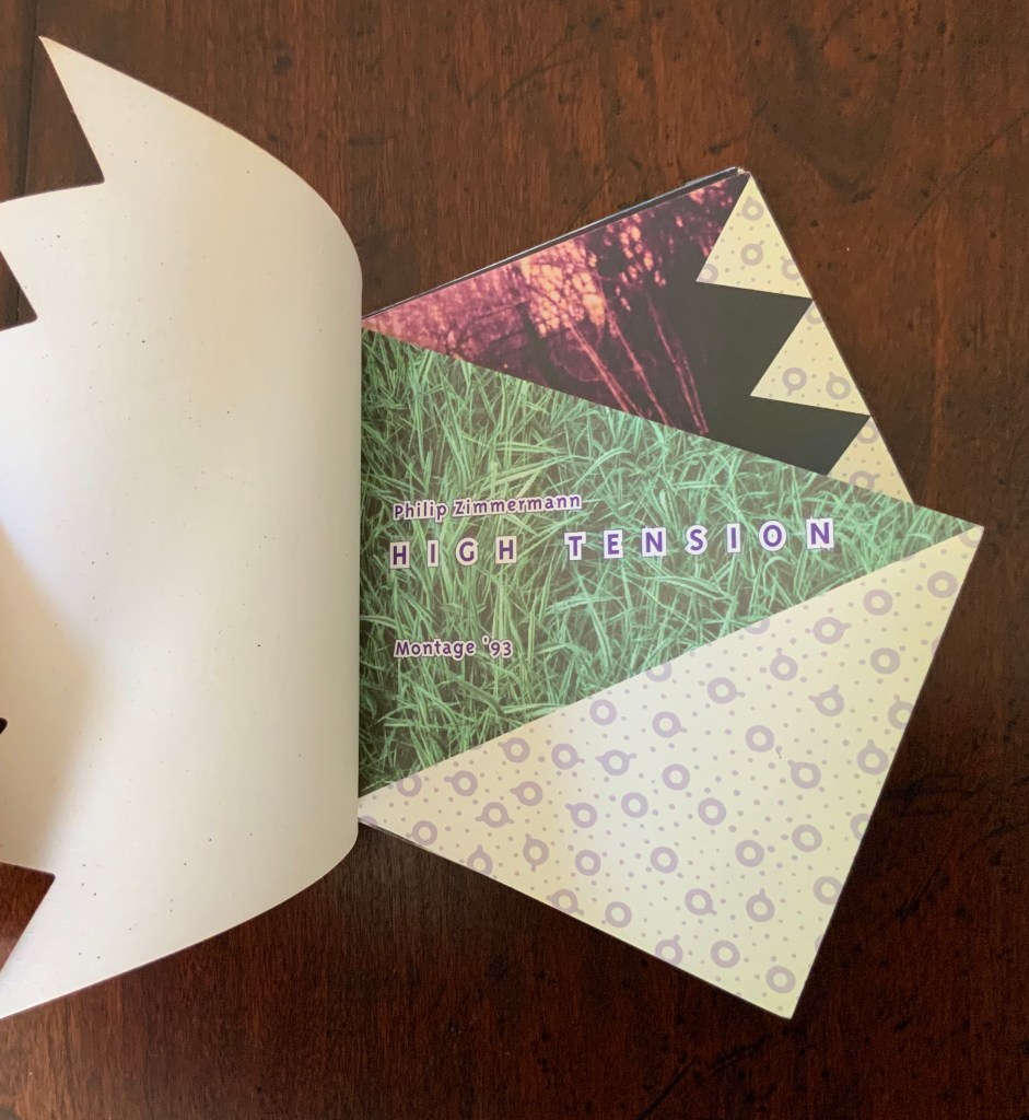
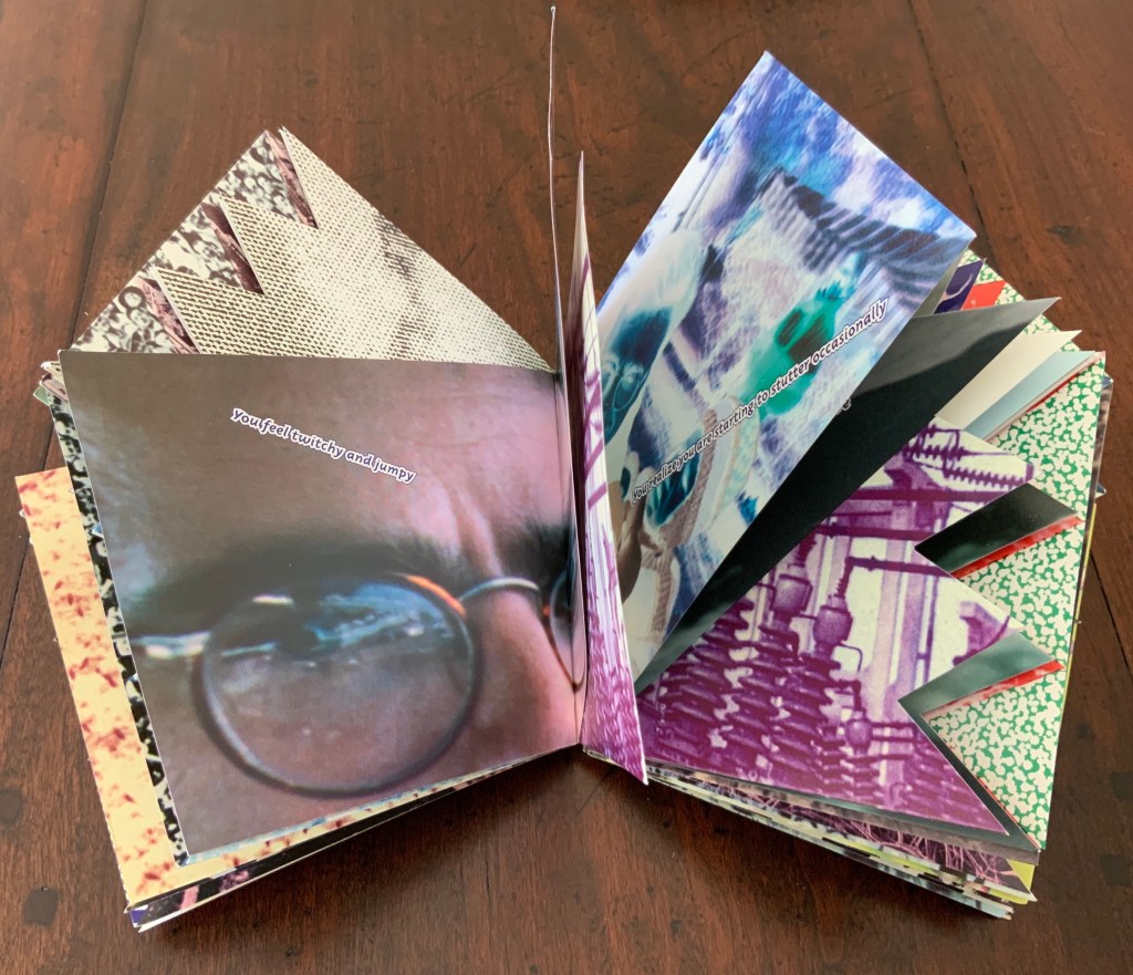
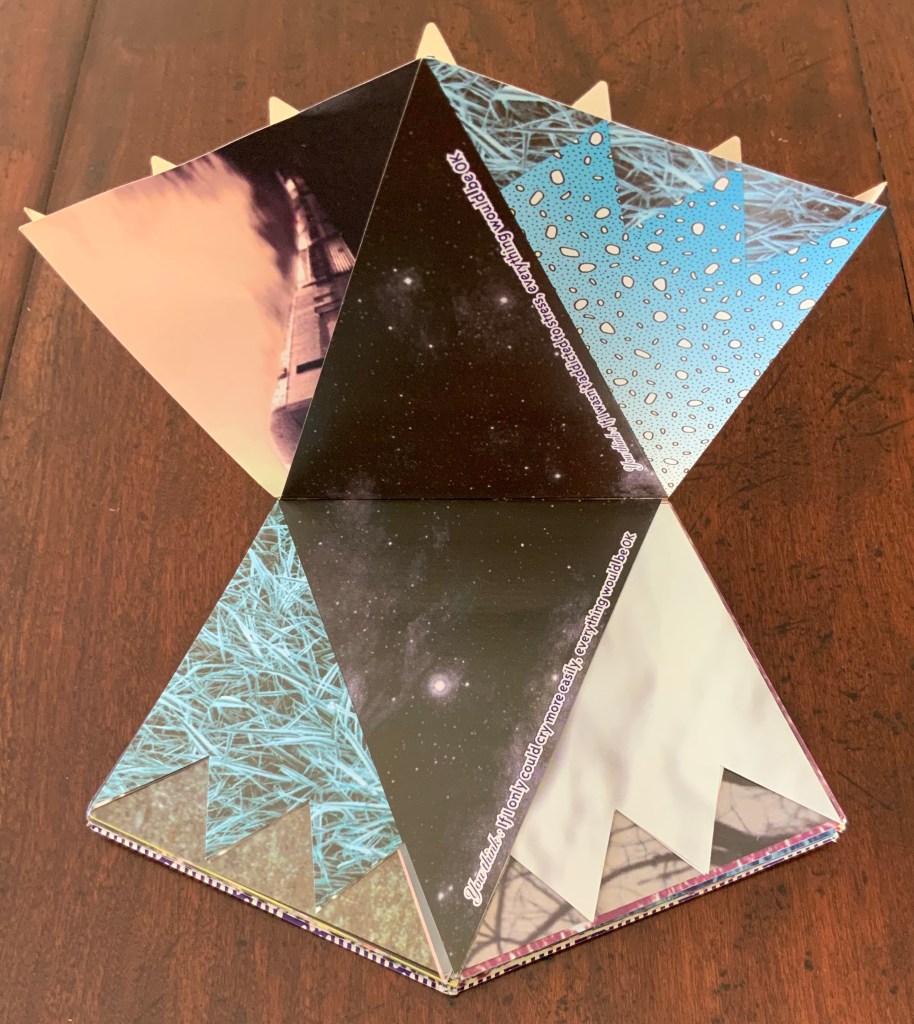
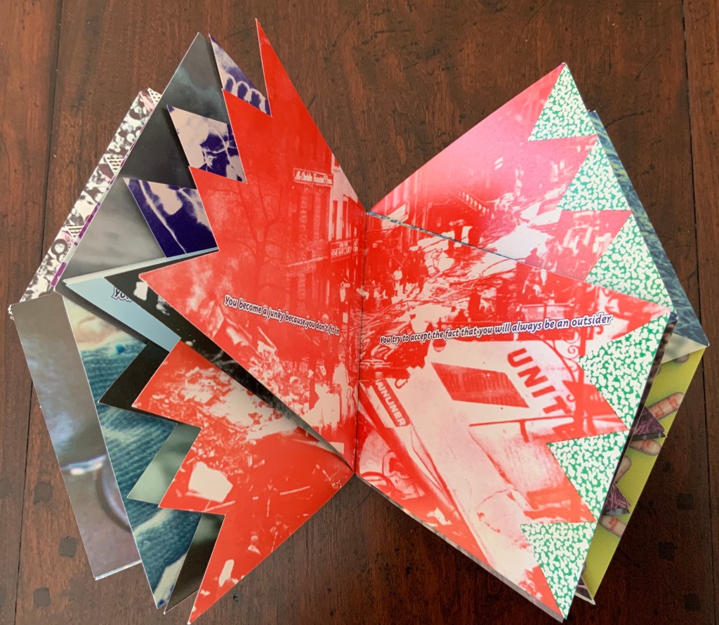
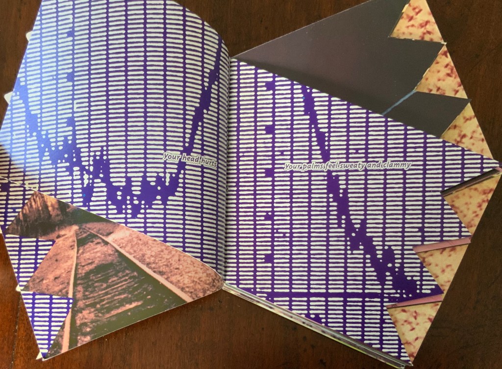
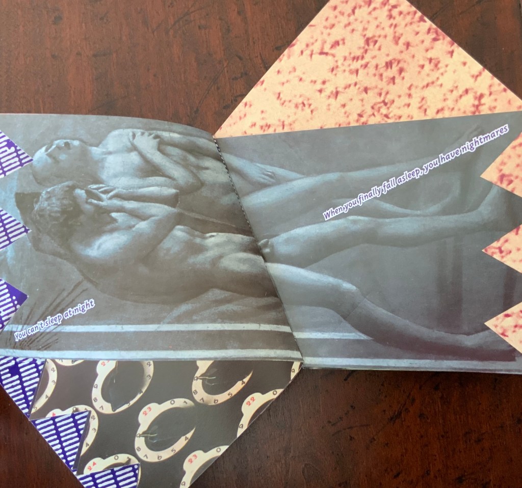
High Tension (1993)
High Tension (1993) Philip Zimmermann 5.5 x 7.9″; 96 pages. Pentagon with 4″ spine and each of the other sides 4.25″. Unmatched irregularly cut pages. Offset printed. Produced and printed for for Montage ’93, International Festival of the Image, Rochester, NY, 1993.
High Tension is a porcupine of a book. As Johanna Drucker put it, “It’s about anxiety, and it pricks your fingers as you turn the pages.”
The work has been well-described in The Cutting Edge of Reading:
[High Tension] overwhelms us with a surprisingly varied profusion of images. Each of the many double pages introduces at least one radically new picture having more often than not merely a marginal relationship with those that had preceded. We must process these words somewhat gingerly in terms of our own past experiences when immediate recognition fails. It would therefore appear that unpredictability characterizes the selection and succession of the graphics. Each new image has its own motif and its own color scheme. Dealing in its own way with representation, it imposes its own focus and its own scale to which the reader must adapt. Thus, each turning of a page practically guarantees a further disruption and reduces any hope that we may have entertained of discovering either a formal or a thematic continuity. Instead, it calls forth unsuspected resources within us. Surprise follows surprise without affording a moment of relaxation. Each page relentlessly renews the shock of novelty, but in so titillating a manner that we must dwell on each image without any desire to skip. The artist has of course abandoned or deliberately misapplied expected formats. The pages may overlap, but they never coincide with one another. Deviation happens on two levels: each page slants diagonally and, when turned, symmetrically prolongs across the gutter the preceding one. Thus, two successive pages point in opposite directions while jointly providing a partially coherent and integrated image — partially, because fragments of images from other double pages show a propensity to migrate or, if we may use a medical term in describing a pictorial and psychological venture, metastasize. As we move along, we can hardly avoid twisting and turning the book around for successive viewings of the double paged pictures. Obviously, we can no longer rely on the measured progress so characteristic of reading. Moreover, the angularity of the pages greatly increases the nervous energy of their graphic and verbal content. …
Renée Riese Hubert and Judd D. Hubert, The Cutting Edge of Reading: Artists’ Books (New York: Granary Books, 1999), pp. 168-73.
There are also third and fourth deviations to add to what the Huberts observed above. Note how the orientation of the text and images varies across the double-page spreads. Text runs at different diagonals and sometimes apparently horizontally as expected (for example, in all of the spreads below). Sometimes images are vertically aligned within the double-page spread but at an angle (for example, the graph below), and sometimes horizontally (for example, the Masaccio below that).
Zimmermann himself writes at length and self-critically about the work on his website:
This was the first book that I had ever done that was completely imaged and output on a computer. I used my Macintosh to lay out the pages and then output the film at Purchase College on the AGFA image setter we had there. I did all the film assembly and made the offset plates at my studio at home in Barrytown NY and then took the finished plates up to Rochester in April of 1993 for printing. Pressman Paul Muhle did the presswork this time, on the same Heidelberg KORD press. …
I was at VSW for two weeks during the printing of High Tension, living in the artists’ apartment there at 31 Prince Street. The book was then packed up and sent out to Publisher’s Bookbindery in Long Island City for the die-cutting and foil stamping and finally the smythe-sewing. As it turned out, the book was sub-contracted to a bindery in western Massachusetts. Every aspect of the job was botched and I lost about a third of the edition of a thousand to mis-registered die cutting, torn pages, badly sewn books and many other problems. High Tension was a very difficult binding job, it is true. There are no right angles to line the signatures up by. However I think that when the bindery realized how difficult a job it was they decided to just slap it out with no care whatsoever rather than lose a lot of money on it. Because of the due date being the opening of Montage ‘93 in July of 1993 I had no choice but swallw [sic] the bad binding. If I had time, I would have forced the bindery to reprint the whole book and do the job over again. I had a very precise die-cut master sent with the job that somehow got lost and I later found out that was why the die-cutting was so poor.
The budget for the book was substantial both because of the rather large amount of production money from Montage ‘93 but also because of a Faculty Development award from Purchase. I also contributed some of my own money. Still the money was not enough to do the whole book by full color CMYK process printing. So I decided to try to output everything to three-color CMY separations, which required some special fiddling with Photoshop. That meant no black ink at all is used in the whole book, which few people realize. The entire book was done as three color “process”. This saved one set of plates and one press run for each side of every printing form, but it was much harder to print for the pressman because ink levels really had to be turned way up on the coated paper to get anything close to a black made up of just cyan, magenta and yellow. In retrospect I wish I had just found the money and printed it as normal CMYK sets because the blacks are not as good as normal and are uneven.
One additional innovative production feature of the cover was that I made a duotone foil stamp, which as far as I know is the first time that had been done other than the cover I had done for an earlier book Interference published by Nexus Press.
Philip Zimmermann, “High Tension”, Spaceheater Editions. Accessed 27 February 2020.
As with Landscapes of the Late Anthropocene, reading Zimmermann about the process and technique is an education in how to look at book art.
Kariniemi, Merja; Nors, Minna; Kujanpää, Marjukka; Pajula, Tiina; and Pihkola, Hanna (VTT Technical Research Centre of Finland, Espoo). Nov/December 2010. “Evaluating Environmental Sustainability of Digital Printing“. The IS&T Reporter. 25:6. Springfield, VA: Society for Imaging Science and Technology.
Rafferty, Colin. 12 January 2006. Interview with Colin Rafferty, Book Arts Podcasts, University of Alabama. Accessed 6 February 2014.
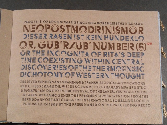
Van Wyk, Gary. 2018. Our Anthropocene: Eco Crises. New York: Center for Book Arts. Descriptive catalogue of an exhibition (19 January – 31 March 2018), p. 18.
Zimmermann, Philip. Artist’s statement on Landscapes of the Late Anthropocene. Spaceheater Editions. See also a Youtube video of the hard bound edition.
Zimmermann, Philip. 2013. Youtube video of Sanctus Sonorensis.
Zimmermann, Philip. 2014. Youtube video of Incident in Deseret.
Zimmermann, Philip. 2013. Youtube video of Long Story Short.
Renée Riese Hubert and Judd D. Hubert’s The Cutting Edge of Reading: Artists’ Books (Granary Books, 1999) is a signal work of appreciation and analysis of book art. Nearly twenty years on, it can be read and appreciated itself more vibrantly with a web browser open alongside it.
To facilitate that for others, here follows a linked version of the bibliography in The Cutting Edge of Reading — a “webliography”. Because web links do break, multiple, alternative links per entry and permanent links from libraries, repositories and collections have been used wherever possible. These appear in the captions as well as the text entries. Also included are links to videos relating to the works or the artists. At the end of the webliography, links for finding copies of The Cutting Edge (now out of print) are provided.