Books On Books Collection – Gracia Haby & Louise Jennison

Gracia Haby and Louise Jennison are exuberant archival eco-artists whose palette embraces the digital collections of the Metropolitan Museum of Art, New York Public Library, Rijksmuseum, State Library of New South Wales, State Library Victoria, and more. Their preferred media are paper, the artist’s book, and installations; their preferred technique, collage.

Dip and Bob (2021)
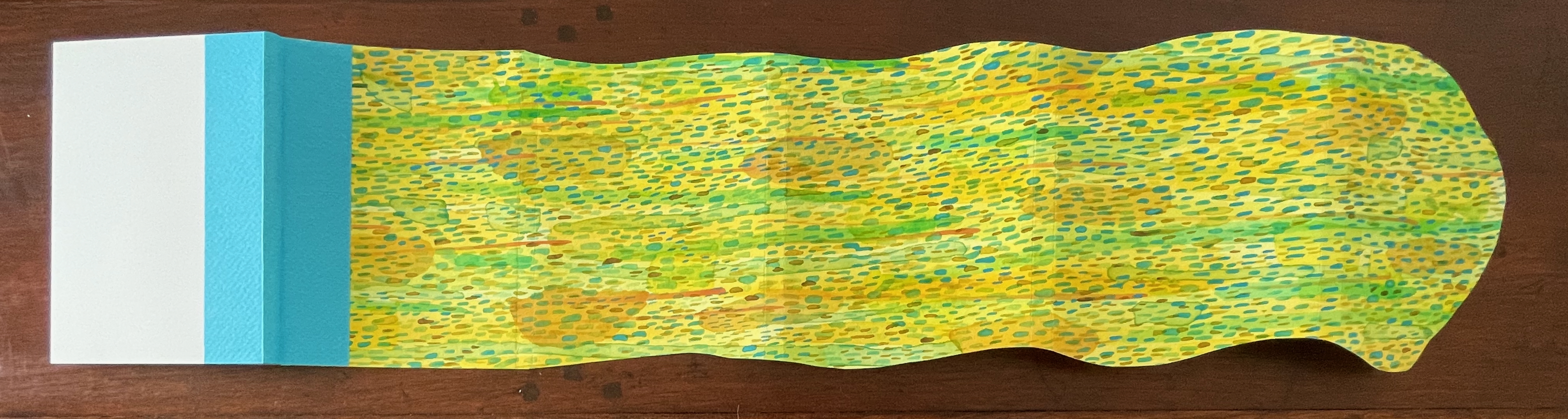
Colorful layered paper art featuring abstract patterns in green, blue, and yellow hues.

Dip and Bob (2021)
Gracia Haby & Louise Jennison
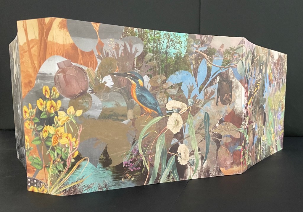
Casebound, softcover with five-panel irregular trim wraparound card. H149 x W110 mm. [72] pages. Edition of 50. Acquired from the artists, 21 February 2026.
Photos: Books On Books Collection.

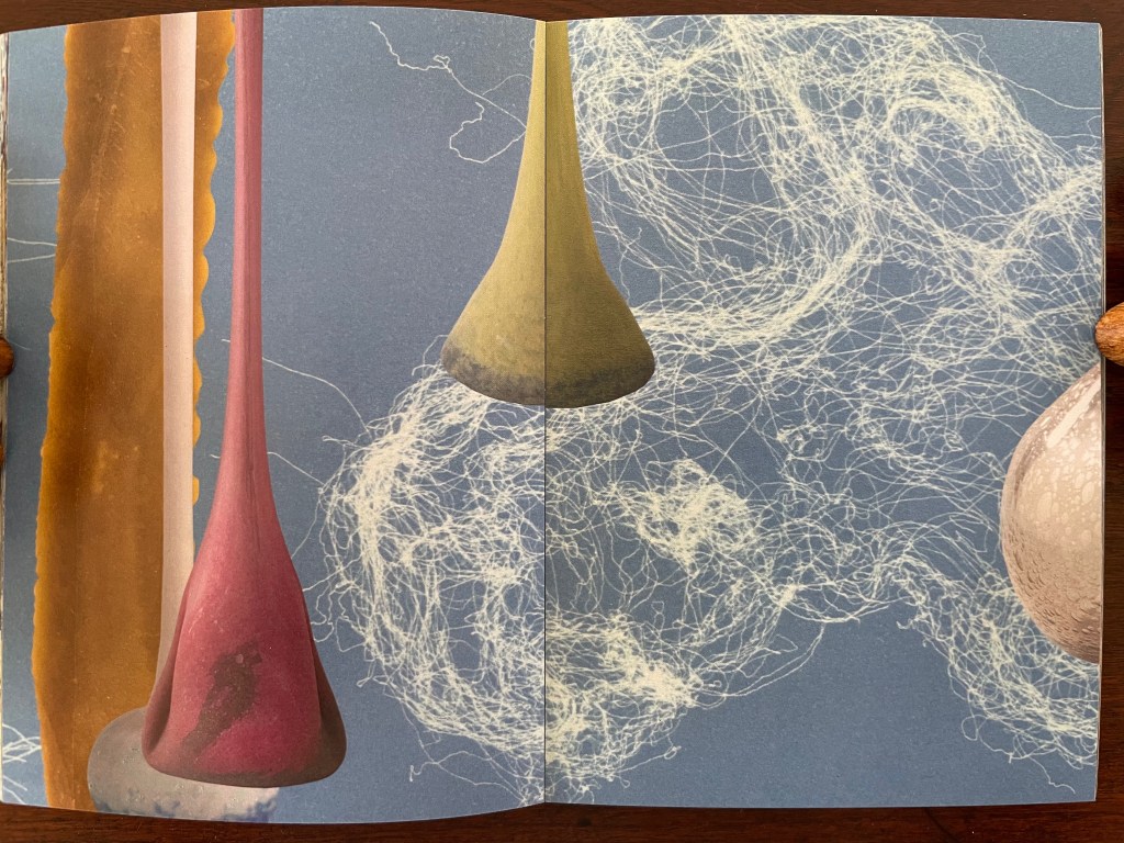
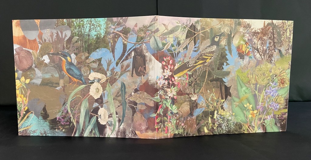
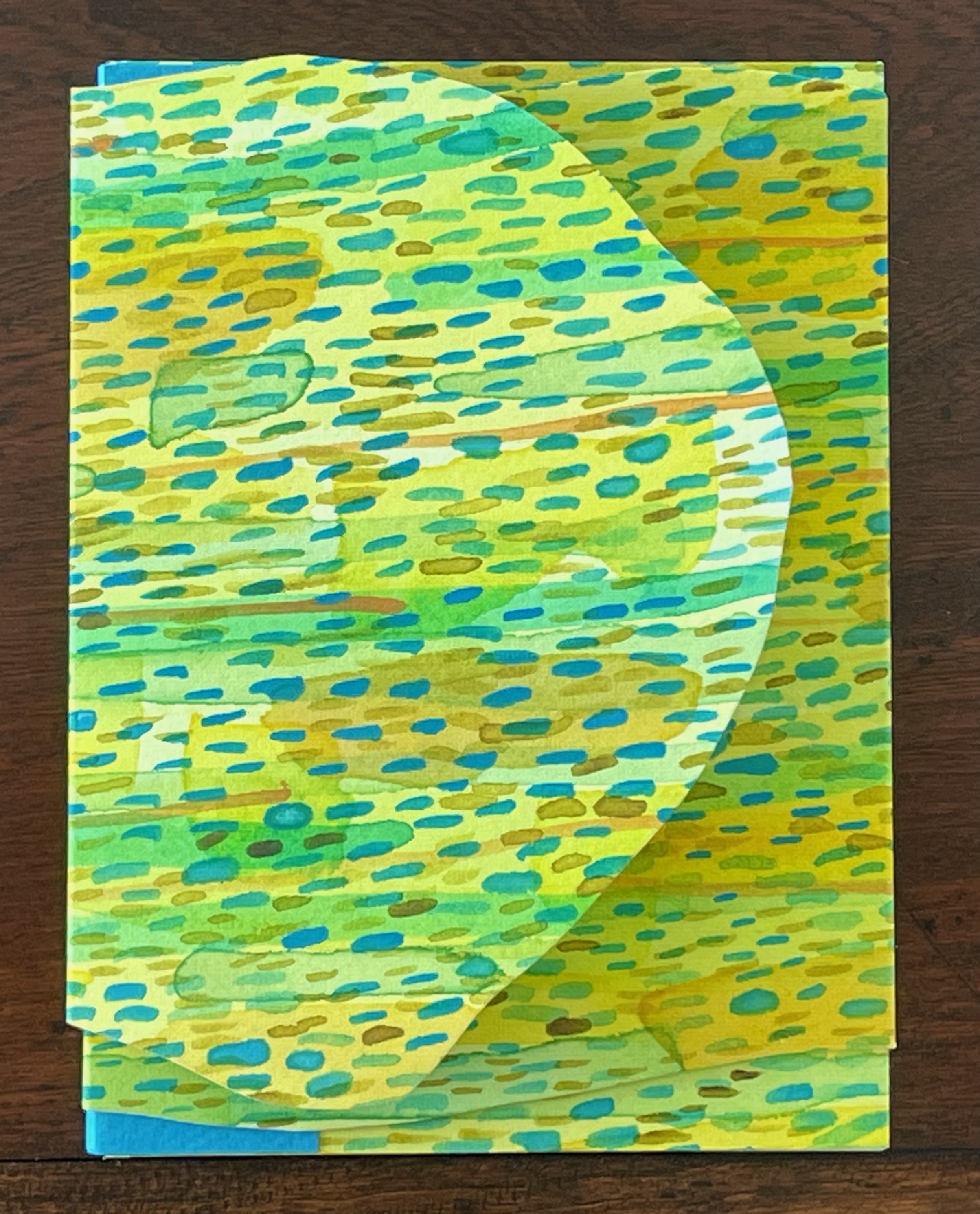
Like other works in the collection, Dip and Bob (2021) teases connections between the media of watercolor, artist’s book, performance, and installation. The cover is an original watercolor cover on Fabriano Artistico 300 gsm paper.
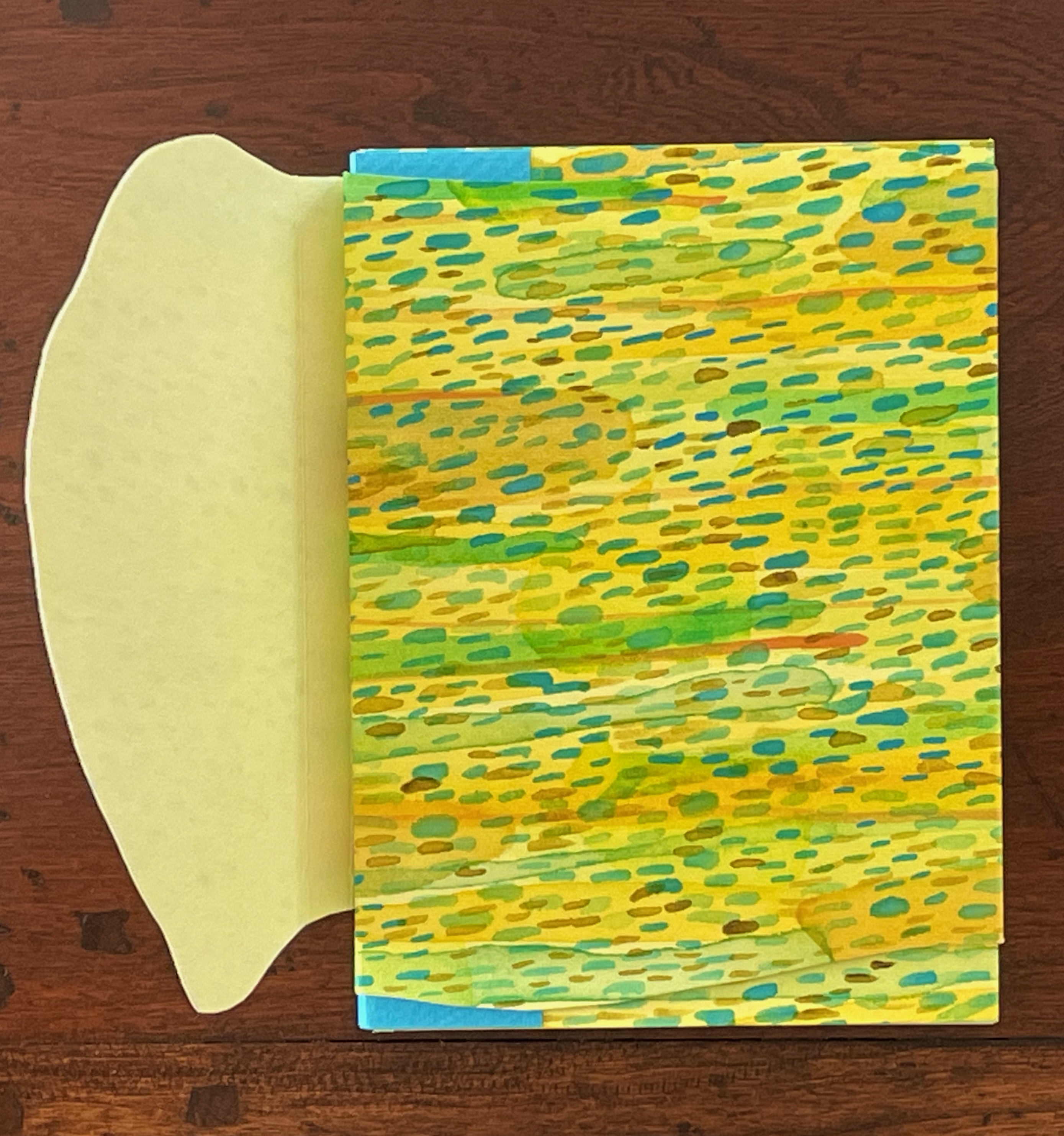
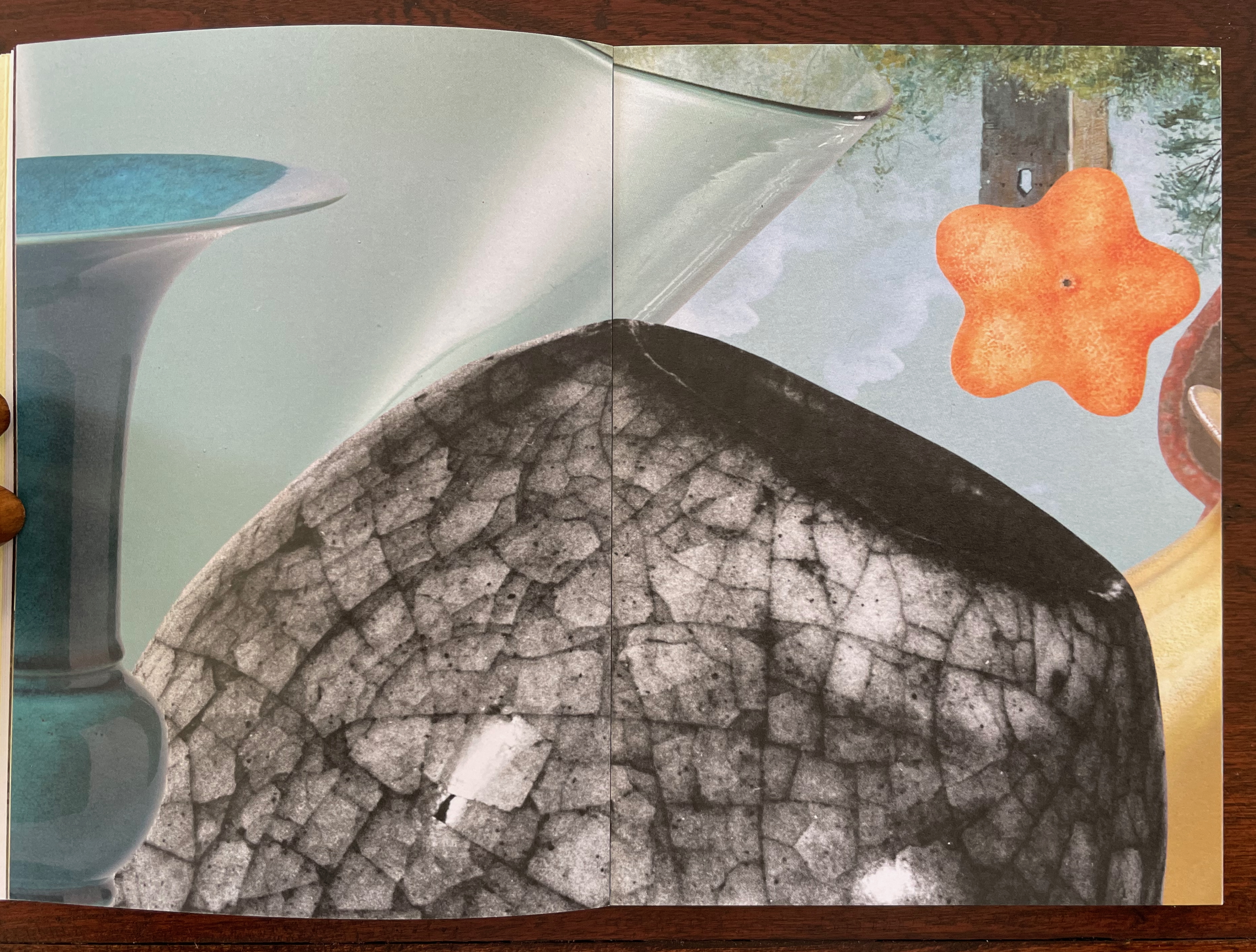
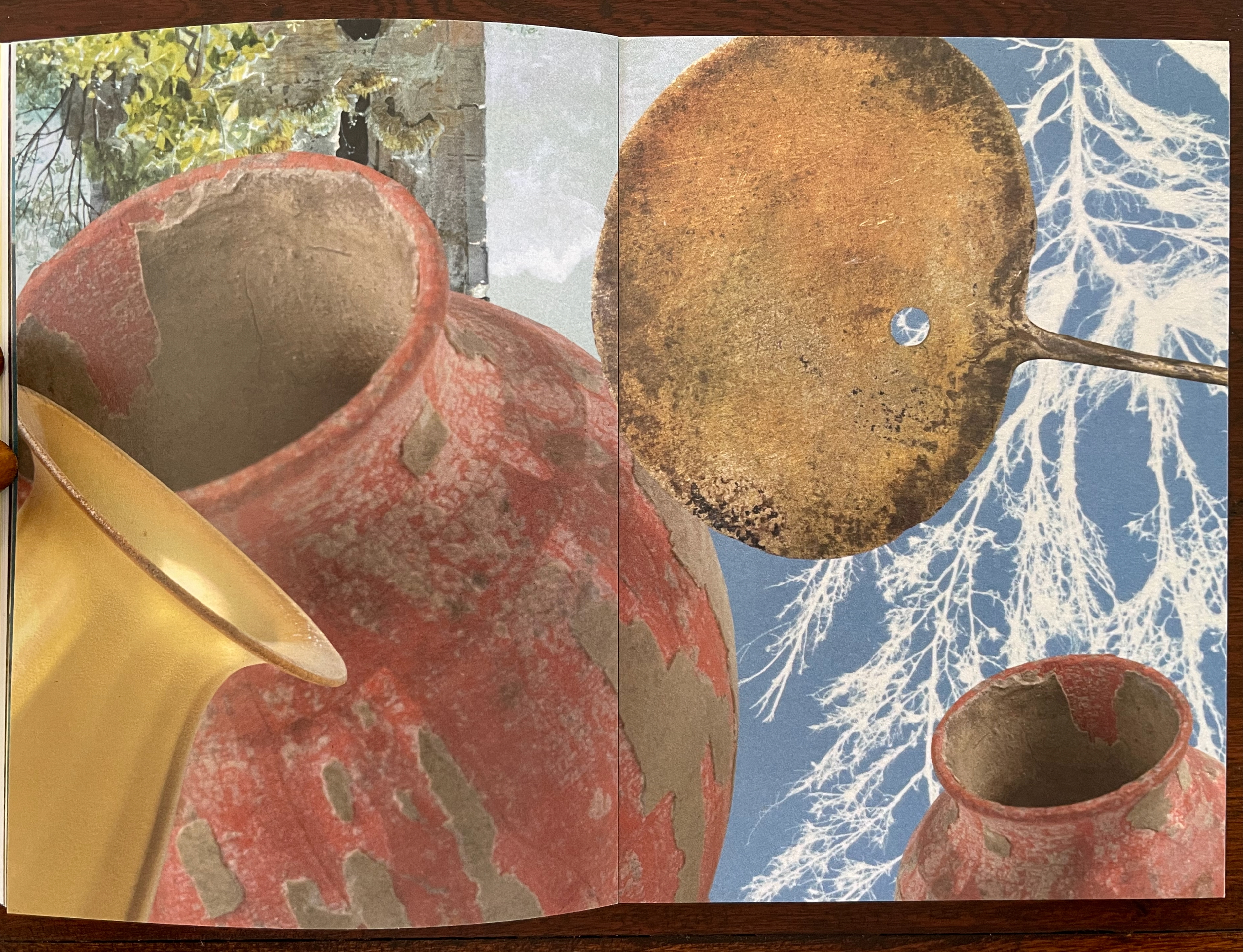
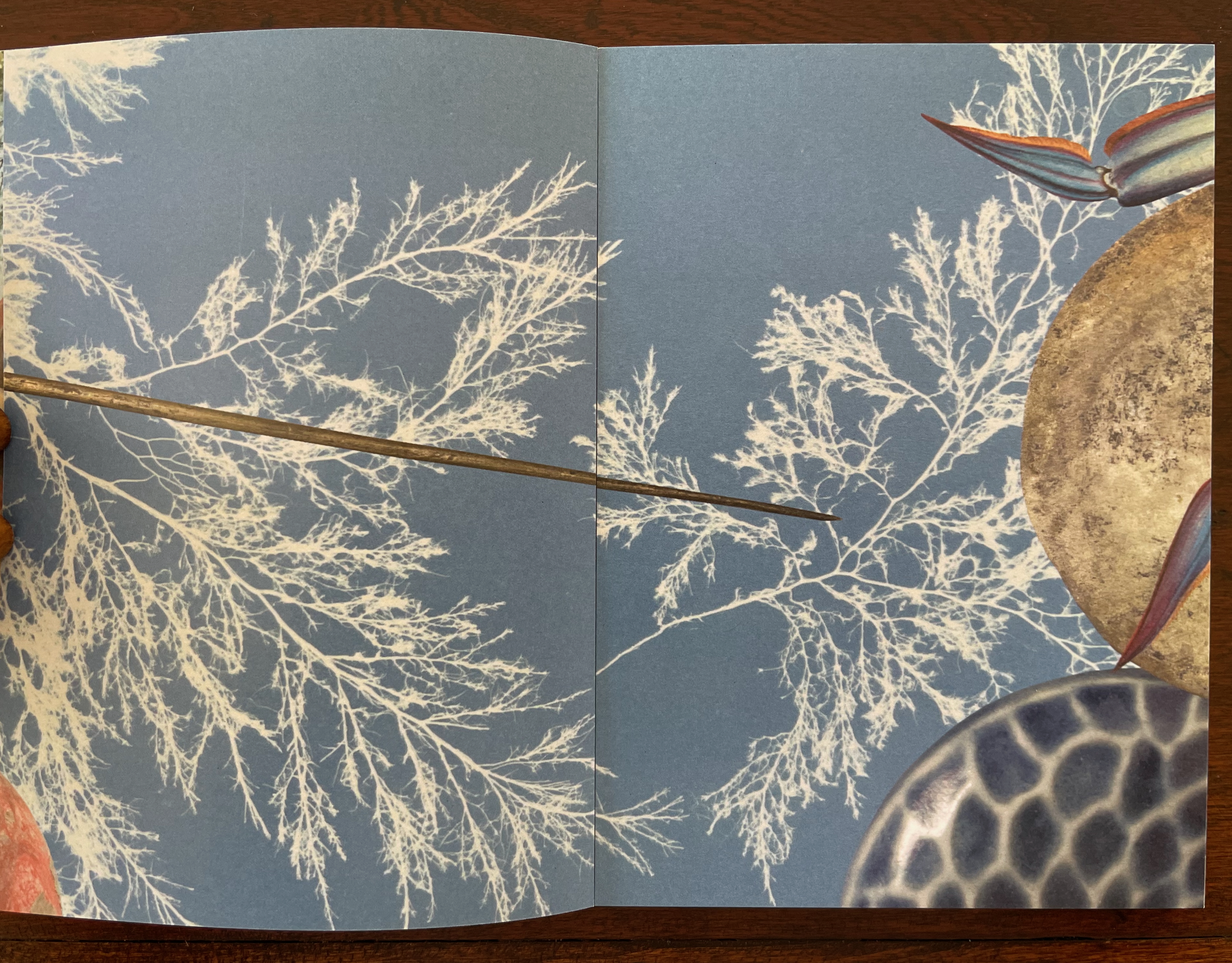
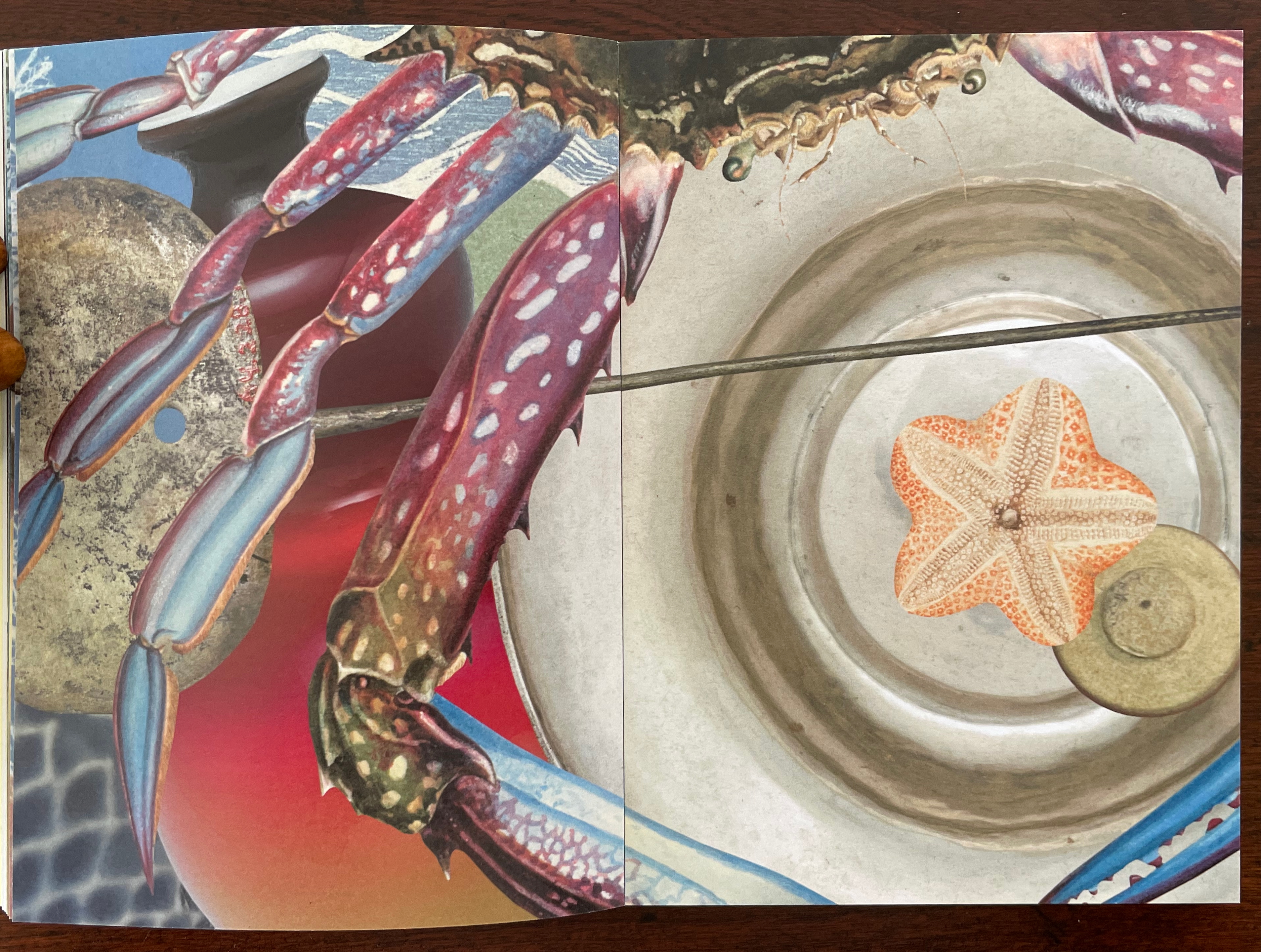
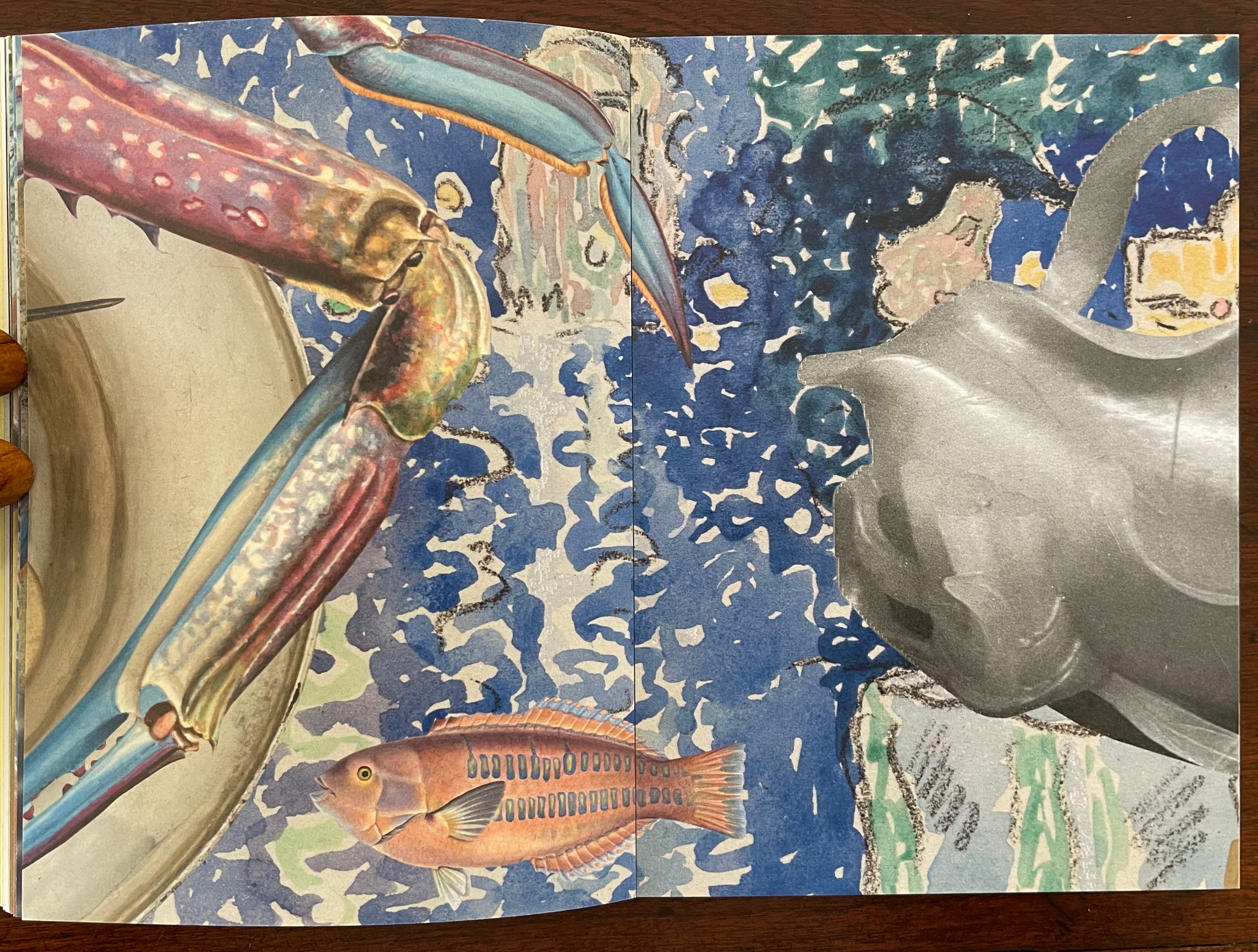
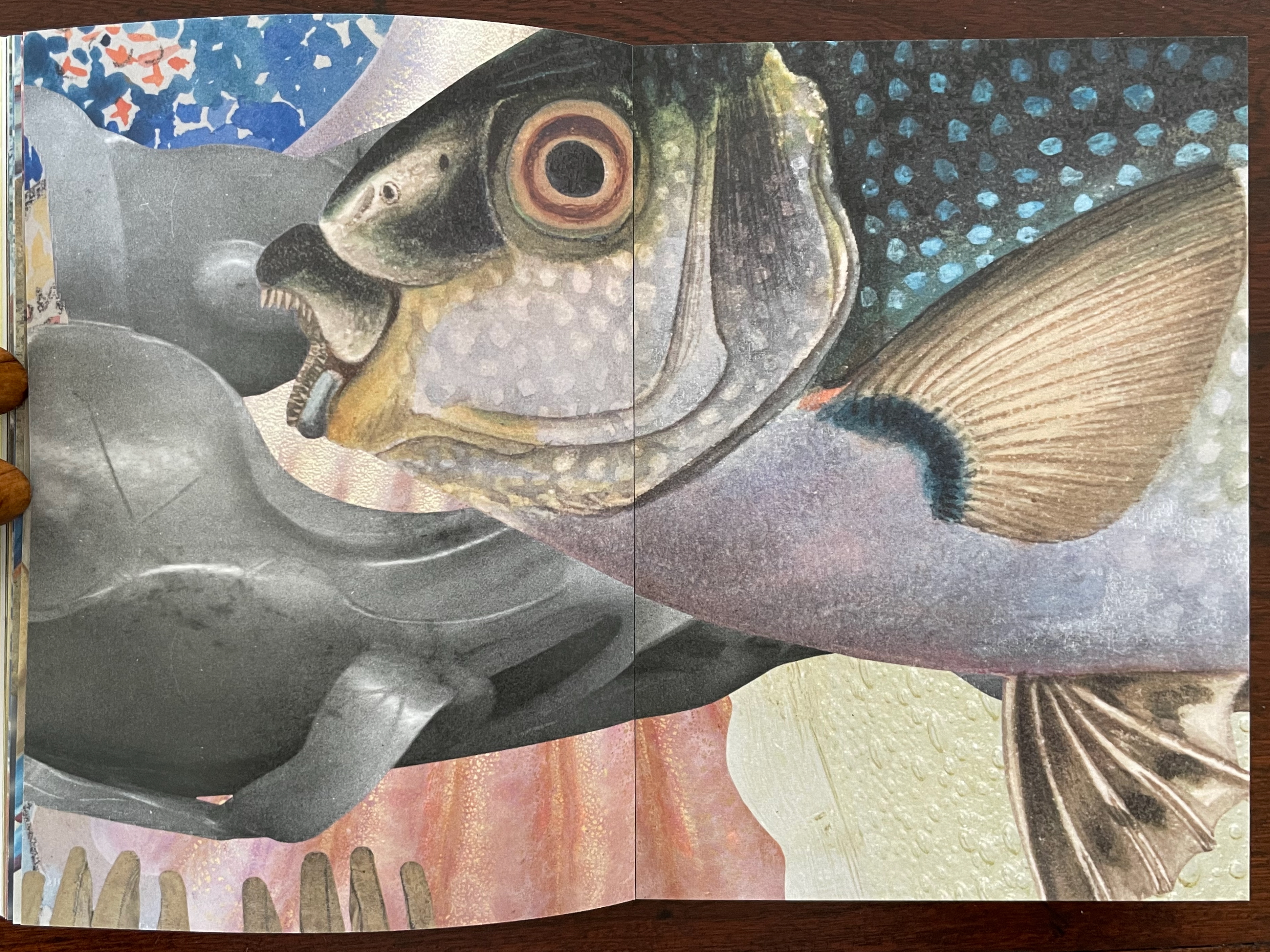
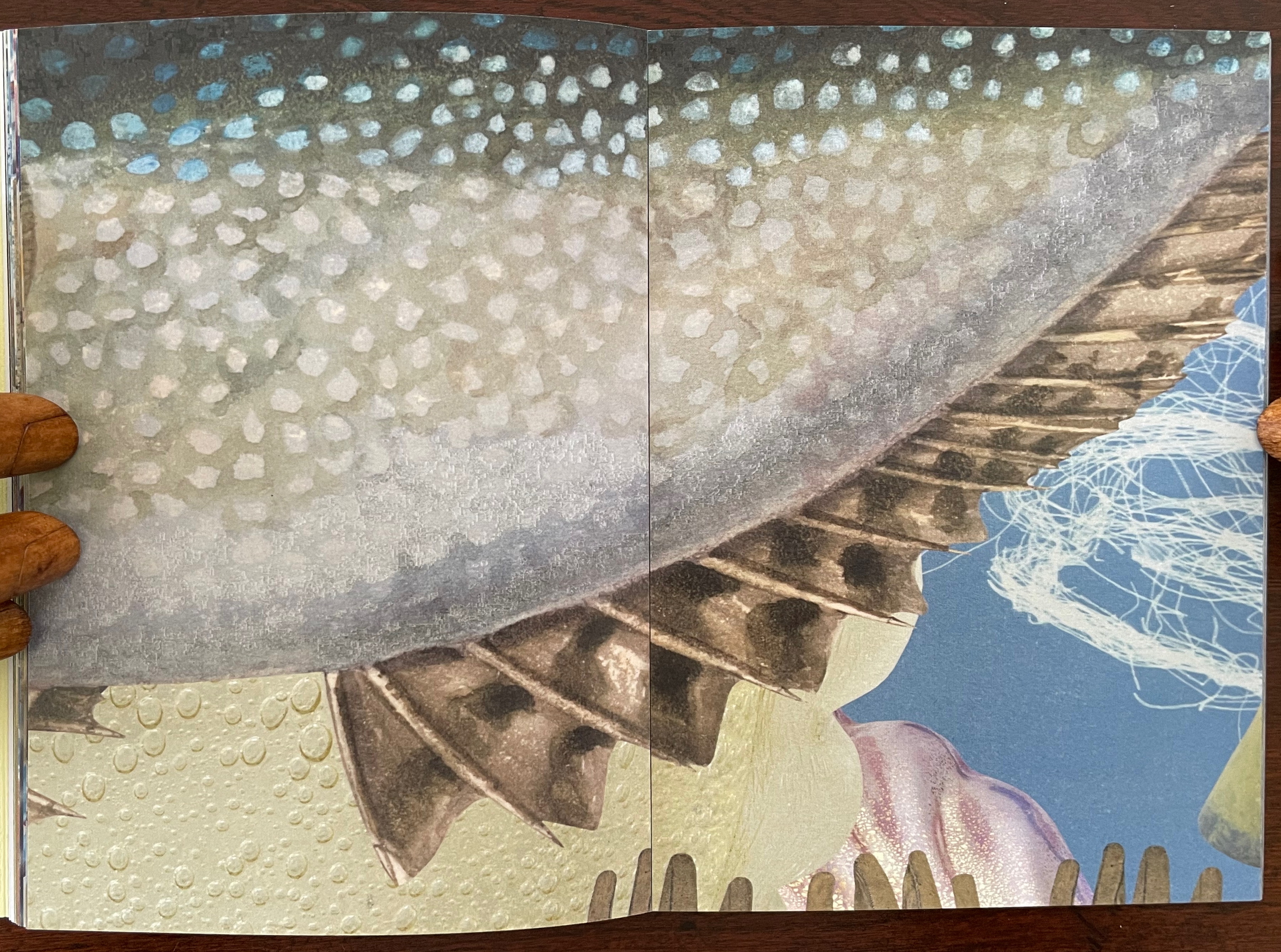
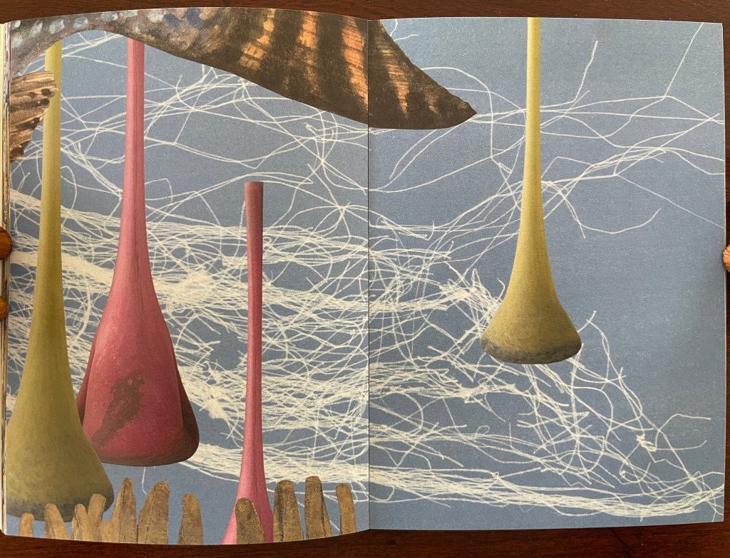
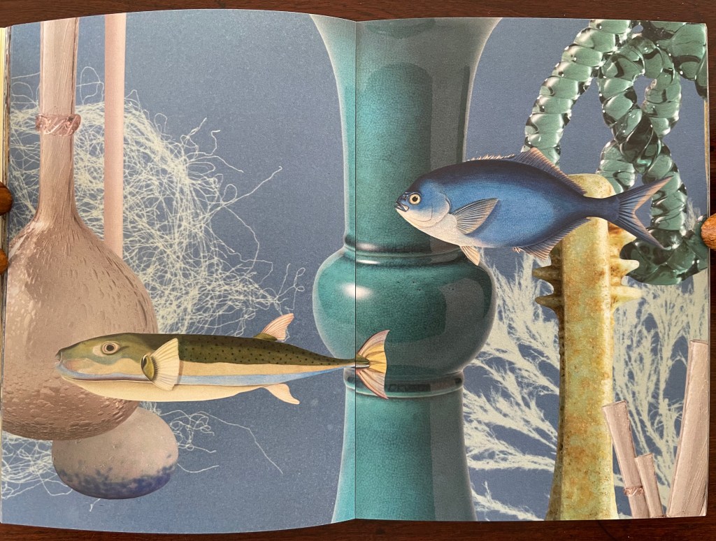
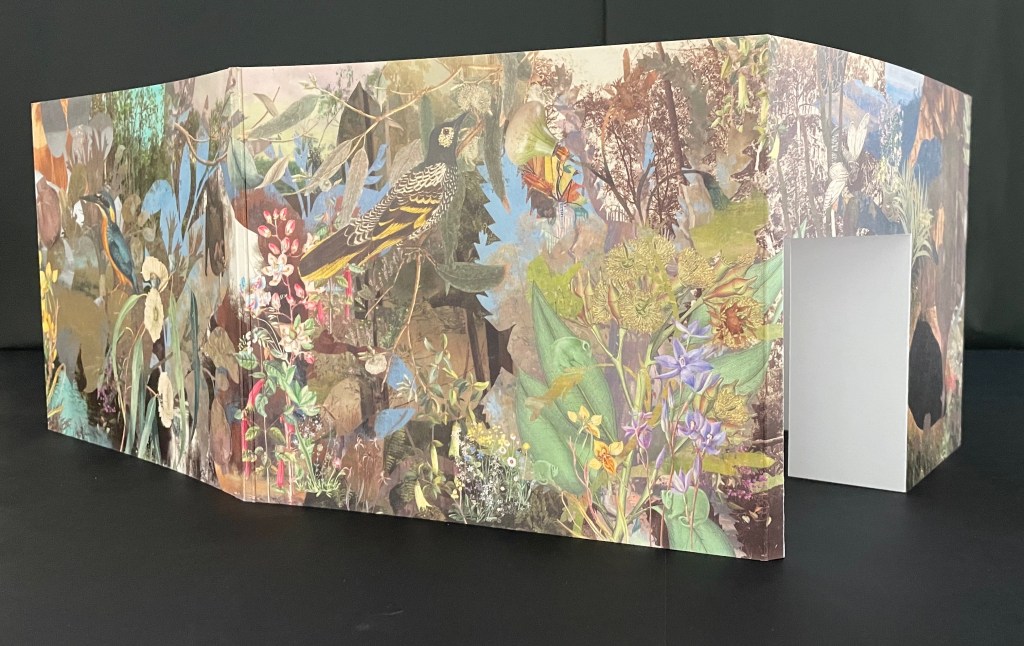
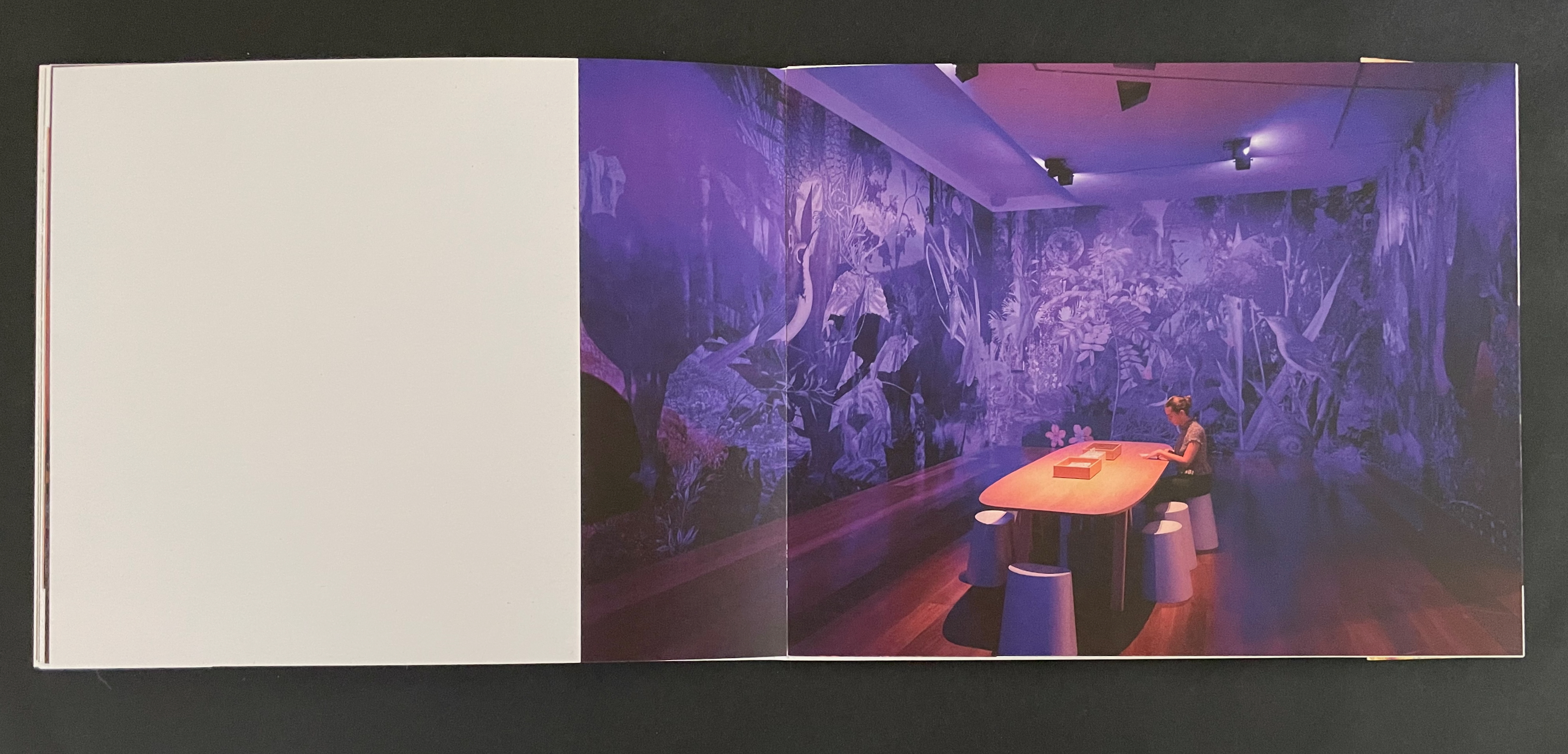
The 72 pages of prints on Impact 100% Recycled Uncoated 150gsm derives from a 620 cm long digital collage. Created for the 2021 NGV Melbourne Art Book Fair, its performance element was twofold. First, as the artists explain, the collage was made “in place of a swim”, the local pool being too busy. Second, toward the end of the making, several copies were bound live before the Book Fair attendees. Its installation element, however, is the greatest tease. There is and was no installation of the 620 cm long collage work. It rests in your hands, and you experience it by turning the pages, then turning them back, then turning them forward — like laps in the pool. Or if you happen to photograph the double-page spreads, you can jump out of the pool and look down on them joined end to end.
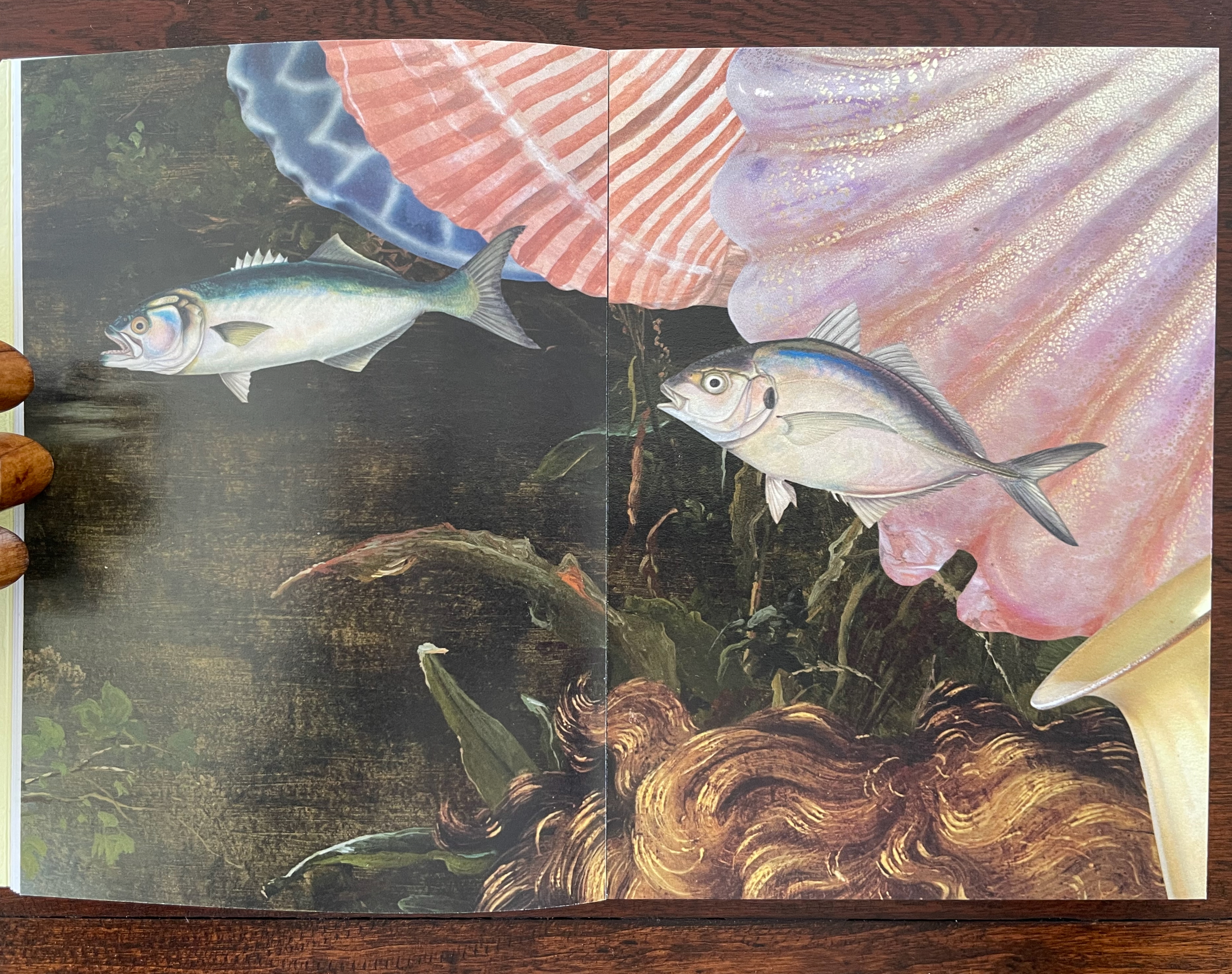
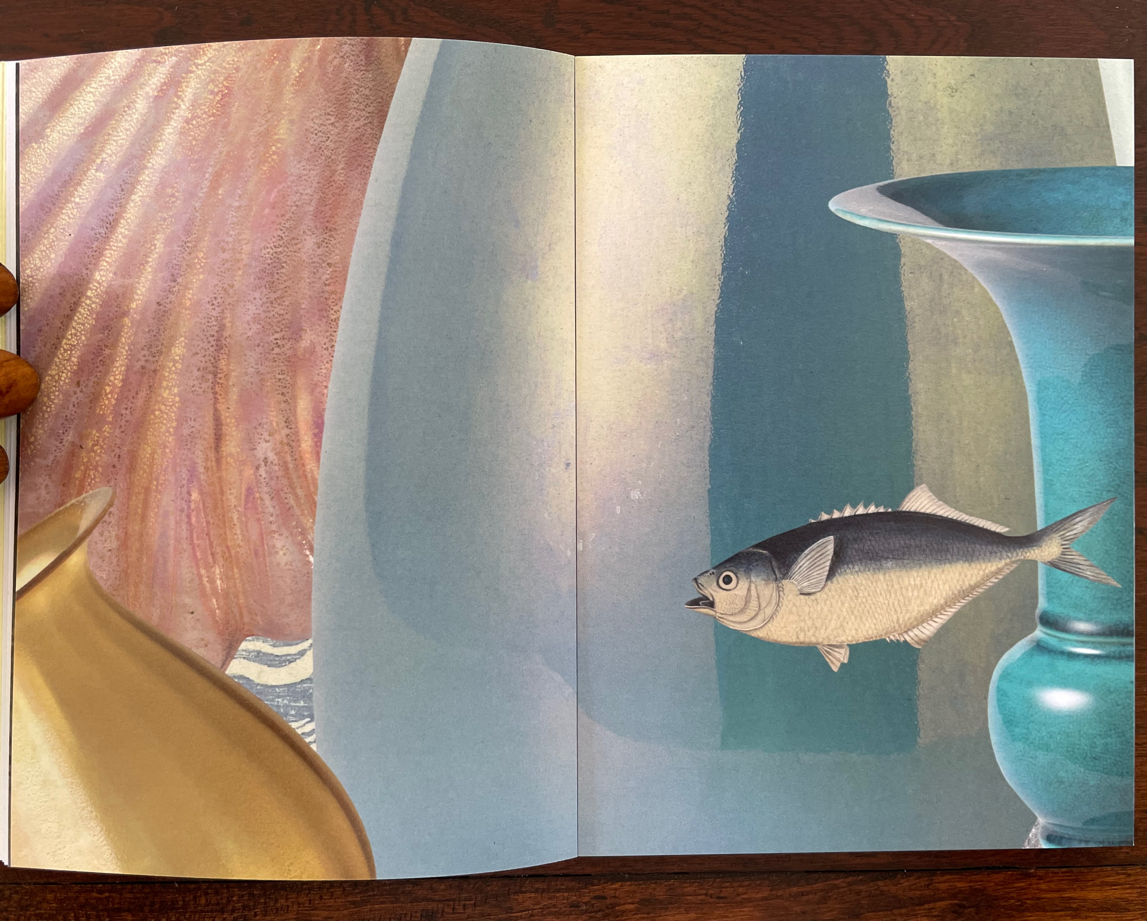
Their introduction, however, will lure you back into the collage, which is

Underwater, kind of. Yes. Dive in.

Don’t forget to hold your breath. …

Search the collection. Sift the collection. “Water”, Return key.

Invert a forest. A daguerreotype of poplars stretching across the plate could be bands of seaweed. …

A crab from a trade card. Not for the skillet. Zoom in, Moonfish.

The Young Saint John the Baptist hair tendrils ca. 1480–82, repurposed. Papyrus fragment with lines from Homer’s Odyssey, ca. 285–250 B.C., for kelp bands.

Haby and Jennison wear their eco-hearts on their sleeves and admit, or rather assert, “For us, above all, it is not the medium that is always of greatest import, but the message”, which is

Our only chance of a healthy, safe, joyous, and sustainable future is to return to being reciprocal with nature so nature can continue to look after us.

Stand up and fight for the oceans and the waterways.

And yet it is their long-held breath as they create their underwater collage and your breath caught as you paddle forwards and backwards over fore edges and through the collection of human and natural art that will most hold you.

The Remaking of Things (2023)
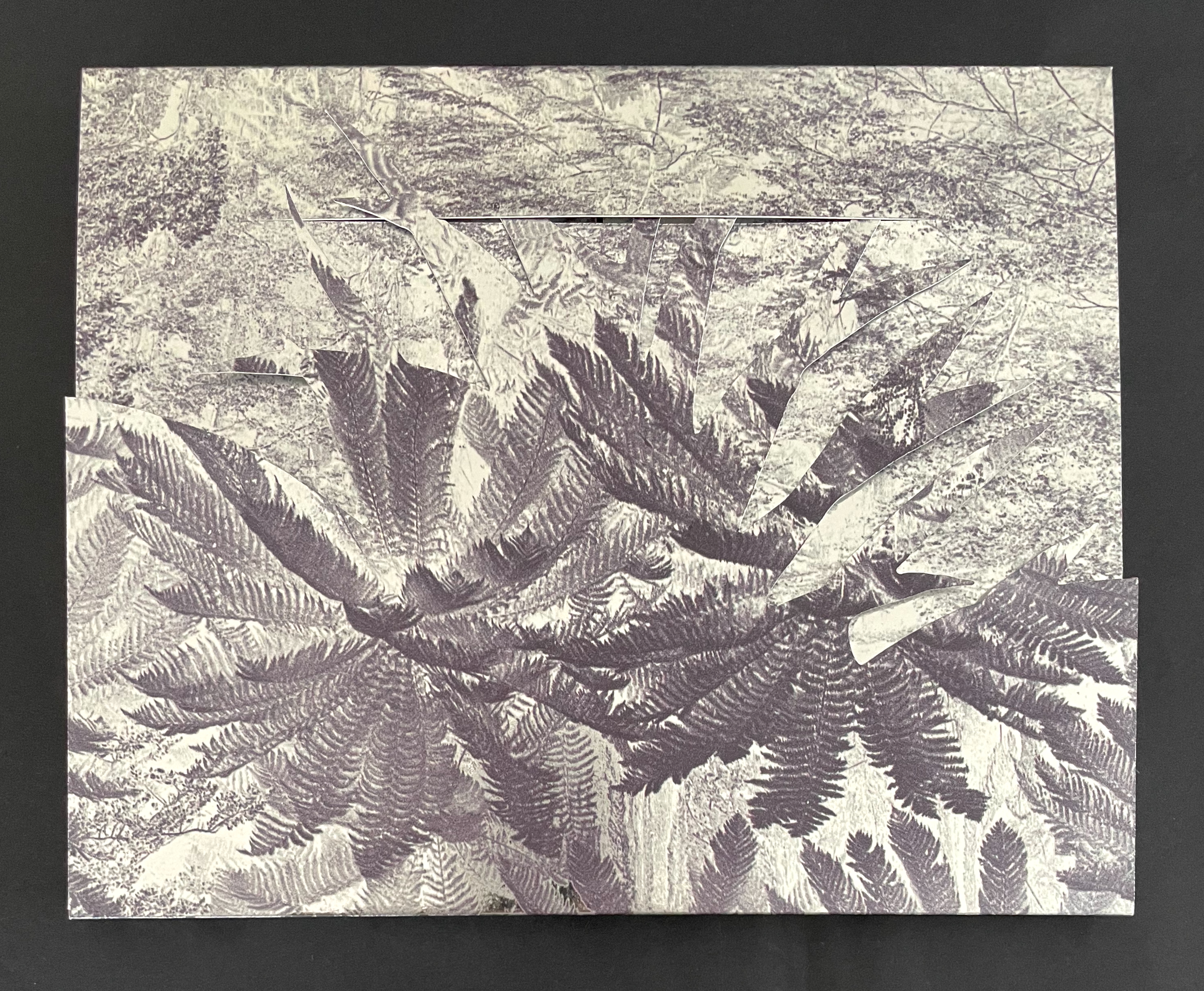
A textured artwork featuring layered images of ferns in shades of gray, set against a dark background.

The Remaking of Things (2023)
Gracia Haby & Louise Jennison
Folded container with tab-and-slot closure, holding belly-band-secured front cover fold out, part of card cover casing a perfect bound book. Container: H186 x W228 x D15 mm. Book: H180 x W222 mm. [36] panels. Edition of 100, of which this is #25. Acquired from Vamp & Tramp, 21 May 2025.
Photos: Books On Books Collection.

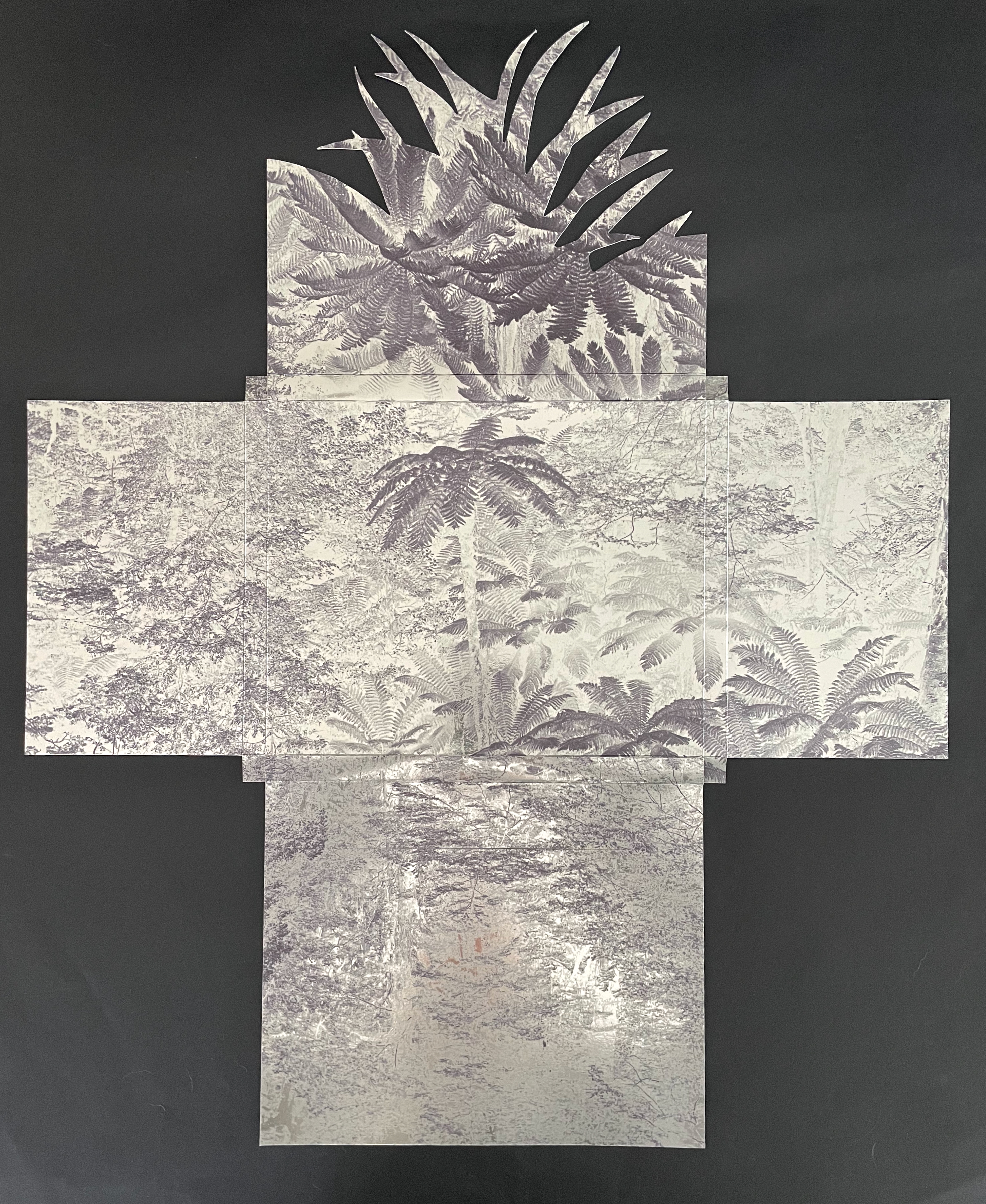
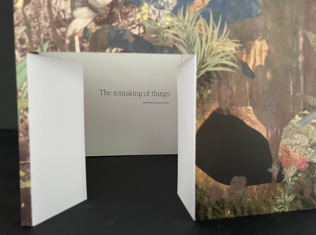
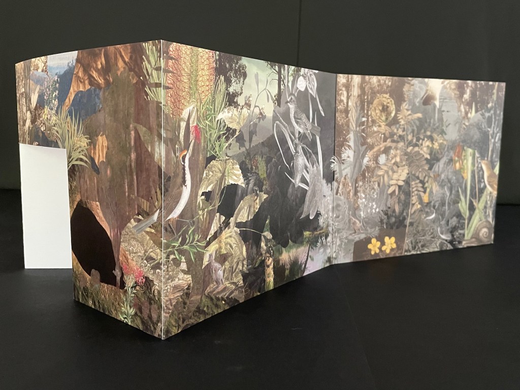
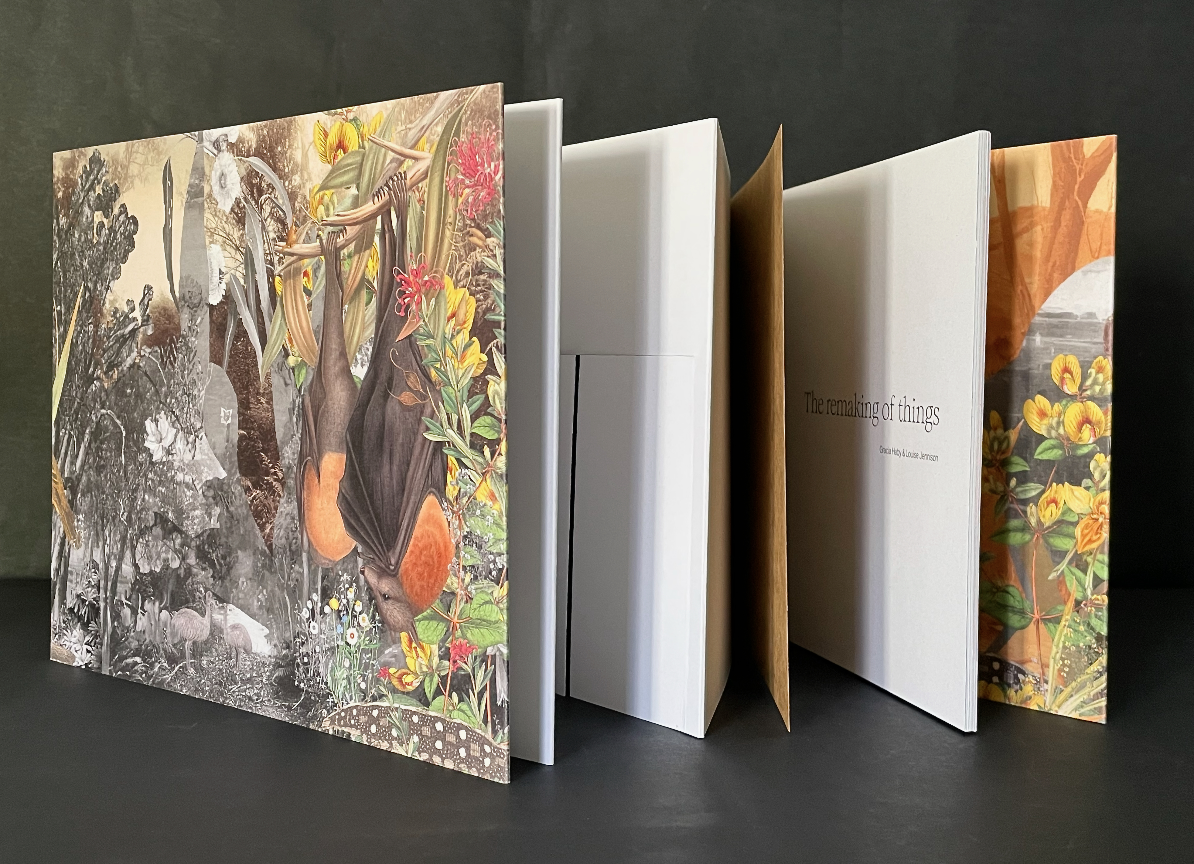
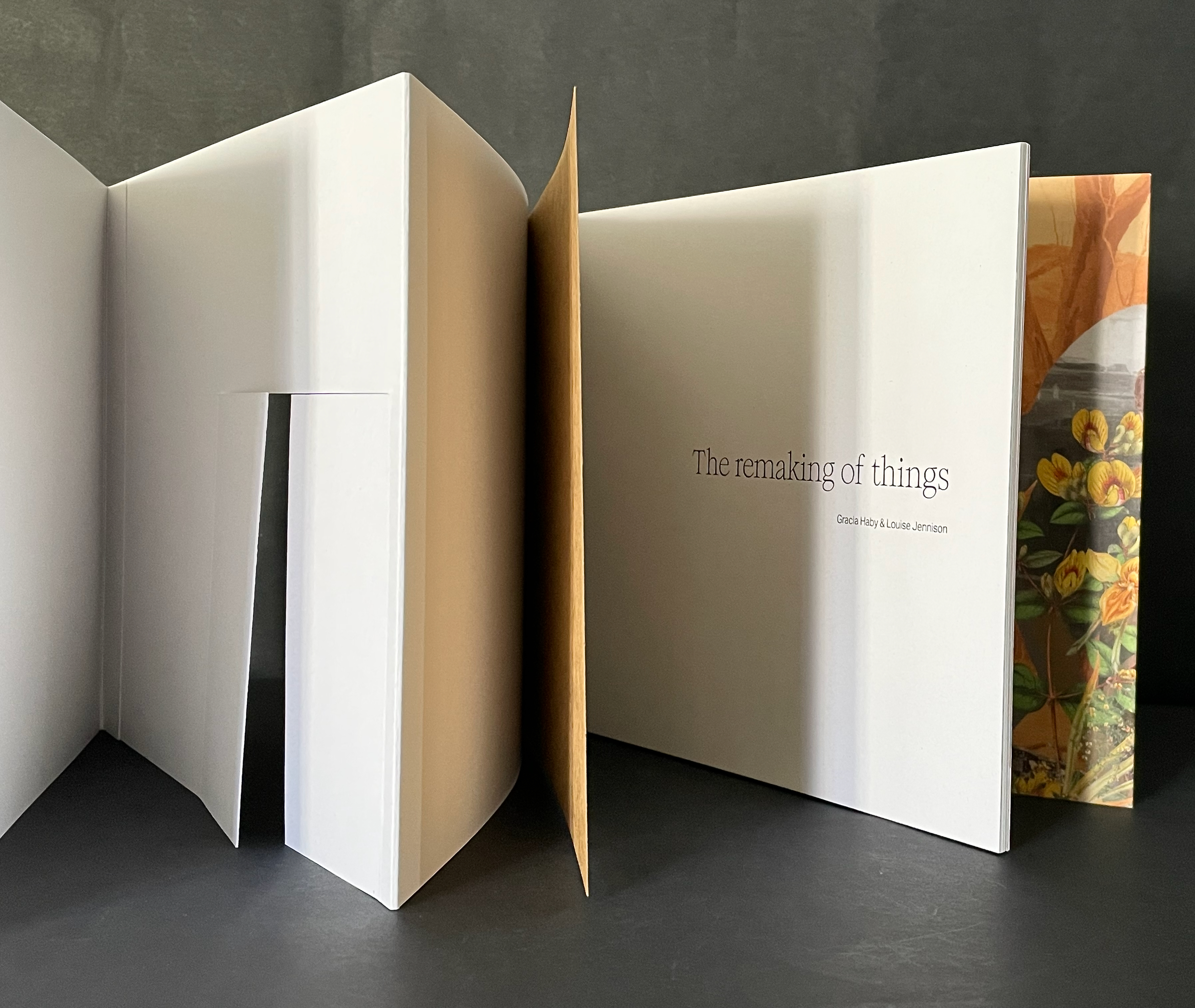
From 24 May through 20 August 2023, the Ian Potter Centre (NGV Australia) held hosted an installation of The Remaking of Things. This work produced for the exhibition comprises a silvery tab-and-slot folder, holding a casebound softcover artist’s book whose front cover opens into a desktop installation, making you wish for a sip of Alice’s “Drink me” potion or bite of the Caterpillar’s magic mushroom.
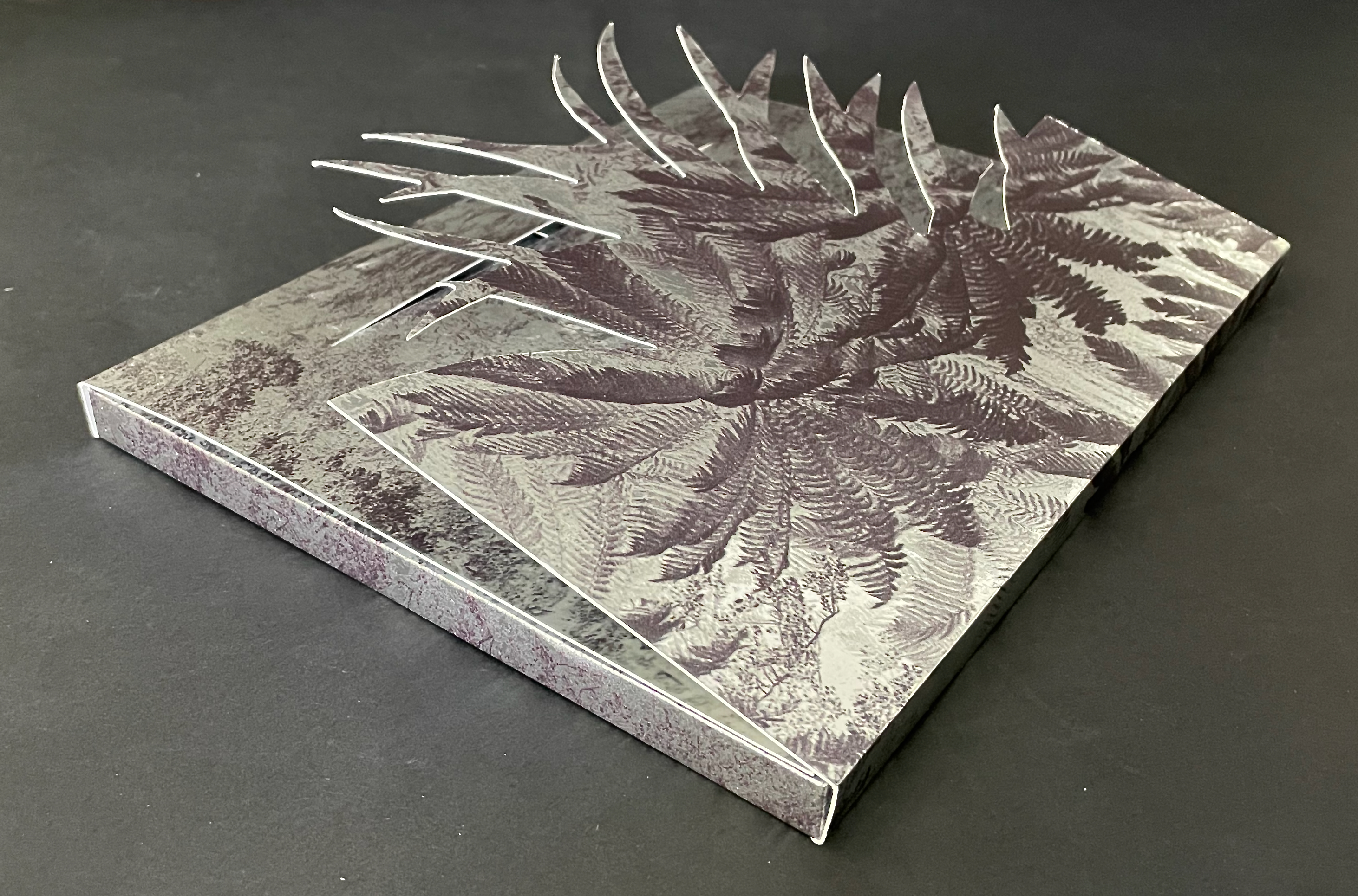
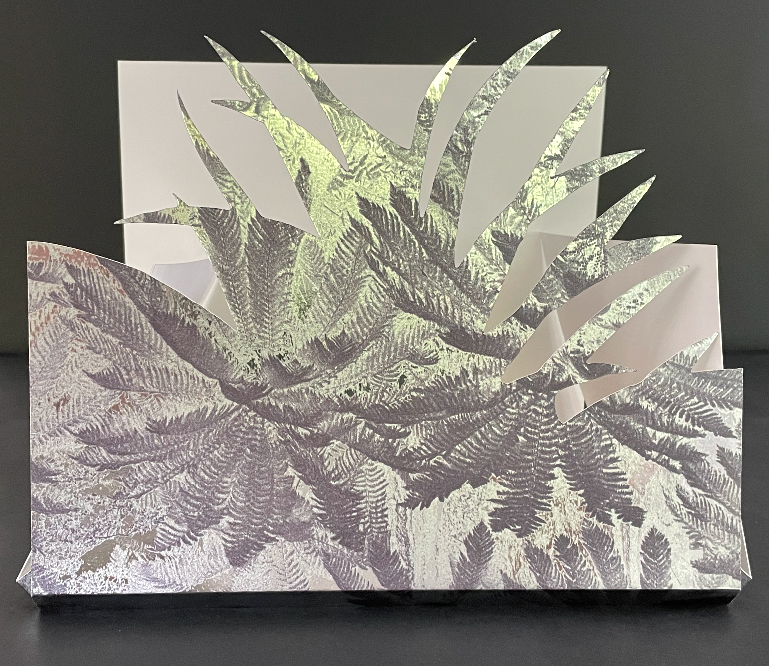
Tab-and-slot folder made of Silver Metalised Polyester satin paper 300 gsm, router cut, printed on a swissQprint inkjet printer. Image from Nicholas Caire‘s Fairy scene at the Landslip, Black’s Spur (c. 1878)

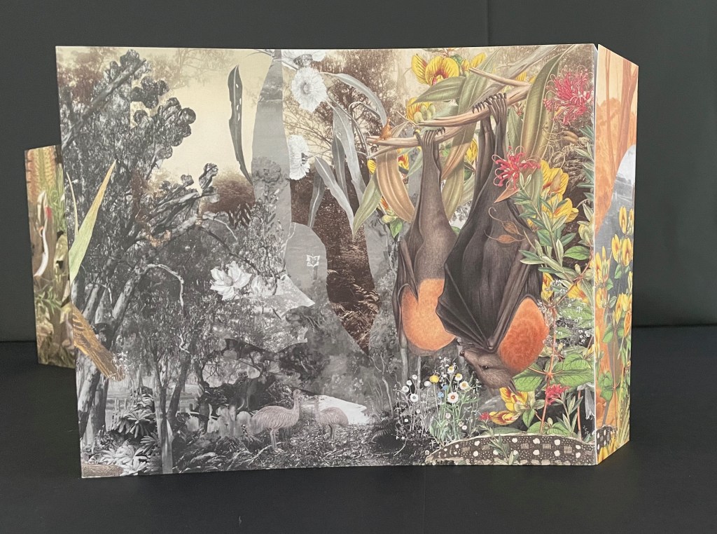
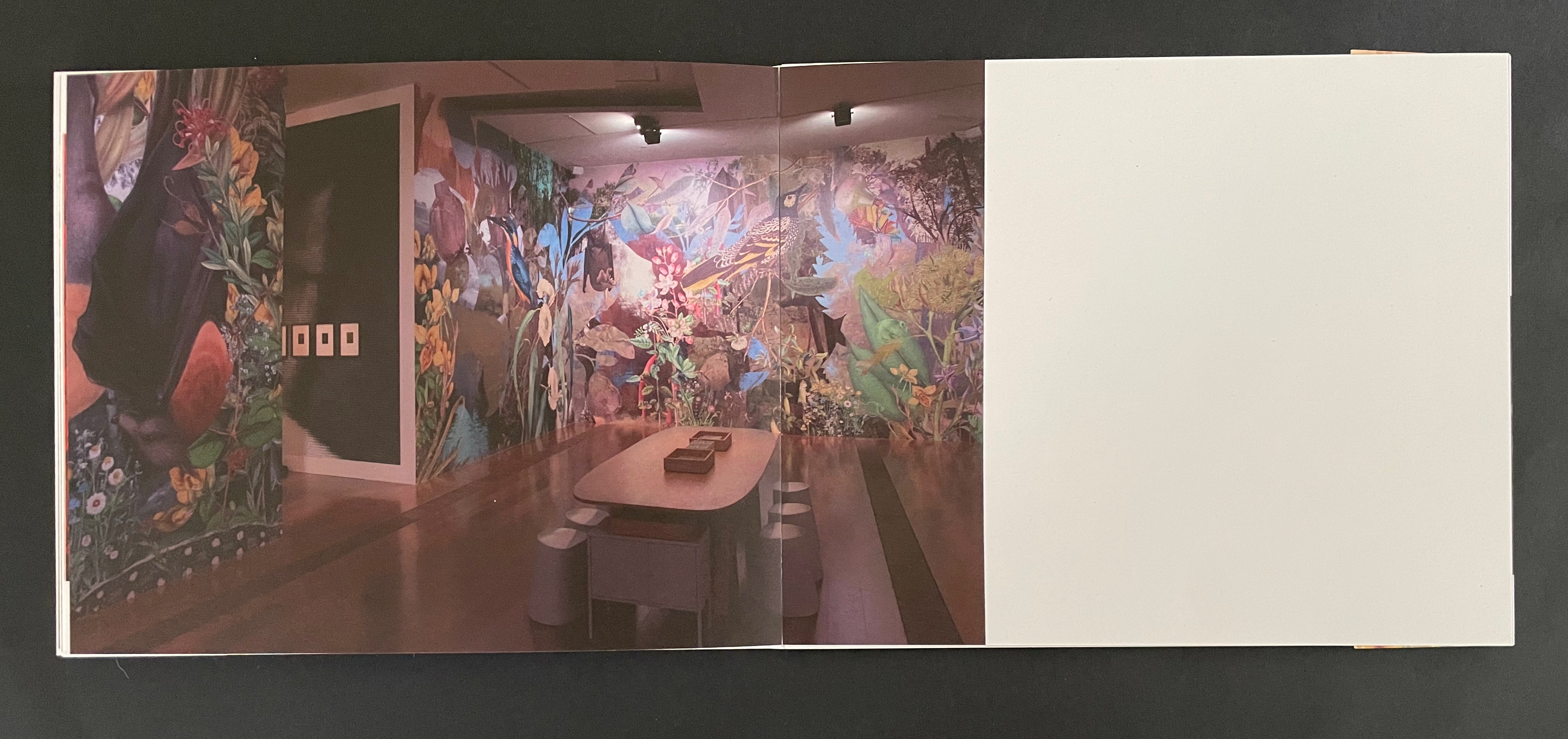
Although the work continues their archival poetics, drawing on “100 individual pieces in the NGV collection, spanning painting and photography by way of ceramics and silverware, textiles and works on paper”, it has its origin in Haby & Jennison’s restored eucalyptus forest habitat for the Grey-heading flying fox, the animal featured on the “wall” that serves for the front cover.
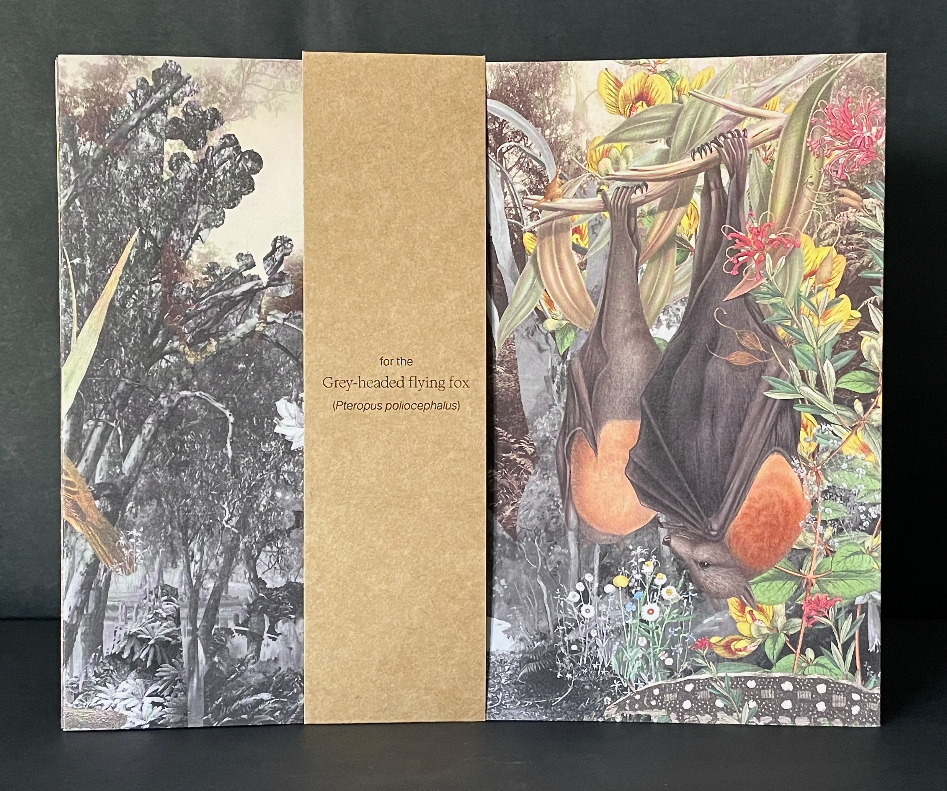
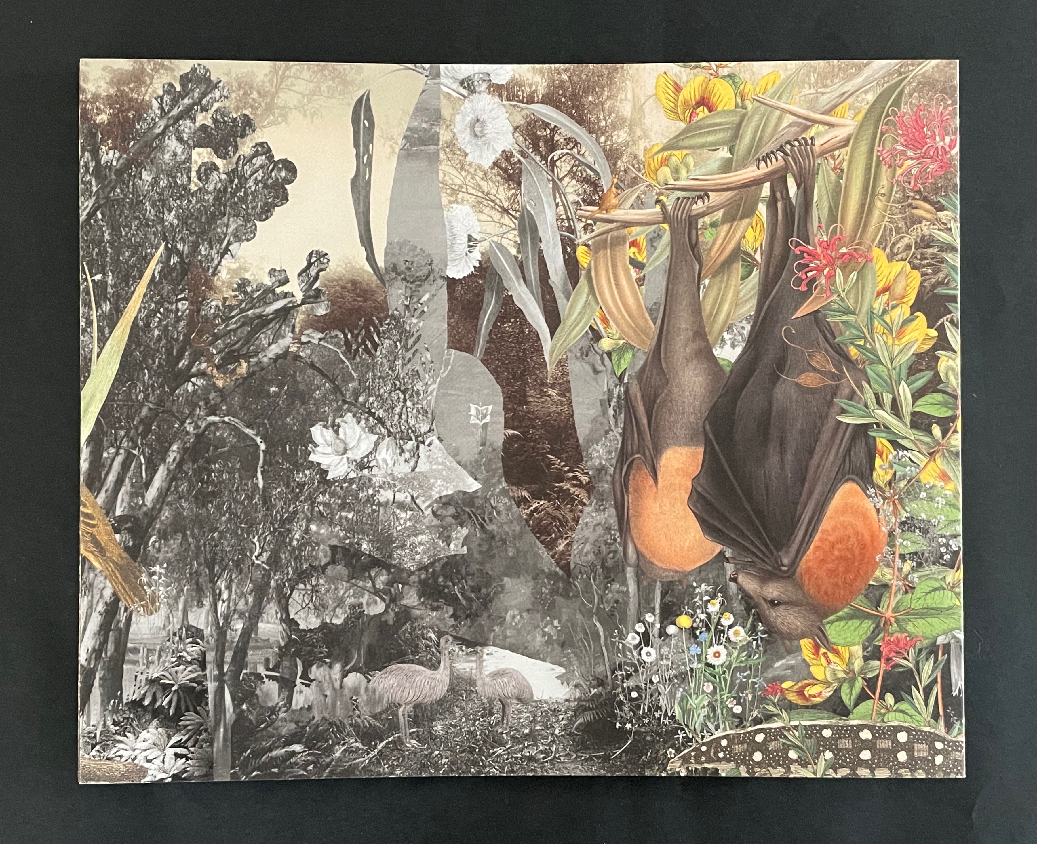
Front cover with and without belly band.

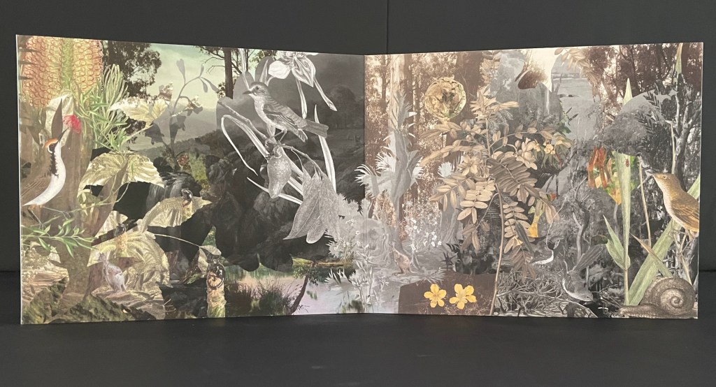
As the front cover unfolds, a double door appears, cut into one of the other walls. “Walking” to the right around the walls, you see the images that, enlarged, occupied the exhibition walls in Melbourne.
Within the exhibition rooms, a 24-minute for 24 hours sound track played as the lighting changed. Within the book, photographs of the exhibition rooms provide a sense of the visual experience and its scale.
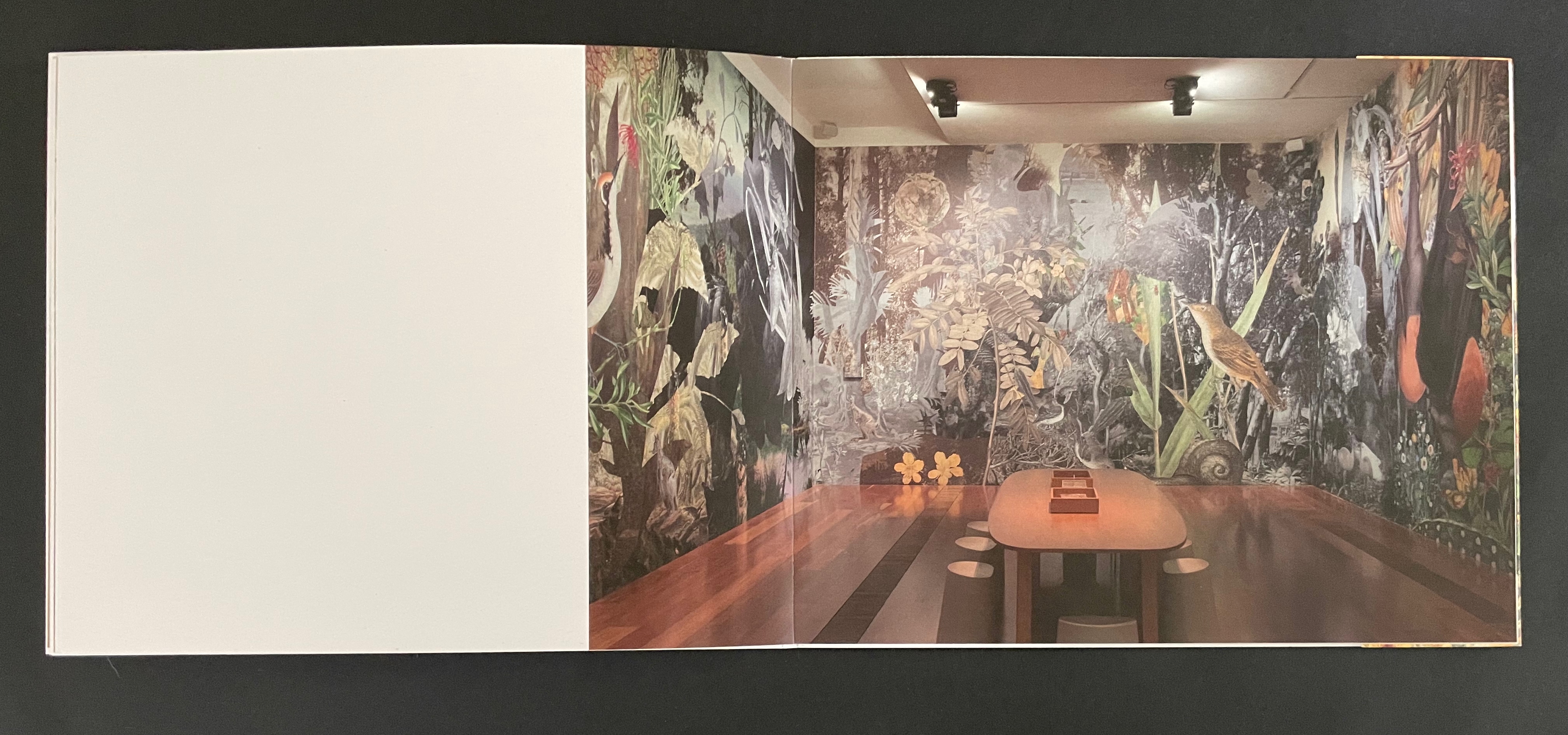
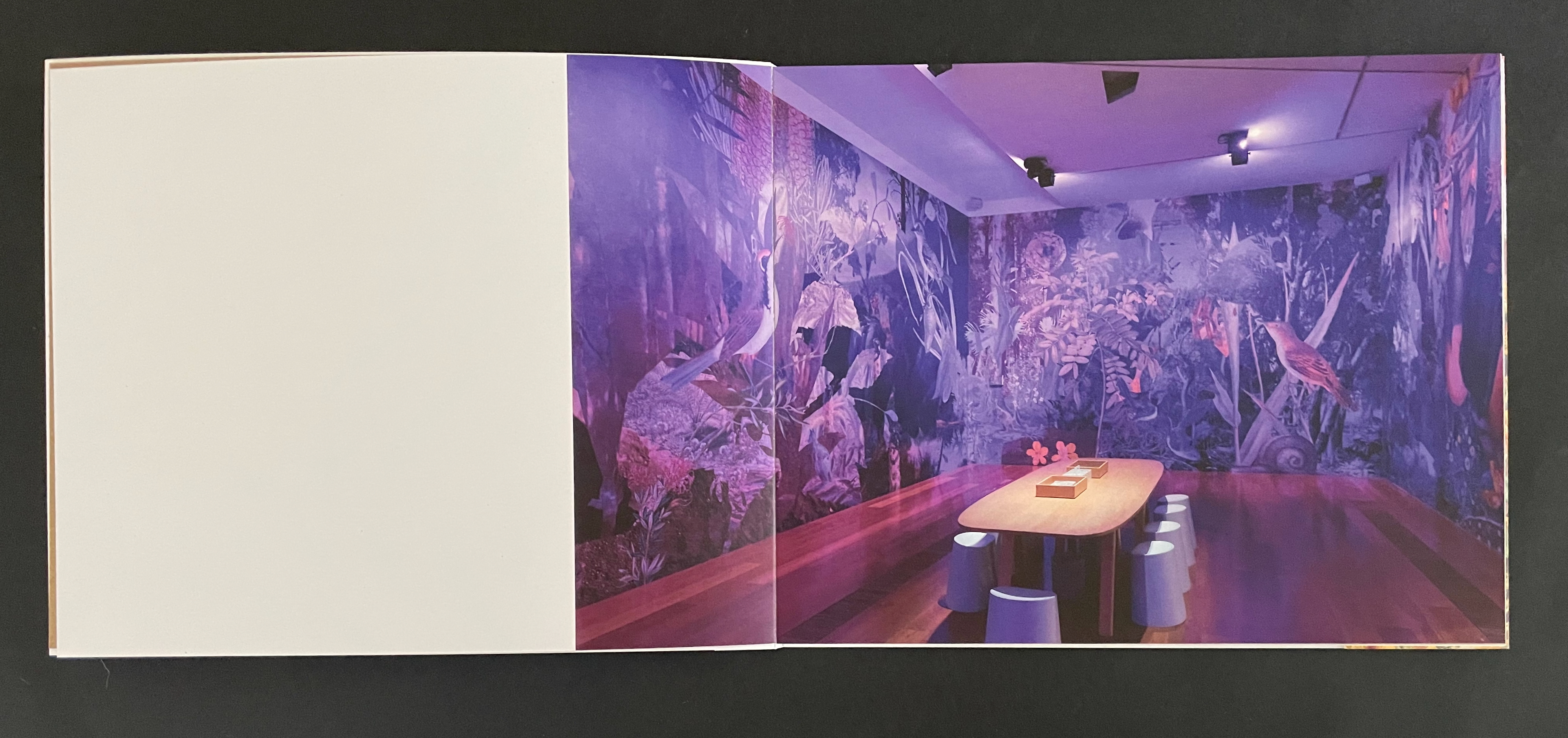
The images within the book are likely to send you back to the images on your desktop installation. There, it is much easier to register James Sowerby‘s etching Tetratheca juncea (1793), John Lewin’s Warty-face Honey-sucker (1822), Richard Bunbury‘s Green native fuchsia (1844), Anne Paulson’s Sketches of Victorian bush flowers (c. 1861), Fanny Anne Charsley‘s The Wildflowers of Melbourne (1867), Eugene von Guérard‘s Ferntree gully (1867), Tom Humphrey‘s Summer walk (c. 1888), F.E. Striezel‘s Kookaburra carving (1915), A. Shelden‘s Possum and banksia (1920s), E.G. Adamson‘s Snow coral (1930s-40s), Grace Cossington Smith’s Bottlebrushes (1935), NASA’s Lunar Crater (1969), and the dozens of others listed in the center of the book that can be found on the NGV website. As Haby & Jennison indicate in the work, they “invite you to enter the pages of the book in a similar spirit as you would the gallery”. Across time, etchings, paintings, carvings, inkwells, snuff boxes, glass plate negatives, digital photographs and a host of other artefacts, they create a complex habitat of interconnectedness of art and species.

Given that aim, it is surprising that the fold-out cover is constructed for viewing around rather than within. Double-sided printing of the cover might have done the trick and offered an additional opportunity to show the change of lighting.

Looking for Green, Remaining Hopeful (2024)
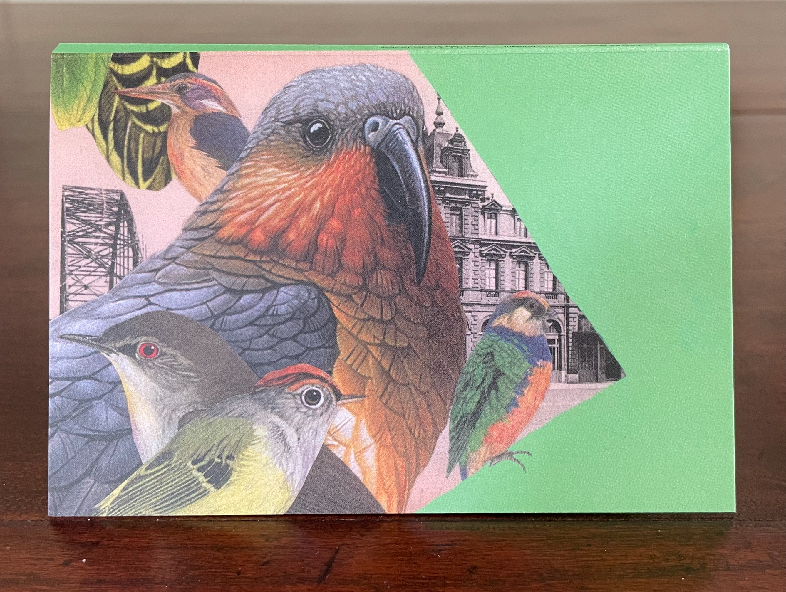
Illustration of several colorful birds including a large bird with orange and gray feathers, smaller birds with distinctive markings, and a backdrop of urban architecture, all set against a green triangle background.

Looking for Green, Remaining Hopeful (2024)
Gracia Haby & Louise Jennison
Accordion book. H135 x W92 mm (closed), W802 mm (open). [9] panels. Edition of 75, of which this is #4. Acquired from the artists, 21 February 2026.
Photos: Books On Books Collection.

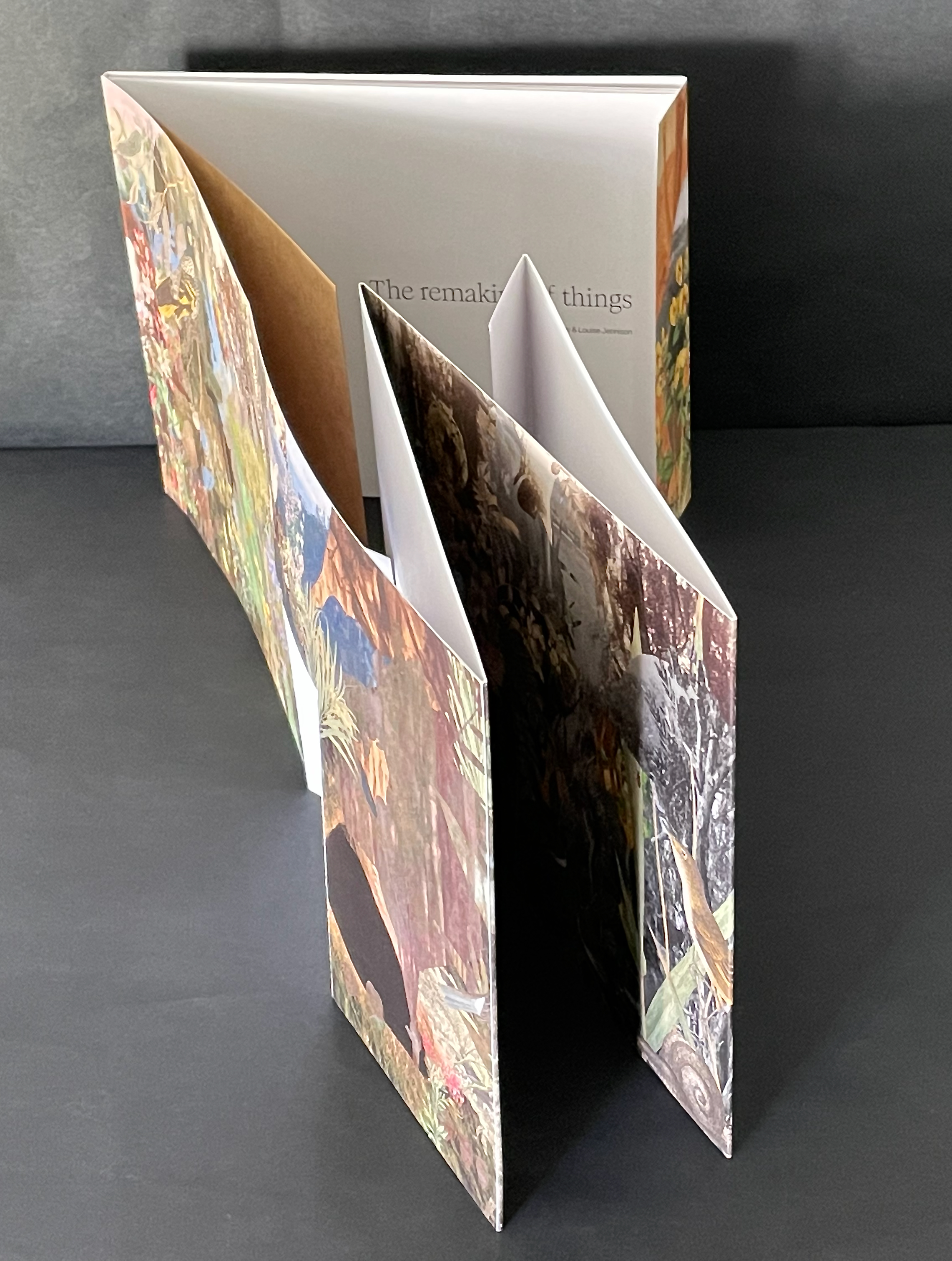
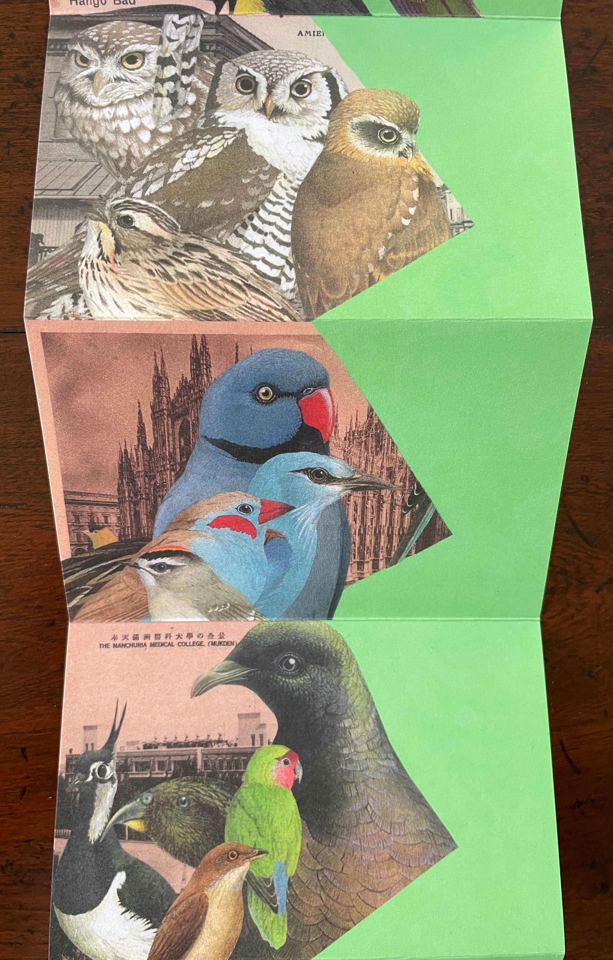
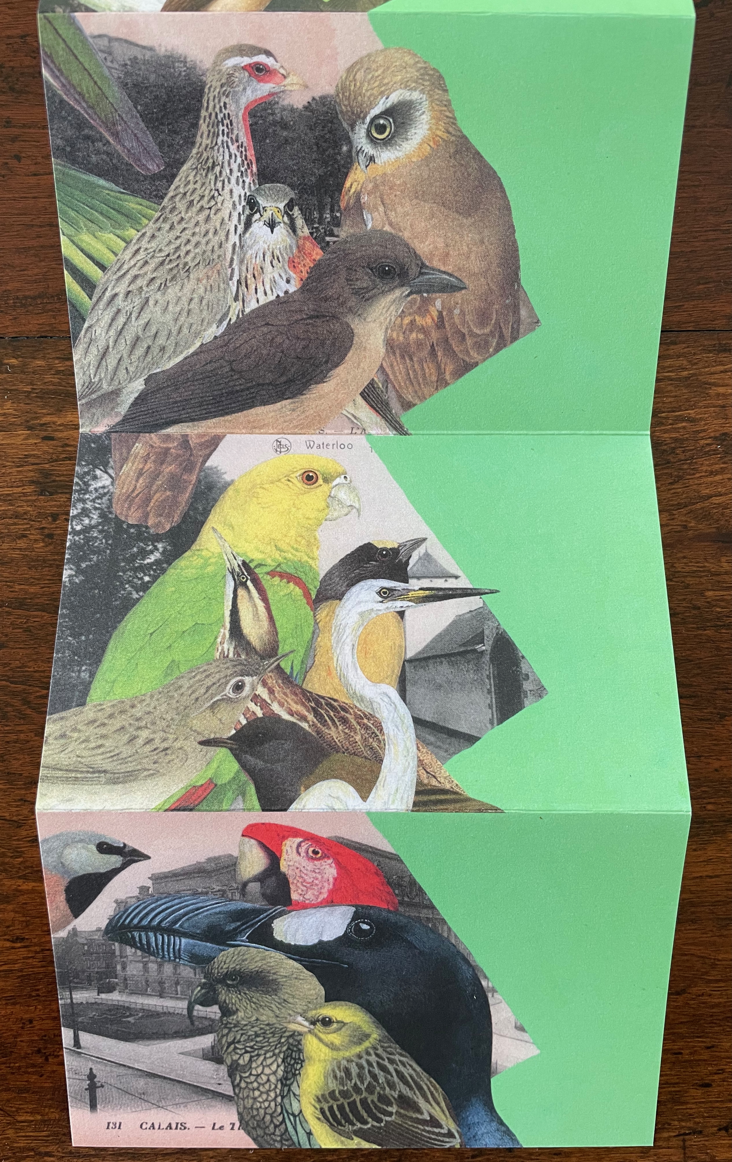
World Book Night’s 2024 theme was “in praise of birds”. Using old postcards from various locations and cut outs collected over the years, Gracia Haby and Louise Jennison selected 45 birds to arrange in this vertical collage in response. The Indigo Digital CMYK used on ecoStar 100 gsm for the body and ecoStar 300 gsm for the cover delivers the vibrant avian colors against a chroma-key-like green screen background. The choice of the green screen effect has layers of significance. One layer is its obvious echo of the “green” choice of 100% recycled paper. Another, not so obvious, requires the textual explanation from the covers:
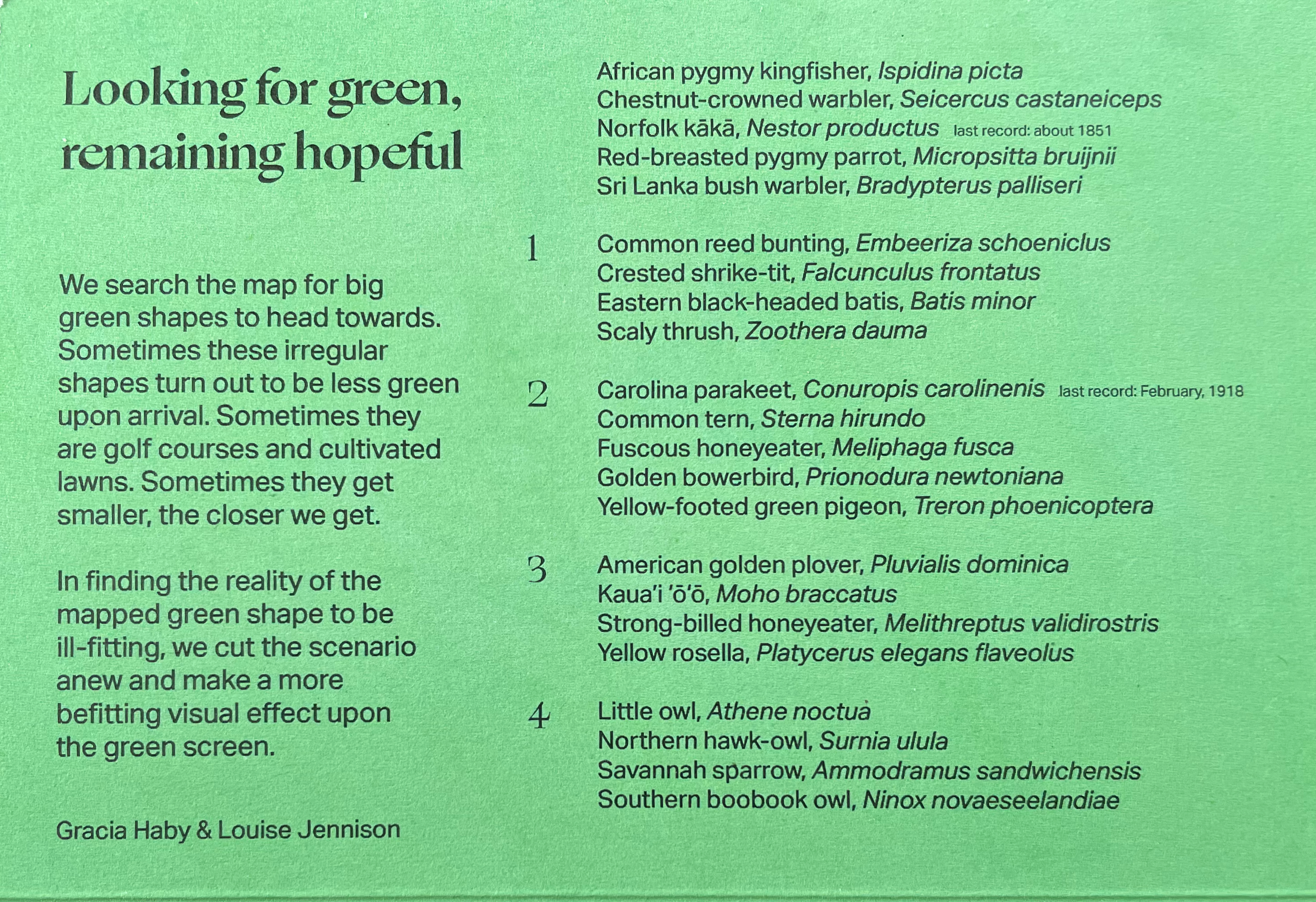
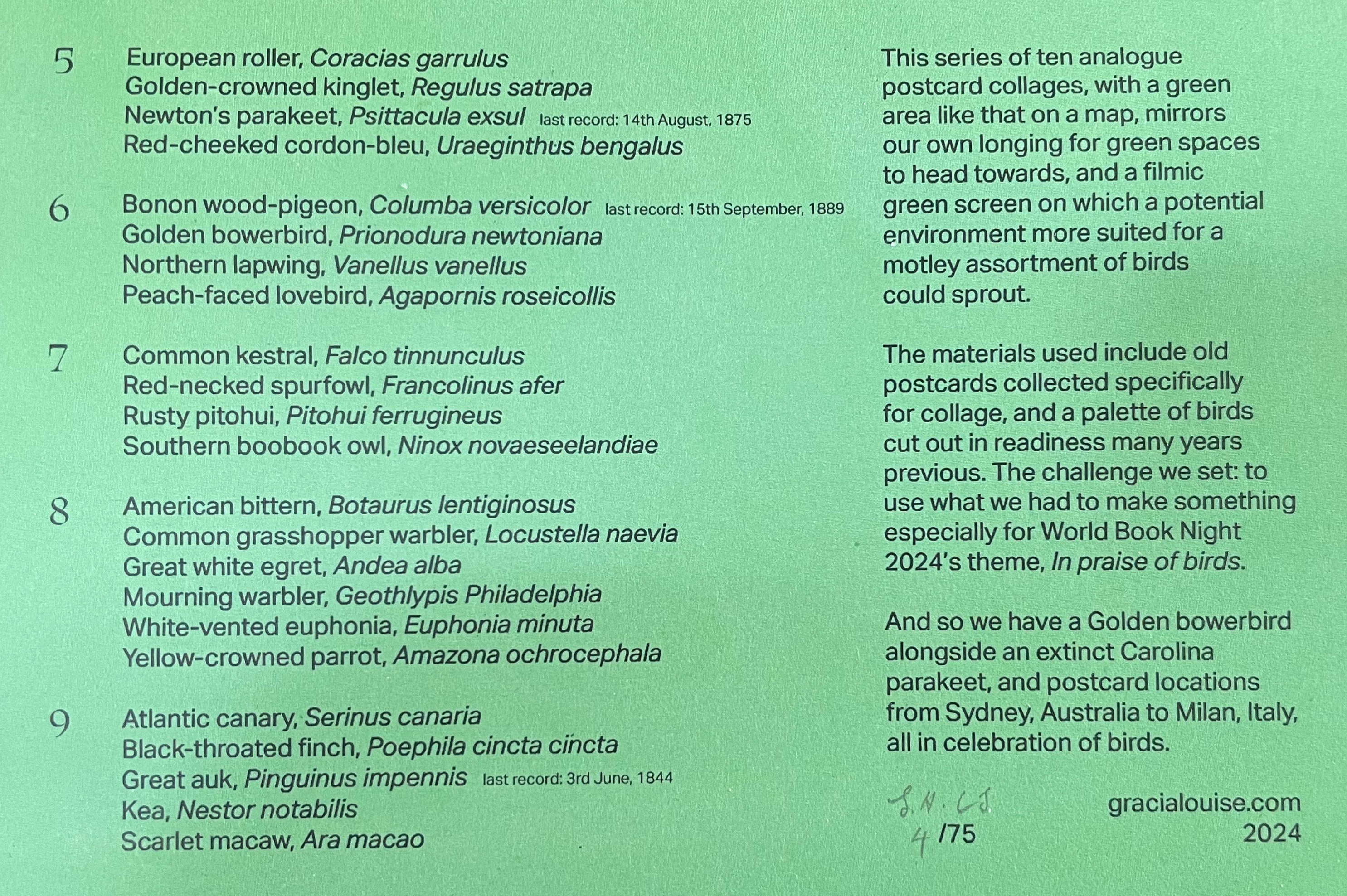
A green screen enables video makers to fill in the background or environment behind actors after filming. Haby & Jennison’s mimicry of it says that we need to provide these avian actors with more befitting environments than those in the sepia and gray toned backgrounds. Against the minatory background, the exuberant “motley assortment of birds” points in signposts to the “potential environment” left to be filled in on the green screen.
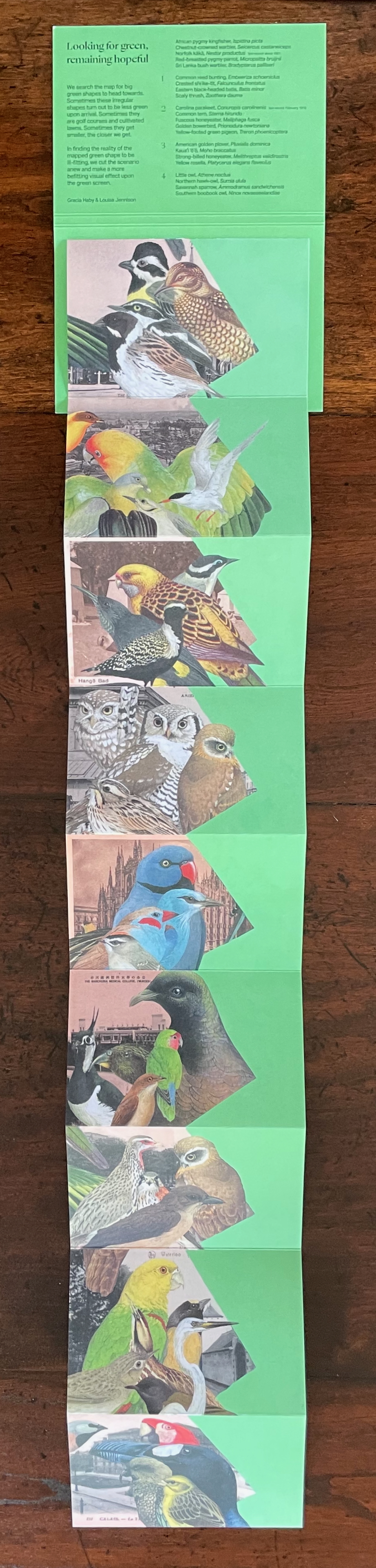
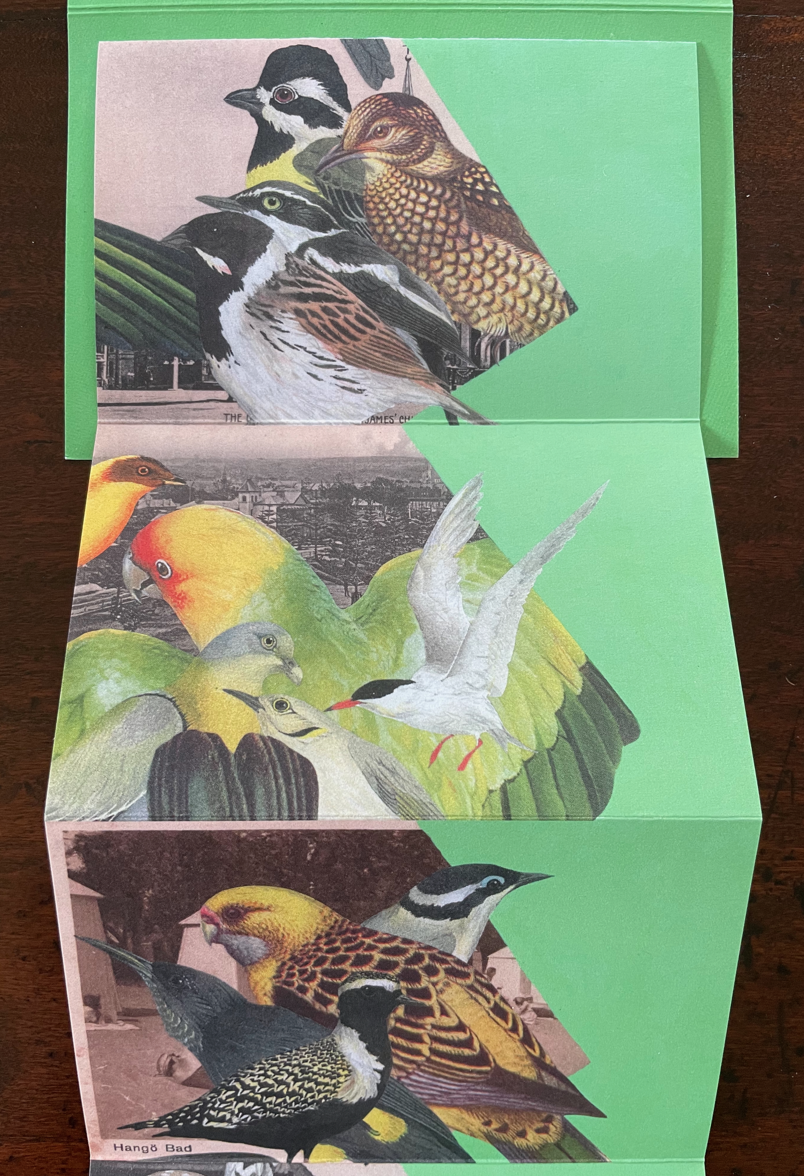
Despite its format, this is not a perforated pack of postcards to be detached and dispatched. You want to see and keep it all at once, as prompted by the vertical zigzagging against the green screen. But you will want also to examine it panel by panel, as prompted by the key on the covers and the detail of the images. In doing so, you sense the celebration and take the warning that this conference of birds being celebrated may disperse into extinction as has happened with the Norfolk kākā (last recorded sighting, about 1851), Carolina parakeet (last recorded sighting, February 1918), Newton’s parakeet (last recorded sighting, 14 August 1875), Bonon wood-pigeon (last recorded sighting, 15 September 1889), and Great Auk (last recorded sighting, 3 June 1844).

Bilateral Symmetry (2024)
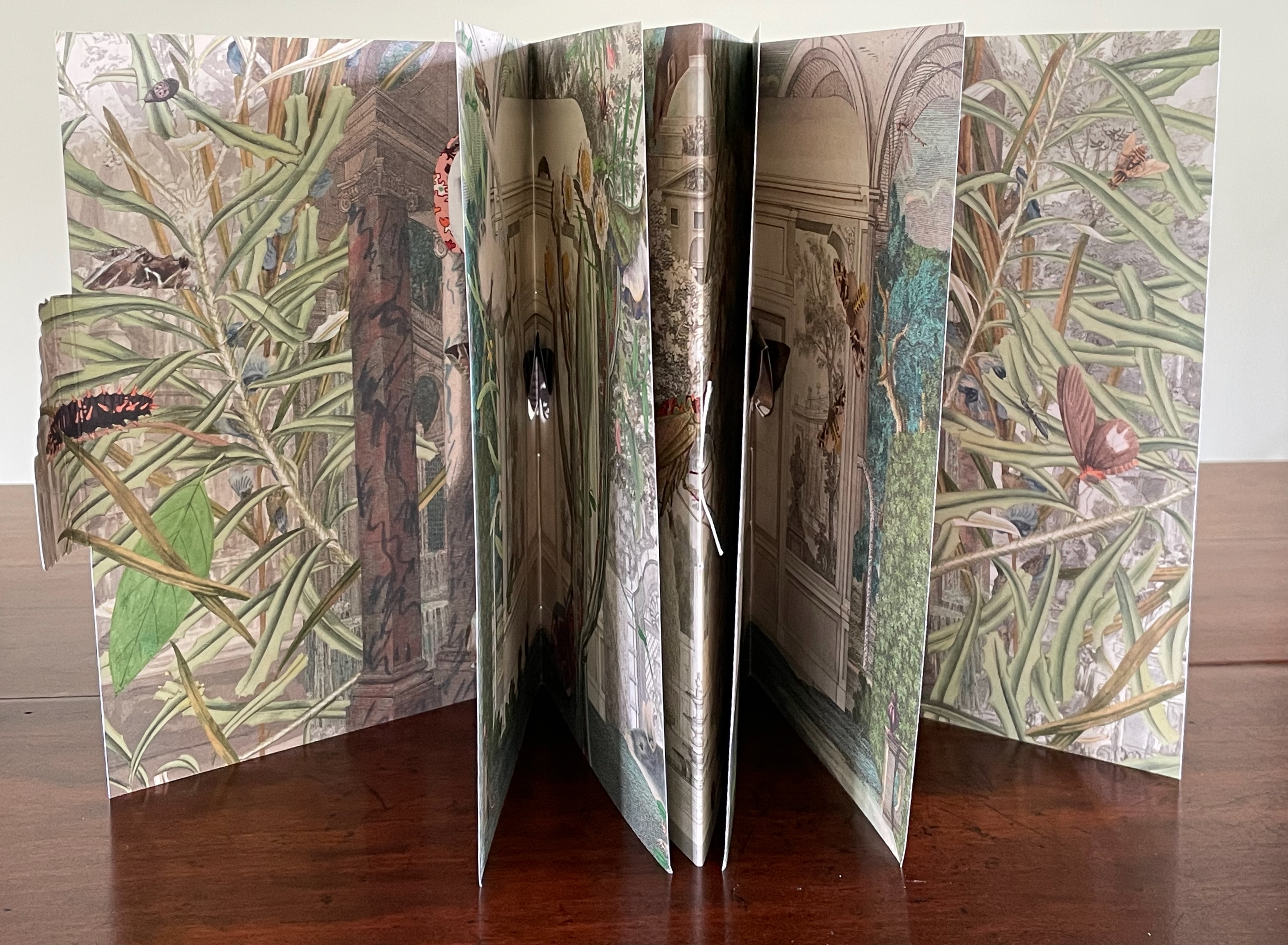
An open, artistic book showcasing vibrant illustrations of plants and butterflies with a layered, three-dimensional effect.

Bilateral Symmetry (2024)
Gracia Haby & Louise Jennison
Self-enclosing barn-fold artist’s book with tab-and-slot closure, pamphlet stitched, and pop-up components. H240 x W174 mm. [24] pages. Edition of 100. Acquired from the artists, 21 February 2026.
Photos: Books On Books Collection.

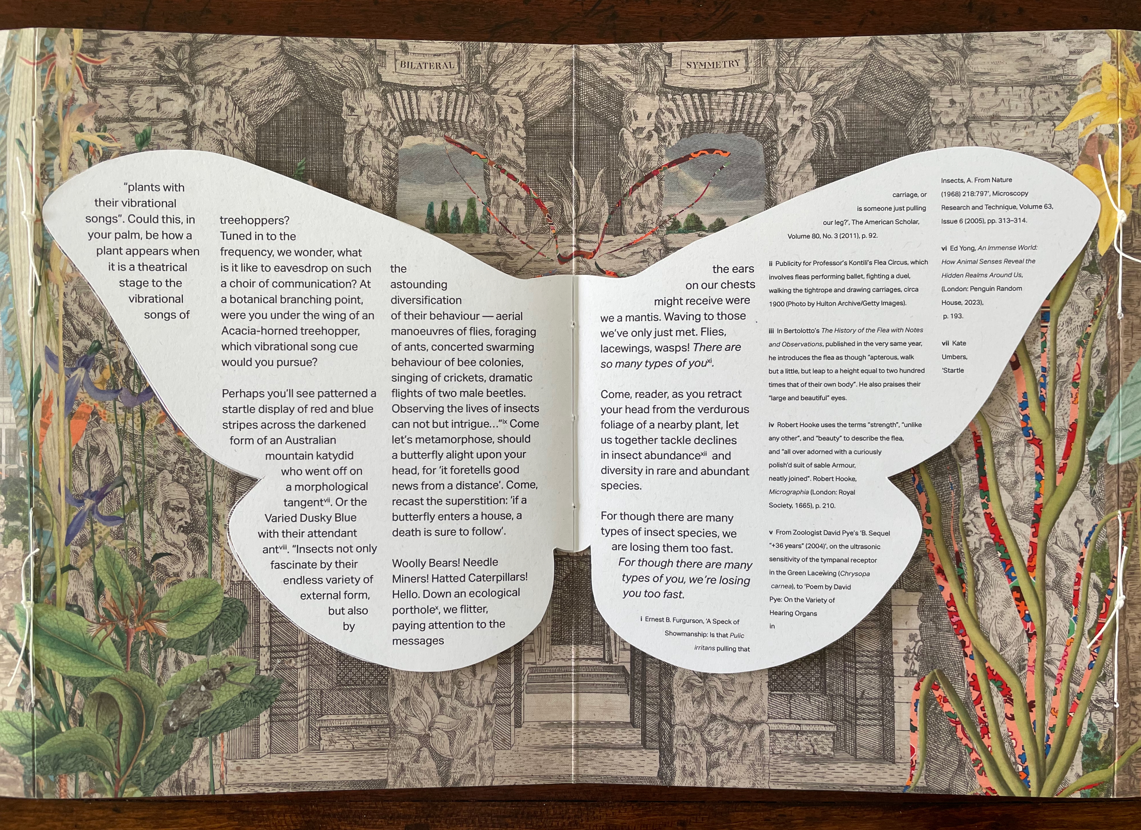
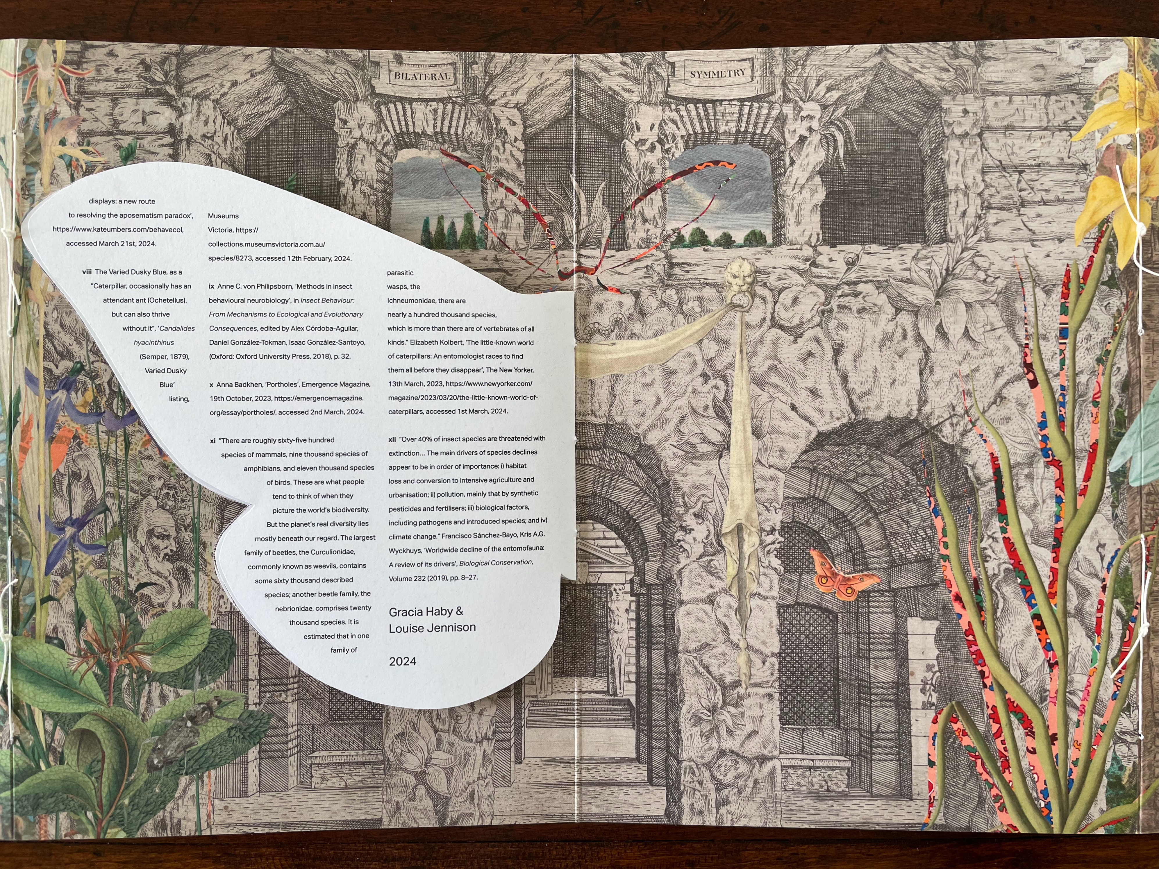
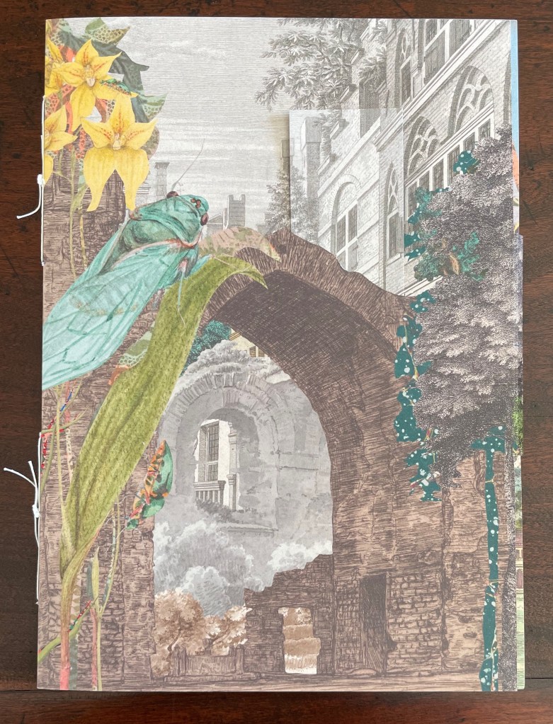
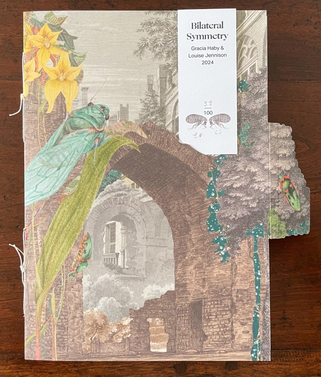
Bilateral Symmetry (2024) is the most successful of the four of artist’s books in the collection. Every element supports its exploration of perception and bilateral symmetry: the sewing, the barn-fold structure, cut outs and pop-ups, the page spreads and alignment, the choice of imagery from the natural world and architecture, and presentation of text across moth-shaped pages.

From the start, it combines surprising trompe l’oeil with startling juxtapositions. On the front cover, a bookmark aligns with the architecture behind a ruined arch overseen by a giant lacewing perched on a tree-size plant leaf.
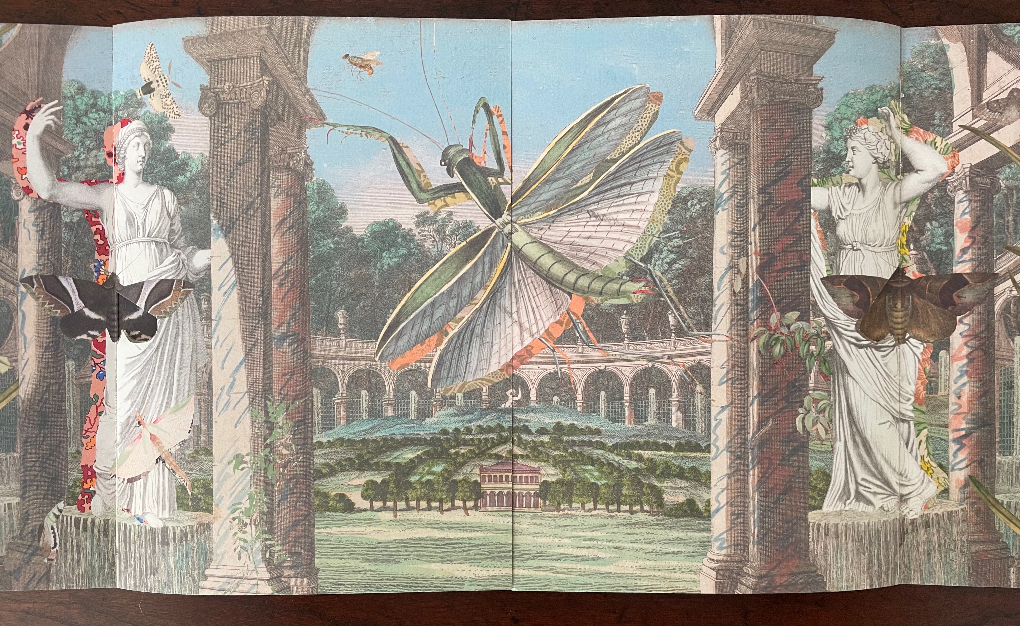
Opening the barn-fold book reveals a new set of perspectival surprises. Inside, there are two booklets facing each other. The edge of the recto page of the booklet on the left aligns with the edge of the verso page of the booklet on the right to form an image across a four-page spread. Between the two foregrounded columns and statues, we see a neatly divided and aligned building in a small formal landscape. Beyond the building and landscape, an arcade with statuary curves symmetrically to the left and to the right. In fact, the arcade extends in a circle that comes around to the columns and statues through which we are looking. But the proportions are impossible or, at least, surreal. Of course, the huge dragonfly, also neatly split by the pages meeting in the center, offers a strange perspective especially alongside the collage of other insects. Even the marbled columns offer peculiarities. Some are rounded, some are squared, some start square at the foot but end rounded at the capital. And the statuary, collaged with insects, are shadowed with bright marbled patterns.
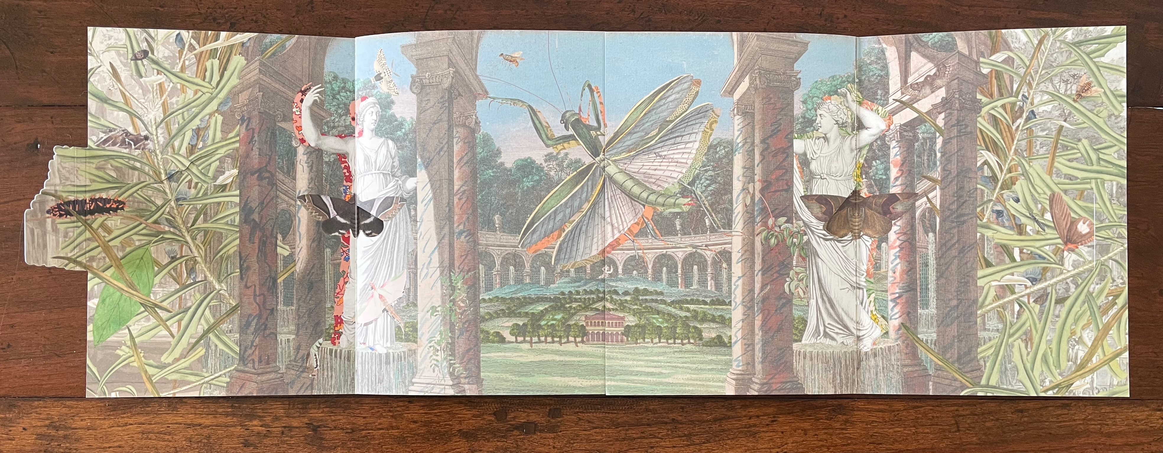
A vibrant collage featuring classical statues and lush greenery, with large butterflies and a dragonfly amidst columns and a serene landscape in the background.
An artistic depiction featuring two classical statues surrounded by vibrant insects, including a large grasshopper and several butterflies, set in a landscaped garden with arches in the background.

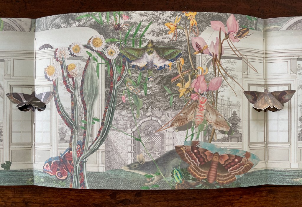
With the turn to the next set of facing spreads, the two statues and view through the arcade disappear, yet the moths that were posed against them remain as lepidopteral pop-ups against double doors in the middle of seemingly detached greenhouse walls. On the left, a flying squirrel attributed to Louisa Atkinson (ca. 1849-72) hangs from a branch intruding through an open arch in the wall. Diversity and trompe l’oeil strain at the work’s bilateral symmetry.
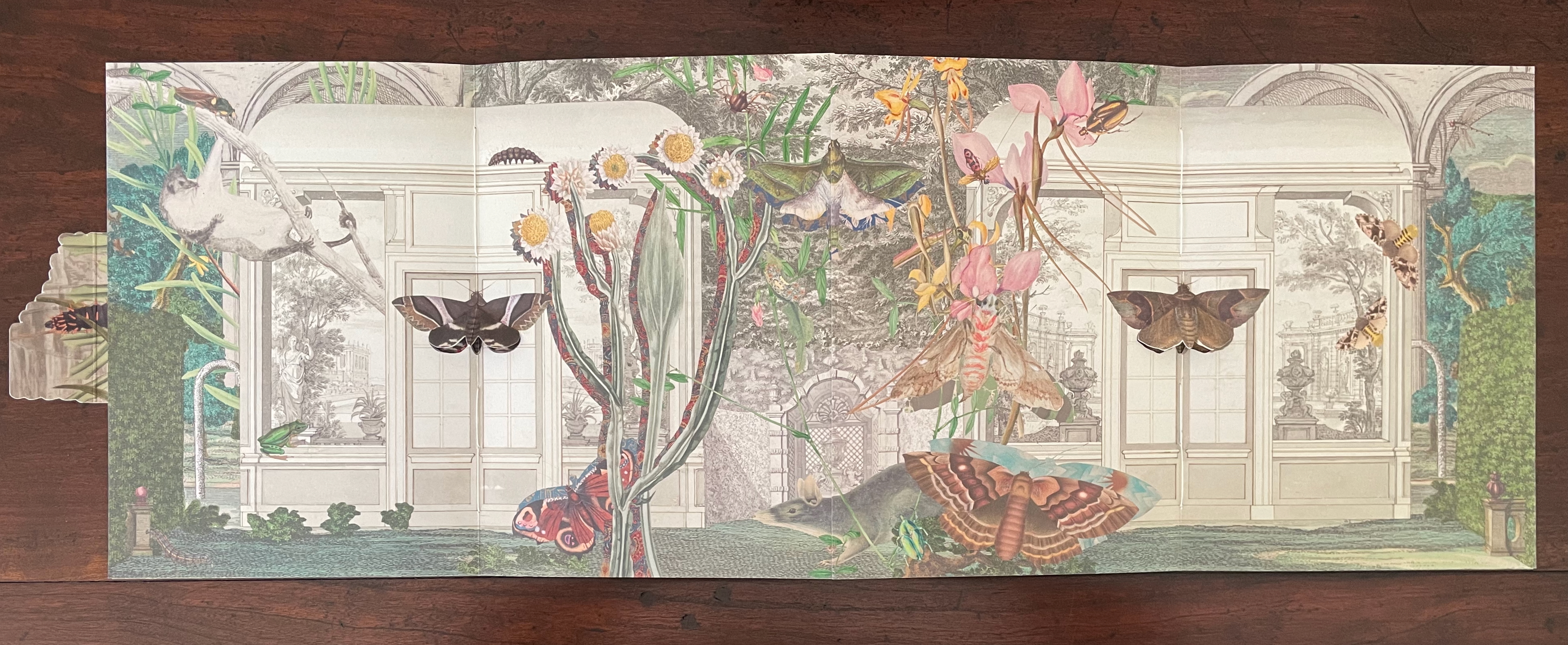
A colorful collage featuring a variety of butterflies and moths amidst intertwined plants, set against a background of ornate architecture and a garden landscape.
A pop-up book page featuring various colorful butterflies and moths amidst a detailed botanical illustration, set in a garden-like environment with a classic architectural background.

Pop-up on the left, Catocala albo-fasciata. Pop-up on the right, Catocala fusca. From Helena and Harriet Scott’s Australian Lepidoptera (1893).

The final spread on this side of the book displays further distortions challenging our perception — even of bilateral symmetry but somehow nevertheless underscoring the theme. The Scotts’ pop-up moths, each centered a booklet’s spine, are flanked by Atkinson‘s far too small ringtailed oppossum on the left and by Gerard Kreft‘s far too large water rat to the right, peering down on the scene. The huge mantis in the center hangs mid air against the formal tree lined garden abnormally far in the background. The garden is perspectivally more distant than the domed edifice behind it, and an impossibly large rodent peeps over it. Although the central rodent and mantis are not symmetrically divided, and although the scenes to the left and right of the spine are not symmetrical, the central spine bisects the garden and dome precisely. Likewise the left and right spines bisect the Scotts’ moths precisely, underscoring the theme of bilateral symmetry. Meanwhile, the spreads have reiterated the point about the variety and diversity of insects, flora, and mammals.
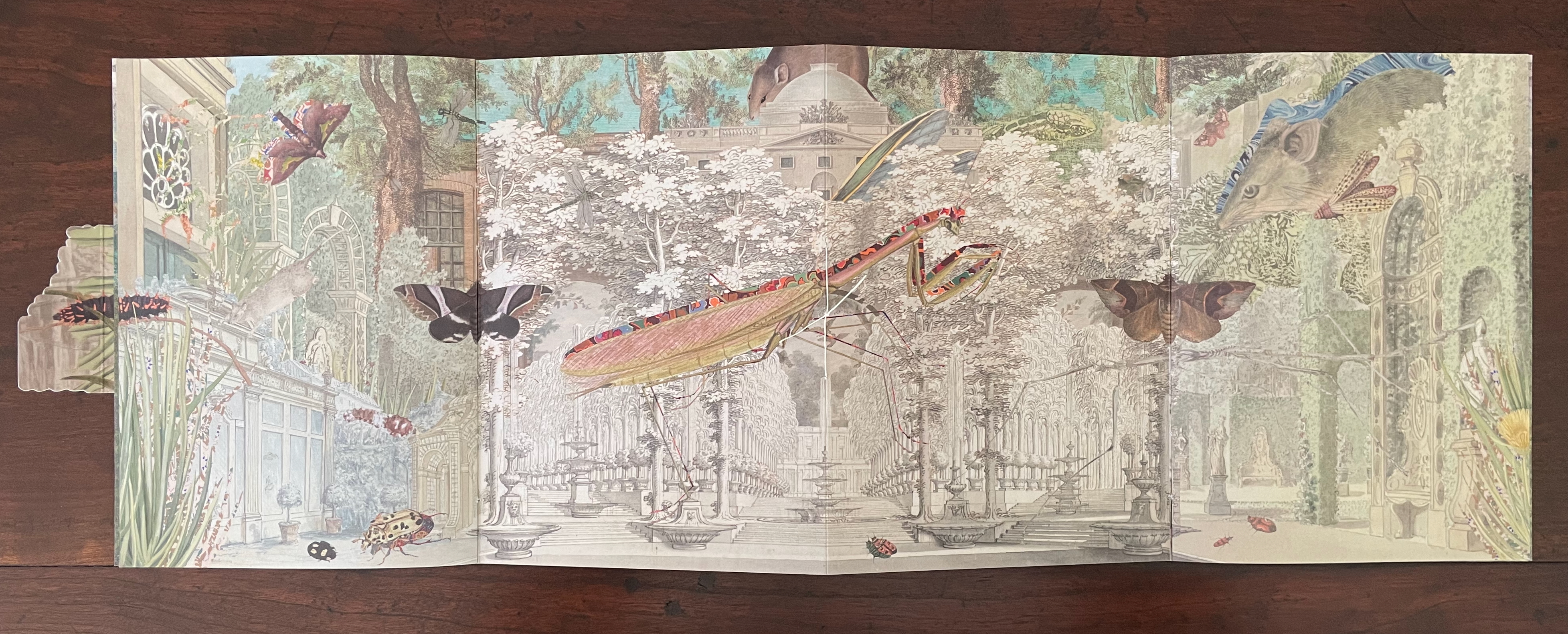
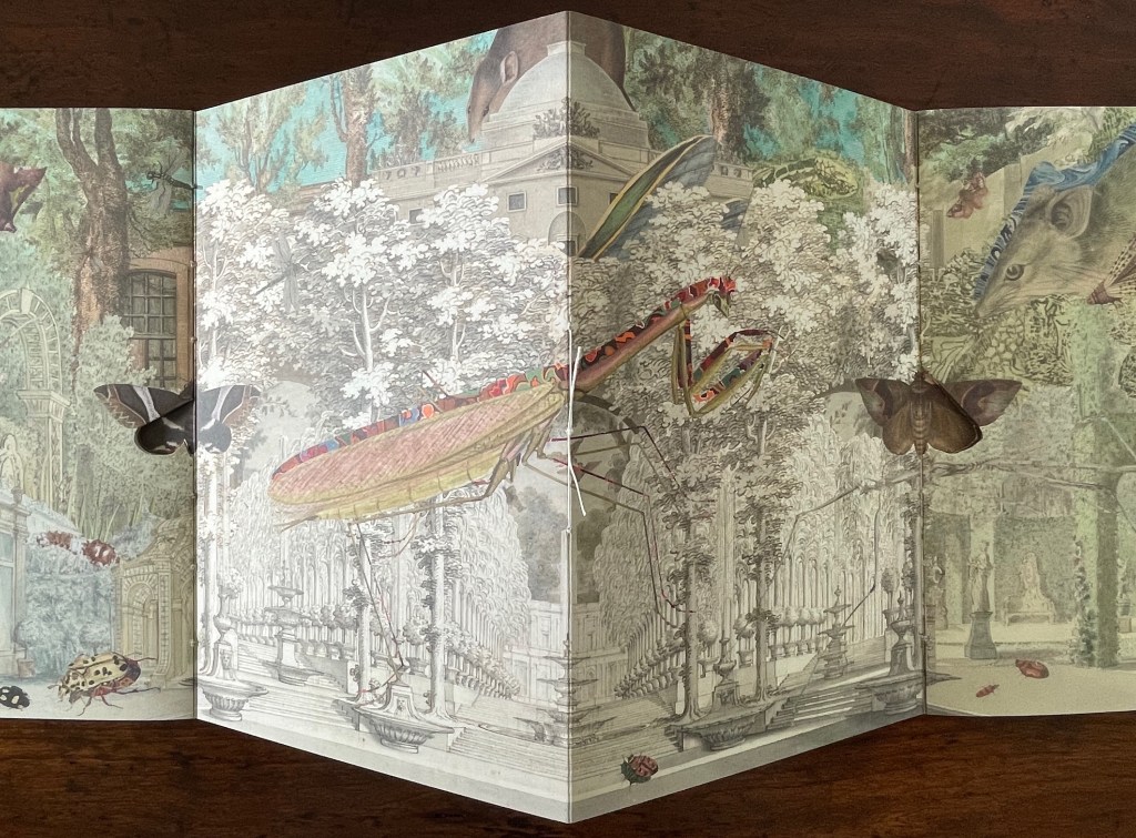
A fantastical scene featuring oversized insects and butterflies amidst a lush botanical garden, with classical architecture and sculptures in the background.
A three-dimensional pop-up book page featuring detailed illustrations of insects like a grasshopper and butterflies, set against a backdrop of elaborate garden scenes with trees, architecture, and ornamental details.

On the reverse side of the book, between the splayed-out back and front covers of the two booklets, a cut out moth with wings spread disappears in trompe l’oeil fashion into the facade against which it has alighted. Above the moth, the two-word title of the book appears on two engraved banners hanging over the two parallel open archways centered between two shuttered archways. Two Harriet Scott Emperor Gum moths hover in the two archways shown on the lower lobes of the cut out moth’s wings. (Did I mention how every element supports the exploration of bilateral symmetry?)
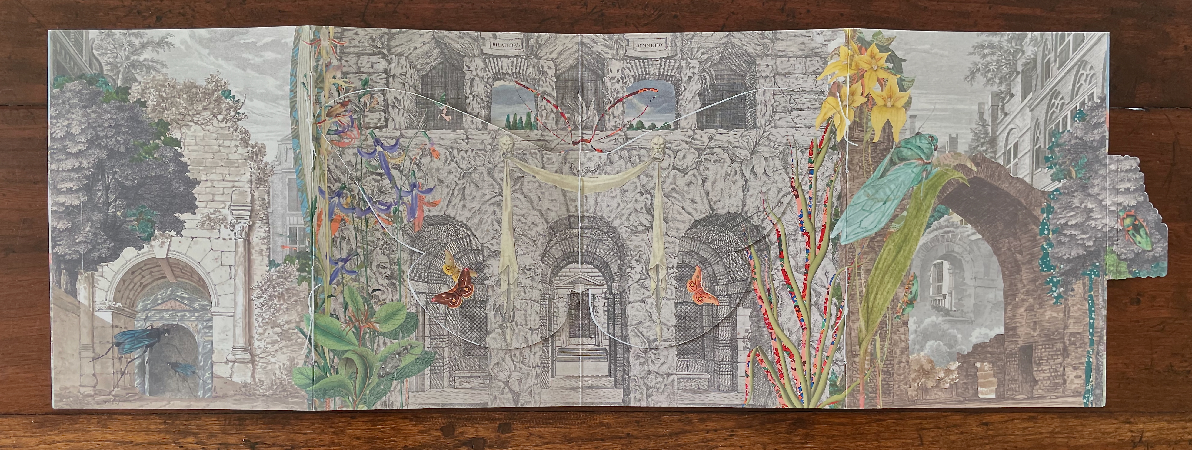
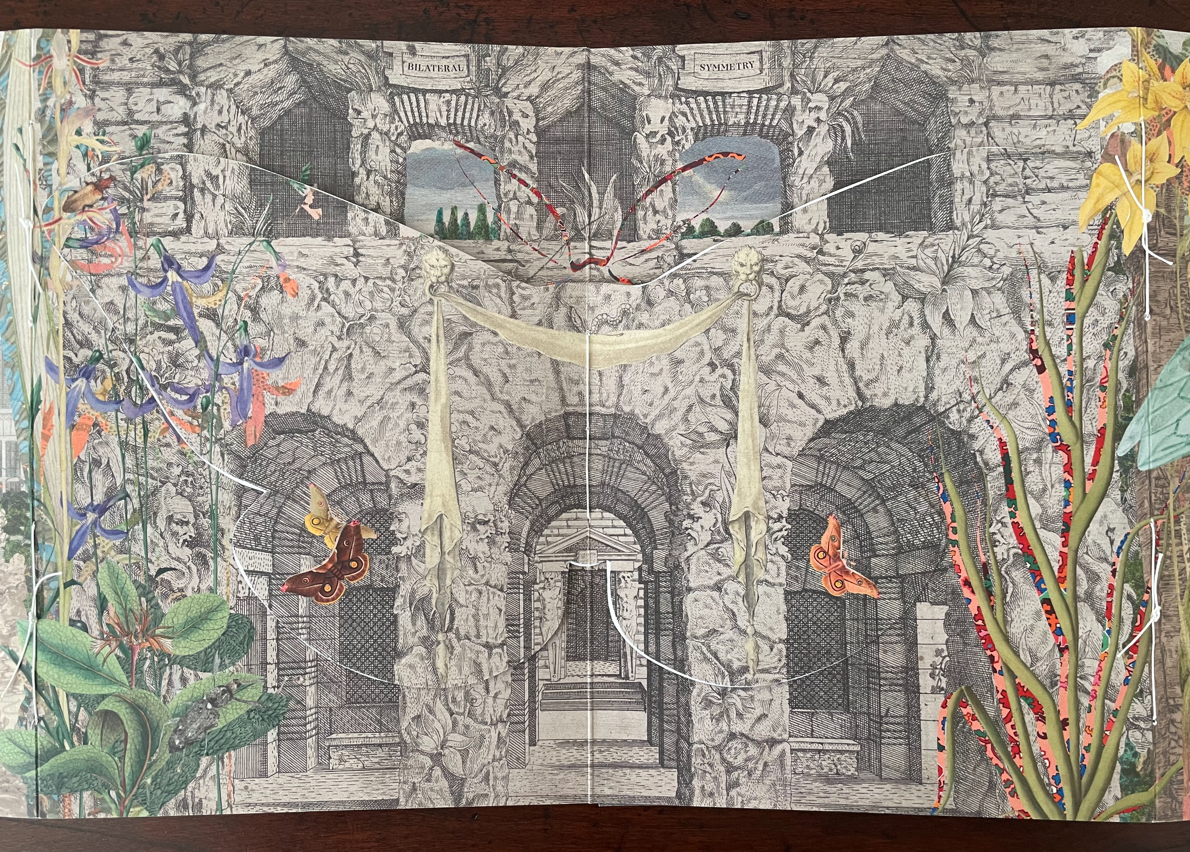
An illustrated pop-up book page featuring a detailed scene of ancient ruins surrounded by vibrant flowers, butterflies, and insects. The background includes stone arches and architectural details, blending nature with a historic setting.
A colorful artistic illustration featuring a stone archway with intricate details, surrounded by vibrant flowers, butterflies, and greenery, creating a whimsical garden scene.

The book’s text appears on the reverse side of the cut out moth’s wings. As you turn to the first wing/page of text or turn to the last wing/page, you may notice how the two Emperor Gum moths have “jumped” from the cut out’s wings to the background underneath each wing. A sort of slow motion persistence of vision, it is another perceptual trick alongside the trompe l’oeil of the cut out moth.
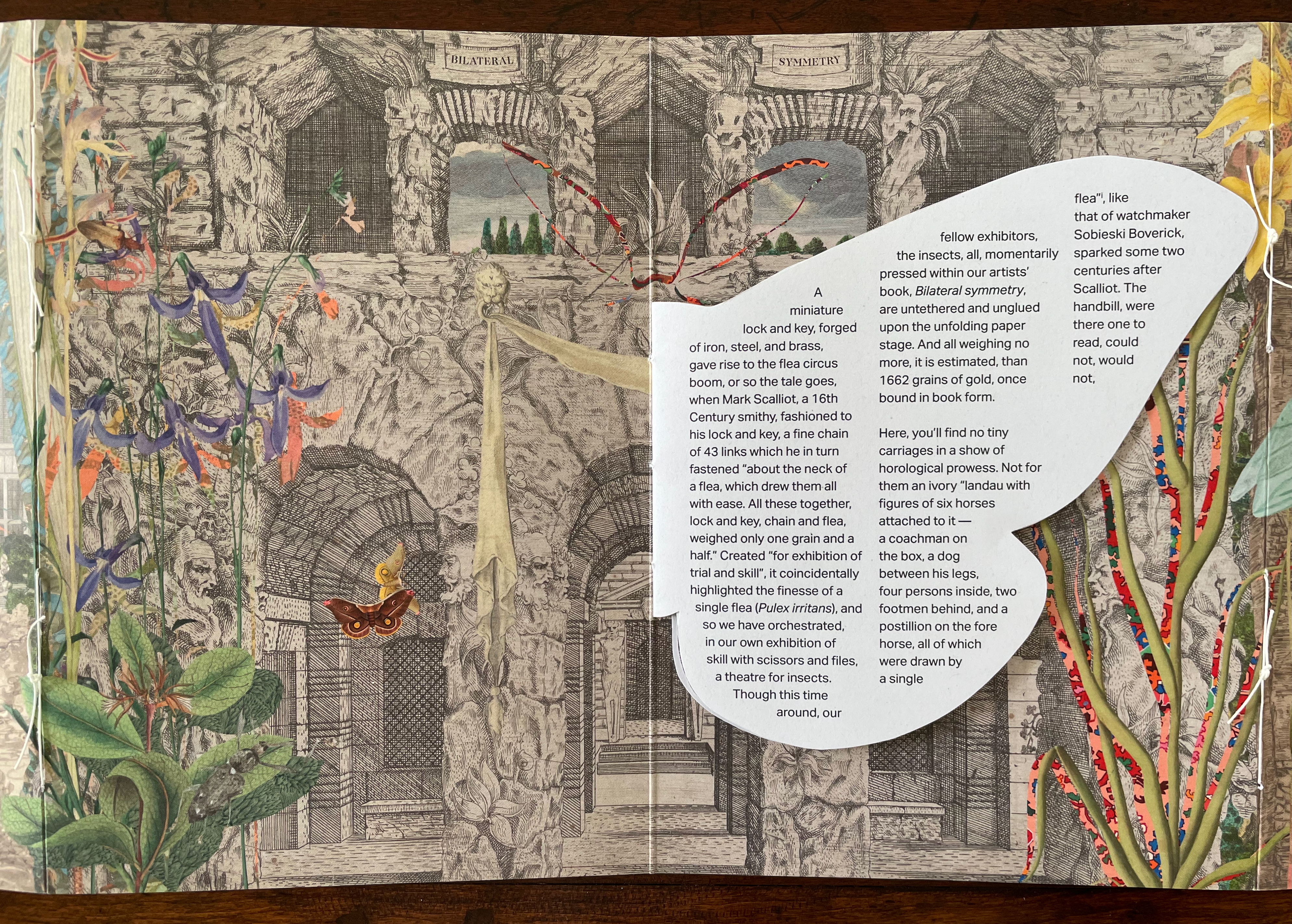
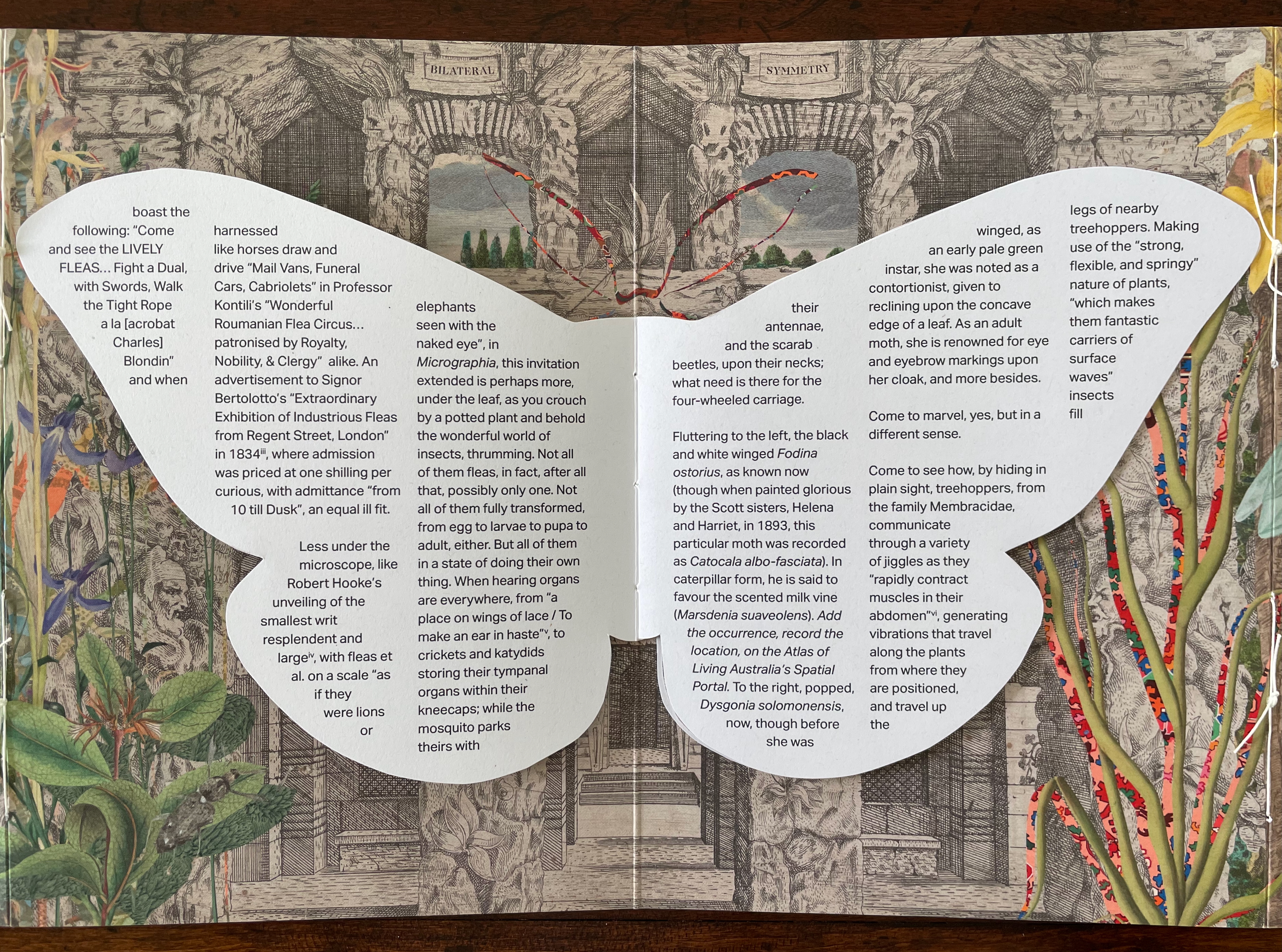
The first paragraph of text picks up on this theme of visual legerdemain by recalling the first flea circus impresario Mark Scalliot. That is a rhetorical means of introducing Bilateral Symmetry as a “theatre for insects” and posing the depicted insects as “fellow exhibitors”, which in turn is a rhetorical sleight of hand by which Haby and Jennison place themselves and the insects on an equal footing as performers and artists. The equation elevates the insects from the hucksterism of the flea circus — “Not for them an ivory “landau with figures of six horses attached to it ….” and, in the next paragraph, even raises these performers over Robert Hooke’s fleas as large as “elephants seen with the naked eye”. The exhibitors of Bilateral Symmetry invite you to better Hooke’s microscope by crouching “by a potted plant and behold[ing] the wonderful world of insects, thrumming”.

Leaning into entomomorphism, the artists invite us “[d]own an ecological porthole [to] flitter, paying attention to the messages the ears on our chests might receive were we a mantis”. Familiar by now with the artists’ message, we know this leads to the ecological observation of declining diversity, but up to this point, their artistry has been primarily about visual perception. This is not to gainsay the message, but as important as the message is, their marvelous handling of the media (the archival sources, the innovative book structure, and the collage) and reorienting of our perspective do more than simply make us receptive to it. Only in its final two paragraphs does the text exhort the reader to care and do something about the decline in insect diversity. The paragraphs preceding them conjure a world of insect perception and behavior that is as surreal as the whimsical perceptual distortions of the collage. The collage may include insects registered as endangered, but the text does not identify them. If text and collage were to have included endangered insects such as the Angled Tiger butterfly, Beautiful Petaltail dragonfly, Illidge’s Ant-blue (Butterfly), Queen Alexandra’s Birdwing Butterfly, Fan-winged Katydids, or Zaprochilus ninae (Bush crickets), might we have arrived at the same exhortation on our own?

With its blend of architectural ruins and artificial landscaping with oversized and undersized insects at various stages of metamorphosis, Bilateral Symmetry urges a shift of perspective in our perception of nature and our interconnectedness. With its structural embodiment of bilateral symmetry and diversity, it offers a rich example of the perceptual and perspectival shift it urges.

Further Reading

“Carol Barton“. 10 August 2024. Books On Books Collection.

“Caren Florance“. 30 April 2026. Books On Books Collection. In particular, see L OO P (2019).

“Ernst Huebner“. 21 July 2023. Books On Books Collection.

“Willow Legge“. 16 February 2021. Books On Books Collection.

“On the Origin of Species“. 12 February 2017. Bookmarking Book Art.

“Philip Zimmermann“. 14 January 2020. Books On Books Collection. In particular, see Melt (2023) and Landscapes of the Late Anthropocene (2017).

Davis, Brian. 2024. “Part One: The Rise of Multimodal Book-Archives“. College Book Art Association. Accessed 24 November 2025.
Books On Books Collection – Ellsworth Kelly

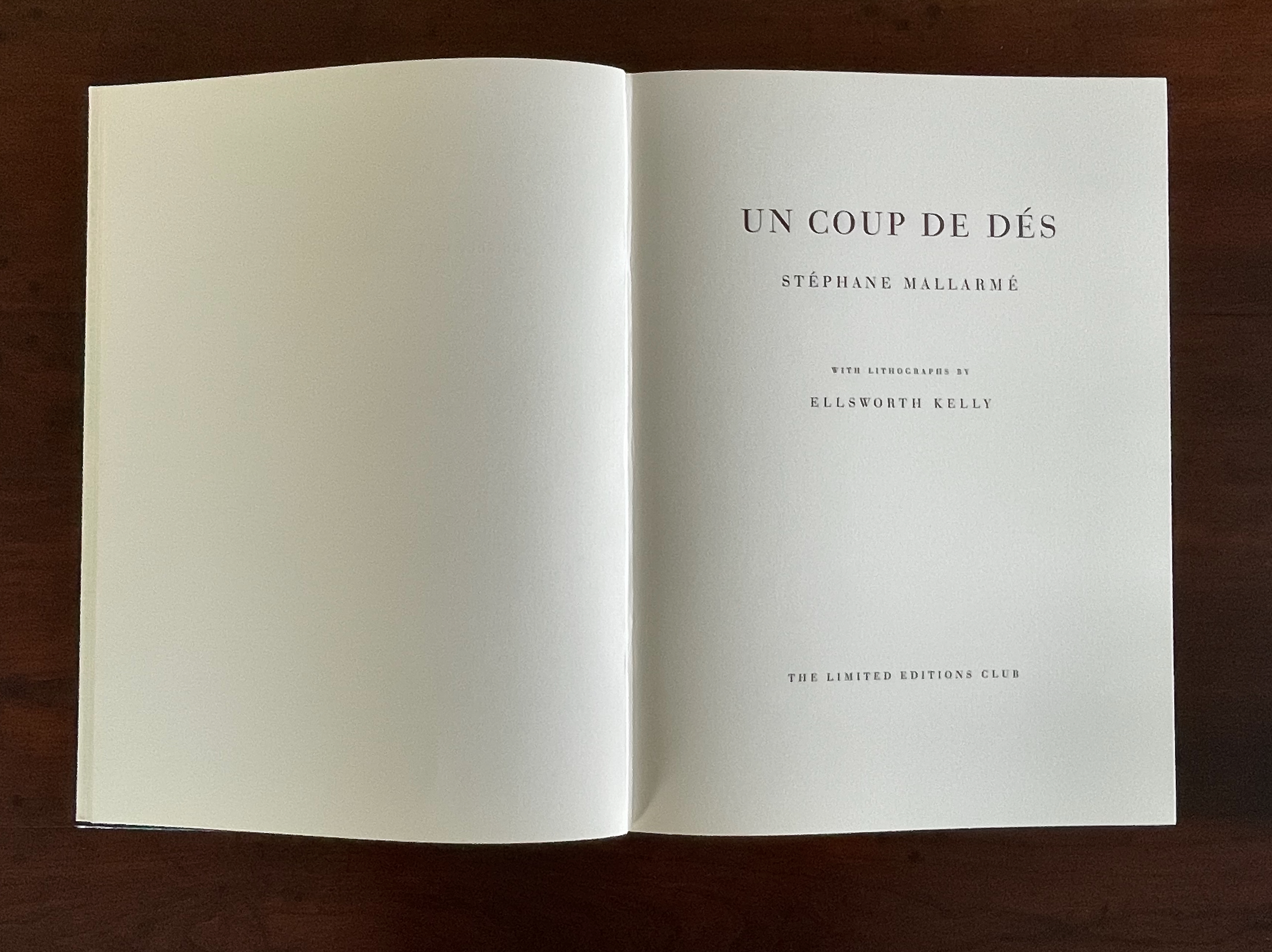
Un Coup de Dés Jamais N’Abolira le Hasard (1992)

Un Coup de Dés Jamais N’Abolira le Hasard (1992)
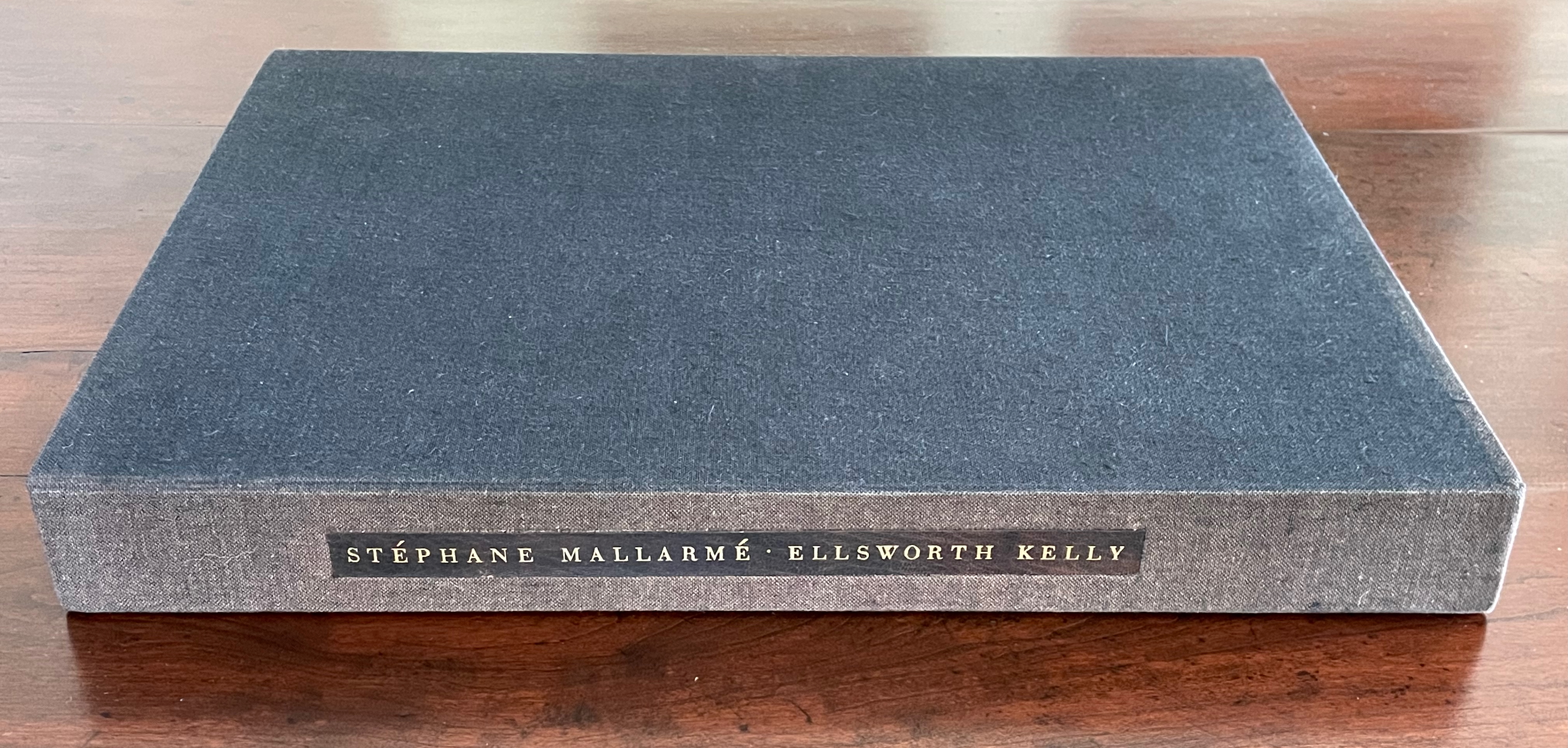
Ellsworth Kelly and Stéphane Mallarmé
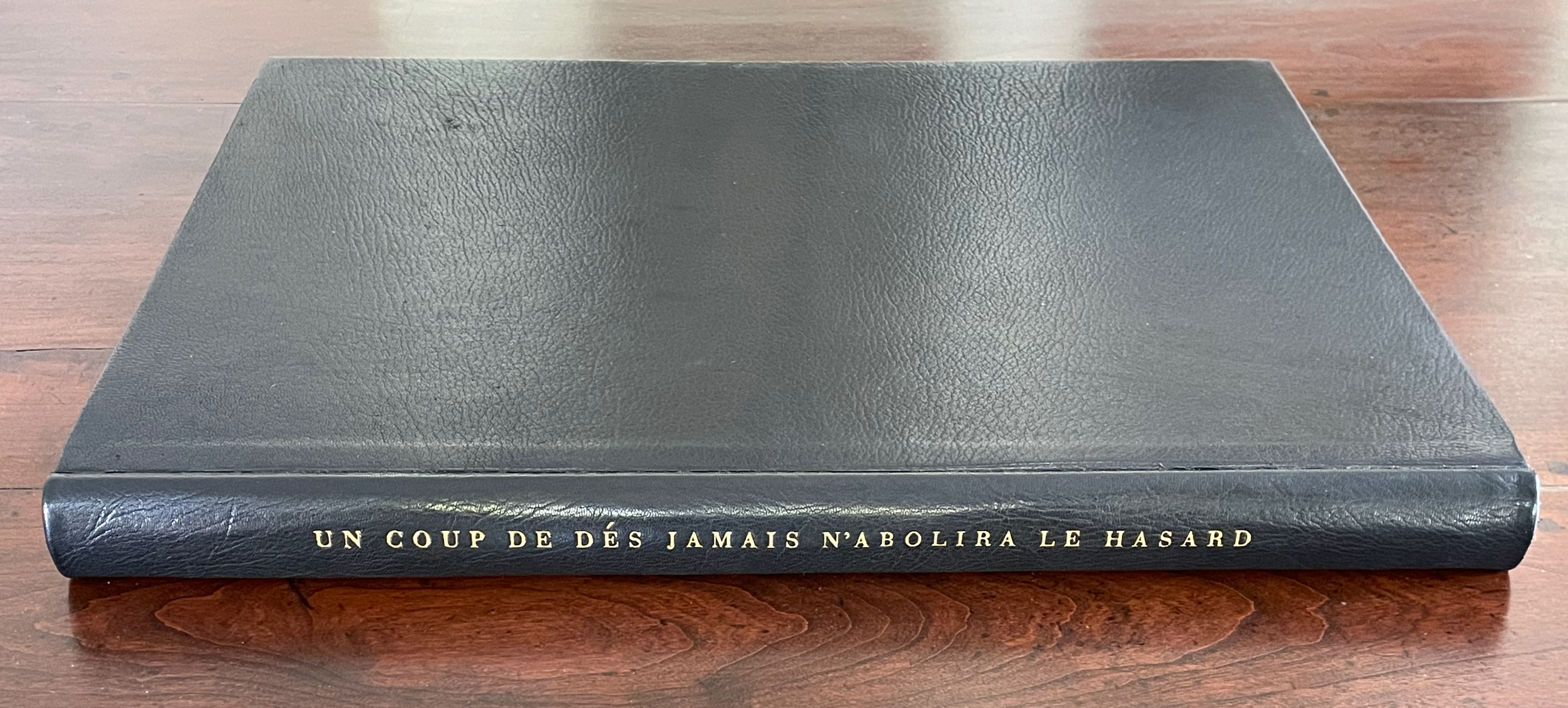
Hardback, case bound in full black morocco, spine gilt-lettered. 17 x 12 1/2 in Edition of 300, of which this is #204. Acquired at Swann Auctions, 24 October 2024.
Photos: Books On Books Collection. Permission to display, courtesy of Limited Editions.

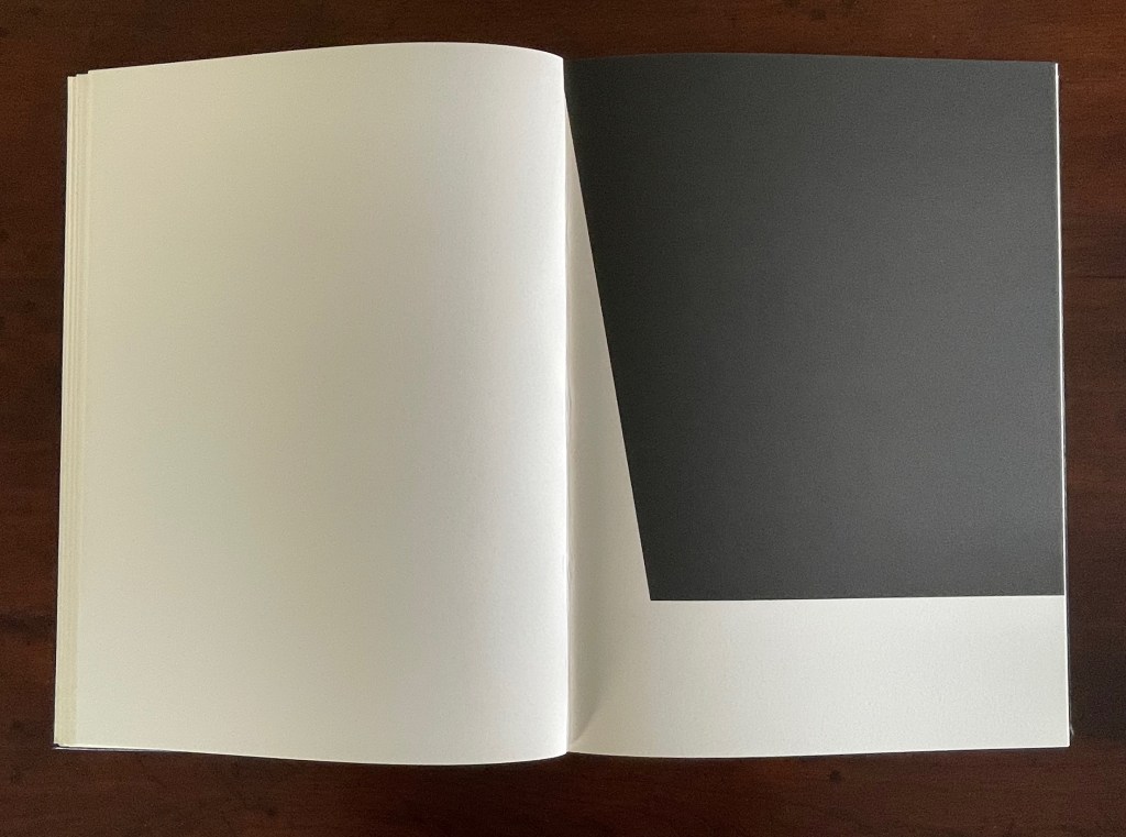
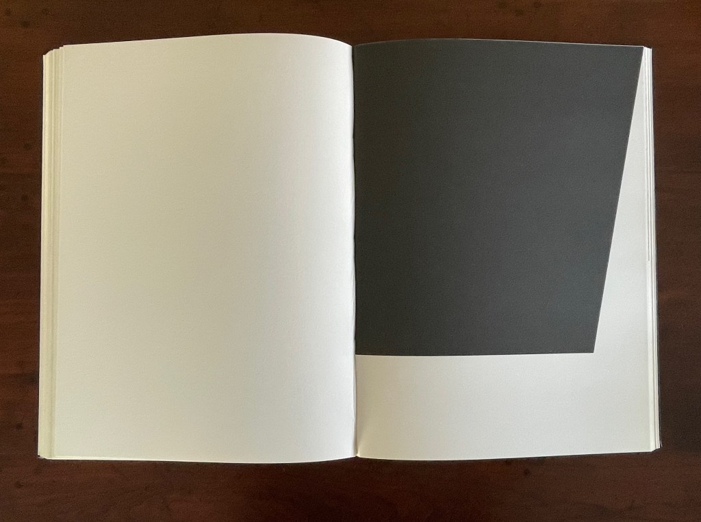
Is Ellsworth Kelly’s homage to Stéphane Mallarmé’s Un Coup de Dés Jamais N’Abolira Le Hasard an illustrated book, a livre d’artiste, or an artist’s book? It certainly resonates with and intensifies the poem’s design and imagery, but without being a spread-for-spread illustration. It is akin to the tributes paid by André Masson (1961), Jean Lecoultre (1975), Ian Tyson & Neil Crawford (1985), Jacques Vernière (1987), Christiane Vielle (1989), Ofer Lellouche (1997), Robert Bononno & Jeff Clark (2015), and Eric Zboya (2018). Some of these kindred spirits like Masson, Vielle, and Bononno & Clark intersperse artwork within the poem that evoke if not illustrate the setting and action of the sea and shipwreck. Some, like Masson, Lecoultre, Vernière, and Lellouche display images that have less to do with the poem’s imagery. Some, like Tyson & Crawford and Zboya, show more interest in capturing the poem’s numerological esotericism (LE NOMBRE). More than the others, though, Kelly builds on Mallarmé’s double-page spread principle and its structural importance for the poem.

The double-page spread is the chief design structure in Mallarmé’s poem and is essential to its workings. We know this from the differences in layouts between its first publication in Cosmopolis in 1897, its marked-up proofs Mallarmé left behind after his death, and his son-in-law’s effort with Gallimard in 1913 to reflect the poet’s plan. Just before his death, Mallarmé had been working on the volume with Ambroise Vollard, who had commissioned etchings from Odilon Redon to bring it to the status and price of the livre d’artiste, a genre he was shaping. Mallarmé was amenable to this as long as the etchings were grouped at the end of the book. He did not want the artwork to distract the reader from his careful arrangement of the text on and across eleven double-page spreads.

The fact of Ellsworth Kelly’s eleven lithographs aligns with Mallarmé’s plan for eleven double-page spreads of text, but the interweaving of the two sets of spreads runs contrary to Mallarmé’s wishes. To follow the poet’s wishes, Kelly and the book designer hired for The Limited Editions Club’s production could have been grouped at the end of the book, but they didn’t. To double down on the contravention, they added a blank double-page spread after each of the eleven spreads of text and after each of the eleven spreads of lithographs. Someone also decided to begin and end the volume with sets of four blank flyleaves. This is not mere padding to justify a deluxe price. The effect signals and enhances the importance of the double-page spread for Mallarmé’s poem. It underlines the importance of what Mallarmé called “les blancs”. More than underline it, those punctuations of blank space after each spread of text and then after each spread of image add a pace to the sequence and place an additional demand on the memory as it juggles Mallarmé’s interweaving of text in its different sizes, styles, and position across the double-page spread. The lithographs’ nature, their pattern, and their spatial relationship to everything in the book’s structure match Mallarmé’s architectural plans far more than Vollard’s impresario interventions.

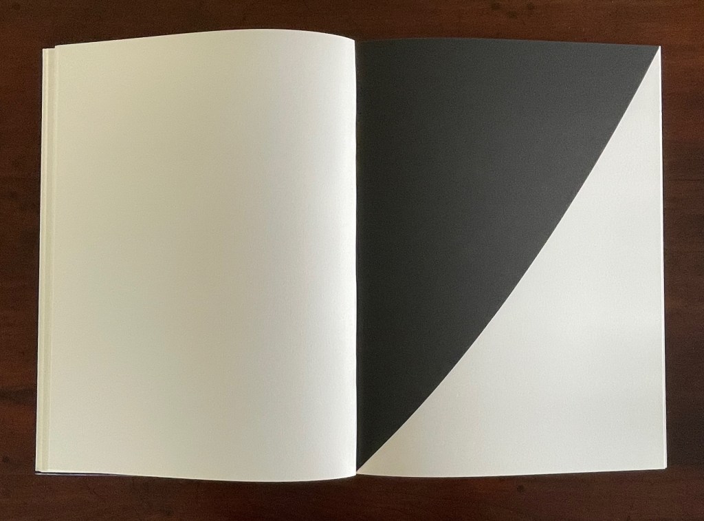
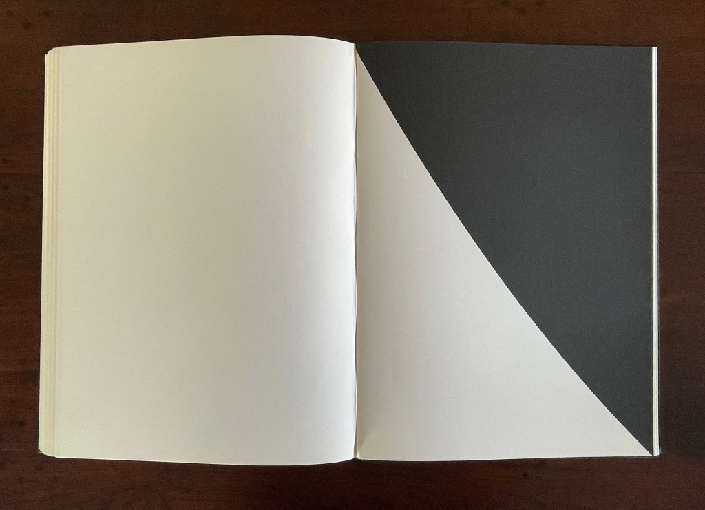
Abstract as they are, Kelly’s lithographs subtly mirror the structure and content of Mallarmé’s poem. Just as Mallarmé’s first sentence begins and his last sentence ends with “un coup de dés”, Kelly reverses the image in his first lithograph to make the image in his last.

Just as inversions are recurrent in the poem, so they recur in Kelly’s lithographs.

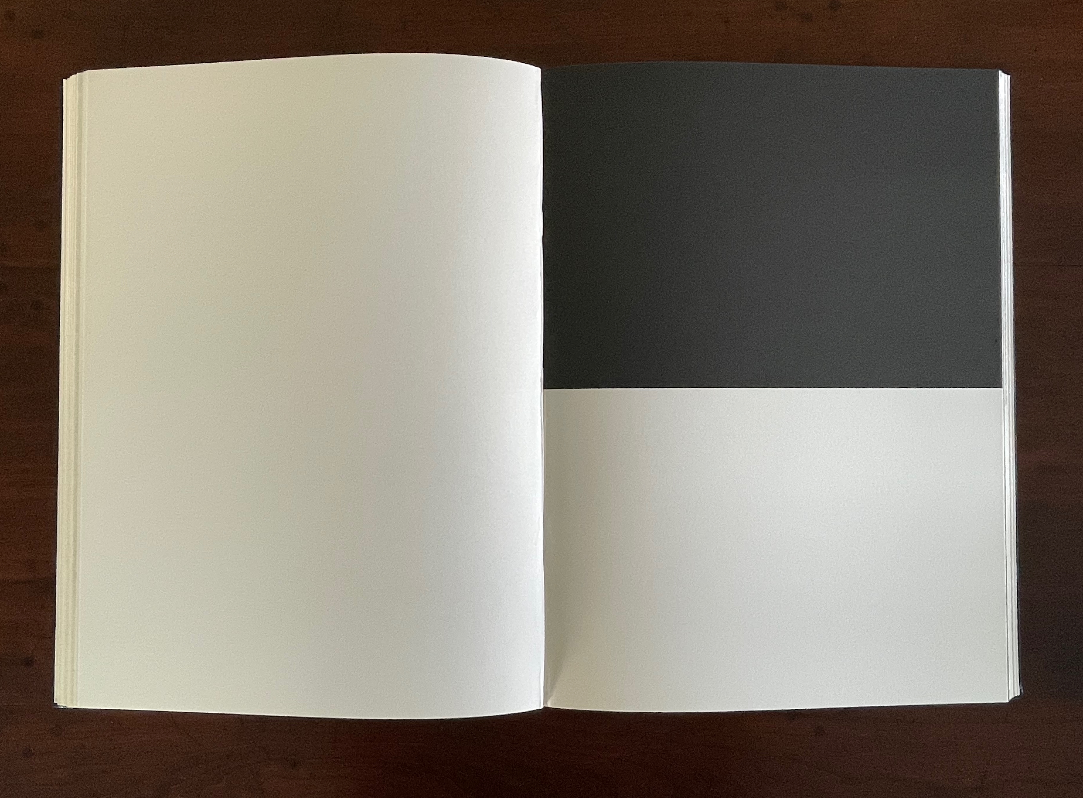
The poem’s spread beginning and ending COMME SI [“AS IF“] is central to the poem physically and thematically. The sixth of the eleven spreads, it is the only one showing this spatial, syntactic, and typographic pattern. Likewise, Kelly’s sixth lithograph splits its page equally. No other lithograph depicts this equilibrium.

An open book with one page entirely blank and the opposite page divided into two horizontal sections, one black at the top and one white at the bottom.

Kelly created a separate portfolio of four lithographs: The Mallarmé Suite. This work is meant to be displayed on a wall and arranged precisely according to Kelly ‘s instructions. Despite the four shapes’ replication from the book, the portfolio stands quite apart in its introduction of color and positioning of the shapes (see Bonfitto’s essay). Its mere conjunction with the book does not imbue it with what happens in the book, and that underscores the fact that Kelly’s eleven black-and-white lithographs are not in mere conjunction with Mallarmé’s poem. The reader/viewer can imagine billowing sails, overwhelming waves, or tilting masts in the lithographs, but what matters is how Kelly makes his distinctive shapes play with one another and all the book’s double-page spreads to mirror how Mallarmé makes his words, typography, and double-page spreads play with one another. If self-reflexiveness is one of the key markers for distinguishing an artist’s book from a livre d’artiste, we have here a self-reflexive poem and a self-reflexive visual artwork punctuated by blanks within the canvas of the book structure to create a self-reflexive artist’s book.

Further Reading

“‘Un Coup de Dés Jamais N’Abolira l’Appropriation’— An Online Exhibition“. 1 May 2022. Books On Books Collection.

Bonfitto, Tracy. 8 June 2018. “The Poetic Space of Ellsworth Kelly’s Prints“. ransomcenter. Harry Ransom Center, University of Texas at Austin. Internet Archive link.

Books On Books Collection – Lu Jingren, Amanda Degener, and Peng Wu

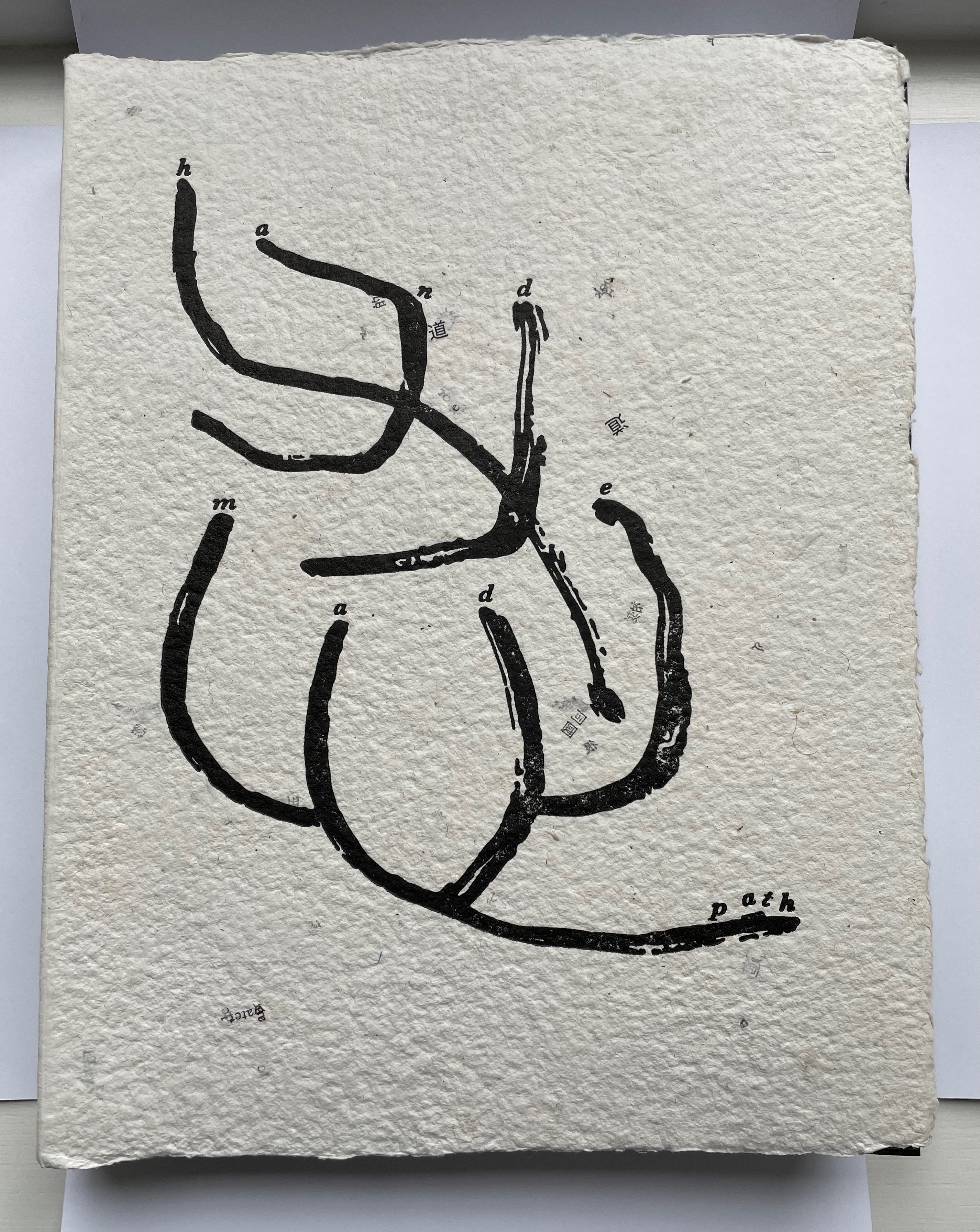
Handmade Path (2021)

Handmade Path (2021)
Lu Jingren, Amanda Degener, and Peng Wu
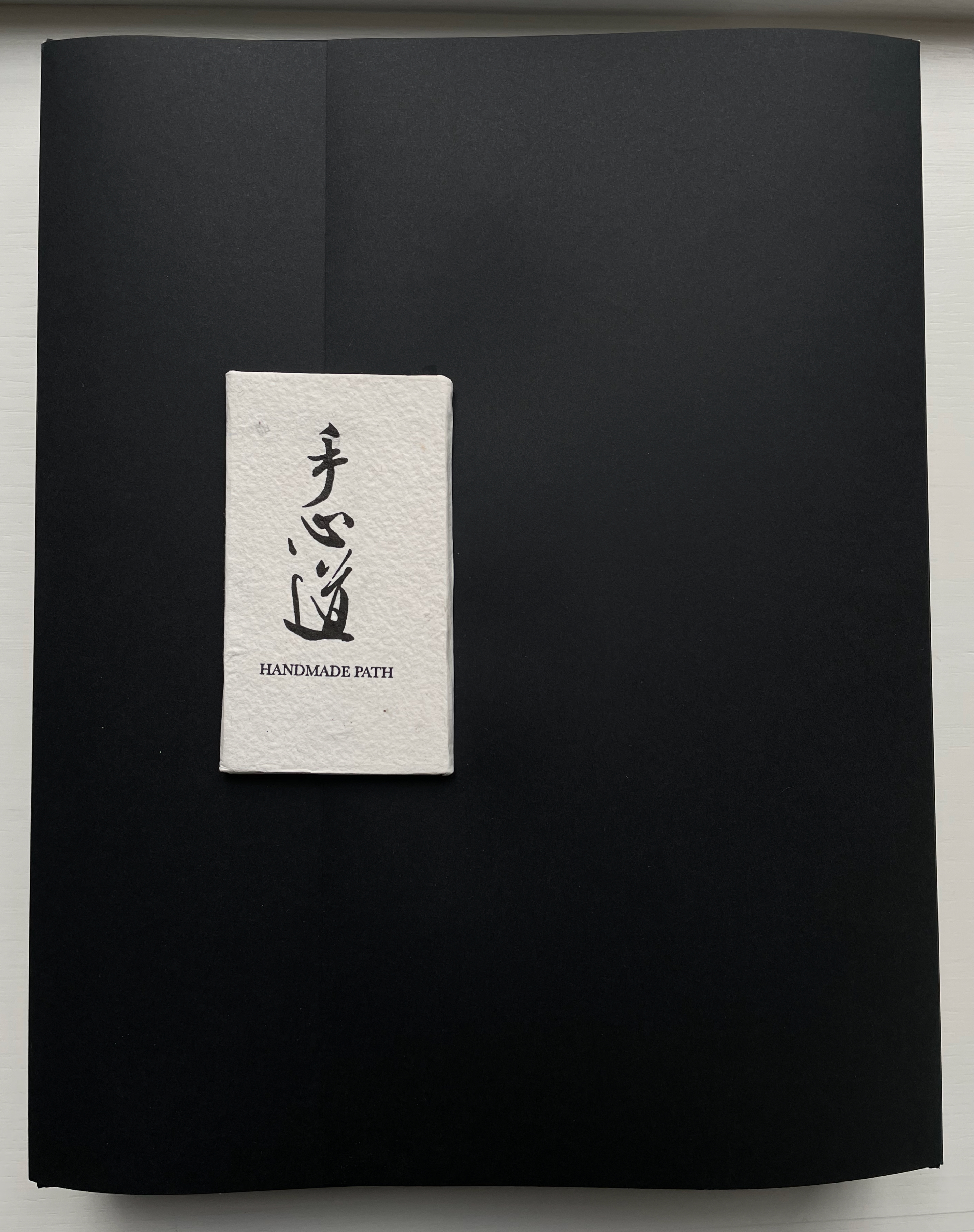
Black-inked card wrapper with magnetic closure. Handbound, handsewn, handmade paper cover book. H285 x W220 x D40 mm. 268pages. Edition of 350, of which this is #152. Acquired from Amanda Degener, 5 December 2022.
Photos: Books On Books.

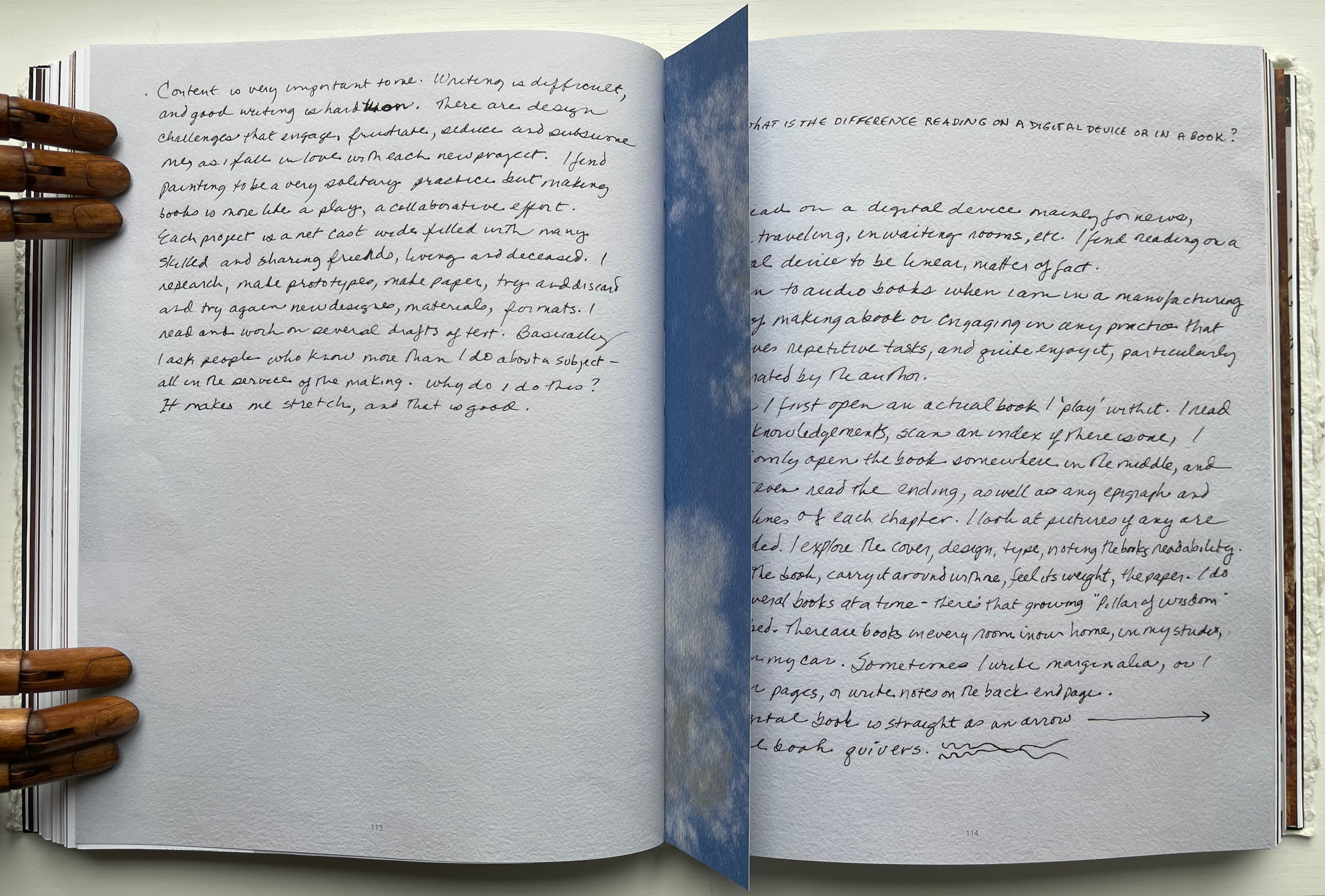
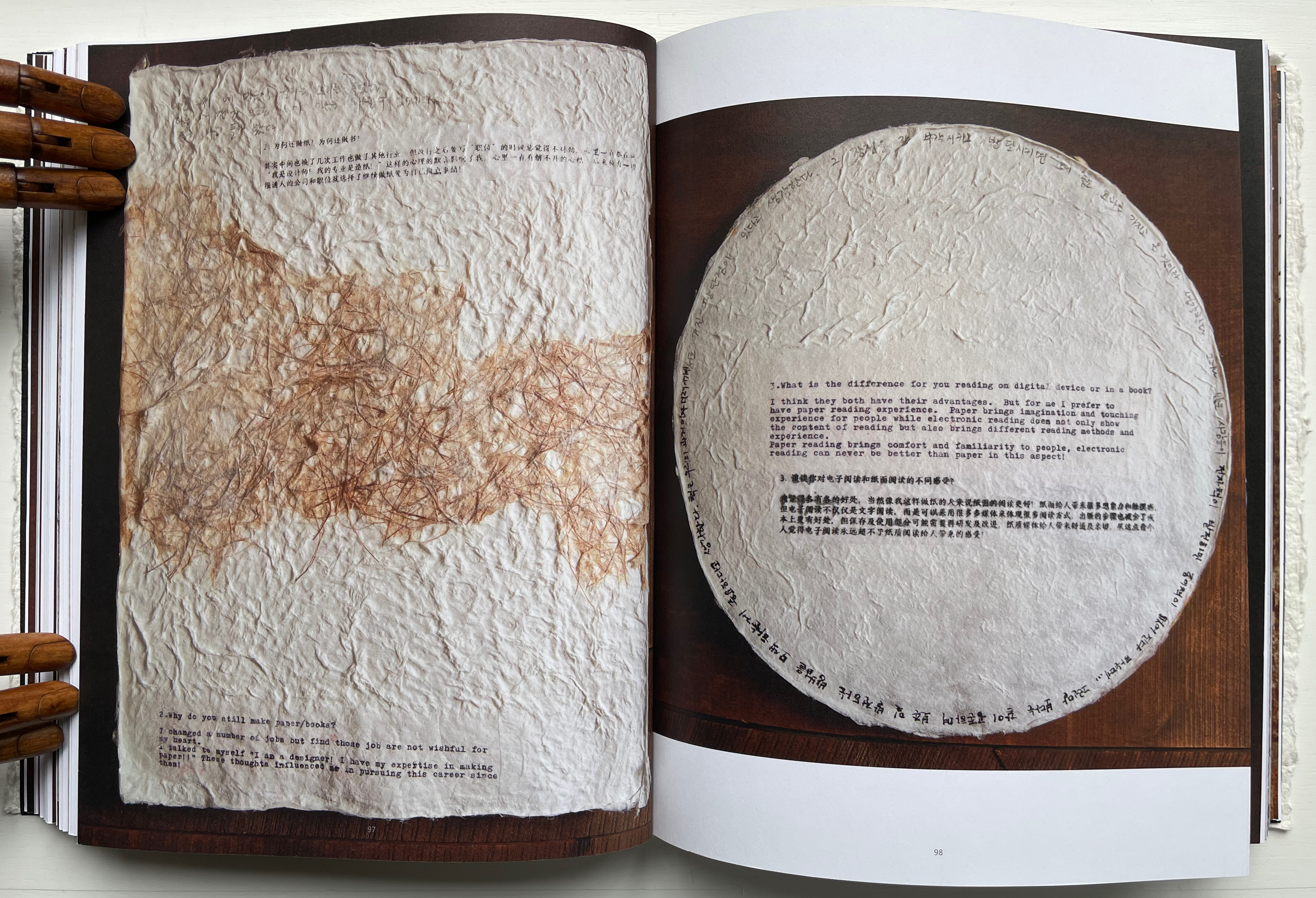
Handmade Path presents 57 artists of paper and book who responded to 6 questions circulated by the editors. The editors asked the artists to provide handwritten replies to the questions as well as images of both their work and of their hands.

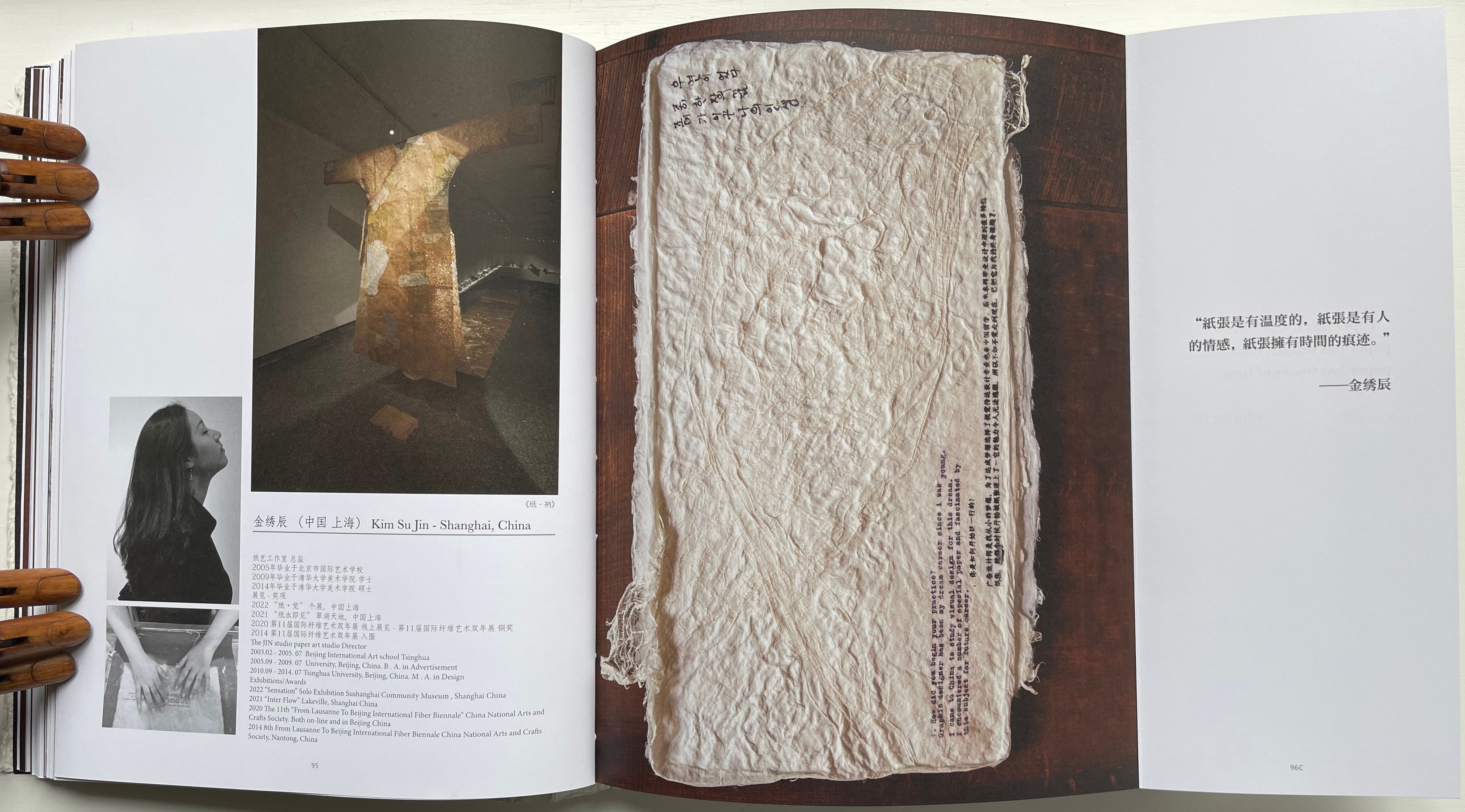
  1. How did you begin your practice?
  2. Why do you still make paper / books?
  3. What is the difference for you reading on digital device or in a book?
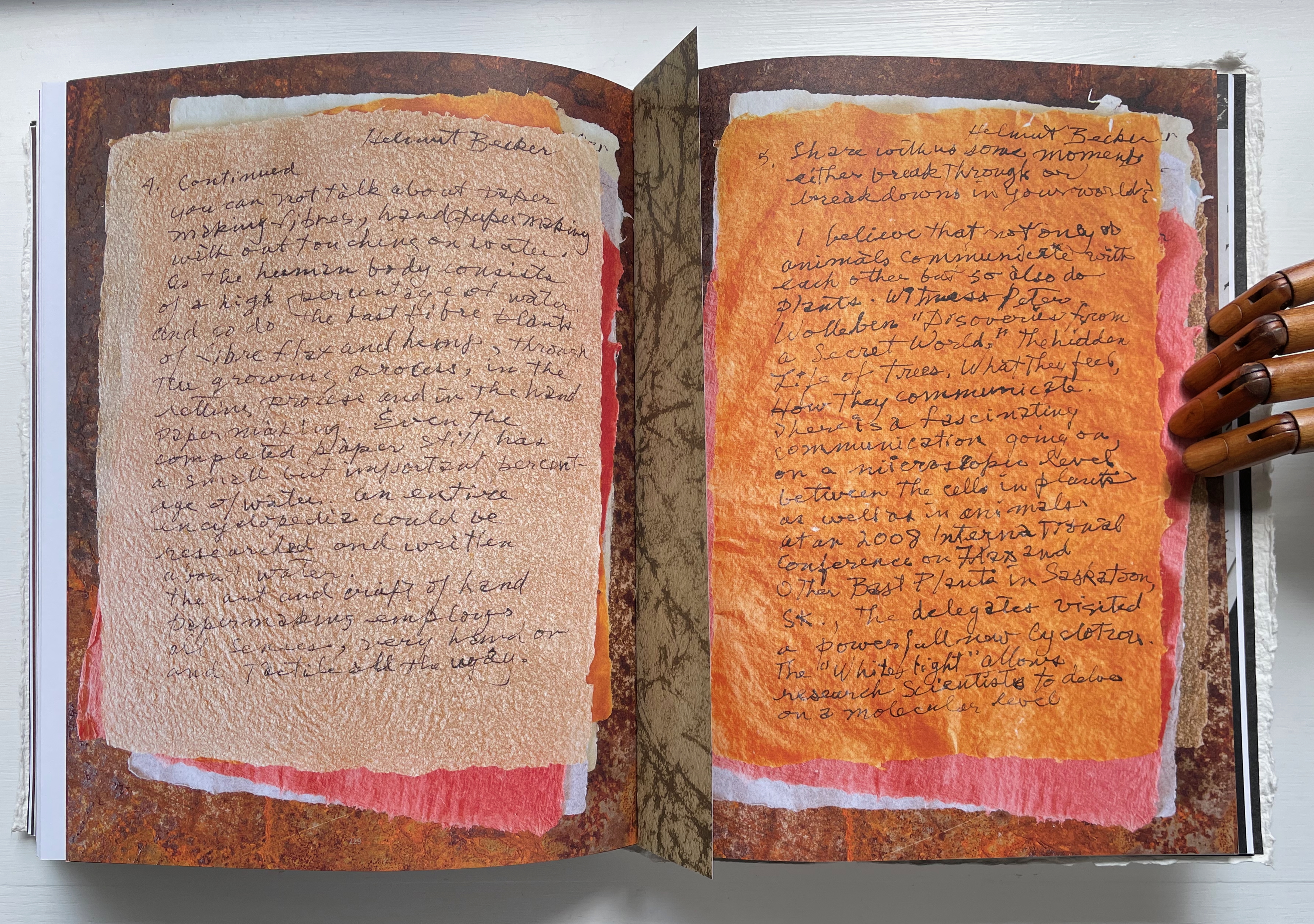
  4. In what way do you understand the 5 senses of paper/book: vision, touch, hearing, smelling, tasting?
  5. Share with us some moments; eitherbreakthroughs or break downs in your work?
  6. What is your next dream project?

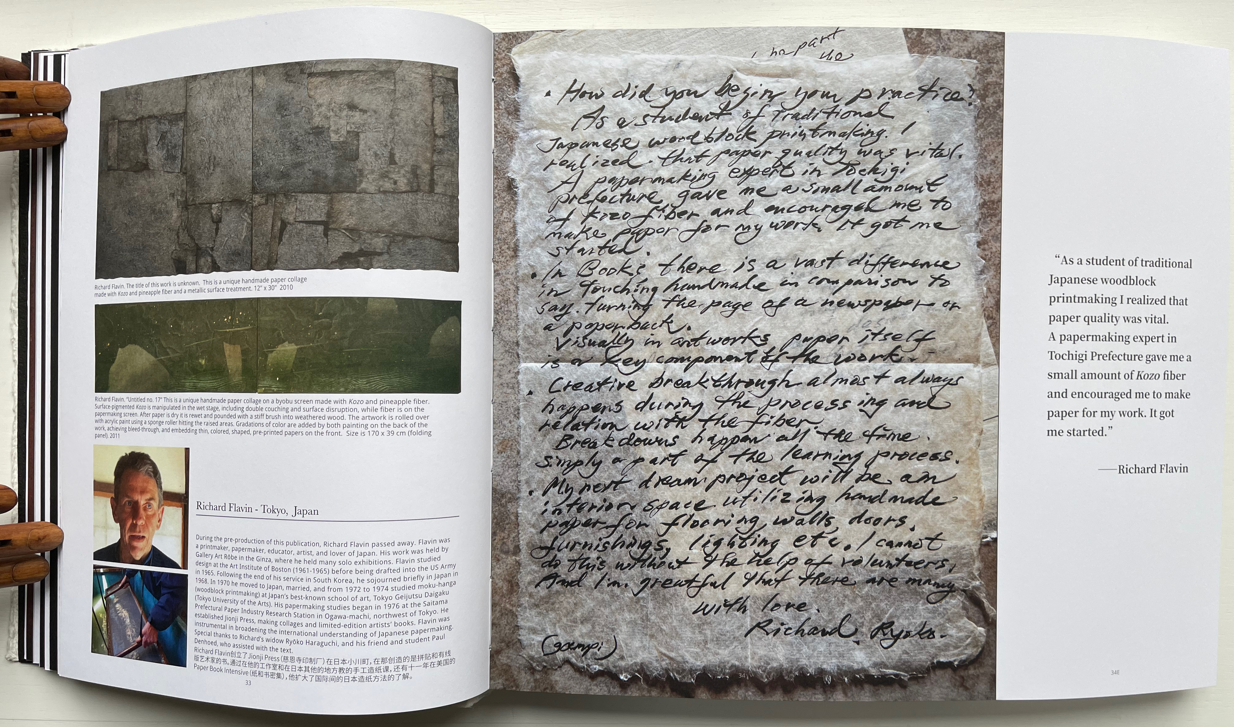
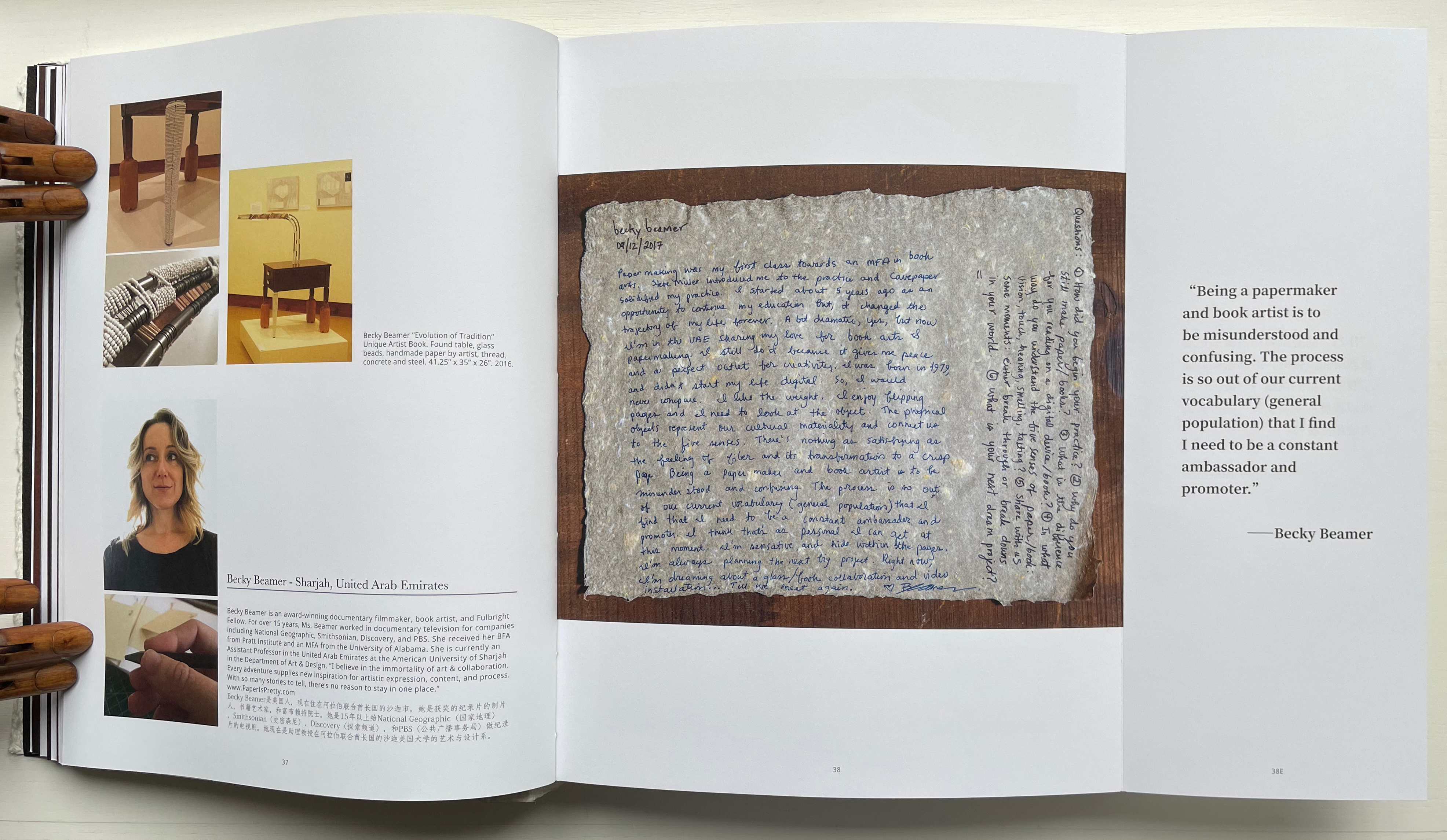
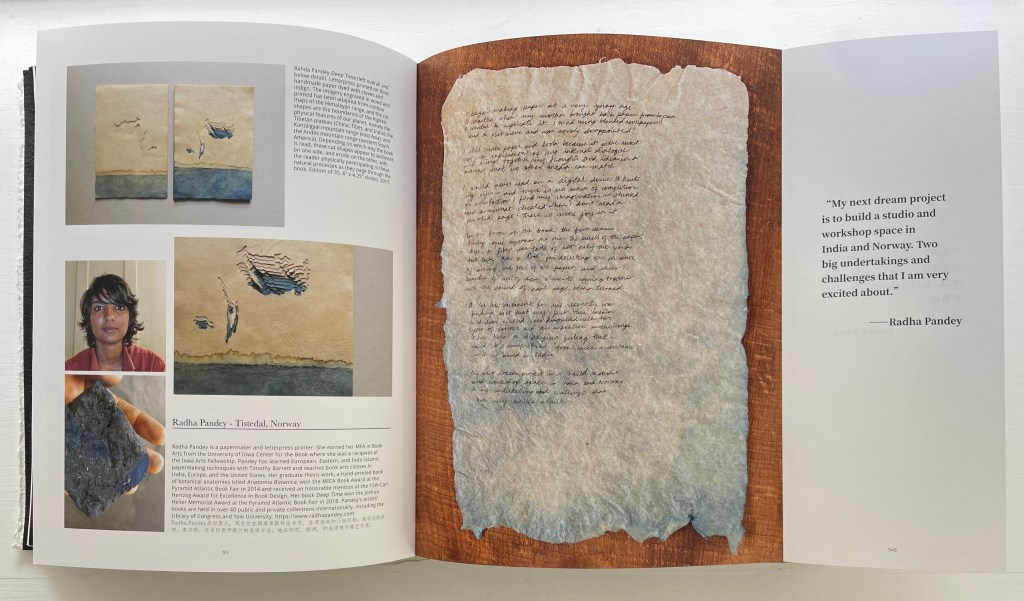
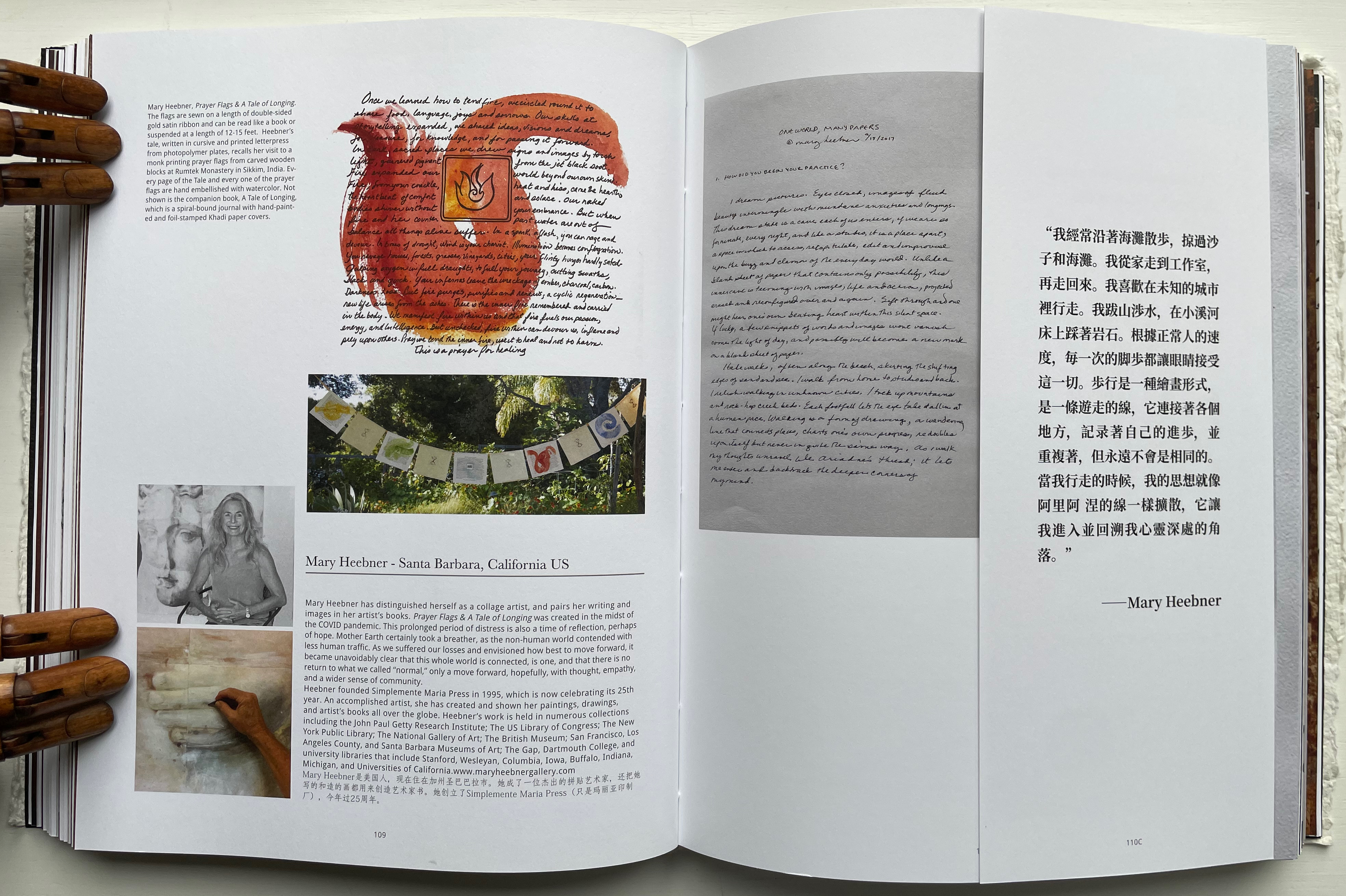
Not all of the respondents replied in handwriting, but many sent their replies on material that reflected their work. The late Richard Flavin’s contribution arrived on gampi paper. Becky Beamer inked her reply on a gray handmade sheet. Radha Pandey’s came on indigo tinted handmade paper.

An open book featuring two pages: the left page displays an artistic collage made from handmade paper with textured elements, while the right page contains handwritten notes and a quote attributed to Richard Flavin about his experience with traditional Japanese woodblock printmaking and the importance of paper quality.

Richard Flavin

A page from a book featuring Becky Beamer's artist statement, accompanied by images of her unique artist book titled 'Evolution of Tradition', showcasing found materials like glass, beads, and handmade paper.

Becky Beamer

An open book featuring artwork and text by Radha Pandey, showcasing two pieces of textured paper art arranged on the left page, along with images of the artist and her work. The right page includes a quote from Radha Pandey about her future projects.

Radha Pandey

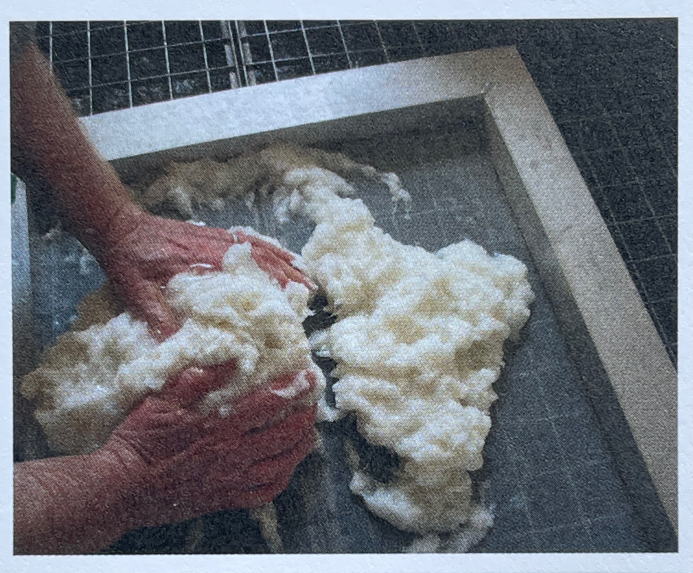
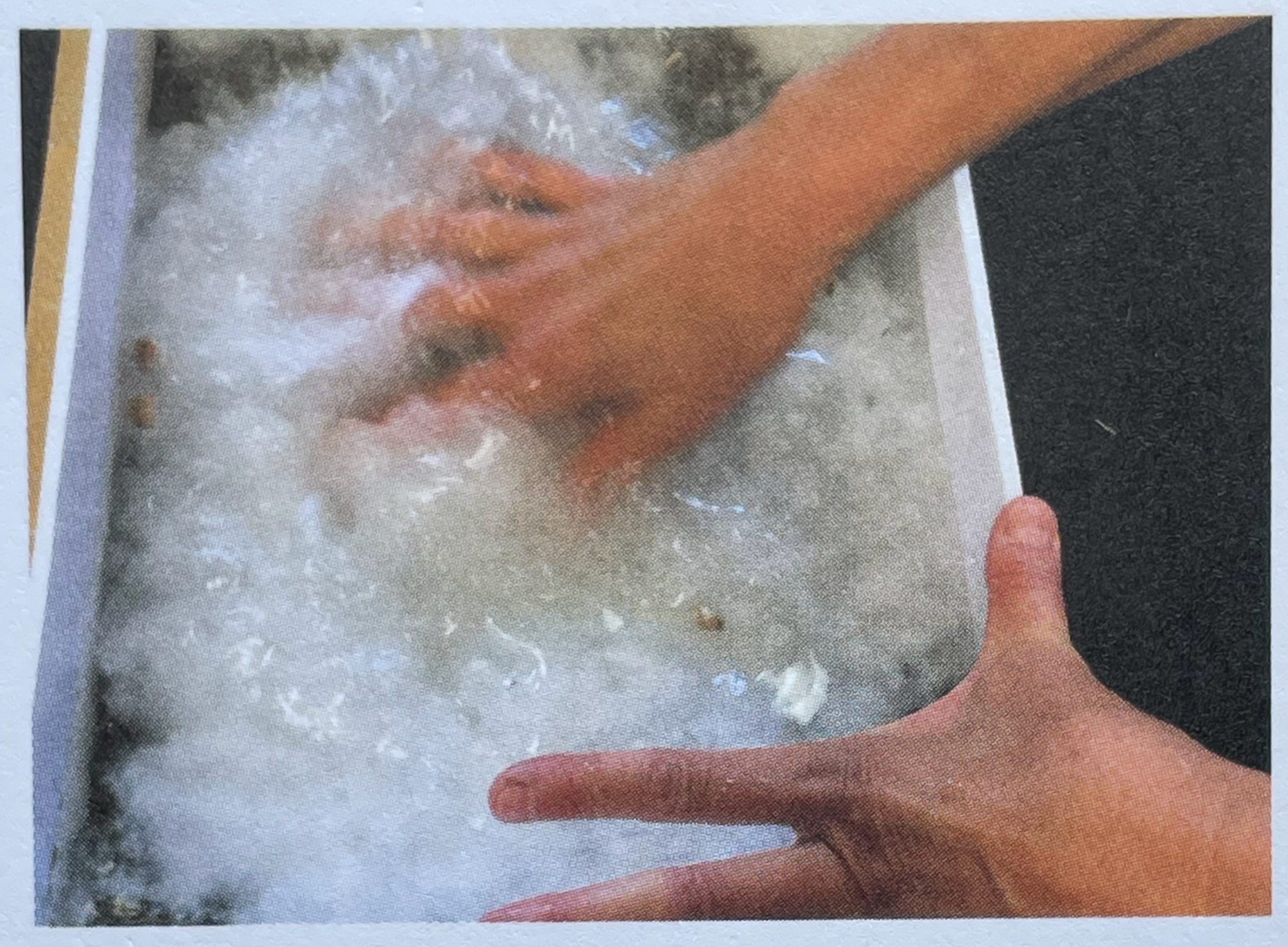
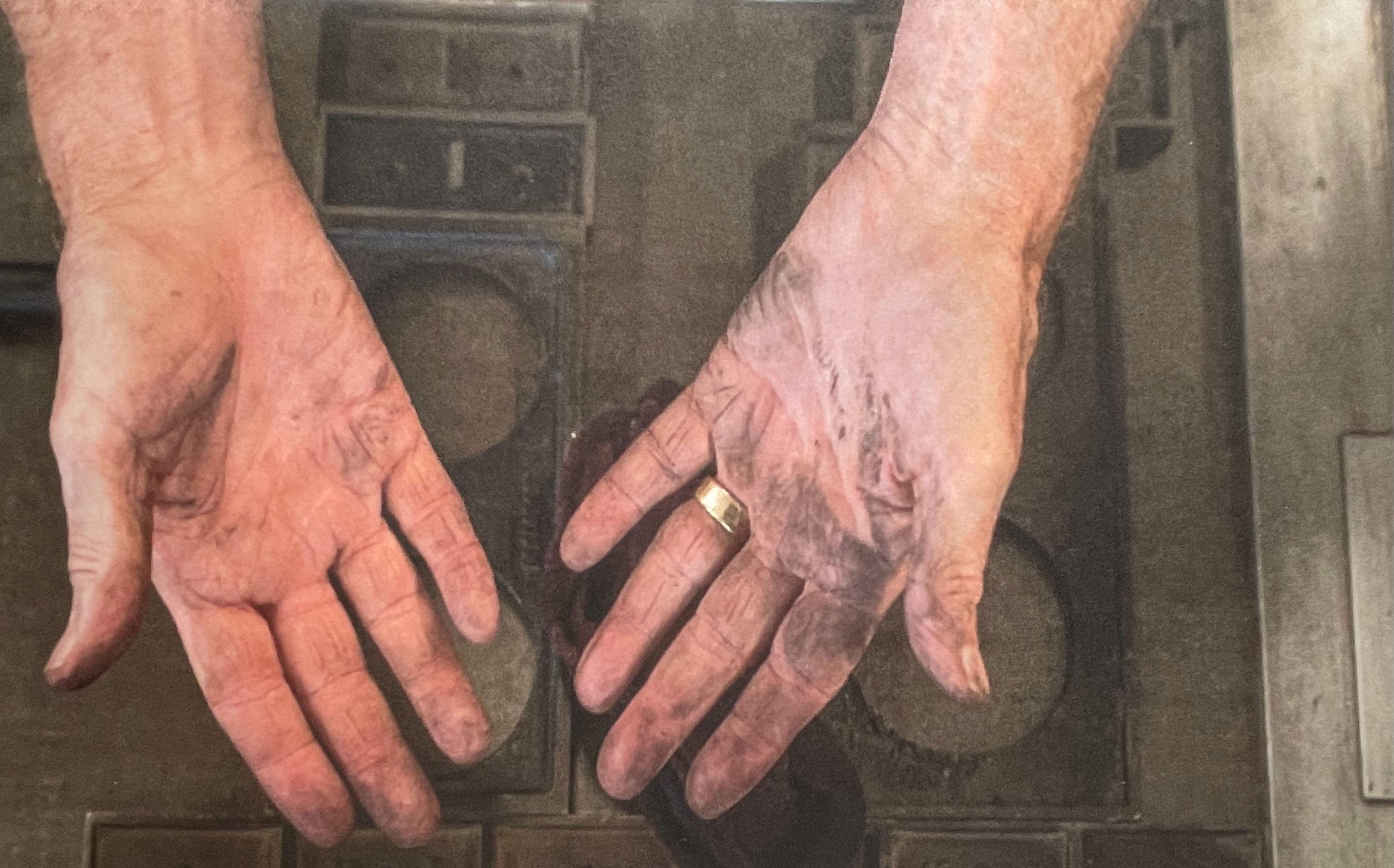
Jack Mader photographed these contributions in ways that render them visually haptic. It places that fourth question — “In what way do you understand the 5 senses of paper / book: vision, touch, hearing, smelling, tasting?” — at the core of the book. You’d swear you can feel the velvet texture of Mary Heebner’s 11 pages. Or the roughness of Helmut Becker’s colored handmade sheets or of Su Jin Kim’s white sculptural responses. The request for images of the artists’ hands naturally added to this sensory effect. There’s the glutinous wetness of pulp between the fingers of Jean Michel Letellier and Helen Hiebert and the imagined smell of the ink on George Roberts’ hands.

Mary Heebner

An open book displaying handwritten notes on textured paper, highlighted with colorful pages. The left page contains notes related to nature and communication, while the right page features reflections on trees and their interactions.

Helmut Becker

Kim Su Jin

Left: Jean Michel Letellier’s hands. Right: Helen Hiebert’s hands.

Close-up of two hands with visible dirt and wear, one wearing a gold ring.

George Roberts’ hands.

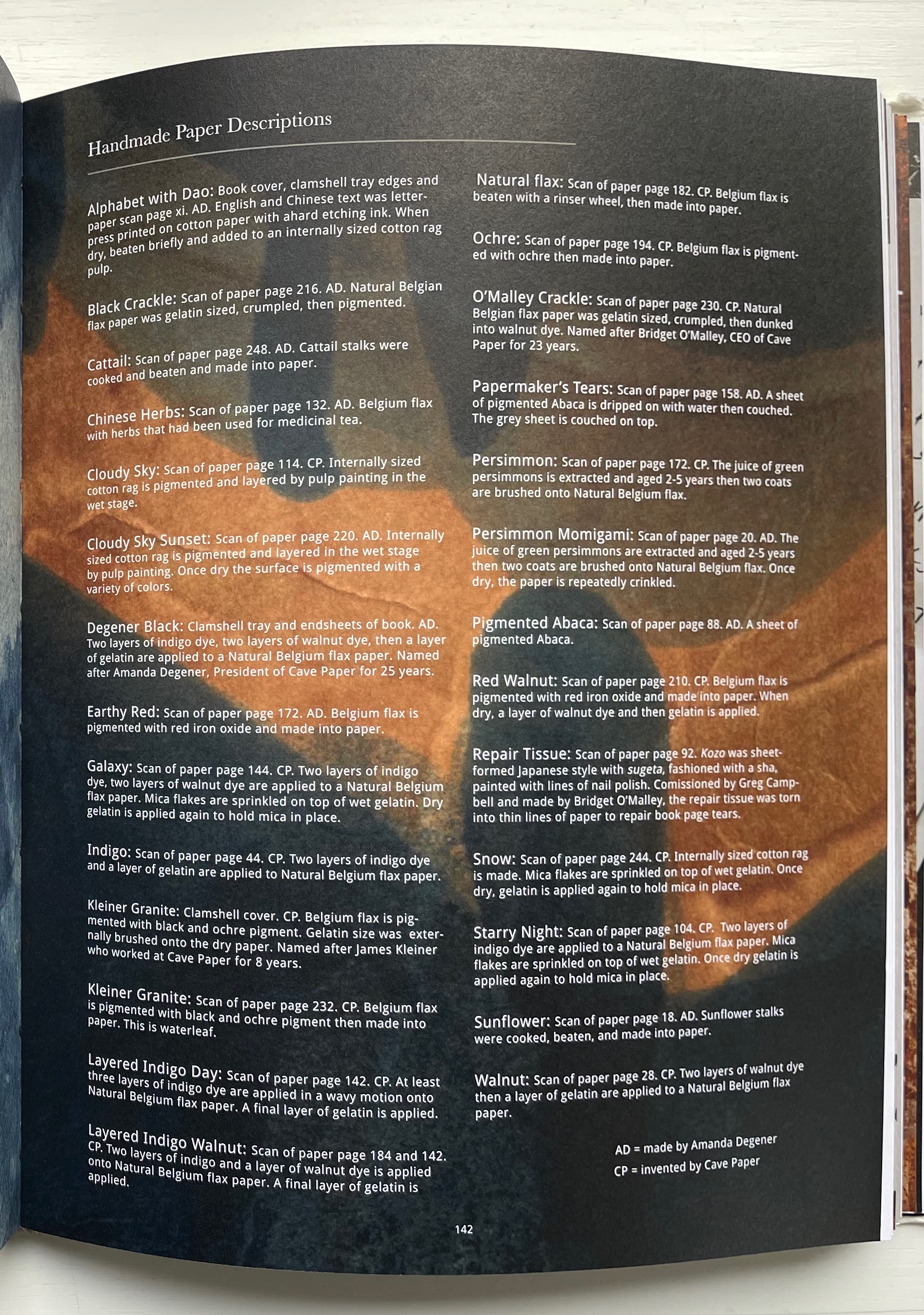
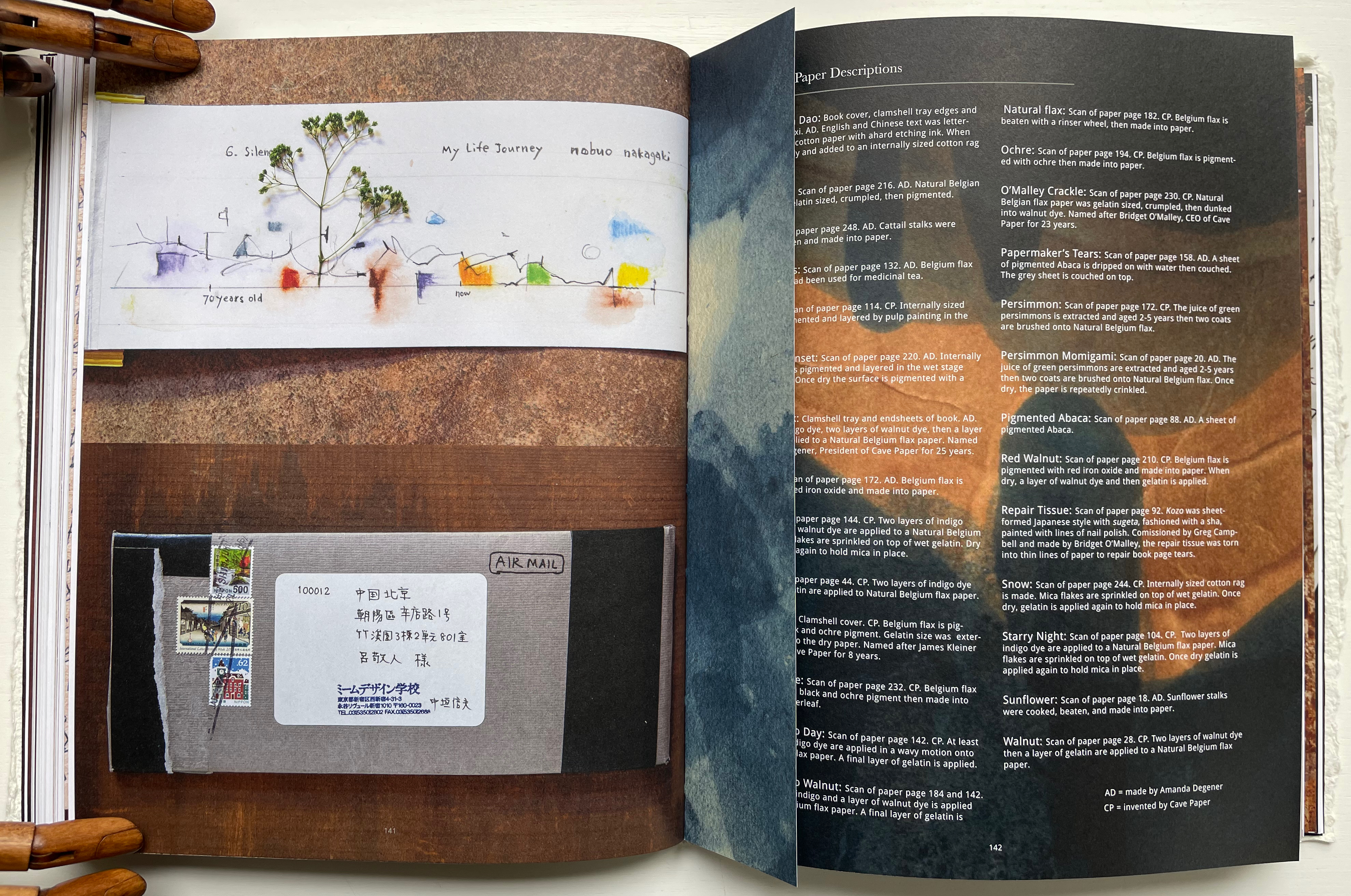
Throughout the book are truncated pages that act almost like bookmarks. Only midway through do we learn that they bear scanned images of handmade paper from Amanda Degener and Cave Paper. Degener provides an index describing the handmade papers, which oddly appears at page 142. Not only does it function as an index, it delivers information expected in a colophon. It even describes the paper used for the book’s cover, endpapers, and the clamshell tray. But nevermind, it’s all part of diving into the artists’ process and practice.

Page displaying various handmade paper descriptions including details on materials, processes, and page references.

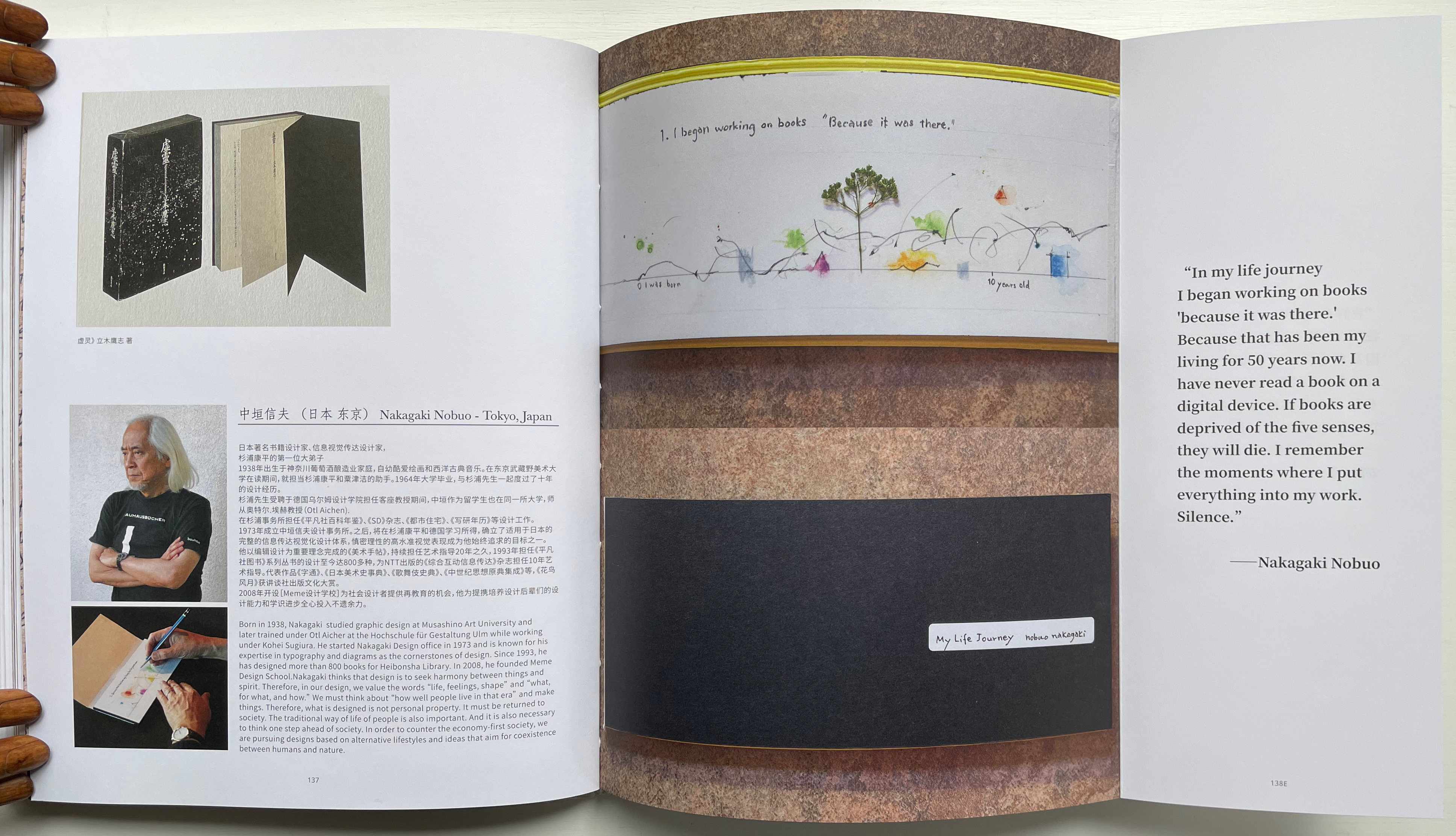
Quite appropriately this midway index appears just after the entry for Nakagaki Nabuo, whose response to the opening question “How did you begin your practice?” comes in the form of an autobiographical handmade artist’s book. In the pages presenting his book, we see the artist, his hands at work on the book, and Mader’s precise photography of the book and its airmail envelope, followed by the bookmark-like stub with its image of Cave Paper’s Layered Indigo Day paper.

An open book with a unique design, featuring a tree illustration and colorful splashes on one page, alongside a portrait of artist Nakagaki Nobuo. The page includes text about his journey in book design and a quote discussing the importance of sensory experiences in books.

Nakagaki Nabuo and his hands at work.

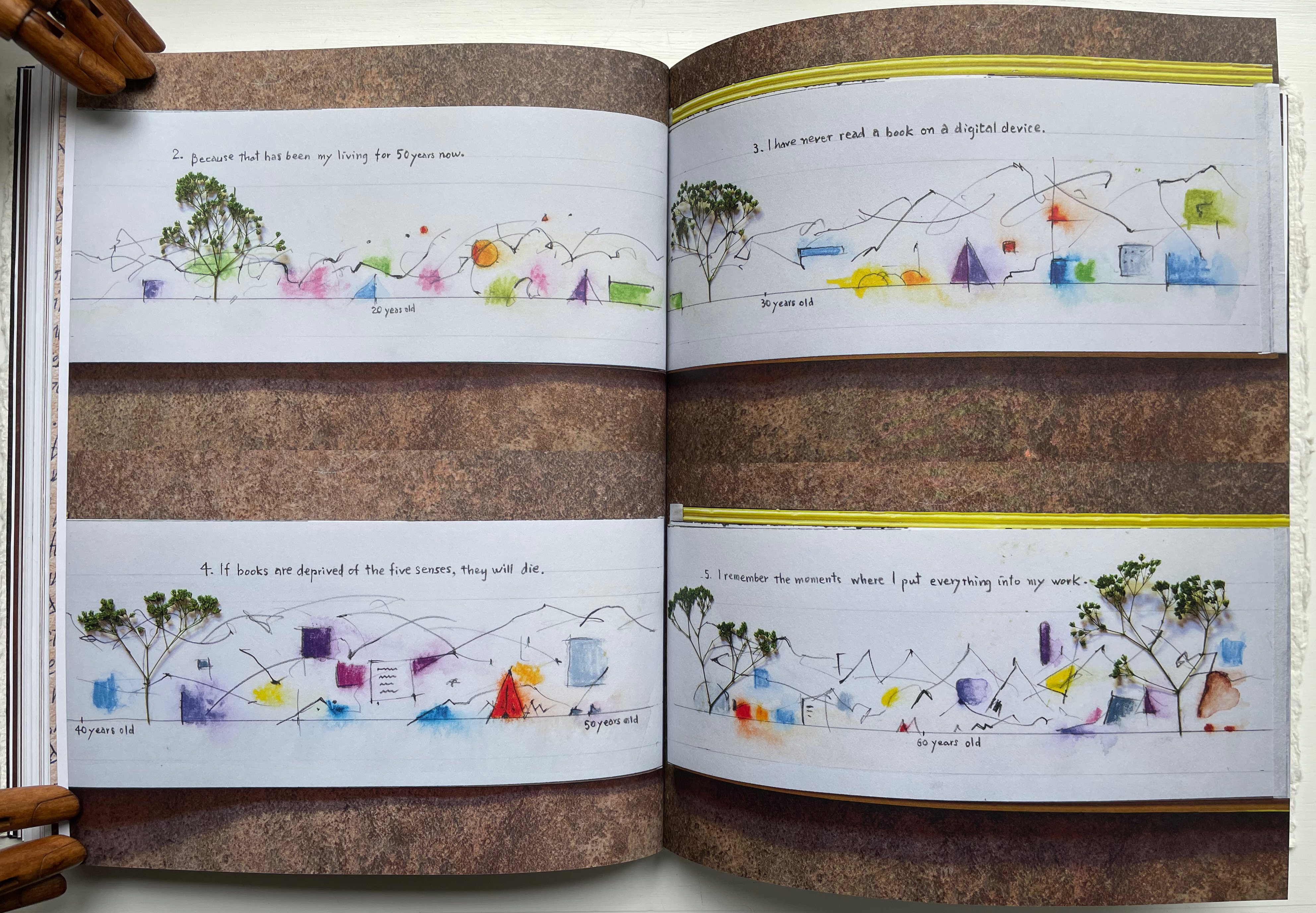
An open book displaying colorful sketches and handwritten notes that reflect personal thoughts related to the passage of time and the significance of books. The sketches include trees, mountains, and abstract shapes, with accompanying text indicating different ages.

Nakagaki’s My Life Journey

An open book displaying a watercolor illustration of a tree on the left page, accompanied by handwritten text titled 'My Life Journey' and a letter addressed with postage stamps on the right page, along with descriptions of various papers.

Verso: Nakagaki’s answer to question 6: “What is your next dream project?” Recto: “Handmade Paper Descriptions” index/colophon.

In their preface, the editors write:

Although reading is a private activity we are not alone; we are cooperating with the book, bringing it into ourselves. Reading is not only about transplanting ourselves to the beyond, but we modify ourselves to see the world differently. Our vision or purpose for Handmade Path is for you to participate in this collaboration.

Just holding Handmade Path and constantly feeling its Alphabet Dao cover, navigating its foldouts alternating Chinese with English according to the contributor, being tempted to lift a contributor’s sheet of paper from the photos, hearing the snap and creak of sewn pages turning, and absorbing the contributors’ testaments, we cannot help but be drawn into participating with the book. In doing so, we learn that, as Paulette Myers-Rich puts it, “Paper is not a substrate — it is story” (p. 197).

Further Reading & Viewing

“The First Seven Books of the Rijswijk Paper Biennial“. 10 October 2019. Books On Books Collection.

“Maureen Richardson“. 28 September 2019. Books on Books Collection.

“Fred Siegenthaler“. 10 January 2021. Books On Books Collection.

“Taller Leñateros“. 19 November 2020. Books on Books Collection.

“Susan Mills“. In progress. Books on Books Collection.

“Timothy Mosely“. 23 August 2024. Books on Books Collection.

“Peter & Donna Thomas (II)”. 12 June 2025. Books on Books Collection.

“Claire Van Vliet (II)“. 28 May 2025. Books on Books Collection.

Hamady, Walter; Samuel Haatoum; and Hermann Zapf. 1982. Papermaking by Hand : A Book of Suspicions. Perry Township, Dane County, Wisconsin, USA: Perishable Press Limited.

Hiebert, Helen. The Papermaker’s Companion: The Ultimate Guide to Making and Using Handmade Paper (North Adams, MA: Storey Publishing, 2000)

Lin Gengli. 2018. Art in Book Form. Corte Madera: Gingko Press, Inc.

Richardson, Maureen. 1999. Grow your own paper : recipes for creating unique handmade papers . N.P.: Diane Pub Co.

Thomas, Peter, and Donna Thomas. 1999. Paper from Plants. Santa Cruz, Calif: Verf. You can find images of this and others by the artists online in the Special Collections website of the University of Wisconsin-Milwaukee Libraries.

Weber, Therese. 2008. The language of paper: a history of 2000 years. Bangkok, Thailand: Orchid Press.

Books On Books Collection – Michael Hampton

RAGE PEN (2025)

RAGE PEN (2025)
David Blackmore and Michael Hampton
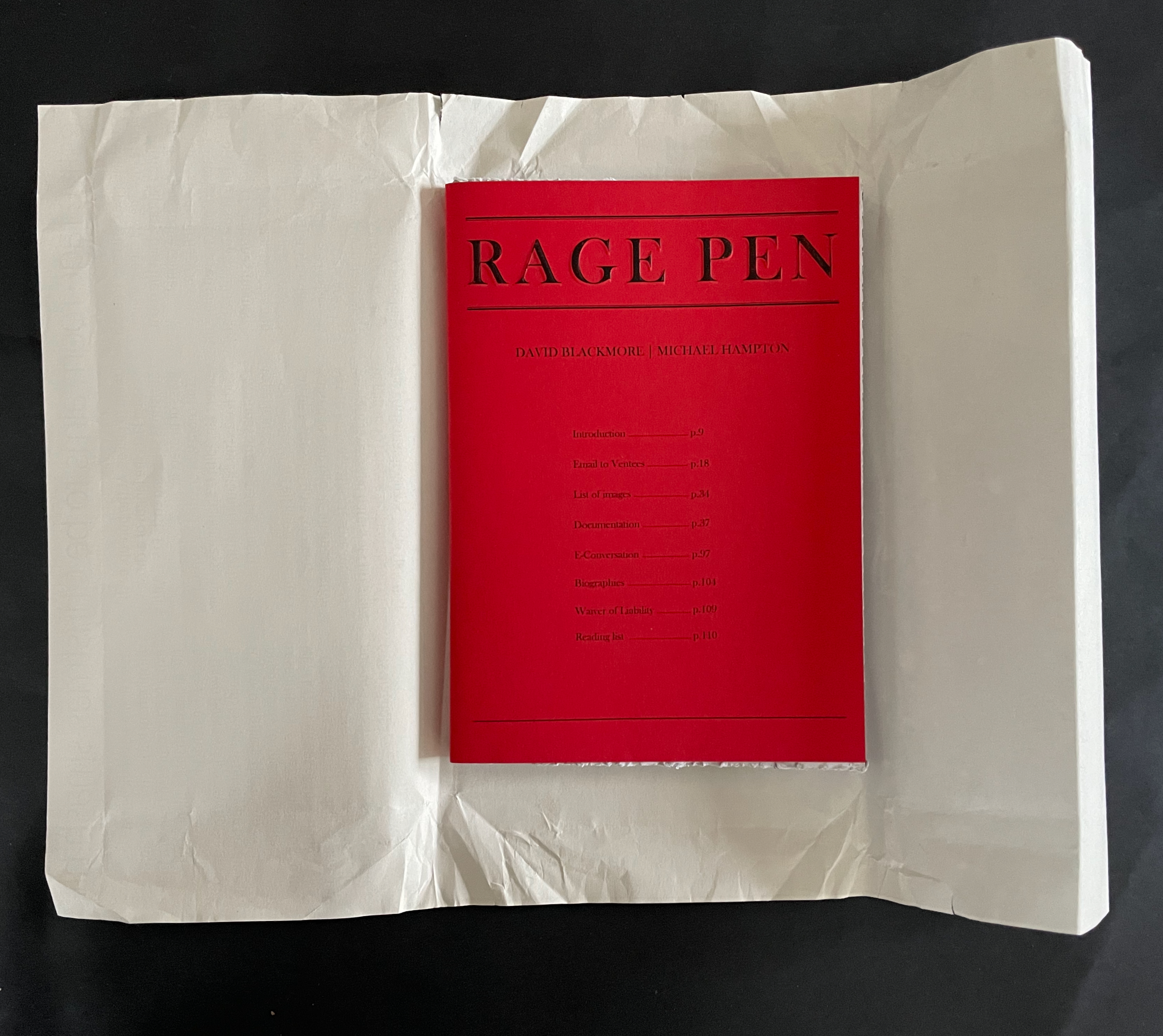
Soft cover, mitre sawn head and foot, perforated fore-edge. H210 x W148 mm. [108] pages. Edition of 100. Acquired from Folium, 13 November 2025.
Photos: Books On Books Collection.

Folium, the publisher, describes RAGE PEN as “developed from a relational piece of the same name held at Chisenhale Studios 2017/18”. Per the Museum of Modern Art, relational aesthetics is

A mode of art practice that establishes spaces, situations, or environments for a variety of social interactions. In essence, the social space or interaction becomes the work of art itself. The term was popularized by French critic and curator Nicholas Bourriaud in 1998.

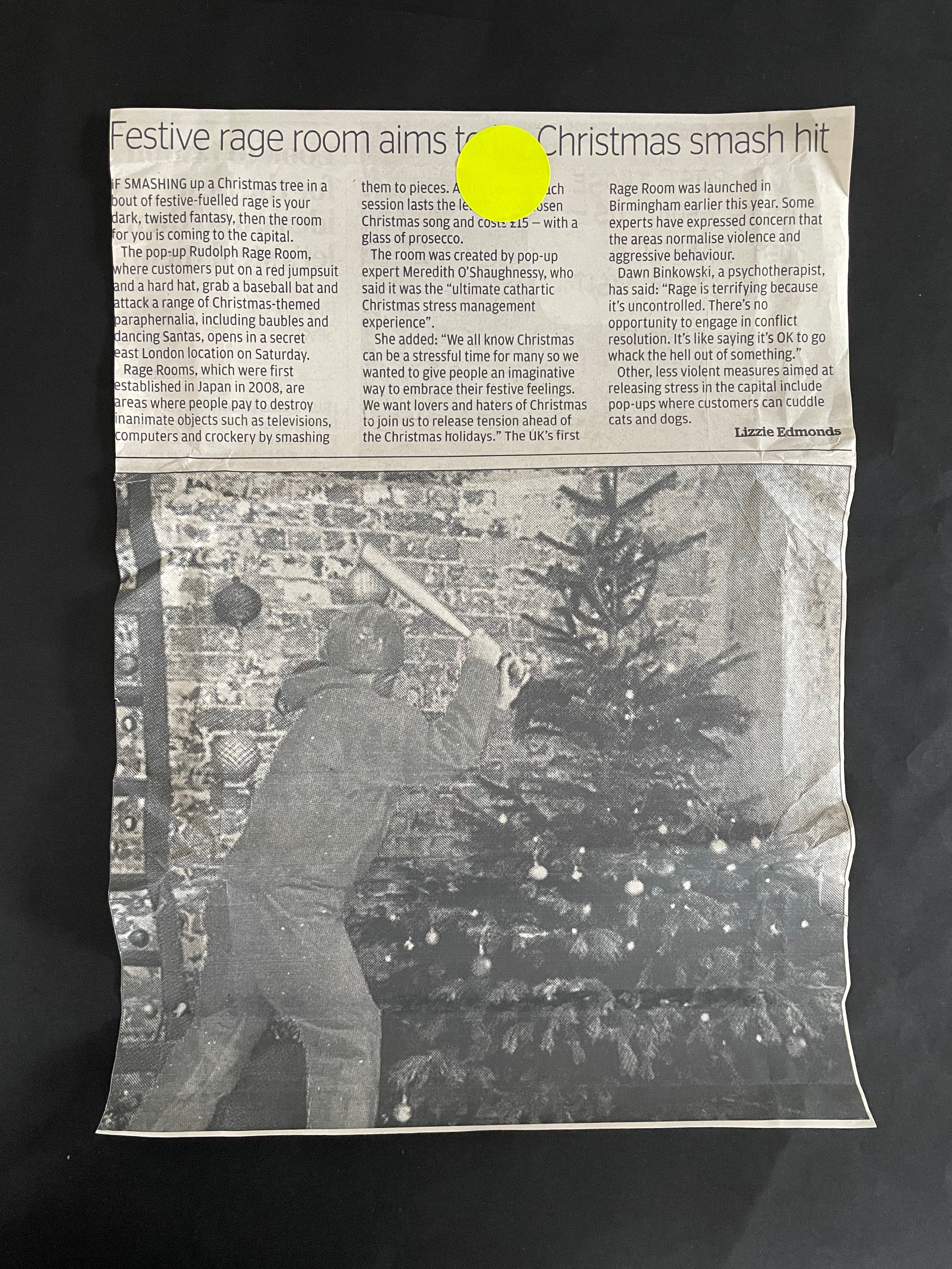
RAGE PEN‘s environment was a safe rage room equipped with a variety of handheld tools. Anonymous members of the public, or “ventees”, were invited to name an object that had caused them frustration, don protective equipment, and enter the shuttered room to smash said objects. The interactions filmed and photographed by David Blackmore formed the images in RAGE PEN the book. Holding the book with its mitre-sawn top and bottom edges and its perforated, still-sealed fore-edges, we might suspect that we are being invited into our very own private relational aesthetic piece.

Continue reading →

Books On Books Collection – Valeria Brancaforte

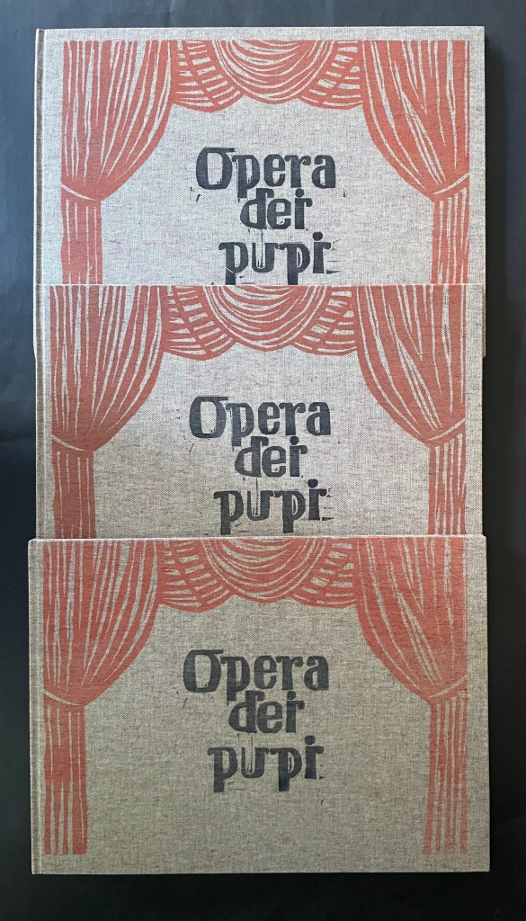
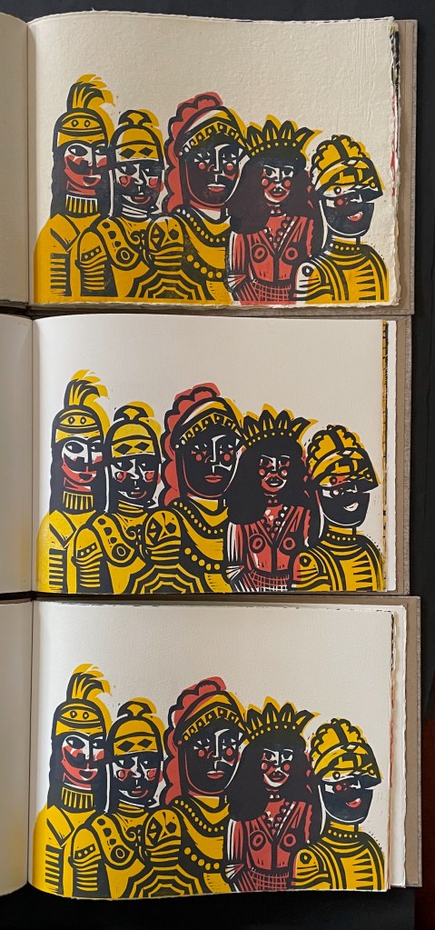
Opera dei Pupi (2024)

Opera dei Pupi (2024)
Valeria Brancaforte
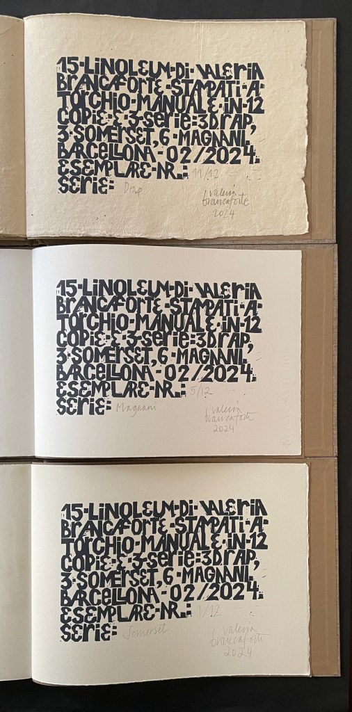
Casebound hardback, cloth over boards, print on front cover. Plain brown doublures. Three variants based on trim and paper.
A: H272 x W368 mm; Drap, Catalan hand-made paper.
B: H261 x W360 mm; Italian Magnani Incisione.
C: H265 x W362 mm; Somerset Velvet White 250gsm.
[20] pages with 14 prints. Each in an edition of 12, of which A is #11, B is #5, and C is #1. Acquired from the artist, 14 November 2025 and 7 February 2026.
Photos: Books On Books Collection. Displayed with permission of the artist.

Puppets and marionettes have figured in more than a few artists’ books. Ron King and Roy Fisher’s The Left-handed Punch (1986) and Anansi Company (1992) are perhaps the best known. Others include Ann Kresge’s Shadow Play (1998), Antonio Nocera’s La Valigia di Pinocchio (2015), Emily Martin’s Funny Peculiar Funny Ha Ha (2017), Hormazd Narielwalla’s Paper Dolls (2018) Erminia De Luca’s Now it’s up to you (2023), and Rachel Simmons’ Dream of the Golden Empress (2023). Valeria Brancaforte’s recent addition to the cavalcade brings to it a new cultural tradition and a welcome chance to compare how variation in paper can play into appreciation of an artist’s book.

Continue reading →

Books On Books Collection – Caren Florance

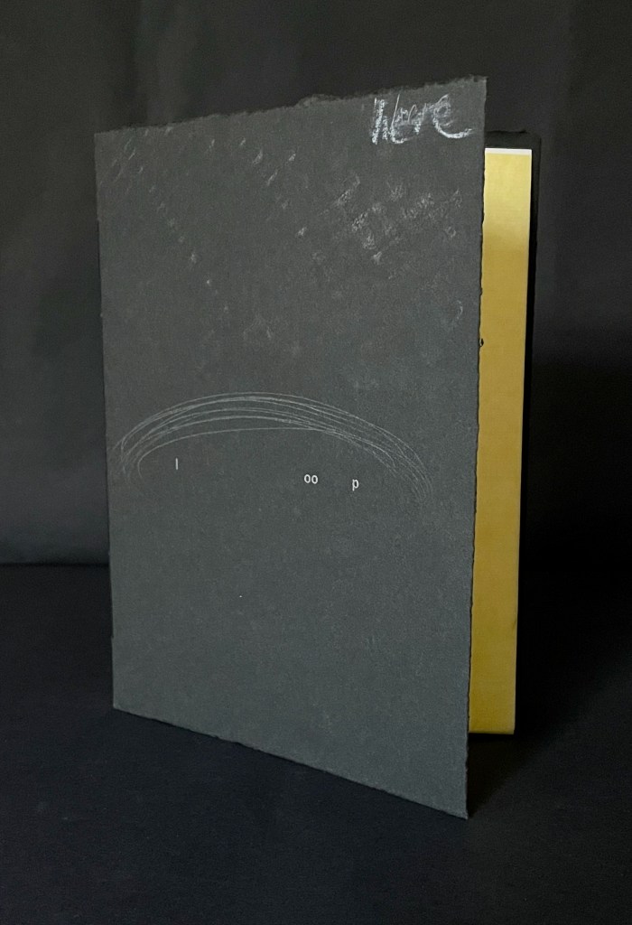
L OO P (2019)

L OO P (2019)
Caren Florance
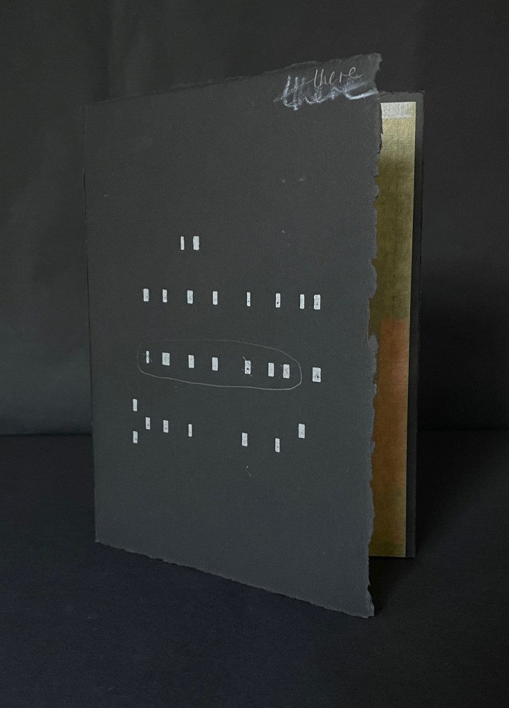
Handset letterpress and mixed media on Stonehenge Black, Chinese papers and found maps. Hand-stitched Z-fold dos-à-dos booklet. H193 x W143 mm. [48] pages. Edition of 16, of which this is #13. Acquired from the artist, 1 December 2025.
Photos: Books On Books Collection. Displayed with artist’s permission.

L OO P is one to compare with Jack Oudyn’s Opening Dark Windows (2020) and Tim Mosely’s Grasping the Nettle (2020). All three of these Australian book artists create works responding to climate change. L OO P is also one to contrast with Barbara Beisinghoff’s Tau blau / Dew Blue (2013). Both thrust forward their works’ tactility, but while Beisinghoff’s offers the fond hope of natural and artistic renewal as it plays off H.C. Andersen’s fairy tale Hørren /The Flax, Florance’s embeds shards of John Bennett’s bird poem Overwintering in a back-to-back loop of despair over climate change.

Continue reading →

Books On Books Collection – Jean-Pierre Hébert, Harry and Sandra Liddell Reese

In Visible Cities (2012)

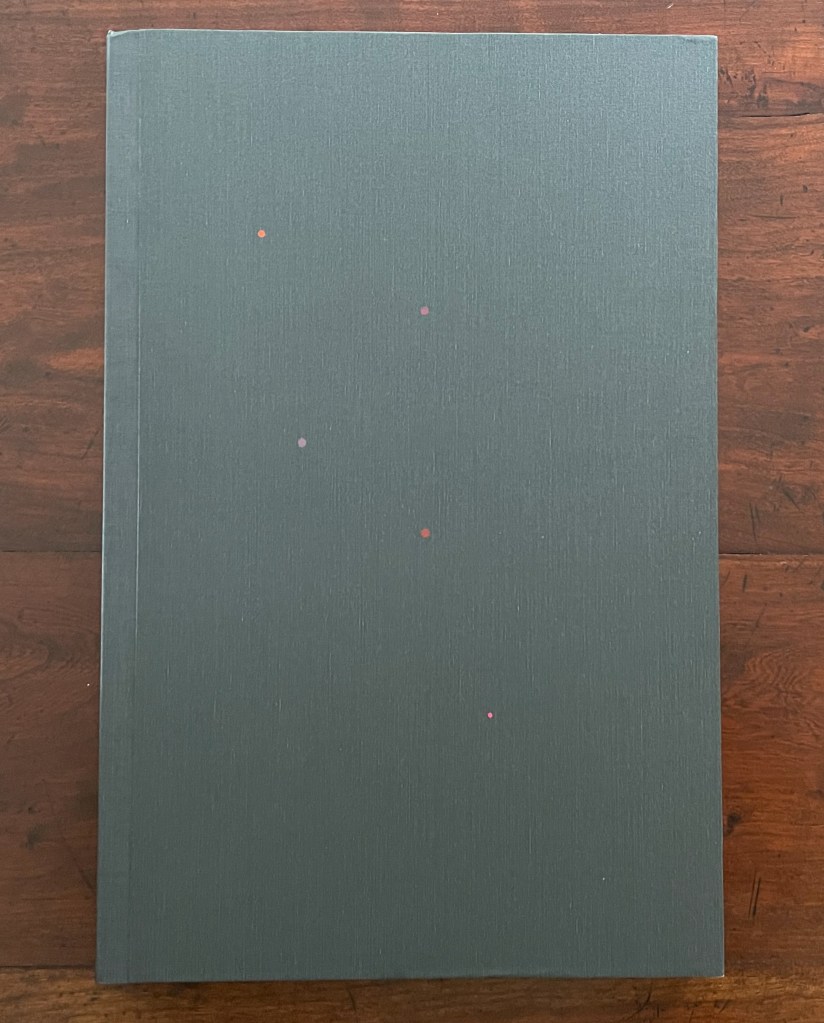
A closed book with a matte gray cover, featuring small colorful dots in red, pink, and orange scattered on the front.
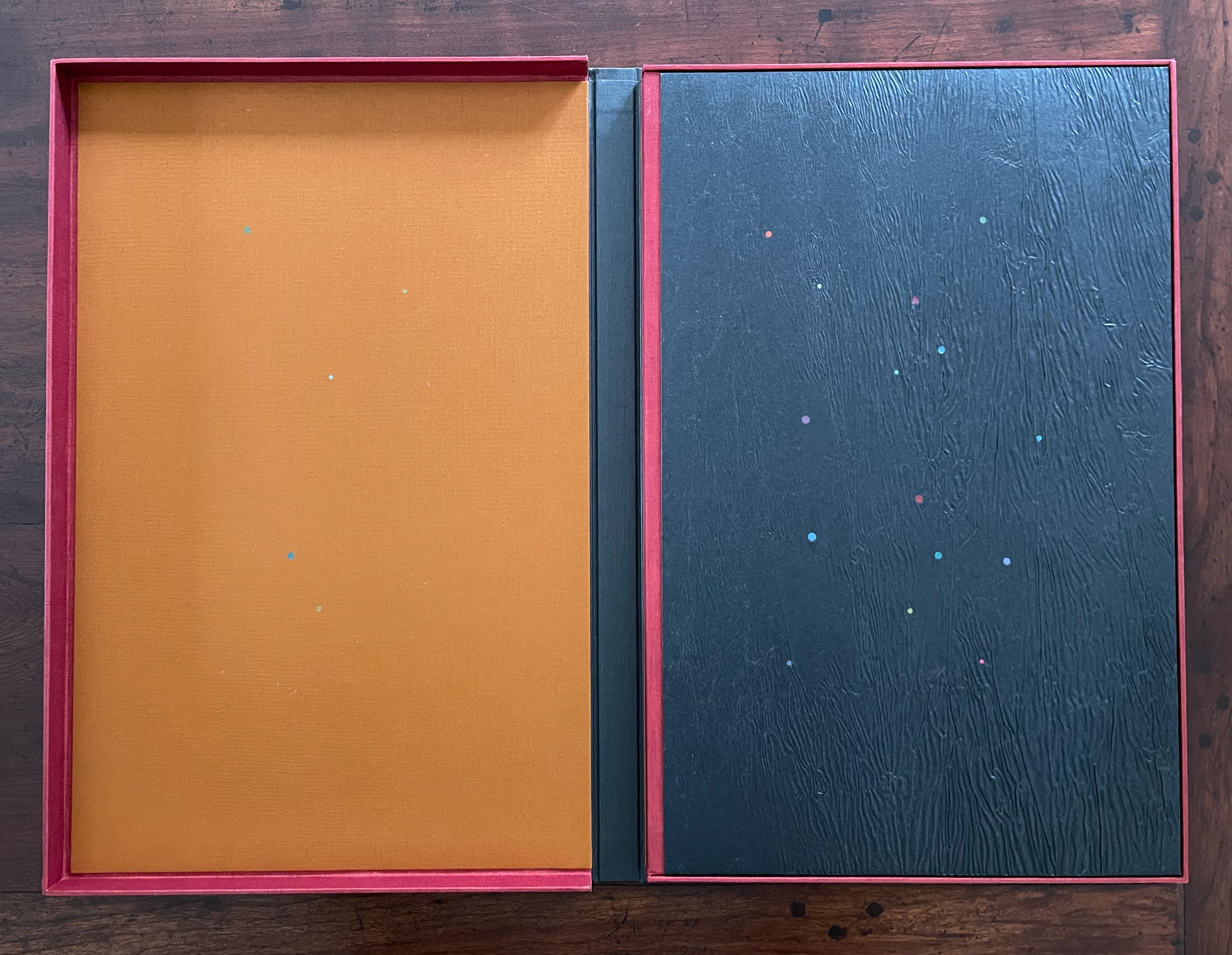
Opened box with an orange interior on the left and a textured black cover with colorful dots on the right.
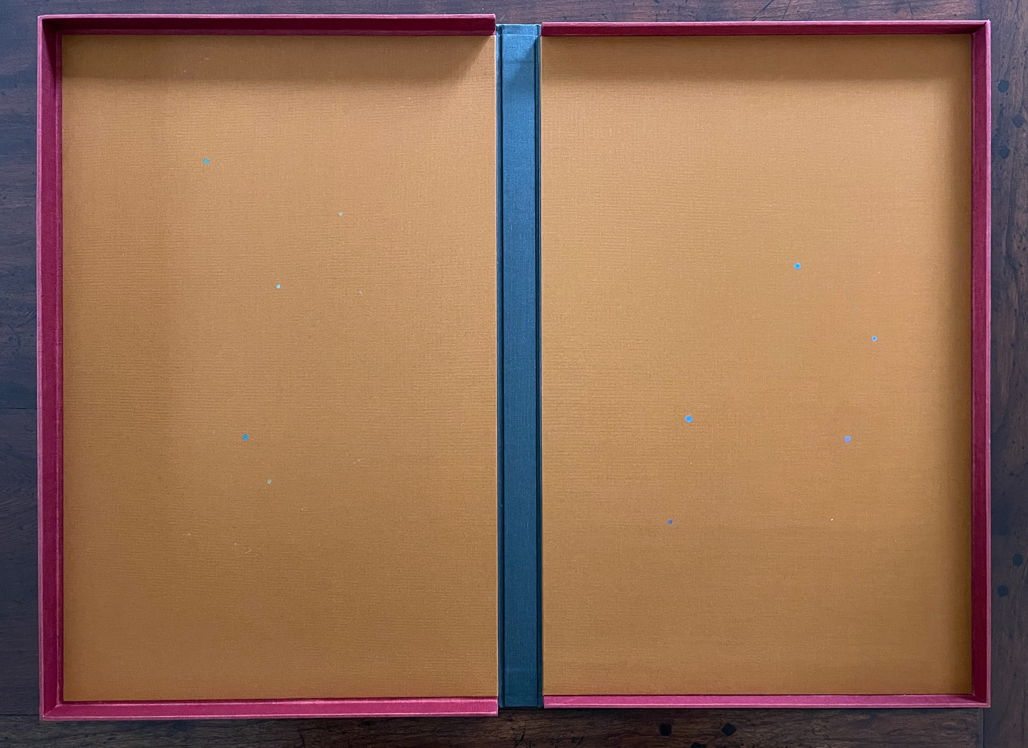
An open book with a yellow-orange interior and a pink border, displaying small blue dots on the pages.

In Visible Cities (2012)
Jean-Pierre Hébert, Harry and Sandra Liddell Reese
Custom-made box enclosing sewn board binding with cloth spine, treated abaca/cotton paper with painted inlays, pastedowns with drawings, valley-fold folios of Niyodo Natural paper printed on Epson Stylus Pro 4800. Box: H442 x W290 mm. Book: H424 x W276 mm. [46] pages. Edition of 73, of which this is #48. Acquired from the Reeses, 9 February 2026.
Photos: Books On Books Collection. Displayed with permission of Claire Hébert and the Reeses.

More than a few artists have been drawn to Italo Calvino’s Invisible Cities (1972/74). Its attraction is not hard to understand. Calvino supposes a series of conversations between Marco Polo and Kublai Khan about cities across the Khan’s empire that he has not visited but Marco Polo has and which he describes for the Khan. The premise, however, is paradoxical: the fifty-five cities Marco Polo describes do not exist. Calvino’s sensuous and surrealistic prose and combinatorial arrangement of the conversations and descriptions create a book that is simultaneously inwardly and outwardly reflective. Simple but complex. Realistic but fantastical. Concrete but conceptual. A work ripe for homage and inspiration.

Continue reading →

Books On Books Collection – Ximena Pérez Grobet (II)

Nagori (2023)

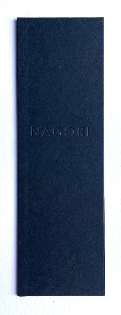
A sleek black folder with the embossed word 'NAGORI' on the front.

Nagori (2023)
Ximena Pérez Grobet and Kati Riquelme
Clothbound hardcover. H153 x W47 mm. Edition of 33, of which this is #14. Acquired from Ximena Pérez Grobet, 5 February 2024.
Photos: Books On Books Collection. Permission to display from Ximena Pérez Grobet.

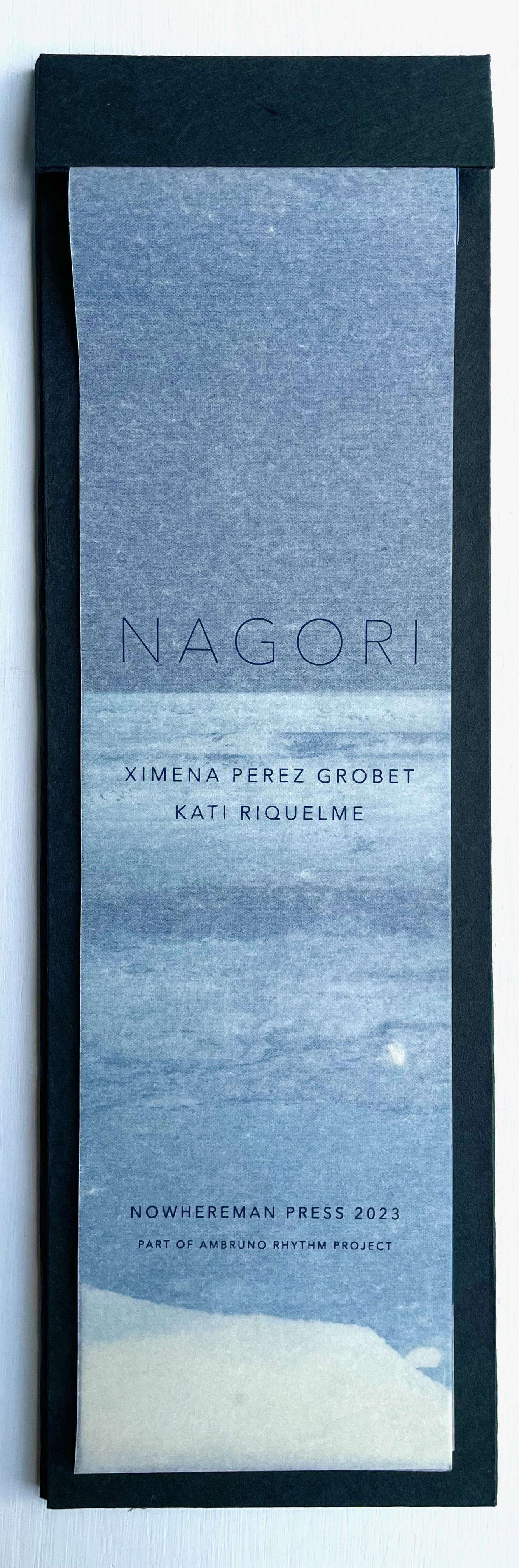
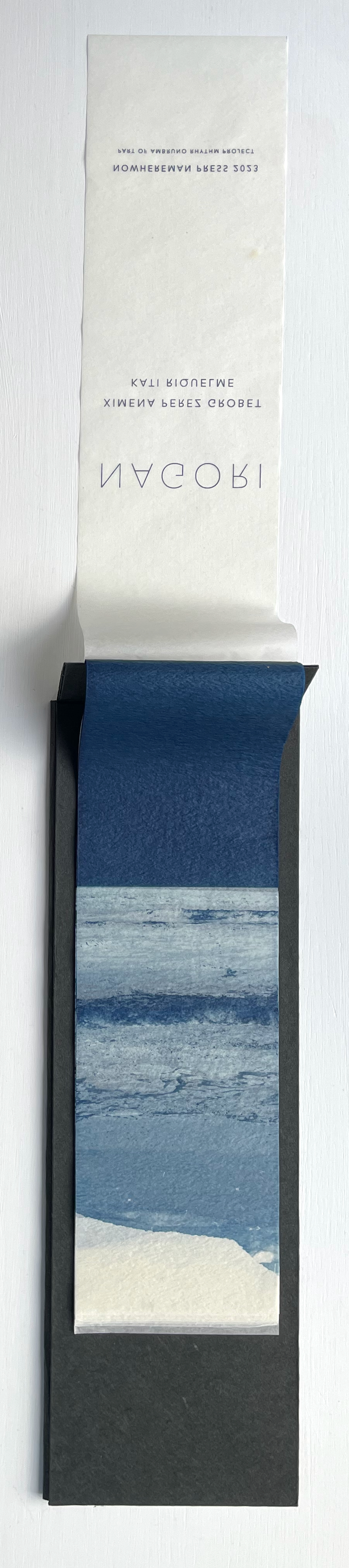
The Japanese word nagori has several meanings. Beware translation applications, but embrace the online discoveries that lead to Ryōko Sekiguchi, the Japanese expatriate writer, and Victor Burgin, the British conceptual artist and writer, who cites her. With Sekiguchi, you will find that it means “nostalgia for the season leaving us”, the longing for the taste of an early season fruit evoked by its late season taste, or a room’s sense of waiting for the return of someone who has just left. With Burgin, before he cites Sekiguchi, you will first find nagori‘s etymology — nami-nokori, referring to the remnant, remains or traces of receding waves. Burgin’s etymological explanation is obviously the most applicable to this collaborative artists’ book, but after you have put the book aside, you may feel a lingering nostalgia for the experience of it akin to the sensuousness Sekiguchi evokes.

Continue reading →

Books On Books Collection – Helen M. Brunner

Primer: Ritual Elements (Book One) (1982)

An artistic cover of a book titled 'Primer: Ritual Elements' by Helen M. Barger, featuring ancient script designs and abstract shapes.

Primer: Ritual Elements (Book One) (1982)
Helen M. Brunner
Softcover, pamphlet-stitched. H239 x W155 mm. 22 pages. Binding adapted from a design by Barbara Press, developed under the instruction of Hedi Kyle. Edition of 300. Acquired from JP Antiquarian Books, 14 February 2024.
Photos: Books On Books Collection.

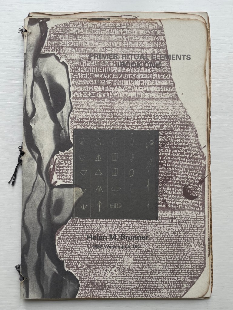
Primer is an unusually made booklet. Stitched with black cotton thread over three signatures, its two outer signatures are of white wove Curtis rag paper, the inner signature is of parchment or a translucent paper, and four 5-panel thumbnail accordions in translucent paper are glued to the beginning of the last outer signature. More unusual is that the booklet’s edges appear burnt into unevenness, yet there is no odor of ash. The edges of the sewing holes also appear burnt, one page has a scorch mark in its center, and even the edges of the collaged items appear to have been burnt before being photographed. The breadth of collaged items — from cave markings to cuneiform to Rosetta Stone to film strips or slides — is not unusual given the title; you would expect a primer on ritual elements to address a prehistoric to historic range of petroglyphs, pictographs, symbols, letters, photographs, etc. But most unusual — and perhaps the point of the work — is that the legible text undermines the aim suggested by the title. The script on the back cover makes the subversion plainest.

Continue reading →

Books On Books Collection – Claude Lothier

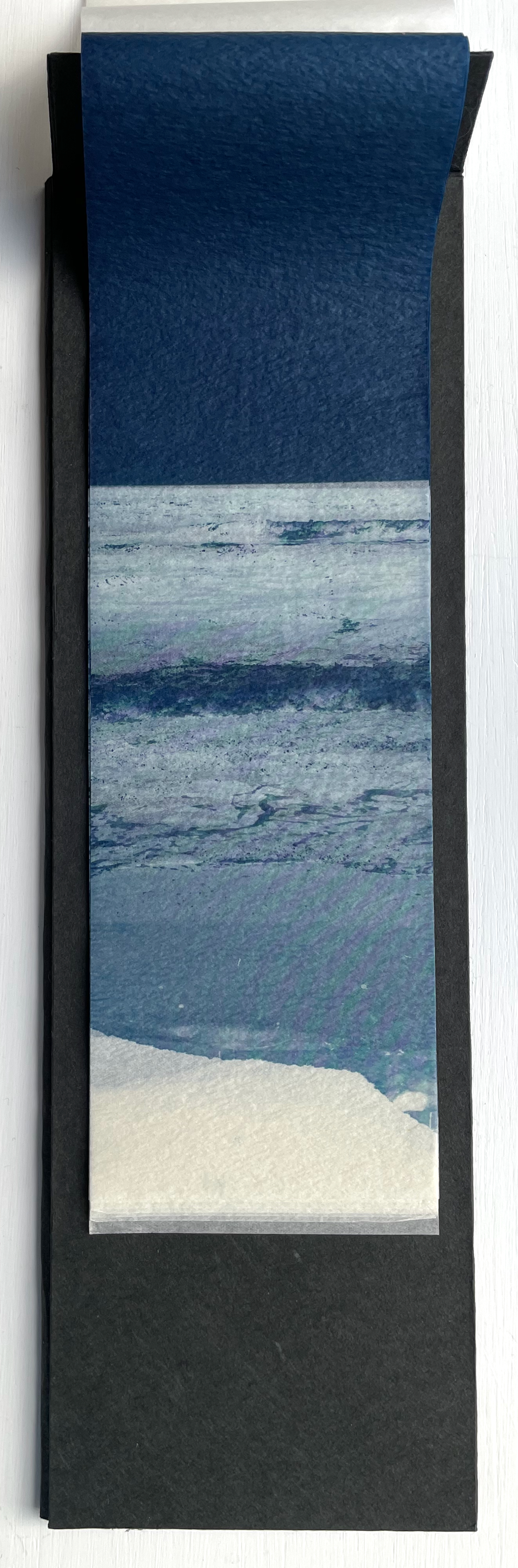
Quant au Livre (2011)

A stack of colorful paper sheets in assorted shades, neatly arranged within a green folder.

Quant au Livre (2011)
Claude Lothier
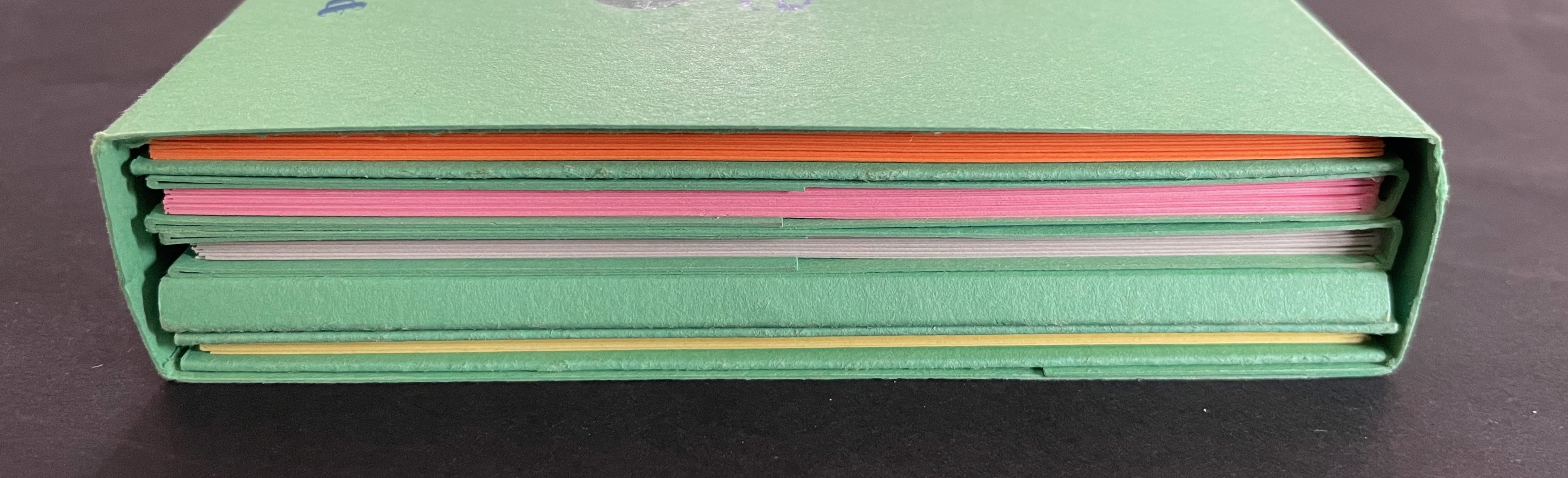
Slipcase around five cased and glued softcover booklets. Slipcase: H110 x W158 x D25 mm. AEIO TTNTN: H108 x W157 mm. Niv ula: H157 x W108 mm. C’est difficile: H108 x W157 mm. TUBED/NIF: H108 x W157 mm. U: H108 x W157 mm. [28] pages each except for TUBED/NIF, which has [20], and U, which has [24]. Edition of 200. Acquired from Biblio-Net, 16 October 2025.
Photos: Books On Books Collection

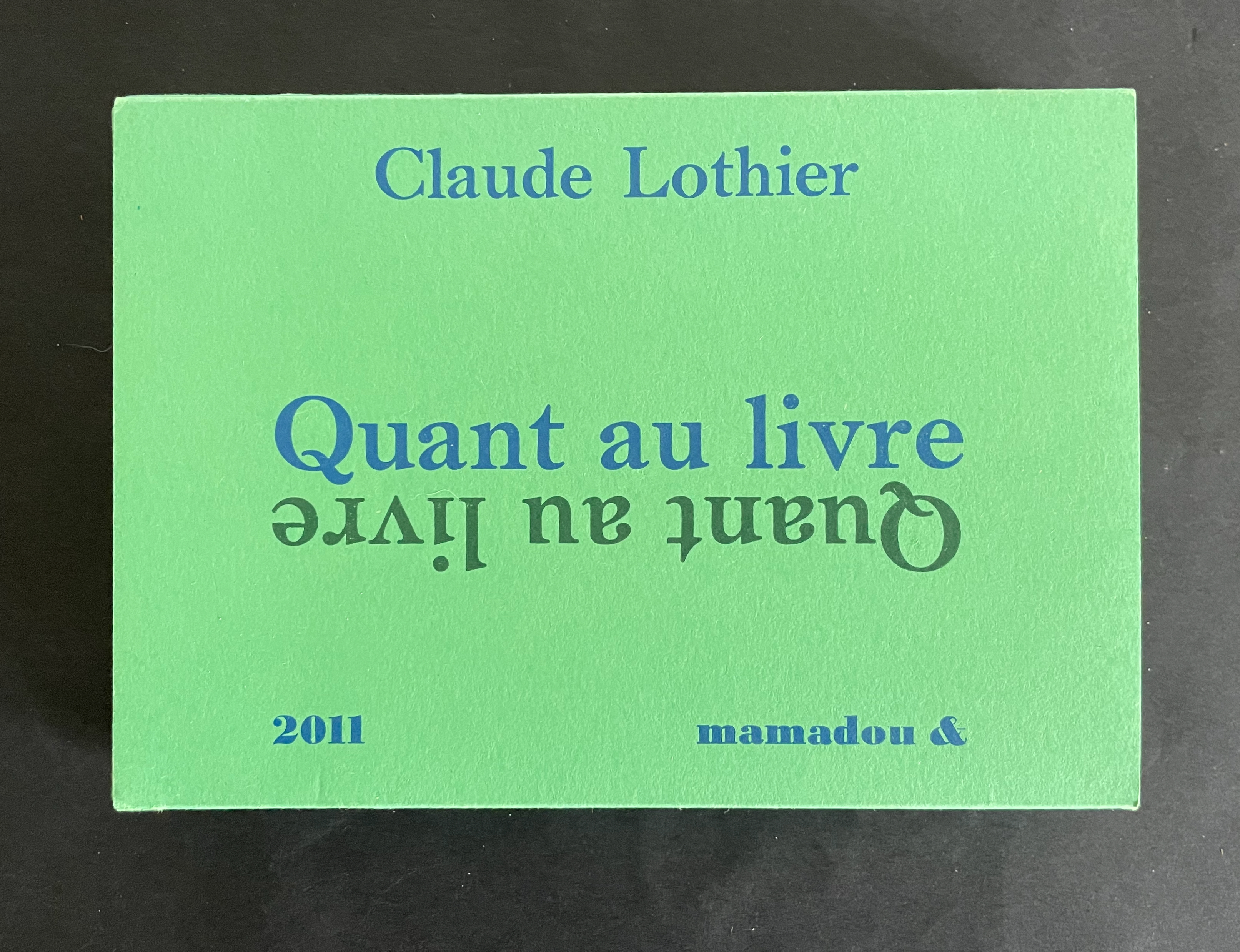
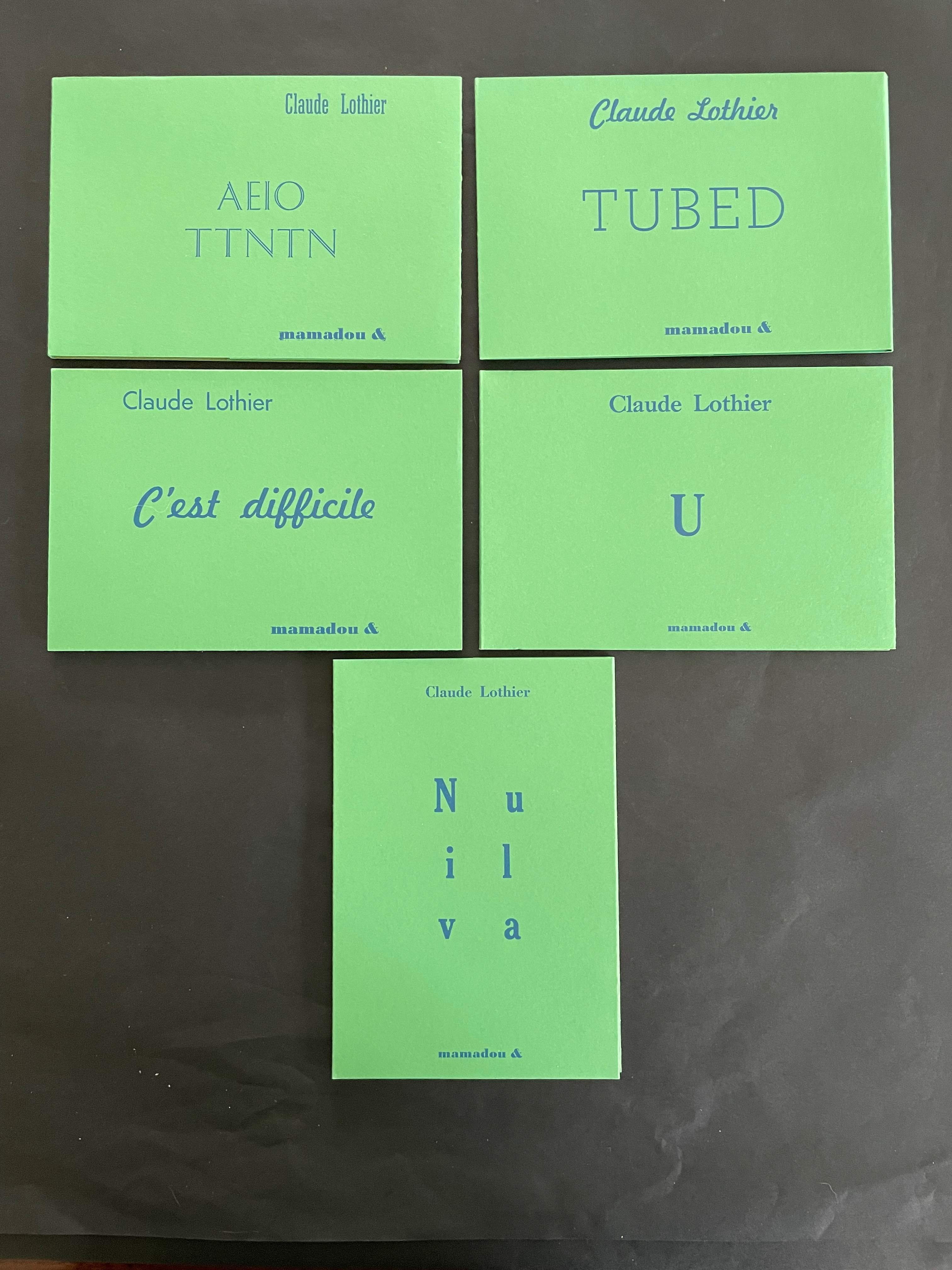
In English, the phrase quant au livre would be “as for the book” or “concerning the book”. What is lost in translation is the phrase’s association with Stéphane Mallarmé’s volume of essays Divagations (1897) in which one section was entitled Quant au Livre. It included the essay “Le Livre, Instrument Spirituel”, which delivered the proclamation “tout, au monde, existe pour aboutir à un livre” (“everything in the world exists to end up in a book”). It was the proclamation scholars seized on to give artists’ books their metaphysical underpinning. If it swallows up everything in the world, What is a book? Many book artists have simply bypassed the discussion and jumped in with works of art that challenge how we read, how we make sense of a book, how we make sense of what a book is. Claude Lothier is one of those book artists.
Continue reading →