Magicienne des formes et des couleurs is how Art & Métiers du Livre (2002) describes Shirley Sharoff. The magic she makes reveals itself in a particular kind of fusion. One of structure, content as image, content as text, color, type, layout, material and craft. It is a magic best sensed when handling or really seeing her work.
OVI: objets volants identifiés dans le ciel d’Italo Calvino (1988) Shirley Sharoff
Graphic ‘big bang’ and typographic spirals with an extract from Cosmicomics by Italo Calvino, postface by Mario Fusco
4 color etchings printed by the Atelier René Tazé
Edition of 74 on Vélin Rives
Typography by François Da Ros in Cochin typeface
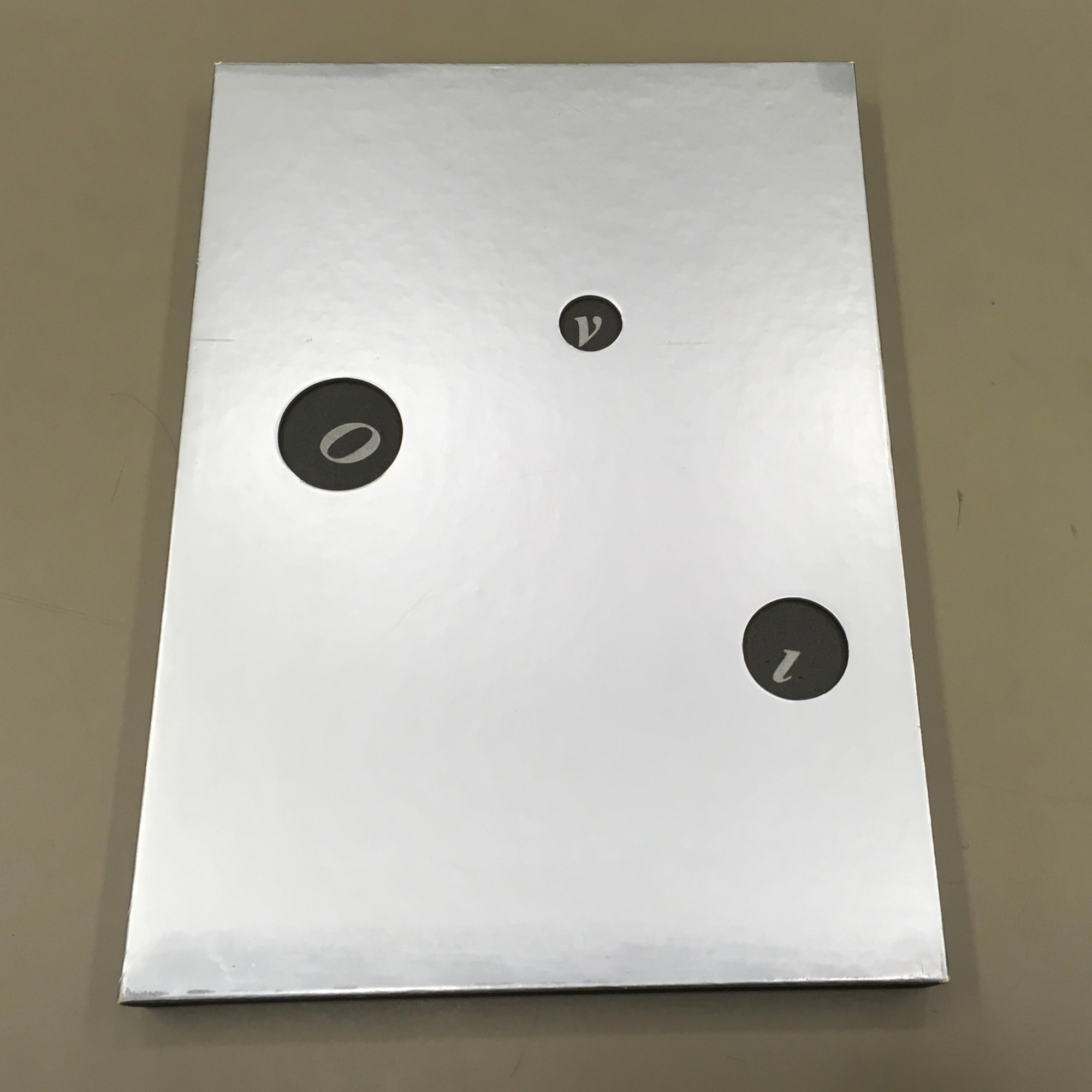
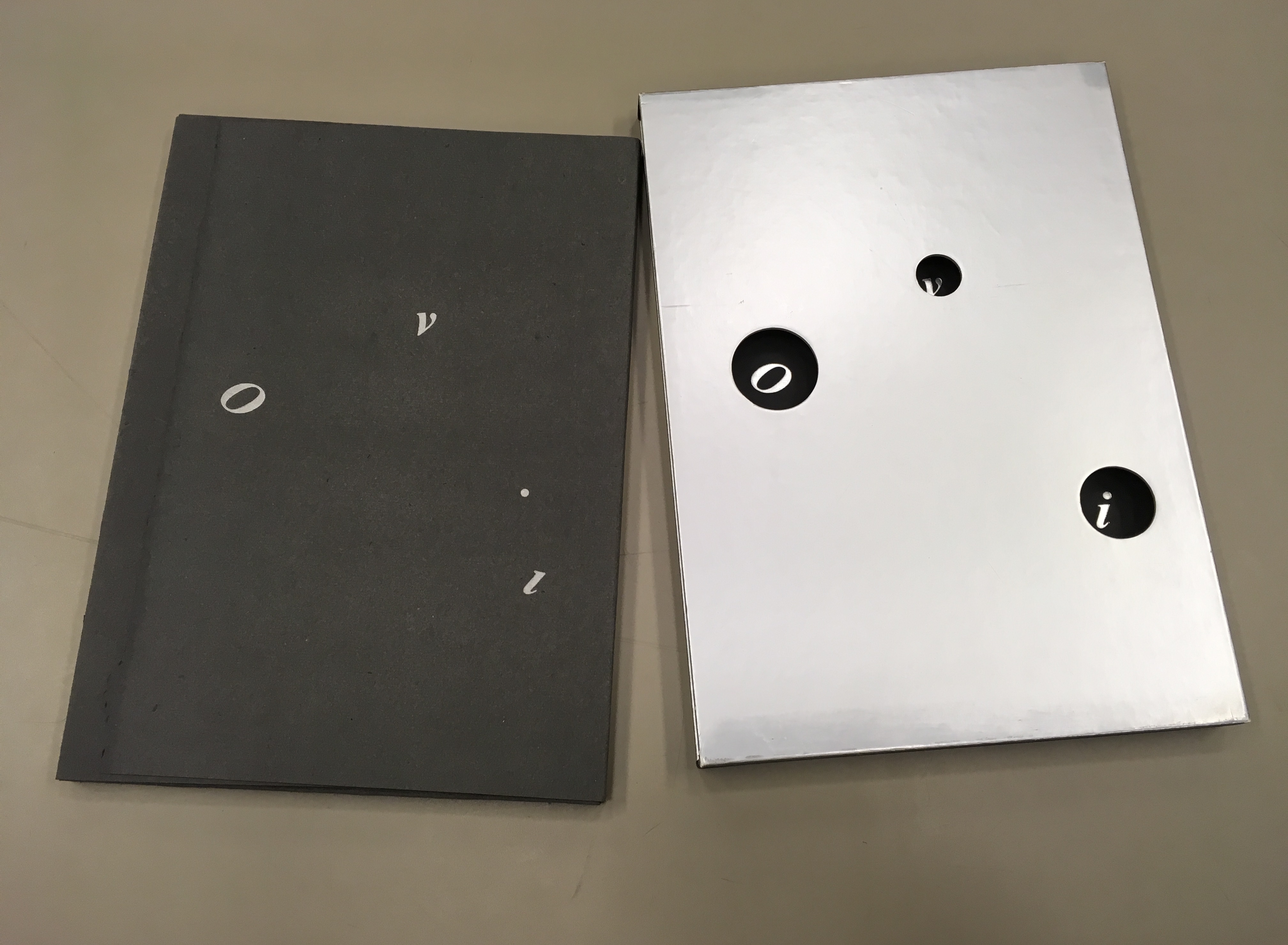
In a silver-colored box of 26.5 x 37 cm Photos by Books On Books and reproduced with artist’s permisision
Brooklyn-born but resident and working in France for most of her life, Sharoff studied in Paris under Gotthard Johnny Friedlaender (1912-1992), learning his method of making color prints from two or three different plates. She came to the artist’s book in the 1980s through a friend who introduced her to a typographer with whom the friend was working: François Da Ros.
During my conversation with [Da Ros], I told him that I had an idea for a book but didn’t know how to go about it. It involved prints and an excerpt from one of Italo Calvino’s works. … that’s how my first artist book got started — and once I did that I thought “artist books” were so interesting that I just wanted to keep on doing it. — Artist’s correspondence with Books On Books, 18 December 2018
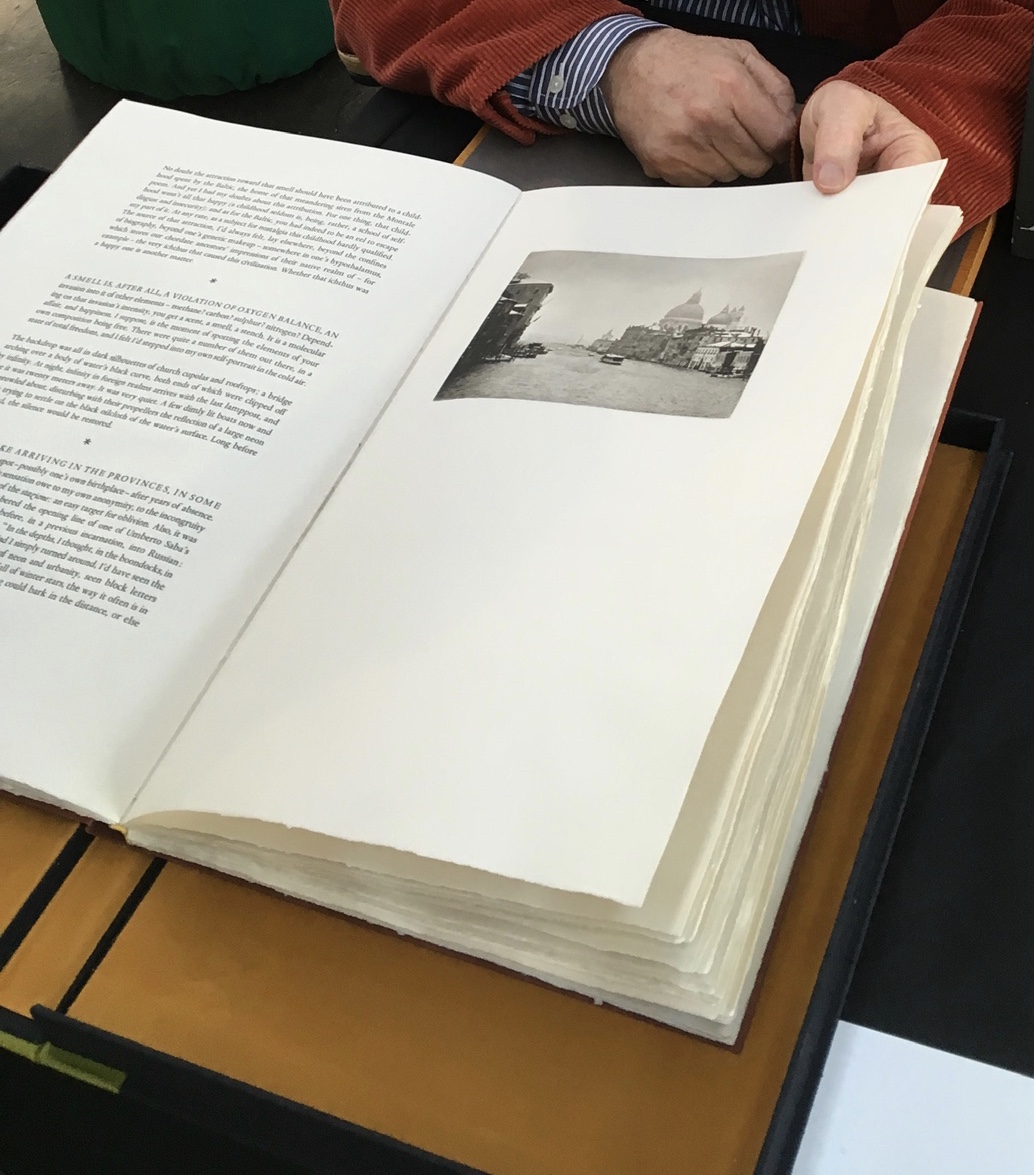
The result of that encounter was OVI (1988). The text came from Calvino’s Big Bang story “Sul far del giorno” (“At daybreak”) in his collection Le Cosmicomiche (1965) (Cosmicomics, 1968). Calvino’s story relates how the main character, Qfwfq, and his extended family, from a species we cannot identify, experience the cosmic Big Bang.
The story’s language, character and narrative deliver an astrophysical and micro-organic alchemy that falls in line with Calvino’s association with the Ouvroir de Littérature Potentielle (OuLiPo) or “Workshop for Potential Literature”. OuLiPo’s participants seek and have sought new forms and structures for literature through play with the properties of language, word games or imposing constraints through mathematical or computational principles such as Boolean algebra or recursiveness. For example, Georges Perec wrote La Disparition (1969), a “lipogrammatic” novel avoiding any words containing the letter “e”. Raymond Queneau constructed Cent mille milliards de poèmes (1961), which is actually an interactive work of book art, confronting readers with 1014 different sonnets generated by the reader’s choosing one of 10 options per line, accessed by turning each line like a page.
OVI lifts this literary playfulness into a revel of intricate puns, played out in language, image, typography and structure or form. Sharoff discovered the Calvino story in Le Monde independently of her prints already underway, but it was the conjunction of the story with them that led her to “an idea for a book”. Although, like Friedlaender, Sharoff would illustrate books, the idea diverged from a mere illustration of the story or a livre d’artiste in the traditional sense. Like many book artists, Sharoff conceived a blend of image, text and form. The Sharoff/Da Ros execution of her idea re-presents, absorbs, reacts to, embodies Calvino’s fiction in a work that stands apart from it. It is the reverse of the usual ekphrasis we see when a literary text strives to re-present, absorb, react to, embody an urn, a sculpture, painting or print. Think of Keats’ “Ode to a Grecian Urn”.
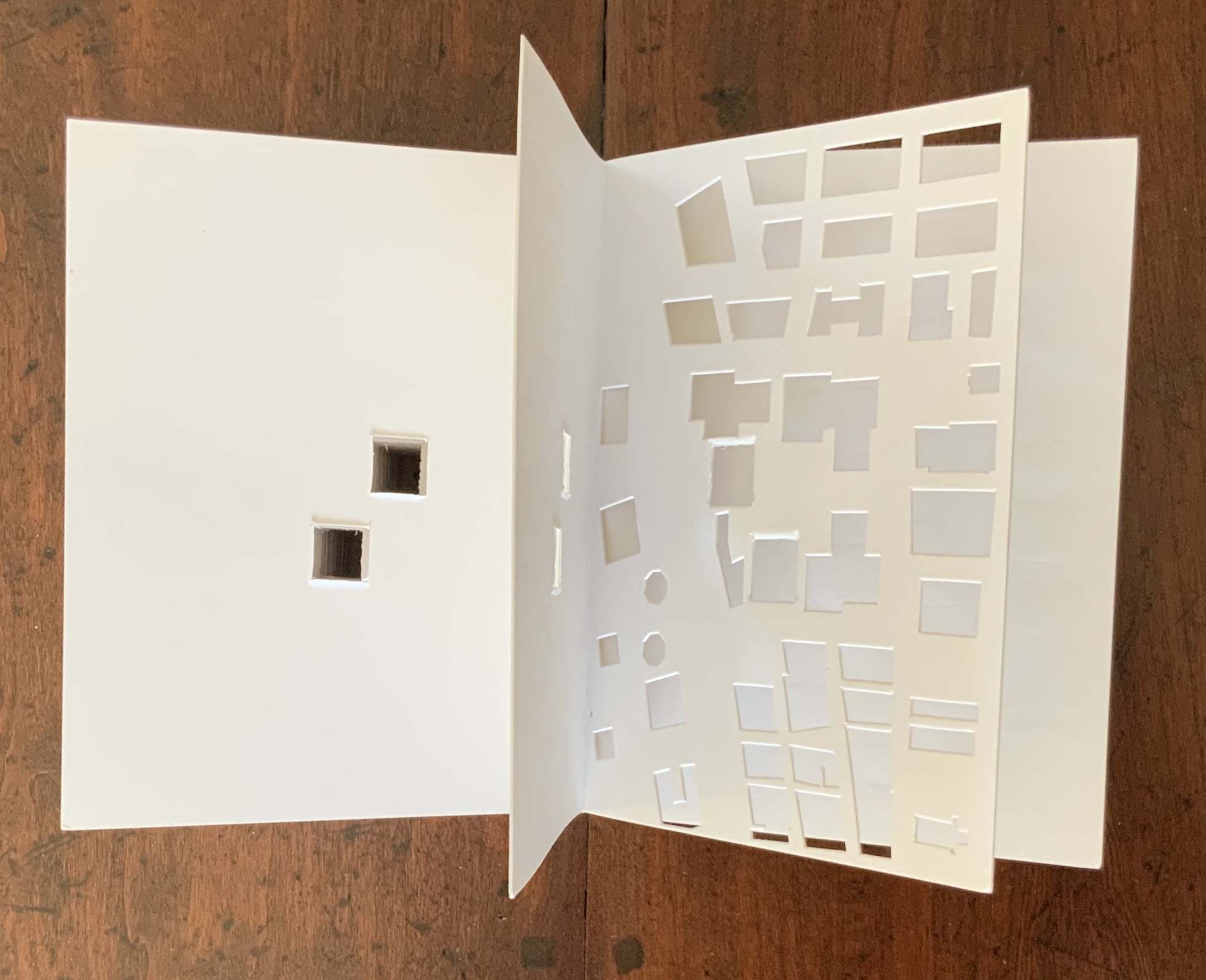
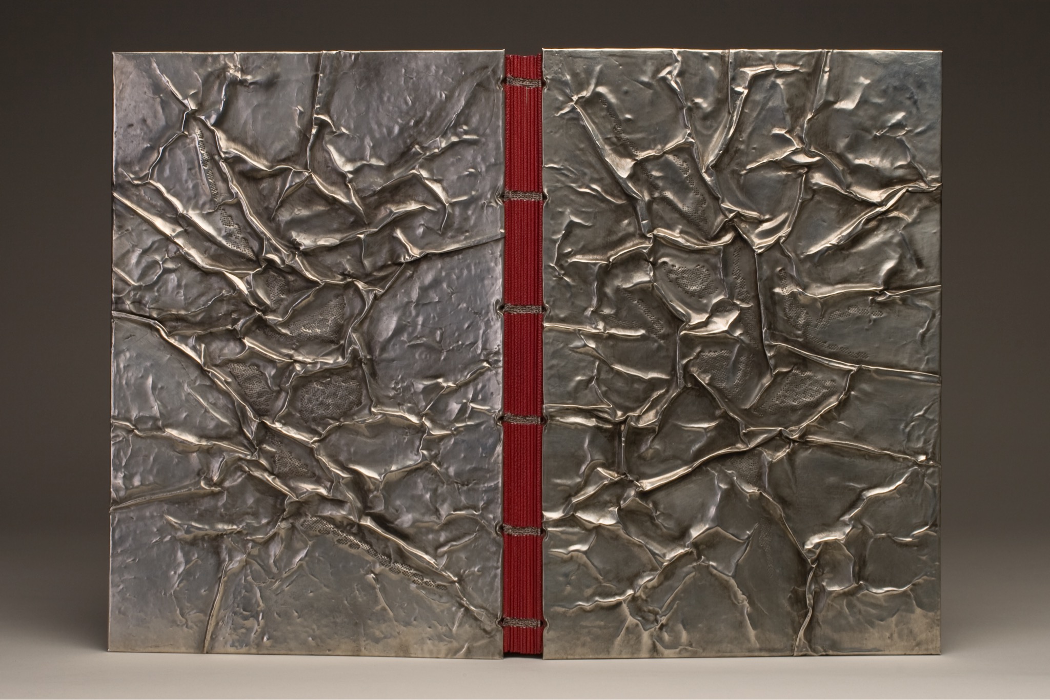
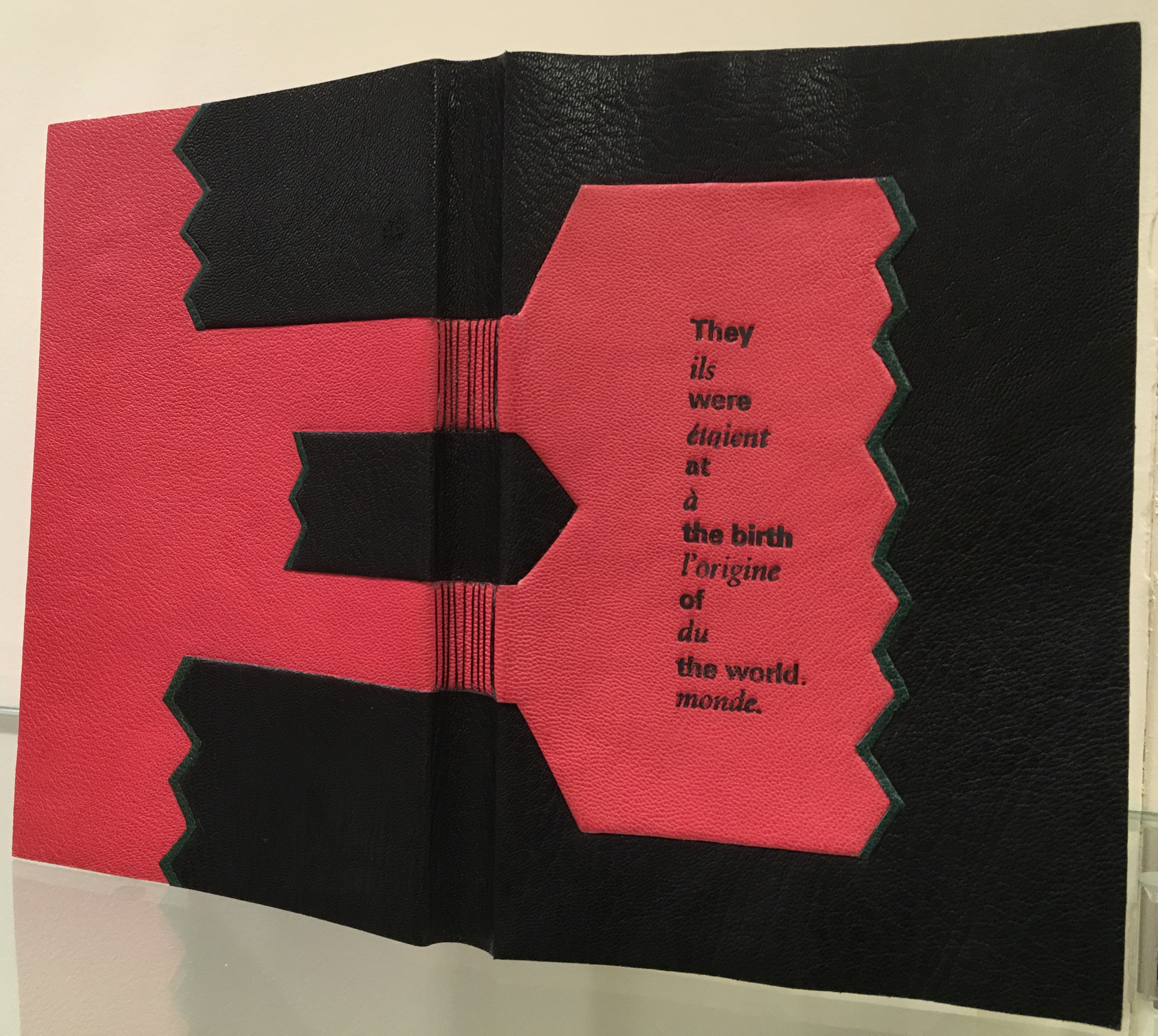
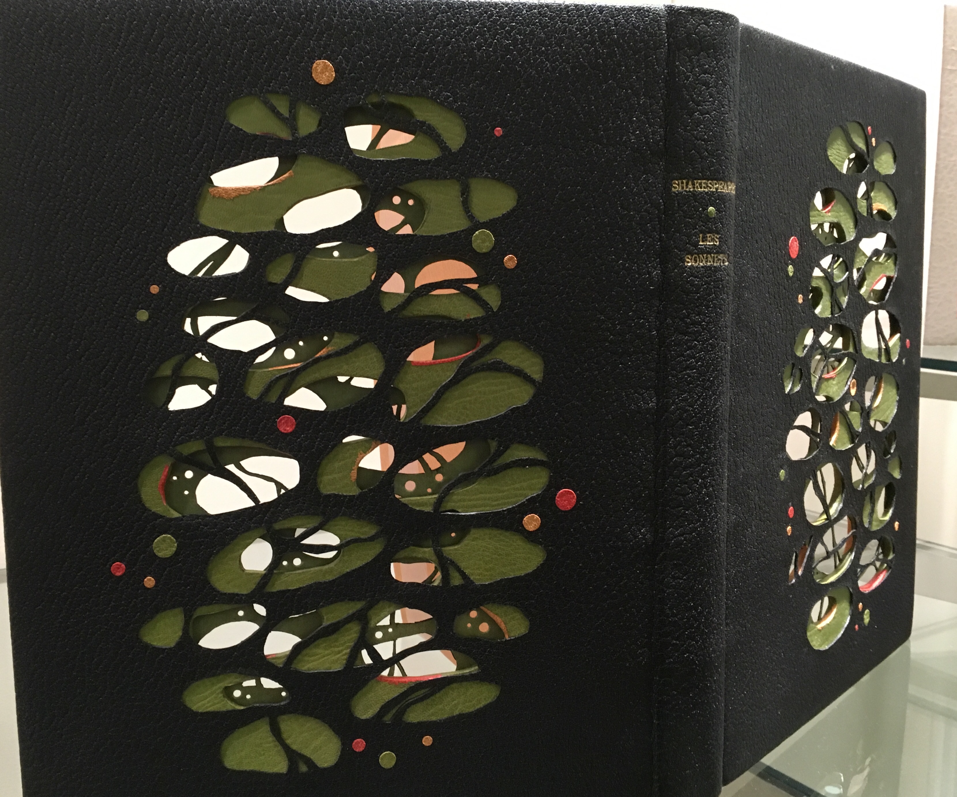
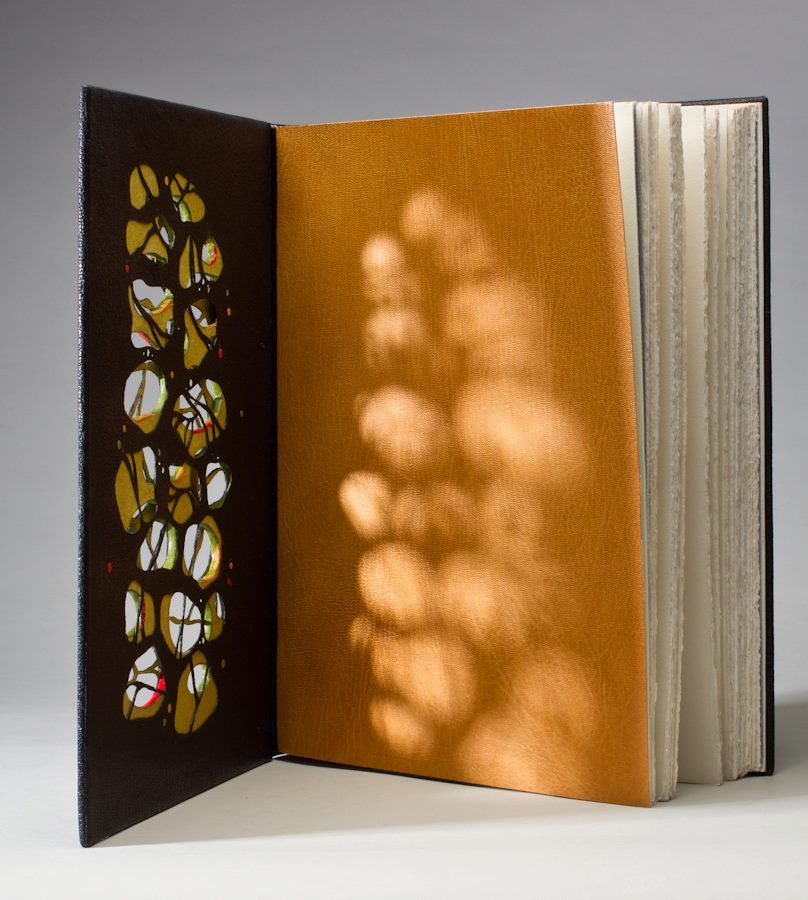
Instead of Unidentified Flying Objects (OVNI in French), the artist gives us OVI (“identified flying objects”), the first three of which are the letters “O”, “v” and “i” appearing through the “black holes” of the silver paper slipcase. As the black portfolio emerges from the slipcase, we see the i’s dot adrift as perhaps another object in the firmament. Through the holes in the slipcase, the same letters reappear printed on the inside of the slipcase but with the i’s dot no longer adrift (the “stars” aligned?). And this is just the start of the punning and play with structure, content as image, content as text, color, type, layout, material and craft.
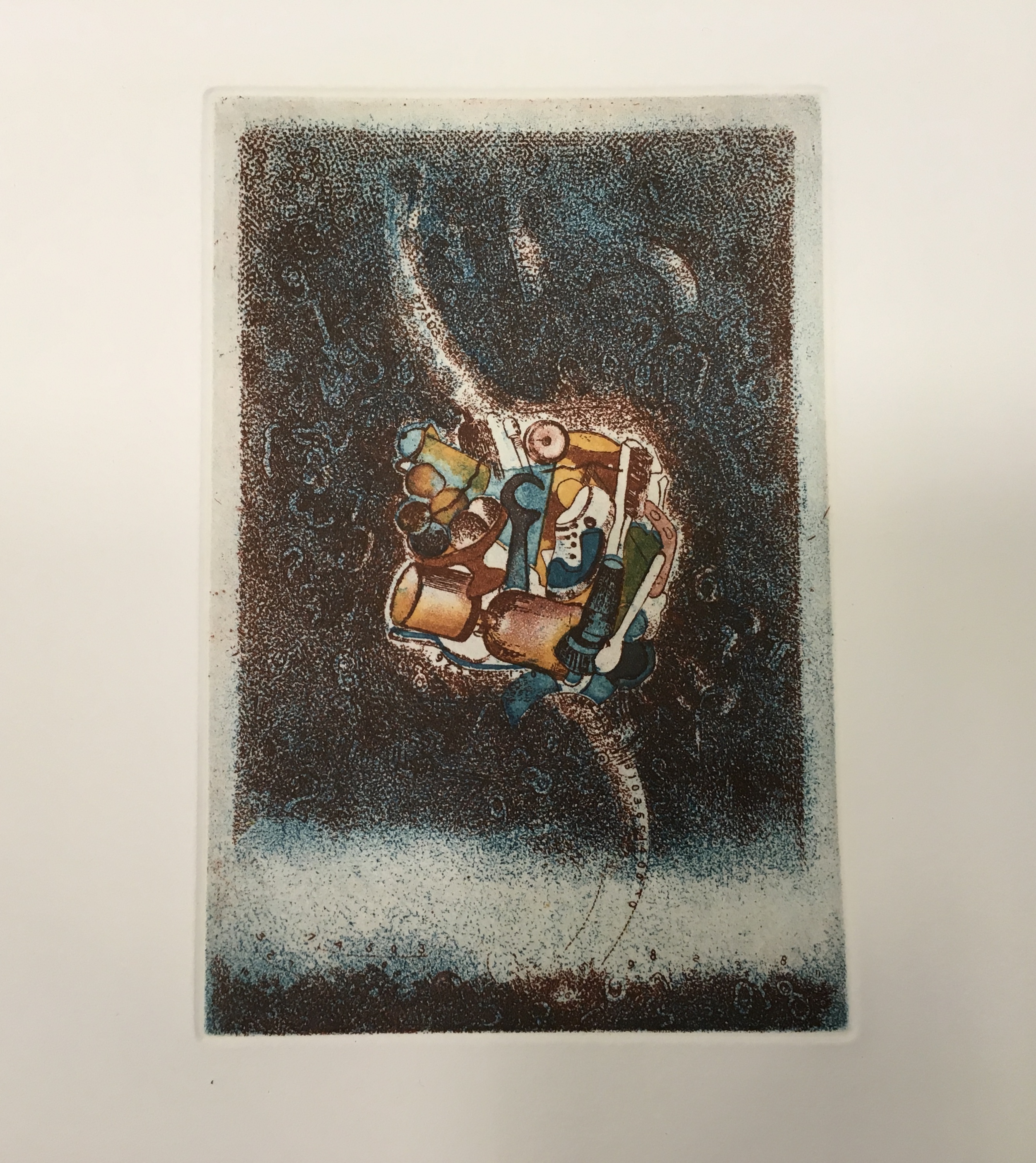
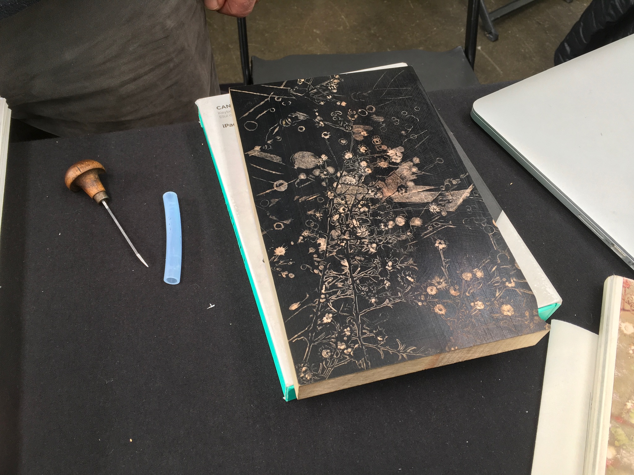
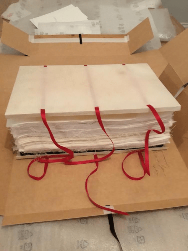
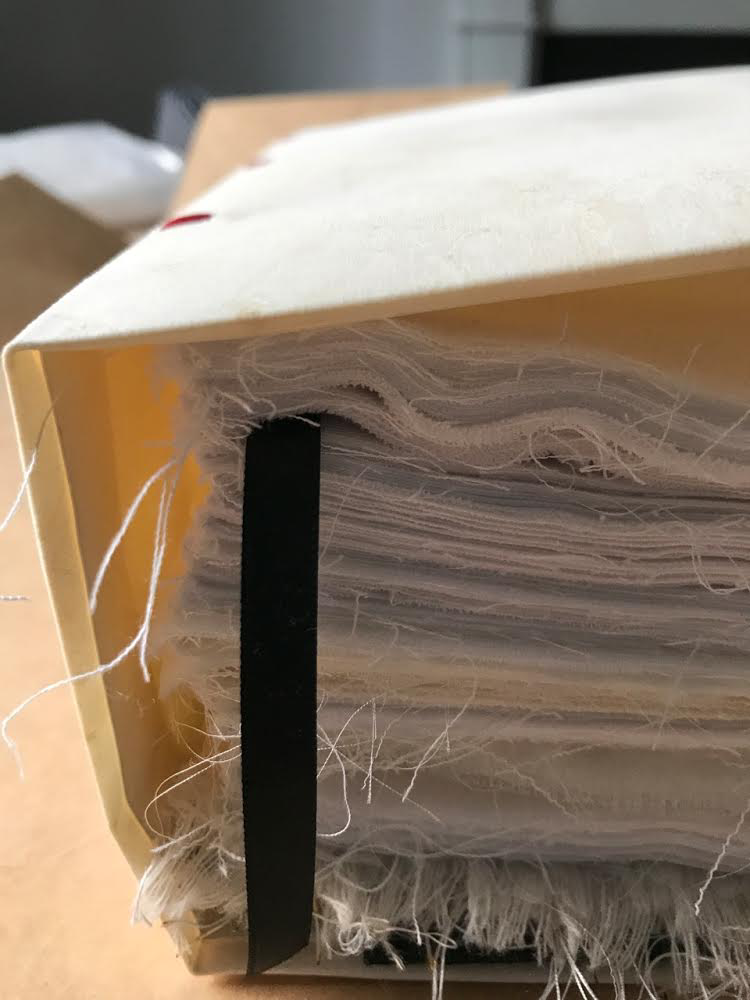
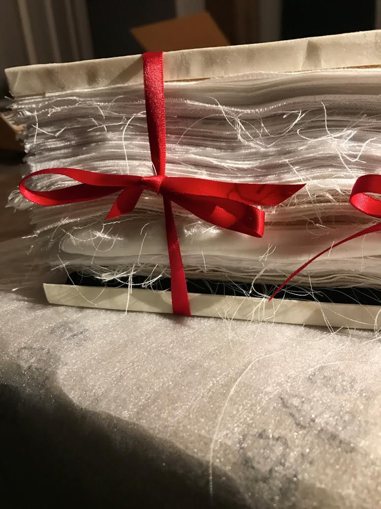
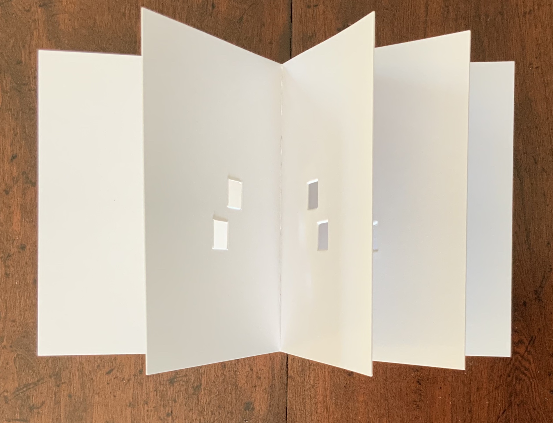
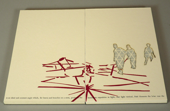
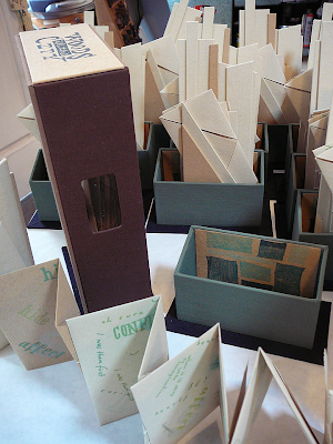
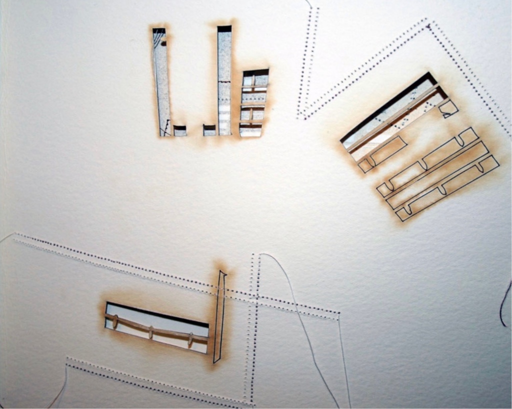
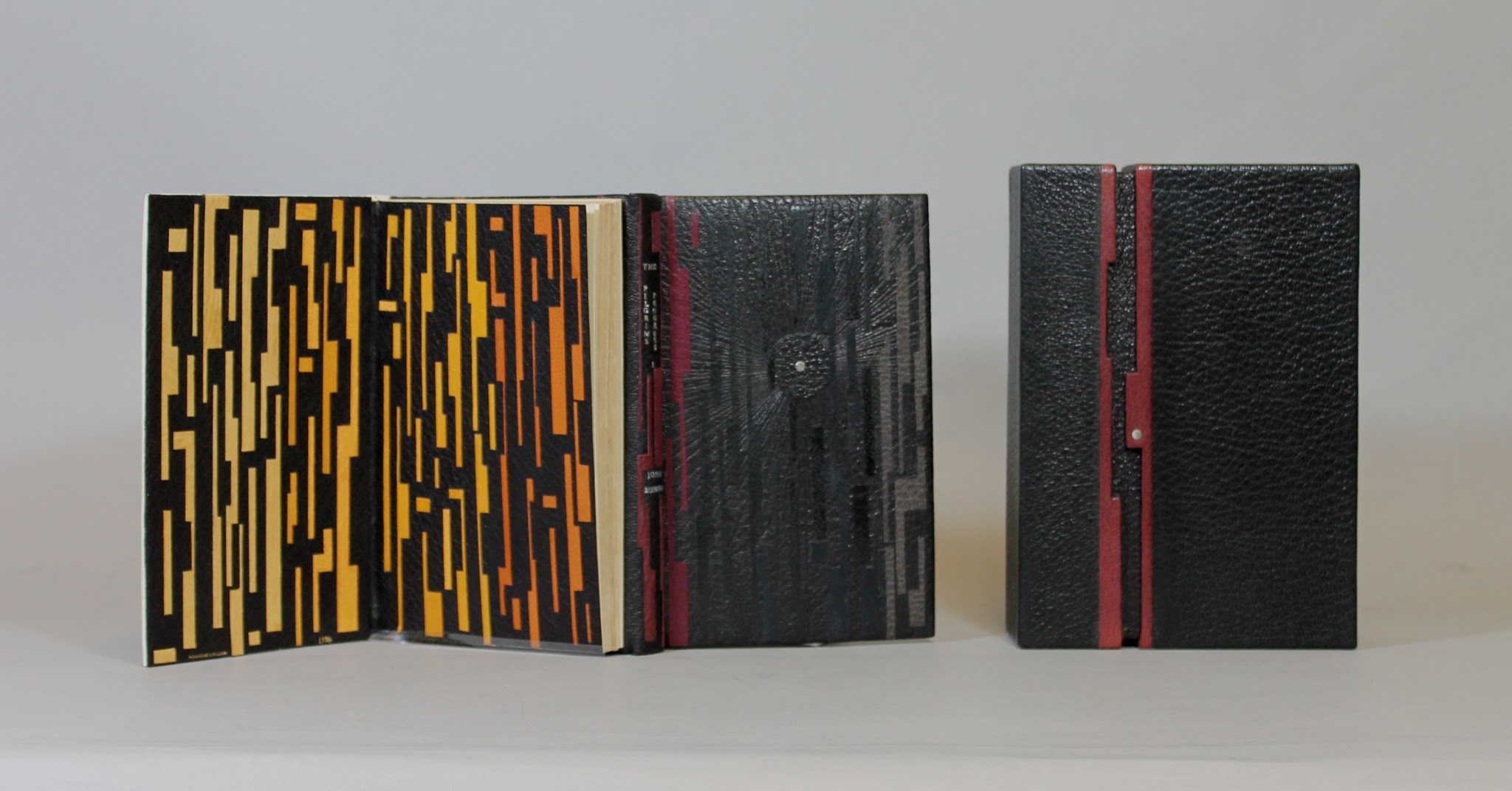
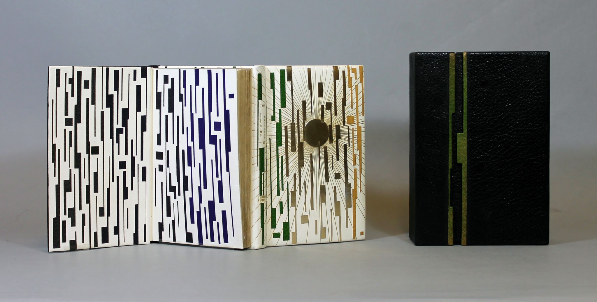
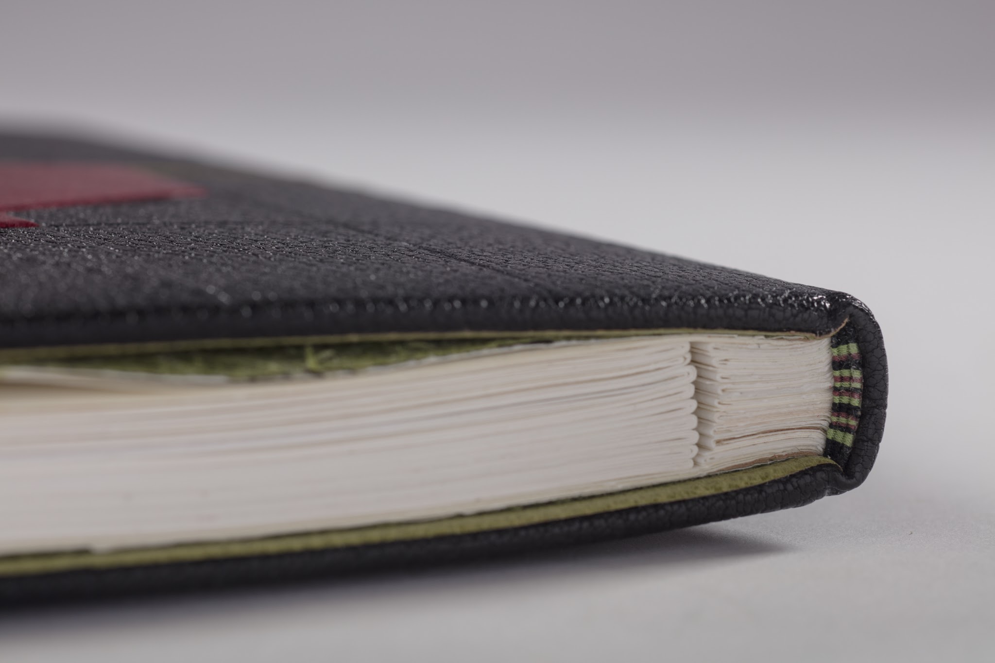
Encased in the trifold black portfolio are nine loose map-like folios.
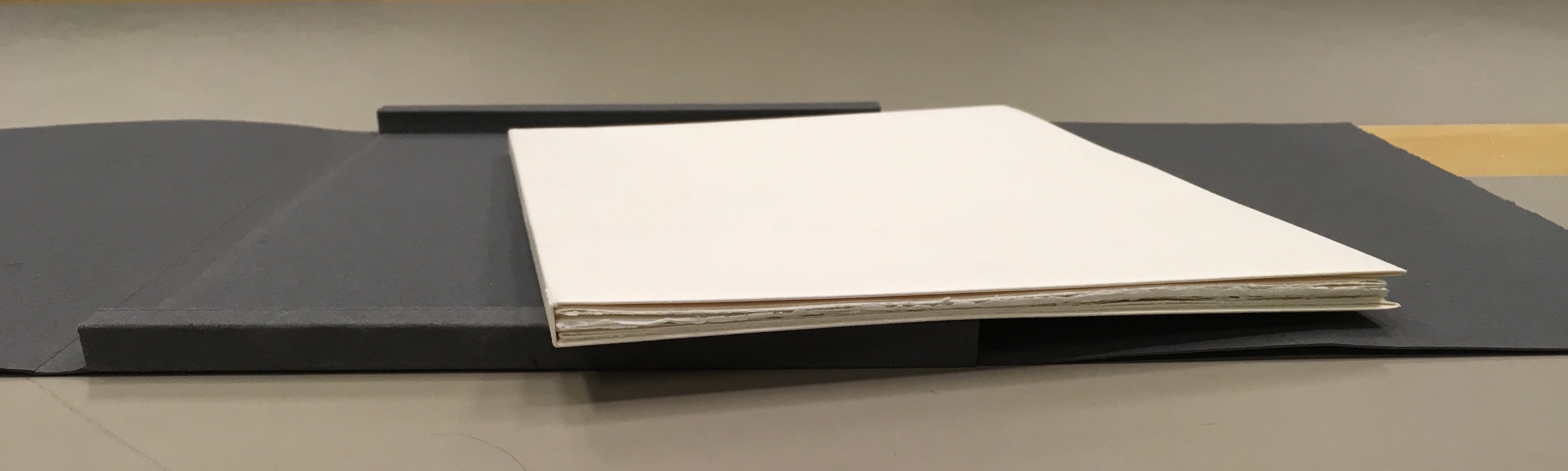
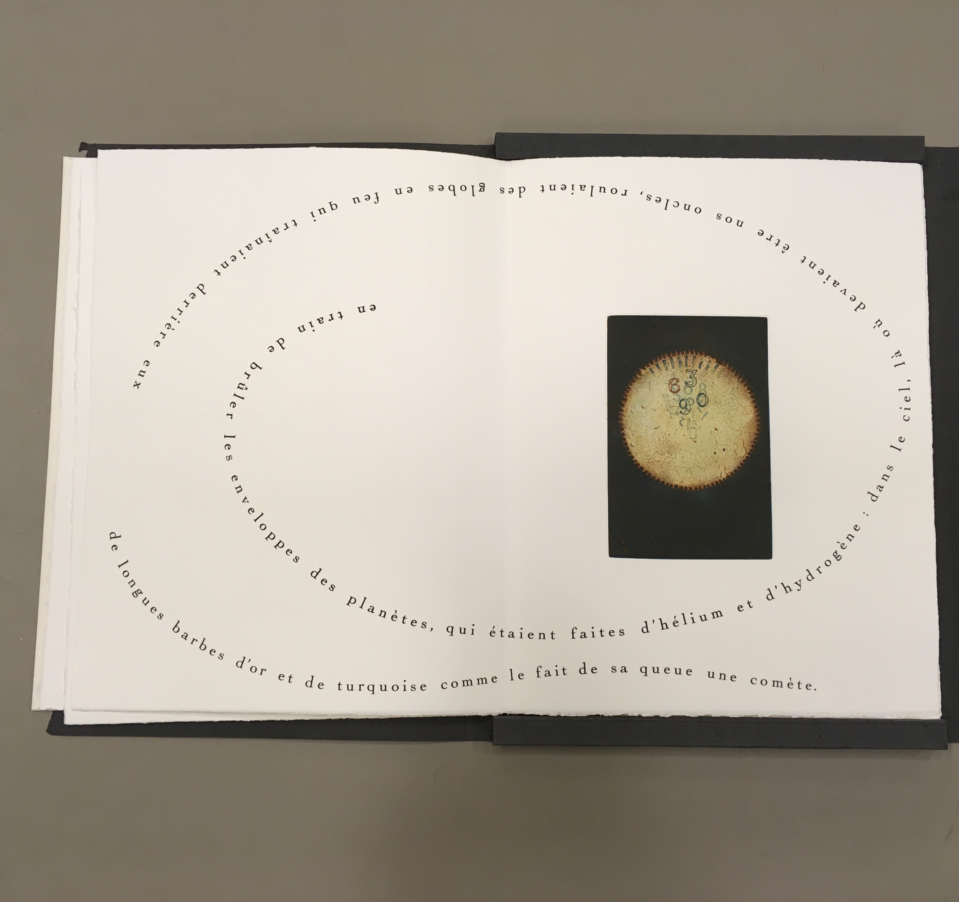
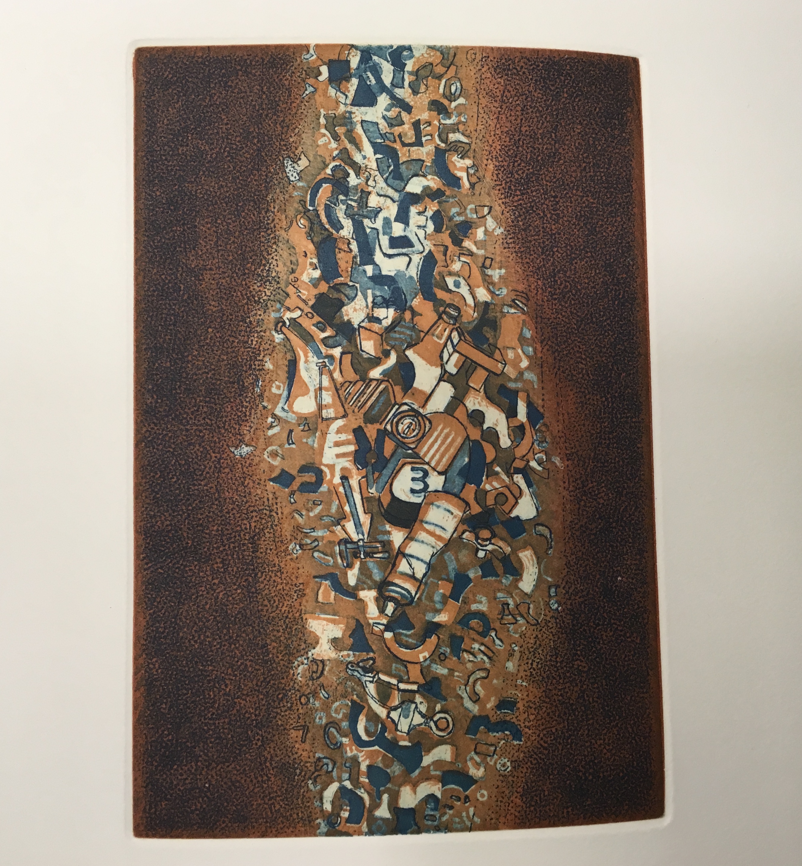
Opened, the folios display selected text from the French translation of Calvino’s short story and four Sharoff prints. In three of the prints, the text swirls, construction-poem-like, around the multicolor images. Part of the folios’ magic here is Sharoff’s fusion of image with the substance of Calvino’s words, a Friedlaender-esque palette and the typographic and form-locking skills of Da Ros.
The first image looks like a macrophoto of a cell (or is it an image of the sun?) with numbers superimposed. The second image looks like a cloud nebula (or is it some multicellular life form with two flagellae?) consisting of everyday objects. The third image looks like an asteroid belt (or is it a paramecium?) made of a discarded aerosol can and other trash.
possibly happen had happened, and ‘yes, this is the end,’ Grandmother said, ‘mind what
us old folks say. . .’ Instead, the Earth had merely made one of its turns. It was night.
Everything was just beginning.”
from Italo Calvino, “Sul far del giorno” in Le Cosmicomiche (Milan: Einaudi, 1965), translated as “At Daybreak” by William Weaver in Cosmicomics (New York: Harcourt, Brace & World, 1968)
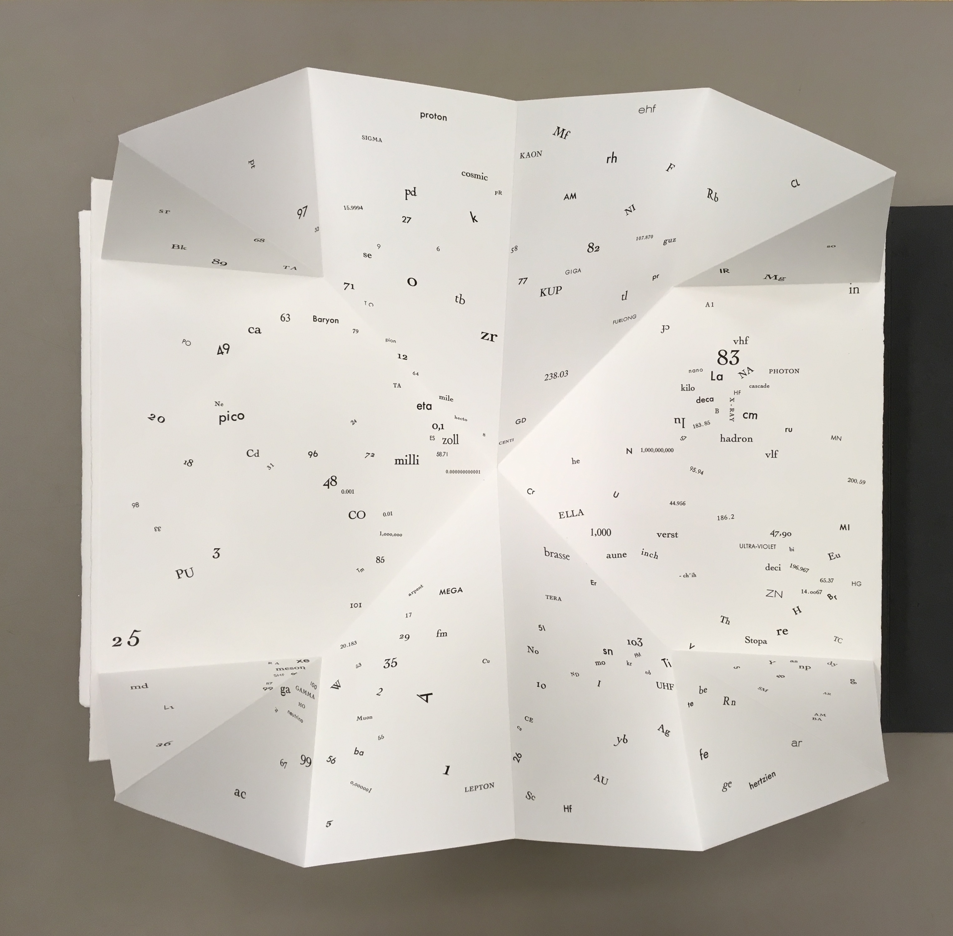
One of the four prints stands alone without text. The image is a cascade of large and small numerals, logic symbols, a gear, protractor and metallic-looking detritus landing in a heap.
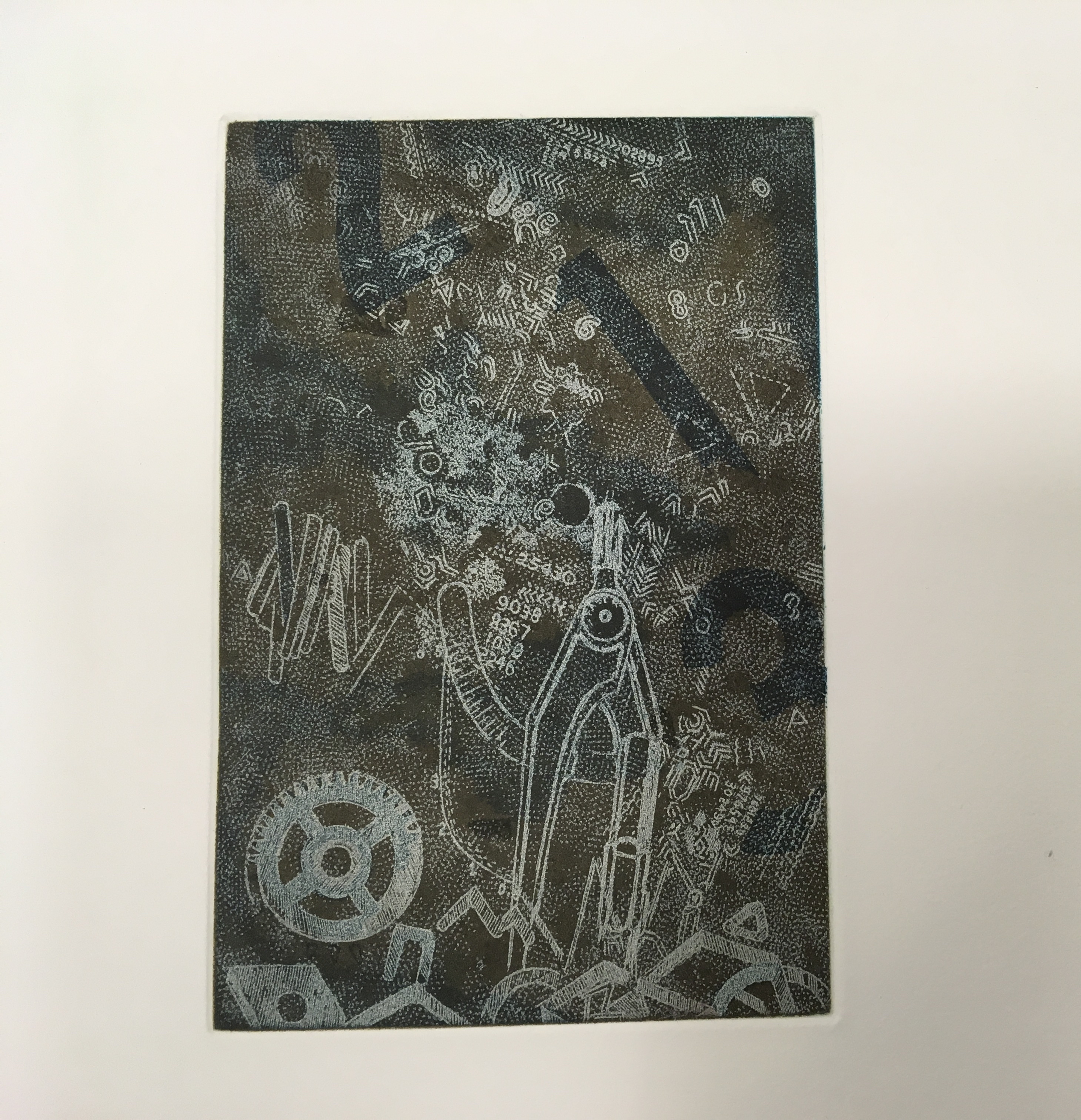
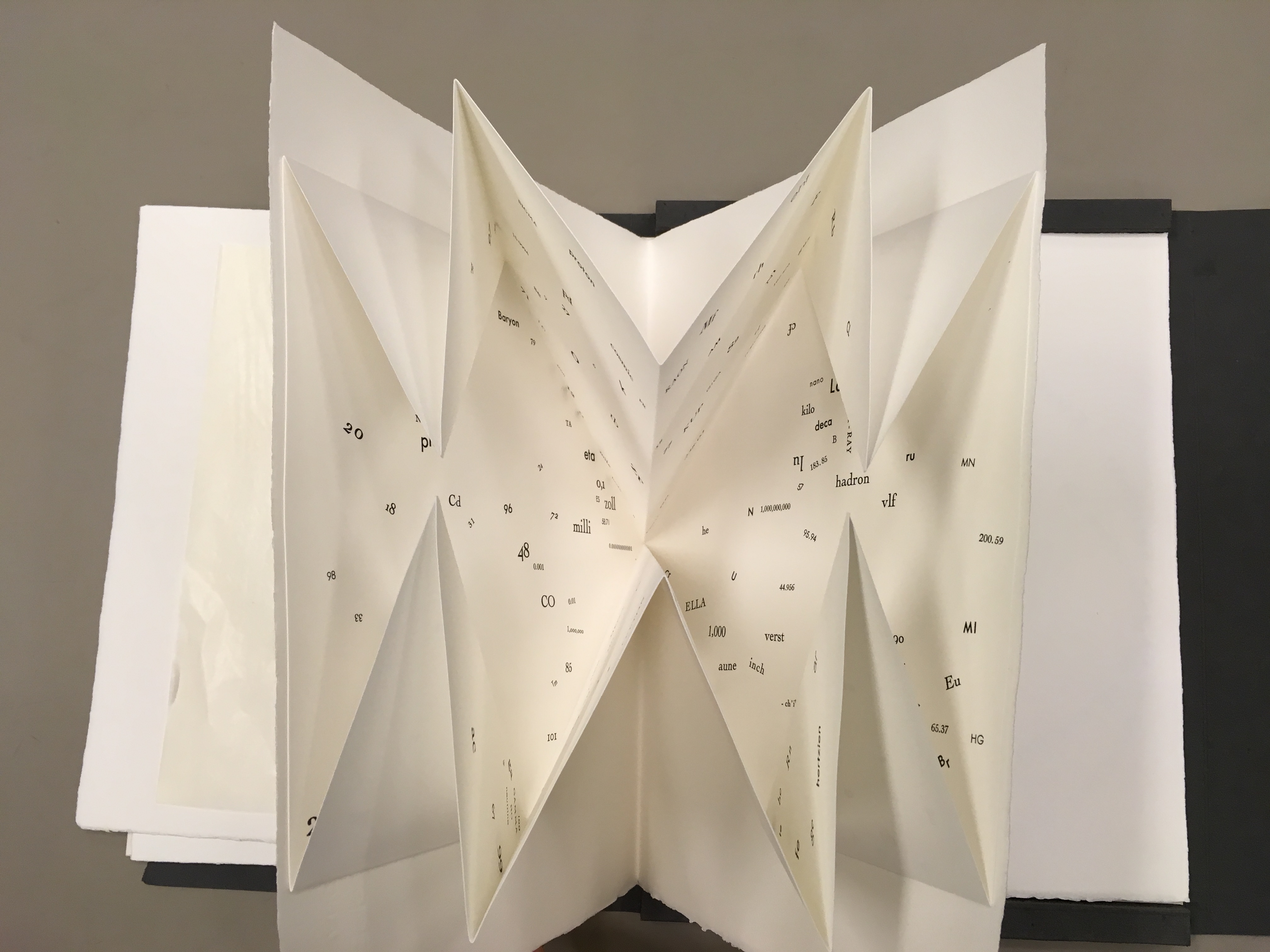
One of the leaves deploys a Turkish map fold, opening to reveal a constellation of numbers, letters from the periodic table and terms from particle physics and astrophysics — an outstanding display of skill from Da Ros and entirely evocative of Qfwfq and his family’s bizarre tale of the big bang. It’s also a prescient reminder that a crater on the planet Mercury and a main asteroid belt were named after Calvino.
The separate folios echo the abrupt jumps in Calvino’s story. In the end, Sharoff succeeds with OVI in echoing how the story — despite those jumps, the bewildering and unpronounceably named characters and the teasing references to familiar and unfamiliar domains of knowledge — hangs together. The spiraling text makes the viewer turn and turn the opened folio to read the words — much as the story’s surreal yet familiar characters and their situations make the reader puzzle through the storyline. The prints present the viewer with familiar yet unfamiliar shapes composed of everyday objects or recognizable symbols. The tactility of the paper, the solidity of the slipcase and texture of the multicolored prints play off the intellectuality of the ekphrasis and scientific images and symbols in much the same way as the familiar familial relations play off the characters’ bewildering experience of the cosmic Big Bang.
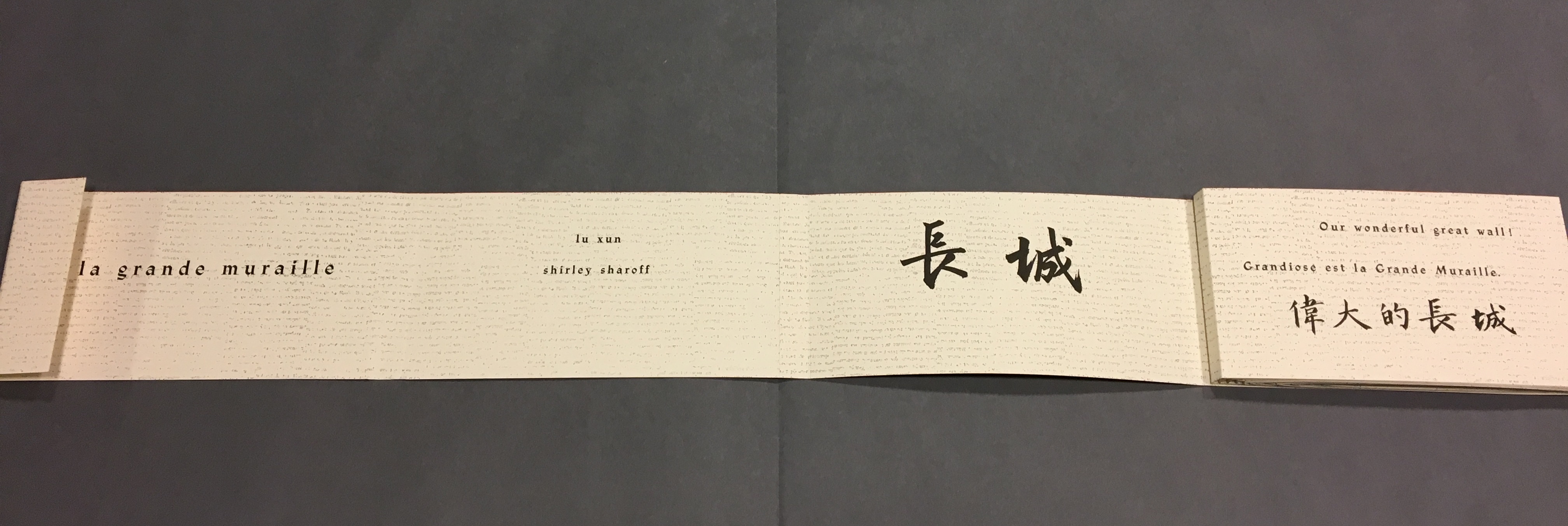
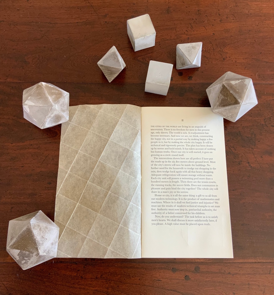
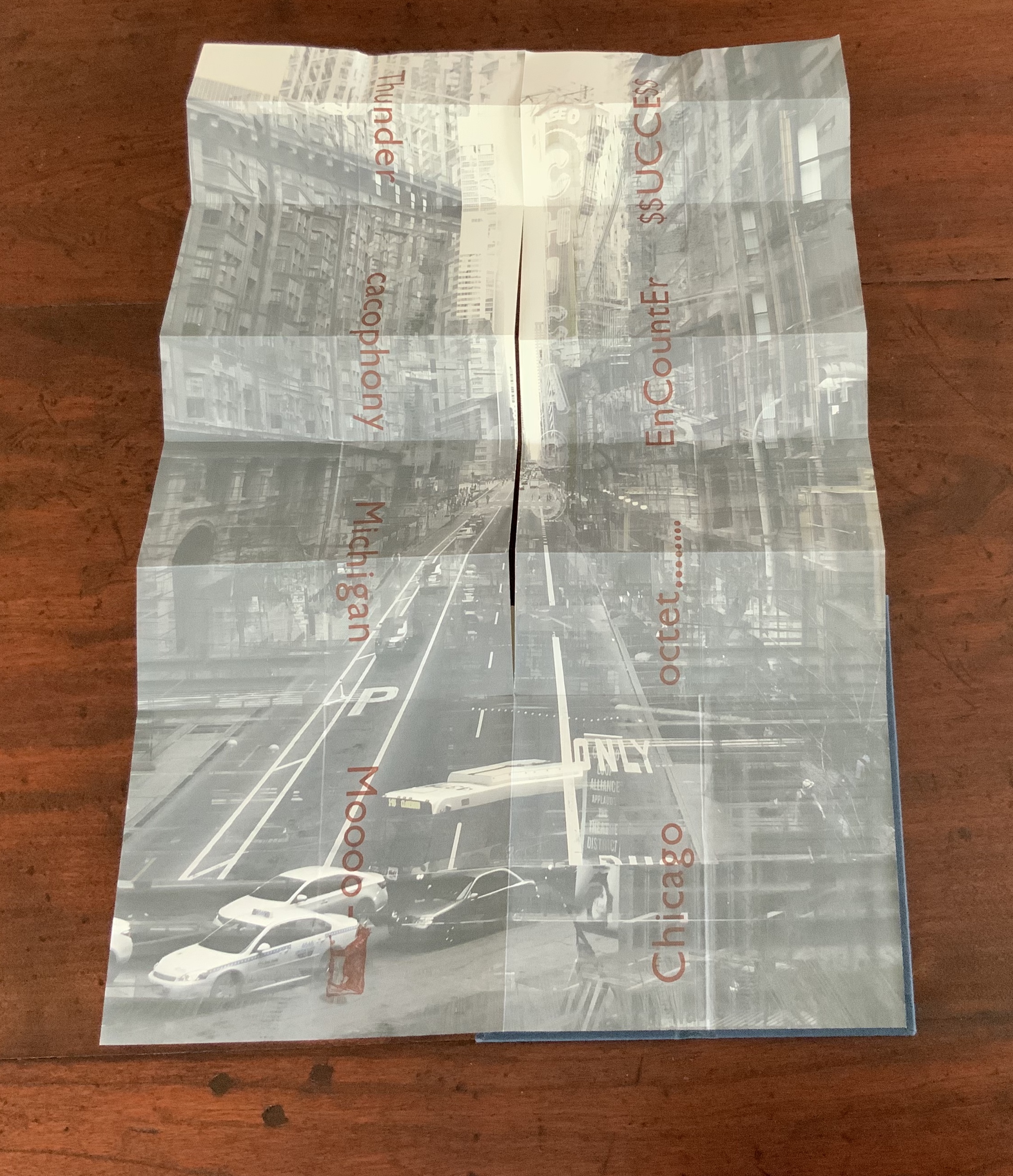
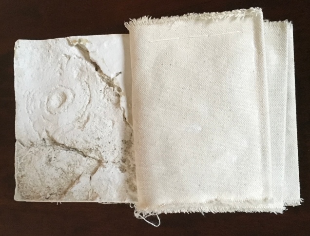
Sharoff’s next major artist’s book — again with Da Ros — would be La grande muraille/The Great Wall (1991). There is little if anything implying a Chinese or other oriental influence on printmaking or typography as practiced by Friedlaender or Da Ros, respectively. And until her visit to China in the late eighties, Sharoff’s work showed no such influence. When the influence came, it was concentrated in the one work. Sharoff was concerned not to respond to China in a typical Western artist way or to fall prey to traditions that neglected the hardship or grittiness she saw while teaching English to young Chinese bank employees. Sharoff hungered for a text that would fuse with the images coming to her in reaction to the remnants of the Great Wall, the summer palace’s maze, and post-revolutionary infrastructure.

Shirley Sharoff
Taken at Koninklijke Bibliotheek, Den Haag, Nederlands. Reproduced with permission of the artist.
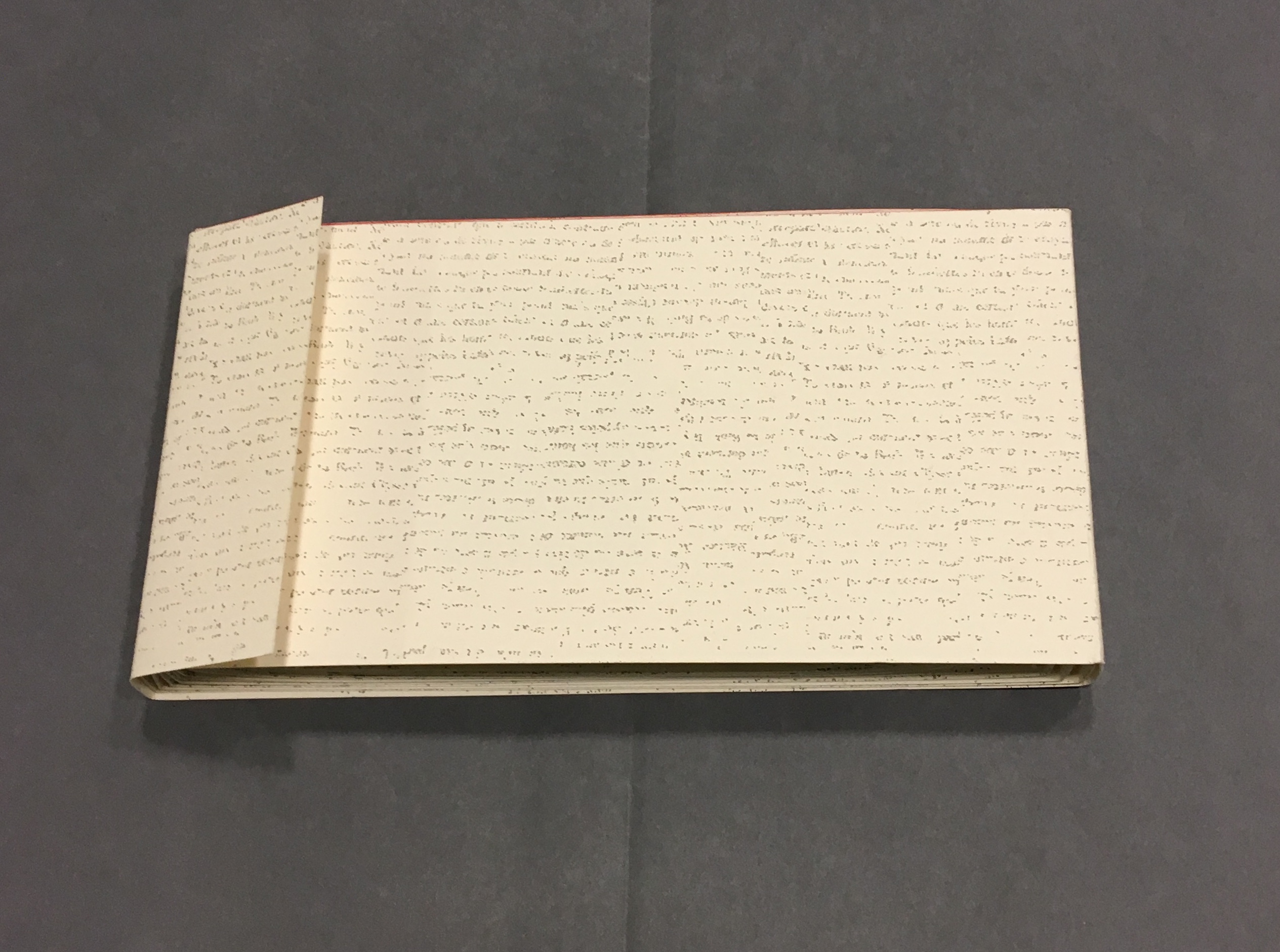
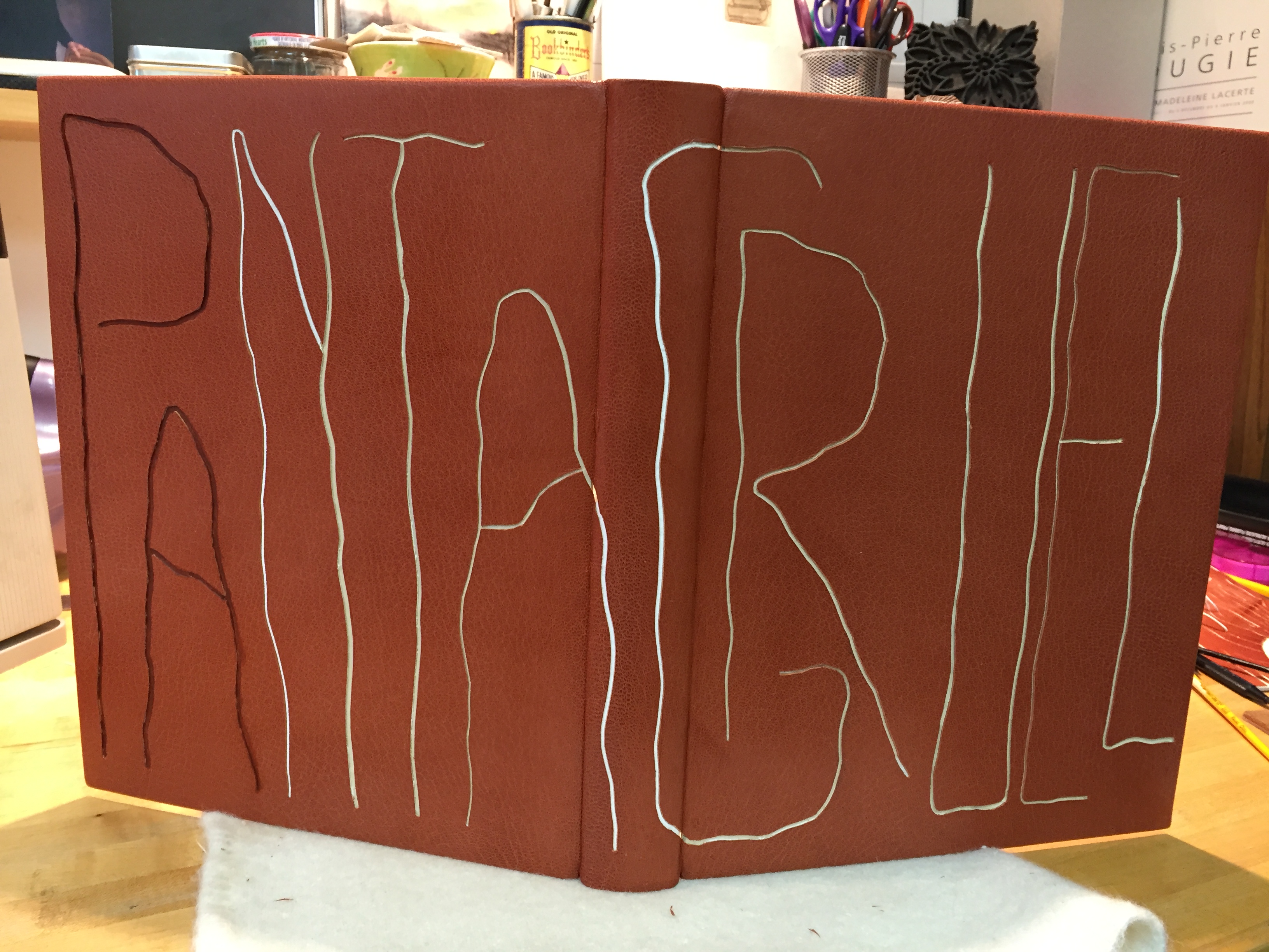
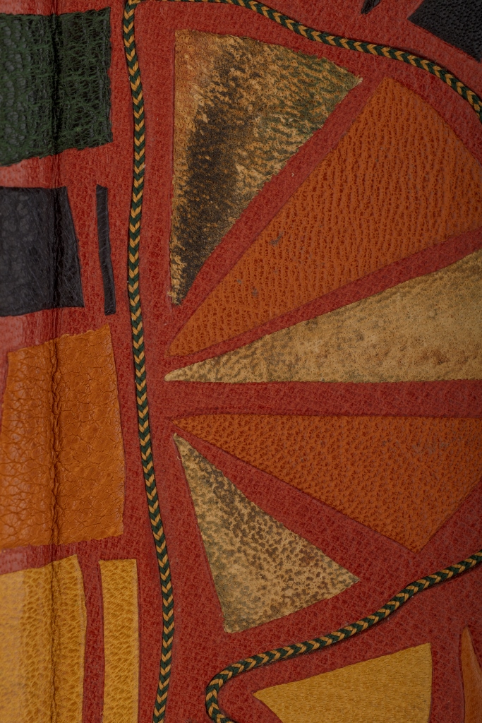
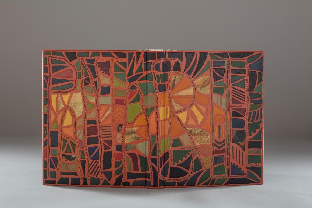
She uses the words of the 1930s writer Lu Xun and those of her 1980s English-language students to bounce echoes of strife, ambivalence and paradox from the walls of her prints and artist’s book, a double-sided accordion in forme en escargot (snail-shell form as she calls it). Lu’s poem appears in Chinese calligraphy and translated into French and English, set in bold and equal in weight to the Chinese characters. Sharoff breaks the three versions across increasingly shorter segments of paper, layering the different languages like mortar and rows of bricks. In a different, smaller typeface — like fragments of modern brick — the English text from her language students, reflecting on Western culture and their lives, is interspersed along with eight prints. The “snail-shell” structure unfolds/unrolls in a way that both “sides of the wall” end up being read. The juxtapositions and structure draw the viewer repeatedly from the flatness of paper into the multiple dimensions of the bookwork.
Bringing together barriers/bridges — languages, cultures and political eras — the bookwork breathes its own original life into Lu’s text of ambivalence and paradox. It is an effect similar but on a different scale to contemporaneous works by Xu Bing: Book from the Sky (1991) and Ghosts Pounding the Wall (1990-91). The faint markings on the Arches paper of Sharoff’s wall, markings created by printing the results of repeated photocopies of an unidentified manuscript, echo the unreadability of Xu’s faux Chinese characters printed from his 4,000 hand-cut stamps for Book from the Sky. The red edge of Sharoff’s wall and the words of Lu Xun catch the echo of Xu’s and his students’ beating their ink-soaked mallets against the rice paper hanging on the Great Wall and invoke the ghosts of those who died building the wall. The execution of the unusual “forme en escargot” equals in exquisiteness and production value any of Xu’s works.
La grande muraille/The Great Wall (1991), Shirley Sharoff
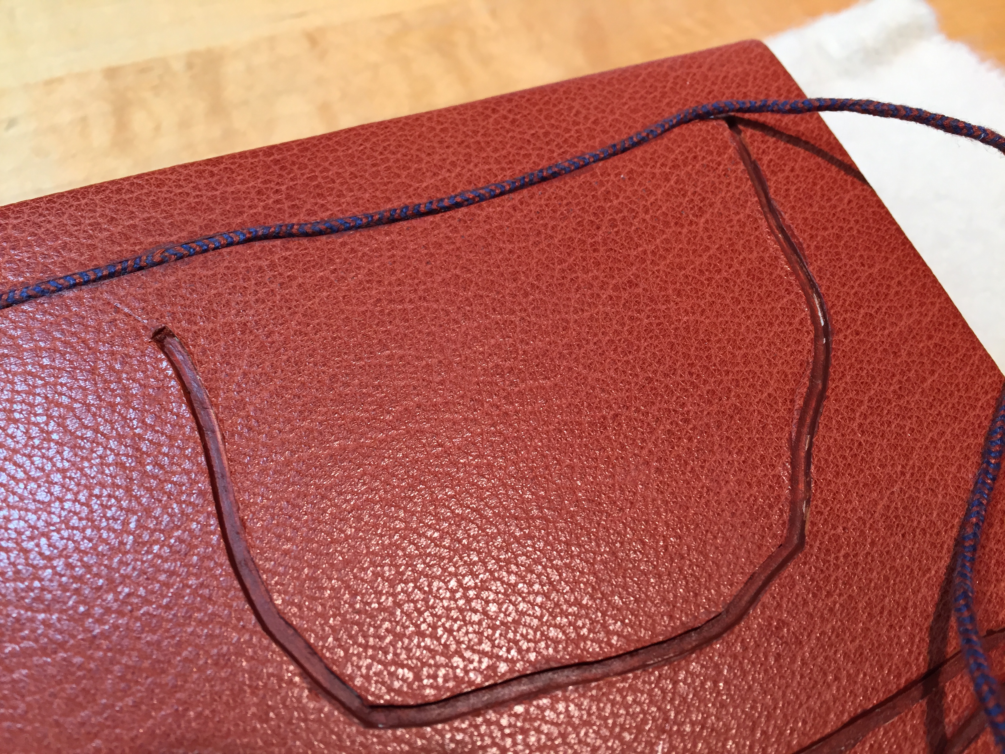
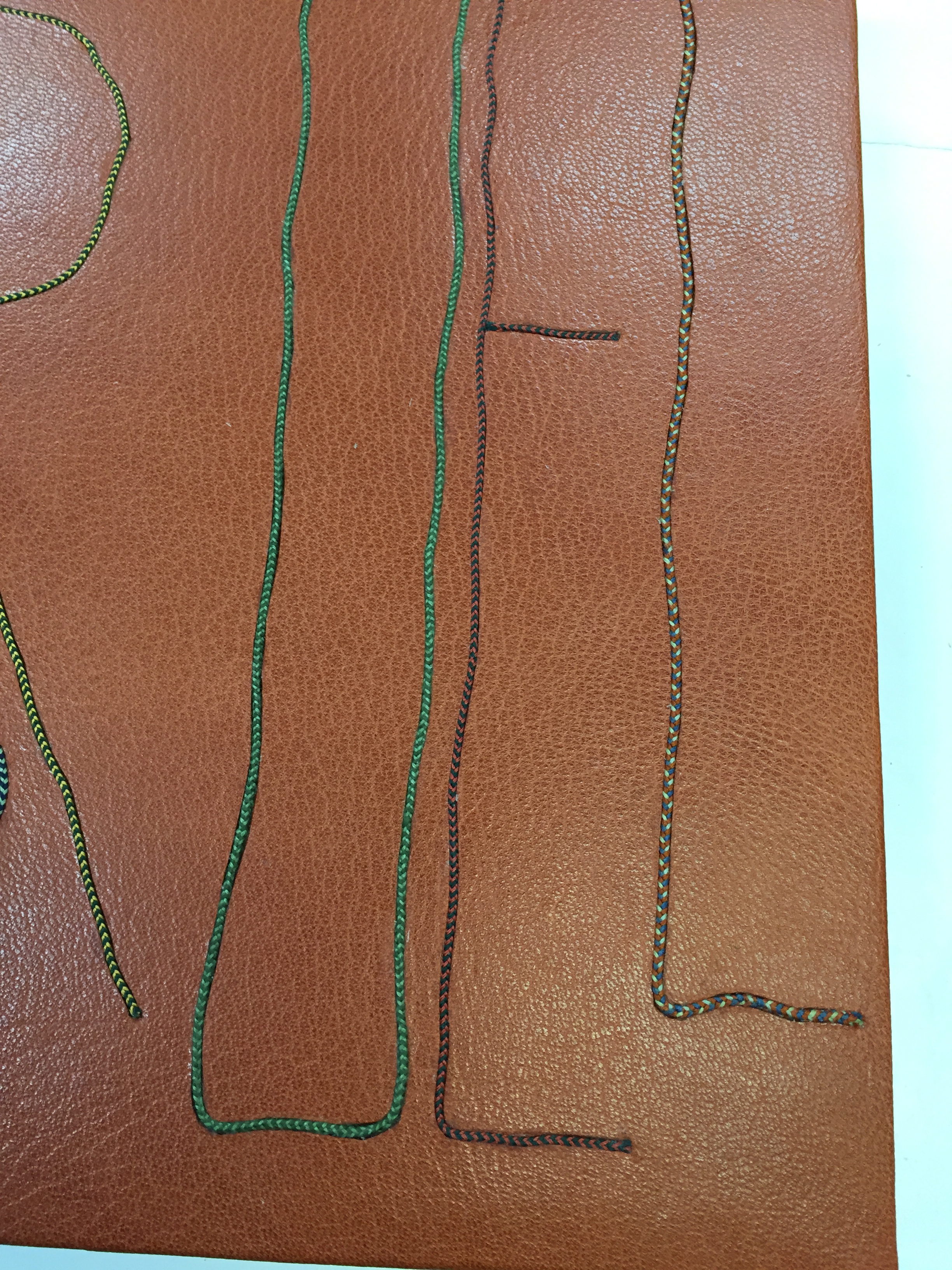
On first encounter, that snail-shell structure of this double-sided accordion book challenges the reader/viewer. Should the work be completely unfurled? Should it stand on its edge, or be laid flat then turned over? To try to read La grande muraille in those ways, however, is to overlook the multi-page spreads that Sharoff conceived with François Da Ros. The snail-shell form, its multi-page spreads and the text demand that you read La grande muraille as you unroll it or, rather, as you unfold it.
With the book laid flat, the “page spreads” are easier to recognize, the text is easier to read, and the forethought needed for the “imposition” of text and images to deliver the sequential text, easier to marvel at. As each recto page is turned to the right, two new pages appear to the right. This unfolding approach to reading the book offers several intriguing “double- and multi-page spreads” and an experience of the texts and eight prints in the sequence driven by the text. When you have finished reading in this sequence, you will have read both sides of the scroll.
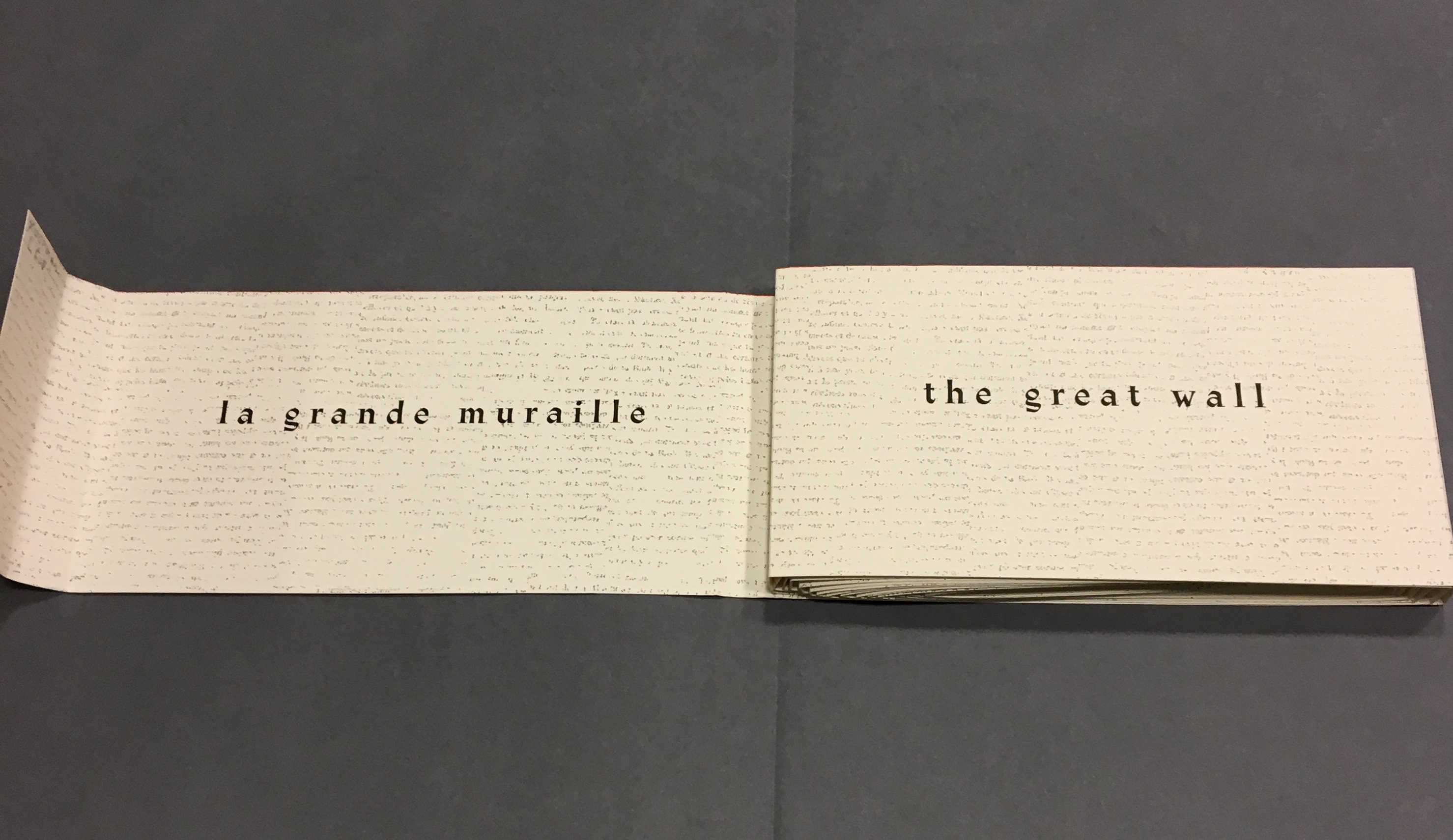
As “page 2” is turned to the right and the English title of the work disappears, “pages 3 and 4” come into view.
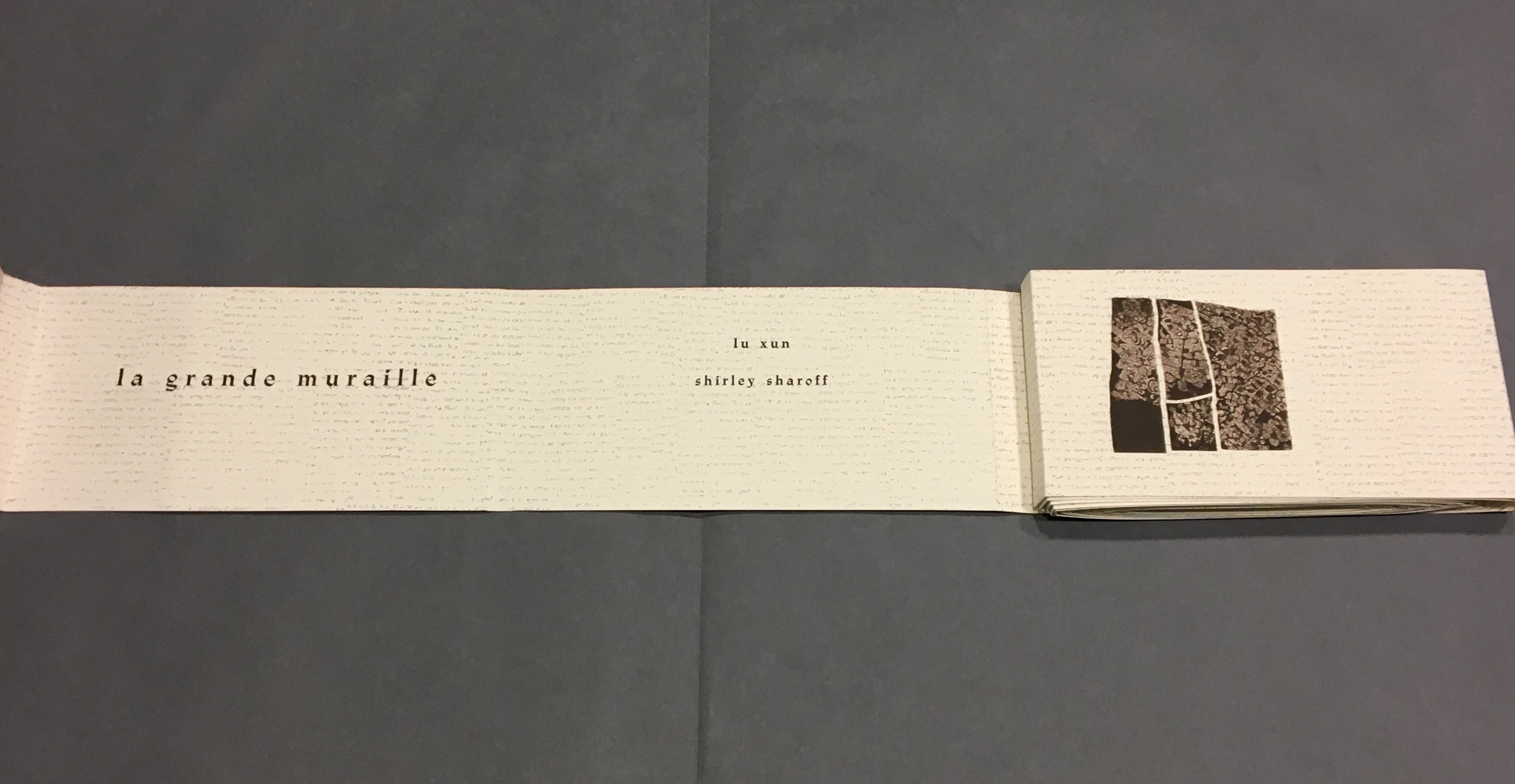
“Page 3” displays the authors names, and “page 4” displays the first of eight prints in the book. As “page 4” is turned to the right and disappears, “pages 5 and 6” appear.
“Page 5” gives the title of the book in Chinese calligraphy. On “page 6”, the opening line of Lu Xun’s text appears in English, French and Chinese.
Turning “page 1” to the right will cover the authors’ names on “page 3”, and turning “page 6” to the right will yield the next four-page view.
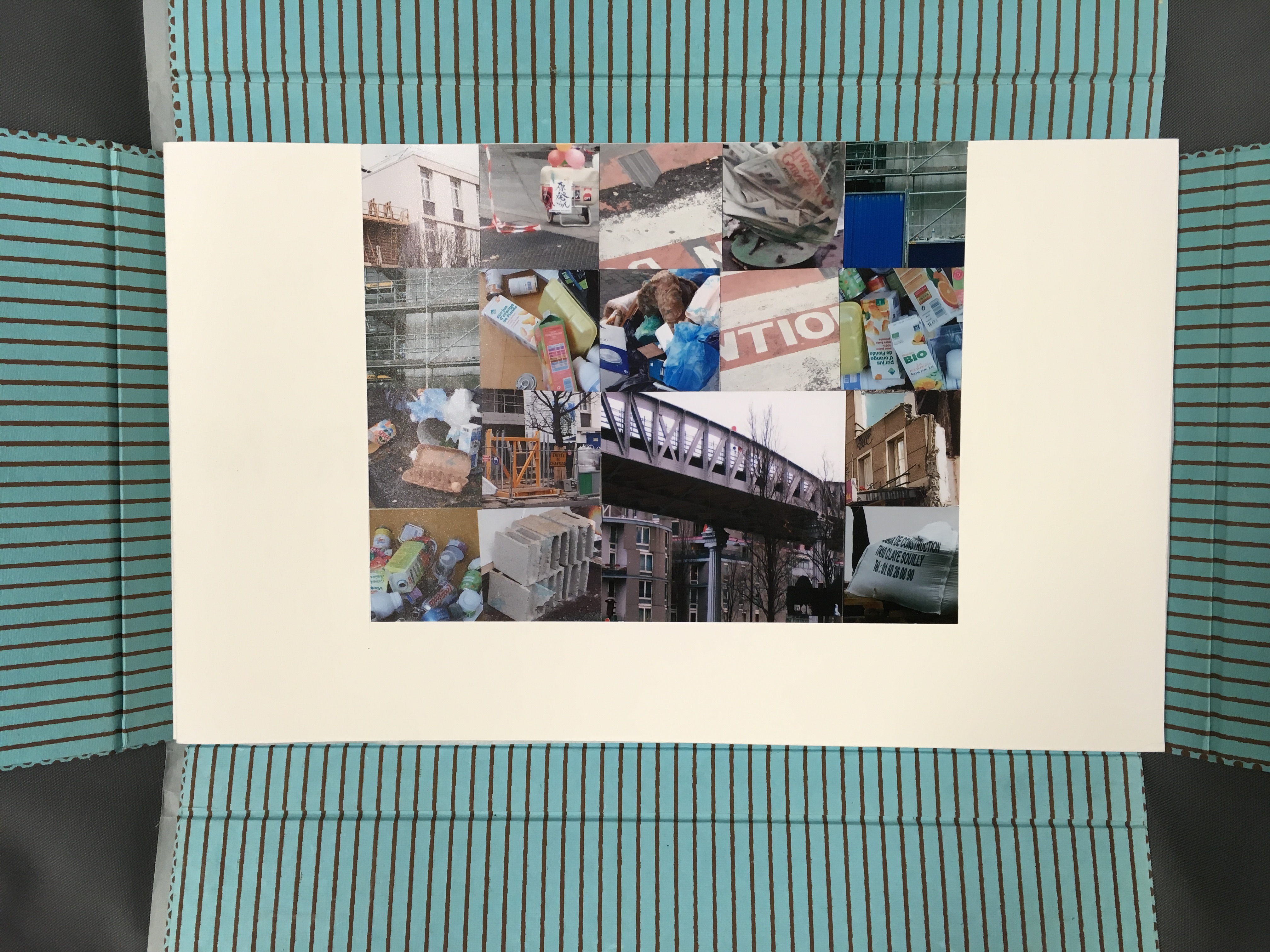
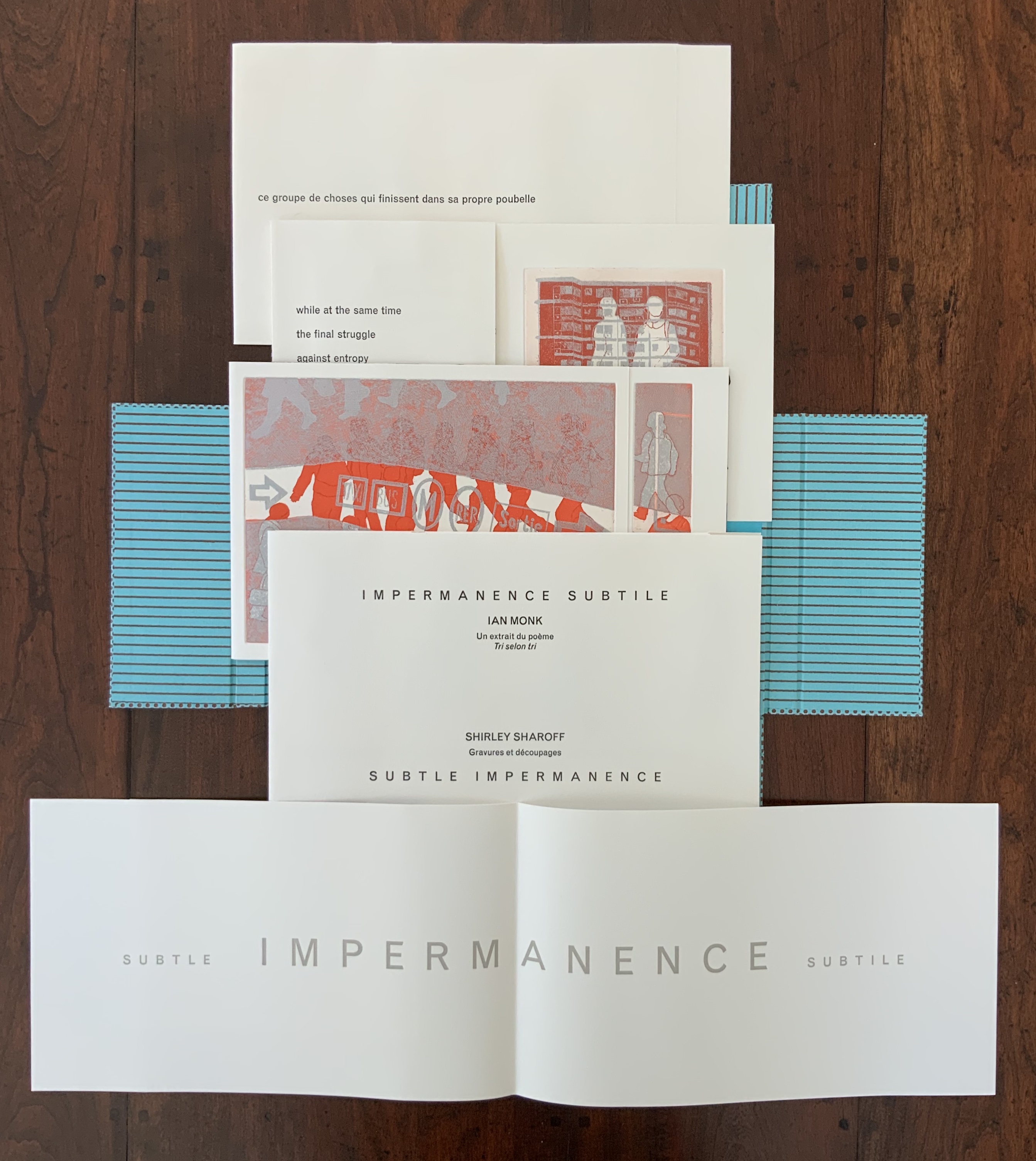
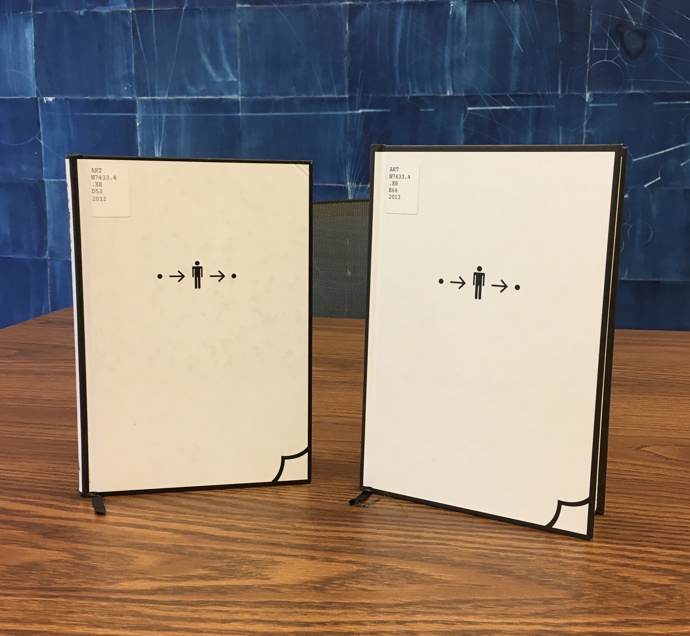
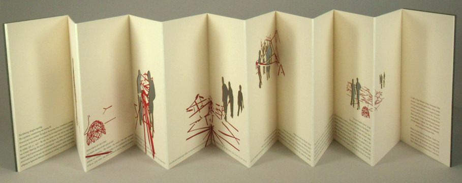
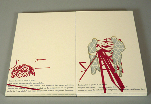
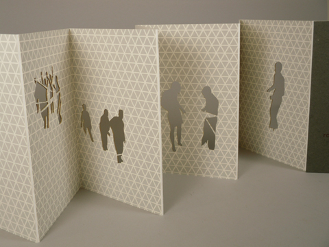
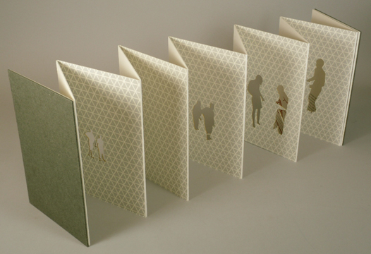
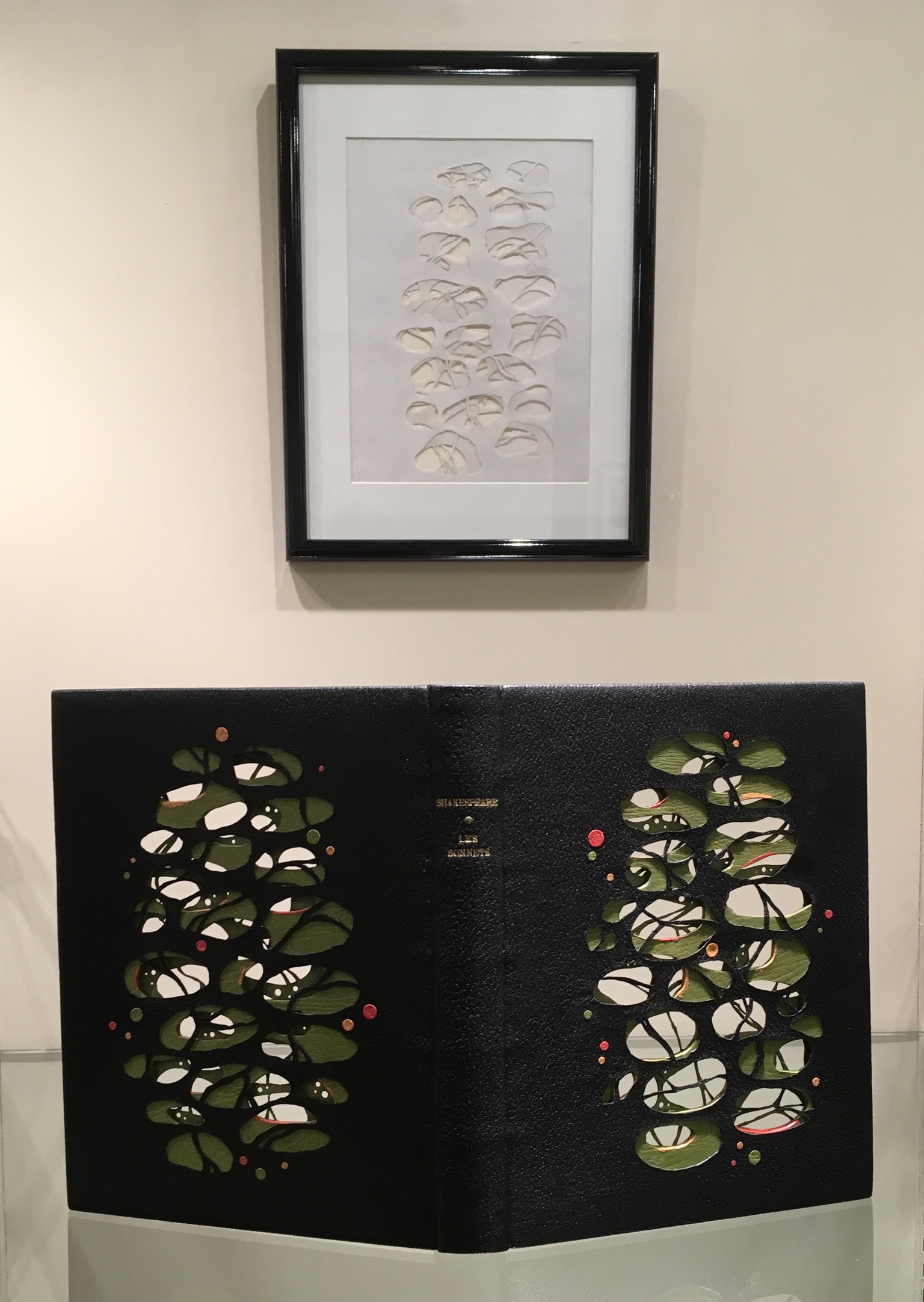
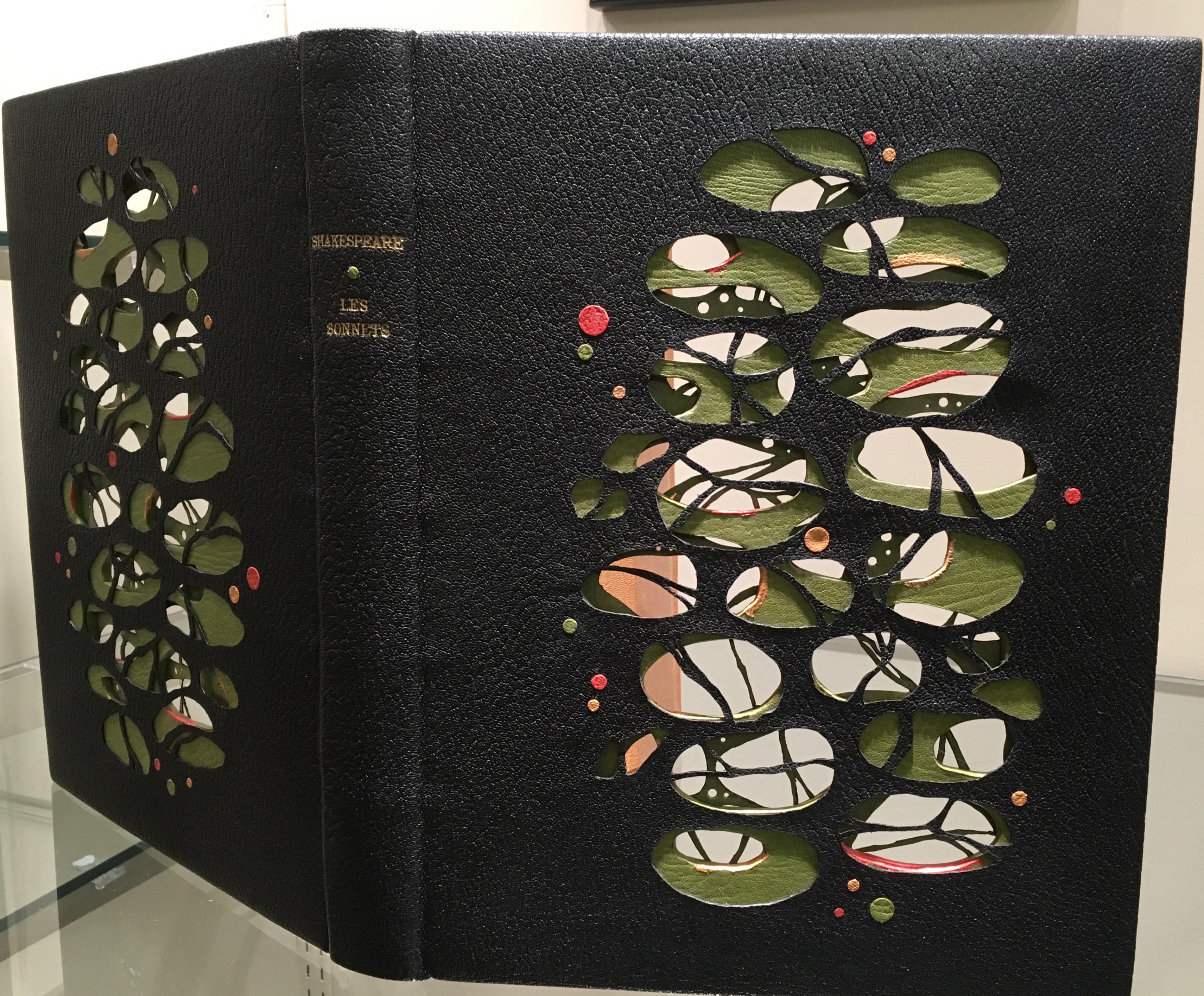
La grande muraille is a rare work, viewable at the Koninklijke Bibliotheek in The Hague and these other locations. Almost as rare but still available from the artist is Impermanence subtile/Subtle Impermanence (2013), in which Sharoff continues her experimentation with structures. She returns to the cased portfolio and folios of OVI but introduces fraction folds (two-thirds, etc.), vertical flaps and an accordion structure with mountain folds. In collage-like manner, silhouettes and cutouts of modern everywoman and everyman move through their urban working and shopping environment. And vice versa, images of the environment behind the cut-outs move through everywoman and everyman!
Sharoff’s everyman and everywoman are in strife with the environment. The portfolio opens with a “collage of garbage” whose relationship to them becomes clear in the ways Sharoff works the fragment of Ian Monk’s poem “Tri selon Tri” (displayed in French and English) in, under and through her prints and book structure.
Shirley Sharoff
Photo: Books On Books at Koninklijke Bibliotheek, Den Haag, Nederlands
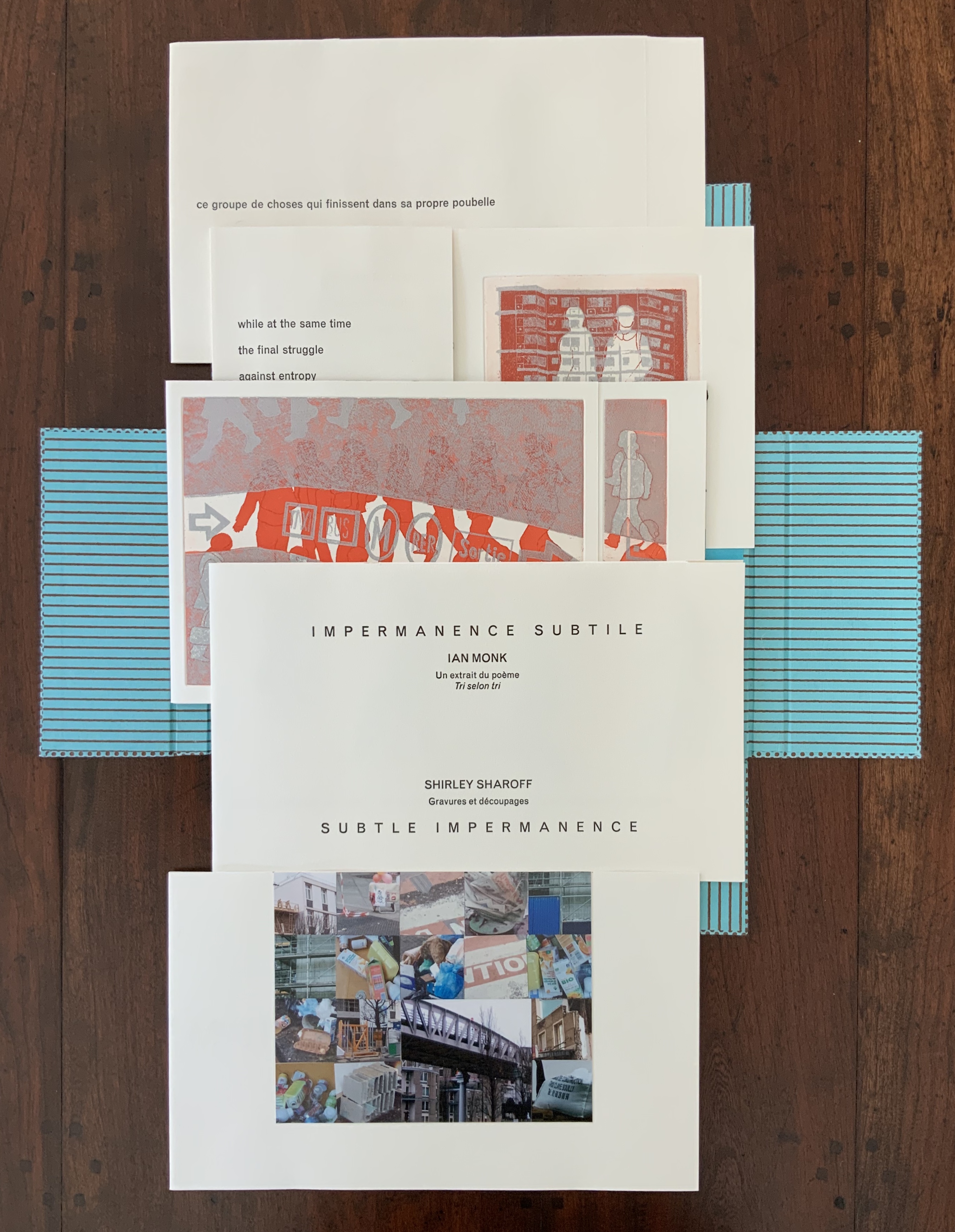
Photo: Books On Books collection
Note the “grammatico-textual” binding of the adjectives around the noun, mirroring the wordplay binding of the poem’s title “Tri selon tri”
Photo: Books On Books collection
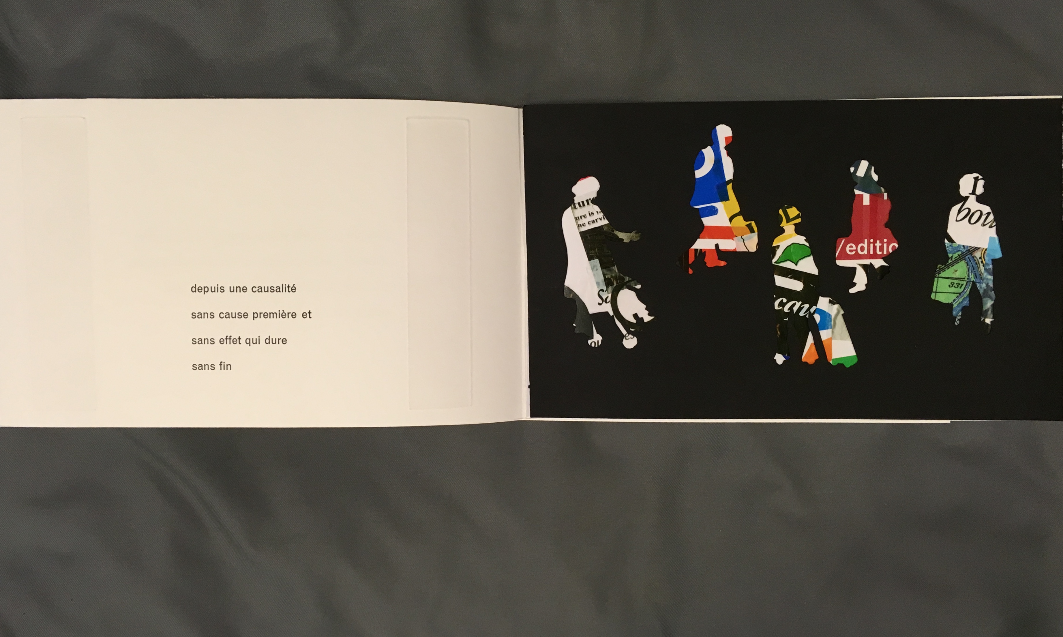
Photo: Books On Books at Koninklijke Bibliotheek, Den Haag, Nederlands
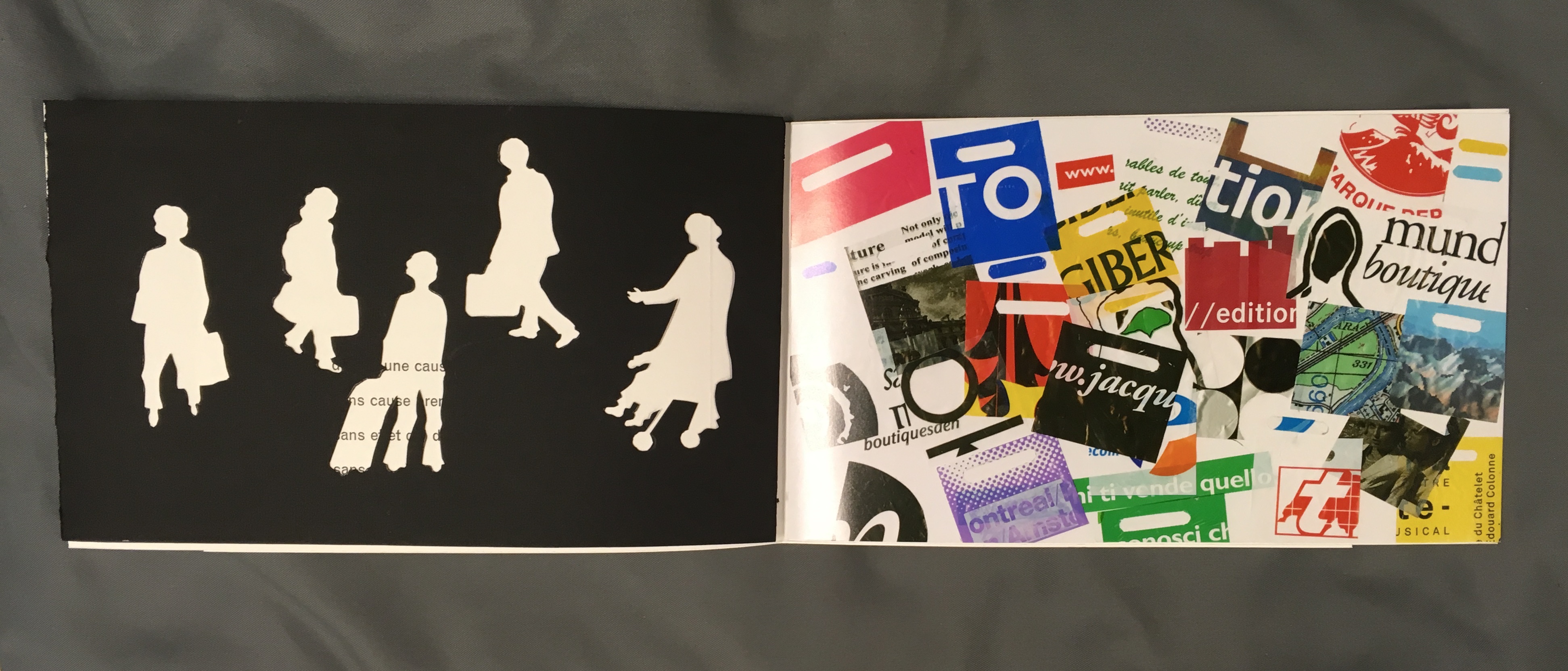
Photo: Books On Books at Koninklijke Bibliotheek, Den Haag, Nederlands
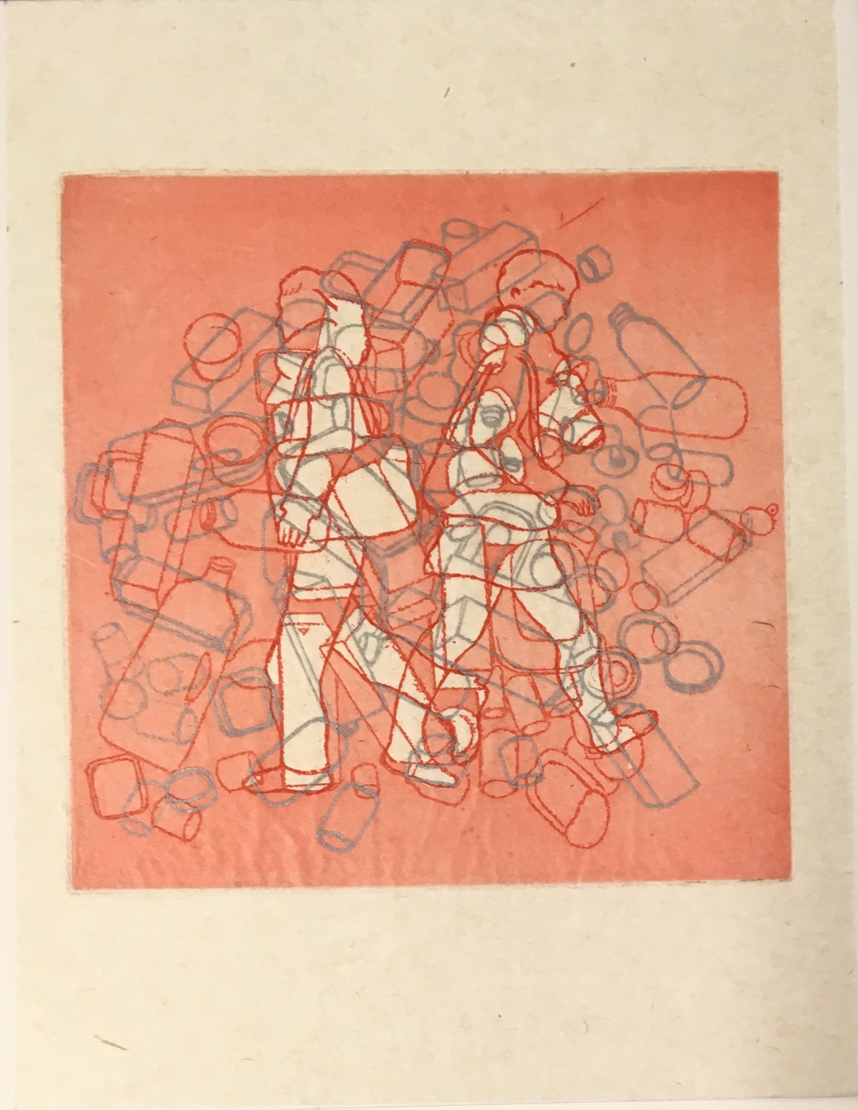
Photo: Books On Books collection
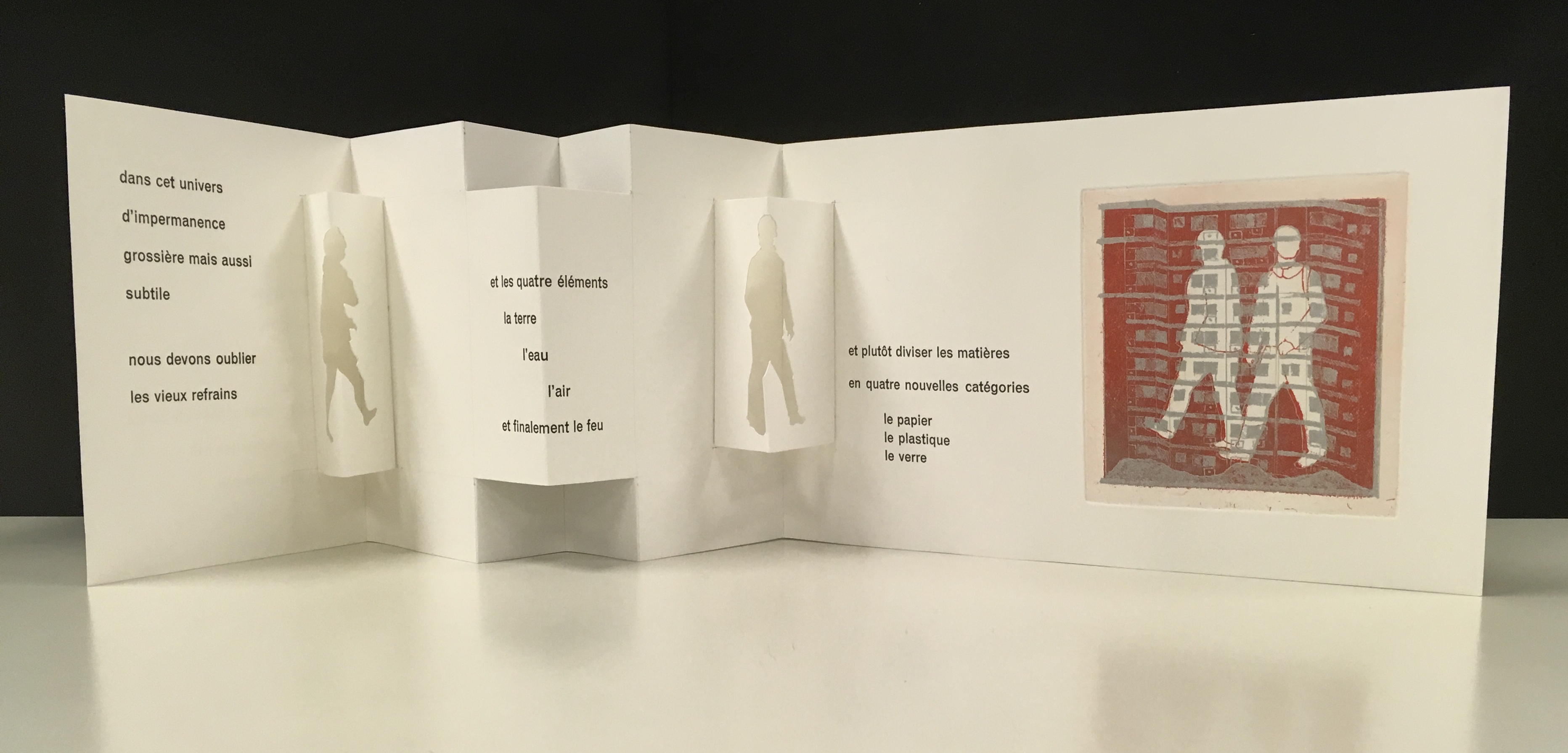
Photo: Books On Books at Koninklijke Bibliotheek, Den Haag, Nederlands
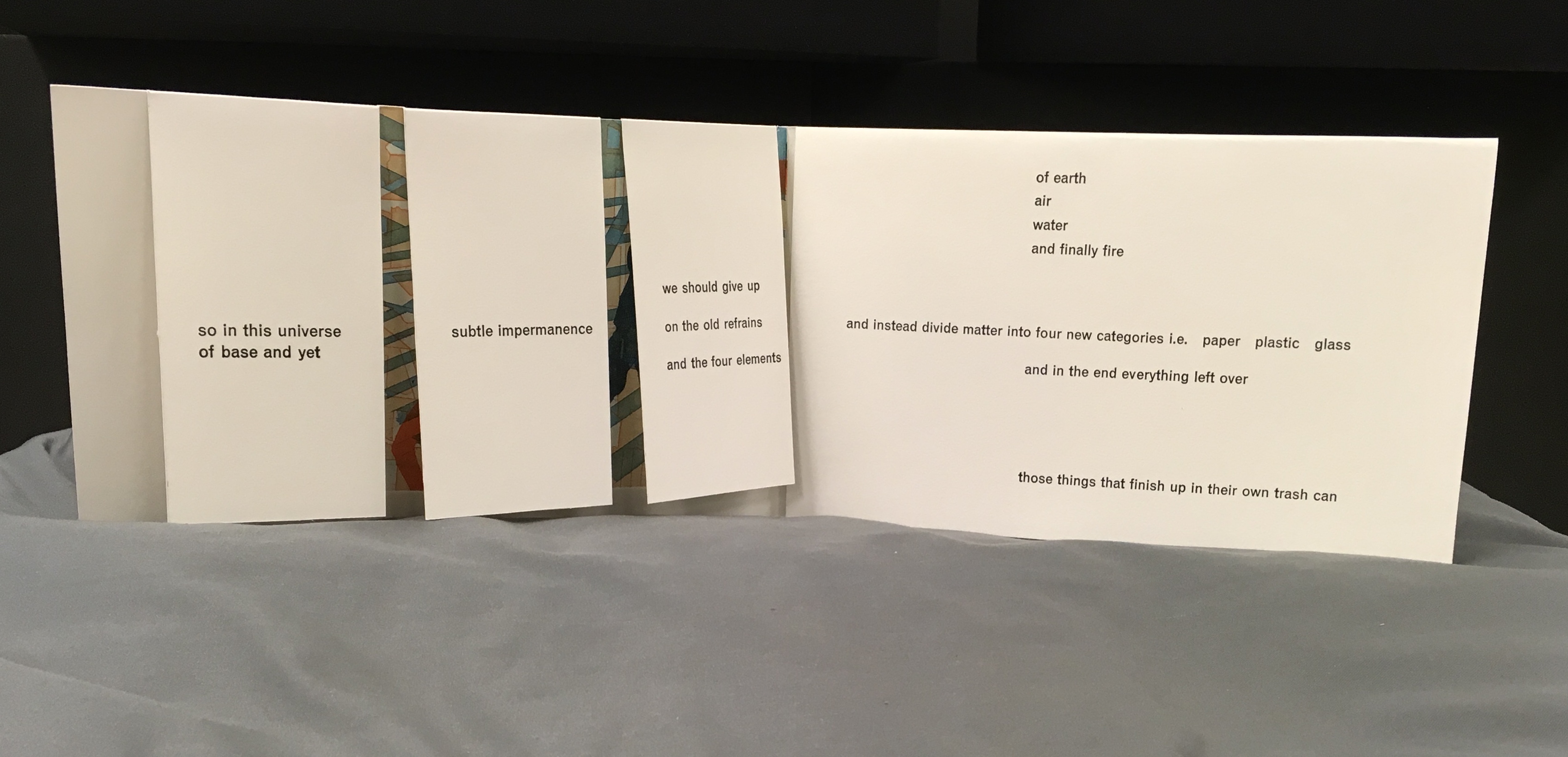
Photo: Books On Books at Koninklijke Bibliotheek, Den Haag, Nederlands
The cutouts of everywoman and everyman fill up with the photos of trash behind them. In the prints, they stroll entangled in bricks and clutter toward an outcome where “in this universe of base and yet subtle impermanence, we should give up on the old refrains and the four elements of earth, air, water and finally fire, and instead divide matter into four new categories, i.e., paper, plastic, glass and in the end everything left over — those things that finish up in their own trash can” — i.e., us!
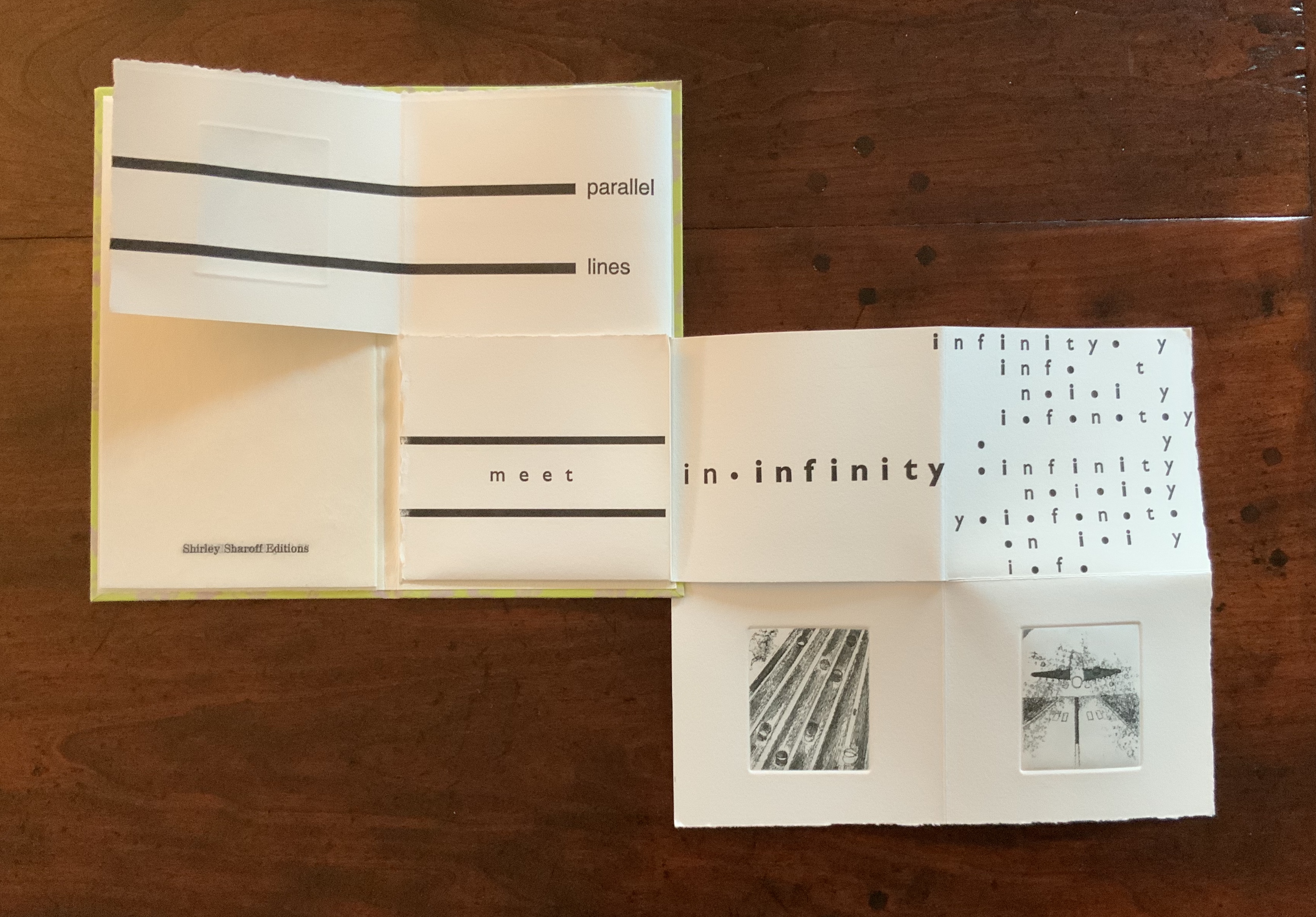
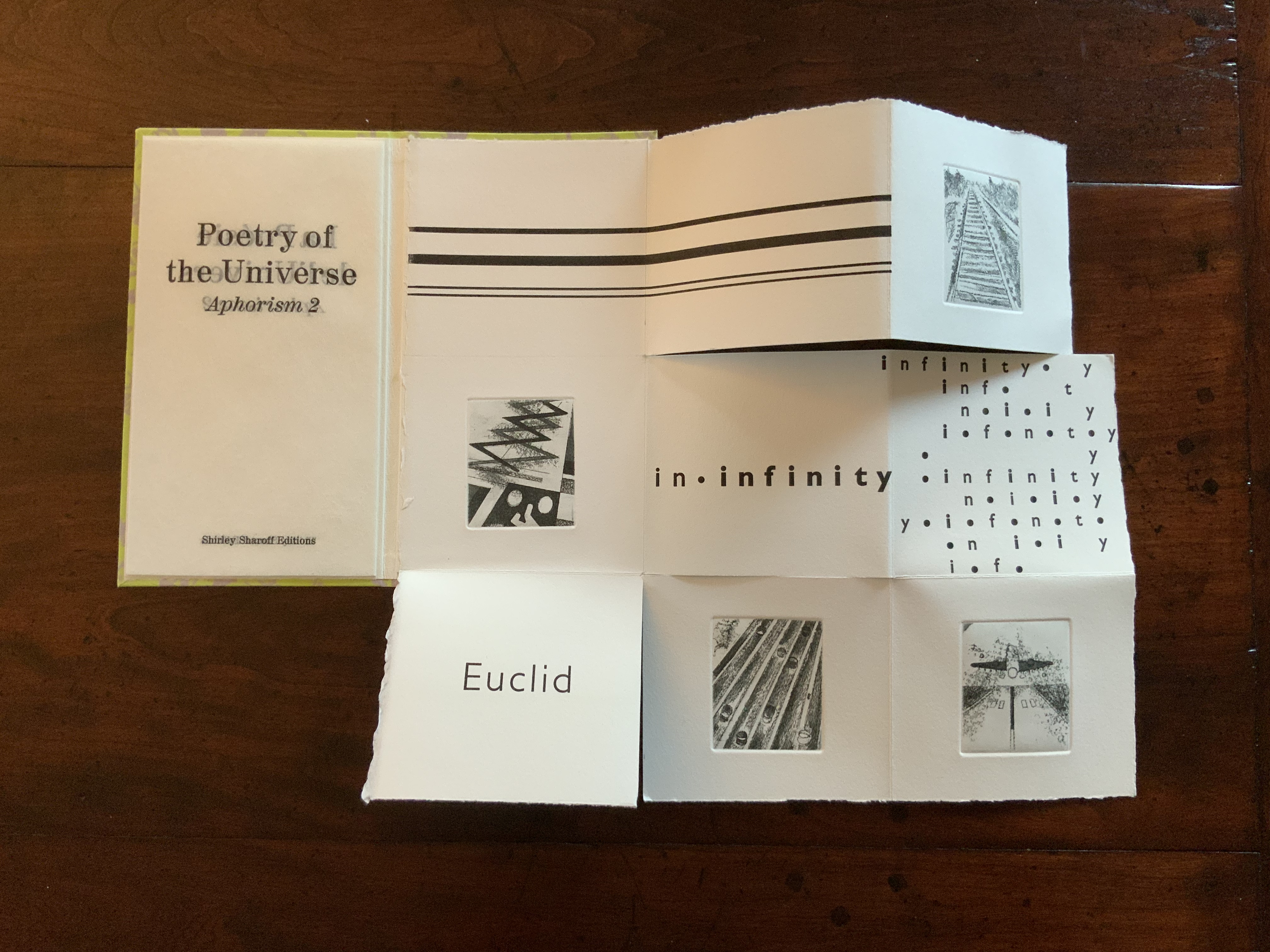
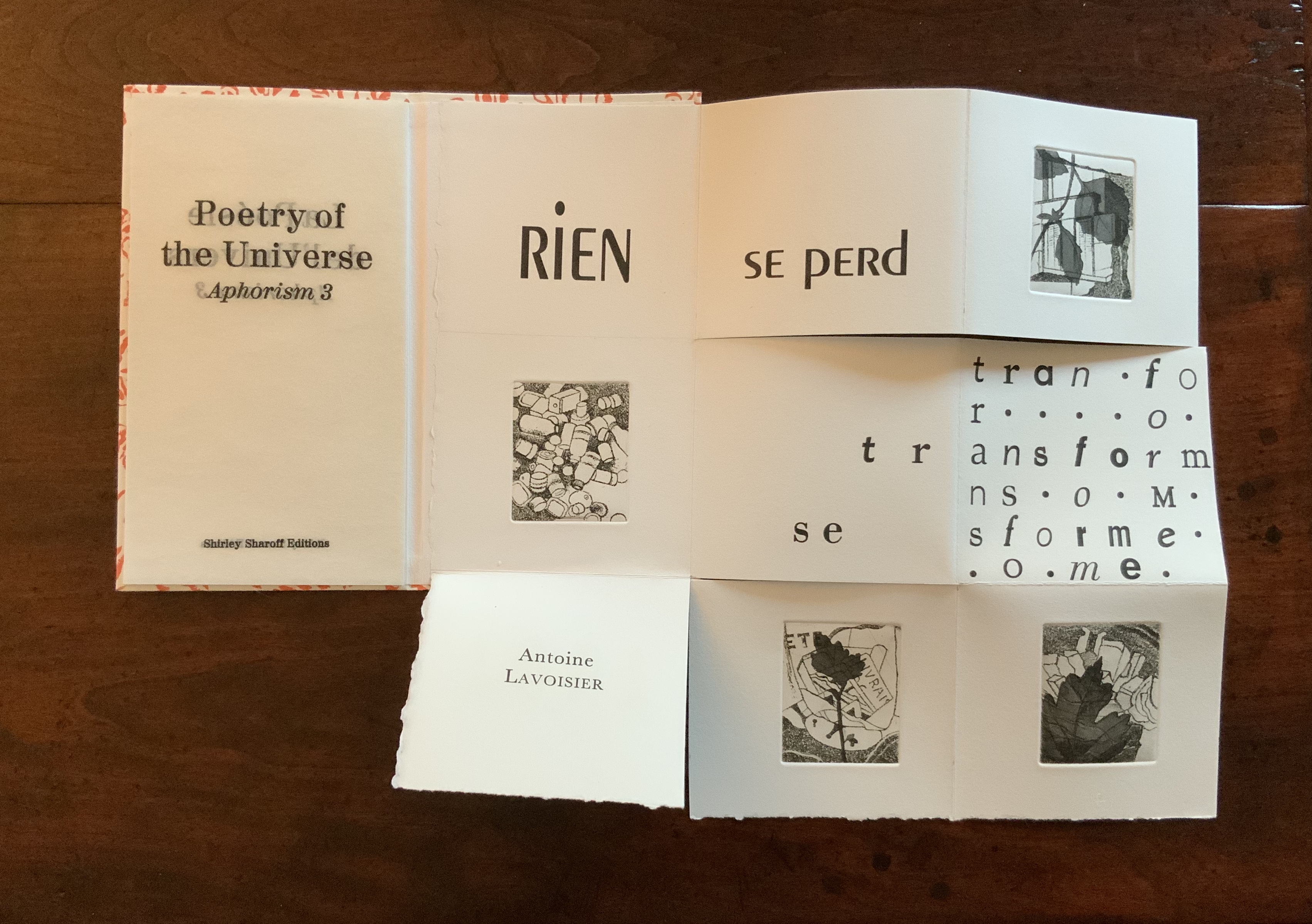
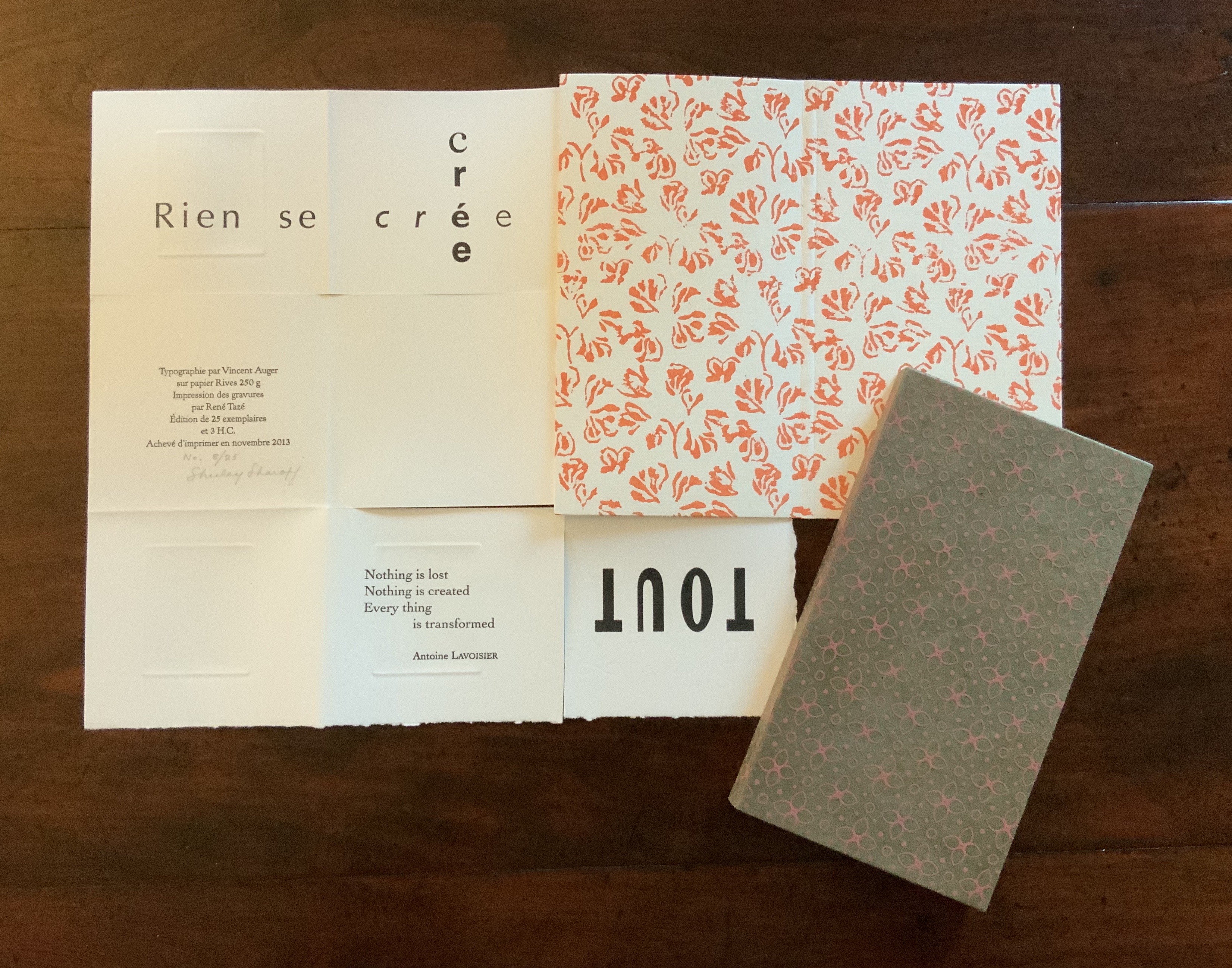
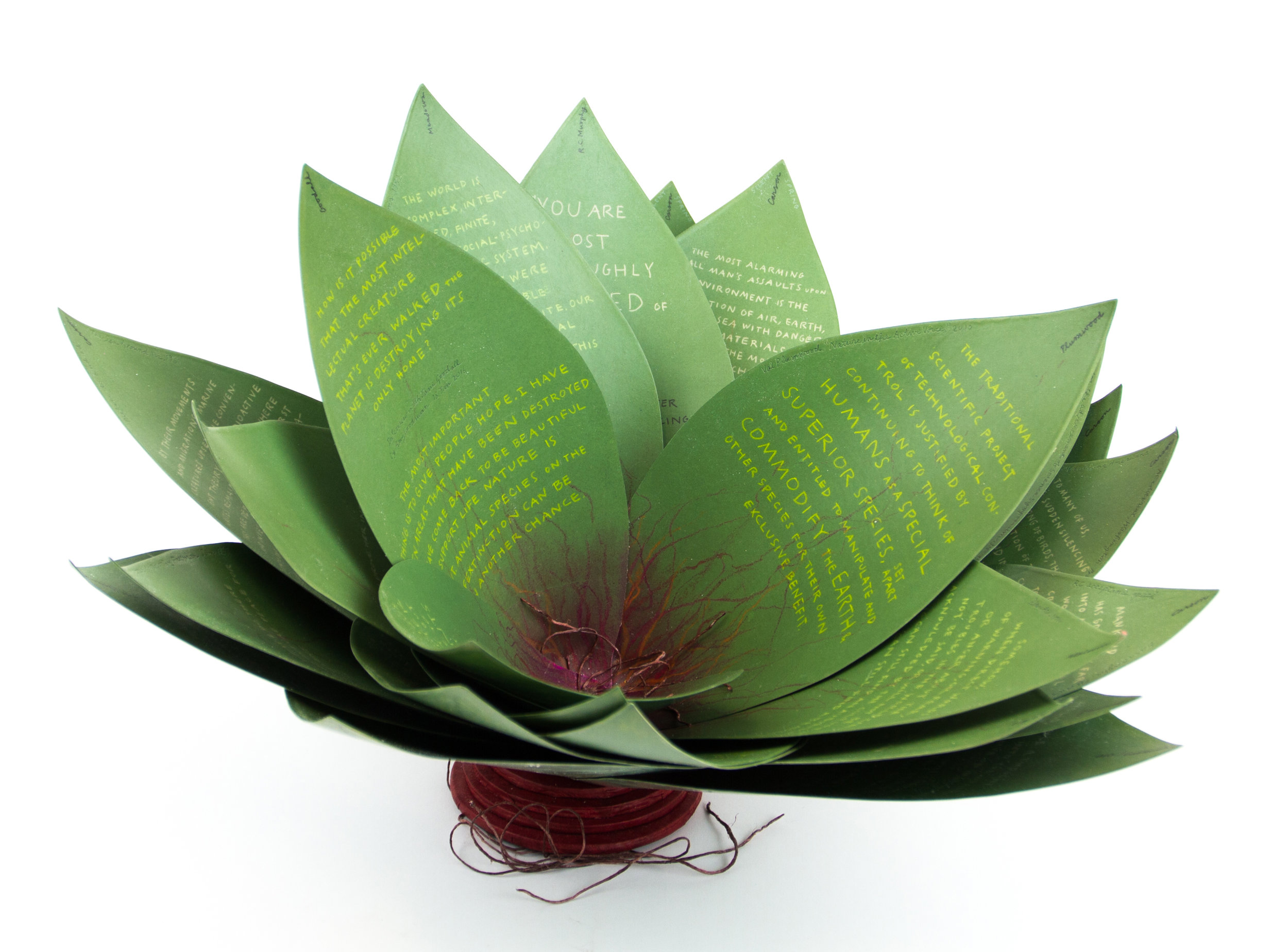
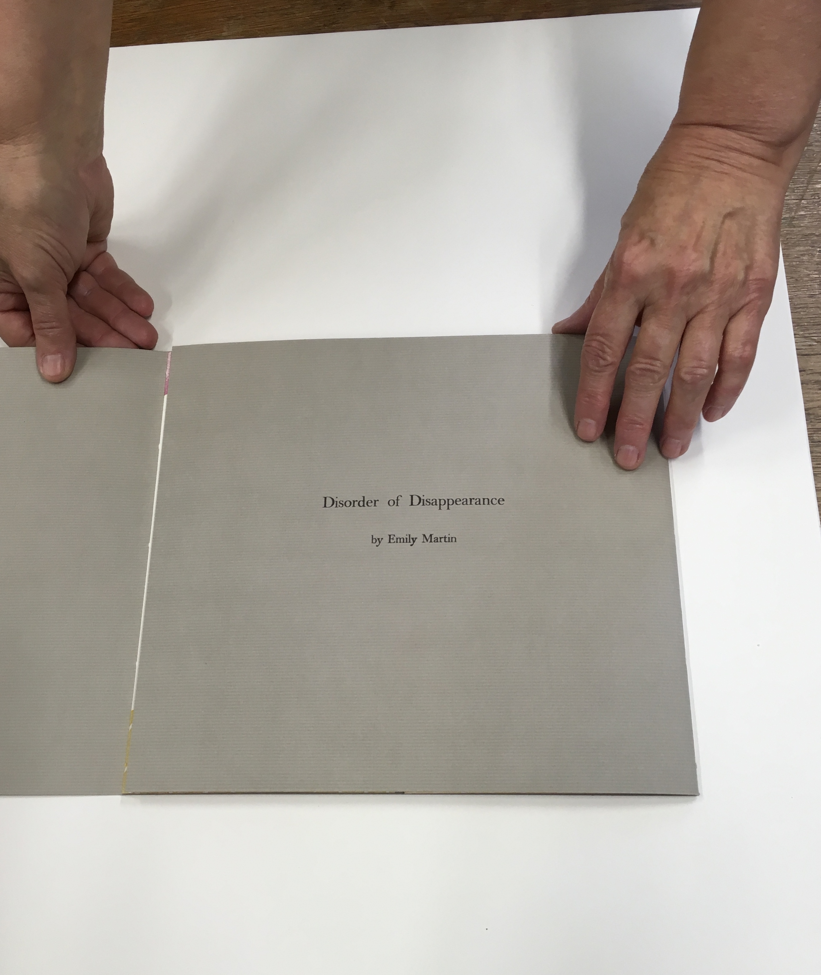
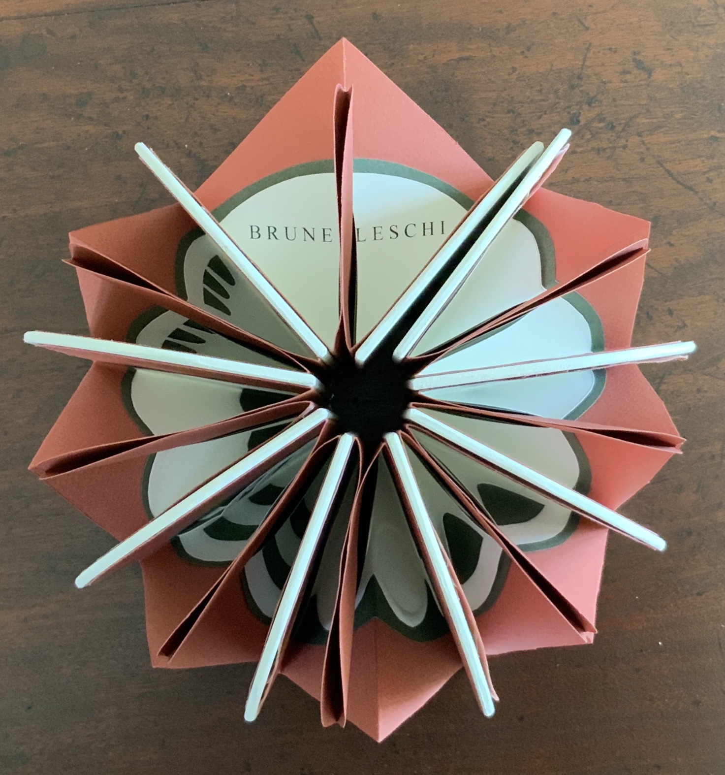
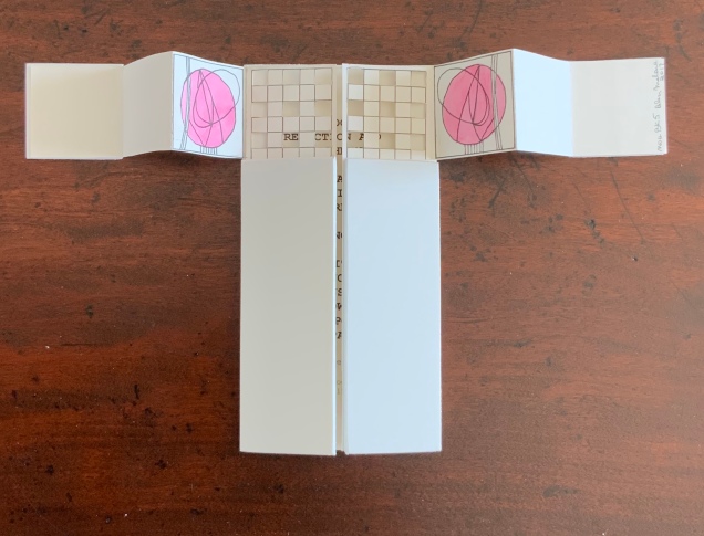
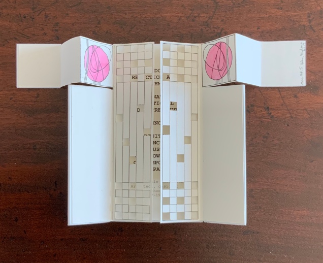
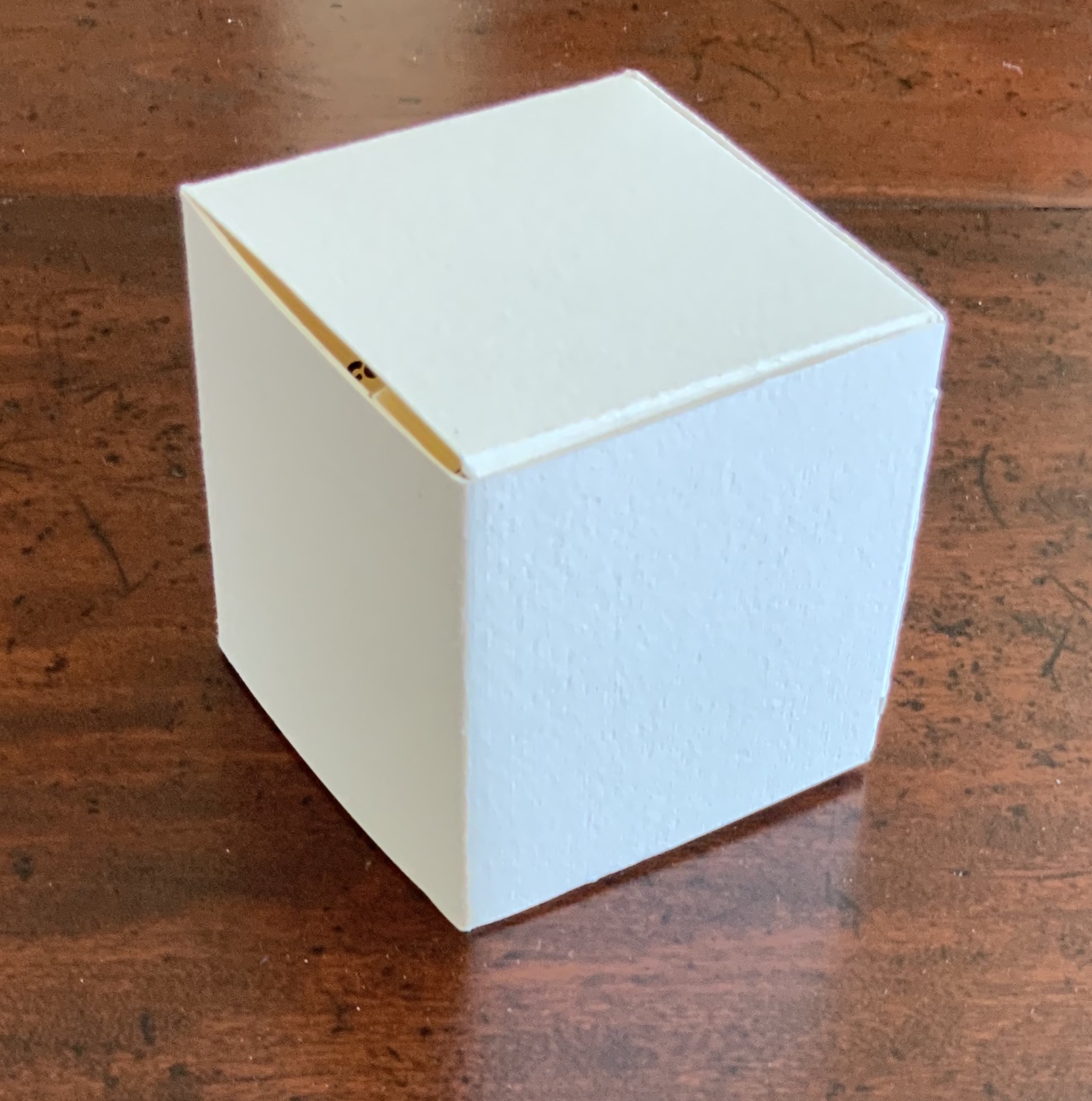
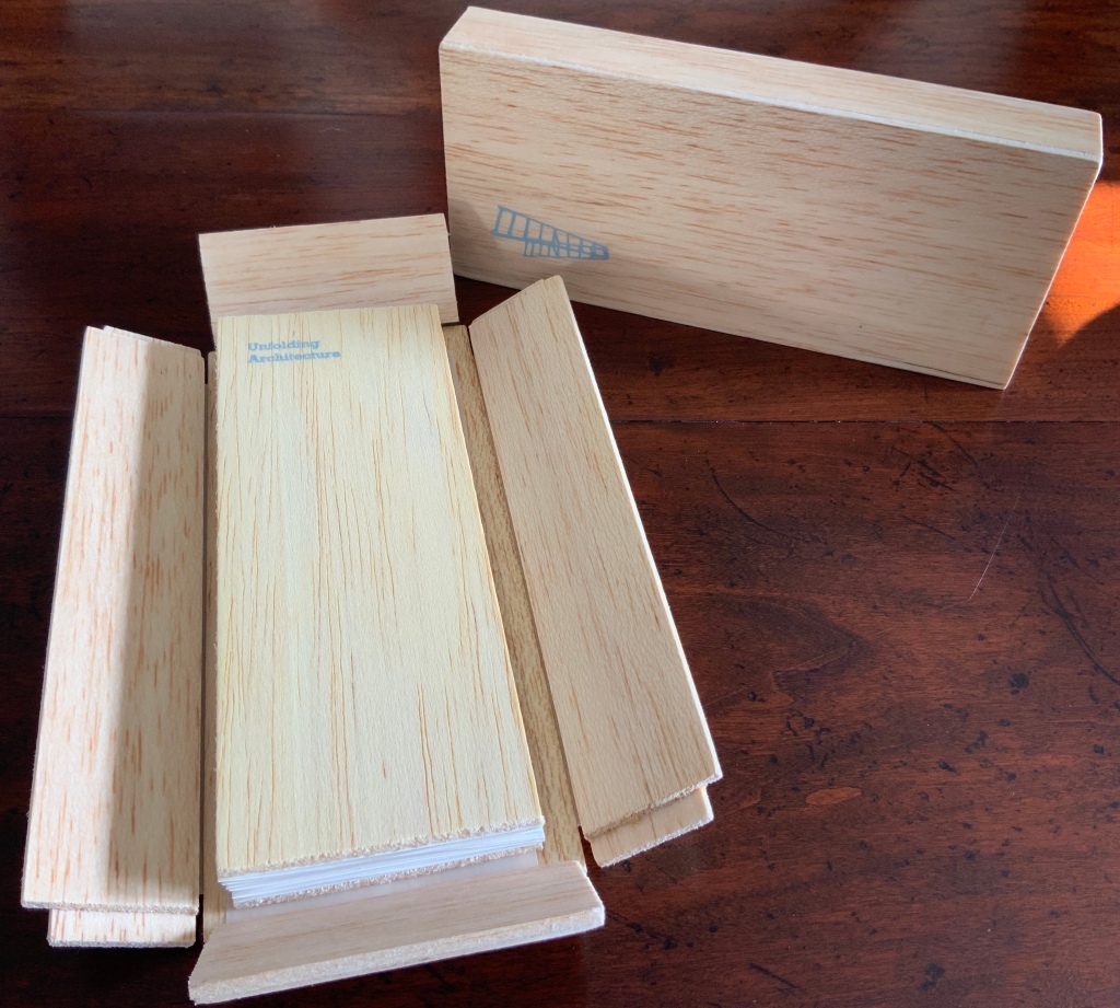
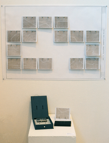
Continuing with the elemental, paradox and structural experiment, La poésie de l’univers (2012-2013) takes up the challenge of the folded single-page codex. In each of the three volumes in the set, the pattern of folds and cuts is the same, yet the pattern’s interplay with the prints and bilingual content in each seems uniquely appropriate. A hat trick of book art magic.
Shirley Sharoff
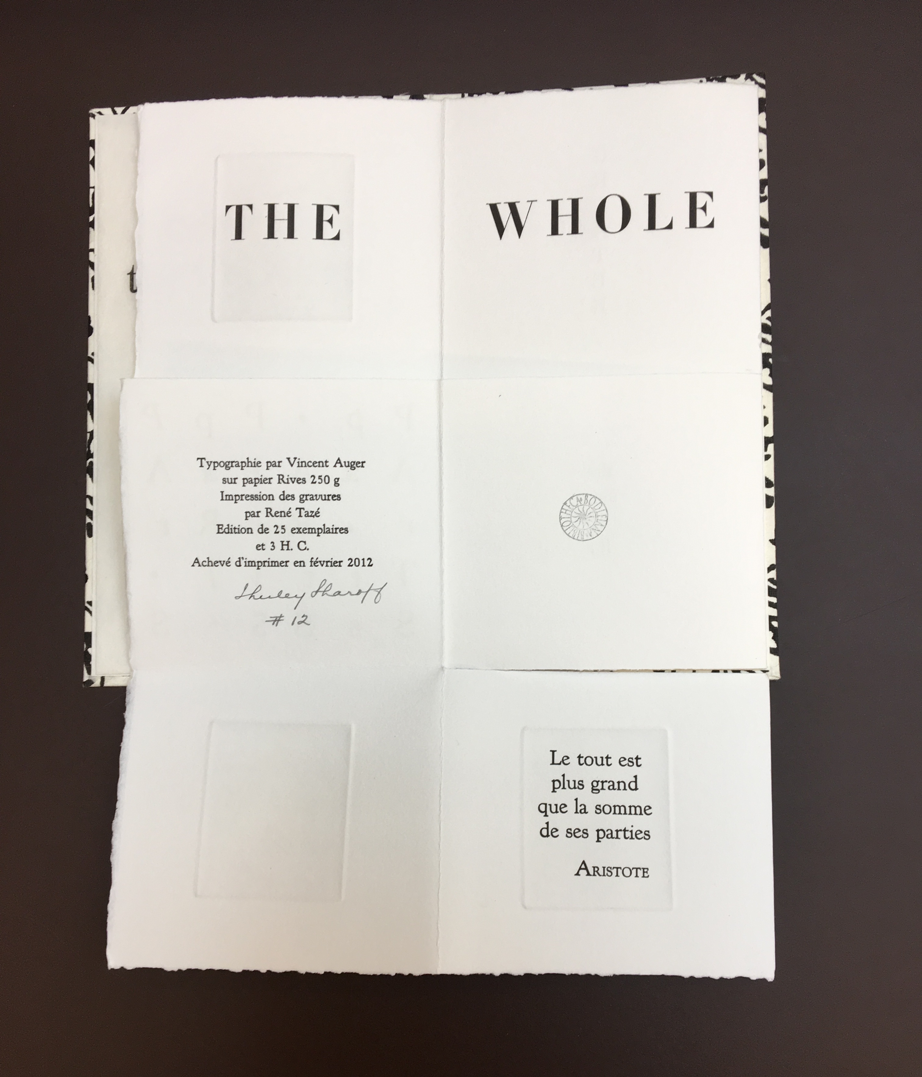
Each volume (12 x 21.5 cm) is housed in a slipcase. The text in each is printed on one sheet of Rives 250 gsm in English and French, folding and unfolding to reveal different aspects of the text and images; 4 prints in each book. Edition of 25
The Poetry of the Universe consists of three aphorisms: Aristotle’s “The whole is greater than the sum of its parts”; Euclid’s “Parallel lines meet in infinity”; and Lavoisier’s “Nothing is lost, nothing is created, everything is transformed”. As mentioned with La grande muraille, the execution is exquisite, and likewise, learning to read the work requires exploration.
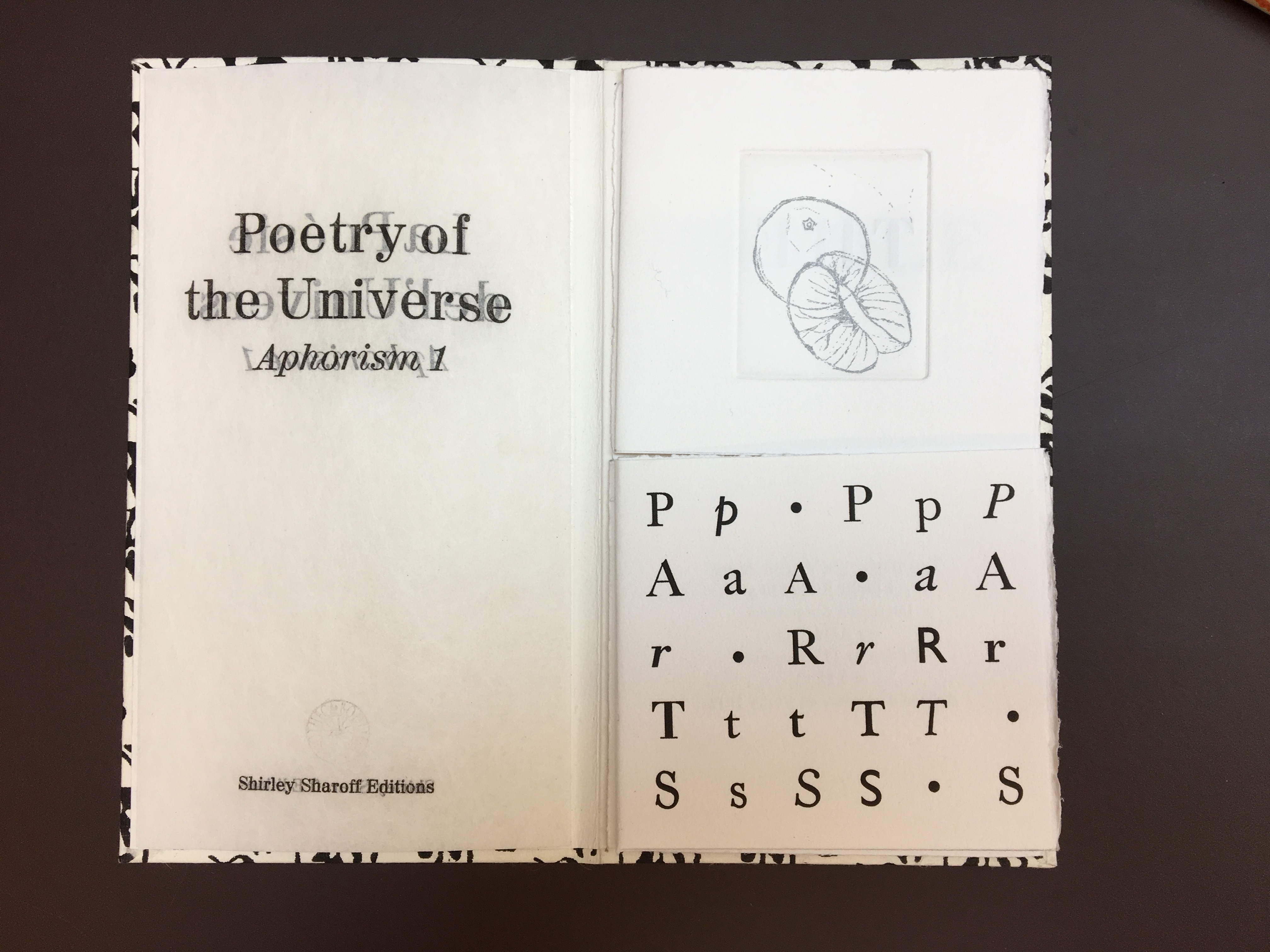
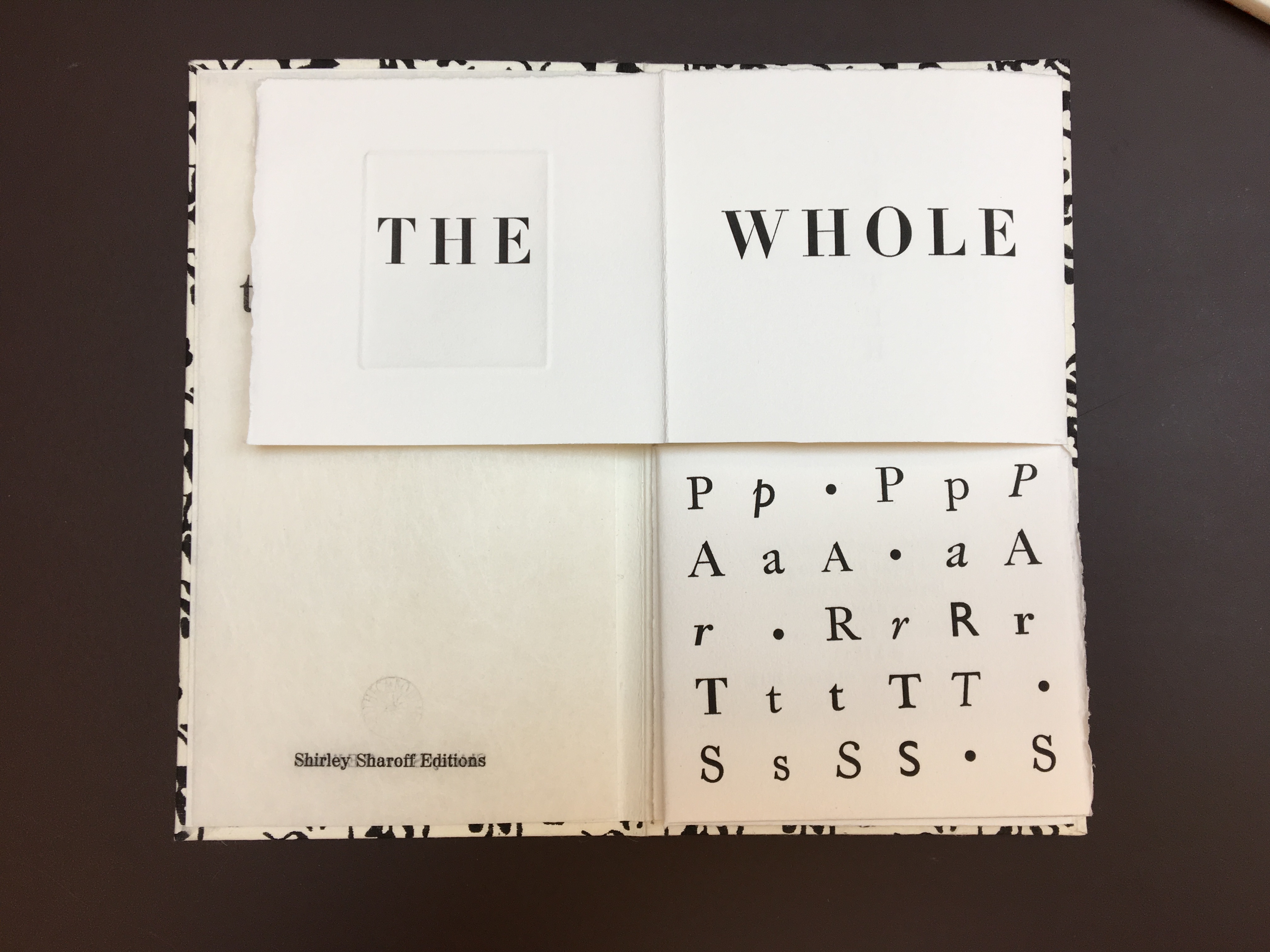
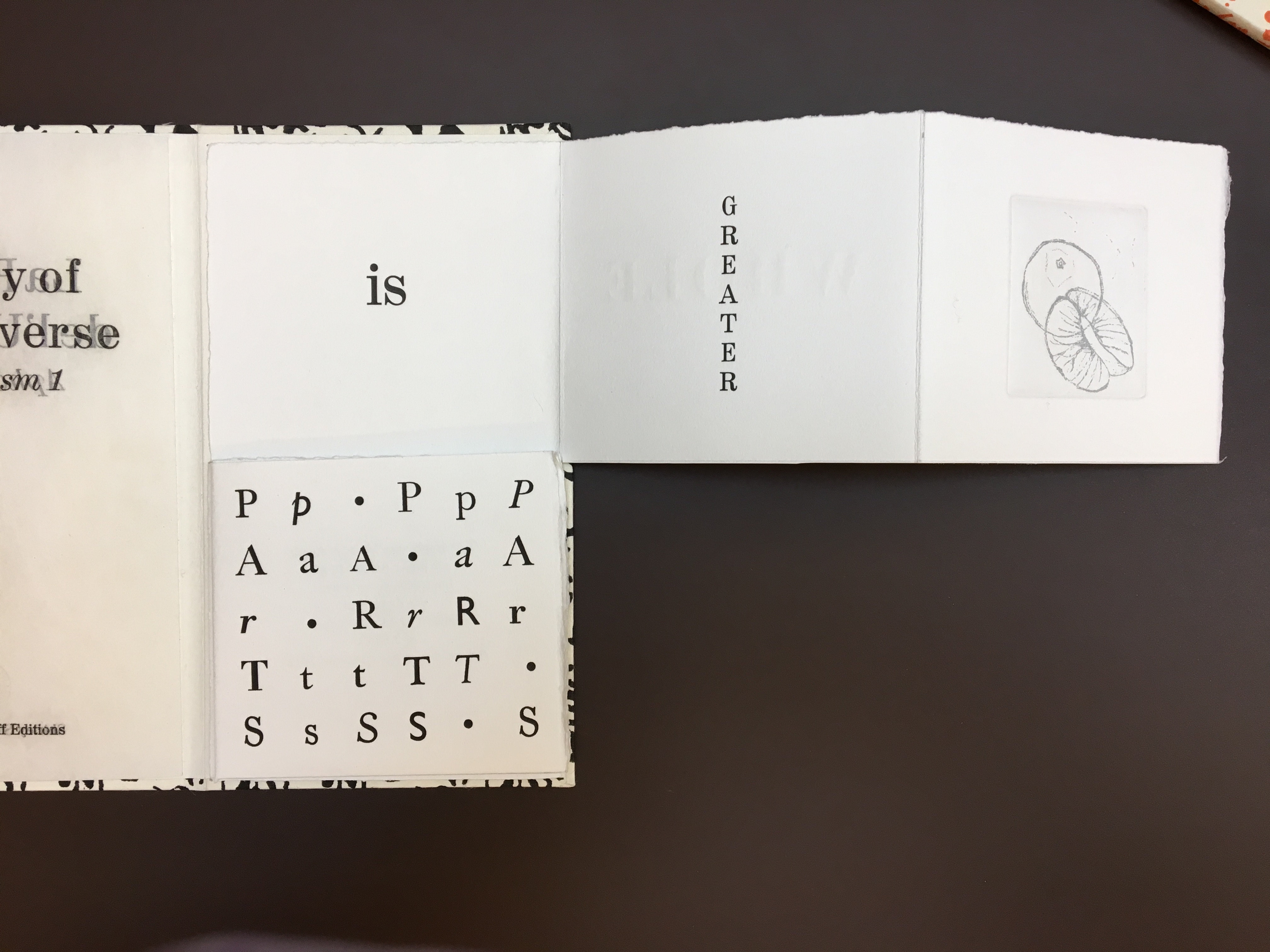
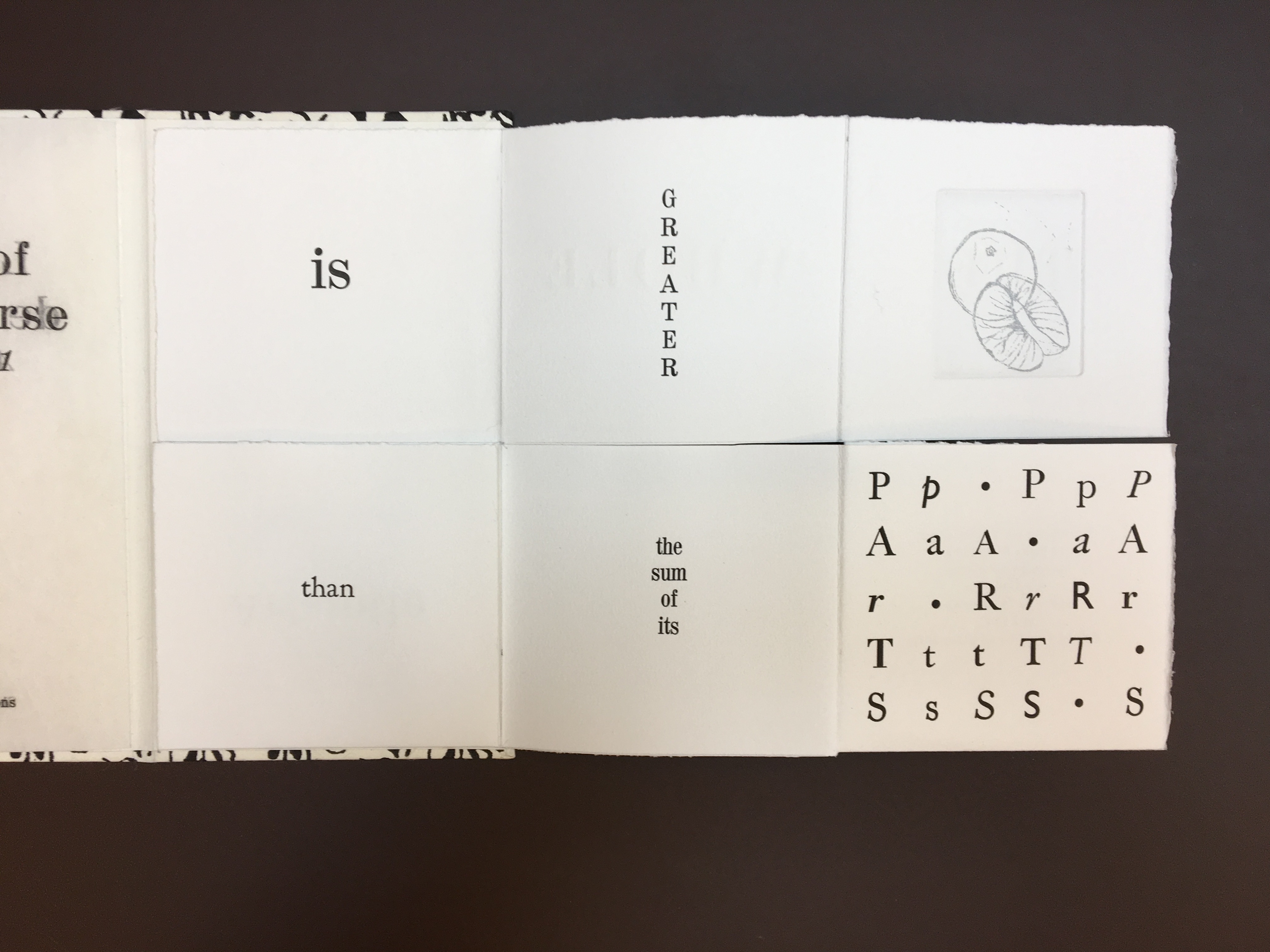
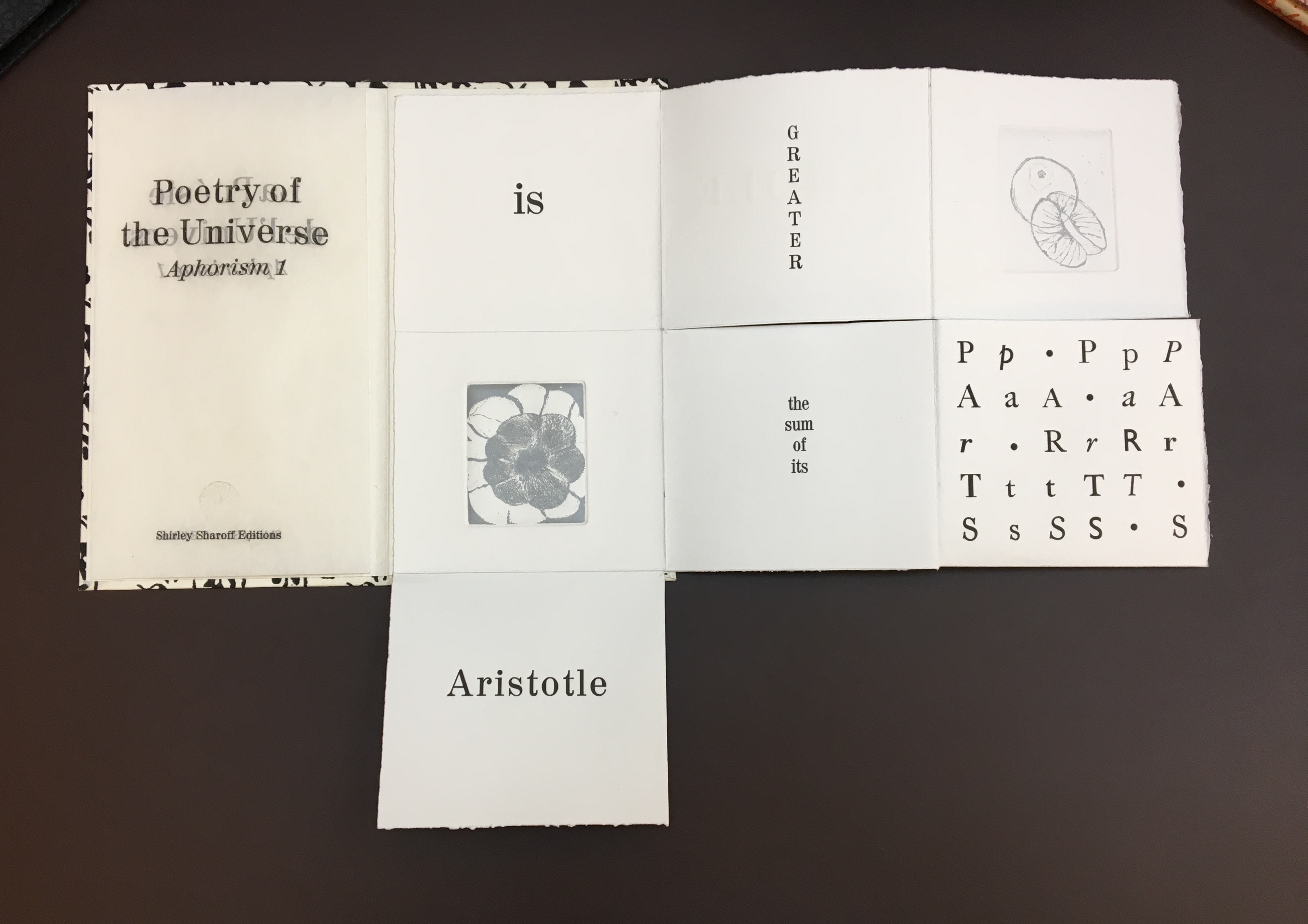
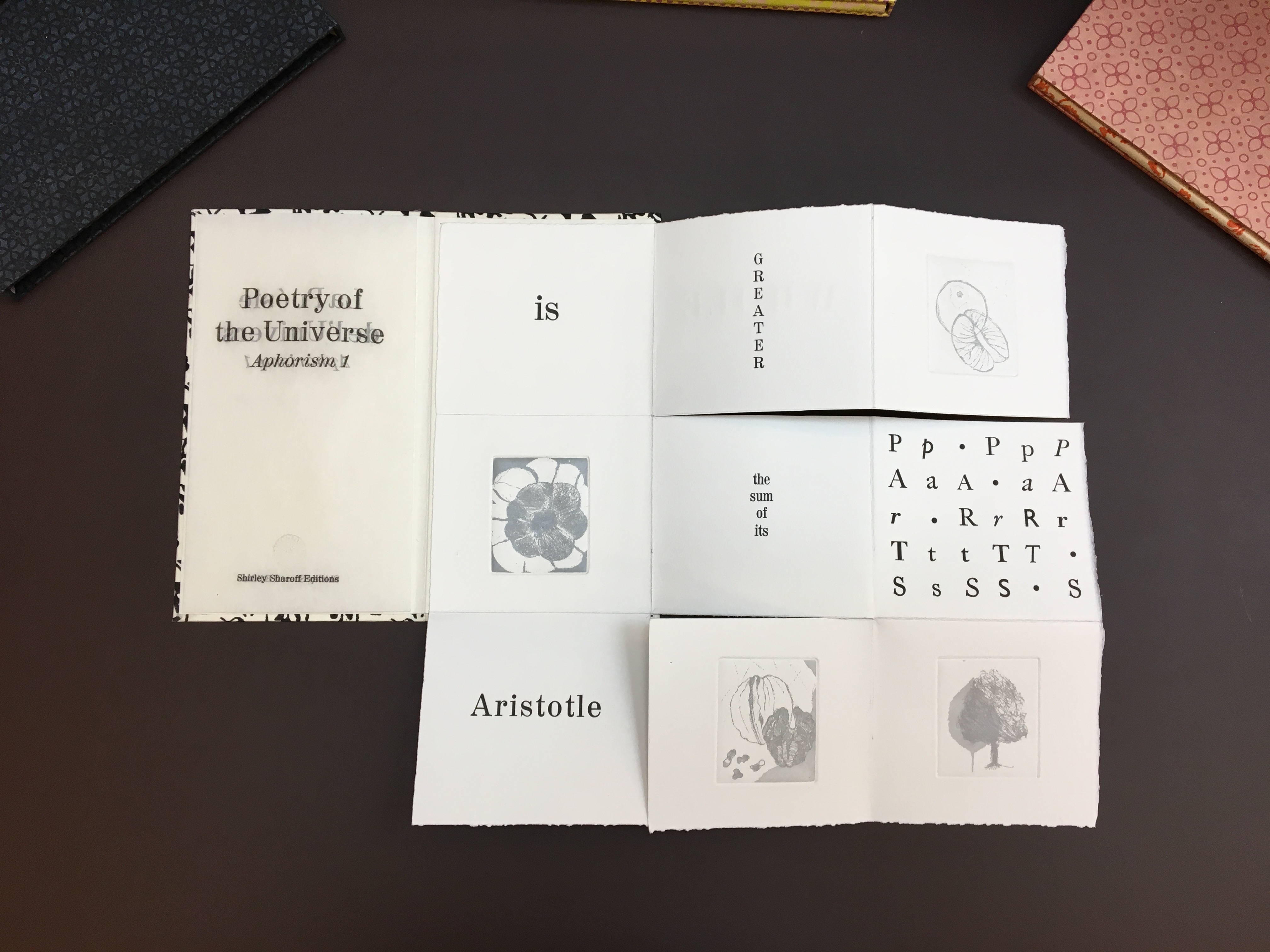
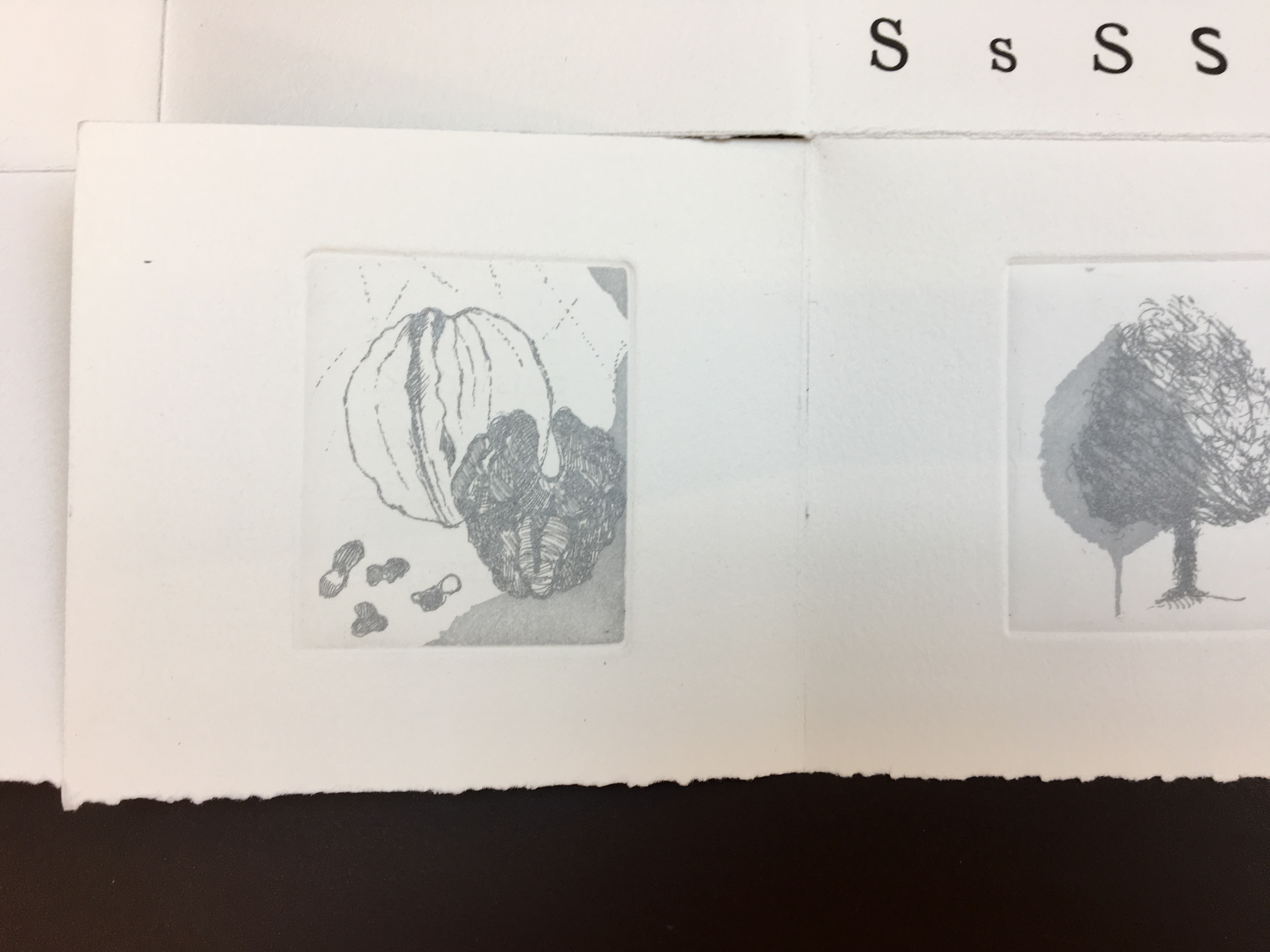
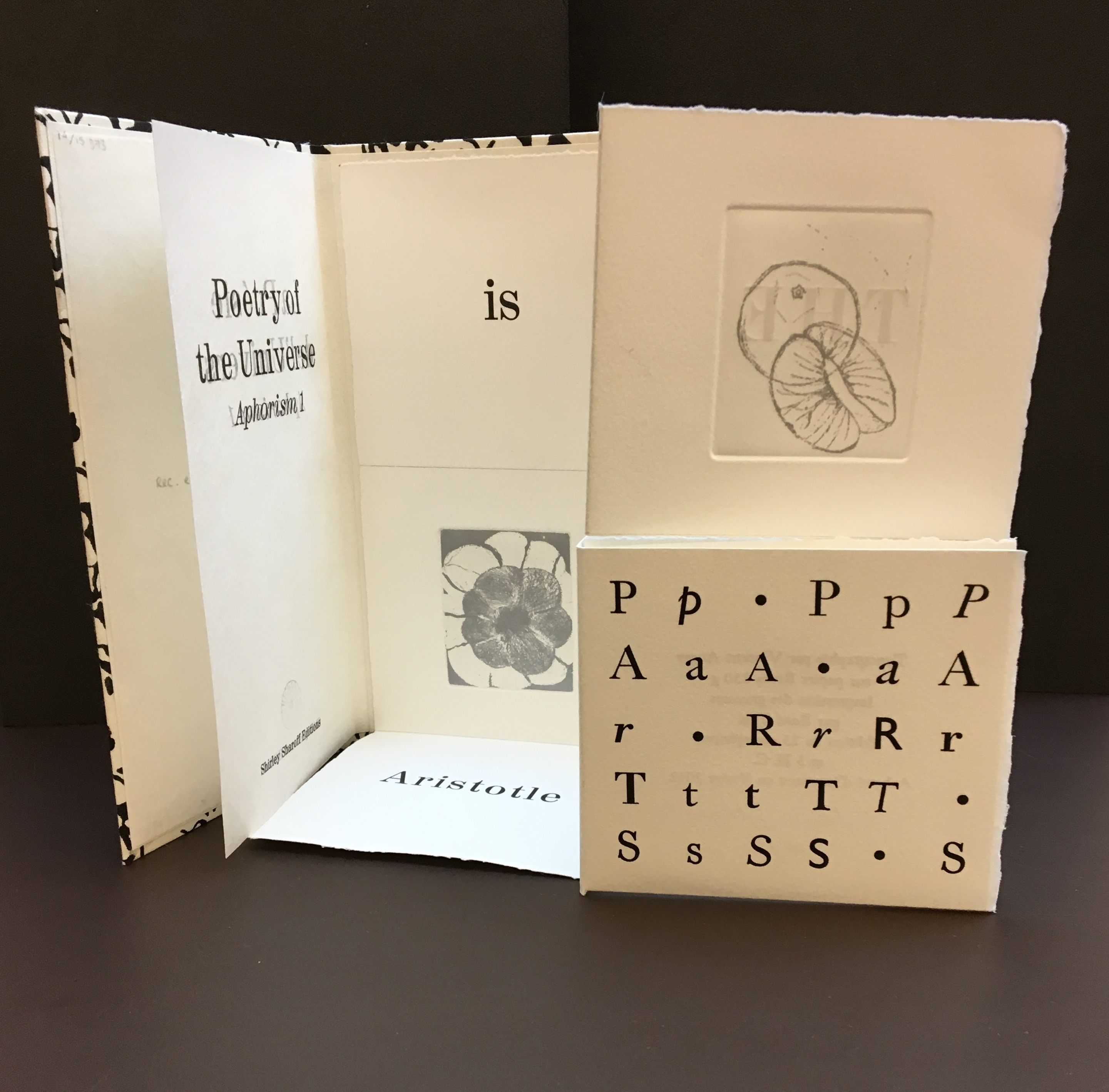
The etchings in soft grey — an orange and its segments, a blossom and its petals, a walnut and its meat, and a tree and leaf — illustrate the aphorism, much as the typographic choices and arrangements and the breaking up of the sentence complement it. Sharoff makes the second and third volumes perform similarly but differently — just as a magician weaves a routine from variations on the same vanishes and productions of a coin or other object.
As Comentale wrote in Art & Métiers du Livre: ” magicienne des formes”. La Poésie de l’univers is as rare as OVI and La grande muraille. It can be viewed here and here.
For further reading
A more detailed view of La grande muraille can be found here: ‘Learning to read Shirley Sharoff’s “La grande muraille”’, Books On Books, 17 June 2018.
The most extensive essay on Sharoff’s work can be found in Paul van Capelleveen’s Artists & Others (2016). It comments on La reparation (2001), The Waves (2003), Les amazones sont parmi nous (2005), Bruits de la ville (2007), Impermanence subtile (2013), La poésie de l’univers (2012-2013). He addresses La grande muraille (1991) in Voices and Visions (2009). The special collection at the Koninklijke Bibliotheek in The Netherlands is one of the few where several of Sharoff’s works — including La grande muraille — can be seen and handled in one place.
Christophe Comentale’s essay captures the delight of exploration and discovery in the encounter with Sharoff’s art.
Shirley Sharoff, entre France et Etats-Unis, présente une pluralité d’inspiration consommée entre l’estampe et le livre devenu un média, entre unique et multiple. […] Magicienne des formes et des couleurs, Shirley Sharoff ne cesse de remettre en cause, par besoin autant que par défi personnel, tout ce qui pourrait ressembler au début d’un système de lecture, de vision, figé et donc clos. L’impossibilité de savoir -qui vaut aussi pour elle- de quoi sa prochaine oeuvre-livre-manuscrit-tableau-dépliant, ou tout cela à la fois, sera fait est assez excitant. La présence de textes sentis par affinités sensorielles, personnelles, avec des écrivains non encore classiques, autant de raisons d’apprécier de pénétrer dans cet univers où le conformisme est inexistant.
Christophe Comentale, “Shirley Sharoff, des livres a tenir debout et des estampes a voir aussi”, Art & Métiers du Livre, n°231 (Aout-Septembre 2002), p.63.


