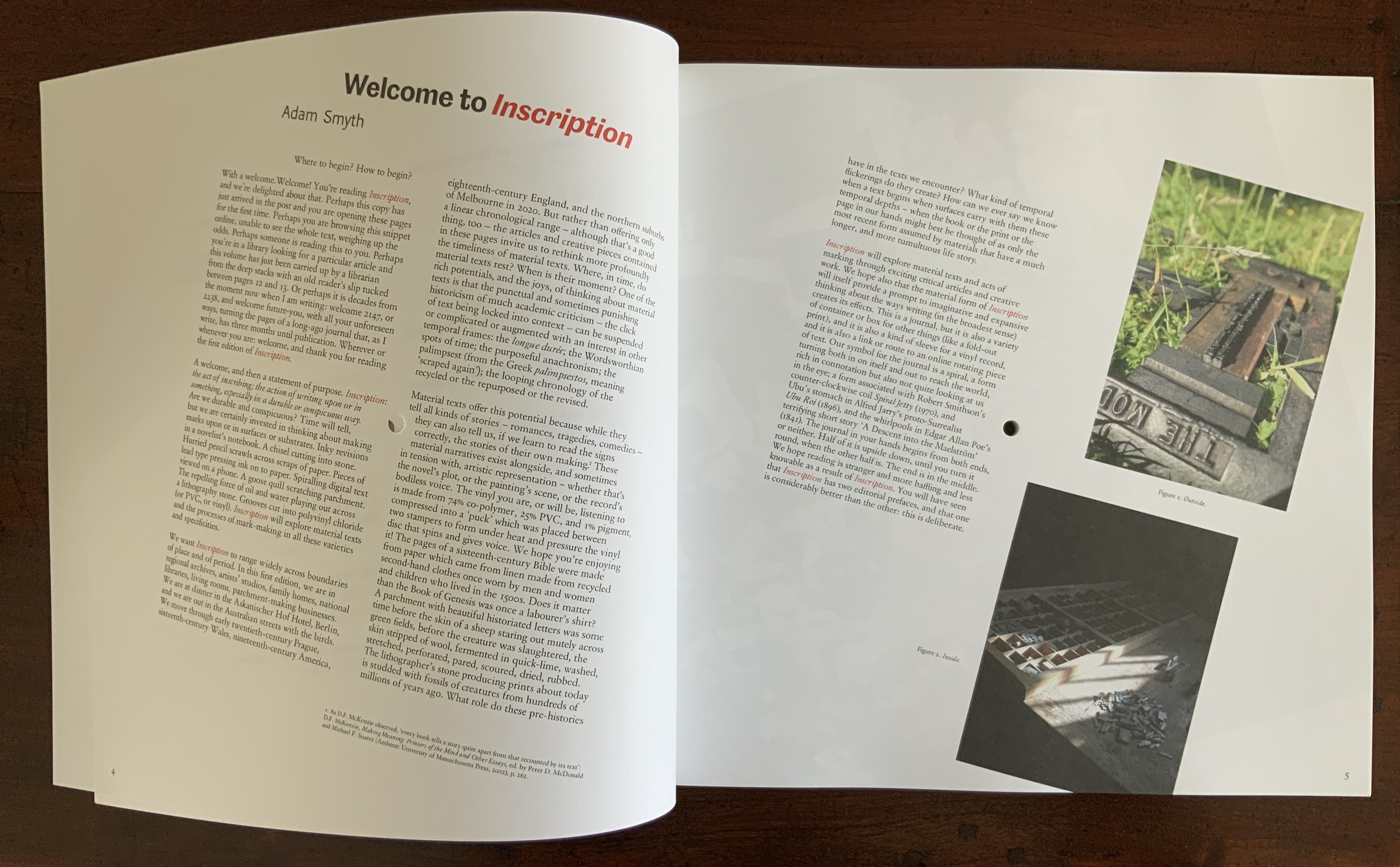
Inscription: the Journal of Material Text – Theory, Practice, History, Issue 1 on Beginnings (2020)
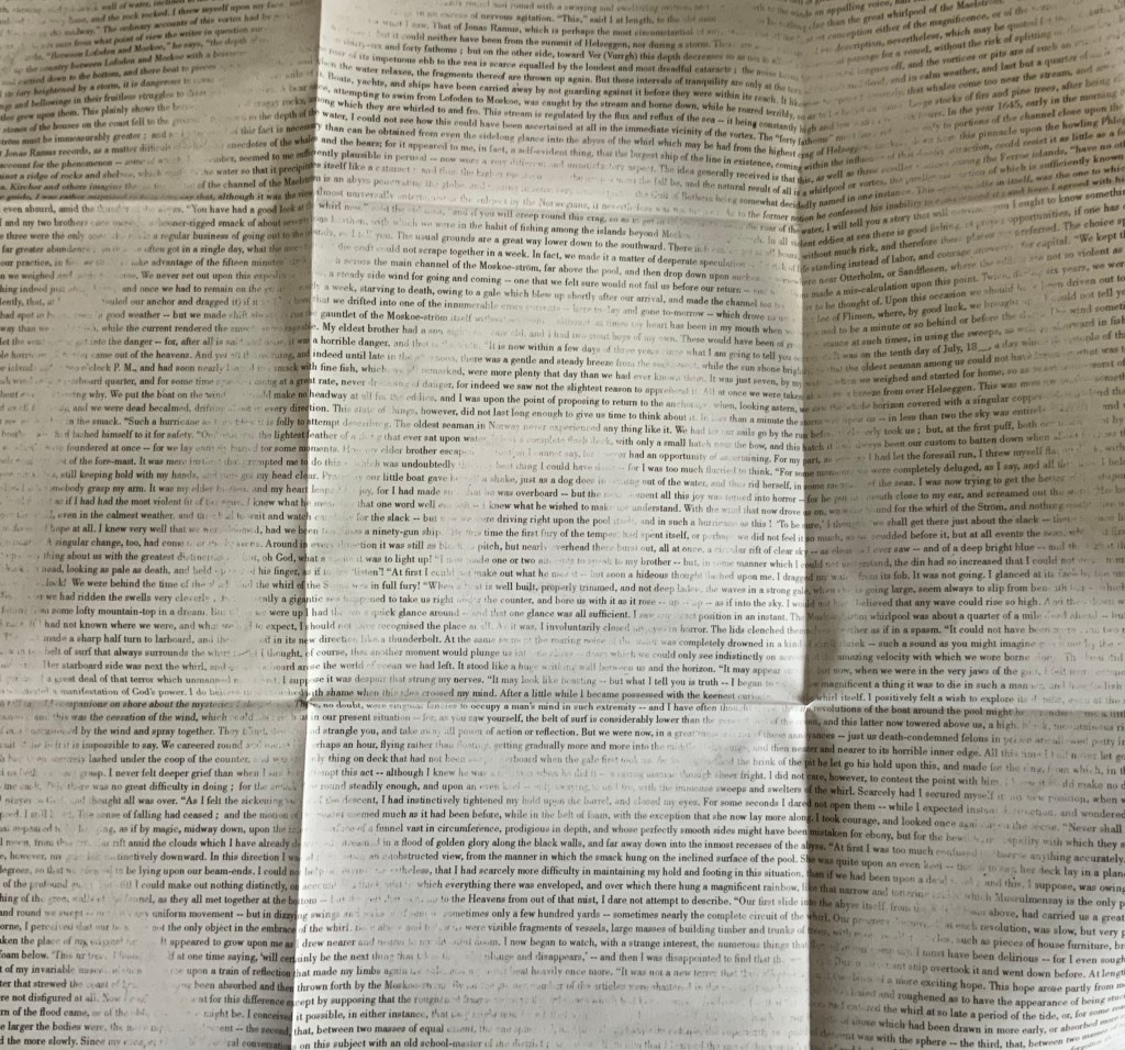
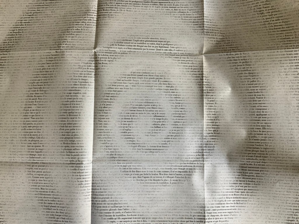
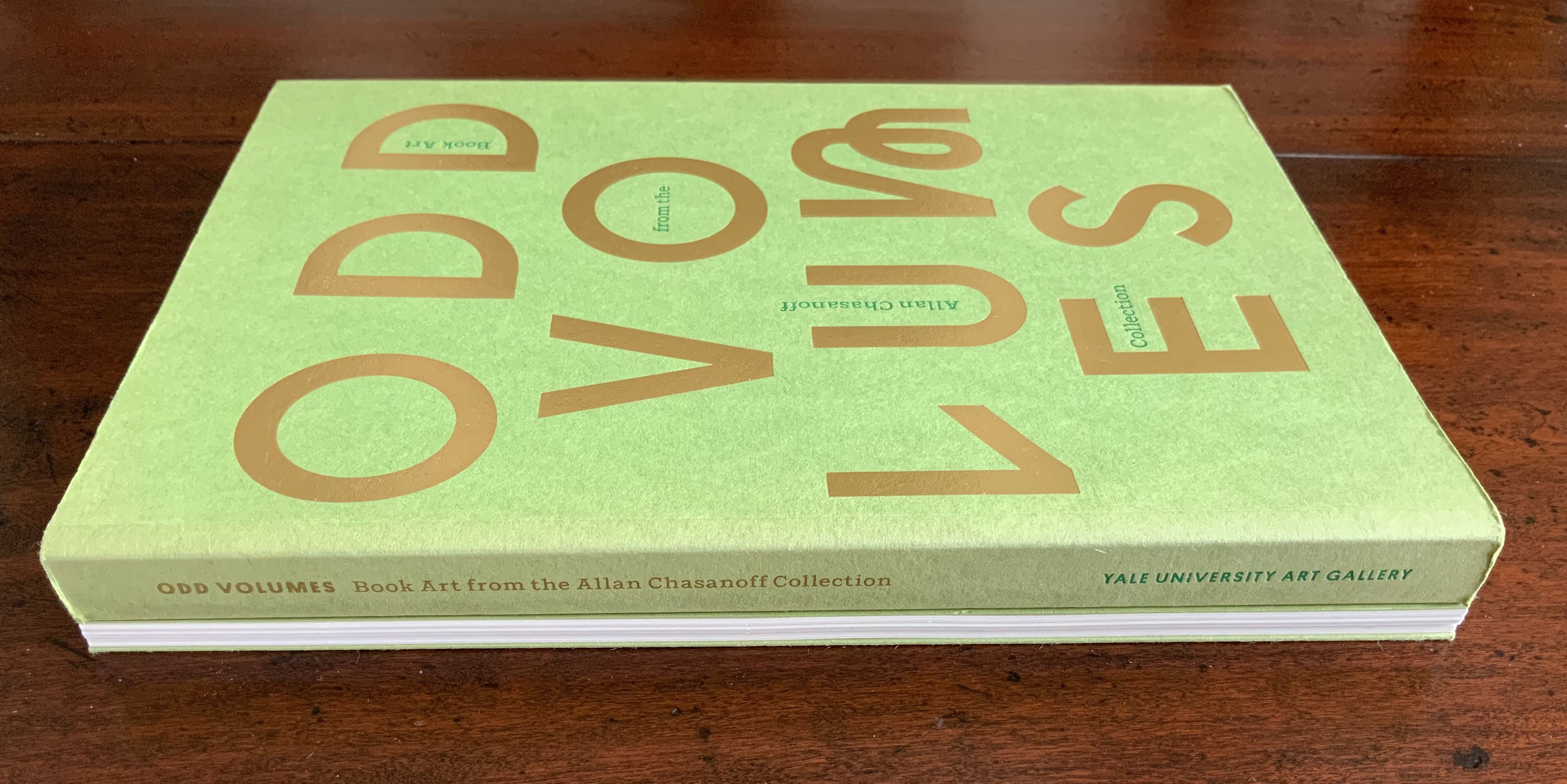
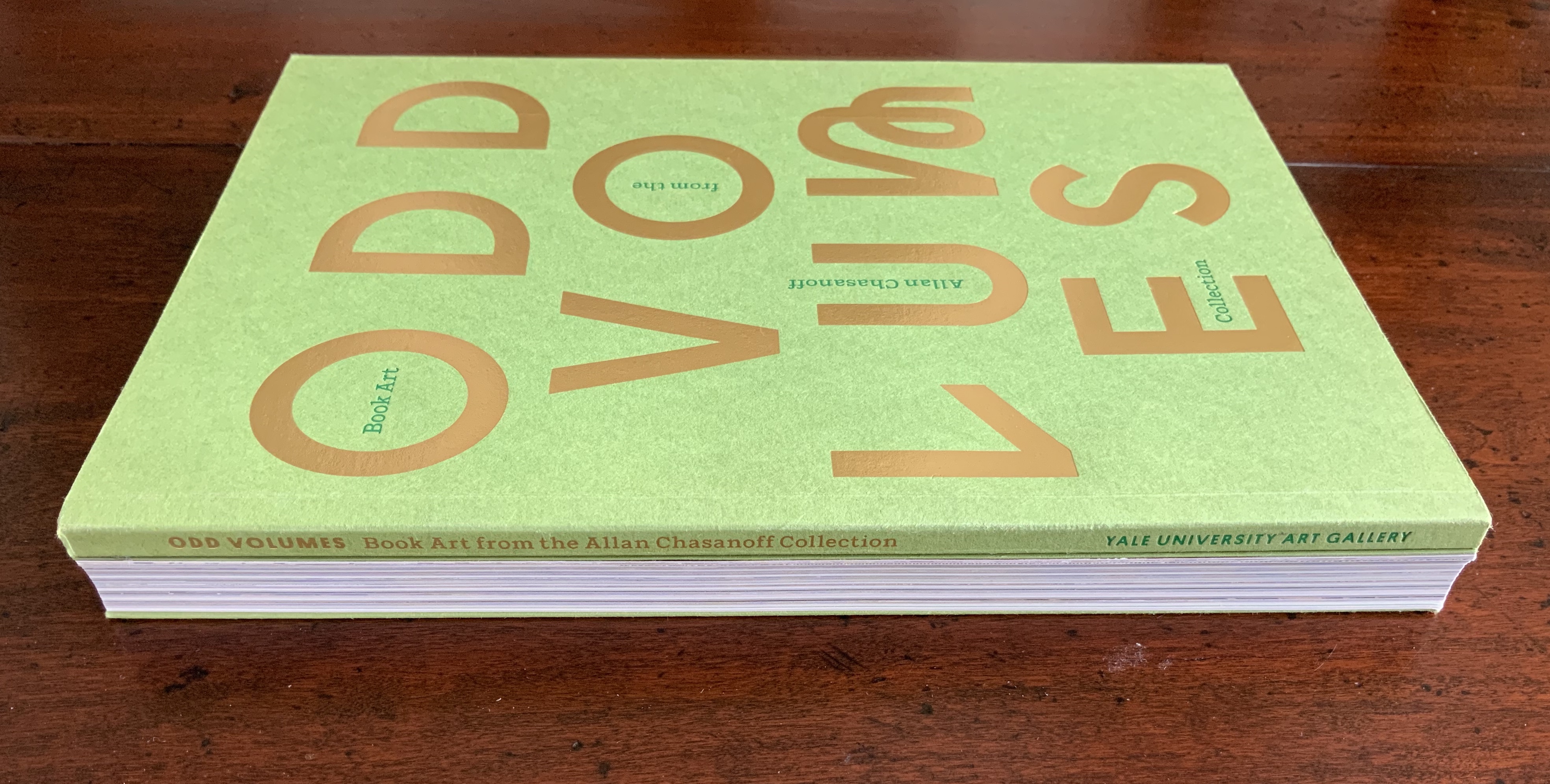
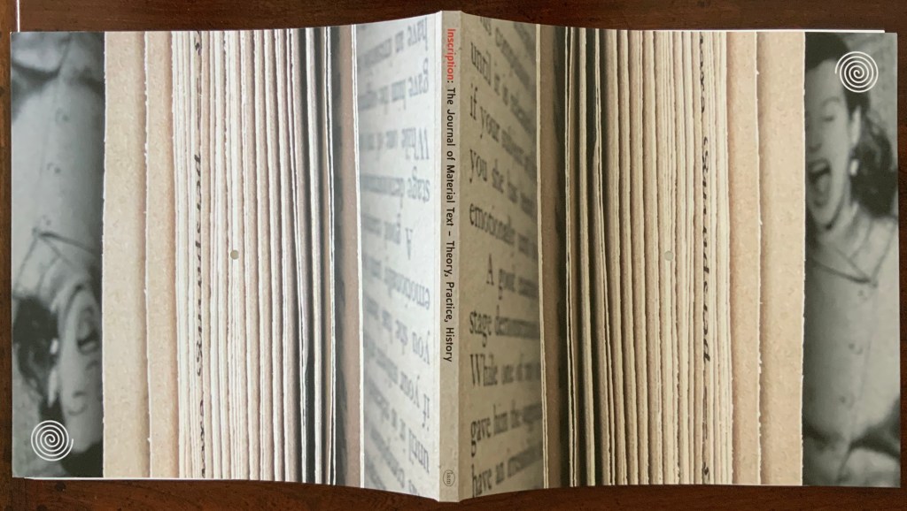
Inscription: the Journal of Material Text – Theory, Practice, History Issue 1 on Beginnings (2020) Edited by Gill Partington, Adam Smyth and Simon Morris Dos-à-dos (flipped), perfect bound softcover, H314 x W314 mm, 132 pages (including the end pages left intentionally blank); fold-out double-sided print of Jérémie Bennequin’s erasure of Edgar Allen Poe’s “A Descent into the Maelstrom”, H940 x W940 mm; saddle-stitched chapbook of Craig Dworkin’s “Clock”, held in a mock 45 RPM record sleeve, H180 x W180 mm; vinyl LP recording of Sean Ashton’s novel Living in a Land, H314 x W314 mm; Acquired from Information as Material, 10 October 2020.
In its design, typography, format and media components, the first issue of Inscription: the Journal of Material Text – Theory, Practice, History embodies its domain. So much so that this metaphorical box of artifacts stands as a contribution to the study of material texts as much as any of the journal’s inaugural articles.
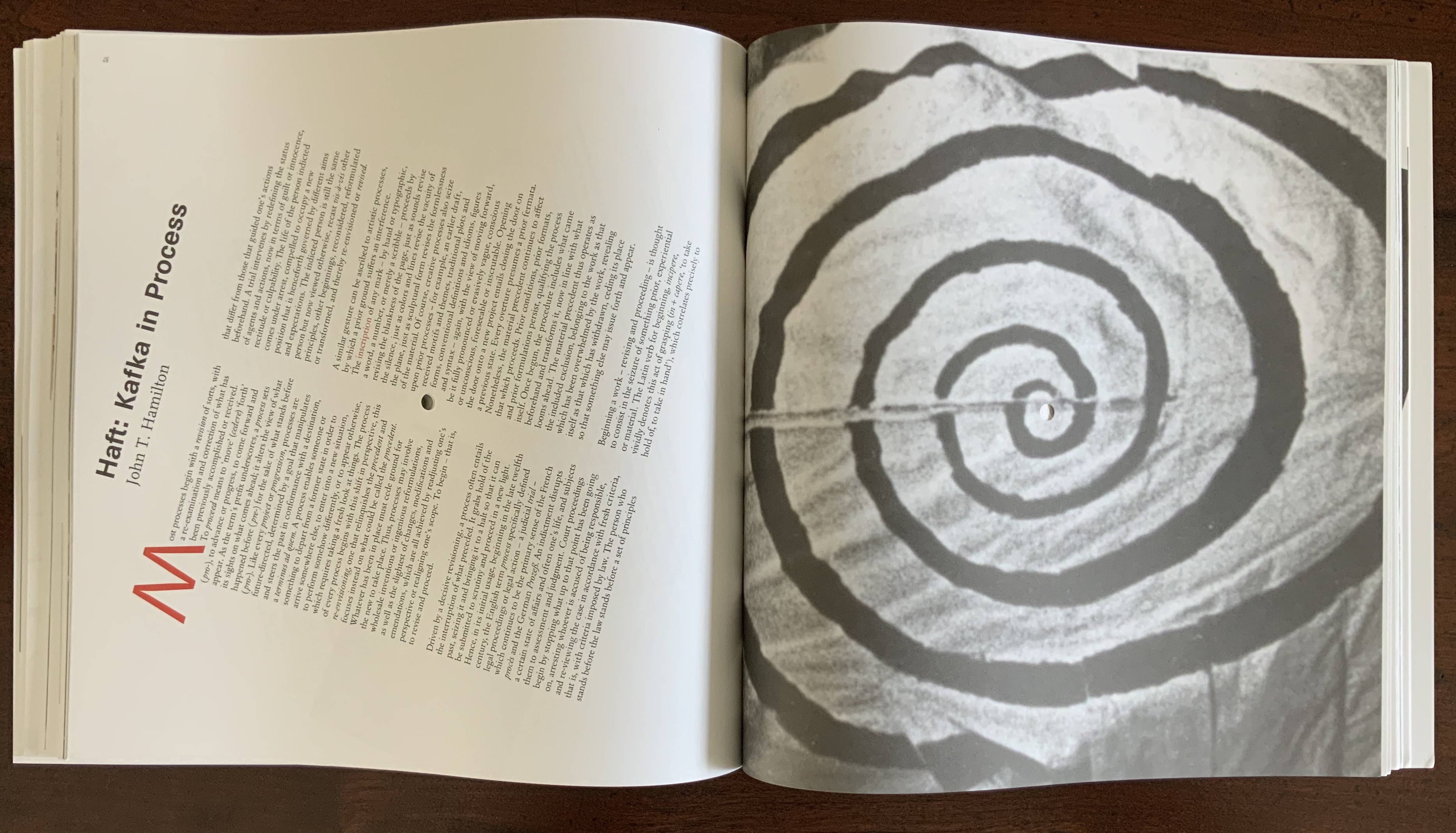
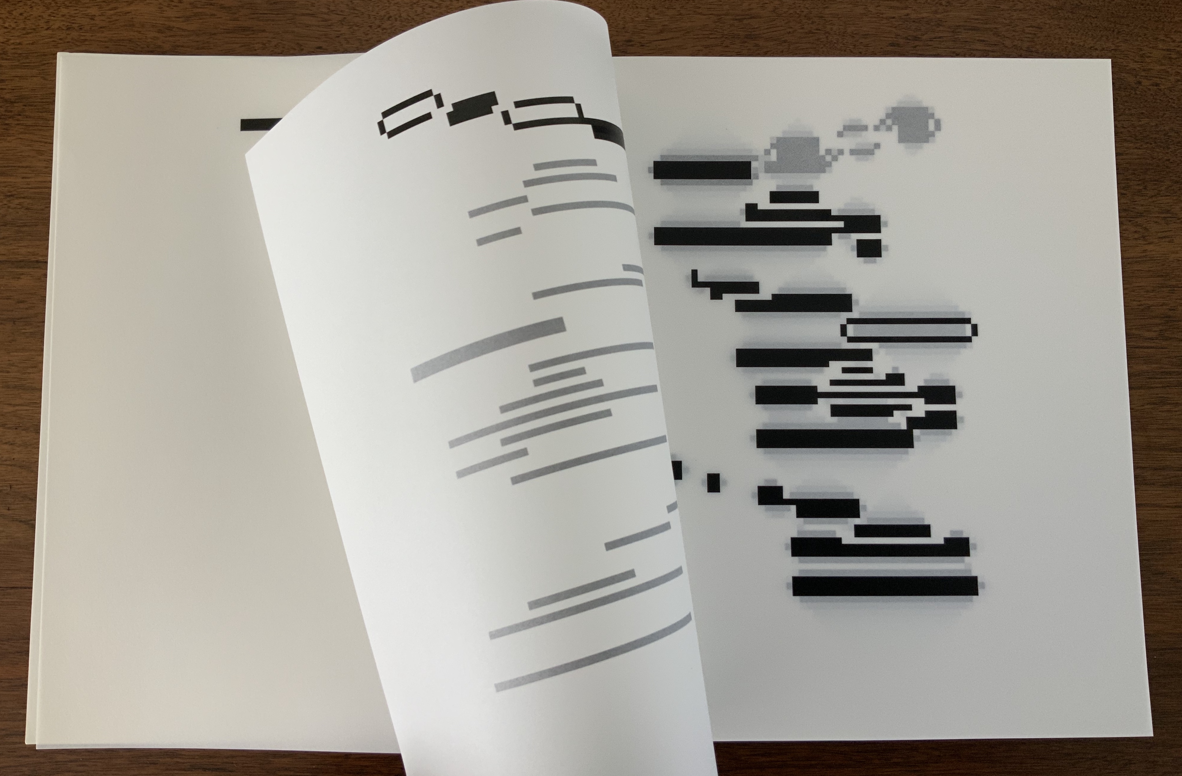
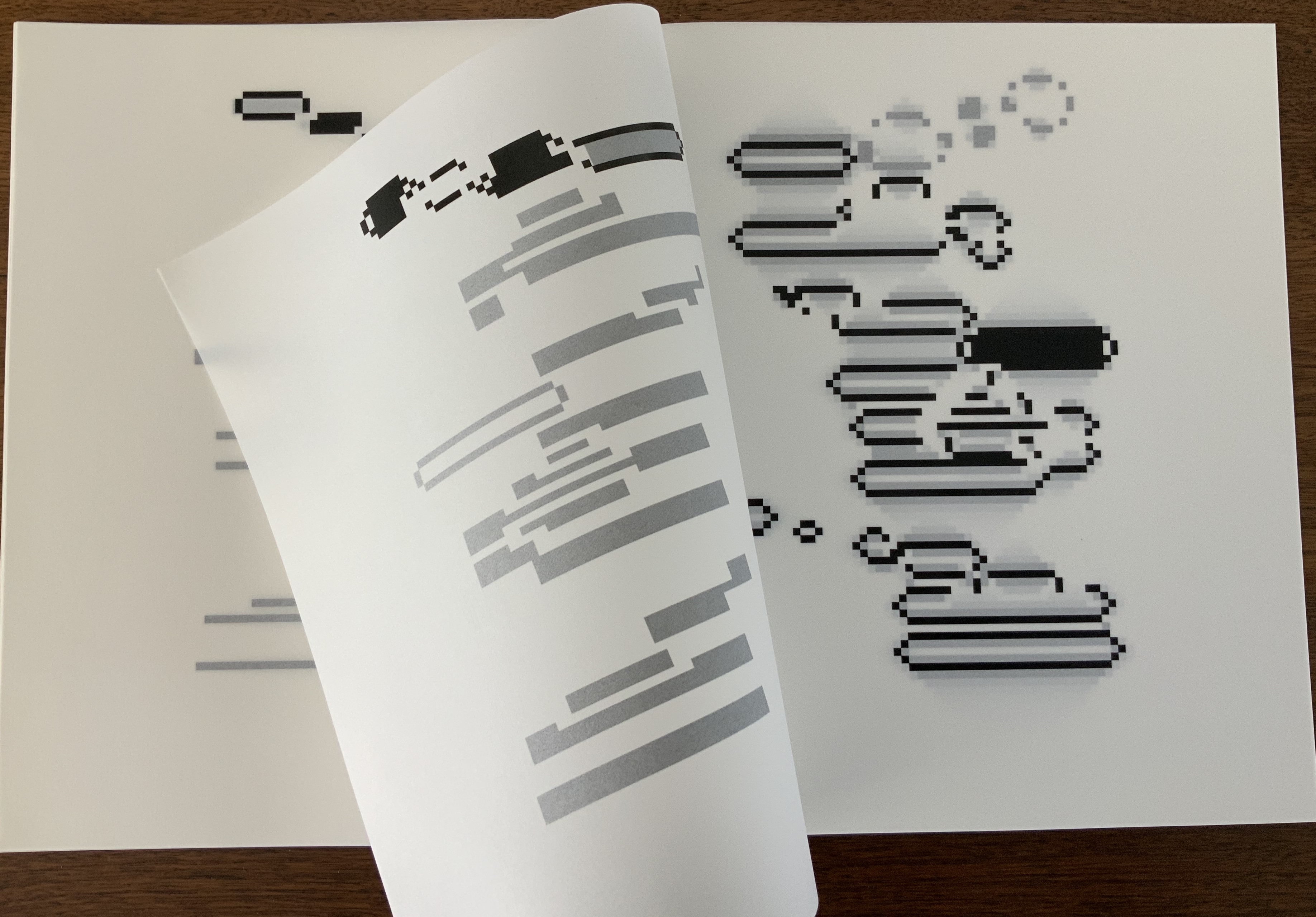
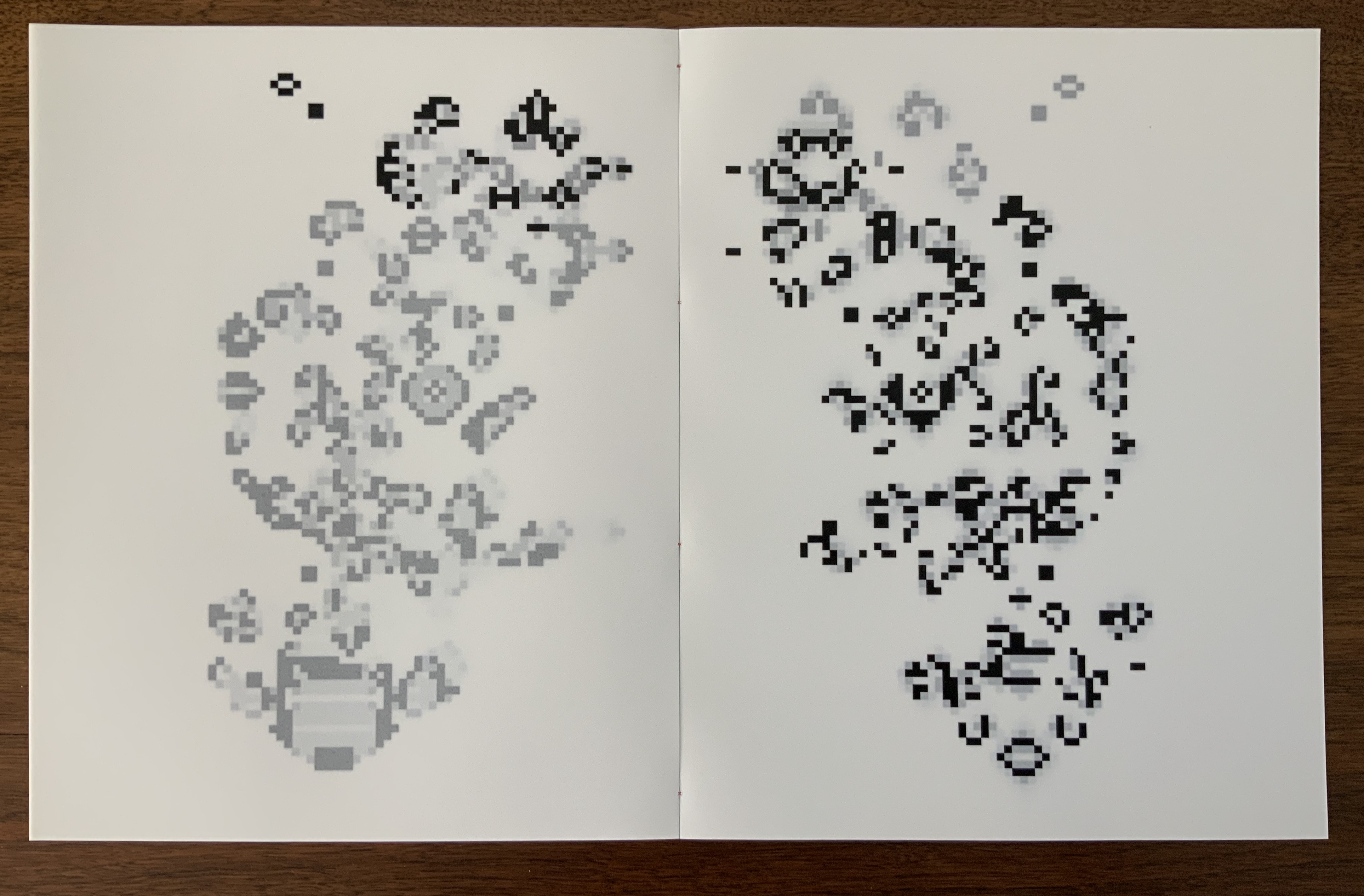
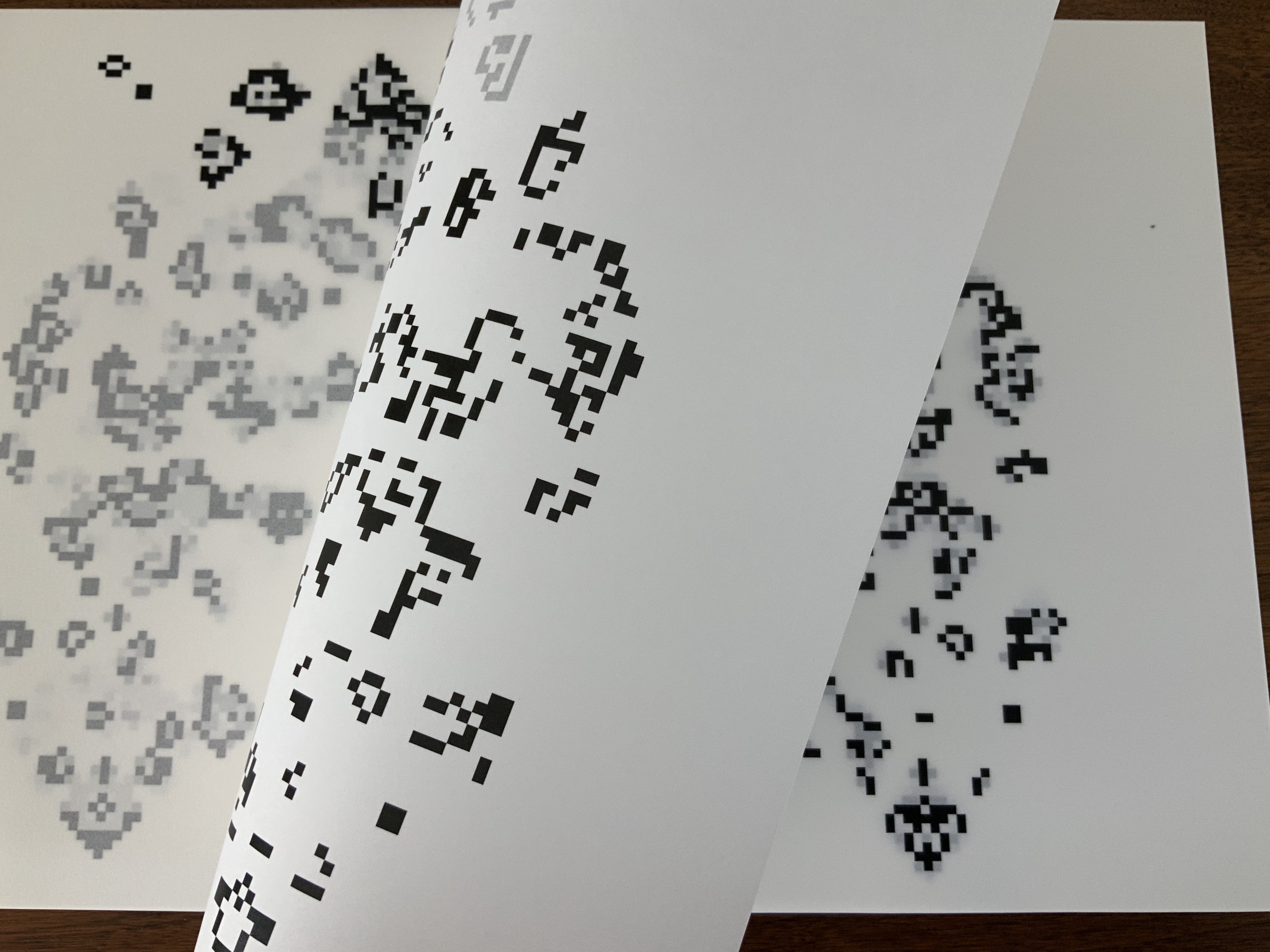
Jérémie Bennequin’s double-sided, bilingual print of his erasure of Poe’s “A Descent into the Maelstrom” recalls the palimpsest — a longstanding topic of material text study. Also, by standing in for Poe’s swirling maelstrom, the print’s image of spiralling erasure raises the domain’s recurrent theme of text-and-image interaction as well as that of the self-reflexiveness of such art. Using the book or text as physical material with which to create a work is central to book art as is the self-referencing that arises.
Bennequin’s choice of text also alludes to his other work. The short story’s themes of abyss, shipwreck and nothingness occur prominently in Poe-loving Mallarmé’s Un Coup de Dés Jamais N’Abolira le Hasard, the 19th century poem that made us modern and launched (is still launching) scores of artists’ books paying material and conceptual homage. Bennequin is one of those artists.†
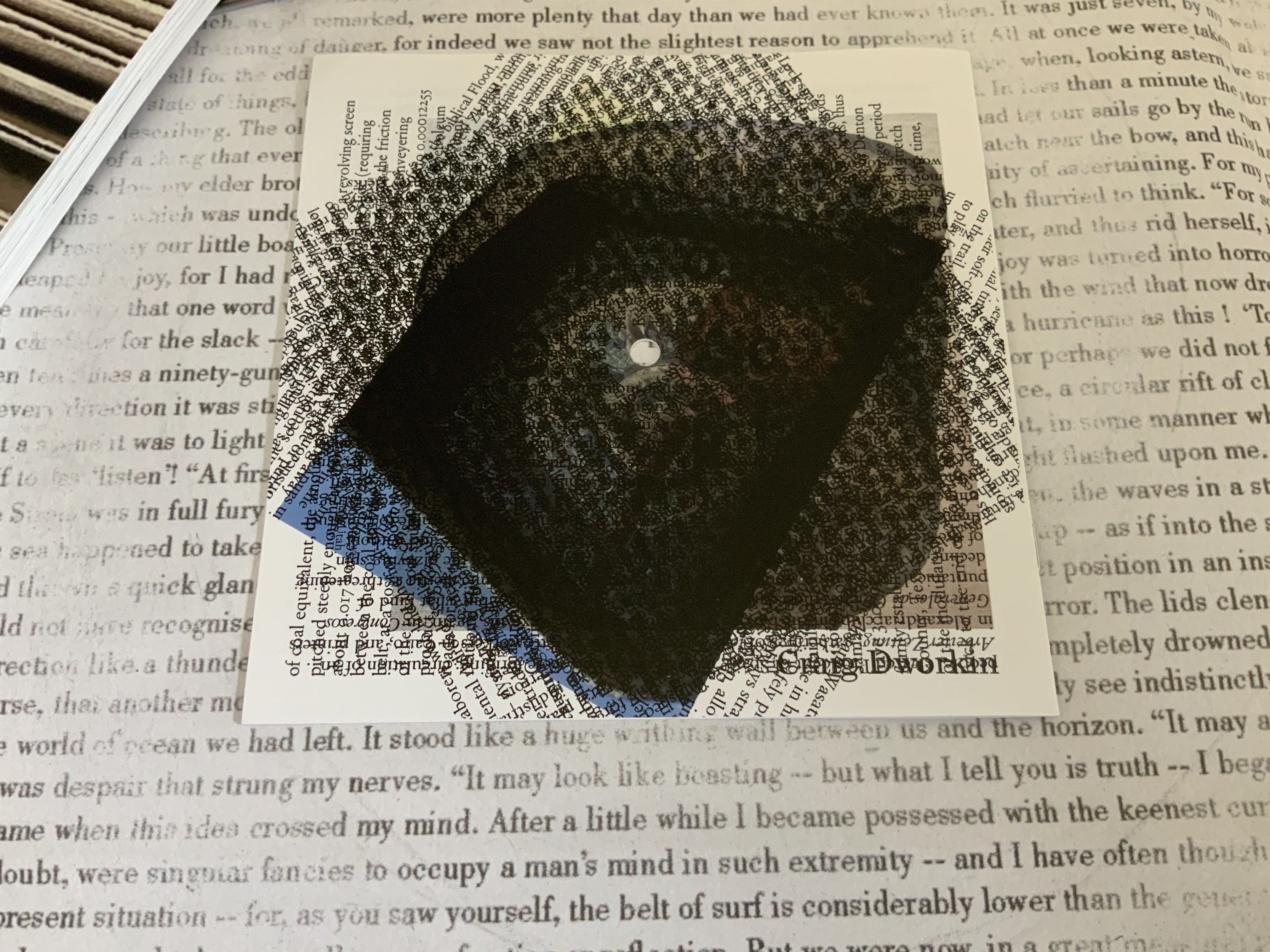
The print’s spiral erasure on a background of text serves as one of several voices in this journal issue’s intermedial†† harmony (or cacophony). The spiral reappears in Craig Dworkin’s meditation that scales up a pocket watch’s clock spring to the size of Robert Smithson’s Spiral Jetty (1980). Dworkin finds the spiral in the fossil of a Holocene fish that swam over the bed that became the jetty. He “materializes” the watch’s minutes against the geological and evolutionary time frames of the formation of the Great Salt Lake and the fossil. On the back cover of the chapbook, its entire text is repeated in a spiral of text blocks. The chapbook slips back into its 45 RPM-size sleeve to echo the spiralling inscription of sound in vinyl grooves that actually occurs on the LP recording of Sean Ashton’s novel Living in a Land.
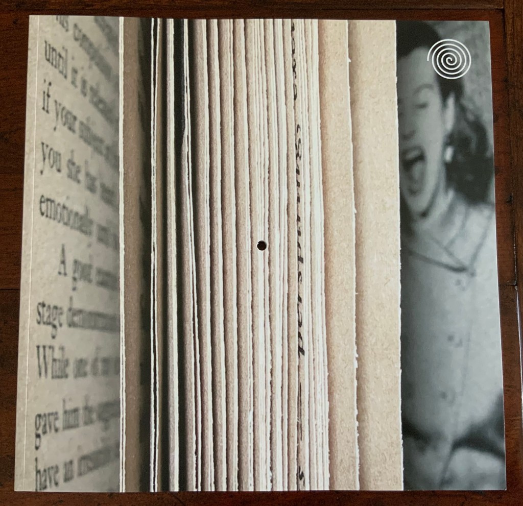
After Bennequin’s print, Dworkin’s meditation and Ashton’s LP, the journal itself appears, sporting the spiral as a logo on its trompe l’oeil cover. Not only drawn from Smithson’s Spiral Jetty, the logo draws from the stage costumes of Alfred Jarry’s Ubu Roi, which recur throughout the journal’s pages reminding us of drama as another medium in which the materiality of the text matters. In its own physical manifestation, the journal wears the materiality of the text on its sleeve and in its pages. The pages themselves spiral around a hole drilled through the center of the issue, echoing the sculptural extremity of inscribing, the book art technique of excising and the concept of nothingness central to many artists of inscription such as Robert Barry and Carl Andre, as this exchange shows:
RB: There is something about void and emptiness which I am personally very concerned with. I guess I can’t get it out of my system. Just emptiness. Nothing seems to me the most potent thing in the world.
CA: I would say a thing is a hole in a thing it is not. — Arts Magazine 47 (1972): 46
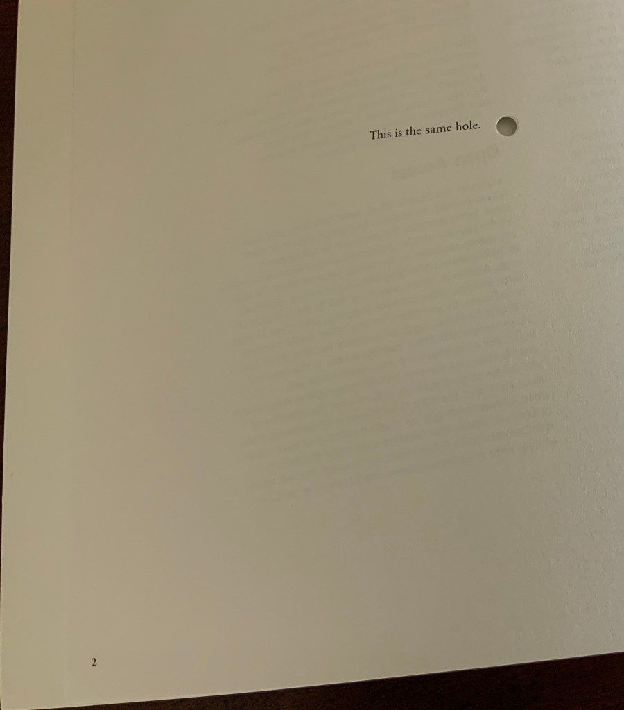
On its two page 2’s (a result of the dos-à-dos or back to back binding), Incription offers its own Magrittean take on holes:
In dos-à-dos binding, two codices are bound back to back in a Z form. So usually there are two fore-edges, two spines, and both codices have the same vertical orientation.
Inscription is bound dos-à-dos, but with only one fore-edge and one spine. Materially emphasizing the theme of inward spiralling, Inscription‘s two halves are upside down to one another. Their vertical orientations differ as can be seen in the following photo of the two front covers splayed away from the spine. The cover designer has obviously joined the fun by creating two fore-edges with the trompe l’oeil and “two” spines, one downward reading in the English style and, when flipped, one upward reading in the European style. Of course, therefore, there are two Tables of Content in opposite orders and two editorial prefaces, of which “one is considerably better: this is deliberate”. (Tongue-in-cheek humor seems to reside in the DNA of material text studies — and especially in book art.)
Two Tables of Content — naturally in reverse order for the dos-à-dos bound volume.
With the page layout spiralling from each end of the issue toward the spiral-set colophon placed in the center (usually part of the endmatter), we have spirals inscribed within spirals.
Left (or is it right?): the drilled hole centered on Ubu Roi‘s omphalic costume. Right (or is it left?): the spiral-set colophon.
Across the issue, the text block rotates like a vinyl record around the central hole.
By the time the colophon is reached, the reader/viewer’s head may be spinning, which could make it easier to read the colophon — wherein it is revealed that the book has been set in twenty different versions of Garamond type in a sequence such that the first letter of a line comes from the first version of Garamond, the second letter from the second version and so on, with the sequence starting anew with the next line. More spirals within spirals.
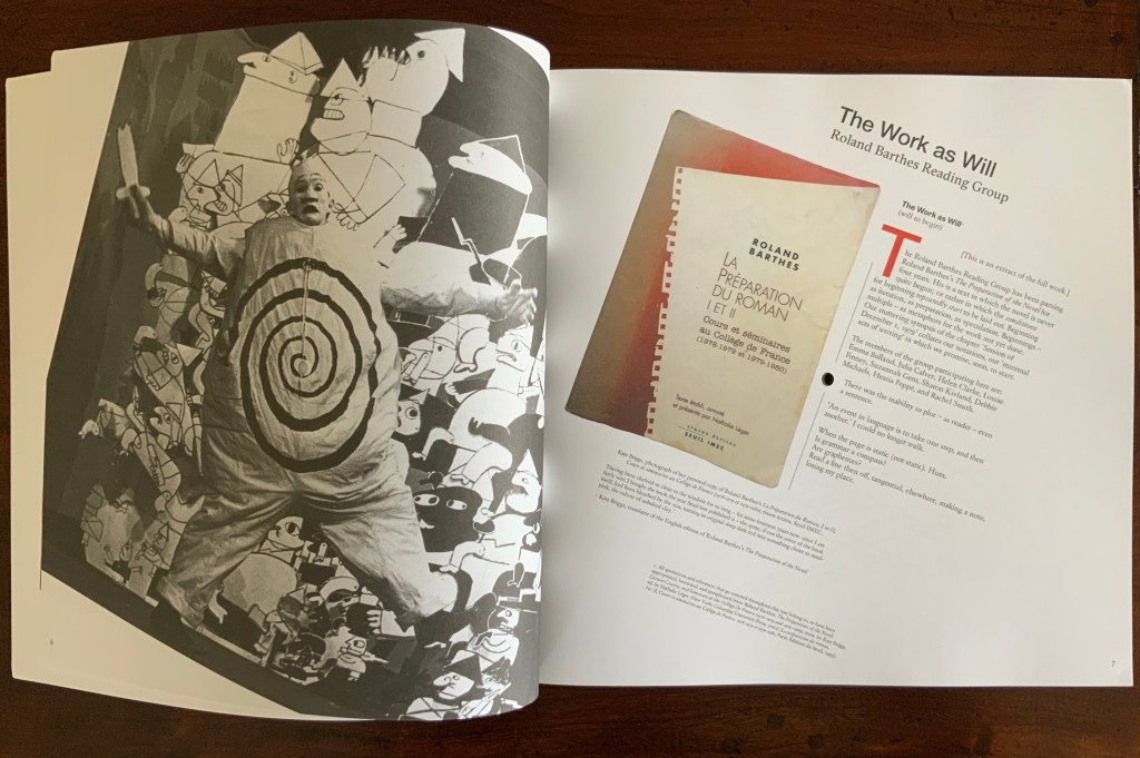
The materiality of this inaugural issue demonstrates how Inscription‘s focus “is not just on the meanings and uses of the codex book, but also the nature of writing surfaces (papery or otherwise), and the processes of mark-making in the widest possible sense”, as the editors put it. The care and creativity with which this first issue has been put together offer raw material with which to “take the study of material texts in new directions”. Mark-making by erasure, printing, juxtaposing, drilling, vinyl inscription, land erosion, evolution, land art, stage costumes, choice of type, page layout, binding, sleeving — all this even before we come to the articles themselves (see the photos of the Table of Contents above)!
For academics, book artists, printmakers, poets, and artists – and every permutation of roles, subsidiary roles and sub-subs of role — Inscription is rich, exuberant, eye-opening and eye-twisting, and eminently collectible as a work of art in its own right. Which is why it is in the Books On Books Collection.
† For Bennequin’s homage to Un Coup de Dés, see “Jérémie Bennequin“, Books On Books Collection, 11 April 2020.
†† “Intermedial” is taken from Trevor Stark’s Total Expansion of the Letter: Avant-Garde Art and Language after Mallarmé (2020), p.9. It refers to “the zone of indeterminacy between mediums, social practices, and temporalities” into which Mallarmé’s question “Does something like Letters exist?” threw the poet and avant-gardists. The question is ultimately a phenomenological one, which the study of material text inherently addresses.
A similar, related neologism — “intermediation” — was adopted from Samuel Taylor Coleridge in 1965 by the language-, book-, and publishing-artist Dick Higgins in “Intermedia“, republished in Leonardo, Volume 34, Number 1, February 2001, pp. 49-54. It is not the same thing as intermediality or mixed media. As Higgins expressed it, “Many fine works are being done in mixed media: paintings which incorporate poems within their visual fields, for instance. But one knows which is which. In intermedia, on the other hand, the visual element (painting) is fused conceptually with the words.”, p. 52. It can be argued that works of intermedia are one way in which artists address intermediality.
Further Reading
“Inscription 2“. 29 May 2022. Books On Books Collection.
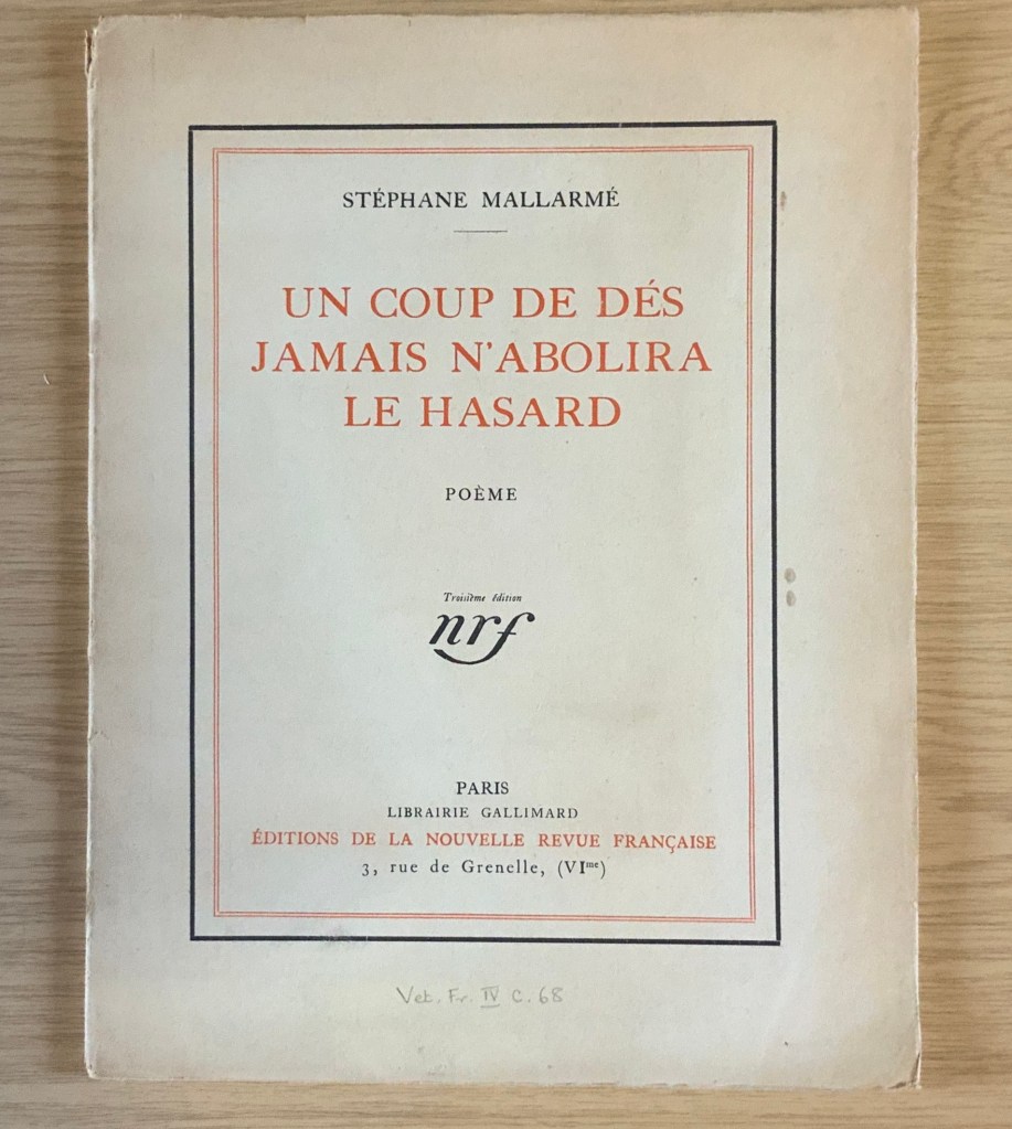
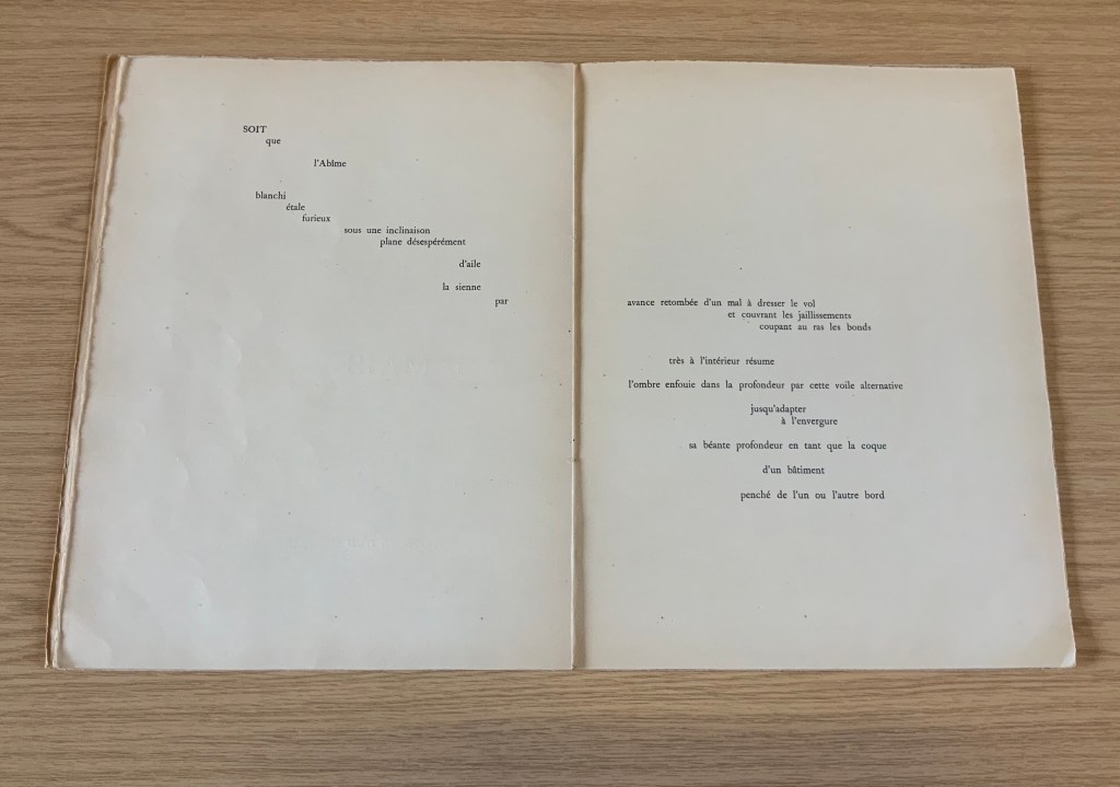
It was 1913. Stravinsky’s ballet “The Rite of Spring” debuted. The Cubists, Constructivists, Suprematists, Futurists all bound onto the art scene, many of them showcased in the Armory Show in New York that year. The Nouvelle revue française (NRF) attempted the first book form of Stéphane Mallarmé’s Un Coup de Dés Jamais N’Abolira le Hasard, which revived that 1897 typographic disruption of the page and prepared the ground for dozens of works of book art since. And Blaise Cendrars and Sonia Delaunay-Terk announced and published what they called le premier livre simultané. It was La Prose du Transsibérien et de la petite Jehanne de France.
From the Bodleian Library collection Photos: Books On Books
From the National Art Library, Victoria & Albert Photo: Books On Books
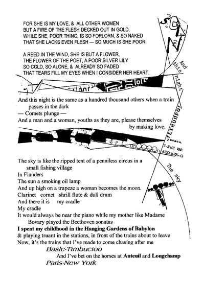
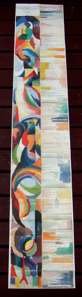
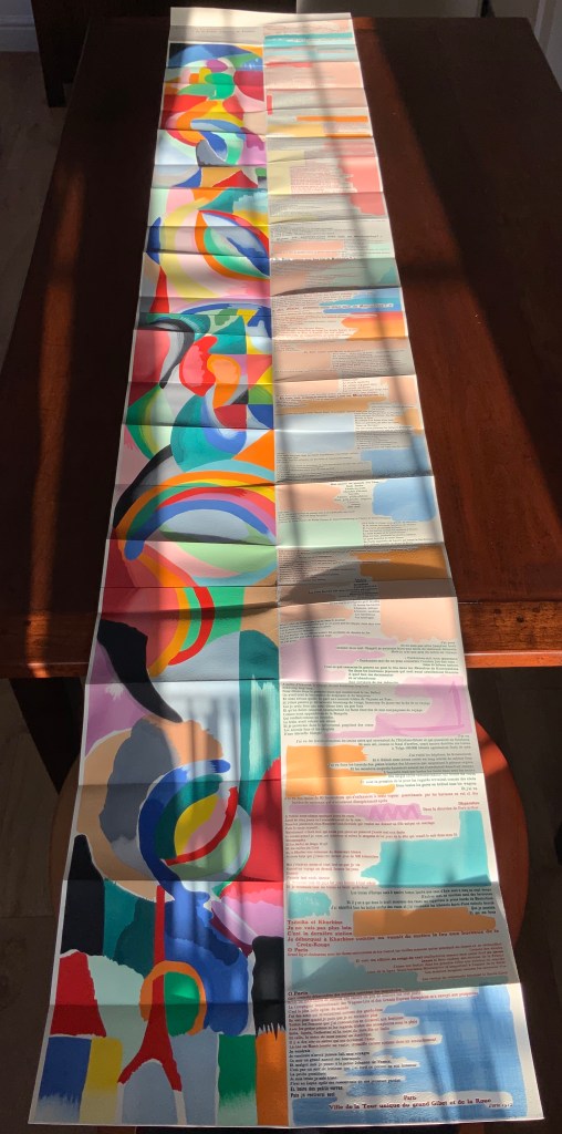
Like Mallarmé, Cendrars disrupts the page with multiple typefaces (thirty distinct ones in his case) and scattered placement of lines and stanzas. But La Prose presents an even more physical and structural disruption of the page and book than Un Coup de Dés. Unlike the latter, La Prose unfolds — twice — in an accordion format to over two metres in length or rather height since the text descends on the right and ends alongside the interlinked images of the Eiffel Tower and a Ferris wheel at the foot of the accordion. Cendrars and Delaunay had aimed to produce 150 copies of La Prose because, placed end to end, that would have equalled the Eiffel Tower’s height.
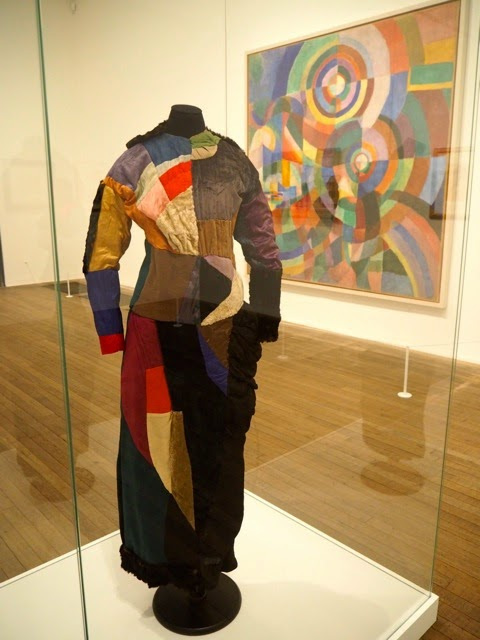
More than this monumental, sculptural, typographic and physical disruption of page and book, La Prose presents a temporal disruption. By le premier livre simultané, Cendrars meant a simultaneity of the verbal and visual — the way that text and image appear all at once — en un éclair. Early Bohemian that he was, Cendrars was co-opting a fair bit of artistic and literary theorising by the Cubists, Futurists and others. Most important and of the moment was his co-opting of Robert and Sonia Delaunay’s colour theory of simultanéisme. The “couleurs simultanées de Mme Delaunay-Terk” had also appeared in her 1913 robe simultanée and paintings. Building on a French scientist’s exposition on how perception of colours changes depending on the colours around them, the Delaunays claimed that rhythmic, musical and spatial synaesthetic elements were also at play. Sonia Delaunay asserted that the artwork produced for La Prose was not in response to reading the poem but hearing it from Cendrars. (Listen to it for yourself here.)
In presenting the adolescent Cendrars travelling physically eastward on the Transsibérien, travelling mentally to Flanders-Basle-Timbuctoo-Auteuil-Longchamps-Paris-New York while still registering the landscape outside, seeing the maimed and wounded returning from the front of the Russo-Japanese war, conversing with a prostitute named after Joan of Arc, doubting himself as a poet, and so on until a sudden transposition back to Paris, the process poem juxtaposes the sacred and profane, past/present/future, stationary and dynamic, national and international in outlook and locale. In short, simultaneously. In a format that is bound and unbound, the poem mirrors the swirling, interacting shapes and colours beside and in which it moves — and vice versa.
However more disruptive of the page and book La Prose may have been, it did not inspire the profusion of direct re-interpretations (or appropriations) that Un Coup de Dés prompted from artists such as Jérémie Bennequin, Ellsworth Kelly, Man Ray, Didier Mutel, Michel Pichler, Eric Zboya and dozens of others.
Not until 2001 did a re-versioning of La Prose appear. Tony Baker and Alan Halsey published an English translation and codex re-formatting. Its black on white imagery is reminiscent of the Russian Futurists, the type is monochromatic, and the typefaces, fonts and weights vary but not as much as in La Prose.
Baker and Halsey note in their colophon:
So far as we’re aware no translation of the poem into English has ever been attempted to give a sense of Cendrars and Delaunay’s original conception, not the least reason for which may have been the difficulty until recently of seeing the first edition, even in reproduction. — Prose of the Trans-Siberian and of the Little Jeanne de France (Sheffield: West House Books, 2001)
A well-founded lament — at least for the book art community. Not until 2000 had there been a reduced-scale reproduction of La Prose. It appeared in Granary Books’ A Book of the Book by Jerome Rothenberg and Steven Clay across a four-page foldout in the embrace of Ron Padgett’s English translation. Only in 2008 was there a full-scale, full-colour offset facsimile, produced by Yale University Press with an appended translation. It is now out of print.
With her work La Prose du Transsibérien Re-creation (2019), Kitty Maryatt has changed all that. With this deuxième livre simultané, she has more than caught the echo of Cendrars/Delaunay’s original and its arrival. As scholar, artist and veritable impresaria, she has reinvigorated the book art/arts community with the legacy of La Prose.
Her blogspot documents the research and production with rich details about sourcing the type, learning about stencil-cutting from Atelier Coloris (one of the few remaining businesses devoted to pochoir), determining the recipes for the ink colours, testing papers (Zerkall Crème, Biblio, and Rives HW), creating a census of the existing 1913/14 originals and their locations — all that and more, including the use of bacon fat and a wine bottle filled with lead shot. She also organized a documentary by Rosylyn Rhee: “The Pochoir Re-creation of La Prose du Transsibérien”. It brings the importance of the original and this re-creation to life in the expressions and voices of prominent collectors, librarians and scholars, artists, rare book dealers and the project’s funders.
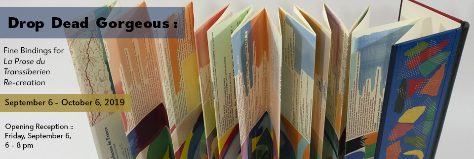
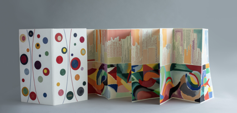
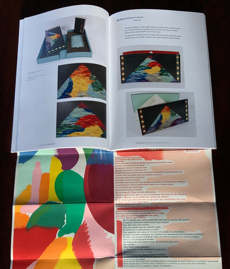
In addition, Maryatt has been either a contributor to, or the motivating force behind, several symposia and exhibitions such as “Paris 1913: Reinventing the Artist’s Book” (at the Legion of Honor Museum in San Francisco, 2018) and “Drop Dead Gorgeous”. The latter is a travelling exhibition resulting from invitations to twenty-four book artists and designer bookbinders to design and create bound copies of La Prose du Transsibérien Re-creation. For the San Francisco venue, Maryatt prepared a workshop on traditional French pochoir and provided text for the exhibition catalogue (available from the online store of the San Francisco Center for Books).
Monique Lallier’s fine binding of La Prose du Transsibérien Re-creation Photos: Courtesy of Monique Lallier
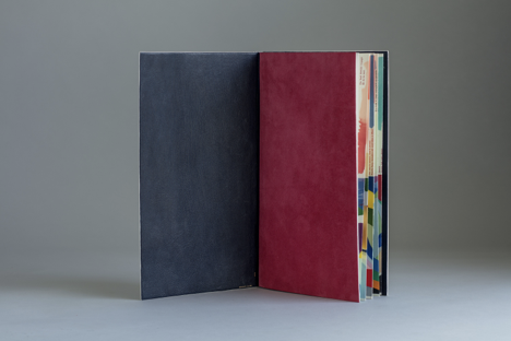
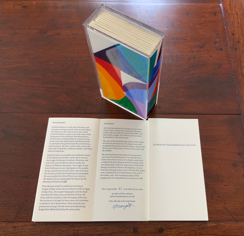
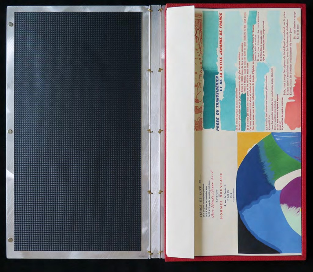
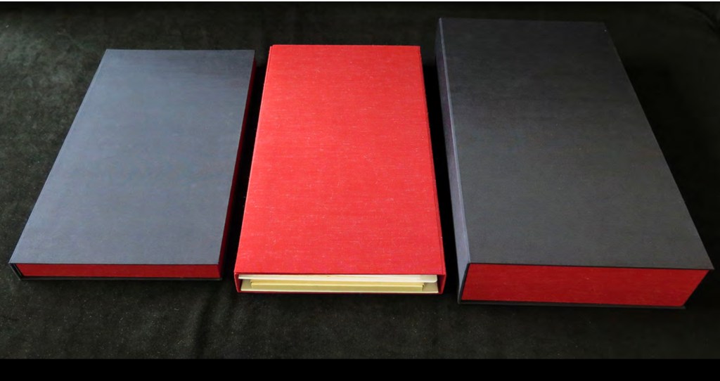
The pinnacle of Maryatt’s efforts, of course, is the standard and deluxe editions of La Prose. Both editions consist of 4 pages, glued together to create the tall single page. For the standard edition, the page is folded into 21 sections and loosely placed in a painted vellum cover with a booklet describing the project and production. An acrylic slipcase houses the covered bundle.
The standard edition Slipcase: H195 x W108 x D45 mm. Wrapper: H182 x W97 x D35 mm. Leporello: H81 x W95 mm (closed). H1954 x W160 mm (open). Booklet: H81 x W94 mm (closed), W1055 mm (open). Photo: Books On Books
Photo: Books On Books
Photos: Books On Books
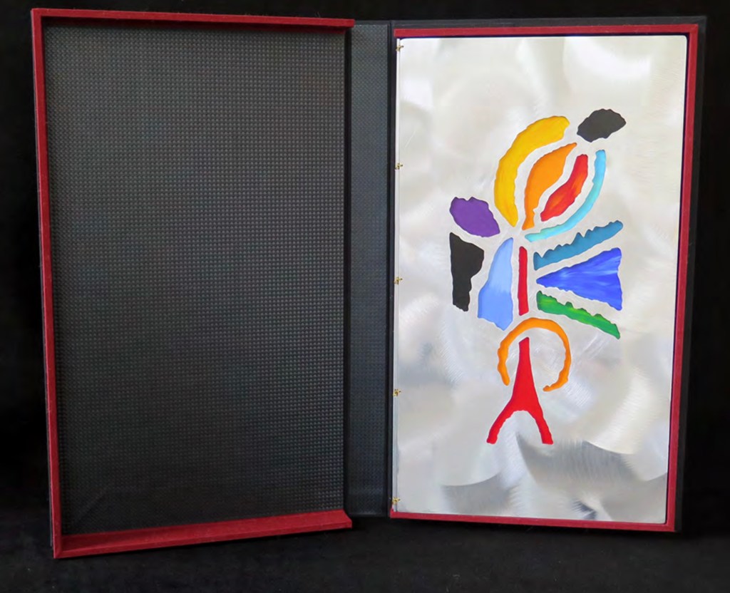
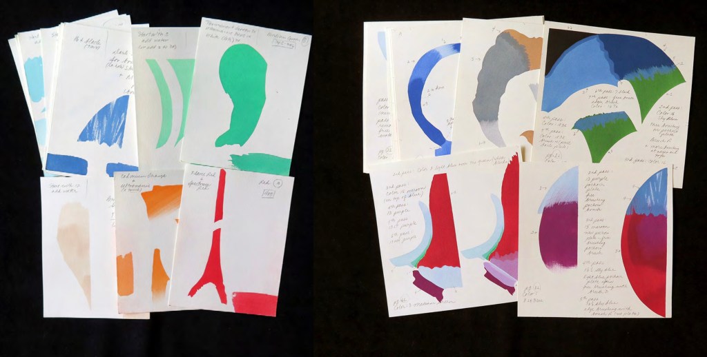
For the deluxe edition, the single page is left double-wide, accordion-folded double-tall between aluminum covers and housed in a clamshell box. A separate case holds the painted vellum cover, colour cards, Sonia’s visual vocabulary, 27 progressives for page one, 5 pochoir plates with tracing paper and registration system, the booklet with introduction and colophon, and the list of 30 typefaces Cendrars used. A large clamshell box houses this separate case and the boxed book. The colour cards include the recipe for mixing the gouache, and Sonia’s visual vocabulary shows the numbered steps of operations. The progressives for page one show the steps for doing the pochoir stencils and handwork.
The deluxe edition Photos: Courtesy of Kitty Maryatt
Any institution with a focus on book art or the graphic arts should seek out the standard edition of La Prose du Transsibérien Re-creation. Any institution with a focus on teaching and practice in those domains should seek out the deluxe edition. As indefatigable as Cendrars and as productive as Delaunay, Kitty Maryatt has provided the basis of master classes for generations. Now it is up to the book art community to respond as it has to Un Coup de Dés.
A shorter version of this essay appears in Parenthesis 39, Fall Issue, 2020.
Further Reading
Ashton, Doré. “On Blaise Cendrars. . . But I Digress.” Raritan 31, no. 2 (2011): 1-42,164. An entertaining extended anecdote sketching Cendrars and his milieu.
Gage, John. Colour and Meaning : Art, Science and Symbolism(Berkeley, CA: University of California Press, 1999). Despite her works’ better quality and representation of simultanéisme, Gage focuses on Robert and mentions Sonia only in passing or footnotes. (Telling that the Tate chose Sonia not Robert for a retrospective in 2015.) Nevertheless, there are passages that place her work in context.
P.198: Chevreul’s “privileging of the harmony of complementaries was essentially in the context of ‘painting in flat tints’, a method developed largely in the decorative arts, but which was increasingly integrated into many branches of French painting in the second half of the nineteenth century …”.
P.254 “When, probably early in 1912, Delaunay wrote to Kandinsky outlining his theories, he had shifted to a rather different approach, claiming: ‘the laws I discovered … are based on researches into the transparency of colour, that can be compared with musical tones. This has obliged me to discover the movement of colours.’ …
P.256 [Delaunay’s] Essay on Light, which was composed in the summer of 1912, attributed the movement of colours less to transparency than to the qualities of hue: ‘Movement is given by the relationship of unequal measures, of contrasts of colours among themselves which constitute Reality. The reality has depth (we see as far as the stars), and thus becomes rhythmic Simultaneity.’”
P.257 “For Chevreul in 1839 such painting [in flat tints] had only a decorative, accessory function, but the Delaunays did not feel the distinction, and Sonia had recently been experimenting with flat colours in appliqué textiles and in bookbindings decorated with collage.”
Maryatt, Kitty. “A Bookmaker’s Analysis of Blaise Cendrar’s and Sonia Delaunay’s La Prose du Transsibérien et de la Petite Jehanne de France”, The Quarterly Newsletter(Fall 2016), The Book Club of California. Online version available here.
Maryatt, Kitty. Interview with Steve Miller, Book Arts Podcasts, School of Library Information and Sciences, University of Alabama, 13 January 2006.
Rothenberg, Jerome; Clay, Steven. A Book of the Book: Some Works & Projections about the Book & Writing (New York City: Granary Books, 2000). Contains an excerpt from Perloff’s book above, Ron Padgett’s translation of La Prose and a four-page foldout showing a full-color photo-reduction of the 1913 original.
Shingler, Katherine. “Visual-verbal encounters in Cendrars and Delaunay‘s La Prose du Transsibérien“, e-France: an on-line Journal of French Studies, Vol. 3, 2012, pp. 1-28. Accessed 15 November 2019. Along with Perloff’s book, this is the best explication of the work and its lineage with Mallarmé’s Un Coup de Dés.
Woodall, Stephen. “La Prose du Transsibérien et de la Petite Jehanne de France”, Insights from the de Young and Legion of Honor (San Francisco: Fine Arts Museums of San Francisco, 2020. A spectacular website presenting the original work in its context and its influences on subsequent book art. The work can be viewed panel by panel, and its overall structure is presented in an animation of its unfolding and refolding.
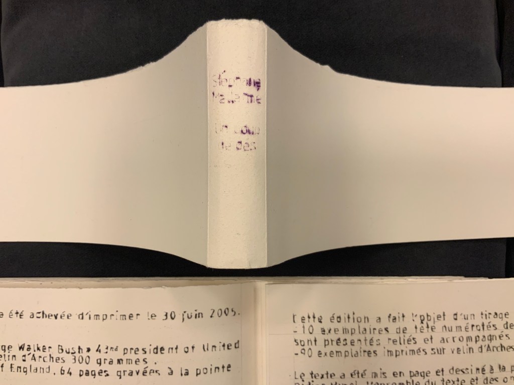
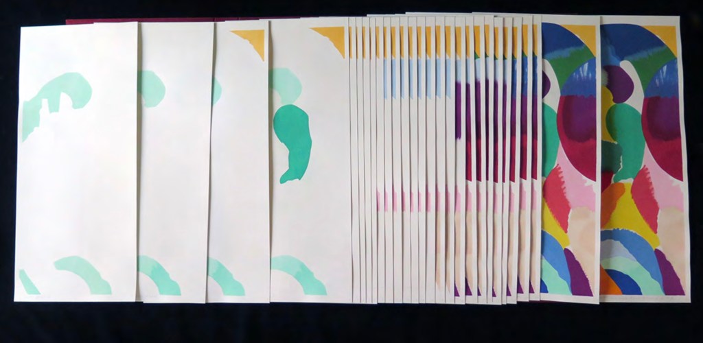
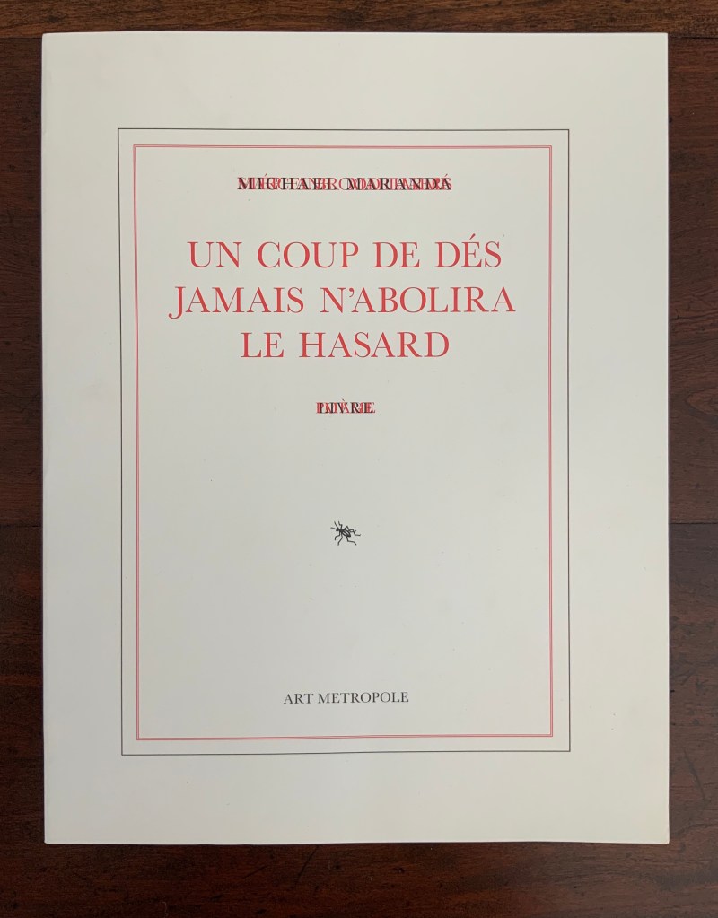
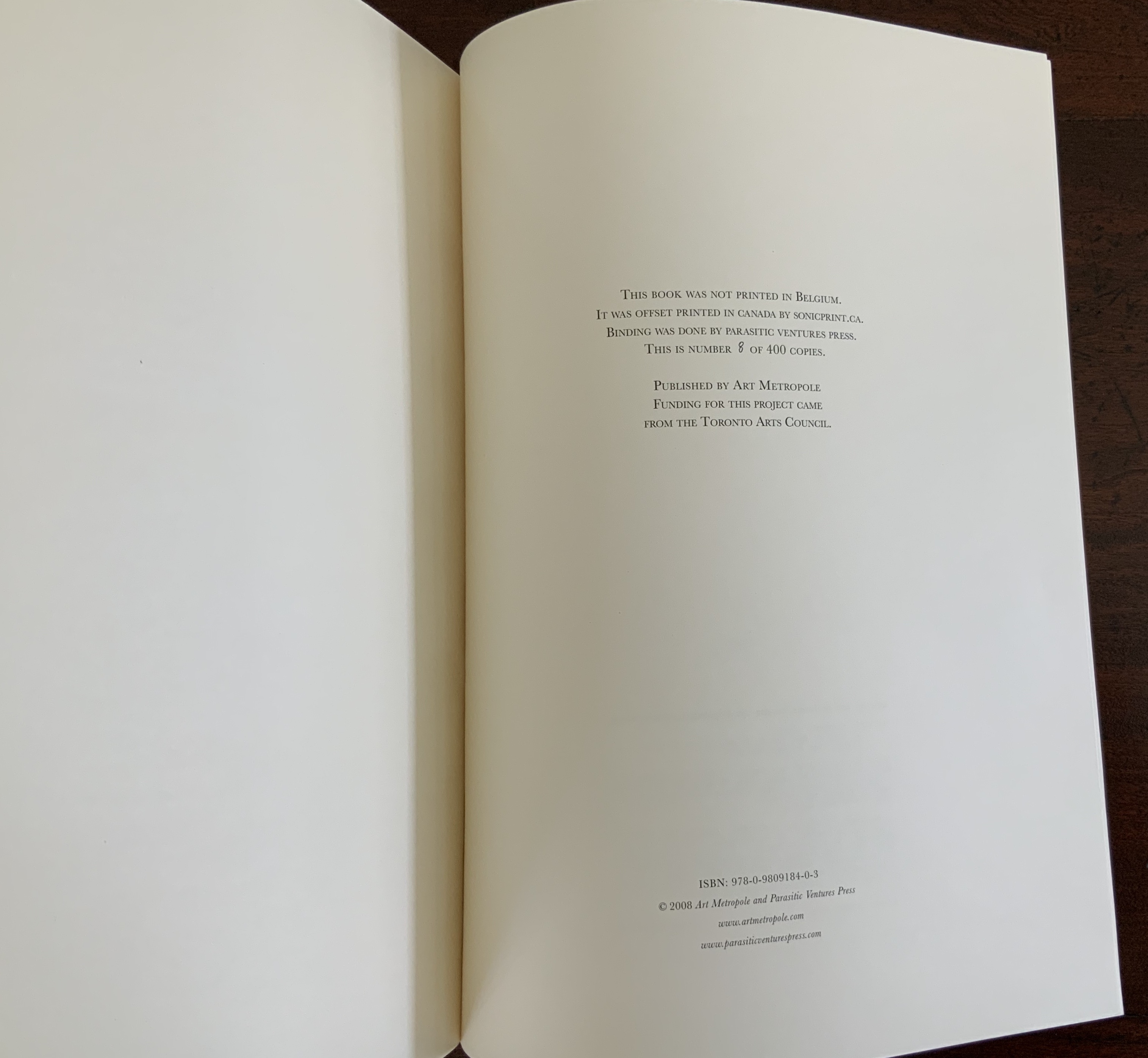
Hand bound. H325 x W250 mm, 32 pages. Edition of 400, of which this is #8. Acquired from Stefan Schuelke, 30 June 2020. Photos: Books On Books Collection.
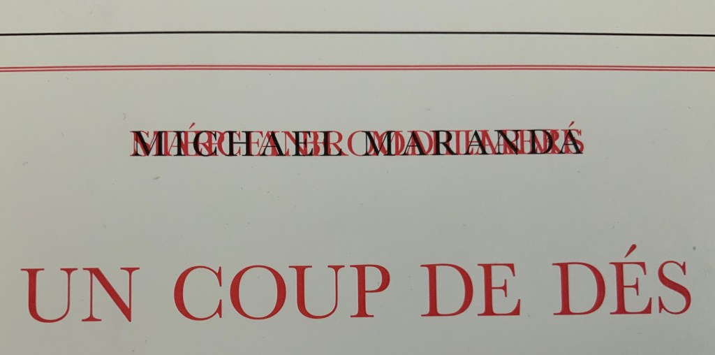
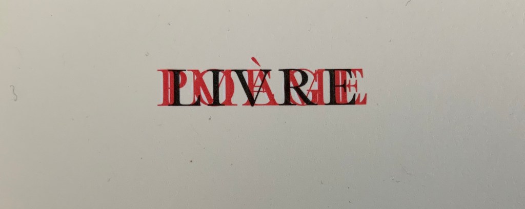
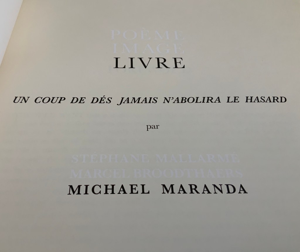
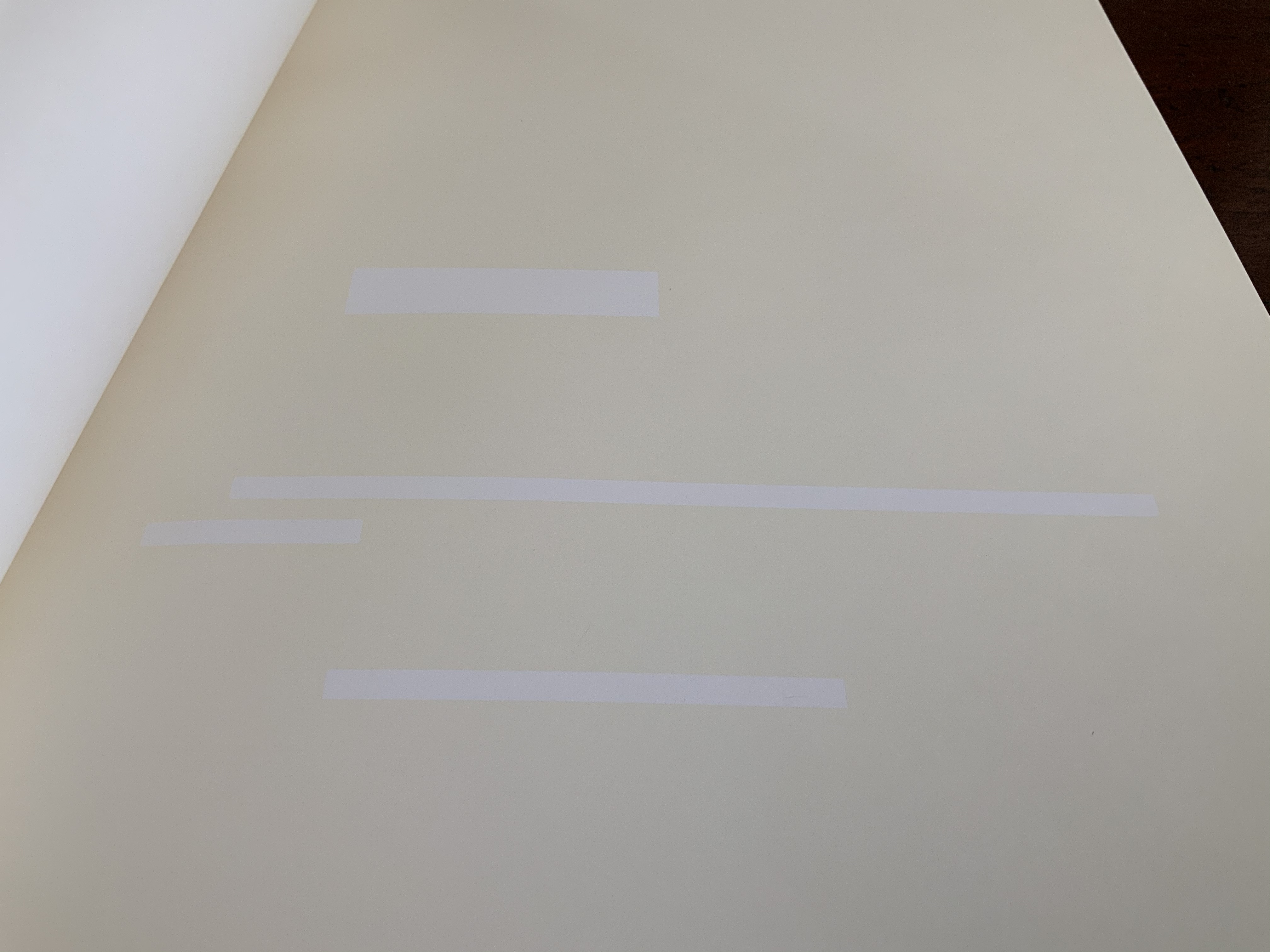
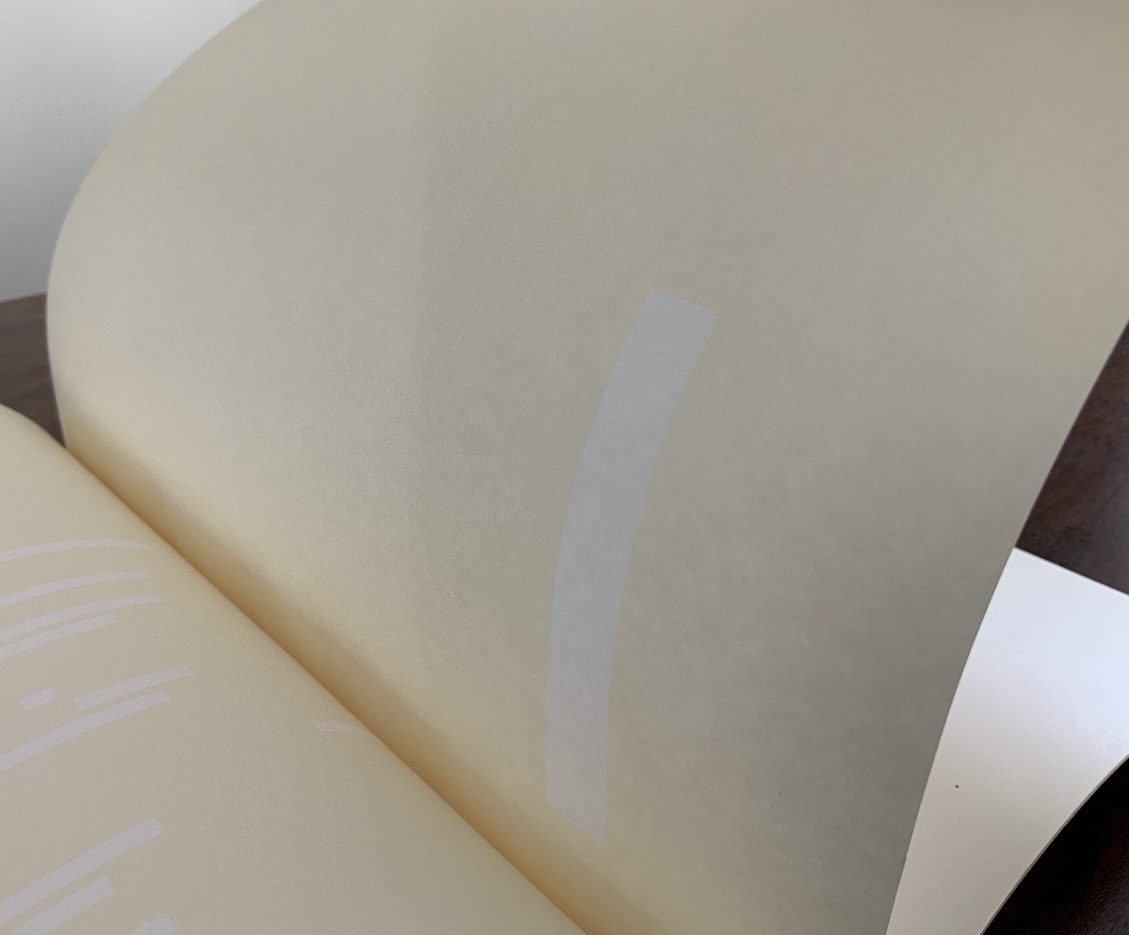
Look carefully at this work’s text and images. On its cover, the author’s and artists’ names are hard to make out, overlapping one another as they do, as do the subtitles: Mallarmé and Poème in red, Broodthaers and Image also in red, and Maranda and Livre in black. Between Mallarmé and Broodthaers, it is hard to say technically whose name and subtitle came first in the printing; who and what are overprinting whom and whose? Unbroken as the letters are, though, Michael Maranda and Livre must have come last.
The title page offers a bit more legibility, but the printing hijinks continue. Poème/Mallarmé and Image/Broodthaers no longer occupy the same space and are just perceptible in white lettering created by the ocean of cream-colored ink surrounding them. Along with the poem’s title, Livre/Maranda appear in black.
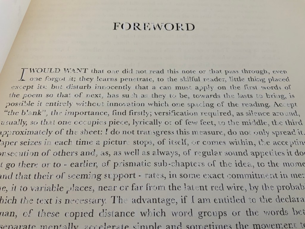
Then comes the Foreword, and the hijinks strain the eyes even more. At first, it seems that the Foreword has been badly printed. Not only badly printed, but badly translated from Mallarmé’s original: “I would want that one did not read this note or that pass through, even one forgot it”!? Only Maranda’s online artist’s statement explains the how and why of the poor translation:
To highlight the transformation of the reception of the poem by Broodthaers edition, the preface of this edition is Mallarmé’s original one, translated from French to Dutch and then to English using the online translator, Babble [sic] Fish. Michael Maranda, “Statement“, 2008. Accessed 6 August 2020.
That may explain the poor English translation, but what about the poor printing job? Actually, the printwork is precise, and the cover and title page offer the clues to this in their overprinting and reversed-out inking, respectively. The mangled English of the foreword has been printed in black, but the French of the préface appears as the absence of the cream-colored ink. Organizing the printing so that the black ink is broken up by those letters formed from the absence of ink is precision indeed.
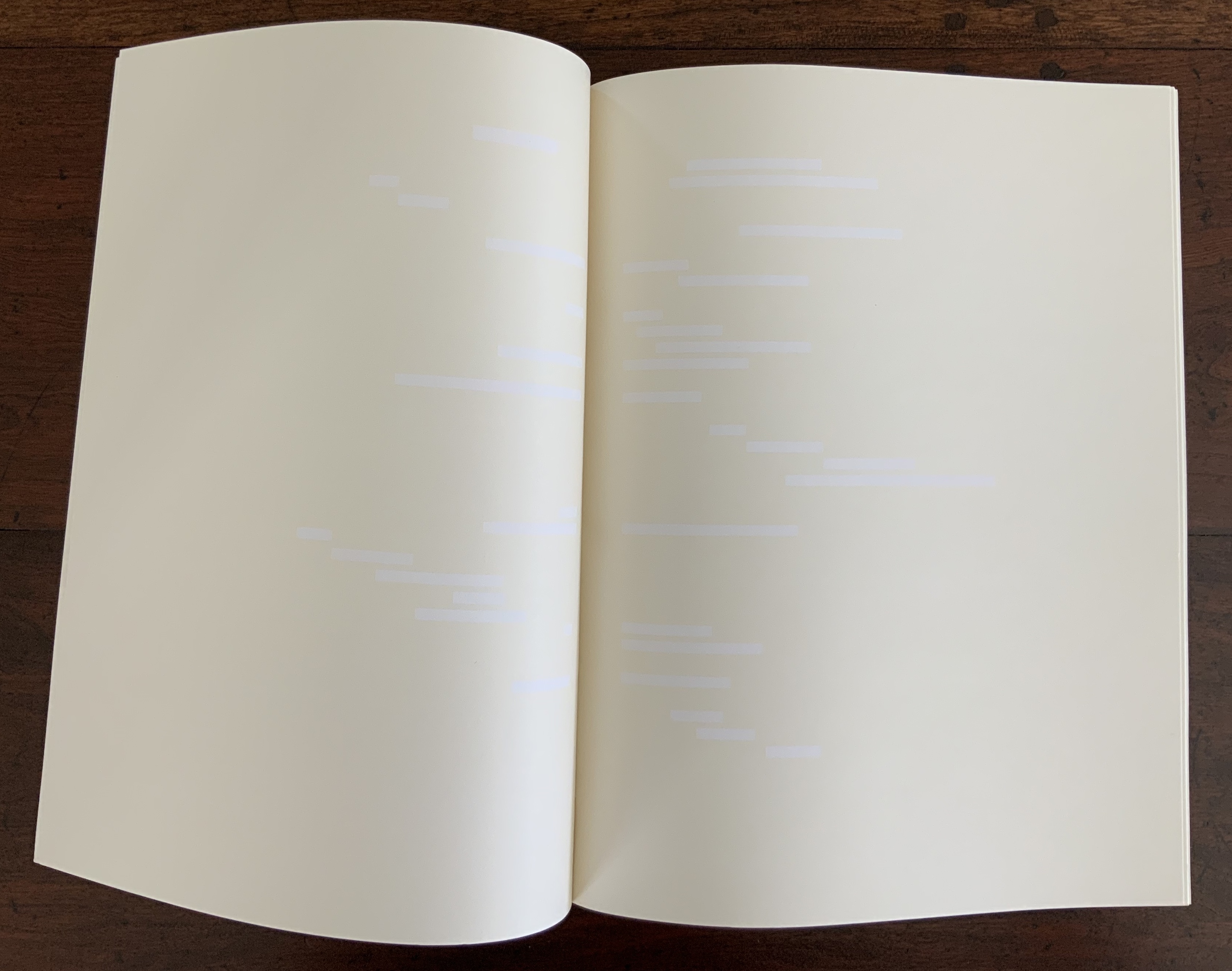
Maranda calls his work a “meditation on les blancs“, the term that Mallarmé used in his 1897 preface to Un Coup de Dés to draw attention to the blank spaces surrounding the carefully scattered lines of verse. Taking Mallarmé at his word, Broodthaers drew attention to les blancs by blacking out the text with rectangles and parallelograms reflecting the type’s sizes and styles. In all of the pages that follow the preface, Maranda fills in Mallarmé’s and Broodthaers’ blancs with cream-colored ink. Paradoxically, Mallarmé’s text and Broodthaers’ black stripes have become blank spaces, and les blancs to which they drew attention have been printed in cream.
This strange reversed-out palimpsest recalls a passage from Ulises Carrión’s “The New Art of Making Books” (1975):
The most beautiful and perfect book in the world is a book with only blank pages, in the same way that the most complete language is that which lies beyond all that the words of a man can say. Carrión.
Maranda’s Livre stands among several works of erasure and excision paying homage to Un Coup de Dés in its 1914/1969 iterations — think of those by Jérémie Bennequin, Cerith Wyn Evans and Michalis Pichler — but by titling his work as he does, Maranda also pays homage to Mallarmé’s lifelong conceptual holy grail of le Livre — that work that everything in the world comes to be. By overlaying Mallarmé’s Poème and Broodthaers’ Image with his meditation on les blancs, Maranda may be implying that visual language is the complete language in which that most beautiful and perfect book can be written.
Yet Maranda’s Livre ends with a colophon that suggests he takes himself no more seriously than his immediate predecessor in the palimpsest did:
This edition is published by Art Metropole. It was not printed in Belgium.
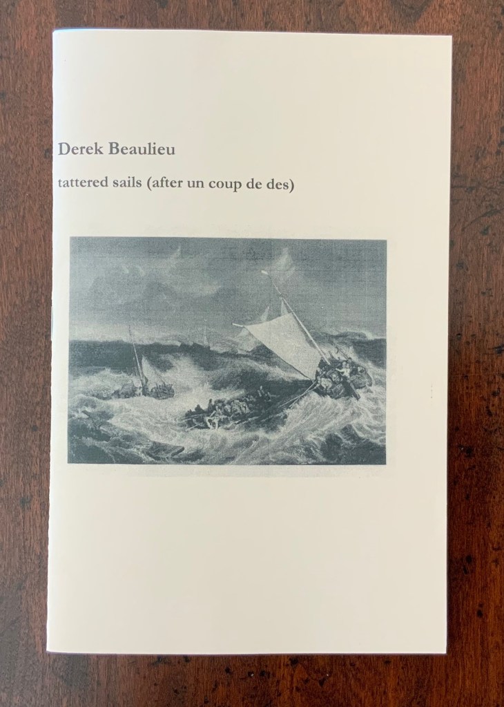
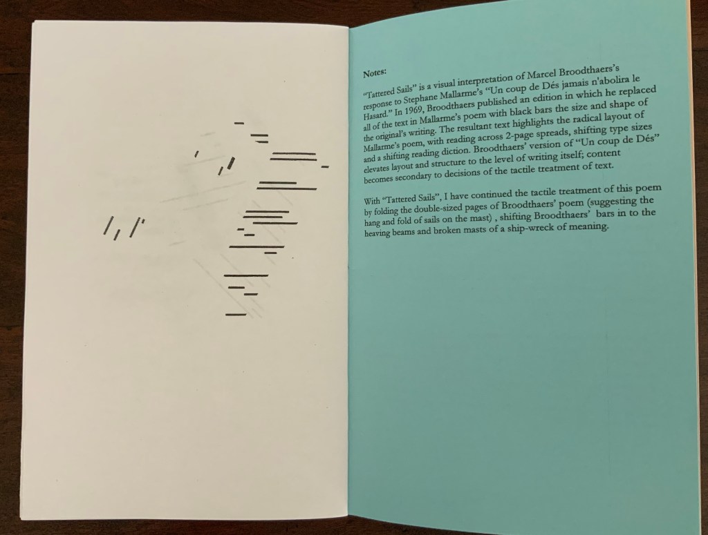
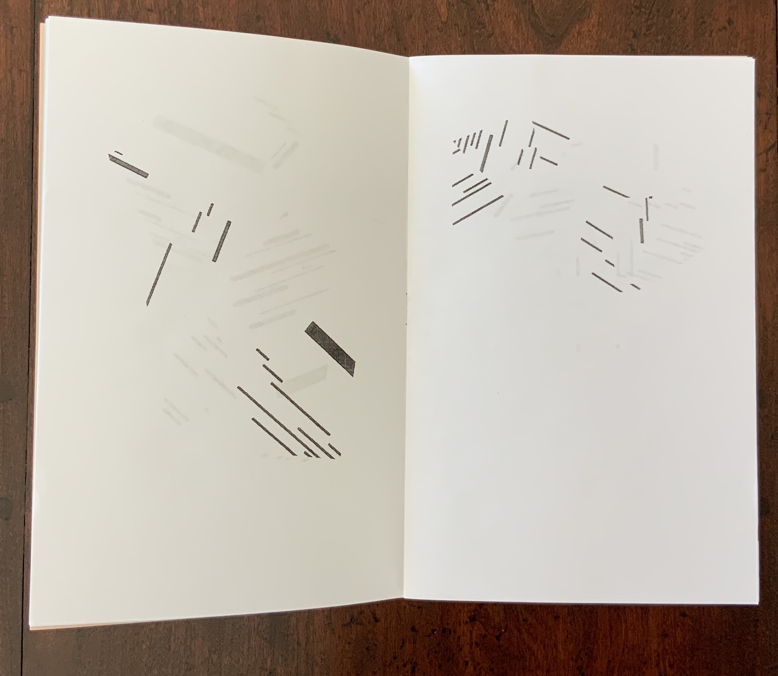
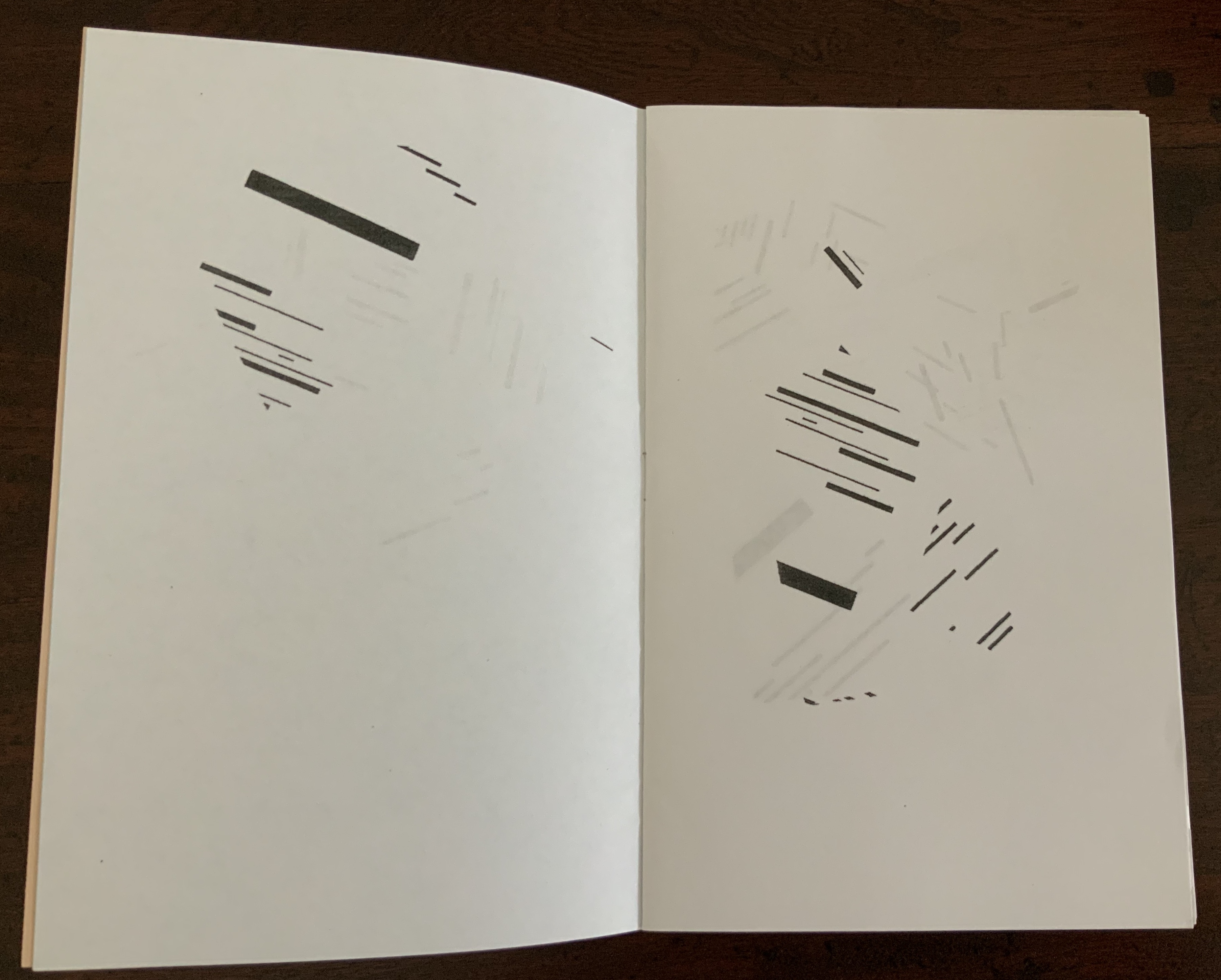
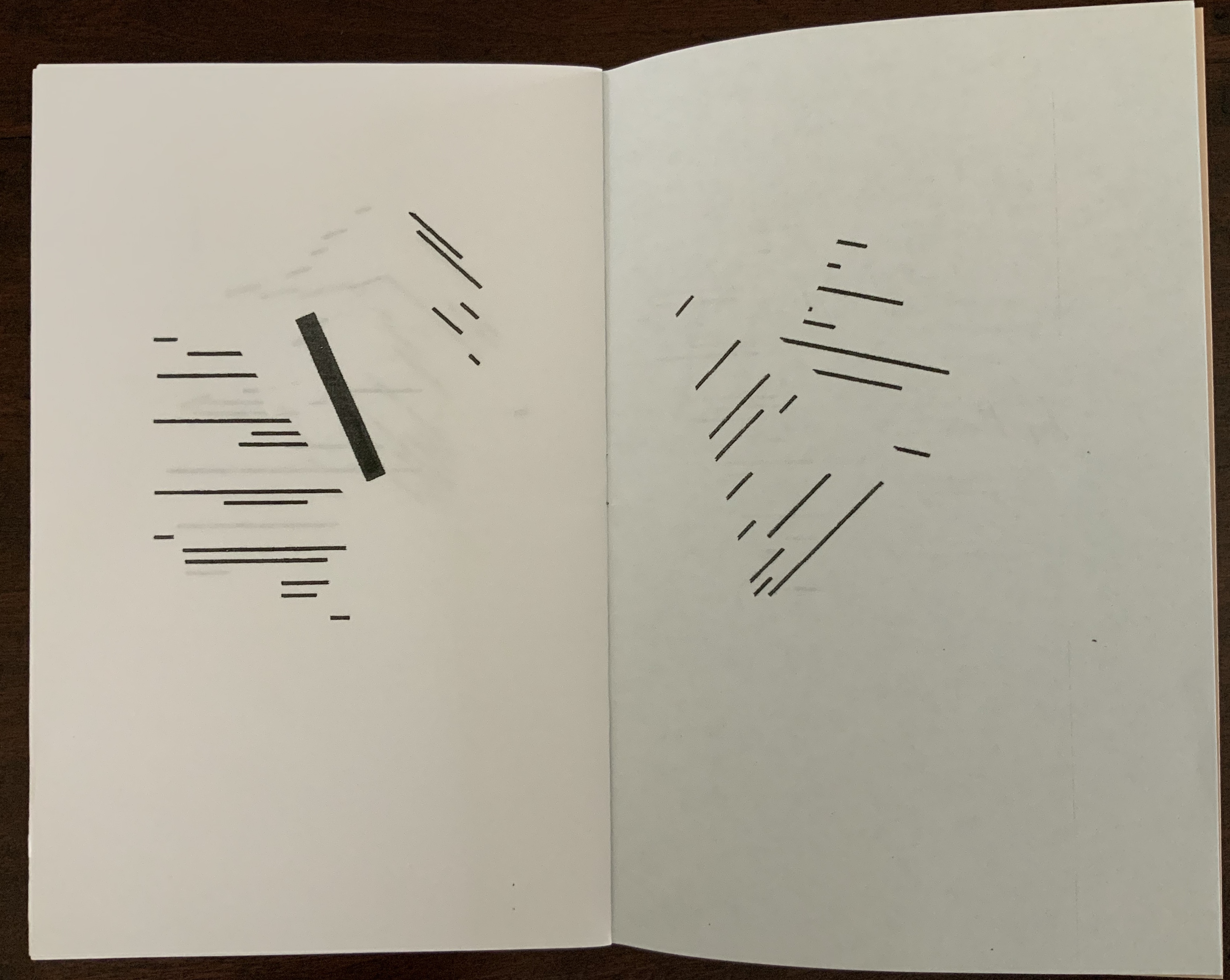
Tattered Sails(2018) Derek Beaulieu Saddle-stitched, one staple, colored endpapers; 12 unnumbered pages. H217 x W140 mm. Acquired from Above/Ground Press, 12 March 2019. Photos: Books On Books Collection.
Few book artists inspired by Broodthaers’ homage to Mallarmé have seized on aligning a key textual and visual metaphor of the poem with a distortion of Broodthaers’ treatment. That is what Beaulieu has done with Mallarmé’s metaphor of the shipwreck, his typographic replication of it and Broodthaer’s black bars. Tattered Sails also recalls Broodthaers’ A voyage on the North Sea (1973).
Photos: upper, Books On Books Collection; lower, Artists’ Books. Accessed 18 June 2020.
In one sense, Tattered Sails seems to underline the notion that image has supplanted text (W.J.T. Mitchell), which is a little less extreme than image’s having saturated all cultural space (Frederic Jameson) or than art’s just being now a “leeching of the aesthetic out into the social field in general” (Rosalind Krauss). But in another sense, by harking back to the low-tech era of democratic multiples and, nevertheless, enriching the interplay of text and image that spans four different artworks (counting the image on the cover) across the 19th, 20th and 21st centuries, Beaulieu pushes back on those 20th century critical notions.
Away from the critical theories’ abyss, Tattered Sails refreshes perception — of the work in itself and those on whose metaphors and techniques it stands. Turning our eyes into hands, it is part of a book art genre –“a genre of Un Coup de Dés“– in which works not only recall the original’s words, their shapes on the pages, the shipwreck tangling and untangling of syntax, the images and meanings bouncing into view like numbers on the side of rolling dice but also recall the rolls of the dice by others before.
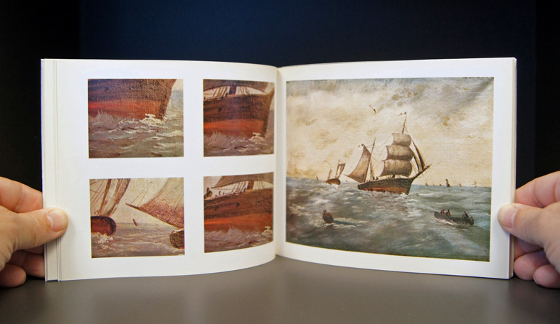
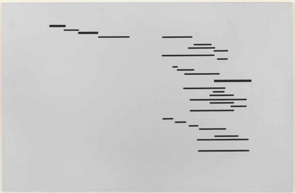
The Abolition of Chance: Sequence (2019) Benjamin Lord Laid finish card cover; hand-assembled perfect binding with inlaid red linen thread; 70 pages printed on translucent cellulose paper. H10 1/2″ x W8 1/4. Edition of 50, unnumbered. Acquired from the artist, 24 April 2020. Photos: Books On Books Collection.
The title of Benjamin Lord’s book names what Mallarmé’s Un Coup de Dés declares can never be accomplished by a throw of the dice: the abolition of chance. Taking the predicate of Mallarmé’s title (its verb and object), elevating it to the title position, substituting the word “sequence” for the subtitle Poéme, and placing it in a cover layout reminiscent of the 1913 NRF edition of Mallarmé’s book, Lord’s cover raises expectations and questions. Perhaps chance can be abolished? Perhaps by a certain sequence — of words?
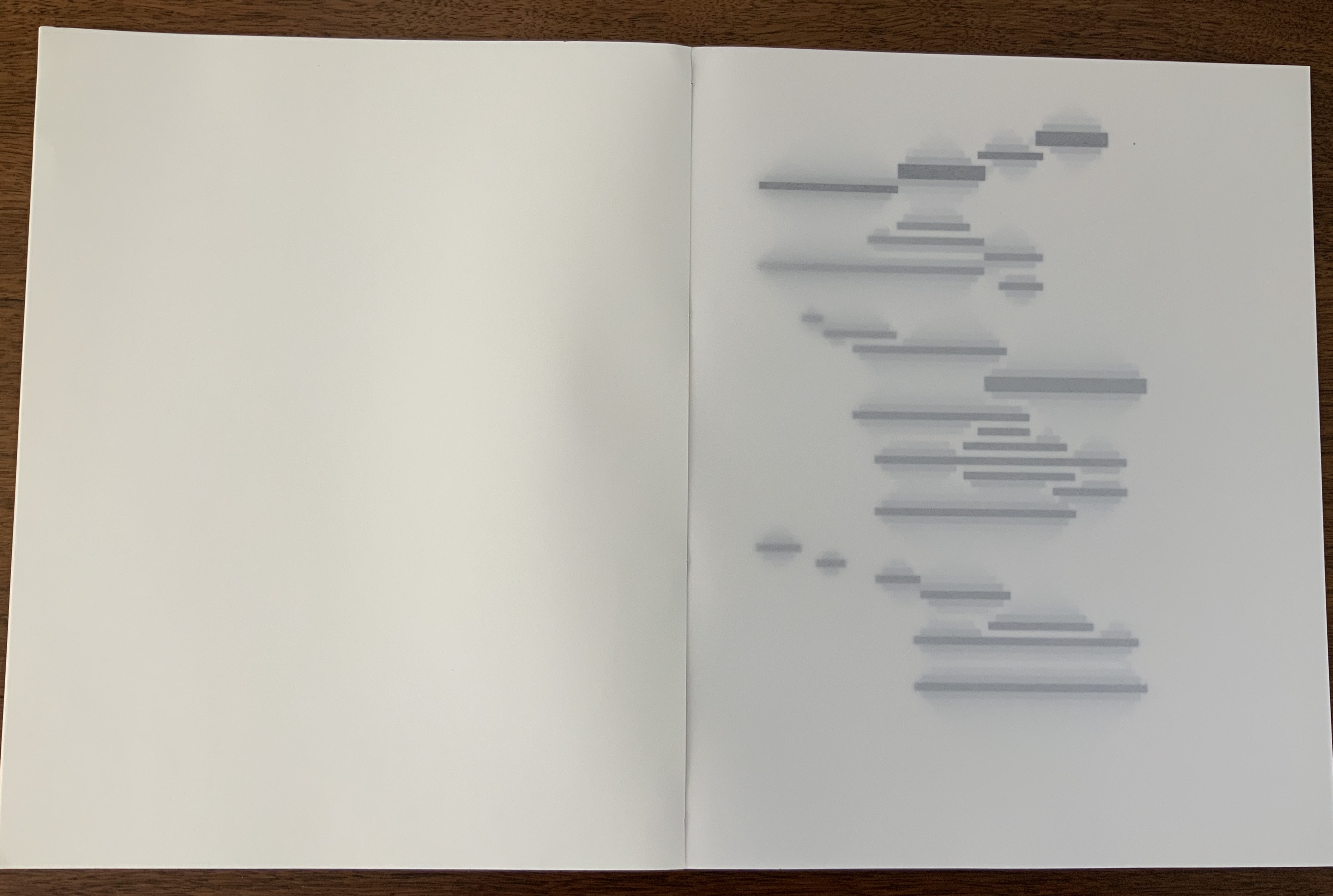
Bowling over the textual expectations raised by the cover, the interior pages offer only images — images that gradually shift from linearly arranged black rectangles to what seem to be digitally generated Rorschach tests, shifting QR codes or snapshots of a bitmap computer game, all blurred by the turning of the translucent paper. The translucency and images add another layer to each page and double-spread of images and also add another set of expectations and questions. What determined the starting point of those arranged rectangles? What drives the sequence of their change?
Without Lord’s own description of the work, a highly developed form of art-historical, science-historical visual genius is required to answer those questions. A genius with the visual recall to recognize that “The first spread of the book copies the last spread of Marcel Broodthaer’s book Un coup de dés jamais n’abolira le hasard (A throw of the dice will never abolish chance), made in 1969.” A genius that can recognize the sequence as being “generated using a simple mathematical formula known as the Game of Life, originally devised by the mathematician John Conway, also in the year 1969.”
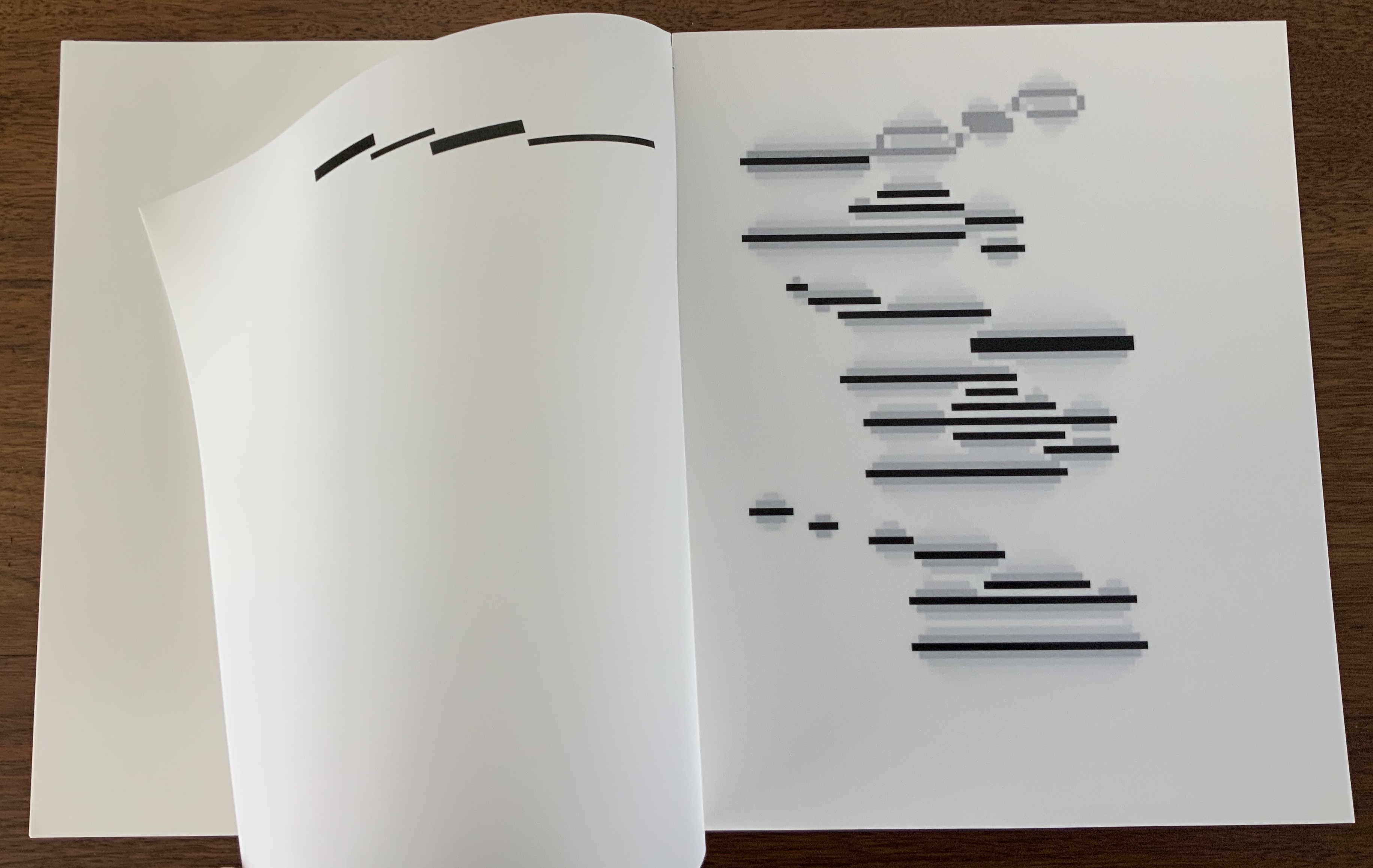
On the left is a “still-life” seed known as “Boat”; on the right is “Gosper’s glider gun”, an obviously more complicated pattern named after its creator, Bill Gosper. A forerunner of simulation games, Conway’s game poses a set of simple rules to be played out within an infinite grid:
Any live cell with fewer than two live neighbours dies, as if by underpopulation.
Any live cell with two or three live neighbours lives on to the next generation.
Any live cell with more than three live neighbours dies, as if by overpopulation.
Any dead cell with exactly three live neighbours becomes a live cell, as if by reproduction.
Here is Gosper’s glider gun, activated by the Game of Life’s rules encoded in a GIF:
Lord’s seed is the image of the last double-page spread in Broodthaers’ version of Un Coup de Dés.
Like a more complex glider gun, it generates the subsequent double-page spread images, each image being the seed for the next image. As Lord puts it,
The lines of Mallarmé’s poem inflate into balloons which expand and then pop into nothingness, or collide with each other to generate debris, or collapse into thicker bars. The image fragments into a vibratory bitmap constellation of expansions and contractions, in which interactions between forms continuously generate new forms, in a way that is neither random nor intuitive.
This 21st century American artist turning with a 20th century paintbrush dipped into the words of a 19th century French poet via a 20th century Belgian artist calls to mind The Education of Henry Adams. Throughout, Adams refers to himself in the third person. Post-Broodthaers, there is something “third-person-ish” — of being at two removes — in Lord’s homage and those of Beaulieu et al. above. But there is more to the recollection than grammar. Consider this passage from The Education in which “one” writes,
Historians undertake to arrange sequences,–called stories, or histories–assuming in silence a relation of cause and effect. These assumptions, hidden in the depths of dusty libraries, have been astounding, but commonly unconscious and childlike; so much so, that if any captious critic were to drag them to light, historians would probably reply, with one voice, that they had never supposed themselves required to know what they were talking about. Adams, for one, had toiled in vain to find out what he meant….he insisted on a relation of sequence, and if he could not reach it by one method, he would try as many methods as science knew. Satisfied that the sequence of men led to nothing and that the sequence of their society could lead no further, while the mere sequence of time was artificial, and the sequence of thought was chaos, he turned at last to the sequence of force; and thus it happened that, after ten years’ pursuit, he found himself lying in the Gallery of Machines at the Great Exposition of 1900, his historical neck broken by the sudden irruption of forces totally new.Chapter XXV
Adams and his third-person self were in Paris in May 1897, when Un Coup de Dés first appeared in the quarterly Cosmopolis. Despite their proximity, a common interest in quarterlies and the popular press, and a near obsession with the electrical forces of the dynamo, the men’s two paths did not cross. Adams mentions Mallarmé in a letter only in passing.
Sartre called Mallarmé the poet of nothingness. Its title and Lord’s description of The Abolition of Chance as a “constellation of expansions and contractions, in which interactions between forms continuously generate new forms, in a way that is neither random nor intuitive” suggest an alternative to nothingness. The final double-page spread does present a pattern of live cells. Lord, perhaps like his fellow American, responds to nothingness with a type of Buddhist repose, if not affirmation, much as Adams responded to the memorial for his wife that he had commissioned from Augustus St. Gaudens:
His first step, on returning to Washington, took him out to the cemetery known as Rock Creek, to see the bronze figure which St. Gaudens had made for him in his absence. Naturally every detail interested him; every line; every touch of the artist; every change of light and shade; every point of relation; every possible doubt of St. Gaudens’s correctness of taste or feeling; so that, as the spring approached, he was apt to stop there often to see what the figure had to tell him that was new; but, in all that it had to say, he never once thought of questioning what it meant. … From the Egyptian Sphinx to the Kamakura Daibuts; from Prometheus to Christ; from Michael Angelo to Shelley, art had wrought on this eternal figure almost as though it had nothing else to say. The interest of the figure was not in its meaning, but in the response of the observer. Chapter XXI
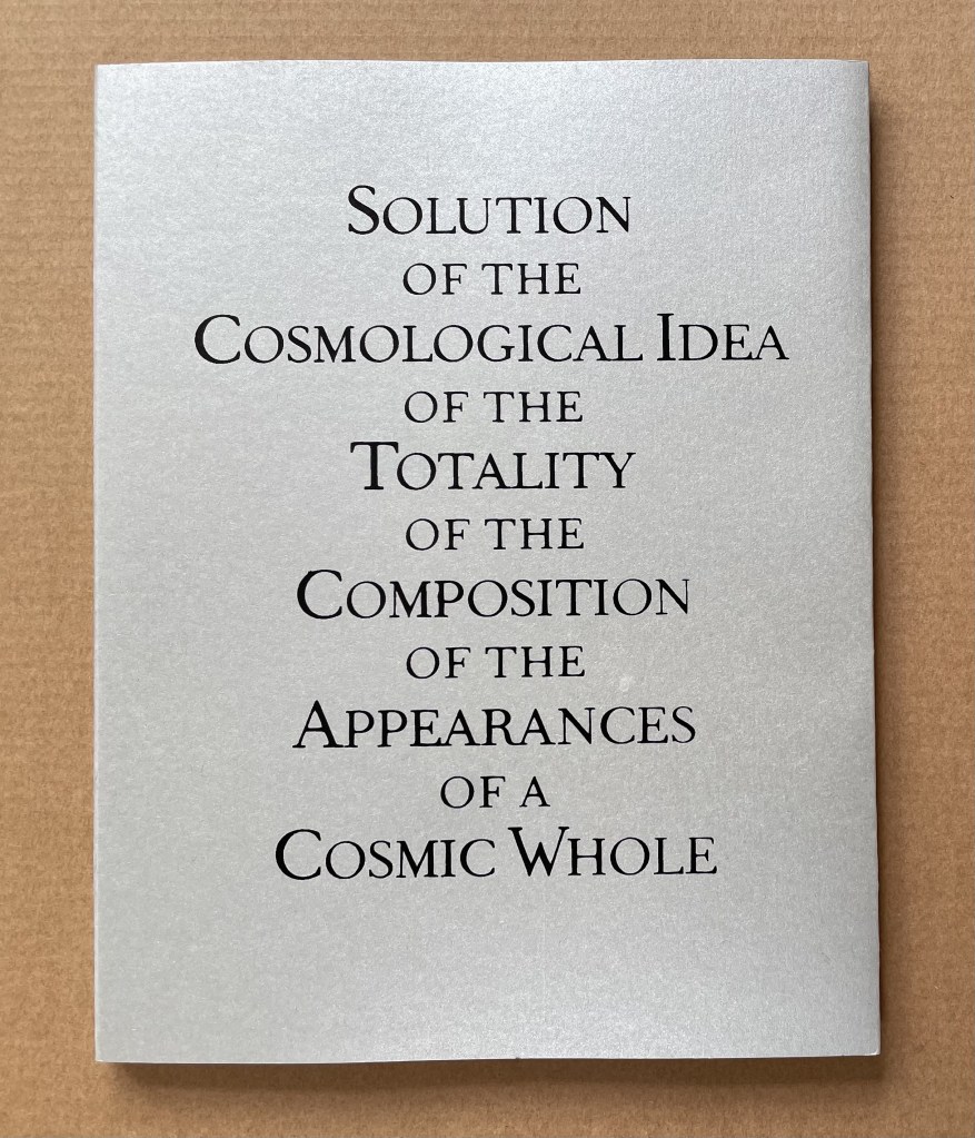
Solution of the Cosmological Idea of the Totality of the Composition of the Appearances of a Cosmic Whole (2010)
With apologies to the preacher: Of making many books [on books] there is no end.
(Ecclesiastes 12:12)
With the choir of its forebearers, Amaranth Borsuk’s The Book (MIT Press, 2018) sounds an “amen” to that truth. The proliferation of degree programs in book studies covering the history of the book, the book arts and even book art ensures The Book will not be the last. What distinguishes Borsuk’s book are her perspective as an artist and the book’s breadth and depth despite its brevity.
The book has a long history of existential crises. What is a book? Is the end of the book nigh? For more than a century, those questions have returned again and again. The most recent recurrence stems from the ebook’s threat to dematerialize the book and the online world’s threat to take us into a post-text future. Even before these latest threats, book artists have long lived and worked with their own existential questions, a kind of higher existential calculus, or derivative of, the book’s crises: What is an artist’s book? What is book art? Stephen Bury, Riva Castleman, Johanna Drucker, Joan Lyons, Stefan Klima, Clive Philpott and many others in the last quarter of the 20th century dwelt on defining and categorizing book art.
Borsuk belongs to a later generation of book artists that has embraced these existential crises and recognized that the book’s existential crises are what make the book a rich medium in which and with which to create art — from bio-art miniature to the biblioclastic human-scale to large-scale installations and performances. Even to the digital.
The Origin of Species (2016) Dr. Simon Park, Guildford, Surrey “The small book shown here was grown from and made entirely from bacteria. Not only is the fabric of its pages (GXCELL) produced by bacteria, but the book is also printed and illustrated with naturally pigmented bacteria. ” Posted 27 March 2016. Photo credit: Dr. Simon F. Park
Silenda: Black Sea Book (2015) Jacqueline Rush Lee Transformed Peter Green‘s translation of Ovid’s Tristia and the Black Sea Letters H9.5″ x W12″ x D6.5.” Manipulated Text, Ink, Graphite Photo credit: Paul Kodama. In Private Collection, NL
Field (2015) Johannes Heldén Produced, and premiered, at HUMlab, Umeå University Reproduced with permission of the artist
Performance artist and academic as well, Borsuk brings that later generational and creative perspective to the existential question — What is the book? — and, with an artist’s perception of her medium of choice, displaces the old companion existential question — Is the end of the book nigh? — with an altogether more interesting one — Where next for the book?
To see where books might be going, we must think of them as objects that have experienced a long history of experimentation and play. Rather than bemoaning the death of books or creating a dichotomy between print and digital media, this guide points to continuities, positioning the book as a changing technology and highlighting the way artists in the twentieth and twenty-first centuries have pushed us to rethink and redefine the term. (pp. xiii-xiv)
In The Book, the future is not far from the physical past. Where once we had text on scrolls, now we scroll through text (albeit more vertically than horizontally). Where once human consciousness changed with the invention of the alphabet and writing, now it may be altering with our reading and writing through networked digital devices. Like the many historians before her, Borsuk starts with cuneiform (those wedge-shaped accounting marks on baked clay), hieroglyphics and the invention of the alphabet to set the scene for the advent of the book and its ongoing physicality:
its shape (scroll, accordion, codex)
its material (papyrus, vellum, paper, charcoal or mineral-based watercolor and ink)
its manufacture (scribing, printing by woodblock and movable type, design and typography, illumination and illustration, folding into pages, methods of binding)
its constituent and navigational parts (cover, book block, title page, table of contents, page numbering, index).
But Borsuk reminds us — from Sumer’s clay to Amazon’s Kindle, from Johannes Gutenberg to Project Gutenberg — the book as human artifact exists in a social, political, technological, economic and even ecological context. Who is allowed to make it, how it is transacted, how and where we use it, how we perceive and speak of it — all have affected the physicality of the book object and are reflected in it.
In the first half of The Book, Borsuk steers us through these interdependencies to a turning point. That turning point is where the pinnacle of the book arts — Beatrice Warde‘s and Jan Tschichold‘s vision of the book as a crystalline container of content — and the book’s commodification combine to cause the book’s physicality to disappear because it is so taken for granted, leaving us with “the book as idea”.
With the perception that books are ideas bestowed on readers by an authorial genius whose activity is purely intellectual, the book’s object status vanished for much of the reading public as we raised a glass to happily consume its contents…. Even though innumerable material elements come together to make the book, these features have been naturalized to such a degree that we now hardly notice them, since we have come to see content as the copyrightable, consumable, marketable aspect of the work. (pp. 106-9)
At this turning point — where “the historic relationship between materiality and text is severed” (p. 112) — the second half of The Book introduces book art. It is telling that the longest chapter in the book begins the second half, that it is called “The Book as Idea” and that it comes before any extended engagement with the digital dematerialization of the book. It is a wry pivot: the artistic genius supplants the authorial genius; what the latter takes as invisible background, the former re-makes as self-regarding foreground. As Borsuk shows and her book’s cover neatly demonstrates, works of book art are inevitably self-referential and self-aware.
As such, works of book art
have much to teach us about the changing nature of the book, in part because they highlight the “idea” by paradoxically drawing attention to the “object” we have come to take for granted. They disrupt our treatment of the book as a transparent container for literary and aesthetic “content” and engage its material form in the work’s meaning. (p. 113)
Rather than offer a chronological history of book art to explore what “artists’ books have to teach us about a path forward for the book”, Borsuk offers “flashpoints” that represent “the energies motivating artwork in book form”(p. 117). These “flashpoints” are William Blake, Stéphane Mallarmé, Ed Ruscha and Ulises Carrión. Following these flashpoints, Borsuk organizes the rest of the chapter into “key themes that recur throughout artists’ books of the twentieth century: spatiotemporal play, animation, recombinant structures, ephemerality, silence, and interactivity” (pp. 146-47).
Oddly, Blake as flashpoint does not illuminate these six particular themes. Rather Borsuk notes three other recurrent themes or “energies motivating artwork in book form” that Blake and his work represent: centering or re-centering the production processes on the author/artist; using the book as a sociopolitical and visionary platform; and redefining, developing and challenging the relationship between word and image.
Blake refers to himself as “The Author & Printer W. Blake,” making clear the union of creativity and craft in his work. (p. 121)
Blake’s engagement with the social issues of his day, and his use of book form to respond to child labor, urban squalor, and slavery, established an important trend in both artists’ books and independent publishing—the utility of the book as a means of spreading social justice. (pp. 121, 124)
Blake used his craftsmanship to develop the relationship between word and image (p. 140)
One need not look far among twentieth and twenty-first century book artists for resonance with those themes. That Blakean union of creativity and craft resurfaces in artists such as Ken Campbell (UK), Cathryn Miller (Canada), Pien Rotterdam (Netherlands), Barb Tetenbaum (US) and Xu Bing (China) — some of them even to the point of carving or setting their own type, making their own paper, pulp printing on it themselves or binding the finished work themselves. Vision and sociopolitical observation have risen up in the works of artists such as Doug Beube (Canada), Julie K. Dodd (UK), Basia Irland (US), Diane Jacobs (US), Anselm Kiefer (Germany) and Chris Ruston (UK). Blake’s redefining the relationship of word (or text) to image often reappears book artists’ abecedariesand their children’s books such as A Dictionary Storyby Sam Winston (UK).As for emulators of Blake in technical innovation, consider the analogue example of Australian Tim Mosely’s works created with his patented pulp printing process, where the “ink” is actually colored pulp, or the digital example of Borsuk’s work Between Page and Screen, where the pages contain no text—only QR codes that, when scanned with a webcam, activate the text’s appearance on the reader’s browser screen.
For her second flashpoint, Borsuk selects another visionary, Stéphane Mallarmé, who like Blake was reacting to his own perceived Satanic mills draining poetry of its spirituality. Mallarmé’s Satanic mills dispensed rigid columns of newsprint to the masses and bland expanses of poetry and fiction set by Linotype machines in the neo-classical Didot font. With his famous visionary dictum — “everything in the world exists in order to end up as a book” (p. 135) — Mallarmé nudged the book toward pure concept and opened its mystical covers to the Dadaists, Surrealists, Futurists, Vorticists, Lettrists, Conceptualists and biblioclasts. With spatiotemporal play — mixing type sizes and fonts, breaking up the line and even breaking the page — Mallarmé used text to evoke image and, in his view, remake the book as a “spiritual instrument”. His post-humous book-length poem Un coup de Dés jamais n’abolira le Hasard (A Throw of the Dice Will Never Abolish Chance), published in 1897, embodies that vision and continues to cast its flashpoint light across multiple generations of book artists’ efforts. From Marcel Broodthaers in 1969, we have his homage to Un Coup de Dés. From Jérémie Bennequin in 2014, we have his serial “omage” to Broodthaers’ homage. And, most recently, we have the 2015 new bilingual edition A Roll of the Dice by Jeff Clark and Robert Bononno, for which Borsuk provides a perceptive reading.
Where Mallarmé’s flashpoint enlisted his vision alongside the cry “épater le bourgeois” from Baudelaire and other late nineteenth-century poets, Ed Ruscha’s later flashpoint illuminates a democratic counterpoint, a Zen-like vision and a very different way of changing the relationship of text to image. Ruscha’s self-published photobooks were cheap and distributed outside the gallery-controlled channels of art. As Borsuk shows — directly with Ruscha and indirectly with the many book artists influenced by him — the text is restricted to the book’s title, which interacts with a series of deadpan photos and their layout to deliver a wry, tongue-in-cheek work of book art. Ruscha’s spatiotemporal play manifests itself across the accordion book format and out-of-sequence juxtapositions. Ironically Ruscha’s works now command thousands of dollars per copy, and one has more chance of seeing them in an exhibition than in a roadside stop’s rack of newspapers, magazines and mass-market paperbacks.
Mexico’s Ulises Carrión — polemicist, European bookshop owner, conceptual artist and Borsuk’s fourth choice of flashpoints — is a counter-flashpoint to Ruscha. Where Ruscha reveled in self-publishing commodification, Carrión sneered at the book in its traditional commercial form. Where Ruscha has resisted the label “conceptual artist”, Carrión played the role to the hilt. Where Ruscha’s work has elicited numerous homages (see Various Small Books from MIT Press in 2013) and achieved a high profile, Carrión’s work, much lower in profile, has provided a more compelling range of hooks or influences on which to hang many different manifestations of book art (or bookworks as Carrión preferred). In fact, Borsuk’s six stated key themes or “energies motivating artwork in book form” come from Carrión’s manifestos (pp. 146-47).
The first theme — “spatiotemporal play” — comes from Carrión’s initial definition of the book as a “sequence of spaces”, which Borsuk traces to tunnel books, pop-ups and even large-scale constructs, the latter illustrated by American Alison Knowles‘ inhabitable The Big Book (1968). One more possible future of the book implied by spatiotemporal play manifests itself in Borsuk’s own augmented-reality (AR) works, those of Caitlin Fisher (Canada) and Carla Gannis’ Selfie Drawings (2016), in which portraits on the hardcover book’s pages animate and change when viewed through smartphone or tablet.
Borsuk takes the second theme, that of “animation”, from Carrión’s dictum: “Each of these spaces is perceived at a different moment— a book is also a sequence of moments”. As her several examples illustrate, much book art is cinematic. Borsuk’s exposition of Canadian Michael Snow‘s Cover to Cover (1975) comes closest to reproducing the experience I enjoyed of “watching” that photo bookwork from cover to cover several times at the now closed Corcoran Art Gallery. Borsuk is quick and right to remind that the cinematic future of the book has been with us for a long time, even before the cinema. She bookends her exposition of Snow’s book and the text animation of American Emmett Williams‘ Sweethearts (1967) on one side with Victorian flip-books and on the other with American Bob Brown‘s 1930s The Readies (presumably pronounced “reedies” to follow Brown’s comparison of his scrolling one-line texts with the cinema’s “talkies”).
A forgotten modernist, Brown declared the obsolescence of the book, predicted a new form of reading and technology to enable it, an optical projector emitting text into the ether and directly into the eyeball. But what does this tell us about the future of the book? Borsuk notes Craig Saper‘s resurrection of Brown’s Roving Eye Press and how he even put together a website that emulates Brown’s reading machine. In her phrase describing the machine’s effect of “turning readers themselves into a kind of machine for making meaning” (p. 168), Borsuk hints at a future of digitally interactive books, which she takes up in the next section and more extensively in the next chapter. At this point, however, the reader could use a hint of practicality and skepticism. Linear-one-word-at-a-time reading, however accelerated, eliminates affordances of the page, ignores graphics and strains against the combination of peripheral vision and rapid eye movement we unconsciously (even atavistically?) deploy as we “read” whatever we see. Although in the next section Borsuk does bring on more likely examples of the book’s future exploitation of its cinematic affordances (manga, graphic novels and children’s books), this section’s treatment of animation misses the chance to cite actual recent successes like Moonbot Studios‘ The Fantastic Flying Books of Mr. Morris Lessmore (2012) and others.
Once into the third theme — “recombinant structure” — it is clear that Borsuk’s chosen Carriónesque themes overlap one another. Like the cinematic, the recombinant structure manifests itself in accordion books. It extends, however, to something more interactive: volvelles (or medieval apps as Erik Kwakkel calls them), interactive pop-ups, harlequinades (flap books) and more. Borsuk uses Raymond Queneau‘s harlequinade Cent mille milliards de poèmes ( One hundred thousand billion poems, 1961), Dieter Roth‘s slot books and works by Carolee Schneemann to illustrate book art’s celebration of the concept. The fact that Queneau’s book is still easily available on Amazon vouches for book art’s predictive qualities. The example of Marc Saporta’s Composition No.1 (Éditions du Seuil, 1962), “a box of 150 leaves printed on only one side that the reader is instructed to shuffle at the outset”, goes Queneau one better —ironically. In 2011, Visual Editions reissued Composition No. 1 in print and app forms. Alas, the former is out of print, and the latter is no longer available for download (although a video of it is available here).
Composition No. 1 (2011) Marc Saporta Translation by Richard Howard, Introduction by T.L. Uglow, Google Creative Lab, Diagrams by Salvador Plascencia and Designed by Universal Everything Photo credit: Books On Books
Borsuk draws her fourth theme — ephemerality — from Carrión’s dictum:
I firmly believe that every book that now exists will eventually disappear. And I see here no reason for lamentation. Like any other living organism, books will grow, multiply, change color, and, eventually, die. At the moment, bookworks represent the final phase of this irrevocable process. Libraries, museums, archives are the perfect cemeteries for books. (p. 145)
To illustrate, Borsuk begins with the physical biblioclasts — those who in Doug Beube‘s phrase are “breaking the codex“. They include Beube himself, Bruce Nauman (see above), Brian Dettmer, Cai Guo-Qiang, Marcel Duchamp, Dieter Roth and Xu Bing. While some of these artists reflect a twenty-first century surge of interest in altered books and book sculpture, “facilitated by the overarching notion that the book is an artifact not long for this world” (pp.82-84), others have taken a more generative archaeological approach — erasing or cutting away a book’s words to reveal another. Examples include Tom Phillips‘ A Humument (1966-2014) and Jonathan Safran Foer‘s Tree of Codes(2010). Phillips’ bookwork serves multiple purposes for Borsuk’s arguments. Not only does it represent the book art of “erasure”, its success across multiple editions, digital formats and presence in art galleries supports her notion of book art’s predictive qualities.
There is a variant on her theme that Borsuk does not illustrate and is worth consideration for her next edition: the self-destructing yet regenerative work of book art. Examples could include American Basia Irland‘s series ICE BOOKS: Ice receding/Books reseeding (2007-), which gives a formidably tangible and new meaning to “publishing as dissemination”; and Canadian Cathryn Miller‘s tail-chasing Recomp (2014); and Argentinian Pequeño Editor‘sMi Papa Estuvo en la Selva (2015), which after reading can be planted to grow into a jacaranda tree.
Recomp (2014) Cathryn Miller Copy of Decomp, Collis and Scott (2013) nailed to a tree. Photo credit: David G. Miller
Recomp (2015) Photo credit: David G. Miller
Recomp vandalized (2015) Photo credit: David G. Miller
The last section in this chapter expands on the fifth theme — silence — drawn from Carrión’s statement:
The most beautiful and perfect book in the world is a book with only blank pages, in the same way that the most complete language is that which lies beyond all that the words of a man can say. Every book of the new art is searching after that book of absolute whiteness in the same way that every poem searches for silence. Ulises Carrión, Second Thoughts (1980), pp. 15-16.
Among her several examples are Pamela Paulsrud‘s Touchstones (2007-10), which look like stones but are books sanded-down into stone-like shapes, and Scott McCarney‘s 1988 Never Read(Opposed to Ever Green), a sculpture composed of stacked library discards that narrows as it ascends. Paulsrud’s, McCarney’s, Irland’s and Miller’s works are what Borsuk calls “muted objects”, but they speak and signify nevertheless:
Muted books take on a totemic [metaphoric] significance…. The language of the book as a space of fixity, certainty, and order reminds us that the book has been transmuted into an idea and ideal based on the role it plays in culture…. Defining the book involves consideration for its use as much as its form. (pp. 193-95)
Never Read (Opposed to Ever Green) (1988) Scott McCarney Reproduced with permission of the artist
Never Read (Opposed to Ever Green) (1988) Scott McCarney Reproduced with permission of the artist
Never Read (Opposed to Ever Green) (1988) Scott McCarney Reproduced with permission of the artist
Borsuk is a superb stylist of the sentence and expository structure. The words above, concluding chapter three, launch the reader into Borsuk’s final theme of interactivity and her unifying metaphor: “the book as interface”. Owners of Kindles, buyers from Amazon, perusers of Facebook — we may think we know what’s coming next in The Book and for the book, but Borsuk pushes the reader to contemplate the almost real-time evolutionary change we have seen with ebook devices and apps, audiobooks, the ascension of books to the cloud via Project Gutenberg, the Internet Archive and Google Books, and their descent to Brewster Kahle‘s physical back-up warehouse (to be sited in Canada in light of recent political events) and into flattening ebook sales of late. Chapter 4 is a hard-paced narrative of the book’s digital history from the Memex in Vannevar Bush‘s 1945 classic “As we may think” to T.L. Uglow‘s 100-author blockchain collaboration in 2017, A Universe Explodes from Visual Editions’ series Editions at Play.
Borsuk reminds us:
Our current moment appears to be much like the first centuries of movable type, a cusp. Just as manuscript books persisted into the Gutenberg era, books currently exist in multiple forms simultaneously: as paperbacks, audiobooks, EPUB downloads, and, in rare cases, interactive digital experiences. (p. 244)
Borsuk weaves into this moment of the book’s future a reminder that print affordances such as tactility (or the haptic) and the paratextual (those peripheral elements like page numbers, running heads, ISBNs, etc., that Gary Frost argues “make the book a book”) have been finding fresh ways into the way we read digitally. The touchscreen enables us to read between the lines literally in the novella Pry (2014) by Samantha Gorman and Danny Cannizaro (2014). Breathe (2018) by Kate Pullinger, another work in the Editions at Play series, uses GPS to detect and insert the reader’s location, the time and weather, and when the reader tilts the device or rubs the screen, hidden messages from the story’s (the reader’s?) ghosts appear.
At this point, an earlier passage from The Book should haunt the reader:
Artists’ books continually remind us of the reader’s role in the book by forcing us to reckon with its materiality and, by extension, our own embodiment. Such experiments present a path forward for digital books, which would do well to consider the affordances of their media and the importance of the reader, rather than treating the e-reader as a Warde-ian crystal goblet for the delivery of content. (p. 147)
Borsuk convinces. Art, artifact, concept — wrought by hand and mind, hands and minds — the book is our consensual tool and toy for surviving beyond our DNA. So now what? Metaphor, hints and historical flashpoints may illuminate where we have been, how it shows up in contemporary books and book art and where we may be going with it. In ten or one hundred years though, how will a book publisher become a book publisher? Given the self-publishing capability today’s technology offers, will anyone with a file on a home computer and an internet connection consider himself or herself a book publisher? Borsuk thinks not:
The act of publication — of making public — is central to our cultural definition of the book. Publication might presume some cultural capital: some editorial body has deemed this work worthy of print. It might also presume an audience: a readership clamors for this text. But on a fundamental level, publication presumes the appendage of elements outside the text that help us recognize it as a book, even when published in digital form. (pp. 239-40)
How will future book publishers learn to master the appendage of these elements outside the text (the paratext) that make a book a book “even when published in digital form”? Borsuk’s commentary on the ISBN as one of these elements sheds oblique light on that. She points to the artist Fiona Banner’s uses of the ISBN under her imprint/pseudonym Vanity Press — tattooing one on her lower back, publishing a series Book 1/1(2009) consisting of sixty-five ISBN’d pieces of mirrored cardstock and then collecting them in a photobook entitled ISBN 978-1-907118-99-9 in order to deposit those one-offs with the British Library as required by the UK’s Legal Deposit Libraries Act. What can a future ebook publisher deduce from this?
That the use of a globally unique identifier (GUID) matters.
The backstory of the transition from ISBN10 to ISBN13 and that of ebooks, ISBNs and Digital Object Identifiers (DOIs) might provide interesting fodder. The notion that the book industry was running out of 10-digit ISBNs was a red herring used to convince industry executives to adopt the more widely used format of unique identifiers overseen by GS1. The real reason for moving to ISBN13 — reduced friction in the supply chain — was too hard to sell. About the same time, some major publishers proposed incorporating the ISBN into the DOI for an industry-standard ebook identifier. The DOI offered an existing digital, networked infrastructure already being used by most of the world’s scientific, technical and medical journals publishers. It is an offshoot of the Handle System, established by Robert Kahn. Sad to say, few book publishers adopted the DOI for their ebooks; still fewer used the DOI’s application- and network-friendliness to enable their ebooks to take advantage of the network’s digital affordances.
The DOI shares with the ISBN a feature that Borsuk points out as a limitation to more widespread use: it is not free. A significant percentage of ebooks exist without ISBNs, much less DOIs. If a digital GUID is to be used in ways that help us recognize the identified digital object as a book, future book publishers and their providers of a network ecosystem supporting ebooks, linking with the print ecosystem and reducing friction in the supply chain still have wide gaps in commerce and knowledge to close. Perhaps this particular paratextual element is unnecessary for the book’s digital future, but until those gaps are narrowed, the ecosystem for eBooks will remain balkanized by Amazon, Apple, Google, Lulu and the more digitally literate denizen of the print publishing industry. In the meantime, as Borsuk’s examples throughout her book show, there are boundless other print and digital affordances with which publishers, authors, editors, designers, typographers, developers and readers can play as they continue to shape the book.
The Book‘s publication month, June 2018, is auspicious, being the same for the Getty Center’s exhibition “Artists and Their Books/Books and Their Artists“, June 26 – October 28. The Center and MIT Press would do well to have stacks of The Book on hand. The Book will also serve as an excellent introductory textbook for courses on book art or the history of the book. And by virtue of its style and artist’s perspective, Borsuk’s book will appeal to anyone with even a passing interest in this essential technology of civilization and its growing role as a material and focus of art in the twentieth and twenty-first centuries.
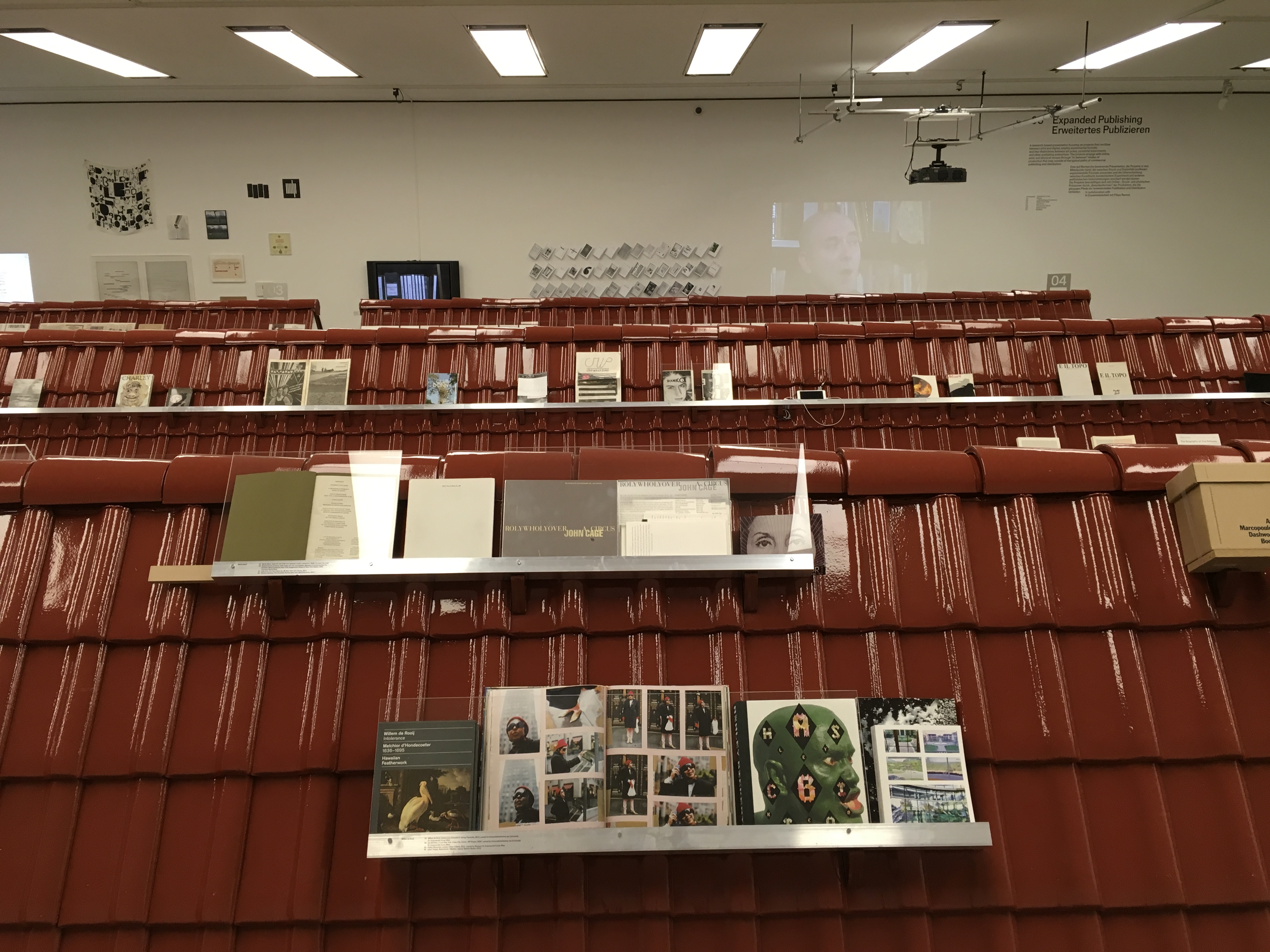
Last Sunday, 28 January 2018, this ambitious exhibition curated by Luca Lo Pinto closed.
The metonymic metaphor of the glazed roof tiles’ evoking the concept of “home” in support of the individual and common ritual experience of reading as being translated into space is a bit topsy turvy if not strained. Overall, though, the effect was pleasing, playful and distinctively European (as was the selection of artists) in the cast concrete hall. The simultaneous warmth and cold of the color proved a pleasing contrast with the items displayed, although its glare and the occasional protective plexiglas made viewing and photographing a challenge.
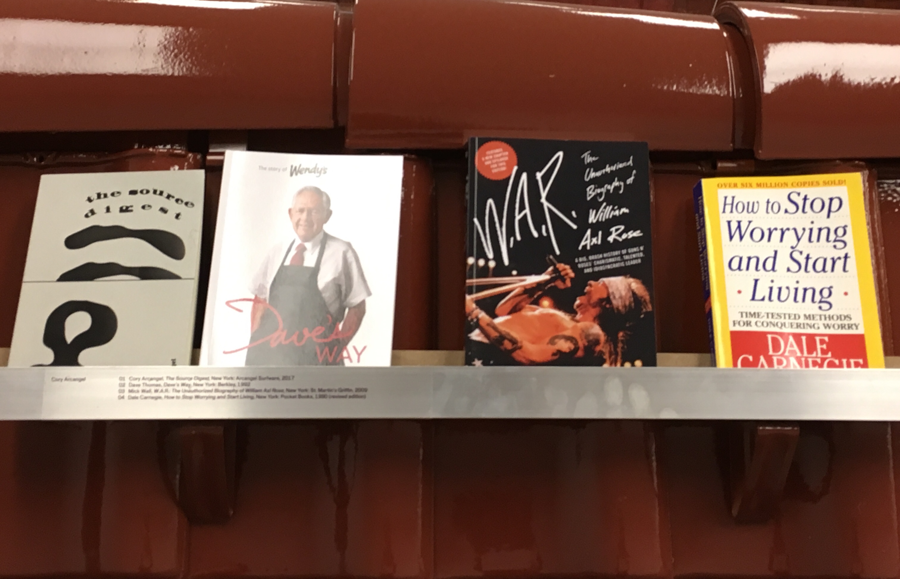
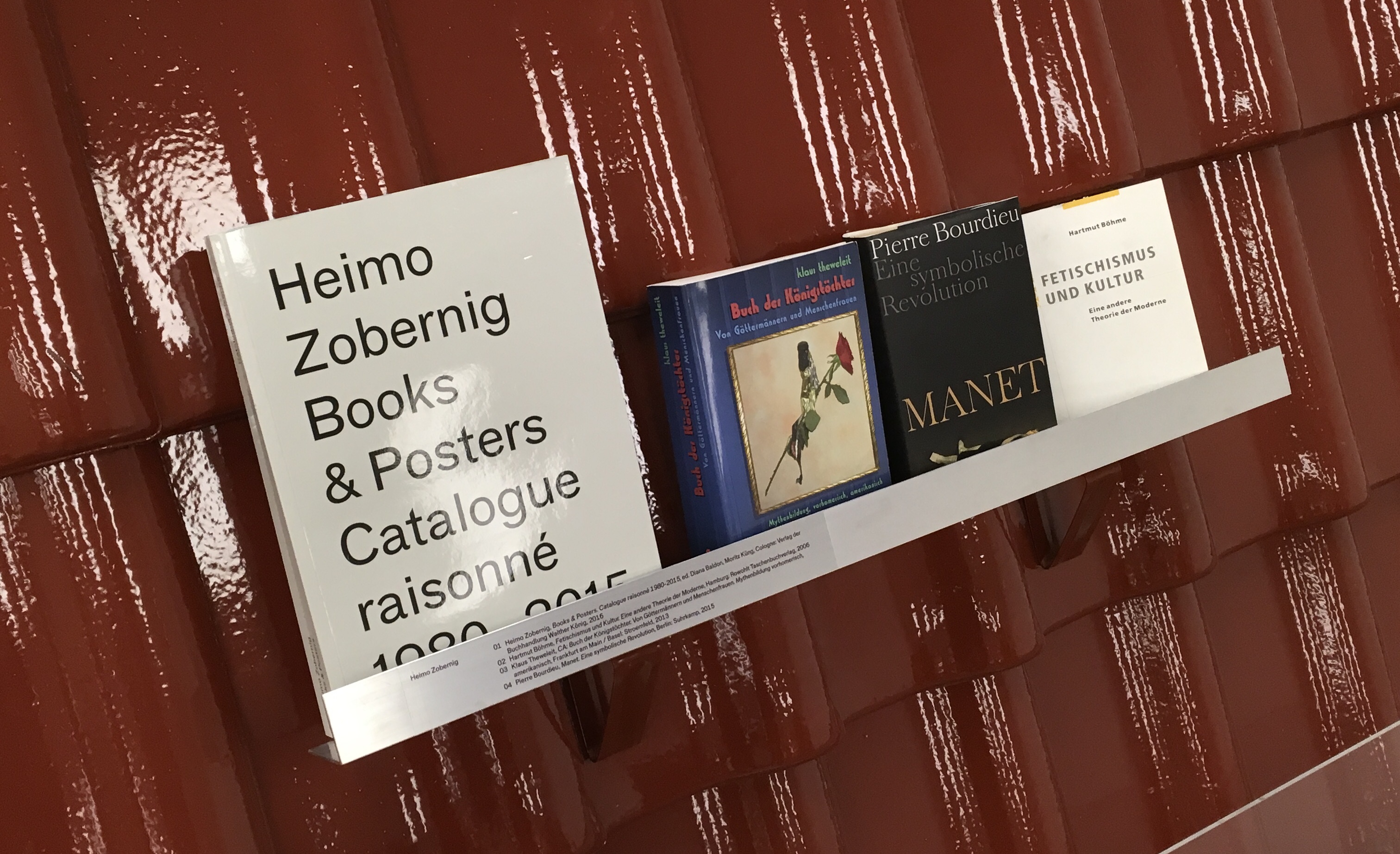
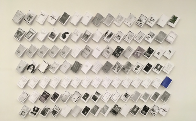
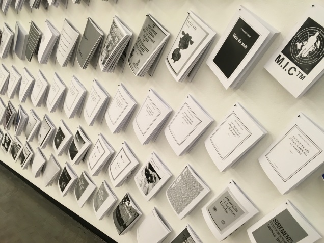
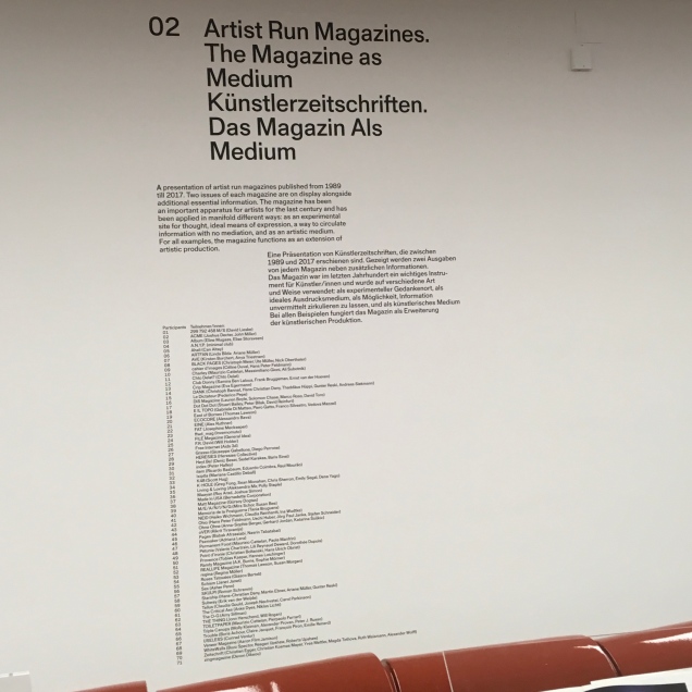
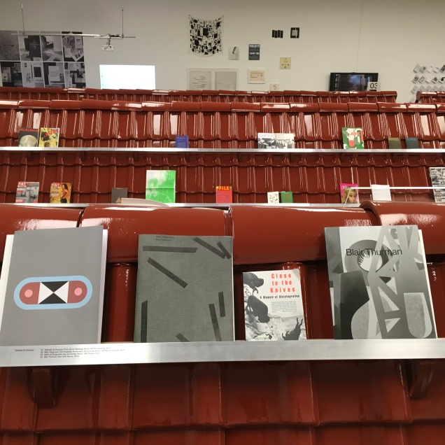
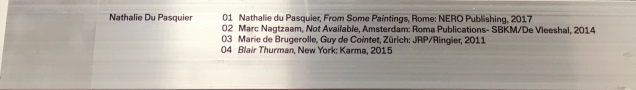
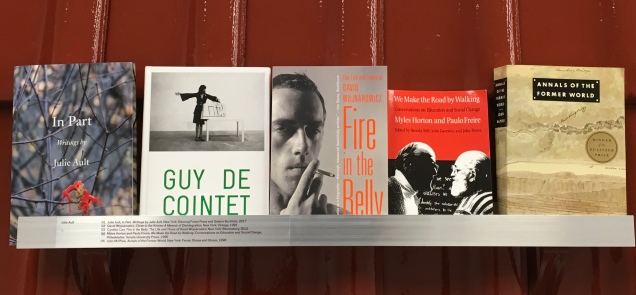
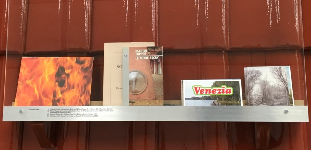
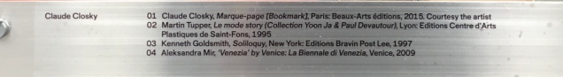
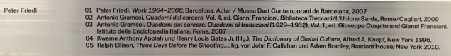
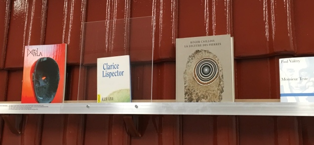
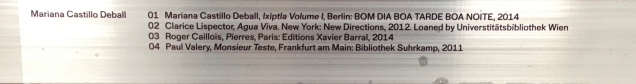
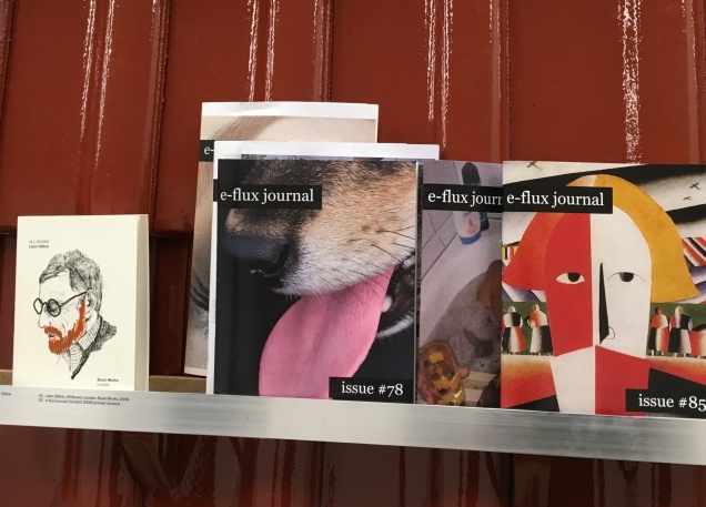
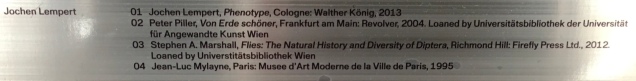
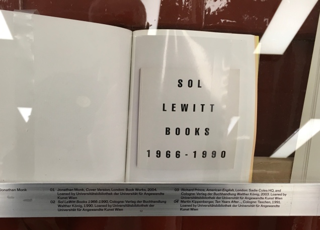
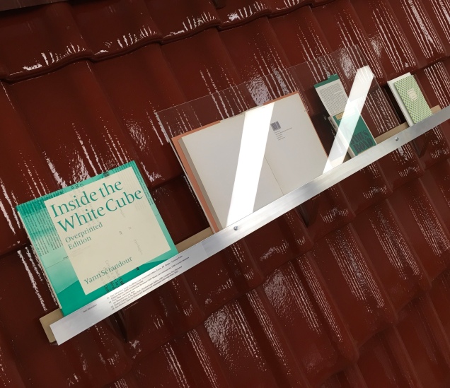
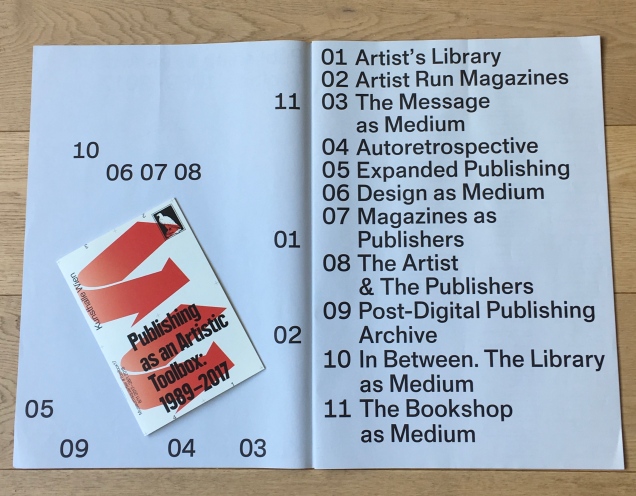
In Section 01 Artists’ Library and propped on stainless steel shelves were artists’ own publications and choices of books from 1989 to 2017 that have influenced their view of publishing. So then, with the usual sly humor of book art, we have “artists’ books” and artists’ “books” — from Cory Arcangel to Heimo Zobernig.
Arcangel’s The Source Digest (from his series in which he rings the changes on selling us annotated source code in varying metaphorically driven and recursive manifestations) struck the first of several common notes in the exhibition: the digitally driven artist’s book. At the far end of the hall, in Section 05 Expanded Publishing, Antoine Lefebvre‘s La Bibliotheque Fantastique (an online library of free artists’ books) echoed that note and added one of its own: book art’s genre-reflexive, form-reflexive and self-reflexive tradition.
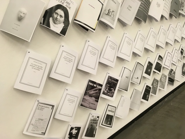
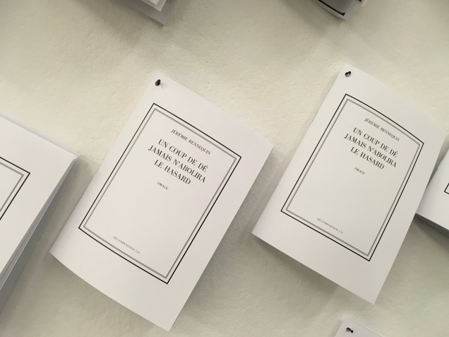
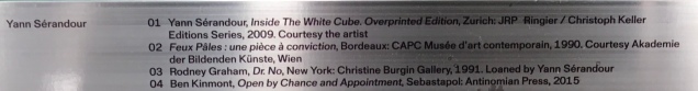
The ninety-item display is a genre-reflexive nod to series such as Dick Higgins’ Great Bear Pamphlet series. One row here on its own embodies multiple forms of reflexivity: Jérémie Bennequin‘s homage to Marcel Broodthaers’ homage to Stéphane Mallarmé’s Un Coup de Dés Jamais N’Abolira Le Hasard.
Bennequin’s homage is the result of a decomposition performance in which he and Lefebvre — sometimes each in two different cities — decompose Mallarmé’s poem by rolling a die then locating and erasing the syllable corresponding to the number rolled.
The title’s missing “s” from “Dés”, the subtitle’s missing “h” from “homage” and its isolation of “dé” in the hyphenation of “decomposition” pun self-reflexively — as book art so often does — underscoring here the paradoxical technique of creation/de-creation.
Section 02, devoted to periodicals and zines, occupied the most space in the hall. Although the coverage was wide, it seemed odd not to find Brad Freeman’s Journal of Artists’ Books or Sarah Bodman’s Bookarts Newsletter or The Blue Notebook. But Lo Pinto did not set out to present the encyclopedia of everything within each compartment of the toolbox. The unexpected — like Lefebvre’s display — and the provocative depth of resonance within Section 01 and across sections more than made up for omissions of the expected.
Among the “interventions” in Section 03 The Medium as Message was Michael Riedel‘s Frieze CMYK (2007), now, like so many other items in the exhibition, out of print — a reality-imposed dollop of self-reflexive irony given Riedel’s paradoxical view that an exhibition must generate ephemera to live on.
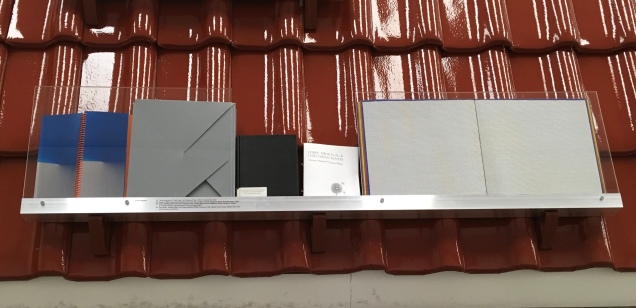
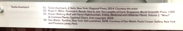
As with the echoing Section 05 that sent me back to look at Arcangel’s contribution in Section 01, the color play of Riedel’s Frieze CMYK returned me to Tauba Auerbach’s entry in Section 01. But I was misremembering and thinking of her work titled 2,3, (2011), RGB Color Atlas (2011) and their color play. On display here was her Z Helix(2014) behind plexiglas. Only the interlocking blue and red spiral bindings hinted at the color inside.
Strolling back to Section 05 and thinking of the physicality as well as color of Auerbach’s works, I stopped at Section 04 Autoretrospective, which focused on Philippe Thomas’ fictitious ad agency readymades belong to everyone® that he “installed” in the Cable Gallery in New York in 1987. The section’s title seems ironically unfair to Thomas’ self-effacing, deconstructivist intent. Given what was on display in Vienna, it was inescapably — like the mythological World Turtles — Thomas “all the way down”. Perhaps there is something to the row-upon-row of roof tiles metaphor after all.
The remaining sections — one being a space for performances and readings, another a screen showing the home page of Silvio Lorusso’s Post-Digital Publishing Archive and another entirely elsewhere in the city — began to push the limits of the senses and imagination to make up for that lack of three-dimensionality that limited the impact of Auerbach’s and others’ shelves. (It was commendable, however, that visitors were allowed to touch the works not behind plexiglas.)
Being familiar with Lorusso’s site, I looked back over the roof top shelves and wall projections and momentarily found myself slipping into that “consensual hallucination experienced daily by billions … in every nation, … A graphical representation of data abstracted from the banks of every computer in the human system. Unthinkable complexity. Lines of light ranged in the non-space of the mind, clusters and constellations of data” (William Gibson’s definition of “cyberspace” from Neuromancer, New York: Berkley Publishing Group, 1989, p. 128). As with all white cube spaces, though, the physical arrangement did not fail to reassert itself and draw me out of the exhibition through Section 11 The Bookshop as Medium, which much like Sections 01 through 05 offered unexpected tangible and intangible compensations.
Section 11 The Bookshop as Medium Austellungsansicht: Publishing as an Artistic Toolbox: 1989–2017, Kunsthalle, Wien Photo by Stephen Wyckoff
As noted at the beginning, an ambitious exhibition: one also reminiscent of Germano Celant’s effort in 1973 Book as Artwork 1960/1972. With the hope for more to come from this talented curator and the artists and publishers gathered, here are some favorites on the way out … best enjoyed with the downloaded or printed catalog close to hand (links after the favorites).