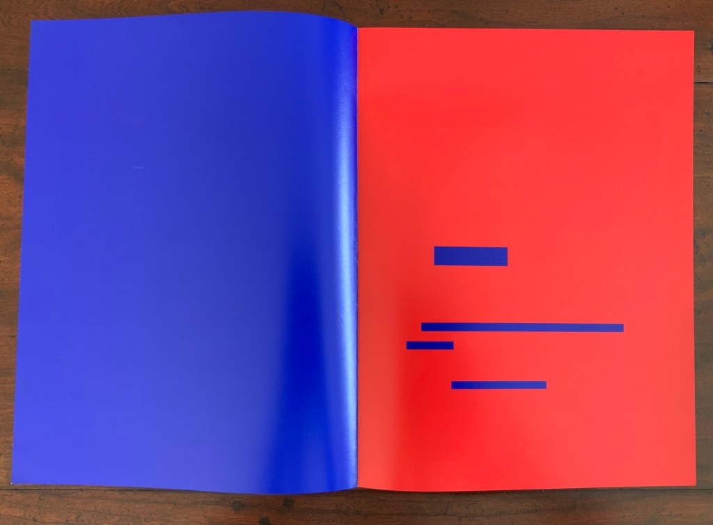
Eric Zboya is poet, writer and artist. Years before this book, he wrote for Ubu Web about the dialogues between Mallarmé’s groundbreaking poem and artists such as Marcel Broodthaers, Guido Molinari and Michalis Pichler, who explore “the higher-dimensional characteristics of the poem”. Broodthaers’ and Molinari’s solid-colored horizontal blocks take the place of lines of text and, reflecting its typographic size, deliver the poem’s page-oriented image(s) without its words. Pichler goes a sculptural step further and excises the lines altogether.
In one sense, Zboya returns to the traditional “collaborative” livre d’artiste, where the artist’s images illustrate the author’s text. But Zboya’s process for generating the images and his handling of the text are anything but traditional.
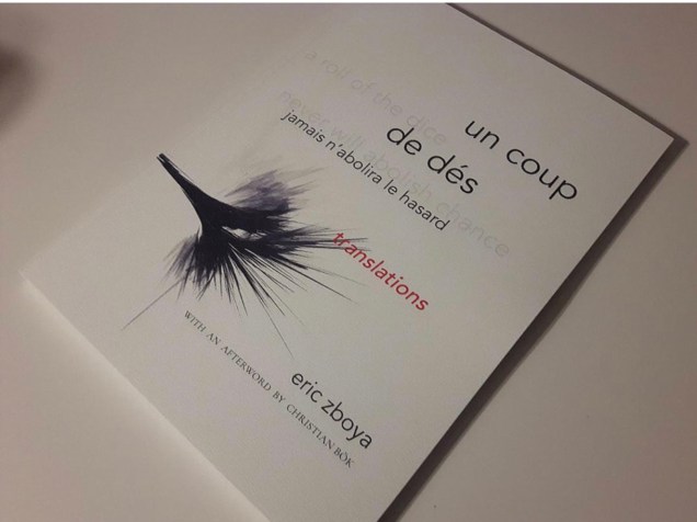
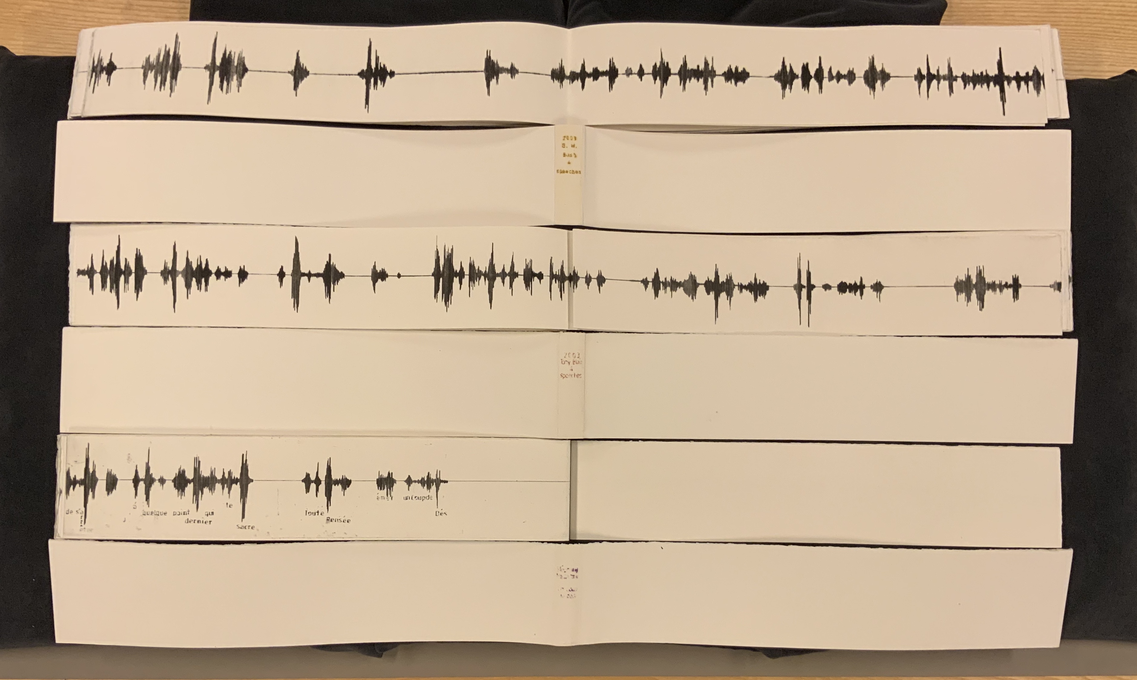
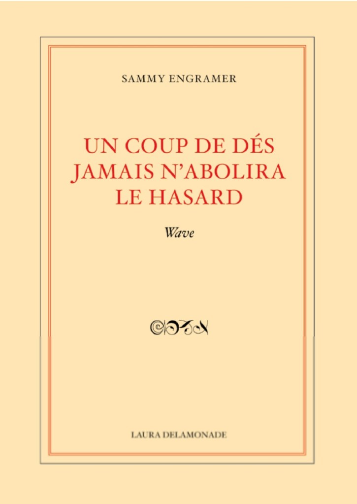
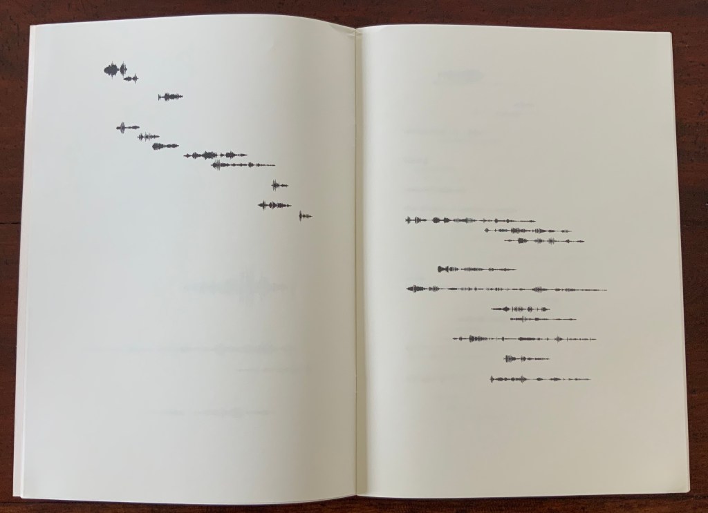
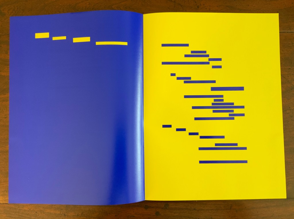
Just as Mario Diacono runs parallel to Broodthaers, so too do Didier Mutel (2003) and Sammy Engramer (2009) to Zboya. His Ubu Web essay appeared in 2011. While similar, the three artists’ approaches to images differ far more from one another than those of Diacono and Broodthaers differ. Mutel’s sonographs come from recordings of three different speeches. Engramer’s come from the recording of his reading of Un Coup de Dés. Although Zboya’s images come from the translated text of Un Coup de Dés, they do not come from sound recordings.
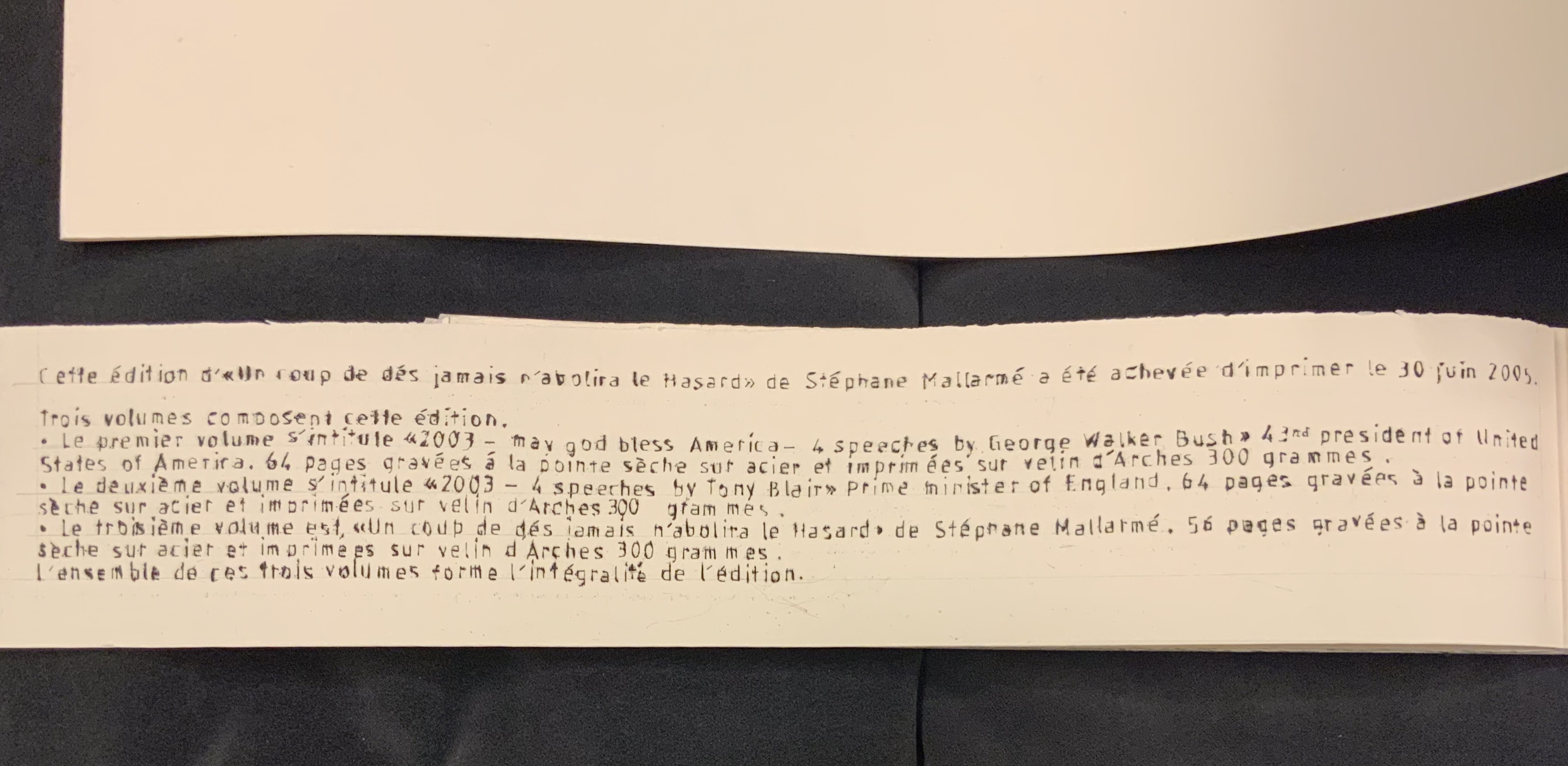
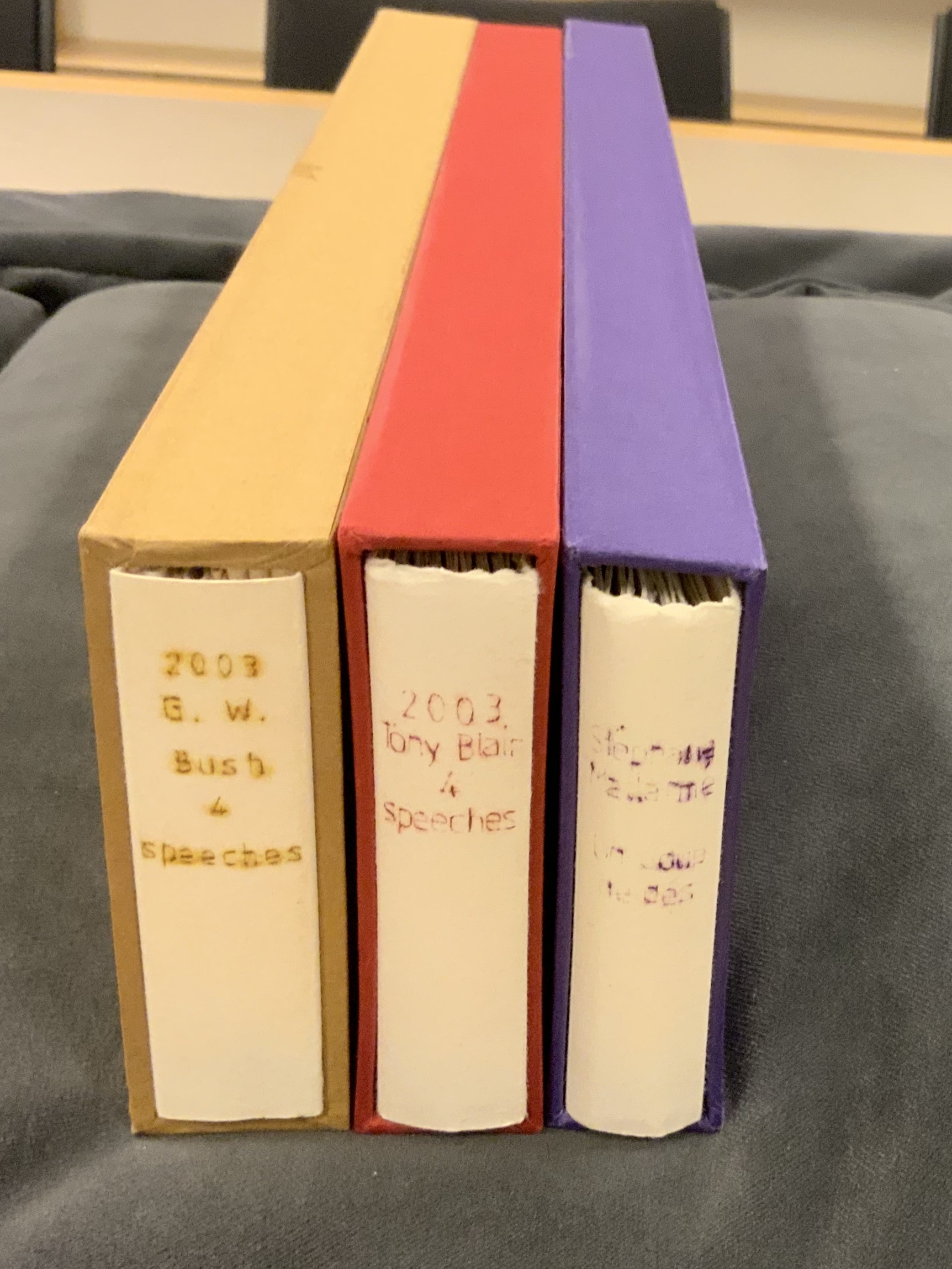
Un Coup de Dés Jamais N’Abolira le Hasard: Poème (2005) Didier Mutel Consists of three volumes: the first entitled “2003 — may god bless america — 4 speeches by George Walker Bush”; the second, “2003 — 4 speeches by Tony Blair”; the third, “Un coup de dés jamais n’abolira le hasard”. Each engraved in drypoint on steel and printed on Velin Arches 300 gsm.
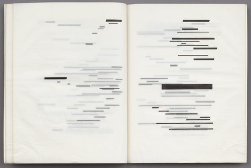
Un Coup de Dés Jamais N’Abolira le Hasard: Wave (2009) Sammy Engramer H340 x W240 mm, 32 pages. Recording his own reading aloud of the poem, Engramer then ran the recording through sonographic equipment. The rendering of each line’s soundwave became his graphic substitute for Mallarmé’s line of verse and, by extension, each black block that Broodthaers used to displace Mallarmé’s text.
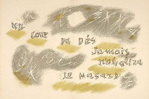
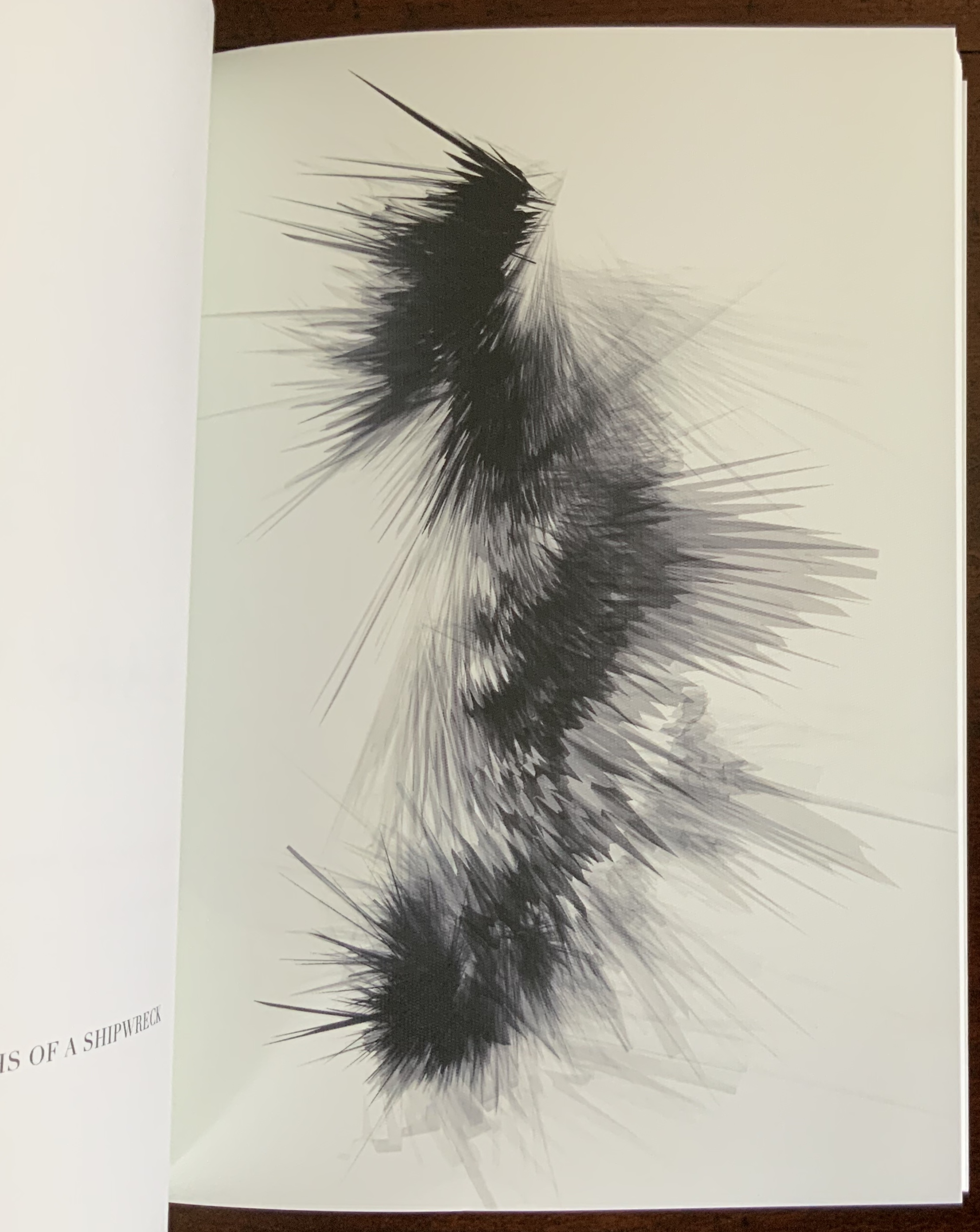
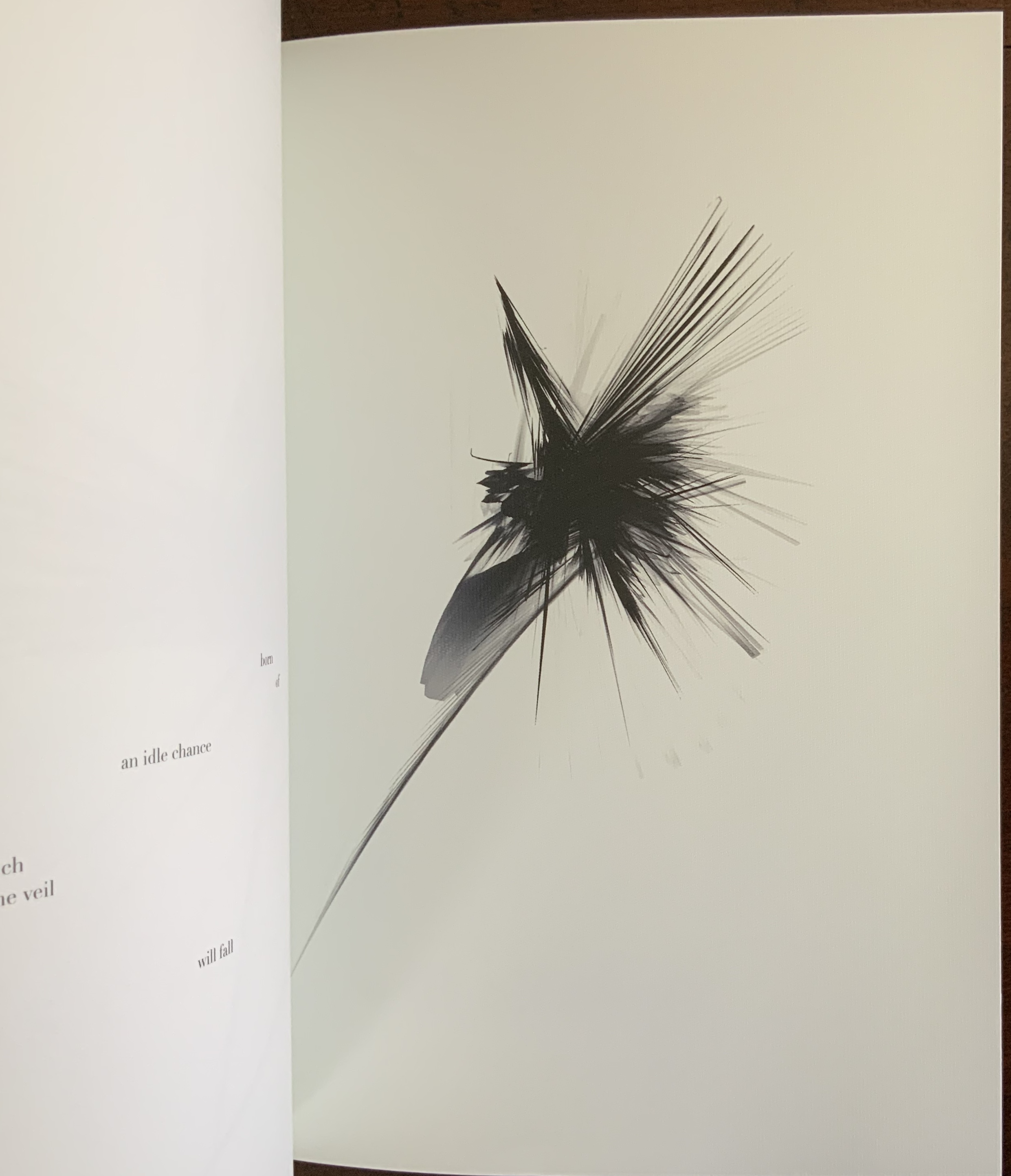
Zboya uses graphic imaging software to transform each letter, mark of punctuation and pixel into an abstract image based upon the original topographical placement of the type on the space of the page. Text mutates into a graphic, nonlinear entity. Zboya calls this Algorithmic Translation.Due to a randomization function, the program never yields the same image from the same input. In keeping both with the title (Un Coup de Dés Jamais N’Abolira le Hasard) and the poem’s last line (Toute pensée émet un Coup de Dés), no run of the program ever abolishes chance, and every input (thought) generates a roll of the dice.
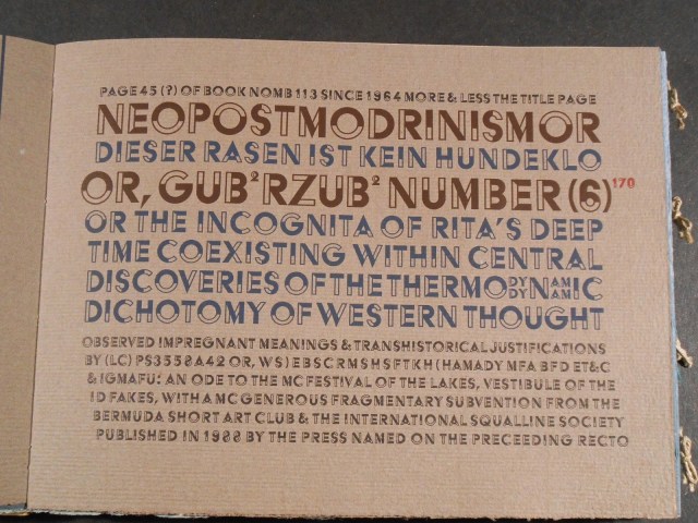
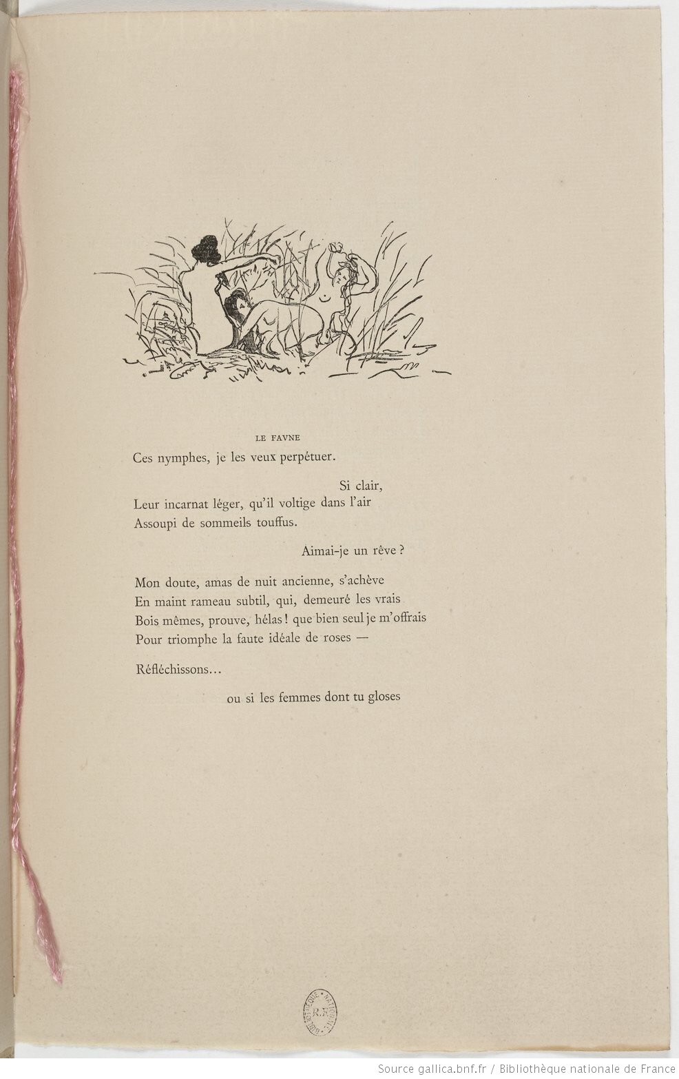
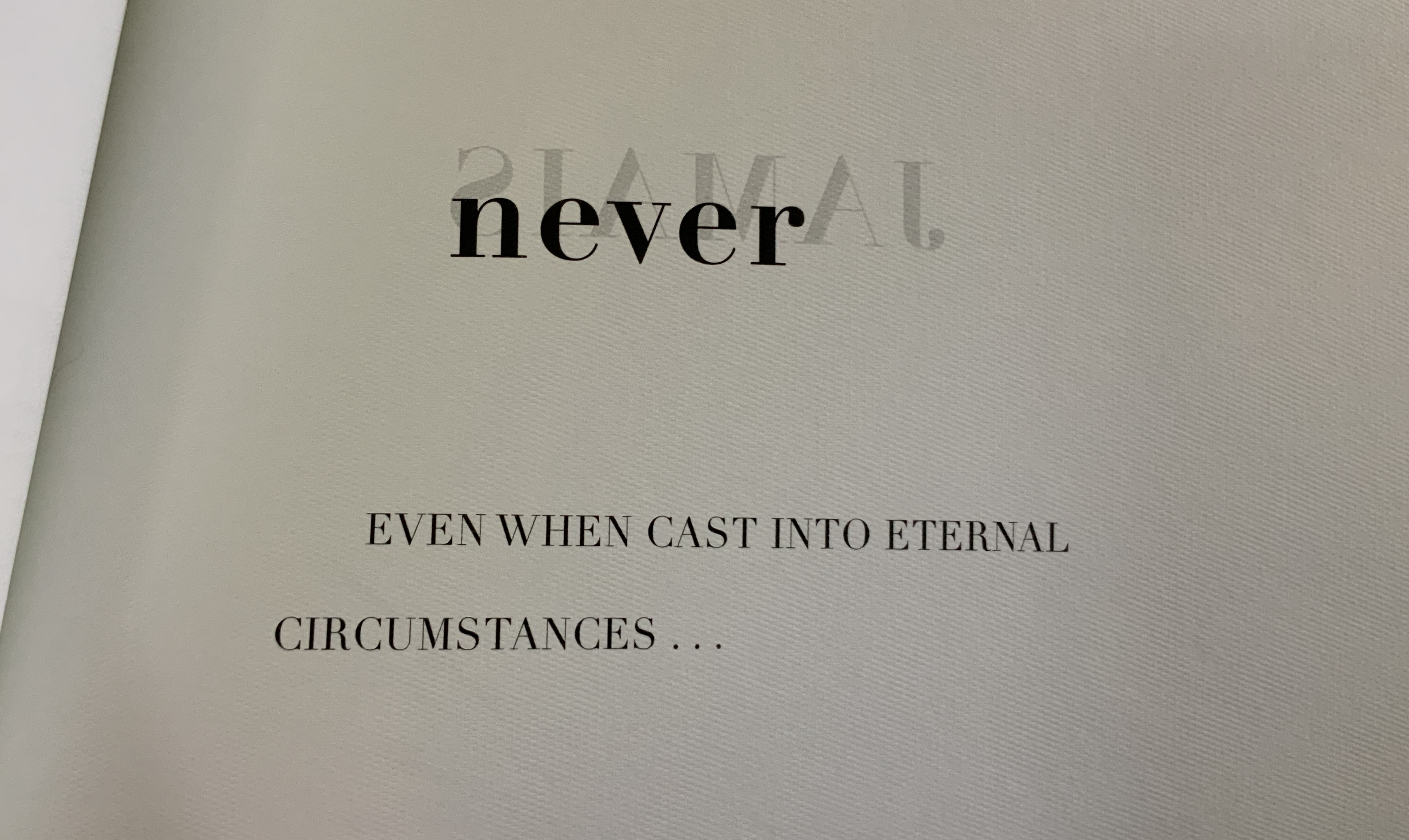
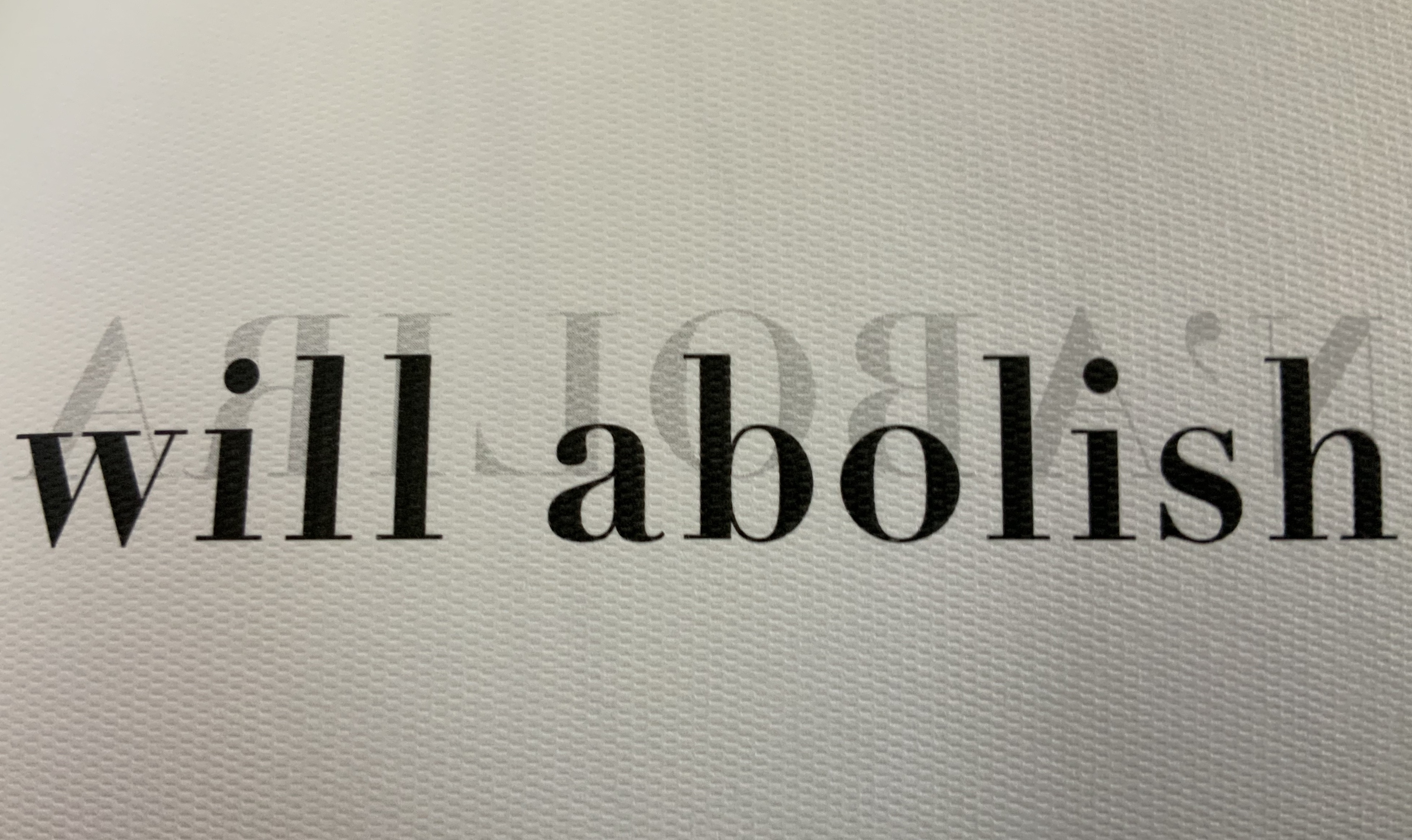
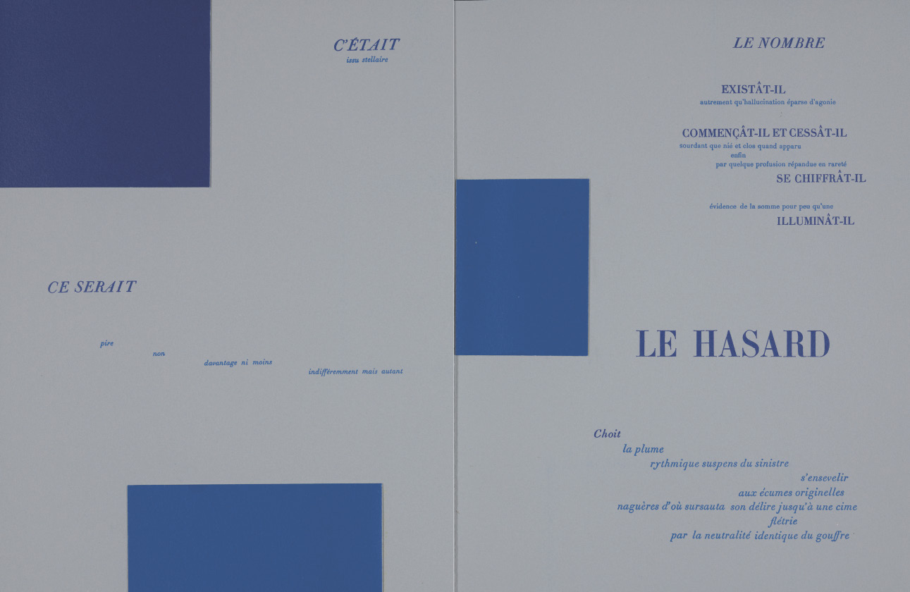
Zboya’s artist book presents more than these graphic, constellation-like translations of the text. Literally shadowing the right-reading English translation of the title is the French text set in reverse. Drawing the reader closer to the synaesthesia promoted by Mallarmé, Valéry and, before them, Baudelaire, the contrast of black (English) and gray (hcnerF) echoes the tonality of the algorithmically translated images; the reversed letters of the French emphasize the physical reversing that occurs when printing text; and the movement from the original hcnerF to the translated English urges the “mind’s ear” to play along with the mind’s eye. The choice to print everything on the same highly textured Rives Design, Brilliant White, enlists hand and eye in support of a synaesthetic equation of text, page and image.
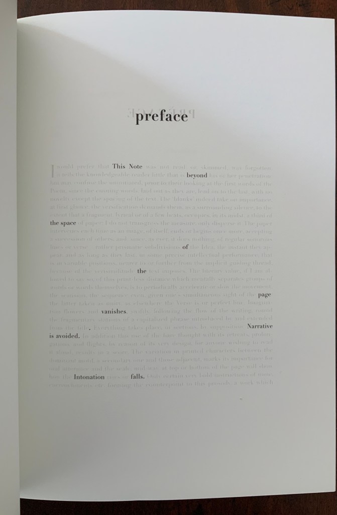
Just as important in another dimension is Zboya’s creative manipulation of the poem’s English translation by Basil Cleveland and preface by Charles Bernstein. The preface is the first clue. Only words selected by Zboya appear in black, left in their original position on the page and creating an envoi to Zboya’s book:
This Note beyond the space of the page vanishes. Narrative is avoided. Intonation falls. Courageous Poem, open a few eyes to this unforeseen symphony.
Zboya has done the same with the text of the translated poem. He erases certain lines and leaves those not erased in their topographical position as close to Mallarmé’s intention as interpreted by Zboya’s numerous predecessors (Broodthaers in 1969, Pichler in 2008, Meillassoux in 2012, Bononno and Clark in 2015, Bloch in 2017 among others). In this way, Zboya’s appropriation occurs across multiple dimensions.
By “erasing” text to select text that syntactically creates new content, Zboya is also following in the footsteps of Tom Phillips (A Humument, 1966-2016), but the effect and result of doing so differs distinctively from Phillips’ work, which is decidedly narrative. The concept of translation in Zboya’s book is closer to Ezra Pound’s approach in Personae (1926). The fragments and sentences created by the “translated” words are close but not the same as those in the source. In Pound’s case, not the same sentences as those of the troubadours. In Zboya’s case, not the same as Mallarmé’s, Cleveland’s, Bernstein’s, etc. The appropriation/translations make something new.
Occurring in its several dimensions, Zboya’s manipulation of text, image and surface recalls Valéry’s description of reading and looking at the worksheets for the book version of Un Coup de Dés:
It seemed to me that I was looking at the form and pattern of a thought, placed for the first time in a finite space. Here space itself truly spoke, dreamed, and gave birth to temporal forms. Expectancy, doubt, concentration, all were visible things. With my own eye I could see silences that had assumed bodily shapes. Inappreciable instants became clearly visible: the fraction of a second during which an idea flashes into being and dies away; atoms of time that serve as the germs of infinite consequences lasting through psychological centuries — at last these appeared as beings, each surrounded with a palpable emptiness…. there in the same void with them, like some new form of matter arranged in systems or masses or trailing lines, coexisted the Word! — Paul Valéry, Collected Works of Paul Valery, Volume 8: Leonardo, Poe, Mallarmé (1972).
That is the effect of reading and looking at Zboya’s work of book art.
As many bookworks do, Wyn Evans’ “…” offers a puzzle. In this case: What has been omitted? What is coming after the pause or delay?
In his brief essay at the end of the book, Moritz Küng describes this work as a catalogue for Wyn Evans’ exhibition (15 October 2009 – 10 January 2010, deSingel, International arts campus, Antwerp) and characterizes it as “a reciprocate hypertext”, recalling the “trilogy of Un coup de dés by Mallarmé [1914], Broodthaers [1969] and Wyn Evans [2008]”.
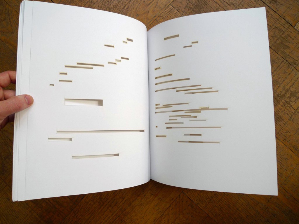
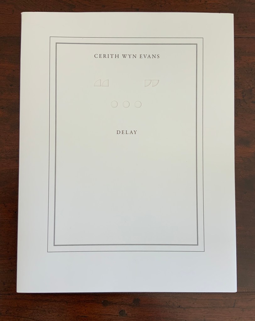
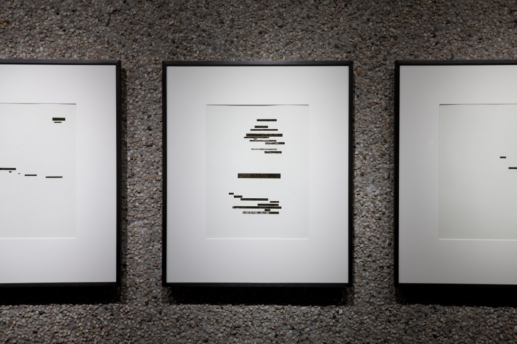
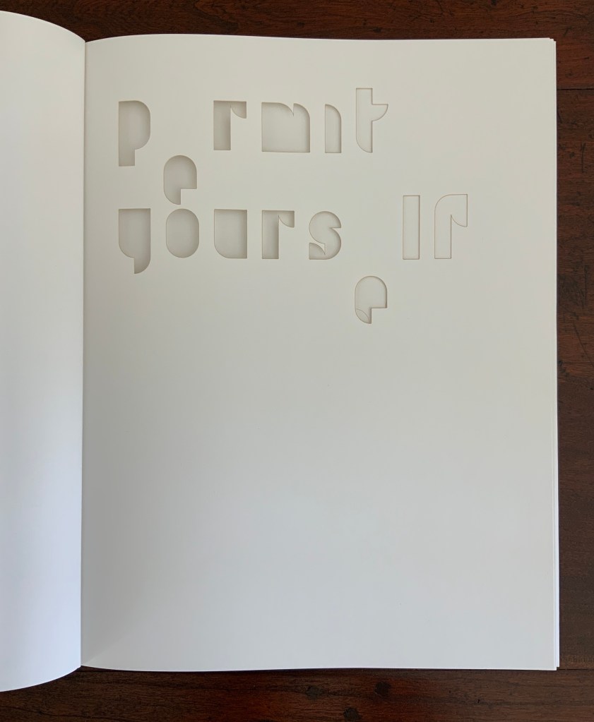
The work “…” (2009) alludes to those other three works by form and materiality, not actual text. It uses the same trim size of the 1914, 1969 and 2008 works. The 2009’s laser cut text is positioned in a way to imply the placement of text in the 1914 work, the placement of black strips in the 1969 work and the positioning of excised blocks in the 2008 work. The 2009 work’s subtitle — DELAY — is even positioned exactly where the subtitle is displayed in the three earlier works. Of course, the title page and subtitle in Wyn Evans’ 2008 version of Un Coup de Dés went along with the rest of his variation on Broodthaers’ 1969 work: the pages are framed and hung, allowing the pebbled wall behind the excisions to show through.
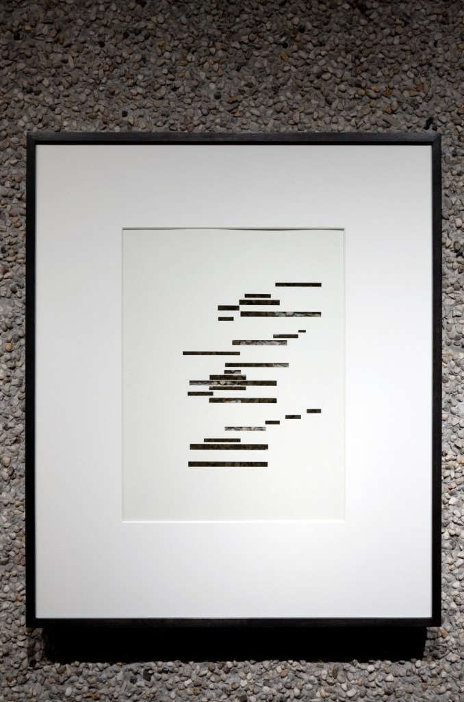
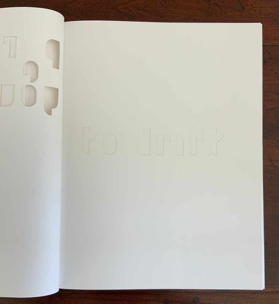
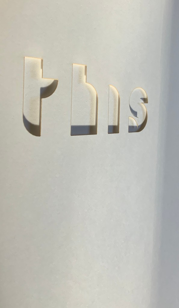
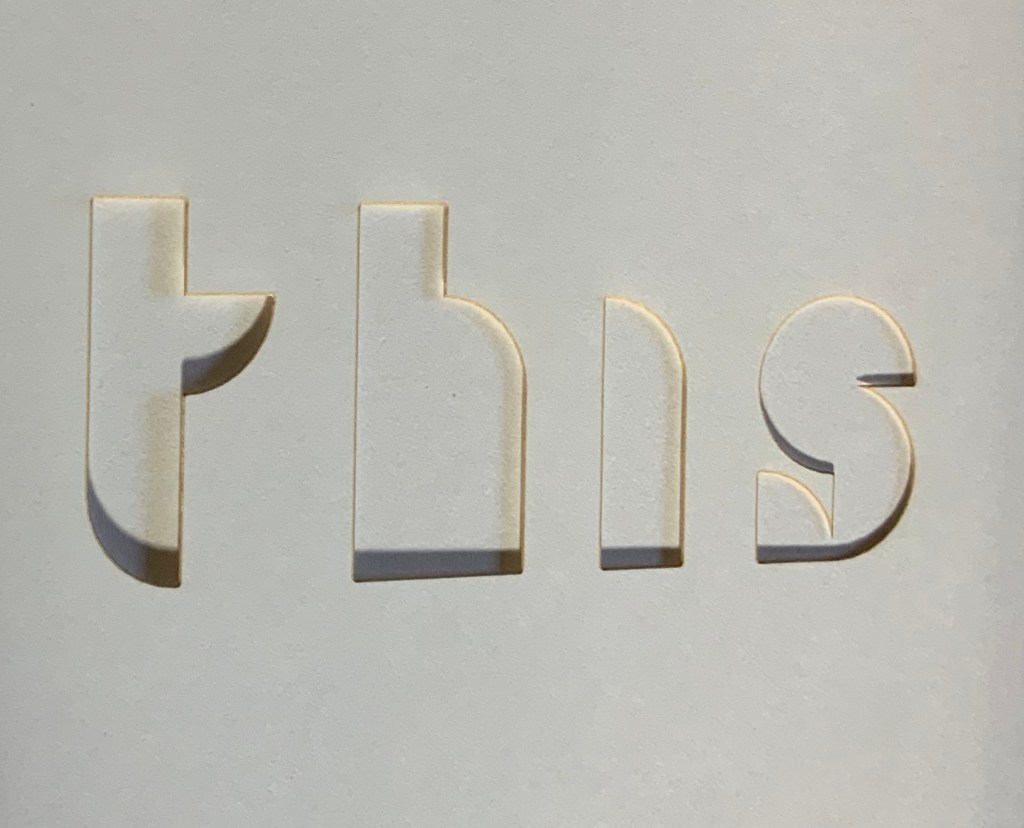
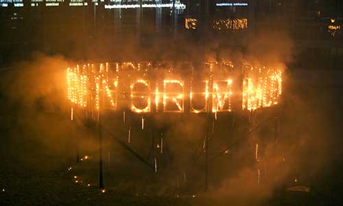
But where the 2008 work excises text, “…” excises paper to create text. The actual text in “…” comes from Stephan Pfohl’s review of Guy Debord’s filmscript In Girum Imus Nocte Et Consumimur Igni: A Film (1991). (The Latin is a palindrome — reads the same backwards as forwards — written by Terenziano Màuro, a grammarian and poet of the late second century CE.)
Permit yourself to drift from what you are reading at this very moment into another situation … Imagine a situation that, in all likelihood, you’ve never been in.
Photos: Books On Books Collection
Without knowing the text in question, deciphering the laser cut is a bit difficult, especially also until it becomes apparent that the letter “e” systematically falls below the line. Notice how this happens with “permit” and “yourself” above. Is it a reference to George Perec’s novel LaDisparution (1969), written entirely without the letter “e”? Is it an interruption to delay the reader in following an instruction not yet deciphered and read? There is something more going on here than meets the eye — which is, of course, what an omission or pause implies.
If another display in Wyn Evans’ 2009 deSingel exhibition is taken into account, and if Pfohl’s review is explored further, the laser cutting of the letters offers something else not immediately obvious to the eye. Wyn Evans could have chosen die cutting for the letters but chose (or at least approved) laser cutting instead. The signature singeing from the laser comes with the choice. To what is the choice alluding?
Details of “…” Photos: Books On Books Collection
Is it alluding to the firework display that spelled out Debord’s 1978 film title, which translates “We go round and round at night and are consumed by fire”? As Pfohl explicates the filmscript and highlights Debord’s anti-consumerist, anti-capitalist and near-nihilist point of view informing it, he quips, “Look out for the flames”. Is the singeing alluding to that?
How does the reader/viewer of “…” know to make these connections, to fill in the omissions? Well, after the pause/delay of “ellipsis” come Küng’s essay and the colophon, which provide many but not all of the clues with which to make the connections.
Knowledge of — or the presence of — the 1914 edition of Un coup de Dés, Broodthaers’ 1969 version and Wyn Evans’ 2008 re-version seems essential. Attendance at the fireworks display — or finding the images in the deSingel archive — would seem necessary to make sense of Küng’s reference to the artist’s “fireworks texts”. For the reader/viewer ignorant of Debord’s last and autobiographical film, access to Pfohl’s essay is essential to connect that particular film with Küng’s reference. Also, access to Pfohl’s essay is essential to see the context of the sentences Wyn Evans extracts, essential to find the Latin title of Debord’s film, and essential to pick up Pfohl’s quip.
Does the burden of the elusive, multi-layered allusiveness and self-referencing placed on the reader/viewer diminish and interfere with the work or enhance and help it? Depends on the reader/viewer. Or as Terenziano put it, Pro captu lectoris habent sua fata libelli (The fate of books lies in the capability of their readers).
The colophon also provides a set of details that can shape the reader/viewer’s appreciation of “…” — DELAY. It assigns the concept to Wyn Evans, Armand Mevis and Moritz Küng, the overall graphic design to Mevis & van Deursen and the layout design to Paul Elliman, whose Albernaut font was used for the excised text. Collaboration as recorded in a colophon grounds this work in a lineage that extends far beyond Mallarmé and Vollard. Even before the printed codex, the colophon, or finishing touch, to a scroll or manuscript book recorded how collaborative the effort to make a book actually is. Although book art is leavened with Blakean works of individual creation, the works of artists such as Cerith Wyn Evans remind us how this object is so often the result of multiple talents going round and round and catching fire.
Further Reading, Viewing and Listening
“Cerith Wyn Evans”, desingel.be. Accessed 15 March 2020.
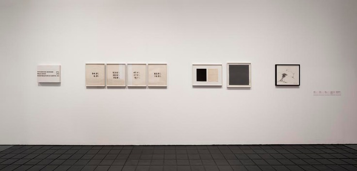
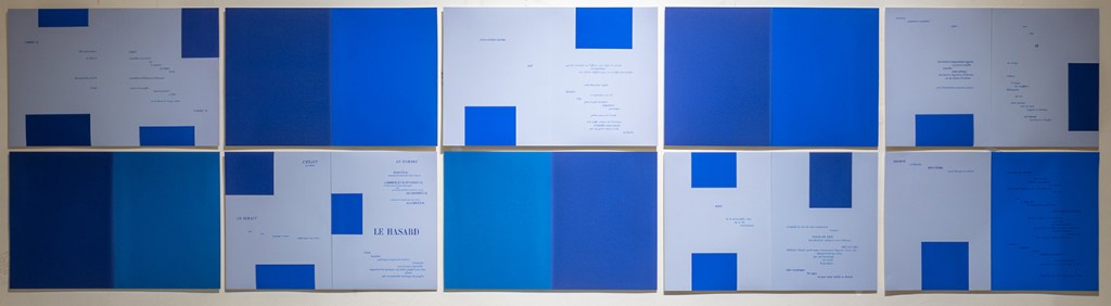
In the first three minutes of this extract from the film Molinari: la couleur chante (2005), Molinari walks through an exhibition of Équivalence, discussing it with Roald Nasgaard and commenting on Un coup de Dés, its visual musicality and his transformation of it into his colourful geometric abstractions. The opportunity to see all of the poem ranged along one wall and all of Molinari’s abstractions along a facing wall is a pleasure. A pleasure enhanced by leafing through the portfolio and juxtaposing each double-page spread of the poem with Molinari’s “equivalent” abstraction.
Update
At the Guido Molinari Foundation’s exhibition Sophie Lanctôt, Mallarmé, Molinari: Mots Croisés (6 June – 25 August 2024), a previously undiscovered artist’s book by Molinari appeared for the first time in thirty years:
Continuum pour Mallarmé (1994)
Images courtesy of Fondation Guido Molinari. Photos: Michael Patten. Especial thanks to artist Sophie Lanctôt and curator Monic Robillard.
Note in this earlier work how the text is integrated with artwork, omitting the later work’s intermediate homage to Broodthaers.
Continuum pour Mallarmé was created for a group show of 47 books by renowned artists such as Louise Robert, Michel Goulet, Irene F. Whittome and Rober Racine, presented at AXENÉO-7 in Gatineau from March 27 to April 24, 1994, under the title De causis et tractatibus. Each artist was free to choose his or her subject. Molinari chose Mallarmé’s poem.
“The idea of a fictional encyclopedic project arose during a conversation between Marie-Jeanne Musiol and Richard Gagnier about the creation of artist’s books. Each of the artists received an identically crafted book with a closed dimension of 33.8 x 26.5 x 1.4 cm (13 ¼ x 10 ½ x ½ in.). The interior consists of six sheets of white BFK Reeves paper folded in quarters and sewn together. (…) The title of the encyclopedia and the volume’s serial number, in Roman numerals, are pressed into the cover and repeated in the same way on the inside title page,” writes Richard Gagnier in 3 manières d’instruire l’inventaire, published by Le Sabord in 1998. Continuum pour Mallarmé by Guido Molinari is number 44. — Exhibition notes provided by Monic Robillard.
Further Reading
Molinari, Guido, Gilles Daigneault, Patrick Lafontaine. Nul mot: les livres d’artiste de Guido Molinari (Montréal, Québec: Éditions du Noroît, 2017).
Nasgaard, Roald. Abstract Painting in Canada (D&M Publishers Inc., 2008).
With apologies to the preacher: Of making many books [on books] there is no end.
(Ecclesiastes 12:12)
With the choir of its forebearers, Amaranth Borsuk’s The Book (MIT Press, 2018) sounds an “amen” to that truth. The proliferation of degree programs in book studies covering the history of the book, the book arts and even book art ensures The Book will not be the last. What distinguishes Borsuk’s book are her perspective as an artist and the book’s breadth and depth despite its brevity.
The book has a long history of existential crises. What is a book? Is the end of the book nigh? For more than a century, those questions have returned again and again. The most recent recurrence stems from the ebook’s threat to dematerialize the book and the online world’s threat to take us into a post-text future. Even before these latest threats, book artists have long lived and worked with their own existential questions, a kind of higher existential calculus, or derivative of, the book’s crises: What is an artist’s book? What is book art? Stephen Bury, Riva Castleman, Johanna Drucker, Joan Lyons, Stefan Klima, Clive Philpott and many others in the last quarter of the 20th century dwelt on defining and categorizing book art.
Borsuk belongs to a later generation of book artists that has embraced these existential crises and recognized that the book’s existential crises are what make the book a rich medium in which and with which to create art — from bio-art miniature to the biblioclastic human-scale to large-scale installations and performances. Even to the digital.
The Origin of Species (2016) Dr. Simon Park, Guildford, Surrey “The small book shown here was grown from and made entirely from bacteria. Not only is the fabric of its pages (GXCELL) produced by bacteria, but the book is also printed and illustrated with naturally pigmented bacteria. ” Posted 27 March 2016. Photo credit: Dr. Simon F. Park
Silenda: Black Sea Book (2015) Jacqueline Rush Lee Transformed Peter Green‘s translation of Ovid’s Tristia and the Black Sea Letters H9.5″ x W12″ x D6.5.” Manipulated Text, Ink, Graphite Photo credit: Paul Kodama. In Private Collection, NL
Field (2015) Johannes Heldén Produced, and premiered, at HUMlab, Umeå University Reproduced with permission of the artist
Performance artist and academic as well, Borsuk brings that later generational and creative perspective to the existential question — What is the book? — and, with an artist’s perception of her medium of choice, displaces the old companion existential question — Is the end of the book nigh? — with an altogether more interesting one — Where next for the book?
To see where books might be going, we must think of them as objects that have experienced a long history of experimentation and play. Rather than bemoaning the death of books or creating a dichotomy between print and digital media, this guide points to continuities, positioning the book as a changing technology and highlighting the way artists in the twentieth and twenty-first centuries have pushed us to rethink and redefine the term. (pp. xiii-xiv)
In The Book, the future is not far from the physical past. Where once we had text on scrolls, now we scroll through text (albeit more vertically than horizontally). Where once human consciousness changed with the invention of the alphabet and writing, now it may be altering with our reading and writing through networked digital devices. Like the many historians before her, Borsuk starts with cuneiform (those wedge-shaped accounting marks on baked clay), hieroglyphics and the invention of the alphabet to set the scene for the advent of the book and its ongoing physicality:
its shape (scroll, accordion, codex)
its material (papyrus, vellum, paper, charcoal or mineral-based watercolor and ink)
its manufacture (scribing, printing by woodblock and movable type, design and typography, illumination and illustration, folding into pages, methods of binding)
its constituent and navigational parts (cover, book block, title page, table of contents, page numbering, index).
But Borsuk reminds us — from Sumer’s clay to Amazon’s Kindle, from Johannes Gutenberg to Project Gutenberg — the book as human artifact exists in a social, political, technological, economic and even ecological context. Who is allowed to make it, how it is transacted, how and where we use it, how we perceive and speak of it — all have affected the physicality of the book object and are reflected in it.
In the first half of The Book, Borsuk steers us through these interdependencies to a turning point. That turning point is where the pinnacle of the book arts — Beatrice Warde‘s and Jan Tschichold‘s vision of the book as a crystalline container of content — and the book’s commodification combine to cause the book’s physicality to disappear because it is so taken for granted, leaving us with “the book as idea”.
With the perception that books are ideas bestowed on readers by an authorial genius whose activity is purely intellectual, the book’s object status vanished for much of the reading public as we raised a glass to happily consume its contents…. Even though innumerable material elements come together to make the book, these features have been naturalized to such a degree that we now hardly notice them, since we have come to see content as the copyrightable, consumable, marketable aspect of the work. (pp. 106-9)
At this turning point — where “the historic relationship between materiality and text is severed” (p. 112) — the second half of The Book introduces book art. It is telling that the longest chapter in the book begins the second half, that it is called “The Book as Idea” and that it comes before any extended engagement with the digital dematerialization of the book. It is a wry pivot: the artistic genius supplants the authorial genius; what the latter takes as invisible background, the former re-makes as self-regarding foreground. As Borsuk shows and her book’s cover neatly demonstrates, works of book art are inevitably self-referential and self-aware.
As such, works of book art
have much to teach us about the changing nature of the book, in part because they highlight the “idea” by paradoxically drawing attention to the “object” we have come to take for granted. They disrupt our treatment of the book as a transparent container for literary and aesthetic “content” and engage its material form in the work’s meaning. (p. 113)
Rather than offer a chronological history of book art to explore what “artists’ books have to teach us about a path forward for the book”, Borsuk offers “flashpoints” that represent “the energies motivating artwork in book form”(p. 117). These “flashpoints” are William Blake, Stéphane Mallarmé, Ed Ruscha and Ulises Carrión. Following these flashpoints, Borsuk organizes the rest of the chapter into “key themes that recur throughout artists’ books of the twentieth century: spatiotemporal play, animation, recombinant structures, ephemerality, silence, and interactivity” (pp. 146-47).
Oddly, Blake as flashpoint does not illuminate these six particular themes. Rather Borsuk notes three other recurrent themes or “energies motivating artwork in book form” that Blake and his work represent: centering or re-centering the production processes on the author/artist; using the book as a sociopolitical and visionary platform; and redefining, developing and challenging the relationship between word and image.
Blake refers to himself as “The Author & Printer W. Blake,” making clear the union of creativity and craft in his work. (p. 121)
Blake’s engagement with the social issues of his day, and his use of book form to respond to child labor, urban squalor, and slavery, established an important trend in both artists’ books and independent publishing—the utility of the book as a means of spreading social justice. (pp. 121, 124)
Blake used his craftsmanship to develop the relationship between word and image (p. 140)
One need not look far among twentieth and twenty-first century book artists for resonance with those themes. That Blakean union of creativity and craft resurfaces in artists such as Ken Campbell (UK), Cathryn Miller (Canada), Pien Rotterdam (Netherlands), Barb Tetenbaum (US) and Xu Bing (China) — some of them even to the point of carving or setting their own type, making their own paper, pulp printing on it themselves or binding the finished work themselves. Vision and sociopolitical observation have risen up in the works of artists such as Doug Beube (Canada), Julie K. Dodd (UK), Basia Irland (US), Diane Jacobs (US), Anselm Kiefer (Germany) and Chris Ruston (UK). Blake’s redefining the relationship of word (or text) to image often reappears book artists’ abecedariesand their children’s books such as A Dictionary Storyby Sam Winston (UK).As for emulators of Blake in technical innovation, consider the analogue example of Australian Tim Mosely’s works created with his patented pulp printing process, where the “ink” is actually colored pulp, or the digital example of Borsuk’s work Between Page and Screen, where the pages contain no text—only QR codes that, when scanned with a webcam, activate the text’s appearance on the reader’s browser screen.
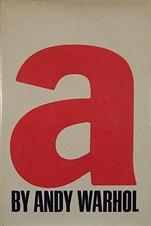
For her second flashpoint, Borsuk selects another visionary, Stéphane Mallarmé, who like Blake was reacting to his own perceived Satanic mills draining poetry of its spirituality. Mallarmé’s Satanic mills dispensed rigid columns of newsprint to the masses and bland expanses of poetry and fiction set by Linotype machines in the neo-classical Didot font. With his famous visionary dictum — “everything in the world exists in order to end up as a book” (p. 135) — Mallarmé nudged the book toward pure concept and opened its mystical covers to the Dadaists, Surrealists, Futurists, Vorticists, Lettrists, Conceptualists and biblioclasts. With spatiotemporal play — mixing type sizes and fonts, breaking up the line and even breaking the page — Mallarmé used text to evoke image and, in his view, remake the book as a “spiritual instrument”. His post-humous book-length poem Un coup de Dés jamais n’abolira le Hasard (A Throw of the Dice Will Never Abolish Chance), published in 1897, embodies that vision and continues to cast its flashpoint light across multiple generations of book artists’ efforts. From Marcel Broodthaers in 1969, we have his homage to Un Coup de Dés. From Jérémie Bennequin in 2014, we have his serial “omage” to Broodthaers’ homage. And, most recently, we have the 2015 new bilingual edition A Roll of the Dice by Jeff Clark and Robert Bononno, for which Borsuk provides a perceptive reading.
Where Mallarmé’s flashpoint enlisted his vision alongside the cry “épater le bourgeois” from Baudelaire and other late nineteenth-century poets, Ed Ruscha’s later flashpoint illuminates a democratic counterpoint, a Zen-like vision and a very different way of changing the relationship of text to image. Ruscha’s self-published photobooks were cheap and distributed outside the gallery-controlled channels of art. As Borsuk shows — directly with Ruscha and indirectly with the many book artists influenced by him — the text is restricted to the book’s title, which interacts with a series of deadpan photos and their layout to deliver a wry, tongue-in-cheek work of book art. Ruscha’s spatiotemporal play manifests itself across the accordion book format and out-of-sequence juxtapositions. Ironically Ruscha’s works now command thousands of dollars per copy, and one has more chance of seeing them in an exhibition than in a roadside stop’s rack of newspapers, magazines and mass-market paperbacks.
Mexico’s Ulises Carrión — polemicist, European bookshop owner, conceptual artist and Borsuk’s fourth choice of flashpoints — is a counter-flashpoint to Ruscha. Where Ruscha reveled in self-publishing commodification, Carrión sneered at the book in its traditional commercial form. Where Ruscha has resisted the label “conceptual artist”, Carrión played the role to the hilt. Where Ruscha’s work has elicited numerous homages (see Various Small Books from MIT Press in 2013) and achieved a high profile, Carrión’s work, much lower in profile, has provided a more compelling range of hooks or influences on which to hang many different manifestations of book art (or bookworks as Carrión preferred). In fact, Borsuk’s six stated key themes or “energies motivating artwork in book form” come from Carrión’s manifestos (pp. 146-47).
The first theme — “spatiotemporal play” — comes from Carrión’s initial definition of the book as a “sequence of spaces”, which Borsuk traces to tunnel books, pop-ups and even large-scale constructs, the latter illustrated by American Alison Knowles‘ inhabitable The Big Book (1968). One more possible future of the book implied by spatiotemporal play manifests itself in Borsuk’s own augmented-reality (AR) works, those of Caitlin Fisher (Canada) and Carla Gannis’ Selfie Drawings (2016), in which portraits on the hardcover book’s pages animate and change when viewed through smartphone or tablet.
Borsuk takes the second theme, that of “animation”, from Carrión’s dictum: “Each of these spaces is perceived at a different moment— a book is also a sequence of moments”. As her several examples illustrate, much book art is cinematic. Borsuk’s exposition of Canadian Michael Snow‘s Cover to Cover (1975) comes closest to reproducing the experience I enjoyed of “watching” that photo bookwork from cover to cover several times at the now closed Corcoran Art Gallery. Borsuk is quick and right to remind that the cinematic future of the book has been with us for a long time, even before the cinema. She bookends her exposition of Snow’s book and the text animation of American Emmett Williams‘ Sweethearts (1967) on one side with Victorian flip-books and on the other with American Bob Brown‘s 1930s The Readies (presumably pronounced “reedies” to follow Brown’s comparison of his scrolling one-line texts with the cinema’s “talkies”).
A forgotten modernist, Brown declared the obsolescence of the book, predicted a new form of reading and technology to enable it, an optical projector emitting text into the ether and directly into the eyeball. But what does this tell us about the future of the book? Borsuk notes Craig Saper‘s resurrection of Brown’s Roving Eye Press and how he even put together a website that emulates Brown’s reading machine. In her phrase describing the machine’s effect of “turning readers themselves into a kind of machine for making meaning” (p. 168), Borsuk hints at a future of digitally interactive books, which she takes up in the next section and more extensively in the next chapter. At this point, however, the reader could use a hint of practicality and skepticism. Linear-one-word-at-a-time reading, however accelerated, eliminates affordances of the page, ignores graphics and strains against the combination of peripheral vision and rapid eye movement we unconsciously (even atavistically?) deploy as we “read” whatever we see. Although in the next section Borsuk does bring on more likely examples of the book’s future exploitation of its cinematic affordances (manga, graphic novels and children’s books), this section’s treatment of animation misses the chance to cite actual recent successes like Moonbot Studios‘ The Fantastic Flying Books of Mr. Morris Lessmore (2012) and others.
Once into the third theme — “recombinant structure” — it is clear that Borsuk’s chosen Carriónesque themes overlap one another. Like the cinematic, the recombinant structure manifests itself in accordion books. It extends, however, to something more interactive: volvelles (or medieval apps as Erik Kwakkel calls them), interactive pop-ups, harlequinades (flap books) and more. Borsuk uses Raymond Queneau‘s harlequinade Cent mille milliards de poèmes ( One hundred thousand billion poems, 1961), Dieter Roth‘s slot books and works by Carolee Schneemann to illustrate book art’s celebration of the concept. The fact that Queneau’s book is still easily available on Amazon vouches for book art’s predictive qualities. The example of Marc Saporta’s Composition No.1 (Éditions du Seuil, 1962), “a box of 150 leaves printed on only one side that the reader is instructed to shuffle at the outset”, goes Queneau one better —ironically. In 2011, Visual Editions reissued Composition No. 1 in print and app forms. Alas, the former is out of print, and the latter is no longer available for download (although a video of it is available here).
Composition No. 1 (2011) Marc Saporta Translation by Richard Howard, Introduction by T.L. Uglow, Google Creative Lab, Diagrams by Salvador Plascencia and Designed by Universal Everything Photo credit: Books On Books
Borsuk draws her fourth theme — ephemerality — from Carrión’s dictum:
I firmly believe that every book that now exists will eventually disappear. And I see here no reason for lamentation. Like any other living organism, books will grow, multiply, change color, and, eventually, die. At the moment, bookworks represent the final phase of this irrevocable process. Libraries, museums, archives are the perfect cemeteries for books. (p. 145)
To illustrate, Borsuk begins with the physical biblioclasts — those who in Doug Beube‘s phrase are “breaking the codex“. They include Beube himself, Bruce Nauman (see above), Brian Dettmer, Cai Guo-Qiang, Marcel Duchamp, Dieter Roth and Xu Bing. While some of these artists reflect a twenty-first century surge of interest in altered books and book sculpture, “facilitated by the overarching notion that the book is an artifact not long for this world” (pp.82-84), others have taken a more generative archaeological approach — erasing or cutting away a book’s words to reveal another. Examples include Tom Phillips‘ A Humument (1966-2014) and Jonathan Safran Foer‘s Tree of Codes(2010). Phillips’ bookwork serves multiple purposes for Borsuk’s arguments. Not only does it represent the book art of “erasure”, its success across multiple editions, digital formats and presence in art galleries supports her notion of book art’s predictive qualities.
There is a variant on her theme that Borsuk does not illustrate and is worth consideration for her next edition: the self-destructing yet regenerative work of book art. Examples could include American Basia Irland‘s series ICE BOOKS: Ice receding/Books reseeding (2007-), which gives a formidably tangible and new meaning to “publishing as dissemination”; and Canadian Cathryn Miller‘s tail-chasing Recomp (2014); and Argentinian Pequeño Editor‘sMi Papa Estuvo en la Selva (2015), which after reading can be planted to grow into a jacaranda tree.
Recomp (2014) Cathryn Miller Copy of Decomp, Collis and Scott (2013) nailed to a tree. Photo credit: David G. Miller
Recomp (2015) Photo credit: David G. Miller
Recomp vandalized (2015) Photo credit: David G. Miller
The last section in this chapter expands on the fifth theme — silence — drawn from Carrión’s statement:
The most beautiful and perfect book in the world is a book with only blank pages, in the same way that the most complete language is that which lies beyond all that the words of a man can say. Every book of the new art is searching after that book of absolute whiteness in the same way that every poem searches for silence. Ulises Carrión, Second Thoughts (1980), pp. 15-16.
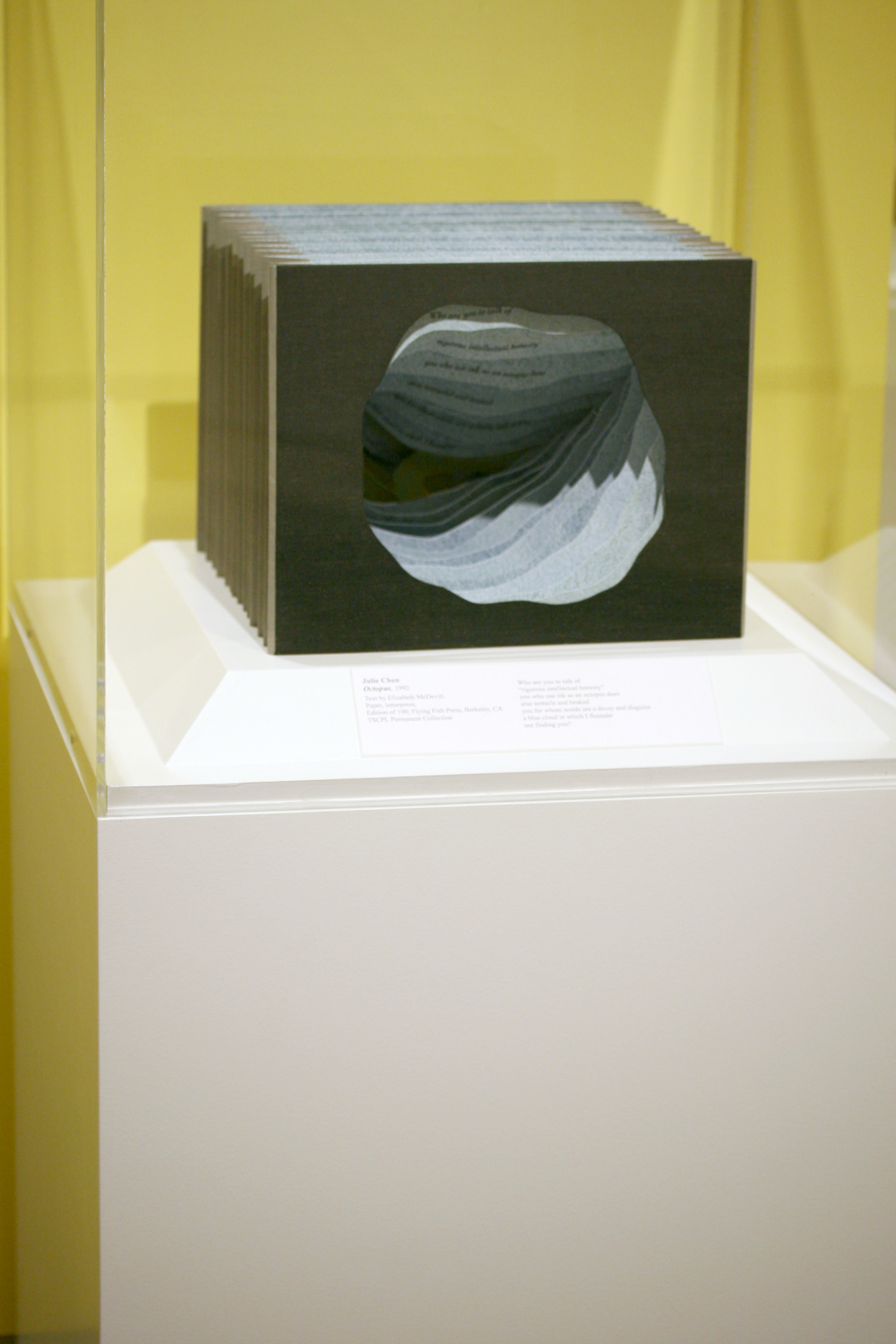
Among her several examples are Pamela Paulsrud‘s Touchstones (2007-10), which look like stones but are books sanded-down into stone-like shapes, and Scott McCarney‘s 1988 Never Read(Opposed to Ever Green), a sculpture composed of stacked library discards that narrows as it ascends. Paulsrud’s, McCarney’s, Irland’s and Miller’s works are what Borsuk calls “muted objects”, but they speak and signify nevertheless:
Muted books take on a totemic [metaphoric] significance…. The language of the book as a space of fixity, certainty, and order reminds us that the book has been transmuted into an idea and ideal based on the role it plays in culture…. Defining the book involves consideration for its use as much as its form. (pp. 193-95)
Never Read (Opposed to Ever Green) (1988) Scott McCarney Reproduced with permission of the artist
Never Read (Opposed to Ever Green) (1988) Scott McCarney Reproduced with permission of the artist
Never Read (Opposed to Ever Green) (1988) Scott McCarney Reproduced with permission of the artist
Borsuk is a superb stylist of the sentence and expository structure. The words above, concluding chapter three, launch the reader into Borsuk’s final theme of interactivity and her unifying metaphor: “the book as interface”. Owners of Kindles, buyers from Amazon, perusers of Facebook — we may think we know what’s coming next in The Book and for the book, but Borsuk pushes the reader to contemplate the almost real-time evolutionary change we have seen with ebook devices and apps, audiobooks, the ascension of books to the cloud via Project Gutenberg, the Internet Archive and Google Books, and their descent to Brewster Kahle‘s physical back-up warehouse (to be sited in Canada in light of recent political events) and into flattening ebook sales of late. Chapter 4 is a hard-paced narrative of the book’s digital history from the Memex in Vannevar Bush‘s 1945 classic “As we may think” to T.L. Uglow‘s 100-author blockchain collaboration in 2017, A Universe Explodes from Visual Editions’ series Editions at Play.
Borsuk reminds us:
Our current moment appears to be much like the first centuries of movable type, a cusp. Just as manuscript books persisted into the Gutenberg era, books currently exist in multiple forms simultaneously: as paperbacks, audiobooks, EPUB downloads, and, in rare cases, interactive digital experiences. (p. 244)
Borsuk weaves into this moment of the book’s future a reminder that print affordances such as tactility (or the haptic) and the paratextual (those peripheral elements like page numbers, running heads, ISBNs, etc., that Gary Frost argues “make the book a book”) have been finding fresh ways into the way we read digitally. The touchscreen enables us to read between the lines literally in the novella Pry (2014) by Samantha Gorman and Danny Cannizaro (2014). Breathe (2018) by Kate Pullinger, another work in the Editions at Play series, uses GPS to detect and insert the reader’s location, the time and weather, and when the reader tilts the device or rubs the screen, hidden messages from the story’s (the reader’s?) ghosts appear.
At this point, an earlier passage from The Book should haunt the reader:
Artists’ books continually remind us of the reader’s role in the book by forcing us to reckon with its materiality and, by extension, our own embodiment. Such experiments present a path forward for digital books, which would do well to consider the affordances of their media and the importance of the reader, rather than treating the e-reader as a Warde-ian crystal goblet for the delivery of content. (p. 147)
Borsuk convinces. Art, artifact, concept — wrought by hand and mind, hands and minds — the book is our consensual tool and toy for surviving beyond our DNA. So now what? Metaphor, hints and historical flashpoints may illuminate where we have been, how it shows up in contemporary books and book art and where we may be going with it. In ten or one hundred years though, how will a book publisher become a book publisher? Given the self-publishing capability today’s technology offers, will anyone with a file on a home computer and an internet connection consider himself or herself a book publisher? Borsuk thinks not:
The act of publication — of making public — is central to our cultural definition of the book. Publication might presume some cultural capital: some editorial body has deemed this work worthy of print. It might also presume an audience: a readership clamors for this text. But on a fundamental level, publication presumes the appendage of elements outside the text that help us recognize it as a book, even when published in digital form. (pp. 239-40)
How will future book publishers learn to master the appendage of these elements outside the text (the paratext) that make a book a book “even when published in digital form”? Borsuk’s commentary on the ISBN as one of these elements sheds oblique light on that. She points to the artist Fiona Banner’s uses of the ISBN under her imprint/pseudonym Vanity Press — tattooing one on her lower back, publishing a series Book 1/1(2009) consisting of sixty-five ISBN’d pieces of mirrored cardstock and then collecting them in a photobook entitled ISBN 978-1-907118-99-9 in order to deposit those one-offs with the British Library as required by the UK’s Legal Deposit Libraries Act. What can a future ebook publisher deduce from this?
That the use of a globally unique identifier (GUID) matters.
The backstory of the transition from ISBN10 to ISBN13 and that of ebooks, ISBNs and Digital Object Identifiers (DOIs) might provide interesting fodder. The notion that the book industry was running out of 10-digit ISBNs was a red herring used to convince industry executives to adopt the more widely used format of unique identifiers overseen by GS1. The real reason for moving to ISBN13 — reduced friction in the supply chain — was too hard to sell. About the same time, some major publishers proposed incorporating the ISBN into the DOI for an industry-standard ebook identifier. The DOI offered an existing digital, networked infrastructure already being used by most of the world’s scientific, technical and medical journals publishers. It is an offshoot of the Handle System, established by Robert Kahn. Sad to say, few book publishers adopted the DOI for their ebooks; still fewer used the DOI’s application- and network-friendliness to enable their ebooks to take advantage of the network’s digital affordances.
The DOI shares with the ISBN a feature that Borsuk points out as a limitation to more widespread use: it is not free. A significant percentage of ebooks exist without ISBNs, much less DOIs. If a digital GUID is to be used in ways that help us recognize the identified digital object as a book, future book publishers and their providers of a network ecosystem supporting ebooks, linking with the print ecosystem and reducing friction in the supply chain still have wide gaps in commerce and knowledge to close. Perhaps this particular paratextual element is unnecessary for the book’s digital future, but until those gaps are narrowed, the ecosystem for eBooks will remain balkanized by Amazon, Apple, Google, Lulu and the more digitally literate denizen of the print publishing industry. In the meantime, as Borsuk’s examples throughout her book show, there are boundless other print and digital affordances with which publishers, authors, editors, designers, typographers, developers and readers can play as they continue to shape the book.
The Book‘s publication month, June 2018, is auspicious, being the same for the Getty Center’s exhibition “Artists and Their Books/Books and Their Artists“, June 26 – October 28. The Center and MIT Press would do well to have stacks of The Book on hand. The Book will also serve as an excellent introductory textbook for courses on book art or the history of the book. And by virtue of its style and artist’s perspective, Borsuk’s book will appeal to anyone with even a passing interest in this essential technology of civilization and its growing role as a material and focus of art in the twentieth and twenty-first centuries.
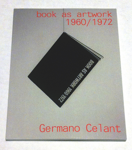
Where to go to compare and contrast the book art in Germano Celant’s pioneering “catalogue” of the Nigel Greenwood Gallery exhibition in London (1972) with that of the last half century?
Being a sort of small and portable catalogue and curator’s explanation for the gallery’s exhibition of ca. 300 works, Celant’s Book as Artwork is arranged chronologically and then alphabetically by artist. Presumably it was organized to match the exhibition’s organization (note the year 1967 in upper left of the photograph below and the distinctive Hidalgo cover, fifth from the left). With no photographs of the works, Book as Artwork gives no easily accessible visual sense of the 300 works in that exhibition. If we had that starting visual touchpoint, it would be easier to “place” the period or individual works in relation to book art from the 80’s onward.
Book as Artwork 1960 – 1972 – Exhibition Nigel Greenwood Gallery B, 1972.
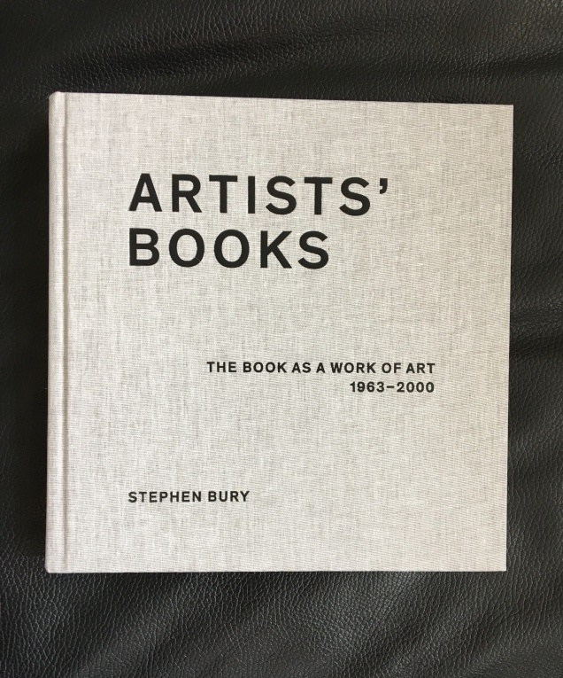
Stephen Bury’s Artists’ Books: The Book as a Work of Art, 1963 – 2000 (2015) includes, by design, only a handful of the artists and works selected for the Celano/Greenwood exhibition.
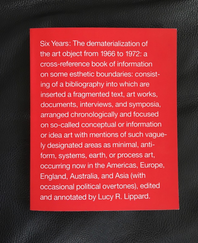
Lucy Lippard’s Six Years: The dematerialization of the art object from 1966 to 1972 (1973, 1997) — a “bibliography into which are inserted a fragmented text, art works, documents, interviews, and symposia, arranged chronologically” — comes as close as one might hope in black-and-white print for a starting visual touchpoint. Lippard’s scope, however, ranges beyond book art, so the number illustrated limits systematic visual comparison and contrast with the book art of the ensuing decades.
Phaidon’s Artists Who Make Books(2017) provides good coverage and bridges the 1960s to the 21st century. The essays and descriptions bring the book art off the page and into the mind’s hands.
Best of all is Lynda Morris’s mini-memoir of her role in organizing the Celant/Greenwood exhibition.
Germano had sent Nigel [Greenwood] a wonderful, arty handwritten letter in pink capitals … on December 22, 1970:
DEAR PUBLISHER I AM PREPARING FOR A NEW INTERNATIONAL MAGAZINE A COMPLETE ANTHOLOGY OF BOOKS MADE DIRECTLY BY ARTISTS.
…Nigel had met Germano and had his telephone number in Genoa. I was sitting beside him when he phoned and proposed Book as Artwork exhibition for September 1972. Germano immediately agreed.
For sources of book art since the close of the Celant/Greenwood exhibition, we are spoilt for choice. Print and digital, image-rich aggregations of book art abound. We can return to the Phaidon and Bury books. We can turn to the well-illustrated print and online publications from the Centre for Fine Print Research at the University of Western England, online library collections such as the MassArt Library or Chicago’s School of the Art Institute, the websites of dealers such as Zucker Art Books displaying their wares, the dozens of websites for recurring book art fairs such as International Artist’s Books Triennial Vilnius (1997 – present) and CODEX International Book Fair (2007 – present) and community sites suchas Artist Books 3.0. In the future, the Getty Research Institute‘s processing of the Steven Leiber Basement archive should also yield a rich source of images of works by the artists selected for the Celant/Greenwood exhibition.
Present-day online access challenges Mallarmé’s dictum: ”Everything in the world exists to end up in a book.” Now it seems:
Everything in the world exists to end up on the web.
As far as that premise holds, this annotation and rearrangement of Celant’s bibliography — a “webliography” — offers an online starting point for connecting the book as artwork 1960/1972 with the book as artwork since. In providing some images of the works and links to images, the webliography offers anyone interested in book art the means to gain a more colored impression of the period’s book art. That the primary impression is still black and white underscores the impact of xerographic technology on artists then as well as that of conceptualism driven by text or photograph. A webliographic approach also offers the opportunity to link the book art of the Celant exhibition with book-oriented Web-art or Net-art such as that of Amaranth Borsuk, Taeyoon Choi, Gunnar Green, Johannes Heldén, Bernhard Hopfengärtner and many others referenced below.
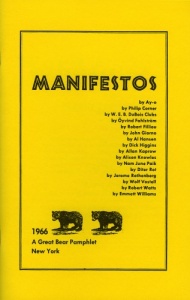
The reorganization here of Celant’s and Morris’s list — by artist alphabetically then chronologically — makes it easier to see the curators’ tendencies in selection as well as the influence of practical factors. The curators’ selection is obviously more Western, less Eastern European and even less Middle Eastern and Asian. Individuals’ prodigality surely played a role in whom and what was included. As Morris’s essay in the Phaidon book reveals, the geographical proximity of works available to be chosen played a role; so, too, the influence of the then-contemporary art network played a role (Atkinson, Beuys, Celant, Dwan,Greenwood, Hansjorg Mayer, Walther König, Maenz, Siegelaub, Sperone and the many other personalities of the Art-Language, Arte Povera, Conceptualist and Fluxus movements); and even the size of suitcases and availability of transport for bringing the artwork into the UK played a role.
Generally the online links for the artists’/authors’ names lead to biographies, either in their official websites, Wikipedia or other news sources. Where an artist/author is listed multiple times, the links vary from instance to instance to provide a wider range of information about the individual and, in some cases (such as Dieter Rot’s), more images. The links behind the publishers’ names go to publishers’ websites or Wikipedia entries about them. The links that follow each entry resolve to images of the work, videos, audio, interviews or essays relevant to the work. For selected entries in Celant’s list, a compare/contrast takes the user to websites or works whose juxtaposition might shed light on the similarities or differences between the item in Celant’s list and book art of the subsequent decades.
The webliography also supports the haptically as well as digitally inclined. The links behind the titles of the works provide information on the nearest library location of the work (although not all titles could be located). Be sure to enter your own location and refresh the results.
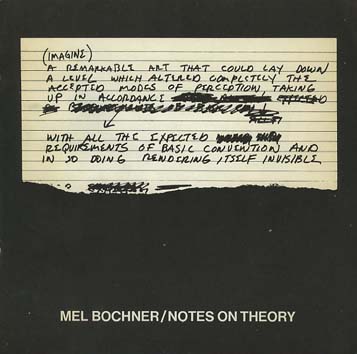
Bochner, Mel. The Singer Notes. New York: Self-published, 1968. [Images] [Compare/contrast Bochner’s notes and drawings resulting from conversations with scientists and engineers at Singer Labs in New Jersey with the Smithsonian Libraries’ online exhibition Science and the Artist’s Book, 1995]
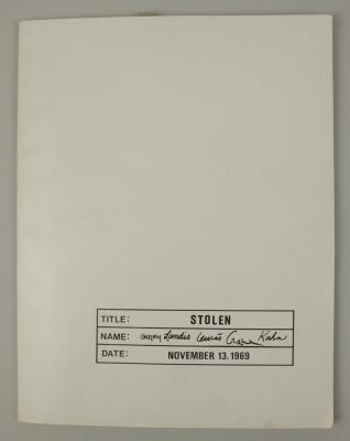
Gregory, Kathe; Landis, Marilyn; Lewis, Russell; Crane, David; Kahn, Scott. Stolen. New York: Colorcraft Lithographers/Dwan Gallery, 1970. [Images] [Compare/contrast with Andrew Savage’s Stolen White Goods, 2006, and then Cristina Garrido’s intervention White Goods, 2011]
Lole, Kevin; Smith, Paul. Handbook on Models. Coventry: Self-published, 1972. [Unable to locate a work of this title in WorldCat, but one with the title The Relativism of Emotion Handbook to the Model and same date of publication is described in Paul Robertson‘s “A Collection of Rare Art+ Language Books and Internal Documents – Many Unknown in Literature”, Gorebridge, Midlothian: Unoriginal Sins/Heart Fine Art, n.d.]
30 x 21cm, 50pp (printed recto only) plus printed card covers. Xerox inner pages as issued. The first and only edition of this theoretical work based on a physical model (electro-shock, photo beams and electronic buzzers) acting as metaphor for analogue, theoretical and representative models. Cover is very minority marked on the front and back cover has a faint diagonal crease else VG++. From the archive of David Rushton who believes only 10 or fewer of this book was published.
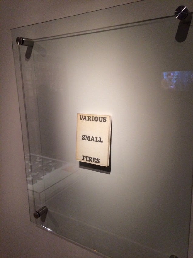
Display of Ed Ruscha’s Various Small Fires and Milk, 1964, at Pliure: La Part du Feu, 2 February – 12 April 2015, Paris. Photo by Robert Bolick. Reflected in the lower left hand corner is the display of Bruce Nauman’s Burning Small Fires; in the upper right corner, the film clip of Truffaut’s 1966 Fahrenheit 451; and in the upper left, Maria Helena Vieira da Silva’s La bibliotheque en feu, 1974.
Pilkington, Philip; Rushton, David; Lole, Kevin; Smith, Paul. Concerning the Paradigm of Art. Zurich: Editions Bischofberger, 1971. [Last author’s name corrected from “Paul” to “Peter”] [From Paul Robertson, “A Collection of Rare Art+ Language Books and Internal Documents – Many Unknown in Literature”, Gorebridge, Midlothian: Unoriginal Sins/Heart Fine Art, n.d.
“30 x 21cm, 16pp (recto only). White card covers – with offset title. A text published by Bischofberger from a theoretical document written by Kevin Lole, Philip Pilkington, David Rushton and Peter Smith (formerly Analytical Art and by this time fully regarded as members of Art & Language) which applied Thomas Kuhn’s theory of paradigm shift to art (the original theory by Kuhn being a view that revolutions in scientific thought only occurred when sufficient contrary evidence to the prevailing orthodoxy had mounted up and the original hypothesis could no longer explain the physical evidence emerging from empirical studies). It is worth noting that at this time Bischofberger bought a great deal of Art + Language material from the group and published other documents by them including some of the group’s rarest publications – storing many of the more three-dimensional works for later resale. Bischofberger did not print the books himself – rather Art and Language arranged design and publication in Coventry (for free using the University’s resources) and David Rushton drove the books over in a camper van to Switzerland (breaking down just on the edge of the city due to running out of petrol and having little money left, Rushton coasted the last mile down hill on an empty tank).
The limitations of these series of books are usually placed at c. 200 but Rushton remembers taking far fewer than that with him and this Analytical Art book was in fact only produced in 50 copies taken to Zurich plus a few retained by the artists in the UK.
That said this is one of ONLY 5 copies which were numbered in roman numerals (this one being III/V) and signed by ALL of the four writers in pencil on the first title page.”]
Pilkington, Philip; Rushton, David. Sample from a Topological Notebook. Coventry: Self-published, 1972. [Video] [From Paul Robertson, “A Collection of Rare Art+ Language Books and Internal Documents – Many Unknown in Literature”, Gorebridge, Midlothian: Unoriginal Sins/Heart Fine Art, n.d.
“30 x 21cm, 28pp carbon copy pages and printed cover. This was one of ONLY four copies made and published by the group – two copies being signed by David Rushton and Peter [sic] Pilkington and created from original typed sheets and two copies remaining unsigned and created (as here) using the carbon copies from the originals. These latter two examples were regarded by the group as artist’s proofs of the book. This is the only copy of this book available for sale anywhere as from the original four prices: one is in Paul Maenz’s archive and another two copies are in the hands of private collectors (who purchased them from ourselves). This copy is signed by David Rushton and Philip Pilkington and has been stamped on the inside front cover with the official Art & Language Stamp and also designated in blue ink “Second Copy”. Fine estate and clearly rare.”]
Magnet / Photo Series / Group 2000 / September 1968 / (4 Phase) / Continuous Photographic Photographs Continuously Photographs Up to 20,000 Shots / Run Time work / 10 years / annual series of 20,000 elements / technique / black and white photography / leafs / 3 M / K 203 3 / each 30 x 40 / constant time setting diaphragm / fixed tilt stand / 1969 / camera used maintains the original value and adds to the artistic market.
Ramsden, Mel. The Black Book. [Unable to find a work under this title in WorldCat]
Ramsden, Mel. Abstract Relations. New York: Art-Language, 1968. Edition of 5. [Unable to find a work under this title in WorldCat; the 5 images on the left in this photograph from the Philippe Méaille private collection at MACBA come closest.]
Rot, Dieter. Icelandic Leather. Reykjavik: Self-published, 1970. [Unable to locate by this title; may be referring to Volume 5, Bok 3 of the Collected Works]
Display of Ed Ruscha’s Various Small Fires and Milk, 1964, at Pliure: La Part du Feu, 2 February – 12 April 2015, Paris. Photo by Robert Bolick. Reflected in the lower left hand corner is the display of Bruce Nauman’s Burning Small Fires; in the upper right corner, the film clip of Truffaut’s 1966 Fahrenheit 451; and in the upper left, Maria Helena Vieira da Silva’s La bibliotheque en feu, 1974.
Renée Riese Hubert and Judd D. Hubert’s The Cutting Edge of Reading: Artists’ Books (Granary Books, 1999) is a signal work of appreciation and analysis of book art. Nearly twenty years on, it can be read and appreciated itself more vibrantly with a web browser open alongside it.
To facilitate that for others, here follows a linked version of the bibliography in The Cutting Edge of Reading — a “webliography”. Because web links do break, multiple, alternative links per entry and permanent links from libraries, repositories and collections have been used wherever possible. These appear in the captions as well as the text entries. Also included are links to videos relating to the works or the artists. At the end of the webliography, links for finding copies of The Cutting Edge (now out of print) are provided.


![Image result for art & language: texte zum phänomen kunst und sprache [book]](http://igem.adlibsoft.com/wwwopacx/wwwopac.ashx?command=getcontent&server=images&value=coda%5CAB00318.jpg)