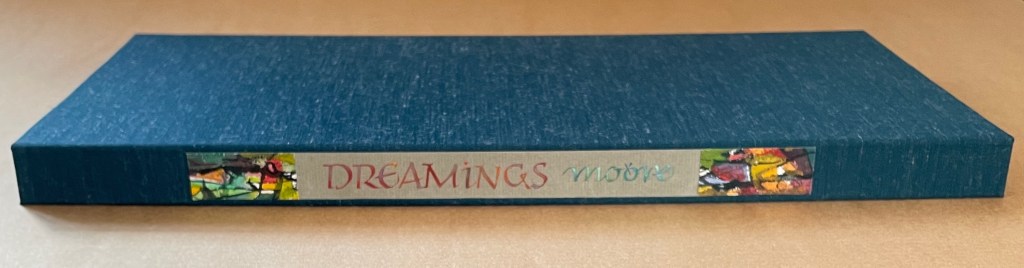
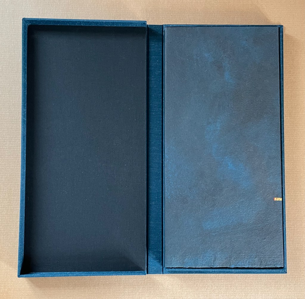
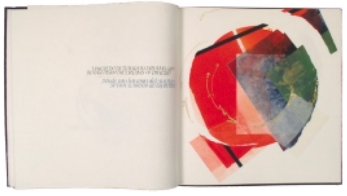
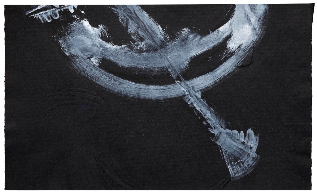
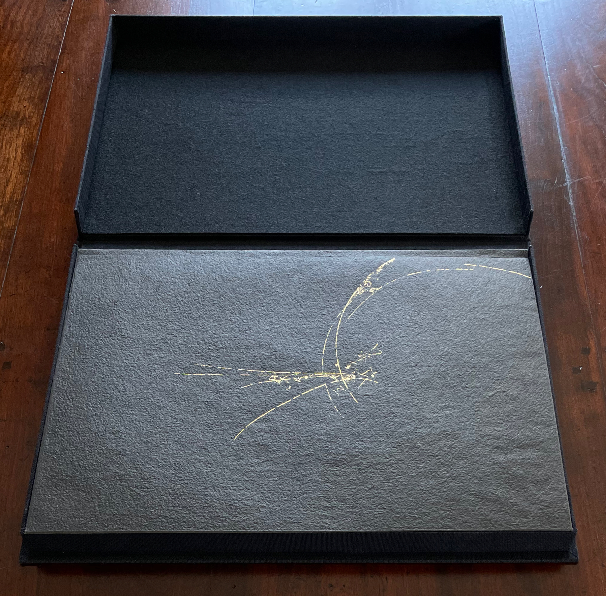
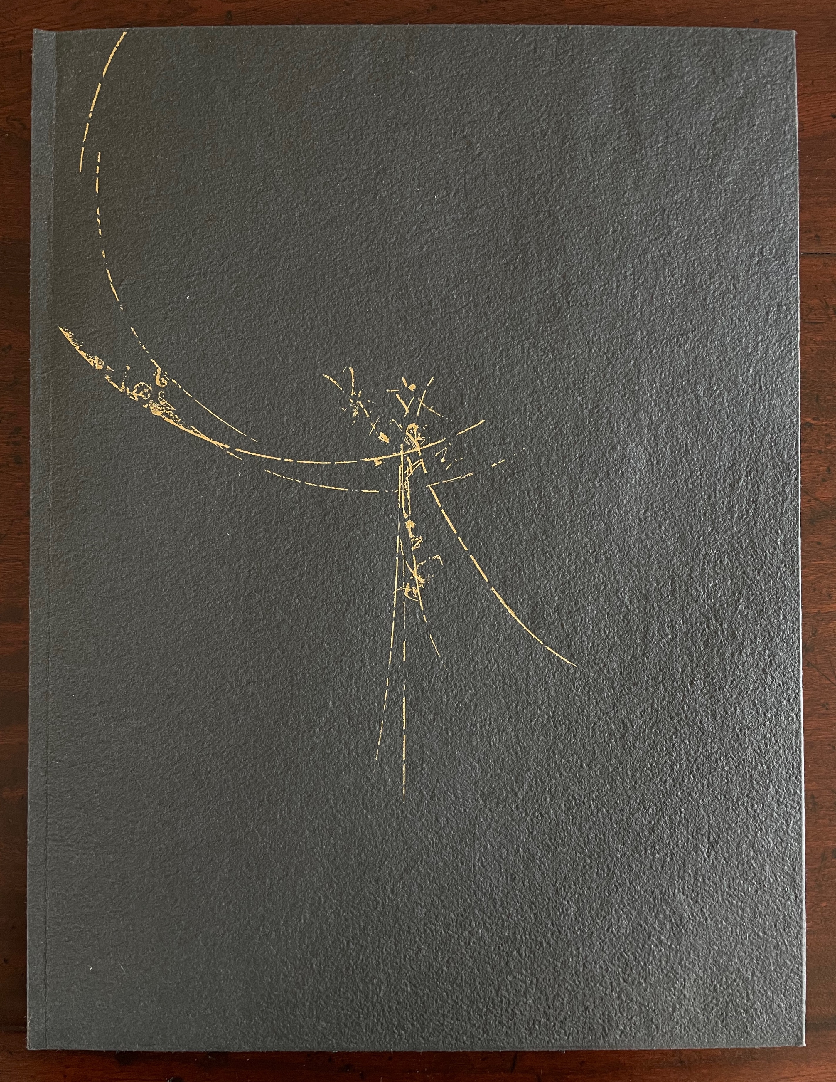
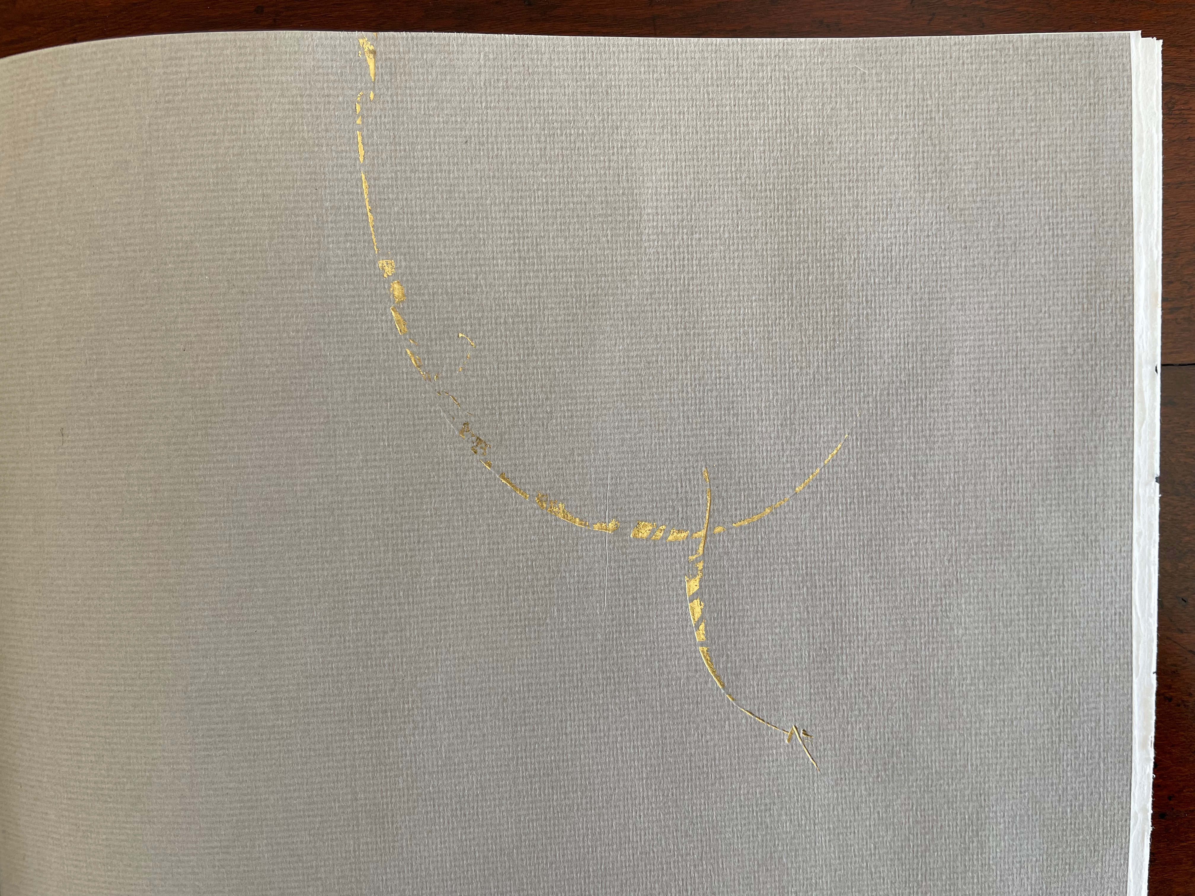
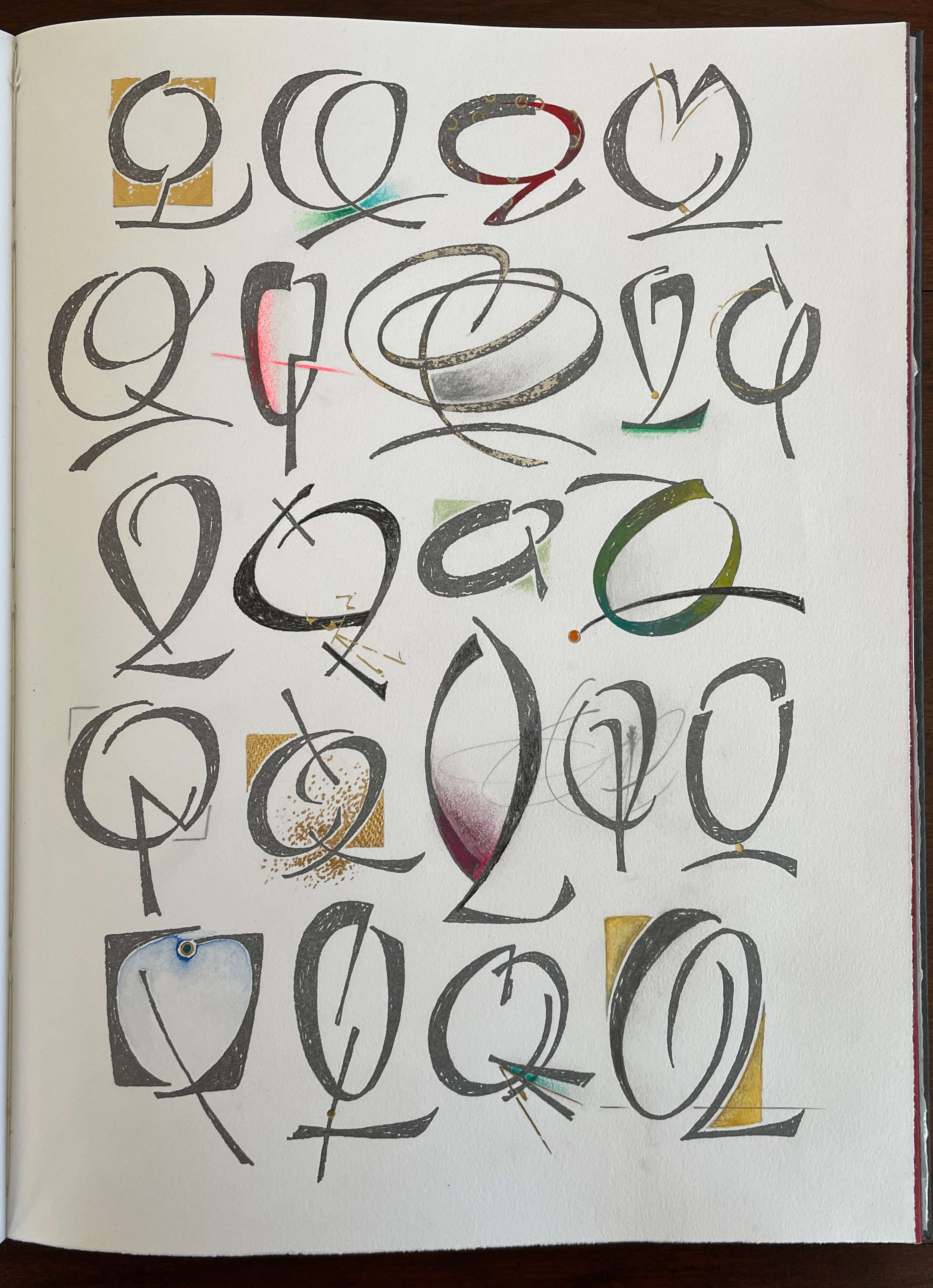
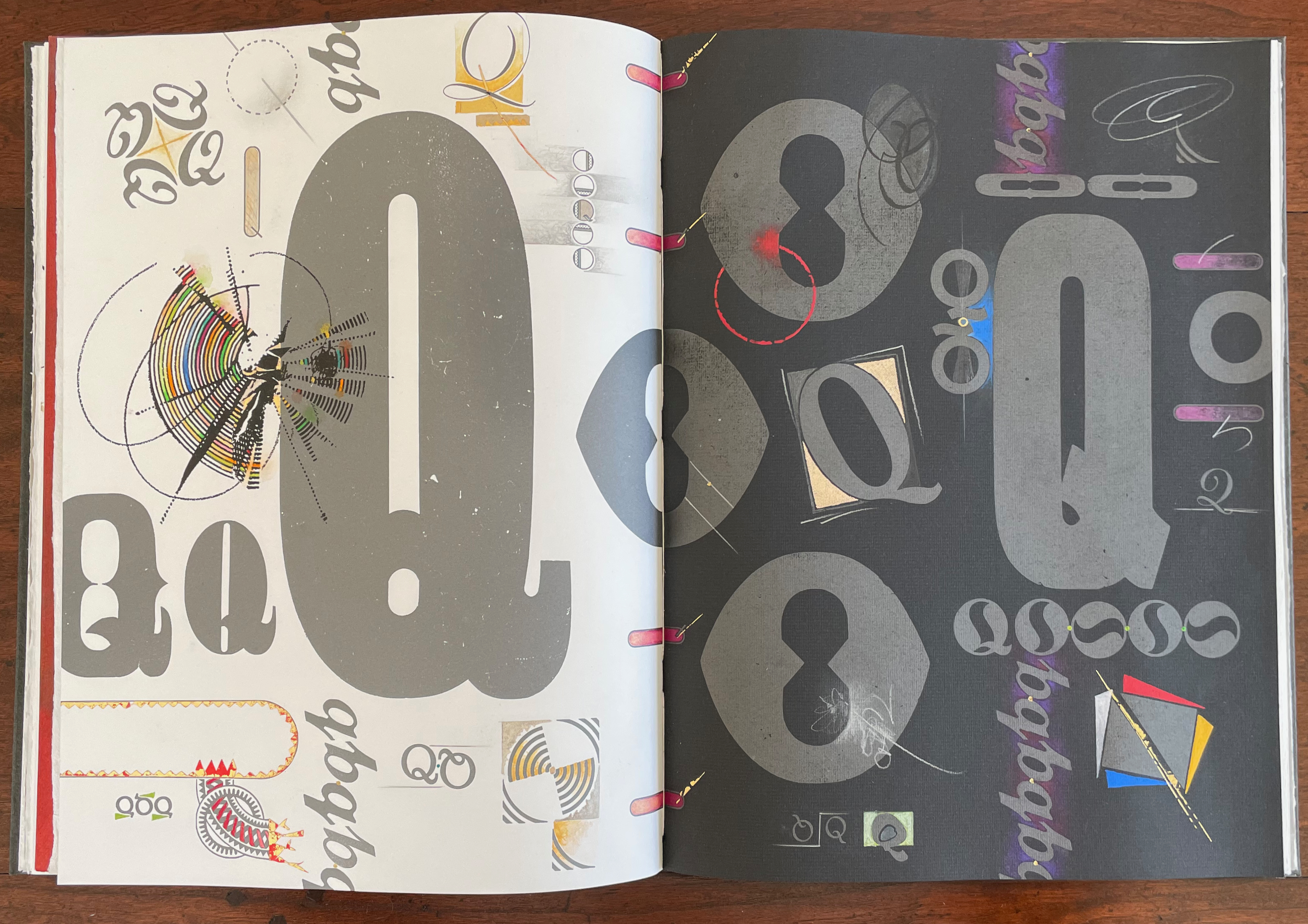
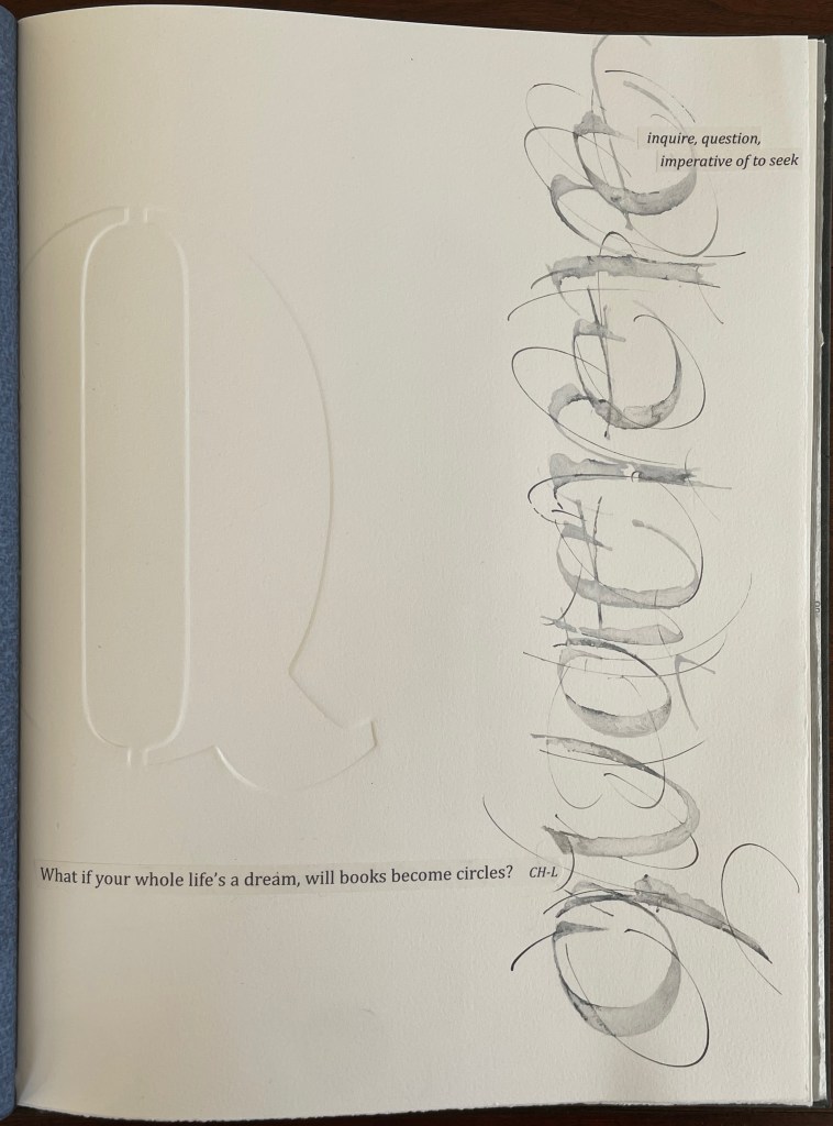
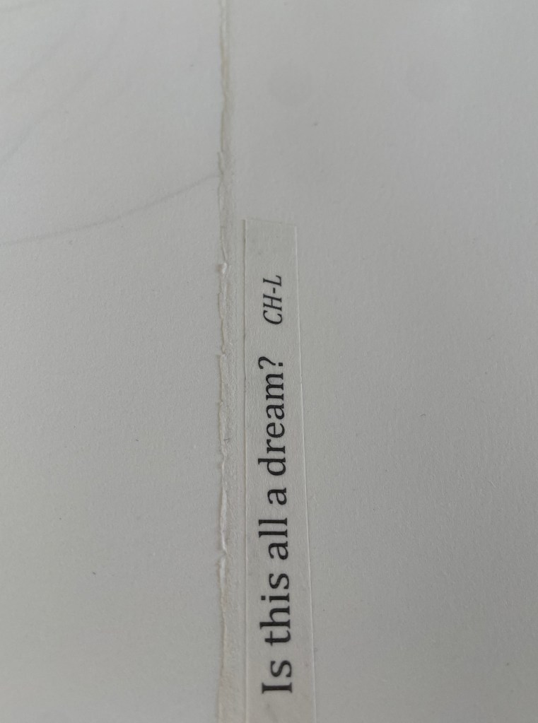
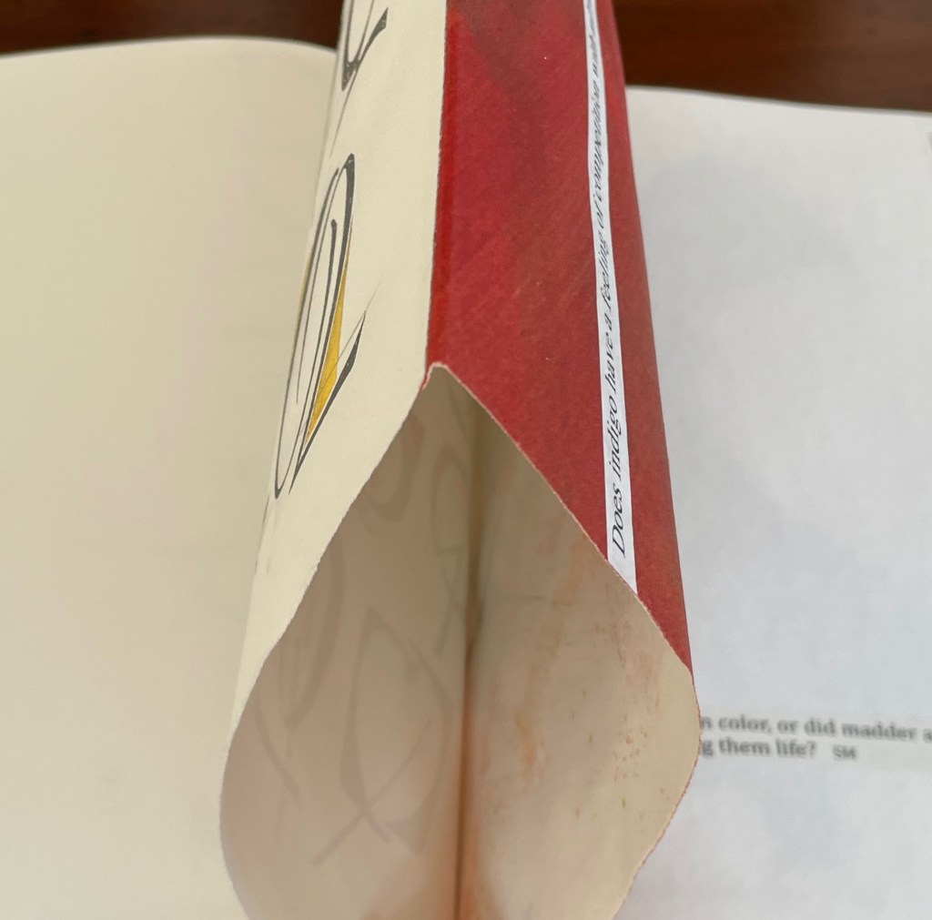
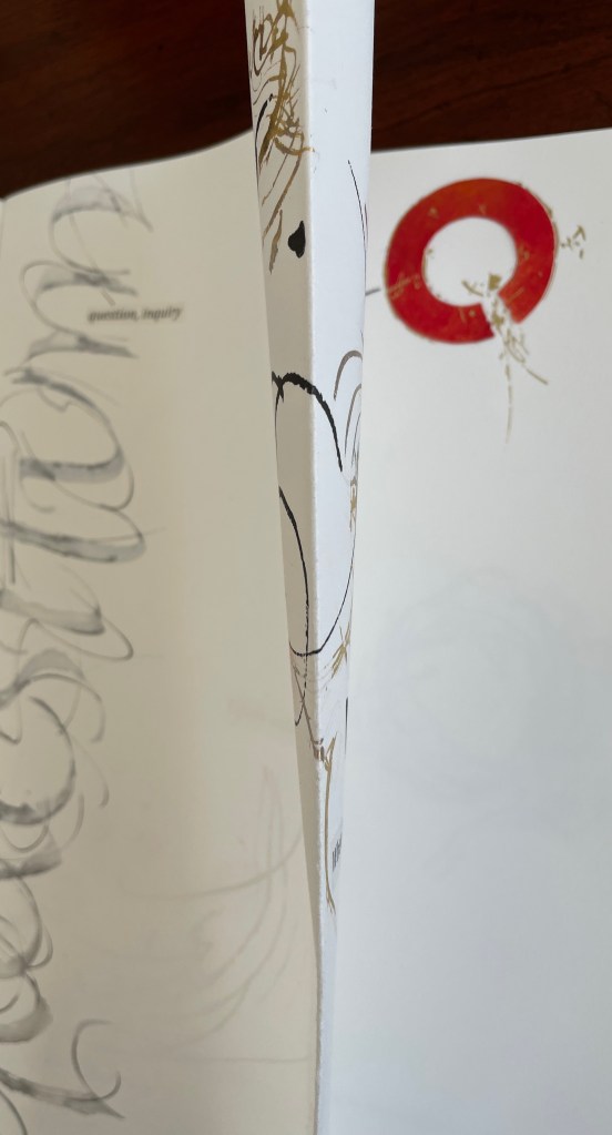
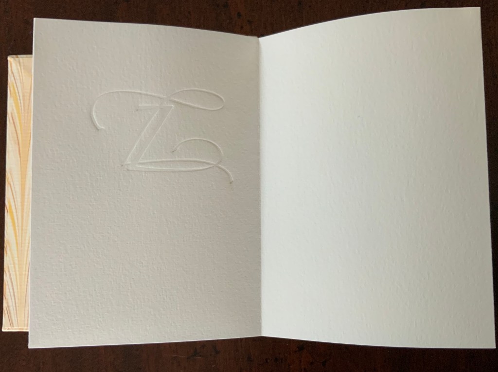
Dreamings (2023) Suzanne Moore Artist’s manuscript. Softcover, handsewn. Cloth-covered box with handwritten and painted title pastedown on the spine. H368 x W178 mm. 17 pages. A unique edition. Acquired from the artist, 15 April 2024. Photos: Books On Books Collection and artist.
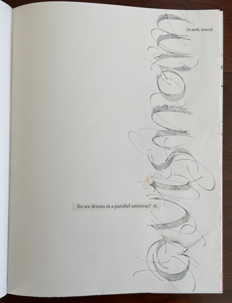
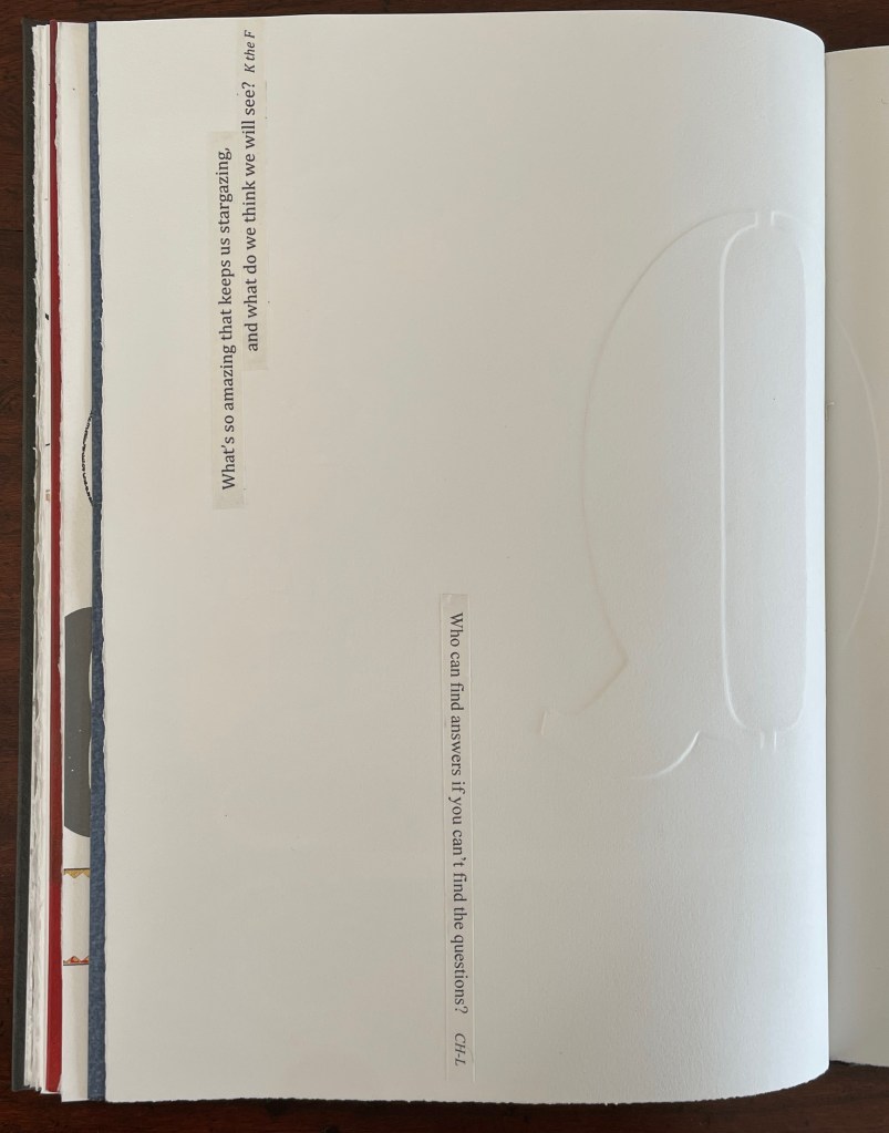
Dreamings (2023) follows the artist’s Question Series, begun in 2008 considering questions of life and art while exploring the letter Q – “that quirky letter of distinct design” as Moore calls it. Other works in the series include:
Thirteen Questions (2008), drawn from Pablo Neruda’s The Book of Questions (1991) [Libro de las preguntas (1974)], unknown location.*
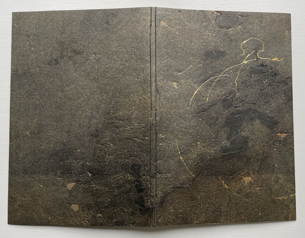
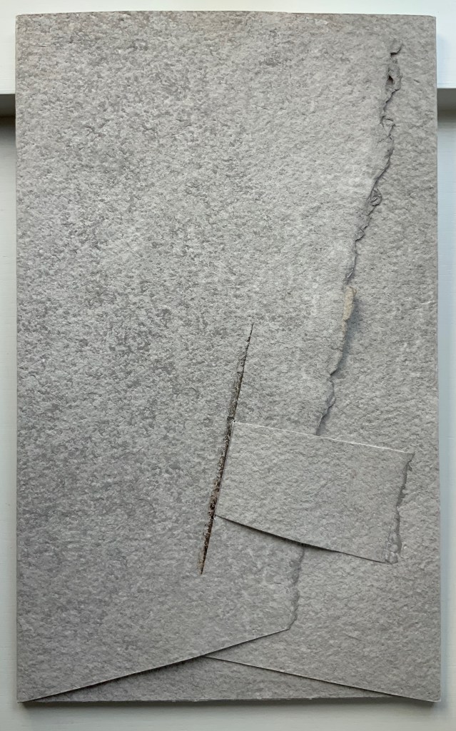
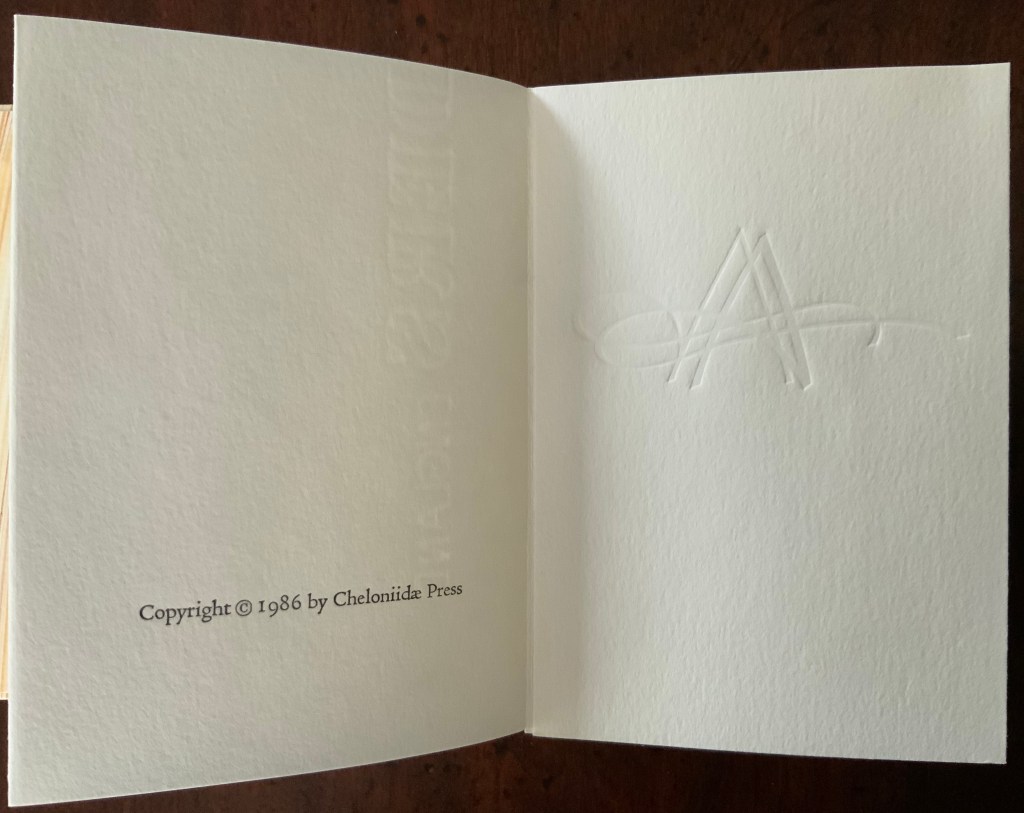
Amorous Embrace (2023) Suzanne Moore and Titus Lucretius Carus (trans. A.E. Stallings) Artist’s manuscript, stub bound to stone cover, tinted thread, gold leaf, kozo, paste paper. H220 x W148 mm. 12 pages. Unique. Acquired from the artist, 5 February 2024. Photos: Books On Books Collection.
Sometime in the first century BCE, the Roman poet Lucretius wrote the didactic epic De rerum natura (The Nature of Things). It celebrates the atomistic physics and philosophy that Epicurus and his followers recorded two hundred plus years before in thirty-seven volumes. Imagine the determination to press that Greek vision of the world from atoms to the cosmos into six volumes of Latin poetry. We’ll have to await further papyrology applied to the cinders of the Herculaneum library of scrolls and hope that it reveals more scraps of the Greek’s Περὶ φύσεως (On Nature). Only then will we know whether Lucretius based his poem directly on them.
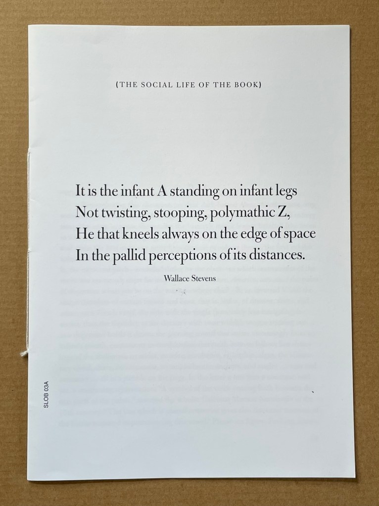
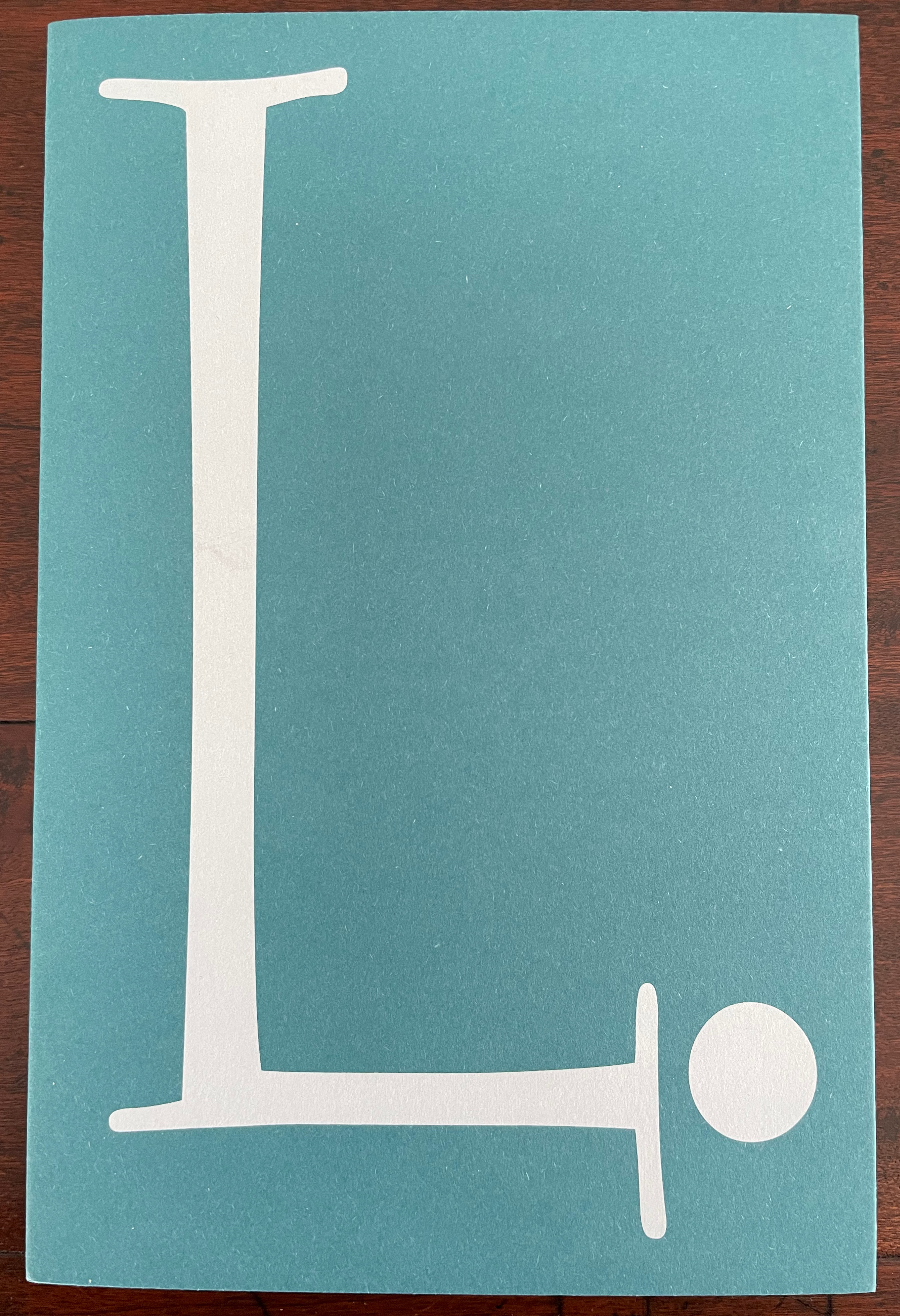
Infant A (2012) Louis Lüthi Thread-stitched signature. H225 x W160 16 pages. Edition of 1000. Acquired from Torpedo Books, 8 January 2024. Photos: Books On Books Collection
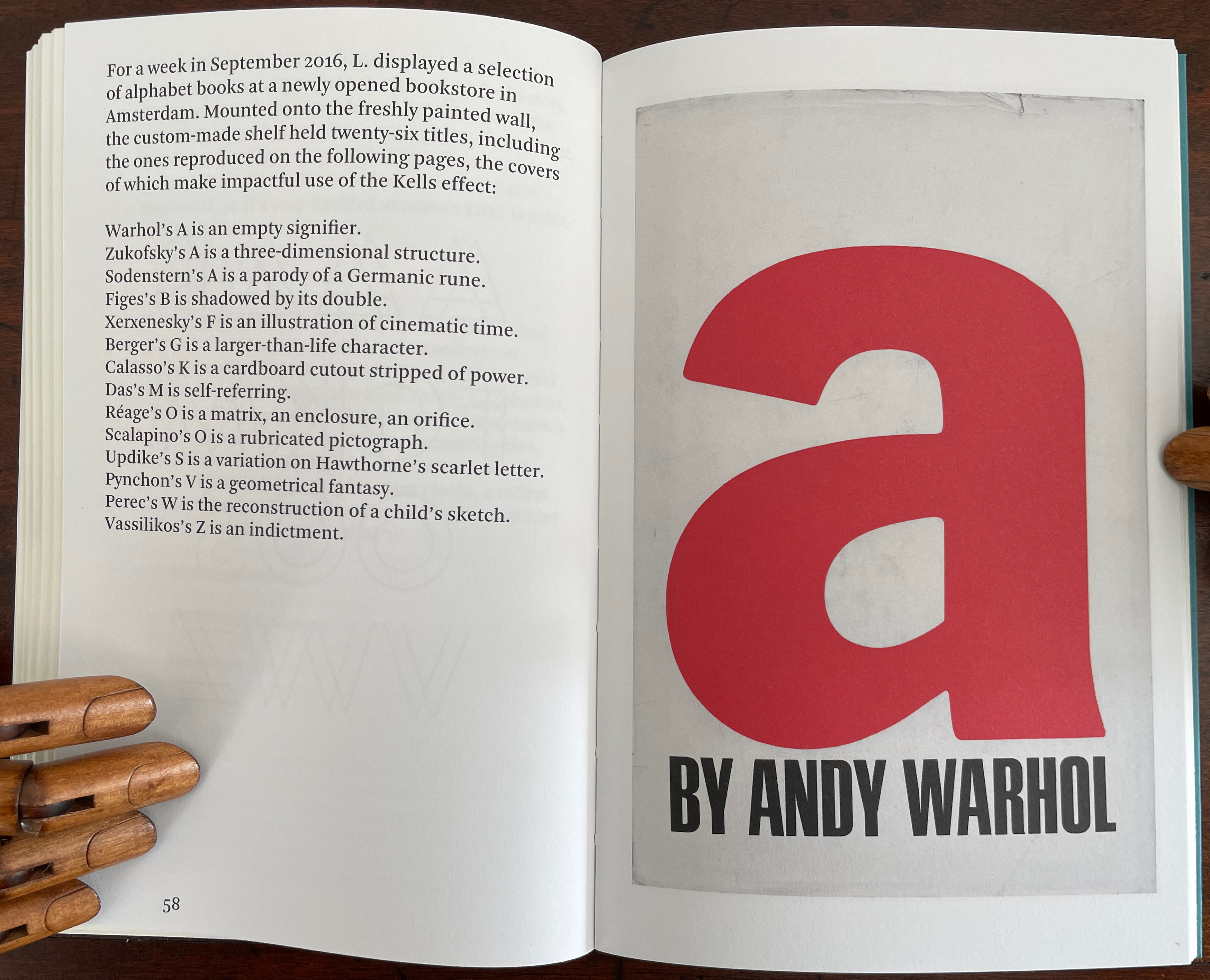
Infant A is part of a collection of essays commissioned by castillo/corrales and published by Paraguay Press under the series title The Social Life of the Book. Lüthi’s contribution fits the Books On Books Collection on several scores. First is the epigram’s invocation of the alphabet, which echoes the collection’s concentration of alphabet-related artists’ books and children’s books. See Alphabets Alive! Second is the epigram’s source: Wallace Stevens, whose poetry has inspired Ximena Pérez Grobet’s Words (2016). Would that other book artists be so inspired. Third is the narrator’s fictional conversation with Ulises Carrión in a celebration of all things A-related, in particular Andy Warhol’s novel a: a novel (1968), which finds analogues in Warren Lehrer’s A Life in Books: The Rise and Fall of Bleu Mobley (2013) and Derek Beaulieu’s a, A Novel by Andy Warhol (2017) (entry in progress). Fifth is how the dialogue reminds me of Suzanne Moore’s A Musings (2015).
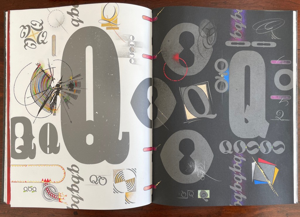
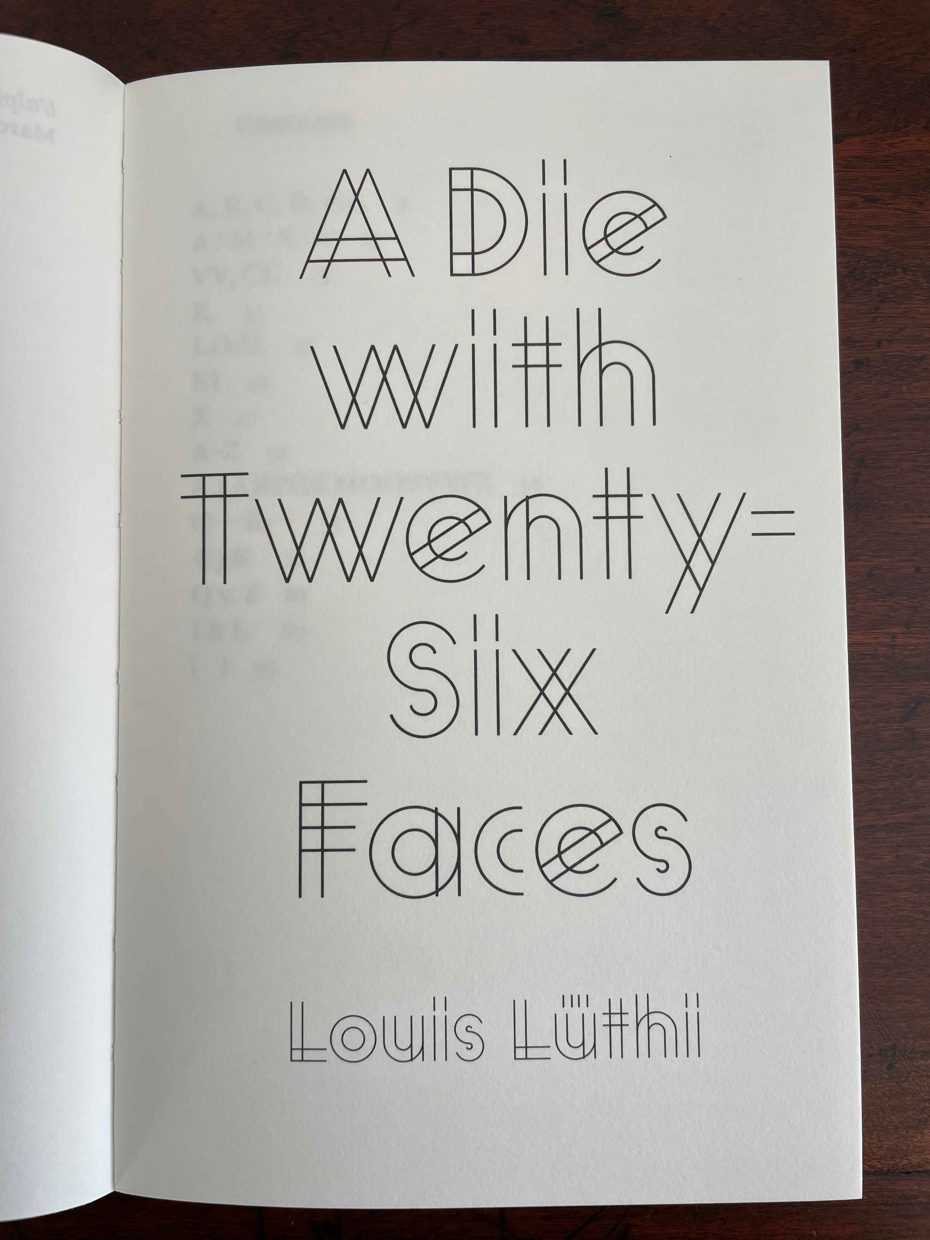
A Die With Twenty-six Faces (2019)
A Die With Twenty-six Faces(2019) Louis Lüthi Paperback. H200 x W130 mm. 104 pages. Acquired from Amazon, 18 September 2022. Photos: Books On Books Collection
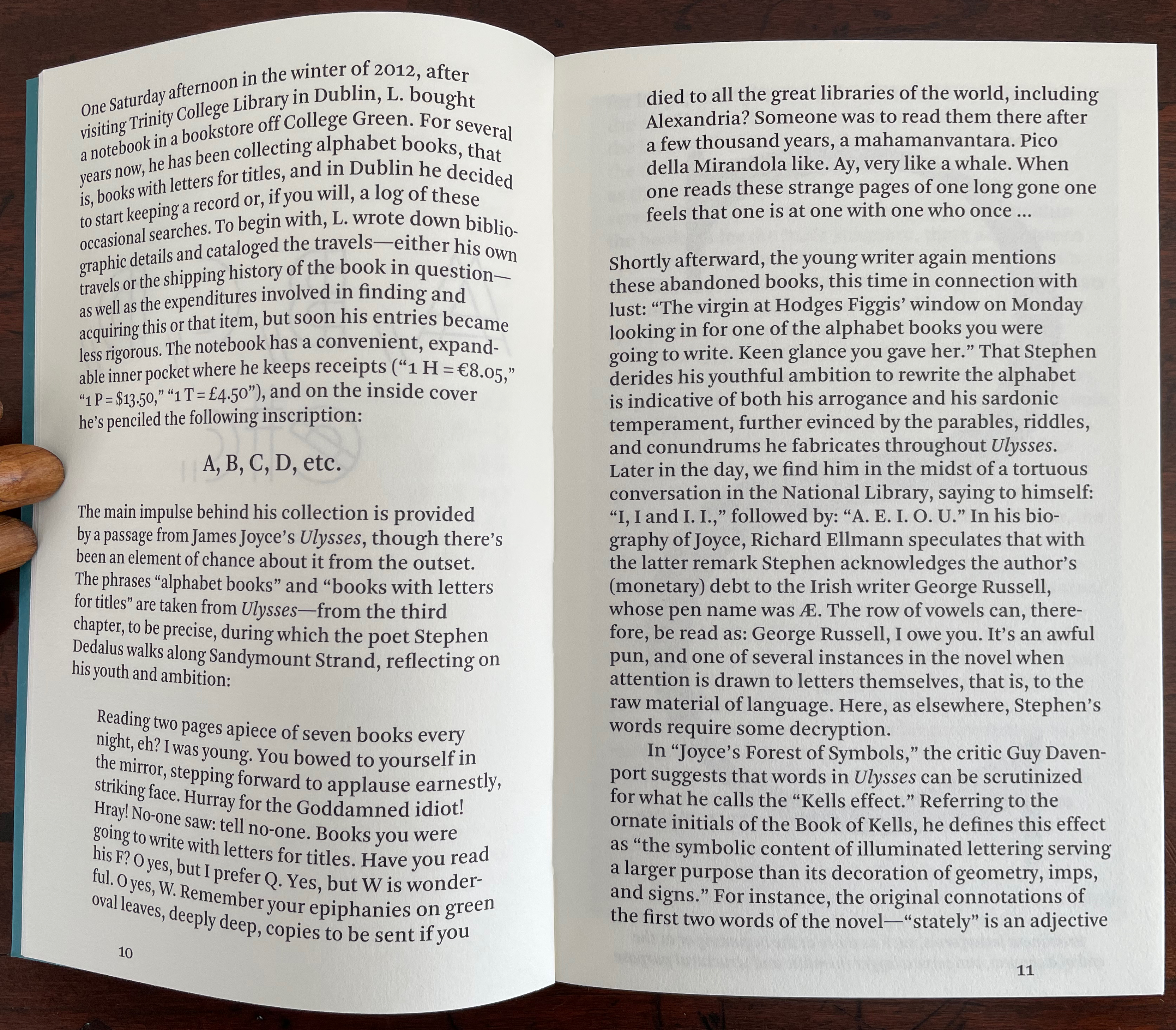
Walter Benjamin’ unpacking of his library has a lot to answer for. Not only do we have Buzz Spector‘s take on it in 1995, but Jo Steffens’ Unpacking trilogy of photos of architects’, artists’ and writers’ bookshelves, Alberto Manguel’s elegiac Packing My Library (2018), and here is Louis Lüthi’s.
Publisher’s website: In A Die with Twenty-Six Faces, the author — let’s call him L. — guides the reader through his collection of alphabet books, that is, books with letters for titles. Some of these titles are well known: Andy Warhol’s “a,” Louis Zukofsky’s “A”, Georges Perec’s W. Others are obscure, perhaps even imaginary: Zach Sodenstern’s A, Arnold Skemer’s C and D. Tracing connections between these books, L. elaborates on what the critic Guy Davenport has called the “Kells effect”: “the symbolic content of illuminated lettering serving a larger purpose than its decoration of geometry, imps, and signs.”
The title stirs thoughts of Marcel Broodthaers’ oracular statement in 1974 “I see new horizons approaching me and the hope of another alphabet”. An alphabet that unrolls across the twenty-six faces of a die would certainly qualify as another alphabet. Broodthaers and the die also stir thoughts of Stéphane Mallarmé’s Un Coup de DésJamais N’Abolira le Hasard to which Broodthaers paid repeated homage. Throwing a twenty-six-sided die would certainly no more abolish chance than would a roll of Mallarmé’s six-sided die. Lüthi’s game, however, has little to do with chance unless we count his luck in finding the works to build his library of single-letter-entitled books. Even less to do with luck if some of the library is fictitious, a likelihood that the “publisher’s” statement suggests. Lüthi’s die is loaded!
A selection of Lüthi’s “alphabet” books on display. Courtesy of the author. Photo: Gesellschaft für Aktuelle Kunst Bremen
On the Self-Reflexive Page II (2021)
On the Self-Reflexive PageII(2021) Louis Lüthi Paperback. H200 x W130 mm. 304 pages. Acquired from Idea Books, 18 September 2022. Photos: Books On Books Collection.
This is a peculiar book in its order and nature. After two variant half-title pages, it begins with a section entitled “Black Pages”. Only on flipping through the volume can we find the remaining front matter — just after page 208. There’s another half-title and then the Table of Contents. Reproducing the marbled page from Laurence Sterne’s The Life and Opinions of Tristram Shandy, Gentleman (1759–1767), the book’s cover gives a clue to this peculiarity. Sure enough, Lüthi spells it out later in the section entitled “On Drawing Pages”.
So much in Tristram Shandy is presented out of order: a second dedication comes not after the first but on page 27, the preface is not at the beginning of the novel but in chapter 20 of volume three, and chapters 18 and 19 of volume nine come not after chapter 17 but are inserted after chapter 25. In a similar act of transposition, we find a marbled page in volume three, even though hand marbling is customarily used to decorate covers and endpapers. As Viktor Shklovsky observed, “It is precisely the unusual order of even common, traditional elements that is characteristic of Sterne.” (p. 240)
This one paragraph confers on Lüthi’s entire book the very self-reflexivity that it explores across a range of literature and artists’ books. Reflecting the custom to which it refers, On The Self-Reflexive Page II carries Sterne’s marbled pages on its front and back covers. In the text before his marbled leaf, Sterne refers to it as the “(motly emblem of my work!)“. Lüthi has taken that exclamation to heart (and cover) as if it were advice in creating this hybrid, motley work of his own: “part artist’s book and part essay, part literary excavation and part typographical miscellany” as he calls it in his middle-of-the-book Foreword.
Lüthi’s work is just one in the Books on Books collection of several inspired by Tristram Shandy. There is Erica Van Horn’s Born in Clonmel (2011), Simon Morris’ Do or DIY (2012), Abra Ancliffe’s The Secret Astronomy of Tristram Shandy (2015), and Shandy Hall‘s The Black Page Catalogue (2010), Emblem of My Work (2013), Paint Her To Your Own Mind (2018) and The Flourish of Liberty (2019). Outside the collection, there is Brian Dettmer’s Tristram Shandy (2004), commissioned by Shandy Hall’s Laurence Sterne Trust, and also Sean Silver’s Shandean online venture called The Motley Emblem (2022~) celebrating Sterne’s marbled leaf and the analytical chemistry of marbling. The latter may become a book, even an artist’s books to add to the tally. In The Century of Artists’ Books, Johanna Drucker draws attention to Sterne’s novel twice as an example of self-reflexivity or self-interrogation, but in 1994 and 2004, Sterne did not rise to the same level of precursor to book artists as William Blake or Stéphane Mallarmé in Drucker’s view. With these later works of book art inspired by Uncle Toby’s nephew in the bag, a dozen or so more might nudge Sterne up the scale.
In the meantime, anyone interested in artists’ books could fruitfully apply to the medium Sterne’s exhortation to his own readers:
Read, read, read, read, my unlearned reader! read, — or by the knowledge of the great faint Paraleipomenon — I tell you before-hand, you had better throw down the book at once; for without much reading , by which your reverence knows, I mean much knowledge, you will no more be able to penetrate the moral of the next marbled page (motly emblem of my work!) than the world with all its sagacity has been able to unraval the many opinions, transactions and truths which still lie mystically hid under the dark veil of the black one.
Artists’ books are to be read, handled and digested, not stored away in the archives.
Animalphabet (1996) Department of Special Publications, The Museum of Metropolitan Art Hardcover, casebound sewn. H120 x W150 mm, 60 unnumbered pages. Acquired from Aardvark Books, 1 August 2021. Photos: Books On Books Collection.
Animalphabet is a reminder of the close connection between animals and alphabet books. Think of the several same-titled works, e.g., Julia Donaldson’s Animalphabet (2018) or Sharon Werner and Sharon Forss’ AlphaBeasties (2009) or Alan James Robinson and Suzanne Moore’s A Fowl Alphabet (1986). It also highlights an aspect of book art.
Although the museum’s little book does not rise to the level of art, its self-reflective textual/visual puns are a hallmark of much book art. In it, the museum staff selects an ink scroll depiction of donkeys by Huang Chou for “Ass-embly”, François Pompon’s Polar Bear for “Bear Minimum”, and a 10th-11th-century bookcover carving of the emblem of Luke the Evangelist for “Holy Cow”. The Met’s choice of Pompon’s Minimalist bear to pun on the art movement comes closest to the rampant punning of homages to Ed Ruscha’s “various” iconic works of book art, distilled in Various Small Books (MIT Press, 2013).
Because it is hard to think of a textual/visual/genre pun among artists’ books that is more multilevel than the Met’s final letter, the little book should have the last word.
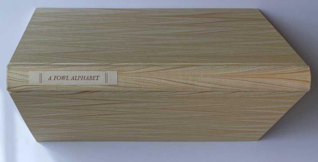
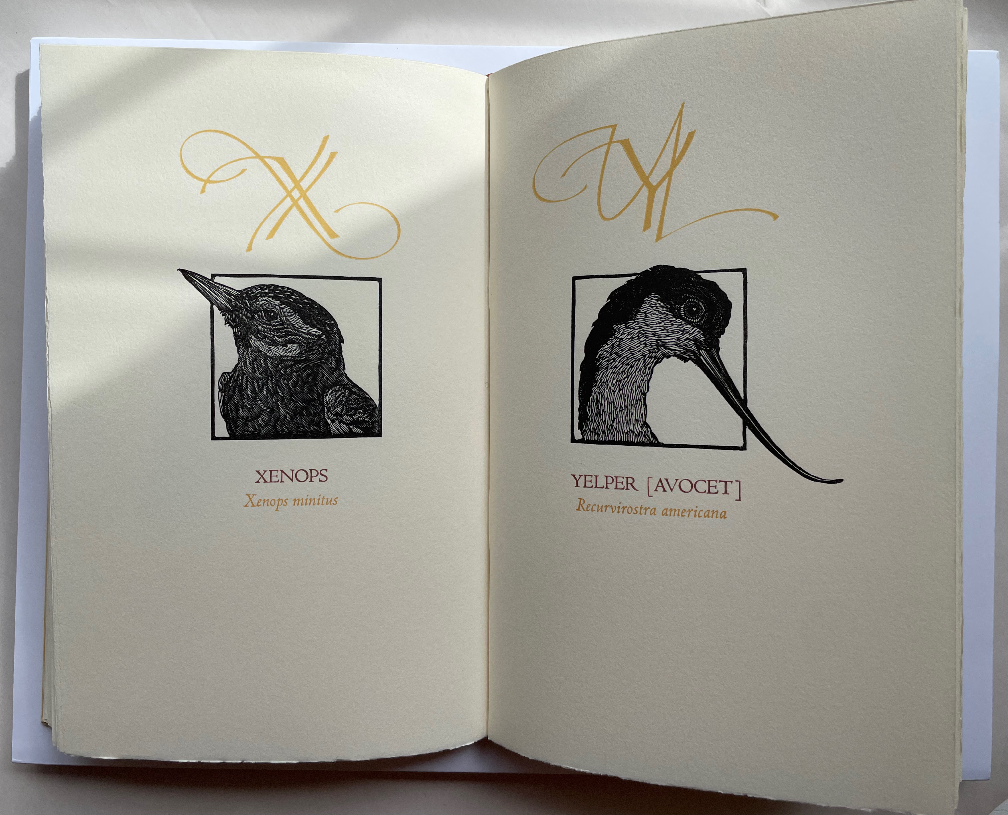
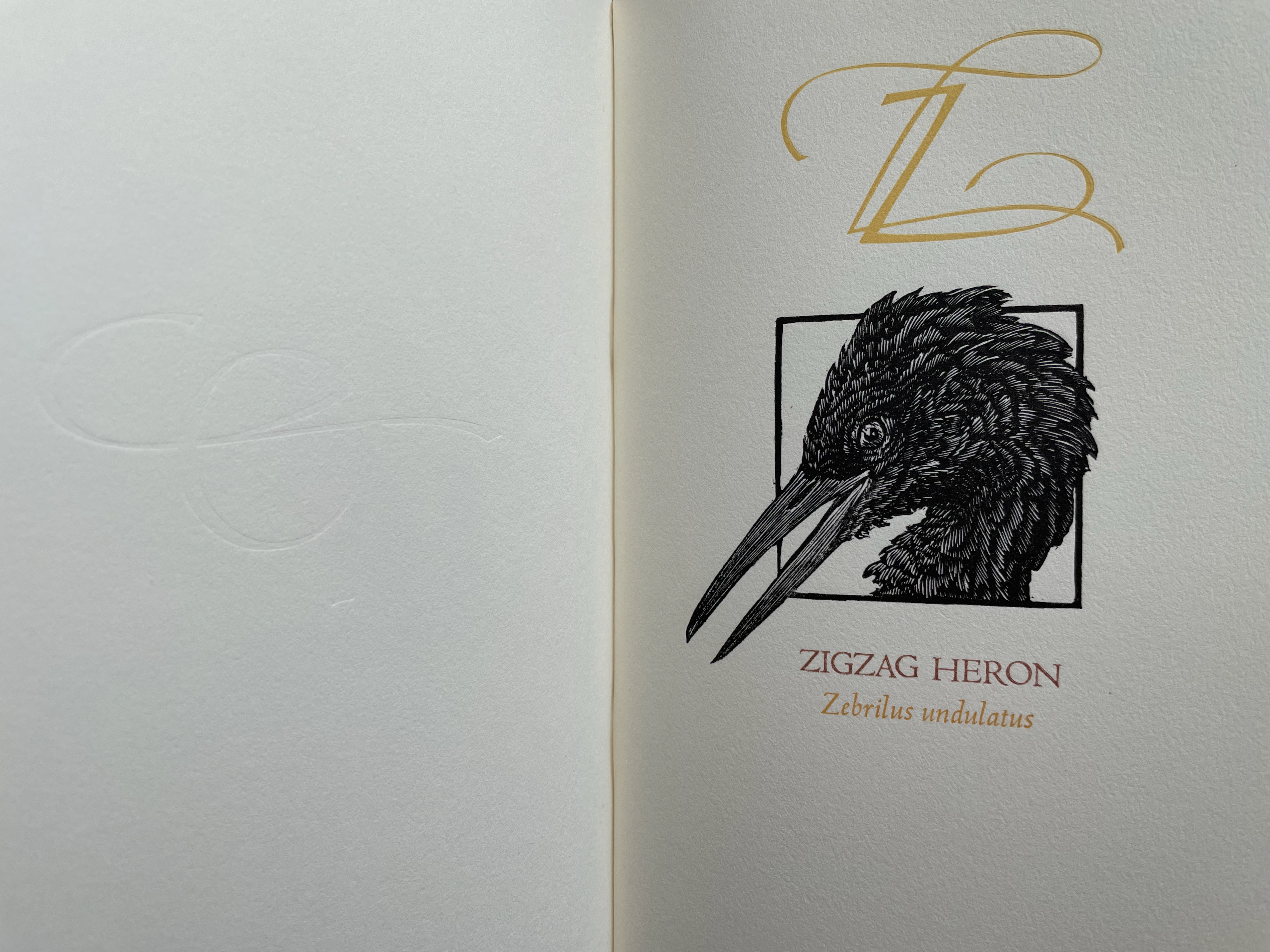
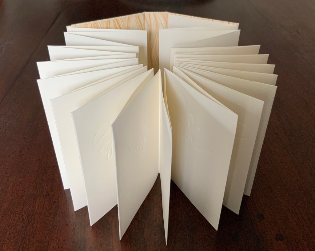
A Fowl Alphabet (1986) Alan James Robinson (etchings), Suzanne Moore (calligraphy) Casebound. Marbled paper over boards. Doublures and flyleaves. H218 x W145 mm. 26 Folios untrimmed at head. Four-page prospectus loose. Acquired from Bromers Bookseller, 16 August 2022. Photos: Books On Books Collection. Displayed with permission of the artists.
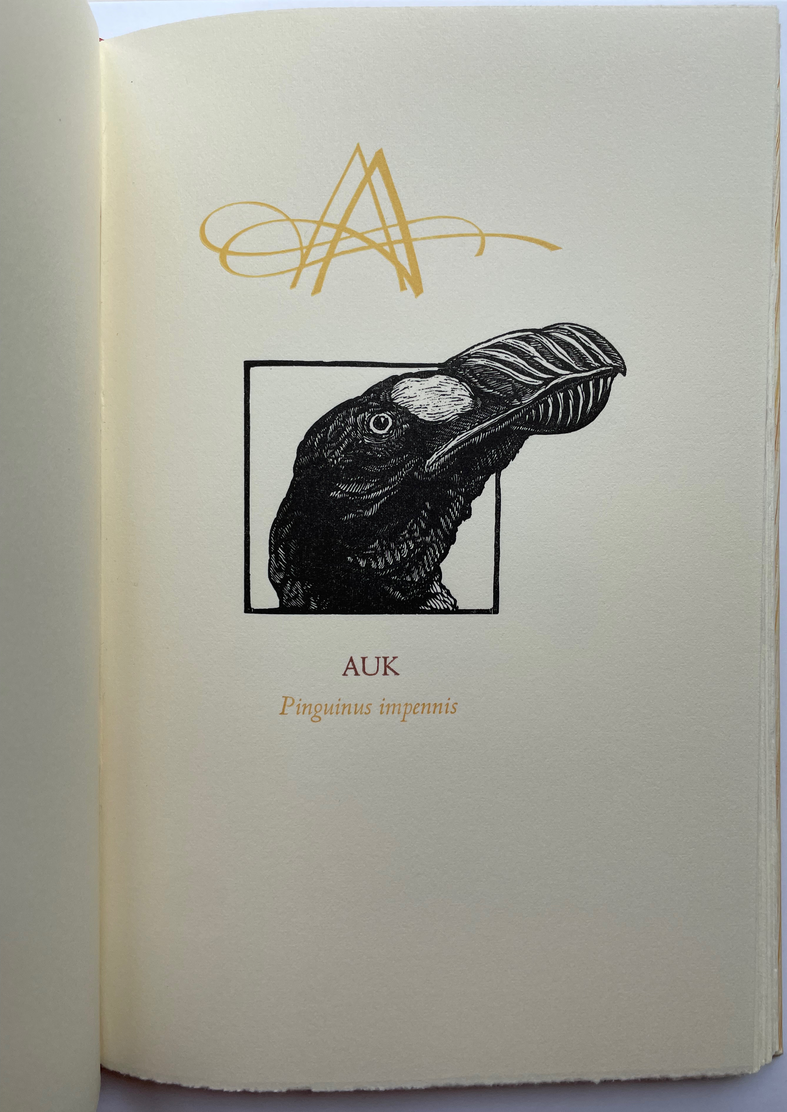
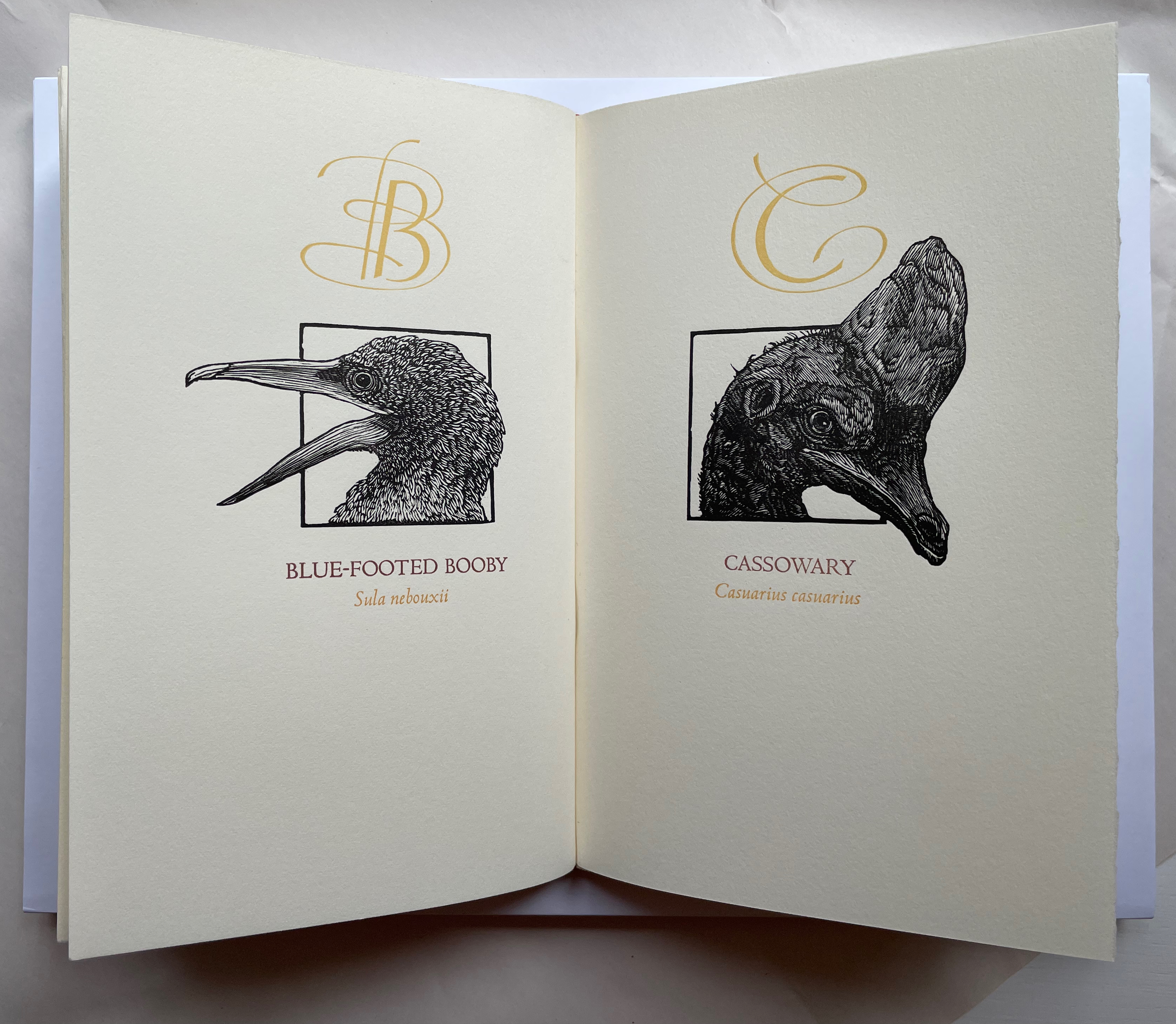
Under his Cheloniidae Press imprint, Alan James Robinson created three artist’s alphabets: A Fowl Alphabet with Suzanne Moore; An Odd Bestiary (1982) and The Birds and Beasts of Shakespeare (1990), arranged as a double abecedary, first the birds and then the beasts. Although this copy of A Fowl Alphabet comes from the regular edition and does not have the color of the deluxe editions of all three abecedaries, it does demonstrate the extraordinary fineness of Robinson’s wood engraving as well as his compositional talent, which also informs the book’s design. The positioning of the birds’ heads in their printed black frames conveys a sense of movement and three dimensionality on the individual page, but notice how Robinson varies the positioning from page to page and across double-page spreads to enhance the sense of movement.
With its core thick strokes shadowed and entwined with thinner flourishes, Suzanne Moore’s calligraphy creatively complements the way that the heft of Robinson’s engraved heads plays against those compositional features.
“Cheloniidae” is the scientific term for the family of sea turtles, and much of Robinson’s art is marine related. But the dominant and consistent impression conveyed by the ouput of Cheloniidae Press is that of Robinson’s artistic skill as an impresario and conductor of artistic talents. Added to the background of his duet with Moore are Master Printer Harold Patrick McGrath, Faith Harrison and her hand marbled paper, Arthur Larson and his hand typesetting and the binding skills of Claudia Cohen.
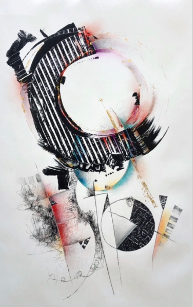
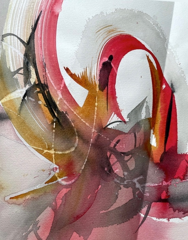
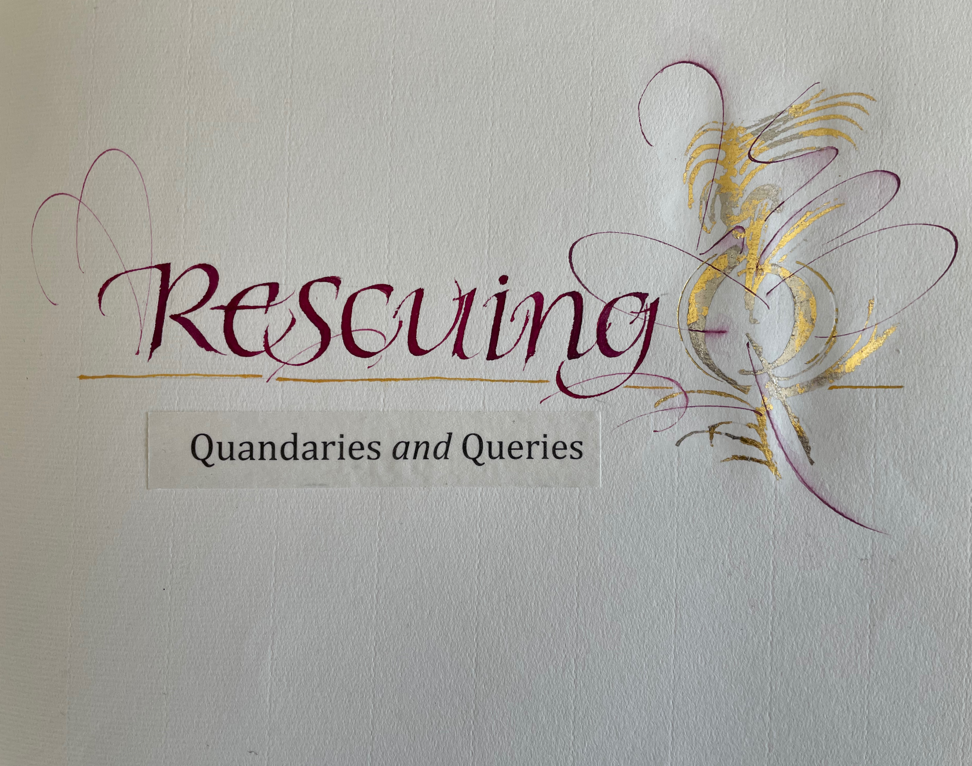
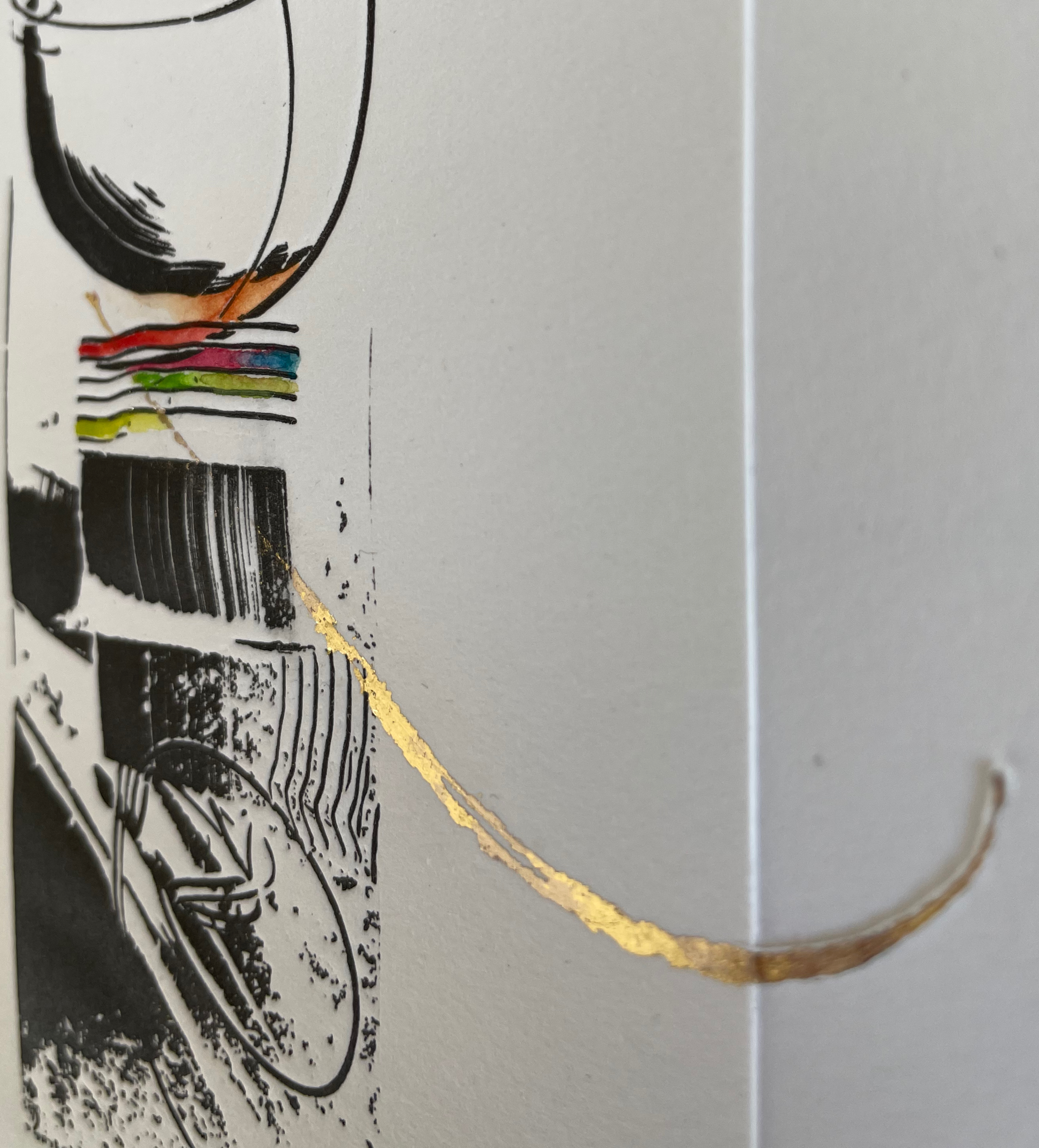
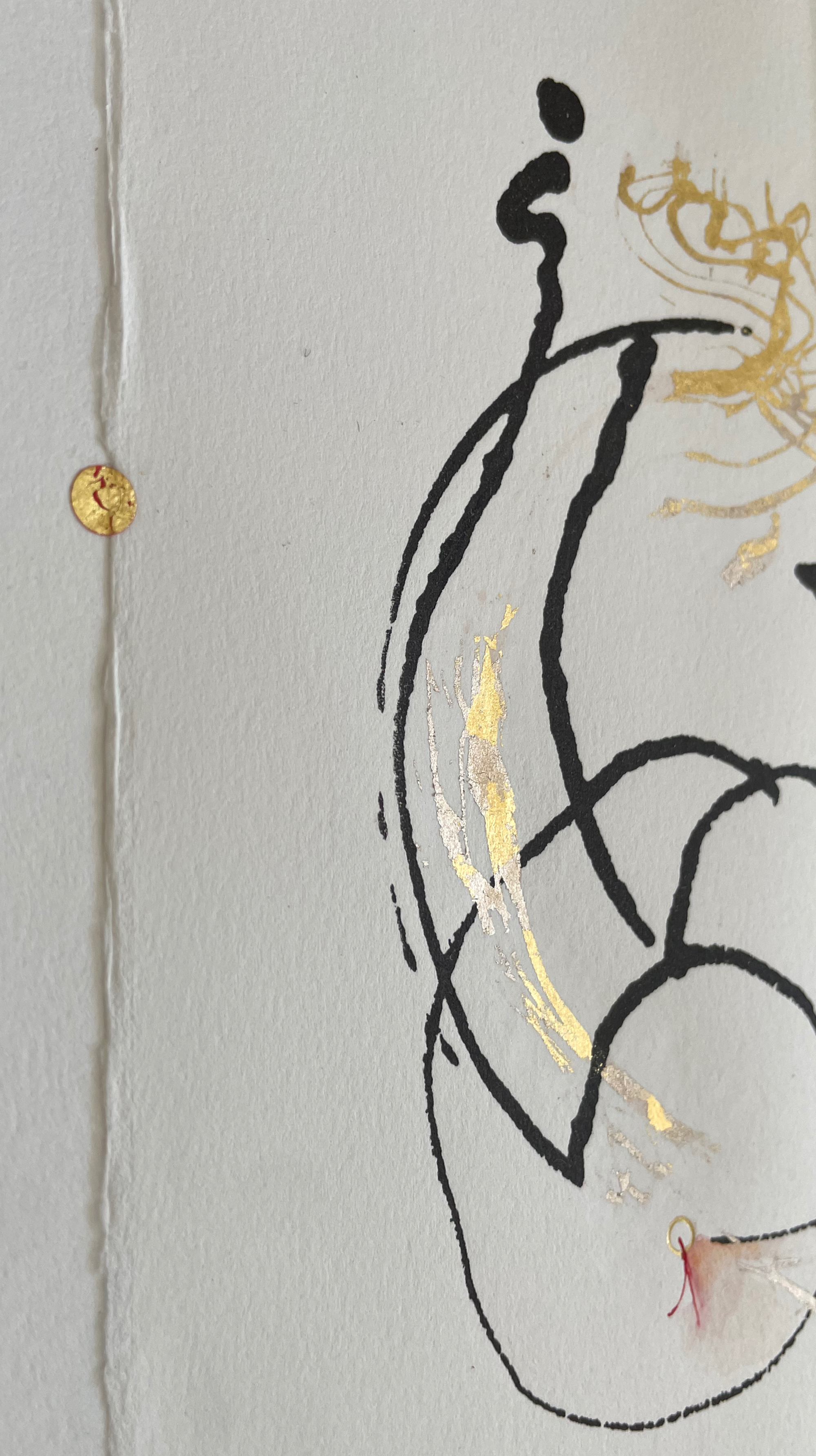
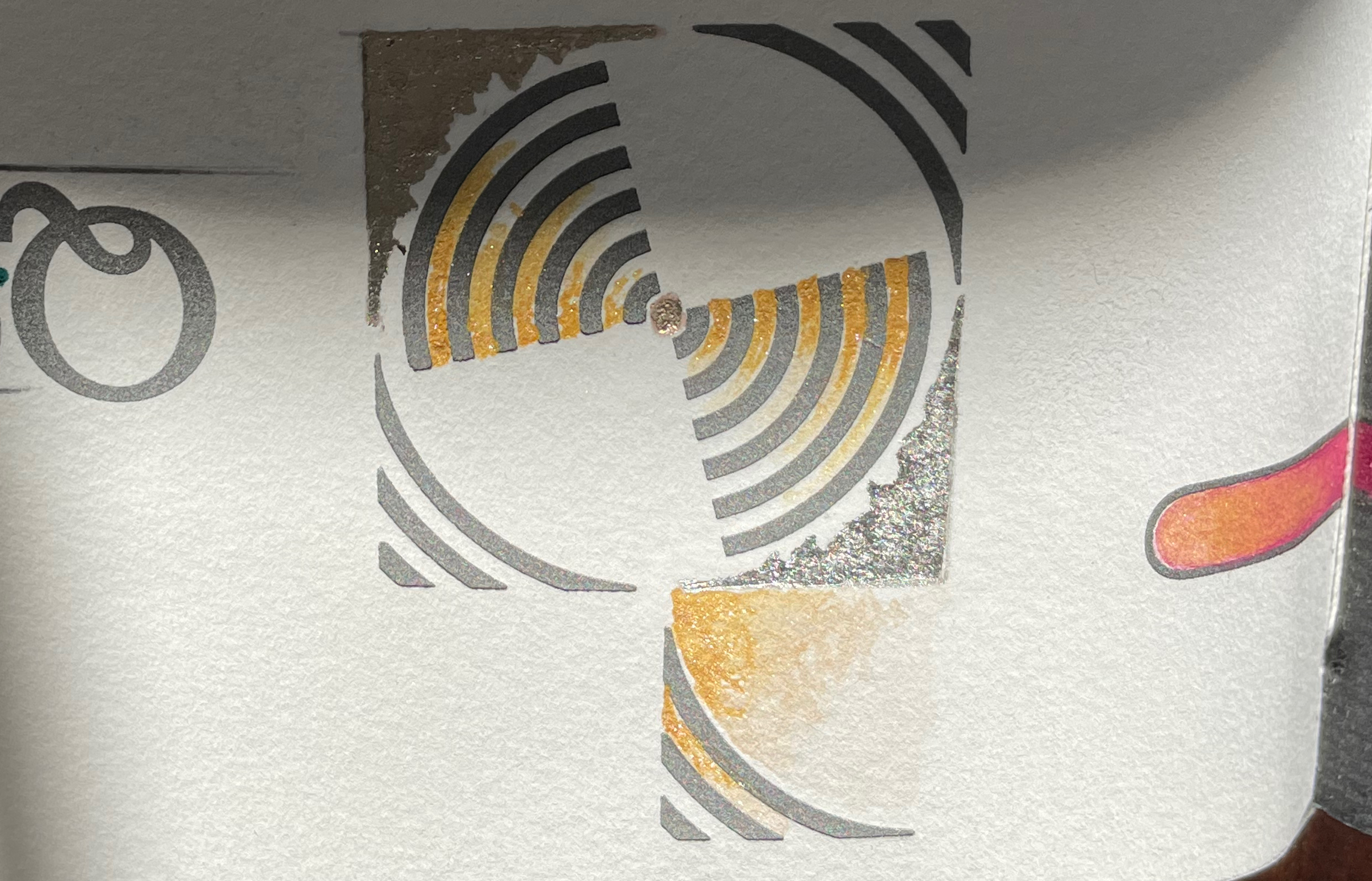
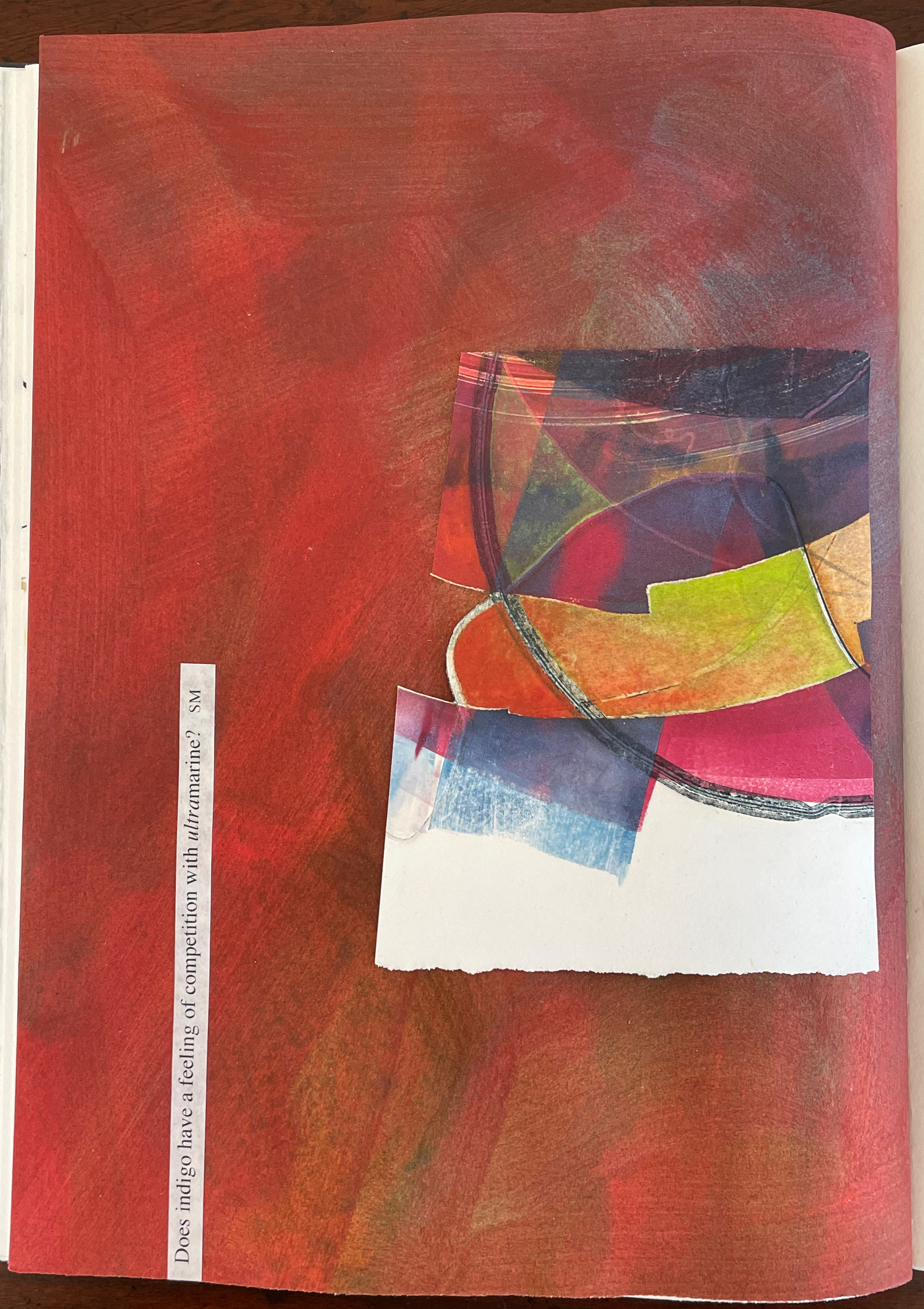
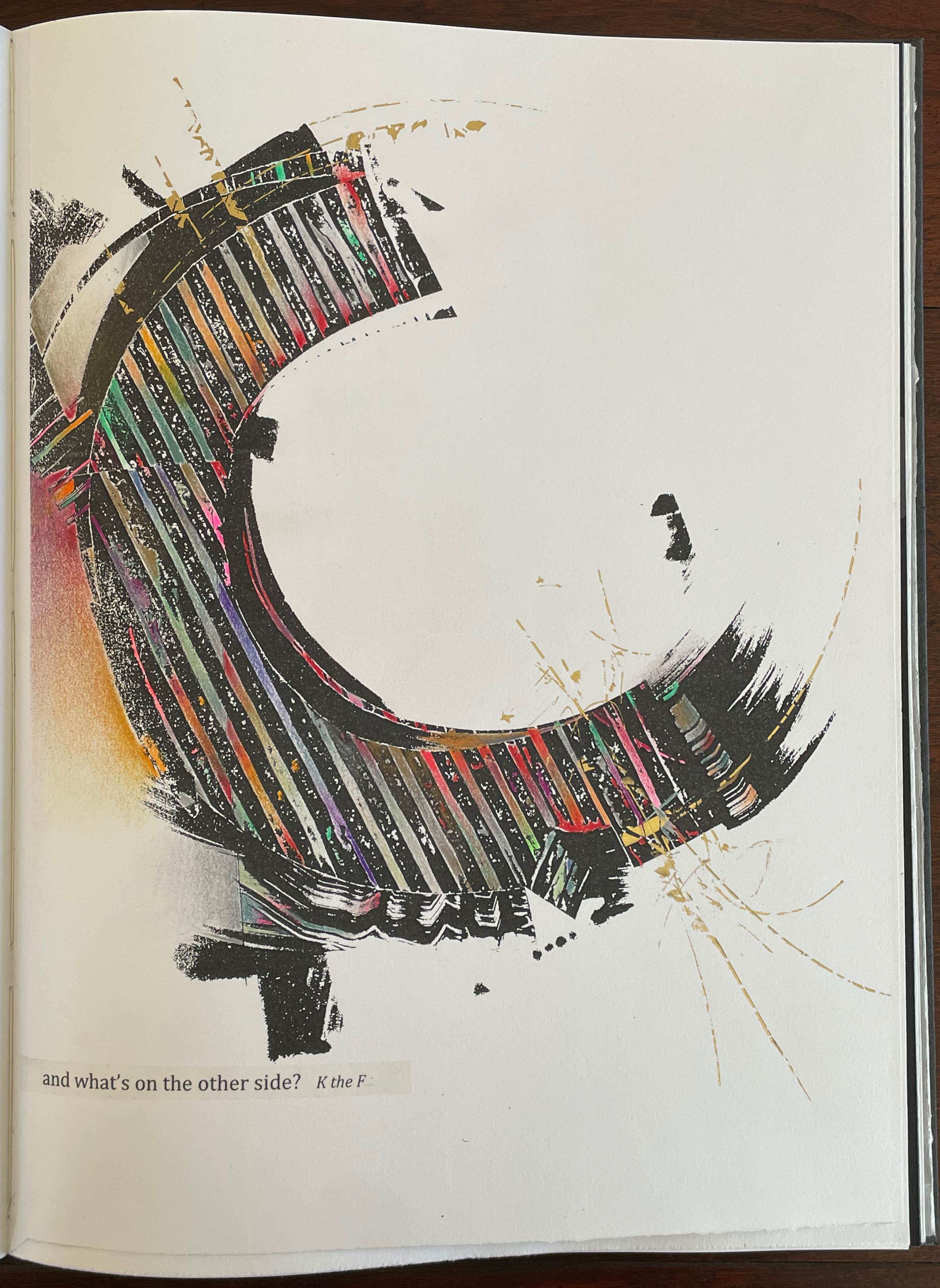
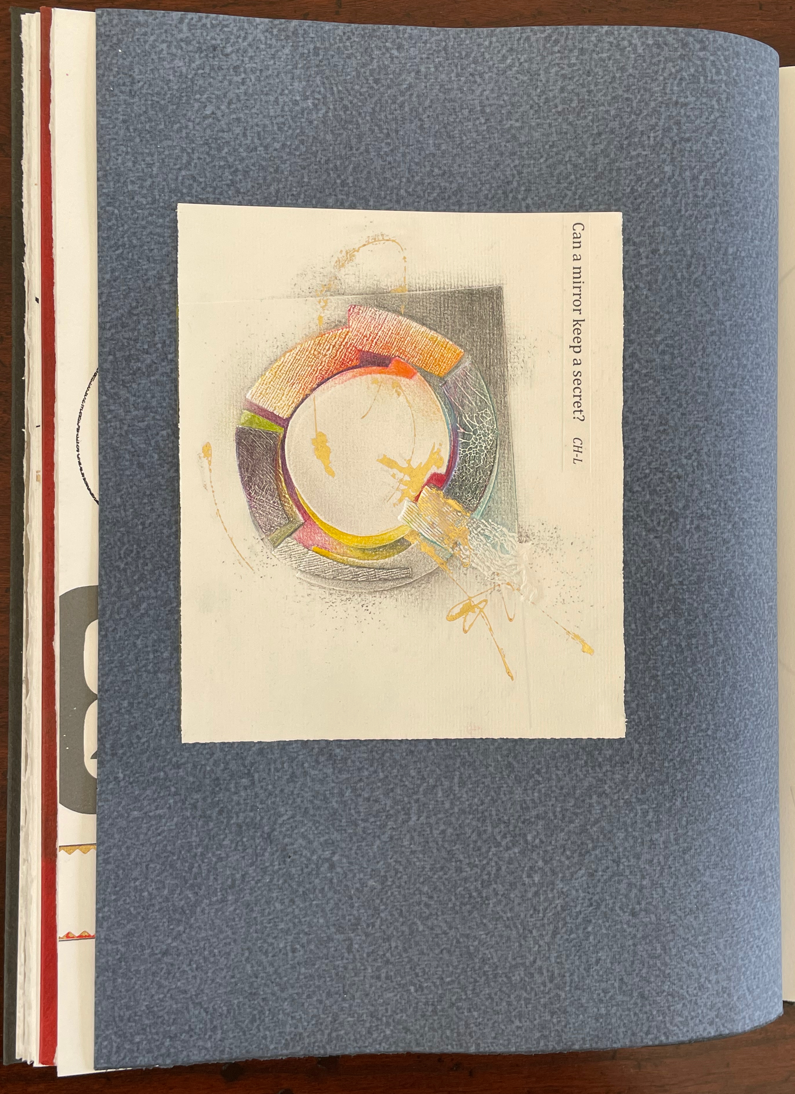
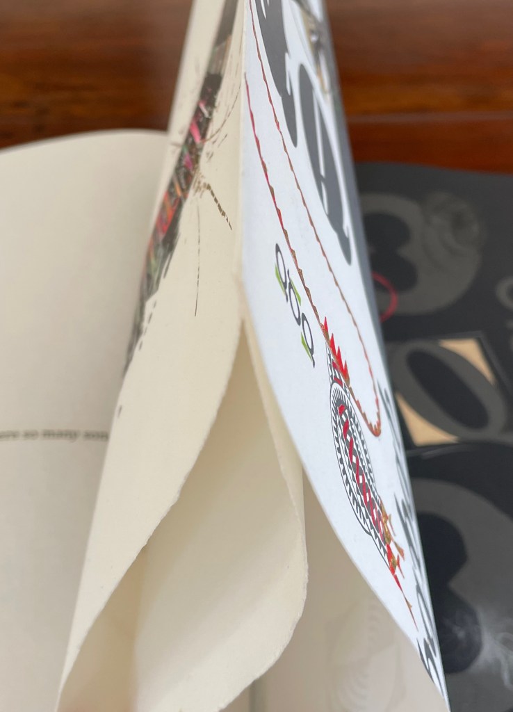
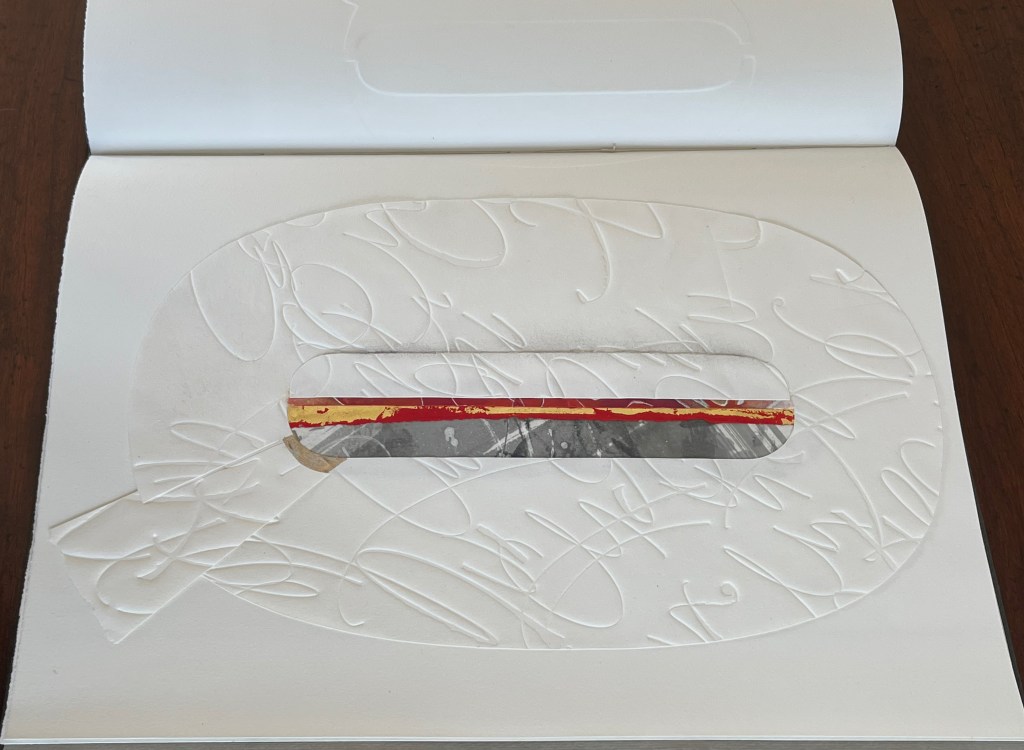
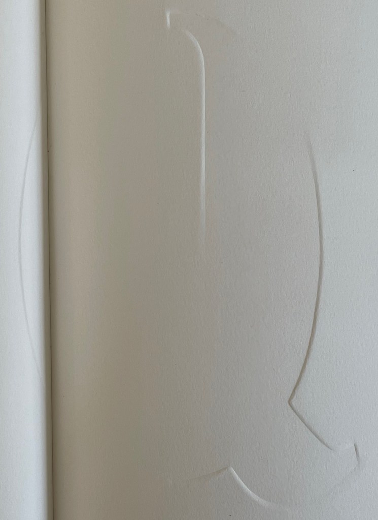
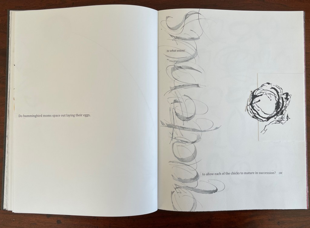
Rescuing Q (2023) Suzanne Moore Box enclosing softcover book. Box: H400 x W300 x D30 mm. Book: H380 x W285 mm. 32 pages. Printing by Sandy Tilcock (and Phoebe) at Lone Goose Press and Jessica Spring, Springtide Press. Unique edition. Acquired from the artist, 25 April 2023. Photos: Books On Books Collection. Displayed with permission of the artist.
Rescuing Q is a manuscript book, consisting of original paintings, monoprints, collage, pigmented prints, embossing, debossing, gilding and handwork complementing the letterpress printing. It is one of several such works designed and created by Suzanne Moore after more than 20 years of experimentation.
Q is not normal. Q is quirky. Q floats away. Q comes in too many shapes and sizes and colors. So attractive, Q was bound to be hijacked by Q-Anon, political operatives and social anarchists.
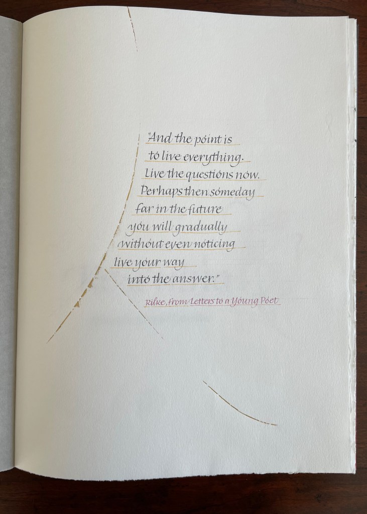
But Q will not remain captive for long because it is always asking questions. And, if we want answers, then as Rilke says, we must “live the questions now”.
For most readers though, the question that will be uppermost is “How did she do that?” Moore is quick in her generosity and would insist on amending that question to “How did they do that?” Consider the selection of paper. More than Arches (a laid paper with visible mesh and watermark) had to be considered for these interactions of ink, gouache, gold leaf, palladium, debossing/embossing by etching press and hand, cuts and overlays.
What notes, movements and rhythms were playing when these colors and the sequences were chosen?
How do they think of paper and ink in three dimensions?
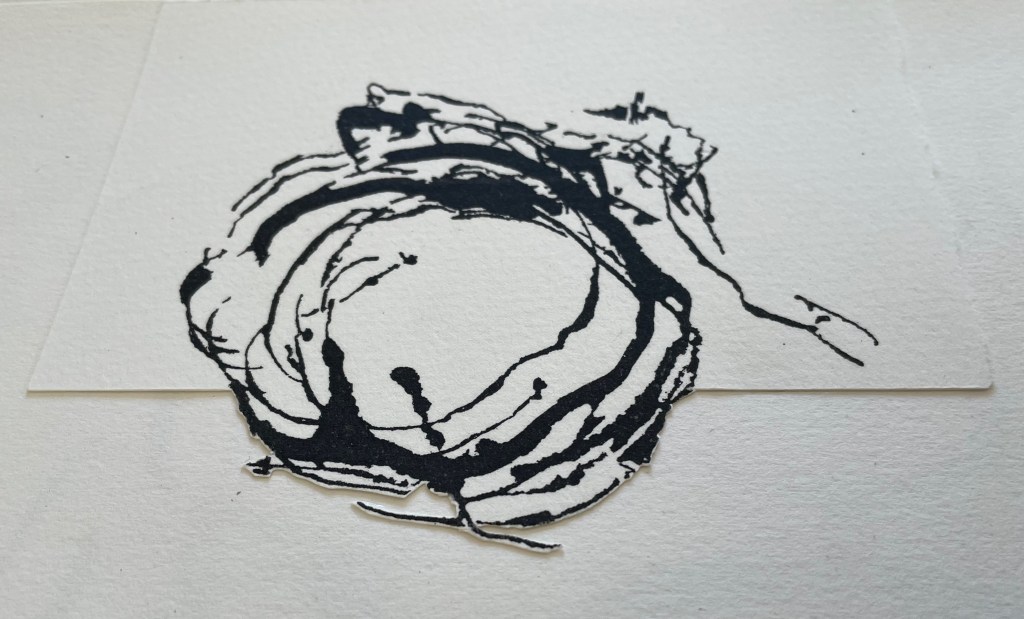
Who saw Q and questions in a bird’s nest?
And someone’s memory called up Cave Alphabet paper for the endpapers.
The fact that Moore and her colleagues can do all that (and more) and the fact that their gentle and pointed questions fuse with the art ensure that Rescuing Q does and will succeed.
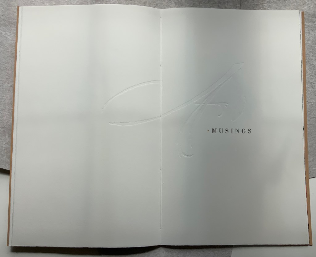
A Musings (2015)
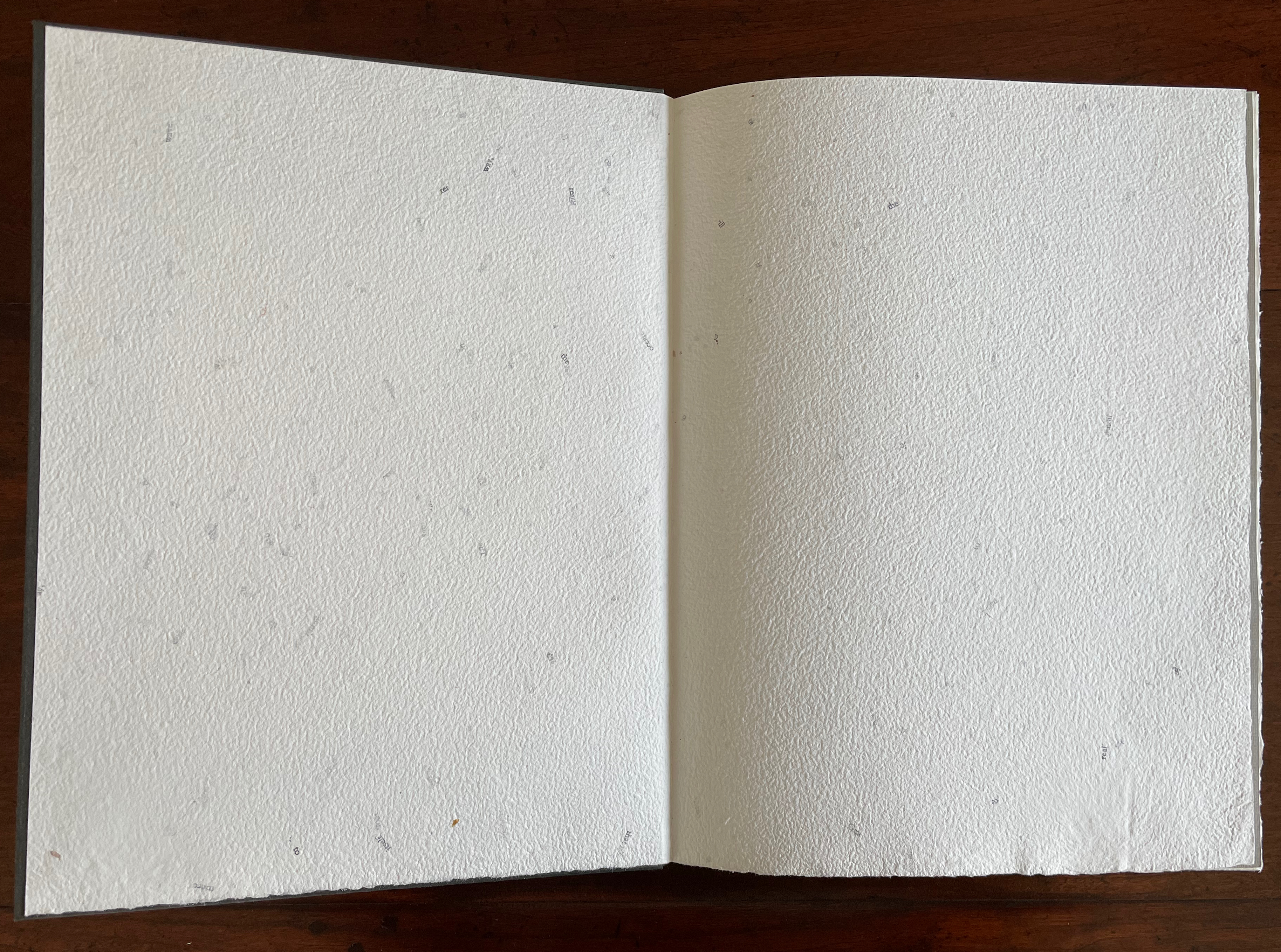
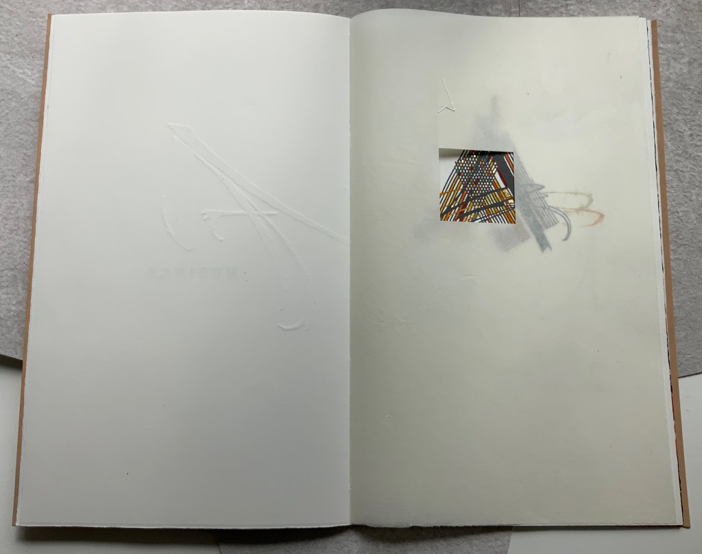
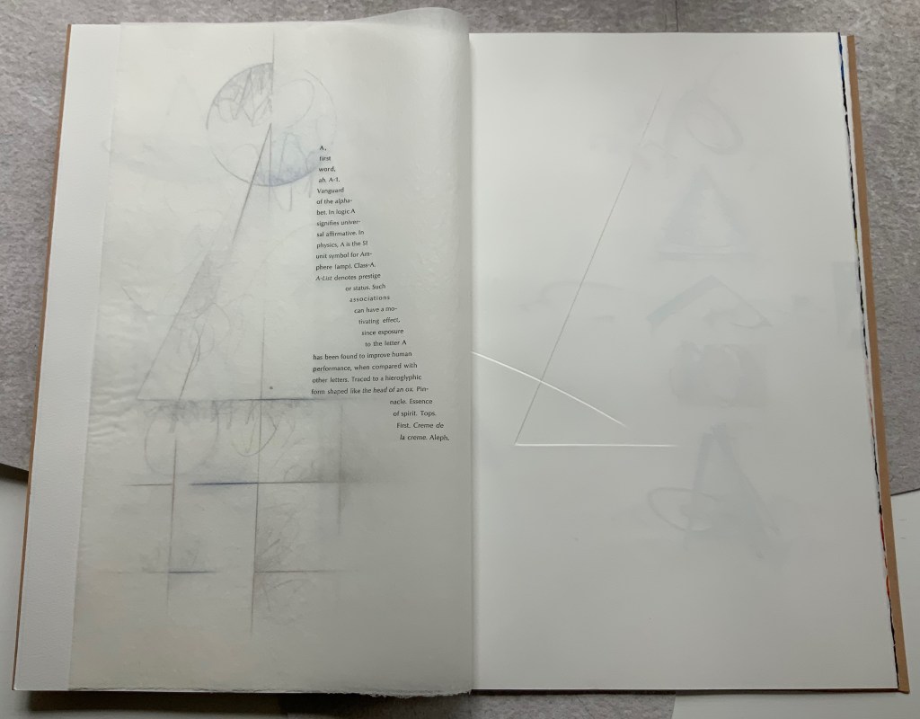
A Musings (2015) Suzanne Moore Tab-insert portfolio around softcover book. H370 x W230 mm, 24 pages. Edition of 26 variants, of which this is N. Acquired from Abecedarian Gallery, 13 February 2022. Photos: Books On Books Collection. Displayed with permission of Suzanne Moore.
Title page
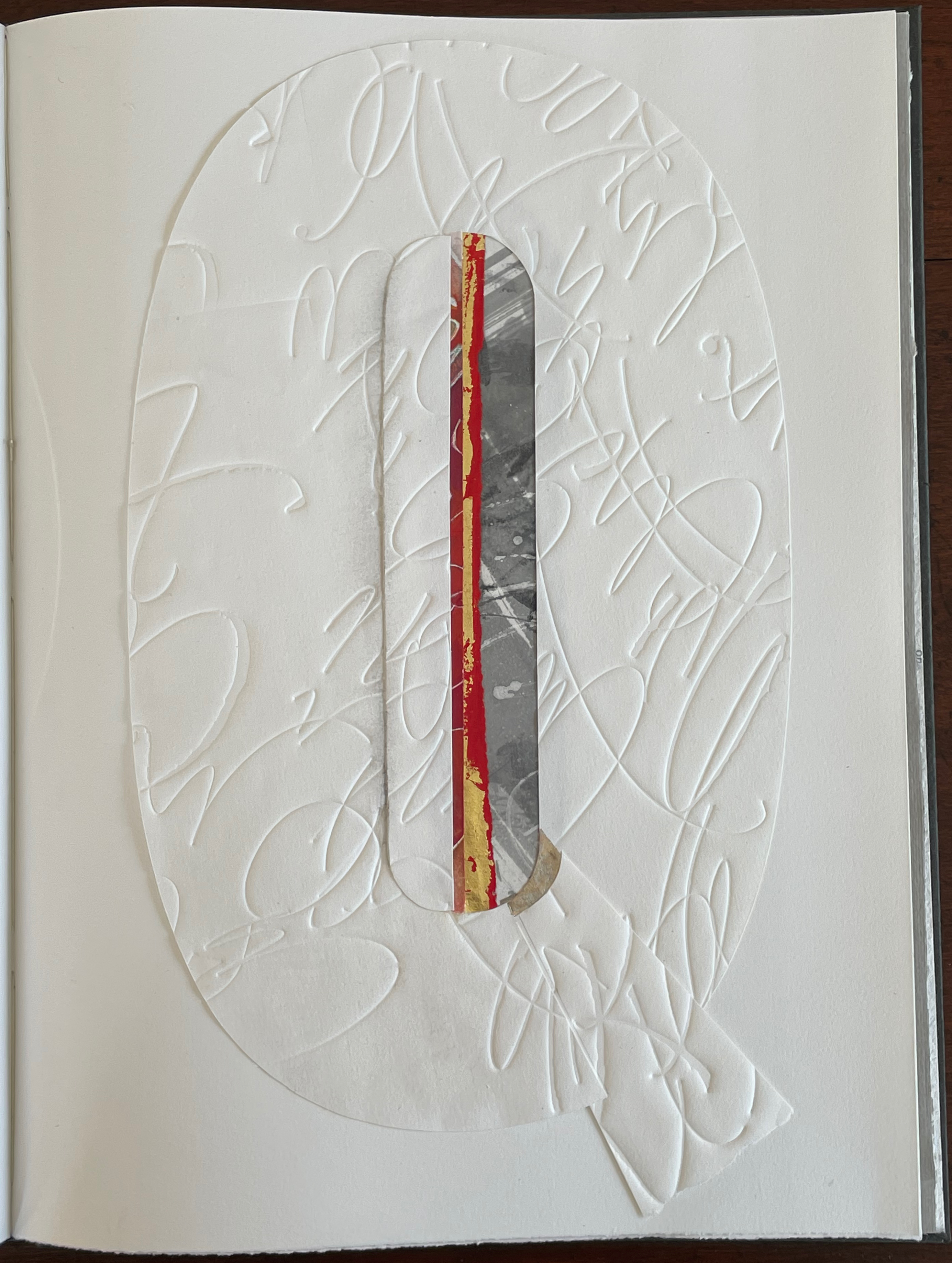
Another manuscript book, A Musings is an encounter between Suzanne Moore and the letter A, one of her 26 muses. As with any artist and muse, this naturally leads to portrayals of A in such varied positions, with such varied tools and techniques and such varied materials that the boxed and bound portfolio must take the amusing title A Musings. The muse finds itself posed across Magnani Aquaforte, Arches Text Wove, transparent kozo and other handmade papers enveloped by a stiffened, painted handmade paper. Moore’s musings fall on the historical, symbolic and spiritual aspects of the letter A with acrylic paint, pencil, freehand foil tooling, gold and palladium leaf, collage, debossing and embossing, sumi ink and gouache, sizing and varnish, monoprint, letterpress, folds and cutouts.
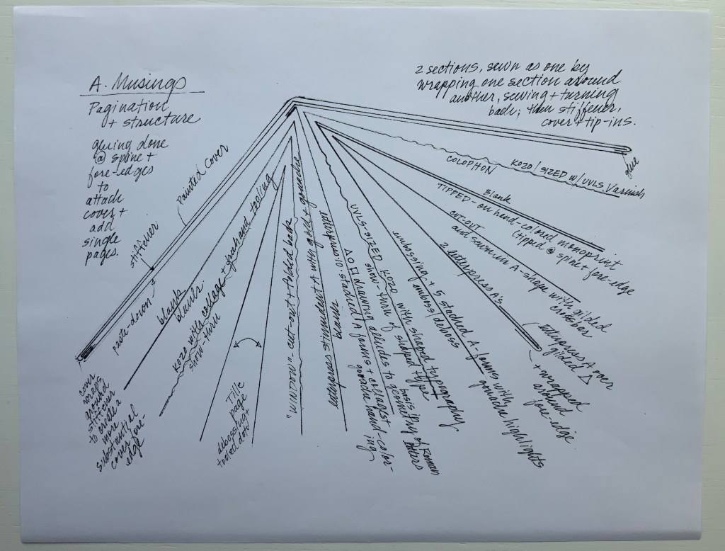
A separately provided copy of the artist’s plan for the pagination, structure and treatment per page offers a useful insight into the questions of how such a work is thought through and made. Page layout and the type of paper, in particular, play together sometimes like a clockwork mechanism and sometimes organically.
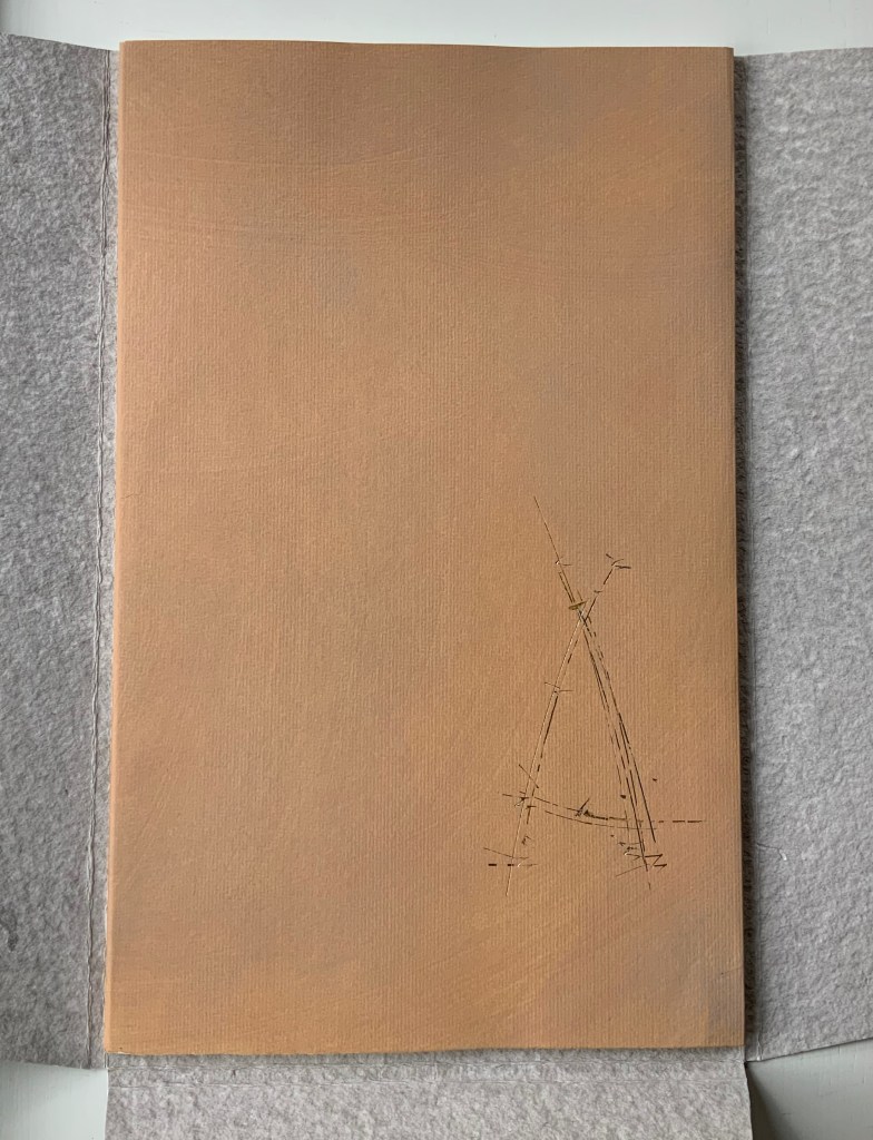
Painted cover
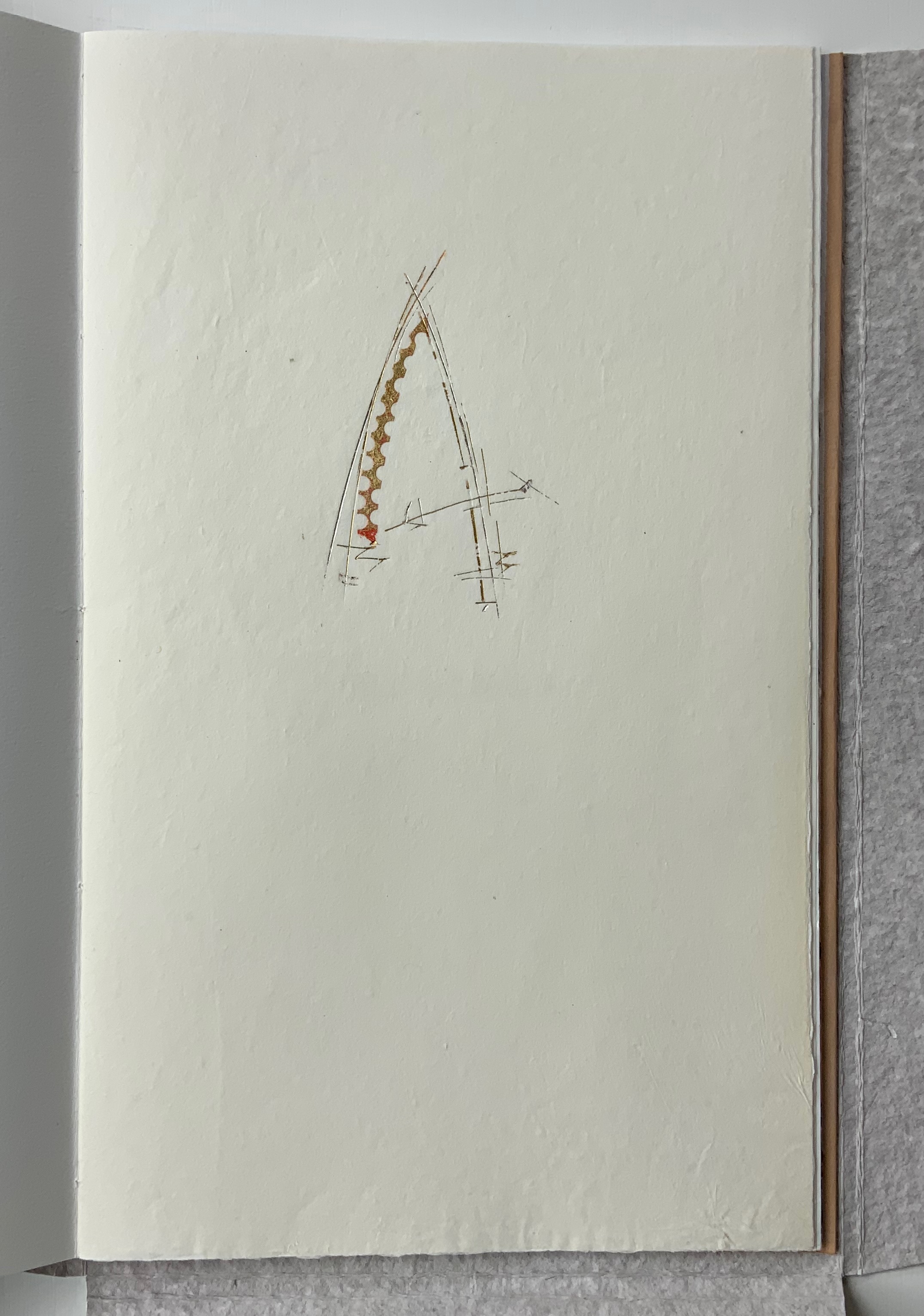
Left: Half-title. Right: Half-title turned to show translucency of kozo; note on the facing recto how the stroke from the debossed A on the title peeks through.
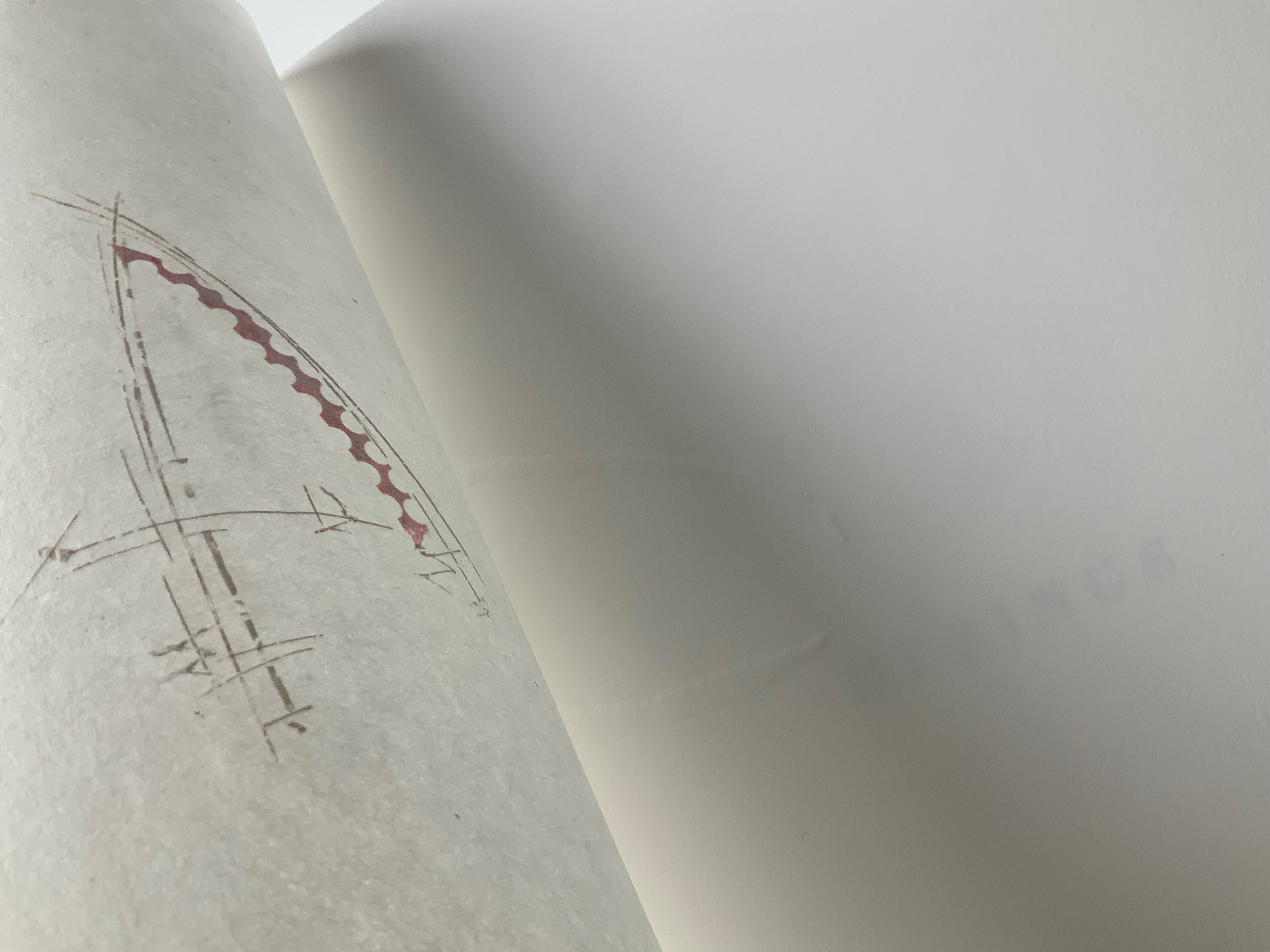
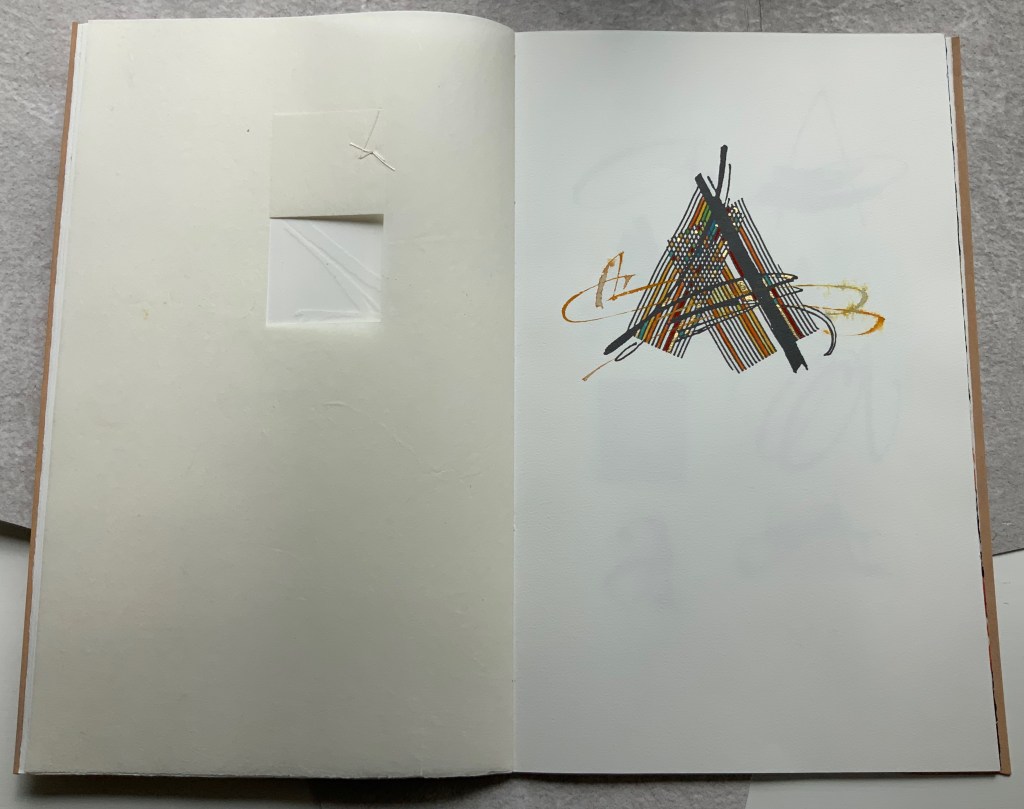
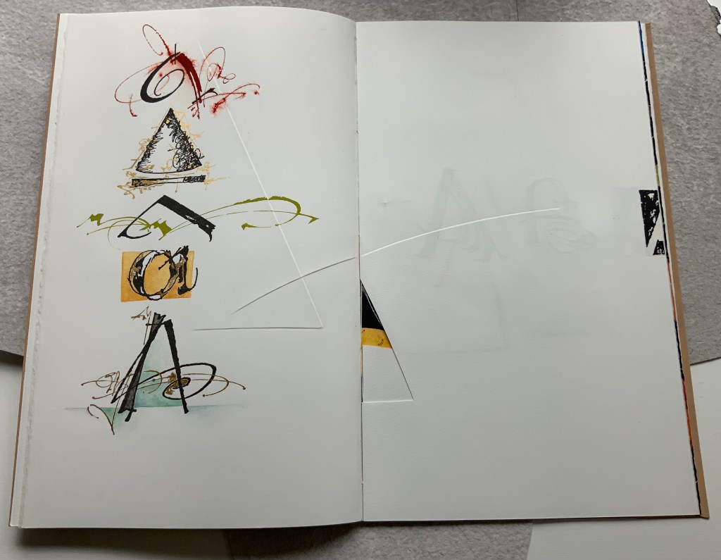
After the title page (see further above), the next double-page spread shows the title page’s debossed A in reverse on the verso page. Facing it is a square cutout through which multicolored lines forming overlapping As appear. Because the cutout page is translucent paper, we can see that the multicolored lines extend into a larger A on the next recto page. Turning the cutout page reveals that the cutout is actually a flap folded up and secured with white thread sewn in the shape of an A. This three-dimensionality of the flap is echoed by the way the crossbar swashes of the facing A seem to swirl around its two legs implying a spinning A.
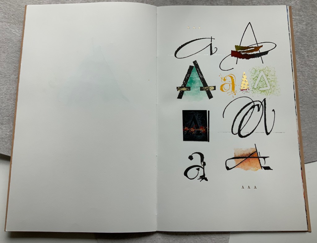
From the single A interacting with a cutout, we move to a dozen evocations of the historic forms that the lowercase and uppercase A have taken. The lowercase “closed a” from the semi-uncial hand starting in the 5th century appears second down in the lefthand column, and the “perfected” Roman uppercase A appears at the bottom of the right column. Amusingly, some evocations blend periods of history. In the lower left, the drawing of a lowercase “open a”, which comes from the 8th century Carolingian miniscule hand, takes on the stylization of the 15th century’s bianchi girari (white-vine stem decoration). Just across from it, the stylized version of the Proto-Sinaitic (1700 BCE) form of aleph, meaning “ox”, has a burnt umber background that suggests markings in early cave dwellings.
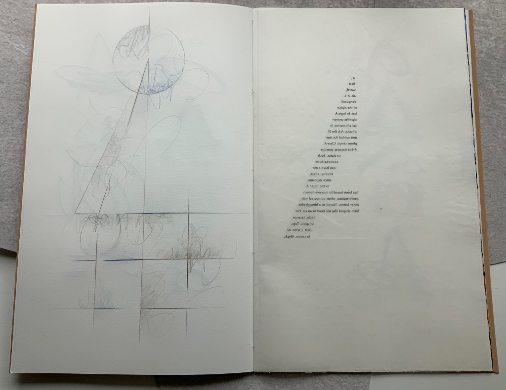
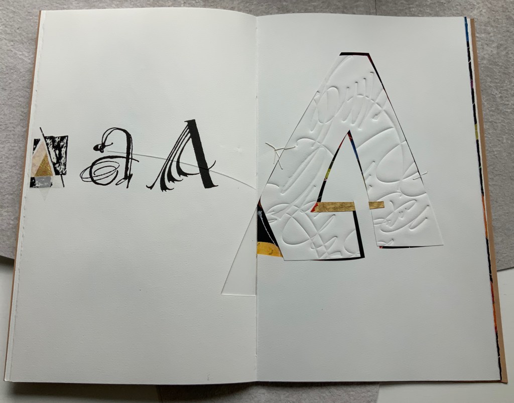
Using a translucent leaf with set type shaping half an A, the next two double-page spreads play (or muse) on uppercase A’s bilateral symmetry poised between geometric and freehand approaches to lettering, between typography and calligraphy and between inking and debossing.
When the recto page above with its debossed line and angle is turned, another extraordinary integration of composition, paper, printing (inking, debossing and “embossing”) and, now, cutting occurs. Notice how the ink of the first and third As overlaps the now “embossed” angle, how the now “embossed” line becomes debossed as it crosses the gutter, how the previous double-page spread’s themes of geometry/freehand, printing/drawing and lowercase/uppercase likewise cross over, and how the cutout triangle uses the yellow ink showing through to form the crossbar of an A and the gutter to form the A’s lefthand stem.
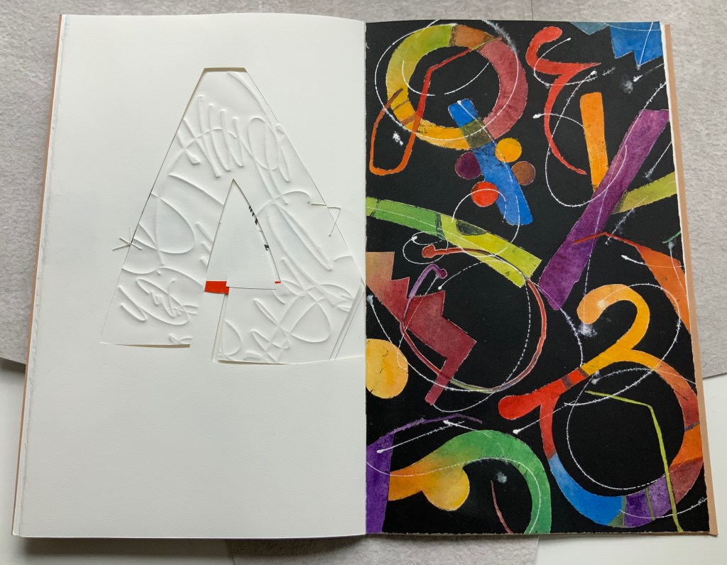
There is much else to muse upon in the spreads above, but it’s in the last two spreads where Moore builds and unfolds a fantasia of calligraphy, color, debossing, cutting, gilding and painting. Notice how the gilt crossbar slots through the page and helps secure the debossed piece behind the cutout to the page.
And when the page turns, notice how its gilt crossbar reveals its red paper beneath and becomes the spot of red completing the crossbar for the cutout A. The red spot against white seems to set off the explosion of color and calligraphy on the black final page, printed by Jessica Spring from polymer. The different shapes for A here come from African alphabets. The images are unique monoprints, done on an etching press. With the letters placed to block out the black and overlap one another, a sense of depth and texture arises. Contributing to that sense of texture, the white letters are hand-painted in gouache — sometimes layered, sometimes blended.
Books are inherently collaborative affairs, and for artists’ books, collaboration can become almost another tool for the artist. Jessica Spring, mentioned above, also debossed the opening A, hand-set the half-A composition and contributed to Rescuing Q. Now a fine binder in her own right, Gabby Cooksey, a studio assistant to Moore and Don Glaister, was essential to A Musing‘s hand work, binding and wrapper. Part of Moore’s creative progression from contributing to overseeing to orchestrating can be traced from here across three other works in the Books On Books Collection.
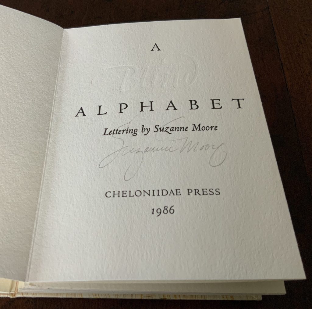
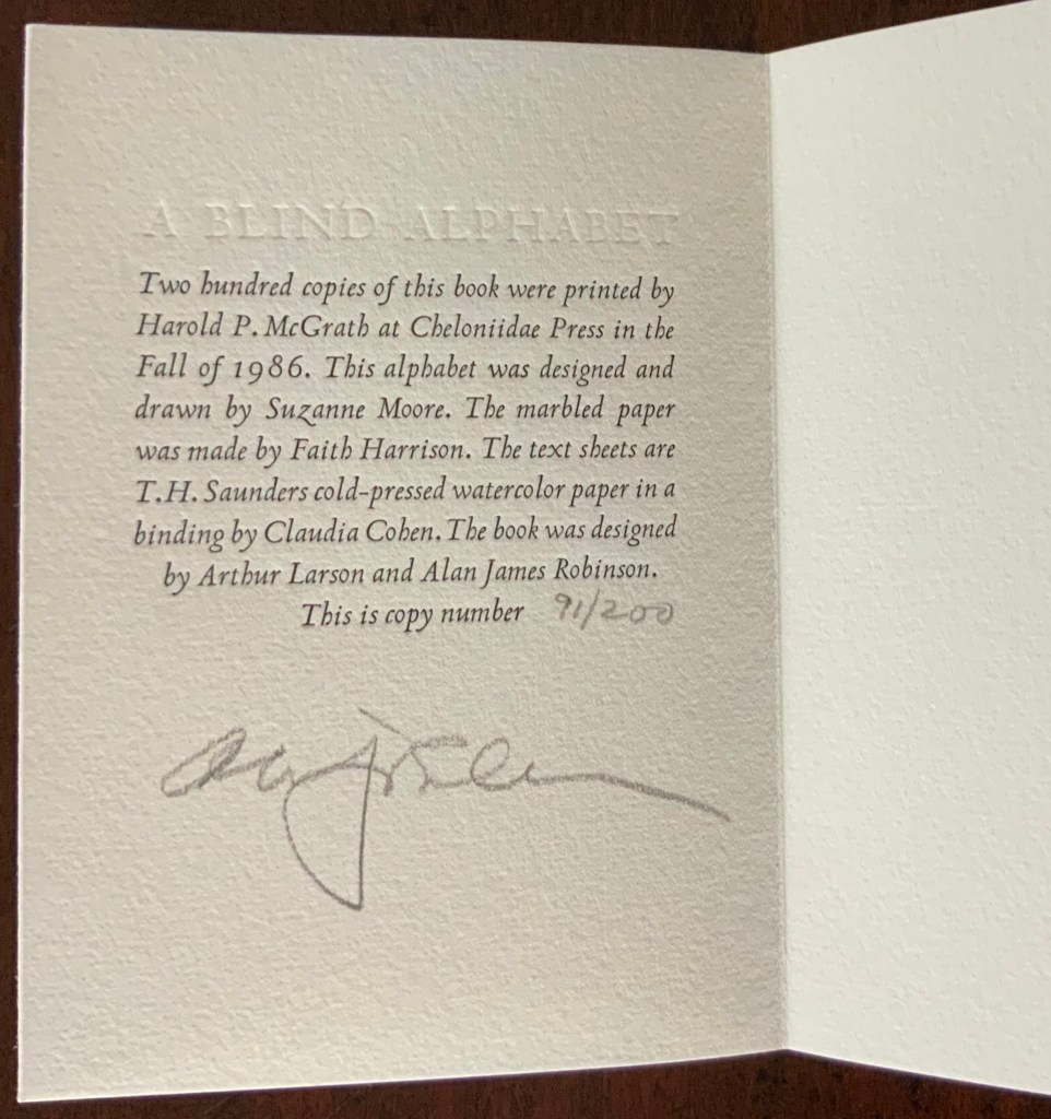
A Blind Alphabet (1986)
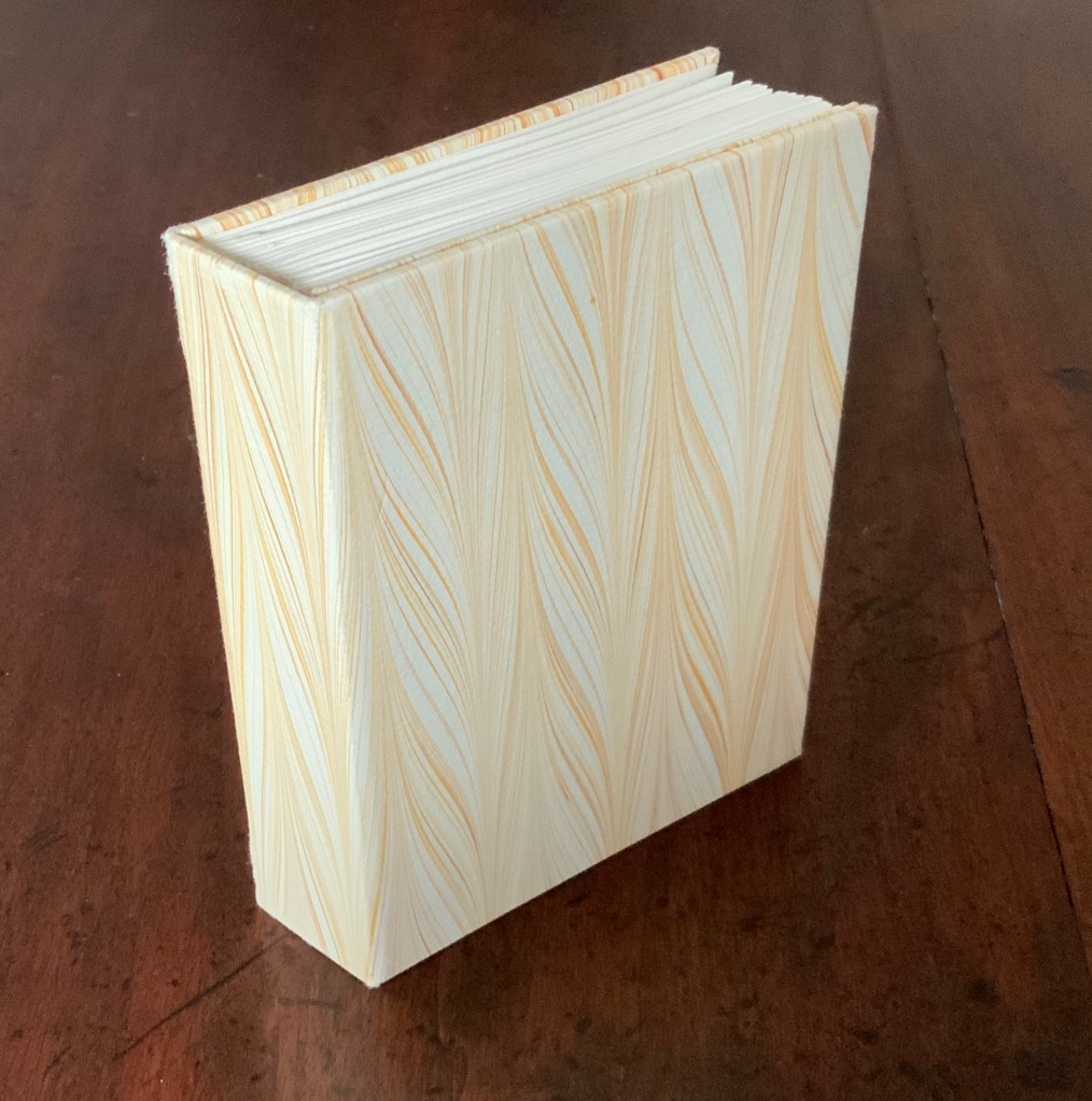
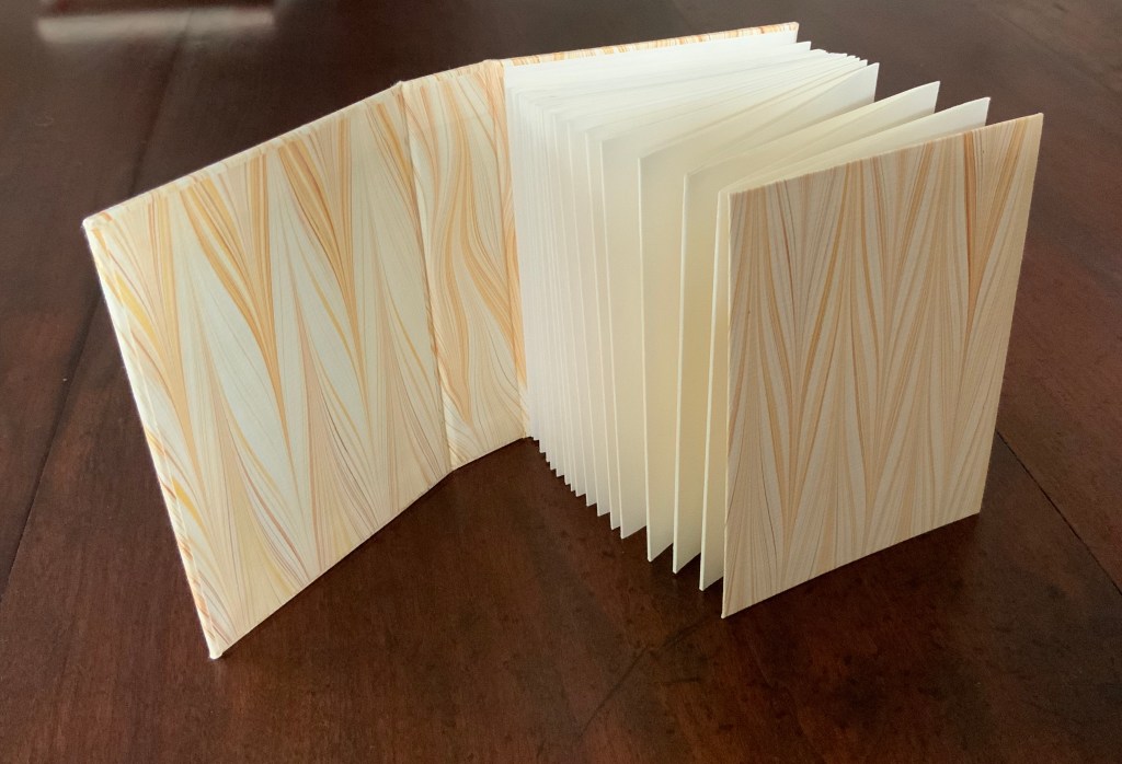
A Blind Alphabet (1986) Suzanne Moore Accordion-fold. Closed H128 x W93 D28 (spine) D22 (fore-edge) mm; open 3200 mm. 34 pages. Edition of 200 of which this is #91. Calligraphic letters designed and drawn by Suzanne Moore, printed by Harold McGrath on T.H. Saunders cold-pressed watercolour paper, bound by Claudia Cohen in marbled paper by Faith Harrison. Acquired from Veatchs, 1 May 2018.
Here, as noted in the colophon to A Blind Alphabet, Moore has the creative role of originating artist, designing and drawing the alphabet — soloist, as it were, in the Cheloniidae Press reportory orchestrated by Alan James Robinson.
In Robinson’s wood engravings of birds, Moore plays a creative contributing role with much the same repertory company.
A Fowl Alphabet (1986)
A Fowl Alphabet(1986) Alan James Robinson (etchings), Suzanne Moore(calligraphy) Casebound. Marbled paper over boards. Doublures and flyleaves. H218 x W145 mm. 26 Folios untrimmed at head. Four-page prospectus loose. Acquired from Bromers Bookseller, 16 August 2022. Photos: Books On Books Collection. Displayed with Suzanne Moore’s permission.
Again, Cheloniidae Press’ master printer Harold Patrick McGrath and “usual suspects” Arthur Larson (hand typesetting), Faith Harrison (hand marbling) and Claudia Cohen (binding) played their roles in this book. Here, Moore has the creative contributing role of designing the alphabet and, for the deluxe and full vellum editions (not shown), hand lettering.
In book art, an artist’s progression from contributor to orchestrator is not necessarily linear as can be seen in this subsequent work.
Bartleby, The Scrivener: A Story of Wall Street (1995)
Herman Melville, Bartleby the Scrivener: A Tale of Wall Street, 1853. Indulgence Press, 1995. Typeetting, printing and binding by Wilber Schilling; Calligraphy by Suzanne Moore. Text paper by Janus Press. Endpapers by MacGregor & Vinzani. Edition of 100 of which this is #71. H320 x W158 x D14 mm. Acquired from Indulgence Press, 17 December 2015. Photos: Books On Books Collection. Displayed with permission of the publisher.
Wilber Schilling (Indulgence Press) orchestrated this edition of Herman Melville’s well-known story. Part of Schilling’s genius was to invite Moore to provide the calligraphy for Bartleby’s hallmark (his only) words “I prefer not to”. Another part was to print Moore’s calligraphy in ever-increasing size in ghostly ochre and in descending position across the pages of the book.
For more of Suzanne Moore’s works and artistic roles as well as others’ insight into them, see below.
Moore, Suzanne. 2016. Studies in Love the Question. Handlettered pages in book bound by the artist. 34 images available at Letterform Archives. ______________. 2014. Zero – Cypher of Infinity. 24-page handlettered pages in book bound by the artist. Letterpress pages by Jessica Spring. 20 images available at Letterform Archives.
______________. 2014. Origins and Spectrum. Process portfolio for Zero — Cypher of Infinity. Includes notes from the artist. 28 images available at Letterform Archives.
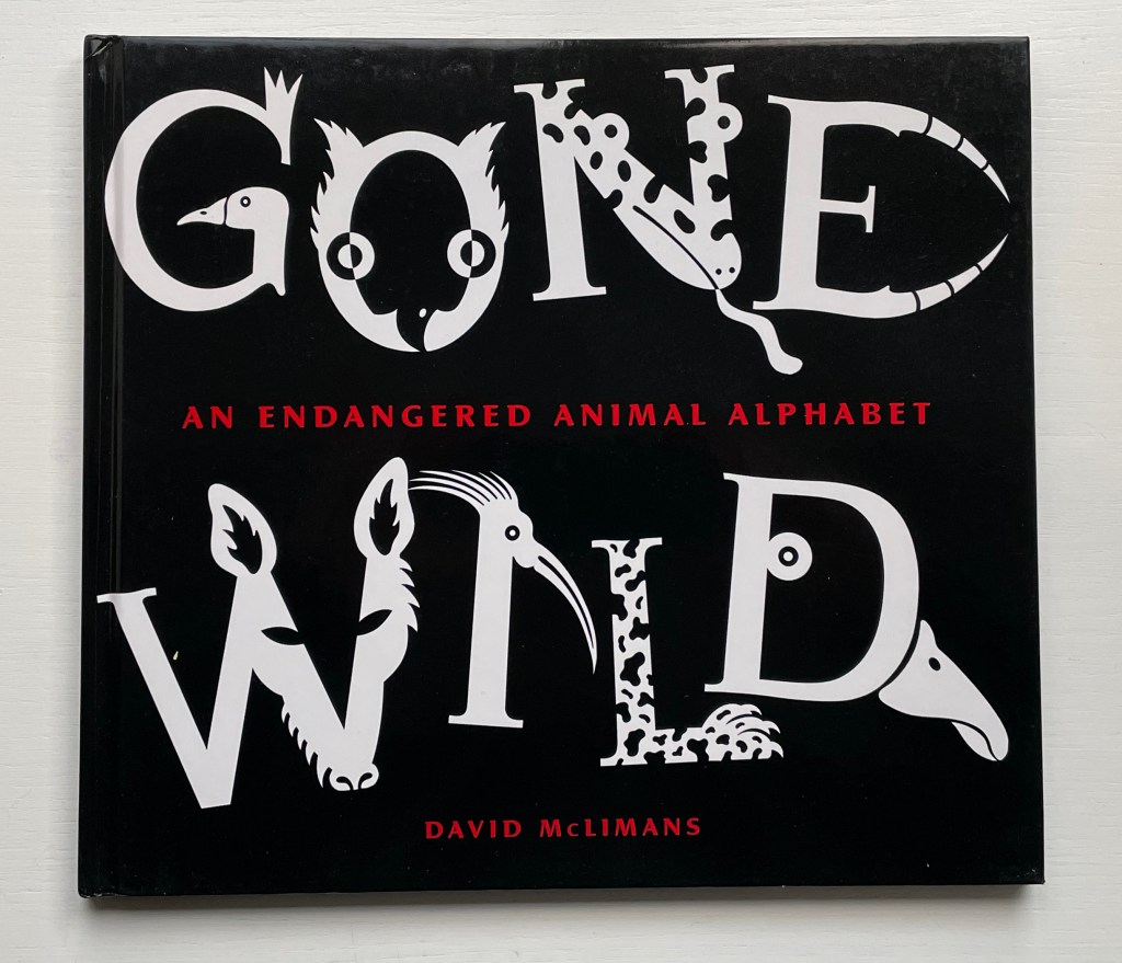
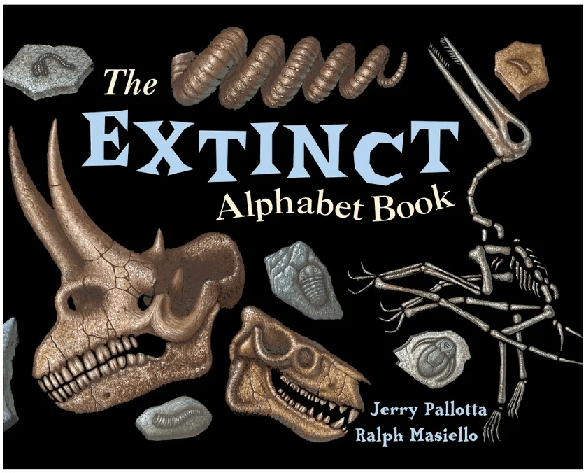
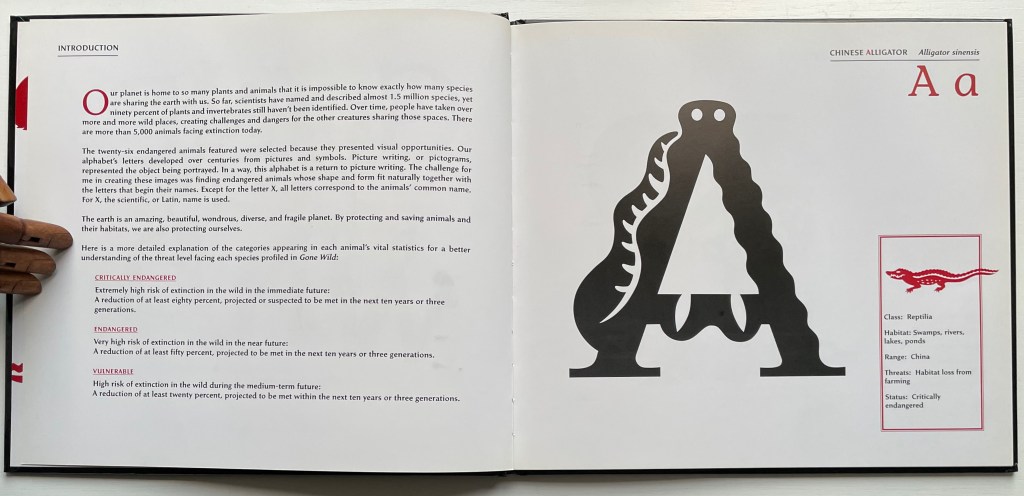
Gone Wild: An Endangered Animal Alphabet(2016) David McLimans Casebound, illustrated paper over boards, illustrated doublures, sewn book block. Illustrated, debossed glossy paper dustjacket. H255 x W285 mm. 36 unnumbered pages. Acquired from Gargoyle Books, 25 August 2022. Photos: Books On Books Collection.
In the history of children’s books, the alphabet looms large, and among alphabet books, animal alphabets make up the largest category. But why animals?
For learning and teaching letters, they are easily recognized and mnemonically effective. Illustrators can wrap them around letters, make them twist themselves into letters or hide them behind letters. Designers can hide them on tabs behind letters, make them pop out, parade them across leporellos (accordion books), let them lurk in tunnel books or put them on a paper disk to appear and disappear in a volvelle’s window. Writers can weave stories with animals and letters, put animals and letters together in puns and surprising scenarios or use alliteration and rhyme with them to reinforce letter recognition and reading. For authors more paleographically and philosophically inclined, the answer to “Why animals?” might be sought in the origins of the alphabet’s first letter as James Rumford does in There’s a Monster in the Alphabet (2002) and Don Robb and Anne Smith do in Ox, House, Stick (2007).
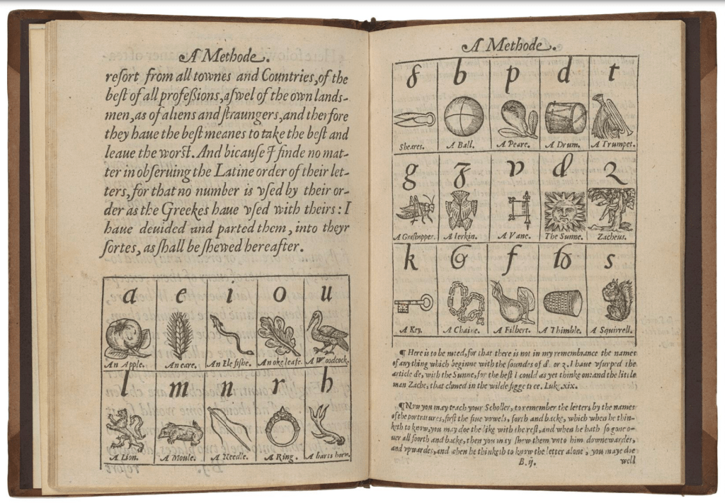
Whatever the cause, ever since John Hart’s A Methode, or Comfortable Beginning for All Unlearned (1570), which appears to be the first example of teaching the English alphabet with illustrations, we have had an explosion of imagination and wit choosing, finding or making up animals, birds, fish, insects and reptiles with which to decorate the letters, to make from letters (or make letters with), to be disguised with abstractions or to be hidden, revealed or popped out from behind letters. Now, in reverse over four centuries later, the alphabet has been mustered for teaching the endangered state of those creatures.
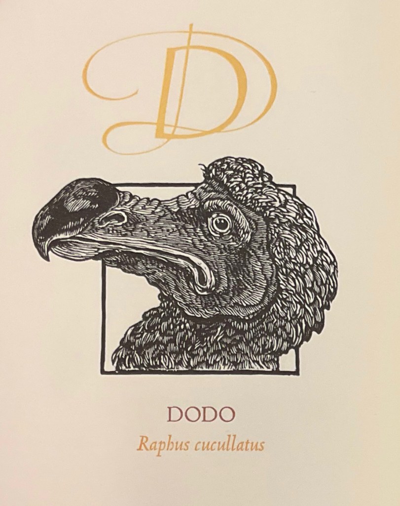
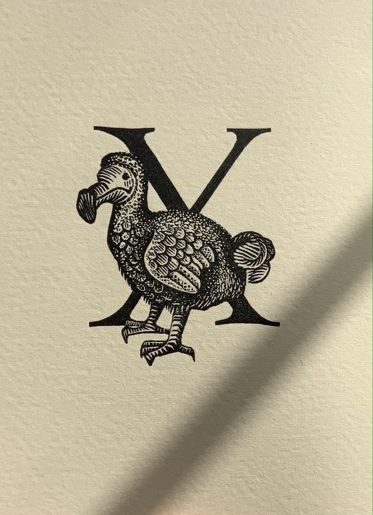
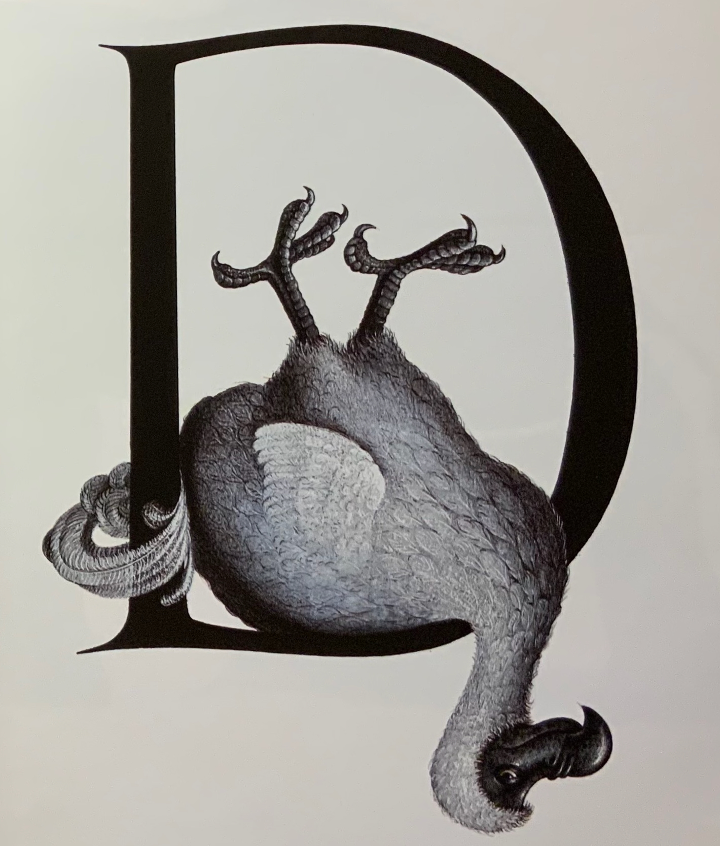
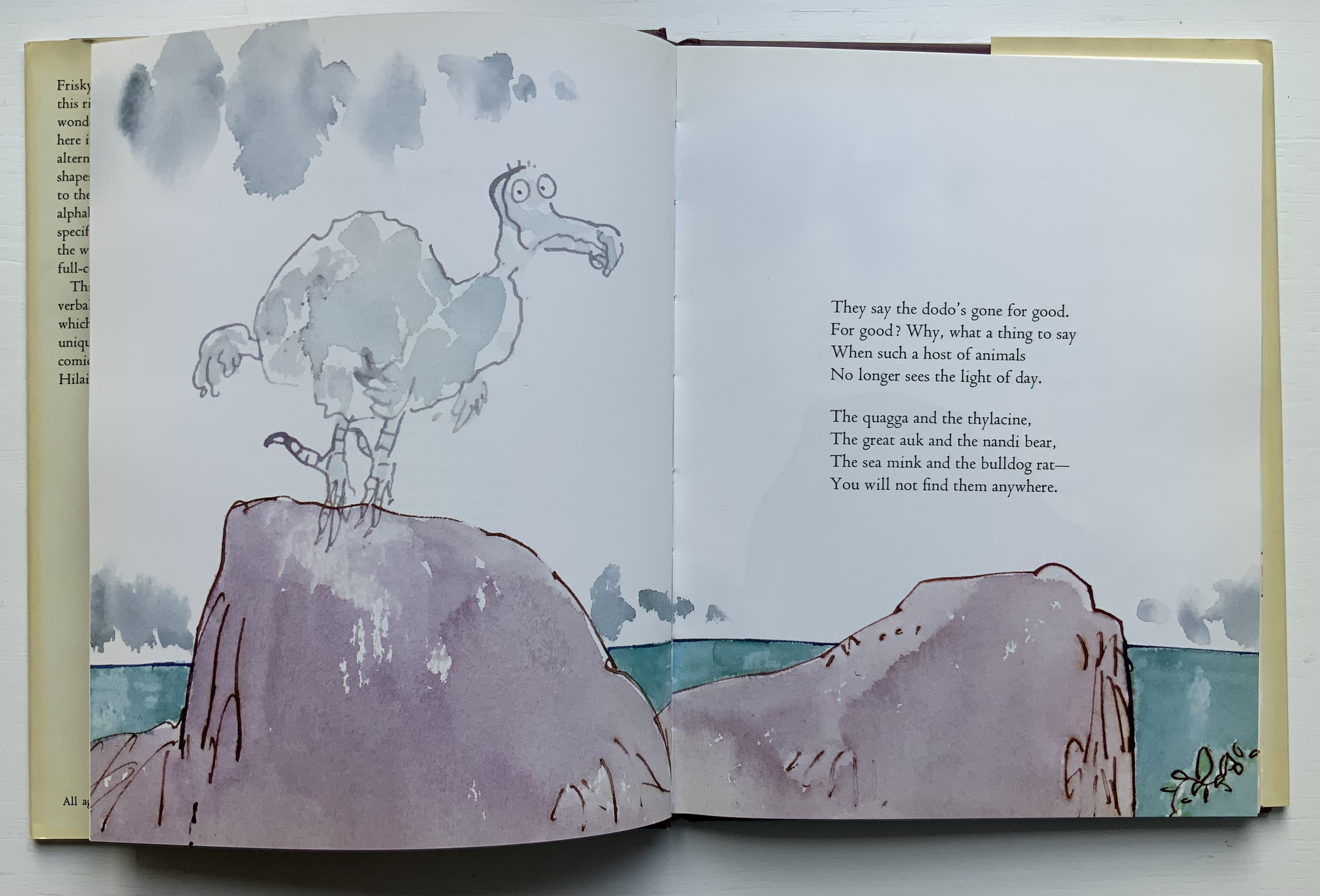
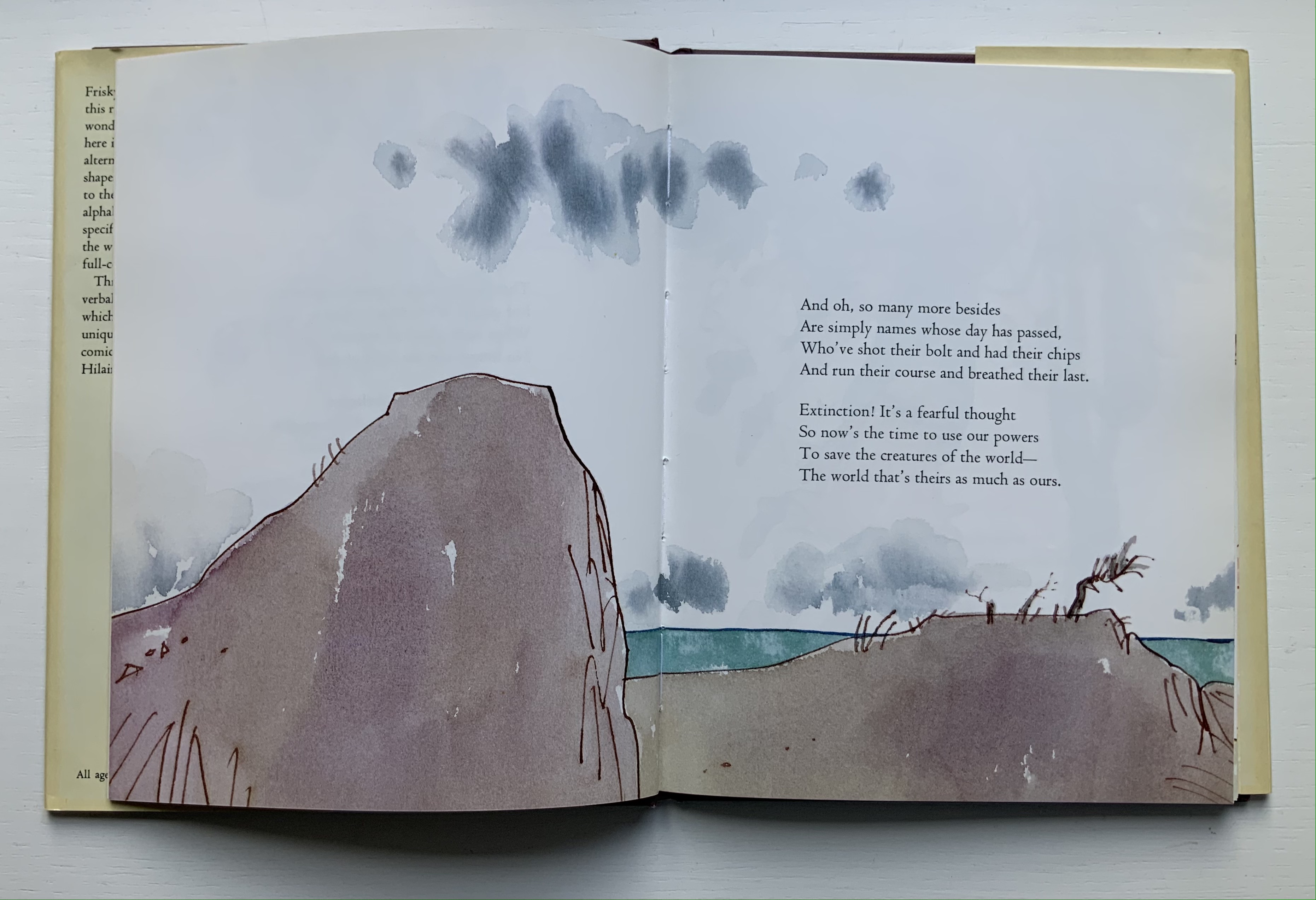
While E.N. Ellis, Bert Kitchen, the team of Alan Robinson and Suzanne Moore all allot only one letter and the dodo to make the point, Dick King-Smith and Quentin Blake together devote almost all of their Alphabeasts (1990) to examples of extinction, as do Jerry Pallotta and Ralph Masiello in The Extinction Alphabet Book (1993).
Left to right: from E.N. Ellis’s An Alphabet; Bert Kitchen’s Animal Alphabet; Alan Robinson and Suzanne Moore’s A Fowl Alphabet.
Quentin Blake’s page-by-page visual narrative married to Dick King-Smith’s opening verses in Alphabeasts.
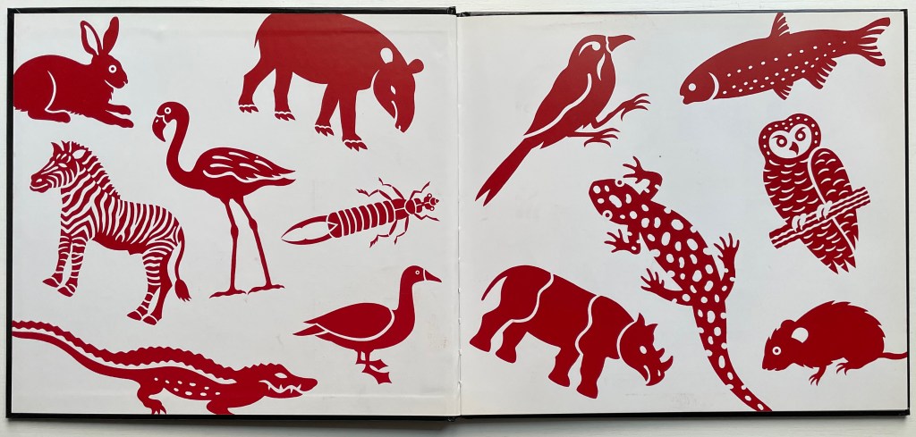
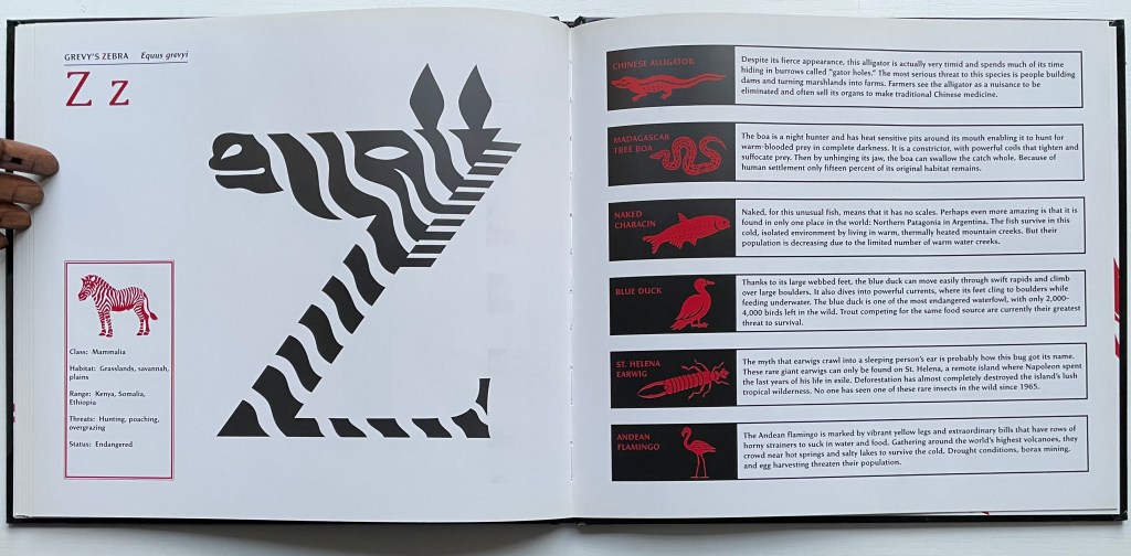
With Gone Wild, David McLimans adds a complex and subtle device to the explosion. The book is not so much about learning the alphabet with animals as learning about animals with the alphabet — or rather with “alphabetic art”. Wielding computer, pencil, pen, brush and India ink on bristol board, David McLimans redraws the alphabet’s capital letters to look like animals not yet extinct but on the Red List of the International Union for Conservation of Nature. Even the design of the traditional alphabet book subtly serves as a teaching tool about these animals. Notice how McLimans and John Candell, the book’s designer, turn the traditional presentation of uppercase and lowercase letters into a kind of running head that underscores the common and scientific names of each animal. Even the list of facts on each species — their habitats, geographic ranges, threats to survival and statuses — receives meaningful thematic design touches from the use of two-color printing — blood red and extinction black.
After the brief red-on-black thumbnails and descriptions following Grevy’s Zebra, McLimans provides further reading (online and in print). You have to go beyond a quick dive into the address he provides for the IUCN to find the Red List (see address above). There you will learn how up to the minute this book was in 2016 — and, unfortunately, still is.
Kitchen, Bert. 1991. Animal Alphabet. London: Walker Books. For letters decorated with animals other than the dodo.
Mackey, Bonnie and Hedy Schiller Watson. 2017. Alphabet Books : The K-12 Educators’ Power Tool. Santa Barbara California: Libraries Unlimited. For a brief history and extended categorization of alphabet books.
Markle, Sandra; Markle, William; and Dávalos, Felipe. 1998. Gone Forever! : An Alphabet of Extinct Animals. 1st ed. New York N.Y: Atheneum Books for Young Readers. For letters in aid of animals rather than vice versa.
Pallotta, Jerry, and Masiello, Ralph. 1993. The Extinct Alphabet Book. Watertown Mass: Charlesbridge. For letters in aid of animals rather than vice versa.
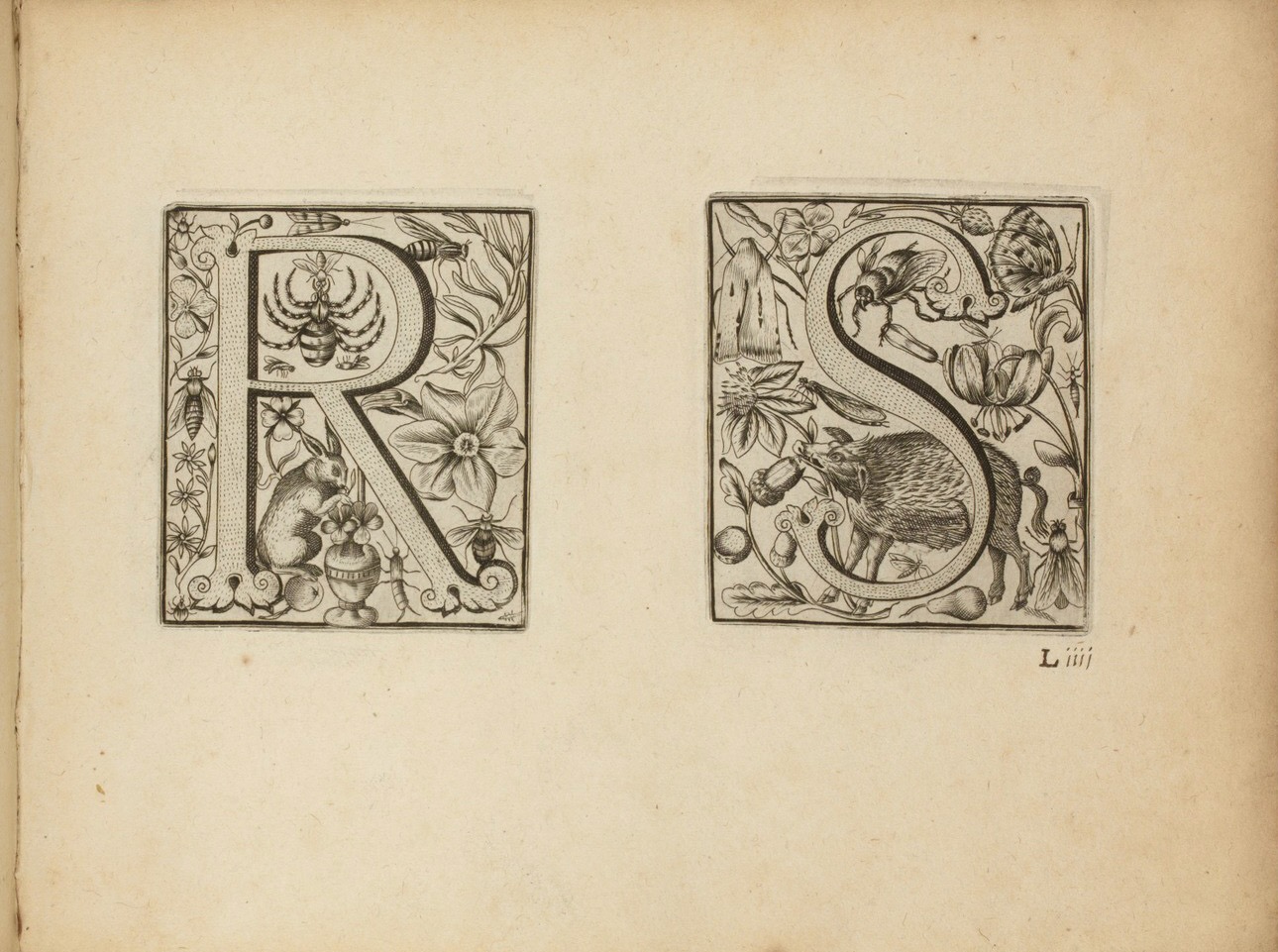
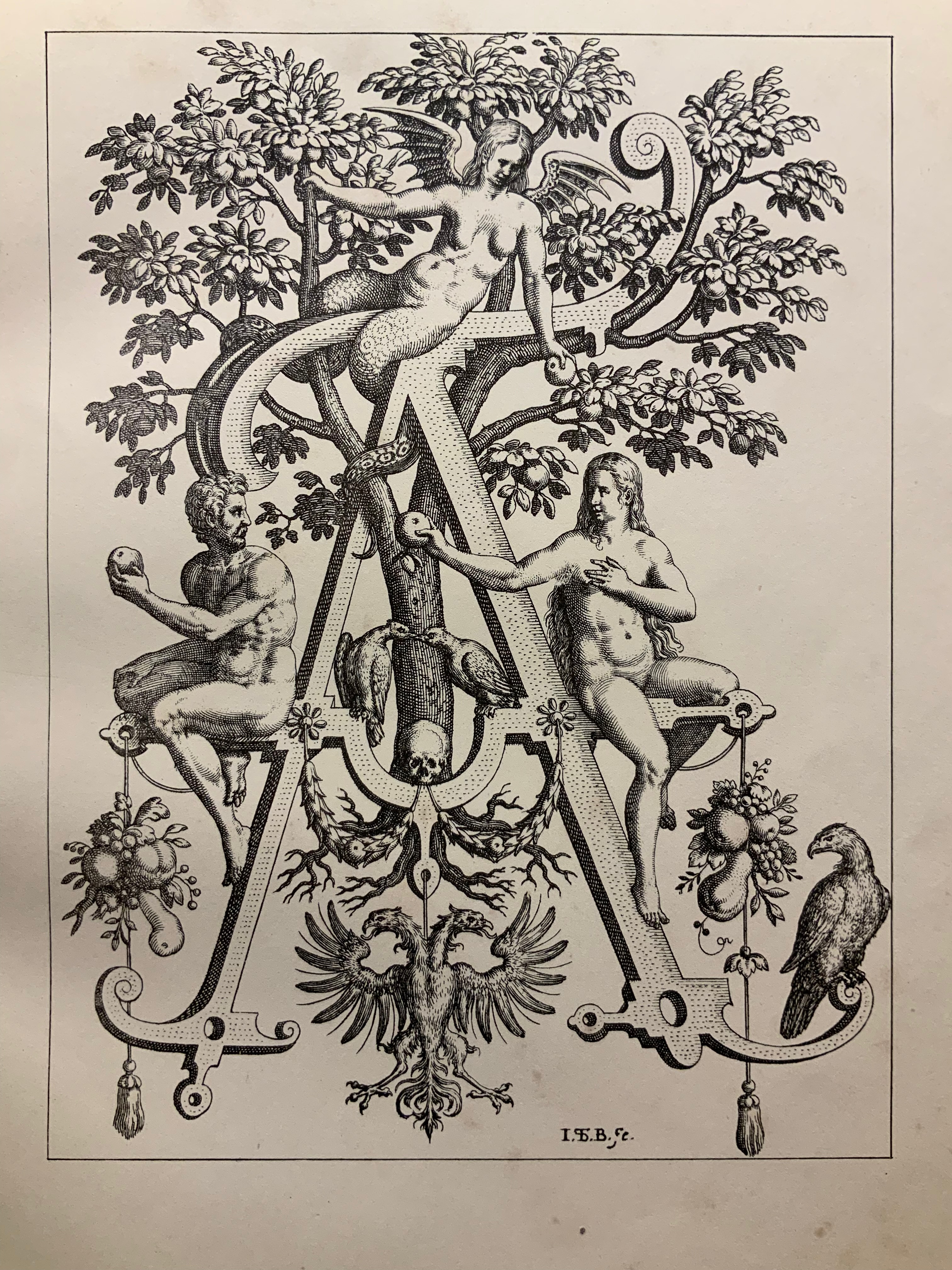
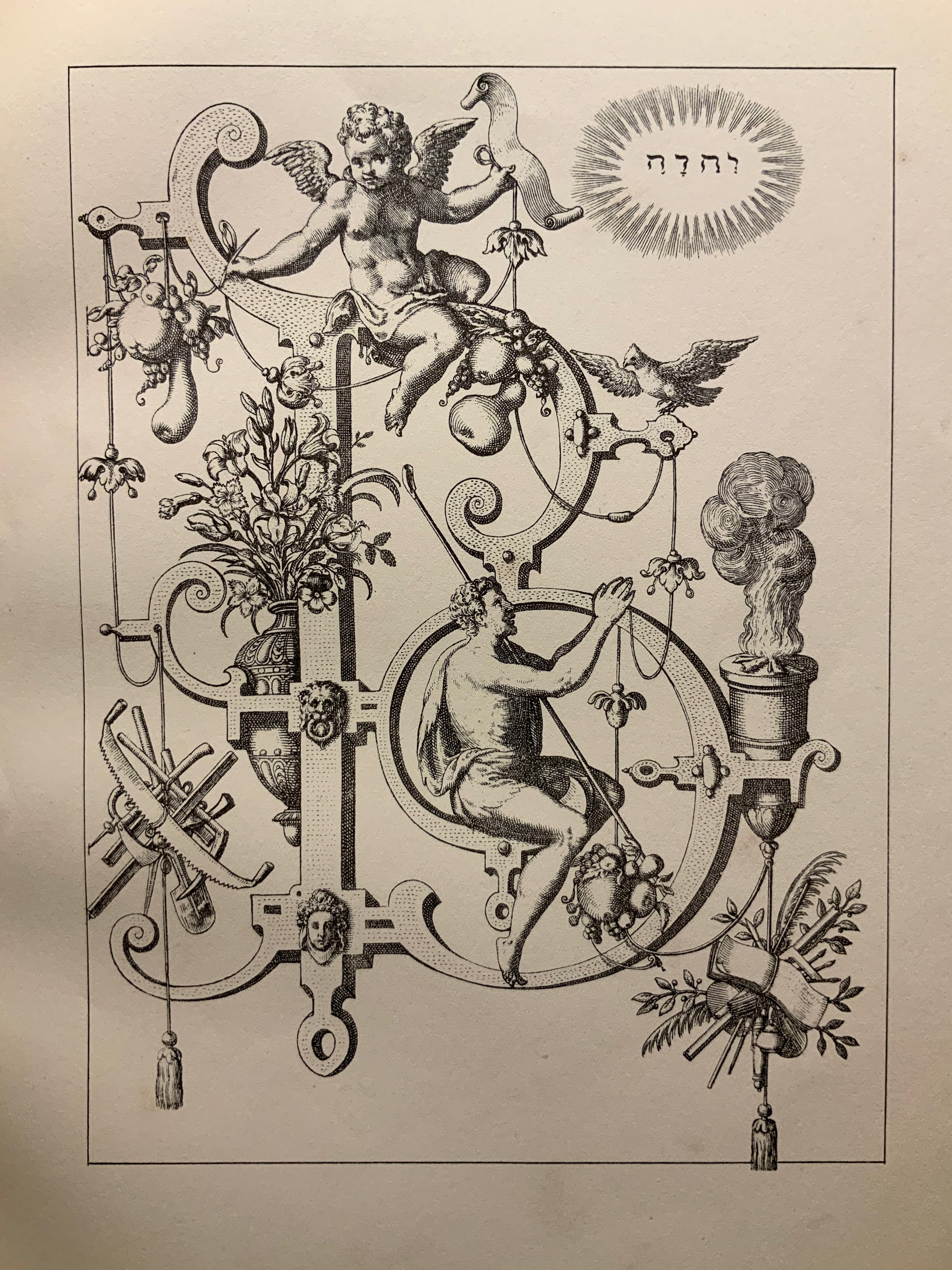
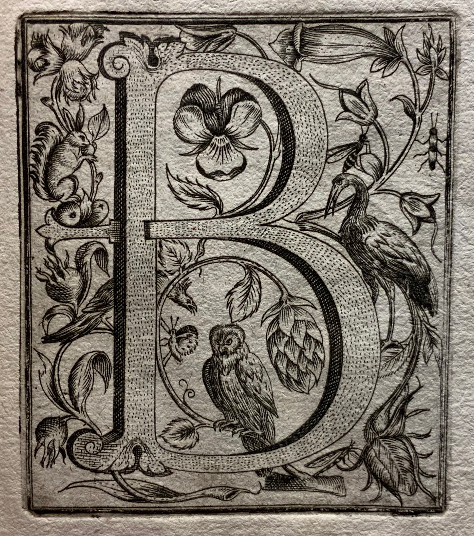
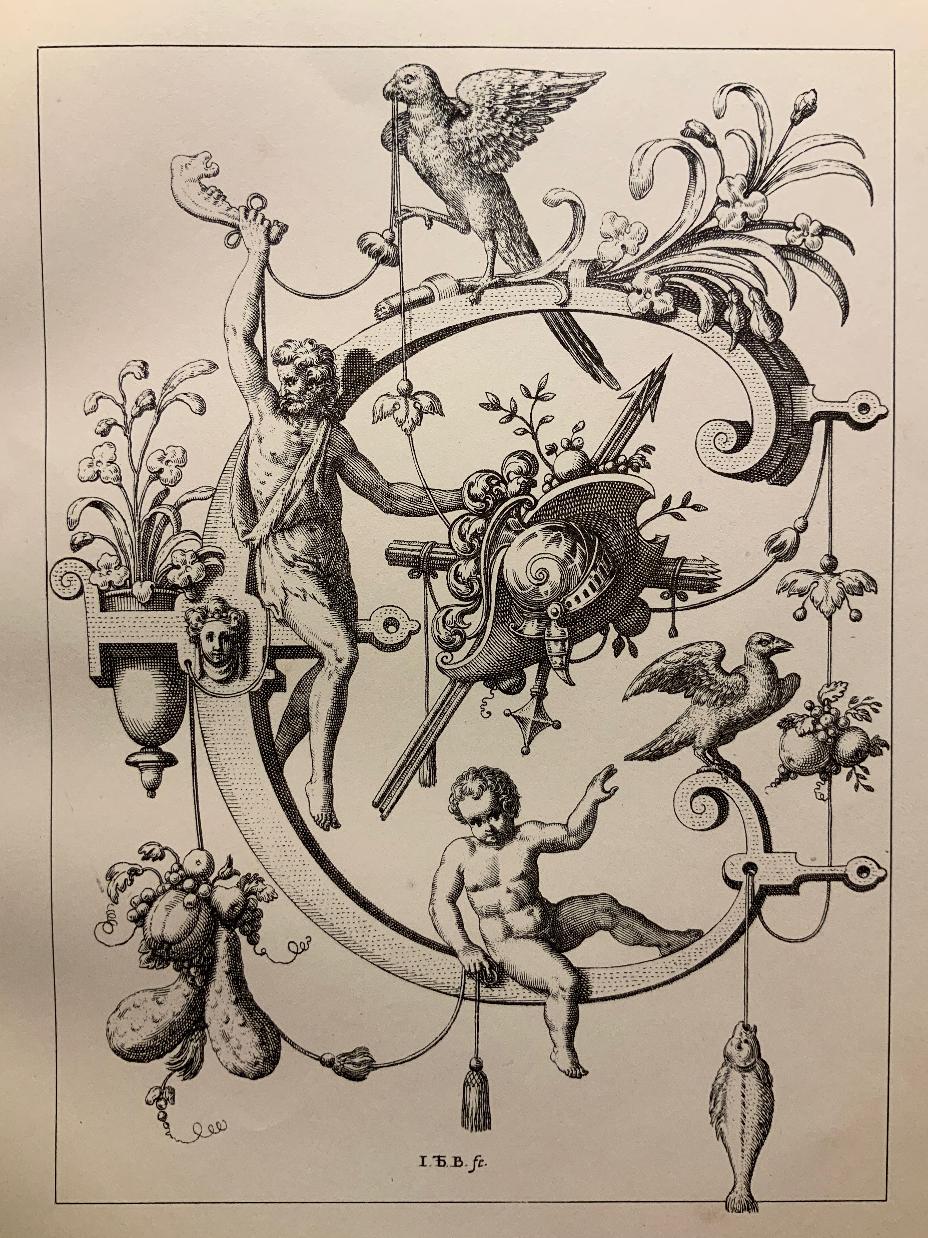
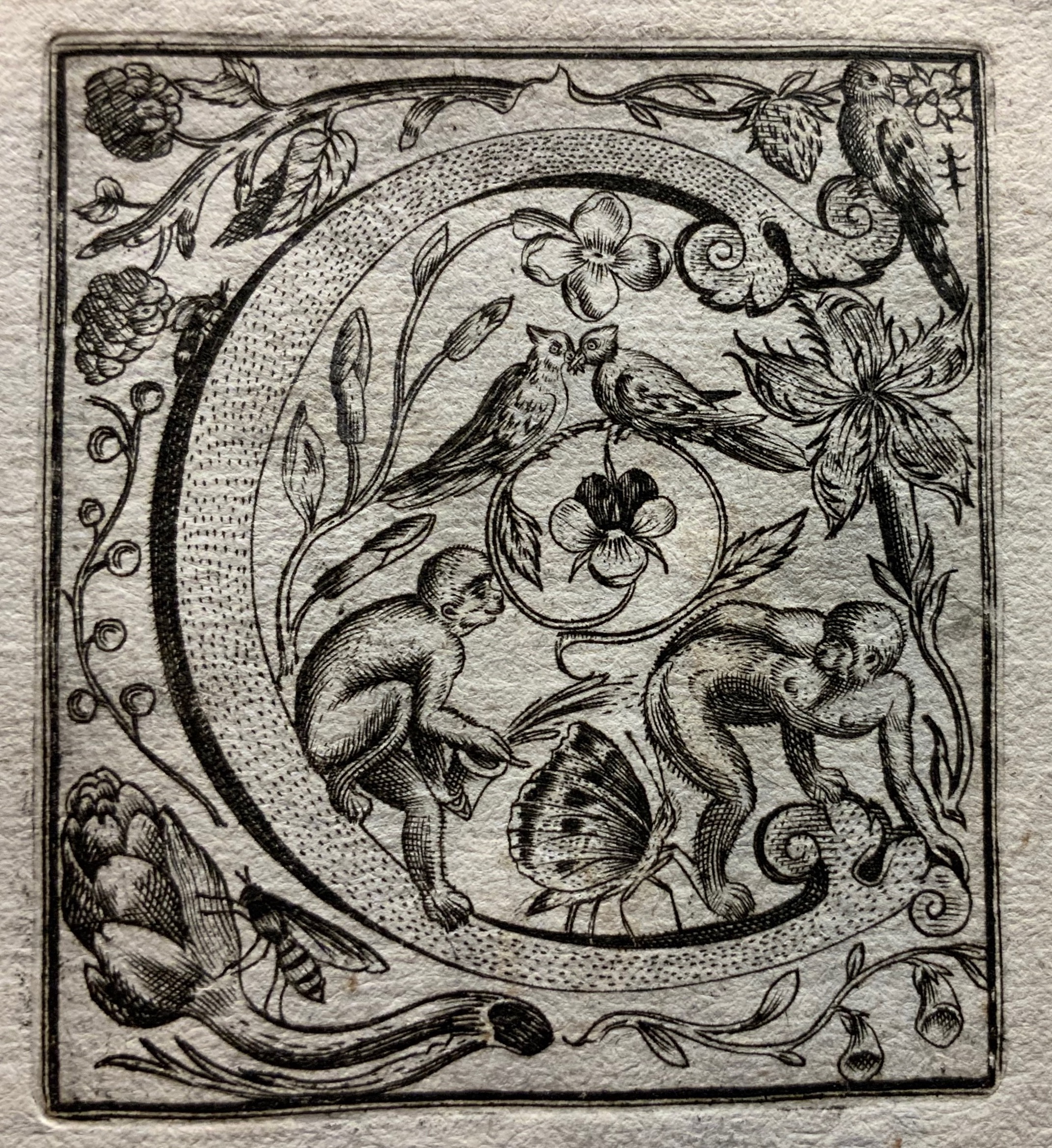
Neiw Kunstliches Alphabet (1595/1995) Johann Theodor de Bry Facsimile edition created by Joseph Kiermeier-Debre and Fritz Franz Vogel as part of the boxed set Alphabets Buchstaben Calligraphy, published by Ravensburger Buchverlag (1998). H275 x W255 mm, 80 pages. Acquired from Antiquariat Terrahe & Oswald, 14 March 2021. Photos: Books On Books Collection.
Johann Theodor de Dry and his sons were copperplate engravers, best known for their Grands and Petits Voyages (1590-1634) of 57 separate parts, containing over 500 different engravings illustrating the explorations of the world beyond the shores of 16th and 17th century Europe. While the De Brys’ place in the history of book art might be traced from their illustrations of Hans Staden’s tales of Brazilian cannibals to Oswald de Andrade’s “Manifesto Antropófago” [Cannibal Manifesto] (1928) and Moussa Kone’s Nowhere Land (2017), their equally strong, if not better, claim rests on the Neiw Kunstliches Alphabet (1595) and the Alphabeta et characteres (1596).
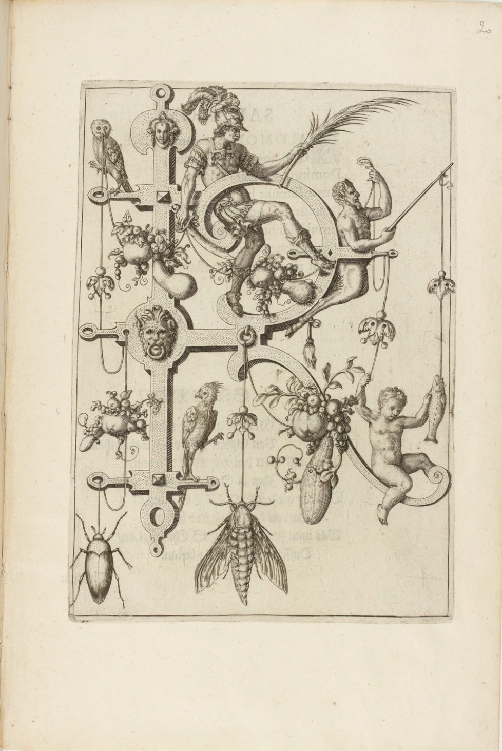
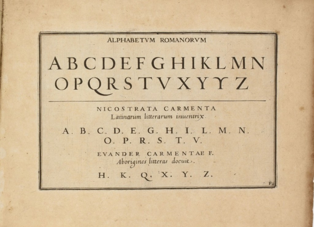
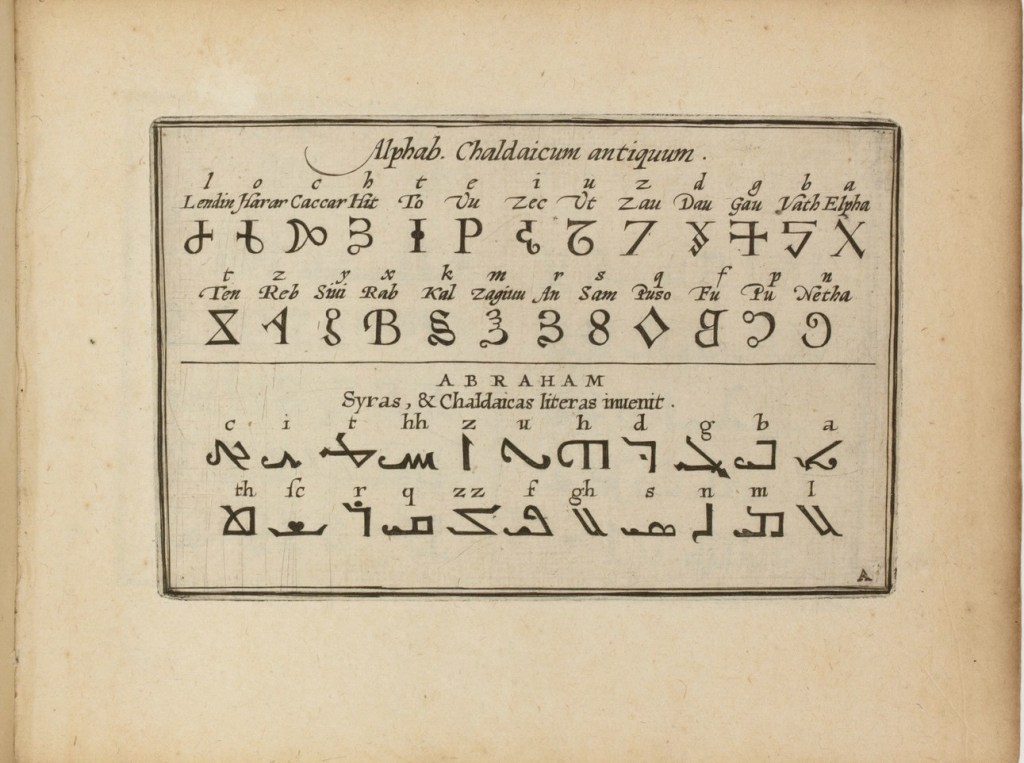
The Neiw Kunstliches Alphabet presents the letters of the alphabet adorned with Judaeo-Christian allegorical figures, vegetation, birds and animals, instruments, implements, weapons and regal emblems. An octave in Latin and one in German provide hints for identifying the allegorical and emblematic references. At the end of the De Brys’ alphabet atlas Alphabeta et characteres, iam inde a creato mundo ad nostra usq. tempora, apud omnes omnino nationes usurpat (1596) depicting dozens of alphabets — the Chaldaic, Egyptian, Hebrew, Greek, Slavonic, Hispanic, Latin and so on — another decorated alphabet and an alphabet formed of human figures make their appearance.
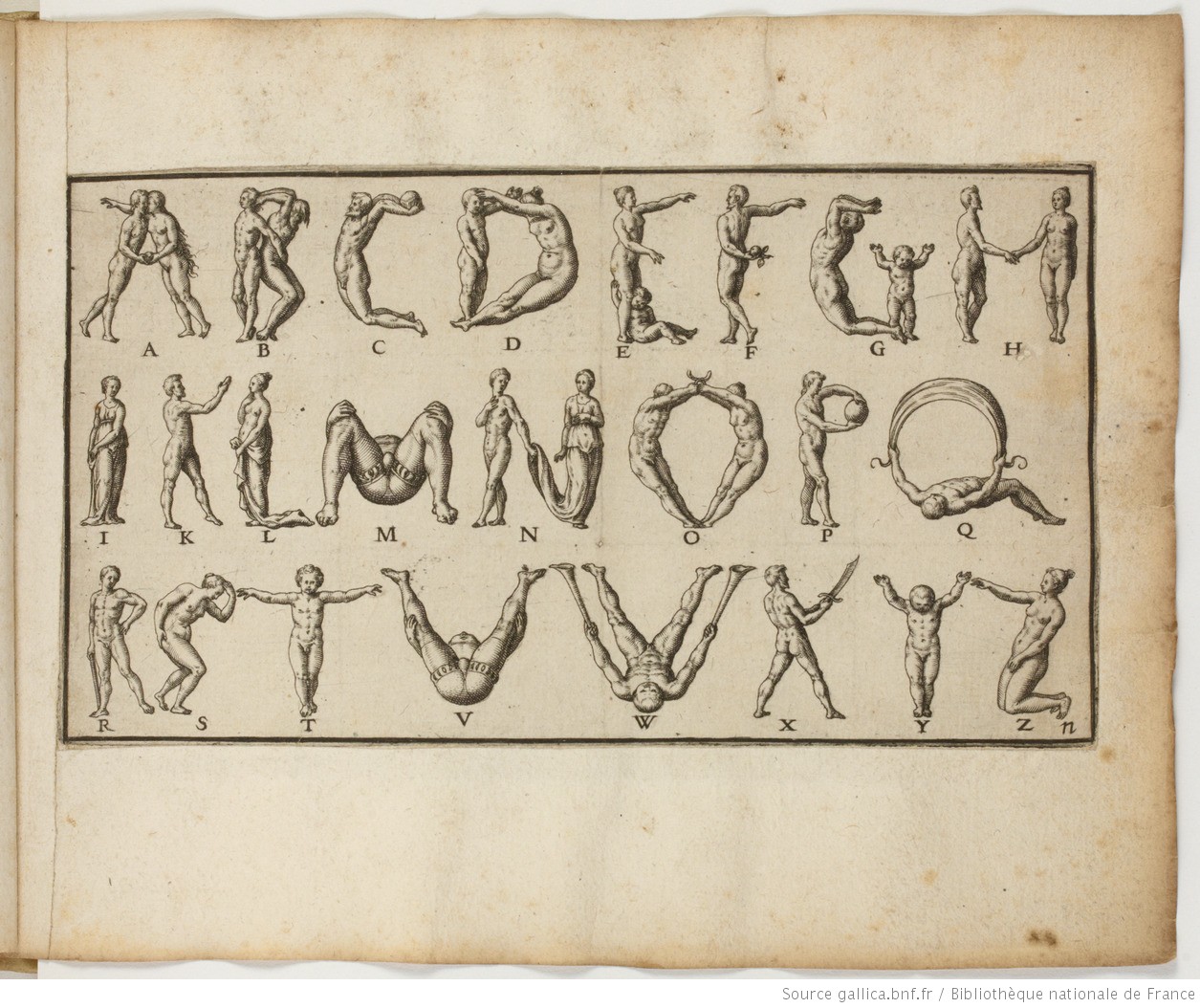
Letters R&S and the human alphabet from Alphabeta et characteres, iam inde a creato mundo ad nostra usq. tempora, apud omnes omnino nationes usurpat (1596). Images: Bibliothèque nationale de France.
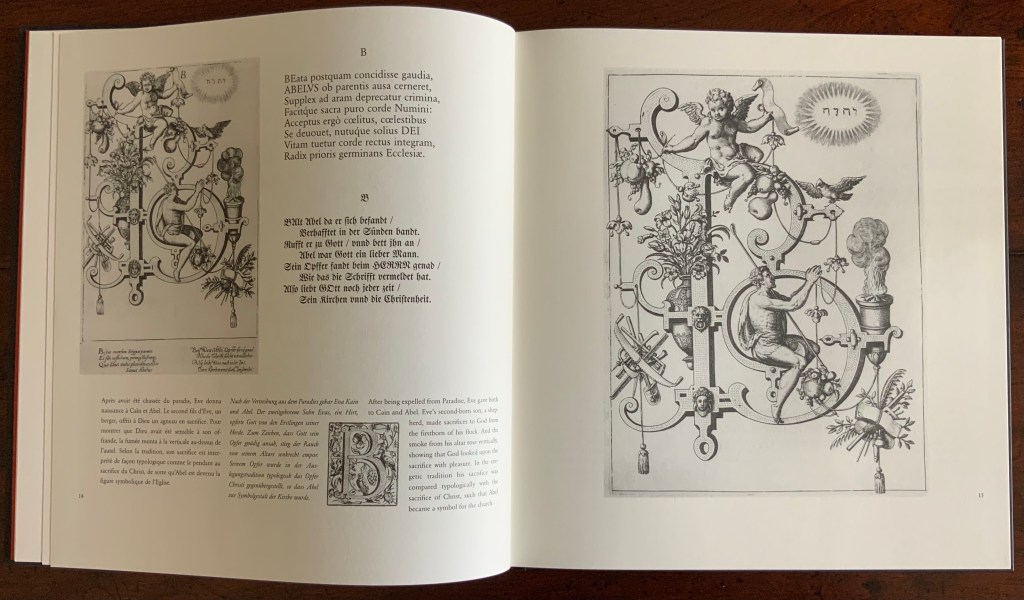
Kiermeier-Debre and Vogel reproduce to scale the letters from the Neiw Kunstliches Alphabet and present thumb-nail versions of the alphabets as well as the decorated letters from Alphabeta et characteres. Their facsimile is not the first for these works. J.N. Stoltzenberger printed Alphabeta et characteres in translation for William Fitzer in 1628, and George Waterston & Sons published Neiw Kunstliches Alphabet as The New Artistic Alphabet in 1880 (albeit without the original’s text and verses). By juxtaposing all these originals, Kiermeier-Debre and Vogel provide a concentration of what makes the De Brys partial forerunners in the history of book art: images embracing letters (and letters embracing images).
Joseph Kiermeier-Debre and Fritz Franz Vogel facsimile (1995) of Neiw Kunstliches Alphabet (1595), pp. 12-13. Photos: Books On Books Collection.
Other abecedaries in the Books On Books Collection that strike the Baroque note or blend image and letter in ways that argue a descendancy from the De Brys include
De Bry also published Michael Maier’s Atalanta Fugiens or Emblemata Nova (1618), which is represented in the Books On Books Collection by Daniel E. Kelm’s Möbius version Neo Emblemata Nova (2005).
Further Reading
“Paulus Franck“. 22 March 2022. Books On Books Collection.
“Richard Niessen“. 23 April 2021. Books On Books Collection.
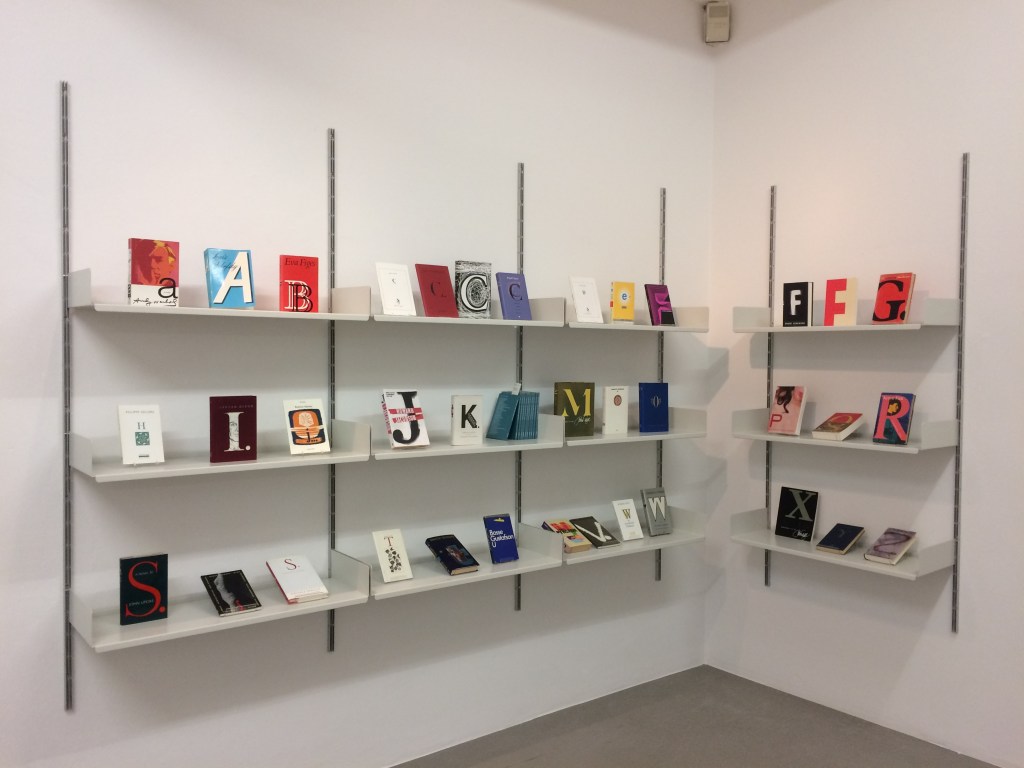
The art of the alphabet seems to be a rite of passage for graphic artists. Perhaps it is that art and the alphabet find common ground in the urge to make sense of the world. Perhaps it’s that the alphabet’s invention, development and artistic treatment present a rich tradition for artists to follow or challenge. Perhaps it’s that letterforms and the alphabet offer raw material, subject and organizing principle all in one. Semic or asemic. Calligraphic, typographic or even plastic. Representational or abstract. All are options. But most often, something bookish results. From Islam Aly’s 28 Letters(2013) to Ludwig Zeller’s Alphacollage (1979), a significant part of the Books On Books Collection is taken up with artists’ books based on the ABCs and letterforms. The Collection’s two facsimiles of Geofroy Tory’s Champ Fleury provide a useful historical backdrop that throws into relief several of the Collection’s works and their performance of this rite of passage.
It should be no surprise that Geofroy Tory de Bourges (c.1480-1533) serves up such an exemplar. In her Playful Letters, Erika Boeckler writes
An accomplished designer, typographer, printer, poet, author, translator, calligrapher, illustrator, woodcutter, and engraver, he received his education in Italy and ultimately settled in Paris, setting up a bookstore, writing his own works, running a press, and collaborating with or working for Simone de Colines, director of one of the most influential and experimental fine publishing houses of the time. Personally writing the text, designing the woodcuts, and cutting some of them, organizing the layout, perhaps even setting the type, Tory created Champ Fleury as what we might call today an artist’s book. (p. 29)
Tory straddles the letters of the late Middle Ages and Renaissance. Appointed by François I in 1530 as his printer, Tory operated on the Petit Pont under the sign of le Pot cassé (“the broken pot”) and was known for his workshop’s handwritten Book of Hours (1524). Rooted in the horae tradition reaching back to the 13th century, Tory’s Book of Hours is an early-to-mid-Renaissance version of its predecessors. As beautiful as his Book of Hours is, Champ Fleury (1529) became his best known work. Authored and designed by Tory, it was produced by hand typesetting and letterpress printing in Paris with Giles Gourmont. Printed less than 100 years after Gutenberg’s innovation, Champ Fleury represents the printed book toddling out of its incunabula period.
Book of Hours Geofroy Tory (1524) Bound in the 18th century, 113 leaves of vellum. Lessing J. Rosenwald Collection (Library of Congress). Accessed 30 May 2021.
According to Jeremy Norman’sHistory of Informationsite, the first separate printed title page appeared in 1463. Subject indices date back to the 13th century, originating at the University of Paris, and the first printed indices, to 1470. Champ Fleury‘s front matter boasts a title page, two prefaces to the reader, a statement of the King’s Privilege awarded for the book for ten years (a forerunner to the copyright page), a name index without location references and a subject index with folio references. Champ Fleury’s back matter consists of a colophon preceded by a lengthy appendix illustrating various forms of the alphabet (Hebrew, Greek, Latin, etc.).
Tory’s placement of the indices in the front matter rather than the back matter reflects the gradual development of the anatomy of the book towards the structure that would ultimately be codified in reference works like the Chicago Manual of Style. Paratextual elements like the title page, table of contents, page numbers, etc., did not spring up overnight. If, as Eric Havelock and others assert, society, the arts and culture are a superstructure erected on the foundation of the alphabet (see below), Champ Fleury and its “letterology” make for a particularly fitting exemplar of the book as an element of the superstructure arising from the alphabet.
Perhaps book artists sense this, which again leads to that alphabet art rite of passage and the elaborate variations on it. The illustration of various forms of the alphabet in the appendix also draws on another developing tradition: the typesetter/printer’s sample book advertising the firm’s fonts. Abecedaries and artist books have sprung from that tradition, too.
Tory was not the first to propose an art and science behind the letterforms of the alphabet. Predating his efforts were Giovanninno de’ Grassi (1390-1405), Felice Feliciano (1463), the Anonymous Chicagoensis and Anonymous Monachensis (1468?), Damianus Moyllus (1480), Fra Luca Pacioli (1509), Sigismondo Fanti (1514), Francesco Torniello (1517), Ludovico Arrighi (1522), Albrecht Dürer (1525) and Giovanni Battista Verini (1527). Leading up to Champ Fleury, these earlier efforts track the development of humanism. Arguably, Tory’s effort is a capstone, combining myth, allegory, metaphysics, geometry, linguistics, calligraphy, typography and cryptography.
Book One, concerned with the mythical origins of the French language, also addresses the fabled origins of the alphabet: the story of Jove, Io and Mercury behind the letters I and O and their claim to being the first letters and also the tale of Apollo’s accidental murder of Hyacinth explaining the letters A and Y and their similar claim. Two works in the Collection built on alphabet origin stories are Francisca Prieto’s Printed Matter series (2002-2008) William Joyce’s The Numberlys (2014), but many more follow in Champ Fleury’s art and science footsteps.
Tory’s late medieval/early Renaissance perspective gives way to 20th and 21st century poetics and phenomenology in most works of the Collection. Aaron Cohick’s The New Manifesto of the NewLights Press (third iteration) (2017) offers a good example. Another — closer to Tory’s moral and geometric perspective but of a more modern spirituality — is Jeffrey Morin and Steven Ferlauto’s Sacred Space (2003).
Compile all the abecedaries ever created and it would approximate the result of Adam and Eve’s task of naming all the creatures and things of the world. Leonard Baskin echoes that innocence in Hosie’s Alphabet(1972) with its words and animals supplied by his children. If Adam and Eve had had an alphabet, they might have been tempted into pareidolia, which is represented in the Collection by VUES/LUES: Un Abécédaire de Marion Bataille (2018) and Typographic Universe (2014) by Steven Heller and Gail Anderson. Heller and Anderson’s compendium extends to letters formed of natural and drawn objects from the real world, which Champ Fleury’s appendix foreshadows with its floral and fantastic alphabets.
Of course, Tory’s work is not an abecedary. In Books Two and Three, it develops into a full-blown treatise on letterforms whose meaning and appearance are explained allegorically and driven by the compass, rule and geometry expressed within a 10x10x10 cell cube. It would overstate the case to call it “typographic design”. As drawn, Tory’s diagrams would serve poorly for cutting and forming punches or matrices (although it has been done). Nevertheless, his geometric approach foreshadows the grids and algorithms of Wim Crouwel’s New Alphabet (1967), Timothy Epps and Christopher Evans’ Alphabet(1970) and Ji Lee’s Univers Revolved: A Three-Dimensional Alphabet (2004).
Before the age of computers and algorithms, though, the artist and designer Bruce Rogers did bring typographic design to bear on Champ Fleury. The Grolier Club sponsored the printing of George B. Ives’ English translation. Rogers’ design “translates” Champ Fleury just as much as Ives does, perhaps more so. The Grolier Club edition is one of only ten books to be set completely in the Centaur typeface designed by Rogers.
Of course, the translation entails a complete resetting of the text, and Centaur naturally delivers crisper letters. Also, in redesigning with Centaur, Rogers alters the original’s layout and, therefore, the reader’s experience of it. Notice in the OAHK pages above and in the three double-page spreads below how Rogers changes Tory’s flow or jumpiness to something fixed or stately. Attention to the page and its layout offers book artists as well as book designers yet another creative avenue. For proof of that, compare the Collection’s entries for Angel, Baskin and de Cumptich.
Architecture is another of Tory’s well-developed analogies and explanations of the ancients’ thinking behind the letterforms. In his drawings below, he aligns the letters AHKOIS with the parts of a building and letters IL with floor plans. He connects the circularity of the Coliseum’s exterior and the ovalness of its arena with the proper shape of the letter O. In the Collection, the analogy reappears fantastically in Johann David Steingruber’s Architectural Alphabet (1773/1972), Antonio Basoli’s Alfabeto Pittorico (1839/1998) Antonio and Giovanni Battista de Pian’s efforts in 1839 and 1842.
The architectural analogy provides Tory with his segue from plane to solid geometry in aligning the shapes of letters with human anatomy and virtues. His three-dimensional analysis of letterforms also finds contemporary analogues in two of Pieter Brattinga’s Kwadraat Blad series: Crouwel’s, mentioned above, and Anthon Beeke’s Alphabet (1970). Tory’s three-dimensional letterforms foreshadow Crouwel’s investigation of units based on the assembly of organic cells and his later musings on a laser-generated four-dimensional typography (Elliman, 62). And it is hard to evoke anything more humanoid and three-dimensional — albeit far less analytical or prudish — than Beeke’s alphabet formed with naked female models. (Tory comments that in a correctly drawn A, the crossbar will virtuously cover the genitals of Vitruvian man inscribed in the 10×10 grid. Modesty seems to extend to H as well but not so much to O and K.)
The calligraphic impulse that underlies Champ Fleury‘s typographic representations shows itself clearest in the woodcuts for the Cadeaulx alphabet in the appendix. The Books On Books Collection has its share of calligraphic abecedaries such as Marie Angel’s An Animated Alphabet (1996) and Andrew Zega and Bernd Dam’s An Architectural Alphabet (2008) as well as more purely calligraphic alphabets such as Islam Aly’s, mentioned above, and Suzanne Moore’s A Blind Alphabet (1986) .
Two artists whose abecedaries blend the calligraphic and typographic are Robert de Vicq de Cumptich and Cathryn Miller. In de Cumptich’s Bembo’s Zoo (2000), letters and punctuation marks from the Bembo typeface form calligraphic animal shapes. Miller’s L is for Lettering(2011) joins up the alphabetic rite of passage, calligraphy and typography by allying each of her hand-drawn letters with the name of a typeface from “A is for Arial” to “Z is for Zapfino”.
The last page of Tory’s illustration of additional alphabets is not the end of his work. The colophon plays that role. Curiously, Tory misses out the character that plays that role for the alphabet itself: the ampersand. “Curiously” because the character & appears throughout Champ Fleury — even at the end of the colophon’s fourth line in French — and it is after all the most flowery of the alphabet’s characters. Perhaps some book artist will follow Bruce Rogers’ example in his joking Depression-era homage to Tory on the back of Champ Rosé and create an homage to Tory and Rogers of three-dimensional ampersands.
Gelb, Ignace J. 1974. A Study of Writing. Chicago: University of Chicago Press.
Golec, Michael. 2015. “Champ Fleury in the Machine Age”, lecture at the School of Visual Arts, NYC. Uploaded 4 June 2015. Accessed 12 May 2021. Good slides and a comparative look at Tory’s original and Rogers’ resetting.
Tien-Min Liao, Handmade Type. Compare/contrast with Tauba Auerbach’s Stacking (2007), which is covered in How to Spell the Alphabet (see above).
Poul Webb, “Alphabet Books — Parts 1-8” on Art & Artists. Google has designated this site “A Blog of Note”, well deserved for its historical breadth in examples, clarity of images and insight.