Infant A (2012) Louis Lüthi Thread-stitched signature. H225 x W160 16 pages. Edition of 1000. Acquired from Torpedo Books, 8 January 2024. Photos: Books On Books Collection
Infant A is part of a collection of essays commissioned by castillo/corrales and published by Paraguay Press under the series title The Social Life of the Book. Lüthi’s contribution fits the Books On Books Collection on several scores. First is the epigram’s invocation of the alphabet, which echoes the collection’s concentration of alphabet-related artists’ books and children’s books. See Alphabets Alive! Second is the epigram’s source: Wallace Stevens, whose poetry has inspired Ximena Pérez Grobet’s Words (2016). Would that other book artists be so inspired. Third is the narrator’s fictional conversation with Ulises Carrión in a celebration of all things A-related, in particular Andy Warhol’s novel a: a novel (1968), which finds analogues in Warren Lehrer’s A Life in Books: The Rise and Fall of Bleu Mobley (2013) and Derek Beaulieu’s a, A Novel by Andy Warhol (2017) (entry in progress). Fifth is how the dialogue reminds me of Suzanne Moore’s A Musings (2015).
A Die With Twenty-six Faces (2019)
A Die With Twenty-six Faces(2019) Louis Lüthi Paperback. H200 x W130 mm. 104 pages. Acquired from Amazon, 18 September 2022. Photos: Books On Books Collection
Walter Benjamin’ unpacking of his library has a lot to answer for. Not only do we have Buzz Spector‘s take on it in 1995, but Jo Steffens’ Unpacking trilogy of photos of architects’, artists’ and writers’ bookshelves, Alberto Manguel’s elegiac Packing My Library (2018), and here is Louis Lüthi’s.
Publisher’s website: In A Die with Twenty-Six Faces, the author — let’s call him L. — guides the reader through his collection of alphabet books, that is, books with letters for titles. Some of these titles are well known: Andy Warhol’s “a,” Louis Zukofsky’s “A”, Georges Perec’s W. Others are obscure, perhaps even imaginary: Zach Sodenstern’s A, Arnold Skemer’s C and D. Tracing connections between these books, L. elaborates on what the critic Guy Davenport has called the “Kells effect”: “the symbolic content of illuminated lettering serving a larger purpose than its decoration of geometry, imps, and signs.”
The title stirs thoughts of Marcel Broodthaers’ oracular statement in 1974 “I see new horizons approaching me and the hope of another alphabet”. An alphabet that unrolls across the twenty-six faces of a die would certainly qualify as another alphabet. Broodthaers and the die also stir thoughts of Stéphane Mallarmé’s Un Coup de DésJamais N’Abolira le Hasard to which Broodthaers paid repeated homage. Throwing a twenty-six-sided die would certainly no more abolish chance than would a roll of Mallarmé’s six-sided die. Lüthi’s game, however, has little to do with chance unless we count his luck in finding the works to build his library of single-letter-entitled books. Even less to do with luck if some of the library is fictitious, a likelihood that the “publisher’s” statement suggests. Lüthi’s die is loaded!
A selection of Lüthi’s “alphabet” books on display. Courtesy of the author. Photo: Gesellschaft für Aktuelle Kunst Bremen
On the Self-Reflexive Page II (2021)
On the Self-Reflexive PageII(2021) Louis Lüthi Paperback. H200 x W130 mm. 304 pages. Acquired from Idea Books, 18 September 2022. Photos: Books On Books Collection.
This is a peculiar book in its order and nature. After two variant half-title pages, it begins with a section entitled “Black Pages”. Only on flipping through the volume can we find the remaining front matter — just after page 208. There’s another half-title and then the Table of Contents. Reproducing the marbled page from Laurence Sterne’s The Life and Opinions of Tristram Shandy, Gentleman (1759–1767), the book’s cover gives a clue to this peculiarity. Sure enough, Lüthi spells it out later in the section entitled “On Drawing Pages”.
So much in Tristram Shandy is presented out of order: a second dedication comes not after the first but on page 27, the preface is not at the beginning of the novel but in chapter 20 of volume three, and chapters 18 and 19 of volume nine come not after chapter 17 but are inserted after chapter 25. In a similar act of transposition, we find a marbled page in volume three, even though hand marbling is customarily used to decorate covers and endpapers. As Viktor Shklovsky observed, “It is precisely the unusual order of even common, traditional elements that is characteristic of Sterne.” (p. 240)
This one paragraph confers on Lüthi’s entire book the very self-reflexivity that it explores across a range of literature and artists’ books. Reflecting the custom to which it refers, On The Self-Reflexive Page II carries Sterne’s marbled pages on its front and back covers. In the text before his marbled leaf, Sterne refers to it as the “(motly emblem of my work!)“. Lüthi has taken that exclamation to heart (and cover) as if it were advice in creating this hybrid, motley work of his own: “part artist’s book and part essay, part literary excavation and part typographical miscellany” as he calls it in his middle-of-the-book Foreword.
Lüthi’s work is just one in the Books on Books collection of several inspired by Tristram Shandy. There is Erica Van Horn’s Born in Clonmel (2011), Simon Morris’ Do or DIY (2012), Abra Ancliffe’s The Secret Astronomy of Tristram Shandy (2015), and Shandy Hall‘s The Black Page Catalogue (2010), Emblem of My Work (2013), Paint Her To Your Own Mind (2018) and The Flourish of Liberty (2019). Outside the collection, there is Brian Dettmer’s Tristram Shandy (2004), commissioned by Shandy Hall’s Laurence Sterne Trust, and also Sean Silver’s Shandean online venture called The Motley Emblem (2022~) celebrating Sterne’s marbled leaf and the analytical chemistry of marbling. The latter may become a book, even an artist’s books to add to the tally. In The Century of Artists’ Books, Johanna Drucker draws attention to Sterne’s novel twice as an example of self-reflexivity or self-interrogation, but in 1994 and 2004, Sterne did not rise to the same level of precursor to book artists as William Blake or Stéphane Mallarmé in Drucker’s view. With these later works of book art inspired by Uncle Toby’s nephew in the bag, a dozen or so more might nudge Sterne up the scale.
In the meantime, anyone interested in artists’ books could fruitfully apply to the medium Sterne’s exhortation to his own readers:
Read, read, read, read, my unlearned reader! read, — or by the knowledge of the great faint Paraleipomenon — I tell you before-hand, you had better throw down the book at once; for without much reading , by which your reverence knows, I mean much knowledge, you will no more be able to penetrate the moral of the next marbled page (motly emblem of my work!) than the world with all its sagacity has been able to unraval the many opinions, transactions and truths which still lie mystically hid under the dark veil of the black one.
Artists’ books are to be read, handled and digested, not stored away in the archives.
The Century of Artists’ Books (1994) — An Appreciation
Before Johanna Drucker’s The Century of Artists’ Books (1994), the discussion of artists’ books was all argy-bargy about definitions, boundaries, neologisms or the placement of apostrophes. The Century cut through all that to become the introductory textbook to the field’s evolutionary biology. Decidedly post-Darwinian, it avoided rigid taxonomy and categories.
If all the elements or activities which contribute to artists’ books as a field are described[,] what emerges is a zone of activity, rather than a category into which to place works by evaluating whether they meet or fail to meet certain rigid criteria. There are many of these activities: fine printing, independent publishing, the craft tradition of book arts, conceptual art, painting and other traditional arts, politically motivated art activity and activist production, performance of both traditional and experimental varieties, concrete poetry, experimental music, computer and electronic arts, and last but not least, the tradition of the illustrated book, the livre d’artiste. — (p. 2).
More than occasionally, certain denizen of this “zone of activity” emerge to question, prod, probe, devour, regurgitate, excrete, smash, bang together, impale, immerse, soak, burn, freeze, distill, erase, sculpt, digitize or otherwise engage the physical aspects, possibilities and very idea of “the book”. When they do, “[t]he book becomes a form of artistic expression in the hands of these artists rather than a convention-bound mode of reproduction” (p. 47). The Century of Artists’ Books serves up numerous examples of them. It teases out the various strands of book-DNA that these specimens engage in becoming artists’ books. In doing so, The Century has proven to be a valuable tool for the collector, not just for historians and critics. It enhances appreciation and enjoyment when reviewing acquisitions or considering new ones.
The numerous specimens and the different ways they interrogate “the conceptual or material form of the book” (p.3) offer points of comparison and contrast for the work acquired or about to be acquired. Is it a democratic multiple or a rare and auratic object? Is it a codex or one of its variants or its precursors or its digital successors, and is it playing them off one another? Does it exhibit a self-reflexive form? Is its form celebrating the visual over the textual/verbal, and if so, with what visual arts and what visual aspects of the book? If vice versa, what aspects of the book’s textual/verbal form does it explore? Is the work a play on sequence (narrative and non-narrative) in the book? Does it intentionally dance on the border between the ephemeral performance or installation and the more lasting book? Is it questioning the book as document? Is it posing itself as a metaphor of the book? Does it somehow declare its affinity with any of the artist’s book’s antecedents identified by The Century?
As comprehensiveas The Century is, the haptic is one element of book-DNA that it does not single out for a chapter of its own. Codex works in the Books On Books Collection that primarily address what the eye can feel and fingers see, such as Tim Mosely’s The Book of Tears (2014) and Grasping the Nettle (2020), do not have easily found specimens with which to compare and contrast. Drucker’s decision to exclude “book-like objects or book sculpture” may have led to this, although the sections “Hybrid and Spatial Variants” and “Interior Spaces” (pp. 145-53) certainly touch on them and their engagement of hand and eye.
Arguably over-inclusive is The Century‘s designation of antecedents: William Blake (for his illuminated books’ union of text and image, craft and art, and vision with form and structure), Gelett Burgess (for Le Petit Journal des Refusés and its spontaneous, topical and zine-like spirit), Gustave Flaubert (for Bouvard et Pécuchet and its idea of the “book as failure” to transmit knowledge), Stéphane Mallarmé (for Un Coup de Dés Jamais N’Abolira le Hasard and its revolutionary use of type, page layout and a metaphysical idea of The Book), William Morris (for The Works of Geoffrey Chaucer and his eccentric designer’s eye) and Laurence Sterne (for Tristram Shandy‘s rollicking interrogation of the book as novel).
Of those antecedents Blake and Mallarmé (and more Mallarmé than Blake) are the most useful touchstones for a collector. Blake’s innovation with etching that enabled him to unify script and image on the page and his mythic stance as a one-man band present a high bar to subsequent book artists. But for the collector, he stands as a reminder to consider both works of rude as well as fine craft, to inquire into technique and painstaking effort, and to look for unity (or intentional dis-unity) of word, image and form when contemplating an acquisition.
As abstruse as Mallarmé’s writings are, Poème‘s content, its play with type and the double-page spread, and its possible embodiment of Mallarmé’s metaphysical notion of the book all offer book artists more approachable avenues. In fact, so many book artists have paid direct homage to Poème and Mallarmé’s idea of le Livre (“the Book”) that a sub-genre of artists’ books has evolved. Poème‘s trueness as an antecedent touchstone can be found in the various and extraordinary ways those hommageurs respond to, and even appropriate, its book-DNA. For the collector, Mallarmé acts as a reminder to see what the book artist is doing visually, structurally and conceptually with type, the leaves, the pages and the idea of the book.
Unsurprisingly The Century proves helpful for appreciating and enjoying Drucker’s own artist’s books in the Books On Books Collection.
Stochastic Poetics (2012)
Stochastic Poetics(2012/2024) Johanna Drucker Softcover, flexible, high-gloss laminated cover. Facsimile (original’s cover was in brushed steel). H250 x W200 mm. 62 pages. Acquired from Blurb, Inc., 28 March 2024. Photos: Books On Books Collection. Displayed with artist’s permission.
In Stochastic Poetics (2012/2024), Drucker scatters words and letters and plays with typography in a manner that makes Mallarmé’s revolutionary poem look almost staid. As Drucker explains in the colophon to Stochastic Poetics, the poem’s text is taken from Aristotle, sources on complexity theory, and “observations of readings and events at L.A.C.E. and Modern Language Association”. Aristotle might be deducible from lines such as “Poetry in general seems to have sprung from two causes in each of them lying deep in our nature”, but you would have to be vaguely familiar with his Poetics. The “observations” seem more personal, ephemeral, period-specific, but deducing their sources seems beside the point. It’s best to “go with the flow” — to unravel the explosions of sentences, phrases and words on the page and follow their imaginative leaps.
For example, on the page where Aristotle refers to the causes of poetry, that phrase “deep in our nature” leads to the wordplay of “stochasm”, and its typographic display enacts a chasm (or abyss if you’re feeling the Mallarméan vibrations). The first half of that wordplay comes from the word stochastic, whose root is stókhos [“aim, target, bullseye”], and “a stochastic process is a collection of random variables used to represent the evolution of some random value, or system, over time”). Again, if you’re feeling the Mallarméan vibrations, you’ll remember that throwing dice — one means of generating random variables — lies at the heart of Un Coup de Dés Jamais N’Abolira le Hasard (“A Throw of the Dice Will Never Abolish Chance“).
Later among the poem’s seemingly random linguistic and typographic acrobatics, two phrases jump out — “Constellationary living / language” and “MOOmeNTARY CoNsTeLLaTiOn” (see below, lower left and lower right, respectively). Those phrases clearly evoke Mallarmé’s lines from Poème: “Nothing will have taken place except the place… except perhaps a constellation”. Mallarmé’s mise-en-page fireworks have often been taken as figurative allusions to the listing and foundering ship, central to the poem, or to the Big Dipper (Septentrion) constellation, or tumbling dice. Drucker’s typography and layout take Stochastic Poetics more in the direction of the abstract than the figurative, although some of its appearance could be considered representative of randomness or the tracks on a well-used dartboard, which alludes to the stókhos [“aim, target, bullseye”] of stochastic.
If these sparks of recognition between Drucker’s and Mallarmé’s poems still seem tenuous, this brief passage from Drucker’s essay on Mallarmé’s poem may add wattage:
Another set of three phrases “Except” “Perhaps” and “A Constellation” form a typographic group. Indeed, they express the crucial exception to the terms of abyss and dissolution, scattering and fragmentation, …. Redescribed in the smaller roman font as features incidentallycreated through “obliquity” and “declination” –- astronomical terms -– that are reinforced by invocation of the “Septentrion” or Big Dipper, and the north star …. The final line, “All thought expresses a throw of the dice,” recapitulates the theme of the whole work, showing that thought as well as language is caught in the probabilistic system between chance and constellationary form. — Drucker, 2011, pp. 12-13.
But enough of Mallarmé for a moment: go with the flow and read/view Stochastic Poetics without precisely tracking down its allusions. Clusters of letters not quite forming words, phrases or sentences suggest abstract doodling. The shapes of the clusters and lines create a sense of mental motion, or “AACTIION”. Eyes twist and turn as hands rotate the book to untangle words, phrases and sentences. In disentangling the portmanteau words and phrases such as “skeptical delightenment”, the mind finds itself playing out the reading — being skeptical, delighting, experiencing enlightenment. This is the artist-printer interrogating “the conceptual or material form of the book as part of [her] intention, thematic interests, or production activities” (The Century of Artists’ Books, p.3). This is the author-artist-printer twisting and turning the visual and verbal strands of book-DNA. This is a true specimen of the artist’s book.
The Word Made Flesh (1989/1996)
The Word Made Flesh (1989/1996) Johanna Drucker Casebound. H267 x W315 mm. 26 unnumbered leaves. Acquired from Black Dog Books, 16 August 2022. Photos: Books On Books Collection. Displayed with the artist’s permission.
When it comes to The Word Made Flesh, we find the Mallarméan influence again in the typographic and mise-en-page fireworks and some choice allusive phrases. Not content with spreading the oversized words of the title across the book’s pages as Mallarmé’s does with UN COUP DE DÉS JAMAIS N’‘ABOLIRA LE HASARD, Drucker amplifies each letter of each word. As if stuttering or trying to unstick its tongue from the roof of its mouth, the letter T takes up each of four pages until, on the fifth try, it is followed by the letter H on the next page, then E and so on until THE WORD MADE FLESH is spelled out. In the original letterpress edition, whose fiftieth and last copy provided the source for this facsimile edition (five hundred copies, fittingly), these oversized letters presumably came from wooden type. À la Mallarmé, the surrounding letters come from various families, fonts, sizes and styles of type, but amplifying and extrapolating his typographic technique, Drucker attaches the oversized letter to multiple words: “it”, “the”, “this, “table” and so on.
In Un Coup de Dés, the syntactically split and parallel texts become difficult to read. In The Word, the typographically split words add to the difficulty of reading the text. Already at the opening of The Word, Drucker has flagged that she will out-Mallarmé Mallarmé and take us à l’interieur du langage and à l’interieur de la langue (“into the interior of language and into the interior of the tongue”). Keep in mind that la langue not only means “tongue” but also “language” in the usual sense in English, whereas le langage means diction, a kind of language (jargon, computer, etc.) as well as the faculty of speech.
Adding another level of difficulty in reading is a background grid of red letters in small caps that appears behind the fifth T in the sequence above. It spells out a text made difficult to read by the spacing between letters and their disruption by the separate text of the black letters in the foreground and center. The visionary background text reads:
All the waters, elements and primal fishes broke through air around us into tongues. How was the trace of displacement into pale air made into speech by a breaking wave of chance? All the nights, broken glass and starstruck children woke to find themselves enslaved by authoritarian strictures placed into the face of stone on the shelves of supermarkets naming themselves judiciary operations. The sting of power marked the world into small spaces of unorthodox arrangements. Vivid scarlet as the fact of blood against the winter wash. Then all the earth. Unfocused energy and wandering eyes made their way into the pulse of a primitive economy and waited there for the ice to crack on our surface of time. But how about old engines accustomed to being seen in untoward emergencies? Where the shining streaks of chrome brought to bear upon the mass of chaos and bring it in baptismal fonts of timely mercy? Following a bus into battle we shook with a horror at the dimness of the horizons we approached, and hope of a casual sacrifice was made for us time after time while moments were substituted one for another in a succession so rapid no accounting was made of their relation to themselves to us or to each other, we have listened to tales of trading we have seen flights of birds into men, women pigs and out again as babies hurried off in designing programs whose wily whistling whims would wake the world from wild slumber if that were that possible. Ripeness was a matter of appetite, not taste, in the sweet afternoon of a genuine opportunity the afterimage on the glass was a miracle of form and of correctness. The slipping substance of jam on sticky fingers of engagement worked their own way into the graces of prevalent currents, and when the matter was fully in hand, at bay, up for question and review, there was no longer any sort of book into which to enter the record of tasks which showed up on glass as a mere trail of slime. How to imagine the world without remembering how it had been presented to us in the past and in the package of delights according to rules of the game were measured out in draughts matched to a mood of a brilliant day. Some small needles had been heated and grasses lit as sparks to sponsor a crusade to mentor the insects listening just below the ground, training their small ears to take notice of complex arrangements of formal elements in the sky. The most complex movements of plates of earth, most a minute opening in the sphere of heavens we know what was wrong as sighs slid into a hallway of archival dust and we had never felt more grateful than when well laundered meaning implied by an inflamed arc of successes glowing with salvation for the aching heart of bankrupt gossip, found meandering through the powdered landscape, trailing its timely marks the next day, its activity, a prefigured silence dancing in front of us at last and all attendant fantasies flushed our wistful flesh, and many fragmentary signs of monumentality, suggestions and reconditioned bodies manifest themselves long enough to be recognized according to the delicately nuanced pace of articulation of a raw and passionate tongue.*
There are hints of Mallarmé above in phrases such as “a breaking wave of chance” and “complex arrangements of formal elements in the sky” and, of course, in the general surreality and obscurity. More deeply, though, The Word addresses the elemental, primitive origin of language, its descent into adspeak and legalese, and a need to return to “a raw and passionate tongue” — hence à l’interieur du langage and à l’interieur de la langue. The Mallarmé keen “to purify the words of the tribe” would recognize these concerns and aims. To Mallarmé’s tools for doing this, though, — words, lines, typography, the fold (pli en pli), space (les blancs), the double-page spread, an all-encompassing concept of the book (le Livre) — Drucker the “author-printer” has added the alphabet itself in the next work.
*Some typographical errors transmitted from the original to the facsimile have been corrected here with the author’s assistance. Text displayed with the author’s permission.
For Drucker the scholar, the alphabet has been worth two academic books: The Alphabetic Labyrinth (1995) and Inventing the Alphabet (2022). For Drucker the author-printer-artist, it has been a career-long Muse. So it should be no surprise that alphabet shows up among the strands of book-DNA teased out in The Century‘s discussion of artists’ books. Nor that it centers one of her earliest works: From A to Z: Our An (Collective Specifics) an im partial bibliography; Incidents in a Non-Relationship or how I came to not know who is (1977/2012).
In The Century the three relevant strands and their alphabetic exemplars appear in chapter 7 “Self-Reflexivity in Book Form”, chapter 9 “Books as Verbal Exploration” and chapter 10 “The Book as Sequence: Narrative and Non-narrative”. For an artist’s book whose self-reflexivity depends on the alphabet, The Century gives us Keith Smith’s Book 106: Construct (1985), which uses it as a structuring device by having it disappear from the book letter by letter (p. 180).
Keith Smith, Book 106: Construct (1985). From the Books On Books Collection. Displayed with permission of the artist.
For the book-DNA of verbal exploration, by which Drucker means bringing the sonoric and visual aspects of language “into the book form as part of its substance” (p. 227), The Century give us Maurice Lemaître’s Roman Hypergraphique [“Hypergraphic Novel”] (1950) from the Lettrisme movement (pp. 228).
For the book as sequence, we have Brad Freeman’s Long Slow Screw Alphasex Book (1990), “an alphabet book comprised of fifteen cards drilled through the center and threaded onto a long stove bolt” (p.279). On each side of thirteen of the bolted cards, the artist has printed various anatomical and sexual terms in different fonts and sizes in alphabetic order. Unscrewed, the thirteen cards can be arranged in alphabetic order with the result being two large images on either side. The non-narrative sequence is dually dictated by the alphabetic order of the words and the composition of the images.
Brad Freeman’s Long Slow Screw Alphasex Book (1990). From the Carol Barton Collection, James Madison University Special Collections. Accessed April 14, 2024. Displayed with artist’s permission.
From A to Z appears in The Century as an example of self-reflexivity in book form, but it also uses the alphabet to explore the verbal and sequence elements of book-DNA. The book’s self-reflexivity appears at various levels, culminating in a two-page artist/author’s statement explaining the book’s subject, features and workings. It’s hard for a book to be much more self-reflexive than that, but in living up to the statement’s description, Drucker’s book manages to do so.
The main level comes from the book’s being a roman à clé, the key being that each character name is a letter of the alphabet. Self-reflexively at the end, the roman (“novel”) offers a key — a list of the characters and their characteristics. A, for example, is a “Miss East Coast uptight hot shit coed-just so smart and attractive and well educated and able to play it all right”, and Z is “Very Ivy League, greying prematurely and into the distinction it lent him – good family, good education, & good prospects, nice inheritance – poor fellow”, especially as his description is preceded by the word “constipation” spelled backwards. A’s preceding backwardly-spelled word is “diarrhea”, which seems appropriate for A’s failed May-December crush that is the central story played out only on the recto pages of this epistolary novel, or novel of letters from A to Z” (get it?).
The rest of the book, however, isn’t a narrative, but rather A’s anthology of poems by the twenty-six characters. In her introduction, A asserts that “the poetry of the period, as best exemplified by A, has an impressive complexity which can be traced to various contemporary influences” and then proceeds to put down the other twenty-five poets, which rather skewers her own poetry as the best exemplifier of the period. In her commentary and diaristic addresses to Z, A swings wildly between self-aggrandizement and self-deprecation. So not only is the book self-reflexive, its lead character is as well.
Left: A’s poem in the anthology. Right: Annotated citation of the volume from which the poem is taken.
Left: Z’s poem in the anthology. Right: Annotated citation of the volume from which the poem is taken.
From A to Z also plays self-reflexively with other parts of a book besides the Key and also with structural elements of page layout. The dedication’s sentences are numbered from 1 to 26, echoing the alphabet-referencing title. The table of contents embeds and interleaves the titles of the A-Z characters’ poems in a descriptive list of scenes in which the epistolary narrative will play out in the margins alongside the poems. The running heads and running feet abandon their usual function and consist of continuous text that runs across the head and foot of each page all the way to the end of the book. In keeping with A’s forwardness and Z’s indifference in the novel of letters, the text at the head begins “Approach:” and the text at the foot begins “Avoidance:”, and both capture the awkward sublimation of sex and power in a stilted acadamese.
With the exploration of the sonoric and visual aspects of language as an element of book-DNA, Drucker runs riot with peculiar misspellings (LEDDERS, DEADD’CAKESHÙM, etc.) and the diction and typeface assigned to each poet. She amplifies this sonoric/visual play with an Oulipian restriction to the use of the forty-some drawers of lead type available to her at the time. Each piece of type is used once and only once, which adds to the eyeball-twisting appearance and introduces a randomness to her Mallarméan play with the type fonts. By the time, the reader reaches
the entries under it are nigh illegible, a self-reflexive comment on the poets’ acadamese.
As for sequence (narrative and non-narrative) as a strand of book-DNA, Drucker’s use of alphabetic order throughout ties that one into a Gordian knot. The alphabetic sequence of the anthology, the naming of each character with a letter, the 26 numbered statements in the dedication, etc., call attention to the book’s self-commentary on the expected sequencing of a book. The game with sequencing occurs even at the level of the word in the “Key to Abbreviations” with the backwards spelling of the characters’ illnesses, infections or physical conditions. It’s a case of adding injury to the insults of the snarky descriptions of the characters!
Otherspace: Martian ty/opography (1992)
Otherspace: Martian ty/opography(1992) Brad Freeman & Johanna Drucker Casebound hardback, printed paper over boards. HxW mm. 92 pages. Acquired from Mallory Books, 11 March 2022. Photos: Books On Books Collection. Displayed with the artists’ permission.
There’s a sort of academic or anthropological distancing in the settings of Drucker’s works considered so far. In StochasticPoetics, street-level images of Los Angeles enter by way of a workshop exercise at either the Modern Language Association or Los Angeles Contemporary Exhibitions (L.A.C.E.). In The Word, the abstract, surreal, geologic and primordial put women, babies, men, fish, birds, insects, buses and even fingers sticky with jam at a surreal distance. The distancing tracks back to two trends that Lawrence Alloway noted when reviewing the exhibition “Artists’ Books and Notations” in 1978. He wrote:
There are two loose tendencies in recent art that have not yet been definitely named. One is art as an elaborate projection of the self. In one sense, of course, the firstperson of the artist is expressed in all personally originate painting and sculpture: it has been a constituent of art since the Renaissance. What is at issue here, however, is the use of confessions, souvenirs and calendars. The other tendency derives from a notion of art as simulation of social systems — from imaginary museums to the picturesque anthropology of whole cultures. The two modes, of expanded autobiography and legible societies, approach one another. Both exemplify an art of human traces, whether the perspective is that of the diarist or of the weather satellite.
Budding poets in the seventies and eighties were seeking the sun from under the shade of the Confessionals (Robert Lowell, John Berryman, Sylvia Plath et al.). Budding feminist poets had the obvious added struggle from under the shade of patriarchal societies. Alloway’s second trend identifies an effective strategy. As an emerging art form, the self-reflexive artist’s book offered an effective vehicle for adopting that strategy for poets and prose writers alike. Susan E. King’s Lessons from the South (1986) is a good example of the latter. Drucker’s three works above are good examples of the former. With Otherspace (O/u/t/h/erspace?), she adopts prose and the role of omniscient narrator.
The words “slant” and “oblique” come to mind when enjoying Drucker’s book art — not just because of the distancing or the use of the punctuation mark the “solidus” or slash. With an omniscient narrative and a collage of snippets from the main character’s work/personal diary and of quotations and images from various sources, Otherspace unfolds the story of telepathic Jane, the scientist of astrophysical phenomena, her growing obsession with Mars and her frustrating romantic relationship with J. But it’s really the story of the discovery of an Other through the alphabet — told slant through Jane’s encounter with the planet/character Mars and discovery of its topographical/typographical alphabet.
Everything seems to comment on everything else. The pixellated glyph for the letter h parades as an illustration of Martian canals described in the quotation from Alfred Russell Wallace’s Is Mars Habitable?, which runs across the double-page spread and in between snippets from Jane’s diary describing the “unintelligible transmissions” from Mars. And all of that seems glossed by the diary entry: “No word from J.”
As Jane’s curiosity about the hieroglyphic face of Mars’ messages and their seemingly subliminal linguistic effort toward order grows, her disenchantment with J. intensifies to the point that, as the excerpt from Percival Lowell’s Mars and Its Canals implies, the grass grows redder on the other side. Sure enough, J. falls out of the picture, and Jane obsesses with her extraterrestrial Other. Accordingly, the book’s pages redden, and some Other-erasing fusion or consummation is sought. Mars, however, rejects Jane and her “bounded form”, and the messages cease. Mars the Other reverts “to its status as object”, returning “only an inert and passive face” while Jane tunes “her gaze into the remote monitor, hoping for renewed exchange”. The images on two final double-page spreads obliquely punctuate that ending
Polarized images Left, scene from Invaders from Mars (1953) showing the bridge into the pit where people go and come back changed; Right, extraterrestrial craters.
Still, the real mystery in Otherspace (O/u/t/h/erspace?) is not in its science fiction but rather the mysterious origin and role that our own alphabet plays in our simultaneously solitary and social existence. Jane’s futile quest to absorb and be absorbed by the Other through language has its parallel in Mallarmé’s “the Book, the total expansion of the letter”. Drucker’s comment below on Mallarmé’s quest could be taken as an oblique comment on Otherspace:
[Mallarmé’s] ideas about the metaphysical extension of “The Book” were in effect unrealizable. … Though the structure of poetics might be stretched to the point where it could attempt to be the crystallized form of thought (abstract, mobile, complex, interrelated at numerous levels), the possibility of a book which contained “all earthly existence” was always precluded by its own conceptual parameters. At the point of this limit, the end of the book begins. (Drucker, The Century, pp. 34-37).
For Jane, the end of the book Otherspace also leaves her at the point of a limit: working to decipher the Other’s mute ty/opography but still hopeful: My sense of what is to be gained is complicated by my own limitations. Maybe there will be a way to understand more than I do, after all.
For Drucker, the end of Otherspace (O/u/t/h/erspace?) is its colophon. It is an element of book-DNA that she almost always blends with the tradition of the “artist’s statement”.
Her online archive expands on the colophon: “The idea of the book came to us in the National Air and Space Museum in DC. We were looking at images of the Mars lander and the photo caption included the phrase “Martian topography.” Almost simultaneously we said aloud, “Martian TYpography.” So the project began.”
Other works by Johanna Drucker in the Books On Books Collection
The Fall (2008)
Artist’s statement (website): Another post-Trump election work, this is fully elegiac. Using the same I-am-an-algorithm technique that I used in Fabulas Feminae, I did compression writing for a series of weeks after the election. I drew on two corpora, the mainstream newspapers and Edward Gibbon’s The History of the Decline and Fall of the Roman Empire. Brad Freeman collaborated, creating the rich, dense, dark imagery on the pages through his techniques of offset overprinting.
Damaged Nature Salvage Culture(2006)
Artist’s statement (website): The overall project for which these books were editioned included a series of watercolors and other studies that were exhibited in Charlottesville, first at the Off-Grounds Gallery in December, 2005, and the second time at Les Yeux du Monde as part of the Compicit Codex! exhibit in August-September 2006. The books are meant to provide a catalogue of the smaller pieces from those exhibitions and also offer a text stating the premises that underlie the works. In many ways, these pieces and the publication continue a project that has been ongoing for several decades that addresses organic process and form through drawings and watercolors.
From Now (2005)
Artist’s statement (website): From Now continues the strain of my work that processes news and events through a locus of subjectivity as an organizing lens or principle. The project makes use of snippets, fragments, bits and pieces of different kinds of writing projects, most deliberately granting each autonomoy within a whole. The multiple spheres of language discourse each register in the structure and compositional mode, as well as the texture and graphic presentation of language. The “now” this is “from” is the lived and real, monstrous, grotesque, supersaturated with the noise of mass mediated culture, and yet, it is also the now of being, always, aware and present, in the midst of all that stimulation, what we are. Awareness shoots through the full world, and returns as a projection of self, that set of bounding and defining specifics that delineate a place as a profile, position, from which the world is made. So the curious codependent systems work. And language? Endlessly polyphonic, heteroglossic, multifaceted, varied in tone and vocabulary, look and sound, image and texture.
Simulant Portrait (1990)
Artist’s statement (website): In the late 1980s, I was still involved in working on the biography of Ilia Zdanevich (Iliazd), begun in 1985 when I was a Fulbright Fellow in Paris, working on my dissertation. That biography went through many iterations, and was finally left unpublished after Northwestern cancelled my contract. I had lost interest in the project, swept up in other matters, but the process of research and synthesis from documents and snippets of different kinds of materials had touched a nerve. I found this utterly satisfying to a certain obsessive streak. And so the structures of biography-writing, with all their connect-the-dots assumptions, varieties and ranges of sources and voices, evidence and documents, etc., were extremely appealing. Structurally, then, Simulant Portrait was conceived to mimic that process of research. Thematically the book was closer to older themes, of women and their lives, biographies and celebrity, the tensions of mass and literary culture in my own mind, and so on. The cyber-pulp aspect of the book is harder to place, as my proclivities were hardly sci-fi at that moment. Only that such notions were in the air, with Philip K. Dick (particularly the film Blade Runner) and William Gibson (rising star) occupying a certain popular imagination.
Further Reading
See “‘Un Coup de Dés Jamais N’Abolira l’Appropriation’ — An Online Exhibition“, 1 May 2022, Bookmarking Book Art, for works of homage to Mallarmé with which Drucker’s works can be compared and contrasted. Other works in the Books On Books Collection whose comparison/contrast with Drucker’s artist’s books provide appreciation in both directions include:
The Fall (1976) Michelle Stuart for the trend of distancing described by Alloway.
Auparavant (1991) by Roland Sabatier for the Lettrist context.
A Life in Books(2013) by Warren Lehrer for comparison with Otherspace for format and Stochastic Poetics and From A to Z for commentary on the academic literary milieu. See also Lehrer’s “Note from the Editor” for comparison with the “Biographer’s Note” from Simulant Portrait (1990) above.
Alloway, Lawrence. 9 December 1978. “Art”. [Touchstone Gallery, 118 E. 64th Street, New York] The Nation, p. 653.
Drucker, Johanna. N.D. “An Introduction to the Work of Johanna Drucker“. Artists’ Books Online: An online repository of facsimiles, metadata, and criticism. Archived 22 April 2021 at the Internet Archive Wayback Machine.
Drucker, Johanna. August 2012. “Future Visions and Versions of the Codex“. Transforming Artist Books. London: Tate Research Publication. Archived 26 March 2024 at the Internet Archive Wayback Machine.
Drucker, Johanna. 2022. Inventing the Alphabet: The Origins of Letters from Antiquity to the Present. Chicago: University of Chicago Press. Like The Century of Artists’ Books, Drucker’s scholarly works on the alphabet — this one and The Alphabetic Labyrinth below — enrich the appreciation of her artist’s books.
Drucker, Johanna, Brad Freeman and Jessica Cochran. 2020. Aleatoric Collaborations. Chicago, IL: Center for the Book and Paper/Columbia College. If any proof of Poème‘s direct influence on Drucker were needed, here it is:
Aleatoric Collaborations (2020) Johanna Drucker, Brad Freeman et al. Photo: Courtesy of Brad Freeman.
Mallarmé, Stéphane, and Bertrand Marchal (ed.). 2003. “Le Livre, Instrument Spirituel“. Œuvres Complètes. New ed. Paris: Gallimard. Vol. 2, p. 224-28.
The Bird Book (2013) Brian D. Cohen & Holiday Eames Case bound hardback, paper over boards with doublures. H260 x W210 mm. 56 unnumbered pages. Acquired from The Saint Bookstore, 17 September 2022. Photos: Books On Books Collection. Displayed with the artist’s permission.
Brian Cohen’s inclusion of the following statement makes examining The Bird Book again and again a rewarding effort:
The printmaking technique … used for this book was originally developed by William Blake in 1788. The printing plates for the book were created with acids and engraving on metal (zinc) plates as in traditional etching techniques. The plates were then printed by carefully rolling a thin layer of ink over the surface of the plate, exactly the way a woodblock (relief print) is made. Because the technique combines both etching to create the plates and relief printing, it is termed relief etching. After printing, each individual sheet was hand-colored by brush with watercolor by the artist.
The artist has also encouraged close viewing of each relief etching by hiding its letter in the background, middle ground or foreground — or even the body of the bird.
With the exception of Unpacking my Library and Between the Sheets, Spector’s works in the Books On Books Collection fall into the category of ephemera. More than most book artists’ ephemera such as invitations, broadsides and the like, however, Buzz Spector’s ephemera have that self-reflexiveness so characteristic of book art.
Artist, curator and historian Jeffrey Abt wrote that the “irresistible” idea of placing an exhibition of artists’ books alongside the University of Chicago Library’s collection “broadly representative of the history of the book” started with a visit to famed art dealer Tony Zwicker‘s studio. It was also, however, almost as if he were taking a cue from this statement by artist-printers Betsy Davids and Jim Petrillo just the year before:
A representative collection of artists’ books often does not seem visually remarkable in a gallery, where a wide range of visual experience is the norm. The same collection, installed in a library or bookstore, can seem visually startling almost beyond the limits of decorum. — “The Artist as Book Printer: Four Short Courses”).
While Abt’s introductory essay rings the historical changes on the roots of book art — once there was Mallarmé’s Un Coup de Dés Jamais N’Abolira Le Hasard, but before Mallarmé, there was William Blake — the works included and the catalogue’s design ring some chimes of their own about book art. One way or another, all book art self-consciously draws attention to some particularly bookish element. For the most part, the 49 works listed in this catalogue ring true. The catalogue’s design itself, however, not only chimes to that notion of self-reflexiveness but also to wider notions about the nature of book art within contemporary art.
Not long after this exhibition, Spector wrote of “the language of the book” and all its parts — pages, signatures, cover, letter forms and their placement on the page, etc. — as having a syntax (“Going Over the Books”). With its pencil-circled numbers, alignment guides, pastedowns and other designer’s marks appearing throughout — as if a printer’s devil had run amok and let the marked-up proofs go to press unchanged — the catalogue draws attention to that syntax, the underlying processes of bookmaking and, therefore, this object’s “bookness”. The colophon’s note initialed by Jeffrey Abt to Buzz Spector and “pasted” on the last page jokingly rings the self-reflexive chime of the markings throughout the catalogue.
The second chime comes in the catalogue’s verbal and visual punning. Like book art, punning is self-reflexive, words playing on words. The title ”the book made art” can be read with different meanings: “the book made into art”, “art that is bookish” and so on. The catalogue’s trim and two-dimensional representation of three-dimensions create the visual pun of a glass or white cube. The verbal and visual puns also play with Abt’s “irresistible” context. Here in the Joseph Regenstein Library was an exhibition catalogue, teasing the viewer with a reminder that vitrines separated them from the bookworks. Reviewing two other exhibitions of book art, Spector elaborated explicitly on his visual tongue-in-cheek irony:
The dilemma in staging exhibitions of books as art objects is the denial of access to the work that conservation necessarily demands. … and it is a morethan passing irony that implications of hermeticism and elitism should surround books shown to a public using the library as a means of gaining access to texts. — “Art Readings”.
The catalogue also teases with its title and design by suggesting that once books have been placed on display like this, the setting is no longer a library but a “white cube gallery“. As the catalogue progresses, black-and-white photos of items from the exhibition appear on the verso page in frames that appear to be hanging on the trompe l’oeil cube’s rear wall.
Poster distributed on the University of Chicago campus. The image combines Michael Kostiuk’s Airplane Shadow Book (1981/82) with a variation of the catalogue cover. Photo: Courtesy of the artist.
But a viewer standing in the “brutalist” construct of the Regenstein Library and holding the finished catalogue might have asked, “What makes these objects I cannot touch — or, in some cases even if I could, cannot read — art?” There is the catalogue’s third chime. From the start, book art has faced a constant definitional or identity crisis and even the challenge “but is it art?” The catalogue’s title echoes Lucy Lippard’s Duchampian proposition: “It’s an artist book if an artist made it, or if an artist says it is”. The catalogue’s design says, “This is the gallery, these are the objects on display in it, they are art”.
The “white cube gallery” brings on a fourth and final ironic chime. In the 1970s and early ‘80s, artists’ books were pitched as a “democratic” medium and means by which art could escape the clutches of the gallery and reach a wider public. In another catalogue — the one for the 1973 Moore College exhibition, nominated as the first of book art — John Perreault writes:
Books as art, from the artist’s point of view and the viewer’s point of view, are practical and democratic. They do not cost as much as prints. They are portable, personal, and, if need be, disposable. Because books are easily mailed, books as art are aiding in the decentralisation of the art system. — “Some Thoughts on Books as Art”.
By the mid-80s, lo and behold, The Book Made Art’s catalogue-cum-gallery jokingly recaptures “books as art”. And in a further irony, by the mid-80s and since, the increased rareness and price of such bookworks have made them into galleries‘ and museums’ expensive objects of desire. Including this catalogue.
The Library of Babel (1991)
The Library of Babel Curated and edited by Todd Alden; catalogue designed by Buzz Spector. Dos-à-dos binding, offset. H241 x 177 mm Buffalo, NY: Hallwalls Contemporary Art Center, Hallwalls Inc., 1991. Photo of the work: Books On Books Collection.
As with The Book Made Art, Spector uses the cover (this time with a photograph of The Library of Babel) to introduce the self-reflexivity so characteristic of book art, but he does not stop there. Pagination and the back-to-back binding structure work together to evoke a mirror’s reflection; the last page of the first half “faces” the last page of the second half.
Photo of the work: Books On Books Collection.
The first half contains Todd Alden’s essay “The Library of Babel: Books to Infinity”, Paul Holdengräber’s “Unpacking Benjamin’s Library: Bibliomania in Dark Times”, and a checklist of the 34 works by their 10 artists.
Photo of the work: Books On Books Collection.
The second half contains half-tones of selected works and brief CVs of the artists. Among the half-tones are also photographs of works referenced by Alden (one by Jasper Johns, two by Marcel Broodthaers). Notice how the rules change position in the footers of the two halves, again evoking the back-to-front theme of the dos-à-dos binding.
Photo of the work: Books On Books Collection.
As in The Book Made Art, Spector had an entry in “The Library of Babel“ exhibition. With its torn pages, North Sea (for M.B.) (1990) echoes Altered LeWitt (1985), further below, but it is instead a work 10 feet long and presented on a table appropriately jutting out from the wall like a pier. “M.B.” is Marcel Broodthaers, to whose works there are multiple and layered references. The eleven “waves” of torn pages placed in a row on top of the steel shelf are the excised material from another of Spector’s works: Marcel Broodthaers, made from eleven copies of the Walker Art Center’s 1987 catalogue to Broodthaers’s first U.S. retrospective. Spector painted all the pages in each copy with white gesso before excising them and leaving behind his 1990 “altered Broodthaers”.
Marcel Broodthaers (1990) Buzz Spector An altered copy of: Marcel Broodthaers (Minneapolis/New York: Walker Art Center/Rizzoli, 1989). Photos: Courtesy of Buzz Spector.
He saved the excised “wedges” and bound them at the fore edges. Because the gesso does not completely obscure the text and images from the catalogues, viewers who come close to the work can see slivers of some of Broodthaers’ works along with the word fragments typical of Spector’s altered books.
North Sea (for M.B.) (1990) Buzz Spector Books, steel, gesso, 25 x 96 x 10 inches Collection Orange County Museum of Art,CA; Museum purchase with additional funds provided by Peter and Eileen Norton and the National Endowment for the Arts, a federal agency. Photo: Courtesy Orange County Museum of Art.
Spector’s library contains a copy of Broodthaers’ 1974 artist book, A Voyage on the North Sea. These layered references and self-references — direct references to Broodthaers’ A Voyage, indirect references through the self-reference to Spector’s Marcel Broodthaers (1990) — bring into sparkling focus two features of book art and, in particular, late 20th century book art: reverse ekphrasis and bookworks in conversation with one another.
When a visual work of art inspires poetry or prose, the literary result is called ekphrastic: “the verbal representation of visual representation”. But where the poets Keats, Auden and Jarrell, for example, use words to “recreate”, re-present, evoke or respond to works of art — an antique urn, a painting by Brueghel and Donatello’s sculpture of “David” — book artists have in turn used the letter, words, actual books, the physical materials of the book or even the shape of books, their functions or processes of making them to create works of art. A kind of ekphrasis in reverse.
Not only does Spector perform this reverse ekphrasis with exhibition catalogues in North Sea (M.B.), he does it in conversation with a multimedia work by Broodthaers. Works in conversation with one another is also a common occurrence in poetry. An entire anthology showcases these poems that talk to other poems. The later work not only evokes the earlier work, it illuminates and adds to it. In book art, other instances include Bruce Nauman’s Burning Small Fires (1968), a one-sheet folded book of photos of Ed Ruscha’s Various Small Fires and Milk (1964) being set on fire and burning to ash, and Dennis Oppenheim’s Flower Arrangement for Bruce Nauman (1970), a leporello which refers to Nauman’s Flour Arrangements (1967), a video in which the artist pours over 50 pounds of flour on a mock talk-show studio floor and then sculpts it into ephemeral shapes. Nauman’s shift to an ingenious folded single-sheet structure and Oppenheim’s shift (and pun) to an accordion view of flowers are part of the addition to their conversations with their very structurally different counterparts. Spector’s shift to the sculptural is part of the addition to his conversation with Broodthaers’ book and video. Consider not only Spector’s gessoed sea of pages and the pier, but also those two 19th century black bronze sailing ship bookends evoking the 19th century nautical painting that Broodthaers appropriated in A Voyage on the North Sea.
North Sea (for M.B.) (1990) Buzz Spector Books, steel, gesso, 25 x 96 x 10 inches Collection Orange County Museum of Art,CA; Museum purchase with additional funds provided by Peter and Eileen Norton and the National Endowment for the Arts, a federal agency. Photo: Courtesy Orange County Museum of Art.
Unpacking my Library (1994-95) Buzz Spector Leporello full-colour offset printed; folded H100 x W155 mm, unfolded W3600 mm; Cleveland Center for Contemporary Art. Installation exhibited at the San Diego State University Art Gallery, 1-31 October 1994. Photo of the work: Books On Books Collection.
Clearly from his entry in The Library of Babel, Spector’s artistic output extends beyond altered books and catalogue design to larger scale installations. One of the more well-known, Unpacking my Library imposes multiple orders on what Walter Benjamin called “the chaos of memories”. How “multiple orders”? First, because of its subtleties; second, because of its several forms.
From the start at the San Diego State University Art Gallery, 1-31 October 1994, the installation imposed the order of “descending height” on Spector’s library, unpacked and displayed across one shelf attached along the white walls of a room in the gallery. The single shelf ran 188 feet.
Although Spector is rejecting the library’s traditional method of making sense of a collection of books — ordering by academic category — in favor of a physical criterion, the title imposes another method of making sense — allusion. The installation makes “more” sense if you have read Walter Benjamin’s essay “Unpacking My Library — A Talk on Collecting” (1931). If you haven’t, then, on the reverse of the leporello produced with the Cleveland Center for Contemporary Art, are these two sentences from the essay:
This or any other procedure is merely a dam against the spring tide of memories which surges toward any collector as he contemplates his possessions. Every passion borders on the chaotic, but the collector’s passion borders on the chaos of memories.
So what has ordering by height to do with the chaos of memories? Well, if the order of the personal library had been chronological by acquisition, that would be an assertion against chaos, a kind of aide- mèmoire. If the order had been by the library’s traditional method, again that would be an assertion against chaos. Benjamin and Spector embrace the chaos. Spector’s at-first amusing and puzzling organization of his library prods the viewer into the chance to do somewhat the same — to wander along the shelf with that phrase of process hovering in the mind and be reminded of books once read (when? where?), familiar and almost-familiar names and places (from when or where?) and subjects studied (what did that cover?). But the viewer also experiences a surge of unknown names, places and subjects, and spines that mystify.
The allusion to Benjamin’s essay offers another way of making sense of this experience into which the viewer is prodded. If a personal library is a kind of self portrait you can detect from the clues that its usual groupings into fiction, biographies, history, science, etc., give us about the owner, then here the order by height washes them and the portrait away. And if the viewer knows the essay, Benjamin’s last sentence may come to mind:
So I have erected one of [the real collector’s] dwellings, with books as the building stones, before you, and now he going to disappear inside, as is fitting. — Walter Benjamin, “Unpacking My Library”
Spector mentions this disappearance in a video record of the making and showing of the installation. Whether or not the installation’s spectator knows Benjamin’s essay, the installation’s title is a clue to the imposition of a fictional order. “Unpacking my library” is a phrase implying an activity that is just getting going. For his essay, Benjamin created the fiction of the reader’s being present as the library is being unpacked. Likewise for Spector’s installation, any spectator walking into it has entered a fiction. Spector’s library has already been unpacked, sorted on the floor and placed on the single shelf running around the room.
Of course, however, the owner of the leporello form of Unpacking my Library does not experience this fiction as directly. The opening and arranging of the leporello is a hands-on activity; the unpacking of Spector’s library occurs panel by panel in the reader’s hands. The library’s arrangement by height appears more gradually than in the gallery. Once the bookwork is fully extended, the installation’s fiction then becomes more readily available to the leporello’ s reader/viewer.
Photo of the work: Books On Books Collection.
As fictions, Benjamin’s essay and Spector’s installation need an ending. Benjamin’s technique is to disappear into his collection. Spector chooses a different technique. In correspondence with Books On Books, he writes:
The length of all the publications in my library was 165 feet; the single shelf, at the UCSD Art Gallery, on which they were placed ran 188 feet. That additional space implied a future, and life-affirming, growth of my collection. — Buzz Spector, 26 March 2020.
Photo of the work: Books On Books Collection.
Whether it is leporello or installation, the reader/viewer of Unpacking my Library is launching and launched on this open-ended ending.
The Book Maker’s Desire (1995)
The Book Maker’s Desire: Writings on the Art of the Book Buzz Spector Pasadena, CA: Umbrella Editions, 1995. 2nd printing. Cover design by Buzz Spector. Image: History of Europe (1983) by Buzz Spector; plaster over found book, 10.5 x 12 x 15 inches. Photo of the work: Books On Books Collection.
Spector’s essays are tonic. His comments on Margaret Wharton’s bookworks could refresh any reader and viewer lucky enough to see her works (Union League Club-Chicago or Yale) or remind the viewer of them when looking at works by later artists such as Thomas Wightman or the “Mystery Book Artist of Edinburgh”. In the past few months, Walter Hamady and John Baldessari have died, and Spector’s essays on them bring them both and particular works of theirs to present life. His essay and letter on Broodthaers would enhance any reading of the artists who have stood on Broodthaers’ shoulders to address Mallarmé’s Un Coup de Dés: Bennequin, Mutel, Pichler, Wyn Evans, Zboya. The essay “Going Over the Books” may have inspired Alden’s curation of ‘The Library of Babel” exhibition.
The essays are not entirely the point of having The Book Maker’s Desire in the Books On Books Collection. What completes the point is the cover design. The object on the book’s front cover is Spector’s own work History of Europe (1983), which pays homage to Broodthaers’ Pense-Bête (1964). But look closer. The cover stock has elements of text and colour seeping through, almost as if it were made of shredded books. The aptness and artistry of the cover design make The Book Maker’s Desire an object of desire in and of itself.
Detail of cover: Books On Books Collection.
Along with Unpacking my Library, Between the Sheets (2003) is the only other of Spector’s limited edition artist’s books in the Books On Books Collection. It is the solo exhibition to the joint exhibition of The Book Made Art (1986), described at the outset of this entry. In Between the Sheets, Spector again shows the self-reflexiveness of book art but also demonstrates how originality can spring from it.
Between the Sheets (2003)
Between the Sheets (2003) Buzz Spector Cloth over boards, Japanese stab binding, 15 folded sheets, outer sides offset printed with enlarged “authors’ photos” clipped from dust jackets of art books repurposed by Spector for his bookworks, inner side printed (recto only) with text by and selected by Spector. H157.5 x W216 x D12.7 mm. Edition of 40, of which this is #40. Acquired from Olive Branch Press, 26 June 2020. Photos of the work: Books On Books Collection.
Unlike Altered Lewitt (1985) and North Sea (for M.B.) (1990), which appropriate and alter named works, Between the Sheets is made at two or three removes from its source material. In the first instance, Spector clipped authors’ photos from the dust jackets of their books (unnamed), then rephotographed and printed them at enlarged scale in offset editions. These prints were then bound together to make books. As with Altered Lewitt and other works, Spector then tore strips in a sequence of decreasing increments from the spreads so as to form a wedge-shaped cross section of the image block. In the next remove, this process left a pile of torn strips, and from these torn strips, Spector has proceeded to create Between the Sheets. With images on one side and text imposed on the reverse, these folios are folded and bound at their open ends with Japanese stab binding.
The work’s main thrust is philosophically, artistically and self-reflexively aesthetic. It quotes from the French philosopher Guy Debord, the Belgian artist Marcel Broodthaers and Spector himself. The quotation from Debord comes early on, the first after the title page and two of prefatory explanation, and very much sets the tone.
Diversion is the opposite of quotation, of the theoretical authority which is always falsified by the mere fate of having become a quotation — a fragment torn from its context, from its movement … [Debord]
With Between the Sheets, we have on our hands a decidedly multi-layered diversion. At one layer, it diverts by questioning Debord’s own words, consigning their “theoretical authority” to a fate of falsification by “having become a quotation — a fragment torn from its context”. Like a fun-house mirror, the page bows to give this distorted reflection of Debord’s words.
But is it a diversion? After all, the “truth” of Between the Sheets rests at least in part in its composition from fragments. At this other layer, Between the Sheets “quotes” the fragments torn from the context of another of Spector’s artwork. In turn, that other artwork was composed of prints of photographic “quotations”, the fragments torn from authors’ images on dust jackets (the coverlets for the source books and their sheets). It is no accident that, when the sheets of Between the Sheets are bowed to permit a look inside, the images bracket the text pages like single quotation marks.
Another quotation resting between the sheets comes from Spector’s own essay on Ann Hamilton in The Book Maker’s Desire (p.63):
A printed page to whose every word is attached a tiny stone. It is as if an edifice of ancient language had crumbled under the force of centuries, leaving a granular residue that still corresponded to the structure of now vanished thought. [a page by Ann Hamilton]
Spector runs the risk of “Debord-ing” himself here with his self-quotation, but he only succeeds in diverting this reader back to the essay on Hamilton’s work and specifically the four works commissioned to benefit The New Museum of Contemporary Art in New York:
The artist chose a total of fifty four volumes (40 in the edition, plus 14 artist’ proofs) for the untitled project. These found books, mostly old novels or poetry, were selected for a variety of physical characteristics –size, wear, and paper quality — and for their typographic layout. Each book was opened to its middle, where six or eight pages were cut from the text block and reattached, edge-to-edge, to the right-hand side of the opened page spread, making an accordian-fold [sic] extension from the book. The eight pages thus displayed were meticulously rendered unreadable by Hamilton and several attendants who glued tiny stones over every word on the visible side. (p. 63)
Is it a coincidence that Between the Sheets also consists of 40 in the edition just like Hamilton’s commission? Spector quotes not only images and words from others’ works and his own, he quotes the details of their production and form. It is certainly no coincidence that Between the Sheets quotes the stab bound structure of Marcel Broodthaers’ A Voyage on the North Sea. After all, in his hidden prefatory explanation, Spector makes no bones about the fact that Between the Sheets arose in part from his astonishment at finding the page numbers hidden within the bound edge of A Voyage. But how did he find them? In the process of creating his own North Sea (for M.B.) (1990). So yet another self-quotation of production process.
Spector’s forthright quotations are divertingly sly. When he cites Broodthaers between these sheets,
he is also echoing Broodthaers’ injunctions in A Voyage on the North Sea:
Before cutting the pages the reader had better beware of the knife he will be wielding for the purpose. Sooner than make such a gesture, I would prefer him to hold back that weapon, dagger, piece of office equipment which, swift as lightning, might turn into an indefinite sky. … These pages must not be cut.
Of course, Spector did not cut the pages; he tore them.
Another sly diversion is sex. By using photos of male and female authors and by interposing suggestive phrases inside the folds (“a movement of bodies together as one body” and “peek between the sheets”), Spector spices up the obvious diversion of sex in his work’s title. But the slyness re-diverts via Broodthaers to Mallarmé, whose poem Un Coup de Dés Jamais N’Abolira le Hasard (1897) Broodthaers “knifed up” at the very level of the words and whose contemplations of the letter, the page and the fold have taken on an erotic tone that Spector embraces in A Book Maker’s Desire:
When Stéphane Mallarmé described the folded and uncut signatures of books as “virginal,” awaiting the penetration of the “paper knife,” he identified an erotics of reading. (p.15)
The topography of an open book is explicit in its erotic associations: sumptuous twin paper curves that meet in a recessed seam. Page turning is a series of gentle, sweeping gestures, like the brush of fingers on a naked back. Indeed, the behavior of readers has more in common with the play of intimacy than with the public decorum of art viewing or music listening. Most of us read lying down or seated and most of us read at least partially unclothed. We dress up to go out and look at art; undressed, in bed, we read. We seek greater comfort while reading than the furnishings of museums or concert halls will ever grant us. When we read — the conventional distance between eye and page is around fourteen inches — we often become the lectern that receives the book: chest, arms, lap, or thighs. This proximity is the territory of embrace, of possession; not to be entered without permission. (p.17)
There is much more between the sheets of Between the Sheets. I wish that the 40 copies could find many more readers/lovers to embrace its diversions.
Buzz Spector: Alterations (2020)
Buzz Spector: Alterations (2020) Buzz Spector Gretchen L. Wagner; Elizabeth Wyckoff; Andrea Ferber Brochure. H254 x W256 mm, 4 unnumbered pages. Acquired from the artist, 23 June 2020. Photos of the work: Books On Books Collection.
Three items of ephemera conclude this entry. The first is a pristine copy of the announcement for Spector’s retrospective at the Saint Louis Art Museum, held 20 November 2020 through 31 May 31 2021, along with a copy of it with the front cover hand torn by the artist. The second is the catalogue from his show in 2021 Between the Lines. With both, Spector makes an ephemeral piece echo the works in the exhibition. The third item is a hand torn postcard reproducing his drawing Torn Flag (2022).
Between the Lines (2021)
Between the Lines (2021) Buzz Spector Elizabeth Wyckoff, Gretchen L. Wagner, Meredith Malone, Michael Garzel, Jane E. Neidhardt Perfect bound paperback. H268 x W 230 mm, 81 pages. Acquired from the artist, 10 March 2021. Photo of the work: Books On Books Collection.
The Zolla/Lieberman Gallery, which has supported Spector’s work since 1995, sponsored this monograph following 2020/21 retrospective held at the Saint Louis Art Museum. As a slightly less ephemeral item, it neatly rounds off this entry. Its cover image shows one of Spector’s well-known alterations: Altered LeWitt (1985), one of five of the found and hand-torn catalogue: Sol LeWitt, Drawing Series I, II, III, IIII A & B (Turin, Italy, at the Galleria Sperone, 1974). Compare it with North Sea (for M.B), above, which Spector created five years after Altered LeWitt. Spector extends the technique and concept across the two works in distinctive ways to echo two distinctive artists and yet also speak to commonalities and originality among the three artists.
Photo of Between the Lines (pp. 12-13): Books On Books Collection.
Between the Lines‘ presentation of the works is spectacular. Recalling the effect in The Book Made Art (above), they seem to float three dimensionally on the page. The detail photo of Unpacking my Library across a double-page spread offers a good example, especially when compared with the images above.
Photo of Between the Lines (pp.16-17): Books On Books Collection.
Between the Lines also provides the opportunity to end this entry with an image of the work incorporating an image of the author and his generosity toward his fellow bookworkers. Note in particular the reference to Michael Garzel, the monograph’s designer and creator of the typeface used so strikingly on the cover, for chapter titles and here in the heading “Acknowledgments”.
Photo of Between the Lines (pp. 4-5): Books On Books Collection.
Torn Flag (2024)
Torn Flag(2024) Buzz Spector Postcard. Acquired from the artist, 26 February 2024. Photos: Books On Books Collection.
Revisiting Spector’s works this time was prompted by an invitation from the Center for Book Arts to “BookTalk: Full Dress or Half Dress, Not Casual with Buzz Spector” on 8 October 2024. The postcard reproduces the drawing Torn Flag (2022), a 565 × 1118 mm drawing (graphite on paper) that appeared in the Zolla/Lieberman Gallery. Spector describes the postcard as an “(informal) edition … Elegy to the Divided States”. Ephemeral though the postcard may be, its tearing makes a self-reflexive artistic gesture. But it also serves as an injunction: Vote. Always.
Revised entry: 7 October 2024; 24 September 2021; original entry, 31 March 2020.
Further Reading
“Buzz Spector“, Bookmarking Book Art, 12 March 2016.
Davids, Betsy, and Jim Petrillo. “The Artist as Book Printer: Four Short Courses” in Artists’ Books: A Critical Anthology and Sourcebook, edited by Joan Lyons (Rochester, NY: Visual Studies Workshop Press, 1985), p. 160.
Drucker, Johanna. 2004. The Century of Artists’ Books [Second edition] ed. New York City: Granary Books. See pages 118-19 for perceptive comments on Spector’s A Passage (1994) and his method of torn pages.
Lippard, Lucy. “New Artist’s Books” in Artists’ Books. A Critical Anthology and Sourcebook, edited by Joan Lyons (Rochester, NY: Visual Studies Workshop Press,1985), p. 53.
Mathews, Emily, and Sylvia Page. “Off the Shelf and Into the Gallery: Librarians on Spector”, Buzz Spector: Off the Shelf, Grunwald Gallery of Art, October 19 — November 16, 2012 (Bloomington, IN: Grunwald Gallery of Art, Indiana University, 2012), pp. 9-15.
Otten, Liam. “A sea of torn pages“, The Source, Washington University in St. Louis, 26 February 2010. Accessed 26 March 2020.
Perloff, Nancy. 2016. Explodity : Sound, Image, and Word in Russian Futurist Book Art. Los Angeles, California: Getty Research Institute. See pages 179-81 for perceptive comments on Spector’s A Passage (1994), a variant on biblioclasm and example of what Spector calls “a ‘conceptual purity’ because it engages completely with the book as a book.” (p.180)
Perrault, John. “Some Thoughts on Books as Art” in Artists Books, Moore College of Art, 23 March – 20 April 1973, curated by Dianne Perry Vanderlip (Philadelphia, PA: Moore College of Art, 1973), p. 21.
Schlesinger, Kyle. “The Missing Book”, Buzz Spector: Off the Shelf, Grunwald Gallery of Art, October 19 — November 16, 2012 (Bloomington, IN: Grunwald Gallery of Art, Indiana University, 2012), pp. 17-25.
Spector, Buzz. “Going Over the Books” in The Book Maker’s Desire (Pasadena, CA: Umbrella Editions, 1995), p. 8.
Spector, Buzz. “Art Readings” in The Book Maker’s Desire (Pasadena, CA: Umbrella Editions, 1995), p. 13.
Spector, Buzz. “I stack things. I tear stuff up”, Buzz Spector: Shelf Life: selected works, Bruno David Gallery, January 22 — March 6, 2010 (Saint Louis, MO: Bruno David Gallery, 2010).
Spector, Buzz. 25 March 2021. “Art Speaks“. Saint Louis Art Museum. Video series of artists’ talks. Accessed 23 August 2021.
The New Manifesto of the NewLights Press (third iteration) (2017)
The New Manifesto of the NewLights Press (third iteration) (2017) Aaron Cohick Booklet, saddle-stapled, risograph, letterpress/collagraph, and hand painting. H165.1 x W139.7 mm (closed), 20 pages. #000611, unlimited, iterative edition. Acquired from New Lights Press, 11 December 2020. Photos: Books On Books Collection. Displayed with permission of the artist.
The New Manifesto of the NewLights Press (third iteration) has multiple starting points. Even in its first iteration, we have
The book is a dangerously unstable object, always between, continuously opening. It is interstitial, occupying many planes at once.
Digital technology has killed the book, finally.
The book is an impossible thing — comprised entirely of edges and full of holes. It moves. It happens in between.
Readers move through authors and books. Books move through readers and authors. Authors move through books and readers. They exist between each other’s pages. They only exist in between.
The form of the book, the history of the book, and the processes involved in its production provide a foundation for rethinking and re-evaluating the dominant discourse(s) of contemporary art.
The book … exemplifies a model that expands beyond form and content…. It is a field, whose axis points [form, content, production and reception] are always held in tension. In this model a piece or practice is a “zone of activity.”
Moreover, there are ten refinements on these starting points, touching on Julia Kristeva’s “intertextuality”, Roland Barthes’ “death of the author”, Michel Foucault’s “death of the book” and much more in the same vein. Each iteration even has diagram and footnotes, underscoring the academic nature of the starting points.
By its third iteration, The New Manifesto‘s words been further refined as a combination of announcement, exposition, lyric and prayer. It soars beyond literary theories and finds birds of a closer feather among Ulises Carrión and Michalis Pichler.
The book is a dangerously unstable object // It is a series of edges // Once clustered and knotted // Now open and spreading // Now cutting and bending // Mostly // The book betrays // Mostly // The book howls // The book falls apart in the face of our anguish // In the face of our quiet // In the silence of our slipping // Mostly // It will also always be something else // That we did not // Can not yet // See // The book is a remarkable technology // It is a shimmering substance // It is a noise of the hands and thought // The book is perhaps now a dead thing // In the hands of the dead // So be it // We never mattered much anyway // Beyond our capacity to consume // Our capacity to labor // We are fuel // So be it // We remain in the dark // With these books // The original autonomous window technology that is us looking through // At // In // Against // With care // The book returns our labor to us //
If a new edition of Publishing Manifestos is ever issued, Cohick’s hortatory words should be considered. The words, however, cannot be considered alone. Over the three iterations, The New Manifesto — the only one in the collection and, therefore, the only one tangible for the visitor — has “participated more & more in the world of visual art”. Cohick’s use of the collagraphic technique increases. It adds painterliness to the booklets as well as a sense of depth and spatial play within the page, across the gutter and from recto to verso pages. In a series of online essays for the College Book Art Association, Cohick confirms the pleasure and intent here:
Collagraph is a well-known technique and is usually taught as part of introductory letterpress courses. It has an immediacy and fidelity that is very exciting—you can stick a leaf or other flat object to a block, print it, and get a decent image of that object. Unfortunately it usually stops there. Those flat objects are hard to push beyond that initial single-color print. Linoleum, photopolymer, wood and metal type, and to some extent woodcut are all made to be “neutral” printing surfaces—flat and smooth. Trying to get collagraph to be flat and smooth begs the question: why use collagraph at all? In collagraph the material that makes the plate is not neutral—the material is exactly the point. That embrace of material and its many, varied effects and marks is what moves collagraph closer to the direct markmaking of drawing/painting. It makes all of those “unacceptable” (or abject?) marks readily available. Relief collagraph printed with letterpress equipment can be a method of painting or drawing in multiple, with control as good as—if not better than, but also different from—the hand. “You’re doing it all wrong (Part 2)“
From the first iteration of the manifesto, black & white details of Jan Van Eyck’s The Arnolfini Marriage appear and are manipulated on the cover and throughout. Although they recede in the second iteration, they move strikingly to the fore in the third. Constantly alongside the Arnolfini details has been the ampersand, enlarged, reversed, in different colors, and present — almost ornamentally — within the text line. The increased visuality of the third iteration announces itself on the booklet’s cover and inside with the grainy enlarged detail of the mirror from The Arnolfini Marriage. What do the Arnolfini details signify? Although Van Eyck’s original itself is straightforwardly representational, its meanings are not always any clearer than that of its use in Cohick’s collage. With his slices of black (“a series of edges”) obscuring the image of the groom, perhaps Cohick is compounding obscurities to present “something else // That we did not // Can not yet // See”.
And what about the large overlapping ampersands in red and gray, systematically reversed and alternating in color? Are they emphasizing the “and so on and so on” of tradition in Cohick’s painterly printing technique? Are they alluding to the joining of hands in the marriage? Are they alluding to, and performing, a marriage of the book and visual art? On a verso page in the manifesto’s first iteration, he writes, “The form of the book, the history of the book, and the processes involved in its production provide a foundation for rethinking and re-evaluating the dominant discourse(s) of contemporary art.” On the facing recto page, the Arnolfini bride in reverse from the original extends her hand to a reversed ampersand.
In perhaps the most important enhancement of the third iteration’s visuality, Cohick’s full-blown typographic redesign of the alphabet occupies the visual foreground, middle ground and background. It is as if Cohick sets out to demonstrate Mallarmé’s proposition that the book is the “total expansion of the letter”. The first iteration’s completely legible Palatino, Arial and Placard Condensed typefaces used in the text line have yielded to what Cohick calls a “dislegible” font, which he often reverses, lays out as occasional “running sides” rather than “running heads”, and subjects increasingly to collagraphic layering. In his “You’re doing it all wrong” series, Cohick explains:
If “legible” and “illegible” are binary opposites, then the term “dislegible” is about looking at the space between those two poles. Dislegibility displaces, dislocates, deforms, and/or disrupts the process of reading, with the ultimate goal of making that process of reading (dis)legible to the reader. The dislegible can be read, but it resists closure or certainty. “You’re doing it all wrong (Part 1)“
Also contributing to dislegibility is the reversal of images, the ampersand and letters. More than that, the reversal reminds us of what is involved in letterpress production — the inked relief surface and its reversed image or letter to be transferred to paper. Always in tension with form, content and reception, production makes up the open field from which the artist’s book emerges. The third iteration exudes production’s physicality. A black saturated endleaf bleeds over onto a stark white sheet that faces a stamped title page, intensifying a feel of mechanical working. Letterforms behave as so much raw material — as if they were oil, acrylic, brick or mortar — to be re-seen from different angles, noted for more than one function and their text read for more than one meaning.
According to Cohick, “For art to thrive, form and content must be in a dynamic relationship… It must contain enough disruptions, ambiguities, and peculiarities to resist the deadly state of stable signification.” The iterations of The New Manifesto enact that statement.
Alphabet One: A Submanifesto of the NewLights Press (2017)
Alphabet One: A Submanifesto of the NewLights Press (2017) Aaron Cohick Booklet, center-stapled. Letterpress printed from woven collagraph blocks on newsprint. H165 x W140 mm, 28 pages. Acquired from the artist, 11 December 2020. Edition of 250, unnumbered. Photos: Books On Books Collection, displayed with permission of the artist.
Alphabet One, “companion book to the third iteration of The New Manifesto of the NewLights Press”, presents Cohick’s “complete ‘noise’ alphabet, in order, in condensed and full form”. In The New Manifesto, Cohick has described the book as “a noise of the hands and thought”. Well then, being a book, Alphabet One demonstrates that the manifesto is the alphabet, and the alphabet is the manifesto, and “woven collagraph blocks” could hardly be less “a noise of hands and thought”. Lest those inferences seem strained, continue reading the passage Cohick reproduces from The New Manifesto immediately after the reference to the “complete ‘noise’ alphabet”:
This is not a utopian program // This is not an alphabet for saving the world // Such a thing is a dangerous lie // This is one possibility // Not a tool // But a movement-between // An object-between // A growing // Changing thing // Meant to do just that // It is about attention and its revitalization // It is about structure and our being in it //
A, B, C, D. Photos: Books On Books Collection.
W, X, Y, Z. Photos: Books On Books Collection.
It cannot be an accident that the “noise” alphabet’s letterforms arise from varyingly shaded bricks: rose, gray, reddish gray and reddish black. To left and right of each letter, the rose color dominates. A reddish gray bar tops and tails each letter. The color gray forms the “strokes” of each letter. Reddish black fills the counters. Extracting the signal from the noise of the alphabet or books does not come easily. This is intentional. Just as The New Manifesto says,
With these books // The original autonomous window technology that is us looking through // At // In // Against // With care //The book returns our labor to us //
Days Open Air (2016)
Days Open Air(2016) Aaron Cohick Booklet, center-stapled, H203 x W152, 12 pages. Edition of 100, of which this is #40. Acquired from the artist, 11 December 2020. Photos: Books On Books Collection, displayed with artist’s permission.
Days Open Air is one of those books returning our labor to us that The New Manifesto announces. Cohick call it “an artists’ book/poem thing … an experiment: with our new Risograph, with the alphabet, with writing, with random numbers, and with noise.” Letterforms stretch. Words run sideways, they break in the middle across lines, even across pages.
Look-See (REAED) (2014)
Look-See (REAED) (2014) Aaron Cohick Print. H300 x W456 mm. Photos: Books On Books Collection, displayed with artist’s permission.
More evocative of barcode stripes than bricks, the letterform strokes in this poem-print-poster stretch even more than in Days Open Air. Printed on a Vandercook 219 from vinyl and gesso collagraph blocks, the letterforms challenge us to “look” and “see”. An angle at the top right, two angles midway on the right and two counters condensed to small squares suffice to define the first letter — R. The letters E and A are more efficient, requiring only the placement of two counters each. Note how the textural effect of the gesso and letterpress printed collagraph on chipboard joins The New Manifesto‘s celebration of the physicality and noise of production.
In Cohick’s world, the book and art make, and should be perceived as, a “strange” continuity. His vision and embrace of the collagraph suggest a 21st century version of William Blake. He names his nearer contemporaries as Ken Campbell, Walter Hamady, Amos P. Kennedy, Jr., Karen Kunc, Emily McVarish, Dieter Roth and Nancy Spero. In the Books On Books Collection, those far and near can also be found in Eleonora Cumer, Raffaella della Olga and Geofroy Tory.
Reading as Art (2016) Simon Morris, ed. Perfect bound paperback. H297 x W210 mm. Acquired from Information as Material, 22 August 2020. Photo: Books On Books Collection. Displayed with permission of the publisher.
Simon Morris and Books On Books crossed paths at the opening of an exhibition at the Meermanno Museum in The Hague. The exhibition was called “The Art of Reading“, and he gave a talk on his performative work Reading as Art (2004), a compiled-stills film of him reading and turning the pages of a book. (Not at all like watching paint dry or grass grow, if you are unkindly thinking so.) Reading as Art (the volume) provides a taste of Reading as Art (the performance) with black-and-white frames from the film appearing at the bottom right-hand corner of nearly every page: just run your thumb down the fore edge and let the pages flip to see the “action”.
Details from Reading as Art (the book). Photos: Books On Books Collection. Displayed with permission of the publisher.
That feature of this one volume speaks volumes about Simon Morris as an artist. The idea of “reading as art” is not far off “publishing as art”. Morris’s collaborative publishing operation Information as Material has employed nearly every tool in the “Publishing as Artistic Toolbox“, as the 2018 exhibition in Vienna was called: documented performances, polemics, apps, free downloadable PDFs, prints and broadsides, and a journal Inscription, whose first issue is a sculptural bookwork and comes with a vinyl LP record, poster and chapbook.
It is strange that this polemic does not mention William Blake among literary history’s do-it-yourselfers. Although their primary message of “don’t wait for a commercial publisher” is for wordsmiths, the authors include the book artist Johanna Drucker among their hortatory examples as well as The Life and Opinions of Tristram Shandy, which can lay a plausible claim to being the first work of modern book art, even before Blake’s “artist’s books”. The authors themselves have even played their parts in book art. So why no nod to the world of book art and its past and current contributions to Do or DIY?
In the 1960s and 70s, book artists’ democratic multiples aimed to sidestep the galleries, museums and art industry. Whether chicken or egg, photocopying and cheap printing brought forth or hatched Siegelaub’s The Xerox Book, Ruscha’s Royal Road Test and many more fair fowl. By century’s end and into the 21st, book artists were still doing it themselves, but the democratic multiple ceded quite a bit of territory to limited editions and unique works. Toward the 20th century’s end, desktop publishing and digital publishing, however, offered up a different, much larger target — the super-concentrated publishing industry — for a much larger cadre of creators — wordsmiths. Perhaps that bit-torrent caught up the authors on this occasion.
Still, the occasion itself — an exhibition that saw the polemic printed on indoor walls and on outside posters — must have appealed to the book art community. Book art makes us read differently, and that clearly happened with this exhibition.
Royal Road to the Unconscious (2004)
Royal Road to the Unconscious (2004) Simon Morris Spiral bound paperback. H240 x W160 mm, 80 pages. Acquired from Johan Deumens, 10 October 2020. Photos: Books On Books.
This is the book of the movie. Or the book of the movie “made by the book” of the movie. Or…. Better let the artist explain:
Utilising Ed Ruscha’s book Royal Road Test as a readymade set of instructions, seventy-eight students cut out every single word from Sigmund Freud’s Interpretation of Dreams. On Sunday, June 1st, 2003, the artist, Simon Morris (thrower) threw the words out of the window of a Renault Clio Sport on Redbridge Road, Crossways, Dorset, travelling at a speed of 90mph, approximately 122 miles southwest of Freud’s psychoanalytical couch in London. The action freed the words from the structural unity of Freud’s text as it subjected them to an ‘aleatory moment’ – a seemingly random act of utter madness.
Daniel Jackson (filmmaker), Maurizio Cogliandro (photographer) and Dallas Seitz (photographer) documented the action as 222,704 words erupted from the window of the car. They also recorded the stream of words strewn along the side of the road. Dr. Howard Britton, a psychoanalyst (driver), directed them to any slippages or eruptions of the Real that occurred in the reconfigured text. The poetic act of liberating Freud’s text allows us to engage with what Jacques Lacan called the register of the Real. The concept of the Real is far removed from anything that we conventionally attribute to reality. It is the experience of a world without language. If language names, it is all that escapes the name – an encounter beyond images and words.
Conceptual art can do one’s head in. So, in the meantime, enjoy the aleatory moment.
Mitchell, Beverly. “Q & A with conceptual writer and professor, Simon Morris“, Blog of the Hamon Arts Library, 22 February 2019. Accessed 2 December 2020. Good coverage of The Royal Road to the Unconscious as well as the exhibition “Reading as Art”.
(The artist always lowercases his name — to avoid hierarchy.)
Box folder of 36 postcards & box folder of juniper berries. Edition of 216, of which this is 189. Acquired from Peter Foolen Editions, November 2014. Photos: Books On Books Collection.
April 2012
February and November 2013
February 2014
This “edition of two”, as Peter Foolen has termed it, gives the reader/viewer slices of two much larger works. The first was a 320-page hardback edition of 750 copies, also entitled die wiese / the meadow but involving Marion Reissner for the concept and photography. Two copies of the special edition, signed and numbered, also included dried leaves that de vries selected from the 4000 square meters — the meadow — that is one of de vries’ most important works of art. In the Steigerwald near Eschenau, Germany, where they live, he and susanne de vries, his wife, started this work of nature’s sculpture in 1986. A peninsula anchored on the forest and surrounded by farmland, the meadow boasts a barrier of cultivated aspen and hedges. Within, a variety of shrubs, trees and wildflowers abound. A work of art in and of itself, it is also the source and palette for smaller works made of selections of leaves, arrays of briars and pressed vegetation. The dried juniper berries in juniperus communis signal that aspect of his art.
In small, juniperus communis reflects another important aspect: exhibitions and installations.
H166 x W210 mm. Edition of 1000. Acquired from Éditions incertain sens, 27 June 2020. Photos: Books On Books Collection.
In the Books On Books Collection, infinity in finity occupies a mid-point between die weise|the meadow and argumentstellen. Whereas die weise|the meadow draws its art directly from nature or the artist’s interaction with nature, argumentstellen draws its art from the artist’s interaction with a book of philosophy and his visual translation/illustration of it through the book arts. Except for the photo of herman de vries as naturalist-cum-naturist, infinity in finity belongs more to that side of his work that focuses on wordplay and the book arts.
The single photo and the phrase “infinity in finity” point more toward intangible, abstract nature rather than the tangible nature of a meadow and handful of juniper berries. The strand under the artist’s feet and the repeated phrase evoke the lines of Blake’s “Auguries of Innocence”:
To see a World in a Grain of Sand

And a Heaven in a Wild Flower

Hold Infinity in the palm of your hand

And Eternity in an hour
Grafix Centrum Poligrafii (Gdańsk, Poland) has precisely executed the genius of the design that aligns the repeated phrase across the double-page spread, into and out of the gutter, and sends it off the top, bottom and fore edges. The meaning of the words and form of the book align perfectly. The reader/viewer holds infinity in the finite form of a book held between two hands.
The first date 1968 is the year the artwork was conceived and drawn; the second date, the year it was published. H296 x W210 mm. Edition of 1250. Acquired from Éditions incertain sens, 27 June 2020. Photos: Books On Books Collection.
Argumentstellen (German for “arguing” or “making an argument”) roots itself even more in abstraction, allusion and the book arts than infinity in finity. Other than the title and colophon, there are no words in argumentstellen. Still, the little text on which it relies looms large.
The Dutch naar and French de translate as “after”; so argumentstellen is “after Wittgenstein — tractatus — 2. 0131 …” Here are English translations for the text from section 2.0131 of Wittgenstein’s Tractatus Logico-Philosophicus:
From Wittgenstein’s Tractatus Logico-Philosophicus, Side-by-Side-by-Side Edition, curated by Kevin C. Klement, Department of Philosophy, University of Massachusetts – Amherst
Unlike most paintings and prints entitled “after [fill in the blank]” — but like many instances of reverse-ekphrasis in book art — argumentstellen is simultaneously a visual translation and interpretation of referenced text, not another artist’s visual work. Rather than the ekphrastic text/poem that proceeds from the visual or sculptural work of art, this is visual book art that proceeds from philosophical text. On each rich, thick, white page, the black dot (the “point in space”, full stop or period?) appears once but in different places from page to page. Against the texture and color of the page, each black dot almost performs a trompe l’oeil that surrounds it with ghostly text — implying that it marks the space or place where a statement or argument occurs, which differs from place to place, from perspective to perspective.
In the same year as the drawing for this work occurred, so did that for the lines (1968/1995). De vries’ comments on the lines shed light on argumentstellen as well as return our thoughts to walking into the ocean or through the meadow:
the position of a single line in the surface determines our experience of these surfaces, so that with another position of the line, an extension or a shortening, our experience of the surface is changed.
like every primary picture element, the line has its own unique effect.
a point, for example, determines the space around it, creates an area of tension out of it. a line does that too, but it is clearer that the line divides the area.
lines are like dams in water. the eye must overcome it like an obstacle.
but it can also go around, flow. Another option is to follow the line, walk on the embankment and notice the changes in the area. because the place where the eye is located is a point of perception in relation to the surface.
in this way the line is a series of 'arguments'. Walking along, around or over here means changing your perspective and viewpoint. — herman de vries. Accessed 30 June 2020.
At which William Blake and those other Romantics — those ambler poets — John Clare, Samuel Coleridge and William Wordsworth must be nodding and smiling.
Further Reading
“Jacqueline Rush Lee”, Books On Books Collection, 8 October 2019. More on reverse-ekphrasis.
“Barbara Tetenbaum”, Bookmarking Book Art, 26 June 2013. More on reverse-ekphrasis.
Artist, curator and historian Jeffrey Abt wrote that the “irresistible” idea of placing an exhibition of artists’ books alongside the University of Chicago Library’s collection “broadly representative of the history of the book” started with a visit to famed art dealer Tony Zwicker‘s studio. It was also, however, almost as if he were taking a cue from this statement by artist-printers Betsy Davids and Jim Petrillo just the year before:
A representative collection of artists’ books often does not seem visually remarkable in a gallery, where a wide range of visual experience is the norm. The same collection, installed in a library or bookstore, can seem visually startling almost beyond the limits of decorum. — “The Artist as Book Printer: Four Short Courses” in Artists’ Books: A Critical Anthology and Sourcebook, edited by Joan Lyons (Rochester, NY: Visual Studies Workshop Press, 1985).
The handful of images below would lead anyone to suspect that the 49 works (many loaned by Zwicker) were selected to startle and, in a subtle way, challenge the notion that ”a representative collection of artists’ books often does not seem visually remarkable in a gallery”. The peculiar shape of the exhibition catalogue deepens the suspicion. The rest of its design and identity of its designer — Buzz Spector — clinch it.
While Abt’s introductory essay rings the historical changes on the roots of book art — once there was Mallarmé’s Un Coup de Dés, but before Mallarmé, there was William Blake — the works included and the catalogue’s design ring some chimes of their own about book art. One way or another, all book art self-consciously draws attention to some particularly bookish element. For the most part, the 49 works listed in the catalogue ring true. The catalogue design itself, however, chimes not only to that notion of self-reflexiveness but also to wider notions about the nature of book art within contemporary art.
Not long after this 1986 exhibition, Spector wrote of “the language of the book” and all its parts — pages, signatures and cover as well as its letter forms and their placement on the spread page — as having a syntax. With its pencil-circled numbers, alignment guides, pastedowns and other designer’s marks appearing throughout — as if a printer’s devil had run amok and let the marked-up proofs go to press unchanged — the catalogue draws attention to that syntax, the underlying processes of bookmaking and and this object’s “bookness”. The colophon’s note initialed by Jeffrey Abt to Buzz Spector and “pasted” on the last page seals the self-reflexive joke of the markings throughout the catalogue.
Page 36 and cover 3 from The Book Made Art (1986) Permission of the curator and designer.
The second chime comes in the catalogue’s verbal and visual punning. Like book art, punning is self-reflexive, words playing on words. The title ”the book made art” can be read with different meanings: “the book made into art”, “art that is bookish” and so on. The catalogue’s trim and two-dimensional representation of three-dimensions create the visual pun of a glass or white cube. The verbal and visual puns also play with Abt’s “irresistible” context. Here in the Joseph Regenstein Library was an exhibition catalogue, teasing the viewer with a reminder that vitrines separated them from the bookworks. Reviewing two other exhibitions of book art, Spector elaborated explicitly on his visual tongue-in-cheek irony:
The dilemma in staging exhibitions of books as art objects is the denial of access to the work that conservation necessarily demands. … and it is a morethan passing irony that implications of hermeticism and elitism should surround books shown to a public using the library as a means of gaining access to texts. — Buzz Spector, “Art Readings” in The Book Maker’s Desire (Pasadena, CA: Umbrella Editions, 1995), p.13.
The catalogue also teases with its title and design by suggesting that once books have been placed on display like this, the setting is no longer a library but a “white cube gallery“. As the catalogue progresses, black-and-white photos of items from the exhibition appear on the verso page in frames that appear to be hanging on the trompe l’oeil cube’s rear wall.
Pages 14 and 20 of The Book Made Art (1986) Permission of the curator and designer.
But a viewer standing in the “brutalist” construct of the Regenstein Library and holding this catalogue of The Book Made Art might have asked, “What makes these objects I cannot touch — or, in some cases even if I could, cannot read — art?” There is the catalogue’s third chime. From the start, book art has faced a constant definitional or identity crisis and even the challenge “but is it art?” The catalogue’s title echoes Lucy Lippard’s Duchampian proposition: “It’s an artist book if an artist made it, or if an artist says it is”. The catalogue’s design says, “This is the gallery, these are the objects on display in it, they are art”.
The “white cube gallery” brings on a fourth and final ironic chime. In the 1970s and early ‘80s, artists’ books were pitched as a “democratic” medium and means by which art could escape the clutches of the gallery and reach a wider public. In another catalogue — the one for the 1973 Moore College exhibition, nominated as the first of book art — John Perreault writes:
Books as art, from the artist’s point of view and the viewer’s point of view, are practical and democratic. They do not cost as much as prints. They are portable, personal, and, if need be, disposable. Because books are easily mailed, books as art are aiding in the decentralisation of the art system. — John Perreault, “Some Thoughts on Books as Art”, in Artists Books, Moore College of Art, 23 March – 20 April 1973 (Philadelphia, PA: Moore College of Art, 1973), p. 21.
By the mid-80s, lo and behold, The Book Made Art’s catalogue-cum-gallery jokingly recaptures “books as art”. And in a further irony, by the mid-80s and since, the increased rareness and price of such bookworks have made them into galleries‘ and museums’ expensive objects of desire.
With the catalogue for The Book Made Art being so scarce and with its inclusion of images of only 13 of the 49 works displayed, it is difficult to reconstruct and imagine what the exhibition must have been like. Why try? By the mid-80s, book art had opened its arms to a variety of works not existing in the 1960s to mid-70s when the Moore College of Art and the Nigel Greenwood landmark exhibitions occurred. From what the catalogues for Dianne Perry Vanderlip’s Artists’ Books and Germano Celant’s Book as Artwork: 1960/72 convey, from the images for each that can be found, the experience in Philadelphia and London must have differed greatly from that in Chicago with The Book Made Art.
What follows is a resource for comparing and contrasting The Book Made Art with the two earlier catalogues. Although he is present in The Book Made Art through Spector’s Altered LeWitt entry, Lewitt and many of the earlier catalogues’ illuminati are missing: Art-Language (Atkinson, Baldwin, Burn, Hurrell, Kosuth and Ramsden), Carl Andre, John Baldessari, Mel Bochner, Stanley Brouwn, John Cage, Robert Filliou, Mario Merz, Bruce Nauman, Claes Oldenburg, Tom Phillips, Dieter Rot, Ed Ruscha, Daniel Spoerri, Lawrence Weiner and Emmet Williams. These omissions leave The Book Made Art with fewer works that are purely text-based, algorithmic or typographic (as in construction poetry). The overarching impression — urged on by Spector’s inspired design — is that The Book Made Art emphasizes more of the painterly and sculptural and offers a new group of claimants to the circle of book art illuminati: Beube, Broaddus, Löhr, Share, Smith, Spector, Van Horn and several others shown below.
In addition to images retrieved or provided by the artists, links to information about the artists, to sources or images of the displayed work or to images of similar work are offered. Where possible the links provided are persistent links (avoiding “Page Not Found” messages). As with the online annotation of Celant’s Book as Artwork: 1960/72 (see Further Reading), this one offers some comparison/contrast links to earlier and later bookworks to aid in appreciating continuities and departures.
Also under Further Reading, Jeffrey Abt has kindly provided additional context about the roles played by Tony Zwicker and Robert Rosenthal, Curator of Special Collections at the University of Chicago Library, in making The Book Made Art possible.
Caveat lector/observator: Even with a work’s measurements supplied by the catalogue, it is difficult to call to the mind’s eyes and hands the presence of the object — even harder to imagine the experience of an exhibition and its environment. Measure or scale is not the only issue. As one of the artists below — Timothy Ely — puts it: “Time is scale” and “On the scale of time, some books may well last a thousand years and a drawing on a beach only a few hours. Exhibits end and fortunes change.” But then that’s why it’s called an essay.
The Artists and their Works
Algardi, Alessandro. L’Immagine della scrittura [maquette]. Milan? (1983). Paint and graphite pencil over paper; codex binding in calf; 12 leaves. Signed. 20 3/16” x 14 1/4” x 3/4”. [No image of the work found]
Some of Algardi’s works can be seen here and more extensively and clearly in the online version of Ubeir Peeters’ book Alessandro Algardi (2006), pages 112-20 in particular. As a maquette, L’Immagine della scrittura (“The image of writing”) would have required the viewer to project in the mind the executed work. Algardi’s work ranges widely in materials: acrylic, oils, cementite, titanium, vinyl tempera, emulsified canvas and from large paintings to oversized and lesser books constructed of overpainted card and even plexiglas in various bindings, including the accordion. His constant subject (the written word) and use of impasto make Algardi’s work distinctive.
Detail from 28 works, Mythos (1995) at MutualArt. Accessed 3 February 2020.
Allen, Roberta. The Traveling Woman, Book IV (1985). Paint and ink over paper; codex binding with string loops and painted boards; 6 leaves. Signed. 8 15/16” x 6 5/8” x 5/8”.
The Traveling Woman, Book I (1985) Roberta Allen Photos: Courtesy of the artist.
Allen has provided images of Book I as all four books were similarly formatted. She notes, however, that the binding for all four books consists of archival paper, not boards. These artist’s books are one manifestation of The Traveling Woman oeuvre. Several stories from this vein of Roberta Allen’s imagination appeared in WhiteWalls, the magazine of writings by artists founded in Chicago in 1978, continuing up to 2002. In 1986, The Traveling Woman morphed into a novel.
The technique of roughly painted-over paper appeared among many of the works in The Book Made Art, thereby contributing to the exhibition’s painterly ambiance. While The Traveling Woman’s size is close to the US standard of 6 x 9 in., together with several other much larger painted-over paper bookworks, it must have created a colourful overall effect. It is a technique varying but traceable at least to the ‘70s if not earlier (for example, John Latham’s Skoob works) and continues today (for example, Bodil Rosenberg’s Vandstand).
Appel, Christian.Incontro di Dante con Beatrice (1983). Black-and-white and color photocopies, hand-coloured and mounted on binders’ boards; accordion-fold binding; 7 panels. Signed. 10 7/16” x 5 3/16” x 11/16”.
Appel is mentioned in the Umbrella archives as being associated with the short-lived review/cooperative KLAB, but there is little else online. This image of the encounter of Dante with Beatrice comes from the Walker Art Center Library (see the image’s lower right hand corner) and yields two of the seven panels of the twenty-edition work in accordion form, published out of Amsterdam by Da Costa Editions. Zooming in on the image behind the link, one can detect considerable and vigorous overdrawing. Vibrant turquoise, orange and lavender distinguish this work from these images of other works by Appel in the Bibliotheca Librorum apud Artificem. Appel’s Postkarten in the Joan Flasch Artists’ Book Collection shows up only in its slipcase.
Baltazar/Michel Butor.Zodiaque des Nuages (1984). Watercolor, ink, and pastel over paper; in codex gathering but not sewn; with rigid publishers’ cloth cover and slip case; 18 leaves with paper wrapper. Script in author’s hand. Signed by artist and author. With autograph postcard, decorated with collage, Butor to Baltazar, 10.19.85. 11 5/16” x 7 9/16” x 1 3/8”. [No image of the work found]
Baltazar is Hervé Lambion‘s nom de plume. He has created numerous livres d’artiste with many authors in addition to those with Butor. No online image of Zodiaque des Nuages is readily located. The image below shows a similar work: Entre Deux Avalanches (1980).
Two other artist’s books by Baltazar can be seen here in the Champetier Gallery, and several images and an analysis of another (with Butor’s text) — La main sur le mur — can be viewed here from the Koninklijke Bibliotheek in The Hague. Baltazar’s work with the author Michel Butor has been extensive enough to warrant this lengthy (but minimally illustrated) essay. As can be gathered from the images of these other works and from the essay, Baltazar’s contribution to The Book Made Art served as an exemplar of the traditional artist’s book.
Beube, Douglas. Ashes: The Effect of Fire on Paper (1980). Cloth, fabric edging and cords, marbled and found papers, and specimen bottles; mounted on found and hinged compartment trays. Signed. 16 11/16” x 11 5/8” x 2 5/16”.
Pages 12 and 13 of The Book Made Art (1986) Permission of the curator and designer.
No online image seems available, and the one in the catalogue is black and white. Framed on the back wall of the page, it hangs there like a religious diptych. This work became the second in the M.A.D. trilogy (matches, ashes, dust), and full-color images of Ashes and the trilogy have been provided here by the artist. These can also be seen in full color and context in Beube’s Breaking the Codex (New York: Etc. Etc. The Iconoclastic Press, 2011), p. 186.
M.A.D. trilogy. Photo: Courtesy of the artist.
Beube has been extraordinarily inventive with the book as raw artistic material. His works have altered the codex form and deployed nearly every element of its “syntax” to address recurring political, social and philosophical themes. His outcomes range as well across larger sculptural works as well as action installations. Breaking the Codex documents the impression that Beube has foreshadowed and/or echoed nearly every variation of book art in play. With Beube’s Ashes and works below by Lori Christmastree, David Horton, Andrew Masullo, Anne Hicks Siberell and Paul Zelevansky, The Book Made Art gives a significant nod toward the tradition of the Cornellian “box” in book art (see “The Box from Duchamp to Horn” in Further Reading below).
____________. My Book Journal: 1980-1982. Graphite pencil, watercolor, coloured marking pens, stamping, coloured pencil, found and layered papers, photographs, miscellaneous materials, small objects, and ephemera; codex binding in printed fabric-wrapped boards; 33 leaves. Unsigned. 5 13/16” x 10 5/8” x 1 9/16”. [No image of the work found]
Images of bound sketchbooks from other date ranges can be found on the artist’s website. Here is Sketchbook #1: My Book Journal (1979), which comes closest to the work described for the exhibition.
Sketchbook #1: My Book Journal (1979) Doug Beube Collage, fabric, paper, gouache, graphite, water color, thread, silver gelatin print, rubber stamp. H6 x W10 x D2 1/2 in.
Brater, Meryl.Black Pool White Pillow #2 (1984). Graphite, graphite pencil, coloured pencil, and printing ink over paper with ribbon ties; combination codex and accordion bindings; four principal panels. Signed. 23 7/8” x 16 11/16” x 1 5/8”. [No image of the work found]
As described in the catalogue, this work combined codex and accordion structures. Another of Brater’s works — Hidden Agenda — appears to do the same but adds a protective four-fold envelope. The accordion form is well represented among the catalogue’s entries: Appel, Brater, Haynes, McCarney, Polansky, Robinson, Schnabel, Senser, Van Horn and Vogel.
This image of Brater’s Hidden Agenda (1991) appeared on AbeBooks (23 January 2020); a thumbnail image of the same appeared on Printed Matter’s website the same date; and an exterior-only view can be found in the Joan Flasch Artists’ Book Collection.
Broaddus, John Eric. Meridian Passage (1979). Paint and ink over paper; codex binding in painted boards; 9 leaves. Unsigned. 22 7/16th x 22 3/8” x 7/8”.
This unique work now resides with the Fine Arts Museums of San Francisco. Its record is “John Eric Broaddus, American, 1943–1990. Meridian Passage, 1979 Unique book, each page hand painted with acrylic, tempera, watercolor, and ink with abstract cut-outs Folio: 572 x 616 mm (22 1/2 x 24 1/4 in.) L15.99.2“.
Along with Allen’s, Apple’s and several others’ works below, the bold colours and cutouts of Meridian Passage underscore the painterly and sculptural nature of the book art celebrated by The Book Made Art. Despite the strong theme of democratic multiples around him, Broaddus explored the unique bookwork. Meridian Passage and the next work by Broaddus are unique, not limited editions or multiples.
____________. France I (1983). Found printed codex [popular geography] altered with paint, ink, coloured pencil, glitter, and cutting; with painted slip case and painted cloth outer wrapper; 104 leaves. Signed. 12 1/8” x 9 1/16” x 1 11/16”.
At 104 leaves, this was one of the larger works in the exhibition. The three small black-and-white images of double-page spreads in the catalogue do not do the work justice, nor does the one in The Cutting Edge of Reading by Renée Riese Hubert and Judd D. Hubert. With the latter, however, we have this bit of description to aid in visualising the work:
By cutting away large sections of pages, Broaddus playfully establishes astonishing connections between well-known monuments as well as between them and his own imaginative creations. … By clever cutting, a cute photograph showing children observing an artist drawing, it would seem, their portraits, metamorphoses on the other side of the leaf into a gigantic statue consisting of Watteau’s famous Arlequin partly framed within a dark blue Broaddus abstraction. — Hubert, Renée Riese, and Judd D. Hubert. The Cutting Edge of Reading: Artists’ Books (New York: Granary Press, 1999), p. 230.
Best of all, though, for visualising the work, we have the tribute video from the Jaffe Center for Book Arts, which includes full-colour images and discussion by the Huberts and others.
Christmastree, Lori.You Have to Break the Glass to Get Out (1984). Graphite pencil, colored ink, watercolor, found materials, and glass shards over layered papers; unbound in double-lidded box with ribbon ties; 9 leaves. Signed. 25 1/4” x 19 1/8” x 2 3/16”.
You Have to Break the Glass to Get Out (1984) Lori Christmastree Photos of pages 3, 6 and 7: Courtesy of Misha Tomic via Buzz Spector.
Much of Lori Christmastree’s work and documentation of it were destroyed in a house fire. The artist Misha Tomic, her partner, kindly provided the images above, which echo her other works’ characteristic use of collage, ink and watercolour.
Crawford, Elsie. Willow Waterway (1985). Colored ink over wood veneer-backed paper scroll mounted on wooden dowel with leather tie; with hollowed-out tree stump case. Unsigned. 6 1/2” x 4 5/8” x 4” [No image of the work found]
Ely, Timothy C.Field Points 3 (1985). Ink and watercolor over pigment, foil-stamped, and embossed paper; in codex binding with painted boards with collage elements, and pigment and foil stamping; in drop-spine book box with buckram covering; 26 leaves. Signed. 16 3/4” x 11 5/16” x 1 1/2”. [No image of the work found]
Synesthesia, a work that in some ways exemplifies Ely’s output but in others does not, provides a stand-in here. It contains drawn and painted images by Timothy Ely and text by Terence McKenna. The typography and printing are by Philip Gallo and The Hermetic Press; the binding is by Daniel E. Kelm and The Wide Awake Garage; and the publishing, by the Granary Press. It is a limited edition (75). Note the precision of production, especially in the binding, as well as the distinctive effect of ink and watercolor over pigment. Compare it with the Baltazar/Butor work above. This is a distinctively American livre d’artiste.
Synesthesia (1992) Timothy C. Ely Bound between black boards blind stamped with multiple symbols and shapes; boards have touches of copper, blue, and pink paint; copper triangle with symbols written on it is mounted on front board; exposed spine shows 3 bands of sewing attached at each end to a metal rod running through each board. In black cloth box. 250 mm in box of 270 mm. Photos: Books On Books.
Forget, Carol.The Diplomat’s Handbook (1981). White cloth gloves stuffed with miniature flags of various nations, sewn end to end. Signed on display instructions. 8 1/4” x 4 1/4” x 3 9/16”. [No image of the work found]
With its flag-stuffed gloves punning on its title, The Diplomat’s Handbook hands us the catalogue’s first “book-alluding object“. The use of gloves finds later echoes in the work of Jules Allen (below):
The Book of White (in progress) Jules Allen Kid leather gloves, hand made paper, housing a collection of utilitarian antiques and collectibles from the mid to late 20th century. H270 x W80 x D50 mm
Forget’s tongue-in-glove tendency is evident from these images of another work — Margin Release (1976), a collection of loose cards (no binding, thus releasing the margins) — and from the New York Times’ mention of yet another of her works: “A Formica steak on a base of shredded newsprint, for instance, is titled ’Model for the Historical Novel (Meat Plus Filler)’ by the artist Carol Forget of New York.“
____________. VHF Salvation (1984). Found printed codex [Bible] altered with cloth ribbons. Signed on display instructions. 11 3/8” x 5 11/16” x 1 5/8”.
VHF Salvation (1984) Carol Forget
The caption for this work tantalisingly refers to signed display instructions. With that (and unable to enact the instructions), the viewers must have felt their noses being rubbed in both the catalogue’s joking “vitrine” and the exhibition’s real glass case. It is a guess that the instructions helped the viewer to decipher this instance of an “altered-book object” (or, in keeping with its spirit, an altared-book object) that preserves the altered book.
VHF Salvation is a King James Version of the Holy Bible altered with a multitude of ribbon placeholders protruding from its lower edge to provide the “very high frequency” means of “saving one’s place“. In a special issue of Visible Language, Renée Riese Hubert describes the work as an “aggressive antibook” (p. 130). Even though VHF Salvation preserves the book being altered — unlike Beube’s Ashes diptych (above), which alters the book or books beyond recognition — some viewers might nevertheless have felt as uneasy as some viewers of Meg Hitchcock’s more aggressive alterations of the Bible, Koran and Bhavagad Gita.
Freeman, Jane. The Book of Sisters (1978). Watercolor and color marking-pen ink over collage elements including packaging ephemera, postcards, clippings from magazines and books, and photographs; in codex binding with cloth-covered boards and fore-edge ties; 23 leaves. Unsigned. 5 9/16” x 8 7/8” x 1 9/16”.
The Book of Sisters (1978) Jane Freeman Photo: Courtesy of the artist.
As with Forget’s work, images of Freeman’s early works are hard to find. The description of the 23 leaves as a collage of packaging ephemera, postcards, magazine and book clippings and photographs — all covered by watercolour and colour-marking pen ink — serves well to capture Freeman’s approach in these additional images of another work — A Freelance Life (1988).
A Freelance Life (1988) Jane Freeman 9” x 6 1/2“ Photos: Courtesy of the artist.
____________. Worse Verse (1983). Found printed codex [poetry] altered with watercolor, color marking pen, and collage elements including string, postage stamps, and clippings from magazines and books; in codex binding in publisher’s cloth altered with paint; 12 leaves. Signed. 8 13/16” x 5 3/8” x 9/16”. [No image of the work found]
The New York Center for Book Arts shows four images of another work by Freeman — New, Improved (1985) — which is an altered Sotheby Parke-Bernet Inc. fine art auction catalogue. The artist has provided images of a similar work — Highly Important Paintings (1985) — shown below. With their heavily overpainted layers of acrylic and gouache obscuring and/or revealing parts of the underlying work and text and with tipped-in images and found bits of ephemera, these two works likely give an impression comparable to Worse Verse.
Highly Important Paintings (1985) Jane Freeman Auction house catalogue, each page collaged and painted. 10 1/4” x 8” closed. Photo: Courtesy of the artist.
As mentioned in the entry for Roberta Allen, the technique of painted-over pages has been widespread. So has the technique of painting over book and magazine pages and selectively allowing text to show through. Tom Phillips’ A Humument is perhaps the best known of the type that creates a new novel, a type not represented in the Chicago exhibition. The type that comments on the underlying form and content is well represented by Broaddus and Freeman.
Hartmann, Werner. Krankengeschichten (1979). White pencil over slate; assembled in cloth sleeves in codex format in cloth wrapper with ties; 10 slates. Signed. 11 5/16” x 7 7/8” x 2 1/4”.
In the catalogue, two images show Krankengeschichten (“Medical Records”) closed and open. Closed, it is a codex shape made up of page-size cloth sleeves; two cloth ties hold it closed like a hospital gown. Open, it displays one of ten dark slates removed from its sleeve and showing white-pencilled text and an image (a cross section? an X-ray?). Hartmann worked with images on slate in at least two other instances, but nothing as book-like as Krankengeschichten.
Haynes,Ric.Early Fish (1984). Paint, ink, and rubber stamping over layered papers in combination with decorative and marbled papers; in accordion-fold binding with rubber stamping and marbled-paper decorated slip case; 8 panels. Signed. 9 5/16” x 20 1/4” x 4 1/2”. [No image of the work found]
The description of Haynes’ entry conjures a work very different from his other work self-published under his Joke Bone Press imprint. With no image of Early Fish readily discoverable, Haynes’ Aquatic Yoga with Dangerous Foods (1984) may serve as an alternative with which to imagine what Early Fish depicts and to have a sense of Haynes’ sense of humor as well as to remind us of humor’s presence throughout The Book Made Art.
Photos: Books On Books Collection.
Aquatic Yoga subjects a number of targets to parody — including the New Age as well as the artist’s book as democratic multiple. His anecdote recounted in The Sun (March 1984) captures this:
Ric says that when he first published the book, “I took it to a ‘New Age’ bookstore and was thrown out for being insulting to the Art and Life of Yoga. However, I know that Yoga people, like the rest of us, get off on a nice chocolate mint-chocolate chip ice cream sundae with kaluha syrup on top and a shot or two of creme de cacao on the side once in a while. Maybe at least they dream of it. I am sure.” — The Sun (March 1984).
Although Aquatic Yoga has the irreverence of R. Crumb’s Mr. Natural (1970-77) and Fritz the Cat (1969), the description of Early Fish implies a nod toward the sort of livre d’artiste exemplified by Max Ernst’s Une Semaine de Bonté (1934) and Ludwig Zeller’s Alphacollage (1979). Continuing in this tradition are book artists such as Moussa Kone and Francesc Ruiz.
Hines, Kay. The Endless Filmscript [drehbuch] (1978). Found objects and motion-picture film altered with ink and mounted as a Möbius strip. Signed. 29 1/2” X 8” x 13 5/8”.
The Endless Filmscript [Drehbuch] (1978) Kay Hines Photo and video: Courtesy of the artist. Click on the image or title to see the video.
Along with her partner Dieter Froese (d.2006), Hines pioneered video installation art and co-founded Dekart Video. Both were part of the Fluxus movement. Displayed in the same space as Jana Kluge’s Untitled (see below), this loop of film altered with ink and mounted as a Möbius strip would certainly have contributed to the exhibition’s startle factor. The video behind the link shows the work more clearly and includes its reading by the performance artist Arleen Schloss. What a boon to book art exhibitions if each work displayed under glass were accompanied by similar videos.
Hines writes that the inspiration for The Endless Filmscript was twofold:
It was based on 2 concepts. One I wanted to correlate individual film frames with alphabet letters. And two, I was interested in the Möbius loop concept where the last sentence of a story leads back to the first. — Correspondence with Books On Books, 31 March 2020.
The Möbius strip is not uncommon in book art. Two outstanding examples are Daniel E. Kelm‘s Neo Emblemata Nova (2005) and Doug Beube’s Red Infinity #4 (2014). But combining the use of film with the allocation of one letter per film frame is one of the more uncommon challenges in book art to the page as a syntactic unit.
Hocks, Paula.No Caryatids(1982). Multiple: one of two. Black-and-white and color photocopy reproductions of collages; in codex binding with publisher’s cloth with inner and outer cloth wrappers; 115 leaves. Unsigned. 9 1/16” x 10 11/16” x 1 9/16”. [No image of the work found]
Founder of Running Women Press, Hocks (d.2003) relied on a photocopier to reproduce imagery and text that was hand written, typed, or clipped from printed material. This seems to have been more of financial necessity than allegiance to the ”democratic multiple”. Images of her other works can be found here. The Otis College of Art and Design has images of four of her works, including Head and Bodies 2, which illustrate the likely techniques of No Caryatids. The Paula Hocks archive resides at the New Mexico Museum of Art Library.
Horton, David.In Celebration of the Discovery of the Abandoned Star Factory(1982). Multiple: one of thirty. Paper maché and electric motor in commercial salesman’s samples case; with cloth pouch containing: David Horton. In Celebration of the Discovery of the Abandoned Star Factory. Atlanta, Georgia. Nexus Press, 1982 [halftone illustrations and text printed lithographically with serigraphed designs over paper and string collages, and silver print (photograph); in codex binding in publisher’s cloth; 12 leaves]. Construction: unsigned. 11 15/16” x 15 1/8” x 5 11/16”. Codex: signed. 9 15/16” x 8 11/16” x 1”. [No image of the work found]
As noted in Ric Haynes’ entry, Horton can be associated with the comic or cartoon book tradition in book art. Although In Celebration does not fall into that category, it predicts Horton’s fictional character “Dr. Thelonious Tinker, Cosmic Archeologist”. According to Horton’s entry at William Paterson University, “In addition to making artifacts, appliances and notebook pages, he is currently drafting writings and drawings for a series of graphic novels on this character’s life and adventures“. This work by Horton with its commercial salesman’s sample case reflects the Duchampian “boîte-en-valise” tradition in book art, and its introduction of moving parts and motors reflects another sub-genre in the field. See Regan Avery’s The Groton Avery Clan (2014) or Doug Beube’s Dis/Solve(2018).
Kluge, Jana.[Untitled] (1984). Found printed codex [Spanish/English dictionary] altered with seawater borne vegetable and mineral matter. Signed. 4 9/16” x 5 7/8” x 1 11/16”.
The description above matches that for her work entitled se(e)a book (1984) displayed by Galerie Horst Dietrich in Berlin in 1987 as well as that for the description of the work entitled Book Written by the Sea, Cadaqués, Spain (1984) listed and shown in Odd Volumes: Book Art from the Allan Chasanoff Collection (2014). In correspondence with Books On Books, Kluge writes that the work was one of a series created over the summers of 1983-85 in Cadaqués, Spain. The technique or tradition in book art of creating a work by exposing it to the elements runs back to Marcel Duchamp’s Le Readymade Malheureux (1919) and forward to Mark Cockram’s Kintsugi (2013) and Decomp (2013) by Stephen Collis and Jordan Scott.
se(e)a book (1984) Spanish/English dictionary, covered under water with seaweed and seashells, being formed by movements of the sea, dried in the wind and by the sun); 23 x 18 x 7 cm. Photographer: Horst Dietrich. Photo: Courtesy of the artist.
Photo of page from Odd Volumes: Book Art from the Allan Chasanoff Collection (2014) Photo: Books On Books
From the late 80s though, Kluge felt another force impinging on the book form, and her work moved from collaboration with the elements to the communal and expanded into the digital. Her collaboration Gutenberg‘s Galaxy (2014) represents Marshall McLuhan’s themes of alphabetization, print culture and electronic medias altered by a “village” of artists employing audiovisual fantasies, video-works, digital art on paper and twelve electro-acoustical compositions.
Image: Courtesy of the artist
Kostiuk, Michael. Airplane Shadow Book (1981/82). Found codex, plastic airplane model, wood, and photolithography-offset reproduction altered with paint. Signed. 7 7/16” x 16 1/16” x 16 1/16”.
The found codex is apparently penetrated by a diving plastic model airplane (cut in two and attached to the back and front covers). From the Franklin Furnace “New Zealand Tour” of artists’ books, Kostiuk’s comments on his approach shed some light on Airplane Shadow Book, and images on his FaceBook page use an approach similar to that in Airplane Shadow Book.
I use the book format to involve the viewer personally and tactually [sic] by elements of surprise within the motion of opening and viewing the pop-up books and the physical or visual three-dimensionality of various works. Sometimes clear vinyl is used for pages, instead of paper, and are loose-leaf/ring bound, giving the viewer an option of hand viewing or, by attaching each grommeted page with push pins to a wall, linear viewing.
I use various artistic experiences to create an imagery that is both clearly stated and contradictory. The concepts are seen as paired imagery, visible speech narratives, and three-dimensional pop-ups, incorporated in various media of drawing, painting, and sculpture on photographic surfaces to create a personal style.
Kostiuk’s book penetration is quite distinct from those of, say, John Latham and Doug Beube. The Michael Kostiuk Collection is held at the University of Texas at Austin, but no online images are currently available there, and Airplane Shadow Book seems not to be part of the collection. Images of Kostiuk’s photography can be found in the Dallas Museum of Art.and archival material resides with New York’s MoMA.
Lavater, Warja.Jeu : livre en “papier modulé” (1980). Multiple: One of twenty-two. Cast paper, some color-dyed; in codex gathering but not sewn; in drop-spine book box with publisher’s cloth covering; 10 leaves. Signed. 18 1/2” x 11 11/16” x 1 7/16”. [No image of the work found]
Lazaron, Edna (d.2007). Terror (1985). Multiple: One of four. Black-and-white and color photocopies of collages over paper and transparent polyester, altered with ink, paint, and color photographs; in codex binding with foil over heavy paper front board altered with paint and string, and colored plastic back board, with electrical coil cord, string, and field clasp tie; in matte plastic draw-string bag; 6 leaves. Unsigned. 9” x 12 1/4” x 1 7/8”.
The catalogue shows two images of this work: closed and open. A related work — Terrorism (1985) — resides in New York’s Center for Book Arts and is shown in the catalogue Multiple, Limited, Unique (2011), p.88. The Joan Flasch Artists’ Books Collection holds two other works — Souvenir vignette/Yucatán (1982) and Markings (1985) — that suggest a penchant on Lazaron’s part for soft containers for her bookworks, further confirmed by the plastic sleeve enveloping Worth the Wait?, four images of which can be seen in the Artists’ Book Collection, University of Louisville Margaret M. Bridwell Art Library.
Worth the Wait? (197?) Edna Lazaron Unbound artists’ book folded to 11 x 11 cm with illustrations; 22 x 22 cm unfolded. Artists’ Book Collection, University of Louisville Margaret M. Bridwell Art Library.
Löhr, Helmut(d.2010). Blablabla (1985). Found codex wrapped in layered and rubber stamped colored tissue papers. Signed. 11 5/16” x 7 13/16” x 3 1/4”. [No image of the work found]
The many instances of Löhr’s works in the National Art Library at the Victoria & Albert Museum are nothing like that described in The Book Made Art. In Visual Poetry (1987), below, Löhr distorts blocks of type and the type within the blocks and presents them in irregular pentagrams. The text may be found text, but the production value is unlike that in most found codex works.
Visual Poetry (1987) Helmut Löhr Artist’s book, featuring typewriter art printed on double leaves cut in the shape of an irregular pentagram. Photos: Books On Books at National Art Library, Victoria & Albert Museum.
Long, Richard.Mud Hand Prints (1984). Multiple: One of one hundred. Dried mud over paper; 6 leaves. Unsigned. 13 1/2” x 11 5/8” x 5/8”.
Mud Hand Prints was published by an early champion of Long, Coracle Press, which is also represented in The Book Made Art by Erica Van Horn (below). The incorporation of raw natural material in book art has a long tradition and ongoing
Masullo, Andrew.Pandora (1985). Twenty tablets wrapped in letterpress- and photolithography-offset-printed papers; in hinged box with glass-covered compartments containing dried flowers, a photograph, and found papers; box covered with found and painted papers. Unsigned. 2 5/16” x 6 5/8” x 4 5/8”.
Masullo retains the work, and the only view of it is that in the catalogue. Like Beube’s entry in The Book Made Art, the description of Masullo’s will remind the viewer of Joseph Cornell’s boxes. According to Masullo, the work’s full title is 1029; Pandora. His subsequent works (mostly paintings in vibrant colours and numbered sequentially), the titles are simply the number reflecting the order in which they were created. According to most articles about Masullo, the numbers reflect his aim “to prevent the viewer from being unduly influenced by words“. More than that, as Masullo writes: “using words to explain my visual life is something I do my best to avoid“ (correspondence with Books On Books, 17 February 2020).
So if the work had been named only 1029, how might the viewer in 1986 have responded to this hinged box, closed with a “P”-shaped clasp and containing dried flowers in their glass-covered compartments, images of classical busts and the Sphinx, medical drawings of the human organs, a globe and twenty tablets wrapped in paper and embedded in the upper half of the box? From that clasp, might the viewer have sussed that it was “Pandora’s” box? Would the viewer have known what had been irretrievably released by opening the box? Hard to say: like Pandora, the viewer/reader today cannot un-know what is known when responding to this work of art. The conundrum does, however, focus attention on the role of words and text in book art.
McCarney, Scott.Home Sweet Home(1985). Multiple: One of four. Paper in accordion-fold binding with decorative and marbled paper-covered Boards; with paper-covered slip case. Signed. 11 5/8” x 9 1/12” x 1 3/4”.
Home Sweet Home (1985) Scott McCarney Photo: Courtesy of the artist.
The role of words and text in Scott McCarney’s art runs long and deep. McCarney’s use of the pop-up and leporello forms is most often seen in his abecedaries, a common genre in book art that is surprisingly not represented in The Book Made Art. As Spector might put it, in Home Sweet Home, McCarney is a master of the syntax of the book. Using the leporello and pop-up structures, the forms of letters and their placement on the spread page, he creates a striking effect of simultaneity.
Miller, Brenda. The Aleph (1985). Pastel over stencil pattern-cut decorative paper [correction per correspondence with artist, 8 May 2020: “Blue editing pencil on hand made paper from sisal, cut from alphabet stencil“]; in codex binding with leather over boards and gold foil title stamping by Gérard Charrière; 31 leaves. Signed. 16 13/16” x 15 1/16” x 1 5/8”.
Miller’s other alphabet-related works differ from The Aleph in their size and in this work’s more literary inspiration (the Borges story, according to Miller in correspondence with Books On Books, 21 March 2020). This “blue editing pencil on hand made paper from sisal, cut from alphabet stencil“ and Miller’s Horizontal alphabet (26) south-east in the Harry Ransom Center Book Collection, University of Texas Austin, share Gérard Charrière as binder. Clearly from the title of the latter, it is closer to the spirit of the installations under the titles Vertical Alphabet and Horizontal Alphabet, which can be seen on the New York MoMA site. An interview with Barbara Haskell on the occasion of an exhibition at the Whitney explains Miller’s conceptual and systematic creative technique.
Osborn, Kevin.Vector Rev (1983). Multiple: One of one hundred. Color offset lithography over decorative die-cut papers with glass marbles; in fan-shape binding (hinged near base); with brushed aluminum outer covers and cloth ribbon tie with aluminum clasp; 140 leaves. Unsigned. 19 3/16” x 2 1/16” x 1 7/8”.
Like Kay Hines’ The Endless Filmscript and many other works displayed in The Book Made Art, Osborn’s Vector Rev challenges to the very structure of the book. But this challenge is rooted in the book’s historical structure. Books shaped like fans are an Asian and Indian tradition, dating back to manuscript sutras.
Photos: Left – “Pattra”, Cangminzho • CC BY-SA 4.0; Right – “Palm leaf manuscripts of 16th century in Odia script”, Manoj Choudhury • CC BY-SA 3.0.
Phillips, Nicholas. Egyptian Hours (1980). Multiple: One of ninety. Color intaglio over paper altered with cutting, watercolors, thread, and graphite pencil; unbound in paperback edition leather folding case; 8 panels. Signed. 6 7/16” x 6 7/16” x 1 3/4”
Egyptian Hours falls somewhere between book and portfolio box. Somewhat like photos and captions in a photobook, text and relief images play off one another, but mediated by glyphs in the “table of contents”, the named hours are distant from the images associated with them. If the table of contents were held apart, the distance would shorten, but the images are so evocative, there is more pleasure in guessing the nature of the hour that the image represents: the image of a window lattice through which to watch, an image of a tile fragment or the image of archivally numbered shards.
Egyptian Hours (1980) Nicholas Phillips Photos: Books On Books at the National Art Library, Victoria & Albert Museum.
____________. Tales of the Floating World (1983). Multiple: One of forty-five. Color intaglio over paper; unbound with two protective boards in publisher’s cloth and paper-covered telescoping box; 9 leaves. Signed. 10 1/4” x 10 3/16” x 1 1/16”.
Photos: Courtesy of the artist.
A sequence of images where the viewer floats away from the earth and its orbit to the far reaches of the universe. Starting with a view of the pyramids at Kareima (from drawings I’d done from high up on the Gebel Berkal), thence a low earth orbit view of cloud formations over the ocean, and so on past the moon to be amongst the exploding galaxies. The images increase in size as we travel: from the single squares at the start to the doubles for space walk and moon to the final image where the view opens out across 3 side-by-side sheets. The colophon text, a quote from a 17th cent Buddhist priest [Tales of the floating world, by Asai Ryoi] says it all. — Nicholas Phillips
The words of Asai Ryoi, partially hidden in the first row’s center image, are
Living only for the moment, turning our full attention to the pleasures of the moon, the snow, the cherry blossoms, and the maple leaves; singing songs, drinking wine, diverting ourselves in just floating, floating …Tales of the Floating World (Columbus, OH: Ohio State University, 1984).
Polansky, Lois.Anatomical Digressions (1985). Gold ink, graphite pencil, charcoal, printing ink, watercolor, paint, and dry transfer and self-adhesive lettering over cast and machine-made papers; in accordion-fold binding; 12 panels. Signed. 15 3/8” x 11 1/2” x 3 3/4”. [No image of the work found]
U&LC, February 1985, Vol 11, No 4 contains “The Metamorphosis of a Book”, an essay on Polansky’s bookworks. A small thumbnail appears on the “Art in Embassies” site, and two loose album pages have been offered for sale by RoGallery (see below).
The Heart Leves (n.d.) Lois Polansky From “Lois Polansky”, Art in Embassies, U.S. Department of State, accessed 3 February 2020.
Album Pages IX & X (n.d.) Lois Polansky From RoGallery, accessed 5 February 2020.
Robinson, Aminah Brenda Lynn.Sapelo Hog Hammock Community (1984). Cloths, buttons, and embroidery yarns; in accordion-fold binding; 3 panels. Signed. 24” x 16 5/8” x 2 3/4”.
A halftone image of the bookwork is included in the catalogue, so the full glory of the work has to be appreciated by a look at its quilt work companion. The quilt work shown below surpasses the book work in size, but both thrust a vibrant narrative grounded in the African concept of Sankofa, “learning from the past in order to move forward“. Both works draw on her extended visits to Sapelo Island, Georgia, USA. [Image of the book art from Artnet]
Schnabel, Bruce.Companions in Spirit (1985). See Simon Toparovsky below.
Senser, Andreas.I remember Italy (1985). Paint, graphite pencil, and ink over layered papers, found illustrations and text, photographs, and clear polyester; in accordion-fold binding; 11 panels. Unsigned. 13 3/16” x 10 3/16” x 15/16”. [No image of the work found]
Images of thirteen works by Senser can be viewed at Visual AIDS. The one below is the only accordion-fold among them.
Untitled (poem), 1986 Andreas Senser Pigment on collaged paper, rag board, and wood, 6×10 1/2×4 Courtesy the estate of Andreas Senser and Visual AIDS.
Share, Susan Joy.The Bell Show (1982). Game board and game board pieces, black-and-white and color photocopies of packing ephemera, found illustrations, and text, altered with watercolor, paint, and rubber stamping; mounted on painted publishers’ cloth-wrapped panels; in end-to-end gate-fold binding with brass snap-buttons on buckram band closure; 4 panels. Signed. 14 7/8” x 14 5/8” x 1 9/16”.
The Bell Show (1982) Susan Joy Share Photos: Courtesy of the artist.
Another example of Share’s “architectural” flair in making art of the book’s form, Vivian’s Photos (below) from the same period combines discarded photos of buildings and sidewalks with painted papers to create changing atmospheres and architectural formats. This work did not appear in The Book Made Art but did show up in Book Ar(t)chitecture, curated by Richard Minsky the year before.
Vivian’s Photos (1984) Susan Joy Share Cloth, board, photo, paper, acrylic, cord. The eight signatures are made from board-weight collaged panels, laminated to linen hinges. The signatures are oversewn onto a single common cord, creating a clothesline-like appearance. A collage folding-box contains the piece. 7” x 6.25” x 2.5” opening to 6.25” x 13″” x 30”. Photos: Hiro Ihara. Courtesy of the artist.
Update: Still more can be found in this interview with Helen Hiebert, accessed 15 November 2020. And more in this artist’s talk at New York’s Center for Book Arts in 2023.
Shaw, Karen.Petit Larousse: Various Editions (1980). Found materials including twelve miniature blank books, pins, metal title plate, glass-lidded box, cotton, and small labels altered with dry-transfer lettering. Signed. 12 3/16” x 16 1/4” x 2 1/2”.
The catalogue provides a halftone image, but the zoomable, online images at the Yale Art Gallery, where the work is part of the Allan Chasanoff Collection, provides some of the color’s impact. Shaw’s bookworks have a great sense of humor, as does the best of book art. These images of another of her dictionary-related works demonstrate that humor well.
Entomological–Etymological Specimens Karen Shaw From a series of nine. Open: 14” x 22”. When these works were displayed, they were only partially open and mounted on the wall to resemble the shape of butterflies. Photos: Courtesy of the artist.
Siberell, Anne Hicks. Wotan (1984). Colored and cast plasters imbedded with found objects including photographic slide mount altered with paint, packaging labels, and ruler fragment; with wood box and cover and elastic band closure containing ink on vellum manuscript poem. Unsigned. 8” x 5 15/16” x 1 3/8”.
Wotan (1984) Anne Hicks Siberell Photo: Courtesy of the artist.
Unboxed: Wotan (1984) Anne Hicks Siberell Photo: Courtesy of the artist.
Clockwise from top left: Goddess Doormat (), Archaeology (), Three Blind Mice (), He Said She Said () and Pisa (). Anne Hicks Siberell. Photos: Courtesy of the artist.
Skuber, Berty.A Different Game (1977). Ink, graphite pencil, and watercolor over paper in combination with black-and-white photocopies, black-and-white photographs, color photographs, and postage stamp; unbound in publishers’ cloth drop-spine book box; 16 leaves. Signed. 9 1/16” x 6 3/4” x 15/16”.
First and last “pages” from A Different Game (1977) Berty Skuber Photos: Courtesy of the artist.
This work has “long, strong legs”. It appeared as recently as 7 March – 7 June 2019 in the exhibition called Anatomia del linguaggio at the Galleria dell’Accademia di Belle Arti in Macerata, Italy. In requesting that the work be framed in two rows, one above the other, each eight pages long, and shown on a wall, or displayed in a vitrine, Skuber makes clear that she does not think of A Different Game as exclusively a book. In correspondence, she also notes, “This was the form most typical of my work at that time, most of which, like this piece, made use of photographs, India ink, watercolor, and elements of collage.“ In 2002, Henry Martin wrote an insightful piece in NY Arts Magazine about Skuber’s work then. Skuber’s work will be shown in New Orleans in 2020, and for that show she writes: “Words are an essential part of [my work], and another of its features is a constant return to grids and grid-like stuctures that also have something to do with a sense of the scansion of time. This is particularly clear, moreover, in my animated video collages, all of which are visible on my website, and three of which I’d especially call to your attention: Widdershins, parts 1 & 2 (2015-2016); Epicycles/eclipse (2013); and Sieben Farbraeume, for which the best English title might be “Seven Spaces, Seven Colors” (1996).
Smith, Keith A.Book 91 (1982). Multiple: One of fifty. Die-cut and embossed paper with string; in quarter publishers’ cloth and paper-sides binding; 24 leaves. Signed. 10 3/16” x 14 3/8” x 1 1/8”.
Phil Zimmerman published Book 91 under Spaceheater Editions 1984 and released the video above in 2013. Another example of how an accompanying video can somewhat counter the glass case. Also known as the ”String Book”, Book 91 boasts images at the Boston Athenaeum] and the Jaffe Center for Book Arts, which has an excellent descriptive essay by Judith Klau.
Spector, Buzz.Altered Lewitt (1985). Multiple: One of five. Found printed book [Sol Lewitt. (untitled. n.p.:) Sperone/Fisher, 1974. Edition: one of fifteen hundred.] altered by tearing and mounting text block in open position. Signed. 17 11/16” x 8 7/8” x 7/8”.
Photo: Courtesy of the artist. Taken during preparation for June 2020 exhibition at Saint Louis Art Museum.
Photo: Courtesy of the artist.
At the 1’55” mark, this video provides a view of Spector’s handling a similar work (a Jasper Johns catalogue). The technique of altering another book artist’s work or another artist’s catalogue of works is a recurrent practice among artists. Bruce Nauman’s 1968 Burning Small Fires plays with Ed Ruscha’s 1964 Various Small Fires and Milk, and Dennis Oppenheim’s 1970 Flower Arrangement for Bruce Nauman returns the favour. Noriko Ambe has come closest to Spector’s variation; she has altered catalogues of Koons, Lichtenstein, Richter, Warhol and several others.
Terauchi, Yoko.Terra (1984). Multiple: One of ten. Powdered pigment and paper; in codex binding with cloth ribbon fore-edge ties. Unsigned [correction per artist’s correspondence: “the title Terra on the first page is handwritten by myself and it is my ‘signature’ for all my art works”]. 14 5/8” x 10 15/16” x 5/8”.
Terra was the first of several works that Terauchi published with Coracle.
Toparovsky, Simon. Companions in Spirit (1985). Sequins, wire, thread, and cloth over synthetic mesh in silk-wrapped mats; in accordion-fold binding with silk over shallow bas-relief covers; with drop-spine book box in silk-wrapped, embossed, and shallow bas-relief outer covers; 6 panels. Unsigned. 19 1/8” x 15 3/4” x 2 3/8”. [No image of the work found]
Bruce Schnabel taught bookbinding at the Otis College of Design. Around 1990, he abandoned book art and began sculptural work under the name Simon Toparovsky. Toparovsky writes, “I believe ‘Companions in Spirit’ is in Special Collections at the University of Southern California… The most similar book about which I have a record is in the Getty Research Institute– ‘Chaos Should be Regarded as Extremely Good News’.” (correspondence with Books On Books, 24 April 2020). Although a full description of the latter can be found under its link, there is no image there. The artist has been kind enough to provide images of other bookworks from the same period.
Healing Hand (1983) Simon Toparovsky Photos: Courtesy of the artist.
Tikal Codex (1982) Simon Toparovsky Photos: Courtesy of the artist.
The Mind Sees What the Eye Misses (1986) Simon Toparovsky From the artist’s collection: A screen book made of hand-dyed silk, heat tooled with gold and color foils over boards with onlays of hand-dyed silk. Bound with silk insertion stitches and glass seed beads. Edition of 9. Photos: Courtesy of the artist.
Van Horn, Erica.La Ville aux dames (“second state”). Vitry-sur-Seine: n.p., 1983. One-of-a-kind. Paint over paper; in accordion-style cover in publishers’ cloth with cloth ribbon ties on three sides; 12 leaves. Signed. 12 1/4” x 17 15/16” x 11/16”.
Permission of the artist. Additional images can be found in Yale University’s Beinecke Digital Collections.
The work is one sheet constructed of six sheets sewn together and folded accordion style. Displayed unfolded, the work exceeds seventeen feet. Nancy Kuhl’s The Book Remembers Everything (2010) shows images of La Ville aux Dames and places the work in context of Van Horn’s other works of that period.
Vogel, Cornelia.6 Livres (1982). Each book containing a number of collage elements including ink, graphite pencil, paint, and watercolor over paper with string, intaglio prints, color photographic transparencies, and cloth mesh; in accordion-fold bindings with similarly prepared paper covers; 6 leaves each. All signed. With painted compartment box. Unsigned. 3 1/2” x 3 11/16” x 4 15/16”. [No image of the work found]
Wygonik, Melanie (d.2005). Lost Playground (1985). Colored pencil, graphite pencil, ink, and paint over layered and sewn papers in combination with collage elements including fabrics, fabric edgings; embroideries, embroidery threads, buttons, sequins, and charms; in codex binding; 7 leaves. Signed. 22 1/4” x 15 3/16” x 1 3/8”. [No image of the work found]
Images of some of the artist’s two-dimensional works can be easily found, not so for the three-dimensional. From the same decade, Just Desserts (1980) and Shimmering (1983) are representative; unfortunately the images are black and white. The detail from this untitled watercolour can be found here (accessed 25 February 2020).
Detail of untitled watercolor (1977) Melanie Wygonik From eBay, accessed 25 February 2020.
Zelevansky, Paul.The Case for the Burial of Ancestors, Book I (1979-81). Ink, watercolor, graphite and blue graphic layout pencils, rubber stamping, dry-transfer lettering, and typewriter printing over paper in combination with photographs and photolitho-offset reproductions; unbound in solander case with carrying handle; 101 leaves. Signed. [Partial manuscript for: Paul Zelevansky. The Case for the Burial of Ancestors, Book I. New York: Zartscorp, Inc. Books and Visual Studies Workshop, 1981.] 2 15/16” x 15 3/8” x 13 1/2”.
Zush. Portrait of New York City (1976-82). Found blank codex, with fore-edge leather ties, altered with ink, graphite pencil, and watercolor with the addition of found objects including photographs, string, metal scraps, fabric, vegetable matter, map fragment, and postcard. 23 leaves. Signed. 12 15/16” x 10 3/16” x 1 5/16”. [No image of the work found]
The Catalan artist Alberto Porta y Muñoz assumed the name Zush in 1968 and gradually switched to Evru starting in 2001. Portrait of New York City may have looked like the work Untitled (1979-1984) in Colleció “La Caixa”. Another work Uroxos (2000) is one of the last bookworks by Porta under the name Zush. Although Uroxos is an accordion-fold, its appearance alongside those of the accompanying prints and Untitled may stand in here for that of Portrait of New York City.
Credit for the exhibit’s inception goes to Tony Zwicker (1925-2000) a passionate, knowledgeable, courageous, and caring dealer of modern and contemporary artists books. I first met her on a visit to her home/gallery located in a former artist’s studio in the National Arts Club building overlooking Gramercy Park (on 20th Street in New York) around 1983 or 1984. With its nearly two-story tall glass wall facing north over the park, it was a memorable setting. I was visiting her in the company of Robert Rosenthal, Curator (head) of the Special Collections Research Center, University of Chicago Library, where I worked as exhibition coordinator. In addition to that job, I also advised Bob on the acquisition of artists books for the rare book collections; and we were there to learn and perhaps make some purchases. Tony not only knew the history of artists books and kept up to date on the latest developments, she was also discerning, insightful, and generous with her learning. When the idea for doing this show came about in thefollowing year, we did not–originally–intend to rely so heavily on her holdings, but it became inevitable because she was so widely connected and the artists she represented trusted her (nearly all the works in the exhibit were very fragile and had to be prepared for shipment by fine arts packers). Bob, who was nothing if not adventuresome in his approach to book culture, enthusiastically backed my proposal for the exhibition despite its cost and encouraged the University’s Library Society to fund it and publication of the exhibit catalogue.
Tony’s importance at this particular point in the development of contemporary artists books warrants further exploration. Her papers are preserved at the Art Institute of Chicago: Tony Zwicker Archive. — Jeffrey Abt, Professor Emeritus, James Pearson Duffy Department of Art and Art History, Wayne State University, 12 May 2020.
With apologies to the preacher: Of making many books [on books] there is no end.
(Ecclesiastes 12:12)
With the choir of its forebearers, Amaranth Borsuk’s The Book (MIT Press, 2018) sounds an “amen” to that truth. The proliferation of degree programs in book studies covering the history of the book, the book arts and even book art ensures The Book will not be the last. What distinguishes Borsuk’s book are her perspective as an artist and the book’s breadth and depth despite its brevity.
The book has a long history of existential crises. What is a book? Is the end of the book nigh? For more than a century, those questions have returned again and again. The most recent recurrence stems from the ebook’s threat to dematerialize the book and the online world’s threat to take us into a post-text future. Even before these latest threats, book artists have long lived and worked with their own existential questions, a kind of higher existential calculus, or derivative of, the book’s crises: What is an artist’s book? What is book art? Stephen Bury, Riva Castleman, Johanna Drucker, Joan Lyons, Stefan Klima, Clive Philpott and many others in the last quarter of the 20th century dwelt on defining and categorizing book art.
Borsuk belongs to a later generation of book artists that has embraced these existential crises and recognized that the book’s existential crises are what make the book a rich medium in which and with which to create art — from bio-art miniature to the biblioclastic human-scale to large-scale installations and performances. Even to the digital.
The Origin of Species (2016) Dr. Simon Park, Guildford, Surrey “The small book shown here was grown from and made entirely from bacteria. Not only is the fabric of its pages (GXCELL) produced by bacteria, but the book is also printed and illustrated with naturally pigmented bacteria. ” Posted 27 March 2016. Photo credit: Dr. Simon F. Park
Silenda: Black Sea Book (2015) Jacqueline Rush Lee Transformed Peter Green‘s translation of Ovid’s Tristia and the Black Sea Letters H9.5″ x W12″ x D6.5.” Manipulated Text, Ink, Graphite Photo credit: Paul Kodama. In Private Collection, NL
Field (2015) Johannes Heldén Produced, and premiered, at HUMlab, Umeå University Reproduced with permission of the artist
Performance artist and academic as well, Borsuk brings that later generational and creative perspective to the existential question — What is the book? — and, with an artist’s perception of her medium of choice, displaces the old companion existential question — Is the end of the book nigh? — with an altogether more interesting one — Where next for the book?
To see where books might be going, we must think of them as objects that have experienced a long history of experimentation and play. Rather than bemoaning the death of books or creating a dichotomy between print and digital media, this guide points to continuities, positioning the book as a changing technology and highlighting the way artists in the twentieth and twenty-first centuries have pushed us to rethink and redefine the term. (pp. xiii-xiv)
In The Book, the future is not far from the physical past. Where once we had text on scrolls, now we scroll through text (albeit more vertically than horizontally). Where once human consciousness changed with the invention of the alphabet and writing, now it may be altering with our reading and writing through networked digital devices. Like the many historians before her, Borsuk starts with cuneiform (those wedge-shaped accounting marks on baked clay), hieroglyphics and the invention of the alphabet to set the scene for the advent of the book and its ongoing physicality:
its shape (scroll, accordion, codex)
its material (papyrus, vellum, paper, charcoal or mineral-based watercolor and ink)
its manufacture (scribing, printing by woodblock and movable type, design and typography, illumination and illustration, folding into pages, methods of binding)
its constituent and navigational parts (cover, book block, title page, table of contents, page numbering, index).
But Borsuk reminds us — from Sumer’s clay to Amazon’s Kindle, from Johannes Gutenberg to Project Gutenberg — the book as human artifact exists in a social, political, technological, economic and even ecological context. Who is allowed to make it, how it is transacted, how and where we use it, how we perceive and speak of it — all have affected the physicality of the book object and are reflected in it.
In the first half of The Book, Borsuk steers us through these interdependencies to a turning point. That turning point is where the pinnacle of the book arts — Beatrice Warde‘s and Jan Tschichold‘s vision of the book as a crystalline container of content — and the book’s commodification combine to cause the book’s physicality to disappear because it is so taken for granted, leaving us with “the book as idea”.
With the perception that books are ideas bestowed on readers by an authorial genius whose activity is purely intellectual, the book’s object status vanished for much of the reading public as we raised a glass to happily consume its contents…. Even though innumerable material elements come together to make the book, these features have been naturalized to such a degree that we now hardly notice them, since we have come to see content as the copyrightable, consumable, marketable aspect of the work. (pp. 106-9)
At this turning point — where “the historic relationship between materiality and text is severed” (p. 112) — the second half of The Book introduces book art. It is telling that the longest chapter in the book begins the second half, that it is called “The Book as Idea” and that it comes before any extended engagement with the digital dematerialization of the book. It is a wry pivot: the artistic genius supplants the authorial genius; what the latter takes as invisible background, the former re-makes as self-regarding foreground. As Borsuk shows and her book’s cover neatly demonstrates, works of book art are inevitably self-referential and self-aware.
As such, works of book art
have much to teach us about the changing nature of the book, in part because they highlight the “idea” by paradoxically drawing attention to the “object” we have come to take for granted. They disrupt our treatment of the book as a transparent container for literary and aesthetic “content” and engage its material form in the work’s meaning. (p. 113)
Rather than offer a chronological history of book art to explore what “artists’ books have to teach us about a path forward for the book”, Borsuk offers “flashpoints” that represent “the energies motivating artwork in book form”(p. 117). These “flashpoints” are William Blake, Stéphane Mallarmé, Ed Ruscha and Ulises Carrión. Following these flashpoints, Borsuk organizes the rest of the chapter into “key themes that recur throughout artists’ books of the twentieth century: spatiotemporal play, animation, recombinant structures, ephemerality, silence, and interactivity” (pp. 146-47).
Oddly, Blake as flashpoint does not illuminate these six particular themes. Rather Borsuk notes three other recurrent themes or “energies motivating artwork in book form” that Blake and his work represent: centering or re-centering the production processes on the author/artist; using the book as a sociopolitical and visionary platform; and redefining, developing and challenging the relationship between word and image.
Blake refers to himself as “The Author & Printer W. Blake,” making clear the union of creativity and craft in his work. (p. 121)
Blake’s engagement with the social issues of his day, and his use of book form to respond to child labor, urban squalor, and slavery, established an important trend in both artists’ books and independent publishing—the utility of the book as a means of spreading social justice. (pp. 121, 124)
Blake used his craftsmanship to develop the relationship between word and image (p. 140)
One need not look far among twentieth and twenty-first century book artists for resonance with those themes. That Blakean union of creativity and craft resurfaces in artists such as Ken Campbell (UK), Cathryn Miller (Canada), Pien Rotterdam (Netherlands), Barb Tetenbaum (US) and Xu Bing (China) — some of them even to the point of carving or setting their own type, making their own paper, pulp printing on it themselves or binding the finished work themselves. Vision and sociopolitical observation have risen up in the works of artists such as Doug Beube (Canada), Julie K. Dodd (UK), Basia Irland (US), Diane Jacobs (US), Anselm Kiefer (Germany) and Chris Ruston (UK). Blake’s redefining the relationship of word (or text) to image often reappears book artists’ abecedariesand their children’s books such as A Dictionary Storyby Sam Winston (UK).As for emulators of Blake in technical innovation, consider the analogue example of Australian Tim Mosely’s works created with his patented pulp printing process, where the “ink” is actually colored pulp, or the digital example of Borsuk’s work Between Page and Screen, where the pages contain no text—only QR codes that, when scanned with a webcam, activate the text’s appearance on the reader’s browser screen.
For her second flashpoint, Borsuk selects another visionary, Stéphane Mallarmé, who like Blake was reacting to his own perceived Satanic mills draining poetry of its spirituality. Mallarmé’s Satanic mills dispensed rigid columns of newsprint to the masses and bland expanses of poetry and fiction set by Linotype machines in the neo-classical Didot font. With his famous visionary dictum — “everything in the world exists in order to end up as a book” (p. 135) — Mallarmé nudged the book toward pure concept and opened its mystical covers to the Dadaists, Surrealists, Futurists, Vorticists, Lettrists, Conceptualists and biblioclasts. With spatiotemporal play — mixing type sizes and fonts, breaking up the line and even breaking the page — Mallarmé used text to evoke image and, in his view, remake the book as a “spiritual instrument”. His post-humous book-length poem Un coup de Dés jamais n’abolira le Hasard (A Throw of the Dice Will Never Abolish Chance), published in 1897, embodies that vision and continues to cast its flashpoint light across multiple generations of book artists’ efforts. From Marcel Broodthaers in 1969, we have his homage to Un Coup de Dés. From Jérémie Bennequin in 2014, we have his serial “omage” to Broodthaers’ homage. And, most recently, we have the 2015 new bilingual edition A Roll of the Dice by Jeff Clark and Robert Bononno, for which Borsuk provides a perceptive reading.
Where Mallarmé’s flashpoint enlisted his vision alongside the cry “épater le bourgeois” from Baudelaire and other late nineteenth-century poets, Ed Ruscha’s later flashpoint illuminates a democratic counterpoint, a Zen-like vision and a very different way of changing the relationship of text to image. Ruscha’s self-published photobooks were cheap and distributed outside the gallery-controlled channels of art. As Borsuk shows — directly with Ruscha and indirectly with the many book artists influenced by him — the text is restricted to the book’s title, which interacts with a series of deadpan photos and their layout to deliver a wry, tongue-in-cheek work of book art. Ruscha’s spatiotemporal play manifests itself across the accordion book format and out-of-sequence juxtapositions. Ironically Ruscha’s works now command thousands of dollars per copy, and one has more chance of seeing them in an exhibition than in a roadside stop’s rack of newspapers, magazines and mass-market paperbacks.
Mexico’s Ulises Carrión — polemicist, European bookshop owner, conceptual artist and Borsuk’s fourth choice of flashpoints — is a counter-flashpoint to Ruscha. Where Ruscha reveled in self-publishing commodification, Carrión sneered at the book in its traditional commercial form. Where Ruscha has resisted the label “conceptual artist”, Carrión played the role to the hilt. Where Ruscha’s work has elicited numerous homages (see Various Small Books from MIT Press in 2013) and achieved a high profile, Carrión’s work, much lower in profile, has provided a more compelling range of hooks or influences on which to hang many different manifestations of book art (or bookworks as Carrión preferred). In fact, Borsuk’s six stated key themes or “energies motivating artwork in book form” come from Carrión’s manifestos (pp. 146-47).
The first theme — “spatiotemporal play” — comes from Carrión’s initial definition of the book as a “sequence of spaces”, which Borsuk traces to tunnel books, pop-ups and even large-scale constructs, the latter illustrated by American Alison Knowles‘ inhabitable The Big Book (1968). One more possible future of the book implied by spatiotemporal play manifests itself in Borsuk’s own augmented-reality (AR) works, those of Caitlin Fisher (Canada) and Carla Gannis’ Selfie Drawings (2016), in which portraits on the hardcover book’s pages animate and change when viewed through smartphone or tablet.
Borsuk takes the second theme, that of “animation”, from Carrión’s dictum: “Each of these spaces is perceived at a different moment— a book is also a sequence of moments”. As her several examples illustrate, much book art is cinematic. Borsuk’s exposition of Canadian Michael Snow‘s Cover to Cover (1975) comes closest to reproducing the experience I enjoyed of “watching” that photo bookwork from cover to cover several times at the now closed Corcoran Art Gallery. Borsuk is quick and right to remind that the cinematic future of the book has been with us for a long time, even before the cinema. She bookends her exposition of Snow’s book and the text animation of American Emmett Williams‘ Sweethearts (1967) on one side with Victorian flip-books and on the other with American Bob Brown‘s 1930s The Readies (presumably pronounced “reedies” to follow Brown’s comparison of his scrolling one-line texts with the cinema’s “talkies”).
A forgotten modernist, Brown declared the obsolescence of the book, predicted a new form of reading and technology to enable it, an optical projector emitting text into the ether and directly into the eyeball. But what does this tell us about the future of the book? Borsuk notes Craig Saper‘s resurrection of Brown’s Roving Eye Press and how he even put together a website that emulates Brown’s reading machine. In her phrase describing the machine’s effect of “turning readers themselves into a kind of machine for making meaning” (p. 168), Borsuk hints at a future of digitally interactive books, which she takes up in the next section and more extensively in the next chapter. At this point, however, the reader could use a hint of practicality and skepticism. Linear-one-word-at-a-time reading, however accelerated, eliminates affordances of the page, ignores graphics and strains against the combination of peripheral vision and rapid eye movement we unconsciously (even atavistically?) deploy as we “read” whatever we see. Although in the next section Borsuk does bring on more likely examples of the book’s future exploitation of its cinematic affordances (manga, graphic novels and children’s books), this section’s treatment of animation misses the chance to cite actual recent successes like Moonbot Studios‘ The Fantastic Flying Books of Mr. Morris Lessmore (2012) and others.
Once into the third theme — “recombinant structure” — it is clear that Borsuk’s chosen Carriónesque themes overlap one another. Like the cinematic, the recombinant structure manifests itself in accordion books. It extends, however, to something more interactive: volvelles (or medieval apps as Erik Kwakkel calls them), interactive pop-ups, harlequinades (flap books) and more. Borsuk uses Raymond Queneau‘s harlequinade Cent mille milliards de poèmes ( One hundred thousand billion poems, 1961), Dieter Roth‘s slot books and works by Carolee Schneemann to illustrate book art’s celebration of the concept. The fact that Queneau’s book is still easily available on Amazon vouches for book art’s predictive qualities. The example of Marc Saporta’s Composition No.1 (Éditions du Seuil, 1962), “a box of 150 leaves printed on only one side that the reader is instructed to shuffle at the outset”, goes Queneau one better —ironically. In 2011, Visual Editions reissued Composition No. 1 in print and app forms. Alas, the former is out of print, and the latter is no longer available for download (although a video of it is available here).
Composition No. 1 (2011) Marc Saporta Translation by Richard Howard, Introduction by T.L. Uglow, Google Creative Lab, Diagrams by Salvador Plascencia and Designed by Universal Everything Photo credit: Books On Books
Borsuk draws her fourth theme — ephemerality — from Carrión’s dictum:
I firmly believe that every book that now exists will eventually disappear. And I see here no reason for lamentation. Like any other living organism, books will grow, multiply, change color, and, eventually, die. At the moment, bookworks represent the final phase of this irrevocable process. Libraries, museums, archives are the perfect cemeteries for books. (p. 145)
To illustrate, Borsuk begins with the physical biblioclasts — those who in Doug Beube‘s phrase are “breaking the codex“. They include Beube himself, Bruce Nauman (see above), Brian Dettmer, Cai Guo-Qiang, Marcel Duchamp, Dieter Roth and Xu Bing. While some of these artists reflect a twenty-first century surge of interest in altered books and book sculpture, “facilitated by the overarching notion that the book is an artifact not long for this world” (pp.82-84), others have taken a more generative archaeological approach — erasing or cutting away a book’s words to reveal another. Examples include Tom Phillips‘ A Humument (1966-2014) and Jonathan Safran Foer‘s Tree of Codes(2010). Phillips’ bookwork serves multiple purposes for Borsuk’s arguments. Not only does it represent the book art of “erasure”, its success across multiple editions, digital formats and presence in art galleries supports her notion of book art’s predictive qualities.
There is a variant on her theme that Borsuk does not illustrate and is worth consideration for her next edition: the self-destructing yet regenerative work of book art. Examples could include American Basia Irland‘s series ICE BOOKS: Ice receding/Books reseeding (2007-), which gives a formidably tangible and new meaning to “publishing as dissemination”; and Canadian Cathryn Miller‘s tail-chasing Recomp (2014); and Argentinian Pequeño Editor‘sMi Papa Estuvo en la Selva (2015), which after reading can be planted to grow into a jacaranda tree.
Recomp (2014) Cathryn Miller Copy of Decomp, Collis and Scott (2013) nailed to a tree. Photo credit: David G. Miller
Recomp (2015) Photo credit: David G. Miller
Recomp vandalized (2015) Photo credit: David G. Miller
The last section in this chapter expands on the fifth theme — silence — drawn from Carrión’s statement:
The most beautiful and perfect book in the world is a book with only blank pages, in the same way that the most complete language is that which lies beyond all that the words of a man can say. Every book of the new art is searching after that book of absolute whiteness in the same way that every poem searches for silence. Ulises Carrión, Second Thoughts (1980), pp. 15-16.
Among her several examples are Pamela Paulsrud‘s Touchstones (2007-10), which look like stones but are books sanded-down into stone-like shapes, and Scott McCarney‘s 1988 Never Read(Opposed to Ever Green), a sculpture composed of stacked library discards that narrows as it ascends. Paulsrud’s, McCarney’s, Irland’s and Miller’s works are what Borsuk calls “muted objects”, but they speak and signify nevertheless:
Muted books take on a totemic [metaphoric] significance…. The language of the book as a space of fixity, certainty, and order reminds us that the book has been transmuted into an idea and ideal based on the role it plays in culture…. Defining the book involves consideration for its use as much as its form. (pp. 193-95)
Never Read (Opposed to Ever Green) (1988) Scott McCarney Reproduced with permission of the artist
Never Read (Opposed to Ever Green) (1988) Scott McCarney Reproduced with permission of the artist
Never Read (Opposed to Ever Green) (1988) Scott McCarney Reproduced with permission of the artist
Borsuk is a superb stylist of the sentence and expository structure. The words above, concluding chapter three, launch the reader into Borsuk’s final theme of interactivity and her unifying metaphor: “the book as interface”. Owners of Kindles, buyers from Amazon, perusers of Facebook — we may think we know what’s coming next in The Book and for the book, but Borsuk pushes the reader to contemplate the almost real-time evolutionary change we have seen with ebook devices and apps, audiobooks, the ascension of books to the cloud via Project Gutenberg, the Internet Archive and Google Books, and their descent to Brewster Kahle‘s physical back-up warehouse (to be sited in Canada in light of recent political events) and into flattening ebook sales of late. Chapter 4 is a hard-paced narrative of the book’s digital history from the Memex in Vannevar Bush‘s 1945 classic “As we may think” to T.L. Uglow‘s 100-author blockchain collaboration in 2017, A Universe Explodes from Visual Editions’ series Editions at Play.
Borsuk reminds us:
Our current moment appears to be much like the first centuries of movable type, a cusp. Just as manuscript books persisted into the Gutenberg era, books currently exist in multiple forms simultaneously: as paperbacks, audiobooks, EPUB downloads, and, in rare cases, interactive digital experiences. (p. 244)
Borsuk weaves into this moment of the book’s future a reminder that print affordances such as tactility (or the haptic) and the paratextual (those peripheral elements like page numbers, running heads, ISBNs, etc., that Gary Frost argues “make the book a book”) have been finding fresh ways into the way we read digitally. The touchscreen enables us to read between the lines literally in the novella Pry (2014) by Samantha Gorman and Danny Cannizaro (2014). Breathe (2018) by Kate Pullinger, another work in the Editions at Play series, uses GPS to detect and insert the reader’s location, the time and weather, and when the reader tilts the device or rubs the screen, hidden messages from the story’s (the reader’s?) ghosts appear.
At this point, an earlier passage from The Book should haunt the reader:
Artists’ books continually remind us of the reader’s role in the book by forcing us to reckon with its materiality and, by extension, our own embodiment. Such experiments present a path forward for digital books, which would do well to consider the affordances of their media and the importance of the reader, rather than treating the e-reader as a Warde-ian crystal goblet for the delivery of content. (p. 147)
Borsuk convinces. Art, artifact, concept — wrought by hand and mind, hands and minds — the book is our consensual tool and toy for surviving beyond our DNA. So now what? Metaphor, hints and historical flashpoints may illuminate where we have been, how it shows up in contemporary books and book art and where we may be going with it. In ten or one hundred years though, how will a book publisher become a book publisher? Given the self-publishing capability today’s technology offers, will anyone with a file on a home computer and an internet connection consider himself or herself a book publisher? Borsuk thinks not:
The act of publication — of making public — is central to our cultural definition of the book. Publication might presume some cultural capital: some editorial body has deemed this work worthy of print. It might also presume an audience: a readership clamors for this text. But on a fundamental level, publication presumes the appendage of elements outside the text that help us recognize it as a book, even when published in digital form. (pp. 239-40)
How will future book publishers learn to master the appendage of these elements outside the text (the paratext) that make a book a book “even when published in digital form”? Borsuk’s commentary on the ISBN as one of these elements sheds oblique light on that. She points to the artist Fiona Banner’s uses of the ISBN under her imprint/pseudonym Vanity Press — tattooing one on her lower back, publishing a series Book 1/1(2009) consisting of sixty-five ISBN’d pieces of mirrored cardstock and then collecting them in a photobook entitled ISBN 978-1-907118-99-9 in order to deposit those one-offs with the British Library as required by the UK’s Legal Deposit Libraries Act. What can a future ebook publisher deduce from this?
That the use of a globally unique identifier (GUID) matters.
The backstory of the transition from ISBN10 to ISBN13 and that of ebooks, ISBNs and Digital Object Identifiers (DOIs) might provide interesting fodder. The notion that the book industry was running out of 10-digit ISBNs was a red herring used to convince industry executives to adopt the more widely used format of unique identifiers overseen by GS1. The real reason for moving to ISBN13 — reduced friction in the supply chain — was too hard to sell. About the same time, some major publishers proposed incorporating the ISBN into the DOI for an industry-standard ebook identifier. The DOI offered an existing digital, networked infrastructure already being used by most of the world’s scientific, technical and medical journals publishers. It is an offshoot of the Handle System, established by Robert Kahn. Sad to say, few book publishers adopted the DOI for their ebooks; still fewer used the DOI’s application- and network-friendliness to enable their ebooks to take advantage of the network’s digital affordances.
The DOI shares with the ISBN a feature that Borsuk points out as a limitation to more widespread use: it is not free. A significant percentage of ebooks exist without ISBNs, much less DOIs. If a digital GUID is to be used in ways that help us recognize the identified digital object as a book, future book publishers and their providers of a network ecosystem supporting ebooks, linking with the print ecosystem and reducing friction in the supply chain still have wide gaps in commerce and knowledge to close. Perhaps this particular paratextual element is unnecessary for the book’s digital future, but until those gaps are narrowed, the ecosystem for eBooks will remain balkanized by Amazon, Apple, Google, Lulu and the more digitally literate denizen of the print publishing industry. In the meantime, as Borsuk’s examples throughout her book show, there are boundless other print and digital affordances with which publishers, authors, editors, designers, typographers, developers and readers can play as they continue to shape the book.
The Book‘s publication month, June 2018, is auspicious, being the same for the Getty Center’s exhibition “Artists and Their Books/Books and Their Artists“, June 26 – October 28. The Center and MIT Press would do well to have stacks of The Book on hand. The Book will also serve as an excellent introductory textbook for courses on book art or the history of the book. And by virtue of its style and artist’s perspective, Borsuk’s book will appeal to anyone with even a passing interest in this essential technology of civilization and its growing role as a material and focus of art in the twentieth and twenty-first centuries.
It took a long look at the development of Ioana Stoian’s work to show me the relationship of trompe l’oeil to book art — and to appreciate how an artist can invent herself.
Stoian’s apprenticeship as an artist began with the decorative arts in 2004 in Lower Normandy, France, and has taken her to New York (MoMA), Cologne, Vienna, Salzburg, Minneapolis, Ostende (Belgium), Kadoide (Japan), Amsterdam (the Stedlijk) and, as of 2015, back to Minneapolis, where she is a Jerome Foundation fellow at the Minnesota Center for the Book Arts.
Stoian’s time as an assistant artist with the Scottish painter Lucy McKenzie, starting in 2008, honed her skills in deceiving the eye with faux woodgrain and faux marbling. For example, see McKenzie’s 2008 installation at MoMA, 2009 installation at the Ludwig (Cologne), 2011 installation at the Galerie Buchholz and 2013 installation at the Stedelijk. One may wonder whether Daniel Buchholz’s roots in antiquarian books or the Stedelijk’s in artists’ books prepared the ground for Stoian’s artistic direction toward book art and paper art, but book art and trompe l’oeil joined spectacularly in 2014 when Stoian had the chance to work with Tauba Auerbach in 2014 on the completion of Auerbach’s Wood and Bent Onyx. Stoian handpainted the fore, top and bottom edges of the book blocks in watercolor pencil and paints to match the color and grain of the prints of wood and marble digitally offset on pages of Mohawk superfine paper. As a technique, fore edge painting dates to the 16th century, and the “vanishing” variety, where the painting appears only when the pages are pressed and fanned out, dates to the 17th century. Over time, a standard type of press developed to hold the “canvas” of page edges evenly fanned to accept the painting.
Stephen Bowers’ fore-edge painting on a copy of A Narrative of a Survey of the Inter-tropical and Western Coasts of Australia by Phillip Parker King, son of the third governor of New South Wales Still from “Fantastically Fast Fore-edge Painting by Stephen Bowers“ Friends of the State Library of Australia, 18 February 2013
Despite this established history of fore-edge painting, Stoian had to fall back on a mastery and technique that come from her apprenticeship work, inventiveness and meticulousness. These books were very heavy and the pages were very thick …. There was absolutely no way to fan the pages. I went through the book, page by page, and made marks of where the wood/ marble veins were located.
Before Stoian started work on Wood
Then I clamped the book so that water wouldn’t seep in and using my ‘map’, I recreated the wood/ marble. As you can imagine, it was challenging to match the inside spreads. I had to constantly unclamp, verify that I was matching the spreads, re-clamp, paint, wait…
I used both watercolour pencils and paints. Needless to say, it’s very hard to erase watercolour without using lots of water and saturating the page. I had to be careful with every single brush stroke I made.
Finished
There is something Zen-like about trompe l’oeil in the attentiveness to detail, to material, to execution. But there is more. To mangle a Zen saying: Trompe l’oeil is more than a pointing at the moon; those who gaze only at the pointing will never see beyond — never see the beauty of the moon, never see the beauty of the pointing. With the best of trompe l’oeil, that moment in which the eye is fooled recurs again and again for the attentive viewer. In its recurrence, the work of art alternates between the self-referential (the mind drawn to the pointing) and the mimetic (the mind drawn to the pointed at).
Moon of Enlightenment (2010) David Bull From a design by Tsukioka Yoshitoshi (1839-92) in his series “One Hundred Aspects of the Moon”. The Zen saying is “All instruction is but a finger pointing to the moon; and those whose gaze is fixed upon the pointer will never see beyond. Even let him catch sight of the moon, and still he cannot see its beauty.”
So it is not surprising that Stoian has “always been interested in Japanese art and culture”. As early as 2008, origami appears in her commercial decorative work. She is the author of two books: Origami for All with her partner Eric Gjerde (2013) and The Origami Garden (2016). In reviewing both books for The Fold , Jane Rosemarin commented:
… as I paged through her first book, “Origami for All,” I eventually began to understand that Stoian is an artist who has chosen origami as her medium. Her work is not hard to fold, but it has a consistency of style and a real beauty.
Recognized not only for their origami, Stoian and Gjerde were invited in 2013 to exhibit their paper art at the prestigious Salon des Artisans et Métiers d’Art, held at La Propriété Caillebotte in the village of Yerres outside Paris. While Gjerde’s folds explicitly explore the mathematical (for example, Voronoi tessellations and hyperbolic paraboloids), Stoian’s explore shapes more suggestive of the oriental: cranes and flowers as in Strelizia (2010).
Strelizia (2010) Ioana Stoian Pigment on handmade flax and abaca paper 165cm x 59cm Strelizia (Strelitzia reginae) is a South African plant, known as the “bird of paradise” or “crane” flower.
Where Gjerde’s interest in his material has led him to bio-art (paper grown from bacterial cellulose), Stoian’s has hewed to traditional papermaking, which figures consistently in her work: for example, Hidden Within (2010). In 2012, that interest in traditional
Hidden Within (2010) Ioana Stoian Hand-made flax and abaca paper 1.3m x 1.3m
western papermaking had turned eastward:
After discovering western papermaking, I became fascinated with thin, strong sheets, which obviously led me to washi – the Japanese paper made from mulberry. I naturally had the desire to go to Japan and see how this paper was made.
It so happens that a friend of mine, Tomoko Fuse (a very talented and well-known female origami artist and perhaps the most published origami author in the world), was at a paper folding event in France. I casually mentioned that I wanted to go to Japan to learn papermaking. Next thing I know, she had very kindly organised for me to spend a month with Yasuo Kobayashi, master paper maker and owner of Kadoide Washi – an offer I could not refuse.
I spent a magical month in the mountains, during the Kozo harvest (December) and had an amazing time learning from a great master.
Yasuo Kobayashi is a fifth-generation papermaker but also a writer and philosopher, whose unique views on papermaking warranted his inclusion in the American Folklore Society’s sponsored report on apprenticeship and papermaking. Yasuo Kobayashi told the report’s author, Aimee Lee: “I wanted the kozo to tell me what kind of paper it wants to become, not to force it to be what I want. This is not typical for papermakers. I want kozo to be my teacher.” When asked to elaborate,
… Kobayashi compared bunka (culture) and bunmei (civilization). “Bunka is what you think from your heart.” In contrast, bunmei’s goal is to develop constantly, exemplified by the western desire for progress: people do not want today and tomorrow to be the same—they want things to be less difficult and more convenient. This mindset cannot translate to making real paper. His grandfather’s and father’s lives were not very different. His father’s and his lives were a little different. But his son’s and his lives are so different that it is hard to relate across that rift. He sees two roots for the future of paper: growers and makers. Real kozo goes with the heart but is inconvenient and does not follow progress. Kigami [paper] comes from the root “to be born,” and this word also relates to breathing. When born, paper is like a child: weak, but growing stronger over time until it dies. He knows that his point of view is rare, but also said people must balance bunka and bunmei, rather than to go absolutely one way or another. Today, the balance is too heavy on the professional side, so he tries to balance this by leaning towards the growing side.
Stoian’s jump at the chance to learn from him is consonant with her “journeyman’s” approach to her artistic development. Note that the visit to Kadoide Washi precedes the work on Wood and Bent Onyx for Tauba Auerbach in 2014. The methodical diligence required in making washi and the resulting appreciation of the properties of paper re-present themselves in Stoian’s mapping of the grain and perceiving what the works and the paper “wanted”. The impressive fore-edge work with Wood and Bent Onyx now seems inevitable, rising from a combination of technique and deep appreciation of color, material, form and structure in the service of illusion. In her own work, Stoian strives toward bunka, which is evident in works like Strelizia and Hidden Within, where the form and color her handmade paper takes combine to convey feeling — or “heart” as Kobayashi might put it. Her aim has become even clearer during the Jerome Foundation stage of her “journeyman’s” journey.
Stoian received the Jerome Foundation Mentorship grant for 2014/15 at the Minnesota Center for Book Arts to create an artist book — an extraordinary artist book. The mentorship program offers emerging artists the resources to create a book, fusing together newly acquired skills with aspects of their own artistic practice. The grant provided one year of 24-hour access to the Center’s facilities, a mentor, and a series of introductory workshops on paper making, letterpress printing, and book binding.
Responding to her new wintry environment, Stoian embarked on l’hiver (2014), a new work consisting of 80+ individually hand-made and dyed pieces of paper. L’hiver is reminiscent of Hidden Within (2010) in its pursuit of a harmony of color, structure, and form. The former is perhaps more open than the latter and lets each part’s snowflake-like uniqueness assert itself.
l’hiver (2104) Ioana Stoian Hand dyed, handmade flax and abaca paper 3m x 1m
The congruence and continuity of those two works do nothing to prepare the viewer for Nous Sommes (2015), the artist’s book that follows them. While Nous Sommes continues Stoian’s aim of harmony among color, structure and form, while its intensity of colors harks back to the stencil work for Lucy McKenzie’s Stedelijk exhibition in 2013, the structure and form Stoian chose marks a bold departure.
The cover and binding of Nous Sommes has the feel of a Solander box. The book opens in a particular order of lifting the triangular flaps, one of which displays the “Table of Contents” and another the colophon.
Nous Sommes (2015) Ioana Stoian
Nous Sommes has nine “chapters” or differently sized, shaped and colored slipcases whose material matches that of the cover and binding. The chapters fit precisely together (tangram-like), but the order of their reading lies with the reader’s choice of color, shape or size. The video provided by Stoian and Gjerde offers one of many readings of the work.
Nous Sommes (2015) Ioana Stoian
Empty “chapters” Nous Sommes (2015) Ioana Stoian
Within each chapter is a precisely fitted paper structure to be “read” by unfolding, positioning, displaying, contemplating and, in conclusion, returning it to its chapter/slipcase.
“Contents” of nine chapters/slipcases Nous Sommes (2015) Ioana Stoian
Commenting on Strelizia, shown earlier, Stoian writes,
I am interested in intuitive color experiments; this work represents the flow from mood to colour, with the final form of the paper manifesting itself from these captured emotions.
In Kandinsky’s footsteps, perhaps, this artist finds and aims to offer the spiritual in art. The title Nous Sommes suggests so. Whether the expression “we are” applies to the art object (self-referentially) or to its audience (individually or collectively), form, structure and colors assert community, inclusion and a fitting together.
We can look forward to Stoian’s next chapter as she has received a follow-on appointment from the Minnesota Center for the Book Arts: the 2017/18 Jerome Foundation Fellowship.
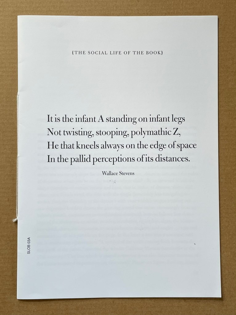


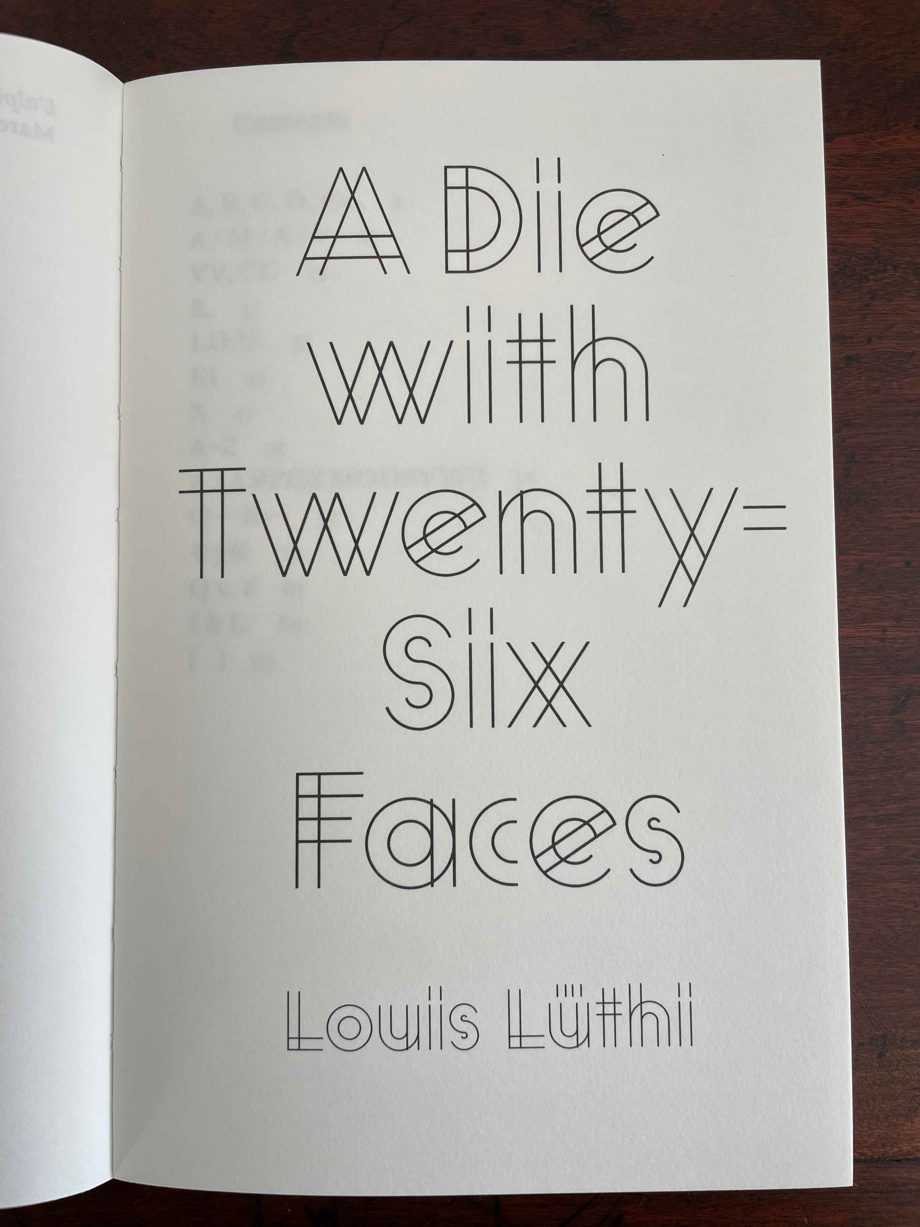
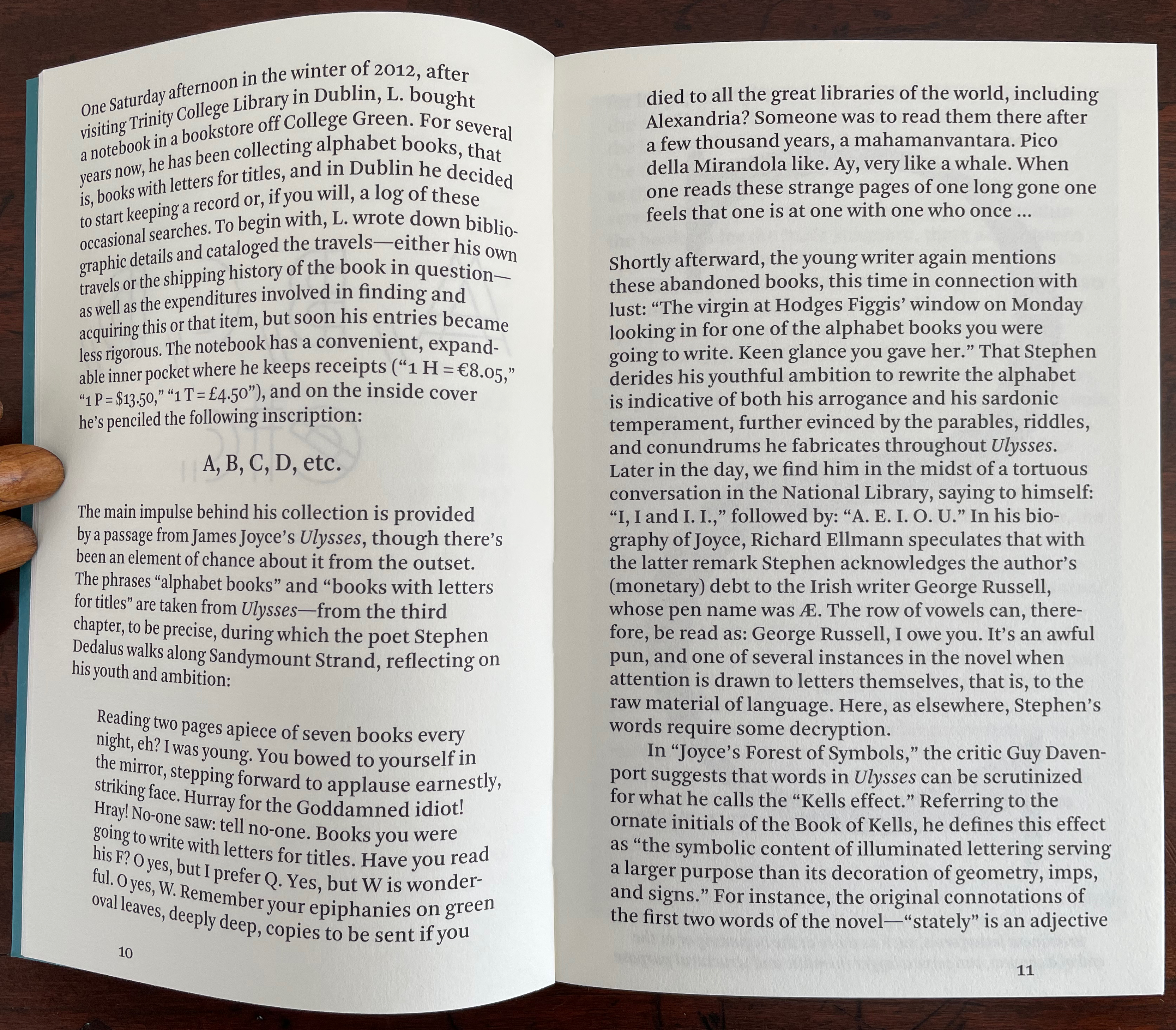
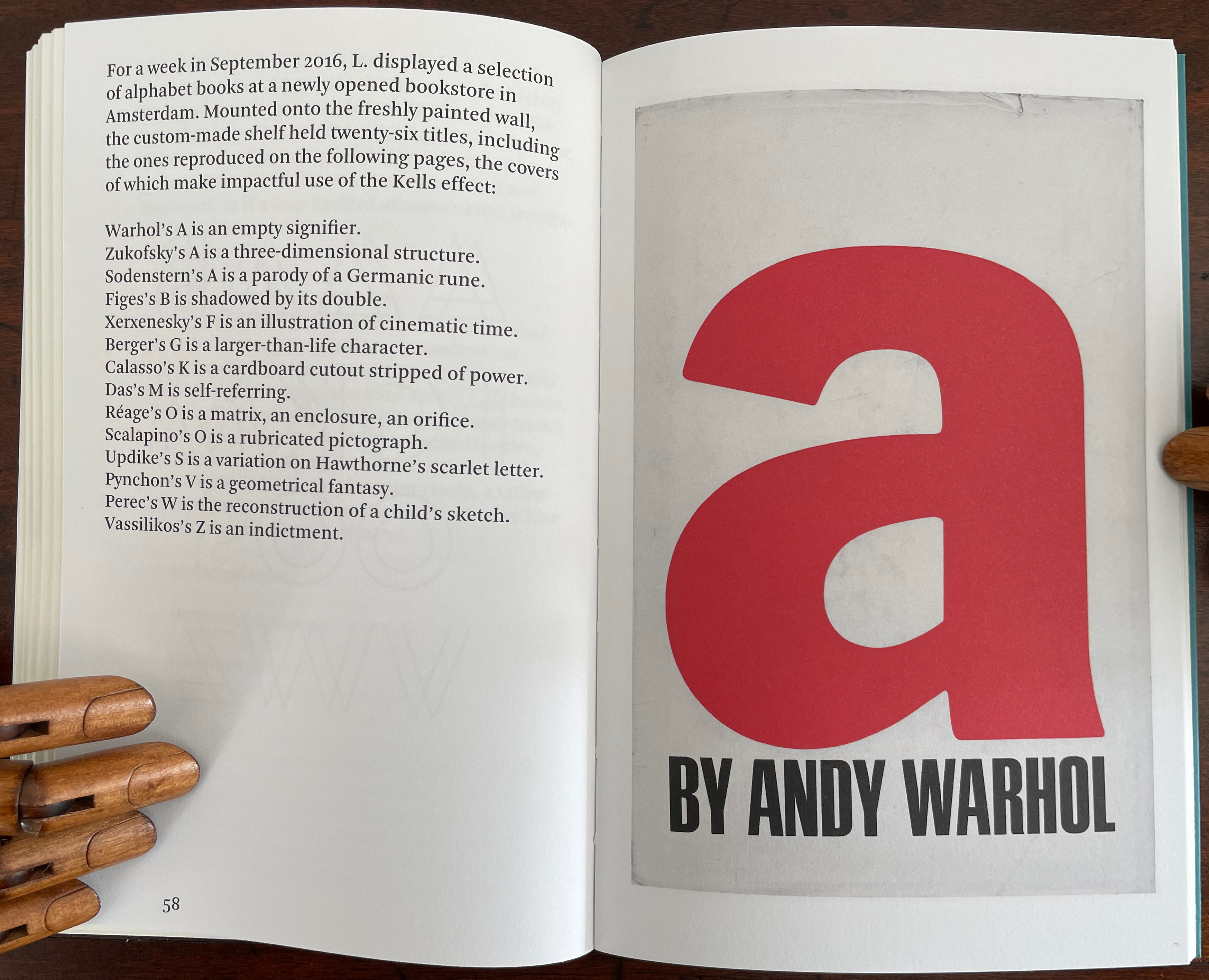
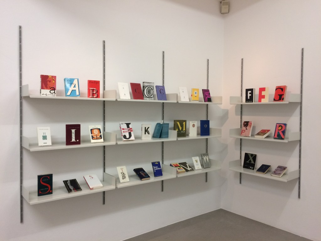


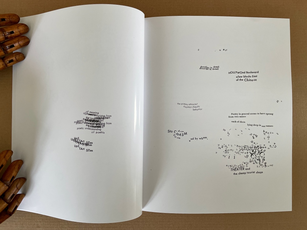
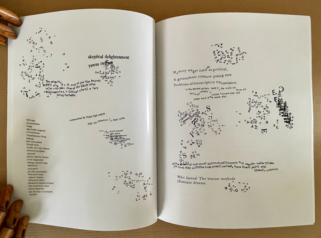


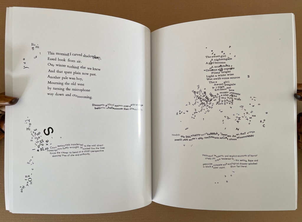


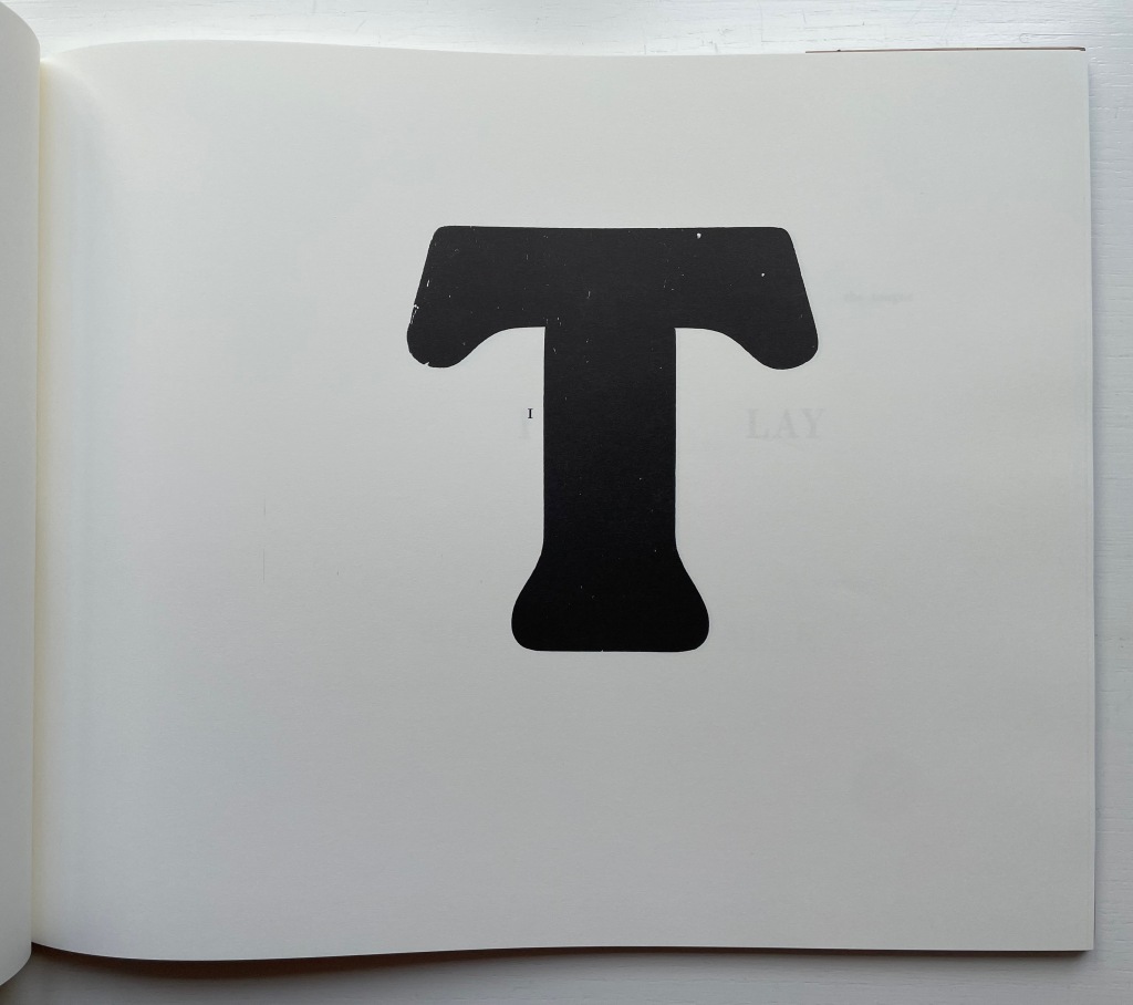
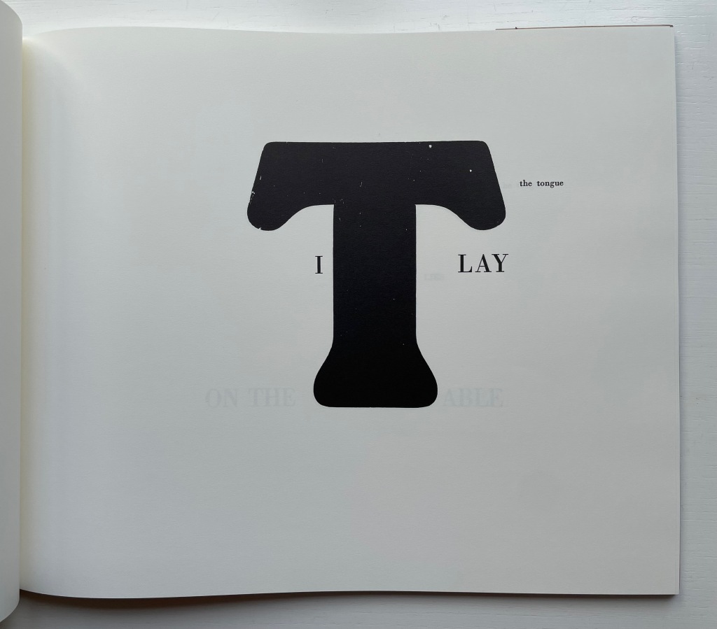
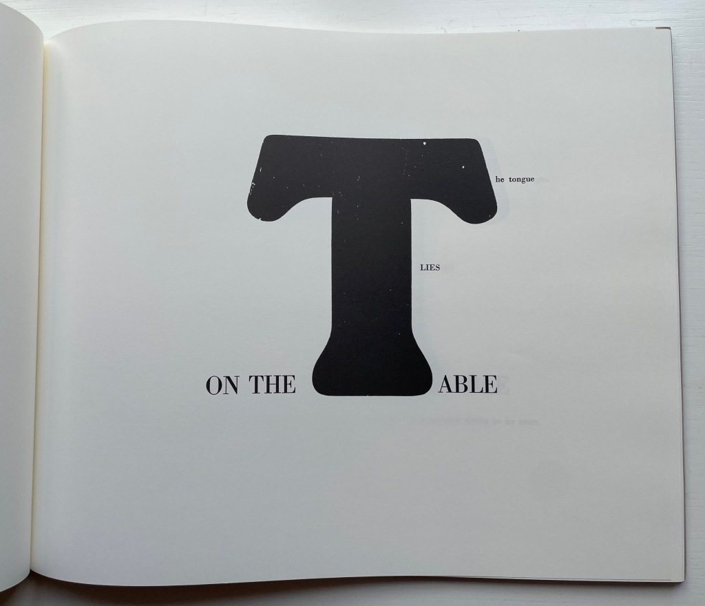

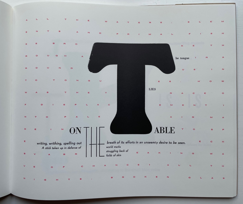
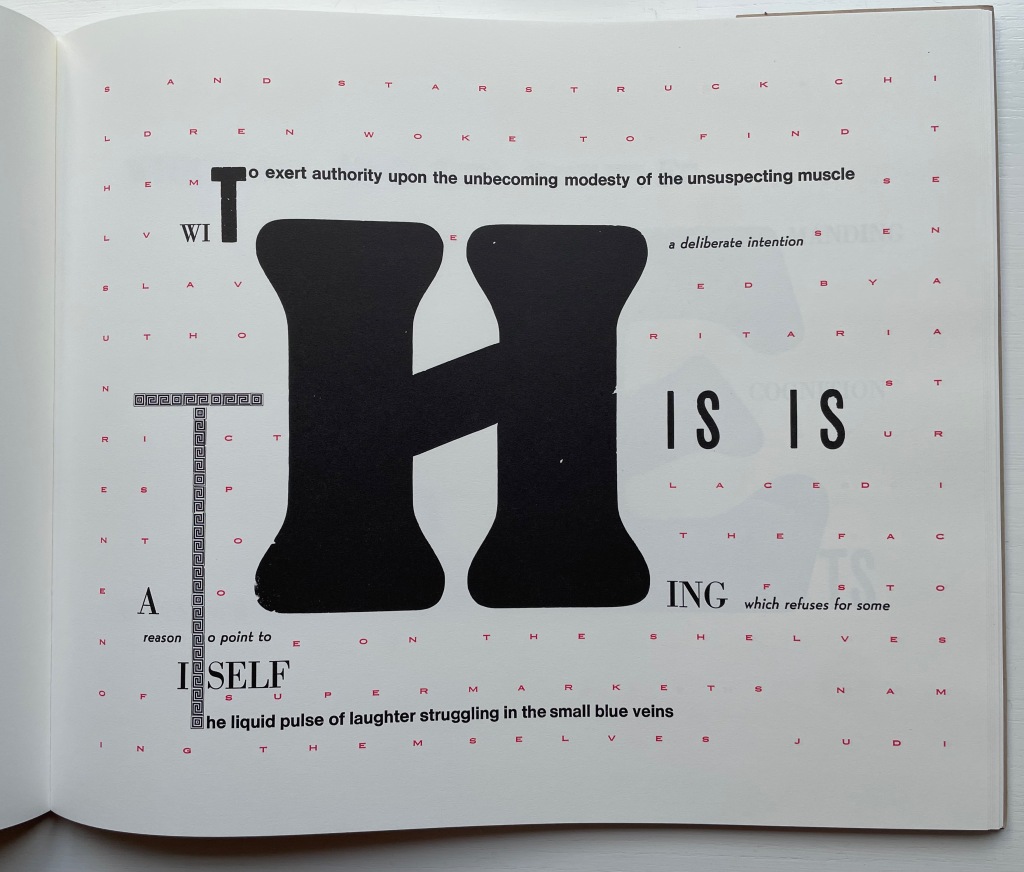


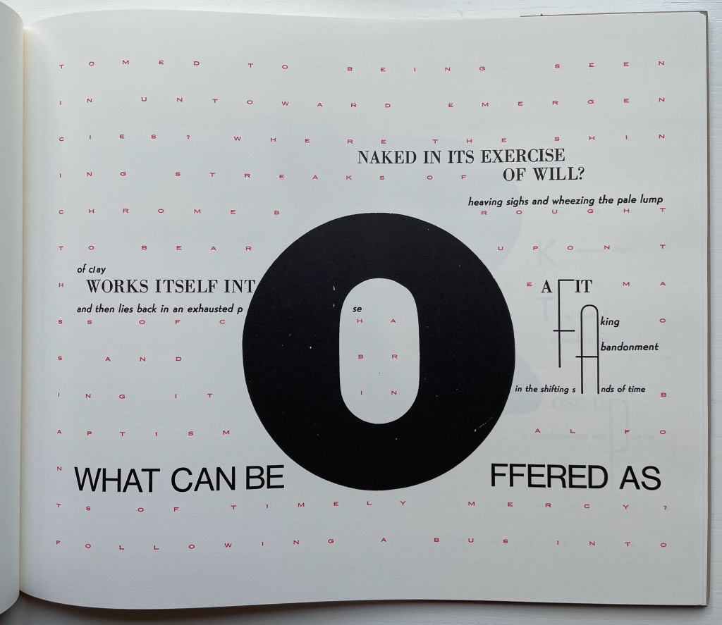

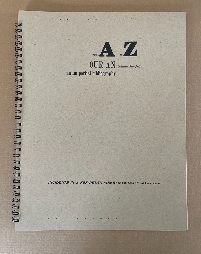


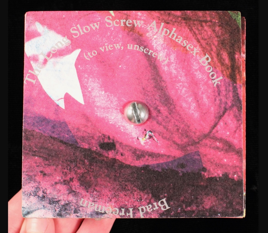
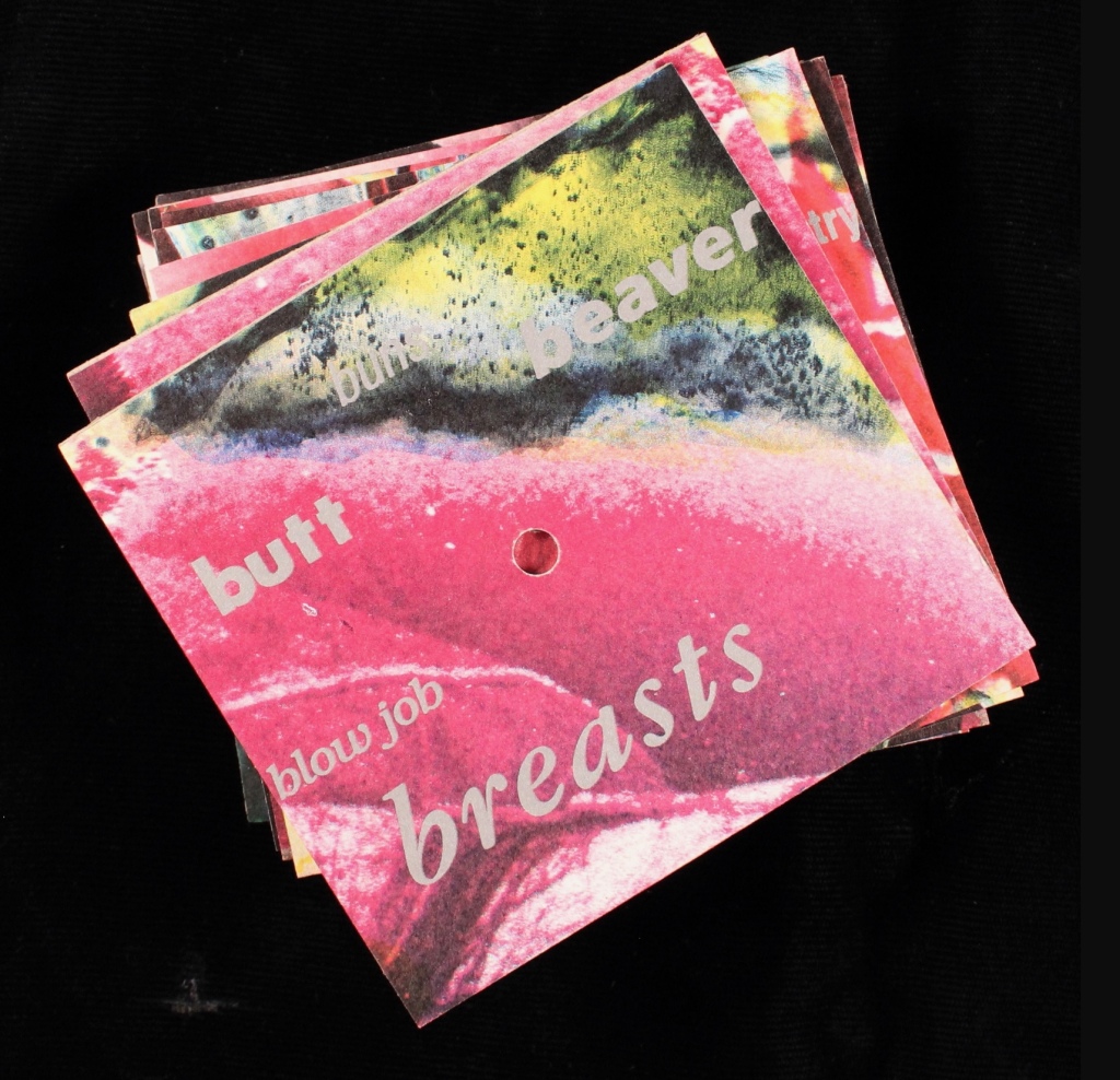
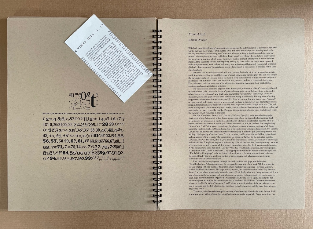


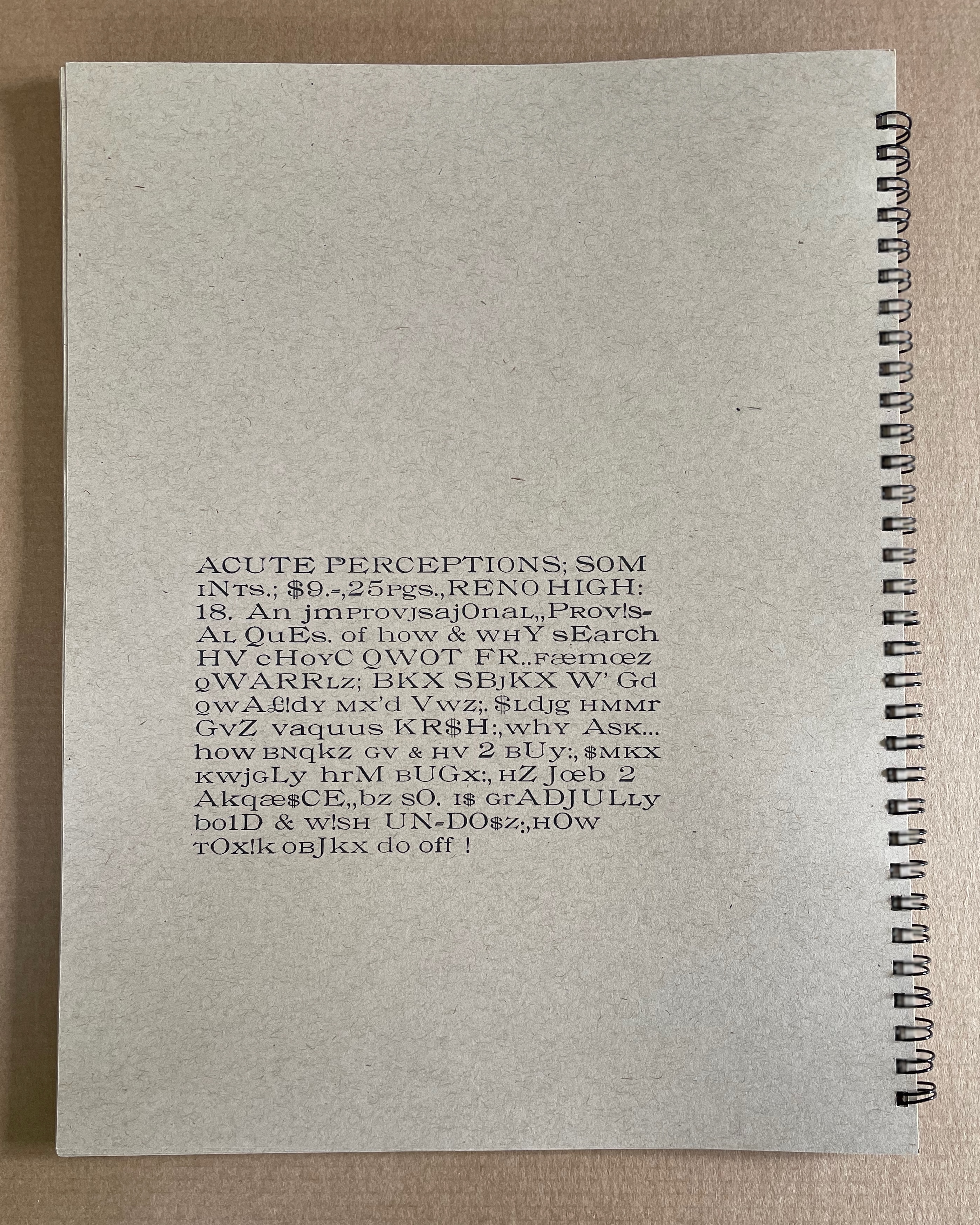

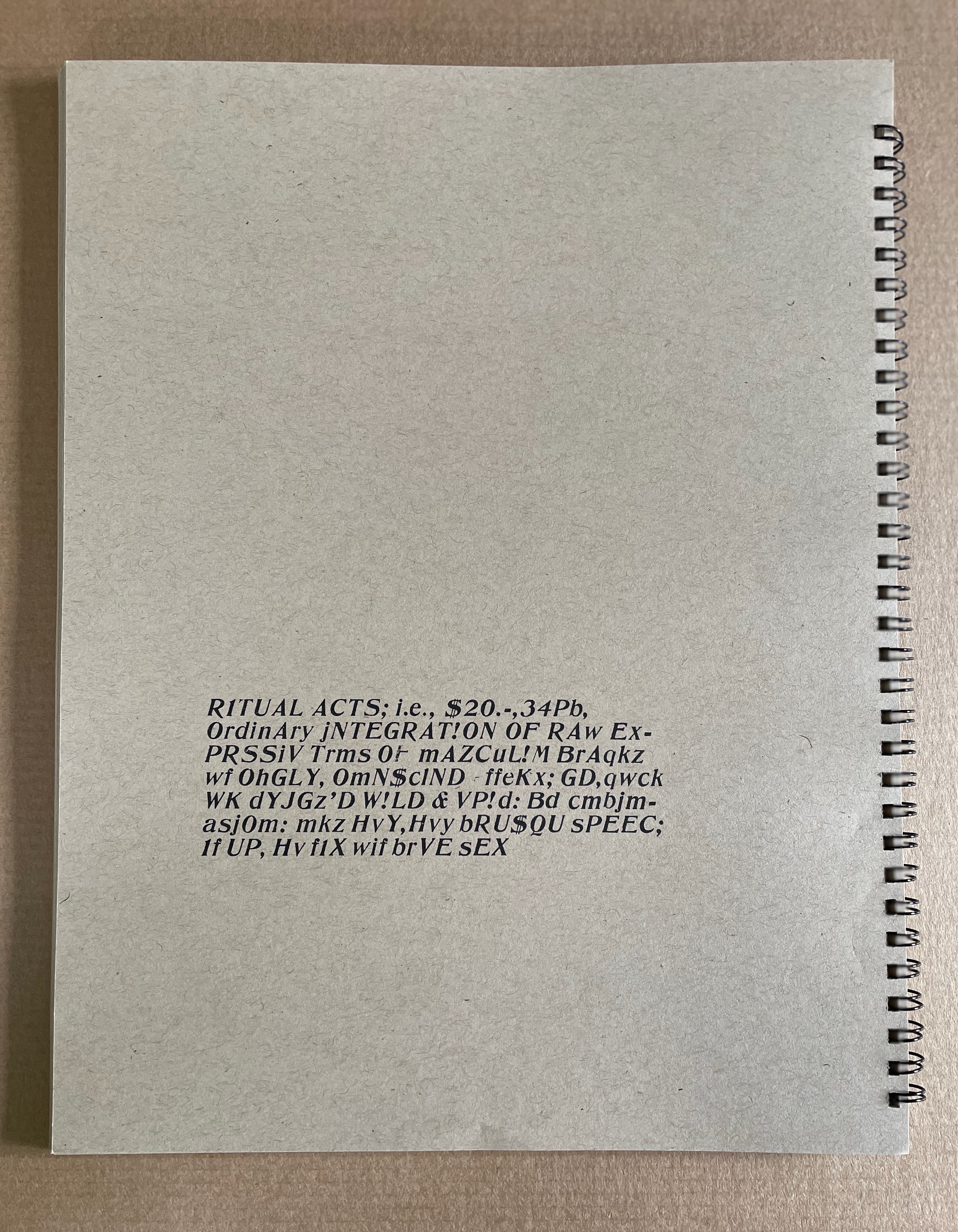


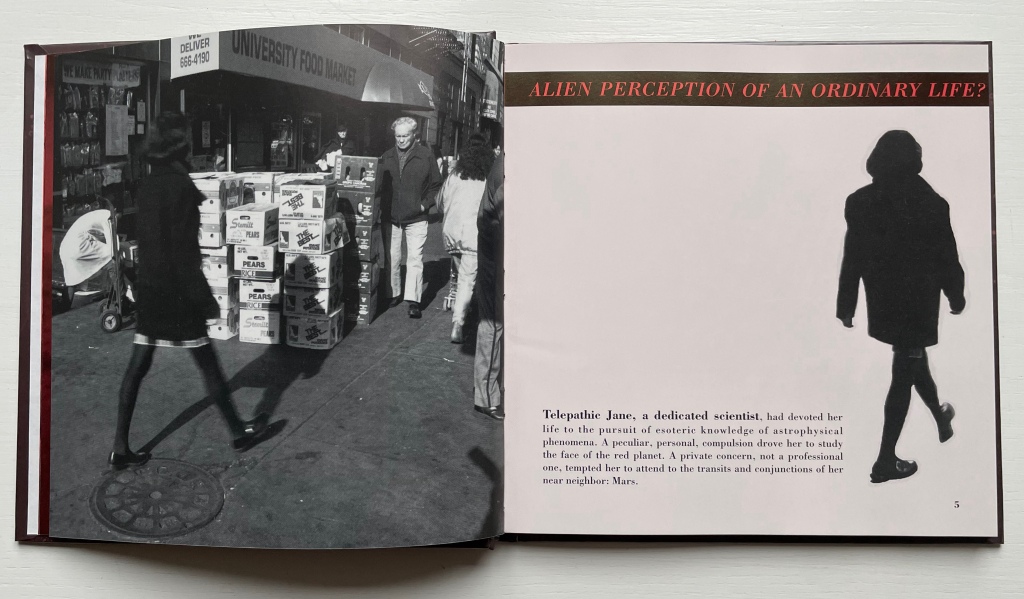

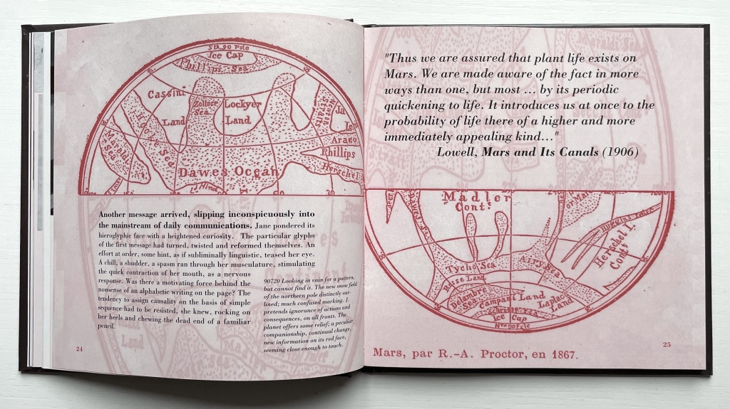

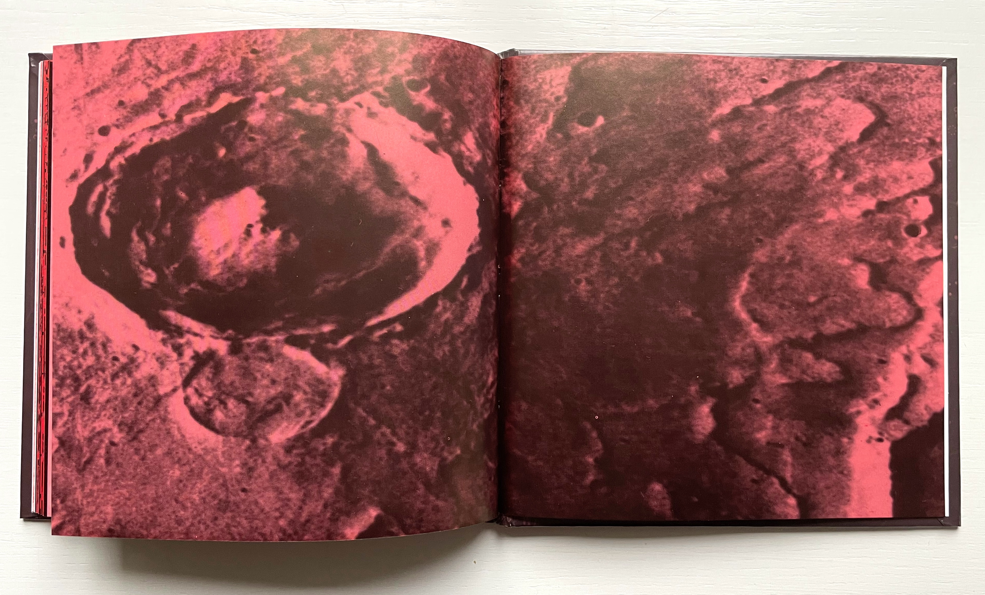
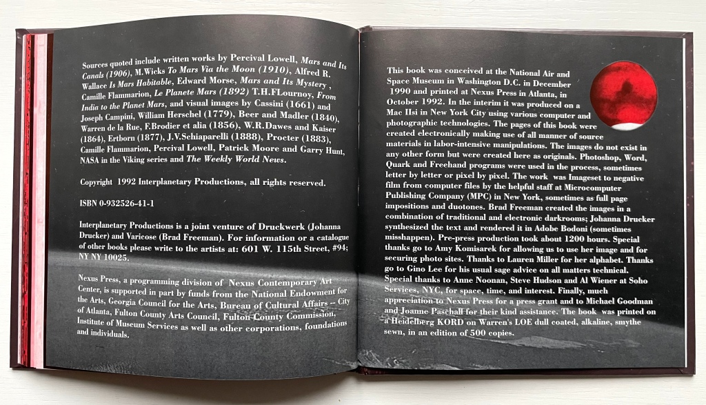


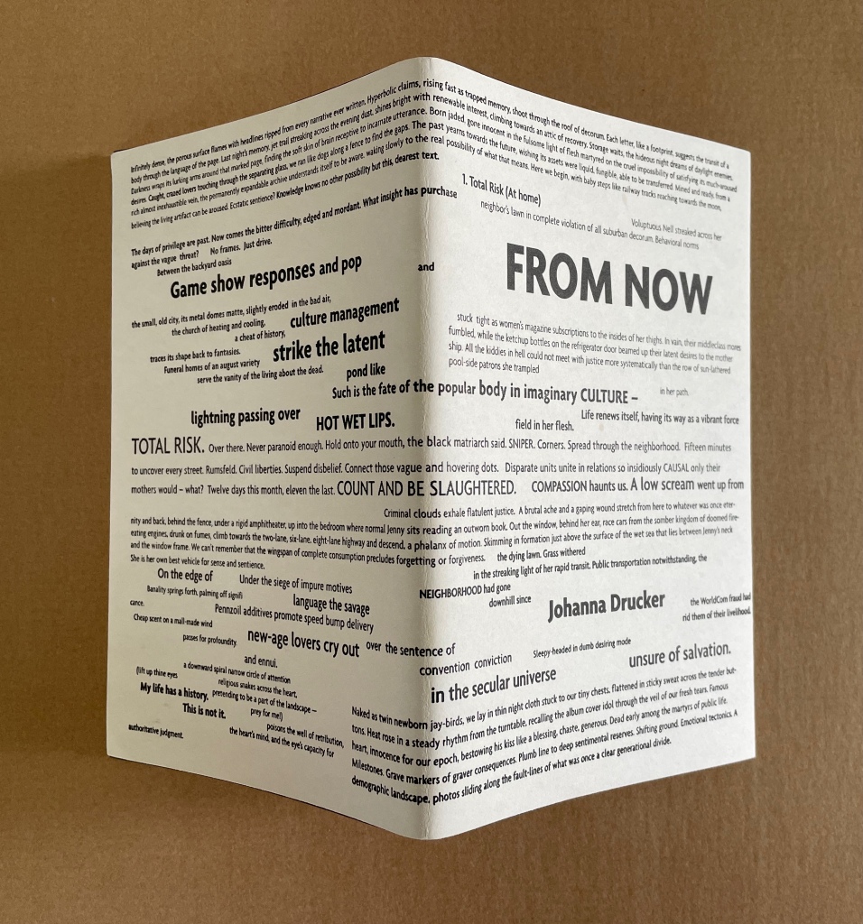

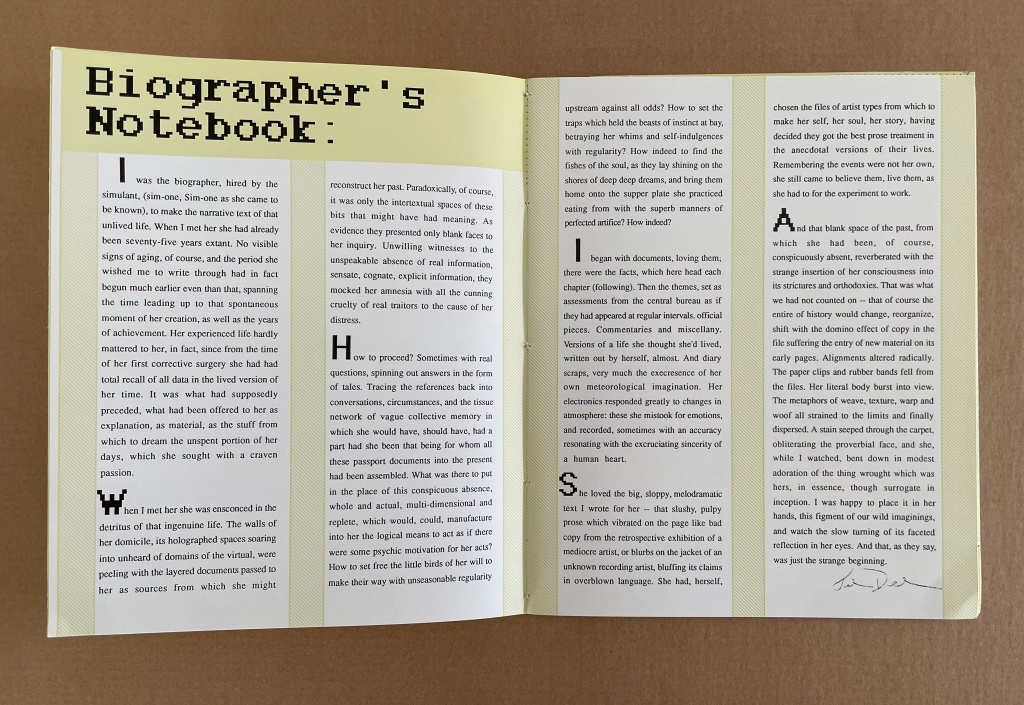

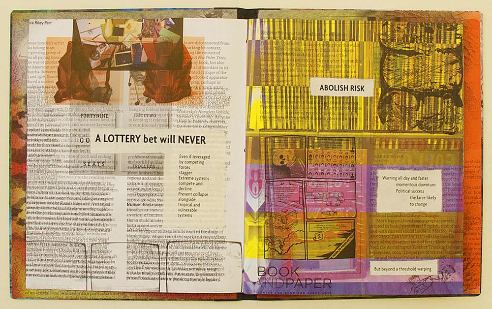
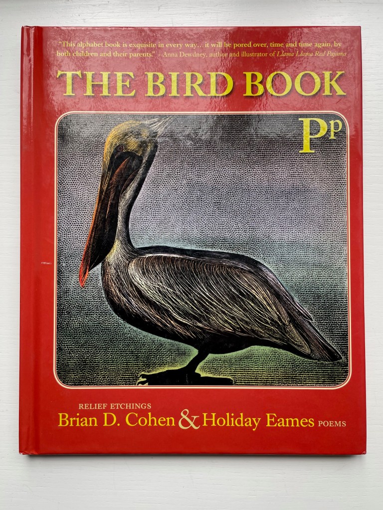
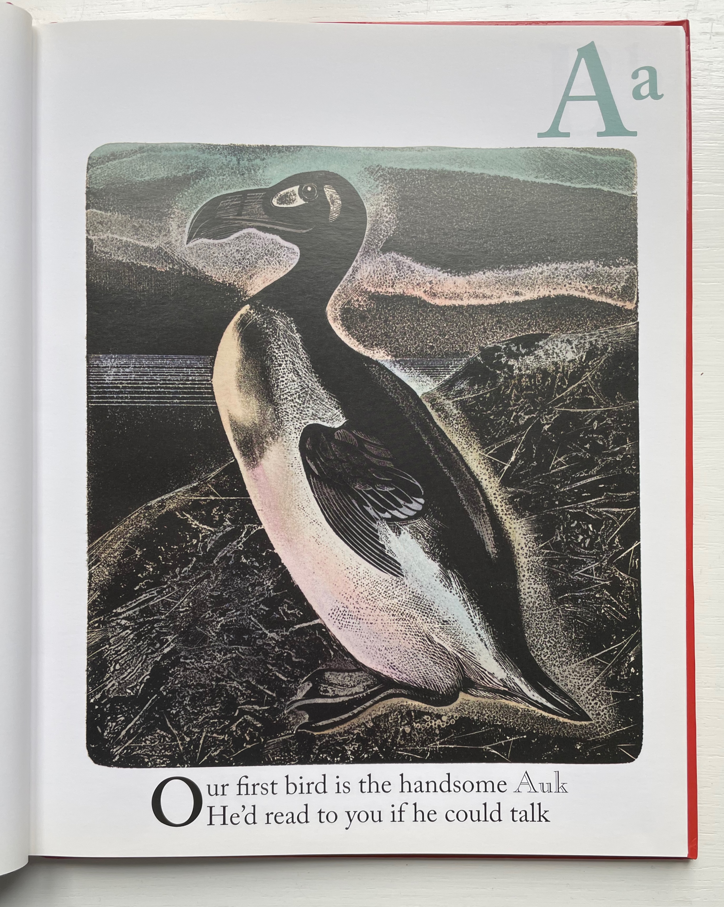
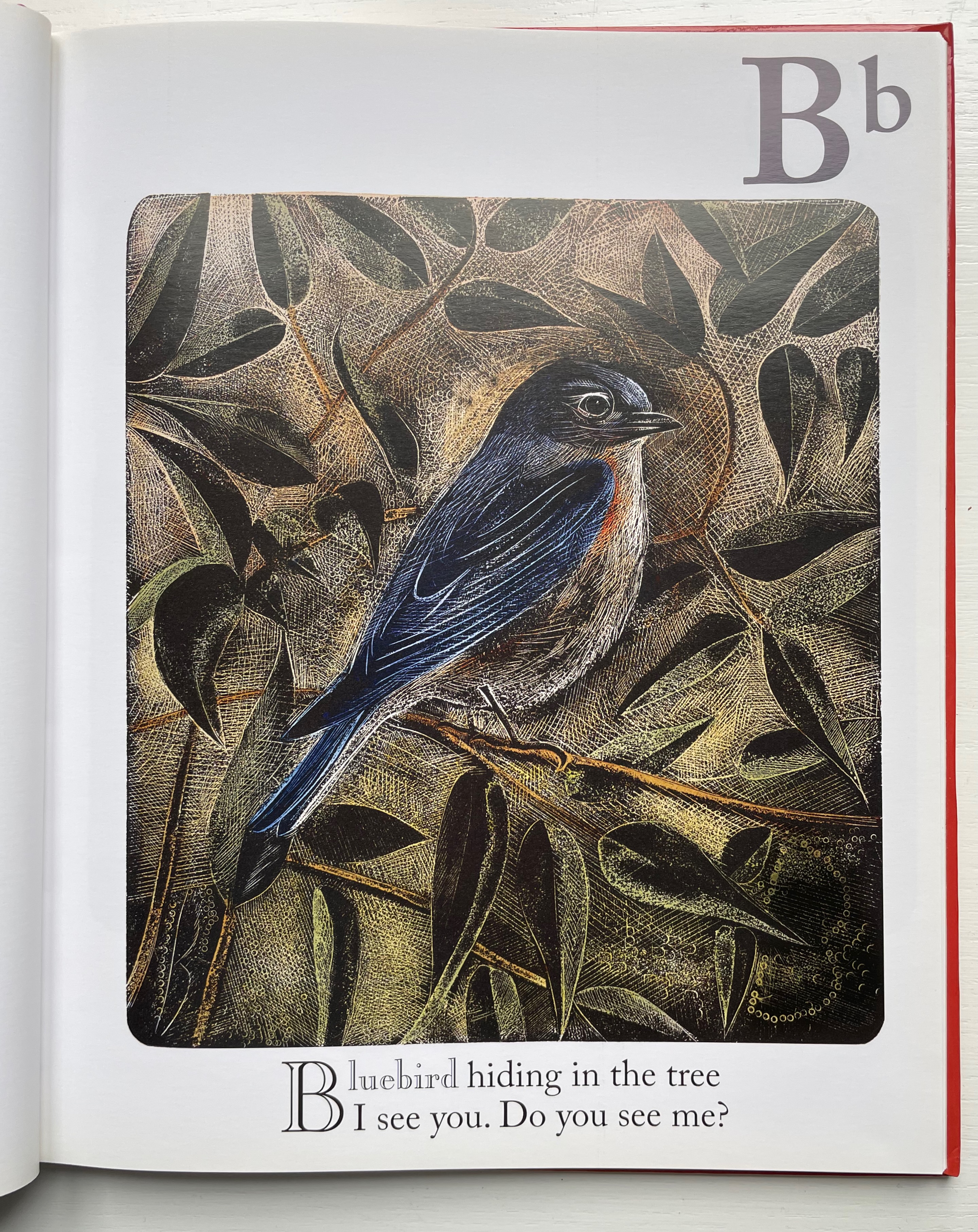
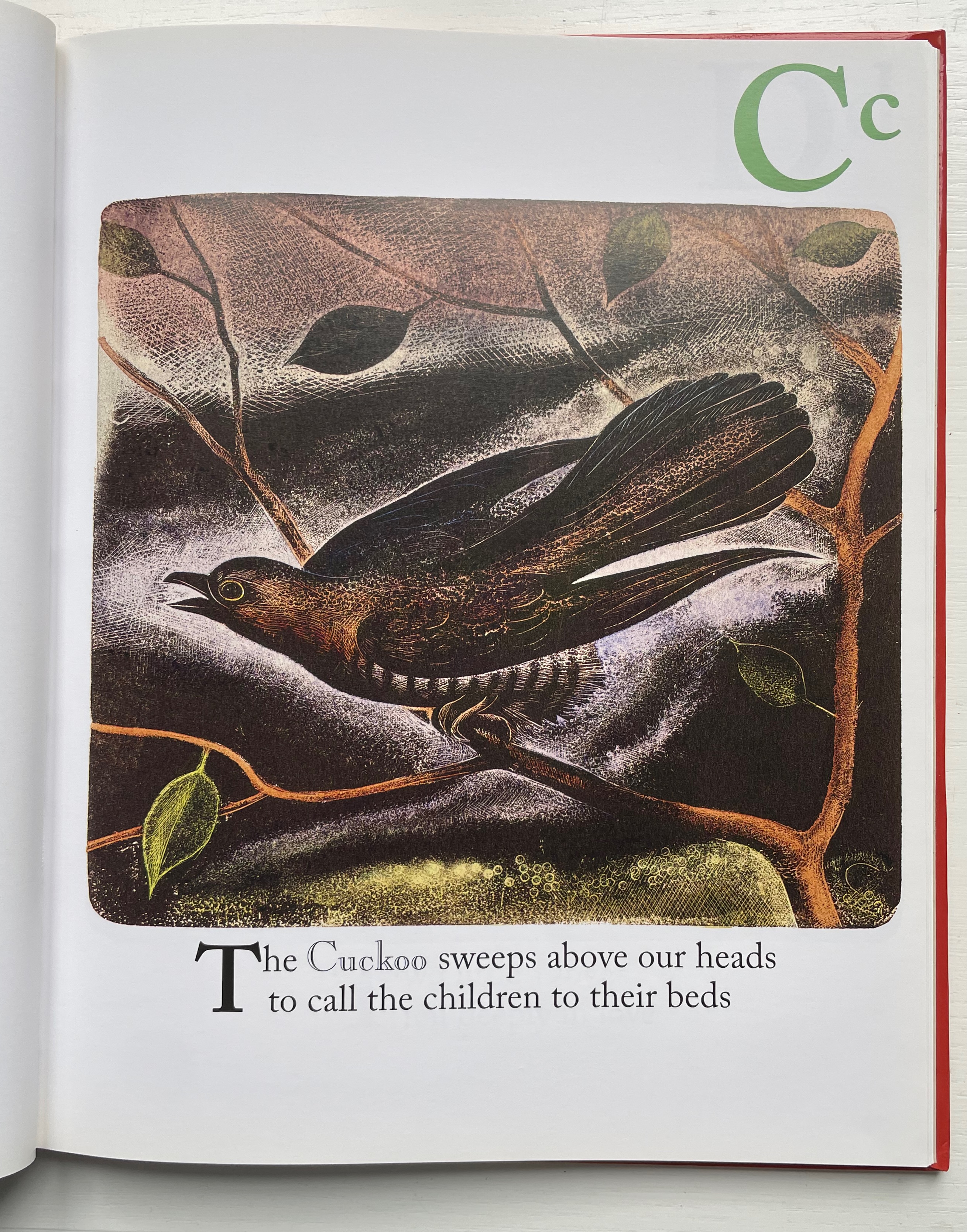
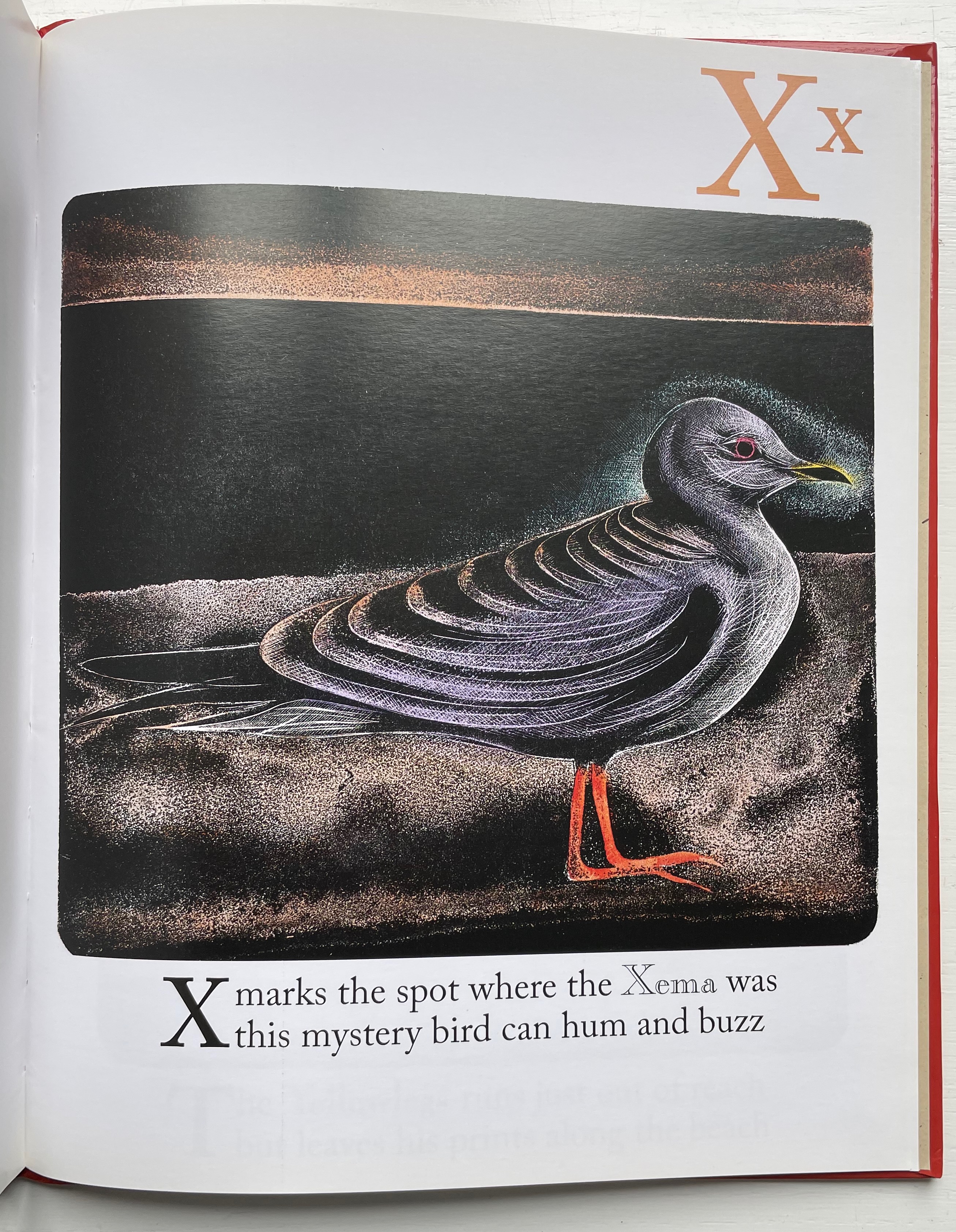
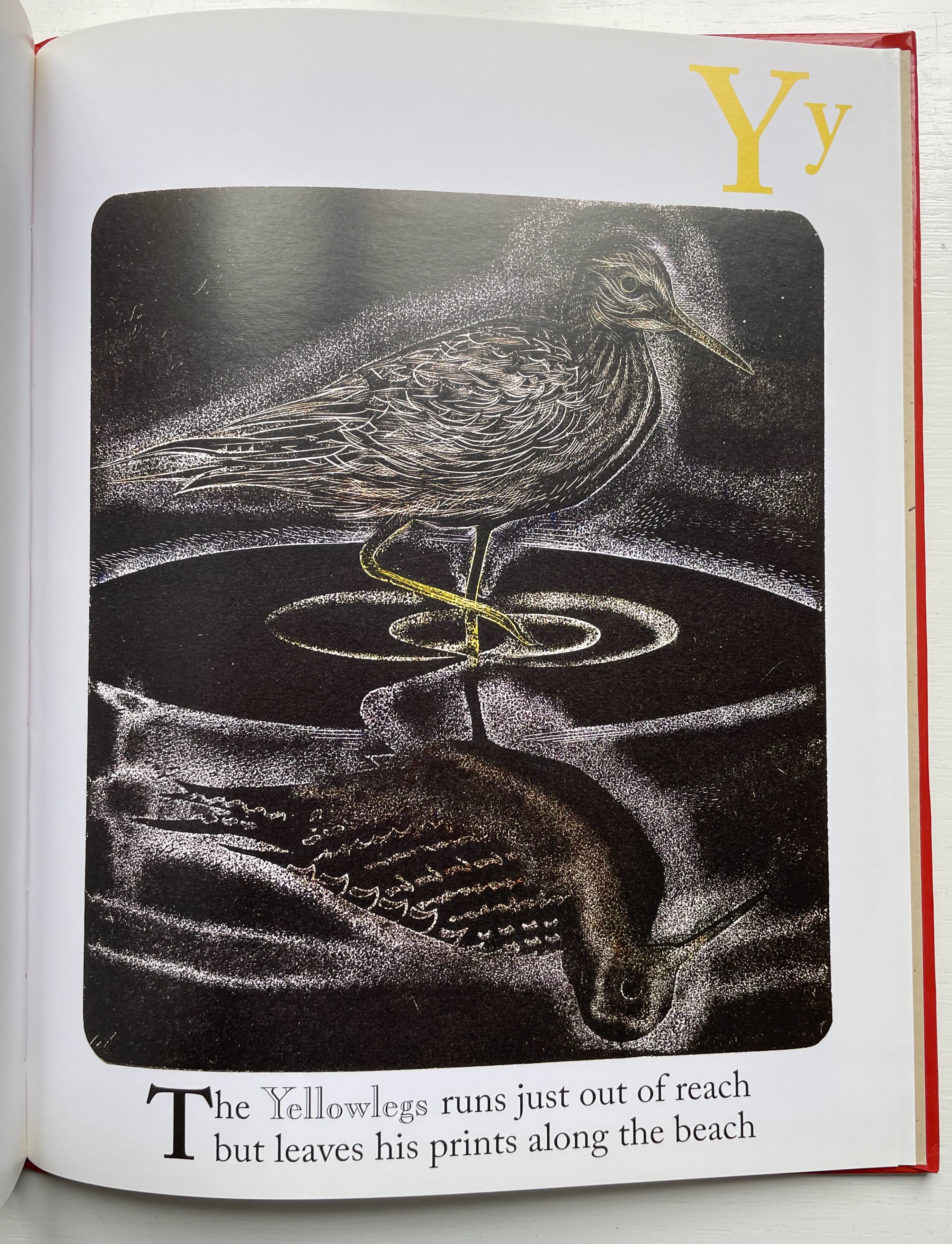
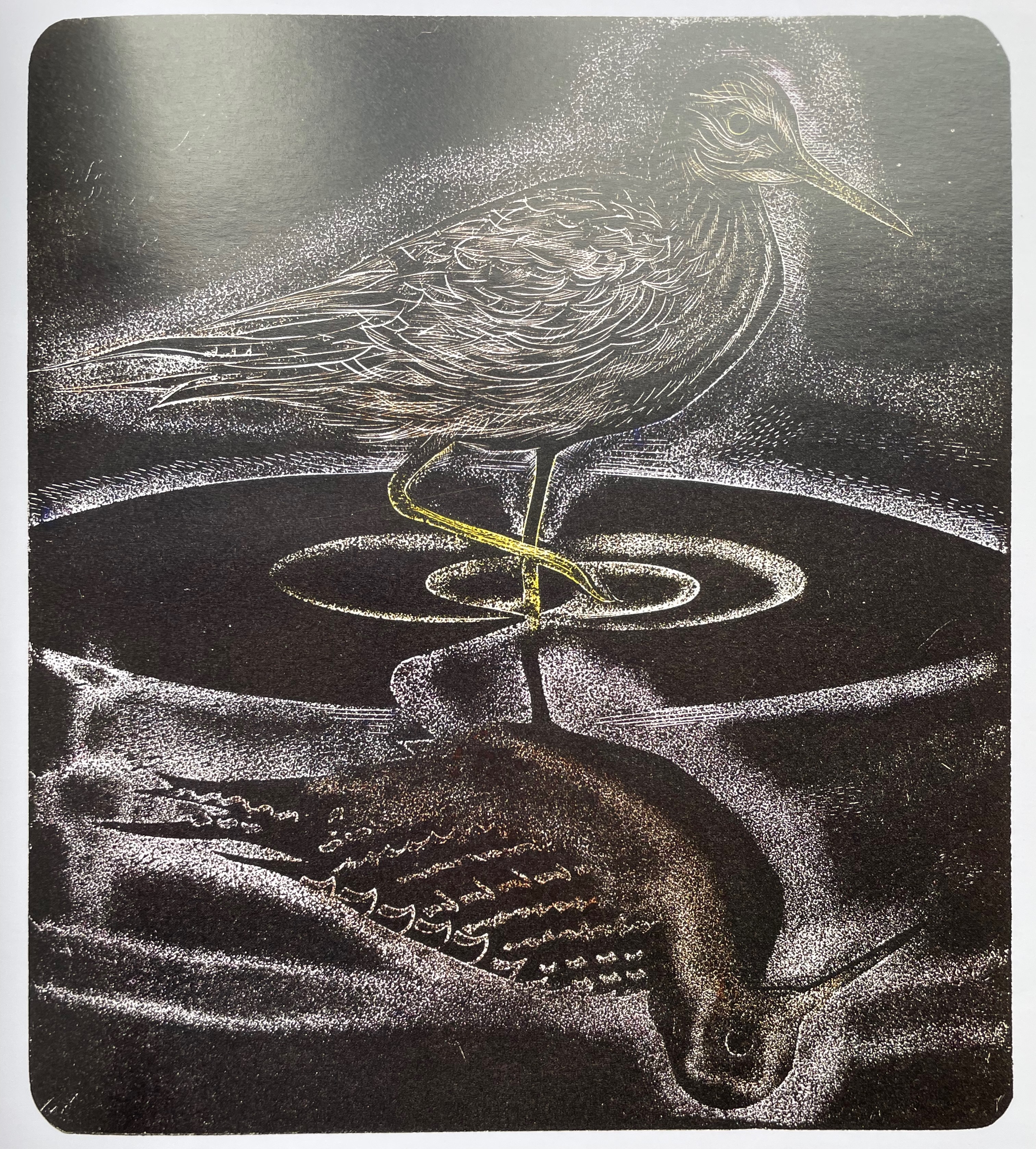
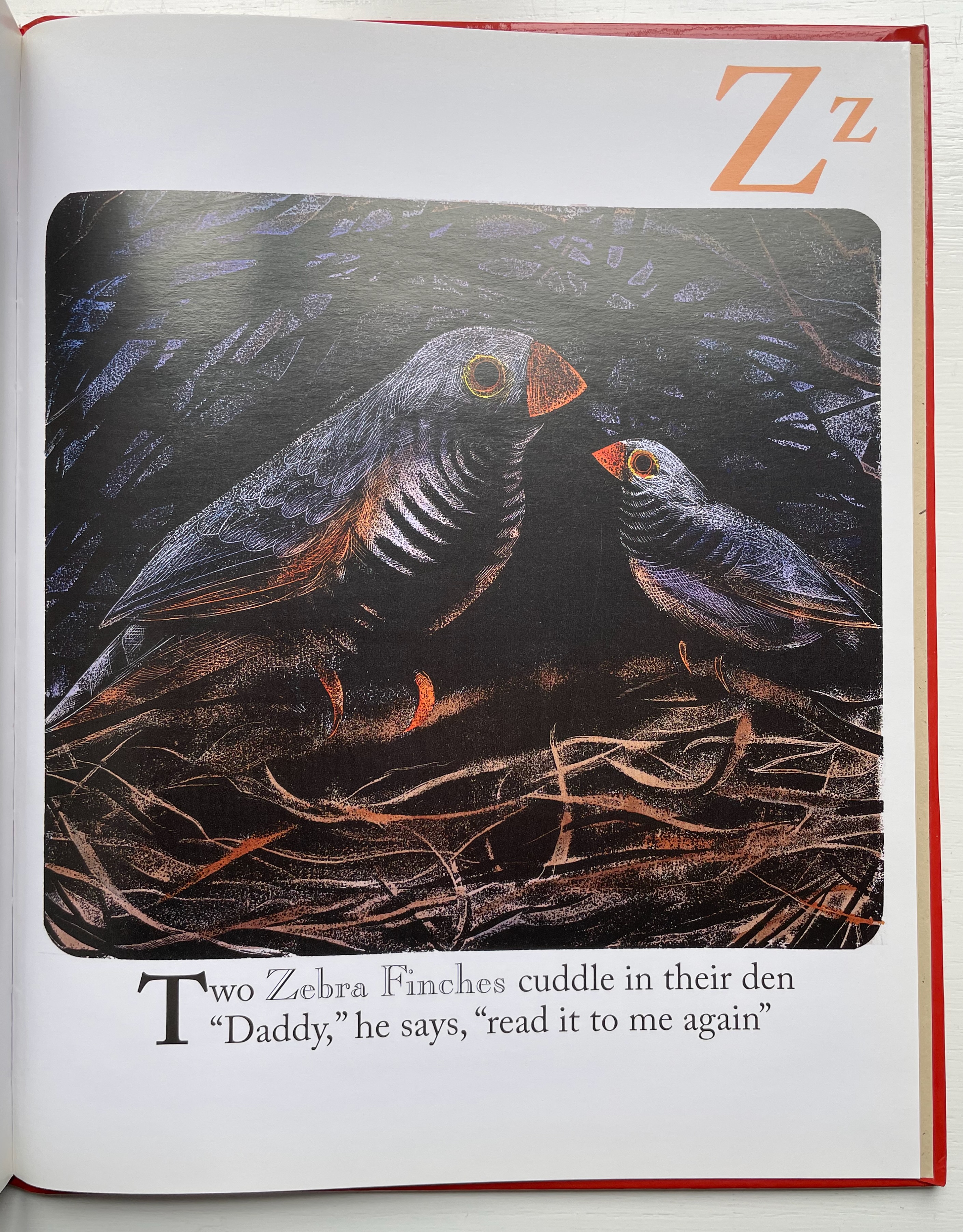
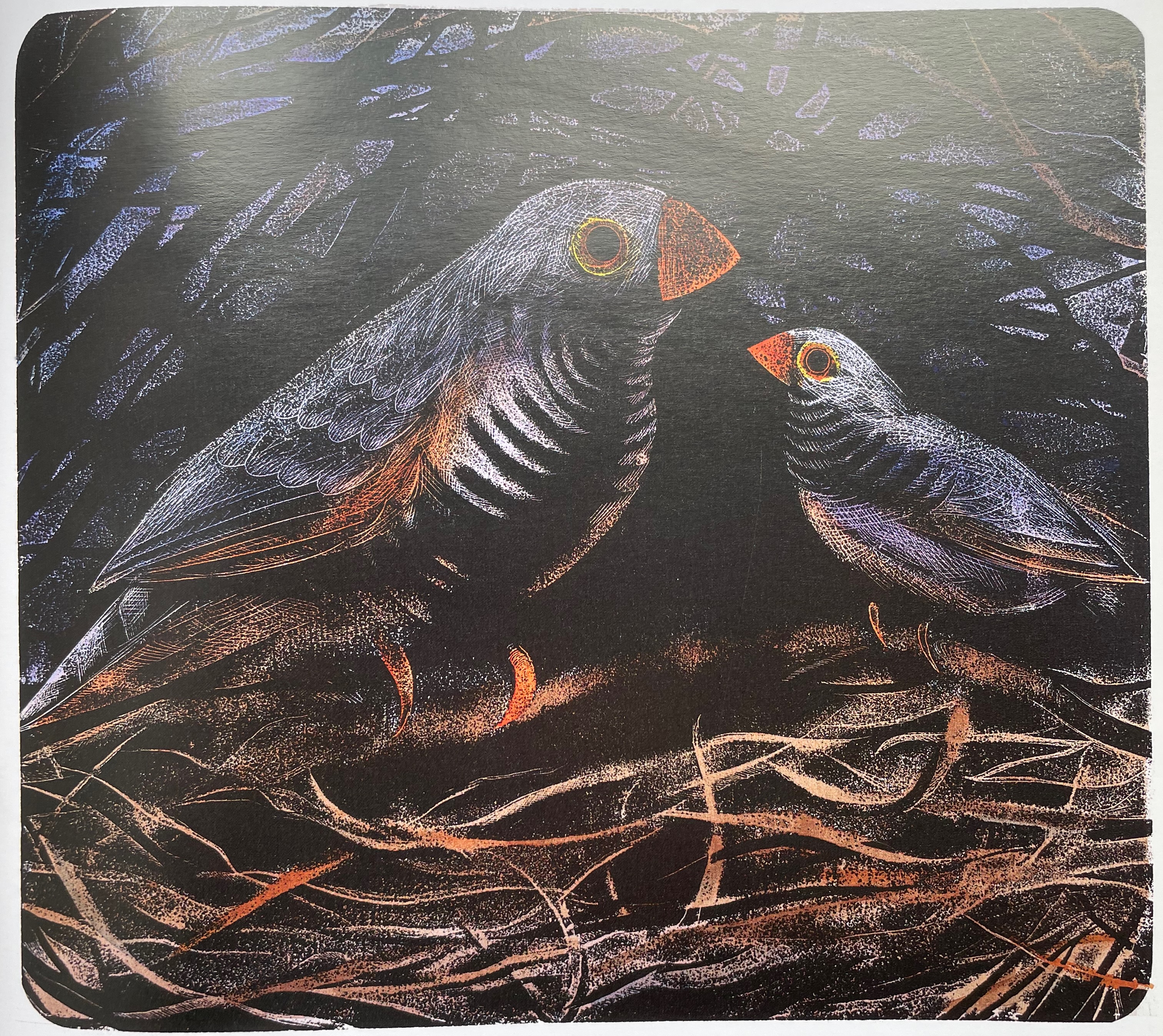


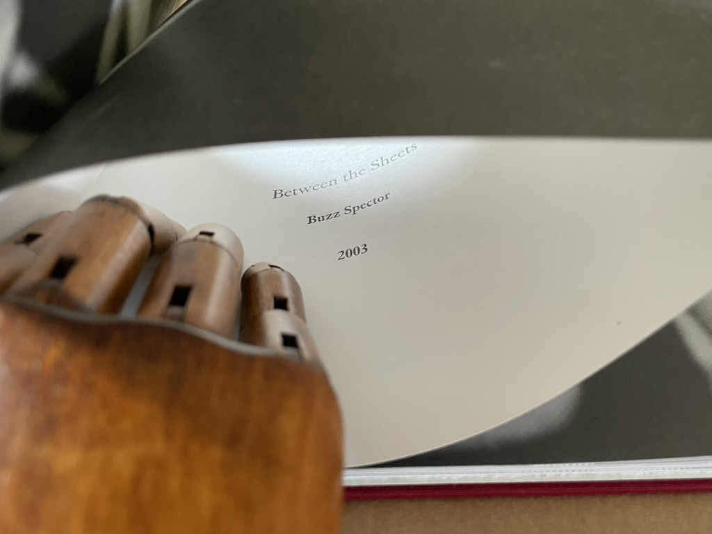
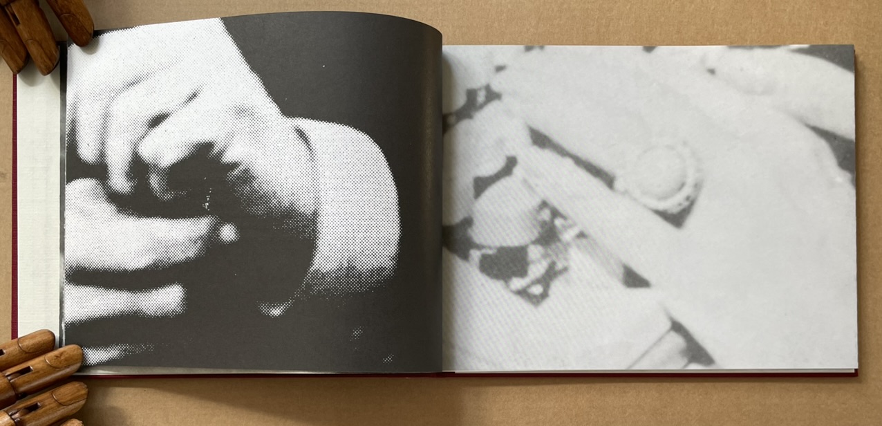
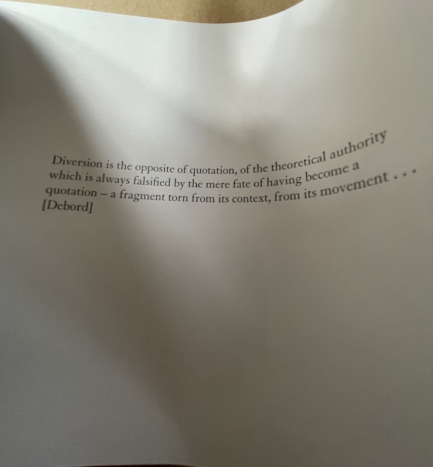
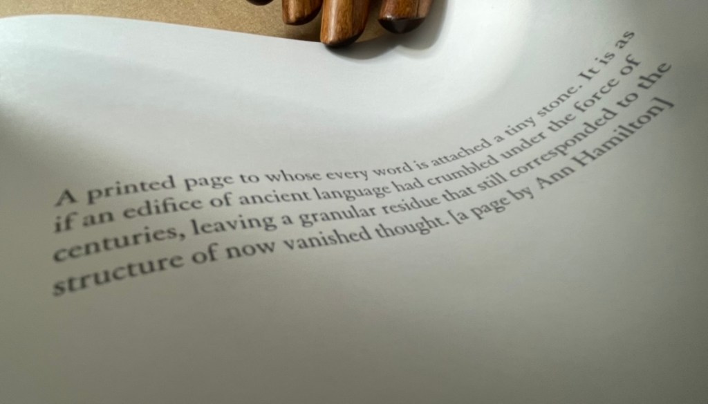
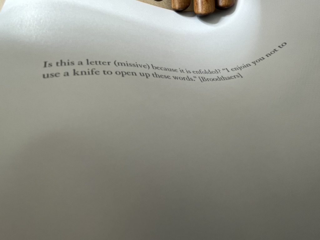


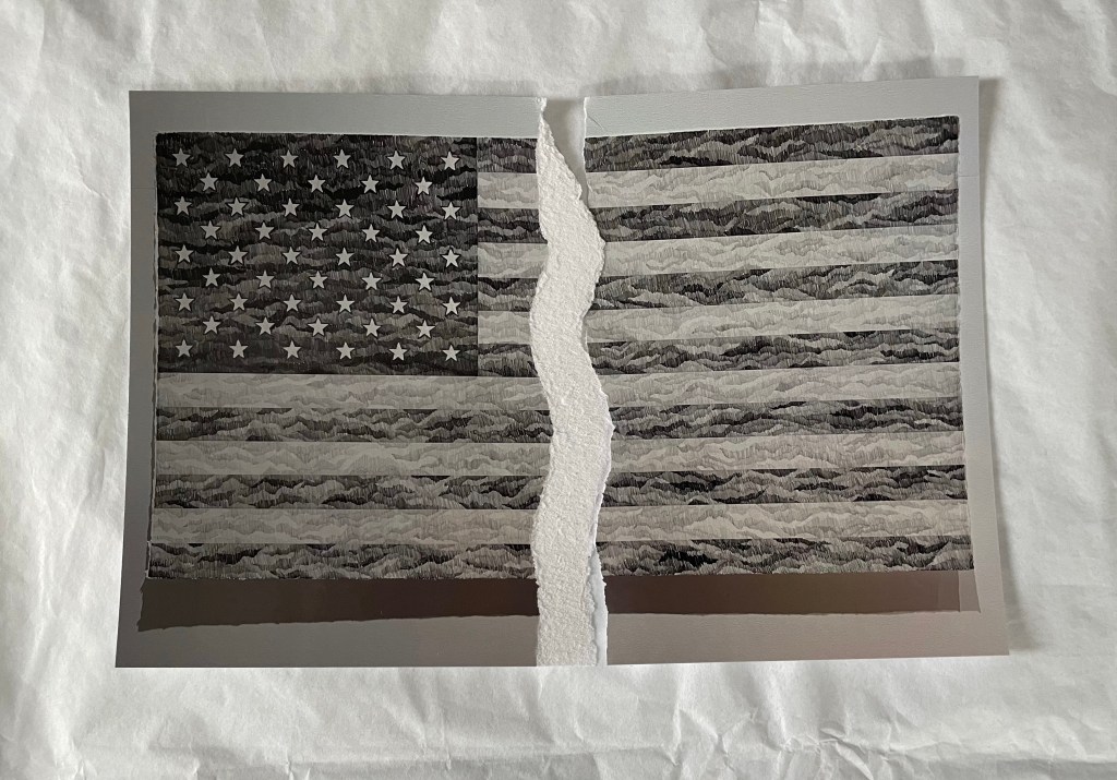
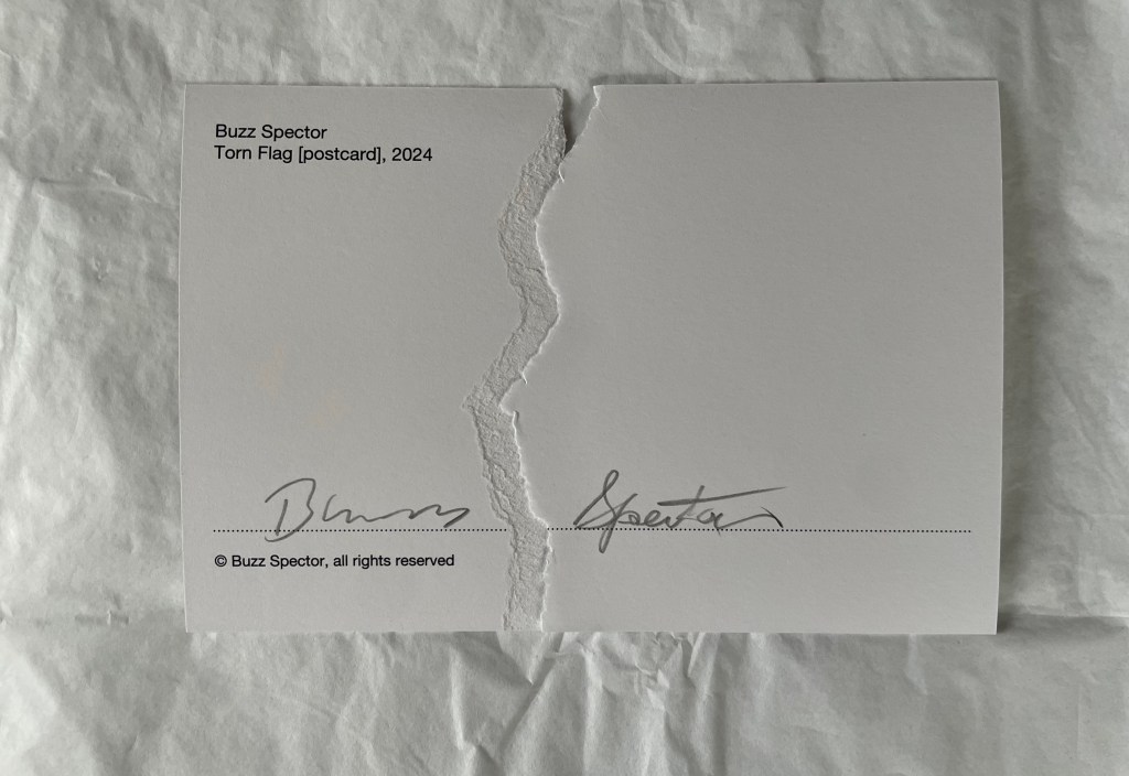

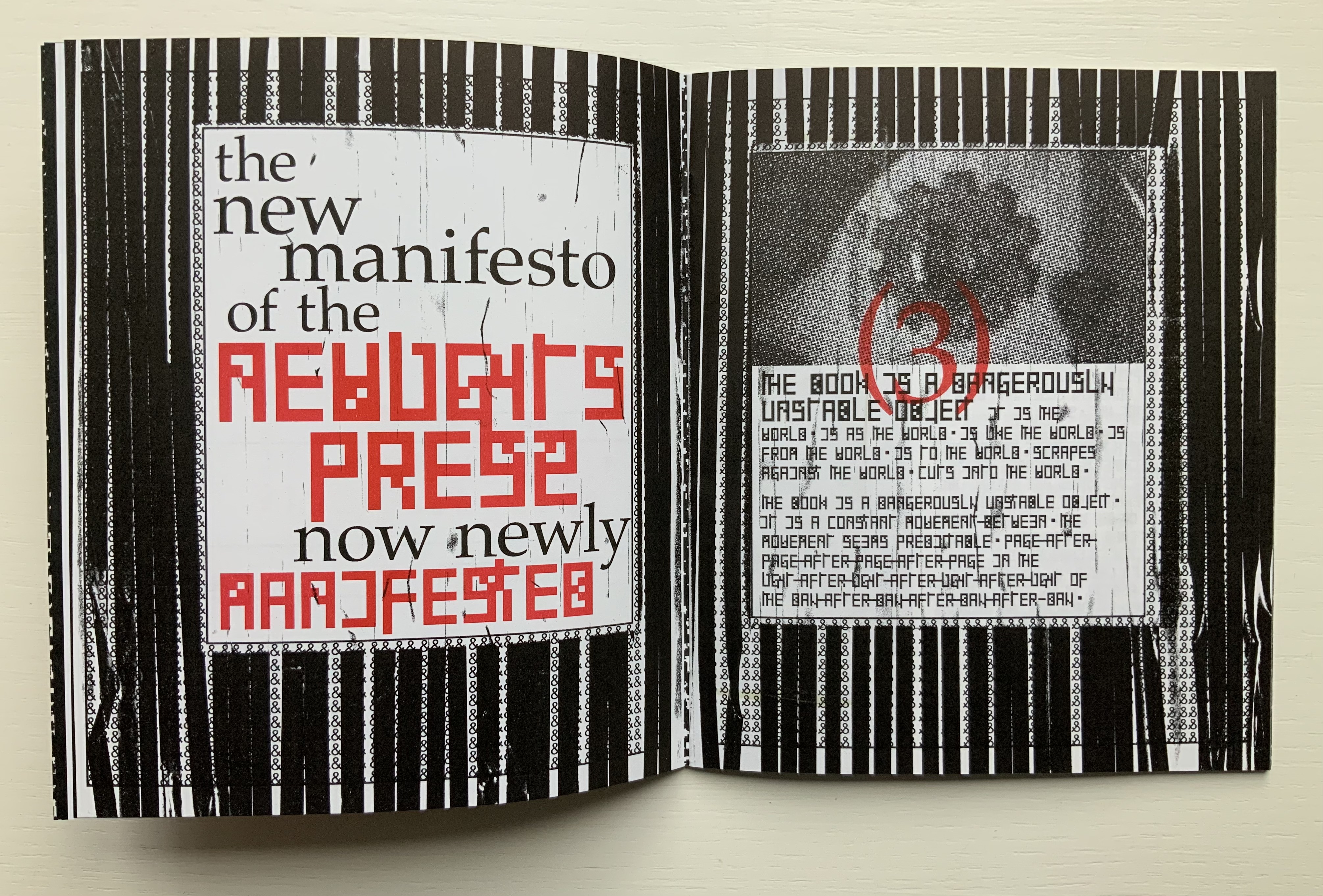
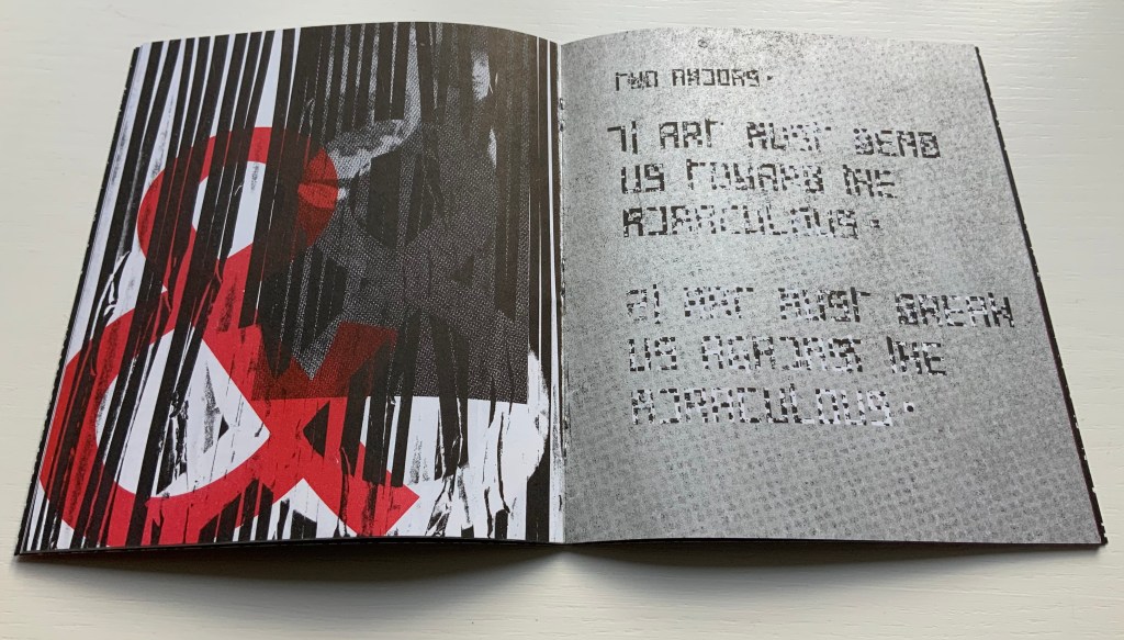
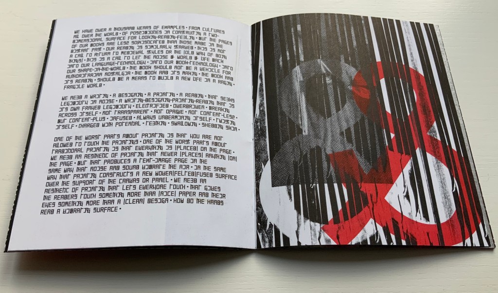
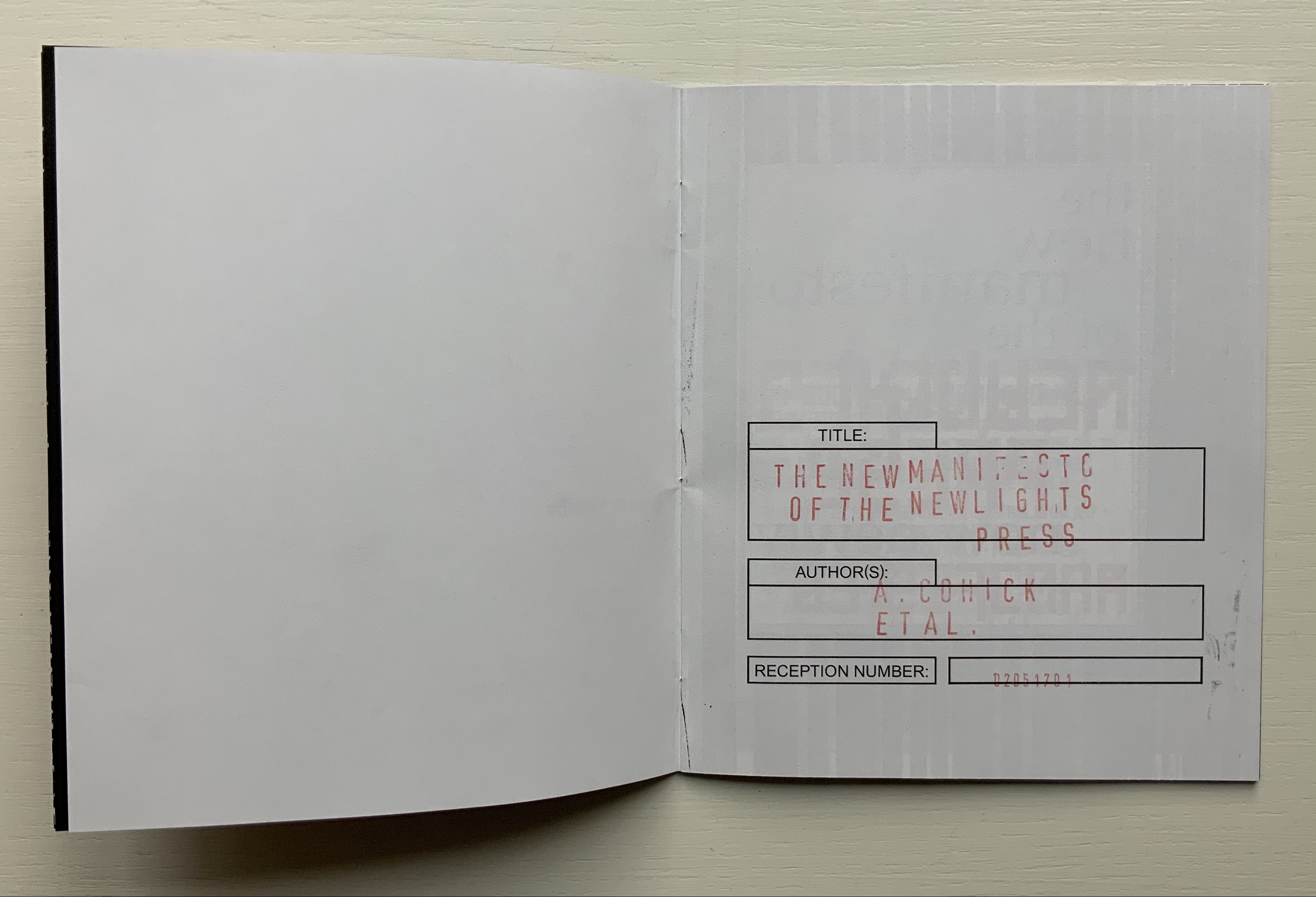
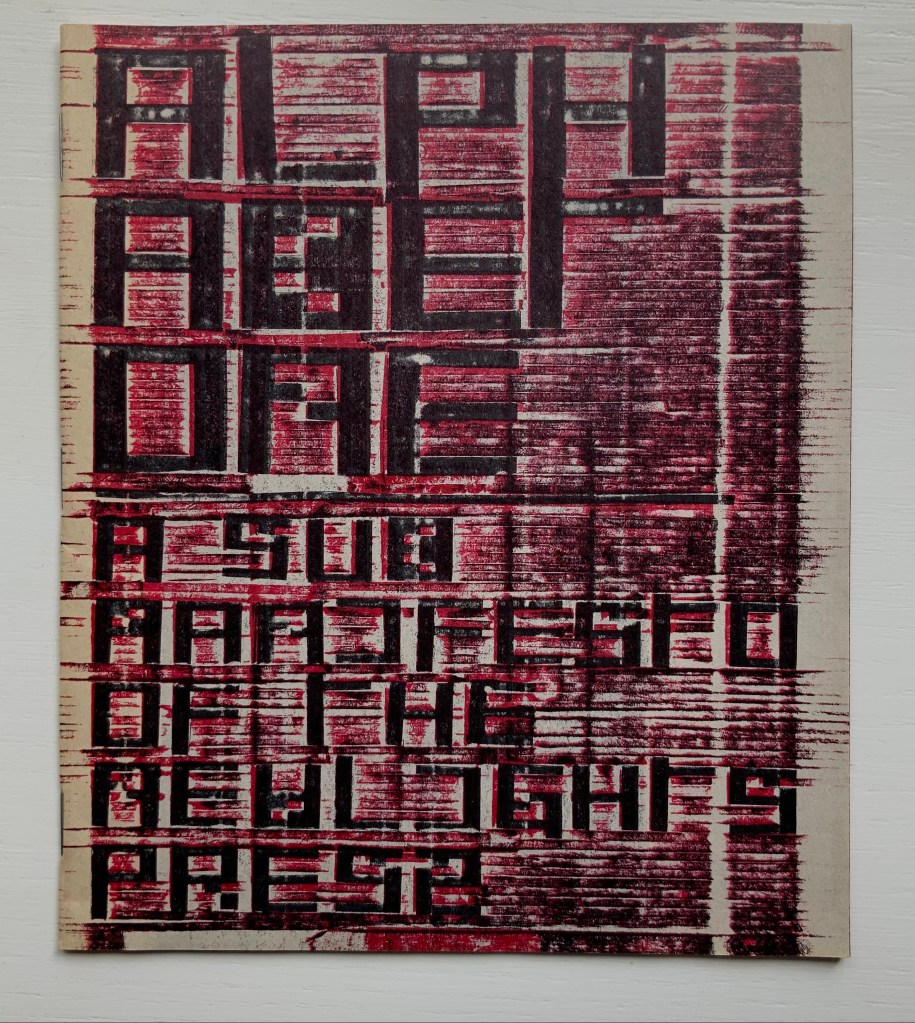
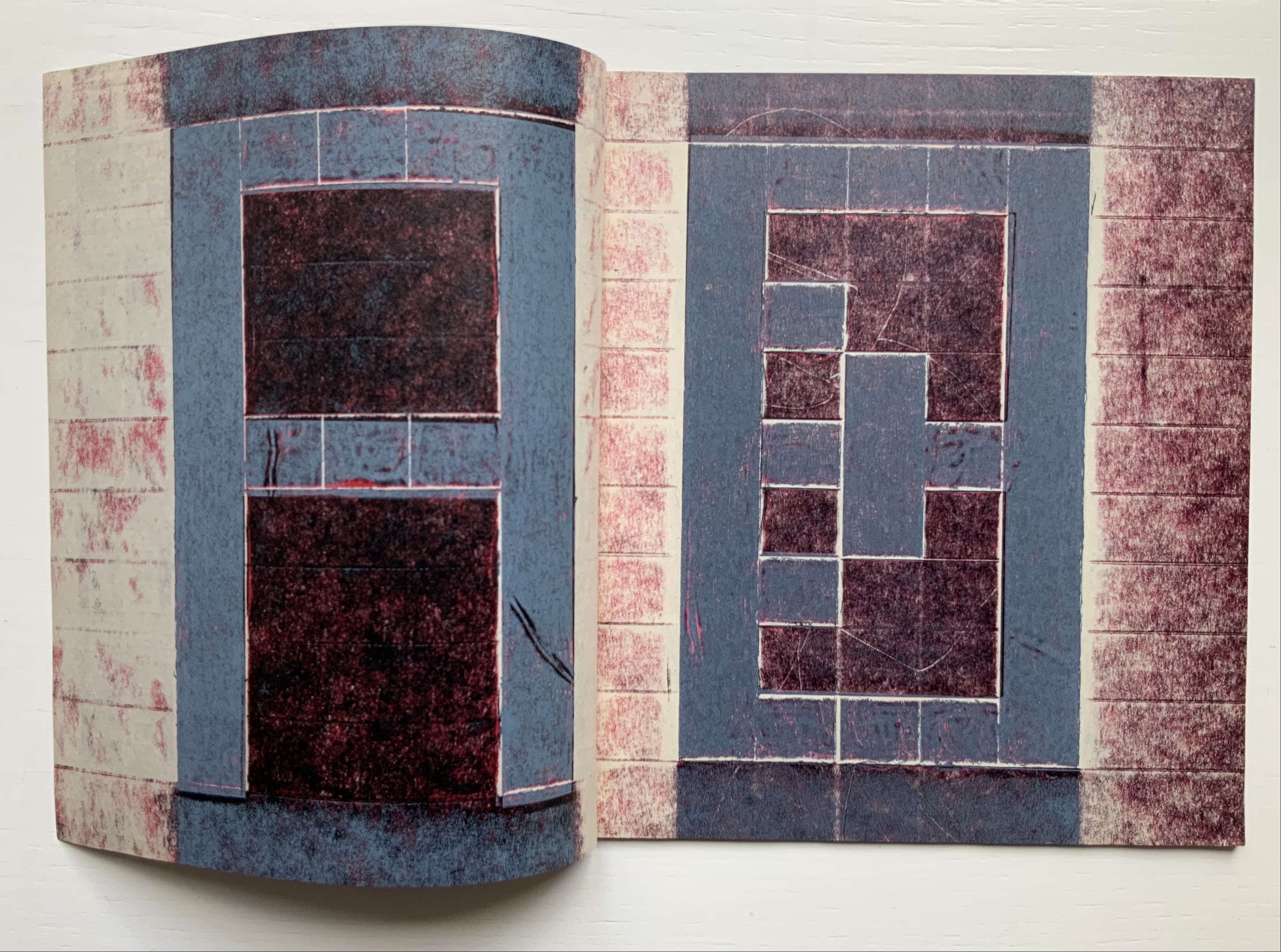
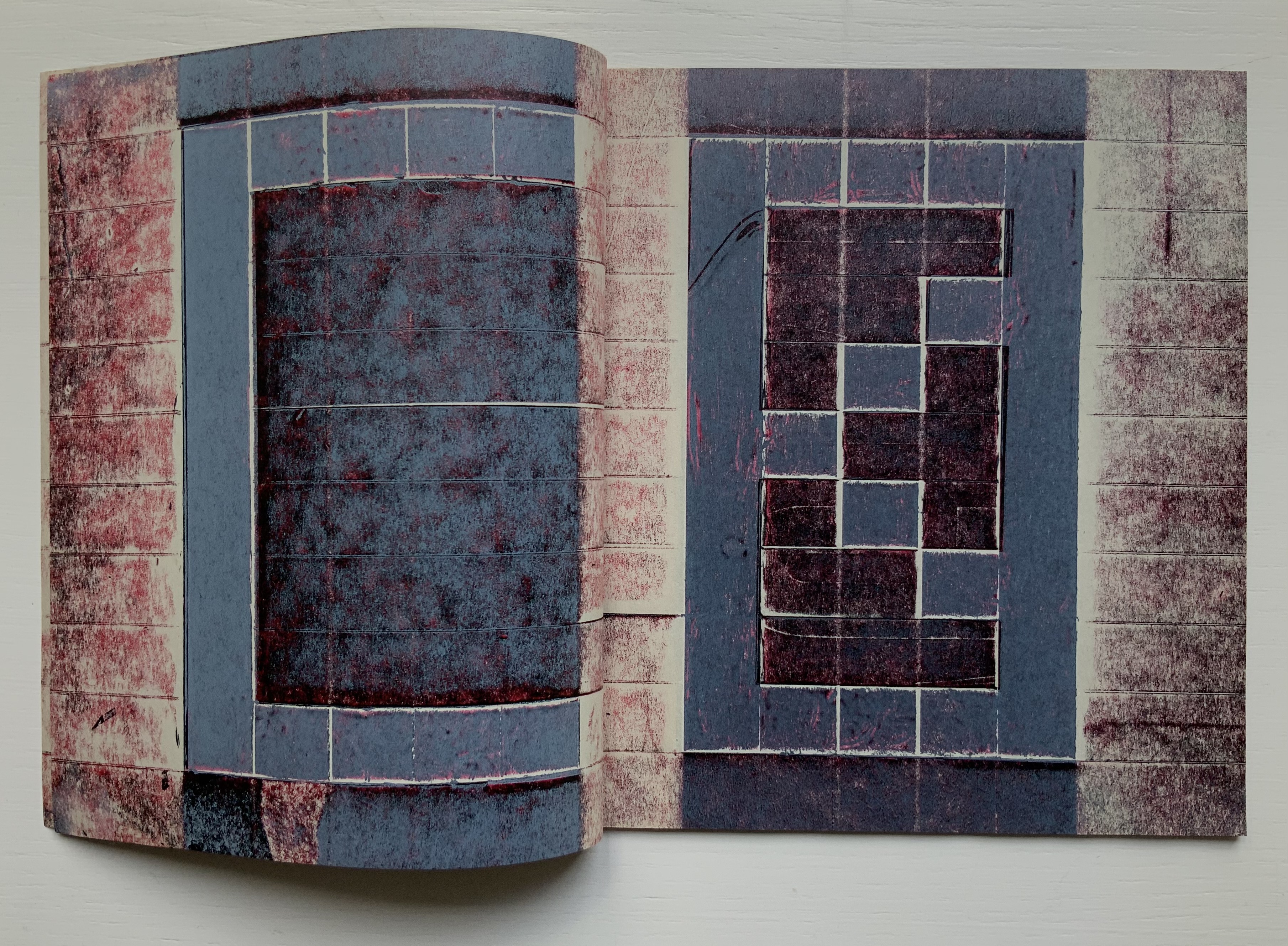
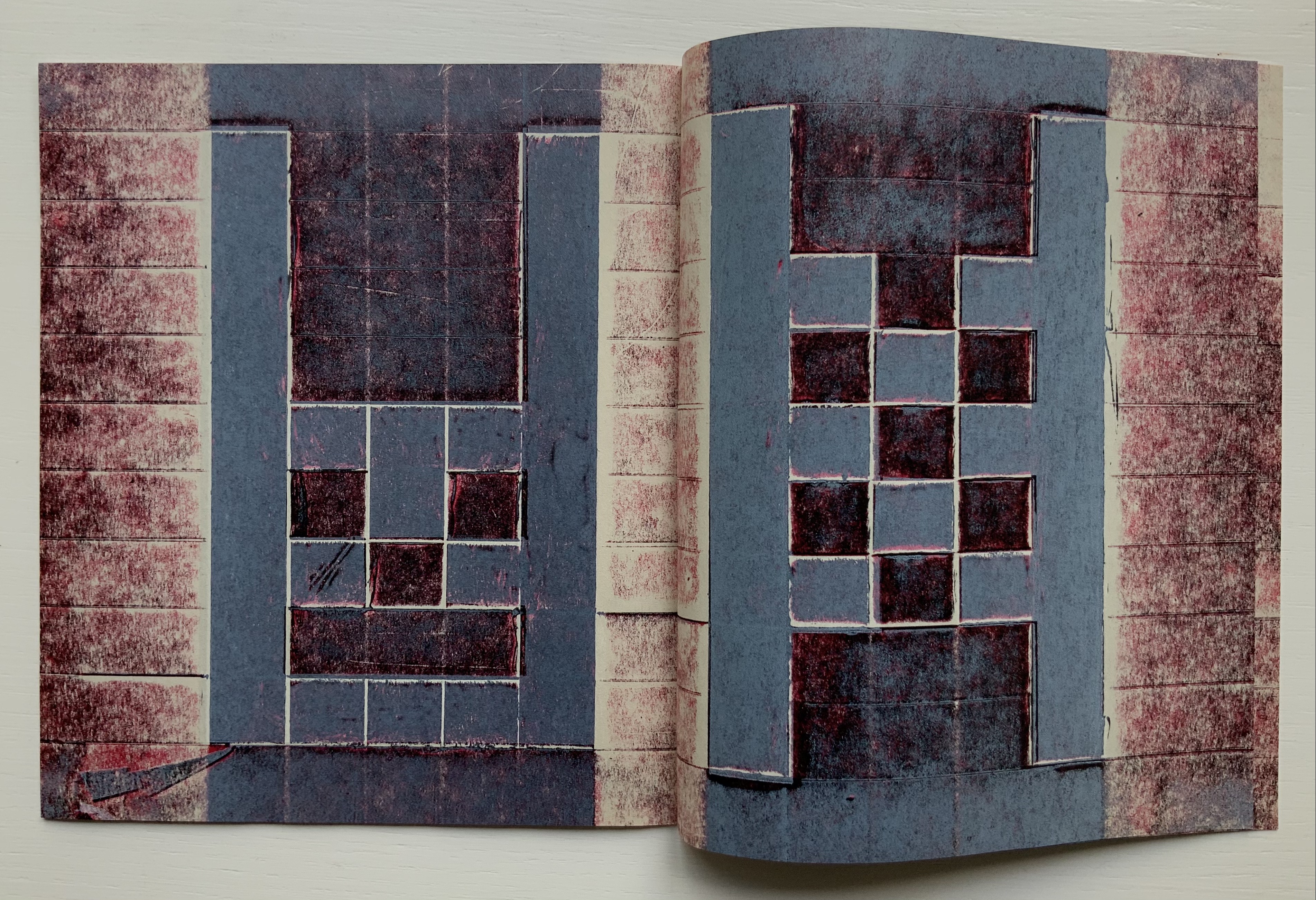
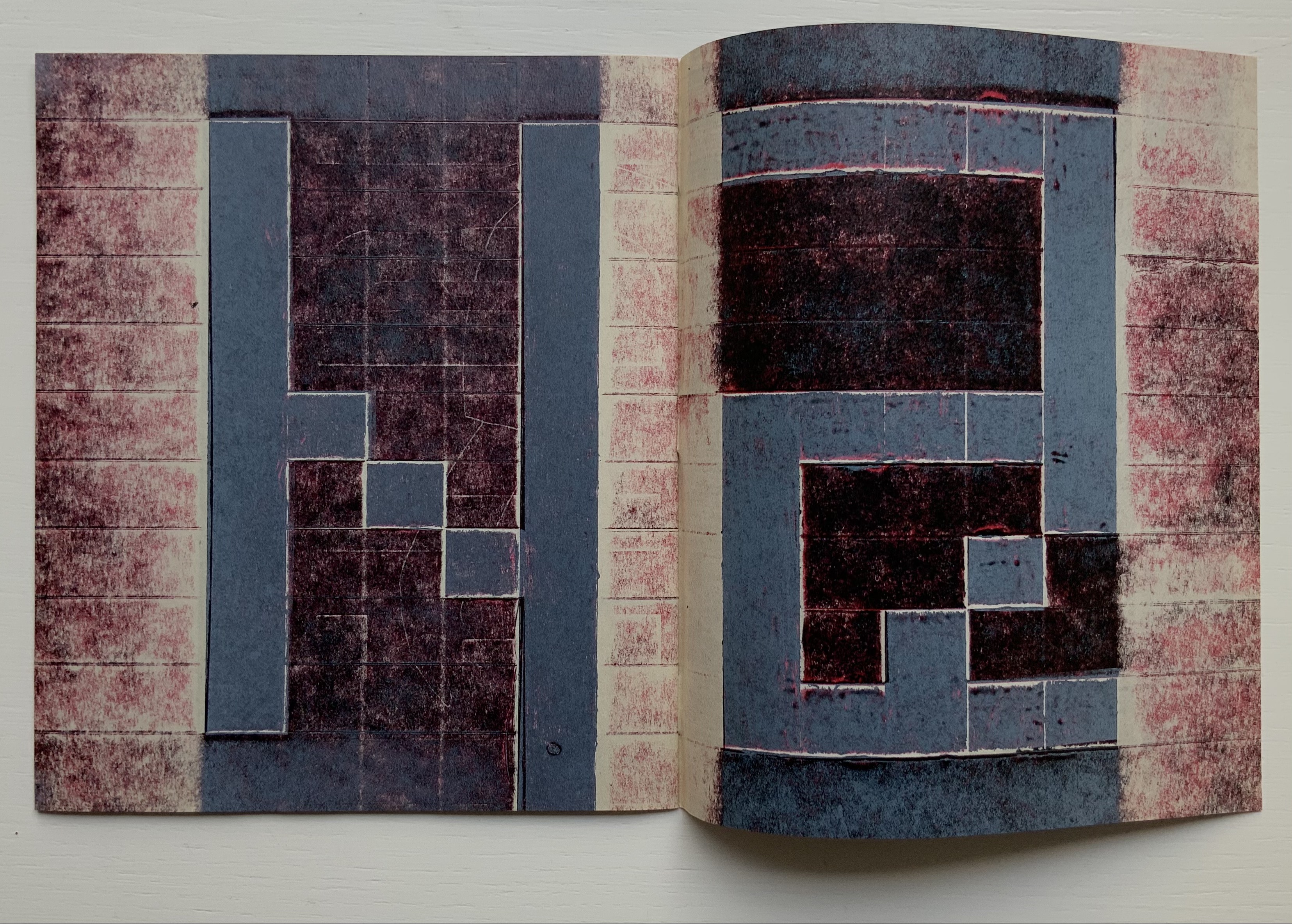
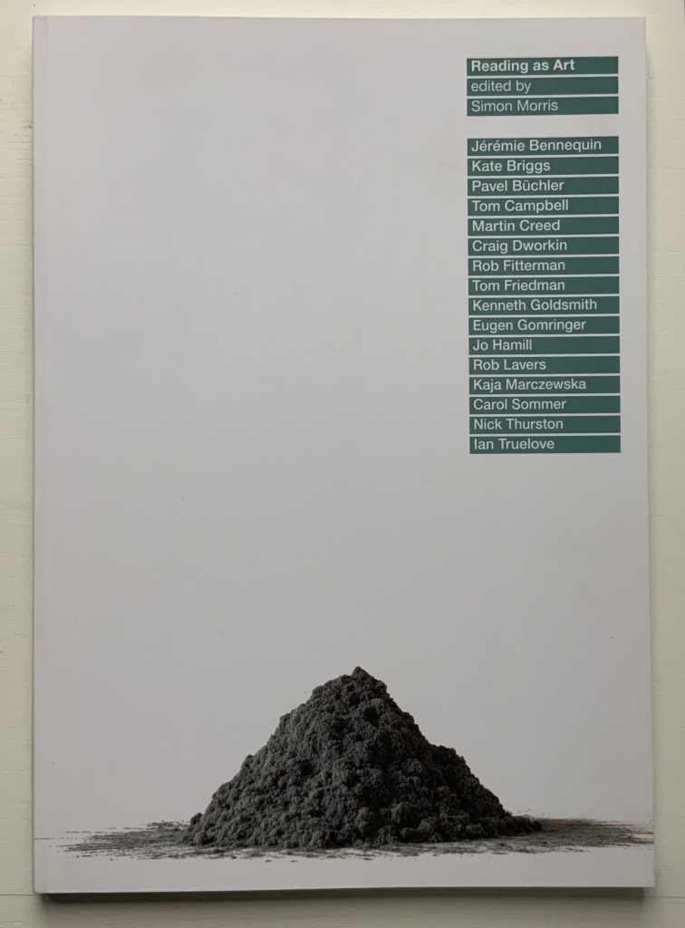


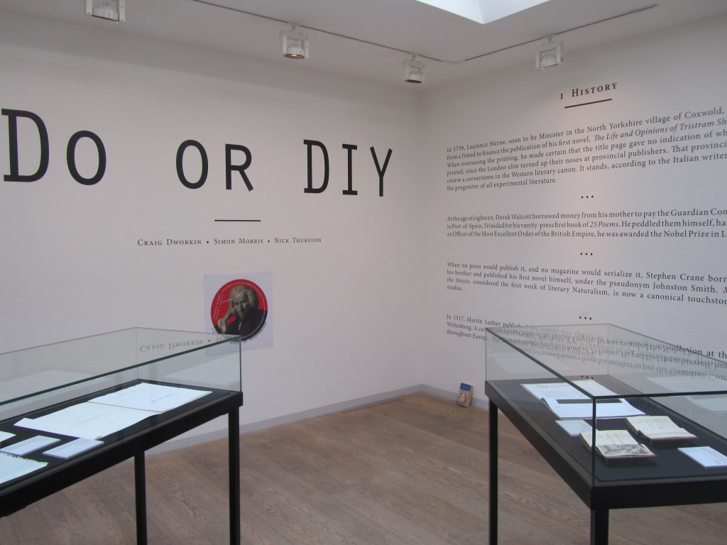
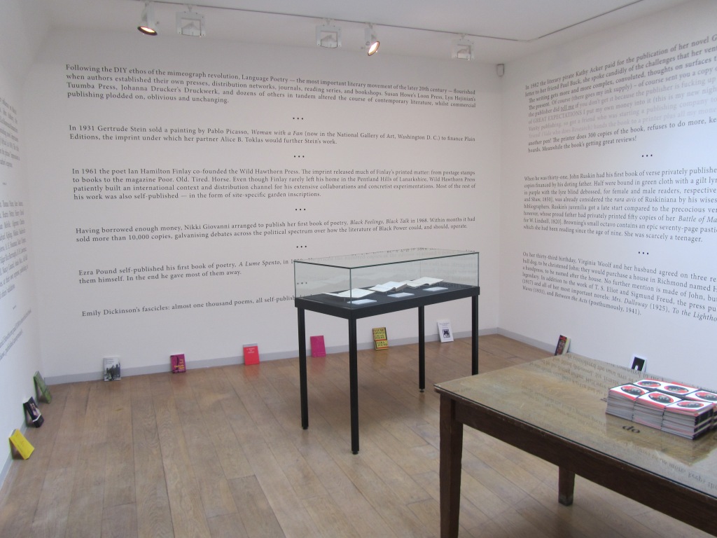


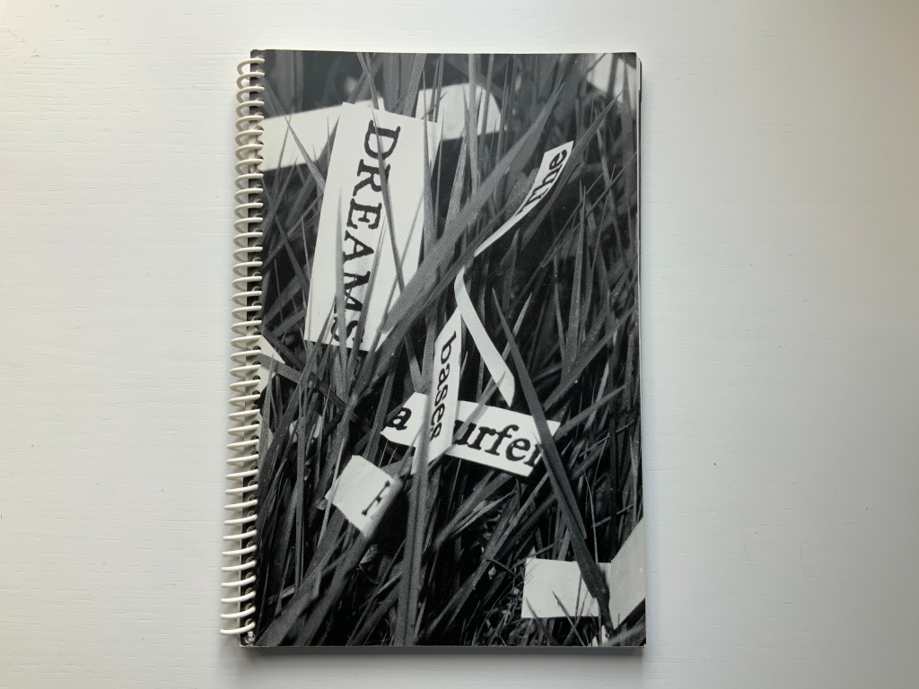
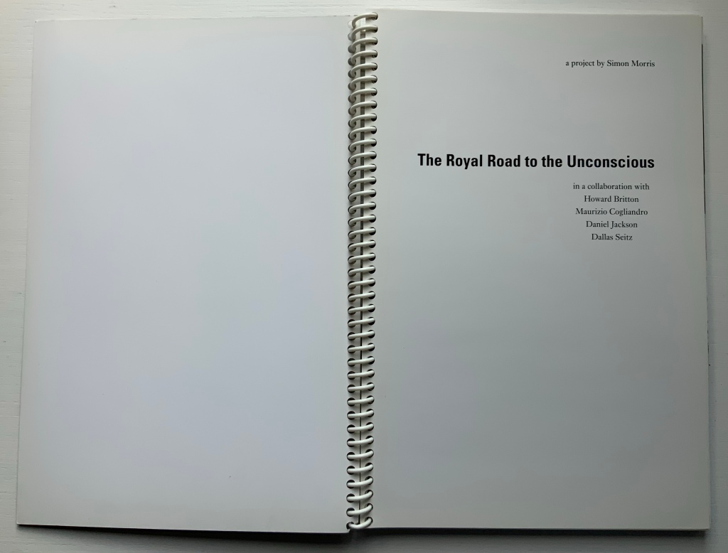

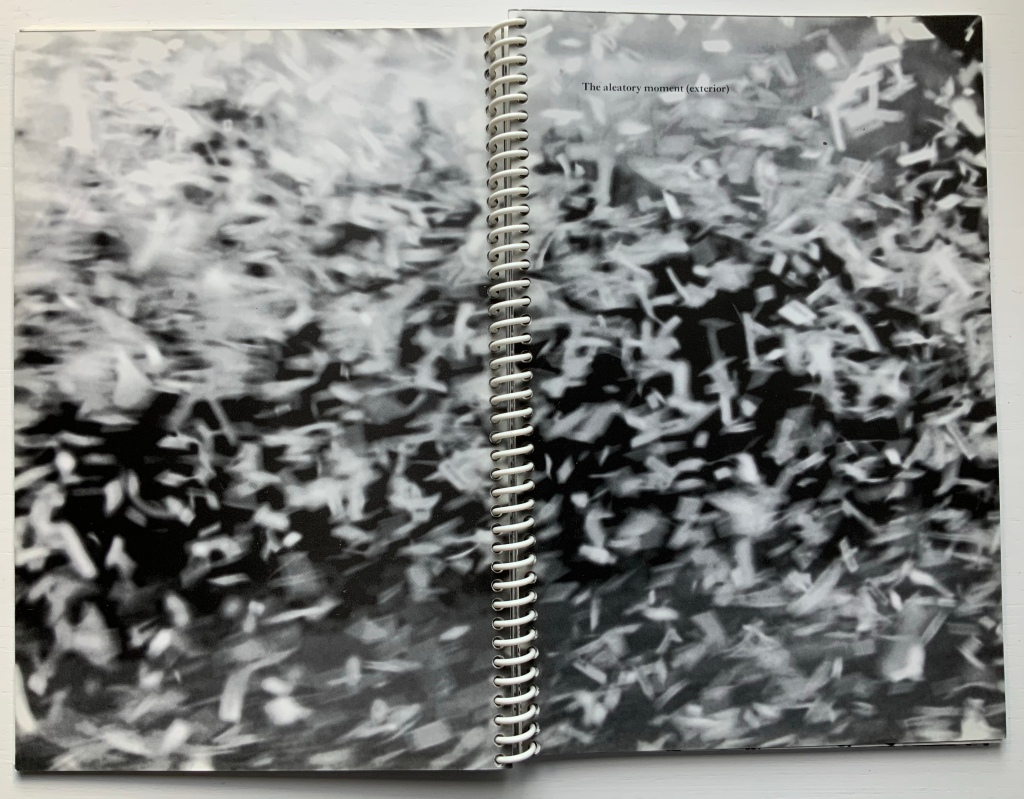

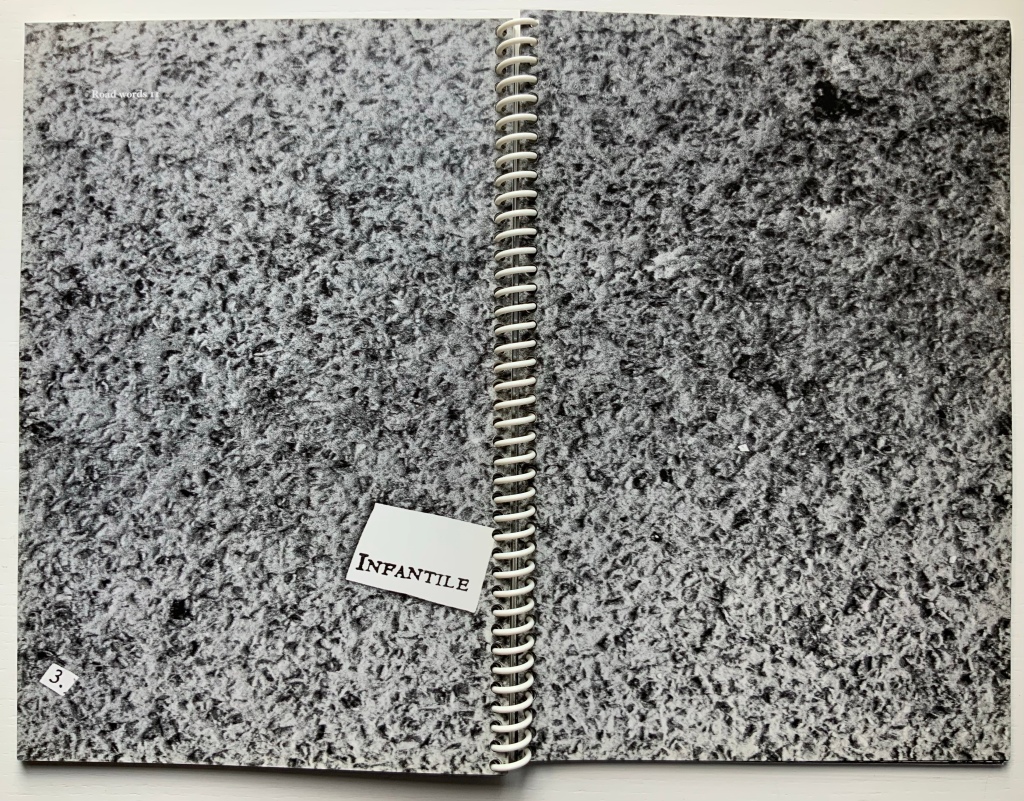

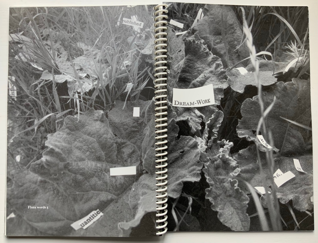
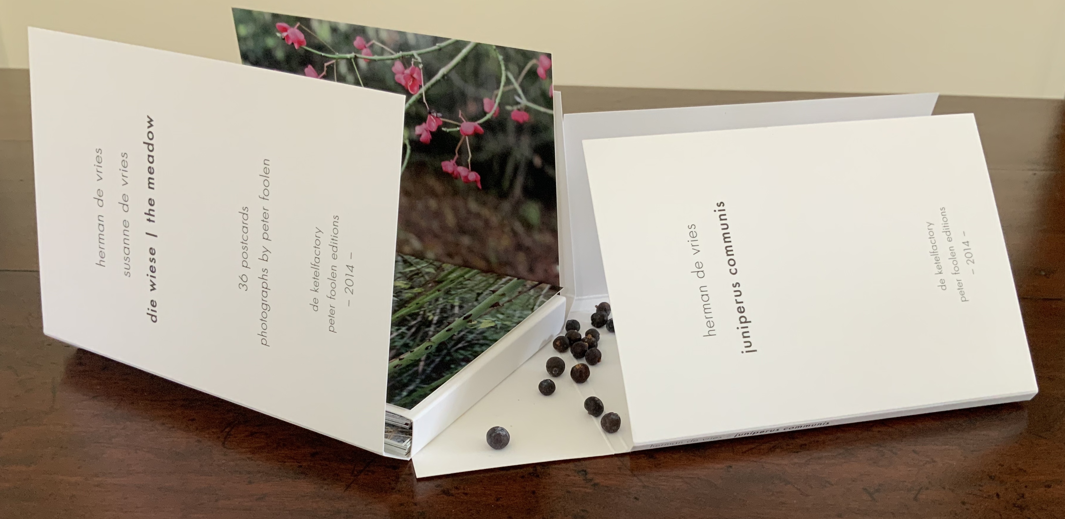
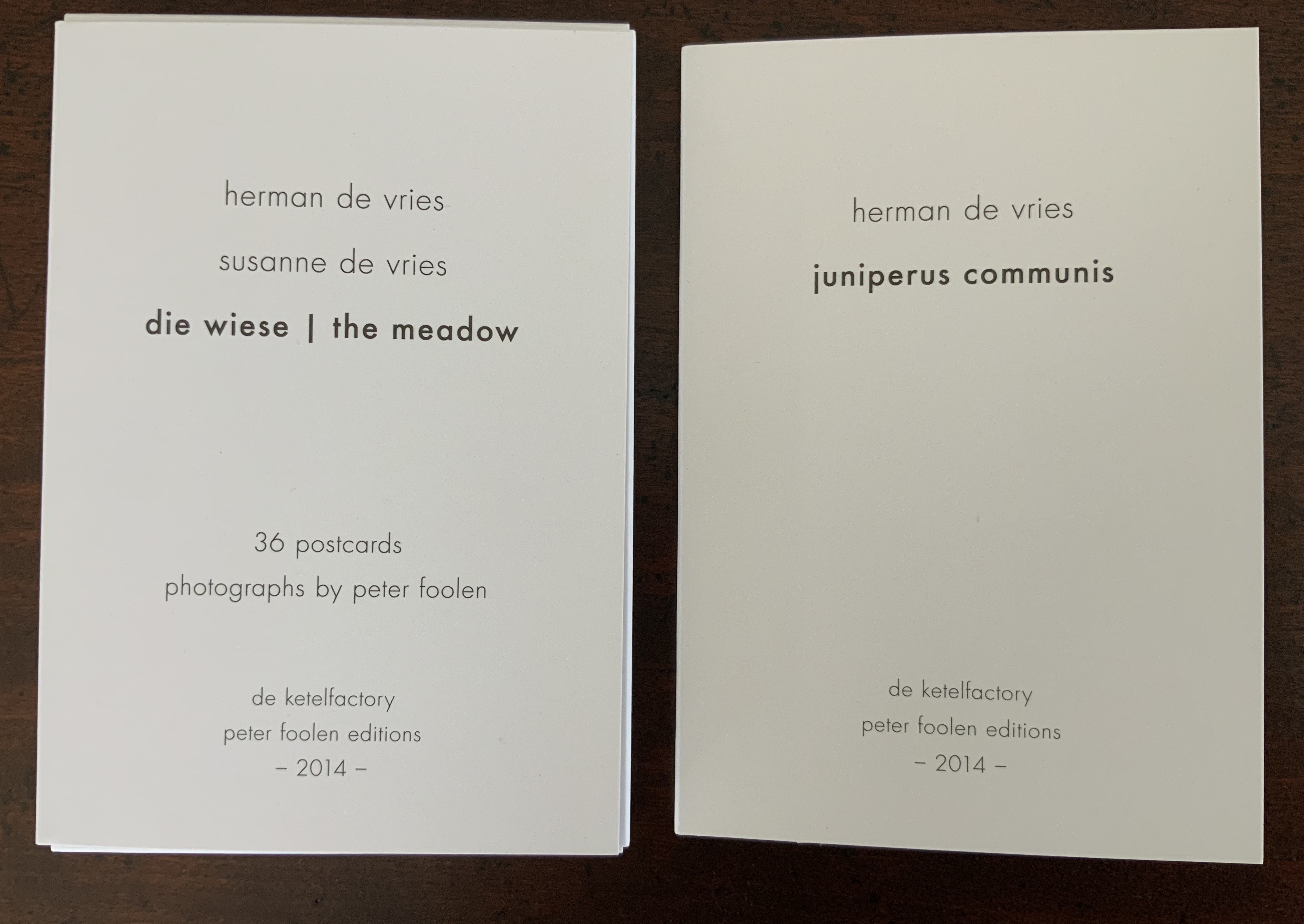
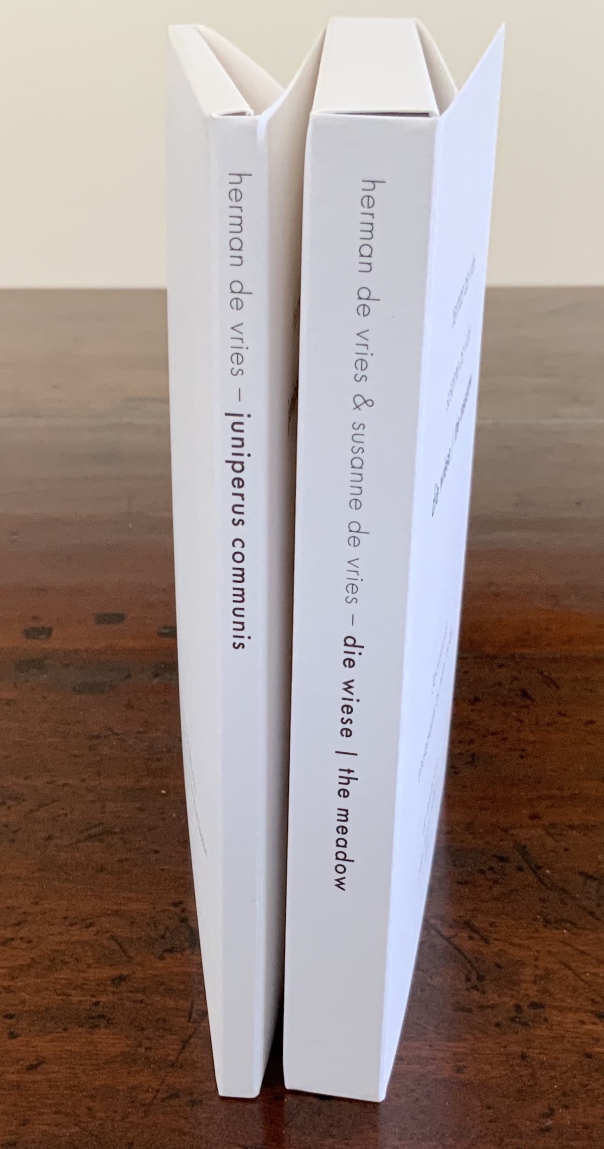
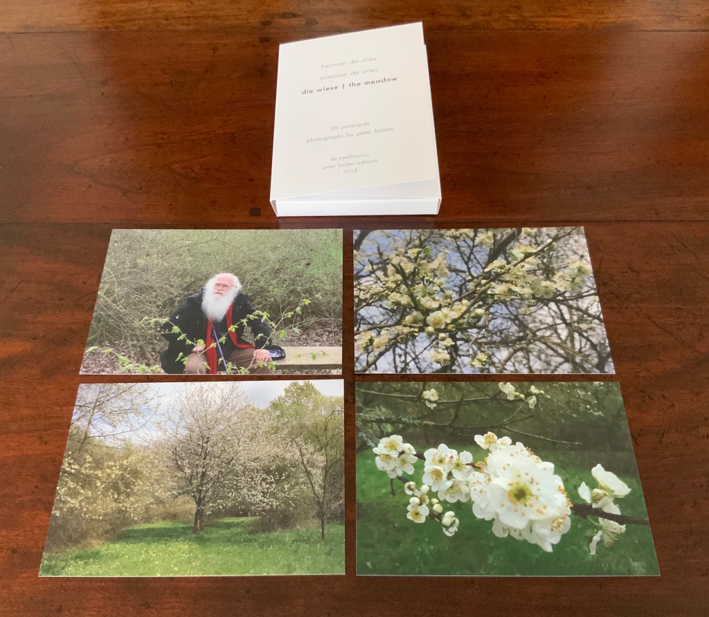
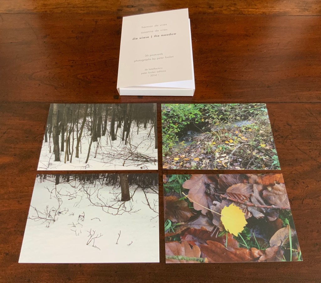
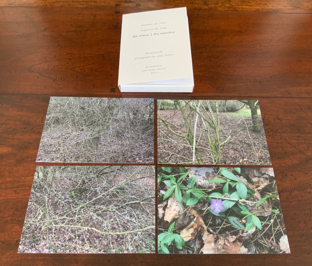
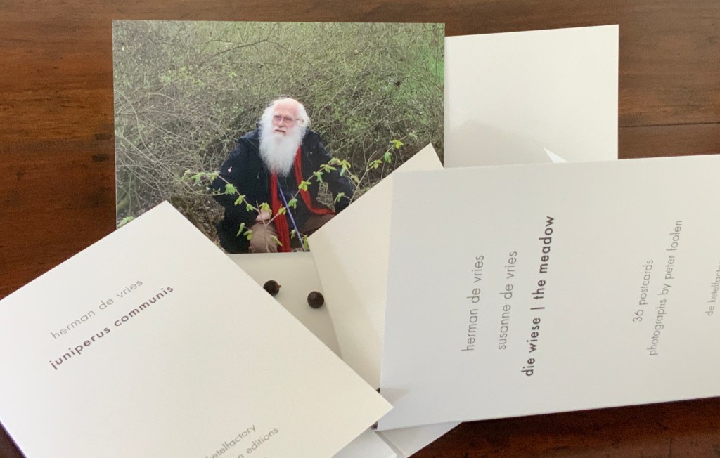
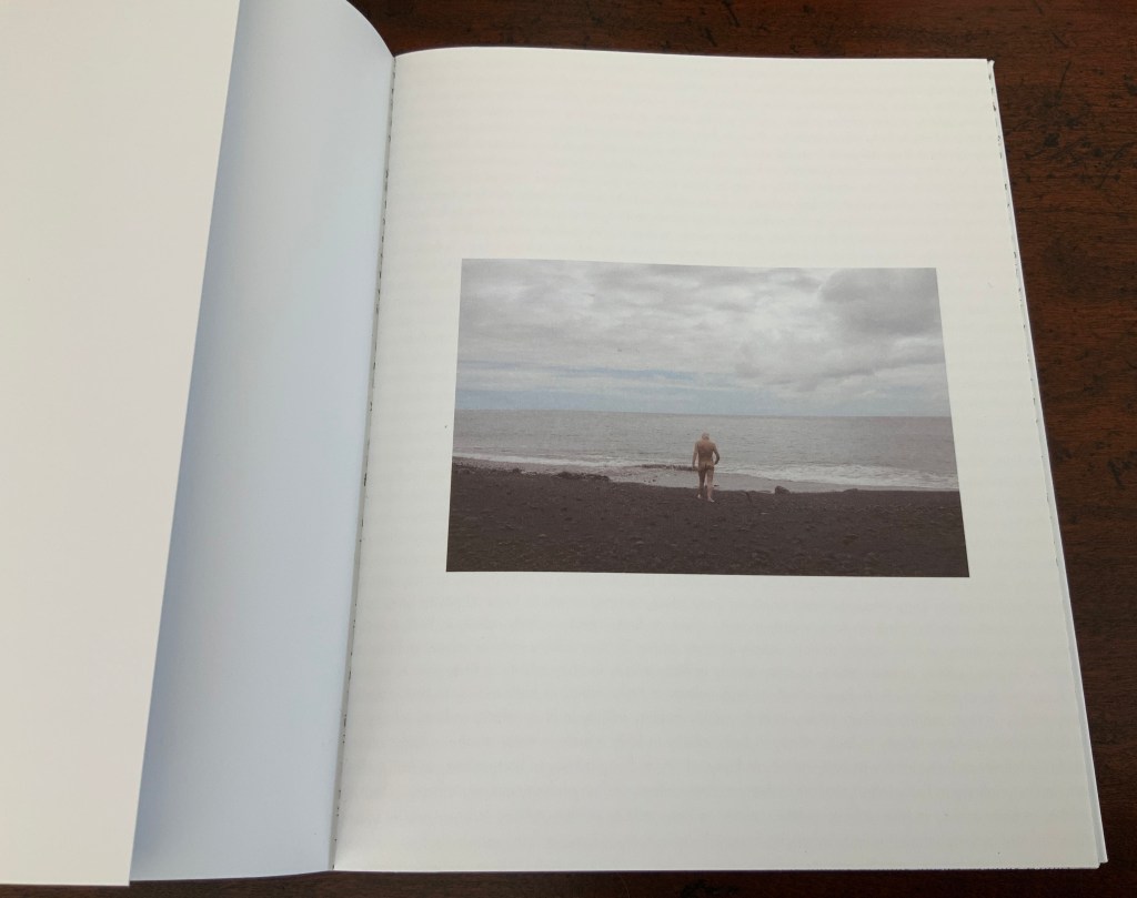
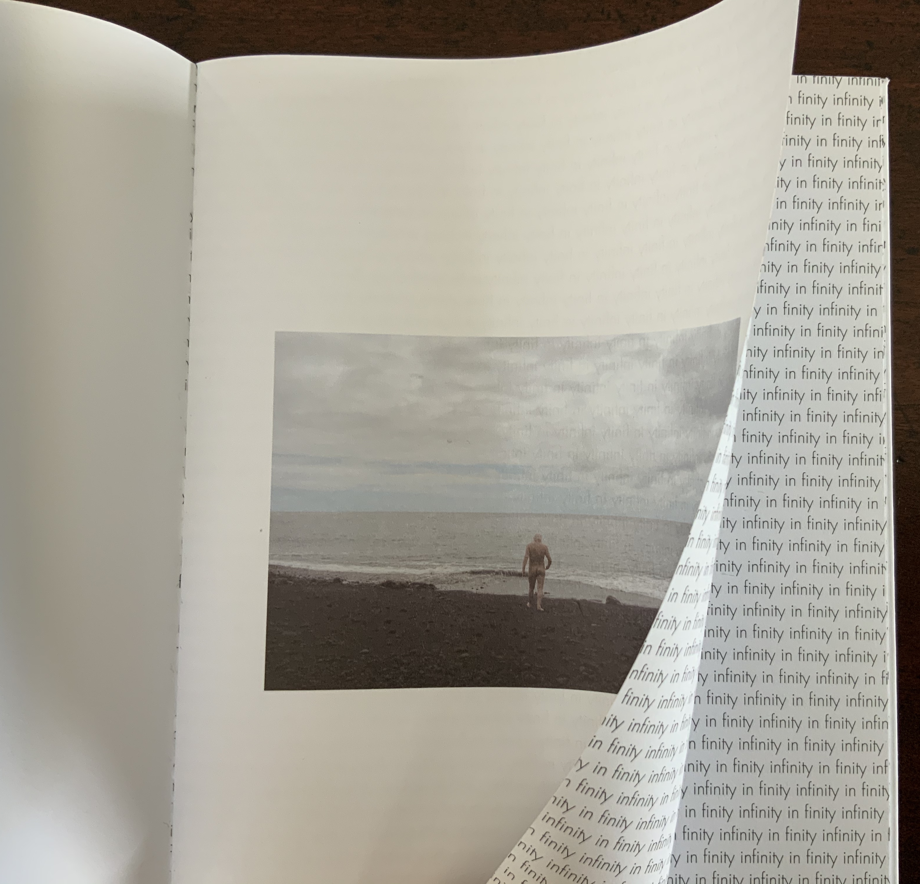
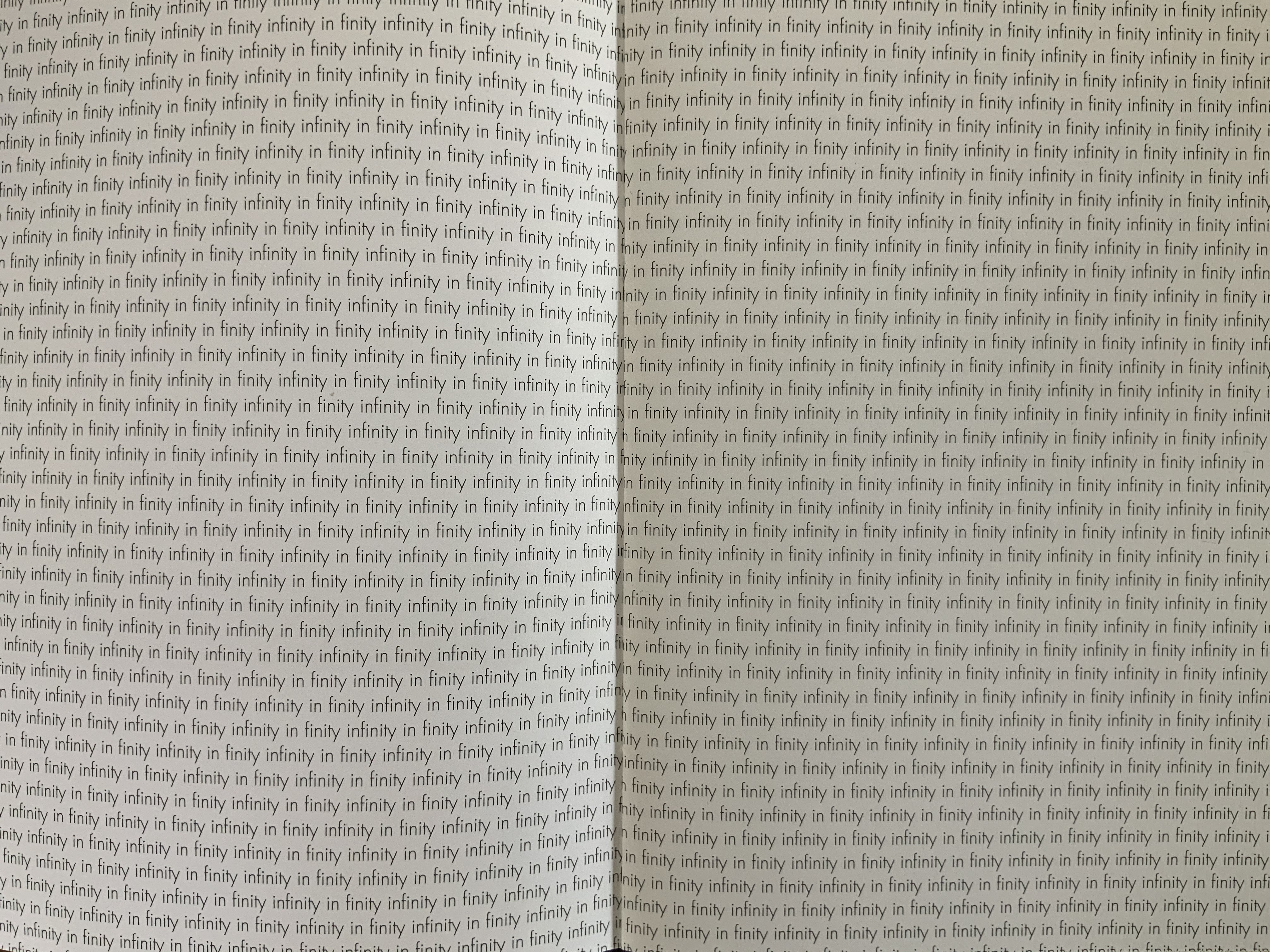
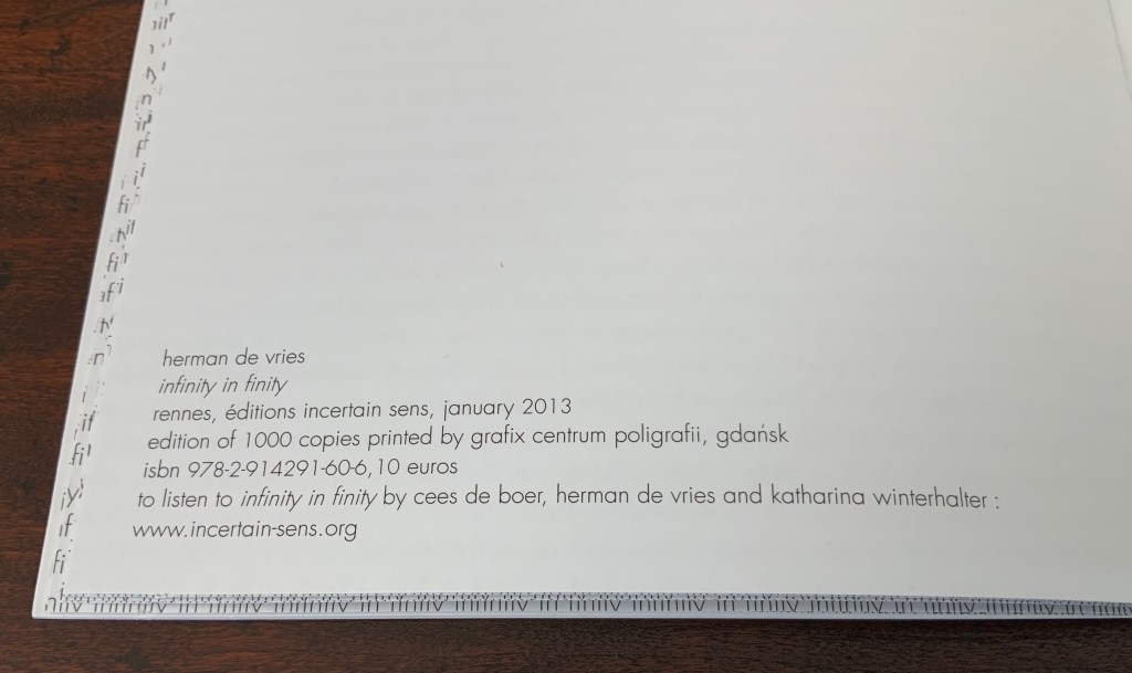
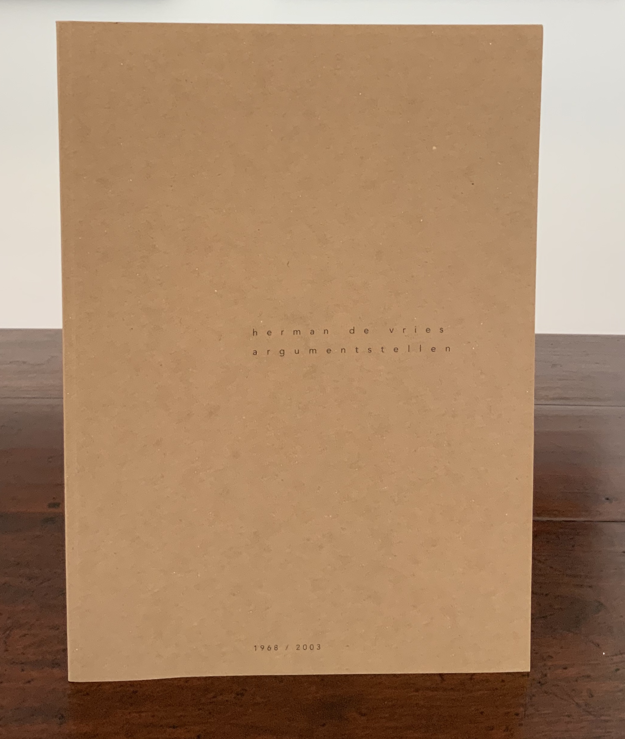
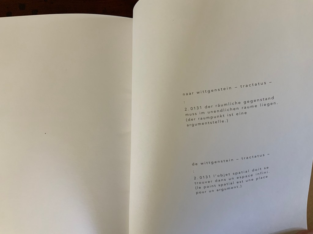
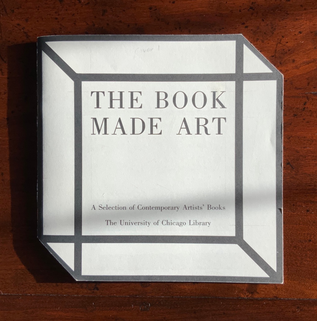


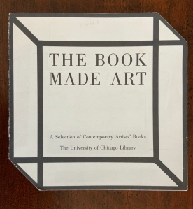


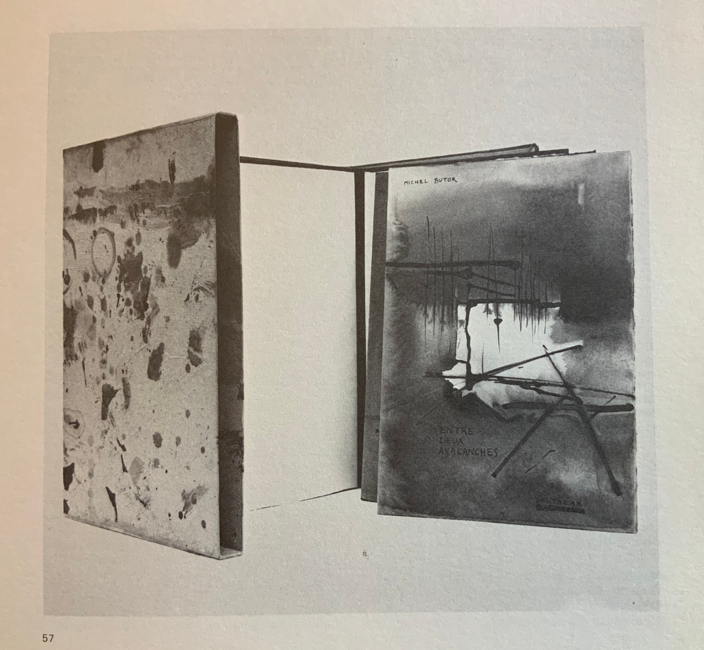
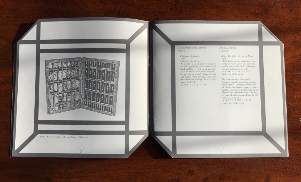


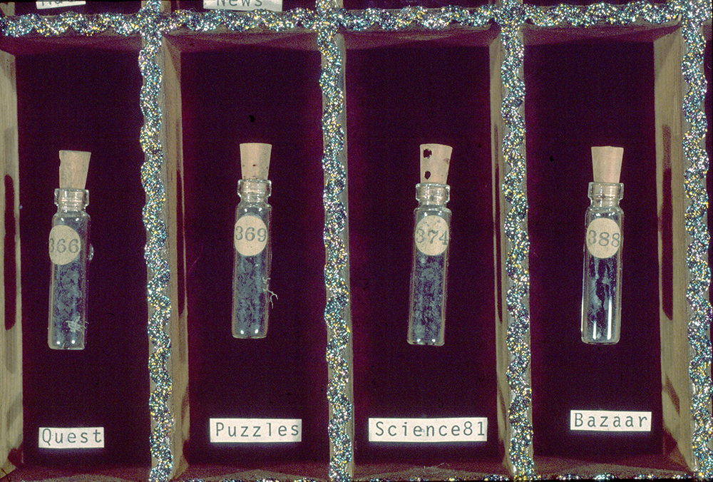

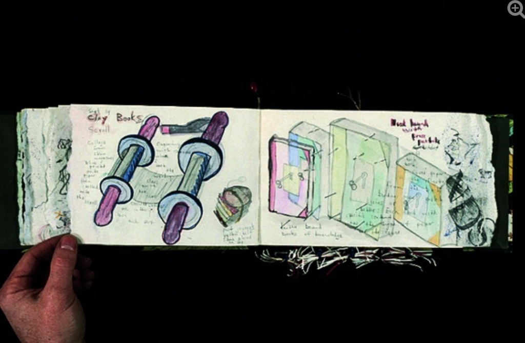


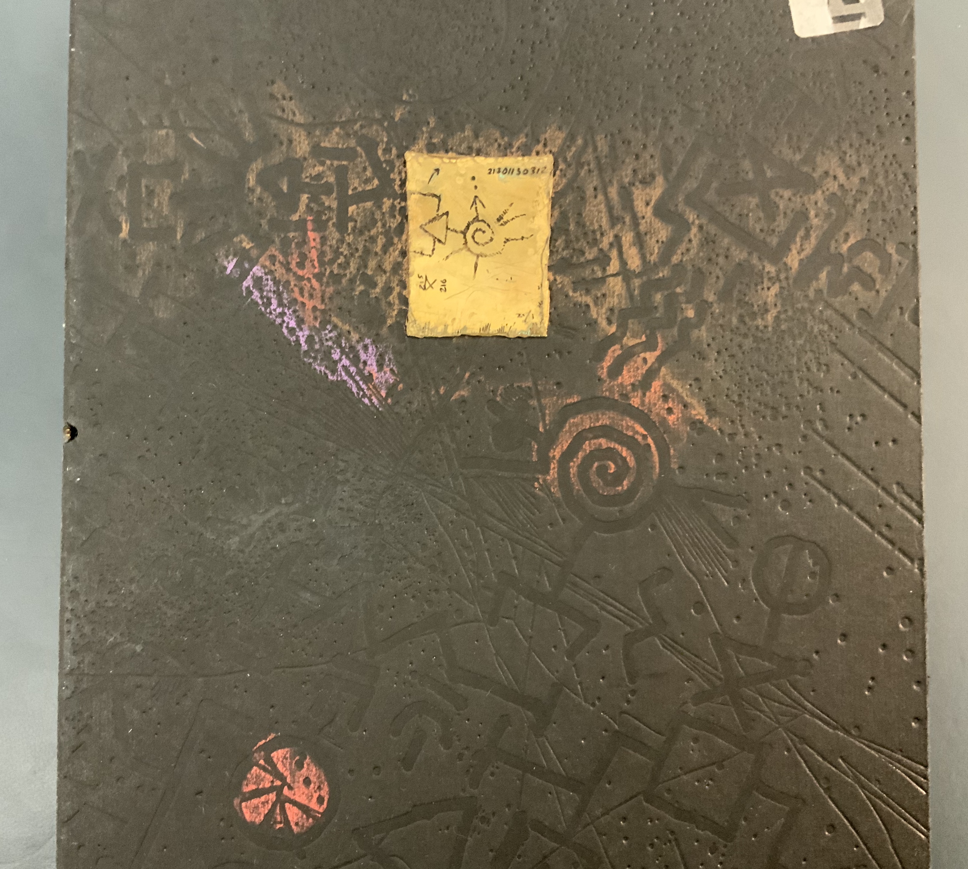
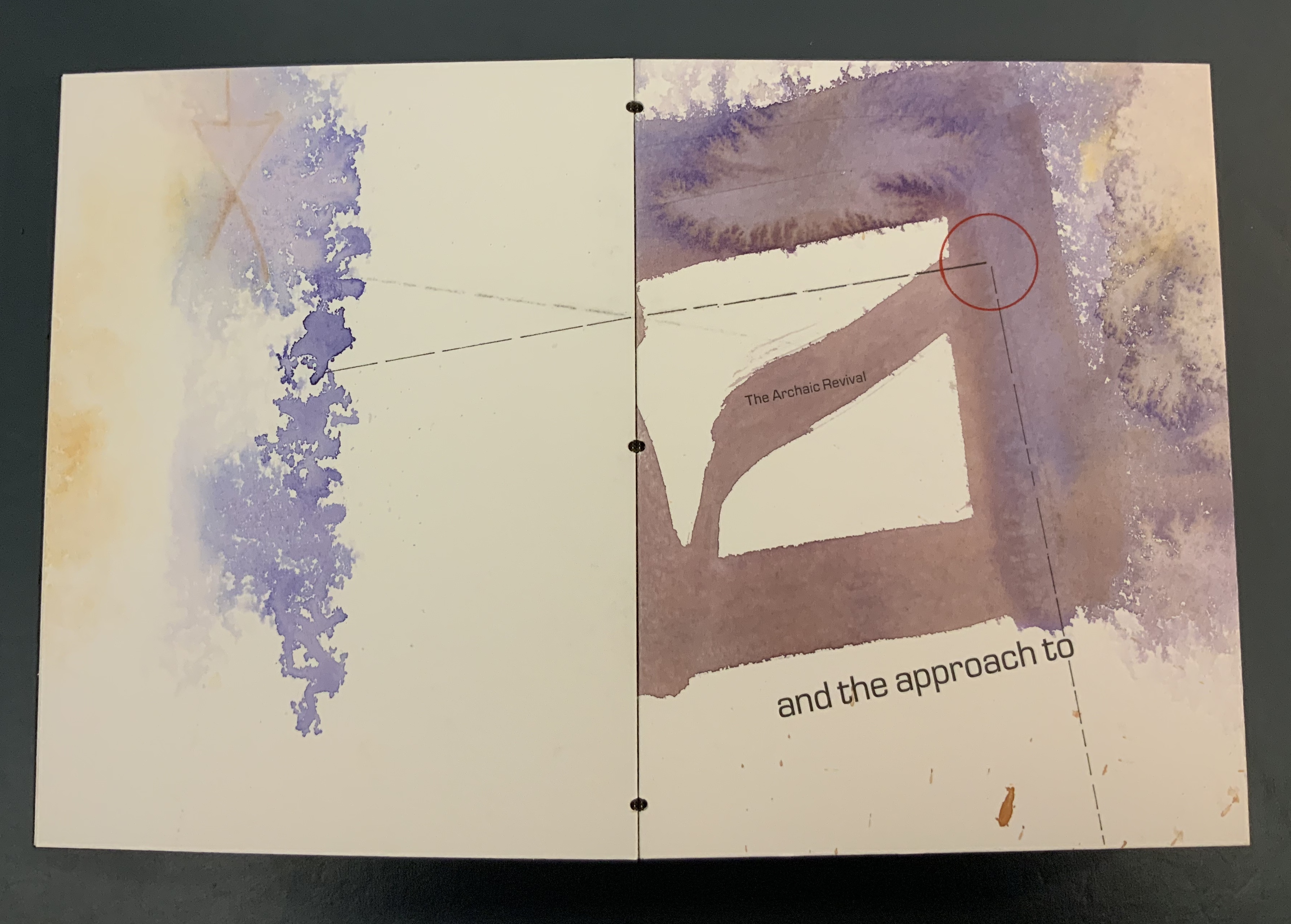


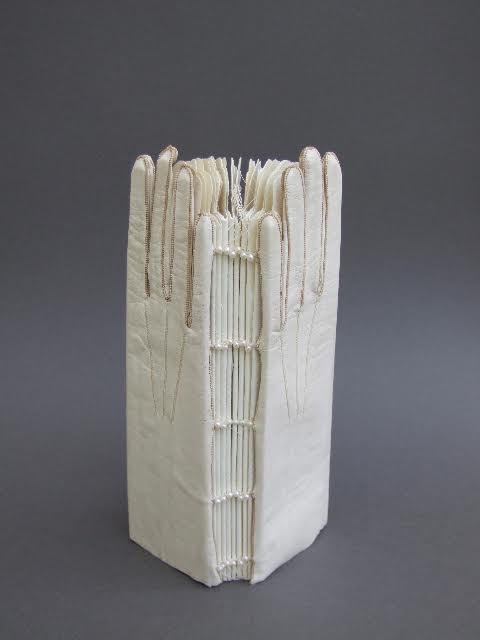
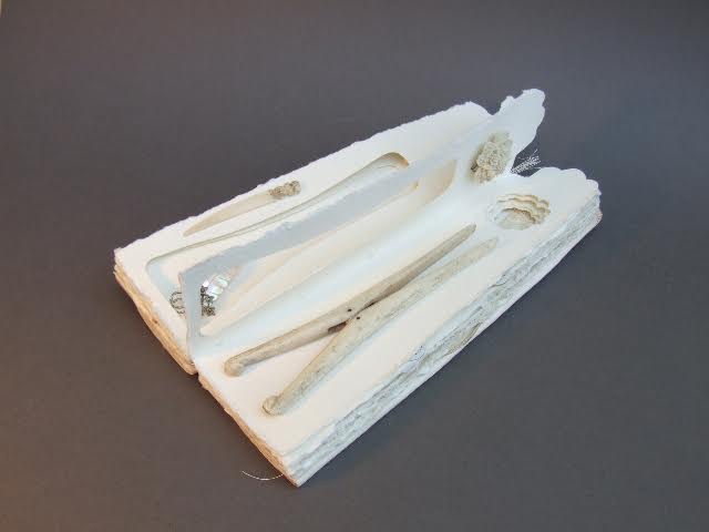
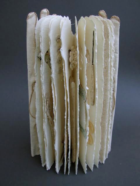

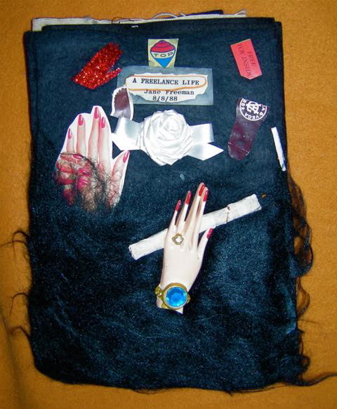


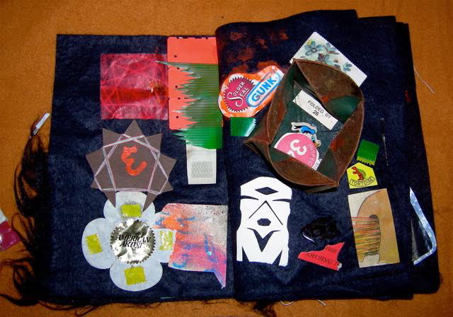


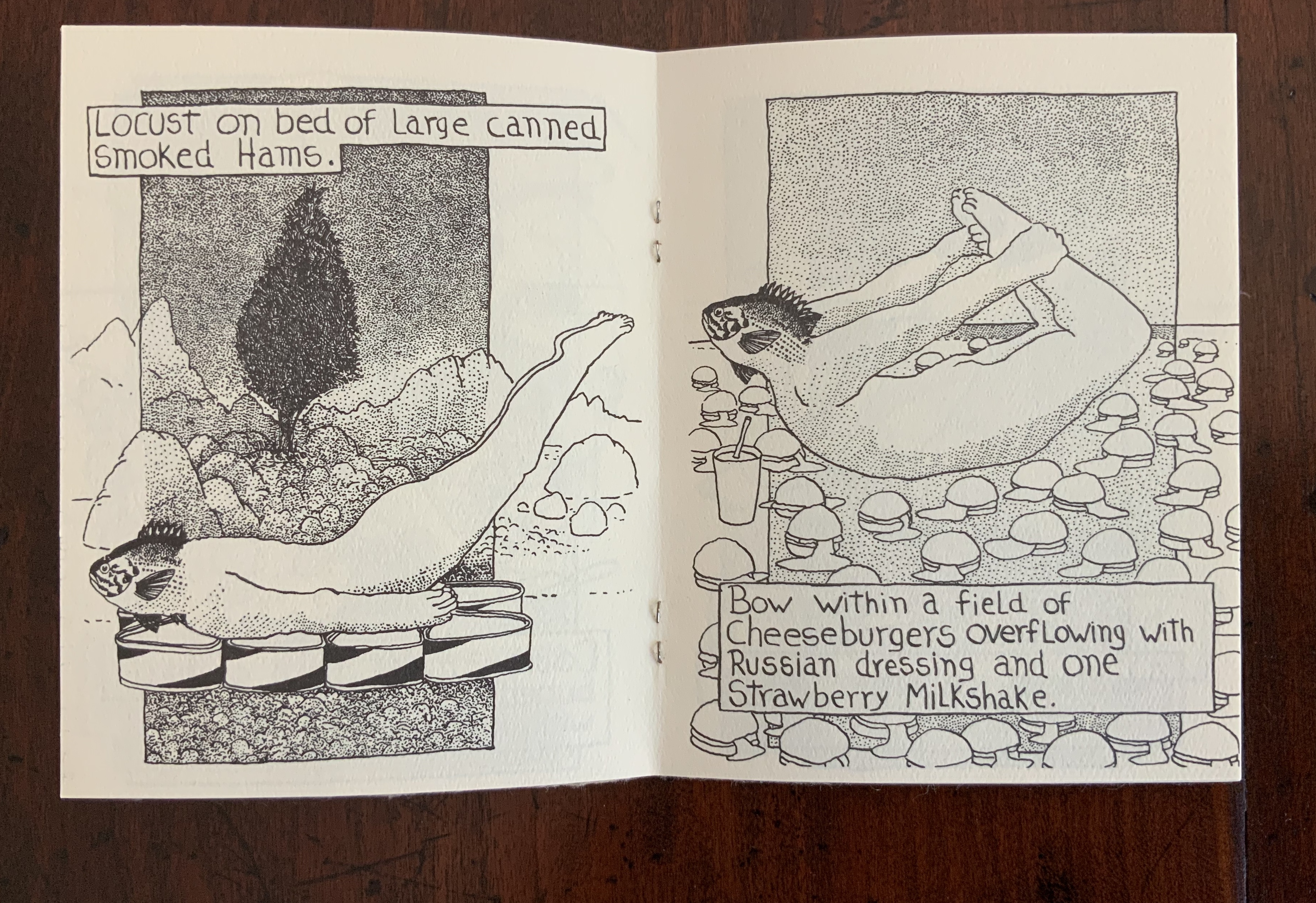


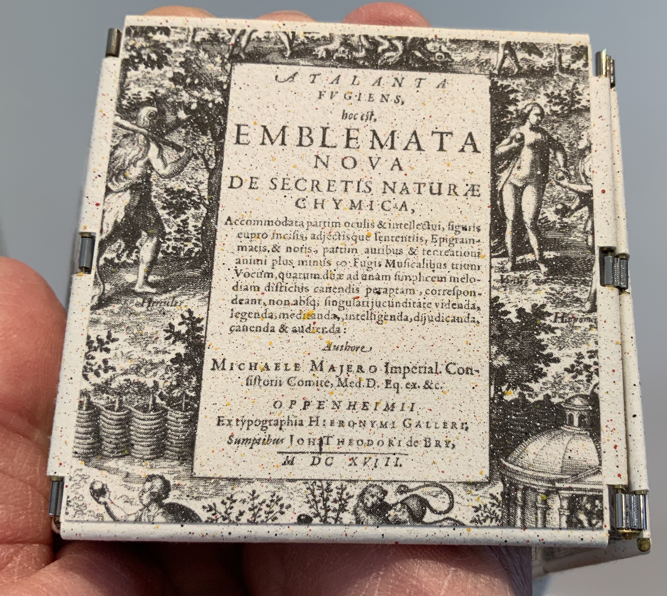


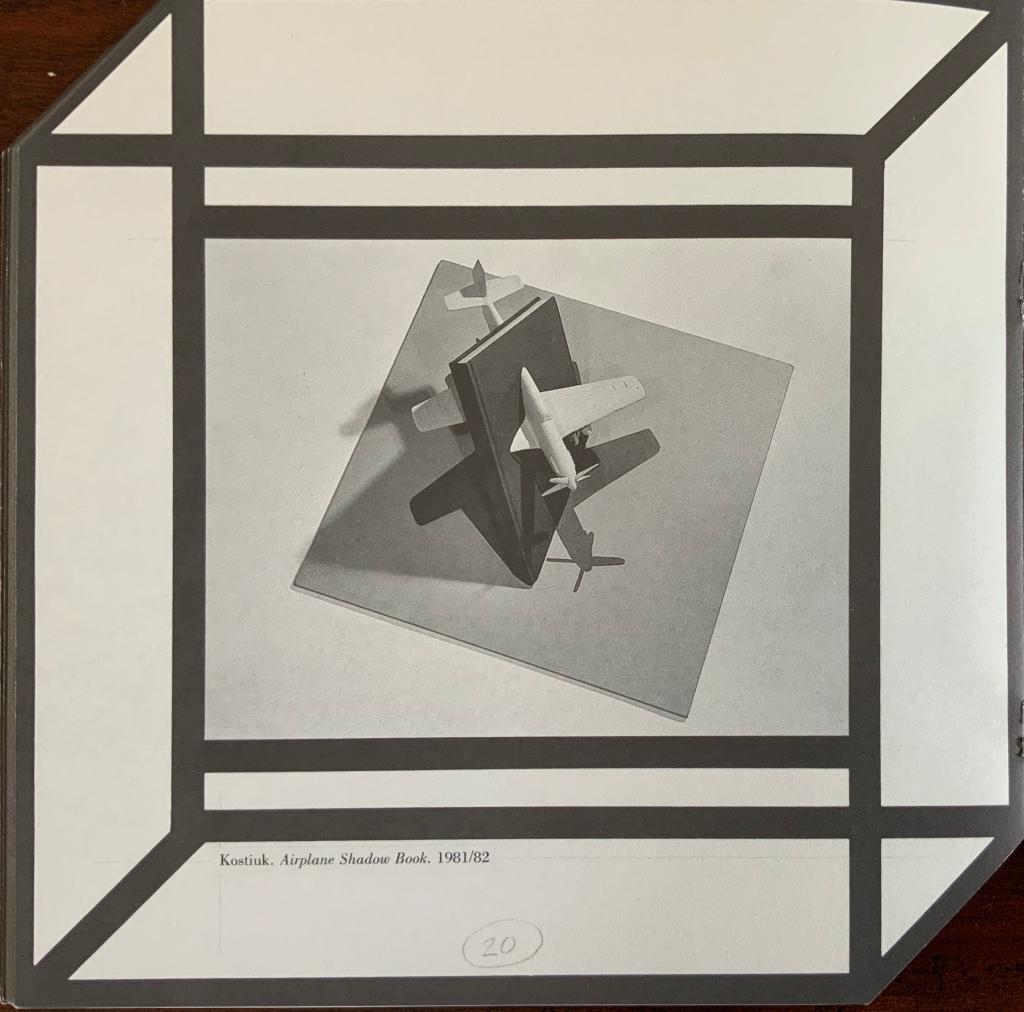


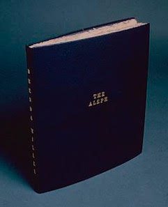
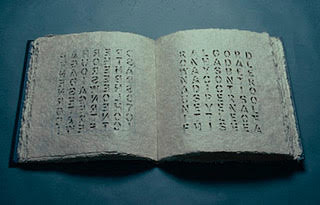


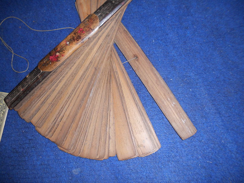


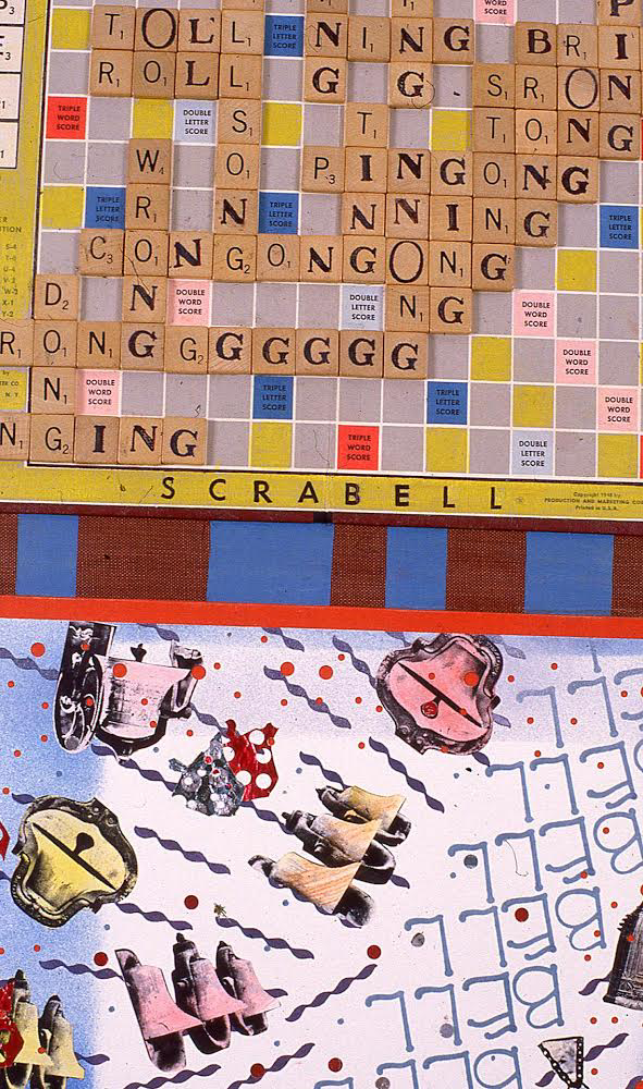


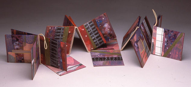


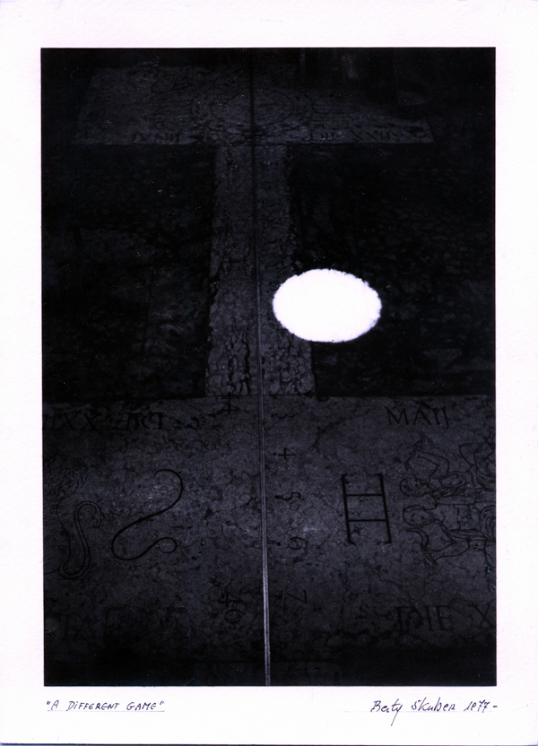


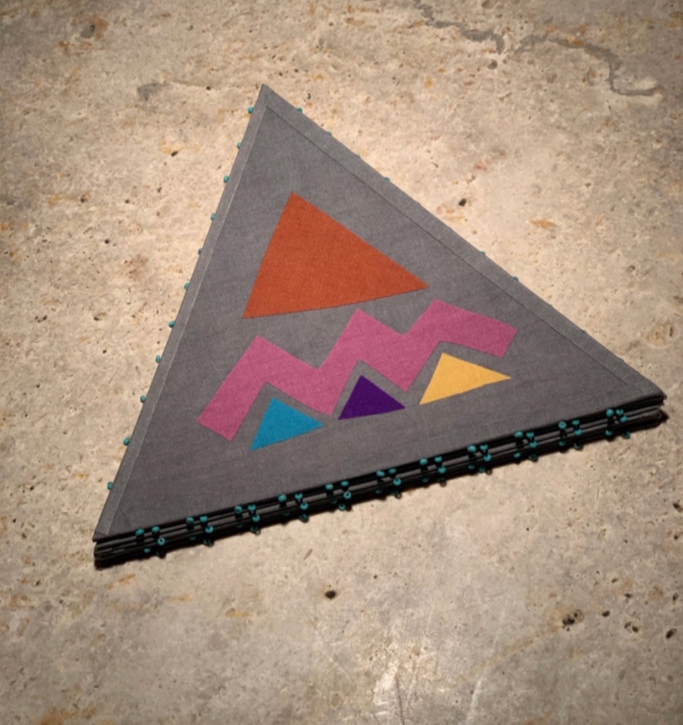
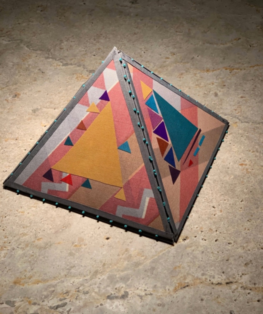
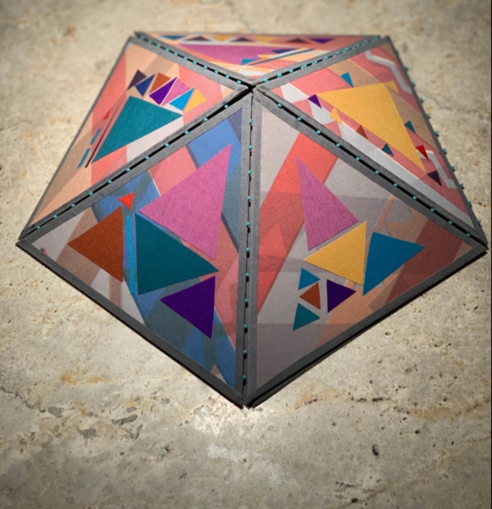
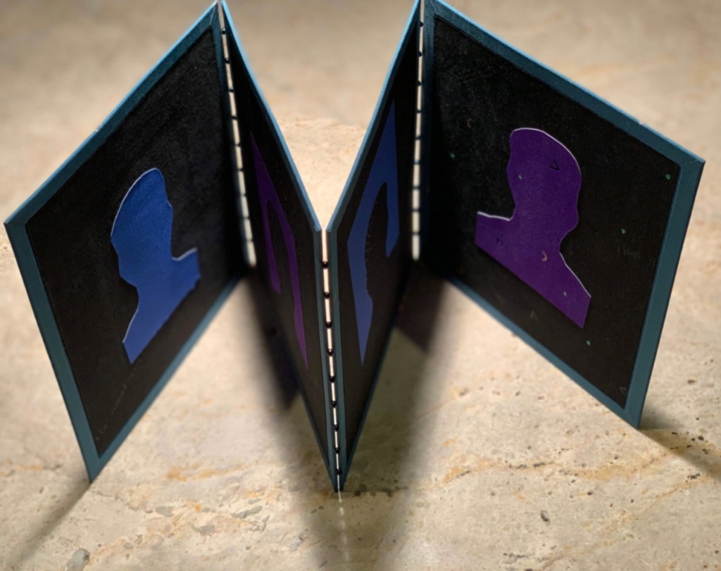


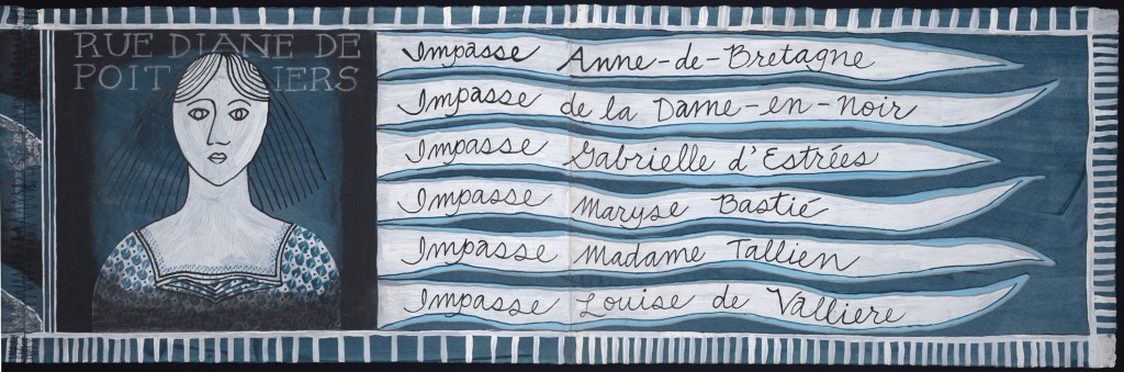
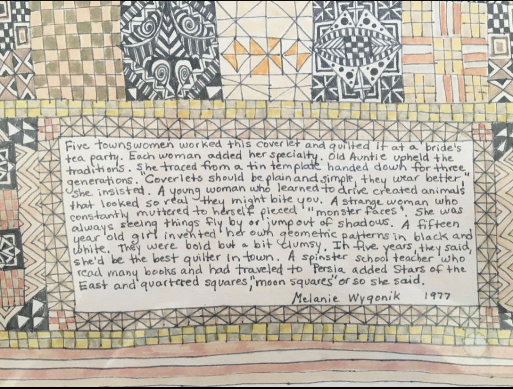


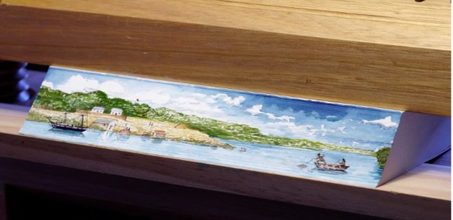
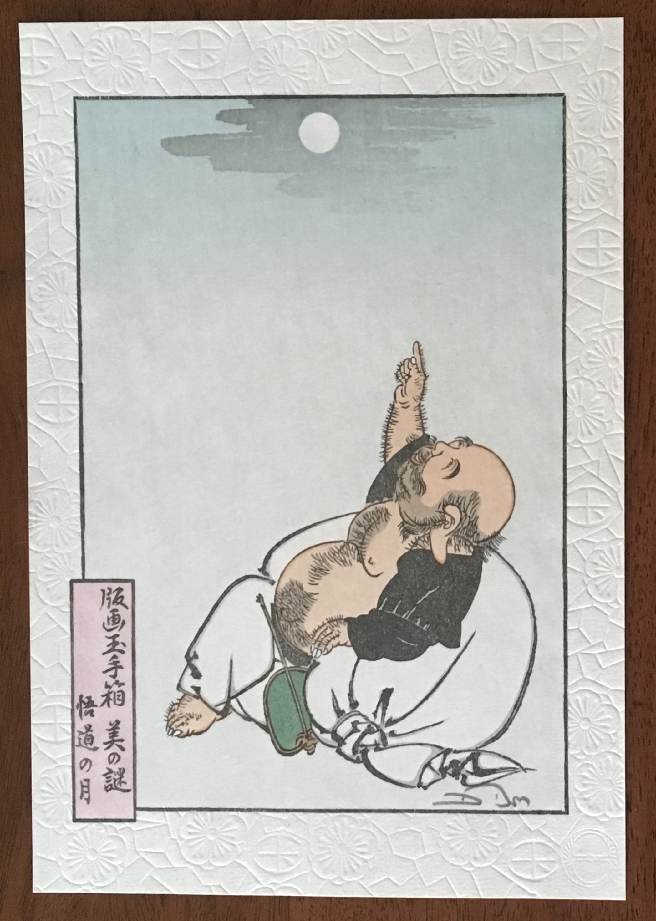
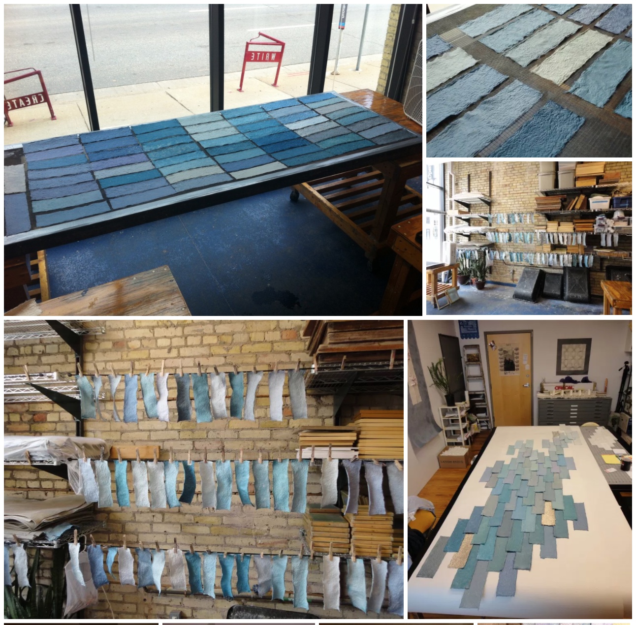
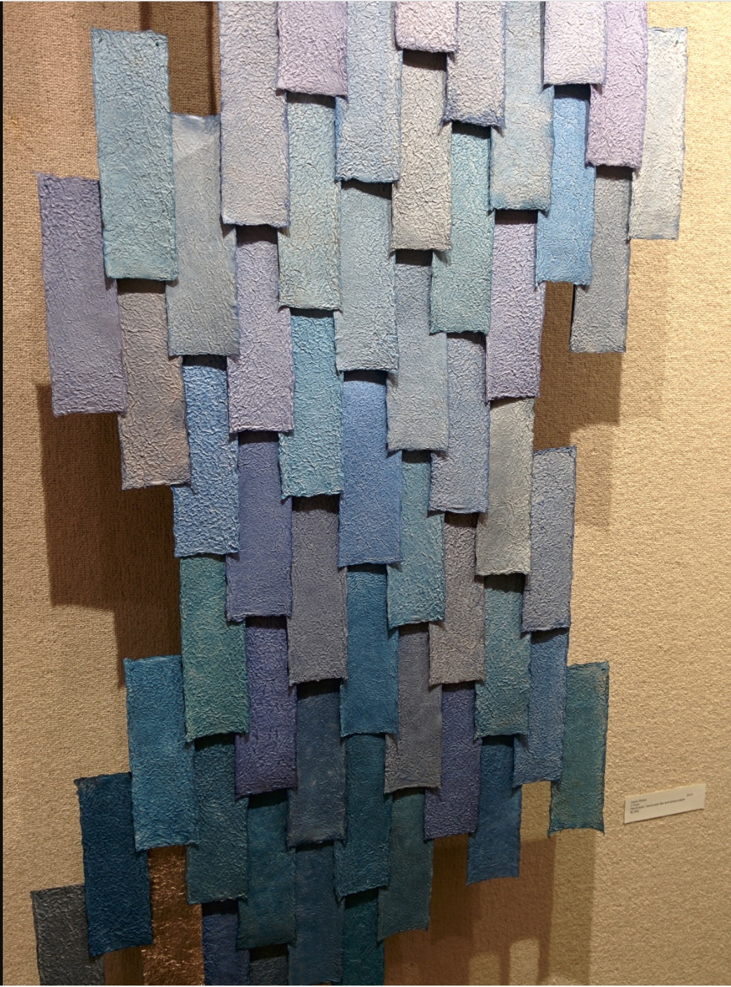
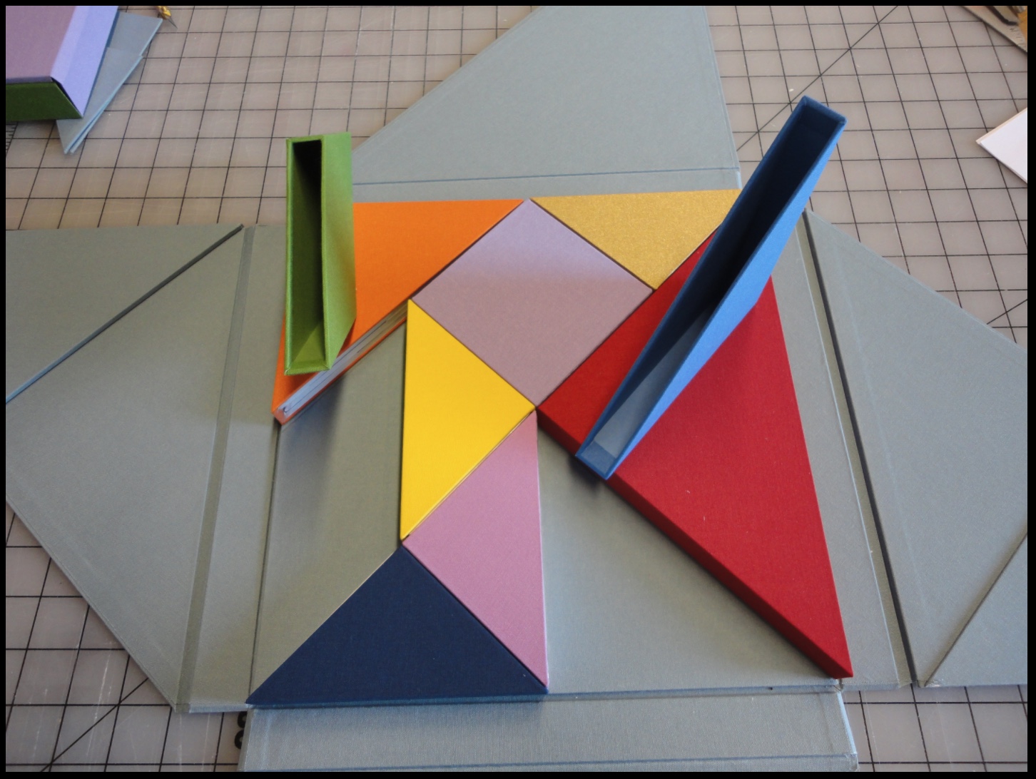
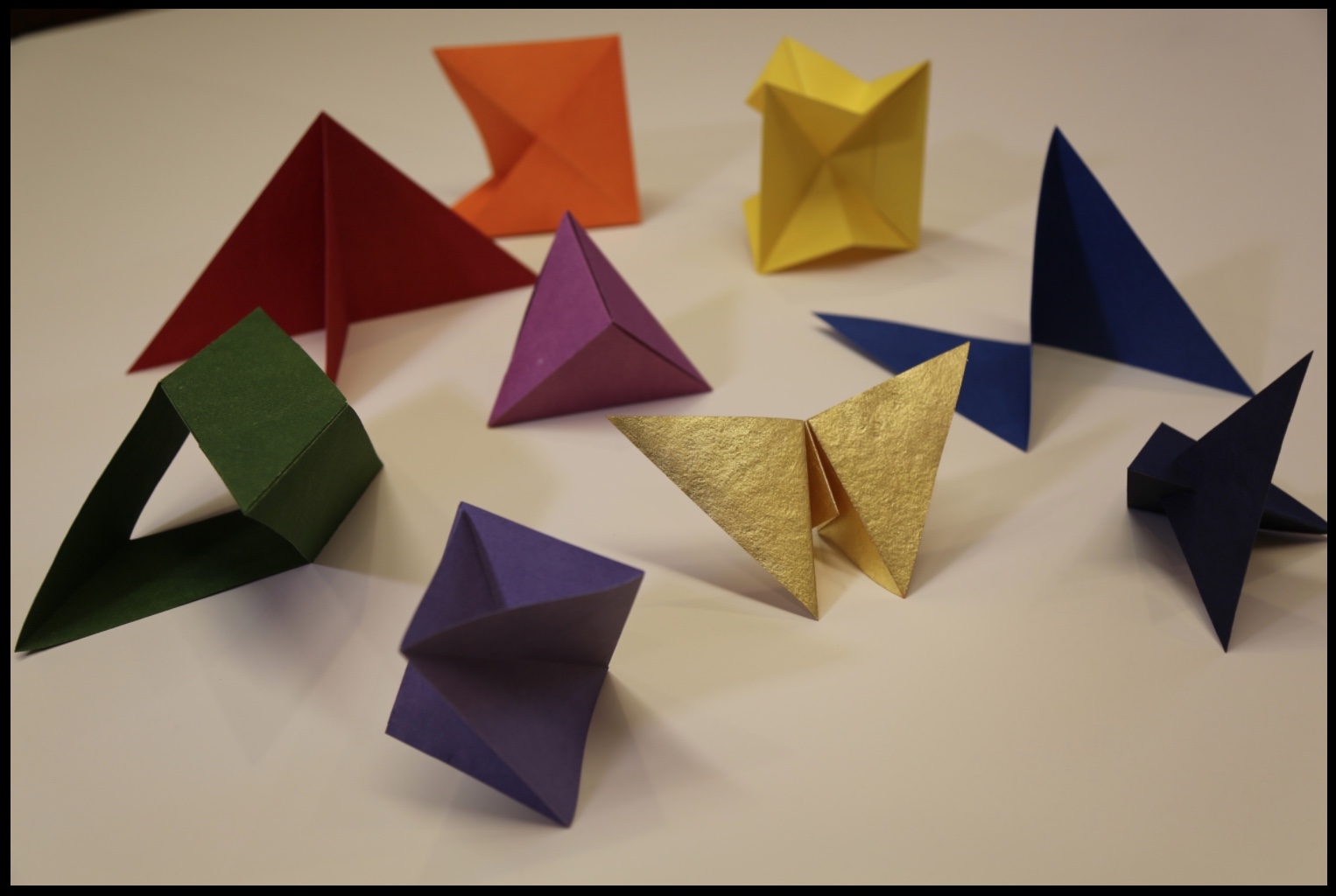
